
DESIGN REFERENCE
株式会社Neu|広告に、こだわりと偏愛を。
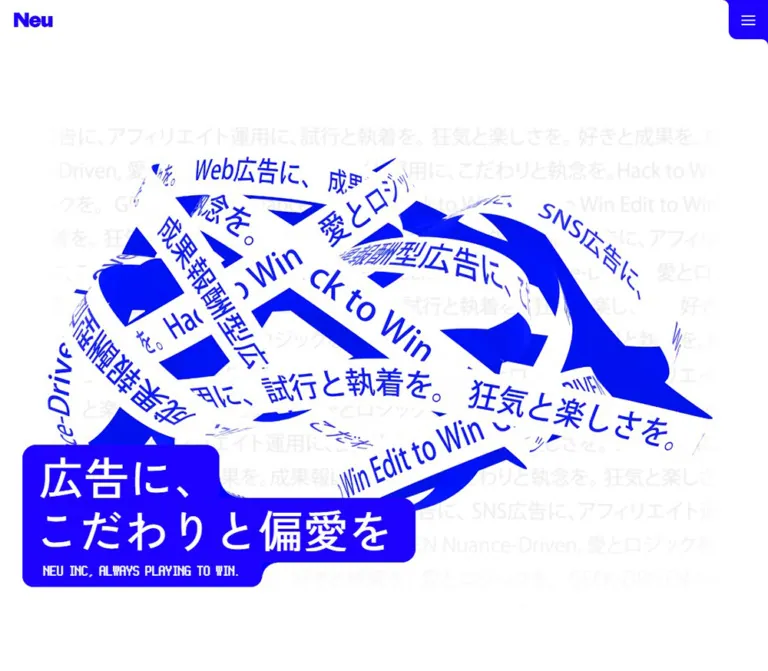
鮮烈な青と白、文字をまとった立体的なリボン、大きな日本語見出しが印象的な広告会社のコーポレートサイト。ピクセル書体、余白の広い人物写真配置、青一色のフッターが個性をつくる。
オリジナルサイトを見るNeu — Style Reference
Electric-blue advertising language twists into sculpture, then opens into white space and human portraits.
Website: neu-ad.jp
Original URL: https://neu-ad.jp/
Final URL: https://neu-ad.jp/
Theme: white opening and content areas, with saturated blue sections and a blue footer; no selectable theme was evidenced.
Inspected: September 12, 2026. Supplied inspection timestamp: 2026-09-12T14:46:26.986Z, equivalent to 23:46:26.986 JST.
Viewports: 1440 × 1000 and 390 × 844 CSS pixels.
Scope: the current corporate homepage. Desktop captures show the opening composition, a Team scene, and the Contact/footer ending. Mobile captures show the opening and ending. Rendered text and computed styles additionally cover About, Service, Team, News, and Contact. Linked interior pages and expanded navigation were not inspected.
Neu presents an advertising team specializing in performance-based advertising and video content for social platforms. Its homepage combines expressive brand presentation with routes to company information, services, people, news, and contact. The six-item navigation is ordinary site navigation, while the page itself uses unusually theatrical scale and spacing.
The strongest visual relationship is between white space and almost pure electric blue. In the desktop opening, broad white ribbons carry blue Japanese and English advertising phrases through an overlapping, three-dimensional composition. A large Japanese statement sits in front on connected blue shapes. Elsewhere, pixel-style labels punctuate smooth sans-serif typography, photographs sit inside gently distorted rectangular windows, and the final screen becomes a dense blue field with white navigation and an oversized wordmark.
How to Read This Reference
- Measured means a value appears in the supplied computed styles or element rectangles. Values are CSS pixels unless stated otherwise.
- Calculated means arithmetic applied to those measurements, with assumptions identified.
- Estimated means a visual approximation from the current-page screenshots. It is not an extracted stylesheet value or a sampled pixel color.
- Recommended means a practical choice for a new implementation. Breakpoints, motion durations, fallback shapes, and accessibility behavior in the Quick Start belong to this category.
- Token names are descriptive implementation aliases. The evidence does not provide a reusable source palette or spacing-token system.
- Several middle-section rectangles are much smaller than their computed text sizes. They represent a transformed sampled state, not reliable resting layout dimensions. Use the declared type sizes and visible screenshots together.
- Static captures establish appearance at particular moments. They do not establish animation direction, duration, hover behavior, menu behavior, or the complete sequence of a scroll effect.
Tokens — Colors
Default Palette
| Name | Value | Suggested token | Evidence and role |
|---|---|---|---|
| Electric Blue | #1d01fe |
--color-blue |
Measured rgb(29, 1, 254): navigation text, several section labels, ticker text, News metadata, and the Contact card background |
| Signal Blue | #0100fe |
--color-blue-alt |
Measured rgb(1, 0, 254): Service titles and the Contact action label |
| Minor Blue Variant | #1900ff |
No separate semantic token required | Measured on the desktop About action text; a local variation rather than evidence of another interaction state |
| White | #ffffff |
--color-white |
Measured page background and reversed text; also visually dominant in the opening and Team scene |
| Reading Ink | #0f0f0f |
--color-ink |
Measured Service paragraph color |
| Faint Text Gray | Approximately #e8e8e8 |
--color-texture |
Visual estimate for the opening's repeated background copy; effective appearance varies through its fade |
| Deep Blue Field | Approximately #0b00b8 |
--color-deep |
Visual estimate for the darker Contact backdrop; its exact fill was not included in the extracted styles |
| Pale Blue Block | Approximately #c3cfff |
--color-pale |
Visual estimate for a partially visible decorative block in the Team capture |
Use Electric Blue and White as the main pair. The small differences between measured blues are real declarations, but their semantic purpose is unknown. Do not invent separate hover, visited, or disabled states from them.
The footer is visibly a saturated blue field. Its container background was not supplied as a computed value, so using #1d01fe for that field is a recommended normalization. The same distinction applies to the visible hero callout fill: blue is visually established, but its exact background declaration was not extracted.
Some anchor wrappers report browser-default rgb(0, 0, 238) while their children declare the visible blue or white. That wrapper color is not an additional brand token.
Tokens — Typography
Japanese Display and General Copy
Measured family: "Zen Kaku Gothic New", "Zen Kaku Gothic New Placeholder", sans-serif.
The main statement uses weight 500, which keeps the large Japanese forms open and relatively light. Service paragraphs also use 500; News titles, ticker phrases, and action labels use 700. This contrast matters: the opening gets its force from size and its blue backing, rather than maximum font weight.
Japanese Editorial Copy
Measured family: "Zen Kaku Gothic Antique", "Zen Kaku Gothic Antique Placeholder", sans-serif.
This family appears in About and Contact paragraphs and several Japanese section actions. About uses generous double leading. Contact is more compact because its text sits in a narrow central card.
Latin Navigation and Categories
Measured family: Figtree, "Figtree Placeholder", sans-serif.
Figtree provides the smooth, contemporary Latin voice: compact navigation at weight 600, Service titles at 700, large News categories, dates, footer navigation, and legal text. Its rounded forms relate to the curved blue containers without turning every element into a pill.
Pixel Labels
Measured family: "BestTen-CRT Bold", "BestTen-CRT Bold Placeholder", sans-serif.
This face is used for the English hero strapline, parenthesized section labels, the Contact heading, and the mobile Team link VIEW. Despite the family name containing Bold, the reported CSS weight is 400. Do not add synthetic bolding by default.
The pixel treatment is a selective accent. Japanese paragraphs and photographs retain normal smooth rendering.
Wordmark
The Neu wordmark is visible as a distinctive graphic in the header and footer. Its source asset and construction were not supplied. Preserve an authorized logo asset rather than approximating it by typing the name in Figtree.
The families above are supported by computed font stacks. Font binaries, loading declarations, and the exact fallback face used for every glyph were not independently inspected. The Placeholder names are source-stack aliases, not additional fonts to obtain.
Type Scale
| Role | Desktop | Mobile | Weight | Leading / tracking |
|---|---|---|---|---|
| Main Japanese statement | 88px |
40px |
500 |
1; normal tracking |
| Hero English strapline | 24px |
14px |
400 |
1.2; normal tracking |
| Desktop navigation | 15px |
Hidden in supplied closed-menu capture | 600 |
1 |
| About / Service / News pixel label | 16px |
14px |
400 |
1 |
| About paragraph | 15px |
14px |
500 |
30px / 28px, both 2 |
| Service title | 32px |
24px |
700 |
1 |
| Service paragraph | 15px |
14px |
500 |
27.75px / 23.1px; 0.04em tracking |
| Japanese section action | 16px |
16px |
700 |
1 |
| News date | 15px |
14px |
600 |
1 |
| News category | 56px |
32px |
700 |
1 |
| News Japanese title | 24px |
20px |
700 |
1.2; 0.1em tracking |
| News summary | 14px |
14px |
500 |
22.4px, or 1.6; -0.02em tracking |
| Contact pixel heading | 32px |
32px |
400 |
38.4px, or 1.2 |
| Contact paragraph | 15px |
14px |
500 |
24.75px / 22.4px |
| Contact action | 16px |
16px |
700 |
20px |
| Footer ticker | 32px |
20px |
700 |
1 |
| Footer English link | 40px |
28px |
700 |
Desktop 40–48px; mobile 28px; -0.02em tracking |
| Footer legal text | 14px |
14px |
500–600 |
1 |
Two additional text systems appear in the opening DOM: duplicate slogan paragraphs at 56px desktop / 20px mobile, and long repeated phrases at 64px / 30px. Their clipping and relationship to the artwork are not fully established. They should not become extra visible headings in a reconstruction.
The source root computes to 10px, with a body default of 12px. Most visible text has explicit sizes. The Quick Start retains a conventional root and uses explicit component sizes instead of copying source rem assumptions.
Tokens — Spacing & Shapes
The page has two densities: very open visual stages, and compact information or navigation groups. There is no evidence of a single universal spacing multiplier.
Spacing Scale
| Use | Value | Status |
|---|---|---|
| Desktop navigation link padding | 6px 10px |
Measured |
| Gap between desktop navigation link boxes | 12px |
Calculated from adjacent rectangles |
| Logo-link vertical padding | 4px |
Measured at both widths |
| Main horizontal gutter | Desktop 56px; mobile 20px |
Measured across header, News, footer, and legal content |
| Hero line-box separation | Desktop 16px; mobile 8px |
Calculated between the two H1 rectangles |
| Mobile News content gap | 16px |
Measured flex gap |
| Separation between News entries | 20px |
Calculated from successive row bounds |
| Contact stack gap | Desktop 56px; mobile 32px |
Measured |
| Contact vertical padding | Desktop 56px; mobile 32px |
Measured |
| Contact content inset | Desktop 48px; mobile 32px |
Desktop calculated from inner and outer widths; mobile measured padding |
| Footer top clearance after tickers | Desktop 120px; mobile 40px |
Calculated from ticker and content bounds |
| Mobile footer navigation-to-logo gap | 48px |
Calculated |
| Footer legal bottom clearance | Approximately 24px |
Calculated from text and document bounds |
Border Radius
| Element | Value / character | Evidence |
|---|---|---|
| Desktop navigation link | 6px |
Measured on anchor boxes |
| Contact card | 16px |
Measured |
| Contact white action surface | Approximately 20px |
Visual estimate |
| Main statement shapes | Approximately 18–24px, with concave joins |
Visual estimate; individual source shapes were not extracted |
| Mobile menu corner | Approximately 14px |
Visual estimate of its lower-left turn |
| Team media | Gently bowed rectangle with rounded corners | Screenshot observation; no mask or radius definition supplied |
| Footer and ticker fields | Straight edges | Screenshot observation |
The headline's outline is more specific than a rounded rectangle. Its first line is short, its second line projects much farther right, and its strapline contracts again. Rounded outward corners and inward transitions make those parts read as one continuous blue shape.
Layout Measurements
| Element | Desktop at 1440 × 1000 | Mobile at 390 × 844 | Status |
|---|---|---|---|
| Document height | 10301.33px |
8576.28px |
Measured; state-dependent document extents |
| Main content width | 1328px |
350px |
Measured in News; also consistent with outer gutters |
| Header logo link | 81 × 40px, at (56, 32) |
58 × 31px, at (20, 13.5) |
Measured; includes vertical link padding |
| Hero statement envelope | About 818 × 277px, starting near (56, 643) |
About 356 × 137px, starting near (17, 354) |
Screenshot estimate |
| Contact card | 359 × 487.66px |
309 × 375.25px |
Measured |
| Contact inner content width | 263px |
245px |
Measured |
| Contact action surface | About 263 × 52px |
About 245 × 52px |
Height calculated from stack dimensions and supported visually |
| Individual footer ticker row | 1440 × 44px |
375 × 32px, centered |
Measured |
| Footer logo link | 400 × 160.17px |
350 × 138px |
Measured |
Transformed Bounds Require Caution
The initial desktop About label has a 16px line height but a 6.4px rectangle height. The Service label has a 16px line height but a 4.48px rectangle height. These correspond to apparent factors of 0.4 and 0.28. On mobile, the Service label's 14px line height occupies a 6.3px rectangle, corresponding to 0.45.
Those ratios are consistent with scaled ancestors, although the actual transform matrices were not supplied. They are not evidence that section labels should be 4–8px tall in a usable layout. The Team screenshot also depicts a different visible state from the tiny initial Team bounds in the DOM extract.
Components
Persistent Site Header
Role: identity and navigation to the main site sections.
The desktop header places a small blue Neu mark at the left and six English links at the right: Top, About, Service, Team, News, and Contact. Links use Figtree 15px / 1, weight 600, with measured 6px 10px padding and 12px gaps.
Top is white on a rounded blue active surface. Other labels are blue. In the darker ending capture, a white rounded backing behind the navigation keeps these links distinct from the page below. The colored active surface appears slightly larger than the extracted inner anchor rectangle, so its exact outer geometry should not be inferred from that anchor alone.
The header remains visible in the Team and ending captures, supporting a persistent presentation. Whether the source uses fixed positioning, sticky positioning, or a coordinated wrapper is not established. Top remains active because these captures are all on the homepage; the evidence does not show a section-by-section scroll indicator.
On mobile, the horizontal links are replaced by a blue control at the top-right corner, approximately 56 × 56px, with three short white strokes. The closed trigger is visible; opening, closing, focus handling, and the menu contents are unverified.
Hero Artwork Stage
Role: turns the advertising vocabulary into a memorable brand image.
The desktop opening has three major layers:
- A white canvas with a broad field of very faint repeated copy.
- A large overlapping ribbon sculpture, extending across most of the central width.
- The blue Japanese statement positioned in front near the bottom-left.
The ribbons have white printed faces, saturated blue reverse surfaces, curved paths, sharp folds, and many overlaps. Japanese phrases mix with English fragments such as GEEK-DRIVEN and Hack to Win. The lettering follows the surfaces' perspective. It is part of the visual object, not a flat text overlay casually rotated above a picture.
The rendering mechanism is unknown. The evidence does not identify an image, video, canvas, or 3D engine for this object, and no animation sequence is provided.
Mobile limitation: no ribbon sculpture is visible in the supplied 390 × 844 opening capture. The faint text field and blue statement remain. This could reflect responsive behavior, rendering readiness, or the captured state; the evidence does not distinguish them. Preserve a complete, readable composition when that decorative layer is absent.
Stepped Main Statement
Role: the primary readable brand message.
The visible copy is split into 広告に、 and こだわりと偏愛を, followed by NEU INC, ALWAYS PLAYING TO WIN.. Both Japanese lines use white Zen Kaku Gothic New at weight 500. The English strap uses BestTen-CRT Bold at weight 400.
On desktop, the Japanese lines are 88px / 1, with their text starting at x = 88px; the enclosing blue shape begins around x = 56px. The second line projects considerably farther right than the first. The strapline begins slightly farther inward at x = 100px.
On mobile, the Japanese type becomes 40px / 1 and the strap becomes 14px / 1.2. The blue envelope occupies almost the whole available width and sits around the vertical center of the opening. This is a compositional change, not a uniform reduction of the desktop frame.
The source reports separate H1 elements for the two lines. A recommended implementation uses one semantic H1 containing two styled spans, followed by a separate strapline paragraph. Keep the text live even if an SVG or mask creates the blue outline.
Pixel Section Marker
Role: introduces sections without competing with the main content.
Parenthesized English labels such as ( About Neu ), ( Service ), and ( News ) use the CRT-style face, usually 16px desktop and 14px mobile. Their color follows the surrounding surface: white for About, blue for Service and News.
The Team label is exceptional. The desktop computed style is 20px / 24px; the mobile style reports 56px / 67.2px inside a transformed state. The Team capture shows a small label near the center of a large white stage. Do not standardize this section to the other label sizes without considering its visible scene.
About Introduction
Role: explains the team's working philosophy and leads to company information.
The content consists of a pixel marker, a Japanese statement about turning love for advertising into results, a substantial paragraph, and the action ノイについて. About paragraphs use Zen Kaku Gothic Antique at 15px / 30px desktop and 14px / 28px mobile, weight 500.
White labels and paragraphs establish a reversed-text treatment in the DOM. The supplied screenshots do not show the complete About surface, so its exact background, surrounding shapes, and settled geometry remain unverified.
The mobile text is divided into two paragraph groups, while the desktop extraction presents a more continuous block. Preserve comfortable reading width and double leading rather than copying the miniature transformed bounds.
The desktop action points to /about#aboutotop; the mobile action points to /about.
Service Overview
Role: presents three parts of the advertising workflow.
The section contains the Service marker, a Japanese summary, and three named entries:
Research & PlanningCreative ProductionAd Operations
Each entry pairs a blue Figtree heading with a near-black Japanese paragraph. Titles use 32px / 1 desktop and 24px / 1 mobile. Paragraphs use 15px / 1.85 desktop and 14px / 1.65 mobile, with 0.04em tracking.
The text hierarchy is supported by computed styles, but the full section arrangement is not visually documented in the supplied captures. No illustration, icon, column arrangement, or hover treatment should be invented as an original finding.
The action サービスと強み uses a white Japanese label; the desktop anchor itself has a measured Electric Blue background. Its destination is /service#servicetop on desktop and /service on mobile.
Team Photography Stage
Role: gives the corporate identity a human and informal counterpoint.
The desktop Team capture shows three photographic windows at staggered positions: one near the upper-left, one midway down the right, and another near the lower-left. Their visible boxes are approximately 398 × 250px, with a landscape ratio near 1.56:1. These are screenshot estimates, not extracted media dimensions.
The images show people in an office, an editing workspace, and an outdoor setting. Faces and work environments remain in natural color. The rectangular windows have gently bowed edges and rounded corners, creating a subtle screen-like distortion.
A small ( TEAM ) label sits near the middle of the broad empty field. Blue and pale-blue rounded blocks enter from the lower part of the frame. The scene relies on distance, asymmetry, and partial cropping; there is no evidence of a conventional equal-column staff-card grid in this view.
The mobile DOM includes a team philosophy passage and a VIEW link to /team. The VIEW style is 120px / 1 with 8.4px tracking, but its measured height is 54px in the sampled transformed state. No mobile Team screenshot was supplied, so final photo placement and the visible link scale are unverified.
The captures do not establish whether the photographic windows are still images or video frames.
News Entry
Role: combines company updates and performance announcements.
Three entries are present, each dated 2025/07/25: two categorized Release, and one Award. These are content dates, not inspection dates.
Desktop rows span 1328px. The left area contains the date and a large blue Figtree category. The summary column begins at x = 468px, with the Japanese title text slightly inset at x = 480px. Category text is 56px; the title is 24px, weight 700, with 0.1em tracking. Summaries are blue at 14px / 22.4px.
On mobile, the entry becomes a vertical stack within 350px: date, 32px category, Japanese title, and summary. The title is 20px / 24px and can occupy two lines. Summaries retain their desktop size and line height, producing approximately five lines in the sampled entries. A measured 16px flex gap and approximately 20px separation between entries maintain a compact reading rhythm.
The title text computes to white, but its surrounding fill or mask was not included in the extract. A solid blue title band is a recommended, legible adaptation rather than a verified container measurement.
Desktop categories appear in duplicate overlapping text nodes; mobile extraction shows a single copy. This may support an effect, but no effect was exercised. Do not render three stacked category labels as ordinary content.
The sampled News row anchors have empty href values. Their click outcomes are unknown. A reusable implementation should use genuine article destinations when available, or non-link article containers.
Contact Card
Role: provides a focused route into an inquiry.
A narrow blue card is centered within a darker, text-covered blue scene. Vertical rounded blocks appear around it. The card contains a pixel heading, a Japanese invitation, and a white rounded action surface labeled お問合わせ.
The desktop card measures 359 × 487.66px, with a 16px radius, 56px vertical padding, and 56px gaps between its three main groups. Its content is 263px wide, giving a calculated 48px inset on each side. The paragraph uses 15px / 24.75px and occupies seven lines.
The mobile card is 309 × 375.25px, with 32px padding and gaps. Its content width is 245px; the heading stays at 32px, while the paragraph becomes 14px / 22.4px. The white action surface remains approximately 52px tall.
The entire card is one anchor to /contact#contacttop. In a reconstruction, the white action appearance should be a span inside that anchor, not a nested button or second link.
Three-Row Text Ticker
Role: bridges the visual Contact scene and the corporate footer.
Three tightly stacked white strips carry bold blue Japanese and English advertising phrases. They extend beyond the visible width and are clipped horizontally. Narrow blue separators remain between the strips.
Desktop rows are 44px tall with 32px / 1 text, consistent with 6px vertical clearance. Their top positions are 46px apart, leaving 2px between rows. Mobile rows are 32px tall with 20px / 1 text and the same 2px separation. The measured mobile wrapper is 375px wide, centered within the 390px viewport.
The DOM contains repeated copies of the long phrases and offscreen placements, supporting a looping-strip structure. Exact motion speed, direction, and phase are not verified. A static implementation can preserve the same three-row visual rhythm.
Corporate Footer
Role: closes with strong identity, secondary navigation, and legal links.
The desktop footer places a large white Neu logo at the left and a compact navigation group at the right. The navigation forms three columns and two rows: Top / Team, About / News, and Service / Contact by column. English labels use white Figtree at 40px, weight 700, with small Japanese subtitles directly below.
On mobile, the links move above the logo and form two columns with three rows: Top / Team, About / News, and Service / Contact by row. English labels reduce to 28px. The white logo then fills the available 350px width, making it proportionally much larger than on desktop.
A thin white rule separates the main content from Privacy Policy at the left and © Neu INC. at the right. Legal text remains 14px at both widths. The extracted privacy destination is /privacy-policyp; its spelling is preserved here because the destination page was not inspected.
Tokens — Motion & Interaction
| Treatment | Evidence | Limit and implementation guidance |
|---|---|---|
| Header persistence | Header remains visible in top, Team, and ending captures | Fixed versus sticky mechanics were not extracted; fixed positioning is an adaptation option |
| Active navigation | Top is filled blue with white text throughout the homepage captures |
Supports current-page state; does not demonstrate a scrollspy |
| Ribbon sculpture | One desktop rendered arrangement is visible | No temporal sequence, duration, pointer response, or rendering engine is established |
| Middle-section scaling | Rectangle-to-line-height ratios indicate transformed sampled states | Compatible with staged presentation; does not prove pinning, easing, or scroll mapping |
| Repeated text strips | Duplicate long phrases and offscreen coordinates appear in the DOM | Supports ticker anatomy; speed and direction remain unverified |
| Repeated News categories | Desktop contains overlapping category copies | Hover or reveal behavior is unverified |
| Contact route | Full card is an anchor with a supplied href | Destination form and submission behavior were not inspected |
| Mobile menu | Closed three-line trigger is visible | Open state, animation, keyboard support, and dismissal were not tested |
Most sampled elements report animation: none and a generic transition: all without a useful duration. That is insufficient to describe the page as static or to assign transition timings: motion may reside on ancestors, scripts, or media omitted from the sample.
Recommended motion policy: keep the statement, links, and reading copy stable. Confine optional continuous movement to decorative ribbons, blocks, or tickers. Provide a static reduced-motion state and a pause control for persistent moving copy. The Quick Start's optional 24s linear ticker is a proposed value, not a source measurement.
Surfaces
| Layer | Appearance | Evidence / purpose |
|---|---|---|
| Opening canvas | Solid white | Measured body background; establishes generous negative space |
| Opening texture | Very faint repeated gray text with soft fading | Screenshot observation; decorative atmosphere rather than essential reading |
| Ribbon sculpture | White printed faces and saturated blue surfaces | Screenshot observation; depth comes from curvature, perspective, and overlap |
| Statement backing | Connected blue shapes with white text | Screenshot observation; the main contrast anchor |
| Team field | White with natural-color media and isolated blue blocks | Screenshot observation; open, human, and asymmetrical |
| Contact scene | Darker blue text field with brighter blue vertical forms | Screenshot observation; exact background colors unmeasured |
| Contact card | Electric Blue, white text, white inner action | Card fill and radius measured |
| Ticker strips | White with blue lettering and narrow blue separations | Screenshot and geometry evidence |
| Footer | Saturated blue with white identity and navigation | Screenshot observation; exact field fill unmeasured |
There is no visible general elevation system of soft card shadows, translucent glass, or layered gray panels. Hierarchy comes from scale, surface inversion, silhouette, and spacing. The faint opening fade is a texture treatment, not a glossy UI gradient.
Imagery
The opening artwork treats language as physical material. Preserve the breadth of the ribbons, oversized lettering, alternating white and blue surfaces, and dense overlaps. A small decorative knot placed beside a conventional text column would lose the defining composition.
Team imagery supplies the opposite kind of detail: natural light, greenery, ordinary workspaces, editing equipment, and informal human presence. Maintain enough surrounding context to communicate a working team. Do not infer names, roles, or biographies from the people shown.
The photographs remain smooth and full-color. Their identity comes from the bowed window silhouette and scattered arrangement, not from pixelation. Reserve the CRT aesthetic for the confirmed text face.
Observed Asset References
The supplied evidence contains no image source URLs or media manifest. These are observed asset roles, not filenames to request from the original host.
| Asset | Reference availability | Use |
|---|---|---|
| Neu wordmark | Visible in current header and footer captures; source URL unavailable | Small blue identity mark and oversized white footer identity |
| Printed ribbon sculpture | Visible in current desktop opening capture; source and format unavailable | Main visual object |
| Team media windows | Three visible desktop images or frames; source URLs unavailable | People, editing work, and outdoor team context |
| Repeated advertising copy | DOM text and screenshots available | Opening texture and footer strips |
| Rounded blue blocks | Visible in Team and Contact captures | Abstract support shapes; no dedicated asset confirmed |
Use authorized assets when available. An authored static illustration or rendered frame can preserve the hero composition without assuming a particular original graphics engine. Exact ribbon geometry and bowed media masks require more than generic border-radius styling.
Layout & Responsive Behavior
The measured documents are approximately ten viewport heights long at both inspected sizes. This is a staged corporate homepage, with different densities and substantial transitions between sections. Document height should remain an output of content and presentation, not a hardcoded target.
| Relationship | Desktop observation | Mobile observation |
|---|---|---|
| Outer content gutter | 56px |
20px |
| Header | Small logo and six horizontal links | Smaller logo and top-right menu trigger |
| Main statement | Large, lower-left, layered over ribbon artwork | Smaller type, near the vertical center, almost full-width |
| Ribbon artwork | Dominates the opening | Not visible in the supplied opening state; reason unknown |
| About copy | 15px, double leading |
14px, double leading, separate paragraph groups |
| Service titles | 32px |
24px |
| Team composition | Widely staggered photographic windows | Text and route known from DOM; visual arrangement unverified |
| News | Metadata/category beside title and summary | Metadata, category, title, summary stacked |
| Contact card | 359px wide, 56px stack spacing |
309px wide, 32px stack spacing |
| Tickers | Full viewport width, 44px rows |
Centered 375px wrapper, 32px rows |
| Footer | Logo left, three-column navigation right | Two-column navigation first, large logo below |
The source breakpoint values were not supplied. The Quick Start uses 767px as a recommended switch and adds fluid desktop headline sizing. It should be tested at intermediate widths, smaller phones, and increased text zoom before use.
Keep overflow clipping local to artwork and tickers. The long text tracks need clipping; body text, focus outlines, and navigation should remain reachable. Header persistence also requires enough clearance for linked content in a new implementation.
Do’s and Don’ts
Do
- Build the identity around saturated electric blue and white.
- Keep the Japanese main statement at medium weight and give it a strong, connected blue backing.
- Preserve the distinction between Figtree, the two Japanese Gothic families, and the selective CRT-style labels.
- Let the desktop ribbon composition occupy a large central area with the statement in front.
- Retain generous white space around the Team media and its small central label.
- Keep photographs natural in color and place them in gently distorted landscape windows.
- Preserve the mobile footer's navigation-first order and oversized wordmark.
- Use the measured Contact card proportions and one coherent link target.
- Treat duplicate decorative copy as visual machinery, separate from the readable content structure.
- Keep a complete opening composition when decorative media is unavailable.
Don’t
- Do not replace the site's multi-page navigation with invented in-page section links.
- Do not turn the Team scene into a uniform grid of profile cards.
- Do not treat tiny transformed DOM rectangles as normal typography sizes.
- Do not infer mobile ribbon behavior from a single missing layer.
- Do not reproduce overlapping News category copies as three ordinary labels.
- Do not use the logo's appearance as evidence of a particular font.
- Do not spread the pixel face across all body copy or pixelate the photographs.
- Do not introduce unrelated accent colors, glossy gradients, glass panels, or pervasive shadows.
- Do not make decorative pale text carry essential information.
- Do not claim verified hover, menu, or scroll choreography without additional interaction evidence.
Recommended Implementation Additions
These are recommendations for reuse, not verified features of the original page:
- Use a single H1 with styled line spans. Hide duplicate ribbon and ticker text from assistive technology when it repeats already available content.
- Give the home logo link an accessible name. Implement the mobile menu with a real button,
aria-expanded, an associated panel, and appropriate focus behavior. - Retain compact navigation typography while providing approximately
44pxtouch targets or equivalent target spacing. - Preserve a visible focus indicator on white and blue surfaces. The blue header logo has little separation from the darker ending background in the capture; a white mark or small backing surface would improve that state.
- Supply a static fallback for complex decorative media and ensure its loading cannot hide the statement or navigation.
- Disable or pause optional decorative motion for reduced-motion users. Persistent moving text should have a usable pause mechanism.
- Use real destinations for News links. Avoid empty href values and avoid nested interactive controls inside the Contact card.
- Allow Japanese copy to reflow naturally. The Contact extract contains separately arranged lines, including awkward word splits; those line breaks should not be hardcoded into a responsive adaptation.
- Test 320px-wide screens, text zoom, keyboard navigation, and content expansion. Two supplied widths do not establish the behavior between or beyond them.
Agent Prompt Guide
Quick Color Reference
- Main blue: measured
#1d01fe. - Secondary source blue: measured
#0100fe. - Canvas and reversed text:
#ffffff. - Service reading text:
#0f0f0f. - Opening texture: approximate pale gray
#e8e8e8; decorative only. - Contact backdrop: approximate deep blue
#0b00b8. - Team accent block: approximate pale blue
#c3cfff. - Footer: saturated blue; using the main blue is a recommended normalization.
Overall Prompt
“Create a Japanese advertising-company homepage inspired by Neu's current visual language. Use white space and electric blue #1d01fe, a small graphic wordmark, and compact Figtree navigation to separate company, service, team, news, and contact pages. Build the desktop opening around a large sculptural arrangement of white ribbons printed with blue Japanese and English advertising phrases. Place a two-line Japanese statement in front on connected, stepped blue shapes with rounded outer and inner corners. Use Zen Kaku Gothic New at medium weight for the statement and BestTen-CRT Bold for its small English strapline. Follow with readable corporate sections, an open Team scene with scattered natural-color media windows, structured News entries, and a narrow blue Contact card. Finish with three white text strips and a saturated-blue footer. On mobile, center the compact statement vertically, retain a complete composition without decorative media, stack News content, and place a two-column footer navigation above a large white logo. Treat motion as optional and independently specified.”
Example Component Prompts
- Main statement: “Create one semantic H1 containing
広告に、andこだわりと偏愛を. Use white Zen Kaku Gothic New, weight 500, at 88px desktop and 40px at a 390px viewport. Give the lines a connected blue stepped backing, with the second line extending farther right. Add the white 24px desktop / 14px mobile CRT-style straplineNEU INC, ALWAYS PLAYING TO WIN.. Keep text editable; use an authored mask if exact concave corners are required.” - Team scene: “Create an expansive white desktop stage with three approximately 1.56:1 natural-color media windows, staggered upper-left, middle-right, and lower-left. Use gently bowed rectangular masks, a small central pixel-style
( TEAM )label, and isolated blue blocks entering from the lower edge. Preserve large gaps; do not add names or roles without supplied content.” - News entry: “Pair a 15px Figtree date and a 56px blue category with a Japanese title and 14px summary. On mobile, stack the groups, reduce the category to 32px and title to 20px, and retain 14px / 1.6 summary copy. Use a blue backing for the white title as a recommended adaptation. Render only one accessible category label.”
- Contact card: “Create one linked blue card, 359px wide on desktop and 309px at a 390px viewport, with a 16px radius. Stack a 32px CRT-style heading, Japanese paragraph, and white 52px-high action surface. Use 56px desktop stack spacing and 32px mobile spacing. The apparent inner button is a non-interactive span inside the card link.”
- Footer: “Use a saturated blue field with a white logo and bilingual navigation. Desktop: a 400px-wide logo at left and three columns of 40px English links at right. Mobile: two columns of 28px links first, then a logo filling a 350px content width. Finish with a fine white rule and 14px legal links at opposite edges.”
Quick Start
CSS Custom Properties
This is a recommended implementation scaffold, not recovered source CSS. It uses measured colors and type roles, approximates the statement's connected shapes, and implements the observed footer rearrangement. The 767px breakpoint, fluid interpolation, focus treatment, and optional ticker timing are recommendations.
Load authorized font files separately. Populate the artwork and logo slots with supplied assets. The plain rounded Team media treatment below is a fallback; bowed edges and the exact statement notches need authored masks. The menu styles cover its closed trigger, with expanded behavior requiring separate implementation.
:root {
  /* Measured palette */
  --color-blue: #1d01fe;
  --color-blue-alt: #0100fe;
  --color-white: #ffffff;
  --color-ink: #0f0f0f;

  /* Visual estimates for decorative layers */
  --color-texture: #e8e8e8;
  --color-deep: #0b00b8;
  --color-pale: #c3cfff;

  /* Confirmed family names; load licensed files separately */
  --font-latin: 'Figtree', sans-serif;
  --font-jp: 'Zen Kaku Gothic New', sans-serif;
  --font-editorial: 'Zen Kaku Gothic Antique', sans-serif;
  --font-pixel: 'BestTen-CRT Bold', monospace;

  --gutter: 56px;
  --hero-size: clamp(40px, 6.111vw, 88px);
  --radius-small: 6px;
  --radius-card: 16px;
  --radius-shape: 20px;
  --ticker-size: 32px;
  --ticker-height: 44px;
}

* { box-sizing: border-box; }
body {
  margin: 0;
  color: var(--color-ink);
  background: var(--color-white);
  font-family: var(--font-jp);
}
img { display: block; max-width: 100%; }
a { color: inherit; }
button { font: inherit; }
.container { margin-inline: var(--gutter); }

.site-header {
  position: fixed;
  z-index: 50;
  inset: 32px var(--gutter) auto;
  display: flex;
  align-items: center;
  justify-content: space-between;
}
.header-brand {
  display: flex;
  align-items: center;
  width: 81px;
  height: 40px;
  padding-block: 4px;
}
.header-brand img { width: 100%; height: 100%; object-fit: contain; }
.desktop-nav {
  display: flex;
  align-items: center;
  gap: 12px;
  padding: 4px;
  border-radius: 8px;
  background: var(--color-white);
}
.desktop-nav a {
  padding: 6px 10px;
  border-radius: var(--radius-small);
  color: var(--color-blue);
  font: 600 15px/1 var(--font-latin);
  text-decoration: none;
}
.desktop-nav a[aria-current='page'] {
  color: var(--color-white);
  background: var(--color-blue);
}
.menu-toggle { display: none; }

.neu-hero {
  position: relative;
  min-height: 100svh;
  isolation: isolate;
  overflow: clip;
}
.hero-texture {
  position: absolute;
  z-index: -2;
  inset: 190px 40px 80px;
  overflow: hidden;
  color: var(--color-texture);
  font: 500 18px/1.55 var(--font-jp);
  pointer-events: none;
  mask-image: linear-gradient(transparent, #000 12%, #000 80%, transparent);
}
.hero-art {
  position: absolute;
  z-index: -1;
  inset: 150px var(--gutter) 150px;
  pointer-events: none;
}
.hero-art > img, .hero-art > video, .hero-art > canvas {
  width: 100%;
  height: 100%;
  object-fit: contain;
}
.hero-caption {
  position: absolute;
  left: var(--gutter);
  bottom: 80px;
  color: var(--color-white);
}
.hero-heading {
  margin: 0;
  font: 500 var(--hero-size)/1 var(--font-jp);
}
.hero-line {
  display: table;
  white-space: nowrap;
  background: var(--color-blue);
}
.hero-line:first-child {
  padding: 16px 0 0 32px;
  border-radius: var(--radius-shape) var(--radius-shape) 0 0;
}
.hero-line:last-child {
  padding: 16px 80px 24px 32px;
  border-radius: 0 var(--radius-shape) var(--radius-shape) 0;
}
.hero-strap {
  display: table;
  margin: 0;
  padding: 0 64px 16px 44px;
  border-radius: 0 0 var(--radius-shape) var(--radius-shape);
  background: var(--color-blue);
  font: 400 24px/1.2 var(--font-pixel);
}

.section-marker {
  margin: 0;
  color: var(--color-blue);
  font: 400 16px/1 var(--font-pixel);
}
.about-copy { font: 500 15px/2 var(--font-editorial); }
.service-title {
  color: var(--color-blue-alt);
  font: 700 32px/1 var(--font-latin);
}
.service-copy {
  font: 500 15px/1.85 var(--font-jp);
  letter-spacing: 0.04em;
}
.team-photo {
  aspect-ratio: 1.56;
  object-fit: cover;
  border-radius: 24px;
}

.news-entry {
  display: grid;
  grid-template-columns: 332px minmax(0, 1fr);
  gap: 80px;
  margin-bottom: 20px;
  color: var(--color-blue);
}
.news-date { margin: 0; font: 600 15px/1 var(--font-latin); }
.news-category {
  margin: 32px 0 0;
  font: 700 56px/1 var(--font-latin);
}
.news-title {
  /* Recommended backing; the source title fill was not extracted */
  display: inline-block;
  margin: 0 0 24px;
  padding: 12px;
  color: var(--color-white);
  background: var(--color-blue);
  font: 700 24px/1.2 var(--font-jp);
  letter-spacing: 0.1em;
}
.news-summary {
  margin: 0;
  font: 500 14px/1.6 var(--font-jp);
  letter-spacing: -0.02em;
}

.contact-scene {
  display: grid;
  place-items: center;
  min-height: 780px;
  background: var(--color-deep);
}
.contact-card {
  display: flex;
  flex-direction: column;
  gap: 56px;
  width: 359px;
  max-width: calc(100% - 40px);
  padding: 56px 48px;
  border-radius: var(--radius-card);
  color: var(--color-white);
  background: var(--color-blue);
  text-decoration: none;
}
.contact-heading { margin: 0; font: 400 32px/1.2 var(--font-pixel); }
.contact-copy { margin: 0; font: 500 15px/1.65 var(--font-editorial); }
.contact-cta {
  display: grid;
  place-items: center;
  min-height: 52px;
  border-radius: 20px;
  color: var(--color-blue-alt);
  background: var(--color-white);
  font: 700 16px/20px var(--font-jp);
}

.tickers {
  display: grid;
  gap: 2px;
  background: var(--color-blue);
}
.ticker-row {
  height: var(--ticker-height);
  overflow: hidden;
  padding: 6px;
  color: var(--color-blue);
  background: var(--color-white);
}
.ticker-track {
  display: flex;
  width: max-content;
  white-space: nowrap;
  font: 700 var(--ticker-size)/1 var(--font-jp);
}
.ticker-track > span { flex: none; padding-right: 12px; }
/* Optional: use exactly two equal groups and provide a pause control. */
.ticker-track[data-motion='on'] {
  animation: ticker-travel 24s linear infinite;
}
.ticker-track[data-paused='true'] { animation-play-state: paused; }
@keyframes ticker-travel { to { transform: translateX(-50%); } }

.site-footer {
  padding: 120px var(--gutter) 24px;
  color: var(--color-white);
  background: var(--color-blue);
}
.footer-main {
  display: grid;
  grid-template-columns: minmax(0, 1fr) auto;
  align-items: start;
  gap: 48px;
}
.footer-brand { width: 400px; max-width: 100%; }
.footer-brand img { width: 100%; height: auto; }
.footer-links {
  display: grid;
  grid-auto-flow: column;
  grid-template-columns: repeat(3, max-content);
  grid-template-rows: repeat(2, auto);
  gap: 24px 54px;
}
.footer-link { display: grid; gap: 2px; text-decoration: none; }
.footer-link .en {
  font: 700 40px/1.2 var(--font-latin);
  letter-spacing: -0.02em;
}
.footer-link .ja { font: 600 14px/1.2 var(--font-jp); }
.footer-legal {
  display: flex;
  justify-content: space-between;
  gap: 20px;
  margin-top: 80px;
  padding-top: 24px;
  border-top: 1px solid currentColor;
  font: 500 14px/1 var(--font-latin);
}
.footer-legal a { text-decoration: none; }

/* Recommended keyboard focus treatment */
a:focus-visible, button:focus-visible {
  outline: 2px solid currentColor;
  outline-offset: 4px;
}

@media (max-width: 767px) {
  :root {
    --gutter: 20px;
    --hero-size: min(40px, calc((100vw - 70px) / 8));
    --ticker-size: 20px;
    --ticker-height: 32px;
  }
  .site-header { top: 13.5px; }
  .header-brand { width: 58px; height: 31px; }
  .desktop-nav { display: none; }
  .menu-toggle {
    position: fixed;
    inset: 0 0 auto auto;
    display: grid;
    place-content: center;
    gap: 5px;
    width: 56px;
    height: 56px;
    padding: 0;
    border: 0;
    border-radius: 0 0 0 14px;
    color: var(--color-white);
    background: var(--color-blue);
  }
  .menu-toggle > span { width: 20px; height: 2px; background: currentColor; }
  .hero-texture { inset: 175px 40px 150px; font-size: 14px; line-height: 1.7; }
  .hero-art { inset: 150px 17px; }
  .hero-caption { left: 17px; top: 50%; bottom: auto; transform: translateY(-50%); }
  .hero-line:first-child { padding: 8px 0 0 16px; }
  .hero-line:last-child { padding: 8px 22px 12px 14px; }
  .hero-strap { padding: 0 12px 12px 21px; font-size: min(14px, 3.59vw); }
  .section-marker { font-size: 14px; }
  .about-copy { font-size: 14px; }
  .service-title { font-size: 24px; }
  .service-copy { font-size: 14px; line-height: 1.65; }
  .news-entry { grid-template-columns: minmax(0, 1fr); gap: 16px; }
  .news-date { font-size: 14px; }
  .news-category { margin-top: 12px; font-size: 32px; }
  .news-title { margin-bottom: 16px; padding: 8px 6px; font-size: 20px; }
  .contact-scene { min-height: 560px; }
  .contact-card { width: 309px; padding: 32px; gap: 32px; }
  .contact-copy { font-size: 14px; line-height: 1.6; }
  .tickers { width: min(375px, 100%); margin-inline: auto; }
  .site-footer { padding-top: 40px; }
  .footer-main { grid-template-columns: minmax(0, 1fr); gap: 48px; }
  .footer-links {
    order: 1;
    grid-auto-flow: row;
    grid-template-columns: 100px max-content;
    grid-template-rows: repeat(3, auto);
    gap: 24px 40px;
  }
  .footer-brand { order: 2; width: 100%; }
  .footer-link .en { font-size: 28px; line-height: 1; }
  .footer-legal { margin-top: 16px; }
}

@media (prefers-reduced-motion: reduce) {
  .ticker-track[data-motion='on'] { animation: none; }
}
The footer CSS expects link order Top, Team, About, News, Service, Contact. Column flow produces the desktop grouping; row flow produces the mobile grouping without changing the DOM order.
The headline and Contact card can use the following minimal anatomy. The hero artwork slot is populated separately; its absence does not remove the message.
<section class="neu-hero" aria-labelledby="main-statement">
  <div class="hero-art" aria-hidden="true"></div>
  <div class="hero-caption">
    <h1 class="hero-heading" id="main-statement">
      <span class="hero-line">広告に、</span>
      <span class="hero-line">こだわりと偏愛を</span>
    </h1>
    <p class="hero-strap">NEU INC, ALWAYS PLAYING TO WIN.</p>
  </div>
</section>

<div class="contact-scene">
  <a class="contact-card" href="/contact#contacttop">
    <h2 class="contact-heading">( Contact )</h2>
    <p class="contact-copy">何を、どう相談すれば良いかわからない。そんなタイミングからでも是非気軽にご相談ください。</p>
    <span class="contact-cta">お問合わせ</span>
  </a>
</div>
The shortened Contact copy above demonstrates structure; card height will naturally differ from the measured full-copy version.
Tailwind v4 Token Mapping
Optional aliases for a project already using Tailwind v4. This does not identify the original site's implementation framework. Define the preceding custom properties first.
@theme inline {
  --color-neu: var(--color-blue);
  --color-neu-alt: var(--color-blue-alt);
  --color-reading: var(--color-ink);
  --color-scene: var(--color-deep);
  --font-latin: 'Figtree', sans-serif;
  --font-japanese: 'Zen Kaku Gothic New', sans-serif;
  --font-editorial: 'Zen Kaku Gothic Antique', sans-serif;
  --font-pixel: 'BestTen-CRT Bold', monospace;
  --text-hero: var(--hero-size);
  --text-ticker: var(--ticker-size);
  --spacing-page: var(--gutter);
  --radius-card: 16px;
  --radius-shape: 20px;
}
Sources & Evidence
- Neu — current homepage: original and final URL are identical, with supplied HTTP status
200. The rendered title identifies the site as株式会社Neu; the footer independently shows© Neu INC.. - Inspection bundle: timestamp
2026-09-12T14:46:26.986Z. Per-image timestamps were not supplied. The inspected CSS-pixel viewports are1440 × 1000and390 × 844. - Current-page screenshots: three desktop views covering the opening, Team scene, and ending; two mobile views covering the opening and ending. About, Service, and News descriptions rely primarily on rendered DOM and computed styles rather than complete visual captures.
- Rendered evidence: font stacks, sizes, weights, leading, tracking, colors, selected backgrounds, padding, gaps, radii, element rectangles, document heights, text content, and link destinations. No complete stylesheet, asset manifest, transform matrices, or media source URLs were supplied.
- Linked routes:
/about,/service,/team,/news,/contact, and/privacy-policypwere present in the homepage evidence. Their destination pages were not inspected. Some homepage actions also include the observed fragments#aboutotop,#servicetop, and#contacttop. - Capture procedure: the supplied inspection reports an initial observation of at least five seconds, readiness checks with a fifteen-second overall limit and a five-second pending-image limit, and intermediate scrolling with up to ten seconds per position. Perpetual animations were temporarily paused during readiness checks and then resumed. SharedWorkers and service workers were disabled.
- Limits: these checks do not prove semantic completeness or document every animation state. No menu expansion, hover, keyboard interaction, News activation, contact form, or reduced-motion mode was exercised in the supplied evidence. The mobile ribbon layer and the settled geometry of transformed middle sections remain unresolved.
This reference describes the current homepage evidenced by those captures and measurements. Approximate artwork colors, fallback geometry, responsive interpolation, and the reusable implementation code are explicitly adaptation guidance.
# Neu — Style Reference

> Electric-blue advertising language twists into sculpture, then opens into white space and human portraits.

**Website:** [neu-ad.jp](https://neu-ad.jp/)
**Original URL:** https://neu-ad.jp/
**Final URL:** https://neu-ad.jp/
**Theme:** white opening and content areas, with saturated blue sections and a blue footer; no selectable theme was evidenced.
**Inspected:** September 12, 2026. Supplied inspection timestamp: `2026-09-12T14:46:26.986Z`, equivalent to 23:46:26.986 JST.
**Viewports:** 1440 × 1000 and 390 × 844 CSS pixels.
**Scope:** the current corporate homepage. Desktop captures show the opening composition, a Team scene, and the Contact/footer ending. Mobile captures show the opening and ending. Rendered text and computed styles additionally cover About, Service, Team, News, and Contact. Linked interior pages and expanded navigation were not inspected.

Neu presents an advertising team specializing in performance-based advertising and video content for social platforms. Its homepage combines expressive brand presentation with routes to company information, services, people, news, and contact. The six-item navigation is ordinary site navigation, while the page itself uses unusually theatrical scale and spacing.

The strongest visual relationship is between white space and almost pure electric blue. In the desktop opening, broad white ribbons carry blue Japanese and English advertising phrases through an overlapping, three-dimensional composition. A large Japanese statement sits in front on connected blue shapes. Elsewhere, pixel-style labels punctuate smooth sans-serif typography, photographs sit inside gently distorted rectangular windows, and the final screen becomes a dense blue field with white navigation and an oversized wordmark.

## How to Read This Reference

- **Measured** means a value appears in the supplied computed styles or element rectangles. Values are CSS pixels unless stated otherwise.
- **Calculated** means arithmetic applied to those measurements, with assumptions identified.
- **Estimated** means a visual approximation from the current-page screenshots. It is not an extracted stylesheet value or a sampled pixel color.
- **Recommended** means a practical choice for a new implementation. Breakpoints, motion durations, fallback shapes, and accessibility behavior in the Quick Start belong to this category.
- Token names are descriptive implementation aliases. The evidence does not provide a reusable source palette or spacing-token system.
- Several middle-section rectangles are much smaller than their computed text sizes. They represent a transformed sampled state, not reliable resting layout dimensions. Use the declared type sizes and visible screenshots together.
- Static captures establish appearance at particular moments. They do not establish animation direction, duration, hover behavior, menu behavior, or the complete sequence of a scroll effect.

## Tokens — Colors

### Default Palette

| Name | Value | Suggested token | Evidence and role |
| --- | --- | --- | --- |
| Electric Blue | `#1d01fe` | `--color-blue` | Measured `rgb(29, 1, 254)`: navigation text, several section labels, ticker text, News metadata, and the Contact card background |
| Signal Blue | `#0100fe` | `--color-blue-alt` | Measured `rgb(1, 0, 254)`: Service titles and the Contact action label |
| Minor Blue Variant | `#1900ff` | No separate semantic token required | Measured on the desktop About action text; a local variation rather than evidence of another interaction state |
| White | `#ffffff` | `--color-white` | Measured page background and reversed text; also visually dominant in the opening and Team scene |
| Reading Ink | `#0f0f0f` | `--color-ink` | Measured Service paragraph color |
| Faint Text Gray | Approximately `#e8e8e8` | `--color-texture` | Visual estimate for the opening's repeated background copy; effective appearance varies through its fade |
| Deep Blue Field | Approximately `#0b00b8` | `--color-deep` | Visual estimate for the darker Contact backdrop; its exact fill was not included in the extracted styles |
| Pale Blue Block | Approximately `#c3cfff` | `--color-pale` | Visual estimate for a partially visible decorative block in the Team capture |

Use Electric Blue and White as the main pair. The small differences between measured blues are real declarations, but their semantic purpose is unknown. Do not invent separate hover, visited, or disabled states from them.

The footer is visibly a saturated blue field. Its container background was not supplied as a computed value, so using `#1d01fe` for that field is a recommended normalization. The same distinction applies to the visible hero callout fill: blue is visually established, but its exact background declaration was not extracted.

Some anchor wrappers report browser-default `rgb(0, 0, 238)` while their children declare the visible blue or white. That wrapper color is not an additional brand token.

## Tokens — Typography

### Japanese Display and General Copy

**Measured family:** `"Zen Kaku Gothic New", "Zen Kaku Gothic New Placeholder", sans-serif`.

The main statement uses weight `500`, which keeps the large Japanese forms open and relatively light. Service paragraphs also use `500`; News titles, ticker phrases, and action labels use `700`. This contrast matters: the opening gets its force from size and its blue backing, rather than maximum font weight.

### Japanese Editorial Copy

**Measured family:** `"Zen Kaku Gothic Antique", "Zen Kaku Gothic Antique Placeholder", sans-serif`.

This family appears in About and Contact paragraphs and several Japanese section actions. About uses generous double leading. Contact is more compact because its text sits in a narrow central card.

### Latin Navigation and Categories

**Measured family:** `Figtree, "Figtree Placeholder", sans-serif`.

Figtree provides the smooth, contemporary Latin voice: compact navigation at weight `600`, Service titles at `700`, large News categories, dates, footer navigation, and legal text. Its rounded forms relate to the curved blue containers without turning every element into a pill.

### Pixel Labels

**Measured family:** `"BestTen-CRT Bold", "BestTen-CRT Bold Placeholder", sans-serif`.

This face is used for the English hero strapline, parenthesized section labels, the Contact heading, and the mobile Team link `VIEW`. Despite the family name containing Bold, the reported CSS weight is `400`. Do not add synthetic bolding by default.

The pixel treatment is a selective accent. Japanese paragraphs and photographs retain normal smooth rendering.

### Wordmark

The Neu wordmark is visible as a distinctive graphic in the header and footer. Its source asset and construction were not supplied. Preserve an authorized logo asset rather than approximating it by typing the name in Figtree.

The families above are supported by computed font stacks. Font binaries, loading declarations, and the exact fallback face used for every glyph were not independently inspected. The Placeholder names are source-stack aliases, not additional fonts to obtain.

### Type Scale

| Role | Desktop | Mobile | Weight | Leading / tracking |
| --- | --- | --- | --- | --- |
| Main Japanese statement | `88px` | `40px` | `500` | `1`; normal tracking |
| Hero English strapline | `24px` | `14px` | `400` | `1.2`; normal tracking |
| Desktop navigation | `15px` | Hidden in supplied closed-menu capture | `600` | `1` |
| About / Service / News pixel label | `16px` | `14px` | `400` | `1` |
| About paragraph | `15px` | `14px` | `500` | `30px` / `28px`, both `2` |
| Service title | `32px` | `24px` | `700` | `1` |
| Service paragraph | `15px` | `14px` | `500` | `27.75px` / `23.1px`; `0.04em` tracking |
| Japanese section action | `16px` | `16px` | `700` | `1` |
| News date | `15px` | `14px` | `600` | `1` |
| News category | `56px` | `32px` | `700` | `1` |
| News Japanese title | `24px` | `20px` | `700` | `1.2`; `0.1em` tracking |
| News summary | `14px` | `14px` | `500` | `22.4px`, or `1.6`; `-0.02em` tracking |
| Contact pixel heading | `32px` | `32px` | `400` | `38.4px`, or `1.2` |
| Contact paragraph | `15px` | `14px` | `500` | `24.75px` / `22.4px` |
| Contact action | `16px` | `16px` | `700` | `20px` |
| Footer ticker | `32px` | `20px` | `700` | `1` |
| Footer English link | `40px` | `28px` | `700` | Desktop `40–48px`; mobile `28px`; `-0.02em` tracking |
| Footer legal text | `14px` | `14px` | `500–600` | `1` |

Two additional text systems appear in the opening DOM: duplicate slogan paragraphs at `56px` desktop / `20px` mobile, and long repeated phrases at `64px` / `30px`. Their clipping and relationship to the artwork are not fully established. They should not become extra visible headings in a reconstruction.

The source root computes to `10px`, with a body default of `12px`. Most visible text has explicit sizes. The Quick Start retains a conventional root and uses explicit component sizes instead of copying source rem assumptions.

## Tokens — Spacing & Shapes

The page has two densities: very open visual stages, and compact information or navigation groups. There is no evidence of a single universal spacing multiplier.

### Spacing Scale

| Use | Value | Status |
| --- | --- | --- |
| Desktop navigation link padding | `6px 10px` | Measured |
| Gap between desktop navigation link boxes | `12px` | Calculated from adjacent rectangles |
| Logo-link vertical padding | `4px` | Measured at both widths |
| Main horizontal gutter | Desktop `56px`; mobile `20px` | Measured across header, News, footer, and legal content |
| Hero line-box separation | Desktop `16px`; mobile `8px` | Calculated between the two H1 rectangles |
| Mobile News content gap | `16px` | Measured flex gap |
| Separation between News entries | `20px` | Calculated from successive row bounds |
| Contact stack gap | Desktop `56px`; mobile `32px` | Measured |
| Contact vertical padding | Desktop `56px`; mobile `32px` | Measured |
| Contact content inset | Desktop `48px`; mobile `32px` | Desktop calculated from inner and outer widths; mobile measured padding |
| Footer top clearance after tickers | Desktop `120px`; mobile `40px` | Calculated from ticker and content bounds |
| Mobile footer navigation-to-logo gap | `48px` | Calculated |
| Footer legal bottom clearance | Approximately `24px` | Calculated from text and document bounds |

### Border Radius

| Element | Value / character | Evidence |
| --- | --- | --- |
| Desktop navigation link | `6px` | Measured on anchor boxes |
| Contact card | `16px` | Measured |
| Contact white action surface | Approximately `20px` | Visual estimate |
| Main statement shapes | Approximately `18–24px`, with concave joins | Visual estimate; individual source shapes were not extracted |
| Mobile menu corner | Approximately `14px` | Visual estimate of its lower-left turn |
| Team media | Gently bowed rectangle with rounded corners | Screenshot observation; no mask or radius definition supplied |
| Footer and ticker fields | Straight edges | Screenshot observation |

The headline's outline is more specific than a rounded rectangle. Its first line is short, its second line projects much farther right, and its strapline contracts again. Rounded outward corners and inward transitions make those parts read as one continuous blue shape.

### Layout Measurements

| Element | Desktop at 1440 × 1000 | Mobile at 390 × 844 | Status |
| --- | --- | --- | --- |
| Document height | `10301.33px` | `8576.28px` | Measured; state-dependent document extents |
| Main content width | `1328px` | `350px` | Measured in News; also consistent with outer gutters |
| Header logo link | `81 × 40px`, at `(56, 32)` | `58 × 31px`, at `(20, 13.5)` | Measured; includes vertical link padding |
| Hero statement envelope | About `818 × 277px`, starting near `(56, 643)` | About `356 × 137px`, starting near `(17, 354)` | Screenshot estimate |
| Contact card | `359 × 487.66px` | `309 × 375.25px` | Measured |
| Contact inner content width | `263px` | `245px` | Measured |
| Contact action surface | About `263 × 52px` | About `245 × 52px` | Height calculated from stack dimensions and supported visually |
| Individual footer ticker row | `1440 × 44px` | `375 × 32px`, centered | Measured |
| Footer logo link | `400 × 160.17px` | `350 × 138px` | Measured |

### Transformed Bounds Require Caution

The initial desktop About label has a `16px` line height but a `6.4px` rectangle height. The Service label has a `16px` line height but a `4.48px` rectangle height. These correspond to apparent factors of `0.4` and `0.28`. On mobile, the Service label's `14px` line height occupies a `6.3px` rectangle, corresponding to `0.45`.

Those ratios are consistent with scaled ancestors, although the actual transform matrices were not supplied. They are not evidence that section labels should be 4–8px tall in a usable layout. The Team screenshot also depicts a different visible state from the tiny initial Team bounds in the DOM extract.

## Components

### Persistent Site Header

**Role:** identity and navigation to the main site sections.

The desktop header places a small blue Neu mark at the left and six English links at the right: `Top`, `About`, `Service`, `Team`, `News`, and `Contact`. Links use Figtree `15px / 1`, weight `600`, with measured `6px 10px` padding and `12px` gaps.

`Top` is white on a rounded blue active surface. Other labels are blue. In the darker ending capture, a white rounded backing behind the navigation keeps these links distinct from the page below. The colored active surface appears slightly larger than the extracted inner anchor rectangle, so its exact outer geometry should not be inferred from that anchor alone.

The header remains visible in the Team and ending captures, supporting a persistent presentation. Whether the source uses fixed positioning, sticky positioning, or a coordinated wrapper is not established. `Top` remains active because these captures are all on the homepage; the evidence does not show a section-by-section scroll indicator.

On mobile, the horizontal links are replaced by a blue control at the top-right corner, approximately `56 × 56px`, with three short white strokes. The closed trigger is visible; opening, closing, focus handling, and the menu contents are unverified.

### Hero Artwork Stage

**Role:** turns the advertising vocabulary into a memorable brand image.

The desktop opening has three major layers:

1. A white canvas with a broad field of very faint repeated copy.
2. A large overlapping ribbon sculpture, extending across most of the central width.
3. The blue Japanese statement positioned in front near the bottom-left.

The ribbons have white printed faces, saturated blue reverse surfaces, curved paths, sharp folds, and many overlaps. Japanese phrases mix with English fragments such as `GEEK-DRIVEN` and `Hack to Win`. The lettering follows the surfaces' perspective. It is part of the visual object, not a flat text overlay casually rotated above a picture.

The rendering mechanism is unknown. The evidence does not identify an image, video, canvas, or 3D engine for this object, and no animation sequence is provided.

**Mobile limitation:** no ribbon sculpture is visible in the supplied 390 × 844 opening capture. The faint text field and blue statement remain. This could reflect responsive behavior, rendering readiness, or the captured state; the evidence does not distinguish them. Preserve a complete, readable composition when that decorative layer is absent.

### Stepped Main Statement

**Role:** the primary readable brand message.

The visible copy is split into `広告に、` and `こだわりと偏愛を`, followed by `NEU INC, ALWAYS PLAYING TO WIN.`. Both Japanese lines use white Zen Kaku Gothic New at weight `500`. The English strap uses BestTen-CRT Bold at weight `400`.

On desktop, the Japanese lines are `88px / 1`, with their text starting at `x = 88px`; the enclosing blue shape begins around `x = 56px`. The second line projects considerably farther right than the first. The strapline begins slightly farther inward at `x = 100px`.

On mobile, the Japanese type becomes `40px / 1` and the strap becomes `14px / 1.2`. The blue envelope occupies almost the whole available width and sits around the vertical center of the opening. This is a compositional change, not a uniform reduction of the desktop frame.

The source reports separate H1 elements for the two lines. A recommended implementation uses one semantic H1 containing two styled spans, followed by a separate strapline paragraph. Keep the text live even if an SVG or mask creates the blue outline.

### Pixel Section Marker

**Role:** introduces sections without competing with the main content.

Parenthesized English labels such as `( About Neu )`, `( Service )`, and `( News )` use the CRT-style face, usually `16px` desktop and `14px` mobile. Their color follows the surrounding surface: white for About, blue for Service and News.

The Team label is exceptional. The desktop computed style is `20px / 24px`; the mobile style reports `56px / 67.2px` inside a transformed state. The Team capture shows a small label near the center of a large white stage. Do not standardize this section to the other label sizes without considering its visible scene.

### About Introduction

**Role:** explains the team's working philosophy and leads to company information.

The content consists of a pixel marker, a Japanese statement about turning love for advertising into results, a substantial paragraph, and the action `ノイについて`. About paragraphs use Zen Kaku Gothic Antique at `15px / 30px` desktop and `14px / 28px` mobile, weight `500`.

White labels and paragraphs establish a reversed-text treatment in the DOM. The supplied screenshots do not show the complete About surface, so its exact background, surrounding shapes, and settled geometry remain unverified.

The mobile text is divided into two paragraph groups, while the desktop extraction presents a more continuous block. Preserve comfortable reading width and double leading rather than copying the miniature transformed bounds.

The desktop action points to `/about#aboutotop`; the mobile action points to `/about`.

### Service Overview

**Role:** presents three parts of the advertising workflow.

The section contains the Service marker, a Japanese summary, and three named entries:

- `Research & Planning`
- `Creative Production`
- `Ad Operations`

Each entry pairs a blue Figtree heading with a near-black Japanese paragraph. Titles use `32px / 1` desktop and `24px / 1` mobile. Paragraphs use `15px / 1.85` desktop and `14px / 1.65` mobile, with `0.04em` tracking.

The text hierarchy is supported by computed styles, but the full section arrangement is not visually documented in the supplied captures. No illustration, icon, column arrangement, or hover treatment should be invented as an original finding.

The action `サービスと強み` uses a white Japanese label; the desktop anchor itself has a measured Electric Blue background. Its destination is `/service#servicetop` on desktop and `/service` on mobile.

### Team Photography Stage

**Role:** gives the corporate identity a human and informal counterpoint.

The desktop Team capture shows three photographic windows at staggered positions: one near the upper-left, one midway down the right, and another near the lower-left. Their visible boxes are approximately `398 × 250px`, with a landscape ratio near `1.56:1`. These are screenshot estimates, not extracted media dimensions.

The images show people in an office, an editing workspace, and an outdoor setting. Faces and work environments remain in natural color. The rectangular windows have gently bowed edges and rounded corners, creating a subtle screen-like distortion.

A small `( TEAM )` label sits near the middle of the broad empty field. Blue and pale-blue rounded blocks enter from the lower part of the frame. The scene relies on distance, asymmetry, and partial cropping; there is no evidence of a conventional equal-column staff-card grid in this view.

The mobile DOM includes a team philosophy passage and a `VIEW` link to `/team`. The `VIEW` style is `120px / 1` with `8.4px` tracking, but its measured height is `54px` in the sampled transformed state. No mobile Team screenshot was supplied, so final photo placement and the visible link scale are unverified.

The captures do not establish whether the photographic windows are still images or video frames.

### News Entry

**Role:** combines company updates and performance announcements.

Three entries are present, each dated `2025/07/25`: two categorized `Release`, and one `Award`. These are content dates, not inspection dates.

Desktop rows span `1328px`. The left area contains the date and a large blue Figtree category. The summary column begins at `x = 468px`, with the Japanese title text slightly inset at `x = 480px`. Category text is `56px`; the title is `24px`, weight `700`, with `0.1em` tracking. Summaries are blue at `14px / 22.4px`.

On mobile, the entry becomes a vertical stack within `350px`: date, `32px` category, Japanese title, and summary. The title is `20px / 24px` and can occupy two lines. Summaries retain their desktop size and line height, producing approximately five lines in the sampled entries. A measured `16px` flex gap and approximately `20px` separation between entries maintain a compact reading rhythm.

The title text computes to white, but its surrounding fill or mask was not included in the extract. A solid blue title band is a recommended, legible adaptation rather than a verified container measurement.

Desktop categories appear in duplicate overlapping text nodes; mobile extraction shows a single copy. This may support an effect, but no effect was exercised. Do not render three stacked category labels as ordinary content.

The sampled News row anchors have empty href values. Their click outcomes are unknown. A reusable implementation should use genuine article destinations when available, or non-link article containers.

### Contact Card

**Role:** provides a focused route into an inquiry.

A narrow blue card is centered within a darker, text-covered blue scene. Vertical rounded blocks appear around it. The card contains a pixel heading, a Japanese invitation, and a white rounded action surface labeled `お問合わせ`.

The desktop card measures `359 × 487.66px`, with a `16px` radius, `56px` vertical padding, and `56px` gaps between its three main groups. Its content is `263px` wide, giving a calculated `48px` inset on each side. The paragraph uses `15px / 24.75px` and occupies seven lines.

The mobile card is `309 × 375.25px`, with `32px` padding and gaps. Its content width is `245px`; the heading stays at `32px`, while the paragraph becomes `14px / 22.4px`. The white action surface remains approximately `52px` tall.

The entire card is one anchor to `/contact#contacttop`. In a reconstruction, the white action appearance should be a span inside that anchor, not a nested button or second link.

### Three-Row Text Ticker

**Role:** bridges the visual Contact scene and the corporate footer.

Three tightly stacked white strips carry bold blue Japanese and English advertising phrases. They extend beyond the visible width and are clipped horizontally. Narrow blue separators remain between the strips.

Desktop rows are `44px` tall with `32px / 1` text, consistent with `6px` vertical clearance. Their top positions are `46px` apart, leaving `2px` between rows. Mobile rows are `32px` tall with `20px / 1` text and the same `2px` separation. The measured mobile wrapper is `375px` wide, centered within the `390px` viewport.

The DOM contains repeated copies of the long phrases and offscreen placements, supporting a looping-strip structure. Exact motion speed, direction, and phase are not verified. A static implementation can preserve the same three-row visual rhythm.

### Corporate Footer

**Role:** closes with strong identity, secondary navigation, and legal links.

The desktop footer places a large white Neu logo at the left and a compact navigation group at the right. The navigation forms three columns and two rows: `Top / Team`, `About / News`, and `Service / Contact` by column. English labels use white Figtree at `40px`, weight `700`, with small Japanese subtitles directly below.

On mobile, the links move above the logo and form two columns with three rows: `Top / Team`, `About / News`, and `Service / Contact` by row. English labels reduce to `28px`. The white logo then fills the available `350px` width, making it proportionally much larger than on desktop.

A thin white rule separates the main content from `Privacy Policy` at the left and `© Neu INC.` at the right. Legal text remains `14px` at both widths. The extracted privacy destination is `/privacy-policyp`; its spelling is preserved here because the destination page was not inspected.

## Tokens — Motion & Interaction

| Treatment | Evidence | Limit and implementation guidance |
| --- | --- | --- |
| Header persistence | Header remains visible in top, Team, and ending captures | Fixed versus sticky mechanics were not extracted; fixed positioning is an adaptation option |
| Active navigation | `Top` is filled blue with white text throughout the homepage captures | Supports current-page state; does not demonstrate a scrollspy |
| Ribbon sculpture | One desktop rendered arrangement is visible | No temporal sequence, duration, pointer response, or rendering engine is established |
| Middle-section scaling | Rectangle-to-line-height ratios indicate transformed sampled states | Compatible with staged presentation; does not prove pinning, easing, or scroll mapping |
| Repeated text strips | Duplicate long phrases and offscreen coordinates appear in the DOM | Supports ticker anatomy; speed and direction remain unverified |
| Repeated News categories | Desktop contains overlapping category copies | Hover or reveal behavior is unverified |
| Contact route | Full card is an anchor with a supplied href | Destination form and submission behavior were not inspected |
| Mobile menu | Closed three-line trigger is visible | Open state, animation, keyboard support, and dismissal were not tested |

Most sampled elements report `animation: none` and a generic `transition: all` without a useful duration. That is insufficient to describe the page as static or to assign transition timings: motion may reside on ancestors, scripts, or media omitted from the sample.

**Recommended motion policy:** keep the statement, links, and reading copy stable. Confine optional continuous movement to decorative ribbons, blocks, or tickers. Provide a static reduced-motion state and a pause control for persistent moving copy. The Quick Start's optional `24s linear` ticker is a proposed value, not a source measurement.

## Surfaces

| Layer | Appearance | Evidence / purpose |
| --- | --- | --- |
| Opening canvas | Solid white | Measured body background; establishes generous negative space |
| Opening texture | Very faint repeated gray text with soft fading | Screenshot observation; decorative atmosphere rather than essential reading |
| Ribbon sculpture | White printed faces and saturated blue surfaces | Screenshot observation; depth comes from curvature, perspective, and overlap |
| Statement backing | Connected blue shapes with white text | Screenshot observation; the main contrast anchor |
| Team field | White with natural-color media and isolated blue blocks | Screenshot observation; open, human, and asymmetrical |
| Contact scene | Darker blue text field with brighter blue vertical forms | Screenshot observation; exact background colors unmeasured |
| Contact card | Electric Blue, white text, white inner action | Card fill and radius measured |
| Ticker strips | White with blue lettering and narrow blue separations | Screenshot and geometry evidence |
| Footer | Saturated blue with white identity and navigation | Screenshot observation; exact field fill unmeasured |

There is no visible general elevation system of soft card shadows, translucent glass, or layered gray panels. Hierarchy comes from scale, surface inversion, silhouette, and spacing. The faint opening fade is a texture treatment, not a glossy UI gradient.

## Imagery

The opening artwork treats language as physical material. Preserve the breadth of the ribbons, oversized lettering, alternating white and blue surfaces, and dense overlaps. A small decorative knot placed beside a conventional text column would lose the defining composition.

Team imagery supplies the opposite kind of detail: natural light, greenery, ordinary workspaces, editing equipment, and informal human presence. Maintain enough surrounding context to communicate a working team. Do not infer names, roles, or biographies from the people shown.

The photographs remain smooth and full-color. Their identity comes from the bowed window silhouette and scattered arrangement, not from pixelation. Reserve the CRT aesthetic for the confirmed text face.

### Observed Asset References

The supplied evidence contains no image source URLs or media manifest. These are observed asset roles, not filenames to request from the original host.

| Asset | Reference availability | Use |
| --- | --- | --- |
| Neu wordmark | Visible in current header and footer captures; source URL unavailable | Small blue identity mark and oversized white footer identity |
| Printed ribbon sculpture | Visible in current desktop opening capture; source and format unavailable | Main visual object |
| Team media windows | Three visible desktop images or frames; source URLs unavailable | People, editing work, and outdoor team context |
| Repeated advertising copy | DOM text and screenshots available | Opening texture and footer strips |
| Rounded blue blocks | Visible in Team and Contact captures | Abstract support shapes; no dedicated asset confirmed |

Use authorized assets when available. An authored static illustration or rendered frame can preserve the hero composition without assuming a particular original graphics engine. Exact ribbon geometry and bowed media masks require more than generic border-radius styling.

## Layout & Responsive Behavior

The measured documents are approximately ten viewport heights long at both inspected sizes. This is a staged corporate homepage, with different densities and substantial transitions between sections. Document height should remain an output of content and presentation, not a hardcoded target.

| Relationship | Desktop observation | Mobile observation |
| --- | --- | --- |
| Outer content gutter | `56px` | `20px` |
| Header | Small logo and six horizontal links | Smaller logo and top-right menu trigger |
| Main statement | Large, lower-left, layered over ribbon artwork | Smaller type, near the vertical center, almost full-width |
| Ribbon artwork | Dominates the opening | Not visible in the supplied opening state; reason unknown |
| About copy | `15px`, double leading | `14px`, double leading, separate paragraph groups |
| Service titles | `32px` | `24px` |
| Team composition | Widely staggered photographic windows | Text and route known from DOM; visual arrangement unverified |
| News | Metadata/category beside title and summary | Metadata, category, title, summary stacked |
| Contact card | `359px` wide, `56px` stack spacing | `309px` wide, `32px` stack spacing |
| Tickers | Full viewport width, `44px` rows | Centered `375px` wrapper, `32px` rows |
| Footer | Logo left, three-column navigation right | Two-column navigation first, large logo below |

The source breakpoint values were not supplied. The Quick Start uses `767px` as a recommended switch and adds fluid desktop headline sizing. It should be tested at intermediate widths, smaller phones, and increased text zoom before use.

Keep overflow clipping local to artwork and tickers. The long text tracks need clipping; body text, focus outlines, and navigation should remain reachable. Header persistence also requires enough clearance for linked content in a new implementation.

## Do’s and Don’ts

### Do

- Build the identity around saturated electric blue and white.
- Keep the Japanese main statement at medium weight and give it a strong, connected blue backing.
- Preserve the distinction between Figtree, the two Japanese Gothic families, and the selective CRT-style labels.
- Let the desktop ribbon composition occupy a large central area with the statement in front.
- Retain generous white space around the Team media and its small central label.
- Keep photographs natural in color and place them in gently distorted landscape windows.
- Preserve the mobile footer's navigation-first order and oversized wordmark.
- Use the measured Contact card proportions and one coherent link target.
- Treat duplicate decorative copy as visual machinery, separate from the readable content structure.
- Keep a complete opening composition when decorative media is unavailable.

### Don’t

- Do not replace the site's multi-page navigation with invented in-page section links.
- Do not turn the Team scene into a uniform grid of profile cards.
- Do not treat tiny transformed DOM rectangles as normal typography sizes.
- Do not infer mobile ribbon behavior from a single missing layer.
- Do not reproduce overlapping News category copies as three ordinary labels.
- Do not use the logo's appearance as evidence of a particular font.
- Do not spread the pixel face across all body copy or pixelate the photographs.
- Do not introduce unrelated accent colors, glossy gradients, glass panels, or pervasive shadows.
- Do not make decorative pale text carry essential information.
- Do not claim verified hover, menu, or scroll choreography without additional interaction evidence.

## Recommended Implementation Additions

These are recommendations for reuse, not verified features of the original page:

- Use a single H1 with styled line spans. Hide duplicate ribbon and ticker text from assistive technology when it repeats already available content.
- Give the home logo link an accessible name. Implement the mobile menu with a real button, `aria-expanded`, an associated panel, and appropriate focus behavior.
- Retain compact navigation typography while providing approximately `44px` touch targets or equivalent target spacing.
- Preserve a visible focus indicator on white and blue surfaces. The blue header logo has little separation from the darker ending background in the capture; a white mark or small backing surface would improve that state.
- Supply a static fallback for complex decorative media and ensure its loading cannot hide the statement or navigation.
- Disable or pause optional decorative motion for reduced-motion users. Persistent moving text should have a usable pause mechanism.
- Use real destinations for News links. Avoid empty href values and avoid nested interactive controls inside the Contact card.
- Allow Japanese copy to reflow naturally. The Contact extract contains separately arranged lines, including awkward word splits; those line breaks should not be hardcoded into a responsive adaptation.
- Test 320px-wide screens, text zoom, keyboard navigation, and content expansion. Two supplied widths do not establish the behavior between or beyond them.

## Agent Prompt Guide

### Quick Color Reference

- Main blue: measured `#1d01fe`.
- Secondary source blue: measured `#0100fe`.
- Canvas and reversed text: `#ffffff`.
- Service reading text: `#0f0f0f`.
- Opening texture: approximate pale gray `#e8e8e8`; decorative only.
- Contact backdrop: approximate deep blue `#0b00b8`.
- Team accent block: approximate pale blue `#c3cfff`.
- Footer: saturated blue; using the main blue is a recommended normalization.

### Overall Prompt

“Create a Japanese advertising-company homepage inspired by Neu's current visual language. Use white space and electric blue `#1d01fe`, a small graphic wordmark, and compact Figtree navigation to separate company, service, team, news, and contact pages. Build the desktop opening around a large sculptural arrangement of white ribbons printed with blue Japanese and English advertising phrases. Place a two-line Japanese statement in front on connected, stepped blue shapes with rounded outer and inner corners. Use Zen Kaku Gothic New at medium weight for the statement and BestTen-CRT Bold for its small English strapline. Follow with readable corporate sections, an open Team scene with scattered natural-color media windows, structured News entries, and a narrow blue Contact card. Finish with three white text strips and a saturated-blue footer. On mobile, center the compact statement vertically, retain a complete composition without decorative media, stack News content, and place a two-column footer navigation above a large white logo. Treat motion as optional and independently specified.”

### Example Component Prompts

1. **Main statement:** “Create one semantic H1 containing `広告に、` and `こだわりと偏愛を`. Use white Zen Kaku Gothic New, weight 500, at 88px desktop and 40px at a 390px viewport. Give the lines a connected blue stepped backing, with the second line extending farther right. Add the white 24px desktop / 14px mobile CRT-style strapline `NEU INC, ALWAYS PLAYING TO WIN.`. Keep text editable; use an authored mask if exact concave corners are required.”
2. **Team scene:** “Create an expansive white desktop stage with three approximately 1.56:1 natural-color media windows, staggered upper-left, middle-right, and lower-left. Use gently bowed rectangular masks, a small central pixel-style `( TEAM )` label, and isolated blue blocks entering from the lower edge. Preserve large gaps; do not add names or roles without supplied content.”
3. **News entry:** “Pair a 15px Figtree date and a 56px blue category with a Japanese title and 14px summary. On mobile, stack the groups, reduce the category to 32px and title to 20px, and retain 14px / 1.6 summary copy. Use a blue backing for the white title as a recommended adaptation. Render only one accessible category label.”
4. **Contact card:** “Create one linked blue card, 359px wide on desktop and 309px at a 390px viewport, with a 16px radius. Stack a 32px CRT-style heading, Japanese paragraph, and white 52px-high action surface. Use 56px desktop stack spacing and 32px mobile spacing. The apparent inner button is a non-interactive span inside the card link.”
5. **Footer:** “Use a saturated blue field with a white logo and bilingual navigation. Desktop: a 400px-wide logo at left and three columns of 40px English links at right. Mobile: two columns of 28px links first, then a logo filling a 350px content width. Finish with a fine white rule and 14px legal links at opposite edges.”

## Quick Start

### CSS Custom Properties

This is a recommended implementation scaffold, not recovered source CSS. It uses measured colors and type roles, approximates the statement's connected shapes, and implements the observed footer rearrangement. The `767px` breakpoint, fluid interpolation, focus treatment, and optional ticker timing are recommendations.

Load authorized font files separately. Populate the artwork and logo slots with supplied assets. The plain rounded Team media treatment below is a fallback; bowed edges and the exact statement notches need authored masks. The menu styles cover its closed trigger, with expanded behavior requiring separate implementation.

```css
:root {
  /* Measured palette */
  --color-blue: #1d01fe;
  --color-blue-alt: #0100fe;
  --color-white: #ffffff;
  --color-ink: #0f0f0f;

  /* Visual estimates for decorative layers */
  --color-texture: #e8e8e8;
  --color-deep: #0b00b8;
  --color-pale: #c3cfff;

  /* Confirmed family names; load licensed files separately */
  --font-latin: 'Figtree', sans-serif;
  --font-jp: 'Zen Kaku Gothic New', sans-serif;
  --font-editorial: 'Zen Kaku Gothic Antique', sans-serif;
  --font-pixel: 'BestTen-CRT Bold', monospace;

  --gutter: 56px;
  --hero-size: clamp(40px, 6.111vw, 88px);
  --radius-small: 6px;
  --radius-card: 16px;
  --radius-shape: 20px;
  --ticker-size: 32px;
  --ticker-height: 44px;
}

* { box-sizing: border-box; }
body {
  margin: 0;
  color: var(--color-ink);
  background: var(--color-white);
  font-family: var(--font-jp);
}
img { display: block; max-width: 100%; }
a { color: inherit; }
button { font: inherit; }
.container { margin-inline: var(--gutter); }

.site-header {
  position: fixed;
  z-index: 50;
  inset: 32px var(--gutter) auto;
  display: flex;
  align-items: center;
  justify-content: space-between;
}
.header-brand {
  display: flex;
  align-items: center;
  width: 81px;
  height: 40px;
  padding-block: 4px;
}
.header-brand img { width: 100%; height: 100%; object-fit: contain; }
.desktop-nav {
  display: flex;
  align-items: center;
  gap: 12px;
  padding: 4px;
  border-radius: 8px;
  background: var(--color-white);
}
.desktop-nav a {
  padding: 6px 10px;
  border-radius: var(--radius-small);
  color: var(--color-blue);
  font: 600 15px/1 var(--font-latin);
  text-decoration: none;
}
.desktop-nav a[aria-current='page'] {
  color: var(--color-white);
  background: var(--color-blue);
}
.menu-toggle { display: none; }

.neu-hero {
  position: relative;
  min-height: 100svh;
  isolation: isolate;
  overflow: clip;
}
.hero-texture {
  position: absolute;
  z-index: -2;
  inset: 190px 40px 80px;
  overflow: hidden;
  color: var(--color-texture);
  font: 500 18px/1.55 var(--font-jp);
  pointer-events: none;
  mask-image: linear-gradient(transparent, #000 12%, #000 80%, transparent);
}
.hero-art {
  position: absolute;
  z-index: -1;
  inset: 150px var(--gutter) 150px;
  pointer-events: none;
}
.hero-art > img, .hero-art > video, .hero-art > canvas {
  width: 100%;
  height: 100%;
  object-fit: contain;
}
.hero-caption {
  position: absolute;
  left: var(--gutter);
  bottom: 80px;
  color: var(--color-white);
}
.hero-heading {
  margin: 0;
  font: 500 var(--hero-size)/1 var(--font-jp);
}
.hero-line {
  display: table;
  white-space: nowrap;
  background: var(--color-blue);
}
.hero-line:first-child {
  padding: 16px 0 0 32px;
  border-radius: var(--radius-shape) var(--radius-shape) 0 0;
}
.hero-line:last-child {
  padding: 16px 80px 24px 32px;
  border-radius: 0 var(--radius-shape) var(--radius-shape) 0;
}
.hero-strap {
  display: table;
  margin: 0;
  padding: 0 64px 16px 44px;
  border-radius: 0 0 var(--radius-shape) var(--radius-shape);
  background: var(--color-blue);
  font: 400 24px/1.2 var(--font-pixel);
}

.section-marker {
  margin: 0;
  color: var(--color-blue);
  font: 400 16px/1 var(--font-pixel);
}
.about-copy { font: 500 15px/2 var(--font-editorial); }
.service-title {
  color: var(--color-blue-alt);
  font: 700 32px/1 var(--font-latin);
}
.service-copy {
  font: 500 15px/1.85 var(--font-jp);
  letter-spacing: 0.04em;
}
.team-photo {
  aspect-ratio: 1.56;
  object-fit: cover;
  border-radius: 24px;
}

.news-entry {
  display: grid;
  grid-template-columns: 332px minmax(0, 1fr);
  gap: 80px;
  margin-bottom: 20px;
  color: var(--color-blue);
}
.news-date { margin: 0; font: 600 15px/1 var(--font-latin); }
.news-category {
  margin: 32px 0 0;
  font: 700 56px/1 var(--font-latin);
}
.news-title {
  /* Recommended backing; the source title fill was not extracted */
  display: inline-block;
  margin: 0 0 24px;
  padding: 12px;
  color: var(--color-white);
  background: var(--color-blue);
  font: 700 24px/1.2 var(--font-jp);
  letter-spacing: 0.1em;
}
.news-summary {
  margin: 0;
  font: 500 14px/1.6 var(--font-jp);
  letter-spacing: -0.02em;
}

.contact-scene {
  display: grid;
  place-items: center;
  min-height: 780px;
  background: var(--color-deep);
}
.contact-card {
  display: flex;
  flex-direction: column;
  gap: 56px;
  width: 359px;
  max-width: calc(100% - 40px);
  padding: 56px 48px;
  border-radius: var(--radius-card);
  color: var(--color-white);
  background: var(--color-blue);
  text-decoration: none;
}
.contact-heading { margin: 0; font: 400 32px/1.2 var(--font-pixel); }
.contact-copy { margin: 0; font: 500 15px/1.65 var(--font-editorial); }
.contact-cta {
  display: grid;
  place-items: center;
  min-height: 52px;
  border-radius: 20px;
  color: var(--color-blue-alt);
  background: var(--color-white);
  font: 700 16px/20px var(--font-jp);
}

.tickers {
  display: grid;
  gap: 2px;
  background: var(--color-blue);
}
.ticker-row {
  height: var(--ticker-height);
  overflow: hidden;
  padding: 6px;
  color: var(--color-blue);
  background: var(--color-white);
}
.ticker-track {
  display: flex;
  width: max-content;
  white-space: nowrap;
  font: 700 var(--ticker-size)/1 var(--font-jp);
}
.ticker-track > span { flex: none; padding-right: 12px; }
/* Optional: use exactly two equal groups and provide a pause control. */
.ticker-track[data-motion='on'] {
  animation: ticker-travel 24s linear infinite;
}
.ticker-track[data-paused='true'] { animation-play-state: paused; }
@keyframes ticker-travel { to { transform: translateX(-50%); } }

.site-footer {
  padding: 120px var(--gutter) 24px;
  color: var(--color-white);
  background: var(--color-blue);
}
.footer-main {
  display: grid;
  grid-template-columns: minmax(0, 1fr) auto;
  align-items: start;
  gap: 48px;
}
.footer-brand { width: 400px; max-width: 100%; }
.footer-brand img { width: 100%; height: auto; }
.footer-links {
  display: grid;
  grid-auto-flow: column;
  grid-template-columns: repeat(3, max-content);
  grid-template-rows: repeat(2, auto);
  gap: 24px 54px;
}
.footer-link { display: grid; gap: 2px; text-decoration: none; }
.footer-link .en {
  font: 700 40px/1.2 var(--font-latin);
  letter-spacing: -0.02em;
}
.footer-link .ja { font: 600 14px/1.2 var(--font-jp); }
.footer-legal {
  display: flex;
  justify-content: space-between;
  gap: 20px;
  margin-top: 80px;
  padding-top: 24px;
  border-top: 1px solid currentColor;
  font: 500 14px/1 var(--font-latin);
}
.footer-legal a { text-decoration: none; }

/* Recommended keyboard focus treatment */
a:focus-visible, button:focus-visible {
  outline: 2px solid currentColor;
  outline-offset: 4px;
}

@media (max-width: 767px) {
  :root {
    --gutter: 20px;
    --hero-size: min(40px, calc((100vw - 70px) / 8));
    --ticker-size: 20px;
    --ticker-height: 32px;
  }
  .site-header { top: 13.5px; }
  .header-brand { width: 58px; height: 31px; }
  .desktop-nav { display: none; }
  .menu-toggle {
    position: fixed;
    inset: 0 0 auto auto;
    display: grid;
    place-content: center;
    gap: 5px;
    width: 56px;
    height: 56px;
    padding: 0;
    border: 0;
    border-radius: 0 0 0 14px;
    color: var(--color-white);
    background: var(--color-blue);
  }
  .menu-toggle > span { width: 20px; height: 2px; background: currentColor; }
  .hero-texture { inset: 175px 40px 150px; font-size: 14px; line-height: 1.7; }
  .hero-art { inset: 150px 17px; }
  .hero-caption { left: 17px; top: 50%; bottom: auto; transform: translateY(-50%); }
  .hero-line:first-child { padding: 8px 0 0 16px; }
  .hero-line:last-child { padding: 8px 22px 12px 14px; }
  .hero-strap { padding: 0 12px 12px 21px; font-size: min(14px, 3.59vw); }
  .section-marker { font-size: 14px; }
  .about-copy { font-size: 14px; }
  .service-title { font-size: 24px; }
  .service-copy { font-size: 14px; line-height: 1.65; }
  .news-entry { grid-template-columns: minmax(0, 1fr); gap: 16px; }
  .news-date { font-size: 14px; }
  .news-category { margin-top: 12px; font-size: 32px; }
  .news-title { margin-bottom: 16px; padding: 8px 6px; font-size: 20px; }
  .contact-scene { min-height: 560px; }
  .contact-card { width: 309px; padding: 32px; gap: 32px; }
  .contact-copy { font-size: 14px; line-height: 1.6; }
  .tickers { width: min(375px, 100%); margin-inline: auto; }
  .site-footer { padding-top: 40px; }
  .footer-main { grid-template-columns: minmax(0, 1fr); gap: 48px; }
  .footer-links {
    order: 1;
    grid-auto-flow: row;
    grid-template-columns: 100px max-content;
    grid-template-rows: repeat(3, auto);
    gap: 24px 40px;
  }
  .footer-brand { order: 2; width: 100%; }
  .footer-link .en { font-size: 28px; line-height: 1; }
  .footer-legal { margin-top: 16px; }
}

@media (prefers-reduced-motion: reduce) {
  .ticker-track[data-motion='on'] { animation: none; }
}
```

The footer CSS expects link order `Top`, `Team`, `About`, `News`, `Service`, `Contact`. Column flow produces the desktop grouping; row flow produces the mobile grouping without changing the DOM order.

The headline and Contact card can use the following minimal anatomy. The hero artwork slot is populated separately; its absence does not remove the message.

```html
<section class="neu-hero" aria-labelledby="main-statement">
  <div class="hero-art" aria-hidden="true"></div>
  <div class="hero-caption">
    <h1 class="hero-heading" id="main-statement">
      <span class="hero-line">広告に、</span>
      <span class="hero-line">こだわりと偏愛を</span>
    </h1>
    <p class="hero-strap">NEU INC, ALWAYS PLAYING TO WIN.</p>
  </div>
</section>

<div class="contact-scene">
  <a class="contact-card" href="/contact#contacttop">
    <h2 class="contact-heading">( Contact )</h2>
    <p class="contact-copy">何を、どう相談すれば良いかわからない。そんなタイミングからでも是非気軽にご相談ください。</p>
    <span class="contact-cta">お問合わせ</span>
  </a>
</div>
```

The shortened Contact copy above demonstrates structure; card height will naturally differ from the measured full-copy version.

### Tailwind v4 Token Mapping

Optional aliases for a project already using Tailwind v4. This does not identify the original site's implementation framework. Define the preceding custom properties first.

```css
@theme inline {
  --color-neu: var(--color-blue);
  --color-neu-alt: var(--color-blue-alt);
  --color-reading: var(--color-ink);
  --color-scene: var(--color-deep);
  --font-latin: 'Figtree', sans-serif;
  --font-japanese: 'Zen Kaku Gothic New', sans-serif;
  --font-editorial: 'Zen Kaku Gothic Antique', sans-serif;
  --font-pixel: 'BestTen-CRT Bold', monospace;
  --text-hero: var(--hero-size);
  --text-ticker: var(--ticker-size);
  --spacing-page: var(--gutter);
  --radius-card: 16px;
  --radius-shape: 20px;
}
```

## Sources & Evidence

- [Neu — current homepage](https://neu-ad.jp/): original and final URL are identical, with supplied HTTP status `200`. The rendered title identifies the site as `株式会社Neu`; the footer independently shows `© Neu INC.`.
- **Inspection bundle:** timestamp `2026-09-12T14:46:26.986Z`. Per-image timestamps were not supplied. The inspected CSS-pixel viewports are `1440 × 1000` and `390 × 844`.
- **Current-page screenshots:** three desktop views covering the opening, Team scene, and ending; two mobile views covering the opening and ending. About, Service, and News descriptions rely primarily on rendered DOM and computed styles rather than complete visual captures.
- **Rendered evidence:** font stacks, sizes, weights, leading, tracking, colors, selected backgrounds, padding, gaps, radii, element rectangles, document heights, text content, and link destinations. No complete stylesheet, asset manifest, transform matrices, or media source URLs were supplied.
- **Linked routes:** `/about`, `/service`, `/team`, `/news`, `/contact`, and `/privacy-policyp` were present in the homepage evidence. Their destination pages were not inspected. Some homepage actions also include the observed fragments `#aboutotop`, `#servicetop`, and `#contacttop`.
- **Capture procedure:** the supplied inspection reports an initial observation of at least five seconds, readiness checks with a fifteen-second overall limit and a five-second pending-image limit, and intermediate scrolling with up to ten seconds per position. Perpetual animations were temporarily paused during readiness checks and then resumed. SharedWorkers and service workers were disabled.
- **Limits:** these checks do not prove semantic completeness or document every animation state. No menu expansion, hover, keyboard interaction, News activation, contact form, or reduced-motion mode was exercised in the supplied evidence. The mobile ribbon layer and the settled geometry of transformed middle sections remain unresolved.

This reference describes the current homepage evidenced by those captures and measurements. Approximate artwork colors, fallback geometry, responsive interpolation, and the reusable implementation code are explicitly adaptation guidance.