
DESIGN REFERENCE
IRIAM Anniversary Project ミライト【2024】
星空とホログラムの質感を背景に、華やかなキャラクターイラストと金縁のアーチ型カードで周年企画を紹介するIRIAMの特設サイト。
オリジナルサイトを見るIRIAM Anniversary Project ミライト 2024 — Style Reference
A starlit anniversary invitation framed in silver, gold, and luminous blue.
Original URL: miraito.iriam.com/2024/ Final URL: miraito.iriam.com/2024/ — unchanged; supplied HTTP status: 200. Inspected: September 17, 2026, 04:43 JST. The supplied inspection record was retrieved at September 16, 2026, 19:43:38.715 UTC. Viewports: 1440 × 1000 desktop and 390 × 844 mobile, in CSS pixels. Theme: a silver canvas with dark blue and teal event panels, white lettering, and restrained gold framing. Scope: the currently served 2024 anniversary page, including its newer-anniversary notice, illustrated opening, campaign cards, and download footer. Theme copy, additional campaigns, schedule positioning, and update content are also supported by the supplied rendered DOM. Those intermediate sections were not all supplied as screenshots.
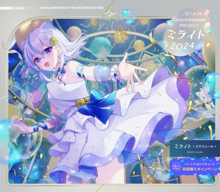
The page presents an anniversary program for a character livestreaming community. Its strongest visual element is an expansive anime illustration: a lavender-haired character in a white party dress, surrounded by celestial architecture, balloons, ribbons, bubbles, and gold confetti. A silver identity seal overlaps the upper-right corner. The opening works as an illustrated invitation, with small supporting navigation rather than a large typographic sales headline.
Further down, tall blue panels resemble arched windows or celebration displays. Their gold outlines, overlapping category medallions, decorative lettering, and scattered placement establish a consistent event identity. Silver negative space and sweeping gold curves connect the panels. The closing download section returns to the silver treatment and places the app icon, store badges, legal copy, and brand mark on a central axis.
The current page includes a link to the 2025 anniversary site above its 2024 content. Retain that distinction when documenting this version: older event dates and a visible COMING SOON... message remain part of the page presently served at this URL.
How to Read This Reference
- Measured values come from the supplied rendered DOM and computed-style records. Coordinates refer to the corresponding viewport or document as recorded.
- Visual estimates describe the five original-page screenshots: three desktop views and two mobile views. Estimated colors and geometry are not stylesheet values or instrumented pixel samples.
- Recommended values are implementation choices for a reusable adaptation. Breakpoints, reconstructed gradients, and the starter layout are explicitly recommendations.
- Named tokens are descriptive aliases. The supplied custom-property extraction was empty; these names are not claimed to exist in the original source.
- Coverage matters: the mobile hero and footer were visually captured. Mobile campaign arrangement is supported by DOM geometry, without a supplied mobile campaign screenshot.
- Interaction limits: link destinations and selected transition declarations were supplied. Click results, hover endpoints, keyboard behavior, and continuous animation were not demonstrated.
Tokens — Colors
Core Palette
| Name | Value | Suggested token | Evidence and role |
|---|---|---|---|
| Silver Canvas | #BABFBF |
--color-silver |
Measured body background, rgb(186, 191, 191). Also measured on the teaser status text. |
| Navy Ink | #2C375F |
--color-navy |
Measured introduction text and date-capsule text, rgb(44, 55, 95). A useful dark endpoint for reconstructed blue surfaces. |
| Celebration Gold | #D7C78F |
--color-gold |
Measured highlighted participant copy, rgb(215, 199, 143). Similar gold appears in decorative elements, but their exact colors were not extracted. |
| White | #FFFFFF |
--color-white |
Measured card copy, notice text, footer copy, and capsule backgrounds. |
| Notice Gray | #A9A9A9 |
--color-notice |
Measured background of the newer-anniversary notice. |
| Update Black | #000000 |
--color-update-text |
Measured text in the white update panel near the bottom. |
| Deep Teal | Approximately #226D8B |
--color-teal |
Visual estimate for blue-green areas of the starry panels and lower-page background. |
| Frame Gold | Approximately #B5A568 |
--color-frame |
Visual estimate for thin gold outlines and sweeping background curves. |
| Bubble Cyan | Approximately #0BD7EE |
--color-cyan |
Visual estimate for luminous bubbles and app imagery; primarily an artwork color. |
| Lavender | Approximately #AAA0E9 |
--color-lavender |
Visual estimate for hair, fabric, and iridescent highlights; primarily an artwork color. |
Surface Color Behavior
The silver surface is visibly textured. Fine multicolored grain, soft cloudy light patches, and reflective ornaments make it read as pearlescent material. A flat #BABFBF background captures the measured base but omits a major part of the appearance.
The event panels combine navy, royal blue, and teal with faint star speckles. Their color placement varies; they are not a set of identical flat navy rectangles. Gold CTA fills also appear softly shaded rather than uniformly solid.
Some visibly decorated elements have a computed background of transparent in the supplied record. That field does not include all background-image, descendant, or pseudo-element detail. Treat the screenshot as evidence of the visible treatment without inventing its underlying CSS construction.
No alternate theme or user-selectable palette was evidenced.
Tokens — Typography
Rounded Japanese Body Copy
Measured family: heisei-maru-gothic-std, sans-serif.
Most explanatory text uses this rounded Japanese family at weight 400. Typical tracking is 0.05em: 14px text has 0.7px letter spacing, 13px text has 0.65px, and 16px text has 0.8px. Body line height is generous, commonly twice the font size and sometimes 2.5 times the font size.
This creates a gentle, ceremonial rhythm around dense illustration. Preserve the light weight and open line spacing instead of introducing heavy UI typography throughout.
The computed family name is directly supported. Font files, licensing, and successful loading of every glyph were not independently inspected.
Dates and English Utility Labels
Measured family: nave, sans-serif.
Dates use 28px regular type on desktop and 24px on mobile. The opening English project label uses 14px at weight 600. The schedule marker changes from 14px/600 on desktop to 12px/400 with 0.6px tracking on mobile.
Keep the source-declared fallback when reproducing the stack; the screenshot alone is not a reliable basis for replacing it with a different named display family.
Theme and Teaser Labels
Measured family: the-seasons, serif.
THEME uses weight 700, 16px desktop and 12px mobile, with 0.1em tracking. COMING SOON... uses the same family and weight at 24px desktop and 20px mobile.
Graphic Headings
The anniversary seal, theme title, and multiple campaign titles are graphical compositions. Their visible lettering includes delicate strokes, handwritten forms, ribbons, bubbles, and custom arrangements.
Several corresponding H1 and H2 records contain no extracted text and report inherited Times at 16px. That describes the heading container, not the lettering visible in its artwork. Do not rebuild these titles as ordinary 16px Times text or infer a font name from their shapes.
Type Scale
All entries below are measured unless noted otherwise.
| Role | Desktop | Mobile | Tracking / notes |
|---|---|---|---|
| Newer-anniversary notice | 20px / 30px, 700 | 14px / 21px, 700 | Computed family: Times; Japanese glyphs may use platform fallback. |
| Opening English label | 14px / 14px, 600 | 14px / 14px, 600 in DOM | Full wording is not visibly readable in the mobile opening capture. |
THEME |
16px / 16px, 700 | 12px / 12px, 700 | 0.1em. |
| Theme paragraph | 14px / 35px | 11px / 27.5px | 0.05em. |
| Anniversary introduction | 16px / 40px | 11px / 27.5px | 0.05em. |
| Main event description | 14px / 28px | 14px / 28px | Unchanged size across the two records. |
| Narrow-card body | Usually 13–14px / 26–28px | Usually 12–14px / 24–28px | Component-specific; not a universal scale factor. |
| Event date | 28px / 28px | 24px / 24px | nave, weight 400. |
| Venue | 20px / 20px | 16px / 16px | Rounded Japanese body family. |
| Date capsule | 12px / 12px | 10px / 10px | 0.1em. |
| Gold detail link | 16px / 16px | 16px / 16px | 0.05em; label size stays constant. |
| Outlined informational notice | 14px / 14px | 12px / 12px | 0.05em. |
| Campaign disclaimer | 11px / 22px | 10px / 20px | 0.05em. |
| Schedule marker | 14px / 14px, 600 | 12px / 12px, 400 | Mobile tracking: 0.6px. |
| Update-panel lead | 20px / 30px | 16px / 24px | Black text. |
| Footer legal copy | 10px / 20px | 10px / 20px | White; normal tracking. |
| Copyright | 10px / 10px | 10px / 10px | White; normal tracking. |
Tokens — Spacing & Shapes
The layout combines large scenic intervals with closely controlled details inside each campaign. It does not use a single proportional scale across all viewport sizes.
Spacing Scale
| Use | Desktop | Mobile | Evidence |
|---|---|---|---|
| Notice padding | 16px | 8px | Measured on the full-width anchor. |
| Theme content side inset | 40px | 16px | Measured paragraph bounds. |
| Campaign paragraph inset | 24px per side | 24px per side | Repeated measured padding. |
| Date badge-to-value gap in inline rows | 16px | 16px | Calculated from measured event-row bounds. |
| Detail-link padding | 22px 60px 22px 40px |
18px 58px 16px 40px |
Measured; reserves extra space at the right. |
| Date-capsule padding | 7px 10px 4px 12px |
6px 8px 3px 10px |
Measured asymmetric optical alignment. |
| Outlined-notice padding | 16px 20px 12px |
11px 16px 8px |
Measured. |
| Edge-banner vertical gap | 8px | 4px | Calculated from measured link rectangles. |
| Store-badge horizontal gap | 16px | 16px | Calculated from measured anchor positions and widths. |
| Footer top inset | Approximately 120px | Approximately 96px | Visual estimate from surface edge to app icon. |
Useful adaptation steps are 8, 16, 24, 32, 40, 48, 64, 96, and 120px. This is a recommended working scale assembled around repeated measurements, not an extracted source spacing system.
Border Radius
| Element | Value or appearance | Evidence |
|---|---|---|
| Gold detail link | 56px | Measured; produces a capsule at the observed height. |
| Date label | 24px | Measured. |
| Outlined informational notice | 40px | Measured. |
| Campaign frame | Broad domed top, approximately 20–24px lower corners | Visual estimate. |
| Category medallion | Slightly tilted oval, approximately 90 × 60px on desktop | Visual estimate. |
| Download surface | Approximately 80–90px upper corners desktop; 45–50px mobile | Visual estimate. |
| Update panel | Approximately 24px corners | Visual estimate. |
The arched panels need a different shape from a generic rounded card. Their top curvature occupies a substantial part of the panel width, while the lower corners stay compact.
Layout Measurements
| Element | Desktop: 1440 × 1000 | Mobile: 390 × 844 | Qualification |
|---|---|---|---|
| Document height | 8629.36px | 10740.28px | Measured; rounded to two decimals. |
| Top notice | 1440 × 62px | 390 × 58px | Measured. Mobile text uses two lines. |
| Identity heading box | 273 × 240px at x1151, y94 | 136 × 119.55px at x250, y74 | Measured container around the graphic. |
| Hero image side clearance | Approximately 40px | Approximately 16px | Visual estimate for the inner artwork, excluding its outer gold line. |
| Schedule banner | 240 × 80px at x1200, y814 | 144 × 48px at x246, y770 | Measured at the opening capture. |
| Charge banner | 240 × 80px at x1200, y902 | 144 × 48px at x246, y822 | Measured; mobile bottom extends beyond the 844px capture. |
| Theme-title graphic box | 480 × 56.73px | 240 × 28.36px | Measured. |
| Narrow campaign content region | 356.63px wide | 318px wide | Measured, before paragraph inset. |
| Larger campaign content region | 552.47px in several cards | 358px | Measured; layout varies by campaign. |
| Main event description region | 752.39px wide | 326px wide | Measured; mobile region also has 24px inner padding. |
| Standard detail link | 193.13 × 60px | 191.13 × 50px | Measured for 詳細はこちら. |
| Download app icon | Approximately 160px square | Approximately 120px square | Visual estimate, consistent with measured anchor widths. |
| Store-badge anchor widths | 137px and 168px | 137px and 168px | Measured; combined row width including gap is 321px. |
| Footer brand anchor width | 182px | 160px | Measured. |
Inline image links sometimes have a recorded height of 16px even when the visible image is much taller. These are inline box measurements, not reliable image or touch-target heights. Use the actual rendered artwork dimensions when implementing the icon and store badges.
Components
Newer-Anniversary Notice
Role: direct visitors from the current annual page to the next anniversary site.
A full-width gray anchor sits above the illustrated composition. Its white, bold, centered label is underlined. Desktop uses one 30px line with 16px padding; mobile uses two 21px lines with 8px padding.
The observed label is 『IRIAM 7th Anniversary Project ミライト』公式サイトはこちら, and its destination is https://miraito.iriam.com/2025. The supplied final URL remains the 2024 page. This is a navigation notice, not evidence of an automatic redirect or a modal overlay.
Illustrated Hero and Identity Seal
Role: establish the anniversary world before explaining the program.
The dominant illustration sits inside a thin gold frame and a pale inner gutter. Its upper corners form a broad arch. Bubbles, ribbons, stars, and the identity seal cross the frame boundary, making the opening feel layered rather than boxed into a conventional content section.
On desktop, the character's face, extended hand, sweeping dress, and surrounding celestial room are visible together. The mobile composition crops deeply into the scene and keeps the face and torso prominent. Reproduce this through deliberate artwork framing or an authorized alternate crop, rather than uniformly shrinking the entire desktop scene.
The graphic identity sits at the upper right, measuring roughly half its desktop width on mobile. A small English project line and decorative horizontal rule occupy the opposite side on desktop. In the mobile screenshot, the decorative rule remains apparent while the complete English wording is not visibly readable.
No conventional navigation bar is visible in the supplied opening captures.
Edge Banner Pair
Role: expose the schedule and a charge campaign without placing a large text CTA over the character.
Two image-based links touch the right edge. The upper banner uses the dark blue event palette and reads ミライト・スケジュール; the lower banner uses a brighter cyan-and-violet campaign treatment.
The upper link points to /2024/#schedule. The lower link points to https://www.iriam.app/top. Their destinations are verified from the rendered links; navigation behavior was not exercised.
Desktop banners are 240 × 80px with an 8px gap. Mobile uses 144 × 48px with a 4px gap, exactly 60% of the desktop dimensions. The second mobile banner is partly below the supplied opening viewport. The records do not establish whether the pair remains fixed during scrolling, becomes sticky, or belongs to the hero. Do not assume persistent viewport positioning.
Theme Statement and Introduction
Role: transition from spectacle to the event's meaning and program.
The theme section combines a small tracked THEME label, a centered graphic title, and short centered lines of Japanese copy. Measured line height is 2.5 times the text size: 35px for 14px desktop text and 27.5px for 11px mobile text.
The subsequent introduction changes the body text to navy and explains the sixth anniversary and the October 2024–January 2025 program. It also uses generous line spacing and controlled line breaks. Its position and typography are DOM-supported; the complete surrounding composition was not supplied as a screenshot.
Staggered Campaign Field
Role: organize a varied program while maintaining the feeling of a decorated exhibition.
The desktop screenshot shows three narrow arched panels at different heights: a bubble campaign toward the left, limited gifts near the center, and a social gratitude campaign at the right. Larger event and illustration-related panels occur elsewhere in the DOM. Avoid forcing all campaign modules into equal-height rows.
A typical panel contains:
- A category medallion overlapping the crown, such as
APPorSNS. - A dark blue or teal star-textured inner surface.
- A campaign-specific graphic heading.
- Short centered explanatory copy, usually with 24px horizontal padding.
- Illustration or decorative objects integrated with the panel.
- A date capsule and contrasting date typography where applicable.
- A gold link or an outlined informational notice.
The visible outer edge combines pale silver and gold lines. Decorations may be clipped into the panel, sit inside its lower corners, or extend beyond its perimeter. Keep the category medallion outside the inner clipping layer.
Bubble Campaign Panel
Role: communicate a participatory app event through a single repeated material motif.
A blue-to-teal panel uses translucent cyan bubbles at its edges and bubble-shaped title lettering. The short introduction, title artwork, reward copy, date group, and gold link form a centered vertical sequence. The observed date is 10/1(火) ― 10/7(月).
The panel's decorative bubbles vary in size and are partly cropped by the curved frame. This produces depth without adding interface shadows. Retain ample clear space behind body copy even when decorating the perimeter heavily.
Limited-Gift Panel
Role: show collectible anniversary content available in the app.
The crown label reads APP. A graphic heading for ミライト 限定ギフト sits above three lines of 13px/26px copy. The central illustration groups balloons, the mascot, and faceted star ornaments. A smaller 12px/24px note precedes an outlined notice reading 詳しくは公式X/アプリをチェック.
That outlined notice is recorded as a P, not an anchor. Preserve the distinction between an informational callout and an actionable link. Do not invent an app-opening behavior for this element.
Social Gratitude Panel
Role: invite community participation through a celebratory message.
A gold SNS medallion overlaps the top. Large handwritten-style gold lettering is followed by a delicate TO: You graphic. Two centered text rows are separated by fine horizontal rules. Gold roses, a metallic bow, and pale spherical ornaments frame the edges.
Supporting copy uses 12px/24px. The date is 10/4(金) ― 10/8(火), followed by a gold 詳細はこちら link. The handwritten headline and decorative addressee are artwork; their fonts were not supplied.
Date Capsule and Date Row
Role: make campaign timing immediately recognizable across different panel designs.
Use a compact white capsule with navy rounded text for 開催期間, 開催日時, or 場所. Dates use the contrasting Nave family and substantially larger numerals.
At desktop, the narrow social and bubble panels place the capsule above the date. On mobile, their measured capsule and date bounds share a horizontal row. Larger event modules also use inline label/value rows. The relationship therefore changes by component and viewport; it is not universally a stacked pattern.
Desktop capsules are approximately 75 × 23px for 開催期間; mobile capsules are 62 × 19px. Keep their asymmetric padding to preserve optical alignment.
Gold Detail Link and Outlined Notice
Role: distinguish direct navigation from information about where to find updates.
Gold detail links use a rounded capsule, white 16px text, and a small sparkle at the right. The standard desktop link is approximately 193 × 60px. The mobile link remains nearly the same width but becomes 50px high. Longer event-site labels naturally produce wider capsules.
The visible gold treatment is softly shaded. Its exact gradient was not exported. Extra right padding creates room for the sparkle; a desktop transition declaration targets that padding.
Outlined notices have a white hairline border, transparent-looking interior, and smaller copy. Their measured height is 44px desktop and 33px mobile. The supplied examples are paragraphs, so their button-like appearance should not be taken as proof of interactivity.
Schedule and Update Panel
Role: provide program timing and a final bridge to broader product updates.
The MIRAITO SCHEDULE marker occurs around document y6634.75 on desktop and y9022.53 on mobile. Its decorative left inset is 192px desktop and 128px mobile. The supplied evidence does not expose the schedule's full artwork or internal layout; a calendar grid, carousel, or interactive timeline cannot be asserted.
A white rounded update panel follows later. Its text is black, in contrast to the surrounding white-on-blue content. The desktop screenshot shows a wide panel approximately 1200px across; the mobile screenshot shows a narrower panel approximately 342px across. Both are visual estimates.
The DOM places update copy and an image link beside one another on desktop and sequentially on mobile. The linked image points to an IRIAM information page. Only the lower portion of this panel is visible in the footer screenshots.
App Download Footer
Role: conclude the event page with a clear route into the app and a quiet brand signature.
A full-width silver section has very large rounded upper corners. Its content follows a centered sequence: app icon, store badges, legal copy, IRIAM wordmark, copyright.
The app icon scales from approximately 160px to 120px. The two store-badge anchor widths remain 137px and 168px, separated by 16px at both inspected widths. Preserve their intrinsic proportions and readable text instead of shrinking the entire footer as a single image.
Balloons occupy the side edges; bubbles, faceted stars, small spheres, and ribbons create depth around the center. Mobile repositions and crops these ornaments while keeping the central download content legible.
The icon and both store badges use the same observed https://go.onelink.me/UKig/jc25dsfd destination. The brand mark links to https://www.live.iriam.com/. The footer independently displays © IRIAM Inc. and trademark copy. No production role was established by the inspected original-page evidence.
Tokens — Motion & Interaction
| Target | Supplied declaration or behavior | What it establishes |
|---|---|---|
| Desktop edge-banner links | filter 0.5s cubic-bezier(0.215, 0.61, 0.355, 1) |
A filter transition is defined. The triggering state and filter endpoint were not supplied. |
| Desktop gold detail links | padding-right 0.75s cubic-bezier(0.165, 0.84, 0.44, 1) |
Right-padding changes can ease over 750ms. The resulting padding and visible hover state were not captured. |
| Mobile equivalents | Exported transition field: all |
Insufficient information to recover a duration or determine whether transitions are disabled. |
| Sampled text and link nodes | animation: none |
No animation on those sampled nodes; not proof that decorative descendants or other layers are static. |
| Schedule banner | Anchor destination ends in #schedule |
An in-page destination exists. Smooth scrolling and final alignment were not tested. |
| Detail and download links | Rendered anchor destinations supplied | Navigation affordances exist; destination responses and app handoff were not tested. |
| Bubbles, ribbons, stars | Visible in still captures | Position and material treatment are observable. Floating, rotation, parallax, or twinkling are unverified. |
The capture process waited for layout and visible content to settle and temporarily paused perpetual animations during readiness checks before resuming them. That process helps produce stable screenshots but does not establish a motion design specification.
Recommended adaptation: keep decorative movement optional and subtle. Use the two measured transition timings where their corresponding effects are implemented, provide equivalent keyboard focus feedback, and remove nonessential movement under prefers-reduced-motion. Do not add autoplay media or elaborate scroll choreography on the assumption that it existed here.
Surfaces
| Layer | Appearance | Function |
|---|---|---|
| Page canvas | Pale silver with fine iridescent grain | Unifies the celebration and gives dark panels breathing room. |
| Opening artwork | Saturated blue, lavender, white, and gold | Carries the primary identity and emotional impact. |
| Campaign panel | Navy-to-teal star field | Provides a calm, dark backing for small white copy. |
| Panel outline | Fine pale and gold edges | Defines the arched silhouette without heavy elevation. |
| Category medallion | Silver or gold oval | Identifies program context and breaks the panel's top edge. |
| Date label | White capsule with navy text | Makes recurring schedule metadata easy to locate. |
| Primary link | Soft gold capsule | Separates direct actions from content and notices. |
| Update panel | White with black copy | Provides a simpler information surface near the end. |
| Download section | Rounded silver field | Returns to the opening material palette and centers app acquisition. |
Depth comes from illustration, material highlights, layered ornaments, and overlapping edges. A general card-shadow elevation system is not evident in the supplied screenshots. The metallic and transparent objects belong to the artwork; they do not imply translucent glass UI panels.
Imagery
The artwork combines anime character illustration with rendered celebration objects. Key materials include satin-like white and lavender fabric, blue bows, metallic gold roses, transparent balloons filled with confetti, pearlescent bubbles, and faceted four-point stars.
The overall atmosphere is celestial and festive. Orbital curves, moon-like spheres, luminous windows, and scattered stars reinforce the observed Starlight Party theme. Large gold curves continue through the silver page background and visually connect distant campaign panels.
Keep the distinction between three image roles:
- Identity artwork: the character key visual, anniversary seal, and custom campaign titles.
- Supporting illustration: mascot gifts, balloons, roses, bows, and campaign-specific objects.
- Atmospheric decoration: fine grain, star speckles, bubbles, ribbons, and sweeping gold lines.
Use smooth rendering for these illustrations. Pixelated scaling would conflict with the soft gradients, delicate linework, and reflective materials.
Observed Asset References
The evidence did not expose image filenames, native dimensions, or asset URLs. References below identify visible artwork without inventing source paths.
| Asset or group | Evidence | Implementation guidance |
|---|---|---|
| Character key visual | Desktop and mobile opening screenshots | Supply authorized high-resolution artwork and test subject-aware cropping at both widths. |
| Anniversary identity seal | Both opening screenshots; measured heading boxes | Preserve its complete silhouette, transparency, and internal lettering. |
| Campaign title graphics | Desktop campaign screenshot and empty-text heading boxes | Treat as artwork; provide equivalent semantic headings in the implementation. |
| Gift illustration group | Desktop limited-gift panel | Preserve the relationship between mascot, balloons, and stars. |
| Category medallions | Desktop campaign screenshot | Reusable shape treatment; exact lettering font was not measured. |
| Silver grain and blue star textures | Desktop campaign/footer and mobile footer screenshots | Use subtle tiled or full-surface textures; avoid obvious repetitive dot grids. |
| Store badges | Both footer screenshots | Use official proportionally scaled badge artwork. |
| App icon and IRIAM wordmark | Both footer screenshots | Keep their distinct sizes and vertical separation. |
| Edge banners | Both opening screenshots; measured anchors | Keep the observed 3:1 ratio and provide meaningful link names. |
CSS can approximate framing, gradients, spacing, and typography. The character, campaign lettering, and decorative objects carry much of the identity and require appropriate artwork.
Layout & Responsive Behavior
Desktop Composition
The opening fills almost the full width with illustration while retaining approximately 40px of inner artwork clearance at each side. The notice spans the viewport. The identity seal and edge banners overlap the scenic composition rather than occupying a separate navigation column.
Campaigns form a staggered multi-column field. Narrow content regions measure approximately 356.63px, while larger modules use approximately 552.47px or 752.39px regions. Different widths and vertical starts establish hierarchy. The visible three-card group is intentionally uneven: the center panel starts above its neighbors, and the right panel extends lower.
The footer simplifies the arrangement into a centered axis. Broad empty silver areas separate legal and brand content from the decorative objects at the edges.
Mobile Composition
The 390px layout is not a uniform miniature of desktop:
- The notice wraps into two lines and remains 58px high.
- The identity graphic width drops from 273px to 136px.
- The hero crops into the character instead of fitting the entire landscape illustration.
- Edge banners scale to 60% of their desktop dimensions.
- Campaigns become a vertical sequence with alternating lateral offsets.
- Many campaign body sizes remain unchanged, while the theme and introduction become 11px.
- Detail-link text stays 16px even as the capsule height changes from 60px to 50px.
- The app icon shrinks, while store-badge widths and their 16px gap remain unchanged.
Mobile narrow campaign regions alternate between x56 with width318 and x16 with width318. Their centers are therefore x215 and x175, offset by 20px to either side of the viewport center. Wider modules use x16 and width358. This measured lateral rhythm is an important part of the mobile adaptation.
The limited-gift, gratitude, and bubble sections appear sequentially in that order on mobile. The desktop visual places the bubble campaign at the left of the same visible group. Preserve meaningful DOM reading order rather than deriving it from desktop left-to-right placement alone.
The document grows from approximately 8629px to 10740px. Its mobile length reflects campaign serialization and text wrapping; it is not evidence of a separate page.
Responsive Limits
Only two viewport sizes were supplied. The exact media-query breakpoint, tablet arrangement, maximum layout width, browser zoom behavior, and landscape handling are unknown. The starter below uses a recommended 760px breakpoint and a reconstructed grid; neither is an extracted source rule.
Do’s and Don’ts
Do
- Let the character illustration establish the opening hierarchy.
- Preserve the silver canvas, dark blue content fields, white lettering, and thin gold outlines.
- Build tall panels with domed tops and compact lower corners.
- Keep category medallions visibly overlapping the crown of each panel.
- Use campaign-specific artwork while repeating date, copy, and action anatomy.
- Retain generous line spacing and the rounded Japanese body family where available.
- Keep mobile cards slightly offset to either side of center.
- Preserve the distinction between gold anchor links and outlined informational paragraphs.
- Reposition decorative objects around readable content at narrow widths.
- Keep the app-store badges large enough to retain their official typography.
Don’t
- Replace the opening with a generic split headline-and-button layout.
- Flatten every campaign into an equal-height card grid.
- Treat the inherited 16px Times heading style as the font used inside graphic titles.
- Turn every outlined notice or category label into an interactive control.
- Apply heavy shadows or glass blur to all content panels.
- Use cyan, lavender, and gold as interchangeable UI action colors.
- Shrink the desktop page as a single composition on mobile.
- Assume bubbles float, gold curves animate, or banners stay fixed without additional evidence.
- Invent schedule interactions from an anchor and section label alone.
- Remove the newer-anniversary notice when describing the currently served page.
Recommended Implementation Additions
These are recommendations for a new implementation, not verified features of the original page.
- Provide semantic text equivalents for image-based headings. The empty extracted heading text does not establish whether the original images already have accessible names.
- Give image-only schedule, charge, download, and brand links meaningful accessible labels. Mark purely atmospheric ornaments as decorative.
- Test contrast for white footer copy on silver and white text on gold. Navy legal copy is a practical alternative when readability takes priority over matching the capture.
- Consider a 13–14px minimum for substantive mobile paragraphs instead of reproducing the observed 11px introduction verbatim.
- Add a clear two-tone focus indicator that remains visible on silver, gold, and dark blue backgrounds.
- Keep both edge-banner targets reachable at short viewport heights and account for safe-area insets if viewport pinning is introduced.
- Keep descriptive campaign text in HTML even when its title is illustrated. Preserve reading order when arranging cards visually.
- Reserve image dimensions to reduce layout shifts, load the opening artwork promptly, and defer below-the-fold decorative imagery where appropriate.
- Keep repeated CTA labels understandable in context, for example by associating each
詳細はこちらlink with its campaign heading.
Agent Prompt Guide
Quick Color Reference
- Canvas: measured
#BABFBF, enriched with subtle silver grain. - Text on light surfaces: measured navy
#2C375F. - Text on campaign surfaces: measured white
#FFFFFF. - Highlight gold: measured
#D7C78F. - Fine frame gold: estimated
#B5A568. - Dark surfaces: reconstruct a restrained navy-to-teal gradient; teal estimate
#226D8B. - Update notice: measured gray
#A9A9A9with white text. - Cyan and lavender: primarily illustration accents, not a general control palette.
Overall Prompt
“Create a Japanese anniversary event page inspired by the current IRIAM Miraito 2024 design. Begin with a full-width gray annual-site notice, then a large authorized anime key visual inside a gold arched frame. Overlap a silver anniversary seal at the upper right and place two compact image banners along the right edge. Use a pearlescent silver canvas, dark navy-to-teal star-textured campaign panels, white rounded Japanese body text, fine gold outlines, and softly shaded gold capsule links. Arrange campaign panels at different widths and vertical positions. On mobile, crop the hero around the character and serialize campaign panels with alternating left and right offsets. End with a large rounded silver download surface containing the app icon, full-size store badges, small legal copy, and a centered brand mark. Treat campaign lettering and reflective ornaments as artwork.”
Example Component Prompts
- Hero: “Build an illustrated anniversary opening with approximately 40px inner artwork margins on desktop and 16px on mobile. Use a broad gold arch, an overlapping identity seal, and decorative bubbles and ribbons. Make the mobile crop preserve the character's face and torso. Do not place a large replacement text headline over the illustration.”
- Campaign panel: “Create a tall navy-and-teal campaign panel with a domed top, a fine gold outer line, a pale inner line, and an oval category medallion overlapping the crown. Center an illustrated title, short white paragraphs, a date capsule, and a gold detail link. Keep decorative objects near the edges.”
- Date and action group: “Use a white date-label capsule with navy rounded text and larger Nave date numerals. Set the gold action label at 16px, with 60px total control height on desktop and 50px on mobile. Reserve space for a small sparkle at the right. Keep outlined update notices semantically separate from links.”
- Mobile campaign sequence: “Place larger campaign modules within 16px side insets. Alternate narrower 318px content regions between x16 and x56 at a 390px viewport. Preserve document reading order and avoid reducing every font by the same ratio.”
- Download footer: “Create a full-width silver footer with large rounded top corners, subtle iridescent texture, and cropped balloons at the side edges. Center a 160px app icon on desktop and 120px on mobile. Keep the two store badges at approximately 137px and 168px wide with a 16px gap. Separate legal copy and the wordmark with generous vertical space.”
Quick Start
CSS Custom Properties
This is a usable adaptation scaffold, not recovered source CSS. It preserves measured font stacks, colors, control padding, and key mobile proportions. The seven-track desktop grid, 760px breakpoint, hero aspect ratios, crop position, gradient stops, and decorative frame geometry are recommendations.
Supply authorized artwork through image elements using the indicated classes. Optional texture variables accept an image value such as url(...); they default to none. No original asset paths were available. Keep the category badge outside the panel's clipped inner surface, and place only navigable elements in anchors.
:root {
  /* Measured colors */
  --color-silver: #babfbf;
  --color-navy: #2c375f;
  --color-gold: #d7c78f;
  --color-white: #fff;
  --color-notice: #a9a9a9;
  --color-update-text: #000;

  /* Visual estimates for reconstruction */
  --color-teal: #226d8b;
  --color-frame: #b5a568;
  --color-inner-frame: #d7d9d2;

  /* Observed font stacks; font delivery is project-specific */
  --font-body: 'heisei-maru-gothic-std', sans-serif;
  --font-date: 'nave', sans-serif;
  --font-editorial: 'the-seasons', serif;

  --text-body: 14px;
  --text-date: 28px;
  --text-action: 16px;
  --tracking-body: 0.05em;
  --leading-body: 2;

  --space-8: 8px;
  --space-16: 16px;
  --space-24: 24px;
  --space-40: 40px;
  --space-48: 48px;
  --space-96: 96px;

  --radius-action: 56px;
  --radius-label: 24px;
  --radius-notice: 40px;
  --radius-arch: 190px 190px 24px 24px;

  --motion-banner: 0.5s cubic-bezier(0.215, 0.61, 0.355, 1);
  --motion-action: 0.75s cubic-bezier(0.165, 0.84, 0.44, 1);

  /* Optional owned or licensed textures */
  --silver-grain: none;
  --star-texture: none;
}

* {
  box-sizing: border-box;
}

.miraito-page {
  margin: 0;
  color: var(--color-navy);
  background: var(--color-silver);
  font-family: var(--font-body);
  font-size: var(--text-body);
  font-weight: 400;
}

.silver-surface {
  background-color: var(--color-silver);
  background-image:
    var(--silver-grain),
    radial-gradient(ellipse at 40% 60%, #e0e0d4aa, transparent 65%);
}

.star-surface {
  color: var(--color-white);
  background-color: var(--color-navy);
  background-image:
    var(--star-texture),
    linear-gradient(145deg, var(--color-navy), var(--color-teal));
}

.anniversary-notice {
  display: block;
  padding: 16px;
  color: var(--color-white);
  background: var(--color-notice);
  font-family: Times, serif;
  font-size: 20px;
  font-weight: 700;
  line-height: 30px;
  text-align: center;
  text-decoration: underline;
}

/* Hero geometry and crop are adjustable recommendations. */
.hero-stage {
  position: relative;
  padding: 80px 28px 0;
}

.hero-frame {
  padding: 10px;
  border: 2px solid var(--color-frame);
  border-radius: 180px 180px 24px 24px;
}

.hero__art {
  display: block;
  width: 100%;
  aspect-ratio: 1.4;
  border-radius: 168px 168px 14px 14px;
  object-fit: cover;
  object-position: center;
}

.hero__seal {
  position: absolute;
  z-index: 2;
  top: 32px;
  right: 16px;
  width: 273px;
  height: auto;
}

/* Hero-local placement; persistent pinning was not verified. */
.edge-banners {
  position: absolute;
  z-index: 3;
  right: 0;
  bottom: 18px;
  display: grid;
  gap: 8px;
  width: 240px;
}

.edge-banner {
  display: block;
  aspect-ratio: 3 / 1;
  transition: filter var(--motion-banner);
}

.edge-banner img {
  display: block;
  width: 100%;
  height: auto;
}

.theme-copy {
  margin-inline: 40px;
  font-size: 14px;
  line-height: 2.5;
  letter-spacing: var(--tracking-body);
  text-align: center;
}

/* Reconstructed tracks, not an extracted source grid. */
.campaigns {
  display: grid;
  grid-template-columns: repeat(7, minmax(0, 1fr));
  gap: 96px 24px;
  margin: 120px 40px;
  align-items: start;
}

.campaign-card {
  position: relative;
  min-width: 0;
  padding: 4px;
  border: 2px solid var(--color-frame);
  border-radius: var(--radius-arch);
}

.campaign-card--bubble {
  grid-column: 1 / span 2;
  grid-row: 1;
  margin-top: 96px;
}

.campaign-card--gift {
  grid-column: 4 / span 2;
  grid-row: 1;
}

.campaign-card--thanks {
  grid-column: 6 / span 2;
  grid-row: 1;
  margin-top: 120px;
}

.campaign-card__surface {
  position: relative;
  overflow: hidden;
  padding: 80px 0 56px;
  border: 2px solid var(--color-inner-frame);
  border-radius: inherit;
  text-align: center;
}

.campaign-card__category {
  position: absolute;
  z-index: 2;
  top: -32px;
  left: 50%;
  display: grid;
  place-items: center;
  width: 90px;
  height: 60px;
  border-radius: 50%;
  color: var(--color-white);
  background: linear-gradient(135deg, #e4e8e7, #929fac);
  font-family: var(--font-editorial);
  font-size: 20px;
  transform: translateX(-50%) rotate(-12deg);
}

.campaign-card__category--social {
  background: linear-gradient(135deg, #e9dfb3, #bba774);
}

.campaign-card__copy {
  position: relative;
  z-index: 1;
  padding-inline: 24px;
  line-height: var(--leading-body);
  letter-spacing: var(--tracking-body);
}

.campaign-card__title-art {
  display: block;
  width: 75%;
  height: auto;
  margin: 0 auto 32px;
}

.event-meta {
  display: flex;
  flex-direction: column;
  align-items: center;
  justify-content: center;
  gap: 16px;
  margin-block: 40px;
}

.event-label {
  display: inline-block;
  padding: 7px 10px 4px 12px;
  border-radius: var(--radius-label);
  color: var(--color-navy);
  background: var(--color-white);
  font-size: 12px;
  line-height: 12px;
  letter-spacing: 0.1em;
  white-space: nowrap;
}

.event-date {
  margin: 0;
  font-family: var(--font-date);
  font-size: var(--text-date);
  line-height: 1;
}

.detail-link {
  position: relative;
  display: inline-block;
  max-width: 100%;
  padding: 22px 60px 22px 40px;
  border-radius: var(--radius-action);
  color: var(--color-white);
  background: linear-gradient(110deg, var(--color-gold), #d0c8b7);
  font-size: var(--text-action);
  line-height: 16px;
  letter-spacing: var(--tracking-body);
  text-decoration: none;
  transition: padding-right var(--motion-action);
}

.detail-link::after {
  content: '✦';
  position: absolute;
  top: 50%;
  right: 27px;
  font-size: 11px;
  transform: translateY(-50%);
}

.info-notice {
  display: inline-block;
  max-width: calc(100% - 32px);
  margin: 0;
  padding: 16px 20px 12px;
  border: 1px solid currentColor;
  border-radius: var(--radius-notice);
  font-size: 14px;
  line-height: 14px;
  letter-spacing: var(--tracking-body);
}

.update-panel {
  width: calc(100% - 48px);
  max-width: 1200px;
  margin-inline: auto;
  padding: 56px;
  border-radius: 24px;
  color: var(--color-update-text);
  background: var(--color-white);
}

.download-footer {
  position: relative;
  overflow: hidden;
  padding: 120px 16px;
  border-radius: 88px 88px 0 0;
  color: var(--color-white);
  text-align: center;
}

.download-footer__content {
  position: relative;
  z-index: 1;
}

.download-footer__icon {
  display: block;
  width: 160px;
  height: auto;
  margin-inline: auto;
}

.store-badges {
  display: flex;
  flex-wrap: wrap;
  align-items: center;
  justify-content: center;
  gap: 16px;
  margin-top: 48px;
}

.store-badges a,
.store-badges img {
  display: block;
}

.store-badges img {
  max-width: 100%;
  height: auto;
}

.store-badge--apple {
  width: 137px;
}

.store-badge--google {
  width: 168px;
}

.download-footer__legal {
  margin: 48px 0 0;
  font-size: 10px;
  line-height: 20px;
}

.download-footer__brand {
  display: block;
  width: 182px;
  height: auto;
  margin: 112px auto 0;
}

.download-footer__copyright {
  margin: 32px 0 0;
  font-size: 10px;
  line-height: 10px;
}

.decoration {
  position: absolute;
  pointer-events: none;
  user-select: none;
}

/* Recommended endpoints; original hover endpoints were not supplied. */
@media (hover: hover) and (pointer: fine) {
  .edge-banner:hover {
    filter: brightness(1.08);
  }

  .detail-link:hover {
    padding-right: 68px;
  }
}

/* Recommended keyboard focus treatment. */
.miraito-page a:focus-visible {
  outline: 3px solid var(--color-navy);
  outline-offset: 4px;
  box-shadow: 0 0 0 4px var(--color-white);
}

/* Recommended breakpoint, based on the two supplied layouts. */
@media (max-width: 760px) {
  :root {
    --text-date: 24px;
    --radius-arch: 166px 166px 20px 20px;
  }

  .anniversary-notice {
    padding: 8px;
    font-size: 14px;
    line-height: 21px;
  }

  .hero-stage {
    padding: 24px 8px 0;
  }

  .hero-frame {
    padding: 6px;
    border-radius: 190px 190px 18px 18px;
  }

  .hero__art {
    aspect-ratio: 0.38;
    border-radius: 182px 182px 10px 10px;
    object-position: 28% center;
  }

  .hero__seal {
    top: 16px;
    right: 4px;
    width: 136px;
  }

  .edge-banners {
    gap: 4px;
    width: 144px;
    bottom: 16px;
  }

  .theme-copy {
    margin-inline: 16px;
    font-size: 11px;
    line-height: 27.5px;
  }

  .campaigns {
    display: flex;
    flex-direction: column;
    gap: 96px;
    margin: 96px 8px;
  }

  .campaign-card {
    width: calc(100% - 40px);
    margin-top: 0;
  }

  .campaign-card--gift,
  .campaign-card--bubble {
    align-self: flex-end;
  }

  .campaign-card--thanks {
    align-self: flex-start;
  }

  .campaign-card--wide {
    width: 100%;
  }

  .event-meta {
    flex-direction: row;
    flex-wrap: wrap;
    gap: 16px;
    margin-block: 32px;
  }

  .event-label {
    padding: 6px 8px 3px 10px;
    font-size: 10px;
    line-height: 10px;
  }

  .detail-link {
    padding: 18px 58px 16px 40px;
  }

  .info-notice {
    padding: 11px 16px 8px;
    font-size: 12px;
    line-height: 12px;
  }

  .update-panel {
    padding: 24px;
  }

  .download-footer {
    padding: 96px 16px;
    border-radius: 48px 48px 0 0;
  }

  .download-footer__icon {
    width: 120px;
  }

  .store-badges,
  .download-footer__legal {
    margin-top: 40px;
  }

  .download-footer__brand {
    width: 160px;
    margin-top: 96px;
  }
}

@media (prefers-reduced-motion: reduce) {
  .edge-banner,
  .detail-link {
    transition: none;
  }

  .decoration {
    animation: none;
  }
}
For the three-card example, place the gift, gratitude, and bubble articles in that DOM order. Desktop grid placement establishes their visual positions; the mobile flex layout preserves the reading sequence. Add other campaign groups as separate layout regions rather than forcing the entire page into this one starter grid.
The CSS retains the observed small theme text and white footer copy. Raising mobile paragraph sizes and using navy legal text are recommended readability improvements. Texture assets, image heading alternatives, and decorative positioning still require project-specific implementation.
Tailwind v4 Token Mapping
Optional aliases for a project already using Tailwind v4. These do not imply that the original site uses Tailwind. Define the custom properties above first.
@theme inline {
  --color-miraito-silver: var(--color-silver);
  --color-miraito-navy: var(--color-navy);
  --color-miraito-gold: var(--color-gold);
  --color-miraito-frame: var(--color-frame);
  --color-miraito-teal: var(--color-teal);
  --color-miraito-notice: var(--color-notice);

  --font-miraito-body: var(--font-body);
  --font-miraito-date: var(--font-date);
  --font-miraito-editorial: var(--font-editorial);

  --text-miraito-body: 14px;
  --text-miraito-action: 16px;
  --text-miraito-date: var(--text-date);

  --radius-miraito-action: 56px;
  --radius-miraito-label: 24px;
  --radius-miraito-notice: 40px;
}
Sources & Evidence
- Inspected original and final website: IRIAM Anniversary Project ミライト 2024. The supplied response was HTTP 200, and the final URL matched the original URL.
- Inspection timestamp: September 16, 2026, 19:43:38.715 UTC, equivalent to September 17, 2026, 04:43:38.715 JST. Separate timestamps for individual images were not supplied.
- Desktop evidence: 1440 × 1000 CSS-pixel viewport; original-page screenshots of the opening, a campaign-card region, and the closing download section; rendered DOM and computed-style records across the document.
- Mobile evidence: 390 × 844 CSS-pixel viewport; original-page screenshots of the opening and closing download section; rendered DOM and computed-style records across the document.
- Measurements: element rectangles, document heights, font-family declarations, sizes, line heights, tracking, padding, selected radii, colors, link destinations, and selected transition declarations. No source custom properties were returned.
- Observed navigation structure: the next-anniversary link, the
#schedulelink, the real-event link, information-page links, app-download links, and the footer brand link. These destinations were recorded without being visited for this analysis. - Capture limitations: readiness checks included at least five seconds of initial observation, bounded waits for visible image decoding and finite animations, and scrolling through intermediate positions. Perpetual animations were paused during readiness checks and resumed afterward. Delayed content and unexercised states remain unverified; SharedWorkers and service workers were disabled during inspection.
This reference describes the version currently served at the supplied 2024 URL. It does not reconstruct an earlier version or infer the design of the linked 2025 site. Visual estimates, reconstructed CSS, accessibility additions, and suggested interaction endpoints are distinguished from measured evidence.
# IRIAM Anniversary Project ミライト 2024 — Style Reference

> A starlit anniversary invitation framed in silver, gold, and luminous blue.

**Original URL:** [miraito.iriam.com/2024/](https://miraito.iriam.com/2024/)
**Final URL:** [miraito.iriam.com/2024/](https://miraito.iriam.com/2024/) — unchanged; supplied HTTP status: 200.
**Inspected:** September 17, 2026, 04:43 JST. The supplied inspection record was retrieved at September 16, 2026, 19:43:38.715 UTC.
**Viewports:** 1440 × 1000 desktop and 390 × 844 mobile, in CSS pixels.
**Theme:** a silver canvas with dark blue and teal event panels, white lettering, and restrained gold framing.
**Scope:** the currently served 2024 anniversary page, including its newer-anniversary notice, illustrated opening, campaign cards, and download footer. Theme copy, additional campaigns, schedule positioning, and update content are also supported by the supplied rendered DOM. Those intermediate sections were not all supplied as screenshots.

The page presents an anniversary program for a character livestreaming community. Its strongest visual element is an expansive anime illustration: a lavender-haired character in a white party dress, surrounded by celestial architecture, balloons, ribbons, bubbles, and gold confetti. A silver identity seal overlaps the upper-right corner. The opening works as an illustrated invitation, with small supporting navigation rather than a large typographic sales headline.

Further down, tall blue panels resemble arched windows or celebration displays. Their gold outlines, overlapping category medallions, decorative lettering, and scattered placement establish a consistent event identity. Silver negative space and sweeping gold curves connect the panels. The closing download section returns to the silver treatment and places the app icon, store badges, legal copy, and brand mark on a central axis.

The current page includes a link to the 2025 anniversary site above its 2024 content. Retain that distinction when documenting this version: older event dates and a visible `COMING SOON...` message remain part of the page presently served at this URL.

## How to Read This Reference

- **Measured** values come from the supplied rendered DOM and computed-style records. Coordinates refer to the corresponding viewport or document as recorded.
- **Visual estimates** describe the five original-page screenshots: three desktop views and two mobile views. Estimated colors and geometry are not stylesheet values or instrumented pixel samples.
- **Recommended** values are implementation choices for a reusable adaptation. Breakpoints, reconstructed gradients, and the starter layout are explicitly recommendations.
- **Named tokens** are descriptive aliases. The supplied custom-property extraction was empty; these names are not claimed to exist in the original source.
- **Coverage matters:** the mobile hero and footer were visually captured. Mobile campaign arrangement is supported by DOM geometry, without a supplied mobile campaign screenshot.
- **Interaction limits:** link destinations and selected transition declarations were supplied. Click results, hover endpoints, keyboard behavior, and continuous animation were not demonstrated.

## Tokens — Colors

### Core Palette

| Name | Value | Suggested token | Evidence and role |
| --- | --- | --- | --- |
| Silver Canvas | `#BABFBF` | `--color-silver` | Measured body background, `rgb(186, 191, 191)`. Also measured on the teaser status text. |
| Navy Ink | `#2C375F` | `--color-navy` | Measured introduction text and date-capsule text, `rgb(44, 55, 95)`. A useful dark endpoint for reconstructed blue surfaces. |
| Celebration Gold | `#D7C78F` | `--color-gold` | Measured highlighted participant copy, `rgb(215, 199, 143)`. Similar gold appears in decorative elements, but their exact colors were not extracted. |
| White | `#FFFFFF` | `--color-white` | Measured card copy, notice text, footer copy, and capsule backgrounds. |
| Notice Gray | `#A9A9A9` | `--color-notice` | Measured background of the newer-anniversary notice. |
| Update Black | `#000000` | `--color-update-text` | Measured text in the white update panel near the bottom. |
| Deep Teal | Approximately `#226D8B` | `--color-teal` | Visual estimate for blue-green areas of the starry panels and lower-page background. |
| Frame Gold | Approximately `#B5A568` | `--color-frame` | Visual estimate for thin gold outlines and sweeping background curves. |
| Bubble Cyan | Approximately `#0BD7EE` | `--color-cyan` | Visual estimate for luminous bubbles and app imagery; primarily an artwork color. |
| Lavender | Approximately `#AAA0E9` | `--color-lavender` | Visual estimate for hair, fabric, and iridescent highlights; primarily an artwork color. |

### Surface Color Behavior

The silver surface is visibly textured. Fine multicolored grain, soft cloudy light patches, and reflective ornaments make it read as pearlescent material. A flat `#BABFBF` background captures the measured base but omits a major part of the appearance.

The event panels combine navy, royal blue, and teal with faint star speckles. Their color placement varies; they are not a set of identical flat navy rectangles. Gold CTA fills also appear softly shaded rather than uniformly solid.

Some visibly decorated elements have a computed `background` of transparent in the supplied record. That field does not include all background-image, descendant, or pseudo-element detail. Treat the screenshot as evidence of the visible treatment without inventing its underlying CSS construction.

No alternate theme or user-selectable palette was evidenced.

## Tokens — Typography

### Rounded Japanese Body Copy

**Measured family:** `heisei-maru-gothic-std, sans-serif`.

Most explanatory text uses this rounded Japanese family at weight `400`. Typical tracking is `0.05em`: 14px text has 0.7px letter spacing, 13px text has 0.65px, and 16px text has 0.8px. Body line height is generous, commonly twice the font size and sometimes 2.5 times the font size.

This creates a gentle, ceremonial rhythm around dense illustration. Preserve the light weight and open line spacing instead of introducing heavy UI typography throughout.

The computed family name is directly supported. Font files, licensing, and successful loading of every glyph were not independently inspected.

### Dates and English Utility Labels

**Measured family:** `nave, sans-serif`.

Dates use 28px regular type on desktop and 24px on mobile. The opening English project label uses 14px at weight `600`. The schedule marker changes from 14px/600 on desktop to 12px/400 with 0.6px tracking on mobile.

Keep the source-declared fallback when reproducing the stack; the screenshot alone is not a reliable basis for replacing it with a different named display family.

### Theme and Teaser Labels

**Measured family:** `the-seasons, serif`.

`THEME` uses weight `700`, 16px desktop and 12px mobile, with `0.1em` tracking. `COMING SOON...` uses the same family and weight at 24px desktop and 20px mobile.

### Graphic Headings

The anniversary seal, theme title, and multiple campaign titles are graphical compositions. Their visible lettering includes delicate strokes, handwritten forms, ribbons, bubbles, and custom arrangements.

Several corresponding `H1` and `H2` records contain no extracted text and report inherited `Times` at 16px. That describes the heading container, not the lettering visible in its artwork. Do not rebuild these titles as ordinary 16px Times text or infer a font name from their shapes.

### Type Scale

All entries below are measured unless noted otherwise.

| Role | Desktop | Mobile | Tracking / notes |
| --- | --- | --- | --- |
| Newer-anniversary notice | 20px / 30px, 700 | 14px / 21px, 700 | Computed family: `Times`; Japanese glyphs may use platform fallback. |
| Opening English label | 14px / 14px, 600 | 14px / 14px, 600 in DOM | Full wording is not visibly readable in the mobile opening capture. |
| `THEME` | 16px / 16px, 700 | 12px / 12px, 700 | `0.1em`. |
| Theme paragraph | 14px / 35px | 11px / 27.5px | `0.05em`. |
| Anniversary introduction | 16px / 40px | 11px / 27.5px | `0.05em`. |
| Main event description | 14px / 28px | 14px / 28px | Unchanged size across the two records. |
| Narrow-card body | Usually 13–14px / 26–28px | Usually 12–14px / 24–28px | Component-specific; not a universal scale factor. |
| Event date | 28px / 28px | 24px / 24px | `nave`, weight 400. |
| Venue | 20px / 20px | 16px / 16px | Rounded Japanese body family. |
| Date capsule | 12px / 12px | 10px / 10px | `0.1em`. |
| Gold detail link | 16px / 16px | 16px / 16px | `0.05em`; label size stays constant. |
| Outlined informational notice | 14px / 14px | 12px / 12px | `0.05em`. |
| Campaign disclaimer | 11px / 22px | 10px / 20px | `0.05em`. |
| Schedule marker | 14px / 14px, 600 | 12px / 12px, 400 | Mobile tracking: 0.6px. |
| Update-panel lead | 20px / 30px | 16px / 24px | Black text. |
| Footer legal copy | 10px / 20px | 10px / 20px | White; normal tracking. |
| Copyright | 10px / 10px | 10px / 10px | White; normal tracking. |

## Tokens — Spacing & Shapes

The layout combines large scenic intervals with closely controlled details inside each campaign. It does not use a single proportional scale across all viewport sizes.

### Spacing Scale

| Use | Desktop | Mobile | Evidence |
| --- | --- | --- | --- |
| Notice padding | 16px | 8px | Measured on the full-width anchor. |
| Theme content side inset | 40px | 16px | Measured paragraph bounds. |
| Campaign paragraph inset | 24px per side | 24px per side | Repeated measured padding. |
| Date badge-to-value gap in inline rows | 16px | 16px | Calculated from measured event-row bounds. |
| Detail-link padding | `22px 60px 22px 40px` | `18px 58px 16px 40px` | Measured; reserves extra space at the right. |
| Date-capsule padding | `7px 10px 4px 12px` | `6px 8px 3px 10px` | Measured asymmetric optical alignment. |
| Outlined-notice padding | `16px 20px 12px` | `11px 16px 8px` | Measured. |
| Edge-banner vertical gap | 8px | 4px | Calculated from measured link rectangles. |
| Store-badge horizontal gap | 16px | 16px | Calculated from measured anchor positions and widths. |
| Footer top inset | Approximately 120px | Approximately 96px | Visual estimate from surface edge to app icon. |

Useful adaptation steps are 8, 16, 24, 32, 40, 48, 64, 96, and 120px. This is a recommended working scale assembled around repeated measurements, not an extracted source spacing system.

### Border Radius

| Element | Value or appearance | Evidence |
| --- | --- | --- |
| Gold detail link | 56px | Measured; produces a capsule at the observed height. |
| Date label | 24px | Measured. |
| Outlined informational notice | 40px | Measured. |
| Campaign frame | Broad domed top, approximately 20–24px lower corners | Visual estimate. |
| Category medallion | Slightly tilted oval, approximately 90 × 60px on desktop | Visual estimate. |
| Download surface | Approximately 80–90px upper corners desktop; 45–50px mobile | Visual estimate. |
| Update panel | Approximately 24px corners | Visual estimate. |

The arched panels need a different shape from a generic rounded card. Their top curvature occupies a substantial part of the panel width, while the lower corners stay compact.

### Layout Measurements

| Element | Desktop: 1440 × 1000 | Mobile: 390 × 844 | Qualification |
| --- | --- | --- | --- |
| Document height | 8629.36px | 10740.28px | Measured; rounded to two decimals. |
| Top notice | 1440 × 62px | 390 × 58px | Measured. Mobile text uses two lines. |
| Identity heading box | 273 × 240px at x1151, y94 | 136 × 119.55px at x250, y74 | Measured container around the graphic. |
| Hero image side clearance | Approximately 40px | Approximately 16px | Visual estimate for the inner artwork, excluding its outer gold line. |
| Schedule banner | 240 × 80px at x1200, y814 | 144 × 48px at x246, y770 | Measured at the opening capture. |
| Charge banner | 240 × 80px at x1200, y902 | 144 × 48px at x246, y822 | Measured; mobile bottom extends beyond the 844px capture. |
| Theme-title graphic box | 480 × 56.73px | 240 × 28.36px | Measured. |
| Narrow campaign content region | 356.63px wide | 318px wide | Measured, before paragraph inset. |
| Larger campaign content region | 552.47px in several cards | 358px | Measured; layout varies by campaign. |
| Main event description region | 752.39px wide | 326px wide | Measured; mobile region also has 24px inner padding. |
| Standard detail link | 193.13 × 60px | 191.13 × 50px | Measured for `詳細はこちら`. |
| Download app icon | Approximately 160px square | Approximately 120px square | Visual estimate, consistent with measured anchor widths. |
| Store-badge anchor widths | 137px and 168px | 137px and 168px | Measured; combined row width including gap is 321px. |
| Footer brand anchor width | 182px | 160px | Measured. |

Inline image links sometimes have a recorded height of 16px even when the visible image is much taller. These are inline box measurements, not reliable image or touch-target heights. Use the actual rendered artwork dimensions when implementing the icon and store badges.

## Components

### Newer-Anniversary Notice

**Role:** direct visitors from the current annual page to the next anniversary site.

A full-width gray anchor sits above the illustrated composition. Its white, bold, centered label is underlined. Desktop uses one 30px line with 16px padding; mobile uses two 21px lines with 8px padding.

The observed label is `『IRIAM 7th Anniversary Project ミライト』公式サイトはこちら`, and its destination is `https://miraito.iriam.com/2025`. The supplied final URL remains the 2024 page. This is a navigation notice, not evidence of an automatic redirect or a modal overlay.

### Illustrated Hero and Identity Seal

**Role:** establish the anniversary world before explaining the program.

The dominant illustration sits inside a thin gold frame and a pale inner gutter. Its upper corners form a broad arch. Bubbles, ribbons, stars, and the identity seal cross the frame boundary, making the opening feel layered rather than boxed into a conventional content section.

On desktop, the character's face, extended hand, sweeping dress, and surrounding celestial room are visible together. The mobile composition crops deeply into the scene and keeps the face and torso prominent. Reproduce this through deliberate artwork framing or an authorized alternate crop, rather than uniformly shrinking the entire desktop scene.

The graphic identity sits at the upper right, measuring roughly half its desktop width on mobile. A small English project line and decorative horizontal rule occupy the opposite side on desktop. In the mobile screenshot, the decorative rule remains apparent while the complete English wording is not visibly readable.

No conventional navigation bar is visible in the supplied opening captures.

### Edge Banner Pair

**Role:** expose the schedule and a charge campaign without placing a large text CTA over the character.

Two image-based links touch the right edge. The upper banner uses the dark blue event palette and reads `ミライト・スケジュール`; the lower banner uses a brighter cyan-and-violet campaign treatment.

The upper link points to `/2024/#schedule`. The lower link points to `https://www.iriam.app/top`. Their destinations are verified from the rendered links; navigation behavior was not exercised.

Desktop banners are 240 × 80px with an 8px gap. Mobile uses 144 × 48px with a 4px gap, exactly 60% of the desktop dimensions. The second mobile banner is partly below the supplied opening viewport. The records do not establish whether the pair remains fixed during scrolling, becomes sticky, or belongs to the hero. Do not assume persistent viewport positioning.

### Theme Statement and Introduction

**Role:** transition from spectacle to the event's meaning and program.

The theme section combines a small tracked `THEME` label, a centered graphic title, and short centered lines of Japanese copy. Measured line height is 2.5 times the text size: 35px for 14px desktop text and 27.5px for 11px mobile text.

The subsequent introduction changes the body text to navy and explains the sixth anniversary and the October 2024–January 2025 program. It also uses generous line spacing and controlled line breaks. Its position and typography are DOM-supported; the complete surrounding composition was not supplied as a screenshot.

### Staggered Campaign Field

**Role:** organize a varied program while maintaining the feeling of a decorated exhibition.

The desktop screenshot shows three narrow arched panels at different heights: a bubble campaign toward the left, limited gifts near the center, and a social gratitude campaign at the right. Larger event and illustration-related panels occur elsewhere in the DOM. Avoid forcing all campaign modules into equal-height rows.

A typical panel contains:

1. A category medallion overlapping the crown, such as `APP` or `SNS`.
2. A dark blue or teal star-textured inner surface.
3. A campaign-specific graphic heading.
4. Short centered explanatory copy, usually with 24px horizontal padding.
5. Illustration or decorative objects integrated with the panel.
6. A date capsule and contrasting date typography where applicable.
7. A gold link or an outlined informational notice.

The visible outer edge combines pale silver and gold lines. Decorations may be clipped into the panel, sit inside its lower corners, or extend beyond its perimeter. Keep the category medallion outside the inner clipping layer.

### Bubble Campaign Panel

**Role:** communicate a participatory app event through a single repeated material motif.

A blue-to-teal panel uses translucent cyan bubbles at its edges and bubble-shaped title lettering. The short introduction, title artwork, reward copy, date group, and gold link form a centered vertical sequence. The observed date is `10/1(火) ― 10/7(月)`.

The panel's decorative bubbles vary in size and are partly cropped by the curved frame. This produces depth without adding interface shadows. Retain ample clear space behind body copy even when decorating the perimeter heavily.

### Limited-Gift Panel

**Role:** show collectible anniversary content available in the app.

The crown label reads `APP`. A graphic heading for `ミライト 限定ギフト` sits above three lines of 13px/26px copy. The central illustration groups balloons, the mascot, and faceted star ornaments. A smaller 12px/24px note precedes an outlined notice reading `詳しくは公式X/アプリをチェック`.

That outlined notice is recorded as a `P`, not an anchor. Preserve the distinction between an informational callout and an actionable link. Do not invent an app-opening behavior for this element.

### Social Gratitude Panel

**Role:** invite community participation through a celebratory message.

A gold `SNS` medallion overlaps the top. Large handwritten-style gold lettering is followed by a delicate `TO: You` graphic. Two centered text rows are separated by fine horizontal rules. Gold roses, a metallic bow, and pale spherical ornaments frame the edges.

Supporting copy uses 12px/24px. The date is `10/4(金) ― 10/8(火)`, followed by a gold `詳細はこちら` link. The handwritten headline and decorative addressee are artwork; their fonts were not supplied.

### Date Capsule and Date Row

**Role:** make campaign timing immediately recognizable across different panel designs.

Use a compact white capsule with navy rounded text for `開催期間`, `開催日時`, or `場所`. Dates use the contrasting Nave family and substantially larger numerals.

At desktop, the narrow social and bubble panels place the capsule above the date. On mobile, their measured capsule and date bounds share a horizontal row. Larger event modules also use inline label/value rows. The relationship therefore changes by component and viewport; it is not universally a stacked pattern.

Desktop capsules are approximately 75 × 23px for `開催期間`; mobile capsules are 62 × 19px. Keep their asymmetric padding to preserve optical alignment.

### Gold Detail Link and Outlined Notice

**Role:** distinguish direct navigation from information about where to find updates.

Gold detail links use a rounded capsule, white 16px text, and a small sparkle at the right. The standard desktop link is approximately 193 × 60px. The mobile link remains nearly the same width but becomes 50px high. Longer event-site labels naturally produce wider capsules.

The visible gold treatment is softly shaded. Its exact gradient was not exported. Extra right padding creates room for the sparkle; a desktop transition declaration targets that padding.

Outlined notices have a white hairline border, transparent-looking interior, and smaller copy. Their measured height is 44px desktop and 33px mobile. The supplied examples are paragraphs, so their button-like appearance should not be taken as proof of interactivity.

### Schedule and Update Panel

**Role:** provide program timing and a final bridge to broader product updates.

The `MIRAITO SCHEDULE` marker occurs around document y6634.75 on desktop and y9022.53 on mobile. Its decorative left inset is 192px desktop and 128px mobile. The supplied evidence does not expose the schedule's full artwork or internal layout; a calendar grid, carousel, or interactive timeline cannot be asserted.

A white rounded update panel follows later. Its text is black, in contrast to the surrounding white-on-blue content. The desktop screenshot shows a wide panel approximately 1200px across; the mobile screenshot shows a narrower panel approximately 342px across. Both are visual estimates.

The DOM places update copy and an image link beside one another on desktop and sequentially on mobile. The linked image points to an IRIAM information page. Only the lower portion of this panel is visible in the footer screenshots.

### App Download Footer

**Role:** conclude the event page with a clear route into the app and a quiet brand signature.

A full-width silver section has very large rounded upper corners. Its content follows a centered sequence: app icon, store badges, legal copy, IRIAM wordmark, copyright.

The app icon scales from approximately 160px to 120px. The two store-badge anchor widths remain 137px and 168px, separated by 16px at both inspected widths. Preserve their intrinsic proportions and readable text instead of shrinking the entire footer as a single image.

Balloons occupy the side edges; bubbles, faceted stars, small spheres, and ribbons create depth around the center. Mobile repositions and crops these ornaments while keeping the central download content legible.

The icon and both store badges use the same observed `https://go.onelink.me/UKig/jc25dsfd` destination. The brand mark links to `https://www.live.iriam.com/`. The footer independently displays `© IRIAM Inc.` and trademark copy. No production role was established by the inspected original-page evidence.

## Tokens — Motion & Interaction

| Target | Supplied declaration or behavior | What it establishes |
| --- | --- | --- |
| Desktop edge-banner links | `filter 0.5s cubic-bezier(0.215, 0.61, 0.355, 1)` | A filter transition is defined. The triggering state and filter endpoint were not supplied. |
| Desktop gold detail links | `padding-right 0.75s cubic-bezier(0.165, 0.84, 0.44, 1)` | Right-padding changes can ease over 750ms. The resulting padding and visible hover state were not captured. |
| Mobile equivalents | Exported transition field: `all` | Insufficient information to recover a duration or determine whether transitions are disabled. |
| Sampled text and link nodes | `animation: none` | No animation on those sampled nodes; not proof that decorative descendants or other layers are static. |
| Schedule banner | Anchor destination ends in `#schedule` | An in-page destination exists. Smooth scrolling and final alignment were not tested. |
| Detail and download links | Rendered anchor destinations supplied | Navigation affordances exist; destination responses and app handoff were not tested. |
| Bubbles, ribbons, stars | Visible in still captures | Position and material treatment are observable. Floating, rotation, parallax, or twinkling are unverified. |

The capture process waited for layout and visible content to settle and temporarily paused perpetual animations during readiness checks before resuming them. That process helps produce stable screenshots but does not establish a motion design specification.

**Recommended adaptation:** keep decorative movement optional and subtle. Use the two measured transition timings where their corresponding effects are implemented, provide equivalent keyboard focus feedback, and remove nonessential movement under `prefers-reduced-motion`. Do not add autoplay media or elaborate scroll choreography on the assumption that it existed here.

## Surfaces

| Layer | Appearance | Function |
| --- | --- | --- |
| Page canvas | Pale silver with fine iridescent grain | Unifies the celebration and gives dark panels breathing room. |
| Opening artwork | Saturated blue, lavender, white, and gold | Carries the primary identity and emotional impact. |
| Campaign panel | Navy-to-teal star field | Provides a calm, dark backing for small white copy. |
| Panel outline | Fine pale and gold edges | Defines the arched silhouette without heavy elevation. |
| Category medallion | Silver or gold oval | Identifies program context and breaks the panel's top edge. |
| Date label | White capsule with navy text | Makes recurring schedule metadata easy to locate. |
| Primary link | Soft gold capsule | Separates direct actions from content and notices. |
| Update panel | White with black copy | Provides a simpler information surface near the end. |
| Download section | Rounded silver field | Returns to the opening material palette and centers app acquisition. |

Depth comes from illustration, material highlights, layered ornaments, and overlapping edges. A general card-shadow elevation system is not evident in the supplied screenshots. The metallic and transparent objects belong to the artwork; they do not imply translucent glass UI panels.

## Imagery

The artwork combines anime character illustration with rendered celebration objects. Key materials include satin-like white and lavender fabric, blue bows, metallic gold roses, transparent balloons filled with confetti, pearlescent bubbles, and faceted four-point stars.

The overall atmosphere is celestial and festive. Orbital curves, moon-like spheres, luminous windows, and scattered stars reinforce the observed `Starlight Party` theme. Large gold curves continue through the silver page background and visually connect distant campaign panels.

Keep the distinction between three image roles:

- **Identity artwork:** the character key visual, anniversary seal, and custom campaign titles.
- **Supporting illustration:** mascot gifts, balloons, roses, bows, and campaign-specific objects.
- **Atmospheric decoration:** fine grain, star speckles, bubbles, ribbons, and sweeping gold lines.

Use smooth rendering for these illustrations. Pixelated scaling would conflict with the soft gradients, delicate linework, and reflective materials.

### Observed Asset References

The evidence did not expose image filenames, native dimensions, or asset URLs. References below identify visible artwork without inventing source paths.

| Asset or group | Evidence | Implementation guidance |
| --- | --- | --- |
| Character key visual | Desktop and mobile opening screenshots | Supply authorized high-resolution artwork and test subject-aware cropping at both widths. |
| Anniversary identity seal | Both opening screenshots; measured heading boxes | Preserve its complete silhouette, transparency, and internal lettering. |
| Campaign title graphics | Desktop campaign screenshot and empty-text heading boxes | Treat as artwork; provide equivalent semantic headings in the implementation. |
| Gift illustration group | Desktop limited-gift panel | Preserve the relationship between mascot, balloons, and stars. |
| Category medallions | Desktop campaign screenshot | Reusable shape treatment; exact lettering font was not measured. |
| Silver grain and blue star textures | Desktop campaign/footer and mobile footer screenshots | Use subtle tiled or full-surface textures; avoid obvious repetitive dot grids. |
| Store badges | Both footer screenshots | Use official proportionally scaled badge artwork. |
| App icon and IRIAM wordmark | Both footer screenshots | Keep their distinct sizes and vertical separation. |
| Edge banners | Both opening screenshots; measured anchors | Keep the observed 3:1 ratio and provide meaningful link names. |

CSS can approximate framing, gradients, spacing, and typography. The character, campaign lettering, and decorative objects carry much of the identity and require appropriate artwork.

## Layout & Responsive Behavior

### Desktop Composition

The opening fills almost the full width with illustration while retaining approximately 40px of inner artwork clearance at each side. The notice spans the viewport. The identity seal and edge banners overlap the scenic composition rather than occupying a separate navigation column.

Campaigns form a staggered multi-column field. Narrow content regions measure approximately 356.63px, while larger modules use approximately 552.47px or 752.39px regions. Different widths and vertical starts establish hierarchy. The visible three-card group is intentionally uneven: the center panel starts above its neighbors, and the right panel extends lower.

The footer simplifies the arrangement into a centered axis. Broad empty silver areas separate legal and brand content from the decorative objects at the edges.

### Mobile Composition

The 390px layout is not a uniform miniature of desktop:

- The notice wraps into two lines and remains 58px high.
- The identity graphic width drops from 273px to 136px.
- The hero crops into the character instead of fitting the entire landscape illustration.
- Edge banners scale to 60% of their desktop dimensions.
- Campaigns become a vertical sequence with alternating lateral offsets.
- Many campaign body sizes remain unchanged, while the theme and introduction become 11px.
- Detail-link text stays 16px even as the capsule height changes from 60px to 50px.
- The app icon shrinks, while store-badge widths and their 16px gap remain unchanged.

Mobile narrow campaign regions alternate between x56 with width318 and x16 with width318. Their centers are therefore x215 and x175, offset by 20px to either side of the viewport center. Wider modules use x16 and width358. This measured lateral rhythm is an important part of the mobile adaptation.

The limited-gift, gratitude, and bubble sections appear sequentially in that order on mobile. The desktop visual places the bubble campaign at the left of the same visible group. Preserve meaningful DOM reading order rather than deriving it from desktop left-to-right placement alone.

The document grows from approximately 8629px to 10740px. Its mobile length reflects campaign serialization and text wrapping; it is not evidence of a separate page.

### Responsive Limits

Only two viewport sizes were supplied. The exact media-query breakpoint, tablet arrangement, maximum layout width, browser zoom behavior, and landscape handling are unknown. The starter below uses a recommended 760px breakpoint and a reconstructed grid; neither is an extracted source rule.

## Do’s and Don’ts

### Do

- Let the character illustration establish the opening hierarchy.
- Preserve the silver canvas, dark blue content fields, white lettering, and thin gold outlines.
- Build tall panels with domed tops and compact lower corners.
- Keep category medallions visibly overlapping the crown of each panel.
- Use campaign-specific artwork while repeating date, copy, and action anatomy.
- Retain generous line spacing and the rounded Japanese body family where available.
- Keep mobile cards slightly offset to either side of center.
- Preserve the distinction between gold anchor links and outlined informational paragraphs.
- Reposition decorative objects around readable content at narrow widths.
- Keep the app-store badges large enough to retain their official typography.

### Don’t

- Replace the opening with a generic split headline-and-button layout.
- Flatten every campaign into an equal-height card grid.
- Treat the inherited 16px Times heading style as the font used inside graphic titles.
- Turn every outlined notice or category label into an interactive control.
- Apply heavy shadows or glass blur to all content panels.
- Use cyan, lavender, and gold as interchangeable UI action colors.
- Shrink the desktop page as a single composition on mobile.
- Assume bubbles float, gold curves animate, or banners stay fixed without additional evidence.
- Invent schedule interactions from an anchor and section label alone.
- Remove the newer-anniversary notice when describing the currently served page.

## Recommended Implementation Additions

These are recommendations for a new implementation, not verified features of the original page.

- Provide semantic text equivalents for image-based headings. The empty extracted heading text does not establish whether the original images already have accessible names.
- Give image-only schedule, charge, download, and brand links meaningful accessible labels. Mark purely atmospheric ornaments as decorative.
- Test contrast for white footer copy on silver and white text on gold. Navy legal copy is a practical alternative when readability takes priority over matching the capture.
- Consider a 13–14px minimum for substantive mobile paragraphs instead of reproducing the observed 11px introduction verbatim.
- Add a clear two-tone focus indicator that remains visible on silver, gold, and dark blue backgrounds.
- Keep both edge-banner targets reachable at short viewport heights and account for safe-area insets if viewport pinning is introduced.
- Keep descriptive campaign text in HTML even when its title is illustrated. Preserve reading order when arranging cards visually.
- Reserve image dimensions to reduce layout shifts, load the opening artwork promptly, and defer below-the-fold decorative imagery where appropriate.
- Keep repeated CTA labels understandable in context, for example by associating each `詳細はこちら` link with its campaign heading.

## Agent Prompt Guide

### Quick Color Reference

- Canvas: measured `#BABFBF`, enriched with subtle silver grain.
- Text on light surfaces: measured navy `#2C375F`.
- Text on campaign surfaces: measured white `#FFFFFF`.
- Highlight gold: measured `#D7C78F`.
- Fine frame gold: estimated `#B5A568`.
- Dark surfaces: reconstruct a restrained navy-to-teal gradient; teal estimate `#226D8B`.
- Update notice: measured gray `#A9A9A9` with white text.
- Cyan and lavender: primarily illustration accents, not a general control palette.

### Overall Prompt

“Create a Japanese anniversary event page inspired by the current IRIAM Miraito 2024 design. Begin with a full-width gray annual-site notice, then a large authorized anime key visual inside a gold arched frame. Overlap a silver anniversary seal at the upper right and place two compact image banners along the right edge. Use a pearlescent silver canvas, dark navy-to-teal star-textured campaign panels, white rounded Japanese body text, fine gold outlines, and softly shaded gold capsule links. Arrange campaign panels at different widths and vertical positions. On mobile, crop the hero around the character and serialize campaign panels with alternating left and right offsets. End with a large rounded silver download surface containing the app icon, full-size store badges, small legal copy, and a centered brand mark. Treat campaign lettering and reflective ornaments as artwork.”

### Example Component Prompts

1. **Hero:** “Build an illustrated anniversary opening with approximately 40px inner artwork margins on desktop and 16px on mobile. Use a broad gold arch, an overlapping identity seal, and decorative bubbles and ribbons. Make the mobile crop preserve the character's face and torso. Do not place a large replacement text headline over the illustration.”
2. **Campaign panel:** “Create a tall navy-and-teal campaign panel with a domed top, a fine gold outer line, a pale inner line, and an oval category medallion overlapping the crown. Center an illustrated title, short white paragraphs, a date capsule, and a gold detail link. Keep decorative objects near the edges.”
3. **Date and action group:** “Use a white date-label capsule with navy rounded text and larger Nave date numerals. Set the gold action label at 16px, with 60px total control height on desktop and 50px on mobile. Reserve space for a small sparkle at the right. Keep outlined update notices semantically separate from links.”
4. **Mobile campaign sequence:** “Place larger campaign modules within 16px side insets. Alternate narrower 318px content regions between x16 and x56 at a 390px viewport. Preserve document reading order and avoid reducing every font by the same ratio.”
5. **Download footer:** “Create a full-width silver footer with large rounded top corners, subtle iridescent texture, and cropped balloons at the side edges. Center a 160px app icon on desktop and 120px on mobile. Keep the two store badges at approximately 137px and 168px wide with a 16px gap. Separate legal copy and the wordmark with generous vertical space.”

## Quick Start

### CSS Custom Properties

This is a usable adaptation scaffold, not recovered source CSS. It preserves measured font stacks, colors, control padding, and key mobile proportions. The seven-track desktop grid, 760px breakpoint, hero aspect ratios, crop position, gradient stops, and decorative frame geometry are recommendations.

Supply authorized artwork through image elements using the indicated classes. Optional texture variables accept an image value such as `url(...)`; they default to `none`. No original asset paths were available. Keep the category badge outside the panel's clipped inner surface, and place only navigable elements in anchors.

```css
:root {
  /* Measured colors */
  --color-silver: #babfbf;
  --color-navy: #2c375f;
  --color-gold: #d7c78f;
  --color-white: #fff;
  --color-notice: #a9a9a9;
  --color-update-text: #000;

  /* Visual estimates for reconstruction */
  --color-teal: #226d8b;
  --color-frame: #b5a568;
  --color-inner-frame: #d7d9d2;

  /* Observed font stacks; font delivery is project-specific */
  --font-body: 'heisei-maru-gothic-std', sans-serif;
  --font-date: 'nave', sans-serif;
  --font-editorial: 'the-seasons', serif;

  --text-body: 14px;
  --text-date: 28px;
  --text-action: 16px;
  --tracking-body: 0.05em;
  --leading-body: 2;

  --space-8: 8px;
  --space-16: 16px;
  --space-24: 24px;
  --space-40: 40px;
  --space-48: 48px;
  --space-96: 96px;

  --radius-action: 56px;
  --radius-label: 24px;
  --radius-notice: 40px;
  --radius-arch: 190px 190px 24px 24px;

  --motion-banner: 0.5s cubic-bezier(0.215, 0.61, 0.355, 1);
  --motion-action: 0.75s cubic-bezier(0.165, 0.84, 0.44, 1);

  /* Optional owned or licensed textures */
  --silver-grain: none;
  --star-texture: none;
}

* {
  box-sizing: border-box;
}

.miraito-page {
  margin: 0;
  color: var(--color-navy);
  background: var(--color-silver);
  font-family: var(--font-body);
  font-size: var(--text-body);
  font-weight: 400;
}

.silver-surface {
  background-color: var(--color-silver);
  background-image:
    var(--silver-grain),
    radial-gradient(ellipse at 40% 60%, #e0e0d4aa, transparent 65%);
}

.star-surface {
  color: var(--color-white);
  background-color: var(--color-navy);
  background-image:
    var(--star-texture),
    linear-gradient(145deg, var(--color-navy), var(--color-teal));
}

.anniversary-notice {
  display: block;
  padding: 16px;
  color: var(--color-white);
  background: var(--color-notice);
  font-family: Times, serif;
  font-size: 20px;
  font-weight: 700;
  line-height: 30px;
  text-align: center;
  text-decoration: underline;
}

/* Hero geometry and crop are adjustable recommendations. */
.hero-stage {
  position: relative;
  padding: 80px 28px 0;
}

.hero-frame {
  padding: 10px;
  border: 2px solid var(--color-frame);
  border-radius: 180px 180px 24px 24px;
}

.hero__art {
  display: block;
  width: 100%;
  aspect-ratio: 1.4;
  border-radius: 168px 168px 14px 14px;
  object-fit: cover;
  object-position: center;
}

.hero__seal {
  position: absolute;
  z-index: 2;
  top: 32px;
  right: 16px;
  width: 273px;
  height: auto;
}

/* Hero-local placement; persistent pinning was not verified. */
.edge-banners {
  position: absolute;
  z-index: 3;
  right: 0;
  bottom: 18px;
  display: grid;
  gap: 8px;
  width: 240px;
}

.edge-banner {
  display: block;
  aspect-ratio: 3 / 1;
  transition: filter var(--motion-banner);
}

.edge-banner img {
  display: block;
  width: 100%;
  height: auto;
}

.theme-copy {
  margin-inline: 40px;
  font-size: 14px;
  line-height: 2.5;
  letter-spacing: var(--tracking-body);
  text-align: center;
}

/* Reconstructed tracks, not an extracted source grid. */
.campaigns {
  display: grid;
  grid-template-columns: repeat(7, minmax(0, 1fr));
  gap: 96px 24px;
  margin: 120px 40px;
  align-items: start;
}

.campaign-card {
  position: relative;
  min-width: 0;
  padding: 4px;
  border: 2px solid var(--color-frame);
  border-radius: var(--radius-arch);
}

.campaign-card--bubble {
  grid-column: 1 / span 2;
  grid-row: 1;
  margin-top: 96px;
}

.campaign-card--gift {
  grid-column: 4 / span 2;
  grid-row: 1;
}

.campaign-card--thanks {
  grid-column: 6 / span 2;
  grid-row: 1;
  margin-top: 120px;
}

.campaign-card__surface {
  position: relative;
  overflow: hidden;
  padding: 80px 0 56px;
  border: 2px solid var(--color-inner-frame);
  border-radius: inherit;
  text-align: center;
}

.campaign-card__category {
  position: absolute;
  z-index: 2;
  top: -32px;
  left: 50%;
  display: grid;
  place-items: center;
  width: 90px;
  height: 60px;
  border-radius: 50%;
  color: var(--color-white);
  background: linear-gradient(135deg, #e4e8e7, #929fac);
  font-family: var(--font-editorial);
  font-size: 20px;
  transform: translateX(-50%) rotate(-12deg);
}

.campaign-card__category--social {
  background: linear-gradient(135deg, #e9dfb3, #bba774);
}

.campaign-card__copy {
  position: relative;
  z-index: 1;
  padding-inline: 24px;
  line-height: var(--leading-body);
  letter-spacing: var(--tracking-body);
}

.campaign-card__title-art {
  display: block;
  width: 75%;
  height: auto;
  margin: 0 auto 32px;
}

.event-meta {
  display: flex;
  flex-direction: column;
  align-items: center;
  justify-content: center;
  gap: 16px;
  margin-block: 40px;
}

.event-label {
  display: inline-block;
  padding: 7px 10px 4px 12px;
  border-radius: var(--radius-label);
  color: var(--color-navy);
  background: var(--color-white);
  font-size: 12px;
  line-height: 12px;
  letter-spacing: 0.1em;
  white-space: nowrap;
}

.event-date {
  margin: 0;
  font-family: var(--font-date);
  font-size: var(--text-date);
  line-height: 1;
}

.detail-link {
  position: relative;
  display: inline-block;
  max-width: 100%;
  padding: 22px 60px 22px 40px;
  border-radius: var(--radius-action);
  color: var(--color-white);
  background: linear-gradient(110deg, var(--color-gold), #d0c8b7);
  font-size: var(--text-action);
  line-height: 16px;
  letter-spacing: var(--tracking-body);
  text-decoration: none;
  transition: padding-right var(--motion-action);
}

.detail-link::after {
  content: '✦';
  position: absolute;
  top: 50%;
  right: 27px;
  font-size: 11px;
  transform: translateY(-50%);
}

.info-notice {
  display: inline-block;
  max-width: calc(100% - 32px);
  margin: 0;
  padding: 16px 20px 12px;
  border: 1px solid currentColor;
  border-radius: var(--radius-notice);
  font-size: 14px;
  line-height: 14px;
  letter-spacing: var(--tracking-body);
}

.update-panel {
  width: calc(100% - 48px);
  max-width: 1200px;
  margin-inline: auto;
  padding: 56px;
  border-radius: 24px;
  color: var(--color-update-text);
  background: var(--color-white);
}

.download-footer {
  position: relative;
  overflow: hidden;
  padding: 120px 16px;
  border-radius: 88px 88px 0 0;
  color: var(--color-white);
  text-align: center;
}

.download-footer__content {
  position: relative;
  z-index: 1;
}

.download-footer__icon {
  display: block;
  width: 160px;
  height: auto;
  margin-inline: auto;
}

.store-badges {
  display: flex;
  flex-wrap: wrap;
  align-items: center;
  justify-content: center;
  gap: 16px;
  margin-top: 48px;
}

.store-badges a,
.store-badges img {
  display: block;
}

.store-badges img {
  max-width: 100%;
  height: auto;
}

.store-badge--apple {
  width: 137px;
}

.store-badge--google {
  width: 168px;
}

.download-footer__legal {
  margin: 48px 0 0;
  font-size: 10px;
  line-height: 20px;
}

.download-footer__brand {
  display: block;
  width: 182px;
  height: auto;
  margin: 112px auto 0;
}

.download-footer__copyright {
  margin: 32px 0 0;
  font-size: 10px;
  line-height: 10px;
}

.decoration {
  position: absolute;
  pointer-events: none;
  user-select: none;
}

/* Recommended endpoints; original hover endpoints were not supplied. */
@media (hover: hover) and (pointer: fine) {
  .edge-banner:hover {
    filter: brightness(1.08);
  }

  .detail-link:hover {
    padding-right: 68px;
  }
}

/* Recommended keyboard focus treatment. */
.miraito-page a:focus-visible {
  outline: 3px solid var(--color-navy);
  outline-offset: 4px;
  box-shadow: 0 0 0 4px var(--color-white);
}

/* Recommended breakpoint, based on the two supplied layouts. */
@media (max-width: 760px) {
  :root {
    --text-date: 24px;
    --radius-arch: 166px 166px 20px 20px;
  }

  .anniversary-notice {
    padding: 8px;
    font-size: 14px;
    line-height: 21px;
  }

  .hero-stage {
    padding: 24px 8px 0;
  }

  .hero-frame {
    padding: 6px;
    border-radius: 190px 190px 18px 18px;
  }

  .hero__art {
    aspect-ratio: 0.38;
    border-radius: 182px 182px 10px 10px;
    object-position: 28% center;
  }

  .hero__seal {
    top: 16px;
    right: 4px;
    width: 136px;
  }

  .edge-banners {
    gap: 4px;
    width: 144px;
    bottom: 16px;
  }

  .theme-copy {
    margin-inline: 16px;
    font-size: 11px;
    line-height: 27.5px;
  }

  .campaigns {
    display: flex;
    flex-direction: column;
    gap: 96px;
    margin: 96px 8px;
  }

  .campaign-card {
    width: calc(100% - 40px);
    margin-top: 0;
  }

  .campaign-card--gift,
  .campaign-card--bubble {
    align-self: flex-end;
  }

  .campaign-card--thanks {
    align-self: flex-start;
  }

  .campaign-card--wide {
    width: 100%;
  }

  .event-meta {
    flex-direction: row;
    flex-wrap: wrap;
    gap: 16px;
    margin-block: 32px;
  }

  .event-label {
    padding: 6px 8px 3px 10px;
    font-size: 10px;
    line-height: 10px;
  }

  .detail-link {
    padding: 18px 58px 16px 40px;
  }

  .info-notice {
    padding: 11px 16px 8px;
    font-size: 12px;
    line-height: 12px;
  }

  .update-panel {
    padding: 24px;
  }

  .download-footer {
    padding: 96px 16px;
    border-radius: 48px 48px 0 0;
  }

  .download-footer__icon {
    width: 120px;
  }

  .store-badges,
  .download-footer__legal {
    margin-top: 40px;
  }

  .download-footer__brand {
    width: 160px;
    margin-top: 96px;
  }
}

@media (prefers-reduced-motion: reduce) {
  .edge-banner,
  .detail-link {
    transition: none;
  }

  .decoration {
    animation: none;
  }
}
```

For the three-card example, place the gift, gratitude, and bubble articles in that DOM order. Desktop grid placement establishes their visual positions; the mobile flex layout preserves the reading sequence. Add other campaign groups as separate layout regions rather than forcing the entire page into this one starter grid.

The CSS retains the observed small theme text and white footer copy. Raising mobile paragraph sizes and using navy legal text are recommended readability improvements. Texture assets, image heading alternatives, and decorative positioning still require project-specific implementation.

### Tailwind v4 Token Mapping

Optional aliases for a project already using Tailwind v4. These do not imply that the original site uses Tailwind. Define the custom properties above first.

```css
@theme inline {
  --color-miraito-silver: var(--color-silver);
  --color-miraito-navy: var(--color-navy);
  --color-miraito-gold: var(--color-gold);
  --color-miraito-frame: var(--color-frame);
  --color-miraito-teal: var(--color-teal);
  --color-miraito-notice: var(--color-notice);

  --font-miraito-body: var(--font-body);
  --font-miraito-date: var(--font-date);
  --font-miraito-editorial: var(--font-editorial);

  --text-miraito-body: 14px;
  --text-miraito-action: 16px;
  --text-miraito-date: var(--text-date);

  --radius-miraito-action: 56px;
  --radius-miraito-label: 24px;
  --radius-miraito-notice: 40px;
}
```

## Sources & Evidence

- **Inspected original and final website:** [IRIAM Anniversary Project ミライト 2024](https://miraito.iriam.com/2024/). The supplied response was HTTP 200, and the final URL matched the original URL.
- **Inspection timestamp:** September 16, 2026, 19:43:38.715 UTC, equivalent to September 17, 2026, 04:43:38.715 JST. Separate timestamps for individual images were not supplied.
- **Desktop evidence:** 1440 × 1000 CSS-pixel viewport; original-page screenshots of the opening, a campaign-card region, and the closing download section; rendered DOM and computed-style records across the document.
- **Mobile evidence:** 390 × 844 CSS-pixel viewport; original-page screenshots of the opening and closing download section; rendered DOM and computed-style records across the document.
- **Measurements:** element rectangles, document heights, font-family declarations, sizes, line heights, tracking, padding, selected radii, colors, link destinations, and selected transition declarations. No source custom properties were returned.
- **Observed navigation structure:** the next-anniversary link, the `#schedule` link, the real-event link, information-page links, app-download links, and the footer brand link. These destinations were recorded without being visited for this analysis.
- **Capture limitations:** readiness checks included at least five seconds of initial observation, bounded waits for visible image decoding and finite animations, and scrolling through intermediate positions. Perpetual animations were paused during readiness checks and resumed afterward. Delayed content and unexercised states remain unverified; SharedWorkers and service workers were disabled during inspection.

This reference describes the version currently served at the supplied 2024 URL. It does not reconstruct an earlier version or infer the design of the linked 2025 site. Visual estimates, reconstructed CSS, accessibility additions, and suggested interaction endpoints are distinguished from measured evidence.