DESIGN REFERENCE
TSG 公式サイト | 最滴塗料メーカー
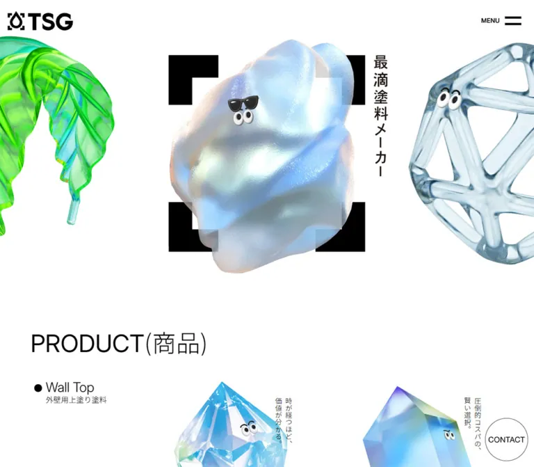
透明感のある3DCGキャラクターと縦書きコピーが印象的な塗料メーカーの公式サイト。白・黒・青みのあるグレーの背景、大きな余白、細い欧文見出し、巨大なロゴで商品情報を整理しています。
オリジナルサイトを見るTSG — Style Reference
Glossy material characters in a precise, spacious industrial catalog.
Website: TSG Original URL: https://www.tsg-jpn.co.jp/ Final URL: https://www.tsg-jpn.co.jp/ Theme: white primary canvas, black roof-coating and footer sections, and a blue-gray intermediate-coating section. Inspected: September 12, 2026, at 05:53 JST. Supplied retrieval timestamp: September 11, 2026, at 20:53:23.111 UTC. Viewports: desktop 1440 × 1000 CSS pixels; mobile 390 × 844 CSS pixels. Scope: the current corporate homepage and its product catalog. Visual evidence covers the desktop opening, a primer-product row, the desktop footer, the mobile opening, and the mobile footer. Rendered DOM and computed-style evidence also cover the other product categories, document-download block, company introduction, and contact section. Linked pages and an opened menu were not inspected.
TSG gives coating materials a cast of personalities. Translucent geometric bodies, reflective surfaces, flexible ribbons, and rounded forms carry small cartoon eyes. Their dimensional, colorful rendering contrasts with a largely monochrome interface: a bold logo, heavy registration-style corners, thin arrows, light English headings, and compact Japanese specifications.
The homepage supports product discovery across thirteen coatings, grouped by application, followed by specifications, company information, and inquiries. Large illustrations introduce each product; restrained bilingual text supplies its name and purpose. On desktop, a broad left rail separates category navigation from two product columns. Mobile changes the catalog to one column and arranges footer categories in two columns. The unusually large header identity and oversized closing wordmark keep the corporate brand present throughout this long page.
How to Read This Reference
- Measured means a value appears in the supplied computed styles or element rectangles. Measurements are reported at the two inspected widths, not asserted as universal CSS rules.
- Calculated means a value is derived from those measurements, such as a column gap or a composited color.
- Estimated means a visual approximation from the supplied screenshots. Image colors, decorative strokes, and unsampled text sizes belong here.
- Recommended means an implementation choice for a new build. Breakpoints, accessibility additions, and the Quick Start are recommendations unless explicitly identified otherwise.
- All token names below are descriptive aliases. The supplied custom-property extraction was empty.
- Rectangles can include transforms and scroll offsets. The mobile main rectangle begins at approximately
y: -179.39px; its vertical positions must not be treated as unscrolled document coordinates. - The screenshots determine visible appearance. A navigation subtree appearing in extracted text does not prove that it was visible or open.
Tokens — Colors
Default Palette
| Name | Value | Suggested token | Evidence and role |
|---|---|---|---|
| Canvas White | #ffffff |
--color-canvas |
Measured body, wall-coating, and primer backgrounds; reversed text in black sections |
| Structural Black | #000000 |
--color-ink |
Measured primary text, roof-coating background, and footer background; visually used by the logo and framing corners |
| Coating Blue Gray | #bec8ce |
--color-coating-panel |
Measured rgb(190, 200, 206) background of the Browncoat section at both widths |
| Navigation Overlay | rgb(215 215 215 / 50%) |
--color-index-overlay |
Measured background of desktop category-index links |
| Navigation on White | #ebebeb |
--color-index-flat |
Calculated result of the navigation overlay over white: each channel is (215 + 255) / 2 = 235 |
| Secondary Gray | approximately #808080 |
--color-muted-estimate |
Visual estimate for subdued text in the captures; not a verified global source token |
White, black, and blue gray organize whole sections. They are not selectable themes in the supplied evidence. The roof category reverses both its background and product-link text; the intermediate-coating category uses dark text on blue gray.
The opening PRODUCT(商品) heading appears gray in its screenshot, while its computed color is black. Its effective opacity and ancestor effects were not supplied. Treat the visible gray as a captured appearance, not proof that the source heading has a permanent gray color declaration.
Artwork Color Family
These are descriptive visual estimates, not sampled asset colors or interface tokens.
| Family | Approximate reference | Visible use |
|---|---|---|
| Glass cyan | #a8ddeb |
Transparent cage and crystal highlights |
| Iridescent violet | #9b97df |
Crystal edges and the lower flexible ribbon |
| Pale metallic gold | #dfc58d |
Upper flexible ribbon and reflective highlights |
| Saturated teal | #0099ad |
Rounded character in the rust-guard illustration |
| Warm orange | #f3a05c |
Companion character in the rust-guard illustration |
Keep these colors inside the imagery. The observed interface does not assign a bright accent fill to every link, product family, or contact action.
Tokens — Typography
English Display and Navigation
- Measured family:
Inter, sans-serifon the main product heading, About heading, contact heading, major sitemap links, and several utility links. - Measured weights: mostly
300; the main product heading uses400. - Character: open, light, and economical. English product names are visually large but do not compete with the illustrations through heavy weight.
- Implementation alias:
--font-display: Inter, sans-serif.
The product-title descendants were not included in the computed-style sample. Their thin sans-serif appearance is visible, but their exact family and weight are not independently measured. Using Inter for them is a consistent implementation recommendation.
Japanese Text and Specifications
- Measured body family:
'Noto Sans CJK JP', sans-serif. - Body:
16px, weight400, line height28px, letter spacing0.16pxat both viewports. - Longer company and contact copy: smaller on mobile than desktop, with approximately
1.75line height. - Role: calm product explanation, series names, application categories, and company information.
These computed stacks establish CSS family declarations, not the origin of font files or the font used for every fallback glyph. The HTML root reports Times at 10px, but the body overrides its family; this is not evidence for a visible serif design.
Type Scale
All values in the following table are measured unless marked as estimates. Size and line height are in CSS pixels.
| Role | Desktop size / line height | Mobile size / line height | Weight and notes |
|---|---|---|---|
| Base body | 16 / 28 |
16 / 28 |
400; Japanese body stack |
| Main product heading | 64.8 / 64.8 |
39 / 39 |
Inter 400; mobile text occupies two lines |
| About heading | 61.632 / 107.856 |
45.708 / 79.989 |
Inter 300 |
| Contact section heading | 51.408 / 51.408 |
45.708 / 45.708 |
Inter 300 |
| Sitemap HOME / PRODUCTS headings | 46.224 / 80.892 |
32.448 / 56.784 |
Inter 300 |
| About Read More link | 36 / 54 |
26.403 / 39.605 |
Inter 300 |
| Major footer links | 30.816 / 53.928 |
28.938 / 50.642 |
Inter 300; ABOUT TSG, DOCUMENTS, CONTACT |
| About and contact paragraphs | 17.424 / 30.492 |
12.714 / 22.250 |
Japanese stack, 400 |
| Privacy link | 17.28 / 30.24 |
13.65 / 23.888 |
Inter 300 |
| Footer product links | 15.408 / 26.964 |
12.168 / 21.294 |
Japanese stack, 400 |
| Desktop category index | 14.4 / 25.2 |
Not present in extracted mobile links | Inter declaration, 300; Japanese fallback may supply glyphs |
| Product English names | Approximately 34–36px |
Not visually measured | Desktop screenshot estimate; child styles unavailable |
| Product Japanese names | Approximately 26–28px |
Not visually measured | Desktop screenshot estimate |
| Product benefit statements | Approximately 18–20px |
Not visually measured in the catalog | Desktop estimate; upright vertical Japanese |
| Product specifications | Approximately 12–13px |
Not visually measured | Desktop estimate |
| Hero slogan | Approximately 36–38px |
Approximately 18px |
Screenshot estimates |
The sampled category H3 wrappers use 16px / 28px, weight 700, but their child display spans were not sampled. Do not use the wrapper value to claim that all visible category lettering is 16px.
Tracking and Language Hierarchy
The default measured tracking is 0.16px. Footer product links use tighter tracking: -0.7704px on desktop and -0.6084px on mobile, both equivalent to -0.05em. The HOME link similarly uses -0.05em.
Product names combine a large uppercase English title with a Japanese name beneath it. Series names sit above this pair; technical details sit below. Vertical Japanese benefits sit beside the artwork rather than being mixed into the horizontal specification block. Preserve that separation of reading directions.
Tokens — Spacing & Shapes
Spacing Scale
The source root is 10px at both measured widths. The following aliases use explicit pixel values or clearly labeled responsive approximations, rather than assuming a standard source rem.
| Use | Desktop measurement | Mobile measurement | Interpretation |
|---|---|---|---|
| Header padding | 20.448px |
18.798px |
Header inset stays visually similar across widths |
| Main horizontal gutter | 82.219px |
22.266px |
Approximately 5.71vw at both widths, calculated |
| Footer directory left inset | 102.813px |
27.844px |
Approximately 7.14vw, calculated |
| Standard product-section top padding | 97.625px |
28px |
First category has its own top spacing |
| Standard product-section bottom padding | 97.625px |
42px |
Mobile spacing is materially tighter |
| First category top padding | 54.72px |
58.5px |
Measured exception to the standard section rule |
| Product-column gap | 74.016px |
Single column | Calculated from product rectangles |
| Gap between desktop product rows | 102.813px |
No equivalent external gap in sampled anchor rectangles | Internal product spacing remains significant |
| Desktop index vertical padding | 12.96px per link |
Not measured | Produces approximately 51px-high rows |
| Desktop index left padding | 20.16px |
Not measured | Creates a compact text inset |
| Document section vertical padding | 133.632px |
75px |
Broad breathing room around a central link |
| Contact section vertical padding | 126.719px |
62.4px |
Large full-width contact region |
| About section bottom padding | 236.448px |
319.8px |
Measured reserved space; its full visual contents are not shown |
The large bottom padding in About must not be explained as an illustration or animation reserve without additional evidence. Its geometry is measured; its visual purpose is unverified.
Border Radius
| Element | Appearance | Evidence |
|---|---|---|
| Product entries | Unboxed, without visible rounded containers | Desktop screenshot and transparent product-anchor backgrounds |
| Main sections | Square, full-width bands | Computed section radius 0px |
| Category-index group | Approximately 24–26px outer radius |
Screenshot estimate; sampled individual links have 0px radius |
| Floating contact | Circular | Visible in desktop and mobile opening captures |
| Hero frame | Square corners with very thick L-shaped marks | Screenshot evidence |
| Arrows and separators | Fine, square-ended linework | Screenshot evidence; exact strokes not supplied |
Layout Measurements
| Element | Desktop | Mobile | Evidence qualification |
|---|---|---|---|
| Reported document height | 8958px |
10315px |
Supplied rounded document-height values |
| Header box | 1440 × 112.875px |
390 × 96.094px |
Measured |
| Initial logo wrapper | 175.813 × 51.703px |
180.25 × 53.016px |
Measured; near-identical physical size |
| Logo in scrolled captures | Approximately 125px wide |
Approximately 126px wide |
Visual estimates |
| Hero section height | 745.219px |
1038px |
Measured; mobile exceeds one viewport |
| Hero product-link rectangle | 663 × 663px |
Approximately 372.3 × 372.3px |
Measured rendered bounds |
| Hero corner-frame square | Approximately 530px |
Approximately 312px |
Visual estimates |
| Main content width | 1275.563px |
345.469px |
Measured |
| Desktop category rail | 330.359px wide |
Category heading spans content width | Measured heading boxes |
| Product anchor width | 435.594px |
349.969px |
Mobile bounds include an unexplained negative horizontal offset |
| Typical product anchor height | 615.094px |
492.313px |
Longer names create taller entries |
| Category index | 181px wide; approximately 255.547px for five rows |
Not shown | Width and row heights measured; group height calculated |
| Contact circle | Approximately 115–116px diameter |
Approximately 78px diameter |
Silhouette estimated; link widths corroborate it |
| Closing wordmark | Approximately 1276px wide |
Approximately 346px wide |
Screenshot estimates; preserves logo proportions |
The contact anchors have measured inline heights of 24px; those are not the circular control heights. Use the visible circle and link width to understand this component.
Components
Persistent Header
Role: identity and access to the site menu.
Place the TSG mark at the upper left and a compact MENU label with two thick horizontal bars at the upper right. The header is visually transparent, without a boxed navigation surface or bottom border. In the desktop opening, the logo starts around x: 20.44px; on mobile, around x: 18.80px.
The initial mark remains about 176–180px wide even though the viewport becomes much narrower. Scrolled catalog and footer captures show a smaller mark. The logo wrapper has a measured width 0.5s transition, but the exact scroll threshold and state logic are unverified.
The black footer capture shows white header artwork and menu bars. Preserve an inverse identity state over black regions. The evidence does not establish whether this is implemented through asset swapping, CSS filters, blending, or another mechanism.
Menu Control
Role: exposes global navigation.
The observed closed control consists of MENU plus two bars, without an enclosing button shape. The bars are approximately 43px wide on desktop and 35px on mobile. The label is visually smaller on mobile.
The extracted DOM includes a repeated navigation tree before the main content, but no opened-menu screenshot or click result was supplied. Its opening direction, overlay surface, scroll behavior, and focus handling are not verified. Do not present the footer screenshot as evidence of an opened menu.
Product Sculpture Hero
Role: introduces the material characters and links them to products.
The desktop composition places three large visible objects across an overflowing horizontal field. A transparent cage-like character occupies the center; neighboring forms are deliberately cropped at the left and right edges. Four oversized black L-shaped corners sit behind the central object. The Japanese slogan 最滴塗料メーカー runs vertically beside the frame.
The measured hero contains repeated square product links with a 663px side at desktop. Visible positions associate the central cage with the weak-solvent roof product and the adjacent crystal with SILICON PREMIUM. The repeated link groups are consistent with a repeating showcase, but do not independently establish autoplay speed or interaction mechanics.
Mobile uses a different arrangement: the faceted crystal occupies the center, a cage form enters from the lower left, and another crystal is cropped at the upper right. Rendered product rectangles are about 372px square within a 390px viewport. Preserve the large object scale and diagonal relationship rather than shrinking the desktop strip uniformly.
Hero Corner Frame
Role: anchors the flowing material imagery to the graphic identity.
The frame is four separate, heavy right-angle marks. The desktop square is approximately 530px across; the mobile square approximately 312px. The image overlaps the marks, making the sculpture feel physically in front of a flat identity device.
Recommended construction: make each corner span one quarter of the frame side, with strokes approximately one eighth of that side. These proportions reproduce the visible relationship without assuming an original SVG or CSS implementation. Mark this decorative geometry as hidden from assistive technology.
Floating Contact Circle
Role: persistent access to inquiries while browsing.
A fine outline circle contains the uppercase CONTACT label, without a bright fill or shadow. It sits near the lower-right viewport edge: about 16px from the desktop right and bottom edges, and about 18px on mobile. Its observed destination is /contact/.
The circle is visible in opening captures and the desktop product capture. It is absent from the supplied footer captures. The exact hide or overlap rule was not recorded; a new implementation should explicitly coordinate it with the footer contact area.
Product Section Heading and Category Rail
Role: separates application categories from individual products.
The large product heading introduces four groups in this order:
- Wall Top —
外壁用上塗り塗料: four products on white. - Roof Top —
屋根用上塗り塗料: two products on black. - Primer —
下塗り塗料: six products on white. - Browncoat —
中塗り塗料: one product on blue gray.
Desktop category-heading boxes occupy a 330px left rail. Products start at approximately x: 412.58px, then x: 922.19px. On mobile, category headings precede the single sequence of products.
Desktop Category Index
Role: shortcuts through the long catalog and to specifications.
A compact pale-gray group appears at the lower left in the desktop primer capture. It contains four application links and a final 仕様書DL row. Fine separators organize the rows; the download row has a darker upper rule and a small download symbol.
The current primer entry carries a right-pointing arrow before its label. The others remain plain text. Each measured row is approximately 181 × 51.11px, with 14.4px type and a 25.2px line height.
The observed anchor targets are #walltop, #rooftop, #primer, and #browncoat; the final row links to /documents/. Its exact sticky boundaries and active-section detection were not supplied. These index links are absent from the extracted mobile link list.
Product Entry
Role: combines material identity, a performance benefit, and a route to product details.
The entire entry is represented by a product link. Its visual anatomy is:
- A large isolated character illustration on the section background.
- A short Japanese benefit in vertical columns beside the illustration.
- A small Japanese series label.
- A large uppercase English product name.
- A Japanese product name directly beneath it.
- One or two compact technical lines.
- A fine right arrow aligned toward the lower-right edge.
There is no enclosing card fill, border, radius, or shadow in the supplied product screenshot. Space and image silhouette define the entry. Desktop entries are about 435.6px wide, with a 74px column gap and roughly 103px between rows.
The FILLER SELECT illustration uses two wavy, reflective ribbons with small eyes, echoing the adjacent flexibility benefit. RUST GUARD SELECT pairs orange and teal rounded characters with metallic spiky forms. These are explanatory material metaphors, not interchangeable decorative mascots.
Allow long English names to break into deliberate lines. Do not shrink every name until it fits a single line or impose one fixed card height on all content.
Documents Download Block
Role: routes visitors to product specifications.
The measured section is approximately 377.84px tall on desktop and 211.61px on mobile. Its central link is about 800.2px wide on desktop and 348.34px on mobile, containing DOCUMENTS Download and 仕様書ダウンロード.
This block is supported by DOM measurements rather than a supplied screenshot. Its width, spacing, text, and destination are known; additional decoration or an exact arrow treatment should not be invented.
About TSG Block
Role: explains the company's approach after the product catalog.
A light Inter heading introduces two short Japanese paragraphs about beauty, budget, life plans, and selecting appropriate coatings. A large Read More link follows. Desktop text shares the main 82.22px gutter; mobile uses approximately 22.27px.
The heading measures 61.632px on desktop and 45.708px on mobile. The paragraphs use approximately 17.424px and 12.714px, respectively. The link points to /about-tsg/.
The supplied evidence establishes the content and geometry, but does not visually establish every element occupying this section's large lower space.
Contact Section
Role: introduces product, company, and OEM inquiries before the directory.
A full-width link begins the black footer. Desktop places CONTACT US at the left and explanatory Japanese copy to its right. The mobile DOM shows the heading above the paragraph, both spanning the available content width.
The section measures approximately 316.41px tall on desktop and 232.58px on mobile. Its heading remains unusually prominent on mobile at 45.708px. The background and text are measured black and white.
Footer Directory and Closing Wordmark
Role: provides detailed navigation and ends with a strong brand signature.
The desktop directory gives most of its width to product categories, with company-level links and operator details in a right-hand column. Category headings have fine rules beneath them; subdued series labels sit above product links with thin arrows. Primer subcategories occupy four columns across the lower product area.
On mobile, the primer subcategories form two columns. ABOUT TSG, DOCUMENTS, and CONTACT then stack as large, lightly weighted links. Privacy, company information, and copyright follow at a much smaller scale.
The footer explicitly names 株式会社TSG and gives its Nagoya address. The visible copyright reads © 2024 TSG Co., Ltd.; this is footer content, not evidence of the inspection year or a redesign date.
An enormous white TSG mark fills nearly the entire content width below the directory. Its heavy letterforms and droplet symbol provide a deliberate counterweight to the thin navigation typography. Use an authorized logo asset and preserve its aspect ratio; typing TSG in a generic bold font does not reproduce this component.
Tokens — Motion & Interaction
| Treatment | Supplied evidence | What can safely be carried forward |
|---|---|---|
| Header visibility | opacity 0.5s transition |
A half-second opacity transition exists; trigger and easing were not supplied |
| Main and footer visibility | opacity 0.5s transitions |
Same timing is declared on these sampled regions |
| Logo resizing | width 0.5s on the H1 wrapper |
Width transition is measured; captures also show large and smaller logo states |
| Opening section visibility | opacity 0.3s |
A shorter opacity transition is declared |
| Sitemap links | opacity 0.3s |
Supports restrained opacity feedback; exact start and end values are unknown |
| Desktop category links | background-color 0.3s |
Background-color transition is measured; hover and active colors are not supplied |
| Product navigation | Product URLs in rendered anchors | Entries lead to individual product routes; destination-page appearance was not inspected |
| Category navigation | Four fragment URLs | In-page navigation exists; smooth scrolling and scroll-spy mechanics are unverified |
| Repeated hero | Multiple copies of product links and different responsive positions | A repeating showcase structure is supported; speed, direction, drag behavior, and autoplay are unverified |
| Menu opening | Closed control and navigation text only | No opening animation or overlay appearance can be specified as observed |
Sampled nodes report animation: none. That does not exclude JavaScript motion, child animations, pseudo-elements, or media animation. Several transitions serialize simply as all; no useful duration should be inferred from that alone.
The capture process waited for finite motion and layout stability, and temporarily paused perpetual animations during readiness checks before resuming them. The images remain snapshots, not a temporal recording. Do not infer object rotation, pointer tracking, scroll-linked physics, or a specific animation library.
Recommended adaptation: keep utility feedback short and restrained. If a moving hero is added, keep all products reachable without motion, provide reduced-motion behavior, and establish its timing through a separate implementation decision.
Surfaces
| Surface | Appearance | Function |
|---|---|---|
| Primary canvas | Solid white | Hero, wall coatings, primer, documents, and company introduction |
| Inverse product band | Solid black with white text | Roof coatings |
| Material panel | Solid #bec8ce with black text |
Intermediate coating |
| Category index | Translucent gray over the current surface | Compact catalog shortcuts |
| Product entry | Transparent against its section | Lets character silhouette and spacing define the unit |
| Floating contact | Thin circular outline | Persistent inquiry access |
| Footer | Solid black, white identity, fine rules | Contact, directory, company details, and closing mark |
There is no general UI elevation system in the supplied captures. The depth belongs to the rendered objects; the interface remains flat.
Imagery
The imagery translates coating properties into tactile forms. Transparent glass-like scaffolds suggest engineered material; faceted crystals create sharp refraction and colored edges; flexible waves imply movement; rounded bodies soften technical subject matter. Small eyes and eyebrows make these material studies approachable without adding large facial features or extensive character anatomy.
The rendering includes smooth refraction, metallic reflection, rough pearlescent texture, pastel highlights, and saturated local colors. Keep surface variation specific to the product. Applying the same shiny glass shader to every illustration would erase much of the catalog's explanatory character.
Hero objects are intentionally cropped and layered over the graphic frame. Catalog objects have more breathing room and remain readable beside their vertical benefit statements. The surrounding field appears continuous with the page rather than contained in rectangular image tiles. Actual file formats, alpha channels, and rendering technology were not supplied.
Observed Asset References
The evidence did not include image src values or asset filenames. The URLs below are associated navigation destinations, not image download URLs.
| Visible asset | Associated evidence | Implementation note |
|---|---|---|
| TSG header and closing marks | Homepage captures | Use approved black and white logo artwork; asset format unknown |
| Transparent cage hero character | Product link at the sampled central desktop position: /weak-solvent-roof-top/ |
Preserve the hollow geometry and refraction |
| Faceted crystal character | Central mobile link: /silicon-premium/ |
Preserve its large scale, colored facets, and small eyes |
| Flexible ribbon pair | FILLER SELECT entry, /filler-select/ |
Keep the wave profile and contrasting reflective materials |
| Orange and teal character pair | RUST GUARD SELECT entry, /rust-guard-select/ |
Retain the relationship to metallic spiky forms |
| Fine arrows and download symbol | Desktop product/index capture and footer captures | Simple line geometry; original asset source unknown |
No photographic content is visible in the supplied captures. This does not establish that photography is absent from every unscreened region or linked page.
Layout & Responsive Behavior
Desktop Structure
At 1440px, main content has approximately 82.22px gutters and a 1275.56px inner width. The category rail takes about 25.9% of that inner width. The remaining area holds two 435.59px product columns separated by 74.02px.
The hero occupies approximately 745px before a 144px gap to the product heading. The first viewport therefore shows the sculpture field and the start of the catalog heading, while product entries begin lower down. The catalog alternates section backgrounds by application, not by individual card.
The footer uses a broader information grid, then a nearly full-width logo. Its typography becomes denser while its overall composition remains spacious.
Mobile Structure
At 390px, the main gutter remains approximately 5.71% of viewport width. The initial header logo is slightly wider than its measured desktop counterpart, while the contact circle becomes smaller.
The hero stage measures 1038px tall, exceeding the 844px viewport. The mobile snapshot was recorded with the main rectangle shifted upward by about 179.39px. This explains why the displayed hero composition must not be interpreted as a simple 844px-tall section at scroll zero.
The product heading breaks PRODUCT and (商品) onto separate lines. The DOM confirms a single product column: all product rectangles share the same horizontal position and progress vertically. The desktop category index is absent from the extracted mobile links. No mobile catalog screenshot was supplied, so exact artwork-to-copy placement within those entries remains less certain than the desktop anatomy.
The mobile product-anchor rectangles begin around x: -11.10px and measure 349.97px wide, whereas section content starts around x: 22.27px and is 345.47px wide. The supplied data does not establish the reason. Do not reproduce negative anchor positions indiscriminately; validate the intended visual crop and keep essential text and focus indicators reachable.
The contact heading and explanation stack vertically. Footer taxonomy retains two columns, while major company links and operator information stack below it. The closing mark spans almost the full phone width.
Breakpoint Guidance
Only 1440px and 390px were inspected. Exact source media-query thresholds and interpolation formulas are unknown.
Recommended: start with a catalog breakpoint around 900px, then verify long product names and Japanese copy at intermediate widths. Collapse the left rail and product grid together, remove the floating desktop index, and preserve the large image scale. The Quick Start uses this recommendation; it does not claim to reproduce the original media queries.
Do’s and Don’ts
Do
- Preserve the white, black, and blue-gray section sequence.
- Let material characters supply color and depth while keeping interface surfaces flat.
- Retain the heavy droplet logo and four-corner framing device.
- Keep the initial mobile logo physically large.
- Use light English display typography and compact Japanese explanations.
- Keep product benefits vertical beside desktop artwork, with horizontal names and specifications below.
- Preserve whole-entry product links and fine directional arrows.
- Maintain thirteen products in four application groups when reproducing this page's information architecture.
- Use two product columns on desktop and a single sequence on mobile.
- Finish with a large inverse directory and an oversized, correctly proportioned wordmark.
Don’t
- Do not replace the material characters with generic paint cans, buildings, or stock business photography.
- Do not put every product into a rounded, elevated card.
- Do not convert the glossy object materials into translucent interface panels.
- Do not add brightly filled category badges or an unrelated CTA color.
- Do not set every heading in a heavy weight simply because the logo is bold.
- Do not rotate a horizontal Japanese paragraph as a substitute for proper vertical typesetting.
- Do not assume that different hero objects across captures prove a particular animation sequence.
- Do not fabricate an opened menu from the extracted navigation text.
- Do not copy the anomalous mobile anchor offsets as a required layout rule.
- Do not treat the black and blue-gray bands as a user-selectable theme system.
Recommended Implementation Additions
These are recommendations for a new implementation, not verified features of the original page.
- Give the menu control a semantic button, an accessible name, and an accurate expanded state. If it opens an overlay, implement focus management, Escape handling, and focus restoration.
- Check accessible names on image-only hero links. Empty extracted link text does not establish that an accessible name is absent, but it warrants verification.
- Use ordinary anchors for products, category destinations, documents, and contact routes. Keep duplicate showcase items out of keyboard navigation when they are purely presentational copies.
- Provide visible focus indicators on both white and black surfaces. Intentional image overflow must not clip keyboard focus.
- Raise very small mobile explanatory text where needed. The Quick Start uses a 14px minimum for product specifications and company paragraphs instead of reproducing every smaller source value.
- Keep vertical benefit text in a logical reading order with
lang='ja'. Reserve space so it does not cover product names. - Add a reduced-motion mode and a static hero fallback. Any optional motion should leave product navigation usable.
- Reserve image dimensions or aspect ratios, prioritize the visible hero asset, and defer below-fold imagery. The original loading implementation is unknown.
- Coordinate header contrast and floating controls with dark sections and the footer. Prefer explicit state handling with tested contrast over an assumed blend-mode solution.
- Preserve mobile access to every category even when the desktop index is hidden.
Agent Prompt Guide
Quick Color Reference
- Main page and product fields:
#ffffff. - Text, logo, hero corners, and arrows:
#000000. - Roof category and footer:
#000000with white content. - Intermediate-coating category:
#bec8cewith black content. - Desktop index over white: approximately
#ebebeb. - Cyan, violet, teal, gold, and orange belong primarily to the material illustrations.
Overall Prompt
“Create a corporate coating-manufacturer homepage inspired by TSG's current product catalog. Use a white canvas, a bold droplet wordmark, four heavy black registration corners, and oversized material characters with small expressive eyes. The hero contains glass-like and iridescent forms that extend beyond the viewport; mobile recomposes them diagonally around one dominant object. Use light Inter-style English headings with Japanese sans-serif details. Organize products into a left category rail and two unboxed columns on desktop, then one column on mobile. Each entry combines a large isolated illustration, a vertical Japanese benefit, a series label, bilingual product names, short specifications, and a fine arrow. Alternate white, black, white, and blue-gray category sections. Include a restrained outlined contact circle and finish with a black directory and a very large white logo. Treat menu behavior and hero motion as separate implementation decisions.”
Example Component Prompts
- Hero: “Compose a transparent geometric character in front of four thick black L-shaped corners on white. Crop neighboring characters at the viewport edges. Place
最滴塗料メーカーvertically beside the frame. Keep the top-left logo large and the MENU control small. Use authorized artwork; do not infer an animation engine.” - Product entry: “Create an unboxed coating-product entry approximately 436px wide on desktop. Place a reflective flexible-ribbon character above a small series label, a light uppercase FILLER SELECT title, its Japanese name, and two compact specification lines. Position the Japanese flexibility benefit vertically beside the artwork. Add one fine right arrow at the lower right.”
- Category index: “Create a 181px-wide pale-gray navigation group with five approximately 51px rows, softly rounded outer corners, fine separators, and compact Japanese labels. Precede the current category with a thin arrow. Separate the final document-download row with a darker rule. This is desktop navigation.”
- Footer: “Build a black corporate directory with white links, subdued series labels, fine category rules, and small directional arrows. Use four product subcategory columns on desktop and two on mobile. Stack large light-weight company links below the taxonomy on mobile, then company details and a nearly full-width white brand mark.”
- Responsive adaptation: “At phone width, preserve an approximately 180px header logo and a 78px outlined contact circle. Recompose the hero rather than shrinking its desktop strip. Stack catalog entries, retain two footer taxonomy columns, and keep explanatory text readable. Treat negative sampled link coordinates as an inspection caveat, not a requirement.”
Quick Start
CSS Custom Properties
This is a reusable adaptation, not recovered source CSS. Desktop dimensions and mobile endpoints follow the supplied measurements where practical. The 900px breakpoint, fluid formulas, focus styling, state hooks, and minimum reading sizes are recommendations. The mobile hero retains the measured stage height at 390px without forcing the capture's scroll offset.
Load available, properly licensed fonts separately. Provide authorized logo and product assets; their original filenames were not supplied. The header state hooks, category-index visibility, menu behavior, and optional hero motion require application logic.
:root {
  /* Measured structural colors */
  --color-canvas: #fff;
  --color-ink: #000;
  --color-coating-panel: #bec8ce;
  --color-index-overlay: rgb(215 215 215 / 50%);
  --color-index-flat: #ebebeb;

  /* Source-declared stacks; font files are supplied separately */
  --font-display: Inter, sans-serif;
  --font-body: 'Noto Sans CJK JP', sans-serif;
  --tracking-default: 0.16px;

  /* Recommended fluid adaptation of measured endpoints */
  --page-gutter: 5.71vw;
  --text-section: clamp(39px, 4.5vw, 64.8px);
  --text-about: clamp(45.708px, 4.28vw, 61.632px);
  --text-contact: clamp(45.708px, 3.57vw, 51.408px);
  --text-product: clamp(26px, 2.5vw, 36px);
  --text-product-jp: clamp(20px, 1.944vw, 28px);
  --text-copy: clamp(14px, 1.21vw, 17.424px);
  --text-footer: clamp(12.168px, 1.07vw, 15.408px);
  --section-space: 6.78vw;
  --product-column-gap: 5.14vw;
  --product-row-gap: 7.14vw;

  /* Measured durations; easing is an adaptation choice */
  --motion-short: 300ms ease;
  --motion-shell: 500ms ease;
}

* { box-sizing: border-box; }

body {
  margin: 0;
  color: var(--color-ink);
  background: var(--color-canvas);
  font-family: var(--font-body);
  font-size: 16px;
  line-height: 1.75;
  letter-spacing: var(--tracking-default);
}

img { max-inline-size: 100%; }
a { color: inherit; }
button { font: inherit; }

:where(a, button):focus-visible {
  outline: 2px solid currentColor;
  outline-offset: 5px;
}

.tsg-header {
  position: fixed;
  inset: 0 0 auto;
  z-index: 50;
  display: flex;
  justify-content: space-between;
  align-items: center;
  min-block-size: 112.875px;
  padding: 20.448px;
  color: #000;
  transition: opacity var(--motion-shell);
}

.tsg-brand {
  display: block;
  inline-size: 175.813px;
  transition: width var(--motion-shell);
}

.tsg-brand img { display: block; inline-size: 100%; }
.tsg-header.is-compact .tsg-brand { inline-size: 126px; }
.tsg-header[data-tone='inverse'] { color: #fff; }

/* Use this only with an approved black monochrome logo asset. */
.tsg-header[data-tone='inverse'] .tsg-brand img {
  filter: invert(1);
}

.menu-trigger {
  display: inline-flex;
  align-items: center;
  gap: 15px;
  min-block-size: 44px;
  padding: 0 14px;
  border: 0;
  color: inherit;
  background: transparent;
  cursor: pointer;
}

.menu-bars {
  display: grid;
  gap: 11px;
  inline-size: 43px;
}

.menu-bars::before,
.menu-bars::after {
  content: '';
  block-size: 6px;
  background: currentColor;
}

.contact-orbit {
  position: fixed;
  inset-inline-end: max(16px, env(safe-area-inset-right, 0px));
  inset-block-end: max(16px, env(safe-area-inset-bottom, 0px));
  z-index: 40;
  display: grid;
  place-items: center;
  inline-size: 115.2px;
  aspect-ratio: 1;
  border: 1px solid currentColor;
  border-radius: 50%;
  background: #fff;
  color: #000;
  font-family: var(--font-display);
  font-size: 21px;
  text-decoration: none;
}

/* Application logic hides the orbit when the footer contact takes over. */
.contact-orbit[hidden] { display: none; }

.hero {
  --hero-object: 46.0417vw;
  --hero-frame: calc(var(--hero-object) * 0.8);
  --hero-center: calc(var(--page-gutter) + var(--hero-object) / 2);
  position: relative;
  isolation: isolate;
  block-size: calc(var(--page-gutter) + var(--hero-object));
  overflow: clip;
}

.hero__figure {
  position: absolute;
  inset-inline-start: 50%;
  inset-block-start: var(--hero-center);
  z-index: 2;
  inline-size: var(--hero-object);
  aspect-ratio: 1;
  transform: translate(-50%, -50%);
}

.hero__figure img {
  display: block;
  inline-size: 100%;
  block-size: 100%;
  object-fit: contain;
}

.hero__figure--previous {
  inset-inline-start: calc(50% - var(--hero-object));
}

.hero__figure--next {
  inset-inline-start: calc(50% + var(--hero-object));
}

.hero__frame {
  --frame-stroke: calc(var(--hero-frame) * 0.125);
  position: absolute;
  inset-inline-start: 50%;
  inset-block-start: var(--hero-center);
  inline-size: var(--hero-frame);
  aspect-ratio: 1;
  transform: translate(-50%, -50%);
  pointer-events: none;
}

.hero__corner {
  position: absolute;
  inline-size: 25%;
  block-size: 25%;
  border: 0 solid currentColor;
}

.hero__corner--tl {
  top: 0; left: 0;
  border-top-width: var(--frame-stroke);
  border-left-width: var(--frame-stroke);
}

.hero__corner--tr {
  top: 0; right: 0;
  border-top-width: var(--frame-stroke);
  border-right-width: var(--frame-stroke);
}

.hero__corner--bl {
  bottom: 0; left: 0;
  border-bottom-width: var(--frame-stroke);
  border-left-width: var(--frame-stroke);
}

.hero__corner--br {
  bottom: 0; right: 0;
  border-bottom-width: var(--frame-stroke);
  border-right-width: var(--frame-stroke);
}

.hero__tagline {
  position: absolute;
  z-index: 3;
  left: calc(50% + var(--hero-frame) / 2 + 1.6vw);
  top: calc(var(--hero-center) - var(--hero-frame) / 2);
  margin: 0;
  writing-mode: vertical-rl;
  text-orientation: upright;
  font-size: clamp(18px, 2.65vw, 38px);
  line-height: 1.25;
}

.catalog-title {
  margin: 10vw var(--page-gutter) 0;
  font-family: var(--font-display);
  font-size: var(--text-section);
  font-weight: 400;
  line-height: 1;
}

.catalog-section {
  display: grid;
  grid-template-columns: 25.9% minmax(0, 1fr);
  padding: var(--section-space) var(--page-gutter);
  scroll-margin-top: 115px;
}

.catalog-section--wall { padding-block-start: 3.8vw; }
.catalog-section--roof { background: #000; color: #fff; }
.catalog-section--browncoat { background: var(--color-coating-panel); }

.category-heading { margin: 0; }
.category-heading__en {
  display: block;
  font-family: var(--font-display);
  font-size: clamp(32px, 3.2vw, 46px);
  font-weight: 300;
  line-height: 1.2;
}
.category-heading__jp { display: block; margin-block-start: 8px; }

.product-grid {
  display: grid;
  grid-template-columns: repeat(2, minmax(0, 1fr));
  column-gap: var(--product-column-gap);
  row-gap: var(--product-row-gap);
}

.product-card {
  display: block;
  min-inline-size: 0;
  text-decoration: none;
}

.product-card__media {
  position: relative;
  aspect-ratio: 1;
  margin-block-end: 24px;
}

.product-card__media img {
  display: block;
  inline-size: 100%;
  block-size: 100%;
  object-fit: contain;
}

.product-card__benefit {
  position: absolute;
  top: 9%;
  right: 10%;
  margin: 0;
  writing-mode: vertical-rl;
  text-orientation: mixed;
  font-size: clamp(16px, 1.35vw, 19.44px);
  line-height: 1.5;
}

.product-card__series { margin: 0 0 4px; }

.product-card__title {
  margin: 0;
  font-family: var(--font-display);
  font-size: var(--text-product);
  font-weight: 300;
  line-height: 1.05;
  overflow-wrap: anywhere;
}

.product-card__title span {
  display: block;
  margin-block-start: 4px;
  font-family: var(--font-body);
  font-size: var(--text-product-jp);
  font-weight: 400;
  line-height: 1.2;
}

.product-card__details {
  display: flex;
  align-items: center;
  justify-content: space-between;
  gap: 20px;
  margin-block-start: 18px;
  font-size: 14px;
  line-height: 1.75;
}

.product-card__details p { margin: 0; }

.line-arrow {
  position: relative;
  display: inline-block;
  flex: 0 0 36px;
  inline-size: 36px;
  block-size: 24px;
}

.line-arrow::before {
  content: '';
  position: absolute;
  inset: 50% 0 auto;
  border-top: 1px solid currentColor;
}

.line-arrow::after {
  content: '';
  position: absolute;
  top: 50%; right: 1px;
  inline-size: 20px;
  block-size: 20px;
  border-top: 1px solid currentColor;
  border-right: 1px solid currentColor;
  transform: translateY(-50%) rotate(45deg);
}

.catalog-index {
  position: fixed;
  left: var(--page-gutter);
  bottom: 80px;
  z-index: 30;
  inline-size: 181px;
  border-radius: 25px;
  background: var(--color-index-flat);
  color: #000;
}

/* Show only while the catalog is active; this is a recommended state hook. */
.catalog-index[hidden] { display: none; }
.catalog-index a {
  display: block;
  padding: 12.96px 20.16px;
  border-bottom: 1px solid #fff;
  font-size: 14.4px;
  line-height: 25.2px;
  text-decoration: none;
  transition: background-color var(--motion-short);
}
.catalog-index a:last-child { border-bottom: 0; border-top: 1px solid #000; }
.catalog-index a[aria-current='location']::before { content: '→ '; }

.documents-block { padding: 9.28vw var(--page-gutter); }
.documents-link {
  display: block;
  max-inline-size: 800.2px;
  margin-inline: auto;
  padding-block: 18.432px;
  color: inherit;
}

.about-block { padding: 2.85vw var(--page-gutter) 16.42vw; }
.about-block h2 {
  margin: 0;
  font-family: var(--font-display);
  font-size: var(--text-about);
  font-weight: 300;
  line-height: 1.75;
}
.about-block p { font-size: var(--text-copy); line-height: 1.75; }

.site-footer { padding-block-end: 7.14vw; background: #000; color: #fff; }
.footer-contact {
  display: grid;
  grid-template-columns: 1fr 2fr;
  gap: 7.57vw;
  padding: 8.8vw 5.85vw;
  text-decoration: none;
}
.footer-contact h2 {
  margin: 0;
  font-family: var(--font-display);
  font-size: var(--text-contact);
  font-weight: 300;
  line-height: 1;
}
.footer-contact p { margin: 0; font-size: var(--text-copy); }

.footer-directory {
  display: grid;
  grid-template-columns: minmax(0, 3.15fr) minmax(0, 1fr);
  gap: 5.42vw;
  padding-inline: 7.14vw;
}
.footer-taxonomy {
  display: grid;
  grid-template-columns: repeat(4, minmax(0, 1fr));
  gap: 28px;
}
.footer-taxonomy a {
  font-size: var(--text-footer);
  letter-spacing: -0.05em;
  text-decoration: none;
  transition: opacity var(--motion-short);
}
.footer-major-link {
  display: block;
  margin-block-end: 13px;
  font-family: var(--font-display);
  font-size: clamp(28.938px, 2.14vw, 30.816px);
  font-weight: 300;
  text-decoration: none;
}
.footer-brand {
  display: block;
  inline-size: calc(100% - 2 * var(--page-gutter));
  block-size: auto;
  margin: clamp(40px, 13.9vw, 200px) auto 0;
}

/* Recommended interaction values; source endpoints were not supplied. */
@media (hover: hover) {
  .footer-taxonomy a:hover { opacity: 0.65; }
  .catalog-index a:hover { background: rgb(0 0 0 / 6%); }
}

@media (max-width: 900px) {
  .tsg-header { min-block-size: 96.094px; padding: 18.798px; }
  .tsg-brand { inline-size: 180.25px; }
  .menu-trigger { gap: 12px; padding-inline: 0 12px; font-size: 12px; }
  .menu-bars { inline-size: 35px; gap: 8px; }
  .menu-bars::before, .menu-bars::after { block-size: 5px; }

  .contact-orbit {
    inline-size: 78px;
    right: max(18px, env(safe-area-inset-right, 0px));
    bottom: max(18px, env(safe-area-inset-bottom, 0px));
    font-size: 14px;
  }

  .hero {
    --hero-object: 95.4615vw;
    --hero-frame: 80vw;
    --hero-center: 50%;
    block-size: max(100svh, 266.154vw);
  }
  .hero__figure--previous {
    left: calc(50% - 56.154vw);
    top: calc(50% + 67.385vw);
  }
  .hero__figure--next {
    left: calc(50% + 56.154vw);
    top: calc(50% - 67.385vw);
  }
  .hero__tagline { left: auto; right: 3.5vw; top: calc(50% + 18px); font-size: 18px; }

  .catalog-title { margin-block-start: 5vw; }
  .catalog-title span { display: block; }
  .catalog-section { display: block; padding: 28px var(--page-gutter) 42px; }
  .catalog-section--wall { padding-block-start: 58.5px; }
  .category-heading { margin-block-end: 24px; }
  .product-grid { grid-template-columns: minmax(0, 1fr); row-gap: 36px; }
  .product-card__benefit { right: 2%; }
  .catalog-index { display: none; }

  .documents-block { padding-block: 75px; }
  .documents-link { padding-block: 9.75px; }
  .about-block { padding-block: 0 82vw; }
  .footer-contact { grid-template-columns: 1fr; gap: 16px; padding: 62.4px 5.85vw; }
  .footer-directory { grid-template-columns: 1fr; gap: 40px; }
  .footer-taxonomy { grid-template-columns: repeat(2, minmax(0, 1fr)); gap: 28px 16px; }
}

@media (prefers-reduced-motion: reduce) {
  .tsg-header, .tsg-brand, .catalog-index a, .footer-taxonomy a {
    transition: none;
  }
  /* Disable any separately implemented hero motion in application logic. */
}
Product Entry Markup
Replace the clearly marked image placeholder with an authorized asset. The empty image alternative assumes that the adjacent benefit and product text communicate the necessary information; add meaningful alternative text when the image conveys something additional. The exact image padding and benefit placement should be tuned to each silhouette.
<a class='product-card' href='https://www.tsg-jpn.co.jp/filler-select/'>
  <div class='product-card__media'>
    <img src='REPLACE_WITH_AUTHORIZED_ASSET' alt=''>
    <p class='product-card__benefit' lang='ja'>
      外壁の動きに合わせて、<br>フィラーが伸縮。
    </p>
  </div>
  <p class='product-card__series' lang='ja'>滴アンダーシリーズ</p>
  <h4 class='product-card__title'>
    FILLER SELECT
    <span lang='ja'>(フィラーセレクト)</span>
  </h4>
  <div class='product-card__details'>
    <p lang='ja'>可とう形改修塗材E<br>微弾性・目止め効果</p>
    <span class='line-arrow' aria-hidden='true'></span>
  </div>
</a>
For the hero, place three .hero__figure elements around .hero__frame, with four .hero__corner spans inside the frame. Use the previous and next modifiers for neighboring artwork. Keep the frame decorative and give navigable figures meaningful names. This reproduces a static composition; it does not implement or claim the source showcase behavior.
Tailwind v4 Token Mapping
Optional aliases for a project already using Tailwind v4. They do not imply that the original site uses Tailwind. Define the custom properties above first.
@theme inline {
  --color-canvas: #fff;
  --color-ink: #000;
  --color-coating-panel: #bec8ce;
  --color-index-flat: #ebebeb;

  --font-display: Inter, sans-serif;
  --font-body: 'Noto Sans CJK JP', sans-serif;

  --text-catalog: var(--text-section);
  --text-product-name: var(--text-product);
  --text-reading: var(--text-copy);

  --spacing-page: var(--page-gutter);
  --spacing-product-column: var(--product-column-gap);
  --spacing-product-row: var(--product-row-gap);

  --radius-category-index: 25px;
}
Sources & Evidence
- Inspected original and final website: https://www.tsg-jpn.co.jp/. The supplied browser record reports HTTP 200 and the title
TSG 公式サイト | 最滴塗料メーカー; the final URL is unchanged. - Capture date: September 11, 2026, at 20:53:23.111 UTC, equivalent to September 12, 2026, at 05:53:23.111 JST. This reference uses the Japan-local date in its inspection label.
- Desktop visual evidence: three 1440 × 1000 captures showing the opening material showcase, FILLER SELECT and RUST GUARD SELECT within the primer catalog, and the lower black footer.
- Mobile visual evidence: two 390 × 844 captures showing the opening material composition and lower footer.
- Rendered evidence: text, link destinations, element rectangles, computed colors, font declarations, type sizes, spacing, and transition declarations for both widths. These also support the section inventory and the DOM-only descriptions of documents, About, and the upper contact section.
- Navigation evidence: the original page contains product-detail links, four desktop category fragments, and routes to documents, company information, contact, and privacy information. Those linked resources were not independently opened for this reference.
- Interaction limits: no supplied record demonstrates a menu click, hover endpoint, completed download, contact submission, hero dragging, or a timed hero sequence. Persistent header states and the floating contact control are visible across the provided scroll captures.
- Measurement limits: mobile rectangles include a negative main offset and negative product-link x positions. Computed styles do not include every child, pseudo-element, effective opacity, or visibility ancestor. Exact breakpoints, image filenames, font-loading sources, and animation implementation remain unverified.
This document describes the current homepage represented by the supplied original-page evidence. Its CSS and prompts are labeled adaptations; unscreened regions are described only to the extent supported by rendered text and measurements.
# TSG — Style Reference

> Glossy material characters in a precise, spacious industrial catalog.

**Website:** [TSG](https://www.tsg-jpn.co.jp/)
**Original URL:** https://www.tsg-jpn.co.jp/
**Final URL:** https://www.tsg-jpn.co.jp/
**Theme:** white primary canvas, black roof-coating and footer sections, and a blue-gray intermediate-coating section.
**Inspected:** September 12, 2026, at 05:53 JST. Supplied retrieval timestamp: September 11, 2026, at 20:53:23.111 UTC.
**Viewports:** desktop 1440 × 1000 CSS pixels; mobile 390 × 844 CSS pixels.
**Scope:** the current corporate homepage and its product catalog. Visual evidence covers the desktop opening, a primer-product row, the desktop footer, the mobile opening, and the mobile footer. Rendered DOM and computed-style evidence also cover the other product categories, document-download block, company introduction, and contact section. Linked pages and an opened menu were not inspected.

TSG gives coating materials a cast of personalities. Translucent geometric bodies, reflective surfaces, flexible ribbons, and rounded forms carry small cartoon eyes. Their dimensional, colorful rendering contrasts with a largely monochrome interface: a bold logo, heavy registration-style corners, thin arrows, light English headings, and compact Japanese specifications.

The homepage supports product discovery across thirteen coatings, grouped by application, followed by specifications, company information, and inquiries. Large illustrations introduce each product; restrained bilingual text supplies its name and purpose. On desktop, a broad left rail separates category navigation from two product columns. Mobile changes the catalog to one column and arranges footer categories in two columns. The unusually large header identity and oversized closing wordmark keep the corporate brand present throughout this long page.

## How to Read This Reference

- **Measured** means a value appears in the supplied computed styles or element rectangles. Measurements are reported at the two inspected widths, not asserted as universal CSS rules.
- **Calculated** means a value is derived from those measurements, such as a column gap or a composited color.
- **Estimated** means a visual approximation from the supplied screenshots. Image colors, decorative strokes, and unsampled text sizes belong here.
- **Recommended** means an implementation choice for a new build. Breakpoints, accessibility additions, and the Quick Start are recommendations unless explicitly identified otherwise.
- All token names below are descriptive aliases. The supplied custom-property extraction was empty.
- Rectangles can include transforms and scroll offsets. The mobile main rectangle begins at approximately `y: -179.39px`; its vertical positions must not be treated as unscrolled document coordinates.
- The screenshots determine visible appearance. A navigation subtree appearing in extracted text does not prove that it was visible or open.

## Tokens — Colors

### Default Palette

| Name | Value | Suggested token | Evidence and role |
| --- | --- | --- | --- |
| Canvas White | `#ffffff` | `--color-canvas` | Measured body, wall-coating, and primer backgrounds; reversed text in black sections |
| Structural Black | `#000000` | `--color-ink` | Measured primary text, roof-coating background, and footer background; visually used by the logo and framing corners |
| Coating Blue Gray | `#bec8ce` | `--color-coating-panel` | Measured `rgb(190, 200, 206)` background of the Browncoat section at both widths |
| Navigation Overlay | `rgb(215 215 215 / 50%)` | `--color-index-overlay` | Measured background of desktop category-index links |
| Navigation on White | `#ebebeb` | `--color-index-flat` | Calculated result of the navigation overlay over white: each channel is `(215 + 255) / 2 = 235` |
| Secondary Gray | approximately `#808080` | `--color-muted-estimate` | Visual estimate for subdued text in the captures; not a verified global source token |

White, black, and blue gray organize whole sections. They are not selectable themes in the supplied evidence. The roof category reverses both its background and product-link text; the intermediate-coating category uses dark text on blue gray.

The opening `PRODUCT(商品)` heading appears gray in its screenshot, while its computed color is black. Its effective opacity and ancestor effects were not supplied. Treat the visible gray as a captured appearance, not proof that the source heading has a permanent gray color declaration.

### Artwork Color Family

These are descriptive visual estimates, not sampled asset colors or interface tokens.

| Family | Approximate reference | Visible use |
| --- | --- | --- |
| Glass cyan | `#a8ddeb` | Transparent cage and crystal highlights |
| Iridescent violet | `#9b97df` | Crystal edges and the lower flexible ribbon |
| Pale metallic gold | `#dfc58d` | Upper flexible ribbon and reflective highlights |
| Saturated teal | `#0099ad` | Rounded character in the rust-guard illustration |
| Warm orange | `#f3a05c` | Companion character in the rust-guard illustration |

Keep these colors inside the imagery. The observed interface does not assign a bright accent fill to every link, product family, or contact action.

## Tokens — Typography

### English Display and Navigation

- **Measured family:** `Inter, sans-serif` on the main product heading, About heading, contact heading, major sitemap links, and several utility links.
- **Measured weights:** mostly `300`; the main product heading uses `400`.
- **Character:** open, light, and economical. English product names are visually large but do not compete with the illustrations through heavy weight.
- **Implementation alias:** `--font-display: Inter, sans-serif`.

The product-title descendants were not included in the computed-style sample. Their thin sans-serif appearance is visible, but their exact family and weight are not independently measured. Using Inter for them is a consistent implementation recommendation.

### Japanese Text and Specifications

- **Measured body family:** `'Noto Sans CJK JP', sans-serif`.
- **Body:** `16px`, weight `400`, line height `28px`, letter spacing `0.16px` at both viewports.
- **Longer company and contact copy:** smaller on mobile than desktop, with approximately `1.75` line height.
- **Role:** calm product explanation, series names, application categories, and company information.

These computed stacks establish CSS family declarations, not the origin of font files or the font used for every fallback glyph. The HTML root reports `Times` at `10px`, but the body overrides its family; this is not evidence for a visible serif design.

### Type Scale

All values in the following table are measured unless marked as estimates. Size and line height are in CSS pixels.

| Role | Desktop size / line height | Mobile size / line height | Weight and notes |
| --- | --- | --- | --- |
| Base body | `16 / 28` | `16 / 28` | `400`; Japanese body stack |
| Main product heading | `64.8 / 64.8` | `39 / 39` | Inter `400`; mobile text occupies two lines |
| About heading | `61.632 / 107.856` | `45.708 / 79.989` | Inter `300` |
| Contact section heading | `51.408 / 51.408` | `45.708 / 45.708` | Inter `300` |
| Sitemap HOME / PRODUCTS headings | `46.224 / 80.892` | `32.448 / 56.784` | Inter `300` |
| About Read More link | `36 / 54` | `26.403 / 39.605` | Inter `300` |
| Major footer links | `30.816 / 53.928` | `28.938 / 50.642` | Inter `300`; ABOUT TSG, DOCUMENTS, CONTACT |
| About and contact paragraphs | `17.424 / 30.492` | `12.714 / 22.250` | Japanese stack, `400` |
| Privacy link | `17.28 / 30.24` | `13.65 / 23.888` | Inter `300` |
| Footer product links | `15.408 / 26.964` | `12.168 / 21.294` | Japanese stack, `400` |
| Desktop category index | `14.4 / 25.2` | Not present in extracted mobile links | Inter declaration, `300`; Japanese fallback may supply glyphs |
| Product English names | Approximately `34–36px` | Not visually measured | Desktop screenshot estimate; child styles unavailable |
| Product Japanese names | Approximately `26–28px` | Not visually measured | Desktop screenshot estimate |
| Product benefit statements | Approximately `18–20px` | Not visually measured in the catalog | Desktop estimate; upright vertical Japanese |
| Product specifications | Approximately `12–13px` | Not visually measured | Desktop estimate |
| Hero slogan | Approximately `36–38px` | Approximately `18px` | Screenshot estimates |

The sampled category `H3` wrappers use `16px / 28px`, weight `700`, but their child display spans were not sampled. Do not use the wrapper value to claim that all visible category lettering is 16px.

### Tracking and Language Hierarchy

The default measured tracking is `0.16px`. Footer product links use tighter tracking: `-0.7704px` on desktop and `-0.6084px` on mobile, both equivalent to `-0.05em`. The HOME link similarly uses `-0.05em`.

Product names combine a large uppercase English title with a Japanese name beneath it. Series names sit above this pair; technical details sit below. Vertical Japanese benefits sit beside the artwork rather than being mixed into the horizontal specification block. Preserve that separation of reading directions.

## Tokens — Spacing & Shapes

### Spacing Scale

The source root is `10px` at both measured widths. The following aliases use explicit pixel values or clearly labeled responsive approximations, rather than assuming a standard source `rem`.

| Use | Desktop measurement | Mobile measurement | Interpretation |
| --- | --- | --- | --- |
| Header padding | `20.448px` | `18.798px` | Header inset stays visually similar across widths |
| Main horizontal gutter | `82.219px` | `22.266px` | Approximately `5.71vw` at both widths, calculated |
| Footer directory left inset | `102.813px` | `27.844px` | Approximately `7.14vw`, calculated |
| Standard product-section top padding | `97.625px` | `28px` | First category has its own top spacing |
| Standard product-section bottom padding | `97.625px` | `42px` | Mobile spacing is materially tighter |
| First category top padding | `54.72px` | `58.5px` | Measured exception to the standard section rule |
| Product-column gap | `74.016px` | Single column | Calculated from product rectangles |
| Gap between desktop product rows | `102.813px` | No equivalent external gap in sampled anchor rectangles | Internal product spacing remains significant |
| Desktop index vertical padding | `12.96px` per link | Not measured | Produces approximately 51px-high rows |
| Desktop index left padding | `20.16px` | Not measured | Creates a compact text inset |
| Document section vertical padding | `133.632px` | `75px` | Broad breathing room around a central link |
| Contact section vertical padding | `126.719px` | `62.4px` | Large full-width contact region |
| About section bottom padding | `236.448px` | `319.8px` | Measured reserved space; its full visual contents are not shown |

The large bottom padding in About must not be explained as an illustration or animation reserve without additional evidence. Its geometry is measured; its visual purpose is unverified.

### Border Radius

| Element | Appearance | Evidence |
| --- | --- | --- |
| Product entries | Unboxed, without visible rounded containers | Desktop screenshot and transparent product-anchor backgrounds |
| Main sections | Square, full-width bands | Computed section radius `0px` |
| Category-index group | Approximately `24–26px` outer radius | Screenshot estimate; sampled individual links have `0px` radius |
| Floating contact | Circular | Visible in desktop and mobile opening captures |
| Hero frame | Square corners with very thick L-shaped marks | Screenshot evidence |
| Arrows and separators | Fine, square-ended linework | Screenshot evidence; exact strokes not supplied |

### Layout Measurements

| Element | Desktop | Mobile | Evidence qualification |
| --- | --- | --- | --- |
| Reported document height | `8958px` | `10315px` | Supplied rounded document-height values |
| Header box | `1440 × 112.875px` | `390 × 96.094px` | Measured |
| Initial logo wrapper | `175.813 × 51.703px` | `180.25 × 53.016px` | Measured; near-identical physical size |
| Logo in scrolled captures | Approximately `125px` wide | Approximately `126px` wide | Visual estimates |
| Hero section height | `745.219px` | `1038px` | Measured; mobile exceeds one viewport |
| Hero product-link rectangle | `663 × 663px` | Approximately `372.3 × 372.3px` | Measured rendered bounds |
| Hero corner-frame square | Approximately `530px` | Approximately `312px` | Visual estimates |
| Main content width | `1275.563px` | `345.469px` | Measured |
| Desktop category rail | `330.359px` wide | Category heading spans content width | Measured heading boxes |
| Product anchor width | `435.594px` | `349.969px` | Mobile bounds include an unexplained negative horizontal offset |
| Typical product anchor height | `615.094px` | `492.313px` | Longer names create taller entries |
| Category index | `181px` wide; approximately `255.547px` for five rows | Not shown | Width and row heights measured; group height calculated |
| Contact circle | Approximately `115–116px` diameter | Approximately `78px` diameter | Silhouette estimated; link widths corroborate it |
| Closing wordmark | Approximately `1276px` wide | Approximately `346px` wide | Screenshot estimates; preserves logo proportions |

The contact anchors have measured inline heights of `24px`; those are not the circular control heights. Use the visible circle and link width to understand this component.

## Components

### Persistent Header

**Role:** identity and access to the site menu.

Place the TSG mark at the upper left and a compact MENU label with two thick horizontal bars at the upper right. The header is visually transparent, without a boxed navigation surface or bottom border. In the desktop opening, the logo starts around `x: 20.44px`; on mobile, around `x: 18.80px`.

The initial mark remains about 176–180px wide even though the viewport becomes much narrower. Scrolled catalog and footer captures show a smaller mark. The logo wrapper has a measured `width 0.5s` transition, but the exact scroll threshold and state logic are unverified.

The black footer capture shows white header artwork and menu bars. Preserve an inverse identity state over black regions. The evidence does not establish whether this is implemented through asset swapping, CSS filters, blending, or another mechanism.

### Menu Control

**Role:** exposes global navigation.

The observed closed control consists of MENU plus two bars, without an enclosing button shape. The bars are approximately 43px wide on desktop and 35px on mobile. The label is visually smaller on mobile.

The extracted DOM includes a repeated navigation tree before the main content, but no opened-menu screenshot or click result was supplied. Its opening direction, overlay surface, scroll behavior, and focus handling are not verified. Do not present the footer screenshot as evidence of an opened menu.

### Product Sculpture Hero

**Role:** introduces the material characters and links them to products.

The desktop composition places three large visible objects across an overflowing horizontal field. A transparent cage-like character occupies the center; neighboring forms are deliberately cropped at the left and right edges. Four oversized black L-shaped corners sit behind the central object. The Japanese slogan `最滴塗料メーカー` runs vertically beside the frame.

The measured hero contains repeated square product links with a 663px side at desktop. Visible positions associate the central cage with the weak-solvent roof product and the adjacent crystal with SILICON PREMIUM. The repeated link groups are consistent with a repeating showcase, but do not independently establish autoplay speed or interaction mechanics.

Mobile uses a different arrangement: the faceted crystal occupies the center, a cage form enters from the lower left, and another crystal is cropped at the upper right. Rendered product rectangles are about 372px square within a 390px viewport. Preserve the large object scale and diagonal relationship rather than shrinking the desktop strip uniformly.

### Hero Corner Frame

**Role:** anchors the flowing material imagery to the graphic identity.

The frame is four separate, heavy right-angle marks. The desktop square is approximately 530px across; the mobile square approximately 312px. The image overlaps the marks, making the sculpture feel physically in front of a flat identity device.

**Recommended construction:** make each corner span one quarter of the frame side, with strokes approximately one eighth of that side. These proportions reproduce the visible relationship without assuming an original SVG or CSS implementation. Mark this decorative geometry as hidden from assistive technology.

### Floating Contact Circle

**Role:** persistent access to inquiries while browsing.

A fine outline circle contains the uppercase CONTACT label, without a bright fill or shadow. It sits near the lower-right viewport edge: about 16px from the desktop right and bottom edges, and about 18px on mobile. Its observed destination is `/contact/`.

The circle is visible in opening captures and the desktop product capture. It is absent from the supplied footer captures. The exact hide or overlap rule was not recorded; a new implementation should explicitly coordinate it with the footer contact area.

### Product Section Heading and Category Rail

**Role:** separates application categories from individual products.

The large product heading introduces four groups in this order:

1. Wall Top — `外壁用上塗り塗料`: four products on white.
2. Roof Top — `屋根用上塗り塗料`: two products on black.
3. Primer — `下塗り塗料`: six products on white.
4. Browncoat — `中塗り塗料`: one product on blue gray.

Desktop category-heading boxes occupy a 330px left rail. Products start at approximately `x: 412.58px`, then `x: 922.19px`. On mobile, category headings precede the single sequence of products.

### Desktop Category Index

**Role:** shortcuts through the long catalog and to specifications.

A compact pale-gray group appears at the lower left in the desktop primer capture. It contains four application links and a final `仕様書DL` row. Fine separators organize the rows; the download row has a darker upper rule and a small download symbol.

The current primer entry carries a right-pointing arrow before its label. The others remain plain text. Each measured row is approximately 181 × 51.11px, with `14.4px` type and a `25.2px` line height.

The observed anchor targets are `#walltop`, `#rooftop`, `#primer`, and `#browncoat`; the final row links to `/documents/`. Its exact sticky boundaries and active-section detection were not supplied. These index links are absent from the extracted mobile link list.

### Product Entry

**Role:** combines material identity, a performance benefit, and a route to product details.

The entire entry is represented by a product link. Its visual anatomy is:

1. A large isolated character illustration on the section background.
2. A short Japanese benefit in vertical columns beside the illustration.
3. A small Japanese series label.
4. A large uppercase English product name.
5. A Japanese product name directly beneath it.
6. One or two compact technical lines.
7. A fine right arrow aligned toward the lower-right edge.

There is no enclosing card fill, border, radius, or shadow in the supplied product screenshot. Space and image silhouette define the entry. Desktop entries are about 435.6px wide, with a 74px column gap and roughly 103px between rows.

The FILLER SELECT illustration uses two wavy, reflective ribbons with small eyes, echoing the adjacent flexibility benefit. RUST GUARD SELECT pairs orange and teal rounded characters with metallic spiky forms. These are explanatory material metaphors, not interchangeable decorative mascots.

Allow long English names to break into deliberate lines. Do not shrink every name until it fits a single line or impose one fixed card height on all content.

### Documents Download Block

**Role:** routes visitors to product specifications.

The measured section is approximately 377.84px tall on desktop and 211.61px on mobile. Its central link is about 800.2px wide on desktop and 348.34px on mobile, containing DOCUMENTS Download and `仕様書ダウンロード`.

This block is supported by DOM measurements rather than a supplied screenshot. Its width, spacing, text, and destination are known; additional decoration or an exact arrow treatment should not be invented.

### About TSG Block

**Role:** explains the company's approach after the product catalog.

A light Inter heading introduces two short Japanese paragraphs about beauty, budget, life plans, and selecting appropriate coatings. A large Read More link follows. Desktop text shares the main `82.22px` gutter; mobile uses approximately `22.27px`.

The heading measures `61.632px` on desktop and `45.708px` on mobile. The paragraphs use approximately `17.424px` and `12.714px`, respectively. The link points to `/about-tsg/`.

The supplied evidence establishes the content and geometry, but does not visually establish every element occupying this section's large lower space.

### Contact Section

**Role:** introduces product, company, and OEM inquiries before the directory.

A full-width link begins the black footer. Desktop places CONTACT US at the left and explanatory Japanese copy to its right. The mobile DOM shows the heading above the paragraph, both spanning the available content width.

The section measures approximately 316.41px tall on desktop and 232.58px on mobile. Its heading remains unusually prominent on mobile at `45.708px`. The background and text are measured black and white.

### Footer Directory and Closing Wordmark

**Role:** provides detailed navigation and ends with a strong brand signature.

The desktop directory gives most of its width to product categories, with company-level links and operator details in a right-hand column. Category headings have fine rules beneath them; subdued series labels sit above product links with thin arrows. Primer subcategories occupy four columns across the lower product area.

On mobile, the primer subcategories form two columns. ABOUT TSG, DOCUMENTS, and CONTACT then stack as large, lightly weighted links. Privacy, company information, and copyright follow at a much smaller scale.

The footer explicitly names `株式会社TSG` and gives its Nagoya address. The visible copyright reads `© 2024 TSG Co., Ltd.`; this is footer content, not evidence of the inspection year or a redesign date.

An enormous white TSG mark fills nearly the entire content width below the directory. Its heavy letterforms and droplet symbol provide a deliberate counterweight to the thin navigation typography. Use an authorized logo asset and preserve its aspect ratio; typing TSG in a generic bold font does not reproduce this component.

## Tokens — Motion & Interaction

| Treatment | Supplied evidence | What can safely be carried forward |
| --- | --- | --- |
| Header visibility | `opacity 0.5s` transition | A half-second opacity transition exists; trigger and easing were not supplied |
| Main and footer visibility | `opacity 0.5s` transitions | Same timing is declared on these sampled regions |
| Logo resizing | `width 0.5s` on the H1 wrapper | Width transition is measured; captures also show large and smaller logo states |
| Opening section visibility | `opacity 0.3s` | A shorter opacity transition is declared |
| Sitemap links | `opacity 0.3s` | Supports restrained opacity feedback; exact start and end values are unknown |
| Desktop category links | `background-color 0.3s` | Background-color transition is measured; hover and active colors are not supplied |
| Product navigation | Product URLs in rendered anchors | Entries lead to individual product routes; destination-page appearance was not inspected |
| Category navigation | Four fragment URLs | In-page navigation exists; smooth scrolling and scroll-spy mechanics are unverified |
| Repeated hero | Multiple copies of product links and different responsive positions | A repeating showcase structure is supported; speed, direction, drag behavior, and autoplay are unverified |
| Menu opening | Closed control and navigation text only | No opening animation or overlay appearance can be specified as observed |

Sampled nodes report `animation: none`. That does not exclude JavaScript motion, child animations, pseudo-elements, or media animation. Several transitions serialize simply as `all`; no useful duration should be inferred from that alone.

The capture process waited for finite motion and layout stability, and temporarily paused perpetual animations during readiness checks before resuming them. The images remain snapshots, not a temporal recording. Do not infer object rotation, pointer tracking, scroll-linked physics, or a specific animation library.

**Recommended adaptation:** keep utility feedback short and restrained. If a moving hero is added, keep all products reachable without motion, provide reduced-motion behavior, and establish its timing through a separate implementation decision.

## Surfaces

| Surface | Appearance | Function |
| --- | --- | --- |
| Primary canvas | Solid white | Hero, wall coatings, primer, documents, and company introduction |
| Inverse product band | Solid black with white text | Roof coatings |
| Material panel | Solid `#bec8ce` with black text | Intermediate coating |
| Category index | Translucent gray over the current surface | Compact catalog shortcuts |
| Product entry | Transparent against its section | Lets character silhouette and spacing define the unit |
| Floating contact | Thin circular outline | Persistent inquiry access |
| Footer | Solid black, white identity, fine rules | Contact, directory, company details, and closing mark |

There is no general UI elevation system in the supplied captures. The depth belongs to the rendered objects; the interface remains flat.

## Imagery

The imagery translates coating properties into tactile forms. Transparent glass-like scaffolds suggest engineered material; faceted crystals create sharp refraction and colored edges; flexible waves imply movement; rounded bodies soften technical subject matter. Small eyes and eyebrows make these material studies approachable without adding large facial features or extensive character anatomy.

The rendering includes smooth refraction, metallic reflection, rough pearlescent texture, pastel highlights, and saturated local colors. Keep surface variation specific to the product. Applying the same shiny glass shader to every illustration would erase much of the catalog's explanatory character.

Hero objects are intentionally cropped and layered over the graphic frame. Catalog objects have more breathing room and remain readable beside their vertical benefit statements. The surrounding field appears continuous with the page rather than contained in rectangular image tiles. Actual file formats, alpha channels, and rendering technology were not supplied.

### Observed Asset References

The evidence did not include image `src` values or asset filenames. The URLs below are associated navigation destinations, not image download URLs.

| Visible asset | Associated evidence | Implementation note |
| --- | --- | --- |
| TSG header and closing marks | Homepage captures | Use approved black and white logo artwork; asset format unknown |
| Transparent cage hero character | Product link at the sampled central desktop position: `/weak-solvent-roof-top/` | Preserve the hollow geometry and refraction |
| Faceted crystal character | Central mobile link: `/silicon-premium/` | Preserve its large scale, colored facets, and small eyes |
| Flexible ribbon pair | FILLER SELECT entry, `/filler-select/` | Keep the wave profile and contrasting reflective materials |
| Orange and teal character pair | RUST GUARD SELECT entry, `/rust-guard-select/` | Retain the relationship to metallic spiky forms |
| Fine arrows and download symbol | Desktop product/index capture and footer captures | Simple line geometry; original asset source unknown |

No photographic content is visible in the supplied captures. This does not establish that photography is absent from every unscreened region or linked page.

## Layout & Responsive Behavior

### Desktop Structure

At 1440px, main content has approximately 82.22px gutters and a 1275.56px inner width. The category rail takes about 25.9% of that inner width. The remaining area holds two 435.59px product columns separated by 74.02px.

The hero occupies approximately 745px before a 144px gap to the product heading. The first viewport therefore shows the sculpture field and the start of the catalog heading, while product entries begin lower down. The catalog alternates section backgrounds by application, not by individual card.

The footer uses a broader information grid, then a nearly full-width logo. Its typography becomes denser while its overall composition remains spacious.

### Mobile Structure

At 390px, the main gutter remains approximately 5.71% of viewport width. The initial header logo is slightly wider than its measured desktop counterpart, while the contact circle becomes smaller.

The hero stage measures 1038px tall, exceeding the 844px viewport. The mobile snapshot was recorded with the main rectangle shifted upward by about 179.39px. This explains why the displayed hero composition must not be interpreted as a simple 844px-tall section at scroll zero.

The product heading breaks PRODUCT and `(商品)` onto separate lines. The DOM confirms a single product column: all product rectangles share the same horizontal position and progress vertically. The desktop category index is absent from the extracted mobile links. No mobile catalog screenshot was supplied, so exact artwork-to-copy placement within those entries remains less certain than the desktop anatomy.

The mobile product-anchor rectangles begin around `x: -11.10px` and measure 349.97px wide, whereas section content starts around `x: 22.27px` and is 345.47px wide. The supplied data does not establish the reason. Do not reproduce negative anchor positions indiscriminately; validate the intended visual crop and keep essential text and focus indicators reachable.

The contact heading and explanation stack vertically. Footer taxonomy retains two columns, while major company links and operator information stack below it. The closing mark spans almost the full phone width.

### Breakpoint Guidance

Only 1440px and 390px were inspected. Exact source media-query thresholds and interpolation formulas are unknown.

**Recommended:** start with a catalog breakpoint around 900px, then verify long product names and Japanese copy at intermediate widths. Collapse the left rail and product grid together, remove the floating desktop index, and preserve the large image scale. The Quick Start uses this recommendation; it does not claim to reproduce the original media queries.

## Do’s and Don’ts

### Do

- Preserve the white, black, and blue-gray section sequence.
- Let material characters supply color and depth while keeping interface surfaces flat.
- Retain the heavy droplet logo and four-corner framing device.
- Keep the initial mobile logo physically large.
- Use light English display typography and compact Japanese explanations.
- Keep product benefits vertical beside desktop artwork, with horizontal names and specifications below.
- Preserve whole-entry product links and fine directional arrows.
- Maintain thirteen products in four application groups when reproducing this page's information architecture.
- Use two product columns on desktop and a single sequence on mobile.
- Finish with a large inverse directory and an oversized, correctly proportioned wordmark.

### Don’t

- Do not replace the material characters with generic paint cans, buildings, or stock business photography.
- Do not put every product into a rounded, elevated card.
- Do not convert the glossy object materials into translucent interface panels.
- Do not add brightly filled category badges or an unrelated CTA color.
- Do not set every heading in a heavy weight simply because the logo is bold.
- Do not rotate a horizontal Japanese paragraph as a substitute for proper vertical typesetting.
- Do not assume that different hero objects across captures prove a particular animation sequence.
- Do not fabricate an opened menu from the extracted navigation text.
- Do not copy the anomalous mobile anchor offsets as a required layout rule.
- Do not treat the black and blue-gray bands as a user-selectable theme system.

## Recommended Implementation Additions

These are recommendations for a new implementation, not verified features of the original page.

- Give the menu control a semantic button, an accessible name, and an accurate expanded state. If it opens an overlay, implement focus management, Escape handling, and focus restoration.
- Check accessible names on image-only hero links. Empty extracted link text does not establish that an accessible name is absent, but it warrants verification.
- Use ordinary anchors for products, category destinations, documents, and contact routes. Keep duplicate showcase items out of keyboard navigation when they are purely presentational copies.
- Provide visible focus indicators on both white and black surfaces. Intentional image overflow must not clip keyboard focus.
- Raise very small mobile explanatory text where needed. The Quick Start uses a 14px minimum for product specifications and company paragraphs instead of reproducing every smaller source value.
- Keep vertical benefit text in a logical reading order with `lang='ja'`. Reserve space so it does not cover product names.
- Add a reduced-motion mode and a static hero fallback. Any optional motion should leave product navigation usable.
- Reserve image dimensions or aspect ratios, prioritize the visible hero asset, and defer below-fold imagery. The original loading implementation is unknown.
- Coordinate header contrast and floating controls with dark sections and the footer. Prefer explicit state handling with tested contrast over an assumed blend-mode solution.
- Preserve mobile access to every category even when the desktop index is hidden.

## Agent Prompt Guide

### Quick Color Reference

- Main page and product fields: `#ffffff`.
- Text, logo, hero corners, and arrows: `#000000`.
- Roof category and footer: `#000000` with white content.
- Intermediate-coating category: `#bec8ce` with black content.
- Desktop index over white: approximately `#ebebeb`.
- Cyan, violet, teal, gold, and orange belong primarily to the material illustrations.

### Overall Prompt

“Create a corporate coating-manufacturer homepage inspired by TSG's current product catalog. Use a white canvas, a bold droplet wordmark, four heavy black registration corners, and oversized material characters with small expressive eyes. The hero contains glass-like and iridescent forms that extend beyond the viewport; mobile recomposes them diagonally around one dominant object. Use light Inter-style English headings with Japanese sans-serif details. Organize products into a left category rail and two unboxed columns on desktop, then one column on mobile. Each entry combines a large isolated illustration, a vertical Japanese benefit, a series label, bilingual product names, short specifications, and a fine arrow. Alternate white, black, white, and blue-gray category sections. Include a restrained outlined contact circle and finish with a black directory and a very large white logo. Treat menu behavior and hero motion as separate implementation decisions.”

### Example Component Prompts

1. **Hero:** “Compose a transparent geometric character in front of four thick black L-shaped corners on white. Crop neighboring characters at the viewport edges. Place `最滴塗料メーカー` vertically beside the frame. Keep the top-left logo large and the MENU control small. Use authorized artwork; do not infer an animation engine.”
2. **Product entry:** “Create an unboxed coating-product entry approximately 436px wide on desktop. Place a reflective flexible-ribbon character above a small series label, a light uppercase FILLER SELECT title, its Japanese name, and two compact specification lines. Position the Japanese flexibility benefit vertically beside the artwork. Add one fine right arrow at the lower right.”
3. **Category index:** “Create a 181px-wide pale-gray navigation group with five approximately 51px rows, softly rounded outer corners, fine separators, and compact Japanese labels. Precede the current category with a thin arrow. Separate the final document-download row with a darker rule. This is desktop navigation.”
4. **Footer:** “Build a black corporate directory with white links, subdued series labels, fine category rules, and small directional arrows. Use four product subcategory columns on desktop and two on mobile. Stack large light-weight company links below the taxonomy on mobile, then company details and a nearly full-width white brand mark.”
5. **Responsive adaptation:** “At phone width, preserve an approximately 180px header logo and a 78px outlined contact circle. Recompose the hero rather than shrinking its desktop strip. Stack catalog entries, retain two footer taxonomy columns, and keep explanatory text readable. Treat negative sampled link coordinates as an inspection caveat, not a requirement.”

## Quick Start

### CSS Custom Properties

This is a reusable adaptation, not recovered source CSS. Desktop dimensions and mobile endpoints follow the supplied measurements where practical. The 900px breakpoint, fluid formulas, focus styling, state hooks, and minimum reading sizes are recommendations. The mobile hero retains the measured stage height at 390px without forcing the capture's scroll offset.

Load available, properly licensed fonts separately. Provide authorized logo and product assets; their original filenames were not supplied. The header state hooks, category-index visibility, menu behavior, and optional hero motion require application logic.

```css
:root {
  /* Measured structural colors */
  --color-canvas: #fff;
  --color-ink: #000;
  --color-coating-panel: #bec8ce;
  --color-index-overlay: rgb(215 215 215 / 50%);
  --color-index-flat: #ebebeb;

  /* Source-declared stacks; font files are supplied separately */
  --font-display: Inter, sans-serif;
  --font-body: 'Noto Sans CJK JP', sans-serif;
  --tracking-default: 0.16px;

  /* Recommended fluid adaptation of measured endpoints */
  --page-gutter: 5.71vw;
  --text-section: clamp(39px, 4.5vw, 64.8px);
  --text-about: clamp(45.708px, 4.28vw, 61.632px);
  --text-contact: clamp(45.708px, 3.57vw, 51.408px);
  --text-product: clamp(26px, 2.5vw, 36px);
  --text-product-jp: clamp(20px, 1.944vw, 28px);
  --text-copy: clamp(14px, 1.21vw, 17.424px);
  --text-footer: clamp(12.168px, 1.07vw, 15.408px);
  --section-space: 6.78vw;
  --product-column-gap: 5.14vw;
  --product-row-gap: 7.14vw;

  /* Measured durations; easing is an adaptation choice */
  --motion-short: 300ms ease;
  --motion-shell: 500ms ease;
}

* { box-sizing: border-box; }

body {
  margin: 0;
  color: var(--color-ink);
  background: var(--color-canvas);
  font-family: var(--font-body);
  font-size: 16px;
  line-height: 1.75;
  letter-spacing: var(--tracking-default);
}

img { max-inline-size: 100%; }
a { color: inherit; }
button { font: inherit; }

:where(a, button):focus-visible {
  outline: 2px solid currentColor;
  outline-offset: 5px;
}

.tsg-header {
  position: fixed;
  inset: 0 0 auto;
  z-index: 50;
  display: flex;
  justify-content: space-between;
  align-items: center;
  min-block-size: 112.875px;
  padding: 20.448px;
  color: #000;
  transition: opacity var(--motion-shell);
}

.tsg-brand {
  display: block;
  inline-size: 175.813px;
  transition: width var(--motion-shell);
}

.tsg-brand img { display: block; inline-size: 100%; }
.tsg-header.is-compact .tsg-brand { inline-size: 126px; }
.tsg-header[data-tone='inverse'] { color: #fff; }

/* Use this only with an approved black monochrome logo asset. */
.tsg-header[data-tone='inverse'] .tsg-brand img {
  filter: invert(1);
}

.menu-trigger {
  display: inline-flex;
  align-items: center;
  gap: 15px;
  min-block-size: 44px;
  padding: 0 14px;
  border: 0;
  color: inherit;
  background: transparent;
  cursor: pointer;
}

.menu-bars {
  display: grid;
  gap: 11px;
  inline-size: 43px;
}

.menu-bars::before,
.menu-bars::after {
  content: '';
  block-size: 6px;
  background: currentColor;
}

.contact-orbit {
  position: fixed;
  inset-inline-end: max(16px, env(safe-area-inset-right, 0px));
  inset-block-end: max(16px, env(safe-area-inset-bottom, 0px));
  z-index: 40;
  display: grid;
  place-items: center;
  inline-size: 115.2px;
  aspect-ratio: 1;
  border: 1px solid currentColor;
  border-radius: 50%;
  background: #fff;
  color: #000;
  font-family: var(--font-display);
  font-size: 21px;
  text-decoration: none;
}

/* Application logic hides the orbit when the footer contact takes over. */
.contact-orbit[hidden] { display: none; }

.hero {
  --hero-object: 46.0417vw;
  --hero-frame: calc(var(--hero-object) * 0.8);
  --hero-center: calc(var(--page-gutter) + var(--hero-object) / 2);
  position: relative;
  isolation: isolate;
  block-size: calc(var(--page-gutter) + var(--hero-object));
  overflow: clip;
}

.hero__figure {
  position: absolute;
  inset-inline-start: 50%;
  inset-block-start: var(--hero-center);
  z-index: 2;
  inline-size: var(--hero-object);
  aspect-ratio: 1;
  transform: translate(-50%, -50%);
}

.hero__figure img {
  display: block;
  inline-size: 100%;
  block-size: 100%;
  object-fit: contain;
}

.hero__figure--previous {
  inset-inline-start: calc(50% - var(--hero-object));
}

.hero__figure--next {
  inset-inline-start: calc(50% + var(--hero-object));
}

.hero__frame {
  --frame-stroke: calc(var(--hero-frame) * 0.125);
  position: absolute;
  inset-inline-start: 50%;
  inset-block-start: var(--hero-center);
  inline-size: var(--hero-frame);
  aspect-ratio: 1;
  transform: translate(-50%, -50%);
  pointer-events: none;
}

.hero__corner {
  position: absolute;
  inline-size: 25%;
  block-size: 25%;
  border: 0 solid currentColor;
}

.hero__corner--tl {
  top: 0; left: 0;
  border-top-width: var(--frame-stroke);
  border-left-width: var(--frame-stroke);
}

.hero__corner--tr {
  top: 0; right: 0;
  border-top-width: var(--frame-stroke);
  border-right-width: var(--frame-stroke);
}

.hero__corner--bl {
  bottom: 0; left: 0;
  border-bottom-width: var(--frame-stroke);
  border-left-width: var(--frame-stroke);
}

.hero__corner--br {
  bottom: 0; right: 0;
  border-bottom-width: var(--frame-stroke);
  border-right-width: var(--frame-stroke);
}

.hero__tagline {
  position: absolute;
  z-index: 3;
  left: calc(50% + var(--hero-frame) / 2 + 1.6vw);
  top: calc(var(--hero-center) - var(--hero-frame) / 2);
  margin: 0;
  writing-mode: vertical-rl;
  text-orientation: upright;
  font-size: clamp(18px, 2.65vw, 38px);
  line-height: 1.25;
}

.catalog-title {
  margin: 10vw var(--page-gutter) 0;
  font-family: var(--font-display);
  font-size: var(--text-section);
  font-weight: 400;
  line-height: 1;
}

.catalog-section {
  display: grid;
  grid-template-columns: 25.9% minmax(0, 1fr);
  padding: var(--section-space) var(--page-gutter);
  scroll-margin-top: 115px;
}

.catalog-section--wall { padding-block-start: 3.8vw; }
.catalog-section--roof { background: #000; color: #fff; }
.catalog-section--browncoat { background: var(--color-coating-panel); }

.category-heading { margin: 0; }
.category-heading__en {
  display: block;
  font-family: var(--font-display);
  font-size: clamp(32px, 3.2vw, 46px);
  font-weight: 300;
  line-height: 1.2;
}
.category-heading__jp { display: block; margin-block-start: 8px; }

.product-grid {
  display: grid;
  grid-template-columns: repeat(2, minmax(0, 1fr));
  column-gap: var(--product-column-gap);
  row-gap: var(--product-row-gap);
}

.product-card {
  display: block;
  min-inline-size: 0;
  text-decoration: none;
}

.product-card__media {
  position: relative;
  aspect-ratio: 1;
  margin-block-end: 24px;
}

.product-card__media img {
  display: block;
  inline-size: 100%;
  block-size: 100%;
  object-fit: contain;
}

.product-card__benefit {
  position: absolute;
  top: 9%;
  right: 10%;
  margin: 0;
  writing-mode: vertical-rl;
  text-orientation: mixed;
  font-size: clamp(16px, 1.35vw, 19.44px);
  line-height: 1.5;
}

.product-card__series { margin: 0 0 4px; }

.product-card__title {
  margin: 0;
  font-family: var(--font-display);
  font-size: var(--text-product);
  font-weight: 300;
  line-height: 1.05;
  overflow-wrap: anywhere;
}

.product-card__title span {
  display: block;
  margin-block-start: 4px;
  font-family: var(--font-body);
  font-size: var(--text-product-jp);
  font-weight: 400;
  line-height: 1.2;
}

.product-card__details {
  display: flex;
  align-items: center;
  justify-content: space-between;
  gap: 20px;
  margin-block-start: 18px;
  font-size: 14px;
  line-height: 1.75;
}

.product-card__details p { margin: 0; }

.line-arrow {
  position: relative;
  display: inline-block;
  flex: 0 0 36px;
  inline-size: 36px;
  block-size: 24px;
}

.line-arrow::before {
  content: '';
  position: absolute;
  inset: 50% 0 auto;
  border-top: 1px solid currentColor;
}

.line-arrow::after {
  content: '';
  position: absolute;
  top: 50%; right: 1px;
  inline-size: 20px;
  block-size: 20px;
  border-top: 1px solid currentColor;
  border-right: 1px solid currentColor;
  transform: translateY(-50%) rotate(45deg);
}

.catalog-index {
  position: fixed;
  left: var(--page-gutter);
  bottom: 80px;
  z-index: 30;
  inline-size: 181px;
  border-radius: 25px;
  background: var(--color-index-flat);
  color: #000;
}

/* Show only while the catalog is active; this is a recommended state hook. */
.catalog-index[hidden] { display: none; }
.catalog-index a {
  display: block;
  padding: 12.96px 20.16px;
  border-bottom: 1px solid #fff;
  font-size: 14.4px;
  line-height: 25.2px;
  text-decoration: none;
  transition: background-color var(--motion-short);
}
.catalog-index a:last-child { border-bottom: 0; border-top: 1px solid #000; }
.catalog-index a[aria-current='location']::before { content: '→ '; }

.documents-block { padding: 9.28vw var(--page-gutter); }
.documents-link {
  display: block;
  max-inline-size: 800.2px;
  margin-inline: auto;
  padding-block: 18.432px;
  color: inherit;
}

.about-block { padding: 2.85vw var(--page-gutter) 16.42vw; }
.about-block h2 {
  margin: 0;
  font-family: var(--font-display);
  font-size: var(--text-about);
  font-weight: 300;
  line-height: 1.75;
}
.about-block p { font-size: var(--text-copy); line-height: 1.75; }

.site-footer { padding-block-end: 7.14vw; background: #000; color: #fff; }
.footer-contact {
  display: grid;
  grid-template-columns: 1fr 2fr;
  gap: 7.57vw;
  padding: 8.8vw 5.85vw;
  text-decoration: none;
}
.footer-contact h2 {
  margin: 0;
  font-family: var(--font-display);
  font-size: var(--text-contact);
  font-weight: 300;
  line-height: 1;
}
.footer-contact p { margin: 0; font-size: var(--text-copy); }

.footer-directory {
  display: grid;
  grid-template-columns: minmax(0, 3.15fr) minmax(0, 1fr);
  gap: 5.42vw;
  padding-inline: 7.14vw;
}
.footer-taxonomy {
  display: grid;
  grid-template-columns: repeat(4, minmax(0, 1fr));
  gap: 28px;
}
.footer-taxonomy a {
  font-size: var(--text-footer);
  letter-spacing: -0.05em;
  text-decoration: none;
  transition: opacity var(--motion-short);
}
.footer-major-link {
  display: block;
  margin-block-end: 13px;
  font-family: var(--font-display);
  font-size: clamp(28.938px, 2.14vw, 30.816px);
  font-weight: 300;
  text-decoration: none;
}
.footer-brand {
  display: block;
  inline-size: calc(100% - 2 * var(--page-gutter));
  block-size: auto;
  margin: clamp(40px, 13.9vw, 200px) auto 0;
}

/* Recommended interaction values; source endpoints were not supplied. */
@media (hover: hover) {
  .footer-taxonomy a:hover { opacity: 0.65; }
  .catalog-index a:hover { background: rgb(0 0 0 / 6%); }
}

@media (max-width: 900px) {
  .tsg-header { min-block-size: 96.094px; padding: 18.798px; }
  .tsg-brand { inline-size: 180.25px; }
  .menu-trigger { gap: 12px; padding-inline: 0 12px; font-size: 12px; }
  .menu-bars { inline-size: 35px; gap: 8px; }
  .menu-bars::before, .menu-bars::after { block-size: 5px; }

  .contact-orbit {
    inline-size: 78px;
    right: max(18px, env(safe-area-inset-right, 0px));
    bottom: max(18px, env(safe-area-inset-bottom, 0px));
    font-size: 14px;
  }

  .hero {
    --hero-object: 95.4615vw;
    --hero-frame: 80vw;
    --hero-center: 50%;
    block-size: max(100svh, 266.154vw);
  }
  .hero__figure--previous {
    left: calc(50% - 56.154vw);
    top: calc(50% + 67.385vw);
  }
  .hero__figure--next {
    left: calc(50% + 56.154vw);
    top: calc(50% - 67.385vw);
  }
  .hero__tagline { left: auto; right: 3.5vw; top: calc(50% + 18px); font-size: 18px; }

  .catalog-title { margin-block-start: 5vw; }
  .catalog-title span { display: block; }
  .catalog-section { display: block; padding: 28px var(--page-gutter) 42px; }
  .catalog-section--wall { padding-block-start: 58.5px; }
  .category-heading { margin-block-end: 24px; }
  .product-grid { grid-template-columns: minmax(0, 1fr); row-gap: 36px; }
  .product-card__benefit { right: 2%; }
  .catalog-index { display: none; }

  .documents-block { padding-block: 75px; }
  .documents-link { padding-block: 9.75px; }
  .about-block { padding-block: 0 82vw; }
  .footer-contact { grid-template-columns: 1fr; gap: 16px; padding: 62.4px 5.85vw; }
  .footer-directory { grid-template-columns: 1fr; gap: 40px; }
  .footer-taxonomy { grid-template-columns: repeat(2, minmax(0, 1fr)); gap: 28px 16px; }
}

@media (prefers-reduced-motion: reduce) {
  .tsg-header, .tsg-brand, .catalog-index a, .footer-taxonomy a {
    transition: none;
  }
  /* Disable any separately implemented hero motion in application logic. */
}
```

### Product Entry Markup

Replace the clearly marked image placeholder with an authorized asset. The empty image alternative assumes that the adjacent benefit and product text communicate the necessary information; add meaningful alternative text when the image conveys something additional. The exact image padding and benefit placement should be tuned to each silhouette.

```html
<a class='product-card' href='https://www.tsg-jpn.co.jp/filler-select/'>
  <div class='product-card__media'>
    <img src='REPLACE_WITH_AUTHORIZED_ASSET' alt=''>
    <p class='product-card__benefit' lang='ja'>
      外壁の動きに合わせて、<br>フィラーが伸縮。
    </p>
  </div>
  <p class='product-card__series' lang='ja'>滴アンダーシリーズ</p>
  <h4 class='product-card__title'>
    FILLER SELECT
    <span lang='ja'>(フィラーセレクト)</span>
  </h4>
  <div class='product-card__details'>
    <p lang='ja'>可とう形改修塗材E<br>微弾性・目止め効果</p>
    <span class='line-arrow' aria-hidden='true'></span>
  </div>
</a>
```

For the hero, place three `.hero__figure` elements around `.hero__frame`, with four `.hero__corner` spans inside the frame. Use the previous and next modifiers for neighboring artwork. Keep the frame decorative and give navigable figures meaningful names. This reproduces a static composition; it does not implement or claim the source showcase behavior.

### Tailwind v4 Token Mapping

Optional aliases for a project already using Tailwind v4. They do not imply that the original site uses Tailwind. Define the custom properties above first.

```css
@theme inline {
  --color-canvas: #fff;
  --color-ink: #000;
  --color-coating-panel: #bec8ce;
  --color-index-flat: #ebebeb;

  --font-display: Inter, sans-serif;
  --font-body: 'Noto Sans CJK JP', sans-serif;

  --text-catalog: var(--text-section);
  --text-product-name: var(--text-product);
  --text-reading: var(--text-copy);

  --spacing-page: var(--page-gutter);
  --spacing-product-column: var(--product-column-gap);
  --spacing-product-row: var(--product-row-gap);

  --radius-category-index: 25px;
}
```

## Sources & Evidence

- **Inspected original and final website:** [https://www.tsg-jpn.co.jp/](https://www.tsg-jpn.co.jp/). The supplied browser record reports HTTP 200 and the title `TSG 公式サイト | 最滴塗料メーカー`; the final URL is unchanged.
- **Capture date:** September 11, 2026, at 20:53:23.111 UTC, equivalent to September 12, 2026, at 05:53:23.111 JST. This reference uses the Japan-local date in its inspection label.
- **Desktop visual evidence:** three 1440 × 1000 captures showing the opening material showcase, FILLER SELECT and RUST GUARD SELECT within the primer catalog, and the lower black footer.
- **Mobile visual evidence:** two 390 × 844 captures showing the opening material composition and lower footer.
- **Rendered evidence:** text, link destinations, element rectangles, computed colors, font declarations, type sizes, spacing, and transition declarations for both widths. These also support the section inventory and the DOM-only descriptions of documents, About, and the upper contact section.
- **Navigation evidence:** the original page contains product-detail links, four desktop category fragments, and routes to documents, company information, contact, and privacy information. Those linked resources were not independently opened for this reference.
- **Interaction limits:** no supplied record demonstrates a menu click, hover endpoint, completed download, contact submission, hero dragging, or a timed hero sequence. Persistent header states and the floating contact control are visible across the provided scroll captures.
- **Measurement limits:** mobile rectangles include a negative main offset and negative product-link x positions. Computed styles do not include every child, pseudo-element, effective opacity, or visibility ancestor. Exact breakpoints, image filenames, font-loading sources, and animation implementation remain unverified.

This document describes the current homepage represented by the supplied original-page evidence. Its CSS and prompts are labeled adaptations; unscreened regions are described only to the extent supported by rendered text and measurements.