
DESIGN REFERENCE
黒木テック工業株式会社|遊園地の乗り物製造・設計
乗り物写真の巨大な円形コラージュと力強い日本語コピーが印象的な製造業のコーポレートサイト。アーチ形の写真、凝縮された欧文書体、モノトーンと淡いグラデーションを組み合わせています。
オリジナルサイトを見るKUROKITEC — Style Reference
A ride manufacturer's workshop archive arranged inside a giant photographic wheel.
Original URL: https://www.kurokitec.com/
Final URL: https://www.kurokitec.com/
Theme: textured light canvas, charcoal closing sections, restrained gold and pastel gradient accents.
Inspected: supplied inspection dated September 17, 2026, 04:42 JST / September 16, 2026, 19:42 UTC. Retrieval timestamp: 2026-09-16T19:42:24.939Z.
Viewports: desktop 1440 × 1000 and mobile 390 × 844 CSS pixels.
Scope: the current corporate homepage. Desktop captures show the opening composition, history area, and footer; mobile captures show the opening composition and footer with part of the contact panel. Supplied DOM evidence covers the manifesto, services, history, journal, contact area, footer, and mobile menu content. Linked pages and menu opening were not independently inspected.
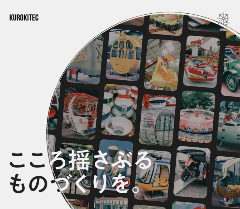
KUROKITEC presents amusement-ride manufacturing through actual machines, accumulated workshop history, and unusually large graphic forms. A circular collage of gondolas, miniature trains, ride vehicles, and teacups dominates the opening screen. Heavy Japanese lettering crosses its boundary, appearing dark over the light canvas and light over the photographs. Small identity controls remain quiet around this oversized centerpiece.
The rest of the homepage expands into a long corporate story: craftsmanship, services, company history, journal entries, and contact information. Condensed English typography gives these sections an industrial rhythm. Arched photographic masks, generous empty space, muted colors, and fine texture soften the engineering subject matter. On mobile, the identity controls move into a compact dark bottom dock while the opening circle remains dramatically larger than the screen width.
How to Read This Reference
- Measured means a value appears in the supplied computed styles, custom properties, or element rectangles. Measurements describe these two captured states, not every possible viewport.
- Visual estimate means a proportion or treatment is estimated from the five original-page captures. It is not an extracted CSS declaration or pixel sample.
- Recommendation means guidance for a new implementation. The Quick Start uses recommended classes and layout rules rather than recovered source selectors.
- DOM-only evidence establishes content, geometry, or declared styling without proving how the complete component looked in an attached screenshot.
- The available page widths were
1425pxon desktop and375pxon mobile, each15pxnarrower than the configured viewport. Preserve this distinction when comparing coordinates; do not reproduce that reserved strip as a design margin. - Several large graphic headings have ordinary inherited font sizes on their wrappers. Those wrapper values do not measure the visible lettering inside them.
Tokens — Colors
Core Palette
| Name | Value | Source or evidence | Role |
|---|---|---|---|
| Canvas White | #ffffff |
Source --main-bg; computed HTML background |
Base beneath the visibly textured light canvas |
| Main Ink | #252525 |
Source --main-color; computed primary text |
Japanese copy, English headings, active service dot |
| Charcoal | #1f1f1f |
Source --black-bg; visually consistent with footer |
Dark closing environment and recommended dock surface |
| Muted Gray | #9f9f9f |
Source --gray-color; computed excerpts and footer copy |
Secondary text, addresses, copyright, time readout |
| Utility Gray | #464646 |
Source --gray-color02; computed mobile menu social tiles |
Secondary dark surface |
| Quiet Gold | #c1a05f |
Source --gold-color and --hover-color |
Accent token; the history overline visibly uses a gold tone |
| Inactive Dot | #d9d9d9 |
Computed service-button background | Unselected service pagination |
| Reversed White | #ffffff |
Computed manifesto, contact, and company-name text | Text over dark or colored regions |
The light screenshots look subtly gray and grainy despite a measured white root background. The exact texture asset, opacity, and compositing method were not supplied. Keep white as the source base; treat any added noise layer as an approximation.
The header also demonstrates why computed text color is not always the final visible color: its desktop samples report white, while the opening screenshot displays a black wordmark and menu. A blend treatment, alternate artwork, or another rendering layer may be involved. The evidence does not identify the mechanism.
Gradient Accents
| Treatment | Exact source declaration | Evidence and intended use |
|---|---|---|
| Main gradient | linear-gradient(265deg, #f7797d 0%, #fbd786 48.96%, #b0f0c8 100%) |
Source --grad-color; the visible mobile contact fragment shows the corresponding mint, yellow, and coral progression |
| Hover gradient | linear-gradient(265deg, #f7797d 22.4%, #fbd786 100%) |
Source --grad-hover-color; actual hover behavior was not exercised |
| Alternate stop list | #aef0c9 0.47%, #fbd786 50.23%, #f7797d 100% |
Source --grad-ratio02; its component assignment was not established |
Reserve the gradient for a major invitation or emphasis. The opening composition obtains its color from photography, not from brightly colored interface panels.
The custom-property inventory also includes standard CMS palettes, gradients, and shadows. Their presence does not establish their use in the inspected design; they are excluded from the core palette.
Tokens — Typography
Japanese Text
- Measured family:
YakuHanJP, 'Zen Kaku Gothic New', sans-serif. - Measured body weight:
700. - Alternate declared stack:
'Zen Kaku Gothic New', sans-serifthrough--font-family-noyakuhan. - Character: substantial, clear Japanese sans-serif text with generous paragraph leading.
- Role: company narrative, service names, descriptions, article text, navigation, and contact details.
The body itself has a measured 16px line height, but its major text components declare their own line heights. Do not apply line-height: 1 indiscriminately to prose.
Condensed English and Numerals
- Measured family:
Oswald, sans-serif. - Measured weight:
400. - Verified uses: the services kicker, repeated column lettering, Contact heading, article numbers, and footer days/time readout.
- Tracking: frequently negative, including
-0.04emon the services kicker and Contact heading, and-0.032emon the repeated column words.
The narrow English lettering balances the wide, heavy Japanese characters. Preserve that width contrast instead of substituting a broad geometric sans-serif throughout.
Identity and Graphic Lettering
The KUROKITEC wordmark is a tightly condensed uppercase identity mark. Its visible shape should be preserved as authorized artwork; the sampled wrapper does not establish the logo's typeface.
The gold History of lettering is visibly cursive. Its font or asset format was not supplied. Use the authorized lockup when available rather than inventing a source font attribution.
The opening Japanese message, こころ揺さぶる ものづくりを。, is visible in the screenshots but absent as ordinary text in the sampled hero paragraphs. Its exact font, rendering format, and letter sizing are therefore unverified.
Type Scale
Values are measured unless explicitly labeled otherwise. Sizes on wrappers are identified as such.
| Role | Desktop | Mobile | Notes |
|---|---|---|---|
| Base body | 16px, weight 700 |
Same | Component leading overrides the base |
| Manifesto paragraphs | 21.6px / 48.6px |
15px / 33.75px |
Exact leading ratio 2.25 |
| Services English kicker | 30px / 30px, tracking -1.2px |
16px / 16px, tracking -0.64px |
Oswald, weight 400 |
| Services introduction | 80px / 88px |
27.803px / 30.583px |
Bold Japanese; leading approximately 1.1 |
| Service category label | 20.308px / 34.523px |
16px / 27.2px |
Includes numbered category prefix |
| Service name | 73.846px / 73.846px |
41.6px / 41.6px |
Large Japanese display text |
| Service description | 18.462px / 33.231px |
14px / 25.2px |
Leading approximately 1.8 |
| Section-link label | 20px / 20px |
16px / 16px |
Large surrounding interaction region |
| History paragraph | 20px / 34px |
14px / 23.8px |
Leading 1.7 |
| Repeated column words | 200px / 200px, tracking -6.4px |
104px / 104px, tracking -3.328px |
Computed fill is transparent; full visible treatment unavailable |
| Article container and excerpt | 18px / 30.6px |
14px / 23.8px |
Excerpts use Muted Gray |
| Article number | 28px / 28px |
21.778px / 21.778px |
Oswald; small No. label is 12px / 9.333px |
| Contact heading | 200px / 200px, tracking -8px |
75.420px / 75.420px, tracking -3.017px |
Oswald, weight 400 |
| Contact supporting text | 21px / 37.8px |
14px / 25.2px |
Tracking -0.04em |
| Footer company name | 20px / 20px |
16px / 16px |
White, weight 700 |
| Footer address and telephone | 20px / 24px |
16px / 19.2px |
Muted Gray |
| Copyright | 16px / 16px |
Same | Japanese stack also handles Latin text here |
| Days/time text | 16px / 16px |
Same | Oswald, weight 400 |
| Opening message | Approximately 120–135px visible glyph scale |
Approximately 52–60px |
Visual estimate; not a recovered font-size declaration |
Tokens — Spacing & Shapes
There is no demonstrated universal spacing unit. The site combines viewport-related dimensions, component-specific offsets, and long editorial pauses. A conventional 4px or 8px scale alone would not reproduce its rhythm.
Spacing Scale
| Relationship | Desktop measurement | Mobile measurement |
|---|---|---|
| Header wordmark position | x: 57.59px, y: 70px |
Inside bottom dock at x: 279.22px, y: 794.81px |
| Common content inset | 114px for journal and contact |
Approximately 28.63px |
| Common content width | 1197px |
Approximately 317.73px |
| Manifesto top / bottom padding | 319.5px / 297.9px |
144px / 198.6px |
| Gap between manifesto paragraphs | Approximately 54px |
37.5px |
| Services top / bottom padding | 471px / 333px |
141.3px / 208.675px |
| History heading-box to paragraph gap | 100px |
70px |
| Journal top / bottom padding | 170px / 407px |
88.4px / 211.64px |
| Offset between desktop article starts | 185px |
Entries become sequential |
| Gap between mobile article blocks | Not applicable | Approximately 83.19px |
| Contact padding | 120px vertical; 114.72px left, 76.48px right |
88px vertical; 38.16px horizontal |
| Contact end to company-name start | 320px |
Approximately 119.08px |
Border Radius
| Element | Value or shape | Evidence |
|---|---|---|
| Hero silhouette | Circle | Directly visible |
| Photographic tiles inside hero | Rounded rectangles, roughly 15–25px corners at desktop scale |
Visual estimate; tiles vary with perspective and crop |
| History photographs | Tall arches and capsule-like masks | Directly visible on desktop |
| Contact panel | 50px desktop; 30px mobile |
Computed border radius |
| Service dots | 50% |
Computed |
| Mobile menu social tiles | 5px |
Computed; menu appearance not captured open |
| Mobile navigation dock | Approximately 10px |
Visual estimate |
| Contact arrow ring | Circle, approximately 120px diameter on mobile |
Visual estimate from the partial panel capture |
Layout Measurements
| Element | Desktop | Mobile |
|---|---|---|
| Document height | 10655.19px |
8064.42px |
| Header wrapper | 1440 × 170px, top anchored |
390 × 70.39px, bottom anchored |
| Header wordmark box | 140 × 30.77px |
80 × 17.58px |
| Menu control | 70 × 93.45px; 15px internal gap |
132 × 58px; 18px internal gap |
| Hero-associated media wrapper | Circle visually approximately 1140–1160px across |
Measured square 804 × 804px, x: -214.5px, y: 20px |
| Manifesto heading box | 151.19 × 576px |
91.19 × 332.81px |
| History title wrapper | 478.03 × 105.05px |
270.91 × 59.53px |
| Journal grid tracks | 439.781px 317.438px 439.781px |
One 317.734px track |
| Article block | 439.78 × 579.59px |
317.73 × 432.98px |
| Contact link | 1197 × 550.59px |
317.73 × 340.17px |
| Service pagination dots | 15 × 15px, horizontal |
10.625 × 10.625px, vertical |
The source declares unitless --section-width: 1252 and --clamp-breakpoint: 750. Their full consuming rules were not supplied. Neither declaration proves that every section is 1252px wide or that every responsive change occurs at exactly 750px.
Components
Persistent Desktop Identity
Role: retain company identity and menu access without competing with the photographic composition.
The wordmark sits near the upper-left corner. At the opposite corner, a fine-line amusement-park icon combines a Ferris wheel with a curved track-like baseline; MENU appears underneath. The measured button is 70 × 93.45px, with a 15px gap between its internal parts.
These controls remain at the same screen positions in the opening, history, and footer captures, supporting a persistent-header reading. Their visible tone changes from black over the light page to pale over the charcoal footer. The exact switching or compositing mechanism is unverified.
Use authorized identity artwork. Preserve the icon's delicate line weight and unusual subject rather than replacing it with a generic hamburger as the primary visible mark.
Mobile Navigation Dock
Role: provide reachable navigation while leaving the top of the opening composition unobstructed.
The mobile header becomes a dark bottom bar. Its left cell contains the miniature amusement-park icon and MENU; a fine vertical divider separates this from the smaller wordmark on the right. The menu target is 132 × 58px, and the wordmark is 80px wide.
The wrapper begins at approximately y: 773.61px in an 844px-high viewport. The visible bar is roughly 60px high with about 10px bottom clearance. A fine outline and modest rounding define its edge. It appears in both supplied mobile captures.
Recommended implementation: add safe-area clearance and reserve enough document space to keep final links and the time readout reachable above the dock. Safe-area handling was not measured in the source.
Circular Hero Collage
Role: immediately show the variety, history, and physical character of the manufacturer's work.
The desktop hero is built around an enormous circle pushed toward the right. Its leftmost visible edge is around x: 348px, and its top is around y: 58px. The circle extends past the right and bottom boundaries of the opening viewport. A pale inner ring and dark outer edge separate it from the light, grainy canvas.
Inside, portrait-oriented photographs form staggered, slightly tilted columns. Broad charcoal gutters separate rounded photo tiles. The photographs show actual gondolas, miniature rail vehicles, teacups, and other amusement rides in workshop or installation settings. Their modest saturation and varied eras make the collage feel accumulated rather than staged.
The two-line Japanese message crosses the lower-left edge of the circle. It visibly changes contrast across the light canvas and dark collage. Reproducing that relationship matters more than applying a solid rectangular text backdrop.
On mobile, the measured media wrapper is 804px square inside a 375px content area. The circle is centered horizontally and cropped heavily on both sides. The large message crosses its middle, with some edge clipping visible in the supplied state. Do not shrink the entire composition into a small contained image.
Implementation limitation: the evidence does not identify whether the collage is a single raster, assembled image elements, canvas, or another render layer. Its movement, rotation, and tile sequencing are also unverified. A prepared collage inside a circular mask is a practical static adaptation.
Craftsmanship Manifesto
Role: slow the page down after the visually dense opening.
DOM evidence places the manifesto immediately after the first viewport: y: 1000px on desktop and y: 844px on mobile. Its heading, コンマ数ミリの 楽しさを設計する, occupies a tall, narrow box. This geometry supports a vertical-heading composition, although no attached screenshot shows the full section.
On desktop, the heading sits to the right of a roughly 503px prose column. The first paragraph begins substantially below the heading's top. Paragraphs use bold 21.6px text with 48.6px leading and approximately 54px gaps. On mobile, the heading box moves above the full-width prose column; paragraphs use 15px / 33.75px with 37.5px gaps.
The text is computed white while the sampled section background is transparent. A separate background layer must determine the final contrast; its exact appearance was not supplied. A charcoal backdrop is a recommended adaptation, not a measured background declaration for this section.
Service Showcase
Role: distinguish three business offerings within one substantial visual stage.
The section opens with CREATE FUN, MOVE THE WORLD. in Oswald, followed by a large Japanese statement. Three service entries follow: 製造, 委託開発, and 特注製品, each with a numbered category label and short description.
Several desktop service text rectangles occupy overlapping positions, and three pagination buttons appear together. This supports a shared-state presentation rather than three independent side-by-side cards. The desktop snapshot marks the third dot active; the mobile snapshot marks the first active. This difference does not establish autoplay or its timing.
Desktop dots are horizontal, 15px across, with centers 35px apart. Mobile dots form a vertical stack near the left edge, approximately 10.625px across with 24.78px center spacing. The service name decreases from approximately 73.85px to 41.6px, retaining a strong display role.
The source declares 1.1s opacity and transform transitions on some service text. Click, swipe, keyboard, and automatic state changes were not exercised.
Section Links
Role: connect the homepage's editorial sections to deeper information.
The service and history links use bold Japanese labels in unusually generous interaction regions. Desktop link rectangles are 348 × 150px, while their labels are only 20px high. The mobile regions are 120px high, with 16px labels; measured widths vary by component and captured state.
The DOM contains duplicate copies of these labels. They may support a visual effect, but the supplied evidence does not establish a rolling, sliding, or hover animation. Do not render both copies as ordinary adjacent text.
The complete decorative anatomy of these links is not visible in the supplied screenshots. A circular-arrow companion is a reasonable adaptation from the observed contact motif, but is not a measured feature of every section link.
History Feature
Role: connect current manufacturing to the company's workshop origins.
This desktop composition is deliberately asymmetric. Tall photographs occupy the left: a workshop view reaches beyond the viewport edge, while an arched image of a wooden company sign begins lower and farther right. The text column sits at approximately x: 833px.
A gold cursive History of overlaps the upper edge of a large condensed KUROKITEC lockup. Below it, a narrow 380px paragraph uses 20px / 34px bold Japanese text. Large EST. 1952 lettering forms an additional graphic layer toward the left; only part is visible in the attached history capture.
On mobile, DOM evidence places the title and copy in the standard 317.73px content column after the media region. The title wrapper contracts to about 270.91px wide, and the paragraph becomes 14px / 23.8px. The complete mobile image arrangement was not visually captured.
Preserve uneven image starts, tall masks, overlapping lettering, and ample separation between title, prose, and link. Avoid turning the history into a small uniform image-and-text card.
Column Band and Journal Entries
Role: transition from company narrative to ongoing evidence of work.
The DOM includes three repeated pairs of MONOZUKURI and COLUMN, laid out horizontally with copies extending beyond both viewport edges. Their measured type is 200px on desktop and 104px on mobile. Their computed text fill is transparent. A stroke, mask, or other visible treatment may be involved, but that property was not included in the evidence. Continuous marquee movement was not demonstrated.
Below, the desktop journal uses an unusual three-track composition: one article at left, the section heading in the center, and a second article at right. The right article begins 185px lower than the left. Each article is one link containing a media region, title, muted excerpt, and small Oswald issue number, No. 10 or No. 09.
On mobile, the heading and articles become one vertical column. Article blocks are approximately 317.73 × 432.98px, with about 83px between consecutive blocks. Their article text and excerpts use 14px / 23.8px.
The supplied links describe vehicle-floor fabrication work, broadening the company's story beyond amusement rides. Exact article-image crops, corner radii, and hover treatment were not visually captured.
Contact Panel
Role: create a large, approachable invitation before the company details.
The entire panel is a link to /contact/. It contains a very large uppercase Contact heading, a short Japanese invitation, and a prominent outlined circular arrow. The visible mobile fragment confirms a soft mint-to-yellow-to-coral surface and a ring extending beyond the panel's right/lower boundary.
The desktop link measures 1197 × 550.59px, with 50px corners and 120px vertical padding. The heading is 200px Oswald. On mobile, the panel becomes 317.73 × 340.17px, with 30px corners, 88px vertical padding, and a 75.42px heading.
This is the page's major colored interface surface. Its scale and the projecting arrow distinguish it from ordinary text links. The full desktop panel was not included in the screenshots; its dimensions and typography come from the DOM.
Company Footer and Time Readout
Role: close the page with practical company information while retaining the amusement-park visual theme.
The desktop footer is a broad charcoal field with subtle grain. Company identity and contact information sit at the left. Two navigation columns sit to the right, followed by a fine horizontal rule and social links. A larger KUROKITEC wordmark anchors the lower-right corner.
The visible company name is 黒木テック工業株式会社. This identity is independently supported by the homepage title and footer. Navigation includes company information, services, work examples, history, journal, news, and contact destinations.
Sparse small dots occupy the dark lower field. Near the bottom-left, a luminous point precedes a days/time readout. The text uses 16px Oswald and includes 9,296 Days in the supplied run. The clock-like values differ between captures and DOM snapshots. Their reference event and exact semantics are unknown; do not label the value as time since the company's 1952 founding.
Mobile keeps the company information and time readout but omits the desktop footer navigation columns and separate large footer wordmark from the visible capture. The fixed dock supplies the visible brand mark. Large areas of dark space remain intentional.
Menu Content — DOM Evidence Only
The mobile DOM includes a menu heading, close control, social tiles, telephone and email links, primary navigation rows, news subcategories, and a privacy link. No attached image shows the open menu, and no opening interaction was reported.
Measured internal details include two social tiles of approximately 138.4 × 100px with 5px corners, telephone and email rows of 290.75 × 58px, and primary navigation rows of 290.75 × 68px. Primary rows use 16px bold Japanese text. News subcategories are indented and use half-opacity white.
These measurements can guide menu content density. They do not establish the overlay's entrance direction, background treatment, focus behavior, or scrolling mechanics.
Tokens — Motion & Interaction
| Treatment | Evidence | What can be claimed |
|---|---|---|
| General transition token | 0.3s cubic-bezier(0.250, 0.460, 0.450, 0.940) |
Declared reusable timing token |
| Footer link color | Same 0.3s timing |
Computed color transition; destination hover color was not tested |
| Service text opacity and transform | 1.1s cubic-bezier(0.23, 1, 0.32, 1) |
Transition is declared on selected sampled text elements; triggering behavior remains unknown |
| Pagination fill | 0.2s cubic-bezier(0.39, 0.575, 0.565, 1) |
Computed background transition between dot states |
| Privacy-link opacity | 0.3s cubic-bezier(0.25, 0.46, 0.45, 0.94) |
Computed transition in the mobile menu subtree |
| Contact hover gradient | Alternate gradient token exists | Component application and actual transition were not exercised |
| Hero collage movement | Static captures only | No verified rotation direction, speed, parallax, or tile loop |
| Repeated column band | Repeated offscreen content in DOM | Horizontal repetition is established; scrolling speed and direction are not |
| Menu opening and closing | Controls and menu content in DOM | Open-state appearance and interaction behavior are unverified |
| Footer dots and time readout | Visible dots and differing time values | Their complete behavior and meaning are unverified |
Many sampled nodes report animation: none. This does not prove that their descendants, pseudo-elements, parent transforms, or script-controlled layers are static.
For an adaptation, retain the measured short utility transitions and the longer service reveal where appropriate. Do not invent a global spring system or assign guessed motion timings to the photographic wheel. Provide a complete static layout before adding motion.
Surfaces
| Layer | Observed appearance | Practical treatment |
|---|---|---|
| Light canvas | White base with fine visible grain | Use a subtle authorized texture; avoid making noise compete with text |
| Hero interior | Dark collage ground and subdued photographs | Let gutters and photography establish structure |
| History area | Pale field, arched photographs, dark lettering | Separate content through scale and space rather than boxed panels |
| Journal | DOM indicates shared page surface and linked content | No evidence for a general elevated-card system |
| Contact invitation | Pastel gradient with large rounded corners | Reserve this colorful surface for a major action |
| Footer | Charcoal with sparse points and subdued typography | Keep broad empty space and low visual density |
| Mobile dock | Dark surface, fine outline and divider | Strong enough to read over photographs and footer alike |
| Menu social tiles | Computed #464646 fill |
Utility surface within the unverified open-menu presentation |
There is no visually demonstrated general shadow-elevation system. The page relies on masks, contrast, typography, and overlapping geometry.
Imagery
Use documentary photographs of manufactured objects: gondolas, passenger compartments, ride vehicles, welded structures, metalwork, workshop interiors, and inherited signage. Objects should retain their particular colors, scuffs, shapes, and industrial surroundings. This specificity gives the design its identity.
The hero collage combines many photographs inside one large silhouette. Maintain substantial dark gutters, portrait crops, staggered rows, and gently rounded tile corners. The muted photographic treatment is visible, but exact saturation, contrast, overlay opacity, and filter values are unavailable.
History imagery changes the pace through tall arches and quieter subjects. A factory window and a wooden company sign connect the large-scale rides to a smaller workshop setting. Do not replace these with generic abstract metal textures.
Observed Asset References
No original image URLs, filenames, intrinsic dimensions, or font-file URLs were supplied. The following references identify visible subjects only.
| Visual material | Verified location | Treatment |
|---|---|---|
| Amusement-ride photo collection | Desktop and mobile opening captures | Circular clipping, dark gutters, rounded individual tiles |
| Factory interior and window | Desktop history capture | Tall capsule-like crop extending beyond the left viewport edge |
| Wooden company sign | Desktop history capture | Tall arched crop with warm wood against a subdued workshop background |
| KUROKITEC identity mark | Header, mobile dock, desktop footer | Condensed uppercase artwork at several measured sizes |
| Amusement-park menu icon | Desktop header and mobile dock | Fine monochrome linework |
| Contact arrow | Mobile footer capture | Thin white ring projecting beyond a gradient panel |
Use authorized source assets when available. Do not present invented asset paths as recovered references, and do not use pixelated rendering for this photography.
Layout & Responsive Behavior
The homepage is a long editorial sequence rather than a compact conversion-only layout. Its first screen occupies the full viewport, but the site continues through a substantial corporate narrative and multiple content destinations.
Measured section starts illustrate the pacing:
| Section | Desktop document position | Mobile document position |
|---|---|---|
| Manifesto | 1000px |
844px |
| Services | 3181.11px |
2419.41px |
| History | 5207.31px |
3734.83px |
| Journal content | 7096.36px |
5070.05px |
| Contact link | 9094.20px |
6979.63px |
The footer element starts before the main element ends: approximately 280px of rectangle overlap on desktop and 71.44px on mobile. Because the sampled footer background is transparent, these rectangles alone do not identify the exact visible background boundary.
Desktop
The common 1197px content region is centered within the 1425px page width. The hero uses a wider composition and smaller left inset. Services and history have their own internal alignment lines rather than a single universal text column.
The history text begins far to the right of the photographic group. The journal places its title between two staggered articles. The footer distributes identity and navigation across separate halves. These asymmetries are central to the composition.
Mobile
The principal change is structural, not just typographic scaling:
- The top-corner controls become a bottom dock.
- The hero circle remains height-led and wider than the screen.
- The manifesto heading moves above the prose column.
- Service indicators change from a horizontal row to a vertical stack.
- History text follows the media area in a single content column.
- The journal becomes sequential instead of using a central heading track.
- Contact corners decrease from
50pxto30pxand its heading reduces substantially. - The visible footer drops its desktop navigation columns while retaining substantial dark breathing room.
The viewport variables are measured as --vw: 14.4px and --vh: 10px on desktop, and --vw: 3.9px and --vh: 8.44px on mobile. These establish viewport-related inputs, not a complete universal scaling formula.
No tablet, landscape-phone, or intermediate-width capture was supplied. A 750px breakpoint in the Quick Start is a recommendation informed by the declared breakpoint token, not a recovered media query.
Do’s and Don’ts
Do
- Keep the circular photo composition oversized and partially outside the viewport.
- Preserve the relationship between heavy Japanese lettering and condensed English typography.
- Use actual rides, workshop objects, and historical material as the visual content.
- Maintain white, charcoal, and muted gray as the main interface palette.
- Reserve the pastel gradient for a major invitation such as Contact.
- Keep the history images tall, arched, and unevenly positioned.
- Preserve generous section spacing and the staggered desktop journal layout.
- Move persistent navigation into a compact bottom dock on mobile.
- Distinguish asset lettering from the inherited styles on its DOM wrapper.
- Label untested motion and menu behavior rather than treating it as established.
Don’t
- Don’t convert the homepage into a generic grid of manufacturing feature cards.
- Don’t shrink the mobile hero into a small centered circle with wide empty margins.
- Don’t replace the wordmark or cursive history lockup with an unsupported font claim.
- Don’t spread colorful gradients, pills, or category badges across every section.
- Don’t add glass blur or soft card shadows as a general surface system.
- Don’t render duplicated transition labels twice for ordinary reading.
- Don’t infer autoplay, wheel rotation, or marquee speed from static images.
- Don’t interpret the days counter as the age of the company.
- Don’t treat the reserved 15px viewport strip as intentional page padding.
- Don’t use unrelated CMS preset colors merely because they appear in the custom-property inventory.
Recommended Implementation Additions
These recommendations are not verified features of the original site.
- Implement the menu trigger as a button with
aria-expandedandaria-controls. Make an overlay keyboard-operable, restore focus on closing, and keep its content scrollable above the mobile dock. - Keep service dots visually small while providing at least a
44 × 44pxinteraction region. Name each destination and expose the selected state. - Preserve meaningful hero copy as accessible text, even when visual lettering is supplied as artwork. Hide decorative duplicate copies from assistive technology.
- Provide a stable high-contrast fallback for text crossing photographs. A blend effect alone cannot guarantee readability over every image.
- Offer reduced-motion behavior for any future collage movement, service autoplay, or repeated text animation. Pause controls should accompany sustained movement.
- Recheck the contrast of
#9f9f9fexcerpts on white and white text on the pastel gradient. Use a darker text token or local contrast treatment where needed. - Add meaningful image alternatives for editorial content. Treat purely decorative duplicated collage tiles and grain as decorative.
- Do not announce a changing seconds display every second through a live region. Give the time readout a meaningful label only after its reference event is known.
- Keep a usable navigation fallback until the mobile menu is fully implemented.
- Load the confirmed text fonts and appropriately sized images efficiently; preserve the collage's crop while avoiding unnecessarily large mobile downloads.
Agent Prompt Guide
Quick Color Reference
- Light base:
#ffffff, with subtle visible grain. - Primary text:
#252525. - Dark environment:
#1f1f1f. - Secondary text:
#9f9f9f; adjust for accessible contrast in a new implementation. - Utility panel:
#464646. - Restrained accent:
#c1a05f. - Contact gradient: coral
#f7797d, yellow#fbd786, mint#b0f0c8at the measured 265-degree direction. - Service dots: active
#252525, inactive#d9d9d9.
Overall Prompt
“Create a corporate homepage for an amusement-ride manufacturer using an oversized circular collage of real workshop and ride photographs. Place the circle toward the right on desktop and crop it heavily at both sides on mobile. Overlay a large two-line Japanese statement that remains legible across the pale page and dark photo collage. Pair bold Zen Kaku Gothic New text with narrow Oswald English headings. Use white, charcoal, muted gray, and a small gold accent, then introduce one large pastel-gradient Contact panel. Build a long editorial sequence with a spacious craftsmanship manifesto, a three-entry services stage, tall arched history photographs, staggered desktop journal entries, and a quiet dark company footer. Keep identity controls in the desktop corners and move them into a dark bottom dock on mobile. Use authorized identity artwork and a complete static layout; add motion only with explicit behavior and accessibility requirements.”
Example Component Prompts
- Opening composition: “Build a circular photographic archive on a white textured canvas. Use muted photographs of actual ride vehicles in staggered rounded tiles with thick charcoal gutters. The circle should exceed the desktop viewport at the right and bottom. Cross its lower-left edge with the two-line copy
こころ揺さぶる ものづくりを。. On mobile, keep the circle approximately viewport-height in diameter rather than fitting it to screen width.” - History feature: “Arrange two tall workshop photographs in staggered arched masks on the left. Place an authorized condensed company lockup and a restrained gold cursive overline at the right. Use a narrow bold Japanese paragraph with 1.7 line height and generous separation before the history link. Stack media before text on mobile.”
- Service stage: “Create one shared presentation region for three manufacturing services, each containing a numbered category, large Japanese service name, and short description. Use horizontal 15px pagination dots on desktop and a vertical row of approximately 11px dots on mobile, with larger invisible interaction targets. If transitions are added, use the evidenced 1.1-second opacity/transform easing and preserve a usable static state.”
- Mobile dock: “Create a charcoal bottom navigation bar with a fine outline and roughly 10px corners. Put the line-art amusement-park icon and MENU in a 132px left cell, a vertical divider in the middle, and an 80px-wide company wordmark aligned right. Provide safe-area clearance and accessible menu behavior.”
- Contact invitation: “Create a large mint-to-yellow-to-coral gradient link with a condensed uppercase Contact heading, short Japanese invitation, and an outlined circular arrow projecting beyond the lower-right corner. Use 50px panel corners on desktop and 30px on mobile. Keep it within a dark closing section.”
Quick Start
CSS Custom Properties
This is adaptation CSS, not extracted source code. Exact colors, confirmed font families, selected sizes, and transition curves come from the evidence. Layout formulas, the 750px breakpoint, hero text blending, image aspect ratios, focus treatment, and static component states are recommendations.
Load authorized font and image assets separately. A .hero-wheel can contain one prepared collage image; .brand and .history-lockup should use authorized artwork. The CSS does not implement menu state, carousel logic, a counter, or source animation. It intentionally leaves footer navigation available on mobile until the application sets data-menu-ready='true' after implementing a working menu.
:root {
  /* Source-derived colors and typography */
  --color-paper: #fff;
  --color-ink: #252525;
  --color-dark: #1f1f1f;
  --color-muted: #9f9f9f;
  --color-panel: #464646;
  --color-gold: #c1a05f;
  --color-dot: #d9d9d9;
  --font-jp: YakuHanJP, 'Zen Kaku Gothic New', sans-serif;
  --font-latin: Oswald, sans-serif;
  --gradient-contact: linear-gradient(
    265deg, #f7797d 0%, #fbd786 48.96%, #b0f0c8 100%
  );
  --gradient-contact-hover: linear-gradient(
    265deg, #f7797d 22.4%, #fbd786 100%
  );
  --motion-ui: 300ms cubic-bezier(.25, .46, .45, .94);
  --motion-service: 1100ms cubic-bezier(.23, 1, .32, 1);
  --motion-dot: 200ms cubic-bezier(.39, .575, .565, 1);

  /* Adaptation tokens */
  --content-max: 1252px;
  --radius-contact: 50px;
  --safe-bottom: env(safe-area-inset-bottom, 0px);
}

* { box-sizing: border-box; }
body {
  margin: 0;
  color: var(--color-ink);
  background: var(--color-paper);
  font-family: var(--font-jp);
  font-weight: 700;
  line-height: 1.7;
}
img { display: block; max-width: 100%; }
button { font: inherit; color: inherit; }
a { color: inherit; }
.page { overflow-x: clip; }
.frame {
  width: 84%;
  max-width: var(--content-max);
  margin-inline: auto;
}

/* Explicit theme switching is an adaptation. */
.site-header {
  position: fixed;
  z-index: 30;
  inset: 60px 4vw auto;
  display: flex;
  align-items: flex-start;
  justify-content: space-between;
  color: var(--color-ink);
  pointer-events: none;
}
.site-header[data-tone='dark'] { color: var(--color-paper); }
.site-header a,
.site-header button { pointer-events: auto; }
.brand {
  display: block;
  width: 140px;
  margin-top: 10px;
  line-height: 0;
}
.brand svg { width: 100%; height: auto; fill: currentColor; }
.menu-toggle {
  display: flex;
  flex-direction: column;
  align-items: center;
  justify-content: center;
  gap: 15px;
  min-width: 70px;
  min-height: 93px;
  padding: 0;
  border: 0;
  background: none;
  font-family: var(--font-latin);
  font-weight: 400;
  line-height: 1;
  cursor: pointer;
}
.menu-art { width: 60px; height: 63px; }

.hero {
  position: relative;
  isolation: isolate;
  min-height: 100svh;
  overflow: hidden;
  background: var(--color-paper);
}
.hero-wheel {
  position: absolute;
  top: 6%;
  left: 24.4%;
  width: 81%;
  aspect-ratio: 1;
  overflow: hidden;
  border: 6px solid var(--color-ink);
  border-radius: 50%;
  background: var(--color-dark);
}
.hero-wheel > img {
  width: 100%;
  height: 100%;
  object-fit: cover;
}
.hero-wheel::after {
  content: '';
  position: absolute;
  inset: 3px;
  border: 5px solid var(--color-paper);
  border-radius: 50%;
  pointer-events: none;
}
.hero-headline {
  position: absolute;
  z-index: 2;
  left: 4%;
  bottom: 7.6%;
  margin: 0;
  color: #fff;
  font-size: clamp(72px, 9vw, 130px);
  line-height: 1.12;
  letter-spacing: .015em;
  /* Approximation only; verify contrast against every image. */
  mix-blend-mode: difference;
}
.hero-headline > span { display: block; white-space: nowrap; }

/* Recommended dark treatment for the DOM-only manifesto. */
.manifesto {
  padding-block: 320px 298px;
  color: var(--color-paper);
  background: var(--color-dark);
}
.manifesto-layout {
  display: grid;
  grid-template-columns: minmax(0, 504px) auto;
  justify-content: center;
  gap: clamp(64px, 14vw, 210px);
}
.manifesto-heading {
  grid-column: 2;
  grid-row: 1;
  margin: 0;
  writing-mode: vertical-rl;
  font-size: 40px;
  line-height: 1.8;
}
.manifesto-copy {
  grid-column: 1;
  grid-row: 1;
  padding-top: 414px;
  font-size: 21.6px;
  line-height: 2.25;
}
.manifesto-copy p { margin: 0 0 2.5em; }
.manifesto-copy p:last-child { margin-bottom: 0; }

.service-kicker {
  font-family: var(--font-latin);
  font-size: 30px;
  font-weight: 400;
  line-height: 1;
  letter-spacing: -.04em;
  text-transform: uppercase;
}
.service-intro { font-size: 80px; line-height: 1.1; }
.service-name { font-size: 73.85px; line-height: 1; }
.service-description { font-size: 18.46px; line-height: 1.8; }
.service-dots { display: flex; gap: 0; }
.service-dot {
  display: grid;
  place-items: center;
  width: 44px;
  height: 44px;
  padding: 0;
  border: 0;
  background: none;
  cursor: pointer;
}
.service-dot::before {
  content: '';
  width: 15px;
  height: 15px;
  border-radius: 50%;
  background: var(--color-dot);
  transition: background var(--motion-dot);
}
.service-dot[aria-current='true']::before {
  background: var(--color-ink);
}
.section-link {
  display: inline-flex;
  align-items: center;
  min-height: 150px;
  font-size: 20px;
  text-decoration: none;
}

.history {
  display: grid;
  grid-template-columns: 1.2fr 1fr;
  gap: clamp(64px, 10vw, 144px);
  padding-block: 140px;
}
.history-media {
  display: grid;
  grid-template-columns: .8fr 1fr;
  align-items: start;
  gap: 40px;
}
.arch {
  width: 100%;
  aspect-ratio: 2 / 5;
  object-fit: cover;
  border-radius: 999px 999px 0 0;
}
.arch.is-capsule { border-radius: 999px; }
.history-media > :nth-child(2) { margin-top: 140px; }
.history-lockup { width: 100%; max-width: 478px; }
.history-copy {
  max-width: 380px;
  margin-top: 100px;
  font-size: 20px;
  line-height: 1.7;
}

.journal {
  display: grid;
  grid-template-columns: 1fr .722fr 1fr;
  padding-block: 170px 407px;
}
.journal-heading { grid-column: 2; grid-row: 1; }
.journal-entry {
  position: relative;
  display: block;
  font-size: 18px;
  line-height: 1.7;
  text-decoration: none;
}
.journal-entry--first {
  grid-column: 1;
  grid-row: 1;
  margin-top: 160px;
}
.journal-entry--second {
  grid-column: 3;
  grid-row: 1;
  margin-top: 345px;
}
.journal-image {
  width: 100%;
  aspect-ratio: 4 / 3;
  object-fit: cover;
  /* This image ratio is a recommendation, not a measured asset ratio. */
}
.journal-title { margin: 30px 0 0; font-size: inherit; line-height: 1.5; }
.journal-excerpt { margin-top: 50px; color: var(--color-muted); }
.journal-number {
  position: absolute;
  top: -9px;
  left: 0;
  font-family: var(--font-latin);
  font-size: 28px;
  font-weight: 400;
  line-height: 1;
}
.journal-number small { display: block; margin-bottom: 6px; font-size: 12px; }

.site-footer {
  padding-block: 160px 100px;
  color: var(--color-muted);
  background: var(--color-dark);
}
.contact {
  position: relative;
  display: block;
  padding: 120px 9.6%;
  border-radius: var(--radius-contact);
  color: var(--color-paper);
  background: var(--gradient-contact);
  text-decoration: none;
}
.contact-title {
  margin: 0;
  font-family: var(--font-latin);
  font-size: clamp(80px, 13.89vw, 200px);
  font-weight: 400;
  line-height: 1;
  letter-spacing: -.04em;
  text-transform: uppercase;
}
.contact-copy {
  margin: 35px 0 0;
  font-size: 21px;
  line-height: 1.8;
  letter-spacing: -.04em;
}
.contact-arrow {
  position: absolute;
  right: -25px;
  bottom: -25px;
  display: grid;
  place-items: center;
  width: 120px;
  aspect-ratio: 1;
  border: 2px solid currentColor;
  border-radius: 50%;
  font-size: 28px;
}
.footer-details {
  display: grid;
  grid-template-columns: 1fr 1fr;
  margin-top: 320px;
}
.footer-name { color: var(--color-paper); font-size: 20px; }
.footer-nav {
  display: grid;
  grid-template-columns: 1fr 1fr;
  gap: 32px 0;
}
.footer-nav a { text-decoration: none; transition: color var(--motion-ui); }
.footer-bottom {
  display: flex;
  align-items: end;
  justify-content: space-between;
  margin-top: 170px;
}
.time-readout { font-family: var(--font-latin); font-weight: 400; }

@media (hover: hover) {
  /* Recommended use of the source accent tokens. */
  .footer-nav a:hover { color: var(--color-gold); }
  .contact:hover { background: var(--gradient-contact-hover); }
}

@media (max-width: 750px) {
  :root { --radius-contact: 30px; }
  .frame { width: 84.73%; }
  .page { padding-bottom: calc(80px + var(--safe-bottom)); }
  .site-header {
    inset: auto 10px calc(10px + var(--safe-bottom));
    display: grid;
    grid-template-columns: 132px 1fr;
    align-items: center;
    min-height: 60px;
    overflow: hidden;
    border: 1px solid var(--color-panel);
    border-radius: 10px;
    color: var(--color-paper);
    background: var(--color-dark);
  }
  .brand {
    grid-column: 2;
    grid-row: 1;
    justify-self: end;
    width: 80px;
    margin: 0 16px 0 0;
  }
  .menu-toggle {
    grid-column: 1;
    grid-row: 1;
    flex-direction: row;
    gap: 18px;
    width: 100%;
    min-width: 0;
    min-height: 58px;
    border-right: 1px solid var(--color-panel);
  }
  .menu-art { width: 30px; height: 32px; }
  .hero-wheel {
    top: 20px;
    left: 50%;
    width: calc(100svh - 40px);
    transform: translateX(-50%);
    border-width: 3px;
  }
  .hero-wheel::after { inset: 2px; border-width: 2px; }
  .hero-headline {
    top: 50%;
    right: auto;
    bottom: auto;
    left: 50%;
    width: max-content;
    transform: translate(-50%, -50%);
    font-size: clamp(48px, 14vw, 60px);
  }
  .manifesto { padding-block: 144px 198.6px; }
  .manifesto-layout { display: flex; flex-direction: column; gap: 68px; }
  .manifesto-heading { align-self: center; font-size: 28px; }
  .manifesto-copy { padding-top: 0; font-size: 15px; }
  .service-kicker { font-size: 16px; }
  .service-intro { font-size: 27.8px; }
  .service-name { font-size: 41.6px; }
  .service-description { font-size: 14px; }
  .service-dots { flex-direction: column; }
  .service-dot::before { width: 10.625px; height: 10.625px; }
  .section-link { min-height: 120px; font-size: 16px; }
  .history { grid-template-columns: 1fr; gap: 70px; padding-block: 100px; }
  .history-media { gap: 24px; }
  .history-media > :nth-child(2) { margin-top: 60px; }
  .history-lockup { max-width: 271px; }
  .history-copy { margin-top: 70px; font-size: 14px; }
  .journal { grid-template-columns: 1fr; gap: 83px; padding-block: 88px 212px; }
  .journal-heading,
  .journal-entry { grid-column: auto; grid-row: auto; margin-top: 0; }
  .journal-entry { font-size: 14px; }
  .journal-excerpt { margin-top: 40px; }
  .journal-number { font-size: 21.78px; }
  .journal-number small { font-size: 9.33px; }
  .contact { padding: 88px 12%; }
  .contact-title { font-size: 75.42px; }
  .contact-copy { margin-top: 13px; font-size: 14px; }
  .footer-details { grid-template-columns: 1fr; gap: 48px; margin-top: 119px; }
  .footer-name { font-size: 16px; }
  [data-menu-ready='true'] .footer-nav { display: none; }
  .footer-bottom { margin-top: 338px; }
}

/* Recommended focus indicator for both light and dark regions. */
:where(a, button):focus-visible {
  outline: 2px solid #252525;
  outline-offset: 4px;
  box-shadow: 0 0 0 6px #fff;
}

@media (prefers-reduced-motion: reduce) {
  *, *::before, *::after {
    animation: none !important;
    transition: none !important;
    scroll-behavior: auto !important;
  }
  /* Script-driven motion must also respect this preference. */
}
The sample intentionally enlarges pagination targets beyond the observed dot spacing. Its manifesto heading size, photo aspect ratios, and history-image offsets are approximations. Add the fine grain only after establishing clean, legible geometry; no texture file was provided.
Tailwind v4 Token Mapping
Optional aliases for a project already using Tailwind v4. This is not evidence that the original site uses Tailwind. Define the preceding custom properties first.
@theme inline {
  --color-paper: #ffffff;
  --color-ink: #252525;
  --color-charcoal: #1f1f1f;
  --color-muted: #9f9f9f;
  --color-panel: #464646;
  --color-gold: #c1a05f;
  --color-dot: #d9d9d9;
  --font-japanese: YakuHanJP, 'Zen Kaku Gothic New', sans-serif;
  --font-condensed: Oswald, sans-serif;
  --radius-contact: 50px;
  --radius-contact-mobile: 30px;
  --radius-dock: 10px;
  --text-story: 21.6px;
  --text-story-mobile: 15px;
  --text-service: 73.85px;
  --text-service-mobile: 41.6px;
  --text-contact: 200px;
  --text-contact-mobile: 75.42px;
}
Sources & Evidence
- KUROKITEC current homepage: both original and final URL in the supplied inspection; reported HTTP status
200. The homepage title and footer independently identify the operating company. - Inspection timestamp:
2026-09-16T19:42:24.939Z, corresponding to September 17, 2026, 04:42 JST. Separate timestamps for each screenshot were not provided. - Desktop evidence: three original-page captures at
1440 × 1000, showing the hero, history area, and footer; rendered DOM with approximately10655.19pxdocument height and1425pxroot width. - Mobile evidence: two original-page captures at
390 × 844, showing the hero and footer/contact fragment; rendered DOM with approximately8064.42pxdocument height and375pxroot width. - Style evidence: supplied element rectangles, computed typography, colors, transitions, and custom properties. Full stylesheets, image source paths, font files, and all descendant or pseudo-element styles were not included.
- Observed navigation evidence: original-page links establish service, history, journal, contact, company, social, and menu destinations. Those linked pages were not inspected here.
- Capture limitations: the supplied process waited for loading, image decoding, finite animations, and sampled layout stability within bounded timeouts. Perpetual animations were temporarily paused during readiness checks and resumed. These procedures do not prove complete delayed content or demonstrate interaction sequences. Shared workers and service workers were disabled during inspection.
- Interaction limitations: no supplied click-through, hover recording, open-menu screenshot, carousel-control test, or measured hero animation sequence. Responsive behavior between the two sampled sizes remains unverified.
This reference describes the current homepage represented by the supplied original-page evidence. Visual estimates and implementation recommendations are explicitly separated from measured values.
# KUROKITEC — Style Reference

> A ride manufacturer's workshop archive arranged inside a giant photographic wheel.

**Original URL:** [https://www.kurokitec.com/](https://www.kurokitec.com/)
**Final URL:** [https://www.kurokitec.com/](https://www.kurokitec.com/)
**Theme:** textured light canvas, charcoal closing sections, restrained gold and pastel gradient accents.
**Inspected:** supplied inspection dated September 17, 2026, 04:42 JST / September 16, 2026, 19:42 UTC. Retrieval timestamp: `2026-09-16T19:42:24.939Z`.
**Viewports:** desktop `1440 × 1000` and mobile `390 × 844` CSS pixels.
**Scope:** the current corporate homepage. Desktop captures show the opening composition, history area, and footer; mobile captures show the opening composition and footer with part of the contact panel. Supplied DOM evidence covers the manifesto, services, history, journal, contact area, footer, and mobile menu content. Linked pages and menu opening were not independently inspected.

KUROKITEC presents amusement-ride manufacturing through actual machines, accumulated workshop history, and unusually large graphic forms. A circular collage of gondolas, miniature trains, ride vehicles, and teacups dominates the opening screen. Heavy Japanese lettering crosses its boundary, appearing dark over the light canvas and light over the photographs. Small identity controls remain quiet around this oversized centerpiece.

The rest of the homepage expands into a long corporate story: craftsmanship, services, company history, journal entries, and contact information. Condensed English typography gives these sections an industrial rhythm. Arched photographic masks, generous empty space, muted colors, and fine texture soften the engineering subject matter. On mobile, the identity controls move into a compact dark bottom dock while the opening circle remains dramatically larger than the screen width.

## How to Read This Reference

- **Measured** means a value appears in the supplied computed styles, custom properties, or element rectangles. Measurements describe these two captured states, not every possible viewport.
- **Visual estimate** means a proportion or treatment is estimated from the five original-page captures. It is not an extracted CSS declaration or pixel sample.
- **Recommendation** means guidance for a new implementation. The Quick Start uses recommended classes and layout rules rather than recovered source selectors.
- **DOM-only evidence** establishes content, geometry, or declared styling without proving how the complete component looked in an attached screenshot.
- The available page widths were `1425px` on desktop and `375px` on mobile, each `15px` narrower than the configured viewport. Preserve this distinction when comparing coordinates; do not reproduce that reserved strip as a design margin.
- Several large graphic headings have ordinary inherited font sizes on their wrappers. Those wrapper values do not measure the visible lettering inside them.

## Tokens — Colors

### Core Palette

| Name | Value | Source or evidence | Role |
| --- | --- | --- | --- |
| Canvas White | `#ffffff` | Source `--main-bg`; computed HTML background | Base beneath the visibly textured light canvas |
| Main Ink | `#252525` | Source `--main-color`; computed primary text | Japanese copy, English headings, active service dot |
| Charcoal | `#1f1f1f` | Source `--black-bg`; visually consistent with footer | Dark closing environment and recommended dock surface |
| Muted Gray | `#9f9f9f` | Source `--gray-color`; computed excerpts and footer copy | Secondary text, addresses, copyright, time readout |
| Utility Gray | `#464646` | Source `--gray-color02`; computed mobile menu social tiles | Secondary dark surface |
| Quiet Gold | `#c1a05f` | Source `--gold-color` and `--hover-color` | Accent token; the history overline visibly uses a gold tone |
| Inactive Dot | `#d9d9d9` | Computed service-button background | Unselected service pagination |
| Reversed White | `#ffffff` | Computed manifesto, contact, and company-name text | Text over dark or colored regions |

The light screenshots look subtly gray and grainy despite a measured white root background. The exact texture asset, opacity, and compositing method were not supplied. Keep white as the source base; treat any added noise layer as an approximation.

The header also demonstrates why computed text color is not always the final visible color: its desktop samples report white, while the opening screenshot displays a black wordmark and menu. A blend treatment, alternate artwork, or another rendering layer may be involved. The evidence does not identify the mechanism.

### Gradient Accents

| Treatment | Exact source declaration | Evidence and intended use |
| --- | --- | --- |
| Main gradient | `linear-gradient(265deg, #f7797d 0%, #fbd786 48.96%, #b0f0c8 100%)` | Source `--grad-color`; the visible mobile contact fragment shows the corresponding mint, yellow, and coral progression |
| Hover gradient | `linear-gradient(265deg, #f7797d 22.4%, #fbd786 100%)` | Source `--grad-hover-color`; actual hover behavior was not exercised |
| Alternate stop list | `#aef0c9 0.47%, #fbd786 50.23%, #f7797d 100%` | Source `--grad-ratio02`; its component assignment was not established |

Reserve the gradient for a major invitation or emphasis. The opening composition obtains its color from photography, not from brightly colored interface panels.

The custom-property inventory also includes standard CMS palettes, gradients, and shadows. Their presence does not establish their use in the inspected design; they are excluded from the core palette.

## Tokens — Typography

### Japanese Text

- **Measured family:** `YakuHanJP, 'Zen Kaku Gothic New', sans-serif`.
- **Measured body weight:** `700`.
- **Alternate declared stack:** `'Zen Kaku Gothic New', sans-serif` through `--font-family-noyakuhan`.
- **Character:** substantial, clear Japanese sans-serif text with generous paragraph leading.
- **Role:** company narrative, service names, descriptions, article text, navigation, and contact details.

The body itself has a measured `16px` line height, but its major text components declare their own line heights. Do not apply `line-height: 1` indiscriminately to prose.

### Condensed English and Numerals

- **Measured family:** `Oswald, sans-serif`.
- **Measured weight:** `400`.
- **Verified uses:** the services kicker, repeated column lettering, Contact heading, article numbers, and footer days/time readout.
- **Tracking:** frequently negative, including `-0.04em` on the services kicker and Contact heading, and `-0.032em` on the repeated column words.

The narrow English lettering balances the wide, heavy Japanese characters. Preserve that width contrast instead of substituting a broad geometric sans-serif throughout.

### Identity and Graphic Lettering

The KUROKITEC wordmark is a tightly condensed uppercase identity mark. Its visible shape should be preserved as authorized artwork; the sampled wrapper does not establish the logo's typeface.

The gold `History of` lettering is visibly cursive. Its font or asset format was not supplied. Use the authorized lockup when available rather than inventing a source font attribution.

The opening Japanese message, `こころ揺さぶる ものづくりを。`, is visible in the screenshots but absent as ordinary text in the sampled hero paragraphs. Its exact font, rendering format, and letter sizing are therefore unverified.

### Type Scale

Values are measured unless explicitly labeled otherwise. Sizes on wrappers are identified as such.

| Role | Desktop | Mobile | Notes |
| --- | --- | --- | --- |
| Base body | `16px`, weight `700` | Same | Component leading overrides the base |
| Manifesto paragraphs | `21.6px / 48.6px` | `15px / 33.75px` | Exact leading ratio `2.25` |
| Services English kicker | `30px / 30px`, tracking `-1.2px` | `16px / 16px`, tracking `-0.64px` | Oswald, weight `400` |
| Services introduction | `80px / 88px` | `27.803px / 30.583px` | Bold Japanese; leading approximately `1.1` |
| Service category label | `20.308px / 34.523px` | `16px / 27.2px` | Includes numbered category prefix |
| Service name | `73.846px / 73.846px` | `41.6px / 41.6px` | Large Japanese display text |
| Service description | `18.462px / 33.231px` | `14px / 25.2px` | Leading approximately `1.8` |
| Section-link label | `20px / 20px` | `16px / 16px` | Large surrounding interaction region |
| History paragraph | `20px / 34px` | `14px / 23.8px` | Leading `1.7` |
| Repeated column words | `200px / 200px`, tracking `-6.4px` | `104px / 104px`, tracking `-3.328px` | Computed fill is transparent; full visible treatment unavailable |
| Article container and excerpt | `18px / 30.6px` | `14px / 23.8px` | Excerpts use Muted Gray |
| Article number | `28px / 28px` | `21.778px / 21.778px` | Oswald; small `No.` label is `12px` / `9.333px` |
| Contact heading | `200px / 200px`, tracking `-8px` | `75.420px / 75.420px`, tracking `-3.017px` | Oswald, weight `400` |
| Contact supporting text | `21px / 37.8px` | `14px / 25.2px` | Tracking `-0.04em` |
| Footer company name | `20px / 20px` | `16px / 16px` | White, weight `700` |
| Footer address and telephone | `20px / 24px` | `16px / 19.2px` | Muted Gray |
| Copyright | `16px / 16px` | Same | Japanese stack also handles Latin text here |
| Days/time text | `16px / 16px` | Same | Oswald, weight `400` |
| Opening message | Approximately `120–135px` visible glyph scale | Approximately `52–60px` | Visual estimate; not a recovered font-size declaration |

## Tokens — Spacing & Shapes

There is no demonstrated universal spacing unit. The site combines viewport-related dimensions, component-specific offsets, and long editorial pauses. A conventional 4px or 8px scale alone would not reproduce its rhythm.

### Spacing Scale

| Relationship | Desktop measurement | Mobile measurement |
| --- | --- | --- |
| Header wordmark position | `x: 57.59px`, `y: 70px` | Inside bottom dock at `x: 279.22px`, `y: 794.81px` |
| Common content inset | `114px` for journal and contact | Approximately `28.63px` |
| Common content width | `1197px` | Approximately `317.73px` |
| Manifesto top / bottom padding | `319.5px / 297.9px` | `144px / 198.6px` |
| Gap between manifesto paragraphs | Approximately `54px` | `37.5px` |
| Services top / bottom padding | `471px / 333px` | `141.3px / 208.675px` |
| History heading-box to paragraph gap | `100px` | `70px` |
| Journal top / bottom padding | `170px / 407px` | `88.4px / 211.64px` |
| Offset between desktop article starts | `185px` | Entries become sequential |
| Gap between mobile article blocks | Not applicable | Approximately `83.19px` |
| Contact padding | `120px` vertical; `114.72px` left, `76.48px` right | `88px` vertical; `38.16px` horizontal |
| Contact end to company-name start | `320px` | Approximately `119.08px` |

### Border Radius

| Element | Value or shape | Evidence |
| --- | --- | --- |
| Hero silhouette | Circle | Directly visible |
| Photographic tiles inside hero | Rounded rectangles, roughly `15–25px` corners at desktop scale | Visual estimate; tiles vary with perspective and crop |
| History photographs | Tall arches and capsule-like masks | Directly visible on desktop |
| Contact panel | `50px` desktop; `30px` mobile | Computed border radius |
| Service dots | `50%` | Computed |
| Mobile menu social tiles | `5px` | Computed; menu appearance not captured open |
| Mobile navigation dock | Approximately `10px` | Visual estimate |
| Contact arrow ring | Circle, approximately `120px` diameter on mobile | Visual estimate from the partial panel capture |

### Layout Measurements

| Element | Desktop | Mobile |
| --- | --- | --- |
| Document height | `10655.19px` | `8064.42px` |
| Header wrapper | `1440 × 170px`, top anchored | `390 × 70.39px`, bottom anchored |
| Header wordmark box | `140 × 30.77px` | `80 × 17.58px` |
| Menu control | `70 × 93.45px`; `15px` internal gap | `132 × 58px`; `18px` internal gap |
| Hero-associated media wrapper | Circle visually approximately `1140–1160px` across | Measured square `804 × 804px`, `x: -214.5px`, `y: 20px` |
| Manifesto heading box | `151.19 × 576px` | `91.19 × 332.81px` |
| History title wrapper | `478.03 × 105.05px` | `270.91 × 59.53px` |
| Journal grid tracks | `439.781px 317.438px 439.781px` | One `317.734px` track |
| Article block | `439.78 × 579.59px` | `317.73 × 432.98px` |
| Contact link | `1197 × 550.59px` | `317.73 × 340.17px` |
| Service pagination dots | `15 × 15px`, horizontal | `10.625 × 10.625px`, vertical |

The source declares unitless `--section-width: 1252` and `--clamp-breakpoint: 750`. Their full consuming rules were not supplied. Neither declaration proves that every section is 1252px wide or that every responsive change occurs at exactly 750px.

## Components

### Persistent Desktop Identity

**Role:** retain company identity and menu access without competing with the photographic composition.

The wordmark sits near the upper-left corner. At the opposite corner, a fine-line amusement-park icon combines a Ferris wheel with a curved track-like baseline; `MENU` appears underneath. The measured button is `70 × 93.45px`, with a `15px` gap between its internal parts.

These controls remain at the same screen positions in the opening, history, and footer captures, supporting a persistent-header reading. Their visible tone changes from black over the light page to pale over the charcoal footer. The exact switching or compositing mechanism is unverified.

Use authorized identity artwork. Preserve the icon's delicate line weight and unusual subject rather than replacing it with a generic hamburger as the primary visible mark.

### Mobile Navigation Dock

**Role:** provide reachable navigation while leaving the top of the opening composition unobstructed.

The mobile header becomes a dark bottom bar. Its left cell contains the miniature amusement-park icon and `MENU`; a fine vertical divider separates this from the smaller wordmark on the right. The menu target is `132 × 58px`, and the wordmark is `80px` wide.

The wrapper begins at approximately `y: 773.61px` in an `844px`-high viewport. The visible bar is roughly `60px` high with about `10px` bottom clearance. A fine outline and modest rounding define its edge. It appears in both supplied mobile captures.

Recommended implementation: add safe-area clearance and reserve enough document space to keep final links and the time readout reachable above the dock. Safe-area handling was not measured in the source.

### Circular Hero Collage

**Role:** immediately show the variety, history, and physical character of the manufacturer's work.

The desktop hero is built around an enormous circle pushed toward the right. Its leftmost visible edge is around `x: 348px`, and its top is around `y: 58px`. The circle extends past the right and bottom boundaries of the opening viewport. A pale inner ring and dark outer edge separate it from the light, grainy canvas.

Inside, portrait-oriented photographs form staggered, slightly tilted columns. Broad charcoal gutters separate rounded photo tiles. The photographs show actual gondolas, miniature rail vehicles, teacups, and other amusement rides in workshop or installation settings. Their modest saturation and varied eras make the collage feel accumulated rather than staged.

The two-line Japanese message crosses the lower-left edge of the circle. It visibly changes contrast across the light canvas and dark collage. Reproducing that relationship matters more than applying a solid rectangular text backdrop.

On mobile, the measured media wrapper is `804px` square inside a `375px` content area. The circle is centered horizontally and cropped heavily on both sides. The large message crosses its middle, with some edge clipping visible in the supplied state. Do not shrink the entire composition into a small contained image.

**Implementation limitation:** the evidence does not identify whether the collage is a single raster, assembled image elements, canvas, or another render layer. Its movement, rotation, and tile sequencing are also unverified. A prepared collage inside a circular mask is a practical static adaptation.

### Craftsmanship Manifesto

**Role:** slow the page down after the visually dense opening.

DOM evidence places the manifesto immediately after the first viewport: `y: 1000px` on desktop and `y: 844px` on mobile. Its heading, `コンマ数ミリの 楽しさを設計する`, occupies a tall, narrow box. This geometry supports a vertical-heading composition, although no attached screenshot shows the full section.

On desktop, the heading sits to the right of a roughly `503px` prose column. The first paragraph begins substantially below the heading's top. Paragraphs use bold `21.6px` text with `48.6px` leading and approximately `54px` gaps. On mobile, the heading box moves above the full-width prose column; paragraphs use `15px / 33.75px` with `37.5px` gaps.

The text is computed white while the sampled section background is transparent. A separate background layer must determine the final contrast; its exact appearance was not supplied. A charcoal backdrop is a recommended adaptation, not a measured background declaration for this section.

### Service Showcase

**Role:** distinguish three business offerings within one substantial visual stage.

The section opens with `CREATE FUN, MOVE THE WORLD.` in Oswald, followed by a large Japanese statement. Three service entries follow: `製造`, `委託開発`, and `特注製品`, each with a numbered category label and short description.

Several desktop service text rectangles occupy overlapping positions, and three pagination buttons appear together. This supports a shared-state presentation rather than three independent side-by-side cards. The desktop snapshot marks the third dot active; the mobile snapshot marks the first active. This difference does not establish autoplay or its timing.

Desktop dots are horizontal, `15px` across, with centers `35px` apart. Mobile dots form a vertical stack near the left edge, approximately `10.625px` across with `24.78px` center spacing. The service name decreases from approximately `73.85px` to `41.6px`, retaining a strong display role.

The source declares `1.1s` opacity and transform transitions on some service text. Click, swipe, keyboard, and automatic state changes were not exercised.

### Section Links

**Role:** connect the homepage's editorial sections to deeper information.

The service and history links use bold Japanese labels in unusually generous interaction regions. Desktop link rectangles are `348 × 150px`, while their labels are only `20px` high. The mobile regions are `120px` high, with `16px` labels; measured widths vary by component and captured state.

The DOM contains duplicate copies of these labels. They may support a visual effect, but the supplied evidence does not establish a rolling, sliding, or hover animation. Do not render both copies as ordinary adjacent text.

The complete decorative anatomy of these links is not visible in the supplied screenshots. A circular-arrow companion is a reasonable adaptation from the observed contact motif, but is not a measured feature of every section link.

### History Feature

**Role:** connect current manufacturing to the company's workshop origins.

This desktop composition is deliberately asymmetric. Tall photographs occupy the left: a workshop view reaches beyond the viewport edge, while an arched image of a wooden company sign begins lower and farther right. The text column sits at approximately `x: 833px`.

A gold cursive `History of` overlaps the upper edge of a large condensed KUROKITEC lockup. Below it, a narrow `380px` paragraph uses `20px / 34px` bold Japanese text. Large `EST. 1952` lettering forms an additional graphic layer toward the left; only part is visible in the attached history capture.

On mobile, DOM evidence places the title and copy in the standard `317.73px` content column after the media region. The title wrapper contracts to about `270.91px` wide, and the paragraph becomes `14px / 23.8px`. The complete mobile image arrangement was not visually captured.

Preserve uneven image starts, tall masks, overlapping lettering, and ample separation between title, prose, and link. Avoid turning the history into a small uniform image-and-text card.

### Column Band and Journal Entries

**Role:** transition from company narrative to ongoing evidence of work.

The DOM includes three repeated pairs of `MONOZUKURI` and `COLUMN`, laid out horizontally with copies extending beyond both viewport edges. Their measured type is `200px` on desktop and `104px` on mobile. Their computed text fill is transparent. A stroke, mask, or other visible treatment may be involved, but that property was not included in the evidence. Continuous marquee movement was not demonstrated.

Below, the desktop journal uses an unusual three-track composition: one article at left, the section heading in the center, and a second article at right. The right article begins `185px` lower than the left. Each article is one link containing a media region, title, muted excerpt, and small Oswald issue number, `No. 10` or `No. 09`.

On mobile, the heading and articles become one vertical column. Article blocks are approximately `317.73 × 432.98px`, with about `83px` between consecutive blocks. Their article text and excerpts use `14px / 23.8px`.

The supplied links describe vehicle-floor fabrication work, broadening the company's story beyond amusement rides. Exact article-image crops, corner radii, and hover treatment were not visually captured.

### Contact Panel

**Role:** create a large, approachable invitation before the company details.

The entire panel is a link to `/contact/`. It contains a very large uppercase Contact heading, a short Japanese invitation, and a prominent outlined circular arrow. The visible mobile fragment confirms a soft mint-to-yellow-to-coral surface and a ring extending beyond the panel's right/lower boundary.

The desktop link measures `1197 × 550.59px`, with `50px` corners and `120px` vertical padding. The heading is `200px` Oswald. On mobile, the panel becomes `317.73 × 340.17px`, with `30px` corners, `88px` vertical padding, and a `75.42px` heading.

This is the page's major colored interface surface. Its scale and the projecting arrow distinguish it from ordinary text links. The full desktop panel was not included in the screenshots; its dimensions and typography come from the DOM.

### Company Footer and Time Readout

**Role:** close the page with practical company information while retaining the amusement-park visual theme.

The desktop footer is a broad charcoal field with subtle grain. Company identity and contact information sit at the left. Two navigation columns sit to the right, followed by a fine horizontal rule and social links. A larger KUROKITEC wordmark anchors the lower-right corner.

The visible company name is `黒木テック工業株式会社`. This identity is independently supported by the homepage title and footer. Navigation includes company information, services, work examples, history, journal, news, and contact destinations.

Sparse small dots occupy the dark lower field. Near the bottom-left, a luminous point precedes a days/time readout. The text uses `16px` Oswald and includes `9,296 Days` in the supplied run. The clock-like values differ between captures and DOM snapshots. Their reference event and exact semantics are unknown; do not label the value as time since the company's 1952 founding.

Mobile keeps the company information and time readout but omits the desktop footer navigation columns and separate large footer wordmark from the visible capture. The fixed dock supplies the visible brand mark. Large areas of dark space remain intentional.

### Menu Content — DOM Evidence Only

The mobile DOM includes a menu heading, close control, social tiles, telephone and email links, primary navigation rows, news subcategories, and a privacy link. No attached image shows the open menu, and no opening interaction was reported.

Measured internal details include two social tiles of approximately `138.4 × 100px` with `5px` corners, telephone and email rows of `290.75 × 58px`, and primary navigation rows of `290.75 × 68px`. Primary rows use `16px` bold Japanese text. News subcategories are indented and use half-opacity white.

These measurements can guide menu content density. They do not establish the overlay's entrance direction, background treatment, focus behavior, or scrolling mechanics.

## Tokens — Motion & Interaction

| Treatment | Evidence | What can be claimed |
| --- | --- | --- |
| General transition token | `0.3s cubic-bezier(0.250, 0.460, 0.450, 0.940)` | Declared reusable timing token |
| Footer link color | Same `0.3s` timing | Computed color transition; destination hover color was not tested |
| Service text opacity and transform | `1.1s cubic-bezier(0.23, 1, 0.32, 1)` | Transition is declared on selected sampled text elements; triggering behavior remains unknown |
| Pagination fill | `0.2s cubic-bezier(0.39, 0.575, 0.565, 1)` | Computed background transition between dot states |
| Privacy-link opacity | `0.3s cubic-bezier(0.25, 0.46, 0.45, 0.94)` | Computed transition in the mobile menu subtree |
| Contact hover gradient | Alternate gradient token exists | Component application and actual transition were not exercised |
| Hero collage movement | Static captures only | No verified rotation direction, speed, parallax, or tile loop |
| Repeated column band | Repeated offscreen content in DOM | Horizontal repetition is established; scrolling speed and direction are not |
| Menu opening and closing | Controls and menu content in DOM | Open-state appearance and interaction behavior are unverified |
| Footer dots and time readout | Visible dots and differing time values | Their complete behavior and meaning are unverified |

Many sampled nodes report `animation: none`. This does not prove that their descendants, pseudo-elements, parent transforms, or script-controlled layers are static.

For an adaptation, retain the measured short utility transitions and the longer service reveal where appropriate. Do not invent a global spring system or assign guessed motion timings to the photographic wheel. Provide a complete static layout before adding motion.

## Surfaces

| Layer | Observed appearance | Practical treatment |
| --- | --- | --- |
| Light canvas | White base with fine visible grain | Use a subtle authorized texture; avoid making noise compete with text |
| Hero interior | Dark collage ground and subdued photographs | Let gutters and photography establish structure |
| History area | Pale field, arched photographs, dark lettering | Separate content through scale and space rather than boxed panels |
| Journal | DOM indicates shared page surface and linked content | No evidence for a general elevated-card system |
| Contact invitation | Pastel gradient with large rounded corners | Reserve this colorful surface for a major action |
| Footer | Charcoal with sparse points and subdued typography | Keep broad empty space and low visual density |
| Mobile dock | Dark surface, fine outline and divider | Strong enough to read over photographs and footer alike |
| Menu social tiles | Computed `#464646` fill | Utility surface within the unverified open-menu presentation |

There is no visually demonstrated general shadow-elevation system. The page relies on masks, contrast, typography, and overlapping geometry.

## Imagery

Use documentary photographs of manufactured objects: gondolas, passenger compartments, ride vehicles, welded structures, metalwork, workshop interiors, and inherited signage. Objects should retain their particular colors, scuffs, shapes, and industrial surroundings. This specificity gives the design its identity.

The hero collage combines many photographs inside one large silhouette. Maintain substantial dark gutters, portrait crops, staggered rows, and gently rounded tile corners. The muted photographic treatment is visible, but exact saturation, contrast, overlay opacity, and filter values are unavailable.

History imagery changes the pace through tall arches and quieter subjects. A factory window and a wooden company sign connect the large-scale rides to a smaller workshop setting. Do not replace these with generic abstract metal textures.

### Observed Asset References

No original image URLs, filenames, intrinsic dimensions, or font-file URLs were supplied. The following references identify visible subjects only.

| Visual material | Verified location | Treatment |
| --- | --- | --- |
| Amusement-ride photo collection | Desktop and mobile opening captures | Circular clipping, dark gutters, rounded individual tiles |
| Factory interior and window | Desktop history capture | Tall capsule-like crop extending beyond the left viewport edge |
| Wooden company sign | Desktop history capture | Tall arched crop with warm wood against a subdued workshop background |
| KUROKITEC identity mark | Header, mobile dock, desktop footer | Condensed uppercase artwork at several measured sizes |
| Amusement-park menu icon | Desktop header and mobile dock | Fine monochrome linework |
| Contact arrow | Mobile footer capture | Thin white ring projecting beyond a gradient panel |

Use authorized source assets when available. Do not present invented asset paths as recovered references, and do not use pixelated rendering for this photography.

## Layout & Responsive Behavior

The homepage is a long editorial sequence rather than a compact conversion-only layout. Its first screen occupies the full viewport, but the site continues through a substantial corporate narrative and multiple content destinations.

Measured section starts illustrate the pacing:

| Section | Desktop document position | Mobile document position |
| --- | --- | --- |
| Manifesto | `1000px` | `844px` |
| Services | `3181.11px` | `2419.41px` |
| History | `5207.31px` | `3734.83px` |
| Journal content | `7096.36px` | `5070.05px` |
| Contact link | `9094.20px` | `6979.63px` |

The footer element starts before the main element ends: approximately `280px` of rectangle overlap on desktop and `71.44px` on mobile. Because the sampled footer background is transparent, these rectangles alone do not identify the exact visible background boundary.

### Desktop

The common `1197px` content region is centered within the `1425px` page width. The hero uses a wider composition and smaller left inset. Services and history have their own internal alignment lines rather than a single universal text column.

The history text begins far to the right of the photographic group. The journal places its title between two staggered articles. The footer distributes identity and navigation across separate halves. These asymmetries are central to the composition.

### Mobile

The principal change is structural, not just typographic scaling:

- The top-corner controls become a bottom dock.
- The hero circle remains height-led and wider than the screen.
- The manifesto heading moves above the prose column.
- Service indicators change from a horizontal row to a vertical stack.
- History text follows the media area in a single content column.
- The journal becomes sequential instead of using a central heading track.
- Contact corners decrease from `50px` to `30px` and its heading reduces substantially.
- The visible footer drops its desktop navigation columns while retaining substantial dark breathing room.

The viewport variables are measured as `--vw: 14.4px` and `--vh: 10px` on desktop, and `--vw: 3.9px` and `--vh: 8.44px` on mobile. These establish viewport-related inputs, not a complete universal scaling formula.

No tablet, landscape-phone, or intermediate-width capture was supplied. A 750px breakpoint in the Quick Start is a recommendation informed by the declared breakpoint token, not a recovered media query.

## Do’s and Don’ts

### Do

- Keep the circular photo composition oversized and partially outside the viewport.
- Preserve the relationship between heavy Japanese lettering and condensed English typography.
- Use actual rides, workshop objects, and historical material as the visual content.
- Maintain white, charcoal, and muted gray as the main interface palette.
- Reserve the pastel gradient for a major invitation such as Contact.
- Keep the history images tall, arched, and unevenly positioned.
- Preserve generous section spacing and the staggered desktop journal layout.
- Move persistent navigation into a compact bottom dock on mobile.
- Distinguish asset lettering from the inherited styles on its DOM wrapper.
- Label untested motion and menu behavior rather than treating it as established.

### Don’t

- Don’t convert the homepage into a generic grid of manufacturing feature cards.
- Don’t shrink the mobile hero into a small centered circle with wide empty margins.
- Don’t replace the wordmark or cursive history lockup with an unsupported font claim.
- Don’t spread colorful gradients, pills, or category badges across every section.
- Don’t add glass blur or soft card shadows as a general surface system.
- Don’t render duplicated transition labels twice for ordinary reading.
- Don’t infer autoplay, wheel rotation, or marquee speed from static images.
- Don’t interpret the days counter as the age of the company.
- Don’t treat the reserved 15px viewport strip as intentional page padding.
- Don’t use unrelated CMS preset colors merely because they appear in the custom-property inventory.

## Recommended Implementation Additions

These recommendations are not verified features of the original site.

- Implement the menu trigger as a button with `aria-expanded` and `aria-controls`. Make an overlay keyboard-operable, restore focus on closing, and keep its content scrollable above the mobile dock.
- Keep service dots visually small while providing at least a `44 × 44px` interaction region. Name each destination and expose the selected state.
- Preserve meaningful hero copy as accessible text, even when visual lettering is supplied as artwork. Hide decorative duplicate copies from assistive technology.
- Provide a stable high-contrast fallback for text crossing photographs. A blend effect alone cannot guarantee readability over every image.
- Offer reduced-motion behavior for any future collage movement, service autoplay, or repeated text animation. Pause controls should accompany sustained movement.
- Recheck the contrast of `#9f9f9f` excerpts on white and white text on the pastel gradient. Use a darker text token or local contrast treatment where needed.
- Add meaningful image alternatives for editorial content. Treat purely decorative duplicated collage tiles and grain as decorative.
- Do not announce a changing seconds display every second through a live region. Give the time readout a meaningful label only after its reference event is known.
- Keep a usable navigation fallback until the mobile menu is fully implemented.
- Load the confirmed text fonts and appropriately sized images efficiently; preserve the collage's crop while avoiding unnecessarily large mobile downloads.

## Agent Prompt Guide

### Quick Color Reference

- Light base: `#ffffff`, with subtle visible grain.
- Primary text: `#252525`.
- Dark environment: `#1f1f1f`.
- Secondary text: `#9f9f9f`; adjust for accessible contrast in a new implementation.
- Utility panel: `#464646`.
- Restrained accent: `#c1a05f`.
- Contact gradient: coral `#f7797d`, yellow `#fbd786`, mint `#b0f0c8` at the measured 265-degree direction.
- Service dots: active `#252525`, inactive `#d9d9d9`.

### Overall Prompt

“Create a corporate homepage for an amusement-ride manufacturer using an oversized circular collage of real workshop and ride photographs. Place the circle toward the right on desktop and crop it heavily at both sides on mobile. Overlay a large two-line Japanese statement that remains legible across the pale page and dark photo collage. Pair bold Zen Kaku Gothic New text with narrow Oswald English headings. Use white, charcoal, muted gray, and a small gold accent, then introduce one large pastel-gradient Contact panel. Build a long editorial sequence with a spacious craftsmanship manifesto, a three-entry services stage, tall arched history photographs, staggered desktop journal entries, and a quiet dark company footer. Keep identity controls in the desktop corners and move them into a dark bottom dock on mobile. Use authorized identity artwork and a complete static layout; add motion only with explicit behavior and accessibility requirements.”

### Example Component Prompts

1. **Opening composition:** “Build a circular photographic archive on a white textured canvas. Use muted photographs of actual ride vehicles in staggered rounded tiles with thick charcoal gutters. The circle should exceed the desktop viewport at the right and bottom. Cross its lower-left edge with the two-line copy `こころ揺さぶる ものづくりを。`. On mobile, keep the circle approximately viewport-height in diameter rather than fitting it to screen width.”
2. **History feature:** “Arrange two tall workshop photographs in staggered arched masks on the left. Place an authorized condensed company lockup and a restrained gold cursive overline at the right. Use a narrow bold Japanese paragraph with 1.7 line height and generous separation before the history link. Stack media before text on mobile.”
3. **Service stage:** “Create one shared presentation region for three manufacturing services, each containing a numbered category, large Japanese service name, and short description. Use horizontal 15px pagination dots on desktop and a vertical row of approximately 11px dots on mobile, with larger invisible interaction targets. If transitions are added, use the evidenced 1.1-second opacity/transform easing and preserve a usable static state.”
4. **Mobile dock:** “Create a charcoal bottom navigation bar with a fine outline and roughly 10px corners. Put the line-art amusement-park icon and MENU in a 132px left cell, a vertical divider in the middle, and an 80px-wide company wordmark aligned right. Provide safe-area clearance and accessible menu behavior.”
5. **Contact invitation:** “Create a large mint-to-yellow-to-coral gradient link with a condensed uppercase Contact heading, short Japanese invitation, and an outlined circular arrow projecting beyond the lower-right corner. Use 50px panel corners on desktop and 30px on mobile. Keep it within a dark closing section.”

## Quick Start

### CSS Custom Properties

This is adaptation CSS, not extracted source code. Exact colors, confirmed font families, selected sizes, and transition curves come from the evidence. Layout formulas, the 750px breakpoint, hero text blending, image aspect ratios, focus treatment, and static component states are recommendations.

Load authorized font and image assets separately. A `.hero-wheel` can contain one prepared collage image; `.brand` and `.history-lockup` should use authorized artwork. The CSS does not implement menu state, carousel logic, a counter, or source animation. It intentionally leaves footer navigation available on mobile until the application sets `data-menu-ready='true'` after implementing a working menu.

```css
:root {
  /* Source-derived colors and typography */
  --color-paper: #fff;
  --color-ink: #252525;
  --color-dark: #1f1f1f;
  --color-muted: #9f9f9f;
  --color-panel: #464646;
  --color-gold: #c1a05f;
  --color-dot: #d9d9d9;
  --font-jp: YakuHanJP, 'Zen Kaku Gothic New', sans-serif;
  --font-latin: Oswald, sans-serif;
  --gradient-contact: linear-gradient(
    265deg, #f7797d 0%, #fbd786 48.96%, #b0f0c8 100%
  );
  --gradient-contact-hover: linear-gradient(
    265deg, #f7797d 22.4%, #fbd786 100%
  );
  --motion-ui: 300ms cubic-bezier(.25, .46, .45, .94);
  --motion-service: 1100ms cubic-bezier(.23, 1, .32, 1);
  --motion-dot: 200ms cubic-bezier(.39, .575, .565, 1);

  /* Adaptation tokens */
  --content-max: 1252px;
  --radius-contact: 50px;
  --safe-bottom: env(safe-area-inset-bottom, 0px);
}

* { box-sizing: border-box; }
body {
  margin: 0;
  color: var(--color-ink);
  background: var(--color-paper);
  font-family: var(--font-jp);
  font-weight: 700;
  line-height: 1.7;
}
img { display: block; max-width: 100%; }
button { font: inherit; color: inherit; }
a { color: inherit; }
.page { overflow-x: clip; }
.frame {
  width: 84%;
  max-width: var(--content-max);
  margin-inline: auto;
}

/* Explicit theme switching is an adaptation. */
.site-header {
  position: fixed;
  z-index: 30;
  inset: 60px 4vw auto;
  display: flex;
  align-items: flex-start;
  justify-content: space-between;
  color: var(--color-ink);
  pointer-events: none;
}
.site-header[data-tone='dark'] { color: var(--color-paper); }
.site-header a,
.site-header button { pointer-events: auto; }
.brand {
  display: block;
  width: 140px;
  margin-top: 10px;
  line-height: 0;
}
.brand svg { width: 100%; height: auto; fill: currentColor; }
.menu-toggle {
  display: flex;
  flex-direction: column;
  align-items: center;
  justify-content: center;
  gap: 15px;
  min-width: 70px;
  min-height: 93px;
  padding: 0;
  border: 0;
  background: none;
  font-family: var(--font-latin);
  font-weight: 400;
  line-height: 1;
  cursor: pointer;
}
.menu-art { width: 60px; height: 63px; }

.hero {
  position: relative;
  isolation: isolate;
  min-height: 100svh;
  overflow: hidden;
  background: var(--color-paper);
}
.hero-wheel {
  position: absolute;
  top: 6%;
  left: 24.4%;
  width: 81%;
  aspect-ratio: 1;
  overflow: hidden;
  border: 6px solid var(--color-ink);
  border-radius: 50%;
  background: var(--color-dark);
}
.hero-wheel > img {
  width: 100%;
  height: 100%;
  object-fit: cover;
}
.hero-wheel::after {
  content: '';
  position: absolute;
  inset: 3px;
  border: 5px solid var(--color-paper);
  border-radius: 50%;
  pointer-events: none;
}
.hero-headline {
  position: absolute;
  z-index: 2;
  left: 4%;
  bottom: 7.6%;
  margin: 0;
  color: #fff;
  font-size: clamp(72px, 9vw, 130px);
  line-height: 1.12;
  letter-spacing: .015em;
  /* Approximation only; verify contrast against every image. */
  mix-blend-mode: difference;
}
.hero-headline > span { display: block; white-space: nowrap; }

/* Recommended dark treatment for the DOM-only manifesto. */
.manifesto {
  padding-block: 320px 298px;
  color: var(--color-paper);
  background: var(--color-dark);
}
.manifesto-layout {
  display: grid;
  grid-template-columns: minmax(0, 504px) auto;
  justify-content: center;
  gap: clamp(64px, 14vw, 210px);
}
.manifesto-heading {
  grid-column: 2;
  grid-row: 1;
  margin: 0;
  writing-mode: vertical-rl;
  font-size: 40px;
  line-height: 1.8;
}
.manifesto-copy {
  grid-column: 1;
  grid-row: 1;
  padding-top: 414px;
  font-size: 21.6px;
  line-height: 2.25;
}
.manifesto-copy p { margin: 0 0 2.5em; }
.manifesto-copy p:last-child { margin-bottom: 0; }

.service-kicker {
  font-family: var(--font-latin);
  font-size: 30px;
  font-weight: 400;
  line-height: 1;
  letter-spacing: -.04em;
  text-transform: uppercase;
}
.service-intro { font-size: 80px; line-height: 1.1; }
.service-name { font-size: 73.85px; line-height: 1; }
.service-description { font-size: 18.46px; line-height: 1.8; }
.service-dots { display: flex; gap: 0; }
.service-dot {
  display: grid;
  place-items: center;
  width: 44px;
  height: 44px;
  padding: 0;
  border: 0;
  background: none;
  cursor: pointer;
}
.service-dot::before {
  content: '';
  width: 15px;
  height: 15px;
  border-radius: 50%;
  background: var(--color-dot);
  transition: background var(--motion-dot);
}
.service-dot[aria-current='true']::before {
  background: var(--color-ink);
}
.section-link {
  display: inline-flex;
  align-items: center;
  min-height: 150px;
  font-size: 20px;
  text-decoration: none;
}

.history {
  display: grid;
  grid-template-columns: 1.2fr 1fr;
  gap: clamp(64px, 10vw, 144px);
  padding-block: 140px;
}
.history-media {
  display: grid;
  grid-template-columns: .8fr 1fr;
  align-items: start;
  gap: 40px;
}
.arch {
  width: 100%;
  aspect-ratio: 2 / 5;
  object-fit: cover;
  border-radius: 999px 999px 0 0;
}
.arch.is-capsule { border-radius: 999px; }
.history-media > :nth-child(2) { margin-top: 140px; }
.history-lockup { width: 100%; max-width: 478px; }
.history-copy {
  max-width: 380px;
  margin-top: 100px;
  font-size: 20px;
  line-height: 1.7;
}

.journal {
  display: grid;
  grid-template-columns: 1fr .722fr 1fr;
  padding-block: 170px 407px;
}
.journal-heading { grid-column: 2; grid-row: 1; }
.journal-entry {
  position: relative;
  display: block;
  font-size: 18px;
  line-height: 1.7;
  text-decoration: none;
}
.journal-entry--first {
  grid-column: 1;
  grid-row: 1;
  margin-top: 160px;
}
.journal-entry--second {
  grid-column: 3;
  grid-row: 1;
  margin-top: 345px;
}
.journal-image {
  width: 100%;
  aspect-ratio: 4 / 3;
  object-fit: cover;
  /* This image ratio is a recommendation, not a measured asset ratio. */
}
.journal-title { margin: 30px 0 0; font-size: inherit; line-height: 1.5; }
.journal-excerpt { margin-top: 50px; color: var(--color-muted); }
.journal-number {
  position: absolute;
  top: -9px;
  left: 0;
  font-family: var(--font-latin);
  font-size: 28px;
  font-weight: 400;
  line-height: 1;
}
.journal-number small { display: block; margin-bottom: 6px; font-size: 12px; }

.site-footer {
  padding-block: 160px 100px;
  color: var(--color-muted);
  background: var(--color-dark);
}
.contact {
  position: relative;
  display: block;
  padding: 120px 9.6%;
  border-radius: var(--radius-contact);
  color: var(--color-paper);
  background: var(--gradient-contact);
  text-decoration: none;
}
.contact-title {
  margin: 0;
  font-family: var(--font-latin);
  font-size: clamp(80px, 13.89vw, 200px);
  font-weight: 400;
  line-height: 1;
  letter-spacing: -.04em;
  text-transform: uppercase;
}
.contact-copy {
  margin: 35px 0 0;
  font-size: 21px;
  line-height: 1.8;
  letter-spacing: -.04em;
}
.contact-arrow {
  position: absolute;
  right: -25px;
  bottom: -25px;
  display: grid;
  place-items: center;
  width: 120px;
  aspect-ratio: 1;
  border: 2px solid currentColor;
  border-radius: 50%;
  font-size: 28px;
}
.footer-details {
  display: grid;
  grid-template-columns: 1fr 1fr;
  margin-top: 320px;
}
.footer-name { color: var(--color-paper); font-size: 20px; }
.footer-nav {
  display: grid;
  grid-template-columns: 1fr 1fr;
  gap: 32px 0;
}
.footer-nav a { text-decoration: none; transition: color var(--motion-ui); }
.footer-bottom {
  display: flex;
  align-items: end;
  justify-content: space-between;
  margin-top: 170px;
}
.time-readout { font-family: var(--font-latin); font-weight: 400; }

@media (hover: hover) {
  /* Recommended use of the source accent tokens. */
  .footer-nav a:hover { color: var(--color-gold); }
  .contact:hover { background: var(--gradient-contact-hover); }
}

@media (max-width: 750px) {
  :root { --radius-contact: 30px; }
  .frame { width: 84.73%; }
  .page { padding-bottom: calc(80px + var(--safe-bottom)); }
  .site-header {
    inset: auto 10px calc(10px + var(--safe-bottom));
    display: grid;
    grid-template-columns: 132px 1fr;
    align-items: center;
    min-height: 60px;
    overflow: hidden;
    border: 1px solid var(--color-panel);
    border-radius: 10px;
    color: var(--color-paper);
    background: var(--color-dark);
  }
  .brand {
    grid-column: 2;
    grid-row: 1;
    justify-self: end;
    width: 80px;
    margin: 0 16px 0 0;
  }
  .menu-toggle {
    grid-column: 1;
    grid-row: 1;
    flex-direction: row;
    gap: 18px;
    width: 100%;
    min-width: 0;
    min-height: 58px;
    border-right: 1px solid var(--color-panel);
  }
  .menu-art { width: 30px; height: 32px; }
  .hero-wheel {
    top: 20px;
    left: 50%;
    width: calc(100svh - 40px);
    transform: translateX(-50%);
    border-width: 3px;
  }
  .hero-wheel::after { inset: 2px; border-width: 2px; }
  .hero-headline {
    top: 50%;
    right: auto;
    bottom: auto;
    left: 50%;
    width: max-content;
    transform: translate(-50%, -50%);
    font-size: clamp(48px, 14vw, 60px);
  }
  .manifesto { padding-block: 144px 198.6px; }
  .manifesto-layout { display: flex; flex-direction: column; gap: 68px; }
  .manifesto-heading { align-self: center; font-size: 28px; }
  .manifesto-copy { padding-top: 0; font-size: 15px; }
  .service-kicker { font-size: 16px; }
  .service-intro { font-size: 27.8px; }
  .service-name { font-size: 41.6px; }
  .service-description { font-size: 14px; }
  .service-dots { flex-direction: column; }
  .service-dot::before { width: 10.625px; height: 10.625px; }
  .section-link { min-height: 120px; font-size: 16px; }
  .history { grid-template-columns: 1fr; gap: 70px; padding-block: 100px; }
  .history-media { gap: 24px; }
  .history-media > :nth-child(2) { margin-top: 60px; }
  .history-lockup { max-width: 271px; }
  .history-copy { margin-top: 70px; font-size: 14px; }
  .journal { grid-template-columns: 1fr; gap: 83px; padding-block: 88px 212px; }
  .journal-heading,
  .journal-entry { grid-column: auto; grid-row: auto; margin-top: 0; }
  .journal-entry { font-size: 14px; }
  .journal-excerpt { margin-top: 40px; }
  .journal-number { font-size: 21.78px; }
  .journal-number small { font-size: 9.33px; }
  .contact { padding: 88px 12%; }
  .contact-title { font-size: 75.42px; }
  .contact-copy { margin-top: 13px; font-size: 14px; }
  .footer-details { grid-template-columns: 1fr; gap: 48px; margin-top: 119px; }
  .footer-name { font-size: 16px; }
  [data-menu-ready='true'] .footer-nav { display: none; }
  .footer-bottom { margin-top: 338px; }
}

/* Recommended focus indicator for both light and dark regions. */
:where(a, button):focus-visible {
  outline: 2px solid #252525;
  outline-offset: 4px;
  box-shadow: 0 0 0 6px #fff;
}

@media (prefers-reduced-motion: reduce) {
  *, *::before, *::after {
    animation: none !important;
    transition: none !important;
    scroll-behavior: auto !important;
  }
  /* Script-driven motion must also respect this preference. */
}
```

The sample intentionally enlarges pagination targets beyond the observed dot spacing. Its manifesto heading size, photo aspect ratios, and history-image offsets are approximations. Add the fine grain only after establishing clean, legible geometry; no texture file was provided.

### Tailwind v4 Token Mapping

Optional aliases for a project already using Tailwind v4. This is not evidence that the original site uses Tailwind. Define the preceding custom properties first.

```css
@theme inline {
  --color-paper: #ffffff;
  --color-ink: #252525;
  --color-charcoal: #1f1f1f;
  --color-muted: #9f9f9f;
  --color-panel: #464646;
  --color-gold: #c1a05f;
  --color-dot: #d9d9d9;
  --font-japanese: YakuHanJP, 'Zen Kaku Gothic New', sans-serif;
  --font-condensed: Oswald, sans-serif;
  --radius-contact: 50px;
  --radius-contact-mobile: 30px;
  --radius-dock: 10px;
  --text-story: 21.6px;
  --text-story-mobile: 15px;
  --text-service: 73.85px;
  --text-service-mobile: 41.6px;
  --text-contact: 200px;
  --text-contact-mobile: 75.42px;
}
```

## Sources & Evidence

- [KUROKITEC current homepage](https://www.kurokitec.com/): both original and final URL in the supplied inspection; reported HTTP status `200`. The homepage title and footer independently identify the operating company.
- **Inspection timestamp:** `2026-09-16T19:42:24.939Z`, corresponding to September 17, 2026, 04:42 JST. Separate timestamps for each screenshot were not provided.
- **Desktop evidence:** three original-page captures at `1440 × 1000`, showing the hero, history area, and footer; rendered DOM with approximately `10655.19px` document height and `1425px` root width.
- **Mobile evidence:** two original-page captures at `390 × 844`, showing the hero and footer/contact fragment; rendered DOM with approximately `8064.42px` document height and `375px` root width.
- **Style evidence:** supplied element rectangles, computed typography, colors, transitions, and custom properties. Full stylesheets, image source paths, font files, and all descendant or pseudo-element styles were not included.
- **Observed navigation evidence:** original-page links establish service, history, journal, contact, company, social, and menu destinations. Those linked pages were not inspected here.
- **Capture limitations:** the supplied process waited for loading, image decoding, finite animations, and sampled layout stability within bounded timeouts. Perpetual animations were temporarily paused during readiness checks and resumed. These procedures do not prove complete delayed content or demonstrate interaction sequences. Shared workers and service workers were disabled during inspection.
- **Interaction limitations:** no supplied click-through, hover recording, open-menu screenshot, carousel-control test, or measured hero animation sequence. Responsive behavior between the two sampled sizes remains unverified.

This reference describes the current homepage represented by the supplied original-page evidence. Visual estimates and implementation recommendations are explicitly separated from measured values.