DESIGN REFERENCE
FOLIOホールディングス
白地と鮮やかな青、点描の球体と細い軌道線が印象的な金融グループのコーポレートサイト。余白を生かした構成に、段違いの事業紹介カードと淡い青の企業情報カードを配置。
オリジナルサイトを見るFOLIO Holdings — Style Reference
A white financial atlas drawn with blue points, fine orbital lines, and generous space.
Website: folio-hd.com Original URL: https://folio-hd.com/ Final URL: https://folio-hd.com/ Status: HTTP 200; the supplied inspection remained on the original homepage. Theme: light in the inspected states. Inspected: September 13, 2026, Japan Standard Time. The supplied evidence was retrieved at September 12, 2026, 19:43:25.818 UTC, equivalent to September 13 at 04:43:25.818 JST. Individual screenshot timestamps were not supplied. Viewports: 1440 × 1000 desktop and 390 × 844 mobile, as recorded by the collector. Scope: the current corporate homepage: opening composition, navigation, mission content, group companies, news, company-profile links, and footer. Desktop captures directly show the opening, group companies, company-profile cards, and footer. Mobile captures directly show the opening and footer. Mission and news details, and intermediate mobile component measurements, come from the supplied rendered DOM.
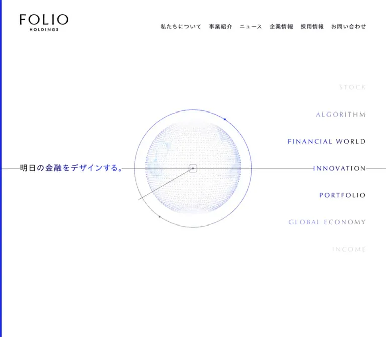
FOLIO Holdings presents its financial and technology businesses through a restrained white canvas, saturated blue accents, and diagrams that suggest an interconnected portfolio. A fine point sphere and circular orbit occupy the center of the opening screen. The Japanese statement sits to the left on desktop, while a vertically spaced column of financial terms balances the right. A narrow blue line remains visible at the extreme left edge.
Below the opening, this is a substantial corporate information site. Four numbered sections lead through the mission, two group businesses, recent announcements, and company information. Portrait business cards introduce richer blue imagery; pale company-profile tiles return to quiet line illustrations. The footer repeats the group identity and gives primary and policy navigation enough room to remain distinct. Preserve this change in density across the page rather than applying one identical card layout to every section.
How to Read This Reference
- Measured means a value supplied in rendered element rectangles or computed styles. Values are in CSS pixels unless stated otherwise.
- Declared means a custom property present in the supplied evidence. Its existence does not establish that every visually similar element uses it.
- Estimated means a visual approximation from an original-page capture, particularly for artwork geometry, child typography, and the scrolled header.
- Recommended means an implementation choice for reuse. Breakpoints, substitute graphics, accessibility additions, and unobserved interaction states are explicitly treated this way.
- Element rectangles describe layout boxes. An inline logo link with a 16px-high rectangle does not establish a 16px-high logo image.
- Only two viewport sizes were inspected. Responsive changes between them are established; the exact media queries and interpolation formulas are not.
- All token aliases introduced here are descriptive implementation names unless explicitly identified as source properties.
Tokens — Colors
Core Palette
| Name | Value | Evidence / source token | Role |
|---|---|---|---|
| White Canvas | #ffffff |
Declared --color-background-area-white, --color-surface-button-neutral, and --color-text-white; white computed pill background |
Visible page canvas, neutral controls, illustration medallions, and reversed text |
| Financial Blue | #1122d9 |
Declared --color-text-accent, --color-text-link, and --color-object-accent; computed selected-filter text |
Accent text, navigation cues, and the principal UI blue |
| Primary Ink | #202128 |
Declared --color-text-primary; computed body and link color |
Japanese interface text, navigation, and business descriptions on light imagery |
| Secondary Gray | #70707e |
Declared --color-text-secondary and --color-object-secondary; computed policy-link text |
Legal navigation, secondary details, and a useful reference for subdued diagram lines |
| Pale Blue Surface | #edf2fa |
Computed company-card and selected-filter background | Quiet informational cards and selected category surface |
| Fine Divider | #e0e1e8 |
Declared --color-stroke-divider-low |
Low-emphasis separator token; visually consistent with the footer rule |
| Hover Blue | #4773f7 |
Declared --color-text-hover |
Available interaction color; its application was not exercised |
| Quiet Gray Surface | #f7f8fa |
Declared --color-folio-gray-00 |
Supporting surface token; no specific visible component assignment was established |
| Disabled Object | #dadbe3 |
Declared --color-object-disable |
Available disabled-state token; no disabled control was inspected |
| Translucent Blue Area | rgba(220,230,245,.5) |
Declared --color-background-area-low-alpha |
Available translucent surface treatment; keep separate from the directly measured solid card fill |
Color Behavior
White is the dominant visible surface even though the sampled root and body backgrounds compute as transparent. Use the visible canvas and declared white tokens together as the evidence for the page background.
Blue is concentrated in rules, small circles, section labels, and diagram details. It does not become a full-width promotional background. The business imagery contains its own pale cyan, medium blue, and darker blue variations; those image colors are not additional measured UI tokens.
The opening statement changes visually from dark text toward blue, and the financial terms vary in strength from nearly invisible to clear blue or dark ink. The screenshots establish that tonal arrangement, but not its gradient stops, opacity values, or animation sequence. A restrained text gradient and opacity ramp are reasonable approximations for a new implementation.
Tokens — Typography
Japanese Interface
- Computed source stack:
MFW-PAotoGothicStdN-Regular, sans-serif. - Measured base:
16px, weight400, and0.8pxletter spacing. - Measured navigation:
16px / 24px, weight400. - Declared body rhythm:
16px / 1.8with regular and600variants. - Character: clear Japanese gothic text with open tracking and generous paragraph leading.
The evidence establishes the computed family declaration, not a downloadable font file or permission to redistribute it. Retain the source face when appropriately available; otherwise use a deliberate Japanese sans-serif fallback and check line wrapping again.
Latin Text and Display Capitals
The declared Latin-family variable is:
--font-family-latin: '__Lato_6e409a', '__Lato_Fallback_6e409a';
These are generated family identifiers associated with the declared Lato stack. Their presence does not prove that the fine display capitals in the opening or section labels use that stack. Those individual elements were not included in the computed-font sample.
Visually, the financial terms use slender, widely spaced capitals. Section labels such as COMPANY PROFILE are also light and spacious. Preserve their weight and tracking relationship without assigning an unverified font name. The FOLIO, folio, and AlpacaTech marks should remain artwork rather than approximate text treatments.
Type Scale
| Role | Value | Evidence and use |
|---|---|---|
| Body and primary navigation | 16px, weight 400, tracking 0.8px |
Measured on both viewports |
| Navigation and standard pill line height | 24px |
Measured |
| Body paragraph line height | 1.8, equivalent to 28.8px at 16px |
Declared body token; a suitable reuse default |
| Strong text | Weight 600 |
Declared --font-weight-bold and multiple title/body tokens |
| Large display | 48px / 1.5 |
Declared display token; not evidence that the opening statement is 48px |
| Title 1 | 32px |
Declared --font-size-title-1; component assignment not established |
| Title 2 / medium display | 24px |
Declared; medium-display line height is 1.8 |
| Title 3 | 20px |
Declared; company-card headings visually appear close to this size |
| Title 4 | 16px |
Declared |
| Title 5 | 14px / 21px |
Declared |
| Title 6 | 12px / 18px |
Declared |
| Policy links | 12px / 18px, weight 400, tracking 0.8px |
Measured on both viewports |
Compact mobile VIEW ALL |
12px / 18px, tracking 0.8px |
Measured |
| Desktop opening statement | Approximately 28–30px |
Screenshot estimate; single line at the inspected width |
| Mobile opening statement | Approximately 24px / 36px |
Screenshot estimate; two lines |
| Desktop financial terms | Approximately 24px, widely tracked |
Screenshot estimate; individual family and spacing unmeasured |
| Mobile financial terms | Approximately 14px, widely tracked |
Screenshot estimate |
| Group introduction | Approximately 24px, strong weight, roughly 48px line steps |
Desktop screenshot estimate; not a computed heading measurement |
Several source typography properties contain the literal value 5%. Do not copy that value directly into letter-spacing. Use the valid declared general token 0.05em when appropriate. Preserve the measured 0.8px override for small policy and compact-button text if matching those controls closely; at 12px, 0.05em would only be 0.6px.
Tokens — Spacing & Shapes
Density: broad section spacing around small navigation and control details. Geometry: circles, fine straight lines, softly rounded rectangles, and long outlined pills.
Spacing Scale
| Value | Evidence | Typical use |
|---|---|---|
4px |
Calculated from mobile category-button rectangles | Gap between horizontal news filters |
8px |
Measured selected-filter vertical padding | Compact control inset |
16px |
Declared --spacing-xs; multiple measured gaps and paddings |
Profile-card gaps, desktop header navigation gaps, mobile business-card padding |
24px |
Measured | Main mobile gutter, mobile profile-card padding, vertical gap between mobile business cards |
32px |
Declared --spacing-m; measured card padding |
Desktop profile-card inset and business-card horizontal inset |
40px |
Calculated from desktop footer links | Gap between primary footer links |
45px |
Calculated from desktop card and news-column rectangles | Business-card column gap and news sidebar-to-list gap |
64px |
Declared --spacing-xl |
Large spacing token; also the measured mobile menu-button size |
72px |
Measured desktop content and footer inset | Main desktop gutter |
80px |
Declared --spacing-xxl; calculated mobile profile-to-footer gap |
Mobile section separation |
160px |
Calculated desktop profile-to-footer gap | Broad desktop separation before the footer |
189px |
Difference between desktop business-card top positions | Deliberate business-card stagger |
Border Radius
| Element | Value | Status |
|---|---|---|
| Business and company-profile cards | 16px |
Measured |
| Standard 50px pill | 25px |
Measured |
| Selected 40px news filter | 20px |
Measured |
Compact mobile VIEW ALL |
25px on a 34px-high box |
Measured; visually capsule-shaped |
| Mobile menu button | 50% on 64 × 64px |
Measured |
| Scrolled desktop header | Approximately 32px or greater |
Screenshot estimate on a roughly 64px-high pill |
| Small source radius | 4px |
Declared --radius-xxxs; visible assignment not established |
| Large source radius | 40px |
Declared --radius-l; do not assume a specific assignment |
Layout Measurements
| Element | Desktop: 1440 × 1000 | Mobile: 390 × 844 |
|---|---|---|
| Document height | 5204.78px, reported rounded as 5205 |
6584.52px, reported rounded as 6585 |
| Main content width | 1296px, from 72px side gutters |
342px, from 24px side gutters |
| Initial header wrapper | 104px high |
80px high |
| Initial logo-link width | 138px |
92px |
| Outer hero orbit | Approximately 432px diameter |
Approximately 216px diameter |
| Hero orbit center | Approximately (720, 500) |
Approximately (195, 422) |
| Business card | 364 × 647px |
294 × 514.8px |
| Business-card inset | 24px 32px |
16px |
| Business-card arrangement | Two columns, 45px gap, 189px stagger | One centered column, 24px vertical gap |
Standard BUSINESS pill |
240 × 50px |
279 × 50px |
OUR MISSION pill |
240 × 50px |
279 × 50px |
VIEW ALL pill |
240 × 50px |
160 × 34px |
| News filter rail | Approximately 221.61px wide |
One 342px-wide horizontal row |
| News article column | Approximately 1029.39px wide |
342px wide |
| Profile card | Approximately 421.33 × 368px |
342 × 245px |
| Profile-card gap | 16px |
16px |
| Footer | 249px high |
657px high |
| Footer main logo link | 184 × 75px |
184 × 75px |
The desktop profile grid follows directly from the measurements: (1296 - 2 × 16) / 3 = 421.33px. The business cards occupy a narrower centered composition of 364 + 45 + 364 = 773px. These are different layout systems within the same page.
Components
Page Edge and Section Index
A blue strip approximately 4px wide runs down the left edge in every supplied original-page capture. It is visually separate from the content gutter. Treat it as decoration, not as a measured progress indicator; no progress semantics were established.
The four sections use a small blue number and an uppercase English label:
01—ABOUT US02—GROUP COMPANIES03—NEWS04—COMPANY PROFILE
The visible company-profile index includes a short horizontal blue stroke above the number. The number is visually around 12px; the section label is around 24px. Their individual computed styles were not supplied. Keep this index subordinate to the actual content rather than enlarging it into a promotional heading.
Desktop Header
Role: primary corporate navigation and persistent identity.
The initial state is unboxed against white. The logo sits at the left content gutter, with six Japanese navigation links aligned across the right: 私たちについて, 事業紹介, ニュース, 企業情報, 採用情報, and お問い合わせ.
The measured navigation uses 16px text, 24px line height, and approximately 16px gaps between link boxes. The header wrapper is 104px high. Its inline logo link is 138px wide; its 16px rectangle height must not be used as the artwork height.
In the scrolled desktop captures, the header appears as a floating white capsule approximately 1296px wide and 64px high, positioned about 16px below the viewport top. The logo is visually reduced to roughly 72px wide, with navigation still on the right. A faint blue-tinted shadow separates the capsule from the page.
The persistent appearance across scroll positions is visible, but the exact positioning implementation, scroll threshold, and transition path are unverified. Duplicate link text exists in the extracted desktop DOM while each label appears once in the screenshot; this does not establish a particular rolling-text hover effect.
Mobile Header and Menu Control
The opening mobile header shows a smaller logo near the upper left and three thin blue horizontal lines at the upper right. The measured menu button is a 64px circle at x = 318, y = 16, leaving 8px to the right viewport edge. The visible line artwork is approximately 32px wide.
At the footer scroll position, the menu control remains visible inside a white circular surface with a soft shadow. The initial logo is no longer visible there. This establishes distinct resting appearances, not the contents or behavior of an opened menu.
No menu-open capture, focus behavior, accessible name, or dismissal behavior was supplied. The empty extracted button text alone is not proof that its accessible name is missing.
Opening Composition
Role: communicate the financial portfolio idea before the informational sections.
The desktop arrangement has three principal anchors:
- The statement
明日の金融をデザインする。starts around the 72px gutter and aligns with the center horizontal guide. - A point-based sphere sits inside a fine circular orbit at the viewport center.
- A right-aligned column of financial terms ends at the opposite 72px gutter.
The orbit is approximately 432px across, with an inner sphere around 350px across. Small blue and gray nodes sit on the orbit. A diagonal line extends from a small central square toward the lower left, while a thin horizontal gray line crosses the page at approximately y = 500px. The central square is around 30px across.
The point sphere is airy and translucent, with layered circular or latitudinal traces rather than a solid shaded ball. Its drawing technology is not established by the supplied DOM. Do not claim a particular canvas, SVG, video, or WebGL implementation.
The visible desktop term sequence includes FINANCIAL WORLD, INNOVATION, PORTFOLIO, GLOBAL ECONOMY, INCOME, AUTOMATION, and STOCK. Terms occupy roughly 100px vertical intervals. The mobile capture also shows ALGORITHM. These are visual vocabulary, with no supplied link evidence identifying them as controls.
On mobile, the statement moves above the diagram and breaks into two lines. The orbit becomes approximately 216px across, centered around (195, 422). The central square is approximately 16px. The terms remain right aligned near the 24px gutter and overlap the diagram's horizontal area, with roughly 68px vertical steps. Preserve this deliberate layering instead of putting the entire composition into a simple vertical stack.
The hero statement and terms are visible in the captures but absent from the supplied text extraction. Their text-rendering and accessibility implementation remain unverified.
Mission Section
The DOM establishes the heading 未来を創る「ポートフォリオ」へ, three paragraphs about changing financial needs and the group's combination of data science, ideas, and technology, and an OUR MISSION link to /about/.
The desktop extraction includes deliberate short lines; the mobile extraction presents more continuous paragraphs. The mission button measures 240 × 50px on desktop and 279 × 50px on mobile, centered at x = 55.5px in the mobile viewport.
There is no direct mission-section screenshot in the supplied set. Its complete visual composition, heading size, illustration treatment, and paragraph positioning should not be reconstructed from the text extraction alone. For reuse, retain a clear statement, readable paragraphs, and the established outlined action treatment.
Group Introduction and Business Cards
Role: introduce the two businesses through distinct imagery within a shared geometry.
The desktop introduction occupies the upper left and reads as three spacious, strong lines. Below and alongside it, two portrait cards form a staggered composition. The folio card starts 189px lower than the AlpacaTech card. Both measure 364 × 647px, with 16px corners and 24px vertical / 32px horizontal padding.
Each card is a single anchor containing branded imagery, a logo, a short Japanese description, and a small circular arrow near the bottom right. The arrow is a visual part of the larger link, not a separate nested button.
folio card: pale blue ribbon-like shapes frame angled mobile and tablet product screens. The black script logo and dark description sit over a light lower region. Its destination is /business/#our-solution-robopro.
AlpacaTech card: translucent blue dashboard panels and small human figures create a deeper spatial scene. The lower area darkens sufficiently for the white logo and white description visible in the capture. Although the parent anchor computes to dark text, those visible white descendants clearly use a different treatment. Its destination is /business/#our-solution-alpaca.
Fine orbits, slanted lines, and small labels extend outside the image rectangles. Keep these diagrams behind the cards; the imagery is clipped to rounded corners while the surrounding geometry is not.
On mobile, both cards measure approximately 294 × 514.8px and sit at x = 48px, introducing an extra 24px inset inside the normal content gutter. They stack in reading order with a 24px gap and no desktop stagger. Padding reduces to 16px. The mobile card dimensions are measured from DOM evidence; no direct mobile business-card screenshot was supplied.
Outlined Navigation Pill
Role: a consistent route to broader content.
OUR MISSION, BUSINESS, and desktop VIEW ALL use white capsules with a fine gray outline, a left-aligned label, and a small blue arrow disc at the right. Standard dimensions are 240 × 50px, with 25px radius and padding 12px 16px 12px 24px. Text is 16px / 24px.
The arrow disc is visually about 24px across. Its exact SVG or icon asset was not supplied. A simple thin right arrow is a reasonable implementation substitute.
On mobile, OUR MISSION and BUSINESS become centered 279 × 50px controls. VIEW ALL is intentionally different: it sits at the right gutter as a 160 × 34px capsule with 12px / 18px text and padding 7px 7px 7px 16px.
Do not apply the same mobile width to every pill. The smaller archive link has a separate measured treatment.
News Categories and Article List
Role: make current corporate announcements browsable without changing the page's restrained visual language.
The desktop DOM establishes a left category rail and a wider article list. The rail is approximately 221.61px wide, followed by a 45px gap and a 1029.39px list. It includes CATEGORY and three buttons: すべて, プレスリリース, and お知らせ.
The selected すべて button has a pale blue background, blue text, 20px radius, 40px height, and 8px 16px padding. The other two buttons have transparent backgrounds in the sampled state. Their top positions are 64px apart, giving a 24px gap between 40px controls.
Mobile places the buttons in one row above the articles. Their measured widths are approximately 88px, 147.53px, and 98.48px, with 4px gaps. CATEGORY does not appear in the mobile visible-text extraction. The first article begins 16px below the controls.
Five article links are present. Each combines a date, group-company name, category, and Japanese headline. The latest visible date is September 10, 2026. Desktop row boxes are approximately 132.8px high, except the longer second item at 161.6px. Mobile rows range from approximately 129.8px to 216.2px as titles wrap.
Successive article boxes are separated by 1px in the measured coordinates. A fine divider is a suitable implementation, although article border properties were not included in the evidence. Metadata badge colors, inner row spacing, and category-filter results were not directly inspected. Do not invent thumbnail cards or fixed-height title truncation.
Company-Profile Cards
Role: three equal entry points to corporate information.
Desktop uses three pale blue cards in a single row, each approximately 421.33 × 368px with 16px corners and 32px padding. Their anatomy is consistent:
- A dark Japanese title at the upper left.
- A white circular medallion centered in the middle.
- A delicate blue-gray line illustration inside the medallion.
- A small blue arrow disc at the lower right.
The titles and destinations are 会社概要 → /corporate/, 役員紹介 → /corporate/#officer, and 沿革 → /corporate/#history. The illustrations depict a book or document, a standing thoughtful figure, and a hand drawing a line. Fine line extensions and small nodes connect them visually to the opening diagram.
The white medallions are approximately 160px across in the desktop screenshot. The card-title typography appears close to 20px with a strong weight; this is a visual estimate, distinct from the measured 16px inherited anchor style.
Mobile changes to one column of 342 × 245px cards with 24px padding and 16px gaps. The supplied mobile footer capture shows only the lower part of the last card, so its full illustration placement is supported less directly than the desktop composition.
Footer
Role: close the page with group identity, repeat navigation, and separate legal destinations.
A fine horizontal rule spans the content width. The desktop footer begins 160px below the profile cards; the mobile footer begins 80px below them.
On desktop, a 184 × 75px FOLIO Holdings logo anchors the left. A subsidiary-logo row sits below, with a 44 × 25px folio link and a 107 × 17px AlpacaTech link separated by a fine vertical divider. The observed external destinations are https://corp.folio-sec.com/ and https://www.alpaca-tech.ai/; those sites were not inspected.
Primary navigation runs horizontally on the right with 40px gaps. Smaller gray policy links form subordinate lines beneath it. Their measured type is 12px / 18px with 0.8px tracking. A large, sparse point-sphere graphic rises from the lower edge behind the footer content.
Mobile centers the unchanged 184px-wide main logo and subsidiary row. Primary links become two columns and three rows, with 24px line boxes and 24px vertical gaps. Policy links form a centered vertical list; their top positions are 40px apart. The longest policy label wraps onto two lines. This reorganization produces a 657px footer instead of the desktop's 249px footer.
Keep the background points subordinate to text and preserve the distinction between primary navigation and legal links.
Tokens — Motion & Interaction
| Treatment | Supplied value or observation | What is established |
|---|---|---|
| Standard navigation pills | box-shadow 0.25s ease-out |
A declared shadow transition; activated appearance not supplied |
| Business cards | background-size 0.25s ease-out, box-shadow 0.25s ease-out |
Image-size and shadow transitions are defined; target scale and shadow are unknown |
| Company-profile cards | background-color 0.25s, box-shadow 0.25s |
Surface and shadow transitions are defined; end states were not exercised |
| News category buttons | color 0.25s |
Text-color transition is defined; filtering behavior was not tested |
| Mobile menu button | 0.5s forwards Header_shadowout__nvqJ6 |
A named finite animation is present; its keyframes and trigger are not supplied |
| Header shadow | 0 2px 4px rgba(17,34,217,.1) |
Declared --shadow-header; visually consistent with the scrolled capsule |
| Header across scroll positions | Unboxed opening; capsule or circular menu surface below | Distinct captured appearances; exact threshold and transition are unverified |
| Hero sphere and keyword rail | Different arrangements in different viewport captures | Appearance is established; speed, direction, timeline, and scroll coupling are not |
The collector reports an initial observation lasting at least five seconds and bounded waits for visible finite motion and layout stability. Perpetual animations were temporarily paused during readiness checks and then resumed. This procedure does not provide a recording or establish a particular hero animation.
Some sampled elements report animation: none or only transition: all. These summaries are not evidence that the complete page is static, nor that a meaningful animation duration exists on those elements.
Recommended motion for reuse: retain the measured 250ms interaction rhythm. If an orbital animation is added, make it slow, decorative, and optional; a 20–30 second rotation would be a new design choice, not a source value. Keep labels readable and provide an equivalent static composition for reduced motion. Do not invent pointer parallax, snapping sections, or a rotating keyword control from these captures.
Surfaces
| Layer | Appearance | Purpose |
|---|---|---|
| Page canvas | White, with a narrow blue left edge | Establishes continuity through a long corporate page |
| Opening graphics | Fine blue-gray lines and translucent points | Gives the financial portfolio idea a spatial expression |
| Business cards | Rounded, full-bleed blue imagery | Differentiates the two businesses while retaining shared geometry |
| Profile cards | Solid pale blue with white circular inserts | Makes corporate navigation quiet and approachable |
| Standard actions | White outlined capsules with blue arrow discs | Provides clear navigation without large filled buttons |
| Selected category | Pale blue capsule and blue text | Shows the sampled active filter |
| Scrolled navigation | White capsule or circle with a faint blue shadow | Keeps navigation legible over content |
| Footer | White with a fine divider and sparse point artwork | Repeats identity while accommodating many secondary links |
There is no evidence for a broad system of heavy elevations. Use the measured header shadow sparingly. Cards get their identity from imagery, fill, radius, and linework rather than pronounced floating shadows.
Imagery
The imagery combines abstract financial diagrams, product visualization, and fine line illustrations. Its coherence comes from circles, points, translucent layers, and a limited blue-gray range.
The opening sphere is intricate but low contrast. It needs clean antialiasing and fine detail, not pixelated rendering. The business cards are more substantial: device mockups and ribbon-like surfaces for folio, spatial dashboard panels for AlpacaTech. The company-profile illustrations simplify the same visual vocabulary into human and document subjects.
Keep logos separate from ordinary typography. Preserve the contrast difference between the light folio card and the darker AlpacaTech card. Do not apply one identical text color or overlay to both.
Observed Asset References
No image file paths, font-file URLs, dimensions of source image files, or rendering-library identifiers were included in the supplied evidence. The following inventory identifies visible assets without inventing download locations.
| Visible asset | Placement | Evidence and implementation guidance |
|---|---|---|
| FOLIO Holdings wordmark | Initial header, compact desktop header, footer | Visible in original captures; use an authorized logo asset |
| Point sphere and orbital diagram | Opening screen | Visible at both viewports; rendering technology and source asset unknown |
| Financial vocabulary | Right side of opening | Visible text treatment; individual font assignment unknown |
| folio device composition | First business card | Desktop capture; preserve portrait framing and light text area |
| AlpacaTech dashboard composition | Second business card | Desktop capture; preserve spatial layers and darker lower area |
| Book, figure, and hand line illustrations | Profile-card medallions | Desktop capture; fine blue-gray strokes on white circles |
| Sparse point-sphere crop | Footer background | Desktop and mobile captures; decorative and partially cropped |
| Subsidiary logos | Business cards and footer | Visible artwork; homepage links establish navigation destinations |
A CSS dot pattern can act as a temporary sphere placeholder. It cannot reproduce the original point distribution, depth, or any unobserved animation. Replace the placeholder with suitable artwork or a separately developed graphic when visual fidelity matters.
Layout & Responsive Behavior
The page retains its content order while changing how each section uses width. Desktop has approximately 5205px of document height; mobile has approximately 6585px. Those heights describe the inspected content and should not become fixed implementation targets.
| Area | Desktop observation | Mobile observation |
|---|---|---|
| Main gutter | 72px | 24px |
| Initial navigation | Six visible text links | Logo and 64px menu control |
| Scrolled navigation | Wide white capsule | Floating circular menu control |
| Opening statement | Left of the sphere at its horizontal center | Above the sphere, in two lines |
| Opening sphere | Approximately 432px outer orbit | Approximately 216px outer orbit |
| Financial terms | Right rail with roughly 100px steps | Smaller right rail with roughly 68px steps, overlapping the diagram area |
| Business cards | Narrow centered pair with a 189px stagger | Centered 294px cards in one column |
| News filters | Vertical sidebar | Horizontal row above the articles |
| Article text | Broad rows with limited wrapping | Natural wrapping creates taller rows |
| Profile cards | Three equal columns | One column of shorter cards |
| Footer | Left identity, right navigation | Centered identity, two-column primary links, vertical policies |
The main desktop content happens to equal 90% of the inspected viewport, but one desktop sample does not establish a universal 5vw gutter formula. Likewise, the mobile business-card width is measured as 294px, not proven to be a percentage rule.
For a new implementation, a 1296px maximum content width, 72px large-screen gutter, 24px phone gutter, and a breakpoint near 900px are practical starting choices. The maximum width and breakpoint are recommendations. Test intermediate widths, short landscape screens, and text zoom before adopting them.
Keep navigation and essential copy above the decorative layers. The mobile keyword rail may cross the sphere's area, but it should not block the opening statement or interactive controls. Allow news and policy text to grow vertically rather than preserving screenshot heights through clipping.
Do’s and Don’ts
Do
- Keep white dominant and use
#1122d9for focused accents. - Preserve the fine blue left-edge line and recurring orbital vocabulary.
- Give the opening enough empty space for its thin lines and point sphere to remain legible.
- Keep Japanese interface text around the measured 16px scale with open tracking.
- Distinguish the light folio imagery from the darker AlpacaTech imagery.
- Preserve the 189px desktop business-card stagger and remove it in the mobile stack.
- Use 16px card corners, pale blue profile surfaces, and small circular arrow cues.
- Keep mission/business pills distinct from the smaller mobile news-archive pill.
- Reflow news categories into a horizontal mobile row.
- Center the mobile footer while retaining separate primary and policy navigation.
- Let long Japanese news titles and policy labels wrap naturally.
Don't
- Don't fill the opening with a large solid-blue panel or oversized conversion button.
- Don't replace delicate point and line graphics with a heavy glossy sphere.
- Don't scale the entire desktop opening down uniformly for mobile.
- Don't force business cards, news rows, and profile links into one generic card system.
- Don't use the parent anchor's dark computed color for the visibly white AlpacaTech content.
- Don't recreate the wordmarks with loosely similar fonts.
- Don't assign the Lato variable to every display label without element-level evidence.
- Don't copy literal
5%values into CSSletter-spacing. - Don't treat decorative financial terms as proven interactive controls.
- Don't infer menu contents, hover end states, or continuous animation timings from static captures.
- Don't fix the full document height or truncate headlines to match one screenshot.
Recommended Implementation Additions
These recommendations are for a new implementation; they are not verified features of the original page.
- Render the opening statement as a meaningful text heading even if the sphere and vocabulary use graphics. Hide purely decorative duplicates from assistive technology.
- Give the mobile menu an accessible name,
aria-expanded, andaria-controls. Implement keyboard navigation and appropriate focus handling for the chosen menu pattern. - Keep business and profile cards as whole-card links. Avoid nesting independent buttons inside those links.
- Represent news categories with semantic buttons and an exposed selected state. If content updates dynamically, announce the resulting count without moving focus unexpectedly.
- Preserve a visible blue focus outline. The 34px mobile archive link can retain its visual size while receiving a larger practical interaction area.
- Check text contrast over the real business images, especially the white AlpacaTech description. Use a restrained local overlay if the replacement image requires one.
- Provide a static alternative for any moving sphere or vocabulary animation. Decorative animation should never be necessary to understand the mission or navigate.
- Keep policy text at least as readable as the measured 12px treatment, with comfortable link spacing.
- Reserve image dimensions to prevent layout shifts and optimize portrait assets for their actual desktop and mobile card sizes.
- Test the chosen breakpoint, 200% text zoom, and short landscape viewports; only the two recorded viewport sizes are established by this reference.
Agent Prompt Guide
Quick Color Reference
- Main canvas and neutral controls:
#ffffff. - Accent text and arrow discs:
#1122d9. - Main Japanese text:
#202128. - Secondary and policy text:
#70707e. - Company-profile cards and selected filter:
#edf2fa. - Quiet divider token:
#e0e1e8. - Header shadow:
0 2px 4px rgba(17,34,217,.1). - Imagery: blue-toned, with light folio and darker AlpacaTech treatments.
Overall Prompt
“Create a Japanese financial-group corporate homepage with a white canvas, a narrow blue line at the left edge, dark Japanese gothic text, and restrained blue accents. Build a spacious opening around a delicate point sphere, a fine circular orbit, a diagonal guide, and a horizontal center line. Place a modest Japanese statement on the left and slender, widely tracked financial terms on the right. Follow with numbered mission, group-company, news, and company-profile sections. Use two portrait business cards staggered on desktop, a category sidebar beside text-based news rows, and three pale blue profile cards with white circular line illustrations. On mobile, move the opening statement above the diagram, stack the business and profile cards, place news filters in a horizontal row, and center the footer. Use small circular arrow cues and outlined pills. Preserve live text, accessible links, and a static alternative for decorative motion.”
Example Component Prompts
- Opening: “A white 1440px desktop composition with a roughly 432px orbital diagram centered in the viewport, an airy blue-gray point sphere, a small central target, and a fine diagonal extending down-left. Place
明日の金融をデザインする。at the left gutter and seven widely spaced financial terms at the right. Keep the drawing light and the headline modest.” - Business cards: “Two 364 × 647px portrait links with 16px corners, separated by 45px. Lower the first card by 189px. Use light blue device imagery with dark text for the first and deeper blue dashboard imagery with white text for the second. Add subtle orbit lines outside the cards and a small dark arrow circle inside each lower-right corner.”
- Company profile: “Three equal pale blue cards with 16px corners and 32px insets. Each has a dark Japanese title at top left, a centered white 160px circle holding a fine blue-gray illustration, and a 24px blue arrow disc at bottom right. Use a book, thoughtful figure, and drawing hand as the three subjects.”
- News: “A restrained announcement section with a narrow category rail and a broad list of linked dates, company names, categories, and Japanese headlines. Use a pale blue selected pill with blue text. On phones, move all three category buttons into one row and let article heights follow wrapping.”
- Footer: “A white footer with a fine top rule, a prominent FOLIO Holdings mark, smaller subsidiary marks, and a faint cropped point sphere at the bottom. Use right-aligned horizontal navigation on desktop; center the identity and use two columns of primary links on mobile, followed by a vertical gray policy list.”
Quick Start
CSS Custom Properties
This is a new implementation scaffold, not recovered source CSS. Measured colors, control dimensions, card geometry, and gaps are retained where practical. The 900px breakpoint, 1296px content cap, generic display-font substitute, approximate hero geometry, and hover end states are recommendations.
The Japanese source family and Lato must be provided separately if used. The generic serif display family below is only a placeholder for the unmeasured display capitals. No original image or font assets are bundled. The sphere below is a static dot-pattern approximation.
:root {
  /* Source colors and directly measured surfaces. */
  --folio-white: #fff;
  --folio-accent: #1122d9;
  --folio-ink: #202128;
  --folio-muted: #70707e;
  --folio-panel: #edf2fa;
  --folio-divider: #e0e1e8;
  --folio-hover: #4773f7;
  --folio-header-shadow: 0 2px 4px rgba(17, 34, 217, .1);

  /* Font files are not included. Display serif is a substitute. */
  --folio-font-ja: 'MFW-PAotoGothicStdN-Regular', sans-serif;
  --folio-font-latin: 'Lato', sans-serif;
  --folio-font-display: serif;
  --folio-body: 16px;
  --folio-caption: 12px;
  --folio-leading: 1.8;
  --folio-tracking: .05em;
  --folio-weight-regular: 400;
  --folio-weight-strong: 600;

  /* The maximum width is a recommended cap. */
  --folio-gutter: 72px;
  --folio-content-max: 1296px;
  --folio-card-radius: 16px;
  --folio-pill-radius: 25px;
  --folio-orbit-size: 432px;
  --folio-target-size: 30px;
  --folio-motion: 250ms ease-out;
}

* { box-sizing: border-box; }

body {
  margin: 0;
  color: var(--folio-ink);
  background: var(--folio-white);
  font-family: var(--folio-font-ja);
  font-size: var(--folio-body);
  font-weight: var(--folio-weight-regular);
  line-height: var(--folio-leading);
  letter-spacing: var(--folio-tracking);
}

body::before {
  content: '';
  position: fixed;
  inset: 0 auto 0 0;
  z-index: 100;
  width: 4px;
  background: var(--folio-accent);
  pointer-events: none;
}

a { color: inherit; }
button { font: inherit; letter-spacing: inherit; }
img { display: block; max-width: 100%; height: auto; }

.folio-container {
  width: min(
    calc(100% - 2 * var(--folio-gutter)),
    var(--folio-content-max)
  );
  margin-inline: auto;
}

.folio-header {
  position: fixed;
  inset: 0 0 auto;
  z-index: 30;
  padding: 40px var(--folio-gutter) 0;
}

.folio-header__inner {
  display: flex;
  align-items: center;
  justify-content: space-between;
  gap: 32px;
}

.folio-brand { width: 138px; }
.folio-nav { display: flex; align-items: center; gap: 16px; }
.folio-nav a { text-decoration: none; line-height: 24px; }

/* Set this state in application code; the source threshold is unknown. */
.folio-header[data-scrolled='true'] { padding-top: 16px; }
.folio-header[data-scrolled='true'] .folio-header__inner {
  min-height: 64px;
  padding: 12px 32px;
  border-radius: 40px;
  background: var(--folio-white);
  box-shadow: var(--folio-header-shadow);
}
.folio-header[data-scrolled='true'] .folio-brand { width: 72px; }

.folio-menu {
  display: none;
  width: 64px;
  height: 64px;
  padding: 0;
  border: 0;
  border-radius: 50%;
  color: var(--folio-accent);
  background: transparent;
  place-items: center;
}

.folio-menu__lines {
  display: grid;
  align-content: space-between;
  width: 32px;
  height: 16px;
}
.folio-menu__lines span { height: 1px; background: currentColor; }

/* Approximate static opening composition. */
.folio-hero {
  position: relative;
  isolation: isolate;
  height: 100svh;
  min-height: 640px;
  overflow: hidden;
}

.folio-hero::before {
  content: '';
  position: absolute;
  top: 50%;
  left: 4px;
  right: 0;
  height: 1px;
  background: var(--folio-muted);
}

.folio-hero__copy {
  position: absolute;
  z-index: 2;
  top: 50%;
  left: var(--folio-gutter);
  margin: 0;
  transform: translateY(-50%);
  background: var(--folio-white);
  font-size: 28px;
  font-weight: 400;
  line-height: 1.5;
}

.folio-hero__accent {
  color: var(--folio-accent);
}
.folio-hero__break { display: none; }

.folio-orbit {
  position: absolute;
  top: 50%;
  left: 50%;
  width: var(--folio-orbit-size);
  aspect-ratio: 1;
  transform: translate(-50%, -50%);
  border: 1px solid rgba(17, 34, 217, .55);
  border-radius: 50%;
  pointer-events: none;
}

.folio-orbit::before {
  content: '';
  position: absolute;
  top: 15%;
  left: 86%;
  width: 5px;
  height: 5px;
  border-radius: 50%;
  background: var(--folio-accent);
}

.folio-orbit::after {
  content: '';
  position: absolute;
  top: 50%;
  left: 50%;
  width: 54%;
  height: 1px;
  transform: rotate(150deg);
  transform-origin: left center;
  background: var(--folio-muted);
}

.folio-sphere {
  position: absolute;
  inset: 9%;
  border-radius: 50%;
  background-image: radial-gradient(
    circle, rgba(17, 34, 217, .32) .65px, transparent .9px
  );
  background-size: 4px 4px;
  mask-image: radial-gradient(ellipse, #000 30%, transparent 72%);
}

.folio-target {
  position: absolute;
  top: 50%;
  left: 50%;
  width: var(--folio-target-size);
  height: var(--folio-target-size);
  transform: translate(-50%, -50%);
  border: 1px solid var(--folio-muted);
  border-radius: 4px;
}

.folio-terms {
  position: absolute;
  z-index: 2;
  top: 50%;
  right: var(--folio-gutter);
  margin: 0;
  padding: 0;
  transform: translateY(-50%);
  list-style: none;
  text-align: right;
  font-family: var(--folio-font-display);
  font-size: 24px;
  line-height: 100px;
  letter-spacing: .2em;
}

.folio-terms span { background: var(--folio-white); }
.folio-terms li:nth-child(1),
.folio-terms li:nth-child(7) { opacity: .18; }
.folio-terms li:nth-child(2),
.folio-terms li:nth-child(6) { opacity: .5; }
.folio-terms li:nth-child(4) { color: var(--folio-accent); }

.folio-section { padding-top: 160px; }
.folio-index { color: var(--folio-accent); font-size: 12px; }
.folio-index::before {
  content: '';
  display: block;
  width: 16px;
  height: 1px;
  margin-bottom: 8px;
  background: currentColor;
}
.folio-section__label {
  margin: 44px 0 32px;
  color: var(--folio-accent);
  font: 400 24px / 1.5 var(--folio-font-display);
}

.folio-pill {
  display: flex;
  align-items: center;
  justify-content: space-between;
  gap: 16px;
  width: 240px;
  max-width: 100%;
  height: 50px;
  padding: 12px 16px 12px 24px;
  border: 1px solid rgba(112, 112, 126, .5);
  border-radius: var(--folio-pill-radius);
  color: var(--folio-ink);
  background: var(--folio-white);
  font-size: 16px;
  line-height: 24px;
  text-decoration: none;
  transition: box-shadow var(--folio-motion);
}

.folio-arrow {
  display: inline-grid;
  flex: 0 0 24px;
  width: 24px;
  height: 24px;
  place-items: center;
  border-radius: 50%;
  color: var(--folio-white);
  background: var(--folio-accent);
  font: 400 16px / 1 sans-serif;
  letter-spacing: 0;
}

.folio-business-grid {
  display: grid;
  grid-template-columns: repeat(2, minmax(0, 364px));
  align-items: start;
  gap: 45px;
  max-width: 773px;
  margin-inline: auto;
}

.folio-business-card {
  display: flex;
  flex-direction: column;
  justify-content: flex-end;
  min-height: 647px;
  padding: 24px 32px;
  border-radius: var(--folio-card-radius);
  overflow: hidden;
  background-color: var(--folio-panel);
  /* Supply an authorized image through this property. */
  background-image: var(--business-image, none);
  background-position: center;
  background-size: cover;
  text-decoration: none;
  transition: background-size var(--folio-motion),
              box-shadow var(--folio-motion);
}

.folio-business-card:first-child { margin-top: 189px; }
.folio-business-card--dark {
  color: var(--folio-white);
  background-color: var(--folio-accent);
}
.folio-business-card p { margin: 24px 0 12px; line-height: 1.8; }
.folio-business-card .folio-arrow {
  align-self: flex-end;
  background: var(--folio-ink);
}

.folio-news-layout {
  display: grid;
  grid-template-columns: 221.61px minmax(0, 1fr);
  gap: 45px;
}

.folio-filters { display: flex; flex-direction: column; gap: 24px; }
.folio-filter {
  min-height: 40px;
  padding: 8px 16px;
  border: 0;
  color: var(--folio-ink);
  background: transparent;
  text-align: left;
  line-height: 24px;
  cursor: pointer;
  transition: color 250ms;
}
.folio-filter[aria-pressed='true'] {
  border-radius: 20px;
  color: var(--folio-accent);
  background: var(--folio-panel);
}

/* Inner news spacing is an adaptation, not a measured source rule. */
.folio-news-item {
  display: block;
  padding-block: 32px;
  border-bottom: 1px solid var(--folio-divider);
  text-decoration: none;
}
.folio-news-meta {
  display: flex;
  flex-wrap: wrap;
  gap: 12px;
  color: var(--folio-muted);
  font-size: 12px;
}
.folio-news-title { margin: 16px 0 0; font-size: 16px; font-weight: 400; }
.folio-news-more { margin: 40px 0 0 auto; }

.folio-profile-grid {
  display: grid;
  grid-template-columns: repeat(3, minmax(0, 1fr));
  gap: 16px;
}

.folio-profile-card {
  display: grid;
  grid-template-rows: auto 1fr auto;
  min-height: 368px;
  padding: 32px;
  border-radius: var(--folio-card-radius);
  background: var(--folio-panel);
  text-decoration: none;
  transition: background-color 250ms, box-shadow 250ms;
}
.folio-profile-card h3 {
  margin: 0;
  font-size: 20px;
  font-weight: 600;
  line-height: 1.5;
}
.folio-profile-art {
  width: 160px;
  height: 160px;
  align-self: center;
  justify-self: center;
  border-radius: 50%;
  background: var(--folio-white);
}
.folio-profile-card .folio-arrow { justify-self: end; }

.folio-footer { position: relative; margin-top: 160px; }
.folio-footer__inner {
  display: grid;
  grid-template-columns: 184px minmax(0, 1fr);
  gap: 48px;
  padding-block: 58px;
  border-top: 1px solid var(--folio-divider);
}
.folio-footer__brand { width: 184px; }
.folio-footer__subsidiaries {
  display: flex;
  align-items: center;
  gap: 16px;
  margin-top: 32px;
}
.folio-footer__primary {
  display: flex;
  flex-wrap: wrap;
  justify-content: flex-end;
  gap: 24px 40px;
  margin-top: 14px;
}
.folio-footer__policies {
  display: flex;
  flex-wrap: wrap;
  justify-content: flex-end;
  gap: 16px;
  margin-top: 24px;
  color: var(--folio-muted);
  font-size: 12px;
  line-height: 18px;
  letter-spacing: .8px;
}
.folio-footer a { text-decoration: none; }

/* Recommended interaction end states and keyboard treatment. */
@media (hover: hover) {
  .folio-pill:hover,
  .folio-business-card:hover,
  .folio-profile-card:hover { box-shadow: var(--folio-header-shadow); }
  .folio-nav a:hover { color: var(--folio-hover); }
}

:where(a, button):focus-visible {
  outline: 2px solid var(--folio-accent);
  outline-offset: 4px;
}

/* Recommended breakpoint; only the endpoint layouts were inspected. */
@media (max-width: 900px) {
  :root {
    --folio-gutter: 24px;
    --folio-orbit-size: 216px;
    --folio-target-size: 16px;
  }

  .folio-header { padding: 32px 24px 0; }
  .folio-brand { width: 92px; }
  .folio-nav { display: none; }
  .folio-menu {
    position: fixed;
    top: 16px;
    right: 8px;
    display: grid;
  }
  .folio-header[data-scrolled='true'] .folio-header__inner {
    min-height: 0;
    padding: 0;
    background: transparent;
    box-shadow: none;
  }
  .folio-header[data-scrolled='true'] .folio-brand { display: none; }
  .folio-header[data-scrolled='true'] .folio-menu {
    background: var(--folio-white);
    box-shadow: var(--folio-header-shadow);
  }

  .folio-hero__copy {
    top: 144px;
    transform: none;
    font-size: 24px;
    line-height: 36px;
  }
  .folio-hero__break { display: block; }
  .folio-terms { font-size: 14px; line-height: 68px; letter-spacing: .1em; }
  .folio-section { padding-top: 80px; }

  .folio-pill--section { width: min(279px, 100%); margin-inline: auto; }
  .folio-news-more {
    width: 160px;
    height: 34px;
    padding: 7px 7px 7px 16px;
    font-size: 12px;
    line-height: 18px;
    letter-spacing: .8px;
  }
  .folio-news-more .folio-arrow {
    flex-basis: 18px;
    width: 18px;
    height: 18px;
    font-size: 12px;
  }

  .folio-business-grid {
    grid-template-columns: minmax(0, 1fr);
    width: min(294px, 100%);
    gap: 24px;
  }
  .folio-business-card { min-height: 515px; padding: 16px; }
  .folio-business-card:first-child { margin-top: 0; }

  .folio-news-layout { grid-template-columns: minmax(0, 1fr); gap: 16px; }
  .folio-category-label { display: none; }
  .folio-filters { flex-direction: row; flex-wrap: wrap; gap: 4px; }
  .folio-filter { flex: 1 0 auto; text-align: center; white-space: nowrap; }
  .folio-news-item { padding-block: 24px; }

  .folio-profile-grid { grid-template-columns: minmax(0, 1fr); }
  .folio-profile-card { min-height: 245px; padding: 24px; }
  /* Illustration size is a recommended mobile approximation. */
  .folio-profile-art { width: 120px; height: 120px; }

  .folio-footer { margin-top: 80px; }
  .folio-footer__inner { grid-template-columns: 1fr; gap: 32px; }
  .folio-footer__identity { justify-self: center; }
  .folio-footer__primary {
    display: grid;
    grid-template-columns: auto auto;
    justify-content: center;
    gap: 24px 32px;
    margin-top: 0;
    line-height: 24px;
  }
  .folio-footer__policies {
    flex-direction: column;
    align-items: center;
    gap: 22px;
    margin-top: 40px;
    text-align: center;
  }
}

@media (prefers-reduced-motion: reduce) {
  .folio-pill,
  .folio-business-card,
  .folio-profile-card,
  .folio-filter { transition: none; }
}
Minimal Component Markup
The example uses real destination URLs observed on the homepage. Illustration content is intentionally left as an explicit asset slot. The arrow character is a substitute, not an identified original icon.
<section class='folio-container folio-section' aria-labelledby='profile-title'>
  <div class='folio-index' aria-hidden='true'>04</div>
  <h2 class='folio-section__label' id='profile-title'>COMPANY PROFILE</h2>

  <div class='folio-profile-grid'>
    <a class='folio-profile-card' href='https://folio-hd.com/corporate/'>
      <h3>会社概要</h3>
      <span class='folio-profile-art' aria-hidden='true'>
        <!-- Insert authorized book line artwork here. -->
      </span>
      <span class='folio-arrow' aria-hidden='true'>→</span>
    </a>

    <a class='folio-profile-card' href='https://folio-hd.com/corporate/#officer'>
      <h3>役員紹介</h3>
      <span class='folio-profile-art' aria-hidden='true'>
        <!-- Insert authorized figure line artwork here. -->
      </span>
      <span class='folio-arrow' aria-hidden='true'>→</span>
    </a>

    <a class='folio-profile-card' href='https://folio-hd.com/corporate/#history'>
      <h3>沿革</h3>
      <span class='folio-profile-art' aria-hidden='true'>
        <!-- Insert authorized hand line artwork here. -->
      </span>
      <span class='folio-arrow' aria-hidden='true'>→</span>
    </a>
  </div>
</section>

<a class='folio-pill folio-pill--section' href='https://folio-hd.com/business/'>
  <span>BUSINESS</span>
  <span class='folio-arrow' aria-hidden='true'>→</span>
</a>
Menu behavior, category filtering, header-state changes, and any decorative animation require separate application logic. The scaffold has not been browser-tested in this analysis; verify it with the project's actual fonts, content, and assets.
Tailwind v4 Token Mapping
Optional mapping for a project already using Tailwind v4. This is not evidence that the original website uses Tailwind. Define the custom properties above first.
@theme inline {
  --color-folio-white: var(--folio-white);
  --color-folio-accent: var(--folio-accent);
  --color-folio-ink: var(--folio-ink);
  --color-folio-muted: var(--folio-muted);
  --color-folio-panel: var(--folio-panel);
  --color-folio-divider: var(--folio-divider);

  --font-corporate: var(--folio-font-ja);
  --font-corporate-latin: var(--folio-font-latin);

  --text-folio-body: 16px;
  --text-folio-body--line-height: 1.8;
  --text-folio-caption: 12px;
  --text-folio-caption--line-height: 18px;

  --spacing-folio-gutter: var(--folio-gutter);
  --radius-folio-card: 16px;
  --radius-folio-pill: 25px;
  --shadow-folio-header: var(--folio-header-shadow);
}
Sources & Evidence
- FOLIO Holdings homepage: original and final inspected URL, supplied HTTP 200 status, rendered title, page text, links, computed styles, custom properties, and element rectangles.
- Inspection timestamp: supplied retrieval at
2026-09-12T19:43:25.818Z, corresponding to September 13, 2026 in Japan. Separate timestamps for individual captures were not provided. - Desktop evidence: 1440 × 1000 viewport; opening, group-company, company-profile, and footer captures; rendered document height approximately 5204.78px.
- Mobile evidence: 390 × 844 viewport; opening and footer captures; rendered DOM measurements for intermediate sections; document height approximately 6584.52px.
- Collection behavior: at least five seconds of initial observation, bounded readiness checks, visible-image decoding checks, and scrolling through intermediate positions. Perpetual motion was paused during readiness checks and then resumed. These checks establish sampled states, not complete interaction coverage.
- Interaction limits: no supplied menu-open state, filter activation result, hover recording, keyboard test, or animation timeline. Subpage and subsidiary URLs are observed link destinations only; their contents were not inspected.
- Technical limits: no source image URLs, font files, full stylesheet, graphic-rendering implementation, or media-query definitions were supplied. Shared workers and service workers were disabled during collection. No additional browsing, commands, or file access were performed for this reference.
This reference describes the supplied current homepage evidence. Screenshot estimates and reusable implementation choices remain distinct from measured source values.
# FOLIO Holdings — Style Reference

> A white financial atlas drawn with blue points, fine orbital lines, and generous space.

**Website:** [folio-hd.com](https://folio-hd.com/)
**Original URL:** https://folio-hd.com/
**Final URL:** https://folio-hd.com/
**Status:** HTTP 200; the supplied inspection remained on the original homepage.
**Theme:** light in the inspected states.
**Inspected:** September 13, 2026, Japan Standard Time. The supplied evidence was retrieved at September 12, 2026, 19:43:25.818 UTC, equivalent to September 13 at 04:43:25.818 JST. Individual screenshot timestamps were not supplied.
**Viewports:** 1440 × 1000 desktop and 390 × 844 mobile, as recorded by the collector.
**Scope:** the current corporate homepage: opening composition, navigation, mission content, group companies, news, company-profile links, and footer. Desktop captures directly show the opening, group companies, company-profile cards, and footer. Mobile captures directly show the opening and footer. Mission and news details, and intermediate mobile component measurements, come from the supplied rendered DOM.

FOLIO Holdings presents its financial and technology businesses through a restrained white canvas, saturated blue accents, and diagrams that suggest an interconnected portfolio. A fine point sphere and circular orbit occupy the center of the opening screen. The Japanese statement sits to the left on desktop, while a vertically spaced column of financial terms balances the right. A narrow blue line remains visible at the extreme left edge.

Below the opening, this is a substantial corporate information site. Four numbered sections lead through the mission, two group businesses, recent announcements, and company information. Portrait business cards introduce richer blue imagery; pale company-profile tiles return to quiet line illustrations. The footer repeats the group identity and gives primary and policy navigation enough room to remain distinct. Preserve this change in density across the page rather than applying one identical card layout to every section.

## How to Read This Reference

- **Measured** means a value supplied in rendered element rectangles or computed styles. Values are in CSS pixels unless stated otherwise.
- **Declared** means a custom property present in the supplied evidence. Its existence does not establish that every visually similar element uses it.
- **Estimated** means a visual approximation from an original-page capture, particularly for artwork geometry, child typography, and the scrolled header.
- **Recommended** means an implementation choice for reuse. Breakpoints, substitute graphics, accessibility additions, and unobserved interaction states are explicitly treated this way.
- Element rectangles describe layout boxes. An inline logo link with a 16px-high rectangle does not establish a 16px-high logo image.
- Only two viewport sizes were inspected. Responsive changes between them are established; the exact media queries and interpolation formulas are not.
- All token aliases introduced here are descriptive implementation names unless explicitly identified as source properties.

## Tokens — Colors

### Core Palette

| Name | Value | Evidence / source token | Role |
| --- | --- | --- | --- |
| White Canvas | `#ffffff` | Declared `--color-background-area-white`, `--color-surface-button-neutral`, and `--color-text-white`; white computed pill background | Visible page canvas, neutral controls, illustration medallions, and reversed text |
| Financial Blue | `#1122d9` | Declared `--color-text-accent`, `--color-text-link`, and `--color-object-accent`; computed selected-filter text | Accent text, navigation cues, and the principal UI blue |
| Primary Ink | `#202128` | Declared `--color-text-primary`; computed body and link color | Japanese interface text, navigation, and business descriptions on light imagery |
| Secondary Gray | `#70707e` | Declared `--color-text-secondary` and `--color-object-secondary`; computed policy-link text | Legal navigation, secondary details, and a useful reference for subdued diagram lines |
| Pale Blue Surface | `#edf2fa` | Computed company-card and selected-filter background | Quiet informational cards and selected category surface |
| Fine Divider | `#e0e1e8` | Declared `--color-stroke-divider-low` | Low-emphasis separator token; visually consistent with the footer rule |
| Hover Blue | `#4773f7` | Declared `--color-text-hover` | Available interaction color; its application was not exercised |
| Quiet Gray Surface | `#f7f8fa` | Declared `--color-folio-gray-00` | Supporting surface token; no specific visible component assignment was established |
| Disabled Object | `#dadbe3` | Declared `--color-object-disable` | Available disabled-state token; no disabled control was inspected |
| Translucent Blue Area | `rgba(220,230,245,.5)` | Declared `--color-background-area-low-alpha` | Available translucent surface treatment; keep separate from the directly measured solid card fill |

### Color Behavior

White is the dominant visible surface even though the sampled root and body backgrounds compute as transparent. Use the visible canvas and declared white tokens together as the evidence for the page background.

Blue is concentrated in rules, small circles, section labels, and diagram details. It does not become a full-width promotional background. The business imagery contains its own pale cyan, medium blue, and darker blue variations; those image colors are not additional measured UI tokens.

The opening statement changes visually from dark text toward blue, and the financial terms vary in strength from nearly invisible to clear blue or dark ink. The screenshots establish that tonal arrangement, but not its gradient stops, opacity values, or animation sequence. A restrained text gradient and opacity ramp are reasonable approximations for a new implementation.

## Tokens — Typography

### Japanese Interface

- **Computed source stack:** `MFW-PAotoGothicStdN-Regular, sans-serif`.
- **Measured base:** `16px`, weight `400`, and `0.8px` letter spacing.
- **Measured navigation:** `16px / 24px`, weight `400`.
- **Declared body rhythm:** `16px / 1.8` with regular and `600` variants.
- **Character:** clear Japanese gothic text with open tracking and generous paragraph leading.

The evidence establishes the computed family declaration, not a downloadable font file or permission to redistribute it. Retain the source face when appropriately available; otherwise use a deliberate Japanese sans-serif fallback and check line wrapping again.

### Latin Text and Display Capitals

The declared Latin-family variable is:

```css
--font-family-latin: '__Lato_6e409a', '__Lato_Fallback_6e409a';
```

These are generated family identifiers associated with the declared Lato stack. Their presence does not prove that the fine display capitals in the opening or section labels use that stack. Those individual elements were not included in the computed-font sample.

Visually, the financial terms use slender, widely spaced capitals. Section labels such as `COMPANY PROFILE` are also light and spacious. Preserve their weight and tracking relationship without assigning an unverified font name. The FOLIO, folio, and AlpacaTech marks should remain artwork rather than approximate text treatments.

### Type Scale

| Role | Value | Evidence and use |
| --- | --- | --- |
| Body and primary navigation | `16px`, weight `400`, tracking `0.8px` | Measured on both viewports |
| Navigation and standard pill line height | `24px` | Measured |
| Body paragraph line height | `1.8`, equivalent to `28.8px` at 16px | Declared body token; a suitable reuse default |
| Strong text | Weight `600` | Declared `--font-weight-bold` and multiple title/body tokens |
| Large display | `48px / 1.5` | Declared display token; not evidence that the opening statement is 48px |
| Title 1 | `32px` | Declared `--font-size-title-1`; component assignment not established |
| Title 2 / medium display | `24px` | Declared; medium-display line height is `1.8` |
| Title 3 | `20px` | Declared; company-card headings visually appear close to this size |
| Title 4 | `16px` | Declared |
| Title 5 | `14px / 21px` | Declared |
| Title 6 | `12px / 18px` | Declared |
| Policy links | `12px / 18px`, weight `400`, tracking `0.8px` | Measured on both viewports |
| Compact mobile `VIEW ALL` | `12px / 18px`, tracking `0.8px` | Measured |
| Desktop opening statement | Approximately `28–30px` | Screenshot estimate; single line at the inspected width |
| Mobile opening statement | Approximately `24px / 36px` | Screenshot estimate; two lines |
| Desktop financial terms | Approximately `24px`, widely tracked | Screenshot estimate; individual family and spacing unmeasured |
| Mobile financial terms | Approximately `14px`, widely tracked | Screenshot estimate |
| Group introduction | Approximately `24px`, strong weight, roughly `48px` line steps | Desktop screenshot estimate; not a computed heading measurement |

Several source typography properties contain the literal value `5%`. Do not copy that value directly into `letter-spacing`. Use the valid declared general token `0.05em` when appropriate. Preserve the measured `0.8px` override for small policy and compact-button text if matching those controls closely; at 12px, `0.05em` would only be 0.6px.

## Tokens — Spacing & Shapes

**Density:** broad section spacing around small navigation and control details.
**Geometry:** circles, fine straight lines, softly rounded rectangles, and long outlined pills.

### Spacing Scale

| Value | Evidence | Typical use |
| --- | --- | --- |
| `4px` | Calculated from mobile category-button rectangles | Gap between horizontal news filters |
| `8px` | Measured selected-filter vertical padding | Compact control inset |
| `16px` | Declared `--spacing-xs`; multiple measured gaps and paddings | Profile-card gaps, desktop header navigation gaps, mobile business-card padding |
| `24px` | Measured | Main mobile gutter, mobile profile-card padding, vertical gap between mobile business cards |
| `32px` | Declared `--spacing-m`; measured card padding | Desktop profile-card inset and business-card horizontal inset |
| `40px` | Calculated from desktop footer links | Gap between primary footer links |
| `45px` | Calculated from desktop card and news-column rectangles | Business-card column gap and news sidebar-to-list gap |
| `64px` | Declared `--spacing-xl` | Large spacing token; also the measured mobile menu-button size |
| `72px` | Measured desktop content and footer inset | Main desktop gutter |
| `80px` | Declared `--spacing-xxl`; calculated mobile profile-to-footer gap | Mobile section separation |
| `160px` | Calculated desktop profile-to-footer gap | Broad desktop separation before the footer |
| `189px` | Difference between desktop business-card top positions | Deliberate business-card stagger |

### Border Radius

| Element | Value | Status |
| --- | --- | --- |
| Business and company-profile cards | `16px` | Measured |
| Standard 50px pill | `25px` | Measured |
| Selected 40px news filter | `20px` | Measured |
| Compact mobile `VIEW ALL` | `25px` on a 34px-high box | Measured; visually capsule-shaped |
| Mobile menu button | `50%` on `64 × 64px` | Measured |
| Scrolled desktop header | Approximately `32px` or greater | Screenshot estimate on a roughly 64px-high pill |
| Small source radius | `4px` | Declared `--radius-xxxs`; visible assignment not established |
| Large source radius | `40px` | Declared `--radius-l`; do not assume a specific assignment |

### Layout Measurements

| Element | Desktop: 1440 × 1000 | Mobile: 390 × 844 |
| --- | --- | --- |
| Document height | `5204.78px`, reported rounded as 5205 | `6584.52px`, reported rounded as 6585 |
| Main content width | `1296px`, from 72px side gutters | `342px`, from 24px side gutters |
| Initial header wrapper | `104px` high | `80px` high |
| Initial logo-link width | `138px` | `92px` |
| Outer hero orbit | Approximately `432px` diameter | Approximately `216px` diameter |
| Hero orbit center | Approximately `(720, 500)` | Approximately `(195, 422)` |
| Business card | `364 × 647px` | `294 × 514.8px` |
| Business-card inset | `24px 32px` | `16px` |
| Business-card arrangement | Two columns, 45px gap, 189px stagger | One centered column, 24px vertical gap |
| Standard `BUSINESS` pill | `240 × 50px` | `279 × 50px` |
| `OUR MISSION` pill | `240 × 50px` | `279 × 50px` |
| `VIEW ALL` pill | `240 × 50px` | `160 × 34px` |
| News filter rail | Approximately `221.61px` wide | One 342px-wide horizontal row |
| News article column | Approximately `1029.39px` wide | `342px` wide |
| Profile card | Approximately `421.33 × 368px` | `342 × 245px` |
| Profile-card gap | `16px` | `16px` |
| Footer | `249px` high | `657px` high |
| Footer main logo link | `184 × 75px` | `184 × 75px` |

The desktop profile grid follows directly from the measurements: `(1296 - 2 × 16) / 3 = 421.33px`. The business cards occupy a narrower centered composition of `364 + 45 + 364 = 773px`. These are different layout systems within the same page.

## Components

### Page Edge and Section Index

A blue strip approximately 4px wide runs down the left edge in every supplied original-page capture. It is visually separate from the content gutter. Treat it as decoration, not as a measured progress indicator; no progress semantics were established.

The four sections use a small blue number and an uppercase English label:

1. `01` — `ABOUT US`
2. `02` — `GROUP COMPANIES`
3. `03` — `NEWS`
4. `04` — `COMPANY PROFILE`

The visible company-profile index includes a short horizontal blue stroke above the number. The number is visually around 12px; the section label is around 24px. Their individual computed styles were not supplied. Keep this index subordinate to the actual content rather than enlarging it into a promotional heading.

### Desktop Header

**Role:** primary corporate navigation and persistent identity.

The initial state is unboxed against white. The logo sits at the left content gutter, with six Japanese navigation links aligned across the right: `私たちについて`, `事業紹介`, `ニュース`, `企業情報`, `採用情報`, and `お問い合わせ`.

The measured navigation uses 16px text, 24px line height, and approximately 16px gaps between link boxes. The header wrapper is 104px high. Its inline logo link is 138px wide; its 16px rectangle height must not be used as the artwork height.

In the scrolled desktop captures, the header appears as a floating white capsule approximately 1296px wide and 64px high, positioned about 16px below the viewport top. The logo is visually reduced to roughly 72px wide, with navigation still on the right. A faint blue-tinted shadow separates the capsule from the page.

The persistent appearance across scroll positions is visible, but the exact positioning implementation, scroll threshold, and transition path are unverified. Duplicate link text exists in the extracted desktop DOM while each label appears once in the screenshot; this does not establish a particular rolling-text hover effect.

### Mobile Header and Menu Control

The opening mobile header shows a smaller logo near the upper left and three thin blue horizontal lines at the upper right. The measured menu button is a 64px circle at `x = 318`, `y = 16`, leaving 8px to the right viewport edge. The visible line artwork is approximately 32px wide.

At the footer scroll position, the menu control remains visible inside a white circular surface with a soft shadow. The initial logo is no longer visible there. This establishes distinct resting appearances, not the contents or behavior of an opened menu.

No menu-open capture, focus behavior, accessible name, or dismissal behavior was supplied. The empty extracted button text alone is not proof that its accessible name is missing.

### Opening Composition

**Role:** communicate the financial portfolio idea before the informational sections.

The desktop arrangement has three principal anchors:

- The statement `明日の金融をデザインする。` starts around the 72px gutter and aligns with the center horizontal guide.
- A point-based sphere sits inside a fine circular orbit at the viewport center.
- A right-aligned column of financial terms ends at the opposite 72px gutter.

The orbit is approximately 432px across, with an inner sphere around 350px across. Small blue and gray nodes sit on the orbit. A diagonal line extends from a small central square toward the lower left, while a thin horizontal gray line crosses the page at approximately `y = 500px`. The central square is around 30px across.

The point sphere is airy and translucent, with layered circular or latitudinal traces rather than a solid shaded ball. Its drawing technology is not established by the supplied DOM. Do not claim a particular canvas, SVG, video, or WebGL implementation.

The visible desktop term sequence includes `FINANCIAL WORLD`, `INNOVATION`, `PORTFOLIO`, `GLOBAL ECONOMY`, `INCOME`, `AUTOMATION`, and `STOCK`. Terms occupy roughly 100px vertical intervals. The mobile capture also shows `ALGORITHM`. These are visual vocabulary, with no supplied link evidence identifying them as controls.

On mobile, the statement moves above the diagram and breaks into two lines. The orbit becomes approximately 216px across, centered around `(195, 422)`. The central square is approximately 16px. The terms remain right aligned near the 24px gutter and overlap the diagram's horizontal area, with roughly 68px vertical steps. Preserve this deliberate layering instead of putting the entire composition into a simple vertical stack.

The hero statement and terms are visible in the captures but absent from the supplied text extraction. Their text-rendering and accessibility implementation remain unverified.

### Mission Section

The DOM establishes the heading `未来を創る「ポートフォリオ」へ`, three paragraphs about changing financial needs and the group's combination of data science, ideas, and technology, and an `OUR MISSION` link to `/about/`.

The desktop extraction includes deliberate short lines; the mobile extraction presents more continuous paragraphs. The mission button measures 240 × 50px on desktop and 279 × 50px on mobile, centered at `x = 55.5px` in the mobile viewport.

There is no direct mission-section screenshot in the supplied set. Its complete visual composition, heading size, illustration treatment, and paragraph positioning should not be reconstructed from the text extraction alone. For reuse, retain a clear statement, readable paragraphs, and the established outlined action treatment.

### Group Introduction and Business Cards

**Role:** introduce the two businesses through distinct imagery within a shared geometry.

The desktop introduction occupies the upper left and reads as three spacious, strong lines. Below and alongside it, two portrait cards form a staggered composition. The folio card starts 189px lower than the AlpacaTech card. Both measure 364 × 647px, with 16px corners and 24px vertical / 32px horizontal padding.

Each card is a single anchor containing branded imagery, a logo, a short Japanese description, and a small circular arrow near the bottom right. The arrow is a visual part of the larger link, not a separate nested button.

**folio card:** pale blue ribbon-like shapes frame angled mobile and tablet product screens. The black script logo and dark description sit over a light lower region. Its destination is `/business/#our-solution-robopro`.

**AlpacaTech card:** translucent blue dashboard panels and small human figures create a deeper spatial scene. The lower area darkens sufficiently for the white logo and white description visible in the capture. Although the parent anchor computes to dark text, those visible white descendants clearly use a different treatment. Its destination is `/business/#our-solution-alpaca`.

Fine orbits, slanted lines, and small labels extend outside the image rectangles. Keep these diagrams behind the cards; the imagery is clipped to rounded corners while the surrounding geometry is not.

On mobile, both cards measure approximately 294 × 514.8px and sit at `x = 48px`, introducing an extra 24px inset inside the normal content gutter. They stack in reading order with a 24px gap and no desktop stagger. Padding reduces to 16px. The mobile card dimensions are measured from DOM evidence; no direct mobile business-card screenshot was supplied.

### Outlined Navigation Pill

**Role:** a consistent route to broader content.

`OUR MISSION`, `BUSINESS`, and desktop `VIEW ALL` use white capsules with a fine gray outline, a left-aligned label, and a small blue arrow disc at the right. Standard dimensions are 240 × 50px, with 25px radius and padding `12px 16px 12px 24px`. Text is 16px / 24px.

The arrow disc is visually about 24px across. Its exact SVG or icon asset was not supplied. A simple thin right arrow is a reasonable implementation substitute.

On mobile, `OUR MISSION` and `BUSINESS` become centered 279 × 50px controls. `VIEW ALL` is intentionally different: it sits at the right gutter as a 160 × 34px capsule with 12px / 18px text and padding `7px 7px 7px 16px`.

Do not apply the same mobile width to every pill. The smaller archive link has a separate measured treatment.

### News Categories and Article List

**Role:** make current corporate announcements browsable without changing the page's restrained visual language.

The desktop DOM establishes a left category rail and a wider article list. The rail is approximately 221.61px wide, followed by a 45px gap and a 1029.39px list. It includes `CATEGORY` and three buttons: `すべて`, `プレスリリース`, and `お知らせ`.

The selected `すべて` button has a pale blue background, blue text, 20px radius, 40px height, and `8px 16px` padding. The other two buttons have transparent backgrounds in the sampled state. Their top positions are 64px apart, giving a 24px gap between 40px controls.

Mobile places the buttons in one row above the articles. Their measured widths are approximately 88px, 147.53px, and 98.48px, with 4px gaps. `CATEGORY` does not appear in the mobile visible-text extraction. The first article begins 16px below the controls.

Five article links are present. Each combines a date, group-company name, category, and Japanese headline. The latest visible date is September 10, 2026. Desktop row boxes are approximately 132.8px high, except the longer second item at 161.6px. Mobile rows range from approximately 129.8px to 216.2px as titles wrap.

Successive article boxes are separated by 1px in the measured coordinates. A fine divider is a suitable implementation, although article border properties were not included in the evidence. Metadata badge colors, inner row spacing, and category-filter results were not directly inspected. Do not invent thumbnail cards or fixed-height title truncation.

### Company-Profile Cards

**Role:** three equal entry points to corporate information.

Desktop uses three pale blue cards in a single row, each approximately 421.33 × 368px with 16px corners and 32px padding. Their anatomy is consistent:

1. A dark Japanese title at the upper left.
2. A white circular medallion centered in the middle.
3. A delicate blue-gray line illustration inside the medallion.
4. A small blue arrow disc at the lower right.

The titles and destinations are `会社概要` → `/corporate/`, `役員紹介` → `/corporate/#officer`, and `沿革` → `/corporate/#history`. The illustrations depict a book or document, a standing thoughtful figure, and a hand drawing a line. Fine line extensions and small nodes connect them visually to the opening diagram.

The white medallions are approximately 160px across in the desktop screenshot. The card-title typography appears close to 20px with a strong weight; this is a visual estimate, distinct from the measured 16px inherited anchor style.

Mobile changes to one column of 342 × 245px cards with 24px padding and 16px gaps. The supplied mobile footer capture shows only the lower part of the last card, so its full illustration placement is supported less directly than the desktop composition.

### Footer

**Role:** close the page with group identity, repeat navigation, and separate legal destinations.

A fine horizontal rule spans the content width. The desktop footer begins 160px below the profile cards; the mobile footer begins 80px below them.

On desktop, a 184 × 75px FOLIO Holdings logo anchors the left. A subsidiary-logo row sits below, with a 44 × 25px folio link and a 107 × 17px AlpacaTech link separated by a fine vertical divider. The observed external destinations are `https://corp.folio-sec.com/` and `https://www.alpaca-tech.ai/`; those sites were not inspected.

Primary navigation runs horizontally on the right with 40px gaps. Smaller gray policy links form subordinate lines beneath it. Their measured type is 12px / 18px with 0.8px tracking. A large, sparse point-sphere graphic rises from the lower edge behind the footer content.

Mobile centers the unchanged 184px-wide main logo and subsidiary row. Primary links become two columns and three rows, with 24px line boxes and 24px vertical gaps. Policy links form a centered vertical list; their top positions are 40px apart. The longest policy label wraps onto two lines. This reorganization produces a 657px footer instead of the desktop's 249px footer.

Keep the background points subordinate to text and preserve the distinction between primary navigation and legal links.

## Tokens — Motion & Interaction

| Treatment | Supplied value or observation | What is established |
| --- | --- | --- |
| Standard navigation pills | `box-shadow 0.25s ease-out` | A declared shadow transition; activated appearance not supplied |
| Business cards | `background-size 0.25s ease-out, box-shadow 0.25s ease-out` | Image-size and shadow transitions are defined; target scale and shadow are unknown |
| Company-profile cards | `background-color 0.25s, box-shadow 0.25s` | Surface and shadow transitions are defined; end states were not exercised |
| News category buttons | `color 0.25s` | Text-color transition is defined; filtering behavior was not tested |
| Mobile menu button | `0.5s forwards Header_shadowout__nvqJ6` | A named finite animation is present; its keyframes and trigger are not supplied |
| Header shadow | `0 2px 4px rgba(17,34,217,.1)` | Declared `--shadow-header`; visually consistent with the scrolled capsule |
| Header across scroll positions | Unboxed opening; capsule or circular menu surface below | Distinct captured appearances; exact threshold and transition are unverified |
| Hero sphere and keyword rail | Different arrangements in different viewport captures | Appearance is established; speed, direction, timeline, and scroll coupling are not |

The collector reports an initial observation lasting at least five seconds and bounded waits for visible finite motion and layout stability. Perpetual animations were temporarily paused during readiness checks and then resumed. This procedure does not provide a recording or establish a particular hero animation.

Some sampled elements report `animation: none` or only `transition: all`. These summaries are not evidence that the complete page is static, nor that a meaningful animation duration exists on those elements.

**Recommended motion for reuse:** retain the measured 250ms interaction rhythm. If an orbital animation is added, make it slow, decorative, and optional; a 20–30 second rotation would be a new design choice, not a source value. Keep labels readable and provide an equivalent static composition for reduced motion. Do not invent pointer parallax, snapping sections, or a rotating keyword control from these captures.

## Surfaces

| Layer | Appearance | Purpose |
| --- | --- | --- |
| Page canvas | White, with a narrow blue left edge | Establishes continuity through a long corporate page |
| Opening graphics | Fine blue-gray lines and translucent points | Gives the financial portfolio idea a spatial expression |
| Business cards | Rounded, full-bleed blue imagery | Differentiates the two businesses while retaining shared geometry |
| Profile cards | Solid pale blue with white circular inserts | Makes corporate navigation quiet and approachable |
| Standard actions | White outlined capsules with blue arrow discs | Provides clear navigation without large filled buttons |
| Selected category | Pale blue capsule and blue text | Shows the sampled active filter |
| Scrolled navigation | White capsule or circle with a faint blue shadow | Keeps navigation legible over content |
| Footer | White with a fine divider and sparse point artwork | Repeats identity while accommodating many secondary links |

There is no evidence for a broad system of heavy elevations. Use the measured header shadow sparingly. Cards get their identity from imagery, fill, radius, and linework rather than pronounced floating shadows.

## Imagery

The imagery combines abstract financial diagrams, product visualization, and fine line illustrations. Its coherence comes from circles, points, translucent layers, and a limited blue-gray range.

The opening sphere is intricate but low contrast. It needs clean antialiasing and fine detail, not pixelated rendering. The business cards are more substantial: device mockups and ribbon-like surfaces for folio, spatial dashboard panels for AlpacaTech. The company-profile illustrations simplify the same visual vocabulary into human and document subjects.

Keep logos separate from ordinary typography. Preserve the contrast difference between the light folio card and the darker AlpacaTech card. Do not apply one identical text color or overlay to both.

### Observed Asset References

No image file paths, font-file URLs, dimensions of source image files, or rendering-library identifiers were included in the supplied evidence. The following inventory identifies visible assets without inventing download locations.

| Visible asset | Placement | Evidence and implementation guidance |
| --- | --- | --- |
| FOLIO Holdings wordmark | Initial header, compact desktop header, footer | Visible in original captures; use an authorized logo asset |
| Point sphere and orbital diagram | Opening screen | Visible at both viewports; rendering technology and source asset unknown |
| Financial vocabulary | Right side of opening | Visible text treatment; individual font assignment unknown |
| folio device composition | First business card | Desktop capture; preserve portrait framing and light text area |
| AlpacaTech dashboard composition | Second business card | Desktop capture; preserve spatial layers and darker lower area |
| Book, figure, and hand line illustrations | Profile-card medallions | Desktop capture; fine blue-gray strokes on white circles |
| Sparse point-sphere crop | Footer background | Desktop and mobile captures; decorative and partially cropped |
| Subsidiary logos | Business cards and footer | Visible artwork; homepage links establish navigation destinations |

A CSS dot pattern can act as a temporary sphere placeholder. It cannot reproduce the original point distribution, depth, or any unobserved animation. Replace the placeholder with suitable artwork or a separately developed graphic when visual fidelity matters.

## Layout & Responsive Behavior

The page retains its content order while changing how each section uses width. Desktop has approximately 5205px of document height; mobile has approximately 6585px. Those heights describe the inspected content and should not become fixed implementation targets.

| Area | Desktop observation | Mobile observation |
| --- | --- | --- |
| Main gutter | 72px | 24px |
| Initial navigation | Six visible text links | Logo and 64px menu control |
| Scrolled navigation | Wide white capsule | Floating circular menu control |
| Opening statement | Left of the sphere at its horizontal center | Above the sphere, in two lines |
| Opening sphere | Approximately 432px outer orbit | Approximately 216px outer orbit |
| Financial terms | Right rail with roughly 100px steps | Smaller right rail with roughly 68px steps, overlapping the diagram area |
| Business cards | Narrow centered pair with a 189px stagger | Centered 294px cards in one column |
| News filters | Vertical sidebar | Horizontal row above the articles |
| Article text | Broad rows with limited wrapping | Natural wrapping creates taller rows |
| Profile cards | Three equal columns | One column of shorter cards |
| Footer | Left identity, right navigation | Centered identity, two-column primary links, vertical policies |

The main desktop content happens to equal 90% of the inspected viewport, but one desktop sample does not establish a universal `5vw` gutter formula. Likewise, the mobile business-card width is measured as 294px, not proven to be a percentage rule.

For a new implementation, a 1296px maximum content width, 72px large-screen gutter, 24px phone gutter, and a breakpoint near 900px are practical starting choices. The maximum width and breakpoint are recommendations. Test intermediate widths, short landscape screens, and text zoom before adopting them.

Keep navigation and essential copy above the decorative layers. The mobile keyword rail may cross the sphere's area, but it should not block the opening statement or interactive controls. Allow news and policy text to grow vertically rather than preserving screenshot heights through clipping.

## Do’s and Don’ts

### Do

- Keep white dominant and use `#1122d9` for focused accents.
- Preserve the fine blue left-edge line and recurring orbital vocabulary.
- Give the opening enough empty space for its thin lines and point sphere to remain legible.
- Keep Japanese interface text around the measured 16px scale with open tracking.
- Distinguish the light folio imagery from the darker AlpacaTech imagery.
- Preserve the 189px desktop business-card stagger and remove it in the mobile stack.
- Use 16px card corners, pale blue profile surfaces, and small circular arrow cues.
- Keep mission/business pills distinct from the smaller mobile news-archive pill.
- Reflow news categories into a horizontal mobile row.
- Center the mobile footer while retaining separate primary and policy navigation.
- Let long Japanese news titles and policy labels wrap naturally.

### Don't

- Don't fill the opening with a large solid-blue panel or oversized conversion button.
- Don't replace delicate point and line graphics with a heavy glossy sphere.
- Don't scale the entire desktop opening down uniformly for mobile.
- Don't force business cards, news rows, and profile links into one generic card system.
- Don't use the parent anchor's dark computed color for the visibly white AlpacaTech content.
- Don't recreate the wordmarks with loosely similar fonts.
- Don't assign the Lato variable to every display label without element-level evidence.
- Don't copy literal `5%` values into CSS `letter-spacing`.
- Don't treat decorative financial terms as proven interactive controls.
- Don't infer menu contents, hover end states, or continuous animation timings from static captures.
- Don't fix the full document height or truncate headlines to match one screenshot.

## Recommended Implementation Additions

These recommendations are for a new implementation; they are not verified features of the original page.

- Render the opening statement as a meaningful text heading even if the sphere and vocabulary use graphics. Hide purely decorative duplicates from assistive technology.
- Give the mobile menu an accessible name, `aria-expanded`, and `aria-controls`. Implement keyboard navigation and appropriate focus handling for the chosen menu pattern.
- Keep business and profile cards as whole-card links. Avoid nesting independent buttons inside those links.
- Represent news categories with semantic buttons and an exposed selected state. If content updates dynamically, announce the resulting count without moving focus unexpectedly.
- Preserve a visible blue focus outline. The 34px mobile archive link can retain its visual size while receiving a larger practical interaction area.
- Check text contrast over the real business images, especially the white AlpacaTech description. Use a restrained local overlay if the replacement image requires one.
- Provide a static alternative for any moving sphere or vocabulary animation. Decorative animation should never be necessary to understand the mission or navigate.
- Keep policy text at least as readable as the measured 12px treatment, with comfortable link spacing.
- Reserve image dimensions to prevent layout shifts and optimize portrait assets for their actual desktop and mobile card sizes.
- Test the chosen breakpoint, 200% text zoom, and short landscape viewports; only the two recorded viewport sizes are established by this reference.

## Agent Prompt Guide

### Quick Color Reference

- Main canvas and neutral controls: `#ffffff`.
- Accent text and arrow discs: `#1122d9`.
- Main Japanese text: `#202128`.
- Secondary and policy text: `#70707e`.
- Company-profile cards and selected filter: `#edf2fa`.
- Quiet divider token: `#e0e1e8`.
- Header shadow: `0 2px 4px rgba(17,34,217,.1)`.
- Imagery: blue-toned, with light folio and darker AlpacaTech treatments.

### Overall Prompt

“Create a Japanese financial-group corporate homepage with a white canvas, a narrow blue line at the left edge, dark Japanese gothic text, and restrained blue accents. Build a spacious opening around a delicate point sphere, a fine circular orbit, a diagonal guide, and a horizontal center line. Place a modest Japanese statement on the left and slender, widely tracked financial terms on the right. Follow with numbered mission, group-company, news, and company-profile sections. Use two portrait business cards staggered on desktop, a category sidebar beside text-based news rows, and three pale blue profile cards with white circular line illustrations. On mobile, move the opening statement above the diagram, stack the business and profile cards, place news filters in a horizontal row, and center the footer. Use small circular arrow cues and outlined pills. Preserve live text, accessible links, and a static alternative for decorative motion.”

### Example Component Prompts

1. **Opening:** “A white 1440px desktop composition with a roughly 432px orbital diagram centered in the viewport, an airy blue-gray point sphere, a small central target, and a fine diagonal extending down-left. Place `明日の金融をデザインする。` at the left gutter and seven widely spaced financial terms at the right. Keep the drawing light and the headline modest.”
2. **Business cards:** “Two 364 × 647px portrait links with 16px corners, separated by 45px. Lower the first card by 189px. Use light blue device imagery with dark text for the first and deeper blue dashboard imagery with white text for the second. Add subtle orbit lines outside the cards and a small dark arrow circle inside each lower-right corner.”
3. **Company profile:** “Three equal pale blue cards with 16px corners and 32px insets. Each has a dark Japanese title at top left, a centered white 160px circle holding a fine blue-gray illustration, and a 24px blue arrow disc at bottom right. Use a book, thoughtful figure, and drawing hand as the three subjects.”
4. **News:** “A restrained announcement section with a narrow category rail and a broad list of linked dates, company names, categories, and Japanese headlines. Use a pale blue selected pill with blue text. On phones, move all three category buttons into one row and let article heights follow wrapping.”
5. **Footer:** “A white footer with a fine top rule, a prominent FOLIO Holdings mark, smaller subsidiary marks, and a faint cropped point sphere at the bottom. Use right-aligned horizontal navigation on desktop; center the identity and use two columns of primary links on mobile, followed by a vertical gray policy list.”

## Quick Start

### CSS Custom Properties

This is a new implementation scaffold, not recovered source CSS. Measured colors, control dimensions, card geometry, and gaps are retained where practical. The 900px breakpoint, 1296px content cap, generic display-font substitute, approximate hero geometry, and hover end states are recommendations.

The Japanese source family and Lato must be provided separately if used. The generic serif display family below is only a placeholder for the unmeasured display capitals. No original image or font assets are bundled. The sphere below is a static dot-pattern approximation.

```css
:root {
  /* Source colors and directly measured surfaces. */
  --folio-white: #fff;
  --folio-accent: #1122d9;
  --folio-ink: #202128;
  --folio-muted: #70707e;
  --folio-panel: #edf2fa;
  --folio-divider: #e0e1e8;
  --folio-hover: #4773f7;
  --folio-header-shadow: 0 2px 4px rgba(17, 34, 217, .1);

  /* Font files are not included. Display serif is a substitute. */
  --folio-font-ja: 'MFW-PAotoGothicStdN-Regular', sans-serif;
  --folio-font-latin: 'Lato', sans-serif;
  --folio-font-display: serif;
  --folio-body: 16px;
  --folio-caption: 12px;
  --folio-leading: 1.8;
  --folio-tracking: .05em;
  --folio-weight-regular: 400;
  --folio-weight-strong: 600;

  /* The maximum width is a recommended cap. */
  --folio-gutter: 72px;
  --folio-content-max: 1296px;
  --folio-card-radius: 16px;
  --folio-pill-radius: 25px;
  --folio-orbit-size: 432px;
  --folio-target-size: 30px;
  --folio-motion: 250ms ease-out;
}

* { box-sizing: border-box; }

body {
  margin: 0;
  color: var(--folio-ink);
  background: var(--folio-white);
  font-family: var(--folio-font-ja);
  font-size: var(--folio-body);
  font-weight: var(--folio-weight-regular);
  line-height: var(--folio-leading);
  letter-spacing: var(--folio-tracking);
}

body::before {
  content: '';
  position: fixed;
  inset: 0 auto 0 0;
  z-index: 100;
  width: 4px;
  background: var(--folio-accent);
  pointer-events: none;
}

a { color: inherit; }
button { font: inherit; letter-spacing: inherit; }
img { display: block; max-width: 100%; height: auto; }

.folio-container {
  width: min(
    calc(100% - 2 * var(--folio-gutter)),
    var(--folio-content-max)
  );
  margin-inline: auto;
}

.folio-header {
  position: fixed;
  inset: 0 0 auto;
  z-index: 30;
  padding: 40px var(--folio-gutter) 0;
}

.folio-header__inner {
  display: flex;
  align-items: center;
  justify-content: space-between;
  gap: 32px;
}

.folio-brand { width: 138px; }
.folio-nav { display: flex; align-items: center; gap: 16px; }
.folio-nav a { text-decoration: none; line-height: 24px; }

/* Set this state in application code; the source threshold is unknown. */
.folio-header[data-scrolled='true'] { padding-top: 16px; }
.folio-header[data-scrolled='true'] .folio-header__inner {
  min-height: 64px;
  padding: 12px 32px;
  border-radius: 40px;
  background: var(--folio-white);
  box-shadow: var(--folio-header-shadow);
}
.folio-header[data-scrolled='true'] .folio-brand { width: 72px; }

.folio-menu {
  display: none;
  width: 64px;
  height: 64px;
  padding: 0;
  border: 0;
  border-radius: 50%;
  color: var(--folio-accent);
  background: transparent;
  place-items: center;
}

.folio-menu__lines {
  display: grid;
  align-content: space-between;
  width: 32px;
  height: 16px;
}
.folio-menu__lines span { height: 1px; background: currentColor; }

/* Approximate static opening composition. */
.folio-hero {
  position: relative;
  isolation: isolate;
  height: 100svh;
  min-height: 640px;
  overflow: hidden;
}

.folio-hero::before {
  content: '';
  position: absolute;
  top: 50%;
  left: 4px;
  right: 0;
  height: 1px;
  background: var(--folio-muted);
}

.folio-hero__copy {
  position: absolute;
  z-index: 2;
  top: 50%;
  left: var(--folio-gutter);
  margin: 0;
  transform: translateY(-50%);
  background: var(--folio-white);
  font-size: 28px;
  font-weight: 400;
  line-height: 1.5;
}

.folio-hero__accent {
  color: var(--folio-accent);
}
.folio-hero__break { display: none; }

.folio-orbit {
  position: absolute;
  top: 50%;
  left: 50%;
  width: var(--folio-orbit-size);
  aspect-ratio: 1;
  transform: translate(-50%, -50%);
  border: 1px solid rgba(17, 34, 217, .55);
  border-radius: 50%;
  pointer-events: none;
}

.folio-orbit::before {
  content: '';
  position: absolute;
  top: 15%;
  left: 86%;
  width: 5px;
  height: 5px;
  border-radius: 50%;
  background: var(--folio-accent);
}

.folio-orbit::after {
  content: '';
  position: absolute;
  top: 50%;
  left: 50%;
  width: 54%;
  height: 1px;
  transform: rotate(150deg);
  transform-origin: left center;
  background: var(--folio-muted);
}

.folio-sphere {
  position: absolute;
  inset: 9%;
  border-radius: 50%;
  background-image: radial-gradient(
    circle, rgba(17, 34, 217, .32) .65px, transparent .9px
  );
  background-size: 4px 4px;
  mask-image: radial-gradient(ellipse, #000 30%, transparent 72%);
}

.folio-target {
  position: absolute;
  top: 50%;
  left: 50%;
  width: var(--folio-target-size);
  height: var(--folio-target-size);
  transform: translate(-50%, -50%);
  border: 1px solid var(--folio-muted);
  border-radius: 4px;
}

.folio-terms {
  position: absolute;
  z-index: 2;
  top: 50%;
  right: var(--folio-gutter);
  margin: 0;
  padding: 0;
  transform: translateY(-50%);
  list-style: none;
  text-align: right;
  font-family: var(--folio-font-display);
  font-size: 24px;
  line-height: 100px;
  letter-spacing: .2em;
}

.folio-terms span { background: var(--folio-white); }
.folio-terms li:nth-child(1),
.folio-terms li:nth-child(7) { opacity: .18; }
.folio-terms li:nth-child(2),
.folio-terms li:nth-child(6) { opacity: .5; }
.folio-terms li:nth-child(4) { color: var(--folio-accent); }

.folio-section { padding-top: 160px; }
.folio-index { color: var(--folio-accent); font-size: 12px; }
.folio-index::before {
  content: '';
  display: block;
  width: 16px;
  height: 1px;
  margin-bottom: 8px;
  background: currentColor;
}
.folio-section__label {
  margin: 44px 0 32px;
  color: var(--folio-accent);
  font: 400 24px / 1.5 var(--folio-font-display);
}

.folio-pill {
  display: flex;
  align-items: center;
  justify-content: space-between;
  gap: 16px;
  width: 240px;
  max-width: 100%;
  height: 50px;
  padding: 12px 16px 12px 24px;
  border: 1px solid rgba(112, 112, 126, .5);
  border-radius: var(--folio-pill-radius);
  color: var(--folio-ink);
  background: var(--folio-white);
  font-size: 16px;
  line-height: 24px;
  text-decoration: none;
  transition: box-shadow var(--folio-motion);
}

.folio-arrow {
  display: inline-grid;
  flex: 0 0 24px;
  width: 24px;
  height: 24px;
  place-items: center;
  border-radius: 50%;
  color: var(--folio-white);
  background: var(--folio-accent);
  font: 400 16px / 1 sans-serif;
  letter-spacing: 0;
}

.folio-business-grid {
  display: grid;
  grid-template-columns: repeat(2, minmax(0, 364px));
  align-items: start;
  gap: 45px;
  max-width: 773px;
  margin-inline: auto;
}

.folio-business-card {
  display: flex;
  flex-direction: column;
  justify-content: flex-end;
  min-height: 647px;
  padding: 24px 32px;
  border-radius: var(--folio-card-radius);
  overflow: hidden;
  background-color: var(--folio-panel);
  /* Supply an authorized image through this property. */
  background-image: var(--business-image, none);
  background-position: center;
  background-size: cover;
  text-decoration: none;
  transition: background-size var(--folio-motion),
              box-shadow var(--folio-motion);
}

.folio-business-card:first-child { margin-top: 189px; }
.folio-business-card--dark {
  color: var(--folio-white);
  background-color: var(--folio-accent);
}
.folio-business-card p { margin: 24px 0 12px; line-height: 1.8; }
.folio-business-card .folio-arrow {
  align-self: flex-end;
  background: var(--folio-ink);
}

.folio-news-layout {
  display: grid;
  grid-template-columns: 221.61px minmax(0, 1fr);
  gap: 45px;
}

.folio-filters { display: flex; flex-direction: column; gap: 24px; }
.folio-filter {
  min-height: 40px;
  padding: 8px 16px;
  border: 0;
  color: var(--folio-ink);
  background: transparent;
  text-align: left;
  line-height: 24px;
  cursor: pointer;
  transition: color 250ms;
}
.folio-filter[aria-pressed='true'] {
  border-radius: 20px;
  color: var(--folio-accent);
  background: var(--folio-panel);
}

/* Inner news spacing is an adaptation, not a measured source rule. */
.folio-news-item {
  display: block;
  padding-block: 32px;
  border-bottom: 1px solid var(--folio-divider);
  text-decoration: none;
}
.folio-news-meta {
  display: flex;
  flex-wrap: wrap;
  gap: 12px;
  color: var(--folio-muted);
  font-size: 12px;
}
.folio-news-title { margin: 16px 0 0; font-size: 16px; font-weight: 400; }
.folio-news-more { margin: 40px 0 0 auto; }

.folio-profile-grid {
  display: grid;
  grid-template-columns: repeat(3, minmax(0, 1fr));
  gap: 16px;
}

.folio-profile-card {
  display: grid;
  grid-template-rows: auto 1fr auto;
  min-height: 368px;
  padding: 32px;
  border-radius: var(--folio-card-radius);
  background: var(--folio-panel);
  text-decoration: none;
  transition: background-color 250ms, box-shadow 250ms;
}
.folio-profile-card h3 {
  margin: 0;
  font-size: 20px;
  font-weight: 600;
  line-height: 1.5;
}
.folio-profile-art {
  width: 160px;
  height: 160px;
  align-self: center;
  justify-self: center;
  border-radius: 50%;
  background: var(--folio-white);
}
.folio-profile-card .folio-arrow { justify-self: end; }

.folio-footer { position: relative; margin-top: 160px; }
.folio-footer__inner {
  display: grid;
  grid-template-columns: 184px minmax(0, 1fr);
  gap: 48px;
  padding-block: 58px;
  border-top: 1px solid var(--folio-divider);
}
.folio-footer__brand { width: 184px; }
.folio-footer__subsidiaries {
  display: flex;
  align-items: center;
  gap: 16px;
  margin-top: 32px;
}
.folio-footer__primary {
  display: flex;
  flex-wrap: wrap;
  justify-content: flex-end;
  gap: 24px 40px;
  margin-top: 14px;
}
.folio-footer__policies {
  display: flex;
  flex-wrap: wrap;
  justify-content: flex-end;
  gap: 16px;
  margin-top: 24px;
  color: var(--folio-muted);
  font-size: 12px;
  line-height: 18px;
  letter-spacing: .8px;
}
.folio-footer a { text-decoration: none; }

/* Recommended interaction end states and keyboard treatment. */
@media (hover: hover) {
  .folio-pill:hover,
  .folio-business-card:hover,
  .folio-profile-card:hover { box-shadow: var(--folio-header-shadow); }
  .folio-nav a:hover { color: var(--folio-hover); }
}

:where(a, button):focus-visible {
  outline: 2px solid var(--folio-accent);
  outline-offset: 4px;
}

/* Recommended breakpoint; only the endpoint layouts were inspected. */
@media (max-width: 900px) {
  :root {
    --folio-gutter: 24px;
    --folio-orbit-size: 216px;
    --folio-target-size: 16px;
  }

  .folio-header { padding: 32px 24px 0; }
  .folio-brand { width: 92px; }
  .folio-nav { display: none; }
  .folio-menu {
    position: fixed;
    top: 16px;
    right: 8px;
    display: grid;
  }
  .folio-header[data-scrolled='true'] .folio-header__inner {
    min-height: 0;
    padding: 0;
    background: transparent;
    box-shadow: none;
  }
  .folio-header[data-scrolled='true'] .folio-brand { display: none; }
  .folio-header[data-scrolled='true'] .folio-menu {
    background: var(--folio-white);
    box-shadow: var(--folio-header-shadow);
  }

  .folio-hero__copy {
    top: 144px;
    transform: none;
    font-size: 24px;
    line-height: 36px;
  }
  .folio-hero__break { display: block; }
  .folio-terms { font-size: 14px; line-height: 68px; letter-spacing: .1em; }
  .folio-section { padding-top: 80px; }

  .folio-pill--section { width: min(279px, 100%); margin-inline: auto; }
  .folio-news-more {
    width: 160px;
    height: 34px;
    padding: 7px 7px 7px 16px;
    font-size: 12px;
    line-height: 18px;
    letter-spacing: .8px;
  }
  .folio-news-more .folio-arrow {
    flex-basis: 18px;
    width: 18px;
    height: 18px;
    font-size: 12px;
  }

  .folio-business-grid {
    grid-template-columns: minmax(0, 1fr);
    width: min(294px, 100%);
    gap: 24px;
  }
  .folio-business-card { min-height: 515px; padding: 16px; }
  .folio-business-card:first-child { margin-top: 0; }

  .folio-news-layout { grid-template-columns: minmax(0, 1fr); gap: 16px; }
  .folio-category-label { display: none; }
  .folio-filters { flex-direction: row; flex-wrap: wrap; gap: 4px; }
  .folio-filter { flex: 1 0 auto; text-align: center; white-space: nowrap; }
  .folio-news-item { padding-block: 24px; }

  .folio-profile-grid { grid-template-columns: minmax(0, 1fr); }
  .folio-profile-card { min-height: 245px; padding: 24px; }
  /* Illustration size is a recommended mobile approximation. */
  .folio-profile-art { width: 120px; height: 120px; }

  .folio-footer { margin-top: 80px; }
  .folio-footer__inner { grid-template-columns: 1fr; gap: 32px; }
  .folio-footer__identity { justify-self: center; }
  .folio-footer__primary {
    display: grid;
    grid-template-columns: auto auto;
    justify-content: center;
    gap: 24px 32px;
    margin-top: 0;
    line-height: 24px;
  }
  .folio-footer__policies {
    flex-direction: column;
    align-items: center;
    gap: 22px;
    margin-top: 40px;
    text-align: center;
  }
}

@media (prefers-reduced-motion: reduce) {
  .folio-pill,
  .folio-business-card,
  .folio-profile-card,
  .folio-filter { transition: none; }
}
```

### Minimal Component Markup

The example uses real destination URLs observed on the homepage. Illustration content is intentionally left as an explicit asset slot. The arrow character is a substitute, not an identified original icon.

```html
<section class='folio-container folio-section' aria-labelledby='profile-title'>
  <div class='folio-index' aria-hidden='true'>04</div>
  <h2 class='folio-section__label' id='profile-title'>COMPANY PROFILE</h2>

  <div class='folio-profile-grid'>
    <a class='folio-profile-card' href='https://folio-hd.com/corporate/'>
      <h3>会社概要</h3>
      <span class='folio-profile-art' aria-hidden='true'>
        <!-- Insert authorized book line artwork here. -->
      </span>
      <span class='folio-arrow' aria-hidden='true'>→</span>
    </a>

    <a class='folio-profile-card' href='https://folio-hd.com/corporate/#officer'>
      <h3>役員紹介</h3>
      <span class='folio-profile-art' aria-hidden='true'>
        <!-- Insert authorized figure line artwork here. -->
      </span>
      <span class='folio-arrow' aria-hidden='true'>→</span>
    </a>

    <a class='folio-profile-card' href='https://folio-hd.com/corporate/#history'>
      <h3>沿革</h3>
      <span class='folio-profile-art' aria-hidden='true'>
        <!-- Insert authorized hand line artwork here. -->
      </span>
      <span class='folio-arrow' aria-hidden='true'>→</span>
    </a>
  </div>
</section>

<a class='folio-pill folio-pill--section' href='https://folio-hd.com/business/'>
  <span>BUSINESS</span>
  <span class='folio-arrow' aria-hidden='true'>→</span>
</a>
```

Menu behavior, category filtering, header-state changes, and any decorative animation require separate application logic. The scaffold has not been browser-tested in this analysis; verify it with the project's actual fonts, content, and assets.

### Tailwind v4 Token Mapping

Optional mapping for a project already using Tailwind v4. This is not evidence that the original website uses Tailwind. Define the custom properties above first.

```css
@theme inline {
  --color-folio-white: var(--folio-white);
  --color-folio-accent: var(--folio-accent);
  --color-folio-ink: var(--folio-ink);
  --color-folio-muted: var(--folio-muted);
  --color-folio-panel: var(--folio-panel);
  --color-folio-divider: var(--folio-divider);

  --font-corporate: var(--folio-font-ja);
  --font-corporate-latin: var(--folio-font-latin);

  --text-folio-body: 16px;
  --text-folio-body--line-height: 1.8;
  --text-folio-caption: 12px;
  --text-folio-caption--line-height: 18px;

  --spacing-folio-gutter: var(--folio-gutter);
  --radius-folio-card: 16px;
  --radius-folio-pill: 25px;
  --shadow-folio-header: var(--folio-header-shadow);
}
```

## Sources & Evidence

- [FOLIO Holdings homepage](https://folio-hd.com/): original and final inspected URL, supplied HTTP 200 status, rendered title, page text, links, computed styles, custom properties, and element rectangles.
- **Inspection timestamp:** supplied retrieval at `2026-09-12T19:43:25.818Z`, corresponding to September 13, 2026 in Japan. Separate timestamps for individual captures were not provided.
- **Desktop evidence:** 1440 × 1000 viewport; opening, group-company, company-profile, and footer captures; rendered document height approximately 5204.78px.
- **Mobile evidence:** 390 × 844 viewport; opening and footer captures; rendered DOM measurements for intermediate sections; document height approximately 6584.52px.
- **Collection behavior:** at least five seconds of initial observation, bounded readiness checks, visible-image decoding checks, and scrolling through intermediate positions. Perpetual motion was paused during readiness checks and then resumed. These checks establish sampled states, not complete interaction coverage.
- **Interaction limits:** no supplied menu-open state, filter activation result, hover recording, keyboard test, or animation timeline. Subpage and subsidiary URLs are observed link destinations only; their contents were not inspected.
- **Technical limits:** no source image URLs, font files, full stylesheet, graphic-rendering implementation, or media-query definitions were supplied. Shared workers and service workers were disabled during collection. No additional browsing, commands, or file access were performed for this reference.

This reference describes the supplied current homepage evidence. Screenshot estimates and reusable implementation choices remain distinct from measured source values.