
DESIGN REFERENCE
ROKKAKU|箔押しペーパーアイテムのブランドサイト
紙の質感と鮮やかな商品写真を、広い余白と非対称のレイアウトで引き立てるブランドサイト。左側のナビゲーション、大小を組み合わせた商品一覧、制作風景の大判写真が特徴。
オリジナルサイトを見るROKKAKU — Style Reference
Colorful foil-stamped paper, presented with the space and restraint of a printed brand book.
Website / original URL: rokkaku-futaba.jp Final URL: https://rokkaku-futaba.jp/ Theme: light, with near-white paper surfaces, black typography, and color concentrated in photography. Inspected: supplied capture retrieved September 16, 2026 at 20:09:23 UTC; September 17, 2026 at 05:09:23 JST. Viewports: desktop 1440 × 1000 CSS px; mobile 390 × 844 CSS px. Scope: the current Japanese brand homepage, including the opening, brand introduction, Feature, Products, Story, News, Contact, Services, company information, and closing photographic strip. Linked pages and external stores were not inspected.
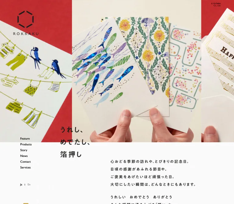
ROKKAKU presents foil-stamped stationery through close photography, small navigation, carefully offset text, and long stretches of pale space. Red backdrops, cream paper, blue birds, botanical patterns, metallic printing, and visible hands establish the product's physical character. The surrounding interface stays quiet: black labels, thin rules, tiny arrows, and almost no rounded containers.
The defining layout is a wide photographic opening followed by a content column displaced substantially to the right. Desktop navigation occupies the left margin. Product categories use unequal image sizes, while editorial stories become broad photographic links. On mobile, the page preserves an unusually generous left gutter instead of centering everything. A second image strip and repeated slogan close the page, giving the homepage the structure of a complete brand publication.
How to Read This Reference
- Measured values come from the supplied rendered DOM, computed-style samples, and element rectangles. Coordinates refer to the recorded page state unless a screenshot position is explicitly described.
- Visually observed descriptions come from the five supplied original-page captures: three desktop views and two mobile views.
- Estimated colors and small visual details are approximations from those captures. No pixel sampling was performed.
- Inferred layout rules explain recurring measurements; they are not recovered stylesheet declarations.
- Recommended values and code are practical implementation choices, clearly separated from original-site evidence.
- The supplied styles often describe wrappers rather than their visible descendants. A wrapper's font size or transparent text color must not automatically be treated as the final appearance of its contents.
- The mobile opening contains an important evidence limitation: the introduction is present in the DOM below the slogan, but it is not visible in the supplied opening screenshot. Its visibility mechanism remains unverified.
Tokens — Colors
Default Palette
| Name | Value | Suggested token | Evidence and role |
|---|---|---|---|
| Paper canvas | Approximately #fafafa |
--color-paper |
Visual estimate of the pale, subtly textured background. The sampled HTML and BODY backgrounds are transparent, so this is not a measured BODY fill. |
| Black ink | #000000 |
--color-ink |
Measured text color on body copy, ordinary links, and contact-button text. |
| Reverse white | #ffffff |
--color-white |
Measured on story metadata, Feature and Contact text, and the contact-button background. |
| Warm fallback surface | rgba(235, 233, 228, 0.5) |
--color-story-fallback |
Measured background on story anchors. Photography normally covers this surface; it is not evidence of a global image tint. |
| Hairline neutral | Approximately #e6e3dd |
--color-rule |
Visual estimate for the faint social-link separators. |
| Foil gold | Approximately #c5a54a |
--color-gold |
Visual estimate for small gold marks and foil-related accents. Metallic reflections themselves come from photographs. |
| Social pink | Approximately #ff0080 |
--color-social-accent |
Visual estimate of the Instagram arrow in the closing captures. Its state or interaction trigger was not established. |
| Menu red | Approximately #e60033 |
--color-menu-accent |
Visual estimate of the two short strokes beneath the mobile Menu label. |
| Photographic red | Approximately #cc2b2e |
--color-photo-red |
Representative photographic backdrop color, not a measured interface fill. Actual photographs contain substantial tonal variation. |
The page's color hierarchy depends on separating the neutral interface from colorful objects. Paper goods and their backgrounds provide most of the saturation. Keep pink, red, and gold interface details small.
The full backgrounds behind Feature and Contact are not shown in the supplied screenshots. Their white text is measured, but the exact supporting background colors or images are unknown. Do not assign those sections a supposedly original red or black fill without further evidence.
Theme Presets
Only the light presentation is evidenced. No theme selector or alternate theme was inspected.
Tokens — Typography
Japanese and Interface Typeface
- Measured family:
dnp-shuei-gothic-kin-std, sans-serifon BODY and the sampled content elements. - Measured weights: predominantly
400; navigation, compact action labels, story issue numbers, and some contact information use500. - Role: unifies Japanese content with small English navigation and utility labels.
- Implementation: use the declared family when properly licensed and loaded. No font-file URL was supplied. The fallback is
sans-serif.
The HTML element reports Times, but BODY and the sampled page content override it. Times is not the basis for this site's visible typography.
Brand Marks and Slogan
The identity combines an open hexagon made from six separated black segments with a widely tracked ROKKAKU wordmark. Two configurations appear: a tall opening mark and a horizontal mark in the desktop side rail.
The slogan, うれし、めでたし、箔押し, appears as three short horizontal lines. Its compact, expressive forms should be preserved through an authorized brand asset when available. The H1 wrapper reports 32px at both viewports, but its bounding box changes from 130 × 139px to 98 × 105px. The supplied evidence does not establish whether that change is produced by descendants, graphics, scaling, or another rule.
Type Scale
| Role | Measured style | Measured geometry or visual reading | Implementation guidance |
|---|---|---|---|
| Body | 16px, weight 400, line height normal |
Paragraph blocks vary by section | Start at 16px; choose explicit leading after matching actual wrapping. |
| Desktop navigation | 16px, weight 500, 16px line height |
Each anchor is 16px high; starts repeat every 26px | Preserve the compact rhythm. The visible glyphs appear smaller than a typical 16px UI font. |
| Slogan H1 wrapper | 32px, weight 400 |
Desktop 130 × 139px; mobile 98 × 105px |
Match the composition rather than assuming the wrapper size controls every visible glyph. |
| Introductory H2 wrapper | 24px, weight 400 |
Desktop 463 × 439px; mobile 272 × 557px |
Desktop visible text appears roughly 16–18px. Descendant styling is not supplied. |
| Product-category paragraph | 16px, weight 400 |
Sampled paragraph boxes are about 14–16px high | Keep captions small and secondary to photographs. |
| Compact action label | 16px, weight 500 |
Text sits inside a 40px-high link | Use a small label and a distant arrow, not a large button title. |
| Story issue number | 16px, weight 500, white |
#05, #04, and #03 are measured |
Keep issue number, small divider, and series name together. |
| Services description | 16px, weight 400, 1.28px tracking |
Desktop text width 172px; mobile 206px | Tracking equals 0.08em at the measured size. |
| Footer address and telephone | 16px, weight 500, 1.28px tracking |
Desktop information columns are 220px wide | Retain the deliberate spacing. |
| Copyright | Approximately 8–9px visually | Small two-line block near the upper-right corner | Estimate only; no computed sample was supplied. |
No exact font sizes were supplied for the visible section-title artwork or every nested caption. Do not invent a second display font to account for those differences.
Tokens — Spacing & Shapes
Overall density: sparse page composition, compact controls, large photographs.
The most useful spacing system is the relationship between the side rail, the main content start, and a recurring 20px desktop gutter. There is no evidence of a universal fluid spacing formula.
Spacing Scale
| Use | Value | Status |
|---|---|---|
| Story-to-story seam | 4px |
Measured at both viewports. |
| Navigation row gap | 10px |
Calculated from 26px start intervals and 16px anchor heights. |
| Desktop product-column gutter | 20px |
Calculated from adjacent link rectangles. |
| Mobile story-caption left inset | 20px |
Measured from card and issue-number positions. |
| Contact-button horizontal padding | 24px |
Measured. |
| Desktop story-caption left inset | 28px |
Measured from card and issue-number positions. |
| Mobile main right margin | 32px |
Calculated: 390 − 88 − 270. |
| Mobile product-to-product gap | 48px |
Measured between successive link rectangles. |
| Mobile section-end action gap | 60px |
Measured after the final Products and Story links. |
| Desktop product-row gap | 64px |
Measured from the first row's bottom to the next row's tallest item. |
| Desktop story-caption bottom inset | 24px |
Calculated from the issue-number box and card bottom. |
| Mobile story-caption bottom inset | 20px |
Calculated in the same way. |
Large section gaps are deliberately generous and vary. Do not force every section into the same small vertical interval.
Border Radius
| Element | Value | Evidence |
|---|---|---|
| Story anchors and sampled product links | 0 |
Measured. |
| Photographic panels | Visually square | Observed. |
| Contact action | 2px |
Measured. |
| General pill or rounded-card system | Not observed | Do not introduce one as a defining motif. |
Layout Measurements
| Element | Desktop: 1440 × 1000 | Mobile: 390 × 844 |
|---|---|---|
| Document height | 9414.14px |
10099.95px |
| Opening logo link | 112 × 110px, at (60, 48) |
42 × 41px, at (10, 12) |
| Main content alignment | Starts at x = 350; common right edge 1290 |
Starts at x = 88; common right edge 358 |
| Main content width | 940px |
270px |
| Opening photographic band | Approximately 640px high in screenshot |
Approximately 480px high in screenshot |
| Slogan box | (350, 570), 130 × 139px |
(32, 428), 98 × 105px |
| Introductory H2 | (670, 721), 463 × 439px |
(88, 573), 272 × 557px; not visibly rendered in the opening capture |
| Story link | 940 × 470px |
270 × 220px |
| Standard section-end action | 140 × 40px, at x = 1150 |
270 × 40px, at x = 88 |
| Contact action | 460 × 63px |
270 × 63px |
| Social-link row | 460 × 40px |
270 × 40px |
| Closing photographic band | 640px |
480px |
Inferred Desktop Grid
The product measurements fit a 12-column grid of 60px tracks with 20px gutters:
12 × 60 + 11 × 20 = 940px
This explains widths of 220px, 300px, 380px, 460px, and 540px. It also explains important horizontal starts at 350, 670, 830, 910, and 1070px.
This is a useful reconstruction model, not proof that the source uses CSS Grid. The supplied element samples do not reveal the relevant layout container declarations.
Components
Opening Brand Mark and Copyright
Role: establish identity without occupying a conventional navigation bar.
The desktop opening mark sits directly over the left photographic panel, 60px from the left and 48px from the top. The mobile mark shrinks to a 42 × 41px link at 10px from the left and 12px from the top.
A tiny two-line © FUTABA Co., Ltd. notice remains near the upper-right corner in the supplied captures. Treat it as a quiet corner detail. Do not enlarge it into a footer heading.
Desktop Side Rail
Role: keep primary navigation available beside the long brand narrative.
The rail contains a horizontal logo, six vertically stacked links, and a small language switch. Observed labels are Feature, Products, Story, News, Contact, Services, Ja, and En.
At the opening, navigation begins at (104, 728). The horizontal logo has a measured 218 × 48px box at y = 648, but its recorded opening state is positioned far offscreen. In the middle desktop capture, that logo is visible above the navigation.
The rail should not be described as an unconditional fixed sidebar. In the final desktop capture, the horizontal logo and navigation have moved approximately 640px upward compared with their middle-page positions, allowing the closing photo strip to occupy the lower viewport. This is consistent with a rail constrained by a content boundary; the exact positioning mechanism is unverified.
Feature, Products, Story, News, and Contact link to separate paths. Services links to /#services. Do not convert all six destinations into same-page scroll links.
Mobile Menu Affordance
Role: replace the visible desktop navigation while retaining a narrow left edge for controls.
The mobile captures show a small Menu label near the vertical midpoint of the left edge, with two short red strokes beneath it. The same approximate viewport position appears in both the opening and closing captures.
The menu was not opened. Its panel layout, contents, animation, focus behavior, and close control are unknown. A new implementation should supply a real accessible button and a complete navigation panel, but those are additions rather than observed behavior.
Opening Photographic Strip
Role: introduce the product through material, color, and scale.
The desktop opening is a continuous, edge-to-edge sequence of adjacent photographic panels. A central cream-backed image shows hands holding three illustrated paper pieces. Partial neighbors show blue birds and laundry against red on the left, and a birthday card with musical notation on the right.
There are no visible gutters or rounded frames. The photographs extend beyond the viewport, making the visible composition feel like a window onto a larger sequence.
On mobile, the cream-backed fan photograph is heavily cropped; its boundary with the birthday photograph falls near x = 284. The composition is not reduced to three tiny complete desktop panels. Preserve large subjects and intentional cropping.
The captures do not establish autoplay, dragging, slide controls, or animation speed. A photographic strip is observed; a working carousel is not verified.
Slogan and Introductory Manifesto
Role: connect the tactile product presentation with the brand's emotional purpose.
The slogan crosses the bottom boundary of the opening photograph. Desktop starts at y = 570 while the image band ends around y = 640; mobile starts at y = 428 while the image ends around y = 480.
Use three short lines for うれし、めでたし、箔押し. Keep the group compact and left aligned. Its overlap should feel placed on the edge of a printed spread.
The desktop manifesto sits farther right, at x = 670, below the image boundary. Short Japanese lines and paragraph breaks create a measured reading rhythm. The slogan and manifesto are intentionally offset from each other.
On mobile, the manifesto has a DOM box beginning at x = 88, y = 573, but the corresponding screenshot remains blank below the slogan. Do not infer that the text is intentionally removed on phones. Its reveal state or rendering mechanism requires verification.
Feature Section
Role: explain the brand's foil-stamping heritage and everyday use.
The rendered content describes paper items, the brand's origin on Kyoto's Rokkaku Street, and its continuing role in personal communication. Desktop explanatory copy sits in a 380px-wide region at x = 910; mobile copy uses the standard 270px column at x = 88.
Text and the visible view more label are measured white. The action measures 140 × 40px on desktop and expands to 270 × 40px on mobile.
The complete visual background is outside the supplied screenshot coverage. Preserve the measured content hierarchy without inventing a specific background photograph or color.
Product Category Composition
Role: offer entry points into five collections while preserving an editorial arrangement.
The categories shown are テーブルウェア, 日本名所シリーズ, アニマルシリーズ, ROKKAKU CARD, and みすゞうた, with counts of 9, 21, 12, 24, and 33 products at inspection time. Counts are content, not permanent design tokens.
Desktop anatomy:
- First row: links 300px, 380px, and 220px wide, separated by 20px gutters.
- Their top edges differ, while the category captions share approximately the same baseline.
- Second row: a 540px-wide link followed by a 380px-wide link.
- A small
view allaction aligns with the far-right edge below the composition.
This is an intentionally uneven arrangement, not a uniform three-column card grid. Images carry the mass; captions and product counts remain subordinate. No enclosing card border, shadow, or colored badge is evidenced.
On mobile, all five category links become a single column, each 270px wide and approximately 225px tall, separated by 48px. Exact image-element dimensions were not supplied. A landscape media ratio near 1.414:1 is a useful reconstruction estimate, not a measured asset ratio.
Story Photograph Link
Role: connect the finished objects to the people and decisions behind them.
Three links present the series ひと押しまでの道のり, with issue identifiers #05, #04, and #03. Each desktop link is 940 × 470px. They stack with only 4px between them, producing a continuous editorial sequence.
The supplied middle-page screenshot shows:
- A tabletop covered with foil rolls, paper samples, and a binder for the foil-selection story.
- A person holding a hexagonal product sample and a printed design sheet for the design-development story.
Each link overlays a white title, a smaller subtitle, and an issue-number/series row toward the lower-left corner. The measured issue-number inset is 28px from the left and 24px from the bottom on desktop.
Mobile links are 270 × 220px, with 20px left and bottom metadata insets. This changes the frame from 2:1 to approximately 1.23:1. Mobile imagery therefore needs a deliberate crop or separately composed source; uniformly shrinking the desktop card would not reproduce the measurements.
Section-End Text Link
Role: provide a quiet route to more content.
The repeated anatomy is a short label at the left, ample empty horizontal space, and a small right-pointing chevron at the far end. A fine baseline is visible on the captured Story action and social rows.
The desktop link is 140 × 40px and sits against the content column's right edge. Mobile actions expand to 270 × 40px.
Use this pattern for view more, view all, and related utility actions. Its visual priority comes from alignment and spacing rather than a filled pill or oversized arrow.
News List
Role: publish current exhibition, retail, and event announcements.
The DOM contains five announcements, dated from March 2 through May 25, 2026. Desktop news text occupies a 540px-wide region beginning at x = 670; mobile uses the 270px main column.
The hierarchy is text-led: announcement copy, date, repeated vertical spacing, then a view all action. Individual article-link behavior was not established by the supplied link inventory. Do not claim that every news row is clickable.
Only DOM geometry and text were supplied for this region, so exact separators and title styling remain unverified.
Contact Section
Role: support product questions, stocking inquiries, and business contact.
Desktop uses separated blocks: an introduction at x = 350, address at x = 830, and telephone at x = 1070. The address and telephone regions are each 220px wide.
The contact action is a measured white rectangle, 460 × 63px, with a 2px radius and padding of 18px 24px 14px. It contains お問い合わせフォーム and accompanying business-contact guidance.
Mobile stacks the introduction, address, telephone, and action in the 270px column. The action retains its 63px height and internal padding.
The destination is a separate /contact/ page. A form was not inspected on this homepage, and no submission behavior is evidenced.
Services Directory
Role: connect the brand presentation to shopping and trade services.
Four service groups are present: the official online shop, Rakuten, a New Year card service, and wholesale sales. The wholesale group contains two destinations, producing five visit store links overall.
The desktop geometry is consistent with four 220px-wide groups separated by 20px. Descriptions are inset 24px, leaving a measured 172px text width. Their ordinary action links align near a shared lower edge; the wholesale group has two stacked actions.
Mobile stacks the groups. Text begins at x = 120 within the main column, giving a 32px inner inset and a 206px text width.
The supplied screenshots do not show the full service-group surfaces. Treat this as a measured content and spacing pattern, not evidence for a particular boxed-card style.
Company Information and Social Links
Role: provide a clear organizational endpoint before the closing image sequence.
The original page names and links フタバ株式会社, supporting the operator identification independently. Company information includes a Nagoya address and telephone number.
Desktop social links occupy a 460px-wide region beginning at x = 830. Mobile rows are 270px wide and begin at x = 88. Instagram and X each use a 40px row with a faint bottom rule and a small far-right arrow.
A very pale enlarged geometric brand motif appears behind the information in the closing captures. Keep it faint enough that it reads as a paper impression rather than a prominent illustration.
Closing Slogan and Photograph Strip
Role: return to the product's emotional and material appeal after practical information.
The slogan reappears across the top boundary of another full-width photo sequence. Desktop photographs show a sunflower card against blue, a hedgehog design against red, and a warmly lit bear-themed piece with gold lettering.
The closing band is 640px high on desktop and 480px on mobile. The mobile slogan aligns to the main content start at x = 88, unlike the opening slogan at x = 32.
Retain this distinction. The two slogans repeat the same message while occupying different relationships to the page gutter.
Tokens — Motion & Interaction
| Element | Supplied evidence | Interpretation and limit |
|---|---|---|
| Slogan H1 | opacity 1.6s cubic-bezier(0.23, 1, 0.32, 1) |
A slow opacity transition is declared. The trigger and complete sequence were not observed. |
| Desktop navigation anchors | Transition summary 0.3s |
A duration is present; the changed property and resulting state are not established. |
| Alternate horizontal logo | opacity 0.05s linear, left 0s linear 0.05s |
Supports a rapid visibility/position switch. The opening sample is offscreen and a later capture shows it visible. |
| Desktop side rail | Similar middle-page placement, then approximately 640px upward displacement near the closing strip | Boundary-sensitive positioning is observed across captures; the exact implementation is unknown. |
| Mobile Menu | Visible in opening and closing screenshots | Persistent affordance observed; opening interaction not exercised. |
| Photographic strips | Different cropped panels at opening and closing | Does not prove carousel movement, autoplay, drag behavior, or speed. |
| Services navigation | Anchor destination is /#services |
Same-page destination verified. Smooth scrolling is not verified. |
| Product, story, language, and store links | Rendered hrefs supplied | Destinations are known; post-click behavior was not tested. |
Many samples report transition: all without an explicit duration and animation: none. Those summaries do not establish active motion, and they do not exclude animation on unsampled descendants, pseudo-elements, image tracks, or script-managed elements.
The collection process waited for initial readiness and traversed the document, but it does not prove that every reveal was completed. The invisible mobile introduction is a concrete reason to retain that limitation.
Recommended motion policy: favor restrained opacity changes and short arrow feedback. Keep essential text visible by default, and enable reveal effects only after their controlling script is ready. Respect reduced-motion preferences. Do not invent continuous photo motion as a requirement of the observed design.
Surfaces
| Layer | Appearance | Evidence and purpose |
|---|---|---|
| Main canvas | Near-white with very fine texture | Visually observed; supports the paper-product character. Exact texture source is unknown. |
| Product presentation | Unboxed image and caption | Link geometry is measured; no general elevation system is evidenced. |
| Story link | Photograph over a warm translucent fallback | Fallback color measured; photo and white text observed. |
| Contact action | White, almost square rectangle | Fill, 2px radius, and padding measured. |
| Utility link | Bare text, small arrow, fine rule where visible | Keeps navigation quieter than photography. |
| Footer motif | Very pale geometric mark | Visually observed behind company/social information. |
| Feature and Contact backdrop | Unverified | White foreground text is measured, but the supporting surface was not captured clearly. |
The page does not use shadow elevation as its primary organizing device. Size, alignment, whitespace, photographic boundaries, and small rules carry the hierarchy.
Imagery
Photography makes the printing process tangible. Preserve visible paper grain, foil reflection, slight card bends, fingers holding objects, and the relationship between the object and its colored background. The cards are both products and small illustrated compositions.
The opening uses tightly cropped finished goods. Story imagery expands into the workspace: foil rolls, samples, drawings, binders, and people demonstrating decisions. The closing returns to bright product photographs. This progression gives the homepage a coherent editorial rhythm.
Do not flatten metallic detail into a generic yellow overlay. Foil changes with light and viewing angle; that variation belongs in the source photograph. Likewise, do not globally recolor the photographs to match a neutral UI palette.
Observed Asset References
No image filenames, image URLs, font files, or logo asset paths were supplied. The following references identify visible subjects only.
| Asset or subject | Evidence | Reuse guidance |
|---|---|---|
| Tall segmented-hexagon logo | Desktop and mobile opening captures | Use an authorized original asset; preserve separated strokes and wordmark proportions. |
| Horizontal logo with small Japanese line | Middle and closing desktop captures | Maintain its approximately 218 × 48px placement envelope. |
| Fan of fish and botanical paper designs | Opening desktop and mobile captures | Retain hands, cream background, and large crop. |
| Bird-and-laundry card and birthday stationery | Desktop opening; birthday stationery also visible on mobile | Keep adjacent-panel relationships without shrinking all panels to fit. |
| Foil-roll selection workspace | Middle desktop capture, second story | Preserve material variety and the tabletop context. |
| Designer holding a hexagonal sample | Middle desktop capture, third story | Keep the hands, sample, and design sheet legible together. |
| Sunflower, hedgehog, and bear-themed paper goods | Closing captures | Retain the blue/red/cream sequence and metallic highlights. |
| Fine paper texture and pale geometric motif | Light surfaces and closing captures | Exact assets and compositing methods are unknown. |
Layout & Responsive Behavior
Desktop Composition
The page is not centered within equal margins. The main 940px content region begins 350px from the left and ends 150px from the right. The left rail occupies the intervening space, with its navigation indented farther than its logo.
Inside that region, content shifts between several alignments. The slogan and story photographs begin at 350px. Introductory copy and news begin at 670px. Contact and footer details begin at 830px. Feature and section-description copy use a 380px region beginning at 910px.
These offsets create a composed spread rather than one repetitive stack. Use the inferred 12-column grid to preserve those relationships.
Mobile Composition
At 390px wide, the main content column is only 270px wide, with an 88px left margin and a 32px right margin. This pronounced asymmetry leaves room for the small persistent menu control and carries the desktop's editorial character into mobile.
The opening remains full bleed and 480px high. Its slogan uses a separate 32px left inset. Product categories become equal-width stacked links. Story photographs become much taller relative to their width. Contact information and service groups stack vertically. Section-end actions become full-column rows.
The upper-left logo remains visible in both supplied mobile captures. The desktop navigation list is absent from the visible mobile state.
Responsive Evidence Limits
Only 1440px and 390px viewport widths were supplied. The exact breakpoint, tablet arrangement, intermediate scaling, and landscape behavior are unknown.
The source exposes --cw: 1440px / 390px and --vw: 14.4px / 3.9px. These values correspond to viewport width and one percent of it in the two snapshots; the generating formula and all uses were not supplied.
A 960px layout breakpoint is a reasonable recommendation for the scaffold below, not a recovered source value. Very narrow devices should reduce the left gutter before text or controls overflow.
Do’s and Don’ts
Do
- Preserve the offset desktop content column and the unusually wide mobile left gutter.
- Keep the opening and closing photography full bleed, with large cropped subjects.
- Maintain the three-line slogan across the photo-to-paper boundary.
- Use the measured Japanese font family when available and licensed.
- Preserve unequal desktop product widths and aligned caption baselines.
- Keep story links large, square-cornered, and separated by a 4px seam.
- Treat hands, paper texture, foil rolls, and design sheets as part of the brand narrative.
- Use small text links, distant arrows, fine rules, and restrained accent marks.
- Keep the desktop rail compatible with the closing photo boundary.
- Distinguish measured wrapper typography from the appearance of nested content.
Don’t
- Don’t recast the homepage as a single campaign with a large conversion button above the fold.
- Don’t turn all product categories into equal rounded cards on desktop.
- Don’t center the mobile content with matching left and right margins.
- Don’t replace the photography with generic stationery mockups or vector illustrations.
- Don’t imitate foil with a flat gold fill across product artwork.
- Don’t infer autoplay, hover effects, or menu behavior from still images.
- Don’t reproduce transparent navigation-wrapper text as invisible labels.
- Don’t make the mobile manifesto permanently blank because one captured state is blank.
- Don’t assume the white-text sections have a particular background color.
- Don’t introduce shadows, pills, glass effects, or a large multicolor control system.
Recommended Implementation Additions
These are recommendations for a new implementation, not verified features of the original:
- Implement Menu as a button with an accessible name,
aria-expanded, and an associated navigation panel. Return focus on close. - Give small arrows and compact labels larger invisible hit areas where needed. Keep visible proportions while targeting at least 44px for primary touch controls.
- Add a keyboard skip link and clear focus outlines that remain visible over both photography and pale paper.
- Render introductory text visibly without JavaScript. Enhance it with motion only after initialization succeeds.
- Provide purposeful image alternatives. Distinguish decorative photo strips from story links whose photographs convey editorial information.
- Check white story-caption contrast against each crop. A subtle local scrim is a possible addition; its exact gradient is not established by the source evidence.
- Use responsive image sources and explicit dimensions to keep large photographic sections stable while loading.
- If continuous strip movement is later implemented, provide reduced-motion behavior and an appropriate pause mechanism.
- Retain complete product motifs when choosing mobile crops; do not cut off the printing detail that makes a category recognizable.
- Verify font licensing and provide a reliable fallback instead of copying a font-loading configuration without authorization.
Agent Prompt Guide
Quick Color Reference
- Canvas: approximately
#fafafa, with very subtle paper texture. - Text: measured
#000000. - Reverse text and contact action: measured
#ffffff. - Story fallback: measured
rgba(235, 233, 228, 0.5). - Fine rules: approximate
#e6e3dd. - Small gold detail: approximate
#c5a54a. - Instagram arrow: approximate
#ff0080. - Strong red and blue belong mainly to photographs, not large interface buttons.
Overall Prompt
“Create an editorial brand homepage for foil-stamped paper goods, inspired by ROKKAKU's current layout. Use a subtly textured near-white canvas, black Japanese typography, a segmented hexagonal identity, and small English navigation labels. At a 1440px viewport, place a 940px content region 350px from the left, with a quiet navigation rail beside it. Open and close with large edge-to-edge photographic strips showing colorful paper items held by hands. Overlap a compact three-line Japanese slogan across the edge of each strip. Arrange desktop product categories in unequal widths, then use broad 2:1 photographs for process stories. On a 390px phone, retain an 88px left gutter and 270px content column, stack categories, and use taller story crops. Keep controls understated and avoid rounded-card styling. Treat motion as optional unless separately specified.”
Example Component Prompts
- Product composition: “Build a 940px-wide product section using a 12-column layout with 20px gutters. The first row spans 4, 5, and 3 columns; the second spans 7 and 5. Align items to the bottom of each row so differently sized photographs share caption baselines. Use small category names and product counts, with no enclosing card surface. Stack everything at 270px wide on the reference phone viewport.”
- Story link: “Create a 940 × 470px photographic story link with a square frame, white lower-left title, smaller subtitle, and an issue-number/series row. Place metadata 28px from the left and 24px above the bottom. Separate adjacent links by 4px. At mobile size use 270 × 220px and 20px caption insets.”
- Opening: “Show adjacent, oversized product photographs that extend beyond the viewport. Center the visual story on hands holding illustrated paper against cream, with red-backed neighboring photographs. Place a small logo over the upper-left image and a three-line Japanese slogan across the bottom edge. Preserve the large crop on mobile rather than shrinking every panel.”
- Side rail: “Build a narrow desktop navigation rail with a 218 × 48px horizontal brand mark, six unboxed links at 26px intervals, and a small language switch. Keep it beside the content through the page, then constrain it above the closing photographic strip. The exact scroll implementation may be chosen for the new project.”
- Footer links: “Create two 40px-high social rows on pale textured paper, labeled Instagram and X, with fine neutral bottom rules and small far-right chevrons. Use pink only on the Instagram arrow. Place a barely visible geometric brand impression behind the surrounding contact information.”
Quick Start
CSS Custom Properties
This is a reconstruction scaffold, not the original stylesheet. It preserves measured geometry at the two supplied viewports where practical. Colors marked as estimates remain approximations. The 960px breakpoint, static photographic-track offsets, product media ratio, explicit text leading, and local story scrim are recommended implementation choices.
The slogan and manifesto use readable text approximations. Their source wrapper font sizes do not fully explain their rendered appearance, so matching authorized brand artwork may be necessary for closer correspondence.
:root {
  /* Measured colors and visual approximations */
  --color-paper: #fafafa;
  --color-ink: #000;
  --color-white: #fff;
  --color-story-fallback: rgb(235 233 228 / 0.5);
  --color-rule: #e6e3dd;
  --color-gold: #c5a54a;
  --color-social-accent: #ff0080;
  --color-menu-accent: #e60033;

  /* The original font must be licensed and loaded separately. */
  --font-japanese: 'dnp-shuei-gothic-kin-std', sans-serif;
  --text-body: 16px;
  --text-ui: 14px;
  --text-caption: 12px;
  --text-tagline: 28px;
  --leading-body: 1.75;
  --tracking-detail: 0.08em;

  /* Recommended interpolation; exact at 1440px. */
  --main-start: clamp(300px, 24.30556vw, 350px);
  --main-end: clamp(40px, 10.41667vw, 150px);
  --grid-gap: 20px;
  --story-gap: 4px;
  --story-inset: 28px;
  --story-bottom: 24px;
  --strip-height: 640px;
  --tagline-width: 130px;
  --tagline-height: 139px;
  --tagline-overlap: 70px;
  --radius-contact: 2px;

  /* Observed transition values */
  --motion-reveal: 1.6s cubic-bezier(0.23, 1, 0.32, 1);
  --motion-logo: 50ms linear;
}

* { box-sizing: border-box; }

body {
  margin: 0;
  color: var(--color-ink);
  background: var(--color-paper);
  font-family: var(--font-japanese);
  font-size: var(--text-body);
  font-weight: 400;
  line-height: var(--leading-body);
}

a { color: inherit; }
img { display: block; max-width: 100%; }
button { font: inherit; }

/* Add an authorized paper texture separately, if available. */
.page-main { position: relative; }

.content-shell {
  margin-left: var(--main-start);
  margin-right: var(--main-end);
}

.opening-brand {
  position: absolute;
  z-index: 5;
  top: 48px;
  left: 60px;
  width: 112px;
  height: 110px;
}

.copyright {
  position: fixed;
  z-index: 6;
  top: 12px;
  right: 60px;
  margin: 0;
  font: 8px / 1.1 sans-serif;
  text-align: right;
}

/* Keep this track inside .page-main, before the closing strip. */
.rail-track {
  position: absolute;
  inset: 0 auto 0 60px;
  width: 218px;
  pointer-events: none;
}

.side-rail {
  position: sticky;
  top: max(0px, calc(100vh - 352px));
  height: 352px;
  pointer-events: auto;
}

.side-rail__brand {
  display: block;
  width: 218px;
  height: 48px;
  transition: opacity var(--motion-logo);
}

/* Optional application-managed opening state. */
.page-main[data-opening='true'] .side-rail__brand {
  visibility: hidden;
}

.side-nav {
  display: grid;
  gap: 10px;
  margin-top: 32px;
  padding-left: 44px;
}

.side-nav a {
  text-decoration: none;
  font-size: var(--text-ui);
  font-weight: 500;
  line-height: 16px;
}

.languages {
  display: flex;
  gap: 12px;
  margin: 32px 0 0 44px;
  font-size: var(--text-caption);
  line-height: 14px;
}

.mobile-menu { display: none; }

.hero,
.closing-banner {
  position: relative;
}

/* Static crop scaffold; these offsets are not source measurements. */
.photo-strip {
  --panel-width: 796px;
  --strip-offset: -521px;
  height: var(--strip-height);
  overflow: hidden;
}

.photo-strip__track {
  display: flex;
  width: max-content;
  height: 100%;
  transform: translateX(var(--strip-offset));
}

.photo-strip__panel {
  flex: 0 0 var(--panel-width);
  width: var(--panel-width);
  max-width: none;
  height: 100%;
  object-fit: cover;
}

.closing-banner .photo-strip { --strip-offset: -422px; }

.tagline {
  position: absolute;
  z-index: 2;
  left: var(--main-start);
  display: flex;
  flex-direction: column;
  justify-content: space-between;
  width: var(--tagline-width);
  height: var(--tagline-height);
  margin: 0;
  font-size: var(--text-tagline);
  font-weight: 500;
  line-height: 1;
  white-space: nowrap;
}

.hero .tagline {
  top: calc(100% - var(--tagline-overlap));
}

.closing-banner .tagline {
  top: calc(-1 * var(--tagline-overlap));
}

.intro { padding-block: 81px 160px; }

.intro__copy {
  max-width: 463px;
  margin: 0 0 0 320px;
  font-size: 16px;
  font-weight: 500;
  line-height: 2.15;
  letter-spacing: 0.08em;
}

/* Remain readable without animation initialization. */
.reveal-copy { opacity: 1; }

.products-grid {
  display: grid;
  grid-template-columns: repeat(12, minmax(0, 1fr));
  gap: 64px var(--grid-gap);
  align-items: end;
}

.product { min-width: 0; text-decoration: none; }
.product:nth-child(1) { grid-column: span 4; }
.product:nth-child(2) { grid-column: span 5; }
.product:nth-child(3) { grid-column: span 3; }
.product:nth-child(4) { grid-column: span 7; }
.product:nth-child(5) { grid-column: span 5; }

.product__media {
  width: 100%;
  aspect-ratio: 1.414 / 1;
  object-fit: contain;
}

.product__caption {
  display: flex;
  justify-content: space-between;
  align-items: baseline;
  gap: 8px;
  margin-top: 18px;
  font-size: var(--text-caption);
  line-height: 1.4;
}

.story-list { display: grid; gap: var(--story-gap); }

.story-link {
  position: relative;
  display: block;
  aspect-ratio: 2 / 1;
  overflow: hidden;
  color: var(--color-white);
  background: var(--color-story-fallback);
  text-decoration: none;
}

.story-link > img {
  width: 100%;
  height: 100%;
  object-fit: cover;
}

/* Recommended contrast support, not an extracted source gradient. */
.story-link::after {
  content: '';
  position: absolute;
  inset: 0;
  background: linear-gradient(transparent 45%, rgb(0 0 0 / 0.35));
  pointer-events: none;
}

.story-caption {
  position: absolute;
  z-index: 1;
  right: var(--story-inset);
  bottom: var(--story-bottom);
  left: var(--story-inset);
}

.story-caption__title { margin: 0; font-size: 16px; }
.story-caption__subtitle { margin: 2px 0 8px; font-size: 12px; }
.story-caption__meta { display: flex; gap: 10px; font-size: 12px; }

.text-link {
  display: flex;
  justify-content: space-between;
  align-items: center;
  min-height: 40px;
  border-bottom: 1px solid var(--color-rule);
  font-size: var(--text-ui);
  text-decoration: none;
}

.text-link::after {
  content: '';
  width: 6px;
  height: 6px;
  margin-right: 2px;
  border-top: 1px solid currentColor;
  border-right: 1px solid currentColor;
  transform: rotate(45deg);
}

.section-action {
  width: 140px;
  margin: 67px 0 0 auto;
}

.contact-action {
  display: block;
  width: min(100%, 460px);
  min-height: 63px;
  padding: 18px 24px 14px;
  border-radius: var(--radius-contact);
  color: var(--color-ink);
  background: var(--color-white);
  text-decoration: none;
}

.services-grid {
  display: grid;
  grid-template-columns: repeat(4, minmax(0, 1fr));
  gap: 20px;
}

.service { padding-inline: 24px; }
.service__description { letter-spacing: var(--tracking-detail); }
.social-links { width: min(100%, 460px); margin-left: auto; }
.social-link--instagram::after { color: var(--color-social-accent); }

:focus-visible {
  outline: 2px solid currentColor;
  outline-offset: 4px;
}

@media (max-width: 959px) {
  :root {
    --main-start: 88px;
    --main-end: 32px;
    --strip-height: 480px;
    --story-inset: 20px;
    --story-bottom: 20px;
    --tagline-width: 98px;
    --tagline-height: 105px;
    --tagline-overlap: 52px;
    --text-tagline: 21px;
  }

  .opening-brand {
    position: fixed;
    top: 12px;
    left: 10px;
    width: 42px;
    height: 41px;
  }

  .copyright { right: 32px; }
  .rail-track { display: none; }

  .mobile-menu {
    position: fixed;
    z-index: 10;
    top: 50%;
    left: 10px;
    display: flex;
    flex-direction: column;
    justify-content: center;
    align-items: flex-start;
    gap: 8px;
    width: 44px;
    height: 48px;
    padding: 0;
    border: 0;
    color: var(--color-ink);
    background: transparent;
    font-size: 13px;
    transform: translateY(-50%);
  }

  .mobile-menu__mark {
    width: 11px;
    height: 5px;
    margin-left: 12px;
    border-block: 1px solid var(--color-menu-accent);
  }

  .photo-strip {
    --panel-width: 597px;
    --strip-offset: -910px;
  }

  .closing-banner .photo-strip { --strip-offset: -357px; }
  .hero .tagline { left: 32px; }
  .intro { padding-top: 93px; }
  .intro__copy { max-width: none; margin-left: 0; }

  .products-grid { grid-template-columns: 1fr; gap: 48px; }
  .product:nth-child(n) { grid-column: auto; }
  .story-link { aspect-ratio: auto; height: 220px; }
  .section-action { width: 100%; margin-top: 60px; }
  .services-grid { grid-template-columns: 1fr; gap: 48px; }
  .service { padding-inline: 32px; }
  .social-links { width: 100%; }
}

/* Recommended accommodation for narrower devices. */
@media (max-width: 359px) {
  :root { --main-start: 72px; --main-end: 24px; }
  .service { padding-inline: 20px; }
}

@media (prefers-reduced-motion: reduce) {
  .side-rail__brand,
  .reveal-copy {
    animation: none;
    transition: none;
  }
}
Structure assumptions: place .rail-track > .side-rail inside .page-main. Place .closing-banner after .page-main so the recommended sticky rail ends before the final photographs. Each photographic track contains three appropriately ordered images. Put the three slogan lines in separate spans. Use semantic anchors for product and story links.
The track widths and translations above are illustrative stationary crops tuned to the supplied compositions. Adjust them to the real image assets and intermediate viewports. They do not implement or imply an original carousel. Menu behavior, active rail state, image loading, font delivery, and any enhanced reveal sequence require separate implementation.
Tailwind v4 Token Mapping
Optional aliases for a project that already uses Tailwind v4. This does not imply that the original site uses Tailwind. Define the properties above first.
@theme inline {
  --color-paper: #fafafa;
  --color-ink: #000000;
  --color-foil-gold: #c5a54a;
  --color-social-pink: #ff0080;
  --font-brand: var(--font-japanese);
  --text-body: 16px;
  --text-utility: 14px;
  --text-caption: 12px;
  --spacing-editorial-gutter: 20px;
  --spacing-story-seam: 4px;
  --spacing-mobile-content-start: 88px;
  --radius-contact: 2px;
}
Sources & Evidence
- Inspected original and final page: ROKKAKU. The supplied observation reports HTTP 200 and no URL change.
- Capture time: September 16, 2026, 20:09:23.110 UTC, equivalent to September 17, 2026, 05:09:23.110 JST.
- Visual coverage: original-page desktop captures at 1440 × 1000 showing the opening, middle Story region, and closing region; mobile captures at 390 × 844 showing the opening and closing region.
- Rendered evidence: full-page text, anchor destinations, sampled element rectangles, computed colors, typography, padding, radii, transition summaries, and the
--cw/--vwcustom-property values for both viewports. - Capture procedure: the supplied collection description reports an initial observation of at least five seconds, readiness checks for layout and images, and traversal through intermediate scroll positions. Those checks do not guarantee completion of every delayed reveal.
- Interaction scope: scroll-position states are represented in the captures. No menu opening, hover sequence, destination-page visit, form submission, or photo-strip control interaction was supplied.
- Limitations: only two viewport sizes were inspected; full visual coverage of Feature, News, Contact, and Services was not supplied; asset paths and complete stylesheets were unavailable; wrapper measurements do not fully describe nested text rendering; mobile introduction visibility remains unresolved.
This reference describes the current homepage evidenced by those captures. Recommended code, inferred grid rules, estimated colors, and accessibility additions are distinguished from measured original-page behavior.
# ROKKAKU — Style Reference

> Colorful foil-stamped paper, presented with the space and restraint of a printed brand book.

**Website / original URL:** [rokkaku-futaba.jp](https://rokkaku-futaba.jp/)
**Final URL:** [https://rokkaku-futaba.jp/](https://rokkaku-futaba.jp/)
**Theme:** light, with near-white paper surfaces, black typography, and color concentrated in photography.
**Inspected:** supplied capture retrieved September 16, 2026 at 20:09:23 UTC; September 17, 2026 at 05:09:23 JST.
**Viewports:** desktop **1440 × 1000 CSS px**; mobile **390 × 844 CSS px**.
**Scope:** the current Japanese brand homepage, including the opening, brand introduction, Feature, Products, Story, News, Contact, Services, company information, and closing photographic strip. Linked pages and external stores were not inspected.

ROKKAKU presents foil-stamped stationery through close photography, small navigation, carefully offset text, and long stretches of pale space. Red backdrops, cream paper, blue birds, botanical patterns, metallic printing, and visible hands establish the product's physical character. The surrounding interface stays quiet: black labels, thin rules, tiny arrows, and almost no rounded containers.

The defining layout is a wide photographic opening followed by a content column displaced substantially to the right. Desktop navigation occupies the left margin. Product categories use unequal image sizes, while editorial stories become broad photographic links. On mobile, the page preserves an unusually generous left gutter instead of centering everything. A second image strip and repeated slogan close the page, giving the homepage the structure of a complete brand publication.

## How to Read This Reference

- **Measured** values come from the supplied rendered DOM, computed-style samples, and element rectangles. Coordinates refer to the recorded page state unless a screenshot position is explicitly described.
- **Visually observed** descriptions come from the five supplied original-page captures: three desktop views and two mobile views.
- **Estimated** colors and small visual details are approximations from those captures. No pixel sampling was performed.
- **Inferred** layout rules explain recurring measurements; they are not recovered stylesheet declarations.
- **Recommended** values and code are practical implementation choices, clearly separated from original-site evidence.
- The supplied styles often describe wrappers rather than their visible descendants. A wrapper's font size or transparent text color must not automatically be treated as the final appearance of its contents.
- The mobile opening contains an important evidence limitation: the introduction is present in the DOM below the slogan, but it is not visible in the supplied opening screenshot. Its visibility mechanism remains unverified.

## Tokens — Colors

### Default Palette

| Name | Value | Suggested token | Evidence and role |
| --- | --- | --- | --- |
| Paper canvas | Approximately `#fafafa` | `--color-paper` | Visual estimate of the pale, subtly textured background. The sampled HTML and BODY backgrounds are transparent, so this is not a measured BODY fill. |
| Black ink | `#000000` | `--color-ink` | Measured text color on body copy, ordinary links, and contact-button text. |
| Reverse white | `#ffffff` | `--color-white` | Measured on story metadata, Feature and Contact text, and the contact-button background. |
| Warm fallback surface | `rgba(235, 233, 228, 0.5)` | `--color-story-fallback` | Measured background on story anchors. Photography normally covers this surface; it is not evidence of a global image tint. |
| Hairline neutral | Approximately `#e6e3dd` | `--color-rule` | Visual estimate for the faint social-link separators. |
| Foil gold | Approximately `#c5a54a` | `--color-gold` | Visual estimate for small gold marks and foil-related accents. Metallic reflections themselves come from photographs. |
| Social pink | Approximately `#ff0080` | `--color-social-accent` | Visual estimate of the Instagram arrow in the closing captures. Its state or interaction trigger was not established. |
| Menu red | Approximately `#e60033` | `--color-menu-accent` | Visual estimate of the two short strokes beneath the mobile Menu label. |
| Photographic red | Approximately `#cc2b2e` | `--color-photo-red` | Representative photographic backdrop color, not a measured interface fill. Actual photographs contain substantial tonal variation. |

The page's color hierarchy depends on separating the neutral interface from colorful objects. Paper goods and their backgrounds provide most of the saturation. Keep pink, red, and gold interface details small.

The full backgrounds behind Feature and Contact are not shown in the supplied screenshots. Their white text is measured, but the exact supporting background colors or images are unknown. Do not assign those sections a supposedly original red or black fill without further evidence.

### Theme Presets

Only the light presentation is evidenced. No theme selector or alternate theme was inspected.

## Tokens — Typography

### Japanese and Interface Typeface

- **Measured family:** `dnp-shuei-gothic-kin-std, sans-serif` on BODY and the sampled content elements.
- **Measured weights:** predominantly `400`; navigation, compact action labels, story issue numbers, and some contact information use `500`.
- **Role:** unifies Japanese content with small English navigation and utility labels.
- **Implementation:** use the declared family when properly licensed and loaded. No font-file URL was supplied. The fallback is `sans-serif`.

The HTML element reports `Times`, but BODY and the sampled page content override it. Times is not the basis for this site's visible typography.

### Brand Marks and Slogan

The identity combines an open hexagon made from six separated black segments with a widely tracked ROKKAKU wordmark. Two configurations appear: a tall opening mark and a horizontal mark in the desktop side rail.

The slogan, `うれし、めでたし、箔押し`, appears as three short horizontal lines. Its compact, expressive forms should be preserved through an authorized brand asset when available. The H1 wrapper reports `32px` at both viewports, but its bounding box changes from `130 × 139px` to `98 × 105px`. The supplied evidence does not establish whether that change is produced by descendants, graphics, scaling, or another rule.

### Type Scale

| Role | Measured style | Measured geometry or visual reading | Implementation guidance |
| --- | --- | --- | --- |
| Body | `16px`, weight `400`, line height `normal` | Paragraph blocks vary by section | Start at 16px; choose explicit leading after matching actual wrapping. |
| Desktop navigation | `16px`, weight `500`, `16px` line height | Each anchor is 16px high; starts repeat every 26px | Preserve the compact rhythm. The visible glyphs appear smaller than a typical 16px UI font. |
| Slogan H1 wrapper | `32px`, weight `400` | Desktop `130 × 139px`; mobile `98 × 105px` | Match the composition rather than assuming the wrapper size controls every visible glyph. |
| Introductory H2 wrapper | `24px`, weight `400` | Desktop `463 × 439px`; mobile `272 × 557px` | Desktop visible text appears roughly 16–18px. Descendant styling is not supplied. |
| Product-category paragraph | `16px`, weight `400` | Sampled paragraph boxes are about 14–16px high | Keep captions small and secondary to photographs. |
| Compact action label | `16px`, weight `500` | Text sits inside a 40px-high link | Use a small label and a distant arrow, not a large button title. |
| Story issue number | `16px`, weight `500`, white | `#05`, `#04`, and `#03` are measured | Keep issue number, small divider, and series name together. |
| Services description | `16px`, weight `400`, `1.28px` tracking | Desktop text width 172px; mobile 206px | Tracking equals `0.08em` at the measured size. |
| Footer address and telephone | `16px`, weight `500`, `1.28px` tracking | Desktop information columns are 220px wide | Retain the deliberate spacing. |
| Copyright | Approximately 8–9px visually | Small two-line block near the upper-right corner | Estimate only; no computed sample was supplied. |

No exact font sizes were supplied for the visible section-title artwork or every nested caption. Do not invent a second display font to account for those differences.

## Tokens — Spacing & Shapes

**Overall density:** sparse page composition, compact controls, large photographs.

The most useful spacing system is the relationship between the side rail, the main content start, and a recurring 20px desktop gutter. There is no evidence of a universal fluid spacing formula.

### Spacing Scale

| Use | Value | Status |
| --- | --- | --- |
| Story-to-story seam | `4px` | Measured at both viewports. |
| Navigation row gap | `10px` | Calculated from 26px start intervals and 16px anchor heights. |
| Desktop product-column gutter | `20px` | Calculated from adjacent link rectangles. |
| Mobile story-caption left inset | `20px` | Measured from card and issue-number positions. |
| Contact-button horizontal padding | `24px` | Measured. |
| Desktop story-caption left inset | `28px` | Measured from card and issue-number positions. |
| Mobile main right margin | `32px` | Calculated: `390 − 88 − 270`. |
| Mobile product-to-product gap | `48px` | Measured between successive link rectangles. |
| Mobile section-end action gap | `60px` | Measured after the final Products and Story links. |
| Desktop product-row gap | `64px` | Measured from the first row's bottom to the next row's tallest item. |
| Desktop story-caption bottom inset | `24px` | Calculated from the issue-number box and card bottom. |
| Mobile story-caption bottom inset | `20px` | Calculated in the same way. |

Large section gaps are deliberately generous and vary. Do not force every section into the same small vertical interval.

### Border Radius

| Element | Value | Evidence |
| --- | --- | --- |
| Story anchors and sampled product links | `0` | Measured. |
| Photographic panels | Visually square | Observed. |
| Contact action | `2px` | Measured. |
| General pill or rounded-card system | Not observed | Do not introduce one as a defining motif. |

### Layout Measurements

| Element | Desktop: 1440 × 1000 | Mobile: 390 × 844 |
| --- | --- | --- |
| Document height | `9414.14px` | `10099.95px` |
| Opening logo link | `112 × 110px`, at `(60, 48)` | `42 × 41px`, at `(10, 12)` |
| Main content alignment | Starts at `x = 350`; common right edge `1290` | Starts at `x = 88`; common right edge `358` |
| Main content width | `940px` | `270px` |
| Opening photographic band | Approximately `640px` high in screenshot | Approximately `480px` high in screenshot |
| Slogan box | `(350, 570)`, `130 × 139px` | `(32, 428)`, `98 × 105px` |
| Introductory H2 | `(670, 721)`, `463 × 439px` | `(88, 573)`, `272 × 557px`; not visibly rendered in the opening capture |
| Story link | `940 × 470px` | `270 × 220px` |
| Standard section-end action | `140 × 40px`, at `x = 1150` | `270 × 40px`, at `x = 88` |
| Contact action | `460 × 63px` | `270 × 63px` |
| Social-link row | `460 × 40px` | `270 × 40px` |
| Closing photographic band | `640px` | `480px` |

### Inferred Desktop Grid

The product measurements fit a **12-column grid of 60px tracks with 20px gutters**:

`12 × 60 + 11 × 20 = 940px`

This explains widths of 220px, 300px, 380px, 460px, and 540px. It also explains important horizontal starts at 350, 670, 830, 910, and 1070px.

This is a useful reconstruction model, not proof that the source uses CSS Grid. The supplied element samples do not reveal the relevant layout container declarations.

## Components

### Opening Brand Mark and Copyright

**Role:** establish identity without occupying a conventional navigation bar.

The desktop opening mark sits directly over the left photographic panel, 60px from the left and 48px from the top. The mobile mark shrinks to a 42 × 41px link at 10px from the left and 12px from the top.

A tiny two-line `© FUTABA Co., Ltd.` notice remains near the upper-right corner in the supplied captures. Treat it as a quiet corner detail. Do not enlarge it into a footer heading.

### Desktop Side Rail

**Role:** keep primary navigation available beside the long brand narrative.

The rail contains a horizontal logo, six vertically stacked links, and a small language switch. Observed labels are Feature, Products, Story, News, Contact, Services, Ja, and En.

At the opening, navigation begins at `(104, 728)`. The horizontal logo has a measured 218 × 48px box at `y = 648`, but its recorded opening state is positioned far offscreen. In the middle desktop capture, that logo is visible above the navigation.

The rail should not be described as an unconditional fixed sidebar. In the final desktop capture, the horizontal logo and navigation have moved approximately 640px upward compared with their middle-page positions, allowing the closing photo strip to occupy the lower viewport. This is consistent with a rail constrained by a content boundary; the exact positioning mechanism is unverified.

Feature, Products, Story, News, and Contact link to separate paths. Services links to `/#services`. Do not convert all six destinations into same-page scroll links.

### Mobile Menu Affordance

**Role:** replace the visible desktop navigation while retaining a narrow left edge for controls.

The mobile captures show a small Menu label near the vertical midpoint of the left edge, with two short red strokes beneath it. The same approximate viewport position appears in both the opening and closing captures.

The menu was not opened. Its panel layout, contents, animation, focus behavior, and close control are unknown. A new implementation should supply a real accessible button and a complete navigation panel, but those are additions rather than observed behavior.

### Opening Photographic Strip

**Role:** introduce the product through material, color, and scale.

The desktop opening is a continuous, edge-to-edge sequence of adjacent photographic panels. A central cream-backed image shows hands holding three illustrated paper pieces. Partial neighbors show blue birds and laundry against red on the left, and a birthday card with musical notation on the right.

There are no visible gutters or rounded frames. The photographs extend beyond the viewport, making the visible composition feel like a window onto a larger sequence.

On mobile, the cream-backed fan photograph is heavily cropped; its boundary with the birthday photograph falls near `x = 284`. The composition is not reduced to three tiny complete desktop panels. Preserve large subjects and intentional cropping.

The captures do not establish autoplay, dragging, slide controls, or animation speed. A photographic strip is observed; a working carousel is not verified.

### Slogan and Introductory Manifesto

**Role:** connect the tactile product presentation with the brand's emotional purpose.

The slogan crosses the bottom boundary of the opening photograph. Desktop starts at `y = 570` while the image band ends around `y = 640`; mobile starts at `y = 428` while the image ends around `y = 480`.

Use three short lines for `うれし、めでたし、箔押し`. Keep the group compact and left aligned. Its overlap should feel placed on the edge of a printed spread.

The desktop manifesto sits farther right, at `x = 670`, below the image boundary. Short Japanese lines and paragraph breaks create a measured reading rhythm. The slogan and manifesto are intentionally offset from each other.

On mobile, the manifesto has a DOM box beginning at `x = 88`, `y = 573`, but the corresponding screenshot remains blank below the slogan. Do not infer that the text is intentionally removed on phones. Its reveal state or rendering mechanism requires verification.

### Feature Section

**Role:** explain the brand's foil-stamping heritage and everyday use.

The rendered content describes paper items, the brand's origin on Kyoto's Rokkaku Street, and its continuing role in personal communication. Desktop explanatory copy sits in a 380px-wide region at `x = 910`; mobile copy uses the standard 270px column at `x = 88`.

Text and the visible `view more` label are measured white. The action measures 140 × 40px on desktop and expands to 270 × 40px on mobile.

The complete visual background is outside the supplied screenshot coverage. Preserve the measured content hierarchy without inventing a specific background photograph or color.

### Product Category Composition

**Role:** offer entry points into five collections while preserving an editorial arrangement.

The categories shown are `テーブルウェア`, `日本名所シリーズ`, `アニマルシリーズ`, `ROKKAKU CARD`, and `みすゞうた`, with counts of 9, 21, 12, 24, and 33 products at inspection time. Counts are content, not permanent design tokens.

Desktop anatomy:

1. First row: links 300px, 380px, and 220px wide, separated by 20px gutters.
2. Their top edges differ, while the category captions share approximately the same baseline.
3. Second row: a 540px-wide link followed by a 380px-wide link.
4. A small `view all` action aligns with the far-right edge below the composition.

This is an intentionally uneven arrangement, not a uniform three-column card grid. Images carry the mass; captions and product counts remain subordinate. No enclosing card border, shadow, or colored badge is evidenced.

On mobile, all five category links become a single column, each 270px wide and approximately 225px tall, separated by 48px. Exact image-element dimensions were not supplied. A landscape media ratio near 1.414:1 is a useful reconstruction estimate, not a measured asset ratio.

### Story Photograph Link

**Role:** connect the finished objects to the people and decisions behind them.

Three links present the series `ひと押しまでの道のり`, with issue identifiers `#05`, `#04`, and `#03`. Each desktop link is 940 × 470px. They stack with only 4px between them, producing a continuous editorial sequence.

The supplied middle-page screenshot shows:

- A tabletop covered with foil rolls, paper samples, and a binder for the foil-selection story.
- A person holding a hexagonal product sample and a printed design sheet for the design-development story.

Each link overlays a white title, a smaller subtitle, and an issue-number/series row toward the lower-left corner. The measured issue-number inset is 28px from the left and 24px from the bottom on desktop.

Mobile links are 270 × 220px, with 20px left and bottom metadata insets. This changes the frame from 2:1 to approximately 1.23:1. Mobile imagery therefore needs a deliberate crop or separately composed source; uniformly shrinking the desktop card would not reproduce the measurements.

### Section-End Text Link

**Role:** provide a quiet route to more content.

The repeated anatomy is a short label at the left, ample empty horizontal space, and a small right-pointing chevron at the far end. A fine baseline is visible on the captured Story action and social rows.

The desktop link is 140 × 40px and sits against the content column's right edge. Mobile actions expand to 270 × 40px.

Use this pattern for `view more`, `view all`, and related utility actions. Its visual priority comes from alignment and spacing rather than a filled pill or oversized arrow.

### News List

**Role:** publish current exhibition, retail, and event announcements.

The DOM contains five announcements, dated from March 2 through May 25, 2026. Desktop news text occupies a 540px-wide region beginning at `x = 670`; mobile uses the 270px main column.

The hierarchy is text-led: announcement copy, date, repeated vertical spacing, then a `view all` action. Individual article-link behavior was not established by the supplied link inventory. Do not claim that every news row is clickable.

Only DOM geometry and text were supplied for this region, so exact separators and title styling remain unverified.

### Contact Section

**Role:** support product questions, stocking inquiries, and business contact.

Desktop uses separated blocks: an introduction at `x = 350`, address at `x = 830`, and telephone at `x = 1070`. The address and telephone regions are each 220px wide.

The contact action is a measured white rectangle, 460 × 63px, with a 2px radius and padding of `18px 24px 14px`. It contains `お問い合わせフォーム` and accompanying business-contact guidance.

Mobile stacks the introduction, address, telephone, and action in the 270px column. The action retains its 63px height and internal padding.

The destination is a separate `/contact/` page. A form was not inspected on this homepage, and no submission behavior is evidenced.

### Services Directory

**Role:** connect the brand presentation to shopping and trade services.

Four service groups are present: the official online shop, Rakuten, a New Year card service, and wholesale sales. The wholesale group contains two destinations, producing five `visit store` links overall.

The desktop geometry is consistent with four 220px-wide groups separated by 20px. Descriptions are inset 24px, leaving a measured 172px text width. Their ordinary action links align near a shared lower edge; the wholesale group has two stacked actions.

Mobile stacks the groups. Text begins at `x = 120` within the main column, giving a 32px inner inset and a 206px text width.

The supplied screenshots do not show the full service-group surfaces. Treat this as a measured content and spacing pattern, not evidence for a particular boxed-card style.

### Company Information and Social Links

**Role:** provide a clear organizational endpoint before the closing image sequence.

The original page names and links `フタバ株式会社`, supporting the operator identification independently. Company information includes a Nagoya address and telephone number.

Desktop social links occupy a 460px-wide region beginning at `x = 830`. Mobile rows are 270px wide and begin at `x = 88`. Instagram and X each use a 40px row with a faint bottom rule and a small far-right arrow.

A very pale enlarged geometric brand motif appears behind the information in the closing captures. Keep it faint enough that it reads as a paper impression rather than a prominent illustration.

### Closing Slogan and Photograph Strip

**Role:** return to the product's emotional and material appeal after practical information.

The slogan reappears across the top boundary of another full-width photo sequence. Desktop photographs show a sunflower card against blue, a hedgehog design against red, and a warmly lit bear-themed piece with gold lettering.

The closing band is 640px high on desktop and 480px on mobile. The mobile slogan aligns to the main content start at `x = 88`, unlike the opening slogan at `x = 32`.

Retain this distinction. The two slogans repeat the same message while occupying different relationships to the page gutter.

## Tokens — Motion & Interaction

| Element | Supplied evidence | Interpretation and limit |
| --- | --- | --- |
| Slogan H1 | `opacity 1.6s cubic-bezier(0.23, 1, 0.32, 1)` | A slow opacity transition is declared. The trigger and complete sequence were not observed. |
| Desktop navigation anchors | Transition summary `0.3s` | A duration is present; the changed property and resulting state are not established. |
| Alternate horizontal logo | `opacity 0.05s linear, left 0s linear 0.05s` | Supports a rapid visibility/position switch. The opening sample is offscreen and a later capture shows it visible. |
| Desktop side rail | Similar middle-page placement, then approximately 640px upward displacement near the closing strip | Boundary-sensitive positioning is observed across captures; the exact implementation is unknown. |
| Mobile Menu | Visible in opening and closing screenshots | Persistent affordance observed; opening interaction not exercised. |
| Photographic strips | Different cropped panels at opening and closing | Does not prove carousel movement, autoplay, drag behavior, or speed. |
| Services navigation | Anchor destination is `/#services` | Same-page destination verified. Smooth scrolling is not verified. |
| Product, story, language, and store links | Rendered hrefs supplied | Destinations are known; post-click behavior was not tested. |

Many samples report `transition: all` without an explicit duration and `animation: none`. Those summaries do not establish active motion, and they do not exclude animation on unsampled descendants, pseudo-elements, image tracks, or script-managed elements.

The collection process waited for initial readiness and traversed the document, but it does not prove that every reveal was completed. The invisible mobile introduction is a concrete reason to retain that limitation.

**Recommended motion policy:** favor restrained opacity changes and short arrow feedback. Keep essential text visible by default, and enable reveal effects only after their controlling script is ready. Respect reduced-motion preferences. Do not invent continuous photo motion as a requirement of the observed design.

## Surfaces

| Layer | Appearance | Evidence and purpose |
| --- | --- | --- |
| Main canvas | Near-white with very fine texture | Visually observed; supports the paper-product character. Exact texture source is unknown. |
| Product presentation | Unboxed image and caption | Link geometry is measured; no general elevation system is evidenced. |
| Story link | Photograph over a warm translucent fallback | Fallback color measured; photo and white text observed. |
| Contact action | White, almost square rectangle | Fill, 2px radius, and padding measured. |
| Utility link | Bare text, small arrow, fine rule where visible | Keeps navigation quieter than photography. |
| Footer motif | Very pale geometric mark | Visually observed behind company/social information. |
| Feature and Contact backdrop | Unverified | White foreground text is measured, but the supporting surface was not captured clearly. |

The page does not use shadow elevation as its primary organizing device. Size, alignment, whitespace, photographic boundaries, and small rules carry the hierarchy.

## Imagery

Photography makes the printing process tangible. Preserve visible paper grain, foil reflection, slight card bends, fingers holding objects, and the relationship between the object and its colored background. The cards are both products and small illustrated compositions.

The opening uses tightly cropped finished goods. Story imagery expands into the workspace: foil rolls, samples, drawings, binders, and people demonstrating decisions. The closing returns to bright product photographs. This progression gives the homepage a coherent editorial rhythm.

Do not flatten metallic detail into a generic yellow overlay. Foil changes with light and viewing angle; that variation belongs in the source photograph. Likewise, do not globally recolor the photographs to match a neutral UI palette.

### Observed Asset References

No image filenames, image URLs, font files, or logo asset paths were supplied. The following references identify visible subjects only.

| Asset or subject | Evidence | Reuse guidance |
| --- | --- | --- |
| Tall segmented-hexagon logo | Desktop and mobile opening captures | Use an authorized original asset; preserve separated strokes and wordmark proportions. |
| Horizontal logo with small Japanese line | Middle and closing desktop captures | Maintain its approximately 218 × 48px placement envelope. |
| Fan of fish and botanical paper designs | Opening desktop and mobile captures | Retain hands, cream background, and large crop. |
| Bird-and-laundry card and birthday stationery | Desktop opening; birthday stationery also visible on mobile | Keep adjacent-panel relationships without shrinking all panels to fit. |
| Foil-roll selection workspace | Middle desktop capture, second story | Preserve material variety and the tabletop context. |
| Designer holding a hexagonal sample | Middle desktop capture, third story | Keep the hands, sample, and design sheet legible together. |
| Sunflower, hedgehog, and bear-themed paper goods | Closing captures | Retain the blue/red/cream sequence and metallic highlights. |
| Fine paper texture and pale geometric motif | Light surfaces and closing captures | Exact assets and compositing methods are unknown. |

## Layout & Responsive Behavior

### Desktop Composition

The page is not centered within equal margins. The main 940px content region begins 350px from the left and ends 150px from the right. The left rail occupies the intervening space, with its navigation indented farther than its logo.

Inside that region, content shifts between several alignments. The slogan and story photographs begin at 350px. Introductory copy and news begin at 670px. Contact and footer details begin at 830px. Feature and section-description copy use a 380px region beginning at 910px.

These offsets create a composed spread rather than one repetitive stack. Use the inferred 12-column grid to preserve those relationships.

### Mobile Composition

At 390px wide, the main content column is only 270px wide, with an 88px left margin and a 32px right margin. This pronounced asymmetry leaves room for the small persistent menu control and carries the desktop's editorial character into mobile.

The opening remains full bleed and 480px high. Its slogan uses a separate 32px left inset. Product categories become equal-width stacked links. Story photographs become much taller relative to their width. Contact information and service groups stack vertically. Section-end actions become full-column rows.

The upper-left logo remains visible in both supplied mobile captures. The desktop navigation list is absent from the visible mobile state.

### Responsive Evidence Limits

Only 1440px and 390px viewport widths were supplied. The exact breakpoint, tablet arrangement, intermediate scaling, and landscape behavior are unknown.

The source exposes `--cw: 1440px` / `390px` and `--vw: 14.4px` / `3.9px`. These values correspond to viewport width and one percent of it in the two snapshots; the generating formula and all uses were not supplied.

A 960px layout breakpoint is a reasonable recommendation for the scaffold below, not a recovered source value. Very narrow devices should reduce the left gutter before text or controls overflow.

## Do’s and Don’ts

### Do

- Preserve the offset desktop content column and the unusually wide mobile left gutter.
- Keep the opening and closing photography full bleed, with large cropped subjects.
- Maintain the three-line slogan across the photo-to-paper boundary.
- Use the measured Japanese font family when available and licensed.
- Preserve unequal desktop product widths and aligned caption baselines.
- Keep story links large, square-cornered, and separated by a 4px seam.
- Treat hands, paper texture, foil rolls, and design sheets as part of the brand narrative.
- Use small text links, distant arrows, fine rules, and restrained accent marks.
- Keep the desktop rail compatible with the closing photo boundary.
- Distinguish measured wrapper typography from the appearance of nested content.

### Don’t

- Don’t recast the homepage as a single campaign with a large conversion button above the fold.
- Don’t turn all product categories into equal rounded cards on desktop.
- Don’t center the mobile content with matching left and right margins.
- Don’t replace the photography with generic stationery mockups or vector illustrations.
- Don’t imitate foil with a flat gold fill across product artwork.
- Don’t infer autoplay, hover effects, or menu behavior from still images.
- Don’t reproduce transparent navigation-wrapper text as invisible labels.
- Don’t make the mobile manifesto permanently blank because one captured state is blank.
- Don’t assume the white-text sections have a particular background color.
- Don’t introduce shadows, pills, glass effects, or a large multicolor control system.

## Recommended Implementation Additions

These are recommendations for a new implementation, not verified features of the original:

- Implement Menu as a button with an accessible name, `aria-expanded`, and an associated navigation panel. Return focus on close.
- Give small arrows and compact labels larger invisible hit areas where needed. Keep visible proportions while targeting at least 44px for primary touch controls.
- Add a keyboard skip link and clear focus outlines that remain visible over both photography and pale paper.
- Render introductory text visibly without JavaScript. Enhance it with motion only after initialization succeeds.
- Provide purposeful image alternatives. Distinguish decorative photo strips from story links whose photographs convey editorial information.
- Check white story-caption contrast against each crop. A subtle local scrim is a possible addition; its exact gradient is not established by the source evidence.
- Use responsive image sources and explicit dimensions to keep large photographic sections stable while loading.
- If continuous strip movement is later implemented, provide reduced-motion behavior and an appropriate pause mechanism.
- Retain complete product motifs when choosing mobile crops; do not cut off the printing detail that makes a category recognizable.
- Verify font licensing and provide a reliable fallback instead of copying a font-loading configuration without authorization.

## Agent Prompt Guide

### Quick Color Reference

- Canvas: approximately `#fafafa`, with very subtle paper texture.
- Text: measured `#000000`.
- Reverse text and contact action: measured `#ffffff`.
- Story fallback: measured `rgba(235, 233, 228, 0.5)`.
- Fine rules: approximate `#e6e3dd`.
- Small gold detail: approximate `#c5a54a`.
- Instagram arrow: approximate `#ff0080`.
- Strong red and blue belong mainly to photographs, not large interface buttons.

### Overall Prompt

“Create an editorial brand homepage for foil-stamped paper goods, inspired by ROKKAKU's current layout. Use a subtly textured near-white canvas, black Japanese typography, a segmented hexagonal identity, and small English navigation labels. At a 1440px viewport, place a 940px content region 350px from the left, with a quiet navigation rail beside it. Open and close with large edge-to-edge photographic strips showing colorful paper items held by hands. Overlap a compact three-line Japanese slogan across the edge of each strip. Arrange desktop product categories in unequal widths, then use broad 2:1 photographs for process stories. On a 390px phone, retain an 88px left gutter and 270px content column, stack categories, and use taller story crops. Keep controls understated and avoid rounded-card styling. Treat motion as optional unless separately specified.”

### Example Component Prompts

1. **Product composition:** “Build a 940px-wide product section using a 12-column layout with 20px gutters. The first row spans 4, 5, and 3 columns; the second spans 7 and 5. Align items to the bottom of each row so differently sized photographs share caption baselines. Use small category names and product counts, with no enclosing card surface. Stack everything at 270px wide on the reference phone viewport.”
2. **Story link:** “Create a 940 × 470px photographic story link with a square frame, white lower-left title, smaller subtitle, and an issue-number/series row. Place metadata 28px from the left and 24px above the bottom. Separate adjacent links by 4px. At mobile size use 270 × 220px and 20px caption insets.”
3. **Opening:** “Show adjacent, oversized product photographs that extend beyond the viewport. Center the visual story on hands holding illustrated paper against cream, with red-backed neighboring photographs. Place a small logo over the upper-left image and a three-line Japanese slogan across the bottom edge. Preserve the large crop on mobile rather than shrinking every panel.”
4. **Side rail:** “Build a narrow desktop navigation rail with a 218 × 48px horizontal brand mark, six unboxed links at 26px intervals, and a small language switch. Keep it beside the content through the page, then constrain it above the closing photographic strip. The exact scroll implementation may be chosen for the new project.”
5. **Footer links:** “Create two 40px-high social rows on pale textured paper, labeled Instagram and X, with fine neutral bottom rules and small far-right chevrons. Use pink only on the Instagram arrow. Place a barely visible geometric brand impression behind the surrounding contact information.”

## Quick Start

### CSS Custom Properties

This is a reconstruction scaffold, not the original stylesheet. It preserves measured geometry at the two supplied viewports where practical. Colors marked as estimates remain approximations. The 960px breakpoint, static photographic-track offsets, product media ratio, explicit text leading, and local story scrim are recommended implementation choices.

The slogan and manifesto use readable text approximations. Their source wrapper font sizes do not fully explain their rendered appearance, so matching authorized brand artwork may be necessary for closer correspondence.

```css
:root {
  /* Measured colors and visual approximations */
  --color-paper: #fafafa;
  --color-ink: #000;
  --color-white: #fff;
  --color-story-fallback: rgb(235 233 228 / 0.5);
  --color-rule: #e6e3dd;
  --color-gold: #c5a54a;
  --color-social-accent: #ff0080;
  --color-menu-accent: #e60033;

  /* The original font must be licensed and loaded separately. */
  --font-japanese: 'dnp-shuei-gothic-kin-std', sans-serif;
  --text-body: 16px;
  --text-ui: 14px;
  --text-caption: 12px;
  --text-tagline: 28px;
  --leading-body: 1.75;
  --tracking-detail: 0.08em;

  /* Recommended interpolation; exact at 1440px. */
  --main-start: clamp(300px, 24.30556vw, 350px);
  --main-end: clamp(40px, 10.41667vw, 150px);
  --grid-gap: 20px;
  --story-gap: 4px;
  --story-inset: 28px;
  --story-bottom: 24px;
  --strip-height: 640px;
  --tagline-width: 130px;
  --tagline-height: 139px;
  --tagline-overlap: 70px;
  --radius-contact: 2px;

  /* Observed transition values */
  --motion-reveal: 1.6s cubic-bezier(0.23, 1, 0.32, 1);
  --motion-logo: 50ms linear;
}

* { box-sizing: border-box; }

body {
  margin: 0;
  color: var(--color-ink);
  background: var(--color-paper);
  font-family: var(--font-japanese);
  font-size: var(--text-body);
  font-weight: 400;
  line-height: var(--leading-body);
}

a { color: inherit; }
img { display: block; max-width: 100%; }
button { font: inherit; }

/* Add an authorized paper texture separately, if available. */
.page-main { position: relative; }

.content-shell {
  margin-left: var(--main-start);
  margin-right: var(--main-end);
}

.opening-brand {
  position: absolute;
  z-index: 5;
  top: 48px;
  left: 60px;
  width: 112px;
  height: 110px;
}

.copyright {
  position: fixed;
  z-index: 6;
  top: 12px;
  right: 60px;
  margin: 0;
  font: 8px / 1.1 sans-serif;
  text-align: right;
}

/* Keep this track inside .page-main, before the closing strip. */
.rail-track {
  position: absolute;
  inset: 0 auto 0 60px;
  width: 218px;
  pointer-events: none;
}

.side-rail {
  position: sticky;
  top: max(0px, calc(100vh - 352px));
  height: 352px;
  pointer-events: auto;
}

.side-rail__brand {
  display: block;
  width: 218px;
  height: 48px;
  transition: opacity var(--motion-logo);
}

/* Optional application-managed opening state. */
.page-main[data-opening='true'] .side-rail__brand {
  visibility: hidden;
}

.side-nav {
  display: grid;
  gap: 10px;
  margin-top: 32px;
  padding-left: 44px;
}

.side-nav a {
  text-decoration: none;
  font-size: var(--text-ui);
  font-weight: 500;
  line-height: 16px;
}

.languages {
  display: flex;
  gap: 12px;
  margin: 32px 0 0 44px;
  font-size: var(--text-caption);
  line-height: 14px;
}

.mobile-menu { display: none; }

.hero,
.closing-banner {
  position: relative;
}

/* Static crop scaffold; these offsets are not source measurements. */
.photo-strip {
  --panel-width: 796px;
  --strip-offset: -521px;
  height: var(--strip-height);
  overflow: hidden;
}

.photo-strip__track {
  display: flex;
  width: max-content;
  height: 100%;
  transform: translateX(var(--strip-offset));
}

.photo-strip__panel {
  flex: 0 0 var(--panel-width);
  width: var(--panel-width);
  max-width: none;
  height: 100%;
  object-fit: cover;
}

.closing-banner .photo-strip { --strip-offset: -422px; }

.tagline {
  position: absolute;
  z-index: 2;
  left: var(--main-start);
  display: flex;
  flex-direction: column;
  justify-content: space-between;
  width: var(--tagline-width);
  height: var(--tagline-height);
  margin: 0;
  font-size: var(--text-tagline);
  font-weight: 500;
  line-height: 1;
  white-space: nowrap;
}

.hero .tagline {
  top: calc(100% - var(--tagline-overlap));
}

.closing-banner .tagline {
  top: calc(-1 * var(--tagline-overlap));
}

.intro { padding-block: 81px 160px; }

.intro__copy {
  max-width: 463px;
  margin: 0 0 0 320px;
  font-size: 16px;
  font-weight: 500;
  line-height: 2.15;
  letter-spacing: 0.08em;
}

/* Remain readable without animation initialization. */
.reveal-copy { opacity: 1; }

.products-grid {
  display: grid;
  grid-template-columns: repeat(12, minmax(0, 1fr));
  gap: 64px var(--grid-gap);
  align-items: end;
}

.product { min-width: 0; text-decoration: none; }
.product:nth-child(1) { grid-column: span 4; }
.product:nth-child(2) { grid-column: span 5; }
.product:nth-child(3) { grid-column: span 3; }
.product:nth-child(4) { grid-column: span 7; }
.product:nth-child(5) { grid-column: span 5; }

.product__media {
  width: 100%;
  aspect-ratio: 1.414 / 1;
  object-fit: contain;
}

.product__caption {
  display: flex;
  justify-content: space-between;
  align-items: baseline;
  gap: 8px;
  margin-top: 18px;
  font-size: var(--text-caption);
  line-height: 1.4;
}

.story-list { display: grid; gap: var(--story-gap); }

.story-link {
  position: relative;
  display: block;
  aspect-ratio: 2 / 1;
  overflow: hidden;
  color: var(--color-white);
  background: var(--color-story-fallback);
  text-decoration: none;
}

.story-link > img {
  width: 100%;
  height: 100%;
  object-fit: cover;
}

/* Recommended contrast support, not an extracted source gradient. */
.story-link::after {
  content: '';
  position: absolute;
  inset: 0;
  background: linear-gradient(transparent 45%, rgb(0 0 0 / 0.35));
  pointer-events: none;
}

.story-caption {
  position: absolute;
  z-index: 1;
  right: var(--story-inset);
  bottom: var(--story-bottom);
  left: var(--story-inset);
}

.story-caption__title { margin: 0; font-size: 16px; }
.story-caption__subtitle { margin: 2px 0 8px; font-size: 12px; }
.story-caption__meta { display: flex; gap: 10px; font-size: 12px; }

.text-link {
  display: flex;
  justify-content: space-between;
  align-items: center;
  min-height: 40px;
  border-bottom: 1px solid var(--color-rule);
  font-size: var(--text-ui);
  text-decoration: none;
}

.text-link::after {
  content: '';
  width: 6px;
  height: 6px;
  margin-right: 2px;
  border-top: 1px solid currentColor;
  border-right: 1px solid currentColor;
  transform: rotate(45deg);
}

.section-action {
  width: 140px;
  margin: 67px 0 0 auto;
}

.contact-action {
  display: block;
  width: min(100%, 460px);
  min-height: 63px;
  padding: 18px 24px 14px;
  border-radius: var(--radius-contact);
  color: var(--color-ink);
  background: var(--color-white);
  text-decoration: none;
}

.services-grid {
  display: grid;
  grid-template-columns: repeat(4, minmax(0, 1fr));
  gap: 20px;
}

.service { padding-inline: 24px; }
.service__description { letter-spacing: var(--tracking-detail); }
.social-links { width: min(100%, 460px); margin-left: auto; }
.social-link--instagram::after { color: var(--color-social-accent); }

:focus-visible {
  outline: 2px solid currentColor;
  outline-offset: 4px;
}

@media (max-width: 959px) {
  :root {
    --main-start: 88px;
    --main-end: 32px;
    --strip-height: 480px;
    --story-inset: 20px;
    --story-bottom: 20px;
    --tagline-width: 98px;
    --tagline-height: 105px;
    --tagline-overlap: 52px;
    --text-tagline: 21px;
  }

  .opening-brand {
    position: fixed;
    top: 12px;
    left: 10px;
    width: 42px;
    height: 41px;
  }

  .copyright { right: 32px; }
  .rail-track { display: none; }

  .mobile-menu {
    position: fixed;
    z-index: 10;
    top: 50%;
    left: 10px;
    display: flex;
    flex-direction: column;
    justify-content: center;
    align-items: flex-start;
    gap: 8px;
    width: 44px;
    height: 48px;
    padding: 0;
    border: 0;
    color: var(--color-ink);
    background: transparent;
    font-size: 13px;
    transform: translateY(-50%);
  }

  .mobile-menu__mark {
    width: 11px;
    height: 5px;
    margin-left: 12px;
    border-block: 1px solid var(--color-menu-accent);
  }

  .photo-strip {
    --panel-width: 597px;
    --strip-offset: -910px;
  }

  .closing-banner .photo-strip { --strip-offset: -357px; }
  .hero .tagline { left: 32px; }
  .intro { padding-top: 93px; }
  .intro__copy { max-width: none; margin-left: 0; }

  .products-grid { grid-template-columns: 1fr; gap: 48px; }
  .product:nth-child(n) { grid-column: auto; }
  .story-link { aspect-ratio: auto; height: 220px; }
  .section-action { width: 100%; margin-top: 60px; }
  .services-grid { grid-template-columns: 1fr; gap: 48px; }
  .service { padding-inline: 32px; }
  .social-links { width: 100%; }
}

/* Recommended accommodation for narrower devices. */
@media (max-width: 359px) {
  :root { --main-start: 72px; --main-end: 24px; }
  .service { padding-inline: 20px; }
}

@media (prefers-reduced-motion: reduce) {
  .side-rail__brand,
  .reveal-copy {
    animation: none;
    transition: none;
  }
}
```

**Structure assumptions:** place `.rail-track > .side-rail` inside `.page-main`. Place `.closing-banner` after `.page-main` so the recommended sticky rail ends before the final photographs. Each photographic track contains three appropriately ordered images. Put the three slogan lines in separate spans. Use semantic anchors for product and story links.

The track widths and translations above are illustrative stationary crops tuned to the supplied compositions. Adjust them to the real image assets and intermediate viewports. They do not implement or imply an original carousel. Menu behavior, active rail state, image loading, font delivery, and any enhanced reveal sequence require separate implementation.

### Tailwind v4 Token Mapping

Optional aliases for a project that already uses Tailwind v4. This does not imply that the original site uses Tailwind. Define the properties above first.

```css
@theme inline {
  --color-paper: #fafafa;
  --color-ink: #000000;
  --color-foil-gold: #c5a54a;
  --color-social-pink: #ff0080;
  --font-brand: var(--font-japanese);
  --text-body: 16px;
  --text-utility: 14px;
  --text-caption: 12px;
  --spacing-editorial-gutter: 20px;
  --spacing-story-seam: 4px;
  --spacing-mobile-content-start: 88px;
  --radius-contact: 2px;
}
```

## Sources & Evidence

- **Inspected original and final page:** [ROKKAKU](https://rokkaku-futaba.jp/). The supplied observation reports HTTP 200 and no URL change.
- **Capture time:** September 16, 2026, 20:09:23.110 UTC, equivalent to September 17, 2026, 05:09:23.110 JST.
- **Visual coverage:** original-page desktop captures at 1440 × 1000 showing the opening, middle Story region, and closing region; mobile captures at 390 × 844 showing the opening and closing region.
- **Rendered evidence:** full-page text, anchor destinations, sampled element rectangles, computed colors, typography, padding, radii, transition summaries, and the `--cw` / `--vw` custom-property values for both viewports.
- **Capture procedure:** the supplied collection description reports an initial observation of at least five seconds, readiness checks for layout and images, and traversal through intermediate scroll positions. Those checks do not guarantee completion of every delayed reveal.
- **Interaction scope:** scroll-position states are represented in the captures. No menu opening, hover sequence, destination-page visit, form submission, or photo-strip control interaction was supplied.
- **Limitations:** only two viewport sizes were inspected; full visual coverage of Feature, News, Contact, and Services was not supplied; asset paths and complete stylesheets were unavailable; wrapper measurements do not fully describe nested text rendering; mobile introduction visibility remains unresolved.

This reference describes the current homepage evidenced by those captures. Recommended code, inferred grid rules, estimated colors, and accessibility additions are distinguished from measured original-page behavior.