DESIGN REFERENCE
シフトラ|AIシフト管理サービスの公式サイト
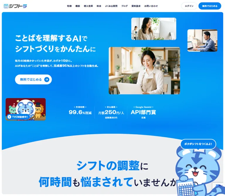
鮮やかな青を基調に、働く人の写真とトラのキャラクターを組み合わせたサービスサイト。吹き出し型のカード、大きな数値、黄色の手描き風アクセントで、親しみやすさと機能性を伝えています。
オリジナルサイトを見るシフトラ / AI Shift Management — Style Reference
Bright blue workplace communication, guided by a friendly tiger and oversized numbers.
Original URL: https://aishift.com/ Final URL: https://aishift.com/ Theme: light interface with saturated blue feature fields, white controls, pale neutral sections, and yellow annotations; no theme selector was evidenced. Inspected: September 12, 2026. The supplied browser observation was retrieved at 06:32:10.366 UTC / 15:32:10.366 JST. Viewports: 1440 × 1000 and 390 × 844 CSS pixels. Scope: the current public service homepage: hero, workplace problems, solution cards, four-step explanation, nine-feature catalog, adoption effects, pricing, FAQ text, application-form text, closing message, and footer. Three desktop captures and two mobile captures provide visual coverage of the hero, desktop effects section, and closing/footer areas. Computed element evidence extends through pricing; later FAQ and form details are primarily supported by rendered text.
シフトラ presents AI-assisted shift scheduling through an approachable workplace identity. A broad blue field carries heavy white Japanese copy, photographs of people working at computers, and a large blue tiger mascot. White pill buttons repeat one clear action, while small proof statements introduce price, time savings, and an award claim. Farther down the page, speech-shaped cards and exceptionally large blue statistics make dense product information feel conversational.
This is a service homepage with substantial on-page product and application content, plus links to a blog, contact pages, and a separate login application. Its distinctive structure comes from alternating blue and pale sections, asymmetric compositions, character overlaps, and changes in information density. On mobile, the composition is deliberately rearranged: the hero photograph moves between heading and explanatory copy, problem cards stack, feature cards retain two columns, and effects become a staggered vertical sequence.
How to Read This Reference
- Measured values come from the supplied rendered element rectangles, computed styles, and custom properties. Dimensions below use CSS pixels unless stated otherwise.
- Visual estimates describe geometry or colors visible in the captures when corresponding computed properties were not supplied. They are not sampled pixel measurements.
- Declared tokens establish that a value exists in the source. They do not prove that every visually similar element uses that token.
- Implementation aliases and recommendations are explicitly identified. The Quick Start is an adaptation, not recovered source code.
- Several large headings and number containers report inherited 14px desktop type. Their visible children are clearly larger. Likewise, an inline link rectangle can be only 14px high while the surrounding painted pill is 64px high. Do not use those parent measurements as the visible display size.
- A mobile navigation subtree has measurable rectangles in the DOM, but its links are absent from the closed-header capture. DOM geometry alone does not establish visibility.
Tokens — Colors
Default Palette
| Name | Value | Evidence | Role |
|---|---|---|---|
| Action Blue | #0381ef |
Computed on feature headings, metric labels, metric values, and the mascot bubble; source --color-code-light-blue-500-rgb: 3 129 239 |
Primary emphasis, filled labels, speech bubbles, and action identity |
| Cyan | #02a3e0 |
Declared as --color-light-blue-500-rgb; computed on mobile problem bubbles |
Supporting bright blue, distinct from the deeper action blue |
| Navy Ink | #151b3c |
Computed body/navigation color; source --color-black-rgb: 21 27 60 |
Main text on pale backgrounds |
| Muted Copy | #5b5f76 |
Computed on solution and feature descriptions | Longer supporting copy |
| Soft Blue | #5075cf |
Computed on solution-card headings; declared blue-500 RGB value | Secondary heading emphasis |
| White | #ffffff |
Computed body/header background and reversed text | Header, buttons, value plates, and text on blue |
| Problem Gray | #edeef0 |
Computed problem-section background | Quiet field behind workplace problems and solutions |
| Card White | #f9f9fa |
Computed solution and feature-card background | Slightly softened cards against stronger fields |
| Ice | #f2fafd |
Declared --color-light-blue-025; visually close to the footer surface |
Recommended direct-color approximation for the pale footer; assignment is not measured |
| Pale Cyan | #ccedf9 |
Declared --color-light-blue-100 |
Available supporting tint; the effects icons and ring appear within this pale-cyan family, but their exact fills were not captured |
| Marker Yellow | Approximately #e6df00 |
Visual estimate from the effects capture | Hand-drawn loops, underlines, and directional annotations |
The visible hero contains broad blue-to-cyan variation. The supplied style extract does not include its background-image declaration, so exact gradient stops, layer positions, and rendering technique remain unknown. The Quick Start uses layered radial gradients as a recommended approximation.
Yellow is concentrated in the effects section. The red commercial poster is a contained image accent, not evidence of a red interface theme. Preserve those distinctions instead of expanding every image color into a global UI token.
Color Relationships
Use blue and white for the main service message and repeated action. Use navy and muted copy on the pale explanatory fields. The softer blue belongs to solution headings and complements the mascot's blue linework without requiring the artwork to share an exact CSS color.
Metric labels reverse the palette: a small blue tab with white text sits directly above a white number plate with blue content. The footer uses another reversal, with a blue outlined action on an almost-white blue surface.
Tokens — Typography
Source Families
| Family or stack | Evidence and use |
|---|---|
NewCezannePro-DB, 'Hiragino Kaku Gothic ProN', meiryo, sans-serif |
Computed body, navigation, hero-copy, and many wrapper styles; declared as the base family |
NewCezannePro-M, sans-serif |
Computed on supporting descriptions, metric captions, and several small labels |
NewCezannePro-B, sans-serif |
Computed on solution headings, feature headings, the pricing heading, and mascot speech |
NewCezannePro-EB, sans-serif |
Declared extra-bold family token; assignment to the visible hero lettering is not established |
Roboto Condensed, sans-serif |
Declared token; no sampled numeral child proves that it renders the large effects numbers |
'Hiragino Kaku Gothic ProN', meiryo, sans-serif |
Declared form stack; individual form-control styles were not supplied |
The sampled named Cezanne variants generally report font-weight: 400. Their visual weight is carried by the selected font family. Applying an additional 700 weight indiscriminately may create synthetic bolding.
The HTML element reports Times, but the body explicitly overrides it with the Japanese sans-serif stack. Times is not the visible site typography.
Type Scale
| Role | Desktop | Mobile | Status |
|---|---|---|---|
| Base body | 14px / 25.2px, tracking 0.7px |
12.675px / 22.815px, tracking 0.63375px |
Measured |
| Desktop navigation | 14px / 14px |
Closed menu links are not visually exposed | Measured desktop |
| Hero supporting copy | 16px / 28.8px |
13.65px / 25.935px |
Measured parent styles |
| Hero display lettering | Approximately 44–52px, with phrase-level size variation |
Approximately 28–32px |
Visual estimate; child styles unavailable |
| Hero heading block | 132.81px high across two lines |
85.50px high across two lines |
Measured container |
| Problem descriptions | 16px / 28.8px |
14.625px / 26.325px |
Measured |
| Solution heading | 26px / 36.4px |
19.5px / 27.3px |
Measured, B family |
| Solution description | 15px / 24px |
13.65px / 21.84px |
Measured, M family |
| Feature heading | 20px / 20px |
13.65px / 19.11px |
Measured, B family |
| Feature description | 14px / 22.4px |
11.7px / 18.72px |
Measured, M family |
| Effects label | 20px / 20px |
15.6px / 15.6px |
Measured |
| Main effects numeral | Approximately 128px |
Child size not supplied | Desktop visual estimate |
| Secondary effects numerals | Approximately 96px |
Child size not supplied | Desktop visual estimate |
| Pricing section heading | 72px / 72px, tracking 2.16px |
35.1px / 35.1px, tracking 1.053px |
Measured, B family |
| Plan title | 32px / 32px |
23.4px / 23.4px |
Measured, B family |
| Hero proof captions | 13px / 13px |
7.8px / 7.8px |
Measured; notably small on mobile |
| Mascot speech | 16px / 16px |
9.75px / 9.75px |
Measured, B family |
Typography alternates between emphatic display lettering and compact explanatory text. Preserve short Japanese phrase groups and deliberate line breaks. The hero's small particles and larger key phrases create a more expressive silhouette than a uniform heading size.
For a new implementation, retain the hierarchy while allowing larger mobile descriptions. The observed 7.8px captions and 11.7px feature copy are reference measurements, not recommended accessibility targets.
Tokens — Spacing & Shapes
Source Scaling
The computed root font size is 10px on desktop and 9.75px at 390px wide. The declared base-size token changes from 14px to 13px, while the actual mobile body computes to 12.675px. Source rem values therefore cannot be copied into a project with a conventional 16px root without conversion.
The inner-radius token changes from 1.2rem on desktop to 1rem on mobile, producing 12px and 9.75px respectively. These two snapshots do not establish a complete fluid scaling formula for all intermediate widths.
Spacing Scale
| Use | Desktop | Mobile | Evidence |
|---|---|---|---|
| Header horizontal inset | 24px |
Left 17.55px; other horizontal inset 11.7px |
Computed header padding |
| Main content inset | Commonly 96px |
Commonly 19.5px, with component-specific exceptions |
Measured |
| Problem-card gap | 48px horizontally |
Approximately 39px vertically |
Calculated from adjacent rectangles |
| Solution-card padding | 42px 48px |
35.1px 39px |
Computed |
| Solution-card vertical gap | 24px |
19.5px |
Calculated from rectangles |
| Feature-card padding | 40px 36px |
19.5px 13.65px |
Computed |
| Feature-grid gap | 24px |
7.8px |
Calculated from rectangles |
| Large section padding | Frequently 156–168px |
Often around 78px; several sections have special illustration clearance |
Computed examples, not one global rule |
| Hero top padding | 212px |
111.15px |
Computed |
Border Radius and Lines
| Element | Treatment | Evidence |
|---|---|---|
| Desktop header | Square, full width | Computed |
| Mobile header | 7.8px radius |
Computed |
| Desktop visible page frame | Approximately 12px corners and 12px outside gutter |
Visual estimate |
| Photographs | Approximately 12px desktop and 10px mobile corners |
Visual estimate |
| Solution cards | 24px rounded corners with one bottom corner square |
Computed; orientation varies by desktop side |
| Mobile solution cards | 19.5px 19.5px 19.5px 0 |
Computed |
| Feature cards | 24px 24px 24px 0 desktop; 19.5px 19.5px 19.5px 0 mobile |
Computed |
| Metric label tabs | 4px 4px 0 0 desktop; 3.9px 3.9px 0 0 mobile |
Computed |
| Metric number plates | Square upper-left corner, other corners approximately 4px |
Computed |
| Pills and mascot bubble | Fully rounded; speech bubble uses 9999px |
Computed bubble, visually confirmed buttons |
| Desktop footer panel | Approximately 24px |
Visual estimate |
| Hero proof separators | Fine dotted white vertical rules | Visual observation |
| Mobile footer link separators | Fine dotted horizontal rules | Visual observation |
The square corner on an otherwise rounded card is a recurring speech motif. It connects the product cards to the mascot's dialogue without attaching a literal triangular tail to every card.
Layout Measurements
| Element | Desktop | Mobile |
|---|---|---|
| Document height | 12,354.42px |
15,326.63px |
| Header | 1440 × 77px |
Approximately 366.59 × 58.47px, positioned at 11.70, 11.69 |
| Header logo box | 149 × 28.98px |
119.92 × 23.33px |
| Hero section | 966.59px high |
1126.84px high |
| Main content width | Frequently 1248px |
Common card container 351px |
| Problem card | 384 × 488.39px |
312 × 408.48px |
| Solution card | 456 × 256px |
351px wide; height varies with copy |
| Feature card | 312px wide; first rows 331.17px high |
Approximately 171.6px wide; common height 228.31px |
| Main effects number plate | 528 × 140px |
314.92 × 85.80px |
| Secondary effects number plate | 286 × 116px |
209.63 × 81.89px |
| Main hero action | Approximately 235.61 × 64px |
Approximately 204.31 × 54.58px |
The white desktop frame recurs in the hero, effects, and footer captures. However, main-section DOM boxes still span the full 1440px width. Treat the visible frame and the content inset as separate systems; the exact source masking implementation was not supplied.
Components
Persistent Header
Role: product identity, section navigation, account access, and the primary application action.
On desktop, a 77px white strip places the logo at x=24, eight navigation links across the center, and two pill controls on the right. Navigation gaps measure 24px. The outlined ログイン control links to the separate application, while the filled 無料ではじめる action targets #entry.
On mobile, the header becomes an inset white rectangle with approximately 12px outside clearance. A smaller logo sits left; a compact blue application pill and circular menu control sit right. The menu button measures about 35.09px square. The desktop login control is absent from the visible mobile header.
The header occupies the same screen position in the supplied top and scrolled captures. Persistent placement is therefore visually supported, although the precise fixed/sticky implementation is not included in the computed-property extract. No opened mobile menu was captured.
A skip link targets #main and sits above the viewport at rest. Its transform and opacity transitions are evidenced; keyboard-triggered visibility was not exercised.
Hero Composition
Role: connect a concrete workplace benefit to a friendly, recognizable product identity.
Desktop copy begins at x=96, y=212. Two lines of white display text lead into supporting copy, then a white action pill. Photographs occupy an independently arranged composition on the right, leaving the heading readable rather than putting text over a busy image.
| Visual | Desktop placement and size | Mobile treatment | Evidence |
|---|---|---|---|
| Main café photograph | Approximately x=696, y=302; 456 × 304px |
Approximately x=39, y=238; 312 × 208px |
Screenshot estimates |
| Small office photograph | Approximately x=840, y=113; 288 × 144px |
Not visible in the supplied mobile hero | Screenshot observation |
| Smaller male worker photograph | Approximately x=1200, y=188; 192 × 144px |
Approximately x=12, y=261; 117 × 88px, overlapping the main image |
Screenshot estimates |
| Calendar-holding tiger | Large, lower-right composition; extends beyond the visible lower/right edge | Smaller figure overlaps the main photograph on the right | Screenshot observation |
| Commercial thumbnail | Approximately x=36, y=630; 256 × 144px |
Centered below the main action, approximately 312px wide |
Screenshot estimates |
The mobile order is heading → photo composition → supporting copy → primary action → commercial → proof strip. The supporting-copy block begins at y=479.39 and the action wrapper at y=622.69. This is a rearrangement, not a proportional reduction of the desktop two-sided scene.
A broad pale-gray wave rises into the bottom of the desktop blue hero. Its contour is visible; its implementation is not. It introduces the following problem section and lets the mascot overlap the boundary.
Primary Action System
Role: repeat the same destination with context-appropriate contrast.
Three main variants are visible:
- Header action: compact blue pill, white label, no prominent circular arrow.
- Hero action: white pill, blue label, and a filled blue circle containing a white right arrow.
- Footer action: pale/white pill with a thick blue outline, large blue label, and the same circular arrow treatment.
The hero action is approximately 236 × 64px on desktop and 204 × 55px on mobile. Its text appears around 20px and 18px respectively; these are visual estimates because the sampled anchor inherits smaller wrapper type.
The final desktop action is approximately 376 × 84px. The mobile footer action is approximately 280 × 78px. Keep the arrow circle distinct from the enclosing pill rather than replacing it with a plain chevron aligned to the text baseline.
The repeated 無料ではじめる links and pricing trial link target #entry. The evidence establishes their destinations, not smooth-scroll behavior or a completed application flow.
Mascot and Speech Bubble
Role: narrate the page and soften technical explanations.
The tiger has a large rounded head, pale-blue body, white muzzle, thick blue outlines, navy facial details, and a small clock motif. Three poses are directly visible: smiling with a calendar in the hero, presenting the effects section with a pointer, and peeking over the footer action.
Speech bubbles use blue fill, white text, a white outline, and a small downward tail. The measured hero bubble is about 231.05 × 68px on desktop and 129.91 × 33.19px on mobile. Its computed padding changes from 22px 23px to 10.725px 8.775px. The visible outline is approximately 4px on desktop and 1px on mobile.
Keep the bubble attached spatially to the character. The figure can cross a section edge, but it should not cover essential copy or the action's interactive area. Additional mascot dialogue exists in the rendered text; its exact associated poses are not documented by the supplied captures.
Hero Proof Strip and Commercial Control
Role: provide a compact layer of reassurance beneath the main message.
The desktop strip contains three groups: time reduction, per-person monthly price, and an award claim. Each stacks a small centered caption over larger white content, with smaller supporting text where needed. Dotted vertical separators divide the groups. The caption row begins around y=679.59.
The commercial is a separate colorful image with a blue play-label treatment reading TVCM放映中!. A button is present in the DOM. Playback, destination media, sound policy, and modal behavior were not tested.
On mobile, the commercial and proof strip sit below the first 844px viewport. The DOM places proof captions around y=969.77. Do not assume that the opening mobile capture contains the complete hero.
All numerical benefits and awards in this component are site claims. This reference documents their presentation, not independent verification.
Workplace Problems and Solution Cards
Role: move from recognizable scheduling problems to specific product capabilities.
The desktop problem area contains three equal columns, positioned at x=96, 528, and 960. Each is 384px wide, with a 48px gap. Their descriptions use the M family at 16px with 28.8px leading. On mobile, the same three groups become a single sequence of 312px-wide blocks at x=39.
The solution area contains six cards arranged around a central title region. Desktop cards are 456 × 256px. The outer rows begin at x=96 and x=888; the middle pair shifts farther outward to x=48 and x=936. This produces an intentional alternating silhouette around the central content.
Each card combines a blue two-line heading with muted description text on Card White. A single square bottom corner points the composition inward. On mobile, all six cards become 351px-wide blocks with 19.5px gaps, consistent bottom-left square corners, and content-dependent heights.
The supplied images do not visually cover these problem/solution sections. Card geometry, typography, colors, and content order are supported by the DOM; detailed illustration appearances should not be invented.
Four-Step Explanation
Role: explain the sequence from natural-language input to usable shift output.
The four source labels are 入力, AI解析, 自動生成, and 出力. Each combines a number, a short title, and a concise explanation.
On desktop, the sampled titles begin around x=992 and descriptions around x=1124, creating a compact right-side explanatory column. The visual material occupying the remaining desktop area was not shown in the supplied captures.
On mobile, each step becomes a nearly full-width white row, approximately 374.44px wide, with a 9.75px radius. Title boxes are about 80px wide, and description boxes about 146px wide. Rows measure roughly 73–91px high depending on copy. This preserves internal horizontal grouping instead of stacking number, title, and paragraph into three separate full-width bands.
Feature Catalog
Role: present nine capabilities with a repeatable route to video explanations.
Desktop cards form a three-column grid at x=96, 432, and 768, each 312px wide with 24px gaps. A separate title/copy region sits to the right. The first two rows are about 331px tall, while the final row is about 309px tall.
Card anatomy is consistent: a reserved upper visual area, blue feature heading, muted paragraph, and a bottom 動画で機能を見る button. The sampled desktop heading begins 120px below the card top, including 40px top padding; preserve room for the actual visual asset rather than filling that space with an invented icon. The video control is 36px high and spans the 240px inner width.
At 390px, the catalog remains two columns. Cards are approximately 171.6px wide, separated by only 7.8px, inside a 351px container. Their corner radius is 19.5px. The final ninth card starts in the left column. Text and padding become much smaller; some rows grow to accommodate longer copy.
The video buttons are evidenced as buttons. Their resulting playback interface is unverified.
Adoption Effects Infographic
Role: give the page its strongest numerical and illustrative contrast.
The desktop effects section reserves a broad left region for the presenting tiger. Its measured padding is 168px 96px 168px 384px, leaving a 960px-wide information area on the right.
The main statistic pairs a small blue title tab with a white 528 × 140px number plate. A large pale-cyan circular dial sits to the right; its visual diameter is approximately 384px. The settled capture displays a ten-minute time value, with a small qualification beneath it. A tiny blue arc interrupts the otherwise pale ring. The ring's precise quantitative encoding was not established.
Below, three 288px-wide groups sit at x=384, 720, and 1056 with 48px gaps. Each contains a blue tab, white value plate, and two-line navy explanation. The settled values shown are:
| Source label | Displayed result | Presentation |
|---|---|---|
シフト作成時間 |
99.6%削減 |
Largest number, surrounded by a loose yellow loop |
コスト |
89%削減 |
Large blue digits with a loose yellow underline |
離職率 |
45%低下 |
Large blue digits with a dashed yellow underline |
売り上げ |
17%向上 |
Large blue digits with a wavy yellow underline |
A fine dot field covers the pale background; its spacing appears approximately 24px. Pale calendar, currency, people, and growth symbols support the statistics. Yellow marks include a heading underline, an irregular loop, and a curved arrow linking the main value and dial. Their irregularity is part of the visual identity.
On mobile, the main plate and dial become a vertical sequence. The three smaller groups are staggered rather than uniformly centered: their measured left edges are approximately 19.5px, 122.84px, and 58.5px. Keep that purposeful variation when reproducing this composition.
The initial desktop text extract contains zero values and a forty-hour state, while the settled desktop image and mobile DOM show the completed results. Use the settled values for a static reference; do not reproduce the initial counter state as final content.
Pricing
Role: explain one standard offer and provide a separate path for larger deployments.
The rendered content presents one standard plan, a per-person monthly price, an initial-cost statement, nine included capabilities, and a 30-day trial action. A separate enterprise message addresses deployments of 100 or more people and links to contact.
Measured typography establishes a 72px white section heading on desktop and a 35.1px heading on mobile. Plan titles use 32px and 23.4px respectively. The price display occupies a 96px-high desktop container, but its child font size was not supplied.
The supplied captures do not show the pricing panel itself. Its exact enclosing surface, decorative illustration, and feature-control interactions should remain unspecified. A multi-tier comparison grid would not match the evidenced content structure.
FAQ and Application Form
Role: resolve practical questions and collect a trial request.
The rendered FAQ contains eight question-and-answer pairs with explicit Q and A markers. Topics include collecting availability, custom rules, sudden absence, time savings, approval controls, multiple locations, integrations, and industry-specific constraints. No toggle action or open/closed state was tested, so accordion behavior is unverified.
The application section includes a three-stage introduction followed by company name, email address, personal name, telephone number, and remarks fields. A required marker, privacy-consent text, an application action, and a reCAPTCHA notice are present. The supplied evidence does not establish every required-field association or the form's validation, loading, success, and error states.
For implementation work, preserve those information groups while treating control styling and interaction details as new design decisions. No form submission was performed.
Closing Message and Footer
Role: return to the people-centered message, then provide navigation, trust information, and a final application action.
The desktop closing area returns to the blue photographic composition. A large image at approximately x=144, y=267 measures 432 × 288px in the supplied scrolled capture. Smaller workplace photographs sit above it, while short white paragraphs occupy the right side. The large headline is partly above the captured viewport; this is scroll framing, not evidence that the heading should intentionally be clipped.
A pale footer panel appears at approximately x=48, y=660, measuring 1344 × 296px. It contains a larger product wordmark, short product description, privacy badge and operator statement, two columns of primary links, a legal-link group, and the prominent outlined action. A tiger peeks over that action and visually connects it to the closing scene.
The original footer names 株式会社ams as the operator and states that it is a PrivacyMark-certified business. The statement and badge are observed page content; certification status was not independently checked.
On mobile, the footer uses a full pale field. Primary links appear in two columns with small pale-blue arrows and dotted horizontal separators. Legal links follow in a quieter two-column group. A large vertical interval precedes the centered final action.
The mobile footer capture begins partway through the footer and does not show the complete upper content. The desktop peeking mascot is also absent from that particular mobile capture; the evidence does not establish whether it was hidden, outside the crop, or awaiting another state. Do not infer a removal rule from that image alone.
Tokens — Motion & Interaction
| Treatment | Evidence | What can be reproduced confidently |
|---|---|---|
| Desktop navigation color transition | color 0.2s |
A short color transition exists; the hovered target color was not sampled |
| Skip-link transition | transform 0.2s, opacity 0.2s |
Short transform/opacity treatment; focus behavior was not exercised |
| Hero mascot bubble | Opacity 0.2s; translate 0.45s; scale 0.35s with 0.1s delay |
Separate fade, movement, and scale timing |
| Bubble easing | cubic-bezier(0.235, 1.335, 0.63, 1) |
Overshooting arrival character |
| Mobile problem bubbles | Opacity 0.2s; translate 0.45s; scale 0.35s, with the same easing |
Related speech entrance treatment, without the hero's recorded scale delay |
| Numerical effects | Initial DOM and settled capture show different number states | Stateful numerical presentation; trigger, duration, and exact mechanism remain unverified |
| Section navigation | Links target #point, #function, #introduction, #price, #faq, and #entry |
In-page destinations are confirmed |
| Mobile menu | Circular button visible in the closed header | Open layout, transition, dismissal, and keyboard behavior are unverified |
| Video controls | Commercial and feature buttons exist | Playback interaction and overlay appearance are unverified |
| FAQ and application | Content and controls appear in rendered text | Expansion behavior, validation, and submission outcomes are unverified |
Additional back, power, and circular easing custom properties are declared, but their existence does not identify which visible components use them. Many sampled elements report animation: none; that does not rule out animated children, pseudo-elements, or script-driven effects.
The supplied capture process waited for visible finite motion and layout stability within stated limits, and temporarily paused perpetual animations during readiness checks. Static captures still do not establish continuous mascot motion, parallax, autoplay, or a complete entrance sequence.
For an extension, favor short, friendly speech arrivals and restrained control feedback. Any new counter animation should expose the final value without requiring animation to finish, and should have a reduced-motion alternative.
Surfaces
| Layer | Appearance | Function |
|---|---|---|
| Page frame and header | White, visually flat | Keep the long page contained and navigation legible |
| Hero and closing field | Saturated blue with broad cyan variation | Carry white display copy, photographs, and character artwork |
| Problem field | Measured #edeef0 |
Lower the visual intensity for explanatory content |
| Solution and feature cards | Measured #f9f9fa, one square corner |
Group information using a speech-like silhouette |
| Effects field | Pale gray with fine dots; exact fill unmeasured | Support large blue statistics and yellow annotations |
| Metric plates | White, small asymmetric radii | Separate numbers from the patterned field |
| Footer | Very pale blue, visually close to #f2fafd |
Group identity, trust content, navigation, and final action |
| Speech bubble | Blue with white text and outline | Attach short narration to the mascot |
There is no evidenced general system of elevated cards with large soft shadows. Most separation comes from color changes, silhouettes, spacing, and overlap. A subtle shadow may contribute to the mobile header's separation, but no shadow declaration was supplied.
Imagery
Photography depicts people using laptops and desktop computers in bright workplaces. Café clothing, office attire, wooden interiors, and greenery make the scenes feel familiar and human. The images are not evidenced as verified customer portraits or testimonials, and their production method is unknown.
The photographs use several ratios rather than one repeated card crop: approximately 3:2 for the main café image, 2:1 for one smaller office image, and 4:3 for another. Preserve faces, hands, and working devices when adapting crops. Keep corners softly rounded and avoid heavy image overlays.
The tiger artwork supplies the brand's strongest recognition. Rounded blue outlines, pale cyan fills, white facial shapes, expressive eyes, a striped forehead, and a calendar or clock motif connect the character to scheduling. The effects pose adds a pointer; the footer pose uses paws over the action. These are specific illustration assets, not interchangeable generic animal icons.
Observed Asset References
No original image-file paths were included in the supplied evidence. The following are visual references, not downloadable asset URLs.
| Asset | Supplied visual reference | Implementation note |
|---|---|---|
| Product wordmark | Desktop and mobile headers; desktop footer | Use an authorized logo asset; do not approximate the slanted lettering with ordinary text |
| Main café photograph | Desktop and mobile hero | Preserve the 3:2 crop and visible computer/work context |
| Supporting workplace photographs | Desktop hero, mobile hero, and desktop closing scene | Maintain varied scale and aspect ratio |
| Calendar-holding tiger | Desktop and mobile hero | Transparent artwork overlapping the photographic composition |
| Presenting tiger | Desktop effects capture | Large left-side illustration with pointer |
| Peeking tiger | Desktop footer | Layer behind the final action so paws overlap its top edge |
| Commercial poster | Desktop hero and partial mobile hero | Contained red theatrical scene with a play-label treatment |
| Privacy badge | Desktop footer and partial mobile footer | Preserve proportions and the accompanying operator statement |
| Yellow annotations | Desktop effects capture | Use authored SVG or artwork for irregular loops and underlines |
Use original artwork when authorized and available. The CSS shell can reproduce the layout and color relationships, but it cannot replace the identity carried by the logo, photographs, and mascot poses.
Layout & Responsive Behavior
| Area | Desktop observation | Mobile observation |
|---|---|---|
| Header | Full-width white strip, eight links, login, and application action | Inset rounded bar, smaller logo, application action, circular menu |
| Hero | Copy left; independently positioned photographs right; mascot lower right | Heading, collage, copy, action, commercial, then proof strip |
| Problem groups | Three columns | One column |
| Solution groups | Paired cards around a central region, with an outward-shifted middle pair | One column with consistent speech-card corners |
| Four-step explanation | Compact explanatory text on the right side | Four nearly full-width horizontal rows |
| Feature catalog | Three columns plus a separate right-side title region | Two columns across five rows |
| Effects | Main value and dial share a horizontal composition; three statistics below | Main value and dial stack; smaller statistics use staggered left positions |
| Footer | Wide pale panel with several information zones and an illustrated action | Two-column link groups and a centered large action with broad preceding space |
The declared breakpoint tokens include 768px, 1024px, and 1680px. Only 1440px and 390px were inspected, so exact component switching thresholds and tablet behavior remain unverified.
The mobile hero is about 1127px tall, substantially taller than the 844px viewport. A captured --first-view-height token remains 1000px even in the mobile evidence; it is not a reliable statement of the mobile viewport height or the hero's actual height. Avoid forcing this composition into height: 100vh.
Use component-specific widths rather than one universal mobile inset. Problem groups use 312px, solution/feature containers use 351px, and workflow rows use about 374px at the inspected 390px width. These differences create the original rhythm.
For intermediate widths, preserve readable text and intentional image overlap before preserving every desktop coordinate. The mobile two-column feature grid is an observed choice; switching it to one column at very narrow widths or enlarged text settings would be a recommended enhancement.
Do’s and Don’ts
Do
- Build the identity around Action Blue, white, navy text, workplace photography, and the blue tiger.
- Preserve the distinction between compact header actions, inverse hero actions, and outlined footer actions.
- Keep one square corner on the solution and feature cards.
- Use deliberate Japanese phrase breaks and strong display/body contrast.
- Retain the mobile hero's image-before-description order.
- Preserve the two-column feature catalog at the inspected mobile width.
- Give the effects section unusually large numbers, small attached labels, pale symbols, and irregular yellow annotations.
- Keep the main effects value and its qualification together.
- Allow illustrations to overlap boundaries while reserving clear space for text and controls.
- Use the settled counter values when creating a static design reference.
Don’t
- Don’t reduce every section to an identical rounded-card grid.
- Don’t replace the source font hierarchy with a single generic bold weight everywhere.
- Don’t interpret a 14px heading wrapper as the actual size of its large rendered lettering.
- Don’t treat inline anchor rectangles as the full painted button dimensions.
- Don’t turn the yellow marker color or commercial poster red into a competing global action color.
- Don’t assume every mobile component stacks into one column.
- Don’t flatten all photographs to one ratio or obscure faces with text overlays.
- Don’t invent mascot poses, image URLs, customer identities, or unobserved software screenshots.
- Don’t claim smooth scrolling, modal video playback, accordion behavior, or successful form submission without testing them.
- Don’t preserve small mobile measurements at the expense of readable content and usable controls.
Recommended Implementation Additions
These recommendations are additions for a new implementation, not verified features of the original:
- Give the mobile menu button an accessible name, a synchronized expanded state, and at least a 44px interaction target. Its observed visible circle is about 35px.
- Keep the skip link and add visible keyboard focus to links, video buttons, and form controls.
- Review small text on saturated blue. Calculated from the solid colors, white against
#0381efis approximately 3.9:1. A darker source blue,#0267bf, offers approximately 5.7:1 and is a useful optional background for normal-sized white action text. These calculations do not measure contrast over the actual gradient. - Increase mobile feature descriptions toward 14px and proof captions toward 11–12px when adapting the design. Allow cards to grow with enlarged text.
- Represent animated statistics with a stable accessible final value; hide decorative digit reels and marker strokes from assistive technology.
- Respect reduced motion for speech entrances and counters. Essential text should remain visible when animation scripts fail.
- Associate form labels, required states, errors, and consent controls explicitly. Keep entered data intact after validation errors.
- If video opens in a dialog, provide keyboard dismissal, focus management, captions where available, and user-initiated playback.
- Use meaningful alternatives for informative workplace images and appropriate empty alternatives for decorative duplicate mascot artwork.
- Offset in-page anchor targets so the persistent header does not obscure their headings.
Agent Prompt Guide
Quick Color Reference
- Primary blue:
#0381ef. - Supporting cyan:
#02a3e0. - Main text:
#151b3c; supporting copy:#5b5f76. - Solution heading blue:
#5075cf. - Problem field:
#edeef0; card surface:#f9f9fa. - Footer approximation:
#f2fafd. - Effects marker approximation:
#e6df00, used sparingly. - Hero action: white pill, blue text, blue circle with a white right arrow.
Overall Prompt
“Create a Japanese AI shift-management service homepage inspired by the current シフトラ visual system. Use a saturated blue field with broad cyan variation, heavy Japanese sans-serif display copy, bright workplace photographs in varied rounded crops, and a friendly blue tiger mascot. Keep a persistent white header with section navigation and a clear application action. Alternate expressive blue compositions with pale explanatory sections. Build speech-shaped cards with one square bottom corner, a nine-feature catalog, and an effects section with oversized blue numerals, attached blue labels, pale icons, and loose yellow marker annotations. On mobile, place the hero collage between the heading and description, stack the problem and solution groups, retain two feature columns, and stagger the smaller effects statistics. Use supplied licensed artwork and do not invent original interaction details.”
Example Component Prompts
- Hero: “Compose a blue service hero with the source headline
ことばを理解するAIで / シフトづくりをかんたんに, left-aligned desktop copy, a white pill action, and three differently sized workplace photographs on the right. Place a calendar-holding blue tiger near the lower-right edge. At 390px, center the heading, move the main photograph above the supporting copy, and overlap it with one small photo and the mascot.” - Solution card: “Build a pale
#f9f9faspeech-shaped card, approximately 456 × 256px on desktop, with 24px corners except one square bottom corner. Use a#5075cftwo-line heading and muted#5b5f76supporting copy. On mobile, use one 351px-wide column and content-driven height.” - Feature catalog: “Create nine feature cards in three desktop columns with a separate right-side heading region. Each card contains supplied feature artwork, a blue title, muted description, and a bottom video button. At 390px retain two columns, approximately 172px each, with tight gaps and one square bottom-left corner.”
- Effects panel: “Create a pale dotted section with a presenting mascot at left, a very large blue
99.6%削減value on a white plate, and a pale circular time diagram at right. Add three smaller statistic groups below. Use a loose yellow loop, dashed and wavy underlines, and pale support icons. For mobile, stack the main value and dial and vary the smaller groups' left alignment.” - Footer: “Create a pale-blue footer with the product logo and trust statement at left, compact navigation and legal links in the middle, and a large blue outlined application pill at right. With authorized artwork, place a peeking tiger behind the desktop action. On mobile, use two-column link groups with dotted rules and a centered final action.”
- Motion: “Use the evidenced 200ms fade, 450ms translation, and 350ms scale treatment for short speech arrivals with
cubic-bezier(0.235, 1.335, 0.63, 1). Keep content visible by default and disable nonessential motion for reduced-motion users. Treat any counter or menu animation as a newly specified behavior.”
Quick Start
CSS Custom Properties
This is a reusable adaptation with a conventional root font size. Exact computed colors and selected desktop/mobile dimensions are retained where practical. Hero gradients, numeral typography, intermediate breakpoints, hover target colors, focus styling, and responsive interpolation are recommendations. Named fonts require authorized installation; the fallback stacks keep the shell usable without them.
The selectors assume semantic header, hero, feature, effects, and footer components. The photo composition and mascot use supplied image elements. Menu state, video behavior, form processing, and counters require separate implementation.
:root {
  /* Measured colors */
  --shift-blue: #0381ef;
  --shift-cyan: #02a3e0;
  --shift-ink: #151b3c;
  --shift-muted: #5b5f76;
  --shift-soft-blue: #5075cf;
  --shift-white: #ffffff;
  --shift-gray: #edeef0;
  --shift-card: #f9f9fa;

  /* Declared color with estimated placement; estimated marker color */
  --shift-ice: #f2fafd;
  --shift-marker: #e6df00;
  --shift-effects: #f3f4f5;

  /* Source families with practical fallback additions */
  --shift-font-base: 'NewCezannePro-DB', 'Hiragino Kaku Gothic ProN', meiryo, sans-serif;
  --shift-font-copy: 'NewCezannePro-M', 'Hiragino Kaku Gothic ProN', meiryo, sans-serif;
  --shift-font-heading: 'NewCezannePro-B', 'Hiragino Kaku Gothic ProN', meiryo, sans-serif;
  --shift-font-number: system-ui, sans-serif;

  --shift-header-height: 77px;
  --shift-inset: clamp(24px, 6.667vw, 96px);
  --shift-card-gap: 24px;
  --shift-radius-card: 24px;
  --shift-radius-image: 12px;
  --shift-fast: 200ms;
  --shift-bubble-ease: cubic-bezier(0.235, 1.335, 0.63, 1);
}

* { box-sizing: border-box; }

body {
  margin: 0;
  color: var(--shift-ink);
  background: var(--shift-white);
  font: 400 14px/1.8 var(--shift-font-base);
  letter-spacing: 0.05em;
}

button, input, textarea { font: inherit; }
img { display: block; max-width: 100%; }
[hidden] { display: none !important; }
section[id] { scroll-margin-top: 100px; }

.site-header {
  position: fixed;
  inset: 0 0 auto;
  z-index: 100;
  display: flex;
  align-items: center;
  gap: 24px;
  min-height: var(--shift-header-height);
  padding: 16px 24px;
  background: var(--shift-white);
}

.brand { flex: 0 0 auto; width: 149px; }
.desktop-nav { display: flex; gap: 24px; margin-inline: auto; }
.desktop-nav a {
  color: var(--shift-ink);
  line-height: 1;
  text-decoration: none;
  white-space: nowrap;
  transition: color var(--shift-fast);
}
.header-actions { display: flex; align-items: center; gap: 8px; }
.menu-toggle { display: none; }

.blue-field {
  color: var(--shift-white);
  /* Recommended approximation; original gradient stops are unknown. */
  background:
    radial-gradient(ellipse at 35% 30%, rgb(2 163 224 / 0.8), transparent 60%),
    radial-gradient(ellipse at 85% 75%, rgb(2 163 224 / 0.75), transparent 65%),
    var(--shift-blue);
}

.hero {
  position: relative;
  isolation: isolate;
  min-height: 967px;
  padding: 212px var(--shift-inset) 206px;
}
.hero-title {
  position: relative;
  z-index: 2;
  max-width: 560px;
  margin: 0;
  font: 400 clamp(36px, 3.333vw, 48px)/1.38 var(--shift-font-heading);
  letter-spacing: 0.03em;
}
.hero-copy {
  position: relative;
  z-index: 2;
  max-width: 560px;
  margin: 28px 0 40px;
  font-size: 16px;
  line-height: 1.8;
}
.hero-action { position: relative; z-index: 2; }
.hero-visual { position: absolute; inset: 0; pointer-events: none; }
.hero-photo { position: absolute; object-fit: cover; border-radius: var(--shift-radius-image); }
.hero-photo--main { left: 48.333%; top: 302px; width: 31.667%; aspect-ratio: 3 / 2; }
.hero-photo--office { left: 58.333%; top: 113px; width: 20%; aspect-ratio: 2 / 1; }
.hero-photo--small { right: 3.333%; top: 188px; width: 13.333%; aspect-ratio: 4 / 3; }
.hero-mascot { position: absolute; right: 0; bottom: 0; width: min(24vw, 344px); }

.cta {
  display: inline-flex;
  align-items: center;
  justify-content: center;
  gap: 20px;
  min-height: 64px;
  padding: 12px 16px 12px 32px;
  border: 0;
  border-radius: 9999px;
  color: var(--shift-blue);
  background: var(--shift-white);
  font: 400 20px/1.2 var(--shift-font-heading);
  text-decoration: none;
  cursor: pointer;
}
.cta-arrow {
  display: grid;
  place-items: center;
  flex: 0 0 32px;
  width: 32px;
  height: 32px;
  border-radius: 50%;
  color: var(--shift-white);
  background: var(--shift-blue);
}
.cta--header { min-height: 46px; padding: 12px 24px; font-size: 14px; }
.cta--filled { color: var(--shift-white); background: var(--shift-blue); }
.cta--outline { border: 3px solid var(--shift-blue); }
.cta--large { min-height: 84px; font-size: 28px; }
.cta--large .cta-arrow { flex-basis: 48px; width: 48px; height: 48px; }

.speech-bubble {
  position: relative;
  width: fit-content;
  padding: 22px 23px;
  border: 4px solid var(--shift-white);
  border-radius: 9999px;
  color: var(--shift-white);
  background: var(--shift-blue);
  font: 400 16px/1 var(--shift-font-heading);
  transition:
    opacity 200ms,
    translate 450ms var(--shift-bubble-ease),
    scale 350ms var(--shift-bubble-ease) 100ms;
}
.speech-bubble::after {
  content: '';
  position: absolute;
  left: calc(50% - 7px);
  bottom: -10px;
  width: 14px;
  height: 14px;
  background: var(--shift-blue);
  border-right: 4px solid var(--shift-white);
  border-bottom: 4px solid var(--shift-white);
  transform: rotate(45deg);
}

.section-inner { margin-inline: var(--shift-inset); }
.problem-field { background: var(--shift-gray); }
.problem-grid { display: grid; grid-template-columns: repeat(3, minmax(0, 1fr)); gap: 48px; }
.solution-card, .feature-card {
  min-width: 0;
  border-radius: var(--shift-radius-card) var(--shift-radius-card) var(--shift-radius-card) 0;
  background: var(--shift-card);
}
.solution-card { padding: 42px 48px; }
.solution-card h3 { margin: 0 0 28px; color: var(--shift-soft-blue); font: 400 26px/1.4 var(--shift-font-heading); }
.solution-card p { margin: 0; color: var(--shift-muted); font: 400 15px/1.6 var(--shift-font-copy); }

.feature-layout { display: grid; grid-template-columns: minmax(0, 1fr) 192px; gap: 72px; }
.feature-intro { grid-column: 2; grid-row: 1; }
.feature-grid { grid-column: 1; grid-row: 1; display: grid; grid-template-columns: repeat(3, minmax(0, 1fr)); gap: 24px; }
.feature-card { display: flex; flex-direction: column; padding: 40px 36px; }
.feature-media { min-height: 80px; }
.feature-card h3 { margin: 0 0 24px; color: var(--shift-blue); font: 400 20px/1.4 var(--shift-font-heading); }
.feature-card p { margin: 0 0 24px; color: var(--shift-muted); font: 400 14px/1.6 var(--shift-font-copy); }
.feature-video { min-height: 36px; margin-top: auto; cursor: pointer; }

.effects {
  position: relative;
  padding: 168px var(--shift-inset) 168px max(var(--shift-inset), 26.667vw);
  background-color: var(--shift-effects);
  /* Estimated dot spacing and tint. */
  background-image: radial-gradient(rgb(21 27 60 / 0.24) 0.6px, transparent 0.8px);
  background-size: 24px 24px;
}
.effects-main { display: grid; grid-template-columns: minmax(0, 528px) minmax(0, 1fr); gap: 48px; align-items: center; }
.metric-label { display: table; margin: 0; padding: 8px; border-radius: 4px 4px 0 0; color: white; background: var(--shift-blue); font-size: 20px; line-height: 1; }
.metric-value { display: flex; align-items: baseline; width: fit-content; max-width: 100%; padding: 10px; border-radius: 0 4px 4px 4px; color: var(--shift-blue); background: white; }
.metric-number { font: 800 96px/1 var(--shift-font-number); letter-spacing: -0.04em; font-variant-numeric: tabular-nums; }
.metric-value--main .metric-number { font-size: 128px; line-height: 0.91; }
.metric-unit { font-size: 32px; line-height: 1; white-space: nowrap; }
.effects-small { display: grid; grid-template-columns: repeat(3, minmax(0, 1fr)); gap: 48px; margin-top: 168px; }
.metric-description { margin: 13px 0 0; font: 400 16px/1.8 var(--shift-font-copy); }

.footer-panel { margin: 0 48px 44px; padding: 48px; border-radius: 24px; color: var(--shift-ink); background: var(--shift-ice); }
.footer-links { display: grid; grid-template-columns: repeat(2, minmax(0, 1fr)); gap: 8px 24px; }
.footer-links a { color: inherit; text-decoration: none; }

/* Recommended focus and hover treatments. */
:where(a, button, input, textarea):focus-visible { outline: 3px solid var(--shift-ink); outline-offset: 4px; }
@media (hover: hover) {
  .desktop-nav a:hover { color: var(--shift-blue); }
}

/* Recommended navigation threshold; original switch point is unverified. */
@media (max-width: 1199px) {
  .desktop-nav, .header-login { display: none; }
  .header-actions { margin-left: auto; }
  .menu-toggle { display: grid; place-items: center; width: 44px; height: 44px; border: 1px solid #d9ecfd; border-radius: 50%; color: var(--shift-blue); background: white; }
}

@media (max-width: 767px) {
  :root { --shift-inset: 5vw; --shift-radius-card: 19.5px; --shift-radius-image: 10px; }
  .site-header { inset: 12px 12px auto; gap: 6px; min-height: 58px; padding: 7px 12px 7px 18px; border-radius: 8px; }
  .brand { width: 120px; }
  .header-actions { gap: 6px; }
  .cta--header { min-height: 36px; padding: 10px 12px; font-size: 11px; }
  .hero { display: flex; flex-direction: column; align-items: center; min-height: 1127px; padding: 111px 0 105px; }
  .hero-title { order: 1; width: 100%; padding-inline: 20px; text-align: center; font-size: 30px; line-height: 1.425; }
  .hero-visual { position: relative; inset: auto; order: 2; width: 100%; height: 53.333vw; margin: 41px 0 32px; }
  .hero-photo--main { left: 10%; top: 0; width: 80%; }
  .hero-photo--office { display: none; }
  .hero-photo--small { left: 3%; right: auto; top: 23px; width: 30%; }
  .hero-mascot { right: 0; bottom: -38px; width: 34%; }
  .hero-copy { order: 3; margin: 0 0 32px; padding-inline: 20px; text-align: center; font-size: 14px; line-height: 1.95; }
  .hero-action { order: 4; }
  .hero-action .cta { min-height: 55px; gap: 16px; padding: 10px 14px 10px 26px; font-size: 18px; }
  .hero-action .cta-arrow { flex-basis: 28px; width: 28px; height: 28px; }
  .problem-grid { grid-template-columns: 1fr; gap: 39px; margin-inline: 10vw; }
  .solution-card { padding: 35px 39px; }
  .solution-card h3 { margin-bottom: 20px; font-size: 19.5px; }
  .solution-card p { font-size: 14px; }
  .feature-layout { grid-template-columns: 1fr; gap: 32px; }
  .feature-intro { grid-column: 1; grid-row: 1; }
  .feature-grid { grid-column: 1; grid-row: 2; grid-template-columns: repeat(2, minmax(0, 1fr)); gap: 2vw; }
  .feature-card { padding: 20px 14px; }
  .feature-media { min-height: 56px; }
  .feature-card h3 { margin-bottom: 10px; font-size: 14px; }
  .feature-card p { margin-bottom: 13px; font-size: 14px; }
  .feature-video { min-height: 44px; }
  .effects { padding: 78px 5vw; }
  .effects-main { grid-template-columns: 1fr; gap: 32px; }
  .metric-label { font-size: 15.6px; }
  .metric-number { font-size: 64px; }
  .metric-value--main .metric-number { font-size: 76px; }
  .metric-unit { font-size: 24px; }
  .metric-description { font-size: 15px; line-height: 1.6; }
  .effects-small { display: flex; flex-direction: column; gap: 38px; margin-top: 38px; }
  .effects-small > :nth-child(2) { margin-left: 29.5%; }
  .effects-small > :nth-child(3) { margin-left: 11%; }
  .footer-panel { margin: 0; padding: 48px 12vw 60px; border-radius: 0; }
  .footer-links a { padding-block: 14px; border-bottom: 1px dotted #d0d1d8; }
  .footer-action { margin-top: 120px; text-align: center; }
  .cta--large { min-height: 78px; padding-inline: 24px 16px; font-size: 24px; }
  .cta--large .cta-arrow { flex-basis: 40px; width: 40px; height: 40px; }
}

/* Recommended narrow-width fallback beyond the inspected mobile state. */
@media (max-width: 359px) {
  .feature-grid { grid-template-columns: 1fr; }
  .effects-small > :nth-child(n) { margin-left: 0; }
}

@media (prefers-reduced-motion: reduce) {
  .speech-bubble { transition: none; opacity: 1; translate: none; scale: none; }
  .desktop-nav a { transition: none; }
}
The starter intentionally allows card heights to grow with its recommended larger mobile copy. Its mobile photo omission, header collapse threshold, dot field, and numeral font are implementation choices informed by the captures, not verified source rules. Add the commercial, proof strip, authored wave contour, metric dial, and yellow SVG annotations as separate components using the anatomy above.
Tailwind v4 Token Mapping
Optional aliases for a project already using Tailwind v4. This does not imply that the original site uses Tailwind. Define the preceding custom properties first.
@theme inline {
  --color-shift-blue: var(--shift-blue);
  --color-shift-cyan: var(--shift-cyan);
  --color-shift-ink: var(--shift-ink);
  --color-shift-muted: var(--shift-muted);
  --color-shift-soft-blue: var(--shift-soft-blue);
  --color-shift-card: var(--shift-card);
  --color-shift-gray: var(--shift-gray);
  --color-shift-ice: var(--shift-ice);
  --color-shift-marker: var(--shift-marker);

  --font-shift-base: var(--shift-font-base);
  --font-shift-copy: var(--shift-font-copy);
  --font-shift-heading: var(--shift-font-heading);
  --font-shift-number: var(--shift-font-number);

  --spacing-shift-inset: var(--shift-inset);
  --spacing-shift-card-gap: var(--shift-card-gap);
  --radius-shift-card: var(--shift-radius-card);
  --radius-shift-image: var(--shift-radius-image);
  --ease-shift-bubble: var(--shift-bubble-ease);
}
Sources & Evidence
- Original and final homepage — シフトラ: supplied HTTP 200 observation, page title, rendered document text, links, computed element styles, rectangles, and custom properties. Original and final URLs are identical.
- Capture record: September 12, 2026, retrieved at 06:32:10.366 UTC / 15:32:10.366 JST. Inspected browser viewports were 1440 × 1000 and 390 × 844 CSS pixels.
- Desktop visual evidence: hero, settled adoption-effects section, and closing/footer capture. Mobile visual evidence: hero and lower-footer capture. No comparison thumbnail was supplied.
- DOM coverage: full-page rendered text for both viewports; detailed sampled element geometry and styles through pricing. FAQ and application-form appearance are not fully documented by screenshots or individual computed controls.
- Interaction evidence: section and application destinations are present in links; video and mobile-menu buttons are present; speech and navigation transitions are recorded; numerical content differs between initial and settled states. No menu opening, video playback, FAQ toggling, form submission, or keyboard navigation test was supplied.
- Inspection limitations: readiness checks waited for loading, visible finite motion, layout/text stability, and image decoding within finite limits. Perpetual animations were temporarily paused during readiness checks. Delayed content and unexercised behavior remain unverified. Linked blog, contact, login, and external pages were not inspected for this reference.
This document describes the current page represented by the supplied evidence. Screenshot estimates, declared-but-unassigned tokens, and recommended implementation decisions are distinguished from measured original-page properties.
# シフトラ / AI Shift Management — Style Reference

> Bright blue workplace communication, guided by a friendly tiger and oversized numbers.

**Original URL:** [https://aishift.com/](https://aishift.com/)
**Final URL:** [https://aishift.com/](https://aishift.com/)
**Theme:** light interface with saturated blue feature fields, white controls, pale neutral sections, and yellow annotations; no theme selector was evidenced.
**Inspected:** September 12, 2026. The supplied browser observation was retrieved at 06:32:10.366 UTC / 15:32:10.366 JST.
**Viewports:** 1440 × 1000 and 390 × 844 CSS pixels.
**Scope:** the current public service homepage: hero, workplace problems, solution cards, four-step explanation, nine-feature catalog, adoption effects, pricing, FAQ text, application-form text, closing message, and footer. Three desktop captures and two mobile captures provide visual coverage of the hero, desktop effects section, and closing/footer areas. Computed element evidence extends through pricing; later FAQ and form details are primarily supported by rendered text.

シフトラ presents AI-assisted shift scheduling through an approachable workplace identity. A broad blue field carries heavy white Japanese copy, photographs of people working at computers, and a large blue tiger mascot. White pill buttons repeat one clear action, while small proof statements introduce price, time savings, and an award claim. Farther down the page, speech-shaped cards and exceptionally large blue statistics make dense product information feel conversational.

This is a service homepage with substantial on-page product and application content, plus links to a blog, contact pages, and a separate login application. Its distinctive structure comes from alternating blue and pale sections, asymmetric compositions, character overlaps, and changes in information density. On mobile, the composition is deliberately rearranged: the hero photograph moves between heading and explanatory copy, problem cards stack, feature cards retain two columns, and effects become a staggered vertical sequence.

## How to Read This Reference

- **Measured values** come from the supplied rendered element rectangles, computed styles, and custom properties. Dimensions below use CSS pixels unless stated otherwise.
- **Visual estimates** describe geometry or colors visible in the captures when corresponding computed properties were not supplied. They are not sampled pixel measurements.
- **Declared tokens** establish that a value exists in the source. They do not prove that every visually similar element uses that token.
- **Implementation aliases and recommendations** are explicitly identified. The Quick Start is an adaptation, not recovered source code.
- Several large headings and number containers report inherited 14px desktop type. Their visible children are clearly larger. Likewise, an inline link rectangle can be only 14px high while the surrounding painted pill is 64px high. Do not use those parent measurements as the visible display size.
- A mobile navigation subtree has measurable rectangles in the DOM, but its links are absent from the closed-header capture. DOM geometry alone does not establish visibility.

## Tokens — Colors

### Default Palette

| Name | Value | Evidence | Role |
| --- | --- | --- | --- |
| Action Blue | `#0381ef` | Computed on feature headings, metric labels, metric values, and the mascot bubble; source `--color-code-light-blue-500-rgb: 3 129 239` | Primary emphasis, filled labels, speech bubbles, and action identity |
| Cyan | `#02a3e0` | Declared as `--color-light-blue-500-rgb`; computed on mobile problem bubbles | Supporting bright blue, distinct from the deeper action blue |
| Navy Ink | `#151b3c` | Computed body/navigation color; source `--color-black-rgb: 21 27 60` | Main text on pale backgrounds |
| Muted Copy | `#5b5f76` | Computed on solution and feature descriptions | Longer supporting copy |
| Soft Blue | `#5075cf` | Computed on solution-card headings; declared blue-500 RGB value | Secondary heading emphasis |
| White | `#ffffff` | Computed body/header background and reversed text | Header, buttons, value plates, and text on blue |
| Problem Gray | `#edeef0` | Computed problem-section background | Quiet field behind workplace problems and solutions |
| Card White | `#f9f9fa` | Computed solution and feature-card background | Slightly softened cards against stronger fields |
| Ice | `#f2fafd` | Declared `--color-light-blue-025`; visually close to the footer surface | Recommended direct-color approximation for the pale footer; assignment is not measured |
| Pale Cyan | `#ccedf9` | Declared `--color-light-blue-100` | Available supporting tint; the effects icons and ring appear within this pale-cyan family, but their exact fills were not captured |
| Marker Yellow | Approximately `#e6df00` | Visual estimate from the effects capture | Hand-drawn loops, underlines, and directional annotations |

The visible hero contains broad blue-to-cyan variation. The supplied style extract does not include its background-image declaration, so exact gradient stops, layer positions, and rendering technique remain unknown. The Quick Start uses layered radial gradients as a recommended approximation.

Yellow is concentrated in the effects section. The red commercial poster is a contained image accent, not evidence of a red interface theme. Preserve those distinctions instead of expanding every image color into a global UI token.

### Color Relationships

Use blue and white for the main service message and repeated action. Use navy and muted copy on the pale explanatory fields. The softer blue belongs to solution headings and complements the mascot's blue linework without requiring the artwork to share an exact CSS color.

Metric labels reverse the palette: a small blue tab with white text sits directly above a white number plate with blue content. The footer uses another reversal, with a blue outlined action on an almost-white blue surface.

## Tokens — Typography

### Source Families

| Family or stack | Evidence and use |
| --- | --- |
| `NewCezannePro-DB, 'Hiragino Kaku Gothic ProN', meiryo, sans-serif` | Computed body, navigation, hero-copy, and many wrapper styles; declared as the base family |
| `NewCezannePro-M, sans-serif` | Computed on supporting descriptions, metric captions, and several small labels |
| `NewCezannePro-B, sans-serif` | Computed on solution headings, feature headings, the pricing heading, and mascot speech |
| `NewCezannePro-EB, sans-serif` | Declared extra-bold family token; assignment to the visible hero lettering is not established |
| `Roboto Condensed, sans-serif` | Declared token; no sampled numeral child proves that it renders the large effects numbers |
| `'Hiragino Kaku Gothic ProN', meiryo, sans-serif` | Declared form stack; individual form-control styles were not supplied |

The sampled named Cezanne variants generally report `font-weight: 400`. Their visual weight is carried by the selected font family. Applying an additional 700 weight indiscriminately may create synthetic bolding.

The HTML element reports Times, but the body explicitly overrides it with the Japanese sans-serif stack. Times is not the visible site typography.

### Type Scale

| Role | Desktop | Mobile | Status |
| --- | --- | --- | --- |
| Base body | `14px / 25.2px`, tracking `0.7px` | `12.675px / 22.815px`, tracking `0.63375px` | Measured |
| Desktop navigation | `14px / 14px` | Closed menu links are not visually exposed | Measured desktop |
| Hero supporting copy | `16px / 28.8px` | `13.65px / 25.935px` | Measured parent styles |
| Hero display lettering | Approximately `44–52px`, with phrase-level size variation | Approximately `28–32px` | Visual estimate; child styles unavailable |
| Hero heading block | `132.81px` high across two lines | `85.50px` high across two lines | Measured container |
| Problem descriptions | `16px / 28.8px` | `14.625px / 26.325px` | Measured |
| Solution heading | `26px / 36.4px` | `19.5px / 27.3px` | Measured, B family |
| Solution description | `15px / 24px` | `13.65px / 21.84px` | Measured, M family |
| Feature heading | `20px / 20px` | `13.65px / 19.11px` | Measured, B family |
| Feature description | `14px / 22.4px` | `11.7px / 18.72px` | Measured, M family |
| Effects label | `20px / 20px` | `15.6px / 15.6px` | Measured |
| Main effects numeral | Approximately `128px` | Child size not supplied | Desktop visual estimate |
| Secondary effects numerals | Approximately `96px` | Child size not supplied | Desktop visual estimate |
| Pricing section heading | `72px / 72px`, tracking `2.16px` | `35.1px / 35.1px`, tracking `1.053px` | Measured, B family |
| Plan title | `32px / 32px` | `23.4px / 23.4px` | Measured, B family |
| Hero proof captions | `13px / 13px` | `7.8px / 7.8px` | Measured; notably small on mobile |
| Mascot speech | `16px / 16px` | `9.75px / 9.75px` | Measured, B family |

Typography alternates between emphatic display lettering and compact explanatory text. Preserve short Japanese phrase groups and deliberate line breaks. The hero's small particles and larger key phrases create a more expressive silhouette than a uniform heading size.

For a new implementation, retain the hierarchy while allowing larger mobile descriptions. The observed 7.8px captions and 11.7px feature copy are reference measurements, not recommended accessibility targets.

## Tokens — Spacing & Shapes

### Source Scaling

The computed root font size is **10px on desktop** and **9.75px at 390px wide**. The declared base-size token changes from 14px to 13px, while the actual mobile body computes to 12.675px. Source `rem` values therefore cannot be copied into a project with a conventional 16px root without conversion.

The inner-radius token changes from `1.2rem` on desktop to `1rem` on mobile, producing 12px and 9.75px respectively. These two snapshots do not establish a complete fluid scaling formula for all intermediate widths.

### Spacing Scale

| Use | Desktop | Mobile | Evidence |
| --- | --- | --- | --- |
| Header horizontal inset | `24px` | Left `17.55px`; other horizontal inset `11.7px` | Computed header padding |
| Main content inset | Commonly `96px` | Commonly `19.5px`, with component-specific exceptions | Measured |
| Problem-card gap | `48px` horizontally | Approximately `39px` vertically | Calculated from adjacent rectangles |
| Solution-card padding | `42px 48px` | `35.1px 39px` | Computed |
| Solution-card vertical gap | `24px` | `19.5px` | Calculated from rectangles |
| Feature-card padding | `40px 36px` | `19.5px 13.65px` | Computed |
| Feature-grid gap | `24px` | `7.8px` | Calculated from rectangles |
| Large section padding | Frequently `156–168px` | Often around `78px`; several sections have special illustration clearance | Computed examples, not one global rule |
| Hero top padding | `212px` | `111.15px` | Computed |

### Border Radius and Lines

| Element | Treatment | Evidence |
| --- | --- | --- |
| Desktop header | Square, full width | Computed |
| Mobile header | `7.8px` radius | Computed |
| Desktop visible page frame | Approximately `12px` corners and `12px` outside gutter | Visual estimate |
| Photographs | Approximately `12px` desktop and `10px` mobile corners | Visual estimate |
| Solution cards | `24px` rounded corners with one bottom corner square | Computed; orientation varies by desktop side |
| Mobile solution cards | `19.5px 19.5px 19.5px 0` | Computed |
| Feature cards | `24px 24px 24px 0` desktop; `19.5px 19.5px 19.5px 0` mobile | Computed |
| Metric label tabs | `4px 4px 0 0` desktop; `3.9px 3.9px 0 0` mobile | Computed |
| Metric number plates | Square upper-left corner, other corners approximately `4px` | Computed |
| Pills and mascot bubble | Fully rounded; speech bubble uses `9999px` | Computed bubble, visually confirmed buttons |
| Desktop footer panel | Approximately `24px` | Visual estimate |
| Hero proof separators | Fine dotted white vertical rules | Visual observation |
| Mobile footer link separators | Fine dotted horizontal rules | Visual observation |

The square corner on an otherwise rounded card is a recurring speech motif. It connects the product cards to the mascot's dialogue without attaching a literal triangular tail to every card.

### Layout Measurements

| Element | Desktop | Mobile |
| --- | --- | --- |
| Document height | `12,354.42px` | `15,326.63px` |
| Header | `1440 × 77px` | Approximately `366.59 × 58.47px`, positioned at `11.70, 11.69` |
| Header logo box | `149 × 28.98px` | `119.92 × 23.33px` |
| Hero section | `966.59px` high | `1126.84px` high |
| Main content width | Frequently `1248px` | Common card container `351px` |
| Problem card | `384 × 488.39px` | `312 × 408.48px` |
| Solution card | `456 × 256px` | `351px` wide; height varies with copy |
| Feature card | `312px` wide; first rows `331.17px` high | Approximately `171.6px` wide; common height `228.31px` |
| Main effects number plate | `528 × 140px` | `314.92 × 85.80px` |
| Secondary effects number plate | `286 × 116px` | `209.63 × 81.89px` |
| Main hero action | Approximately `235.61 × 64px` | Approximately `204.31 × 54.58px` |

The white desktop frame recurs in the hero, effects, and footer captures. However, main-section DOM boxes still span the full 1440px width. Treat the visible frame and the content inset as separate systems; the exact source masking implementation was not supplied.

## Components

### Persistent Header

**Role:** product identity, section navigation, account access, and the primary application action.

On desktop, a 77px white strip places the logo at x=24, eight navigation links across the center, and two pill controls on the right. Navigation gaps measure 24px. The outlined `ログイン` control links to the separate application, while the filled `無料ではじめる` action targets `#entry`.

On mobile, the header becomes an inset white rectangle with approximately 12px outside clearance. A smaller logo sits left; a compact blue application pill and circular menu control sit right. The menu button measures about 35.09px square. The desktop login control is absent from the visible mobile header.

The header occupies the same screen position in the supplied top and scrolled captures. Persistent placement is therefore visually supported, although the precise fixed/sticky implementation is not included in the computed-property extract. No opened mobile menu was captured.

A skip link targets `#main` and sits above the viewport at rest. Its transform and opacity transitions are evidenced; keyboard-triggered visibility was not exercised.

### Hero Composition

**Role:** connect a concrete workplace benefit to a friendly, recognizable product identity.

Desktop copy begins at x=96, y=212. Two lines of white display text lead into supporting copy, then a white action pill. Photographs occupy an independently arranged composition on the right, leaving the heading readable rather than putting text over a busy image.

| Visual | Desktop placement and size | Mobile treatment | Evidence |
| --- | --- | --- | --- |
| Main café photograph | Approximately x=696, y=302; `456 × 304px` | Approximately x=39, y=238; `312 × 208px` | Screenshot estimates |
| Small office photograph | Approximately x=840, y=113; `288 × 144px` | Not visible in the supplied mobile hero | Screenshot observation |
| Smaller male worker photograph | Approximately x=1200, y=188; `192 × 144px` | Approximately x=12, y=261; `117 × 88px`, overlapping the main image | Screenshot estimates |
| Calendar-holding tiger | Large, lower-right composition; extends beyond the visible lower/right edge | Smaller figure overlaps the main photograph on the right | Screenshot observation |
| Commercial thumbnail | Approximately x=36, y=630; `256 × 144px` | Centered below the main action, approximately `312px` wide | Screenshot estimates |

The mobile order is heading → photo composition → supporting copy → primary action → commercial → proof strip. The supporting-copy block begins at y=479.39 and the action wrapper at y=622.69. This is a rearrangement, not a proportional reduction of the desktop two-sided scene.

A broad pale-gray wave rises into the bottom of the desktop blue hero. Its contour is visible; its implementation is not. It introduces the following problem section and lets the mascot overlap the boundary.

### Primary Action System

**Role:** repeat the same destination with context-appropriate contrast.

Three main variants are visible:

- **Header action:** compact blue pill, white label, no prominent circular arrow.
- **Hero action:** white pill, blue label, and a filled blue circle containing a white right arrow.
- **Footer action:** pale/white pill with a thick blue outline, large blue label, and the same circular arrow treatment.

The hero action is approximately 236 × 64px on desktop and 204 × 55px on mobile. Its text appears around 20px and 18px respectively; these are visual estimates because the sampled anchor inherits smaller wrapper type.

The final desktop action is approximately 376 × 84px. The mobile footer action is approximately 280 × 78px. Keep the arrow circle distinct from the enclosing pill rather than replacing it with a plain chevron aligned to the text baseline.

The repeated `無料ではじめる` links and pricing trial link target `#entry`. The evidence establishes their destinations, not smooth-scroll behavior or a completed application flow.

### Mascot and Speech Bubble

**Role:** narrate the page and soften technical explanations.

The tiger has a large rounded head, pale-blue body, white muzzle, thick blue outlines, navy facial details, and a small clock motif. Three poses are directly visible: smiling with a calendar in the hero, presenting the effects section with a pointer, and peeking over the footer action.

Speech bubbles use blue fill, white text, a white outline, and a small downward tail. The measured hero bubble is about 231.05 × 68px on desktop and 129.91 × 33.19px on mobile. Its computed padding changes from `22px 23px` to `10.725px 8.775px`. The visible outline is approximately 4px on desktop and 1px on mobile.

Keep the bubble attached spatially to the character. The figure can cross a section edge, but it should not cover essential copy or the action's interactive area. Additional mascot dialogue exists in the rendered text; its exact associated poses are not documented by the supplied captures.

### Hero Proof Strip and Commercial Control

**Role:** provide a compact layer of reassurance beneath the main message.

The desktop strip contains three groups: time reduction, per-person monthly price, and an award claim. Each stacks a small centered caption over larger white content, with smaller supporting text where needed. Dotted vertical separators divide the groups. The caption row begins around y=679.59.

The commercial is a separate colorful image with a blue play-label treatment reading `TVCM放映中!`. A button is present in the DOM. Playback, destination media, sound policy, and modal behavior were not tested.

On mobile, the commercial and proof strip sit below the first 844px viewport. The DOM places proof captions around y=969.77. Do not assume that the opening mobile capture contains the complete hero.

All numerical benefits and awards in this component are site claims. This reference documents their presentation, not independent verification.

### Workplace Problems and Solution Cards

**Role:** move from recognizable scheduling problems to specific product capabilities.

The desktop problem area contains three equal columns, positioned at x=96, 528, and 960. Each is 384px wide, with a 48px gap. Their descriptions use the M family at 16px with 28.8px leading. On mobile, the same three groups become a single sequence of 312px-wide blocks at x=39.

The solution area contains six cards arranged around a central title region. Desktop cards are 456 × 256px. The outer rows begin at x=96 and x=888; the middle pair shifts farther outward to x=48 and x=936. This produces an intentional alternating silhouette around the central content.

Each card combines a blue two-line heading with muted description text on Card White. A single square bottom corner points the composition inward. On mobile, all six cards become 351px-wide blocks with 19.5px gaps, consistent bottom-left square corners, and content-dependent heights.

The supplied images do not visually cover these problem/solution sections. Card geometry, typography, colors, and content order are supported by the DOM; detailed illustration appearances should not be invented.

### Four-Step Explanation

**Role:** explain the sequence from natural-language input to usable shift output.

The four source labels are `入力`, `AI解析`, `自動生成`, and `出力`. Each combines a number, a short title, and a concise explanation.

On desktop, the sampled titles begin around x=992 and descriptions around x=1124, creating a compact right-side explanatory column. The visual material occupying the remaining desktop area was not shown in the supplied captures.

On mobile, each step becomes a nearly full-width white row, approximately 374.44px wide, with a 9.75px radius. Title boxes are about 80px wide, and description boxes about 146px wide. Rows measure roughly 73–91px high depending on copy. This preserves internal horizontal grouping instead of stacking number, title, and paragraph into three separate full-width bands.

### Feature Catalog

**Role:** present nine capabilities with a repeatable route to video explanations.

Desktop cards form a three-column grid at x=96, 432, and 768, each 312px wide with 24px gaps. A separate title/copy region sits to the right. The first two rows are about 331px tall, while the final row is about 309px tall.

Card anatomy is consistent: a reserved upper visual area, blue feature heading, muted paragraph, and a bottom `動画で機能を見る` button. The sampled desktop heading begins 120px below the card top, including 40px top padding; preserve room for the actual visual asset rather than filling that space with an invented icon. The video control is 36px high and spans the 240px inner width.

At 390px, the catalog remains **two columns**. Cards are approximately 171.6px wide, separated by only 7.8px, inside a 351px container. Their corner radius is 19.5px. The final ninth card starts in the left column. Text and padding become much smaller; some rows grow to accommodate longer copy.

The video buttons are evidenced as buttons. Their resulting playback interface is unverified.

### Adoption Effects Infographic

**Role:** give the page its strongest numerical and illustrative contrast.

The desktop effects section reserves a broad left region for the presenting tiger. Its measured padding is `168px 96px 168px 384px`, leaving a 960px-wide information area on the right.

The main statistic pairs a small blue title tab with a white 528 × 140px number plate. A large pale-cyan circular dial sits to the right; its visual diameter is approximately 384px. The settled capture displays a ten-minute time value, with a small qualification beneath it. A tiny blue arc interrupts the otherwise pale ring. The ring's precise quantitative encoding was not established.

Below, three 288px-wide groups sit at x=384, 720, and 1056 with 48px gaps. Each contains a blue tab, white value plate, and two-line navy explanation. The settled values shown are:

| Source label | Displayed result | Presentation |
| --- | --- | --- |
| `シフト作成時間` | `99.6%削減` | Largest number, surrounded by a loose yellow loop |
| `コスト` | `89%削減` | Large blue digits with a loose yellow underline |
| `離職率` | `45%低下` | Large blue digits with a dashed yellow underline |
| `売り上げ` | `17%向上` | Large blue digits with a wavy yellow underline |

A fine dot field covers the pale background; its spacing appears approximately 24px. Pale calendar, currency, people, and growth symbols support the statistics. Yellow marks include a heading underline, an irregular loop, and a curved arrow linking the main value and dial. Their irregularity is part of the visual identity.

On mobile, the main plate and dial become a vertical sequence. The three smaller groups are staggered rather than uniformly centered: their measured left edges are approximately 19.5px, 122.84px, and 58.5px. Keep that purposeful variation when reproducing this composition.

The initial desktop text extract contains zero values and a forty-hour state, while the settled desktop image and mobile DOM show the completed results. Use the settled values for a static reference; do not reproduce the initial counter state as final content.

### Pricing

**Role:** explain one standard offer and provide a separate path for larger deployments.

The rendered content presents one standard plan, a per-person monthly price, an initial-cost statement, nine included capabilities, and a 30-day trial action. A separate enterprise message addresses deployments of 100 or more people and links to contact.

Measured typography establishes a 72px white section heading on desktop and a 35.1px heading on mobile. Plan titles use 32px and 23.4px respectively. The price display occupies a 96px-high desktop container, but its child font size was not supplied.

The supplied captures do not show the pricing panel itself. Its exact enclosing surface, decorative illustration, and feature-control interactions should remain unspecified. A multi-tier comparison grid would not match the evidenced content structure.

### FAQ and Application Form

**Role:** resolve practical questions and collect a trial request.

The rendered FAQ contains eight question-and-answer pairs with explicit Q and A markers. Topics include collecting availability, custom rules, sudden absence, time savings, approval controls, multiple locations, integrations, and industry-specific constraints. No toggle action or open/closed state was tested, so accordion behavior is unverified.

The application section includes a three-stage introduction followed by company name, email address, personal name, telephone number, and remarks fields. A required marker, privacy-consent text, an application action, and a reCAPTCHA notice are present. The supplied evidence does not establish every required-field association or the form's validation, loading, success, and error states.

For implementation work, preserve those information groups while treating control styling and interaction details as new design decisions. No form submission was performed.

### Closing Message and Footer

**Role:** return to the people-centered message, then provide navigation, trust information, and a final application action.

The desktop closing area returns to the blue photographic composition. A large image at approximately x=144, y=267 measures 432 × 288px in the supplied scrolled capture. Smaller workplace photographs sit above it, while short white paragraphs occupy the right side. The large headline is partly above the captured viewport; this is scroll framing, not evidence that the heading should intentionally be clipped.

A pale footer panel appears at approximately x=48, y=660, measuring 1344 × 296px. It contains a larger product wordmark, short product description, privacy badge and operator statement, two columns of primary links, a legal-link group, and the prominent outlined action. A tiger peeks over that action and visually connects it to the closing scene.

The original footer names **株式会社ams** as the operator and states that it is a PrivacyMark-certified business. The statement and badge are observed page content; certification status was not independently checked.

On mobile, the footer uses a full pale field. Primary links appear in two columns with small pale-blue arrows and dotted horizontal separators. Legal links follow in a quieter two-column group. A large vertical interval precedes the centered final action.

The mobile footer capture begins partway through the footer and does not show the complete upper content. The desktop peeking mascot is also absent from that particular mobile capture; the evidence does not establish whether it was hidden, outside the crop, or awaiting another state. Do not infer a removal rule from that image alone.

## Tokens — Motion & Interaction

| Treatment | Evidence | What can be reproduced confidently |
| --- | --- | --- |
| Desktop navigation color transition | `color 0.2s` | A short color transition exists; the hovered target color was not sampled |
| Skip-link transition | `transform 0.2s, opacity 0.2s` | Short transform/opacity treatment; focus behavior was not exercised |
| Hero mascot bubble | Opacity `0.2s`; translate `0.45s`; scale `0.35s` with `0.1s` delay | Separate fade, movement, and scale timing |
| Bubble easing | `cubic-bezier(0.235, 1.335, 0.63, 1)` | Overshooting arrival character |
| Mobile problem bubbles | Opacity `0.2s`; translate `0.45s`; scale `0.35s`, with the same easing | Related speech entrance treatment, without the hero's recorded scale delay |
| Numerical effects | Initial DOM and settled capture show different number states | Stateful numerical presentation; trigger, duration, and exact mechanism remain unverified |
| Section navigation | Links target `#point`, `#function`, `#introduction`, `#price`, `#faq`, and `#entry` | In-page destinations are confirmed |
| Mobile menu | Circular button visible in the closed header | Open layout, transition, dismissal, and keyboard behavior are unverified |
| Video controls | Commercial and feature buttons exist | Playback interaction and overlay appearance are unverified |
| FAQ and application | Content and controls appear in rendered text | Expansion behavior, validation, and submission outcomes are unverified |

Additional back, power, and circular easing custom properties are declared, but their existence does not identify which visible components use them. Many sampled elements report `animation: none`; that does not rule out animated children, pseudo-elements, or script-driven effects.

The supplied capture process waited for visible finite motion and layout stability within stated limits, and temporarily paused perpetual animations during readiness checks. Static captures still do not establish continuous mascot motion, parallax, autoplay, or a complete entrance sequence.

For an extension, favor short, friendly speech arrivals and restrained control feedback. Any new counter animation should expose the final value without requiring animation to finish, and should have a reduced-motion alternative.

## Surfaces

| Layer | Appearance | Function |
| --- | --- | --- |
| Page frame and header | White, visually flat | Keep the long page contained and navigation legible |
| Hero and closing field | Saturated blue with broad cyan variation | Carry white display copy, photographs, and character artwork |
| Problem field | Measured `#edeef0` | Lower the visual intensity for explanatory content |
| Solution and feature cards | Measured `#f9f9fa`, one square corner | Group information using a speech-like silhouette |
| Effects field | Pale gray with fine dots; exact fill unmeasured | Support large blue statistics and yellow annotations |
| Metric plates | White, small asymmetric radii | Separate numbers from the patterned field |
| Footer | Very pale blue, visually close to `#f2fafd` | Group identity, trust content, navigation, and final action |
| Speech bubble | Blue with white text and outline | Attach short narration to the mascot |

There is no evidenced general system of elevated cards with large soft shadows. Most separation comes from color changes, silhouettes, spacing, and overlap. A subtle shadow may contribute to the mobile header's separation, but no shadow declaration was supplied.

## Imagery

Photography depicts people using laptops and desktop computers in bright workplaces. Café clothing, office attire, wooden interiors, and greenery make the scenes feel familiar and human. The images are not evidenced as verified customer portraits or testimonials, and their production method is unknown.

The photographs use several ratios rather than one repeated card crop: approximately 3:2 for the main café image, 2:1 for one smaller office image, and 4:3 for another. Preserve faces, hands, and working devices when adapting crops. Keep corners softly rounded and avoid heavy image overlays.

The tiger artwork supplies the brand's strongest recognition. Rounded blue outlines, pale cyan fills, white facial shapes, expressive eyes, a striped forehead, and a calendar or clock motif connect the character to scheduling. The effects pose adds a pointer; the footer pose uses paws over the action. These are specific illustration assets, not interchangeable generic animal icons.

### Observed Asset References

No original image-file paths were included in the supplied evidence. The following are visual references, not downloadable asset URLs.

| Asset | Supplied visual reference | Implementation note |
| --- | --- | --- |
| Product wordmark | Desktop and mobile headers; desktop footer | Use an authorized logo asset; do not approximate the slanted lettering with ordinary text |
| Main café photograph | Desktop and mobile hero | Preserve the 3:2 crop and visible computer/work context |
| Supporting workplace photographs | Desktop hero, mobile hero, and desktop closing scene | Maintain varied scale and aspect ratio |
| Calendar-holding tiger | Desktop and mobile hero | Transparent artwork overlapping the photographic composition |
| Presenting tiger | Desktop effects capture | Large left-side illustration with pointer |
| Peeking tiger | Desktop footer | Layer behind the final action so paws overlap its top edge |
| Commercial poster | Desktop hero and partial mobile hero | Contained red theatrical scene with a play-label treatment |
| Privacy badge | Desktop footer and partial mobile footer | Preserve proportions and the accompanying operator statement |
| Yellow annotations | Desktop effects capture | Use authored SVG or artwork for irregular loops and underlines |

Use original artwork when authorized and available. The CSS shell can reproduce the layout and color relationships, but it cannot replace the identity carried by the logo, photographs, and mascot poses.

## Layout & Responsive Behavior

| Area | Desktop observation | Mobile observation |
| --- | --- | --- |
| Header | Full-width white strip, eight links, login, and application action | Inset rounded bar, smaller logo, application action, circular menu |
| Hero | Copy left; independently positioned photographs right; mascot lower right | Heading, collage, copy, action, commercial, then proof strip |
| Problem groups | Three columns | One column |
| Solution groups | Paired cards around a central region, with an outward-shifted middle pair | One column with consistent speech-card corners |
| Four-step explanation | Compact explanatory text on the right side | Four nearly full-width horizontal rows |
| Feature catalog | Three columns plus a separate right-side title region | Two columns across five rows |
| Effects | Main value and dial share a horizontal composition; three statistics below | Main value and dial stack; smaller statistics use staggered left positions |
| Footer | Wide pale panel with several information zones and an illustrated action | Two-column link groups and a centered large action with broad preceding space |

The declared breakpoint tokens include 768px, 1024px, and 1680px. Only 1440px and 390px were inspected, so exact component switching thresholds and tablet behavior remain unverified.

The mobile hero is about 1127px tall, substantially taller than the 844px viewport. A captured `--first-view-height` token remains 1000px even in the mobile evidence; it is not a reliable statement of the mobile viewport height or the hero's actual height. Avoid forcing this composition into `height: 100vh`.

Use component-specific widths rather than one universal mobile inset. Problem groups use 312px, solution/feature containers use 351px, and workflow rows use about 374px at the inspected 390px width. These differences create the original rhythm.

For intermediate widths, preserve readable text and intentional image overlap before preserving every desktop coordinate. The mobile two-column feature grid is an observed choice; switching it to one column at very narrow widths or enlarged text settings would be a recommended enhancement.

## Do’s and Don’ts

### Do

- Build the identity around Action Blue, white, navy text, workplace photography, and the blue tiger.
- Preserve the distinction between compact header actions, inverse hero actions, and outlined footer actions.
- Keep one square corner on the solution and feature cards.
- Use deliberate Japanese phrase breaks and strong display/body contrast.
- Retain the mobile hero's image-before-description order.
- Preserve the two-column feature catalog at the inspected mobile width.
- Give the effects section unusually large numbers, small attached labels, pale symbols, and irregular yellow annotations.
- Keep the main effects value and its qualification together.
- Allow illustrations to overlap boundaries while reserving clear space for text and controls.
- Use the settled counter values when creating a static design reference.

### Don’t

- Don’t reduce every section to an identical rounded-card grid.
- Don’t replace the source font hierarchy with a single generic bold weight everywhere.
- Don’t interpret a 14px heading wrapper as the actual size of its large rendered lettering.
- Don’t treat inline anchor rectangles as the full painted button dimensions.
- Don’t turn the yellow marker color or commercial poster red into a competing global action color.
- Don’t assume every mobile component stacks into one column.
- Don’t flatten all photographs to one ratio or obscure faces with text overlays.
- Don’t invent mascot poses, image URLs, customer identities, or unobserved software screenshots.
- Don’t claim smooth scrolling, modal video playback, accordion behavior, or successful form submission without testing them.
- Don’t preserve small mobile measurements at the expense of readable content and usable controls.

## Recommended Implementation Additions

These recommendations are additions for a new implementation, not verified features of the original:

- Give the mobile menu button an accessible name, a synchronized expanded state, and at least a 44px interaction target. Its observed visible circle is about 35px.
- Keep the skip link and add visible keyboard focus to links, video buttons, and form controls.
- Review small text on saturated blue. Calculated from the solid colors, white against `#0381ef` is approximately 3.9:1. A darker source blue, `#0267bf`, offers approximately 5.7:1 and is a useful optional background for normal-sized white action text. These calculations do not measure contrast over the actual gradient.
- Increase mobile feature descriptions toward 14px and proof captions toward 11–12px when adapting the design. Allow cards to grow with enlarged text.
- Represent animated statistics with a stable accessible final value; hide decorative digit reels and marker strokes from assistive technology.
- Respect reduced motion for speech entrances and counters. Essential text should remain visible when animation scripts fail.
- Associate form labels, required states, errors, and consent controls explicitly. Keep entered data intact after validation errors.
- If video opens in a dialog, provide keyboard dismissal, focus management, captions where available, and user-initiated playback.
- Use meaningful alternatives for informative workplace images and appropriate empty alternatives for decorative duplicate mascot artwork.
- Offset in-page anchor targets so the persistent header does not obscure their headings.

## Agent Prompt Guide

### Quick Color Reference

- Primary blue: `#0381ef`.
- Supporting cyan: `#02a3e0`.
- Main text: `#151b3c`; supporting copy: `#5b5f76`.
- Solution heading blue: `#5075cf`.
- Problem field: `#edeef0`; card surface: `#f9f9fa`.
- Footer approximation: `#f2fafd`.
- Effects marker approximation: `#e6df00`, used sparingly.
- Hero action: white pill, blue text, blue circle with a white right arrow.

### Overall Prompt

“Create a Japanese AI shift-management service homepage inspired by the current シフトラ visual system. Use a saturated blue field with broad cyan variation, heavy Japanese sans-serif display copy, bright workplace photographs in varied rounded crops, and a friendly blue tiger mascot. Keep a persistent white header with section navigation and a clear application action. Alternate expressive blue compositions with pale explanatory sections. Build speech-shaped cards with one square bottom corner, a nine-feature catalog, and an effects section with oversized blue numerals, attached blue labels, pale icons, and loose yellow marker annotations. On mobile, place the hero collage between the heading and description, stack the problem and solution groups, retain two feature columns, and stagger the smaller effects statistics. Use supplied licensed artwork and do not invent original interaction details.”

### Example Component Prompts

1. **Hero:** “Compose a blue service hero with the source headline `ことばを理解するAIで / シフトづくりをかんたんに`, left-aligned desktop copy, a white pill action, and three differently sized workplace photographs on the right. Place a calendar-holding blue tiger near the lower-right edge. At 390px, center the heading, move the main photograph above the supporting copy, and overlap it with one small photo and the mascot.”
2. **Solution card:** “Build a pale `#f9f9fa` speech-shaped card, approximately 456 × 256px on desktop, with 24px corners except one square bottom corner. Use a `#5075cf` two-line heading and muted `#5b5f76` supporting copy. On mobile, use one 351px-wide column and content-driven height.”
3. **Feature catalog:** “Create nine feature cards in three desktop columns with a separate right-side heading region. Each card contains supplied feature artwork, a blue title, muted description, and a bottom video button. At 390px retain two columns, approximately 172px each, with tight gaps and one square bottom-left corner.”
4. **Effects panel:** “Create a pale dotted section with a presenting mascot at left, a very large blue `99.6%削減` value on a white plate, and a pale circular time diagram at right. Add three smaller statistic groups below. Use a loose yellow loop, dashed and wavy underlines, and pale support icons. For mobile, stack the main value and dial and vary the smaller groups' left alignment.”
5. **Footer:** “Create a pale-blue footer with the product logo and trust statement at left, compact navigation and legal links in the middle, and a large blue outlined application pill at right. With authorized artwork, place a peeking tiger behind the desktop action. On mobile, use two-column link groups with dotted rules and a centered final action.”
6. **Motion:** “Use the evidenced 200ms fade, 450ms translation, and 350ms scale treatment for short speech arrivals with `cubic-bezier(0.235, 1.335, 0.63, 1)`. Keep content visible by default and disable nonessential motion for reduced-motion users. Treat any counter or menu animation as a newly specified behavior.”

## Quick Start

### CSS Custom Properties

This is a reusable adaptation with a conventional root font size. Exact computed colors and selected desktop/mobile dimensions are retained where practical. Hero gradients, numeral typography, intermediate breakpoints, hover target colors, focus styling, and responsive interpolation are recommendations. Named fonts require authorized installation; the fallback stacks keep the shell usable without them.

The selectors assume semantic header, hero, feature, effects, and footer components. The photo composition and mascot use supplied image elements. Menu state, video behavior, form processing, and counters require separate implementation.

```css
:root {
  /* Measured colors */
  --shift-blue: #0381ef;
  --shift-cyan: #02a3e0;
  --shift-ink: #151b3c;
  --shift-muted: #5b5f76;
  --shift-soft-blue: #5075cf;
  --shift-white: #ffffff;
  --shift-gray: #edeef0;
  --shift-card: #f9f9fa;

  /* Declared color with estimated placement; estimated marker color */
  --shift-ice: #f2fafd;
  --shift-marker: #e6df00;
  --shift-effects: #f3f4f5;

  /* Source families with practical fallback additions */
  --shift-font-base: 'NewCezannePro-DB', 'Hiragino Kaku Gothic ProN', meiryo, sans-serif;
  --shift-font-copy: 'NewCezannePro-M', 'Hiragino Kaku Gothic ProN', meiryo, sans-serif;
  --shift-font-heading: 'NewCezannePro-B', 'Hiragino Kaku Gothic ProN', meiryo, sans-serif;
  --shift-font-number: system-ui, sans-serif;

  --shift-header-height: 77px;
  --shift-inset: clamp(24px, 6.667vw, 96px);
  --shift-card-gap: 24px;
  --shift-radius-card: 24px;
  --shift-radius-image: 12px;
  --shift-fast: 200ms;
  --shift-bubble-ease: cubic-bezier(0.235, 1.335, 0.63, 1);
}

* { box-sizing: border-box; }

body {
  margin: 0;
  color: var(--shift-ink);
  background: var(--shift-white);
  font: 400 14px/1.8 var(--shift-font-base);
  letter-spacing: 0.05em;
}

button, input, textarea { font: inherit; }
img { display: block; max-width: 100%; }
[hidden] { display: none !important; }
section[id] { scroll-margin-top: 100px; }

.site-header {
  position: fixed;
  inset: 0 0 auto;
  z-index: 100;
  display: flex;
  align-items: center;
  gap: 24px;
  min-height: var(--shift-header-height);
  padding: 16px 24px;
  background: var(--shift-white);
}

.brand { flex: 0 0 auto; width: 149px; }
.desktop-nav { display: flex; gap: 24px; margin-inline: auto; }
.desktop-nav a {
  color: var(--shift-ink);
  line-height: 1;
  text-decoration: none;
  white-space: nowrap;
  transition: color var(--shift-fast);
}
.header-actions { display: flex; align-items: center; gap: 8px; }
.menu-toggle { display: none; }

.blue-field {
  color: var(--shift-white);
  /* Recommended approximation; original gradient stops are unknown. */
  background:
    radial-gradient(ellipse at 35% 30%, rgb(2 163 224 / 0.8), transparent 60%),
    radial-gradient(ellipse at 85% 75%, rgb(2 163 224 / 0.75), transparent 65%),
    var(--shift-blue);
}

.hero {
  position: relative;
  isolation: isolate;
  min-height: 967px;
  padding: 212px var(--shift-inset) 206px;
}
.hero-title {
  position: relative;
  z-index: 2;
  max-width: 560px;
  margin: 0;
  font: 400 clamp(36px, 3.333vw, 48px)/1.38 var(--shift-font-heading);
  letter-spacing: 0.03em;
}
.hero-copy {
  position: relative;
  z-index: 2;
  max-width: 560px;
  margin: 28px 0 40px;
  font-size: 16px;
  line-height: 1.8;
}
.hero-action { position: relative; z-index: 2; }
.hero-visual { position: absolute; inset: 0; pointer-events: none; }
.hero-photo { position: absolute; object-fit: cover; border-radius: var(--shift-radius-image); }
.hero-photo--main { left: 48.333%; top: 302px; width: 31.667%; aspect-ratio: 3 / 2; }
.hero-photo--office { left: 58.333%; top: 113px; width: 20%; aspect-ratio: 2 / 1; }
.hero-photo--small { right: 3.333%; top: 188px; width: 13.333%; aspect-ratio: 4 / 3; }
.hero-mascot { position: absolute; right: 0; bottom: 0; width: min(24vw, 344px); }

.cta {
  display: inline-flex;
  align-items: center;
  justify-content: center;
  gap: 20px;
  min-height: 64px;
  padding: 12px 16px 12px 32px;
  border: 0;
  border-radius: 9999px;
  color: var(--shift-blue);
  background: var(--shift-white);
  font: 400 20px/1.2 var(--shift-font-heading);
  text-decoration: none;
  cursor: pointer;
}
.cta-arrow {
  display: grid;
  place-items: center;
  flex: 0 0 32px;
  width: 32px;
  height: 32px;
  border-radius: 50%;
  color: var(--shift-white);
  background: var(--shift-blue);
}
.cta--header { min-height: 46px; padding: 12px 24px; font-size: 14px; }
.cta--filled { color: var(--shift-white); background: var(--shift-blue); }
.cta--outline { border: 3px solid var(--shift-blue); }
.cta--large { min-height: 84px; font-size: 28px; }
.cta--large .cta-arrow { flex-basis: 48px; width: 48px; height: 48px; }

.speech-bubble {
  position: relative;
  width: fit-content;
  padding: 22px 23px;
  border: 4px solid var(--shift-white);
  border-radius: 9999px;
  color: var(--shift-white);
  background: var(--shift-blue);
  font: 400 16px/1 var(--shift-font-heading);
  transition:
    opacity 200ms,
    translate 450ms var(--shift-bubble-ease),
    scale 350ms var(--shift-bubble-ease) 100ms;
}
.speech-bubble::after {
  content: '';
  position: absolute;
  left: calc(50% - 7px);
  bottom: -10px;
  width: 14px;
  height: 14px;
  background: var(--shift-blue);
  border-right: 4px solid var(--shift-white);
  border-bottom: 4px solid var(--shift-white);
  transform: rotate(45deg);
}

.section-inner { margin-inline: var(--shift-inset); }
.problem-field { background: var(--shift-gray); }
.problem-grid { display: grid; grid-template-columns: repeat(3, minmax(0, 1fr)); gap: 48px; }
.solution-card, .feature-card {
  min-width: 0;
  border-radius: var(--shift-radius-card) var(--shift-radius-card) var(--shift-radius-card) 0;
  background: var(--shift-card);
}
.solution-card { padding: 42px 48px; }
.solution-card h3 { margin: 0 0 28px; color: var(--shift-soft-blue); font: 400 26px/1.4 var(--shift-font-heading); }
.solution-card p { margin: 0; color: var(--shift-muted); font: 400 15px/1.6 var(--shift-font-copy); }

.feature-layout { display: grid; grid-template-columns: minmax(0, 1fr) 192px; gap: 72px; }
.feature-intro { grid-column: 2; grid-row: 1; }
.feature-grid { grid-column: 1; grid-row: 1; display: grid; grid-template-columns: repeat(3, minmax(0, 1fr)); gap: 24px; }
.feature-card { display: flex; flex-direction: column; padding: 40px 36px; }
.feature-media { min-height: 80px; }
.feature-card h3 { margin: 0 0 24px; color: var(--shift-blue); font: 400 20px/1.4 var(--shift-font-heading); }
.feature-card p { margin: 0 0 24px; color: var(--shift-muted); font: 400 14px/1.6 var(--shift-font-copy); }
.feature-video { min-height: 36px; margin-top: auto; cursor: pointer; }

.effects {
  position: relative;
  padding: 168px var(--shift-inset) 168px max(var(--shift-inset), 26.667vw);
  background-color: var(--shift-effects);
  /* Estimated dot spacing and tint. */
  background-image: radial-gradient(rgb(21 27 60 / 0.24) 0.6px, transparent 0.8px);
  background-size: 24px 24px;
}
.effects-main { display: grid; grid-template-columns: minmax(0, 528px) minmax(0, 1fr); gap: 48px; align-items: center; }
.metric-label { display: table; margin: 0; padding: 8px; border-radius: 4px 4px 0 0; color: white; background: var(--shift-blue); font-size: 20px; line-height: 1; }
.metric-value { display: flex; align-items: baseline; width: fit-content; max-width: 100%; padding: 10px; border-radius: 0 4px 4px 4px; color: var(--shift-blue); background: white; }
.metric-number { font: 800 96px/1 var(--shift-font-number); letter-spacing: -0.04em; font-variant-numeric: tabular-nums; }
.metric-value--main .metric-number { font-size: 128px; line-height: 0.91; }
.metric-unit { font-size: 32px; line-height: 1; white-space: nowrap; }
.effects-small { display: grid; grid-template-columns: repeat(3, minmax(0, 1fr)); gap: 48px; margin-top: 168px; }
.metric-description { margin: 13px 0 0; font: 400 16px/1.8 var(--shift-font-copy); }

.footer-panel { margin: 0 48px 44px; padding: 48px; border-radius: 24px; color: var(--shift-ink); background: var(--shift-ice); }
.footer-links { display: grid; grid-template-columns: repeat(2, minmax(0, 1fr)); gap: 8px 24px; }
.footer-links a { color: inherit; text-decoration: none; }

/* Recommended focus and hover treatments. */
:where(a, button, input, textarea):focus-visible { outline: 3px solid var(--shift-ink); outline-offset: 4px; }
@media (hover: hover) {
  .desktop-nav a:hover { color: var(--shift-blue); }
}

/* Recommended navigation threshold; original switch point is unverified. */
@media (max-width: 1199px) {
  .desktop-nav, .header-login { display: none; }
  .header-actions { margin-left: auto; }
  .menu-toggle { display: grid; place-items: center; width: 44px; height: 44px; border: 1px solid #d9ecfd; border-radius: 50%; color: var(--shift-blue); background: white; }
}

@media (max-width: 767px) {
  :root { --shift-inset: 5vw; --shift-radius-card: 19.5px; --shift-radius-image: 10px; }
  .site-header { inset: 12px 12px auto; gap: 6px; min-height: 58px; padding: 7px 12px 7px 18px; border-radius: 8px; }
  .brand { width: 120px; }
  .header-actions { gap: 6px; }
  .cta--header { min-height: 36px; padding: 10px 12px; font-size: 11px; }
  .hero { display: flex; flex-direction: column; align-items: center; min-height: 1127px; padding: 111px 0 105px; }
  .hero-title { order: 1; width: 100%; padding-inline: 20px; text-align: center; font-size: 30px; line-height: 1.425; }
  .hero-visual { position: relative; inset: auto; order: 2; width: 100%; height: 53.333vw; margin: 41px 0 32px; }
  .hero-photo--main { left: 10%; top: 0; width: 80%; }
  .hero-photo--office { display: none; }
  .hero-photo--small { left: 3%; right: auto; top: 23px; width: 30%; }
  .hero-mascot { right: 0; bottom: -38px; width: 34%; }
  .hero-copy { order: 3; margin: 0 0 32px; padding-inline: 20px; text-align: center; font-size: 14px; line-height: 1.95; }
  .hero-action { order: 4; }
  .hero-action .cta { min-height: 55px; gap: 16px; padding: 10px 14px 10px 26px; font-size: 18px; }
  .hero-action .cta-arrow { flex-basis: 28px; width: 28px; height: 28px; }
  .problem-grid { grid-template-columns: 1fr; gap: 39px; margin-inline: 10vw; }
  .solution-card { padding: 35px 39px; }
  .solution-card h3 { margin-bottom: 20px; font-size: 19.5px; }
  .solution-card p { font-size: 14px; }
  .feature-layout { grid-template-columns: 1fr; gap: 32px; }
  .feature-intro { grid-column: 1; grid-row: 1; }
  .feature-grid { grid-column: 1; grid-row: 2; grid-template-columns: repeat(2, minmax(0, 1fr)); gap: 2vw; }
  .feature-card { padding: 20px 14px; }
  .feature-media { min-height: 56px; }
  .feature-card h3 { margin-bottom: 10px; font-size: 14px; }
  .feature-card p { margin-bottom: 13px; font-size: 14px; }
  .feature-video { min-height: 44px; }
  .effects { padding: 78px 5vw; }
  .effects-main { grid-template-columns: 1fr; gap: 32px; }
  .metric-label { font-size: 15.6px; }
  .metric-number { font-size: 64px; }
  .metric-value--main .metric-number { font-size: 76px; }
  .metric-unit { font-size: 24px; }
  .metric-description { font-size: 15px; line-height: 1.6; }
  .effects-small { display: flex; flex-direction: column; gap: 38px; margin-top: 38px; }
  .effects-small > :nth-child(2) { margin-left: 29.5%; }
  .effects-small > :nth-child(3) { margin-left: 11%; }
  .footer-panel { margin: 0; padding: 48px 12vw 60px; border-radius: 0; }
  .footer-links a { padding-block: 14px; border-bottom: 1px dotted #d0d1d8; }
  .footer-action { margin-top: 120px; text-align: center; }
  .cta--large { min-height: 78px; padding-inline: 24px 16px; font-size: 24px; }
  .cta--large .cta-arrow { flex-basis: 40px; width: 40px; height: 40px; }
}

/* Recommended narrow-width fallback beyond the inspected mobile state. */
@media (max-width: 359px) {
  .feature-grid { grid-template-columns: 1fr; }
  .effects-small > :nth-child(n) { margin-left: 0; }
}

@media (prefers-reduced-motion: reduce) {
  .speech-bubble { transition: none; opacity: 1; translate: none; scale: none; }
  .desktop-nav a { transition: none; }
}
```

The starter intentionally allows card heights to grow with its recommended larger mobile copy. Its mobile photo omission, header collapse threshold, dot field, and numeral font are implementation choices informed by the captures, not verified source rules. Add the commercial, proof strip, authored wave contour, metric dial, and yellow SVG annotations as separate components using the anatomy above.

### Tailwind v4 Token Mapping

Optional aliases for a project already using Tailwind v4. This does not imply that the original site uses Tailwind. Define the preceding custom properties first.

```css
@theme inline {
  --color-shift-blue: var(--shift-blue);
  --color-shift-cyan: var(--shift-cyan);
  --color-shift-ink: var(--shift-ink);
  --color-shift-muted: var(--shift-muted);
  --color-shift-soft-blue: var(--shift-soft-blue);
  --color-shift-card: var(--shift-card);
  --color-shift-gray: var(--shift-gray);
  --color-shift-ice: var(--shift-ice);
  --color-shift-marker: var(--shift-marker);

  --font-shift-base: var(--shift-font-base);
  --font-shift-copy: var(--shift-font-copy);
  --font-shift-heading: var(--shift-font-heading);
  --font-shift-number: var(--shift-font-number);

  --spacing-shift-inset: var(--shift-inset);
  --spacing-shift-card-gap: var(--shift-card-gap);
  --radius-shift-card: var(--shift-radius-card);
  --radius-shift-image: var(--shift-radius-image);
  --ease-shift-bubble: var(--shift-bubble-ease);
}
```

## Sources & Evidence

- [Original and final homepage — シフトラ](https://aishift.com/): supplied HTTP 200 observation, page title, rendered document text, links, computed element styles, rectangles, and custom properties. Original and final URLs are identical.
- **Capture record:** September 12, 2026, retrieved at 06:32:10.366 UTC / 15:32:10.366 JST. Inspected browser viewports were 1440 × 1000 and 390 × 844 CSS pixels.
- **Desktop visual evidence:** hero, settled adoption-effects section, and closing/footer capture. **Mobile visual evidence:** hero and lower-footer capture. No comparison thumbnail was supplied.
- **DOM coverage:** full-page rendered text for both viewports; detailed sampled element geometry and styles through pricing. FAQ and application-form appearance are not fully documented by screenshots or individual computed controls.
- **Interaction evidence:** section and application destinations are present in links; video and mobile-menu buttons are present; speech and navigation transitions are recorded; numerical content differs between initial and settled states. No menu opening, video playback, FAQ toggling, form submission, or keyboard navigation test was supplied.
- **Inspection limitations:** readiness checks waited for loading, visible finite motion, layout/text stability, and image decoding within finite limits. Perpetual animations were temporarily paused during readiness checks. Delayed content and unexercised behavior remain unverified. Linked blog, contact, login, and external pages were not inspected for this reference.

This document describes the current page represented by the supplied evidence. Screenshot estimates, declared-but-unassigned tokens, and recommended implementation decisions are distinguished from measured original-page properties.