DESIGN REFERENCE
NOT A HOTEL ARCHITECTS|建築デザインユニットの公式サイト
大胆な余白と白黒の画面構成に建築写真を組み合わせ、設計思想・専門領域・実績・チームを紹介する公式サイト。
オリジナルサイトを見るNOT A HOTEL ARCHITECTS — Style Reference
Architectural photographs and a geometric monogram, framed by expansive white space and precise black-and-white navigation.
Website: NOT A HOTEL ARCHITECTS
Original URL: https://architects.notahotel.com/
Final URL: https://architects.notahotel.com/
Theme: a white opening, photographic narrative, and alternating black and white content sections.
Inspected: September 12, 2026. Supplied capture record: 2026-09-12T12:32:44.458Z, equivalent to 21:32:44.458 JST.
Viewports: desktop 1440 × 1000 and mobile 390 × 844 CSS pixels.
Scope: the current Japanese homepage: opening identity, bilingual introduction, design principles, expertise, project preview, team section, and footer. Linked pages and external destinations were not inspected.
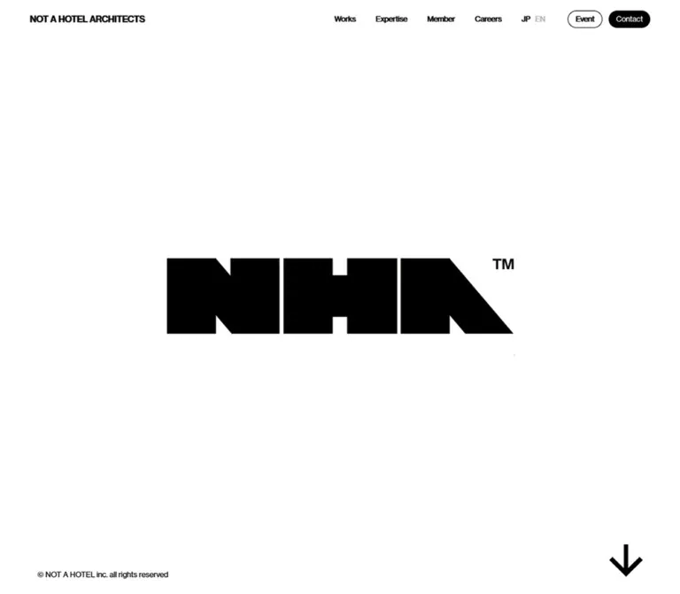
NOT A HOTEL ARCHITECTS presents an architecture-centered design unit through a deliberately sparse interface. A small brand name and compact navigation occupy the top edge. The desktop opening places a large geometric NHA monogram in an otherwise almost empty white viewport; an architectural interior is visible inside its letterforms. A copyright line and a substantial downward arrow anchor the lower corners.
The page then develops into a long visual narrative. Architectural photography carries material, light, landscape, and atmosphere, while large English statements and smaller Japanese captions explain the design principles. Black expertise and footer sections contrast with a white project index. Compact capsule links provide navigation without competing with the imagery.
This is a corporate and portfolio homepage with several destinations: projects, capabilities, people, editorial content, recruitment, events, and contact. Its reusable character comes from the relationship between small interface details, extensive empty space, full-width photographs, and a disciplined project grid.
How to Read This Reference
- Measured values come from the supplied rendered DOM, computed styles, and element rectangles. Measurements are in CSS pixels unless stated otherwise.
- Calculated values are derived from those measurements, such as column gaps or the number of viewport-height intervals.
- Visual estimates describe the supplied original-page screenshots. They are not exact pixel samples or source declarations.
- Recommendations describe a new implementation. Breakpoints, accessibility improvements, fallback behavior, and unspecified interaction states are explicitly adaptations.
- Named tokens are implementation aliases unless identified as original custom properties.
- The first five supplied images document the current page. Some sections have DOM measurements but no corresponding detailed screenshot; their internal visual treatment remains partially unverified.
- A recorded font stack does not prove which font file supplied every glyph. A recorded element rectangle does not prove that the element was visible above other layers.
Tokens — Colors
Default Palette
| Name | Value | Suggested token | Evidence and role |
|---|---|---|---|
| White | #FFFFFF |
--white |
Measured opening and Works backgrounds; reversed text and filled links on dark surfaces |
| Black | #000000 |
--black |
Measured body, Expertise, and footer backgrounds; Works heading and dark CTA fills |
| Desktop copyright gray | #A3A8B1 |
--copyright-desktop |
Measured desktop footer copyright text |
| Mobile copyright gray | #858A95 |
--copyright-mobile |
Measured mobile footer copyright text |
| Footer strip overlay | rgba(255,255,255,0.05) |
--footer-band |
Measured copyright-strip background over black |
| Composited footer strip | Approximately #0D0D0D |
Optional direct-color equivalent | Calculated from the white 5% overlay on black |
| Secondary header language | rgba(255,255,255,0.3) |
Contextual muted foreground | Measured desktop EN button color; final appearance depends on the surrounding rendering state |
| Footer divider | Approximately #2B2B2B |
--rule-dark |
Visual estimate from the mobile footer; exact border color was not supplied |
The interface has no verified chromatic CTA accent. Warm orange-brown and blue occupy large areas of the materiality photograph, but they belong to the image rather than a reusable UI palette.
Contrast States
| Context | Visible treatment | Implementation implication |
|---|---|---|
| White opening | Black identity, black arrow, outlined Event link, black Contact capsule | Keep utility controls crisp against the empty canvas |
| Architectural photograph | Light identity and text, with header colors varying across the image | Validate contrast against the actual image crop |
| Black footer | White logo, white navigation, restrained gray secondary information | Use surface inversion rather than decorative elevation |
| Copyright strip | Slightly lighter black with muted gray text | A shallow tonal distinction is sufficient |
Computed color is not always the final visible color. The supplied header samples report white text while the opening screenshot shows black text. Event and Contact also appear inverted between light and dark contexts. This establishes a visible contrast change, but the evidence does not identify its mechanism. Do not claim that a particular blend mode, filter, or JavaScript theme switch was verified.
For a new implementation, explicit light and dark header states are a practical recommendation. The Quick Start uses that approach. JP and EN are language controls; no user-selectable color theme was demonstrated.
Tokens — Typography
English Interface and Display Text
Measured source stack:
YakuHanJP, neue-haas-grotesk-text, 'SF Pro Icons',
'Helvetica Neue', Helvetica, Arial, sans-serif
This stack appears on the visible brand link, navigation, English principle statements, section headings, CTA labels, and primary footer links. The dominant treatment is compact sans-serif typography with slightly negative tracking. Weights are usually 400 or 500, including the large statements.
Use the named family only when the corresponding font is available and authorized for the implementation. The supplied evidence contains no font-file URLs or resolved-glyph report.
Japanese Text and General Body Stack
Measured source stack:
YakuHanJP, 'Hiragino Sans', Meiryo,
'Helvetica Neue', Helvetica, Arial, sans-serif
Japanese principle captions use weight 300, normal tracking, and relatively tight line heights. Legal navigation uses weight 400 and positive tracking. English and Japanese are differentiated primarily by size, weight, and placement rather than separate colored panels.
Declared Highlight Family
The original --font-family-english-highlight variable includes 'Manuka Condensed'. None of the supplied measured text elements uses that variable. Its presence is not evidence that the inspected homepage visibly uses a condensed display face. Do not make it the primary heading font in a reproduction of these captures.
Type Scale
| Role | Desktop size / line height | Mobile size / line height | Weight | Tracking |
|---|---|---|---|---|
| Visible header brand link | 14 / 14px |
12 / 12px |
500 |
-0.28px at both sizes |
| Desktop navigation | 12 / 18px |
Hidden from the compact header | 400 |
-0.24px |
| Header Event / Contact | 12 / 14.4px |
12 / 14.4px |
400 |
-0.24px |
| Principle statement | 54 / 64.8px |
30 / 36px |
400 |
-0.02em |
| Japanese principle caption | 18 / 20.7px |
12 / 13.8px |
300 |
Normal |
| Expertise heading | 48 / 65.28px |
36 / 48.96px |
400 |
-0.02em |
| WORKS heading | 36 / 48.96px |
36 / 48.96px |
500 |
-0.72px |
| Our Team heading | 64 / 73.6px |
58 / 66.7px |
500 |
-0.02em |
| Main content CTA | 14 / 14px |
14 / 14px |
400 |
-0.28px |
| Primary footer navigation | 20 / 32px |
20 / 32px |
500 |
-0.4px |
| Footer language links | 16 / 25.6px |
16 / 25.6px |
500 |
-0.32px |
| Legal links | 12px, normal line height; 18px measured box |
11 / 35.2px |
400 |
0.04em |
| Footer copyright | 12 / 12px |
10 / 10px |
400 |
0.04em |
| Mobile navigation layer, DOM only | Not measured | 40 / 40px |
500 |
-0.8px |
The root element is measured at 10px, while the body is 16px. The root's Times family is not the visible design language. Similarly, the header H1 wrapper reports 42px on desktop and 32px on mobile, but its child brand link supplies the visible 14px and 12px type. Use the child link measurements for the wordmark.
The Quick Start uses explicit pixel values and does not depend on the original 10px root.
Tokens — Spacing & Shapes
Density: exceptionally sparse in the opening and photographic narrative, compact in navigation, and regular in the project grid.
Original Custom Properties
| Source variable | Desktop | Mobile | Interpretation |
|---|---|---|---|
--header_height |
62px |
54px |
Matches the measured header height |
--padding-inline |
48px |
24px |
Shared token, but not the actual inset of every component |
--section-padding-block |
60px |
24px |
Declared token; Expertise and Works have measured 160px block padding |
--max-component-width |
1120px |
1120px |
Declared limit; the desktop Works region is actually 1280px wide |
--vh |
10px |
8.44px |
Numerically equals 1% of the inspected viewport height |
--vw |
14.4px |
3.9px |
Numerically equals 1% of the inspected viewport width |
Do not constrain the entire page to 1120px simply because that variable exists. At the inspected desktop width, the project grid runs from x=80 to x=1360.
Spacing Scale
These are recurring measured or calculated distances, not a claim that the source defines a single spacing system.
| Distance | Observed use |
|---|---|
8px |
Main CTA flex gap; mobile principle title-to-caption gap; desktop header JP-to-EN gap |
10px |
Gap between header Event and Contact capsules |
12px |
Gap between Members and Entry; mobile footer navigation row gaps |
16px |
Mobile header side inset; main CTA vertical padding |
20px |
Project column and row gaps; desktop principle title-to-caption gap |
24px |
Mobile content inset; main CTA horizontal padding; footer social icon gaps |
32px |
Gaps between the measured desktop primary navigation links |
48px |
Desktop header side inset; Works heading-to-grid gap; mobile grid-to-View all gap |
60px |
Desktop footer primary-link gaps; desktop grid-to-View all gap |
80px |
Desktop Expertise, Works, and footer horizontal inset |
160px |
Expertise and Works top and bottom padding at both inspected widths |
The mobile layout preserves substantial vertical pacing. It reduces side gutters but retains the 160px section padding around Expertise and Works.
Border Radius
| Element | Measured value | Effect |
|---|---|---|
| Header Event / Contact | 17px radius on a 28px box |
Small capsule silhouette |
| Learn more / View all / Members / Entry | 24px radius on a 46px box |
Larger capsule link |
| Section and project link wrappers | 0px |
Rectangular structural geometry |
| Mobile menu button | 0px on a 20 × 20px box |
Unboxed chevron control |
The outline around Event is approximately one pixel in the screenshots; border-width measurements were not supplied. No general card-shadow system is visible.
Components
Application Header
Role: persistent identity and direct access to the site's main destinations.
The desktop header is 62px high with a transparent computed background. Its visible brand link starts at x=48, y=24 and measures approximately 185.64 × 14px. The primary navigation begins near x=726.91, leaving a large interval between identity and navigation.
The right-hand sequence is:
- Works, Expertise, Member, Article, Careers, New grads.
- JP and EN language controls.
- Outlined Event capsule.
- Filled Contact capsule.
Primary navigation uses 12px text with 32px gaps. Event measures 56.22 × 28px; Contact measures 67.14 × 28px. Both use 12px horizontal padding and a 17px radius. Their small size preserves the priority of the page imagery.
At 390px, the header becomes 54px high. The brand starts at x=16, while Event, Contact, and a downward chevron occupy the right side. The capsules reduce horizontal padding to 10px, producing widths of approximately 52.22px and 63.14px. The chevron button has a measured 20 × 20px box at x=354, y=17.
The header is visible at the top of the opening, middle, and footer screenshots. Its computed transform transition is documented below; the exact fixed/sticky declaration and any directional hide behavior were not supplied.
Mobile Navigation Layer
Role: access to destinations omitted from the compact header.
The mobile DOM records a separate sequence of Home, Works, Expertise, Member, Article, Careers, and New grads, followed by language controls. These links use 40px / 40px English type, weight 500, and 24px left alignment. Their recorded vertical starts are 64px apart, implying 24px between the 40px line boxes.
No supplied screenshot demonstrates this layer opening. Its DOM coordinates do not establish visibility, backdrop treatment, animation, focus handling, or scrolling behavior.
The supplied black mobile screen with a centered NHA mark and 20px navigation is the page footer, not evidence of the expanded navigation layer. Keep these two components distinct.
Opening Identity Stage
Role: establish the brand before introducing explanatory content.
The opening section measures exactly one inspected viewport: 1440 × 1000px on desktop and 390 × 844px on mobile. Its background is white.
In the desktop capture, the angular NHA mark spans approximately 736 × 160px, including the small trademark area, and is centered close to the viewport midpoint. The visible letterforms contain warm interior imagery with dark planes and wall lighting. The exact media source and masking implementation were not provided.
The lower-left copyright line reads © NOT A HOTEL inc. all rights reserved. Its visible left inset is approximately 60px on desktop and 24px on mobile. The downward arrow occupies the lower-right corner.
The mobile opening capture shows a small centered NOT A HOTEL ARCHITECTS text treatment instead of the large photographic monogram. This is an observed capture state. It does not prove a permanent mobile substitution, a loading failure, or a specific animation phase. A new implementation should preserve a readable brand fallback, but should not invent a source transition between these appearances.
Viewport Corner Arrow
Role: a strong visual cue toward downward progression.
The arrow is a thick, unboxed geometric symbol. Its visible artwork is approximately 52px square on desktop and 40px square on mobile. Estimated right clearances are 60px and 24px, respectively, with roughly 28px below the visible drawing.
It appears in the same lower-right region in opening, middle, and footer captures, changing visible contrast with the surrounding scene. Its clickable bounds, accessible label, destination, and activation behavior are not included in the evidence. In particular, do not rename the footer arrow as a back-to-top control: it still points down, and no click was demonstrated.
Bilingual Introduction and Design Principles
Role: explain the design unit through a paced sequence of statements and architectural scenes.
The long section immediately after the opening measures 6000px on desktop and 5064px on mobile—six inspected viewport heights in each case. It contains the bilingual introduction, a The Principles of Design statement, and four named principles:
- Landscape First
- Make the Scene
- Sense of Materiality
- High Quality , Not Luxury
Each principle pairs a large English statement with a smaller Japanese sentence. The materiality example reads 五感に訴えかける質感の素材で仕上げること beneath the English title.
Titles are horizontally centered, with measured type of 54px / 64.8px on desktop and 30px / 36px on mobile. The Japanese caption follows after 20px on desktop and 8px on mobile. Its respective sizes are 18px / 20.7px and 12px / 13.8px.
The desktop materiality screenshot shows a full-width photograph with a strong diagonal orange-brown facade, dark underside, tree shadows, and blue sky. White copy sits directly over the image without a visible enclosing panel. Another architectural image begins at the bottom of the screenshot; this is a scrolled view, not evidence that the scene's source height is 853px.
The introduction text and all principle labels are confirmed by the DOM. Exact visual treatments for every narrative scene were not captured. The regular viewport spacing supports a scene-based presentation, but does not establish scroll snapping, pinning, parallax, or scroll-controlled media.
Expertise Section
Role: summarize the unit's range of capabilities.
A black, full-width section with white content. The measured outer padding is 160px 80px on desktop and 160px 24px on mobile. The English heading uses 48px desktop type and 36px mobile type, both at weight 400.
The content records nine numbered capabilities:
| Number | Source label |
|---|---|
| 01 | Business Development |
| 02 | Project Management |
| 03 | Design |
| 04 | Brand Direction |
| 05 | CG Visualization |
| 06 | Engineering Management |
| 07 | Lifecycle Management |
| 08 | Hotel Management |
| 09 | AI/Engineering |
A centered white Learn more capsule links to /expertise. It measures approximately 139.58 × 46px, with 16px 24px padding and an 8px flex gap.
The supplied extract does not provide individual capability-row rectangles or a detailed screenshot of this section. Row typography, separators, column structure, illustration, and hover behavior therefore remain unverified. The Quick Start supplies only the confirmed section shell, rather than inventing a capability-card system.
Works Preview Grid
Role: offer a compact, image-oriented entry into individual projects.
The section is white with a black WORKS heading. Outer padding is 160px 80px on desktop and 160px 24px on mobile. The heading stays 36px / 48.96px, weight 500, at both widths. Its lower edge is followed by a measured 48px gap before the first project row.
The project anchors establish the grid geometry:
| Property | Desktop | Mobile |
|---|---|---|
| Available width | 1280px |
342px |
| Columns | 5 | 2 |
| Column gap | 20px |
20px |
| Row gap | 20px |
20px |
| Project link box | 240 × 330.48px |
161 × 241.5px |
| Measured visible project links | 10 | 8 |
| Grid-to-View all gap | 60px |
48px |
Desktop entries run from ONSEN SUITE through NATURE WITHIN in two rows. The measured mobile preview ends with EARTH in four rows. Additional names occur in raw DOM text, so these counts describe the measured homepage previews, not the complete project catalog.
Each measured block is a link associated with a project title and its individual /works/... destination. The inner image rectangles, title placement, overlays, and title-specific computed styles are absent from the supplied extract. The outer link's inherited 16px font and white foreground are insufficient to establish the final caption treatment.
The mobile link box has a calculated 2:3 width-to-height ratio. The desktop box is approximately 0.726:1. These are whole-link ratios, not verified image aspect ratios.
A centered black View all capsule links to /works. It measures approximately 114.98 × 46px. Preserve the compact control and regular project rhythm; avoid adding unverified category badges or dense descriptions.
Team Section
Role: connect the architecture to the people behind the unit and provide recruitment access.
The section occupies one viewport: 1000px high on desktop and 844px on mobile. The desktop footer capture shows its trailing image area: people gathered in an interior, seen through a dark opening, rendered in grayscale.
The DOM records an Our Team heading and two capsule links: Members to /members, and Entry to /careers. The heading is 64px / 73.6px on desktop and 58px / 66.7px on mobile. Members is black with white text; Entry is white with black text. Both are 46px high and are separated horizontally by 12px.
On mobile, the measured heading-to-button gap is 24px. The desktop heading and button rectangles overlap vertically in the supplied sample, so that sample should not be treated as proof of intentional typographic overlap. The central desktop team composition was not shown in a screenshot.
Footer
Role: a substantial closing navigation surface with corporate, language, and social links.
The footer is black and measures approximately 649.59px high on desktop and 841.84px on mobile. It has five primary destinations: Home, Works, Expertise, Member, and Careers. Article and New grads remain header/menu destinations rather than appearing in this footer list.
On desktop, the NHA logo sits at the left with primary navigation aligned across the right. The logo link measures 205.25 × 57px; the visible mark is shorter than its link box. Primary links use 20px / 32px, weight 500, with calculated 60px horizontal gaps.
A lower row places X, Instagram, and YouTube at the left and JP / EN at the right. Social link boxes are 24 × 24px, separated by 24px. Beneath that is a single line of small legal and corporate links, including 会社概要, 採用情報, メディアキット, プライバシーポリシー, 利用規約, and 利用者情報の外部送信情報.
On mobile, the logo is centered within a 342px link region. Its visible artwork is approximately 140px wide. The five primary links stack as full-width 56px boxes with 12px between them and fine visible rules between entries. Social link boxes become 20px, while the language pair remains right-aligned on the same row. Legal links wrap to two rows, using 11px text, 35.2px line height, and 8px gaps.
The final copyright band is 92px high on desktop and 90px on mobile. It uses the measured white 5% background overlay and 40px vertical padding. The text is centered, with the viewport arrow visually occupying the right side of the captured band.
Tokens — Motion & Interaction
| Treatment | Evidence | What can be carried forward |
|---|---|---|
| Header transform | Measured transform 0.3s ease-in-out |
A 300ms header movement transition; trigger and travel distance are unverified |
| Footer link opacity | Measured opacity 0.3s on logo, navigation, social, and legal links |
A 300ms opacity transition; its target opacity was not supplied |
| Other sampled transitions | Many elements report only all |
This does not establish a nonzero duration or a distinctive motion treatment |
| Sampled CSS animations | Sampled elements report none |
Limited to those elements and that inspection moment; not proof that the whole page is static |
| Photographic monogram | Visible in one desktop capture | Image-filled letterforms are confirmed; playback, sequence, and animation timing are not |
| Narrative progression | Long section with viewport-spaced titles; middle capture supplied | Scrollable scene progression is supported; snapping, pinning, and parallax are unverified |
| Mobile navigation | Chevron button and separate menu links exist in the DOM | Menu content is supported; opening/closing behavior was not demonstrated |
| Language selection | Header buttons; footer links to / and /en |
Destination intent is supported; actual language switching was not exercised |
| Project and CTA navigation | Rendered link destinations supplied | Use real links; destination-page behavior was not inspected |
| Corner arrow | Visible across several capture positions | Preserve the visual cue only after defining its intended action |
No hover demonstration, menu activation, arrow click, project activation, or media playback trace was supplied. A static photograph cannot distinguish an image from a frame of video.
Recommended motion: use restrained opacity transitions and the measured 300ms header timing where appropriate. Establish static layouts and usable navigation before adding media choreography. Do not introduce spring effects, automatic zooming, or scroll interception as though they were observed features.
Surfaces
| Surface | Appearance | Structural role |
|---|---|---|
| Opening | Pure white, small black utilities, central identity | Creates an unusually quiet first viewport |
| Architectural narrative | Full-width imagery with light overlaid statements in the captured scene | Supplies color, material, and visual scale |
| Expertise | Pure black with white text and a white capsule | Separates capabilities from the photographic sequence |
| Works | Pure white with black heading and black capsule | Creates a clear project-index interval |
| Team | Grayscale human imagery with reversed content recorded in the DOM | Introduces people and recruitment |
| Footer | Pure black with white navigation and thin rules | Provides a strong closing field |
| Copyright band | White at 5% over black, muted gray text | Distinguishes legal closure with minimal contrast |
The system relies on large surface changes, image boundaries, whitespace, and typography. Rounded shapes are concentrated in small action links. No generalized floating-card, glass, or shadow hierarchy is evidenced.
Imagery
Architecture is presented through physical atmosphere: directional light, surface texture, deep shadow, and large geometric planes. The materiality frame is especially instructive because the facade's diagonal occupies most of the viewport and the tree shadows add irregular movement-like texture without requiring a decorative UI layer.
The entry mark uses imagery inside a crisp brand silhouette. The surrounding white is essential: the photographic fill remains a concentrated detail rather than becoming a full-screen background immediately.
The team image changes both subject and palette. Grayscale people and dark doorway framing connect the end of the page to the black footer. The supplied evidence does not identify the people, location, photographer, or whether any scene is moving media.
Observed Asset References
The supplied DOM does not include image, video, SVG, mask, or font-file URLs. The following are visual references, not downloadable asset paths.
| Visual | Evidence | Reusable direction |
|---|---|---|
| NHA monogram with interior fill | Desktop opening capture | Preserve the approved angular silhouette and clear negative space |
| Materiality facade | Desktop middle capture | Use a strong architectural diagonal, texture, shadow, and sufficient calm space for white text |
| Interior at the following scene boundary | Lower edge of desktop middle capture | Confirms adjacent architectural imagery; the full composition is not available |
| Grayscale group in an interior | Upper region of desktop footer capture | Use human-scale imagery with dark framing near the transition to the footer |
| White NHA footer mark | Desktop and mobile footer captures | Use the actual brand asset; preserve the trademark relationship |
| X, Instagram, YouTube, chevron, down arrow | Header and footer captures | Keep symbols monochrome and visually unboxed |
| Project media | Project links confirmed by DOM | Select project-specific assets; exact crops and caption placement require further evidence |
Do not reconstruct the NHA mark by stretching ordinary text. Use an approved vector or raster asset. CSS masking is a possible implementation technique for the desktop appearance, but it is not a verified source technique.
For a new build, use responsive photographic assets, intentional focal points, and stable dimensions. object-fit: cover is a practical recommendation for scene media, not an observed declaration. Preserve the architecture's proportions rather than distorting images to match a box.
Layout & Responsive Behavior
Measured Page Structure
| Region | Desktop start / height | Mobile start / height |
|---|---|---|
| Opening | 0 / 1000px |
0 / 844px |
| Introduction and principles | 1000 / 6000px |
844 / 5064px |
| Expertise | 7000 / 1439.52px |
5908 / 1215.95px |
| Works | 8439.52 / 1203.92px |
7123.95 / 1536.95px |
| Team | 9643.44 / 1000px |
8660.91 / 844px |
| Footer | 10643.44 / 649.59px |
9504.91 / 841.84px |
| Total document | Approximately 11293.03px |
Approximately 10346.75px |
The opening plus narrative occupies seven viewport heights at both inspected sizes. The layout therefore retains its long introduction on mobile rather than compressing immediately into a short project list.
Grid Calculations
Desktop:
1440 - 80 - 80 = 1280px available
(1280 - 4 × 20) / 5 = 240px per project
Mobile:
390 - 24 - 24 = 342px available
(342 - 20) / 2 = 161px per project
These calculations match the recorded anchor widths. They do not depend on the declared 1120px maximum-width variable.
Responsive Changes Confirmed at the Two Endpoints
- Header height changes from
62pxto54px; the mobile header retains Event and Contact while exposing a chevron. - Header brand size changes from
14pxto12px; its left inset changes from48pxto16px. - Principle titles change from
54pxto30px; Japanese captions change from18pxto12px. - Main section gutters change from
80pxto24px, while160pxvertical padding remains. - Works changes from five columns and ten measured links to two columns and eight measured links.
- Footer navigation changes from a horizontal group to a ruled vertical list.
- Legal navigation wraps, social icons become smaller, and the copyright type decreases.
- The opening identity has different captured appearances; its responsive or temporal cause remains unresolved.
Intermediate widths, landscape phones, zoomed layouts, safe-area behavior, and exact media-query thresholds were not inspected. The Quick Start's 768px, 1100px, and 1200px thresholds are recommendations, not recovered source breakpoints.
Do’s and Don’ts
Do
- Preserve the unusually empty white opening and compact edge-aligned utilities.
- Use the real NHA mark with its angular geometry and trademark detail.
- Let architectural photographs supply color and material character.
- Pair large English statements with smaller Japanese captions.
- Keep English tracking close to
-0.02emand use moderate weights. - Distinguish the
48pxdesktop header inset from the80pxcontent inset. - Retain the measured
20pxproject grid gaps at both inspected widths. - Keep Expertise black and Works white, with capsule links inverted appropriately.
- Preserve the footer's substantial spacing and clear mobile stacking.
- Separate measured source behavior from proposed motion or accessibility improvements.
Don’t
- Don't fill the opening whitespace with promotional paragraphs or extra CTA groups.
- Don't turn photograph colors into an unrelated UI accent palette.
- Don't use the declared condensed highlight family without evidence of its role.
- Don't treat inherited wrapper font sizes as the visible text measurements.
- Don't force every region into the declared
1120pxmaximum width. - Don't infer a carousel from a project collection whose measured anchors form a grid.
- Don't add rounded project panels, gradients, shadows, or category badges without a new design reason.
- Don't describe the mobile footer as an opened navigation menu.
- Don't present the mobile opening frame as proof of a permanent logo replacement.
- Don't invent parallax, scroll snapping, video playback, hover effects, or an arrow destination.
- Don't copy the six-viewport narrative as empty spacer blocks; each interval needs meaningful, accessible content.
Recommended Implementation Additions
These are recommendations for a new implementation, not verified features of the original site:
- Give the chevron and corner arrow explicit accessible names and sufficiently large interaction areas. The source's
20pxmenu box and28pxheader capsules warrant larger touch targets without enlarging their visible artwork unnecessarily. - Use a disclosure button with
aria-expandedandaria-controlsfor the mobile navigation. Hidden navigation should not remain keyboard-focusable; opening and closing should manage focus predictably. - Preserve visible keyboard focus on all project links, utility links, language controls, and social icons.
- Implement principle titles as meaningful headings in the new document hierarchy. The inspected statements are paragraphs; their semantic role can be improved without changing their appearance.
- Use explicit header contrast states or another tested contrast strategy. Verify every photograph crop and transition, especially where small navigation crosses bright and dark image areas.
- Consider larger mobile Japanese captions and legal text where readability takes priority. The observed
12pxcaptions and11pxlegal links are reference values, not accessibility targets. - Provide a static brand and scene fallback if media is delayed or unavailable. If video is introduced, provide reduced-motion behavior and avoid making content depend on autoplay.
- Use stable viewport sizing for full-screen scenes, while allowing content to exceed the nominal scene height under zoom or text enlargement.
- Preserve the full project catalog route when limiting the homepage preview. Do not remove catalog content merely to reproduce the observed mobile preview count.
- Keep imagery descriptions useful and avoid duplicate brand announcements when the logo and adjacent brand link provide the same accessible name.
Agent Prompt Guide
Quick Color Reference
- Opening and Works:
#FFFFFFwith black foreground. - Expertise and footer:
#000000with white foreground. - Header actions: outlined Event and filled Contact, adapted to the scene's contrast.
- Copyright band:
rgba(255,255,255,0.05)over black. - Copyright text: desktop
#A3A8B1; mobile#858A95. - Photography supplies the warm and cool colors; keep the interface monochrome.
Overall Prompt
“Create an architecture design-unit homepage informed by the supplied NOT A HOTEL ARCHITECTS reference. Use an almost empty white first viewport with a small upper-left brand link, compact upper-right navigation, outlined Event and filled Contact capsules, a centered approved geometric monogram, lower-left copyright, and an unboxed downward cue. Continue with full-width architectural scenes and centered English principles paired with smaller Japanese captions. Use a black expertise section, a white project preview with five desktop columns and two mobile columns separated by 20px, a grayscale team section, and a substantial black footer. Use the documented sans-serif stacks where available, moderate weights, and approximately -0.02em English tracking. Keep content gutters at 80px desktop and 24px mobile. Treat motion, image crops, and intermediate breakpoints as implementation decisions rather than verified source behavior.”
Example Component Prompts
- Header: “Build a transparent 62px desktop header with a 14px brand link at a 48px inset. Place six compact text destinations, JP/EN, and two 28px-high capsules on the right. At the mobile breakpoint, use a 54px header, 16px side insets, a 12px brand, Event, Contact, and a chevron. Provide explicit contrast states and an accessible navigation disclosure.”
- Principle scene: “Use a full-width architectural photograph with strong geometry and material texture. Overlay a centered 54px English statement and an 18px Japanese caption with a 20px gap; use 30px, 12px, and an 8px gap on the inspected mobile proportions. Keep text outside decorative boxes. Add any contrast scrim only as a deliberate readability adaptation.”
- Works preview: “Create a white project index with a 36px WORKS heading, 48px space before the grid, 80px desktop gutters, and 20px gaps. Use five desktop columns and two phone columns. Make every project a genuine link and place a small black View all capsule beneath the grid. Choose caption placement explicitly because the supplied evidence does not resolve it.”
- Footer: “Create a large black footer with a white geometric logo, 20px primary links, a separate social-and-language row, compact legal links, and a subtly lighter copyright band. On mobile, center the logo and stack five full-width navigation rows with fine dividers. Keep the expanded header menu a separate component.”
Quick Start
CSS Custom Properties
This CSS is a usable static adaptation of the measured shell. It preserves the two inspected endpoint proportions and supplies recommended intermediate layouts. It does not reproduce an unverified media sequence, menu controller, or scroll animation.
Suggested structure: .site-header contains .brand, .desktop-nav, and .header-actions; .intro contains an approved .intro-mark or .intro-fallback; .principle-scene contains media and a .principle-copy group; .works-grid contains .project-card links. The footer contains .footer-top, .footer-middle, .footer-legal, and .footer-copyright.
Use .surface-light or .surface-dark to establish local foreground and surface colors. Set the header's data-tone from application logic when needed. The footer and header navigation require separate DOM groups.
:root {
  /* Measured colors and source-derived font stacks */
  --white: #fff;
  --black: #000;
  --copyright-desktop: #a3a8b1;
  --copyright-mobile: #858a95;
  --footer-band: rgb(255 255 255 / 0.05);
  --font-en: YakuHanJP, neue-haas-grotesk-text, 'SF Pro Icons',
    'Helvetica Neue', Helvetica, Arial, sans-serif;
  --font-ja: YakuHanJP, 'Hiragino Sans', Meiryo,
    'Helvetica Neue', Helvetica, Arial, sans-serif;

  /* Mobile endpoint values */
  --header-height: 54px;
  --header-gutter: 16px;
  --content-gutter: 24px;
  --section-space: 160px;
  --project-gap: 20px;
  --principle-size: 30px;
  --caption-size: 12px;
  --principle-gap: 8px;
  --expertise-size: 36px;
  --team-size: 58px;
  --brand-size: 12px;
  --capsule-padding: 10px;
  --screen-height: 100vh;

  /* Recommended approximation for the visible footer rules */
  --footer-rule: rgb(255 255 255 / 0.16);

  /* Contextual colors */
  --surface: var(--black);
  --ink: var(--white);
}

@supports (height: 100svh) {
  :root {
    /* Recommended stable viewport sizing */
    --screen-height: 100svh;
  }
}

* { box-sizing: border-box; }

body {
  margin: 0;
  color: var(--ink);
  background: var(--surface);
  font-family: var(--font-ja);
  font-size: 16px;
}

button, a { -webkit-tap-highlight-color: transparent; }
button { font: inherit; }
a { color: inherit; }
img, video, svg { max-inline-size: 100%; }
[hidden] { display: none !important; }

.surface-light {
  --surface: var(--white);
  --ink: var(--black);
  color: var(--ink);
  background: var(--surface);
}

.surface-dark {
  --surface: var(--black);
  --ink: var(--white);
  color: var(--ink);
  background: var(--surface);
}

.site-header {
  --surface: var(--white);
  --ink: var(--black);
  position: fixed; /* Adaptation of the persistent captured header */
  z-index: 30;
  inset: 0 0 auto;
  display: flex;
  align-items: center;
  justify-content: space-between;
  block-size: var(--header-height);
  padding-inline: var(--header-gutter);
  color: var(--ink);
  background: transparent;
  transition: transform 300ms ease-in-out;
}

.site-header[data-tone='dark'] {
  --surface: var(--black);
  --ink: var(--white);
}

.brand {
  flex: none;
  margin: 0;
  font-family: var(--font-en);
  font-size: var(--brand-size);
  font-weight: 500;
  line-height: 1;
  letter-spacing: -0.28px;
  white-space: nowrap;
  text-decoration: none;
}

.desktop-nav { display: none; }

.header-actions,
.language-links {
  display: flex;
  align-items: center;
}

.header-actions { gap: 10px; }
.language-links { gap: 8px; }
.language-links .is-secondary { opacity: 0.3; }

.header-pill {
  display: inline-flex;
  align-items: center;
  justify-content: center;
  block-size: 28px;
  padding-inline: var(--capsule-padding);
  border: 1px solid var(--ink);
  border-radius: 17px;
  color: var(--ink);
  font: 400 12px / 1.2 var(--font-en);
  letter-spacing: -0.24px;
  text-decoration: none;
  white-space: nowrap;
}

.header-pill.is-filled {
  color: var(--surface);
  background: var(--ink);
}

.menu-toggle {
  display: grid;
  place-items: center;
  inline-size: 20px;
  block-size: 20px;
  padding: 0;
  border: 0;
  color: inherit;
  background: transparent;
}

.intro {
  position: relative;
  display: grid;
  place-items: center;
  min-block-size: var(--screen-height);
  padding: var(--header-height) 24px;
}

.intro-mark {
  display: block;
  inline-size: min(72vw, 736px);
  block-size: auto;
  /* Supply an approved asset; mobile scaling is a recommendation. */
}

.intro-fallback {
  font: 500 12px / 1 var(--font-en);
  text-align: center;
}

.intro-copyright {
  position: absolute;
  inset-inline-start: 24px;
  inset-block-end: 24px;
  margin: 0;
  font: 400 12px / 1.2 var(--font-en);
  letter-spacing: -0.02em;
}

.principle-scene,
.team-scene {
  position: relative;
  display: grid;
  place-items: center;
  min-block-size: var(--screen-height);
  padding: 80px var(--content-gutter);
  color: var(--white);
  background: var(--black);
  isolation: isolate;
}

.scene-media {
  position: absolute;
  z-index: -1;
  inset: 0;
  inline-size: 100%;
  block-size: 100%;
  object-fit: cover; /* Recommended cropping strategy */
  object-position: var(--scene-focal-point, 50% 50%);
}

.principle-copy {
  display: grid;
  gap: var(--principle-gap);
  text-align: center;
}

.principle-title {
  margin: 0;
  font: 400 var(--principle-size) / 1.2 var(--font-en);
  letter-spacing: -0.02em;
  text-wrap: balance;
}

.principle-caption {
  margin: 0;
  font: 300 var(--caption-size) / 1.15 var(--font-ja);
}

.content-section {
  padding: var(--section-space) var(--content-gutter);
}

.expertise-title {
  margin: 0;
  font: 400 var(--expertise-size) / 1.36 var(--font-en);
  letter-spacing: -0.02em;
}

.works-title {
  margin: 0 0 48px;
  font: 500 36px / 1.36 var(--font-en);
  letter-spacing: -0.72px;
}

.works-grid {
  display: grid;
  grid-template-columns: repeat(2, minmax(0, 1fr));
  gap: var(--project-gap);
}

.project-card {
  position: relative;
  display: block;
  min-inline-size: 0;
  aspect-ratio: 2 / 3;
  border-radius: 0;
  text-decoration: none;
  /* This ratio follows the measured link box, not an image box. */
}

/* Optional media treatment; caption placement must be designed separately. */
.project-card > .project-media {
  display: block;
  inline-size: 100%;
  block-size: 100%;
  object-fit: cover;
}

.cta {
  display: inline-flex;
  align-items: center;
  justify-content: center;
  gap: 8px;
  block-size: 46px;
  padding: 16px 24px;
  border: 0;
  border-radius: 24px;
  color: var(--surface);
  background: var(--ink);
  font: 400 14px / 1 var(--font-en);
  letter-spacing: -0.28px;
  text-decoration: none;
  white-space: nowrap;
}

.works-more {
  display: flex;
  justify-content: center;
  margin-block-start: 48px;
}

.team-copy {
  display: grid;
  justify-items: center;
  gap: 24px; /* Mobile measurement; recommended desktop spacing */
}

.team-title {
  margin: 0;
  font: 500 var(--team-size) / 1.15 var(--font-en);
  letter-spacing: -0.02em;
}

.team-actions {
  display: flex;
  flex-wrap: wrap;
  justify-content: center;
  gap: 12px;
}

.team-actions .is-dark {
  color: var(--white);
  background: var(--black);
}

.site-footer {
  color: var(--white);
  background: var(--black);
}

.footer-body {
  padding: 80px 24px 40px;
  border-block-start: 1px solid var(--footer-rule);
}

.footer-top {
  display: flex;
  flex-direction: column;
  gap: 60px;
}

.footer-logo {
  display: flex;
  align-items: center;
  justify-content: center;
  min-block-size: 38.875px;
}

.footer-logo img,
.footer-logo svg {
  display: block;
  inline-size: 140px;
  block-size: auto;
}

.footer-primary {
  display: flex;
  flex-direction: column;
  gap: 12px;
}

.footer-primary a {
  display: flex;
  align-items: center;
  block-size: 56px;
  padding-block: 12px;
  font: 500 20px / 32px var(--font-en);
  letter-spacing: -0.4px;
  text-decoration: none;
}

.footer-primary a:not(:last-child) {
  border-block-end: 1px solid var(--footer-rule);
}

.footer-middle {
  display: flex;
  align-items: center;
  justify-content: space-between;
  margin-block-start: 40px;
}

.footer-socials {
  display: flex;
  gap: 24px;
}

.footer-socials a {
  display: grid;
  place-items: center;
  inline-size: 20px;
  block-size: 20px;
}

.footer-middle .language-links {
  font: 500 16px / 1.6 var(--font-en);
  letter-spacing: -0.32px;
}

.footer-legal {
  display: flex;
  flex-wrap: wrap;
  gap: 8px;
  margin-block-start: 60px;
}

.footer-legal a {
  font: 400 11px / 35.2px var(--font-ja);
  letter-spacing: 0.04em;
  text-decoration: none;
}

.footer-copyright {
  margin: 0;
  padding: 40px 0;
  color: var(--copyright-mobile);
  background: var(--footer-band);
  font: 400 10px / 1 var(--font-en);
  letter-spacing: 0.04em;
  text-align: center;
}

.site-footer a {
  transition: opacity 300ms;
}

/* Recommended hover target; source target opacity was not supplied. */
@media (hover: hover) {
  .site-footer a:hover { opacity: 0.65; }
}

/* Recommended intermediate layout, not an observed source breakpoint. */
@media (min-width: 768px) {
  .works-grid {
    grid-template-columns: repeat(3, minmax(0, 1fr));
  }
}

/* Recommended navigation threshold. */
@media (min-width: 1100px) {
  :root {
    --header-height: 62px;
    --header-gutter: 48px;
    --brand-size: 14px;
    --capsule-padding: 12px;
  }

  .desktop-nav {
    display: flex;
    align-items: center;
    gap: 32px;
    margin-inline-start: auto;
    margin-inline-end: 36px;
    font: 400 12px / 18px var(--font-en);
    letter-spacing: -0.24px;
  }

  .desktop-nav a { text-decoration: none; }
  .menu-toggle { display: none; }
}

/* Desktop endpoint geometry; threshold is an adaptation. */
@media (min-width: 1200px) {
  :root {
    --content-gutter: 80px;
    --principle-size: 54px;
    --caption-size: 18px;
    --principle-gap: 20px;
    --expertise-size: 48px;
    --team-size: 64px;
  }

  .intro-mark { inline-size: min(51.1vw, 736px); }
  .intro-copyright { inset-inline-start: 60px; }

  .works-grid {
    grid-template-columns: repeat(5, minmax(0, 1fr));
  }

  .project-card { aspect-ratio: 240 / 330.484375; }
  .works-more { margin-block-start: 60px; }

  .footer-body { padding: 80px 80px 48px; }

  .footer-top {
    flex-direction: row;
    align-items: center;
    justify-content: space-between;
  }

  .footer-logo { min-block-size: 57px; }
  .footer-logo img,
  .footer-logo svg { inline-size: 205.25px; }

  .footer-primary {
    flex-direction: row;
    gap: 60px;
  }

  .footer-primary a {
    block-size: 32px;
    padding: 0;
  }

  .footer-primary a:not(:last-child) { border: 0; }
  .footer-middle { margin-block-start: 220px; }
  .footer-socials a { inline-size: 24px; block-size: 24px; }

  .footer-legal {
    gap: 24px;
    margin-block-start: 108px;
  }

  .footer-legal a { font-size: 12px; line-height: 18px; }

  .footer-copyright {
    padding: 40px 24px;
    color: var(--copyright-desktop);
    font-size: 12px;
  }
}

/* Recommended accessibility additions */
a:focus-visible,
button:focus-visible {
  outline: 2px solid currentColor;
  outline-offset: 4px;
}

@media (prefers-reduced-motion: reduce) {
  .site-header,
  .site-footer a {
    transition: none;
  }
}
The project media rule is optional because the captured evidence does not resolve image-versus-caption allocation. Do not hide additional projects through CSS simply to reach the observed preview count; choose the intended content subset explicitly. Media playback, responsive asset selection, mobile menu behavior, and the corner arrow's action require separate implementation.
Tailwind v4 Token Mapping
Optional aliases for a project already using Tailwind v4. This is not evidence that the original site uses Tailwind. Define the custom properties above first.
@theme inline {
  --color-paper: var(--white);
  --color-carbon: var(--black);
  --color-surface: var(--surface);
  --color-foreground: var(--ink);
  --color-footer-muted: var(--copyright-desktop);

  --font-interface: var(--font-en);
  --font-japanese: var(--font-ja);

  --text-principle: var(--principle-size);
  --text-principle--line-height: 1.2;
  --text-principle--letter-spacing: -0.02em;
  --text-scene-caption: var(--caption-size);
  --text-scene-caption--line-height: 1.15;
  --text-team: var(--team-size);
  --text-team--line-height: 1.15;

  --spacing-page-gutter: var(--content-gutter);
  --spacing-section: var(--section-space);
  --spacing-project-gap: var(--project-gap);

  --radius-header-pill: 17px;
  --radius-action-pill: 24px;
}
Sources & Evidence
- Inspected original and final page: https://architects.notahotel.com/. Both URLs are identical; the supplied response status is
200and the rendered title isNOT A HOTEL ARCHITECTS. - Capture record: September 12, 2026,
12:32:44.458 UTC/21:32:44.458 JST. Individual screenshot timestamps were not supplied. - Desktop visual evidence: supplied original-page opening, materiality, and footer captures at
1440 × 1000. - Mobile visual evidence: supplied original-page opening and footer captures at
390 × 844. - Rendered DOM evidence: section text, link destinations, original custom properties, element rectangles, computed colors, font stacks, sizes, weights, line heights, tracking, padding, radii, and sampled transition/animation values at both viewports.
- Capture scope: the supplied browser process waited for loading, sampled layout and text stability, and visible image decoding, and traversed intermediate scroll positions. These readiness checks have finite limits and do not prove that every delayed or interactive state was revealed.
- Limitations: no full stylesheet, media source inventory, resolved font-file inventory, intermediate-width capture, open-menu screenshot, hover test, keyboard test, arrow activation, language activation, destination-page inspection, or media playback trace was supplied. SharedWorkers and service workers were disabled during capture.
This reference describes the current supplied homepage evidence. Visual estimates, calculated dimensions, and implementation recommendations are labeled separately from measured source values.
# NOT A HOTEL ARCHITECTS — Style Reference

> Architectural photographs and a geometric monogram, framed by expansive white space and precise black-and-white navigation.

**Website:** [NOT A HOTEL ARCHITECTS](https://architects.notahotel.com/)
**Original URL:** https://architects.notahotel.com/
**Final URL:** https://architects.notahotel.com/
**Theme:** a white opening, photographic narrative, and alternating black and white content sections.
**Inspected:** September 12, 2026. Supplied capture record: `2026-09-12T12:32:44.458Z`, equivalent to 21:32:44.458 JST.
**Viewports:** desktop `1440 × 1000` and mobile `390 × 844` CSS pixels.
**Scope:** the current Japanese homepage: opening identity, bilingual introduction, design principles, expertise, project preview, team section, and footer. Linked pages and external destinations were not inspected.

NOT A HOTEL ARCHITECTS presents an architecture-centered design unit through a deliberately sparse interface. A small brand name and compact navigation occupy the top edge. The desktop opening places a large geometric NHA monogram in an otherwise almost empty white viewport; an architectural interior is visible inside its letterforms. A copyright line and a substantial downward arrow anchor the lower corners.

The page then develops into a long visual narrative. Architectural photography carries material, light, landscape, and atmosphere, while large English statements and smaller Japanese captions explain the design principles. Black expertise and footer sections contrast with a white project index. Compact capsule links provide navigation without competing with the imagery.

This is a corporate and portfolio homepage with several destinations: projects, capabilities, people, editorial content, recruitment, events, and contact. Its reusable character comes from the relationship between small interface details, extensive empty space, full-width photographs, and a disciplined project grid.

## How to Read This Reference

- **Measured** values come from the supplied rendered DOM, computed styles, and element rectangles. Measurements are in CSS pixels unless stated otherwise.
- **Calculated** values are derived from those measurements, such as column gaps or the number of viewport-height intervals.
- **Visual estimates** describe the supplied original-page screenshots. They are not exact pixel samples or source declarations.
- **Recommendations** describe a new implementation. Breakpoints, accessibility improvements, fallback behavior, and unspecified interaction states are explicitly adaptations.
- **Named tokens** are implementation aliases unless identified as original custom properties.
- The first five supplied images document the current page. Some sections have DOM measurements but no corresponding detailed screenshot; their internal visual treatment remains partially unverified.
- A recorded font stack does not prove which font file supplied every glyph. A recorded element rectangle does not prove that the element was visible above other layers.

## Tokens — Colors

### Default Palette

| Name | Value | Suggested token | Evidence and role |
| --- | --- | --- | --- |
| White | `#FFFFFF` | `--white` | Measured opening and Works backgrounds; reversed text and filled links on dark surfaces |
| Black | `#000000` | `--black` | Measured body, Expertise, and footer backgrounds; Works heading and dark CTA fills |
| Desktop copyright gray | `#A3A8B1` | `--copyright-desktop` | Measured desktop footer copyright text |
| Mobile copyright gray | `#858A95` | `--copyright-mobile` | Measured mobile footer copyright text |
| Footer strip overlay | `rgba(255,255,255,0.05)` | `--footer-band` | Measured copyright-strip background over black |
| Composited footer strip | Approximately `#0D0D0D` | Optional direct-color equivalent | Calculated from the white 5% overlay on black |
| Secondary header language | `rgba(255,255,255,0.3)` | Contextual muted foreground | Measured desktop EN button color; final appearance depends on the surrounding rendering state |
| Footer divider | Approximately `#2B2B2B` | `--rule-dark` | Visual estimate from the mobile footer; exact border color was not supplied |

The interface has no verified chromatic CTA accent. Warm orange-brown and blue occupy large areas of the materiality photograph, but they belong to the image rather than a reusable UI palette.

### Contrast States

| Context | Visible treatment | Implementation implication |
| --- | --- | --- |
| White opening | Black identity, black arrow, outlined Event link, black Contact capsule | Keep utility controls crisp against the empty canvas |
| Architectural photograph | Light identity and text, with header colors varying across the image | Validate contrast against the actual image crop |
| Black footer | White logo, white navigation, restrained gray secondary information | Use surface inversion rather than decorative elevation |
| Copyright strip | Slightly lighter black with muted gray text | A shallow tonal distinction is sufficient |

**Computed color is not always the final visible color.** The supplied header samples report white text while the opening screenshot shows black text. Event and Contact also appear inverted between light and dark contexts. This establishes a visible contrast change, but the evidence does not identify its mechanism. Do not claim that a particular blend mode, filter, or JavaScript theme switch was verified.

For a new implementation, explicit light and dark header states are a practical recommendation. The Quick Start uses that approach. JP and EN are language controls; no user-selectable color theme was demonstrated.

## Tokens — Typography

### English Interface and Display Text

**Measured source stack:**

```css
YakuHanJP, neue-haas-grotesk-text, 'SF Pro Icons',
'Helvetica Neue', Helvetica, Arial, sans-serif
```

This stack appears on the visible brand link, navigation, English principle statements, section headings, CTA labels, and primary footer links. The dominant treatment is compact sans-serif typography with slightly negative tracking. Weights are usually `400` or `500`, including the large statements.

Use the named family only when the corresponding font is available and authorized for the implementation. The supplied evidence contains no font-file URLs or resolved-glyph report.

### Japanese Text and General Body Stack

**Measured source stack:**

```css
YakuHanJP, 'Hiragino Sans', Meiryo,
'Helvetica Neue', Helvetica, Arial, sans-serif
```

Japanese principle captions use weight `300`, normal tracking, and relatively tight line heights. Legal navigation uses weight `400` and positive tracking. English and Japanese are differentiated primarily by size, weight, and placement rather than separate colored panels.

### Declared Highlight Family

The original `--font-family-english-highlight` variable includes `'Manuka Condensed'`. None of the supplied measured text elements uses that variable. Its presence is not evidence that the inspected homepage visibly uses a condensed display face. Do not make it the primary heading font in a reproduction of these captures.

### Type Scale

| Role | Desktop size / line height | Mobile size / line height | Weight | Tracking |
| --- | --- | --- | --- | --- |
| Visible header brand link | `14 / 14px` | `12 / 12px` | `500` | `-0.28px` at both sizes |
| Desktop navigation | `12 / 18px` | Hidden from the compact header | `400` | `-0.24px` |
| Header Event / Contact | `12 / 14.4px` | `12 / 14.4px` | `400` | `-0.24px` |
| Principle statement | `54 / 64.8px` | `30 / 36px` | `400` | `-0.02em` |
| Japanese principle caption | `18 / 20.7px` | `12 / 13.8px` | `300` | Normal |
| Expertise heading | `48 / 65.28px` | `36 / 48.96px` | `400` | `-0.02em` |
| WORKS heading | `36 / 48.96px` | `36 / 48.96px` | `500` | `-0.72px` |
| Our Team heading | `64 / 73.6px` | `58 / 66.7px` | `500` | `-0.02em` |
| Main content CTA | `14 / 14px` | `14 / 14px` | `400` | `-0.28px` |
| Primary footer navigation | `20 / 32px` | `20 / 32px` | `500` | `-0.4px` |
| Footer language links | `16 / 25.6px` | `16 / 25.6px` | `500` | `-0.32px` |
| Legal links | `12px`, normal line height; `18px` measured box | `11 / 35.2px` | `400` | `0.04em` |
| Footer copyright | `12 / 12px` | `10 / 10px` | `400` | `0.04em` |
| Mobile navigation layer, DOM only | Not measured | `40 / 40px` | `500` | `-0.8px` |

The root element is measured at `10px`, while the body is `16px`. The root's Times family is not the visible design language. Similarly, the header H1 wrapper reports `42px` on desktop and `32px` on mobile, but its child brand link supplies the visible `14px` and `12px` type. Use the child link measurements for the wordmark.

The Quick Start uses explicit pixel values and does not depend on the original 10px root.

## Tokens — Spacing & Shapes

**Density:** exceptionally sparse in the opening and photographic narrative, compact in navigation, and regular in the project grid.

### Original Custom Properties

| Source variable | Desktop | Mobile | Interpretation |
| --- | --- | --- | --- |
| `--header_height` | `62px` | `54px` | Matches the measured header height |
| `--padding-inline` | `48px` | `24px` | Shared token, but not the actual inset of every component |
| `--section-padding-block` | `60px` | `24px` | Declared token; Expertise and Works have measured `160px` block padding |
| `--max-component-width` | `1120px` | `1120px` | Declared limit; the desktop Works region is actually `1280px` wide |
| `--vh` | `10px` | `8.44px` | Numerically equals 1% of the inspected viewport height |
| `--vw` | `14.4px` | `3.9px` | Numerically equals 1% of the inspected viewport width |

Do not constrain the entire page to `1120px` simply because that variable exists. At the inspected desktop width, the project grid runs from `x=80` to `x=1360`.

### Spacing Scale

These are recurring measured or calculated distances, not a claim that the source defines a single spacing system.

| Distance | Observed use |
| --- | --- |
| `8px` | Main CTA flex gap; mobile principle title-to-caption gap; desktop header JP-to-EN gap |
| `10px` | Gap between header Event and Contact capsules |
| `12px` | Gap between Members and Entry; mobile footer navigation row gaps |
| `16px` | Mobile header side inset; main CTA vertical padding |
| `20px` | Project column and row gaps; desktop principle title-to-caption gap |
| `24px` | Mobile content inset; main CTA horizontal padding; footer social icon gaps |
| `32px` | Gaps between the measured desktop primary navigation links |
| `48px` | Desktop header side inset; Works heading-to-grid gap; mobile grid-to-View all gap |
| `60px` | Desktop footer primary-link gaps; desktop grid-to-View all gap |
| `80px` | Desktop Expertise, Works, and footer horizontal inset |
| `160px` | Expertise and Works top and bottom padding at both inspected widths |

The mobile layout preserves substantial vertical pacing. It reduces side gutters but retains the `160px` section padding around Expertise and Works.

### Border Radius

| Element | Measured value | Effect |
| --- | --- | --- |
| Header Event / Contact | `17px` radius on a `28px` box | Small capsule silhouette |
| Learn more / View all / Members / Entry | `24px` radius on a `46px` box | Larger capsule link |
| Section and project link wrappers | `0px` | Rectangular structural geometry |
| Mobile menu button | `0px` on a `20 × 20px` box | Unboxed chevron control |

The outline around Event is approximately one pixel in the screenshots; border-width measurements were not supplied. No general card-shadow system is visible.

## Components

### Application Header

**Role:** persistent identity and direct access to the site's main destinations.

The desktop header is `62px` high with a transparent computed background. Its visible brand link starts at `x=48, y=24` and measures approximately `185.64 × 14px`. The primary navigation begins near `x=726.91`, leaving a large interval between identity and navigation.

The right-hand sequence is:

1. Works, Expertise, Member, Article, Careers, New grads.
2. JP and EN language controls.
3. Outlined Event capsule.
4. Filled Contact capsule.

Primary navigation uses `12px` text with `32px` gaps. Event measures `56.22 × 28px`; Contact measures `67.14 × 28px`. Both use `12px` horizontal padding and a `17px` radius. Their small size preserves the priority of the page imagery.

At `390px`, the header becomes `54px` high. The brand starts at `x=16`, while Event, Contact, and a downward chevron occupy the right side. The capsules reduce horizontal padding to `10px`, producing widths of approximately `52.22px` and `63.14px`. The chevron button has a measured `20 × 20px` box at `x=354, y=17`.

The header is visible at the top of the opening, middle, and footer screenshots. Its computed transform transition is documented below; the exact fixed/sticky declaration and any directional hide behavior were not supplied.

### Mobile Navigation Layer

**Role:** access to destinations omitted from the compact header.

The mobile DOM records a separate sequence of Home, Works, Expertise, Member, Article, Careers, and New grads, followed by language controls. These links use `40px / 40px` English type, weight `500`, and `24px` left alignment. Their recorded vertical starts are `64px` apart, implying `24px` between the 40px line boxes.

No supplied screenshot demonstrates this layer opening. Its DOM coordinates do not establish visibility, backdrop treatment, animation, focus handling, or scrolling behavior.

The supplied black mobile screen with a centered NHA mark and `20px` navigation is the **page footer**, not evidence of the expanded navigation layer. Keep these two components distinct.

### Opening Identity Stage

**Role:** establish the brand before introducing explanatory content.

The opening section measures exactly one inspected viewport: `1440 × 1000px` on desktop and `390 × 844px` on mobile. Its background is white.

In the desktop capture, the angular NHA mark spans approximately `736 × 160px`, including the small trademark area, and is centered close to the viewport midpoint. The visible letterforms contain warm interior imagery with dark planes and wall lighting. The exact media source and masking implementation were not provided.

The lower-left copyright line reads `© NOT A HOTEL inc. all rights reserved`. Its visible left inset is approximately `60px` on desktop and `24px` on mobile. The downward arrow occupies the lower-right corner.

The mobile opening capture shows a small centered `NOT A HOTEL ARCHITECTS` text treatment instead of the large photographic monogram. This is an observed capture state. It does not prove a permanent mobile substitution, a loading failure, or a specific animation phase. A new implementation should preserve a readable brand fallback, but should not invent a source transition between these appearances.

### Viewport Corner Arrow

**Role:** a strong visual cue toward downward progression.

The arrow is a thick, unboxed geometric symbol. Its visible artwork is approximately `52px` square on desktop and `40px` square on mobile. Estimated right clearances are `60px` and `24px`, respectively, with roughly `28px` below the visible drawing.

It appears in the same lower-right region in opening, middle, and footer captures, changing visible contrast with the surrounding scene. Its clickable bounds, accessible label, destination, and activation behavior are not included in the evidence. In particular, do not rename the footer arrow as a back-to-top control: it still points down, and no click was demonstrated.

### Bilingual Introduction and Design Principles

**Role:** explain the design unit through a paced sequence of statements and architectural scenes.

The long section immediately after the opening measures `6000px` on desktop and `5064px` on mobile—six inspected viewport heights in each case. It contains the bilingual introduction, a `The Principles of Design` statement, and four named principles:

- Landscape First
- Make the Scene
- Sense of Materiality
- High Quality , Not Luxury

Each principle pairs a large English statement with a smaller Japanese sentence. The materiality example reads `五感に訴えかける質感の素材で仕上げること` beneath the English title.

Titles are horizontally centered, with measured type of `54px / 64.8px` on desktop and `30px / 36px` on mobile. The Japanese caption follows after `20px` on desktop and `8px` on mobile. Its respective sizes are `18px / 20.7px` and `12px / 13.8px`.

The desktop materiality screenshot shows a full-width photograph with a strong diagonal orange-brown facade, dark underside, tree shadows, and blue sky. White copy sits directly over the image without a visible enclosing panel. Another architectural image begins at the bottom of the screenshot; this is a scrolled view, not evidence that the scene's source height is `853px`.

The introduction text and all principle labels are confirmed by the DOM. Exact visual treatments for every narrative scene were not captured. The regular viewport spacing supports a scene-based presentation, but does not establish scroll snapping, pinning, parallax, or scroll-controlled media.

### Expertise Section

**Role:** summarize the unit's range of capabilities.

A black, full-width section with white content. The measured outer padding is `160px 80px` on desktop and `160px 24px` on mobile. The English heading uses `48px` desktop type and `36px` mobile type, both at weight `400`.

The content records nine numbered capabilities:

| Number | Source label |
| --- | --- |
| 01 | Business Development |
| 02 | Project Management |
| 03 | Design |
| 04 | Brand Direction |
| 05 | CG Visualization |
| 06 | Engineering Management |
| 07 | Lifecycle Management |
| 08 | Hotel Management |
| 09 | AI/Engineering |

A centered white Learn more capsule links to `/expertise`. It measures approximately `139.58 × 46px`, with `16px 24px` padding and an `8px` flex gap.

The supplied extract does not provide individual capability-row rectangles or a detailed screenshot of this section. Row typography, separators, column structure, illustration, and hover behavior therefore remain unverified. The Quick Start supplies only the confirmed section shell, rather than inventing a capability-card system.

### Works Preview Grid

**Role:** offer a compact, image-oriented entry into individual projects.

The section is white with a black `WORKS` heading. Outer padding is `160px 80px` on desktop and `160px 24px` on mobile. The heading stays `36px / 48.96px`, weight `500`, at both widths. Its lower edge is followed by a measured `48px` gap before the first project row.

The project anchors establish the grid geometry:

| Property | Desktop | Mobile |
| --- | --- | --- |
| Available width | `1280px` | `342px` |
| Columns | 5 | 2 |
| Column gap | `20px` | `20px` |
| Row gap | `20px` | `20px` |
| Project link box | `240 × 330.48px` | `161 × 241.5px` |
| Measured visible project links | 10 | 8 |
| Grid-to-View all gap | `60px` | `48px` |

Desktop entries run from ONSEN SUITE through NATURE WITHIN in two rows. The measured mobile preview ends with EARTH in four rows. Additional names occur in raw DOM text, so these counts describe the measured homepage previews, not the complete project catalog.

Each measured block is a link associated with a project title and its individual `/works/...` destination. The inner image rectangles, title placement, overlays, and title-specific computed styles are absent from the supplied extract. The outer link's inherited `16px` font and white foreground are insufficient to establish the final caption treatment.

The mobile link box has a calculated `2:3` width-to-height ratio. The desktop box is approximately `0.726:1`. These are **whole-link ratios**, not verified image aspect ratios.

A centered black View all capsule links to `/works`. It measures approximately `114.98 × 46px`. Preserve the compact control and regular project rhythm; avoid adding unverified category badges or dense descriptions.

### Team Section

**Role:** connect the architecture to the people behind the unit and provide recruitment access.

The section occupies one viewport: `1000px` high on desktop and `844px` on mobile. The desktop footer capture shows its trailing image area: people gathered in an interior, seen through a dark opening, rendered in grayscale.

The DOM records an Our Team heading and two capsule links: Members to `/members`, and Entry to `/careers`. The heading is `64px / 73.6px` on desktop and `58px / 66.7px` on mobile. Members is black with white text; Entry is white with black text. Both are `46px` high and are separated horizontally by `12px`.

On mobile, the measured heading-to-button gap is `24px`. The desktop heading and button rectangles overlap vertically in the supplied sample, so that sample should not be treated as proof of intentional typographic overlap. The central desktop team composition was not shown in a screenshot.

### Footer

**Role:** a substantial closing navigation surface with corporate, language, and social links.

The footer is black and measures approximately `649.59px` high on desktop and `841.84px` on mobile. It has five primary destinations: Home, Works, Expertise, Member, and Careers. Article and New grads remain header/menu destinations rather than appearing in this footer list.

On desktop, the NHA logo sits at the left with primary navigation aligned across the right. The logo link measures `205.25 × 57px`; the visible mark is shorter than its link box. Primary links use `20px / 32px`, weight `500`, with calculated `60px` horizontal gaps.

A lower row places X, Instagram, and YouTube at the left and JP / EN at the right. Social link boxes are `24 × 24px`, separated by `24px`. Beneath that is a single line of small legal and corporate links, including `会社概要`, `採用情報`, `メディアキット`, `プライバシーポリシー`, `利用規約`, and `利用者情報の外部送信情報`.

On mobile, the logo is centered within a `342px` link region. Its visible artwork is approximately `140px` wide. The five primary links stack as full-width `56px` boxes with `12px` between them and fine visible rules between entries. Social link boxes become `20px`, while the language pair remains right-aligned on the same row. Legal links wrap to two rows, using `11px` text, `35.2px` line height, and `8px` gaps.

The final copyright band is `92px` high on desktop and `90px` on mobile. It uses the measured white 5% background overlay and `40px` vertical padding. The text is centered, with the viewport arrow visually occupying the right side of the captured band.

## Tokens — Motion & Interaction

| Treatment | Evidence | What can be carried forward |
| --- | --- | --- |
| Header transform | Measured `transform 0.3s ease-in-out` | A 300ms header movement transition; trigger and travel distance are unverified |
| Footer link opacity | Measured `opacity 0.3s` on logo, navigation, social, and legal links | A 300ms opacity transition; its target opacity was not supplied |
| Other sampled transitions | Many elements report only `all` | This does not establish a nonzero duration or a distinctive motion treatment |
| Sampled CSS animations | Sampled elements report `none` | Limited to those elements and that inspection moment; not proof that the whole page is static |
| Photographic monogram | Visible in one desktop capture | Image-filled letterforms are confirmed; playback, sequence, and animation timing are not |
| Narrative progression | Long section with viewport-spaced titles; middle capture supplied | Scrollable scene progression is supported; snapping, pinning, and parallax are unverified |
| Mobile navigation | Chevron button and separate menu links exist in the DOM | Menu content is supported; opening/closing behavior was not demonstrated |
| Language selection | Header buttons; footer links to `/` and `/en` | Destination intent is supported; actual language switching was not exercised |
| Project and CTA navigation | Rendered link destinations supplied | Use real links; destination-page behavior was not inspected |
| Corner arrow | Visible across several capture positions | Preserve the visual cue only after defining its intended action |

No hover demonstration, menu activation, arrow click, project activation, or media playback trace was supplied. A static photograph cannot distinguish an image from a frame of video.

**Recommended motion:** use restrained opacity transitions and the measured 300ms header timing where appropriate. Establish static layouts and usable navigation before adding media choreography. Do not introduce spring effects, automatic zooming, or scroll interception as though they were observed features.

## Surfaces

| Surface | Appearance | Structural role |
| --- | --- | --- |
| Opening | Pure white, small black utilities, central identity | Creates an unusually quiet first viewport |
| Architectural narrative | Full-width imagery with light overlaid statements in the captured scene | Supplies color, material, and visual scale |
| Expertise | Pure black with white text and a white capsule | Separates capabilities from the photographic sequence |
| Works | Pure white with black heading and black capsule | Creates a clear project-index interval |
| Team | Grayscale human imagery with reversed content recorded in the DOM | Introduces people and recruitment |
| Footer | Pure black with white navigation and thin rules | Provides a strong closing field |
| Copyright band | White at 5% over black, muted gray text | Distinguishes legal closure with minimal contrast |

The system relies on large surface changes, image boundaries, whitespace, and typography. Rounded shapes are concentrated in small action links. No generalized floating-card, glass, or shadow hierarchy is evidenced.

## Imagery

Architecture is presented through physical atmosphere: directional light, surface texture, deep shadow, and large geometric planes. The materiality frame is especially instructive because the facade's diagonal occupies most of the viewport and the tree shadows add irregular movement-like texture without requiring a decorative UI layer.

The entry mark uses imagery inside a crisp brand silhouette. The surrounding white is essential: the photographic fill remains a concentrated detail rather than becoming a full-screen background immediately.

The team image changes both subject and palette. Grayscale people and dark doorway framing connect the end of the page to the black footer. The supplied evidence does not identify the people, location, photographer, or whether any scene is moving media.

### Observed Asset References

The supplied DOM does not include image, video, SVG, mask, or font-file URLs. The following are visual references, not downloadable asset paths.

| Visual | Evidence | Reusable direction |
| --- | --- | --- |
| NHA monogram with interior fill | Desktop opening capture | Preserve the approved angular silhouette and clear negative space |
| Materiality facade | Desktop middle capture | Use a strong architectural diagonal, texture, shadow, and sufficient calm space for white text |
| Interior at the following scene boundary | Lower edge of desktop middle capture | Confirms adjacent architectural imagery; the full composition is not available |
| Grayscale group in an interior | Upper region of desktop footer capture | Use human-scale imagery with dark framing near the transition to the footer |
| White NHA footer mark | Desktop and mobile footer captures | Use the actual brand asset; preserve the trademark relationship |
| X, Instagram, YouTube, chevron, down arrow | Header and footer captures | Keep symbols monochrome and visually unboxed |
| Project media | Project links confirmed by DOM | Select project-specific assets; exact crops and caption placement require further evidence |

Do not reconstruct the NHA mark by stretching ordinary text. Use an approved vector or raster asset. CSS masking is a possible implementation technique for the desktop appearance, but it is not a verified source technique.

For a new build, use responsive photographic assets, intentional focal points, and stable dimensions. `object-fit: cover` is a practical recommendation for scene media, not an observed declaration. Preserve the architecture's proportions rather than distorting images to match a box.

## Layout & Responsive Behavior

### Measured Page Structure

| Region | Desktop start / height | Mobile start / height |
| --- | --- | --- |
| Opening | `0 / 1000px` | `0 / 844px` |
| Introduction and principles | `1000 / 6000px` | `844 / 5064px` |
| Expertise | `7000 / 1439.52px` | `5908 / 1215.95px` |
| Works | `8439.52 / 1203.92px` | `7123.95 / 1536.95px` |
| Team | `9643.44 / 1000px` | `8660.91 / 844px` |
| Footer | `10643.44 / 649.59px` | `9504.91 / 841.84px` |
| Total document | Approximately `11293.03px` | Approximately `10346.75px` |

The opening plus narrative occupies seven viewport heights at both inspected sizes. The layout therefore retains its long introduction on mobile rather than compressing immediately into a short project list.

### Grid Calculations

Desktop:

```text
1440 - 80 - 80 = 1280px available
(1280 - 4 × 20) / 5 = 240px per project
```

Mobile:

```text
390 - 24 - 24 = 342px available
(342 - 20) / 2 = 161px per project
```

These calculations match the recorded anchor widths. They do not depend on the declared `1120px` maximum-width variable.

### Responsive Changes Confirmed at the Two Endpoints

- Header height changes from `62px` to `54px`; the mobile header retains Event and Contact while exposing a chevron.
- Header brand size changes from `14px` to `12px`; its left inset changes from `48px` to `16px`.
- Principle titles change from `54px` to `30px`; Japanese captions change from `18px` to `12px`.
- Main section gutters change from `80px` to `24px`, while `160px` vertical padding remains.
- Works changes from five columns and ten measured links to two columns and eight measured links.
- Footer navigation changes from a horizontal group to a ruled vertical list.
- Legal navigation wraps, social icons become smaller, and the copyright type decreases.
- The opening identity has different captured appearances; its responsive or temporal cause remains unresolved.

Intermediate widths, landscape phones, zoomed layouts, safe-area behavior, and exact media-query thresholds were not inspected. The Quick Start's `768px`, `1100px`, and `1200px` thresholds are recommendations, not recovered source breakpoints.

## Do’s and Don’ts

### Do

- Preserve the unusually empty white opening and compact edge-aligned utilities.
- Use the real NHA mark with its angular geometry and trademark detail.
- Let architectural photographs supply color and material character.
- Pair large English statements with smaller Japanese captions.
- Keep English tracking close to `-0.02em` and use moderate weights.
- Distinguish the `48px` desktop header inset from the `80px` content inset.
- Retain the measured `20px` project grid gaps at both inspected widths.
- Keep Expertise black and Works white, with capsule links inverted appropriately.
- Preserve the footer's substantial spacing and clear mobile stacking.
- Separate measured source behavior from proposed motion or accessibility improvements.

### Don’t

- Don't fill the opening whitespace with promotional paragraphs or extra CTA groups.
- Don't turn photograph colors into an unrelated UI accent palette.
- Don't use the declared condensed highlight family without evidence of its role.
- Don't treat inherited wrapper font sizes as the visible text measurements.
- Don't force every region into the declared `1120px` maximum width.
- Don't infer a carousel from a project collection whose measured anchors form a grid.
- Don't add rounded project panels, gradients, shadows, or category badges without a new design reason.
- Don't describe the mobile footer as an opened navigation menu.
- Don't present the mobile opening frame as proof of a permanent logo replacement.
- Don't invent parallax, scroll snapping, video playback, hover effects, or an arrow destination.
- Don't copy the six-viewport narrative as empty spacer blocks; each interval needs meaningful, accessible content.

## Recommended Implementation Additions

These are recommendations for a new implementation, not verified features of the original site:

- Give the chevron and corner arrow explicit accessible names and sufficiently large interaction areas. The source's `20px` menu box and `28px` header capsules warrant larger touch targets without enlarging their visible artwork unnecessarily.
- Use a disclosure button with `aria-expanded` and `aria-controls` for the mobile navigation. Hidden navigation should not remain keyboard-focusable; opening and closing should manage focus predictably.
- Preserve visible keyboard focus on all project links, utility links, language controls, and social icons.
- Implement principle titles as meaningful headings in the new document hierarchy. The inspected statements are paragraphs; their semantic role can be improved without changing their appearance.
- Use explicit header contrast states or another tested contrast strategy. Verify every photograph crop and transition, especially where small navigation crosses bright and dark image areas.
- Consider larger mobile Japanese captions and legal text where readability takes priority. The observed `12px` captions and `11px` legal links are reference values, not accessibility targets.
- Provide a static brand and scene fallback if media is delayed or unavailable. If video is introduced, provide reduced-motion behavior and avoid making content depend on autoplay.
- Use stable viewport sizing for full-screen scenes, while allowing content to exceed the nominal scene height under zoom or text enlargement.
- Preserve the full project catalog route when limiting the homepage preview. Do not remove catalog content merely to reproduce the observed mobile preview count.
- Keep imagery descriptions useful and avoid duplicate brand announcements when the logo and adjacent brand link provide the same accessible name.

## Agent Prompt Guide

### Quick Color Reference

- Opening and Works: `#FFFFFF` with black foreground.
- Expertise and footer: `#000000` with white foreground.
- Header actions: outlined Event and filled Contact, adapted to the scene's contrast.
- Copyright band: `rgba(255,255,255,0.05)` over black.
- Copyright text: desktop `#A3A8B1`; mobile `#858A95`.
- Photography supplies the warm and cool colors; keep the interface monochrome.

### Overall Prompt

“Create an architecture design-unit homepage informed by the supplied NOT A HOTEL ARCHITECTS reference. Use an almost empty white first viewport with a small upper-left brand link, compact upper-right navigation, outlined Event and filled Contact capsules, a centered approved geometric monogram, lower-left copyright, and an unboxed downward cue. Continue with full-width architectural scenes and centered English principles paired with smaller Japanese captions. Use a black expertise section, a white project preview with five desktop columns and two mobile columns separated by 20px, a grayscale team section, and a substantial black footer. Use the documented sans-serif stacks where available, moderate weights, and approximately -0.02em English tracking. Keep content gutters at 80px desktop and 24px mobile. Treat motion, image crops, and intermediate breakpoints as implementation decisions rather than verified source behavior.”

### Example Component Prompts

1. **Header:** “Build a transparent 62px desktop header with a 14px brand link at a 48px inset. Place six compact text destinations, JP/EN, and two 28px-high capsules on the right. At the mobile breakpoint, use a 54px header, 16px side insets, a 12px brand, Event, Contact, and a chevron. Provide explicit contrast states and an accessible navigation disclosure.”
2. **Principle scene:** “Use a full-width architectural photograph with strong geometry and material texture. Overlay a centered 54px English statement and an 18px Japanese caption with a 20px gap; use 30px, 12px, and an 8px gap on the inspected mobile proportions. Keep text outside decorative boxes. Add any contrast scrim only as a deliberate readability adaptation.”
3. **Works preview:** “Create a white project index with a 36px WORKS heading, 48px space before the grid, 80px desktop gutters, and 20px gaps. Use five desktop columns and two phone columns. Make every project a genuine link and place a small black View all capsule beneath the grid. Choose caption placement explicitly because the supplied evidence does not resolve it.”
4. **Footer:** “Create a large black footer with a white geometric logo, 20px primary links, a separate social-and-language row, compact legal links, and a subtly lighter copyright band. On mobile, center the logo and stack five full-width navigation rows with fine dividers. Keep the expanded header menu a separate component.”

## Quick Start

### CSS Custom Properties

This CSS is a usable static adaptation of the measured shell. It preserves the two inspected endpoint proportions and supplies recommended intermediate layouts. It does not reproduce an unverified media sequence, menu controller, or scroll animation.

Suggested structure: `.site-header` contains `.brand`, `.desktop-nav`, and `.header-actions`; `.intro` contains an approved `.intro-mark` or `.intro-fallback`; `.principle-scene` contains media and a `.principle-copy` group; `.works-grid` contains `.project-card` links. The footer contains `.footer-top`, `.footer-middle`, `.footer-legal`, and `.footer-copyright`.

Use `.surface-light` or `.surface-dark` to establish local foreground and surface colors. Set the header's `data-tone` from application logic when needed. The footer and header navigation require separate DOM groups.

```css
:root {
  /* Measured colors and source-derived font stacks */
  --white: #fff;
  --black: #000;
  --copyright-desktop: #a3a8b1;
  --copyright-mobile: #858a95;
  --footer-band: rgb(255 255 255 / 0.05);
  --font-en: YakuHanJP, neue-haas-grotesk-text, 'SF Pro Icons',
    'Helvetica Neue', Helvetica, Arial, sans-serif;
  --font-ja: YakuHanJP, 'Hiragino Sans', Meiryo,
    'Helvetica Neue', Helvetica, Arial, sans-serif;

  /* Mobile endpoint values */
  --header-height: 54px;
  --header-gutter: 16px;
  --content-gutter: 24px;
  --section-space: 160px;
  --project-gap: 20px;
  --principle-size: 30px;
  --caption-size: 12px;
  --principle-gap: 8px;
  --expertise-size: 36px;
  --team-size: 58px;
  --brand-size: 12px;
  --capsule-padding: 10px;
  --screen-height: 100vh;

  /* Recommended approximation for the visible footer rules */
  --footer-rule: rgb(255 255 255 / 0.16);

  /* Contextual colors */
  --surface: var(--black);
  --ink: var(--white);
}

@supports (height: 100svh) {
  :root {
    /* Recommended stable viewport sizing */
    --screen-height: 100svh;
  }
}

* { box-sizing: border-box; }

body {
  margin: 0;
  color: var(--ink);
  background: var(--surface);
  font-family: var(--font-ja);
  font-size: 16px;
}

button, a { -webkit-tap-highlight-color: transparent; }
button { font: inherit; }
a { color: inherit; }
img, video, svg { max-inline-size: 100%; }
[hidden] { display: none !important; }

.surface-light {
  --surface: var(--white);
  --ink: var(--black);
  color: var(--ink);
  background: var(--surface);
}

.surface-dark {
  --surface: var(--black);
  --ink: var(--white);
  color: var(--ink);
  background: var(--surface);
}

.site-header {
  --surface: var(--white);
  --ink: var(--black);
  position: fixed; /* Adaptation of the persistent captured header */
  z-index: 30;
  inset: 0 0 auto;
  display: flex;
  align-items: center;
  justify-content: space-between;
  block-size: var(--header-height);
  padding-inline: var(--header-gutter);
  color: var(--ink);
  background: transparent;
  transition: transform 300ms ease-in-out;
}

.site-header[data-tone='dark'] {
  --surface: var(--black);
  --ink: var(--white);
}

.brand {
  flex: none;
  margin: 0;
  font-family: var(--font-en);
  font-size: var(--brand-size);
  font-weight: 500;
  line-height: 1;
  letter-spacing: -0.28px;
  white-space: nowrap;
  text-decoration: none;
}

.desktop-nav { display: none; }

.header-actions,
.language-links {
  display: flex;
  align-items: center;
}

.header-actions { gap: 10px; }
.language-links { gap: 8px; }
.language-links .is-secondary { opacity: 0.3; }

.header-pill {
  display: inline-flex;
  align-items: center;
  justify-content: center;
  block-size: 28px;
  padding-inline: var(--capsule-padding);
  border: 1px solid var(--ink);
  border-radius: 17px;
  color: var(--ink);
  font: 400 12px / 1.2 var(--font-en);
  letter-spacing: -0.24px;
  text-decoration: none;
  white-space: nowrap;
}

.header-pill.is-filled {
  color: var(--surface);
  background: var(--ink);
}

.menu-toggle {
  display: grid;
  place-items: center;
  inline-size: 20px;
  block-size: 20px;
  padding: 0;
  border: 0;
  color: inherit;
  background: transparent;
}

.intro {
  position: relative;
  display: grid;
  place-items: center;
  min-block-size: var(--screen-height);
  padding: var(--header-height) 24px;
}

.intro-mark {
  display: block;
  inline-size: min(72vw, 736px);
  block-size: auto;
  /* Supply an approved asset; mobile scaling is a recommendation. */
}

.intro-fallback {
  font: 500 12px / 1 var(--font-en);
  text-align: center;
}

.intro-copyright {
  position: absolute;
  inset-inline-start: 24px;
  inset-block-end: 24px;
  margin: 0;
  font: 400 12px / 1.2 var(--font-en);
  letter-spacing: -0.02em;
}

.principle-scene,
.team-scene {
  position: relative;
  display: grid;
  place-items: center;
  min-block-size: var(--screen-height);
  padding: 80px var(--content-gutter);
  color: var(--white);
  background: var(--black);
  isolation: isolate;
}

.scene-media {
  position: absolute;
  z-index: -1;
  inset: 0;
  inline-size: 100%;
  block-size: 100%;
  object-fit: cover; /* Recommended cropping strategy */
  object-position: var(--scene-focal-point, 50% 50%);
}

.principle-copy {
  display: grid;
  gap: var(--principle-gap);
  text-align: center;
}

.principle-title {
  margin: 0;
  font: 400 var(--principle-size) / 1.2 var(--font-en);
  letter-spacing: -0.02em;
  text-wrap: balance;
}

.principle-caption {
  margin: 0;
  font: 300 var(--caption-size) / 1.15 var(--font-ja);
}

.content-section {
  padding: var(--section-space) var(--content-gutter);
}

.expertise-title {
  margin: 0;
  font: 400 var(--expertise-size) / 1.36 var(--font-en);
  letter-spacing: -0.02em;
}

.works-title {
  margin: 0 0 48px;
  font: 500 36px / 1.36 var(--font-en);
  letter-spacing: -0.72px;
}

.works-grid {
  display: grid;
  grid-template-columns: repeat(2, minmax(0, 1fr));
  gap: var(--project-gap);
}

.project-card {
  position: relative;
  display: block;
  min-inline-size: 0;
  aspect-ratio: 2 / 3;
  border-radius: 0;
  text-decoration: none;
  /* This ratio follows the measured link box, not an image box. */
}

/* Optional media treatment; caption placement must be designed separately. */
.project-card > .project-media {
  display: block;
  inline-size: 100%;
  block-size: 100%;
  object-fit: cover;
}

.cta {
  display: inline-flex;
  align-items: center;
  justify-content: center;
  gap: 8px;
  block-size: 46px;
  padding: 16px 24px;
  border: 0;
  border-radius: 24px;
  color: var(--surface);
  background: var(--ink);
  font: 400 14px / 1 var(--font-en);
  letter-spacing: -0.28px;
  text-decoration: none;
  white-space: nowrap;
}

.works-more {
  display: flex;
  justify-content: center;
  margin-block-start: 48px;
}

.team-copy {
  display: grid;
  justify-items: center;
  gap: 24px; /* Mobile measurement; recommended desktop spacing */
}

.team-title {
  margin: 0;
  font: 500 var(--team-size) / 1.15 var(--font-en);
  letter-spacing: -0.02em;
}

.team-actions {
  display: flex;
  flex-wrap: wrap;
  justify-content: center;
  gap: 12px;
}

.team-actions .is-dark {
  color: var(--white);
  background: var(--black);
}

.site-footer {
  color: var(--white);
  background: var(--black);
}

.footer-body {
  padding: 80px 24px 40px;
  border-block-start: 1px solid var(--footer-rule);
}

.footer-top {
  display: flex;
  flex-direction: column;
  gap: 60px;
}

.footer-logo {
  display: flex;
  align-items: center;
  justify-content: center;
  min-block-size: 38.875px;
}

.footer-logo img,
.footer-logo svg {
  display: block;
  inline-size: 140px;
  block-size: auto;
}

.footer-primary {
  display: flex;
  flex-direction: column;
  gap: 12px;
}

.footer-primary a {
  display: flex;
  align-items: center;
  block-size: 56px;
  padding-block: 12px;
  font: 500 20px / 32px var(--font-en);
  letter-spacing: -0.4px;
  text-decoration: none;
}

.footer-primary a:not(:last-child) {
  border-block-end: 1px solid var(--footer-rule);
}

.footer-middle {
  display: flex;
  align-items: center;
  justify-content: space-between;
  margin-block-start: 40px;
}

.footer-socials {
  display: flex;
  gap: 24px;
}

.footer-socials a {
  display: grid;
  place-items: center;
  inline-size: 20px;
  block-size: 20px;
}

.footer-middle .language-links {
  font: 500 16px / 1.6 var(--font-en);
  letter-spacing: -0.32px;
}

.footer-legal {
  display: flex;
  flex-wrap: wrap;
  gap: 8px;
  margin-block-start: 60px;
}

.footer-legal a {
  font: 400 11px / 35.2px var(--font-ja);
  letter-spacing: 0.04em;
  text-decoration: none;
}

.footer-copyright {
  margin: 0;
  padding: 40px 0;
  color: var(--copyright-mobile);
  background: var(--footer-band);
  font: 400 10px / 1 var(--font-en);
  letter-spacing: 0.04em;
  text-align: center;
}

.site-footer a {
  transition: opacity 300ms;
}

/* Recommended hover target; source target opacity was not supplied. */
@media (hover: hover) {
  .site-footer a:hover { opacity: 0.65; }
}

/* Recommended intermediate layout, not an observed source breakpoint. */
@media (min-width: 768px) {
  .works-grid {
    grid-template-columns: repeat(3, minmax(0, 1fr));
  }
}

/* Recommended navigation threshold. */
@media (min-width: 1100px) {
  :root {
    --header-height: 62px;
    --header-gutter: 48px;
    --brand-size: 14px;
    --capsule-padding: 12px;
  }

  .desktop-nav {
    display: flex;
    align-items: center;
    gap: 32px;
    margin-inline-start: auto;
    margin-inline-end: 36px;
    font: 400 12px / 18px var(--font-en);
    letter-spacing: -0.24px;
  }

  .desktop-nav a { text-decoration: none; }
  .menu-toggle { display: none; }
}

/* Desktop endpoint geometry; threshold is an adaptation. */
@media (min-width: 1200px) {
  :root {
    --content-gutter: 80px;
    --principle-size: 54px;
    --caption-size: 18px;
    --principle-gap: 20px;
    --expertise-size: 48px;
    --team-size: 64px;
  }

  .intro-mark { inline-size: min(51.1vw, 736px); }
  .intro-copyright { inset-inline-start: 60px; }

  .works-grid {
    grid-template-columns: repeat(5, minmax(0, 1fr));
  }

  .project-card { aspect-ratio: 240 / 330.484375; }
  .works-more { margin-block-start: 60px; }

  .footer-body { padding: 80px 80px 48px; }

  .footer-top {
    flex-direction: row;
    align-items: center;
    justify-content: space-between;
  }

  .footer-logo { min-block-size: 57px; }
  .footer-logo img,
  .footer-logo svg { inline-size: 205.25px; }

  .footer-primary {
    flex-direction: row;
    gap: 60px;
  }

  .footer-primary a {
    block-size: 32px;
    padding: 0;
  }

  .footer-primary a:not(:last-child) { border: 0; }
  .footer-middle { margin-block-start: 220px; }
  .footer-socials a { inline-size: 24px; block-size: 24px; }

  .footer-legal {
    gap: 24px;
    margin-block-start: 108px;
  }

  .footer-legal a { font-size: 12px; line-height: 18px; }

  .footer-copyright {
    padding: 40px 24px;
    color: var(--copyright-desktop);
    font-size: 12px;
  }
}

/* Recommended accessibility additions */
a:focus-visible,
button:focus-visible {
  outline: 2px solid currentColor;
  outline-offset: 4px;
}

@media (prefers-reduced-motion: reduce) {
  .site-header,
  .site-footer a {
    transition: none;
  }
}
```

The project media rule is optional because the captured evidence does not resolve image-versus-caption allocation. Do not hide additional projects through CSS simply to reach the observed preview count; choose the intended content subset explicitly. Media playback, responsive asset selection, mobile menu behavior, and the corner arrow's action require separate implementation.

### Tailwind v4 Token Mapping

Optional aliases for a project already using Tailwind v4. This is not evidence that the original site uses Tailwind. Define the custom properties above first.

```css
@theme inline {
  --color-paper: var(--white);
  --color-carbon: var(--black);
  --color-surface: var(--surface);
  --color-foreground: var(--ink);
  --color-footer-muted: var(--copyright-desktop);

  --font-interface: var(--font-en);
  --font-japanese: var(--font-ja);

  --text-principle: var(--principle-size);
  --text-principle--line-height: 1.2;
  --text-principle--letter-spacing: -0.02em;
  --text-scene-caption: var(--caption-size);
  --text-scene-caption--line-height: 1.15;
  --text-team: var(--team-size);
  --text-team--line-height: 1.15;

  --spacing-page-gutter: var(--content-gutter);
  --spacing-section: var(--section-space);
  --spacing-project-gap: var(--project-gap);

  --radius-header-pill: 17px;
  --radius-action-pill: 24px;
}
```

## Sources & Evidence

- **Inspected original and final page:** [https://architects.notahotel.com/](https://architects.notahotel.com/). Both URLs are identical; the supplied response status is `200` and the rendered title is `NOT A HOTEL ARCHITECTS`.
- **Capture record:** September 12, 2026, `12:32:44.458 UTC` / `21:32:44.458 JST`. Individual screenshot timestamps were not supplied.
- **Desktop visual evidence:** supplied original-page opening, materiality, and footer captures at `1440 × 1000`.
- **Mobile visual evidence:** supplied original-page opening and footer captures at `390 × 844`.
- **Rendered DOM evidence:** section text, link destinations, original custom properties, element rectangles, computed colors, font stacks, sizes, weights, line heights, tracking, padding, radii, and sampled transition/animation values at both viewports.
- **Capture scope:** the supplied browser process waited for loading, sampled layout and text stability, and visible image decoding, and traversed intermediate scroll positions. These readiness checks have finite limits and do not prove that every delayed or interactive state was revealed.
- **Limitations:** no full stylesheet, media source inventory, resolved font-file inventory, intermediate-width capture, open-menu screenshot, hover test, keyboard test, arrow activation, language activation, destination-page inspection, or media playback trace was supplied. SharedWorkers and service workers were disabled during capture.

This reference describes the current supplied homepage evidence. Visual estimates, calculated dimensions, and implementation recommendations are labeled separately from measured source values.