DESIGN REFERENCE
Weekday|ファッションメディア企業のコーポレートサイト
東京の夜景に大きなセリフ体のロゴを重ね、緻密なサンセリフ文字と白・黒・濃紺のセクションで構成。事業紹介、実績、クライアント、採用情報をつなぐ企業サイト。
オリジナルサイトを見るWeekday, Inc. — Style Reference
A fashion-media corporate index with a monumental serif wordmark, compact editorial copy, and a cinematic city backdrop.
Original URL: https://weekday.co.jp/
Final URL: https://weekday.co.jp/
Theme: photographic opening, deep indigo services, white editorial sections, and charcoal client and footer surfaces
Inspected: September 13, 2026, Japan Standard Time; supplied retrieval timestamp: September 12, 2026 at 18:14:03.894 UTC
Viewports: 1440 × 1000 and 390 × 844 CSS pixels
Scope: the current corporate homepage, including its opening composition, navigation, services, media links, works tracks, client directory, recruitment content, footer, and visible cookie notice. Visual coverage consists of three desktop captures and two mobile captures; intermediate content is also documented through supplied rendered DOM measurements. Destination pages and activated menu states were not inspected.
Weekday presents itself as a fashion-focused media company and creative studio working across media, creative production, digital marketing, and television. The homepage functions as an extensive corporate directory and portfolio gateway. Its navigation, client list, recruitment information, and detailed footer are substantial parts of the experience.
The central visual relationship is between the delicate, high-contrast serif Weekday wordmark and dense sans-serif information. The opening places both directly over a dark Tokyo street scene. Further down, broad changes of surface color establish chapters, while small arrows, thin rules, restrained pills, and carefully indented text provide navigation. Large areas of space coexist with unusually tight English text. Preserve that contrast when adapting the design.
How to Read This Reference
- Measured means reported by the supplied rendered DOM, computed styles, or CSS custom properties. Values are CSS pixels unless otherwise stated; some decimals are rounded for readability.
- Visual estimate means inferred from the current desktop or mobile captures. Client typography and cookie-panel geometry fall into this category because their computed element records were not supplied.
- Declared token means a custom property was present. Its existence does not establish that every corresponding component was visible or used that value.
- Recommendation means guidance for a new implementation. Breakpoints, accessibility improvements, fallback brand typography, and the Quick Start layout formulas are explicitly adaptations.
- Element rectangles can include graphic wrappers, transformed content, or offscreen navigation. A measured box is not automatically the visible ink boundary.
- The supplied evidence is the inspection source. No additional browsing, file access, asset retrieval, or interaction testing was performed for this reference.
Tokens — Colors
Default Palette
| Name | Value | Source token | Role and evidence |
|---|---|---|---|
| White | #ffffff |
--color-base, --color-white |
Measured background of media and works wrappers; reversed text over the hero and services; white recruitment surface visible in the desktop capture |
| Charcoal | #1a1a1a |
--color-base-invert |
Declared inverse canvas, consistent with the visible client directory and expanded footer |
| Primary Ink | #1e1e1e |
--color-text |
Measured default body text and light-surface navigation |
| Deep Indigo | #0d1722 |
--color-indigo |
Measured services-section background at both viewport sizes |
| Black | #000000 |
--color-black |
Declared black; the cookie notice and footer separator appear black in the captures |
| Dark Gray | #262626 |
--color-darkgray |
Declared secondary dark neutral; a specific visible assignment was not established |
| Border Gray | #cccccc |
--color-border, --color-gray |
Declared general border neutral |
| Navigation Rule | #e5e5e5 |
--color-gn-border |
Declared navigation divider color |
| Control Gray | #999999 |
--color-button-border, --color-button-border-hover |
Declared control border; the visible client pill also has a gray appearance, but its exact captured fill was not measured |
| Pale Service Blue | #ddeff7 |
--color-service-text |
Declared service-text accent; application to a particular visible element remains unverified |
| Input Surface | #f5f5f5 |
--color-input-bg |
Declared input surface; no form interface was visually inspected |
The warm road markings, greenish windows, colored signals, and illuminated tower belong to the hero imagery. They do not establish additional interface accent colors.
Section and Control Color Behavior
| Treatment | Source value or visual evidence | Interpretation |
|---|---|---|
| Section divider | color-mix(in srgb, #000000 30%, transparent) |
A translucent black rule; its final appearance depends on the underlying surface |
| Button hover fill | color-mix(in srgb, #999999 65%, transparent) |
Declared translucent gray hover treatment; do not replace it with opaque gray without considering the surface |
| Text selection | rgba(0,0,0,.3) |
Declared selection color |
| Navigation shadow | rgba(0,0,0,.25) |
Declared shadow color; blur and spread were not supplied |
| Header foreground | White over the hero and dark content; dark over white content | Both foreground variants appear in the evidence |
| Cookie separation | Soft pale halo around a black rectangle | Visually observed exception to the otherwise flat surface system; exact shadow parameters are unknown |
No user-selectable color theme is evidenced. Treat the changing foreground and backgrounds as section-related presentation. The initial works wrapper computes as white, while the client capture is charcoal; do not assign one permanent background to every descendant solely from the parent measurement.
Tokens — Typography
Interface Sans Serif
The measured body stack is:
Inter, dnp-shuei-gothic-gin-std, SystemSerif, MyHiragino,
メイリオ, Meiryo, Osaka, 'MS UI Gothic', 'MS Pゴシック',
'MS PGothic', sans-serif
Inter and dnp-shuei-gothic-gin-std are declared families, not independently verified font-file loads. SystemSerif and MyHiragino appear as family names in the stack; their definitions were not supplied.
The default body weight is 500. English introductory copy uses compact line spacing and negative tracking. The hero introduction increases the weight to 700. Japanese explanatory copy has considerably more vertical breathing room.
Weekday Wordmark
The visible wordmark has very thin hairlines, strong stroke contrast, and serif forms. Its exact typeface and rendering mechanism are not established by the supplied evidence.
The logo wrappers inherit the interface stack and report weight 700. This does not mean the visible wordmark should be recreated as bold Inter. The hero H2 reports a 242px font size on desktop, while its rectangle is approximately 899.81 × 275px. These values describe its wrapper, not a confirmed live-text serif font.
For faithful reproduction, use an authorized brand asset when available. A generic serif fallback in the Quick Start is only a temporary approximation.
Type Scale
| Role | Desktop measured size / line height | Mobile measured size / line height | Weight / tracking | Evidence note |
|---|---|---|---|---|
| Root | 16px / normal |
16.64px / normal |
400 |
Computed HTML style |
| Default body | 16px / 24px |
16.64px / 24.96px |
500, normal |
Inherited baseline, not the size of every paragraph |
| Header brand wrapper | 34px / 34px |
35.36px / 35.36px |
700, normal |
Graphic appearance differs from inherited family |
| Hero brand wrapper | 242px / 242px |
89.44px / 89.44px |
700, normal |
Visible serif identity must be treated separately |
| Hero introduction | 20px / 22px |
12.48px / 13.728px |
700, -0.04em |
Dense white English paragraph |
| Hero marquee | 10px / 10px |
6.24px / 6.24px |
500, 0.05em |
Decorative repeated slogan |
| Desktop primary navigation | 13px / 16px |
Hidden in the phone capture | 500, normal |
Links have 13px padding |
| Navigation category links | 16px / 30px |
12.48px / 31.2px |
500; mobile -0.02em |
Mobile measurements are from offscreen menu content |
| Navigation child links | 12px / 24px |
12.48px / 31.2px |
Desktop 600, mobile 500 |
Padded link boxes exceed line height |
| English section introduction | 16px / 23px |
12.48px / 18.304px |
500, -0.04em |
Measured for services and works |
| Services statement | 90px / 81px |
46.8px / 42.12px |
600, -0.07em |
Four tightly stacked lines |
| Japanese service heading | 24px / 33.6px |
20.8px / 29.12px |
600, normal |
Supporting explanatory heading |
| Japanese service body | 13px / 24.3px |
12.48px / 24.96px |
500, normal |
Loose leading compared with English copy |
| Small pill link | 12px / 12px |
11.44px / 11.44px |
500, normal |
Examples: view more, view all |
| Vertical section label | 12px / 12px |
10.4px / 10.4px |
600, normal |
Right-side Japanese navigation label |
Screenshot-Based Type Estimates
| Role | Visual estimate | Application |
|---|---|---|
| Clients heading | Approximately 52px, bold |
Strong heading above the four-column text directory |
| Client names | Approximately 20px / 22px, bold |
Tightly stacked names with little space between entries |
| Recruit heading | Approximately 40px, bold |
Left-aligned heading with a horizontal rule extending right |
| Footer category headings | Approximately 20px, bold |
Uppercase English category followed by a small chevron |
| Footer links | Approximately 13px |
Compact Japanese and English hierarchy |
| Mobile cookie heading | Approximately 16px |
Notice title above Japanese copy |
| Mobile Accept label | Approximately 20px, bold |
Horizontal white action button |
The Services and Works title wrappers report 30px on desktop and 16.64px on mobile, but their recorded heights are zero. Do not treat those wrapper values as reliable measurements of all visible section-heading lettering.
Responsive Rem Tokens
| Source token | Desktop declaration → computed equivalent | Mobile declaration → computed equivalent |
|---|---|---|
--fs-rem-xs |
clamp(11px, 0.8125rem, 0.8125rem) → 13px |
0.6875rem → 11.44px |
--fs-rem-s |
0.6875rem → 11px |
0.78125rem → 13px |
--fs-rem-m |
0.8125rem → 13px |
0.875rem → 14.56px |
The mobile root is 1.04 times the desktop root at the inspected widths, but the underlying scaling formula and breakpoint are unknown. Some role-specific text sizes decrease despite the larger mobile root. Copying the root ratio alone will not reproduce the responsive hierarchy.
Tokens — Spacing & Shapes
There is no demonstrated universal spacing grid. The evidence combines small fixed gaps, rem-scaled mobile values, large section padding, and separate outer and inner alignment rails.
Spacing Scale
| Use | Measured value | Interpretation |
|---|---|---|
| Works-track item gap | 2px |
Derived from adjacent link rectangles on both viewports |
| Desktop navigation label-to-chevron gap | 4px |
Computed flex gap |
| Desktop navigation child-link padding | 6px |
Increases the target around small text |
| Mobile navigation child-link padding | 6.24px |
Computed offscreen menu style |
| Desktop primary-link padding | 13px |
Produces 42px-high link boxes |
| Desktop pill horizontal padding | 16px |
Within a 30px-high capsule |
| Mobile pill horizontal padding | 11.44px |
Within an approximately 31.19px-high capsule |
| Desktop service CTA-to-copy gap | 40px |
Computed gap between the pill and explanatory block |
| Mobile service content gap | 20.8px |
Computed vertical gap in the supporting block |
| Desktop outer content inset | 70px |
Shared by hero, introduction, and major footer alignments |
| Mobile outer content inset | 10.39px |
Hero and section introduction rail |
| Mobile inner content start | 46.78px |
Japanese service explanation and its CTA |
| Desktop major section top padding | 140px |
Services and works wrappers |
| Mobile major section top padding | 135.2px |
Services and works wrappers |
| Desktop media-section vertical padding | 110px |
Top and bottom |
| Mobile media-section vertical padding | 72.8px |
Top and bottom |
| Desktop statement vertical padding | 160px each side |
Included in its 644px-tall rectangle; removed on mobile |
Border Radius and Rules
| Element | Value | Status |
|---|---|---|
| Sampled structural wrappers and ordinary links | 0 |
Measured |
| Desktop small pill | 15px |
Measured radius with 30px height |
| Mobile small pill | 15.6px |
Measured radius with approximately 31.19px height |
| Cookie action corners | Approximately 4px |
Visual estimate |
| Footer dividers | Approximately 1px |
Visual estimate |
| Footer child-link dash | Approximately 30px wide |
Visual estimate |
Roundness is concentrated in small navigation pills and the cookie action. Large sections remain rectangular. The design does not show a general system of floating, rounded, shadowed cards.
Layout Measurements
| Element | 1440 × 1000 | 390 × 844 |
|---|---|---|
| Reported document height | 9095px |
10861px |
| Main element height | 8333.16px |
8941.05px |
| Hero rectangle | 1440 × 1000px |
390 × 844px |
| Hero wordmark wrapper | x:70, y:344.5, 899.81 × 275px |
x:10.39, y:327.19, 369.22 × 101.88px |
| Hero introduction | x:70, y:597.5, 720 × 198px |
x:10.39, y:448.91, 369.22 × 151.08px |
| English services introduction | 650px wide |
332.83px wide |
| Japanese services explanation | 480px wide, starting at x:224.53 |
332.83px wide, starting at x:46.78 |
| Media selector | Three 333.33px slots, starting at x:220 |
Three 123.06px slots, starting at x:10.39 |
view more link |
114.53 × 30px |
101.67 × 31.19px |
Works view all link |
97.97 × 30px |
85.86 × 31.19px |
| Works-track row heights | 120px, 90px, 80px |
Approximately 101.91px, 75.91px, 67.59px |
The desktop hero wordmark and paragraph rectangles overlap by 22px vertically. This is a wrapper-level measurement, not evidence that the visible letterforms collide with the paragraph. Avoid reproducing that overlap blindly with a substitute font.
Components
Persistent Site Header
Role: maintain identity and access to the four corporate categories.
On desktop, the scrolled captures show a small Weekday wordmark at the left, four Japanese category links across the right half, and a Nippon TV Group mark at the far right. Primary link labels are 事業・サービス, 事例・実績, 会社情報, and 採用情報. Small downward chevrons accompany them.
The first navigation link begins at approximately x696.22. The measured links are 42px high, and consecutive links have approximately 54px of horizontal space between their boxes. The header brand wrapper is 126.55 × 37px at x70, y53. The small Weekday mark is not visibly present in the initial hero capture, although brand wrappers exist in the DOM.
On mobile, a two-line hamburger replaces the desktop category row. The group mark remains at the right. A centered Weekday wordmark appears in the lower-page capture, with a measured wrapper width of 131.61px. Header controls stay near the same viewport positions across captures, supporting persistent visual behavior; the precise positioning implementation was not supplied.
The desktop header's 425px rectangle includes navigation structures, and the mobile header's rectangle spans the viewport height. Neither should be used as the height of the visible top bar. Desktop submenu groups extend beyond the viewport, and mobile menu links have negative x coordinates. Their DOM presence establishes information architecture, not an opened menu state.
Full-Viewport Hero
Role: establish the company identity through scale and atmosphere.
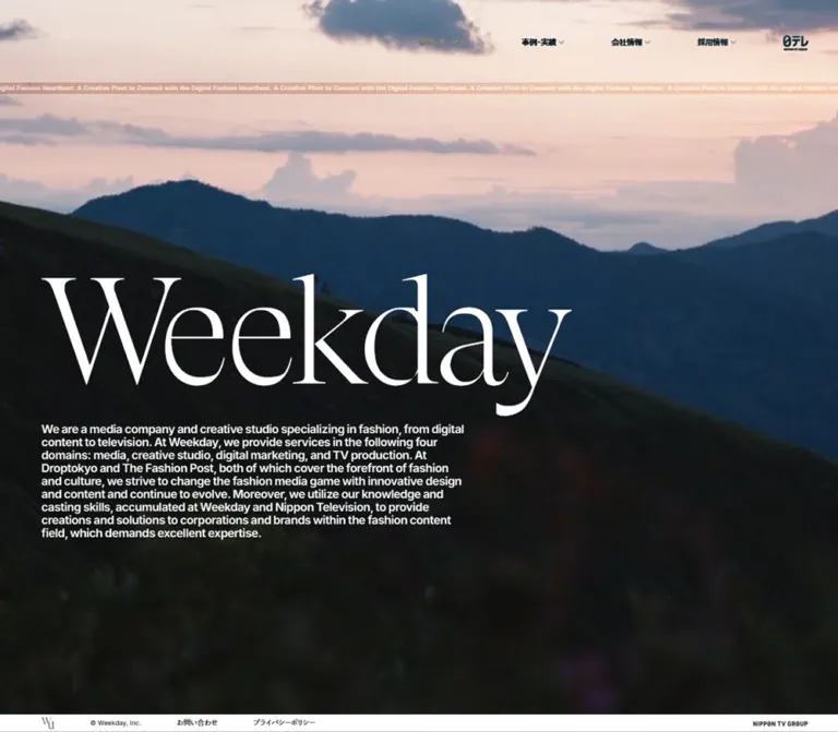
The current hero imagery shows a nighttime Tokyo street with Tokyo Tower near the center, tall buildings, traffic lights, and strong crosswalk markings. The image fills the viewport. White branding and copy sit directly on it without a visible card or text panel.
Desktop anatomy is a large empty upper area, the thin slogan strip, an oversized left-aligned Weekday wordmark, and a 720px-wide English introduction. The wordmark begins around 34.5% of the viewport height. The introduction uses 20px bold text with 22px leading and tightly packed line breaks.
On the phone, the photographic field remains full height and crops much more tightly around the tower and road. The wordmark wrapper uses nearly the entire available width. The same introduction contracts to 12.48px text with 13.728px leading. Preserve the full paragraph as selectable text rather than embedding it into the background.
No content CTA is visible within the opening brand block. The prominent white action in the lower-right corner belongs to the cookie notice.
Slogan Marquee
Role: provide a thin, continuous editorial detail near the top of the hero.
The repeated phrase is “A Creative Pivot to Connect with the Digital Fashion Heartbeat.” It appears as a narrow horizontal strip across the viewport. The desktop text rectangle starts at y145 and is only 10px high. Mobile reduces it to 6.24px at approximately y86.30.
Three repeated paragraph records carry 30s linear infinite hero-marquee. Their differing x coordinates show repeated tracks extending outside the viewport. The exact keyframe displacement is not included in the evidence. Preserve the restrained scale and continuous linear character; this is background identity texture rather than a primary reading surface.
Section Introduction and Side Label
Role: announce a chapter and keep a direct route to its full section.
Services and Works combine an English title, a narrow English introduction, and a Japanese label positioned vertically along the right edge. In the desktop recruitment capture, the title shares a horizontal line with a fine rule extending across the remaining width.
The services and works introductions are 650px wide on desktop and 332.83px on mobile. The mobile copy leaves room for the right-side label instead of filling the entire screen. Section-label links measure 36px wide on desktop and approximately 31.17px on mobile, including padding.
Use one consistent relationship between a large horizontal heading, supporting copy, and a small vertical marker. The exact title reveal or scrolling mechanism cannot be recovered from the zero-height title wrappers.
Services Statement and Explanation
Role: explain the four business domains at both an expressive and a detailed level.
The services wrapper has a measured deep indigo background with white text. Its statement occupies four lines:
A Creative Pivot to
Connect with the
Digital Fashion
Heartbeat
At desktop size, 90px type, 81px leading, and -0.07em tracking make this block compact despite its scale. The source adds 160px of padding above and below the text. Mobile uses 46.8px type and 42.12px leading without that internal padding.
The DOM also names Media, Creative Studio, Digital Marketing, and TV Produce with Japanese counterparts. Their visual arrangement is not shown in the supplied captures, so a diagram, orbit, icon system, or card layout should not be assumed.
The supporting Japanese explanation demonstrates a verified responsive reorder. On desktop, view more sits at x70 and the copy begins at x224.53, separated by 40px. On mobile, the explanation begins at x46.78 and the CTA follows below it. This preserves an indented editorial rail while making the reading order vertical.
Media Brand Showcase
Role: connect the company's media brands with their service details and external publications.
The rendered content identifies Droptokyo, The Fashion Post, and ANOTHER SKY. Each repeated showcase instance includes a view more link to an internal service anchor and a separate external URL. A lower selector presents the three names in equal-width slots.
Desktop selector slots total approximately 1000px across, centered between x220 and x1220. The mobile selector fills approximately 369px between the outer page insets. Its height changes from 50px to 52px.
Repeated brand instances and offscreen coordinates are consistent with a looping or carousel arrangement. Mobile exposes several repeated runs with different measured positions. Without an activated control or the parent animation definition, do not prescribe autoplay speed, drag behavior, selected-state movement, or the exact number of simultaneously visible cards.
The central artwork was not supplied as a directly inspectable screenshot region or asset reference. Preserve the known links and selector anatomy while leaving image treatment explicitly unresolved.
Works Image Tracks
Role: offer a dense visual route into project detail pages.
The works introduction describes clients across luxury, fashion, beauty, jewelry, and lifestyle. A small view all pill links to the complete works section. Below it, measured project anchors form three horizontally extended rows with different heights.
Desktop row heights are 120px, 90px, and 80px. Widths vary according to each item: the first row includes approximately 49px, 80px, 96px, and 181px-wide entries. Adjacent items are separated by only 2px. Repeated sequences of project destinations appear in the link evidence.
This geometry supports a compact filmstrip structure that retains varied proportions. It does not support replacing every project with an identical square card. The mobile row heights remain substantial at approximately 102px, 76px, and 68px.
The project anchors have empty extracted text. Their accessible names might come from image alternatives not included in the evidence; accessibility cannot be determined from the text extraction alone. Loop direction, hover previews, cursor behavior, and animation timing are unverified.
Client Directory
Role: establish breadth through a typographic index of client names.
The desktop capture shows white text on charcoal with a large Clients heading and a small gray view all pill. Names appear in four tightly stacked columns rather than as a grid of brand logos. The column starts are approximately x220, x490, x760, and x1030, giving a repeated 270px pitch.
The directory includes names such as Acne Studios, CHANEL, Gucci, Meta, Prada, Shiseido, and Vivienne Westwood. Consistent sans-serif styling makes them read as one editorial list. The final column ends with “… And more.” Avoid substituting each client's separate visual identity; uniform typography is a defining part of the composition.
The title and list sit on a narrower, inset rail than the outer 70px page gutter. There is generous dark space below the names before the white recruitment section begins. The phone's client-column arrangement was not visually supplied and should remain an implementation choice, not an observed claim.
Recruitment Content
Role: provide a substantial recruitment pathway within the corporate homepage.
The visible recruitment introduction begins on white beneath the dark client area. It uses a bold Recruit heading at x70, a fine horizontal rule, and a left-aligned English paragraph approximately 650px wide.
The rendered content continues with Digital × Fashion × Television, a Japanese recruitment introduction, Members and Environment groups, and Current Open Positions. Nine position links are present at capture time, including administrative roles, video production, editorial work, sales, digital marketing, an internship, and a contributing-writer role.
Each position link includes a role title and descriptive text in the rendered evidence. The supplied screenshots do not establish the complete visual treatment of these entries. Preserve their title-and-summary content structure without inventing accordion behavior, application dialogs, photography, or card styling.
Expanded Footer
Role: expose the complete site hierarchy and corporate identity.
The desktop footer is a broad charcoal directory with five visual columns: a Weekday wordmark followed by Services, Works, Company, and Recruit. Each category begins with a thin horizontal rule, an uppercase English heading, a small chevron, and a muted Japanese subtitle.
Category groups have different content densities. Works is short. Company contains profile links, Mission/Vision/Value, and group information. Recruit separates people, working environment, and applications. Child links are indented and preceded by short gray horizontal dashes. These dashes are hierarchy markers rather than text underlines.
In the phone capture, category content stacks vertically. The visible Recruit group begins around x47, its subgroups around x83, and child text around x125. Approximate 40px row intervals make the small type navigable. The top-level divider extends almost to the right page inset.
A lower legal band contains copyright, contact, privacy, and group identification. The original homepage explicitly displays “©︎ Weekday, Inc.” and states that the company belongs to Nippon Television Holdings' group. These are original-page identity statements, not production credits.
Opening Utility Strip
Role: keep legal and contact links visible at the base of the desktop opening.
The initial desktop capture has an approximately 30px-high white strip along its bottom edge. It contains a small monogram, copyright, お問い合わせ, プライバシーポリシー, and group identification. Its sparse horizontal layout differs from the expanded footer.
No corresponding strip appears in the initial phone capture. Its exact fixed-versus-local positioning and visibility thresholds were not provided. The Quick Start attaches an equivalent strip to the hero as a documented adaptation.
Cookie Notice
Role: present cookie information and an Accept action.
The notice is a black rectangle with white text, an English “We Use Cookies” heading, Japanese explanatory copy, an underlined privacy link, and a white action button. It remains visible in every supplied current capture.
On desktop, its visible footprint is approximately 280 × 140px at the lower right, beginning near x1160, y818. The Accept label is oriented vertically in a narrow right-hand button. On mobile, the visible region begins near x234, y546 and extends to about y792. It occupies the rightmost 156px of the 390px capture; its complete width cannot be established where it meets the image boundary. The Accept label becomes horizontal.
The mobile notice visibly covers part of the hero introduction and lower-page footer content. This overlap is an observed limitation, not a desirable responsive pattern to preserve. The acceptance result, dismissal animation, and persistence behavior were not tested. The original action appears as a javascript:void(0) anchor in the link evidence; a new implementation should use a real button.
Tokens — Motion & Interaction
| Treatment | Supplied value | Evidence and limitation |
|---|---|---|
| Hero slogan marquee | 30s linear infinite hero-marquee |
Computed animation on repeated paragraph elements at both widths; keyframe distance was not supplied |
| Header foreground transition | color 0.9s cubic-bezier(0.25, 0.1, 0.25, 1) |
Computed header transition; exact state trigger was not exercised |
| Section foreground transition | Same 0.9s easing |
Computed on section wrappers; does not prove every background animates |
| Brand wrapper transform | 0.3s cubic-bezier(0.25, 0.1, 0.25, 1) |
Computed transition; transform endpoints are unknown |
| Brand link transform | 0.15s with the same easing |
Computed transition; no observed hover result |
| Pill feedback | 0.3s for color, background-color, and border-color |
Computed on view more and view all |
| Media selector feedback | opacity 0.3s with the same easing |
Computed transition; selector activation was not tested |
| Hero imagery | No playback measurement supplied | A cinematic frame is visible; video element, autoplay, loop, audio, and media duration are unverified |
| Works and media tracks | Repeated sequences and offscreen rectangles | Suggest a looping presentation; timing, direction, and input behavior are unverified |
| Recruitment repeated phrase | Repeated text present | Does not establish rotation or scrolling animation |
The easing curve is the standard CSS ease curve. Source duration tokens are --duration-theme: .9s, --duration-hover: .3s, and --duration-hover-short: .15s.
The supplied collection process included load waits, animation readiness checks, and scroll traversal. It did not provide a record of opening menus, selecting media brands, accepting cookies, or activating project links. Perpetual animations were temporarily paused during readiness checks and resumed afterward. Settled captures therefore document layout and selected moments, not the complete motion experience.
For an adaptation, preserve the confirmed slow linear marquee and restrained control transitions. Keep additional media motion optional until its behavior can be specified independently.
Surfaces
| Surface | Appearance | Structural purpose |
|---|---|---|
| Hero | Full-viewport dark city imagery with white content | Brand atmosphere and initial identity |
| Services | Deep indigo with reversed typography | Business statement and detailed explanation |
| Media showcase | Measured white wrapper | Brand links and selector structure |
| Works introduction | Measured white wrapper | Portfolio context and route to the complete archive |
| Client directory | Charcoal with white typography | Dense, uniform client index |
| Recruitment introduction | White with dark text and a fine rule | Reset in tone before longer recruitment content |
| Expanded footer | Charcoal, gray rules, white hierarchy | Comprehensive site navigation |
| Opening utility strip | Narrow white band | Legal and contact details |
| Cookie notice | Black rectangle, pale halo, white button | Foreground consent information |
Source stacking tokens include header 400, mobile header 600, global footer 300, and consent 700. They support the intended relative layering, although the computed z-index of every visible element was not supplied. Higher modal and cursor tokens also exist; they do not establish that a modal or custom cursor was active.
Imagery
The current hero uses urban photographic depth: dark building walls form a corridor, the illuminated tower supplies a recognizable vertical landmark, and crosswalk stripes spread toward the lower edge. Much of the upper image is nearly black, providing space for the sparse header and thin marquee. The city remains visible through and around the open shapes of the oversized wordmark.
The desktop crop is wide and architectural. The phone crop emphasizes the tower and street axis while removing much of the lateral scene. For an adaptation, use full-bleed imagery with a deliberate focal point and sufficient contrast behind the text. object-fit: cover is a suitable recommendation, but the original media fitting property was not included in the supplied records.
Do not assume the visible darkness comes from a specific overlay. No scrim opacity, image filter, or media-source URL was supplied. Evaluate contrast against the actual selected image or frame.
Observed Asset References
| Asset category | What is established | What remains unavailable |
|---|---|---|
| Hero city imagery | Current desktop and mobile appearance | Image/video URL, native resolution, playback behavior, and alternate frames |
| Weekday wordmark and monogram | Visible serif identity at several scales | Exact font, vector/raster format, and asset URL |
| Nippon TV Group mark | Visible in the header and legal area | Asset path and intrinsic dimensions |
| Works media | Variable-width linked entries arranged in three measured rows | Image source URLs and a direct visual inspection of the complete track artwork |
| Media-brand showcase artwork | Associated brand names and links | Exact composition, source files, and verified active-state appearance |
No downloadable image, video, SVG, or font-file paths were exposed in the supplied asset evidence. Routes such as /works/802/ are project-page destinations, not image files. Supply authorized imagery and branding through implementation markup instead of inventing asset URLs.
Layout & Responsive Behavior
The homepage remains a long vertically navigable corporate document. Its reported height grows from 9095px on desktop to 10861px on mobile. The main content itself grows more modestly, from about 8333px to 8941px; the remainder after the main is substantially larger on mobile, consistent with the visibly stacked footer.
Verified Changes
| Relationship | Desktop | Phone |
|---|---|---|
| Primary navigation | Four horizontal category links | Hamburger control; category content exists offscreen |
| Header wordmark on lower-page capture | Left aligned | Centered |
| Hero | Full viewport, wide city composition | Full viewport, narrow crop |
| Hero introduction | 720px-wide, 20px text | Approximately 369px-wide, 12.48px text |
| Outer content rail | 70px from the left | Approximately 10.39px from the left |
| Inner service explanation | 480px-wide copy next to the CTA | Approximately 333px-wide copy above the CTA |
| Large services statement | 90px text with 160px vertical padding | 46.8px text without that padding |
| Media selector | Three equal slots in a 1000px span | Three equal slots in a 369px span |
| Works imagery | Three compact horizontal rows | Three rows retained with reduced heights |
| Footer | Wordmark plus four category columns | Vertically stacked hierarchy |
| Cookie Accept label | Vertical | Horizontal |
The layout uses several alignment rails rather than a single centered container. Hero and section introductions follow the outer inset. The client directory and desktop media selector are more deeply inset. Mobile Japanese explanations and footer navigation preserve another inner rail near x47.
The exact breakpoint, tablet layout, mobile client-column count, open-menu appearance, and browser safe-area handling are unverified. The Quick Start uses a recommended 960px layout breakpoint and a 560px client-list breakpoint. These are practical adaptation choices, not recovered source rules.
The phone's small hero copy and overlapping cookie panel deserve particular attention. Preserve the visual hierarchy while allowing text enlargement, content-driven height, and a fully contained consent surface.
Do’s and Don’ts
Do
- Preserve the contrast between the fine serif wordmark and dense sans-serif information.
- Keep the hero atmospheric, full bleed, and visually anchored by a clear subject.
- Use the measured white, charcoal, ink, and deep indigo as the main interface colors.
- Maintain the distinct English and Japanese text rhythms: compact English, more generous Japanese leading.
- Retain small pill links, tiny chevrons, thin rules, and indented footer hierarchy.
- Keep client names uniformly typeset in the desktop directory.
- Preserve varied project proportions and the compact three-row works structure.
- Reflow supporting service copy before its CTA on mobile.
- Treat the footer and recruitment content as substantial parts of the corporate site.
- Label wrapper measurements, visual estimates, and proposed behavior separately.
Don’t
- Don’t render the visible Weekday wordmark as bold Inter merely because its wrapper inherits that family.
- Don’t replace the extensive corporate structure with a short conversion-only page.
- Don’t turn the client list into colorful logo cards.
- Don’t introduce large rounded containers and diffuse shadows throughout the page.
- Don’t promote photographic traffic-light colors into interface accents.
- Don’t flatten all content onto one centered rail or one background color.
- Don’t infer an opened menu from offscreen links in the DOM.
- Don’t invent video playback, carousel timing, parallax, custom-cursor behavior, or recruitment animation.
- Don’t duplicate interactive project links unnecessarily when creating a visual loop.
- Don’t reproduce the cookie panel's mobile obstruction as an intentional design requirement.
Recommended Implementation Additions
These are improvements for a new implementation, not verified original-site features:
- Use semantic navigation, headings, lists, and buttons. Give the hamburger an accessible name,
aria-expanded, and a relationship to its controlled panel. - Keep closed navigation panels out of the tab order. Offscreen positioning alone is insufficient for an accessible hidden state.
- Use one clear page-heading hierarchy while preserving the original visual distinction between the brand and section titles.
- Preserve compact visible pills while enlarging touch targets to at least 44px where practical.
- Add visible focus styling that remains legible on white, indigo, charcoal, and photography.
- Verify accessible names for image-only project links. Avoid interpreting empty extracted text as proof that names are missing.
- Provide a pause mechanism for continuous marquee movement and honor reduced-motion preferences. Keep repeated decorative copies out of assistive-technology reading order.
- Use a static poster if hero media motion is added, and pause playback when reduced motion is requested. CSS alone cannot pause a video.
- Keep the cookie notice within the phone viewport, with readable copy and a complete horizontal button. Test it with text enlargement and safe-area insets.
- Allow the hero to grow on short screens instead of clipping its introductory text to a rigid height.
- Use explicit header foreground states and test contrast during transitions across photographic and solid sections.
Agent Prompt Guide
Quick Color Reference
- Light canvas:
#ffffff. - Primary light-surface text:
#1e1e1e. - Dark directory and footer:
#1a1a1awith white text. - Services field:
#0d1722with white typography. - General border neutral:
#cccccc; control border:#999999. - Cookie notice: black with a white action button.
- Imagery supplies incidental color; the interface remains predominantly neutral.
Overall Prompt
“Create an extensive corporate homepage for a fashion-focused media company and creative studio, inspired by the inspected Weekday site. Open with a full-viewport nighttime city image, a very large fine-stroked serif brand wordmark, and a dense left-aligned white English introduction. Use a sparse persistent header, four Japanese desktop navigation categories, and a hamburger on mobile. Structure the page through deep indigo services, white editorial content, a charcoal four-column client-name directory, recruitment information, and a detailed dark sitemap footer. Pair compact sans-serif English copy with more open Japanese explanatory text. Use small capsule links, fine rules, tiny chevrons, and distinct outer and inner alignment rails. Include the evidenced slow linear slogan marquee; keep additional media behavior unspecified unless separately designed.”
Example Component Prompts
- Hero: “Design a full-height city-image opening with a delicate serif brand asset approximately 900px wide at a 1440px viewport. Place it on a 70px left rail around the middle of the screen, followed by a 720px-wide introduction in bold 20px sans-serif with 22px leading. Preserve the nighttime landmark in the mobile crop and let content grow on short screens.”
- Services statement: “Create a deep indigo section using white sans-serif text. Set the four-line English statement at 90px with 81px leading and -0.07em tracking on desktop. Add a Japanese heading and spacious body copy on a narrower inner rail. Move the small view-more pill below the explanation on mobile.”
- Client directory: “Create a charcoal panel with a large Clients heading and four compact columns of uniformly styled white client names. Use approximately 20px bold text with 22px leading, an inset content span, and a small gray view-all pill. Keep the presentation typographic and flat.”
- Works tracks: “Build three tightly spaced horizontal rows of linked project images with variable aspect ratios. Use desktop heights of 120px, 90px, and 80px with 2px gaps. Preserve full image proportions. Provide a static accessible version before adding any separately specified looping motion.”
- Footer: “Create a charcoal sitemap footer with a serif brand mark and four unequal content columns. Use uppercase category headings, muted Japanese subtitles, fine top rules, chevrons, and short dashes before indented child links. Stack the hierarchy vertically on phones while retaining its indentation.”
- Cookie notice improvement: “Use the observed black notice and white Accept button, but keep the entire mobile panel inside the viewport with readable Japanese copy and a horizontal action. Preserve the monochrome appearance while preventing the clipped, narrow mobile layout seen in the reference.”
Quick Start
CSS Custom Properties
This is an implementation adaptation, not recovered source CSS. Exact colors and endpoint measurements are reused where supported. The normal root remains intact; explicit role tokens avoid copying the original mobile rem scaling blindly. Header state attributes require application logic. Supply real brand assets and imagery through markup.
The client and footer type sizes are screenshot estimates. The hero-position percentages interpolate from the two inspected captures and are recommendations, not original formulas. The mobile consent layout intentionally improves the observed obstruction.
:root {
  /* Measured colors and declared source colors */
  --color-base: #ffffff;
  --color-ink: #1e1e1e;
  --color-inverse: #1a1a1a;
  --color-indigo: #0d1722;
  --color-black: #000000;
  --color-border: #cccccc;
  --color-control-border: #999999;
  --color-rule: rgb(0 0 0 / 30%);
  --color-rule-inverse: rgb(255 255 255 / 25%);

  /* Declared interface families; loading is a separate concern */
  --font-ui: Inter, dnp-shuei-gothic-gin-std, SystemSerif,
    MyHiragino, Meiryo, Osaka, 'MS UI Gothic', 'MS PGothic',
    sans-serif;
  --font-brand-fallback: serif;

  /* Desktop endpoint measurements */
  --page-inset: 70px;
  --inner-inset: 220px;
  --hero-copy-width: 720px;
  --intro-width: 650px;
  --text-hero: 20px;
  --leading-hero: 22px;
  --text-intro: 16px;
  --leading-intro: 23px;
  --text-statement: 90px;
  --leading-statement: 81px;
  --text-ja-heading: 24px;
  --leading-ja-heading: 33.6px;
  --text-ja-body: 13px;
  --leading-ja-body: 24.3px;
  --text-pill: 12px;
  --pill-height: 30px;
  --pill-inset: 16px;
  --section-top: 140px;
  --section-bottom: 110px;
  --marquee-size: 10px;
  --marquee-top: 145px;

  /* Visual estimates and adaptation choices */
  --text-clients-title: 52px;
  --text-client: 20px;
  --leading-client: 22px;
  --text-section-title: 40px;
  --hero-start: 34.45svh;
  --brand-display-size: 242px;
  --brand-copy-gap: 11px;

  /* Source timing and relative layers */
  --ease-ui: cubic-bezier(0.25, 0.1, 0.25, 1);
  --duration-theme: 900ms;
  --duration-hover: 300ms;
  --duration-short: 150ms;
  --z-header: 400;
  --z-consent: 700;
  --safe-bottom: env(safe-area-inset-bottom, 0px);
}

* { box-sizing: border-box; }

body {
  margin: 0;
  color: var(--color-ink);
  background: var(--color-base);
  font-family: var(--font-ui);
  font-size: 16px;
  font-weight: 500;
  line-height: 1.5;
}

button, input { font: inherit; }
button, a { -webkit-tap-highlight-color: transparent; }
a { color: inherit; }
img { max-width: 100%; }

.page-rail {
  padding-inline: var(--page-inset);
}

.site-header {
  position: fixed;
  inset: 0 0 auto;
  z-index: var(--z-header);
  display: flex;
  align-items: center;
  padding: 51px var(--page-inset);
  color: var(--color-ink);
  transition: color var(--duration-theme) var(--ease-ui);
}

.site-header[data-surface='dark'] { color: #ffffff; }
.site-header__brand { width: 126.55px; flex: 0 0 auto; }
.site-header__brand img { display: block; width: 100%; }
.site-header[data-at-hero='true'] .site-header__brand {
  visibility: hidden;
}

.site-nav {
  display: flex;
  align-items: center;
  gap: 54px;
  margin-left: auto;
}

.site-nav a {
  display: inline-flex;
  align-items: center;
  gap: 4px;
  padding: 13px;
  font-size: 13px;
  line-height: 16px;
  text-decoration: none;
}

.site-header__group {
  display: block;
  width: 42px;
  margin-left: 67px;
}

.site-menu-button { display: none; }

.hero {
  position: relative;
  isolation: isolate;
  min-height: 100vh;
  min-height: 100svh;
  overflow: hidden;
  color: #ffffff;
  background: var(--color-indigo);
}

/* Supply an image or video poster with a suitable focal point. */
.hero__media {
  position: absolute;
  inset: 0;
  z-index: -1;
  width: 100%;
  height: 100%;
  object-fit: cover;
  object-position: var(--hero-focal-point, 50% 50%);
}

.hero__content {
  padding: var(--hero-start) var(--page-inset) 120px;
}

/* Temporary serif fallback; replace with an authorized brand asset. */
.hero__brand {
  max-width: 900px;
  margin: 0 0 var(--brand-copy-gap);
  font-family: var(--font-brand-fallback);
  font-size: var(--brand-display-size);
  font-weight: 400;
  line-height: 1;
}

.hero__brand img {
  display: block;
  width: 100%;
  height: auto;
}

.hero__intro {
  max-width: var(--hero-copy-width);
  margin: 0;
  font-size: var(--text-hero);
  font-weight: 700;
  line-height: var(--leading-hero);
  letter-spacing: -0.04em;
}

.hero-marquee {
  position: absolute;
  inset: var(--marquee-top) 0 auto;
  overflow: hidden;
  font-size: var(--marquee-size);
  line-height: 1;
  letter-spacing: 0.05em;
  white-space: nowrap;
}

/* Use two equal text runs; hide the decorative duplicate accessibly. */
.hero-marquee__track {
  display: flex;
  width: max-content;
  animation: reference-marquee 30s linear infinite;
}

.hero-marquee__run {
  flex: none;
  padding-right: 1em;
}

@keyframes reference-marquee {
  to { transform: translateX(-50%); }
}

.hero-marquee[data-paused='true'] .hero-marquee__track {
  animation-play-state: paused;
}

.section {
  position: relative;
  padding-block: var(--section-top) var(--section-bottom);
}

.section--services { color: #ffffff; background: var(--color-indigo); }
.section--dark { color: #ffffff; background: var(--color-inverse); }
.section--light { color: var(--color-ink); background: #ffffff; }

.section__heading {
  display: flex;
  align-items: center;
  gap: 30px;
  margin: 0 0 32px;
  font-size: var(--text-section-title);
  line-height: 1.1;
  letter-spacing: -0.04em;
}

.section__heading::after {
  content: '';
  flex: 1;
  border-top: 1px solid var(--color-rule);
}

.section--dark .section__heading::after,
.section--services .section__heading::after {
  border-color: var(--color-rule-inverse);
}

.section__intro {
  max-width: var(--intro-width);
  margin: 0;
  font-size: var(--text-intro);
  line-height: var(--leading-intro);
  letter-spacing: -0.04em;
}

.section__side-label {
  position: absolute;
  top: calc(var(--section-top) + 32px);
  right: 58px;
  padding: 12px;
  writing-mode: vertical-rl;
  font-size: 12px;
  font-weight: 600;
  line-height: 1;
  text-decoration: none;
}

.services-statement {
  max-width: 701px;
  margin: 28px 0;
  padding-block: 160px;
  font-size: var(--text-statement);
  font-weight: 600;
  line-height: var(--leading-statement);
  letter-spacing: -0.07em;
}

.services-detail {
  display: grid;
  grid-template-columns: 114.53px minmax(0, 480px);
  gap: 40px;
  align-items: start;
}

.services-detail__copy { grid-column: 2; grid-row: 1; }
.services-detail__action { grid-column: 1; grid-row: 1; }

.services-detail h3 {
  margin: 0 0 20px;
  font-size: var(--text-ja-heading);
  font-weight: 600;
  line-height: var(--leading-ja-heading);
}

.services-detail p {
  margin: 0;
  font-size: var(--text-ja-body);
  line-height: var(--leading-ja-body);
}

.pill {
  display: inline-flex;
  align-items: center;
  justify-content: center;
  gap: 8px;
  min-height: var(--pill-height);
  padding-inline: var(--pill-inset);
  border: 1px solid var(--color-control-border);
  border-radius: 999px;
  color: inherit;
  background: transparent;
  font-size: var(--text-pill);
  line-height: 1;
  text-decoration: none;
  transition:
    color var(--duration-hover) var(--ease-ui),
    background-color var(--duration-hover) var(--ease-ui),
    border-color var(--duration-hover) var(--ease-ui);
}

@media (hover: hover) {
  .pill:hover {
    background: color-mix(in srgb, #999999 65%, transparent);
  }
}

.media-selector {
  display: grid;
  grid-template-columns: repeat(3, minmax(0, 1fr));
  max-width: 1000px;
  margin-inline: auto;
}

.media-selector button {
  min-height: 50px;
  border: 0;
  color: inherit;
  background: transparent;
  cursor: pointer;
}

/* Static tracks are the baseline; motion needs a separate specification. */
.works-tracks { overflow: hidden; }
.works-track {
  display: flex;
  gap: 2px;
  width: max-content;
  margin-bottom: 2px;
  --track-height: 120px;
}
.works-track:nth-child(2) { --track-height: 90px; }
.works-track:nth-child(3) { --track-height: 80px; }
.works-track a { display: block; flex: none; }
.works-track img {
  display: block;
  width: auto;
  max-width: none;
  height: var(--track-height);
}

.clients__inner {
  max-width: 1000px;
  margin-inline: auto;
}

.clients__heading {
  margin: 0 0 40px;
  font-size: var(--text-clients-title);
  line-height: 1;
  letter-spacing: -0.04em;
}

/* Four explicit lists preserve top-to-bottom ordering within columns. */
.clients__columns {
  display: grid;
  grid-template-columns: repeat(4, minmax(0, 1fr));
  gap: 80px;
}

.clients__columns ul { list-style: none; margin: 0; padding: 0; }
.clients__columns li {
  font-size: var(--text-client);
  font-weight: 700;
  line-height: var(--leading-client);
  letter-spacing: -0.04em;
  overflow-wrap: break-word;
}

.site-footer {
  padding: 80px var(--page-inset) 24px;
  color: #ffffff;
  background: var(--color-inverse);
}

.footer-grid {
  display: grid;
  grid-template-columns: 160px 1.1fr 0.65fr 1.25fr 1fr;
  gap: clamp(24px, 5.35vw, 77px);
}

.footer-group { min-width: 0; border-top: 1px solid var(--color-rule-inverse); }
.footer-group h2 { margin: 24px 0 4px; font-size: 20px; line-height: 1.2; }
.footer-group__subtitle { opacity: 0.55; font-size: 11px; }
.footer-group ul { list-style: none; padding: 0; margin: 24px 0 0; }
.footer-group a { display: block; padding-block: 10px; font-size: 13px; text-decoration: none; }
.footer-group__child { display: flex; align-items: center; gap: 10px; }
.footer-group__child::before {
  content: '';
  flex: 0 0 30px;
  border-top: 1px solid var(--color-rule-inverse);
}

.hero-utility {
  position: absolute;
  inset: auto 0 0;
  display: flex;
  align-items: center;
  gap: 60px;
  min-height: 30px;
  padding-inline: var(--page-inset);
  color: var(--color-ink);
  background: #ffffff;
  font-size: 11px;
}

/* Desktop-inspired notice; mobile containment is an improvement. */
.consent {
  position: fixed;
  right: 0;
  bottom: 42px;
  z-index: var(--z-consent);
  display: grid;
  grid-template-columns: minmax(0, 1fr) 50px;
  gap: 30px;
  align-items: center;
  width: 280px;
  padding: 10px 0 10px 20px;
  color: #ffffff;
  background: #000000;
  box-shadow: 0 0 12px rgb(255 255 255 / 25%);
}

.consent h2 { margin: 0 0 8px; font-size: 12px; line-height: 1.3; }
.consent p { margin: 0; font-size: 10px; line-height: 1.5; }
.consent button {
  min-height: 120px;
  border: 0;
  border-radius: 4px;
  color: var(--color-ink);
  background: #ffffff;
  writing-mode: vertical-rl;
  cursor: pointer;
}

/* Recommended focus treatment for both light and dark surfaces. */
:where(a, button):focus-visible {
  outline: 2px solid currentColor;
  outline-offset: 4px;
}

/* Recommended breakpoint; the original breakpoint was not supplied. */
@media (max-width: 960px) {
  :root {
    --page-inset: 10.4px;
    --inner-inset: 46.8px;
    --hero-copy-width: 100%;
    --intro-width: calc(100vw - 57.2px);
    --text-hero: 12.48px;
    --leading-hero: 13.728px;
    --text-intro: 12.48px;
    --leading-intro: 18.304px;
    --text-statement: 46.8px;
    --leading-statement: 42.12px;
    --text-ja-heading: 20.8px;
    --leading-ja-heading: 29.12px;
    --text-ja-body: 12.48px;
    --leading-ja-body: 24.96px;
    --text-pill: 11.44px;
    --pill-height: 31.2px;
    --pill-inset: 11.44px;
    --section-top: 135.2px;
    --section-bottom: 72.8px;
    --marquee-size: 6.24px;
    --marquee-top: 86.3px;
    --hero-start: 38.77svh;
    --brand-display-size: clamp(64px, 22.933vw, 140px);
    --brand-copy-gap: 32.28px;
    --text-section-title: 32px;
    --z-header: 600;
  }

  .site-header {
    display: grid;
    grid-template-columns: 44px minmax(0, 1fr) 44px;
    padding: 24px var(--page-inset);
  }
  .site-nav { display: none; }
  .site-header__brand { grid-column: 2; grid-row: 1; justify-self: center; width: 131.61px; }
  .site-header__group { grid-column: 3; grid-row: 1; justify-self: end; width: 34px; margin: 0; }
  .site-menu-button {
    grid-column: 1;
    grid-row: 1;
    display: grid;
    align-content: center;
    gap: 6px;
    width: 44px;
    height: 44px;
    padding: 0;
    border: 0;
    color: inherit;
    background: transparent;
  }
  .site-menu-button::before,
  .site-menu-button::after {
    content: '';
    width: 37px;
    height: 4px;
    background: currentColor;
  }

  .section__side-label {
    top: calc(var(--section-top) + 14px);
    right: 0;
    padding: 10.4px;
    font-size: 10.4px;
  }
  .services-statement { max-width: 100%; margin-block: 72.8px; padding: 0; }
  .services-detail { display: flex; flex-direction: column; gap: 20.8px; margin-left: 36.4px; }
  .services-detail__copy { order: 0; }
  .services-detail__action { order: 1; }
  .media-selector { margin-inline: var(--page-inset); }
  .media-selector button { min-height: 52px; }
  .works-track { --track-height: 101.91px; }
  .works-track:nth-child(2) { --track-height: 75.91px; }
  .works-track:nth-child(3) { --track-height: 67.59px; }

  /* Mobile client columns are an adaptation, not an observed layout. */
  .clients__inner { margin-inline: var(--inner-inset) var(--page-inset); }
  .clients__columns { grid-template-columns: repeat(2, minmax(0, 1fr)); gap: 32px; }
  .site-footer { padding-inline: var(--inner-inset) var(--page-inset); }
  .footer-grid { grid-template-columns: 1fr; gap: 32px; }
  .footer-group a { min-height: 40px; }
  .hero-utility { display: none; }

  .consent {
    inset-inline: 16px;
    bottom: calc(16px + var(--safe-bottom));
    grid-template-columns: 1fr;
    gap: 12px;
    width: auto;
    max-height: calc(100svh - 32px - var(--safe-bottom));
    overflow-y: auto;
    padding: 16px;
  }
  .consent h2 { font-size: 16px; }
  .consent p { font-size: 13px; line-height: 1.6; }
  .consent button { width: 100%; min-height: 44px; writing-mode: horizontal-tb; font-size: 20px; font-weight: 700; }
}

@media (max-width: 560px) {
  .clients__columns { grid-template-columns: 1fr; }
}

/* Recommended protection for unusually short viewport heights. */
@media (max-height: 600px) {
  .hero__content { padding-top: 180px; }
}

@media (prefers-reduced-motion: reduce) {
  .hero-marquee__track { animation: none; }
  .site-header, .pill { transition: none; }
}
Use readable semantic markup around these classes. Put the service copy before its CTA in source order, then use the desktop grid placement to achieve the side-by-side layout. The mobile menu button needs an actual panel controller, and the consent button needs an explicit event handler. Neither behavior is implemented by this CSS.
Tailwind v4 Token Mapping
Optional mapping for a project already using Tailwind v4. These names are adaptation aliases and do not imply that the original site uses Tailwind. Define the custom properties above first.
@theme inline {
  --color-paper: var(--color-base);
  --color-ink: var(--color-ink);
  --color-charcoal: var(--color-inverse);
  --color-service: var(--color-indigo);
  --color-divider: var(--color-border);

  --font-interface: var(--font-ui);
  --font-brand: var(--font-brand-fallback);

  --text-hero-copy: var(--text-hero);
  --text-introduction: var(--text-intro);
  --text-manifesto: var(--text-statement);
  --text-client-name: var(--text-client);
  --text-small-link: var(--text-pill);

  --spacing-page: var(--page-inset);
  --spacing-inner: var(--inner-inset);
  --spacing-section-top: var(--section-top);
  --spacing-section-bottom: var(--section-bottom);

  --radius-pill: 999px;
}
When integrating this mapping, omit the --color-ink mapping line because the identically named property is already defined in :root; referencing a custom property from itself would create a cycle. Alternatively, rename that Tailwind alias to --color-body-ink: var(--color-ink).
Sources & Evidence
- Weekday, Inc. — original and final homepage: supplied HTTP 200 response, page title, rendered text, link destinations, CSS custom properties, computed element styles, and measured rectangles. The original and final URLs are identical.
- Capture date: September 13, 2026 JST, corresponding to the supplied retrieval timestamp
2026-09-12T18:14:03.894Z. - Desktop evidence: 1440 × 1000 CSS-pixel viewport; reported document height 9095px. Captures show the opening hero, client-to-recruitment transition, and expanded footer.
- Mobile evidence: 390 × 844 CSS-pixel viewport; reported document height 10861px. Captures show the opening hero and lower footer hierarchy, both with the cookie notice present.
- Original-page identity: the homepage displays “©︎ Weekday, Inc.” and its Nippon Television group relationship. No production-credit claim is made here.
- Collection conditions: the supplied browser process waited for document load, relevant finite animation completion, sampled layout/text stability, and visible image decoding within stated time limits. It traversed intermediate scroll positions. SharedWorkers and service workers were disabled during inspection.
- Interaction limits: no activated navigation panel, cookie acceptance result, media selection, project destination, application flow, or keyboard interaction was supplied. Declared transitions are distinguished from tested behavior.
- Visual and asset limits: intermediate service, media, works, and recruitment content has uneven screenshot coverage. No downloadable image, video, wordmark, or font-file URLs were provided. A partially visible outlined fragment above the desktop footer is insufficient to identify a loading state or component.
This reference describes the current homepage supported by the supplied original-page evidence. Exact tokens, wrapper measurements, visual estimates, and implementation recommendations are kept distinct throughout.
# Weekday, Inc. — Style Reference

> A fashion-media corporate index with a monumental serif wordmark, compact editorial copy, and a cinematic city backdrop.

**Original URL:** [https://weekday.co.jp/](https://weekday.co.jp/)
**Final URL:** [https://weekday.co.jp/](https://weekday.co.jp/)
**Theme:** photographic opening, deep indigo services, white editorial sections, and charcoal client and footer surfaces
**Inspected:** September 13, 2026, Japan Standard Time; supplied retrieval timestamp: September 12, 2026 at 18:14:03.894 UTC
**Viewports:** 1440 × 1000 and 390 × 844 CSS pixels
**Scope:** the current corporate homepage, including its opening composition, navigation, services, media links, works tracks, client directory, recruitment content, footer, and visible cookie notice. Visual coverage consists of three desktop captures and two mobile captures; intermediate content is also documented through supplied rendered DOM measurements. Destination pages and activated menu states were not inspected.

Weekday presents itself as a fashion-focused media company and creative studio working across media, creative production, digital marketing, and television. The homepage functions as an extensive corporate directory and portfolio gateway. Its navigation, client list, recruitment information, and detailed footer are substantial parts of the experience.

The central visual relationship is between the delicate, high-contrast serif Weekday wordmark and dense sans-serif information. The opening places both directly over a dark Tokyo street scene. Further down, broad changes of surface color establish chapters, while small arrows, thin rules, restrained pills, and carefully indented text provide navigation. Large areas of space coexist with unusually tight English text. Preserve that contrast when adapting the design.

## How to Read This Reference

- **Measured** means reported by the supplied rendered DOM, computed styles, or CSS custom properties. Values are CSS pixels unless otherwise stated; some decimals are rounded for readability.
- **Visual estimate** means inferred from the current desktop or mobile captures. Client typography and cookie-panel geometry fall into this category because their computed element records were not supplied.
- **Declared token** means a custom property was present. Its existence does not establish that every corresponding component was visible or used that value.
- **Recommendation** means guidance for a new implementation. Breakpoints, accessibility improvements, fallback brand typography, and the Quick Start layout formulas are explicitly adaptations.
- Element rectangles can include graphic wrappers, transformed content, or offscreen navigation. A measured box is not automatically the visible ink boundary.
- The supplied evidence is the inspection source. No additional browsing, file access, asset retrieval, or interaction testing was performed for this reference.

## Tokens — Colors

### Default Palette

| Name | Value | Source token | Role and evidence |
| --- | --- | --- | --- |
| White | `#ffffff` | `--color-base`, `--color-white` | Measured background of media and works wrappers; reversed text over the hero and services; white recruitment surface visible in the desktop capture |
| Charcoal | `#1a1a1a` | `--color-base-invert` | Declared inverse canvas, consistent with the visible client directory and expanded footer |
| Primary Ink | `#1e1e1e` | `--color-text` | Measured default body text and light-surface navigation |
| Deep Indigo | `#0d1722` | `--color-indigo` | Measured services-section background at both viewport sizes |
| Black | `#000000` | `--color-black` | Declared black; the cookie notice and footer separator appear black in the captures |
| Dark Gray | `#262626` | `--color-darkgray` | Declared secondary dark neutral; a specific visible assignment was not established |
| Border Gray | `#cccccc` | `--color-border`, `--color-gray` | Declared general border neutral |
| Navigation Rule | `#e5e5e5` | `--color-gn-border` | Declared navigation divider color |
| Control Gray | `#999999` | `--color-button-border`, `--color-button-border-hover` | Declared control border; the visible client pill also has a gray appearance, but its exact captured fill was not measured |
| Pale Service Blue | `#ddeff7` | `--color-service-text` | Declared service-text accent; application to a particular visible element remains unverified |
| Input Surface | `#f5f5f5` | `--color-input-bg` | Declared input surface; no form interface was visually inspected |

The warm road markings, greenish windows, colored signals, and illuminated tower belong to the hero imagery. They do not establish additional interface accent colors.

### Section and Control Color Behavior

| Treatment | Source value or visual evidence | Interpretation |
| --- | --- | --- |
| Section divider | `color-mix(in srgb, #000000 30%, transparent)` | A translucent black rule; its final appearance depends on the underlying surface |
| Button hover fill | `color-mix(in srgb, #999999 65%, transparent)` | Declared translucent gray hover treatment; do not replace it with opaque gray without considering the surface |
| Text selection | `rgba(0,0,0,.3)` | Declared selection color |
| Navigation shadow | `rgba(0,0,0,.25)` | Declared shadow color; blur and spread were not supplied |
| Header foreground | White over the hero and dark content; dark over white content | Both foreground variants appear in the evidence |
| Cookie separation | Soft pale halo around a black rectangle | Visually observed exception to the otherwise flat surface system; exact shadow parameters are unknown |

No user-selectable color theme is evidenced. Treat the changing foreground and backgrounds as section-related presentation. The initial works wrapper computes as white, while the client capture is charcoal; do not assign one permanent background to every descendant solely from the parent measurement.

## Tokens — Typography

### Interface Sans Serif

The measured body stack is:

```css
Inter, dnp-shuei-gothic-gin-std, SystemSerif, MyHiragino,
メイリオ, Meiryo, Osaka, 'MS UI Gothic', 'MS Pゴシック',
'MS PGothic', sans-serif
```

Inter and `dnp-shuei-gothic-gin-std` are declared families, not independently verified font-file loads. `SystemSerif` and `MyHiragino` appear as family names in the stack; their definitions were not supplied.

The default body weight is `500`. English introductory copy uses compact line spacing and negative tracking. The hero introduction increases the weight to `700`. Japanese explanatory copy has considerably more vertical breathing room.

### Weekday Wordmark

The visible wordmark has very thin hairlines, strong stroke contrast, and serif forms. Its exact typeface and rendering mechanism are not established by the supplied evidence.

The logo wrappers inherit the interface stack and report weight `700`. This does **not** mean the visible wordmark should be recreated as bold Inter. The hero H2 reports a 242px font size on desktop, while its rectangle is approximately 899.81 × 275px. These values describe its wrapper, not a confirmed live-text serif font.

For faithful reproduction, use an authorized brand asset when available. A generic serif fallback in the Quick Start is only a temporary approximation.

### Type Scale

| Role | Desktop measured size / line height | Mobile measured size / line height | Weight / tracking | Evidence note |
| --- | --- | --- | --- | --- |
| Root | `16px / normal` | `16.64px / normal` | `400` | Computed HTML style |
| Default body | `16px / 24px` | `16.64px / 24.96px` | `500`, normal | Inherited baseline, not the size of every paragraph |
| Header brand wrapper | `34px / 34px` | `35.36px / 35.36px` | `700`, normal | Graphic appearance differs from inherited family |
| Hero brand wrapper | `242px / 242px` | `89.44px / 89.44px` | `700`, normal | Visible serif identity must be treated separately |
| Hero introduction | `20px / 22px` | `12.48px / 13.728px` | `700`, `-0.04em` | Dense white English paragraph |
| Hero marquee | `10px / 10px` | `6.24px / 6.24px` | `500`, `0.05em` | Decorative repeated slogan |
| Desktop primary navigation | `13px / 16px` | Hidden in the phone capture | `500`, normal | Links have 13px padding |
| Navigation category links | `16px / 30px` | `12.48px / 31.2px` | `500`; mobile `-0.02em` | Mobile measurements are from offscreen menu content |
| Navigation child links | `12px / 24px` | `12.48px / 31.2px` | Desktop `600`, mobile `500` | Padded link boxes exceed line height |
| English section introduction | `16px / 23px` | `12.48px / 18.304px` | `500`, `-0.04em` | Measured for services and works |
| Services statement | `90px / 81px` | `46.8px / 42.12px` | `600`, `-0.07em` | Four tightly stacked lines |
| Japanese service heading | `24px / 33.6px` | `20.8px / 29.12px` | `600`, normal | Supporting explanatory heading |
| Japanese service body | `13px / 24.3px` | `12.48px / 24.96px` | `500`, normal | Loose leading compared with English copy |
| Small pill link | `12px / 12px` | `11.44px / 11.44px` | `500`, normal | Examples: `view more`, `view all` |
| Vertical section label | `12px / 12px` | `10.4px / 10.4px` | `600`, normal | Right-side Japanese navigation label |

### Screenshot-Based Type Estimates

| Role | Visual estimate | Application |
| --- | --- | --- |
| Clients heading | Approximately `52px`, bold | Strong heading above the four-column text directory |
| Client names | Approximately `20px / 22px`, bold | Tightly stacked names with little space between entries |
| Recruit heading | Approximately `40px`, bold | Left-aligned heading with a horizontal rule extending right |
| Footer category headings | Approximately `20px`, bold | Uppercase English category followed by a small chevron |
| Footer links | Approximately `13px` | Compact Japanese and English hierarchy |
| Mobile cookie heading | Approximately `16px` | Notice title above Japanese copy |
| Mobile Accept label | Approximately `20px`, bold | Horizontal white action button |

The Services and Works title wrappers report `30px` on desktop and `16.64px` on mobile, but their recorded heights are zero. Do not treat those wrapper values as reliable measurements of all visible section-heading lettering.

### Responsive Rem Tokens

| Source token | Desktop declaration → computed equivalent | Mobile declaration → computed equivalent |
| --- | --- | --- |
| `--fs-rem-xs` | `clamp(11px, 0.8125rem, 0.8125rem)` → `13px` | `0.6875rem` → `11.44px` |
| `--fs-rem-s` | `0.6875rem` → `11px` | `0.78125rem` → `13px` |
| `--fs-rem-m` | `0.8125rem` → `13px` | `0.875rem` → `14.56px` |

The mobile root is 1.04 times the desktop root at the inspected widths, but the underlying scaling formula and breakpoint are unknown. Some role-specific text sizes decrease despite the larger mobile root. Copying the root ratio alone will not reproduce the responsive hierarchy.

## Tokens — Spacing & Shapes

There is no demonstrated universal spacing grid. The evidence combines small fixed gaps, rem-scaled mobile values, large section padding, and separate outer and inner alignment rails.

### Spacing Scale

| Use | Measured value | Interpretation |
| --- | --- | --- |
| Works-track item gap | `2px` | Derived from adjacent link rectangles on both viewports |
| Desktop navigation label-to-chevron gap | `4px` | Computed flex gap |
| Desktop navigation child-link padding | `6px` | Increases the target around small text |
| Mobile navigation child-link padding | `6.24px` | Computed offscreen menu style |
| Desktop primary-link padding | `13px` | Produces 42px-high link boxes |
| Desktop pill horizontal padding | `16px` | Within a 30px-high capsule |
| Mobile pill horizontal padding | `11.44px` | Within an approximately 31.19px-high capsule |
| Desktop service CTA-to-copy gap | `40px` | Computed gap between the pill and explanatory block |
| Mobile service content gap | `20.8px` | Computed vertical gap in the supporting block |
| Desktop outer content inset | `70px` | Shared by hero, introduction, and major footer alignments |
| Mobile outer content inset | `10.39px` | Hero and section introduction rail |
| Mobile inner content start | `46.78px` | Japanese service explanation and its CTA |
| Desktop major section top padding | `140px` | Services and works wrappers |
| Mobile major section top padding | `135.2px` | Services and works wrappers |
| Desktop media-section vertical padding | `110px` | Top and bottom |
| Mobile media-section vertical padding | `72.8px` | Top and bottom |
| Desktop statement vertical padding | `160px` each side | Included in its 644px-tall rectangle; removed on mobile |

### Border Radius and Rules

| Element | Value | Status |
| --- | --- | --- |
| Sampled structural wrappers and ordinary links | `0` | Measured |
| Desktop small pill | `15px` | Measured radius with 30px height |
| Mobile small pill | `15.6px` | Measured radius with approximately 31.19px height |
| Cookie action corners | Approximately `4px` | Visual estimate |
| Footer dividers | Approximately `1px` | Visual estimate |
| Footer child-link dash | Approximately `30px` wide | Visual estimate |

Roundness is concentrated in small navigation pills and the cookie action. Large sections remain rectangular. The design does not show a general system of floating, rounded, shadowed cards.

### Layout Measurements

| Element | 1440 × 1000 | 390 × 844 |
| --- | --- | --- |
| Reported document height | `9095px` | `10861px` |
| Main element height | `8333.16px` | `8941.05px` |
| Hero rectangle | `1440 × 1000px` | `390 × 844px` |
| Hero wordmark wrapper | `x:70, y:344.5`, `899.81 × 275px` | `x:10.39, y:327.19`, `369.22 × 101.88px` |
| Hero introduction | `x:70, y:597.5`, `720 × 198px` | `x:10.39, y:448.91`, `369.22 × 151.08px` |
| English services introduction | `650px` wide | `332.83px` wide |
| Japanese services explanation | `480px` wide, starting at `x:224.53` | `332.83px` wide, starting at `x:46.78` |
| Media selector | Three `333.33px` slots, starting at `x:220` | Three `123.06px` slots, starting at `x:10.39` |
| `view more` link | `114.53 × 30px` | `101.67 × 31.19px` |
| Works `view all` link | `97.97 × 30px` | `85.86 × 31.19px` |
| Works-track row heights | `120px`, `90px`, `80px` | Approximately `101.91px`, `75.91px`, `67.59px` |

The desktop hero wordmark and paragraph rectangles overlap by 22px vertically. This is a wrapper-level measurement, not evidence that the visible letterforms collide with the paragraph. Avoid reproducing that overlap blindly with a substitute font.

## Components

### Persistent Site Header

**Role:** maintain identity and access to the four corporate categories.

On desktop, the scrolled captures show a small Weekday wordmark at the left, four Japanese category links across the right half, and a Nippon TV Group mark at the far right. Primary link labels are `事業・サービス`, `事例・実績`, `会社情報`, and `採用情報`. Small downward chevrons accompany them.

The first navigation link begins at approximately x696.22. The measured links are 42px high, and consecutive links have approximately 54px of horizontal space between their boxes. The header brand wrapper is 126.55 × 37px at x70, y53. The small Weekday mark is not visibly present in the initial hero capture, although brand wrappers exist in the DOM.

On mobile, a two-line hamburger replaces the desktop category row. The group mark remains at the right. A centered Weekday wordmark appears in the lower-page capture, with a measured wrapper width of 131.61px. Header controls stay near the same viewport positions across captures, supporting persistent visual behavior; the precise positioning implementation was not supplied.

The desktop header's 425px rectangle includes navigation structures, and the mobile header's rectangle spans the viewport height. Neither should be used as the height of the visible top bar. Desktop submenu groups extend beyond the viewport, and mobile menu links have negative x coordinates. Their DOM presence establishes information architecture, not an opened menu state.

### Full-Viewport Hero

**Role:** establish the company identity through scale and atmosphere.

The current hero imagery shows a nighttime Tokyo street with Tokyo Tower near the center, tall buildings, traffic lights, and strong crosswalk markings. The image fills the viewport. White branding and copy sit directly on it without a visible card or text panel.

Desktop anatomy is a large empty upper area, the thin slogan strip, an oversized left-aligned Weekday wordmark, and a 720px-wide English introduction. The wordmark begins around 34.5% of the viewport height. The introduction uses 20px bold text with 22px leading and tightly packed line breaks.

On the phone, the photographic field remains full height and crops much more tightly around the tower and road. The wordmark wrapper uses nearly the entire available width. The same introduction contracts to 12.48px text with 13.728px leading. Preserve the full paragraph as selectable text rather than embedding it into the background.

No content CTA is visible within the opening brand block. The prominent white action in the lower-right corner belongs to the cookie notice.

### Slogan Marquee

**Role:** provide a thin, continuous editorial detail near the top of the hero.

The repeated phrase is “A Creative Pivot to Connect with the Digital Fashion Heartbeat.” It appears as a narrow horizontal strip across the viewport. The desktop text rectangle starts at y145 and is only 10px high. Mobile reduces it to 6.24px at approximately y86.30.

Three repeated paragraph records carry `30s linear infinite hero-marquee`. Their differing x coordinates show repeated tracks extending outside the viewport. The exact keyframe displacement is not included in the evidence. Preserve the restrained scale and continuous linear character; this is background identity texture rather than a primary reading surface.

### Section Introduction and Side Label

**Role:** announce a chapter and keep a direct route to its full section.

Services and Works combine an English title, a narrow English introduction, and a Japanese label positioned vertically along the right edge. In the desktop recruitment capture, the title shares a horizontal line with a fine rule extending across the remaining width.

The services and works introductions are 650px wide on desktop and 332.83px on mobile. The mobile copy leaves room for the right-side label instead of filling the entire screen. Section-label links measure 36px wide on desktop and approximately 31.17px on mobile, including padding.

Use one consistent relationship between a large horizontal heading, supporting copy, and a small vertical marker. The exact title reveal or scrolling mechanism cannot be recovered from the zero-height title wrappers.

### Services Statement and Explanation

**Role:** explain the four business domains at both an expressive and a detailed level.

The services wrapper has a measured deep indigo background with white text. Its statement occupies four lines:

> A Creative Pivot to
> Connect with the
> Digital Fashion
> Heartbeat

At desktop size, 90px type, 81px leading, and `-0.07em` tracking make this block compact despite its scale. The source adds 160px of padding above and below the text. Mobile uses 46.8px type and 42.12px leading without that internal padding.

The DOM also names Media, Creative Studio, Digital Marketing, and TV Produce with Japanese counterparts. Their visual arrangement is not shown in the supplied captures, so a diagram, orbit, icon system, or card layout should not be assumed.

The supporting Japanese explanation demonstrates a verified responsive reorder. On desktop, `view more` sits at x70 and the copy begins at x224.53, separated by 40px. On mobile, the explanation begins at x46.78 and the CTA follows below it. This preserves an indented editorial rail while making the reading order vertical.

### Media Brand Showcase

**Role:** connect the company's media brands with their service details and external publications.

The rendered content identifies Droptokyo, The Fashion Post, and ANOTHER SKY. Each repeated showcase instance includes a `view more` link to an internal service anchor and a separate external URL. A lower selector presents the three names in equal-width slots.

Desktop selector slots total approximately 1000px across, centered between x220 and x1220. The mobile selector fills approximately 369px between the outer page insets. Its height changes from 50px to 52px.

Repeated brand instances and offscreen coordinates are consistent with a looping or carousel arrangement. Mobile exposes several repeated runs with different measured positions. Without an activated control or the parent animation definition, do not prescribe autoplay speed, drag behavior, selected-state movement, or the exact number of simultaneously visible cards.

The central artwork was not supplied as a directly inspectable screenshot region or asset reference. Preserve the known links and selector anatomy while leaving image treatment explicitly unresolved.

### Works Image Tracks

**Role:** offer a dense visual route into project detail pages.

The works introduction describes clients across luxury, fashion, beauty, jewelry, and lifestyle. A small `view all` pill links to the complete works section. Below it, measured project anchors form three horizontally extended rows with different heights.

Desktop row heights are 120px, 90px, and 80px. Widths vary according to each item: the first row includes approximately 49px, 80px, 96px, and 181px-wide entries. Adjacent items are separated by only 2px. Repeated sequences of project destinations appear in the link evidence.

This geometry supports a compact filmstrip structure that retains varied proportions. It does not support replacing every project with an identical square card. The mobile row heights remain substantial at approximately 102px, 76px, and 68px.

The project anchors have empty extracted text. Their accessible names might come from image alternatives not included in the evidence; accessibility cannot be determined from the text extraction alone. Loop direction, hover previews, cursor behavior, and animation timing are unverified.

### Client Directory

**Role:** establish breadth through a typographic index of client names.

The desktop capture shows white text on charcoal with a large Clients heading and a small gray `view all` pill. Names appear in four tightly stacked columns rather than as a grid of brand logos. The column starts are approximately x220, x490, x760, and x1030, giving a repeated 270px pitch.

The directory includes names such as Acne Studios, CHANEL, Gucci, Meta, Prada, Shiseido, and Vivienne Westwood. Consistent sans-serif styling makes them read as one editorial list. The final column ends with “… And more.” Avoid substituting each client's separate visual identity; uniform typography is a defining part of the composition.

The title and list sit on a narrower, inset rail than the outer 70px page gutter. There is generous dark space below the names before the white recruitment section begins. The phone's client-column arrangement was not visually supplied and should remain an implementation choice, not an observed claim.

### Recruitment Content

**Role:** provide a substantial recruitment pathway within the corporate homepage.

The visible recruitment introduction begins on white beneath the dark client area. It uses a bold Recruit heading at x70, a fine horizontal rule, and a left-aligned English paragraph approximately 650px wide.

The rendered content continues with Digital × Fashion × Television, a Japanese recruitment introduction, Members and Environment groups, and Current Open Positions. Nine position links are present at capture time, including administrative roles, video production, editorial work, sales, digital marketing, an internship, and a contributing-writer role.

Each position link includes a role title and descriptive text in the rendered evidence. The supplied screenshots do not establish the complete visual treatment of these entries. Preserve their title-and-summary content structure without inventing accordion behavior, application dialogs, photography, or card styling.

### Expanded Footer

**Role:** expose the complete site hierarchy and corporate identity.

The desktop footer is a broad charcoal directory with five visual columns: a Weekday wordmark followed by Services, Works, Company, and Recruit. Each category begins with a thin horizontal rule, an uppercase English heading, a small chevron, and a muted Japanese subtitle.

Category groups have different content densities. Works is short. Company contains profile links, Mission/Vision/Value, and group information. Recruit separates people, working environment, and applications. Child links are indented and preceded by short gray horizontal dashes. These dashes are hierarchy markers rather than text underlines.

In the phone capture, category content stacks vertically. The visible Recruit group begins around x47, its subgroups around x83, and child text around x125. Approximate 40px row intervals make the small type navigable. The top-level divider extends almost to the right page inset.

A lower legal band contains copyright, contact, privacy, and group identification. The original homepage explicitly displays “©︎ Weekday, Inc.” and states that the company belongs to Nippon Television Holdings' group. These are original-page identity statements, not production credits.

### Opening Utility Strip

**Role:** keep legal and contact links visible at the base of the desktop opening.

The initial desktop capture has an approximately 30px-high white strip along its bottom edge. It contains a small monogram, copyright, `お問い合わせ`, `プライバシーポリシー`, and group identification. Its sparse horizontal layout differs from the expanded footer.

No corresponding strip appears in the initial phone capture. Its exact fixed-versus-local positioning and visibility thresholds were not provided. The Quick Start attaches an equivalent strip to the hero as a documented adaptation.

### Cookie Notice

**Role:** present cookie information and an Accept action.

The notice is a black rectangle with white text, an English “We Use Cookies” heading, Japanese explanatory copy, an underlined privacy link, and a white action button. It remains visible in every supplied current capture.

On desktop, its visible footprint is approximately 280 × 140px at the lower right, beginning near x1160, y818. The Accept label is oriented vertically in a narrow right-hand button. On mobile, the visible region begins near x234, y546 and extends to about y792. It occupies the rightmost 156px of the 390px capture; its complete width cannot be established where it meets the image boundary. The Accept label becomes horizontal.

The mobile notice visibly covers part of the hero introduction and lower-page footer content. This overlap is an observed limitation, not a desirable responsive pattern to preserve. The acceptance result, dismissal animation, and persistence behavior were not tested. The original action appears as a `javascript:void(0)` anchor in the link evidence; a new implementation should use a real button.

## Tokens — Motion & Interaction

| Treatment | Supplied value | Evidence and limitation |
| --- | --- | --- |
| Hero slogan marquee | `30s linear infinite hero-marquee` | Computed animation on repeated paragraph elements at both widths; keyframe distance was not supplied |
| Header foreground transition | `color 0.9s cubic-bezier(0.25, 0.1, 0.25, 1)` | Computed header transition; exact state trigger was not exercised |
| Section foreground transition | Same `0.9s` easing | Computed on section wrappers; does not prove every background animates |
| Brand wrapper transform | `0.3s cubic-bezier(0.25, 0.1, 0.25, 1)` | Computed transition; transform endpoints are unknown |
| Brand link transform | `0.15s` with the same easing | Computed transition; no observed hover result |
| Pill feedback | `0.3s` for color, background-color, and border-color | Computed on `view more` and `view all` |
| Media selector feedback | `opacity 0.3s` with the same easing | Computed transition; selector activation was not tested |
| Hero imagery | No playback measurement supplied | A cinematic frame is visible; video element, autoplay, loop, audio, and media duration are unverified |
| Works and media tracks | Repeated sequences and offscreen rectangles | Suggest a looping presentation; timing, direction, and input behavior are unverified |
| Recruitment repeated phrase | Repeated text present | Does not establish rotation or scrolling animation |

The easing curve is the standard CSS `ease` curve. Source duration tokens are `--duration-theme: .9s`, `--duration-hover: .3s`, and `--duration-hover-short: .15s`.

The supplied collection process included load waits, animation readiness checks, and scroll traversal. It did not provide a record of opening menus, selecting media brands, accepting cookies, or activating project links. Perpetual animations were temporarily paused during readiness checks and resumed afterward. Settled captures therefore document layout and selected moments, not the complete motion experience.

For an adaptation, preserve the confirmed slow linear marquee and restrained control transitions. Keep additional media motion optional until its behavior can be specified independently.

## Surfaces

| Surface | Appearance | Structural purpose |
| --- | --- | --- |
| Hero | Full-viewport dark city imagery with white content | Brand atmosphere and initial identity |
| Services | Deep indigo with reversed typography | Business statement and detailed explanation |
| Media showcase | Measured white wrapper | Brand links and selector structure |
| Works introduction | Measured white wrapper | Portfolio context and route to the complete archive |
| Client directory | Charcoal with white typography | Dense, uniform client index |
| Recruitment introduction | White with dark text and a fine rule | Reset in tone before longer recruitment content |
| Expanded footer | Charcoal, gray rules, white hierarchy | Comprehensive site navigation |
| Opening utility strip | Narrow white band | Legal and contact details |
| Cookie notice | Black rectangle, pale halo, white button | Foreground consent information |

Source stacking tokens include header `400`, mobile header `600`, global footer `300`, and consent `700`. They support the intended relative layering, although the computed z-index of every visible element was not supplied. Higher modal and cursor tokens also exist; they do not establish that a modal or custom cursor was active.

## Imagery

The current hero uses urban photographic depth: dark building walls form a corridor, the illuminated tower supplies a recognizable vertical landmark, and crosswalk stripes spread toward the lower edge. Much of the upper image is nearly black, providing space for the sparse header and thin marquee. The city remains visible through and around the open shapes of the oversized wordmark.

The desktop crop is wide and architectural. The phone crop emphasizes the tower and street axis while removing much of the lateral scene. For an adaptation, use full-bleed imagery with a deliberate focal point and sufficient contrast behind the text. `object-fit: cover` is a suitable recommendation, but the original media fitting property was not included in the supplied records.

Do not assume the visible darkness comes from a specific overlay. No scrim opacity, image filter, or media-source URL was supplied. Evaluate contrast against the actual selected image or frame.

### Observed Asset References

| Asset category | What is established | What remains unavailable |
| --- | --- | --- |
| Hero city imagery | Current desktop and mobile appearance | Image/video URL, native resolution, playback behavior, and alternate frames |
| Weekday wordmark and monogram | Visible serif identity at several scales | Exact font, vector/raster format, and asset URL |
| Nippon TV Group mark | Visible in the header and legal area | Asset path and intrinsic dimensions |
| Works media | Variable-width linked entries arranged in three measured rows | Image source URLs and a direct visual inspection of the complete track artwork |
| Media-brand showcase artwork | Associated brand names and links | Exact composition, source files, and verified active-state appearance |

No downloadable image, video, SVG, or font-file paths were exposed in the supplied asset evidence. Routes such as `/works/802/` are project-page destinations, not image files. Supply authorized imagery and branding through implementation markup instead of inventing asset URLs.

## Layout & Responsive Behavior

The homepage remains a long vertically navigable corporate document. Its reported height grows from 9095px on desktop to 10861px on mobile. The main content itself grows more modestly, from about 8333px to 8941px; the remainder after the main is substantially larger on mobile, consistent with the visibly stacked footer.

### Verified Changes

| Relationship | Desktop | Phone |
| --- | --- | --- |
| Primary navigation | Four horizontal category links | Hamburger control; category content exists offscreen |
| Header wordmark on lower-page capture | Left aligned | Centered |
| Hero | Full viewport, wide city composition | Full viewport, narrow crop |
| Hero introduction | 720px-wide, 20px text | Approximately 369px-wide, 12.48px text |
| Outer content rail | 70px from the left | Approximately 10.39px from the left |
| Inner service explanation | 480px-wide copy next to the CTA | Approximately 333px-wide copy above the CTA |
| Large services statement | 90px text with 160px vertical padding | 46.8px text without that padding |
| Media selector | Three equal slots in a 1000px span | Three equal slots in a 369px span |
| Works imagery | Three compact horizontal rows | Three rows retained with reduced heights |
| Footer | Wordmark plus four category columns | Vertically stacked hierarchy |
| Cookie Accept label | Vertical | Horizontal |

The layout uses several alignment rails rather than a single centered container. Hero and section introductions follow the outer inset. The client directory and desktop media selector are more deeply inset. Mobile Japanese explanations and footer navigation preserve another inner rail near x47.

The exact breakpoint, tablet layout, mobile client-column count, open-menu appearance, and browser safe-area handling are unverified. The Quick Start uses a recommended 960px layout breakpoint and a 560px client-list breakpoint. These are practical adaptation choices, not recovered source rules.

The phone's small hero copy and overlapping cookie panel deserve particular attention. Preserve the visual hierarchy while allowing text enlargement, content-driven height, and a fully contained consent surface.

## Do’s and Don’ts

### Do

- Preserve the contrast between the fine serif wordmark and dense sans-serif information.
- Keep the hero atmospheric, full bleed, and visually anchored by a clear subject.
- Use the measured white, charcoal, ink, and deep indigo as the main interface colors.
- Maintain the distinct English and Japanese text rhythms: compact English, more generous Japanese leading.
- Retain small pill links, tiny chevrons, thin rules, and indented footer hierarchy.
- Keep client names uniformly typeset in the desktop directory.
- Preserve varied project proportions and the compact three-row works structure.
- Reflow supporting service copy before its CTA on mobile.
- Treat the footer and recruitment content as substantial parts of the corporate site.
- Label wrapper measurements, visual estimates, and proposed behavior separately.

### Don’t

- Don’t render the visible Weekday wordmark as bold Inter merely because its wrapper inherits that family.
- Don’t replace the extensive corporate structure with a short conversion-only page.
- Don’t turn the client list into colorful logo cards.
- Don’t introduce large rounded containers and diffuse shadows throughout the page.
- Don’t promote photographic traffic-light colors into interface accents.
- Don’t flatten all content onto one centered rail or one background color.
- Don’t infer an opened menu from offscreen links in the DOM.
- Don’t invent video playback, carousel timing, parallax, custom-cursor behavior, or recruitment animation.
- Don’t duplicate interactive project links unnecessarily when creating a visual loop.
- Don’t reproduce the cookie panel's mobile obstruction as an intentional design requirement.

## Recommended Implementation Additions

These are improvements for a new implementation, not verified original-site features:

- Use semantic navigation, headings, lists, and buttons. Give the hamburger an accessible name, `aria-expanded`, and a relationship to its controlled panel.
- Keep closed navigation panels out of the tab order. Offscreen positioning alone is insufficient for an accessible hidden state.
- Use one clear page-heading hierarchy while preserving the original visual distinction between the brand and section titles.
- Preserve compact visible pills while enlarging touch targets to at least 44px where practical.
- Add visible focus styling that remains legible on white, indigo, charcoal, and photography.
- Verify accessible names for image-only project links. Avoid interpreting empty extracted text as proof that names are missing.
- Provide a pause mechanism for continuous marquee movement and honor reduced-motion preferences. Keep repeated decorative copies out of assistive-technology reading order.
- Use a static poster if hero media motion is added, and pause playback when reduced motion is requested. CSS alone cannot pause a video.
- Keep the cookie notice within the phone viewport, with readable copy and a complete horizontal button. Test it with text enlargement and safe-area insets.
- Allow the hero to grow on short screens instead of clipping its introductory text to a rigid height.
- Use explicit header foreground states and test contrast during transitions across photographic and solid sections.

## Agent Prompt Guide

### Quick Color Reference

- Light canvas: `#ffffff`.
- Primary light-surface text: `#1e1e1e`.
- Dark directory and footer: `#1a1a1a` with white text.
- Services field: `#0d1722` with white typography.
- General border neutral: `#cccccc`; control border: `#999999`.
- Cookie notice: black with a white action button.
- Imagery supplies incidental color; the interface remains predominantly neutral.

### Overall Prompt

“Create an extensive corporate homepage for a fashion-focused media company and creative studio, inspired by the inspected Weekday site. Open with a full-viewport nighttime city image, a very large fine-stroked serif brand wordmark, and a dense left-aligned white English introduction. Use a sparse persistent header, four Japanese desktop navigation categories, and a hamburger on mobile. Structure the page through deep indigo services, white editorial content, a charcoal four-column client-name directory, recruitment information, and a detailed dark sitemap footer. Pair compact sans-serif English copy with more open Japanese explanatory text. Use small capsule links, fine rules, tiny chevrons, and distinct outer and inner alignment rails. Include the evidenced slow linear slogan marquee; keep additional media behavior unspecified unless separately designed.”

### Example Component Prompts

1. **Hero:** “Design a full-height city-image opening with a delicate serif brand asset approximately 900px wide at a 1440px viewport. Place it on a 70px left rail around the middle of the screen, followed by a 720px-wide introduction in bold 20px sans-serif with 22px leading. Preserve the nighttime landmark in the mobile crop and let content grow on short screens.”
2. **Services statement:** “Create a deep indigo section using white sans-serif text. Set the four-line English statement at 90px with 81px leading and -0.07em tracking on desktop. Add a Japanese heading and spacious body copy on a narrower inner rail. Move the small view-more pill below the explanation on mobile.”
3. **Client directory:** “Create a charcoal panel with a large Clients heading and four compact columns of uniformly styled white client names. Use approximately 20px bold text with 22px leading, an inset content span, and a small gray view-all pill. Keep the presentation typographic and flat.”
4. **Works tracks:** “Build three tightly spaced horizontal rows of linked project images with variable aspect ratios. Use desktop heights of 120px, 90px, and 80px with 2px gaps. Preserve full image proportions. Provide a static accessible version before adding any separately specified looping motion.”
5. **Footer:** “Create a charcoal sitemap footer with a serif brand mark and four unequal content columns. Use uppercase category headings, muted Japanese subtitles, fine top rules, chevrons, and short dashes before indented child links. Stack the hierarchy vertically on phones while retaining its indentation.”
6. **Cookie notice improvement:** “Use the observed black notice and white Accept button, but keep the entire mobile panel inside the viewport with readable Japanese copy and a horizontal action. Preserve the monochrome appearance while preventing the clipped, narrow mobile layout seen in the reference.”

## Quick Start

### CSS Custom Properties

This is an implementation adaptation, not recovered source CSS. Exact colors and endpoint measurements are reused where supported. The normal root remains intact; explicit role tokens avoid copying the original mobile rem scaling blindly. Header state attributes require application logic. Supply real brand assets and imagery through markup.

The client and footer type sizes are screenshot estimates. The hero-position percentages interpolate from the two inspected captures and are recommendations, not original formulas. The mobile consent layout intentionally improves the observed obstruction.

```css
:root {
  /* Measured colors and declared source colors */
  --color-base: #ffffff;
  --color-ink: #1e1e1e;
  --color-inverse: #1a1a1a;
  --color-indigo: #0d1722;
  --color-black: #000000;
  --color-border: #cccccc;
  --color-control-border: #999999;
  --color-rule: rgb(0 0 0 / 30%);
  --color-rule-inverse: rgb(255 255 255 / 25%);

  /* Declared interface families; loading is a separate concern */
  --font-ui: Inter, dnp-shuei-gothic-gin-std, SystemSerif,
    MyHiragino, Meiryo, Osaka, 'MS UI Gothic', 'MS PGothic',
    sans-serif;
  --font-brand-fallback: serif;

  /* Desktop endpoint measurements */
  --page-inset: 70px;
  --inner-inset: 220px;
  --hero-copy-width: 720px;
  --intro-width: 650px;
  --text-hero: 20px;
  --leading-hero: 22px;
  --text-intro: 16px;
  --leading-intro: 23px;
  --text-statement: 90px;
  --leading-statement: 81px;
  --text-ja-heading: 24px;
  --leading-ja-heading: 33.6px;
  --text-ja-body: 13px;
  --leading-ja-body: 24.3px;
  --text-pill: 12px;
  --pill-height: 30px;
  --pill-inset: 16px;
  --section-top: 140px;
  --section-bottom: 110px;
  --marquee-size: 10px;
  --marquee-top: 145px;

  /* Visual estimates and adaptation choices */
  --text-clients-title: 52px;
  --text-client: 20px;
  --leading-client: 22px;
  --text-section-title: 40px;
  --hero-start: 34.45svh;
  --brand-display-size: 242px;
  --brand-copy-gap: 11px;

  /* Source timing and relative layers */
  --ease-ui: cubic-bezier(0.25, 0.1, 0.25, 1);
  --duration-theme: 900ms;
  --duration-hover: 300ms;
  --duration-short: 150ms;
  --z-header: 400;
  --z-consent: 700;
  --safe-bottom: env(safe-area-inset-bottom, 0px);
}

* { box-sizing: border-box; }

body {
  margin: 0;
  color: var(--color-ink);
  background: var(--color-base);
  font-family: var(--font-ui);
  font-size: 16px;
  font-weight: 500;
  line-height: 1.5;
}

button, input { font: inherit; }
button, a { -webkit-tap-highlight-color: transparent; }
a { color: inherit; }
img { max-width: 100%; }

.page-rail {
  padding-inline: var(--page-inset);
}

.site-header {
  position: fixed;
  inset: 0 0 auto;
  z-index: var(--z-header);
  display: flex;
  align-items: center;
  padding: 51px var(--page-inset);
  color: var(--color-ink);
  transition: color var(--duration-theme) var(--ease-ui);
}

.site-header[data-surface='dark'] { color: #ffffff; }
.site-header__brand { width: 126.55px; flex: 0 0 auto; }
.site-header__brand img { display: block; width: 100%; }
.site-header[data-at-hero='true'] .site-header__brand {
  visibility: hidden;
}

.site-nav {
  display: flex;
  align-items: center;
  gap: 54px;
  margin-left: auto;
}

.site-nav a {
  display: inline-flex;
  align-items: center;
  gap: 4px;
  padding: 13px;
  font-size: 13px;
  line-height: 16px;
  text-decoration: none;
}

.site-header__group {
  display: block;
  width: 42px;
  margin-left: 67px;
}

.site-menu-button { display: none; }

.hero {
  position: relative;
  isolation: isolate;
  min-height: 100vh;
  min-height: 100svh;
  overflow: hidden;
  color: #ffffff;
  background: var(--color-indigo);
}

/* Supply an image or video poster with a suitable focal point. */
.hero__media {
  position: absolute;
  inset: 0;
  z-index: -1;
  width: 100%;
  height: 100%;
  object-fit: cover;
  object-position: var(--hero-focal-point, 50% 50%);
}

.hero__content {
  padding: var(--hero-start) var(--page-inset) 120px;
}

/* Temporary serif fallback; replace with an authorized brand asset. */
.hero__brand {
  max-width: 900px;
  margin: 0 0 var(--brand-copy-gap);
  font-family: var(--font-brand-fallback);
  font-size: var(--brand-display-size);
  font-weight: 400;
  line-height: 1;
}

.hero__brand img {
  display: block;
  width: 100%;
  height: auto;
}

.hero__intro {
  max-width: var(--hero-copy-width);
  margin: 0;
  font-size: var(--text-hero);
  font-weight: 700;
  line-height: var(--leading-hero);
  letter-spacing: -0.04em;
}

.hero-marquee {
  position: absolute;
  inset: var(--marquee-top) 0 auto;
  overflow: hidden;
  font-size: var(--marquee-size);
  line-height: 1;
  letter-spacing: 0.05em;
  white-space: nowrap;
}

/* Use two equal text runs; hide the decorative duplicate accessibly. */
.hero-marquee__track {
  display: flex;
  width: max-content;
  animation: reference-marquee 30s linear infinite;
}

.hero-marquee__run {
  flex: none;
  padding-right: 1em;
}

@keyframes reference-marquee {
  to { transform: translateX(-50%); }
}

.hero-marquee[data-paused='true'] .hero-marquee__track {
  animation-play-state: paused;
}

.section {
  position: relative;
  padding-block: var(--section-top) var(--section-bottom);
}

.section--services { color: #ffffff; background: var(--color-indigo); }
.section--dark { color: #ffffff; background: var(--color-inverse); }
.section--light { color: var(--color-ink); background: #ffffff; }

.section__heading {
  display: flex;
  align-items: center;
  gap: 30px;
  margin: 0 0 32px;
  font-size: var(--text-section-title);
  line-height: 1.1;
  letter-spacing: -0.04em;
}

.section__heading::after {
  content: '';
  flex: 1;
  border-top: 1px solid var(--color-rule);
}

.section--dark .section__heading::after,
.section--services .section__heading::after {
  border-color: var(--color-rule-inverse);
}

.section__intro {
  max-width: var(--intro-width);
  margin: 0;
  font-size: var(--text-intro);
  line-height: var(--leading-intro);
  letter-spacing: -0.04em;
}

.section__side-label {
  position: absolute;
  top: calc(var(--section-top) + 32px);
  right: 58px;
  padding: 12px;
  writing-mode: vertical-rl;
  font-size: 12px;
  font-weight: 600;
  line-height: 1;
  text-decoration: none;
}

.services-statement {
  max-width: 701px;
  margin: 28px 0;
  padding-block: 160px;
  font-size: var(--text-statement);
  font-weight: 600;
  line-height: var(--leading-statement);
  letter-spacing: -0.07em;
}

.services-detail {
  display: grid;
  grid-template-columns: 114.53px minmax(0, 480px);
  gap: 40px;
  align-items: start;
}

.services-detail__copy { grid-column: 2; grid-row: 1; }
.services-detail__action { grid-column: 1; grid-row: 1; }

.services-detail h3 {
  margin: 0 0 20px;
  font-size: var(--text-ja-heading);
  font-weight: 600;
  line-height: var(--leading-ja-heading);
}

.services-detail p {
  margin: 0;
  font-size: var(--text-ja-body);
  line-height: var(--leading-ja-body);
}

.pill {
  display: inline-flex;
  align-items: center;
  justify-content: center;
  gap: 8px;
  min-height: var(--pill-height);
  padding-inline: var(--pill-inset);
  border: 1px solid var(--color-control-border);
  border-radius: 999px;
  color: inherit;
  background: transparent;
  font-size: var(--text-pill);
  line-height: 1;
  text-decoration: none;
  transition:
    color var(--duration-hover) var(--ease-ui),
    background-color var(--duration-hover) var(--ease-ui),
    border-color var(--duration-hover) var(--ease-ui);
}

@media (hover: hover) {
  .pill:hover {
    background: color-mix(in srgb, #999999 65%, transparent);
  }
}

.media-selector {
  display: grid;
  grid-template-columns: repeat(3, minmax(0, 1fr));
  max-width: 1000px;
  margin-inline: auto;
}

.media-selector button {
  min-height: 50px;
  border: 0;
  color: inherit;
  background: transparent;
  cursor: pointer;
}

/* Static tracks are the baseline; motion needs a separate specification. */
.works-tracks { overflow: hidden; }
.works-track {
  display: flex;
  gap: 2px;
  width: max-content;
  margin-bottom: 2px;
  --track-height: 120px;
}
.works-track:nth-child(2) { --track-height: 90px; }
.works-track:nth-child(3) { --track-height: 80px; }
.works-track a { display: block; flex: none; }
.works-track img {
  display: block;
  width: auto;
  max-width: none;
  height: var(--track-height);
}

.clients__inner {
  max-width: 1000px;
  margin-inline: auto;
}

.clients__heading {
  margin: 0 0 40px;
  font-size: var(--text-clients-title);
  line-height: 1;
  letter-spacing: -0.04em;
}

/* Four explicit lists preserve top-to-bottom ordering within columns. */
.clients__columns {
  display: grid;
  grid-template-columns: repeat(4, minmax(0, 1fr));
  gap: 80px;
}

.clients__columns ul { list-style: none; margin: 0; padding: 0; }
.clients__columns li {
  font-size: var(--text-client);
  font-weight: 700;
  line-height: var(--leading-client);
  letter-spacing: -0.04em;
  overflow-wrap: break-word;
}

.site-footer {
  padding: 80px var(--page-inset) 24px;
  color: #ffffff;
  background: var(--color-inverse);
}

.footer-grid {
  display: grid;
  grid-template-columns: 160px 1.1fr 0.65fr 1.25fr 1fr;
  gap: clamp(24px, 5.35vw, 77px);
}

.footer-group { min-width: 0; border-top: 1px solid var(--color-rule-inverse); }
.footer-group h2 { margin: 24px 0 4px; font-size: 20px; line-height: 1.2; }
.footer-group__subtitle { opacity: 0.55; font-size: 11px; }
.footer-group ul { list-style: none; padding: 0; margin: 24px 0 0; }
.footer-group a { display: block; padding-block: 10px; font-size: 13px; text-decoration: none; }
.footer-group__child { display: flex; align-items: center; gap: 10px; }
.footer-group__child::before {
  content: '';
  flex: 0 0 30px;
  border-top: 1px solid var(--color-rule-inverse);
}

.hero-utility {
  position: absolute;
  inset: auto 0 0;
  display: flex;
  align-items: center;
  gap: 60px;
  min-height: 30px;
  padding-inline: var(--page-inset);
  color: var(--color-ink);
  background: #ffffff;
  font-size: 11px;
}

/* Desktop-inspired notice; mobile containment is an improvement. */
.consent {
  position: fixed;
  right: 0;
  bottom: 42px;
  z-index: var(--z-consent);
  display: grid;
  grid-template-columns: minmax(0, 1fr) 50px;
  gap: 30px;
  align-items: center;
  width: 280px;
  padding: 10px 0 10px 20px;
  color: #ffffff;
  background: #000000;
  box-shadow: 0 0 12px rgb(255 255 255 / 25%);
}

.consent h2 { margin: 0 0 8px; font-size: 12px; line-height: 1.3; }
.consent p { margin: 0; font-size: 10px; line-height: 1.5; }
.consent button {
  min-height: 120px;
  border: 0;
  border-radius: 4px;
  color: var(--color-ink);
  background: #ffffff;
  writing-mode: vertical-rl;
  cursor: pointer;
}

/* Recommended focus treatment for both light and dark surfaces. */
:where(a, button):focus-visible {
  outline: 2px solid currentColor;
  outline-offset: 4px;
}

/* Recommended breakpoint; the original breakpoint was not supplied. */
@media (max-width: 960px) {
  :root {
    --page-inset: 10.4px;
    --inner-inset: 46.8px;
    --hero-copy-width: 100%;
    --intro-width: calc(100vw - 57.2px);
    --text-hero: 12.48px;
    --leading-hero: 13.728px;
    --text-intro: 12.48px;
    --leading-intro: 18.304px;
    --text-statement: 46.8px;
    --leading-statement: 42.12px;
    --text-ja-heading: 20.8px;
    --leading-ja-heading: 29.12px;
    --text-ja-body: 12.48px;
    --leading-ja-body: 24.96px;
    --text-pill: 11.44px;
    --pill-height: 31.2px;
    --pill-inset: 11.44px;
    --section-top: 135.2px;
    --section-bottom: 72.8px;
    --marquee-size: 6.24px;
    --marquee-top: 86.3px;
    --hero-start: 38.77svh;
    --brand-display-size: clamp(64px, 22.933vw, 140px);
    --brand-copy-gap: 32.28px;
    --text-section-title: 32px;
    --z-header: 600;
  }

  .site-header {
    display: grid;
    grid-template-columns: 44px minmax(0, 1fr) 44px;
    padding: 24px var(--page-inset);
  }
  .site-nav { display: none; }
  .site-header__brand { grid-column: 2; grid-row: 1; justify-self: center; width: 131.61px; }
  .site-header__group { grid-column: 3; grid-row: 1; justify-self: end; width: 34px; margin: 0; }
  .site-menu-button {
    grid-column: 1;
    grid-row: 1;
    display: grid;
    align-content: center;
    gap: 6px;
    width: 44px;
    height: 44px;
    padding: 0;
    border: 0;
    color: inherit;
    background: transparent;
  }
  .site-menu-button::before,
  .site-menu-button::after {
    content: '';
    width: 37px;
    height: 4px;
    background: currentColor;
  }

  .section__side-label {
    top: calc(var(--section-top) + 14px);
    right: 0;
    padding: 10.4px;
    font-size: 10.4px;
  }
  .services-statement { max-width: 100%; margin-block: 72.8px; padding: 0; }
  .services-detail { display: flex; flex-direction: column; gap: 20.8px; margin-left: 36.4px; }
  .services-detail__copy { order: 0; }
  .services-detail__action { order: 1; }
  .media-selector { margin-inline: var(--page-inset); }
  .media-selector button { min-height: 52px; }
  .works-track { --track-height: 101.91px; }
  .works-track:nth-child(2) { --track-height: 75.91px; }
  .works-track:nth-child(3) { --track-height: 67.59px; }

  /* Mobile client columns are an adaptation, not an observed layout. */
  .clients__inner { margin-inline: var(--inner-inset) var(--page-inset); }
  .clients__columns { grid-template-columns: repeat(2, minmax(0, 1fr)); gap: 32px; }
  .site-footer { padding-inline: var(--inner-inset) var(--page-inset); }
  .footer-grid { grid-template-columns: 1fr; gap: 32px; }
  .footer-group a { min-height: 40px; }
  .hero-utility { display: none; }

  .consent {
    inset-inline: 16px;
    bottom: calc(16px + var(--safe-bottom));
    grid-template-columns: 1fr;
    gap: 12px;
    width: auto;
    max-height: calc(100svh - 32px - var(--safe-bottom));
    overflow-y: auto;
    padding: 16px;
  }
  .consent h2 { font-size: 16px; }
  .consent p { font-size: 13px; line-height: 1.6; }
  .consent button { width: 100%; min-height: 44px; writing-mode: horizontal-tb; font-size: 20px; font-weight: 700; }
}

@media (max-width: 560px) {
  .clients__columns { grid-template-columns: 1fr; }
}

/* Recommended protection for unusually short viewport heights. */
@media (max-height: 600px) {
  .hero__content { padding-top: 180px; }
}

@media (prefers-reduced-motion: reduce) {
  .hero-marquee__track { animation: none; }
  .site-header, .pill { transition: none; }
}
```

Use readable semantic markup around these classes. Put the service copy before its CTA in source order, then use the desktop grid placement to achieve the side-by-side layout. The mobile menu button needs an actual panel controller, and the consent button needs an explicit event handler. Neither behavior is implemented by this CSS.

### Tailwind v4 Token Mapping

Optional mapping for a project already using Tailwind v4. These names are adaptation aliases and do not imply that the original site uses Tailwind. Define the custom properties above first.

```css
@theme inline {
  --color-paper: var(--color-base);
  --color-ink: var(--color-ink);
  --color-charcoal: var(--color-inverse);
  --color-service: var(--color-indigo);
  --color-divider: var(--color-border);

  --font-interface: var(--font-ui);
  --font-brand: var(--font-brand-fallback);

  --text-hero-copy: var(--text-hero);
  --text-introduction: var(--text-intro);
  --text-manifesto: var(--text-statement);
  --text-client-name: var(--text-client);
  --text-small-link: var(--text-pill);

  --spacing-page: var(--page-inset);
  --spacing-inner: var(--inner-inset);
  --spacing-section-top: var(--section-top);
  --spacing-section-bottom: var(--section-bottom);

  --radius-pill: 999px;
}
```

When integrating this mapping, omit the `--color-ink` mapping line because the identically named property is already defined in `:root`; referencing a custom property from itself would create a cycle. Alternatively, rename that Tailwind alias to `--color-body-ink: var(--color-ink)`.

## Sources & Evidence

- [Weekday, Inc. — original and final homepage](https://weekday.co.jp/): supplied HTTP 200 response, page title, rendered text, link destinations, CSS custom properties, computed element styles, and measured rectangles. The original and final URLs are identical.
- **Capture date:** September 13, 2026 JST, corresponding to the supplied retrieval timestamp `2026-09-12T18:14:03.894Z`.
- **Desktop evidence:** 1440 × 1000 CSS-pixel viewport; reported document height 9095px. Captures show the opening hero, client-to-recruitment transition, and expanded footer.
- **Mobile evidence:** 390 × 844 CSS-pixel viewport; reported document height 10861px. Captures show the opening hero and lower footer hierarchy, both with the cookie notice present.
- **Original-page identity:** the homepage displays “©︎ Weekday, Inc.” and its Nippon Television group relationship. No production-credit claim is made here.
- **Collection conditions:** the supplied browser process waited for document load, relevant finite animation completion, sampled layout/text stability, and visible image decoding within stated time limits. It traversed intermediate scroll positions. SharedWorkers and service workers were disabled during inspection.
- **Interaction limits:** no activated navigation panel, cookie acceptance result, media selection, project destination, application flow, or keyboard interaction was supplied. Declared transitions are distinguished from tested behavior.
- **Visual and asset limits:** intermediate service, media, works, and recruitment content has uneven screenshot coverage. No downloadable image, video, wordmark, or font-file URLs were provided. A partially visible outlined fragment above the desktop footer is insufficient to identify a loading state or component.

This reference describes the current homepage supported by the supplied original-page evidence. Exact tokens, wrapper measurements, visual estimates, and implementation recommendations are kept distinct throughout.