DESIGN REFERENCE
スタジオあかり|キッズフォトスタジオ
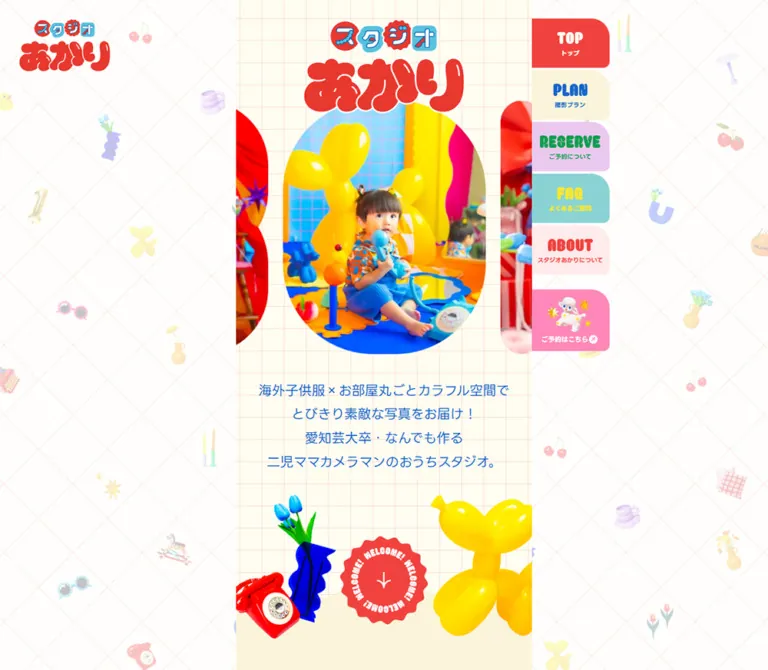
鮮やかな撮影小物と丸みのある文字が彩るフォトスタジオの公式サイト。細い中央カラム、パステルカラーの固定タブ、カプセル形の写真、スマートフォンの下部固定メニューが特徴。
オリジナルサイトを見るStudio AKARI — Style Reference
A narrow photographic scrapbook surrounded by pastel index tabs, glossy party props, and cheerful red lettering.
Website: studioakari.jp
Original URL: https://studioakari.jp/
Final URL: https://studioakari.jp/
Inspected: September 12, 2026; supplied retrieval timestamp 2026-09-12T07:42:52.280Z, equivalent to 16:42:52.280 JST.
Viewports: 1440 × 1000 desktop and 390 × 844 mobile, in CSS pixels.
Theme: light, with multiple section and action colors; no theme selector was evidenced.
Scope: the current official kids photography studio website, including its introduction, photography plans, sample photographs, booking guidance, FAQ, studio introduction, contact links, social links, and footer. Visual evidence consists of three desktop captures and two mobile captures, supplemented by rendered text, links, element rectangles, computed styles, and custom properties.
Studio AKARI combines saturated red, blue, and yellow objects with cream, blush, lavender, and aqua surfaces. The contrast is deliberate: photographs and large cutout props supply the excitement, while pale backgrounds and generously spaced Japanese text make the long service information approachable. Bulging logo lettering, rounded English labels, capsule-shaped photographs, and scalloped edges repeat the softness of balloons and children's toys.
The defining composition is a narrow central column. At the desktop viewport, the visible page occupies approximately 480px, with a small persistent logo at the far upper left and a vertical stack of colored navigation tabs attached to the column's right edge. On mobile, the column fills the screen and two compact controls remain at the bottom left. This is a complete studio website with substantial practical information and an album-access link for existing customers.
How to Read This Reference
- Measured means a value explicitly present in the supplied computed styles or element rectangles. Decimal values are retained where they explain the responsive system.
- Declared means a custom property exists in the supplied evidence. Its existence alone does not establish which visible element uses it.
- Visual estimate means an approximate dimension, shape, or appearance read from a supplied screenshot. These observations are not pixel-sampling results.
- Calculated means arithmetic applied to measured values. The responsive formulas below reproduce the two inspected sizes; they are not recovered source CSS.
- Recommended means guidance for a new implementation. The CSS, accessibility additions, and unverified interaction suggestions belong to this category.
The captures show selected portions of the page. The rendered text covers the full content sequence, but the detailed element sample ends partway through the desktop FAQ and near the beginning of the mobile About section. Unpictured surfaces and unexercised controls therefore have narrower evidence than the hero, desktop navigation, location-plan gallery, and footer.
Tokens — Colors
Default Palette
All hexadecimal values in this table are declared source values, normalized from eight-digit opaque hexadecimal notation. The role column distinguishes measured applications from visual associations.
| Name | Value | Implementation alias / source variable | Role and evidence |
|---|---|---|---|
| White | #ffffff |
--color-white / --s-color-0fbb256a |
Measured body background, reversed copy, and the sampled FAQ answer surface; visible amenity-tile fill |
| Warm Ivory | #fffdf2 |
--color-ivory / --s-color-569b9ad9 |
Measured desktop navigation captions on red and pink; visually consistent with the pale hero paper |
| Butter Cream | #faf4da |
--color-cream / --s-color-3f9e704a |
Measured PLAN tab fill; visually matches the plan introduction and inset location-plan panel |
| Soft Blush | #ffebeb |
--color-blush / --s-color-21a9b959 |
Measured ABOUT tab fill; visually matches the closing About/contact area |
| Coral Red | #f1423e |
--color-red / --s-color-95a86654 |
Measured TOP tab, ABOUT caption, and album text; visually echoed by the footer and display artwork |
| Clear Blue | #1665cc |
--color-blue / --s-color-a88e9a22 |
Measured introduction text, plan headings, prices, badges, and studio-plan navigation fill |
| Candy Pink | #ff87b9 |
--color-pink / --s-color-f1b7e4aa |
Measured reservation shortcut and location-plan navigation fill; visible surround of the location-plan panel |
| Aqua | #8ad3d4 |
--color-aqua / --s-color-3ab6f48a |
Measured FAQ tab and mobile MENU button fill |
| Lavender | #ebc8f0 |
--color-lavender / --s-color-ec88fc8a |
Measured RESERVE section-navigation tab fill |
| Section Green | #129e4e |
--color-green / --s-color-61a108ea |
Measured reservation-section caption and RESERVE tab caption |
| LINE Green | #06c755 |
--color-line / --s-color-cfbe6c92 |
Measured official LINE contact-button fill |
| Bright Yellow | #ffe730 |
--color-yellow / --s-color-6f95c99a |
Measured FAQ caption color on aqua |
| Lemon | #fffa70 |
--color-lemon / --s-color-e4834588 |
Measured online-album button and desktop album-tab fill |
| Body Gray | #4d4d4d |
--color-text / --s-color-9d809069 |
Measured explanatory paragraphs, plan descriptions, answers, and fine print |
Additional declared colors are #ffd7e8, #fff3f8, and #cccccc. Their specific visible applications are not established by the supplied element sample, so they should remain secondary reference values rather than mandatory additions.
Color Relationships
The page uses several distinct relationships instead of one universal button color:
- Plan information: blue headings and prices on cream, supported by pink or blue category controls.
- Section navigation: individual pastel fills paired with contrasting display labels.
- Booking destination: a large green LINE pill, plus a separate pink illustrated reservation shortcut.
- Existing-customer utility: coral text on a lemon album button.
- Closing identity: blush space above a coral footer, with yellow and orange props overlapping the boundary.
The yellow balloon dog and other photographic props contain their own highlights and color variation. Do not replace all yellow pixels in imagery with the FAQ text token.
Visual estimate: the background rules are very pale coral. A red line at approximately 15–20% opacity is a useful reconstruction starting point. Neither its exact color nor its opacity was supplied as a measured background declaration.
Tokens — Typography
LINE Seed JP — Japanese Text and Service Information
- Measured family:
"LINE Seed JP". - Measured weights:
400for introductory and explanatory copy;700for captions, plan names, prices, badges, and controls. - Character: friendly, clear Japanese sans-serif typography with enough weight contrast to organize dense pricing and booking information.
- Leading: generally
1.8for broad introductions and1.7for detailed paragraphs. - Tracking: predominantly normal. The desktop ABOUT navigation caption uses
-0.2px; the compact two-booth amenity label uses-0.06emat both inspected widths. - Recommended fallback:
"LINE Seed JP", sans-serif. The fallback is implementation guidance, not a recovered source stack.
The Times family recorded on the root and body is a browser-level default. The actual sampled Japanese content overrides it with LINE Seed JP. Likewise, the generic 32px style on the image-bearing H1 does not describe the visible logo lettering.
Rounded English Display Lettering
The visible PLAN, TOP, RESERVE, MENU, ABOUT, and FOLLOW ME! treatments use heavy, rounded lettering with narrow counters or white inset marks. The arched social heading and irregular Japanese logo are especially dependent on artwork.
The source declares Coiny, Gravitas One, and Syncopate font tokens. None of the supplied computed element records conclusively assigns these families to the distinctive visible English lettering. Preserve the lettering as supplied artwork when available; do not identify it as Coiny solely because that token exists.
Visual estimate: the desktop PLAN artwork occupies approximately 200 × 75px. This is an artwork footprint, not a measured font size.
Type Scale
Values below are measured. Each desktop/mobile pair refers to the same sampled role unless otherwise noted.
| Role | Desktop size / line height | Mobile size / line height | Weight |
|---|---|---|---|
| Section-navigation caption | 10 / 10px |
Dock caption: 10 / 14px |
700 |
| Illustrated utility-tab caption | 11 / 11px |
Reservation dock caption: 10 / 14px |
700 |
| Plan-category jump caption | 14.4 / 14.4px |
11.7 / 11.7px |
700 |
| Amenity label | 14.4 / 17.28px |
11.7 / 14.04px |
700 |
| Production/transport fine print | 14 / 16.8px |
12 / 14.4px |
400 |
| Add-on or surcharge line | 16.8 / 33.6px |
13.65 / 27.3px |
700 |
| Detailed body copy | 19.2 / 32.64px |
15.6 / 26.52px |
400 |
| Cut-count and duration badge text | 19.2 / 23.04px |
15.6 / 18.72px |
700 |
| Introductory copy | 21.6 / 38.88px |
17.55 / 31.59px |
400 |
| Japanese section caption | 21.6 / 30.24px |
17.55 / 24.57px |
700 |
| Booth-name strip | 24 / 33.6px |
19.5 / 27.3px |
700 |
| Plan price | 26.4 / 31.68px |
21.45 / 25.74px |
700 |
| Booking-method heading | 28.8 / 43.2px |
23.4 / 35.1px |
700 |
| Large pill label | 28.8 / 86.4px |
23.4 / 70.2px |
700 |
| Short-session plan name | 31.2 / 53.04px |
25.35 / 43.095px |
700 |
| Standard/premium plan name | 36 / 36px |
29.25 / 29.25px |
700 |
The large pill's line height provides vertical centering in the original. A reusable component should use flex alignment and a minimum height so wrapped or enlarged text remains usable.
Tokens — Spacing & Shapes
Responsive Unit
Many measured dimensions share the ratio 390 / 480 = 0.8125. For example, 21.6 × 0.8125 = 17.55, and 264 × 0.8125 = 214.5.
A useful calculated reconstruction model is:
/* Reconstruction model; not recovered source CSS. */
--column-width: min(100vw, 480px);
--u: min(1vw, 4.8px);
Under this model, introductory type is 4.5u, body type is 4u, price type is 5.5u, and major plan names are 7.5u. The conventional root font size can remain unchanged.
Not everything follows this unit. The 30px content padding inside the sampled FAQ answer, the 12px plan-jump gap, and the mobile dock's 64px height are independent measurements. Keep proportional sizing and fixed spacing separate.
Spacing Scale
| Use | Value | Evidence |
|---|---|---|
| Desktop tab separation | 4px |
Calculated from consecutive measured rectangles |
| Mobile dock separation | 4px |
Calculated from measured control positions |
| Category-to-plan-name separation | Approximately 4–8px |
Calculated from sampled text rectangles; varies by plan and viewport |
| Price trailing inset | 10px |
Measured right padding on price text |
| Two plan-jump controls | 12px gap |
Calculated at both viewports |
| Booking heading to paragraph | 16px |
Calculated from measured rectangles |
| Price row to plan description | Approximately 20px |
Calculated from desktop rectangles |
| Section caption to introduction | 28px |
Calculated at both viewports |
| FAQ answer inset | 30px |
Measured on the mobile studio-location answer link |
| Plan introduction to category jumps | 60px |
Calculated at both viewports |
| Final booking explanation to contact caption | 90px |
Calculated at both viewports |
Border Radius
| Element | Value or geometry | Evidence |
|---|---|---|
| Desktop section and utility tabs | 0 30px 10px 0 |
Measured |
| Mobile reservation/menu controls | 10px 30px 0 0 |
Measured |
| Plan-category jump controls | 30px |
Measured |
| LINE and album pills | 100px |
Measured |
| Sampled FAQ answer lower corners | 0 0 30px 30px |
Measured |
| Large gallery photograph | Vertical capsule with semicircular ends | Visual estimate |
| Gallery previews | Small portrait rectangles with varied rounded silhouettes | Visual observation |
| Amenity tiles | Approximately 10–12px corners |
Visual estimate |
| Welcome link | Scalloped circular seal | Visual observation; not an ordinary circular fill |
| Footer boundary | Repeating shallow wave | Visual observation |
The asymmetric tabs are a signature detail. Their straight attachment edge and larger upper-right curve give them the appearance of index tabs protruding from the page.
Layout Measurements
| Element | Desktop | Mobile | Status |
|---|---|---|---|
| Visible central page | Approximately 480px, from x≈480 to x≈960 |
390px, full viewport |
Desktop visual estimate; mobile corroborated by section rectangles |
| Main introductory text | 432px wide |
351px wide |
Measured |
| Inset plan description | 388.80px wide |
315.89px wide |
Measured |
| Sampled FAQ answer text | 372px wide |
291px wide |
Measured |
| Main H1 wrapper | 264 × 183.59px |
214.5 × 154.80px |
Measured; includes wrapper space |
| Upper-left logo link | 172.80 × 100.53px, at (30, 30) |
Not visible | Measured desktop rectangle and mobile capture |
| Welcome link | 144 × 144px |
117 × 117px |
Measured |
| Section-navigation tab | 126 × 80px |
Replaced by dock/menu arrangement | Measured desktop rectangle |
| Illustrated utility tab | 126 × 100px |
Album appears inline in the hero | Measured |
| Large contact pill | 384 × 86.39px |
Approximately 312–315.11 × 70.22px |
Desktop and reservation mobile measurements; closing mobile width estimated from capture |
| Plan-category jump | 210 × 111.98px |
169.5 × 98.75px |
Measured |
| Each mobile dock control | Not present | 122.05 × 64px |
Measured |
| Initial document height | 16828.625px |
15196.547px |
Measured |
The source's outer section wrappers span the viewport and often report transparent backgrounds. They are not measurements of the visible colored page strip. Reproduce the nested central surface rather than painting every 1440px section across the screen.
Components
Wallpaper and Central Page
Role: establish a playful environment while preserving a focused reading column.
The desktop margins contain a faint diagonal lattice and scattered miniature objects: cherries, flowers, candles, vases, cups, balloons, and small toys. Their low visual intensity allows the central content to remain dominant. The wallpaper composition stays visually consistent across the supplied desktop scroll captures.
The central hero uses a smaller upright square grid on pale ivory. Below it, broad colored surfaces carry the long content sequence. The plan introduction is cream; the pictured location plan has a cream inner panel with a pink surround; the closing About area is blush.
Visual estimates: the hero grid interval is approximately 36px on desktop and 31px on mobile. Parallel diagonal wallpaper lines intersect a horizontal scan at roughly 130px intervals. Exact pattern assets and repetition rules were not supplied.
A new implementation should keep decoration in a separate, noninteractive layer. Clip the photo track locally, while allowing selected props to overlap section boundaries.
Brand Marks
Role: repeat identity at entry, during desktop navigation, and at the page ending.
The main mark stacks a compact blue/red upper word above large, irregular red Japanese lettering. White edging separates parts of the mark from photographs and patterned paper. It is a composed graphic, not a conventional text heading.
The desktop upper-left logo links to #top and remains in the same apparent position across captures. The main centered H1 wrapper is 55% of the reconstructed column width at both inspected sizes. On mobile, the main logo overlaps the upper portion of the photograph strip.
The footer repeats a smaller logo with prominent white outlining against coral. Preserve the approved variants instead of recoloring one flattened image indiscriminately. The H1 extraction contains no text, but the supplied evidence does not include a complete accessibility tree; accessible naming cannot be determined from that fact alone.
Desktop Index Navigation
Role: provide persistent access to the major sections and two external utilities.
The stack begins at (960, 30) in the 1440px viewport. Five 80px section tabs are followed by two 100px illustrated utility tabs. All are 126px wide. Their left edges align with the visible column's right edge, so they appear attached to it.
| Visible label | Japanese caption | Fill / caption color | Recorded destination |
|---|---|---|---|
| TOP | トップ |
Coral / ivory | #top |
| PLAN | 撮影プラン |
Cream / blue | #plan |
| RESERVE | ご予約について |
Lavender / section green | #reserve |
| FAQ | よくあるご質問 |
Aqua / bright yellow | #faq |
| ABOUT | スタジオあかりについて |
Blush / coral | #about |
| Illustrated reservation shortcut | ご予約はこちら |
Pink / ivory | Official LINE link |
| Illustrated album shortcut | オンラインアルバム |
Lemon / coral | Online album link |
Each section tab places rounded English lettering above a small Japanese caption. The measured tab padding is 22px 2px 0 0. Utility tabs use 10px 0 0 padding and a colorful object illustration above their caption. The reservation utility begins 20px after the preceding tab; other neighboring tabs are separated by 4px.
Persistence is visually supported by the scroll captures. The exact source positioning property, hover response, and scroll-based active state were not recorded.
Mobile Bottom Dock
Role: retain booking and navigation access without consuming the top of the phone screen.
Two controls sit at the bottom left, leaving the right portion of the viewport open. At 390 × 844, the reservation link begins at x=6 and the menu button at x≈132.05; both begin at y=780 and are 64px high.
The reservation control is pink and the menu control aqua. Each has rounded English artwork above a 10px Japanese caption. A fine light outline is visible around the shapes. The measured radii are 10px 30px 0 0, echoing the desktop tabs in a bottom-attached orientation.
サイトメニュー is a real button in the rendered DOM; ご予約はこちら is a link to LINE. The menu's open state, contents, transition, dismissal behavior, and focus handling were not supplied. The two screenshots support persistent dock placement, not a particular menu-overlay design.
Introductory Hero
Role: communicate the studio's photographic character and introduce its personal service.
The desktop capture shows the centered brand, four centered lines of blue introduction copy, and a decorative cluster surrounding a scalloped welcome link. A red rotary telephone and blue vase with tulips occupy the left of the cluster; a large yellow balloon dog occupies the right. The welcome seal links to #plan.
The mobile capture adds a prominent portrait photo strip between the brand and introduction. The central photograph shows a child among saturated studio props, with partial neighboring photographs visible at both edges. Its frame is approximately 266 × 332px, a visual estimate close to a 4:5 capsule. The logo overlaps the upper edge of the image area.
The mobile introduction begins at y≈506.80, compared with y≈203.59 on desktop. A coral utility caption and lemon オンラインアルバム pill follow the mobile introduction. The album pill measures 312 × 70.22px and begins at y≈694.30.
The desktop capture does not show that photographic strip or inline album pill between its logo and copy. The evidence establishes the different captured compositions; it does not establish whether the photograph difference is caused by a breakpoint rule, media state, or another rendering condition.
Section Heading and Plan Jumps
Role: punctuate the long page and provide direct routes into the plan families.
The pictured PLAN heading is large blue rounded artwork above the Japanese caption 撮影プラン. A centered three-line paragraph follows after a measured 28px gap. Its 1.8 line height keeps the narrow column relaxed.
Two category links follow in one row: スタジオ撮影 on blue and ロケーション撮影 on pink. Each has a 30px radius. The pair retains a 12px gap on desktop and mobile, with widths calculated as half the available inner width after subtracting the gap.
Their destinations are #studio_plan and #location_plan. They are links to sections of the same document. The supplied evidence does not show tab panels replacing one another when these category controls are activated.
Photography Plan Panel
Role: present an offer through a compact information header, an expressive sample photograph, and practical inclusions.
The pictured location premium plan uses this sequence:
- Small blue category label.
- Bold blue plan name.
- Blue price followed by a joined cut-count/duration badge.
- Centered gray description with 1.7 line height.
- Large capsule photograph.
- Five small photograph previews.
- A compact grid of inclusion icons and labels.
- Add-on costs and conditions farther down the document.
The cream panel is inset within a pink field. Its information stays centered instead of spreading into a desktop pricing grid. A cropped toy typewriter overlaps the upper-left area in the supplied mid-page capture.
Representative captured content includes スタンダードプラン, 29,000円, 80cut, and 90分, or プレミアムプラン, 38,000円〜, 120cut, and 120分. The shorter session options use a smaller 31.2px desktop plan-name size. Keep plan content editable while preserving the hierarchy.
Price and Specification Badge
Role: keep cost, delivered image count, and session duration immediately adjacent.
The price is bold blue at 26.4px on desktop and 21.45px on mobile, with 10px trailing padding. The neighboring specification unit has a blue filled left segment with white cut-count text and a light right segment with blue duration text. A blue outline visually joins them.
The badge text is 19.2px on desktop and 15.6px on mobile. Its rounded outline is visible, but the exact badge border width and corner radius were not included in the sampled wrapper styles. An approximately 2px border and 10–12px radius are reasonable reconstruction values.
This unit communicates specifications; it should not acquire button behavior merely because its shape resembles a control.
Capsule Gallery and Previews
Role: show the atmosphere of a plan through a large image and a compact selection of examples.
In the desktop location-plan capture, the large frame is approximately 346 × 431px. The photograph includes a colorful Ferris wheel above children near the bottom, so the framing preserves environmental context as well as the subjects. Five portrait previews beneath it are approximately 60–64px wide and 75–80px tall, with small even gaps.
The previews echo the main image's rounded silhouette, with some variation in corner treatment. The first preview corresponds visually to the displayed large image.
The preview row and a tab-related styling fragment in the DOM suggest an image-selection implementation. No preview activation was supplied. Selection timing, keyboard behavior, swipe support, autoplay, and the exact selected-state treatment remain unverified.
For a new implementation, use buttons if the previews change the main image, expose the selected state, and preserve the frame dimensions while images decode.
Amenity Tiles
Role: summarize inclusions and permissions without long paragraphs.
Small white tiles combine blue outline illustrations with two short lines of bold blue Japanese text. The pictured location plan shows clothing, two houses, and a camera in its first row. Other recorded labels cover bubbles, cake, and pets.
Visual estimate: desktop tiles are approximately 90 × 120px, with about 10px between them. The label itself measures approximately 81.42px wide in the detailed desktop sample and 64.64px on mobile.
The location arrangement uses three columns. The studio sample's label positions establish a four-item row followed by three centered items. Preserve that content-dependent grouping rather than assuming one universal three-column grid.
Use consistent blue stroke weight and simple recognizable forms. These tiles are service information; their clickability was not evidenced.
Booking Guidance and Contact Pill
Role: explain how reservations differ by plan before directing visitors to LINE.
The booking section contains a centered introduction, a schedule-example label, and three vertically arranged methods. Each method pairs a bold blue heading with a smaller duration and a regular gray paragraph. Detailed text widths measure 372px on desktop and 294.5px on mobile, indicating a further inset inside the broader section content.
The method heading is 28.8px on desktop and 23.4px on mobile. The following paragraph begins after a measured 16px gap. The premium method contains a longer set of instructions and therefore needs natural height rather than a fixed card height.
The contact block stacks ご予約・お問い合わせ above a wide green 公式LINEはこちら pill. The source booking-section caption is white; the closing contact caption appears green in the screenshots. Preserve that contextual difference. The main button uses a 100px radius, white 700-weight type, and the measured green #06c755.
The recorded link is https://line.me/R/ti/p/@105vqttw. The external booking form and its subsequent flow were not inspected.
FAQ Question and Answer
Role: provide practical reassurance about payment, cancellation, delivery, photo selection, snacks, and studio location.
All six answers appear in the rendered page text. Sampled answer rectangles have nonzero heights; no evidence establishes collapsed accordion behavior. Questions use bold white text, and answers use regular gray text with 1.7 leading.
The mobile studio-location answer is explicitly measured as a white 351px-wide link with 30px padding and 0 0 30px 30px radii. Its inner text width is 291px. It links to #about_studio.
The enclosing question-surface fill was not recorded. The FAQ navigation tab's aqua fill does not prove that every FAQ question bar or the full section uses aqua. In a new implementation, a blue question bar is a compatible recommendation, but it must not be described as a measured original-page value.
About, Social Links, and Footer
Role: connect the studio's personal identity with a clear closing contact point.
The rendered About content identifies あかりちゃん as the studio organizer and photographer. This is a service-provider introduction, not a website-production credit. It is followed by studio-access information, event information, and another LINE contact block.
The closing screenshots show a strip of small colorful portraits above centered gray event copy on blush. After the green contact pill, a broad interval of empty blush separates the contact action from an arched coral FOLLOW ME! graphic. Three recognizable social marks sit in one centered row: LINE, Instagram, and X.
Visual estimates: the desktop icons are approximately 57px square with 18px gaps; mobile icons are approximately 42px square with 19–20px gaps. Their native brand treatments remain visible, including Instagram's gradient and X's black square.
The footer begins with a shallow repeating wave. A yellow/orange jug with a flower and two twisted candles protrude above the coral surface on the left. The outlined studio logo and ©studio AKARI sit on the right. The mobile dock overlaps the lower-left footer area in the supplied capture; a new implementation should reserve enough final scroll clearance to reach all content.
Tokens — Motion & Interaction
| Treatment | Evidence | What can be concluded |
|---|---|---|
| General element transitions | Repeated computed 0.3s cubic-bezier(0.4, 0.4, 0, 1) declarations |
A shared transition timing exists; the specific property changes and triggers were not exercised |
| Body background transition | Measured background 0.5s cubic-bezier(0.4, 0.4, 0, 1) |
A background transition is defined; no theme-switching interaction is established |
| Booth-name loop structure | Repeated booth labels, offscreen duplicates, and a loop-box styling rule |
Consistent with looping content; direction, duration, and playback behavior are unverified |
| Mobile photo strip | Central portrait with neighboring images clipped at both sides | A horizontal track composition is visible; autoplay and swiping are unverified |
| Plan gallery previews | Five image previews and tab-related DOM styling | Selection is suggested; its behavior was not tested |
| Section links | Recorded fragment destinations | In-page navigation is available; smooth-scroll timing and landing offsets were not tested |
| Desktop navigation and mobile dock | Same apparent viewport positions across scroll captures | Persistent visual placement is supported |
| Mobile menu | Rendered BUTTON labeled サイトメニュー |
A menu trigger exists; the open state is unknown |
| Welcome seal and decorative props | Static supplied captures | Rotation, floating, bouncing, and parallax must not be assumed |
Most sampled elements report animation: none. This does not establish a motionless page: animation may live on ancestors, pseudo-elements, images, or script-controlled elements outside the sample.
The capture process waited at least five seconds initially and checked finite animation, layout, text, and visible-image readiness within bounded time limits. Perpetual animations were paused during readiness checks and resumed afterward. These checks reduce transient capture artifacts, but they do not establish every delayed state or interaction.
Recommended motion: retain the measured 300ms easing for modest control feedback. If a gallery or looping strip is implemented, provide a static reduced-motion state and explicit controls where motion affects access to content. Do not invent a continuous floating animation for every prop.
Surfaces
| Layer | Appearance | Evidence and implementation implication |
|---|---|---|
| Desktop environment | White field, pale diagonal rules, faded object collage | Visible in all desktop captures; keep it subordinate to the content |
| Hero paper | Pale ivory with a small upright grid | Visible; exact pattern implementation unavailable |
| Plan introduction | Cream central strip | Visible in desktop opening capture |
| Location plan | Cream inset panel within pink | Visible in the desktop plan capture |
| Contact ending | Blush with gray copy and green action | Visible on desktop and mobile |
| Amenity tile | White with blue outline artwork and blue labels | Visible; no general elevation treatment |
| FAQ answer | White with rounded lower corners | Measured on the mobile studio-location answer |
| Footer | Coral, scalloped upper edge, overlapping props | Visible on desktop and mobile |
| Navigation tab | Flat, individually colored, asymmetrically rounded | Measured and visible |
No general card-shadow or glass-blur system is visible in the supplied captures. Depth comes from photographed objects, image overlap, and shaped boundaries. Natural highlights on glossy props should remain distinct from interface elevation.
Imagery
The photographs are central to the studio's identity. They show children in vivid, carefully arranged environments: blue and yellow furniture, red props, colorful clothing, balloons, and outdoor scenes with strong environmental color. The site carries those same objects into its decoration, making the interface feel connected to the photographic sets.
Three image scales work together:
- Large photographs: capsule crops for the mobile introduction and plan examples.
- Medium cutout props: a telephone, sculptural vase, balloon dog, toy typewriter, flower jug, and candles overlapping the content.
- Small background objects: faint, widely separated motifs in the desktop margins.
Keep photography crisp and full color. Use object-fit: cover with subject-specific focal positions for capsule crops, and object-fit: contain for isolated props. Preserve transparency around cutouts. The evidence does not establish whether an individual decorative asset is a photograph, a rendered image, or a composite; it does not show live 3D rendering.
Observed Asset References
The supplied extract contains partial asset-host references but no complete, dependable image-file inventory. The entries below identify observed artwork and placement without inventing filenames.
| Asset | Observed placement | Reuse guidance |
|---|---|---|
| Main studio logo | Centered hero H1 and desktop upper-left link | Use an approved graphic with an accessible name |
| Footer logo variant | Lower-right coral footer | Preserve white outlining |
| Rounded English lettering | Desktop tabs, PLAN heading, mobile dock | Preserve artwork proportions; font assignment remains unverified |
| Arched FOLLOW ME artwork | Above social icons | Use the curved composition rather than a straight text line |
| Welcome seal | Between introduction and plans | Keep the scalloped perimeter and central directional motif |
| Child portrait strip | Mobile hero | Preserve capsule framing and side previews |
| Outdoor plan photography | Large location-plan image and five previews | Keep the relationship between subject and colorful surroundings |
| Telephone, vase, tulips, balloon dog | Introduction-to-plan transition | Use separate transparent layers where available |
| Toy typewriter | Upper-left overlap in the location-plan capture | Preserve the cropped, oversized prop treatment |
| Clothing, houses, camera, and other amenity symbols | Plan inclusion tiles | Use matching blue outline artwork |
| Jug, flower, and twisted candles | Footer overlap | Anchor the composition to the footer boundary |
| LINE, Instagram, and X marks | Closing social row | Retain recognizable brand treatments and explicit link names |
Use authorized original assets when available. CSS can reproduce the surfaces and masks, but the studio's photographs and lettering carry much of the visual identity.
Layout & Responsive Behavior
Desktop
At 1440 × 1000, the central content remains approximately 480px wide. Its center aligns with the viewport center at x=720. The tab stack begins at x=960, directly against the content edge, while the small logo sits independently at x=30.
Text columns are nested: 432px for section introductions, approximately 388.8px for plan descriptions, and 372px for detailed FAQ or booking text. The wide outer margins remain decorative throughout the long scroll. Plans continue as vertically arranged content rather than expanding into several desktop columns.
Mobile
At 390 × 844, the visible column fills the viewport and the desktop wallpaper margins disappear. Most broad copy uses 351px, equivalent to 90% of the viewport. Main logo width, type sizes, and the welcome-link dimensions scale in step with the narrower column.
The desktop tab stack and detached logo are absent. The pink reservation link and aqua menu button stay at the lower left. The album utility becomes a prominent inline hero action.
The mobile hero is taller: its measured section height is 1022.25px, compared with 641.42px on desktop. Consequently, the mobile opening viewport shows the brand, photography, introduction, album action, and dock, while the desktop opening capture already includes the PLAN heading and introductory plan copy.
Reconstruction Rules and Limits
A centered min(100%, 480px) page, 90% introduction width, 81% plan-copy width, and 80% primary-action width closely reproduce the main observed proportions. These are calculated relationships, not verified source selectors.
There are local exceptions. The mobile reservation introduction is 354.5px wide, and its LINE button is 315.11px wide. The hero album button is exactly 312px wide. Do not force every section into a single percentage when matching the original closely.
The supplied stylesheet fragment explicitly contains an 840px breakpoint for conditional line breaks. It does not establish the breakpoint for replacing desktop navigation. The Quick Start uses 960px as a recommended chrome-switch threshold to provide room for the detached logo and right-hand tabs. Intermediate widths, landscape phones, zoomed layouts, and safe-area behavior were not captured.
Do’s and Don’ts
Do
- Keep the narrow central composition and generous decorative desktop margins.
- Pair saturated photographs and props with pale cream and blush reading surfaces.
- Preserve the exact measured blue, coral, pink, aqua, and lemon interface colors.
- Use LINE Seed JP for the sampled Japanese content roles, with regular body copy and bold service labels.
- Retain asymmetric navigation-tab corners and the two-control mobile dock.
- Keep cost, image count, and duration together in each plan header.
- Use capsule photographs, small portrait previews, and compact blue amenity illustrations.
- Preserve the distinction between pink reservation shortcuts, green LINE contact pills, and lemon album access.
- Let selected large props overlap transitions while maintaining readable copy.
- Give long booking explanations and FAQ answers natural content height.
Don't
- Don't widen the central content merely to fill a desktop viewport.
- Don't replace the illustrated tabs with an unrelated full-width navigation bar.
- Don't identify the rounded artwork lettering with an unverified font family.
- Don't turn plan-information badges or amenity tiles into unexplained controls.
- Don't assume the FAQ is collapsed or the photo strips autoplay.
- Don't apply the navigation tab's fill to an entire unpictured section without evidence.
- Don't add shadows, blur, or gradients to every interface surface.
- Don't fade the primary photography to match the deliberately faint wallpaper props.
- Don't crop faces, hands, or meaningful set details carelessly inside the rounded masks.
- Don't make decorative assets intercept the mobile dock or obscure essential text.
Recommended Implementation Additions
These are recommendations for a new implementation, not verified existing features:
- Give the image-based brand, welcome link, social icons, and artwork-led controls explicit accessible names.
- Keep native links for section navigation and external destinations. Use buttons for gallery selection and menu disclosure.
- If the menu opens a modal panel, implement focus placement, Escape dismissal, focus return, and an exposed expanded state.
- Preserve visible answers unless an accordion is intentionally implemented with appropriate semantics.
- Review small-text contrast, especially yellow on aqua and white on pink. Strengthen essential captions while retaining the palette in larger artwork or surfaces.
- Consider a 16px minimum for detailed mobile body text and a larger minimum for fine print. The measured body size at 390px is 15.6px, and some labels are 11.7px.
- Add bottom safe-area support and sufficient final scroll clearance for the persistent dock.
- Supply image dimensions, prioritize the initial mobile photograph, and lazy-load later gallery photographs without collapsing their frames.
- Provide reduced-motion alternatives for any implemented loop or automatic gallery advance.
Agent Prompt Guide
Quick Color Reference
- Desktop environment: white with very pale coral rules and faded object motifs.
- Hero paper: ivory
#fffdf2with a fine square grid. - Plan reading surface: cream
#faf4dawith blue#1665ccheadings and gray#4d4d4dparagraphs. - Decorative emphasis: coral
#f1423e, pink#ff87b9, and bright photographic yellows. - Section tabs: cream, lavender
#ebc8f0, aqua#8ad3d4, and blush#ffebeb. - Booking: LINE green
#06c755with white text. - Album access: lemon
#fffa70with coral text. - Closing surface: blush above a coral scalloped footer.
Overall Prompt
“Create a complete Japanese kids photography studio website inspired by Studio AKARI's current visual system. Use a centered column approximately 480px wide on desktop, full width on a 390px phone, with pale decorative wallpaper in the desktop margins. Combine cream and blush reading surfaces with saturated blue, coral, pink, and yellow photographs and glossy cutout party props. Use LINE Seed JP for Japanese body text and approved rounded display artwork for major English labels. Attach seven colorful asymmetric tabs to the right edge on desktop. On mobile, use compact pink reservation and aqua menu controls at the bottom left. Present plans vertically with centered names, prices, joined cut-count/duration badges, capsule photographs, five small previews, and blue outline amenity tiles. Include booking guidance, visible FAQ answers, a personal studio introduction, green LINE contact pills, social icons, and a scalloped coral footer. Preserve evidence limits: menu opening, gallery selection, autoplay, and decorative motion require separate implementation decisions.”
Example Component Prompts
- Desktop navigation: “Build a persistent tab stack attached to the right edge of a 480px centered page. Use 126 × 80px section tabs, 4px gaps, and
0 30px 10px 0radii. Place rounded English artwork above 10px Japanese captions. Add pink and lemon illustrated utility tabs at 100px height.” - Mobile introduction: “At 390px width, center a 214.5px-wide studio-brand wrapper above an approximately 266 × 332px capsule photograph, with neighboring photographs peeking at the sides. Follow with blue 17.55px copy at 1.8 leading and a 312 × 70px lemon album pill with coral text. Preserve natural vertical scrolling.”
- Plan panel: “Create a cream photography-plan panel within a pink field. Center a small category label, a bold blue 36px plan name, a 26.4px price, and a two-part cut-count/duration badge. Add gray 19.2px copy at 1.7 leading, a 4:5 capsule image, five portrait previews, and three columns of compact white amenity tiles.”
- Mobile dock: “Place two approximately 122 × 64px controls at the bottom left with a 6px outer inset and 4px gap. Use pink for reservation and aqua for menu, light outlines, and
10px 30px 0 0radii. Keep the remainder of the viewport visually open and support bottom safe areas.” - Contact ending: “On blush, center a green LINE pill beneath short gray copy. Leave generous space before an arched coral FOLLOW ME graphic and a row of LINE, Instagram, and X marks. Finish with a shallow-wave coral footer, a flower jug and twisted candles overlapping its left edge, and the outlined logo at right.”
Quick Start
CSS Custom Properties
This is an unexecuted adaptation, not extracted source code. Palette values and the primary type ratios follow supplied measurements. Wallpaper construction, gallery masks, spacing between unsampled wrappers, hover feedback, and the 960px chrome breakpoint are recommendations.
Place .desktop-brand, .desktop-tabs, and .mobile-dock outside .akari-page. Put the document sections inside .akari-page. Artwork classes expect authorized image assets supplied by the implementation. The CSS does not provide menu state, gallery selection, or automatic motion.
:root {
  /* Measured source palette, expressed through semantic aliases. */
  --color-white: #ffffff;
  --color-ivory: #fffdf2;
  --color-cream: #faf4da;
  --color-blush: #ffebeb;
  --color-red: #f1423e;
  --color-blue: #1665cc;
  --color-pink: #ff87b9;
  --color-aqua: #8ad3d4;
  --color-lavender: #ebc8f0;
  --color-green: #129e4e;
  --color-line: #06c755;
  --color-yellow: #ffe730;
  --color-lemon: #fffa70;
  --color-text: #4d4d4d;

  /* Reconstructed proportional unit; retain a normal root font size. */
  --column-max: 480px;
  --u: min(1vw, 4.8px);
  --font-body: 'LINE Seed JP', sans-serif;
  --text-small: calc(3 * var(--u));
  --text-note: calc(3.5 * var(--u));
  --text-body: calc(4 * var(--u));
  --text-lead: calc(4.5 * var(--u));
  --text-price: calc(5.5 * var(--u));
  --text-action: calc(6 * var(--u));
  --text-plan-compact: calc(6.5 * var(--u));
  --text-plan: calc(7.5 * var(--u));
  --leading-body: 1.7;
  --leading-lead: 1.8;

  --radius-tab: 0 30px 10px 0;
  --radius-dock: 10px 30px 0 0;
  --radius-panel: 30px;
  --radius-pill: 100px;
  --tab-width: 126px;
  --dock-height: 64px;
  --safe-bottom: env(safe-area-inset-bottom, 0px);

  /* Measured timing; assigned feedback below is recommended. */
  --motion-ui: 300ms cubic-bezier(0.4, 0.4, 0, 1);

  /* Estimated pattern values. */
  --grid-line: rgb(241 66 62 / 16%);
  --hero-grid: 31px;
}

* { box-sizing: border-box; }

body {
  margin: 0;
  color: var(--color-text);
  background: var(--color-white);
  font-family: var(--font-body);
}

button, input { font: inherit; }
img { display: block; max-inline-size: 100%; }

.akari-page {
  position: relative;
  inline-size: min(100%, var(--column-max));
  margin-inline: auto;
  background: var(--color-ivory);
  font-size: var(--text-body);
  line-height: var(--leading-body);
  isolation: isolate;
}

.akari-page section[id] { scroll-margin-top: 24px; }

.section-inner {
  inline-size: 90%;
  margin-inline: auto;
}

.hero {
  position: relative;
  padding-block-end: 20px;
  background-color: var(--color-ivory);
  background-image:
    linear-gradient(var(--grid-line) 1px, transparent 1px),
    linear-gradient(90deg, var(--grid-line) 1px, transparent 1px);
  background-size: var(--hero-grid) var(--hero-grid);
}

.hero-brand {
  position: relative;
  z-index: 2;
  inline-size: 55%;
  margin: 0 auto;
  padding-block-start: 30px;
}

.hero-brand img { inline-size: 100%; }

/* Static reconstruction of the pictured mobile photo strip. */
.hero-gallery {
  margin-block-start: -20px;
  overflow: hidden;
}

.hero-track {
  display: flex;
  align-items: center;
  gap: 24px;
  inline-size: max-content;
  margin-inline-start: 50%;
  transform: translateX(-50%);
}

.hero-photo {
  flex: 0 0 auto;
  inline-size: min(68.2vw, 327.36px);
  aspect-ratio: 4 / 5;
  border-radius: 999px;
  object-fit: cover;
  object-position: var(--photo-position, 50% 50%);
}

.hero-copy {
  inline-size: 90%;
  margin: 40px auto 0;
  color: var(--color-blue);
  font-size: var(--text-lead);
  font-weight: 400;
  line-height: var(--leading-lead);
  text-align: center;
}

.contact-block {
  inline-size: 80%;
  margin-inline: auto;
  text-align: center;
}

.hero-album { margin-block-start: 30px; }

.contact-caption {
  margin: 0;
  color: var(--color-line);
  font-size: var(--text-body);
  font-weight: 700;
  line-height: 2;
}

.hero-album .contact-caption { color: var(--color-red); }
.contact-caption--reversed { color: var(--color-white); }

.pill {
  display: flex;
  align-items: center;
  justify-content: center;
  min-block-size: calc(18 * var(--u));
  padding: 12px 16px;
  border-radius: var(--radius-pill);
  color: var(--color-white);
  background: var(--color-line);
  font-size: var(--text-action);
  font-weight: 700;
  line-height: 1.4;
  text-decoration: none;
  transition: opacity var(--motion-ui);
}

.pill--album {
  color: var(--color-red);
  background: var(--color-lemon);
}

.welcome-link {
  display: block;
  inline-size: 30%;
  aspect-ratio: 1;
  margin: 120px auto 0;
}

.welcome-link img {
  inline-size: 100%;
  block-size: 100%;
  object-fit: contain;
}

/* Attach individual authorized cutouts to a positioned section. */
.decorative-prop {
  position: absolute;
  z-index: 1;
  pointer-events: none;
  object-fit: contain;
}

.plan-overview {
  padding-block-start: 40px;
  background: var(--color-cream);
}

.section-heading { text-align: center; }

.section-heading-art {
  inline-size: var(--heading-art-width, 70%);
  margin: 0 auto 16px;
  object-fit: contain;
}

.section-heading--plan { --heading-art-width: 42%; }

.section-caption {
  margin: 0;
  color: var(--section-ink, var(--color-blue));
  font-size: var(--text-lead);
  font-weight: 700;
  line-height: 1.4;
}

.section-intro {
  margin: 28px 0 60px;
  font-size: var(--text-lead);
  line-height: var(--leading-lead);
  text-align: center;
}

.plan-jumps {
  display: grid;
  grid-template-columns: repeat(2, minmax(0, 1fr));
  gap: 12px;
}

.plan-jump {
  display: flex;
  flex-direction: column;
  align-items: center;
  justify-content: center;
  gap: 2px;
  min-block-size: 99px;
  padding: 15px 8px 12px;
  border-radius: 30px;
  color: var(--color-pink);
  background: var(--color-blue);
  text-decoration: none;
}

.plan-jump--location {
  color: var(--color-blue);
  background: var(--color-pink);
}

.plan-jump-caption {
  font-size: var(--text-small);
  font-weight: 700;
  line-height: 1;
}

/* Reconstructs the pictured location-plan surface. */
.location-plans {
  padding-block: 80px;
  background: var(--color-pink);
}

.plan-panel {
  position: relative;
  inline-size: 90%;
  margin-inline: auto;
  padding-block: 40px;
  background: var(--color-cream);
  text-align: center;
}

.plan-panel + .plan-panel { margin-block-start: 80px; }

.plan-category {
  margin: 0 0 6px;
  color: var(--color-blue);
  font-size: var(--text-body);
  font-weight: 700;
  line-height: 1.2;
}

.plan-name {
  margin: 0;
  color: var(--color-blue);
  font-size: var(--text-plan);
  font-weight: 700;
  line-height: 1.15;
}

.plan-name--compact { font-size: var(--text-plan-compact); }

.price-row {
  display: flex;
  flex-wrap: wrap;
  align-items: center;
  justify-content: center;
  row-gap: 8px;
  margin-block-start: 10px;
  color: var(--color-blue);
  font-weight: 700;
}

.price {
  padding-inline-end: 10px;
  font-size: var(--text-price);
  line-height: 1.2;
  white-space: nowrap;
}

.spec-badge {
  display: inline-flex;
  overflow: hidden;
  border: 2px solid var(--color-blue);
  border-radius: 11px;
  font-size: var(--text-body);
  line-height: 1.2;
  white-space: nowrap;
}

.spec-badge > span { padding: 2px 6px; }
.spec-badge > span:first-child {
  color: var(--color-white);
  background: var(--color-blue);
}

.spec-badge > span:last-child { background: var(--color-white); }

.plan-copy {
  inline-size: 90%;
  margin: 20px auto 32px;
  font-size: var(--text-body);
  line-height: var(--leading-body);
}

.plan-gallery {
  inline-size: 80%;
  margin-inline: auto;
}

.gallery-main {
  inline-size: 100%;
  aspect-ratio: 4 / 5;
  border-radius: 999px;
  object-fit: cover;
  object-position: var(--photo-position, 50% 50%);
}

.gallery-previews {
  display: grid;
  grid-template-columns: repeat(5, minmax(0, 1fr));
  gap: 8px;
  margin-block-start: 12px;
}

/* Use buttons here only when image-selection behavior is implemented. */
.gallery-preview {
  min-inline-size: 0;
  padding: 0;
  border: 0;
  border-radius: 16px;
  background: transparent;
}

.gallery-preview img {
  inline-size: 100%;
  aspect-ratio: 4 / 5;
  border-radius: inherit;
  object-fit: cover;
}

.amenities {
  display: flex;
  flex-wrap: wrap;
  justify-content: center;
  gap: 10px;
  inline-size: 90%;
  margin: 48px auto 0;
  padding: 0;
  list-style: none;
}

.amenity {
  flex: 0 0 calc((100% - 30px) / 4);
  min-inline-size: 0;
  padding: 6px 4px;
  border-radius: 11px;
  color: var(--color-blue);
  background: var(--color-white);
  font-size: var(--text-small);
  font-weight: 700;
  line-height: 1.2;
}

.amenity img {
  inline-size: 100%;
  aspect-ratio: 1;
  margin-block-end: 6px;
  object-fit: contain;
}

.amenities--location { inline-size: 68%; }
.amenities--location .amenity {
  flex-basis: calc((100% - 20px) / 3);
}

.booking-method { padding: 30px; }
.booking-method h3 {
  margin: 0 0 16px;
  color: var(--color-blue);
  font-size: var(--text-action);
  line-height: 1.5;
}
.booking-method p { margin: 0; }

.faq-item + .faq-item { margin-block-start: 20px; }

/* Recommended question fill; original wrapper fill was not sampled. */
.faq-question {
  margin: 0;
  padding: 30px;
  border-radius: 30px 30px 0 0;
  color: var(--color-white);
  background: var(--color-blue);
  font-size: var(--text-body);
  line-height: 1.4;
}

.faq-answer {
  display: block;
  margin: 0;
  padding: 30px;
  border-radius: 0 0 30px 30px;
  color: var(--color-text);
  background: var(--color-white);
  line-height: var(--leading-body);
}

.about-ending {
  padding-block: 40px 150px;
  background: var(--color-blush);
  text-align: center;
}

.follow-art {
  inline-size: 52%;
  margin: 120px auto 24px;
}

.social-links {
  display: flex;
  justify-content: center;
  gap: 20px;
}

.social-links a {
  display: grid;
  place-items: center;
  min-inline-size: 44px;
  min-block-size: 44px;
}

.social-links img {
  inline-size: 42px;
  block-size: 42px;
  object-fit: contain;
}

.studio-footer {
  position: relative;
  min-block-size: 140px;
  padding: 24px 5% calc(20px + var(--dock-height) + var(--safe-bottom));
  color: var(--color-white);
  background: var(--color-red);
}

/* Recommended CSS approximation of the shallow scalloped boundary. */
.studio-footer::before {
  content: '';
  position: absolute;
  inset: -16px 0 auto;
  block-size: 16px;
  background:
    url('data:image/svg+xml,%3Csvg xmlns=%22http://www.w3.org/2000/svg%22 width=%2252%22 height=%2216%22 viewBox=%220 0 52 16%22%3E%3Cpath fill=%22%23f1423e%22 d=%22M0 8 Q13 -8 26 8 T52 8 V16 H0Z%22/%3E%3C/svg%3E')
    0 0 / 52px 16px repeat-x;
}

.footer-brand {
  inline-size: 28%;
  margin-inline-start: auto;
}

.desktop-brand, .desktop-tabs { display: none; }

.mobile-dock {
  position: fixed;
  z-index: 30;
  inset-inline-start: 6px;
  inset-block-end: 0;
  display: grid;
  grid-template-columns: repeat(2, minmax(0, 1fr));
  gap: 4px;
  inline-size: min(calc(100% - 12px), 248.1px);
  pointer-events: none;
}

.dock-control {
  display: flex;
  flex-direction: column;
  align-items: center;
  justify-content: flex-start;
  min-block-size: calc(var(--dock-height) + var(--safe-bottom));
  padding: 14px 4px calc(8px + var(--safe-bottom));
  border: 1px solid var(--color-white);
  border-radius: var(--radius-dock);
  color: var(--color-white);
  background: var(--color-pink);
  text-decoration: none;
  pointer-events: auto;
}

.dock-control--menu { background: var(--color-aqua); }
.dock-art { block-size: 20px; object-fit: contain; }
.dock-caption {
  margin-block-start: 5px;
  font-size: 10px;
  font-weight: 700;
  line-height: 14px;
}

/* Recommended breakpoint; only text wrapping at 840px was evidenced. */
@media (min-width: 960px) {
  :root { --hero-grid: 36px; }

  body {
    background-image:
      repeating-linear-gradient(
        45deg, transparent 0 91px, var(--grid-line) 91px 92px
      ),
      repeating-linear-gradient(
        -45deg, transparent 0 91px, var(--grid-line) 91px 92px
      );
    background-attachment: fixed;
  }

  /* Matches the captured desktop state; not a verified source rule. */
  .hero-gallery, .hero-album { display: none; }
  .hero-copy { margin-block-start: 20px; }
  .welcome-link { margin-block-start: 100px; }
  .plan-jump { min-block-size: 112px; }
  .mobile-dock { display: none; }

  .desktop-brand {
    position: fixed;
    z-index: 20;
    inset: 30px auto auto 30px;
    display: block;
    inline-size: 172.8px;
  }

  .desktop-tabs {
    position: fixed;
    z-index: 20;
    inset-block-start: 30px;
    inset-inline-start: calc(50% + 240px);
    display: flex;
    flex-direction: column;
    gap: 4px;
    inline-size: var(--tab-width);
    max-block-size: calc(100dvh - 60px);
    overflow-y: auto;
  }

  .nav-tab {
    display: flex;
    flex: 0 0 80px;
    flex-direction: column;
    align-items: center;
    gap: 6px;
    padding: 22px 2px 0 0;
    border-radius: var(--radius-tab);
    color: var(--tab-ink);
    background: var(--tab-fill);
    text-decoration: none;
  }

  .nav-art { block-size: 24px; object-fit: contain; }
  .nav-caption { font-size: 10px; font-weight: 700; line-height: 10px; }
  .nav-tab--top { --tab-fill: var(--color-red); --tab-ink: var(--color-ivory); }
  .nav-tab--plan { --tab-fill: var(--color-cream); --tab-ink: var(--color-blue); }
  .nav-tab--reserve { --tab-fill: var(--color-lavender); --tab-ink: var(--color-green); }
  .nav-tab--faq { --tab-fill: var(--color-aqua); --tab-ink: var(--color-yellow); }
  .nav-tab--about { --tab-fill: var(--color-blush); --tab-ink: var(--color-red); }

  .nav-tab--utility { flex-basis: 100px; padding: 10px 0 0; }
  .nav-tab--utility .nav-art { block-size: 60px; }
  .nav-tab--utility .nav-caption { font-size: 11px; line-height: 11px; }
  .nav-tab--booking {
    --tab-fill: var(--color-pink);
    --tab-ink: var(--color-ivory);
    margin-block-start: 16px;
  }
  .nav-tab--album { --tab-fill: var(--color-lemon); --tab-ink: var(--color-red); }

  .social-links { gap: 18px; }
  .social-links img { inline-size: 57px; block-size: 57px; }
  .studio-footer { padding-block-end: 20px; }
}

/* Recommended accessibility treatments. */
:where(.akari-page, .desktop-tabs, .mobile-dock, .desktop-brand):focus-visible,
:where(.akari-page, .desktop-tabs, .mobile-dock) :focus-visible {
  outline: 3px solid var(--color-text);
  outline-offset: 4px;
}

@media (hover: hover) {
  .pill:hover { opacity: 0.88; }
}

@media (prefers-reduced-motion: reduce) {
  .pill { transition: none; }
  .hero-track { animation: none; }
}

/* Optional readable variant: deliberately departs from small source sizes. */
.akari-page--readable {
  --text-body: max(1rem, min(4vw, 19.2px));
  --text-small: max(0.875rem, min(3vw, 14.4px));
}
The CSS intentionally leaves actual logo, display lettering, wallpaper objects, photographic assets, and footer cutout placement to the asset composition. Give decorative images empty alternative text and mark purely decorative groups appropriately; give meaningful photographs descriptive alternatives.
Tailwind v4 Token Mapping
Optional aliases for a project already using Tailwind v4. This is not evidence that the original site uses Tailwind. Define the preceding custom properties first.
@theme inline {
  --color-akari-ivory: var(--color-ivory);
  --color-akari-cream: var(--color-cream);
  --color-akari-blush: var(--color-blush);
  --color-akari-red: var(--color-red);
  --color-akari-blue: var(--color-blue);
  --color-akari-pink: var(--color-pink);
  --color-akari-aqua: var(--color-aqua);
  --color-akari-lavender: var(--color-lavender);
  --color-akari-line: var(--color-line);
  --color-akari-lemon: var(--color-lemon);
  --color-akari-text: var(--color-text);

  --font-akari: 'LINE Seed JP', sans-serif;
  --text-akari-small: var(--text-small);
  --text-akari-body: var(--text-body);
  --text-akari-lead: var(--text-lead);
  --text-akari-price: var(--text-price);
  --text-akari-action: var(--text-action);
  --text-akari-plan: var(--text-plan);

  --spacing-akari-unit: var(--u);
  --spacing-akari-column: 480px;
  --spacing-akari-tab: 126px;
  --radius-akari-panel: 30px;
  --radius-akari-pill: 100px;
}
Sources & Evidence
- Original and final website: Studio AKARI. The supplied inspection records HTTP 200 and no change of URL.
- Capture timestamp:
2026-09-12T07:42:52.280Z, September 12, 2026. This is the supplied retrieval timestamp; separate timestamps for individual images were not provided. - Desktop evidence: 1440 × 1000 CSS-pixel viewport; opening, location premium-plan, and closing/footer captures. Initial measured document height: 16828.625px.
- Mobile evidence: 390 × 844 CSS-pixel viewport; opening and closing/footer captures. Initial measured document height: 15196.546875px.
- Rendered original-page evidence: full text sequence, internal and external link destinations, sampled element rectangles, computed typography, fills, radii, transitions, and declared custom properties. Original-page anchors include plans, booking, FAQ, and About.
- Observed navigation context: supplied captures traverse the document and show persistent desktop and mobile controls. No menu-opening, gallery-selection, hover, keyboard, or external-destination interaction results were provided.
- Inspection limits: analysis used only the supplied original-page evidence. No additional browsing, commands, file access, asset retrieval, or execution of the Quick Start occurred. Finite-motion and image-readiness checks had bounded waits; delayed content and unexercised behavior remain unverified. SharedWorkers and service workers were disabled during the supplied inspection.
This reference describes the current captured website. Exact source values, calculated responsive relationships, screenshot estimates, and recommended implementation behavior are identified separately throughout.
# Studio AKARI — Style Reference

> A narrow photographic scrapbook surrounded by pastel index tabs, glossy party props, and cheerful red lettering.

**Website:** [studioakari.jp](https://studioakari.jp/)
**Original URL:** https://studioakari.jp/
**Final URL:** https://studioakari.jp/
**Inspected:** September 12, 2026; supplied retrieval timestamp `2026-09-12T07:42:52.280Z`, equivalent to 16:42:52.280 JST.
**Viewports:** 1440 × 1000 desktop and 390 × 844 mobile, in CSS pixels.
**Theme:** light, with multiple section and action colors; no theme selector was evidenced.
**Scope:** the current official kids photography studio website, including its introduction, photography plans, sample photographs, booking guidance, FAQ, studio introduction, contact links, social links, and footer. Visual evidence consists of three desktop captures and two mobile captures, supplemented by rendered text, links, element rectangles, computed styles, and custom properties.

Studio AKARI combines saturated red, blue, and yellow objects with cream, blush, lavender, and aqua surfaces. The contrast is deliberate: photographs and large cutout props supply the excitement, while pale backgrounds and generously spaced Japanese text make the long service information approachable. Bulging logo lettering, rounded English labels, capsule-shaped photographs, and scalloped edges repeat the softness of balloons and children's toys.

The defining composition is a narrow central column. At the desktop viewport, the visible page occupies approximately 480px, with a small persistent logo at the far upper left and a vertical stack of colored navigation tabs attached to the column's right edge. On mobile, the column fills the screen and two compact controls remain at the bottom left. This is a complete studio website with substantial practical information and an album-access link for existing customers.

## How to Read This Reference

- **Measured** means a value explicitly present in the supplied computed styles or element rectangles. Decimal values are retained where they explain the responsive system.
- **Declared** means a custom property exists in the supplied evidence. Its existence alone does not establish which visible element uses it.
- **Visual estimate** means an approximate dimension, shape, or appearance read from a supplied screenshot. These observations are not pixel-sampling results.
- **Calculated** means arithmetic applied to measured values. The responsive formulas below reproduce the two inspected sizes; they are not recovered source CSS.
- **Recommended** means guidance for a new implementation. The CSS, accessibility additions, and unverified interaction suggestions belong to this category.

The captures show selected portions of the page. The rendered text covers the full content sequence, but the detailed element sample ends partway through the desktop FAQ and near the beginning of the mobile About section. Unpictured surfaces and unexercised controls therefore have narrower evidence than the hero, desktop navigation, location-plan gallery, and footer.

## Tokens — Colors

### Default Palette

All hexadecimal values in this table are declared source values, normalized from eight-digit opaque hexadecimal notation. The role column distinguishes measured applications from visual associations.

| Name | Value | Implementation alias / source variable | Role and evidence |
| --- | --- | --- | --- |
| White | `#ffffff` | `--color-white` / `--s-color-0fbb256a` | Measured body background, reversed copy, and the sampled FAQ answer surface; visible amenity-tile fill |
| Warm Ivory | `#fffdf2` | `--color-ivory` / `--s-color-569b9ad9` | Measured desktop navigation captions on red and pink; visually consistent with the pale hero paper |
| Butter Cream | `#faf4da` | `--color-cream` / `--s-color-3f9e704a` | Measured PLAN tab fill; visually matches the plan introduction and inset location-plan panel |
| Soft Blush | `#ffebeb` | `--color-blush` / `--s-color-21a9b959` | Measured ABOUT tab fill; visually matches the closing About/contact area |
| Coral Red | `#f1423e` | `--color-red` / `--s-color-95a86654` | Measured TOP tab, ABOUT caption, and album text; visually echoed by the footer and display artwork |
| Clear Blue | `#1665cc` | `--color-blue` / `--s-color-a88e9a22` | Measured introduction text, plan headings, prices, badges, and studio-plan navigation fill |
| Candy Pink | `#ff87b9` | `--color-pink` / `--s-color-f1b7e4aa` | Measured reservation shortcut and location-plan navigation fill; visible surround of the location-plan panel |
| Aqua | `#8ad3d4` | `--color-aqua` / `--s-color-3ab6f48a` | Measured FAQ tab and mobile MENU button fill |
| Lavender | `#ebc8f0` | `--color-lavender` / `--s-color-ec88fc8a` | Measured RESERVE section-navigation tab fill |
| Section Green | `#129e4e` | `--color-green` / `--s-color-61a108ea` | Measured reservation-section caption and RESERVE tab caption |
| LINE Green | `#06c755` | `--color-line` / `--s-color-cfbe6c92` | Measured official LINE contact-button fill |
| Bright Yellow | `#ffe730` | `--color-yellow` / `--s-color-6f95c99a` | Measured FAQ caption color on aqua |
| Lemon | `#fffa70` | `--color-lemon` / `--s-color-e4834588` | Measured online-album button and desktop album-tab fill |
| Body Gray | `#4d4d4d` | `--color-text` / `--s-color-9d809069` | Measured explanatory paragraphs, plan descriptions, answers, and fine print |

Additional declared colors are `#ffd7e8`, `#fff3f8`, and `#cccccc`. Their specific visible applications are not established by the supplied element sample, so they should remain secondary reference values rather than mandatory additions.

### Color Relationships

The page uses several distinct relationships instead of one universal button color:

- **Plan information:** blue headings and prices on cream, supported by pink or blue category controls.
- **Section navigation:** individual pastel fills paired with contrasting display labels.
- **Booking destination:** a large green LINE pill, plus a separate pink illustrated reservation shortcut.
- **Existing-customer utility:** coral text on a lemon album button.
- **Closing identity:** blush space above a coral footer, with yellow and orange props overlapping the boundary.

The yellow balloon dog and other photographic props contain their own highlights and color variation. Do not replace all yellow pixels in imagery with the FAQ text token.

**Visual estimate:** the background rules are very pale coral. A red line at approximately 15–20% opacity is a useful reconstruction starting point. Neither its exact color nor its opacity was supplied as a measured background declaration.

## Tokens — Typography

### LINE Seed JP — Japanese Text and Service Information

- **Measured family:** `"LINE Seed JP"`.
- **Measured weights:** `400` for introductory and explanatory copy; `700` for captions, plan names, prices, badges, and controls.
- **Character:** friendly, clear Japanese sans-serif typography with enough weight contrast to organize dense pricing and booking information.
- **Leading:** generally `1.8` for broad introductions and `1.7` for detailed paragraphs.
- **Tracking:** predominantly normal. The desktop ABOUT navigation caption uses `-0.2px`; the compact two-booth amenity label uses `-0.06em` at both inspected widths.
- **Recommended fallback:** `"LINE Seed JP", sans-serif`. The fallback is implementation guidance, not a recovered source stack.

The `Times` family recorded on the root and body is a browser-level default. The actual sampled Japanese content overrides it with LINE Seed JP. Likewise, the generic 32px style on the image-bearing H1 does not describe the visible logo lettering.

### Rounded English Display Lettering

The visible `PLAN`, `TOP`, `RESERVE`, `MENU`, `ABOUT`, and `FOLLOW ME!` treatments use heavy, rounded lettering with narrow counters or white inset marks. The arched social heading and irregular Japanese logo are especially dependent on artwork.

The source declares `Coiny`, `Gravitas One`, and `Syncopate` font tokens. None of the supplied computed element records conclusively assigns these families to the distinctive visible English lettering. Preserve the lettering as supplied artwork when available; do not identify it as Coiny solely because that token exists.

**Visual estimate:** the desktop PLAN artwork occupies approximately 200 × 75px. This is an artwork footprint, not a measured font size.

### Type Scale

Values below are measured. Each desktop/mobile pair refers to the same sampled role unless otherwise noted.

| Role | Desktop size / line height | Mobile size / line height | Weight |
| --- | --- | --- | --- |
| Section-navigation caption | `10 / 10px` | Dock caption: `10 / 14px` | 700 |
| Illustrated utility-tab caption | `11 / 11px` | Reservation dock caption: `10 / 14px` | 700 |
| Plan-category jump caption | `14.4 / 14.4px` | `11.7 / 11.7px` | 700 |
| Amenity label | `14.4 / 17.28px` | `11.7 / 14.04px` | 700 |
| Production/transport fine print | `14 / 16.8px` | `12 / 14.4px` | 400 |
| Add-on or surcharge line | `16.8 / 33.6px` | `13.65 / 27.3px` | 700 |
| Detailed body copy | `19.2 / 32.64px` | `15.6 / 26.52px` | 400 |
| Cut-count and duration badge text | `19.2 / 23.04px` | `15.6 / 18.72px` | 700 |
| Introductory copy | `21.6 / 38.88px` | `17.55 / 31.59px` | 400 |
| Japanese section caption | `21.6 / 30.24px` | `17.55 / 24.57px` | 700 |
| Booth-name strip | `24 / 33.6px` | `19.5 / 27.3px` | 700 |
| Plan price | `26.4 / 31.68px` | `21.45 / 25.74px` | 700 |
| Booking-method heading | `28.8 / 43.2px` | `23.4 / 35.1px` | 700 |
| Large pill label | `28.8 / 86.4px` | `23.4 / 70.2px` | 700 |
| Short-session plan name | `31.2 / 53.04px` | `25.35 / 43.095px` | 700 |
| Standard/premium plan name | `36 / 36px` | `29.25 / 29.25px` | 700 |

The large pill's line height provides vertical centering in the original. A reusable component should use flex alignment and a minimum height so wrapped or enlarged text remains usable.

## Tokens — Spacing & Shapes

### Responsive Unit

Many measured dimensions share the ratio `390 / 480 = 0.8125`. For example, `21.6 × 0.8125 = 17.55`, and `264 × 0.8125 = 214.5`.

A useful **calculated reconstruction model** is:

```css
/* Reconstruction model; not recovered source CSS. */
--column-width: min(100vw, 480px);
--u: min(1vw, 4.8px);
```

Under this model, introductory type is `4.5u`, body type is `4u`, price type is `5.5u`, and major plan names are `7.5u`. The conventional root font size can remain unchanged.

Not everything follows this unit. The 30px content padding inside the sampled FAQ answer, the 12px plan-jump gap, and the mobile dock's 64px height are independent measurements. Keep proportional sizing and fixed spacing separate.

### Spacing Scale

| Use | Value | Evidence |
| --- | --- | --- |
| Desktop tab separation | `4px` | Calculated from consecutive measured rectangles |
| Mobile dock separation | `4px` | Calculated from measured control positions |
| Category-to-plan-name separation | Approximately `4–8px` | Calculated from sampled text rectangles; varies by plan and viewport |
| Price trailing inset | `10px` | Measured right padding on price text |
| Two plan-jump controls | `12px` gap | Calculated at both viewports |
| Booking heading to paragraph | `16px` | Calculated from measured rectangles |
| Price row to plan description | Approximately `20px` | Calculated from desktop rectangles |
| Section caption to introduction | `28px` | Calculated at both viewports |
| FAQ answer inset | `30px` | Measured on the mobile studio-location answer link |
| Plan introduction to category jumps | `60px` | Calculated at both viewports |
| Final booking explanation to contact caption | `90px` | Calculated at both viewports |

### Border Radius

| Element | Value or geometry | Evidence |
| --- | --- | --- |
| Desktop section and utility tabs | `0 30px 10px 0` | Measured |
| Mobile reservation/menu controls | `10px 30px 0 0` | Measured |
| Plan-category jump controls | `30px` | Measured |
| LINE and album pills | `100px` | Measured |
| Sampled FAQ answer lower corners | `0 0 30px 30px` | Measured |
| Large gallery photograph | Vertical capsule with semicircular ends | Visual estimate |
| Gallery previews | Small portrait rectangles with varied rounded silhouettes | Visual observation |
| Amenity tiles | Approximately `10–12px` corners | Visual estimate |
| Welcome link | Scalloped circular seal | Visual observation; not an ordinary circular fill |
| Footer boundary | Repeating shallow wave | Visual observation |

The asymmetric tabs are a signature detail. Their straight attachment edge and larger upper-right curve give them the appearance of index tabs protruding from the page.

### Layout Measurements

| Element | Desktop | Mobile | Status |
| --- | --- | --- | --- |
| Visible central page | Approximately `480px`, from x≈480 to x≈960 | `390px`, full viewport | Desktop visual estimate; mobile corroborated by section rectangles |
| Main introductory text | `432px` wide | `351px` wide | Measured |
| Inset plan description | `388.80px` wide | `315.89px` wide | Measured |
| Sampled FAQ answer text | `372px` wide | `291px` wide | Measured |
| Main H1 wrapper | `264 × 183.59px` | `214.5 × 154.80px` | Measured; includes wrapper space |
| Upper-left logo link | `172.80 × 100.53px`, at `(30, 30)` | Not visible | Measured desktop rectangle and mobile capture |
| Welcome link | `144 × 144px` | `117 × 117px` | Measured |
| Section-navigation tab | `126 × 80px` | Replaced by dock/menu arrangement | Measured desktop rectangle |
| Illustrated utility tab | `126 × 100px` | Album appears inline in the hero | Measured |
| Large contact pill | `384 × 86.39px` | Approximately `312–315.11 × 70.22px` | Desktop and reservation mobile measurements; closing mobile width estimated from capture |
| Plan-category jump | `210 × 111.98px` | `169.5 × 98.75px` | Measured |
| Each mobile dock control | Not present | `122.05 × 64px` | Measured |
| Initial document height | `16828.625px` | `15196.547px` | Measured |

The source's outer section wrappers span the viewport and often report transparent backgrounds. They are not measurements of the visible colored page strip. Reproduce the nested central surface rather than painting every 1440px section across the screen.

## Components

### Wallpaper and Central Page

**Role:** establish a playful environment while preserving a focused reading column.

The desktop margins contain a faint diagonal lattice and scattered miniature objects: cherries, flowers, candles, vases, cups, balloons, and small toys. Their low visual intensity allows the central content to remain dominant. The wallpaper composition stays visually consistent across the supplied desktop scroll captures.

The central hero uses a smaller upright square grid on pale ivory. Below it, broad colored surfaces carry the long content sequence. The plan introduction is cream; the pictured location plan has a cream inner panel with a pink surround; the closing About area is blush.

**Visual estimates:** the hero grid interval is approximately 36px on desktop and 31px on mobile. Parallel diagonal wallpaper lines intersect a horizontal scan at roughly 130px intervals. Exact pattern assets and repetition rules were not supplied.

A new implementation should keep decoration in a separate, noninteractive layer. Clip the photo track locally, while allowing selected props to overlap section boundaries.

### Brand Marks

**Role:** repeat identity at entry, during desktop navigation, and at the page ending.

The main mark stacks a compact blue/red upper word above large, irregular red Japanese lettering. White edging separates parts of the mark from photographs and patterned paper. It is a composed graphic, not a conventional text heading.

The desktop upper-left logo links to `#top` and remains in the same apparent position across captures. The main centered H1 wrapper is 55% of the reconstructed column width at both inspected sizes. On mobile, the main logo overlaps the upper portion of the photograph strip.

The footer repeats a smaller logo with prominent white outlining against coral. Preserve the approved variants instead of recoloring one flattened image indiscriminately. The H1 extraction contains no text, but the supplied evidence does not include a complete accessibility tree; accessible naming cannot be determined from that fact alone.

### Desktop Index Navigation

**Role:** provide persistent access to the major sections and two external utilities.

The stack begins at `(960, 30)` in the 1440px viewport. Five 80px section tabs are followed by two 100px illustrated utility tabs. All are 126px wide. Their left edges align with the visible column's right edge, so they appear attached to it.

| Visible label | Japanese caption | Fill / caption color | Recorded destination |
| --- | --- | --- | --- |
| TOP | `トップ` | Coral / ivory | `#top` |
| PLAN | `撮影プラン` | Cream / blue | `#plan` |
| RESERVE | `ご予約について` | Lavender / section green | `#reserve` |
| FAQ | `よくあるご質問` | Aqua / bright yellow | `#faq` |
| ABOUT | `スタジオあかりについて` | Blush / coral | `#about` |
| Illustrated reservation shortcut | `ご予約はこちら` | Pink / ivory | Official LINE link |
| Illustrated album shortcut | `オンラインアルバム` | Lemon / coral | Online album link |

Each section tab places rounded English lettering above a small Japanese caption. The measured tab padding is `22px 2px 0 0`. Utility tabs use `10px 0 0` padding and a colorful object illustration above their caption. The reservation utility begins 20px after the preceding tab; other neighboring tabs are separated by 4px.

Persistence is visually supported by the scroll captures. The exact source positioning property, hover response, and scroll-based active state were not recorded.

### Mobile Bottom Dock

**Role:** retain booking and navigation access without consuming the top of the phone screen.

Two controls sit at the bottom left, leaving the right portion of the viewport open. At 390 × 844, the reservation link begins at x=6 and the menu button at x≈132.05; both begin at y=780 and are 64px high.

The reservation control is pink and the menu control aqua. Each has rounded English artwork above a 10px Japanese caption. A fine light outline is visible around the shapes. The measured radii are `10px 30px 0 0`, echoing the desktop tabs in a bottom-attached orientation.

`サイトメニュー` is a real button in the rendered DOM; `ご予約はこちら` is a link to LINE. The menu's open state, contents, transition, dismissal behavior, and focus handling were not supplied. The two screenshots support persistent dock placement, not a particular menu-overlay design.

### Introductory Hero

**Role:** communicate the studio's photographic character and introduce its personal service.

The desktop capture shows the centered brand, four centered lines of blue introduction copy, and a decorative cluster surrounding a scalloped welcome link. A red rotary telephone and blue vase with tulips occupy the left of the cluster; a large yellow balloon dog occupies the right. The welcome seal links to `#plan`.

The mobile capture adds a prominent portrait photo strip between the brand and introduction. The central photograph shows a child among saturated studio props, with partial neighboring photographs visible at both edges. Its frame is approximately 266 × 332px, a visual estimate close to a 4:5 capsule. The logo overlaps the upper edge of the image area.

The mobile introduction begins at y≈506.80, compared with y≈203.59 on desktop. A coral utility caption and lemon `オンラインアルバム` pill follow the mobile introduction. The album pill measures 312 × 70.22px and begins at y≈694.30.

The desktop capture does not show that photographic strip or inline album pill between its logo and copy. The evidence establishes the different captured compositions; it does not establish whether the photograph difference is caused by a breakpoint rule, media state, or another rendering condition.

### Section Heading and Plan Jumps

**Role:** punctuate the long page and provide direct routes into the plan families.

The pictured PLAN heading is large blue rounded artwork above the Japanese caption `撮影プラン`. A centered three-line paragraph follows after a measured 28px gap. Its 1.8 line height keeps the narrow column relaxed.

Two category links follow in one row: `スタジオ撮影` on blue and `ロケーション撮影` on pink. Each has a 30px radius. The pair retains a 12px gap on desktop and mobile, with widths calculated as half the available inner width after subtracting the gap.

Their destinations are `#studio_plan` and `#location_plan`. They are links to sections of the same document. The supplied evidence does not show tab panels replacing one another when these category controls are activated.

### Photography Plan Panel

**Role:** present an offer through a compact information header, an expressive sample photograph, and practical inclusions.

The pictured location premium plan uses this sequence:

1. Small blue category label.
2. Bold blue plan name.
3. Blue price followed by a joined cut-count/duration badge.
4. Centered gray description with 1.7 line height.
5. Large capsule photograph.
6. Five small photograph previews.
7. A compact grid of inclusion icons and labels.
8. Add-on costs and conditions farther down the document.

The cream panel is inset within a pink field. Its information stays centered instead of spreading into a desktop pricing grid. A cropped toy typewriter overlaps the upper-left area in the supplied mid-page capture.

Representative captured content includes `スタンダードプラン`, `29,000円`, `80cut`, and `90分`, or `プレミアムプラン`, `38,000円〜`, `120cut`, and `120分`. The shorter session options use a smaller 31.2px desktop plan-name size. Keep plan content editable while preserving the hierarchy.

### Price and Specification Badge

**Role:** keep cost, delivered image count, and session duration immediately adjacent.

The price is bold blue at 26.4px on desktop and 21.45px on mobile, with 10px trailing padding. The neighboring specification unit has a blue filled left segment with white cut-count text and a light right segment with blue duration text. A blue outline visually joins them.

The badge text is 19.2px on desktop and 15.6px on mobile. Its rounded outline is visible, but the exact badge border width and corner radius were not included in the sampled wrapper styles. An approximately 2px border and 10–12px radius are reasonable reconstruction values.

This unit communicates specifications; it should not acquire button behavior merely because its shape resembles a control.

### Capsule Gallery and Previews

**Role:** show the atmosphere of a plan through a large image and a compact selection of examples.

In the desktop location-plan capture, the large frame is approximately 346 × 431px. The photograph includes a colorful Ferris wheel above children near the bottom, so the framing preserves environmental context as well as the subjects. Five portrait previews beneath it are approximately 60–64px wide and 75–80px tall, with small even gaps.

The previews echo the main image's rounded silhouette, with some variation in corner treatment. The first preview corresponds visually to the displayed large image.

The preview row and a tab-related styling fragment in the DOM suggest an image-selection implementation. No preview activation was supplied. Selection timing, keyboard behavior, swipe support, autoplay, and the exact selected-state treatment remain unverified.

For a new implementation, use buttons if the previews change the main image, expose the selected state, and preserve the frame dimensions while images decode.

### Amenity Tiles

**Role:** summarize inclusions and permissions without long paragraphs.

Small white tiles combine blue outline illustrations with two short lines of bold blue Japanese text. The pictured location plan shows clothing, two houses, and a camera in its first row. Other recorded labels cover bubbles, cake, and pets.

**Visual estimate:** desktop tiles are approximately 90 × 120px, with about 10px between them. The label itself measures approximately 81.42px wide in the detailed desktop sample and 64.64px on mobile.

The location arrangement uses three columns. The studio sample's label positions establish a four-item row followed by three centered items. Preserve that content-dependent grouping rather than assuming one universal three-column grid.

Use consistent blue stroke weight and simple recognizable forms. These tiles are service information; their clickability was not evidenced.

### Booking Guidance and Contact Pill

**Role:** explain how reservations differ by plan before directing visitors to LINE.

The booking section contains a centered introduction, a schedule-example label, and three vertically arranged methods. Each method pairs a bold blue heading with a smaller duration and a regular gray paragraph. Detailed text widths measure 372px on desktop and 294.5px on mobile, indicating a further inset inside the broader section content.

The method heading is 28.8px on desktop and 23.4px on mobile. The following paragraph begins after a measured 16px gap. The premium method contains a longer set of instructions and therefore needs natural height rather than a fixed card height.

The contact block stacks `ご予約・お問い合わせ` above a wide green `公式LINEはこちら` pill. The source booking-section caption is white; the closing contact caption appears green in the screenshots. Preserve that contextual difference. The main button uses a 100px radius, white 700-weight type, and the measured green `#06c755`.

The recorded link is `https://line.me/R/ti/p/@105vqttw`. The external booking form and its subsequent flow were not inspected.

### FAQ Question and Answer

**Role:** provide practical reassurance about payment, cancellation, delivery, photo selection, snacks, and studio location.

All six answers appear in the rendered page text. Sampled answer rectangles have nonzero heights; no evidence establishes collapsed accordion behavior. Questions use bold white text, and answers use regular gray text with 1.7 leading.

The mobile studio-location answer is explicitly measured as a white 351px-wide link with 30px padding and `0 0 30px 30px` radii. Its inner text width is 291px. It links to `#about_studio`.

The enclosing question-surface fill was not recorded. The FAQ navigation tab's aqua fill does not prove that every FAQ question bar or the full section uses aqua. In a new implementation, a blue question bar is a compatible recommendation, but it must not be described as a measured original-page value.

### About, Social Links, and Footer

**Role:** connect the studio's personal identity with a clear closing contact point.

The rendered About content identifies `あかりちゃん` as the studio organizer and photographer. This is a service-provider introduction, not a website-production credit. It is followed by studio-access information, event information, and another LINE contact block.

The closing screenshots show a strip of small colorful portraits above centered gray event copy on blush. After the green contact pill, a broad interval of empty blush separates the contact action from an arched coral `FOLLOW ME!` graphic. Three recognizable social marks sit in one centered row: LINE, Instagram, and X.

**Visual estimates:** the desktop icons are approximately 57px square with 18px gaps; mobile icons are approximately 42px square with 19–20px gaps. Their native brand treatments remain visible, including Instagram's gradient and X's black square.

The footer begins with a shallow repeating wave. A yellow/orange jug with a flower and two twisted candles protrude above the coral surface on the left. The outlined studio logo and `©studio AKARI` sit on the right. The mobile dock overlaps the lower-left footer area in the supplied capture; a new implementation should reserve enough final scroll clearance to reach all content.

## Tokens — Motion & Interaction

| Treatment | Evidence | What can be concluded |
| --- | --- | --- |
| General element transitions | Repeated computed `0.3s cubic-bezier(0.4, 0.4, 0, 1)` declarations | A shared transition timing exists; the specific property changes and triggers were not exercised |
| Body background transition | Measured `background 0.5s cubic-bezier(0.4, 0.4, 0, 1)` | A background transition is defined; no theme-switching interaction is established |
| Booth-name loop structure | Repeated booth labels, offscreen duplicates, and a `loop-box` styling rule | Consistent with looping content; direction, duration, and playback behavior are unverified |
| Mobile photo strip | Central portrait with neighboring images clipped at both sides | A horizontal track composition is visible; autoplay and swiping are unverified |
| Plan gallery previews | Five image previews and tab-related DOM styling | Selection is suggested; its behavior was not tested |
| Section links | Recorded fragment destinations | In-page navigation is available; smooth-scroll timing and landing offsets were not tested |
| Desktop navigation and mobile dock | Same apparent viewport positions across scroll captures | Persistent visual placement is supported |
| Mobile menu | Rendered BUTTON labeled `サイトメニュー` | A menu trigger exists; the open state is unknown |
| Welcome seal and decorative props | Static supplied captures | Rotation, floating, bouncing, and parallax must not be assumed |

Most sampled elements report `animation: none`. This does not establish a motionless page: animation may live on ancestors, pseudo-elements, images, or script-controlled elements outside the sample.

The capture process waited at least five seconds initially and checked finite animation, layout, text, and visible-image readiness within bounded time limits. Perpetual animations were paused during readiness checks and resumed afterward. These checks reduce transient capture artifacts, but they do not establish every delayed state or interaction.

**Recommended motion:** retain the measured 300ms easing for modest control feedback. If a gallery or looping strip is implemented, provide a static reduced-motion state and explicit controls where motion affects access to content. Do not invent a continuous floating animation for every prop.

## Surfaces

| Layer | Appearance | Evidence and implementation implication |
| --- | --- | --- |
| Desktop environment | White field, pale diagonal rules, faded object collage | Visible in all desktop captures; keep it subordinate to the content |
| Hero paper | Pale ivory with a small upright grid | Visible; exact pattern implementation unavailable |
| Plan introduction | Cream central strip | Visible in desktop opening capture |
| Location plan | Cream inset panel within pink | Visible in the desktop plan capture |
| Contact ending | Blush with gray copy and green action | Visible on desktop and mobile |
| Amenity tile | White with blue outline artwork and blue labels | Visible; no general elevation treatment |
| FAQ answer | White with rounded lower corners | Measured on the mobile studio-location answer |
| Footer | Coral, scalloped upper edge, overlapping props | Visible on desktop and mobile |
| Navigation tab | Flat, individually colored, asymmetrically rounded | Measured and visible |

No general card-shadow or glass-blur system is visible in the supplied captures. Depth comes from photographed objects, image overlap, and shaped boundaries. Natural highlights on glossy props should remain distinct from interface elevation.

## Imagery

The photographs are central to the studio's identity. They show children in vivid, carefully arranged environments: blue and yellow furniture, red props, colorful clothing, balloons, and outdoor scenes with strong environmental color. The site carries those same objects into its decoration, making the interface feel connected to the photographic sets.

Three image scales work together:

- **Large photographs:** capsule crops for the mobile introduction and plan examples.
- **Medium cutout props:** a telephone, sculptural vase, balloon dog, toy typewriter, flower jug, and candles overlapping the content.
- **Small background objects:** faint, widely separated motifs in the desktop margins.

Keep photography crisp and full color. Use `object-fit: cover` with subject-specific focal positions for capsule crops, and `object-fit: contain` for isolated props. Preserve transparency around cutouts. The evidence does not establish whether an individual decorative asset is a photograph, a rendered image, or a composite; it does not show live 3D rendering.

### Observed Asset References

The supplied extract contains partial asset-host references but no complete, dependable image-file inventory. The entries below identify observed artwork and placement without inventing filenames.

| Asset | Observed placement | Reuse guidance |
| --- | --- | --- |
| Main studio logo | Centered hero H1 and desktop upper-left link | Use an approved graphic with an accessible name |
| Footer logo variant | Lower-right coral footer | Preserve white outlining |
| Rounded English lettering | Desktop tabs, PLAN heading, mobile dock | Preserve artwork proportions; font assignment remains unverified |
| Arched FOLLOW ME artwork | Above social icons | Use the curved composition rather than a straight text line |
| Welcome seal | Between introduction and plans | Keep the scalloped perimeter and central directional motif |
| Child portrait strip | Mobile hero | Preserve capsule framing and side previews |
| Outdoor plan photography | Large location-plan image and five previews | Keep the relationship between subject and colorful surroundings |
| Telephone, vase, tulips, balloon dog | Introduction-to-plan transition | Use separate transparent layers where available |
| Toy typewriter | Upper-left overlap in the location-plan capture | Preserve the cropped, oversized prop treatment |
| Clothing, houses, camera, and other amenity symbols | Plan inclusion tiles | Use matching blue outline artwork |
| Jug, flower, and twisted candles | Footer overlap | Anchor the composition to the footer boundary |
| LINE, Instagram, and X marks | Closing social row | Retain recognizable brand treatments and explicit link names |

Use authorized original assets when available. CSS can reproduce the surfaces and masks, but the studio's photographs and lettering carry much of the visual identity.

## Layout & Responsive Behavior

### Desktop

At 1440 × 1000, the central content remains approximately 480px wide. Its center aligns with the viewport center at x=720. The tab stack begins at x=960, directly against the content edge, while the small logo sits independently at x=30.

Text columns are nested: 432px for section introductions, approximately 388.8px for plan descriptions, and 372px for detailed FAQ or booking text. The wide outer margins remain decorative throughout the long scroll. Plans continue as vertically arranged content rather than expanding into several desktop columns.

### Mobile

At 390 × 844, the visible column fills the viewport and the desktop wallpaper margins disappear. Most broad copy uses 351px, equivalent to 90% of the viewport. Main logo width, type sizes, and the welcome-link dimensions scale in step with the narrower column.

The desktop tab stack and detached logo are absent. The pink reservation link and aqua menu button stay at the lower left. The album utility becomes a prominent inline hero action.

The mobile hero is taller: its measured section height is 1022.25px, compared with 641.42px on desktop. Consequently, the mobile opening viewport shows the brand, photography, introduction, album action, and dock, while the desktop opening capture already includes the PLAN heading and introductory plan copy.

### Reconstruction Rules and Limits

A centered `min(100%, 480px)` page, 90% introduction width, 81% plan-copy width, and 80% primary-action width closely reproduce the main observed proportions. These are calculated relationships, not verified source selectors.

There are local exceptions. The mobile reservation introduction is 354.5px wide, and its LINE button is 315.11px wide. The hero album button is exactly 312px wide. Do not force every section into a single percentage when matching the original closely.

The supplied stylesheet fragment explicitly contains an 840px breakpoint for conditional line breaks. It does not establish the breakpoint for replacing desktop navigation. The Quick Start uses 960px as a recommended chrome-switch threshold to provide room for the detached logo and right-hand tabs. Intermediate widths, landscape phones, zoomed layouts, and safe-area behavior were not captured.

## Do’s and Don’ts

### Do

- Keep the narrow central composition and generous decorative desktop margins.
- Pair saturated photographs and props with pale cream and blush reading surfaces.
- Preserve the exact measured blue, coral, pink, aqua, and lemon interface colors.
- Use LINE Seed JP for the sampled Japanese content roles, with regular body copy and bold service labels.
- Retain asymmetric navigation-tab corners and the two-control mobile dock.
- Keep cost, image count, and duration together in each plan header.
- Use capsule photographs, small portrait previews, and compact blue amenity illustrations.
- Preserve the distinction between pink reservation shortcuts, green LINE contact pills, and lemon album access.
- Let selected large props overlap transitions while maintaining readable copy.
- Give long booking explanations and FAQ answers natural content height.

### Don't

- Don't widen the central content merely to fill a desktop viewport.
- Don't replace the illustrated tabs with an unrelated full-width navigation bar.
- Don't identify the rounded artwork lettering with an unverified font family.
- Don't turn plan-information badges or amenity tiles into unexplained controls.
- Don't assume the FAQ is collapsed or the photo strips autoplay.
- Don't apply the navigation tab's fill to an entire unpictured section without evidence.
- Don't add shadows, blur, or gradients to every interface surface.
- Don't fade the primary photography to match the deliberately faint wallpaper props.
- Don't crop faces, hands, or meaningful set details carelessly inside the rounded masks.
- Don't make decorative assets intercept the mobile dock or obscure essential text.

## Recommended Implementation Additions

These are recommendations for a new implementation, not verified existing features:

- Give the image-based brand, welcome link, social icons, and artwork-led controls explicit accessible names.
- Keep native links for section navigation and external destinations. Use buttons for gallery selection and menu disclosure.
- If the menu opens a modal panel, implement focus placement, Escape dismissal, focus return, and an exposed expanded state.
- Preserve visible answers unless an accordion is intentionally implemented with appropriate semantics.
- Review small-text contrast, especially yellow on aqua and white on pink. Strengthen essential captions while retaining the palette in larger artwork or surfaces.
- Consider a 16px minimum for detailed mobile body text and a larger minimum for fine print. The measured body size at 390px is 15.6px, and some labels are 11.7px.
- Add bottom safe-area support and sufficient final scroll clearance for the persistent dock.
- Supply image dimensions, prioritize the initial mobile photograph, and lazy-load later gallery photographs without collapsing their frames.
- Provide reduced-motion alternatives for any implemented loop or automatic gallery advance.

## Agent Prompt Guide

### Quick Color Reference

- Desktop environment: white with very pale coral rules and faded object motifs.
- Hero paper: ivory `#fffdf2` with a fine square grid.
- Plan reading surface: cream `#faf4da` with blue `#1665cc` headings and gray `#4d4d4d` paragraphs.
- Decorative emphasis: coral `#f1423e`, pink `#ff87b9`, and bright photographic yellows.
- Section tabs: cream, lavender `#ebc8f0`, aqua `#8ad3d4`, and blush `#ffebeb`.
- Booking: LINE green `#06c755` with white text.
- Album access: lemon `#fffa70` with coral text.
- Closing surface: blush above a coral scalloped footer.

### Overall Prompt

“Create a complete Japanese kids photography studio website inspired by Studio AKARI's current visual system. Use a centered column approximately 480px wide on desktop, full width on a 390px phone, with pale decorative wallpaper in the desktop margins. Combine cream and blush reading surfaces with saturated blue, coral, pink, and yellow photographs and glossy cutout party props. Use LINE Seed JP for Japanese body text and approved rounded display artwork for major English labels. Attach seven colorful asymmetric tabs to the right edge on desktop. On mobile, use compact pink reservation and aqua menu controls at the bottom left. Present plans vertically with centered names, prices, joined cut-count/duration badges, capsule photographs, five small previews, and blue outline amenity tiles. Include booking guidance, visible FAQ answers, a personal studio introduction, green LINE contact pills, social icons, and a scalloped coral footer. Preserve evidence limits: menu opening, gallery selection, autoplay, and decorative motion require separate implementation decisions.”

### Example Component Prompts

1. **Desktop navigation:** “Build a persistent tab stack attached to the right edge of a 480px centered page. Use 126 × 80px section tabs, 4px gaps, and `0 30px 10px 0` radii. Place rounded English artwork above 10px Japanese captions. Add pink and lemon illustrated utility tabs at 100px height.”
2. **Mobile introduction:** “At 390px width, center a 214.5px-wide studio-brand wrapper above an approximately 266 × 332px capsule photograph, with neighboring photographs peeking at the sides. Follow with blue 17.55px copy at 1.8 leading and a 312 × 70px lemon album pill with coral text. Preserve natural vertical scrolling.”
3. **Plan panel:** “Create a cream photography-plan panel within a pink field. Center a small category label, a bold blue 36px plan name, a 26.4px price, and a two-part cut-count/duration badge. Add gray 19.2px copy at 1.7 leading, a 4:5 capsule image, five portrait previews, and three columns of compact white amenity tiles.”
4. **Mobile dock:** “Place two approximately 122 × 64px controls at the bottom left with a 6px outer inset and 4px gap. Use pink for reservation and aqua for menu, light outlines, and `10px 30px 0 0` radii. Keep the remainder of the viewport visually open and support bottom safe areas.”
5. **Contact ending:** “On blush, center a green LINE pill beneath short gray copy. Leave generous space before an arched coral FOLLOW ME graphic and a row of LINE, Instagram, and X marks. Finish with a shallow-wave coral footer, a flower jug and twisted candles overlapping its left edge, and the outlined logo at right.”

## Quick Start

### CSS Custom Properties

This is an unexecuted adaptation, not extracted source code. Palette values and the primary type ratios follow supplied measurements. Wallpaper construction, gallery masks, spacing between unsampled wrappers, hover feedback, and the 960px chrome breakpoint are recommendations.

Place `.desktop-brand`, `.desktop-tabs`, and `.mobile-dock` outside `.akari-page`. Put the document sections inside `.akari-page`. Artwork classes expect authorized image assets supplied by the implementation. The CSS does not provide menu state, gallery selection, or automatic motion.

```css
:root {
  /* Measured source palette, expressed through semantic aliases. */
  --color-white: #ffffff;
  --color-ivory: #fffdf2;
  --color-cream: #faf4da;
  --color-blush: #ffebeb;
  --color-red: #f1423e;
  --color-blue: #1665cc;
  --color-pink: #ff87b9;
  --color-aqua: #8ad3d4;
  --color-lavender: #ebc8f0;
  --color-green: #129e4e;
  --color-line: #06c755;
  --color-yellow: #ffe730;
  --color-lemon: #fffa70;
  --color-text: #4d4d4d;

  /* Reconstructed proportional unit; retain a normal root font size. */
  --column-max: 480px;
  --u: min(1vw, 4.8px);
  --font-body: 'LINE Seed JP', sans-serif;
  --text-small: calc(3 * var(--u));
  --text-note: calc(3.5 * var(--u));
  --text-body: calc(4 * var(--u));
  --text-lead: calc(4.5 * var(--u));
  --text-price: calc(5.5 * var(--u));
  --text-action: calc(6 * var(--u));
  --text-plan-compact: calc(6.5 * var(--u));
  --text-plan: calc(7.5 * var(--u));
  --leading-body: 1.7;
  --leading-lead: 1.8;

  --radius-tab: 0 30px 10px 0;
  --radius-dock: 10px 30px 0 0;
  --radius-panel: 30px;
  --radius-pill: 100px;
  --tab-width: 126px;
  --dock-height: 64px;
  --safe-bottom: env(safe-area-inset-bottom, 0px);

  /* Measured timing; assigned feedback below is recommended. */
  --motion-ui: 300ms cubic-bezier(0.4, 0.4, 0, 1);

  /* Estimated pattern values. */
  --grid-line: rgb(241 66 62 / 16%);
  --hero-grid: 31px;
}

* { box-sizing: border-box; }

body {
  margin: 0;
  color: var(--color-text);
  background: var(--color-white);
  font-family: var(--font-body);
}

button, input { font: inherit; }
img { display: block; max-inline-size: 100%; }

.akari-page {
  position: relative;
  inline-size: min(100%, var(--column-max));
  margin-inline: auto;
  background: var(--color-ivory);
  font-size: var(--text-body);
  line-height: var(--leading-body);
  isolation: isolate;
}

.akari-page section[id] { scroll-margin-top: 24px; }

.section-inner {
  inline-size: 90%;
  margin-inline: auto;
}

.hero {
  position: relative;
  padding-block-end: 20px;
  background-color: var(--color-ivory);
  background-image:
    linear-gradient(var(--grid-line) 1px, transparent 1px),
    linear-gradient(90deg, var(--grid-line) 1px, transparent 1px);
  background-size: var(--hero-grid) var(--hero-grid);
}

.hero-brand {
  position: relative;
  z-index: 2;
  inline-size: 55%;
  margin: 0 auto;
  padding-block-start: 30px;
}

.hero-brand img { inline-size: 100%; }

/* Static reconstruction of the pictured mobile photo strip. */
.hero-gallery {
  margin-block-start: -20px;
  overflow: hidden;
}

.hero-track {
  display: flex;
  align-items: center;
  gap: 24px;
  inline-size: max-content;
  margin-inline-start: 50%;
  transform: translateX(-50%);
}

.hero-photo {
  flex: 0 0 auto;
  inline-size: min(68.2vw, 327.36px);
  aspect-ratio: 4 / 5;
  border-radius: 999px;
  object-fit: cover;
  object-position: var(--photo-position, 50% 50%);
}

.hero-copy {
  inline-size: 90%;
  margin: 40px auto 0;
  color: var(--color-blue);
  font-size: var(--text-lead);
  font-weight: 400;
  line-height: var(--leading-lead);
  text-align: center;
}

.contact-block {
  inline-size: 80%;
  margin-inline: auto;
  text-align: center;
}

.hero-album { margin-block-start: 30px; }

.contact-caption {
  margin: 0;
  color: var(--color-line);
  font-size: var(--text-body);
  font-weight: 700;
  line-height: 2;
}

.hero-album .contact-caption { color: var(--color-red); }
.contact-caption--reversed { color: var(--color-white); }

.pill {
  display: flex;
  align-items: center;
  justify-content: center;
  min-block-size: calc(18 * var(--u));
  padding: 12px 16px;
  border-radius: var(--radius-pill);
  color: var(--color-white);
  background: var(--color-line);
  font-size: var(--text-action);
  font-weight: 700;
  line-height: 1.4;
  text-decoration: none;
  transition: opacity var(--motion-ui);
}

.pill--album {
  color: var(--color-red);
  background: var(--color-lemon);
}

.welcome-link {
  display: block;
  inline-size: 30%;
  aspect-ratio: 1;
  margin: 120px auto 0;
}

.welcome-link img {
  inline-size: 100%;
  block-size: 100%;
  object-fit: contain;
}

/* Attach individual authorized cutouts to a positioned section. */
.decorative-prop {
  position: absolute;
  z-index: 1;
  pointer-events: none;
  object-fit: contain;
}

.plan-overview {
  padding-block-start: 40px;
  background: var(--color-cream);
}

.section-heading { text-align: center; }

.section-heading-art {
  inline-size: var(--heading-art-width, 70%);
  margin: 0 auto 16px;
  object-fit: contain;
}

.section-heading--plan { --heading-art-width: 42%; }

.section-caption {
  margin: 0;
  color: var(--section-ink, var(--color-blue));
  font-size: var(--text-lead);
  font-weight: 700;
  line-height: 1.4;
}

.section-intro {
  margin: 28px 0 60px;
  font-size: var(--text-lead);
  line-height: var(--leading-lead);
  text-align: center;
}

.plan-jumps {
  display: grid;
  grid-template-columns: repeat(2, minmax(0, 1fr));
  gap: 12px;
}

.plan-jump {
  display: flex;
  flex-direction: column;
  align-items: center;
  justify-content: center;
  gap: 2px;
  min-block-size: 99px;
  padding: 15px 8px 12px;
  border-radius: 30px;
  color: var(--color-pink);
  background: var(--color-blue);
  text-decoration: none;
}

.plan-jump--location {
  color: var(--color-blue);
  background: var(--color-pink);
}

.plan-jump-caption {
  font-size: var(--text-small);
  font-weight: 700;
  line-height: 1;
}

/* Reconstructs the pictured location-plan surface. */
.location-plans {
  padding-block: 80px;
  background: var(--color-pink);
}

.plan-panel {
  position: relative;
  inline-size: 90%;
  margin-inline: auto;
  padding-block: 40px;
  background: var(--color-cream);
  text-align: center;
}

.plan-panel + .plan-panel { margin-block-start: 80px; }

.plan-category {
  margin: 0 0 6px;
  color: var(--color-blue);
  font-size: var(--text-body);
  font-weight: 700;
  line-height: 1.2;
}

.plan-name {
  margin: 0;
  color: var(--color-blue);
  font-size: var(--text-plan);
  font-weight: 700;
  line-height: 1.15;
}

.plan-name--compact { font-size: var(--text-plan-compact); }

.price-row {
  display: flex;
  flex-wrap: wrap;
  align-items: center;
  justify-content: center;
  row-gap: 8px;
  margin-block-start: 10px;
  color: var(--color-blue);
  font-weight: 700;
}

.price {
  padding-inline-end: 10px;
  font-size: var(--text-price);
  line-height: 1.2;
  white-space: nowrap;
}

.spec-badge {
  display: inline-flex;
  overflow: hidden;
  border: 2px solid var(--color-blue);
  border-radius: 11px;
  font-size: var(--text-body);
  line-height: 1.2;
  white-space: nowrap;
}

.spec-badge > span { padding: 2px 6px; }
.spec-badge > span:first-child {
  color: var(--color-white);
  background: var(--color-blue);
}

.spec-badge > span:last-child { background: var(--color-white); }

.plan-copy {
  inline-size: 90%;
  margin: 20px auto 32px;
  font-size: var(--text-body);
  line-height: var(--leading-body);
}

.plan-gallery {
  inline-size: 80%;
  margin-inline: auto;
}

.gallery-main {
  inline-size: 100%;
  aspect-ratio: 4 / 5;
  border-radius: 999px;
  object-fit: cover;
  object-position: var(--photo-position, 50% 50%);
}

.gallery-previews {
  display: grid;
  grid-template-columns: repeat(5, minmax(0, 1fr));
  gap: 8px;
  margin-block-start: 12px;
}

/* Use buttons here only when image-selection behavior is implemented. */
.gallery-preview {
  min-inline-size: 0;
  padding: 0;
  border: 0;
  border-radius: 16px;
  background: transparent;
}

.gallery-preview img {
  inline-size: 100%;
  aspect-ratio: 4 / 5;
  border-radius: inherit;
  object-fit: cover;
}

.amenities {
  display: flex;
  flex-wrap: wrap;
  justify-content: center;
  gap: 10px;
  inline-size: 90%;
  margin: 48px auto 0;
  padding: 0;
  list-style: none;
}

.amenity {
  flex: 0 0 calc((100% - 30px) / 4);
  min-inline-size: 0;
  padding: 6px 4px;
  border-radius: 11px;
  color: var(--color-blue);
  background: var(--color-white);
  font-size: var(--text-small);
  font-weight: 700;
  line-height: 1.2;
}

.amenity img {
  inline-size: 100%;
  aspect-ratio: 1;
  margin-block-end: 6px;
  object-fit: contain;
}

.amenities--location { inline-size: 68%; }
.amenities--location .amenity {
  flex-basis: calc((100% - 20px) / 3);
}

.booking-method { padding: 30px; }
.booking-method h3 {
  margin: 0 0 16px;
  color: var(--color-blue);
  font-size: var(--text-action);
  line-height: 1.5;
}
.booking-method p { margin: 0; }

.faq-item + .faq-item { margin-block-start: 20px; }

/* Recommended question fill; original wrapper fill was not sampled. */
.faq-question {
  margin: 0;
  padding: 30px;
  border-radius: 30px 30px 0 0;
  color: var(--color-white);
  background: var(--color-blue);
  font-size: var(--text-body);
  line-height: 1.4;
}

.faq-answer {
  display: block;
  margin: 0;
  padding: 30px;
  border-radius: 0 0 30px 30px;
  color: var(--color-text);
  background: var(--color-white);
  line-height: var(--leading-body);
}

.about-ending {
  padding-block: 40px 150px;
  background: var(--color-blush);
  text-align: center;
}

.follow-art {
  inline-size: 52%;
  margin: 120px auto 24px;
}

.social-links {
  display: flex;
  justify-content: center;
  gap: 20px;
}

.social-links a {
  display: grid;
  place-items: center;
  min-inline-size: 44px;
  min-block-size: 44px;
}

.social-links img {
  inline-size: 42px;
  block-size: 42px;
  object-fit: contain;
}

.studio-footer {
  position: relative;
  min-block-size: 140px;
  padding: 24px 5% calc(20px + var(--dock-height) + var(--safe-bottom));
  color: var(--color-white);
  background: var(--color-red);
}

/* Recommended CSS approximation of the shallow scalloped boundary. */
.studio-footer::before {
  content: '';
  position: absolute;
  inset: -16px 0 auto;
  block-size: 16px;
  background:
    url('data:image/svg+xml,%3Csvg xmlns=%22http://www.w3.org/2000/svg%22 width=%2252%22 height=%2216%22 viewBox=%220 0 52 16%22%3E%3Cpath fill=%22%23f1423e%22 d=%22M0 8 Q13 -8 26 8 T52 8 V16 H0Z%22/%3E%3C/svg%3E')
    0 0 / 52px 16px repeat-x;
}

.footer-brand {
  inline-size: 28%;
  margin-inline-start: auto;
}

.desktop-brand, .desktop-tabs { display: none; }

.mobile-dock {
  position: fixed;
  z-index: 30;
  inset-inline-start: 6px;
  inset-block-end: 0;
  display: grid;
  grid-template-columns: repeat(2, minmax(0, 1fr));
  gap: 4px;
  inline-size: min(calc(100% - 12px), 248.1px);
  pointer-events: none;
}

.dock-control {
  display: flex;
  flex-direction: column;
  align-items: center;
  justify-content: flex-start;
  min-block-size: calc(var(--dock-height) + var(--safe-bottom));
  padding: 14px 4px calc(8px + var(--safe-bottom));
  border: 1px solid var(--color-white);
  border-radius: var(--radius-dock);
  color: var(--color-white);
  background: var(--color-pink);
  text-decoration: none;
  pointer-events: auto;
}

.dock-control--menu { background: var(--color-aqua); }
.dock-art { block-size: 20px; object-fit: contain; }
.dock-caption {
  margin-block-start: 5px;
  font-size: 10px;
  font-weight: 700;
  line-height: 14px;
}

/* Recommended breakpoint; only text wrapping at 840px was evidenced. */
@media (min-width: 960px) {
  :root { --hero-grid: 36px; }

  body {
    background-image:
      repeating-linear-gradient(
        45deg, transparent 0 91px, var(--grid-line) 91px 92px
      ),
      repeating-linear-gradient(
        -45deg, transparent 0 91px, var(--grid-line) 91px 92px
      );
    background-attachment: fixed;
  }

  /* Matches the captured desktop state; not a verified source rule. */
  .hero-gallery, .hero-album { display: none; }
  .hero-copy { margin-block-start: 20px; }
  .welcome-link { margin-block-start: 100px; }
  .plan-jump { min-block-size: 112px; }
  .mobile-dock { display: none; }

  .desktop-brand {
    position: fixed;
    z-index: 20;
    inset: 30px auto auto 30px;
    display: block;
    inline-size: 172.8px;
  }

  .desktop-tabs {
    position: fixed;
    z-index: 20;
    inset-block-start: 30px;
    inset-inline-start: calc(50% + 240px);
    display: flex;
    flex-direction: column;
    gap: 4px;
    inline-size: var(--tab-width);
    max-block-size: calc(100dvh - 60px);
    overflow-y: auto;
  }

  .nav-tab {
    display: flex;
    flex: 0 0 80px;
    flex-direction: column;
    align-items: center;
    gap: 6px;
    padding: 22px 2px 0 0;
    border-radius: var(--radius-tab);
    color: var(--tab-ink);
    background: var(--tab-fill);
    text-decoration: none;
  }

  .nav-art { block-size: 24px; object-fit: contain; }
  .nav-caption { font-size: 10px; font-weight: 700; line-height: 10px; }
  .nav-tab--top { --tab-fill: var(--color-red); --tab-ink: var(--color-ivory); }
  .nav-tab--plan { --tab-fill: var(--color-cream); --tab-ink: var(--color-blue); }
  .nav-tab--reserve { --tab-fill: var(--color-lavender); --tab-ink: var(--color-green); }
  .nav-tab--faq { --tab-fill: var(--color-aqua); --tab-ink: var(--color-yellow); }
  .nav-tab--about { --tab-fill: var(--color-blush); --tab-ink: var(--color-red); }

  .nav-tab--utility { flex-basis: 100px; padding: 10px 0 0; }
  .nav-tab--utility .nav-art { block-size: 60px; }
  .nav-tab--utility .nav-caption { font-size: 11px; line-height: 11px; }
  .nav-tab--booking {
    --tab-fill: var(--color-pink);
    --tab-ink: var(--color-ivory);
    margin-block-start: 16px;
  }
  .nav-tab--album { --tab-fill: var(--color-lemon); --tab-ink: var(--color-red); }

  .social-links { gap: 18px; }
  .social-links img { inline-size: 57px; block-size: 57px; }
  .studio-footer { padding-block-end: 20px; }
}

/* Recommended accessibility treatments. */
:where(.akari-page, .desktop-tabs, .mobile-dock, .desktop-brand):focus-visible,
:where(.akari-page, .desktop-tabs, .mobile-dock) :focus-visible {
  outline: 3px solid var(--color-text);
  outline-offset: 4px;
}

@media (hover: hover) {
  .pill:hover { opacity: 0.88; }
}

@media (prefers-reduced-motion: reduce) {
  .pill { transition: none; }
  .hero-track { animation: none; }
}

/* Optional readable variant: deliberately departs from small source sizes. */
.akari-page--readable {
  --text-body: max(1rem, min(4vw, 19.2px));
  --text-small: max(0.875rem, min(3vw, 14.4px));
}
```

The CSS intentionally leaves actual logo, display lettering, wallpaper objects, photographic assets, and footer cutout placement to the asset composition. Give decorative images empty alternative text and mark purely decorative groups appropriately; give meaningful photographs descriptive alternatives.

### Tailwind v4 Token Mapping

Optional aliases for a project already using Tailwind v4. This is not evidence that the original site uses Tailwind. Define the preceding custom properties first.

```css
@theme inline {
  --color-akari-ivory: var(--color-ivory);
  --color-akari-cream: var(--color-cream);
  --color-akari-blush: var(--color-blush);
  --color-akari-red: var(--color-red);
  --color-akari-blue: var(--color-blue);
  --color-akari-pink: var(--color-pink);
  --color-akari-aqua: var(--color-aqua);
  --color-akari-lavender: var(--color-lavender);
  --color-akari-line: var(--color-line);
  --color-akari-lemon: var(--color-lemon);
  --color-akari-text: var(--color-text);

  --font-akari: 'LINE Seed JP', sans-serif;
  --text-akari-small: var(--text-small);
  --text-akari-body: var(--text-body);
  --text-akari-lead: var(--text-lead);
  --text-akari-price: var(--text-price);
  --text-akari-action: var(--text-action);
  --text-akari-plan: var(--text-plan);

  --spacing-akari-unit: var(--u);
  --spacing-akari-column: 480px;
  --spacing-akari-tab: 126px;
  --radius-akari-panel: 30px;
  --radius-akari-pill: 100px;
}
```

## Sources & Evidence

- **Original and final website:** [Studio AKARI](https://studioakari.jp/). The supplied inspection records HTTP 200 and no change of URL.
- **Capture timestamp:** `2026-09-12T07:42:52.280Z`, September 12, 2026. This is the supplied retrieval timestamp; separate timestamps for individual images were not provided.
- **Desktop evidence:** 1440 × 1000 CSS-pixel viewport; opening, location premium-plan, and closing/footer captures. Initial measured document height: 16828.625px.
- **Mobile evidence:** 390 × 844 CSS-pixel viewport; opening and closing/footer captures. Initial measured document height: 15196.546875px.
- **Rendered original-page evidence:** full text sequence, internal and external link destinations, sampled element rectangles, computed typography, fills, radii, transitions, and declared custom properties. Original-page anchors include [plans](https://studioakari.jp/#plan), [booking](https://studioakari.jp/#reserve), [FAQ](https://studioakari.jp/#faq), and [About](https://studioakari.jp/#about).
- **Observed navigation context:** supplied captures traverse the document and show persistent desktop and mobile controls. No menu-opening, gallery-selection, hover, keyboard, or external-destination interaction results were provided.
- **Inspection limits:** analysis used only the supplied original-page evidence. No additional browsing, commands, file access, asset retrieval, or execution of the Quick Start occurred. Finite-motion and image-readiness checks had bounded waits; delayed content and unexercised behavior remain unverified. SharedWorkers and service workers were disabled during the supplied inspection.

This reference describes the current captured website. Exact source values, calculated responsive relationships, screenshot estimates, and recommended implementation behavior are identified separately throughout.