
DESIGN REFERENCE
小森あやイラストレーション
温かな生成りの余白と、四季を感じる手描きの風景が印象的なポートフォリオ。左右分割の画面、縦書きの文章、作品を一枚ずつ見せる構成が特徴。
オリジナルサイトを見るAYA KOMORI — Style Reference
A quiet portfolio on warm paper, beside a painted window onto nature.
Website: komori-aya.com Original URL: https://komori-aya.com/ Final URL: https://komori-aya.com/ Theme: light cream interface with a changing illustrated landscape on desktop Inspected: September 12, 2026; supplied observation record timestamp: 14:22:23.338 UTC / 23:22:23.338 JST Viewports: desktop 1440 × 1000 CSS pixels; mobile 390 × 844 CSS pixels Scope: the current homepage, including its opening identity, introduction, eight linked works, two news entries, contact invitation, closing illustration, and footer. Visual evidence consists of three desktop captures and two mobile captures, supplemented by rendered DOM measurements across the page. Linked destination pages and opened menus were not inspected.
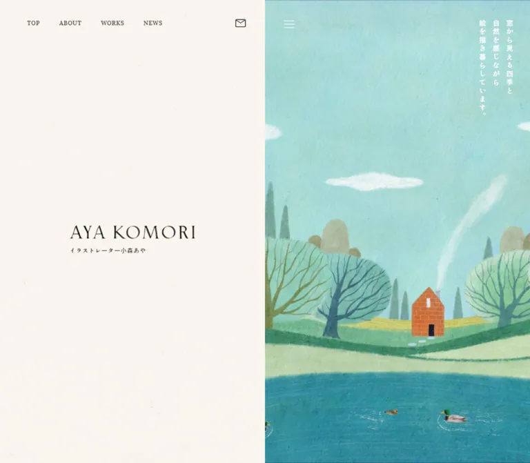
Aya Komori’s portfolio gives equal visual weight to empty paper and illustration. On desktop, the page divides precisely down the middle: a long sequence of content occupies the left half while a painted landscape remains visible on the right. A small image wordmark, restrained Japanese navigation, and generously tracked vertical copy leave the artwork room to establish the atmosphere.
The landscape combines an expansive sky, rounded trees, a small orange house, rolling fields, and a lake. Paper grain and uneven painted edges carry the texture; the surrounding interface remains flat and quiet. Individual works retain their different proportions and appear one at a time, with small captions and substantial space between them.
The mobile layout uses the full page width for content. Its opening capture contains white identity text and vertical copy on an almost uniform cream background, without visible scenic artwork. That captured condition is an evidence limitation and a readability concern; it does not establish an intentionally blank mobile composition.
How to Read This Reference
- Measured values come from the supplied rendered DOM rectangles, computed styles, or custom properties. They are CSS-pixel values at the stated viewport.
- Calculated values are arithmetic derived from those measurements, such as gaps between adjacent work links.
- Estimated values describe screenshot appearance, including representative paint colors and illustration dimensions without corresponding DOM rectangles. They are not pixel samples.
- Recommended values belong to the reusable implementation. Breakpoints, fallback behavior, focus styling, and unverified interaction details are explicitly treated as adaptations.
- Token names such as
--color-paperare descriptive aliases. Original custom-property names are identified separately. - Document coordinates refer to the supplied DOM record. Scrolled screenshots were captured separately, so a screenshot’s visible Y coordinate should not be substituted for a document coordinate.
- Computed transition declarations establish timing configuration, not the property endpoints, triggering events, or successful playback of an interaction.
Tokens — Colors
Default Palette
| Name | Value | Evidence / alias | Role |
|---|---|---|---|
| Warm Paper | #fbf7f0 |
Measured body background; source --s-color-afa07712 and --s-color-718d50d1; alias --color-paper |
Main canvas and small paper surfaces behind desktop navigation labels |
| Warm Ink | #423e3e |
Measured text; source --s-color-1bae9835; alias --color-ink |
Introduction, identity subtitle, section links, news text, and footer navigation |
| Navigation Ink | #4a4646 |
Measured navigation-label color; alias --color-nav |
Desktop top navigation and contact-pill label |
| Caption Ink | #333333 |
Measured work-caption color; alias --color-caption |
Small titles directly below portfolio images |
| Reversed White | #ffffff |
Measured scenic copy and mobile opening text; alias --color-on-art |
Copy over the scenic region and the captured mobile opening identity |
| Black Detail | #000000 |
Measured contact copy and copyright | Selected small text and dark visual details; do not replace every warm-gray label with black |
The main surface is a solid color. Its warmth should come from #fbf7f0, while visible grain belongs primarily to the artwork. No general page-wide noise overlay is established by the supplied evidence.
Two additional colors are declared but lack a verified visible component assignment: #f2eee5e6, a cream color at approximately 90.2% opacity, and #f6f6f6, a pale gray. Retain them as source inventory if needed; do not invent a modal, overlay, or card system around them.
The many supplied --g-color-* properties are transparent in the sampled state. Their presence does not demonstrate a visible CSS-gradient treatment.
Scenic Color States
The following are visual estimates for art direction, not measured CSS colors or a selectable theme palette.
| Descriptive color | Approximate reference | Visible use |
|---|---|---|
| Pale Aqua | #a8d8d5 |
Broad daytime sky and pale painted areas |
| Lake Teal | #2f94a3 |
Foreground water in the blue-green scene |
| Sage Green | #7ba58b |
Trees, vegetation, and parts of the fields |
| House Orange | #d87844 |
Small brick-like house, providing concentrated warm contrast |
| Evening Pink | #e4bdc5 |
Sky and lake in the later desktop capture |
| Muted Violet | #81759c |
Hills, trunks, and cooler details in the pink scene |
Several shades coexist within each painted area. A flat fill cannot reproduce the variation in the original imagery. These colors should guide illustration selection, not become six competing button colors.
The interface remains cream and dark gray while the scenic region changes. No user-operated theme selector was verified.
Tokens — Typography
Shippori Antique B1 — Japanese Interface and Editorial Copy
- Measured family:
'Shippori Antique B1'. - Source variable:
--s-font-0387b9e5. - Measured weight:
400on the sampled Japanese labels and paragraphs. - Roles: desktop navigation, identity subtitle, introductory vertical paragraphs, news dates and titles, contact copy, and footer links.
- Character: small, restrained Japanese lettering with deliberate tracking. Space and line direction contribute more to hierarchy than heavy weights.
Shippori Antique — Captions and Section Links
- Measured family:
'Shippori Antique'. - Source variable:
--s-font-e5aa807c. - Measured weight:
400. - Roles: work captions, 16px section-link labels, and the desktop scenic statement.
- Preserve the distinction between this family and the B1 variant when implementing the observed typography.
Vollkorn — Copyright
- Measured family:
Vollkorn. - Source variable:
--s-font-239bf248. - Verified role: the footer’s
© aya komoriline. - Its presence does not identify the typeface used to draw the large brand wordmark.
Image-Based Identity and Headings
The desktop AYA KOMORI wordmark is an image inside an H1 wrapper. The wrapper reports 32px, 700, and sans-serif, but those values do not describe the visible letterforms. The wordmark’s original font is unverified.
The works and contact H2 elements also contain raster heading assets. Their computed 24px / 700 wrapper styles must not be promoted into a verified display-type scale. The sampled news H2 has no extracted text, and its exact lettering is not established by the supplied captures.
Preserve authorized identity assets when available. If live type must replace them, treat that replacement as a new design decision.
Type Scale
All values below are measured unless marked otherwise. Size and line height are listed in pixels.
| Role | Desktop size / line height | Mobile size / line height | Tracking | Family / notes |
|---|---|---|---|---|
| Top navigation | 12 / 18 |
Not visible | 0.6px, or 0.05em |
Shippori Antique B1 |
| Header contact label | 12 / 18 |
Desktop pill not visible | 0.6px |
Shippori Antique B1 |
| Identity subtitle | 12 / 22 |
13 / 22 |
1.2px / 1.3px, or 0.1em |
Shippori Antique B1; mobile element is an H1 |
| Scenic statement | 14 / 28 |
13 / 16.9 per separate vertical paragraph |
3.5px desktop; 1.69px mobile |
Antique on desktop; B1 on mobile |
| Introductory vertical copy | 14 / 28 |
13 / 26 |
4.2px / 3.9px, or 0.3em |
Shippori Antique B1 |
| Work caption | 13 / 18.2 |
13 / 18.2 |
Normal | Shippori Antique |
| Section-link label | 16 / 16 |
16 / 16 |
1.28px, or 0.08em |
Shippori Antique |
| News date | 12 / 12 |
14 / 14 |
Normal | Shippori Antique B1 |
| News title | 14 / 22.4 |
14 / 22.4 |
Normal | Shippori Antique B1 |
| Contact invitation | 12 / 21.6 |
13 / 23.4 |
0.1em |
Shippori Antique B1 |
| Footer navigation | 12 / 18 |
Mostly 12 / 24; About remains 12 / 18 |
1.2px, or 0.1em |
Shippori Antique B1 |
| Copyright | 12 / 28 |
13 / 28 |
0.1em |
Vollkorn |
| Opening wordmark | Image box 260 × 30.33 |
Approximately 220px wide, screenshot estimate |
Embedded in asset | Original lettering font unverified |
| Footer wordmark | Image link 160 × 18.77 |
Image link 143.09 × 16.69 |
Embedded in asset | Preserve proportions |
This is a modest text scale. The larger visual events are illustrations and areas of empty space, rather than oversized text headings.
Tokens — Spacing & Shapes
Density: sparse editorial composition with compact controls. Spacing system: repeated pixel values are observable, but no universal source spacing formula was supplied.
Spacing Scale
| Use | Desktop | Mobile | Evidence |
|---|---|---|---|
| Space between top navigation link boxes | 8px |
Not applicable | Calculated from link rectangles |
| Navigation-label padding | 2px 8px |
Not applicable | Computed |
| Image-to-caption gap | 12px |
12px |
Computed work-link gap |
| Wordmark-to-subtitle gap | 12px |
Exact image gap unmeasured | Calculated desktop rectangles |
| Section-link padding | 16px 8px |
16px 8px |
Computed |
| News link internal gap | 20px |
20px |
Computed; leading child not separately measured |
| Intro paragraph-group separation | 36px |
36px |
Calculated horizontal clearance |
| Intro copy to About link | 120px |
120px |
Calculated from the longest paragraph’s bottom |
| Works heading to first work | 84px |
28px |
Calculated |
| Space between complete work links | 88px |
96px |
Calculated consistently across sampled entries |
| Last work to works-index link | 164px |
148px |
Calculated |
| News heading to first news row | 64px |
64px |
Calculated |
| Space between news rows | 24px |
36px |
Calculated |
| News rows to news-index link | 184px |
128px |
Calculated |
| Footer padding | 86px 40px |
64px 36px |
Computed |
| Social-link padding | 16px |
16px |
Computed |
A distinctive detail is that mobile work spacing grows from 88px to 96px while the images become narrower. The page retains a slow browsing rhythm instead of compressing everything into a dense phone list.
Border Radius
| Element | Value | Interpretation |
|---|---|---|
| Work links and image presentation | 0 |
Square geometry; no rounded card shell |
| Section links | 0 |
Rectangular, transparent link region |
| Footer and navigation-label surfaces | 0 |
Flat composition |
| Header contact pill | 40px |
Measured radius on a 36px-tall control |
| Contact-pill outline | Approximately 1px |
Screenshot estimate; border width was not included in the supplied computed-style fields |
No general shadow or elevation system is visible. The contact pill is the clearest rounded interface shape.
Layout Measurements
| Element | Desktop 1440 × 1000 | Mobile 390 × 844 |
|---|---|---|
| Visual page division | Left content 720px; right scene 720px |
Single content column |
| Top header | 720 × 84px; padding 24px 24px 24px 40px |
Desktop header absent from visible evidence |
| Header contact pill | 138.61 × 36px, at x=557.39, y=24 |
Not visible |
| Scenic menu-style button | 28 × 28px, at x=756, y=36 |
Upper button 84 × 84px, at x=306, y=0 |
| Opening identity | Wordmark at x=230, y=521.83 |
Subtitle at x=28, y=701.59 |
| Scenic statement | 84 × 210px, at x=1328, y=40 |
Three 17px-wide paragraphs at x=28, 53, 78, all at y=36 |
| Work column | 480px wide, beginning at x=120 |
342px wide, beginning at x=24 |
| Standard section link | 220 × 49px |
220 × 49px |
| News row | 480px wide at x=64 |
342px wide at x=24 |
| Contact copy | 320px wide at x=64 |
318px wide at x=36 |
| Footer wordmark inset | 40px |
36px |
| Social-link boxes | Approximately 48 × 49px |
Approximately 48 × 49px |
| Back-to-top link | 68 × 68.25px, at x=622 |
No corresponding link in supplied mobile link inventory |
| Reported document height | Approximately 10048px |
Approximately 8236px |
The footer’s sampled outer DOM rectangle is 1440px wide, while the desktop screenshot exposes its content in the left half beside the persistent scene. Match the visible composition; do not assume every source wrapper shares the visible 720px width.
Components
Desktop Split Composition
Role: keeps the artist’s visual world present throughout portfolio browsing.
The center seam sits at x=720. The left side contains the opening identity and the long content sequence. The right side fills the viewport with illustration and stays in the same screen region in the opening, mid-page, and footer captures.
This supports a persistent scenic panel. The evidence does not expose its exact position rule or media-rendering mechanism. A fixed right panel is a practical implementation choice, rather than a verified transcription of its source CSS.
Avoid putting the whole page into a fixed-height application shell. The measured document is long and scrolls through ordinary portfolio content.
Desktop Header
Role: compact access to the main site sections and contact page.
The header occupies only the left half. Its transparent parent contains five separate paper-backed text links: トップページ, わたしについて, 制作実績, お知らせ, and よくあるご質問. The final contact link adds a thin rounded outline and envelope symbol.
Each text link has 2px 8px padding and an 18px line box. An 8px gap separates adjacent link rectangles. These small cream rectangles become particularly apparent when portfolio imagery passes beneath the header in the mid-page capture.
The header remains at the top in that capture but is absent in the footer capture. Persistence is therefore evidenced over part of the scroll; its exact hiding threshold or trigger is unverified.
The FAQ destination is /fqa, exactly as supplied in the current link evidence. Do not silently replace it with an assumed /faq path.
Opening Identity
Role: introduces the illustrator without a large promotional message.
On desktop, the dark wordmark sits in a 260px-wide group centered horizontally within the left panel. Its Japanese subtitle shares the same left edge, separated by 12px. The complete measured group centers roughly 54px below the viewport’s vertical midpoint.
The mobile wordmark appears white near the lower-left corner of the opening capture. The subtitle starts 28px from the left and uses 13px B1 lettering. Its element is an H1 in the mobile DOM, whereas the desktop H1 contains the wordmark image.
For a new implementation, retain a meaningful accessible page heading independently of the decorative asset arrangement.
Scenic Statement
Role: connects the landscape to the artist’s daily practice.
The statement reads 窓から見える四季と / 自然を感じながら / 絵を描き暮らしています。 in vertical columns. On desktop it is white, near the upper-right corner of the landscape, with a measured 28px right clearance and 40px top clearance.
On mobile it moves to the upper-left. Three separate paragraph boxes are 17px wide with 8px spaces between them. Reading begins with the rightmost column. Preserve natural Japanese reading order in accessible markup even if the visual arrangement uses reversed flex order.
The supplied computed-style fields do not include writing-mode. Vertical typography is established by the screenshots and text rectangles; writing-mode: vertical-rl is the recommended implementation.
Introductory Copy
Role: provides a short personal introduction before the work sequence.
Two vertical text groups sit near the horizontal center of the content region. On desktop their combined footprint spans x=272 to 448; on mobile it spans x=112 to 278. Both versions retain a 36px gap between the groups.
The copy uses a two-times line height and 0.3em tracking. A わたしについて link appears 120px below the longer paragraph. This creates a deliberate pause between the opening identity and the gallery.
The measured introduction begins around document y=1373.89 on desktop and y=1031.89 on mobile. These positions describe the captured layouts; no source formula for their viewport dependence was supplied.
Work Link
Role: makes each commissioned or personal work a clear destination.
Each work is a single transparent link containing an image and a small caption underneath. The link is 480px wide on desktop and 342px on mobile, has no internal padding, and uses a 12px image-to-caption gap. Captions use Shippori Antique at 13px / 18.2px with normal tracking.
The eight entries include promotional illustration, packaging, personal artwork, website illustration, and bus wrapping. Their image proportions vary substantially. The first asset’s declared dimensions are 1325 × 1875, another is 2000 × 1500, and the matchbox entry is 1000 × 1000.
For example, the first desktop link measures 480 × 709.42px. Subtracting its 12px gap and approximately 18.19px caption leaves about 679.23px for the portrait image. This closely follows the declared asset ratio. The landscape packaging entry similarly leaves a 480 × 360px image region.
Long captions wrap on mobile: the packaging caption grows from one line to two, reaching approximately 36.38px. Allow the link height to grow naturally. Preserve the actual 88px desktop and 96px mobile separation between complete links.
No hover endpoint, zoom effect, or project-page transition was exercised.
Section Link
Role: connects the homepage to About, the works index, news, or contact.
All four sampled section links share a 220 × 49px transparent rectangle, 16px 8px padding, square corners, and a 16px Shippori Antique label with 0.08em tracking. The internal gap changes from 24px on desktop to 40px on mobile.
The supplied text-element inventory does not identify the companion decoration or its full geometry. Preserve the measured label and spacing, but treat any added arrow or underline as a recommendation unless an authorized component asset is available.
The About link is centered beneath the introduction. Works, news, and contact links align with their respective sections rather than all sharing one universal page inset.
News Row
Role: presents two compact updates without competing with the gallery.
Each row is a link with a date above its title. The text begins 80px inside the row: desktop rows start at x=64, text at x=144; mobile rows start at x=24, text at x=104.
The row’s computed gap is 20px. This is consistent with a 60px leading region plus the gap, but that leading child’s content and dimensions were not separately recorded. Do not invent a specific thumbnail or icon.
The date-to-title space is 8px. Desktop rows are 60px tall and 24px apart. Mobile rows are 36px apart; the longer title wraps to two lines and increases its row to approximately 66.78px. Mobile dates grow to 14px while titles remain 14px.
The current entries are an exhibition announcement dated March 31, 2026 and a portfolio renewal announcement dated June 26, 2025. Those dates describe content, not capture timing.
Contact Invitation
Role: offers a quiet next step for illustration commissions.
An image-based heading precedes a short paragraph and an お問い合わせ section link. The desktop copy occupies 320px at a 64px left inset and uses 12px / 21.6px. On mobile it occupies 318px at a 36px inset and uses 13px / 23.4px.
The captured text changes from two desktop lines to three mobile lines, including an explicit break after イラスト制作の. Preserve that editorial wrapping where the same copy is used.
This homepage component links to /contact. Form fields, validation, submission behavior, and success states were not inspected.
Closing Illustration and Footer
Role: ends the page with an artwork and a small directory of destinations.
A square illustration of a fox among white tree trunks appears above the footer. The desktop screenshot suggests an approximately 356px square centered in the left half. The visible mobile image is approximately 318px wide with 36px side clearances. Its exact asset URL and title were not supplied; it should not be assigned one of the eight work titles by assumption.
The footer begins with a smaller wordmark, followed by navigation, a privacy-policy link, Instagram and X symbols, and © aya komori. It has no contrasting background band or visible divider.
On desktop, the five principal links share a row and the privacy link starts another. Social links and copyright sit on one horizontal line. On mobile, navigation wraps into a two-link row, then a three-link row, then the privacy link. Social links and copyright occupy separate rows with 64px between their measured boxes.
The desktop back-to-top control is a fine upward arrow within an approximately 68px square link targeting /#fv. Its click result and scrolling animation were not tested.
Menu-Style Controls
Role: visible three-line control affordances; exact behavior unverified.
Desktop shows one small white three-line symbol near the upper-left of the scenic panel. Mobile shows a larger upper-right button and a second dark three-line button near the bottom of the opening view, measured at 66 × 70px.
Neither button was activated in the supplied evidence. Do not infer a drawer layout, scenic settings panel, overlay color, or relationship between the two mobile controls. Their accessible names are also not established by the selected text inventory.
Tokens — Motion & Interaction
Recorded Transition Configuration
| Element | Desktop declaration | Mobile declaration | Evidence limit |
|---|---|---|---|
| Body background | 0.5s cubic-bezier(0.4, 0.4, 0, 1) |
Same | A background transition is configured; no alternate body color was observed |
| General text and wrappers | Commonly 0.3s cubic-bezier(0.4, 0.4, 0, 1) |
Commonly the same | Broad transition declarations do not identify actual animated properties |
| Header text links | 0.4s cubic-bezier(0.39, 0.575, 0.565, 1) |
Desktop navigation absent | Hover endpoints untested |
| Scenic menu-style button | 0.8s cubic-bezier(0.4, 0.4, 0, 1) |
Buttons use 0.3s with the same curve |
Opened states untested |
| Work links | 2s cubic-bezier(0.39, 0.575, 0.565, 1) 0.2s |
0.3s cubic-bezier(0.4, 0.4, 0, 1) |
Could support appearance changes; trigger and endpoints were not supplied |
| Section and news links | 0.4s |
0.4s |
No endpoint evidence |
| Footer link wrappers | 0.6s, delays progressing from 0.1s to 0.8s |
Mostly 0.3s; some 0.16s or 0.4s |
Stagger configuration is recorded, but a reveal sequence was not directly observed |
| Footer copyright | 0.6s 0.9s |
0.3s with the common curve |
Same limitation |
| Footer label text | 0.16s cubic-bezier(0.4, 0.4, 0, 1) |
Same | Immediate visual response not tested |
| Back-to-top link | 0.6s cubic-bezier(0.4, 0.4, 0, 1) |
Not present in mobile link inventory | This is the link’s transition, not a verified scroll duration |
The generated transition strings also list many gradient custom properties. These repeated entries should not be copied into a new implementation without a demonstrated need.
Scenic State Evidence
The first two desktop captures show a blue-green landscape. Ducks are visible in the lake in the mid-page capture. The footer capture shows a pink sky and lake, violet land details, and birds in the sky while retaining the same broad scene composition.
These captures establish multiple rendered scene states. They do not establish whether changes are driven by time, scroll position, a loop, an interaction, or another mechanism. Duration, easing, frame rate, media format, and layer structure remain unknown.
The selected DOM elements report animation: none. That does not establish that the scenic media or unlisted descendants are static.
Navigation Evidence
Work links point to individual /worksdetail/... routes. News entries point to /newsdetail/... routes. About, works, news, contact, FAQ, privacy, and social destinations are present as links. Their existence is verified; successful activation and destination-page behavior are outside scope.
For an adaptation, use restrained color or opacity feedback and preserve ordinary link behavior. Any specific hover treatment or scenic crossfade must be labeled as a new implementation choice.
Surfaces
| Layer | Appearance | Function |
|---|---|---|
| Page canvas | Solid warm cream | Unifies identity, gallery margins, supporting content, and footer |
| Desktop scenic region | Full-height textured illustration | Maintains atmosphere throughout browsing |
| Top navigation labels | Small, opaque cream rectangles within a transparent header | Keeps labels visually separated from passing artwork |
| Header contact link | Cream fill, thin dark outline, pill shape | Gives contact slightly more emphasis |
| Work links | Transparent containers, square image boundaries | Lets each illustration define its own visual block |
| Supporting links and news | Unboxed dark text on cream | Provides navigation with low visual weight |
| Footer | Same cream canvas | Ends the page without introducing a new theme |
No opened dialog, menu surface, blurred backdrop, or dark-mode interface was supplied. Do not fill those gaps with assumed component styling.
Imagery
The desktop landscape has a hand-painted, paper-textured character: broad washes, irregular edges, softly varied pigments, and simplified shapes. Trees are rendered as rounded masses with branching trunks. A small orange house and its pale smoke trail create a focal point amid the larger cool-colored landscape.
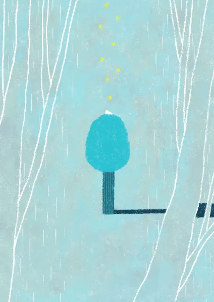
Visible portfolio art includes a pale turquoise rainy-window scene and a portrait composition of white gulls with dark wing tips around an orange sun on an ochre ground. The closing fox image introduces stronger green and violet areas, white trunks, small yellow stars, and an orange animal.
These descriptions identify visible qualities, not a verified physical medium. The images resemble painted or mixed-media work, but the exact production technique was not documented.
Keep texture within the images. Preserve smooth browser image scaling; there is no evidence for pixelated rendering. Work images should generally retain their intrinsic proportions. A full-height scenic panel can use a separately composed crop, but its crop should protect the house, trees, and lake rather than simply centering an arbitrary landscape.
Observed Asset References
The following complete URLs appear in the supplied original-page DOM. They were not independently fetched during this analysis. Declared dimensions are HTML image metadata, not proof of the decoded file’s exact dimensions.
| Asset | Observed URL | Recorded use |
|---|---|---|
| Desktop opening wordmark | Wordmark asset | Image inside desktop H1; declared 1151 × 135 |
| Footer wordmark | Footer identity asset | Home link in footer; declared 1151 × 135 |
| Works heading | Works heading asset | Image inside works H2; declared 653 × 133 |
| Contact heading | Contact heading asset | Image inside contact H2; declared 911 × 132 |
| First promotional work | Promotional artwork asset | First linked work; declared 1325 × 1875 |
しずかな雨の日 |
Rain artwork asset | Fourth linked work; declared 2000 × 2827 |
夕日とカモメ |
Gull artwork asset | Fifth linked work; declared 2000 × 2338 |





The scenic media and closing fox illustration have no complete asset reference in the supplied selected-element evidence. Do not fabricate their filenames or media technology.
Layout & Responsive Behavior
Desktop
The portfolio column occupies one third of the total viewport width but two thirds of the left panel: 480 / 720 = 66.67%. Its 120px side margins are specific to the gallery. News and contact begin farther left at 64px, while the footer wordmark begins at 40px.
The opening identity is centered within the left half; subsequent content uses its own alignment. These changing insets prevent the page from feeling like one rigid stack of identical sections.
The right scene stays present even beside the footer. Its upper copy remains in the same location as the landscape changes state. The header’s disappearance in the footer capture should be retained as an observation, without inventing a scroll-direction rule.
Mobile
The desktop scenic side panel and horizontal header are not visible. Gallery and news content use 24px side margins, producing a 342px column. Contact and footer content use 36px margins, producing a 318px region.
Work images remain a single sequence. They do not become tiles or a carousel. Captions keep their 13px size and wrap naturally. News dates and contact copy grow slightly rather than shrinking with the viewport.
The lower menu-style button begins at y=759.59, numerically close to 90% of the 844px viewport height. This is consistent with a 90vh opening region, but the actual source height formula was not supplied.
The mobile opening capture shows extremely low-contrast white text on cream and no visible landscape. Readiness checks reduce the likelihood of a simple immediate-load capture, but do not prove semantic completeness. The cause could not be established from the supplied evidence. Do not infer a finished mobile illustration, a permanent blank state, or a confirmed loading failure.
Reusable Responsive Rules
- Preserve the observed 50/50 desktop composition and the single-column mobile gallery.
- Keep independent insets for gallery, supporting sections, and footer.
- Retain intrinsic work-image ratios and permit caption-driven height changes.
- Treat the precise breakpoint and intermediate tablet layout as unverified.
- For the Quick Start, a recommended 1360px breakpoint gives the desktop header enough space: its measured items, padding, and a small gap require roughly 675px in the left half.
- Use a readable mobile fallback until any chosen opening artwork is successfully available. This is a recommended improvement, not the captured original state.
Do’s and Don’ts
Do
- Use the exact cream canvas
#fbf7f0and warm text color#423e3e. - Give the desktop illustration an entire half of the viewport.
- Preserve the small identity group and extensive opening whitespace.
- Use the verified Japanese font families in their observed roles.
- Keep vertical paragraphs, generous character spacing, and careful reading order.
- Show works at varied natural proportions with a caption 12px below each image.
- Retain substantial space between works, including the larger 96px mobile gap.
- Keep contact emphasis restrained: one outlined header pill and simple supporting links.
- Preserve differences between gallery, news, contact, and footer insets.
- Treat scenic state changes and declared transition timings as separate evidence.
Don’t
- Don’t turn the portfolio into a dense multi-column card grid.
- Don’t replace the opening with an oversized sales headline and several filled buttons.
- Don’t apply rounded corners, shadows, gradients, or glass effects to every component.
- Don’t use illustration colors as a broad UI action palette.
- Don’t identify the raster wordmark’s font from its H1 wrapper or the copyright font.
- Don’t impose one image ratio on portrait, square, and landscape work.
- Don’t describe the scenery as scroll-driven, video-based, or a particular animation loop without evidence.
- Don’t invent menu contents or the function of the second mobile button.
- Don’t reproduce white text on a blank cream mobile background as a recommended finished state.
- Don’t extrapolate unseen destination-page layouts from the homepage’s links.
Recommended Implementation Additions
These are recommendations for a new implementation, not verified features of the original:
- Give image wordmarks meaningful accessible text. The sampled logo images have empty
altattributes; the intended heading should remain understandable without them. - Associate each work link with its visible caption, and add useful image descriptions where the artwork conveys information beyond the title.
- Give every icon-only button an accessible name. A menu control should expose its expanded state and connect to the region it operates.
- Expand the desktop 28px menu target to at least 44px while preserving the small visible glyph. Mobile controls and social-link targets already have larger measured boxes.
- Retain an explicit keyboard focus outline and provide access to the main content without navigating every header link.
- Use dark mobile text and a dark wordmark until a verified art surface is available. Switch to white only when contrast is adequate across the image.
- Keep all works visible without animation initialization. Avoid hiding content behind a required reveal script.
- Offer reduced-motion and static scenic modes if an animated interpretation is implemented. Stop background work while the scene is hidden.
- Provide a well-composed static first frame for any scenic media, reserve image dimensions, and avoid delaying the opening identity behind lazy loading.
- Test vertical copy and footer navigation with text enlargement, narrow viewports, keyboard navigation, and assistive technology.
Agent Prompt Guide
Quick Color Reference
- Main page: measured
#fbf7f0. - Main text: measured
#423e3e. - Desktop navigation: measured
#4a4646. - Work captions: measured
#333333. - Text over suitable art: measured white
#ffffff. - Illustration direction only: approximate aqua
#a8d8d5, teal#2f94a3, sage#7ba58b, orange#d87844, and evening pink#e4bdc5. - Shape emphasis: a thin outlined contact pill; otherwise square, flat, and unboxed.
Overall Prompt
“Create an illustrator’s portfolio with the quiet spatial character of the current AYA KOMORI homepage. At a 1440 × 1000 desktop viewport, divide the screen into a 720px scrolling cream content region and a persistent 720px illustrated landscape. Use #fbf7f0 paper, warm gray text, a small image wordmark, compact Japanese navigation, and a restrained outlined contact pill. Place vertical introductory copy before a single sequence of works, 480px wide, with natural image ratios, 13px captions, 12px caption gaps, and 88px between entries. Let textured landscape illustration provide the color and atmosphere. On a 390px phone, use a 342px work column with 24px margins and 96px gaps; use 36px margins for contact and footer. Preserve readable fallback text when opening artwork is unavailable. Keep unverified scenic animation and menu behavior separate from the measured visual shell.”
Example Component Prompts
- Opening identity: “A warm cream desktop panel with a 260px-wide image wordmark and a small Japanese subtitle underneath. Center the group within the left half of the screen, slightly below the vertical midpoint. Surround it with extensive empty space. Add no additional promotional blocks.”
- Work link: “A square-edged portfolio link with an uncropped illustration at its natural aspect ratio and a 13px Shippori Antique caption 12px below. Use a 480px desktop width or a 342px width on a 390px phone. Leave 88px desktop or 96px mobile space before the next complete item.”
- Vertical introduction: “Two groups of Japanese vertical copy in regular Shippori Antique B1, with two-times line height,
0.3emtracking, and 36px between groups. Center the combined composition and place a quiet 220px-wide About link 120px beneath the longer paragraph.” - Footer: “Continue the cream page into a spacious footer. Use a small image wordmark, tracked 12px Japanese links, a separate privacy link, and small Instagram and X symbols in generous click targets. On mobile, wrap the links into two, three, and one-item rows, with copyright beneath the social row.”
- Scenic panel: “Compose an original paper-textured landscape with a broad pale aqua sky, rounded trees, a small orange house, curved green fields, and a teal lake. Keep the house visible in a tall desktop crop and reserve quiet space for small white vertical copy near the upper-right. Any alternate pink scene or crossfade is a proposed enhancement with independently chosen timing.”
Quick Start
CSS Custom Properties
This CSS reproduces the principal measured dimensions and typography while using a simpler DOM structure. The fixed scenic panel, 1360px breakpoint, static image crop, hover underline, focus treatment, and mobile dark fallback are recommended adaptations. The code does not implement unverified menus or scenic animation and was not browser-tested during this analysis.
Load the named fonts through the host project; font-file URLs were not supplied. Provide authorized images separately. The fallback families below are recommendations.
Expected structure: .portfolio-page contains .scene, .desktop-header, and .content. Inside .content, place .hero, .intro, .works, .news, .contact, an optional .closing-art, and .site-footer. A .work-card link wraps an image and .work-caption. A .news-row wraps .news-body, containing a date and title. Place .mobile-quote inside the hero, with its three spans in logical reading order.
:root {
  /* Measured interface colors */
  --color-paper: #fbf7f0;
  --color-ink: #423e3e;
  --color-nav: #4a4646;
  --color-caption: #333333;
  --color-on-art: #ffffff;

  /* Measured families; recommended generic fallbacks */
  --font-ui: 'Shippori Antique B1', sans-serif;
  --font-caption: 'Shippori Antique', sans-serif;
  --font-copyright: 'Vollkorn', serif;
  --text-ui: 12px;
  --text-caption: 13px;
  --text-intro: 14px;
  --text-link: 16px;

  /* Measured recurring geometry */
  --work-width: 480px;
  --work-gap: 88px;
  --caption-gap: 12px;
  --section-link-width: 220px;
  --support-inset: 64px;
  --radius-contact: 40px;

  /* Recorded timing vocabulary, with explicit properties below */
  --ease-soft: cubic-bezier(0.4, 0.4, 0, 1);
  --ease-editorial: cubic-bezier(0.39, 0.575, 0.565, 1);
  --motion-ui: 300ms;
  --motion-link: 400ms;
}

* { box-sizing: border-box; }
html { background: var(--color-paper); }
body {
  margin: 0;
  color: var(--color-ink);
  background: var(--color-paper);
  font-family: var(--font-ui);
  font-weight: 400;
}
a { color: inherit; text-decoration: none; }
button { font: inherit; }
img { display: block; max-width: 100%; }
p, h1, h2 { margin: 0; }

.portfolio-page { position: relative; }
.content { width: 50%; }

/* Recommended fixed implementation of the persistent scene */
.scene {
  position: fixed;
  inset: 0 0 0 auto;
  width: 50%;
  height: 100vh;
  height: 100dvh;
  overflow: hidden;
  background: var(--color-paper);
}
.scene > img {
  width: 100%;
  height: 100%;
  object-fit: cover;
  object-position: center;
}
.scene-quote {
  position: absolute;
  top: 40px;
  right: 28px;
  writing-mode: vertical-rl;
  color: var(--color-on-art);
  font-family: var(--font-caption);
  font-size: 14px;
  line-height: 28px;
  letter-spacing: 0.25em;
}

.desktop-header {
  position: fixed;
  z-index: 10;
  top: 0;
  left: 0;
  display: flex;
  align-items: center;
  justify-content: space-between;
  gap: 8px;
  width: 50%;
  padding: 24px 24px 24px 40px;
}
.primary-nav { display: flex; gap: 8px; }
.primary-nav a {
  flex: none;
  padding: 2px 8px;
  color: var(--color-nav);
  background: var(--color-paper);
  font-size: 12px;
  line-height: 18px;
  letter-spacing: 0.05em;
  white-space: nowrap;
}
.contact-pill {
  display: inline-flex;
  flex: none;
  align-items: center;
  gap: 8px;
  min-height: 36px;
  padding: 8px 16px;
  border: 1px solid var(--color-ink);
  border-radius: var(--radius-contact);
  color: var(--color-nav);
  background: var(--color-paper);
  font-size: 12px;
  line-height: 18px;
  letter-spacing: 0.05em;
  white-space: nowrap;
}
.contact-pill svg { width: 21px; height: 18px; }

.hero {
  position: relative;
  display: grid;
  min-height: 100vh;
  min-height: 100svh;
  place-items: center;
}
.hero-identity {
  width: 260px;
  max-width: calc(100% - 56px);
  transform: translateY(54px);
}
.brand-image { width: 100%; height: auto; }
.hero-subtitle {
  margin-top: 12px;
  font-size: 12px;
  line-height: 22px;
  letter-spacing: 0.1em;
}
.mobile-quote { display: none; }

/* Approximate section placement at the recorded desktop size */
.intro { padding: 374px 24px 390px; }
.intro-copy {
  display: flex;
  flex-direction: row-reverse;
  justify-content: center;
  align-items: flex-start;
  gap: 36px;
}
.intro-copy p {
  writing-mode: vertical-rl;
  font-size: var(--text-intro);
  line-height: 2;
  letter-spacing: 0.3em;
}
.section-link {
  display: flex;
  align-items: center;
  gap: 24px;
  width: var(--section-link-width);
  max-width: 100%;
  min-height: 49px;
  padding: 16px 8px;
  font-family: var(--font-caption);
  font-size: var(--text-link);
  line-height: 16px;
  letter-spacing: 0.08em;
}
.intro .section-link { margin: 120px auto 0; }

.works {
  width: min(var(--work-width), calc(100% - 48px));
  margin-inline: auto;
}
.section-heading img { width: auto; height: 30px; }
.works .section-heading { margin-bottom: 84px; }
.work-list { display: grid; gap: var(--work-gap); }
.work-card {
  display: flex;
  flex-direction: column;
  gap: var(--caption-gap);
  min-width: 0;
  border-radius: 0;
}
.work-card img { width: 100%; height: auto; }
.work-caption {
  color: var(--color-caption);
  font-family: var(--font-caption);
  font-size: var(--text-caption);
  line-height: 1.4;
  overflow-wrap: anywhere;
}
.works > .section-link { margin-top: 164px; }

.news {
  width: min(480px, calc(100% - 2 * var(--support-inset)));
  margin-top: 360px;
  margin-left: var(--support-inset);
}
.news-list { display: grid; gap: 24px; margin-top: 64px; }
.news-row {
  display: flex;
  align-items: center;
  min-height: 60px;
  /* Measured text inset; leading artwork is unverified */
  padding-left: 80px;
}
.news-body { display: grid; gap: 8px; min-width: 0; }
.news-date { font-size: 12px; line-height: 1; }
.news-title { font-size: 14px; line-height: 1.6; }
.news > .section-link { margin-top: 184px; }

.contact {
  margin: 468px var(--support-inset) 0;
}
.contact .section-heading { margin-bottom: 24px; }
.contact-copy {
  width: 320px;
  max-width: 100%;
  color: #000;
  font-size: 12px;
  line-height: 1.8;
  letter-spacing: 0.1em;
}
.contact > .section-link { margin-top: 57px; }

/* Recommended spacing for an independently supplied closing image */
.closing-art {
  width: min(356px, calc(100% - 72px));
  margin: 240px auto 180px;
}
.closing-art img { width: 100%; height: auto; }

/* Simpler left-column footer matching the visible composition */
.site-footer { padding: 86px 40px; }
.footer-brand { display: block; width: 160px; }
.footer-brand img { width: 100%; height: auto; }
.footer-nav {
  display: flex;
  flex-wrap: wrap;
  gap: 0 16px;
  margin: 44px -16px 0;
}
.footer-nav a {
  padding: 8px 16px;
  font-size: 12px;
  line-height: 18px;
  letter-spacing: 0.1em;
}
.footer-lower {
  display: flex;
  align-items: center;
  gap: 48px;
  margin: 36px -16px 0;
}
.social-links { display: flex; gap: 8px; }
.social-links a {
  display: grid;
  width: 48px;
  min-height: 49px;
  padding: 16px;
  place-items: center;
}
.social-links svg { width: 16px; height: 17px; }
.copyright {
  color: #000;
  font-family: var(--font-copyright);
  font-size: 12px;
  line-height: 28px;
  letter-spacing: 0.1em;
}

/* Recommended feedback; original hover endpoints were not verified */
a { transition: color var(--motion-link) var(--ease-editorial); }
@media (hover: hover) {
  .primary-nav a:hover,
  .section-link:hover,
  .footer-nav a:hover,
  .work-card:hover .work-caption {
    text-decoration: underline;
    text-underline-offset: 4px;
  }
}
:where(a, button):focus-visible {
  outline: 2px solid currentColor;
  outline-offset: 4px;
}

/* Recommended breakpoint, not a recovered source media query */
@media (max-width: 1359px) {
  :root {
    --work-gap: 96px;
    --text-intro: 13px;
    --support-inset: 24px;
  }
  .content { width: 100%; }
  .scene, .desktop-header { display: none; }
  .hero { min-height: 90vh; min-height: 90svh; }
  .hero-identity {
    position: absolute;
    left: 28px;
    bottom: 36px;
    width: 220px;
    transform: none;
  }
  .hero-subtitle { font-size: 13px; }
  .mobile-quote {
    position: absolute;
    top: 36px;
    left: 28px;
    display: flex;
    flex-direction: row-reverse;
    gap: 8px;
    /* Readable fallback differs from captured white-on-cream text */
    color: var(--color-ink);
  }
  .mobile-quote span {
    writing-mode: vertical-rl;
    font-size: 13px;
    line-height: 17px;
    letter-spacing: 0.13em;
  }
  .intro { padding: 272px 24px 230px; }
  .section-link { gap: 40px; }
  .works .section-heading { min-height: 45px; margin-bottom: 28px; }
  .works > .section-link { margin-top: 148px; }
  .news { margin-top: 268px; }
  .news-list { gap: 36px; }
  .news-date { font-size: 14px; }
  .news > .section-link { margin-top: 128px; }
  .contact { margin: 304px 36px 0; }
  .contact .section-heading { margin-bottom: 28px; }
  .contact-copy { width: 100%; font-size: 13px; }
  .contact > .section-link { margin-top: 92px; }
  .site-footer { padding: 64px 36px; }
  .footer-brand { width: 45%; max-width: 160px; }
  .footer-nav { margin-top: 64px; }
  .footer-nav a { line-height: 24px; }
  .footer-lower {
    flex-direction: column;
    align-items: flex-start;
    gap: 64px;
    margin-top: 64px;
  }
  .copyright { font-size: 13px; }
}

/* Recommended reduced-motion baseline */
@media (prefers-reduced-motion: reduce) {
  .portfolio-page *,
  .portfolio-page *::before,
  .portfolio-page *::after {
    animation: none !important;
    transition: none !important;
    scroll-behavior: auto !important;
  }
}
Do not set a fixed document height from the capture measurements. Content, fonts, image dimensions, and caption wrapping should determine it. The large section paddings above approximate the two recorded layouts; intermediate sizes should be tested and adjusted.
If an animated scenic layer is added, reduced-motion CSS alone will not stop video, canvas rendering, or JavaScript timers. Handle those separately. Menu markup and behavior also require a deliberate implementation beyond this visual starter.
Tailwind v4 Token Mapping
Optional aliases for a project already using Tailwind v4. This is not evidence that the original site uses Tailwind. Load the custom properties and font resources separately.
@theme inline {
  --color-paper: #fbf7f0;
  --color-ink: #423e3e;
  --color-nav: #4a4646;
  --color-caption: #333333;
  --color-on-art: #ffffff;

  --font-ui: 'Shippori Antique B1', sans-serif;
  --font-caption: 'Shippori Antique', sans-serif;
  --font-copyright: 'Vollkorn', serif;

  --text-ui: 12px;
  --text-caption: 13px;
  --text-editorial: 14px;
  --text-section-link: 16px;

  --spacing-caption: 12px;
  --spacing-mobile-inset: 24px;
  --spacing-footer-inset: 36px;
  --spacing-work-gap: var(--work-gap);
  --spacing-work-width: 480px;
  --spacing-section-link: 220px;

  --radius-contact: 40px;
}
Sources & Evidence
- Current homepage — original and final URL: HTTP 200 in the supplied observation record; page title
小森あやイラストレーション. Original and final URLs are identical. - Capture record: September 12, 2026, retrieved at
2026-09-12T14:22:23.338Z. Individual screenshot timestamps were not supplied. - Desktop evidence: three supplied 1440 × 1000 captures showing the opening, a mid-gallery position, and the closing illustration/footer. Rendered DOM includes element rectangles, text, destination URLs, computed fonts, colors, spacing, and transitions throughout the homepage.
- Mobile evidence: two supplied 390 × 844 captures showing the opening and footer, plus rendered DOM measurements for the introduction, all eight works, news, contact, and footer.
- Observed browsing scope: page loading and scrolling through intermediate positions. No supplied evidence demonstrates menu activation, hover testing, keyboard operation, form submission, or navigation into linked pages.
- Readiness limitations: the capture process waited for document load, relevant finite animation settling, sampled layout/text stability, and visible image decoding, subject to time limits. Perpetual animations were temporarily paused during readiness checks and resumed. SharedWorkers and service workers were disabled. These conditions do not guarantee every delayed or media-driven state was complete.
- Specific unresolved areas: missing scenic artwork in the mobile opening capture; exact scene technology and transition trigger; menu contents and behavior; header hiding logic; intermediate breakpoints; complete heading lettering; and unlisted image-child styles.
This reference describes the supplied current homepage evidence. Measured values, visual estimates, arithmetic derivations, and implementation recommendations remain distinct throughout.
# AYA KOMORI — Style Reference

> A quiet portfolio on warm paper, beside a painted window onto nature.

**Website:** [komori-aya.com](https://komori-aya.com/)
**Original URL:** https://komori-aya.com/
**Final URL:** https://komori-aya.com/
**Theme:** light cream interface with a changing illustrated landscape on desktop
**Inspected:** September 12, 2026; supplied observation record timestamp: 14:22:23.338 UTC / 23:22:23.338 JST
**Viewports:** desktop 1440 × 1000 CSS pixels; mobile 390 × 844 CSS pixels
**Scope:** the current homepage, including its opening identity, introduction, eight linked works, two news entries, contact invitation, closing illustration, and footer. Visual evidence consists of three desktop captures and two mobile captures, supplemented by rendered DOM measurements across the page. Linked destination pages and opened menus were not inspected.

Aya Komori’s portfolio gives equal visual weight to empty paper and illustration. On desktop, the page divides precisely down the middle: a long sequence of content occupies the left half while a painted landscape remains visible on the right. A small image wordmark, restrained Japanese navigation, and generously tracked vertical copy leave the artwork room to establish the atmosphere.

The landscape combines an expansive sky, rounded trees, a small orange house, rolling fields, and a lake. Paper grain and uneven painted edges carry the texture; the surrounding interface remains flat and quiet. Individual works retain their different proportions and appear one at a time, with small captions and substantial space between them.

The mobile layout uses the full page width for content. Its opening capture contains white identity text and vertical copy on an almost uniform cream background, without visible scenic artwork. That captured condition is an evidence limitation and a readability concern; it does not establish an intentionally blank mobile composition.

## How to Read This Reference

- **Measured** values come from the supplied rendered DOM rectangles, computed styles, or custom properties. They are CSS-pixel values at the stated viewport.
- **Calculated** values are arithmetic derived from those measurements, such as gaps between adjacent work links.
- **Estimated** values describe screenshot appearance, including representative paint colors and illustration dimensions without corresponding DOM rectangles. They are not pixel samples.
- **Recommended** values belong to the reusable implementation. Breakpoints, fallback behavior, focus styling, and unverified interaction details are explicitly treated as adaptations.
- Token names such as `--color-paper` are descriptive aliases. Original custom-property names are identified separately.
- Document coordinates refer to the supplied DOM record. Scrolled screenshots were captured separately, so a screenshot’s visible Y coordinate should not be substituted for a document coordinate.
- Computed transition declarations establish timing configuration, not the property endpoints, triggering events, or successful playback of an interaction.

## Tokens — Colors

### Default Palette

| Name | Value | Evidence / alias | Role |
| --- | --- | --- | --- |
| Warm Paper | `#fbf7f0` | Measured body background; source `--s-color-afa07712` and `--s-color-718d50d1`; alias `--color-paper` | Main canvas and small paper surfaces behind desktop navigation labels |
| Warm Ink | `#423e3e` | Measured text; source `--s-color-1bae9835`; alias `--color-ink` | Introduction, identity subtitle, section links, news text, and footer navigation |
| Navigation Ink | `#4a4646` | Measured navigation-label color; alias `--color-nav` | Desktop top navigation and contact-pill label |
| Caption Ink | `#333333` | Measured work-caption color; alias `--color-caption` | Small titles directly below portfolio images |
| Reversed White | `#ffffff` | Measured scenic copy and mobile opening text; alias `--color-on-art` | Copy over the scenic region and the captured mobile opening identity |
| Black Detail | `#000000` | Measured contact copy and copyright | Selected small text and dark visual details; do not replace every warm-gray label with black |

The main surface is a solid color. Its warmth should come from `#fbf7f0`, while visible grain belongs primarily to the artwork. No general page-wide noise overlay is established by the supplied evidence.

Two additional colors are declared but lack a verified visible component assignment: `#f2eee5e6`, a cream color at approximately 90.2% opacity, and `#f6f6f6`, a pale gray. Retain them as source inventory if needed; do not invent a modal, overlay, or card system around them.

The many supplied `--g-color-*` properties are transparent in the sampled state. Their presence does not demonstrate a visible CSS-gradient treatment.

### Scenic Color States

The following are **visual estimates for art direction**, not measured CSS colors or a selectable theme palette.

| Descriptive color | Approximate reference | Visible use |
| --- | --- | --- |
| Pale Aqua | `#a8d8d5` | Broad daytime sky and pale painted areas |
| Lake Teal | `#2f94a3` | Foreground water in the blue-green scene |
| Sage Green | `#7ba58b` | Trees, vegetation, and parts of the fields |
| House Orange | `#d87844` | Small brick-like house, providing concentrated warm contrast |
| Evening Pink | `#e4bdc5` | Sky and lake in the later desktop capture |
| Muted Violet | `#81759c` | Hills, trunks, and cooler details in the pink scene |

Several shades coexist within each painted area. A flat fill cannot reproduce the variation in the original imagery. These colors should guide illustration selection, not become six competing button colors.

The interface remains cream and dark gray while the scenic region changes. No user-operated theme selector was verified.

## Tokens — Typography

### Shippori Antique B1 — Japanese Interface and Editorial Copy

- **Measured family:** `'Shippori Antique B1'`.
- **Source variable:** `--s-font-0387b9e5`.
- **Measured weight:** `400` on the sampled Japanese labels and paragraphs.
- **Roles:** desktop navigation, identity subtitle, introductory vertical paragraphs, news dates and titles, contact copy, and footer links.
- **Character:** small, restrained Japanese lettering with deliberate tracking. Space and line direction contribute more to hierarchy than heavy weights.

### Shippori Antique — Captions and Section Links

- **Measured family:** `'Shippori Antique'`.
- **Source variable:** `--s-font-e5aa807c`.
- **Measured weight:** `400`.
- **Roles:** work captions, 16px section-link labels, and the desktop scenic statement.
- Preserve the distinction between this family and the B1 variant when implementing the observed typography.

### Vollkorn — Copyright

- **Measured family:** `Vollkorn`.
- **Source variable:** `--s-font-239bf248`.
- **Verified role:** the footer’s `© aya komori` line.
- Its presence does not identify the typeface used to draw the large brand wordmark.

### Image-Based Identity and Headings

The desktop `AYA KOMORI` wordmark is an image inside an H1 wrapper. The wrapper reports `32px`, `700`, and `sans-serif`, but those values do not describe the visible letterforms. The wordmark’s original font is unverified.

The works and contact H2 elements also contain raster heading assets. Their computed `24px / 700` wrapper styles must not be promoted into a verified display-type scale. The sampled news H2 has no extracted text, and its exact lettering is not established by the supplied captures.

Preserve authorized identity assets when available. If live type must replace them, treat that replacement as a new design decision.

### Type Scale

All values below are measured unless marked otherwise. Size and line height are listed in pixels.

| Role | Desktop size / line height | Mobile size / line height | Tracking | Family / notes |
| --- | --- | --- | --- | --- |
| Top navigation | `12 / 18` | Not visible | `0.6px`, or `0.05em` | Shippori Antique B1 |
| Header contact label | `12 / 18` | Desktop pill not visible | `0.6px` | Shippori Antique B1 |
| Identity subtitle | `12 / 22` | `13 / 22` | `1.2px` / `1.3px`, or `0.1em` | Shippori Antique B1; mobile element is an H1 |
| Scenic statement | `14 / 28` | `13 / 16.9` per separate vertical paragraph | `3.5px` desktop; `1.69px` mobile | Antique on desktop; B1 on mobile |
| Introductory vertical copy | `14 / 28` | `13 / 26` | `4.2px` / `3.9px`, or `0.3em` | Shippori Antique B1 |
| Work caption | `13 / 18.2` | `13 / 18.2` | Normal | Shippori Antique |
| Section-link label | `16 / 16` | `16 / 16` | `1.28px`, or `0.08em` | Shippori Antique |
| News date | `12 / 12` | `14 / 14` | Normal | Shippori Antique B1 |
| News title | `14 / 22.4` | `14 / 22.4` | Normal | Shippori Antique B1 |
| Contact invitation | `12 / 21.6` | `13 / 23.4` | `0.1em` | Shippori Antique B1 |
| Footer navigation | `12 / 18` | Mostly `12 / 24`; About remains `12 / 18` | `1.2px`, or `0.1em` | Shippori Antique B1 |
| Copyright | `12 / 28` | `13 / 28` | `0.1em` | Vollkorn |
| Opening wordmark | Image box `260 × 30.33` | Approximately `220px` wide, screenshot estimate | Embedded in asset | Original lettering font unverified |
| Footer wordmark | Image link `160 × 18.77` | Image link `143.09 × 16.69` | Embedded in asset | Preserve proportions |

This is a modest text scale. The larger visual events are illustrations and areas of empty space, rather than oversized text headings.

## Tokens — Spacing & Shapes

**Density:** sparse editorial composition with compact controls.
**Spacing system:** repeated pixel values are observable, but no universal source spacing formula was supplied.

### Spacing Scale

| Use | Desktop | Mobile | Evidence |
| --- | --- | --- | --- |
| Space between top navigation link boxes | `8px` | Not applicable | Calculated from link rectangles |
| Navigation-label padding | `2px 8px` | Not applicable | Computed |
| Image-to-caption gap | `12px` | `12px` | Computed work-link gap |
| Wordmark-to-subtitle gap | `12px` | Exact image gap unmeasured | Calculated desktop rectangles |
| Section-link padding | `16px 8px` | `16px 8px` | Computed |
| News link internal gap | `20px` | `20px` | Computed; leading child not separately measured |
| Intro paragraph-group separation | `36px` | `36px` | Calculated horizontal clearance |
| Intro copy to About link | `120px` | `120px` | Calculated from the longest paragraph’s bottom |
| Works heading to first work | `84px` | `28px` | Calculated |
| Space between complete work links | `88px` | `96px` | Calculated consistently across sampled entries |
| Last work to works-index link | `164px` | `148px` | Calculated |
| News heading to first news row | `64px` | `64px` | Calculated |
| Space between news rows | `24px` | `36px` | Calculated |
| News rows to news-index link | `184px` | `128px` | Calculated |
| Footer padding | `86px 40px` | `64px 36px` | Computed |
| Social-link padding | `16px` | `16px` | Computed |

A distinctive detail is that mobile work spacing grows from 88px to 96px while the images become narrower. The page retains a slow browsing rhythm instead of compressing everything into a dense phone list.

### Border Radius

| Element | Value | Interpretation |
| --- | --- | --- |
| Work links and image presentation | `0` | Square geometry; no rounded card shell |
| Section links | `0` | Rectangular, transparent link region |
| Footer and navigation-label surfaces | `0` | Flat composition |
| Header contact pill | `40px` | Measured radius on a 36px-tall control |
| Contact-pill outline | Approximately `1px` | Screenshot estimate; border width was not included in the supplied computed-style fields |

No general shadow or elevation system is visible. The contact pill is the clearest rounded interface shape.

### Layout Measurements

| Element | Desktop 1440 × 1000 | Mobile 390 × 844 |
| --- | --- | --- |
| Visual page division | Left content `720px`; right scene `720px` | Single content column |
| Top header | `720 × 84px`; padding `24px 24px 24px 40px` | Desktop header absent from visible evidence |
| Header contact pill | `138.61 × 36px`, at `x=557.39, y=24` | Not visible |
| Scenic menu-style button | `28 × 28px`, at `x=756, y=36` | Upper button `84 × 84px`, at `x=306, y=0` |
| Opening identity | Wordmark at `x=230, y=521.83` | Subtitle at `x=28, y=701.59` |
| Scenic statement | `84 × 210px`, at `x=1328, y=40` | Three `17px`-wide paragraphs at `x=28, 53, 78`, all at `y=36` |
| Work column | `480px` wide, beginning at `x=120` | `342px` wide, beginning at `x=24` |
| Standard section link | `220 × 49px` | `220 × 49px` |
| News row | `480px` wide at `x=64` | `342px` wide at `x=24` |
| Contact copy | `320px` wide at `x=64` | `318px` wide at `x=36` |
| Footer wordmark inset | `40px` | `36px` |
| Social-link boxes | Approximately `48 × 49px` | Approximately `48 × 49px` |
| Back-to-top link | `68 × 68.25px`, at `x=622` | No corresponding link in supplied mobile link inventory |
| Reported document height | Approximately `10048px` | Approximately `8236px` |

The footer’s sampled outer DOM rectangle is 1440px wide, while the desktop screenshot exposes its content in the left half beside the persistent scene. Match the visible composition; do not assume every source wrapper shares the visible 720px width.

## Components

### Desktop Split Composition

**Role:** keeps the artist’s visual world present throughout portfolio browsing.

The center seam sits at `x=720`. The left side contains the opening identity and the long content sequence. The right side fills the viewport with illustration and stays in the same screen region in the opening, mid-page, and footer captures.

This supports a persistent scenic panel. The evidence does not expose its exact `position` rule or media-rendering mechanism. A fixed right panel is a practical implementation choice, rather than a verified transcription of its source CSS.

Avoid putting the whole page into a fixed-height application shell. The measured document is long and scrolls through ordinary portfolio content.

### Desktop Header

**Role:** compact access to the main site sections and contact page.

The header occupies only the left half. Its transparent parent contains five separate paper-backed text links: `トップページ`, `わたしについて`, `制作実績`, `お知らせ`, and `よくあるご質問`. The final contact link adds a thin rounded outline and envelope symbol.

Each text link has `2px 8px` padding and an 18px line box. An 8px gap separates adjacent link rectangles. These small cream rectangles become particularly apparent when portfolio imagery passes beneath the header in the mid-page capture.

The header remains at the top in that capture but is absent in the footer capture. Persistence is therefore evidenced over part of the scroll; its exact hiding threshold or trigger is unverified.

The FAQ destination is `/fqa`, exactly as supplied in the current link evidence. Do not silently replace it with an assumed `/faq` path.

### Opening Identity

**Role:** introduces the illustrator without a large promotional message.

On desktop, the dark wordmark sits in a 260px-wide group centered horizontally within the left panel. Its Japanese subtitle shares the same left edge, separated by 12px. The complete measured group centers roughly 54px below the viewport’s vertical midpoint.

The mobile wordmark appears white near the lower-left corner of the opening capture. The subtitle starts 28px from the left and uses 13px B1 lettering. Its element is an H1 in the mobile DOM, whereas the desktop H1 contains the wordmark image.

For a new implementation, retain a meaningful accessible page heading independently of the decorative asset arrangement.

### Scenic Statement

**Role:** connects the landscape to the artist’s daily practice.

The statement reads `窓から見える四季と / 自然を感じながら / 絵を描き暮らしています。` in vertical columns. On desktop it is white, near the upper-right corner of the landscape, with a measured 28px right clearance and 40px top clearance.

On mobile it moves to the upper-left. Three separate paragraph boxes are 17px wide with 8px spaces between them. Reading begins with the rightmost column. Preserve natural Japanese reading order in accessible markup even if the visual arrangement uses reversed flex order.

The supplied computed-style fields do not include `writing-mode`. Vertical typography is established by the screenshots and text rectangles; `writing-mode: vertical-rl` is the recommended implementation.

### Introductory Copy

**Role:** provides a short personal introduction before the work sequence.

Two vertical text groups sit near the horizontal center of the content region. On desktop their combined footprint spans `x=272` to `448`; on mobile it spans `x=112` to `278`. Both versions retain a 36px gap between the groups.

The copy uses a two-times line height and `0.3em` tracking. A `わたしについて` link appears 120px below the longer paragraph. This creates a deliberate pause between the opening identity and the gallery.

The measured introduction begins around document `y=1373.89` on desktop and `y=1031.89` on mobile. These positions describe the captured layouts; no source formula for their viewport dependence was supplied.

### Work Link

**Role:** makes each commissioned or personal work a clear destination.

Each work is a single transparent link containing an image and a small caption underneath. The link is 480px wide on desktop and 342px on mobile, has no internal padding, and uses a 12px image-to-caption gap. Captions use Shippori Antique at `13px / 18.2px` with normal tracking.

The eight entries include promotional illustration, packaging, personal artwork, website illustration, and bus wrapping. Their image proportions vary substantially. The first asset’s declared dimensions are `1325 × 1875`, another is `2000 × 1500`, and the matchbox entry is `1000 × 1000`.

For example, the first desktop link measures `480 × 709.42px`. Subtracting its 12px gap and approximately 18.19px caption leaves about 679.23px for the portrait image. This closely follows the declared asset ratio. The landscape packaging entry similarly leaves a `480 × 360px` image region.

Long captions wrap on mobile: the packaging caption grows from one line to two, reaching approximately 36.38px. Allow the link height to grow naturally. Preserve the actual 88px desktop and 96px mobile separation between complete links.

No hover endpoint, zoom effect, or project-page transition was exercised.

### Section Link

**Role:** connects the homepage to About, the works index, news, or contact.

All four sampled section links share a `220 × 49px` transparent rectangle, `16px 8px` padding, square corners, and a 16px Shippori Antique label with `0.08em` tracking. The internal gap changes from 24px on desktop to 40px on mobile.

The supplied text-element inventory does not identify the companion decoration or its full geometry. Preserve the measured label and spacing, but treat any added arrow or underline as a recommendation unless an authorized component asset is available.

The About link is centered beneath the introduction. Works, news, and contact links align with their respective sections rather than all sharing one universal page inset.

### News Row

**Role:** presents two compact updates without competing with the gallery.

Each row is a link with a date above its title. The text begins 80px inside the row: desktop rows start at `x=64`, text at `x=144`; mobile rows start at `x=24`, text at `x=104`.

The row’s computed gap is 20px. This is consistent with a 60px leading region plus the gap, but that leading child’s content and dimensions were not separately recorded. Do not invent a specific thumbnail or icon.

The date-to-title space is 8px. Desktop rows are 60px tall and 24px apart. Mobile rows are 36px apart; the longer title wraps to two lines and increases its row to approximately 66.78px. Mobile dates grow to 14px while titles remain 14px.

The current entries are an exhibition announcement dated March 31, 2026 and a portfolio renewal announcement dated June 26, 2025. Those dates describe content, not capture timing.

### Contact Invitation

**Role:** offers a quiet next step for illustration commissions.

An image-based heading precedes a short paragraph and an `お問い合わせ` section link. The desktop copy occupies 320px at a 64px left inset and uses `12px / 21.6px`. On mobile it occupies 318px at a 36px inset and uses `13px / 23.4px`.

The captured text changes from two desktop lines to three mobile lines, including an explicit break after `イラスト制作の`. Preserve that editorial wrapping where the same copy is used.

This homepage component links to `/contact`. Form fields, validation, submission behavior, and success states were not inspected.

### Closing Illustration and Footer

**Role:** ends the page with an artwork and a small directory of destinations.

A square illustration of a fox among white tree trunks appears above the footer. The desktop screenshot suggests an approximately 356px square centered in the left half. The visible mobile image is approximately 318px wide with 36px side clearances. Its exact asset URL and title were not supplied; it should not be assigned one of the eight work titles by assumption.

The footer begins with a smaller wordmark, followed by navigation, a privacy-policy link, Instagram and X symbols, and `© aya komori`. It has no contrasting background band or visible divider.

On desktop, the five principal links share a row and the privacy link starts another. Social links and copyright sit on one horizontal line. On mobile, navigation wraps into a two-link row, then a three-link row, then the privacy link. Social links and copyright occupy separate rows with 64px between their measured boxes.

The desktop back-to-top control is a fine upward arrow within an approximately 68px square link targeting `/#fv`. Its click result and scrolling animation were not tested.

### Menu-Style Controls

**Role:** visible three-line control affordances; exact behavior unverified.

Desktop shows one small white three-line symbol near the upper-left of the scenic panel. Mobile shows a larger upper-right button and a second dark three-line button near the bottom of the opening view, measured at `66 × 70px`.

Neither button was activated in the supplied evidence. Do not infer a drawer layout, scenic settings panel, overlay color, or relationship between the two mobile controls. Their accessible names are also not established by the selected text inventory.

## Tokens — Motion & Interaction

### Recorded Transition Configuration

| Element | Desktop declaration | Mobile declaration | Evidence limit |
| --- | --- | --- | --- |
| Body background | `0.5s cubic-bezier(0.4, 0.4, 0, 1)` | Same | A background transition is configured; no alternate body color was observed |
| General text and wrappers | Commonly `0.3s cubic-bezier(0.4, 0.4, 0, 1)` | Commonly the same | Broad transition declarations do not identify actual animated properties |
| Header text links | `0.4s cubic-bezier(0.39, 0.575, 0.565, 1)` | Desktop navigation absent | Hover endpoints untested |
| Scenic menu-style button | `0.8s cubic-bezier(0.4, 0.4, 0, 1)` | Buttons use `0.3s` with the same curve | Opened states untested |
| Work links | `2s cubic-bezier(0.39, 0.575, 0.565, 1) 0.2s` | `0.3s cubic-bezier(0.4, 0.4, 0, 1)` | Could support appearance changes; trigger and endpoints were not supplied |
| Section and news links | `0.4s` | `0.4s` | No endpoint evidence |
| Footer link wrappers | `0.6s`, delays progressing from `0.1s` to `0.8s` | Mostly `0.3s`; some `0.16s` or `0.4s` | Stagger configuration is recorded, but a reveal sequence was not directly observed |
| Footer copyright | `0.6s 0.9s` | `0.3s` with the common curve | Same limitation |
| Footer label text | `0.16s cubic-bezier(0.4, 0.4, 0, 1)` | Same | Immediate visual response not tested |
| Back-to-top link | `0.6s cubic-bezier(0.4, 0.4, 0, 1)` | Not present in mobile link inventory | This is the link’s transition, not a verified scroll duration |

The generated transition strings also list many gradient custom properties. These repeated entries should not be copied into a new implementation without a demonstrated need.

### Scenic State Evidence

The first two desktop captures show a blue-green landscape. Ducks are visible in the lake in the mid-page capture. The footer capture shows a pink sky and lake, violet land details, and birds in the sky while retaining the same broad scene composition.

These captures establish multiple rendered scene states. They do not establish whether changes are driven by time, scroll position, a loop, an interaction, or another mechanism. Duration, easing, frame rate, media format, and layer structure remain unknown.

The selected DOM elements report `animation: none`. That does not establish that the scenic media or unlisted descendants are static.

### Navigation Evidence

Work links point to individual `/worksdetail/...` routes. News entries point to `/newsdetail/...` routes. About, works, news, contact, FAQ, privacy, and social destinations are present as links. Their existence is verified; successful activation and destination-page behavior are outside scope.

For an adaptation, use restrained color or opacity feedback and preserve ordinary link behavior. Any specific hover treatment or scenic crossfade must be labeled as a new implementation choice.

## Surfaces

| Layer | Appearance | Function |
| --- | --- | --- |
| Page canvas | Solid warm cream | Unifies identity, gallery margins, supporting content, and footer |
| Desktop scenic region | Full-height textured illustration | Maintains atmosphere throughout browsing |
| Top navigation labels | Small, opaque cream rectangles within a transparent header | Keeps labels visually separated from passing artwork |
| Header contact link | Cream fill, thin dark outline, pill shape | Gives contact slightly more emphasis |
| Work links | Transparent containers, square image boundaries | Lets each illustration define its own visual block |
| Supporting links and news | Unboxed dark text on cream | Provides navigation with low visual weight |
| Footer | Same cream canvas | Ends the page without introducing a new theme |

No opened dialog, menu surface, blurred backdrop, or dark-mode interface was supplied. Do not fill those gaps with assumed component styling.

## Imagery

The desktop landscape has a hand-painted, paper-textured character: broad washes, irregular edges, softly varied pigments, and simplified shapes. Trees are rendered as rounded masses with branching trunks. A small orange house and its pale smoke trail create a focal point amid the larger cool-colored landscape.

Visible portfolio art includes a pale turquoise rainy-window scene and a portrait composition of white gulls with dark wing tips around an orange sun on an ochre ground. The closing fox image introduces stronger green and violet areas, white trunks, small yellow stars, and an orange animal.

These descriptions identify visible qualities, not a verified physical medium. The images resemble painted or mixed-media work, but the exact production technique was not documented.

Keep texture within the images. Preserve smooth browser image scaling; there is no evidence for pixelated rendering. Work images should generally retain their intrinsic proportions. A full-height scenic panel can use a separately composed crop, but its crop should protect the house, trees, and lake rather than simply centering an arbitrary landscape.

### Observed Asset References

The following complete URLs appear in the supplied original-page DOM. They were not independently fetched during this analysis. Declared dimensions are HTML image metadata, not proof of the decoded file’s exact dimensions.

| Asset | Observed URL | Recorded use |
| --- | --- | --- |
| Desktop opening wordmark | [Wordmark asset](https://storage.googleapis.com/studio-design-asset-files/projects/9YWy4r00aM/s-1151x135_v-fs_webp_bb558ffd-124e-4ddf-8660-fc1354f32e46_small.webp) | Image inside desktop H1; declared `1151 × 135` |
| Footer wordmark | [Footer identity asset](https://storage.googleapis.com/studio-design-asset-files/projects/9YWy4r00aM/s-1151x135_v-fs_webp_27926deb-c6df-4bac-bdc8-f683a751019d_small.webp) | Home link in footer; declared `1151 × 135` |
| Works heading | [Works heading asset](https://storage.googleapis.com/studio-design-asset-files/projects/9YWy4r00aM/s-653x133_v-fs_webp_0b58797e-f3a5-4616-ac80-eaa96cb5d1d3_small.webp) | Image inside works H2; declared `653 × 133` |
| Contact heading | [Contact heading asset](https://storage.googleapis.com/studio-design-asset-files/projects/9YWy4r00aM/s-911x132_v-fs_webp_17dfd3c9-e20a-4921-8fa0-3ecb30cb6902_small.webp) | Image inside contact H2; declared `911 × 132` |
| First promotional work | [Promotional artwork asset](https://storage.googleapis.com/studio-design-asset-files/projects/9YWy4r00aM/s-1325x1875_v-frms_webp_91bae707-4b0f-43fb-a7d4-6e7dd4371a2c_small.webp) | First linked work; declared `1325 × 1875` |
| `しずかな雨の日` | [Rain artwork asset](https://storage.googleapis.com/studio-cms-assets/projects/9YWy4r00aM/s-2000x2827_v-frms_webp_79b5ebe1-7c58-4797-ab04-5816baf556b0_small.webp) | Fourth linked work; declared `2000 × 2827` |
| `夕日とカモメ` | [Gull artwork asset](https://storage.googleapis.com/studio-cms-assets/projects/9YWy4r00aM/s-2000x2338_v-frms_webp_ab8bddcd-e6c7-42bf-801b-5929b9422b30_small.webp) | Fifth linked work; declared `2000 × 2338` |

The scenic media and closing fox illustration have no complete asset reference in the supplied selected-element evidence. Do not fabricate their filenames or media technology.

## Layout & Responsive Behavior

### Desktop

The portfolio column occupies one third of the total viewport width but two thirds of the left panel: `480 / 720 = 66.67%`. Its 120px side margins are specific to the gallery. News and contact begin farther left at 64px, while the footer wordmark begins at 40px.

The opening identity is centered within the left half; subsequent content uses its own alignment. These changing insets prevent the page from feeling like one rigid stack of identical sections.

The right scene stays present even beside the footer. Its upper copy remains in the same location as the landscape changes state. The header’s disappearance in the footer capture should be retained as an observation, without inventing a scroll-direction rule.

### Mobile

The desktop scenic side panel and horizontal header are not visible. Gallery and news content use 24px side margins, producing a 342px column. Contact and footer content use 36px margins, producing a 318px region.

Work images remain a single sequence. They do not become tiles or a carousel. Captions keep their 13px size and wrap naturally. News dates and contact copy grow slightly rather than shrinking with the viewport.

The lower menu-style button begins at `y=759.59`, numerically close to 90% of the 844px viewport height. This is consistent with a 90vh opening region, but the actual source height formula was not supplied.

The mobile opening capture shows extremely low-contrast white text on cream and no visible landscape. Readiness checks reduce the likelihood of a simple immediate-load capture, but do not prove semantic completeness. The cause could not be established from the supplied evidence. Do not infer a finished mobile illustration, a permanent blank state, or a confirmed loading failure.

### Reusable Responsive Rules

- Preserve the observed 50/50 desktop composition and the single-column mobile gallery.
- Keep independent insets for gallery, supporting sections, and footer.
- Retain intrinsic work-image ratios and permit caption-driven height changes.
- Treat the precise breakpoint and intermediate tablet layout as unverified.
- For the Quick Start, a **recommended 1360px breakpoint** gives the desktop header enough space: its measured items, padding, and a small gap require roughly 675px in the left half.
- Use a readable mobile fallback until any chosen opening artwork is successfully available. This is a recommended improvement, not the captured original state.

## Do’s and Don’ts

### Do

- Use the exact cream canvas `#fbf7f0` and warm text color `#423e3e`.
- Give the desktop illustration an entire half of the viewport.
- Preserve the small identity group and extensive opening whitespace.
- Use the verified Japanese font families in their observed roles.
- Keep vertical paragraphs, generous character spacing, and careful reading order.
- Show works at varied natural proportions with a caption 12px below each image.
- Retain substantial space between works, including the larger 96px mobile gap.
- Keep contact emphasis restrained: one outlined header pill and simple supporting links.
- Preserve differences between gallery, news, contact, and footer insets.
- Treat scenic state changes and declared transition timings as separate evidence.

### Don’t

- Don’t turn the portfolio into a dense multi-column card grid.
- Don’t replace the opening with an oversized sales headline and several filled buttons.
- Don’t apply rounded corners, shadows, gradients, or glass effects to every component.
- Don’t use illustration colors as a broad UI action palette.
- Don’t identify the raster wordmark’s font from its H1 wrapper or the copyright font.
- Don’t impose one image ratio on portrait, square, and landscape work.
- Don’t describe the scenery as scroll-driven, video-based, or a particular animation loop without evidence.
- Don’t invent menu contents or the function of the second mobile button.
- Don’t reproduce white text on a blank cream mobile background as a recommended finished state.
- Don’t extrapolate unseen destination-page layouts from the homepage’s links.

## Recommended Implementation Additions

These are recommendations for a new implementation, not verified features of the original:

- Give image wordmarks meaningful accessible text. The sampled logo images have empty `alt` attributes; the intended heading should remain understandable without them.
- Associate each work link with its visible caption, and add useful image descriptions where the artwork conveys information beyond the title.
- Give every icon-only button an accessible name. A menu control should expose its expanded state and connect to the region it operates.
- Expand the desktop 28px menu target to at least 44px while preserving the small visible glyph. Mobile controls and social-link targets already have larger measured boxes.
- Retain an explicit keyboard focus outline and provide access to the main content without navigating every header link.
- Use dark mobile text and a dark wordmark until a verified art surface is available. Switch to white only when contrast is adequate across the image.
- Keep all works visible without animation initialization. Avoid hiding content behind a required reveal script.
- Offer reduced-motion and static scenic modes if an animated interpretation is implemented. Stop background work while the scene is hidden.
- Provide a well-composed static first frame for any scenic media, reserve image dimensions, and avoid delaying the opening identity behind lazy loading.
- Test vertical copy and footer navigation with text enlargement, narrow viewports, keyboard navigation, and assistive technology.

## Agent Prompt Guide

### Quick Color Reference

- Main page: measured `#fbf7f0`.
- Main text: measured `#423e3e`.
- Desktop navigation: measured `#4a4646`.
- Work captions: measured `#333333`.
- Text over suitable art: measured white `#ffffff`.
- Illustration direction only: approximate aqua `#a8d8d5`, teal `#2f94a3`, sage `#7ba58b`, orange `#d87844`, and evening pink `#e4bdc5`.
- Shape emphasis: a thin outlined contact pill; otherwise square, flat, and unboxed.

### Overall Prompt

“Create an illustrator’s portfolio with the quiet spatial character of the current AYA KOMORI homepage. At a 1440 × 1000 desktop viewport, divide the screen into a 720px scrolling cream content region and a persistent 720px illustrated landscape. Use `#fbf7f0` paper, warm gray text, a small image wordmark, compact Japanese navigation, and a restrained outlined contact pill. Place vertical introductory copy before a single sequence of works, 480px wide, with natural image ratios, 13px captions, 12px caption gaps, and 88px between entries. Let textured landscape illustration provide the color and atmosphere. On a 390px phone, use a 342px work column with 24px margins and 96px gaps; use 36px margins for contact and footer. Preserve readable fallback text when opening artwork is unavailable. Keep unverified scenic animation and menu behavior separate from the measured visual shell.”

### Example Component Prompts

1. **Opening identity:** “A warm cream desktop panel with a 260px-wide image wordmark and a small Japanese subtitle underneath. Center the group within the left half of the screen, slightly below the vertical midpoint. Surround it with extensive empty space. Add no additional promotional blocks.”
2. **Work link:** “A square-edged portfolio link with an uncropped illustration at its natural aspect ratio and a 13px Shippori Antique caption 12px below. Use a 480px desktop width or a 342px width on a 390px phone. Leave 88px desktop or 96px mobile space before the next complete item.”
3. **Vertical introduction:** “Two groups of Japanese vertical copy in regular Shippori Antique B1, with two-times line height, `0.3em` tracking, and 36px between groups. Center the combined composition and place a quiet 220px-wide About link 120px beneath the longer paragraph.”
4. **Footer:** “Continue the cream page into a spacious footer. Use a small image wordmark, tracked 12px Japanese links, a separate privacy link, and small Instagram and X symbols in generous click targets. On mobile, wrap the links into two, three, and one-item rows, with copyright beneath the social row.”
5. **Scenic panel:** “Compose an original paper-textured landscape with a broad pale aqua sky, rounded trees, a small orange house, curved green fields, and a teal lake. Keep the house visible in a tall desktop crop and reserve quiet space for small white vertical copy near the upper-right. Any alternate pink scene or crossfade is a proposed enhancement with independently chosen timing.”

## Quick Start

### CSS Custom Properties

This CSS reproduces the principal measured dimensions and typography while using a simpler DOM structure. The fixed scenic panel, 1360px breakpoint, static image crop, hover underline, focus treatment, and mobile dark fallback are recommended adaptations. The code does not implement unverified menus or scenic animation and was not browser-tested during this analysis.

Load the named fonts through the host project; font-file URLs were not supplied. Provide authorized images separately. The fallback families below are recommendations.

Expected structure: `.portfolio-page` contains `.scene`, `.desktop-header`, and `.content`. Inside `.content`, place `.hero`, `.intro`, `.works`, `.news`, `.contact`, an optional `.closing-art`, and `.site-footer`. A `.work-card` link wraps an image and `.work-caption`. A `.news-row` wraps `.news-body`, containing a date and title. Place `.mobile-quote` inside the hero, with its three spans in logical reading order.

```css
:root {
  /* Measured interface colors */
  --color-paper: #fbf7f0;
  --color-ink: #423e3e;
  --color-nav: #4a4646;
  --color-caption: #333333;
  --color-on-art: #ffffff;

  /* Measured families; recommended generic fallbacks */
  --font-ui: 'Shippori Antique B1', sans-serif;
  --font-caption: 'Shippori Antique', sans-serif;
  --font-copyright: 'Vollkorn', serif;
  --text-ui: 12px;
  --text-caption: 13px;
  --text-intro: 14px;
  --text-link: 16px;

  /* Measured recurring geometry */
  --work-width: 480px;
  --work-gap: 88px;
  --caption-gap: 12px;
  --section-link-width: 220px;
  --support-inset: 64px;
  --radius-contact: 40px;

  /* Recorded timing vocabulary, with explicit properties below */
  --ease-soft: cubic-bezier(0.4, 0.4, 0, 1);
  --ease-editorial: cubic-bezier(0.39, 0.575, 0.565, 1);
  --motion-ui: 300ms;
  --motion-link: 400ms;
}

* { box-sizing: border-box; }
html { background: var(--color-paper); }
body {
  margin: 0;
  color: var(--color-ink);
  background: var(--color-paper);
  font-family: var(--font-ui);
  font-weight: 400;
}
a { color: inherit; text-decoration: none; }
button { font: inherit; }
img { display: block; max-width: 100%; }
p, h1, h2 { margin: 0; }

.portfolio-page { position: relative; }
.content { width: 50%; }

/* Recommended fixed implementation of the persistent scene */
.scene {
  position: fixed;
  inset: 0 0 0 auto;
  width: 50%;
  height: 100vh;
  height: 100dvh;
  overflow: hidden;
  background: var(--color-paper);
}
.scene > img {
  width: 100%;
  height: 100%;
  object-fit: cover;
  object-position: center;
}
.scene-quote {
  position: absolute;
  top: 40px;
  right: 28px;
  writing-mode: vertical-rl;
  color: var(--color-on-art);
  font-family: var(--font-caption);
  font-size: 14px;
  line-height: 28px;
  letter-spacing: 0.25em;
}

.desktop-header {
  position: fixed;
  z-index: 10;
  top: 0;
  left: 0;
  display: flex;
  align-items: center;
  justify-content: space-between;
  gap: 8px;
  width: 50%;
  padding: 24px 24px 24px 40px;
}
.primary-nav { display: flex; gap: 8px; }
.primary-nav a {
  flex: none;
  padding: 2px 8px;
  color: var(--color-nav);
  background: var(--color-paper);
  font-size: 12px;
  line-height: 18px;
  letter-spacing: 0.05em;
  white-space: nowrap;
}
.contact-pill {
  display: inline-flex;
  flex: none;
  align-items: center;
  gap: 8px;
  min-height: 36px;
  padding: 8px 16px;
  border: 1px solid var(--color-ink);
  border-radius: var(--radius-contact);
  color: var(--color-nav);
  background: var(--color-paper);
  font-size: 12px;
  line-height: 18px;
  letter-spacing: 0.05em;
  white-space: nowrap;
}
.contact-pill svg { width: 21px; height: 18px; }

.hero {
  position: relative;
  display: grid;
  min-height: 100vh;
  min-height: 100svh;
  place-items: center;
}
.hero-identity {
  width: 260px;
  max-width: calc(100% - 56px);
  transform: translateY(54px);
}
.brand-image { width: 100%; height: auto; }
.hero-subtitle {
  margin-top: 12px;
  font-size: 12px;
  line-height: 22px;
  letter-spacing: 0.1em;
}
.mobile-quote { display: none; }

/* Approximate section placement at the recorded desktop size */
.intro { padding: 374px 24px 390px; }
.intro-copy {
  display: flex;
  flex-direction: row-reverse;
  justify-content: center;
  align-items: flex-start;
  gap: 36px;
}
.intro-copy p {
  writing-mode: vertical-rl;
  font-size: var(--text-intro);
  line-height: 2;
  letter-spacing: 0.3em;
}
.section-link {
  display: flex;
  align-items: center;
  gap: 24px;
  width: var(--section-link-width);
  max-width: 100%;
  min-height: 49px;
  padding: 16px 8px;
  font-family: var(--font-caption);
  font-size: var(--text-link);
  line-height: 16px;
  letter-spacing: 0.08em;
}
.intro .section-link { margin: 120px auto 0; }

.works {
  width: min(var(--work-width), calc(100% - 48px));
  margin-inline: auto;
}
.section-heading img { width: auto; height: 30px; }
.works .section-heading { margin-bottom: 84px; }
.work-list { display: grid; gap: var(--work-gap); }
.work-card {
  display: flex;
  flex-direction: column;
  gap: var(--caption-gap);
  min-width: 0;
  border-radius: 0;
}
.work-card img { width: 100%; height: auto; }
.work-caption {
  color: var(--color-caption);
  font-family: var(--font-caption);
  font-size: var(--text-caption);
  line-height: 1.4;
  overflow-wrap: anywhere;
}
.works > .section-link { margin-top: 164px; }

.news {
  width: min(480px, calc(100% - 2 * var(--support-inset)));
  margin-top: 360px;
  margin-left: var(--support-inset);
}
.news-list { display: grid; gap: 24px; margin-top: 64px; }
.news-row {
  display: flex;
  align-items: center;
  min-height: 60px;
  /* Measured text inset; leading artwork is unverified */
  padding-left: 80px;
}
.news-body { display: grid; gap: 8px; min-width: 0; }
.news-date { font-size: 12px; line-height: 1; }
.news-title { font-size: 14px; line-height: 1.6; }
.news > .section-link { margin-top: 184px; }

.contact {
  margin: 468px var(--support-inset) 0;
}
.contact .section-heading { margin-bottom: 24px; }
.contact-copy {
  width: 320px;
  max-width: 100%;
  color: #000;
  font-size: 12px;
  line-height: 1.8;
  letter-spacing: 0.1em;
}
.contact > .section-link { margin-top: 57px; }

/* Recommended spacing for an independently supplied closing image */
.closing-art {
  width: min(356px, calc(100% - 72px));
  margin: 240px auto 180px;
}
.closing-art img { width: 100%; height: auto; }

/* Simpler left-column footer matching the visible composition */
.site-footer { padding: 86px 40px; }
.footer-brand { display: block; width: 160px; }
.footer-brand img { width: 100%; height: auto; }
.footer-nav {
  display: flex;
  flex-wrap: wrap;
  gap: 0 16px;
  margin: 44px -16px 0;
}
.footer-nav a {
  padding: 8px 16px;
  font-size: 12px;
  line-height: 18px;
  letter-spacing: 0.1em;
}
.footer-lower {
  display: flex;
  align-items: center;
  gap: 48px;
  margin: 36px -16px 0;
}
.social-links { display: flex; gap: 8px; }
.social-links a {
  display: grid;
  width: 48px;
  min-height: 49px;
  padding: 16px;
  place-items: center;
}
.social-links svg { width: 16px; height: 17px; }
.copyright {
  color: #000;
  font-family: var(--font-copyright);
  font-size: 12px;
  line-height: 28px;
  letter-spacing: 0.1em;
}

/* Recommended feedback; original hover endpoints were not verified */
a { transition: color var(--motion-link) var(--ease-editorial); }
@media (hover: hover) {
  .primary-nav a:hover,
  .section-link:hover,
  .footer-nav a:hover,
  .work-card:hover .work-caption {
    text-decoration: underline;
    text-underline-offset: 4px;
  }
}
:where(a, button):focus-visible {
  outline: 2px solid currentColor;
  outline-offset: 4px;
}

/* Recommended breakpoint, not a recovered source media query */
@media (max-width: 1359px) {
  :root {
    --work-gap: 96px;
    --text-intro: 13px;
    --support-inset: 24px;
  }
  .content { width: 100%; }
  .scene, .desktop-header { display: none; }
  .hero { min-height: 90vh; min-height: 90svh; }
  .hero-identity {
    position: absolute;
    left: 28px;
    bottom: 36px;
    width: 220px;
    transform: none;
  }
  .hero-subtitle { font-size: 13px; }
  .mobile-quote {
    position: absolute;
    top: 36px;
    left: 28px;
    display: flex;
    flex-direction: row-reverse;
    gap: 8px;
    /* Readable fallback differs from captured white-on-cream text */
    color: var(--color-ink);
  }
  .mobile-quote span {
    writing-mode: vertical-rl;
    font-size: 13px;
    line-height: 17px;
    letter-spacing: 0.13em;
  }
  .intro { padding: 272px 24px 230px; }
  .section-link { gap: 40px; }
  .works .section-heading { min-height: 45px; margin-bottom: 28px; }
  .works > .section-link { margin-top: 148px; }
  .news { margin-top: 268px; }
  .news-list { gap: 36px; }
  .news-date { font-size: 14px; }
  .news > .section-link { margin-top: 128px; }
  .contact { margin: 304px 36px 0; }
  .contact .section-heading { margin-bottom: 28px; }
  .contact-copy { width: 100%; font-size: 13px; }
  .contact > .section-link { margin-top: 92px; }
  .site-footer { padding: 64px 36px; }
  .footer-brand { width: 45%; max-width: 160px; }
  .footer-nav { margin-top: 64px; }
  .footer-nav a { line-height: 24px; }
  .footer-lower {
    flex-direction: column;
    align-items: flex-start;
    gap: 64px;
    margin-top: 64px;
  }
  .copyright { font-size: 13px; }
}

/* Recommended reduced-motion baseline */
@media (prefers-reduced-motion: reduce) {
  .portfolio-page *,
  .portfolio-page *::before,
  .portfolio-page *::after {
    animation: none !important;
    transition: none !important;
    scroll-behavior: auto !important;
  }
}
```

Do not set a fixed document height from the capture measurements. Content, fonts, image dimensions, and caption wrapping should determine it. The large section paddings above approximate the two recorded layouts; intermediate sizes should be tested and adjusted.

If an animated scenic layer is added, reduced-motion CSS alone will not stop video, canvas rendering, or JavaScript timers. Handle those separately. Menu markup and behavior also require a deliberate implementation beyond this visual starter.

### Tailwind v4 Token Mapping

Optional aliases for a project already using Tailwind v4. This is not evidence that the original site uses Tailwind. Load the custom properties and font resources separately.

```css
@theme inline {
  --color-paper: #fbf7f0;
  --color-ink: #423e3e;
  --color-nav: #4a4646;
  --color-caption: #333333;
  --color-on-art: #ffffff;

  --font-ui: 'Shippori Antique B1', sans-serif;
  --font-caption: 'Shippori Antique', sans-serif;
  --font-copyright: 'Vollkorn', serif;

  --text-ui: 12px;
  --text-caption: 13px;
  --text-editorial: 14px;
  --text-section-link: 16px;

  --spacing-caption: 12px;
  --spacing-mobile-inset: 24px;
  --spacing-footer-inset: 36px;
  --spacing-work-gap: var(--work-gap);
  --spacing-work-width: 480px;
  --spacing-section-link: 220px;

  --radius-contact: 40px;
}
```

## Sources & Evidence

- [Current homepage — original and final URL](https://komori-aya.com/): HTTP 200 in the supplied observation record; page title `小森あやイラストレーション`. Original and final URLs are identical.
- **Capture record:** September 12, 2026, retrieved at `2026-09-12T14:22:23.338Z`. Individual screenshot timestamps were not supplied.
- **Desktop evidence:** three supplied 1440 × 1000 captures showing the opening, a mid-gallery position, and the closing illustration/footer. Rendered DOM includes element rectangles, text, destination URLs, computed fonts, colors, spacing, and transitions throughout the homepage.
- **Mobile evidence:** two supplied 390 × 844 captures showing the opening and footer, plus rendered DOM measurements for the introduction, all eight works, news, contact, and footer.
- **Observed browsing scope:** page loading and scrolling through intermediate positions. No supplied evidence demonstrates menu activation, hover testing, keyboard operation, form submission, or navigation into linked pages.
- **Readiness limitations:** the capture process waited for document load, relevant finite animation settling, sampled layout/text stability, and visible image decoding, subject to time limits. Perpetual animations were temporarily paused during readiness checks and resumed. SharedWorkers and service workers were disabled. These conditions do not guarantee every delayed or media-driven state was complete.
- **Specific unresolved areas:** missing scenic artwork in the mobile opening capture; exact scene technology and transition trigger; menu contents and behavior; header hiding logic; intermediate breakpoints; complete heading lettering; and unlisted image-child styles.

This reference describes the supplied current homepage evidence. Measured values, visual estimates, arithmetic derivations, and implementation recommendations remain distinct throughout.