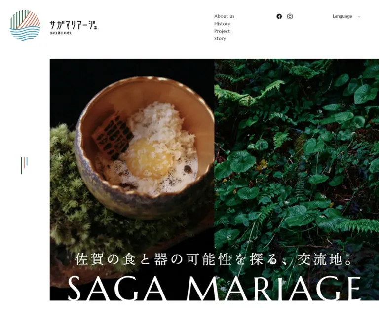
DESIGN REFERENCE
サガマリアージュ|佐賀の食と器を伝える公式サイト
佐賀の食材・器・料理人をつなぐ取組を紹介する地域文化サイト。大きな写真の分割構成、広い余白、明朝体と欧文セリフ、左端に残るロゴが特徴。
オリジナルサイトを見るSaga Mariage — Style Reference
A spacious editorial frame for the meeting of food, vessels, people, and place.
Website: sagamariage.jp Original URL: https://sagamariage.jp/ Final URL: https://sagamariage.jp/ Theme: white editorial canvas with a charcoal footer and restrained multicolor identity accents. Inspected: September 13, 2026, 03:37 JST; supplied browser retrieval timestamp: September 12, 2026, 18:37:05.029 UTC. Viewports: desktop 1440 × 1000 and mobile 390 × 844 CSS pixels. Scope: the current homepage, including its entry composition, Topics & Event, Concept, About/History links, Project and Story rows, Activity Log, and footer. Visual captures cover the entry views, a desktop middle section, and the desktop/mobile footer. Rendered DOM and computed styles provide additional measurements for sections outside those captures. Linked destination pages and opened navigation states were not inspected.
Saga Mariage presents a regional food-and-craft initiative through large photographs, restrained typography, and conspicuous white space. Its homepage introduces the initiative and distributes visitors across projects, editorial stories, events, and activity reports. The visual hierarchy supports exploration through these different content types.
The defining spatial device is a persistent identity rail at the left. Major photographs begin beside this rail and reach the right viewport edge; text often starts farther inward. A second recurring device is pairing: two photographic hero panels, adjacent About and History panels, and English section names accompanied by Japanese explanations. Marcellus gives English navigation a quiet ceremonial tone, while Japanese serif headings and sans-serif paragraphs distinguish names from explanation.
The footer changes the atmosphere without changing the vocabulary. A white identity mark, large serif navigation, small administrative text, and a faint oversized wordmark sit on a subtly textured charcoal field.
How to Read This Reference
- Measured means a value appears in the supplied rendered element bounds, computed styles, or CSS custom properties. Measurements are in CSS pixels unless stated otherwise.
- Calculated means arithmetic derived from those measurements, such as card gaps or the proportion of the hero occupied by its wordmark.
- Visual estimate means a feature is visible in a supplied capture but its exact declaration or element measurement was not provided.
- Recommended means guidance for a new implementation. The Quick Start is an adaptation using measured anchors, rather than recovered production CSS.
- Font names below come from computed family declarations. Font files, loading behavior, and the actual face used for every glyph were not independently verified.
- Some repeated navigation descendants have bounds in the DOM without appearing in the captures. Their presence does not establish that a menu or submenu was open.
- The dark mobile capture corresponds to the bottom-of-page footer. It is not evidence of an activated menu overlay.
Tokens — Colors
Default Palette
| Name | Value | Evidence | Role |
|---|---|---|---|
| Canvas White | #FFFFFF |
Computed body background | Main page, open margins, and white arrow tiles |
| Primary Ink | #111111 |
Source --base-text-color; computed text |
General text and Japanese card titles |
| Link Black | #000000 |
Source --base-link-color; computed navigation |
English section headings, header links, and text actions |
| Paragraph Gray | #333333 |
Computed paragraphs | Concept copy and editorial excerpts |
| Footer Charcoal | #25262B |
Source --base-color-black; computed footer background |
Full-width closing surface |
| Reversed White | #FFFFFF |
Computed feature and footer links | Typography over photography and charcoal |
| Secondary Gray | #666666 |
Source --base-color-gray |
Available neutral token; specific visible use is not established by the supplied samples |
| Navigation Detail Gray | #999999 |
Computed address in an additional navigation structure | Secondary administrative information in that structure |
The footer address and copyright appear subdued in the captures. The sampled footer text itself computes to white, so its final appearance may involve opacity or another compositing layer absent from the supplied property set. Do not treat #999999 as a measured final footer text color merely because it occurs elsewhere in the navigation DOM.
Identity and Accent Palette
| Name | Source value | Source property | Interpretation |
|---|---|---|---|
| Warm Coral | #D8654A |
--theme-color |
Warm member of the identity palette |
| Forest Green | #105C31 |
--theme-color02, --base-color-green |
Green member of the identity palette |
| Water Blue | #2D96C1 |
--theme-color03 |
Blue member of the identity palette |
| Bright Coral | #F36251 |
--menu-border-color01 |
Additional declared navigation accent |
| Amber | #FEAD39 |
--menu-border-color02, --menu-border-color03 |
Declared navigation colors; their active visible state was not established |
The circular identity and the small vertical rail mark visibly combine green, warm red/coral, and blue. Individual artwork strokes were not sampled, so the source palette should not be presented as a verified pixel-for-pixel mapping of every logo line.
A fine coral next arrow and gray previous arrow are visible beside the desktop Project heading. Their exact stroke colors were not measured.
Rules and Image Shading
- Declared light rules:
--base-border-color: #E0E0E0and--base-color-gray02: #E7E7E7. - Declared darker rule:
--base-border-color02: #777. - Declared hero gradient:
linear-gradient(0deg, rgba(0,0,0,1) 0%, rgba(0,0,0,0) 100%), stored as--fv-gradation. - Observed photographic treatment: darkened images support white captions and headings. The gradient layer's effective opacity was not supplied.
White and charcoal organize the interface. Color remains concentrated in the identity and small navigation details; photography provides most of the remaining chromatic variety. The declared --swiper-theme-color: #007aff is not evidence that bright blue is a general action color on the rendered page.
Tokens — Typography
Marcellus — English Navigation and Section Names
Computed family: Marcellus, serif.
Use regular weight 400 for English section titles, primary navigation, footer navigation, and View More labels. The letterforms are elegant without looking delicate at ordinary reading sizes. Tracking is usually 0.05em for headings and navigation; View More labels have normal tracking.
Capitalization changes by role: content sections use labels such as ABOUT, HISTORY, PROJECT, and STORY, while navigation uses About us, History, and Activity Log.
Zen Old Mincho — Japanese Concept and Project Identity
Computed family: 'Zen Old Mincho', serif.
The Concept heading uses weight 600. Project and Story names use weight 700, with slightly negative tracking of approximately -0.01em. Additional navigation descendants use regular 400 at smaller sizes.
This family gives Japanese project names a distinct editorial presence. Retain the distinction between these titles and the sans-serif explanatory paragraphs below them.
Noto Serif JP — Topics Headlines
Computed family: 'Noto Serif JP', serif.
Topics headlines use weight 600, 1.4 line height, and 0.05em tracking. This is a separate observed family from the project-title serif; combining them into a single Japanese heading font would simplify the original typographic system.
Noto Sans JP — Explanations and Administrative Text
The computed stack begins with 'Noto Sans JP', followed by Japanese system fallbacks including Hiragino Kaku Gothic Pro, Yu Gothic, Meiryo, MS PGothic, and sans-serif.
Concept and feature paragraphs use regular 400. Topics excerpts and Activity Log titles/excerpts use 500 in the supplied samples. Most descriptive copy has 0.05em tracking.
Type Scale
Values below are computed font size / line height, rounded where useful. Element rectangles sometimes exclude parts of the line box, so rectangle height should not replace the recorded line-height value.
| Role | Desktop | Mobile | Weight and tracking |
|---|---|---|---|
| Header navigation | 15 / 15px |
Hidden in entry capture | Marcellus 400, 0.05em |
| Language label | 15 / 15px |
12.44 / 12.44px |
Marcellus 400, normal tracking |
| Topics section heading | 40 / 52px |
24.96 / 32.45px |
Marcellus 400, 0.05em |
| About/History heading | 40 / 40px |
24.96 / 24.96px |
Marcellus 400, 0.05em |
| Project/Story section heading | 40 / 40px |
24.96 / 24.96px |
Marcellus 400, 0.05em |
| Concept heading | 36 / 57.6px |
24.96 / 39.94px |
Zen Old Mincho 600 |
| Concept paragraphs | 16 / 33.6px |
14.56 / 26.21px |
Noto Sans JP 400, 0.05em |
| Feature-panel paragraphs | 16 / 28.8px |
14.56 / 26.21px |
Noto Sans JP 400, 0.05em |
| Topics headline | 20 / 28px |
16.59 / 23.23px |
Noto Serif JP 600, 0.05em |
| Topics excerpt | 14 / 22.4px |
14.52 / 23.23px |
Noto Sans JP 500, 0.05em |
| Project title | 20 / 24px |
18.72 / 22.46px |
Zen Old Mincho 700, -0.01em |
| Story category title | 22 / 26.4px |
22.81 / 27.38px |
Zen Old Mincho 700, -0.01em |
| Project/Story description | 14 / 19.6px |
14.52 / 20.33px |
Noto Sans JP 400, 0.05em |
| Feature View More | 14 / 14px |
12.48 / 12.48px |
Marcellus 400 |
| Project/Story View More | 12 / 12px |
12.44 / 12.44px |
Marcellus 400 |
| Activity Log title | 16 / 22.4px |
14.56 / 20.38px |
Noto Sans JP 500 |
| Activity Log excerpt | 14 / 22.4px |
12.48 / 19.97px |
Noto Sans JP 500, 0.05em |
| Footer main navigation | 32 / 48px |
29.12 / 43.68px |
Marcellus 400, 0.05em |
| Footer descendant links | 13 / 19.5px |
12.48 / 18.72px |
Zen Old Mincho 400; expanded state unverified |
| Footer address | 12 / 19.2px |
12.44 / 19.91px |
Noto Sans JP 400 |
| Footer copyright | Not separately measured | 12.48 / 12.48px |
Marcellus 400, 0.05em |
Oversized Brand Artwork
The visible SAGA MARIAGE wordmark occupies a measured heading wrapper approximately 1152 × 98.94px on desktop and 297.31 × 104.05px on mobile. It is one line on desktop and two lines on mobile.
The sampled h1 has empty text and an inherited font size of only 6.25px on desktop. That computed value does not describe the visible lettering. The rendering mechanism and underlying graphic asset were not included in the evidence. For reproduction, use approved brand artwork with separate desktop/mobile arrangements, or explicitly label a typeset substitute as an approximation.
The white Japanese hero statement is visually estimated at roughly 36–40px on desktop and 14px on mobile. Its exact font and tracking were not measured.
Tokens — Spacing & Shapes
Two Horizontal Starting Lines
The source supplies two important alignment formulas:
/* Observed desktop custom properties */
--ml: 144px;
--lvw: 4.89vw;
--mlvw: calc(144px + 4.89vw);

/* Observed mobile custom properties */
--ml: 55px;
--lvw: 2.666vw;
--mlvw: calc(55px + 2.666vw);
The first line establishes the edge of large media. The second establishes the beginning of several editorial sections. At the inspected widths, the latter is approximately 214.42px on desktop and 65.40px on mobile, closely matching the rendered bounds of 214.41px and 65.39px.
Not every section uses the second formula. Desktop Project headings and cards begin at 216px; their mobile equivalents begin directly at 55px. Concept text has an additional mobile inset.
Layout Measurements
| Element | Desktop 1440 × 1000 | Mobile 390 × 844 | Evidence |
|---|---|---|---|
| Left media offset | 144px |
55px |
Custom property and bounds |
| Header height | 170px |
65px |
Bounds |
| Header padding | 40px 0 0 144px |
20px 0 0 55px |
Computed style |
| Hero | 1296 × 730px at (144,170) |
335 × 630.22px at (55,65) |
Bounds |
| Hero pane arrangement | Two equal columns | Two equal stacked regions | Captures |
| Individual hero region | Approximately 648 × 730px |
Approximately 335 × 315.11px |
Calculated from visible split |
| Hero wordmark left inset | 72.03px inside hero |
18.84px inside hero |
Bounds subtraction |
| Hero wordmark width | About 88.89% of hero |
About 88.75% of hero |
Calculated |
| Topics heading column | 288px |
Full 324.59px section width |
Bounds |
| Concept text width | 599.59px |
199.88px |
Bounds |
| Concept text left edge | 214.41px |
86.13px |
Bounds |
| About/History panel | Each 648 × 460px |
Each 335 × 397.81px |
Bounds |
| Project card width | 360px |
240px |
Bounds |
| Project card horizontal gap | 56px |
20px |
Calculated |
| Project/Story caption inset | 86px |
56px |
Bounds subtraction |
| Project/Story description width | 274px |
184px |
Bounds |
| Topics card width | 245px |
240px |
Bounds |
| Topics/Activity horizontal pitch | 281px |
276px |
Consecutive item positions |
| Footer height | 757.22px |
866.08px |
Bounds |
| Document height | 6277.52px |
5957.84px |
Rendered document bounds |
Vertical Rhythm
| Use | Desktop measurement | Mobile measurement |
|---|---|---|
| Topics top padding | 130px |
76.96px |
| Topics bottom padding | 160px |
83.2px |
| Concept section top padding | 240px |
204.88px |
| Space after Concept section before feature pair | 160px |
About 165.91px |
| Project section top padding | 160px |
About 76.95px |
| Project heading-to-card gap | 48px |
About 25.92px |
| Activity section bottom padding | 240px |
About 41.48px |
| Footer opening content padding | 100px |
About 62.22px |
These intervals create distinct pauses between chapters. They are not a single uniform section-padding token. The Concept region, in particular, contains more staging space than its top padding alone explains.
Shapes and Fine Details
- Major photographs and content regions have square corners. Sampled element radii are
0px. - No general raised-card or rounded-container treatment appears in the captures.
- The About/History action terminates in a white square of approximately
48 × 48pxon desktop, with a fine right-pointing chevron. - Thin horizontal rules below feature headings are visually about
72pxwide on desktop; their exact thickness is not supplied. - The rail mark uses three top-aligned vertical strokes of decreasing height. Visual estimates are approximately
48/32/24pxtall on desktop and36/24/16pxon mobile. - Social glyphs measure
15 × 15pxin the desktop header and approximately15.55pxwide in mobile navigation/footer samples. These glyph dimensions do not establish usable touch-target dimensions.
Components
Persistent Identity Rail
Role: maintains a recognizable left edge as the page scrolls.
The color identity mark sits in the reserved rail, separate from the Japanese header wordmark. Its desktop wrapper is 89 × 91.25px at approximately (27.5,29); mobile reduces this to 35 × 35.88px at (10,15).
The identity contains vertical and diagonal lines above a sequence of horizontal waves. Below it, near the viewport's vertical midpoint, three small colored strokes form a navigation-like affordance. Both elements remain at consistent viewport positions across the supplied scroll captures, supporting a persistent or fixed treatment; the exact positioning declaration was not included.
The rail has no visible enclosing border. Over the footer, the charcoal background extends behind it. Avoid implementing a permanently white rail that would interrupt the full-width dark closing surface.
Activation of the three-stroke control was not recorded. If it becomes a menu button in an adaptation, give it an accessible name, a larger invisible hit area, and a real navigation destination or panel.
Header
Role: introduces identity, primary destinations, social channels, and language selection.
Desktop anatomy:
- Japanese wordmark at
x144, with a measured wrapper width of137px. - A four-link vertical navigation stack at
x792: About us, History, Project, and Story. - Facebook and Instagram glyphs beginning near
x1022.75, separated by a16pxgap. - Language utility at approximately
x1290.
The navigation uses 15px Marcellus with 15px line height. Consecutive links begin 25px apart, giving a calculated 10px gap between their line boxes.
The mobile header keeps a 100px Japanese wordmark and the Language utility. The desktop link stack and header social glyphs are absent from the mobile entry capture. The small color emblem remains in the separate left rail.
The header's Project link targets /#project; About us, History, and Story target separate paths. Destination behavior beyond these recorded hrefs was not tested.
Language Utility
Role: exposes language choice without dominating the identity area.
The visible control is the word Language with a tiny downward chevron. It has no prominent button fill or border. The DOM contains Select Language, 日本語, and English, but no opened selection state is shown.
Preserve the small utility scale. Do not infer a modal, dropdown animation, persistence mechanism, or translation service from the text alone.
Paired Photographic Hero
Role: communicates the relationship between making, material, food, and landscape.
The desktop hero begins below the 170px header, beside the 144px rail, and reaches the right edge. Two equal image fields meet without a gutter. White Japanese copy sits above the oversized English brand artwork near the bottom.
The supplied desktop frame contains overlapping pottery, food, foliage, and a glowing vessel scene. The mobile frame shows two clearer regions: hands shaping a vessel above a plated composition in a vessel with a bright rim. This is consistent with a changing image state, but the precise transition mechanism and timing are unverified. The overlap should not automatically become a permanent double-exposure effect in a reconstruction.
On mobile, the pair becomes a vertical composition approximately 630px high. The title changes to two lines and remains anchored near the bottom of the second image. Its lower edge closely meets the hero boundary, creating a deliberate cropped-poster feeling.
There is no large conversion button within the captured hero. Its main work is visual introduction and identity.
Topics & Event Row
Role: surfaces recent reporting and announcements immediately after the hero.
On desktop, a 288px heading column sits to the left of a horizontal sequence of linked articles. The first article begins at x502.41; following articles begin at x783.41, 1064.41, and 1345.41. The final position extends beyond the viewport, establishing a continuing horizontal row.
Each sampled topic link contains a date, a Japanese serif headline, and a sans-serif excerpt. The link box is 245px wide with 36px right padding, leaving 209px for the sampled headline and paragraph. Large bottom padding is also present; the media element associated with that space was not included in the supplied element measurements.
Mobile moves the section heading above the row. Cards remain horizontal, with 240px boxes, 20px internal right padding, and a 276px start-to-start pitch. The next item begins at x341.39, leaving a narrow preview at the right edge of the 390px viewport.
The captured mobile entry shows only the section heading. Card typography and placement here are grounded in the rendered DOM, rather than a detailed visual capture of the row.
Concept Narrative
Role: explains the initiative through an editorial passage with generous breathing room.
The section combines a Japanese serif statement with five sans-serif paragraphs. The text discusses encounters between chefs, ingredients, vessels, and people as the source of new culinary expression.
Desktop text occupies an approximately 600px column beginning at 214.41px. A rock/material photograph is visible at the right in the supplied middle capture. Its full section placement and intrinsic dimensions are not available.
Mobile compresses the narrative into an unusually narrow 199.88px column beginning at 86.13px. The heading wraps into short lines, while paragraphs use 14.56px type with 26.21px leading. This maintains a considered reading rhythm inside the wider photographic frame.
For an adaptation, retain the inset composition at normal sizes while allowing the text measure to expand under large text settings. A strict 200px width should not become an accessibility constraint.
About and History Feature Pair
Role: creates two substantial gateways into the initiative's purpose and background.
Each entire panel is an anchor. Desktop places two 648 × 460px panels side by side, with no gutter. About uses a close-up of food preparation; History uses an outdoor evening dining event beneath a large tree.
Panel anatomy:
- Full-panel photograph with darkening sufficient for reversed text.
- Centered uppercase Marcellus heading.
- Short centered horizontal rule.
- Left-aligned Japanese explanatory paragraph.
- Underlined View More label at the lower right.
- White corner tile with a fine right chevron.
The measured inner heading region is approximately 576px wide. Desktop paragraphs add 20px left and 40px right padding within that region. The visual text therefore begins farther inward than the heading container.
Mobile stacks the two links into a 335px-wide column. Each panel is approximately 397.81px high, and its content region is 251.25px wide, or 75% of the panel. Paragraph padding disappears in the sampled mobile styles. The image treatment stays substantial rather than shrinking into a thumbnail beside text.
Project Row
Role: introduces seven distinct programs through a continuing sequence of linked cards.
The section heading is accompanied by fine previous/next chevrons in the desktop middle capture. DOM geometry places the seven links in a horizontal row, including items beyond the viewport. Arrow activation, dragging, wrapping, and autoplay were not tested.
Measured card anatomy:
- Desktop outer width:
360px; gap:56px. - Mobile outer width:
240px; gap:20px. - Title begins approximately
307pxbelow the card top on desktop and204pxbelow it on mobile. - Title, description, and View More share an inset caption column:
86pxfrom the desktop card edge,56pxon mobile. - Description width is
274pxdesktop and184pxmobile.
The upper media rectangle was not separately measured. The title offset includes whatever media and spacing precede it; it must not be reported as an exact image height.
Japanese titles use bold Zen Old Mincho. Descriptions stay compact and relatively tight at 1.4 line height. View More is a small Marcellus text action. All three belong to the same card link, so an adaptation should not nest additional anchors inside it.
The programs span research, dining events, seminars, tours, residencies, student education, and a gastronomy conference. Keep these as distinct content entries rather than reducing the section to a few generic service cards.
Story Categories
Role: groups editorial content around the initiative's three central subjects.
The visible source labels are 食, 器, and 料理人, corresponding to food, vessels, and chefs. Each card combines its short Japanese title, an explanatory sentence, and View More.
The measured card and caption widths match the Project system. Category titles are slightly larger: 22px desktop and approximately 22.81px mobile. This preserves the weight of short labels even when the card narrows.
Desktop card starts are 252, 668, and 1084px, so this row begins 36px farther right than the first Project card. Mobile starts are 55, 315, and 575px, matching the mobile Project pitch. Preserve this observation as a specific layout difference rather than inventing one universal alignment rule.
Activity Log
Role: provides an ongoing record of visits, ingredients, makers, and program activity.
Desktop repeats the editorial heading-column arrangement used by Topics. A View More link sits beneath the heading and targets /voice/. Entries contain dates, categories, titles, and excerpts in the supplied DOM.
The typography differs from Topics: Activity Log titles use medium-weight Noto Sans JP rather than Noto Serif JP. On mobile, the title and View More share the top region, and the horizontal sequence follows below.
This distinction helps visitors recognize an ongoing journal within the broader project presentation. Preserve the typography and information hierarchy rather than styling every editorial row identically.
Charcoal Footer
Role: closes the page with strong identity, repeated navigation, social links, and administrative information.
Desktop uses a large white identity lockup at the left and two groups of large serif navigation at the right, followed by small social glyphs. The footer spans the full viewport width, including behind the rail. Its base color is the measured #25262B; a fine texture is visible, though no texture asset or blend settings were supplied.
Top-level links are white Marcellus at 32px, with Project and Story accompanied by small chevrons. The DOM includes descendant links, but the captures show the compact top-level arrangement. Submenu opening behavior remains unverified.
The original footer explicitly identifies the operator as サガマリアージュ推進協議会 and gives an office address within the Saga Prefectural Government's distribution and trade department. This is original-page evidence, not an inferred production credit.
Mobile rearranges the footer into a single column beginning at x78, with a measured content width of 234px. The white logo, five main navigation labels, social links, operator address, and copyright appear sequentially. Navigation remains large at 29.12px rather than becoming a tiny utility list.
A very faint Japanese statement and oversized English wordmark sit near the bottom. Treat these as decorative identity reinforcement. The displayed © 2024 Saga Mariage is a copyright string, not evidence of the current design's publication date.
Tokens — Motion & Interaction
| Treatment | Supplied evidence | What can be concluded |
|---|---|---|
| General links and identity anchors | 0.4s cubic-bezier(0.215, 0.61, 0.355, 1) |
A transition is defined; the destination property/state is not established for every link |
| Header navigation and many text labels | color 0.4s cubic-bezier(0.39, 0.575, 0.565, 1) |
Text-color changes use a measured 400ms transition |
| Topics and Project/Story card anchors | transform 0.4s cubic-bezier(0.215, 0.61, 0.355, 1) |
Transform feedback is defined; direction and magnitude were not supplied |
| Project/Story title spans | Color and background transitions, 0.4s, same sine curve |
Both properties are prepared for state changes; final state colors were not tested |
| Mobile Concept heading and paragraphs | opacity 0.8s, plus a 400ms color transition |
Opacity transitions exist; trigger, delay, and sequence remain unverified |
| Language label | color 0.4s |
A color transition is defined; opened utility behavior is unknown |
| Hero image changes | Different photographic states and overlap in the captures | Consistent with image transitions, without verified cadence or mechanism |
| Horizontal content rows | Offscreen card bounds and visible Project arrows | Horizontal continuation is established; swipe, drag, snap, and autoplay behavior are unverified |
| Persistent rail | Same viewport placement across scroll captures | Persistence is visually supported; fixed/sticky source declaration is unavailable |
Two useful source easing definitions are:
--easeOutQuad: cubic-bezier(0.215, 0.61, 0.355, 1);
--easeOutSine: cubic-bezier(0.39, 0.575, 0.565, 1);
Other easing variables, including an overshooting popup curve, are declared. Their presence does not establish that a bouncing popup occurs on this homepage.
Many sampled elements report animation: none, while some transition strings contain only all. These records do not prove a completely static site: image layers, pseudo-elements, JavaScript-driven changes, and unexercised states are not fully represented.
Recommended motion direction: use restrained color changes and gentle photographic transitions. Keep text stable while imagery changes. Provide a static or paused presentation when reduced motion is requested. Do not add parallax, automatic scrolling, or dramatic card travel as if they were verified original behavior.
Surfaces
| Surface | Appearance | Structural purpose |
|---|---|---|
| Main canvas | Flat white | Creates generous pauses between content chapters |
| Identity rail | Visually open; inherits the surrounding page field | Holds the persistent emblem and three-stroke mark |
| Hero | Edge-to-edge paired photography within the offset frame | Introduces material, food, place, and brand |
| Feature links | Darkened full-panel photography with white text | Makes About and History substantial destinations |
| Project and editorial content | Unboxed content on white | Supports browsing without a heavy card framework |
| Arrow corner tile | Small white square with fine dark chevron | Makes the lower-right panel action recognizable |
| Footer | Charcoal with subtle visible texture | Provides a strong closing chapter |
| Footer watermark | Very low-contrast identity artwork | Adds scale without competing with navigation |
Hierarchy comes from size, alignment, contrast, and photographic boundaries. There is no visible general-purpose elevation system to reproduce.
Imagery
Photography carries the site's material character: clay on hands, an irregular ceramic rim, fine shavings over food, moss, dense foliage, rock, and evening dining beneath a tree. These subjects connect finished dishes to the people and materials behind them.
The framing is close and tactile. Vessels are large enough for surface imperfections and glaze to matter. Working hands remain central. Landscape and mineral details contribute context through texture rather than through generic destination panoramas.
Natural greens, earthy browns, dark clothing, warm highlights, and blue evening light provide color inside an otherwise restrained interface. Preserve those differences; a single warm filter across every image would flatten the relationship between forest, workshop, food, and event.
Observed Asset References
No image source URLs, filenames, intrinsic dimensions, or font-file URLs were included in the supplied evidence. The following inventory identifies visible subjects and their usage without inventing asset paths.
| Visible asset or subject | Placement | Evidence limit |
|---|---|---|
| Multicolor line-and-wave emblem | Persistent upper-left rail | Desktop and mobile captures |
| Japanese wordmark | Header beside the rail | Desktop and mobile entry captures |
| Hands shaping a ceramic vessel | Hero | Clear mobile frame; overlaps with another scene on desktop |
| Close-up food in a ceramic bowl with moss | Hero | Visible within the desktop overlapping image state |
| Dense green foliage | Hero | Visible in the desktop image state |
| Vessel with a bright glowing rim and plated food | Hero | Clear lower mobile region; also visible in desktop overlap |
| Rock/mineral close-up | Concept area | Partial view at the top right of the desktop middle capture |
| Hands finishing a plated dish | About link | Desktop feature panel |
| Outdoor evening dining under a tree | History link | Desktop feature panel |
| White identity lockup | Footer | Desktop and mobile footer captures |
| Faint enlarged wordmark and statement | Footer bottom | Desktop and mobile footer captures |
| Fine dark texture | Footer background | Visually present; implementation unverified |
Use approved photography and identity assets where available. Project, Story, Topics, and Activity Log media should be selected from their own content; the supplied evidence does not establish the exact image subject of each card.
Layout & Responsive Behavior
Desktop Composition
At 1440px width, the 144px rail reserves exactly one tenth of the viewport. The hero occupies the remaining 1296px, with a central seam at x792. That seam also aligns with the header's primary navigation and the start of the History panel.
Several text sections begin around 214–216px, creating an additional inset of approximately 70–72px beyond the media edge. Within cards, captions step inward again. This nested alignment produces the editorial character more strongly than a conventional centered maximum-width container would.
Topics and Activity Log use a left heading column with content extending horizontally to the right. Project uses 360px cards separated by 56px. The footer introduces a wider internal composition while retaining the relationship between the identity on the left and navigation on the right.
Mobile Composition
At 390px width, the rail remains 55px, leaving 335px for major media. It occupies approximately 14.1% of the viewport, so its proportional presence increases.
The hero becomes two stacked image regions. Its 630.22px height places the bottom at approximately y695.22; Topics begins immediately after it, with its heading appearing around y772.17 after section padding.
About and History also stack. Project and Story retain horizontal rows, with 240px cards and a visible portion of the next card. Topics and Activity Log move their heading above the row. This is selective reflow, not a universal conversion into full-width vertical cards.
The Concept passage becomes a narrow inset reading column. The footer becomes a tall single column, while its navigation text remains nearly desktop-sized. The smaller document height does not indicate fewer project entries: the DOM still contains all seven, arranged outside the initial horizontal viewport.
Source Mobile Sizing Tokens
The source declares a family of viewport-based clamps. Representative calculations at 390px are:
| Source token | Source expression | Calculated value at 390px |
|---|---|---|
--fz12 |
clamp(12px, calc((12/375)*100vw), 14px) |
12.48px |
--fz14 |
clamp(14px, calc((14/375)*100vw), 16px) |
14.56px |
--fz16 |
clamp(16px, calc((16/375)*100vw), 17px) |
16.64px |
--fz18 |
clamp(18px, calc((18/375)*100vw), 20px) |
18.72px |
--fz24 |
clamp(24px, calc((24/375)*100vw), 26px) |
24.96px |
--fz36 |
clamp(36px, calc((36/375)*100vw), 40px) |
37.44px |
--fz40 |
clamp(40px, calc((40/375)*100vw), 44px) |
41.6px |
Not every element uses these clamps directly. The measured mobile root is approximately 10.3701px, and several elements resolve to values such as 14.5181px or 12.4441px. Keep those computed measurements distinct from the nominal clamp calculations.
Only the two supplied viewport widths were inspected. Breakpoint thresholds, tablet layouts, landscape behavior, zoom handling, and safe-area treatment were not established. The Quick Start's breakpoint is a recommendation.
Do’s and Don’ts
Do
- Preserve the left rail and the distinction between media edges and text starting lines.
- Let large photographs reach the right edge of the available frame.
- Keep the desktop hero as a pair and reorganize it vertically on mobile.
- Use Marcellus for English navigation and section names, with restrained
0.05emtracking. - Preserve the separate Japanese serif roles for Concept/project identity and Topics headlines.
- Give narrative paragraphs generous line height while keeping card descriptions more compact.
- Keep About and History as entire photographic links with a small corner-arrow treatment.
- Retain horizontal continuation for Project, Story, and editorial rows on mobile.
- Preserve the inset caption columns inside Project and Story cards.
- Use color mainly in the identity and fine directional details.
- Make the footer full-width charcoal, with large white serif navigation and a faint decorative wordmark.
- Distinguish the hero's captured image overlap from a confirmed permanent effect.
Don’t
- Don't replace the asymmetric rail system with one centered container applied to every section.
- Don't reduce the mobile hero to a short banner that loses the pairing of subjects.
- Don't place every item inside a rounded, bordered, shadowed card.
- Don't turn the small View More links into large colored buttons throughout the page.
- Don't use a single sans-serif family for every heading.
- Don't copy the inherited
6.25pxheading font size as the size of the visible brand artwork. - Don't convert all horizontally arranged content into a long vertical list without a reason.
- Don't claim that the footer capture shows an open menu.
- Don't infer hover distances, autoplay timing, swipe behavior, or submenu animation from declarations alone.
- Don't use the faint decorative footer lettering as the only presentation of important information.
- Don't apply one aggressive color grade to every photographic subject.
Recommended Implementation Additions
These are recommendations for a new implementation, not verified original features:
- Give the rail affordance a named button and at least a
44 × 44pxhit area while retaining the small painted strokes. - Implement language selection and expandable navigation with explicit state, keyboard operation, and visible focus.
- Give carousel arrows accessible names and expose all items through keyboard-operable controls or native horizontal scrolling.
- Keep horizontal overflow inside the appropriate content row rather than allowing the entire page to pan sideways.
- If the hero rotates automatically, provide pause behavior and a stable reduced-motion presentation.
- Reserve image dimensions before loading to protect the large composition from layout shifts. Load the initial hero promptly and defer distant editorial images.
- Provide a meaningful accessible name for the brand heading even when its visible lettering is artwork.
- Keep white text legible across every hero and feature image state; verify contrast on the brightest underlying regions.
- Increase the effective contrast of footer administrative text where necessary. A faint watermark may remain decorative, but addresses and copyright should stay readable.
- Allow the narrow Concept column and fixed-height feature panels to grow with text enlargement and translation.
- Keep one anchor per linked card and provide meaningful image alternatives without repeating the entire adjacent paragraph.
Agent Prompt Guide
Quick Color Reference
- Main canvas:
#FFFFFF. - General text:
#111111; English headings and links:#000000. - Paragraph text:
#333333. - Footer:
#25262B, with white navigation. - Identity palette: coral
#D8654A, green#105C31, blue#2D96C1. - Accent colors remain small; photographs carry the larger color fields.
- Photo shading uses black transparency. The source declares a bottom-to-top black-to-transparent gradient, but its effective opacity is unverified.
Overall Prompt
“Create an editorial homepage for a regional food-and-craft initiative inspired by Saga Mariage. Use a white canvas with a persistent left identity rail: 144px at the desktop reference width and 55px on mobile. Begin large photographs beside this rail and extend them to the right viewport edge. Build a two-panel photographic hero with tactile pottery, food, and landscape subjects; stack the panels on mobile. Place a white Japanese statement and large brand artwork near the lower edge. Use regular Marcellus for English navigation and section names, Zen Old Mincho for Japanese concept and project titles, Noto Serif JP for Topics headlines, and Noto Sans JP for explanations. Follow the hero with editorial rows, a spacious Concept passage, adjacent About/History photo links, horizontally continuing Project and Story cards, and Activity Log. End with a full-width charcoal footer containing white identity artwork, large serif navigation, small administrative text, and a faint decorative wordmark. Preserve square corners, inset captions, broad pauses, and small underlined text actions.”
Example Component Prompts
- Header and rail: “Create a transparent persistent left rail with a small multicolor line-and-wave emblem near the top and three decreasing vertical strokes at mid-height. Put the Japanese wordmark in the normal-flow white header beside it. On desktop, distribute a four-link vertical Marcellus navigation stack, two small social glyphs, and a Language utility across the remaining width. On mobile, keep the wordmark and Language utility.”
- Hero: “Create a right-edge photographic pair inside an offset page frame. Use working hands shaping clay and a dramatic ceramic food composition. Keep the photographs separate, with no gutter. Overlay a small white Japanese statement and oversized brand artwork near the bottom. Stack the photos and use a two-line brand arrangement on mobile. Do not assume video or a permanent double exposure.”
- About/History pair: “Create two adjoining square-cornered photographic links. Use food preparation for About and an outdoor evening dining scene for History. Each panel has a centered white 40px Marcellus heading, a short fine rule, left-aligned Japanese explanatory text, and a lower-right underlined View More label beside a 48px white chevron tile. Stack the panels on mobile.”
- Project row: “Create a horizontally continuing row of 360px cards with 56px gaps on desktop. Inset captions 86px from each card's left edge. Use bold 20px Zen Old Mincho titles, compact 14px sans-serif descriptions, and a small serif View More label. On mobile, use 240px cards, 20px gaps, and a 56px caption inset, leaving the next card partly visible.”
- Footer: “Create a full-width #25262B footer that extends behind the left rail. Place a white identity lockup at left and spacious 32px Marcellus navigation at right, with small social glyphs and administrative text below. On mobile, use one inset column and retain approximately 29px navigation. Finish with faint oversized decorative brand artwork.”
Evidence-Aware Motion Prompt
“Use the measured 400ms color-transition curve cubic-bezier(0.39, 0.575, 0.565, 1) and the measured 400ms transform-transition curve cubic-bezier(0.215, 0.61, 0.355, 1). Select any transform distance as a new design decision. Keep the initial hero static unless an image sequence is explicitly supplied. Provide reduced-motion behavior and avoid inventing parallax or autoplay specifications.”
Quick Start
CSS Custom Properties
This adaptation keeps a conventional root font size. It reproduces the main measured dimensions at 1440px and 390px, while using a recommended 900px breakpoint for reflow. Mobile clamps approximate the measured typography; they do not reproduce every root-based decimal value.
Provide approved images and wordmark artwork separately. The stylesheet does not fetch assets or fonts. Its project-media ratio, hover treatment, focus styling, footer text contrast, and horizontal scroll snapping are recommendations.
Expected structure:
.identity-railcontains.rail-homeand a.rail-triggerbutton with a.rail-lineswrapper containing three spans..site-headercontains.header-wordmark,.primary-nav,.header-socials, and.language-control..hero.page-framecontains.hero-mediawith two images, plus.hero-captionand.hero-wordmark. Use a picture element inside the wordmark wrapper when separate mobile artwork is available..feature-pair.page-framecontains two.feature-cardanchors. Each contains an image,.feature-copy,.feature-more, and.arrow-tile..project-section.page-framecontains a heading and.card-trackof.project-cardanchors with media and.project-copy..site-footercontains.footer-top,.footer-legal, and decorative.footer-watermarkartwork.
:root {
  /* Colors measured in the supplied page evidence */
  --paper: #fff;
  --ink: #111;
  --link: #000;
  --copy: #333;
  --charcoal: #25262b;
  --coral: #d8654a;
  --green: #105c31;
  --blue: #2d96c1;
  --rule: #e0e0e0;
  --hero-gradient: linear-gradient(
    0deg,
    rgba(0, 0, 0, 1) 0%,
    rgba(0, 0, 0, 0) 100%
  );

  /* Computed family names; load approved font files separately */
  --font-en: 'Marcellus', serif;
  --font-jp-title: 'Zen Old Mincho', serif;
  --font-jp-news: 'Noto Serif JP', serif;
  --font-body: 'Noto Sans JP', 'Hiragino Kaku Gothic Pro',
    'Yu Gothic', Meiryo, sans-serif;

  /* Measured desktop anchors */
  --rail: 144px;
  --editorial-gutter: 4.89vw;
  --editorial-start: calc(var(--rail) + var(--editorial-gutter));
  --header-height: 170px;
  --section-title: 40px;
  --project-inset: 72px;
  --card-width: 360px;
  --card-gap: 56px;
  --caption-inset: 86px;
  --project-title: 20px;
  --story-title: 22px;
  --card-copy: 14px;
  --small-link: 12px;
  --feature-copy: 16px;
  --feature-title: 40px;
  --footer-link: 32px;

  /* Measured transition definitions */
  --ease-transform: cubic-bezier(0.215, 0.61, 0.355, 1);
  --ease-color: cubic-bezier(0.39, 0.575, 0.565, 1);
  --duration-link: 400ms;
}

* {
  box-sizing: border-box;
}

html {
  font-size: 100%;
}

body {
  margin: 0;
  overflow-x: clip;
  color: var(--ink);
  background: var(--paper);
  font: 400 16px/1.8 var(--font-body);
}

img,
svg {
  max-width: 100%;
}

img {
  display: block;
}

a {
  color: inherit;
}

button,
summary {
  font: inherit;
}

button {
  cursor: pointer;
}

.page-frame {
  margin-inline-start: var(--rail);
}

/* Keep this rail transparent over the full-width footer. */
.identity-rail {
  position: fixed;
  inset: 0 auto 0 0;
  z-index: 30;
  width: var(--rail);
  pointer-events: none;
}

.identity-rail > * {
  pointer-events: auto;
}

.rail-home {
  position: absolute;
  inset-block-start: 29px;
  inset-inline-start: calc((var(--rail) - 89px) / 2);
  width: 89px;
}

.rail-trigger {
  position: absolute;
  inset-block-start: 50%;
  inset-inline-start: 50%;
  display: grid;
  place-items: center;
  width: 44px;
  height: 52px;
  padding: 0;
  border: 0;
  background: transparent;
  transform: translate(-50%, -50%);
}

.rail-lines {
  display: flex;
  align-items: flex-start;
  gap: 6px;
  height: 48px;
}

.rail-lines span {
  display: block;
  width: 2px;
}

.rail-lines span:nth-child(1) {
  height: 48px;
  background: var(--green);
}

.rail-lines span:nth-child(2) {
  height: 32px;
  background: var(--coral);
}

.rail-lines span:nth-child(3) {
  height: 24px;
  background: var(--blue);
}

.site-header {
  display: flex;
  align-items: flex-start;
  height: var(--header-height);
  padding: 40px 4.86vw 0 var(--rail);
}

.header-wordmark {
  flex: 0 0 137px;
  width: 137px;
  margin-block-start: 20px;
  margin-inline-end: auto;
}

.primary-nav {
  display: grid;
  gap: 10px;
  flex: 0 0 80px;
  margin-inline-end: 10.47vw;
  font: 400 15px/1 var(--font-en);
  letter-spacing: 0.05em;
}

.primary-nav a {
  color: var(--link);
  text-decoration: none;
  transition: color var(--duration-link) var(--ease-color);
}

.header-socials {
  display: flex;
  gap: 16px;
  margin-inline-end: 15.36vw;
}

.header-socials svg {
  display: block;
  width: 15px;
  height: 15px;
}

.language-control {
  flex: 0 0 80px;
  width: 80px;
  padding: 0;
  border: 0;
  color: var(--link);
  background: transparent;
  font: 400 15px/1 var(--font-en);
  text-align: start;
}

.hero {
  position: relative;
  isolation: isolate;
  height: 730px;
  overflow: hidden;
  background: #000;
}

.hero-media {
  display: grid;
  grid-template-columns: repeat(2, minmax(0, 1fr));
  width: 100%;
  height: 100%;
}

.hero-media img {
  width: 100%;
  height: 100%;
  min-height: 0;
  object-fit: cover;
}

/* Recommended opacity; the source layer opacity was not supplied. */
.hero::after {
  position: absolute;
  inset: 0;
  z-index: 1;
  content: '';
  background: var(--hero-gradient);
  opacity: 0.4;
  pointer-events: none;
}

/* Caption size and placement approximate the visible capture. */
.hero-caption {
  position: absolute;
  z-index: 2;
  inset-inline-end: 7%;
  inset-block-end: 120px;
  margin: 0;
  color: #fff;
  font: 400 36px/1.5 var(--font-jp-title);
  letter-spacing: 0.14em;
}

.hero-wordmark {
  position: absolute;
  z-index: 2;
  inset-inline-start: 5.5556%;
  inset-block-end: -1px;
  width: 88.8889%;
  margin: 0;
}

.hero-wordmark img {
  width: 100%;
  height: auto;
}

.section-title {
  margin: 0;
  color: var(--link);
  font: 400 var(--section-title)/1 var(--font-en);
  letter-spacing: 0.05em;
}

.editorial-band {
  display: grid;
  grid-template-columns: 288px minmax(0, 1fr);
  margin-inline-start: var(--editorial-start);
  padding-block: 130px 160px;
}

.editorial-band .section-title {
  line-height: 1.3;
}

.editorial-track {
  display: flex;
  gap: 36px;
  min-width: 0;
  overflow-x: auto;
  padding-block-end: 16px;
}

.news-card {
  flex: 0 0 245px;
  padding-inline-end: 36px;
  color: var(--ink);
  text-decoration: none;
}

.news-title {
  margin-block: 20px;
  font: 600 20px/1.4 var(--font-jp-news);
  letter-spacing: 0.05em;
}

.news-excerpt {
  margin: 0;
  color: var(--copy);
  font: 500 14px/1.6 var(--font-body);
  letter-spacing: 0.05em;
}

.concept-copy {
  width: min(600px, calc(100% - var(--editorial-start) - 32px));
  margin-inline-start: var(--editorial-start);
}

.concept-copy h2 {
  margin-block: 0 64px;
  font: 600 36px/1.6 var(--font-jp-title);
}

.concept-copy p {
  margin-block: 0 48px;
  color: var(--copy);
  font-size: 16px;
  line-height: 2.1;
  letter-spacing: 0.05em;
}

.feature-pair {
  display: grid;
  grid-template-columns: repeat(2, minmax(0, 1fr));
}

.feature-card {
  position: relative;
  isolation: isolate;
  display: flex;
  align-items: center;
  min-height: 460px;
  overflow: hidden;
  color: #fff;
  text-decoration: none;
}

.feature-card > img {
  position: absolute;
  inset: 0;
  z-index: -2;
  width: 100%;
  height: 100%;
  object-fit: cover;
}

/* Recommended shading; adjust against each approved photograph. */
.feature-card::before {
  position: absolute;
  inset: 0;
  z-index: -1;
  content: '';
  background: rgba(0, 0, 0, 0.42);
}

.feature-copy {
  width: 88.8889%;
  margin-inline: auto;
  padding-block: 72px;
}

.feature-copy h2 {
  margin: 0;
  font: 400 var(--feature-title)/1 var(--font-en);
  letter-spacing: 0.05em;
  text-align: center;
}

.feature-copy h2::after {
  display: block;
  width: 72px;
  height: 1px;
  margin: 28px auto 26px;
  background: currentColor;
  content: '';
}

.feature-copy p {
  margin: 0;
  padding-inline: 20px 40px;
  font-size: var(--feature-copy);
  line-height: 1.8;
  letter-spacing: 0.05em;
}

.feature-more {
  position: absolute;
  inset-inline-end: 72px;
  inset-block-end: 20px;
  font: 400 14px/1 var(--font-en);
  text-decoration: underline;
  text-underline-offset: 2px;
}

.arrow-tile {
  position: absolute;
  inset-inline-end: 0;
  inset-block-end: 0;
  display: grid;
  place-items: center;
  width: 48px;
  height: 48px;
  color: #777;
  background: #fff;
}

.arrow-tile::before {
  width: 12px;
  height: 12px;
  border-block-start: 1px solid currentColor;
  border-inline-end: 1px solid currentColor;
  content: '';
  transform: rotate(45deg);
}

.project-section {
  padding-block-start: 160px;
}

.project-section > .section-title {
  margin-inline-start: var(--project-inset);
  margin-block-end: 48px;
}

/* Native scrolling and snapping are recommended adaptations. */
.card-track {
  display: flex;
  gap: var(--card-gap);
  overflow-x: auto;
  overscroll-behavior-inline: contain;
  scroll-snap-type: x proximity;
  scroll-padding-inline-start: var(--project-inset);
  padding: 0 32px 16px var(--project-inset);
}

.project-card {
  flex: 0 0 var(--card-width);
  min-width: 0;
  color: var(--ink);
  text-decoration: none;
  scroll-snap-align: start;
}

/* Approximation: image bounds were not included in the evidence. */
.project-media {
  width: 100%;
  aspect-ratio: 6 / 5;
  object-fit: cover;
}

.project-copy {
  margin-inline-start: var(--caption-inset);
  padding-block-start: 7px;
}

.project-title {
  margin: 0 0 20px;
  font: 700 var(--project-title)/1.2 var(--font-jp-title);
  letter-spacing: -0.01em;
}

.story-card .project-title {
  font-size: var(--story-title);
}

.project-copy p {
  margin: 0 0 25px;
  color: var(--copy);
  font-size: var(--card-copy);
  line-height: 1.4;
  letter-spacing: 0.05em;
}

.text-more {
  font: 400 var(--small-link)/1 var(--font-en);
  text-decoration: underline;
  text-underline-offset: 3px;
}

.site-footer {
  position: relative;
  min-height: 757px;
  overflow: hidden;
  padding-block-start: 100px;
  color: #fff;
  background: var(--charcoal);
}

/* Footer placement approximates the measured desktop composition. */
.footer-top {
  display: flex;
  align-items: flex-start;
  justify-content: space-between;
  gap: 40px;
  margin-inline: calc(var(--rail) + 6.65vw) 10.8vw;
}

.footer-logo {
  flex: 0 0 clamp(180px, 17.36vw, 250px);
  width: clamp(180px, 17.36vw, 250px);
}

.footer-nav {
  display: grid;
  grid-template-columns: repeat(2, minmax(130px, 200px)) 46px;
  gap: clamp(16px, 1.65vw, 24px);
  margin-block-start: 60px;
}

.footer-nav-group {
  display: grid;
  align-content: start;
  gap: 11px;
}

.footer-nav-group > a,
.footer-nav-group > details > summary {
  font: 400 var(--footer-link)/1.5 var(--font-en);
  letter-spacing: 0.05em;
  text-decoration: none;
}

.footer-subnav a {
  display: block;
  margin-block: 12px;
  font: 400 13px/1.5 var(--font-jp-title);
}

.footer-socials {
  display: flex;
  gap: 16px;
}

.footer-socials svg {
  width: 15px;
  height: 15px;
}

/* Recommended readable neutral, not a measured final pixel color. */
.footer-legal {
  display: flex;
  justify-content: space-between;
  gap: 32px;
  margin: 48px 8.75vw 0 calc(var(--rail) + 4.5833vw);
  color: #aaa;
  font: 400 12px/1.6 var(--font-body);
}

.footer-legal p {
  margin: 0;
}

.footer-copyright {
  font-family: var(--font-en);
  letter-spacing: 0.05em;
}

/* Decorative artwork only; opacity is a recommended approximation. */
.footer-watermark {
  width: calc(100% - var(--rail) - 18.33vw);
  margin: 160px 8.75vw 0 auto;
  opacity: 0.14;
}

/* Recommended hover and focus states, not recovered target states. */
@media (hover: hover) {
  .primary-nav a:hover {
    color: var(--coral);
  }

  .project-card:hover .project-title,
  .news-card:hover .news-title {
    text-decoration: underline;
    text-underline-offset: 4px;
  }
}

:where(a, button, summary):focus-visible {
  outline: 2px solid currentColor;
  outline-offset: 4px;
}

:where(.feature-card, .project-card, .news-card):focus-visible {
  outline-offset: -3px;
}

/* Recommended breakpoint; the original threshold was not supplied. */
@media (max-width: 900px) {
  :root {
    --rail: 55px;
    --editorial-gutter: 2.666vw;
    --header-height: 65px;
    --section-title: clamp(24px, 6.4vw, 26px);
    --project-inset: 0px;
    --card-width: 240px;
    --card-gap: 20px;
    --caption-inset: 56px;
    --project-title: clamp(18px, 4.8vw, 20px);
    --story-title: clamp(22px, 5.85vw, 24px);
    --card-copy: clamp(14px, 3.7226vw, 16px);
    --small-link: clamp(12px, 3.1908vw, 14px);
    --feature-copy: clamp(14px, 3.7333vw, 16px);
    --feature-title: var(--section-title);
    --footer-link: clamp(28px, 7.4667vw, 32px);
  }

  .rail-home {
    inset-block-start: 15px;
    inset-inline-start: 10px;
    width: 35px;
  }

  .rail-lines {
    gap: 4px;
    height: 36px;
  }

  .rail-lines span:nth-child(1) { height: 36px; }
  .rail-lines span:nth-child(2) { height: 24px; }
  .rail-lines span:nth-child(3) { height: 16px; }

  .site-header {
    padding: 20px 5.333vw 0 var(--rail);
  }

  .header-wordmark {
    flex-basis: 100px;
    width: 100px;
    margin-block-start: 0;
  }

  .primary-nav,
  .header-socials {
    display: none;
  }

  .language-control {
    flex-basis: 65px;
    width: 65px;
    margin-block-start: 5px;
    font-size: var(--small-link);
  }

  /* Derived from 335 x 630.22px, not an observed source formula. */
  .hero {
    height: calc((100vw - var(--rail)) * 1.88125);
  }

  .hero-media {
    grid-template-columns: minmax(0, 1fr);
    grid-template-rows: repeat(2, minmax(0, 1fr));
  }

  .hero-caption {
    inset-inline: 5.625%;
    inset-block-end: 116px;
    font-size: 14px;
    line-height: 1.4;
    letter-spacing: 0.1em;
  }

  .hero-wordmark {
    inset-inline-start: 5.625%;
    width: 88.75%;
  }

  .editorial-band {
    display: block;
    padding-block: 76.96px 83.2px;
  }

  .editorial-band .section-title {
    margin-block-end: 31px;
  }

  .news-card {
    flex-basis: 240px;
    padding-inline-end: 20px;
  }

  .news-title {
    font-size: clamp(16px, 4.2544vw, 17px);
  }

  .news-excerpt {
    font-size: var(--card-copy);
  }

  .concept-copy {
    width: min(200px, calc(100vw - var(--rail) - 56px));
    margin-inline-start: calc(var(--rail) + 7.98vw);
  }

  .concept-copy h2 {
    margin-block-end: 41px;
    font-size: var(--section-title);
  }

  .concept-copy p {
    margin-block-end: 26px;
    font-size: var(--feature-copy);
    line-height: 1.8;
  }

  .feature-pair {
    grid-template-columns: minmax(0, 1fr);
  }

  .feature-card {
    min-height: 398px;
  }

  .feature-copy {
    width: 75%;
    padding-block: 72px;
  }

  .feature-copy h2::after {
    width: 48px;
    margin-block: 16px;
  }

  .feature-copy p {
    padding: 0;
  }

  .feature-more {
    inset-inline-end: 64px;
    inset-block-end: 16px;
    font-size: var(--small-link);
  }

  .project-section {
    padding-block-start: 76.95px;
  }

  .project-section > .section-title {
    margin-block-end: 25.92px;
  }

  .project-copy {
    padding-block-start: 4px;
  }

  .project-title {
    margin-block-end: 12px;
  }

  .site-footer {
    min-height: 866px;
    padding-block-start: 62.22px;
  }

  .footer-top {
    flex-direction: column;
    gap: 29px;
    width: 60vw;
    margin-inline: 20vw;
  }

  .footer-logo {
    flex-basis: auto;
    width: 100%;
  }

  .footer-nav {
    display: flex;
    flex-direction: column;
    gap: 28px;
    width: 100%;
    margin: 0;
  }

  .footer-nav-group {
    gap: 14px;
  }

  .footer-legal {
    display: block;
    margin: 57px 20vw 0;
    font-size: var(--small-link);
  }

  .footer-legal .footer-copyright {
    margin-block-start: 28px;
  }

  .footer-watermark {
    width: 75.73vw;
    margin: 80px 0 0 20vw;
  }
}

@media (prefers-reduced-motion: reduce) {
  .primary-nav a,
  .project-card,
  .news-card,
  .feature-card {
    transition: none;
  }

  .card-track {
    scroll-snap-type: none;
    scroll-behavior: auto;
  }
}
The CSS provides a static photographic shell and native horizontal rows. Opening a navigation panel, changing language, operating custom carousel arrows, or rotating hero images requires separate behavior. The supplied evidence does not establish those behaviors sufficiently to reconstruct them exactly.
Tailwind v4 Token Mapping
Optional aliases for a project already using Tailwind v4. This does not identify the original site's framework. Define the custom properties above first.
@theme inline {
  --color-saga-paper: var(--paper);
  --color-saga-ink: var(--ink);
  --color-saga-copy: var(--copy);
  --color-saga-charcoal: var(--charcoal);
  --color-saga-coral: var(--coral);
  --color-saga-green: var(--green);
  --color-saga-blue: var(--blue);

  --font-saga-en: var(--font-en);
  --font-saga-title: var(--font-jp-title);
  --font-saga-news: var(--font-jp-news);
  --font-saga-body: var(--font-body);

  --text-saga-section: var(--section-title);
  --text-saga-project: var(--project-title);
  --text-saga-copy: var(--card-copy);
  --text-saga-footer: var(--footer-link);

  --spacing-saga-rail: var(--rail);
  --spacing-saga-card: var(--card-width);
  --spacing-saga-gap: var(--card-gap);
  --spacing-saga-caption: var(--caption-inset);
}
Sources & Evidence
- Inspected original and final page: Saga Mariage. Both URLs are identical; the supplied browser response reports HTTP
200. - Retrieval time:
2026-09-12T18:37:05.029Z, equivalent to September 13, 2026, 03:37:05.029 JST. - Desktop evidence: 1440 × 1000 CSS-pixel viewport; entry, middle, and footer captures; rendered document height approximately
6277.52px. - Mobile evidence: 390 × 844 CSS-pixel viewport; entry and footer captures; rendered document height approximately
5957.84px. - Measurement source: supplied rendered DOM bounds, computed typography, colors, padding, transitions, and CSS custom properties. These establish the numerical tokens and horizontal card positions in this document.
- Navigation evidence: hrefs rendered on the homepage establish links to About, History, Project, Story categories, Activity Log, and social profiles. Those destination pages were not independently opened for this reference.
- Capture procedure: the supplied browser process allowed at least five seconds of initial observation and checked document load, layout/text stability, finite animation readiness, and visible image decoding within bounded waits. It traversed intermediate scroll positions. Perpetual animations were temporarily paused during readiness checks and resumed afterward.
- Limitations: no interaction trace establishes menu opening, language selection, hover end states, carousel activation, touch dragging, or hero timing. Asset URLs, pseudo-element details, opacity chains, font files, and breakpoint declarations were not supplied. SharedWorkers and service workers were disabled during the browser inspection.
This reference describes the current homepage shown by the supplied evidence. Measurements, visual estimates, and implementation recommendations are identified separately throughout.
# Saga Mariage — Style Reference

> A spacious editorial frame for the meeting of food, vessels, people, and place.

**Website:** [sagamariage.jp](https://sagamariage.jp/)
**Original URL:** https://sagamariage.jp/
**Final URL:** https://sagamariage.jp/
**Theme:** white editorial canvas with a charcoal footer and restrained multicolor identity accents.
**Inspected:** September 13, 2026, 03:37 JST; supplied browser retrieval timestamp: September 12, 2026, 18:37:05.029 UTC.
**Viewports:** desktop 1440 × 1000 and mobile 390 × 844 CSS pixels.
**Scope:** the current homepage, including its entry composition, Topics & Event, Concept, About/History links, Project and Story rows, Activity Log, and footer. Visual captures cover the entry views, a desktop middle section, and the desktop/mobile footer. Rendered DOM and computed styles provide additional measurements for sections outside those captures. Linked destination pages and opened navigation states were not inspected.

Saga Mariage presents a regional food-and-craft initiative through large photographs, restrained typography, and conspicuous white space. Its homepage introduces the initiative and distributes visitors across projects, editorial stories, events, and activity reports. The visual hierarchy supports exploration through these different content types.

The defining spatial device is a persistent identity rail at the left. Major photographs begin beside this rail and reach the right viewport edge; text often starts farther inward. A second recurring device is pairing: two photographic hero panels, adjacent About and History panels, and English section names accompanied by Japanese explanations. Marcellus gives English navigation a quiet ceremonial tone, while Japanese serif headings and sans-serif paragraphs distinguish names from explanation.

The footer changes the atmosphere without changing the vocabulary. A white identity mark, large serif navigation, small administrative text, and a faint oversized wordmark sit on a subtly textured charcoal field.

## How to Read This Reference

- **Measured** means a value appears in the supplied rendered element bounds, computed styles, or CSS custom properties. Measurements are in CSS pixels unless stated otherwise.
- **Calculated** means arithmetic derived from those measurements, such as card gaps or the proportion of the hero occupied by its wordmark.
- **Visual estimate** means a feature is visible in a supplied capture but its exact declaration or element measurement was not provided.
- **Recommended** means guidance for a new implementation. The Quick Start is an adaptation using measured anchors, rather than recovered production CSS.
- Font names below come from computed family declarations. Font files, loading behavior, and the actual face used for every glyph were not independently verified.
- Some repeated navigation descendants have bounds in the DOM without appearing in the captures. Their presence does not establish that a menu or submenu was open.
- The dark mobile capture corresponds to the bottom-of-page footer. It is not evidence of an activated menu overlay.

## Tokens — Colors

### Default Palette

| Name | Value | Evidence | Role |
| --- | --- | --- | --- |
| Canvas White | `#FFFFFF` | Computed body background | Main page, open margins, and white arrow tiles |
| Primary Ink | `#111111` | Source `--base-text-color`; computed text | General text and Japanese card titles |
| Link Black | `#000000` | Source `--base-link-color`; computed navigation | English section headings, header links, and text actions |
| Paragraph Gray | `#333333` | Computed paragraphs | Concept copy and editorial excerpts |
| Footer Charcoal | `#25262B` | Source `--base-color-black`; computed footer background | Full-width closing surface |
| Reversed White | `#FFFFFF` | Computed feature and footer links | Typography over photography and charcoal |
| Secondary Gray | `#666666` | Source `--base-color-gray` | Available neutral token; specific visible use is not established by the supplied samples |
| Navigation Detail Gray | `#999999` | Computed address in an additional navigation structure | Secondary administrative information in that structure |

The footer address and copyright appear subdued in the captures. The sampled footer text itself computes to white, so its final appearance may involve opacity or another compositing layer absent from the supplied property set. Do not treat `#999999` as a measured final footer text color merely because it occurs elsewhere in the navigation DOM.

### Identity and Accent Palette

| Name | Source value | Source property | Interpretation |
| --- | --- | --- | --- |
| Warm Coral | `#D8654A` | `--theme-color` | Warm member of the identity palette |
| Forest Green | `#105C31` | `--theme-color02`, `--base-color-green` | Green member of the identity palette |
| Water Blue | `#2D96C1` | `--theme-color03` | Blue member of the identity palette |
| Bright Coral | `#F36251` | `--menu-border-color01` | Additional declared navigation accent |
| Amber | `#FEAD39` | `--menu-border-color02`, `--menu-border-color03` | Declared navigation colors; their active visible state was not established |

The circular identity and the small vertical rail mark visibly combine green, warm red/coral, and blue. Individual artwork strokes were not sampled, so the source palette should not be presented as a verified pixel-for-pixel mapping of every logo line.

A fine coral next arrow and gray previous arrow are visible beside the desktop Project heading. Their exact stroke colors were not measured.

### Rules and Image Shading

- **Declared light rules:** `--base-border-color: #E0E0E0` and `--base-color-gray02: #E7E7E7`.
- **Declared darker rule:** `--base-border-color02: #777`.
- **Declared hero gradient:** `linear-gradient(0deg, rgba(0,0,0,1) 0%, rgba(0,0,0,0) 100%)`, stored as `--fv-gradation`.
- **Observed photographic treatment:** darkened images support white captions and headings. The gradient layer's effective opacity was not supplied.

White and charcoal organize the interface. Color remains concentrated in the identity and small navigation details; photography provides most of the remaining chromatic variety. The declared `--swiper-theme-color: #007aff` is not evidence that bright blue is a general action color on the rendered page.

## Tokens — Typography

### Marcellus — English Navigation and Section Names

**Computed family:** `Marcellus, serif`.

Use regular weight `400` for English section titles, primary navigation, footer navigation, and View More labels. The letterforms are elegant without looking delicate at ordinary reading sizes. Tracking is usually `0.05em` for headings and navigation; View More labels have normal tracking.

Capitalization changes by role: content sections use labels such as `ABOUT`, `HISTORY`, `PROJECT`, and `STORY`, while navigation uses `About us`, `History`, and `Activity Log`.

### Zen Old Mincho — Japanese Concept and Project Identity

**Computed family:** `'Zen Old Mincho', serif`.

The Concept heading uses weight `600`. Project and Story names use weight `700`, with slightly negative tracking of approximately `-0.01em`. Additional navigation descendants use regular `400` at smaller sizes.

This family gives Japanese project names a distinct editorial presence. Retain the distinction between these titles and the sans-serif explanatory paragraphs below them.

### Noto Serif JP — Topics Headlines

**Computed family:** `'Noto Serif JP', serif`.

Topics headlines use weight `600`, `1.4` line height, and `0.05em` tracking. This is a separate observed family from the project-title serif; combining them into a single Japanese heading font would simplify the original typographic system.

### Noto Sans JP — Explanations and Administrative Text

The computed stack begins with `'Noto Sans JP'`, followed by Japanese system fallbacks including Hiragino Kaku Gothic Pro, Yu Gothic, Meiryo, MS PGothic, and `sans-serif`.

Concept and feature paragraphs use regular `400`. Topics excerpts and Activity Log titles/excerpts use `500` in the supplied samples. Most descriptive copy has `0.05em` tracking.

### Type Scale

Values below are computed font size / line height, rounded where useful. Element rectangles sometimes exclude parts of the line box, so rectangle height should not replace the recorded line-height value.

| Role | Desktop | Mobile | Weight and tracking |
| --- | --- | --- | --- |
| Header navigation | `15 / 15px` | Hidden in entry capture | Marcellus `400`, `0.05em` |
| Language label | `15 / 15px` | `12.44 / 12.44px` | Marcellus `400`, normal tracking |
| Topics section heading | `40 / 52px` | `24.96 / 32.45px` | Marcellus `400`, `0.05em` |
| About/History heading | `40 / 40px` | `24.96 / 24.96px` | Marcellus `400`, `0.05em` |
| Project/Story section heading | `40 / 40px` | `24.96 / 24.96px` | Marcellus `400`, `0.05em` |
| Concept heading | `36 / 57.6px` | `24.96 / 39.94px` | Zen Old Mincho `600` |
| Concept paragraphs | `16 / 33.6px` | `14.56 / 26.21px` | Noto Sans JP `400`, `0.05em` |
| Feature-panel paragraphs | `16 / 28.8px` | `14.56 / 26.21px` | Noto Sans JP `400`, `0.05em` |
| Topics headline | `20 / 28px` | `16.59 / 23.23px` | Noto Serif JP `600`, `0.05em` |
| Topics excerpt | `14 / 22.4px` | `14.52 / 23.23px` | Noto Sans JP `500`, `0.05em` |
| Project title | `20 / 24px` | `18.72 / 22.46px` | Zen Old Mincho `700`, `-0.01em` |
| Story category title | `22 / 26.4px` | `22.81 / 27.38px` | Zen Old Mincho `700`, `-0.01em` |
| Project/Story description | `14 / 19.6px` | `14.52 / 20.33px` | Noto Sans JP `400`, `0.05em` |
| Feature View More | `14 / 14px` | `12.48 / 12.48px` | Marcellus `400` |
| Project/Story View More | `12 / 12px` | `12.44 / 12.44px` | Marcellus `400` |
| Activity Log title | `16 / 22.4px` | `14.56 / 20.38px` | Noto Sans JP `500` |
| Activity Log excerpt | `14 / 22.4px` | `12.48 / 19.97px` | Noto Sans JP `500`, `0.05em` |
| Footer main navigation | `32 / 48px` | `29.12 / 43.68px` | Marcellus `400`, `0.05em` |
| Footer descendant links | `13 / 19.5px` | `12.48 / 18.72px` | Zen Old Mincho `400`; expanded state unverified |
| Footer address | `12 / 19.2px` | `12.44 / 19.91px` | Noto Sans JP `400` |
| Footer copyright | Not separately measured | `12.48 / 12.48px` | Marcellus `400`, `0.05em` |

### Oversized Brand Artwork

The visible `SAGA MARIAGE` wordmark occupies a measured heading wrapper approximately `1152 × 98.94px` on desktop and `297.31 × 104.05px` on mobile. It is one line on desktop and two lines on mobile.

The sampled `h1` has empty text and an inherited font size of only `6.25px` on desktop. That computed value does not describe the visible lettering. The rendering mechanism and underlying graphic asset were not included in the evidence. For reproduction, use approved brand artwork with separate desktop/mobile arrangements, or explicitly label a typeset substitute as an approximation.

The white Japanese hero statement is visually estimated at roughly `36–40px` on desktop and `14px` on mobile. Its exact font and tracking were not measured.

## Tokens — Spacing & Shapes

### Two Horizontal Starting Lines

The source supplies two important alignment formulas:

```css
/* Observed desktop custom properties */
--ml: 144px;
--lvw: 4.89vw;
--mlvw: calc(144px + 4.89vw);

/* Observed mobile custom properties */
--ml: 55px;
--lvw: 2.666vw;
--mlvw: calc(55px + 2.666vw);
```

The first line establishes the edge of large media. The second establishes the beginning of several editorial sections. At the inspected widths, the latter is approximately `214.42px` on desktop and `65.40px` on mobile, closely matching the rendered bounds of `214.41px` and `65.39px`.

Not every section uses the second formula. Desktop Project headings and cards begin at `216px`; their mobile equivalents begin directly at `55px`. Concept text has an additional mobile inset.

### Layout Measurements

| Element | Desktop 1440 × 1000 | Mobile 390 × 844 | Evidence |
| --- | --- | --- | --- |
| Left media offset | `144px` | `55px` | Custom property and bounds |
| Header height | `170px` | `65px` | Bounds |
| Header padding | `40px 0 0 144px` | `20px 0 0 55px` | Computed style |
| Hero | `1296 × 730px` at `(144,170)` | `335 × 630.22px` at `(55,65)` | Bounds |
| Hero pane arrangement | Two equal columns | Two equal stacked regions | Captures |
| Individual hero region | Approximately `648 × 730px` | Approximately `335 × 315.11px` | Calculated from visible split |
| Hero wordmark left inset | `72.03px` inside hero | `18.84px` inside hero | Bounds subtraction |
| Hero wordmark width | About `88.89%` of hero | About `88.75%` of hero | Calculated |
| Topics heading column | `288px` | Full `324.59px` section width | Bounds |
| Concept text width | `599.59px` | `199.88px` | Bounds |
| Concept text left edge | `214.41px` | `86.13px` | Bounds |
| About/History panel | Each `648 × 460px` | Each `335 × 397.81px` | Bounds |
| Project card width | `360px` | `240px` | Bounds |
| Project card horizontal gap | `56px` | `20px` | Calculated |
| Project/Story caption inset | `86px` | `56px` | Bounds subtraction |
| Project/Story description width | `274px` | `184px` | Bounds |
| Topics card width | `245px` | `240px` | Bounds |
| Topics/Activity horizontal pitch | `281px` | `276px` | Consecutive item positions |
| Footer height | `757.22px` | `866.08px` | Bounds |
| Document height | `6277.52px` | `5957.84px` | Rendered document bounds |

### Vertical Rhythm

| Use | Desktop measurement | Mobile measurement |
| --- | --- | --- |
| Topics top padding | `130px` | `76.96px` |
| Topics bottom padding | `160px` | `83.2px` |
| Concept section top padding | `240px` | `204.88px` |
| Space after Concept section before feature pair | `160px` | About `165.91px` |
| Project section top padding | `160px` | About `76.95px` |
| Project heading-to-card gap | `48px` | About `25.92px` |
| Activity section bottom padding | `240px` | About `41.48px` |
| Footer opening content padding | `100px` | About `62.22px` |

These intervals create distinct pauses between chapters. They are not a single uniform section-padding token. The Concept region, in particular, contains more staging space than its top padding alone explains.

### Shapes and Fine Details

- Major photographs and content regions have square corners. Sampled element radii are `0px`.
- No general raised-card or rounded-container treatment appears in the captures.
- The About/History action terminates in a white square of approximately `48 × 48px` on desktop, with a fine right-pointing chevron.
- Thin horizontal rules below feature headings are visually about `72px` wide on desktop; their exact thickness is not supplied.
- The rail mark uses three top-aligned vertical strokes of decreasing height. Visual estimates are approximately `48/32/24px` tall on desktop and `36/24/16px` on mobile.
- Social glyphs measure `15 × 15px` in the desktop header and approximately `15.55px` wide in mobile navigation/footer samples. These glyph dimensions do not establish usable touch-target dimensions.

## Components

### Persistent Identity Rail

**Role:** maintains a recognizable left edge as the page scrolls.

The color identity mark sits in the reserved rail, separate from the Japanese header wordmark. Its desktop wrapper is `89 × 91.25px` at approximately `(27.5,29)`; mobile reduces this to `35 × 35.88px` at `(10,15)`.

The identity contains vertical and diagonal lines above a sequence of horizontal waves. Below it, near the viewport's vertical midpoint, three small colored strokes form a navigation-like affordance. Both elements remain at consistent viewport positions across the supplied scroll captures, supporting a persistent or fixed treatment; the exact positioning declaration was not included.

The rail has no visible enclosing border. Over the footer, the charcoal background extends behind it. Avoid implementing a permanently white rail that would interrupt the full-width dark closing surface.

Activation of the three-stroke control was not recorded. If it becomes a menu button in an adaptation, give it an accessible name, a larger invisible hit area, and a real navigation destination or panel.

### Header

**Role:** introduces identity, primary destinations, social channels, and language selection.

Desktop anatomy:

1. Japanese wordmark at `x144`, with a measured wrapper width of `137px`.
2. A four-link vertical navigation stack at `x792`: About us, History, Project, and Story.
3. Facebook and Instagram glyphs beginning near `x1022.75`, separated by a `16px` gap.
4. Language utility at approximately `x1290`.

The navigation uses `15px` Marcellus with `15px` line height. Consecutive links begin `25px` apart, giving a calculated `10px` gap between their line boxes.

The mobile header keeps a `100px` Japanese wordmark and the Language utility. The desktop link stack and header social glyphs are absent from the mobile entry capture. The small color emblem remains in the separate left rail.

The header's Project link targets `/#project`; About us, History, and Story target separate paths. Destination behavior beyond these recorded hrefs was not tested.

### Language Utility

**Role:** exposes language choice without dominating the identity area.

The visible control is the word `Language` with a tiny downward chevron. It has no prominent button fill or border. The DOM contains `Select Language`, `日本語`, and `English`, but no opened selection state is shown.

Preserve the small utility scale. Do not infer a modal, dropdown animation, persistence mechanism, or translation service from the text alone.

### Paired Photographic Hero

**Role:** communicates the relationship between making, material, food, and landscape.

The desktop hero begins below the `170px` header, beside the `144px` rail, and reaches the right edge. Two equal image fields meet without a gutter. White Japanese copy sits above the oversized English brand artwork near the bottom.

The supplied desktop frame contains overlapping pottery, food, foliage, and a glowing vessel scene. The mobile frame shows two clearer regions: hands shaping a vessel above a plated composition in a vessel with a bright rim. This is consistent with a changing image state, but the precise transition mechanism and timing are unverified. The overlap should not automatically become a permanent double-exposure effect in a reconstruction.

On mobile, the pair becomes a vertical composition approximately `630px` high. The title changes to two lines and remains anchored near the bottom of the second image. Its lower edge closely meets the hero boundary, creating a deliberate cropped-poster feeling.

There is no large conversion button within the captured hero. Its main work is visual introduction and identity.

### Topics & Event Row

**Role:** surfaces recent reporting and announcements immediately after the hero.

On desktop, a `288px` heading column sits to the left of a horizontal sequence of linked articles. The first article begins at `x502.41`; following articles begin at `x783.41`, `1064.41`, and `1345.41`. The final position extends beyond the viewport, establishing a continuing horizontal row.

Each sampled topic link contains a date, a Japanese serif headline, and a sans-serif excerpt. The link box is `245px` wide with `36px` right padding, leaving `209px` for the sampled headline and paragraph. Large bottom padding is also present; the media element associated with that space was not included in the supplied element measurements.

Mobile moves the section heading above the row. Cards remain horizontal, with `240px` boxes, `20px` internal right padding, and a `276px` start-to-start pitch. The next item begins at `x341.39`, leaving a narrow preview at the right edge of the `390px` viewport.

The captured mobile entry shows only the section heading. Card typography and placement here are grounded in the rendered DOM, rather than a detailed visual capture of the row.

### Concept Narrative

**Role:** explains the initiative through an editorial passage with generous breathing room.

The section combines a Japanese serif statement with five sans-serif paragraphs. The text discusses encounters between chefs, ingredients, vessels, and people as the source of new culinary expression.

Desktop text occupies an approximately `600px` column beginning at `214.41px`. A rock/material photograph is visible at the right in the supplied middle capture. Its full section placement and intrinsic dimensions are not available.

Mobile compresses the narrative into an unusually narrow `199.88px` column beginning at `86.13px`. The heading wraps into short lines, while paragraphs use `14.56px` type with `26.21px` leading. This maintains a considered reading rhythm inside the wider photographic frame.

For an adaptation, retain the inset composition at normal sizes while allowing the text measure to expand under large text settings. A strict 200px width should not become an accessibility constraint.

### About and History Feature Pair

**Role:** creates two substantial gateways into the initiative's purpose and background.

Each entire panel is an anchor. Desktop places two `648 × 460px` panels side by side, with no gutter. About uses a close-up of food preparation; History uses an outdoor evening dining event beneath a large tree.

Panel anatomy:

1. Full-panel photograph with darkening sufficient for reversed text.
2. Centered uppercase Marcellus heading.
3. Short centered horizontal rule.
4. Left-aligned Japanese explanatory paragraph.
5. Underlined View More label at the lower right.
6. White corner tile with a fine right chevron.

The measured inner heading region is approximately `576px` wide. Desktop paragraphs add `20px` left and `40px` right padding within that region. The visual text therefore begins farther inward than the heading container.

Mobile stacks the two links into a `335px`-wide column. Each panel is approximately `397.81px` high, and its content region is `251.25px` wide, or `75%` of the panel. Paragraph padding disappears in the sampled mobile styles. The image treatment stays substantial rather than shrinking into a thumbnail beside text.

### Project Row

**Role:** introduces seven distinct programs through a continuing sequence of linked cards.

The section heading is accompanied by fine previous/next chevrons in the desktop middle capture. DOM geometry places the seven links in a horizontal row, including items beyond the viewport. Arrow activation, dragging, wrapping, and autoplay were not tested.

Measured card anatomy:

- Desktop outer width: `360px`; gap: `56px`.
- Mobile outer width: `240px`; gap: `20px`.
- Title begins approximately `307px` below the card top on desktop and `204px` below it on mobile.
- Title, description, and View More share an inset caption column: `86px` from the desktop card edge, `56px` on mobile.
- Description width is `274px` desktop and `184px` mobile.

The upper media rectangle was not separately measured. The title offset includes whatever media and spacing precede it; it must not be reported as an exact image height.

Japanese titles use bold Zen Old Mincho. Descriptions stay compact and relatively tight at `1.4` line height. View More is a small Marcellus text action. All three belong to the same card link, so an adaptation should not nest additional anchors inside it.

The programs span research, dining events, seminars, tours, residencies, student education, and a gastronomy conference. Keep these as distinct content entries rather than reducing the section to a few generic service cards.

### Story Categories

**Role:** groups editorial content around the initiative's three central subjects.

The visible source labels are `食`, `器`, and `料理人`, corresponding to food, vessels, and chefs. Each card combines its short Japanese title, an explanatory sentence, and View More.

The measured card and caption widths match the Project system. Category titles are slightly larger: `22px` desktop and approximately `22.81px` mobile. This preserves the weight of short labels even when the card narrows.

Desktop card starts are `252`, `668`, and `1084px`, so this row begins `36px` farther right than the first Project card. Mobile starts are `55`, `315`, and `575px`, matching the mobile Project pitch. Preserve this observation as a specific layout difference rather than inventing one universal alignment rule.

### Activity Log

**Role:** provides an ongoing record of visits, ingredients, makers, and program activity.

Desktop repeats the editorial heading-column arrangement used by Topics. A View More link sits beneath the heading and targets `/voice/`. Entries contain dates, categories, titles, and excerpts in the supplied DOM.

The typography differs from Topics: Activity Log titles use medium-weight Noto Sans JP rather than Noto Serif JP. On mobile, the title and View More share the top region, and the horizontal sequence follows below.

This distinction helps visitors recognize an ongoing journal within the broader project presentation. Preserve the typography and information hierarchy rather than styling every editorial row identically.

### Charcoal Footer

**Role:** closes the page with strong identity, repeated navigation, social links, and administrative information.

Desktop uses a large white identity lockup at the left and two groups of large serif navigation at the right, followed by small social glyphs. The footer spans the full viewport width, including behind the rail. Its base color is the measured `#25262B`; a fine texture is visible, though no texture asset or blend settings were supplied.

Top-level links are white Marcellus at `32px`, with Project and Story accompanied by small chevrons. The DOM includes descendant links, but the captures show the compact top-level arrangement. Submenu opening behavior remains unverified.

The original footer explicitly identifies the operator as `サガマリアージュ推進協議会` and gives an office address within the Saga Prefectural Government's distribution and trade department. This is original-page evidence, not an inferred production credit.

Mobile rearranges the footer into a single column beginning at `x78`, with a measured content width of `234px`. The white logo, five main navigation labels, social links, operator address, and copyright appear sequentially. Navigation remains large at `29.12px` rather than becoming a tiny utility list.

A very faint Japanese statement and oversized English wordmark sit near the bottom. Treat these as decorative identity reinforcement. The displayed `© 2024 Saga Mariage` is a copyright string, not evidence of the current design's publication date.

## Tokens — Motion & Interaction

| Treatment | Supplied evidence | What can be concluded |
| --- | --- | --- |
| General links and identity anchors | `0.4s cubic-bezier(0.215, 0.61, 0.355, 1)` | A transition is defined; the destination property/state is not established for every link |
| Header navigation and many text labels | `color 0.4s cubic-bezier(0.39, 0.575, 0.565, 1)` | Text-color changes use a measured 400ms transition |
| Topics and Project/Story card anchors | `transform 0.4s cubic-bezier(0.215, 0.61, 0.355, 1)` | Transform feedback is defined; direction and magnitude were not supplied |
| Project/Story title spans | Color and background transitions, `0.4s`, same sine curve | Both properties are prepared for state changes; final state colors were not tested |
| Mobile Concept heading and paragraphs | `opacity 0.8s`, plus a 400ms color transition | Opacity transitions exist; trigger, delay, and sequence remain unverified |
| Language label | `color 0.4s` | A color transition is defined; opened utility behavior is unknown |
| Hero image changes | Different photographic states and overlap in the captures | Consistent with image transitions, without verified cadence or mechanism |
| Horizontal content rows | Offscreen card bounds and visible Project arrows | Horizontal continuation is established; swipe, drag, snap, and autoplay behavior are unverified |
| Persistent rail | Same viewport placement across scroll captures | Persistence is visually supported; fixed/sticky source declaration is unavailable |

Two useful source easing definitions are:

```css
--easeOutQuad: cubic-bezier(0.215, 0.61, 0.355, 1);
--easeOutSine: cubic-bezier(0.39, 0.575, 0.565, 1);
```

Other easing variables, including an overshooting popup curve, are declared. Their presence does not establish that a bouncing popup occurs on this homepage.

Many sampled elements report `animation: none`, while some transition strings contain only `all`. These records do not prove a completely static site: image layers, pseudo-elements, JavaScript-driven changes, and unexercised states are not fully represented.

**Recommended motion direction:** use restrained color changes and gentle photographic transitions. Keep text stable while imagery changes. Provide a static or paused presentation when reduced motion is requested. Do not add parallax, automatic scrolling, or dramatic card travel as if they were verified original behavior.

## Surfaces

| Surface | Appearance | Structural purpose |
| --- | --- | --- |
| Main canvas | Flat white | Creates generous pauses between content chapters |
| Identity rail | Visually open; inherits the surrounding page field | Holds the persistent emblem and three-stroke mark |
| Hero | Edge-to-edge paired photography within the offset frame | Introduces material, food, place, and brand |
| Feature links | Darkened full-panel photography with white text | Makes About and History substantial destinations |
| Project and editorial content | Unboxed content on white | Supports browsing without a heavy card framework |
| Arrow corner tile | Small white square with fine dark chevron | Makes the lower-right panel action recognizable |
| Footer | Charcoal with subtle visible texture | Provides a strong closing chapter |
| Footer watermark | Very low-contrast identity artwork | Adds scale without competing with navigation |

Hierarchy comes from size, alignment, contrast, and photographic boundaries. There is no visible general-purpose elevation system to reproduce.

## Imagery

Photography carries the site's material character: clay on hands, an irregular ceramic rim, fine shavings over food, moss, dense foliage, rock, and evening dining beneath a tree. These subjects connect finished dishes to the people and materials behind them.

The framing is close and tactile. Vessels are large enough for surface imperfections and glaze to matter. Working hands remain central. Landscape and mineral details contribute context through texture rather than through generic destination panoramas.

Natural greens, earthy browns, dark clothing, warm highlights, and blue evening light provide color inside an otherwise restrained interface. Preserve those differences; a single warm filter across every image would flatten the relationship between forest, workshop, food, and event.

### Observed Asset References

No image source URLs, filenames, intrinsic dimensions, or font-file URLs were included in the supplied evidence. The following inventory identifies visible subjects and their usage without inventing asset paths.

| Visible asset or subject | Placement | Evidence limit |
| --- | --- | --- |
| Multicolor line-and-wave emblem | Persistent upper-left rail | Desktop and mobile captures |
| Japanese wordmark | Header beside the rail | Desktop and mobile entry captures |
| Hands shaping a ceramic vessel | Hero | Clear mobile frame; overlaps with another scene on desktop |
| Close-up food in a ceramic bowl with moss | Hero | Visible within the desktop overlapping image state |
| Dense green foliage | Hero | Visible in the desktop image state |
| Vessel with a bright glowing rim and plated food | Hero | Clear lower mobile region; also visible in desktop overlap |
| Rock/mineral close-up | Concept area | Partial view at the top right of the desktop middle capture |
| Hands finishing a plated dish | About link | Desktop feature panel |
| Outdoor evening dining under a tree | History link | Desktop feature panel |
| White identity lockup | Footer | Desktop and mobile footer captures |
| Faint enlarged wordmark and statement | Footer bottom | Desktop and mobile footer captures |
| Fine dark texture | Footer background | Visually present; implementation unverified |

Use approved photography and identity assets where available. Project, Story, Topics, and Activity Log media should be selected from their own content; the supplied evidence does not establish the exact image subject of each card.

## Layout & Responsive Behavior

### Desktop Composition

At 1440px width, the `144px` rail reserves exactly one tenth of the viewport. The hero occupies the remaining `1296px`, with a central seam at `x792`. That seam also aligns with the header's primary navigation and the start of the History panel.

Several text sections begin around `214–216px`, creating an additional inset of approximately `70–72px` beyond the media edge. Within cards, captions step inward again. This nested alignment produces the editorial character more strongly than a conventional centered maximum-width container would.

Topics and Activity Log use a left heading column with content extending horizontally to the right. Project uses `360px` cards separated by `56px`. The footer introduces a wider internal composition while retaining the relationship between the identity on the left and navigation on the right.

### Mobile Composition

At 390px width, the rail remains `55px`, leaving `335px` for major media. It occupies approximately `14.1%` of the viewport, so its proportional presence increases.

The hero becomes two stacked image regions. Its `630.22px` height places the bottom at approximately `y695.22`; Topics begins immediately after it, with its heading appearing around `y772.17` after section padding.

About and History also stack. Project and Story retain horizontal rows, with `240px` cards and a visible portion of the next card. Topics and Activity Log move their heading above the row. This is selective reflow, not a universal conversion into full-width vertical cards.

The Concept passage becomes a narrow inset reading column. The footer becomes a tall single column, while its navigation text remains nearly desktop-sized. The smaller document height does not indicate fewer project entries: the DOM still contains all seven, arranged outside the initial horizontal viewport.

### Source Mobile Sizing Tokens

The source declares a family of viewport-based clamps. Representative calculations at 390px are:

| Source token | Source expression | Calculated value at 390px |
| --- | --- | --- |
| `--fz12` | `clamp(12px, calc((12/375)*100vw), 14px)` | `12.48px` |
| `--fz14` | `clamp(14px, calc((14/375)*100vw), 16px)` | `14.56px` |
| `--fz16` | `clamp(16px, calc((16/375)*100vw), 17px)` | `16.64px` |
| `--fz18` | `clamp(18px, calc((18/375)*100vw), 20px)` | `18.72px` |
| `--fz24` | `clamp(24px, calc((24/375)*100vw), 26px)` | `24.96px` |
| `--fz36` | `clamp(36px, calc((36/375)*100vw), 40px)` | `37.44px` |
| `--fz40` | `clamp(40px, calc((40/375)*100vw), 44px)` | `41.6px` |

Not every element uses these clamps directly. The measured mobile root is approximately `10.3701px`, and several elements resolve to values such as `14.5181px` or `12.4441px`. Keep those computed measurements distinct from the nominal clamp calculations.

Only the two supplied viewport widths were inspected. Breakpoint thresholds, tablet layouts, landscape behavior, zoom handling, and safe-area treatment were not established. The Quick Start's breakpoint is a recommendation.

## Do’s and Don’ts

### Do

- Preserve the left rail and the distinction between media edges and text starting lines.
- Let large photographs reach the right edge of the available frame.
- Keep the desktop hero as a pair and reorganize it vertically on mobile.
- Use Marcellus for English navigation and section names, with restrained `0.05em` tracking.
- Preserve the separate Japanese serif roles for Concept/project identity and Topics headlines.
- Give narrative paragraphs generous line height while keeping card descriptions more compact.
- Keep About and History as entire photographic links with a small corner-arrow treatment.
- Retain horizontal continuation for Project, Story, and editorial rows on mobile.
- Preserve the inset caption columns inside Project and Story cards.
- Use color mainly in the identity and fine directional details.
- Make the footer full-width charcoal, with large white serif navigation and a faint decorative wordmark.
- Distinguish the hero's captured image overlap from a confirmed permanent effect.

### Don’t

- Don't replace the asymmetric rail system with one centered container applied to every section.
- Don't reduce the mobile hero to a short banner that loses the pairing of subjects.
- Don't place every item inside a rounded, bordered, shadowed card.
- Don't turn the small View More links into large colored buttons throughout the page.
- Don't use a single sans-serif family for every heading.
- Don't copy the inherited `6.25px` heading font size as the size of the visible brand artwork.
- Don't convert all horizontally arranged content into a long vertical list without a reason.
- Don't claim that the footer capture shows an open menu.
- Don't infer hover distances, autoplay timing, swipe behavior, or submenu animation from declarations alone.
- Don't use the faint decorative footer lettering as the only presentation of important information.
- Don't apply one aggressive color grade to every photographic subject.

## Recommended Implementation Additions

These are recommendations for a new implementation, not verified original features:

- Give the rail affordance a named button and at least a `44 × 44px` hit area while retaining the small painted strokes.
- Implement language selection and expandable navigation with explicit state, keyboard operation, and visible focus.
- Give carousel arrows accessible names and expose all items through keyboard-operable controls or native horizontal scrolling.
- Keep horizontal overflow inside the appropriate content row rather than allowing the entire page to pan sideways.
- If the hero rotates automatically, provide pause behavior and a stable reduced-motion presentation.
- Reserve image dimensions before loading to protect the large composition from layout shifts. Load the initial hero promptly and defer distant editorial images.
- Provide a meaningful accessible name for the brand heading even when its visible lettering is artwork.
- Keep white text legible across every hero and feature image state; verify contrast on the brightest underlying regions.
- Increase the effective contrast of footer administrative text where necessary. A faint watermark may remain decorative, but addresses and copyright should stay readable.
- Allow the narrow Concept column and fixed-height feature panels to grow with text enlargement and translation.
- Keep one anchor per linked card and provide meaningful image alternatives without repeating the entire adjacent paragraph.

## Agent Prompt Guide

### Quick Color Reference

- Main canvas: `#FFFFFF`.
- General text: `#111111`; English headings and links: `#000000`.
- Paragraph text: `#333333`.
- Footer: `#25262B`, with white navigation.
- Identity palette: coral `#D8654A`, green `#105C31`, blue `#2D96C1`.
- Accent colors remain small; photographs carry the larger color fields.
- Photo shading uses black transparency. The source declares a bottom-to-top black-to-transparent gradient, but its effective opacity is unverified.

### Overall Prompt

“Create an editorial homepage for a regional food-and-craft initiative inspired by Saga Mariage. Use a white canvas with a persistent left identity rail: 144px at the desktop reference width and 55px on mobile. Begin large photographs beside this rail and extend them to the right viewport edge. Build a two-panel photographic hero with tactile pottery, food, and landscape subjects; stack the panels on mobile. Place a white Japanese statement and large brand artwork near the lower edge. Use regular Marcellus for English navigation and section names, Zen Old Mincho for Japanese concept and project titles, Noto Serif JP for Topics headlines, and Noto Sans JP for explanations. Follow the hero with editorial rows, a spacious Concept passage, adjacent About/History photo links, horizontally continuing Project and Story cards, and Activity Log. End with a full-width charcoal footer containing white identity artwork, large serif navigation, small administrative text, and a faint decorative wordmark. Preserve square corners, inset captions, broad pauses, and small underlined text actions.”

### Example Component Prompts

1. **Header and rail:** “Create a transparent persistent left rail with a small multicolor line-and-wave emblem near the top and three decreasing vertical strokes at mid-height. Put the Japanese wordmark in the normal-flow white header beside it. On desktop, distribute a four-link vertical Marcellus navigation stack, two small social glyphs, and a Language utility across the remaining width. On mobile, keep the wordmark and Language utility.”
2. **Hero:** “Create a right-edge photographic pair inside an offset page frame. Use working hands shaping clay and a dramatic ceramic food composition. Keep the photographs separate, with no gutter. Overlay a small white Japanese statement and oversized brand artwork near the bottom. Stack the photos and use a two-line brand arrangement on mobile. Do not assume video or a permanent double exposure.”
3. **About/History pair:** “Create two adjoining square-cornered photographic links. Use food preparation for About and an outdoor evening dining scene for History. Each panel has a centered white 40px Marcellus heading, a short fine rule, left-aligned Japanese explanatory text, and a lower-right underlined View More label beside a 48px white chevron tile. Stack the panels on mobile.”
4. **Project row:** “Create a horizontally continuing row of 360px cards with 56px gaps on desktop. Inset captions 86px from each card's left edge. Use bold 20px Zen Old Mincho titles, compact 14px sans-serif descriptions, and a small serif View More label. On mobile, use 240px cards, 20px gaps, and a 56px caption inset, leaving the next card partly visible.”
5. **Footer:** “Create a full-width #25262B footer that extends behind the left rail. Place a white identity lockup at left and spacious 32px Marcellus navigation at right, with small social glyphs and administrative text below. On mobile, use one inset column and retain approximately 29px navigation. Finish with faint oversized decorative brand artwork.”

### Evidence-Aware Motion Prompt

“Use the measured 400ms color-transition curve `cubic-bezier(0.39, 0.575, 0.565, 1)` and the measured 400ms transform-transition curve `cubic-bezier(0.215, 0.61, 0.355, 1)`. Select any transform distance as a new design decision. Keep the initial hero static unless an image sequence is explicitly supplied. Provide reduced-motion behavior and avoid inventing parallax or autoplay specifications.”

## Quick Start

### CSS Custom Properties

This adaptation keeps a conventional root font size. It reproduces the main measured dimensions at 1440px and 390px, while using a **recommended 900px breakpoint** for reflow. Mobile clamps approximate the measured typography; they do not reproduce every root-based decimal value.

Provide approved images and wordmark artwork separately. The stylesheet does not fetch assets or fonts. Its project-media ratio, hover treatment, focus styling, footer text contrast, and horizontal scroll snapping are recommendations.

Expected structure:

- `.identity-rail` contains `.rail-home` and a `.rail-trigger` button with a `.rail-lines` wrapper containing three spans.
- `.site-header` contains `.header-wordmark`, `.primary-nav`, `.header-socials`, and `.language-control`.
- `.hero.page-frame` contains `.hero-media` with two images, plus `.hero-caption` and `.hero-wordmark`. Use a picture element inside the wordmark wrapper when separate mobile artwork is available.
- `.feature-pair.page-frame` contains two `.feature-card` anchors. Each contains an image, `.feature-copy`, `.feature-more`, and `.arrow-tile`.
- `.project-section.page-frame` contains a heading and `.card-track` of `.project-card` anchors with media and `.project-copy`.
- `.site-footer` contains `.footer-top`, `.footer-legal`, and decorative `.footer-watermark` artwork.

```css
:root {
  /* Colors measured in the supplied page evidence */
  --paper: #fff;
  --ink: #111;
  --link: #000;
  --copy: #333;
  --charcoal: #25262b;
  --coral: #d8654a;
  --green: #105c31;
  --blue: #2d96c1;
  --rule: #e0e0e0;
  --hero-gradient: linear-gradient(
    0deg,
    rgba(0, 0, 0, 1) 0%,
    rgba(0, 0, 0, 0) 100%
  );

  /* Computed family names; load approved font files separately */
  --font-en: 'Marcellus', serif;
  --font-jp-title: 'Zen Old Mincho', serif;
  --font-jp-news: 'Noto Serif JP', serif;
  --font-body: 'Noto Sans JP', 'Hiragino Kaku Gothic Pro',
    'Yu Gothic', Meiryo, sans-serif;

  /* Measured desktop anchors */
  --rail: 144px;
  --editorial-gutter: 4.89vw;
  --editorial-start: calc(var(--rail) + var(--editorial-gutter));
  --header-height: 170px;
  --section-title: 40px;
  --project-inset: 72px;
  --card-width: 360px;
  --card-gap: 56px;
  --caption-inset: 86px;
  --project-title: 20px;
  --story-title: 22px;
  --card-copy: 14px;
  --small-link: 12px;
  --feature-copy: 16px;
  --feature-title: 40px;
  --footer-link: 32px;

  /* Measured transition definitions */
  --ease-transform: cubic-bezier(0.215, 0.61, 0.355, 1);
  --ease-color: cubic-bezier(0.39, 0.575, 0.565, 1);
  --duration-link: 400ms;
}

* {
  box-sizing: border-box;
}

html {
  font-size: 100%;
}

body {
  margin: 0;
  overflow-x: clip;
  color: var(--ink);
  background: var(--paper);
  font: 400 16px/1.8 var(--font-body);
}

img,
svg {
  max-width: 100%;
}

img {
  display: block;
}

a {
  color: inherit;
}

button,
summary {
  font: inherit;
}

button {
  cursor: pointer;
}

.page-frame {
  margin-inline-start: var(--rail);
}

/* Keep this rail transparent over the full-width footer. */
.identity-rail {
  position: fixed;
  inset: 0 auto 0 0;
  z-index: 30;
  width: var(--rail);
  pointer-events: none;
}

.identity-rail > * {
  pointer-events: auto;
}

.rail-home {
  position: absolute;
  inset-block-start: 29px;
  inset-inline-start: calc((var(--rail) - 89px) / 2);
  width: 89px;
}

.rail-trigger {
  position: absolute;
  inset-block-start: 50%;
  inset-inline-start: 50%;
  display: grid;
  place-items: center;
  width: 44px;
  height: 52px;
  padding: 0;
  border: 0;
  background: transparent;
  transform: translate(-50%, -50%);
}

.rail-lines {
  display: flex;
  align-items: flex-start;
  gap: 6px;
  height: 48px;
}

.rail-lines span {
  display: block;
  width: 2px;
}

.rail-lines span:nth-child(1) {
  height: 48px;
  background: var(--green);
}

.rail-lines span:nth-child(2) {
  height: 32px;
  background: var(--coral);
}

.rail-lines span:nth-child(3) {
  height: 24px;
  background: var(--blue);
}

.site-header {
  display: flex;
  align-items: flex-start;
  height: var(--header-height);
  padding: 40px 4.86vw 0 var(--rail);
}

.header-wordmark {
  flex: 0 0 137px;
  width: 137px;
  margin-block-start: 20px;
  margin-inline-end: auto;
}

.primary-nav {
  display: grid;
  gap: 10px;
  flex: 0 0 80px;
  margin-inline-end: 10.47vw;
  font: 400 15px/1 var(--font-en);
  letter-spacing: 0.05em;
}

.primary-nav a {
  color: var(--link);
  text-decoration: none;
  transition: color var(--duration-link) var(--ease-color);
}

.header-socials {
  display: flex;
  gap: 16px;
  margin-inline-end: 15.36vw;
}

.header-socials svg {
  display: block;
  width: 15px;
  height: 15px;
}

.language-control {
  flex: 0 0 80px;
  width: 80px;
  padding: 0;
  border: 0;
  color: var(--link);
  background: transparent;
  font: 400 15px/1 var(--font-en);
  text-align: start;
}

.hero {
  position: relative;
  isolation: isolate;
  height: 730px;
  overflow: hidden;
  background: #000;
}

.hero-media {
  display: grid;
  grid-template-columns: repeat(2, minmax(0, 1fr));
  width: 100%;
  height: 100%;
}

.hero-media img {
  width: 100%;
  height: 100%;
  min-height: 0;
  object-fit: cover;
}

/* Recommended opacity; the source layer opacity was not supplied. */
.hero::after {
  position: absolute;
  inset: 0;
  z-index: 1;
  content: '';
  background: var(--hero-gradient);
  opacity: 0.4;
  pointer-events: none;
}

/* Caption size and placement approximate the visible capture. */
.hero-caption {
  position: absolute;
  z-index: 2;
  inset-inline-end: 7%;
  inset-block-end: 120px;
  margin: 0;
  color: #fff;
  font: 400 36px/1.5 var(--font-jp-title);
  letter-spacing: 0.14em;
}

.hero-wordmark {
  position: absolute;
  z-index: 2;
  inset-inline-start: 5.5556%;
  inset-block-end: -1px;
  width: 88.8889%;
  margin: 0;
}

.hero-wordmark img {
  width: 100%;
  height: auto;
}

.section-title {
  margin: 0;
  color: var(--link);
  font: 400 var(--section-title)/1 var(--font-en);
  letter-spacing: 0.05em;
}

.editorial-band {
  display: grid;
  grid-template-columns: 288px minmax(0, 1fr);
  margin-inline-start: var(--editorial-start);
  padding-block: 130px 160px;
}

.editorial-band .section-title {
  line-height: 1.3;
}

.editorial-track {
  display: flex;
  gap: 36px;
  min-width: 0;
  overflow-x: auto;
  padding-block-end: 16px;
}

.news-card {
  flex: 0 0 245px;
  padding-inline-end: 36px;
  color: var(--ink);
  text-decoration: none;
}

.news-title {
  margin-block: 20px;
  font: 600 20px/1.4 var(--font-jp-news);
  letter-spacing: 0.05em;
}

.news-excerpt {
  margin: 0;
  color: var(--copy);
  font: 500 14px/1.6 var(--font-body);
  letter-spacing: 0.05em;
}

.concept-copy {
  width: min(600px, calc(100% - var(--editorial-start) - 32px));
  margin-inline-start: var(--editorial-start);
}

.concept-copy h2 {
  margin-block: 0 64px;
  font: 600 36px/1.6 var(--font-jp-title);
}

.concept-copy p {
  margin-block: 0 48px;
  color: var(--copy);
  font-size: 16px;
  line-height: 2.1;
  letter-spacing: 0.05em;
}

.feature-pair {
  display: grid;
  grid-template-columns: repeat(2, minmax(0, 1fr));
}

.feature-card {
  position: relative;
  isolation: isolate;
  display: flex;
  align-items: center;
  min-height: 460px;
  overflow: hidden;
  color: #fff;
  text-decoration: none;
}

.feature-card > img {
  position: absolute;
  inset: 0;
  z-index: -2;
  width: 100%;
  height: 100%;
  object-fit: cover;
}

/* Recommended shading; adjust against each approved photograph. */
.feature-card::before {
  position: absolute;
  inset: 0;
  z-index: -1;
  content: '';
  background: rgba(0, 0, 0, 0.42);
}

.feature-copy {
  width: 88.8889%;
  margin-inline: auto;
  padding-block: 72px;
}

.feature-copy h2 {
  margin: 0;
  font: 400 var(--feature-title)/1 var(--font-en);
  letter-spacing: 0.05em;
  text-align: center;
}

.feature-copy h2::after {
  display: block;
  width: 72px;
  height: 1px;
  margin: 28px auto 26px;
  background: currentColor;
  content: '';
}

.feature-copy p {
  margin: 0;
  padding-inline: 20px 40px;
  font-size: var(--feature-copy);
  line-height: 1.8;
  letter-spacing: 0.05em;
}

.feature-more {
  position: absolute;
  inset-inline-end: 72px;
  inset-block-end: 20px;
  font: 400 14px/1 var(--font-en);
  text-decoration: underline;
  text-underline-offset: 2px;
}

.arrow-tile {
  position: absolute;
  inset-inline-end: 0;
  inset-block-end: 0;
  display: grid;
  place-items: center;
  width: 48px;
  height: 48px;
  color: #777;
  background: #fff;
}

.arrow-tile::before {
  width: 12px;
  height: 12px;
  border-block-start: 1px solid currentColor;
  border-inline-end: 1px solid currentColor;
  content: '';
  transform: rotate(45deg);
}

.project-section {
  padding-block-start: 160px;
}

.project-section > .section-title {
  margin-inline-start: var(--project-inset);
  margin-block-end: 48px;
}

/* Native scrolling and snapping are recommended adaptations. */
.card-track {
  display: flex;
  gap: var(--card-gap);
  overflow-x: auto;
  overscroll-behavior-inline: contain;
  scroll-snap-type: x proximity;
  scroll-padding-inline-start: var(--project-inset);
  padding: 0 32px 16px var(--project-inset);
}

.project-card {
  flex: 0 0 var(--card-width);
  min-width: 0;
  color: var(--ink);
  text-decoration: none;
  scroll-snap-align: start;
}

/* Approximation: image bounds were not included in the evidence. */
.project-media {
  width: 100%;
  aspect-ratio: 6 / 5;
  object-fit: cover;
}

.project-copy {
  margin-inline-start: var(--caption-inset);
  padding-block-start: 7px;
}

.project-title {
  margin: 0 0 20px;
  font: 700 var(--project-title)/1.2 var(--font-jp-title);
  letter-spacing: -0.01em;
}

.story-card .project-title {
  font-size: var(--story-title);
}

.project-copy p {
  margin: 0 0 25px;
  color: var(--copy);
  font-size: var(--card-copy);
  line-height: 1.4;
  letter-spacing: 0.05em;
}

.text-more {
  font: 400 var(--small-link)/1 var(--font-en);
  text-decoration: underline;
  text-underline-offset: 3px;
}

.site-footer {
  position: relative;
  min-height: 757px;
  overflow: hidden;
  padding-block-start: 100px;
  color: #fff;
  background: var(--charcoal);
}

/* Footer placement approximates the measured desktop composition. */
.footer-top {
  display: flex;
  align-items: flex-start;
  justify-content: space-between;
  gap: 40px;
  margin-inline: calc(var(--rail) + 6.65vw) 10.8vw;
}

.footer-logo {
  flex: 0 0 clamp(180px, 17.36vw, 250px);
  width: clamp(180px, 17.36vw, 250px);
}

.footer-nav {
  display: grid;
  grid-template-columns: repeat(2, minmax(130px, 200px)) 46px;
  gap: clamp(16px, 1.65vw, 24px);
  margin-block-start: 60px;
}

.footer-nav-group {
  display: grid;
  align-content: start;
  gap: 11px;
}

.footer-nav-group > a,
.footer-nav-group > details > summary {
  font: 400 var(--footer-link)/1.5 var(--font-en);
  letter-spacing: 0.05em;
  text-decoration: none;
}

.footer-subnav a {
  display: block;
  margin-block: 12px;
  font: 400 13px/1.5 var(--font-jp-title);
}

.footer-socials {
  display: flex;
  gap: 16px;
}

.footer-socials svg {
  width: 15px;
  height: 15px;
}

/* Recommended readable neutral, not a measured final pixel color. */
.footer-legal {
  display: flex;
  justify-content: space-between;
  gap: 32px;
  margin: 48px 8.75vw 0 calc(var(--rail) + 4.5833vw);
  color: #aaa;
  font: 400 12px/1.6 var(--font-body);
}

.footer-legal p {
  margin: 0;
}

.footer-copyright {
  font-family: var(--font-en);
  letter-spacing: 0.05em;
}

/* Decorative artwork only; opacity is a recommended approximation. */
.footer-watermark {
  width: calc(100% - var(--rail) - 18.33vw);
  margin: 160px 8.75vw 0 auto;
  opacity: 0.14;
}

/* Recommended hover and focus states, not recovered target states. */
@media (hover: hover) {
  .primary-nav a:hover {
    color: var(--coral);
  }

  .project-card:hover .project-title,
  .news-card:hover .news-title {
    text-decoration: underline;
    text-underline-offset: 4px;
  }
}

:where(a, button, summary):focus-visible {
  outline: 2px solid currentColor;
  outline-offset: 4px;
}

:where(.feature-card, .project-card, .news-card):focus-visible {
  outline-offset: -3px;
}

/* Recommended breakpoint; the original threshold was not supplied. */
@media (max-width: 900px) {
  :root {
    --rail: 55px;
    --editorial-gutter: 2.666vw;
    --header-height: 65px;
    --section-title: clamp(24px, 6.4vw, 26px);
    --project-inset: 0px;
    --card-width: 240px;
    --card-gap: 20px;
    --caption-inset: 56px;
    --project-title: clamp(18px, 4.8vw, 20px);
    --story-title: clamp(22px, 5.85vw, 24px);
    --card-copy: clamp(14px, 3.7226vw, 16px);
    --small-link: clamp(12px, 3.1908vw, 14px);
    --feature-copy: clamp(14px, 3.7333vw, 16px);
    --feature-title: var(--section-title);
    --footer-link: clamp(28px, 7.4667vw, 32px);
  }

  .rail-home {
    inset-block-start: 15px;
    inset-inline-start: 10px;
    width: 35px;
  }

  .rail-lines {
    gap: 4px;
    height: 36px;
  }

  .rail-lines span:nth-child(1) { height: 36px; }
  .rail-lines span:nth-child(2) { height: 24px; }
  .rail-lines span:nth-child(3) { height: 16px; }

  .site-header {
    padding: 20px 5.333vw 0 var(--rail);
  }

  .header-wordmark {
    flex-basis: 100px;
    width: 100px;
    margin-block-start: 0;
  }

  .primary-nav,
  .header-socials {
    display: none;
  }

  .language-control {
    flex-basis: 65px;
    width: 65px;
    margin-block-start: 5px;
    font-size: var(--small-link);
  }

  /* Derived from 335 x 630.22px, not an observed source formula. */
  .hero {
    height: calc((100vw - var(--rail)) * 1.88125);
  }

  .hero-media {
    grid-template-columns: minmax(0, 1fr);
    grid-template-rows: repeat(2, minmax(0, 1fr));
  }

  .hero-caption {
    inset-inline: 5.625%;
    inset-block-end: 116px;
    font-size: 14px;
    line-height: 1.4;
    letter-spacing: 0.1em;
  }

  .hero-wordmark {
    inset-inline-start: 5.625%;
    width: 88.75%;
  }

  .editorial-band {
    display: block;
    padding-block: 76.96px 83.2px;
  }

  .editorial-band .section-title {
    margin-block-end: 31px;
  }

  .news-card {
    flex-basis: 240px;
    padding-inline-end: 20px;
  }

  .news-title {
    font-size: clamp(16px, 4.2544vw, 17px);
  }

  .news-excerpt {
    font-size: var(--card-copy);
  }

  .concept-copy {
    width: min(200px, calc(100vw - var(--rail) - 56px));
    margin-inline-start: calc(var(--rail) + 7.98vw);
  }

  .concept-copy h2 {
    margin-block-end: 41px;
    font-size: var(--section-title);
  }

  .concept-copy p {
    margin-block-end: 26px;
    font-size: var(--feature-copy);
    line-height: 1.8;
  }

  .feature-pair {
    grid-template-columns: minmax(0, 1fr);
  }

  .feature-card {
    min-height: 398px;
  }

  .feature-copy {
    width: 75%;
    padding-block: 72px;
  }

  .feature-copy h2::after {
    width: 48px;
    margin-block: 16px;
  }

  .feature-copy p {
    padding: 0;
  }

  .feature-more {
    inset-inline-end: 64px;
    inset-block-end: 16px;
    font-size: var(--small-link);
  }

  .project-section {
    padding-block-start: 76.95px;
  }

  .project-section > .section-title {
    margin-block-end: 25.92px;
  }

  .project-copy {
    padding-block-start: 4px;
  }

  .project-title {
    margin-block-end: 12px;
  }

  .site-footer {
    min-height: 866px;
    padding-block-start: 62.22px;
  }

  .footer-top {
    flex-direction: column;
    gap: 29px;
    width: 60vw;
    margin-inline: 20vw;
  }

  .footer-logo {
    flex-basis: auto;
    width: 100%;
  }

  .footer-nav {
    display: flex;
    flex-direction: column;
    gap: 28px;
    width: 100%;
    margin: 0;
  }

  .footer-nav-group {
    gap: 14px;
  }

  .footer-legal {
    display: block;
    margin: 57px 20vw 0;
    font-size: var(--small-link);
  }

  .footer-legal .footer-copyright {
    margin-block-start: 28px;
  }

  .footer-watermark {
    width: 75.73vw;
    margin: 80px 0 0 20vw;
  }
}

@media (prefers-reduced-motion: reduce) {
  .primary-nav a,
  .project-card,
  .news-card,
  .feature-card {
    transition: none;
  }

  .card-track {
    scroll-snap-type: none;
    scroll-behavior: auto;
  }
}
```

The CSS provides a static photographic shell and native horizontal rows. Opening a navigation panel, changing language, operating custom carousel arrows, or rotating hero images requires separate behavior. The supplied evidence does not establish those behaviors sufficiently to reconstruct them exactly.

### Tailwind v4 Token Mapping

Optional aliases for a project already using Tailwind v4. This does not identify the original site's framework. Define the custom properties above first.

```css
@theme inline {
  --color-saga-paper: var(--paper);
  --color-saga-ink: var(--ink);
  --color-saga-copy: var(--copy);
  --color-saga-charcoal: var(--charcoal);
  --color-saga-coral: var(--coral);
  --color-saga-green: var(--green);
  --color-saga-blue: var(--blue);

  --font-saga-en: var(--font-en);
  --font-saga-title: var(--font-jp-title);
  --font-saga-news: var(--font-jp-news);
  --font-saga-body: var(--font-body);

  --text-saga-section: var(--section-title);
  --text-saga-project: var(--project-title);
  --text-saga-copy: var(--card-copy);
  --text-saga-footer: var(--footer-link);

  --spacing-saga-rail: var(--rail);
  --spacing-saga-card: var(--card-width);
  --spacing-saga-gap: var(--card-gap);
  --spacing-saga-caption: var(--caption-inset);
}
```

## Sources & Evidence

- **Inspected original and final page:** [Saga Mariage](https://sagamariage.jp/). Both URLs are identical; the supplied browser response reports HTTP `200`.
- **Retrieval time:** `2026-09-12T18:37:05.029Z`, equivalent to September 13, 2026, 03:37:05.029 JST.
- **Desktop evidence:** 1440 × 1000 CSS-pixel viewport; entry, middle, and footer captures; rendered document height approximately `6277.52px`.
- **Mobile evidence:** 390 × 844 CSS-pixel viewport; entry and footer captures; rendered document height approximately `5957.84px`.
- **Measurement source:** supplied rendered DOM bounds, computed typography, colors, padding, transitions, and CSS custom properties. These establish the numerical tokens and horizontal card positions in this document.
- **Navigation evidence:** hrefs rendered on the homepage establish links to About, History, Project, Story categories, Activity Log, and social profiles. Those destination pages were not independently opened for this reference.
- **Capture procedure:** the supplied browser process allowed at least five seconds of initial observation and checked document load, layout/text stability, finite animation readiness, and visible image decoding within bounded waits. It traversed intermediate scroll positions. Perpetual animations were temporarily paused during readiness checks and resumed afterward.
- **Limitations:** no interaction trace establishes menu opening, language selection, hover end states, carousel activation, touch dragging, or hero timing. Asset URLs, pseudo-element details, opacity chains, font files, and breakpoint declarations were not supplied. SharedWorkers and service workers were disabled during the browser inspection.

This reference describes the current homepage shown by the supplied evidence. Measurements, visual estimates, and implementation recommendations are identified separately throughout.