
DESIGN REFERENCE
株式会社TriOrb(トライオーブ)
球駆動の全方向移動技術を紹介するコーポレートサイト。黒い背景と青い光の製品ビジュアル、余白を生かしたグリッド、日英の文字組み、丸型ボタンが特徴。
オリジナルサイトを見るTriOrb — Style Reference
Precision typography and electric-blue movement across a deep black stage.
Website: triorb.co.jp Original URL: https://triorb.co.jp/ Final URL: https://triorb.co.jp/ Theme: alternating black, white, and deep-blue sections; no user-selectable theme was evidenced. Inspected: September 12, 2026, from supplied browser evidence retrieved at 07:43:37.043 UTC / 16:43:37.043 JST. Viewports: desktop 1440 × 1000 CSS px; mobile 390 × 844 CSS px. Scope: the current Japanese corporate homepage, including its header, opening product composition, technology introduction, three solution modules, Movie gateway, Future section, company and recruitment links, equity-partner area, news, and footer. Five screenshots provide direct visual coverage of the opening, the desktop Movie-to-Future transition, and desktop/mobile footer areas. Other sections are documented from rendered DOM and computed styles.
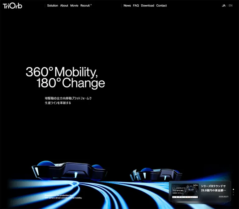
TriOrb presents an industrial mobility company through a spacious corporate site. Black establishes the product stage; blue light traces movement around low, sphere-driven platforms; white sections provide a quieter setting for explanations and news. The opening slogan, “360°Mobility, 180°Change,” uses tightly arranged, staggered lines. Its large scale contrasts with compact navigation and small supporting copy.
The distinctive structure is an asymmetric grid carried through the whole page. Desktop text often starts several columns inward, leaving substantial space for product imagery. Navigation is divided into two groups. News occupies the right side of a larger section grid. In the footer, a detailed sitemap sits between the brand and a narrow column of actions, slogan artwork, and a team photograph. Mobile reduces the number of columns while preserving several of these offsets.
How to Read This Reference
- Measured means a value appears in the supplied computed styles, element rectangles, or viewport metadata. Measurements describe the captured state, not necessarily every state of the site.
- Calculated means arithmetic based on those measurements or the supplied CSS formulas. Calculations are identified explicitly.
- Estimated means a visual approximation from a supplied screenshot. Estimated colors were not sampled programmatically.
- Recommended means guidance for a new implementation. The CSS starter and reusable prompts are adaptations, not recovered source code.
- Source tokens retain the original variable names where available. Other token names are descriptive implementation aliases.
- The browser viewports include a 15px strip outside the rendered document width: the desktop document is 1425px wide and the mobile document is 375px wide. Do not recreate that strip as a deliberate design margin.
- Several DOM labels appear twice although the screenshots show one label. This is consistent with layered text treatments, but their precise animation was not tested. Do not render the duplicates as ordinary repeated copy.
- Parent styles are not always the visible result. The graphic H1 reports a 16px inherited font size, and several button wrappers report black text while their visible child labels are white. Use the relevant child styles and screenshots together.
Tokens — Colors
Default Palette
| Name | Value | Source token or evidence | Role |
|---|---|---|---|
| Stage Black | #000000 |
--color-black; measured introduction and footer backgrounds |
Opening visual field, technology stage, footer |
| White | #ffffff |
--color-my-white, --color-white |
Reversed text and light section canvas |
| Interface Black | #111111 |
--color-my-black; measured compact CTA fill |
Small dark actions and translucent surface base |
| Deep Blue | #223b80 |
--color-my-primary-01; measured Movie section background |
Large blue section fields and selected media actions |
| Action Blue | #2952cc |
--color-my-primary-02; measured footer download action |
Prominent conversion action and small emphasis |
| Contact Charcoal | #1a1a1a |
Measured footer contact button | Secondary action on black |
| Utility Gray | #808080 |
--color-my-gray: gray; measured roadmap caption |
Supporting text |
| Translucent Black 50 | #11111180 |
--color-my-black-50; news cards compute to rgba(17,17,17,.5) |
Stacked hero news surfaces |
| Translucent Black 20 | #11111133 |
--color-my-black-20 |
Company and recruitment link panels |
| White 20 | #ffffff33 |
--color-my-white-20, header divider state, inactive pagination dots |
Fine separation and inactive indicators |
| White 10 | #ffffff1a |
--color-my-white-10 |
Available low-opacity white token; specific visible assignment not established |
| Electric Cyan | Approximately #38d6ff |
Screenshot estimate only | Bright portions of the product lighting and motion trails |
| Decorative Slogan Gray | Approximately #333333 |
Footer screenshot estimate only | Large, deliberately subdued repetition of the brand slogan |
The two blues have different jobs. Deep Blue forms substantial backgrounds, especially around Movie. Action Blue is brighter and appears on the footer’s “資料請求” button. Cyan belongs to the imagery; it is not an evidenced general-purpose button color.
Translucent surfaces change with the image beneath them. A hero news card should not be represented by one opaque gray sampled from a single frame. Its measured background is a half-opacity near-black layer. A visible fine border helps define the edge; no backdrop-filter value was supplied.
Section Color Behavior
| Area | Evidenced appearance | Qualification |
|---|---|---|
| Opening | Black field, white typography, blue/cyan product imagery | Direct desktop and mobile screenshots |
| Technology introduction | Black background and white Japanese text | Computed styles |
| Solutions | Black text in the sampled content styles | Full visual backgrounds were not supplied |
| Movie | Deep-blue outer section, darkened industrial image, white content | Desktop screenshot plus desktop/mobile measurements |
| Future opening | Broad white field with centered black heading | Desktop transition screenshot |
| Company link panels | Translucent black surfaces with white headings | DOM evidence; underlying scene not fully established |
| News | Black typography and unfilled article wrappers | DOM evidence; the light section end is visible above the footer |
| Footer | Black field, white links, gray group labels, blue and charcoal actions | Direct desktop and mobile screenshots |
Header appearance changes between captures: white identity and links sit over the opening and Movie image, while the desktop footer capture shows dark identity and links over the preceding white section. The switching threshold and implementation were not provided.
Tokens — Typography
English Labels — Aktiv Grotesk
- Computed stack:
aktiv-grotesk, sans-serif. - Source alias:
--font-label-en: 'aktiv-grotesk', sans-serif. - Measured weight:
400. - Measured tracking:
-0.01em. - Measured leading: commonly
1.25. - Roles: desktop navigation, language links, Movie heading, the small English hero caption, and Press Release label.
This establishes a restrained grotesk voice with regular weight and slightly tightened spacing. The supplied computed family identifies the requested stack; font file URLs and successful font-face loading were not independently inspected.
Japanese Labels and Body Copy
- Computed stack:
'MFW-YuGoPr6N-Demi', 'Yu Gothic Pr6N', 'Yu Gothic', 'YuGothic', sans-serif. - Source alias:
--font-label-ja. - Measured weight:
500on sampled Japanese titles, descriptions, and navigation links. - Measured tracking:
0.03em, calculated from values such as0.45pxat15px. - Common leading:
1.55; the technology introduction uses2.2.
Do not apply the long introduction’s loose leading to every paragraph. The solution explanations are much more compact.
System Text and Graphic Lettering
The root, body, and opening Japanese subtitle compute to a system sans-serif stack at 16px / 24px, weight 400. The opening subtitle therefore differs from the medium-weight Japanese editorial text farther down the page.
The large English slogan is visible but absent from the H1’s extracted text. Its measured container is 414 × 136px on desktop and 336 × 111.875px on mobile. Treat it as graphic lettering. Its asset format and internal font were not provided; the H1’s inherited 16px is not its visible letter size.
The TriOrb wordmark is also identity artwork. Reuse an authorized asset when available instead of approximating the logo with a typed company name.
Type Scale
| Role | Desktop | Mobile | Weight / leading / tracking | Evidence |
|---|---|---|---|---|
| Root text | 16px |
16px |
400 / 1.5 / normal |
Measured |
| Header navigation | 15px |
Not displayed as inline navigation | 400 / 1.25 / -.01em |
Measured |
| Header language links | 15px |
14px |
400 / 1.25 / -.01em |
Measured |
| Hero slogan lettering | Approximately 64–68px apparent size |
Approximately 52–54px apparent size |
Tight, regular-looking graphic lettering | Visual estimate; not CSS type size |
| Hero Japanese subtitle | 16px |
16px |
400 / 1.5 / normal |
Measured |
| Hero English caption | 10px |
Not visible or included in mobile visible text | 400 / 1.25 / -.01em |
Measured desktop |
| Hero news title | 14px |
13px |
500 / 1.55 / .03em |
Measured |
| Technology introduction | 18px |
16px |
500 / 2.2 / .03em |
Measured |
| Solution title | 20px |
18px |
500 / 1.55 / .03em |
Measured |
| Solution description | 15px |
14px |
500 / 1.55 / .03em |
Measured |
| Movie heading | 36px |
32px |
400 / 1.25 / -.01em |
Measured |
| Movie description | 15px |
14px |
500 / 1.55 / .03em |
Measured |
| Roadmap supporting caption | 12px |
11px |
500 / 1.55 / .03em |
Measured |
| News article title | 20px |
18px |
500 / 1.55 / .03em |
Measured |
| Footer main links | 16px |
15px |
500 / 1.55 / .03em |
Measured |
| Footer detail links | 14px |
13px |
500 / 1.55 / .03em |
Measured |
| Footer English language label | 13px |
13px |
400 / 1.25 / -.01em |
Measured |
The hierarchy comes from scale, position, and empty space more than heavy weights. Preserve the difference between compact English utilities, slightly tracked Japanese text, and graphic identity lettering.
Tokens — Spacing & Shapes
Layout basis: a viewport-scaled 1440px desktop reference and a 400px mobile reference. Density: generous section spacing with compact controls and tightly grouped supporting information.
Responsive Grid
The supplied source variables change as follows:
| Variable | Desktop state | Mobile state |
|---|---|---|
--base-width |
1440 |
400 |
--base-grid-number |
12 |
4 |
--space-side |
calc(100vw * 40 / 1440) |
calc(100vw * 20 / 400) |
--space-gutter |
calc(100vw * 20 / 1440) |
calc(100vw * 20 / 400) |
The source column-width calculation subtracts both side margins and all gutters from 100vw, then divides by the column count.
There is a useful distinction between viewport-derived position tokens and actual CSS grid tracks:
| Measurement | Desktop | Mobile |
|---|---|---|
| Browser viewport width | 1440px |
390px |
| Rendered document width | 1425px |
375px |
| Side inset | 40px |
19.5px |
| Gutter | 20px |
19.5px |
| Inner document width | 1345px |
336px |
Source column width calculated from 100vw |
95px |
73.125px |
| Measured grid track width inside the document | 93.75px |
69.375px |
This explains small alignment differences. The desktop hero starts at 155px, matching the viewport-derived second-column position, while the Movie heading starts at 153.75px, matching the rendered grid. Do not assume every component uses one identical coordinate calculation.
The mobile token dump still contains names for columns beyond four. Their existence does not establish a twelve-column mobile layout; the measured section grid contains four tracks.
Spacing Scale
| Use | Desktop | Mobile | Status |
|---|---|---|---|
| Header navigation item gap | 12px |
Inline groups hidden | Calculated from adjacent link rectangles |
| Hero news padding and column gap | 12px |
12px |
Measured |
| Hero subtitle indent inside copy block | 115px |
53px |
Measured |
| H1 container to subtitle | 16px |
12px |
Calculated from rectangles |
| Solution title to description | 35px |
15px |
Calculated for the first solution |
| Solution description to CTA | 30px |
20px |
Calculated for the first solution |
| Movie outer vertical padding | 100px |
100px |
Measured |
| Company link panel gap | 20px |
20px |
Calculated |
| News card grid gap | 70px horizontally and vertically |
45px vertically |
Calculated |
| Footer action gap | 20px |
20px |
Calculated |
| Footer top padding | 205px |
170px |
Measured |
| Footer bottom padding | 46px |
46px |
Measured |
A --spacing: .25rem token is present, equivalent to 4px at the measured root. It does not replace the separate viewport-based grid or explain all observed spacing.
Border Radius
| Element | Value | Evidence |
|---|---|---|
| Movie image gateway | 0 |
Measured wrapper and screenshot |
| Main news article wrapper | 0 |
Measured |
| Hero news cards | 8px |
Measured |
| Company and recruitment panels | 8px |
Measured |
| Compact and large CTA pills | Fully rounded | Computed radius is effectively unbounded |
| Pagination dots | 50% |
Measured |
| Mobile menu hit area | Fully rounded, transparent in sampled state | Measured |
Roundness is selective. Pills identify actions; small rounded panels identify special gateways and overlays. Large imagery and ordinary news entries remain rectangular.
Layout Measurements
| Element | Desktop | Mobile |
|---|---|---|
| Document height | Approximately 14077px |
Approximately 10936px |
| Opening section | 1425 × 1000px |
375 × 844px |
| Header rectangle | y:13px, height 32px |
y:25px, height 37px |
| Header logo link | 116.73 × 32px, x:17.02px |
100 × 32px, x:19.5px |
| H1 graphic container | x:155px, y:320px, 414 × 136px |
x:19.5px, y:270.08px, 336 × 111.875px |
| Front hero news card | 324 × 105.97px |
313 × 102.91px |
| Movie inner gateway | 1345 × 365.91px |
336 × 280px |
| Company link panel | 548.75 × 163.98px |
336 × 132px |
| Main news article | 410 × 355.94px |
336 × 291.92px |
| Footer | 871.75px high |
1379.81px high |
| Footer logo | 150 × 48px |
150 × 48px |
| Footer main action | 321.25 × 60.25px |
158.25 × 49.69px |
These are captured rectangles, not a recommendation to hardcode the full page height.
Components
Application Header
Role: persistent corporate identity, primary destinations, and language access.
Desktop anatomy is a logo at the far left, a first navigation group beginning around the third grid column, a second group beginning around the seventh, and language links at the right edge. The first group contains Solution, About, Movie, and Recruit. The second contains News, FAQ, Download, and Contact. Fine vertical dividers precede the two groups. A small external-arrow mark accompanies Recruit in the screenshot.
Links use 15px regular English labels, an 18.75px line height, and 12px gaps. The header is visually light and largely transparent. Its identity remains at the top of the supplied desktop scroll captures, although the evidence does not distinguish fixed positioning from another persistent positioning strategy.
Mobile replaces the two inline navigation groups with a three-dot menu button. The measured button is 42 × 42px; JA/EN remain visible around x:197px. Its open state, contents, focus handling, and dismissal behavior were not exercised. The mobile footer screenshot retains the language links and dots; the logo is not visibly present there, so its exact visibility rules remain unverified.
The approximately 128px white band above the desktop footer is preceding page content behind the header. It is not evidence of a 128px-tall navigation bar.
Opening Product Stage
Role: connect omnidirectional mobility with a memorable technical identity.
Use a full-height black field with four distinct layers:
- Persistent header.
- Large two-line slogan, positioned inward on desktop and close to the side inset on mobile.
- Japanese value proposition beneath the slogan, indented farther to the right.
- Low product imagery and luminous blue paths, with news layered over the lower-right region.
The H1 begins at exactly 32% of the captured viewport height on both sizes: 320px on desktop and approximately 270.08px on mobile. This is a calculated relationship from two samples, not a recovered positioning declaration.
The source subtitle reads “球駆動の全方向移動プラットフォームで / 生産ラインを革新する”. Its text begins at x:270px on desktop and x:72.5px on mobile after internal indentation. A very small English equivalent appears near the desktop bottom at x:270px, y:923px; it is absent from the supplied mobile visible text.
The product scene is visually bottom-weighted. Desktop shows a larger platform to the left and another farther right, with bright curved trails spreading toward the lower edge. Mobile preserves two platforms but crops the right-hand one and redistributes the trails. Use an art-directed mobile composition; a centered crop of the desktop frame is not sufficient to explain the observed result.
Stacked Hero News
Role: surface current company updates without occupying the main headline area.
Three rounded, translucent cards overlap. The front card contains a landscape thumbnail on the left and a two-line Japanese title plus small right-aligned date on the right. The active card is 324px wide on desktop and 313px on mobile, with 12px padding and a 12px column gap.
Desktop grid tracks measure 143px + 143px; mobile tracks measure 137.5px + 137.5px. The remaining width is consistent with two 1px borders in addition to the measured padding and gap. This border width is calculated and visually corroborated; its exact color was not measured.
| Stack position | Desktop width | Mobile width | Vertical offset from front |
|---|---|---|---|
| Front | 324px |
313px |
0 |
| Middle | 291.6px |
281.7px |
18px |
| Back | 259.2px |
250.4px |
36px |
The widths correspond exactly to scales of 1, .9, and .8. This describes the captured geometry; the transform declaration itself was not included.
A vertical group of three dots sits to the right. Visible dot diameters are 6px on desktop and 4px on mobile. The active dot is white and the others use white at 20% opacity. The captured desktop front story concerns PLC support; the mobile front story concerns AUTOMATE. Different active states are evidenced, but autoplay, timing, swipe support, and click results are not.
Keep this stack local to the opening stage. No evidence establishes it as a widget fixed over the entire page.
Technology Introduction
Role: explain the sphere-drive mechanism after the visual opening.
The sampled section has a black background and white text. Desktop paragraphs occupy the right half, starting at approximately x:723.5px with a 661.5px width. They use 18px medium Japanese text with a notably open 39.6px line height. Mobile brings the text to the normal 19.5px side inset and uses 16px type with 35.2px leading.
The content explains three spheres and three motors, movement in every direction, and capabilities such as traversing gaps and carrying heavy loads. The mechanism graphic and its exact arrangement were not included in the screenshots. Preserve the measured textual rhythm without inventing an unseen diagram.
Solution Module
Role: connect technical capabilities to three specific manufacturing use cases.
Each rendered module contains a numbered Solution marker, a Japanese title, an explanatory paragraph, and a linked “詳しく見る” pill. The three destinations are /solution01/, /solution02/, and /solution03/.
Desktop places the sampled copy at x:893.25px with a 491.75px width. Numbered module starts are 1000px apart in the captured 1000px-high viewport, suggesting substantial scene-based spacing. The supplied evidence does not establish the image treatment, pinning logic, or transition sequence for those scenes.
Mobile puts the text in a 336px column at x:19.5px. The first title uses two lines of 18px / 27.9px; its description uses three lines of 14px / 21.7px. The second description grows to five lines. Module height therefore responds to text length on mobile.
The large desktop Solution marker rectangles include substantial layout space. Their inherited 16px font declarations and tall containers must not be interpreted as a measured oversized numeral font.
Pill Action
Role: provide a consistent destination cue with restrained emphasis.
Small detail links measure 140 × 40.25px on desktop and 140 × 38.69px on mobile. The measured padding is 8px 20px 9px; the fill is generally #111111. Screenshots show white labels on dark actions. A small dot at the far end is the visible terminal mark on the Movie and footer actions.
The footer expands this pattern to a wider blue download button and a charcoal contact button. Their desktop padding is 17px 30px 20px, with a 60.25px total height. Mobile reduces them to approximately 49.69px high and places them in the right two columns.
The whole pill is the link. Do not implement the text and dot as separate interactive elements.
Movie Gateway
Role: lead visitors to practical demonstrations and use-case videos.
The outer section is #223b80 with 100px vertical padding. Desktop uses a wide rectangular industrial image at x:40px, width 1345px, and height approximately 366px. A dark visual treatment keeps the overlaid white content readable.
Across that image, align a 36px Movie heading on the left, a compact Japanese description near the center, and a blue “一覧を見る” pill toward the right. The whole gateway is an anchor to /movie/; a new implementation should preserve that single link and avoid nesting an additional anchor inside it.
Mobile changes the gateway to 336 × 280px with 25px 25px 30px padding. The 32px heading and three-line description stack vertically. The outer blue padding remains 100px above and below, so the compact layout still has a substantial pause around it.
The screenshot shows an industrial robot image. Its status as a still image, video poster, or moving media layer was not established.
Future Section
Role: broaden the story from transport automation to reconfigurable production systems.
The desktop transition capture shows a centered Japanese eyebrow above Future in an expansive white field. The heading container begins approximately 458.6px after the section starts. The section itself measures 3000px high, or three captured desktop viewport heights.
Mobile compresses the whole section to approximately 1007.8px. Its introductory heading begins 100px after the section starts, followed later by a secondary Future heading, explanation, and a roadmap movie link.
The roadmap action points to a YouTube URL in the rendered DOM. Its measured pill is 210 × 60.25px on desktop and 195 × 58.69px on mobile, with a small gray explanatory caption beside it. Playback was not opened.
Some desktop child rectangles in this section use viewport-looking coordinates while the section rectangle uses a much larger document coordinate. Those values do not establish one static layout. Treat the screenshot as one captured stage, and do not reproduce a permanently empty 3000px spacer in a static adaptation.
Company and Recruitment Gateways
Role: connect the product narrative to company information and hiring.
Desktop presents two equal panels, each approximately 548.75 × 164px, separated by 20px. They use 8px corners, a measured rgba(17,17,17,.2) surface, white headings, and desktop padding of 36px 45px 36px 60px.
Mobile stacks the panels at 336 × 132px, with 20px padding and a 20px gap. The Recruitment Website heading wraps into two English lines in the visible mobile text evidence.
An Equity Partner area and a Press Release link follow. Their presence, heading hierarchy, and several text styles are evidenced, but the partner logos and complete background composition were not supplied. Do not invent a partner roster or a logo-grid design.
News Section
Role: provide an ordinary, browsable record of company updates beyond the compact hero stack.
Desktop has a section introduction on the left and a two-column article grid on the right. The heading begins at x:40px in a 435px block. Articles start at x:495px and x:975px, each 410px wide, with 70px gaps in both directions.
Each article is one unfilled, square-cornered anchor containing a media region, Japanese title, and date. Titles use 20px / 31px. The supplied elements do not include the image rectangles, so a precise source aspect ratio cannot be claimed. A landscape ratio near 16:9 is a reasonable implementation starting point, explicitly a recommendation.
Mobile places all four articles in one 336px column with 45px vertical gaps. Titles reduce to 18px / 27.9px. The “一覧を見る” action moves after the final article and aligns right, rather than remaining under the section heading as on desktop.
The floating hero card style does not carry into this section. These entries do not have a measured rounded panel background or shared elevation treatment.
Corporate Footer
Role: combine a complete sitemap, conversion actions, and a final human image of the company.
Desktop uses three separated regions: a 150px-wide brand mark at the left; a sitemap beginning at x:267.5px; and a 321.25px right column beginning at x:1063.75px. Large top padding creates a quiet entry into the black footer.
The sitemap includes a top link, three solution links marked by small blue bullets, an About group with two-column sublinks, and paired links for recruitment, movies, FAQ, and news. Group labels appear subdued in the screenshot, while destination labels remain white. An unobtrusive language pill sits under the footer logo.
The right column starts with the blue “資料請求” action and charcoal “お問い合わせ” action. Below them, the large slogan reappears in dark gray, followed by a cool-toned photograph of a person wearing a TriOrb-branded work jacket. The photo is rectangular, approximately 321 × 219px in the desktop screenshot; its source dimensions were not supplied.
Mobile retains a two-column arrangement for the About sublinks and utility links. The conversion buttons occupy the right two grid columns: x:197.25px, width 158.25px. The slogan and photograph occupy approximately the right three columns, beginning around x:108px, with the photograph approximately 248 × 168px. Copyright remains near the lower left.
This is a deliberate asymmetric reflow. Making every footer item full-width on mobile would remove a defining part of the observed composition.
Tokens — Motion & Interaction
Observed CSS Values
| Treatment | Supplied value | What is established |
|---|---|---|
| Fast shared duration | .35s |
Source token exists; specific assignment not established |
| Standard shared duration | .5s |
Source token and multiple measured transitions |
| Late shared duration | .8s |
Source token and press-release link transitions |
| Main easing | cubic-bezier(.65,0,.35,1) |
Source token and navigation/company-panel transitions |
| Outward easing | cubic-bezier(.33,1,.68,1) |
Source token and news/language transitions |
| Header logo | opacity .3s ease-out |
Defined transition; final hover opacity not supplied |
| Desktop navigation | opacity .5s cubic-bezier(.65,0,.35,1) |
Defined transition; hover result not tested |
| EN language link | opacity .5s cubic-bezier(.33,1,.68,1) |
Defined transition |
| Mobile menu surface | Color-related properties, .3s cubic-bezier(0,0,.2,1) |
Defined transition; menu opening untested |
| Hero news surface | Color-related properties, .5s cubic-bezier(.33,1,.68,1) |
Defined transition; stack movement timing unknown |
| Company panels | Color-related properties, .5s cubic-bezier(.65,0,.35,1) |
Defined transition |
| Main news headings | Color-related properties, .5s cubic-bezier(.33,1,.68,1) |
Defined transition; destination color unknown |
| Press-release link | Color-related properties, .8s cubic-bezier(.4,0,.2,1) |
Defined transition |
The sampled elements report animation: none. This does not prove the page is static: descendant elements, graphics, video, canvas, or script-controlled transformations are outside that statement.
Observed States and Limits
- Persistent navigation is visible across the supplied scroll positions. Its theme changes between captured backgrounds, but the trigger logic was not inspected.
- Three hero news cards and three active-state indicators are evidenced. Different captures show different front cards. No rotation interval, swipe action, or pagination click was recorded.
- Duplicate DOM labels may support text transitions. A particular slide, roll, or reveal direction cannot be inferred from duplication alone.
- Large desktop scene heights and the Future coordinates suggest staged presentation, but do not establish a particular pinning, parallax, or scroll-animation library.
- Blue trails visually communicate motion. Their playback rate and rendering technology are unknown.
- Navigation destinations are known from href values. Menu, language, movie, download, and contact flows were not followed.
Recommended adaptation: use the measured .5s easing family for restrained opacity or color changes. Keep the initial implementation fully readable in a static state; add scene animation only with a defined story and reduced-motion alternative.
Surfaces
| Layer | Appearance | Purpose |
|---|---|---|
| Product stage | Black with blue-lit imagery | Maximum product contrast and depth |
| Light content area | White or visually light field, black text | Explanation and news hierarchy |
| Movie surround | Solid #223b80 |
Strong section boundary |
| Hero news overlay | Half-opacity #111, fine edge, 8px corners |
Compact updates over imagery |
| Corporate link panel | 20%-opacity #111, 8px corners |
Secondary corporate gateways |
| Compact action | Solid near-black or contextual blue, pill shape | Link affordance |
| Footer primary action | #2952cc pill |
Download/request emphasis |
| Footer secondary action | #1a1a1a pill |
Contact access |
| Footer canvas | Black with white and gray content | Dense navigation with clear grouping |
Depth is concentrated in the product imagery and overlapping news stack. There is no evidence for a site-wide system of soft card shadows, frosted panels, or floating rounded containers.
Imagery
The opening uses polished, render-like product imagery: low black platforms, blue spheres, cool highlights, and cyan paths against almost complete darkness. Reflections identify edges without exposing a busy environment. The visual metaphor is directional freedom and coordinated movement.
The Movie gateway introduces a real industrial setting. The footer changes scale again, using a close crop of a person’s jacket and its printed identity. This progression connects technical spectacle, practical application, and the people behind the company.
Keep actual product geometry credible. If creating a new site in this style, use its own verified product models or photography. Do not generate arbitrary machinery and present it as an accurate TriOrb platform.
Observed Asset References
Asset file paths, formats, and source dimensions were not supplied. The references below identify visible assets without inventing URLs.
| Asset | Observed use | Implementation guidance |
|---|---|---|
| TriOrb wordmark | Header and footer | Use an authorized identity asset with appropriate contrast |
| Two-line mobility slogan | Hero and subdued footer repetition | Preserve staggered lines and internal spacing; provide accessible text |
| Sphere-driven platform scene | Opening desktop and mobile | Provide art-directed compositions for both aspect ratios |
| Blue/cyan movement paths | Lower opening scene | Keep integrated with the product scene, not as generic UI decoration |
| News thumbnails | Hero stack | Preserve the individual story images and their landscape crop |
| Industrial robot image | Movie gateway | Use a dark overlay or suitably exposed source to protect white text |
| Work-jacket photograph | Footer | Preserve cool color balance and the rectangular crop |
| Solution, Future, and partner media | Referenced by surrounding page content, not visually documented in the supplied captures | Obtain direct assets or further visual evidence before recreating them |
Do not infer WebGL, a video format, or an animation library from the render-like appearance alone.
Layout & Responsive Behavior
The page has a long corporate information architecture: opening identity, technology explanation, solutions, movie gateway, future vision, company information, partners, news, and sitemap. Conversion is available in navigation and the footer, while the opening prioritizes product identity.
| Pattern | Desktop observation | Mobile observation |
|---|---|---|
| Grid | Twelve measured columns | Four measured columns |
| Header | Two inline navigation groups plus language links | Logo, language links, three-dot menu |
| Hero slogan | Starts one reference column inward | Uses the main content width |
| Hero subtitle | Deep internal indent of 115px | Reduced indent of 53px |
| Product scene | Broad horizontal composition | Narrow, deliberately cropped composition |
| Hero news | Lower right; 324px front card | Near the lower edge; 313px front card |
| Technology copy | Right-half column | Main single text column |
| Solutions | Copy toward the right in tall scenes | Copy fills the 336px content column |
| Movie | Heading, description, and action across a wide image | Stacked content inside a taller crop |
| Future | 3000px section with a spacious opening stage | Approximately 1008px, with content in normal vertical sequence |
| Corporate links | Two equal side-by-side panels | Two stacked panels |
| News | Left introduction, right two-column grid | One article column; archive link after the list |
| Footer | Brand, sitemap, and narrow right-side identity/actions | Stacked groups with two-column links and right-aligned actions/media |
The exact breakpoint was not included. Do not label an assumed 768px or 1024px threshold as measured. The starter below uses 800px as an explicit implementation choice.
Text changes are modest compared with layout changes: common Japanese descriptions go from 15px to 14px, titles from 20px to 18px, and the Movie heading from 36px to 32px. The opening Japanese subtitle remains 16px. Avoid shrinking the entire desktop design uniformly.
Only two viewport sizes were supplied. Intermediate widths, landscape phones, browser zoom, safe-area behavior, and mobile browser chrome changes remain unverified.
Do’s and Don’ts
Do
- Preserve the black, white, deep-blue, and action-blue hierarchy.
- Keep cyan concentrated in the product imagery.
- Use regular English grotesk labels and medium Japanese text with their different tracking rules.
- Preserve the graphic slogan’s staggered two-line composition.
- Keep the hero subtitle indented relative to the headline.
- Carry grid alignment through the header, Movie gateway, news, and footer.
- Use a compact, translucent news stack only where its overlap has a purpose.
- Keep ordinary news entries unboxed and rectangular.
- Preserve generous transitions between major story sections.
- Reflow mobile content selectively, including the footer’s right-aligned actions and imagery.
- Distinguish recorded transition declarations from interactions that were actually exercised.
Don’t
- Don’t describe the homepage as a dedicated landing page or reduce its corporate navigation to one conversion path.
- Don’t turn every section into a rounded feature-card grid.
- Don’t apply the cyan image highlight as a universal UI accent.
- Don’t interpret inherited 16px heading styles as the size of graphic lettering.
- Don’t display duplicate DOM labels twice.
- Don’t infer automatic rotation timing from different active news cards.
- Don’t recreate the browser’s 15px reserved strip as page padding.
- Don’t hardcode the measured 14,077px desktop document height.
- Don’t reproduce long blank spacers before the associated media presentation exists.
- Don’t assume all black or transparent wrapper styles describe the complete visible surface.
- Don’t invent unseen solution illustrations, partner logos, font files, or media URLs.
- Don’t flatten every mobile footer element into a full-width row.
Recommended Implementation Additions
These are recommendations for a new implementation, not verified features of the original site:
- Give graphic headings and logo links meaningful accessible names. The empty extracted H1 text does not establish whether an accessible name exists in the original accessibility tree.
- Hide decorative duplicate text from assistive technology while retaining one semantic label.
- Give the three-dot menu an accessible name, expanded state, keyboard behavior, and reliable focus return.
- Enlarge pagination hit areas while retaining small visual dots. The observed 4px and 6px button rectangles are too small to copy as comfortable touch targets.
- If the news stack rotates automatically, provide pause behavior and prevent covered links from creating a confusing focus sequence.
- Preserve a complete static product scene and readable content when animation is unavailable or reduced motion is requested.
- Avoid making essential text depend on completing a scroll animation.
- Maintain adequate header contrast over imagery and provide visible focus styles in both header color states.
- Keep the low-contrast footer slogan decorative; do not apply that treatment to essential navigation or instructions.
- Use responsive image sources and reserve media dimensions to prevent layout shifts. Large opening media should not block access to the header or core explanation.
- Test the chosen font fallbacks with Japanese copy, since different metrics can change line breaks and pill dimensions.
- Test shorter landscape viewports and zoom before relying on absolute hero positioning.
Agent Prompt Guide
Quick Color Reference
- Product stage and footer:
#000000. - Light canvas and reversed labels:
#ffffff. - Compact dark action:
#111111. - Deep-blue section field:
#223b80. - Prominent download action:
#2952cc. - Secondary footer action:
#1a1a1a. - Hero news surface:
rgba(17,17,17,.5)with 8px corners. - Cyan: image lighting only; approximately
#38d6ffis a visual estimate.
Overall Prompt
“Create a Japanese robotics corporate homepage using a black product stage, white explanatory sections, and deep-blue media gateways. Use a twelve-column desktop grid that reflows to four columns on mobile. Combine regular grotesk English labels with medium Japanese text, modest body sizes, and generous section spacing. Place a staggered two-line graphic slogan around one third of the way down the opening viewport, with the Japanese explanation indented beneath it. Anchor accurate product imagery and electric-blue paths low in the scene. Add a compact stack of translucent news cards at the lower right. Continue with three solution narratives, Movie and Future sections, company and recruitment gateways, a news grid, and a large black sitemap footer. Use pill actions selectively and retain the footer’s right-aligned buttons and imagery on mobile. Treat animation and inaccessible content states as separate implementation work.”
Example Component Prompts
- Header: “Build a transparent corporate header with a left identity asset, two groups of 15px English links separated by fine vertical rules, and JA/EN at the right. On mobile, retain language access and replace the inline groups with a three-dot menu. Use a dark/light color state controlled by the surrounding section; do not invent the original switching threshold.”
- Hero: “Create a full-height black product composition with a staggered two-line slogan, substantial empty space above and to the right, and Japanese supporting copy indented beneath it. Place accurate low-profile robotic platforms and blue movement trails near the lower edge. Provide a distinct mobile crop.”
- News stack: “Create a 324px-wide desktop news card with two equal columns, 12px padding and gap, an 8px radius, a fine edge, and half-opacity near-black fill. Put a landscape thumbnail left and a two-line Japanese title with small date right. Layer two quieter cards behind it at 90% and 80% scale with 18px increments in vertical offset. Do not assume autoplay.”
- Movie gateway: “Place a wide rectangular industrial image inside a deep-blue section with 100px vertical padding. Overlay a regular 36px Movie heading, compact Japanese description, and a pill action. On mobile, use a 280px-tall image region with stacked content and 25px inner padding.”
- News section: “Use a left section introduction beside a two-column grid of unboxed landscape news articles. At the desktop reference, articles are 410px wide with 70px gaps. Mobile becomes one 336px column with 45px gaps and a right-aligned archive action after the list.”
- Footer: “Build a spacious black footer with a brand column, grouped sitemap links with small blue bullets, and a narrow right column of blue and charcoal pills. Repeat the slogan in subdued gray above a cool-toned team photograph. On mobile, keep two-column sitemap groups, put actions in the right two columns, and put the slogan and photo in the right three columns.”
Quick Start
CSS Custom Properties
This starter combines measured palette, typography, grid formulas, and representative geometry with recommended implementation choices. The 800px breakpoint, semantic class names, focus treatment, and several media sizing rules are adaptations. Supply authorized artwork through your own image elements; no asset URLs are invented here.
Use .page-grid for normal grid sections. The hero separately uses the viewport-derived column calculation to approximate its measured 155px desktop offset. The header’s data-scheme must be set by your implementation. This CSS does not implement menu opening, automatic news rotation, or scroll-controlled media.
:root {
  /* Measured palette */
  --stage: #000;
  --paper: #fff;
  --ink: #111;
  --blue-deep: #223b80;
  --blue-action: #2952cc;
  --contact: #1a1a1a;
  --muted: #808080;
  --glass-dark: rgb(17 17 17 / 50%);
  --panel-dark: rgb(17 17 17 / 20%);
  --edge-light: rgb(255 255 255 / 20%);

  /* Supplied font stacks; font files are not bundled */
  --font-en: 'aktiv-grotesk', sans-serif;
  --font-ja: 'MFW-YuGoPr6N-Demi', 'Yu Gothic Pr6N',
    'Yu Gothic', 'YuGothic', sans-serif;
  --font-system: ui-sans-serif, system-ui, sans-serif;
  --text-body: 15px;
  --text-title: 20px;
  --text-section: 36px;
  --leading-body: 1.55;
  --tracking-en: -.01em;
  --tracking-ja: .03em;

  /* Source-derived desktop grid */
  --unit: calc(100vw / 1440);
  --columns: 12;
  --side: calc(40 * var(--unit));
  --gutter: calc(20 * var(--unit));
  --source-column: calc(
    (100vw - 2 * var(--side) - 11 * var(--gutter)) / 12
  );

  --radius-panel: 8px;
  --radius-pill: 999px;
  --duration-fast: .35s;
  --duration: .5s;
  --duration-late: .8s;
  --ease-main: cubic-bezier(.65, 0, .35, 1);
  --ease-out: cubic-bezier(.33, 1, .68, 1);
}

* { box-sizing: border-box; }

body {
  margin: 0;
  color: #000;
  background: var(--paper);
  font: 400 16px/1.5 var(--font-system);
}

img { display: block; max-inline-size: 100%; }
a { color: inherit; }
button { font: inherit; }

.page-grid {
  display: grid;
  grid-template-columns: repeat(var(--columns), minmax(0, 1fr));
  gap: var(--gutter);
  padding-inline: var(--side);
}

.copy-ja {
  font-family: var(--font-ja);
  font-size: var(--text-body);
  font-weight: 500;
  line-height: var(--leading-body);
  letter-spacing: var(--tracking-ja);
}

.label-en {
  font-family: var(--font-en);
  font-weight: 400;
  line-height: 1.25;
  letter-spacing: var(--tracking-en);
}

/* Recommended persistent shell; original positioning was not supplied */
.site-header {
  position: fixed;
  z-index: 50;
  inset: 13px 0 auto;
  align-items: center;
  color: var(--paper);
}

.site-header[data-scheme='light'] { color: var(--ink); }

.header-brand {
  grid-column: 1 / 3;
  inline-size: 116.734px;
  block-size: 32px;
  transform: translateX(-23px);
}

.header-brand img { block-size: 100%; inline-size: auto; }

.header-nav {
  display: flex;
  align-items: center;
  gap: 12px;
  padding-inline-start: 12px;
  border-inline-start: 1px solid var(--edge-light);
  font: 400 15px/1.25 var(--font-en);
  letter-spacing: -.01em;
}

.header-nav--primary { grid-column: 3 / 7; }
.header-nav--secondary { grid-column: 7 / 11; }

.site-header[data-scheme='light'] .header-nav {
  border-color: rgb(17 17 17 / 20%);
}

.header-nav a,
.header-languages a {
  text-decoration: none;
  transition: opacity var(--duration) var(--ease-main);
}

.header-languages {
  grid-column: 11 / -1;
  justify-self: end;
  display: flex;
  gap: 8px;
  font: 400 15px/1.25 var(--font-en);
}

.menu-button { display: none; }

.hero {
  position: relative;
  isolation: isolate;
  min-block-size: 100vh;
  min-block-size: 100svh;
  overflow: clip;
  color: var(--paper);
  background: var(--stage);
}

/* Supply an art-directed picture or equivalent media layer */
.hero-stage { position: absolute; inset: 0; z-index: 0; }
.hero-stage img { inline-size: 100%; block-size: 100%; object-fit: cover; }

.hero-copy {
  position: absolute;
  z-index: 1;
  inset-block-start: 32%;
  inset-inline-start: calc(
    var(--side) + var(--source-column) + var(--gutter)
  );
  inline-size: min(414px, calc(100% - 2 * var(--side)));
}

.hero-title { margin: 0; aspect-ratio: 414 / 136; }
.hero-title img { inline-size: 100%; block-size: 100%; object-fit: contain; }

.hero-subtitle {
  margin: 16px 0 0;
  padding-inline-start: 115px;
  font: 400 16px/24px var(--font-system);
}

.hero-caption {
  position: absolute;
  z-index: 1;
  inset-inline-start: calc(
    var(--side) + 2 * (var(--source-column) + var(--gutter))
  );
  inset-block-end: 52px;
  margin: 0;
  font: 400 10px/12.5px var(--font-en);
  letter-spacing: -.01em;
}

/* Static stack geometry; interaction requires separate implementation */
.news-stack {
  position: absolute;
  z-index: 2;
  inset-inline-end: 42px;
  inset-block-end: 40px;
  inline-size: 324px;
  block-size: 106px;
}

.teaser {
  position: absolute;
  inset: 0;
  display: grid;
  grid-template-columns: repeat(2, minmax(0, 1fr));
  gap: 12px;
  padding: 12px;
  border: 1px solid var(--edge-light);
  border-radius: var(--radius-panel);
  color: var(--paper);
  background: var(--glass-dark);
  text-decoration: none;
  transform-origin: 50% 0;
}

.teaser--front { z-index: 3; }
.teaser--middle { z-index: 2; transform: translateY(18px) scale(.9); }
.teaser--back { z-index: 1; transform: translateY(36px) scale(.8); }
.teaser img { inline-size: 100%; block-size: 100%; object-fit: cover; }
.teaser-copy { display: flex; flex-direction: column; min-inline-size: 0; }

.teaser-title {
  display: -webkit-box;
  -webkit-box-orient: vertical;
  -webkit-line-clamp: 2;
  overflow: hidden;
  margin: 0;
  font: 500 14px/1.55 var(--font-ja);
  letter-spacing: .03em;
}

.teaser-date {
  margin-block-start: auto;
  align-self: end;
  color: rgb(255 255 255 / 70%);
  font: 400 10px/1.25 var(--font-en);
}

.pill {
  display: inline-flex;
  align-items: center;
  justify-content: space-between;
  gap: 10px;
  min-inline-size: 140px;
  min-block-size: 40.25px;
  padding: 8px 20px 9px;
  border: 0;
  border-radius: var(--radius-pill);
  color: var(--paper);
  background: var(--ink);
  font: 500 15px/1.55 var(--font-ja);
  text-decoration: none;
}

.pill::after {
  content: '';
  flex: 0 0 4px;
  inline-size: 4px;
  block-size: 4px;
  border-radius: 50%;
  background: currentColor;
}

.pill--blue { background: var(--blue-action); }
.pill--deep { background: var(--blue-deep); }
.pill--contact { background: var(--contact); }

/* Recommended normal-flow solution layout until media staging exists */
.solution-copy { grid-column: 8 / -1; }
.solution-title { font-size: var(--text-title); }
.solution-description { margin-block: 35px 30px; }

.movie-section {
  padding: 100px var(--side);
  background: var(--blue-deep);
}

.movie-link {
  position: relative;
  isolation: isolate;
  display: grid;
  grid-template-columns: repeat(12, minmax(0, 1fr));
  align-items: center;
  gap: var(--gutter);
  min-block-size: 366px;
  overflow: hidden;
  color: var(--paper);
  background: var(--stage);
  text-decoration: none;
}

.movie-media { position: absolute; inset: 0; z-index: -2; }
.movie-media img { inline-size: 100%; block-size: 100%; object-fit: cover; }

.movie-link::before {
  content: '';
  position: absolute;
  inset: 0;
  z-index: -1;
  background: rgb(0 0 0 / 55%); /* Recommended overlay approximation */
}

.movie-title { grid-column: 2 / 4; margin: 0; font-size: var(--text-section); }
.movie-description { grid-column: 4 / 9; margin: 0; }
.movie-action { grid-column: 10 / 12; justify-self: end; }

.future-intro {
  padding: 100px var(--side);
  text-align: center;
  color: #000;
  background: var(--paper);
}

.dark-scene { color: var(--paper); background: var(--stage); }
.corporate-links { display: grid; grid-template-columns: repeat(2, 1fr); gap: 20px; }

.company-card {
  display: flex;
  align-items: center;
  min-block-size: 164px;
  padding: 36px 45px 36px 60px;
  border-radius: 8px;
  color: inherit;
  background: var(--panel-dark);
  text-decoration: none;
  transition: background-color var(--duration) var(--ease-main);
}

.news-section { padding-block: 200px; }
.news-intro { grid-column: 1 / 5; }
.news-grid {
  grid-column: 5 / -1;
  display: grid;
  grid-template-columns: repeat(2, minmax(0, 1fr));
  gap: 70px;
}

.news-entry { min-inline-size: 0; text-decoration: none; }
.news-entry img { inline-size: 100%; aspect-ratio: 16 / 9; object-fit: cover; }
.news-entry-title { margin: 30px 0 12px; font-size: var(--text-title); }
.news-archive--mobile { display: none; }

.site-footer {
  padding-block: 205px 46px;
  color: var(--paper);
  background: var(--stage);
}

.footer-brand { grid-column: 1 / 3; }
.footer-brand img { inline-size: 150px; }
.footer-nav { grid-column: 3 / 7; }
.footer-aside { grid-column: 10 / -1; }
.footer-links { display: grid; grid-template-columns: repeat(2, 1fr); gap: 10px 30px; }
.footer-actions { display: grid; gap: 20px; }

.footer-actions .pill {
  inline-size: 100%;
  min-inline-size: 0;
  min-block-size: 60.25px;
  padding: 17px 30px 20px;
}

.footer-signature { margin-block-start: 132px; }
.footer-slogan { opacity: .2; } /* Visual approximation for decorative artwork */
.footer-photo { margin-block-start: 32px; inline-size: 100%; aspect-ratio: 1.47; object-fit: cover; }

/* Recommended accessible interaction treatments */
a:focus-visible,
button:focus-visible {
  outline: 2px solid currentColor;
  outline-offset: 5px;
}

@media (hover: hover) {
  .header-nav a:hover,
  .header-languages a:hover { opacity: .7; }
}

/* Recommended breakpoint; only the two supplied endpoints were inspected */
@media (max-width: 800px) {
  :root {
    --unit: calc(100vw / 400);
    --columns: 4;
    --side: calc(20 * var(--unit));
    --gutter: calc(20 * var(--unit));
    --source-column: calc(
      (100vw - 2 * var(--side) - 3 * var(--gutter)) / 4
    );
    --text-body: 14px;
    --text-title: 18px;
    --text-section: 32px;
  }

  .site-header { inset-block-start: 25px; }
  .header-brand { grid-column: 1 / 3; inline-size: 100px; transform: none; }
  .header-nav { display: none; }
  .header-languages { grid-column: 3; justify-self: start; font-size: 14px; }

  .menu-button {
    display: grid;
    place-items: center;
    grid-column: 4;
    justify-self: end;
    inline-size: 44px;
    block-size: 44px;
    border: 0;
    border-radius: 50%;
    color: inherit;
    background: transparent;
  }

  .hero-copy { inset-inline-start: var(--side); inline-size: calc(100% - 2 * var(--side)); }
  .hero-title { aspect-ratio: 3 / 1; }
  .hero-subtitle { margin-block-start: 12px; padding-inline-start: 53px; }
  .hero-caption { display: none; }
  .news-stack { inline-size: min(313px, calc(100% - 62px)); block-size: 103px; inset-inline-end: 21px; inset-block-end: 33px; }
  .teaser-title { font-size: 13px; }
  .pill { font-size: 14px; }
  .solution-copy { grid-column: 1 / -1; }
  .solution-description { margin-block: 15px 20px; }

  .movie-link { display: flex; flex-direction: column; align-items: flex-start; gap: 25px; min-block-size: 280px; padding: 25px 25px 30px; }
  .movie-action { margin-block-start: auto; }
  .corporate-links { grid-template-columns: 1fr; }
  .company-card { min-block-size: 132px; padding: 20px; }

  .news-section { padding-block: 120px; }
  .news-intro { grid-column: 1 / -1; }
  .news-intro .pill { display: none; }
  .news-grid { grid-column: 1 / -1; grid-template-columns: 1fr; gap: 45px; margin-block-start: 40px; }
  .news-entry-title { margin-block-start: 20px; }
  .news-archive--mobile { display: inline-flex; grid-column: 1 / -1; justify-self: end; margin-block-start: 25px; }

  .site-footer { padding-block-start: 170px; }
  .footer-brand,
  .footer-nav,
  .footer-aside { grid-column: 1 / -1; }
  .footer-nav { margin-block-start: 60px; }
  .footer-aside { display: grid; grid-template-columns: repeat(4, minmax(0, 1fr)); column-gap: var(--gutter); margin-block-start: 60px; }
  .footer-actions { grid-column: 3 / -1; }
  .footer-actions .pill { min-block-size: 49.6875px; padding: 13px 20px 15px 25px; }
  .footer-signature { grid-column: 2 / -1; margin-block-start: 50px; }
}

@media (pointer: coarse) {
  .pill { min-block-size: 44px; } /* Recommended touch-size improvement */
}

@media (prefers-reduced-motion: reduce) {
  .site-header a,
  .company-card,
  .teaser { transition: none; }
  /* Also disable any separately implemented autoplay or scene motion. */
}
Use the news archive action in one accessible position at each breakpoint. Use a non-interactive span for the pill-like label inside the single Movie anchor. Decorative rear news cards should not introduce hidden focus targets. The footer selectors establish its broad alignment; its complete sitemap and copyright placement still require semantic markup.
Tailwind v4 Token Mapping
Optional mapping for a project already using Tailwind v4. These aliases do not assert the original site’s build configuration. Define the custom properties above first.
@theme inline {
  --color-stage: var(--stage);
  --color-paper: var(--paper);
  --color-ink: var(--ink);
  --color-brand-deep: var(--blue-deep);
  --color-brand-action: var(--blue-action);
  --color-contact: var(--contact);
  --color-muted: var(--muted);

  --font-english: var(--font-en);
  --font-japanese: var(--font-ja);

  --text-body-copy: var(--text-body);
  --text-content-title: var(--text-title);
  --text-section-title: var(--text-section);

  --spacing-page: var(--side);
  --spacing-grid-gap: var(--gutter);
  --radius-panel: 8px;
  --radius-action: 999px;
}
Sources & Evidence
- Inspected original and final page: TriOrb Japanese homepage. Both supplied URLs are identical; the browser reported HTTP 200. The page title identifies the company as “株式会社TriOrb(トライオーブ)”, and the footer includes “© TriOrb, Inc.”.
- Capture record: September 12, 2026, 07:43:37.043 UTC / 16:43:37.043 JST. The supplied record covers desktop
1440 × 1000and mobile390 × 844CSS-pixel viewports; individual screenshot timestamps were not separately provided. - Direct visual evidence: screenshot 1, desktop opening; screenshot 2, desktop Movie-to-Future transition; screenshot 3, desktop footer; screenshot 4, mobile opening; screenshot 5, mobile footer. The last image is a current-page mobile capture.
- Rendered evidence: page text, href destinations, document dimensions, element rectangles, computed typography, backgrounds, padding, radii, grid tracks, transition declarations, and custom properties at both viewport sizes.
- Observed destinations, not separately inspected pages: the homepage solution anchor and three solution detail routes; About and company anchors; Movie; recruitment; News; FAQ; Download; Contact; English homepage; and the roadmap movie link. Their hrefs establish navigation intent, not the design or behavior of the destination pages.
- Capture procedure: the supplied browser record describes an initial observation of at least five seconds, bounded waits for document readiness, layout/text stability, visible image decoding, and finite animations. Perpetual animations were paused during readiness checks and resumed afterward; scrolling traversed intermediate positions. SharedWorkers and service workers were disabled.
- Limits: screenshots are not continuous recordings, asset URLs were not included, and hover results, menu opening, carousel controls, video playback, forms, and destination pages were not exercised. Readiness checks do not prove that every delayed or scroll-dependent scene reached its complete semantic state. No additional browsing or file inspection was performed for this reference.
This document describes the current homepage evidenced by those captures. Measured values, calculated relationships, visual estimates, and recommended implementation behavior are identified separately throughout.
# TriOrb — Style Reference

> Precision typography and electric-blue movement across a deep black stage.

**Website:** [triorb.co.jp](https://triorb.co.jp/)
**Original URL:** https://triorb.co.jp/
**Final URL:** https://triorb.co.jp/
**Theme:** alternating black, white, and deep-blue sections; no user-selectable theme was evidenced.
**Inspected:** September 12, 2026, from supplied browser evidence retrieved at 07:43:37.043 UTC / 16:43:37.043 JST.
**Viewports:** desktop 1440 × 1000 CSS px; mobile 390 × 844 CSS px.
**Scope:** the current Japanese corporate homepage, including its header, opening product composition, technology introduction, three solution modules, Movie gateway, Future section, company and recruitment links, equity-partner area, news, and footer. Five screenshots provide direct visual coverage of the opening, the desktop Movie-to-Future transition, and desktop/mobile footer areas. Other sections are documented from rendered DOM and computed styles.

TriOrb presents an industrial mobility company through a spacious corporate site. Black establishes the product stage; blue light traces movement around low, sphere-driven platforms; white sections provide a quieter setting for explanations and news. The opening slogan, “360°Mobility, 180°Change,” uses tightly arranged, staggered lines. Its large scale contrasts with compact navigation and small supporting copy.

The distinctive structure is an asymmetric grid carried through the whole page. Desktop text often starts several columns inward, leaving substantial space for product imagery. Navigation is divided into two groups. News occupies the right side of a larger section grid. In the footer, a detailed sitemap sits between the brand and a narrow column of actions, slogan artwork, and a team photograph. Mobile reduces the number of columns while preserving several of these offsets.

## How to Read This Reference

- **Measured** means a value appears in the supplied computed styles, element rectangles, or viewport metadata. Measurements describe the captured state, not necessarily every state of the site.
- **Calculated** means arithmetic based on those measurements or the supplied CSS formulas. Calculations are identified explicitly.
- **Estimated** means a visual approximation from a supplied screenshot. Estimated colors were not sampled programmatically.
- **Recommended** means guidance for a new implementation. The CSS starter and reusable prompts are adaptations, not recovered source code.
- **Source tokens** retain the original variable names where available. Other token names are descriptive implementation aliases.
- The browser viewports include a 15px strip outside the rendered document width: the desktop document is 1425px wide and the mobile document is 375px wide. Do not recreate that strip as a deliberate design margin.
- Several DOM labels appear twice although the screenshots show one label. This is consistent with layered text treatments, but their precise animation was not tested. Do not render the duplicates as ordinary repeated copy.
- Parent styles are not always the visible result. The graphic H1 reports a 16px inherited font size, and several button wrappers report black text while their visible child labels are white. Use the relevant child styles and screenshots together.

## Tokens — Colors

### Default Palette

| Name | Value | Source token or evidence | Role |
| --- | --- | --- | --- |
| Stage Black | `#000000` | `--color-black`; measured introduction and footer backgrounds | Opening visual field, technology stage, footer |
| White | `#ffffff` | `--color-my-white`, `--color-white` | Reversed text and light section canvas |
| Interface Black | `#111111` | `--color-my-black`; measured compact CTA fill | Small dark actions and translucent surface base |
| Deep Blue | `#223b80` | `--color-my-primary-01`; measured Movie section background | Large blue section fields and selected media actions |
| Action Blue | `#2952cc` | `--color-my-primary-02`; measured footer download action | Prominent conversion action and small emphasis |
| Contact Charcoal | `#1a1a1a` | Measured footer contact button | Secondary action on black |
| Utility Gray | `#808080` | `--color-my-gray: gray`; measured roadmap caption | Supporting text |
| Translucent Black 50 | `#11111180` | `--color-my-black-50`; news cards compute to `rgba(17,17,17,.5)` | Stacked hero news surfaces |
| Translucent Black 20 | `#11111133` | `--color-my-black-20` | Company and recruitment link panels |
| White 20 | `#ffffff33` | `--color-my-white-20`, header divider state, inactive pagination dots | Fine separation and inactive indicators |
| White 10 | `#ffffff1a` | `--color-my-white-10` | Available low-opacity white token; specific visible assignment not established |
| Electric Cyan | Approximately `#38d6ff` | Screenshot estimate only | Bright portions of the product lighting and motion trails |
| Decorative Slogan Gray | Approximately `#333333` | Footer screenshot estimate only | Large, deliberately subdued repetition of the brand slogan |

The two blues have different jobs. Deep Blue forms substantial backgrounds, especially around Movie. Action Blue is brighter and appears on the footer’s “資料請求” button. Cyan belongs to the imagery; it is not an evidenced general-purpose button color.

Translucent surfaces change with the image beneath them. A hero news card should not be represented by one opaque gray sampled from a single frame. Its measured background is a half-opacity near-black layer. A visible fine border helps define the edge; no backdrop-filter value was supplied.

### Section Color Behavior

| Area | Evidenced appearance | Qualification |
| --- | --- | --- |
| Opening | Black field, white typography, blue/cyan product imagery | Direct desktop and mobile screenshots |
| Technology introduction | Black background and white Japanese text | Computed styles |
| Solutions | Black text in the sampled content styles | Full visual backgrounds were not supplied |
| Movie | Deep-blue outer section, darkened industrial image, white content | Desktop screenshot plus desktop/mobile measurements |
| Future opening | Broad white field with centered black heading | Desktop transition screenshot |
| Company link panels | Translucent black surfaces with white headings | DOM evidence; underlying scene not fully established |
| News | Black typography and unfilled article wrappers | DOM evidence; the light section end is visible above the footer |
| Footer | Black field, white links, gray group labels, blue and charcoal actions | Direct desktop and mobile screenshots |

Header appearance changes between captures: white identity and links sit over the opening and Movie image, while the desktop footer capture shows dark identity and links over the preceding white section. The switching threshold and implementation were not provided.

## Tokens — Typography

### English Labels — Aktiv Grotesk

- **Computed stack:** `aktiv-grotesk, sans-serif`.
- **Source alias:** `--font-label-en: 'aktiv-grotesk', sans-serif`.
- **Measured weight:** `400`.
- **Measured tracking:** `-0.01em`.
- **Measured leading:** commonly `1.25`.
- **Roles:** desktop navigation, language links, Movie heading, the small English hero caption, and Press Release label.

This establishes a restrained grotesk voice with regular weight and slightly tightened spacing. The supplied computed family identifies the requested stack; font file URLs and successful font-face loading were not independently inspected.

### Japanese Labels and Body Copy

- **Computed stack:** `'MFW-YuGoPr6N-Demi', 'Yu Gothic Pr6N', 'Yu Gothic', 'YuGothic', sans-serif`.
- **Source alias:** `--font-label-ja`.
- **Measured weight:** `500` on sampled Japanese titles, descriptions, and navigation links.
- **Measured tracking:** `0.03em`, calculated from values such as `0.45px` at `15px`.
- **Common leading:** `1.55`; the technology introduction uses `2.2`.

Do not apply the long introduction’s loose leading to every paragraph. The solution explanations are much more compact.

### System Text and Graphic Lettering

The root, body, and opening Japanese subtitle compute to a system sans-serif stack at `16px / 24px`, weight `400`. The opening subtitle therefore differs from the medium-weight Japanese editorial text farther down the page.

The large English slogan is visible but absent from the H1’s extracted text. Its measured container is `414 × 136px` on desktop and `336 × 111.875px` on mobile. Treat it as graphic lettering. Its asset format and internal font were not provided; the H1’s inherited `16px` is not its visible letter size.

The TriOrb wordmark is also identity artwork. Reuse an authorized asset when available instead of approximating the logo with a typed company name.

### Type Scale

| Role | Desktop | Mobile | Weight / leading / tracking | Evidence |
| --- | --- | --- | --- | --- |
| Root text | `16px` | `16px` | `400 / 1.5 / normal` | Measured |
| Header navigation | `15px` | Not displayed as inline navigation | `400 / 1.25 / -.01em` | Measured |
| Header language links | `15px` | `14px` | `400 / 1.25 / -.01em` | Measured |
| Hero slogan lettering | Approximately `64–68px` apparent size | Approximately `52–54px` apparent size | Tight, regular-looking graphic lettering | Visual estimate; not CSS type size |
| Hero Japanese subtitle | `16px` | `16px` | `400 / 1.5 / normal` | Measured |
| Hero English caption | `10px` | Not visible or included in mobile visible text | `400 / 1.25 / -.01em` | Measured desktop |
| Hero news title | `14px` | `13px` | `500 / 1.55 / .03em` | Measured |
| Technology introduction | `18px` | `16px` | `500 / 2.2 / .03em` | Measured |
| Solution title | `20px` | `18px` | `500 / 1.55 / .03em` | Measured |
| Solution description | `15px` | `14px` | `500 / 1.55 / .03em` | Measured |
| Movie heading | `36px` | `32px` | `400 / 1.25 / -.01em` | Measured |
| Movie description | `15px` | `14px` | `500 / 1.55 / .03em` | Measured |
| Roadmap supporting caption | `12px` | `11px` | `500 / 1.55 / .03em` | Measured |
| News article title | `20px` | `18px` | `500 / 1.55 / .03em` | Measured |
| Footer main links | `16px` | `15px` | `500 / 1.55 / .03em` | Measured |
| Footer detail links | `14px` | `13px` | `500 / 1.55 / .03em` | Measured |
| Footer English language label | `13px` | `13px` | `400 / 1.25 / -.01em` | Measured |

The hierarchy comes from scale, position, and empty space more than heavy weights. Preserve the difference between compact English utilities, slightly tracked Japanese text, and graphic identity lettering.

## Tokens — Spacing & Shapes

**Layout basis:** a viewport-scaled 1440px desktop reference and a 400px mobile reference.
**Density:** generous section spacing with compact controls and tightly grouped supporting information.

### Responsive Grid

The supplied source variables change as follows:

| Variable | Desktop state | Mobile state |
| --- | --- | --- |
| `--base-width` | `1440` | `400` |
| `--base-grid-number` | `12` | `4` |
| `--space-side` | `calc(100vw * 40 / 1440)` | `calc(100vw * 20 / 400)` |
| `--space-gutter` | `calc(100vw * 20 / 1440)` | `calc(100vw * 20 / 400)` |

The source column-width calculation subtracts both side margins and all gutters from `100vw`, then divides by the column count.

There is a useful distinction between viewport-derived position tokens and actual CSS grid tracks:

| Measurement | Desktop | Mobile |
| --- | --- | --- |
| Browser viewport width | `1440px` | `390px` |
| Rendered document width | `1425px` | `375px` |
| Side inset | `40px` | `19.5px` |
| Gutter | `20px` | `19.5px` |
| Inner document width | `1345px` | `336px` |
| Source column width calculated from `100vw` | `95px` | `73.125px` |
| Measured grid track width inside the document | `93.75px` | `69.375px` |

This explains small alignment differences. The desktop hero starts at `155px`, matching the viewport-derived second-column position, while the Movie heading starts at `153.75px`, matching the rendered grid. Do not assume every component uses one identical coordinate calculation.

The mobile token dump still contains names for columns beyond four. Their existence does not establish a twelve-column mobile layout; the measured section grid contains four tracks.

### Spacing Scale

| Use | Desktop | Mobile | Status |
| --- | --- | --- | --- |
| Header navigation item gap | `12px` | Inline groups hidden | Calculated from adjacent link rectangles |
| Hero news padding and column gap | `12px` | `12px` | Measured |
| Hero subtitle indent inside copy block | `115px` | `53px` | Measured |
| H1 container to subtitle | `16px` | `12px` | Calculated from rectangles |
| Solution title to description | `35px` | `15px` | Calculated for the first solution |
| Solution description to CTA | `30px` | `20px` | Calculated for the first solution |
| Movie outer vertical padding | `100px` | `100px` | Measured |
| Company link panel gap | `20px` | `20px` | Calculated |
| News card grid gap | `70px` horizontally and vertically | `45px` vertically | Calculated |
| Footer action gap | `20px` | `20px` | Calculated |
| Footer top padding | `205px` | `170px` | Measured |
| Footer bottom padding | `46px` | `46px` | Measured |

A `--spacing: .25rem` token is present, equivalent to `4px` at the measured root. It does not replace the separate viewport-based grid or explain all observed spacing.

### Border Radius

| Element | Value | Evidence |
| --- | --- | --- |
| Movie image gateway | `0` | Measured wrapper and screenshot |
| Main news article wrapper | `0` | Measured |
| Hero news cards | `8px` | Measured |
| Company and recruitment panels | `8px` | Measured |
| Compact and large CTA pills | Fully rounded | Computed radius is effectively unbounded |
| Pagination dots | `50%` | Measured |
| Mobile menu hit area | Fully rounded, transparent in sampled state | Measured |

Roundness is selective. Pills identify actions; small rounded panels identify special gateways and overlays. Large imagery and ordinary news entries remain rectangular.

### Layout Measurements

| Element | Desktop | Mobile |
| --- | --- | --- |
| Document height | Approximately `14077px` | Approximately `10936px` |
| Opening section | `1425 × 1000px` | `375 × 844px` |
| Header rectangle | `y:13px`, height `32px` | `y:25px`, height `37px` |
| Header logo link | `116.73 × 32px`, `x:17.02px` | `100 × 32px`, `x:19.5px` |
| H1 graphic container | `x:155px`, `y:320px`, `414 × 136px` | `x:19.5px`, `y:270.08px`, `336 × 111.875px` |
| Front hero news card | `324 × 105.97px` | `313 × 102.91px` |
| Movie inner gateway | `1345 × 365.91px` | `336 × 280px` |
| Company link panel | `548.75 × 163.98px` | `336 × 132px` |
| Main news article | `410 × 355.94px` | `336 × 291.92px` |
| Footer | `871.75px` high | `1379.81px` high |
| Footer logo | `150 × 48px` | `150 × 48px` |
| Footer main action | `321.25 × 60.25px` | `158.25 × 49.69px` |

These are captured rectangles, not a recommendation to hardcode the full page height.

## Components

### Application Header

**Role:** persistent corporate identity, primary destinations, and language access.

Desktop anatomy is a logo at the far left, a first navigation group beginning around the third grid column, a second group beginning around the seventh, and language links at the right edge. The first group contains Solution, About, Movie, and Recruit. The second contains News, FAQ, Download, and Contact. Fine vertical dividers precede the two groups. A small external-arrow mark accompanies Recruit in the screenshot.

Links use 15px regular English labels, an 18.75px line height, and 12px gaps. The header is visually light and largely transparent. Its identity remains at the top of the supplied desktop scroll captures, although the evidence does not distinguish fixed positioning from another persistent positioning strategy.

Mobile replaces the two inline navigation groups with a three-dot menu button. The measured button is `42 × 42px`; JA/EN remain visible around `x:197px`. Its open state, contents, focus handling, and dismissal behavior were not exercised. The mobile footer screenshot retains the language links and dots; the logo is not visibly present there, so its exact visibility rules remain unverified.

The approximately 128px white band above the desktop footer is preceding page content behind the header. It is not evidence of a 128px-tall navigation bar.

### Opening Product Stage

**Role:** connect omnidirectional mobility with a memorable technical identity.

Use a full-height black field with four distinct layers:

1. Persistent header.
2. Large two-line slogan, positioned inward on desktop and close to the side inset on mobile.
3. Japanese value proposition beneath the slogan, indented farther to the right.
4. Low product imagery and luminous blue paths, with news layered over the lower-right region.

The H1 begins at exactly `32%` of the captured viewport height on both sizes: `320px` on desktop and approximately `270.08px` on mobile. This is a calculated relationship from two samples, not a recovered positioning declaration.

The source subtitle reads “球駆動の全方向移動プラットフォームで / 生産ラインを革新する”. Its text begins at `x:270px` on desktop and `x:72.5px` on mobile after internal indentation. A very small English equivalent appears near the desktop bottom at `x:270px`, `y:923px`; it is absent from the supplied mobile visible text.

The product scene is visually bottom-weighted. Desktop shows a larger platform to the left and another farther right, with bright curved trails spreading toward the lower edge. Mobile preserves two platforms but crops the right-hand one and redistributes the trails. Use an art-directed mobile composition; a centered crop of the desktop frame is not sufficient to explain the observed result.

### Stacked Hero News

**Role:** surface current company updates without occupying the main headline area.

Three rounded, translucent cards overlap. The front card contains a landscape thumbnail on the left and a two-line Japanese title plus small right-aligned date on the right. The active card is `324px` wide on desktop and `313px` on mobile, with 12px padding and a 12px column gap.

Desktop grid tracks measure `143px + 143px`; mobile tracks measure `137.5px + 137.5px`. The remaining width is consistent with two 1px borders in addition to the measured padding and gap. This border width is calculated and visually corroborated; its exact color was not measured.

| Stack position | Desktop width | Mobile width | Vertical offset from front |
| --- | --- | --- | --- |
| Front | `324px` | `313px` | `0` |
| Middle | `291.6px` | `281.7px` | `18px` |
| Back | `259.2px` | `250.4px` | `36px` |

The widths correspond exactly to scales of `1`, `.9`, and `.8`. This describes the captured geometry; the transform declaration itself was not included.

A vertical group of three dots sits to the right. Visible dot diameters are `6px` on desktop and `4px` on mobile. The active dot is white and the others use white at 20% opacity. The captured desktop front story concerns PLC support; the mobile front story concerns AUTOMATE. Different active states are evidenced, but autoplay, timing, swipe support, and click results are not.

Keep this stack local to the opening stage. No evidence establishes it as a widget fixed over the entire page.

### Technology Introduction

**Role:** explain the sphere-drive mechanism after the visual opening.

The sampled section has a black background and white text. Desktop paragraphs occupy the right half, starting at approximately `x:723.5px` with a `661.5px` width. They use 18px medium Japanese text with a notably open 39.6px line height. Mobile brings the text to the normal 19.5px side inset and uses 16px type with 35.2px leading.

The content explains three spheres and three motors, movement in every direction, and capabilities such as traversing gaps and carrying heavy loads. The mechanism graphic and its exact arrangement were not included in the screenshots. Preserve the measured textual rhythm without inventing an unseen diagram.

### Solution Module

**Role:** connect technical capabilities to three specific manufacturing use cases.

Each rendered module contains a numbered Solution marker, a Japanese title, an explanatory paragraph, and a linked “詳しく見る” pill. The three destinations are `/solution01/`, `/solution02/`, and `/solution03/`.

Desktop places the sampled copy at `x:893.25px` with a `491.75px` width. Numbered module starts are 1000px apart in the captured 1000px-high viewport, suggesting substantial scene-based spacing. The supplied evidence does not establish the image treatment, pinning logic, or transition sequence for those scenes.

Mobile puts the text in a `336px` column at `x:19.5px`. The first title uses two lines of `18px / 27.9px`; its description uses three lines of `14px / 21.7px`. The second description grows to five lines. Module height therefore responds to text length on mobile.

The large desktop Solution marker rectangles include substantial layout space. Their inherited 16px font declarations and tall containers must not be interpreted as a measured oversized numeral font.

### Pill Action

**Role:** provide a consistent destination cue with restrained emphasis.

Small detail links measure `140 × 40.25px` on desktop and `140 × 38.69px` on mobile. The measured padding is `8px 20px 9px`; the fill is generally `#111111`. Screenshots show white labels on dark actions. A small dot at the far end is the visible terminal mark on the Movie and footer actions.

The footer expands this pattern to a wider blue download button and a charcoal contact button. Their desktop padding is `17px 30px 20px`, with a 60.25px total height. Mobile reduces them to approximately 49.69px high and places them in the right two columns.

The whole pill is the link. Do not implement the text and dot as separate interactive elements.

### Movie Gateway

**Role:** lead visitors to practical demonstrations and use-case videos.

The outer section is `#223b80` with 100px vertical padding. Desktop uses a wide rectangular industrial image at `x:40px`, width `1345px`, and height approximately `366px`. A dark visual treatment keeps the overlaid white content readable.

Across that image, align a 36px Movie heading on the left, a compact Japanese description near the center, and a blue “一覧を見る” pill toward the right. The whole gateway is an anchor to `/movie/`; a new implementation should preserve that single link and avoid nesting an additional anchor inside it.

Mobile changes the gateway to `336 × 280px` with `25px 25px 30px` padding. The 32px heading and three-line description stack vertically. The outer blue padding remains 100px above and below, so the compact layout still has a substantial pause around it.

The screenshot shows an industrial robot image. Its status as a still image, video poster, or moving media layer was not established.

### Future Section

**Role:** broaden the story from transport automation to reconfigurable production systems.

The desktop transition capture shows a centered Japanese eyebrow above Future in an expansive white field. The heading container begins approximately 458.6px after the section starts. The section itself measures 3000px high, or three captured desktop viewport heights.

Mobile compresses the whole section to approximately 1007.8px. Its introductory heading begins 100px after the section starts, followed later by a secondary Future heading, explanation, and a roadmap movie link.

The roadmap action points to a YouTube URL in the rendered DOM. Its measured pill is `210 × 60.25px` on desktop and `195 × 58.69px` on mobile, with a small gray explanatory caption beside it. Playback was not opened.

Some desktop child rectangles in this section use viewport-looking coordinates while the section rectangle uses a much larger document coordinate. Those values do not establish one static layout. Treat the screenshot as one captured stage, and do not reproduce a permanently empty 3000px spacer in a static adaptation.

### Company and Recruitment Gateways

**Role:** connect the product narrative to company information and hiring.

Desktop presents two equal panels, each approximately `548.75 × 164px`, separated by 20px. They use 8px corners, a measured `rgba(17,17,17,.2)` surface, white headings, and desktop padding of `36px 45px 36px 60px`.

Mobile stacks the panels at `336 × 132px`, with 20px padding and a 20px gap. The Recruitment Website heading wraps into two English lines in the visible mobile text evidence.

An Equity Partner area and a Press Release link follow. Their presence, heading hierarchy, and several text styles are evidenced, but the partner logos and complete background composition were not supplied. Do not invent a partner roster or a logo-grid design.

### News Section

**Role:** provide an ordinary, browsable record of company updates beyond the compact hero stack.

Desktop has a section introduction on the left and a two-column article grid on the right. The heading begins at `x:40px` in a `435px` block. Articles start at `x:495px` and `x:975px`, each 410px wide, with 70px gaps in both directions.

Each article is one unfilled, square-cornered anchor containing a media region, Japanese title, and date. Titles use `20px / 31px`. The supplied elements do not include the image rectangles, so a precise source aspect ratio cannot be claimed. A landscape ratio near 16:9 is a reasonable implementation starting point, explicitly a recommendation.

Mobile places all four articles in one 336px column with 45px vertical gaps. Titles reduce to `18px / 27.9px`. The “一覧を見る” action moves after the final article and aligns right, rather than remaining under the section heading as on desktop.

The floating hero card style does not carry into this section. These entries do not have a measured rounded panel background or shared elevation treatment.

### Corporate Footer

**Role:** combine a complete sitemap, conversion actions, and a final human image of the company.

Desktop uses three separated regions: a 150px-wide brand mark at the left; a sitemap beginning at `x:267.5px`; and a `321.25px` right column beginning at `x:1063.75px`. Large top padding creates a quiet entry into the black footer.

The sitemap includes a top link, three solution links marked by small blue bullets, an About group with two-column sublinks, and paired links for recruitment, movies, FAQ, and news. Group labels appear subdued in the screenshot, while destination labels remain white. An unobtrusive language pill sits under the footer logo.

The right column starts with the blue “資料請求” action and charcoal “お問い合わせ” action. Below them, the large slogan reappears in dark gray, followed by a cool-toned photograph of a person wearing a TriOrb-branded work jacket. The photo is rectangular, approximately `321 × 219px` in the desktop screenshot; its source dimensions were not supplied.

Mobile retains a two-column arrangement for the About sublinks and utility links. The conversion buttons occupy the right two grid columns: `x:197.25px`, width `158.25px`. The slogan and photograph occupy approximately the right three columns, beginning around `x:108px`, with the photograph approximately `248 × 168px`. Copyright remains near the lower left.

This is a deliberate asymmetric reflow. Making every footer item full-width on mobile would remove a defining part of the observed composition.

## Tokens — Motion & Interaction

### Observed CSS Values

| Treatment | Supplied value | What is established |
| --- | --- | --- |
| Fast shared duration | `.35s` | Source token exists; specific assignment not established |
| Standard shared duration | `.5s` | Source token and multiple measured transitions |
| Late shared duration | `.8s` | Source token and press-release link transitions |
| Main easing | `cubic-bezier(.65,0,.35,1)` | Source token and navigation/company-panel transitions |
| Outward easing | `cubic-bezier(.33,1,.68,1)` | Source token and news/language transitions |
| Header logo | `opacity .3s ease-out` | Defined transition; final hover opacity not supplied |
| Desktop navigation | `opacity .5s cubic-bezier(.65,0,.35,1)` | Defined transition; hover result not tested |
| EN language link | `opacity .5s cubic-bezier(.33,1,.68,1)` | Defined transition |
| Mobile menu surface | Color-related properties, `.3s cubic-bezier(0,0,.2,1)` | Defined transition; menu opening untested |
| Hero news surface | Color-related properties, `.5s cubic-bezier(.33,1,.68,1)` | Defined transition; stack movement timing unknown |
| Company panels | Color-related properties, `.5s cubic-bezier(.65,0,.35,1)` | Defined transition |
| Main news headings | Color-related properties, `.5s cubic-bezier(.33,1,.68,1)` | Defined transition; destination color unknown |
| Press-release link | Color-related properties, `.8s cubic-bezier(.4,0,.2,1)` | Defined transition |

The sampled elements report `animation: none`. This does not prove the page is static: descendant elements, graphics, video, canvas, or script-controlled transformations are outside that statement.

### Observed States and Limits

- Persistent navigation is visible across the supplied scroll positions. Its theme changes between captured backgrounds, but the trigger logic was not inspected.
- Three hero news cards and three active-state indicators are evidenced. Different captures show different front cards. No rotation interval, swipe action, or pagination click was recorded.
- Duplicate DOM labels may support text transitions. A particular slide, roll, or reveal direction cannot be inferred from duplication alone.
- Large desktop scene heights and the Future coordinates suggest staged presentation, but do not establish a particular pinning, parallax, or scroll-animation library.
- Blue trails visually communicate motion. Their playback rate and rendering technology are unknown.
- Navigation destinations are known from href values. Menu, language, movie, download, and contact flows were not followed.

**Recommended adaptation:** use the measured `.5s` easing family for restrained opacity or color changes. Keep the initial implementation fully readable in a static state; add scene animation only with a defined story and reduced-motion alternative.

## Surfaces

| Layer | Appearance | Purpose |
| --- | --- | --- |
| Product stage | Black with blue-lit imagery | Maximum product contrast and depth |
| Light content area | White or visually light field, black text | Explanation and news hierarchy |
| Movie surround | Solid `#223b80` | Strong section boundary |
| Hero news overlay | Half-opacity `#111`, fine edge, 8px corners | Compact updates over imagery |
| Corporate link panel | 20%-opacity `#111`, 8px corners | Secondary corporate gateways |
| Compact action | Solid near-black or contextual blue, pill shape | Link affordance |
| Footer primary action | `#2952cc` pill | Download/request emphasis |
| Footer secondary action | `#1a1a1a` pill | Contact access |
| Footer canvas | Black with white and gray content | Dense navigation with clear grouping |

Depth is concentrated in the product imagery and overlapping news stack. There is no evidence for a site-wide system of soft card shadows, frosted panels, or floating rounded containers.

## Imagery

The opening uses polished, render-like product imagery: low black platforms, blue spheres, cool highlights, and cyan paths against almost complete darkness. Reflections identify edges without exposing a busy environment. The visual metaphor is directional freedom and coordinated movement.

The Movie gateway introduces a real industrial setting. The footer changes scale again, using a close crop of a person’s jacket and its printed identity. This progression connects technical spectacle, practical application, and the people behind the company.

Keep actual product geometry credible. If creating a new site in this style, use its own verified product models or photography. Do not generate arbitrary machinery and present it as an accurate TriOrb platform.

### Observed Asset References

Asset file paths, formats, and source dimensions were not supplied. The references below identify visible assets without inventing URLs.

| Asset | Observed use | Implementation guidance |
| --- | --- | --- |
| TriOrb wordmark | Header and footer | Use an authorized identity asset with appropriate contrast |
| Two-line mobility slogan | Hero and subdued footer repetition | Preserve staggered lines and internal spacing; provide accessible text |
| Sphere-driven platform scene | Opening desktop and mobile | Provide art-directed compositions for both aspect ratios |
| Blue/cyan movement paths | Lower opening scene | Keep integrated with the product scene, not as generic UI decoration |
| News thumbnails | Hero stack | Preserve the individual story images and their landscape crop |
| Industrial robot image | Movie gateway | Use a dark overlay or suitably exposed source to protect white text |
| Work-jacket photograph | Footer | Preserve cool color balance and the rectangular crop |
| Solution, Future, and partner media | Referenced by surrounding page content, not visually documented in the supplied captures | Obtain direct assets or further visual evidence before recreating them |

Do not infer WebGL, a video format, or an animation library from the render-like appearance alone.

## Layout & Responsive Behavior

The page has a long corporate information architecture: opening identity, technology explanation, solutions, movie gateway, future vision, company information, partners, news, and sitemap. Conversion is available in navigation and the footer, while the opening prioritizes product identity.

| Pattern | Desktop observation | Mobile observation |
| --- | --- | --- |
| Grid | Twelve measured columns | Four measured columns |
| Header | Two inline navigation groups plus language links | Logo, language links, three-dot menu |
| Hero slogan | Starts one reference column inward | Uses the main content width |
| Hero subtitle | Deep internal indent of 115px | Reduced indent of 53px |
| Product scene | Broad horizontal composition | Narrow, deliberately cropped composition |
| Hero news | Lower right; 324px front card | Near the lower edge; 313px front card |
| Technology copy | Right-half column | Main single text column |
| Solutions | Copy toward the right in tall scenes | Copy fills the 336px content column |
| Movie | Heading, description, and action across a wide image | Stacked content inside a taller crop |
| Future | 3000px section with a spacious opening stage | Approximately 1008px, with content in normal vertical sequence |
| Corporate links | Two equal side-by-side panels | Two stacked panels |
| News | Left introduction, right two-column grid | One article column; archive link after the list |
| Footer | Brand, sitemap, and narrow right-side identity/actions | Stacked groups with two-column links and right-aligned actions/media |

The exact breakpoint was not included. Do not label an assumed 768px or 1024px threshold as measured. The starter below uses 800px as an explicit implementation choice.

Text changes are modest compared with layout changes: common Japanese descriptions go from 15px to 14px, titles from 20px to 18px, and the Movie heading from 36px to 32px. The opening Japanese subtitle remains 16px. Avoid shrinking the entire desktop design uniformly.

Only two viewport sizes were supplied. Intermediate widths, landscape phones, browser zoom, safe-area behavior, and mobile browser chrome changes remain unverified.

## Do’s and Don’ts

### Do

- Preserve the black, white, deep-blue, and action-blue hierarchy.
- Keep cyan concentrated in the product imagery.
- Use regular English grotesk labels and medium Japanese text with their different tracking rules.
- Preserve the graphic slogan’s staggered two-line composition.
- Keep the hero subtitle indented relative to the headline.
- Carry grid alignment through the header, Movie gateway, news, and footer.
- Use a compact, translucent news stack only where its overlap has a purpose.
- Keep ordinary news entries unboxed and rectangular.
- Preserve generous transitions between major story sections.
- Reflow mobile content selectively, including the footer’s right-aligned actions and imagery.
- Distinguish recorded transition declarations from interactions that were actually exercised.

### Don’t

- Don’t describe the homepage as a dedicated landing page or reduce its corporate navigation to one conversion path.
- Don’t turn every section into a rounded feature-card grid.
- Don’t apply the cyan image highlight as a universal UI accent.
- Don’t interpret inherited 16px heading styles as the size of graphic lettering.
- Don’t display duplicate DOM labels twice.
- Don’t infer automatic rotation timing from different active news cards.
- Don’t recreate the browser’s 15px reserved strip as page padding.
- Don’t hardcode the measured 14,077px desktop document height.
- Don’t reproduce long blank spacers before the associated media presentation exists.
- Don’t assume all black or transparent wrapper styles describe the complete visible surface.
- Don’t invent unseen solution illustrations, partner logos, font files, or media URLs.
- Don’t flatten every mobile footer element into a full-width row.

## Recommended Implementation Additions

These are recommendations for a new implementation, not verified features of the original site:

- Give graphic headings and logo links meaningful accessible names. The empty extracted H1 text does not establish whether an accessible name exists in the original accessibility tree.
- Hide decorative duplicate text from assistive technology while retaining one semantic label.
- Give the three-dot menu an accessible name, expanded state, keyboard behavior, and reliable focus return.
- Enlarge pagination hit areas while retaining small visual dots. The observed 4px and 6px button rectangles are too small to copy as comfortable touch targets.
- If the news stack rotates automatically, provide pause behavior and prevent covered links from creating a confusing focus sequence.
- Preserve a complete static product scene and readable content when animation is unavailable or reduced motion is requested.
- Avoid making essential text depend on completing a scroll animation.
- Maintain adequate header contrast over imagery and provide visible focus styles in both header color states.
- Keep the low-contrast footer slogan decorative; do not apply that treatment to essential navigation or instructions.
- Use responsive image sources and reserve media dimensions to prevent layout shifts. Large opening media should not block access to the header or core explanation.
- Test the chosen font fallbacks with Japanese copy, since different metrics can change line breaks and pill dimensions.
- Test shorter landscape viewports and zoom before relying on absolute hero positioning.

## Agent Prompt Guide

### Quick Color Reference

- Product stage and footer: `#000000`.
- Light canvas and reversed labels: `#ffffff`.
- Compact dark action: `#111111`.
- Deep-blue section field: `#223b80`.
- Prominent download action: `#2952cc`.
- Secondary footer action: `#1a1a1a`.
- Hero news surface: `rgba(17,17,17,.5)` with 8px corners.
- Cyan: image lighting only; approximately `#38d6ff` is a visual estimate.

### Overall Prompt

“Create a Japanese robotics corporate homepage using a black product stage, white explanatory sections, and deep-blue media gateways. Use a twelve-column desktop grid that reflows to four columns on mobile. Combine regular grotesk English labels with medium Japanese text, modest body sizes, and generous section spacing. Place a staggered two-line graphic slogan around one third of the way down the opening viewport, with the Japanese explanation indented beneath it. Anchor accurate product imagery and electric-blue paths low in the scene. Add a compact stack of translucent news cards at the lower right. Continue with three solution narratives, Movie and Future sections, company and recruitment gateways, a news grid, and a large black sitemap footer. Use pill actions selectively and retain the footer’s right-aligned buttons and imagery on mobile. Treat animation and inaccessible content states as separate implementation work.”

### Example Component Prompts

1. **Header:** “Build a transparent corporate header with a left identity asset, two groups of 15px English links separated by fine vertical rules, and JA/EN at the right. On mobile, retain language access and replace the inline groups with a three-dot menu. Use a dark/light color state controlled by the surrounding section; do not invent the original switching threshold.”
2. **Hero:** “Create a full-height black product composition with a staggered two-line slogan, substantial empty space above and to the right, and Japanese supporting copy indented beneath it. Place accurate low-profile robotic platforms and blue movement trails near the lower edge. Provide a distinct mobile crop.”
3. **News stack:** “Create a 324px-wide desktop news card with two equal columns, 12px padding and gap, an 8px radius, a fine edge, and half-opacity near-black fill. Put a landscape thumbnail left and a two-line Japanese title with small date right. Layer two quieter cards behind it at 90% and 80% scale with 18px increments in vertical offset. Do not assume autoplay.”
4. **Movie gateway:** “Place a wide rectangular industrial image inside a deep-blue section with 100px vertical padding. Overlay a regular 36px Movie heading, compact Japanese description, and a pill action. On mobile, use a 280px-tall image region with stacked content and 25px inner padding.”
5. **News section:** “Use a left section introduction beside a two-column grid of unboxed landscape news articles. At the desktop reference, articles are 410px wide with 70px gaps. Mobile becomes one 336px column with 45px gaps and a right-aligned archive action after the list.”
6. **Footer:** “Build a spacious black footer with a brand column, grouped sitemap links with small blue bullets, and a narrow right column of blue and charcoal pills. Repeat the slogan in subdued gray above a cool-toned team photograph. On mobile, keep two-column sitemap groups, put actions in the right two columns, and put the slogan and photo in the right three columns.”

## Quick Start

### CSS Custom Properties

This starter combines measured palette, typography, grid formulas, and representative geometry with recommended implementation choices. The 800px breakpoint, semantic class names, focus treatment, and several media sizing rules are adaptations. Supply authorized artwork through your own image elements; no asset URLs are invented here.

Use `.page-grid` for normal grid sections. The hero separately uses the viewport-derived column calculation to approximate its measured 155px desktop offset. The header’s `data-scheme` must be set by your implementation. This CSS does not implement menu opening, automatic news rotation, or scroll-controlled media.

```css
:root {
  /* Measured palette */
  --stage: #000;
  --paper: #fff;
  --ink: #111;
  --blue-deep: #223b80;
  --blue-action: #2952cc;
  --contact: #1a1a1a;
  --muted: #808080;
  --glass-dark: rgb(17 17 17 / 50%);
  --panel-dark: rgb(17 17 17 / 20%);
  --edge-light: rgb(255 255 255 / 20%);

  /* Supplied font stacks; font files are not bundled */
  --font-en: 'aktiv-grotesk', sans-serif;
  --font-ja: 'MFW-YuGoPr6N-Demi', 'Yu Gothic Pr6N',
    'Yu Gothic', 'YuGothic', sans-serif;
  --font-system: ui-sans-serif, system-ui, sans-serif;
  --text-body: 15px;
  --text-title: 20px;
  --text-section: 36px;
  --leading-body: 1.55;
  --tracking-en: -.01em;
  --tracking-ja: .03em;

  /* Source-derived desktop grid */
  --unit: calc(100vw / 1440);
  --columns: 12;
  --side: calc(40 * var(--unit));
  --gutter: calc(20 * var(--unit));
  --source-column: calc(
    (100vw - 2 * var(--side) - 11 * var(--gutter)) / 12
  );

  --radius-panel: 8px;
  --radius-pill: 999px;
  --duration-fast: .35s;
  --duration: .5s;
  --duration-late: .8s;
  --ease-main: cubic-bezier(.65, 0, .35, 1);
  --ease-out: cubic-bezier(.33, 1, .68, 1);
}

* { box-sizing: border-box; }

body {
  margin: 0;
  color: #000;
  background: var(--paper);
  font: 400 16px/1.5 var(--font-system);
}

img { display: block; max-inline-size: 100%; }
a { color: inherit; }
button { font: inherit; }

.page-grid {
  display: grid;
  grid-template-columns: repeat(var(--columns), minmax(0, 1fr));
  gap: var(--gutter);
  padding-inline: var(--side);
}

.copy-ja {
  font-family: var(--font-ja);
  font-size: var(--text-body);
  font-weight: 500;
  line-height: var(--leading-body);
  letter-spacing: var(--tracking-ja);
}

.label-en {
  font-family: var(--font-en);
  font-weight: 400;
  line-height: 1.25;
  letter-spacing: var(--tracking-en);
}

/* Recommended persistent shell; original positioning was not supplied */
.site-header {
  position: fixed;
  z-index: 50;
  inset: 13px 0 auto;
  align-items: center;
  color: var(--paper);
}

.site-header[data-scheme='light'] { color: var(--ink); }

.header-brand {
  grid-column: 1 / 3;
  inline-size: 116.734px;
  block-size: 32px;
  transform: translateX(-23px);
}

.header-brand img { block-size: 100%; inline-size: auto; }

.header-nav {
  display: flex;
  align-items: center;
  gap: 12px;
  padding-inline-start: 12px;
  border-inline-start: 1px solid var(--edge-light);
  font: 400 15px/1.25 var(--font-en);
  letter-spacing: -.01em;
}

.header-nav--primary { grid-column: 3 / 7; }
.header-nav--secondary { grid-column: 7 / 11; }

.site-header[data-scheme='light'] .header-nav {
  border-color: rgb(17 17 17 / 20%);
}

.header-nav a,
.header-languages a {
  text-decoration: none;
  transition: opacity var(--duration) var(--ease-main);
}

.header-languages {
  grid-column: 11 / -1;
  justify-self: end;
  display: flex;
  gap: 8px;
  font: 400 15px/1.25 var(--font-en);
}

.menu-button { display: none; }

.hero {
  position: relative;
  isolation: isolate;
  min-block-size: 100vh;
  min-block-size: 100svh;
  overflow: clip;
  color: var(--paper);
  background: var(--stage);
}

/* Supply an art-directed picture or equivalent media layer */
.hero-stage { position: absolute; inset: 0; z-index: 0; }
.hero-stage img { inline-size: 100%; block-size: 100%; object-fit: cover; }

.hero-copy {
  position: absolute;
  z-index: 1;
  inset-block-start: 32%;
  inset-inline-start: calc(
    var(--side) + var(--source-column) + var(--gutter)
  );
  inline-size: min(414px, calc(100% - 2 * var(--side)));
}

.hero-title { margin: 0; aspect-ratio: 414 / 136; }
.hero-title img { inline-size: 100%; block-size: 100%; object-fit: contain; }

.hero-subtitle {
  margin: 16px 0 0;
  padding-inline-start: 115px;
  font: 400 16px/24px var(--font-system);
}

.hero-caption {
  position: absolute;
  z-index: 1;
  inset-inline-start: calc(
    var(--side) + 2 * (var(--source-column) + var(--gutter))
  );
  inset-block-end: 52px;
  margin: 0;
  font: 400 10px/12.5px var(--font-en);
  letter-spacing: -.01em;
}

/* Static stack geometry; interaction requires separate implementation */
.news-stack {
  position: absolute;
  z-index: 2;
  inset-inline-end: 42px;
  inset-block-end: 40px;
  inline-size: 324px;
  block-size: 106px;
}

.teaser {
  position: absolute;
  inset: 0;
  display: grid;
  grid-template-columns: repeat(2, minmax(0, 1fr));
  gap: 12px;
  padding: 12px;
  border: 1px solid var(--edge-light);
  border-radius: var(--radius-panel);
  color: var(--paper);
  background: var(--glass-dark);
  text-decoration: none;
  transform-origin: 50% 0;
}

.teaser--front { z-index: 3; }
.teaser--middle { z-index: 2; transform: translateY(18px) scale(.9); }
.teaser--back { z-index: 1; transform: translateY(36px) scale(.8); }
.teaser img { inline-size: 100%; block-size: 100%; object-fit: cover; }
.teaser-copy { display: flex; flex-direction: column; min-inline-size: 0; }

.teaser-title {
  display: -webkit-box;
  -webkit-box-orient: vertical;
  -webkit-line-clamp: 2;
  overflow: hidden;
  margin: 0;
  font: 500 14px/1.55 var(--font-ja);
  letter-spacing: .03em;
}

.teaser-date {
  margin-block-start: auto;
  align-self: end;
  color: rgb(255 255 255 / 70%);
  font: 400 10px/1.25 var(--font-en);
}

.pill {
  display: inline-flex;
  align-items: center;
  justify-content: space-between;
  gap: 10px;
  min-inline-size: 140px;
  min-block-size: 40.25px;
  padding: 8px 20px 9px;
  border: 0;
  border-radius: var(--radius-pill);
  color: var(--paper);
  background: var(--ink);
  font: 500 15px/1.55 var(--font-ja);
  text-decoration: none;
}

.pill::after {
  content: '';
  flex: 0 0 4px;
  inline-size: 4px;
  block-size: 4px;
  border-radius: 50%;
  background: currentColor;
}

.pill--blue { background: var(--blue-action); }
.pill--deep { background: var(--blue-deep); }
.pill--contact { background: var(--contact); }

/* Recommended normal-flow solution layout until media staging exists */
.solution-copy { grid-column: 8 / -1; }
.solution-title { font-size: var(--text-title); }
.solution-description { margin-block: 35px 30px; }

.movie-section {
  padding: 100px var(--side);
  background: var(--blue-deep);
}

.movie-link {
  position: relative;
  isolation: isolate;
  display: grid;
  grid-template-columns: repeat(12, minmax(0, 1fr));
  align-items: center;
  gap: var(--gutter);
  min-block-size: 366px;
  overflow: hidden;
  color: var(--paper);
  background: var(--stage);
  text-decoration: none;
}

.movie-media { position: absolute; inset: 0; z-index: -2; }
.movie-media img { inline-size: 100%; block-size: 100%; object-fit: cover; }

.movie-link::before {
  content: '';
  position: absolute;
  inset: 0;
  z-index: -1;
  background: rgb(0 0 0 / 55%); /* Recommended overlay approximation */
}

.movie-title { grid-column: 2 / 4; margin: 0; font-size: var(--text-section); }
.movie-description { grid-column: 4 / 9; margin: 0; }
.movie-action { grid-column: 10 / 12; justify-self: end; }

.future-intro {
  padding: 100px var(--side);
  text-align: center;
  color: #000;
  background: var(--paper);
}

.dark-scene { color: var(--paper); background: var(--stage); }
.corporate-links { display: grid; grid-template-columns: repeat(2, 1fr); gap: 20px; }

.company-card {
  display: flex;
  align-items: center;
  min-block-size: 164px;
  padding: 36px 45px 36px 60px;
  border-radius: 8px;
  color: inherit;
  background: var(--panel-dark);
  text-decoration: none;
  transition: background-color var(--duration) var(--ease-main);
}

.news-section { padding-block: 200px; }
.news-intro { grid-column: 1 / 5; }
.news-grid {
  grid-column: 5 / -1;
  display: grid;
  grid-template-columns: repeat(2, minmax(0, 1fr));
  gap: 70px;
}

.news-entry { min-inline-size: 0; text-decoration: none; }
.news-entry img { inline-size: 100%; aspect-ratio: 16 / 9; object-fit: cover; }
.news-entry-title { margin: 30px 0 12px; font-size: var(--text-title); }
.news-archive--mobile { display: none; }

.site-footer {
  padding-block: 205px 46px;
  color: var(--paper);
  background: var(--stage);
}

.footer-brand { grid-column: 1 / 3; }
.footer-brand img { inline-size: 150px; }
.footer-nav { grid-column: 3 / 7; }
.footer-aside { grid-column: 10 / -1; }
.footer-links { display: grid; grid-template-columns: repeat(2, 1fr); gap: 10px 30px; }
.footer-actions { display: grid; gap: 20px; }

.footer-actions .pill {
  inline-size: 100%;
  min-inline-size: 0;
  min-block-size: 60.25px;
  padding: 17px 30px 20px;
}

.footer-signature { margin-block-start: 132px; }
.footer-slogan { opacity: .2; } /* Visual approximation for decorative artwork */
.footer-photo { margin-block-start: 32px; inline-size: 100%; aspect-ratio: 1.47; object-fit: cover; }

/* Recommended accessible interaction treatments */
a:focus-visible,
button:focus-visible {
  outline: 2px solid currentColor;
  outline-offset: 5px;
}

@media (hover: hover) {
  .header-nav a:hover,
  .header-languages a:hover { opacity: .7; }
}

/* Recommended breakpoint; only the two supplied endpoints were inspected */
@media (max-width: 800px) {
  :root {
    --unit: calc(100vw / 400);
    --columns: 4;
    --side: calc(20 * var(--unit));
    --gutter: calc(20 * var(--unit));
    --source-column: calc(
      (100vw - 2 * var(--side) - 3 * var(--gutter)) / 4
    );
    --text-body: 14px;
    --text-title: 18px;
    --text-section: 32px;
  }

  .site-header { inset-block-start: 25px; }
  .header-brand { grid-column: 1 / 3; inline-size: 100px; transform: none; }
  .header-nav { display: none; }
  .header-languages { grid-column: 3; justify-self: start; font-size: 14px; }

  .menu-button {
    display: grid;
    place-items: center;
    grid-column: 4;
    justify-self: end;
    inline-size: 44px;
    block-size: 44px;
    border: 0;
    border-radius: 50%;
    color: inherit;
    background: transparent;
  }

  .hero-copy { inset-inline-start: var(--side); inline-size: calc(100% - 2 * var(--side)); }
  .hero-title { aspect-ratio: 3 / 1; }
  .hero-subtitle { margin-block-start: 12px; padding-inline-start: 53px; }
  .hero-caption { display: none; }
  .news-stack { inline-size: min(313px, calc(100% - 62px)); block-size: 103px; inset-inline-end: 21px; inset-block-end: 33px; }
  .teaser-title { font-size: 13px; }
  .pill { font-size: 14px; }
  .solution-copy { grid-column: 1 / -1; }
  .solution-description { margin-block: 15px 20px; }

  .movie-link { display: flex; flex-direction: column; align-items: flex-start; gap: 25px; min-block-size: 280px; padding: 25px 25px 30px; }
  .movie-action { margin-block-start: auto; }
  .corporate-links { grid-template-columns: 1fr; }
  .company-card { min-block-size: 132px; padding: 20px; }

  .news-section { padding-block: 120px; }
  .news-intro { grid-column: 1 / -1; }
  .news-intro .pill { display: none; }
  .news-grid { grid-column: 1 / -1; grid-template-columns: 1fr; gap: 45px; margin-block-start: 40px; }
  .news-entry-title { margin-block-start: 20px; }
  .news-archive--mobile { display: inline-flex; grid-column: 1 / -1; justify-self: end; margin-block-start: 25px; }

  .site-footer { padding-block-start: 170px; }
  .footer-brand,
  .footer-nav,
  .footer-aside { grid-column: 1 / -1; }
  .footer-nav { margin-block-start: 60px; }
  .footer-aside { display: grid; grid-template-columns: repeat(4, minmax(0, 1fr)); column-gap: var(--gutter); margin-block-start: 60px; }
  .footer-actions { grid-column: 3 / -1; }
  .footer-actions .pill { min-block-size: 49.6875px; padding: 13px 20px 15px 25px; }
  .footer-signature { grid-column: 2 / -1; margin-block-start: 50px; }
}

@media (pointer: coarse) {
  .pill { min-block-size: 44px; } /* Recommended touch-size improvement */
}

@media (prefers-reduced-motion: reduce) {
  .site-header a,
  .company-card,
  .teaser { transition: none; }
  /* Also disable any separately implemented autoplay or scene motion. */
}
```

Use the news archive action in one accessible position at each breakpoint. Use a non-interactive span for the pill-like label inside the single Movie anchor. Decorative rear news cards should not introduce hidden focus targets. The footer selectors establish its broad alignment; its complete sitemap and copyright placement still require semantic markup.

### Tailwind v4 Token Mapping

Optional mapping for a project already using Tailwind v4. These aliases do not assert the original site’s build configuration. Define the custom properties above first.

```css
@theme inline {
  --color-stage: var(--stage);
  --color-paper: var(--paper);
  --color-ink: var(--ink);
  --color-brand-deep: var(--blue-deep);
  --color-brand-action: var(--blue-action);
  --color-contact: var(--contact);
  --color-muted: var(--muted);

  --font-english: var(--font-en);
  --font-japanese: var(--font-ja);

  --text-body-copy: var(--text-body);
  --text-content-title: var(--text-title);
  --text-section-title: var(--text-section);

  --spacing-page: var(--side);
  --spacing-grid-gap: var(--gutter);
  --radius-panel: 8px;
  --radius-action: 999px;
}
```

## Sources & Evidence

- **Inspected original and final page:** [TriOrb Japanese homepage](https://triorb.co.jp/). Both supplied URLs are identical; the browser reported HTTP 200. The page title identifies the company as “株式会社TriOrb(トライオーブ)”, and the footer includes “© TriOrb, Inc.”.
- **Capture record:** September 12, 2026, 07:43:37.043 UTC / 16:43:37.043 JST. The supplied record covers desktop `1440 × 1000` and mobile `390 × 844` CSS-pixel viewports; individual screenshot timestamps were not separately provided.
- **Direct visual evidence:** screenshot 1, desktop opening; screenshot 2, desktop Movie-to-Future transition; screenshot 3, desktop footer; screenshot 4, mobile opening; screenshot 5, mobile footer. The last image is a current-page mobile capture.
- **Rendered evidence:** page text, href destinations, document dimensions, element rectangles, computed typography, backgrounds, padding, radii, grid tracks, transition declarations, and custom properties at both viewport sizes.
- **Observed destinations, not separately inspected pages:** the homepage solution anchor and three solution detail routes; About and company anchors; Movie; recruitment; News; FAQ; Download; Contact; English homepage; and the roadmap movie link. Their hrefs establish navigation intent, not the design or behavior of the destination pages.
- **Capture procedure:** the supplied browser record describes an initial observation of at least five seconds, bounded waits for document readiness, layout/text stability, visible image decoding, and finite animations. Perpetual animations were paused during readiness checks and resumed afterward; scrolling traversed intermediate positions. SharedWorkers and service workers were disabled.
- **Limits:** screenshots are not continuous recordings, asset URLs were not included, and hover results, menu opening, carousel controls, video playback, forms, and destination pages were not exercised. Readiness checks do not prove that every delayed or scroll-dependent scene reached its complete semantic state. No additional browsing or file inspection was performed for this reference.

This document describes the current homepage evidenced by those captures. Measured values, calculated relationships, visual estimates, and recommended implementation behavior are identified separately throughout.