
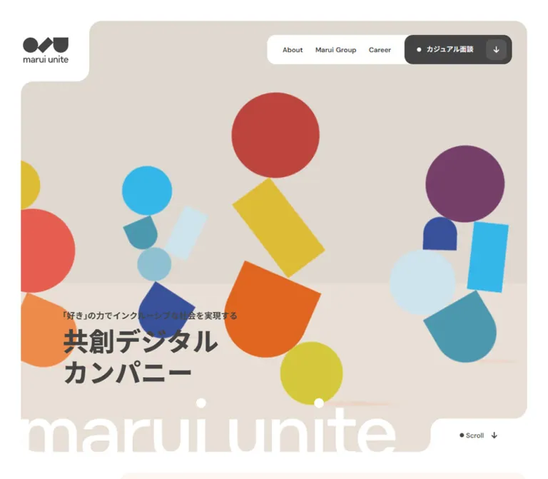
DESIGN REFERENCE
マルイユナイト|幾何学モチーフとパステルカラーの企業サイト
カラフルな幾何学イラスト、切り欠きのある角丸パネル、大きな欧文見出しが特徴。企業紹介・採用・記事・ニュースを、余白と淡い色面でつなぐデザイン。
オリジナルサイトを見るmarui unite — Style Reference
Bright geometric figures balanced inside quiet pastel panels, with white corners carved out for navigation.
Website: marui-unite.co.jp Original URL: https://marui-unite.co.jp/ Final URL: https://marui-unite.co.jp/ Theme: light, with a white outer canvas and differently colored content sections. Inspected: September 17, 2026, 04:41:46 JST; supplied retrieval timestamp: September 16, 2026, 19:41:46.107 UTC. Viewports: desktop 1440 × 1000 and mobile 390 × 844 CSS pixels. Scope: the current corporate homepage, including its hero, company introduction, group relationship, recruitment and application links, Ideas previews, News rows, and footer. Visual captures cover the desktop hero, Career introduction, lower News/footer, and mobile hero/footer. Other section details come from the supplied rendered DOM and computed styles. Linked pages and expanded navigation were not inspected.
The homepage combines a restrained corporate information structure with an expressive geometric identity. Circles, tilted rectangles, and rounded cup shapes form loose, balancing figures across the hero. Their saturated reds, yellows, blues, and purple sit against warm neutral planes. Elsewhere, pale peach, mint, cool blue, and warm gray separate long sections without strong borders or shadows.
The most distinctive relationship is between the colored panels and the white page surrounding them. Rounded white pockets interrupt panel corners to hold the logo, section labels, and Scroll link. Small charcoal dots and arrows repeat throughout the controls. Large English section titles provide visual landmarks, while compact Japanese headings and generously spaced paragraphs carry the information.
This is a corporate homepage with several destinations: company information, recruitment, editorial content, and announcements. Its visual hierarchy should preserve those different functions.
How to Read This Reference
- Measured means a value appears in the supplied rendered DOM or computed-style record. Coordinates are CSS pixels at the stated viewport.
- Calculated means a value is derived from those measurements, such as the gap between adjacent cards.
- Estimated means a visual approximation from an original-page screenshot. Estimated colors were not sampled with a pixel tool.
- Recommended means an implementation choice for reuse, including the CSS starter, accessibility additions, and intermediate breakpoints.
- Token names in this document are descriptive aliases. The supplied source font variable is identified separately.
- A transparent wrapper does not describe the painted layers inside it. This matters especially for the hero and Career section.
- Repeated DOM labels often occupy adjacent line boxes, while screenshots show one visible label. Their precise interaction behavior was not exercised.
Tokens — Colors
Default Palette
| Name | Value | Suggested token | Role and evidence |
|---|---|---|---|
| Canvas White | #FFFFFF |
--mu-white |
Measured body background; also measured on white actions and the Scroll pocket |
| Charcoal | #444444 |
--mu-ink |
Measured visible text color and header application-action fill |
| Pale Peach | #FDF6F3 |
--mu-peach |
Measured About section background |
| Group Mint | #CEEFE5 |
--mu-mint |
Measured Marui Group background and footer external-link fills |
| Action Mint | #D5F4EA |
--mu-mint-action |
Measured About action background; slightly lighter than Group Mint |
| Warm Gray | #F5F4F3 |
--mu-neutral |
Measured News rows, More links, and footer background |
| Hero Upper Plane | Approximately #EFEBE8 |
--mu-hero-upper |
Estimated warm gray behind the geometric artwork |
| Hero Lower Plane | Approximately #FBF7F4 |
--mu-hero-lower |
Estimated lighter plane behind the lower hero copy |
| Career Blue | Approximately #E5EEF0 |
--mu-career |
Estimated from the desktop Career screenshot; the sampled section wrapper itself is transparent |
Use charcoal for the interface rather than treating the saturated illustration colors as action colors. The main header action is charcoal with white details; ordinary section actions are white or mint.
Several wrappers report #333333, and the document root reports black with a Times family. Their visible text descendants explicitly use #444444 and the branded sans-serif stack. Those wrapper defaults should not become competing visual tokens.
Illustration Palette
These values are estimates from the current original-page hero captures, suitable as starting points for new artwork. They are not recovered asset colors.
| Color | Approximate value | Visible use |
|---|---|---|
| Brick Red | #BC433D |
Large upper circle in the central figure |
| Coral | #E86052 |
Large circle toward the left of the desktop composition |
| Orange | #E3651B |
Central rounded cup shape |
| Golden Yellow | #E0C139 |
Tilted rectangle and upper-left circle |
| Lemon | #D3CD3F |
Lower balancing circle |
| Cyan | #2FB3DB |
Small circle and right-hand rectangle |
| Cobalt | #3B5098 |
Small rounded forms |
| Plum | #7A406D |
Large circle on the right |
| Teal | #4F9CAF |
Rounded lower shapes |
| Ice Blue | #CFE4EA |
Pale circle and tilted rectangle |
Keep these colors concentrated in the artwork. The large pastel surfaces and mostly monochrome navigation provide the visual calm around them.
No theme switcher or alternate color mode was established. The transparent gradient-related custom properties in the DOM do not demonstrate a visible gradient system.
Tokens — Typography
Confirmed Font Stack
Source variable: --s-font-5da86b11: 'DM Sans','Noto Sans JP'.
Visible text samples report "DM Sans", "Noto Sans JP". This stack supports the rounded English display typography and the clear Japanese text. The supplied evidence confirms the declaration, but does not include font-file URLs or a glyph-by-glyph font-loading audit.
Use weights 500, 600, and 700 deliberately. Body copy is relatively substantial: About uses 600, while desktop Career paragraphs use 500. Large English section labels use 600, compact Japanese headings generally use 700.
Type Scale
All values in this table are measured. Sizes and line heights are expressed as font-size / line-height.
| Role | Desktop | Mobile | Weight and tracking |
|---|---|---|---|
| Header navigation | 13 / 23.4px |
Links absent from the visible closed header | 600; normal tracking |
| Scroll | 13 / 13px |
13 / 13px |
500 |
| Panel corner label | 13 / 13px |
10 / 10px |
500 |
| About heading | 30 / 48px |
20 / 32px |
700 |
| About paragraph | 14 / 28px |
15 / 30px |
600 |
| Roots label | 16 / 25.6px |
11 / 17.6px |
700 |
| Marui Group display | 90 / 90px |
45 / 45px |
600; -0.02em |
| Group statement | 22 / 35.2px |
17 / 27.2px |
700 |
| Group paragraph | 13 / 26px |
14 / 28px |
600 |
| Career display | 110 / 110px |
60 / 60px |
600; -0.02em |
| Career Japanese section heading | 20 / 32px |
12 / 19.2px |
700 |
| Career statement | 20 / 32px |
18 / 28.8px |
700 |
| Career paragraph | 14 / 28px |
14 / 28px |
Desktop 500; mobile 600 |
| Ideas / News display | 72 / 72px |
36 / 36px |
600; -0.02em |
| Ideas / News Japanese heading | 14 / 22.4px |
11 / 17.6px |
700; 0.01em |
| Standard section action | 16 / 22.4px |
14 / 19.6px |
600 |
| Application action | 16 / 22.4px |
12 / 16.8px |
600 |
| Article title | 14 / 25.2px |
13 / 23.4px |
700; 0.02em |
| Article source label | 10 / 16px |
10 / 16px |
600; 0.04em |
| News date | 24 / 33.6px |
16 / 22.4px |
600 |
| News title | 14 / 25.2px |
12 / 21.6px |
500 |
| Footer navigation | 14 / 25.2px |
14 / 25.2px |
600 |
| Copyright | 10 / 18px |
10 / 18px |
500 |
Hero Typography
The measured H1 wrapper reports 32px / 32px, weight 700, and generic sans-serif at both viewports. That wrapper contains multiple pieces of content and does not establish the final size of every visible child.
From the screenshots, the main Japanese headline appears approximately 48–52px on desktop and 30–32px on mobile. Its introductory line appears approximately 15–16px and 11–12px, respectively. Treat these as visual estimates until the leaf elements or artwork are available.
The headline is anchored low and left. The huge white marui unite wordmark is a separate decorative layer: horizontal across the desktop bottom edge and vertical along the mobile right edge. Its exact font or asset construction was not supplied. Preserve authorized logo artwork rather than assuming ordinary text exactly reproduces it.
Line-Break Behavior
The mobile About paragraph uses shorter, deliberately separated phrases and increases from 14px to 15px. Mobile adaptation therefore includes editorial reflow, not uniform reduction. Career body copy also changes its wrapping and placement. Maintain readable phrase groupings when replacing the Japanese content.
Tokens — Spacing & Shapes
The page has two scales of space: small, carefully packed controls and very large section interiors. Most visible geometry is flat, with rounded edges and no apparent elevation shadow.
Spacing Scale
| Use | Desktop | Mobile | Evidence |
|---|---|---|---|
| Outer panel gutter | 40px |
20px |
Measured section bounds |
| Gap between hero, About, Group, and Career panels | 40px |
40px |
Calculated from section bounds |
| Standard action padding | 12px 12px 12px 32px |
10px 12px 10px 20px |
Measured About/Career actions |
| Standard action internal gap | 26px |
Usually 26px |
Measured; Group mobile action uses 24px |
| About/Group vertical padding | 152px top and bottom |
106px top, 80px bottom |
Measured |
| Ideas/News top padding | 160px |
80px |
Measured |
| Editorial heading-to-content gap | 52px |
29px |
Measured section gap |
| Ideas card gap | 48px |
20px |
Calculated from card positions |
| News row gap | 20px |
15px |
Calculated from row positions |
| Footer padding | 48px 48px 28px |
32px 24px |
Measured |
| Footer major gap | 72px |
40px |
Measured footer gap |
| Footer social-link gap | 12px |
12px |
Calculated from link positions |
These measurements do not reveal a single mandatory spacing grid. Keep distinctive values such as 26px action gaps and 29px editorial spacing when matching the inspected layout.
Border Radius
| Element | Desktop | Mobile | Evidence |
|---|---|---|---|
| About / Group / Career section wrapper | 24px |
12px |
Measured |
| News row | 24px |
12px |
Measured |
| Footer | 24px 24px 0 0 |
12px 12px 0 0 |
Measured |
| Standard section action | 16px |
8px |
Measured |
| Application action | 16px |
16px |
Measured exception to the halving pattern |
| More action | 18px |
9px |
Measured |
| Footer mint link | 24px |
24px |
Measured |
| Mobile menu button | Not visible | 16px |
Measured |
| Scroll pocket | 24px upper-left; other corners zero |
12px upper-left; other corners zero |
Measured on its anchor |
| Hero painted outer corners | Approximately 24px |
Approximately 12px |
Visual estimate; the sampled section wrapper reports zero |
Layout Measurements
| Element | Desktop 1440 × 1000 | Mobile 390 × 844 |
|---|---|---|
| Hero section | x40, y40; 1360 × 900px |
x20, y20; 350 × 633px |
| Header logo link | 87 × 49px, at x88, y70.5 |
59 × 33.22px, at x20, y39.39 |
| Header box | 1440 × 175px |
390 × 89px |
| Header application link | 205.70 × 56px |
Not visible in closed header |
| Mobile menu button | Not visible | 48 × 48px, at x298, y32 |
| Hero H1 wrapper | 335.20 × 153.59px, at x130, y646.41 |
200 × 131.16px, at x43, y487.84 |
| Scroll link | 184.92 × 64px |
94.92 × 45px |
| About section | 1360 × 959px |
350 × 1170px |
| Group section | 1360 × 1244.97px |
350 × 1066.55px |
| Career section, including application content | 1360 × 1994.53px |
350 × 2066.03px |
| Ideas / News desktop content width | 1185px, centered at x127.5 |
News 350px; Ideas section extends from x20 to the right viewport edge |
| Ideas card | 362.95px wide |
242px wide |
| Footer | 1360 × 536.72px |
350 × 772.56px |
| Footer logo link | 225 × 126.72px |
175 × 98.56px |
| Document height | 7337.84px |
7000.27px |
Section heights are records of this content and capture state, not recommended fixed heights for reusable components.
Components
Persistent Header
Role: maintain brand recognition and access to the site's principal destinations.
The desktop header places a small charcoal logo at left and a white navigation rail at right. The rail contains About, Marui Group, Career, Ideas, and News, followed by the dark カジュアル面談 action. The measured header padding is 67px 69px 52px 88px.
The application link is 56px high with a 16px radius, white dot and label, and a lighter rounded square containing a downward arrow. It points to #apply on the homepage; it is not itself the external application destination.
The logo and controls remain near the same viewport coordinates in the supplied scrolled captures, demonstrating a persistent overlay appearance. The supplied style fields do not establish whether its exact implementation is fixed, sticky, or script-controlled.
On mobile, the visible rail becomes a single white 48 × 48px menu button. The logo remains separate. The button has a small three-line glyph, 16px rounding, and substantial surrounding white space. Its expanded state, animation, focus behavior, and contents were not exercised.
Sculpted Hero
Role: introduce the company through geometric artwork and a short positioning statement.
The hero fills most of the opening desktop viewport while retaining a 40px exterior white frame. Its upper-left edge steps inward around the logo, and its lower-right edge steps inward around Scroll. These pockets make the page background appear to cut into the content surface.
The illustration contains four loose groups of balancing forms on desktop. Circles sit above tilted bars and rounded cup shapes. Warm and cool colors alternate; the forms have clean edges, and faint horizontal shadows suggest a ground plane. The central red/yellow/orange figure is the largest vertical grouping. The underlying field changes from warm gray to a lighter lower plane around 61% of the desktop panel height, estimated visually.
The Japanese statement sits in the lower-left region. Its measured wrapper ends 140px above the desktop hero's lower boundary. A huge white wordmark crosses the bottom, partially merging with the white exterior.
The mobile hero is recomposed within 350 × 633px. The central figure remains prominent, neighboring figures are clipped by the side edges, and the main copy sits near the bottom-left. The decorative wordmark runs vertically along the right edge. Scroll occupies a compact white pocket in the lower-right corner.
The exact media type, source asset, animation timeline, and crop algorithm were not supplied. A static capture is sufficient to describe the composition, but not to specify its movement.
Section Label Pocket
Role: identify the next chapter without adding a conventional full-width heading bar.
About, Marui Group, and Career have small dot-prefixed labels near the upper-left edge of their large panels. The mobile About screenshot clearly shows the white label shelf interrupting the pale peach surface.
Labels use 13px / 1 on desktop and 10px / 1 on mobile. The surrounding notch geometry should share the panel's corner language. Keep the shelf compact and allow the larger editorial heading to remain a separate element deeper inside the section.
About Narrative
Role: explain the company's purpose before linking to more detailed information.
The measured desktop section uses pale peach, a 24px radius, and 152px vertical padding. Its main heading begins at x255; the paragraph and mint action share that alignment. The paragraph is approximately 335px wide with 14px text and 28px leading. The action follows the paragraph with a measured 40px gap.
Mobile uses a more staggered composition. The heading starts at x50, while the paragraph and action start at x100. The paragraph becomes approximately 210px wide and uses 15px / 30px, giving the Japanese phrases a deliberate, narrow rhythm.
The mobile heading and paragraph are separated by a substantial interval in the DOM. The supplied screenshot only shows the top of this section, so the intervening visual content is not established. Do not turn the interval into an arbitrary fixed blank spacer or invent an illustration to explain it.
Roots / Marui Group
Role: describe the company's relationship to the wider group and its business model.
A mint panel introduces a centered Roots label and a large Marui Group display line. On desktop, the display is 90px / 1 with -0.02em tracking. Farther down, the Japanese statement starts at x235 and the explanatory paragraph starts at x721, making a two-column information arrangement. The white detail action aligns with the paragraph.
On mobile, the display reduces to 45px; the Japanese statement sits beneath it, centered in the upper content. The paragraph appears later at x88 with a 259px width. Its action spans 304px from x43, extending wider than the text column.
The DOM establishes these positions and content relationships. It does not supply enough visual information to reconstruct any intervening diagram or media asset.
Career and Application Area
Role: introduce the working environment, then offer distinct recruitment destinations.
The desktop Career capture shows a very broad pale blue panel. A tiny geometric brand mark sits above a 110px English title, followed by the Japanese section heading. The left text column begins at x152; the right side is largely open in the captured state.
Below the section label, the statement uses 20px / 32px, the paragraph uses 14px / 28px, and a white 240 × 64px action points to /career. The statement and body have a measured 16px separation; the body and action have a 40px separation.
The complete Career wrapper is much taller than this first panel because it also contains an invitation to talk and two application rows. Desktop application links are 660 × 60px, paired with smaller labels to their left. The destinations distinguish a casual interview application on HERP from open roles on a linked Notion page.
Mobile rearranges this area into a vertical sequence. Career becomes 60px; its statement becomes 18px. The introductory body is offset to x88, while the Career action spans 304px from x43. Application labels sit above 283 × 60px links. These application links retain 16px radii even though ordinary section actions reduce to 8px.
The open right side of the desktop screenshot is a captured condition. Delayed or unrecorded media cannot be ruled out, so it should not be described as a verified permanent empty illustration slot.
Dot-and-Arrow Action Link
Role: provide a consistent transition between content and its destination.
The usual anatomy is:
- A rounded rectangular surface, generally white or pale mint.
- A small solid dot before the label.
- A semibold label, usually
16pxon desktop and14pxon mobile. - A separate rounded square at the trailing edge containing a directional arrow.
Standard desktop actions are 64px high with 12px vertical padding. The visible trailing tile is approximately 40px square, consistent with the available inner height. The leading padding is larger than the trailing padding: 32px versus 12px.
Arrow direction communicates the destination type in the visible interface: rightward for section details, downward for Scroll and the header's application anchor, upward for Page Top, and northeast for external footer links. Do not substitute unrelated icons for these small directional cues.
Footer external links form a larger variant with 24px radii and 76px desktop height. Mobile footer links remain generously rounded and become 66px high.
Ideas Preview
Role: surface three editorial entries and provide access to the larger collection.
The desktop section uses a centered 1185px content region. Its heading combines a 72px Ideas display line with the smaller Japanese heading. A warm-gray More action sits to the right. Three linked cards are approximately 363px wide, separated by 48px.
Card anchors have transparent backgrounds and no measured wrapper rounding. Their text anatomy includes a small note source label and a bold Japanese title. Desktop titles use 14px / 25.2px; mobile titles use 13px / 23.4px.
Mobile card positions are x20, x282, and x544, with 242px widths and 20px gaps. This establishes a horizontal sequence extending beyond the viewport. It does not establish autoplay, snapping, arrow controls, or a tested swipe gesture. A native horizontal overflow region is a reasonable implementation recommendation.
The supplied screenshots do not show this section's leading media. Image subjects, exact aspect ratios, and image corner treatment remain unverified.
News Row
Role: present dated announcements as full-row links.
Desktop News uses warm-gray rows with 24px corners. Each row contains a prominent date, a fine white vertical divider, a smaller announcement title, and a white arrow tile at the right. Rows are approximately 113.59px tall, with 20px gaps.
Dates use 24px / 33.6px and 40px 35px 40px 40px padding. Their measured widths vary from approximately 196.52px to 205.97px because the date text is proportional. The title follows with a 29px gap. A rigid equal-width date column would be an adaptation rather than an exact copy.
Mobile rows are 350px wide with 12px corners. The date becomes a full-width upper block with 20px 20px 14px padding; the title sits below at x40, using 12px / 21.6px within a 254px text width. The observed rows grow to approximately 132.58–154.17px according to content. Keep heights content-driven.
The recorded announcements link to external release pages. Link opening mode and hover behavior were not tested.
Footer
Role: conclude the page with orientation, navigation, brand identity, and external channels.
The footer repeats the large warm-gray panel treatment. Its top row pairs a dot-prefixed Home label with Page Top and a charcoal arrow square. A white dashed divider spans the inner width beneath that row.
On desktop, navigation runs horizontally and Privacy Policy sits at the opposite side. The lower brand row contains a 225px logo, two mint social links, and a wider mint group-site link aligned toward the right. The social labels are text, with dots and small northeast arrows. The group link includes the group's own small mark.
On mobile, navigation becomes a single vertical list while retaining 14px text. Privacy Policy follows the main list. The logo remains large at 175px wide, followed by two equal 145px social links with a 12px gap. The 302px group-site link occupies the next row. Copyright remains a small line near the bottom.
This is a deliberate layout change: the footer becomes approximately 773px tall, compared with approximately 537px on desktop.
Tokens — Motion & Interaction
| Treatment | Evidence | What can be concluded |
|---|---|---|
| General element transitions | Computed 0.3s cubic-bezier(0.4, 0.4, 0, 1) across many sampled elements |
A shared 300ms transition declaration exists; individual hover changes were not exercised |
| Body background transition | Computed background 0.5s cubic-bezier(0.4, 0.4, 0, 1) |
A 500ms background transition is declared; no theme-changing interaction was established |
| Repeated labels | Two adjacent text boxes for navigation and many actions | Compatible with a clipped text-roll treatment; trigger, direction, and actual movement remain unverified |
| Persistent header | Logo and controls remain visible in top and scrolled screenshots | Persistent overlay appearance is observed; exact positioning mechanism is not included |
| Scroll and Page Top | Anchors to #about and #top |
Destinations are confirmed; smooth scrolling, duration, and focus transfer are unverified |
| Header application action | Anchor to #apply |
It targets the homepage application area |
| Mobile Ideas sequence | Cards continue beyond the viewport at measured horizontal offsets | Horizontal layout is confirmed; scrolling mechanics are unverified |
| Hero illustration | Still captures show geometric compositions | No reliable duration, looping behavior, trajectory, or animation technology can be specified |
| Mobile menu | A visible button in the closed state | Opening, closing, overlay style, and keyboard handling were not observed |
The sampled nodes report animation: none. This does not prove that the entire page is static: media, unsampled descendants, pseudo-elements, or script-driven transforms may behave differently.
The capture process waited for loading and layout stability and temporarily paused perpetual animations during readiness checks before resuming them. These procedures improve capture consistency but do not provide a motion recording or prove semantic completeness.
Recommended motion vocabulary: reuse the measured easing and a restrained 300ms duration for small color or arrow changes. Introduce illustration motion only with an independently specified brief. Provide a static reduced-motion state and keep essential content available without animation.
Surfaces
| Layer | Appearance | Purpose |
|---|---|---|
| Outer canvas | Solid white | Frames the page and visually joins the cutout pockets |
| Hero stage | Two warm neutral planes, estimated colors | Supports saturated geometric figures and lower-left text |
| About | Pale peach #FDF6F3 |
Warm introduction to the company's purpose |
| Group | Mint #CEEFE5 |
Distinguishes the group relationship chapter |
| Career introduction | Pale cool blue, estimated | Gives recruitment a calm, spacious setting |
| Editorial region | White canvas | Supports card previews and large English headings |
| News / footer | Warm gray #F5F4F3 |
Groups information with minimal visual weight |
| Standard action | White or Action Mint | Separates links from their section surfaces |
| Emphasized action | Charcoal #444444 with white details |
Highlights the header's application entry point |
| Footer external action | Group Mint | Repeats the group palette for outward destinations |
Visible hierarchy comes from fill, scale, whitespace, and corner geometry. There is no apparent general shadow-elevation system. The faint shadows under hero forms belong to the illustration, not to the cards or buttons.
Imagery
The hero uses flat geometric construction rather than photography. Circles suggest heads; angled bars and rounded cups suggest bodies, movement, or balancing objects without explicit facial details. The logo shares this basic vocabulary through a circle, diagonal element, and rounded-bottom form.
The desktop scene distributes several groups across a wide stage. Mobile preserves the central group's importance while clipping the neighboring groups. Avoid shrinking the whole desktop composition until every object fits inside the phone; that would lose the observed scale and energy.
Use crisp edges, solid fills, and subtle grounding shadows. The image does not show the intentionally pixelated treatment of low-resolution artwork. Its visual character should remain clean when scaled.
The header and footer use the same charcoal logo at different sizes. The small brand marks inside sections repeat its geometry. Authorized logo assets should remain intact, including the relationship between symbol and wordmark.
Observed Asset References
No complete, reliable hero, logo, or article-image asset URLs were supplied. References below identify the observed elements without inventing filenames.
| Asset or visual | Evidence | Implementation consequence |
|---|---|---|
| Hero geometric composition | Original-page desktop and mobile hero captures | Requires supplied artwork or a newly authored geometric composition; exact source format is unknown |
| Charcoal logo | Header and footer captures; measured link bounds | Reuse an authorized asset with its intrinsic proportions |
| Large white hero wordmark | Desktop lower edge and mobile right edge | Treat as an independently positioned decorative layer |
| Tiny geometric section mark | Career capture and mobile About preview | Repeat the brand geometry at a small scale |
| Group mark inside footer link | Desktop and mobile footer captures | Preserve as a distinct mark within the larger link |
| Ideas leading media | Card geometry in the DOM; no visual capture of that region | Obtain actual media before deciding subjects or exact crops |
| Arrow and menu symbols | Current screenshots | Small monochrome directional forms; exact icon library is unknown |
Layout & Responsive Behavior
Desktop Structure
The page alternates broad panels with a narrower editorial container. Hero, About, Group, Career, and footer are 1360px wide at a 1440px viewport. Ideas and News use a centered 1185px region. The 40px outer gutter is therefore not the universal text alignment.
Internal alignments change by section: the hero copy begins at x130, Career at x152, About at x255, and editorial headings at x127.5. This creates variety while preserving the shared panel system. Replacing all of these with one identical left inset would flatten the composition.
The page scrolls as a long document. It is not a fixed-height application shell. The persistent header sits over its contents, and the footer closes the full document.
Mobile Structure
| Feature | Observed change at 390 × 844 |
|---|---|
| Outer frame | Gutter reduces from 40px to 20px |
| Panel corners | Most large radii reduce from 24px to 12px |
| Hero | Becomes 350 × 633px; neighboring artwork is cropped |
| Decorative wordmark | Changes from horizontal bottom placement to vertical right placement |
| Header | Small logo plus 48px menu button replaces the visible desktop rail |
| Large English titles | Group 90 → 45px; Career 110 → 60px; Ideas/News 72 → 36px |
| Narrative text | Frequently moves into narrower, offset columns; some body text becomes larger |
| Standard actions | Mostly 60px high; Career and Group links expand to 304px width |
| Ideas | Three cards retain a horizontal sequence at 242px each |
| News | Date moves above the title; row height becomes content-dependent |
| Footer | Navigation stacks; social links form two columns; group link spans the next row |
The mobile layout is not universally centered. About body copy starts 80px inside its panel, and Group/Career paragraphs start 68px inside theirs. Headings and actions often extend farther left. Retain this controlled asymmetry where the available width supports it.
Only two viewport sizes were supplied. A max-width: 1140px media-query fragment appears in generated line-break rules, but the complete breakpoint map is unavailable. It does not prove that every navigation or layout change occurs at 1140px. The starter below uses a clearly recommended 900px breakpoint.
Do’s and Don’ts
Do
- Build the page around white margins and broad pastel chapter panels.
- Preserve the white corner pockets as part of the panel silhouette.
- Keep interface text and icons charcoal, with saturated colors concentrated in the artwork.
- Use the confirmed DM Sans / Noto Sans JP stack and substantial text weights.
- Pair oversized English section labels with smaller Japanese headings.
- Maintain generous paragraph leading, usually around
1.8–2. - Give action links a leading dot and a separate trailing arrow tile.
- Recompose the mobile hero and turn its decorative wordmark vertically.
- Preserve the horizontal mobile Ideas sequence and the stacked mobile News anatomy.
- Keep the footer logo visually substantial at both viewport sizes.
Don’t
- Don't reduce the corporate homepage to a single recruitment conversion flow.
- Don't apply every illustration color to navigation, badges, and actions.
- Don't replace the panel pockets with ordinary rectangular section headers.
- Don't add card shadows or glass effects to reproduce a design built from flat fills.
- Don't assume all mobile dimensions are half the desktop values; footer and application radii are explicit exceptions.
- Don't shrink body text uniformly on mobile; About increases to
15px. - Don't give all sections the same text alignment or maximum width.
- Don't render duplicate DOM labels as two visible lines.
- Don't invent missing article imagery, Career media, hover behavior, or hero animation timing.
- Don't hardcode the measured document and narrative-section heights into a reusable page.
Recommended Implementation Additions
These are recommendations for a new implementation, not verified features of the original site:
- Give the logo link an accessible name and the menu button a label,
aria-expanded, andaria-controls. Implement keyboard operation and reliable focus return for an expanded menu. - If reproducing rolling labels, expose one accessible label and hide the decorative duplicate from assistive technology.
- Keep essential headings and paragraphs as text. Mark decorative geometry and the oversized repeated wordmark as decorative.
- Add visible focus indicators and sufficient scroll offsets for the persistent header.
- Preserve the observed compact appearance while providing at least 44px interaction targets for small More links and footer navigation where practical.
- Make the Ideas overflow region reachable by keyboard and touch, without moving the entire document horizontally.
- Provide a reduced-motion state. If hero motion is later implemented through video or script, handle that media separately from CSS transitions.
- Check text wrapping and cutout clearance with longer copy, increased text size, and intermediate widths. Scale decorative geometry before sacrificing readable content.
Agent Prompt Guide
Quick Color Reference
- Canvas and cutout pockets: measured
#FFFFFF. - Text, logo treatment, and emphasized header action: measured
#444444. - About: measured
#FDF6F3. - Group panel and footer external links: measured
#CEEFE5. - About action: measured
#D5F4EA. - News and footer: measured
#F5F4F3. - Hero warm planes: estimated
#EFEBE8and#FBF7F4. - Career introduction: estimated
#E5EEF0. - Saturated illustration colors belong to the artwork, with exact asset values still to be supplied.
Overall Prompt
“Create a Japanese corporate homepage inspired by the current marui unite interface. Use a white exterior canvas, broad pastel panels, charcoal typography, and a colorful composition of circles, tilted bars, and rounded cup shapes. Carve rounded white pockets into the hero's upper-left and lower-right corners for the brand area and Scroll link. Place compact Japanese positioning copy low on the left and a very large white decorative wordmark along the lower edge. Use DM Sans with Noto Sans JP, large English chapter titles, compact bold Japanese headings, and body leading near 2. Include separate company, group, recruitment, Ideas, News, and footer sections. At mobile width, retain 20px gutters, crop the artwork around its central figure, rotate the decorative wordmark along the right edge, keep Ideas in a horizontal overflow row, and stack dates above News titles. Use flat surfaces and dot-and-arrow links. Treat unrecorded menu states and motion as new implementation decisions.”
Example Component Prompts
- Hero: “Build a rounded warm-neutral stage inside a white frame. Arrange flat colored circles, slanted rectangles, and rounded cups into several balancing figures. Anchor the Japanese headline at the lower-left. Add a white logo pocket above-left and a small white Scroll pocket below-right. Recompose the artwork for a 350px mobile panel and place the large white wordmark vertically on its right edge.”
- Career panel: “Create a spacious pale-blue recruitment introduction with a tiny geometric brand mark, a 110px charcoal Career display title, a smaller Japanese heading, a two-line statement, and compact text at 14px with 28px leading. Finish with a white 240 × 64px action containing a leading dot and a separate arrow tile. Use 60px display type on mobile and let the text blocks reflow independently.”
- Action link: “Design a flat 64px-high white or pale-mint link with 16px corners, semibold charcoal text, a small leading dot, generous left padding, and a 40px rounded trailing arrow tile. On mobile, use 60px height and 8px corners for ordinary section actions.”
- News list: “Create warm-gray announcement rows with 24px corners, large proportional dates at left, white dividers, small Japanese titles, and trailing white arrow tiles. Use 20px row gaps. At mobile width, reduce corners to 12px, place the 16px date above a 12px title, and allow each row to grow with its text.”
- Footer: “Create a warm-gray footer with rounded upper corners, a Home and Page Top row, a subtle white dashed divider, text navigation, and a large charcoal brand asset. Add mint links for note, X, and the group website. On mobile, stack navigation, retain a 175px logo, place the two social links side by side, and put the group link across the next row.”
Quick Start
CSS Custom Properties
This is a recommended implementation scaffold, not recovered source code. It combines measured tokens with explicitly estimated hero/Career colors. The 900px breakpoint, fluid hero-height rules, simplified corner overlays, and hover response are adaptation choices. The original artwork, exact logo, and mobile-menu controller must be supplied separately.
Keep the conventional root font size. Load the confirmed font families through your project's authorized font setup; no font-file locations were provided. These snippets were not browser-tested during this evidence-only analysis.
:root {
  /* Measured colors */
  --mu-white: #ffffff;
  --mu-ink: #444444;
  --mu-peach: #fdf6f3;
  --mu-mint: #ceefe5;
  --mu-mint-action: #d5f4ea;
  --mu-neutral: #f5f4f3;

  /* Estimated screenshot colors */
  --mu-hero-upper: #efebe8;
  --mu-hero-lower: #fbf7f4;
  --mu-career: #e5eef0;

  /* Confirmed family names; generic fallback added */
  --mu-font: 'DM Sans', 'Noto Sans JP', sans-serif;
  --mu-body: 0.875rem;
  --mu-display: 4.5rem;
  --mu-leading-body: 2;
  --mu-tracking-display: -0.02em;

  /* Measured desktop geometry */
  --mu-gutter: 40px;
  --mu-content-width: 1185px;
  --mu-radius-panel: 24px;
  --mu-radius-action: 16px;
  --mu-section-gap: 40px;
  --mu-editorial-gap: 52px;
  --mu-section-space: 152px;

  /* Measured transition declaration */
  --mu-duration: 300ms;
  --mu-ease: cubic-bezier(0.4, 0.4, 0, 1);
}

* { box-sizing: border-box; }
body {
  margin: 0;
  color: var(--mu-ink);
  background: var(--mu-white);
  font-family: var(--mu-font);
  font-size: var(--mu-body);
  font-weight: 500;
  line-height: var(--mu-leading-body);
}
button { font: inherit; }
a { color: inherit; }
img, svg { max-width: 100%; }
.mu-frame {
  width: calc(100% - 2 * var(--mu-gutter));
  margin-inline: auto;
}
.mu-content {
  width: min(var(--mu-content-width),
    calc(100% - 2 * var(--mu-gutter)));
  margin-inline: auto;
}
[id] { scroll-margin-top: 180px; }
:where(a, button):focus-visible {
  outline: 2px solid var(--mu-ink);
  outline-offset: 4px;
}

/* Recommended fixed implementation of the observed overlay header */
.mu-header {
  position: fixed;
  inset: 0 0 auto;
  z-index: 50;
  display: flex;
  align-items: center;
  justify-content: space-between;
  padding: 67px 69px 52px 88px;
  pointer-events: none;
}
.mu-header > * { pointer-events: auto; }
.mu-logo { display: block; width: 87px; line-height: 0; }
.mu-logo img { display: block; width: 100%; height: auto; }
.mu-nav {
  display: flex;
  align-items: center;
  gap: 32px;
  min-height: 56px;
  padding-left: 29px;
  border-radius: 16px;
  background: var(--mu-white);
}
.mu-nav > a {
  font-size: 13px;
  font-weight: 600;
  text-decoration: none;
}
.mu-menu {
  display: none;
  width: 48px;
  height: 48px;
  padding: 0;
  border: 0;
  border-radius: 16px;
  color: var(--mu-ink);
  background: var(--mu-white);
  cursor: pointer;
}

/* Artwork and decorative wordmark are independent layers */
.mu-hero {
  position: relative;
  isolation: isolate;
  min-height: clamp(680px, 90svh, 900px);
  margin-block: var(--mu-gutter) var(--mu-section-gap);
  overflow: hidden;
  border-radius: var(--mu-radius-panel);
  background: linear-gradient(
    var(--mu-hero-upper) 0 61%,
    var(--mu-hero-lower) 61% 100%
  );
}
.mu-hero__art {
  position: absolute;
  inset: 0;
  z-index: -1;
  pointer-events: none;
}
.mu-hero__art > :is(img, video, svg) {
  display: block;
  width: 100%;
  height: 100%;
  object-fit: cover;
  object-position: center;
}
.mu-hero__copy {
  position: absolute;
  left: 90px;
  bottom: 140px;
  width: min(360px, calc(100% - 48px));
}
.mu-hero__eyebrow {
  margin: 0 0 8px;
  font-size: 15px;
  font-weight: 700;
  line-height: 1.6;
}
.mu-hero__title {
  margin: 0;
  font-size: 48px;
  font-weight: 700;
  line-height: 1.2;
}
.mu-hero__brand {
  position: absolute;
  left: 10px;
  bottom: -30px;
  margin: 0;
  color: var(--mu-white);
  font-size: clamp(100px, 14.5vw, 210px);
  font-weight: 600;
  line-height: 1;
  letter-spacing: -0.04em;
  white-space: nowrap;
  pointer-events: none;
}

/* Simplified white pocket; refine joins with an approved mask */
.mu-corner-pocket {
  position: absolute;
  inset: 0 auto auto 0;
  width: 175px;
  height: 116px;
  border-bottom-right-radius: var(--mu-radius-panel);
  background: var(--mu-white);
  pointer-events: none;
}
.mu-scroll {
  position: absolute;
  right: 0;
  bottom: 0;
  display: flex;
  align-items: center;
  justify-content: center;
  gap: 12px;
  width: 185px;
  min-height: 64px;
  border-top-left-radius: var(--mu-radius-panel);
  background: var(--mu-white);
  font-size: 13px;
  text-decoration: none;
}

.mu-panel {
  position: relative;
  margin-block: var(--mu-section-gap);
  padding: var(--mu-section-space) clamp(24px, 8vw, 112px);
  border-radius: var(--mu-radius-panel);
}
.mu-panel--about { background: var(--mu-peach); }
.mu-panel--group { background: var(--mu-mint); }
.mu-panel--career { background: var(--mu-career); }
.mu-panel__label {
  position: absolute;
  top: 0;
  left: 0;
  margin: 0;
  padding: 24px 48px;
  border-bottom-right-radius: var(--mu-radius-panel);
  background: var(--mu-white);
  font-size: 13px;
  line-height: 1;
}
.mu-display {
  margin: 0;
  font-size: var(--mu-display);
  font-weight: 600;
  line-height: 1;
  letter-spacing: var(--mu-tracking-display);
}
.mu-display--group { font-size: 90px; text-align: center; }
.mu-display--career { font-size: 110px; }
.mu-section-label {
  margin: 8px 0 0;
  font-size: 14px;
  font-weight: 700;
  line-height: 1.6;
}
.mu-copy { max-width: 365px; }
.mu-copy p { margin: 16px 0 0; }
.mu-copy h3 { margin: 0; font-size: 20px; line-height: 1.6; }
.mu-copy .mu-action { margin-top: 40px; }

.mu-action {
  display: inline-flex;
  align-items: center;
  justify-content: space-between;
  gap: 26px;
  max-width: 100%;
  min-height: 64px;
  padding: 12px 12px 12px 32px;
  border-radius: var(--mu-radius-action);
  color: var(--mu-ink);
  background: var(--mu-white);
  font-size: 16px;
  font-weight: 600;
  line-height: 1.4;
  text-decoration: none;
  transition: background-color var(--mu-duration) var(--mu-ease);
}
.mu-action__label { display: flex; align-items: center; gap: 10px; }
.mu-dot {
  flex: 0 0 8px;
  width: 8px;
  height: 8px;
  border-radius: 50%;
  background: currentColor;
}
.mu-icon {
  display: inline-grid;
  flex: 0 0 40px;
  place-items: center;
  width: 40px;
  height: 40px;
  border-radius: 12px;
  background: var(--mu-neutral);
  line-height: 1;
}
.mu-action--mint { background: var(--mu-mint-action); }
.mu-action--dark {
  min-height: 56px;
  padding: 8px 10px 8px 24px;
  gap: 24px;
  color: var(--mu-white);
  background: var(--mu-ink);
  font-size: 13px;
}
.mu-action--dark .mu-icon { background: rgb(255 255 255 / 10%); }
.mu-action--external { border-radius: 24px; background: var(--mu-mint); }
.mu-action--external .mu-icon { background: rgb(255 255 255 / 40%); }

.mu-editorial { padding-top: 160px; }
.mu-editorial__header {
  display: flex;
  align-items: end;
  justify-content: space-between;
  gap: 24px;
  margin-bottom: var(--mu-editorial-gap);
}
.mu-ideas {
  display: grid;
  grid-template-columns: repeat(3, minmax(0, 1fr));
  gap: 48px;
}
.mu-idea { min-width: 0; text-decoration: none; }
.mu-idea img { display: block; width: 100%; height: auto; margin-bottom: 24px; }
.mu-idea__source { font-size: 10px; font-weight: 600; letter-spacing: 0.04em; }
.mu-idea h3 { margin: 10px 0 0; font-size: 14px; line-height: 1.8; letter-spacing: 0.02em; }

.mu-news { display: grid; gap: 20px; }
.mu-news__row {
  display: grid;
  grid-template-columns: max-content minmax(0, 1fr) 40px;
  align-items: center;
  gap: 29px;
  padding-right: 26px;
  border-radius: var(--mu-radius-panel);
  background: var(--mu-neutral);
  text-decoration: none;
}
.mu-news__date {
  padding: 40px 35px 40px 40px;
  border-right: 1px solid var(--mu-white);
  font-size: 24px;
  font-weight: 600;
  line-height: 1.4;
  white-space: nowrap;
}
.mu-news__title { margin: 0; font-size: 14px; font-weight: 500; line-height: 1.8; }
.mu-news__row .mu-icon { background: var(--mu-white); }

.mu-footer {
  display: grid;
  gap: 72px;
  margin-top: 180px;
  padding: 48px 48px 28px;
  border-radius: var(--mu-radius-panel) var(--mu-radius-panel) 0 0;
  background: var(--mu-neutral);
}
.mu-footer__top {
  display: flex;
  align-items: center;
  justify-content: space-between;
  padding-bottom: 32px;
  border-bottom: 2px dashed var(--mu-white);
}
.mu-footer__nav { display: flex; flex-wrap: wrap; gap: 24px; }
.mu-footer__nav a { font-size: 14px; font-weight: 600; line-height: 1.8; text-decoration: none; }
.mu-footer__privacy { margin-left: auto; }
.mu-footer__brand-row { display: flex; align-items: end; gap: 68px; }
.mu-footer__logo { display: block; flex: 0 0 225px; width: 225px; }
.mu-footer__links { display: flex; flex: 1; gap: 12px; }
.mu-footer__links .mu-action { min-height: 76px; }
.mu-footer__group { margin-left: auto; }
.mu-footer__copyright { margin: 0; font-size: 10px; line-height: 1.8; }

/* Recommended feedback; original hover appearance was not captured */
@media (hover: hover) {
  .mu-action:not(.mu-action--dark):hover { background: var(--mu-mint); }
  .mu-news__row:hover .mu-news__title { text-decoration: underline; }
}

/* Recommended breakpoint, not a recovered source breakpoint */
@media (max-width: 900px) {
  :root {
    --mu-gutter: 20px;
    --mu-radius-panel: 12px;
    --mu-radius-action: 8px;
    --mu-display: 2.25rem;
    --mu-editorial-gap: 29px;
    --mu-section-space: 106px;
  }
  [id] { scroll-margin-top: 100px; }
  .mu-header { padding: 32px 44px 9px 20px; }
  .mu-logo { width: 59px; }
  .mu-nav { display: none; }
  .mu-menu { display: grid; place-items: center; }
  .mu-hero {
    min-height: max(633px, 75svh);
    background: linear-gradient(
      var(--mu-hero-upper) 0 58%,
      var(--mu-hero-lower) 58% 100%
    );
  }
  .mu-corner-pocket { width: 94px; height: 70px; }
  .mu-hero__copy { left: 23px; bottom: 34px; width: min(250px, calc(100% - 46px)); }
  .mu-hero__eyebrow { max-width: 205px; font-size: 12px; }
  .mu-hero__title { font-size: 30px; line-height: 1.25; }
  .mu-hero__brand {
    left: auto;
    right: -7px;
    bottom: 48px;
    font-size: 56px;
    transform: rotate(-90deg) translateX(100%);
    transform-origin: right bottom;
  }
  .mu-scroll { width: 95px; min-height: 45px; gap: 6px; }
  .mu-panel { padding: 106px 23px 80px; }
  .mu-panel__label { padding: 18px 24px; font-size: 10px; }
  .mu-display--group { font-size: 45px; }
  .mu-display--career { font-size: 60px; }
  .mu-section-label { font-size: 11px; }
  .mu-copy h3 { font-size: 18px; }
  .mu-action { min-height: 60px; padding: 10px 12px 10px 20px; font-size: 14px; }
  .mu-action--application { border-radius: 16px; font-size: 12px; }
  .mu-editorial { padding-top: 80px; }
  .mu-ideas {
    display: flex;
    gap: 20px;
    overflow-x: auto;
    padding-bottom: 8px;
  }
  .mu-idea { flex: 0 0 242px; }
  .mu-idea img { margin-bottom: 14px; }
  .mu-idea h3 { font-size: 13px; }
  .mu-news { gap: 15px; }
  .mu-news__row {
    grid-template-columns: minmax(0, 1fr) 40px;
    gap: 18px 16px;
    padding: 0 20px 14px;
  }
  .mu-news__date {
    grid-column: 1 / -1;
    margin-inline: -20px;
    padding: 20px 20px 14px;
    border-right: 0;
    border-bottom: 1px solid var(--mu-white);
    font-size: 16px;
  }
  .mu-news__title { font-size: 12px; }
  .mu-footer { gap: 40px; margin-top: 95px; padding: 32px 24px; }
  .mu-footer__top { padding-bottom: 16px; }
  .mu-footer__nav { flex-direction: column; align-items: start; gap: 4px; }
  .mu-footer__privacy { margin: 8px 0 0; }
  .mu-footer__brand-row { display: grid; gap: 45px; }
  .mu-footer__logo { width: 175px; }
  .mu-footer__links { display: grid; grid-template-columns: repeat(2, minmax(0, 1fr)); }
  .mu-footer__links .mu-action { min-height: 66px; padding: 18px 15px; font-size: 13px; }
  .mu-footer__links .mu-icon { width: 30px; height: 30px; flex-basis: 30px; }
  .mu-footer__group { grid-column: 1 / -1; margin-left: 0; }
}

@media (prefers-reduced-motion: reduce) {
  html { scroll-behavior: auto; }
  .mu-action { transition: none; }
}
The panel classes establish surfaces and basic spacing. Apply section-specific inner layouts for the measured About offsets, Group columns, and Career sequence; the shared class alone does not reproduce those compositions. For the exact mobile Ideas edge treatment, allow its scroll container to extend to the viewport's right edge while keeping the heading within the normal gutter.
Example Markup
This fragment demonstrates the measured dot/label/tile anatomy and the responsive News structure. The arrows are text placeholders; replace them with consistent SVGs when matching the original icon shapes.
<a class="mu-action" href="https://marui-unite.co.jp/career">
  <span class="mu-action__label">
    <span class="mu-dot" aria-hidden="true"></span>
    <span lang="ja">採用情報を見る</span>
  </span>
  <span class="mu-icon" aria-hidden="true">→</span>
</a>

<div class="mu-news">
  <a class="mu-news__row"
     href="https://prtimes.jp/main/html/rd/p/000003993.000003860.html">
    <time class="mu-news__date" datetime="2026-02-05">2026.02.05</time>
    <h3 class="mu-news__title" lang="ja">
      2026.2.25開催 内製開発Summit 2026に特別登壇いたします
    </h3>
    <span class="mu-icon" aria-hidden="true">↗</span>
  </a>
</div>
Tailwind v4 Token Mapping
Optional aliases for a project already using Tailwind v4. Define the properties above first. This is not evidence that the original site uses Tailwind.
@theme inline {
  --color-mu-ink: var(--mu-ink);
  --color-mu-white: var(--mu-white);
  --color-mu-peach: var(--mu-peach);
  --color-mu-mint: var(--mu-mint);
  --color-mu-mint-action: var(--mu-mint-action);
  --color-mu-neutral: var(--mu-neutral);
  --color-mu-career: var(--mu-career);

  --font-brand: var(--mu-font);
  --text-section: var(--mu-display);
  --text-copy: var(--mu-body);

  --spacing-page-gutter: var(--mu-gutter);
  --spacing-section-gap: var(--mu-section-gap);
  --radius-panel: var(--mu-radius-panel);
  --radius-action: var(--mu-radius-action);
}
Sources & Evidence
- Inspected original and final page: https://marui-unite.co.jp/. Both URLs are identical; the supplied response status is HTTP 200.
- Capture time:
2026-09-16T19:41:46.107Z, equivalent to September 17, 2026, 04:41:46.107 JST. - Desktop evidence: 1440 × 1000 CSS-pixel viewport; opening hero, Career introduction, and lower News/footer captures; rendered DOM, link targets, computed typography, colors, spacing, and geometry.
- Mobile evidence: 390 × 844 CSS-pixel viewport; opening hero and footer captures; rendered DOM and computed styles for the complete homepage structure.
- Coverage distinction: About, Group, application rows, and Ideas include substantial DOM evidence but limited or no corresponding visual capture. Their unrecorded media and visual states remain unverified.
- Interaction limits: the inspection traversed scroll positions. No supplied results demonstrate menu activation, link navigation, hover changes, keyboard behavior, horizontal dragging, or a complete illustration animation cycle. Recorded link targets establish destinations only.
- Capture limits: readiness checks included document loading, finite animation waits, sampled layout/text stability, and visible image decoding within time limits. Perpetual animations were paused for checks and resumed. SharedWorkers and service workers were disabled. Delayed content and unexercised behavior may remain outside the record.
- Implementation limits: screenshot-derived artwork colors are estimates; the starter CSS, focus treatment, breakpoint, and overflow behavior are recommendations. No commands, additional browsing, asset retrieval, or browser testing were performed for this reference.
# marui unite — Style Reference

> Bright geometric figures balanced inside quiet pastel panels, with white corners carved out for navigation.

**Website:** [marui-unite.co.jp](https://marui-unite.co.jp/)
**Original URL:** https://marui-unite.co.jp/
**Final URL:** https://marui-unite.co.jp/
**Theme:** light, with a white outer canvas and differently colored content sections.
**Inspected:** September 17, 2026, 04:41:46 JST; supplied retrieval timestamp: September 16, 2026, 19:41:46.107 UTC.
**Viewports:** desktop 1440 × 1000 and mobile 390 × 844 CSS pixels.
**Scope:** the current corporate homepage, including its hero, company introduction, group relationship, recruitment and application links, Ideas previews, News rows, and footer. Visual captures cover the desktop hero, Career introduction, lower News/footer, and mobile hero/footer. Other section details come from the supplied rendered DOM and computed styles. Linked pages and expanded navigation were not inspected.

The homepage combines a restrained corporate information structure with an expressive geometric identity. Circles, tilted rectangles, and rounded cup shapes form loose, balancing figures across the hero. Their saturated reds, yellows, blues, and purple sit against warm neutral planes. Elsewhere, pale peach, mint, cool blue, and warm gray separate long sections without strong borders or shadows.

The most distinctive relationship is between the colored panels and the white page surrounding them. Rounded white pockets interrupt panel corners to hold the logo, section labels, and Scroll link. Small charcoal dots and arrows repeat throughout the controls. Large English section titles provide visual landmarks, while compact Japanese headings and generously spaced paragraphs carry the information.

This is a corporate homepage with several destinations: company information, recruitment, editorial content, and announcements. Its visual hierarchy should preserve those different functions.

## How to Read This Reference

- **Measured** means a value appears in the supplied rendered DOM or computed-style record. Coordinates are CSS pixels at the stated viewport.
- **Calculated** means a value is derived from those measurements, such as the gap between adjacent cards.
- **Estimated** means a visual approximation from an original-page screenshot. Estimated colors were not sampled with a pixel tool.
- **Recommended** means an implementation choice for reuse, including the CSS starter, accessibility additions, and intermediate breakpoints.
- Token names in this document are descriptive aliases. The supplied source font variable is identified separately.
- A transparent wrapper does not describe the painted layers inside it. This matters especially for the hero and Career section.
- Repeated DOM labels often occupy adjacent line boxes, while screenshots show one visible label. Their precise interaction behavior was not exercised.

## Tokens — Colors

### Default Palette

| Name | Value | Suggested token | Role and evidence |
| --- | --- | --- | --- |
| Canvas White | `#FFFFFF` | `--mu-white` | Measured body background; also measured on white actions and the Scroll pocket |
| Charcoal | `#444444` | `--mu-ink` | Measured visible text color and header application-action fill |
| Pale Peach | `#FDF6F3` | `--mu-peach` | Measured About section background |
| Group Mint | `#CEEFE5` | `--mu-mint` | Measured Marui Group background and footer external-link fills |
| Action Mint | `#D5F4EA` | `--mu-mint-action` | Measured About action background; slightly lighter than Group Mint |
| Warm Gray | `#F5F4F3` | `--mu-neutral` | Measured News rows, More links, and footer background |
| Hero Upper Plane | Approximately `#EFEBE8` | `--mu-hero-upper` | Estimated warm gray behind the geometric artwork |
| Hero Lower Plane | Approximately `#FBF7F4` | `--mu-hero-lower` | Estimated lighter plane behind the lower hero copy |
| Career Blue | Approximately `#E5EEF0` | `--mu-career` | Estimated from the desktop Career screenshot; the sampled section wrapper itself is transparent |

Use charcoal for the interface rather than treating the saturated illustration colors as action colors. The main header action is charcoal with white details; ordinary section actions are white or mint.

Several wrappers report `#333333`, and the document root reports black with a Times family. Their visible text descendants explicitly use `#444444` and the branded sans-serif stack. Those wrapper defaults should not become competing visual tokens.

### Illustration Palette

These values are **estimates from the current original-page hero captures**, suitable as starting points for new artwork. They are not recovered asset colors.

| Color | Approximate value | Visible use |
| --- | --- | --- |
| Brick Red | `#BC433D` | Large upper circle in the central figure |
| Coral | `#E86052` | Large circle toward the left of the desktop composition |
| Orange | `#E3651B` | Central rounded cup shape |
| Golden Yellow | `#E0C139` | Tilted rectangle and upper-left circle |
| Lemon | `#D3CD3F` | Lower balancing circle |
| Cyan | `#2FB3DB` | Small circle and right-hand rectangle |
| Cobalt | `#3B5098` | Small rounded forms |
| Plum | `#7A406D` | Large circle on the right |
| Teal | `#4F9CAF` | Rounded lower shapes |
| Ice Blue | `#CFE4EA` | Pale circle and tilted rectangle |

Keep these colors concentrated in the artwork. The large pastel surfaces and mostly monochrome navigation provide the visual calm around them.

No theme switcher or alternate color mode was established. The transparent gradient-related custom properties in the DOM do not demonstrate a visible gradient system.

## Tokens — Typography

### Confirmed Font Stack

**Source variable:** `--s-font-5da86b11: 'DM Sans','Noto Sans JP'`.

Visible text samples report `"DM Sans", "Noto Sans JP"`. This stack supports the rounded English display typography and the clear Japanese text. The supplied evidence confirms the declaration, but does not include font-file URLs or a glyph-by-glyph font-loading audit.

Use weights `500`, `600`, and `700` deliberately. Body copy is relatively substantial: About uses `600`, while desktop Career paragraphs use `500`. Large English section labels use `600`, compact Japanese headings generally use `700`.

### Type Scale

All values in this table are measured. Sizes and line heights are expressed as `font-size / line-height`.

| Role | Desktop | Mobile | Weight and tracking |
| --- | --- | --- | --- |
| Header navigation | `13 / 23.4px` | Links absent from the visible closed header | `600`; normal tracking |
| Scroll | `13 / 13px` | `13 / 13px` | `500` |
| Panel corner label | `13 / 13px` | `10 / 10px` | `500` |
| About heading | `30 / 48px` | `20 / 32px` | `700` |
| About paragraph | `14 / 28px` | `15 / 30px` | `600` |
| Roots label | `16 / 25.6px` | `11 / 17.6px` | `700` |
| Marui Group display | `90 / 90px` | `45 / 45px` | `600`; `-0.02em` |
| Group statement | `22 / 35.2px` | `17 / 27.2px` | `700` |
| Group paragraph | `13 / 26px` | `14 / 28px` | `600` |
| Career display | `110 / 110px` | `60 / 60px` | `600`; `-0.02em` |
| Career Japanese section heading | `20 / 32px` | `12 / 19.2px` | `700` |
| Career statement | `20 / 32px` | `18 / 28.8px` | `700` |
| Career paragraph | `14 / 28px` | `14 / 28px` | Desktop `500`; mobile `600` |
| Ideas / News display | `72 / 72px` | `36 / 36px` | `600`; `-0.02em` |
| Ideas / News Japanese heading | `14 / 22.4px` | `11 / 17.6px` | `700`; `0.01em` |
| Standard section action | `16 / 22.4px` | `14 / 19.6px` | `600` |
| Application action | `16 / 22.4px` | `12 / 16.8px` | `600` |
| Article title | `14 / 25.2px` | `13 / 23.4px` | `700`; `0.02em` |
| Article source label | `10 / 16px` | `10 / 16px` | `600`; `0.04em` |
| News date | `24 / 33.6px` | `16 / 22.4px` | `600` |
| News title | `14 / 25.2px` | `12 / 21.6px` | `500` |
| Footer navigation | `14 / 25.2px` | `14 / 25.2px` | `600` |
| Copyright | `10 / 18px` | `10 / 18px` | `500` |

### Hero Typography

The measured `H1` wrapper reports `32px / 32px`, weight `700`, and generic sans-serif at both viewports. That wrapper contains multiple pieces of content and does not establish the final size of every visible child.

From the screenshots, the main Japanese headline appears approximately **48–52px on desktop** and **30–32px on mobile**. Its introductory line appears approximately **15–16px** and **11–12px**, respectively. Treat these as visual estimates until the leaf elements or artwork are available.

The headline is anchored low and left. The huge white `marui unite` wordmark is a separate decorative layer: horizontal across the desktop bottom edge and vertical along the mobile right edge. Its exact font or asset construction was not supplied. Preserve authorized logo artwork rather than assuming ordinary text exactly reproduces it.

### Line-Break Behavior

The mobile About paragraph uses shorter, deliberately separated phrases and increases from `14px` to `15px`. Mobile adaptation therefore includes editorial reflow, not uniform reduction. Career body copy also changes its wrapping and placement. Maintain readable phrase groupings when replacing the Japanese content.

## Tokens — Spacing & Shapes

The page has two scales of space: small, carefully packed controls and very large section interiors. Most visible geometry is flat, with rounded edges and no apparent elevation shadow.

### Spacing Scale

| Use | Desktop | Mobile | Evidence |
| --- | --- | --- | --- |
| Outer panel gutter | `40px` | `20px` | Measured section bounds |
| Gap between hero, About, Group, and Career panels | `40px` | `40px` | Calculated from section bounds |
| Standard action padding | `12px 12px 12px 32px` | `10px 12px 10px 20px` | Measured About/Career actions |
| Standard action internal gap | `26px` | Usually `26px` | Measured; Group mobile action uses `24px` |
| About/Group vertical padding | `152px` top and bottom | `106px` top, `80px` bottom | Measured |
| Ideas/News top padding | `160px` | `80px` | Measured |
| Editorial heading-to-content gap | `52px` | `29px` | Measured section gap |
| Ideas card gap | `48px` | `20px` | Calculated from card positions |
| News row gap | `20px` | `15px` | Calculated from row positions |
| Footer padding | `48px 48px 28px` | `32px 24px` | Measured |
| Footer major gap | `72px` | `40px` | Measured footer gap |
| Footer social-link gap | `12px` | `12px` | Calculated from link positions |

These measurements do not reveal a single mandatory spacing grid. Keep distinctive values such as `26px` action gaps and `29px` editorial spacing when matching the inspected layout.

### Border Radius

| Element | Desktop | Mobile | Evidence |
| --- | --- | --- | --- |
| About / Group / Career section wrapper | `24px` | `12px` | Measured |
| News row | `24px` | `12px` | Measured |
| Footer | `24px 24px 0 0` | `12px 12px 0 0` | Measured |
| Standard section action | `16px` | `8px` | Measured |
| Application action | `16px` | `16px` | Measured exception to the halving pattern |
| More action | `18px` | `9px` | Measured |
| Footer mint link | `24px` | `24px` | Measured |
| Mobile menu button | Not visible | `16px` | Measured |
| Scroll pocket | `24px` upper-left; other corners zero | `12px` upper-left; other corners zero | Measured on its anchor |
| Hero painted outer corners | Approximately `24px` | Approximately `12px` | Visual estimate; the sampled section wrapper reports zero |

### Layout Measurements

| Element | Desktop 1440 × 1000 | Mobile 390 × 844 |
| --- | --- | --- |
| Hero section | `x40, y40; 1360 × 900px` | `x20, y20; 350 × 633px` |
| Header logo link | `87 × 49px`, at `x88, y70.5` | `59 × 33.22px`, at `x20, y39.39` |
| Header box | `1440 × 175px` | `390 × 89px` |
| Header application link | `205.70 × 56px` | Not visible in closed header |
| Mobile menu button | Not visible | `48 × 48px`, at `x298, y32` |
| Hero H1 wrapper | `335.20 × 153.59px`, at `x130, y646.41` | `200 × 131.16px`, at `x43, y487.84` |
| Scroll link | `184.92 × 64px` | `94.92 × 45px` |
| About section | `1360 × 959px` | `350 × 1170px` |
| Group section | `1360 × 1244.97px` | `350 × 1066.55px` |
| Career section, including application content | `1360 × 1994.53px` | `350 × 2066.03px` |
| Ideas / News desktop content width | `1185px`, centered at `x127.5` | News `350px`; Ideas section extends from `x20` to the right viewport edge |
| Ideas card | `362.95px` wide | `242px` wide |
| Footer | `1360 × 536.72px` | `350 × 772.56px` |
| Footer logo link | `225 × 126.72px` | `175 × 98.56px` |
| Document height | `7337.84px` | `7000.27px` |

Section heights are records of this content and capture state, not recommended fixed heights for reusable components.

## Components

### Persistent Header

**Role:** maintain brand recognition and access to the site's principal destinations.

The desktop header places a small charcoal logo at left and a white navigation rail at right. The rail contains About, Marui Group, Career, Ideas, and News, followed by the dark `カジュアル面談` action. The measured header padding is `67px 69px 52px 88px`.

The application link is `56px` high with a `16px` radius, white dot and label, and a lighter rounded square containing a downward arrow. It points to `#apply` on the homepage; it is not itself the external application destination.

The logo and controls remain near the same viewport coordinates in the supplied scrolled captures, demonstrating a persistent overlay appearance. The supplied style fields do not establish whether its exact implementation is fixed, sticky, or script-controlled.

On mobile, the visible rail becomes a single white `48 × 48px` menu button. The logo remains separate. The button has a small three-line glyph, `16px` rounding, and substantial surrounding white space. Its expanded state, animation, focus behavior, and contents were not exercised.

### Sculpted Hero

**Role:** introduce the company through geometric artwork and a short positioning statement.

The hero fills most of the opening desktop viewport while retaining a `40px` exterior white frame. Its upper-left edge steps inward around the logo, and its lower-right edge steps inward around Scroll. These pockets make the page background appear to cut into the content surface.

The illustration contains four loose groups of balancing forms on desktop. Circles sit above tilted bars and rounded cup shapes. Warm and cool colors alternate; the forms have clean edges, and faint horizontal shadows suggest a ground plane. The central red/yellow/orange figure is the largest vertical grouping. The underlying field changes from warm gray to a lighter lower plane around 61% of the desktop panel height, estimated visually.

The Japanese statement sits in the lower-left region. Its measured wrapper ends `140px` above the desktop hero's lower boundary. A huge white wordmark crosses the bottom, partially merging with the white exterior.

The mobile hero is recomposed within `350 × 633px`. The central figure remains prominent, neighboring figures are clipped by the side edges, and the main copy sits near the bottom-left. The decorative wordmark runs vertically along the right edge. Scroll occupies a compact white pocket in the lower-right corner.

The exact media type, source asset, animation timeline, and crop algorithm were not supplied. A static capture is sufficient to describe the composition, but not to specify its movement.

### Section Label Pocket

**Role:** identify the next chapter without adding a conventional full-width heading bar.

About, Marui Group, and Career have small dot-prefixed labels near the upper-left edge of their large panels. The mobile About screenshot clearly shows the white label shelf interrupting the pale peach surface.

Labels use `13px / 1` on desktop and `10px / 1` on mobile. The surrounding notch geometry should share the panel's corner language. Keep the shelf compact and allow the larger editorial heading to remain a separate element deeper inside the section.

### About Narrative

**Role:** explain the company's purpose before linking to more detailed information.

The measured desktop section uses pale peach, a `24px` radius, and `152px` vertical padding. Its main heading begins at `x255`; the paragraph and mint action share that alignment. The paragraph is approximately `335px` wide with `14px` text and `28px` leading. The action follows the paragraph with a measured `40px` gap.

Mobile uses a more staggered composition. The heading starts at `x50`, while the paragraph and action start at `x100`. The paragraph becomes approximately `210px` wide and uses `15px / 30px`, giving the Japanese phrases a deliberate, narrow rhythm.

The mobile heading and paragraph are separated by a substantial interval in the DOM. The supplied screenshot only shows the top of this section, so the intervening visual content is not established. Do not turn the interval into an arbitrary fixed blank spacer or invent an illustration to explain it.

### Roots / Marui Group

**Role:** describe the company's relationship to the wider group and its business model.

A mint panel introduces a centered Roots label and a large Marui Group display line. On desktop, the display is `90px / 1` with `-0.02em` tracking. Farther down, the Japanese statement starts at `x235` and the explanatory paragraph starts at `x721`, making a two-column information arrangement. The white detail action aligns with the paragraph.

On mobile, the display reduces to `45px`; the Japanese statement sits beneath it, centered in the upper content. The paragraph appears later at `x88` with a `259px` width. Its action spans `304px` from `x43`, extending wider than the text column.

The DOM establishes these positions and content relationships. It does not supply enough visual information to reconstruct any intervening diagram or media asset.

### Career and Application Area

**Role:** introduce the working environment, then offer distinct recruitment destinations.

The desktop Career capture shows a very broad pale blue panel. A tiny geometric brand mark sits above a `110px` English title, followed by the Japanese section heading. The left text column begins at `x152`; the right side is largely open in the captured state.

Below the section label, the statement uses `20px / 32px`, the paragraph uses `14px / 28px`, and a white `240 × 64px` action points to `/career`. The statement and body have a measured `16px` separation; the body and action have a `40px` separation.

The complete Career wrapper is much taller than this first panel because it also contains an invitation to talk and two application rows. Desktop application links are `660 × 60px`, paired with smaller labels to their left. The destinations distinguish a casual interview application on HERP from open roles on a linked Notion page.

Mobile rearranges this area into a vertical sequence. Career becomes `60px`; its statement becomes `18px`. The introductory body is offset to `x88`, while the Career action spans `304px` from `x43`. Application labels sit above `283 × 60px` links. These application links retain `16px` radii even though ordinary section actions reduce to `8px`.

The open right side of the desktop screenshot is a captured condition. Delayed or unrecorded media cannot be ruled out, so it should not be described as a verified permanent empty illustration slot.

### Dot-and-Arrow Action Link

**Role:** provide a consistent transition between content and its destination.

The usual anatomy is:

1. A rounded rectangular surface, generally white or pale mint.
2. A small solid dot before the label.
3. A semibold label, usually `16px` on desktop and `14px` on mobile.
4. A separate rounded square at the trailing edge containing a directional arrow.

Standard desktop actions are `64px` high with `12px` vertical padding. The visible trailing tile is approximately `40px` square, consistent with the available inner height. The leading padding is larger than the trailing padding: `32px` versus `12px`.

Arrow direction communicates the destination type in the visible interface: rightward for section details, downward for Scroll and the header's application anchor, upward for Page Top, and northeast for external footer links. Do not substitute unrelated icons for these small directional cues.

Footer external links form a larger variant with `24px` radii and `76px` desktop height. Mobile footer links remain generously rounded and become `66px` high.

### Ideas Preview

**Role:** surface three editorial entries and provide access to the larger collection.

The desktop section uses a centered `1185px` content region. Its heading combines a `72px` Ideas display line with the smaller Japanese heading. A warm-gray More action sits to the right. Three linked cards are approximately `363px` wide, separated by `48px`.

Card anchors have transparent backgrounds and no measured wrapper rounding. Their text anatomy includes a small `note` source label and a bold Japanese title. Desktop titles use `14px / 25.2px`; mobile titles use `13px / 23.4px`.

Mobile card positions are `x20`, `x282`, and `x544`, with `242px` widths and `20px` gaps. This establishes a horizontal sequence extending beyond the viewport. It does not establish autoplay, snapping, arrow controls, or a tested swipe gesture. A native horizontal overflow region is a reasonable implementation recommendation.

The supplied screenshots do not show this section's leading media. Image subjects, exact aspect ratios, and image corner treatment remain unverified.

### News Row

**Role:** present dated announcements as full-row links.

Desktop News uses warm-gray rows with `24px` corners. Each row contains a prominent date, a fine white vertical divider, a smaller announcement title, and a white arrow tile at the right. Rows are approximately `113.59px` tall, with `20px` gaps.

Dates use `24px / 33.6px` and `40px 35px 40px 40px` padding. Their measured widths vary from approximately `196.52px` to `205.97px` because the date text is proportional. The title follows with a `29px` gap. A rigid equal-width date column would be an adaptation rather than an exact copy.

Mobile rows are `350px` wide with `12px` corners. The date becomes a full-width upper block with `20px 20px 14px` padding; the title sits below at `x40`, using `12px / 21.6px` within a `254px` text width. The observed rows grow to approximately `132.58–154.17px` according to content. Keep heights content-driven.

The recorded announcements link to external release pages. Link opening mode and hover behavior were not tested.

### Footer

**Role:** conclude the page with orientation, navigation, brand identity, and external channels.

The footer repeats the large warm-gray panel treatment. Its top row pairs a dot-prefixed Home label with Page Top and a charcoal arrow square. A white dashed divider spans the inner width beneath that row.

On desktop, navigation runs horizontally and Privacy Policy sits at the opposite side. The lower brand row contains a `225px` logo, two mint social links, and a wider mint group-site link aligned toward the right. The social labels are text, with dots and small northeast arrows. The group link includes the group's own small mark.

On mobile, navigation becomes a single vertical list while retaining `14px` text. Privacy Policy follows the main list. The logo remains large at `175px` wide, followed by two equal `145px` social links with a `12px` gap. The `302px` group-site link occupies the next row. Copyright remains a small line near the bottom.

This is a deliberate layout change: the footer becomes approximately `773px` tall, compared with approximately `537px` on desktop.

## Tokens — Motion & Interaction

| Treatment | Evidence | What can be concluded |
| --- | --- | --- |
| General element transitions | Computed `0.3s cubic-bezier(0.4, 0.4, 0, 1)` across many sampled elements | A shared 300ms transition declaration exists; individual hover changes were not exercised |
| Body background transition | Computed `background 0.5s cubic-bezier(0.4, 0.4, 0, 1)` | A 500ms background transition is declared; no theme-changing interaction was established |
| Repeated labels | Two adjacent text boxes for navigation and many actions | Compatible with a clipped text-roll treatment; trigger, direction, and actual movement remain unverified |
| Persistent header | Logo and controls remain visible in top and scrolled screenshots | Persistent overlay appearance is observed; exact positioning mechanism is not included |
| Scroll and Page Top | Anchors to `#about` and `#top` | Destinations are confirmed; smooth scrolling, duration, and focus transfer are unverified |
| Header application action | Anchor to `#apply` | It targets the homepage application area |
| Mobile Ideas sequence | Cards continue beyond the viewport at measured horizontal offsets | Horizontal layout is confirmed; scrolling mechanics are unverified |
| Hero illustration | Still captures show geometric compositions | No reliable duration, looping behavior, trajectory, or animation technology can be specified |
| Mobile menu | A visible button in the closed state | Opening, closing, overlay style, and keyboard handling were not observed |

The sampled nodes report `animation: none`. This does not prove that the entire page is static: media, unsampled descendants, pseudo-elements, or script-driven transforms may behave differently.

The capture process waited for loading and layout stability and temporarily paused perpetual animations during readiness checks before resuming them. These procedures improve capture consistency but do not provide a motion recording or prove semantic completeness.

**Recommended motion vocabulary:** reuse the measured easing and a restrained 300ms duration for small color or arrow changes. Introduce illustration motion only with an independently specified brief. Provide a static reduced-motion state and keep essential content available without animation.

## Surfaces

| Layer | Appearance | Purpose |
| --- | --- | --- |
| Outer canvas | Solid white | Frames the page and visually joins the cutout pockets |
| Hero stage | Two warm neutral planes, estimated colors | Supports saturated geometric figures and lower-left text |
| About | Pale peach `#FDF6F3` | Warm introduction to the company's purpose |
| Group | Mint `#CEEFE5` | Distinguishes the group relationship chapter |
| Career introduction | Pale cool blue, estimated | Gives recruitment a calm, spacious setting |
| Editorial region | White canvas | Supports card previews and large English headings |
| News / footer | Warm gray `#F5F4F3` | Groups information with minimal visual weight |
| Standard action | White or Action Mint | Separates links from their section surfaces |
| Emphasized action | Charcoal `#444444` with white details | Highlights the header's application entry point |
| Footer external action | Group Mint | Repeats the group palette for outward destinations |

Visible hierarchy comes from fill, scale, whitespace, and corner geometry. There is no apparent general shadow-elevation system. The faint shadows under hero forms belong to the illustration, not to the cards or buttons.

## Imagery

The hero uses flat geometric construction rather than photography. Circles suggest heads; angled bars and rounded cups suggest bodies, movement, or balancing objects without explicit facial details. The logo shares this basic vocabulary through a circle, diagonal element, and rounded-bottom form.

The desktop scene distributes several groups across a wide stage. Mobile preserves the central group's importance while clipping the neighboring groups. Avoid shrinking the whole desktop composition until every object fits inside the phone; that would lose the observed scale and energy.

Use crisp edges, solid fills, and subtle grounding shadows. The image does not show the intentionally pixelated treatment of low-resolution artwork. Its visual character should remain clean when scaled.

The header and footer use the same charcoal logo at different sizes. The small brand marks inside sections repeat its geometry. Authorized logo assets should remain intact, including the relationship between symbol and wordmark.

### Observed Asset References

No complete, reliable hero, logo, or article-image asset URLs were supplied. References below identify the observed elements without inventing filenames.

| Asset or visual | Evidence | Implementation consequence |
| --- | --- | --- |
| Hero geometric composition | Original-page desktop and mobile hero captures | Requires supplied artwork or a newly authored geometric composition; exact source format is unknown |
| Charcoal logo | Header and footer captures; measured link bounds | Reuse an authorized asset with its intrinsic proportions |
| Large white hero wordmark | Desktop lower edge and mobile right edge | Treat as an independently positioned decorative layer |
| Tiny geometric section mark | Career capture and mobile About preview | Repeat the brand geometry at a small scale |
| Group mark inside footer link | Desktop and mobile footer captures | Preserve as a distinct mark within the larger link |
| Ideas leading media | Card geometry in the DOM; no visual capture of that region | Obtain actual media before deciding subjects or exact crops |
| Arrow and menu symbols | Current screenshots | Small monochrome directional forms; exact icon library is unknown |

## Layout & Responsive Behavior

### Desktop Structure

The page alternates broad panels with a narrower editorial container. Hero, About, Group, Career, and footer are `1360px` wide at a `1440px` viewport. Ideas and News use a centered `1185px` region. The `40px` outer gutter is therefore not the universal text alignment.

Internal alignments change by section: the hero copy begins at `x130`, Career at `x152`, About at `x255`, and editorial headings at `x127.5`. This creates variety while preserving the shared panel system. Replacing all of these with one identical left inset would flatten the composition.

The page scrolls as a long document. It is not a fixed-height application shell. The persistent header sits over its contents, and the footer closes the full document.

### Mobile Structure

| Feature | Observed change at 390 × 844 |
| --- | --- |
| Outer frame | Gutter reduces from `40px` to `20px` |
| Panel corners | Most large radii reduce from `24px` to `12px` |
| Hero | Becomes `350 × 633px`; neighboring artwork is cropped |
| Decorative wordmark | Changes from horizontal bottom placement to vertical right placement |
| Header | Small logo plus `48px` menu button replaces the visible desktop rail |
| Large English titles | Group `90 → 45px`; Career `110 → 60px`; Ideas/News `72 → 36px` |
| Narrative text | Frequently moves into narrower, offset columns; some body text becomes larger |
| Standard actions | Mostly `60px` high; Career and Group links expand to `304px` width |
| Ideas | Three cards retain a horizontal sequence at `242px` each |
| News | Date moves above the title; row height becomes content-dependent |
| Footer | Navigation stacks; social links form two columns; group link spans the next row |

The mobile layout is not universally centered. About body copy starts `80px` inside its panel, and Group/Career paragraphs start `68px` inside theirs. Headings and actions often extend farther left. Retain this controlled asymmetry where the available width supports it.

Only two viewport sizes were supplied. A `max-width: 1140px` media-query fragment appears in generated line-break rules, but the complete breakpoint map is unavailable. It does not prove that every navigation or layout change occurs at 1140px. The starter below uses a clearly recommended 900px breakpoint.

## Do’s and Don’ts

### Do

- Build the page around white margins and broad pastel chapter panels.
- Preserve the white corner pockets as part of the panel silhouette.
- Keep interface text and icons charcoal, with saturated colors concentrated in the artwork.
- Use the confirmed DM Sans / Noto Sans JP stack and substantial text weights.
- Pair oversized English section labels with smaller Japanese headings.
- Maintain generous paragraph leading, usually around `1.8–2`.
- Give action links a leading dot and a separate trailing arrow tile.
- Recompose the mobile hero and turn its decorative wordmark vertically.
- Preserve the horizontal mobile Ideas sequence and the stacked mobile News anatomy.
- Keep the footer logo visually substantial at both viewport sizes.

### Don’t

- Don't reduce the corporate homepage to a single recruitment conversion flow.
- Don't apply every illustration color to navigation, badges, and actions.
- Don't replace the panel pockets with ordinary rectangular section headers.
- Don't add card shadows or glass effects to reproduce a design built from flat fills.
- Don't assume all mobile dimensions are half the desktop values; footer and application radii are explicit exceptions.
- Don't shrink body text uniformly on mobile; About increases to `15px`.
- Don't give all sections the same text alignment or maximum width.
- Don't render duplicate DOM labels as two visible lines.
- Don't invent missing article imagery, Career media, hover behavior, or hero animation timing.
- Don't hardcode the measured document and narrative-section heights into a reusable page.

## Recommended Implementation Additions

These are recommendations for a new implementation, not verified features of the original site:

- Give the logo link an accessible name and the menu button a label, `aria-expanded`, and `aria-controls`. Implement keyboard operation and reliable focus return for an expanded menu.
- If reproducing rolling labels, expose one accessible label and hide the decorative duplicate from assistive technology.
- Keep essential headings and paragraphs as text. Mark decorative geometry and the oversized repeated wordmark as decorative.
- Add visible focus indicators and sufficient scroll offsets for the persistent header.
- Preserve the observed compact appearance while providing at least 44px interaction targets for small More links and footer navigation where practical.
- Make the Ideas overflow region reachable by keyboard and touch, without moving the entire document horizontally.
- Provide a reduced-motion state. If hero motion is later implemented through video or script, handle that media separately from CSS transitions.
- Check text wrapping and cutout clearance with longer copy, increased text size, and intermediate widths. Scale decorative geometry before sacrificing readable content.

## Agent Prompt Guide

### Quick Color Reference

- Canvas and cutout pockets: measured `#FFFFFF`.
- Text, logo treatment, and emphasized header action: measured `#444444`.
- About: measured `#FDF6F3`.
- Group panel and footer external links: measured `#CEEFE5`.
- About action: measured `#D5F4EA`.
- News and footer: measured `#F5F4F3`.
- Hero warm planes: estimated `#EFEBE8` and `#FBF7F4`.
- Career introduction: estimated `#E5EEF0`.
- Saturated illustration colors belong to the artwork, with exact asset values still to be supplied.

### Overall Prompt

“Create a Japanese corporate homepage inspired by the current marui unite interface. Use a white exterior canvas, broad pastel panels, charcoal typography, and a colorful composition of circles, tilted bars, and rounded cup shapes. Carve rounded white pockets into the hero's upper-left and lower-right corners for the brand area and Scroll link. Place compact Japanese positioning copy low on the left and a very large white decorative wordmark along the lower edge. Use DM Sans with Noto Sans JP, large English chapter titles, compact bold Japanese headings, and body leading near 2. Include separate company, group, recruitment, Ideas, News, and footer sections. At mobile width, retain 20px gutters, crop the artwork around its central figure, rotate the decorative wordmark along the right edge, keep Ideas in a horizontal overflow row, and stack dates above News titles. Use flat surfaces and dot-and-arrow links. Treat unrecorded menu states and motion as new implementation decisions.”

### Example Component Prompts

1. **Hero:** “Build a rounded warm-neutral stage inside a white frame. Arrange flat colored circles, slanted rectangles, and rounded cups into several balancing figures. Anchor the Japanese headline at the lower-left. Add a white logo pocket above-left and a small white Scroll pocket below-right. Recompose the artwork for a 350px mobile panel and place the large white wordmark vertically on its right edge.”
2. **Career panel:** “Create a spacious pale-blue recruitment introduction with a tiny geometric brand mark, a 110px charcoal Career display title, a smaller Japanese heading, a two-line statement, and compact text at 14px with 28px leading. Finish with a white 240 × 64px action containing a leading dot and a separate arrow tile. Use 60px display type on mobile and let the text blocks reflow independently.”
3. **Action link:** “Design a flat 64px-high white or pale-mint link with 16px corners, semibold charcoal text, a small leading dot, generous left padding, and a 40px rounded trailing arrow tile. On mobile, use 60px height and 8px corners for ordinary section actions.”
4. **News list:** “Create warm-gray announcement rows with 24px corners, large proportional dates at left, white dividers, small Japanese titles, and trailing white arrow tiles. Use 20px row gaps. At mobile width, reduce corners to 12px, place the 16px date above a 12px title, and allow each row to grow with its text.”
5. **Footer:** “Create a warm-gray footer with rounded upper corners, a Home and Page Top row, a subtle white dashed divider, text navigation, and a large charcoal brand asset. Add mint links for note, X, and the group website. On mobile, stack navigation, retain a 175px logo, place the two social links side by side, and put the group link across the next row.”

## Quick Start

### CSS Custom Properties

This is a **recommended implementation scaffold**, not recovered source code. It combines measured tokens with explicitly estimated hero/Career colors. The 900px breakpoint, fluid hero-height rules, simplified corner overlays, and hover response are adaptation choices. The original artwork, exact logo, and mobile-menu controller must be supplied separately.

Keep the conventional root font size. Load the confirmed font families through your project's authorized font setup; no font-file locations were provided. These snippets were not browser-tested during this evidence-only analysis.

```css
:root {
  /* Measured colors */
  --mu-white: #ffffff;
  --mu-ink: #444444;
  --mu-peach: #fdf6f3;
  --mu-mint: #ceefe5;
  --mu-mint-action: #d5f4ea;
  --mu-neutral: #f5f4f3;

  /* Estimated screenshot colors */
  --mu-hero-upper: #efebe8;
  --mu-hero-lower: #fbf7f4;
  --mu-career: #e5eef0;

  /* Confirmed family names; generic fallback added */
  --mu-font: 'DM Sans', 'Noto Sans JP', sans-serif;
  --mu-body: 0.875rem;
  --mu-display: 4.5rem;
  --mu-leading-body: 2;
  --mu-tracking-display: -0.02em;

  /* Measured desktop geometry */
  --mu-gutter: 40px;
  --mu-content-width: 1185px;
  --mu-radius-panel: 24px;
  --mu-radius-action: 16px;
  --mu-section-gap: 40px;
  --mu-editorial-gap: 52px;
  --mu-section-space: 152px;

  /* Measured transition declaration */
  --mu-duration: 300ms;
  --mu-ease: cubic-bezier(0.4, 0.4, 0, 1);
}

* { box-sizing: border-box; }
body {
  margin: 0;
  color: var(--mu-ink);
  background: var(--mu-white);
  font-family: var(--mu-font);
  font-size: var(--mu-body);
  font-weight: 500;
  line-height: var(--mu-leading-body);
}
button { font: inherit; }
a { color: inherit; }
img, svg { max-width: 100%; }
.mu-frame {
  width: calc(100% - 2 * var(--mu-gutter));
  margin-inline: auto;
}
.mu-content {
  width: min(var(--mu-content-width),
    calc(100% - 2 * var(--mu-gutter)));
  margin-inline: auto;
}
[id] { scroll-margin-top: 180px; }
:where(a, button):focus-visible {
  outline: 2px solid var(--mu-ink);
  outline-offset: 4px;
}

/* Recommended fixed implementation of the observed overlay header */
.mu-header {
  position: fixed;
  inset: 0 0 auto;
  z-index: 50;
  display: flex;
  align-items: center;
  justify-content: space-between;
  padding: 67px 69px 52px 88px;
  pointer-events: none;
}
.mu-header > * { pointer-events: auto; }
.mu-logo { display: block; width: 87px; line-height: 0; }
.mu-logo img { display: block; width: 100%; height: auto; }
.mu-nav {
  display: flex;
  align-items: center;
  gap: 32px;
  min-height: 56px;
  padding-left: 29px;
  border-radius: 16px;
  background: var(--mu-white);
}
.mu-nav > a {
  font-size: 13px;
  font-weight: 600;
  text-decoration: none;
}
.mu-menu {
  display: none;
  width: 48px;
  height: 48px;
  padding: 0;
  border: 0;
  border-radius: 16px;
  color: var(--mu-ink);
  background: var(--mu-white);
  cursor: pointer;
}

/* Artwork and decorative wordmark are independent layers */
.mu-hero {
  position: relative;
  isolation: isolate;
  min-height: clamp(680px, 90svh, 900px);
  margin-block: var(--mu-gutter) var(--mu-section-gap);
  overflow: hidden;
  border-radius: var(--mu-radius-panel);
  background: linear-gradient(
    var(--mu-hero-upper) 0 61%,
    var(--mu-hero-lower) 61% 100%
  );
}
.mu-hero__art {
  position: absolute;
  inset: 0;
  z-index: -1;
  pointer-events: none;
}
.mu-hero__art > :is(img, video, svg) {
  display: block;
  width: 100%;
  height: 100%;
  object-fit: cover;
  object-position: center;
}
.mu-hero__copy {
  position: absolute;
  left: 90px;
  bottom: 140px;
  width: min(360px, calc(100% - 48px));
}
.mu-hero__eyebrow {
  margin: 0 0 8px;
  font-size: 15px;
  font-weight: 700;
  line-height: 1.6;
}
.mu-hero__title {
  margin: 0;
  font-size: 48px;
  font-weight: 700;
  line-height: 1.2;
}
.mu-hero__brand {
  position: absolute;
  left: 10px;
  bottom: -30px;
  margin: 0;
  color: var(--mu-white);
  font-size: clamp(100px, 14.5vw, 210px);
  font-weight: 600;
  line-height: 1;
  letter-spacing: -0.04em;
  white-space: nowrap;
  pointer-events: none;
}

/* Simplified white pocket; refine joins with an approved mask */
.mu-corner-pocket {
  position: absolute;
  inset: 0 auto auto 0;
  width: 175px;
  height: 116px;
  border-bottom-right-radius: var(--mu-radius-panel);
  background: var(--mu-white);
  pointer-events: none;
}
.mu-scroll {
  position: absolute;
  right: 0;
  bottom: 0;
  display: flex;
  align-items: center;
  justify-content: center;
  gap: 12px;
  width: 185px;
  min-height: 64px;
  border-top-left-radius: var(--mu-radius-panel);
  background: var(--mu-white);
  font-size: 13px;
  text-decoration: none;
}

.mu-panel {
  position: relative;
  margin-block: var(--mu-section-gap);
  padding: var(--mu-section-space) clamp(24px, 8vw, 112px);
  border-radius: var(--mu-radius-panel);
}
.mu-panel--about { background: var(--mu-peach); }
.mu-panel--group { background: var(--mu-mint); }
.mu-panel--career { background: var(--mu-career); }
.mu-panel__label {
  position: absolute;
  top: 0;
  left: 0;
  margin: 0;
  padding: 24px 48px;
  border-bottom-right-radius: var(--mu-radius-panel);
  background: var(--mu-white);
  font-size: 13px;
  line-height: 1;
}
.mu-display {
  margin: 0;
  font-size: var(--mu-display);
  font-weight: 600;
  line-height: 1;
  letter-spacing: var(--mu-tracking-display);
}
.mu-display--group { font-size: 90px; text-align: center; }
.mu-display--career { font-size: 110px; }
.mu-section-label {
  margin: 8px 0 0;
  font-size: 14px;
  font-weight: 700;
  line-height: 1.6;
}
.mu-copy { max-width: 365px; }
.mu-copy p { margin: 16px 0 0; }
.mu-copy h3 { margin: 0; font-size: 20px; line-height: 1.6; }
.mu-copy .mu-action { margin-top: 40px; }

.mu-action {
  display: inline-flex;
  align-items: center;
  justify-content: space-between;
  gap: 26px;
  max-width: 100%;
  min-height: 64px;
  padding: 12px 12px 12px 32px;
  border-radius: var(--mu-radius-action);
  color: var(--mu-ink);
  background: var(--mu-white);
  font-size: 16px;
  font-weight: 600;
  line-height: 1.4;
  text-decoration: none;
  transition: background-color var(--mu-duration) var(--mu-ease);
}
.mu-action__label { display: flex; align-items: center; gap: 10px; }
.mu-dot {
  flex: 0 0 8px;
  width: 8px;
  height: 8px;
  border-radius: 50%;
  background: currentColor;
}
.mu-icon {
  display: inline-grid;
  flex: 0 0 40px;
  place-items: center;
  width: 40px;
  height: 40px;
  border-radius: 12px;
  background: var(--mu-neutral);
  line-height: 1;
}
.mu-action--mint { background: var(--mu-mint-action); }
.mu-action--dark {
  min-height: 56px;
  padding: 8px 10px 8px 24px;
  gap: 24px;
  color: var(--mu-white);
  background: var(--mu-ink);
  font-size: 13px;
}
.mu-action--dark .mu-icon { background: rgb(255 255 255 / 10%); }
.mu-action--external { border-radius: 24px; background: var(--mu-mint); }
.mu-action--external .mu-icon { background: rgb(255 255 255 / 40%); }

.mu-editorial { padding-top: 160px; }
.mu-editorial__header {
  display: flex;
  align-items: end;
  justify-content: space-between;
  gap: 24px;
  margin-bottom: var(--mu-editorial-gap);
}
.mu-ideas {
  display: grid;
  grid-template-columns: repeat(3, minmax(0, 1fr));
  gap: 48px;
}
.mu-idea { min-width: 0; text-decoration: none; }
.mu-idea img { display: block; width: 100%; height: auto; margin-bottom: 24px; }
.mu-idea__source { font-size: 10px; font-weight: 600; letter-spacing: 0.04em; }
.mu-idea h3 { margin: 10px 0 0; font-size: 14px; line-height: 1.8; letter-spacing: 0.02em; }

.mu-news { display: grid; gap: 20px; }
.mu-news__row {
  display: grid;
  grid-template-columns: max-content minmax(0, 1fr) 40px;
  align-items: center;
  gap: 29px;
  padding-right: 26px;
  border-radius: var(--mu-radius-panel);
  background: var(--mu-neutral);
  text-decoration: none;
}
.mu-news__date {
  padding: 40px 35px 40px 40px;
  border-right: 1px solid var(--mu-white);
  font-size: 24px;
  font-weight: 600;
  line-height: 1.4;
  white-space: nowrap;
}
.mu-news__title { margin: 0; font-size: 14px; font-weight: 500; line-height: 1.8; }
.mu-news__row .mu-icon { background: var(--mu-white); }

.mu-footer {
  display: grid;
  gap: 72px;
  margin-top: 180px;
  padding: 48px 48px 28px;
  border-radius: var(--mu-radius-panel) var(--mu-radius-panel) 0 0;
  background: var(--mu-neutral);
}
.mu-footer__top {
  display: flex;
  align-items: center;
  justify-content: space-between;
  padding-bottom: 32px;
  border-bottom: 2px dashed var(--mu-white);
}
.mu-footer__nav { display: flex; flex-wrap: wrap; gap: 24px; }
.mu-footer__nav a { font-size: 14px; font-weight: 600; line-height: 1.8; text-decoration: none; }
.mu-footer__privacy { margin-left: auto; }
.mu-footer__brand-row { display: flex; align-items: end; gap: 68px; }
.mu-footer__logo { display: block; flex: 0 0 225px; width: 225px; }
.mu-footer__links { display: flex; flex: 1; gap: 12px; }
.mu-footer__links .mu-action { min-height: 76px; }
.mu-footer__group { margin-left: auto; }
.mu-footer__copyright { margin: 0; font-size: 10px; line-height: 1.8; }

/* Recommended feedback; original hover appearance was not captured */
@media (hover: hover) {
  .mu-action:not(.mu-action--dark):hover { background: var(--mu-mint); }
  .mu-news__row:hover .mu-news__title { text-decoration: underline; }
}

/* Recommended breakpoint, not a recovered source breakpoint */
@media (max-width: 900px) {
  :root {
    --mu-gutter: 20px;
    --mu-radius-panel: 12px;
    --mu-radius-action: 8px;
    --mu-display: 2.25rem;
    --mu-editorial-gap: 29px;
    --mu-section-space: 106px;
  }
  [id] { scroll-margin-top: 100px; }
  .mu-header { padding: 32px 44px 9px 20px; }
  .mu-logo { width: 59px; }
  .mu-nav { display: none; }
  .mu-menu { display: grid; place-items: center; }
  .mu-hero {
    min-height: max(633px, 75svh);
    background: linear-gradient(
      var(--mu-hero-upper) 0 58%,
      var(--mu-hero-lower) 58% 100%
    );
  }
  .mu-corner-pocket { width: 94px; height: 70px; }
  .mu-hero__copy { left: 23px; bottom: 34px; width: min(250px, calc(100% - 46px)); }
  .mu-hero__eyebrow { max-width: 205px; font-size: 12px; }
  .mu-hero__title { font-size: 30px; line-height: 1.25; }
  .mu-hero__brand {
    left: auto;
    right: -7px;
    bottom: 48px;
    font-size: 56px;
    transform: rotate(-90deg) translateX(100%);
    transform-origin: right bottom;
  }
  .mu-scroll { width: 95px; min-height: 45px; gap: 6px; }
  .mu-panel { padding: 106px 23px 80px; }
  .mu-panel__label { padding: 18px 24px; font-size: 10px; }
  .mu-display--group { font-size: 45px; }
  .mu-display--career { font-size: 60px; }
  .mu-section-label { font-size: 11px; }
  .mu-copy h3 { font-size: 18px; }
  .mu-action { min-height: 60px; padding: 10px 12px 10px 20px; font-size: 14px; }
  .mu-action--application { border-radius: 16px; font-size: 12px; }
  .mu-editorial { padding-top: 80px; }
  .mu-ideas {
    display: flex;
    gap: 20px;
    overflow-x: auto;
    padding-bottom: 8px;
  }
  .mu-idea { flex: 0 0 242px; }
  .mu-idea img { margin-bottom: 14px; }
  .mu-idea h3 { font-size: 13px; }
  .mu-news { gap: 15px; }
  .mu-news__row {
    grid-template-columns: minmax(0, 1fr) 40px;
    gap: 18px 16px;
    padding: 0 20px 14px;
  }
  .mu-news__date {
    grid-column: 1 / -1;
    margin-inline: -20px;
    padding: 20px 20px 14px;
    border-right: 0;
    border-bottom: 1px solid var(--mu-white);
    font-size: 16px;
  }
  .mu-news__title { font-size: 12px; }
  .mu-footer { gap: 40px; margin-top: 95px; padding: 32px 24px; }
  .mu-footer__top { padding-bottom: 16px; }
  .mu-footer__nav { flex-direction: column; align-items: start; gap: 4px; }
  .mu-footer__privacy { margin: 8px 0 0; }
  .mu-footer__brand-row { display: grid; gap: 45px; }
  .mu-footer__logo { width: 175px; }
  .mu-footer__links { display: grid; grid-template-columns: repeat(2, minmax(0, 1fr)); }
  .mu-footer__links .mu-action { min-height: 66px; padding: 18px 15px; font-size: 13px; }
  .mu-footer__links .mu-icon { width: 30px; height: 30px; flex-basis: 30px; }
  .mu-footer__group { grid-column: 1 / -1; margin-left: 0; }
}

@media (prefers-reduced-motion: reduce) {
  html { scroll-behavior: auto; }
  .mu-action { transition: none; }
}
```

The panel classes establish surfaces and basic spacing. Apply section-specific inner layouts for the measured About offsets, Group columns, and Career sequence; the shared class alone does not reproduce those compositions. For the exact mobile Ideas edge treatment, allow its scroll container to extend to the viewport's right edge while keeping the heading within the normal gutter.

### Example Markup

This fragment demonstrates the measured dot/label/tile anatomy and the responsive News structure. The arrows are text placeholders; replace them with consistent SVGs when matching the original icon shapes.

```html
<a class="mu-action" href="https://marui-unite.co.jp/career">
  <span class="mu-action__label">
    <span class="mu-dot" aria-hidden="true"></span>
    <span lang="ja">採用情報を見る</span>
  </span>
  <span class="mu-icon" aria-hidden="true">→</span>
</a>

<div class="mu-news">
  <a class="mu-news__row"
     href="https://prtimes.jp/main/html/rd/p/000003993.000003860.html">
    <time class="mu-news__date" datetime="2026-02-05">2026.02.05</time>
    <h3 class="mu-news__title" lang="ja">
      2026.2.25開催 内製開発Summit 2026に特別登壇いたします
    </h3>
    <span class="mu-icon" aria-hidden="true">↗</span>
  </a>
</div>
```

### Tailwind v4 Token Mapping

Optional aliases for a project already using Tailwind v4. Define the properties above first. This is not evidence that the original site uses Tailwind.

```css
@theme inline {
  --color-mu-ink: var(--mu-ink);
  --color-mu-white: var(--mu-white);
  --color-mu-peach: var(--mu-peach);
  --color-mu-mint: var(--mu-mint);
  --color-mu-mint-action: var(--mu-mint-action);
  --color-mu-neutral: var(--mu-neutral);
  --color-mu-career: var(--mu-career);

  --font-brand: var(--mu-font);
  --text-section: var(--mu-display);
  --text-copy: var(--mu-body);

  --spacing-page-gutter: var(--mu-gutter);
  --spacing-section-gap: var(--mu-section-gap);
  --radius-panel: var(--mu-radius-panel);
  --radius-action: var(--mu-radius-action);
}
```

## Sources & Evidence

- **Inspected original and final page:** [https://marui-unite.co.jp/](https://marui-unite.co.jp/). Both URLs are identical; the supplied response status is HTTP 200.
- **Capture time:** `2026-09-16T19:41:46.107Z`, equivalent to September 17, 2026, 04:41:46.107 JST.
- **Desktop evidence:** 1440 × 1000 CSS-pixel viewport; opening hero, Career introduction, and lower News/footer captures; rendered DOM, link targets, computed typography, colors, spacing, and geometry.
- **Mobile evidence:** 390 × 844 CSS-pixel viewport; opening hero and footer captures; rendered DOM and computed styles for the complete homepage structure.
- **Coverage distinction:** About, Group, application rows, and Ideas include substantial DOM evidence but limited or no corresponding visual capture. Their unrecorded media and visual states remain unverified.
- **Interaction limits:** the inspection traversed scroll positions. No supplied results demonstrate menu activation, link navigation, hover changes, keyboard behavior, horizontal dragging, or a complete illustration animation cycle. Recorded link targets establish destinations only.
- **Capture limits:** readiness checks included document loading, finite animation waits, sampled layout/text stability, and visible image decoding within time limits. Perpetual animations were paused for checks and resumed. SharedWorkers and service workers were disabled. Delayed content and unexercised behavior may remain outside the record.
- **Implementation limits:** screenshot-derived artwork colors are estimates; the starter CSS, focus treatment, breakpoint, and overflow behavior are recommendations. No commands, additional browsing, asset retrieval, or browser testing were performed for this reference.