DESIGN REFERENCE
サザエ食品株式会社|おはぎとおむすびのブランドサイト
深い赤と縦書きの札、暮らしに寄り添う写真が印象的な食品ブランドサイト。商品形状を生かした画像、広い余白、淡い暖色の背景で親しみやすさを表現しています。
オリジナルサイトを見るSAZAE — Style Reference
Everyday food and human warmth, framed by crimson labels and generous white space.
Website: www.sazae.co.jp Original URL: https://www.sazae.co.jp/ Final URL: https://www.sazae.co.jp/ Theme: light, with white, pale blush, and warm cream section backgrounds Inspected: September 12, 2026; supplied retrieval timestamp 13:11:40.675 UTC / 22:11:40.675 JST Viewports: desktop 1440 × 1000 and mobile 390 × 844 CSS pixels Scope: the current homepage, including its hero, promotional content, brand movie entry, story banners, product categories, company and recruitment entries, news, editorial content, category navigation, shopping/store links, contact block, and footer. Detail pages and external destinations were not inspected.
SAZAE presents a food company through people, products, and everyday occasions. Large photographs establish familiarity; deep crimson supplies the identity, headings, navigation, and actions. White space gives the individual foods room to stand out. Pale blush and warm cream distinguish the more informational sections near the bottom.
The most distinctive device is the vertical label. In photographs, Japanese copy appears on staggered white strips with crimson borders. In the product lineup, white-on-crimson name strips overlap soft gray silhouettes shaped around the food. The same visual vocabulary connects a family meal, a product category, a shop counter, and a company story.
This is a substantial corporate and retail brand homepage. It connects consumer products and stores with wholesale bean-paste sales, company history, recruitment, news, and a food journal. Its layout should preserve those distinct browsing purposes.
How to Read This Reference
- Measured means a value appears in the supplied rendered DOM, computed styles, custom properties, or element rectangles.
- Calculated means a value is derived from those measurements, such as the gap between two product links.
- Estimated means a visual approximation from one of the five current-page screenshots. It is not an exact color sample or a recovered CSS declaration.
- Recommended means an implementation choice for an adaptation. Breakpoints, accessible enhancements, and the Quick Start code fall into this category unless explicitly identified otherwise.
- Token names introduced here are descriptive aliases. Original custom properties are identified separately.
- A computed font family identifies the declared stack. Font-file loading and the final font selected for every glyph were not independently verified.
- DOM entries include navigation content that is absent from the closed-menu screenshots. Their presence and dimensions do not establish the appearance or behavior of an opened menu.
Tokens — Colors
Primary Palette
| Name | Value | Suggested token / source | Evidence and role |
|---|---|---|---|
| Brand Crimson | #B50D34 |
--color-brand / source --c-red |
Measured on hero copy, links, banner captions, and filled actions; visually repeated in the logo and footer |
| White | #FFFFFF |
--color-page / source --c-base |
Measured body background; visible product-section canvas and photographic caption strips |
| Pale Blush | #F4E6DF |
--color-blush / source --c-light-red |
Measured news-section background; visually consistent with the post-hero and contact surfaces |
| Editorial Cream | #FFE7C1 |
--color-editorial |
Measured background of the OWNED MEDIA section; no matching named source property was supplied |
| Product Frame Gray | #EEEFEF |
--color-frame / source --c-frame |
Declared source value, visually close to the product backdrops; their actual image/pseudo-element fills were not sampled |
| Body Charcoal | #2D2D2C |
--color-text / source --c-text |
Measured body and journal-title color |
| Secondary Gray | #595858 |
--color-muted / source --c-text-gray |
Declared property; a specific visible use was not established |
| Neutral Gray | #C1C1C1 |
--color-gray / source --c-gray |
Declared property; avoid assuming it is the color of every faint rule |
Crimson is used across the whole page. It is both a brand color and a functional link/action color. Photography remains naturally colored; there is no evidence of a global duotone treatment.
Editorial Category Palette
The journal adds a small category color system. Keep these colors attached to their categories rather than distributing them throughout the main brand sections.
| Category | Color | Confidence | Application |
|---|---|---|---|
小豆とあんこ |
Approximately #AD5B78 |
Screenshot estimate | Muted mauve category tile with a white bean-like symbol |
お米とおむすび |
#C39231 |
Measured on article category links | Ochre category tile, badge, and related tags |
おうちで料理 |
#5D9F42 |
Measured on article category links | Green category tile, badge, and related tags |
北海道を味わう |
Approximately #2D5B7C |
Screenshot estimate | Dark blue tile with a white Hokkaido silhouette |
サザエの豆知識 |
#B50D34 |
Measured on article category links | Crimson category tile, badge, and related tags |
The source also declares --c-green: #5ba84a, --c-blue: #1870a0, and --c-yellow: #f9dc4e. These are not the same as the measured journal badge colors. Do not substitute them solely because their variable names sound appropriate.
Tokens — Typography
Body — Tazugane Gothic Book
- Measured stack:
TazuganeGothicStdN-Book, 'Tazugane Gothic StdN Book', sans-serif. - Measured weight:
400. - Desktop:
16px / 28.8px. - Mobile:
15px / 27px. - Character: an approachable Japanese sans serif with relaxed body leading.
- Suggested alias:
--font-body.
Emphasis — Tazugane Gothic Medium
- Measured stack:
TazuganeGothicStdN-Medium, 'Tazugane Gothic StdN Medium', sans-serif. - Used on hero copy, vertical banner captions, product labels, navigation links, actions, and article titles.
- Its computed weight is also
400: the heavier appearance comes from the separately named Medium face. Do not interpret this as evidence that all visible text uses the Book face, or automatically add synthetic bold. - Suggested alias:
--font-emphasis.
English Labels and Brand Artwork
Section headings pair Japanese labels with small uppercase English labels such as LINEUP, CONTACT, and OWNED MEDIA. The supplied measurements cover their heading wrappers rather than every child span. Their exact child font sizes and font families are therefore not fully established.
The large Japanese logo is artwork. It should not be reconstructed by typing the brand name in the body font. The small section emblem repeats a compact part of the brand's graphic language.
Other font properties are declared, including Bellefair, Noto Serif JP, Proxima Nova, and Source Han Sans Japanese stacks. The sampled principal elements use the Tazugane declarations above. A variable declaration alone does not establish visible use.
Type Scale
All sizes below are measured unless marked as estimates. Line height on vertical text controls the horizontal line-box dimension, so it should not be interpreted as ordinary paragraph leading.
| Role | Desktop size / line height | Mobile size / line height | Tracking and notes |
|---|---|---|---|
| Body | 16 / 28.8px |
15 / 27px |
Normal tracking |
| Hero statement | 36 / 69px |
25 / 47px |
0.025em |
| Main story-banner caption | 26 / 49px |
21 / 39px |
0.025em |
| Secondary story-banner caption | 18 / 33px |
21 / 39px |
The mobile version becomes larger, not smaller |
| Product-section introduction | 18 / 36px |
15 / 30px |
0.06em |
| Featured-product caption wrapper | 18 / 33px |
16 / 29px |
0.025em; larger nested product-name text is not separately measured |
| Small product label | 18 / 39px |
16 / 34.67px |
Usually 0.125em; the longer mixed label uses 0.065em |
| Main navigation entry | 20 / 30px |
15 / 22.5px |
0.06em; DOM-only menu evidence |
| Promotional-card title | 17 / 25.5px |
14 / 21px |
0.06em |
| News title | 15 / 24px |
14 / 22.4px |
Medium face |
| Journal title | 18 / 27px |
14 / 21px |
Medium face, charcoal |
| Rounded action | 14 / 14px |
14 / 14px |
0.025em; stable size across these viewports |
| Category badge | 12 / 12px |
12 / 12px |
0.025em |
| Journal date | 12px |
12px |
Sampled line height is 0px; use normal readable leading in an adaptation |
| Visible Japanese section title | Approximately 22–24px |
Approximately 21–22px |
Screenshot estimate; wrapper font size is not the child size |
| Small English section label | Approximately 13–14px |
Approximately 13px |
Screenshot estimate |
The HTML root is measured at 10px on both viewports, while body text has its own larger size. The Quick Start uses explicit pixel tokens and does not require changing the host application's root size.
Tokens — Spacing & Shapes
Source Properties
| Source property | Desktop | Mobile | Interpretation |
|---|---|---|---|
--header |
88px |
70px |
Header sizing token; the sampled header element itself has zero layout height |
--x-spacer |
30px |
30px |
Shared inset token, visibly important on mobile |
--inner-y-spacer |
70px |
40px |
Declared internal spacing token; do not equate it with every section's top padding |
--footer-space |
100px |
60px |
Declared spacing token, consistent with measured lower-section padding |
--padd |
calc(100 / 1200 * 100%) |
Same | Declared percentage expression; specific application was not supplied |
Measured and Calculated Spacing
| Use | Desktop | Mobile | Evidence |
|---|---|---|---|
| Most narrative section top padding | 120px |
100px |
Measured section styles |
| News bottom padding | 100px |
60px |
Measured |
| Journal top / bottom padding | 100 / 100px |
100 / 60px |
Measured |
| Heading block to following content | Commonly 30px |
Commonly 30px |
Calculated from sampled rectangles |
| Featured-product introduction to image row | 90px |
40px |
Calculated |
| Gap between featured products | 80px horizontally |
40px vertically |
Calculated |
| Featured row to small-product row | 80px |
50px |
Calculated |
| Small-product grid gap | 50px horizontally |
30px in both directions |
Calculated |
| Small products to lineup action | 60px |
50px |
Calculated |
| Story-banner separation | 6px |
6px |
Calculated from adjacent links |
| Rounded action height | 36px |
36px |
Measured |
| Rounded action horizontal padding | 10.8px |
10.8px |
Measured; internal grid also contributes to its width |
Shapes
| Element | Geometry | Confidence |
|---|---|---|
| Story photography | Full-width, square-edged bands | Visible screenshots and link rectangles |
| Hero caption strips | White rectangles with approximately 3px crimson borders |
Border thickness estimated from screenshots |
| Smaller photograph captions | Narrow white rectangles with approximately 2px crimson borders |
Screenshot estimate |
| Filled product-name strips | Square-ended vertical crimson labels | Visually observed |
| Rounded actions | Source radius 100px |
Measured |
| News/article category badges | Radius 0, compact rectangular fills |
Measured |
| Featured ohagi backdrop | Broad oval | Visually observed |
| Featured rice-ball backdrop | Soft rounded triangular silhouette | Visually observed |
| Small-product backdrops | Rounded squares, roughly 35–40px desktop corners |
Screenshot estimate; construction method unknown |
| Editorial category tiles | Approximately 4px corners |
Screenshot estimate |
The product-link wrappers themselves report border-radius: 0. Their visible rounded silhouettes may belong to image assets, descendants, or masks. Do not present the backdrop shapes as recovered wrapper CSS.
Layout Measurements
| Element | Desktop | Mobile |
|---|---|---|
| Document height | 9950.83px |
10551.5px |
| Logo artwork box | 176 × 44px, at 40, 22 |
140 × 35px, at 30, 17.5 |
| Menu button box | 50 × 44px, at 1350, 22 |
44 × 44px, at 316, 13 |
| Hero photograph height | Approximately 900px |
Approximately 759.6px |
| Hero-copy group | 147 × 352.5px, at approximately 1124.25, 149.98 |
103 × 246.63px, at approximately 257, 94.94 |
| Hero-pagination button | 20 × 20px |
20 × 20px |
| Brand-movie link | 800 × 450px |
330 × 185.625px |
| Main story banner | 1440 × 378px |
Usually 390 × 300px |
| Paired secondary story banner | 717 × 276.19px |
390 × 300px |
| Featured product | 320 × 270px |
240 × 202.5px |
| Small product | 180 × 180px |
150 × 150px |
| Lineup action | Approximately 257 × 36px |
Approximately 242.27 × 36px |
The two hero heights are consistent with 90% of the captured viewport height. The exact source viewport-height rule was not supplied.
Components
Persistent Corner Identity and Menu
Role: keep the brand and primary navigation entry visible while the homepage scrolls.
The logo occupies the upper-left corner, while a three-line menu symbol and widely tracked MENU label sit in the upper-right. They overlay the hero photograph and remain in the same screen corners in the lower-page screenshots. There is no visible full-width boxed navigation bar in the closed state.
On desktop, the logo is inset 40px horizontally and 22px vertically. On mobile, it becomes 140px wide with a 30px left inset. The mobile menu button retains a measured 44 × 44px box, even though its visible lines are narrower.
DOM-only navigation information: the primary links cover specialty, wholesale bean paste, products, company information, and recruitment. Additional links cover the journal, online shop, store list, contact, news, company overview, and social channels. Desktop primary-link boxes measure approximately 342 × 75.05px; mobile boxes measure 294.5 × 38px. No opened-menu screenshot or activation result was supplied, so its overlay surface, entrance, focus behavior, and dismissal remain unverified.
Implementation guidance: fixed corner controls reproduce the observed persistence. Ensure that the transparent area between them does not intercept page interactions.
Hero Photograph and Vertical Statement
Role: establish the relationship between food and everyday human connection.
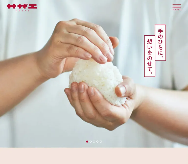
The desktop capture shows a family sharing a meal around a wooden table. The mobile capture shows people eating outdoors, with one person partially cropped at the left edge. These are different captured hero states; they do not establish that each device always receives a different slide.
The photograph fills the viewport width and roughly 90% of its height. The header overlays it. The statement 手のひらに、想いをのせて。 occupies two white vertical strips at the right. The right-hand strip begins higher, while the left-hand strip starts lower. Crimson type and borders remain legible against the photograph without a full-image dark overlay.
Desktop copy is 36px, with a measured group width of 147px; mobile copy is 25px, with a 103px group. The mobile right edge aligns to the 30px page inset. Its placement leaves the lower photograph available for faces and food.
Five small pagination circles sit near the photograph's bottom center. The captured desktop state fills the third circle crimson; the mobile state fills the fourth. The other circles are outlined white. The underlying buttons measure 20 × 20px, with 5px padding and visually hidden numeric text. The visible dots are approximately 10–12px across.
Promotional Content Strip
Role: surface timely product announcements immediately after the hero.
Desktop DOM measurements show three white cards, each 285px wide, with 20px gaps. Each combines an image area, a small promotional category label, and a crimson title. Titles use the Medium face at 17px / 25.5px.
Mobile changes this into a horizontally arranged strip. Card widths become 130px; visible cards begin at x=55 and x=205, with additional cards partially or wholly outside the viewport. Repeated entries in the DOM are consistent with carousel cloning. Two crimson circular arrow buttons measure 25 × 25px.
The supplied mobile hero screenshot shows only the beginning of this strip. Its full mobile appearance, autoplay, swiping, and arrow activation were not demonstrated. Preserve the three unique announcements as content; do not treat cloned DOM entries as additional stories.
Shared Section Heading
Role: make a long page easy to scan without large display headlines.
Stack a small crimson emblem, a Japanese heading, and a smaller uppercase English label. Center the group with generous space above it. The lineup and contact screenshots show this pattern clearly.
Most sampled desktop heading groups measure approximately 84px high. Mobile groups are approximately 78.7px high; the longer specialty heading wraps and reaches approximately 105.6px.
The wrapper's computed font size is inherited body size. It does not establish the visible Japanese title size. Use the screenshot estimates in the typography table when adapting the unsampled child styles.
Brand Movie Entry
Role: provide a focused video entry between announcements and the product/company stories.
A shared section heading precedes an image link measuring 800 × 450px on desktop and 330 × 185.625px on mobile. Both preserve a 16:9 ratio. The mobile link respects 30px side margins.
The rendered anchor points to a YouTube video. The evidence does not establish an inline player, a lightbox, autoplay, sound behavior, or a particular play-icon animation. Implement those only as explicit new decisions.
Photographic Story Banners
Role: turn major areas of the website into visual browsing destinations.
The DOM reveals a repeated structure: a heading group, a broad photographic link, vertical copy near the right, and a small crimson action caption near the lower-left. The action caption is a paragraph inside the larger anchor, so the whole banner is the link.
| Homepage group | Measured desktop structure | Mobile structure |
|---|---|---|
| Specialty | One 1440 × 378px banner, then one approximately 1440 × 275.63px banner |
Two full-width 300px-high banners |
| Bean paste | One 1440 × 378px banner, then two 717 × 276.19px banners separated by 6px |
Three stacked 300px-high banners |
| Store information | One 1440 × 378px banner |
One approximately 299.22px-high banner |
| Company information | One large banner, then two secondary banners | Three stacked 300px-high banners |
| Recruitment | One 1440 × 378px banner |
One 300px-high banner |
On large desktop banners, the caption group is approximately 104px wide, and the lower action begins around 112.5px from the left. Mobile caption groups are 84px wide at x=276, while actions begin at x=30 and sit approximately 20px above the bottom.
The secondary desktop captions use 18px text, but become 21px on mobile when each banner receives the full screen width. This is a meaningful responsive hierarchy change.
Most of these middle-page banners are represented by DOM geometry rather than supplied visual crops. Their exact subjects, image crops, and focal points must remain unspecified. The photographed links near the footer independently show the same caption-and-action vocabulary.
Product Lineup
Role: present food categories through recognizable individual products.
Begin with the shared お品書き / LINEUP heading and a centered crimson introduction. Desktop copy occupies two lines at 18px / 36px; mobile uses three lines at 15px / 30px.
The first tier contains two large links: ohagi and rice balls. Each product is isolated against a pale gray silhouette, with little surrounding furniture. The ohagi backdrop is oval; the rice-ball backdrop has a softened triangular outline. The food remains photographic, including surface texture and natural shadows.
A two-part vertical label overlaps the upper-right edge of each featured product. A white outlined descriptor sits higher; a wider crimson product-name strip begins lower. Desktop label groups extend roughly 23px beyond the image link's right edge and begin roughly 28px above it.
The second tier contains four smaller categories: 巻き寿司, おやき・たい焼, 詰合せ, and 赤飯・弁当. Each uses a rounded-square backdrop and one crimson label with white vertical text. The labels deliberately protrude above and slightly beyond the image bounds.
Desktop uses two centered 320 × 270px featured links, then four 180px square links. Mobile stacks the two 240 × 202.5px featured links and places the smaller links in a two-column 150px grid. The lineup ends with one centered rounded link to the full catalog.
Do not clip the entire product link: doing so would cut off the overlapping labels. If masking is needed, apply it to the backdrop or image layer independently.
Rounded Action Caption
Role: repeat a compact, recognizable navigation affordance.
Use crimson fill, white Medium text, a source radius of 100px, and a measured height of 36px. A fine white arrow sits in a 24px grid column at the right. It reads as a horizontal shaft with a short angled terminal, rather than a large filled chevron.
Actions are content-sized. The desktop lineup link is approximately 257px wide, while shorter story links are substantially narrower. Mobile keeps the 14px type and 36px visual height.
The component appears both as a standalone anchor and as a noninteractive caption inside a larger banner anchor. Match the semantics to its context; do not nest a button inside a linked banner.
News Cards
Role: show current announcements with dates and category labels.
The news section uses measured pale blush #F4E6DF, a centered heading, four entries, and a centered archive action. Desktop title boxes occupy four columns at 255px each. Mobile uses two columns with 136px title boxes.
Titles are crimson, using 15px / 24px on desktop and 14px / 22.4px on mobile. Category links are compact rectangular crimson badges with white 12px text and measured 2px 4px padding. Dates and multiple categories remain associated with each entry.
The DOM establishes the content structure and column arrangement. The supplied screenshots do not show the complete news grid, so its image crops and every card-surface detail are not visually verified.
Journal Cards
Role: support recipe, ingredient, storage, and food-culture browsing.
The journal section uses warm cream #FFE7C1. Six articles are present. Desktop title positions establish three columns, with text boxes approximately 244px wide inside a 900px content region. Mobile establishes two columns with 136px text boxes.
Titles are charcoal rather than crimson: 18px / 27px on desktop, 14px / 21px on mobile. Each article includes a date, a colored category badge, and related text tags. Category colors repeat across badges and tags.
The mobile DOM allocates large title regions, including 163px-high heading boxes. This does not mean every title contains that much visible text or proves a particular line-clamp implementation. Preserve metadata alignment without inventing truncation behavior.
Editorial Category Navigation
Role: offer a visual topic index below the journal articles.
The desktop screenshot shows five colored tiles below a centered category heading and a thin crimson rule. Two tiles form the first row; three form the second. Tiles are approximately 250 × 70px, with roughly 25px gaps.
Each combines a substantial white pictogram with a bold-looking Japanese label. The icons depict a bean-like form, a rice ball, a cooking pot, Hokkaido, and the brand emblem. These are simple filled symbols, not a uniform set of delicate outline icons.
A centered crimson action follows with broad space around it. The mobile arrangement of these five tiles is not included in the supplied screenshots or sampled rectangles. A wrapping grid is a recommendation, not an observed mobile rule.
Shopping and Store Links
Role: provide two concrete next steps before contact information.
Two edge-to-edge photographs form a desktop pair. The left shows an overhead assortment of sweets and ohagi on plates. The right shows smiling staff behind a shop counter. Each includes staggered vertical caption strips toward the right and a crimson action near the bottom.
Desktop panels are approximately 720 × 259px in the supplied bottom capture. On mobile they stack, each approximately 390 × 200px. The action moves to the lower-left, around 30px from the edge. Mobile crops preserve the food arrangement and the staff member while allowing the caption to occupy the right side.
The shop action links to an external Yahoo shopping store. The store-list action points to the original site's /shop/ destination. No checkout or store-search experience was inspected.
Contact Block and Footer
Role: close the page with a clear contact route and compact institutional links.
The contact block uses pale blush, a centered emblem, お問い合わせ, the English label CONTACT, and one rounded link. Its height is approximately 195px on desktop and 194px on mobile in the supplied screenshots.
The footer switches to a solid crimson field with white content. Desktop groups social icons, legal/company links, and the copyright into a compact centered horizontal arrangement. Mobile stacks the social row, wrapped link rows, and copyright within approximately 180px of height. The desktop footer is approximately 105px high.
The visible social destinations are Instagram, Facebook, LINE, and YouTube. Legal/company links include company overview, privacy policy, terms, and compliance. The homepage title and footer identify the operator as サザエ食品株式会社; the visible copyright year is 2024. That year is page content, not the inspection date or proof of a design launch date.
Tokens — Motion & Interaction
Measured Transition Declarations
| Element family | Supplied computed transition | What can be concluded |
|---|---|---|
| Section headings and many story links | opacity 0.6s ease-in, translate 0.6s, scale 2.4s |
These properties have configured transitions; start/end values and triggers are not supplied |
| Primary menu links | 0.4s |
Duration is present; hover/open-state changes are unverified |
| Menu promotional links | 0.6s |
Duration only; menu activation was not demonstrated |
| Promotional and article title links | 0.45s |
A transition is configured; its visible target state is unknown |
| Caption pills within banners | 0.5s |
Do not infer an arrow slide or palette inversion from duration alone |
| Standalone archive/catalog actions | 0.3s |
Short action transition is configured |
| Category badges and journal tags | 0.5s |
State changes were not exercised |
| Mobile promotional-strip arrows | 0.45s |
Controls and duration are evidenced; activation result is not |
Observed States and Limits
The hero has five pagination controls and different active positions across the desktop and mobile captures. This establishes a slide-based presentation. It does not establish the autoplay interval, transition duration, fade-versus-slide behavior, loop direction, or swipe support.
The mobile promotional strip contains offscreen repeated entries and arrow controls. These support a carousel interpretation, but its operation was not tested.
Sampled elements report animation: none. This does not rule out JavaScript-driven carousels or transitions on unsampled descendants. Likewise, a computed value of transition: all without a nonzero duration is not evidence of a visible animation.
The browser evidence includes scrolling and settling checks. No menu activation, hover sequence, keyboard session, movie playback, form submission, or destination navigation was supplied. Do not add parallax, cursor effects, image zoom, or scroll snapping as original-site findings.
Recommended adaptation: keep content visible by default; use restrained opacity/translation transitions only when progressively enhanced. If autoplay is implemented, provide a pause control and respect reduced-motion preferences.
Surfaces
| Surface | Appearance | Structural purpose |
|---|---|---|
| Main canvas | White | Clear breathing room around products and section headings |
| Hero and story banners | Natural-color photography | Emotional context and browsing entry points |
| Photograph captions | White strips, crimson borders and type | Reliable legibility with a printed-label character |
| Product backdrop | Pale gray oval, soft triangle, or rounded square | Separates food from the white canvas without a conventional card |
| News region | Pale blush | Distinguishes timely announcements |
| Journal region | Warm cream | Creates a more editorial, topic-rich zone |
| Contact region | Pale blush | Quiet final action area |
| Footer | Solid crimson, white content | Strong visual closure |
There is no visible general-purpose shadow elevation system in the supplied screenshots. Separation comes from whitespace, color fields, photographic boundaries, and labels. Natural shadows inside product photography should remain distinct from UI box shadows.
Imagery
The current hero captures show shared eating occasions rather than isolated product advertising. Indoor light is soft, the tableware is tactile, and food stays central to the human scene. The outdoor mobile image retains sky, greenery, casual clothing, and a close social interaction.
The lineup shifts to isolated product photography. Bean-paste texture, rice grains, seaweed, fillings, and food cross-sections carry the detail. Keep natural shadows and food proportions. The gray backdrop should be subordinate to the object.
The final promotional pair uses two different views of the business: a tabletop assortment and a staffed shop counter. Their shared caption treatment makes them read as a pair despite the different subjects.
Crop photographs for each aspect ratio. The mobile story banners are much taller relative to their width than the desktop bands, so a single centered crop is unlikely to preserve every subject. The evidence does not establish whether the original uses separate image files or only responsive crop rules.
Observed Asset References
No image src, srcset, SVG path, or downloadable asset manifest was included in the supplied DOM evidence. The following are visual references, not inferred asset filenames.
| Image role | Current capture evidence | Reusable direction |
|---|---|---|
| Desktop hero | Image #1 | Family meal, soft interior light, wooden table, food in the foreground |
| Product lineup | Image #2 | Isolated ohagi and rice ball above four smaller food categories |
| Shopping banner | Images #3 and #5 | Overhead assortment of plated sweets and ohagi |
| Store banner | Images #3 and #5 | Welcoming staff behind a food counter |
| Mobile hero | Image #4 | Outdoor shared eating scene with room above for vertical copy |
| Brand graphics | Images #1–#5 | Crimson wordmark, small emblem, fine menu lines, white social symbols |
Use approved photographs and brand assets when available. CSS can approximate layout and backdrop shapes; it cannot reproduce the identity or food detail of the supplied photography.
Layout & Responsive Behavior
The homepage alternates expansive photography with centered content groups. It does not place every section inside one fixed-width container. Story banners reach the edges; the movie, product lineup, journal, and action groups use narrower regions.
| Pattern | Desktop observation | Mobile observation |
|---|---|---|
| Header | Corner logo and menu overlay | Same arrangement, smaller logo and 44px menu target |
| Hero | Approximately 900px tall |
Approximately 759.6px tall |
| Hero statement | 36px, right side, two staggered strips |
25px, right edge inset 30px |
| Announcements | Three 285px cards in one row |
130px horizontal carousel entries with arrows |
| Movie | Centered 800px width |
330px width with 30px gutters |
| Secondary story links | Some two-column pairs | Full-width stacked banners |
| Featured products | Two columns, 320px wide |
One column, 240px wide |
| Smaller products | Four 180px columns |
Two 150px columns |
| News | Four columns | Two columns |
| Journal | Three columns | Two columns |
| Final shopping/store links | Two adjacent photographs | Two stacked photographs |
| Footer | Compact horizontal grouping | Centered social row and wrapped text rows |
The mobile site retains substantial whitespace: narrative sections still use 100px top padding. It also keeps smaller content grids at two columns. Preserve this mix of large single-column stories and compact multi-column browsing.
The exact breakpoint is unknown. The Quick Start uses 767px as an explicit recommendation. Intermediate tablet widths, landscape layouts, zoom behavior, and browser-toolbar resizing were not captured.
Mobile document height is approximately 10,552px, compared with approximately 9,951px on desktop. This reflects stacking and text reflow; it should not become a fixed page-height requirement.
Do’s and Don’ts
Do
- Use exact crimson
#B50D34for the shared brand/action system. - Preserve the white, blush, and warm-cream sequence of major surfaces.
- Pair everyday human photographs with detailed product photography.
- Keep the staggered vertical caption strips and their clear right-to-left reading order.
- Maintain overlapping labels outside product-image bounds.
- Give the two principal products more space and scale than the four secondary categories.
- Keep actions compact, content-sized, and visually consistent.
- Preserve the mobile increase in secondary story-caption size.
- Use filled category pictograms and category-specific journal colors.
- Treat the page as a set of distinct company, product, store, wholesale, recruitment, and editorial destinations.
Don’t
- Don’t turn the entire homepage into identical rounded cards.
- Don’t replace the vertical strips with oversized horizontal English headlines.
- Don’t put product photographs inside heavy borders or artificial drop shadows.
- Don’t crop labels when masking their associated images.
- Don’t shrink the desktop four-column product lineup directly onto a phone.
- Don’t force every mobile section into a single column; the news and journal retain two.
- Don’t infer visible font use from unused custom-property names.
- Don’t assign exact CSS radii or asset paths to image shapes without evidence.
- Don’t describe menu opening, autoplay timing, hover effects, or video behavior as verified.
- Don’t add generic gradients, glass surfaces, or decorative motion that displaces the photography.
Recommended Implementation Additions
These are recommendations for a new implementation, not verified features of the original homepage.
- Provide a visible focus indicator on links, product tiles, and controls. Give the menu an accessible name,
aria-expanded, and a controlled navigation region. - When implementing the menu, support Escape, focus return, and keyboard navigation. Keep closed-menu links out of the tab order.
- Give carousel controls descriptive names and expose the selected slide. Avoid announcing cloned promotional items as unique content.
- Increase small carousel hit areas and, where practical, standalone action hit areas to at least
44pxwhile retaining compact visible graphics. - Keep vertical copy as selectable text with appropriate language metadata. Use CSS writing modes instead of rotating horizontal text.
- Review contrast for white text on ochre and green category surfaces; adjust an adaptation if necessary without losing category recognition.
- Provide meaningful alternatives for food and editorial images. Decorative backdrops and emblems should not repeat adjacent labels to assistive technology.
- Keep article dates on normal line height. Preserve full titles or offer a clearly accessible equivalent if visual truncation is introduced.
- Supply responsive image sizes and per-image focal positions. Reserve image dimensions to reduce layout movement.
- Respect reduced motion and keep all content available when enhancement scripts fail.
Agent Prompt Guide
Quick Color Reference
- Main brand, actions, and vertical labels:
#B50D34. - Main canvas and photographic caption strips:
#FFFFFF. - News and contact adaptation:
#F4E6DF. - Journal background:
#FFE7C1. - Product backdrops: source-aligned approximation
#EEEFEF. - Body and journal-title text:
#2D2D2C. - Measured journal accents: rice
#C39231, cooking#5D9F42, brand knowledge#B50D34.
Overall Prompt
“Create a Japanese food-company homepage with the visual character of the inspected SAZAE site. Use deep crimson #B50D34, a white canvas, pale blush news/contact regions, and a warm cream journal region. Open with a large natural-light photograph of people sharing food, persistent corner branding, and two staggered white vertical caption strips with crimson borders. Alternate spacious centered section headings with edge-to-edge photographic story links. Build a product lineup with two large isolated foods on an oval and a soft triangular backdrop, followed by four smaller rounded-square food images. Attach overlapping vertical crimson product labels. Use compact crimson pill links with fine white arrows. Include company, wholesale, recruitment, news, and editorial browsing. On mobile, stack featured products and story banners while retaining two-column grids for smaller products, news, and articles.”
Example Component Prompts
- Hero: “A full-width food-brand photograph occupying about 90% of viewport height. Overlay a small crimson logo at top-left and a fine three-line MENU control at top-right. Place the Japanese copy 手のひらに、想いをのせて。 in two staggered vertical white strips at the right, with crimson type and borders. Five small pagination dots sit near the bottom center.”
- Product lineup: “On white, center a small brand emblem, Japanese section title, and LINEUP label. Show two large food photographs on pale gray organic silhouettes, with paired vertical descriptor/name strips overlapping their upper-right edges. Below, place four smaller products with single crimson labels. Mobile stacks the large pair and uses two columns for the smaller four.”
- Story banner: “An edge-to-edge photographic link with square corners, staggered white vertical text strips near the right, and one compact crimson caption pill near the lower-left. At desktop scale use a wide shallow composition; at 390px width use an approximately 300px-tall crop with text inset 30px from the right.”
- Journal section: “A warm cream editorial region with charcoal Japanese article titles, small dates, rectangular category badges, and colored text tags. Use three columns on desktop and two on mobile. Add a five-topic index with filled white pictograms on muted category-colored tiles.”
- Page ending: “Pair an overhead sweets photograph with a staffed food-counter photograph. Each has vertical white/crimson copy and a rounded crimson action. Stack the pair on mobile, then add a centered pale blush contact panel and a solid crimson footer with white social icons and compact company/legal links.”
Quick Start
CSS Custom Properties
This is an implementation scaffold, not recovered source CSS. It combines measured colors, typography, dimensions, and grid relationships with explicitly recommended breakpoints and approximate silhouettes. It uses normal document scrolling and leaves the host root font size unchanged.
Load authorized font and image assets separately. The named font stacks fall back to sans serif when the original faces are unavailable. Menu behavior, carousel state, and video playback require additional implementation.
:root {
  /* Measured colors and source-aligned frame color. */
  --color-brand: #b50d34;
  --color-page: #fff;
  --color-blush: #f4e6df;
  --color-editorial: #ffe7c1;
  --color-frame: #eeefef;
  --color-text: #2d2d2c;
  --color-rice: #c39231;
  --color-cooking: #5d9f42;

  /* Approximate category colors from the desktop screenshot. */
  --color-beans: #ad5b78;
  --color-hokkaido: #2d5b7c;

  --font-body: TazuganeGothicStdN-Book,
    'Tazugane Gothic StdN Book', sans-serif;
  --font-emphasis: TazuganeGothicStdN-Medium,
    'Tazugane Gothic StdN Medium', sans-serif;

  --text-body: 16px;
  --text-hero: 36px;
  --text-story: 26px;
  --text-action: 14px;
  --text-meta: 12px;
  --tracking-label: 0.025em;
  --tracking-intro: 0.06em;

  --page-gutter: 30px;
  --section-top: 120px;
  --section-bottom: 100px;
  --banner-gap: 6px;
  --action-height: 36px;
  --radius-pill: 100px;
  --feature-width: 320px;
  --product-width: 180px;
  --motion-action: 300ms ease;
}

* { box-sizing: border-box; }

body {
  margin: 0;
  color: var(--color-text);
  background: var(--color-page);
  font: 400 var(--text-body)/1.8 var(--font-body);
}

img { display: block; max-width: 100%; }
button, a { -webkit-tap-highlight-color: transparent; }
a { color: inherit; }
button { font: inherit; }

/* Recommended focus treatment. */
:where(a, button):focus-visible {
  outline: 3px solid var(--color-brand);
  outline-offset: 5px;
}

.site-logo {
  position: fixed;
  z-index: 30;
  top: 22px;
  left: 40px;
  width: 176px;
}
.site-logo img { width: 100%; height: auto; }

.menu-toggle {
  position: fixed;
  z-index: 30;
  top: 22px;
  right: 40px;
  width: 50px;
  min-height: 44px;
  padding: 4px 0 0;
  border: 0;
  color: var(--color-brand);
  background: transparent;
  cursor: pointer;
}
.menu-lines {
  position: relative;
  display: block;
  height: 20px;
  border-block: 1px solid currentColor;
}
.menu-lines::after {
  content: '';
  position: absolute;
  inset: 50% 0 auto;
  border-top: 1px solid currentColor;
}
.menu-label {
  display: block;
  margin-top: 4px;
  font-size: 10px;
  line-height: 1.4;
  letter-spacing: 0.34em;
}

/* The height rule and crop controls are recommended adaptations. */
.hero {
  position: relative;
  height: 90vh;
  height: 90svh;
  background: var(--color-blush);
}
.hero > picture,
.hero > picture > img {
  width: 100%;
  height: 100%;
}
.hero > picture > img {
  object-fit: cover;
  object-position: var(--hero-focal, 50% 50%);
}
.placards {
  position: absolute;
  top: 16.6667%;
  right: 11.71875%;
  display: flex;
  flex-direction: row-reverse;
  align-items: flex-start;
  margin: 0;
  color: var(--color-brand);
  font-family: var(--font-emphasis);
  font-size: var(--text-hero);
  font-weight: 400;
  letter-spacing: var(--tracking-label);
}
.placards > span {
  writing-mode: vertical-rl;
  text-orientation: mixed;
  padding: 0.3em 0;
  border: 3px solid currentColor;
  background: var(--color-page);
  line-height: 69px;
  white-space: nowrap;
}
.placards > span + span {
  margin-top: 2em;
  margin-right: -3px;
}
.hero-dots {
  position: absolute;
  bottom: 25px;
  left: 50%;
  display: flex;
  transform: translateX(-50%);
}
.hero-dot {
  display: grid;
  place-items: center;
  width: 20px;
  height: 20px;
  padding: 0;
  border: 0;
  background: transparent;
  cursor: pointer;
}
.hero-dot::before {
  content: '';
  width: 11px;
  height: 11px;
  border: 2px solid white;
  border-radius: 50%;
}
.hero-dot[aria-current='true']::before {
  border-color: var(--color-brand);
  background: var(--color-brand);
}

.content-section { padding-top: var(--section-top); }
.section-heading {
  display: grid;
  justify-items: center;
  gap: 4px;
  margin: 0 0 30px;
  padding-inline: var(--page-gutter);
  color: var(--color-brand);
  text-align: center;
  font-weight: 400;
}
.section-heading img { width: 50px; margin-bottom: 12px; }
/* Child type sizes are visual approximations. */
.section-heading .ja {
  font: 400 23px/1.4 var(--font-emphasis);
}
.section-heading .en { font-size: 14px; line-height: 1.2; }
.lineup-intro {
  margin: 0 30px 90px;
  color: var(--color-brand);
  text-align: center;
  font: 400 18px/2 var(--font-emphasis);
  letter-spacing: var(--tracking-intro);
}

.pill {
  display: inline-grid;
  grid-template-columns: auto 24px;
  align-items: center;
  gap: 12px;
  min-height: var(--action-height);
  max-width: 100%;
  padding: 8px 18px;
  border-radius: var(--radius-pill);
  color: white;
  background: var(--color-brand);
  font: 400 var(--text-action)/1.2 var(--font-emphasis);
  letter-spacing: var(--tracking-label);
  text-decoration: none;
  transition: opacity var(--motion-action);
}
.pill::after {
  content: '';
  width: 22px;
  height: 7px;
  border-right: 1px solid currentColor;
  border-bottom: 1px solid currentColor;
  transform: skewX(30deg);
}
.section-action { margin: 60px 30px 0; text-align: center; }

.featured-products {
  display: grid;
  grid-template-columns: repeat(2, var(--feature-width));
  justify-content: center;
  gap: 80px;
}
.small-products {
  display: grid;
  grid-template-columns: repeat(4, var(--product-width));
  justify-content: center;
  gap: 50px;
  margin-top: 80px;
}
.product-link { position: relative; text-decoration: none; }
.product-art { position: relative; aspect-ratio: 32 / 27; }
.product-art::before {
  content: '';
  position: absolute;
  inset: 0;
  background: var(--color-frame);
}
.product-art--ohagi::before { border-radius: 50%; }
/* Approximate silhouette; replace with an approved mask if available. */
.product-art--rice::before {
  border-radius: 48% 48% 20% 20% / 75% 75% 22% 22%;
}
.product-art--small { aspect-ratio: 1; }
.product-art--small::before { border-radius: 22%; }
.product-art img {
  position: relative;
  width: 100%;
  height: 100%;
  object-fit: contain;
}
.product-tag {
  position: absolute;
  top: -28px;
  right: -23px;
  display: flex;
  flex-direction: row-reverse;
  align-items: flex-start;
  margin: 0;
  font-family: var(--font-emphasis);
  font-weight: 400;
}
.product-tag > span {
  writing-mode: vertical-rl;
  white-space: nowrap;
  padding-block: 12px;
}
.tag-note {
  width: 39px;
  border: 2px solid var(--color-brand);
  color: var(--color-brand);
  background: white;
  font-size: 18px;
  line-height: 35px;
}
.tag-name {
  width: 54px;
  margin-top: 30px;
  color: white;
  background: var(--color-brand);
  font-size: 27px;
  line-height: 54px;
}
.product-tag--small { top: -20px; right: -10px; }
.product-tag--small .tag-name {
  width: 39px;
  margin-top: 0;
  font-size: 18px;
  line-height: 39px;
  letter-spacing: 0.125em;
}

.story-grid { display: grid; gap: var(--banner-gap); }
.story-grid--pair { grid-template-columns: repeat(2, minmax(0, 1fr)); }
.story-banner {
  position: relative;
  display: block;
  height: 378px;
  text-decoration: none;
}
.story-banner > img {
  width: 100%;
  height: 100%;
  object-fit: cover;
  object-position: var(--focal, 50% 50%);
}
.story-banner .placards {
  top: 22px;
  right: 7.8125%;
  font-size: var(--text-story);
}
.story-banner .placards > span { border-width: 2px; line-height: 49px; }
.story-banner .placards > span + span { margin-right: -2px; }
.story-banner .pill {
  position: absolute;
  left: 7.8125%;
  bottom: 28px;
}
.story-grid--pair .story-banner { height: 276px; }
.story-grid--pair .placards { font-size: 18px; }
.story-grid--pair .placards > span { line-height: 33px; }

.news-section,
.journal-section { padding-bottom: var(--section-bottom); }
.news-section { background: var(--color-blush); }
.journal-section { background: var(--color-editorial); }
.news-grid,
.journal-grid {
  display: grid;
  width: calc(100% - 60px);
  margin-inline: auto;
}
.news-grid {
  max-width: 1200px;
  grid-template-columns: repeat(4, minmax(0, 1fr));
  gap: 33.333px;
}
.journal-grid {
  max-width: 900px;
  grid-template-columns: repeat(3, minmax(0, 1fr));
  gap: 40px 39px;
}
.news-card { padding-inline: 10px; }
.journal-card { padding-inline: 15px; }
.news-card h3 {
  color: var(--color-brand);
  font: 400 15px/1.6 var(--font-emphasis);
}
.journal-card h3 { font: 400 18px/1.5 var(--font-emphasis); }
.card-date { font-size: 12px; line-height: 1.5; }
.category-badge {
  display: inline-block;
  padding: 2px 6px;
  color: white;
  background: var(--category-color, var(--color-brand));
  font-size: 12px;
  line-height: 1.2;
  letter-spacing: 0.025em;
  text-decoration: none;
}
.category-nav {
  display: flex;
  flex-wrap: wrap;
  justify-content: center;
  gap: 25px;
  max-width: 800px;
  margin-inline: auto;
}
.category-nav a {
  display: flex;
  align-items: center;
  justify-content: center;
  gap: 12px;
  width: 250px;
  min-height: 70px;
  border-radius: 4px;
  color: white;
  background: var(--category-color, var(--color-brand));
  font: 400 21px/1.4 var(--font-emphasis);
  text-decoration: none;
}
/* Insert a full-row spacer after the first two desktop tiles. */
.category-row-break { flex-basis: 100%; height: 0; margin-block: -12.5px; }

.purchase-links { display: grid; grid-template-columns: repeat(2, 1fr); }
.purchase-links .story-banner { height: 260px; }
.contact-panel {
  padding: 30px;
  background: var(--color-blush);
  text-align: center;
}
.contact-panel .section-heading { margin-bottom: 18px; }
.site-footer {
  padding: 40px 30px;
  color: white;
  background: var(--color-brand);
}
.footer-inner,
.social-links,
.legal-links {
  display: flex;
  align-items: center;
  justify-content: center;
  flex-wrap: wrap;
  gap: 20px;
}
.site-footer a { text-decoration: none; }
.site-footer :focus-visible { outline-color: white; }
.social-links img { width: 24px; height: 24px; object-fit: contain; }
.legal-links,
.copyright { font-size: 11px; line-height: 1.6; }

/* Recommended breakpoint; the original breakpoint was not supplied. */
@media (max-width: 767px) {
  :root {
    --text-body: 15px;
    --text-hero: 25px;
    --text-story: 21px;
    --section-top: 100px;
    --section-bottom: 60px;
    --feature-width: min(240px, calc(100vw - 90px));
    --product-width: min(150px, calc((100vw - 90px) / 2));
  }
  .site-logo { top: 17.5px; left: 30px; width: 140px; }
  .menu-toggle { top: 13px; right: 30px; width: 44px; padding-inline: 2px; }
  .hero .placards { top: 12.5%; right: 30px; }
  .hero .placards > span { line-height: 47px; }
  .section-heading .ja { font-size: 21px; }
  .section-heading .en { font-size: 13px; }
  .lineup-intro { margin-bottom: 40px; font-size: 15px; }
  .featured-products { grid-template-columns: var(--feature-width); gap: 40px; }
  .small-products {
    grid-template-columns: repeat(2, var(--product-width));
    gap: 30px;
    margin-top: 50px;
  }
  .product-tag { top: -20px; right: -10px; }
  .tag-note { width: 31px; font-size: 16px; line-height: 27px; }
  .tag-name { width: 34px; font-size: 21px; line-height: 34px; margin-top: 24px; }
  .product-tag--small { top: -17px; right: -8px; }
  .product-tag--small .tag-name { width: 35px; font-size: 16px; line-height: 35px; }
  .section-action { margin-top: 50px; }
  .story-grid--pair,
  .purchase-links { grid-template-columns: minmax(0, 1fr); }
  .story-banner,
  .story-grid--pair .story-banner { height: 300px; }
  .story-banner .placards,
  .story-grid--pair .placards { top: 20px; right: 30px; font-size: 21px; }
  .story-banner .placards > span,
  .story-grid--pair .placards > span { line-height: 39px; }
  .story-banner .pill { left: 30px; bottom: 20px; }
  .purchase-links .story-banner { height: 200px; }
  .purchase-links .placards { top: 14px; font-size: 16px; }
  .purchase-links .placards > span { line-height: 29px; }
  .news-grid,
  .journal-grid { grid-template-columns: repeat(2, minmax(0, 1fr)); gap: 30px 18px; }
  .journal-card { padding-inline: 10px; }
  .news-card h3 { font-size: 14px; }
  .journal-card h3 { font-size: 14px; }
  /* Mobile topic navigation is a recommendation, not a measured layout. */
  .category-nav { padding-inline: 30px; gap: 15px; }
  .category-nav a { width: 100%; }
  .category-row-break { display: none; }
  .footer-inner { flex-direction: column; gap: 22px; }
  .legal-links { gap: 10px 20px; }
  .site-footer { padding-block: 30px; }
}

@media (hover: hover) {
  /* Recommended feedback; the original hover end state is unknown. */
  a.pill:hover { opacity: 0.85; }
}

@media (prefers-reduced-motion: reduce) {
  .pill { transition: none; }
  /* Also disable autoplay in the carousel controller. */
}
Minimal Component Markup
The local image names below are implementation placeholders, not observed original-site asset paths. Replace them with approved files. The product cutout and gray backdrop are separate layers in this adaptation.
<a class='product-link' href='/products/category/ohagi/'>
  <div class='product-art product-art--ohagi'>
    <img src='/images/approved-ohagi-cutout.webp' alt=''>
  </div>
  <p class='product-tag' lang='ja'>
    <span class='tag-note'>サザエの定番</span>
    <span class='tag-name'>おはぎ</span>
  </p>
</a>

<a class='story-banner' href='/shop/'>
  <img src='/images/approved-store-photo.webp' alt=''>
  <p class='placards' lang='ja'>
    <span>お近くのお店で</span>
    <span>サザエを味わう</span>
  </p>
  <span class='pill' lang='ja'>店舗一覧へ</span>
</a>
These links receive their accessible names from visible text. Use descriptive image alternatives where the photograph conveys additional information beyond the destination label.
Tailwind v4 Token Mapping
Optional aliases for a project already using Tailwind v4. This is not evidence that the original website uses Tailwind. Define the custom properties above first.
@theme inline {
  --color-brand: #b50d34;
  --color-blush: #f4e6df;
  --color-editorial: #ffe7c1;
  --color-frame: #eeefef;
  --color-charcoal: #2d2d2c;
  --color-rice: #c39231;
  --color-cooking: #5d9f42;

  --font-brand-body: var(--font-body);
  --font-brand-emphasis: var(--font-emphasis);

  --text-brand-hero: var(--text-hero);
  --text-brand-story: var(--text-story);
  --text-brand-action: 14px;
  --text-brand-meta: 12px;

  --spacing-page-gutter: 30px;
  --spacing-section-top: var(--section-top);
  --spacing-feature-width: var(--feature-width);
  --radius-brand-pill: 100px;
}
Sources & Evidence
- Inspected original and final page: SAZAE homepage. Both supplied URLs are identical; the recorded HTTP status is 200.
- Capture timestamp: September 12, 2026, 13:11:40.675 UTC / 22:11:40.675 JST. This is the supplied retrieval timestamp; separate timestamps for individual screenshots were not provided.
- Current-page visual evidence: three desktop captures at 1440 × 1000 and two mobile captures at 390 × 844. They show the hero, desktop product lineup, lower category/navigation region, final photographic links, contact block, and footer.
- Rendered evidence: desktop and mobile page text, destination anchors, custom properties, computed font/color/spacing/transition values, and sampled element rectangles. Middle-page and article-grid descriptions rely substantially on these measurements where no visual crop is supplied.
- Observed process: the browser performed an initial observation of at least five seconds, image/layout settling checks, and scrolling through intermediate positions. Perpetual animations were temporarily paused during readiness checks and resumed. These procedures do not verify every delayed state or interaction.
- Inspection limitations: no further browsing, commands, file access, or interaction testing was performed for this reference. Open-menu behavior, hover states, carousel timing, video playback, detail pages, external shopping, forms, tablet layouts, and exact image asset paths remain unverified. SharedWorkers and service workers were disabled during the supplied browser inspection.
This reference describes the current homepage represented by the supplied captures and rendered evidence. Estimates and implementation recommendations are explicitly distinguished from measured original-page values.
# SAZAE — Style Reference

> Everyday food and human warmth, framed by crimson labels and generous white space.

**Website:** [www.sazae.co.jp](https://www.sazae.co.jp/)
**Original URL:** https://www.sazae.co.jp/
**Final URL:** https://www.sazae.co.jp/
**Theme:** light, with white, pale blush, and warm cream section backgrounds
**Inspected:** September 12, 2026; supplied retrieval timestamp 13:11:40.675 UTC / 22:11:40.675 JST
**Viewports:** desktop 1440 × 1000 and mobile 390 × 844 CSS pixels
**Scope:** the current homepage, including its hero, promotional content, brand movie entry, story banners, product categories, company and recruitment entries, news, editorial content, category navigation, shopping/store links, contact block, and footer. Detail pages and external destinations were not inspected.

SAZAE presents a food company through people, products, and everyday occasions. Large photographs establish familiarity; deep crimson supplies the identity, headings, navigation, and actions. White space gives the individual foods room to stand out. Pale blush and warm cream distinguish the more informational sections near the bottom.

The most distinctive device is the vertical label. In photographs, Japanese copy appears on staggered white strips with crimson borders. In the product lineup, white-on-crimson name strips overlap soft gray silhouettes shaped around the food. The same visual vocabulary connects a family meal, a product category, a shop counter, and a company story.

This is a substantial corporate and retail brand homepage. It connects consumer products and stores with wholesale bean-paste sales, company history, recruitment, news, and a food journal. Its layout should preserve those distinct browsing purposes.

## How to Read This Reference

- **Measured** means a value appears in the supplied rendered DOM, computed styles, custom properties, or element rectangles.
- **Calculated** means a value is derived from those measurements, such as the gap between two product links.
- **Estimated** means a visual approximation from one of the five current-page screenshots. It is not an exact color sample or a recovered CSS declaration.
- **Recommended** means an implementation choice for an adaptation. Breakpoints, accessible enhancements, and the Quick Start code fall into this category unless explicitly identified otherwise.
- Token names introduced here are descriptive aliases. Original custom properties are identified separately.
- A computed font family identifies the declared stack. Font-file loading and the final font selected for every glyph were not independently verified.
- DOM entries include navigation content that is absent from the closed-menu screenshots. Their presence and dimensions do not establish the appearance or behavior of an opened menu.

## Tokens — Colors

### Primary Palette

| Name | Value | Suggested token / source | Evidence and role |
| --- | --- | --- | --- |
| Brand Crimson | `#B50D34` | `--color-brand` / source `--c-red` | Measured on hero copy, links, banner captions, and filled actions; visually repeated in the logo and footer |
| White | `#FFFFFF` | `--color-page` / source `--c-base` | Measured body background; visible product-section canvas and photographic caption strips |
| Pale Blush | `#F4E6DF` | `--color-blush` / source `--c-light-red` | Measured news-section background; visually consistent with the post-hero and contact surfaces |
| Editorial Cream | `#FFE7C1` | `--color-editorial` | Measured background of the `OWNED MEDIA` section; no matching named source property was supplied |
| Product Frame Gray | `#EEEFEF` | `--color-frame` / source `--c-frame` | Declared source value, visually close to the product backdrops; their actual image/pseudo-element fills were not sampled |
| Body Charcoal | `#2D2D2C` | `--color-text` / source `--c-text` | Measured body and journal-title color |
| Secondary Gray | `#595858` | `--color-muted` / source `--c-text-gray` | Declared property; a specific visible use was not established |
| Neutral Gray | `#C1C1C1` | `--color-gray` / source `--c-gray` | Declared property; avoid assuming it is the color of every faint rule |

Crimson is used across the whole page. It is both a brand color and a functional link/action color. Photography remains naturally colored; there is no evidence of a global duotone treatment.

### Editorial Category Palette

The journal adds a small category color system. Keep these colors attached to their categories rather than distributing them throughout the main brand sections.

| Category | Color | Confidence | Application |
| --- | --- | --- | --- |
| `小豆とあんこ` | Approximately `#AD5B78` | Screenshot estimate | Muted mauve category tile with a white bean-like symbol |
| `お米とおむすび` | `#C39231` | Measured on article category links | Ochre category tile, badge, and related tags |
| `おうちで料理` | `#5D9F42` | Measured on article category links | Green category tile, badge, and related tags |
| `北海道を味わう` | Approximately `#2D5B7C` | Screenshot estimate | Dark blue tile with a white Hokkaido silhouette |
| `サザエの豆知識` | `#B50D34` | Measured on article category links | Crimson category tile, badge, and related tags |

The source also declares `--c-green: #5ba84a`, `--c-blue: #1870a0`, and `--c-yellow: #f9dc4e`. These are not the same as the measured journal badge colors. Do not substitute them solely because their variable names sound appropriate.

## Tokens — Typography

### Body — Tazugane Gothic Book

- **Measured stack:** `TazuganeGothicStdN-Book, 'Tazugane Gothic StdN Book', sans-serif`.
- **Measured weight:** `400`.
- **Desktop:** `16px / 28.8px`.
- **Mobile:** `15px / 27px`.
- **Character:** an approachable Japanese sans serif with relaxed body leading.
- **Suggested alias:** `--font-body`.

### Emphasis — Tazugane Gothic Medium

- **Measured stack:** `TazuganeGothicStdN-Medium, 'Tazugane Gothic StdN Medium', sans-serif`.
- Used on hero copy, vertical banner captions, product labels, navigation links, actions, and article titles.
- Its computed weight is also `400`: the heavier appearance comes from the separately named Medium face. Do not interpret this as evidence that all visible text uses the Book face, or automatically add synthetic bold.
- **Suggested alias:** `--font-emphasis`.

### English Labels and Brand Artwork

Section headings pair Japanese labels with small uppercase English labels such as `LINEUP`, `CONTACT`, and `OWNED MEDIA`. The supplied measurements cover their heading wrappers rather than every child span. Their exact child font sizes and font families are therefore not fully established.

The large Japanese logo is artwork. It should not be reconstructed by typing the brand name in the body font. The small section emblem repeats a compact part of the brand's graphic language.

Other font properties are declared, including Bellefair, Noto Serif JP, Proxima Nova, and Source Han Sans Japanese stacks. The sampled principal elements use the Tazugane declarations above. A variable declaration alone does not establish visible use.

### Type Scale

All sizes below are measured unless marked as estimates. Line height on vertical text controls the horizontal line-box dimension, so it should not be interpreted as ordinary paragraph leading.

| Role | Desktop size / line height | Mobile size / line height | Tracking and notes |
| --- | --- | --- | --- |
| Body | `16 / 28.8px` | `15 / 27px` | Normal tracking |
| Hero statement | `36 / 69px` | `25 / 47px` | `0.025em` |
| Main story-banner caption | `26 / 49px` | `21 / 39px` | `0.025em` |
| Secondary story-banner caption | `18 / 33px` | `21 / 39px` | The mobile version becomes larger, not smaller |
| Product-section introduction | `18 / 36px` | `15 / 30px` | `0.06em` |
| Featured-product caption wrapper | `18 / 33px` | `16 / 29px` | `0.025em`; larger nested product-name text is not separately measured |
| Small product label | `18 / 39px` | `16 / 34.67px` | Usually `0.125em`; the longer mixed label uses `0.065em` |
| Main navigation entry | `20 / 30px` | `15 / 22.5px` | `0.06em`; DOM-only menu evidence |
| Promotional-card title | `17 / 25.5px` | `14 / 21px` | `0.06em` |
| News title | `15 / 24px` | `14 / 22.4px` | Medium face |
| Journal title | `18 / 27px` | `14 / 21px` | Medium face, charcoal |
| Rounded action | `14 / 14px` | `14 / 14px` | `0.025em`; stable size across these viewports |
| Category badge | `12 / 12px` | `12 / 12px` | `0.025em` |
| Journal date | `12px` | `12px` | Sampled line height is `0px`; use normal readable leading in an adaptation |
| Visible Japanese section title | Approximately `22–24px` | Approximately `21–22px` | Screenshot estimate; wrapper font size is not the child size |
| Small English section label | Approximately `13–14px` | Approximately `13px` | Screenshot estimate |

The HTML root is measured at `10px` on both viewports, while body text has its own larger size. The Quick Start uses explicit pixel tokens and does not require changing the host application's root size.

## Tokens — Spacing & Shapes

### Source Properties

| Source property | Desktop | Mobile | Interpretation |
| --- | --- | --- | --- |
| `--header` | `88px` | `70px` | Header sizing token; the sampled header element itself has zero layout height |
| `--x-spacer` | `30px` | `30px` | Shared inset token, visibly important on mobile |
| `--inner-y-spacer` | `70px` | `40px` | Declared internal spacing token; do not equate it with every section's top padding |
| `--footer-space` | `100px` | `60px` | Declared spacing token, consistent with measured lower-section padding |
| `--padd` | `calc(100 / 1200 * 100%)` | Same | Declared percentage expression; specific application was not supplied |

### Measured and Calculated Spacing

| Use | Desktop | Mobile | Evidence |
| --- | --- | --- | --- |
| Most narrative section top padding | `120px` | `100px` | Measured section styles |
| News bottom padding | `100px` | `60px` | Measured |
| Journal top / bottom padding | `100 / 100px` | `100 / 60px` | Measured |
| Heading block to following content | Commonly `30px` | Commonly `30px` | Calculated from sampled rectangles |
| Featured-product introduction to image row | `90px` | `40px` | Calculated |
| Gap between featured products | `80px` horizontally | `40px` vertically | Calculated |
| Featured row to small-product row | `80px` | `50px` | Calculated |
| Small-product grid gap | `50px` horizontally | `30px` in both directions | Calculated |
| Small products to lineup action | `60px` | `50px` | Calculated |
| Story-banner separation | `6px` | `6px` | Calculated from adjacent links |
| Rounded action height | `36px` | `36px` | Measured |
| Rounded action horizontal padding | `10.8px` | `10.8px` | Measured; internal grid also contributes to its width |

### Shapes

| Element | Geometry | Confidence |
| --- | --- | --- |
| Story photography | Full-width, square-edged bands | Visible screenshots and link rectangles |
| Hero caption strips | White rectangles with approximately `3px` crimson borders | Border thickness estimated from screenshots |
| Smaller photograph captions | Narrow white rectangles with approximately `2px` crimson borders | Screenshot estimate |
| Filled product-name strips | Square-ended vertical crimson labels | Visually observed |
| Rounded actions | Source radius `100px` | Measured |
| News/article category badges | Radius `0`, compact rectangular fills | Measured |
| Featured ohagi backdrop | Broad oval | Visually observed |
| Featured rice-ball backdrop | Soft rounded triangular silhouette | Visually observed |
| Small-product backdrops | Rounded squares, roughly `35–40px` desktop corners | Screenshot estimate; construction method unknown |
| Editorial category tiles | Approximately `4px` corners | Screenshot estimate |

The product-link wrappers themselves report `border-radius: 0`. Their visible rounded silhouettes may belong to image assets, descendants, or masks. Do not present the backdrop shapes as recovered wrapper CSS.

### Layout Measurements

| Element | Desktop | Mobile |
| --- | --- | --- |
| Document height | `9950.83px` | `10551.5px` |
| Logo artwork box | `176 × 44px`, at `40, 22` | `140 × 35px`, at `30, 17.5` |
| Menu button box | `50 × 44px`, at `1350, 22` | `44 × 44px`, at `316, 13` |
| Hero photograph height | Approximately `900px` | Approximately `759.6px` |
| Hero-copy group | `147 × 352.5px`, at approximately `1124.25, 149.98` | `103 × 246.63px`, at approximately `257, 94.94` |
| Hero-pagination button | `20 × 20px` | `20 × 20px` |
| Brand-movie link | `800 × 450px` | `330 × 185.625px` |
| Main story banner | `1440 × 378px` | Usually `390 × 300px` |
| Paired secondary story banner | `717 × 276.19px` | `390 × 300px` |
| Featured product | `320 × 270px` | `240 × 202.5px` |
| Small product | `180 × 180px` | `150 × 150px` |
| Lineup action | Approximately `257 × 36px` | Approximately `242.27 × 36px` |

The two hero heights are consistent with 90% of the captured viewport height. The exact source viewport-height rule was not supplied.

## Components

### Persistent Corner Identity and Menu

**Role:** keep the brand and primary navigation entry visible while the homepage scrolls.

The logo occupies the upper-left corner, while a three-line menu symbol and widely tracked `MENU` label sit in the upper-right. They overlay the hero photograph and remain in the same screen corners in the lower-page screenshots. There is no visible full-width boxed navigation bar in the closed state.

On desktop, the logo is inset `40px` horizontally and `22px` vertically. On mobile, it becomes `140px` wide with a `30px` left inset. The mobile menu button retains a measured `44 × 44px` box, even though its visible lines are narrower.

**DOM-only navigation information:** the primary links cover specialty, wholesale bean paste, products, company information, and recruitment. Additional links cover the journal, online shop, store list, contact, news, company overview, and social channels. Desktop primary-link boxes measure approximately `342 × 75.05px`; mobile boxes measure `294.5 × 38px`. No opened-menu screenshot or activation result was supplied, so its overlay surface, entrance, focus behavior, and dismissal remain unverified.

**Implementation guidance:** fixed corner controls reproduce the observed persistence. Ensure that the transparent area between them does not intercept page interactions.

### Hero Photograph and Vertical Statement

**Role:** establish the relationship between food and everyday human connection.

The desktop capture shows a family sharing a meal around a wooden table. The mobile capture shows people eating outdoors, with one person partially cropped at the left edge. These are different captured hero states; they do not establish that each device always receives a different slide.

The photograph fills the viewport width and roughly 90% of its height. The header overlays it. The statement `手のひらに、想いをのせて。` occupies two white vertical strips at the right. The right-hand strip begins higher, while the left-hand strip starts lower. Crimson type and borders remain legible against the photograph without a full-image dark overlay.

Desktop copy is `36px`, with a measured group width of `147px`; mobile copy is `25px`, with a `103px` group. The mobile right edge aligns to the `30px` page inset. Its placement leaves the lower photograph available for faces and food.

Five small pagination circles sit near the photograph's bottom center. The captured desktop state fills the third circle crimson; the mobile state fills the fourth. The other circles are outlined white. The underlying buttons measure `20 × 20px`, with `5px` padding and visually hidden numeric text. The visible dots are approximately `10–12px` across.

### Promotional Content Strip

**Role:** surface timely product announcements immediately after the hero.

Desktop DOM measurements show three white cards, each `285px` wide, with `20px` gaps. Each combines an image area, a small promotional category label, and a crimson title. Titles use the Medium face at `17px / 25.5px`.

Mobile changes this into a horizontally arranged strip. Card widths become `130px`; visible cards begin at `x=55` and `x=205`, with additional cards partially or wholly outside the viewport. Repeated entries in the DOM are consistent with carousel cloning. Two crimson circular arrow buttons measure `25 × 25px`.

The supplied mobile hero screenshot shows only the beginning of this strip. Its full mobile appearance, autoplay, swiping, and arrow activation were not demonstrated. Preserve the three unique announcements as content; do not treat cloned DOM entries as additional stories.

### Shared Section Heading

**Role:** make a long page easy to scan without large display headlines.

Stack a small crimson emblem, a Japanese heading, and a smaller uppercase English label. Center the group with generous space above it. The lineup and contact screenshots show this pattern clearly.

Most sampled desktop heading groups measure approximately `84px` high. Mobile groups are approximately `78.7px` high; the longer specialty heading wraps and reaches approximately `105.6px`.

The wrapper's computed font size is inherited body size. It does not establish the visible Japanese title size. Use the screenshot estimates in the typography table when adapting the unsampled child styles.

### Brand Movie Entry

**Role:** provide a focused video entry between announcements and the product/company stories.

A shared section heading precedes an image link measuring `800 × 450px` on desktop and `330 × 185.625px` on mobile. Both preserve a `16:9` ratio. The mobile link respects `30px` side margins.

The rendered anchor points to a YouTube video. The evidence does not establish an inline player, a lightbox, autoplay, sound behavior, or a particular play-icon animation. Implement those only as explicit new decisions.

### Photographic Story Banners

**Role:** turn major areas of the website into visual browsing destinations.

The DOM reveals a repeated structure: a heading group, a broad photographic link, vertical copy near the right, and a small crimson action caption near the lower-left. The action caption is a paragraph inside the larger anchor, so the whole banner is the link.

| Homepage group | Measured desktop structure | Mobile structure |
| --- | --- | --- |
| Specialty | One `1440 × 378px` banner, then one approximately `1440 × 275.63px` banner | Two full-width `300px`-high banners |
| Bean paste | One `1440 × 378px` banner, then two `717 × 276.19px` banners separated by `6px` | Three stacked `300px`-high banners |
| Store information | One `1440 × 378px` banner | One approximately `299.22px`-high banner |
| Company information | One large banner, then two secondary banners | Three stacked `300px`-high banners |
| Recruitment | One `1440 × 378px` banner | One `300px`-high banner |

On large desktop banners, the caption group is approximately `104px` wide, and the lower action begins around `112.5px` from the left. Mobile caption groups are `84px` wide at `x=276`, while actions begin at `x=30` and sit approximately `20px` above the bottom.

The secondary desktop captions use `18px` text, but become `21px` on mobile when each banner receives the full screen width. This is a meaningful responsive hierarchy change.

Most of these middle-page banners are represented by DOM geometry rather than supplied visual crops. Their exact subjects, image crops, and focal points must remain unspecified. The photographed links near the footer independently show the same caption-and-action vocabulary.

### Product Lineup

**Role:** present food categories through recognizable individual products.

Begin with the shared `お品書き / LINEUP` heading and a centered crimson introduction. Desktop copy occupies two lines at `18px / 36px`; mobile uses three lines at `15px / 30px`.

The first tier contains two large links: ohagi and rice balls. Each product is isolated against a pale gray silhouette, with little surrounding furniture. The ohagi backdrop is oval; the rice-ball backdrop has a softened triangular outline. The food remains photographic, including surface texture and natural shadows.

A two-part vertical label overlaps the upper-right edge of each featured product. A white outlined descriptor sits higher; a wider crimson product-name strip begins lower. Desktop label groups extend roughly `23px` beyond the image link's right edge and begin roughly `28px` above it.

The second tier contains four smaller categories: `巻き寿司`, `おやき・たい焼`, `詰合せ`, and `赤飯・弁当`. Each uses a rounded-square backdrop and one crimson label with white vertical text. The labels deliberately protrude above and slightly beyond the image bounds.

Desktop uses two centered `320 × 270px` featured links, then four `180px` square links. Mobile stacks the two `240 × 202.5px` featured links and places the smaller links in a two-column `150px` grid. The lineup ends with one centered rounded link to the full catalog.

Do not clip the entire product link: doing so would cut off the overlapping labels. If masking is needed, apply it to the backdrop or image layer independently.

### Rounded Action Caption

**Role:** repeat a compact, recognizable navigation affordance.

Use crimson fill, white Medium text, a source radius of `100px`, and a measured height of `36px`. A fine white arrow sits in a `24px` grid column at the right. It reads as a horizontal shaft with a short angled terminal, rather than a large filled chevron.

Actions are content-sized. The desktop lineup link is approximately `257px` wide, while shorter story links are substantially narrower. Mobile keeps the `14px` type and `36px` visual height.

The component appears both as a standalone anchor and as a noninteractive caption inside a larger banner anchor. Match the semantics to its context; do not nest a button inside a linked banner.

### News Cards

**Role:** show current announcements with dates and category labels.

The news section uses measured pale blush `#F4E6DF`, a centered heading, four entries, and a centered archive action. Desktop title boxes occupy four columns at `255px` each. Mobile uses two columns with `136px` title boxes.

Titles are crimson, using `15px / 24px` on desktop and `14px / 22.4px` on mobile. Category links are compact rectangular crimson badges with white `12px` text and measured `2px 4px` padding. Dates and multiple categories remain associated with each entry.

The DOM establishes the content structure and column arrangement. The supplied screenshots do not show the complete news grid, so its image crops and every card-surface detail are not visually verified.

### Journal Cards

**Role:** support recipe, ingredient, storage, and food-culture browsing.

The journal section uses warm cream `#FFE7C1`. Six articles are present. Desktop title positions establish three columns, with text boxes approximately `244px` wide inside a `900px` content region. Mobile establishes two columns with `136px` text boxes.

Titles are charcoal rather than crimson: `18px / 27px` on desktop, `14px / 21px` on mobile. Each article includes a date, a colored category badge, and related text tags. Category colors repeat across badges and tags.

The mobile DOM allocates large title regions, including `163px`-high heading boxes. This does not mean every title contains that much visible text or proves a particular line-clamp implementation. Preserve metadata alignment without inventing truncation behavior.

### Editorial Category Navigation

**Role:** offer a visual topic index below the journal articles.

The desktop screenshot shows five colored tiles below a centered category heading and a thin crimson rule. Two tiles form the first row; three form the second. Tiles are approximately `250 × 70px`, with roughly `25px` gaps.

Each combines a substantial white pictogram with a bold-looking Japanese label. The icons depict a bean-like form, a rice ball, a cooking pot, Hokkaido, and the brand emblem. These are simple filled symbols, not a uniform set of delicate outline icons.

A centered crimson action follows with broad space around it. The mobile arrangement of these five tiles is not included in the supplied screenshots or sampled rectangles. A wrapping grid is a recommendation, not an observed mobile rule.

### Shopping and Store Links

**Role:** provide two concrete next steps before contact information.

Two edge-to-edge photographs form a desktop pair. The left shows an overhead assortment of sweets and ohagi on plates. The right shows smiling staff behind a shop counter. Each includes staggered vertical caption strips toward the right and a crimson action near the bottom.

Desktop panels are approximately `720 × 259px` in the supplied bottom capture. On mobile they stack, each approximately `390 × 200px`. The action moves to the lower-left, around `30px` from the edge. Mobile crops preserve the food arrangement and the staff member while allowing the caption to occupy the right side.

The shop action links to an external Yahoo shopping store. The store-list action points to the original site's `/shop/` destination. No checkout or store-search experience was inspected.

### Contact Block and Footer

**Role:** close the page with a clear contact route and compact institutional links.

The contact block uses pale blush, a centered emblem, `お問い合わせ`, the English label `CONTACT`, and one rounded link. Its height is approximately `195px` on desktop and `194px` on mobile in the supplied screenshots.

The footer switches to a solid crimson field with white content. Desktop groups social icons, legal/company links, and the copyright into a compact centered horizontal arrangement. Mobile stacks the social row, wrapped link rows, and copyright within approximately `180px` of height. The desktop footer is approximately `105px` high.

The visible social destinations are Instagram, Facebook, LINE, and YouTube. Legal/company links include company overview, privacy policy, terms, and compliance. The homepage title and footer identify the operator as `サザエ食品株式会社`; the visible copyright year is 2024. That year is page content, not the inspection date or proof of a design launch date.

## Tokens — Motion & Interaction

### Measured Transition Declarations

| Element family | Supplied computed transition | What can be concluded |
| --- | --- | --- |
| Section headings and many story links | `opacity 0.6s ease-in, translate 0.6s, scale 2.4s` | These properties have configured transitions; start/end values and triggers are not supplied |
| Primary menu links | `0.4s` | Duration is present; hover/open-state changes are unverified |
| Menu promotional links | `0.6s` | Duration only; menu activation was not demonstrated |
| Promotional and article title links | `0.45s` | A transition is configured; its visible target state is unknown |
| Caption pills within banners | `0.5s` | Do not infer an arrow slide or palette inversion from duration alone |
| Standalone archive/catalog actions | `0.3s` | Short action transition is configured |
| Category badges and journal tags | `0.5s` | State changes were not exercised |
| Mobile promotional-strip arrows | `0.45s` | Controls and duration are evidenced; activation result is not |

### Observed States and Limits

The hero has five pagination controls and different active positions across the desktop and mobile captures. This establishes a slide-based presentation. It does not establish the autoplay interval, transition duration, fade-versus-slide behavior, loop direction, or swipe support.

The mobile promotional strip contains offscreen repeated entries and arrow controls. These support a carousel interpretation, but its operation was not tested.

Sampled elements report `animation: none`. This does not rule out JavaScript-driven carousels or transitions on unsampled descendants. Likewise, a computed value of `transition: all` without a nonzero duration is not evidence of a visible animation.

The browser evidence includes scrolling and settling checks. No menu activation, hover sequence, keyboard session, movie playback, form submission, or destination navigation was supplied. Do not add parallax, cursor effects, image zoom, or scroll snapping as original-site findings.

**Recommended adaptation:** keep content visible by default; use restrained opacity/translation transitions only when progressively enhanced. If autoplay is implemented, provide a pause control and respect reduced-motion preferences.

## Surfaces

| Surface | Appearance | Structural purpose |
| --- | --- | --- |
| Main canvas | White | Clear breathing room around products and section headings |
| Hero and story banners | Natural-color photography | Emotional context and browsing entry points |
| Photograph captions | White strips, crimson borders and type | Reliable legibility with a printed-label character |
| Product backdrop | Pale gray oval, soft triangle, or rounded square | Separates food from the white canvas without a conventional card |
| News region | Pale blush | Distinguishes timely announcements |
| Journal region | Warm cream | Creates a more editorial, topic-rich zone |
| Contact region | Pale blush | Quiet final action area |
| Footer | Solid crimson, white content | Strong visual closure |

There is no visible general-purpose shadow elevation system in the supplied screenshots. Separation comes from whitespace, color fields, photographic boundaries, and labels. Natural shadows inside product photography should remain distinct from UI box shadows.

## Imagery

The current hero captures show shared eating occasions rather than isolated product advertising. Indoor light is soft, the tableware is tactile, and food stays central to the human scene. The outdoor mobile image retains sky, greenery, casual clothing, and a close social interaction.

The lineup shifts to isolated product photography. Bean-paste texture, rice grains, seaweed, fillings, and food cross-sections carry the detail. Keep natural shadows and food proportions. The gray backdrop should be subordinate to the object.

The final promotional pair uses two different views of the business: a tabletop assortment and a staffed shop counter. Their shared caption treatment makes them read as a pair despite the different subjects.

Crop photographs for each aspect ratio. The mobile story banners are much taller relative to their width than the desktop bands, so a single centered crop is unlikely to preserve every subject. The evidence does not establish whether the original uses separate image files or only responsive crop rules.

### Observed Asset References

No image `src`, `srcset`, SVG path, or downloadable asset manifest was included in the supplied DOM evidence. The following are visual references, not inferred asset filenames.

| Image role | Current capture evidence | Reusable direction |
| --- | --- | --- |
| Desktop hero | Image #1 | Family meal, soft interior light, wooden table, food in the foreground |
| Product lineup | Image #2 | Isolated ohagi and rice ball above four smaller food categories |
| Shopping banner | Images #3 and #5 | Overhead assortment of plated sweets and ohagi |
| Store banner | Images #3 and #5 | Welcoming staff behind a food counter |
| Mobile hero | Image #4 | Outdoor shared eating scene with room above for vertical copy |
| Brand graphics | Images #1–#5 | Crimson wordmark, small emblem, fine menu lines, white social symbols |

Use approved photographs and brand assets when available. CSS can approximate layout and backdrop shapes; it cannot reproduce the identity or food detail of the supplied photography.

## Layout & Responsive Behavior

The homepage alternates expansive photography with centered content groups. It does not place every section inside one fixed-width container. Story banners reach the edges; the movie, product lineup, journal, and action groups use narrower regions.

| Pattern | Desktop observation | Mobile observation |
| --- | --- | --- |
| Header | Corner logo and menu overlay | Same arrangement, smaller logo and `44px` menu target |
| Hero | Approximately `900px` tall | Approximately `759.6px` tall |
| Hero statement | `36px`, right side, two staggered strips | `25px`, right edge inset `30px` |
| Announcements | Three `285px` cards in one row | `130px` horizontal carousel entries with arrows |
| Movie | Centered `800px` width | `330px` width with `30px` gutters |
| Secondary story links | Some two-column pairs | Full-width stacked banners |
| Featured products | Two columns, `320px` wide | One column, `240px` wide |
| Smaller products | Four `180px` columns | Two `150px` columns |
| News | Four columns | Two columns |
| Journal | Three columns | Two columns |
| Final shopping/store links | Two adjacent photographs | Two stacked photographs |
| Footer | Compact horizontal grouping | Centered social row and wrapped text rows |

The mobile site retains substantial whitespace: narrative sections still use `100px` top padding. It also keeps smaller content grids at two columns. Preserve this mix of large single-column stories and compact multi-column browsing.

The exact breakpoint is unknown. The Quick Start uses `767px` as an explicit recommendation. Intermediate tablet widths, landscape layouts, zoom behavior, and browser-toolbar resizing were not captured.

Mobile document height is approximately `10,552px`, compared with approximately `9,951px` on desktop. This reflects stacking and text reflow; it should not become a fixed page-height requirement.

## Do’s and Don’ts

### Do

- Use exact crimson `#B50D34` for the shared brand/action system.
- Preserve the white, blush, and warm-cream sequence of major surfaces.
- Pair everyday human photographs with detailed product photography.
- Keep the staggered vertical caption strips and their clear right-to-left reading order.
- Maintain overlapping labels outside product-image bounds.
- Give the two principal products more space and scale than the four secondary categories.
- Keep actions compact, content-sized, and visually consistent.
- Preserve the mobile increase in secondary story-caption size.
- Use filled category pictograms and category-specific journal colors.
- Treat the page as a set of distinct company, product, store, wholesale, recruitment, and editorial destinations.

### Don’t

- Don’t turn the entire homepage into identical rounded cards.
- Don’t replace the vertical strips with oversized horizontal English headlines.
- Don’t put product photographs inside heavy borders or artificial drop shadows.
- Don’t crop labels when masking their associated images.
- Don’t shrink the desktop four-column product lineup directly onto a phone.
- Don’t force every mobile section into a single column; the news and journal retain two.
- Don’t infer visible font use from unused custom-property names.
- Don’t assign exact CSS radii or asset paths to image shapes without evidence.
- Don’t describe menu opening, autoplay timing, hover effects, or video behavior as verified.
- Don’t add generic gradients, glass surfaces, or decorative motion that displaces the photography.

## Recommended Implementation Additions

These are recommendations for a new implementation, not verified features of the original homepage.

- Provide a visible focus indicator on links, product tiles, and controls. Give the menu an accessible name, `aria-expanded`, and a controlled navigation region.
- When implementing the menu, support Escape, focus return, and keyboard navigation. Keep closed-menu links out of the tab order.
- Give carousel controls descriptive names and expose the selected slide. Avoid announcing cloned promotional items as unique content.
- Increase small carousel hit areas and, where practical, standalone action hit areas to at least `44px` while retaining compact visible graphics.
- Keep vertical copy as selectable text with appropriate language metadata. Use CSS writing modes instead of rotating horizontal text.
- Review contrast for white text on ochre and green category surfaces; adjust an adaptation if necessary without losing category recognition.
- Provide meaningful alternatives for food and editorial images. Decorative backdrops and emblems should not repeat adjacent labels to assistive technology.
- Keep article dates on normal line height. Preserve full titles or offer a clearly accessible equivalent if visual truncation is introduced.
- Supply responsive image sizes and per-image focal positions. Reserve image dimensions to reduce layout movement.
- Respect reduced motion and keep all content available when enhancement scripts fail.

## Agent Prompt Guide

### Quick Color Reference

- Main brand, actions, and vertical labels: `#B50D34`.
- Main canvas and photographic caption strips: `#FFFFFF`.
- News and contact adaptation: `#F4E6DF`.
- Journal background: `#FFE7C1`.
- Product backdrops: source-aligned approximation `#EEEFEF`.
- Body and journal-title text: `#2D2D2C`.
- Measured journal accents: rice `#C39231`, cooking `#5D9F42`, brand knowledge `#B50D34`.

### Overall Prompt

“Create a Japanese food-company homepage with the visual character of the inspected SAZAE site. Use deep crimson #B50D34, a white canvas, pale blush news/contact regions, and a warm cream journal region. Open with a large natural-light photograph of people sharing food, persistent corner branding, and two staggered white vertical caption strips with crimson borders. Alternate spacious centered section headings with edge-to-edge photographic story links. Build a product lineup with two large isolated foods on an oval and a soft triangular backdrop, followed by four smaller rounded-square food images. Attach overlapping vertical crimson product labels. Use compact crimson pill links with fine white arrows. Include company, wholesale, recruitment, news, and editorial browsing. On mobile, stack featured products and story banners while retaining two-column grids for smaller products, news, and articles.”

### Example Component Prompts

1. **Hero:** “A full-width food-brand photograph occupying about 90% of viewport height. Overlay a small crimson logo at top-left and a fine three-line MENU control at top-right. Place the Japanese copy 手のひらに、想いをのせて。 in two staggered vertical white strips at the right, with crimson type and borders. Five small pagination dots sit near the bottom center.”
2. **Product lineup:** “On white, center a small brand emblem, Japanese section title, and LINEUP label. Show two large food photographs on pale gray organic silhouettes, with paired vertical descriptor/name strips overlapping their upper-right edges. Below, place four smaller products with single crimson labels. Mobile stacks the large pair and uses two columns for the smaller four.”
3. **Story banner:** “An edge-to-edge photographic link with square corners, staggered white vertical text strips near the right, and one compact crimson caption pill near the lower-left. At desktop scale use a wide shallow composition; at 390px width use an approximately 300px-tall crop with text inset 30px from the right.”
4. **Journal section:** “A warm cream editorial region with charcoal Japanese article titles, small dates, rectangular category badges, and colored text tags. Use three columns on desktop and two on mobile. Add a five-topic index with filled white pictograms on muted category-colored tiles.”
5. **Page ending:** “Pair an overhead sweets photograph with a staffed food-counter photograph. Each has vertical white/crimson copy and a rounded crimson action. Stack the pair on mobile, then add a centered pale blush contact panel and a solid crimson footer with white social icons and compact company/legal links.”

## Quick Start

### CSS Custom Properties

This is an implementation scaffold, not recovered source CSS. It combines measured colors, typography, dimensions, and grid relationships with explicitly recommended breakpoints and approximate silhouettes. It uses normal document scrolling and leaves the host root font size unchanged.

Load authorized font and image assets separately. The named font stacks fall back to sans serif when the original faces are unavailable. Menu behavior, carousel state, and video playback require additional implementation.

```css
:root {
  /* Measured colors and source-aligned frame color. */
  --color-brand: #b50d34;
  --color-page: #fff;
  --color-blush: #f4e6df;
  --color-editorial: #ffe7c1;
  --color-frame: #eeefef;
  --color-text: #2d2d2c;
  --color-rice: #c39231;
  --color-cooking: #5d9f42;

  /* Approximate category colors from the desktop screenshot. */
  --color-beans: #ad5b78;
  --color-hokkaido: #2d5b7c;

  --font-body: TazuganeGothicStdN-Book,
    'Tazugane Gothic StdN Book', sans-serif;
  --font-emphasis: TazuganeGothicStdN-Medium,
    'Tazugane Gothic StdN Medium', sans-serif;

  --text-body: 16px;
  --text-hero: 36px;
  --text-story: 26px;
  --text-action: 14px;
  --text-meta: 12px;
  --tracking-label: 0.025em;
  --tracking-intro: 0.06em;

  --page-gutter: 30px;
  --section-top: 120px;
  --section-bottom: 100px;
  --banner-gap: 6px;
  --action-height: 36px;
  --radius-pill: 100px;
  --feature-width: 320px;
  --product-width: 180px;
  --motion-action: 300ms ease;
}

* { box-sizing: border-box; }

body {
  margin: 0;
  color: var(--color-text);
  background: var(--color-page);
  font: 400 var(--text-body)/1.8 var(--font-body);
}

img { display: block; max-width: 100%; }
button, a { -webkit-tap-highlight-color: transparent; }
a { color: inherit; }
button { font: inherit; }

/* Recommended focus treatment. */
:where(a, button):focus-visible {
  outline: 3px solid var(--color-brand);
  outline-offset: 5px;
}

.site-logo {
  position: fixed;
  z-index: 30;
  top: 22px;
  left: 40px;
  width: 176px;
}
.site-logo img { width: 100%; height: auto; }

.menu-toggle {
  position: fixed;
  z-index: 30;
  top: 22px;
  right: 40px;
  width: 50px;
  min-height: 44px;
  padding: 4px 0 0;
  border: 0;
  color: var(--color-brand);
  background: transparent;
  cursor: pointer;
}
.menu-lines {
  position: relative;
  display: block;
  height: 20px;
  border-block: 1px solid currentColor;
}
.menu-lines::after {
  content: '';
  position: absolute;
  inset: 50% 0 auto;
  border-top: 1px solid currentColor;
}
.menu-label {
  display: block;
  margin-top: 4px;
  font-size: 10px;
  line-height: 1.4;
  letter-spacing: 0.34em;
}

/* The height rule and crop controls are recommended adaptations. */
.hero {
  position: relative;
  height: 90vh;
  height: 90svh;
  background: var(--color-blush);
}
.hero > picture,
.hero > picture > img {
  width: 100%;
  height: 100%;
}
.hero > picture > img {
  object-fit: cover;
  object-position: var(--hero-focal, 50% 50%);
}
.placards {
  position: absolute;
  top: 16.6667%;
  right: 11.71875%;
  display: flex;
  flex-direction: row-reverse;
  align-items: flex-start;
  margin: 0;
  color: var(--color-brand);
  font-family: var(--font-emphasis);
  font-size: var(--text-hero);
  font-weight: 400;
  letter-spacing: var(--tracking-label);
}
.placards > span {
  writing-mode: vertical-rl;
  text-orientation: mixed;
  padding: 0.3em 0;
  border: 3px solid currentColor;
  background: var(--color-page);
  line-height: 69px;
  white-space: nowrap;
}
.placards > span + span {
  margin-top: 2em;
  margin-right: -3px;
}
.hero-dots {
  position: absolute;
  bottom: 25px;
  left: 50%;
  display: flex;
  transform: translateX(-50%);
}
.hero-dot {
  display: grid;
  place-items: center;
  width: 20px;
  height: 20px;
  padding: 0;
  border: 0;
  background: transparent;
  cursor: pointer;
}
.hero-dot::before {
  content: '';
  width: 11px;
  height: 11px;
  border: 2px solid white;
  border-radius: 50%;
}
.hero-dot[aria-current='true']::before {
  border-color: var(--color-brand);
  background: var(--color-brand);
}

.content-section { padding-top: var(--section-top); }
.section-heading {
  display: grid;
  justify-items: center;
  gap: 4px;
  margin: 0 0 30px;
  padding-inline: var(--page-gutter);
  color: var(--color-brand);
  text-align: center;
  font-weight: 400;
}
.section-heading img { width: 50px; margin-bottom: 12px; }
/* Child type sizes are visual approximations. */
.section-heading .ja {
  font: 400 23px/1.4 var(--font-emphasis);
}
.section-heading .en { font-size: 14px; line-height: 1.2; }
.lineup-intro {
  margin: 0 30px 90px;
  color: var(--color-brand);
  text-align: center;
  font: 400 18px/2 var(--font-emphasis);
  letter-spacing: var(--tracking-intro);
}

.pill {
  display: inline-grid;
  grid-template-columns: auto 24px;
  align-items: center;
  gap: 12px;
  min-height: var(--action-height);
  max-width: 100%;
  padding: 8px 18px;
  border-radius: var(--radius-pill);
  color: white;
  background: var(--color-brand);
  font: 400 var(--text-action)/1.2 var(--font-emphasis);
  letter-spacing: var(--tracking-label);
  text-decoration: none;
  transition: opacity var(--motion-action);
}
.pill::after {
  content: '';
  width: 22px;
  height: 7px;
  border-right: 1px solid currentColor;
  border-bottom: 1px solid currentColor;
  transform: skewX(30deg);
}
.section-action { margin: 60px 30px 0; text-align: center; }

.featured-products {
  display: grid;
  grid-template-columns: repeat(2, var(--feature-width));
  justify-content: center;
  gap: 80px;
}
.small-products {
  display: grid;
  grid-template-columns: repeat(4, var(--product-width));
  justify-content: center;
  gap: 50px;
  margin-top: 80px;
}
.product-link { position: relative; text-decoration: none; }
.product-art { position: relative; aspect-ratio: 32 / 27; }
.product-art::before {
  content: '';
  position: absolute;
  inset: 0;
  background: var(--color-frame);
}
.product-art--ohagi::before { border-radius: 50%; }
/* Approximate silhouette; replace with an approved mask if available. */
.product-art--rice::before {
  border-radius: 48% 48% 20% 20% / 75% 75% 22% 22%;
}
.product-art--small { aspect-ratio: 1; }
.product-art--small::before { border-radius: 22%; }
.product-art img {
  position: relative;
  width: 100%;
  height: 100%;
  object-fit: contain;
}
.product-tag {
  position: absolute;
  top: -28px;
  right: -23px;
  display: flex;
  flex-direction: row-reverse;
  align-items: flex-start;
  margin: 0;
  font-family: var(--font-emphasis);
  font-weight: 400;
}
.product-tag > span {
  writing-mode: vertical-rl;
  white-space: nowrap;
  padding-block: 12px;
}
.tag-note {
  width: 39px;
  border: 2px solid var(--color-brand);
  color: var(--color-brand);
  background: white;
  font-size: 18px;
  line-height: 35px;
}
.tag-name {
  width: 54px;
  margin-top: 30px;
  color: white;
  background: var(--color-brand);
  font-size: 27px;
  line-height: 54px;
}
.product-tag--small { top: -20px; right: -10px; }
.product-tag--small .tag-name {
  width: 39px;
  margin-top: 0;
  font-size: 18px;
  line-height: 39px;
  letter-spacing: 0.125em;
}

.story-grid { display: grid; gap: var(--banner-gap); }
.story-grid--pair { grid-template-columns: repeat(2, minmax(0, 1fr)); }
.story-banner {
  position: relative;
  display: block;
  height: 378px;
  text-decoration: none;
}
.story-banner > img {
  width: 100%;
  height: 100%;
  object-fit: cover;
  object-position: var(--focal, 50% 50%);
}
.story-banner .placards {
  top: 22px;
  right: 7.8125%;
  font-size: var(--text-story);
}
.story-banner .placards > span { border-width: 2px; line-height: 49px; }
.story-banner .placards > span + span { margin-right: -2px; }
.story-banner .pill {
  position: absolute;
  left: 7.8125%;
  bottom: 28px;
}
.story-grid--pair .story-banner { height: 276px; }
.story-grid--pair .placards { font-size: 18px; }
.story-grid--pair .placards > span { line-height: 33px; }

.news-section,
.journal-section { padding-bottom: var(--section-bottom); }
.news-section { background: var(--color-blush); }
.journal-section { background: var(--color-editorial); }
.news-grid,
.journal-grid {
  display: grid;
  width: calc(100% - 60px);
  margin-inline: auto;
}
.news-grid {
  max-width: 1200px;
  grid-template-columns: repeat(4, minmax(0, 1fr));
  gap: 33.333px;
}
.journal-grid {
  max-width: 900px;
  grid-template-columns: repeat(3, minmax(0, 1fr));
  gap: 40px 39px;
}
.news-card { padding-inline: 10px; }
.journal-card { padding-inline: 15px; }
.news-card h3 {
  color: var(--color-brand);
  font: 400 15px/1.6 var(--font-emphasis);
}
.journal-card h3 { font: 400 18px/1.5 var(--font-emphasis); }
.card-date { font-size: 12px; line-height: 1.5; }
.category-badge {
  display: inline-block;
  padding: 2px 6px;
  color: white;
  background: var(--category-color, var(--color-brand));
  font-size: 12px;
  line-height: 1.2;
  letter-spacing: 0.025em;
  text-decoration: none;
}
.category-nav {
  display: flex;
  flex-wrap: wrap;
  justify-content: center;
  gap: 25px;
  max-width: 800px;
  margin-inline: auto;
}
.category-nav a {
  display: flex;
  align-items: center;
  justify-content: center;
  gap: 12px;
  width: 250px;
  min-height: 70px;
  border-radius: 4px;
  color: white;
  background: var(--category-color, var(--color-brand));
  font: 400 21px/1.4 var(--font-emphasis);
  text-decoration: none;
}
/* Insert a full-row spacer after the first two desktop tiles. */
.category-row-break { flex-basis: 100%; height: 0; margin-block: -12.5px; }

.purchase-links { display: grid; grid-template-columns: repeat(2, 1fr); }
.purchase-links .story-banner { height: 260px; }
.contact-panel {
  padding: 30px;
  background: var(--color-blush);
  text-align: center;
}
.contact-panel .section-heading { margin-bottom: 18px; }
.site-footer {
  padding: 40px 30px;
  color: white;
  background: var(--color-brand);
}
.footer-inner,
.social-links,
.legal-links {
  display: flex;
  align-items: center;
  justify-content: center;
  flex-wrap: wrap;
  gap: 20px;
}
.site-footer a { text-decoration: none; }
.site-footer :focus-visible { outline-color: white; }
.social-links img { width: 24px; height: 24px; object-fit: contain; }
.legal-links,
.copyright { font-size: 11px; line-height: 1.6; }

/* Recommended breakpoint; the original breakpoint was not supplied. */
@media (max-width: 767px) {
  :root {
    --text-body: 15px;
    --text-hero: 25px;
    --text-story: 21px;
    --section-top: 100px;
    --section-bottom: 60px;
    --feature-width: min(240px, calc(100vw - 90px));
    --product-width: min(150px, calc((100vw - 90px) / 2));
  }
  .site-logo { top: 17.5px; left: 30px; width: 140px; }
  .menu-toggle { top: 13px; right: 30px; width: 44px; padding-inline: 2px; }
  .hero .placards { top: 12.5%; right: 30px; }
  .hero .placards > span { line-height: 47px; }
  .section-heading .ja { font-size: 21px; }
  .section-heading .en { font-size: 13px; }
  .lineup-intro { margin-bottom: 40px; font-size: 15px; }
  .featured-products { grid-template-columns: var(--feature-width); gap: 40px; }
  .small-products {
    grid-template-columns: repeat(2, var(--product-width));
    gap: 30px;
    margin-top: 50px;
  }
  .product-tag { top: -20px; right: -10px; }
  .tag-note { width: 31px; font-size: 16px; line-height: 27px; }
  .tag-name { width: 34px; font-size: 21px; line-height: 34px; margin-top: 24px; }
  .product-tag--small { top: -17px; right: -8px; }
  .product-tag--small .tag-name { width: 35px; font-size: 16px; line-height: 35px; }
  .section-action { margin-top: 50px; }
  .story-grid--pair,
  .purchase-links { grid-template-columns: minmax(0, 1fr); }
  .story-banner,
  .story-grid--pair .story-banner { height: 300px; }
  .story-banner .placards,
  .story-grid--pair .placards { top: 20px; right: 30px; font-size: 21px; }
  .story-banner .placards > span,
  .story-grid--pair .placards > span { line-height: 39px; }
  .story-banner .pill { left: 30px; bottom: 20px; }
  .purchase-links .story-banner { height: 200px; }
  .purchase-links .placards { top: 14px; font-size: 16px; }
  .purchase-links .placards > span { line-height: 29px; }
  .news-grid,
  .journal-grid { grid-template-columns: repeat(2, minmax(0, 1fr)); gap: 30px 18px; }
  .journal-card { padding-inline: 10px; }
  .news-card h3 { font-size: 14px; }
  .journal-card h3 { font-size: 14px; }
  /* Mobile topic navigation is a recommendation, not a measured layout. */
  .category-nav { padding-inline: 30px; gap: 15px; }
  .category-nav a { width: 100%; }
  .category-row-break { display: none; }
  .footer-inner { flex-direction: column; gap: 22px; }
  .legal-links { gap: 10px 20px; }
  .site-footer { padding-block: 30px; }
}

@media (hover: hover) {
  /* Recommended feedback; the original hover end state is unknown. */
  a.pill:hover { opacity: 0.85; }
}

@media (prefers-reduced-motion: reduce) {
  .pill { transition: none; }
  /* Also disable autoplay in the carousel controller. */
}
```

### Minimal Component Markup

The local image names below are implementation placeholders, not observed original-site asset paths. Replace them with approved files. The product cutout and gray backdrop are separate layers in this adaptation.

```html
<a class='product-link' href='/products/category/ohagi/'>
  <div class='product-art product-art--ohagi'>
    <img src='/images/approved-ohagi-cutout.webp' alt=''>
  </div>
  <p class='product-tag' lang='ja'>
    <span class='tag-note'>サザエの定番</span>
    <span class='tag-name'>おはぎ</span>
  </p>
</a>

<a class='story-banner' href='/shop/'>
  <img src='/images/approved-store-photo.webp' alt=''>
  <p class='placards' lang='ja'>
    <span>お近くのお店で</span>
    <span>サザエを味わう</span>
  </p>
  <span class='pill' lang='ja'>店舗一覧へ</span>
</a>
```

These links receive their accessible names from visible text. Use descriptive image alternatives where the photograph conveys additional information beyond the destination label.

### Tailwind v4 Token Mapping

Optional aliases for a project already using Tailwind v4. This is not evidence that the original website uses Tailwind. Define the custom properties above first.

```css
@theme inline {
  --color-brand: #b50d34;
  --color-blush: #f4e6df;
  --color-editorial: #ffe7c1;
  --color-frame: #eeefef;
  --color-charcoal: #2d2d2c;
  --color-rice: #c39231;
  --color-cooking: #5d9f42;

  --font-brand-body: var(--font-body);
  --font-brand-emphasis: var(--font-emphasis);

  --text-brand-hero: var(--text-hero);
  --text-brand-story: var(--text-story);
  --text-brand-action: 14px;
  --text-brand-meta: 12px;

  --spacing-page-gutter: 30px;
  --spacing-section-top: var(--section-top);
  --spacing-feature-width: var(--feature-width);
  --radius-brand-pill: 100px;
}
```

## Sources & Evidence

- **Inspected original and final page:** [SAZAE homepage](https://www.sazae.co.jp/). Both supplied URLs are identical; the recorded HTTP status is 200.
- **Capture timestamp:** September 12, 2026, 13:11:40.675 UTC / 22:11:40.675 JST. This is the supplied retrieval timestamp; separate timestamps for individual screenshots were not provided.
- **Current-page visual evidence:** three desktop captures at 1440 × 1000 and two mobile captures at 390 × 844. They show the hero, desktop product lineup, lower category/navigation region, final photographic links, contact block, and footer.
- **Rendered evidence:** desktop and mobile page text, destination anchors, custom properties, computed font/color/spacing/transition values, and sampled element rectangles. Middle-page and article-grid descriptions rely substantially on these measurements where no visual crop is supplied.
- **Observed process:** the browser performed an initial observation of at least five seconds, image/layout settling checks, and scrolling through intermediate positions. Perpetual animations were temporarily paused during readiness checks and resumed. These procedures do not verify every delayed state or interaction.
- **Inspection limitations:** no further browsing, commands, file access, or interaction testing was performed for this reference. Open-menu behavior, hover states, carousel timing, video playback, detail pages, external shopping, forms, tablet layouts, and exact image asset paths remain unverified. SharedWorkers and service workers were disabled during the supplied browser inspection.

This reference describes the current homepage represented by the supplied captures and rendered evidence. Estimates and implementation recommendations are explicitly distinguished from measured original-page values.