
DESIGN REFERENCE
Misshelly(ミスシェリー)|ヘアケアブランド公式オンラインストア
淡いピンクと温かなオフホワイト、細身のセリフ体、柔らかな写真で構成されたヘアケアブランドの公式通販サイト。スマートフォンでも商品を2列で見せ、ブランドの世界観と商品情報を丁寧につなぐ。
オリジナルサイトを見るMisshelly — Style Reference
A pale blush beauty storefront with slender serif lettering and photographs softened like a floral dressing-room editorial.
Website: misshelly.com Original URL: https://misshelly.com/ Final URL: https://misshelly.com/ Theme: light, with blush framing, warm neutral content surfaces, and muted rose accents; no theme selector was evidenced. Inspected: September 13, 2026, from supplied browser evidence retrieved at 08:25:30.721 UTC / 17:25:30.721 JST. Viewports: desktop 1440 × 1000 and mobile 390 × 844 CSS pixels. Scope: the current homepage: announcement, overlaid navigation, photographic opening, brand introduction, concept content, eleven product entries, five news entries, four feature links, and footer. Visual captures cover the desktop opening, a desktop product row, the lower desktop feature/footer area, and the mobile opening and footer. Intermediate sections are documented primarily through supplied rendered DOM measurements.
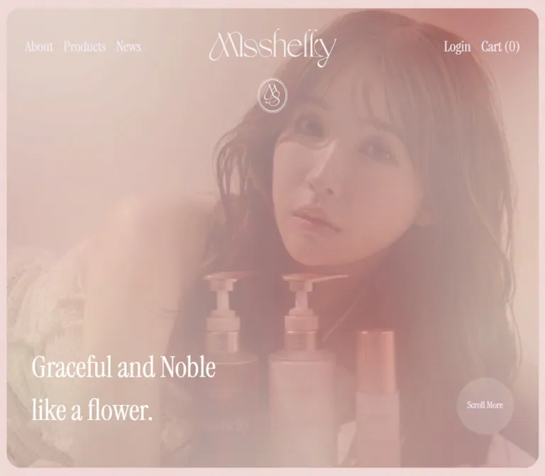
Misshelly combines a hair-care brand presentation with a working storefront structure. The opening establishes atmosphere through a large rounded photographic frame, an intricate white wordmark, an oval monogram, and a two-line English statement. Product browsing then takes over in a long, restrained catalog: portrait photographs, rose-colored English names, small Japanese descriptions, and prominent serif prices.
The hierarchy depends on image scale, generous spacing, and contrasting type families. Instrument Serif supplies the narrow, expressive English lettering; the declared Japanese gothic family carries practical information; Garamond Premier Pro appears in smaller editorial links and subtitles. The product cards have no visible enclosing panels or elevation. Their photographs provide their boundaries.
Responsive behavior is particularly distinctive: products remain in two columns at 390px, while the feature composition and footer become single-column sequences. Preserve these separate responsive decisions rather than applying one universal stacking rule.
How to Read This Reference
- Measured means a value appears in the supplied computed styles or element rectangles. RGB-to-hex conversions are exact equivalents of those values.
- Derived means a value is calculated from recorded geometry, such as the gap between product columns.
- Estimated means a visual approximation from the current-page captures. Background colors and most image corner radii fall into this category because their painting elements were not included in the computed-style sample.
- Recommended means implementation guidance for a new build. The Quick Start is an adaptation, not recovered source code.
- Font-family declarations are verified; font-file loading, available weight files, and actual glyph fallback were not independently inspected.
- Only two responsive endpoints are available. Intermediate breakpoints, landscape behavior, zoom behavior, and browser safe-area handling remain unverified.
- The evidence records scrolling through the page and settled captures. It does not establish the results of opening menus, changing slides, using the cart, hovering links, or playing media.
Tokens — Colors
Default Palette
Names below are implementation aliases, not original source variable names.
| Name | Value | Suggested token | Role and evidence |
|---|---|---|---|
| Blush Frame | approximately #efd9d5 |
--color-blush |
Estimated opening surround and footer background |
| Warm Catalog | approximately #f2efea |
--color-catalog |
Estimated warm off-white behind the photographed product row |
| Pale Rose Surface | approximately #f0e7e7 |
--color-soft |
Estimated feature-section surface visible above the footer |
| Body Gray | #646361 |
--color-ink |
Measured body copy, product descriptions, prices, and feature labels |
| Warm Dark | #464141 |
--color-strong |
Measured announcement text and desktop News/feature section headings |
| Deep Ink | #242222 |
--color-deep |
Measured introduction statement and primary footer links |
| Dusty Rose | #ba9ea6 |
--color-rose |
Measured product headings, product names, and mobile News heading |
| Rose Pill | #d8b2bd |
--color-action |
Measured More Articles background |
| Pagination Rose | #d8b3bd |
--color-dot |
Measured color on the five small introduction pagination buttons |
| Secondary Gray | #918d8d |
--color-secondary |
Measured English feature subtitles |
| Legal Gray | #a2a2a2 |
--color-muted |
Measured legal links and copyright |
| Pale Navigation | #f4e9f4 |
--color-on-image |
Measured opening navigation and Scroll More text |
| Hero White | #ffffff |
--color-white |
Measured hero statement |
| Pill Text | #f2f0ef |
--color-on-action |
Measured More Articles text |
| Circular Veil | rgb(255 255 255 / 15%) |
--surface-cue |
Measured background of the desktop scroll circle |
Color Behavior
The visible palette is subdued, but its text roles are not interchangeable. Product names use dusty rose, descriptions and prices use body gray, and footer navigation uses much darker ink. The News heading changes from #464141 on desktop to #ba9ea6 on mobile; the feature heading remains #464141 at both endpoints.
The body and sampled section elements report transparent backgrounds. That does not mean the page has a transparent or pure-white appearance: the captures show colored surfaces painted by other elements or layers. Treat the three surface hex values above as visual starting points, not recovered CSS declarations.
The photographs have a pale, low-contrast appearance. The evidence does not isolate whether this comes from asset grading, opacity, an overlay, or a combination. Do not apply a blanket opacity reduction to the whole page: the text has independently measured solid colors.
Generic source variables include sale red, success green, warning yellow, a blue slider default, and several shadow presets. These are not demonstrated as prominent colors or surface treatments in the inspected homepage. They should not become part of its main visual palette.
Tokens — Typography
Instrument Serif — English Display and Commerce
- Declared family:
instrument-serif, serif. - Observed roles: opening navigation, hero statement, introduction statement, section titles, product names, prices, footer links, and copyright.
- Weight: predominantly
400; header navigation and mobile Menu use computed500. - Character: narrow proportions, fine strokes, pronounced serif contrast, and a tall editorial silhouette.
- Implementation alias:
--font-display: instrument-serif, serif.
The heading stack is recorded as instrument-serif, sdnp-shuei-gothic-kin-std, sans-serif. The sdnp- spelling is present in the supplied declaration; it differs from the Japanese body family. Do not assume that fallback family exists. The Quick Start uses the verified body-family spelling where a Japanese fallback is needed.
Japanese Gothic — Practical Information
- Declared family:
dnp-shuei-gothic-kin-std, sans-serif. - Weight:
400throughout the sampled Japanese copy. - Observed roles: announcement, concept heading and prose, product translations and descriptions, news titles, feature labels, and legal links.
- Typical line height:
1.65; concept prose uses1.8. - Tracking: generally normal. The concept heading uses
0.05em; concept prose uses0.03em.
Garamond Premier Pro — Editorial Details
- Declared family:
garamond-premier-pro, serif. - Observed roles: More Concept, More Articles, and English feature subtitles such as Message and Components.
- Weights:
400. - Sizes:
15pxfor the small pill links and14pxfor feature subtitles.
Wordmark and Monogram
The visible wordmark is intricate brand artwork with interwoven letterforms. Its wrapping H1 reports a Japanese sans-serif family and 28px, but these inherited values do not describe the painted wordmark. The linked brand-art box measures 245 × 75.47px on desktop and 150 × 46.20px on mobile.
Use authorized wordmark and monogram artwork. Ordinary text set in Instrument Serif will not reproduce the logo, and the supplied evidence does not identify its asset format or file path.
Type Scale
All values below are measured. Sizes and line heights are CSS pixels.
| Role | Desktop size / line height | Mobile size / line height | Weight and notes |
|---|---|---|---|
| Announcement | 11 / 18.15 |
10 / 16.5 |
Gothic, 400 |
| Header links / Menu / Cart | 27 / approximately 45 |
19 / 31.35 |
Instrument Serif, 500; desktop primary links use 45.9px |
| Hero statement | 55 / 71.5 |
37 / 55.5 |
Instrument Serif, 400; two explicit lines |
| Scroll More | 18 / 110 |
Not visible | Instrument Serif; line box centers text in a 110px circle |
| Introduction statement | 59 / 59 |
34 / 34 |
Instrument Serif, 400 |
| Concept Japanese heading | 29 / 47.85 |
20 / 33 |
Gothic; tracking 1.45px / 1px |
| Concept prose | 18 / 32.4 |
12 / 21.6 |
Gothic; tracking 0.54px / 0.36px |
| Main section headings | 58 / 95.7 |
36 / 59.4 |
Instrument Serif, 400 |
| Product introduction | 14 / 23.1 |
14 / 23.1 |
Gothic |
| English product name | 33 / 54.45 |
25 / 41.25 |
Instrument Serif, dusty rose |
| Japanese product name | 13 / 21.45 |
13 / 21.45 |
Gothic |
| Product description | 12 / 19.8 |
12 / 19.8 |
Gothic |
| Product price | 29 / 47.85 |
29 / 47.85 |
Instrument Serif; does not shrink on mobile |
| News title | 16 / 26.4 |
14 / 23.1 |
Gothic |
| Feature Japanese label | 17 / 28.05 |
17 / 28.05 |
Gothic |
| Feature English subtitle | 14 / 23.1 |
14 / 23.1 |
Garamond Premier Pro |
| Small editorial link | 15 / 15 |
15 / 15 |
Garamond Premier Pro |
| Primary footer link | 37 / 61.05 |
30 / 49.5 |
Instrument Serif |
| Legal link | 16 / 26.4 |
20 / 33 |
Gothic; larger on mobile |
| Copyright | 20 / 33 |
16 / 26.4 |
Instrument Serif |
The root is a conventional 16px; body text is 14px. Generic heading-size variables are present, but custom homepage components use their own measured sizes. Copying the generic H2 formula alone would not reproduce the 58px desktop section titles.
Tokens — Spacing & Shapes
Density: broad photographic and section spacing around small practical text. Geometry: rounded image windows, a few compact pills, one circular scroll cue, and otherwise open layouts.
Spacing Scale
These are recurring measured or derived distances, not a verified universal source scale.
| Use | Desktop | Mobile | Evidence |
|---|---|---|---|
| Product information horizontal inset | 5px |
5px |
Text begins 5px inside the linked card |
| English-to-Japanese product-name gap | 5px |
5px |
Derived from text rectangles |
| Description-to-price gap | 10px |
10px |
Derived |
| Image-to-product-title gap | 15px |
15px |
Derived; image height corroborated visually on desktop |
| Japanese name-to-description gap | 15px |
15px |
Derived |
| Feature caption inset | 15px |
15px |
Measured horizontal positions; vertical structure is consistent |
| Product column gap | 90px |
30px |
Derived |
| Product row gap | 90px |
60px |
Derived from the taller preceding card |
| Feature column / row gap | 30px |
30px between cards |
Derived |
| Product introduction-to-grid gap | 110px |
40px |
Derived |
| Products top and bottom spacing | 150px |
65px |
Derived from section bounds and final card |
| Features top and bottom spacing | 110px |
65px |
Derived |
| Footer primary-link row gap | 30px |
10px |
Derived between line boxes |
Border Radius
| Element | Value | Status |
|---|---|---|
| Hero image frame | Approximately 30px desktop, 12px mobile |
Visual estimate |
| Product photographs | Approximately 6px |
Visual estimate from the desktop product row |
| Feature photographs | Approximately 14px |
Visual estimate |
| Footer promotional image | Approximately 20px |
Visual estimate |
| More Concept / More Articles | 35px |
Measured |
| Desktop scroll circle | 110px radius on a 110 × 110px box |
Measured; fully circular |
| Introduction dots | 9999px |
Measured |
The generic source button-radius variable is zero, but the custom editorial links have a measured 35px radius. Component styles take precedence over theme defaults.
Layout Measurements
| Element | Desktop 1440 × 1000 | Mobile 390 × 844 | Status |
|---|---|---|---|
| Document height | 11538.36px |
10184.81px |
Measured |
| Announcement height token | 40.14px |
36.50px |
Measured |
| Header height token | 156.06px |
97.20px |
Measured; overlays opening content |
| Hero section | 959.86px high, beginning at y≈40.16 |
807.50px high, beginning at y≈36.52 |
Measured; ends at the first viewport boundary |
| Visible rounded hero frame | Approximately 1415 × 928px |
Approximately 360 × 777px |
Estimated from captures |
| Brand wordmark box | 245 × 75.47px |
150 × 46.20px |
Measured |
| General editorial content | 990px, x=225px |
334px, x=28px |
Derived from headings and content bounds |
| Concept text column | 475.19px |
310px, x=40px |
Measured |
| Product grid span | 890px, x=275px |
334px, x=28px |
Derived |
| Product card width | 400px |
152px |
Measured |
| Product image | Approximately 400 × 600px |
Derived 152 × 228px |
Desktop capture and consistent 2:3 geometry |
| Product text width | 390px |
142px |
Measured |
| Feature column width | 310px |
334px |
Measured |
| Footer inner span | Approximately 965px |
365px |
Derived from content bounds |
| Footer height | 549.70px |
792.97px |
Measured |
| Footer monogram link | Approximately 80 × 94.57px |
80 × 94.58px |
Measured |
The source container-gutter variable changes from 3rem to 1.25rem, but actual homepage insets vary by component. The mobile concept uses 40px, the catalog uses 28px, the hero frame uses about 15px, and header controls start at 35px. Do not replace these with a single global gutter.
Components
Announcement Strip
Role: a small product-news entry above the main identity.
A centered, single-line Japanese announcement includes a linked English product name. The actual label includes Airy Luminous Splay ✨; preserve that spelling when representing the inspected content. The text is dark warm gray, 11px on desktop and 10px on mobile, with no large promotional badge or button.
The desktop text starts at y=18px; mobile text starts at y=17px. The strip and header are both configured as non-sticky in the supplied variables. The linked product URL is present, but navigation was not exercised.
Overlaid Header
Role: centered brand identity with quiet shopping and navigation utilities.
The source declares three columns: minmax(0, 1fr) auto minmax(0, 1fr). On desktop, About, Products, and News occupy the left group; Login and Cart (0) occupy the right. Adjacent desktop links have approximately 56px of horizontal separation. The brand remains geometrically centered rather than centered within leftover space.
The wordmark begins at x=597.5px on desktop and x=120px on mobile. Header text is pale #f4e9f4, placed directly over the photograph without an opaque navigation bar.
At 390px, the left group becomes a text Menu button, the wordmark becomes 150px wide, and Cart (0) remains at right. Login is not visible in this captured mobile state. Menu is a real button with the recorded accessible text メニューを開く; Cart is an anchor to /cart with the label カートを開く. Their resulting interfaces were not inspected.
Photographic Opening
Role: establish the hair-care brand's visual atmosphere before the catalog.
The image nearly fills the first viewport, leaving a narrow blush perimeter and rounded corners. The desktop capture centers the back of long, smooth hair with a dark ribbon. The mobile capture shows long hair, a hand holding a pale flower, and soft pink fabric. These are observations of the respective captures, not proof of a particular slideshow or video implementation.
The wordmark occupies the upper center; a separate white oval monogram sits below it. The statement Graceful and Noble / like a flower. is anchored near the lower left. Its measured text box begins at x=60.5px on desktop and x=35px on mobile. The bottom of the text box is approximately 64px above the rounded frame's lower edge at both endpoints.
On desktop, a 110px translucent circle labeled Scroll More sits opposite the statement. The sampled element is a paragraph, not a link or button. Treat its click behavior as unverified. It is absent from the visible mobile opening.
Brand Introduction and Pagination
Role: extend the brand mood beyond the opening image.
The next section contains Hair Care Brand, the parenthesized brand name, and the statement Our quest for / beauty goes on forever. The statement uses compact line spacing: 59px type with 59px leading on desktop, 34px with 34px leading on mobile.
Five copies of this statement occupy identical recorded bounds, accompanied by five small buttons. This supports a slide-based structure, but does not establish simultaneous visibility, autoplay, swipe support, transition direction, or timing.
Each sampled pagination button is 6 × 6px, with a 22px horizontal pitch. Their computed color is #d8b3bd. The buttons' extracted text contains an interpolation error involving {{ page }}. That error is an implementation defect to correct, not interface copy to reproduce. The evidence does not show whether the error is visibly painted or confined to an accessible label.
Concept Section
Role: pair the brand proposition with a more spacious Japanese explanation.
The section includes Our Concept, a two-line Japanese heading, a five-line prose block, and More Concept. On desktop, the heading begins in the left 475px column while the prose begins in the right column at x≈739.81px, substantially lower in the section. The text layout is staggered rather than a tightly aligned pair of text blocks.
On mobile, both text blocks use a 310px width with 40px side insets. The heading reduces to 20px and the prose to 12px. The section remains approximately 1054px tall, so it is not merely a compact stack of those text blocks. The supplied captures do not show its complete imagery; exact image arrangement should remain unspecified.
More Concept is a compact Garamond link with a right-pointing marker, 10px vertical and 20px horizontal padding, and a measured 37px height. Its width changes from 165px to approximately 138.42px. Its computed background is transparent; border appearance was not supplied.
Product Catalog
Role: present the current assortment as an editorial shopping sequence.
The Products heading and three-line introduction align to the wider editorial container. The two-column card grid is inset an additional 50px on each side at desktop, producing two 400px cards with a 90px gap. At 390px the grid aligns directly with the 334px content span, retaining two 152px cards with a 30px gap.
The observed assortment contains eleven links: Airy Luminous Splay, Misshelly Holiday Set, two other sets, Moist Shampoo, Moist Treatment, Weekly Hair Pack, Blow Lotion, Styling Butter Balm, and two refill products. The first two carry the text labels NEW ITEM and LIMITED SET. Their exact badge styling was not supplied.
The odd final product remains in the left column. Product prices range from ¥3,190 to ¥16,500 in this capture; these are dated content observations, not permanent design constants.
Product Card
Role: combine a large product photograph with enough information to enter its detail page.
The source wraps each card's content in a product link. Its anatomy is:
- A portrait photograph at a 2:3 ratio, with gently rounded corners.
- A text region inset 5px horizontally and approximately 15px vertically.
- An English name in dusty-rose Instrument Serif.
- A Japanese name after a 5px gap.
- A short Japanese description after a 15px gap.
- A gray serif price after a 10px gap.
The desktop shampoo and treatment photographs show rose-colored bottles with metallic rose-gold pumps against white floral fabric. The image is the card's main surface; there is no visible enclosing card border, filled text panel, or shadow.
Names reduce from 33px to 25px on mobile, but Japanese copy remains 13px/12px and prices remain 29px. Long names wrap naturally. At 390px, the Japanese treatment name occupies an extra line relative to the shampoo name, pushing its price approximately 21.44px lower. Preserve this content-driven flow; the source does not force every price onto a shared baseline.
No quick-add control, quantity selector, or hover image swap is established by the supplied evidence.
News Section
Role: provide operational and product updates without competing with product photography.
Desktop uses an approximately 30% heading column, 5% gutter, and 65% article column within 990px. The article links begin at x=571.5px and span 643.5px. Each contains a date above a Japanese title. There are five entries, dated from August 2025 through April 2026.
The first article begins about 50px below the section heading's top. Consecutive link boxes are separated by approximately 101px. This substantial whitespace creates an open editorial list; the supplied style sample does not establish a divider-line treatment.
On mobile, the list becomes a single 334px column below the heading. Titles reduce from 16px to 14px and wrap. More Articles sits below the list; on desktop it sits near the bottom of the left column.
More Articles is a measured rose-filled pill: #d8b2bd background, #f2f0ef text, 35px radius, and 37px height. Its width is 165px on desktop and 150px on mobile.
Feature Links
Role: offer illustrated routes to the message, ingredients information, product collection, and contact page.
The actual section label is Feautures, including that spelling. Desktop uses three 310px columns with 30px gaps. Message and Components occupy two tall photographic cards; the third column stacks two landscape cards for Products and Contact.
The tall photographs preserve portrait ratios of approximately 0.70–0.71 width to height. The short photographs are approximately 3:2 landscape. Do not force all four into a uniform image ratio.
Captions sit outside the photographs with a 15px inset. Each has a 17px Japanese label, a small right-pointing marker, and a 14px gray Garamond subtitle after a 5px gap. The current lower-page capture shows long brown hair in the ingredients card and a woman in a pale blue dress beside an ornate white stair railing and flowers in the contact card. No personal identity is established.
Mobile places all four links in one column at 334px wide, retaining their different image proportions and a 30px gap. The feature section consequently grows from about 971px to 2055px tall.
Footer
Role: close the page with a spacious navigation directory and a final brand signature.
The desktop footer is a full-width blush field. Its upper area places six large serif links in two columns at left and a roughly 400 × 225px rounded promotional image at right. The link order is Home, About, Products in the first column and Contact, News, Instagram in the second.
The lower row contains the dark oval monogram, プライバシーポリシー, 特定商取引法表示, and the copyright line. The monogram link remains approximately 80 × 94.57px at both viewports.
On mobile, the six main links become a centered vertical list. The promotional image is not visible. Legal links follow as a separate centered group, then the monogram, then copyright. Legal text increases to 20px, while main links reduce to 30px and copyright to 16px.
The mobile footer is nearly a viewport tall at 792.97px. Preserve its deliberate pauses between groups; compressing everything into a short utility bar would remove a defining part of the composition.
Tokens — Motion & Interaction
| Element or behavior | Supplied evidence | What can be concluded |
|---|---|---|
| Header | transform 0.25s ease-in-out |
A transform transition is declared; trigger and endpoint are unverified |
| Header and announcement persistence | Both sticky flags are 0 |
The inspected configuration is non-sticky |
| Announcement link | background-size 0.3s ease-in-out |
A background-size transition exists; its visual endpoint was not captured |
| More Concept / More Articles | Transition reported as 0.3s |
A short transition is declared; changed properties and endpoints remain unspecified |
| Footer navigation | color 0.2s ease-in-out |
Color transition is declared; hover color was not supplied |
| Introduction | Five overlapping statement entries and five dot buttons | Slide-like structure is evidenced; navigation and autoplay are unverified |
| Hero imagery | Different compositions in the current desktop and mobile captures | Media type, playback, looping, and crossfading cannot be established |
| Scroll More | A styled paragraph in the desktop sample | Visual scroll guidance is established; click behavior is not |
| Cart | /cart anchor and a zero-height section containing empty-cart text |
A cart destination and hidden/inactive cart content exist; an opened drawer was not observed |
| Other sampled text elements | Mostly animation: none; many report only transition: all |
This does not establish whole-page motion behavior or a meaningful transition duration |
Do not infer slow-motion video, parallax, scroll-triggered fades, image zooms, or a specific slider library from the still captures and generic variables. A reusable implementation can use restrained color transitions while leaving unverified movement out of its default behavior.
Recommended: if motion is introduced, keep it secondary to the photographs and typography. Provide a static poster and pause behavior for any decorative moving media, and respect reduced-motion preferences. These are additions, not observed original features.
Surfaces
| Layer | Appearance | Function |
|---|---|---|
| Opening surround | Pale blush, estimated color | Frames the rounded photographic opening |
| Hero image | Soft, warm photographic field | Primary emotional and brand surface |
| Navigation over image | Pale lettering without an opaque bar | Keeps the image uninterrupted |
| Product area | Warm off-white, estimated color | Supports floral product photography and small gray copy |
| Product card | Photograph followed by unboxed text | Organizes commerce without visual elevation |
| Feature area | Very pale rose-neutral, estimated color | Connects the catalog to editorial navigation |
| Editorial action | Small rose pill | Restrained action emphasis |
| Footer | Broad blush field | Creates a clear ending and space for the monogram |
There is no demonstrated general shadow system in these captures. Source shadow variables alone do not justify adding elevated cards, floating panels, or glossy controls.
Imagery
The visual language centers on hair, flowers, fabric, and beauty-product packaging. The current hero shows long smooth hair, a ribbon, and closely framed hands and flowers. Product photography uses floral cloth with small pink blossoms and green leaves, subdued pink bottles, and metallic pumps. The photographic surfaces feel softly lit and low in contrast.
The floral fabric supplies much of the catalog's decorative detail. It remains inside the image rather than becoming a repeating UI background. Keep the surrounding interface comparatively plain so the photographs retain their material character.
The lower-page imagery includes a pale blue dress, an ornate white stair railing, flowers, and a pale promotional arrangement of product packaging. These small cooler accents prevent the palette from becoming uniformly pink. They do not introduce a separate blue UI accent system.
Observed Asset References
The supplied evidence does not expose URLs for the principal photography or brand artwork. The references below identify their observed placements without inventing asset paths.
| Asset | Current-page evidence | Reuse guidance |
|---|---|---|
| White wordmark | Desktop and mobile opening captures; linked brand box in DOM | Use authorized artwork at its intrinsic ratio |
| Oval monogram | White beneath the opening wordmark; dark in the footer | Preserve the fine intertwined strokes and double oval outline |
| Opening media | Desktop hair-and-ribbon composition; mobile hair, flower, and hand composition | Verify original assets and media type before choosing image/video behavior |
| Shampoo and treatment photographs | Desktop product-row capture | Preserve 2:3 framing and the floral fabric around each bottle |
| Feature photography | Lower desktop capture and measured feature-card geometry | Preserve the distinction between tall portraits and short landscapes |
| Footer promotional image | Desktop footer capture | Keep a small rounded landscape presentation; no mobile equivalent was visible |
The Quick Start does not bundle these assets. Use licensed originals or authorized replacements with comparable composition. Do not simulate the brand logo with generic text or fabricate image filenames as if they came from the website.
Layout & Responsive Behavior
Page Sequence
The homepage follows a continuous document flow:
- Announcement and overlaid header.
- Nearly viewport-height photographic opening.
- Brand introduction with pagination.
- Staggered concept content.
- Two-column product catalog.
- News list.
- Illustrated feature links.
- Spacious footer.
This is a brand storefront homepage with multiple destinations. Its reference structure should retain product, news, account, cart, contact, and legal navigation rather than reducing the page to a single conversion action.
Measured Responsive Changes
| Area | Desktop | Mobile |
|---|---|---|
| Header | Three navigation links, centered wordmark, Login and Cart | Menu, smaller centered wordmark, Cart |
| Opening | Wide photographic frame; statement and scroll circle at opposing lower corners | Tall crop; statement retained; scroll circle not visible |
| Introduction | About 1027px tall | About 436px tall |
| Concept | Staggered text in two approximately 475px columns | 310px text width with 40px insets |
| Products | Two 400px columns, 90px gap | Two 152px columns, 30px gap |
| Product prices | 29px | Still 29px |
| News | Heading/actions beside article list | Heading, article list, then action |
| Features | Two tall cards plus two stacked landscape cards | Four cards in one vertical sequence |
| Footer | Two-column navigation plus promotional image; horizontal lower row | Centered navigation, legal links, monogram, copyright |
The mobile document is shorter overall despite the stacked feature section. Its product images shrink substantially while the catalog remains two columns. This is a content-specific tradeoff, not evidence that every section is simply scaled down.
Exact breakpoints and interpolation rules were not supplied. The 48rem breakpoint in the Quick Start is a recommendation chosen to express the measured endpoints. It should be tested with real fonts and content at intermediate widths.
Do’s and Don’ts
Do
- Keep the opening framed by a narrow blush perimeter and rounded corners.
- Preserve the centered wordmark, separate oval monogram, and lower-left two-line statement.
- Use Instrument Serif for the observed English display and price roles, the declared Japanese gothic stack for practical text, and Garamond Premier Pro for small editorial details.
- Keep product names dusty rose and descriptions/prices gray.
- Preserve portrait product photography with floral fabric visible around the packaging.
- Retain two product columns at the inspected 390px width.
- Allow names, descriptions, and prices to flow naturally when mobile text wraps.
- Use different image proportions for the tall and short feature cards.
- Preserve the footer's generous spacing and centered mobile sequence.
- Keep measurements, visual estimates, and proposed improvements clearly distinguished.
Don't
- Don't turn the catalog into a dense grid of boxed, elevated cards.
- Don't add a large opaque navigation bar over the opening image.
- Don't replace the logo artwork with an ordinary serif word.
- Don't make every label pink or every heading dark; the measured role changes matter.
- Don't put floral patterns behind the entire interface.
- Don't force all product prices onto a shared baseline when copy lengths differ.
- Don't stack the mobile product grid into one column when reproducing the inspected endpoint.
- Don't copy generic theme shadow, sale, or slider colors into the main visual system without visible evidence.
- Don't reproduce interpolation-error labels as content.
- Don't claim autoplay, drawer behavior, parallax, or hover effects that were not exercised.
- Don't apply opacity to the entire page to imitate the softened photography.
Recommended Implementation Additions
These are proposed improvements for a new implementation, not verified features of the original:
- Increase contrast for legal links and any essential rose text after checking the final surface colors. The measured pale colors should not be assumed to meet accessibility targets.
- Test white hero text against every intended image or media frame. Add a localized image treatment only where necessary, without reducing text opacity.
- Preserve the existing skip-link concept and give it a visible keyboard-focus state.
- Expand Menu and pagination hit areas without enlarging their visual lettering or dots. The recorded 6px pagination boxes need a more generous interactive target.
- Replace broken pagination interpolation with meaningful labels and expose the current slide state.
- If Menu or Cart opens a dialog, implement focus placement, Escape dismissal, focus return, and appropriate state attributes. An anchor destination should remain usable when enhancement fails.
- Use semantic section headings and product headings. The sampled page contains an H1 around the logo and another for the concept; a new build should define a coherent hierarchy.
- Keep long Japanese product text readable at zoom and narrow widths. If increasing body size, retest the two-column catalog rather than hiding descriptions to preserve a fixed height.
- Reserve image dimensions, load below-the-fold imagery efficiently, and provide meaningful alternatives for informative photographs.
- Load the declared fonts only with appropriate licenses. Test fallback wrapping because the narrow English titles are sensitive to font metrics.
Agent Prompt Guide
Quick Color Reference
- Opening and footer: estimated blush
#efd9d5. - Catalog surface: estimated warm neutral
#f2efea. - Product names and selected section headings: measured
#ba9ea6. - Practical text and prices: measured
#646361. - Footer navigation: measured
#242222. - Small filled editorial action: measured
#d8b2bdwith#f2f0eftext. - Hero statement: white; header links: measured pale
#f4e9f4. - Image treatment: softly graded photography; no verified global opacity or blur value.
Overall Prompt
“Create a Japanese hair-care brand storefront inspired by the current Misshelly homepage. Use a pale blush opening surround and footer, a warm off-white catalog surface, dusty-rose English product names, and gray Japanese descriptions. Pair slender Instrument Serif display typography with the declared Japanese gothic stack and small Garamond editorial links. Build a nearly viewport-height rounded photographic opening with a centered authorized wordmark, a separate oval monogram, and a white two-line statement at lower left. Follow with brand storytelling, an open two-column product catalog, a spacious news list, mixed-ratio feature photography, and a generous footer. At 390px retain two product columns while stacking the feature links and footer. Keep photographs and typography dominant; use no card shadows. Treat background hex values and image radii as estimates, and do not invent media or interaction behavior.”
Example Component Prompts
- Opening: “A softly graded hair-and-flower photograph inside a rounded frame with a narrow blush perimeter. Center fine white brand artwork near the top and an oval monogram beneath it. Anchor ‘Graceful and Noble / like a flower.’ at lower left in 55px Instrument Serif on desktop and 37px on mobile. Include a translucent 110px scroll cue only in the desktop composition.”
- Product card: “An unboxed 2:3 product photograph on floral fabric, followed by a dusty-rose English name, small Japanese name and description, and a 29px gray serif price. Use 5px horizontal text insets and natural content height. At 390px use a 152px-wide card with a 25px English name.”
- Feature composition: “Within a 990px desktop container, place two tall photographic links beside a third column containing two landscape links. Use 30px gaps, subtle image rounding, Japanese labels, small Garamond English subtitles, and quiet right arrows. Stack all four cards on mobile while preserving their image ratios.”
- Footer: “A broad blush footer with two columns of dark 37px serif navigation at left and a small rounded landscape image at right. Place the oval monogram, legal links, and copyright below. On mobile hide the promotional image and center six 30px links, then legal links, the monogram, and copyright with generous vertical pauses.”
- News: “A quiet date-and-title list with a large Instrument Serif heading in a separate desktop column. Give entries roughly 101px of space between their text boxes. Use a small rose More Articles pill near the end of the section; stack the content on mobile.”
Quick Start
CSS Custom Properties
This is a reusable visual adaptation of the measured endpoints. Surface colors and image radii are estimates. The 48rem breakpoint, transparent-pill outline, focus styling, and hover color endpoint are recommendations. The source does not establish those exact implementation choices.
Suggested structure: .masthead contains .site-header and .hero-section > .hero-frame. The frame contains authorized media, monogram artwork, statement, and optional desktop scroll cue. Product links contain .product-image followed by .product-info. Feature cards contain an image and caption. The footer uses .footer-top for navigation/media and .footer-bottom for its seal, legal links, and copyright.
CSS does not supply brand assets, font files, menu/cart logic, or slider behavior. Use appropriate semantic elements and real link destinations.
:root {
  /* Estimated surfaces from the supplied current-page captures. */
  --color-blush: #efd9d5;
  --color-catalog: #f2efea;
  --color-soft: #f0e7e7;

  /* Measured text and control colors. */
  --color-ink: #646361;
  --color-strong: #464141;
  --color-deep: #242222;
  --color-rose: #ba9ea6;
  --color-action: #d8b2bd;
  --color-dot: #d8b3bd;
  --color-secondary: #918d8d;
  --color-muted: #a2a2a2;
  --color-on-image: #f4e9f4;
  --color-on-action: #f2f0ef;

  --font-display: instrument-serif, serif;
  --font-ui: dnp-shuei-gothic-kin-std, sans-serif;
  --font-detail: garamond-premier-pro, serif;

  --size-hero: 55px;
  --leading-hero: 1.3;
  --size-section: 58px;
  --size-product: 33px;
  --size-price: 29px;
  --leading-copy: 1.65;

  --announcement-height: 40.14px;
  --content-width: 990px;
  --catalog-width: 890px;
  --catalog-column-gap: 90px;
  --catalog-row-gap: 90px;
  --radius-hero: 30px;
  --radius-product: 6px;
  --radius-feature: 14px;
  --radius-banner: 20px;

  /* Leave at zero when the supplied imagery is already softened. */
  --hero-wash-alpha: 0;
}

* { box-sizing: border-box; }

body { margin: 0; }

.misshelly-page {
  color: var(--color-ink);
  background: var(--color-catalog);
  font: 400 14px / var(--leading-copy) var(--font-ui);
}

.misshelly-page :where(h1, h2, h3, p, figure) { margin: 0; }
.misshelly-page a { color: inherit; }

.announcement {
  min-height: var(--announcement-height);
  padding: 18px 16px 4px;
  color: var(--color-strong);
  background: var(--color-blush);
  text-align: center;
  font-size: 11px;
  line-height: 1.65;
}

.masthead {
  position: relative;
  background: var(--color-blush);
}

.site-header {
  position: absolute;
  z-index: 3;
  inset: 55px 48px auto;
  display: grid;
  grid-template-columns: minmax(0, 1fr) auto minmax(0, 1fr);
  align-items: center;
  color: var(--color-on-image);
  font: 500 27px / 1.7 var(--font-display);
}

.header-links,
.header-actions {
  display: flex;
  align-items: center;
  gap: 56px;
}

.header-actions { justify-content: flex-end; }
.site-header a { text-decoration: none; }
.brand-art { display: block; width: 245px; height: auto; }
.mobile-menu { display: none; }

.hero-section { padding: 16px 12.5px; }

.hero-frame {
  position: relative;
  height: calc(100svh - var(--announcement-height) - 32px);
  min-height: 480px;
  overflow: hidden;
  border-radius: var(--radius-hero);
}

.hero-media,
.hero-wash {
  position: absolute;
  inset: 0;
  width: 100%;
  height: 100%;
}

.hero-media { display: block; object-fit: cover; }

.hero-wash {
  background: rgb(239 217 213 / var(--hero-wash-alpha));
  pointer-events: none;
}

.hero-seal {
  position: absolute;
  top: 134px;
  left: 50%;
  width: 58px;
  height: auto;
  transform: translateX(-50%);
}

.hero-title {
  position: absolute;
  left: 48px;
  bottom: 64px;
  color: #fff;
  font: 400 var(--size-hero) / var(--leading-hero) var(--font-display);
}

.scroll-cue {
  position: absolute;
  right: 48px;
  bottom: 64px;
  display: grid;
  place-items: center;
  width: 110px;
  height: 110px;
  border-radius: 50%;
  color: var(--color-on-image);
  background: rgb(255 255 255 / 15%);
  font: 400 18px / 1 var(--font-display);
}

.content-shell {
  width: min(var(--content-width), calc(100% - 56px));
  margin-inline: auto;
}

.introduction-title {
  color: var(--color-deep);
  font: 400 59px / 1 var(--font-display);
  text-align: center;
}

.concept-heading {
  font: 400 29px / 1.65 var(--font-ui);
  letter-spacing: 0.05em;
}

.concept-copy {
  font: 400 18px / 1.8 var(--font-ui);
  letter-spacing: 0.03em;
}

.section-heading {
  color: var(--color-rose);
  font: 400 var(--size-section) / 1.65 var(--font-display);
}

.section-heading--dark { color: var(--color-strong); }
.products-section { padding-block: 150px; }

.product-grid {
  display: grid;
  grid-template-columns: repeat(2, minmax(0, 1fr));
  align-items: start;
  gap: var(--catalog-row-gap) var(--catalog-column-gap);
  width: min(var(--catalog-width), 100%);
  margin: 110px auto 0;
}

.product-card {
  display: block;
  min-width: 0;
  text-decoration: none;
}

.product-image {
  display: block;
  width: 100%;
  aspect-ratio: 2 / 3;
  object-fit: cover;
  border-radius: var(--radius-product);
}

.product-info { padding: 15px 5px; }

.product-title {
  color: var(--color-rose);
  font: 400 var(--size-product) / 1.65 var(--font-display);
}

.product-ja {
  margin-top: 5px !important;
  font-size: 13px;
  line-height: 1.65;
}

.product-description {
  margin-top: 15px !important;
  font-size: 12px;
  line-height: 1.65;
}

.product-price {
  margin-top: 10px !important;
  font: 400 var(--size-price) / 1.65 var(--font-display);
}

/* The transparent-pill outline is a recommended adaptation. */
.pill-link {
  display: inline-flex;
  align-items: center;
  justify-content: space-between;
  gap: 20px;
  width: 165px;
  min-height: 37px;
  padding: 10px 20px;
  border: 1px solid currentColor;
  border-radius: 35px;
  font: 400 15px / 1 var(--font-detail);
  text-decoration: none;
}

.pill-link--filled {
  color: var(--color-on-action) !important;
  background: var(--color-action);
  border-color: var(--color-action);
}

.news-section { padding-block: 65px; }

.news-grid {
  display: grid;
  grid-template-columns: 30% 65%;
  grid-template-rows: auto 1fr auto;
  grid-template-areas: 'title list' '. list' 'more list';
  column-gap: 5%;
}

.news-title { grid-area: title; color: var(--color-strong); }
.news-more { grid-area: more; }

.news-list {
  grid-area: list;
  display: grid;
  gap: 101px;
  margin: 0;
  padding: 50px 0;
  list-style: none;
}

.news-link { display: block; text-decoration: none; }
.news-date { font: 400 14px / 1.65 var(--font-ui); }

.news-link h3 {
  margin-top: 6px;
  padding-right: 60px;
  font: 400 16px / 1.65 var(--font-ui);
}

.features-section {
  padding-block: 110px;
  background: var(--color-soft);
}

.feature-grid {
  display: grid;
  grid-template-columns: repeat(3, minmax(0, 1fr));
  gap: 30px;
  margin-top: 40px;
}

.feature-card { min-width: 0; text-decoration: none; }
.feature-card--portrait { grid-row: span 2; }

.feature-image {
  display: block;
  width: 100%;
  height: auto;
  border-radius: var(--radius-feature);
}

.feature-card--landscape .feature-image {
  aspect-ratio: 3 / 2;
  object-fit: cover;
}

.feature-caption { padding: 15px; }

.feature-label {
  display: flex;
  justify-content: space-between;
  gap: 20px;
  font: 400 17px / 1.65 var(--font-ui);
}

.feature-subtitle {
  margin-top: 5px !important;
  color: var(--color-secondary);
  font: 400 14px / 1.65 var(--font-detail);
}

.site-footer {
  padding: 58px 12.5px 48px;
  background: var(--color-blush);
}

.footer-shell { max-width: 965px; margin-inline: auto; }

.footer-top {
  display: flex;
  align-items: center;
  justify-content: space-between;
  gap: 48px;
}

.footer-nav {
  display: grid;
  grid-template-columns: repeat(2, minmax(128.77px, auto));
  grid-template-rows: repeat(3, auto);
  grid-auto-flow: column;
  gap: 30px 40px;
}

.footer-nav a {
  color: var(--color-deep);
  font: 400 37px / 1.65 var(--font-display);
  text-decoration: none;
  transition: color 0.2s ease-in-out;
}

.footer-media {
  display: block;
  width: 400px;
  aspect-ratio: 16 / 9;
  object-fit: cover;
  border-radius: var(--radius-banner);
}

.footer-bottom {
  display: grid;
  grid-template-columns: 80px minmax(0, 1fr) auto;
  align-items: center;
  gap: 40px;
  margin-top: 106px;
}

.footer-seal { display: block; width: 80px; height: auto; }

.footer-legal {
  display: flex;
  justify-content: center;
  gap: 64px;
  color: var(--color-muted);
  font: 400 16px / 1.65 var(--font-ui);
}

.footer-legal a { text-decoration: none; }

.copyright {
  color: var(--color-muted);
  font: 400 20px / 1.65 var(--font-display);
}

/* Recommended keyboard and hover treatments. */
.misshelly-page :focus-visible {
  outline: 2px solid var(--color-strong);
  outline-offset: 4px;
}

@media (hover: hover) {
  .footer-nav a:hover { color: var(--color-rose); }
  .product-card:hover .product-title { text-decoration: underline; }
}

/* Recommended breakpoint; the source breakpoint was not supplied. */
@media (max-width: 48rem) {
  :root {
    --announcement-height: 36.5px;
    --size-hero: 37px;
    --leading-hero: 1.5;
    --size-section: 36px;
    --size-product: 25px;
    --catalog-column-gap: 30px;
    --catalog-row-gap: 60px;
    --radius-hero: 12px;
  }

  .announcement { padding: 17px 16px 3px; font-size: 10px; }
  .site-header { inset: 35px 35px auto; font-size: 19px; line-height: 1.65; }
  .header-links, .header-login { display: none; }
  .header-actions { gap: 0; }
  .brand-art { width: 150px; }

  .mobile-menu {
    display: block;
    justify-self: start;
    padding: 0;
    border: 0;
    color: inherit;
    background: transparent;
    font: inherit;
    cursor: pointer;
  }

  .hero-section { padding-inline: 15px; }
  .hero-title { left: 20px; }
  .hero-seal { top: 66px; width: 34px; }
  .scroll-cue { display: none; }
  .introduction-title { font-size: 34px; }
  .concept-heading { font-size: 20px; }
  .concept-copy { font-size: 12px; }

  .products-section { padding-block: 65px; }
  .product-grid { margin-top: 40px; }

  .news-grid {
    grid-template-columns: minmax(0, 1fr);
    grid-template-rows: auto auto auto;
    grid-template-areas: 'title' 'list' 'more';
    column-gap: 0;
  }

  .news-title { color: var(--color-rose); }
  .news-list { padding: 80px 0 63px; }
  .news-link h3 { font-size: 14px; }
  .news-more { width: 150px; }

  .features-section { padding-block: 65px; }
  .feature-grid { grid-template-columns: minmax(0, 1fr); }
  .feature-card--portrait { grid-row: auto; }

  .site-footer { padding: 32px 12.5px; }
  .footer-top { display: block; }
  .footer-media { display: none; }

  .footer-nav {
    grid-template-columns: minmax(0, 1fr);
    grid-template-rows: none;
    grid-auto-flow: row;
    gap: 10px;
    text-align: center;
  }

  .footer-nav a { font-size: 30px; }

  .footer-bottom {
    display: flex;
    flex-direction: column;
    gap: 0;
    margin-top: 64px;
    text-align: center;
  }

  .footer-legal {
    order: 0;
    flex-direction: column;
    gap: 15px;
    font-size: 20px;
  }

  .footer-seal { order: 1; margin-top: 61px; }
  .copyright { order: 2; margin-top: 55px !important; font-size: 16px; }
}

@media (prefers-reduced-motion: reduce) {
  .misshelly-page :where(a, button) { transition: none; }
}
The hero uses a recommended 100svh sizing model to approximate the captured first-screen geometry. Its 480px minimum is a protective adaptation for short screens. Actual media focal points need adjustment for the chosen desktop and mobile assets.
For product markup, use an anchor containing an image and a .product-info block with .product-title, .product-ja, .product-description, and .product-price. Do not give the card a fixed height. For the feature grid, place the two portrait cards first, followed by the two landscape cards; the desktop row spans then reproduce the observed composition.
Tailwind v4 Token Mapping
Optional aliases for a project already using Tailwind v4. This is not evidence that the original site uses Tailwind. Define the custom properties above first.
@theme inline {
  --color-misshelly-blush: var(--color-blush);
  --color-misshelly-catalog: var(--color-catalog);
  --color-misshelly-soft: var(--color-soft);
  --color-misshelly-ink: var(--color-ink);
  --color-misshelly-deep: var(--color-deep);
  --color-misshelly-rose: var(--color-rose);
  --color-misshelly-action: var(--color-action);

  --font-editorial: var(--font-display);
  --font-japanese: var(--font-ui);
  --font-detail-serif: var(--font-detail);

  --text-misshelly-hero: var(--size-hero);
  --text-misshelly-section: var(--size-section);
  --text-misshelly-product: var(--size-product);
  --text-misshelly-price: var(--size-price);

  --spacing-catalog-column: var(--catalog-column-gap);
  --spacing-catalog-row: var(--catalog-row-gap);
  --radius-misshelly-hero: var(--radius-hero);
  --radius-misshelly-product: var(--radius-product);
  --radius-misshelly-feature: var(--radius-feature);
}
Sources & Evidence
- Misshelly homepage: original and final inspected URL, HTTP 200. All site-specific observations in this document come from the supplied current-page captures, rendered text, link destinations, computed styles, and geometry for this page.
- Capture record: September 13, 2026, 08:25:30.721 UTC / 17:25:30.721 JST; desktop 1440 × 1000 and mobile 390 × 844 CSS pixels. Recorded document heights were approximately 11538.36px and 10184.81px.
- Visual coverage: desktop opening, desktop shampoo/treatment row, lower desktop feature/footer area, mobile opening, and mobile footer. Intermediate-section descriptions rely on rendered DOM where a corresponding visual capture was not supplied.
- Readiness and traversal: the supplied browser process observed the initial page for at least five seconds, waited for document/image/layout readiness within bounded time limits, and traversed intermediate scroll positions. Perpetual animations were paused during readiness checks and resumed afterward. SharedWorkers and service workers were disabled.
- Interaction limits: no supplied result establishes opened Menu or Cart states, pagination changes, product-detail behavior, checkout, hover endpoints, keyboard traversal, or media playback. The presence of links, buttons, transition declarations, and hidden content is documented separately from successful interaction.
- Measurement limits: principal image elements and their asset URLs were not included in the style sample. Surface colors, photographic treatment, and most image radii remain estimates. Computed font stacks do not independently verify font downloads or glyph fallback.
- Scope limits: linked About, product, News, account, contact, privacy, and trade-law destinations were recorded but not inspected as separate pages. This document makes no independent legal-operator or production-credit claim.
This reference describes the current homepage evidence at the inspected URL. The reusable CSS, breakpoint, accessibility changes, and additional interaction guidance are explicitly proposed adaptations.
# Misshelly — Style Reference

> A pale blush beauty storefront with slender serif lettering and photographs softened like a floral dressing-room editorial.

**Website:** [misshelly.com](https://misshelly.com/)
**Original URL:** https://misshelly.com/
**Final URL:** https://misshelly.com/
**Theme:** light, with blush framing, warm neutral content surfaces, and muted rose accents; no theme selector was evidenced.
**Inspected:** September 13, 2026, from supplied browser evidence retrieved at 08:25:30.721 UTC / 17:25:30.721 JST.
**Viewports:** desktop 1440 × 1000 and mobile 390 × 844 CSS pixels.
**Scope:** the current homepage: announcement, overlaid navigation, photographic opening, brand introduction, concept content, eleven product entries, five news entries, four feature links, and footer. Visual captures cover the desktop opening, a desktop product row, the lower desktop feature/footer area, and the mobile opening and footer. Intermediate sections are documented primarily through supplied rendered DOM measurements.

Misshelly combines a hair-care brand presentation with a working storefront structure. The opening establishes atmosphere through a large rounded photographic frame, an intricate white wordmark, an oval monogram, and a two-line English statement. Product browsing then takes over in a long, restrained catalog: portrait photographs, rose-colored English names, small Japanese descriptions, and prominent serif prices.

The hierarchy depends on image scale, generous spacing, and contrasting type families. Instrument Serif supplies the narrow, expressive English lettering; the declared Japanese gothic family carries practical information; Garamond Premier Pro appears in smaller editorial links and subtitles. The product cards have no visible enclosing panels or elevation. Their photographs provide their boundaries.

Responsive behavior is particularly distinctive: products remain in two columns at 390px, while the feature composition and footer become single-column sequences. Preserve these separate responsive decisions rather than applying one universal stacking rule.

## How to Read This Reference

- **Measured** means a value appears in the supplied computed styles or element rectangles. RGB-to-hex conversions are exact equivalents of those values.
- **Derived** means a value is calculated from recorded geometry, such as the gap between product columns.
- **Estimated** means a visual approximation from the current-page captures. Background colors and most image corner radii fall into this category because their painting elements were not included in the computed-style sample.
- **Recommended** means implementation guidance for a new build. The Quick Start is an adaptation, not recovered source code.
- Font-family declarations are verified; font-file loading, available weight files, and actual glyph fallback were not independently inspected.
- Only two responsive endpoints are available. Intermediate breakpoints, landscape behavior, zoom behavior, and browser safe-area handling remain unverified.
- The evidence records scrolling through the page and settled captures. It does not establish the results of opening menus, changing slides, using the cart, hovering links, or playing media.

## Tokens — Colors

### Default Palette

Names below are implementation aliases, not original source variable names.

| Name | Value | Suggested token | Role and evidence |
| --- | --- | --- | --- |
| Blush Frame | approximately `#efd9d5` | `--color-blush` | Estimated opening surround and footer background |
| Warm Catalog | approximately `#f2efea` | `--color-catalog` | Estimated warm off-white behind the photographed product row |
| Pale Rose Surface | approximately `#f0e7e7` | `--color-soft` | Estimated feature-section surface visible above the footer |
| Body Gray | `#646361` | `--color-ink` | Measured body copy, product descriptions, prices, and feature labels |
| Warm Dark | `#464141` | `--color-strong` | Measured announcement text and desktop News/feature section headings |
| Deep Ink | `#242222` | `--color-deep` | Measured introduction statement and primary footer links |
| Dusty Rose | `#ba9ea6` | `--color-rose` | Measured product headings, product names, and mobile News heading |
| Rose Pill | `#d8b2bd` | `--color-action` | Measured More Articles background |
| Pagination Rose | `#d8b3bd` | `--color-dot` | Measured color on the five small introduction pagination buttons |
| Secondary Gray | `#918d8d` | `--color-secondary` | Measured English feature subtitles |
| Legal Gray | `#a2a2a2` | `--color-muted` | Measured legal links and copyright |
| Pale Navigation | `#f4e9f4` | `--color-on-image` | Measured opening navigation and Scroll More text |
| Hero White | `#ffffff` | `--color-white` | Measured hero statement |
| Pill Text | `#f2f0ef` | `--color-on-action` | Measured More Articles text |
| Circular Veil | `rgb(255 255 255 / 15%)` | `--surface-cue` | Measured background of the desktop scroll circle |

### Color Behavior

The visible palette is subdued, but its text roles are not interchangeable. Product names use dusty rose, descriptions and prices use body gray, and footer navigation uses much darker ink. The News heading changes from `#464141` on desktop to `#ba9ea6` on mobile; the feature heading remains `#464141` at both endpoints.

The body and sampled section elements report transparent backgrounds. That does not mean the page has a transparent or pure-white appearance: the captures show colored surfaces painted by other elements or layers. Treat the three surface hex values above as visual starting points, not recovered CSS declarations.

The photographs have a pale, low-contrast appearance. The evidence does not isolate whether this comes from asset grading, opacity, an overlay, or a combination. Do not apply a blanket opacity reduction to the whole page: the text has independently measured solid colors.

Generic source variables include sale red, success green, warning yellow, a blue slider default, and several shadow presets. These are not demonstrated as prominent colors or surface treatments in the inspected homepage. They should not become part of its main visual palette.

## Tokens — Typography

### Instrument Serif — English Display and Commerce

- **Declared family:** `instrument-serif, serif`.
- **Observed roles:** opening navigation, hero statement, introduction statement, section titles, product names, prices, footer links, and copyright.
- **Weight:** predominantly `400`; header navigation and mobile Menu use computed `500`.
- **Character:** narrow proportions, fine strokes, pronounced serif contrast, and a tall editorial silhouette.
- **Implementation alias:** `--font-display: instrument-serif, serif`.

The heading stack is recorded as `instrument-serif, sdnp-shuei-gothic-kin-std, sans-serif`. The `sdnp-` spelling is present in the supplied declaration; it differs from the Japanese body family. Do not assume that fallback family exists. The Quick Start uses the verified body-family spelling where a Japanese fallback is needed.

### Japanese Gothic — Practical Information

- **Declared family:** `dnp-shuei-gothic-kin-std, sans-serif`.
- **Weight:** `400` throughout the sampled Japanese copy.
- **Observed roles:** announcement, concept heading and prose, product translations and descriptions, news titles, feature labels, and legal links.
- **Typical line height:** `1.65`; concept prose uses `1.8`.
- **Tracking:** generally normal. The concept heading uses `0.05em`; concept prose uses `0.03em`.

### Garamond Premier Pro — Editorial Details

- **Declared family:** `garamond-premier-pro, serif`.
- **Observed roles:** More Concept, More Articles, and English feature subtitles such as Message and Components.
- **Weights:** `400`.
- **Sizes:** `15px` for the small pill links and `14px` for feature subtitles.

### Wordmark and Monogram

The visible wordmark is intricate brand artwork with interwoven letterforms. Its wrapping H1 reports a Japanese sans-serif family and `28px`, but these inherited values do not describe the painted wordmark. The linked brand-art box measures `245 × 75.47px` on desktop and `150 × 46.20px` on mobile.

Use authorized wordmark and monogram artwork. Ordinary text set in Instrument Serif will not reproduce the logo, and the supplied evidence does not identify its asset format or file path.

### Type Scale

All values below are measured. Sizes and line heights are CSS pixels.

| Role | Desktop size / line height | Mobile size / line height | Weight and notes |
| --- | --- | --- | --- |
| Announcement | `11 / 18.15` | `10 / 16.5` | Gothic, 400 |
| Header links / Menu / Cart | `27 / approximately 45` | `19 / 31.35` | Instrument Serif, 500; desktop primary links use 45.9px |
| Hero statement | `55 / 71.5` | `37 / 55.5` | Instrument Serif, 400; two explicit lines |
| Scroll More | `18 / 110` | Not visible | Instrument Serif; line box centers text in a 110px circle |
| Introduction statement | `59 / 59` | `34 / 34` | Instrument Serif, 400 |
| Concept Japanese heading | `29 / 47.85` | `20 / 33` | Gothic; tracking `1.45px` / `1px` |
| Concept prose | `18 / 32.4` | `12 / 21.6` | Gothic; tracking `0.54px` / `0.36px` |
| Main section headings | `58 / 95.7` | `36 / 59.4` | Instrument Serif, 400 |
| Product introduction | `14 / 23.1` | `14 / 23.1` | Gothic |
| English product name | `33 / 54.45` | `25 / 41.25` | Instrument Serif, dusty rose |
| Japanese product name | `13 / 21.45` | `13 / 21.45` | Gothic |
| Product description | `12 / 19.8` | `12 / 19.8` | Gothic |
| Product price | `29 / 47.85` | `29 / 47.85` | Instrument Serif; does not shrink on mobile |
| News title | `16 / 26.4` | `14 / 23.1` | Gothic |
| Feature Japanese label | `17 / 28.05` | `17 / 28.05` | Gothic |
| Feature English subtitle | `14 / 23.1` | `14 / 23.1` | Garamond Premier Pro |
| Small editorial link | `15 / 15` | `15 / 15` | Garamond Premier Pro |
| Primary footer link | `37 / 61.05` | `30 / 49.5` | Instrument Serif |
| Legal link | `16 / 26.4` | `20 / 33` | Gothic; larger on mobile |
| Copyright | `20 / 33` | `16 / 26.4` | Instrument Serif |

The root is a conventional `16px`; body text is `14px`. Generic heading-size variables are present, but custom homepage components use their own measured sizes. Copying the generic H2 formula alone would not reproduce the 58px desktop section titles.

## Tokens — Spacing & Shapes

**Density:** broad photographic and section spacing around small practical text.
**Geometry:** rounded image windows, a few compact pills, one circular scroll cue, and otherwise open layouts.

### Spacing Scale

These are recurring measured or derived distances, not a verified universal source scale.

| Use | Desktop | Mobile | Evidence |
| --- | --- | --- | --- |
| Product information horizontal inset | `5px` | `5px` | Text begins 5px inside the linked card |
| English-to-Japanese product-name gap | `5px` | `5px` | Derived from text rectangles |
| Description-to-price gap | `10px` | `10px` | Derived |
| Image-to-product-title gap | `15px` | `15px` | Derived; image height corroborated visually on desktop |
| Japanese name-to-description gap | `15px` | `15px` | Derived |
| Feature caption inset | `15px` | `15px` | Measured horizontal positions; vertical structure is consistent |
| Product column gap | `90px` | `30px` | Derived |
| Product row gap | `90px` | `60px` | Derived from the taller preceding card |
| Feature column / row gap | `30px` | `30px` between cards | Derived |
| Product introduction-to-grid gap | `110px` | `40px` | Derived |
| Products top and bottom spacing | `150px` | `65px` | Derived from section bounds and final card |
| Features top and bottom spacing | `110px` | `65px` | Derived |
| Footer primary-link row gap | `30px` | `10px` | Derived between line boxes |

### Border Radius

| Element | Value | Status |
| --- | --- | --- |
| Hero image frame | Approximately `30px` desktop, `12px` mobile | Visual estimate |
| Product photographs | Approximately `6px` | Visual estimate from the desktop product row |
| Feature photographs | Approximately `14px` | Visual estimate |
| Footer promotional image | Approximately `20px` | Visual estimate |
| More Concept / More Articles | `35px` | Measured |
| Desktop scroll circle | `110px` radius on a `110 × 110px` box | Measured; fully circular |
| Introduction dots | `9999px` | Measured |

The generic source button-radius variable is zero, but the custom editorial links have a measured 35px radius. Component styles take precedence over theme defaults.

### Layout Measurements

| Element | Desktop 1440 × 1000 | Mobile 390 × 844 | Status |
| --- | --- | --- | --- |
| Document height | `11538.36px` | `10184.81px` | Measured |
| Announcement height token | `40.14px` | `36.50px` | Measured |
| Header height token | `156.06px` | `97.20px` | Measured; overlays opening content |
| Hero section | `959.86px` high, beginning at y≈40.16 | `807.50px` high, beginning at y≈36.52 | Measured; ends at the first viewport boundary |
| Visible rounded hero frame | Approximately `1415 × 928px` | Approximately `360 × 777px` | Estimated from captures |
| Brand wordmark box | `245 × 75.47px` | `150 × 46.20px` | Measured |
| General editorial content | `990px`, x=`225px` | `334px`, x=`28px` | Derived from headings and content bounds |
| Concept text column | `475.19px` | `310px`, x=`40px` | Measured |
| Product grid span | `890px`, x=`275px` | `334px`, x=`28px` | Derived |
| Product card width | `400px` | `152px` | Measured |
| Product image | Approximately `400 × 600px` | Derived `152 × 228px` | Desktop capture and consistent 2:3 geometry |
| Product text width | `390px` | `142px` | Measured |
| Feature column width | `310px` | `334px` | Measured |
| Footer inner span | Approximately `965px` | `365px` | Derived from content bounds |
| Footer height | `549.70px` | `792.97px` | Measured |
| Footer monogram link | Approximately `80 × 94.57px` | `80 × 94.58px` | Measured |

The source container-gutter variable changes from `3rem` to `1.25rem`, but actual homepage insets vary by component. The mobile concept uses 40px, the catalog uses 28px, the hero frame uses about 15px, and header controls start at 35px. Do not replace these with a single global gutter.

## Components

### Announcement Strip

**Role:** a small product-news entry above the main identity.

A centered, single-line Japanese announcement includes a linked English product name. The actual label includes `Airy Luminous Splay ✨`; preserve that spelling when representing the inspected content. The text is dark warm gray, 11px on desktop and 10px on mobile, with no large promotional badge or button.

The desktop text starts at y=18px; mobile text starts at y=17px. The strip and header are both configured as non-sticky in the supplied variables. The linked product URL is present, but navigation was not exercised.

### Overlaid Header

**Role:** centered brand identity with quiet shopping and navigation utilities.

The source declares three columns: `minmax(0, 1fr) auto minmax(0, 1fr)`. On desktop, About, Products, and News occupy the left group; Login and Cart (0) occupy the right. Adjacent desktop links have approximately 56px of horizontal separation. The brand remains geometrically centered rather than centered within leftover space.

The wordmark begins at x=597.5px on desktop and x=120px on mobile. Header text is pale `#f4e9f4`, placed directly over the photograph without an opaque navigation bar.

At 390px, the left group becomes a text Menu button, the wordmark becomes 150px wide, and Cart (0) remains at right. Login is not visible in this captured mobile state. Menu is a real button with the recorded accessible text `メニューを開く`; Cart is an anchor to `/cart` with the label `カートを開く`. Their resulting interfaces were not inspected.

### Photographic Opening

**Role:** establish the hair-care brand's visual atmosphere before the catalog.

The image nearly fills the first viewport, leaving a narrow blush perimeter and rounded corners. The desktop capture centers the back of long, smooth hair with a dark ribbon. The mobile capture shows long hair, a hand holding a pale flower, and soft pink fabric. These are observations of the respective captures, not proof of a particular slideshow or video implementation.

The wordmark occupies the upper center; a separate white oval monogram sits below it. The statement `Graceful and Noble / like a flower.` is anchored near the lower left. Its measured text box begins at x=60.5px on desktop and x=35px on mobile. The bottom of the text box is approximately 64px above the rounded frame's lower edge at both endpoints.

On desktop, a 110px translucent circle labeled Scroll More sits opposite the statement. The sampled element is a paragraph, not a link or button. Treat its click behavior as unverified. It is absent from the visible mobile opening.

### Brand Introduction and Pagination

**Role:** extend the brand mood beyond the opening image.

The next section contains Hair Care Brand, the parenthesized brand name, and the statement `Our quest for / beauty goes on forever.` The statement uses compact line spacing: 59px type with 59px leading on desktop, 34px with 34px leading on mobile.

Five copies of this statement occupy identical recorded bounds, accompanied by five small buttons. This supports a slide-based structure, but does not establish simultaneous visibility, autoplay, swipe support, transition direction, or timing.

Each sampled pagination button is 6 × 6px, with a 22px horizontal pitch. Their computed color is `#d8b3bd`. The buttons' extracted text contains an interpolation error involving `{{ page }}`. That error is an implementation defect to correct, not interface copy to reproduce. The evidence does not show whether the error is visibly painted or confined to an accessible label.

### Concept Section

**Role:** pair the brand proposition with a more spacious Japanese explanation.

The section includes Our Concept, a two-line Japanese heading, a five-line prose block, and More Concept. On desktop, the heading begins in the left 475px column while the prose begins in the right column at x≈739.81px, substantially lower in the section. The text layout is staggered rather than a tightly aligned pair of text blocks.

On mobile, both text blocks use a 310px width with 40px side insets. The heading reduces to 20px and the prose to 12px. The section remains approximately 1054px tall, so it is not merely a compact stack of those text blocks. The supplied captures do not show its complete imagery; exact image arrangement should remain unspecified.

More Concept is a compact Garamond link with a right-pointing marker, 10px vertical and 20px horizontal padding, and a measured 37px height. Its width changes from 165px to approximately 138.42px. Its computed background is transparent; border appearance was not supplied.

### Product Catalog

**Role:** present the current assortment as an editorial shopping sequence.

The Products heading and three-line introduction align to the wider editorial container. The two-column card grid is inset an additional 50px on each side at desktop, producing two 400px cards with a 90px gap. At 390px the grid aligns directly with the 334px content span, retaining two 152px cards with a 30px gap.

The observed assortment contains eleven links: Airy Luminous Splay, Misshelly Holiday Set, two other sets, Moist Shampoo, Moist Treatment, Weekly Hair Pack, Blow Lotion, Styling Butter Balm, and two refill products. The first two carry the text labels NEW ITEM and LIMITED SET. Their exact badge styling was not supplied.

The odd final product remains in the left column. Product prices range from ¥3,190 to ¥16,500 in this capture; these are dated content observations, not permanent design constants.

### Product Card

**Role:** combine a large product photograph with enough information to enter its detail page.

The source wraps each card's content in a product link. Its anatomy is:

1. A portrait photograph at a 2:3 ratio, with gently rounded corners.
2. A text region inset 5px horizontally and approximately 15px vertically.
3. An English name in dusty-rose Instrument Serif.
4. A Japanese name after a 5px gap.
5. A short Japanese description after a 15px gap.
6. A gray serif price after a 10px gap.

The desktop shampoo and treatment photographs show rose-colored bottles with metallic rose-gold pumps against white floral fabric. The image is the card's main surface; there is no visible enclosing card border, filled text panel, or shadow.

Names reduce from 33px to 25px on mobile, but Japanese copy remains 13px/12px and prices remain 29px. Long names wrap naturally. At 390px, the Japanese treatment name occupies an extra line relative to the shampoo name, pushing its price approximately 21.44px lower. Preserve this content-driven flow; the source does not force every price onto a shared baseline.

No quick-add control, quantity selector, or hover image swap is established by the supplied evidence.

### News Section

**Role:** provide operational and product updates without competing with product photography.

Desktop uses an approximately 30% heading column, 5% gutter, and 65% article column within 990px. The article links begin at x=571.5px and span 643.5px. Each contains a date above a Japanese title. There are five entries, dated from August 2025 through April 2026.

The first article begins about 50px below the section heading's top. Consecutive link boxes are separated by approximately 101px. This substantial whitespace creates an open editorial list; the supplied style sample does not establish a divider-line treatment.

On mobile, the list becomes a single 334px column below the heading. Titles reduce from 16px to 14px and wrap. More Articles sits below the list; on desktop it sits near the bottom of the left column.

More Articles is a measured rose-filled pill: `#d8b2bd` background, `#f2f0ef` text, 35px radius, and 37px height. Its width is 165px on desktop and 150px on mobile.

### Feature Links

**Role:** offer illustrated routes to the message, ingredients information, product collection, and contact page.

The actual section label is `Feautures`, including that spelling. Desktop uses three 310px columns with 30px gaps. Message and Components occupy two tall photographic cards; the third column stacks two landscape cards for Products and Contact.

The tall photographs preserve portrait ratios of approximately 0.70–0.71 width to height. The short photographs are approximately 3:2 landscape. Do not force all four into a uniform image ratio.

Captions sit outside the photographs with a 15px inset. Each has a 17px Japanese label, a small right-pointing marker, and a 14px gray Garamond subtitle after a 5px gap. The current lower-page capture shows long brown hair in the ingredients card and a woman in a pale blue dress beside an ornate white stair railing and flowers in the contact card. No personal identity is established.

Mobile places all four links in one column at 334px wide, retaining their different image proportions and a 30px gap. The feature section consequently grows from about 971px to 2055px tall.

### Footer

**Role:** close the page with a spacious navigation directory and a final brand signature.

The desktop footer is a full-width blush field. Its upper area places six large serif links in two columns at left and a roughly 400 × 225px rounded promotional image at right. The link order is Home, About, Products in the first column and Contact, News, Instagram in the second.

The lower row contains the dark oval monogram, `プライバシーポリシー`, `特定商取引法表示`, and the copyright line. The monogram link remains approximately 80 × 94.57px at both viewports.

On mobile, the six main links become a centered vertical list. The promotional image is not visible. Legal links follow as a separate centered group, then the monogram, then copyright. Legal text increases to 20px, while main links reduce to 30px and copyright to 16px.

The mobile footer is nearly a viewport tall at 792.97px. Preserve its deliberate pauses between groups; compressing everything into a short utility bar would remove a defining part of the composition.

## Tokens — Motion & Interaction

| Element or behavior | Supplied evidence | What can be concluded |
| --- | --- | --- |
| Header | `transform 0.25s ease-in-out` | A transform transition is declared; trigger and endpoint are unverified |
| Header and announcement persistence | Both sticky flags are `0` | The inspected configuration is non-sticky |
| Announcement link | `background-size 0.3s ease-in-out` | A background-size transition exists; its visual endpoint was not captured |
| More Concept / More Articles | Transition reported as `0.3s` | A short transition is declared; changed properties and endpoints remain unspecified |
| Footer navigation | `color 0.2s ease-in-out` | Color transition is declared; hover color was not supplied |
| Introduction | Five overlapping statement entries and five dot buttons | Slide-like structure is evidenced; navigation and autoplay are unverified |
| Hero imagery | Different compositions in the current desktop and mobile captures | Media type, playback, looping, and crossfading cannot be established |
| Scroll More | A styled paragraph in the desktop sample | Visual scroll guidance is established; click behavior is not |
| Cart | `/cart` anchor and a zero-height section containing empty-cart text | A cart destination and hidden/inactive cart content exist; an opened drawer was not observed |
| Other sampled text elements | Mostly `animation: none`; many report only `transition: all` | This does not establish whole-page motion behavior or a meaningful transition duration |

Do not infer slow-motion video, parallax, scroll-triggered fades, image zooms, or a specific slider library from the still captures and generic variables. A reusable implementation can use restrained color transitions while leaving unverified movement out of its default behavior.

**Recommended:** if motion is introduced, keep it secondary to the photographs and typography. Provide a static poster and pause behavior for any decorative moving media, and respect reduced-motion preferences. These are additions, not observed original features.

## Surfaces

| Layer | Appearance | Function |
| --- | --- | --- |
| Opening surround | Pale blush, estimated color | Frames the rounded photographic opening |
| Hero image | Soft, warm photographic field | Primary emotional and brand surface |
| Navigation over image | Pale lettering without an opaque bar | Keeps the image uninterrupted |
| Product area | Warm off-white, estimated color | Supports floral product photography and small gray copy |
| Product card | Photograph followed by unboxed text | Organizes commerce without visual elevation |
| Feature area | Very pale rose-neutral, estimated color | Connects the catalog to editorial navigation |
| Editorial action | Small rose pill | Restrained action emphasis |
| Footer | Broad blush field | Creates a clear ending and space for the monogram |

There is no demonstrated general shadow system in these captures. Source shadow variables alone do not justify adding elevated cards, floating panels, or glossy controls.

## Imagery

The visual language centers on hair, flowers, fabric, and beauty-product packaging. The current hero shows long smooth hair, a ribbon, and closely framed hands and flowers. Product photography uses floral cloth with small pink blossoms and green leaves, subdued pink bottles, and metallic pumps. The photographic surfaces feel softly lit and low in contrast.

The floral fabric supplies much of the catalog's decorative detail. It remains inside the image rather than becoming a repeating UI background. Keep the surrounding interface comparatively plain so the photographs retain their material character.

The lower-page imagery includes a pale blue dress, an ornate white stair railing, flowers, and a pale promotional arrangement of product packaging. These small cooler accents prevent the palette from becoming uniformly pink. They do not introduce a separate blue UI accent system.

### Observed Asset References

The supplied evidence does not expose URLs for the principal photography or brand artwork. The references below identify their observed placements without inventing asset paths.

| Asset | Current-page evidence | Reuse guidance |
| --- | --- | --- |
| White wordmark | Desktop and mobile opening captures; linked brand box in DOM | Use authorized artwork at its intrinsic ratio |
| Oval monogram | White beneath the opening wordmark; dark in the footer | Preserve the fine intertwined strokes and double oval outline |
| Opening media | Desktop hair-and-ribbon composition; mobile hair, flower, and hand composition | Verify original assets and media type before choosing image/video behavior |
| Shampoo and treatment photographs | Desktop product-row capture | Preserve 2:3 framing and the floral fabric around each bottle |
| Feature photography | Lower desktop capture and measured feature-card geometry | Preserve the distinction between tall portraits and short landscapes |
| Footer promotional image | Desktop footer capture | Keep a small rounded landscape presentation; no mobile equivalent was visible |

The Quick Start does not bundle these assets. Use licensed originals or authorized replacements with comparable composition. Do not simulate the brand logo with generic text or fabricate image filenames as if they came from the website.

## Layout & Responsive Behavior

### Page Sequence

The homepage follows a continuous document flow:

1. Announcement and overlaid header.
2. Nearly viewport-height photographic opening.
3. Brand introduction with pagination.
4. Staggered concept content.
5. Two-column product catalog.
6. News list.
7. Illustrated feature links.
8. Spacious footer.

This is a brand storefront homepage with multiple destinations. Its reference structure should retain product, news, account, cart, contact, and legal navigation rather than reducing the page to a single conversion action.

### Measured Responsive Changes

| Area | Desktop | Mobile |
| --- | --- | --- |
| Header | Three navigation links, centered wordmark, Login and Cart | Menu, smaller centered wordmark, Cart |
| Opening | Wide photographic frame; statement and scroll circle at opposing lower corners | Tall crop; statement retained; scroll circle not visible |
| Introduction | About 1027px tall | About 436px tall |
| Concept | Staggered text in two approximately 475px columns | 310px text width with 40px insets |
| Products | Two 400px columns, 90px gap | Two 152px columns, 30px gap |
| Product prices | 29px | Still 29px |
| News | Heading/actions beside article list | Heading, article list, then action |
| Features | Two tall cards plus two stacked landscape cards | Four cards in one vertical sequence |
| Footer | Two-column navigation plus promotional image; horizontal lower row | Centered navigation, legal links, monogram, copyright |

The mobile document is shorter overall despite the stacked feature section. Its product images shrink substantially while the catalog remains two columns. This is a content-specific tradeoff, not evidence that every section is simply scaled down.

Exact breakpoints and interpolation rules were not supplied. The 48rem breakpoint in the Quick Start is a recommendation chosen to express the measured endpoints. It should be tested with real fonts and content at intermediate widths.

## Do’s and Don’ts

### Do

- Keep the opening framed by a narrow blush perimeter and rounded corners.
- Preserve the centered wordmark, separate oval monogram, and lower-left two-line statement.
- Use Instrument Serif for the observed English display and price roles, the declared Japanese gothic stack for practical text, and Garamond Premier Pro for small editorial details.
- Keep product names dusty rose and descriptions/prices gray.
- Preserve portrait product photography with floral fabric visible around the packaging.
- Retain two product columns at the inspected 390px width.
- Allow names, descriptions, and prices to flow naturally when mobile text wraps.
- Use different image proportions for the tall and short feature cards.
- Preserve the footer's generous spacing and centered mobile sequence.
- Keep measurements, visual estimates, and proposed improvements clearly distinguished.

### Don't

- Don't turn the catalog into a dense grid of boxed, elevated cards.
- Don't add a large opaque navigation bar over the opening image.
- Don't replace the logo artwork with an ordinary serif word.
- Don't make every label pink or every heading dark; the measured role changes matter.
- Don't put floral patterns behind the entire interface.
- Don't force all product prices onto a shared baseline when copy lengths differ.
- Don't stack the mobile product grid into one column when reproducing the inspected endpoint.
- Don't copy generic theme shadow, sale, or slider colors into the main visual system without visible evidence.
- Don't reproduce interpolation-error labels as content.
- Don't claim autoplay, drawer behavior, parallax, or hover effects that were not exercised.
- Don't apply opacity to the entire page to imitate the softened photography.

## Recommended Implementation Additions

These are proposed improvements for a new implementation, not verified features of the original:

- Increase contrast for legal links and any essential rose text after checking the final surface colors. The measured pale colors should not be assumed to meet accessibility targets.
- Test white hero text against every intended image or media frame. Add a localized image treatment only where necessary, without reducing text opacity.
- Preserve the existing skip-link concept and give it a visible keyboard-focus state.
- Expand Menu and pagination hit areas without enlarging their visual lettering or dots. The recorded 6px pagination boxes need a more generous interactive target.
- Replace broken pagination interpolation with meaningful labels and expose the current slide state.
- If Menu or Cart opens a dialog, implement focus placement, Escape dismissal, focus return, and appropriate state attributes. An anchor destination should remain usable when enhancement fails.
- Use semantic section headings and product headings. The sampled page contains an H1 around the logo and another for the concept; a new build should define a coherent hierarchy.
- Keep long Japanese product text readable at zoom and narrow widths. If increasing body size, retest the two-column catalog rather than hiding descriptions to preserve a fixed height.
- Reserve image dimensions, load below-the-fold imagery efficiently, and provide meaningful alternatives for informative photographs.
- Load the declared fonts only with appropriate licenses. Test fallback wrapping because the narrow English titles are sensitive to font metrics.

## Agent Prompt Guide

### Quick Color Reference

- Opening and footer: estimated blush `#efd9d5`.
- Catalog surface: estimated warm neutral `#f2efea`.
- Product names and selected section headings: measured `#ba9ea6`.
- Practical text and prices: measured `#646361`.
- Footer navigation: measured `#242222`.
- Small filled editorial action: measured `#d8b2bd` with `#f2f0ef` text.
- Hero statement: white; header links: measured pale `#f4e9f4`.
- Image treatment: softly graded photography; no verified global opacity or blur value.

### Overall Prompt

“Create a Japanese hair-care brand storefront inspired by the current Misshelly homepage. Use a pale blush opening surround and footer, a warm off-white catalog surface, dusty-rose English product names, and gray Japanese descriptions. Pair slender Instrument Serif display typography with the declared Japanese gothic stack and small Garamond editorial links. Build a nearly viewport-height rounded photographic opening with a centered authorized wordmark, a separate oval monogram, and a white two-line statement at lower left. Follow with brand storytelling, an open two-column product catalog, a spacious news list, mixed-ratio feature photography, and a generous footer. At 390px retain two product columns while stacking the feature links and footer. Keep photographs and typography dominant; use no card shadows. Treat background hex values and image radii as estimates, and do not invent media or interaction behavior.”

### Example Component Prompts

1. **Opening:** “A softly graded hair-and-flower photograph inside a rounded frame with a narrow blush perimeter. Center fine white brand artwork near the top and an oval monogram beneath it. Anchor ‘Graceful and Noble / like a flower.’ at lower left in 55px Instrument Serif on desktop and 37px on mobile. Include a translucent 110px scroll cue only in the desktop composition.”
2. **Product card:** “An unboxed 2:3 product photograph on floral fabric, followed by a dusty-rose English name, small Japanese name and description, and a 29px gray serif price. Use 5px horizontal text insets and natural content height. At 390px use a 152px-wide card with a 25px English name.”
3. **Feature composition:** “Within a 990px desktop container, place two tall photographic links beside a third column containing two landscape links. Use 30px gaps, subtle image rounding, Japanese labels, small Garamond English subtitles, and quiet right arrows. Stack all four cards on mobile while preserving their image ratios.”
4. **Footer:** “A broad blush footer with two columns of dark 37px serif navigation at left and a small rounded landscape image at right. Place the oval monogram, legal links, and copyright below. On mobile hide the promotional image and center six 30px links, then legal links, the monogram, and copyright with generous vertical pauses.”
5. **News:** “A quiet date-and-title list with a large Instrument Serif heading in a separate desktop column. Give entries roughly 101px of space between their text boxes. Use a small rose More Articles pill near the end of the section; stack the content on mobile.”

## Quick Start

### CSS Custom Properties

This is a reusable visual adaptation of the measured endpoints. Surface colors and image radii are estimates. The 48rem breakpoint, transparent-pill outline, focus styling, and hover color endpoint are recommendations. The source does not establish those exact implementation choices.

Suggested structure: `.masthead` contains `.site-header` and `.hero-section > .hero-frame`. The frame contains authorized media, monogram artwork, statement, and optional desktop scroll cue. Product links contain `.product-image` followed by `.product-info`. Feature cards contain an image and caption. The footer uses `.footer-top` for navigation/media and `.footer-bottom` for its seal, legal links, and copyright.

CSS does not supply brand assets, font files, menu/cart logic, or slider behavior. Use appropriate semantic elements and real link destinations.

```css
:root {
  /* Estimated surfaces from the supplied current-page captures. */
  --color-blush: #efd9d5;
  --color-catalog: #f2efea;
  --color-soft: #f0e7e7;

  /* Measured text and control colors. */
  --color-ink: #646361;
  --color-strong: #464141;
  --color-deep: #242222;
  --color-rose: #ba9ea6;
  --color-action: #d8b2bd;
  --color-dot: #d8b3bd;
  --color-secondary: #918d8d;
  --color-muted: #a2a2a2;
  --color-on-image: #f4e9f4;
  --color-on-action: #f2f0ef;

  --font-display: instrument-serif, serif;
  --font-ui: dnp-shuei-gothic-kin-std, sans-serif;
  --font-detail: garamond-premier-pro, serif;

  --size-hero: 55px;
  --leading-hero: 1.3;
  --size-section: 58px;
  --size-product: 33px;
  --size-price: 29px;
  --leading-copy: 1.65;

  --announcement-height: 40.14px;
  --content-width: 990px;
  --catalog-width: 890px;
  --catalog-column-gap: 90px;
  --catalog-row-gap: 90px;
  --radius-hero: 30px;
  --radius-product: 6px;
  --radius-feature: 14px;
  --radius-banner: 20px;

  /* Leave at zero when the supplied imagery is already softened. */
  --hero-wash-alpha: 0;
}

* { box-sizing: border-box; }

body { margin: 0; }

.misshelly-page {
  color: var(--color-ink);
  background: var(--color-catalog);
  font: 400 14px / var(--leading-copy) var(--font-ui);
}

.misshelly-page :where(h1, h2, h3, p, figure) { margin: 0; }
.misshelly-page a { color: inherit; }

.announcement {
  min-height: var(--announcement-height);
  padding: 18px 16px 4px;
  color: var(--color-strong);
  background: var(--color-blush);
  text-align: center;
  font-size: 11px;
  line-height: 1.65;
}

.masthead {
  position: relative;
  background: var(--color-blush);
}

.site-header {
  position: absolute;
  z-index: 3;
  inset: 55px 48px auto;
  display: grid;
  grid-template-columns: minmax(0, 1fr) auto minmax(0, 1fr);
  align-items: center;
  color: var(--color-on-image);
  font: 500 27px / 1.7 var(--font-display);
}

.header-links,
.header-actions {
  display: flex;
  align-items: center;
  gap: 56px;
}

.header-actions { justify-content: flex-end; }
.site-header a { text-decoration: none; }
.brand-art { display: block; width: 245px; height: auto; }
.mobile-menu { display: none; }

.hero-section { padding: 16px 12.5px; }

.hero-frame {
  position: relative;
  height: calc(100svh - var(--announcement-height) - 32px);
  min-height: 480px;
  overflow: hidden;
  border-radius: var(--radius-hero);
}

.hero-media,
.hero-wash {
  position: absolute;
  inset: 0;
  width: 100%;
  height: 100%;
}

.hero-media { display: block; object-fit: cover; }

.hero-wash {
  background: rgb(239 217 213 / var(--hero-wash-alpha));
  pointer-events: none;
}

.hero-seal {
  position: absolute;
  top: 134px;
  left: 50%;
  width: 58px;
  height: auto;
  transform: translateX(-50%);
}

.hero-title {
  position: absolute;
  left: 48px;
  bottom: 64px;
  color: #fff;
  font: 400 var(--size-hero) / var(--leading-hero) var(--font-display);
}

.scroll-cue {
  position: absolute;
  right: 48px;
  bottom: 64px;
  display: grid;
  place-items: center;
  width: 110px;
  height: 110px;
  border-radius: 50%;
  color: var(--color-on-image);
  background: rgb(255 255 255 / 15%);
  font: 400 18px / 1 var(--font-display);
}

.content-shell {
  width: min(var(--content-width), calc(100% - 56px));
  margin-inline: auto;
}

.introduction-title {
  color: var(--color-deep);
  font: 400 59px / 1 var(--font-display);
  text-align: center;
}

.concept-heading {
  font: 400 29px / 1.65 var(--font-ui);
  letter-spacing: 0.05em;
}

.concept-copy {
  font: 400 18px / 1.8 var(--font-ui);
  letter-spacing: 0.03em;
}

.section-heading {
  color: var(--color-rose);
  font: 400 var(--size-section) / 1.65 var(--font-display);
}

.section-heading--dark { color: var(--color-strong); }
.products-section { padding-block: 150px; }

.product-grid {
  display: grid;
  grid-template-columns: repeat(2, minmax(0, 1fr));
  align-items: start;
  gap: var(--catalog-row-gap) var(--catalog-column-gap);
  width: min(var(--catalog-width), 100%);
  margin: 110px auto 0;
}

.product-card {
  display: block;
  min-width: 0;
  text-decoration: none;
}

.product-image {
  display: block;
  width: 100%;
  aspect-ratio: 2 / 3;
  object-fit: cover;
  border-radius: var(--radius-product);
}

.product-info { padding: 15px 5px; }

.product-title {
  color: var(--color-rose);
  font: 400 var(--size-product) / 1.65 var(--font-display);
}

.product-ja {
  margin-top: 5px !important;
  font-size: 13px;
  line-height: 1.65;
}

.product-description {
  margin-top: 15px !important;
  font-size: 12px;
  line-height: 1.65;
}

.product-price {
  margin-top: 10px !important;
  font: 400 var(--size-price) / 1.65 var(--font-display);
}

/* The transparent-pill outline is a recommended adaptation. */
.pill-link {
  display: inline-flex;
  align-items: center;
  justify-content: space-between;
  gap: 20px;
  width: 165px;
  min-height: 37px;
  padding: 10px 20px;
  border: 1px solid currentColor;
  border-radius: 35px;
  font: 400 15px / 1 var(--font-detail);
  text-decoration: none;
}

.pill-link--filled {
  color: var(--color-on-action) !important;
  background: var(--color-action);
  border-color: var(--color-action);
}

.news-section { padding-block: 65px; }

.news-grid {
  display: grid;
  grid-template-columns: 30% 65%;
  grid-template-rows: auto 1fr auto;
  grid-template-areas: 'title list' '. list' 'more list';
  column-gap: 5%;
}

.news-title { grid-area: title; color: var(--color-strong); }
.news-more { grid-area: more; }

.news-list {
  grid-area: list;
  display: grid;
  gap: 101px;
  margin: 0;
  padding: 50px 0;
  list-style: none;
}

.news-link { display: block; text-decoration: none; }
.news-date { font: 400 14px / 1.65 var(--font-ui); }

.news-link h3 {
  margin-top: 6px;
  padding-right: 60px;
  font: 400 16px / 1.65 var(--font-ui);
}

.features-section {
  padding-block: 110px;
  background: var(--color-soft);
}

.feature-grid {
  display: grid;
  grid-template-columns: repeat(3, minmax(0, 1fr));
  gap: 30px;
  margin-top: 40px;
}

.feature-card { min-width: 0; text-decoration: none; }
.feature-card--portrait { grid-row: span 2; }

.feature-image {
  display: block;
  width: 100%;
  height: auto;
  border-radius: var(--radius-feature);
}

.feature-card--landscape .feature-image {
  aspect-ratio: 3 / 2;
  object-fit: cover;
}

.feature-caption { padding: 15px; }

.feature-label {
  display: flex;
  justify-content: space-between;
  gap: 20px;
  font: 400 17px / 1.65 var(--font-ui);
}

.feature-subtitle {
  margin-top: 5px !important;
  color: var(--color-secondary);
  font: 400 14px / 1.65 var(--font-detail);
}

.site-footer {
  padding: 58px 12.5px 48px;
  background: var(--color-blush);
}

.footer-shell { max-width: 965px; margin-inline: auto; }

.footer-top {
  display: flex;
  align-items: center;
  justify-content: space-between;
  gap: 48px;
}

.footer-nav {
  display: grid;
  grid-template-columns: repeat(2, minmax(128.77px, auto));
  grid-template-rows: repeat(3, auto);
  grid-auto-flow: column;
  gap: 30px 40px;
}

.footer-nav a {
  color: var(--color-deep);
  font: 400 37px / 1.65 var(--font-display);
  text-decoration: none;
  transition: color 0.2s ease-in-out;
}

.footer-media {
  display: block;
  width: 400px;
  aspect-ratio: 16 / 9;
  object-fit: cover;
  border-radius: var(--radius-banner);
}

.footer-bottom {
  display: grid;
  grid-template-columns: 80px minmax(0, 1fr) auto;
  align-items: center;
  gap: 40px;
  margin-top: 106px;
}

.footer-seal { display: block; width: 80px; height: auto; }

.footer-legal {
  display: flex;
  justify-content: center;
  gap: 64px;
  color: var(--color-muted);
  font: 400 16px / 1.65 var(--font-ui);
}

.footer-legal a { text-decoration: none; }

.copyright {
  color: var(--color-muted);
  font: 400 20px / 1.65 var(--font-display);
}

/* Recommended keyboard and hover treatments. */
.misshelly-page :focus-visible {
  outline: 2px solid var(--color-strong);
  outline-offset: 4px;
}

@media (hover: hover) {
  .footer-nav a:hover { color: var(--color-rose); }
  .product-card:hover .product-title { text-decoration: underline; }
}

/* Recommended breakpoint; the source breakpoint was not supplied. */
@media (max-width: 48rem) {
  :root {
    --announcement-height: 36.5px;
    --size-hero: 37px;
    --leading-hero: 1.5;
    --size-section: 36px;
    --size-product: 25px;
    --catalog-column-gap: 30px;
    --catalog-row-gap: 60px;
    --radius-hero: 12px;
  }

  .announcement { padding: 17px 16px 3px; font-size: 10px; }
  .site-header { inset: 35px 35px auto; font-size: 19px; line-height: 1.65; }
  .header-links, .header-login { display: none; }
  .header-actions { gap: 0; }
  .brand-art { width: 150px; }

  .mobile-menu {
    display: block;
    justify-self: start;
    padding: 0;
    border: 0;
    color: inherit;
    background: transparent;
    font: inherit;
    cursor: pointer;
  }

  .hero-section { padding-inline: 15px; }
  .hero-title { left: 20px; }
  .hero-seal { top: 66px; width: 34px; }
  .scroll-cue { display: none; }
  .introduction-title { font-size: 34px; }
  .concept-heading { font-size: 20px; }
  .concept-copy { font-size: 12px; }

  .products-section { padding-block: 65px; }
  .product-grid { margin-top: 40px; }

  .news-grid {
    grid-template-columns: minmax(0, 1fr);
    grid-template-rows: auto auto auto;
    grid-template-areas: 'title' 'list' 'more';
    column-gap: 0;
  }

  .news-title { color: var(--color-rose); }
  .news-list { padding: 80px 0 63px; }
  .news-link h3 { font-size: 14px; }
  .news-more { width: 150px; }

  .features-section { padding-block: 65px; }
  .feature-grid { grid-template-columns: minmax(0, 1fr); }
  .feature-card--portrait { grid-row: auto; }

  .site-footer { padding: 32px 12.5px; }
  .footer-top { display: block; }
  .footer-media { display: none; }

  .footer-nav {
    grid-template-columns: minmax(0, 1fr);
    grid-template-rows: none;
    grid-auto-flow: row;
    gap: 10px;
    text-align: center;
  }

  .footer-nav a { font-size: 30px; }

  .footer-bottom {
    display: flex;
    flex-direction: column;
    gap: 0;
    margin-top: 64px;
    text-align: center;
  }

  .footer-legal {
    order: 0;
    flex-direction: column;
    gap: 15px;
    font-size: 20px;
  }

  .footer-seal { order: 1; margin-top: 61px; }
  .copyright { order: 2; margin-top: 55px !important; font-size: 16px; }
}

@media (prefers-reduced-motion: reduce) {
  .misshelly-page :where(a, button) { transition: none; }
}
```

The hero uses a recommended `100svh` sizing model to approximate the captured first-screen geometry. Its 480px minimum is a protective adaptation for short screens. Actual media focal points need adjustment for the chosen desktop and mobile assets.

For product markup, use an anchor containing an image and a `.product-info` block with `.product-title`, `.product-ja`, `.product-description`, and `.product-price`. Do not give the card a fixed height. For the feature grid, place the two portrait cards first, followed by the two landscape cards; the desktop row spans then reproduce the observed composition.

### Tailwind v4 Token Mapping

Optional aliases for a project already using Tailwind v4. This is not evidence that the original site uses Tailwind. Define the custom properties above first.

```css
@theme inline {
  --color-misshelly-blush: var(--color-blush);
  --color-misshelly-catalog: var(--color-catalog);
  --color-misshelly-soft: var(--color-soft);
  --color-misshelly-ink: var(--color-ink);
  --color-misshelly-deep: var(--color-deep);
  --color-misshelly-rose: var(--color-rose);
  --color-misshelly-action: var(--color-action);

  --font-editorial: var(--font-display);
  --font-japanese: var(--font-ui);
  --font-detail-serif: var(--font-detail);

  --text-misshelly-hero: var(--size-hero);
  --text-misshelly-section: var(--size-section);
  --text-misshelly-product: var(--size-product);
  --text-misshelly-price: var(--size-price);

  --spacing-catalog-column: var(--catalog-column-gap);
  --spacing-catalog-row: var(--catalog-row-gap);
  --radius-misshelly-hero: var(--radius-hero);
  --radius-misshelly-product: var(--radius-product);
  --radius-misshelly-feature: var(--radius-feature);
}
```

## Sources & Evidence

- [Misshelly homepage](https://misshelly.com/): original and final inspected URL, HTTP 200. All site-specific observations in this document come from the supplied current-page captures, rendered text, link destinations, computed styles, and geometry for this page.
- **Capture record:** September 13, 2026, 08:25:30.721 UTC / 17:25:30.721 JST; desktop 1440 × 1000 and mobile 390 × 844 CSS pixels. Recorded document heights were approximately 11538.36px and 10184.81px.
- **Visual coverage:** desktop opening, desktop shampoo/treatment row, lower desktop feature/footer area, mobile opening, and mobile footer. Intermediate-section descriptions rely on rendered DOM where a corresponding visual capture was not supplied.
- **Readiness and traversal:** the supplied browser process observed the initial page for at least five seconds, waited for document/image/layout readiness within bounded time limits, and traversed intermediate scroll positions. Perpetual animations were paused during readiness checks and resumed afterward. SharedWorkers and service workers were disabled.
- **Interaction limits:** no supplied result establishes opened Menu or Cart states, pagination changes, product-detail behavior, checkout, hover endpoints, keyboard traversal, or media playback. The presence of links, buttons, transition declarations, and hidden content is documented separately from successful interaction.
- **Measurement limits:** principal image elements and their asset URLs were not included in the style sample. Surface colors, photographic treatment, and most image radii remain estimates. Computed font stacks do not independently verify font downloads or glyph fallback.
- **Scope limits:** linked About, product, News, account, contact, privacy, and trade-law destinations were recorded but not inspected as separate pages. This document makes no independent legal-operator or production-credit claim.

This reference describes the current homepage evidence at the inspected URL. The reusable CSS, breakpoint, accessibility changes, and additional interaction guidance are explicitly proposed adaptations.