
DESIGN REFERENCE
LINEヤフー DESIGN|グリッドと斜線が際立つデザインポートフォリオ
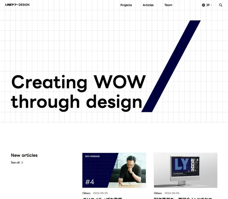
白地の細いグリッド、大きな黒い文字、濃紺の斜線を軸にした企業デザインサイト。余白の大きい制作実績一覧と、モバイルで大胆に組み替わる構成が特徴。
オリジナルサイトを見るLY Corporation DESIGN — Style Reference
An open design portfolio drawn on a fine architectural grid, punctuated by oversized words and diagonal strokes.
Original URL: design.lycorp.co.jp
Final URL: design.lycorp.co.jp/en
Theme: light canvas with a deep-navy social section.
Inspected: September 17, 2026, at 05:24 JST; supplied retrieval timestamp: 2026-09-16T20:24:06.776Z.
Viewports: desktop 1440 × 1000; mobile 390 × 844, in CSS pixels.
Scope: the current English-localized homepage: closed navigation, introductory hero, project overview, team invitation, social links, and footer. This reference uses the supplied original-page screenshots and rendered DOM/computed-style evidence. Linked pages and expanded controls were not inspected.
LY Corporation DESIGN presents an enterprise design portfolio with the confidence of a graphic identity system. White space dominates. Black typography establishes hierarchy, while navy diagonal strokes supply recognition without requiring a photograph in the hero. Fine rectangular grid lines connect the introduction to the team section. Between them, project photography and design mockups introduce color inside an otherwise restrained shell.
The page is a portfolio and organizational publishing surface. Its main actions are browsing projects, meeting the team, searching, and following external channels. Preserve that browsing hierarchy: the large opening statement is followed by real work, not a stack of promotional feature panels.
The root URL resolved to /en with HTTP 200. The retained identity and homepage content support treating this as the same website in an English locale.
How to Read This Reference
- Measured means a value explicitly supplied in the rendered DOM or computed styles. Fractional dimensions are rounded for readability.
- Declared means an exact source custom-property value. A declaration alone does not prove which visible element uses it.
- Estimated means inferred from the supplied screenshots. Hero lettering, decorative paths, and background-grid geometry were not individually included in the element measurements.
- Derived means calculated from measured positions or dimensions, with the calculation explained where relevant.
- Recommended means an implementation choice for a new build. The CSS, responsive breakpoint, accessibility additions, and reconstructed SVG below are adaptations, not recovered source code.
- Desktop screenshots cover the opening, a middle project region, and the closing sections. Mobile screenshots cover the opening and closing sections; mobile project details are additionally supported by DOM measurements.
- DOM extraction includes some offscreen menu and disclosure content. Its presence is not evidence that those controls were open or visible.
Tokens — Colors
Default Palette
| Name | Value | Implementation alias / source token | Role and evidence |
|---|---|---|---|
| White | #ffffff |
--color-paper / --vt-c-white |
Measured body and footer background; main project canvas |
| Black | #000000 |
--color-ink / --vt-c-black |
Measured primary text; visible wordmark and utility icons |
| Deep Navy | #00003e |
--color-navy / --vt-c-navy |
Exact declared token, visually corresponding to the hero slash, team strokes, and social field |
| Muted Navy | #4f4f68 |
--color-navy-muted / --vt-c-navy-700 |
Exact declared token, visually corresponding to alternate team strokes |
| Team Gray | #efefef |
--color-panel / --vt-c-gray-200 |
Measured background of the team section |
| Secondary Gray | #949494 |
--color-secondary / --vt-c-gray-500 |
Declared token matching the gray design-discipline suffixes in project titles; those spans were not separately sampled |
| Utility Gray | #777777 |
--color-utility / --vt-c-gray-600 |
Measured text color of inactive desktop language entries in the extracted menu structure |
| Light Gray | #dfdfdf |
source --vt-c-gray-300 |
Declared neutral; its assignment to the visible grid was not captured |
| Signal Red | #ff3140 |
--color-accent / --vt-c-red |
Declared token matching the large red diagonal accents within the project area |
| Grid Approximation | approximately #d9d9d9 |
--color-grid |
Screenshot estimate for the fine grid rules; not a measured source assignment |
The strongest color relationship is white, black, and almost-black navy. The navy should remain distinctly blue when it fills a large area, while feeling nearly as authoritative as black in a single stroke. Red is a sparse graphic interruption, not the default link or button color.
Additional Declared Colors
The evidence also contains #37e47c, #51897e, #3838f4, #c8c8c8, and #2a2a2a. Their use in the inspected homepage shell was not established. Bright green and yellow are visibly present inside project imagery, but that does not establish a connection to these UI variables.
A --swiper-theme-color: #007aff declaration is also present. It does not establish that this homepage contains a visible carousel. Do not introduce a slider or blue action system on that basis.
Tokens — Typography
Primary Interface Family
- Measured stack:
"LINE Seed JP", -apple-system, sans-serif. - Measured weights:
400for body and supporting labels;700for navigation and most headings;600for the desktop team heading. - Character: rounded, substantial sans-serif forms with a friendly tone, used within a precise geometric layout.
- Verification limit: the computed family stack is supplied; font-file URLs and individual font-face loading results are not.
Use the declared family when an authorized font resource is available. Keep the fallback stack functional and test line wrapping after the font loads. The source evidence does not support inventing a separate English display family.
Base Size and Tracking
Desktop uses a 16px root and body, 19.2px body line height, and -0.32px tracking. Mobile uses a 14px root and body, 16.8px body line height, and -0.28px tracking. The source --base-px changes from 16 to 14 accordingly.
The sampled headings inherit the same absolute tracking values. Do not apply letter-spacing: -0.02em independently to every heading: at large sizes, that would produce much tighter lettering than the recorded -0.32px.
Type Scale
| Role | Desktop | Mobile | Evidence |
|---|---|---|---|
| Body | 16px / 19.2px, 400 |
14px / 16.8px, 400 |
Measured |
| Desktop primary navigation | 16px / 19.2px, 700 |
Not visible in the closed mobile header | Measured |
| Mobile offscreen menu links | — | 36px / 43.2px, 700 |
Measured outside the viewport; not an opened-menu observation |
| Hero statement | Approximately 100–108px, heavy |
Approximately 44–48px, heavy |
Visual estimate; heading node not separately measured |
| New projects heading | 24px / 28.8px, 700 |
20px / 24px, 700 |
Measured |
| Featured project title | 36px / 43.2px, 700 |
18px / 21.6px, 700 |
Measured |
| Standard project title | 24px / 28.8px, 700 |
18px / 21.6px, 700 |
Measured |
| Project category | 14px / 16.8px, 400 |
10px / 12px, 400 |
Measured |
| Featured project excerpt | 14px / 28px, 400 |
Not visible in the recorded mobile layout | Measured desktop |
| Team heading | 64px / 76.8px, 600 |
24px / 28.8px, 700 |
Measured |
| Social heading | 36px / 43.2px, 700 |
18px / 21.6px, 700 |
Measured |
| Text navigation links | 16px / 19.2px, 400 |
14px / 16.8px, 400 |
Measured |
| Related sites caption | 12px / 14.4px, 400 |
12px / 14.4px, 400 |
Measured |
Logo and Title Treatment
The header wordmark occupies approximately 141px of width at both viewports. Its graphic appearance should be preserved as a brand asset; the sampled H1's ordinary font size does not describe the artwork's lettering.
The hero maintains the explicit two-line statement “Creating WOW / through design.” The large team heading is a second display moment, but project titles remain substantially smaller. Do not flatten these distinct levels into one repeated heading size.
Within project titles, the project name is black and the discipline follows in gray: for example, “Tech Week 2024” followed by “Event Design.” These parts read as a continuous title, not as a title plus a pill badge.
Tokens — Spacing & Shapes
Spacing Scale
| Use | Desktop | Mobile | Status |
|---|---|---|---|
| Main content inset | 64px |
16px |
Measured |
| Header left inset | 32px |
16px |
Measured |
| Hero height, including the header area | 720px |
720px |
Measured at these viewports |
| Hero-to-project-section gap | 180px |
64px |
Derived from section bounds |
| Project column gap | 48px |
Single column | Derived from repeated card positions |
| Featured row to regular project grid | 150px |
64px |
Derived from link bounds |
| Regular project row gap | 150px |
64px |
Derived from link bounds |
| Standard image-to-category gap | Approximately 24px |
Approximately 12px |
Inferred using image proportions and text positions |
| Standard category-to-title gap | 16px |
10px |
Derived from paragraph bounds |
| Featured category-to-title gap | 24px |
10px |
Derived |
| Featured title-to-excerpt gap | 48px |
Excerpt not visible | Derived |
| Project section end to team section | 360px |
128px |
Derived from section bounds |
| Team vertical padding | 60px top and bottom |
48px top, 60px bottom |
Measured |
| Social heading top inset | 32px |
16px |
Derived |
| Social icon horizontal gap | 24px between 48px slots |
24px between 24px slots |
Derived |
Large blank intervals are part of the composition. In particular, the desktop project grid is not a tightly packed gallery. Its second row leaves a broad region for red diagonal artwork while the last project occupies the right column.
Background Grid
The screenshots show approximately 32px horizontal spacing between vertical rules and 60px vertical spacing between horizontal rules. These are rectangular cells, not square graph-paper cells. The grid remains similarly sized on mobile instead of scaling down with the viewport.
The rule weight appears to be approximately 1px. Grid positioning is centered horizontally in the supplied compositions; exact source background construction and phase were not supplied. The CSS Quick Start provides a repeating-gradient approximation.
Border Radius and Elevation
| Element | Treatment |
|---|---|
| Project images and links | Square corners; no visible enclosing card panel |
| Hero and team artwork | Hard-edged polygons and bars |
| Navigation and text links | Unboxed |
| Social section | Full-width rectangular color field |
| Main content surfaces | Flat; no general shadow system |
The sampled link and section radii are 0px. One unidentified offscreen button has a box-shadow transition declaration, but it is not evidence of a general elevated-card design.
Layout Measurements
| Element | Desktop, 1440px wide | Mobile, 390px wide |
|---|---|---|
| Document height | 3828.86px |
2897.20px |
| Content width | 1312px |
358px |
| Project section start | y = 900px |
y = 784px |
| First project start | y = 1070.80px |
y = 832px |
| Standard project width | 405.33px |
358px |
| Featured text column | 405.34px |
Full content width below image |
| Featured image width | Approximately 858.66px, derived |
358px |
| Team section start | y = 2880px |
y = 2168.94px |
| Team section height | 498.45px |
478.28px |
| Social section height | Approximately 370.41px, derived |
Approximately 183.98px, derived |
| Footer height | 80px |
66px |
These are observations of the supplied content state, not instructions to fix the entire document to a particular height.
Components
Site Header
Role: identity and access to project browsing, the team, language selection, and search.
On desktop, a transparent 60px header sits over the opening grid. The wordmark begins at x = 32px. Navigation is grouped toward the right: Projects, Team, an EN selector with globe and caret, a fine vertical separator, and a search icon. Primary navigation links use 18px 32px padding, creating generous targets without button backgrounds.
The header and main hero both begin at y = 0; the header does not add another 60px above the measured 720px hero. Its sampled transition is transform 0.4s, but sticky positioning and scroll-triggered hiding were not established.
On mobile, the visible top row contains the same compact wordmark at a 16px inset and a small three-line menu button. The button's measured box is 26 × 25px, with 6px padding. The HEADER element itself measures a full viewport height, 844px, because its structure includes navigation outside the visible screen. Do not mistake that wrapper measurement for the height of the visible toolbar.
Mobile Navigation Structure
Role: compact navigation behind the menu control.
The extracted menu links start at x = 406px, beyond the 390px viewport. They contain Projects, Team, and Search at 36px / 43.2px, plus EN, JP, and KR buttons at 16px bold. Social links are also present in that offscreen structure.
This supports an offscreen mobile navigation arrangement. It does not verify the opening direction, backdrop, focus behavior, body-scroll locking, or final expanded appearance. Implement and test those separately.
Hero Statement and Slash
Role: establish the design team's identity before introducing its work.
A full-width white grid fills a measured 720px section on both inspected viewports. There is no hero photograph, paragraph, filled CTA, or rounded panel. The statement occupies the lower left, while a navy slash creates an opposing diagonal mass.
Estimated desktop geometry: the slash extends from approximately x = 928px to 1280px, and y = 120px to 660px. Its bounding box is approximately 352 × 540px, with horizontal end widths near 64px. The headline starts near the 64px content inset and retains a substantial bottom clearance.
Estimated mobile geometry: the slash occupies approximately 234 × 360px, from around x = 132px, y = 60px, to the upper-right area. The two-line statement moves below it, near the bottom of the same 720px field, beginning at the 16px inset.
This is a recomposition: on desktop, words and shape share the lower field; on mobile, the large shape is above the words. Simply shrinking the desktop arrangement would lose the intended hierarchy.
Project Section Heading
Role: introduce the latest work and provide access to the full index.
Desktop places “New projects” above the “See all” text link. The heading is 24px bold; the link uses 16px text and a right chevron inside a measured 56px-high padded area. The first project begins about 86px after that link box ends.
Mobile puts the 20px heading and the 14px “See all” link on one row. The row begins at y = 784px, and the first image begins 24px below its bottom. The change from stacked to inline controls is a useful part of the responsive design.
Featured Project
Role: give one project greater editorial weight.
The desktop feature is one link spanning the full 1312px content width. A wide image occupies approximately 858.66px at left; a 48px gutter separates it from a 405.34px information column.
The information anatomy is:
- A small category label, “Others.”
- A large bold project name, “LY Corporation DESIGN HUB & DEC Goods,” followed by a gray discipline, “Website and Goods Design.”
- A restrained excerpt set at
14px / 28px, visibly truncated after approximately four lines.
The DOM contains the full project description, while the visible desktop excerpt occupies only 112px of height. Preserve that distinction: the homepage is a preview, not the full case study.
On mobile, the image and metadata stack within 358px. Category text drops to 10px; the complete title group uses 18px / 21.6px. The long excerpt is not visible in the supplied mobile layout. The feature becomes comparable in scale to the other mobile projects.
Standard Project Link
Role: make each project immediately recognizable and easy to browse.
Each desktop item is approximately 405.33px wide. Its anatomy is an edge-to-edge landscape image, a category label, and a bold title with the design discipline continuing in gray. There is no card fill, border, separate CTA, or shadow.
The visible row includes:
- Tech Week 2024 — Event Design.
- FOOD STYLE JAPAN 2024 — Space Design.
- LY Corporation Welcoming Ceremony 2024 — Event Design.
A fourth standard project, Hello Friends! W!th LY Corporation — Event Design, sits in the next row's right column. Large red slashes occupy the open region to its left.
Image proportions appear close to 1.81:1, derived from the layout and visible crops. Image-element bounds and native asset sizes were not supplied, so this is an approximation rather than a confirmed aspect-ratio declaration.
On mobile, the recorded initial state contains the featured project and two standard projects, followed by a centered “See more” button. That button's behavior was not exercised; do not claim whether it loads, reveals, or navigates to more work.
Project-Area Diagonal Accents
Role: carry the identity between content groups without introducing another information panel.
The middle desktop capture shows several thin red diagonal strokes rising through a large white region below the first regular project row. They are much narrower than the hero slash and contrast with the rectangular image grid.
Their exact DOM geometry, animation, and mobile treatment were not captured. Treat their position as screenshot evidence, not as proof of a repeating background or a continuously animated system. In a new implementation, keep these shapes decorative and prevent them from covering text or interactive targets.
Team Invitation
Role: connect the work to the people behind it.
A full-width #efefef section brings back the fine grid. Desktop uses a left text region and a right geometric composition. The heading is 64px / 76.8px, weight 600; a simple Team link sits beneath it. The sampled text region is 608px wide.
The right composition contains six separate bars: forward slashes, backward slashes, one horizontal stroke, and one shallow diagonal. Navy and muted navy alternate. Their arrangement feels modular rather than illustrative. The visible desktop artwork spans approximately 656 × 378px.
Mobile puts the 24px heading and Team link above the artwork. The composition remains broader than the phone and is visibly cropped at both sides. Its visible geometry suggests a centered artwork width around 460px, rather than fitting every bar inside the 358px text container. This width is an estimate; the clipping itself is directly visible.
Social Follow Band
Role: end the main content with a strong invitation to continue following the team's work.
The section is a solid deep-navy field. White text reads “Follow us for more / creative stories.” Desktop places the 36px heading at the upper left and three social marks at the upper right, leaving a large empty area below. Its derived height is about 370px.
The three visible marks link to https://lydesign.jp/, https://twitter.com/lydesign_jp, and https://www.instagram.com/lydesign_jp/. The first appears as an n-shaped mark, followed by X and Instagram. Preserve accurate assets rather than approximating these identities with arbitrary letters.
Desktop anchor slots are 48px wide, separated by 24px. Mobile stacks the 18px heading above a left-aligned icon row; icon slots are 24px wide with 24px gaps. The mobile field is approximately 184px tall. It is a compact stacked composition, not merely a compressed desktop row.
Legal Footer and Related Sites
Role: provide corporate identity and related destinations without competing with the portfolio.
A white footer follows the navy band. It is 80px high on desktop and 66px on mobile. A small red iF DESIGN AWARD 2025 mark and “© LY Corporation” sit at the left; “Related sites” and a chevron sit at the right.
The extracted related links are LY Corporation, LY Corporation Recruitment, and LY Corporation DESIGN HUB. Their presence establishes destinations, but the open disclosure state and click behavior were not captured. The visible award mark is part of the footer artwork; it does not identify a website production company.
Tokens — Motion & Interaction
The supplied evidence establishes several transition declarations, but no control was shown before and after activation. Recorded durations must be distinguished from verified interaction behavior.
| Element | Recorded transition | What is established / unknown |
|---|---|---|
| Header | transform 0.4s |
Transform transition exists; scroll trigger and movement distance unknown |
| Primary navigation links | opacity 0.3s, color 0.3s |
Properties and durations known; hover endpoints not supplied |
| Desktop language trigger | color 0.3s |
Color transition known; expanded menu interaction untested |
| Mobile menu button | 0.5s ease-in-out |
Timing declaration known; animated properties and full menu choreography unverified |
| Social links | transform 0.2s |
Short transform transition known; scale/translation target unknown |
| Related destination links | transform 0.2s |
Transition declaration only |
| Related sites caption | transform 0.4s |
Transition declaration only |
| Unidentified offscreen button | transform 0.6s, box-shadow 0.2s, opacity 0.4s |
Role and visible states not established |
Many sampled nodes report animation: none. That does not prove the entire site is static: child SVG, canvas, script-driven animation, or unsampled elements can behave differently. The DOM text includes a Lottie-related style marker, but no animation data or frame sequence was supplied, so the hero and team motion cannot be reconstructed from it.
The capture process waited for finite motion, layout stability, and image decoding, with bounded timeouts. Perpetual animations were paused during readiness checks and resumed afterward. These are settled visual references, not recordings of entrance or looping behavior.
Recommended implementation: start with static, correctly composed geometry. Use the evidenced 200–500ms range for modest control feedback where useful, and label chosen endpoints as new design decisions. Do not invent cursor-following slashes, parallax, a carousel, or perpetual rotation as observed features.
Surfaces
| Surface | Appearance | Function |
|---|---|---|
| Introductory canvas | White with fine gray rectangular grid | Establishes the design-system motif |
| Project canvas | Plain white | Lets photographs, mockups, and typography carry the content |
| Project item | Unboxed image plus text | Direct browsing without card chrome |
| Team field | Light gray with the same fine grid | Separates the team invitation while retaining continuity |
| Social field | Solid deep navy with white content | Strong closing contrast |
| Legal strip | White with small black/gray text and red award mark | Quiet corporate utility |
Section boundaries are created by whitespace and large changes in fill. Avoid adding separator cards, gradients, or elevation layers between these fields.
Imagery
The imagery is evidence of design work: event graphics, exhibition installations, merchandise, device mockups, and spatial photography. It is not a repeated collection of generic people-at-work photographs.
The middle desktop capture shows a pixelated cursor illustration on a dark gray Tech Week image, a vivid green exhibition installation, rows of pale hanging branded objects, and a dark auditorium with a bright yellow stage graphic. These images retain their own project palettes. Do not recolor them all navy or apply a uniform duotone filter.
The featured project's image is only partly visible in the supplied middle capture: a wide gray device mockup can be seen. Its complete composition is not available for visual analysis.
Observed Asset References
No image src URLs, font files, or animation asset paths were supplied. The following are confirmed project-link destinations associated with the visible imagery, not downloadable image URLs and not independently inspected detail pages.
| Visual reference | Observed destination | Visible evidence |
|---|---|---|
| DESIGN HUB & DEC Goods | Project 58 | Partial wide gray device mockup; featured text in the DOM |
| Tech Week 2024 | Project 44 | White pixel cursor, small colored cubes, dark background |
| FOOD STYLE JAPAN 2024 | Project 42 | Green exhibition environment with large signage |
| Welcoming Ceremony 2024 | Project 36 | Pale hanging branded objects arranged in rows |
| Hello Friends! | Project 33 | Dark event space and bright yellow stage screen |
Use authorized project assets when reproducing the site. For a new portfolio, choose real work with similarly legible compositions and varied subject matter. Preserve square image corners and consistent landscape proportions. Fine logo and utility artwork should remain crisp, without photographic texture or artificial shadows.
Layout & Responsive Behavior
Desktop Composition
At 1440px, the main content is 1312px wide with 64px side margins. The hero is full bleed. The project section begins 180px after the hero and gives its first item a wide image plus a narrow editorial column.
Regular projects form three columns of approximately 405.33px with 48px gutters. The final card sits in the right column of a second row, leaving a deliberate opening for red diagonal graphics. The team invitation returns to a full-width gridded surface, followed immediately by the social band and legal strip.
Mobile Composition
At 390px, content width is 358px with 16px side margins. The hero remains 720px tall. Its slash is placed above the two-line statement, and its grid retains approximately the same cell dimensions.
The project section starts after 64px, and its heading shares a row with See all. All visible projects use a single column. The featured excerpt is absent from the visible layout, and the initial list stops after three projects with a See more button. There is no evidence of a horizontally scrolling project carousel.
The team section stacks copy over deliberately cropped artwork. The social band also stacks its elements, with icons below the heading. The legal footer retains left/right grouping at the smaller height.
Important Implementation Boundaries
- Only two viewport widths were supplied. The actual breakpoint, tablet behavior, and any maximum desktop content width remain unknown.
- The shared 720px hero height is measured at these two viewports, not proof that the site always uses a fixed pixel height.
- Mobile menu content lies outside the viewport in the recorded closed state. It should not be rendered as permanently visible navigation based on DOM text alone.
- The mobile project section includes additional internal whitespace after See more. Do not interpret its full measured height as the height of the three visible cards alone.
- Preserve normal document flow when adapting the page. Avoid hardcoding the observed document height or compensating for content changes with arbitrary spacer elements.
Do’s and Don’ts
Do
- Build the identity around white space, black text, deep navy, and fine rectangular grid lines.
- Preserve the contrast between the large hero slash and the thinner red project-area strokes.
- Keep the two-line opening statement and recompose the slash above it on narrow screens.
- Use the measured LINE Seed JP stack when available, with clear fallback behavior.
- Keep project images square-cornered and their links visually unboxed.
- Let project names and gray discipline suffixes form one continuous typographic group.
- Give the desktop featured project a materially larger image and title.
- Preserve the three-column desktop rhythm and generous row spacing.
- Crop the team artwork intentionally on mobile while keeping text inside the content inset.
- Keep the social band dark and spacious, with white text and recognizable social marks.
Don’t
- Do not replace the portfolio hierarchy with repeated sales sections and oversized conversion buttons.
- Do not turn the fine rectangular grid into a heavy square checkerboard.
- Do not put rounded containers or shadows around every project.
- Do not use red as the default action color throughout the interface.
- Do not flatten all project imagery into a common color filter.
- Do not give project categories colored badges that compete with the work.
- Do not shrink the entire desktop hero proportionally to fit a phone.
- Do not assume extracted language options or related-site links were visibly expanded.
- Do not infer carousels, sticky behavior, or a specific Lottie timeline from library markers alone.
- Do not treat the measured 10px mobile categories as an accessibility recommendation.
Recommended Implementation Additions
These are recommendations for a new implementation, not verified features of the original page:
- Give the menu, search, language selector, social links, and related-sites control explicit accessible names.
- Use real buttons for disclosures, with
aria-expandedandaria-controls; keep navigation destinations as links. - Make closed mobile navigation inert and unavailable to keyboard focus. Test Escape, focus return, and scroll behavior when opening it.
- Keep decorative slash and grid artwork out of the accessibility tree and set
pointer-events: noneon decorative overlays. - Enlarge small touch targets to approximately 44px while retaining compact visible glyphs.
- Consider increasing 10px mobile category labels to at least 12px. Clearly treat this as an intentional departure from the measured scale.
- Test gray title suffixes against white. The declared
#949494is a visual reference; use a darker accessible variant if the chosen text size and weight require it. - Provide visible keyboard focus without relying on color change alone.
- Implement See more with predictable focus and an announcement of newly revealed content, or provide a clear index link. Do not leave an inert button.
- Reserve image dimensions to prevent layout shifts and provide meaningful project-image alternatives.
- Keep an explicit two-line hero break at the supplied widths, but test narrower phones, translated copy, and browser text zoom.
- Offer reduced-motion behavior for any implemented graphic animation. Essential content should remain present when animation is disabled.
Agent Prompt Guide
Quick Color Reference
- Main canvas:
#ffffff. - Primary text and utility marks:
#000000. - Hero slash and closing social field:
#00003e. - Alternate team strokes:
#4f4f68. - Team background:
#efefef. - Secondary project-title text: visually associated with
#949494. - Sparse project-area accent:
#ff3140. - Fine grid: approximate
#d9d9d9, around 1px thick.
Overall Prompt
“Create a corporate design portfolio inspired by LY Corporation DESIGN. Use a white canvas, black LINE Seed JP typography when available, almost-black navy #00003e, and a fine rectangular grid approximately 32px wide by 60px tall. Build a 720px opening composition with a very large two-line statement at the lower left and one thick navy slash on the right. Follow it with an unboxed project overview: one wide featured image with editorial text, then a spacious three-column image grid with gray discipline suffixes inside bold titles. Add sparse red diagonal accents in the open project area. Finish with a light-gray gridded team invitation, six modular navy and muted-navy bars, a deep-navy social band, and a quiet white legal footer. On mobile, move the hero slash above the headline, use 16px content insets, stack projects, and crop the team artwork beyond the viewport edges. Keep unverified animation static unless new behavior is explicitly designed.”
Example Component Prompts
- Hero: “A white full-width field with a very fine 32-by-60px gray grid, a heavy black two-line statement near the lower-left corner, and a tall navy parallelogram rising toward the upper right. No photograph, paragraph, filled button, radius, or shadow. Recompose into shape above text on a 390px phone.”
- Project item: “A square-cornered landscape project image above a small plain category label and a bold title. Continue the design discipline in gray on the same typographic line. Use generous whitespace, with no card background or separate CTA.”
- Featured project: “An editorial project link with an approximately 859px-wide image, a 48px gutter, and a 405px-wide text column at a 1440px viewport. Category first, 36px bold title second, then a short 14px/28px excerpt. Stack the image over an 18px title on mobile.”
- Team invitation: “A pale-gray gridded section with a large black team heading and a plain chevron link on the left. On the right, arrange six hard-edged bars in dark navy and muted navy. At phone width, place the copy above an oversized centered composition that clips at both edges.”
- Social band: “A solid almost-black navy rectangle with a two-line white heading and three white social marks. Align copy left and marks right on desktop; stack marks beneath the copy on mobile. Keep the field flat and leave deliberate empty space.”
Quick Start
CSS Custom Properties
This is a reusable approximation of the inspected shell. Exact measured typography and palette values are retained where available. The grid, hero display size, image ratio, slash paths, and 900px breakpoint are implementation estimates or recommendations. Classes describe a new implementation, not original selectors.
The CSS does not implement menu state, language routing, related-sites disclosure, See more, or Lottie animation. Supply real controls and application logic for those behaviors. Use authorized logo, font, social, and project assets rather than fabricated asset URLs.
:root {
  /* Exact declared colors, except the estimated grid rule. */
  --color-paper: #ffffff;
  --color-ink: #000000;
  --color-navy: #00003e;
  --color-navy-muted: #4f4f68;
  --color-panel: #efefef;
  --color-secondary: #949494;
  --color-utility: #777777;
  --color-accent: #ff3140;
  --color-grid: #d9d9d9;

  --font-ui: 'LINE Seed JP', -apple-system, sans-serif;
  --text-body: 16px;
  --tracking-ui: -0.32px;
  --text-section: 24px;
  --text-project: 24px;
  --text-featured: 36px;
  --text-category: 14px;
  --text-team: 64px;
  --text-social: 36px;
  --weight-team: 600;

  --page-inset: 64px;
  --header-inset: 32px;
  --header-height: 60px;
  --hero-height: 720px;
  --column-gap: 48px;
  --project-row-gap: 150px;
  --grid-x: 32px;
  --grid-y: 60px;
  --project-ratio: 1.8136;

  --motion-link: 300ms;
  --motion-social: 200ms;
  --motion-header: 400ms;
}

* { box-sizing: border-box; }

body {
  margin: 0;
  color: var(--color-ink);
  background: var(--color-paper);
  font-family: var(--font-ui);
  font-size: var(--text-body);
  line-height: 1.2;
  letter-spacing: var(--tracking-ui);
}

button, input { font: inherit; }
a { color: inherit; }
img { display: block; max-width: 100%; }

.design-page {
  position: relative;
  overflow-x: clip;
}

.content-width {
  width: calc(100% - 2 * var(--page-inset));
  margin-inline: auto;
}

/* Estimated grid construction; rectangular cells are intentional. */
.grid-surface {
  background-image:
    linear-gradient(to right,
      transparent calc(100% - 1px), var(--color-grid) 0),
    linear-gradient(to bottom,
      transparent calc(100% - 1px), var(--color-grid) 0);
  background-size: var(--grid-x) var(--grid-y);
  background-position: center top;
}

.site-header {
  position: absolute;
  z-index: 10;
  inset: 0 0 auto;
  height: var(--header-height);
  display: flex;
  align-items: center;
  justify-content: space-between;
  padding-inline: var(--header-inset);
  transition: transform var(--motion-header);
}

.brand-asset { width: 141px; height: auto; }
.desktop-nav { display: flex; align-items: center; }
.menu-toggle { display: none; }

.nav-link {
  padding: 18px 32px;
  font-weight: 700;
  text-decoration: none;
  transition: opacity var(--motion-link), color var(--motion-link);
}

.hero {
  position: relative;
  height: var(--hero-height);
  overflow: hidden;
  background-color: var(--color-paper);
}

/* Recommended starting size: the hero font was not DOM-measured. */
.hero-title {
  position: absolute;
  z-index: 1;
  left: var(--page-inset);
  bottom: 64px;
  margin: 0;
  max-width: calc(100% - 2 * var(--page-inset));
  font-size: clamp(64px, 7.222vw, 104px);
  font-weight: 700;
  line-height: 1.1;
}

.hero-title span { display: block; }

/* Screenshot-derived silhouette, not a recovered source path. */
.hero-slash {
  position: absolute;
  top: 120px;
  right: 11.111%;
  width: 352px;
  height: 540px;
  background: var(--color-navy);
  clip-path: polygon(81.8% 0, 100% 0, 18.2% 100%, 0 100%);
  pointer-events: none;
}

.projects {
  margin-top: 180px;
  margin-bottom: 360px;
}

.projects-heading h2 {
  margin: 0;
  font-size: var(--text-section);
  line-height: 1.2;
  font-weight: 700;
}

.text-link {
  display: inline-flex;
  align-items: center;
  gap: 12px;
  min-height: 56px;
  padding: 16px 16px 16px 0;
  text-decoration: none;
}

.text-link::after {
  content: '';
  width: 7px;
  height: 7px;
  border-top: 1px solid currentColor;
  border-right: 1px solid currentColor;
  transform: rotate(45deg);
}

.featured-project {
  display: grid;
  grid-template-columns: minmax(0, 2.118fr) minmax(0, 1fr);
  gap: var(--column-gap);
  align-items: start;
  margin-top: 86px;
  color: inherit;
  text-decoration: none;
}

.project-image {
  width: 100%;
  aspect-ratio: var(--project-ratio);
  object-fit: cover;
  border-radius: 0;
}

.project-category {
  margin: 24px 0 0;
  font-size: var(--text-category);
  line-height: 1.2;
  font-weight: 400;
}

.project-title {
  margin: 16px 0 0;
  font-size: var(--text-project);
  line-height: 1.2;
  font-weight: 700;
}

.project-discipline { color: var(--color-secondary); }
.featured-project .project-category { margin-top: 0; }

.featured-project .project-title {
  margin-top: 24px;
  font-size: var(--text-featured);
}

/* Recommended implementation of the observed four-line preview. */
.project-excerpt {
  display: -webkit-box;
  -webkit-box-orient: vertical;
  -webkit-line-clamp: 4;
  overflow: hidden;
  margin: 48px 0 0;
  font-size: 14px;
  line-height: 28px;
  font-weight: 400;
}

.project-grid {
  position: relative;
  display: grid;
  grid-template-columns: repeat(3, minmax(0, 1fr));
  gap: var(--project-row-gap) var(--column-gap);
  margin-top: 150px;
}

.project-card {
  min-width: 0;
  color: inherit;
  text-decoration: none;
}

.project-card--last { grid-column: 3; }
.project-card[hidden] { display: none; }

/* Optional artwork slot beside the last desktop project. */
.project-decoration {
  grid-column: 1 / 3;
  grid-row: 2;
  align-self: stretch;
  color: var(--color-accent);
  pointer-events: none;
}

.see-more {
  display: flex;
  align-items: center;
  margin: 64px auto 0;
  padding: 0;
  min-height: 24px;
  border: 0;
  background: transparent;
  color: inherit;
  cursor: pointer;
}

.team-section {
  overflow: hidden;
  padding-block: 60px;
  background-color: var(--color-panel);
}

.team-inner {
  display: grid;
  grid-template-columns: repeat(2, minmax(0, 1fr));
  align-items: start;
}

.team-title {
  margin: 0;
  font-size: var(--text-team);
  font-weight: var(--weight-team);
  line-height: 1.2;
}

.team-copy .text-link { margin-top: 44px; }
.team-art { display: block; width: 100%; height: auto; }
.team-art .navy { fill: var(--color-navy); }
.team-art .muted { fill: var(--color-navy-muted); }

.social-band {
  min-height: 370px;
  padding: 32px var(--page-inset);
  display: flex;
  align-items: flex-start;
  justify-content: space-between;
  gap: 32px;
  color: var(--color-paper);
  background: var(--color-navy);
}

.social-heading {
  margin: 0;
  font-size: var(--text-social);
  line-height: 1.2;
  font-weight: 700;
}

.social-links { display: flex; gap: 24px; }

.social-link {
  display: grid;
  place-items: center;
  width: 48px;
  min-height: 48px;
  color: inherit;
  transition: transform var(--motion-social);
}

.social-link svg { width: 100%; height: auto; }

.site-footer {
  min-height: 80px;
  padding: 0 12px 0 32px;
  display: flex;
  align-items: center;
  justify-content: space-between;
  gap: 16px;
  background: var(--color-paper);
}

.footer-identity { display: flex; align-items: center; gap: 18px; }
.related-trigger { font-size: 12px; line-height: 1.2; }

/* Recommended accessibility addition. */
.design-page :focus-visible {
  outline: 2px solid currentColor;
  outline-offset: 5px;
}

/* Chosen breakpoint; the original breakpoint is unknown. */
@media (max-width: 900px) {
  :root {
    --text-body: 14px;
    --tracking-ui: -0.28px;
    --text-section: 20px;
    --text-project: 18px;
    --text-featured: 18px;
    --text-category: 10px;
    --text-team: 24px;
    --text-social: 18px;
    --weight-team: 700;
    --page-inset: 16px;
    --header-inset: 16px;
    --project-row-gap: 64px;
  }

  .desktop-nav { display: none; }

  /* Enlarged target is recommended, not the measured 26-by-25px box. */
  .menu-toggle {
    display: grid;
    place-items: center;
    min-width: 44px;
    min-height: 44px;
    border: 0;
    background: transparent;
    color: inherit;
  }

  .hero-title {
    bottom: 32px;
    font-size: clamp(32px, 11.795vw, 46px);
    line-height: 1.12;
  }

  .hero-slash {
    top: 60px;
    right: 24px;
    width: 234px;
    height: 360px;
  }

  .projects { margin-top: 64px; margin-bottom: 128px; }

  .projects-heading {
    display: flex;
    align-items: center;
    justify-content: space-between;
    gap: 16px;
  }

  .text-link { min-height: 24px; padding: 0; }

  .featured-project {
    grid-template-columns: minmax(0, 1fr);
    gap: 0;
    margin-top: 24px;
  }

  .project-category,
  .featured-project .project-category { margin-top: 12px; }

  .project-title,
  .featured-project .project-title { margin-top: 10px; }

  .project-excerpt { display: none; }

  .project-grid {
    grid-template-columns: minmax(0, 1fr);
    margin-top: 64px;
  }

  .project-card--last { grid-column: auto; }

  /* Mobile treatment of the original red artwork was not verified. */
  .project-decoration { display: none; }

  .team-section { min-height: 478px; padding-block: 48px 60px; }
  .team-inner { grid-template-columns: minmax(0, 1fr); gap: 24px; }
  .team-copy .text-link { margin-top: 24px; }

  .team-art {
    width: 460px;
    max-width: none;
    justify-self: center;
  }

  .social-band {
    min-height: 184px;
    padding: 16px var(--page-inset);
    flex-direction: column;
    justify-content: flex-start;
    gap: 24px;
  }

  .social-link { width: 24px; min-height: 28px; }
  .site-footer { min-height: 66px; padding: 0 0 0 16px; }
  .footer-identity { gap: 12px; }
}

@media (prefers-reduced-motion: reduce) {
  .design-page *,
  .design-page *::before,
  .design-page *::after {
    animation: none !important;
    transition: none !important;
    scroll-behavior: auto !important;
  }
}
The default mobile category and social-link dimensions above retain the measured visual scale. Apply the accessibility recommendations when building production controls, using larger hit areas without enlarging every visible icon.
Component Markup and Geometric Artwork
Use two explicit spans for the hero statement. The following SVG is a screenshot-derived reconstruction of the team bars, not an original downloaded asset. It provides a practical starting point for the observed proportions without inventing animation.
<section class='hero grid-surface' aria-labelledby='hero-title'>
  <h2 class='hero-title' id='hero-title'>
    <span>Creating WOW</span>
    <span>through design</span>
  </h2>
  <div class='hero-slash' aria-hidden='true'></div>
</section>

<section class='team-section grid-surface' aria-labelledby='team-title'>
  <div class='team-inner content-width'>
    <div class='team-copy'>
      <h2 class='team-title' id='team-title'>Meet our team</h2>
      <a class='text-link' href='/en/team'>Team</a>
    </div>
    <svg class='team-art' viewBox='0 0 656 378'
         aria-hidden='true' focusable='false'>
      <path class='muted' d='M126 0H176L75 189H25Z'/>
      <path class='navy' d='M252 0H302L404 189H354Z'/>
      <path class='muted' d='M454 94L656 0V47L454 142Z'/>
      <path class='navy' d='M0 283H202V330H0Z'/>
      <path class='muted' d='M252 189H302L404 378H354Z'/>
      <path class='navy' d='M581 189H631L530 378H480Z'/>
    </svg>
  </div>
</section>
For project markup, put the image and information inside one destination link. Use separate spans for the project name and gray discipline, retaining a real space between them. On mobile, control the initial three-project state in application logic and ensure See more actually exposes additional content. The quick-start CSS deliberately does not implement a fake loading interaction or fix the page to the captured document height.
Tailwind v4 Token Mapping
Optional aliases for an implementation already using Tailwind v4. This is not evidence that the original site uses Tailwind. Define the custom properties above first.
@theme inline {
  --color-paper: #ffffff;
  --color-ink: #000000;
  --color-navy: #00003e;
  --color-navy-muted: #4f4f68;
  --color-panel: #efefef;
  --color-secondary: #949494;
  --color-accent: #ff3140;
  --color-grid: #d9d9d9;

  --font-interface: 'LINE Seed JP', -apple-system, sans-serif;
  --text-section-heading: var(--text-section);
  --text-project-heading: var(--text-project);
  --text-feature-heading: var(--text-featured);
  --text-project-category: var(--text-category);
  --text-team-heading: var(--text-team);
  --text-social-heading: var(--text-social);

  --spacing-page: var(--page-inset);
  --spacing-column: var(--column-gap);
  --spacing-project-row: var(--project-row-gap);
}
Sources & Evidence
- Original entry: https://design.lycorp.co.jp/. The supplied browser evidence records a final URL of
/enand HTTP 200. - Inspected page: https://design.lycorp.co.jp/en, titled “LY Corporation DESIGN.” The homepage supplies the visible brand, project destinations, team link, social links, corporate footer, and related-site destinations.
- Capture time:
2026-09-16T20:24:06.776Z, equivalent to September 17, 2026, 05:24 JST. - Desktop evidence: three supplied screenshots at
1440 × 1000, plus rendered text, link targets, source custom properties, and sampled element bounds/computed styles. Document height: approximately3828.86px. - Mobile evidence: two supplied screenshots at
390 × 844, plus the corresponding rendered text, link targets, source custom properties, and sampled element bounds/computed styles. Document height: approximately2897.20px. - Observation protocol: the supplied browser inspection included an initial observation of at least five seconds, bounded waits for finite motion and image decoding, layout/text stability checks, and traversal through intermediate scroll positions. SharedWorkers and service workers were disabled.
- Interaction limits: menu opening, language selection, search, project navigation, See more, related-sites expansion, keyboard behavior, hover endpoints, and reduced-motion behavior were not independently exercised in the supplied evidence.
- Asset and motion limits: no original image URLs, font files, animation JSON, complete stylesheet, or temporal frame sequence was provided. Exact breakpoints and intermediate viewport behavior remain unknown.
This document describes the current rendered homepage in the supplied evidence. Measured values, screenshot estimates, calculated dimensions, and recommended implementation choices are identified separately throughout.
# LY Corporation DESIGN — Style Reference

> An open design portfolio drawn on a fine architectural grid, punctuated by oversized words and diagonal strokes.

**Original URL:** [design.lycorp.co.jp](https://design.lycorp.co.jp/)
**Final URL:** [design.lycorp.co.jp/en](https://design.lycorp.co.jp/en)
**Theme:** light canvas with a deep-navy social section.
**Inspected:** September 17, 2026, at 05:24 JST; supplied retrieval timestamp: `2026-09-16T20:24:06.776Z`.
**Viewports:** desktop `1440 × 1000`; mobile `390 × 844`, in CSS pixels.
**Scope:** the current English-localized homepage: closed navigation, introductory hero, project overview, team invitation, social links, and footer. This reference uses the supplied original-page screenshots and rendered DOM/computed-style evidence. Linked pages and expanded controls were not inspected.

LY Corporation DESIGN presents an enterprise design portfolio with the confidence of a graphic identity system. White space dominates. Black typography establishes hierarchy, while navy diagonal strokes supply recognition without requiring a photograph in the hero. Fine rectangular grid lines connect the introduction to the team section. Between them, project photography and design mockups introduce color inside an otherwise restrained shell.

The page is a portfolio and organizational publishing surface. Its main actions are browsing projects, meeting the team, searching, and following external channels. Preserve that browsing hierarchy: the large opening statement is followed by real work, not a stack of promotional feature panels.

The root URL resolved to `/en` with HTTP 200. The retained identity and homepage content support treating this as the same website in an English locale.

## How to Read This Reference

- **Measured** means a value explicitly supplied in the rendered DOM or computed styles. Fractional dimensions are rounded for readability.
- **Declared** means an exact source custom-property value. A declaration alone does not prove which visible element uses it.
- **Estimated** means inferred from the supplied screenshots. Hero lettering, decorative paths, and background-grid geometry were not individually included in the element measurements.
- **Derived** means calculated from measured positions or dimensions, with the calculation explained where relevant.
- **Recommended** means an implementation choice for a new build. The CSS, responsive breakpoint, accessibility additions, and reconstructed SVG below are adaptations, not recovered source code.
- Desktop screenshots cover the opening, a middle project region, and the closing sections. Mobile screenshots cover the opening and closing sections; mobile project details are additionally supported by DOM measurements.
- DOM extraction includes some offscreen menu and disclosure content. Its presence is not evidence that those controls were open or visible.

## Tokens — Colors

### Default Palette

| Name | Value | Implementation alias / source token | Role and evidence |
| --- | --- | --- | --- |
| White | `#ffffff` | `--color-paper` / `--vt-c-white` | Measured body and footer background; main project canvas |
| Black | `#000000` | `--color-ink` / `--vt-c-black` | Measured primary text; visible wordmark and utility icons |
| Deep Navy | `#00003e` | `--color-navy` / `--vt-c-navy` | Exact declared token, visually corresponding to the hero slash, team strokes, and social field |
| Muted Navy | `#4f4f68` | `--color-navy-muted` / `--vt-c-navy-700` | Exact declared token, visually corresponding to alternate team strokes |
| Team Gray | `#efefef` | `--color-panel` / `--vt-c-gray-200` | Measured background of the team section |
| Secondary Gray | `#949494` | `--color-secondary` / `--vt-c-gray-500` | Declared token matching the gray design-discipline suffixes in project titles; those spans were not separately sampled |
| Utility Gray | `#777777` | `--color-utility` / `--vt-c-gray-600` | Measured text color of inactive desktop language entries in the extracted menu structure |
| Light Gray | `#dfdfdf` | source `--vt-c-gray-300` | Declared neutral; its assignment to the visible grid was not captured |
| Signal Red | `#ff3140` | `--color-accent` / `--vt-c-red` | Declared token matching the large red diagonal accents within the project area |
| Grid Approximation | approximately `#d9d9d9` | `--color-grid` | Screenshot estimate for the fine grid rules; not a measured source assignment |

The strongest color relationship is white, black, and almost-black navy. The navy should remain distinctly blue when it fills a large area, while feeling nearly as authoritative as black in a single stroke. Red is a sparse graphic interruption, not the default link or button color.

### Additional Declared Colors

The evidence also contains `#37e47c`, `#51897e`, `#3838f4`, `#c8c8c8`, and `#2a2a2a`. Their use in the inspected homepage shell was not established. Bright green and yellow are visibly present inside project imagery, but that does not establish a connection to these UI variables.

A `--swiper-theme-color: #007aff` declaration is also present. It does not establish that this homepage contains a visible carousel. Do not introduce a slider or blue action system on that basis.

## Tokens — Typography

### Primary Interface Family

- **Measured stack:** `"LINE Seed JP", -apple-system, sans-serif`.
- **Measured weights:** `400` for body and supporting labels; `700` for navigation and most headings; `600` for the desktop team heading.
- **Character:** rounded, substantial sans-serif forms with a friendly tone, used within a precise geometric layout.
- **Verification limit:** the computed family stack is supplied; font-file URLs and individual font-face loading results are not.

Use the declared family when an authorized font resource is available. Keep the fallback stack functional and test line wrapping after the font loads. The source evidence does not support inventing a separate English display family.

### Base Size and Tracking

Desktop uses a `16px` root and body, `19.2px` body line height, and `-0.32px` tracking. Mobile uses a `14px` root and body, `16.8px` body line height, and `-0.28px` tracking. The source `--base-px` changes from `16` to `14` accordingly.

The sampled headings inherit the same absolute tracking values. Do not apply `letter-spacing: -0.02em` independently to every heading: at large sizes, that would produce much tighter lettering than the recorded `-0.32px`.

### Type Scale

| Role | Desktop | Mobile | Evidence |
| --- | --- | --- | --- |
| Body | `16px / 19.2px`, 400 | `14px / 16.8px`, 400 | Measured |
| Desktop primary navigation | `16px / 19.2px`, 700 | Not visible in the closed mobile header | Measured |
| Mobile offscreen menu links | — | `36px / 43.2px`, 700 | Measured outside the viewport; not an opened-menu observation |
| Hero statement | Approximately `100–108px`, heavy | Approximately `44–48px`, heavy | Visual estimate; heading node not separately measured |
| New projects heading | `24px / 28.8px`, 700 | `20px / 24px`, 700 | Measured |
| Featured project title | `36px / 43.2px`, 700 | `18px / 21.6px`, 700 | Measured |
| Standard project title | `24px / 28.8px`, 700 | `18px / 21.6px`, 700 | Measured |
| Project category | `14px / 16.8px`, 400 | `10px / 12px`, 400 | Measured |
| Featured project excerpt | `14px / 28px`, 400 | Not visible in the recorded mobile layout | Measured desktop |
| Team heading | `64px / 76.8px`, 600 | `24px / 28.8px`, 700 | Measured |
| Social heading | `36px / 43.2px`, 700 | `18px / 21.6px`, 700 | Measured |
| Text navigation links | `16px / 19.2px`, 400 | `14px / 16.8px`, 400 | Measured |
| Related sites caption | `12px / 14.4px`, 400 | `12px / 14.4px`, 400 | Measured |

### Logo and Title Treatment

The header wordmark occupies approximately `141px` of width at both viewports. Its graphic appearance should be preserved as a brand asset; the sampled H1's ordinary font size does not describe the artwork's lettering.

The hero maintains the explicit two-line statement “Creating WOW / through design.” The large team heading is a second display moment, but project titles remain substantially smaller. Do not flatten these distinct levels into one repeated heading size.

Within project titles, the project name is black and the discipline follows in gray: for example, “Tech Week 2024” followed by “Event Design.” These parts read as a continuous title, not as a title plus a pill badge.

## Tokens — Spacing & Shapes

### Spacing Scale

| Use | Desktop | Mobile | Status |
| --- | --- | --- | --- |
| Main content inset | `64px` | `16px` | Measured |
| Header left inset | `32px` | `16px` | Measured |
| Hero height, including the header area | `720px` | `720px` | Measured at these viewports |
| Hero-to-project-section gap | `180px` | `64px` | Derived from section bounds |
| Project column gap | `48px` | Single column | Derived from repeated card positions |
| Featured row to regular project grid | `150px` | `64px` | Derived from link bounds |
| Regular project row gap | `150px` | `64px` | Derived from link bounds |
| Standard image-to-category gap | Approximately `24px` | Approximately `12px` | Inferred using image proportions and text positions |
| Standard category-to-title gap | `16px` | `10px` | Derived from paragraph bounds |
| Featured category-to-title gap | `24px` | `10px` | Derived |
| Featured title-to-excerpt gap | `48px` | Excerpt not visible | Derived |
| Project section end to team section | `360px` | `128px` | Derived from section bounds |
| Team vertical padding | `60px` top and bottom | `48px` top, `60px` bottom | Measured |
| Social heading top inset | `32px` | `16px` | Derived |
| Social icon horizontal gap | `24px` between 48px slots | `24px` between 24px slots | Derived |

Large blank intervals are part of the composition. In particular, the desktop project grid is not a tightly packed gallery. Its second row leaves a broad region for red diagonal artwork while the last project occupies the right column.

### Background Grid

The screenshots show approximately `32px` horizontal spacing between vertical rules and `60px` vertical spacing between horizontal rules. These are rectangular cells, not square graph-paper cells. The grid remains similarly sized on mobile instead of scaling down with the viewport.

The rule weight appears to be approximately `1px`. Grid positioning is centered horizontally in the supplied compositions; exact source background construction and phase were not supplied. The CSS Quick Start provides a repeating-gradient approximation.

### Border Radius and Elevation

| Element | Treatment |
| --- | --- |
| Project images and links | Square corners; no visible enclosing card panel |
| Hero and team artwork | Hard-edged polygons and bars |
| Navigation and text links | Unboxed |
| Social section | Full-width rectangular color field |
| Main content surfaces | Flat; no general shadow system |

The sampled link and section radii are `0px`. One unidentified offscreen button has a box-shadow transition declaration, but it is not evidence of a general elevated-card design.

### Layout Measurements

| Element | Desktop, 1440px wide | Mobile, 390px wide |
| --- | --- | --- |
| Document height | `3828.86px` | `2897.20px` |
| Content width | `1312px` | `358px` |
| Project section start | `y = 900px` | `y = 784px` |
| First project start | `y = 1070.80px` | `y = 832px` |
| Standard project width | `405.33px` | `358px` |
| Featured text column | `405.34px` | Full content width below image |
| Featured image width | Approximately `858.66px`, derived | `358px` |
| Team section start | `y = 2880px` | `y = 2168.94px` |
| Team section height | `498.45px` | `478.28px` |
| Social section height | Approximately `370.41px`, derived | Approximately `183.98px`, derived |
| Footer height | `80px` | `66px` |

These are observations of the supplied content state, not instructions to fix the entire document to a particular height.

## Components

### Site Header

**Role:** identity and access to project browsing, the team, language selection, and search.

On desktop, a transparent `60px` header sits over the opening grid. The wordmark begins at `x = 32px`. Navigation is grouped toward the right: Projects, Team, an EN selector with globe and caret, a fine vertical separator, and a search icon. Primary navigation links use `18px 32px` padding, creating generous targets without button backgrounds.

The header and main hero both begin at `y = 0`; the header does not add another 60px above the measured 720px hero. Its sampled transition is `transform 0.4s`, but sticky positioning and scroll-triggered hiding were not established.

On mobile, the visible top row contains the same compact wordmark at a 16px inset and a small three-line menu button. The button's measured box is `26 × 25px`, with `6px` padding. The HEADER element itself measures a full viewport height, `844px`, because its structure includes navigation outside the visible screen. Do not mistake that wrapper measurement for the height of the visible toolbar.

### Mobile Navigation Structure

**Role:** compact navigation behind the menu control.

The extracted menu links start at `x = 406px`, beyond the 390px viewport. They contain Projects, Team, and Search at `36px / 43.2px`, plus EN, JP, and KR buttons at `16px` bold. Social links are also present in that offscreen structure.

This supports an offscreen mobile navigation arrangement. It does not verify the opening direction, backdrop, focus behavior, body-scroll locking, or final expanded appearance. Implement and test those separately.

### Hero Statement and Slash

**Role:** establish the design team's identity before introducing its work.

A full-width white grid fills a measured `720px` section on both inspected viewports. There is no hero photograph, paragraph, filled CTA, or rounded panel. The statement occupies the lower left, while a navy slash creates an opposing diagonal mass.

**Estimated desktop geometry:** the slash extends from approximately `x = 928px` to `1280px`, and `y = 120px` to `660px`. Its bounding box is approximately `352 × 540px`, with horizontal end widths near `64px`. The headline starts near the 64px content inset and retains a substantial bottom clearance.

**Estimated mobile geometry:** the slash occupies approximately `234 × 360px`, from around `x = 132px`, `y = 60px`, to the upper-right area. The two-line statement moves below it, near the bottom of the same 720px field, beginning at the 16px inset.

This is a recomposition: on desktop, words and shape share the lower field; on mobile, the large shape is above the words. Simply shrinking the desktop arrangement would lose the intended hierarchy.

### Project Section Heading

**Role:** introduce the latest work and provide access to the full index.

Desktop places “New projects” above the “See all” text link. The heading is `24px` bold; the link uses 16px text and a right chevron inside a measured 56px-high padded area. The first project begins about 86px after that link box ends.

Mobile puts the `20px` heading and the 14px “See all” link on one row. The row begins at `y = 784px`, and the first image begins 24px below its bottom. The change from stacked to inline controls is a useful part of the responsive design.

### Featured Project

**Role:** give one project greater editorial weight.

The desktop feature is one link spanning the full 1312px content width. A wide image occupies approximately 858.66px at left; a 48px gutter separates it from a 405.34px information column.

The information anatomy is:

1. A small category label, “Others.”
2. A large bold project name, “LY Corporation DESIGN HUB & DEC Goods,” followed by a gray discipline, “Website and Goods Design.”
3. A restrained excerpt set at `14px / 28px`, visibly truncated after approximately four lines.

The DOM contains the full project description, while the visible desktop excerpt occupies only 112px of height. Preserve that distinction: the homepage is a preview, not the full case study.

On mobile, the image and metadata stack within 358px. Category text drops to 10px; the complete title group uses `18px / 21.6px`. The long excerpt is not visible in the supplied mobile layout. The feature becomes comparable in scale to the other mobile projects.

### Standard Project Link

**Role:** make each project immediately recognizable and easy to browse.

Each desktop item is approximately 405.33px wide. Its anatomy is an edge-to-edge landscape image, a category label, and a bold title with the design discipline continuing in gray. There is no card fill, border, separate CTA, or shadow.

The visible row includes:

- Tech Week 2024 — Event Design.
- FOOD STYLE JAPAN 2024 — Space Design.
- LY Corporation Welcoming Ceremony 2024 — Event Design.

A fourth standard project, Hello Friends! W!th LY Corporation — Event Design, sits in the next row's right column. Large red slashes occupy the open region to its left.

Image proportions appear close to `1.81:1`, derived from the layout and visible crops. Image-element bounds and native asset sizes were not supplied, so this is an approximation rather than a confirmed aspect-ratio declaration.

On mobile, the recorded initial state contains the featured project and two standard projects, followed by a centered “See more” button. That button's behavior was not exercised; do not claim whether it loads, reveals, or navigates to more work.

### Project-Area Diagonal Accents

**Role:** carry the identity between content groups without introducing another information panel.

The middle desktop capture shows several thin red diagonal strokes rising through a large white region below the first regular project row. They are much narrower than the hero slash and contrast with the rectangular image grid.

Their exact DOM geometry, animation, and mobile treatment were not captured. Treat their position as screenshot evidence, not as proof of a repeating background or a continuously animated system. In a new implementation, keep these shapes decorative and prevent them from covering text or interactive targets.

### Team Invitation

**Role:** connect the work to the people behind it.

A full-width `#efefef` section brings back the fine grid. Desktop uses a left text region and a right geometric composition. The heading is `64px / 76.8px`, weight 600; a simple Team link sits beneath it. The sampled text region is 608px wide.

The right composition contains six separate bars: forward slashes, backward slashes, one horizontal stroke, and one shallow diagonal. Navy and muted navy alternate. Their arrangement feels modular rather than illustrative. The visible desktop artwork spans approximately `656 × 378px`.

Mobile puts the `24px` heading and Team link above the artwork. The composition remains broader than the phone and is visibly cropped at both sides. Its visible geometry suggests a centered artwork width around 460px, rather than fitting every bar inside the 358px text container. This width is an estimate; the clipping itself is directly visible.

### Social Follow Band

**Role:** end the main content with a strong invitation to continue following the team's work.

The section is a solid deep-navy field. White text reads “Follow us for more / creative stories.” Desktop places the `36px` heading at the upper left and three social marks at the upper right, leaving a large empty area below. Its derived height is about 370px.

The three visible marks link to `https://lydesign.jp/`, `https://twitter.com/lydesign_jp`, and `https://www.instagram.com/lydesign_jp/`. The first appears as an n-shaped mark, followed by X and Instagram. Preserve accurate assets rather than approximating these identities with arbitrary letters.

Desktop anchor slots are 48px wide, separated by 24px. Mobile stacks the `18px` heading above a left-aligned icon row; icon slots are 24px wide with 24px gaps. The mobile field is approximately 184px tall. It is a compact stacked composition, not merely a compressed desktop row.

### Legal Footer and Related Sites

**Role:** provide corporate identity and related destinations without competing with the portfolio.

A white footer follows the navy band. It is 80px high on desktop and 66px on mobile. A small red iF DESIGN AWARD 2025 mark and “© LY Corporation” sit at the left; “Related sites” and a chevron sit at the right.

The extracted related links are LY Corporation, LY Corporation Recruitment, and LY Corporation DESIGN HUB. Their presence establishes destinations, but the open disclosure state and click behavior were not captured. The visible award mark is part of the footer artwork; it does not identify a website production company.

## Tokens — Motion & Interaction

The supplied evidence establishes several transition declarations, but no control was shown before and after activation. Recorded durations must be distinguished from verified interaction behavior.

| Element | Recorded transition | What is established / unknown |
| --- | --- | --- |
| Header | `transform 0.4s` | Transform transition exists; scroll trigger and movement distance unknown |
| Primary navigation links | `opacity 0.3s, color 0.3s` | Properties and durations known; hover endpoints not supplied |
| Desktop language trigger | `color 0.3s` | Color transition known; expanded menu interaction untested |
| Mobile menu button | `0.5s ease-in-out` | Timing declaration known; animated properties and full menu choreography unverified |
| Social links | `transform 0.2s` | Short transform transition known; scale/translation target unknown |
| Related destination links | `transform 0.2s` | Transition declaration only |
| Related sites caption | `transform 0.4s` | Transition declaration only |
| Unidentified offscreen button | `transform 0.6s, box-shadow 0.2s, opacity 0.4s` | Role and visible states not established |

Many sampled nodes report `animation: none`. That does not prove the entire site is static: child SVG, canvas, script-driven animation, or unsampled elements can behave differently. The DOM text includes a Lottie-related style marker, but no animation data or frame sequence was supplied, so the hero and team motion cannot be reconstructed from it.

The capture process waited for finite motion, layout stability, and image decoding, with bounded timeouts. Perpetual animations were paused during readiness checks and resumed afterward. These are settled visual references, not recordings of entrance or looping behavior.

**Recommended implementation:** start with static, correctly composed geometry. Use the evidenced 200–500ms range for modest control feedback where useful, and label chosen endpoints as new design decisions. Do not invent cursor-following slashes, parallax, a carousel, or perpetual rotation as observed features.

## Surfaces

| Surface | Appearance | Function |
| --- | --- | --- |
| Introductory canvas | White with fine gray rectangular grid | Establishes the design-system motif |
| Project canvas | Plain white | Lets photographs, mockups, and typography carry the content |
| Project item | Unboxed image plus text | Direct browsing without card chrome |
| Team field | Light gray with the same fine grid | Separates the team invitation while retaining continuity |
| Social field | Solid deep navy with white content | Strong closing contrast |
| Legal strip | White with small black/gray text and red award mark | Quiet corporate utility |

Section boundaries are created by whitespace and large changes in fill. Avoid adding separator cards, gradients, or elevation layers between these fields.

## Imagery

The imagery is evidence of design work: event graphics, exhibition installations, merchandise, device mockups, and spatial photography. It is not a repeated collection of generic people-at-work photographs.

The middle desktop capture shows a pixelated cursor illustration on a dark gray Tech Week image, a vivid green exhibition installation, rows of pale hanging branded objects, and a dark auditorium with a bright yellow stage graphic. These images retain their own project palettes. Do not recolor them all navy or apply a uniform duotone filter.

The featured project's image is only partly visible in the supplied middle capture: a wide gray device mockup can be seen. Its complete composition is not available for visual analysis.

### Observed Asset References

No image `src` URLs, font files, or animation asset paths were supplied. The following are confirmed project-link destinations associated with the visible imagery, not downloadable image URLs and not independently inspected detail pages.

| Visual reference | Observed destination | Visible evidence |
| --- | --- | --- |
| DESIGN HUB & DEC Goods | [Project 58](https://design.lycorp.co.jp/en/projects/58) | Partial wide gray device mockup; featured text in the DOM |
| Tech Week 2024 | [Project 44](https://design.lycorp.co.jp/en/projects/44) | White pixel cursor, small colored cubes, dark background |
| FOOD STYLE JAPAN 2024 | [Project 42](https://design.lycorp.co.jp/en/projects/42) | Green exhibition environment with large signage |
| Welcoming Ceremony 2024 | [Project 36](https://design.lycorp.co.jp/en/projects/36) | Pale hanging branded objects arranged in rows |
| Hello Friends! | [Project 33](https://design.lycorp.co.jp/en/projects/33) | Dark event space and bright yellow stage screen |

Use authorized project assets when reproducing the site. For a new portfolio, choose real work with similarly legible compositions and varied subject matter. Preserve square image corners and consistent landscape proportions. Fine logo and utility artwork should remain crisp, without photographic texture or artificial shadows.

## Layout & Responsive Behavior

### Desktop Composition

At 1440px, the main content is 1312px wide with 64px side margins. The hero is full bleed. The project section begins 180px after the hero and gives its first item a wide image plus a narrow editorial column.

Regular projects form three columns of approximately 405.33px with 48px gutters. The final card sits in the right column of a second row, leaving a deliberate opening for red diagonal graphics. The team invitation returns to a full-width gridded surface, followed immediately by the social band and legal strip.

### Mobile Composition

At 390px, content width is 358px with 16px side margins. The hero remains 720px tall. Its slash is placed above the two-line statement, and its grid retains approximately the same cell dimensions.

The project section starts after 64px, and its heading shares a row with See all. All visible projects use a single column. The featured excerpt is absent from the visible layout, and the initial list stops after three projects with a See more button. There is no evidence of a horizontally scrolling project carousel.

The team section stacks copy over deliberately cropped artwork. The social band also stacks its elements, with icons below the heading. The legal footer retains left/right grouping at the smaller height.

### Important Implementation Boundaries

- Only two viewport widths were supplied. The actual breakpoint, tablet behavior, and any maximum desktop content width remain unknown.
- The shared 720px hero height is measured at these two viewports, not proof that the site always uses a fixed pixel height.
- Mobile menu content lies outside the viewport in the recorded closed state. It should not be rendered as permanently visible navigation based on DOM text alone.
- The mobile project section includes additional internal whitespace after See more. Do not interpret its full measured height as the height of the three visible cards alone.
- Preserve normal document flow when adapting the page. Avoid hardcoding the observed document height or compensating for content changes with arbitrary spacer elements.

## Do’s and Don’ts

### Do

- Build the identity around white space, black text, deep navy, and fine rectangular grid lines.
- Preserve the contrast between the large hero slash and the thinner red project-area strokes.
- Keep the two-line opening statement and recompose the slash above it on narrow screens.
- Use the measured LINE Seed JP stack when available, with clear fallback behavior.
- Keep project images square-cornered and their links visually unboxed.
- Let project names and gray discipline suffixes form one continuous typographic group.
- Give the desktop featured project a materially larger image and title.
- Preserve the three-column desktop rhythm and generous row spacing.
- Crop the team artwork intentionally on mobile while keeping text inside the content inset.
- Keep the social band dark and spacious, with white text and recognizable social marks.

### Don’t

- Do not replace the portfolio hierarchy with repeated sales sections and oversized conversion buttons.
- Do not turn the fine rectangular grid into a heavy square checkerboard.
- Do not put rounded containers or shadows around every project.
- Do not use red as the default action color throughout the interface.
- Do not flatten all project imagery into a common color filter.
- Do not give project categories colored badges that compete with the work.
- Do not shrink the entire desktop hero proportionally to fit a phone.
- Do not assume extracted language options or related-site links were visibly expanded.
- Do not infer carousels, sticky behavior, or a specific Lottie timeline from library markers alone.
- Do not treat the measured 10px mobile categories as an accessibility recommendation.

## Recommended Implementation Additions

These are recommendations for a new implementation, not verified features of the original page:

- Give the menu, search, language selector, social links, and related-sites control explicit accessible names.
- Use real buttons for disclosures, with `aria-expanded` and `aria-controls`; keep navigation destinations as links.
- Make closed mobile navigation inert and unavailable to keyboard focus. Test Escape, focus return, and scroll behavior when opening it.
- Keep decorative slash and grid artwork out of the accessibility tree and set `pointer-events: none` on decorative overlays.
- Enlarge small touch targets to approximately 44px while retaining compact visible glyphs.
- Consider increasing 10px mobile category labels to at least 12px. Clearly treat this as an intentional departure from the measured scale.
- Test gray title suffixes against white. The declared `#949494` is a visual reference; use a darker accessible variant if the chosen text size and weight require it.
- Provide visible keyboard focus without relying on color change alone.
- Implement See more with predictable focus and an announcement of newly revealed content, or provide a clear index link. Do not leave an inert button.
- Reserve image dimensions to prevent layout shifts and provide meaningful project-image alternatives.
- Keep an explicit two-line hero break at the supplied widths, but test narrower phones, translated copy, and browser text zoom.
- Offer reduced-motion behavior for any implemented graphic animation. Essential content should remain present when animation is disabled.

## Agent Prompt Guide

### Quick Color Reference

- Main canvas: `#ffffff`.
- Primary text and utility marks: `#000000`.
- Hero slash and closing social field: `#00003e`.
- Alternate team strokes: `#4f4f68`.
- Team background: `#efefef`.
- Secondary project-title text: visually associated with `#949494`.
- Sparse project-area accent: `#ff3140`.
- Fine grid: approximate `#d9d9d9`, around 1px thick.

### Overall Prompt

“Create a corporate design portfolio inspired by LY Corporation DESIGN. Use a white canvas, black LINE Seed JP typography when available, almost-black navy `#00003e`, and a fine rectangular grid approximately 32px wide by 60px tall. Build a 720px opening composition with a very large two-line statement at the lower left and one thick navy slash on the right. Follow it with an unboxed project overview: one wide featured image with editorial text, then a spacious three-column image grid with gray discipline suffixes inside bold titles. Add sparse red diagonal accents in the open project area. Finish with a light-gray gridded team invitation, six modular navy and muted-navy bars, a deep-navy social band, and a quiet white legal footer. On mobile, move the hero slash above the headline, use 16px content insets, stack projects, and crop the team artwork beyond the viewport edges. Keep unverified animation static unless new behavior is explicitly designed.”

### Example Component Prompts

1. **Hero:** “A white full-width field with a very fine 32-by-60px gray grid, a heavy black two-line statement near the lower-left corner, and a tall navy parallelogram rising toward the upper right. No photograph, paragraph, filled button, radius, or shadow. Recompose into shape above text on a 390px phone.”
2. **Project item:** “A square-cornered landscape project image above a small plain category label and a bold title. Continue the design discipline in gray on the same typographic line. Use generous whitespace, with no card background or separate CTA.”
3. **Featured project:** “An editorial project link with an approximately 859px-wide image, a 48px gutter, and a 405px-wide text column at a 1440px viewport. Category first, 36px bold title second, then a short 14px/28px excerpt. Stack the image over an 18px title on mobile.”
4. **Team invitation:** “A pale-gray gridded section with a large black team heading and a plain chevron link on the left. On the right, arrange six hard-edged bars in dark navy and muted navy. At phone width, place the copy above an oversized centered composition that clips at both edges.”
5. **Social band:** “A solid almost-black navy rectangle with a two-line white heading and three white social marks. Align copy left and marks right on desktop; stack marks beneath the copy on mobile. Keep the field flat and leave deliberate empty space.”

## Quick Start

### CSS Custom Properties

This is a reusable approximation of the inspected shell. Exact measured typography and palette values are retained where available. The grid, hero display size, image ratio, slash paths, and `900px` breakpoint are implementation estimates or recommendations. Classes describe a new implementation, not original selectors.

The CSS does not implement menu state, language routing, related-sites disclosure, See more, or Lottie animation. Supply real controls and application logic for those behaviors. Use authorized logo, font, social, and project assets rather than fabricated asset URLs.

```css
:root {
  /* Exact declared colors, except the estimated grid rule. */
  --color-paper: #ffffff;
  --color-ink: #000000;
  --color-navy: #00003e;
  --color-navy-muted: #4f4f68;
  --color-panel: #efefef;
  --color-secondary: #949494;
  --color-utility: #777777;
  --color-accent: #ff3140;
  --color-grid: #d9d9d9;

  --font-ui: 'LINE Seed JP', -apple-system, sans-serif;
  --text-body: 16px;
  --tracking-ui: -0.32px;
  --text-section: 24px;
  --text-project: 24px;
  --text-featured: 36px;
  --text-category: 14px;
  --text-team: 64px;
  --text-social: 36px;
  --weight-team: 600;

  --page-inset: 64px;
  --header-inset: 32px;
  --header-height: 60px;
  --hero-height: 720px;
  --column-gap: 48px;
  --project-row-gap: 150px;
  --grid-x: 32px;
  --grid-y: 60px;
  --project-ratio: 1.8136;

  --motion-link: 300ms;
  --motion-social: 200ms;
  --motion-header: 400ms;
}

* { box-sizing: border-box; }

body {
  margin: 0;
  color: var(--color-ink);
  background: var(--color-paper);
  font-family: var(--font-ui);
  font-size: var(--text-body);
  line-height: 1.2;
  letter-spacing: var(--tracking-ui);
}

button, input { font: inherit; }
a { color: inherit; }
img { display: block; max-width: 100%; }

.design-page {
  position: relative;
  overflow-x: clip;
}

.content-width {
  width: calc(100% - 2 * var(--page-inset));
  margin-inline: auto;
}

/* Estimated grid construction; rectangular cells are intentional. */
.grid-surface {
  background-image:
    linear-gradient(to right,
      transparent calc(100% - 1px), var(--color-grid) 0),
    linear-gradient(to bottom,
      transparent calc(100% - 1px), var(--color-grid) 0);
  background-size: var(--grid-x) var(--grid-y);
  background-position: center top;
}

.site-header {
  position: absolute;
  z-index: 10;
  inset: 0 0 auto;
  height: var(--header-height);
  display: flex;
  align-items: center;
  justify-content: space-between;
  padding-inline: var(--header-inset);
  transition: transform var(--motion-header);
}

.brand-asset { width: 141px; height: auto; }
.desktop-nav { display: flex; align-items: center; }
.menu-toggle { display: none; }

.nav-link {
  padding: 18px 32px;
  font-weight: 700;
  text-decoration: none;
  transition: opacity var(--motion-link), color var(--motion-link);
}

.hero {
  position: relative;
  height: var(--hero-height);
  overflow: hidden;
  background-color: var(--color-paper);
}

/* Recommended starting size: the hero font was not DOM-measured. */
.hero-title {
  position: absolute;
  z-index: 1;
  left: var(--page-inset);
  bottom: 64px;
  margin: 0;
  max-width: calc(100% - 2 * var(--page-inset));
  font-size: clamp(64px, 7.222vw, 104px);
  font-weight: 700;
  line-height: 1.1;
}

.hero-title span { display: block; }

/* Screenshot-derived silhouette, not a recovered source path. */
.hero-slash {
  position: absolute;
  top: 120px;
  right: 11.111%;
  width: 352px;
  height: 540px;
  background: var(--color-navy);
  clip-path: polygon(81.8% 0, 100% 0, 18.2% 100%, 0 100%);
  pointer-events: none;
}

.projects {
  margin-top: 180px;
  margin-bottom: 360px;
}

.projects-heading h2 {
  margin: 0;
  font-size: var(--text-section);
  line-height: 1.2;
  font-weight: 700;
}

.text-link {
  display: inline-flex;
  align-items: center;
  gap: 12px;
  min-height: 56px;
  padding: 16px 16px 16px 0;
  text-decoration: none;
}

.text-link::after {
  content: '';
  width: 7px;
  height: 7px;
  border-top: 1px solid currentColor;
  border-right: 1px solid currentColor;
  transform: rotate(45deg);
}

.featured-project {
  display: grid;
  grid-template-columns: minmax(0, 2.118fr) minmax(0, 1fr);
  gap: var(--column-gap);
  align-items: start;
  margin-top: 86px;
  color: inherit;
  text-decoration: none;
}

.project-image {
  width: 100%;
  aspect-ratio: var(--project-ratio);
  object-fit: cover;
  border-radius: 0;
}

.project-category {
  margin: 24px 0 0;
  font-size: var(--text-category);
  line-height: 1.2;
  font-weight: 400;
}

.project-title {
  margin: 16px 0 0;
  font-size: var(--text-project);
  line-height: 1.2;
  font-weight: 700;
}

.project-discipline { color: var(--color-secondary); }
.featured-project .project-category { margin-top: 0; }

.featured-project .project-title {
  margin-top: 24px;
  font-size: var(--text-featured);
}

/* Recommended implementation of the observed four-line preview. */
.project-excerpt {
  display: -webkit-box;
  -webkit-box-orient: vertical;
  -webkit-line-clamp: 4;
  overflow: hidden;
  margin: 48px 0 0;
  font-size: 14px;
  line-height: 28px;
  font-weight: 400;
}

.project-grid {
  position: relative;
  display: grid;
  grid-template-columns: repeat(3, minmax(0, 1fr));
  gap: var(--project-row-gap) var(--column-gap);
  margin-top: 150px;
}

.project-card {
  min-width: 0;
  color: inherit;
  text-decoration: none;
}

.project-card--last { grid-column: 3; }
.project-card[hidden] { display: none; }

/* Optional artwork slot beside the last desktop project. */
.project-decoration {
  grid-column: 1 / 3;
  grid-row: 2;
  align-self: stretch;
  color: var(--color-accent);
  pointer-events: none;
}

.see-more {
  display: flex;
  align-items: center;
  margin: 64px auto 0;
  padding: 0;
  min-height: 24px;
  border: 0;
  background: transparent;
  color: inherit;
  cursor: pointer;
}

.team-section {
  overflow: hidden;
  padding-block: 60px;
  background-color: var(--color-panel);
}

.team-inner {
  display: grid;
  grid-template-columns: repeat(2, minmax(0, 1fr));
  align-items: start;
}

.team-title {
  margin: 0;
  font-size: var(--text-team);
  font-weight: var(--weight-team);
  line-height: 1.2;
}

.team-copy .text-link { margin-top: 44px; }
.team-art { display: block; width: 100%; height: auto; }
.team-art .navy { fill: var(--color-navy); }
.team-art .muted { fill: var(--color-navy-muted); }

.social-band {
  min-height: 370px;
  padding: 32px var(--page-inset);
  display: flex;
  align-items: flex-start;
  justify-content: space-between;
  gap: 32px;
  color: var(--color-paper);
  background: var(--color-navy);
}

.social-heading {
  margin: 0;
  font-size: var(--text-social);
  line-height: 1.2;
  font-weight: 700;
}

.social-links { display: flex; gap: 24px; }

.social-link {
  display: grid;
  place-items: center;
  width: 48px;
  min-height: 48px;
  color: inherit;
  transition: transform var(--motion-social);
}

.social-link svg { width: 100%; height: auto; }

.site-footer {
  min-height: 80px;
  padding: 0 12px 0 32px;
  display: flex;
  align-items: center;
  justify-content: space-between;
  gap: 16px;
  background: var(--color-paper);
}

.footer-identity { display: flex; align-items: center; gap: 18px; }
.related-trigger { font-size: 12px; line-height: 1.2; }

/* Recommended accessibility addition. */
.design-page :focus-visible {
  outline: 2px solid currentColor;
  outline-offset: 5px;
}

/* Chosen breakpoint; the original breakpoint is unknown. */
@media (max-width: 900px) {
  :root {
    --text-body: 14px;
    --tracking-ui: -0.28px;
    --text-section: 20px;
    --text-project: 18px;
    --text-featured: 18px;
    --text-category: 10px;
    --text-team: 24px;
    --text-social: 18px;
    --weight-team: 700;
    --page-inset: 16px;
    --header-inset: 16px;
    --project-row-gap: 64px;
  }

  .desktop-nav { display: none; }

  /* Enlarged target is recommended, not the measured 26-by-25px box. */
  .menu-toggle {
    display: grid;
    place-items: center;
    min-width: 44px;
    min-height: 44px;
    border: 0;
    background: transparent;
    color: inherit;
  }

  .hero-title {
    bottom: 32px;
    font-size: clamp(32px, 11.795vw, 46px);
    line-height: 1.12;
  }

  .hero-slash {
    top: 60px;
    right: 24px;
    width: 234px;
    height: 360px;
  }

  .projects { margin-top: 64px; margin-bottom: 128px; }

  .projects-heading {
    display: flex;
    align-items: center;
    justify-content: space-between;
    gap: 16px;
  }

  .text-link { min-height: 24px; padding: 0; }

  .featured-project {
    grid-template-columns: minmax(0, 1fr);
    gap: 0;
    margin-top: 24px;
  }

  .project-category,
  .featured-project .project-category { margin-top: 12px; }

  .project-title,
  .featured-project .project-title { margin-top: 10px; }

  .project-excerpt { display: none; }

  .project-grid {
    grid-template-columns: minmax(0, 1fr);
    margin-top: 64px;
  }

  .project-card--last { grid-column: auto; }

  /* Mobile treatment of the original red artwork was not verified. */
  .project-decoration { display: none; }

  .team-section { min-height: 478px; padding-block: 48px 60px; }
  .team-inner { grid-template-columns: minmax(0, 1fr); gap: 24px; }
  .team-copy .text-link { margin-top: 24px; }

  .team-art {
    width: 460px;
    max-width: none;
    justify-self: center;
  }

  .social-band {
    min-height: 184px;
    padding: 16px var(--page-inset);
    flex-direction: column;
    justify-content: flex-start;
    gap: 24px;
  }

  .social-link { width: 24px; min-height: 28px; }
  .site-footer { min-height: 66px; padding: 0 0 0 16px; }
  .footer-identity { gap: 12px; }
}

@media (prefers-reduced-motion: reduce) {
  .design-page *,
  .design-page *::before,
  .design-page *::after {
    animation: none !important;
    transition: none !important;
    scroll-behavior: auto !important;
  }
}
```

The default mobile category and social-link dimensions above retain the measured visual scale. Apply the accessibility recommendations when building production controls, using larger hit areas without enlarging every visible icon.

### Component Markup and Geometric Artwork

Use two explicit spans for the hero statement. The following SVG is a screenshot-derived reconstruction of the team bars, not an original downloaded asset. It provides a practical starting point for the observed proportions without inventing animation.

```html
<section class='hero grid-surface' aria-labelledby='hero-title'>
  <h2 class='hero-title' id='hero-title'>
    <span>Creating WOW</span>
    <span>through design</span>
  </h2>
  <div class='hero-slash' aria-hidden='true'></div>
</section>

<section class='team-section grid-surface' aria-labelledby='team-title'>
  <div class='team-inner content-width'>
    <div class='team-copy'>
      <h2 class='team-title' id='team-title'>Meet our team</h2>
      <a class='text-link' href='/en/team'>Team</a>
    </div>
    <svg class='team-art' viewBox='0 0 656 378'
         aria-hidden='true' focusable='false'>
      <path class='muted' d='M126 0H176L75 189H25Z'/>
      <path class='navy' d='M252 0H302L404 189H354Z'/>
      <path class='muted' d='M454 94L656 0V47L454 142Z'/>
      <path class='navy' d='M0 283H202V330H0Z'/>
      <path class='muted' d='M252 189H302L404 378H354Z'/>
      <path class='navy' d='M581 189H631L530 378H480Z'/>
    </svg>
  </div>
</section>
```

For project markup, put the image and information inside one destination link. Use separate spans for the project name and gray discipline, retaining a real space between them. On mobile, control the initial three-project state in application logic and ensure See more actually exposes additional content. The quick-start CSS deliberately does not implement a fake loading interaction or fix the page to the captured document height.

### Tailwind v4 Token Mapping

Optional aliases for an implementation already using Tailwind v4. This is not evidence that the original site uses Tailwind. Define the custom properties above first.

```css
@theme inline {
  --color-paper: #ffffff;
  --color-ink: #000000;
  --color-navy: #00003e;
  --color-navy-muted: #4f4f68;
  --color-panel: #efefef;
  --color-secondary: #949494;
  --color-accent: #ff3140;
  --color-grid: #d9d9d9;

  --font-interface: 'LINE Seed JP', -apple-system, sans-serif;
  --text-section-heading: var(--text-section);
  --text-project-heading: var(--text-project);
  --text-feature-heading: var(--text-featured);
  --text-project-category: var(--text-category);
  --text-team-heading: var(--text-team);
  --text-social-heading: var(--text-social);

  --spacing-page: var(--page-inset);
  --spacing-column: var(--column-gap);
  --spacing-project-row: var(--project-row-gap);
}
```

## Sources & Evidence

- **Original entry:** [https://design.lycorp.co.jp/](https://design.lycorp.co.jp/). The supplied browser evidence records a final URL of `/en` and HTTP 200.
- **Inspected page:** [https://design.lycorp.co.jp/en](https://design.lycorp.co.jp/en), titled “LY Corporation DESIGN.” The homepage supplies the visible brand, project destinations, team link, social links, corporate footer, and related-site destinations.
- **Capture time:** `2026-09-16T20:24:06.776Z`, equivalent to September 17, 2026, 05:24 JST.
- **Desktop evidence:** three supplied screenshots at `1440 × 1000`, plus rendered text, link targets, source custom properties, and sampled element bounds/computed styles. Document height: approximately `3828.86px`.
- **Mobile evidence:** two supplied screenshots at `390 × 844`, plus the corresponding rendered text, link targets, source custom properties, and sampled element bounds/computed styles. Document height: approximately `2897.20px`.
- **Observation protocol:** the supplied browser inspection included an initial observation of at least five seconds, bounded waits for finite motion and image decoding, layout/text stability checks, and traversal through intermediate scroll positions. SharedWorkers and service workers were disabled.
- **Interaction limits:** menu opening, language selection, search, project navigation, See more, related-sites expansion, keyboard behavior, hover endpoints, and reduced-motion behavior were not independently exercised in the supplied evidence.
- **Asset and motion limits:** no original image URLs, font files, animation JSON, complete stylesheet, or temporal frame sequence was provided. Exact breakpoints and intermediate viewport behavior remain unknown.

This document describes the current rendered homepage in the supplied evidence. Measured values, screenshot estimates, calculated dimensions, and recommended implementation choices are identified separately throughout.