
DESIGN REFERENCE
ユニークビジョン|鮮烈なロゴ帯と大胆なタイポグラフィの企業サイト
原色のロゴ帯が囲むヒーロー、青い事業・事例紹介パネル、太い日英タイポグラフィが特徴。実測トークン、レスポンシブ構成、コンポーネント仕様と実装用CSSを収録。
オリジナルサイトを見るUnique Vision — Corporate Website Style Reference
A corporate information system framed by enormous, brightly colored ribbons of its own identity.
Website: Unique Vision Original URL: https://www.uniquevision.co.jp/ Final URL: https://www.uniquevision.co.jp/ Theme: white and black foundations, a saturated blue content panel, and multicolored brand graphics; no selectable theme was demonstrated. Inspected: September 17, 2026, Japan Standard Time. Supplied evidence was retrieved at September 16, 2026, 19:03:27.361 UTC, equivalent to September 17, 04:03:27.361 JST. Viewports: desktop 1440 × 1000 CSS pixels; mobile 390 × 844 CSS pixels. Scope: the current corporate homepage: desktop opening composition, service and case-study panel, contact/footer composition, mobile opening and footer captures, and rendered DOM/computed styles covering the intervening homepage sections. Linked destination pages and expanded navigation states were not inspected.
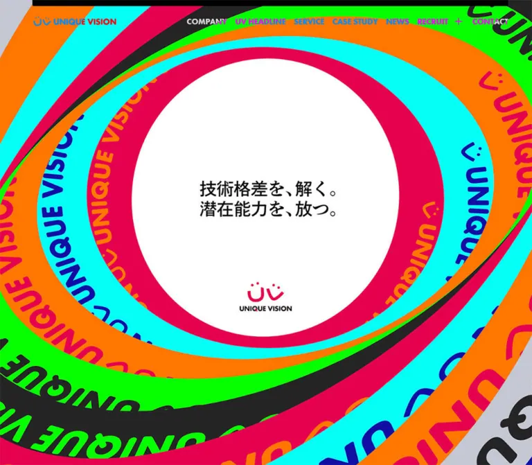
Unique Vision presents its technology and social-marketing business through a deliberately forceful visual identity. Large, overlapping elliptical bands carry repeated wordmarks in cyan, orange, pink, green, charcoal, gray, and deep blue. A quiet white opening at their center holds a compact Japanese statement. The contrast between an extravagant perimeter and a restrained center is the defining opening composition.
Below that opening, the homepage becomes an information-rich corporate site. Mission, editorial updates, services, case studies, news, recruitment, and contact have distinct roles. Bold English section names organize bold Japanese explanations. A broad blue panel joins service information to recent project examples, while the footer returns to white, black branding, thin rules, and orderly navigation. Preserve this relationship between expressive graphics and structured information when adapting the design.
How to Read This Reference
- Measured CSS values come from the supplied computed styles and custom properties. Font sizes, padding, declared colors, radii, and transition durations are reported as CSS values before any ancestor transforms.
- Visual estimates come from the supplied original-page screenshots. Approximate dimensions and decorative colors are explicitly identified; no screenshot pixel-sampling tool was used.
- Geometry requires caution. Many descendant rectangles are scaled, displaced, or extend beyond the recorded document height. They appear affected by a transformed capture state, but transform matrices and their controlling logic were not supplied. These rectangles are not reliable static layout specifications.
- Responsive observations distinguish the two measured viewport states from suggested behavior between them. The original media-query breakpoints were not supplied.
- Recommendations and Quick Start code are an implementation adaptation. They do not establish unobserved behavior or reproduce an unknown animation system.
- Mobile opening limitation: the supplied phone screenshot shows the logo and hamburger above a blank white field. The DOM contains substantial homepage content, but the hero artwork is not visually established on mobile. Do not interpret that frame as proof of an intentionally empty mobile hero.
Tokens — Colors
Core UI Palette
| Name | Value | Source or implementation alias | Evidence and role |
|---|---|---|---|
| Service Blue | #206af4 |
Source --color-blue-1; alias --uv-blue |
Exact declared token; corresponds to the large blue service/case-study panel |
| Brand Pink | #e5004f |
Source --color-pink-1; alias --uv-pink |
Exact declared token; visually consistent with the logo and small control accents |
| White | #ffffff |
Computed HTML/body and service-button fill | Exact computed value; main page foundation, reversed typography, and white action surfaces |
| Black | #000000 |
Computed body text, company button, contact fill | Exact computed value; primary text, logo treatment, contact surface, and structural accents |
| Near White | #fcfcfc |
Source --color-white-1 |
Declared token; its precise deployment is not established by the supplied samples |
| Soft White | #f2f2f2 |
Source --color-white-2 |
Declared token; do not assume it fills every visually white surface |
| Category Teal | #09a29d |
Source --color-green-1 |
Exact token and computed category background for case-study and feature labels |
The blue panel is a large architectural surface. Pink is also present in the decorative identity, but within the information interface it often appears as a short underline or small directional accent. Black and white carry most navigation and reading tasks.
Editorial Category Colors
These values are directly supported by computed category-label backgrounds.
| Actual UI label | Background | Foreground | Use |
|---|---|---|---|
ケーススタディ |
#09a29d |
#ffffff |
Case-study category |
新機能 |
#09a29d |
#ffffff |
Product-feature category |
ニュース |
#a501f2 |
#ffffff |
News category |
セミナー・勉強会 |
#f98da0 |
#ffffff |
Seminar and study-session category |
インタビュー |
#f20166 |
#ffffff |
Interview category |
制度紹介 |
#f29901 |
#ffffff |
Organizational-practice category |
The interview pink is a separate measured value from Brand Pink. Preserve the distinction when reproducing category labels. These labels classify editorial content; they are not a general-purpose rainbow button system.
Decorative Palette — Visual Estimates
The following values are approximate implementation swatches for the original-page graphics, not recovered artwork colors.
| Appearance | Approximate value | Observed use |
|---|---|---|
| Electric cyan | #00eeee |
Broad ribbons with deep-blue lettering |
| Neon green | #00f000 |
Ribbons with dark lettering and surrounding graphic fragments |
| Bright orange | #ff7800 |
Ribbons with pink lettering |
| Deep blue | #160ba5 |
Ribbon fields and lettering on cyan |
| Charcoal | #242424 |
Dark ribbons paired with neon green |
| Cool gray | #c4c9cf |
Neutral ribbon with black lettering |
| Medium gray | Approximately #666666 |
Visible lower-page backdrop in the desktop contact capture; compositing contribution is unknown |
| Fine-rule gray | Approximately #cccccc |
Footer separators |
Use original artwork to recover exact decorative colors when available. The cyan, green, and orange values in this reference are estimates even though the core blue and pink tokens are exact.
Rendered Color Versus Computed Color
Desktop header links compute to white, yet appear pink, cyan, orange, gray, or white over different captured backgrounds. Footer utility text also appears muted despite black computed color. This establishes a difference between raw text color and final appearance; it does not identify the blend mode, filter, opacity, or ancestor effect responsible.
For an adaptation, explicit light/dark header variants are a reasonable recommendation. Do not describe a particular compositing technique as an inspected fact, or hard-code the orange seen over the blue panel as the universal navigation color.
Tokens — Typography
Japanese Reading Text
- Computed family:
'Noto Sans JP', sans-serif. - Observed weight:
700, including paragraphs, dates, and legal links in the supplied samples. - Base size:
16pxwith24.8pxline height. - Usual tracking:
0.04em. - Character: dense, assertive, and readable; hierarchy relies heavily on size and spacing rather than a broad weight range.
English Headings and Navigation
- Computed stack:
futura-pt, 'Noto Sans JP', sans-serif. - Observed weight:
700. - Usual tracking:
-0.04emfor section names, route labels, and footer navigation. - Header exception: the desktop primary navigation uses normal letter spacing and an
18pxline height. - Role: large geometric English words act as section landmarks; compact versions label routes and utilities.
These are computed font-family declarations. Font-file delivery and the exact resolved face were not independently inspected.
Hero Lettering and Brand Artwork
The central statement reads 技術格差を、解く。潜在能力を、放つ。 across two lines. Its compact, editorial appearance differs from the large English navigation. The empty text extraction for the opening section does not expose its font or rendering method. Do not assign a specific typeface to this graphic from appearance alone.
The UV mark and rounded UNIQUE VISION wordmark are brand artwork. They should not be approximated by typing the name in Futura or constructing a monogram from ordinary characters.
Measured Type Scale
All entries below are computed CSS sizes, not dimensions of transformed bounding boxes.
| Role | Desktop size / line height | Mobile size / line height | Tracking |
|---|---|---|---|
| Base inherited text | 16 / 24.8px |
16 / 24.8px |
0.04em |
| Desktop header links | 18 / 18px |
Links absent from visible mobile header | Normal |
| Mission label | 18 / 27.9px |
15 / 23.25px |
-0.04em |
| Mission explanation | 24 / 37.2px |
19 / 29.45px |
0.04em |
| UV HEADLINE heading | 105 / 162.75px |
45 / 69.75px |
-0.04em |
| Standard section heading | 66 / 102.3px |
30 / 46.5px |
-0.04em |
| Japanese section subtitle | 18 / 27.9px |
15 / 23.25px |
0.04em |
| Featured editorial title | 24 / 37.2px |
19 / 29.45px |
0.04em |
| Compact editorial title | 18 / 27.9px |
15 / 23.25px |
0.04em |
| Service explanation | 24 / 37.2px |
15 / 23.25px |
0.02em |
| Case-study title | 18 / 27.9px |
15 / 23.25px |
0.04em |
| News title | 24 / 37.2px |
15 / 23.25px |
0.04em |
| Date and category label | 12 / 18.6px |
11 / 17.05px |
0.04em |
| Standard route button | 18 / 27.9px |
15 / 23.25px |
-0.04em |
| Recruitment statement | 48 / 57.6px |
26 / 31.2px |
0.04em |
| Recruitment role name | 66 / 102.3px |
26 / 40.3px |
-0.04em |
| Recruitment explanatory link text | 18 / 27.9px |
11 / 17.05px |
0.04em |
| Contact heading | 66 / 102.3px |
44 / 68.2px |
-0.04em |
| Footer route text | 18 / 27.9px inherited |
15 / 23.25px inherited |
-0.04em |
| Legal links | 12 / 18.6px |
11 / 17.05px |
0.04em |
The standard line-height ratio is 1.55. The recruitment statement uses 1.2. A large line box is not the same as a large visible glyph: use the CSS values, not the exaggerated transformed rectangles, when rebuilding the type scale.
Tokens — Spacing & Shapes
The source uses a conventional 16px root, explicit pixel dimensions, and several named content widths. There is no evidence of a single viewport-scaled unit governing the whole interface.
Widths and Insets
| Token or element | Desktop evidence | Mobile evidence | Interpretation |
|---|---|---|---|
--wrapper-width |
1296px |
Still declared as 1296px |
Desktop width token; its persistence does not mean the mobile page renders at this width |
--content-width |
1104px |
Still declared | General content-width token |
--small-content-width |
1008px |
Still declared | Matches the desktop blue-panel content region |
--inner-content-width |
816px |
Still declared | Available narrower width; exact usage not established |
--pc-layout-width |
1392px |
Still declared | Reference width, distinct from the visible 1296px panel |
--pc-content-padding |
144px |
32px |
Computed variable changes; not a universal padding on every section |
--header-padding |
64px |
15px |
Matches observed header placement |
--sp-padding |
30px |
30px |
Mobile content inset token |
--sp-wrapper-width |
Declared formula | calc(100vw - 30px) = 360px |
Mobile outer wrapper formula |
--sp-content-width |
Declared formula | calc(100vw - 60px) = 330px |
Mobile content-width formula |
| Mission text column | Measured 528px |
Measured 300px |
Mobile mission uses 45px side insets |
| Contact surface | Measured 720px |
Measured 330px |
Centered contact destination |
In the desktop service screenshot, the blue panel runs approximately from x=72 to x=1368, matching the 1296px token. Its principal content runs from x=216 to x=1224, matching 1008px and leaving 144px of internal space on each side.
Spacing Scale
| Use | Desktop CSS value | Mobile CSS value |
|---|---|---|
| Standard route-button padding | 18px 24px |
18px 20px |
| Editorial category padding | 0 24px |
0 16px |
| Featured editorial link top padding | 12px |
20px |
| Compact editorial link padding | 8px 0 0 |
8px 0 32px |
| News-row padding | 24px 56px 24px 24px |
14px 0 |
| Recruitment destination padding | 40px 48px |
8px 15px 22px |
| Contact padding | 20px 48px 44px |
Outer anchor reports 0; children are individually positioned |
| Footer-link vertical padding | 14px |
19px |
| Nested recruitment-link left padding | 48px |
16px |
| Service section top padding | 308px |
232px |
| Case-study section top/bottom padding | 212px / 330px |
228px / 184px |
The unusually large section padding contributes to the spacious scrolling composition. These are CSS measurements within the captured state, not proof of fixed distances between visible sections throughout an animation.
Shapes and Rules
| Element | Value | Evidence |
|---|---|---|
| Standard route button | 4px radius |
Computed |
| Recruitment destination | 4px radius |
Computed |
| Contact panel | 8px radius |
Computed |
| Category label | 24px radius |
Computed; visually a pill |
| Hero downward control | 50% radius |
Computed circle |
| Case-study image corner | Approximately 4px |
Screenshot estimate |
| Footer upper corners | Approximately 10px |
Screenshot estimate |
| Footer separator | Approximately 1px |
Screenshot estimate |
| Short link/control underline | Approximately 3px thick |
Screenshot estimate |
| Header top rail | Approximately 12px desktop, 6px mobile |
Screenshot estimate; purpose unverified |
The visual system uses flat fills and fine rules. No general soft-shadow elevation system is established by the captures. WordPress preset shadow and gradient variables are present, but their existence is not evidence that these styles are used on the homepage.
Layer Tokens
The supplied custom properties define background layers at 1 and 2, the header at 3, and modal layers at 4 and 5. These are declared stacking tokens. No open modal was captured.
Components
Persistent Header
Role: keep the corporate identity and main routes available over the graphic page.
On desktop, the logo occupies a measured 208 × 24px box at x=64, y=30. The primary navigation sits across the upper right with approximately 20px between adjacent route boxes. Labels are COMPANY, UV HEADLINE, SERVICE, CASE STUDY, NEWS, RECRUIT, and CONTACT. RECRUIT has a plus-like affordance beside it.
The navigation uses 18px bold English text. Link boxes have 28px vertical padding and a recorded height of 74px. A black inset rail appears along the top edge. The header remains visible in the supplied desktop middle and lower-page captures, supporting its description as a persistent overlay.
On mobile, the same 208 × 24px logo sits at x=15, y=20. A three-line menu symbol occupies a measured 66 × 65px button at x=324, y=0, with 25px 15px padding. Desktop navigation is not visible.
The DOM contains paired strings such as COMPANYCOMPANY. The screenshots show one label. Treat these as layered or duplicated text in the implementation, not as two visible route names. Any label-replacement animation and the recruitment expansion trigger remain unverified.
Opening Brand Composition
Role: introduce the brand through scale, color, and a central statement.
The desktop opening fills the view with overlapping, tilted elliptical bands. Each band contains repeated UNIQUE VISION lettering and the UV symbol, following the curved direction of the band. The graphics extend well beyond all viewport edges, making the viewer feel positioned inside a much larger composition.
At the captured frame, the central white opening is approximately 528px wide and 548px high, centered near x=720, y=390. A two-line black Japanese statement sits near its center; a smaller pink UV mark and black wordmark sit below it. These are visual estimates from the screenshot, not recovered artwork coordinates.
The quiet central opening should remain readable while the surrounding lettering is heavily cropped. The perimeter is a graphic field; it is not another navigation layer.
A white circular downward control measures 96 × 96px at x=1296, y=856, leaving 48px to the right and bottom of the desktop viewport. Its small chevron is pink. The mobile DOM records a 48 × 48px counterpart with 15px right/bottom offsets, but the control is not visibly established in the blank mobile opening capture.
The first section box measures 1720px high on desktop and 1298px on mobile. These values show that the opening participates in a longer scroll composition; they should not be replaced with an assertion that the entire source section is exactly one viewport high.
Mission Block
Role: turn the opening statement into a clear description of the company.
The DOM identifies a MISSION eyebrow, a graphic or otherwise non-text-extracted heading region, the Japanese explanation, and a COMPANY destination. The explanation describes a technology company centered on social marketing and unlocking the potential of people and organizations.
Desktop body copy uses 24px / 37.2px within a 528px column. Mobile copy uses 19px / 29.45px within a 300px column, inset 45px from each viewport edge. This narrower mobile mission column differs from the 330px footer/contact width.
The COMPANY link is a full-column black rectangle with white text, a 4px radius, and 18px 24px desktop padding. Its measured desktop height is about 63.9px. The mobile version is 300px wide and about 59.25px high.
The mission heading's appearance is not sufficiently exposed to specify its lettering, image crop, or internal composition.
UV HEADLINE Editorial Collection
Role: show current activity across projects, interviews, features, news, and organizational topics.
The supplied DOM contains nine article links followed by VIEW ALL. The section name is exceptionally large: 105px on desktop and 45px on mobile. A short Japanese introduction connects the collection to the brand statement.
Article anatomy includes a title, dotted numeric date, colored category pill, and any associated media supplied by the implementation. Three articles have the larger title treatment; six use the compact treatment. The larger titles are 24px on desktop and 19px on mobile, while compact titles are 18px and 15px respectively.
Desktop rectangles indicate unequal article modules distributed across multiple horizontal positions. Mobile article links share one horizontal position and width, consistent with a single-column sequence. Since this section lacks a corresponding supplied screenshot and its rectangles are transformed, the exact desktop grid and media placement remain provisional.
Compact mobile titles reserve 136px of right padding, while featured titles reserve 28px. Preserve the existence of these distinct article treatments; the evidence does not establish what occupies every reserved area. A four-column desktop editorial grid with selected two-column features is a reasonable adaptation, not a verified source rule.
Category pills use 12px desktop text, 11px mobile text, white foregrounds, and a 24px radius. Dates remain separate from the category background.
Service Panel
Role: explain the company's products within a strong, easily recognized color field.
The SERVICE and CASE STUDY sections share a broad blue surface. In the supplied desktop middle capture, service information occupies the right half of the 1008px content region, from approximately x=720 to x=1224. A large tonal circular whale illustration occupies the left side. Its roughly 480px diameter and subdued contrast make it background identity rather than a competing content card.
The service stack consists of a large English heading, a smaller Japanese subtitle, a thin divider, a bold explanation mentioning Beluga, and a full-width white route button. The visible button measures approximately 504 × 64px and matches the computed 4px radius and 18px 24px padding.
White headings and copy contrast with the blue fill. Secondary labels and dates appear more subdued in the screenshot, though their exact opacity or compositing treatment was not supplied.
Section Heading Pair
Role: establish bilingual hierarchy consistently across services, case studies, news, and recruitment.
Use a large uppercase English heading followed by a smaller Japanese subtitle. Desktop headings use Futura PT at 66px / 102.3px, with -0.04em tracking; subtitles use Noto Sans JP at 18px / 27.9px. Mobile values are 30px and 15px respectively.
In the blue panel, both lines belong to the white typographic system, with the subtitle appearing visually muted. A fine horizontal divider can separate the heading pair from the following content where shown. UV HEADLINE is a deliberate scale exception, not the default size for every section.
Route Button
Role: provide a strong, readable link to a major destination.
The visible SERVICE button contains four parts: a flat rectangular fill, left-aligned bold English label, right-aligned chevron, and a short pink line near the lower-right edge. It is approximately 64px tall on desktop, with restrained 4px rounding and no visible shadow.
The COMPANY version reverses to black fill with white text. The shared computed values support the same broad rectangular anatomy, although its full visual details were not separately captured.
For a reusable implementation, keep the whole rectangle clickable and align the arrow independently of the label length. Use an anchor for navigation. The supplied evidence establishes link destinations, but not a tested hover transformation or click response.
Case-Study Card Group
Role: connect the service explanation to recent client work.
The desktop screenshot shows three cards aligned across the right portion of the content region. Each thumbnail is approximately 240 × 135px, a 16:9 ratio, with about 24px between cards. The group begins near x=456 and ends near x=1224, while the section heading begins at x=216. The approximately 240px empty left offset gives the card group an asymmetric relationship to the heading.
Each card contains a full-color campaign thumbnail, a small date, and a bold Japanese title. Cards have transparent backgrounds within the blue panel; there is no enclosing white card or shadow. White titles remain separate from the campaign graphics.
The three visible images show a beverage promotion, an entertainment campaign with a phone mockup, and a gold promotional graphic. These belong to the projects, so their internal typography and colors should remain intact.
Desktop titles use 18px text; mobile titles use 15px. Mobile DOM rectangles place the three links sequentially at the same horizontal position, supporting a stacked arrangement. Exact settled mobile image dimensions were not visually verified.
News Rows
Role: present three recent announcements with a more compact reading rhythm.
The DOM shows three linked rows followed by VIEW ALL. Each link is a flex container. Desktop padding is 24px 56px 24px 24px; mobile padding becomes 14px 0. Titles reduce from 24px to 15px, and dates from 12px to 11px.
The text hierarchy is title followed by date. Full row geometry, any media placement, and separator appearance are not established by the supplied screenshots. Keep this component description narrower than the visually verified case-study group.
Recruitment Destinations
Role: split recruitment into director and engineer paths.
The section contains RECRUIT with a Japanese subtitle, a large statement, supporting copy, and two destination blocks. Each destination has a small RECRUIT for label, a large DIRECTOR or ENGINEER name, and a smaller Japanese explanation.
Desktop role names use 66px type inside links with 40px 48px padding. On mobile, role names use 26px, explanatory text uses 11px, and link padding becomes 8px 15px 22px. Both anchors have a 4px radius.
Director text computes to black and engineer text to white. Their anchor backgrounds compute to transparent, so the full surface treatment must come from surrounding layers or uninspected descendants. Do not invent a specific photograph, gradient, or filled background for either destination.
A --recruit-mask-width token changes from 56px to 28px between the supplied viewports. Its name and values alone do not prove a particular reveal effect.
Contact Panel
Role: provide a prominent general inquiry destination before the footer.
The desktop contact anchor is a black 720 × 323.75px surface with an 8px radius and 20px 48px 44px padding. It includes a 66px CONTACT US heading, an 18px Japanese subtitle, and 24px explanatory copy. A white circular arrangement of lettering around the UV mark appears on the right in the lower-page screenshot, with a short pink underline at the panel's lower edge.
The decorative ribbon world continues behind this block. Large cyan and green forms create a visual connection to the opening without making the contact surface itself multicolored.
Mobile layout changes substantially: the anchor measures 330 × 190px, the heading is 44px, and the 15px explanation occupies a narrow region toward the upper right. The heading is positioned lower within the panel. This is a recomposed graphic block, rather than a proportional reduction of the desktop stack. Only DOM evidence is available for this phone composition.
The circular lettering is visible as artwork. Its rotation, interaction, and timing were not verified.
Footer Navigation and Brand Signature
Role: finish the expressive page with a stable directory of routes, policies, and social links.
The desktop footer is a white sheet with subtly rounded upper corners. An oversized black stacked logo occupies the left region. On the right, two navigation columns are approximately 288px wide with a 48px gap. The first contains the main information routes; the second groups recruitment subroutes and contact.
Each route uses bold English text, a right-pointing chevron, a fine gray bottom rule, and a short black segment at the rule's right edge. Recruitment children are indented. The visible row height is approximately 47px on desktop. The source reports 14px vertical anchor padding; duplicated or clipped label layers mean the inherited line height should not simply be added to infer the visible row height.
Legal links sit below the main routes, followed by X and Facebook symbols. The mobile capture also visibly includes the copyright line ©Unique Vision Company, Japan All Rights Reserved.
On mobile, the footer changes to a single column with 30px content insets and a broad horizontal logo near the top. The logo occupies approximately 360 × 40px with a 15px outer inset. Navigation rows are approximately 54px tall, with 15px labels, 19px vertical padding, and 16px indentation for recruitment children. Legal links reduce to 11px.
A black upward control with a white chevron and small pink bottom accent appears at the lower right. Its measured button box is 48 × 49px on desktop and 45 × 46px on mobile. The captures do not establish whether it is fixed to the viewport or anchored within the footer.
Tokens — Motion & Interaction
Directly Supported Transition Values
| Element or property | Supplied value | What is established |
|---|---|---|
| Opening downward control | transform 0.3s, opacity 0.3s, background-color 0.2s |
Transition properties and durations; endpoints and triggers untested |
| Route-link text | color 0.2s |
Short color response defined |
| Editorial and case-study titles | color 0.2s |
Title color transition defined |
| Desktop primary links | opacity 0.3s |
Opacity response defined |
| Desktop recruitment label | color 0.3s |
Color response defined |
| Footer brand and legal links | opacity 0.3s |
Opacity response defined |
| Mobile menu button | transform 0.3s |
Transform transition defined; open state not captured |
| Mobile header | transform 0.3s |
Header movement transition defined; exact behavior unverified |
Many sampled elements report animation: none. This does not exclude JavaScript-driven transforms, animations on other elements, or effects inside graphic assets. Likewise, transition: all without a supplied nonzero duration is not evidence of a timed animation.
Interaction Evidence and Limits
- Scrolling was used during the supplied collection process, and the screenshots cover multiple desktop page positions and the mobile footer.
- The header remains at the top of the desktop captures while content changes beneath it.
- Route destinations are present as real links in the rendered DOM.
- No menu opening, recruitment expansion, hover endpoint, focus sequence, downward-button activation, or upward-button activation was demonstrated.
- Still captures and unusual rectangles do not establish rotation speed, scroll pinning, parallax depth, easing curves, or pointer-follow behavior.
- The main decorative motion's implementation technology is unknown.
For a new implementation, preserve the observed 200–300ms scale for small control feedback. Develop any large graphic motion as a separately specified enhancement with a static fallback. Do not invent a source animation timeline from a single frozen frame.
Surfaces
| Surface | Observed appearance | Structural role |
|---|---|---|
| Main canvas | White | Reading foundation and mobile captured opening field |
| Brand environment | Cropped, overlapping solid-color bands | Opening identity and lower-page continuity |
| Hero center | White oval opening | Quiet area for statement and compact logo |
| Service/case-study panel | Solid blue | Unifies business explanation and proof |
| Editorial content | Predominantly unboxed links in the supplied styles | Differentiates articles through type, categories, and module size |
| Contact surface | Black with white content | Prominent inquiry destination |
| Footer sheet | White with black identity, rules, and gray utilities | Stable navigation and legal information |
| Route buttons | Black or white, 4px radius | Clear destination affordances |
Depth comes primarily from overlap, cropping, scale, and foreground/background contrast. Preserve hard color boundaries and shallow corner radii. Glossy gradients and floating shadow cards would change the observed visual language.
Imagery
The brand imagery behaves like large printed ribbons arranged in space. Solid fills, curved text paths, repeated marks, and severe cropping produce visual energy without relying on photography. Its dimensional impression comes from overlapping ellipses and changes in angle, rather than visible lighting gradients or realistic material texture.
The information imagery is different: project thumbnails retain client logos, campaign typography, phone mockups, promotional colors, and recognizable content. They should remain full-color editorial assets. The faint whale emblem in the service area is a third treatment: a large, low-contrast symbol integrated into the blue surface.
Observed Asset References
No original image or font asset URLs were supplied. The following inventory identifies visible assets without inventing filenames or download paths.
| Asset | Original-page evidence | Reuse guidance |
|---|---|---|
| Elliptical logo-band composition | Desktop opening capture | Use supplied brand artwork or verified vector geometry; preserve curved lettering and edge cropping |
| Small horizontal brand lockup | Desktop and mobile headers | Preserve the measured 208 × 24px presentation |
| Central pink UV mark with black wordmark | Desktop opening capture | Keep subordinate to the Japanese statement |
| Tonal whale emblem | Desktop service capture | Keep large and subdued within the blue panel |
| Three campaign thumbnails | Desktop case-study capture | Preserve approximately 16:9 framing and original project colors |
| Circular contact lettering and mark | Desktop lower-page capture | Treat as artwork; motion is unspecified |
| Large stacked black logo | Desktop footer capture | Preserve the stacked mark/wordmark arrangement |
| Broad horizontal black logo | Mobile footer capture | Use the horizontal variation rather than shrinking the stacked desktop mark |
| Chevrons, plus, hamburger, X, Facebook | Supplied header/footer captures | Match the simple, compact silhouettes and visible stroke weight |
Do not substitute generic stock imagery for the logo bands or whale symbol. CSS can reproduce the layout and controls, but the exact identity requires the corresponding brand assets.
Layout & Responsive Behavior
Page Sequence
The rendered content follows this sequence: opening composition, mission, UV HEADLINE, service, case studies, news, recruitment, contact, and footer. The document height is approximately 11,443px at desktop and 9,731px at mobile in the supplied observations. These are recorded states, not target heights for a rebuild.
Desktop Structure
The layout combines a full-bleed graphic environment with centered content regions. The blue panel uses a 1296px outer width, while its key reading region is 1008px wide. Service content occupies the right half beside the tonal emblem. Case studies form a right-offset three-card group below a left-aligned heading.
The footer changes the rhythm again: large branding at left, compact navigation at right. This varied use of alignment is part of the design. Making every section a centered stack with identical card widths would remove much of its character.
Mobile Structure
| Element | Confirmed change at 390px | Evidence limit |
|---|---|---|
| Header | Logo moves to 15px inset; hamburger replaces visible desktop links | Open menu not captured |
| Opening | Header visible above white field | Hero artwork and settled mobile opening remain unverified |
| Mission | 300px column, 45px side insets, 19px explanation | Graphic heading appearance not captured |
| Section names | 66px becomes 30px; UV HEADLINE becomes 45px | Computed values, not enlarged rectangle dimensions |
| Editorial collection | Links occupy one horizontal position; feature/compact type distinction remains | Exact media placement unverified |
| Case studies | Three links become a vertical sequence | Settled mobile visual crop not captured |
| News | Smaller titles and simpler row padding | Media placement unverified |
| Recruitment | Smaller role names and substantially reduced padding | Surface graphics unverified |
| Contact | 330 × 190px anchor with rearranged heading and copy | DOM-only layout evidence |
| Footer | Horizontal logo, single navigation column, nested recruitment links | Directly visible in screenshot |
Implementation Boundaries
The negative x coordinates and oversized descendant boxes in the observation should not be recreated as permanent horizontal overflow. For example, a mobile service descendant is recorded wider than the 390px viewport, and some desktop descendants extend far beyond the total document height. The final visible screenshots provide a more useful guide to their apparent size.
The original breakpoint thresholds are unknown. A practical adaptation can collapse the header and editorial layout around 800–1000px, then verify the two supplied endpoint widths. That range is a recommendation, not a recovered source rule.
The mobile opening needs additional validation before claiming parity with desktop. A new implementation should display meaningful text and a static brand composition independently of animation readiness.
Do’s and Don’ts
Do
- Preserve the oversized, edge-cropped ribbon composition around a quiet white center.
- Keep Service Blue exact at
#206af4and Brand Pink exact at#e5004fin the interface. - Distinguish exact UI colors from approximate decorative swatches.
- Use the measured Futura PT and Noto Sans JP stacks, bold weight, and contrasting tracking conventions.
- Retain a larger scale for UV HEADLINE than for standard section names.
- Keep the service explanation and case studies inside one broad blue environment.
- Preserve the desktop case-study group's right offset and transparent card backgrounds.
- Use original project thumbnails with their own colors and lettering.
- Give the footer its large brand signature, ruled links, nested recruitment routes, and mobile horizontal logo.
- Keep source-defined control feedback short, and document large motion separately.
Don’t
- Do not reduce this corporate homepage to a single conversion funnel or remove its editorial and recruitment routes.
- Do not replace the graphic bands with generic gradients or stock abstract backgrounds.
- Do not typeset an approximation of the logo using the heading font.
- Do not turn every content item into a rounded white card with a shadow.
- Do not use the category palette indiscriminately for major actions.
- Do not assume the header's orange appearance is its default text color.
- Do not reproduce duplicated DOM labels as repeated visible or accessible names.
- Do not copy transformed offscreen rectangles into static widths and positions.
- Do not treat the blank phone opening as a verified design requirement.
- Do not claim a carousel, pinned sequence, menu animation, or rotating contact seal without further evidence.
Recommended Implementation Additions
These are recommendations for a new implementation, not verified features of the original page:
- Provide a semantic heading for the opening statement, even if the visual lettering is supplied as artwork. Avoid announcing decorative repetitions of the wordmark.
- Render the opening copy and a static image before any motion initialization. Essential content should not depend on a reveal animation completing.
- Give the menu button an accessible name,
aria-expanded, and a relationship to its controlled navigation. Define keyboard behavior when the open state is implemented. - Keep only one accessible name for each duplicated visual navigation label.
- Give icon-only directional and social controls explicit labels and comfortably sized targets.
- Preserve a visible focus indicator on both blue and white surfaces.
- Review category-pill contrast, especially white text on the pale pink seminar label. Keep the original color as a reference while allowing an accessible adaptation.
- Respect reduced-motion preferences and provide a stable decorative composition without large rotation or scroll-dependent scaling.
- Reserve campaign-image aspect ratios to prevent layout shifts, and load the initial brand composition independently of below-the-fold editorial images.
- Test the phone opening and intermediate widths explicitly; the supplied captures do not establish a complete mobile interaction experience.
Agent Prompt Guide
Quick Color Reference
- Main page and footer: white
#ffffffwith black#000000structure. - Shared service/case-study surface: exact blue
#206af4. - Small brand accents: exact pink
#e5004f. - Editorial tags: teal
#09a29d, purple#a501f2, pale pink#f98da0, interview pink#f20166, amber#f29901. - Decorative starting swatches: approximately cyan
#00eeee, green#00f000, orange#ff7800, and deep blue#160ba5; verify against original artwork before treating them as exact. - Buttons: flat black or white rectangles with 4px corners, a chevron, and a restrained lower-edge accent.
Overall Prompt
“Create a Japanese technology-company homepage inspired by the supplied Unique Vision reference. Frame the desktop opening with enormous overlapping elliptical bands carrying repeated brand artwork, cropped beyond the viewport in cyan, orange, pink, green, charcoal, and deep blue. Leave a quiet white center for a compact two-line Japanese statement and small logo. Build a complete corporate information hierarchy with mission, an editorial collection, services, case studies, news, recruitment, contact, and a substantial footer. Use bold Futura PT for English landmarks and Noto Sans JP for Japanese reading text. Join services and three recent case studies inside a broad #206af4 panel, using white typography and unboxed thumbnails. Finish with a white footer, oversized black brand signature, thin ruled links, chevrons, and nested recruitment routes. Preserve the observed desktop asymmetry. On mobile, use the confirmed compact header and single-column footer, and provide a readable static opening fallback because the supplied mobile hero was not established.”
Example Component Prompts
- Desktop opening: “Use verified brand artwork to create an edge-cropped field of tilted elliptical ribbons. Keep the central white opening approximately 528 × 548px at a 1440 × 1000 viewport, with compact black Japanese copy and a small pink/black logo below. Place a 96px white circular downward control 48px from the right and bottom. Do not invent an animation timeline.”
- Service and case studies: “Create a 1296px blue panel with a 1008px inner region. Put a large tonal whale symbol left and a 504px service explanation with white route button right. Below, use a 66px CASE STUDY heading and a right-offset group of three 240 × 135px thumbnails with 24px gaps. Keep titles and dates directly on the blue surface.”
- Editorial collection: “Build a bold editorial collection with a 105px UV HEADLINE title, featured and compact Japanese article titles, separate dates, and category pills using the measured category palette. Treat the desktop grid as an adaptation because settled source geometry is unavailable. Collapse to a single sequence on mobile while retaining the two title sizes.”
- Footer: “Create a white desktop footer with a large stacked black logo on the left and two ruled navigation columns on the right. Each route has a compact bold English label, chevron, fine gray divider, and short black underline at the right edge. On a 390px phone, switch to a broad horizontal logo and one 330px navigation column, with indented recruitment links and small legal text.”
- Route button: “Create a flat white destination link on blue, approximately 64px high, with 4px corners, 18px bold English text, 24px horizontal padding, a right chevron, and a short pink lower-right accent. Use a 200ms color transition and an explicit keyboard focus state; do not add elevation.”
- Motion adaptation: “Use the observed 200–300ms durations for small color, opacity, and control-transform feedback. Specify any large ribbon movement separately and provide a reduced-motion static composition. Keep all content readable before the animation system starts.”
Quick Start
CSS Custom Properties
This stylesheet is a reusable adaptation of the measured UI. It uses normal document flow and a conventional root size. The breakpoint, decorative estimates, separator colors, and simplified footer label masking are recommendations. Supply actual logo, ribbon, whale, and campaign assets separately; no asset filenames or animation engine are assumed.
The main structures are .uv-header, .uv-hero, .uv-panel > .uv-panel__inner, .uv-service, .uv-cases, and .uv-footer. Put the service copy in .uv-service__copy and the emblem in .uv-service__art. A footer link should contain one label span; a route button should contain its label and an .uv-chevron span.
:root {
  /* Exact source colors */
  --uv-blue: #206af4;
  --uv-pink: #e5004f;
  --uv-black: #000000;
  --uv-white: #ffffff;
  --uv-near-white: #fcfcfc;
  --uv-soft-white: #f2f2f2;
  --uv-tag-teal: #09a29d;
  --uv-tag-purple: #a501f2;
  --uv-tag-soft-pink: #f98da0;
  --uv-tag-interview: #f20166;
  --uv-tag-amber: #f29901;

  /* Visual estimates; verify against supplied artwork */
  --uv-ribbon-cyan: #00eeee;
  --uv-ribbon-green: #00f000;
  --uv-ribbon-orange: #ff7800;
  --uv-ribbon-blue: #160ba5;
  --uv-rule: #cccccc;

  /* Computed source font stacks */
  --uv-font-jp: 'Noto Sans JP', sans-serif;
  --uv-font-en: futura-pt, 'Noto Sans JP', sans-serif;
  --uv-weight: 700;
  --uv-leading: 1.55;
  --uv-tracking-jp: 0.04em;
  --uv-tracking-en: -0.04em;
  --uv-text-section: 66px;
  --uv-text-headline: 105px;
  --uv-text-lead: 24px;
  --uv-text-label: 18px;
  --uv-text-small: 12px;

  /* Source widths and reusable spacing */
  --uv-wrapper: 1296px;
  --uv-content: 1104px;
  --uv-small-content: 1008px;
  --uv-header-inset: 64px;
  --uv-panel-inset: 144px;
  --uv-space-8: 8px;
  --uv-space-16: 16px;
  --uv-space-24: 24px;
  --uv-space-48: 48px;
  --uv-radius-control: 4px;
  --uv-radius-contact: 8px;
  --uv-radius-tag: 24px;

  /* Observed duration scale; easing is an adaptation */
  --uv-motion-color: 200ms ease;
  --uv-motion-control: 300ms ease;
}

* { box-sizing: border-box; }

body {
  margin: 0;
  color: var(--uv-black);
  background: var(--uv-white);
  font-family: var(--uv-font-jp);
  font-size: 16px;
  font-weight: var(--uv-weight);
  line-height: var(--uv-leading);
  letter-spacing: var(--uv-tracking-jp);
}

button, input, select, textarea { font: inherit; }
img { display: block; max-width: 100%; }
a { color: inherit; }

.uv-header {
  position: fixed;
  z-index: 3;
  inset: 0 0 auto;
  display: flex;
  align-items: center;
  justify-content: space-between;
  min-height: 81px;
  padding: 7px var(--uv-header-inset) 0;
  color: var(--uv-black);
}

/* Explicit contrast variant; the source compositing is unknown. */
.uv-header--on-dark { color: var(--uv-white); }

.uv-header::before {
  content: '';
  position: absolute;
  inset: 0 var(--uv-header-inset) auto;
  height: 12px;
  background: var(--uv-black);
  border-radius: 0 0 3px 3px;
}

.uv-header__brand {
  display: block;
  flex: 0 0 208px;
  width: 208px;
  height: 24px;
}

.uv-header__brand img { width: 100%; height: 100%; }

.uv-header__nav {
  display: flex;
  align-items: center;
  gap: 20px;
}

.uv-header__nav a {
  padding-block: 28px;
  font-family: var(--uv-font-en);
  font-size: 18px;
  line-height: 1;
  letter-spacing: normal;
  text-decoration: none;
  transition: opacity var(--uv-motion-control);
}

.uv-menu {
  display: none;
  width: 66px;
  height: 65px;
  padding: 25px 15px;
  border: 0;
  background: transparent;
  color: inherit;
  cursor: pointer;
}

.uv-menu span {
  display: block;
  height: 2px;
  background: currentColor;
}

.uv-menu span + span { margin-top: 4px; }

/* Static stage adaptation; source scroll choreography is unspecified. */
.uv-hero {
  position: relative;
  min-height: 100svh;
  overflow: clip;
  isolation: isolate;
  display: grid;
  place-items: center;
}

.uv-hero__art {
  position: absolute;
  z-index: -1;
  inset: 0;
  width: 100%;
  height: 100%;
  object-fit: cover;
}

/* Optional readable fallback when a composed hero asset is unavailable. */
.uv-hero__fallback {
  width: min(528px, calc(100% - 60px));
  padding: 64px 32px;
  border-radius: 50%;
  color: var(--uv-black);
  background: var(--uv-white);
  text-align: center;
}

.uv-down {
  position: absolute;
  right: 48px;
  bottom: 48px;
  display: grid;
  place-items: center;
  width: 96px;
  height: 96px;
  padding: 0;
  border: 0;
  border-radius: 50%;
  background: var(--uv-white);
  color: var(--uv-pink);
  cursor: pointer;
  transition: transform var(--uv-motion-control),
    opacity var(--uv-motion-control),
    background-color var(--uv-motion-color);
}

.uv-chevron {
  display: inline-block;
  width: 8px;
  height: 8px;
  border-top: 2px solid currentColor;
  border-right: 2px solid currentColor;
  transform: rotate(45deg);
}

.uv-down .uv-chevron { transform: rotate(135deg); }

.uv-panel {
  width: min(var(--uv-wrapper), calc(100% - 48px));
  margin-inline: auto;
  color: var(--uv-white);
  background: var(--uv-blue);
}

.uv-panel__inner { padding-inline: var(--uv-panel-inset); }

.uv-section-title,
.uv-headline-title {
  margin: 0;
  font-family: var(--uv-font-en);
  font-size: var(--uv-text-section);
  line-height: var(--uv-leading);
  letter-spacing: var(--uv-tracking-en);
}

.uv-headline-title { font-size: var(--uv-text-headline); }

.uv-section-subtitle {
  margin: 0;
  font-size: var(--uv-text-label);
}

.uv-service {
  display: grid;
  grid-template-columns: repeat(2, minmax(0, 1fr));
  padding-top: 308px;
}

.uv-service__art {
  display: grid;
  place-items: start center;
}

.uv-service__art img {
  width: min(100%, 480px);
  opacity: 0.12; /* Estimated tonal adaptation. */
}

.uv-service__lead {
  margin: 40px 0 54px;
  padding-top: 40px;
  border-top: 1px solid rgb(255 255 255 / 18%);
  font-size: var(--uv-text-lead);
  letter-spacing: 0.02em;
}

.uv-route {
  position: relative;
  display: flex;
  align-items: center;
  justify-content: space-between;
  gap: 24px;
  padding: 18px 24px;
  border-radius: var(--uv-radius-control);
  color: var(--uv-black);
  background: var(--uv-white);
  font-family: var(--uv-font-en);
  font-size: var(--uv-text-label);
  letter-spacing: var(--uv-tracking-en);
  text-decoration: none;
  transition: color var(--uv-motion-color);
}

.uv-route--dark {
  color: var(--uv-white);
  background: var(--uv-black);
}

.uv-route::after {
  content: '';
  position: absolute;
  right: 12px;
  bottom: 0;
  width: 48px;
  height: 3px;
  background: var(--uv-pink);
}

.uv-cases { padding-block: 212px 330px; }

.uv-section-rule {
  height: 1px;
  margin: 40px 0 48px;
  border: 0;
  background: currentColor;
  opacity: 0.18;
}

.uv-case-grid {
  display: grid;
  grid-template-columns: repeat(3, minmax(0, 1fr));
  gap: 24px;
  margin-inline-start: 240px;
}

.uv-case-card { min-width: 0; text-decoration: none; }

.uv-case-card img {
  width: 100%;
  aspect-ratio: 16 / 9;
  object-fit: cover;
  border-radius: 4px;
}

.uv-date {
  display: block;
  margin: 8px 0 4px;
  font-size: var(--uv-text-small);
  line-height: var(--uv-leading);
}

.uv-case-card .uv-date { opacity: 0.6; }

.uv-case-card__title {
  margin: 0;
  padding-right: 28px;
  font-size: var(--uv-text-label);
  transition: color var(--uv-motion-color);
}

.uv-tag {
  display: inline-block;
  padding-inline: 24px;
  border-radius: var(--uv-radius-tag);
  color: var(--uv-white);
  background: var(--uv-tag-teal);
  font-size: var(--uv-text-small);
}

.uv-tag--news { background: var(--uv-tag-purple); }
.uv-tag--seminar { background: var(--uv-tag-soft-pink); }
.uv-tag--interview { background: var(--uv-tag-interview); }
.uv-tag--practice { background: var(--uv-tag-amber); }

.uv-footer {
  position: relative;
  padding: 64px 64px 48px;
  border-radius: 10px 10px 0 0;
  color: var(--uv-black);
  background: var(--uv-white);
}

.uv-footer__inner {
  display: grid;
  grid-template-columns: minmax(0, 1fr) minmax(0, 624px);
}

.uv-footer__brand {
  align-self: center;
  justify-self: center;
  width: min(400px, 100%);
}

.uv-footer__nav {
  display: grid;
  grid-template-columns: repeat(2, minmax(0, 1fr));
  gap: 48px;
}

.uv-footer-link {
  position: relative;
  display: block;
  padding: 14px 28px 14px 0;
  border-bottom: 1px solid var(--uv-rule);
  font-family: var(--uv-font-en);
  font-size: 18px;
  letter-spacing: var(--uv-tracking-en);
  text-decoration: none;
}

/* One readable label substitutes for unverified duplicate text layers. */
.uv-footer-link > span { display: block; line-height: 1; }

.uv-footer-link::before {
  content: '';
  position: absolute;
  right: 0;
  bottom: -1px;
  width: 24px;
  height: 3px;
  background: currentColor;
}

.uv-footer-link::after {
  content: '';
  position: absolute;
  top: 50%;
  right: 9px;
  width: 8px;
  height: 8px;
  border-top: 2px solid currentColor;
  border-right: 2px solid currentColor;
  transform: translateY(-50%) rotate(45deg);
}

.uv-footer-link--child { padding-left: 48px; }

.uv-footer__legal {
  margin-top: 40px;
  font-size: 12px;
  line-height: 2.05;
}

.uv-footer__legal a {
  display: block;
  text-decoration: none;
}

.uv-top {
  position: absolute;
  right: 48px;
  bottom: 48px;
  display: grid;
  place-items: center;
  width: 48px;
  height: 49px;
  border: 0;
  border-radius: 4px;
  color: var(--uv-white);
  background: var(--uv-black);
  cursor: pointer;
}

.uv-top .uv-chevron { transform: rotate(-45deg); }

.uv-top::after {
  content: '';
  position: absolute;
  bottom: 0;
  width: 32px;
  height: 3px;
  background: var(--uv-pink);
}

.uv-page :focus-visible {
  outline: 3px solid var(--uv-pink);
  outline-offset: 4px;
}

/* Recommended intermediate layout; source breakpoints were not supplied. */
@media (max-width: 1100px) {
  :root { --uv-panel-inset: 48px; }
  .uv-header__nav { display: none; }
  .uv-menu { display: block; }
  .uv-case-grid { margin-inline-start: 0; }
  .uv-footer__inner { grid-template-columns: 1fr 1.2fr; gap: 32px; }
  .uv-footer__nav { gap: 24px; }
}

@media (max-width: 800px) {
  :root {
    --uv-header-inset: 15px;
    --uv-panel-inset: 30px;
    --uv-text-section: 30px;
    --uv-text-headline: 45px;
    --uv-text-lead: 15px;
    --uv-text-label: 15px;
    --uv-text-small: 11px;
  }

  .uv-header { min-height: 65px; padding-top: 0; }
  .uv-header::before { height: 6px; }
  .uv-menu { margin-right: -15px; }
  .uv-panel { width: calc(100% - 30px); }

  .uv-down {
    right: 15px;
    bottom: 15px;
    width: 48px;
    height: 48px;
  }

  .uv-service { grid-template-columns: 1fr; padding-top: 232px; }
  .uv-service__art { margin-bottom: 32px; }
  .uv-service__lead { padding-top: 54px; }
  .uv-route { padding-inline: 20px; }
  .uv-cases { padding-block: 228px 184px; }
  .uv-case-grid { grid-template-columns: 1fr; gap: 30px; }
  .uv-case-card__title { padding-right: 24px; }
  .uv-tag { padding-inline: 16px; }

  .uv-footer { padding: 30px 30px 96px; }
  .uv-footer__inner { grid-template-columns: 1fr; gap: 22px; }
  .uv-footer__brand { width: 360px; max-width: calc(100% + 30px); }
  .uv-footer__nav { grid-template-columns: 1fr; gap: 0; }
  .uv-footer-link { padding-block: 19px; font-size: 15px; }
  .uv-footer-link::before { width: 30px; }
  .uv-footer-link--child { padding-left: 16px; }
  .uv-footer__legal { font-size: 11px; }
  .uv-top { right: 15px; bottom: 15px; width: 45px; height: 46px; }
}

/* Recommended enhancement, not a verified source preference setting. */
@media (prefers-reduced-motion: reduce) {
  .uv-page { scroll-behavior: auto; }
  .uv-page *, .uv-page *::before, .uv-page *::after {
    transition-duration: 0.01ms !important;
  }
  .uv-decorative-motion { animation: none !important; }
}
The CSS supplies structure and appearance, not button behavior. Connect the downward and upward buttons to actual section navigation, and implement the menu state with appropriate semantics. Supply a horizontal mobile footer logo through an image or picture source rather than stretching the desktop stacked logo. If a composed hero image already includes the statement and central mark, do not overlay a duplicate visible copy.
Tailwind v4 Token Mapping
Optional aliases for a project already using Tailwind v4. This is not evidence that the original website uses Tailwind. Define the custom properties above first.
@theme inline {
  --color-uv-blue: var(--uv-blue);
  --color-uv-pink: var(--uv-pink);
  --color-uv-ink: var(--uv-black);
  --color-uv-paper: var(--uv-white);
  --color-uv-tag-teal: var(--uv-tag-teal);
  --color-uv-tag-purple: var(--uv-tag-purple);
  --color-uv-tag-interview: var(--uv-tag-interview);

  --font-japanese: var(--uv-font-jp);
  --font-display: var(--uv-font-en);

  --text-section: var(--uv-text-section);
  --text-headline: var(--uv-text-headline);
  --text-lead: var(--uv-text-lead);
  --text-label: var(--uv-text-label);
  --text-meta: var(--uv-text-small);

  --radius-route: var(--uv-radius-control);
  --radius-contact: var(--uv-radius-contact);
  --radius-category: var(--uv-radius-tag);
}
Sources & Evidence
- Inspected original and final page: https://www.uniquevision.co.jp/. The supplied report records HTTP 200 and the same original and final URL.
- Evidence retrieval time:
2026-09-16T19:03:27.361Z, equivalent to September 17, 2026, 04:03:27.361 JST. Individual screenshot timestamps were not supplied separately. - Desktop visual evidence: three original-page captures at 1440 × 1000 covering the opening composition, service/case-study area, and contact/footer area.
- Mobile visual evidence: two original-page captures at 390 × 844 covering the opening frame and footer. The opening frame contains only the visible header above a white field.
- Rendered DOM and computed styles: supplied for both viewport sizes, including homepage text, destination links, custom properties, fonts, padding, radii, transitions, and element rectangles.
- Capture process: the supplied report describes document-load checks, finite-animation and layout-stability waits, image-decoding checks, and scrolling through intermediate positions. It also states that these checks do not prove semantic completeness. Perpetual animations were paused during readiness checks and resumed afterward; service workers and shared workers were disabled.
- Geometry limitation: many descendant rectangles are inconsistent with ordinary static page coordinates. They were not used as literal final layout dimensions where they conflict with the visual captures.
- Interaction limitation: no direct evidence was supplied for menu opening, hover endpoints, keyboard operation, recruitment expansion, directional-button activation, or the main decorative animation timeline.
- Asset limitation: original asset paths, font files, transform matrices, and complete stylesheet or script implementations were not supplied. No production-credit claim is established by the inspected original-page evidence.
This reference describes the current homepage represented by the supplied original-page evidence. It does not reconstruct a prior version or claim a complete interactive or mobile inspection.
# Unique Vision — Corporate Website Style Reference

> A corporate information system framed by enormous, brightly colored ribbons of its own identity.

**Website:** [Unique Vision](https://www.uniquevision.co.jp/)
**Original URL:** https://www.uniquevision.co.jp/
**Final URL:** https://www.uniquevision.co.jp/
**Theme:** white and black foundations, a saturated blue content panel, and multicolored brand graphics; no selectable theme was demonstrated.
**Inspected:** September 17, 2026, Japan Standard Time. Supplied evidence was retrieved at September 16, 2026, 19:03:27.361 UTC, equivalent to September 17, 04:03:27.361 JST.
**Viewports:** desktop 1440 × 1000 CSS pixels; mobile 390 × 844 CSS pixels.
**Scope:** the current corporate homepage: desktop opening composition, service and case-study panel, contact/footer composition, mobile opening and footer captures, and rendered DOM/computed styles covering the intervening homepage sections. Linked destination pages and expanded navigation states were not inspected.

Unique Vision presents its technology and social-marketing business through a deliberately forceful visual identity. Large, overlapping elliptical bands carry repeated wordmarks in cyan, orange, pink, green, charcoal, gray, and deep blue. A quiet white opening at their center holds a compact Japanese statement. The contrast between an extravagant perimeter and a restrained center is the defining opening composition.

Below that opening, the homepage becomes an information-rich corporate site. Mission, editorial updates, services, case studies, news, recruitment, and contact have distinct roles. Bold English section names organize bold Japanese explanations. A broad blue panel joins service information to recent project examples, while the footer returns to white, black branding, thin rules, and orderly navigation. Preserve this relationship between expressive graphics and structured information when adapting the design.

## How to Read This Reference

- **Measured CSS values** come from the supplied computed styles and custom properties. Font sizes, padding, declared colors, radii, and transition durations are reported as CSS values before any ancestor transforms.
- **Visual estimates** come from the supplied original-page screenshots. Approximate dimensions and decorative colors are explicitly identified; no screenshot pixel-sampling tool was used.
- **Geometry requires caution.** Many descendant rectangles are scaled, displaced, or extend beyond the recorded document height. They appear affected by a transformed capture state, but transform matrices and their controlling logic were not supplied. These rectangles are not reliable static layout specifications.
- **Responsive observations** distinguish the two measured viewport states from suggested behavior between them. The original media-query breakpoints were not supplied.
- **Recommendations and Quick Start code** are an implementation adaptation. They do not establish unobserved behavior or reproduce an unknown animation system.
- **Mobile opening limitation:** the supplied phone screenshot shows the logo and hamburger above a blank white field. The DOM contains substantial homepage content, but the hero artwork is not visually established on mobile. Do not interpret that frame as proof of an intentionally empty mobile hero.

## Tokens — Colors

### Core UI Palette

| Name | Value | Source or implementation alias | Evidence and role |
| --- | --- | --- | --- |
| Service Blue | `#206af4` | Source `--color-blue-1`; alias `--uv-blue` | Exact declared token; corresponds to the large blue service/case-study panel |
| Brand Pink | `#e5004f` | Source `--color-pink-1`; alias `--uv-pink` | Exact declared token; visually consistent with the logo and small control accents |
| White | `#ffffff` | Computed HTML/body and service-button fill | Exact computed value; main page foundation, reversed typography, and white action surfaces |
| Black | `#000000` | Computed body text, company button, contact fill | Exact computed value; primary text, logo treatment, contact surface, and structural accents |
| Near White | `#fcfcfc` | Source `--color-white-1` | Declared token; its precise deployment is not established by the supplied samples |
| Soft White | `#f2f2f2` | Source `--color-white-2` | Declared token; do not assume it fills every visually white surface |
| Category Teal | `#09a29d` | Source `--color-green-1` | Exact token and computed category background for case-study and feature labels |

The blue panel is a large architectural surface. Pink is also present in the decorative identity, but within the information interface it often appears as a short underline or small directional accent. Black and white carry most navigation and reading tasks.

### Editorial Category Colors

These values are directly supported by computed category-label backgrounds.

| Actual UI label | Background | Foreground | Use |
| --- | --- | --- | --- |
| `ケーススタディ` | `#09a29d` | `#ffffff` | Case-study category |
| `新機能` | `#09a29d` | `#ffffff` | Product-feature category |
| `ニュース` | `#a501f2` | `#ffffff` | News category |
| `セミナー・勉強会` | `#f98da0` | `#ffffff` | Seminar and study-session category |
| `インタビュー` | `#f20166` | `#ffffff` | Interview category |
| `制度紹介` | `#f29901` | `#ffffff` | Organizational-practice category |

The interview pink is a separate measured value from Brand Pink. Preserve the distinction when reproducing category labels. These labels classify editorial content; they are not a general-purpose rainbow button system.

### Decorative Palette — Visual Estimates

The following values are approximate implementation swatches for the original-page graphics, not recovered artwork colors.

| Appearance | Approximate value | Observed use |
| --- | --- | --- |
| Electric cyan | `#00eeee` | Broad ribbons with deep-blue lettering |
| Neon green | `#00f000` | Ribbons with dark lettering and surrounding graphic fragments |
| Bright orange | `#ff7800` | Ribbons with pink lettering |
| Deep blue | `#160ba5` | Ribbon fields and lettering on cyan |
| Charcoal | `#242424` | Dark ribbons paired with neon green |
| Cool gray | `#c4c9cf` | Neutral ribbon with black lettering |
| Medium gray | Approximately `#666666` | Visible lower-page backdrop in the desktop contact capture; compositing contribution is unknown |
| Fine-rule gray | Approximately `#cccccc` | Footer separators |

Use original artwork to recover exact decorative colors when available. The cyan, green, and orange values in this reference are estimates even though the core blue and pink tokens are exact.

### Rendered Color Versus Computed Color

Desktop header links compute to white, yet appear pink, cyan, orange, gray, or white over different captured backgrounds. Footer utility text also appears muted despite black computed color. This establishes a difference between raw text color and final appearance; it does not identify the blend mode, filter, opacity, or ancestor effect responsible.

For an adaptation, explicit light/dark header variants are a reasonable recommendation. Do not describe a particular compositing technique as an inspected fact, or hard-code the orange seen over the blue panel as the universal navigation color.

## Tokens — Typography

### Japanese Reading Text

- **Computed family:** `'Noto Sans JP', sans-serif`.
- **Observed weight:** `700`, including paragraphs, dates, and legal links in the supplied samples.
- **Base size:** `16px` with `24.8px` line height.
- **Usual tracking:** `0.04em`.
- **Character:** dense, assertive, and readable; hierarchy relies heavily on size and spacing rather than a broad weight range.

### English Headings and Navigation

- **Computed stack:** `futura-pt, 'Noto Sans JP', sans-serif`.
- **Observed weight:** `700`.
- **Usual tracking:** `-0.04em` for section names, route labels, and footer navigation.
- **Header exception:** the desktop primary navigation uses normal letter spacing and an `18px` line height.
- **Role:** large geometric English words act as section landmarks; compact versions label routes and utilities.

These are computed font-family declarations. Font-file delivery and the exact resolved face were not independently inspected.

### Hero Lettering and Brand Artwork

The central statement reads `技術格差を、解く。潜在能力を、放つ。` across two lines. Its compact, editorial appearance differs from the large English navigation. The empty text extraction for the opening section does not expose its font or rendering method. Do not assign a specific typeface to this graphic from appearance alone.

The UV mark and rounded UNIQUE VISION wordmark are brand artwork. They should not be approximated by typing the name in Futura or constructing a monogram from ordinary characters.

### Measured Type Scale

All entries below are computed CSS sizes, not dimensions of transformed bounding boxes.

| Role | Desktop size / line height | Mobile size / line height | Tracking |
| --- | --- | --- | --- |
| Base inherited text | `16 / 24.8px` | `16 / 24.8px` | `0.04em` |
| Desktop header links | `18 / 18px` | Links absent from visible mobile header | Normal |
| Mission label | `18 / 27.9px` | `15 / 23.25px` | `-0.04em` |
| Mission explanation | `24 / 37.2px` | `19 / 29.45px` | `0.04em` |
| UV HEADLINE heading | `105 / 162.75px` | `45 / 69.75px` | `-0.04em` |
| Standard section heading | `66 / 102.3px` | `30 / 46.5px` | `-0.04em` |
| Japanese section subtitle | `18 / 27.9px` | `15 / 23.25px` | `0.04em` |
| Featured editorial title | `24 / 37.2px` | `19 / 29.45px` | `0.04em` |
| Compact editorial title | `18 / 27.9px` | `15 / 23.25px` | `0.04em` |
| Service explanation | `24 / 37.2px` | `15 / 23.25px` | `0.02em` |
| Case-study title | `18 / 27.9px` | `15 / 23.25px` | `0.04em` |
| News title | `24 / 37.2px` | `15 / 23.25px` | `0.04em` |
| Date and category label | `12 / 18.6px` | `11 / 17.05px` | `0.04em` |
| Standard route button | `18 / 27.9px` | `15 / 23.25px` | `-0.04em` |
| Recruitment statement | `48 / 57.6px` | `26 / 31.2px` | `0.04em` |
| Recruitment role name | `66 / 102.3px` | `26 / 40.3px` | `-0.04em` |
| Recruitment explanatory link text | `18 / 27.9px` | `11 / 17.05px` | `0.04em` |
| Contact heading | `66 / 102.3px` | `44 / 68.2px` | `-0.04em` |
| Footer route text | `18 / 27.9px` inherited | `15 / 23.25px` inherited | `-0.04em` |
| Legal links | `12 / 18.6px` | `11 / 17.05px` | `0.04em` |

The standard line-height ratio is `1.55`. The recruitment statement uses `1.2`. A large line box is not the same as a large visible glyph: use the CSS values, not the exaggerated transformed rectangles, when rebuilding the type scale.

## Tokens — Spacing & Shapes

The source uses a conventional `16px` root, explicit pixel dimensions, and several named content widths. There is no evidence of a single viewport-scaled unit governing the whole interface.

### Widths and Insets

| Token or element | Desktop evidence | Mobile evidence | Interpretation |
| --- | --- | --- | --- |
| `--wrapper-width` | `1296px` | Still declared as `1296px` | Desktop width token; its persistence does not mean the mobile page renders at this width |
| `--content-width` | `1104px` | Still declared | General content-width token |
| `--small-content-width` | `1008px` | Still declared | Matches the desktop blue-panel content region |
| `--inner-content-width` | `816px` | Still declared | Available narrower width; exact usage not established |
| `--pc-layout-width` | `1392px` | Still declared | Reference width, distinct from the visible 1296px panel |
| `--pc-content-padding` | `144px` | `32px` | Computed variable changes; not a universal padding on every section |
| `--header-padding` | `64px` | `15px` | Matches observed header placement |
| `--sp-padding` | `30px` | `30px` | Mobile content inset token |
| `--sp-wrapper-width` | Declared formula | `calc(100vw - 30px)` = `360px` | Mobile outer wrapper formula |
| `--sp-content-width` | Declared formula | `calc(100vw - 60px)` = `330px` | Mobile content-width formula |
| Mission text column | Measured `528px` | Measured `300px` | Mobile mission uses `45px` side insets |
| Contact surface | Measured `720px` | Measured `330px` | Centered contact destination |

In the desktop service screenshot, the blue panel runs approximately from x=72 to x=1368, matching the 1296px token. Its principal content runs from x=216 to x=1224, matching 1008px and leaving 144px of internal space on each side.

### Spacing Scale

| Use | Desktop CSS value | Mobile CSS value |
| --- | --- | --- |
| Standard route-button padding | `18px 24px` | `18px 20px` |
| Editorial category padding | `0 24px` | `0 16px` |
| Featured editorial link top padding | `12px` | `20px` |
| Compact editorial link padding | `8px 0 0` | `8px 0 32px` |
| News-row padding | `24px 56px 24px 24px` | `14px 0` |
| Recruitment destination padding | `40px 48px` | `8px 15px 22px` |
| Contact padding | `20px 48px 44px` | Outer anchor reports `0`; children are individually positioned |
| Footer-link vertical padding | `14px` | `19px` |
| Nested recruitment-link left padding | `48px` | `16px` |
| Service section top padding | `308px` | `232px` |
| Case-study section top/bottom padding | `212px / 330px` | `228px / 184px` |

The unusually large section padding contributes to the spacious scrolling composition. These are CSS measurements within the captured state, not proof of fixed distances between visible sections throughout an animation.

### Shapes and Rules

| Element | Value | Evidence |
| --- | --- | --- |
| Standard route button | `4px` radius | Computed |
| Recruitment destination | `4px` radius | Computed |
| Contact panel | `8px` radius | Computed |
| Category label | `24px` radius | Computed; visually a pill |
| Hero downward control | `50%` radius | Computed circle |
| Case-study image corner | Approximately `4px` | Screenshot estimate |
| Footer upper corners | Approximately `10px` | Screenshot estimate |
| Footer separator | Approximately `1px` | Screenshot estimate |
| Short link/control underline | Approximately `3px` thick | Screenshot estimate |
| Header top rail | Approximately `12px` desktop, `6px` mobile | Screenshot estimate; purpose unverified |

The visual system uses flat fills and fine rules. No general soft-shadow elevation system is established by the captures. WordPress preset shadow and gradient variables are present, but their existence is not evidence that these styles are used on the homepage.

### Layer Tokens

The supplied custom properties define background layers at `1` and `2`, the header at `3`, and modal layers at `4` and `5`. These are declared stacking tokens. No open modal was captured.

## Components

### Persistent Header

**Role:** keep the corporate identity and main routes available over the graphic page.

On desktop, the logo occupies a measured `208 × 24px` box at x=64, y=30. The primary navigation sits across the upper right with approximately 20px between adjacent route boxes. Labels are COMPANY, UV HEADLINE, SERVICE, CASE STUDY, NEWS, RECRUIT, and CONTACT. RECRUIT has a plus-like affordance beside it.

The navigation uses 18px bold English text. Link boxes have `28px` vertical padding and a recorded height of 74px. A black inset rail appears along the top edge. The header remains visible in the supplied desktop middle and lower-page captures, supporting its description as a persistent overlay.

On mobile, the same 208 × 24px logo sits at x=15, y=20. A three-line menu symbol occupies a measured `66 × 65px` button at x=324, y=0, with `25px 15px` padding. Desktop navigation is not visible.

The DOM contains paired strings such as COMPANYCOMPANY. The screenshots show one label. Treat these as layered or duplicated text in the implementation, not as two visible route names. Any label-replacement animation and the recruitment expansion trigger remain unverified.

### Opening Brand Composition

**Role:** introduce the brand through scale, color, and a central statement.

The desktop opening fills the view with overlapping, tilted elliptical bands. Each band contains repeated UNIQUE VISION lettering and the UV symbol, following the curved direction of the band. The graphics extend well beyond all viewport edges, making the viewer feel positioned inside a much larger composition.

At the captured frame, the central white opening is approximately 528px wide and 548px high, centered near x=720, y=390. A two-line black Japanese statement sits near its center; a smaller pink UV mark and black wordmark sit below it. These are visual estimates from the screenshot, not recovered artwork coordinates.

The quiet central opening should remain readable while the surrounding lettering is heavily cropped. The perimeter is a graphic field; it is not another navigation layer.

A white circular downward control measures `96 × 96px` at x=1296, y=856, leaving 48px to the right and bottom of the desktop viewport. Its small chevron is pink. The mobile DOM records a `48 × 48px` counterpart with 15px right/bottom offsets, but the control is not visibly established in the blank mobile opening capture.

The first section box measures 1720px high on desktop and 1298px on mobile. These values show that the opening participates in a longer scroll composition; they should not be replaced with an assertion that the entire source section is exactly one viewport high.

### Mission Block

**Role:** turn the opening statement into a clear description of the company.

The DOM identifies a MISSION eyebrow, a graphic or otherwise non-text-extracted heading region, the Japanese explanation, and a COMPANY destination. The explanation describes a technology company centered on social marketing and unlocking the potential of people and organizations.

Desktop body copy uses `24px / 37.2px` within a 528px column. Mobile copy uses `19px / 29.45px` within a 300px column, inset 45px from each viewport edge. This narrower mobile mission column differs from the 330px footer/contact width.

The COMPANY link is a full-column black rectangle with white text, a 4px radius, and `18px 24px` desktop padding. Its measured desktop height is about 63.9px. The mobile version is 300px wide and about 59.25px high.

The mission heading's appearance is not sufficiently exposed to specify its lettering, image crop, or internal composition.

### UV HEADLINE Editorial Collection

**Role:** show current activity across projects, interviews, features, news, and organizational topics.

The supplied DOM contains nine article links followed by VIEW ALL. The section name is exceptionally large: 105px on desktop and 45px on mobile. A short Japanese introduction connects the collection to the brand statement.

Article anatomy includes a title, dotted numeric date, colored category pill, and any associated media supplied by the implementation. Three articles have the larger title treatment; six use the compact treatment. The larger titles are 24px on desktop and 19px on mobile, while compact titles are 18px and 15px respectively.

Desktop rectangles indicate unequal article modules distributed across multiple horizontal positions. Mobile article links share one horizontal position and width, consistent with a single-column sequence. Since this section lacks a corresponding supplied screenshot and its rectangles are transformed, the exact desktop grid and media placement remain provisional.

Compact mobile titles reserve `136px` of right padding, while featured titles reserve `28px`. Preserve the existence of these distinct article treatments; the evidence does not establish what occupies every reserved area. A four-column desktop editorial grid with selected two-column features is a reasonable adaptation, not a verified source rule.

Category pills use 12px desktop text, 11px mobile text, white foregrounds, and a 24px radius. Dates remain separate from the category background.

### Service Panel

**Role:** explain the company's products within a strong, easily recognized color field.

The SERVICE and CASE STUDY sections share a broad blue surface. In the supplied desktop middle capture, service information occupies the right half of the 1008px content region, from approximately x=720 to x=1224. A large tonal circular whale illustration occupies the left side. Its roughly 480px diameter and subdued contrast make it background identity rather than a competing content card.

The service stack consists of a large English heading, a smaller Japanese subtitle, a thin divider, a bold explanation mentioning Beluga, and a full-width white route button. The visible button measures approximately `504 × 64px` and matches the computed 4px radius and `18px 24px` padding.

White headings and copy contrast with the blue fill. Secondary labels and dates appear more subdued in the screenshot, though their exact opacity or compositing treatment was not supplied.

### Section Heading Pair

**Role:** establish bilingual hierarchy consistently across services, case studies, news, and recruitment.

Use a large uppercase English heading followed by a smaller Japanese subtitle. Desktop headings use Futura PT at `66px / 102.3px`, with `-0.04em` tracking; subtitles use Noto Sans JP at `18px / 27.9px`. Mobile values are 30px and 15px respectively.

In the blue panel, both lines belong to the white typographic system, with the subtitle appearing visually muted. A fine horizontal divider can separate the heading pair from the following content where shown. UV HEADLINE is a deliberate scale exception, not the default size for every section.

### Route Button

**Role:** provide a strong, readable link to a major destination.

The visible SERVICE button contains four parts: a flat rectangular fill, left-aligned bold English label, right-aligned chevron, and a short pink line near the lower-right edge. It is approximately 64px tall on desktop, with restrained 4px rounding and no visible shadow.

The COMPANY version reverses to black fill with white text. The shared computed values support the same broad rectangular anatomy, although its full visual details were not separately captured.

For a reusable implementation, keep the whole rectangle clickable and align the arrow independently of the label length. Use an anchor for navigation. The supplied evidence establishes link destinations, but not a tested hover transformation or click response.

### Case-Study Card Group

**Role:** connect the service explanation to recent client work.

The desktop screenshot shows three cards aligned across the right portion of the content region. Each thumbnail is approximately `240 × 135px`, a `16:9` ratio, with about 24px between cards. The group begins near x=456 and ends near x=1224, while the section heading begins at x=216. The approximately 240px empty left offset gives the card group an asymmetric relationship to the heading.

Each card contains a full-color campaign thumbnail, a small date, and a bold Japanese title. Cards have transparent backgrounds within the blue panel; there is no enclosing white card or shadow. White titles remain separate from the campaign graphics.

The three visible images show a beverage promotion, an entertainment campaign with a phone mockup, and a gold promotional graphic. These belong to the projects, so their internal typography and colors should remain intact.

Desktop titles use 18px text; mobile titles use 15px. Mobile DOM rectangles place the three links sequentially at the same horizontal position, supporting a stacked arrangement. Exact settled mobile image dimensions were not visually verified.

### News Rows

**Role:** present three recent announcements with a more compact reading rhythm.

The DOM shows three linked rows followed by VIEW ALL. Each link is a flex container. Desktop padding is `24px 56px 24px 24px`; mobile padding becomes `14px 0`. Titles reduce from 24px to 15px, and dates from 12px to 11px.

The text hierarchy is title followed by date. Full row geometry, any media placement, and separator appearance are not established by the supplied screenshots. Keep this component description narrower than the visually verified case-study group.

### Recruitment Destinations

**Role:** split recruitment into director and engineer paths.

The section contains RECRUIT with a Japanese subtitle, a large statement, supporting copy, and two destination blocks. Each destination has a small RECRUIT for label, a large DIRECTOR or ENGINEER name, and a smaller Japanese explanation.

Desktop role names use 66px type inside links with `40px 48px` padding. On mobile, role names use 26px, explanatory text uses 11px, and link padding becomes `8px 15px 22px`. Both anchors have a 4px radius.

Director text computes to black and engineer text to white. Their anchor backgrounds compute to transparent, so the full surface treatment must come from surrounding layers or uninspected descendants. Do not invent a specific photograph, gradient, or filled background for either destination.

A `--recruit-mask-width` token changes from 56px to 28px between the supplied viewports. Its name and values alone do not prove a particular reveal effect.

### Contact Panel

**Role:** provide a prominent general inquiry destination before the footer.

The desktop contact anchor is a black `720 × 323.75px` surface with an 8px radius and `20px 48px 44px` padding. It includes a 66px CONTACT US heading, an 18px Japanese subtitle, and 24px explanatory copy. A white circular arrangement of lettering around the UV mark appears on the right in the lower-page screenshot, with a short pink underline at the panel's lower edge.

The decorative ribbon world continues behind this block. Large cyan and green forms create a visual connection to the opening without making the contact surface itself multicolored.

Mobile layout changes substantially: the anchor measures `330 × 190px`, the heading is 44px, and the 15px explanation occupies a narrow region toward the upper right. The heading is positioned lower within the panel. This is a recomposed graphic block, rather than a proportional reduction of the desktop stack. Only DOM evidence is available for this phone composition.

The circular lettering is visible as artwork. Its rotation, interaction, and timing were not verified.

### Footer Navigation and Brand Signature

**Role:** finish the expressive page with a stable directory of routes, policies, and social links.

The desktop footer is a white sheet with subtly rounded upper corners. An oversized black stacked logo occupies the left region. On the right, two navigation columns are approximately 288px wide with a 48px gap. The first contains the main information routes; the second groups recruitment subroutes and contact.

Each route uses bold English text, a right-pointing chevron, a fine gray bottom rule, and a short black segment at the rule's right edge. Recruitment children are indented. The visible row height is approximately 47px on desktop. The source reports 14px vertical anchor padding; duplicated or clipped label layers mean the inherited line height should not simply be added to infer the visible row height.

Legal links sit below the main routes, followed by X and Facebook symbols. The mobile capture also visibly includes the copyright line `©Unique Vision Company, Japan All Rights Reserved`.

On mobile, the footer changes to a single column with 30px content insets and a broad horizontal logo near the top. The logo occupies approximately 360 × 40px with a 15px outer inset. Navigation rows are approximately 54px tall, with 15px labels, 19px vertical padding, and 16px indentation for recruitment children. Legal links reduce to 11px.

A black upward control with a white chevron and small pink bottom accent appears at the lower right. Its measured button box is `48 × 49px` on desktop and `45 × 46px` on mobile. The captures do not establish whether it is fixed to the viewport or anchored within the footer.

## Tokens — Motion & Interaction

### Directly Supported Transition Values

| Element or property | Supplied value | What is established |
| --- | --- | --- |
| Opening downward control | `transform 0.3s, opacity 0.3s, background-color 0.2s` | Transition properties and durations; endpoints and triggers untested |
| Route-link text | `color 0.2s` | Short color response defined |
| Editorial and case-study titles | `color 0.2s` | Title color transition defined |
| Desktop primary links | `opacity 0.3s` | Opacity response defined |
| Desktop recruitment label | `color 0.3s` | Color response defined |
| Footer brand and legal links | `opacity 0.3s` | Opacity response defined |
| Mobile menu button | `transform 0.3s` | Transform transition defined; open state not captured |
| Mobile header | `transform 0.3s` | Header movement transition defined; exact behavior unverified |

Many sampled elements report `animation: none`. This does not exclude JavaScript-driven transforms, animations on other elements, or effects inside graphic assets. Likewise, `transition: all` without a supplied nonzero duration is not evidence of a timed animation.

### Interaction Evidence and Limits

- Scrolling was used during the supplied collection process, and the screenshots cover multiple desktop page positions and the mobile footer.
- The header remains at the top of the desktop captures while content changes beneath it.
- Route destinations are present as real links in the rendered DOM.
- No menu opening, recruitment expansion, hover endpoint, focus sequence, downward-button activation, or upward-button activation was demonstrated.
- Still captures and unusual rectangles do not establish rotation speed, scroll pinning, parallax depth, easing curves, or pointer-follow behavior.
- The main decorative motion's implementation technology is unknown.

For a new implementation, preserve the observed 200–300ms scale for small control feedback. Develop any large graphic motion as a separately specified enhancement with a static fallback. Do not invent a source animation timeline from a single frozen frame.

## Surfaces

| Surface | Observed appearance | Structural role |
| --- | --- | --- |
| Main canvas | White | Reading foundation and mobile captured opening field |
| Brand environment | Cropped, overlapping solid-color bands | Opening identity and lower-page continuity |
| Hero center | White oval opening | Quiet area for statement and compact logo |
| Service/case-study panel | Solid blue | Unifies business explanation and proof |
| Editorial content | Predominantly unboxed links in the supplied styles | Differentiates articles through type, categories, and module size |
| Contact surface | Black with white content | Prominent inquiry destination |
| Footer sheet | White with black identity, rules, and gray utilities | Stable navigation and legal information |
| Route buttons | Black or white, 4px radius | Clear destination affordances |

Depth comes primarily from overlap, cropping, scale, and foreground/background contrast. Preserve hard color boundaries and shallow corner radii. Glossy gradients and floating shadow cards would change the observed visual language.

## Imagery

The brand imagery behaves like large printed ribbons arranged in space. Solid fills, curved text paths, repeated marks, and severe cropping produce visual energy without relying on photography. Its dimensional impression comes from overlapping ellipses and changes in angle, rather than visible lighting gradients or realistic material texture.

The information imagery is different: project thumbnails retain client logos, campaign typography, phone mockups, promotional colors, and recognizable content. They should remain full-color editorial assets. The faint whale emblem in the service area is a third treatment: a large, low-contrast symbol integrated into the blue surface.

### Observed Asset References

No original image or font asset URLs were supplied. The following inventory identifies visible assets without inventing filenames or download paths.

| Asset | Original-page evidence | Reuse guidance |
| --- | --- | --- |
| Elliptical logo-band composition | Desktop opening capture | Use supplied brand artwork or verified vector geometry; preserve curved lettering and edge cropping |
| Small horizontal brand lockup | Desktop and mobile headers | Preserve the measured 208 × 24px presentation |
| Central pink UV mark with black wordmark | Desktop opening capture | Keep subordinate to the Japanese statement |
| Tonal whale emblem | Desktop service capture | Keep large and subdued within the blue panel |
| Three campaign thumbnails | Desktop case-study capture | Preserve approximately 16:9 framing and original project colors |
| Circular contact lettering and mark | Desktop lower-page capture | Treat as artwork; motion is unspecified |
| Large stacked black logo | Desktop footer capture | Preserve the stacked mark/wordmark arrangement |
| Broad horizontal black logo | Mobile footer capture | Use the horizontal variation rather than shrinking the stacked desktop mark |
| Chevrons, plus, hamburger, X, Facebook | Supplied header/footer captures | Match the simple, compact silhouettes and visible stroke weight |

Do not substitute generic stock imagery for the logo bands or whale symbol. CSS can reproduce the layout and controls, but the exact identity requires the corresponding brand assets.

## Layout & Responsive Behavior

### Page Sequence

The rendered content follows this sequence: opening composition, mission, UV HEADLINE, service, case studies, news, recruitment, contact, and footer. The document height is approximately 11,443px at desktop and 9,731px at mobile in the supplied observations. These are recorded states, not target heights for a rebuild.

### Desktop Structure

The layout combines a full-bleed graphic environment with centered content regions. The blue panel uses a 1296px outer width, while its key reading region is 1008px wide. Service content occupies the right half beside the tonal emblem. Case studies form a right-offset three-card group below a left-aligned heading.

The footer changes the rhythm again: large branding at left, compact navigation at right. This varied use of alignment is part of the design. Making every section a centered stack with identical card widths would remove much of its character.

### Mobile Structure

| Element | Confirmed change at 390px | Evidence limit |
| --- | --- | --- |
| Header | Logo moves to 15px inset; hamburger replaces visible desktop links | Open menu not captured |
| Opening | Header visible above white field | Hero artwork and settled mobile opening remain unverified |
| Mission | 300px column, 45px side insets, 19px explanation | Graphic heading appearance not captured |
| Section names | 66px becomes 30px; UV HEADLINE becomes 45px | Computed values, not enlarged rectangle dimensions |
| Editorial collection | Links occupy one horizontal position; feature/compact type distinction remains | Exact media placement unverified |
| Case studies | Three links become a vertical sequence | Settled mobile visual crop not captured |
| News | Smaller titles and simpler row padding | Media placement unverified |
| Recruitment | Smaller role names and substantially reduced padding | Surface graphics unverified |
| Contact | 330 × 190px anchor with rearranged heading and copy | DOM-only layout evidence |
| Footer | Horizontal logo, single navigation column, nested recruitment links | Directly visible in screenshot |

### Implementation Boundaries

The negative x coordinates and oversized descendant boxes in the observation should not be recreated as permanent horizontal overflow. For example, a mobile service descendant is recorded wider than the 390px viewport, and some desktop descendants extend far beyond the total document height. The final visible screenshots provide a more useful guide to their apparent size.

The original breakpoint thresholds are unknown. A practical adaptation can collapse the header and editorial layout around 800–1000px, then verify the two supplied endpoint widths. That range is a recommendation, not a recovered source rule.

The mobile opening needs additional validation before claiming parity with desktop. A new implementation should display meaningful text and a static brand composition independently of animation readiness.

## Do’s and Don’ts

### Do

- Preserve the oversized, edge-cropped ribbon composition around a quiet white center.
- Keep Service Blue exact at `#206af4` and Brand Pink exact at `#e5004f` in the interface.
- Distinguish exact UI colors from approximate decorative swatches.
- Use the measured Futura PT and Noto Sans JP stacks, bold weight, and contrasting tracking conventions.
- Retain a larger scale for UV HEADLINE than for standard section names.
- Keep the service explanation and case studies inside one broad blue environment.
- Preserve the desktop case-study group's right offset and transparent card backgrounds.
- Use original project thumbnails with their own colors and lettering.
- Give the footer its large brand signature, ruled links, nested recruitment routes, and mobile horizontal logo.
- Keep source-defined control feedback short, and document large motion separately.

### Don’t

- Do not reduce this corporate homepage to a single conversion funnel or remove its editorial and recruitment routes.
- Do not replace the graphic bands with generic gradients or stock abstract backgrounds.
- Do not typeset an approximation of the logo using the heading font.
- Do not turn every content item into a rounded white card with a shadow.
- Do not use the category palette indiscriminately for major actions.
- Do not assume the header's orange appearance is its default text color.
- Do not reproduce duplicated DOM labels as repeated visible or accessible names.
- Do not copy transformed offscreen rectangles into static widths and positions.
- Do not treat the blank phone opening as a verified design requirement.
- Do not claim a carousel, pinned sequence, menu animation, or rotating contact seal without further evidence.

## Recommended Implementation Additions

These are recommendations for a new implementation, not verified features of the original page:

- Provide a semantic heading for the opening statement, even if the visual lettering is supplied as artwork. Avoid announcing decorative repetitions of the wordmark.
- Render the opening copy and a static image before any motion initialization. Essential content should not depend on a reveal animation completing.
- Give the menu button an accessible name, `aria-expanded`, and a relationship to its controlled navigation. Define keyboard behavior when the open state is implemented.
- Keep only one accessible name for each duplicated visual navigation label.
- Give icon-only directional and social controls explicit labels and comfortably sized targets.
- Preserve a visible focus indicator on both blue and white surfaces.
- Review category-pill contrast, especially white text on the pale pink seminar label. Keep the original color as a reference while allowing an accessible adaptation.
- Respect reduced-motion preferences and provide a stable decorative composition without large rotation or scroll-dependent scaling.
- Reserve campaign-image aspect ratios to prevent layout shifts, and load the initial brand composition independently of below-the-fold editorial images.
- Test the phone opening and intermediate widths explicitly; the supplied captures do not establish a complete mobile interaction experience.

## Agent Prompt Guide

### Quick Color Reference

- Main page and footer: white `#ffffff` with black `#000000` structure.
- Shared service/case-study surface: exact blue `#206af4`.
- Small brand accents: exact pink `#e5004f`.
- Editorial tags: teal `#09a29d`, purple `#a501f2`, pale pink `#f98da0`, interview pink `#f20166`, amber `#f29901`.
- Decorative starting swatches: approximately cyan `#00eeee`, green `#00f000`, orange `#ff7800`, and deep blue `#160ba5`; verify against original artwork before treating them as exact.
- Buttons: flat black or white rectangles with 4px corners, a chevron, and a restrained lower-edge accent.

### Overall Prompt

“Create a Japanese technology-company homepage inspired by the supplied Unique Vision reference. Frame the desktop opening with enormous overlapping elliptical bands carrying repeated brand artwork, cropped beyond the viewport in cyan, orange, pink, green, charcoal, and deep blue. Leave a quiet white center for a compact two-line Japanese statement and small logo. Build a complete corporate information hierarchy with mission, an editorial collection, services, case studies, news, recruitment, contact, and a substantial footer. Use bold Futura PT for English landmarks and Noto Sans JP for Japanese reading text. Join services and three recent case studies inside a broad `#206af4` panel, using white typography and unboxed thumbnails. Finish with a white footer, oversized black brand signature, thin ruled links, chevrons, and nested recruitment routes. Preserve the observed desktop asymmetry. On mobile, use the confirmed compact header and single-column footer, and provide a readable static opening fallback because the supplied mobile hero was not established.”

### Example Component Prompts

1. **Desktop opening:** “Use verified brand artwork to create an edge-cropped field of tilted elliptical ribbons. Keep the central white opening approximately 528 × 548px at a 1440 × 1000 viewport, with compact black Japanese copy and a small pink/black logo below. Place a 96px white circular downward control 48px from the right and bottom. Do not invent an animation timeline.”
2. **Service and case studies:** “Create a 1296px blue panel with a 1008px inner region. Put a large tonal whale symbol left and a 504px service explanation with white route button right. Below, use a 66px CASE STUDY heading and a right-offset group of three 240 × 135px thumbnails with 24px gaps. Keep titles and dates directly on the blue surface.”
3. **Editorial collection:** “Build a bold editorial collection with a 105px UV HEADLINE title, featured and compact Japanese article titles, separate dates, and category pills using the measured category palette. Treat the desktop grid as an adaptation because settled source geometry is unavailable. Collapse to a single sequence on mobile while retaining the two title sizes.”
4. **Footer:** “Create a white desktop footer with a large stacked black logo on the left and two ruled navigation columns on the right. Each route has a compact bold English label, chevron, fine gray divider, and short black underline at the right edge. On a 390px phone, switch to a broad horizontal logo and one 330px navigation column, with indented recruitment links and small legal text.”
5. **Route button:** “Create a flat white destination link on blue, approximately 64px high, with 4px corners, 18px bold English text, 24px horizontal padding, a right chevron, and a short pink lower-right accent. Use a 200ms color transition and an explicit keyboard focus state; do not add elevation.”
6. **Motion adaptation:** “Use the observed 200–300ms durations for small color, opacity, and control-transform feedback. Specify any large ribbon movement separately and provide a reduced-motion static composition. Keep all content readable before the animation system starts.”

## Quick Start

### CSS Custom Properties

This stylesheet is a reusable adaptation of the measured UI. It uses normal document flow and a conventional root size. The breakpoint, decorative estimates, separator colors, and simplified footer label masking are recommendations. Supply actual logo, ribbon, whale, and campaign assets separately; no asset filenames or animation engine are assumed.

The main structures are `.uv-header`, `.uv-hero`, `.uv-panel > .uv-panel__inner`, `.uv-service`, `.uv-cases`, and `.uv-footer`. Put the service copy in `.uv-service__copy` and the emblem in `.uv-service__art`. A footer link should contain one label span; a route button should contain its label and an `.uv-chevron` span.

```css
:root {
  /* Exact source colors */
  --uv-blue: #206af4;
  --uv-pink: #e5004f;
  --uv-black: #000000;
  --uv-white: #ffffff;
  --uv-near-white: #fcfcfc;
  --uv-soft-white: #f2f2f2;
  --uv-tag-teal: #09a29d;
  --uv-tag-purple: #a501f2;
  --uv-tag-soft-pink: #f98da0;
  --uv-tag-interview: #f20166;
  --uv-tag-amber: #f29901;

  /* Visual estimates; verify against supplied artwork */
  --uv-ribbon-cyan: #00eeee;
  --uv-ribbon-green: #00f000;
  --uv-ribbon-orange: #ff7800;
  --uv-ribbon-blue: #160ba5;
  --uv-rule: #cccccc;

  /* Computed source font stacks */
  --uv-font-jp: 'Noto Sans JP', sans-serif;
  --uv-font-en: futura-pt, 'Noto Sans JP', sans-serif;
  --uv-weight: 700;
  --uv-leading: 1.55;
  --uv-tracking-jp: 0.04em;
  --uv-tracking-en: -0.04em;
  --uv-text-section: 66px;
  --uv-text-headline: 105px;
  --uv-text-lead: 24px;
  --uv-text-label: 18px;
  --uv-text-small: 12px;

  /* Source widths and reusable spacing */
  --uv-wrapper: 1296px;
  --uv-content: 1104px;
  --uv-small-content: 1008px;
  --uv-header-inset: 64px;
  --uv-panel-inset: 144px;
  --uv-space-8: 8px;
  --uv-space-16: 16px;
  --uv-space-24: 24px;
  --uv-space-48: 48px;
  --uv-radius-control: 4px;
  --uv-radius-contact: 8px;
  --uv-radius-tag: 24px;

  /* Observed duration scale; easing is an adaptation */
  --uv-motion-color: 200ms ease;
  --uv-motion-control: 300ms ease;
}

* { box-sizing: border-box; }

body {
  margin: 0;
  color: var(--uv-black);
  background: var(--uv-white);
  font-family: var(--uv-font-jp);
  font-size: 16px;
  font-weight: var(--uv-weight);
  line-height: var(--uv-leading);
  letter-spacing: var(--uv-tracking-jp);
}

button, input, select, textarea { font: inherit; }
img { display: block; max-width: 100%; }
a { color: inherit; }

.uv-header {
  position: fixed;
  z-index: 3;
  inset: 0 0 auto;
  display: flex;
  align-items: center;
  justify-content: space-between;
  min-height: 81px;
  padding: 7px var(--uv-header-inset) 0;
  color: var(--uv-black);
}

/* Explicit contrast variant; the source compositing is unknown. */
.uv-header--on-dark { color: var(--uv-white); }

.uv-header::before {
  content: '';
  position: absolute;
  inset: 0 var(--uv-header-inset) auto;
  height: 12px;
  background: var(--uv-black);
  border-radius: 0 0 3px 3px;
}

.uv-header__brand {
  display: block;
  flex: 0 0 208px;
  width: 208px;
  height: 24px;
}

.uv-header__brand img { width: 100%; height: 100%; }

.uv-header__nav {
  display: flex;
  align-items: center;
  gap: 20px;
}

.uv-header__nav a {
  padding-block: 28px;
  font-family: var(--uv-font-en);
  font-size: 18px;
  line-height: 1;
  letter-spacing: normal;
  text-decoration: none;
  transition: opacity var(--uv-motion-control);
}

.uv-menu {
  display: none;
  width: 66px;
  height: 65px;
  padding: 25px 15px;
  border: 0;
  background: transparent;
  color: inherit;
  cursor: pointer;
}

.uv-menu span {
  display: block;
  height: 2px;
  background: currentColor;
}

.uv-menu span + span { margin-top: 4px; }

/* Static stage adaptation; source scroll choreography is unspecified. */
.uv-hero {
  position: relative;
  min-height: 100svh;
  overflow: clip;
  isolation: isolate;
  display: grid;
  place-items: center;
}

.uv-hero__art {
  position: absolute;
  z-index: -1;
  inset: 0;
  width: 100%;
  height: 100%;
  object-fit: cover;
}

/* Optional readable fallback when a composed hero asset is unavailable. */
.uv-hero__fallback {
  width: min(528px, calc(100% - 60px));
  padding: 64px 32px;
  border-radius: 50%;
  color: var(--uv-black);
  background: var(--uv-white);
  text-align: center;
}

.uv-down {
  position: absolute;
  right: 48px;
  bottom: 48px;
  display: grid;
  place-items: center;
  width: 96px;
  height: 96px;
  padding: 0;
  border: 0;
  border-radius: 50%;
  background: var(--uv-white);
  color: var(--uv-pink);
  cursor: pointer;
  transition: transform var(--uv-motion-control),
    opacity var(--uv-motion-control),
    background-color var(--uv-motion-color);
}

.uv-chevron {
  display: inline-block;
  width: 8px;
  height: 8px;
  border-top: 2px solid currentColor;
  border-right: 2px solid currentColor;
  transform: rotate(45deg);
}

.uv-down .uv-chevron { transform: rotate(135deg); }

.uv-panel {
  width: min(var(--uv-wrapper), calc(100% - 48px));
  margin-inline: auto;
  color: var(--uv-white);
  background: var(--uv-blue);
}

.uv-panel__inner { padding-inline: var(--uv-panel-inset); }

.uv-section-title,
.uv-headline-title {
  margin: 0;
  font-family: var(--uv-font-en);
  font-size: var(--uv-text-section);
  line-height: var(--uv-leading);
  letter-spacing: var(--uv-tracking-en);
}

.uv-headline-title { font-size: var(--uv-text-headline); }

.uv-section-subtitle {
  margin: 0;
  font-size: var(--uv-text-label);
}

.uv-service {
  display: grid;
  grid-template-columns: repeat(2, minmax(0, 1fr));
  padding-top: 308px;
}

.uv-service__art {
  display: grid;
  place-items: start center;
}

.uv-service__art img {
  width: min(100%, 480px);
  opacity: 0.12; /* Estimated tonal adaptation. */
}

.uv-service__lead {
  margin: 40px 0 54px;
  padding-top: 40px;
  border-top: 1px solid rgb(255 255 255 / 18%);
  font-size: var(--uv-text-lead);
  letter-spacing: 0.02em;
}

.uv-route {
  position: relative;
  display: flex;
  align-items: center;
  justify-content: space-between;
  gap: 24px;
  padding: 18px 24px;
  border-radius: var(--uv-radius-control);
  color: var(--uv-black);
  background: var(--uv-white);
  font-family: var(--uv-font-en);
  font-size: var(--uv-text-label);
  letter-spacing: var(--uv-tracking-en);
  text-decoration: none;
  transition: color var(--uv-motion-color);
}

.uv-route--dark {
  color: var(--uv-white);
  background: var(--uv-black);
}

.uv-route::after {
  content: '';
  position: absolute;
  right: 12px;
  bottom: 0;
  width: 48px;
  height: 3px;
  background: var(--uv-pink);
}

.uv-cases { padding-block: 212px 330px; }

.uv-section-rule {
  height: 1px;
  margin: 40px 0 48px;
  border: 0;
  background: currentColor;
  opacity: 0.18;
}

.uv-case-grid {
  display: grid;
  grid-template-columns: repeat(3, minmax(0, 1fr));
  gap: 24px;
  margin-inline-start: 240px;
}

.uv-case-card { min-width: 0; text-decoration: none; }

.uv-case-card img {
  width: 100%;
  aspect-ratio: 16 / 9;
  object-fit: cover;
  border-radius: 4px;
}

.uv-date {
  display: block;
  margin: 8px 0 4px;
  font-size: var(--uv-text-small);
  line-height: var(--uv-leading);
}

.uv-case-card .uv-date { opacity: 0.6; }

.uv-case-card__title {
  margin: 0;
  padding-right: 28px;
  font-size: var(--uv-text-label);
  transition: color var(--uv-motion-color);
}

.uv-tag {
  display: inline-block;
  padding-inline: 24px;
  border-radius: var(--uv-radius-tag);
  color: var(--uv-white);
  background: var(--uv-tag-teal);
  font-size: var(--uv-text-small);
}

.uv-tag--news { background: var(--uv-tag-purple); }
.uv-tag--seminar { background: var(--uv-tag-soft-pink); }
.uv-tag--interview { background: var(--uv-tag-interview); }
.uv-tag--practice { background: var(--uv-tag-amber); }

.uv-footer {
  position: relative;
  padding: 64px 64px 48px;
  border-radius: 10px 10px 0 0;
  color: var(--uv-black);
  background: var(--uv-white);
}

.uv-footer__inner {
  display: grid;
  grid-template-columns: minmax(0, 1fr) minmax(0, 624px);
}

.uv-footer__brand {
  align-self: center;
  justify-self: center;
  width: min(400px, 100%);
}

.uv-footer__nav {
  display: grid;
  grid-template-columns: repeat(2, minmax(0, 1fr));
  gap: 48px;
}

.uv-footer-link {
  position: relative;
  display: block;
  padding: 14px 28px 14px 0;
  border-bottom: 1px solid var(--uv-rule);
  font-family: var(--uv-font-en);
  font-size: 18px;
  letter-spacing: var(--uv-tracking-en);
  text-decoration: none;
}

/* One readable label substitutes for unverified duplicate text layers. */
.uv-footer-link > span { display: block; line-height: 1; }

.uv-footer-link::before {
  content: '';
  position: absolute;
  right: 0;
  bottom: -1px;
  width: 24px;
  height: 3px;
  background: currentColor;
}

.uv-footer-link::after {
  content: '';
  position: absolute;
  top: 50%;
  right: 9px;
  width: 8px;
  height: 8px;
  border-top: 2px solid currentColor;
  border-right: 2px solid currentColor;
  transform: translateY(-50%) rotate(45deg);
}

.uv-footer-link--child { padding-left: 48px; }

.uv-footer__legal {
  margin-top: 40px;
  font-size: 12px;
  line-height: 2.05;
}

.uv-footer__legal a {
  display: block;
  text-decoration: none;
}

.uv-top {
  position: absolute;
  right: 48px;
  bottom: 48px;
  display: grid;
  place-items: center;
  width: 48px;
  height: 49px;
  border: 0;
  border-radius: 4px;
  color: var(--uv-white);
  background: var(--uv-black);
  cursor: pointer;
}

.uv-top .uv-chevron { transform: rotate(-45deg); }

.uv-top::after {
  content: '';
  position: absolute;
  bottom: 0;
  width: 32px;
  height: 3px;
  background: var(--uv-pink);
}

.uv-page :focus-visible {
  outline: 3px solid var(--uv-pink);
  outline-offset: 4px;
}

/* Recommended intermediate layout; source breakpoints were not supplied. */
@media (max-width: 1100px) {
  :root { --uv-panel-inset: 48px; }
  .uv-header__nav { display: none; }
  .uv-menu { display: block; }
  .uv-case-grid { margin-inline-start: 0; }
  .uv-footer__inner { grid-template-columns: 1fr 1.2fr; gap: 32px; }
  .uv-footer__nav { gap: 24px; }
}

@media (max-width: 800px) {
  :root {
    --uv-header-inset: 15px;
    --uv-panel-inset: 30px;
    --uv-text-section: 30px;
    --uv-text-headline: 45px;
    --uv-text-lead: 15px;
    --uv-text-label: 15px;
    --uv-text-small: 11px;
  }

  .uv-header { min-height: 65px; padding-top: 0; }
  .uv-header::before { height: 6px; }
  .uv-menu { margin-right: -15px; }
  .uv-panel { width: calc(100% - 30px); }

  .uv-down {
    right: 15px;
    bottom: 15px;
    width: 48px;
    height: 48px;
  }

  .uv-service { grid-template-columns: 1fr; padding-top: 232px; }
  .uv-service__art { margin-bottom: 32px; }
  .uv-service__lead { padding-top: 54px; }
  .uv-route { padding-inline: 20px; }
  .uv-cases { padding-block: 228px 184px; }
  .uv-case-grid { grid-template-columns: 1fr; gap: 30px; }
  .uv-case-card__title { padding-right: 24px; }
  .uv-tag { padding-inline: 16px; }

  .uv-footer { padding: 30px 30px 96px; }
  .uv-footer__inner { grid-template-columns: 1fr; gap: 22px; }
  .uv-footer__brand { width: 360px; max-width: calc(100% + 30px); }
  .uv-footer__nav { grid-template-columns: 1fr; gap: 0; }
  .uv-footer-link { padding-block: 19px; font-size: 15px; }
  .uv-footer-link::before { width: 30px; }
  .uv-footer-link--child { padding-left: 16px; }
  .uv-footer__legal { font-size: 11px; }
  .uv-top { right: 15px; bottom: 15px; width: 45px; height: 46px; }
}

/* Recommended enhancement, not a verified source preference setting. */
@media (prefers-reduced-motion: reduce) {
  .uv-page { scroll-behavior: auto; }
  .uv-page *, .uv-page *::before, .uv-page *::after {
    transition-duration: 0.01ms !important;
  }
  .uv-decorative-motion { animation: none !important; }
}
```

The CSS supplies structure and appearance, not button behavior. Connect the downward and upward buttons to actual section navigation, and implement the menu state with appropriate semantics. Supply a horizontal mobile footer logo through an image or picture source rather than stretching the desktop stacked logo. If a composed hero image already includes the statement and central mark, do not overlay a duplicate visible copy.

### Tailwind v4 Token Mapping

Optional aliases for a project already using Tailwind v4. This is not evidence that the original website uses Tailwind. Define the custom properties above first.

```css
@theme inline {
  --color-uv-blue: var(--uv-blue);
  --color-uv-pink: var(--uv-pink);
  --color-uv-ink: var(--uv-black);
  --color-uv-paper: var(--uv-white);
  --color-uv-tag-teal: var(--uv-tag-teal);
  --color-uv-tag-purple: var(--uv-tag-purple);
  --color-uv-tag-interview: var(--uv-tag-interview);

  --font-japanese: var(--uv-font-jp);
  --font-display: var(--uv-font-en);

  --text-section: var(--uv-text-section);
  --text-headline: var(--uv-text-headline);
  --text-lead: var(--uv-text-lead);
  --text-label: var(--uv-text-label);
  --text-meta: var(--uv-text-small);

  --radius-route: var(--uv-radius-control);
  --radius-contact: var(--uv-radius-contact);
  --radius-category: var(--uv-radius-tag);
}
```

## Sources & Evidence

- **Inspected original and final page:** [https://www.uniquevision.co.jp/](https://www.uniquevision.co.jp/). The supplied report records HTTP 200 and the same original and final URL.
- **Evidence retrieval time:** `2026-09-16T19:03:27.361Z`, equivalent to September 17, 2026, 04:03:27.361 JST. Individual screenshot timestamps were not supplied separately.
- **Desktop visual evidence:** three original-page captures at 1440 × 1000 covering the opening composition, service/case-study area, and contact/footer area.
- **Mobile visual evidence:** two original-page captures at 390 × 844 covering the opening frame and footer. The opening frame contains only the visible header above a white field.
- **Rendered DOM and computed styles:** supplied for both viewport sizes, including homepage text, destination links, custom properties, fonts, padding, radii, transitions, and element rectangles.
- **Capture process:** the supplied report describes document-load checks, finite-animation and layout-stability waits, image-decoding checks, and scrolling through intermediate positions. It also states that these checks do not prove semantic completeness. Perpetual animations were paused during readiness checks and resumed afterward; service workers and shared workers were disabled.
- **Geometry limitation:** many descendant rectangles are inconsistent with ordinary static page coordinates. They were not used as literal final layout dimensions where they conflict with the visual captures.
- **Interaction limitation:** no direct evidence was supplied for menu opening, hover endpoints, keyboard operation, recruitment expansion, directional-button activation, or the main decorative animation timeline.
- **Asset limitation:** original asset paths, font files, transform matrices, and complete stylesheet or script implementations were not supplied. No production-credit claim is established by the inspected original-page evidence.

This reference describes the current homepage represented by the supplied original-page evidence. It does not reconstruct a prior version or claim a complete interactive or mobile inspection.