
DESIGN REFERENCE
SmartHR 10周年特設サイト|人が、社会が、本当に欲しいもの
大きな円と縦書きのコピー、鮮やかな色面で構成された周年サイト。幾何学的なグラフィックと余白のある編集的レイアウトで、これまでの歩みと働く未来を紹介しています。
オリジナルサイトを見るSmartHR 10th Anniversary — Style Reference
A corporate anniversary told through an enormous split circle, vertical Japanese lettering, and spacious editorial grids.
Website: SmartHR 10th Anniversary Original URL: https://smarthr.jp/smarthr-10th-anniversary/ Final URL: https://smarthr.jp/smarthr-10th-anniversary/ Theme: a white opening canvas, saturated chapter surfaces, warm stone information panels, and a charcoal footer; no theme selector was verified. Inspected: September 13, 2026, at 00:08 JST. Supplied retrieval timestamp: September 12, 2026, 15:08:01.570 UTC. Viewports: desktop 1440 × 1000 CSS pixels; mobile 390 × 844 CSS pixels. Scope: the current anniversary homepage, using three desktop captures, two mobile captures, and rendered DOM/computed-style evidence across the document. Linked chapter pages and external articles were not opened. Splash and expanded-navigation elements are represented in the DOM, but their complete visible interaction sequences were not supplied.
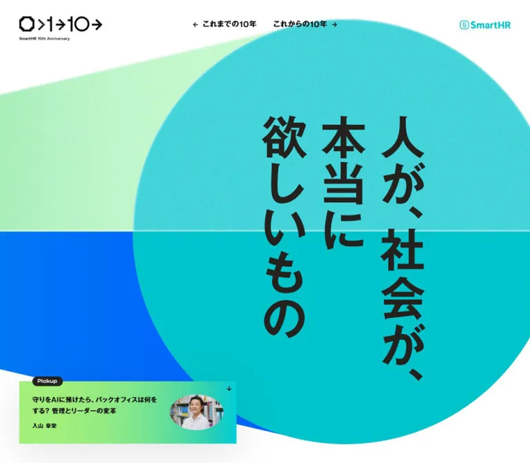
SmartHR presents its anniversary as a substantial editorial destination. The opening composition is almost a poster: a huge cyan circle, two colored planes extending toward the left, and the vertical statement “人が、社会が、本当に欲しいもの.” The small anniversary mark and SmartHR logo establish identity without competing with the central graphic. A compact gradient Pickup link introduces a person and an article at the lower edge.
Below the opening, the site moves between a manifesto, future-facing interviews, a service-vision feature, a retrospective, related media, and a company introduction. Large typography and full-width surfaces supply the drama. Narrow paragraphs, precise column alignments, and small directional links organize the reading. The footer closes with an oversized anniversary symbol that progresses from stepped edges to smooth geometry.
The essential relationship is between expressive geometry and disciplined editorial alignment. On mobile, the artwork becomes deliberately wider than the screen, while many paragraphs retain an asymmetric inset. Preserve both behaviors when adapting the design.
How to Read This Reference
- Measured means a value appears in the supplied computed styles or element rectangles. Values are rounded for readability.
- Calculated means a value follows from supplied variables or a relationship between measured rectangles. These calculations assume the observed 16px root size.
- Estimated means a visual approximation from an original-page screenshot. Hero geometry, portrait crops, grain, and shadow appearance fall into this category.
- Recommended means implementation guidance for a new project. The CSS below is an adaptation, not the original stylesheet.
- Source tokens retain their supplied names. Other names are descriptive implementation aliases.
- A computed font stack establishes the declared family, not a separate verification of the font file used for every glyph.
- Some DOM elements belong to completed splash or unverified navigation states. Their presence and coordinates do not prove that they were visible in the settled screenshots.
Tokens — Colors
Default Palette
These exact values come from source custom properties or computed element colors. The source calls its cyan brand color “blue.”
| Name | Value | Source token or evidence | Role |
|---|---|---|---|
| White | #ffffff |
--color-white; computed body background |
Opening canvas, media section, reversed text and logos |
| SmartHR Cyan | #00c4cc |
--color-smarthr-blue |
Main brand accent; computed mobile retrospective label background |
| Electric Blue | #0066fd |
--color-blue |
Source blue associated visually with the hero's lower plane and narrow chapter-edge color |
| Light Green | #a3ef7b |
--color-lightgreen; computed Pickup background |
Pickup base color and the green end of its visible gradient |
| Editorial Green | #009766 |
--color-green |
Green chapter surface, visible around the third interview |
| Warm Stone | #edebe6 |
--color-stone-02; computed service-vision background |
Large explanatory panels beside product imagery |
| Charcoal | #23221f |
--color-black; computed Pickup badge and selected story text |
Footer appearance, badge fill, and dark text in colored sections |
| Text Black | #000000 |
Computed body, header links, and several headings | Actual foreground on much of the white and stone content |
Do not collapse Text Black and Charcoal into one measured value. The body is computed as black, while the named source black token is a warmer charcoal. Both appear in the evidence.
The hero's rendered cyan varies with its graphic treatment. The upper half has visible grain and tonal variation; the lower half is flatter. #00c4cc is an exact source token, not a claim that every hero pixel has that value. Similarly, the Pickup anchor's computed light-green background does not describe its complete visible green-to-cyan gradient.
Supporting Palette
| Name | Value | Source token | Evidence and reuse guidance |
|---|---|---|---|
| Pale Aqua | #d4f4f5 |
--color-aqua-01 |
Declared supporting color; specific visible placement not established in the supplied captures |
| Soft Aqua | #69d9de |
--color-aqua-02 |
Computed mobile user-story label background |
| Near-white Stone | #f8f7f6 |
--color-stone-01 |
Declared neutral; do not substitute it for the measured service-vision stone |
| Orange | #eb5d00 |
--color-orange |
An orange strip is visible beside the green interview surface; this is the source orange, not a screenshot sample |
| Purple | #c3009f |
--color-purple |
Declared accent; placement is not established by the supplied screenshots |
| Pink | #e5d1e2 |
--color-pink |
Declared supporting color; placement is not established by the supplied screenshots |
| Darker Green | #00875b |
--color-green-a11y |
Declared accessibility-oriented variant; application and contrast behavior were not tested |
These colors belong to one page palette. There is no evidence that they are selectable themes. Use large color fields purposefully, and keep the opening's cyan, green, blue, white, and dark lettering visually dominant.
Tokens — Typography
Japanese Body and Editorial Text
Declared regular family: MFW-PGothicMB101Pr6N-Regular.
Declared bold family: MFW-PGothicMB101Pr6N-DeBold.
The stacks continue through Hiragino Sans, Hiragino Kaku Gothic variants, Meiryo, MS PGothic, and sans-serif. Regular text is computed at weight 400; bold headings, navigation, and article links typically use the DeBold family with weight 600.
The typography is substantial but highly organized. Paragraphs have generous leading, while headings wrap into deliberate short statements. The manifesto uses bold text even though its elements are paragraphs.
Measured body settings:
- Desktop:
16.2254px / 29.2056px, weight400. - Mobile:
15.0298px / 27.0536px, weight400. - Body line height:
1.8at both sizes. - Body letter spacing:
0.8113pxdesktop and0.7515pxmobile, equivalent to0.05emat the body size. - Many descendants inherit that resolved tracking value. Do not assign
0.05emindependently to every large heading and expect the same result.
English Chapter Labels
Declared family: Figtree, sans-serif, through --ff-en-01.
“Next 10” and “Past 10” use weight 600, approximately 20px type, a single-height line box, and normal tracking. The “Story” labels use the same family at weight 400, with a smaller mobile size.
Pickup Caption
Declared family: ClashDisplay-Medium, sans-serif, through --ff-en-02.
The small “Pickup” badge uses this family at 11.1549px desktop and 11px mobile. Its English lettering is a localized accent; the surrounding Japanese title remains in the bold Japanese family.
Hero Lettering and Anniversary Identity
The hero statement is visibly arranged in three vertical columns, read from right to left. Its exact glyph source and asset implementation were not supplied as a measured text element. Do not infer its font from the body stack alone.
The header's semantic H1 contains the anniversary identity. Its computed font size does not measure the visible logo lettering. Likewise, the root HTML element's Times declaration is not evidence of a visible serif design.
Use authorized headline and logo artwork when exact identity matters. A vertical-text fallback can preserve the composition, but its shapes and punctuation spacing will only approximate the original.
Type Scale
| Role | Desktop size / line height | Mobile size / line height | Family and weight | Evidence |
|---|---|---|---|---|
| Body paragraphs | 16.23 / 29.21px |
15.03 / 27.05px |
Regular, 400 | Measured |
| Introductory manifesto | 24.34 / 43.81px |
18.10 / 32.57px |
DeBold, 600 | Measured |
| Vertical chapter heading | 60.85 / 66.93px |
40.30 / 44.33px |
DeBold, 600 | Measured |
| Service-vision heading | 40.56 / 60.85px |
28.18 / 42.26px |
DeBold, 600 | Measured |
| Interview headline | 36.51 / 54.76px |
24.18 / 38.65px |
DeBold, 600 | Measured |
| Interview-series introduction heading | 24.34 / 38.94px |
20.06 / 32.09px |
DeBold, 600 | Measured |
| Interviewee name | 20.28 / 36.51px |
18.03 / 32.45px |
DeBold, 600 | Measured |
| Interviewee credentials | 12.17 / 21.90px |
11.03 / 19.85px |
Regular, 400 | Measured |
| Standard editorial link | 14.20 / 25.55px |
13.03 / 23.45px |
DeBold, 600 | Measured |
| Header chapter links | 15.21 / 27.38px |
Not shown in opening header | DeBold, 600 | Measured and visually confirmed |
| Pickup article title | 14.20 / 25.55px |
11.06 / 19.91px |
DeBold, 600 | Measured |
| Pickup author | 11.16 / 20.09px |
10.02 / 18.04px |
DeBold, 600 | Measured |
| Pickup badge | 11.15 / 18.25px |
11 / 18px |
ClashDisplay-Medium, 400 | Measured |
| Next/Past label | 20.28 / 20.28px |
20 / 20px |
Figtree, 600 | Measured |
| Story label | 20.28 / 20.28px |
14 / 14px |
Figtree, 400 | Measured |
| Footer utility link | 12.17 / 16.43px |
12 / 16.2px |
DeBold, 600 | Measured |
| Footer chapter link | 24.34 / 32.86px |
16.13 / 21.77px |
DeBold, 600 | Measured |
| Hero display lettering | Approximately 95–100px |
Approximately 50–54px |
Exact source unverified | Visual estimate |
Source token names describe a scale rather than semantic HTML levels. For example, the approximately 60.85px desktop value of --fz-h1 is used by a vertical H2 chapter heading, while the actual H1 is the anniversary mark.
Tokens — Spacing & Shapes
Responsive Unit
The supplied variables combine fluid interpolation with an additional scale above a 1420px reference width. At the observed 16px root, their relevant behavior simplifies to:
W = viewport width in CSS pixels
S = max(1, W / 1420)
P = 1px × S
R = 16px × S
G = clamp(19, 0.0201 × W + 11.464, 40) × S pixels
This is an explanatory simplification of the supplied formulas, not their literal syntax. The source also normalizes measurements against the root font size.
| Quantity | At 1440px | At 390px | Basis |
|---|---|---|---|
| Scale S | 1.01408 |
1 |
Calculated from --scale |
Source --px |
1.01408px |
1px |
Calculated |
Source --rem |
16.22535px |
16px |
Calculated |
| Main gap G | 40.5634px |
19.303px |
Calculated and consistent with measured layouts |
Source --space-01 |
162.254px |
120.624px |
Calculated; also measured on media-section padding |
Source --space-02 |
121.690px |
80.624px |
Calculated |
Source --scroll-gap |
243.380px |
240px |
Calculated; actual scroll application unverified |
At desktop, --offset resolves from 2.5 × R; at mobile it uses the gap formula. Both correspond to the visible page insets at their inspected sizes. The exact breakpoint between these rules was not supplied.
Spacing Scale
| Use | Desktop | Mobile | Status |
|---|---|---|---|
| Common small icon/text gap | 10.14px |
10px |
Measured |
| Medium content gap | 20.28px |
Approximately 20px |
Measured in several components |
| Main horizontal gutter | 40.56px |
19.30px |
Measured |
| Pickup internal padding | 30.42px |
Approximately 20.15px |
Measured |
| Major section spacing | 162.25px |
120.62px |
Measured on media section |
| Service-vision heading top inset | 40.56px |
80.61px |
Measured from section and heading rectangles |
| Standard article-link height | 60.84px |
40.30px |
Measured in unscaled examples |
| Footer utility row step | 36.70px |
36.19px |
Calculated from successive link positions |
Border Radius
| Element | Value or shape | Evidence |
|---|---|---|
| Pickup card | 0 |
Computed |
| Media entries | 0 |
Computed |
| Large editorial panels | Square boundaries | Screenshots and measured section layout |
| Pickup badge | 10.14px desktop; 10px mobile |
Computed |
| Portrait crop | Horizontal ellipse, about 3:2 | Screenshot estimate |
| Floating menu control | 50% on a rectangular box |
Computed; produces an ellipse |
| Editorial link symbol | Ellipse associated with a square control area | Screenshot and source ellipse mask |
| Hero | Large circle | Screenshot estimate |
Roundness is concentrated in symbols, faces, and the hero. Content containers remain predominantly square.
Layout Measurements
| Element | Desktop 1440 × 1000 | Mobile 390 × 844 | Status |
|---|---|---|---|
| Document height | 16489.17px |
13597.61px |
Measured DOM |
| Header height | 141.97px |
80.95px |
Measured box; surface is transparent |
| Anniversary logo link | 207.89 × 60.84px |
95.58 × 30.50px |
Measured |
| SmartHR header logo link | 114.59 × 21.28px |
85.44 × 15.86px |
Measured |
| Pickup card | 455.31 × 142.19px |
351.41 × 103.19px |
Measured |
| Pickup origin | 40.56, 817.25px |
19.30, 690.80px |
Measured in opening viewport |
| Introductory text column | 659.16px wide, starting at x 740.28px |
351.41px wide, starting at x 19.30px |
Measured |
| Common narrow body column | 309.30px |
258.73px |
Measured in unscaled story and information sections |
| Service-vision panel | 1440 × 811.27px; two 720px columns |
390 × 994.92px; block layout |
Measured |
| Media entry | 659.16 × 347.86px |
351.41px wide; heights about 184–202px |
Measured |
| Footer height | 726.98px |
571.31px |
Measured |
| Floating menu button | 103.42 × 68.95px |
64.59 × 43.39px |
Measured DOM; mobile visibility not established |
| Hero circle | Approximately 892px diameter; center near (913, 500) |
Approximately 457px diameter; center near (195, 386) |
Screenshot estimate |
Components
Anniversary Header
Role: establish identity and offer the two principal chapter routes.
The transparent header overlays the white opening canvas. Place the anniversary mark at the left, chapter links near the horizontal center, and the cyan SmartHR logo at the right. Desktop padding is 40.5634px. The visible anniversary link is about 208px wide; its surrounding H1 box is wider and should not be mistaken for the artwork width.
The chapter links are “これまでの10年” and “これからの10年,” paired with outward-facing arrows. Their destinations are /past10/ and /next10/ under the anniversary URL. They are small, bold text links rather than filled conversion buttons.
On mobile, the opening header retains the two identity marks and omits the central chapter navigation. Its horizontal inset drops to approximately 19.3px, and the anniversary logo becomes about 95.6px wide. The lower-page chapter links remain available in the footer. A mobile menu-opening sequence was not supplied.
Geometric Hero
Role: express the anniversary theme before introducing detailed content.
Build the composition in distinct layers:
- A white canvas spanning the opening viewport.
- A pale green upper plane entering from the left.
- A saturated blue lower plane, also entering from the left.
- An oversized cyan circle, with a textured upper half and flatter lower half.
- Three columns of dark vertical Japanese display lettering.
- The header and the smaller Pickup article link.
At desktop, the circle is shifted to the right. Its approximate left edge is x 467px, its top is y 54px, and its bottom is y 946px. The horizontal split sits around y 500px and continues through the surrounding planes. This shared seam makes the separate shapes read as one composition.
On mobile, the circle is centered horizontally and extends beyond both edges. Its approximate top and bottom are y 157px and y 614px. The split falls near y 386px. The lettering remains comfortably inside the visible region even though the circle is cropped.
The upper field has visible fine grain. Its texture source, blend mode, and animation are unknown. Preserve a clear horizontal division and restrained tonal variation; exact reconstruction requires the original graphic assets.
Pickup Article Link
Role: connect the large brand statement to a current editorial story.
The entire square-cornered card links to #next10-story-01. Its visible anatomy is:
- A horizontal light-green-to-cyan background.
- A charcoal “Pickup” pill overlapping the top edge.
- A two-line bold Japanese title at left.
- A smaller bold author line below.
- A horizontal oval portrait at right.
- A small downward arrow near the upper-right corner.
- A broad, soft shadow visible beneath the card.
Desktop measurements are 455.31 × 142.19px, with 30.42px padding and a 20.28px content gap. The text region is 252.50px wide. The badge begins about 10.14px above the card and aligns with the text inset.
On mobile, the card spans the inset content width: 351.41px. Padding becomes approximately 20px and the gap approximately 10px. The title region is 210.53px wide. Its measured 11.06px title is substantially smaller than general body text.
Portrait dimensions are approximately 122 × 81px desktop and 90 × 60px mobile, inferred from the remaining flex space and visible crop. The precise shadow and gradient declarations were not supplied. A left-to-right gradient and a diffuse low-opacity shadow are recommended approximations.
Introductory Manifesto
Role: explain the anniversary's premise and establish the narrative voice.
Four bold paragraphs introduce the service's beginnings, its approach to customers, its ambition, and the next decade. On desktop they occupy the right half of the inset grid, beginning at x 740.28px with a width of 659.16px. The left half remains compositionally open.
Use 24.34px DeBold type with 43.81px leading. Paragraph gaps are approximately 20.28px. The first paragraph begins around document y 1162px, beyond the initial viewport.
At mobile, the text spans the full 351.41px content width and uses 18.10 / 32.57px. The first paragraph begins around document y 1138px. Preserve the deliberate breathing room between the opening composition and this text; it is part of the observed pacing.
Chapter Entrances
Role: distinguish the future-facing and retrospective halves of the site.
Each chapter combines a small English label, a short Japanese descriptor, a prominent vertical title, and an introductory text group.
The “Next 10” title sits at the right edge of the inset layout. “Past 10” mirrors that placement at the left. Their measured vertical heading boxes are approximately 66.92 × 512.91px desktop and 44.31 × 341.02px mobile.
Desktop chapter labels use Figtree at approximately 20px and place their Japanese descriptor alongside. In the mobile Next 10 block, the descriptor wraps onto a separate row. The supplied mobile Past 10 descriptor remains beside its label. Do not force these distinct content lengths into an identical wrapping rule.
The chapter titles link to their respective detail pages. Preserve vertical Japanese writing and handle “10” deliberately within the vertical composition. The exact original writing-mode and number treatment were not included in the extracted styles.
Interview Story Panels
Role: present three substantial perspectives on the future of work.
The rendered page contains three stories featuring 今井 翔太, 坂爪 洋美, and 谷川 嘉浩. Each includes a Story number, a headline, the SmartHR Mag. label, an interviewee name and credentials, a summary, imagery, and an “この記事を読む” link.
The headline spans two desktop grid columns at approximately 659px. Supporting metadata occupies a narrower column. Summaries sit in the adjacent narrow column, producing staggered editorial alignment rather than a uniform stack of cards. The third story's supplied screenshot shows white copy on a large green field, part of a tinted portrait above, and narrow orange and blue strips at the right boundary.
The desktop story-index title is a very narrow vertical link near the right edge. At mobile, it becomes a horizontal title alongside a small Story label. For the second story, the mobile label/title row uses approximately 14px English type and 11px Japanese type.
Mobile story headlines span the full inset width. Summaries retain a rightward inset: x 111.97px with a width of 258.73px. Reading links move below those summaries in the same inset region.
Some first-story rectangles are approximately 84% of corresponding unscaled dimensions: a desktop body rectangle is 259.81px rather than 309.30px, and a mobile headline rectangle is 295.18px rather than 351.41px. This is consistent with a transformed sampled state. Do not turn those smaller rectangles into a second permanent grid or infer a specific scroll-animation sequence from them.
External reading links point to individual SmartHR Mag. articles. Their extracted labels include an announcement that they open a new tab. The actual click behavior was not independently exercised.
Service-Vision Feature
Role: connect the anniversary narrative to the service's “worker-friendly” vision.
At desktop, this is a measured two-column grid of 720px 720px on a warm-stone section. The left half contains a large three-line heading near its top, a narrow paragraph much lower down, and an editorial link. The right half is filled by a large product-interface montage.
The visual crop shows tilted desktop and mobile interfaces, employee portraits, turquoise application headers, and light interface surfaces. It runs to the panel edges rather than sitting inside a small rounded image card.
The desktop heading uses 40.56 / 60.85px. The paragraph is only 309.30px wide inside the 720px half-panel. Maintain the contrast between a broad heading and a narrow reading measure.
At mobile, the section's computed display changes to block. The heading spans the inset width, while the paragraph and link use the rightmost three-column measure. The heading begins about 80.6px below the section top. The full mobile image transition is not shown in the supplied screenshots, so exact image crop and spacing there remain unverified.
Retrospective Features
Role: introduce service-growth data and customer stories.
The homepage contains two feature groups: “データで見る0→1→10” and “ユーザーストーリー.” Each has a local section link, a larger title, an explanatory paragraph, and a link into the Past 10 page.
Desktop titles can span approximately 1009px, or three columns of the inset grid. Supporting paragraphs return to a single narrow column. The mobile user-story headline spans the inset width, with the paragraph and link aligned to the rightmost three columns.
The mobile section-label bars are measured at 50px high. The data label has a computed cyan background #00c4cc; the user-story label uses #69d9de. Their title text is approximately 11.03 / 19.85px, with 15px horizontal padding.
The supplied screenshots do not expose the complete artwork or data presentation within these features. Reuse the verified hierarchy and spacing without inventing charts, counters, or animated statistics.
Media and Events Directory
Role: offer four related content destinations after the main anniversary narrative.
The entries are WEDNESDAY HOLIDAY, SmartHR Mag., リアル SmartHR, and the events/seminars destination. The DOM establishes four full-entry links, each with a title, a Media or Event label, and explanatory copy.
On desktop, the entries form two columns. Each entry is about 659px wide and internally uses two 309px columns separated by 40.56px. Titles sit at the top of the information region; descriptions sit farther down. The entries have square corners and transparent backgrounds on a white section.
On mobile, the directory becomes a single stack. Each entry uses 100px 232.109px columns with a 19.303px gap. The title and category share an upper row across the entry, while the description begins at x 138.59px in the right column. Copy uses approximately 13.03 / 23.45px.
One-pixel vertical differences between successive entry rectangles indicate a thin separator allocation, but its exact color was not supplied. A subtle solid rule is a reasonable implementation recommendation.
SmartHR Introduction
Role: explain the company and offer direct routes to its service and corporate sites.
The desktop bottom capture shows a stone text half beside a saturated cyan product half. The image features a laptop and phone displaying an HR dashboard. Unlike the tilted service-vision montage, this is a centered device presentation with large areas of cyan around it.
The company paragraph uses the same narrow reading measure as earlier information blocks. At desktop, two external destination links share a row in the left half. On mobile, both links occupy the inset three-column text region and stack vertically.
The original page names 株式会社SmartHR in this introduction and links separately to the service and corporate websites. These destinations identify two purposes within the same brand, not separate site operators.
Editorial Link Symbol
Role: make small text links recognizable without large filled buttons.
Common links use bold text beside a substantial geometric symbol. In the desktop company-introduction capture, a dark square of approximately 61px contains a pale horizontal ellipse and a small external-link glyph. The source includes a 60 × 50 ellipse mask and 10 × 10 arrow/external-link SVG definitions.
Measured unscaled link boxes are about 60.84px high on desktop and 40.30px on mobile, with approximately 10px between icon area and text. The exact pseudo-element implementation and hover transformation were not provided.
Preserve the contrast between a large simple symbol and a modest text label. Use real anchors for navigation, with the symbol treated as decorative when the text already supplies the accessible name.
Footer
Role: supply corporate utilities, social destinations, and a final return to the anniversary's two chapters.
A charcoal surface fills the footer. The upper desktop region follows four columns: SmartHR identity, legal/company links, corporate/social links, and Back to Top. Text is white, with cyan SmartHR symbols and recognizable platform-colored social icons.
A faint horizontal rule separates these utilities from the chapter links. “これまでの10年” sits left with a left arrow; “これからの10年” sits right with a right arrow. Beneath them, a very large white anniversary graphic fills the content width. Its early symbols have stepped edges, while the later circle and arrow are smooth.
On mobile, the top row pairs the SmartHR logo with Back to Top. Legal links form two columns, followed by another divided two-column group of corporate and social links. The chapter links remain side by side. The oversized anniversary graphic still stretches across the inset width near the bottom.
The two mobile utility columns measure approximately 166px each with a 19.3px gap. Footer utility type remains about 12px rather than shrinking in direct proportion to the desktop layout.
Floating Menu Control and Navigation Structure
Role: provide a compact access point to deeper chapter links.
A gray, softly shaded oval with two short white horizontal strokes is visible near the lower-right corner of the desktop middle capture. Its measured box is 103.42 × 68.95px, approximately 20.28px from the right and bottom viewport edges. Its shading suggests a rounded volume, but the precise gradient or shadow recipe is unavailable.
The mobile DOM includes a smaller 64.59 × 43.39px button near the same corner. It is not visibly established in the supplied mobile captures. Do not assume that its presence in the DOM means it is always shown.
The DOM also contains navigation groups for Past 10 and Next 10, including history, data, user stories, service vision, messages, and development topics. Their desktop rectangles form two groups; mobile rectangles stack them. This establishes a navigation structure, but not the visible backdrop, opening animation, focus behavior, or scroll locking of an expanded menu.
Tokens — Motion & Interaction
| Treatment | Supplied value or evidence | What is established | Limitation |
|---|---|---|---|
| Header entrance/state change | top 1.2s ease-out, opacity 1.2s ease-out |
Explicit computed transition definition | Trigger, complete movement, and repeat behavior not recorded |
| Pickup entrance/state change | translate 1.2s ease-out, opacity 1.2s ease-out |
Explicit computed transition definition | Initial offset and subsequent behavior unknown |
| Splash text movement | translate 0.8s |
Definition exists on splash content | Full visible sequence not captured |
| Splash graphic movement | translate 0.8s plus margin-left 0.8s cubic-bezier(0.47, 0, 0.23, 1.38) 1s |
An overshooting curve and a 1s delay are explicitly declared for the margin change | Do not generalize this easing to the whole site |
| Shared timing variables | --duration-base: 1s; --transition-duration: calc(1s * .5) |
Source timing tokens | They do not prove every component animates for these durations |
| Story/retrospective transforms | Some rectangles are approximately 0.84× comparable layout dimensions |
Transformed sampled geometry | No verified start/end sequence or scroll linkage |
| Pickup navigation | Anchor to #next10-story-01 |
Local destination | Smooth scrolling and focus transfer untested |
| Story index navigation | Local story anchors | Targets are present | Selection and sticky behavior untested |
| Back to Top | Anchor to #top |
Destination is present | Scroll duration and easing unknown |
| Splash completion | Completion text and a Skip button exist in DOM | A splash-related state is represented | Skip activation, recurrence, and keyboard behavior untested |
| Floating menu | Visible desktop control and deeper navigation DOM | Control appearance and navigation content | Open/close interaction unverified |
Many sampled elements report transition: all without a nonzero duration and animation: none. These values do not establish active motion, nor do they rule out JavaScript-driven behavior elsewhere.
The capture process waited for finite motion and sampled layout stability, temporarily pausing perpetual animations during readiness checks and then resuming them. This helps explain why the screenshots show settled content; it does not prove that all delayed content or interactions were observed.
For a new implementation, use deliberate opacity and position changes for entrances. Keep essential text available in the static state. Continuous hero rotation, an automatic Pickup carousel, magnetic buttons, and scroll snapping are not established by this evidence and should not be presented as original behavior.
Surfaces
| Surface | Appearance | Structural role |
|---|---|---|
| Opening canvas | White, with large colored geometry | Gives the headline and anniversary symbol room |
| Upper hero field | Cyan and pale green with visible fine grain | Adds material variation to simple geometry |
| Lower hero field | Flatter cyan and electric blue | Creates a strong horizontal division |
| Pickup card | Green-to-cyan gradient, square corners, soft shadow | Highlights one editorial entry |
| Interview region | Large colored fields; green is visually confirmed | Gives stories chapter-scale presence |
| Service-vision panel | Warm stone next to edge-to-edge interface imagery | Separates explanation from product visualization |
| Media section | White with open entry layouts | Returns to a quieter directory rhythm |
| Company/product panel | Stone and cyan | Reconnects editorial content to the service |
| Footer | Charcoal with white type and faint rules | Consolidates navigation and closes the identity system |
| Floating control | Shaded gray ellipse | Isolates a compact utility from changing backgrounds |
There is no general elevated-card system. The Pickup shadow and shaded menu control are localized treatments. Most structure comes from color boundaries, grids, image crops, and whitespace.
Imagery
The site combines three distinct visual materials: abstract geometry, editorial portraits, and software imagery. They share color relationships and strong cropping, while retaining their own functions.
Abstract geometry: use a circle with a visible equator, trapezoidal planes, arrows, and the progression from stepped to smooth anniversary symbols. Geometry is large enough to become architecture for the page. Fine grain belongs primarily to the hero's upper field; it should not become a filter across all text and screenshots.
Editorial portraits: the Pickup shows a natural-color portrait against foliage in a horizontal oval. A portion of the third interview portrait is visibly tinted green. Do not infer that all portraits use one uniform treatment or assign a specific blend mode without asset evidence.
Service imagery: the service-vision section contains a large tilted collage of application screens and device interfaces. The final company section uses a more restrained laptop-and-phone composition on cyan. Keep these two image roles distinct: one immerses the reader in the interface; the other provides a clear product overview.
Identity artwork: the anniversary mark intentionally combines stepped and smooth contours. Preserve the supplied artwork at high quality. Do not apply image-rendering: pixelated globally: the portraits, product screens, and smooth parts of the mark are not low-resolution pixel art.
Observed Asset References
No image filenames or downloadable asset URLs were supplied for the visual artwork. The references below identify what is observable without inventing paths.
| Asset | Evidence available | Implementation guidance |
|---|---|---|
| Anniversary identity | Header and footer captures; logo-link rectangles | Use authorized logo artwork with its original proportions |
| Vertical hero statement | Desktop and mobile opening captures | Use approved display artwork or a clearly identified text approximation |
| Hero circle, planes, and grain | Opening captures | CSS can approximate geometry; original grain and compositing remain unknown |
| Pickup portrait | Opening captures | Use the actual editorial subject and preserve the oval crop |
| Interview portrait treatment | Partial third-story image in desktop middle capture | Preserve verified crop/tint when the asset is available |
| Service-vision montage | Desktop middle capture | Use a large edge-to-edge crop, preserving screen legibility |
| Laptop and phone image | Desktop lower-page and mobile footer captures | Contain the devices within the cyan field |
| External-link glyph | Source --icon-blank, inline SVG with a 10 × 10 viewBox |
Reuse an accessible decorative SVG equivalent |
| Directional arrow | Source --icon-arrow, inline SVG with a 10 × 10 viewBox |
Keep a compact, solid-stroke arrow |
| Elliptical link mask | Source --icon-circle, 60 × 50 SVG ellipse |
Preserve its horizontal proportions |
Layout & Responsive Behavior
Four-Column Editorial Alignment
The desktop content coordinates reveal a consistent four-column system:
Page inset: 40.56px
Column starts: 40.56px, 390.42px, 740.28px, 1090.14px
Single column: 309.30px
Gap: 40.56px
Two-column span: 659.16px
Three-column span: 1009.02px
With four equal tracks, two outside insets, and three internal gaps, the calculated track width is (viewport width − 5 × gap) / 4 when the inset equals the gap. These dimensions explain the narrow paragraphs, two-column headlines, manifesto placement, and directory entries.
The service-vision panel deliberately uses a different outer structure: two exact viewport halves, with content aligned inside each half.
Mobile Keeps the Asymmetry
At 390px, a corresponding four-track construction uses a 19.303px gutter and approximately 73.37px tracks. Three tracks plus two gaps measure approximately 258.72px, matching the common mobile text width.
This produces a characteristic body region starting near x 111.97px, while headings start at x 19.30px. The mobile layout is therefore more specific than a universal single column:
- The manifesto spans the full inset width.
- Interview, service-vision, retrospective, and company summaries often occupy the rightmost three tracks.
- The Next 10 introduction can occupy the leftmost three tracks beside its right-edge vertical heading.
- Story-index titles become horizontal rows.
- Media entries use their own
100px + flexibleinternal layout. - Footer utilities use two equal columns.
Opening Composition
Desktop places the hero circle off center to the right and overlaps the Pickup card with its lower-left region. Mobile recenters the circle, crops its sides, and places the card below the circle with visible white separation.
The mobile header is smaller, but the hero does not shrink to fit entirely inside the content gutter. This deliberate artwork overflow is separate from document overflow: a new implementation should clip decorative layers locally while keeping content and focus indicators reachable.
Evidence Boundaries
Only the two stated viewport sizes were inspected. The exact breakpoint, tablet layout, landscape behavior, browser zoom handling, and safe-area implementation are unknown. A breakpoint near 56rem is proposed in the Quick Start solely as a practical adaptation.
The measured document is shorter on mobile despite text reflow. Do not force an implementation to reproduce total document height: content, transforms, and responsive section geometry all affect it. Preserve the observed component relationships instead.
Do’s and Don’ts
Do
- Make the split circle and vertical statement the opening's dominant elements.
- Align the circle's horizontal seam with the colored planes behind it.
- Keep the opening white, cyan, green, and blue palette distinct from later chapter surfaces.
- Preserve square content panels alongside circular and elliptical symbols.
- Use the measured Japanese regular/DeBold hierarchy and generous paragraph leading.
- Keep Figtree chapter labels and the ClashDisplay Pickup caption as localized English treatments.
- Build desktop editorial alignment around four columns and shared gutters.
- Retain mobile paragraph insets where the evidence shows them.
- Give the Pickup card its overlapping badge, oval portrait, directional arrow, and compact title.
- Use different crops for the immersive interface montage and the final device overview.
- End with the charcoal footer and oversized stepped-to-smooth anniversary artwork.
- Separate observed transition definitions from unverified interaction sequences.
Don’t
- Do not replace the editorial journey with a repetitive grid of feature cards.
- Do not center every mobile paragraph or stretch every summary across the full width.
- Do not shrink the mobile circle until its entire outline fits between the gutters.
- Do not turn the large vertical statement into an ordinary horizontal heading without acknowledging the loss of the defining composition.
- Do not use rounded corners and shadows as a universal container style.
- Do not flatten all text colors into the source charcoal token; computed black is also present.
- Do not claim an exact hero font or texture algorithm from visual similarity.
- Do not use grain or pixelation filters on all photographs and software screens.
- Do not treat source color variables as evidence of a theme switcher.
- Do not infer autoplay, scroll locking, sticky panels, or menu transitions from static images alone.
- Do not use scaled DOM rectangles as permanent content widths.
- Do not duplicate completed splash text as visible page copy.
Recommended Implementation Additions
These are recommendations for an adaptation, not verified features of the original:
- Keep hero lettering available as accessible text or meaningful image alternative text. Hide purely decorative geometry from assistive technology.
- Supply explicit accessible names for the SmartHR logo link and menu button. The extracted empty text values do not establish whether such names already exist.
- Implement a real menu state with
aria-expanded, keyboard support, Escape handling where appropriate, and focus restoration. If its mobile contents exceed the viewport, make the navigation scrollable. - Preserve announced external-link behavior and include the full article title in an accessible link name.
- Enlarge invisible hit areas around compact utility links. The observed mobile menu box is only about 43.4px tall, and several text links have much smaller line boxes.
- Consider increasing the mobile Pickup title and author sizes for readability, allowing the card to grow vertically instead of compressing its copy.
- Test text contrast against the actual rendered gradients and story surfaces. A source variable named for accessibility is not a completed contrast audit.
- Add reduced-motion behavior that reveals content immediately and bypasses decorative splash movement.
- Provide resilient ordinary document flow before adding any scroll-driven transformations. Anchor destinations should remain reachable without animation.
- Reserve image dimensions and use responsive assets for the portraits, montage, and product overview. Load below-the-fold imagery progressively while keeping the opening stable.
Agent Prompt Guide
Quick Color Reference
- Opening canvas:
#ffffff. - Brand cyan: source
#00c4cc; textured hero rendering can vary. - Hero lower plane: source electric blue
#0066fd. - Pickup green:
#a3ef7b, blending visually toward cyan. - Confirmed green story surface: source
#009766. - Information panel:
#edebe6. - Footer and badge: charcoal
#23221f. - Ordinary white/stone-section text: measured black
#000000. - Reversed text: white.
- Mobile retrospective label variant:
#69d9de.
Overall Prompt
“Create an editorial corporate-anniversary homepage inspired by the current SmartHR 10th Anniversary page. Begin with a white viewport containing a huge cyan circle shifted to the right, a visible horizontal seam through its middle, pale-green and electric-blue planes extending from the left, and three columns of dark vertical Japanese display copy. Use the example statement ‘人が、社会が、本当に欲しいもの’. Place a small anniversary identity at upper left, two directional chapter links near the center, and a cyan corporate logo at upper right. Add a square green-to-cyan Pickup link with a tiny overlapping dark pill and an oval editorial portrait. Continue through a right-aligned manifesto, future-work interviews, a warm-stone service-vision feature, retrospective entries, a media directory, and a charcoal footer. Use a four-column desktop grid, narrow paragraphs, bold Japanese headings, about 1.8 body leading, and restrained arrow links. On mobile, center and crop the large circle, hide the center header links, and preserve the asymmetric three-column measure for many body paragraphs. Treat unverified motion as optional enhancement.”
Example Component Prompts
- Hero: “A white anniversary opening with a cyan circle approximately 892px across in a 1440 × 1000 composition, centered near x 913px and y 500px. Align the circle's equator with pale-green and blue planes arriving from the left. Put dark vertical Japanese lettering over the circle. Use subtle grain only in the upper graphic field. On a 390px phone, make the circle approximately 457px across and clip its sides.”
- Pickup: “A square-cornered editorial link, approximately 455 × 142px desktop and 351 × 103px mobile. Use a green-to-cyan horizontal gradient, a dark 20px-high Pickup pill overlapping the top edge, a bold two-line Japanese title, a small author line, an oval portrait at right, and a downward arrow near the upper-right corner. Add one broad soft shadow.”
- Interview section: “A chapter-scale editorial story with a bold multiline headline, small Story number, publication label, interviewee name, credentials, portrait, and a narrow summary. Align desktop content to four columns with about 40px gutters. At mobile, keep the headline full width and place the summary in the rightmost three columns with about 19px gutters. Use explicit article links; do not invent a carousel.”
- Service vision: “A full-width two-panel feature: warm stone at left and a large tilted software-interface montage at right. Put a roughly 41px bold heading high in the left panel and a 309px-wide paragraph lower down. On mobile, stack the feature, use a roughly 28px heading, and retain a right-inset summary.”
- Media entry: “An open, square-cornered directory entry with a title, Media/Event label, image region, and explanatory paragraph. Desktop uses two equal internal columns. Mobile places the title and category in the upper row and uses a 100px image column beside a flexible description column. Use a fine separator instead of card elevation.”
- Footer: “A charcoal footer with white utility text, a small white corporate logo, cyan brand icons, and compact social links. Use four utility columns on desktop and divided two-column groups on mobile. Add outward-facing chapter links and a very large white anniversary graphic that progresses from stepped contours to smooth circular and arrow forms.”
Quick Start
CSS Custom Properties
This is a usable static adaptation of the measured palette, typography endpoints, grids, and principal components. It keeps a conventional root font size. The 56rem layout breakpoint, intermediate sizing, hero geometry, gradients, shadows, and focus treatment are recommendations. The source's complete root-normalization formulas are not reproduced.
The named fonts require separately supplied, licensed font files or the original authorized font-loading setup. Fallbacks remain usable. The hero title and anniversary logos should use approved artwork; no asset paths are invented here. Supply an optional grain image through --hero-texture.
:root {
  /* Exact source palette and observed text color */
  --color-white: #ffffff;
  --color-text: #000000;
  --color-ink: #23221f;
  --color-brand: #00c4cc;
  --color-blue: #0066fd;
  --color-lime: #a3ef7b;
  --color-green: #009766;
  --color-stone: #edebe6;
  --color-aqua: #69d9de;
  --color-orange: #eb5d00;

  /* Source family names with a shortened fallback stack */
  --font-body: 'MFW-PGothicMB101Pr6N-Regular',
    'Hiragino Sans', 'Hiragino Kaku Gothic ProN', Meiryo, sans-serif;
  --font-bold: 'MFW-PGothicMB101Pr6N-DeBold',
    'Hiragino Sans', 'Hiragino Kaku Gothic ProN', Meiryo, sans-serif;
  --font-chapter: 'Figtree', sans-serif;
  --font-caption: 'ClashDisplay-Medium', sans-serif;

  /* Source-derived scaling at the observed root size */
  --u: max(1px, calc(100vw / 1420));
  --gutter: clamp(19px, calc(2.01vw + 11.464px), 40px);
  --text-body: clamp(.938rem, calc(.09584vw + .916rem), 1rem);
  --text-small: calc(var(--text-body) - 2 * var(--u));
  --text-tiny: calc(var(--text-body) - 4 * var(--u));
  --text-heading: clamp(1.75rem, calc(1.1488vw + 1.481rem), 2.5rem);
  --text-story: clamp(1.5rem, calc(1.1488vw + 1.231rem), 2.25rem);
  --text-chapter: clamp(2.5rem, calc(1.92vw + 2.051rem), 3.75rem);
  --space-major: clamp(7.5rem, calc(3.84vw + 6.603rem), 10rem);
  --space-section: clamp(5rem, calc(3.84vw + 4.103rem), 7.5rem);
  --control-size: 40.3px;
  --leading-body: 1.8;
  --leading-heading: 1.5;

  /* Recommended visual approximations */
  --pickup-shadow: 0 24px 56px rgb(35 34 31 / 10%);
  --footer-rule: rgb(255 255 255 / 12%);
  --hero-texture: none;
  --feedback-duration: 180ms;
}

@media (min-width: 56rem) {
  :root {
    --gutter: calc(40 * var(--u));
    --control-size: calc(60 * var(--u));
  }
}

@media (min-width: 1420px) {
  :root {
    --text-body: calc(16 * var(--u));
    --text-heading: calc(40 * var(--u));
    --text-story: calc(36 * var(--u));
    --text-chapter: calc(60 * var(--u));
    --space-major: calc(160 * var(--u));
    --space-section: calc(120 * var(--u));
  }
}

* { box-sizing: border-box; }

body {
  margin: 0;
  color: var(--color-text);
  background: var(--color-white);
  font-family: var(--font-body);
  font-size: var(--text-body);
  font-weight: 400;
  line-height: var(--leading-body);
  letter-spacing: .05em;
}

img, svg { max-width: 100%; }
a { color: inherit; }
button { font: inherit; }
h1, h2, h3, p, figure { margin: 0; }

.heading, .story-title {
  font-family: var(--font-bold);
  font-weight: 600;
  line-height: var(--leading-heading);
}

.heading { font-size: var(--text-heading); }
.story-title { font-size: var(--text-story); }

.editorial-grid {
  display: grid;
  grid-template-columns: repeat(4, minmax(0, 1fr));
  gap: var(--gutter);
  padding-inline: var(--gutter);
}

.editorial-grid > * { min-width: 0; }

.anniversary-header {
  position: absolute;
  z-index: 5;
  inset: 0 0 auto;
  display: grid;
  grid-template-columns: 1fr auto 1fr;
  align-items: start;
  padding: var(--gutter);
}

.anniversary-mark {
  display: block;
  width: calc(205 * var(--u));
}

.anniversary-mark img,
.brand-mark img {
  display: block;
  width: 100%;
  height: auto;
}

.brand-mark {
  justify-self: end;
  width: calc(113 * var(--u));
  margin-top: calc(10 * var(--u));
}

.chapter-nav {
  display: flex;
  gap: var(--gutter);
  font-family: var(--font-bold);
  font-size: calc(15 * var(--u));
  font-weight: 600;
}

.chapter-nav a {
  display: inline-flex;
  align-items: center;
  gap: calc(10 * var(--u));
  text-decoration: none;
}

/* Approximate the settled hero; no motion is required. */
.anniversary-hero {
  position: relative;
  min-height: max(640px, 100svh);
  isolation: isolate;
}

.hero-art {
  position: absolute;
  z-index: -1;
  inset: 0;
  overflow: hidden;
  pointer-events: none;
}

.hero-plane {
  position: absolute;
  inset: 0;
}

.hero-plane--upper {
  background: linear-gradient(90deg, #9de4b1, #dcffd5);
  clip-path: polygon(0 25.7%, 63.4% 5.4%, 63.4% 50%, 0 50%);
}

.hero-plane--lower {
  background: var(--color-blue);
  clip-path: polygon(0 50%, 63.4% 50%, 63.4% 94.6%, 0 74.6%);
}

.hero-circle {
  position: absolute;
  left: 63.4%;
  top: 50%;
  width: min(89.2svh, 62vw);
  aspect-ratio: 1;
  transform: translate(-50%, -50%);
  overflow: hidden;
  border-radius: 50%;
  background: var(--color-brand);
}

.hero-circle::before {
  content: '';
  position: absolute;
  inset: 0 0 50%;
  background-image: var(--hero-texture),
    linear-gradient(135deg, var(--color-aqua), var(--color-brand));
  border-bottom: 1px solid rgb(255 255 255 / 65%);
}

/* This wrapper expects approved vertical headline artwork. */
.hero-title {
  position: absolute;
  left: 63.4%;
  top: 25.5%;
  width: 24.3vw;
  transform: translateX(-50%);
}

.hero-title img {
  display: block;
  width: 100%;
  height: auto;
}

.pickup {
  position: absolute;
  left: var(--gutter);
  bottom: var(--gutter);
  display: flex;
  align-items: center;
  gap: calc(20 * var(--u));
  width: calc(449 * var(--u));
  padding: calc(30 * var(--u));
  color: var(--color-text);
  background: linear-gradient(90deg, var(--color-lime), var(--color-brand));
  border-radius: 0;
  box-shadow: var(--pickup-shadow);
  text-decoration: none;
}

.pickup-copy { flex: 1; min-width: 0; }

.pickup-label {
  position: absolute;
  left: calc(30 * var(--u));
  top: calc(-10 * var(--u));
  display: flex;
  align-items: center;
  height: calc(20 * var(--u));
  padding-inline: calc(10 * var(--u));
  border-radius: 999px;
  background: var(--color-ink);
  color: var(--color-white);
  font-family: var(--font-caption);
  font-size: calc(11 * var(--u));
  line-height: 1;
}

.pickup-title, .pickup-author {
  font-family: var(--font-bold);
  font-weight: 600;
}

.pickup-title {
  font-size: calc(14 * var(--u));
  line-height: 1.8;
  letter-spacing: .04em;
}

.pickup-author {
  margin-top: calc(10 * var(--u));
  font-size: calc(11 * var(--u));
}

.pickup-portrait {
  flex: none;
  display: block;
  width: calc(120 * var(--u));
  aspect-ratio: 3 / 2;
  object-fit: cover;
  border-radius: 50%;
}

.pickup-arrow {
  position: absolute;
  top: 8px;
  right: 10px;
  line-height: 1;
}

.manifesto {
  padding-block: var(--space-major);
}

.manifesto-copy {
  grid-column: 3 / span 2;
  font-family: var(--font-bold);
  font-size: calc(24 * var(--u));
  font-weight: 600;
}

.manifesto-copy p + p { margin-top: calc(20 * var(--u)); }

.chapter-label {
  font-family: var(--font-chapter);
  font-size: calc(20 * var(--u));
  font-weight: 600;
  line-height: 1;
  letter-spacing: normal;
}

.chapter-heading {
  writing-mode: vertical-rl;
  text-orientation: mixed;
  font-family: var(--font-bold);
  font-size: var(--text-chapter);
  font-weight: 600;
  line-height: 1.1;
}

.chapter-heading .digits { text-combine-upright: all; }
.chapter-heading--next { grid-column: 4; justify-self: end; }
.chapter-heading--past { grid-column: 1; }
.narrow-copy { grid-column: 2; }

/* Use a supplied SVG arrow or external-link glyph inside the icon. */
.editorial-link {
  display: inline-flex;
  align-items: center;
  gap: calc(10 * var(--u));
  font-family: var(--font-bold);
  font-size: var(--text-small);
  font-weight: 600;
  text-decoration: none;
}

.editorial-link-icon {
  flex: none;
  display: grid;
  place-items: center;
  width: var(--control-size);
  height: var(--control-size);
  background: var(--color-text);
}

.editorial-link-oval {
  display: grid;
  place-items: center;
  width: 100%;
  height: 83.333%;
  border-radius: 50%;
  background: var(--link-surface, var(--color-stone));
  color: var(--color-text);
}

.editorial-link-oval svg { width: 10px; height: 10px; }

.vision {
  display: grid;
  grid-template-columns: repeat(2, minmax(0, 1fr));
  background: var(--color-stone);
}

.vision-copy {
  display: flex;
  flex-direction: column;
  align-items: flex-start;
  gap: var(--gutter);
  min-height: calc(800 * var(--u));
  padding: var(--gutter);
}

.vision-summary {
  width: calc((100vw - 5 * var(--gutter)) / 4);
  max-width: 100%;
  margin-top: auto;
}

.vision-summary .editorial-link { margin-top: var(--gutter); }
.vision-image { min-width: 0; overflow: hidden; }

.vision-image img {
  display: block;
  width: 100%;
  height: 100%;
  object-fit: cover;
}

.media-section {
  padding: var(--space-major) var(--gutter);
  background: var(--color-white);
}

.media-list {
  display: grid;
  grid-template-columns: repeat(2, minmax(0, 1fr));
  column-gap: var(--gutter);
  margin-top: var(--gutter);
}

.media-entry {
  display: grid;
  grid-template-columns: repeat(2, minmax(0, 1fr));
  grid-template-rows: auto 1fr;
  gap: 10px var(--gutter);
  padding-block: 20px;
  border-top: 1px solid rgb(35 34 31 / 18%);
  text-decoration: none;
}

.media-image { grid-column: 1; grid-row: 1 / span 2; }
.media-image img { display: block; width: 100%; height: auto; }
.media-heading { grid-column: 2; }
.media-name { font-family: var(--font-bold); font-weight: 600; }
.media-description { grid-column: 2; align-self: end; font-size: var(--text-small); }

.site-footer {
  padding: calc(60 * var(--u)) var(--gutter) 0;
  color: var(--color-white);
  background: var(--color-ink);
}

.footer-top {
  display: grid;
  grid-template-columns: repeat(4, minmax(0, 1fr));
  gap: var(--gutter);
  padding-bottom: calc(60 * var(--u));
  border-bottom: 1px solid var(--footer-rule);
}

.footer-brand { grid-column: 1; grid-row: 1; }
.footer-legal { grid-column: 2; grid-row: 1; }
.footer-social { grid-column: 3; grid-row: 1; }
.footer-back { grid-column: 4; grid-row: 1; justify-self: end; }

.footer-links {
  display: grid;
  align-content: start;
  gap: 20px;
  margin: 0;
  padding: 0;
  list-style: none;
}

.site-footer a {
  font-family: var(--font-bold);
  font-size: 12px;
  font-weight: 600;
  line-height: 1.35;
  text-decoration: none;
}

.footer-chapters {
  display: flex;
  justify-content: space-between;
  gap: 20px;
  padding-block: calc(60 * var(--u));
}

.footer-chapters a { font-size: calc(24 * var(--u)); }
.footer-art { display: block; width: 100%; height: auto; }

/* Recommended keyboard feedback, not an observed source rule. */
a:focus-visible, button:focus-visible {
  outline: 3px solid currentColor;
  outline-offset: 5px;
}

@media (hover: hover) {
  .chapter-nav a:hover,
  .editorial-link:hover,
  .site-footer a:hover {
    text-decoration: underline;
    text-underline-offset: .25em;
  }
}

@media (max-width: 55.999rem) {
  .anniversary-header {
    grid-template-columns: 1fr 1fr;
    padding-block: 20.32px 30.15px;
  }
  .anniversary-mark { width: 95.58px; }
  .brand-mark { width: 85.44px; margin-top: 2px; }
  .chapter-nav { display: none; }
  .anniversary-hero { min-height: max(780px, 100svh); }

  .hero-circle {
    left: 50%;
    top: 45.67%;
    width: 117.2vw;
  }
  .hero-plane--upper {
    clip-path: polygon(0 23.3%, 50% 18.6%, 50% 45.67%, 0 45.67%);
  }
  .hero-plane--lower {
    clip-path: polygon(0 45.67%, 50% 45.67%, 50% 72.75%, 0 68.3%);
  }
  .hero-title { left: 50%; top: 28.43%; width: 49.2vw; }

  .pickup {
    width: calc(100% - 2 * var(--gutter));
    bottom: 50px;
    padding: 20.15px 20.14px;
    gap: 10.14px;
  }
  .pickup-label { top: -10px; left: 20.14px; height: 20px; font-size: 11px; }
  .pickup-title { font-size: 11.06px; }
  .pickup-author { margin-top: 5px; font-size: 10.02px; }
  .pickup-portrait { width: 90.45px; }

  .manifesto-copy { grid-column: 1 / -1; font-size: 18.1px; }
  .narrow-copy { grid-column: 2 / -1; }
  .story-title { line-height: 1.6; }
  .chapter-label { font-size: 20px; }

  .vision { display: block; }
  .vision-copy {
    display: grid;
    grid-template-columns: repeat(4, minmax(0, 1fr));
    min-height: 0;
    gap: 30px var(--gutter);
    padding: var(--space-section) var(--gutter);
  }
  .vision-copy > .heading { grid-column: 1 / -1; }
  .vision-summary { grid-column: 2 / -1; width: auto; margin: 0; }
  .vision-summary .editorial-link { margin-top: 30px; }
  .vision-image img { height: auto; }

  .media-list { grid-template-columns: 1fr; }
  .media-entry {
    grid-template-columns: 100px minmax(0, 1fr);
    gap: var(--gutter);
    padding-block: 19px;
  }
  .media-heading {
    grid-column: 1 / -1;
    grid-row: 1;
    display: flex;
    align-items: start;
    justify-content: space-between;
    gap: 12px;
  }
  .media-image { grid-column: 1; grid-row: 2; }
  .media-description { grid-column: 2; grid-row: 2; align-self: start; }

  .site-footer { padding-top: 40px; }
  .footer-top {
    grid-template-columns: repeat(2, minmax(0, 1fr));
    gap: 40px var(--gutter);
    padding-bottom: 40px;
  }
  .footer-brand { grid-column: 1; grid-row: 1; }
  .footer-back { grid-column: 2; grid-row: 1; }
  .footer-legal, .footer-social {
    grid-column: 1 / -1;
    grid-template-columns: repeat(2, minmax(0, 1fr));
    column-gap: var(--gutter);
    padding-top: 40px;
    border-top: 1px solid var(--footer-rule);
  }
  .footer-legal { grid-row: 2; }
  .footer-social { grid-row: 3; }
  .footer-chapters { padding-block: 40px; }
  .footer-chapters a { font-size: 16.125px; }
}

/* Optional entrance treatment using the observed timing. */
@media (prefers-reduced-motion: no-preference) {
  .reveal {
    transition: translate 1.2s ease-out, opacity 1.2s ease-out;
  }
  .reveal[data-entering='true'] { opacity: 0; translate: 0 20px; }
}

@media (prefers-reduced-motion: reduce) {
  .reveal { transition: none; opacity: 1; translate: none; }
}
Use .hero-art only for decorative layers and keep the title and Pickup outside its clipping region. The optional .reveal state needs application code to remove data-entering; content should default to visible. Header movement, expanded navigation, splash orchestration, and scroll-linked effects require separate verified interaction design.
Tailwind v4 Token Mapping
Optional aliases for a project already using Tailwind v4. Define the custom properties above first. This does not identify the original site's framework.
@theme inline {
  --color-canvas: var(--color-white);
  --color-brand: #00c4cc;
  --color-electric: #0066fd;
  --color-lime: #a3ef7b;
  --color-editorial-green: #009766;
  --color-stone: #edebe6;
  --color-charcoal: #23221f;

  --font-sans: var(--font-body);
  --font-editorial-bold: var(--font-bold);
  --font-chapter: 'Figtree', sans-serif;
  --font-caption: 'ClashDisplay-Medium', sans-serif;

  --text-copy: var(--text-body);
  --text-utility: var(--text-small);
  --text-feature: var(--text-heading);
  --text-story-title: var(--text-story);
  --text-vertical-chapter: var(--text-chapter);

  --spacing-gutter: var(--gutter);
  --spacing-section: var(--space-section);
  --spacing-major: var(--space-major);
  --radius-card: 0px;
  --shadow-pickup: var(--pickup-shadow);
}
Sources & Evidence
- Inspected original and final page: SmartHR 10th Anniversary. Both supplied URLs are identical, with HTTP status 200 and the page title “SmartHR 10th Anniversary|人が、社会が、本当に欲しいもの.”
- Capture time: supplied retrieval timestamp
2026-09-12T15:08:01.570Z, corresponding to September 13, 2026, 00:08:01.570 JST. Separate per-image timestamps were not provided. - Desktop evidence: three 1440 × 1000 captures showing the opening, a third-interview/service-vision boundary, and the company/footer boundary; rendered DOM and computed styles across a document measuring approximately 16489.17px high.
- Mobile evidence: two 390 × 844 captures showing the opening and the product/footer region; rendered DOM and computed styles across a document measuring approximately 13597.61px high.
- Measured material: color and font custom properties, source scaling expressions, element typography, padding, gaps, corner radii, grid tracks, transition definitions, rectangles, and link destinations.
- Navigation evidence: local story and top anchors, the
/past10/and/next10/chapter links, service-vision and retrospective deep links, and external article/corporate destinations are present in the inspected page. Destination contents were not inspected. - Capture limitations: readiness checks waited for document load, relevant finite motion, sampled layout/text stability, and visible-image decoding within bounded time limits. Intermediate scrolling was performed for capture preparation. This is not an exhaustive interaction test. The expanded menu, complete splash sequence, hover/focus states, tablet layouts, reduced-motion handling, delayed content, and continuous animation remain unverified.
- Visual-estimate limitations: exact hero asset geometry, grain generation, compositing, shadow values, and several image crops were not supplied as source declarations. They are explicitly treated as estimates or implementation recommendations above.
This reference describes the current homepage supported by the supplied original-page evidence. Its reusable CSS is an adaptation, and its linked destinations are not additional inspected pages.
# SmartHR 10th Anniversary — Style Reference

> A corporate anniversary told through an enormous split circle, vertical Japanese lettering, and spacious editorial grids.

**Website:** [SmartHR 10th Anniversary](https://smarthr.jp/smarthr-10th-anniversary/)
**Original URL:** https://smarthr.jp/smarthr-10th-anniversary/
**Final URL:** https://smarthr.jp/smarthr-10th-anniversary/
**Theme:** a white opening canvas, saturated chapter surfaces, warm stone information panels, and a charcoal footer; no theme selector was verified.
**Inspected:** September 13, 2026, at 00:08 JST. Supplied retrieval timestamp: September 12, 2026, 15:08:01.570 UTC.
**Viewports:** desktop 1440 × 1000 CSS pixels; mobile 390 × 844 CSS pixels.
**Scope:** the current anniversary homepage, using three desktop captures, two mobile captures, and rendered DOM/computed-style evidence across the document. Linked chapter pages and external articles were not opened. Splash and expanded-navigation elements are represented in the DOM, but their complete visible interaction sequences were not supplied.

SmartHR presents its anniversary as a substantial editorial destination. The opening composition is almost a poster: a huge cyan circle, two colored planes extending toward the left, and the vertical statement “人が、社会が、本当に欲しいもの.” The small anniversary mark and SmartHR logo establish identity without competing with the central graphic. A compact gradient Pickup link introduces a person and an article at the lower edge.

Below the opening, the site moves between a manifesto, future-facing interviews, a service-vision feature, a retrospective, related media, and a company introduction. Large typography and full-width surfaces supply the drama. Narrow paragraphs, precise column alignments, and small directional links organize the reading. The footer closes with an oversized anniversary symbol that progresses from stepped edges to smooth geometry.

The essential relationship is between expressive geometry and disciplined editorial alignment. On mobile, the artwork becomes deliberately wider than the screen, while many paragraphs retain an asymmetric inset. Preserve both behaviors when adapting the design.

## How to Read This Reference

- **Measured** means a value appears in the supplied computed styles or element rectangles. Values are rounded for readability.
- **Calculated** means a value follows from supplied variables or a relationship between measured rectangles. These calculations assume the observed 16px root size.
- **Estimated** means a visual approximation from an original-page screenshot. Hero geometry, portrait crops, grain, and shadow appearance fall into this category.
- **Recommended** means implementation guidance for a new project. The CSS below is an adaptation, not the original stylesheet.
- **Source tokens** retain their supplied names. Other names are descriptive implementation aliases.
- A computed font stack establishes the declared family, not a separate verification of the font file used for every glyph.
- Some DOM elements belong to completed splash or unverified navigation states. Their presence and coordinates do not prove that they were visible in the settled screenshots.

## Tokens — Colors

### Default Palette

These exact values come from source custom properties or computed element colors. The source calls its cyan brand color “blue.”

| Name | Value | Source token or evidence | Role |
| --- | --- | --- | --- |
| White | `#ffffff` | `--color-white`; computed body background | Opening canvas, media section, reversed text and logos |
| SmartHR Cyan | `#00c4cc` | `--color-smarthr-blue` | Main brand accent; computed mobile retrospective label background |
| Electric Blue | `#0066fd` | `--color-blue` | Source blue associated visually with the hero's lower plane and narrow chapter-edge color |
| Light Green | `#a3ef7b` | `--color-lightgreen`; computed Pickup background | Pickup base color and the green end of its visible gradient |
| Editorial Green | `#009766` | `--color-green` | Green chapter surface, visible around the third interview |
| Warm Stone | `#edebe6` | `--color-stone-02`; computed service-vision background | Large explanatory panels beside product imagery |
| Charcoal | `#23221f` | `--color-black`; computed Pickup badge and selected story text | Footer appearance, badge fill, and dark text in colored sections |
| Text Black | `#000000` | Computed body, header links, and several headings | Actual foreground on much of the white and stone content |

**Do not collapse Text Black and Charcoal into one measured value.** The body is computed as black, while the named source black token is a warmer charcoal. Both appear in the evidence.

The hero's rendered cyan varies with its graphic treatment. The upper half has visible grain and tonal variation; the lower half is flatter. `#00c4cc` is an exact source token, not a claim that every hero pixel has that value. Similarly, the Pickup anchor's computed light-green background does not describe its complete visible green-to-cyan gradient.

### Supporting Palette

| Name | Value | Source token | Evidence and reuse guidance |
| --- | --- | --- | --- |
| Pale Aqua | `#d4f4f5` | `--color-aqua-01` | Declared supporting color; specific visible placement not established in the supplied captures |
| Soft Aqua | `#69d9de` | `--color-aqua-02` | Computed mobile user-story label background |
| Near-white Stone | `#f8f7f6` | `--color-stone-01` | Declared neutral; do not substitute it for the measured service-vision stone |
| Orange | `#eb5d00` | `--color-orange` | An orange strip is visible beside the green interview surface; this is the source orange, not a screenshot sample |
| Purple | `#c3009f` | `--color-purple` | Declared accent; placement is not established by the supplied screenshots |
| Pink | `#e5d1e2` | `--color-pink` | Declared supporting color; placement is not established by the supplied screenshots |
| Darker Green | `#00875b` | `--color-green-a11y` | Declared accessibility-oriented variant; application and contrast behavior were not tested |

These colors belong to one page palette. There is no evidence that they are selectable themes. Use large color fields purposefully, and keep the opening's cyan, green, blue, white, and dark lettering visually dominant.

## Tokens — Typography

### Japanese Body and Editorial Text

**Declared regular family:** `MFW-PGothicMB101Pr6N-Regular`.

**Declared bold family:** `MFW-PGothicMB101Pr6N-DeBold`.

The stacks continue through Hiragino Sans, Hiragino Kaku Gothic variants, Meiryo, MS PGothic, and sans-serif. Regular text is computed at weight `400`; bold headings, navigation, and article links typically use the DeBold family with weight `600`.

The typography is substantial but highly organized. Paragraphs have generous leading, while headings wrap into deliberate short statements. The manifesto uses bold text even though its elements are paragraphs.

**Measured body settings:**

- Desktop: `16.2254px / 29.2056px`, weight `400`.
- Mobile: `15.0298px / 27.0536px`, weight `400`.
- Body line height: `1.8` at both sizes.
- Body letter spacing: `0.8113px` desktop and `0.7515px` mobile, equivalent to `0.05em` at the body size.
- Many descendants inherit that resolved tracking value. Do not assign `0.05em` independently to every large heading and expect the same result.

### English Chapter Labels

**Declared family:** `Figtree, sans-serif`, through `--ff-en-01`.

“Next 10” and “Past 10” use weight `600`, approximately 20px type, a single-height line box, and normal tracking. The “Story” labels use the same family at weight `400`, with a smaller mobile size.

### Pickup Caption

**Declared family:** `ClashDisplay-Medium, sans-serif`, through `--ff-en-02`.

The small “Pickup” badge uses this family at `11.1549px` desktop and `11px` mobile. Its English lettering is a localized accent; the surrounding Japanese title remains in the bold Japanese family.

### Hero Lettering and Anniversary Identity

The hero statement is visibly arranged in three vertical columns, read from right to left. Its exact glyph source and asset implementation were not supplied as a measured text element. Do not infer its font from the body stack alone.

The header's semantic H1 contains the anniversary identity. Its computed font size does not measure the visible logo lettering. Likewise, the root HTML element's `Times` declaration is not evidence of a visible serif design.

Use authorized headline and logo artwork when exact identity matters. A vertical-text fallback can preserve the composition, but its shapes and punctuation spacing will only approximate the original.

### Type Scale

| Role | Desktop size / line height | Mobile size / line height | Family and weight | Evidence |
| --- | --- | --- | --- | --- |
| Body paragraphs | `16.23 / 29.21px` | `15.03 / 27.05px` | Regular, 400 | Measured |
| Introductory manifesto | `24.34 / 43.81px` | `18.10 / 32.57px` | DeBold, 600 | Measured |
| Vertical chapter heading | `60.85 / 66.93px` | `40.30 / 44.33px` | DeBold, 600 | Measured |
| Service-vision heading | `40.56 / 60.85px` | `28.18 / 42.26px` | DeBold, 600 | Measured |
| Interview headline | `36.51 / 54.76px` | `24.18 / 38.65px` | DeBold, 600 | Measured |
| Interview-series introduction heading | `24.34 / 38.94px` | `20.06 / 32.09px` | DeBold, 600 | Measured |
| Interviewee name | `20.28 / 36.51px` | `18.03 / 32.45px` | DeBold, 600 | Measured |
| Interviewee credentials | `12.17 / 21.90px` | `11.03 / 19.85px` | Regular, 400 | Measured |
| Standard editorial link | `14.20 / 25.55px` | `13.03 / 23.45px` | DeBold, 600 | Measured |
| Header chapter links | `15.21 / 27.38px` | Not shown in opening header | DeBold, 600 | Measured and visually confirmed |
| Pickup article title | `14.20 / 25.55px` | `11.06 / 19.91px` | DeBold, 600 | Measured |
| Pickup author | `11.16 / 20.09px` | `10.02 / 18.04px` | DeBold, 600 | Measured |
| Pickup badge | `11.15 / 18.25px` | `11 / 18px` | ClashDisplay-Medium, 400 | Measured |
| Next/Past label | `20.28 / 20.28px` | `20 / 20px` | Figtree, 600 | Measured |
| Story label | `20.28 / 20.28px` | `14 / 14px` | Figtree, 400 | Measured |
| Footer utility link | `12.17 / 16.43px` | `12 / 16.2px` | DeBold, 600 | Measured |
| Footer chapter link | `24.34 / 32.86px` | `16.13 / 21.77px` | DeBold, 600 | Measured |
| Hero display lettering | Approximately `95–100px` | Approximately `50–54px` | Exact source unverified | Visual estimate |

Source token names describe a scale rather than semantic HTML levels. For example, the approximately 60.85px desktop value of `--fz-h1` is used by a vertical H2 chapter heading, while the actual H1 is the anniversary mark.

## Tokens — Spacing & Shapes

### Responsive Unit

The supplied variables combine fluid interpolation with an additional scale above a 1420px reference width. At the observed 16px root, their relevant behavior simplifies to:

```text
W = viewport width in CSS pixels
S = max(1, W / 1420)
P = 1px × S
R = 16px × S
G = clamp(19, 0.0201 × W + 11.464, 40) × S pixels
```

This is an explanatory simplification of the supplied formulas, not their literal syntax. The source also normalizes measurements against the root font size.

| Quantity | At 1440px | At 390px | Basis |
| --- | --- | --- | --- |
| Scale S | `1.01408` | `1` | Calculated from `--scale` |
| Source `--px` | `1.01408px` | `1px` | Calculated |
| Source `--rem` | `16.22535px` | `16px` | Calculated |
| Main gap G | `40.5634px` | `19.303px` | Calculated and consistent with measured layouts |
| Source `--space-01` | `162.254px` | `120.624px` | Calculated; also measured on media-section padding |
| Source `--space-02` | `121.690px` | `80.624px` | Calculated |
| Source `--scroll-gap` | `243.380px` | `240px` | Calculated; actual scroll application unverified |

At desktop, `--offset` resolves from `2.5 × R`; at mobile it uses the gap formula. Both correspond to the visible page insets at their inspected sizes. The exact breakpoint between these rules was not supplied.

### Spacing Scale

| Use | Desktop | Mobile | Status |
| --- | --- | --- | --- |
| Common small icon/text gap | `10.14px` | `10px` | Measured |
| Medium content gap | `20.28px` | Approximately `20px` | Measured in several components |
| Main horizontal gutter | `40.56px` | `19.30px` | Measured |
| Pickup internal padding | `30.42px` | Approximately `20.15px` | Measured |
| Major section spacing | `162.25px` | `120.62px` | Measured on media section |
| Service-vision heading top inset | `40.56px` | `80.61px` | Measured from section and heading rectangles |
| Standard article-link height | `60.84px` | `40.30px` | Measured in unscaled examples |
| Footer utility row step | `36.70px` | `36.19px` | Calculated from successive link positions |

### Border Radius

| Element | Value or shape | Evidence |
| --- | --- | --- |
| Pickup card | `0` | Computed |
| Media entries | `0` | Computed |
| Large editorial panels | Square boundaries | Screenshots and measured section layout |
| Pickup badge | `10.14px` desktop; `10px` mobile | Computed |
| Portrait crop | Horizontal ellipse, about 3:2 | Screenshot estimate |
| Floating menu control | `50%` on a rectangular box | Computed; produces an ellipse |
| Editorial link symbol | Ellipse associated with a square control area | Screenshot and source ellipse mask |
| Hero | Large circle | Screenshot estimate |

Roundness is concentrated in symbols, faces, and the hero. Content containers remain predominantly square.

### Layout Measurements

| Element | Desktop 1440 × 1000 | Mobile 390 × 844 | Status |
| --- | --- | --- | --- |
| Document height | `16489.17px` | `13597.61px` | Measured DOM |
| Header height | `141.97px` | `80.95px` | Measured box; surface is transparent |
| Anniversary logo link | `207.89 × 60.84px` | `95.58 × 30.50px` | Measured |
| SmartHR header logo link | `114.59 × 21.28px` | `85.44 × 15.86px` | Measured |
| Pickup card | `455.31 × 142.19px` | `351.41 × 103.19px` | Measured |
| Pickup origin | `40.56, 817.25px` | `19.30, 690.80px` | Measured in opening viewport |
| Introductory text column | `659.16px` wide, starting at x `740.28px` | `351.41px` wide, starting at x `19.30px` | Measured |
| Common narrow body column | `309.30px` | `258.73px` | Measured in unscaled story and information sections |
| Service-vision panel | `1440 × 811.27px`; two `720px` columns | `390 × 994.92px`; block layout | Measured |
| Media entry | `659.16 × 347.86px` | `351.41px` wide; heights about `184–202px` | Measured |
| Footer height | `726.98px` | `571.31px` | Measured |
| Floating menu button | `103.42 × 68.95px` | `64.59 × 43.39px` | Measured DOM; mobile visibility not established |
| Hero circle | Approximately `892px` diameter; center near `(913, 500)` | Approximately `457px` diameter; center near `(195, 386)` | Screenshot estimate |

## Components

### Anniversary Header

**Role:** establish identity and offer the two principal chapter routes.

The transparent header overlays the white opening canvas. Place the anniversary mark at the left, chapter links near the horizontal center, and the cyan SmartHR logo at the right. Desktop padding is `40.5634px`. The visible anniversary link is about 208px wide; its surrounding H1 box is wider and should not be mistaken for the artwork width.

The chapter links are “これまでの10年” and “これからの10年,” paired with outward-facing arrows. Their destinations are `/past10/` and `/next10/` under the anniversary URL. They are small, bold text links rather than filled conversion buttons.

On mobile, the opening header retains the two identity marks and omits the central chapter navigation. Its horizontal inset drops to approximately 19.3px, and the anniversary logo becomes about 95.6px wide. The lower-page chapter links remain available in the footer. A mobile menu-opening sequence was not supplied.

### Geometric Hero

**Role:** express the anniversary theme before introducing detailed content.

Build the composition in distinct layers:

1. A white canvas spanning the opening viewport.
2. A pale green upper plane entering from the left.
3. A saturated blue lower plane, also entering from the left.
4. An oversized cyan circle, with a textured upper half and flatter lower half.
5. Three columns of dark vertical Japanese display lettering.
6. The header and the smaller Pickup article link.

At desktop, the circle is shifted to the right. Its approximate left edge is x 467px, its top is y 54px, and its bottom is y 946px. The horizontal split sits around y 500px and continues through the surrounding planes. This shared seam makes the separate shapes read as one composition.

On mobile, the circle is centered horizontally and extends beyond both edges. Its approximate top and bottom are y 157px and y 614px. The split falls near y 386px. The lettering remains comfortably inside the visible region even though the circle is cropped.

The upper field has visible fine grain. Its texture source, blend mode, and animation are unknown. Preserve a clear horizontal division and restrained tonal variation; exact reconstruction requires the original graphic assets.

### Pickup Article Link

**Role:** connect the large brand statement to a current editorial story.

The entire square-cornered card links to `#next10-story-01`. Its visible anatomy is:

- A horizontal light-green-to-cyan background.
- A charcoal “Pickup” pill overlapping the top edge.
- A two-line bold Japanese title at left.
- A smaller bold author line below.
- A horizontal oval portrait at right.
- A small downward arrow near the upper-right corner.
- A broad, soft shadow visible beneath the card.

Desktop measurements are `455.31 × 142.19px`, with `30.42px` padding and a `20.28px` content gap. The text region is `252.50px` wide. The badge begins about 10.14px above the card and aligns with the text inset.

On mobile, the card spans the inset content width: `351.41px`. Padding becomes approximately 20px and the gap approximately 10px. The title region is `210.53px` wide. Its measured 11.06px title is substantially smaller than general body text.

Portrait dimensions are approximately `122 × 81px` desktop and `90 × 60px` mobile, inferred from the remaining flex space and visible crop. The precise shadow and gradient declarations were not supplied. A left-to-right gradient and a diffuse low-opacity shadow are recommended approximations.

### Introductory Manifesto

**Role:** explain the anniversary's premise and establish the narrative voice.

Four bold paragraphs introduce the service's beginnings, its approach to customers, its ambition, and the next decade. On desktop they occupy the right half of the inset grid, beginning at x 740.28px with a width of 659.16px. The left half remains compositionally open.

Use `24.34px` DeBold type with `43.81px` leading. Paragraph gaps are approximately 20.28px. The first paragraph begins around document y 1162px, beyond the initial viewport.

At mobile, the text spans the full 351.41px content width and uses `18.10 / 32.57px`. The first paragraph begins around document y 1138px. Preserve the deliberate breathing room between the opening composition and this text; it is part of the observed pacing.

### Chapter Entrances

**Role:** distinguish the future-facing and retrospective halves of the site.

Each chapter combines a small English label, a short Japanese descriptor, a prominent vertical title, and an introductory text group.

The “Next 10” title sits at the right edge of the inset layout. “Past 10” mirrors that placement at the left. Their measured vertical heading boxes are approximately `66.92 × 512.91px` desktop and `44.31 × 341.02px` mobile.

Desktop chapter labels use Figtree at approximately 20px and place their Japanese descriptor alongside. In the mobile Next 10 block, the descriptor wraps onto a separate row. The supplied mobile Past 10 descriptor remains beside its label. Do not force these distinct content lengths into an identical wrapping rule.

The chapter titles link to their respective detail pages. Preserve vertical Japanese writing and handle “10” deliberately within the vertical composition. The exact original writing-mode and number treatment were not included in the extracted styles.

### Interview Story Panels

**Role:** present three substantial perspectives on the future of work.

The rendered page contains three stories featuring 今井 翔太, 坂爪 洋美, and 谷川 嘉浩. Each includes a Story number, a headline, the SmartHR Mag. label, an interviewee name and credentials, a summary, imagery, and an “この記事を読む” link.

The headline spans two desktop grid columns at approximately 659px. Supporting metadata occupies a narrower column. Summaries sit in the adjacent narrow column, producing staggered editorial alignment rather than a uniform stack of cards. The third story's supplied screenshot shows white copy on a large green field, part of a tinted portrait above, and narrow orange and blue strips at the right boundary.

The desktop story-index title is a very narrow vertical link near the right edge. At mobile, it becomes a horizontal title alongside a small Story label. For the second story, the mobile label/title row uses approximately 14px English type and 11px Japanese type.

Mobile story headlines span the full inset width. Summaries retain a rightward inset: x 111.97px with a width of 258.73px. Reading links move below those summaries in the same inset region.

Some first-story rectangles are approximately 84% of corresponding unscaled dimensions: a desktop body rectangle is 259.81px rather than 309.30px, and a mobile headline rectangle is 295.18px rather than 351.41px. This is consistent with a transformed sampled state. Do not turn those smaller rectangles into a second permanent grid or infer a specific scroll-animation sequence from them.

External reading links point to individual SmartHR Mag. articles. Their extracted labels include an announcement that they open a new tab. The actual click behavior was not independently exercised.

### Service-Vision Feature

**Role:** connect the anniversary narrative to the service's “worker-friendly” vision.

At desktop, this is a measured two-column grid of `720px 720px` on a warm-stone section. The left half contains a large three-line heading near its top, a narrow paragraph much lower down, and an editorial link. The right half is filled by a large product-interface montage.

The visual crop shows tilted desktop and mobile interfaces, employee portraits, turquoise application headers, and light interface surfaces. It runs to the panel edges rather than sitting inside a small rounded image card.

The desktop heading uses `40.56 / 60.85px`. The paragraph is only 309.30px wide inside the 720px half-panel. Maintain the contrast between a broad heading and a narrow reading measure.

At mobile, the section's computed display changes to `block`. The heading spans the inset width, while the paragraph and link use the rightmost three-column measure. The heading begins about 80.6px below the section top. The full mobile image transition is not shown in the supplied screenshots, so exact image crop and spacing there remain unverified.

### Retrospective Features

**Role:** introduce service-growth data and customer stories.

The homepage contains two feature groups: “データで見る0→1→10” and “ユーザーストーリー.” Each has a local section link, a larger title, an explanatory paragraph, and a link into the Past 10 page.

Desktop titles can span approximately 1009px, or three columns of the inset grid. Supporting paragraphs return to a single narrow column. The mobile user-story headline spans the inset width, with the paragraph and link aligned to the rightmost three columns.

The mobile section-label bars are measured at 50px high. The data label has a computed cyan background `#00c4cc`; the user-story label uses `#69d9de`. Their title text is approximately `11.03 / 19.85px`, with 15px horizontal padding.

The supplied screenshots do not expose the complete artwork or data presentation within these features. Reuse the verified hierarchy and spacing without inventing charts, counters, or animated statistics.

### Media and Events Directory

**Role:** offer four related content destinations after the main anniversary narrative.

The entries are WEDNESDAY HOLIDAY, SmartHR Mag., リアル SmartHR, and the events/seminars destination. The DOM establishes four full-entry links, each with a title, a Media or Event label, and explanatory copy.

On desktop, the entries form two columns. Each entry is about 659px wide and internally uses two 309px columns separated by 40.56px. Titles sit at the top of the information region; descriptions sit farther down. The entries have square corners and transparent backgrounds on a white section.

On mobile, the directory becomes a single stack. Each entry uses `100px 232.109px` columns with a 19.303px gap. The title and category share an upper row across the entry, while the description begins at x 138.59px in the right column. Copy uses approximately `13.03 / 23.45px`.

One-pixel vertical differences between successive entry rectangles indicate a thin separator allocation, but its exact color was not supplied. A subtle solid rule is a reasonable implementation recommendation.

### SmartHR Introduction

**Role:** explain the company and offer direct routes to its service and corporate sites.

The desktop bottom capture shows a stone text half beside a saturated cyan product half. The image features a laptop and phone displaying an HR dashboard. Unlike the tilted service-vision montage, this is a centered device presentation with large areas of cyan around it.

The company paragraph uses the same narrow reading measure as earlier information blocks. At desktop, two external destination links share a row in the left half. On mobile, both links occupy the inset three-column text region and stack vertically.

The original page names 株式会社SmartHR in this introduction and links separately to the service and corporate websites. These destinations identify two purposes within the same brand, not separate site operators.

### Editorial Link Symbol

**Role:** make small text links recognizable without large filled buttons.

Common links use bold text beside a substantial geometric symbol. In the desktop company-introduction capture, a dark square of approximately 61px contains a pale horizontal ellipse and a small external-link glyph. The source includes a `60 × 50` ellipse mask and `10 × 10` arrow/external-link SVG definitions.

Measured unscaled link boxes are about 60.84px high on desktop and 40.30px on mobile, with approximately 10px between icon area and text. The exact pseudo-element implementation and hover transformation were not provided.

Preserve the contrast between a large simple symbol and a modest text label. Use real anchors for navigation, with the symbol treated as decorative when the text already supplies the accessible name.

### Footer

**Role:** supply corporate utilities, social destinations, and a final return to the anniversary's two chapters.

A charcoal surface fills the footer. The upper desktop region follows four columns: SmartHR identity, legal/company links, corporate/social links, and Back to Top. Text is white, with cyan SmartHR symbols and recognizable platform-colored social icons.

A faint horizontal rule separates these utilities from the chapter links. “これまでの10年” sits left with a left arrow; “これからの10年” sits right with a right arrow. Beneath them, a very large white anniversary graphic fills the content width. Its early symbols have stepped edges, while the later circle and arrow are smooth.

On mobile, the top row pairs the SmartHR logo with Back to Top. Legal links form two columns, followed by another divided two-column group of corporate and social links. The chapter links remain side by side. The oversized anniversary graphic still stretches across the inset width near the bottom.

The two mobile utility columns measure approximately 166px each with a 19.3px gap. Footer utility type remains about 12px rather than shrinking in direct proportion to the desktop layout.

### Floating Menu Control and Navigation Structure

**Role:** provide a compact access point to deeper chapter links.

A gray, softly shaded oval with two short white horizontal strokes is visible near the lower-right corner of the desktop middle capture. Its measured box is `103.42 × 68.95px`, approximately 20.28px from the right and bottom viewport edges. Its shading suggests a rounded volume, but the precise gradient or shadow recipe is unavailable.

The mobile DOM includes a smaller `64.59 × 43.39px` button near the same corner. It is not visibly established in the supplied mobile captures. Do not assume that its presence in the DOM means it is always shown.

The DOM also contains navigation groups for Past 10 and Next 10, including history, data, user stories, service vision, messages, and development topics. Their desktop rectangles form two groups; mobile rectangles stack them. This establishes a navigation structure, but not the visible backdrop, opening animation, focus behavior, or scroll locking of an expanded menu.

## Tokens — Motion & Interaction

| Treatment | Supplied value or evidence | What is established | Limitation |
| --- | --- | --- | --- |
| Header entrance/state change | `top 1.2s ease-out, opacity 1.2s ease-out` | Explicit computed transition definition | Trigger, complete movement, and repeat behavior not recorded |
| Pickup entrance/state change | `translate 1.2s ease-out, opacity 1.2s ease-out` | Explicit computed transition definition | Initial offset and subsequent behavior unknown |
| Splash text movement | `translate 0.8s` | Definition exists on splash content | Full visible sequence not captured |
| Splash graphic movement | `translate 0.8s` plus `margin-left 0.8s cubic-bezier(0.47, 0, 0.23, 1.38) 1s` | An overshooting curve and a 1s delay are explicitly declared for the margin change | Do not generalize this easing to the whole site |
| Shared timing variables | `--duration-base: 1s`; `--transition-duration: calc(1s * .5)` | Source timing tokens | They do not prove every component animates for these durations |
| Story/retrospective transforms | Some rectangles are approximately `0.84×` comparable layout dimensions | Transformed sampled geometry | No verified start/end sequence or scroll linkage |
| Pickup navigation | Anchor to `#next10-story-01` | Local destination | Smooth scrolling and focus transfer untested |
| Story index navigation | Local story anchors | Targets are present | Selection and sticky behavior untested |
| Back to Top | Anchor to `#top` | Destination is present | Scroll duration and easing unknown |
| Splash completion | Completion text and a Skip button exist in DOM | A splash-related state is represented | Skip activation, recurrence, and keyboard behavior untested |
| Floating menu | Visible desktop control and deeper navigation DOM | Control appearance and navigation content | Open/close interaction unverified |

Many sampled elements report `transition: all` without a nonzero duration and `animation: none`. These values do not establish active motion, nor do they rule out JavaScript-driven behavior elsewhere.

The capture process waited for finite motion and sampled layout stability, temporarily pausing perpetual animations during readiness checks and then resuming them. This helps explain why the screenshots show settled content; it does not prove that all delayed content or interactions were observed.

For a new implementation, use deliberate opacity and position changes for entrances. Keep essential text available in the static state. Continuous hero rotation, an automatic Pickup carousel, magnetic buttons, and scroll snapping are not established by this evidence and should not be presented as original behavior.

## Surfaces

| Surface | Appearance | Structural role |
| --- | --- | --- |
| Opening canvas | White, with large colored geometry | Gives the headline and anniversary symbol room |
| Upper hero field | Cyan and pale green with visible fine grain | Adds material variation to simple geometry |
| Lower hero field | Flatter cyan and electric blue | Creates a strong horizontal division |
| Pickup card | Green-to-cyan gradient, square corners, soft shadow | Highlights one editorial entry |
| Interview region | Large colored fields; green is visually confirmed | Gives stories chapter-scale presence |
| Service-vision panel | Warm stone next to edge-to-edge interface imagery | Separates explanation from product visualization |
| Media section | White with open entry layouts | Returns to a quieter directory rhythm |
| Company/product panel | Stone and cyan | Reconnects editorial content to the service |
| Footer | Charcoal with white type and faint rules | Consolidates navigation and closes the identity system |
| Floating control | Shaded gray ellipse | Isolates a compact utility from changing backgrounds |

There is no general elevated-card system. The Pickup shadow and shaded menu control are localized treatments. Most structure comes from color boundaries, grids, image crops, and whitespace.

## Imagery

The site combines three distinct visual materials: abstract geometry, editorial portraits, and software imagery. They share color relationships and strong cropping, while retaining their own functions.

**Abstract geometry:** use a circle with a visible equator, trapezoidal planes, arrows, and the progression from stepped to smooth anniversary symbols. Geometry is large enough to become architecture for the page. Fine grain belongs primarily to the hero's upper field; it should not become a filter across all text and screenshots.

**Editorial portraits:** the Pickup shows a natural-color portrait against foliage in a horizontal oval. A portion of the third interview portrait is visibly tinted green. Do not infer that all portraits use one uniform treatment or assign a specific blend mode without asset evidence.

**Service imagery:** the service-vision section contains a large tilted collage of application screens and device interfaces. The final company section uses a more restrained laptop-and-phone composition on cyan. Keep these two image roles distinct: one immerses the reader in the interface; the other provides a clear product overview.

**Identity artwork:** the anniversary mark intentionally combines stepped and smooth contours. Preserve the supplied artwork at high quality. Do not apply `image-rendering: pixelated` globally: the portraits, product screens, and smooth parts of the mark are not low-resolution pixel art.

### Observed Asset References

No image filenames or downloadable asset URLs were supplied for the visual artwork. The references below identify what is observable without inventing paths.

| Asset | Evidence available | Implementation guidance |
| --- | --- | --- |
| Anniversary identity | Header and footer captures; logo-link rectangles | Use authorized logo artwork with its original proportions |
| Vertical hero statement | Desktop and mobile opening captures | Use approved display artwork or a clearly identified text approximation |
| Hero circle, planes, and grain | Opening captures | CSS can approximate geometry; original grain and compositing remain unknown |
| Pickup portrait | Opening captures | Use the actual editorial subject and preserve the oval crop |
| Interview portrait treatment | Partial third-story image in desktop middle capture | Preserve verified crop/tint when the asset is available |
| Service-vision montage | Desktop middle capture | Use a large edge-to-edge crop, preserving screen legibility |
| Laptop and phone image | Desktop lower-page and mobile footer captures | Contain the devices within the cyan field |
| External-link glyph | Source `--icon-blank`, inline SVG with a `10 × 10` viewBox | Reuse an accessible decorative SVG equivalent |
| Directional arrow | Source `--icon-arrow`, inline SVG with a `10 × 10` viewBox | Keep a compact, solid-stroke arrow |
| Elliptical link mask | Source `--icon-circle`, `60 × 50` SVG ellipse | Preserve its horizontal proportions |

## Layout & Responsive Behavior

### Four-Column Editorial Alignment

The desktop content coordinates reveal a consistent four-column system:

```text
Page inset: 40.56px
Column starts: 40.56px, 390.42px, 740.28px, 1090.14px
Single column: 309.30px
Gap: 40.56px
Two-column span: 659.16px
Three-column span: 1009.02px
```

With four equal tracks, two outside insets, and three internal gaps, the calculated track width is `(viewport width − 5 × gap) / 4` when the inset equals the gap. These dimensions explain the narrow paragraphs, two-column headlines, manifesto placement, and directory entries.

The service-vision panel deliberately uses a different outer structure: two exact viewport halves, with content aligned inside each half.

### Mobile Keeps the Asymmetry

At 390px, a corresponding four-track construction uses a 19.303px gutter and approximately 73.37px tracks. Three tracks plus two gaps measure approximately 258.72px, matching the common mobile text width.

This produces a characteristic body region starting near x 111.97px, while headings start at x 19.30px. The mobile layout is therefore more specific than a universal single column:

- The manifesto spans the full inset width.
- Interview, service-vision, retrospective, and company summaries often occupy the rightmost three tracks.
- The Next 10 introduction can occupy the leftmost three tracks beside its right-edge vertical heading.
- Story-index titles become horizontal rows.
- Media entries use their own `100px + flexible` internal layout.
- Footer utilities use two equal columns.

### Opening Composition

Desktop places the hero circle off center to the right and overlaps the Pickup card with its lower-left region. Mobile recenters the circle, crops its sides, and places the card below the circle with visible white separation.

The mobile header is smaller, but the hero does not shrink to fit entirely inside the content gutter. This deliberate artwork overflow is separate from document overflow: a new implementation should clip decorative layers locally while keeping content and focus indicators reachable.

### Evidence Boundaries

Only the two stated viewport sizes were inspected. The exact breakpoint, tablet layout, landscape behavior, browser zoom handling, and safe-area implementation are unknown. A breakpoint near 56rem is proposed in the Quick Start solely as a practical adaptation.

The measured document is shorter on mobile despite text reflow. Do not force an implementation to reproduce total document height: content, transforms, and responsive section geometry all affect it. Preserve the observed component relationships instead.

## Do’s and Don’ts

### Do

- Make the split circle and vertical statement the opening's dominant elements.
- Align the circle's horizontal seam with the colored planes behind it.
- Keep the opening white, cyan, green, and blue palette distinct from later chapter surfaces.
- Preserve square content panels alongside circular and elliptical symbols.
- Use the measured Japanese regular/DeBold hierarchy and generous paragraph leading.
- Keep Figtree chapter labels and the ClashDisplay Pickup caption as localized English treatments.
- Build desktop editorial alignment around four columns and shared gutters.
- Retain mobile paragraph insets where the evidence shows them.
- Give the Pickup card its overlapping badge, oval portrait, directional arrow, and compact title.
- Use different crops for the immersive interface montage and the final device overview.
- End with the charcoal footer and oversized stepped-to-smooth anniversary artwork.
- Separate observed transition definitions from unverified interaction sequences.

### Don’t

- Do not replace the editorial journey with a repetitive grid of feature cards.
- Do not center every mobile paragraph or stretch every summary across the full width.
- Do not shrink the mobile circle until its entire outline fits between the gutters.
- Do not turn the large vertical statement into an ordinary horizontal heading without acknowledging the loss of the defining composition.
- Do not use rounded corners and shadows as a universal container style.
- Do not flatten all text colors into the source charcoal token; computed black is also present.
- Do not claim an exact hero font or texture algorithm from visual similarity.
- Do not use grain or pixelation filters on all photographs and software screens.
- Do not treat source color variables as evidence of a theme switcher.
- Do not infer autoplay, scroll locking, sticky panels, or menu transitions from static images alone.
- Do not use scaled DOM rectangles as permanent content widths.
- Do not duplicate completed splash text as visible page copy.

## Recommended Implementation Additions

These are recommendations for an adaptation, not verified features of the original:

- Keep hero lettering available as accessible text or meaningful image alternative text. Hide purely decorative geometry from assistive technology.
- Supply explicit accessible names for the SmartHR logo link and menu button. The extracted empty text values do not establish whether such names already exist.
- Implement a real menu state with `aria-expanded`, keyboard support, Escape handling where appropriate, and focus restoration. If its mobile contents exceed the viewport, make the navigation scrollable.
- Preserve announced external-link behavior and include the full article title in an accessible link name.
- Enlarge invisible hit areas around compact utility links. The observed mobile menu box is only about 43.4px tall, and several text links have much smaller line boxes.
- Consider increasing the mobile Pickup title and author sizes for readability, allowing the card to grow vertically instead of compressing its copy.
- Test text contrast against the actual rendered gradients and story surfaces. A source variable named for accessibility is not a completed contrast audit.
- Add reduced-motion behavior that reveals content immediately and bypasses decorative splash movement.
- Provide resilient ordinary document flow before adding any scroll-driven transformations. Anchor destinations should remain reachable without animation.
- Reserve image dimensions and use responsive assets for the portraits, montage, and product overview. Load below-the-fold imagery progressively while keeping the opening stable.

## Agent Prompt Guide

### Quick Color Reference

- Opening canvas: `#ffffff`.
- Brand cyan: source `#00c4cc`; textured hero rendering can vary.
- Hero lower plane: source electric blue `#0066fd`.
- Pickup green: `#a3ef7b`, blending visually toward cyan.
- Confirmed green story surface: source `#009766`.
- Information panel: `#edebe6`.
- Footer and badge: charcoal `#23221f`.
- Ordinary white/stone-section text: measured black `#000000`.
- Reversed text: white.
- Mobile retrospective label variant: `#69d9de`.

### Overall Prompt

“Create an editorial corporate-anniversary homepage inspired by the current SmartHR 10th Anniversary page. Begin with a white viewport containing a huge cyan circle shifted to the right, a visible horizontal seam through its middle, pale-green and electric-blue planes extending from the left, and three columns of dark vertical Japanese display copy. Use the example statement ‘人が、社会が、本当に欲しいもの’. Place a small anniversary identity at upper left, two directional chapter links near the center, and a cyan corporate logo at upper right. Add a square green-to-cyan Pickup link with a tiny overlapping dark pill and an oval editorial portrait. Continue through a right-aligned manifesto, future-work interviews, a warm-stone service-vision feature, retrospective entries, a media directory, and a charcoal footer. Use a four-column desktop grid, narrow paragraphs, bold Japanese headings, about 1.8 body leading, and restrained arrow links. On mobile, center and crop the large circle, hide the center header links, and preserve the asymmetric three-column measure for many body paragraphs. Treat unverified motion as optional enhancement.”

### Example Component Prompts

1. **Hero:** “A white anniversary opening with a cyan circle approximately 892px across in a 1440 × 1000 composition, centered near x 913px and y 500px. Align the circle's equator with pale-green and blue planes arriving from the left. Put dark vertical Japanese lettering over the circle. Use subtle grain only in the upper graphic field. On a 390px phone, make the circle approximately 457px across and clip its sides.”
2. **Pickup:** “A square-cornered editorial link, approximately 455 × 142px desktop and 351 × 103px mobile. Use a green-to-cyan horizontal gradient, a dark 20px-high Pickup pill overlapping the top edge, a bold two-line Japanese title, a small author line, an oval portrait at right, and a downward arrow near the upper-right corner. Add one broad soft shadow.”
3. **Interview section:** “A chapter-scale editorial story with a bold multiline headline, small Story number, publication label, interviewee name, credentials, portrait, and a narrow summary. Align desktop content to four columns with about 40px gutters. At mobile, keep the headline full width and place the summary in the rightmost three columns with about 19px gutters. Use explicit article links; do not invent a carousel.”
4. **Service vision:** “A full-width two-panel feature: warm stone at left and a large tilted software-interface montage at right. Put a roughly 41px bold heading high in the left panel and a 309px-wide paragraph lower down. On mobile, stack the feature, use a roughly 28px heading, and retain a right-inset summary.”
5. **Media entry:** “An open, square-cornered directory entry with a title, Media/Event label, image region, and explanatory paragraph. Desktop uses two equal internal columns. Mobile places the title and category in the upper row and uses a 100px image column beside a flexible description column. Use a fine separator instead of card elevation.”
6. **Footer:** “A charcoal footer with white utility text, a small white corporate logo, cyan brand icons, and compact social links. Use four utility columns on desktop and divided two-column groups on mobile. Add outward-facing chapter links and a very large white anniversary graphic that progresses from stepped contours to smooth circular and arrow forms.”

## Quick Start

### CSS Custom Properties

This is a usable static adaptation of the measured palette, typography endpoints, grids, and principal components. It keeps a conventional root font size. The 56rem layout breakpoint, intermediate sizing, hero geometry, gradients, shadows, and focus treatment are recommendations. The source's complete root-normalization formulas are not reproduced.

The named fonts require separately supplied, licensed font files or the original authorized font-loading setup. Fallbacks remain usable. The hero title and anniversary logos should use approved artwork; no asset paths are invented here. Supply an optional grain image through `--hero-texture`.

```css
:root {
  /* Exact source palette and observed text color */
  --color-white: #ffffff;
  --color-text: #000000;
  --color-ink: #23221f;
  --color-brand: #00c4cc;
  --color-blue: #0066fd;
  --color-lime: #a3ef7b;
  --color-green: #009766;
  --color-stone: #edebe6;
  --color-aqua: #69d9de;
  --color-orange: #eb5d00;

  /* Source family names with a shortened fallback stack */
  --font-body: 'MFW-PGothicMB101Pr6N-Regular',
    'Hiragino Sans', 'Hiragino Kaku Gothic ProN', Meiryo, sans-serif;
  --font-bold: 'MFW-PGothicMB101Pr6N-DeBold',
    'Hiragino Sans', 'Hiragino Kaku Gothic ProN', Meiryo, sans-serif;
  --font-chapter: 'Figtree', sans-serif;
  --font-caption: 'ClashDisplay-Medium', sans-serif;

  /* Source-derived scaling at the observed root size */
  --u: max(1px, calc(100vw / 1420));
  --gutter: clamp(19px, calc(2.01vw + 11.464px), 40px);
  --text-body: clamp(.938rem, calc(.09584vw + .916rem), 1rem);
  --text-small: calc(var(--text-body) - 2 * var(--u));
  --text-tiny: calc(var(--text-body) - 4 * var(--u));
  --text-heading: clamp(1.75rem, calc(1.1488vw + 1.481rem), 2.5rem);
  --text-story: clamp(1.5rem, calc(1.1488vw + 1.231rem), 2.25rem);
  --text-chapter: clamp(2.5rem, calc(1.92vw + 2.051rem), 3.75rem);
  --space-major: clamp(7.5rem, calc(3.84vw + 6.603rem), 10rem);
  --space-section: clamp(5rem, calc(3.84vw + 4.103rem), 7.5rem);
  --control-size: 40.3px;
  --leading-body: 1.8;
  --leading-heading: 1.5;

  /* Recommended visual approximations */
  --pickup-shadow: 0 24px 56px rgb(35 34 31 / 10%);
  --footer-rule: rgb(255 255 255 / 12%);
  --hero-texture: none;
  --feedback-duration: 180ms;
}

@media (min-width: 56rem) {
  :root {
    --gutter: calc(40 * var(--u));
    --control-size: calc(60 * var(--u));
  }
}

@media (min-width: 1420px) {
  :root {
    --text-body: calc(16 * var(--u));
    --text-heading: calc(40 * var(--u));
    --text-story: calc(36 * var(--u));
    --text-chapter: calc(60 * var(--u));
    --space-major: calc(160 * var(--u));
    --space-section: calc(120 * var(--u));
  }
}

* { box-sizing: border-box; }

body {
  margin: 0;
  color: var(--color-text);
  background: var(--color-white);
  font-family: var(--font-body);
  font-size: var(--text-body);
  font-weight: 400;
  line-height: var(--leading-body);
  letter-spacing: .05em;
}

img, svg { max-width: 100%; }
a { color: inherit; }
button { font: inherit; }
h1, h2, h3, p, figure { margin: 0; }

.heading, .story-title {
  font-family: var(--font-bold);
  font-weight: 600;
  line-height: var(--leading-heading);
}

.heading { font-size: var(--text-heading); }
.story-title { font-size: var(--text-story); }

.editorial-grid {
  display: grid;
  grid-template-columns: repeat(4, minmax(0, 1fr));
  gap: var(--gutter);
  padding-inline: var(--gutter);
}

.editorial-grid > * { min-width: 0; }

.anniversary-header {
  position: absolute;
  z-index: 5;
  inset: 0 0 auto;
  display: grid;
  grid-template-columns: 1fr auto 1fr;
  align-items: start;
  padding: var(--gutter);
}

.anniversary-mark {
  display: block;
  width: calc(205 * var(--u));
}

.anniversary-mark img,
.brand-mark img {
  display: block;
  width: 100%;
  height: auto;
}

.brand-mark {
  justify-self: end;
  width: calc(113 * var(--u));
  margin-top: calc(10 * var(--u));
}

.chapter-nav {
  display: flex;
  gap: var(--gutter);
  font-family: var(--font-bold);
  font-size: calc(15 * var(--u));
  font-weight: 600;
}

.chapter-nav a {
  display: inline-flex;
  align-items: center;
  gap: calc(10 * var(--u));
  text-decoration: none;
}

/* Approximate the settled hero; no motion is required. */
.anniversary-hero {
  position: relative;
  min-height: max(640px, 100svh);
  isolation: isolate;
}

.hero-art {
  position: absolute;
  z-index: -1;
  inset: 0;
  overflow: hidden;
  pointer-events: none;
}

.hero-plane {
  position: absolute;
  inset: 0;
}

.hero-plane--upper {
  background: linear-gradient(90deg, #9de4b1, #dcffd5);
  clip-path: polygon(0 25.7%, 63.4% 5.4%, 63.4% 50%, 0 50%);
}

.hero-plane--lower {
  background: var(--color-blue);
  clip-path: polygon(0 50%, 63.4% 50%, 63.4% 94.6%, 0 74.6%);
}

.hero-circle {
  position: absolute;
  left: 63.4%;
  top: 50%;
  width: min(89.2svh, 62vw);
  aspect-ratio: 1;
  transform: translate(-50%, -50%);
  overflow: hidden;
  border-radius: 50%;
  background: var(--color-brand);
}

.hero-circle::before {
  content: '';
  position: absolute;
  inset: 0 0 50%;
  background-image: var(--hero-texture),
    linear-gradient(135deg, var(--color-aqua), var(--color-brand));
  border-bottom: 1px solid rgb(255 255 255 / 65%);
}

/* This wrapper expects approved vertical headline artwork. */
.hero-title {
  position: absolute;
  left: 63.4%;
  top: 25.5%;
  width: 24.3vw;
  transform: translateX(-50%);
}

.hero-title img {
  display: block;
  width: 100%;
  height: auto;
}

.pickup {
  position: absolute;
  left: var(--gutter);
  bottom: var(--gutter);
  display: flex;
  align-items: center;
  gap: calc(20 * var(--u));
  width: calc(449 * var(--u));
  padding: calc(30 * var(--u));
  color: var(--color-text);
  background: linear-gradient(90deg, var(--color-lime), var(--color-brand));
  border-radius: 0;
  box-shadow: var(--pickup-shadow);
  text-decoration: none;
}

.pickup-copy { flex: 1; min-width: 0; }

.pickup-label {
  position: absolute;
  left: calc(30 * var(--u));
  top: calc(-10 * var(--u));
  display: flex;
  align-items: center;
  height: calc(20 * var(--u));
  padding-inline: calc(10 * var(--u));
  border-radius: 999px;
  background: var(--color-ink);
  color: var(--color-white);
  font-family: var(--font-caption);
  font-size: calc(11 * var(--u));
  line-height: 1;
}

.pickup-title, .pickup-author {
  font-family: var(--font-bold);
  font-weight: 600;
}

.pickup-title {
  font-size: calc(14 * var(--u));
  line-height: 1.8;
  letter-spacing: .04em;
}

.pickup-author {
  margin-top: calc(10 * var(--u));
  font-size: calc(11 * var(--u));
}

.pickup-portrait {
  flex: none;
  display: block;
  width: calc(120 * var(--u));
  aspect-ratio: 3 / 2;
  object-fit: cover;
  border-radius: 50%;
}

.pickup-arrow {
  position: absolute;
  top: 8px;
  right: 10px;
  line-height: 1;
}

.manifesto {
  padding-block: var(--space-major);
}

.manifesto-copy {
  grid-column: 3 / span 2;
  font-family: var(--font-bold);
  font-size: calc(24 * var(--u));
  font-weight: 600;
}

.manifesto-copy p + p { margin-top: calc(20 * var(--u)); }

.chapter-label {
  font-family: var(--font-chapter);
  font-size: calc(20 * var(--u));
  font-weight: 600;
  line-height: 1;
  letter-spacing: normal;
}

.chapter-heading {
  writing-mode: vertical-rl;
  text-orientation: mixed;
  font-family: var(--font-bold);
  font-size: var(--text-chapter);
  font-weight: 600;
  line-height: 1.1;
}

.chapter-heading .digits { text-combine-upright: all; }
.chapter-heading--next { grid-column: 4; justify-self: end; }
.chapter-heading--past { grid-column: 1; }
.narrow-copy { grid-column: 2; }

/* Use a supplied SVG arrow or external-link glyph inside the icon. */
.editorial-link {
  display: inline-flex;
  align-items: center;
  gap: calc(10 * var(--u));
  font-family: var(--font-bold);
  font-size: var(--text-small);
  font-weight: 600;
  text-decoration: none;
}

.editorial-link-icon {
  flex: none;
  display: grid;
  place-items: center;
  width: var(--control-size);
  height: var(--control-size);
  background: var(--color-text);
}

.editorial-link-oval {
  display: grid;
  place-items: center;
  width: 100%;
  height: 83.333%;
  border-radius: 50%;
  background: var(--link-surface, var(--color-stone));
  color: var(--color-text);
}

.editorial-link-oval svg { width: 10px; height: 10px; }

.vision {
  display: grid;
  grid-template-columns: repeat(2, minmax(0, 1fr));
  background: var(--color-stone);
}

.vision-copy {
  display: flex;
  flex-direction: column;
  align-items: flex-start;
  gap: var(--gutter);
  min-height: calc(800 * var(--u));
  padding: var(--gutter);
}

.vision-summary {
  width: calc((100vw - 5 * var(--gutter)) / 4);
  max-width: 100%;
  margin-top: auto;
}

.vision-summary .editorial-link { margin-top: var(--gutter); }
.vision-image { min-width: 0; overflow: hidden; }

.vision-image img {
  display: block;
  width: 100%;
  height: 100%;
  object-fit: cover;
}

.media-section {
  padding: var(--space-major) var(--gutter);
  background: var(--color-white);
}

.media-list {
  display: grid;
  grid-template-columns: repeat(2, minmax(0, 1fr));
  column-gap: var(--gutter);
  margin-top: var(--gutter);
}

.media-entry {
  display: grid;
  grid-template-columns: repeat(2, minmax(0, 1fr));
  grid-template-rows: auto 1fr;
  gap: 10px var(--gutter);
  padding-block: 20px;
  border-top: 1px solid rgb(35 34 31 / 18%);
  text-decoration: none;
}

.media-image { grid-column: 1; grid-row: 1 / span 2; }
.media-image img { display: block; width: 100%; height: auto; }
.media-heading { grid-column: 2; }
.media-name { font-family: var(--font-bold); font-weight: 600; }
.media-description { grid-column: 2; align-self: end; font-size: var(--text-small); }

.site-footer {
  padding: calc(60 * var(--u)) var(--gutter) 0;
  color: var(--color-white);
  background: var(--color-ink);
}

.footer-top {
  display: grid;
  grid-template-columns: repeat(4, minmax(0, 1fr));
  gap: var(--gutter);
  padding-bottom: calc(60 * var(--u));
  border-bottom: 1px solid var(--footer-rule);
}

.footer-brand { grid-column: 1; grid-row: 1; }
.footer-legal { grid-column: 2; grid-row: 1; }
.footer-social { grid-column: 3; grid-row: 1; }
.footer-back { grid-column: 4; grid-row: 1; justify-self: end; }

.footer-links {
  display: grid;
  align-content: start;
  gap: 20px;
  margin: 0;
  padding: 0;
  list-style: none;
}

.site-footer a {
  font-family: var(--font-bold);
  font-size: 12px;
  font-weight: 600;
  line-height: 1.35;
  text-decoration: none;
}

.footer-chapters {
  display: flex;
  justify-content: space-between;
  gap: 20px;
  padding-block: calc(60 * var(--u));
}

.footer-chapters a { font-size: calc(24 * var(--u)); }
.footer-art { display: block; width: 100%; height: auto; }

/* Recommended keyboard feedback, not an observed source rule. */
a:focus-visible, button:focus-visible {
  outline: 3px solid currentColor;
  outline-offset: 5px;
}

@media (hover: hover) {
  .chapter-nav a:hover,
  .editorial-link:hover,
  .site-footer a:hover {
    text-decoration: underline;
    text-underline-offset: .25em;
  }
}

@media (max-width: 55.999rem) {
  .anniversary-header {
    grid-template-columns: 1fr 1fr;
    padding-block: 20.32px 30.15px;
  }
  .anniversary-mark { width: 95.58px; }
  .brand-mark { width: 85.44px; margin-top: 2px; }
  .chapter-nav { display: none; }
  .anniversary-hero { min-height: max(780px, 100svh); }

  .hero-circle {
    left: 50%;
    top: 45.67%;
    width: 117.2vw;
  }
  .hero-plane--upper {
    clip-path: polygon(0 23.3%, 50% 18.6%, 50% 45.67%, 0 45.67%);
  }
  .hero-plane--lower {
    clip-path: polygon(0 45.67%, 50% 45.67%, 50% 72.75%, 0 68.3%);
  }
  .hero-title { left: 50%; top: 28.43%; width: 49.2vw; }

  .pickup {
    width: calc(100% - 2 * var(--gutter));
    bottom: 50px;
    padding: 20.15px 20.14px;
    gap: 10.14px;
  }
  .pickup-label { top: -10px; left: 20.14px; height: 20px; font-size: 11px; }
  .pickup-title { font-size: 11.06px; }
  .pickup-author { margin-top: 5px; font-size: 10.02px; }
  .pickup-portrait { width: 90.45px; }

  .manifesto-copy { grid-column: 1 / -1; font-size: 18.1px; }
  .narrow-copy { grid-column: 2 / -1; }
  .story-title { line-height: 1.6; }
  .chapter-label { font-size: 20px; }

  .vision { display: block; }
  .vision-copy {
    display: grid;
    grid-template-columns: repeat(4, minmax(0, 1fr));
    min-height: 0;
    gap: 30px var(--gutter);
    padding: var(--space-section) var(--gutter);
  }
  .vision-copy > .heading { grid-column: 1 / -1; }
  .vision-summary { grid-column: 2 / -1; width: auto; margin: 0; }
  .vision-summary .editorial-link { margin-top: 30px; }
  .vision-image img { height: auto; }

  .media-list { grid-template-columns: 1fr; }
  .media-entry {
    grid-template-columns: 100px minmax(0, 1fr);
    gap: var(--gutter);
    padding-block: 19px;
  }
  .media-heading {
    grid-column: 1 / -1;
    grid-row: 1;
    display: flex;
    align-items: start;
    justify-content: space-between;
    gap: 12px;
  }
  .media-image { grid-column: 1; grid-row: 2; }
  .media-description { grid-column: 2; grid-row: 2; align-self: start; }

  .site-footer { padding-top: 40px; }
  .footer-top {
    grid-template-columns: repeat(2, minmax(0, 1fr));
    gap: 40px var(--gutter);
    padding-bottom: 40px;
  }
  .footer-brand { grid-column: 1; grid-row: 1; }
  .footer-back { grid-column: 2; grid-row: 1; }
  .footer-legal, .footer-social {
    grid-column: 1 / -1;
    grid-template-columns: repeat(2, minmax(0, 1fr));
    column-gap: var(--gutter);
    padding-top: 40px;
    border-top: 1px solid var(--footer-rule);
  }
  .footer-legal { grid-row: 2; }
  .footer-social { grid-row: 3; }
  .footer-chapters { padding-block: 40px; }
  .footer-chapters a { font-size: 16.125px; }
}

/* Optional entrance treatment using the observed timing. */
@media (prefers-reduced-motion: no-preference) {
  .reveal {
    transition: translate 1.2s ease-out, opacity 1.2s ease-out;
  }
  .reveal[data-entering='true'] { opacity: 0; translate: 0 20px; }
}

@media (prefers-reduced-motion: reduce) {
  .reveal { transition: none; opacity: 1; translate: none; }
}
```

Use `.hero-art` only for decorative layers and keep the title and Pickup outside its clipping region. The optional `.reveal` state needs application code to remove `data-entering`; content should default to visible. Header movement, expanded navigation, splash orchestration, and scroll-linked effects require separate verified interaction design.

### Tailwind v4 Token Mapping

Optional aliases for a project already using Tailwind v4. Define the custom properties above first. This does not identify the original site's framework.

```css
@theme inline {
  --color-canvas: var(--color-white);
  --color-brand: #00c4cc;
  --color-electric: #0066fd;
  --color-lime: #a3ef7b;
  --color-editorial-green: #009766;
  --color-stone: #edebe6;
  --color-charcoal: #23221f;

  --font-sans: var(--font-body);
  --font-editorial-bold: var(--font-bold);
  --font-chapter: 'Figtree', sans-serif;
  --font-caption: 'ClashDisplay-Medium', sans-serif;

  --text-copy: var(--text-body);
  --text-utility: var(--text-small);
  --text-feature: var(--text-heading);
  --text-story-title: var(--text-story);
  --text-vertical-chapter: var(--text-chapter);

  --spacing-gutter: var(--gutter);
  --spacing-section: var(--space-section);
  --spacing-major: var(--space-major);
  --radius-card: 0px;
  --shadow-pickup: var(--pickup-shadow);
}
```

## Sources & Evidence

- **Inspected original and final page:** [SmartHR 10th Anniversary](https://smarthr.jp/smarthr-10th-anniversary/). Both supplied URLs are identical, with HTTP status 200 and the page title “SmartHR 10th Anniversary|人が、社会が、本当に欲しいもの.”
- **Capture time:** supplied retrieval timestamp `2026-09-12T15:08:01.570Z`, corresponding to September 13, 2026, 00:08:01.570 JST. Separate per-image timestamps were not provided.
- **Desktop evidence:** three 1440 × 1000 captures showing the opening, a third-interview/service-vision boundary, and the company/footer boundary; rendered DOM and computed styles across a document measuring approximately 16489.17px high.
- **Mobile evidence:** two 390 × 844 captures showing the opening and the product/footer region; rendered DOM and computed styles across a document measuring approximately 13597.61px high.
- **Measured material:** color and font custom properties, source scaling expressions, element typography, padding, gaps, corner radii, grid tracks, transition definitions, rectangles, and link destinations.
- **Navigation evidence:** local story and top anchors, the `/past10/` and `/next10/` chapter links, service-vision and retrospective deep links, and external article/corporate destinations are present in the inspected page. Destination contents were not inspected.
- **Capture limitations:** readiness checks waited for document load, relevant finite motion, sampled layout/text stability, and visible-image decoding within bounded time limits. Intermediate scrolling was performed for capture preparation. This is not an exhaustive interaction test. The expanded menu, complete splash sequence, hover/focus states, tablet layouts, reduced-motion handling, delayed content, and continuous animation remain unverified.
- **Visual-estimate limitations:** exact hero asset geometry, grain generation, compositing, shadow values, and several image crops were not supplied as source declarations. They are explicitly treated as estimates or implementation recommendations above.

This reference describes the current homepage supported by the supplied original-page evidence. Its reusable CSS is an adaptation, and its linked destinations are not additional inspected pages.