DESIGN REFERENCE
グループ展「ま」|Webとグラフィックデザイン
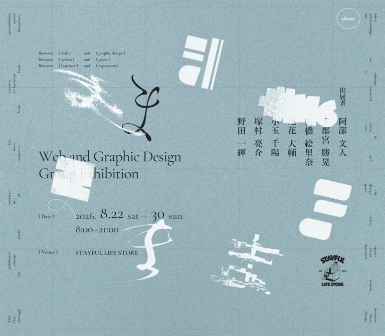
淡いブルーグレーの粒状背景に、明朝体の縦書きと欧文セリフ体を組み合わせた展覧会サイト。罫線と楕円の構図を背景に、抽象的な文字グラフィックが位置や大きさを変え、ポスターのような一画面を構成しています。
オリジナルサイトを見るGroup Exhibition “ま” — Style Reference
A pale blue exhibition poster where disciplined typography meets drifting, distressed letterforms.
Original URL: mamamamamamama.com Final URL: mamamamamamama.com Theme: a light, grain-covered blue-gray canvas with charcoal text and white graphic artwork. Inspected: September 12, 2026, Japan Standard Time. The supplied retrieval timestamp is September 11, 2026, at 21:05:19.631 UTC. Viewports: 1440 × 1000 and 390 × 844 CSS pixels; three desktop captures and two mobile captures. Scope: the current opening exhibition composition, including its concept statement, title, date, venue, seven exhibitor buttons, About control, linked venue mark, and changing decorative artwork. Opened About content, exhibitor detail states, and activated link destinations were not supplied.
The page presents the exhibition as a single screen-sized graphic composition. English information uses a delicate editorial serif; Japanese exhibitor names form a bank of vertical Mincho columns. Both sit on a dusty blue-gray field with dense fine grain, a faint rectangular grid, and a large elliptical outline. White geometric and distressed glyphs, together with a black calligraphic form, pass through the composition without becoming conventional illustrations inside content boxes.
The important relationship is between stable information and unstable artwork. The title, dates, and name columns remain aligned across the supplied captures while the decorative forms change position and, on mobile, apparent scale. Desktop uses the whole screen as a broad poster. Mobile recomposes the same information into a tall poster, placing the exhibitors above the English title and retaining generous space between the concept statement and the main information.
How to Read This Reference
- Measured means reported by the supplied rendered DOM and computed-style evidence. Coordinates are relative to the viewport origin.
- Calculated means arithmetic based on those measurements, such as a gap between two boxes or an inset expressed as a percentage.
- Estimated means visually judged from the screenshots. Estimated colors are not pixel samples or recovered source declarations.
- Recommended means an implementation choice for reuse. Breakpoints, texture generation, animation keyframes, and accessibility additions below belong to this category unless explicitly identified otherwise.
- Font stacks are directly reported by computed styles. The evidence does not independently verify font-file downloads, individual glyph fallback, or whether a requested weight was synthesized.
- The supplied evidence was sufficient for this analysis. No additional browsing, command execution, or file inspection was performed.
Tokens — Colors
Default Palette
| Name | Value | Suggested token | Evidence and role |
|---|---|---|---|
| Dusty Blue Paper | Approximately #A8C2C7 |
--color-paper |
Visual estimate of the textured main canvas. The underlying painted layer was not included in the element sample. |
| Exhibition Ink | #222222 |
--color-ink |
Measured rgb(34, 34, 34) on the concept statement, title, event information, and exhibitor text. |
| About White | #FFFFFF |
--color-control |
Measured text color on the About button. Its visible outline also appears white, but the border color was not separately reported. |
| Printed White | Approximately #F3F6F5 |
--color-art-light |
Visual estimate of the white artwork as it appears against the noisy field. This is an appearance alias, not a recovered asset color. |
| Construction Rule | rgba(34, 34, 34, 0.12) |
--color-rule |
Recommended approximation for the faint grid and ellipse. Their original opacity and stroke declarations are unavailable. |
| Underlying Document White | #FFFFFF |
No visible-canvas token | Measured HTML and body background. It does not explain the blue-gray field visible in every capture. |
The composition relies on a narrow palette rather than multiple semantic accent colors. Charcoal supplies readable information; white supplies most of the graphic interruptions and the small About control. The background grain creates many local tones, so a flat swatch can only approximate the canvas.
Do not use the body's computed white background as the poster's visible background. Likewise, the utility custom properties include generic defaults that are not evidence of a visible accent palette.
Color Behavior
The artwork sometimes overlaps text, temporarily replacing a dark-on-blue relationship with white forms crossing dark lettering. This is visible in both viewport sizes. The evidence does not establish whether the effect comes from image transparency, masks, canvas rendering, blend modes, or layered DOM elements.
For a new implementation, begin with direct colors and transparent artwork. Introduce blending only when actual assets and compositing requirements are known. No alternate theme or theme-selection interface was observed.
Tokens — Typography
English Editorial Serif
Reported source stack: "Cormorant Garamond", "Times New Roman", serif, exposed through --font-en.
The English type has high stroke contrast, narrow forms, and a literary rather than promotional character. The exhibition title uses regular weight, while the small concept statement uses weight 600. Large date numerals provide a second point of emphasis below the title.
The title uses 1.1 line height and -0.03em tracking at both measured sizes. Preserve its two-line composition:
Web and Graphic DesignGroup Exhibition
The first line is intentionally much longer than the second. Automatic balancing could change that silhouette, so explicit line grouping is appropriate when reproducing this content.
Japanese Exhibition Type
Reported source stack: "FOT-筑紫オールド明朝 Pro R", "Hiragino Mincho ProN", "Yu Mincho", serif, exposed through --font-ja.
The exhibitor names and the label 出展者 use this Mincho stack with a computed weight of 500. Names are vertically arranged, with a compact one-character column width and additional character spacing. Their presence balances the broad horizontal English title.
The vertical arrangement is directly visible. writing-mode: vertical-rl and text-orientation: upright are suitable implementation recommendations; those specific properties were not included in the supplied computed-style sample.
Type Scale
All values in the following table are measured unless marked otherwise.
| Role | Desktop size / line height | Mobile size / line height | Weight | Tracking or qualification |
|---|---|---|---|---|
| Concept statement | 15.625px / 23.4375px |
12px / 18px |
600 | Normal tracking; four-column text grid. |
| Exhibition title | 56.6406px / 62.3047px |
28px / 30.8px |
400 | -1.69922px and -0.84px, both equivalent to -0.03em. |
| Date paragraph element | 16px / 16px |
16px / 16px |
400 | Parent declaration only; the visible date contains larger child text. |
| Opening hours | 39.0625px / 39.0625px |
20px / 20px |
400 | Bottom padding is 10.9375px and 5.6px, respectively. |
| Exhibitor label | 23.4375px / 21.0938px |
14px / 12.6px |
500 | Vertical label; line-height ratio is 0.9. |
| Exhibitor names | 31.25px / 31.25px |
16px / 16px |
500 | 2.5px and 1.28px tracking, both 0.08em. |
| About button element | 16px / 24px |
16px / 24px |
400 | Nested label styles were not separately reported. |
| General document text | 16px / 24px |
16px / 24px |
400 | Japanese font stack at the document level. |
Additional Visual Estimates
| Role | Desktop estimate | Mobile estimate | Reuse guidance |
|---|---|---|---|
| Large date numerals | About 49–50px |
About 24–25px |
Keep the month/day and final day larger than the year and weekday text. |
| Year and weekday text | About 34–36px |
About 17–18px |
Align on the date numerals' baseline. |
| Date and venue labels | About 19–20px |
About 13–14px |
Retain the parenthesized label treatment. |
| Venue name | About 23–25px |
About 15–16px |
Uppercase serif lettering; no filled badge. |
| Peripheral desktop copy | About 10–12px |
Not visibly present | Treat as supporting composition, not essential instructions. |
Do not reproduce the entire date at 16px just because its paragraph reports that value. Its measured box is approximately 61.59px high on desktop and 31px high on mobile, and the screenshots clearly show mixed text sizes.
Tokens — Spacing & Shapes
There is no recovered source spacing scale. The useful system is a set of content anchors, typographic ratios, and deliberately unequal empty areas.
Spacing Scale
| Relationship | Desktop | Mobile | Evidence |
|---|---|---|---|
| Main left inset | 144px |
39px |
Measured; both equal 10% of viewport width. |
| Concept grid column gap | 21.875px |
16.8px |
Measured; both equal 1.4em of the concept text. |
| Title block width | 585.9375px |
312px |
Measured; approximately 40.69% and exactly 80% of viewport width. |
| Date value offset from main left edge | 134.7656px |
46.3281px |
Calculated from the measured date paragraph and title positions. |
| Title bottom to date paragraph top | 83.9844px |
23.2813px |
Calculated; a major responsive compression. |
| Date paragraph bottom to hours top | 5.8594px |
3px |
Calculated. |
| Gap between exhibitor button boxes | 30.2656px |
12.4531px |
Calculated from adjacent measured boxes. |
| Exhibitor column pitch | 61.5156px |
28.4531px |
Calculated left-edge interval. |
| Venue mark right inset | 144px |
39px |
Calculated; 10% of viewport width. |
| Venue mark bottom inset | 150px |
Approximately 126.59px |
Calculated; approximately 15% of viewport height in both captures. |
These relationships are more useful than imposing a universal eight-pixel spacing system. In particular, the date label column and the exhibitor gaps change independently of the main 10% horizontal inset.
Border Radius
| Element | Value or appearance | Status |
|---|---|---|
| About control | 50% |
Measured. Its box is wider than it is tall, producing an ellipse. |
| About control aspect ratio | Approximately 8 / 7 |
Calculated from both measured button boxes. |
| Main text and name buttons | No visible container rounding | Observed; sampled name buttons report 0px. |
| Background ellipse | Large continuous oval outline | Visual observation; exact bounds and source construction are unavailable. |
| Artwork | Asset-defined curves and edges | Geometric rounding belongs to the artwork, not a general UI radius system. |
Layout Measurements
Coordinates and dimensions are rounded to two decimals here.
| Element | Desktop: x, y; width × height | Mobile: x, y; width × height |
|---|---|---|
| Poster section | 0, 0; 1440 × 1000 |
0, 0; 390 × 844 |
| Concept statement | 144, 77.40; 585.94 × 70.31 |
39, 73.44; 312 × 54 |
| Exhibition title | 144, 435.79; 585.94 × 124.59 |
39, 519.27; 312 × 61.59 |
| Date paragraph | 278.77, 644.37; 451.17 × 61.59 |
85.33, 604.14; 202.63 × 31 |
| Hours paragraph | 278.77, 711.82; 451.17 × 50 |
85.33, 638.14; 202.63 × 25.59 |
| About button | 1263.25, 30.27; 85.94 × 75.19 |
310, 16; 56 × 49 |
| Exhibitor label | 1268.66, 231.48; 23.44 × 70.31 |
335.92, 244.80; 14 × 42 |
| First name button | 895.66, 340.86; 31.25 × 156.25 |
164.28, 297.63; 16 × 80 |
| Last name button | 1264.75, 340.86; 31.25 × 156.25 |
335, 297.63; 16 × 80 |
| Venue mark link | 1194.44, 737.70; 101.56 × 112.30 |
299, 659.91; 52 × 57.5 |
The longer names have taller boxes: approximately 181.66px on desktop and 93.02px on mobile. Their tops remain aligned with the other names.
Components
Full-Viewport Exhibition Poster
Role: presents the entire opening exhibition identity and essential event information as one composition.
The measured section and document height equal the viewport height at both tested sizes. There is no visible stack of subsequent content sections in the supplied evidence. This establishes the captured opening layout; it does not prove that scrolling is disabled or that other states contain no additional content.
Organize the poster into independently positioned information groups. The main English block begins at 10% from the left. The exhibitor bank and venue mark terminate at 10% from the right. The artwork occupies a separate layer spanning the composition.
Concept Grid
Role: states the exhibition's three conceptual pairings.
The exact visible pairings are:
Between ( web ) and ( graphic design )Between ( screen ) and ( paper )Between ( function ) and ( expression )
The source element is a paragraph displayed as a grid with four columns. Desktop column widths are approximately 52.63px 69.5px 22.73px 105.83px; mobile widths are approximately 40.45px 53.45px 17.47px 81.36px. The columns correspond to the repeated word, the first parenthesized term, the conjunction, and the second term.
Use twelve inline cells in a four-column grid. Set the horizontal gap to 1.4em and the line height to 1.5. The parent is wider than the occupied grid tracks; that unused width is part of the breathing room, not a reason to stretch each column.
Exhibition Title
Role: identifies the event format with a large horizontal counterweight to the Japanese columns.
The title is a real H1, reported as a flex element. Its two lines remain intact on desktop and mobile. Use regular Cormorant Garamond, tight negative tracking, and no surrounding panel or underline.
On desktop, the title starts near 43.58% of viewport height. On mobile, it starts near 61.52%. This is a change of composition, not just a reduced font size.
Date and Venue Rows
Role: makes the practical event information readable within the poster.
The date combines the year, enlarged month/day, weekday text, an en dash, and an enlarged final day. Opening hours form a separate line aligned to the date value rather than the label. The visible content is 2026. 8.22 sat – 30 sun, followed by 8:00–21:00.
The labels use parentheses: ( Date ) and ( Venue ). The venue name is STAYFUL LIFE STORE, set in uppercase serif lettering. On desktop, the values sit well to the right of the labels. On mobile, the label/value spacing becomes much tighter.
Only the date value and hours were measured directly. The venue row's exact font size, track width, and bounding box should remain estimates. Do not assume its mobile label column is identical to the shorter Date label.
The displayed event dates are earlier than the inspection date. They are current page content, and their passage does not establish that the website is discontinued.
Exhibitor Columns
Role: identifies seven participants and exposes seven interactive controls.
From left to right, the visible buttons are 野田 一輝, 塚村 亮介, 小玉 千陽, 尾花 大輔, 大橋 絵里奈, 宇都宮 勝晃, and 阿部 文人. The vertical label 出展者 sits above the rightmost portion of the group.
Each name is a separate native button in the supplied DOM. The buttons have transparent backgrounds, no visible surrounding boxes, weight 500 Mincho text, and 0.08em character spacing. Keep the variable column heights caused by different name lengths.
The seven columns span approximately 400.34px on desktop and 186.72px on mobile. They stay horizontal as a group even though the text inside each button is vertical. Do not convert the mobile state into a conventional horizontal-text list when reproducing the observed composition.
Button activation was not supplied. A biography panel, artwork filter, or animation trigger cannot be claimed from button semantics alone.
About Control
Role: provides a small utility entry point at the upper right.
The control has a transparent background, white label, thin white-looking outline, and 50% radius. Its measured desktop box is about 85.94 × 75.19px; mobile uses 56 × 49px. This is a slightly flattened ellipse rather than a perfect circle.
The computed transition is background-color 0.25s. No hover target color or opened state was captured. The DOM text contains two instances of about, while the screenshots show one visible label; this does not establish the mechanism behind the duplicate text.
For reuse, expose one accessible name. If duplicate text layers are used for an effect, hide the decorative copy from assistive technology.
Venue Mark Link
Role: connects the illustrated venue identity to its website.
The lower-right mark shows the STAYFUL LIFE STORE lettering and a small seated-character illustration. It is the only anchor reported in both snapshots, with the destination stayful.jp.
The mark scales from approximately 101.56 × 112.30px to 52 × 57.5px. Its right and bottom placement correspond to approximately 10% and 15% viewport insets at both measured sizes.
A transform 0.4s transition is declared, but its trigger and endpoint are unknown. The anchor's extracted text is empty; image alternative text and the resulting accessible name were not included in the evidence. The presence of a venue link does not establish website ownership or production responsibility.
Decorative Glyph Field
Role: carries the exhibition's expressive identity and the visible changes between captures.
The field includes white geometric bars and rounded blocks, brush-like strokes, a black calligraphic form, thin looping lines, and distressed or fragmented typographic forms. Some shapes are rotated. Several cross text blocks, and the expanded mobile arrangement clips artwork at the viewport edges.
Keep the artwork separate from semantic text. Its placement should be independently adjustable by viewport and state. A single flattened screenshot would lose both the responsive composition and the observed changes in artwork placement.
The source asset count, file formats, dimensions, and rendering technology are unavailable. Do not assign a particular glyph to a particular exhibitor without further evidence.
Border Copy, Grid, and Ellipse
Role: makes the page resemble a designed sheet with registration geometry and marginal annotations.
Desktop includes very small English text running vertically near both side edges. It is not visibly present in the mobile captures. The supplied text extraction does not expose its full content, so it should not be transcribed from uncertain fragments.
A faint grid spans the background. Visual estimates suggest five broad columns and four rows. Desktop rules appear near 20px from the left and right edges, with horizontal rules near y = 16, 258, 500, 742, and 984px. On mobile, the main grid occupies approximately y = 90–755px with about 10px side insets.
A large, thin ellipse sits behind the typography and artwork. Its exact geometry is unmeasured. Reproduce its compositional role with a low-contrast outline rather than treating it as an interactive boundary.
Tokens — Motion & Interaction
| Treatment | Evidence | What can be concluded |
|---|---|---|
| Desktop glyph movement | Three captures show small changes in graphic positions and orientation while text stays aligned. | The decorative scene changes over time or state. Exact trajectories and timing are unknown. |
| Mobile glyph rearrangement | Two captures show a compact central arrangement and a much larger, more dispersed arrangement. | Artwork scale and placement can change substantially without moving the information anchors. The trigger and sequence are unverified. |
| About background transition | Measured background-color 0.25s. |
A 250ms background transition is defined. Its activated appearance is unavailable. |
| Venue mark transition | Measured transform 0.4s. |
A 400ms transform transition is defined. The transform value and trigger are unavailable. |
| Exhibitor interaction | Seven rendered native buttons. | They are interactive controls; their resulting states were not exercised. |
| Venue navigation | Anchor destination is https://stayful.jp/. |
The destination is known; navigation was not performed for this analysis. |
| Reduced-motion behavior | No relevant state or rules supplied. | Unverified. |
The sampled text and button elements report animation: none. That does not contradict the changing artwork: the relevant graphic nodes, pseudo-elements, or rendering surface were not included in the sample.
The capture process observed the page for at least five seconds and attempted to settle finite animations. Perpetual animation was temporarily paused during readiness checks and resumed afterward. These procedures do not reveal the animation implementation or prove that every possible state was captured.
For reuse, a restrained ambient drift can preserve the relationship between stable information and moving artwork. Any duration, easing, stagger, or loop introduced in the Quick Start is a recommendation, not a recovered motion token. No evidence supports scroll-linked animation, pointer tracking, drag interaction, or a particular animation library.
Surfaces
| Layer | Appearance | Purpose |
|---|---|---|
| Poster canvas | Pale blue-gray with fine, dense grain | Establishes the printed atmosphere across the whole screen. |
| Construction layer | Faint rectilinear grid and large ellipse | Provides order without becoming a visible content container. |
| Semantic text | Charcoal serif and Mincho typography | Carries event identity and practical information. |
| Graphic layer | White and black abstract letterforms with mixed edge textures | Supplies movement, tension, and visual identity. |
| About control | Transparent elliptical outline with white text | Creates a small utility control without a toolbar. |
| Venue mark | Compact monochrome illustrated logo | Anchors the lower-right information area. |
No cards, filled navigation strip, drop-shadow system, or modal surface is visible in the supplied state. Structure comes from alignment, typography, linework, and overlap.
Imagery
This is a typographic artwork system rather than a photographic hero. Its vocabulary includes calligraphy, geometric character construction, rough print edges, halftone-like breakup, fine loops, and glitch-like fragmentation. Smooth and distressed forms coexist; making every shape equally clean or equally rough would remove that contrast.
The grain is finer and more uniform than the larger distressed marks. Keep these scales separate: background texture should read as material, while damage inside the glyphs should remain part of their silhouettes.
The small venue illustration is a distinct branded asset. It should remain compact and legible rather than becoming a generic decorative icon.
Observed Asset References
No artwork URLs, image src values, font-file URLs, or native asset dimensions were included in the supplied evidence.
| Visible asset class | Confirmed use | Reference limitation |
|---|---|---|
| Grain field | Full poster background | Texture source and compositing method are unknown. |
| Abstract glyph artwork | Distributed decorative field | Asset paths, formats, and independent element boundaries are unknown. |
| Grid and ellipse | Background construction geometry | Could be CSS, vector artwork, or another rendering layer. |
| STAYFUL LIFE STORE mark | Lower-right external link | The link destination is known; the image asset URL is not. |
| Marginal English copy | Desktop edge treatment | Full text and rendering method are not supplied. |
Use available authorized artwork when implementing a close adaptation. CSS can establish the page structure and approximate its grain, but it cannot recover the distinctive glyph designs from their general descriptions.
Layout & Responsive Behavior
Desktop Composition
At 1440 × 1000, the concept statement begins near the upper-left interior, at x = 144 and y = 77.40px. The main title sits much lower, at y = 435.79px. The intervening space is actively occupied by artwork rather than additional prose.
The exhibitor columns occupy the upper-right middle of the poster, starting at y = 340.86px. The date and venue form the lower-left information area. The venue mark anchors the lower right. The About ellipse sits closer to the top and right edges than the main information groups.
Mobile Composition
At 390 × 844, the concept grid remains near the top, beginning at x = 39 and y = 73.44px. The exhibitor group begins at y = 297.63px and stays aligned to the right-side 10% inset. The title moves below it to y = 519.27px, followed by the date around y = 604.14px and the venue near the lower part of the composition.
The title becomes exactly half the nominal 56px scale while the concept statement shrinks much less. Exhibitor text decreases from 31.25px to 16px. The About button remains a practical 56 × 49px target. These independent changes demonstrate that the entire desktop canvas is not simply scaled down uniformly.
The artwork requires a separate mobile composition. One mobile capture contains compact motifs clustered around the middle; another spreads larger forms across the screen, with some crossing the date and title and some extending beyond the edges. Essential text stays at the same measured anchors.
Responsive Limits
Only two viewport sizes were inspected. The actual breakpoint, intermediate-width formulas, landscape behavior, browser-chrome handling, safe-area treatment, text-zoom response, and tablet-specific behavior are unknown.
The CSS below fits the measured endpoints with recommended formulas and a chosen breakpoint. For smaller or shorter screens, allow the information to reflow and the document to grow. Keep clipping confined to the decorative layer so that required text and keyboard focus remain reachable.
Do’s and Don’ts
Do
- Build the opening page as an exhibition poster with independently placed information groups.
- Preserve the 10% horizontal anchor shared by the main text and the right edge of the exhibitor group.
- Use the reported English and Japanese font stacks, with the title at regular weight.
- Keep the concept statement as a four-column, three-row text grid.
- Retain the title's two-line silhouette and
-0.03emtracking. - Keep the exhibitor names vertical and individually interactive.
- Use a pale blue-gray field, charcoal information, and predominantly white artwork.
- Distinguish fine background grain from the larger distressed textures inside glyphs.
- Recompose the mobile artwork separately from the information layout.
- Preserve the small elliptical About control and the compact venue mark.
Don’t
- Don't expand the observed poster into an invented sequence of feature cards, testimonials, or conversion sections.
- Don't replace the Japanese name columns with generic profile cards when reproducing this state.
- Don't use one uniform scale factor for desktop and mobile.
- Don't treat the white document background as the visible canvas color.
- Don't infer the size of date numerals from the date paragraph's 16px parent declaration.
- Don't turn the About ellipse into a large filled primary CTA.
- Don't smooth away the distressed glyph edges or apply pixelated rendering to every graphic.
- Don't invent About content, biographies, hover transformations, or animation timings as original-site findings.
- Don't infer operator or production roles from exhibitor names or the venue logo.
- Don't let decorative artwork intercept input or permanently hide essential information in a new implementation.
Recommended Implementation Additions
These are recommendations for reuse, not verified features of the original page:
- Give every exhibitor button a clear keyboard focus indicator and connect it only to a defined, accessible action.
- Review mobile hit areas carefully. The measured name buttons are only 16px wide, with a 28.45px column pitch; enlarging every invisible target to 44px would cause overlap. Increase spacing where possible or provide a roomier equivalent list in the detail interface.
- Expose a single accessible About label if duplicate visual text is used. If it opens a dialog, provide focus management, Escape dismissal, and focus return.
- Keep decorative glyphs, grain, grid lines, and duplicated labels out of the accessibility tree and set their layers to
pointer-events: none. - Give the linked venue mark a meaningful accessible name; the supplied extraction does not establish its current image alternative text.
- Provide a static reduced-motion arrangement and retain the same event information when animation is disabled.
- Test the white About label against the textured pale background. An ink-backed focus state or a darker accessible variant can improve readability.
- Allow reflow at short heights and increased text sizes. Do not rely on a permanently clipped viewport for all content states.
- Load the intended font resources when available and check fallback line breaks before calibrating absolute positions.
Agent Prompt Guide
Quick Color Reference
- Canvas: approximately
#A8C2C7, with fine grain; this is a visual estimate. - Main text: measured
#222222. - About label: measured
#FFFFFF. - Light artwork: approximately
#F3F6F5, with asset-specific distress and transparency. - Grid and ellipse: a faint ink tint;
rgba(34, 34, 34, 0.12)is a recommended starting point. - Surface treatment: flat, textured, and outlined; no general shadow or card system.
Overall Prompt
“Create a responsive exhibition website as a single poster-like opening composition. Use a pale dusty blue-gray canvas with fine grain, faint construction grid lines, and a large thin ellipse. Pair regular Cormorant Garamond English typography with vertical Japanese Mincho exhibitor columns. Place a three-row concept grid near the upper left, a two-line English exhibition title lower left, mixed-size date numerals and venue information beneath it, and seven vertical exhibitor buttons toward the right. Add a small transparent white-outlined About ellipse at the upper right and a compact monochrome venue mark below. Distribute original white geometric and distressed glyph artwork with a black calligraphic accent. Keep text anchors stable while allowing independently controlled decorative motion. On mobile, place the exhibitor bank above the title and author a separate artwork arrangement.”
Example Component Prompts
- Concept statement: “Build a compact four-column serif text grid with three rows. Align repeated ‘Between’ and ‘and’ cells, keep the paired terms in parentheses, use weight 600 and 1.5 line height, and set column gaps to 1.4em. At a 390px viewport, use 12px text and a 39px left inset.”
- Exhibitor bank: “Arrange seven transparent native buttons in a horizontal group, with each Japanese name written vertically in a Mincho stack. Use 16px type, 0.08em tracking, and approximately 12.45px gaps at the supplied mobile size. Align tops, allow unequal name heights, and place a smaller vertical ‘出展者’ label above the right end. Do not invent the buttons' destination content.”
- Event information: “Create parenthesized Date and Venue labels beside unboxed serif values. Make the month/day and final day larger than the year and weekdays. Place opening hours on the next line aligned with the date value. Keep the venue name uppercase and compact.”
- About control: “Create a transparent white-outlined ellipse with one visible ‘about’ label. Use a 56 × 49px mobile box and a 50% radius. Retain a 250ms background-color transition, and clearly identify any newly designed hover or dialog behavior as an addition.”
- Graphic field: “Compose transparent white geometric, brush-textured, and fragmented typographic artwork with one black calligraphic form. Preserve mixed edge qualities, rotate motifs independently, and allow decorative clipping at the canvas edges. Keep required text readable and provide a static arrangement for reduced motion.”
Quick Start
CSS Custom Properties
This is an implementation adaptation of the supplied opening state. Font stacks, ink color, typographic ratios, and the two control transition durations come from the evidence. The canvas color, grid opacity, grain technique, breakpoint, fitted viewport formulas, and optional drift animation are recommendations.
The surrounding page keeps a conventional root font size. No original asset paths are assumed. The starter places information above artwork for reliable readability; the supplied captures sometimes show artwork crossing in front of text.
:root {
  /* Reported font stacks and foreground colors */
  --font-en: "Cormorant Garamond", "Times New Roman", serif;
  --font-ja: "FOT-筑紫オールド明朝 Pro R", "Hiragino Mincho ProN", "Yu Mincho", serif;
  --color-ink: #222222;
  --color-control: #ffffff;

  /* Visual estimates and recommended texture values */
  --color-paper: #a8c2c7;
  --color-art-light: #f3f6f5;
  --color-rule: rgb(34 34 34 / 12%);
  --grain-opacity: 0.2;

  /* Reported ratios and durations */
  --tracking-title: -0.03em;
  --tracking-name: 0.08em;
  --leading-title: 1.1;
  --motion-about: 250ms;
  --motion-mark: 400ms;
}

* { box-sizing: border-box; }
body { margin: 0; }

.ma-poster {
  /* Fitted desktop values, not recovered source formulas */
  --text-concept: clamp(12px, 1.08507vw, 17px);
  --text-title: clamp(28px, 3.93338vw, 64px);
  --text-name: clamp(16px, 2.17014vw, 36px);
  --text-exhibitor-label: clamp(14px, 1.6276vw, 27px);
  --text-hours: clamp(20px, 2.71267vw, 44px);
  --text-date: clamp(18px, 2.4414vw, 40px);
  --text-date-large: clamp(24.8px, 3.40278vw, 56px);
  --name-gap: clamp(18px, 2.10178vw, 34px);
  --label-column: 9.35872vw;
  --content-width: 40.6901%;

  position: relative;
  isolation: isolate;
  min-height: 100vh;
  height: max(100svh, 48rem);
  color: var(--color-ink);
  background: var(--color-paper);
  font-family: var(--font-en);
  font-weight: 400;
}

/* Recommended static grain approximation */
.ma-poster::after {
  content: "";
  position: absolute;
  inset: 0;
  z-index: 5;
  pointer-events: none;
  opacity: var(--grain-opacity);
  mix-blend-mode: multiply;
  background-image: url("data:image/svg+xml,%3Csvg xmlns='http://www.w3.org/2000/svg' width='160' height='160'%3E%3Cfilter id='n'%3E%3CfeTurbulence type='fractalNoise' baseFrequency='.85' numOctaves='3' stitchTiles='stitch'/%3E%3C/filter%3E%3Cpath fill='%23fff' filter='url(%23n)' d='M0 0h160v160H0z'/%3E%3C/svg%3E");
}

.poster-grid,
.poster-orbit,
.art-layer {
  position: absolute;
  pointer-events: none;
}

.poster-grid {
  inset: 1.6% 20px;
  z-index: 0;
  border: 1px solid var(--color-rule);
  background:
    linear-gradient(to right, var(--color-rule) 1px, transparent 1px)
      0 0 / 20% 100%,
    linear-gradient(to bottom, var(--color-rule) 1px, transparent 1px)
      0 0 / 100% 25%;
}

.poster-orbit {
  inset: 1.6% 14%;
  z-index: 0;
  border: 1px solid var(--color-rule);
  border-radius: 50%;
}

.art-layer { inset: 0; z-index: 1; overflow: hidden; }

.glyph {
  position: absolute;
  left: var(--x, 0%);
  top: var(--y, 0%);
  width: var(--width, 15%);
  height: auto;
  transform: rotate(var(--turn, 0deg));
  object-fit: contain;
}

/* Example placement alias for an independently supplied asset */
.glyph--script {
  --x: 32%; --y: 15%; --width: 11%;
  --mobile-x: 16%; --mobile-y: 34%; --mobile-width: 27%;
}

.concept,
.exhibition-title,
.event-info,
.venue-row,
.exhibitors,
.venue-mark {
  position: absolute;
  z-index: 2;
}

.concept {
  left: 10%; top: 7.73984%;
  width: var(--content-width);
  display: grid;
  grid-template-columns: repeat(4, max-content);
  column-gap: 1.4em;
  margin: 0;
  font-size: var(--text-concept);
  font-weight: 600;
  line-height: 1.5;
}

.exhibition-title {
  left: 10%; top: 43.57891%;
  width: var(--content-width);
  margin: 0;
  font-size: var(--text-title);
  font-weight: 400;
  line-height: var(--leading-title);
  letter-spacing: var(--tracking-title);
}

.exhibition-title > span { display: block; }

.event-info {
  left: 10%; top: 64.43672%;
  width: var(--content-width);
}

.event-row {
  display: grid;
  grid-template-columns: var(--label-column) minmax(0, 1fr);
  align-items: baseline;
}

.detail-label { font-size: clamp(14px, 1.38889vw, 22px); }

.date-line {
  display: flex;
  align-items: baseline;
  gap: 0.16em;
  margin: 0;
  white-space: nowrap;
  font-size: var(--text-date);
  line-height: 1.25;
}

.date-numeral { font-size: var(--text-date-large); }

.hours {
  margin: 6px 0 0;
  padding-bottom: 0.28em;
  font-size: var(--text-hours);
  line-height: 1;
}

.venue-row {
  left: 10%; top: 80.4%;
  width: 55%;
  font-size: clamp(16px, 1.66667vw, 27px);
}

.exhibitors { right: 10%; top: 34.08594%; }
.exhibitor-names { display: flex; gap: var(--name-gap); }

.exhibitor-label {
  position: absolute;
  right: 4px;
  bottom: calc(100% + 39.0625px);
  margin: 0;
  writing-mode: vertical-rl;
  text-orientation: upright;
  font-family: var(--font-ja);
  font-size: var(--text-exhibitor-label);
  font-weight: 500;
  line-height: 0.9;
}

.exhibitor-name {
  width: 1em;
  padding: 0;
  border: 0;
  border-radius: 0;
  background: transparent;
  color: inherit;
  writing-mode: vertical-rl;
  text-orientation: upright;
  white-space: nowrap;
  font-family: var(--font-ja);
  font-size: var(--text-name);
  font-weight: 500;
  line-height: 1;
  letter-spacing: var(--tracking-name);
  cursor: pointer;
}

.about {
  position: absolute;
  z-index: 6;
  top: 3.02656%; right: 6.30642%;
  width: clamp(56px, 5.96788vw, 96px);
  aspect-ratio: 8 / 7;
  display: grid;
  place-items: center;
  padding: 0;
  border: 1px solid currentColor;
  border-radius: 50%;
  color: var(--color-control);
  background: transparent;
  font: 400 16px / 24px var(--font-en);
  cursor: pointer;
  transition: background-color var(--motion-about);
}

/* Recommended feedback; the original target color is unknown */
.about:hover,
.about:focus-visible { background-color: var(--color-ink); }

.venue-mark {
  right: 10%; bottom: 15%;
  width: clamp(52px, 7.05295vw, 116px);
  color: inherit;
  transition: transform var(--motion-mark);
}

.venue-mark img { display: block; width: 100%; height: auto; }

.ma-poster :focus-visible {
  outline: 2px solid var(--color-ink);
  outline-offset: 4px;
}

/* Recommended breakpoint, calibrated to the supplied phone capture */
@media (max-width: 60rem) {
  .ma-poster {
    --text-concept: 12px;
    --text-title: 28px;
    --text-name: 16px;
    --text-exhibitor-label: 14px;
    --text-hours: 20px;
    --text-date: 18px;
    --text-date-large: 24.8px;
    --name-gap: 12.4531px;
    --label-column: 46.3281px;
    --content-width: 80%;
    height: max(100svh, 52.75rem);
  }

  .poster-grid,
  .poster-orbit { inset: 10.7% 10px; }
  .concept { top: 8.70113%; }
  .exhibition-title { top: 61.52436%; }
  .event-info { top: 71.58064%; }
  .hours { margin-top: 3px; }
  .detail-label { font-size: 14px; }

  .venue-row {
    top: 80.2%;
    width: 80%;
    grid-template-columns: max-content minmax(0, 1fr);
    column-gap: 0.35em;
    font-size: 16px;
  }

  .exhibitors { top: 35.26363%; }
  .exhibitor-label {
    right: 1.08px;
    bottom: calc(100% + 10.8281px);
  }

  .about { top: 16px; right: 24px; width: 56px; }
  .venue-mark { width: 52px; }

  .glyph {
    left: var(--mobile-x, var(--x, 0%));
    top: var(--mobile-y, var(--y, 0%));
    width: var(--mobile-width, var(--width, 15%));
  }
}

/* Optional ambient motion: invented timing, static by default */
.ma-poster[data-motion="ambient"] .glyph {
  animation: glyph-drift var(--duration, 18s) ease-in-out infinite alternate;
  animation-delay: var(--delay, 0s);
}

@keyframes glyph-drift {
  from { translate: 0 0; }
  to { translate: 6px -9px; }
}

@media (prefers-reduced-motion: reduce) {
  .ma-poster .glyph { animation: none !important; translate: 0 0; }
  .ma-poster button,
  .ma-poster a { transition: none; }
}

/* Recommended fallback for narrow or short viewports */
@media (max-width: 22rem), (max-height: 40rem) {
  .ma-poster {
    height: auto;
    min-height: 100svh;
    display: grid;
    gap: 2rem;
    padding: 6rem 10% 3rem;
  }

  .concept,
  .exhibition-title,
  .event-info,
  .venue-row,
  .exhibitors,
  .venue-mark { position: static; width: auto; }

  .concept { column-gap: 0.7em; font-size: 12px; }
  .exhibition-title { font-size: 28px; }
  .event-row { grid-template-columns: max-content minmax(0, 1fr); gap: 0.4rem; }
  .date-line { flex-wrap: wrap; white-space: normal; }
  .exhibitors { justify-self: end; }
  .exhibitor-names { gap: 10px; }
  .exhibitor-name { font-size: 16px; }
  .exhibitor-label { position: static; margin: 0 0 1rem auto; font-size: 14px; }
  .venue-mark { width: 52px; justify-self: end; }
  .art-layer { opacity: 0.3; }
}
Suggested Markup
This skeleton provides the information and styling hooks. Supply the actual glyph artwork and venue image separately. The text inside the venue link is a fallback, not a recreation of its illustrated logo. About and exhibitor controls require defined application behavior before release; their unobserved detail states are intentionally unspecified.
<main class="ma-poster" aria-labelledby="exhibition-title">
<div class="poster-grid" aria-hidden="true"></div>
<div class="poster-orbit" aria-hidden="true"></div>
<div class="art-layer" aria-hidden="true">
<!-- Add authorized glyph images using the .glyph placement hooks. -->
</div>
<p class="concept">
<span>Between</span><span>( web )</span><span>and</span><span>( graphic design )</span>
<span>Between</span><span>( screen )</span><span>and</span><span>( paper )</span>
<span>Between</span><span>( function )</span><span>and</span><span>( expression )</span>
</p>
<h1 class="exhibition-title" id="exhibition-title">
<span>Web and Graphic Design</span>
<span>Group Exhibition</span>
</h1>
<div class="event-info">
<div class="event-row">
<span class="detail-label">( Date )</span>
<div>
<p class="date-line">
<span>2026.</span>
<span class="date-numeral">8.22</span>
<span>sat –</span>
<span class="date-numeral">30</span>
<span>sun</span>
</p>
<p class="hours">8:00–21:00</p>
</div>
</div>
</div>
<div class="venue-row event-row">
<span class="detail-label">( Venue )</span>
<span>STAYFUL LIFE STORE</span>
</div>
<section class="exhibitors" aria-labelledby="exhibitor-heading">
<h2 class="exhibitor-label" id="exhibitor-heading" lang="ja">出展者</h2>
<div class="exhibitor-names" lang="ja">
<button class="exhibitor-name" type="button">野田 一輝</button>
<button class="exhibitor-name" type="button">塚村 亮介</button>
<button class="exhibitor-name" type="button">小玉 千陽</button>
<button class="exhibitor-name" type="button">尾花 大輔</button>
<button class="exhibitor-name" type="button">大橋 絵里奈</button>
<button class="exhibitor-name" type="button">宇都宮 勝晃</button>
<button class="exhibitor-name" type="button">阿部 文人</button>
</div>
</section>
<button class="about" type="button">about</button>
<a class="venue-mark" href="https://stayful.jp/" aria-label="STAYFUL LIFE STORE website">
<!-- Replace this fallback text with the authorized venue logo. -->
STAYFUL LIFE STORE
</a>
</main>
Tailwind v4 Token Mapping
Optional aliases for a project already using Tailwind v4. The supplied custom properties contain Tailwind-style utility variables, but they do not establish the original framework version. This mapping is a recommended integration, not recovered configuration.
@theme inline {
  --color-paper: #a8c2c7;
  --color-ink: #222222;
  --color-control: #ffffff;
  --color-art-light: #f3f6f5;
  --color-rule: rgb(34 34 34 / 12%);

  --font-editorial: var(--font-en);
  --font-exhibition: var(--font-ja);

  --text-poster-title: var(--text-title);
  --text-poster-concept: var(--text-concept);
  --text-poster-name: var(--text-name);
  --text-poster-hours: var(--text-hours);

  --spacing-poster-inset: 10vw;
  --radius-about: 50%;
}
Sources & Evidence
- Inspected original and final page: Group Exhibition “ま”. Both supplied URLs are identical, and the reported HTTP status is 200.
- Page identity: the rendered document title identifies the exhibition, August 22–30, 2026 dates, and STAYFUL LIFE STORE venue. The opening page repeats that event information.
- Capture time: supplied retrieval timestamp
2026-09-11T21:05:19.631Z, corresponding to September 12, 2026, at 06:05:19.631 JST. Individual image timestamps were not supplied. - Desktop evidence: three supplied 1440 × 1000 captures and a rendered DOM snapshot with document height 1000px.
- Mobile evidence: two supplied 390 × 844 captures and a rendered DOM snapshot with document height 844px.
- Measured material: element rectangles, reported font stacks, font sizes, weights, line heights, tracking, selected layout properties, text colors, control transitions, native button elements, and the venue anchor destination.
- Visual material: textured blue-gray canvas, white and black glyph artwork, grid, ellipse, marginal desktop copy, venue illustration, responsive composition, and differences in artwork placement between captures.
- Interaction limits: About and exhibitor controls were not activated in the supplied evidence. Hover outcomes, detail panels, focus behavior, reduced-motion handling, and animation implementation remain unverified.
- Asset and stylesheet limits: no complete stylesheet, decorative-layer measurements, image URLs, font-file URLs, or animation keyframes were supplied. Estimated colors and the Quick Start's fitted geometry must therefore remain distinct from measured values.
This reference describes the current page shown in the supplied evidence. Its reusable CSS provides an explicit adaptation of that state, with separate recommendations for motion, accessibility, and constrained viewports.
# Group Exhibition “ま” — Style Reference
> A pale blue exhibition poster where disciplined typography meets drifting, distressed letterforms.
**Original URL:** [mamamamamamama.com](https://mamamamamamama.com/)
**Final URL:** [mamamamamamama.com](https://mamamamamamama.com/)
**Theme:** a light, grain-covered blue-gray canvas with charcoal text and white graphic artwork.
**Inspected:** September 12, 2026, Japan Standard Time. The supplied retrieval timestamp is September 11, 2026, at 21:05:19.631 UTC.
**Viewports:** 1440 × 1000 and 390 × 844 CSS pixels; three desktop captures and two mobile captures.
**Scope:** the current opening exhibition composition, including its concept statement, title, date, venue, seven exhibitor buttons, About control, linked venue mark, and changing decorative artwork. Opened About content, exhibitor detail states, and activated link destinations were not supplied.
The page presents the exhibition as a single screen-sized graphic composition. English information uses a delicate editorial serif; Japanese exhibitor names form a bank of vertical Mincho columns. Both sit on a dusty blue-gray field with dense fine grain, a faint rectangular grid, and a large elliptical outline. White geometric and distressed glyphs, together with a black calligraphic form, pass through the composition without becoming conventional illustrations inside content boxes.
The important relationship is between stable information and unstable artwork. The title, dates, and name columns remain aligned across the supplied captures while the decorative forms change position and, on mobile, apparent scale. Desktop uses the whole screen as a broad poster. Mobile recomposes the same information into a tall poster, placing the exhibitors above the English title and retaining generous space between the concept statement and the main information.
## How to Read This Reference
- **Measured** means reported by the supplied rendered DOM and computed-style evidence. Coordinates are relative to the viewport origin.
- **Calculated** means arithmetic based on those measurements, such as a gap between two boxes or an inset expressed as a percentage.
- **Estimated** means visually judged from the screenshots. Estimated colors are not pixel samples or recovered source declarations.
- **Recommended** means an implementation choice for reuse. Breakpoints, texture generation, animation keyframes, and accessibility additions below belong to this category unless explicitly identified otherwise.
- Font stacks are directly reported by computed styles. The evidence does not independently verify font-file downloads, individual glyph fallback, or whether a requested weight was synthesized.
- The supplied evidence was sufficient for this analysis. No additional browsing, command execution, or file inspection was performed.
## Tokens — Colors
### Default Palette
| Name | Value | Suggested token | Evidence and role |
| --- | --- | --- | --- |
| Dusty Blue Paper | Approximately `#A8C2C7` | `--color-paper` | Visual estimate of the textured main canvas. The underlying painted layer was not included in the element sample. |
| Exhibition Ink | `#222222` | `--color-ink` | Measured `rgb(34, 34, 34)` on the concept statement, title, event information, and exhibitor text. |
| About White | `#FFFFFF` | `--color-control` | Measured text color on the About button. Its visible outline also appears white, but the border color was not separately reported. |
| Printed White | Approximately `#F3F6F5` | `--color-art-light` | Visual estimate of the white artwork as it appears against the noisy field. This is an appearance alias, not a recovered asset color. |
| Construction Rule | `rgba(34, 34, 34, 0.12)` | `--color-rule` | Recommended approximation for the faint grid and ellipse. Their original opacity and stroke declarations are unavailable. |
| Underlying Document White | `#FFFFFF` | No visible-canvas token | Measured HTML and body background. It does not explain the blue-gray field visible in every capture. |
The composition relies on a narrow palette rather than multiple semantic accent colors. Charcoal supplies readable information; white supplies most of the graphic interruptions and the small About control. The background grain creates many local tones, so a flat swatch can only approximate the canvas.
Do not use the body's computed white background as the poster's visible background. Likewise, the utility custom properties include generic defaults that are not evidence of a visible accent palette.
### Color Behavior
The artwork sometimes overlaps text, temporarily replacing a dark-on-blue relationship with white forms crossing dark lettering. This is visible in both viewport sizes. The evidence does not establish whether the effect comes from image transparency, masks, canvas rendering, blend modes, or layered DOM elements.
For a new implementation, begin with direct colors and transparent artwork. Introduce blending only when actual assets and compositing requirements are known. No alternate theme or theme-selection interface was observed.
## Tokens — Typography
### English Editorial Serif
**Reported source stack:** `"Cormorant Garamond", "Times New Roman", serif`, exposed through `--font-en`.
The English type has high stroke contrast, narrow forms, and a literary rather than promotional character. The exhibition title uses regular weight, while the small concept statement uses weight 600. Large date numerals provide a second point of emphasis below the title.
The title uses `1.1` line height and `-0.03em` tracking at both measured sizes. Preserve its two-line composition:
- `Web and Graphic Design`
- `Group Exhibition`
The first line is intentionally much longer than the second. Automatic balancing could change that silhouette, so explicit line grouping is appropriate when reproducing this content.
### Japanese Exhibition Type
**Reported source stack:** `"FOT-筑紫オールド明朝 Pro R", "Hiragino Mincho ProN", "Yu Mincho", serif`, exposed through `--font-ja`.
The exhibitor names and the label `出展者` use this Mincho stack with a computed weight of 500. Names are vertically arranged, with a compact one-character column width and additional character spacing. Their presence balances the broad horizontal English title.
The vertical arrangement is directly visible. `writing-mode: vertical-rl` and `text-orientation: upright` are suitable implementation recommendations; those specific properties were not included in the supplied computed-style sample.
### Type Scale
All values in the following table are measured unless marked otherwise.
| Role | Desktop size / line height | Mobile size / line height | Weight | Tracking or qualification |
| --- | --- | --- | --- | --- |
| Concept statement | `15.625px / 23.4375px` | `12px / 18px` | 600 | Normal tracking; four-column text grid. |
| Exhibition title | `56.6406px / 62.3047px` | `28px / 30.8px` | 400 | `-1.69922px` and `-0.84px`, both equivalent to `-0.03em`. |
| Date paragraph element | `16px / 16px` | `16px / 16px` | 400 | Parent declaration only; the visible date contains larger child text. |
| Opening hours | `39.0625px / 39.0625px` | `20px / 20px` | 400 | Bottom padding is `10.9375px` and `5.6px`, respectively. |
| Exhibitor label | `23.4375px / 21.0938px` | `14px / 12.6px` | 500 | Vertical label; line-height ratio is `0.9`. |
| Exhibitor names | `31.25px / 31.25px` | `16px / 16px` | 500 | `2.5px` and `1.28px` tracking, both `0.08em`. |
| About button element | `16px / 24px` | `16px / 24px` | 400 | Nested label styles were not separately reported. |
| General document text | `16px / 24px` | `16px / 24px` | 400 | Japanese font stack at the document level. |
### Additional Visual Estimates
| Role | Desktop estimate | Mobile estimate | Reuse guidance |
| --- | --- | --- | --- |
| Large date numerals | About `49–50px` | About `24–25px` | Keep the month/day and final day larger than the year and weekday text. |
| Year and weekday text | About `34–36px` | About `17–18px` | Align on the date numerals' baseline. |
| Date and venue labels | About `19–20px` | About `13–14px` | Retain the parenthesized label treatment. |
| Venue name | About `23–25px` | About `15–16px` | Uppercase serif lettering; no filled badge. |
| Peripheral desktop copy | About `10–12px` | Not visibly present | Treat as supporting composition, not essential instructions. |
Do not reproduce the entire date at 16px just because its paragraph reports that value. Its measured box is approximately 61.59px high on desktop and 31px high on mobile, and the screenshots clearly show mixed text sizes.
## Tokens — Spacing & Shapes
There is no recovered source spacing scale. The useful system is a set of content anchors, typographic ratios, and deliberately unequal empty areas.
### Spacing Scale
| Relationship | Desktop | Mobile | Evidence |
| --- | --- | --- | --- |
| Main left inset | `144px` | `39px` | Measured; both equal 10% of viewport width. |
| Concept grid column gap | `21.875px` | `16.8px` | Measured; both equal `1.4em` of the concept text. |
| Title block width | `585.9375px` | `312px` | Measured; approximately 40.69% and exactly 80% of viewport width. |
| Date value offset from main left edge | `134.7656px` | `46.3281px` | Calculated from the measured date paragraph and title positions. |
| Title bottom to date paragraph top | `83.9844px` | `23.2813px` | Calculated; a major responsive compression. |
| Date paragraph bottom to hours top | `5.8594px` | `3px` | Calculated. |
| Gap between exhibitor button boxes | `30.2656px` | `12.4531px` | Calculated from adjacent measured boxes. |
| Exhibitor column pitch | `61.5156px` | `28.4531px` | Calculated left-edge interval. |
| Venue mark right inset | `144px` | `39px` | Calculated; 10% of viewport width. |
| Venue mark bottom inset | `150px` | Approximately `126.59px` | Calculated; approximately 15% of viewport height in both captures. |
These relationships are more useful than imposing a universal eight-pixel spacing system. In particular, the date label column and the exhibitor gaps change independently of the main 10% horizontal inset.
### Border Radius
| Element | Value or appearance | Status |
| --- | --- | --- |
| About control | `50%` | Measured. Its box is wider than it is tall, producing an ellipse. |
| About control aspect ratio | Approximately `8 / 7` | Calculated from both measured button boxes. |
| Main text and name buttons | No visible container rounding | Observed; sampled name buttons report `0px`. |
| Background ellipse | Large continuous oval outline | Visual observation; exact bounds and source construction are unavailable. |
| Artwork | Asset-defined curves and edges | Geometric rounding belongs to the artwork, not a general UI radius system. |
### Layout Measurements
Coordinates and dimensions are rounded to two decimals here.
| Element | Desktop: x, y; width × height | Mobile: x, y; width × height |
| --- | --- | --- |
| Poster section | `0, 0; 1440 × 1000` | `0, 0; 390 × 844` |
| Concept statement | `144, 77.40; 585.94 × 70.31` | `39, 73.44; 312 × 54` |
| Exhibition title | `144, 435.79; 585.94 × 124.59` | `39, 519.27; 312 × 61.59` |
| Date paragraph | `278.77, 644.37; 451.17 × 61.59` | `85.33, 604.14; 202.63 × 31` |
| Hours paragraph | `278.77, 711.82; 451.17 × 50` | `85.33, 638.14; 202.63 × 25.59` |
| About button | `1263.25, 30.27; 85.94 × 75.19` | `310, 16; 56 × 49` |
| Exhibitor label | `1268.66, 231.48; 23.44 × 70.31` | `335.92, 244.80; 14 × 42` |
| First name button | `895.66, 340.86; 31.25 × 156.25` | `164.28, 297.63; 16 × 80` |
| Last name button | `1264.75, 340.86; 31.25 × 156.25` | `335, 297.63; 16 × 80` |
| Venue mark link | `1194.44, 737.70; 101.56 × 112.30` | `299, 659.91; 52 × 57.5` |
The longer names have taller boxes: approximately 181.66px on desktop and 93.02px on mobile. Their tops remain aligned with the other names.
## Components
### Full-Viewport Exhibition Poster
**Role:** presents the entire opening exhibition identity and essential event information as one composition.
The measured section and document height equal the viewport height at both tested sizes. There is no visible stack of subsequent content sections in the supplied evidence. This establishes the captured opening layout; it does not prove that scrolling is disabled or that other states contain no additional content.
Organize the poster into independently positioned information groups. The main English block begins at 10% from the left. The exhibitor bank and venue mark terminate at 10% from the right. The artwork occupies a separate layer spanning the composition.
### Concept Grid
**Role:** states the exhibition's three conceptual pairings.
The exact visible pairings are:
- `Between ( web ) and ( graphic design )`
- `Between ( screen ) and ( paper )`
- `Between ( function ) and ( expression )`
The source element is a paragraph displayed as a grid with four columns. Desktop column widths are approximately `52.63px 69.5px 22.73px 105.83px`; mobile widths are approximately `40.45px 53.45px 17.47px 81.36px`. The columns correspond to the repeated word, the first parenthesized term, the conjunction, and the second term.
Use twelve inline cells in a four-column grid. Set the horizontal gap to `1.4em` and the line height to `1.5`. The parent is wider than the occupied grid tracks; that unused width is part of the breathing room, not a reason to stretch each column.
### Exhibition Title
**Role:** identifies the event format with a large horizontal counterweight to the Japanese columns.
The title is a real H1, reported as a flex element. Its two lines remain intact on desktop and mobile. Use regular Cormorant Garamond, tight negative tracking, and no surrounding panel or underline.
On desktop, the title starts near 43.58% of viewport height. On mobile, it starts near 61.52%. This is a change of composition, not just a reduced font size.
### Date and Venue Rows
**Role:** makes the practical event information readable within the poster.
The date combines the year, enlarged month/day, weekday text, an en dash, and an enlarged final day. Opening hours form a separate line aligned to the date value rather than the label. The visible content is `2026. 8.22 sat – 30 sun`, followed by `8:00–21:00`.
The labels use parentheses: `( Date )` and `( Venue )`. The venue name is `STAYFUL LIFE STORE`, set in uppercase serif lettering. On desktop, the values sit well to the right of the labels. On mobile, the label/value spacing becomes much tighter.
Only the date value and hours were measured directly. The venue row's exact font size, track width, and bounding box should remain estimates. Do not assume its mobile label column is identical to the shorter Date label.
The displayed event dates are earlier than the inspection date. They are current page content, and their passage does not establish that the website is discontinued.
### Exhibitor Columns
**Role:** identifies seven participants and exposes seven interactive controls.
From left to right, the visible buttons are `野田 一輝`, `塚村 亮介`, `小玉 千陽`, `尾花 大輔`, `大橋 絵里奈`, `宇都宮 勝晃`, and `阿部 文人`. The vertical label `出展者` sits above the rightmost portion of the group.
Each name is a separate native button in the supplied DOM. The buttons have transparent backgrounds, no visible surrounding boxes, weight 500 Mincho text, and `0.08em` character spacing. Keep the variable column heights caused by different name lengths.
The seven columns span approximately 400.34px on desktop and 186.72px on mobile. They stay horizontal as a group even though the text inside each button is vertical. Do not convert the mobile state into a conventional horizontal-text list when reproducing the observed composition.
Button activation was not supplied. A biography panel, artwork filter, or animation trigger cannot be claimed from button semantics alone.
### About Control
**Role:** provides a small utility entry point at the upper right.
The control has a transparent background, white label, thin white-looking outline, and `50%` radius. Its measured desktop box is about 85.94 × 75.19px; mobile uses 56 × 49px. This is a slightly flattened ellipse rather than a perfect circle.
The computed transition is `background-color 0.25s`. No hover target color or opened state was captured. The DOM text contains two instances of `about`, while the screenshots show one visible label; this does not establish the mechanism behind the duplicate text.
For reuse, expose one accessible name. If duplicate text layers are used for an effect, hide the decorative copy from assistive technology.
### Venue Mark Link
**Role:** connects the illustrated venue identity to its website.
The lower-right mark shows the STAYFUL LIFE STORE lettering and a small seated-character illustration. It is the only anchor reported in both snapshots, with the destination [stayful.jp](https://stayful.jp/).
The mark scales from approximately 101.56 × 112.30px to 52 × 57.5px. Its right and bottom placement correspond to approximately 10% and 15% viewport insets at both measured sizes.
A `transform 0.4s` transition is declared, but its trigger and endpoint are unknown. The anchor's extracted text is empty; image alternative text and the resulting accessible name were not included in the evidence. The presence of a venue link does not establish website ownership or production responsibility.
### Decorative Glyph Field
**Role:** carries the exhibition's expressive identity and the visible changes between captures.
The field includes white geometric bars and rounded blocks, brush-like strokes, a black calligraphic form, thin looping lines, and distressed or fragmented typographic forms. Some shapes are rotated. Several cross text blocks, and the expanded mobile arrangement clips artwork at the viewport edges.
Keep the artwork separate from semantic text. Its placement should be independently adjustable by viewport and state. A single flattened screenshot would lose both the responsive composition and the observed changes in artwork placement.
The source asset count, file formats, dimensions, and rendering technology are unavailable. Do not assign a particular glyph to a particular exhibitor without further evidence.
### Border Copy, Grid, and Ellipse
**Role:** makes the page resemble a designed sheet with registration geometry and marginal annotations.
Desktop includes very small English text running vertically near both side edges. It is not visibly present in the mobile captures. The supplied text extraction does not expose its full content, so it should not be transcribed from uncertain fragments.
A faint grid spans the background. Visual estimates suggest five broad columns and four rows. Desktop rules appear near 20px from the left and right edges, with horizontal rules near y = 16, 258, 500, 742, and 984px. On mobile, the main grid occupies approximately y = 90–755px with about 10px side insets.
A large, thin ellipse sits behind the typography and artwork. Its exact geometry is unmeasured. Reproduce its compositional role with a low-contrast outline rather than treating it as an interactive boundary.
## Tokens — Motion & Interaction
| Treatment | Evidence | What can be concluded |
| --- | --- | --- |
| Desktop glyph movement | Three captures show small changes in graphic positions and orientation while text stays aligned. | The decorative scene changes over time or state. Exact trajectories and timing are unknown. |
| Mobile glyph rearrangement | Two captures show a compact central arrangement and a much larger, more dispersed arrangement. | Artwork scale and placement can change substantially without moving the information anchors. The trigger and sequence are unverified. |
| About background transition | Measured `background-color 0.25s`. | A 250ms background transition is defined. Its activated appearance is unavailable. |
| Venue mark transition | Measured `transform 0.4s`. | A 400ms transform transition is defined. The transform value and trigger are unavailable. |
| Exhibitor interaction | Seven rendered native buttons. | They are interactive controls; their resulting states were not exercised. |
| Venue navigation | Anchor destination is `https://stayful.jp/`. | The destination is known; navigation was not performed for this analysis. |
| Reduced-motion behavior | No relevant state or rules supplied. | Unverified. |
The sampled text and button elements report `animation: none`. That does not contradict the changing artwork: the relevant graphic nodes, pseudo-elements, or rendering surface were not included in the sample.
The capture process observed the page for at least five seconds and attempted to settle finite animations. Perpetual animation was temporarily paused during readiness checks and resumed afterward. These procedures do not reveal the animation implementation or prove that every possible state was captured.
For reuse, a restrained ambient drift can preserve the relationship between stable information and moving artwork. Any duration, easing, stagger, or loop introduced in the Quick Start is a recommendation, not a recovered motion token. No evidence supports scroll-linked animation, pointer tracking, drag interaction, or a particular animation library.
## Surfaces
| Layer | Appearance | Purpose |
| --- | --- | --- |
| Poster canvas | Pale blue-gray with fine, dense grain | Establishes the printed atmosphere across the whole screen. |
| Construction layer | Faint rectilinear grid and large ellipse | Provides order without becoming a visible content container. |
| Semantic text | Charcoal serif and Mincho typography | Carries event identity and practical information. |
| Graphic layer | White and black abstract letterforms with mixed edge textures | Supplies movement, tension, and visual identity. |
| About control | Transparent elliptical outline with white text | Creates a small utility control without a toolbar. |
| Venue mark | Compact monochrome illustrated logo | Anchors the lower-right information area. |
No cards, filled navigation strip, drop-shadow system, or modal surface is visible in the supplied state. Structure comes from alignment, typography, linework, and overlap.
## Imagery
This is a typographic artwork system rather than a photographic hero. Its vocabulary includes calligraphy, geometric character construction, rough print edges, halftone-like breakup, fine loops, and glitch-like fragmentation. Smooth and distressed forms coexist; making every shape equally clean or equally rough would remove that contrast.
The grain is finer and more uniform than the larger distressed marks. Keep these scales separate: background texture should read as material, while damage inside the glyphs should remain part of their silhouettes.
The small venue illustration is a distinct branded asset. It should remain compact and legible rather than becoming a generic decorative icon.
### Observed Asset References
No artwork URLs, image `src` values, font-file URLs, or native asset dimensions were included in the supplied evidence.
| Visible asset class | Confirmed use | Reference limitation |
| --- | --- | --- |
| Grain field | Full poster background | Texture source and compositing method are unknown. |
| Abstract glyph artwork | Distributed decorative field | Asset paths, formats, and independent element boundaries are unknown. |
| Grid and ellipse | Background construction geometry | Could be CSS, vector artwork, or another rendering layer. |
| STAYFUL LIFE STORE mark | Lower-right external link | The link destination is known; the image asset URL is not. |
| Marginal English copy | Desktop edge treatment | Full text and rendering method are not supplied. |
Use available authorized artwork when implementing a close adaptation. CSS can establish the page structure and approximate its grain, but it cannot recover the distinctive glyph designs from their general descriptions.
## Layout & Responsive Behavior
### Desktop Composition
At 1440 × 1000, the concept statement begins near the upper-left interior, at x = 144 and y = 77.40px. The main title sits much lower, at y = 435.79px. The intervening space is actively occupied by artwork rather than additional prose.
The exhibitor columns occupy the upper-right middle of the poster, starting at y = 340.86px. The date and venue form the lower-left information area. The venue mark anchors the lower right. The About ellipse sits closer to the top and right edges than the main information groups.
### Mobile Composition
At 390 × 844, the concept grid remains near the top, beginning at x = 39 and y = 73.44px. The exhibitor group begins at y = 297.63px and stays aligned to the right-side 10% inset. The title moves below it to y = 519.27px, followed by the date around y = 604.14px and the venue near the lower part of the composition.
The title becomes exactly half the nominal 56px scale while the concept statement shrinks much less. Exhibitor text decreases from 31.25px to 16px. The About button remains a practical 56 × 49px target. These independent changes demonstrate that the entire desktop canvas is not simply scaled down uniformly.
The artwork requires a separate mobile composition. One mobile capture contains compact motifs clustered around the middle; another spreads larger forms across the screen, with some crossing the date and title and some extending beyond the edges. Essential text stays at the same measured anchors.
### Responsive Limits
Only two viewport sizes were inspected. The actual breakpoint, intermediate-width formulas, landscape behavior, browser-chrome handling, safe-area treatment, text-zoom response, and tablet-specific behavior are unknown.
The CSS below fits the measured endpoints with recommended formulas and a chosen breakpoint. For smaller or shorter screens, allow the information to reflow and the document to grow. Keep clipping confined to the decorative layer so that required text and keyboard focus remain reachable.
## Do’s and Don’ts
### Do
- Build the opening page as an exhibition poster with independently placed information groups.
- Preserve the 10% horizontal anchor shared by the main text and the right edge of the exhibitor group.
- Use the reported English and Japanese font stacks, with the title at regular weight.
- Keep the concept statement as a four-column, three-row text grid.
- Retain the title's two-line silhouette and `-0.03em` tracking.
- Keep the exhibitor names vertical and individually interactive.
- Use a pale blue-gray field, charcoal information, and predominantly white artwork.
- Distinguish fine background grain from the larger distressed textures inside glyphs.
- Recompose the mobile artwork separately from the information layout.
- Preserve the small elliptical About control and the compact venue mark.
### Don’t
- Don't expand the observed poster into an invented sequence of feature cards, testimonials, or conversion sections.
- Don't replace the Japanese name columns with generic profile cards when reproducing this state.
- Don't use one uniform scale factor for desktop and mobile.
- Don't treat the white document background as the visible canvas color.
- Don't infer the size of date numerals from the date paragraph's 16px parent declaration.
- Don't turn the About ellipse into a large filled primary CTA.
- Don't smooth away the distressed glyph edges or apply pixelated rendering to every graphic.
- Don't invent About content, biographies, hover transformations, or animation timings as original-site findings.
- Don't infer operator or production roles from exhibitor names or the venue logo.
- Don't let decorative artwork intercept input or permanently hide essential information in a new implementation.
## Recommended Implementation Additions
These are recommendations for reuse, not verified features of the original page:
- Give every exhibitor button a clear keyboard focus indicator and connect it only to a defined, accessible action.
- Review mobile hit areas carefully. The measured name buttons are only 16px wide, with a 28.45px column pitch; enlarging every invisible target to 44px would cause overlap. Increase spacing where possible or provide a roomier equivalent list in the detail interface.
- Expose a single accessible About label if duplicate visual text is used. If it opens a dialog, provide focus management, Escape dismissal, and focus return.
- Keep decorative glyphs, grain, grid lines, and duplicated labels out of the accessibility tree and set their layers to `pointer-events: none`.
- Give the linked venue mark a meaningful accessible name; the supplied extraction does not establish its current image alternative text.
- Provide a static reduced-motion arrangement and retain the same event information when animation is disabled.
- Test the white About label against the textured pale background. An ink-backed focus state or a darker accessible variant can improve readability.
- Allow reflow at short heights and increased text sizes. Do not rely on a permanently clipped viewport for all content states.
- Load the intended font resources when available and check fallback line breaks before calibrating absolute positions.
## Agent Prompt Guide
### Quick Color Reference
- Canvas: approximately `#A8C2C7`, with fine grain; this is a visual estimate.
- Main text: measured `#222222`.
- About label: measured `#FFFFFF`.
- Light artwork: approximately `#F3F6F5`, with asset-specific distress and transparency.
- Grid and ellipse: a faint ink tint; `rgba(34, 34, 34, 0.12)` is a recommended starting point.
- Surface treatment: flat, textured, and outlined; no general shadow or card system.
### Overall Prompt
“Create a responsive exhibition website as a single poster-like opening composition. Use a pale dusty blue-gray canvas with fine grain, faint construction grid lines, and a large thin ellipse. Pair regular Cormorant Garamond English typography with vertical Japanese Mincho exhibitor columns. Place a three-row concept grid near the upper left, a two-line English exhibition title lower left, mixed-size date numerals and venue information beneath it, and seven vertical exhibitor buttons toward the right. Add a small transparent white-outlined About ellipse at the upper right and a compact monochrome venue mark below. Distribute original white geometric and distressed glyph artwork with a black calligraphic accent. Keep text anchors stable while allowing independently controlled decorative motion. On mobile, place the exhibitor bank above the title and author a separate artwork arrangement.”
### Example Component Prompts
1. **Concept statement:** “Build a compact four-column serif text grid with three rows. Align repeated ‘Between’ and ‘and’ cells, keep the paired terms in parentheses, use weight 600 and 1.5 line height, and set column gaps to 1.4em. At a 390px viewport, use 12px text and a 39px left inset.”
2. **Exhibitor bank:** “Arrange seven transparent native buttons in a horizontal group, with each Japanese name written vertically in a Mincho stack. Use 16px type, 0.08em tracking, and approximately 12.45px gaps at the supplied mobile size. Align tops, allow unequal name heights, and place a smaller vertical ‘出展者’ label above the right end. Do not invent the buttons' destination content.”
3. **Event information:** “Create parenthesized Date and Venue labels beside unboxed serif values. Make the month/day and final day larger than the year and weekdays. Place opening hours on the next line aligned with the date value. Keep the venue name uppercase and compact.”
4. **About control:** “Create a transparent white-outlined ellipse with one visible ‘about’ label. Use a 56 × 49px mobile box and a 50% radius. Retain a 250ms background-color transition, and clearly identify any newly designed hover or dialog behavior as an addition.”
5. **Graphic field:** “Compose transparent white geometric, brush-textured, and fragmented typographic artwork with one black calligraphic form. Preserve mixed edge qualities, rotate motifs independently, and allow decorative clipping at the canvas edges. Keep required text readable and provide a static arrangement for reduced motion.”
## Quick Start
### CSS Custom Properties
This is an implementation adaptation of the supplied opening state. Font stacks, ink color, typographic ratios, and the two control transition durations come from the evidence. The canvas color, grid opacity, grain technique, breakpoint, fitted viewport formulas, and optional drift animation are recommendations.
The surrounding page keeps a conventional root font size. No original asset paths are assumed. The starter places information above artwork for reliable readability; the supplied captures sometimes show artwork crossing in front of text.
```css
:root {
/* Reported font stacks and foreground colors */
--font-en: "Cormorant Garamond", "Times New Roman", serif;
--font-ja: "FOT-筑紫オールド明朝 Pro R", "Hiragino Mincho ProN", "Yu Mincho", serif;
--color-ink: #222222;
--color-control: #ffffff;
/* Visual estimates and recommended texture values */
--color-paper: #a8c2c7;
--color-art-light: #f3f6f5;
--color-rule: rgb(34 34 34 / 12%);
--grain-opacity: 0.2;
/* Reported ratios and durations */
--tracking-title: -0.03em;
--tracking-name: 0.08em;
--leading-title: 1.1;
--motion-about: 250ms;
--motion-mark: 400ms;
}
* { box-sizing: border-box; }
body { margin: 0; }
.ma-poster {
/* Fitted desktop values, not recovered source formulas */
--text-concept: clamp(12px, 1.08507vw, 17px);
--text-title: clamp(28px, 3.93338vw, 64px);
--text-name: clamp(16px, 2.17014vw, 36px);
--text-exhibitor-label: clamp(14px, 1.6276vw, 27px);
--text-hours: clamp(20px, 2.71267vw, 44px);
--text-date: clamp(18px, 2.4414vw, 40px);
--text-date-large: clamp(24.8px, 3.40278vw, 56px);
--name-gap: clamp(18px, 2.10178vw, 34px);
--label-column: 9.35872vw;
--content-width: 40.6901%;
position: relative;
isolation: isolate;
min-height: 100vh;
height: max(100svh, 48rem);
color: var(--color-ink);
background: var(--color-paper);
font-family: var(--font-en);
font-weight: 400;
}
/* Recommended static grain approximation */
.ma-poster::after {
content: "";
position: absolute;
inset: 0;
z-index: 5;
pointer-events: none;
opacity: var(--grain-opacity);
mix-blend-mode: multiply;
background-image: url("data:image/svg+xml,%3Csvg xmlns='http://www.w3.org/2000/svg' width='160' height='160'%3E%3Cfilter id='n'%3E%3CfeTurbulence type='fractalNoise' baseFrequency='.85' numOctaves='3' stitchTiles='stitch'/%3E%3C/filter%3E%3Cpath fill='%23fff' filter='url(%23n)' d='M0 0h160v160H0z'/%3E%3C/svg%3E");
}
.poster-grid,
.poster-orbit,
.art-layer {
position: absolute;
pointer-events: none;
}
.poster-grid {
inset: 1.6% 20px;
z-index: 0;
border: 1px solid var(--color-rule);
background:
linear-gradient(to right, var(--color-rule) 1px, transparent 1px)
0 0 / 20% 100%,
linear-gradient(to bottom, var(--color-rule) 1px, transparent 1px)
0 0 / 100% 25%;
}
.poster-orbit {
inset: 1.6% 14%;
z-index: 0;
border: 1px solid var(--color-rule);
border-radius: 50%;
}
.art-layer { inset: 0; z-index: 1; overflow: hidden; }
.glyph {
position: absolute;
left: var(--x, 0%);
top: var(--y, 0%);
width: var(--width, 15%);
height: auto;
transform: rotate(var(--turn, 0deg));
object-fit: contain;
}
/* Example placement alias for an independently supplied asset */
.glyph--script {
--x: 32%; --y: 15%; --width: 11%;
--mobile-x: 16%; --mobile-y: 34%; --mobile-width: 27%;
}
.concept,
.exhibition-title,
.event-info,
.venue-row,
.exhibitors,
.venue-mark {
position: absolute;
z-index: 2;
}
.concept {
left: 10%; top: 7.73984%;
width: var(--content-width);
display: grid;
grid-template-columns: repeat(4, max-content);
column-gap: 1.4em;
margin: 0;
font-size: var(--text-concept);
font-weight: 600;
line-height: 1.5;
}
.exhibition-title {
left: 10%; top: 43.57891%;
width: var(--content-width);
margin: 0;
font-size: var(--text-title);
font-weight: 400;
line-height: var(--leading-title);
letter-spacing: var(--tracking-title);
}
.exhibition-title > span { display: block; }
.event-info {
left: 10%; top: 64.43672%;
width: var(--content-width);
}
.event-row {
display: grid;
grid-template-columns: var(--label-column) minmax(0, 1fr);
align-items: baseline;
}
.detail-label { font-size: clamp(14px, 1.38889vw, 22px); }
.date-line {
display: flex;
align-items: baseline;
gap: 0.16em;
margin: 0;
white-space: nowrap;
font-size: var(--text-date);
line-height: 1.25;
}
.date-numeral { font-size: var(--text-date-large); }
.hours {
margin: 6px 0 0;
padding-bottom: 0.28em;
font-size: var(--text-hours);
line-height: 1;
}
.venue-row {
left: 10%; top: 80.4%;
width: 55%;
font-size: clamp(16px, 1.66667vw, 27px);
}
.exhibitors { right: 10%; top: 34.08594%; }
.exhibitor-names { display: flex; gap: var(--name-gap); }
.exhibitor-label {
position: absolute;
right: 4px;
bottom: calc(100% + 39.0625px);
margin: 0;
writing-mode: vertical-rl;
text-orientation: upright;
font-family: var(--font-ja);
font-size: var(--text-exhibitor-label);
font-weight: 500;
line-height: 0.9;
}
.exhibitor-name {
width: 1em;
padding: 0;
border: 0;
border-radius: 0;
background: transparent;
color: inherit;
writing-mode: vertical-rl;
text-orientation: upright;
white-space: nowrap;
font-family: var(--font-ja);
font-size: var(--text-name);
font-weight: 500;
line-height: 1;
letter-spacing: var(--tracking-name);
cursor: pointer;
}
.about {
position: absolute;
z-index: 6;
top: 3.02656%; right: 6.30642%;
width: clamp(56px, 5.96788vw, 96px);
aspect-ratio: 8 / 7;
display: grid;
place-items: center;
padding: 0;
border: 1px solid currentColor;
border-radius: 50%;
color: var(--color-control);
background: transparent;
font: 400 16px / 24px var(--font-en);
cursor: pointer;
transition: background-color var(--motion-about);
}
/* Recommended feedback; the original target color is unknown */
.about:hover,
.about:focus-visible { background-color: var(--color-ink); }
.venue-mark {
right: 10%; bottom: 15%;
width: clamp(52px, 7.05295vw, 116px);
color: inherit;
transition: transform var(--motion-mark);
}
.venue-mark img { display: block; width: 100%; height: auto; }
.ma-poster :focus-visible {
outline: 2px solid var(--color-ink);
outline-offset: 4px;
}
/* Recommended breakpoint, calibrated to the supplied phone capture */
@media (max-width: 60rem) {
.ma-poster {
--text-concept: 12px;
--text-title: 28px;
--text-name: 16px;
--text-exhibitor-label: 14px;
--text-hours: 20px;
--text-date: 18px;
--text-date-large: 24.8px;
--name-gap: 12.4531px;
--label-column: 46.3281px;
--content-width: 80%;
height: max(100svh, 52.75rem);
}
.poster-grid,
.poster-orbit { inset: 10.7% 10px; }
.concept { top: 8.70113%; }
.exhibition-title { top: 61.52436%; }
.event-info { top: 71.58064%; }
.hours { margin-top: 3px; }
.detail-label { font-size: 14px; }
.venue-row {
top: 80.2%;
width: 80%;
grid-template-columns: max-content minmax(0, 1fr);
column-gap: 0.35em;
font-size: 16px;
}
.exhibitors { top: 35.26363%; }
.exhibitor-label {
right: 1.08px;
bottom: calc(100% + 10.8281px);
}
.about { top: 16px; right: 24px; width: 56px; }
.venue-mark { width: 52px; }
.glyph {
left: var(--mobile-x, var(--x, 0%));
top: var(--mobile-y, var(--y, 0%));
width: var(--mobile-width, var(--width, 15%));
}
}
/* Optional ambient motion: invented timing, static by default */
.ma-poster[data-motion="ambient"] .glyph {
animation: glyph-drift var(--duration, 18s) ease-in-out infinite alternate;
animation-delay: var(--delay, 0s);
}
@keyframes glyph-drift {
from { translate: 0 0; }
to { translate: 6px -9px; }
}
@media (prefers-reduced-motion: reduce) {
.ma-poster .glyph { animation: none !important; translate: 0 0; }
.ma-poster button,
.ma-poster a { transition: none; }
}
/* Recommended fallback for narrow or short viewports */
@media (max-width: 22rem), (max-height: 40rem) {
.ma-poster {
height: auto;
min-height: 100svh;
display: grid;
gap: 2rem;
padding: 6rem 10% 3rem;
}
.concept,
.exhibition-title,
.event-info,
.venue-row,
.exhibitors,
.venue-mark { position: static; width: auto; }
.concept { column-gap: 0.7em; font-size: 12px; }
.exhibition-title { font-size: 28px; }
.event-row { grid-template-columns: max-content minmax(0, 1fr); gap: 0.4rem; }
.date-line { flex-wrap: wrap; white-space: normal; }
.exhibitors { justify-self: end; }
.exhibitor-names { gap: 10px; }
.exhibitor-name { font-size: 16px; }
.exhibitor-label { position: static; margin: 0 0 1rem auto; font-size: 14px; }
.venue-mark { width: 52px; justify-self: end; }
.art-layer { opacity: 0.3; }
}
```
### Suggested Markup
This skeleton provides the information and styling hooks. Supply the actual glyph artwork and venue image separately. The text inside the venue link is a fallback, not a recreation of its illustrated logo. About and exhibitor controls require defined application behavior before release; their unobserved detail states are intentionally unspecified.
```html
<main class="ma-poster" aria-labelledby="exhibition-title">
<div class="poster-grid" aria-hidden="true"></div>
<div class="poster-orbit" aria-hidden="true"></div>
<div class="art-layer" aria-hidden="true">
<!-- Add authorized glyph images using the .glyph placement hooks. -->
</div>
<p class="concept">
<span>Between</span><span>( web )</span><span>and</span><span>( graphic design )</span>
<span>Between</span><span>( screen )</span><span>and</span><span>( paper )</span>
<span>Between</span><span>( function )</span><span>and</span><span>( expression )</span>
</p>
<h1 class="exhibition-title" id="exhibition-title">
<span>Web and Graphic Design</span>
<span>Group Exhibition</span>
</h1>
<div class="event-info">
<div class="event-row">
<span class="detail-label">( Date )</span>
<div>
<p class="date-line">
<span>2026.</span>
<span class="date-numeral">8.22</span>
<span>sat –</span>
<span class="date-numeral">30</span>
<span>sun</span>
</p>
<p class="hours">8:00–21:00</p>
</div>
</div>
</div>
<div class="venue-row event-row">
<span class="detail-label">( Venue )</span>
<span>STAYFUL LIFE STORE</span>
</div>
<section class="exhibitors" aria-labelledby="exhibitor-heading">
<h2 class="exhibitor-label" id="exhibitor-heading" lang="ja">出展者</h2>
<div class="exhibitor-names" lang="ja">
<button class="exhibitor-name" type="button">野田 一輝</button>
<button class="exhibitor-name" type="button">塚村 亮介</button>
<button class="exhibitor-name" type="button">小玉 千陽</button>
<button class="exhibitor-name" type="button">尾花 大輔</button>
<button class="exhibitor-name" type="button">大橋 絵里奈</button>
<button class="exhibitor-name" type="button">宇都宮 勝晃</button>
<button class="exhibitor-name" type="button">阿部 文人</button>
</div>
</section>
<button class="about" type="button">about</button>
<a class="venue-mark" href="https://stayful.jp/" aria-label="STAYFUL LIFE STORE website">
<!-- Replace this fallback text with the authorized venue logo. -->
STAYFUL LIFE STORE
</a>
</main>
```
### Tailwind v4 Token Mapping
Optional aliases for a project already using Tailwind v4. The supplied custom properties contain Tailwind-style utility variables, but they do not establish the original framework version. This mapping is a recommended integration, not recovered configuration.
```css
@theme inline {
--color-paper: #a8c2c7;
--color-ink: #222222;
--color-control: #ffffff;
--color-art-light: #f3f6f5;
--color-rule: rgb(34 34 34 / 12%);
--font-editorial: var(--font-en);
--font-exhibition: var(--font-ja);
--text-poster-title: var(--text-title);
--text-poster-concept: var(--text-concept);
--text-poster-name: var(--text-name);
--text-poster-hours: var(--text-hours);
--spacing-poster-inset: 10vw;
--radius-about: 50%;
}
```
## Sources & Evidence
- **Inspected original and final page:** [Group Exhibition “ま”](https://mamamamamamama.com/). Both supplied URLs are identical, and the reported HTTP status is 200.
- **Page identity:** the rendered document title identifies the exhibition, August 22–30, 2026 dates, and STAYFUL LIFE STORE venue. The opening page repeats that event information.
- **Capture time:** supplied retrieval timestamp `2026-09-11T21:05:19.631Z`, corresponding to September 12, 2026, at 06:05:19.631 JST. Individual image timestamps were not supplied.
- **Desktop evidence:** three supplied 1440 × 1000 captures and a rendered DOM snapshot with document height 1000px.
- **Mobile evidence:** two supplied 390 × 844 captures and a rendered DOM snapshot with document height 844px.
- **Measured material:** element rectangles, reported font stacks, font sizes, weights, line heights, tracking, selected layout properties, text colors, control transitions, native button elements, and the venue anchor destination.
- **Visual material:** textured blue-gray canvas, white and black glyph artwork, grid, ellipse, marginal desktop copy, venue illustration, responsive composition, and differences in artwork placement between captures.
- **Interaction limits:** About and exhibitor controls were not activated in the supplied evidence. Hover outcomes, detail panels, focus behavior, reduced-motion handling, and animation implementation remain unverified.
- **Asset and stylesheet limits:** no complete stylesheet, decorative-layer measurements, image URLs, font-file URLs, or animation keyframes were supplied. Estimated colors and the Quick Start's fitted geometry must therefore remain distinct from measured values.
This reference describes the current page shown in the supplied evidence. Its reusable CSS provides an explicit adaptation of that state, with separate recommendations for motion, accessibility, and constrained viewports.