DESIGN REFERENCE
ONIGUILI|東京3日間のフォト日記
巨大な「東京」の文字、縦書きの文章、街の写真を余白豊かに配置した旅行記。落ち着いたグラデーションと大小の書体の対比が特徴です。
オリジナルサイトを見るONIGUILI / 3days in Tokyo — Style Reference
A personal Tokyo travel journal composed as oversized type, intimate notes, and photographic pauses.
Website: 3days in Tokyo|ONIGUILI Original URL: https://oniguili-tokyo3days.studio.site/ Final URL: https://oniguili-tokyo3days.studio.site/ Theme: dark, muted color fields in the supplied captures, with pale narrative text and darker identity elements; no theme selector evidenced. Inspected: September 13, 2026, 04:09 JST. Supplied retrieval timestamp: September 12, 2026, 19:09:21.006 UTC. Viewports: desktop 1440 × 1000 and mobile 390 × 844 CSS pixels. Scope: the current three-day journal, including its opening composition, chapter navigation, chapter introductions, location titles, narrative text, an Ameyoko photographic spread, closing passages, and footer. Visual evidence comprises three desktop captures and two mobile captures. Rendered text and element measurements cover all three days.
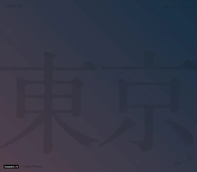
ONIGUILI presents a personal account of three days in Tokyo through a long editorial composition. The opening consists almost entirely of the two characters “東京,” rendered at architectural scale. A thin wordmark, small day links, and a handwritten project caption occupy the perimeter. Subsequent sections alternate concentrated text with photographic space. A large white English location name can cross a photograph while a much smaller Japanese label sits beside it.
The strongest recurring relationship is between enormous display type and small, carefully positioned reading blocks. Japanese vertical writing gives the closing passages a book-like rhythm, while other narrative blocks have the geometry of narrow horizontal columns. Muted navy, plum, and sage surfaces create continuity without enclosing content in cards. The page works as a travel journal and visual essay; its organizing action is reading through the three days.
How to Read This Reference
- Measured means a value appears in the supplied rendered DOM or computed-style export. Measurements are CSS pixels unless otherwise stated.
- Calculated means arithmetic derived from those measurements. A numerical relationship does not establish the original CSS formula.
- Estimated means a visual approximation from the original-page captures. Background hex values are estimates, not pixel samples or recovered declarations.
- Recommended means guidance for a new implementation. The CSS starter, fallback fonts, accessibility treatments, and proposed breakpoints belong to this category.
- Named tokens are implementation aliases unless explicitly identified as source custom properties.
- Visual coverage is selective. All three days have rendered text evidence, but the supplied photographs visually establish only the Ameyoko spread. No additional browsing or interaction testing was performed for this reference.
Tokens — Colors
Default Palette
The export provides precise text colors but does not provide the declarations responsible for the visible background fields.
| Name | Value | Evidence | Role / implementation alias |
|---|---|---|---|
| Heading White | #f5f5f5 |
Measured | Location names, Japanese location labels, and day/date markers; --color-heading |
| Reading White | #f9f9f9 |
Measured | Narrative paragraphs and introductory phrases; --color-reading |
| Utility Charcoal | #333333 |
Measured declaration | Day navigation and the home-link container; --color-ui |
| Display Black | #111111 |
Measured declaration | Opening characters and copyright; --color-display-source |
| Night Blue | Approximately #1b3445 |
Estimated | Blue end of the opening field; --canvas-navy |
| Muted Plum | Approximately #52424f |
Estimated | Warmer lower-left area of the opening; --canvas-plum |
| Closing Slate | Approximately #33394f |
Estimated | Blue-gray region behind closing copy; --canvas-slate |
| Closing Dusk | Approximately #43434d |
Estimated | Grayer purple region of the closing field; --canvas-dusk |
| Sage | Approximately #617d74 |
Estimated | Dominant background around the Ameyoko photograph; --canvas-sage |
| Olive Gray | Approximately #667568 |
Estimated | Subtle warmer variation in that photographic scene; --canvas-olive |
| Platform Black | #000000 |
Measured | Small platform badge background |
Separate declarations from appearance. The body computes to white, yet the captures show dark gradients and a sage field. The opening characters compute to #111111 but appear as subdued shapes within the field. The export does not establish whether ancestor opacity, blending, additional layers, or another mechanism produces this appearance.
Do not reproduce the visible canvas by applying the body's white declaration. Equally, do not claim an exact overlay opacity from these captures. The transparent --g-color-* values in the exported custom properties are insufficient to reconstruct the visible gradients.
Captured Canvas States
| Captured region | Visible treatment | Practical interpretation |
|---|---|---|
| Desktop and mobile opening | Dark plum-to-navy field, with very low-contrast giant lettering | Preserve the broad atmospheric color relationship; tune the lettering separately |
| Desktop Ameyoko spread | Muted green field surrounding a full-color street photograph | Let the photograph carry the color detail and visual density |
| Desktop and mobile closing passages | Blue-gray to gray-purple field with pale text | Maintain a quiet, continuous reading surface |
These are captured page regions, not verified selectable themes. The evidence does not establish a complete day-to-color mapping or the timing of background changes.
Tokens — Typography
Japanese Display and Editorial Labels
Measured family: A1明朝, exposed through source property --s-font-7e8d278f.
This family is declared on the giant opening characters, day navigation, dates, introductory phrases, Japanese location labels, and copyright. The measured weight is consistently 400 in these roles. Its contrast between fine and substantial strokes connects the monumental opening to the small editorial annotations.
The opening wordmark is visually thin and serif-like, but its link has no text in the export. Its lettering must not be assigned to this font based on appearance alone.
Japanese Narrative Text
Measured family: "中ゴシックBBB JIS2004", exposed through source property --s-font-1ea9e0ec.
Body passages use 14px, weight 400. Desktop line height is 25.2px, or 1.8. Most mobile passages use 22.4px, or 1.6; at least one Day 3 passage retains 25.2px on mobile.
For vertical writing, line height controls the horizontal distance between successive text columns. Tightening it therefore narrows the paragraph block without reducing the character size.
English Location and Event Titles
Measured family: Inter, exposed through source property --s-font-a7bf5a18.
Location names such as “Ameyoko,” “Ueno,” and “teamLab” use weight 600. The “Studio Design Award 2024” display treatment uses 700. Their scale and close tracking create a decisive contrast with the small Japanese labels.
Some event and location title rectangles are tall and narrow, consistent with a vertical or rotated presentation. The export omits writing-mode and transform values, so their precise construction is unverified. The supplied Ameyoko capture directly verifies a horizontal English title.
Wordmark and Handwritten Caption
The top-left “ONIGUILI” wordmark behaves as a compact graphic identity. The lower-right “3days in Tokyo” caption has a fine, slanted handwritten appearance. Their asset formats and font identities are not supplied. Use authorized artwork where available; a generic serif or script font is only a placeholder.
Type Scale
| Role | Desktop | Mobile | Weight / tracking | Evidence |
|---|---|---|---|---|
| Opening character | 806.4px; normal line height |
422px; normal line height |
400; normal tracking |
Measured |
| English location title | 124px / 124px |
72px / 72px |
600; -0.06em |
Measured |
| English event display | 124px / 124px |
72px / 72px |
700; desktop -0.06em, mobile -0.01em |
Measured |
| Chapter introduction | 24px / 24px |
20px / 20px |
400; phrase-dependent -0.05em or 0.01em |
Measured |
| Japanese location label | 20px / 20px |
16px / 16px |
400; horizontal examples 0.05em |
Measured |
| Day/date rail | 16px / 16px |
16px / 16px |
400; normal tracking |
Measured |
| Header navigation | 15px / 21px |
14px / 19.6px |
400; normal tracking |
Measured |
| Narrative paragraph | 14px / 25.2px |
Usually 14px / 22.4px |
400; generally normal tracking |
Measured |
| Copyright | 12px / 16.8px |
12px / 16.8px |
400; normal tracking |
Measured |
One desktop paragraph uses -0.7px tracking, equivalent to -0.05em at 14px. Treat this as a local adjustment, not a universal body-text token.
Calculated scale relationships: the desktop opening size equals 56vw at 1440px width. The mobile opening size equals half the 844px viewport height. These relationships inform the starter CSS but do not prove the original responsive expressions.
Tokens — Spacing & Shapes
Density: extremely sparse at the scene level, compact within individual text blocks.
The page uses multiple alignment systems. Header edges, day rails, photograph margins, and narrative offsets should remain separate tokens.
Spacing Scale
| Use | Desktop | Mobile | Status |
|---|---|---|---|
| Header horizontal inset | Approximately 28.8px |
Approximately 7.8px |
Measured; both correspond to 2% of viewport width |
| Header top position | 24px |
16px |
Measured |
| Gap between day-navigation items | 16px |
8px |
Calculated from adjacent rectangles |
| Day number to date gap | 8px |
8px |
Calculated |
| Introduction column step | 64px |
44px |
Calculated from repeated x positions |
| Clear space between standard introduction columns | 40px |
24px |
Calculated after subtracting 24px / 20px column widths |
| Vertical paragraph reading height | 200px |
200px |
Measured in many passages |
| Closing paragraph start-to-start vertical step | 200px |
224px |
Measured |
| Closing paragraph vertical gap | 0px between successive row extents |
24px |
Calculated; blocks also move horizontally |
| Platform badge left/bottom inset | 20px / 20px |
20px / 20px |
Measured |
| Copyright left position | 120px |
120px |
Measured |
Border Radius
| Element | Treatment | Evidence |
|---|---|---|
| Ameyoko photograph | Square corners | Visible in desktop capture |
| Sampled text and navigation elements | 0px radius; transparent backgrounds |
Measured |
| Platform badge | 4px radius |
Measured |
| General content containers | No visible card enclosure or shadow system | Observed within supplied visual scope |
Layout Measurements
| Element | Desktop measurement | Mobile measurement / observation |
|---|---|---|
| Home-link graphic box | 138.23 × 24.09px |
89.84 × 15.66px, approximately 65% of desktop dimensions |
| Opening character allocation | Two adjacent 720px-wide boxes |
Two vertically arranged 390px-wide boxes |
| Individual day link | Approximately 27.27 × 21px |
Approximately 25.58 × 19.59px |
| Ameyoko English title | 510.28 × 124px |
296.30 × 72px |
| Ameyoko photograph | Approximately 1224px wide, from x ≈ 108 to x ≈ 1332 |
Photograph bounds not visually supplied |
| Typical horizontal narrative column | 200px wide |
160px wide |
| Document height | 37,237.77px |
23,739.19px |
The photograph occupies approximately 85% of the desktop viewport width, with 7.5% margins. This is a measurement of one spread, not a proven universal image rule.
Opening text rectangles extend well beyond the viewport vertically. Their heights include font and layout geometry; they are not the visible dimensions of the glyphs. Avoid recreating these oversized boxes literally.
Components
Persistent Identity Header
Role: identifies the journal and provides direct access to its three days.
Place the compact wordmark at the upper left and one uninterrupted line of day navigation at the upper right. The exact visible labels are “Day.”, “( 1 )”, “( 2 )”, and “( 3 )”. The three numbered links target #day1, #day2, and #day3 on the same page.
The header has no visible filled bar, divider, button boxes, or hamburger menu. Its position remains consistent across the supplied scrolled captures. The exported rectangles establish its dimensions and offsets, while the exact positioning declaration is not included.
On mobile, retain the complete navigation. Reduce the graphic to about 90px wide, reduce the labels to 14px, and halve their gaps to 8px. The group still fits on one line.
Interaction limit: link destinations are verified from href values. Click behavior, smooth scrolling, active-day indication, hover appearance, and focus appearance were not tested.
Opening Composition
Role: establishes place and mood before the diary begins.
Two separate text elements form “東京.” On desktop, each occupies half the viewport width. On mobile, the characters stack, with “東” above “京.” The glyphs approach or cross the viewport edges and become the main visual structure.
The background is a subdued dark field with plum toward the lower left and blue toward the upper right. The characters remain deliberately faint in the supplied captures. A small handwritten project caption occupies the lower-right area, angled in its visible treatment.
The opener fills the first captured viewport at both sizes. The first day marker begins approximately 120px below that viewport: y = 1120 on desktop and y = 964 on mobile.
Do not interpret the faint lettering as a verified loading state. The supplied readiness process waited for settling, and no before/after sequence establishes a temporary veil or subsequent brightening.
Day and Date Rail
Role: keeps the reader oriented within a long chapter.
The rail combines a vertically presented English day label, such as “( Day. 2 )”, with a vertical Japanese date such as “2月8日.” Both use 16px A1 text, with an 8px gap between their bounding boxes.
Day 1 and Day 3 appear on the left; Day 2 appears on the right. Desktop left-side dates sit at x = 40px. Mobile Day 1 moves to x = 24px, while Day 3 retains x = 40px. Day 2 sits approximately 24–26px from the right edge on mobile.
The Day 2 rail remains near the upper-right edge in the Ameyoko capture despite that location being far into the chapter. This supports a chapter-pinned presentation. Exact sticky boundaries and offsets remain unverified; the observed upper position varies between captures.
Chapter Introduction
Role: gives each day a brief literary opening.
Use a few narrow columns of Japanese Mincho text, separated by much more space than the narrative columns. The desktop examples use 24px characters and a 64px column step. Mobile uses 20px characters and a 44px step.
The Day 1 and Day 3 groups occupy the left half of desktop compositions; the Day 2 group sits farther right. On mobile, the introductions regroup near the center. These are composed phrases with intentional line divisions, not one large paragraph that should wrap arbitrarily.
Desktop introduction elements have long, delayed transitions. Their mobile equivalents expose the shorter generic transition instead. Preserve the phrase grouping before adding motion.
Bilingual Location Title
Role: identifies a place while functioning as a large compositional element.
Pair a small Japanese label with a much larger English name. The directly visible example is “アメ横” beside “Ameyoko.” The English title uses Inter 600 at 124px / 1 with -0.06em tracking; the Japanese label uses A1 at 20px / 1 with 0.05em tracking.
In the desktop measurement, the Japanese label begins 28px left of the English title and 4px above its line box. On mobile, these offsets become 20px left and 6px above. The apparent gap between the Japanese lettering and English glyph tops also depends on their font metrics.
The desktop English title ends at x = 1332px, aligning with the photograph's visible right edge. It sits over the upper portion of the image without a label plate or shadow.
Other measured titles include “Ueno / Zoo,” “teamLab / Planets,” and “Nihonbashi / & / Ginza.” Their differing arrangements should remain local compositions rather than being forced into one identical title layout.
Ameyoko Photographic Spread
Role: provides a large, immersive visual pause within Day 2.
A full-color street photograph spans approximately 1224px within the green field. In the supplied desktop capture, its upper edge is about 219px below the viewport top. That coordinate describes the captured scroll position, not a reusable section padding value.
The image contains an elevated railway, overhead wires, dense storefront signs, and a crowded foreground. The visual perspective draws inward along the street. White title lettering crosses the upper-right image area while the smaller day rail remains outside the image.
The photograph continues beyond the bottom of the capture. Its complete aspect ratio, crop rule, and native dimensions are unknown. Use an image element with its intrinsic ratio as the initial implementation, then tune framing against an authorized full asset.
Narrative Text Block
Role: delivers the personal voice in small, spatially deliberate units.
The measured body type is 14px Gothic, generally pale #f9f9f9. Paragraphs have no enclosing surface, border, or decorative separator.
Two patterns must be distinguished:
| Pattern | Evidence | Construction guidance |
|---|---|---|
| Vertical reading block | Directly visible in desktop and mobile closing captures; many rectangles have a fixed 200px height and content-dependent width | Use true vertical writing, preserve Japanese punctuation behavior, and let column count determine width |
| Narrow horizontal block | Day 2 rectangles repeatedly have fixed 200px desktop / 160px mobile widths and content-dependent heights | Geometry strongly suggests horizontal reading columns; confirm writing mode before claiming an exact reconstruction |
The export does not include writing-mode. Vertical writing is visually established for the closing passages; orientation elsewhere should not be generalized solely from the font or content language.
Stepped Narrative Group
Role: turns paragraph sequencing into a path across the page.
In the desktop closing capture, three blocks progress from upper right to middle left to lower left. Their measured x positions are approximately 926.5px, 338.8px, and 114px. Each is 200px high, and their document y positions advance by 200px.
On mobile, those same passages remain vertical. Their x positions become approximately 170.9px, 71.8px, and 40px, and their y positions advance by 224px. This preserves a staggered rhythm while adding 24px between blocks.
The mobile closing capture begins with part of the preceding text above the viewport. That crop reflects a scroll position; it is not evidence that the page permanently hides the paragraph's beginning.
Copyright and Platform Badge
Role: provides a quiet author notice and the hosting-platform mark.
The original page visibly states “© Sayoko Nishimura.” This supports the copyright notice; it does not independently establish a detailed design, development, or photography credit.
The copyright uses A1 at 12px / 16.8px, with #111111 declared. It remains near the lower-left edge across desktop captures, positioned at x = 120px and approximately 24px above the viewport bottom. On mobile, its measured position is near the document end, matching its absence from the opening capture and presence in the closing capture.
The platform badge is a separate black 84 × 20px element, 20px from the left and bottom edges, with 4px corners. The original page's closing prose also explicitly says the page was made with Studio. Treat that as a platform statement, not an agency credit.
Tokens — Motion & Interaction
| Treatment | Supplied evidence | Interpretation / limit |
|---|---|---|
| General element transition | 0.3s cubic-bezier(0.4, 0.4, 0, 1) |
Common computed transition; does not prove a particular hover or reveal effect |
| Desktop introduction and selected display transitions | 1.6s cubic-bezier(0.19, 1, 0.22, 1) |
Long deceleration suitable for deliberate entrances; start/end properties are absent |
| Desktop introduction delays | Examples from 0.4s through 1.2s, often separated by 0.2s |
Supports staggered scheduling of individual phrases |
| Desktop event-title delays | English parts at 0.1s, 0.3s, 0.5s, 0.7s; Japanese labels at 0.9s |
A measured sequence of declarations, not a recorded animation timeline |
| Desktop closing paragraphs | 1.6s transition with 0.4s delay |
All three sampled passages share this declaration |
| Mobile counterparts | Sampled elements use the generic 0.3s transition without those long delays |
Responsive change in declared motion; complete mobile motion behavior remains unverified |
| Body background | background 0.5s cubic-bezier(0.4, 0.4, 0, 1) |
Verified declaration, but the visible gradient layer is not identified |
| Platform badge | 0.4s cubic-bezier(0.4, 0.4, 0, 1) |
Trigger and visual result untested |
| Numbered navigation | Same-page #day1, #day2, #day3 links |
Destinations verified; scrolling duration and easing unknown |
| Sampled CSS animations | animation: none |
No keyframe animation on these sampled elements; not proof that all page motion is absent |
The transition strings also include registered gradient properties. Their presence indicates properties that can transition, not proof that every element visibly animates a gradient.
Recommended adaptation: use subtle opacity and short-distance entrance motion with the measured desktop easing, then shorten or remove it on mobile. A translation distance such as 20px is a new design choice, not a recovered source value. Keep all content visible when JavaScript is unavailable.
Parallax, scroll snapping, image zoom, background animation, active navigation changes, and custom cursor behavior are not established by the supplied evidence.
Surfaces
| Layer | Appearance | Function |
|---|---|---|
| Opening canvas | Broad, dark plum/navy field | Establishes atmosphere beneath the giant characters |
| Photographic scene canvas | Muted green field | Gives the busy photograph a quiet perimeter |
| Closing canvas | Slate and gray-purple field | Supports pale reading columns and long pauses |
| Narrative content | Transparent, unboxed text | Keeps the composition continuous |
| Photograph | Full-color rectangle with square corners | Supplies detail, depth, and place |
| Header and day rails | Text/graphic elements without visible panels | Maintains orientation without a heavy navigation surface |
| Platform badge | Small black rounded rectangle | Separate platform interface element |
Depth comes from scale, overlap, photographic perspective, and empty space. No general elevation or card-shadow system is visible.
Imagery
The directly inspected photograph has a documentary street character: crowded foreground figures, mixed commercial signage, railway infrastructure, and pale daylight above darker storefronts. Preserve these ordinary details. The photograph works because it records the experience of moving through the city, including its congestion.
Keep photography in natural color. No image-filter declarations were supplied, so the visible exposure and color should not be attributed to an invented desaturation or darkening filter. Avoid applying the opening's subdued text treatment to every photograph.
The rendered narrative mentions an awards event, Ueno Zoo, Ameyoko, teamLab Planets, Nihonbashi, and Ginza. These establish the journal's subjects; they do not verify the appearance of photographs absent from the supplied captures.
Observed Asset References
| Visual asset | Established evidence | Missing information |
|---|---|---|
| ONIGUILI wordmark | Visible in desktop/mobile captures; home-link box measured | Asset URL, file format, and lettering font |
| Handwritten project caption | Visible near the opening's lower-right corner | Asset URL, format, and whether lettering is image-based |
| Ameyoko street photograph | Visible as a large desktop spread | Source URL, native dimensions, complete aspect ratio, and crop settings |
| Platform badge | Visible at both sizes; link and dimensions exported | Internal graphic implementation is not necessary for the journal's reusable design |
| Opening “東京” | Two real text elements with measured font and size | No image asset is needed for these characters |
No original image URLs or font-file URLs are supplied. Do not invent an asset directory or treat a screenshot as the original photograph.
Layout & Responsive Behavior
Desktop Composition
The document is approximately 37,238px tall at 1440 × 1000. Small navigation and chapter markers provide continuity across an unusually long reading surface. This is document scrolling, not evidence of an internally scrolling application shell.
The opening is a two-character horizontal composition. Later scenes combine broad photographic areas with small narrative groups located at different horizontal positions. The closing passages form a descending path across the canvas. Avoid introducing a centered maximum-width article column around every component; the separate offsets are part of the design.
Mobile Recomposition
At 390 × 844, the document measures approximately 23,739px tall. It retains the same rendered narrative text, while typography, spacing, and positioning change substantially.
| Element | Observed change |
|---|---|
| Opening title | Changes from two side-by-side characters to a vertical stack |
| Wordmark | Graphic box scales to approximately 65% of desktop size |
| Navigation | Remains fully visible; type reduces from 15px to 14px and gaps from 16px to 8px |
| English display text | Reduces from 124px to 72px |
| Japanese introductions | Reduce from 24px to 20px; column step contracts from 64px to 44px |
| Narrative characters | Remain 14px |
| Narrative line height | Generally tightens from 25.2px to 22.4px, with a measured exception |
| Horizontal column geometry | Width reduces from 200px to 160px |
| Closing passages | Preserve vertical writing and staggered alignment; gain 24px inter-block gaps |
| Copyright | Moves from a viewport-pinned desktop presentation to the document end |
| Long entrance transitions | Mobile sampled declarations use the shorter generic timing |
A source fragment includes a max-width: 1024px rule controlling responsive line breaks. It does not establish that every layout change occurs at 1024px. Intermediate widths, landscape layouts, and browser zoom were not visually supplied.
Implementation Consequences
Keep 14px narrative text independent of giant display scaling. Preserve phrase-level line divisions and use separate styles for vertical and horizontal paragraphs. Build mobile placement explicitly rather than uniformly shrinking desktop coordinates.
The total document heights are observations, not target CSS heights. Let actual content, images, and section spacing determine the result. Artificial empty spacers added solely to match those totals would not reproduce the reading rhythm.
Do’s and Don’ts
Do
- Make the opening characters the principal composition, with small identity elements around the edges.
- Preserve A1 Mincho for the measured Japanese display roles, Gothic for body copy, and Inter for English place names.
- Keep English location names tightly tracked and dramatically larger than their Japanese labels.
- Retain both vertical reading blocks and the separately evidenced narrow-column pattern.
- Compose paragraph groups with staggered positions and generous surrounding space.
- Keep the Ameyoko photograph square-cornered and large, with its title overlapping the image.
- Preserve the full three-day navigation on mobile.
- Treat desktop and mobile as related compositions with distinct placement rules.
- Separate measured text colors from estimated background colors.
- Preserve the quiet ending and the mobile copyright's document-end placement.
Don’t
- Don't convert the journal into a sequence of feature cards, promotional buttons, or sales sections.
- Don't replace the giant Japanese opener with a conventional medium-size headline.
- Don't assign a speculative font to the wordmark or handwritten caption.
- Don't force all narrative text into one writing direction.
- Don't apply a single global gutter to the header, date rails, images, and prose.
- Don't add shadows, rounded photo cards, or bright category badges.
- Don't interpret a narrow or offscreen element rectangle as its visible artwork size.
- Don't infer continuous animation, parallax, or smooth anchor scrolling from transition declarations alone.
- Don't brighten the supplied opening on the assumption that it shows an unfinished loader.
- Don't hardcode the measured total page height or crop body text to fit a decorative arrangement.
Recommended Implementation Additions
These are additions for a new implementation, not verified features of the original:
- Improve the contrast of essential navigation and copyright against each canvas state. The captured dark-on-dark identity treatment should not dictate the readability of controls.
- Provide an accessible name for the graphic home link and descriptive labels such as “Day 2, February 8” for compact numbered links.
- Enlarge navigation hit areas without unnecessarily enlarging the visible lettering. A 44px target height is a useful implementation target.
- Use semantic chapter headings and a meaningful document reading order. The exported text fragments do not necessarily reflect the intended visual reading sequence.
- Add a visible focus indicator and sufficient anchor clearance beneath the persistent header.
- Preserve vertical Japanese text through real writing-mode behavior. Test punctuation, Latin runs, text selection, and screen-reader order.
- Offer a horizontal reading fallback at narrow widths or enlarged text settings when a vertical block no longer fits.
- Honor reduced-motion preferences, including removal of entrance delays. Keep copy visible before enhancement scripts initialize.
- Supply meaningful photograph alternatives, responsive image sources, and intrinsic dimensions. Load later photographs progressively without delaying the opening typography.
- Reserve licensed font loading and authorized wordmark/signature artwork as explicit implementation dependencies.
Agent Prompt Guide
Quick Color Reference
- Measured location headings and day rails:
#f5f5f5. - Measured narrative text:
#f9f9f9. - Measured navigation declaration:
#333333; reassess contrast in a new implementation. - Measured opening-character declaration:
#111111; final visual compositing is unknown. - Estimated opening background endpoints: navy
#1b3445and plum#52424f. - Estimated closing background: slate
#33394fto dusk#43434d. - Estimated photographic scene background: sage
#617d74to olive gray#667568. - Keep photography in full color and content surfaces transparent.
Overall Prompt
“Create a three-day Japanese photo journal inspired by the current ONIGUILI Tokyo composition. Begin with two enormous Mincho characters, ‘東京,’ occupying nearly the entire viewport over a muted dark plum/navy field. Place a small graphic wordmark at the upper left and ‘Day. ( 1 ) ( 2 ) ( 3 )’ navigation at the upper right. Use A1 Mincho for Japanese introductions and labels, Gothic at 14px for narrative copy, and Inter 600 for tightly tracked English location titles. Alternate expansive photographic scenes with small, staggered text groups. Include true vertical Japanese reading blocks and separate narrow horizontal paragraph components. On mobile, stack the opening characters, retain all day links, reduce English display text to about 72px, and reposition the prose rather than scaling the whole page. Use the supplied gradient colors as approximations and keep unsupported interactions explicitly optional.”
Example Component Prompts
- Opening: “A full-viewport Tokyo journal cover with two enormous dark Mincho characters across a subdued plum-to-navy background. Tiny identity elements sit at opposite upper corners. A fine handwritten project caption occupies the lower right. Stack the two characters on a tall phone.”
- Location spread: “A square-cornered Ameyoko street photograph occupying about 85% of a desktop viewport's width, surrounded by muted sage. Overlay a white 124px Inter 600 ‘Ameyoko’ title near the upper-right image edge. Place a 20px Japanese ‘アメ横’ label slightly left and above the English line box. Keep the vertical day rail outside the photograph.”
- Closing passages: “Three unboxed Japanese vertical paragraphs in pale Gothic text, each with a 200px reading height. On desktop, descend from upper right to middle left to lower left across a slate field. On mobile, keep the characters at 14px, tighten column pitch to 22.4px, and add 24px between staggered blocks.”
- Header: “A transparent persistent header with a small wordmark at left and plain Mincho day links at right. Use 2% viewport edge insets, 24px desktop top offset, and 16px mobile top offset. Preserve the complete link row on mobile and provide accessible names and visible focus states.”
- Motion: “Use the measured desktop entrance timing of 1.6 seconds with cubic-bezier(0.19, 1, 0.22, 1), optionally staggered by 0.2 seconds. Treat opacity and translation choices as new implementation decisions. Keep content visible without JavaScript and remove motion and delays for reduced-motion users.”
Quick Start
CSS Custom Properties
This is a structural adaptation, not extracted source CSS. Font families and core type values are measured; background colors, gradient construction, title opacity, layout interpolation, and the 700px/360px breakpoints are recommendations. Load the named fonts through an authorized source. The generic fallbacks do not reproduce their exact metrics.
Markup expectations: .opening-title contains two spans; .day-marker contains a day label and date; .chapter-intro contains separate phrase elements; .photo-spread contains an image and .place-title; .closing-copy contains three .vertical-copy paragraphs. The header logo can be an authorized image or SVG using .journal-logo.
:root {
  /* Measured foreground declarations */
  --color-heading: #f5f5f5;
  --color-reading: #f9f9f9;
  --color-ui: #333333;
  --color-display-source: #111111;

  /* Estimated canvas colors; recommended gradient construction */
  --canvas-navy: #1b3445;
  --canvas-plum: #52424f;
  --canvas-slate: #33394f;
  --canvas-dusk: #43434d;
  --canvas-sage: #617d74;
  --canvas-olive: #667568;

  /* Verified family names with recommended generic fallbacks */
  --font-editorial: 'A1明朝', serif;
  --font-reading: '中ゴシックBBB JIS2004', sans-serif;
  --font-display: 'Inter', sans-serif;

  --text-nav: 15px;
  --text-date: 16px;
  --text-body: 14px;
  --text-intro: 24px;
  --text-place-ja: 20px;
  --text-place-en: 124px;
  --text-credit: 12px;
  --leading-body: 1.8;
  --tracking-display: -0.06em;
  --tracking-label: 0.05em;

  --header-top: 24px;
  --header-edge: 2vw;
  --nav-gap: 16px;
  --intro-gap: 40px;
  --reading-height: 200px;
  --photo-width: 85%;

  --ease-ui: cubic-bezier(0.4, 0.4, 0, 1);
  --ease-enter: cubic-bezier(0.19, 1, 0.22, 1);
  --duration-ui: 300ms;
  --duration-enter: 1600ms;
}

* {
  box-sizing: border-box;
}

body {
  margin: 0;
  color: var(--color-reading);
  background: var(--canvas-slate);
  font-family: var(--font-reading);
}

.journal-header {
  position: fixed;
  z-index: 20;
  top: var(--header-top);
  left: var(--header-edge);
  right: var(--header-edge);
  display: flex;
  justify-content: space-between;
  align-items: flex-start;
  color: var(--color-ui);
}

.journal-logo {
  display: block;
  width: 138.23px;
  height: auto;
}

.day-nav {
  display: flex;
  align-items: baseline;
  gap: var(--nav-gap);
  font-family: var(--font-editorial);
  font-size: var(--text-nav);
  line-height: 1.4;
  white-space: nowrap;
}

.day-nav p {
  margin: 0;
}

.journal-header a {
  color: inherit;
  text-decoration: none;
}

.opening {
  position: relative;
  height: 100vh;
  height: 100svh;
  overflow: clip;
  background: linear-gradient(
    35deg,
    var(--canvas-plum),
    var(--canvas-navy)
  );
}

.opening-title {
  position: absolute;
  inset: 0;
  display: grid;
  grid-template-columns: repeat(2, minmax(0, 1fr));
  align-items: center;
  margin: 0;
  font-family: var(--font-editorial);
  font-size: 56vw;
  font-weight: 400;
  line-height: 1;
  color: var(--color-display-source);
  /* Approximation of the captured faint appearance, not source opacity */
  opacity: 0.18;
}

.opening-title span {
  min-width: 0;
  text-align: center;
}

.opening-title span:first-child {
  padding-top: 20px;
}

.opening-signature {
  position: absolute;
  right: 3vw;
  bottom: 24px;
  width: 160px;
  height: auto;
}

.chapter {
  position: relative;
  padding-top: 120px;
  scroll-margin-top: 80px;
}

.day-marker {
  position: sticky;
  top: 80px;
  z-index: 5;
  display: flex;
  flex-direction: column;
  gap: 8px;
  width: 16px;
  margin-left: 40px;
  color: var(--color-heading);
  font-family: var(--font-editorial);
  font-size: var(--text-date);
  line-height: 1;
}

.day-marker > * {
  margin: 0;
  writing-mode: vertical-rl;
  text-orientation: mixed;
}

.day-marker--right {
  margin-left: auto;
  margin-right: 40px;
}

.chapter-intro {
  display: flex;
  flex-direction: row-reverse;
  align-items: flex-start;
  gap: var(--intro-gap);
  width: max-content;
  max-width: calc(100% - 80px);
  margin: 230px auto 300px;
}

.chapter-intro > * {
  margin: 0;
  writing-mode: vertical-rl;
  text-orientation: mixed;
  font-family: var(--font-editorial);
  font-size: var(--text-intro);
  font-weight: 400;
  line-height: 1;
  letter-spacing: 0.01em;
}

.chapter-intro .phrase-tight {
  letter-spacing: -0.05em;
}

.scene--sage {
  padding-block: 120px 200px;
  background: linear-gradient(
    110deg,
    var(--canvas-sage),
    var(--canvas-olive)
  );
}

.photo-spread {
  position: relative;
  width: var(--photo-width);
  margin: 0 auto;
}

.photo-spread > img {
  display: block;
  width: 100%;
  height: auto;
  border-radius: 0;
}

.place-title {
  position: absolute;
  top: 20px;
  right: 0;
  margin: 0;
  color: var(--color-heading);
}

.place-title__en {
  display: block;
  font-family: var(--font-display);
  font-size: var(--text-place-en);
  font-weight: 600;
  line-height: 1;
  letter-spacing: var(--tracking-display);
}

.place-title__ja {
  position: absolute;
  top: -4px;
  left: -28px;
  font-family: var(--font-editorial);
  font-size: var(--text-place-ja);
  font-weight: 400;
  line-height: 1;
  letter-spacing: var(--tracking-label);
  white-space: nowrap;
}

.vertical-copy,
.horizontal-copy {
  margin: 0;
  color: var(--color-reading);
  font-family: var(--font-reading);
  font-size: var(--text-body);
  font-weight: 400;
  line-height: var(--leading-body);
}

.vertical-copy {
  writing-mode: vertical-rl;
  text-orientation: mixed;
  width: max-content;
  max-width: 100%;
  height: var(--reading-height);
}

.horizontal-copy {
  writing-mode: horizontal-tb;
  min-width: 0;
  overflow-wrap: break-word;
}

.horizontal-pair {
  display: grid;
  grid-template-columns: repeat(2, minmax(0, 1fr));
  width: 400px;
  max-width: calc(100% - 48px);
  margin: 120px auto 200px;
}

.horizontal-pair > :first-child {
  grid-area: 1 / 1;
}

.horizontal-pair > :last-child {
  grid-area: 2 / 2;
  /* Recommended one-line overlap in the staggered arrangement */
  margin-top: -1lh;
}

.closing-copy {
  display: grid;
  grid-template-columns: repeat(12, minmax(0, 1fr));
  padding: 80px 7.5vw 290px;
  background: linear-gradient(
    90deg,
    var(--canvas-slate),
    var(--canvas-dusk)
  );
}

.closing-copy > :nth-child(1) {
  grid-area: 1 / 9 / 2 / 12;
}

.closing-copy > :nth-child(2) {
  grid-area: 2 / 3 / 3 / 7;
}

.closing-copy > :nth-child(3) {
  grid-area: 3 / 1 / 4 / 4;
}

.journal-copyright {
  position: fixed;
  z-index: 10;
  left: 120px;
  bottom: 24px;
  margin: 0;
  color: var(--color-display-source);
  font-family: var(--font-editorial);
  font-size: var(--text-credit);
  line-height: 1.4;
}

/* Optional enhancement: baseline content remains visible */
.reveal {
  transition:
    opacity var(--duration-enter) var(--ease-enter),
    transform var(--duration-enter) var(--ease-enter);
  transition-delay: var(--reveal-delay, 400ms);
}

/* Set these attributes only after an observer is ready */
.reveal[data-reveal-ready][data-visible='false'] {
  opacity: 0;
  transform: translateY(20px);
}

/* Recommended focus treatment */
a:focus-visible {
  outline: 2px solid var(--color-heading);
  outline-offset: 4px;
}

@media (max-width: 700px) {
  :root {
    --header-top: 16px;
    --text-nav: 14px;
    --nav-gap: 8px;
    --text-intro: 20px;
    --intro-gap: 24px;
    --text-place-ja: 16px;
    --text-place-en: min(72px, 18.46vw);
    --leading-body: 1.6;
    --photo-width: calc(100% - 48px);
  }

  .journal-logo {
    width: 89.84px;
  }

  .opening-title {
    grid-template-columns: 1fr;
    grid-template-rows: repeat(2, minmax(0, 1fr));
    font-size: min(50svh, 108.2vw);
  }

  .opening-signature {
    right: 16px;
    width: 125px;
  }

  .day-marker {
    margin-left: 24px;
  }

  .day-marker--right {
    margin-left: auto;
    margin-right: 24px;
  }

  #day3 .day-marker {
    margin-left: 40px;
  }

  .chapter-intro {
    max-width: calc(100% - 48px);
    margin-block: 200px 240px;
  }

  .place-title__ja {
    top: -6px;
    left: -20px;
  }

  .horizontal-pair {
    width: 320px;
  }

  .closing-copy {
    grid-template-columns: minmax(0, 1fr);
    gap: 24px;
    padding: 80px 40px 0;
  }

  .closing-copy > .vertical-copy {
    grid-area: auto;
  }

  .closing-copy > :nth-child(1) {
    justify-self: end;
  }

  .closing-copy > :nth-child(2) {
    justify-self: center;
  }

  .closing-copy > :nth-child(3) {
    justify-self: start;
  }

  .journal-copyright {
    position: static;
    margin: 280px 0 22px 120px;
  }

  .reveal {
    transition-duration: var(--duration-ui);
    transition-delay: 0s;
    transition-timing-function: var(--ease-ui);
  }
}

/* Recommended narrow-screen fallback; not an observed source rule */
@media (max-width: 360px) {
  .vertical-copy {
    writing-mode: horizontal-tb;
    width: 100%;
    height: auto;
  }
}

@media (prefers-reduced-motion: reduce) {
  .reveal,
  .reveal[data-reveal-ready][data-visible='false'] {
    opacity: 1;
    transform: none;
    transition: none;
  }
}
The desktop closing grid approximates the measured placement; it does not reproduce every original x coordinate. The mobile alignment closely follows the observed right/center/left arrangement. Scene spacing remains content-dependent.
For text longer than the supplied passages, split vertical copy into consecutive reading blocks or enable a horizontal fallback. Do not hide overflow to preserve the 200px reading height. Test actual licensed font metrics before adjusting the opening glyph positions.
The starter preserves measured dark UI declarations for reference. For a production adaptation, overriding --color-ui with #f5f5f5 is a simple starting point for essential-control contrast. Test the result against every background region.
Tailwind v4 Token Mapping
Optional aliases for a project already using Tailwind v4. This does not imply the original page uses Tailwind. Define the variables above first.
@theme inline {
  --color-journal-heading: var(--color-heading);
  --color-journal-reading: var(--color-reading);
  --color-journal-ui: var(--color-ui);
  --color-journal-slate: var(--canvas-slate);
  --color-journal-sage: var(--canvas-sage);

  --font-journal-editorial: var(--font-editorial);
  --font-journal-reading: var(--font-reading);
  --font-journal-display: var(--font-display);

  --text-journal-body: var(--text-body);
  --text-journal-nav: var(--text-nav);
  --text-journal-intro: var(--text-intro);
  --text-journal-place: var(--text-place-en);
  --text-journal-credit: var(--text-credit);

  --spacing-journal-nav: var(--nav-gap);
  --spacing-journal-intro: var(--intro-gap);
  --spacing-journal-reading: var(--reading-height);
}
Sources & Evidence
- Inspected original and final page: 3days in Tokyo|ONIGUILI. The supplied browser record reports HTTP 200 and identical original/final URLs.
- Capture date: September 12, 2026, 19:09:21.006 UTC / September 13, 2026, 04:09:21.006 JST. This is the supplied retrieval timestamp, not a publication date or the date of the trip.
- Desktop evidence: 1440 × 1000 CSS-pixel captures of the opening, the Ameyoko photographic spread, and the closing text composition; rendered text and computed element measurements across the document.
- Mobile evidence: 390 × 844 CSS-pixel captures of the opening and closing text; rendered text and computed element measurements across the document.
- Verified link destinations: the original-page home URL and its
#day1,#day2, and#day3anchors. These destinations were read from the rendered evidence; clicks were not independently exercised. - Readiness scope: the supplied process waited for document load, visible image decoding, and sampled layout/text stability, and traversed intermediate scroll positions. Its finite waiting limits cannot establish complete delayed-content or animation behavior.
- Inspection limits: no additional browser visit, hover/focus testing, keyboard testing, font-file inspection, asset retrieval, image pixel sampling, intermediate-width capture, or motion recording was performed. The export omits key layout properties including writing-mode, transforms, positioning rules, ancestor opacity, and the visible gradient declarations. SharedWorkers and service workers were disabled during the supplied inspection.
This reference describes the current page represented by the supplied original-page evidence. Background approximations and implementation recommendations are explicitly separated from measured properties.
# ONIGUILI / 3days in Tokyo — Style Reference

> A personal Tokyo travel journal composed as oversized type, intimate notes, and photographic pauses.

**Website:** [3days in Tokyo|ONIGUILI](https://oniguili-tokyo3days.studio.site/)
**Original URL:** https://oniguili-tokyo3days.studio.site/
**Final URL:** https://oniguili-tokyo3days.studio.site/
**Theme:** dark, muted color fields in the supplied captures, with pale narrative text and darker identity elements; no theme selector evidenced.
**Inspected:** September 13, 2026, 04:09 JST. Supplied retrieval timestamp: September 12, 2026, 19:09:21.006 UTC.
**Viewports:** desktop 1440 × 1000 and mobile 390 × 844 CSS pixels.
**Scope:** the current three-day journal, including its opening composition, chapter navigation, chapter introductions, location titles, narrative text, an Ameyoko photographic spread, closing passages, and footer. Visual evidence comprises three desktop captures and two mobile captures. Rendered text and element measurements cover all three days.

ONIGUILI presents a personal account of three days in Tokyo through a long editorial composition. The opening consists almost entirely of the two characters “東京,” rendered at architectural scale. A thin wordmark, small day links, and a handwritten project caption occupy the perimeter. Subsequent sections alternate concentrated text with photographic space. A large white English location name can cross a photograph while a much smaller Japanese label sits beside it.

The strongest recurring relationship is between enormous display type and small, carefully positioned reading blocks. Japanese vertical writing gives the closing passages a book-like rhythm, while other narrative blocks have the geometry of narrow horizontal columns. Muted navy, plum, and sage surfaces create continuity without enclosing content in cards. The page works as a travel journal and visual essay; its organizing action is reading through the three days.

## How to Read This Reference

- **Measured** means a value appears in the supplied rendered DOM or computed-style export. Measurements are CSS pixels unless otherwise stated.
- **Calculated** means arithmetic derived from those measurements. A numerical relationship does not establish the original CSS formula.
- **Estimated** means a visual approximation from the original-page captures. Background hex values are estimates, not pixel samples or recovered declarations.
- **Recommended** means guidance for a new implementation. The CSS starter, fallback fonts, accessibility treatments, and proposed breakpoints belong to this category.
- **Named tokens** are implementation aliases unless explicitly identified as source custom properties.
- **Visual coverage is selective.** All three days have rendered text evidence, but the supplied photographs visually establish only the Ameyoko spread. No additional browsing or interaction testing was performed for this reference.

## Tokens — Colors

### Default Palette

The export provides precise text colors but does not provide the declarations responsible for the visible background fields.

| Name | Value | Evidence | Role / implementation alias |
| --- | --- | --- | --- |
| Heading White | `#f5f5f5` | Measured | Location names, Japanese location labels, and day/date markers; `--color-heading` |
| Reading White | `#f9f9f9` | Measured | Narrative paragraphs and introductory phrases; `--color-reading` |
| Utility Charcoal | `#333333` | Measured declaration | Day navigation and the home-link container; `--color-ui` |
| Display Black | `#111111` | Measured declaration | Opening characters and copyright; `--color-display-source` |
| Night Blue | Approximately `#1b3445` | Estimated | Blue end of the opening field; `--canvas-navy` |
| Muted Plum | Approximately `#52424f` | Estimated | Warmer lower-left area of the opening; `--canvas-plum` |
| Closing Slate | Approximately `#33394f` | Estimated | Blue-gray region behind closing copy; `--canvas-slate` |
| Closing Dusk | Approximately `#43434d` | Estimated | Grayer purple region of the closing field; `--canvas-dusk` |
| Sage | Approximately `#617d74` | Estimated | Dominant background around the Ameyoko photograph; `--canvas-sage` |
| Olive Gray | Approximately `#667568` | Estimated | Subtle warmer variation in that photographic scene; `--canvas-olive` |
| Platform Black | `#000000` | Measured | Small platform badge background |

**Separate declarations from appearance.** The body computes to white, yet the captures show dark gradients and a sage field. The opening characters compute to `#111111` but appear as subdued shapes within the field. The export does not establish whether ancestor opacity, blending, additional layers, or another mechanism produces this appearance.

Do not reproduce the visible canvas by applying the body's white declaration. Equally, do not claim an exact overlay opacity from these captures. The transparent `--g-color-*` values in the exported custom properties are insufficient to reconstruct the visible gradients.

### Captured Canvas States

| Captured region | Visible treatment | Practical interpretation |
| --- | --- | --- |
| Desktop and mobile opening | Dark plum-to-navy field, with very low-contrast giant lettering | Preserve the broad atmospheric color relationship; tune the lettering separately |
| Desktop Ameyoko spread | Muted green field surrounding a full-color street photograph | Let the photograph carry the color detail and visual density |
| Desktop and mobile closing passages | Blue-gray to gray-purple field with pale text | Maintain a quiet, continuous reading surface |

These are captured page regions, not verified selectable themes. The evidence does not establish a complete day-to-color mapping or the timing of background changes.

## Tokens — Typography

### Japanese Display and Editorial Labels

**Measured family:** `A1明朝`, exposed through source property `--s-font-7e8d278f`.

This family is declared on the giant opening characters, day navigation, dates, introductory phrases, Japanese location labels, and copyright. The measured weight is consistently `400` in these roles. Its contrast between fine and substantial strokes connects the monumental opening to the small editorial annotations.

The opening wordmark is visually thin and serif-like, but its link has no text in the export. Its lettering must not be assigned to this font based on appearance alone.

### Japanese Narrative Text

**Measured family:** `"中ゴシックBBB JIS2004"`, exposed through source property `--s-font-1ea9e0ec`.

Body passages use `14px`, weight `400`. Desktop line height is `25.2px`, or `1.8`. Most mobile passages use `22.4px`, or `1.6`; at least one Day 3 passage retains `25.2px` on mobile.

For vertical writing, line height controls the horizontal distance between successive text columns. Tightening it therefore narrows the paragraph block without reducing the character size.

### English Location and Event Titles

**Measured family:** `Inter`, exposed through source property `--s-font-a7bf5a18`.

Location names such as “Ameyoko,” “Ueno,” and “teamLab” use weight `600`. The “Studio Design Award 2024” display treatment uses `700`. Their scale and close tracking create a decisive contrast with the small Japanese labels.

Some event and location title rectangles are tall and narrow, consistent with a vertical or rotated presentation. The export omits writing-mode and transform values, so their precise construction is unverified. The supplied Ameyoko capture directly verifies a horizontal English title.

### Wordmark and Handwritten Caption

The top-left “ONIGUILI” wordmark behaves as a compact graphic identity. The lower-right “3days in Tokyo” caption has a fine, slanted handwritten appearance. Their asset formats and font identities are not supplied. Use authorized artwork where available; a generic serif or script font is only a placeholder.

### Type Scale

| Role | Desktop | Mobile | Weight / tracking | Evidence |
| --- | --- | --- | --- | --- |
| Opening character | `806.4px`; normal line height | `422px`; normal line height | `400`; normal tracking | Measured |
| English location title | `124px / 124px` | `72px / 72px` | `600`; `-0.06em` | Measured |
| English event display | `124px / 124px` | `72px / 72px` | `700`; desktop `-0.06em`, mobile `-0.01em` | Measured |
| Chapter introduction | `24px / 24px` | `20px / 20px` | `400`; phrase-dependent `-0.05em` or `0.01em` | Measured |
| Japanese location label | `20px / 20px` | `16px / 16px` | `400`; horizontal examples `0.05em` | Measured |
| Day/date rail | `16px / 16px` | `16px / 16px` | `400`; normal tracking | Measured |
| Header navigation | `15px / 21px` | `14px / 19.6px` | `400`; normal tracking | Measured |
| Narrative paragraph | `14px / 25.2px` | Usually `14px / 22.4px` | `400`; generally normal tracking | Measured |
| Copyright | `12px / 16.8px` | `12px / 16.8px` | `400`; normal tracking | Measured |

One desktop paragraph uses `-0.7px` tracking, equivalent to `-0.05em` at 14px. Treat this as a local adjustment, not a universal body-text token.

**Calculated scale relationships:** the desktop opening size equals `56vw` at 1440px width. The mobile opening size equals half the 844px viewport height. These relationships inform the starter CSS but do not prove the original responsive expressions.

## Tokens — Spacing & Shapes

**Density:** extremely sparse at the scene level, compact within individual text blocks.

The page uses multiple alignment systems. Header edges, day rails, photograph margins, and narrative offsets should remain separate tokens.

### Spacing Scale

| Use | Desktop | Mobile | Status |
| --- | --- | --- | --- |
| Header horizontal inset | Approximately `28.8px` | Approximately `7.8px` | Measured; both correspond to 2% of viewport width |
| Header top position | `24px` | `16px` | Measured |
| Gap between day-navigation items | `16px` | `8px` | Calculated from adjacent rectangles |
| Day number to date gap | `8px` | `8px` | Calculated |
| Introduction column step | `64px` | `44px` | Calculated from repeated x positions |
| Clear space between standard introduction columns | `40px` | `24px` | Calculated after subtracting 24px / 20px column widths |
| Vertical paragraph reading height | `200px` | `200px` | Measured in many passages |
| Closing paragraph start-to-start vertical step | `200px` | `224px` | Measured |
| Closing paragraph vertical gap | `0px` between successive row extents | `24px` | Calculated; blocks also move horizontally |
| Platform badge left/bottom inset | `20px / 20px` | `20px / 20px` | Measured |
| Copyright left position | `120px` | `120px` | Measured |

### Border Radius

| Element | Treatment | Evidence |
| --- | --- | --- |
| Ameyoko photograph | Square corners | Visible in desktop capture |
| Sampled text and navigation elements | `0px` radius; transparent backgrounds | Measured |
| Platform badge | `4px` radius | Measured |
| General content containers | No visible card enclosure or shadow system | Observed within supplied visual scope |

### Layout Measurements

| Element | Desktop measurement | Mobile measurement / observation |
| --- | --- | --- |
| Home-link graphic box | `138.23 × 24.09px` | `89.84 × 15.66px`, approximately 65% of desktop dimensions |
| Opening character allocation | Two adjacent `720px`-wide boxes | Two vertically arranged `390px`-wide boxes |
| Individual day link | Approximately `27.27 × 21px` | Approximately `25.58 × 19.59px` |
| Ameyoko English title | `510.28 × 124px` | `296.30 × 72px` |
| Ameyoko photograph | Approximately `1224px` wide, from x ≈ 108 to x ≈ 1332 | Photograph bounds not visually supplied |
| Typical horizontal narrative column | `200px` wide | `160px` wide |
| Document height | `37,237.77px` | `23,739.19px` |

The photograph occupies approximately 85% of the desktop viewport width, with 7.5% margins. This is a measurement of one spread, not a proven universal image rule.

Opening text rectangles extend well beyond the viewport vertically. Their heights include font and layout geometry; they are not the visible dimensions of the glyphs. Avoid recreating these oversized boxes literally.

## Components

### Persistent Identity Header

**Role:** identifies the journal and provides direct access to its three days.

Place the compact wordmark at the upper left and one uninterrupted line of day navigation at the upper right. The exact visible labels are “Day.”, “( 1 )”, “( 2 )”, and “( 3 )”. The three numbered links target `#day1`, `#day2`, and `#day3` on the same page.

The header has no visible filled bar, divider, button boxes, or hamburger menu. Its position remains consistent across the supplied scrolled captures. The exported rectangles establish its dimensions and offsets, while the exact positioning declaration is not included.

On mobile, retain the complete navigation. Reduce the graphic to about 90px wide, reduce the labels to 14px, and halve their gaps to 8px. The group still fits on one line.

**Interaction limit:** link destinations are verified from `href` values. Click behavior, smooth scrolling, active-day indication, hover appearance, and focus appearance were not tested.

### Opening Composition

**Role:** establishes place and mood before the diary begins.

Two separate text elements form “東京.” On desktop, each occupies half the viewport width. On mobile, the characters stack, with “東” above “京.” The glyphs approach or cross the viewport edges and become the main visual structure.

The background is a subdued dark field with plum toward the lower left and blue toward the upper right. The characters remain deliberately faint in the supplied captures. A small handwritten project caption occupies the lower-right area, angled in its visible treatment.

The opener fills the first captured viewport at both sizes. The first day marker begins approximately 120px below that viewport: y = 1120 on desktop and y = 964 on mobile.

Do not interpret the faint lettering as a verified loading state. The supplied readiness process waited for settling, and no before/after sequence establishes a temporary veil or subsequent brightening.

### Day and Date Rail

**Role:** keeps the reader oriented within a long chapter.

The rail combines a vertically presented English day label, such as “( Day. 2 )”, with a vertical Japanese date such as “2月8日.” Both use 16px A1 text, with an 8px gap between their bounding boxes.

Day 1 and Day 3 appear on the left; Day 2 appears on the right. Desktop left-side dates sit at x = 40px. Mobile Day 1 moves to x = 24px, while Day 3 retains x = 40px. Day 2 sits approximately 24–26px from the right edge on mobile.

The Day 2 rail remains near the upper-right edge in the Ameyoko capture despite that location being far into the chapter. This supports a chapter-pinned presentation. Exact sticky boundaries and offsets remain unverified; the observed upper position varies between captures.

### Chapter Introduction

**Role:** gives each day a brief literary opening.

Use a few narrow columns of Japanese Mincho text, separated by much more space than the narrative columns. The desktop examples use 24px characters and a 64px column step. Mobile uses 20px characters and a 44px step.

The Day 1 and Day 3 groups occupy the left half of desktop compositions; the Day 2 group sits farther right. On mobile, the introductions regroup near the center. These are composed phrases with intentional line divisions, not one large paragraph that should wrap arbitrarily.

Desktop introduction elements have long, delayed transitions. Their mobile equivalents expose the shorter generic transition instead. Preserve the phrase grouping before adding motion.

### Bilingual Location Title

**Role:** identifies a place while functioning as a large compositional element.

Pair a small Japanese label with a much larger English name. The directly visible example is “アメ横” beside “Ameyoko.” The English title uses Inter 600 at `124px / 1` with `-0.06em` tracking; the Japanese label uses A1 at `20px / 1` with `0.05em` tracking.

In the desktop measurement, the Japanese label begins 28px left of the English title and 4px above its line box. On mobile, these offsets become 20px left and 6px above. The apparent gap between the Japanese lettering and English glyph tops also depends on their font metrics.

The desktop English title ends at x = 1332px, aligning with the photograph's visible right edge. It sits over the upper portion of the image without a label plate or shadow.

Other measured titles include “Ueno / Zoo,” “teamLab / Planets,” and “Nihonbashi / & / Ginza.” Their differing arrangements should remain local compositions rather than being forced into one identical title layout.

### Ameyoko Photographic Spread

**Role:** provides a large, immersive visual pause within Day 2.

A full-color street photograph spans approximately 1224px within the green field. In the supplied desktop capture, its upper edge is about 219px below the viewport top. That coordinate describes the captured scroll position, not a reusable section padding value.

The image contains an elevated railway, overhead wires, dense storefront signs, and a crowded foreground. The visual perspective draws inward along the street. White title lettering crosses the upper-right image area while the smaller day rail remains outside the image.

The photograph continues beyond the bottom of the capture. Its complete aspect ratio, crop rule, and native dimensions are unknown. Use an image element with its intrinsic ratio as the initial implementation, then tune framing against an authorized full asset.

### Narrative Text Block

**Role:** delivers the personal voice in small, spatially deliberate units.

The measured body type is 14px Gothic, generally pale `#f9f9f9`. Paragraphs have no enclosing surface, border, or decorative separator.

Two patterns must be distinguished:

| Pattern | Evidence | Construction guidance |
| --- | --- | --- |
| Vertical reading block | Directly visible in desktop and mobile closing captures; many rectangles have a fixed 200px height and content-dependent width | Use true vertical writing, preserve Japanese punctuation behavior, and let column count determine width |
| Narrow horizontal block | Day 2 rectangles repeatedly have fixed 200px desktop / 160px mobile widths and content-dependent heights | Geometry strongly suggests horizontal reading columns; confirm writing mode before claiming an exact reconstruction |

The export does not include `writing-mode`. Vertical writing is visually established for the closing passages; orientation elsewhere should not be generalized solely from the font or content language.

### Stepped Narrative Group

**Role:** turns paragraph sequencing into a path across the page.

In the desktop closing capture, three blocks progress from upper right to middle left to lower left. Their measured x positions are approximately 926.5px, 338.8px, and 114px. Each is 200px high, and their document y positions advance by 200px.

On mobile, those same passages remain vertical. Their x positions become approximately 170.9px, 71.8px, and 40px, and their y positions advance by 224px. This preserves a staggered rhythm while adding 24px between blocks.

The mobile closing capture begins with part of the preceding text above the viewport. That crop reflects a scroll position; it is not evidence that the page permanently hides the paragraph's beginning.

### Copyright and Platform Badge

**Role:** provides a quiet author notice and the hosting-platform mark.

The original page visibly states “© Sayoko Nishimura.” This supports the copyright notice; it does not independently establish a detailed design, development, or photography credit.

The copyright uses A1 at `12px / 16.8px`, with `#111111` declared. It remains near the lower-left edge across desktop captures, positioned at x = 120px and approximately 24px above the viewport bottom. On mobile, its measured position is near the document end, matching its absence from the opening capture and presence in the closing capture.

The platform badge is a separate black `84 × 20px` element, 20px from the left and bottom edges, with 4px corners. The original page's closing prose also explicitly says the page was made with Studio. Treat that as a platform statement, not an agency credit.

## Tokens — Motion & Interaction

| Treatment | Supplied evidence | Interpretation / limit |
| --- | --- | --- |
| General element transition | `0.3s cubic-bezier(0.4, 0.4, 0, 1)` | Common computed transition; does not prove a particular hover or reveal effect |
| Desktop introduction and selected display transitions | `1.6s cubic-bezier(0.19, 1, 0.22, 1)` | Long deceleration suitable for deliberate entrances; start/end properties are absent |
| Desktop introduction delays | Examples from `0.4s` through `1.2s`, often separated by `0.2s` | Supports staggered scheduling of individual phrases |
| Desktop event-title delays | English parts at `0.1s`, `0.3s`, `0.5s`, `0.7s`; Japanese labels at `0.9s` | A measured sequence of declarations, not a recorded animation timeline |
| Desktop closing paragraphs | `1.6s` transition with `0.4s` delay | All three sampled passages share this declaration |
| Mobile counterparts | Sampled elements use the generic `0.3s` transition without those long delays | Responsive change in declared motion; complete mobile motion behavior remains unverified |
| Body background | `background 0.5s cubic-bezier(0.4, 0.4, 0, 1)` | Verified declaration, but the visible gradient layer is not identified |
| Platform badge | `0.4s cubic-bezier(0.4, 0.4, 0, 1)` | Trigger and visual result untested |
| Numbered navigation | Same-page `#day1`, `#day2`, `#day3` links | Destinations verified; scrolling duration and easing unknown |
| Sampled CSS animations | `animation: none` | No keyframe animation on these sampled elements; not proof that all page motion is absent |

The transition strings also include registered gradient properties. Their presence indicates properties that can transition, not proof that every element visibly animates a gradient.

**Recommended adaptation:** use subtle opacity and short-distance entrance motion with the measured desktop easing, then shorten or remove it on mobile. A translation distance such as 20px is a new design choice, not a recovered source value. Keep all content visible when JavaScript is unavailable.

Parallax, scroll snapping, image zoom, background animation, active navigation changes, and custom cursor behavior are not established by the supplied evidence.

## Surfaces

| Layer | Appearance | Function |
| --- | --- | --- |
| Opening canvas | Broad, dark plum/navy field | Establishes atmosphere beneath the giant characters |
| Photographic scene canvas | Muted green field | Gives the busy photograph a quiet perimeter |
| Closing canvas | Slate and gray-purple field | Supports pale reading columns and long pauses |
| Narrative content | Transparent, unboxed text | Keeps the composition continuous |
| Photograph | Full-color rectangle with square corners | Supplies detail, depth, and place |
| Header and day rails | Text/graphic elements without visible panels | Maintains orientation without a heavy navigation surface |
| Platform badge | Small black rounded rectangle | Separate platform interface element |

Depth comes from scale, overlap, photographic perspective, and empty space. No general elevation or card-shadow system is visible.

## Imagery

The directly inspected photograph has a documentary street character: crowded foreground figures, mixed commercial signage, railway infrastructure, and pale daylight above darker storefronts. Preserve these ordinary details. The photograph works because it records the experience of moving through the city, including its congestion.

Keep photography in natural color. No image-filter declarations were supplied, so the visible exposure and color should not be attributed to an invented desaturation or darkening filter. Avoid applying the opening's subdued text treatment to every photograph.

The rendered narrative mentions an awards event, Ueno Zoo, Ameyoko, teamLab Planets, Nihonbashi, and Ginza. These establish the journal's subjects; they do not verify the appearance of photographs absent from the supplied captures.

### Observed Asset References

| Visual asset | Established evidence | Missing information |
| --- | --- | --- |
| ONIGUILI wordmark | Visible in desktop/mobile captures; home-link box measured | Asset URL, file format, and lettering font |
| Handwritten project caption | Visible near the opening's lower-right corner | Asset URL, format, and whether lettering is image-based |
| Ameyoko street photograph | Visible as a large desktop spread | Source URL, native dimensions, complete aspect ratio, and crop settings |
| Platform badge | Visible at both sizes; link and dimensions exported | Internal graphic implementation is not necessary for the journal's reusable design |
| Opening “東京” | Two real text elements with measured font and size | No image asset is needed for these characters |

No original image URLs or font-file URLs are supplied. Do not invent an asset directory or treat a screenshot as the original photograph.

## Layout & Responsive Behavior

### Desktop Composition

The document is approximately 37,238px tall at 1440 × 1000. Small navigation and chapter markers provide continuity across an unusually long reading surface. This is document scrolling, not evidence of an internally scrolling application shell.

The opening is a two-character horizontal composition. Later scenes combine broad photographic areas with small narrative groups located at different horizontal positions. The closing passages form a descending path across the canvas. Avoid introducing a centered maximum-width article column around every component; the separate offsets are part of the design.

### Mobile Recomposition

At 390 × 844, the document measures approximately 23,739px tall. It retains the same rendered narrative text, while typography, spacing, and positioning change substantially.

| Element | Observed change |
| --- | --- |
| Opening title | Changes from two side-by-side characters to a vertical stack |
| Wordmark | Graphic box scales to approximately 65% of desktop size |
| Navigation | Remains fully visible; type reduces from 15px to 14px and gaps from 16px to 8px |
| English display text | Reduces from 124px to 72px |
| Japanese introductions | Reduce from 24px to 20px; column step contracts from 64px to 44px |
| Narrative characters | Remain 14px |
| Narrative line height | Generally tightens from 25.2px to 22.4px, with a measured exception |
| Horizontal column geometry | Width reduces from 200px to 160px |
| Closing passages | Preserve vertical writing and staggered alignment; gain 24px inter-block gaps |
| Copyright | Moves from a viewport-pinned desktop presentation to the document end |
| Long entrance transitions | Mobile sampled declarations use the shorter generic timing |

A source fragment includes a `max-width: 1024px` rule controlling responsive line breaks. It does not establish that every layout change occurs at 1024px. Intermediate widths, landscape layouts, and browser zoom were not visually supplied.

### Implementation Consequences

Keep 14px narrative text independent of giant display scaling. Preserve phrase-level line divisions and use separate styles for vertical and horizontal paragraphs. Build mobile placement explicitly rather than uniformly shrinking desktop coordinates.

The total document heights are observations, not target CSS heights. Let actual content, images, and section spacing determine the result. Artificial empty spacers added solely to match those totals would not reproduce the reading rhythm.

## Do’s and Don’ts

### Do

- Make the opening characters the principal composition, with small identity elements around the edges.
- Preserve A1 Mincho for the measured Japanese display roles, Gothic for body copy, and Inter for English place names.
- Keep English location names tightly tracked and dramatically larger than their Japanese labels.
- Retain both vertical reading blocks and the separately evidenced narrow-column pattern.
- Compose paragraph groups with staggered positions and generous surrounding space.
- Keep the Ameyoko photograph square-cornered and large, with its title overlapping the image.
- Preserve the full three-day navigation on mobile.
- Treat desktop and mobile as related compositions with distinct placement rules.
- Separate measured text colors from estimated background colors.
- Preserve the quiet ending and the mobile copyright's document-end placement.

### Don’t

- Don't convert the journal into a sequence of feature cards, promotional buttons, or sales sections.
- Don't replace the giant Japanese opener with a conventional medium-size headline.
- Don't assign a speculative font to the wordmark or handwritten caption.
- Don't force all narrative text into one writing direction.
- Don't apply a single global gutter to the header, date rails, images, and prose.
- Don't add shadows, rounded photo cards, or bright category badges.
- Don't interpret a narrow or offscreen element rectangle as its visible artwork size.
- Don't infer continuous animation, parallax, or smooth anchor scrolling from transition declarations alone.
- Don't brighten the supplied opening on the assumption that it shows an unfinished loader.
- Don't hardcode the measured total page height or crop body text to fit a decorative arrangement.

## Recommended Implementation Additions

These are additions for a new implementation, not verified features of the original:

- Improve the contrast of essential navigation and copyright against each canvas state. The captured dark-on-dark identity treatment should not dictate the readability of controls.
- Provide an accessible name for the graphic home link and descriptive labels such as “Day 2, February 8” for compact numbered links.
- Enlarge navigation hit areas without unnecessarily enlarging the visible lettering. A 44px target height is a useful implementation target.
- Use semantic chapter headings and a meaningful document reading order. The exported text fragments do not necessarily reflect the intended visual reading sequence.
- Add a visible focus indicator and sufficient anchor clearance beneath the persistent header.
- Preserve vertical Japanese text through real writing-mode behavior. Test punctuation, Latin runs, text selection, and screen-reader order.
- Offer a horizontal reading fallback at narrow widths or enlarged text settings when a vertical block no longer fits.
- Honor reduced-motion preferences, including removal of entrance delays. Keep copy visible before enhancement scripts initialize.
- Supply meaningful photograph alternatives, responsive image sources, and intrinsic dimensions. Load later photographs progressively without delaying the opening typography.
- Reserve licensed font loading and authorized wordmark/signature artwork as explicit implementation dependencies.

## Agent Prompt Guide

### Quick Color Reference

- Measured location headings and day rails: `#f5f5f5`.
- Measured narrative text: `#f9f9f9`.
- Measured navigation declaration: `#333333`; reassess contrast in a new implementation.
- Measured opening-character declaration: `#111111`; final visual compositing is unknown.
- Estimated opening background endpoints: navy `#1b3445` and plum `#52424f`.
- Estimated closing background: slate `#33394f` to dusk `#43434d`.
- Estimated photographic scene background: sage `#617d74` to olive gray `#667568`.
- Keep photography in full color and content surfaces transparent.

### Overall Prompt

“Create a three-day Japanese photo journal inspired by the current ONIGUILI Tokyo composition. Begin with two enormous Mincho characters, ‘東京,’ occupying nearly the entire viewport over a muted dark plum/navy field. Place a small graphic wordmark at the upper left and ‘Day. ( 1 ) ( 2 ) ( 3 )’ navigation at the upper right. Use A1 Mincho for Japanese introductions and labels, Gothic at 14px for narrative copy, and Inter 600 for tightly tracked English location titles. Alternate expansive photographic scenes with small, staggered text groups. Include true vertical Japanese reading blocks and separate narrow horizontal paragraph components. On mobile, stack the opening characters, retain all day links, reduce English display text to about 72px, and reposition the prose rather than scaling the whole page. Use the supplied gradient colors as approximations and keep unsupported interactions explicitly optional.”

### Example Component Prompts

1. **Opening:** “A full-viewport Tokyo journal cover with two enormous dark Mincho characters across a subdued plum-to-navy background. Tiny identity elements sit at opposite upper corners. A fine handwritten project caption occupies the lower right. Stack the two characters on a tall phone.”
2. **Location spread:** “A square-cornered Ameyoko street photograph occupying about 85% of a desktop viewport's width, surrounded by muted sage. Overlay a white 124px Inter 600 ‘Ameyoko’ title near the upper-right image edge. Place a 20px Japanese ‘アメ横’ label slightly left and above the English line box. Keep the vertical day rail outside the photograph.”
3. **Closing passages:** “Three unboxed Japanese vertical paragraphs in pale Gothic text, each with a 200px reading height. On desktop, descend from upper right to middle left to lower left across a slate field. On mobile, keep the characters at 14px, tighten column pitch to 22.4px, and add 24px between staggered blocks.”
4. **Header:** “A transparent persistent header with a small wordmark at left and plain Mincho day links at right. Use 2% viewport edge insets, 24px desktop top offset, and 16px mobile top offset. Preserve the complete link row on mobile and provide accessible names and visible focus states.”
5. **Motion:** “Use the measured desktop entrance timing of 1.6 seconds with cubic-bezier(0.19, 1, 0.22, 1), optionally staggered by 0.2 seconds. Treat opacity and translation choices as new implementation decisions. Keep content visible without JavaScript and remove motion and delays for reduced-motion users.”

## Quick Start

### CSS Custom Properties

This is a structural adaptation, not extracted source CSS. Font families and core type values are measured; background colors, gradient construction, title opacity, layout interpolation, and the 700px/360px breakpoints are recommendations. Load the named fonts through an authorized source. The generic fallbacks do not reproduce their exact metrics.

Markup expectations: `.opening-title` contains two spans; `.day-marker` contains a day label and date; `.chapter-intro` contains separate phrase elements; `.photo-spread` contains an image and `.place-title`; `.closing-copy` contains three `.vertical-copy` paragraphs. The header logo can be an authorized image or SVG using `.journal-logo`.

```css
:root {
  /* Measured foreground declarations */
  --color-heading: #f5f5f5;
  --color-reading: #f9f9f9;
  --color-ui: #333333;
  --color-display-source: #111111;

  /* Estimated canvas colors; recommended gradient construction */
  --canvas-navy: #1b3445;
  --canvas-plum: #52424f;
  --canvas-slate: #33394f;
  --canvas-dusk: #43434d;
  --canvas-sage: #617d74;
  --canvas-olive: #667568;

  /* Verified family names with recommended generic fallbacks */
  --font-editorial: 'A1明朝', serif;
  --font-reading: '中ゴシックBBB JIS2004', sans-serif;
  --font-display: 'Inter', sans-serif;

  --text-nav: 15px;
  --text-date: 16px;
  --text-body: 14px;
  --text-intro: 24px;
  --text-place-ja: 20px;
  --text-place-en: 124px;
  --text-credit: 12px;
  --leading-body: 1.8;
  --tracking-display: -0.06em;
  --tracking-label: 0.05em;

  --header-top: 24px;
  --header-edge: 2vw;
  --nav-gap: 16px;
  --intro-gap: 40px;
  --reading-height: 200px;
  --photo-width: 85%;

  --ease-ui: cubic-bezier(0.4, 0.4, 0, 1);
  --ease-enter: cubic-bezier(0.19, 1, 0.22, 1);
  --duration-ui: 300ms;
  --duration-enter: 1600ms;
}

* {
  box-sizing: border-box;
}

body {
  margin: 0;
  color: var(--color-reading);
  background: var(--canvas-slate);
  font-family: var(--font-reading);
}

.journal-header {
  position: fixed;
  z-index: 20;
  top: var(--header-top);
  left: var(--header-edge);
  right: var(--header-edge);
  display: flex;
  justify-content: space-between;
  align-items: flex-start;
  color: var(--color-ui);
}

.journal-logo {
  display: block;
  width: 138.23px;
  height: auto;
}

.day-nav {
  display: flex;
  align-items: baseline;
  gap: var(--nav-gap);
  font-family: var(--font-editorial);
  font-size: var(--text-nav);
  line-height: 1.4;
  white-space: nowrap;
}

.day-nav p {
  margin: 0;
}

.journal-header a {
  color: inherit;
  text-decoration: none;
}

.opening {
  position: relative;
  height: 100vh;
  height: 100svh;
  overflow: clip;
  background: linear-gradient(
    35deg,
    var(--canvas-plum),
    var(--canvas-navy)
  );
}

.opening-title {
  position: absolute;
  inset: 0;
  display: grid;
  grid-template-columns: repeat(2, minmax(0, 1fr));
  align-items: center;
  margin: 0;
  font-family: var(--font-editorial);
  font-size: 56vw;
  font-weight: 400;
  line-height: 1;
  color: var(--color-display-source);
  /* Approximation of the captured faint appearance, not source opacity */
  opacity: 0.18;
}

.opening-title span {
  min-width: 0;
  text-align: center;
}

.opening-title span:first-child {
  padding-top: 20px;
}

.opening-signature {
  position: absolute;
  right: 3vw;
  bottom: 24px;
  width: 160px;
  height: auto;
}

.chapter {
  position: relative;
  padding-top: 120px;
  scroll-margin-top: 80px;
}

.day-marker {
  position: sticky;
  top: 80px;
  z-index: 5;
  display: flex;
  flex-direction: column;
  gap: 8px;
  width: 16px;
  margin-left: 40px;
  color: var(--color-heading);
  font-family: var(--font-editorial);
  font-size: var(--text-date);
  line-height: 1;
}

.day-marker > * {
  margin: 0;
  writing-mode: vertical-rl;
  text-orientation: mixed;
}

.day-marker--right {
  margin-left: auto;
  margin-right: 40px;
}

.chapter-intro {
  display: flex;
  flex-direction: row-reverse;
  align-items: flex-start;
  gap: var(--intro-gap);
  width: max-content;
  max-width: calc(100% - 80px);
  margin: 230px auto 300px;
}

.chapter-intro > * {
  margin: 0;
  writing-mode: vertical-rl;
  text-orientation: mixed;
  font-family: var(--font-editorial);
  font-size: var(--text-intro);
  font-weight: 400;
  line-height: 1;
  letter-spacing: 0.01em;
}

.chapter-intro .phrase-tight {
  letter-spacing: -0.05em;
}

.scene--sage {
  padding-block: 120px 200px;
  background: linear-gradient(
    110deg,
    var(--canvas-sage),
    var(--canvas-olive)
  );
}

.photo-spread {
  position: relative;
  width: var(--photo-width);
  margin: 0 auto;
}

.photo-spread > img {
  display: block;
  width: 100%;
  height: auto;
  border-radius: 0;
}

.place-title {
  position: absolute;
  top: 20px;
  right: 0;
  margin: 0;
  color: var(--color-heading);
}

.place-title__en {
  display: block;
  font-family: var(--font-display);
  font-size: var(--text-place-en);
  font-weight: 600;
  line-height: 1;
  letter-spacing: var(--tracking-display);
}

.place-title__ja {
  position: absolute;
  top: -4px;
  left: -28px;
  font-family: var(--font-editorial);
  font-size: var(--text-place-ja);
  font-weight: 400;
  line-height: 1;
  letter-spacing: var(--tracking-label);
  white-space: nowrap;
}

.vertical-copy,
.horizontal-copy {
  margin: 0;
  color: var(--color-reading);
  font-family: var(--font-reading);
  font-size: var(--text-body);
  font-weight: 400;
  line-height: var(--leading-body);
}

.vertical-copy {
  writing-mode: vertical-rl;
  text-orientation: mixed;
  width: max-content;
  max-width: 100%;
  height: var(--reading-height);
}

.horizontal-copy {
  writing-mode: horizontal-tb;
  min-width: 0;
  overflow-wrap: break-word;
}

.horizontal-pair {
  display: grid;
  grid-template-columns: repeat(2, minmax(0, 1fr));
  width: 400px;
  max-width: calc(100% - 48px);
  margin: 120px auto 200px;
}

.horizontal-pair > :first-child {
  grid-area: 1 / 1;
}

.horizontal-pair > :last-child {
  grid-area: 2 / 2;
  /* Recommended one-line overlap in the staggered arrangement */
  margin-top: -1lh;
}

.closing-copy {
  display: grid;
  grid-template-columns: repeat(12, minmax(0, 1fr));
  padding: 80px 7.5vw 290px;
  background: linear-gradient(
    90deg,
    var(--canvas-slate),
    var(--canvas-dusk)
  );
}

.closing-copy > :nth-child(1) {
  grid-area: 1 / 9 / 2 / 12;
}

.closing-copy > :nth-child(2) {
  grid-area: 2 / 3 / 3 / 7;
}

.closing-copy > :nth-child(3) {
  grid-area: 3 / 1 / 4 / 4;
}

.journal-copyright {
  position: fixed;
  z-index: 10;
  left: 120px;
  bottom: 24px;
  margin: 0;
  color: var(--color-display-source);
  font-family: var(--font-editorial);
  font-size: var(--text-credit);
  line-height: 1.4;
}

/* Optional enhancement: baseline content remains visible */
.reveal {
  transition:
    opacity var(--duration-enter) var(--ease-enter),
    transform var(--duration-enter) var(--ease-enter);
  transition-delay: var(--reveal-delay, 400ms);
}

/* Set these attributes only after an observer is ready */
.reveal[data-reveal-ready][data-visible='false'] {
  opacity: 0;
  transform: translateY(20px);
}

/* Recommended focus treatment */
a:focus-visible {
  outline: 2px solid var(--color-heading);
  outline-offset: 4px;
}

@media (max-width: 700px) {
  :root {
    --header-top: 16px;
    --text-nav: 14px;
    --nav-gap: 8px;
    --text-intro: 20px;
    --intro-gap: 24px;
    --text-place-ja: 16px;
    --text-place-en: min(72px, 18.46vw);
    --leading-body: 1.6;
    --photo-width: calc(100% - 48px);
  }

  .journal-logo {
    width: 89.84px;
  }

  .opening-title {
    grid-template-columns: 1fr;
    grid-template-rows: repeat(2, minmax(0, 1fr));
    font-size: min(50svh, 108.2vw);
  }

  .opening-signature {
    right: 16px;
    width: 125px;
  }

  .day-marker {
    margin-left: 24px;
  }

  .day-marker--right {
    margin-left: auto;
    margin-right: 24px;
  }

  #day3 .day-marker {
    margin-left: 40px;
  }

  .chapter-intro {
    max-width: calc(100% - 48px);
    margin-block: 200px 240px;
  }

  .place-title__ja {
    top: -6px;
    left: -20px;
  }

  .horizontal-pair {
    width: 320px;
  }

  .closing-copy {
    grid-template-columns: minmax(0, 1fr);
    gap: 24px;
    padding: 80px 40px 0;
  }

  .closing-copy > .vertical-copy {
    grid-area: auto;
  }

  .closing-copy > :nth-child(1) {
    justify-self: end;
  }

  .closing-copy > :nth-child(2) {
    justify-self: center;
  }

  .closing-copy > :nth-child(3) {
    justify-self: start;
  }

  .journal-copyright {
    position: static;
    margin: 280px 0 22px 120px;
  }

  .reveal {
    transition-duration: var(--duration-ui);
    transition-delay: 0s;
    transition-timing-function: var(--ease-ui);
  }
}

/* Recommended narrow-screen fallback; not an observed source rule */
@media (max-width: 360px) {
  .vertical-copy {
    writing-mode: horizontal-tb;
    width: 100%;
    height: auto;
  }
}

@media (prefers-reduced-motion: reduce) {
  .reveal,
  .reveal[data-reveal-ready][data-visible='false'] {
    opacity: 1;
    transform: none;
    transition: none;
  }
}
```

The desktop closing grid approximates the measured placement; it does not reproduce every original x coordinate. The mobile alignment closely follows the observed right/center/left arrangement. Scene spacing remains content-dependent.

For text longer than the supplied passages, split vertical copy into consecutive reading blocks or enable a horizontal fallback. Do not hide overflow to preserve the 200px reading height. Test actual licensed font metrics before adjusting the opening glyph positions.

The starter preserves measured dark UI declarations for reference. For a production adaptation, overriding `--color-ui` with `#f5f5f5` is a simple starting point for essential-control contrast. Test the result against every background region.

### Tailwind v4 Token Mapping

Optional aliases for a project already using Tailwind v4. This does not imply the original page uses Tailwind. Define the variables above first.

```css
@theme inline {
  --color-journal-heading: var(--color-heading);
  --color-journal-reading: var(--color-reading);
  --color-journal-ui: var(--color-ui);
  --color-journal-slate: var(--canvas-slate);
  --color-journal-sage: var(--canvas-sage);

  --font-journal-editorial: var(--font-editorial);
  --font-journal-reading: var(--font-reading);
  --font-journal-display: var(--font-display);

  --text-journal-body: var(--text-body);
  --text-journal-nav: var(--text-nav);
  --text-journal-intro: var(--text-intro);
  --text-journal-place: var(--text-place-en);
  --text-journal-credit: var(--text-credit);

  --spacing-journal-nav: var(--nav-gap);
  --spacing-journal-intro: var(--intro-gap);
  --spacing-journal-reading: var(--reading-height);
}
```

## Sources & Evidence

- **Inspected original and final page:** [3days in Tokyo|ONIGUILI](https://oniguili-tokyo3days.studio.site/). The supplied browser record reports HTTP 200 and identical original/final URLs.
- **Capture date:** September 12, 2026, 19:09:21.006 UTC / September 13, 2026, 04:09:21.006 JST. This is the supplied retrieval timestamp, not a publication date or the date of the trip.
- **Desktop evidence:** 1440 × 1000 CSS-pixel captures of the opening, the Ameyoko photographic spread, and the closing text composition; rendered text and computed element measurements across the document.
- **Mobile evidence:** 390 × 844 CSS-pixel captures of the opening and closing text; rendered text and computed element measurements across the document.
- **Verified link destinations:** the original-page home URL and its `#day1`, `#day2`, and `#day3` anchors. These destinations were read from the rendered evidence; clicks were not independently exercised.
- **Readiness scope:** the supplied process waited for document load, visible image decoding, and sampled layout/text stability, and traversed intermediate scroll positions. Its finite waiting limits cannot establish complete delayed-content or animation behavior.
- **Inspection limits:** no additional browser visit, hover/focus testing, keyboard testing, font-file inspection, asset retrieval, image pixel sampling, intermediate-width capture, or motion recording was performed. The export omits key layout properties including writing-mode, transforms, positioning rules, ancestor opacity, and the visible gradient declarations. SharedWorkers and service workers were disabled during the supplied inspection.

This reference describes the current page represented by the supplied original-page evidence. Background approximations and implementation recommendations are explicitly separated from measured properties.