
DESIGN REFERENCE
UMIUMA|三陸・常磐うみのうまいものブランド
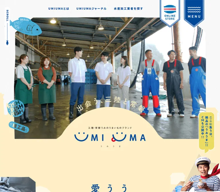
海の青と淡い黄色を基調に、水産現場の写真、かすれた魚のイラスト、波形の境界を組み合わせた地域ブランドサイト。旗型のナビゲーションと太い文字で、記事・生産者・商品への回遊を促します。
オリジナルサイトを見るUMIUMA — Style Reference
A seaside brand magazine where working harbors, smiling lettering, and stamped fish meet blue ink and warm yellow paper.
Website: UMIUMA Original URL: https://umiuma.jp/ Final URL: https://umiuma.jp/ Status: HTTP 200 in the supplied observation. Theme: a light, textured canvas with deep blue typography, pale yellow sections, cyan accents, and a blue footer. Inspected: September 17, 2026, at 05:10:59 JST; capture timestamp September 16, 2026, at 20:10:59.206 UTC. Viewports: desktop 1440 × 1000 CSS pixels; mobile 390 × 844 CSS pixels. Scope: the current homepage, using supplied desktop opening, harbor/topics, and footer captures; mobile opening and footer captures; and rendered DOM/computed-style evidence covering the homepage at both widths. Linked pages, the expanded menu, and video playback were not inspected.
UMIUMA is a regional seafood brand and editorial portal. Its homepage connects brand information, producer interviews, a processor directory, news, video, social content, and a separate online store. The design supports browsing across these destinations through a long sequence of distinct compositions.
The visual identity comes from a deliberate combination: substantial documentary photography, cheerful nautical illustrations, very heavy Japanese text, oversized English section labels, and generous areas of blue, white, and yellow. Pennant-shaped controls hang from the top edge. Fish, crates, bowls, and a small boat act as graphic punctuation. A yellow dome rises into the opening photograph to hold the smiling wordmark, while a wave introduces the blue footer.
Preserve the differences between these modules. The opening is photographic and theatrical; the first news block is compact; journal entries emphasize people and stories; topics sit inside one large rounded panel; the footer becomes an expansive blue sea.
How to Read This Reference
- Measured means a value supplied by the rendered DOM or computed styles. Measurements are in CSS pixels and may be rounded to two decimals in tables.
- Visual estimate means a proportion or appearance read from the supplied current-page screenshots. Image bounds, paper texture, and some decorative geometry fall into this category.
- Recommended means an implementation choice for reuse. Breakpoints, reconstructed masks, accessibility additions, and unspecified interaction endpoints are recommendations.
- Source tokens retain the custom-property names present in the evidence. Other names in the Quick Start are adaptation aliases.
- The sampled elements do not include every child, pseudo-element, image, or style declaration. An inherited
16pxsize on a heading container does not measure the large lettering inside it. - Document coordinates describe layout boxes. Decorative artwork can extend beyond those boxes, and a transparent computed background does not mean that the rendered region is visually empty.
- The supplied browser process traversed the page and waited for loading and layout stability. No click-result evidence was supplied for the menu, movie preview, store controls, or return-to-top button.
Tokens — Colors
Default Palette
| Name | Value | Source or adaptation token | Role and evidence |
|---|---|---|---|
| Ocean Blue | #004999 |
Source --color-blue |
Measured body/navigation color and primary CTA fill; visually anchors the wordmark and blue footer |
| Bright Cyan | #00d1ee |
Source --color-sky |
Bright accent associated with the large English section lettering; individual heading children were not sampled |
| Illustration Blue | #4ab9e7 |
Source --color-lightblue |
Measured article/detail-link color; visually consistent with nautical stamps, boat artwork, and footer accents |
| Warm Yellow | #ffefc7 |
Source --color-yellow |
Pale warm field visible around the opening identity and lower hero |
| Topics Yellow | #fffacc |
Adaptation --color-topics |
Exact computed background of the large topics section: rgb(255, 250, 204) |
| White | #ffffff |
Source --color-white |
Header surface, reversed footer text, CTA text, and light content areas |
| Captain Yellow | #ecdb63 |
Adaptation --color-captain |
Exact computed fill of the movie-section speech bubble; the opening promotion is also yellow but was not separately sampled |
| Logo Red | #dd0021 |
Source --color-red |
Small brand accent, visually present in the smiling wordmark and retail mark |
| Charcoal | #454545 |
Source --color-black |
Measured producer/company text in the featured journal entry |
Keep the two principal yellows separate. The opening uses the warm yellow family, while the topics panel is explicitly #fffacc. Replacing both with one generic cream removes a visible distinction between the page's sections.
Supporting Source Tokens
| Source token | Value | Evidence limit |
|---|---|---|
--color-subyellow |
#fff8e5 |
Present in computed custom properties; a specific visible surface was not isolated |
--color-sublightblue |
#e6f9ff |
Present; exact component assignment not established |
--color-subblue |
#2f8aee |
Present; exact component assignment not established |
--color-hover-blue |
#298fff |
Named hover token exists; individual hover endpoints were not exercised |
--color-hover-white |
#ffffff |
Named hover token exists |
--color-hover-yellow |
#ffefc7 |
Named hover token exists |
These are supporting colors within one observed visual system. No alternate theme selector or dark-mode state was evidenced.
Tokens — Typography
Noto Sans JP — Japanese Content and Navigation
- Computed family:
"Noto Sans JP", sans-serif. - Body weight:
500. - Prominent Japanese labels: usually
900, including navigation, news titles, feature titles, and main CTA labels. - Character: sturdy, friendly, and emphatic. Generous tracking gives short labels a printed-sign feeling.
- Prose: commonly
16px / 28.8pxon desktop, with4.48pxtracking in introductory copy. - Important distinction: the body element's inherited line height is
18.4px; actual paragraph styles often override it with substantially more leading.
Montserrat — English Section Labels
- Source family token:
--font-family-montserrat: "Montserrat", sans-serif. - Measured use: English section-heading containers and the
TOPICS/JOURNALnews subheadings use weight800. - Secondary use: the copyright line uses Montserrat at weight
500. - Character: wide, heavy capitals provide a second hierarchy alongside Japanese content.
The family names above are supplied computed stacks. Font files, download URLs, and individual loaded font faces were not provided.
Brand and Graphic Lettering
The opening H1 is an image-bearing identity composition rather than an ordinary text headline. Its measured box is 408 × 118px on desktop and approximately 184.08 × 53.03px on mobile. The smiling U-shaped forms and red accent should remain artwork.
Several other H2 elements have empty extracted text and substantial graphic bounds. Preserve a meaningful heading alternative when implementing these sections; do not infer their visual font from the container's inherited 16px value.
Type Scale
| Role | Desktop measured value | Mobile measured value | Weight / tracking |
|---|---|---|---|
| Top navigation | 16px / 25.6px |
Text row absent from the mobile capture | 900, 0.18em |
| News subheading | 20px / 20px |
20.8px / 20.8px |
Montserrat 800, 0.1em |
| News title | 16px / 25.6px |
14.56px / 23.30px |
900, 0.2em |
| Journal/brand introduction | 16px / 28.8px |
13.52px / 21.63px |
500, 0.28em |
| Featured producer name | 16px / 28.8px |
16.64px / 29.95px |
900, 0.2em; charcoal |
| Featured journal title | 24px / 43.2px |
18.72px / 33.70px |
900, 0.14em |
| Main CTA | 20px / 36px |
16.64px / 29.95px |
900, 0.2em |
| Featured article detail link | 18px / 32.4px |
12.48px / 22.46px |
900, 0.2em |
| Producer detail link | 14px / 25.2px |
12.48px / 22.46px |
900, 0.2em |
| Instagram introduction | 18px / 32.4px |
14.56px / 26.21px |
500, 0.18em |
| Footer primary link | 20px / 29px |
20.8px / 30.16px |
900, 0.1em |
| Footer secondary link | 18px / 26px |
18.72px / 27.04px |
900, 0.1em |
| Footer legal link | 14px / 20px |
14.56px / 20.8px |
900, normal tracking |
| Copyright | 12px / 15px |
12.48px / 15.6px |
Montserrat 500, 0.06em |
Display-size estimates: in the desktop topics capture, UMIUMA appears approximately 54–56px and TOPICS approximately 96–100px. In the mobile opening capture, the news heading appears approximately 28px over 50px. These are visual estimates, not measured child font sizes. The Quick Start uses them as practical starting points.
Source weight variables include 500, 700, 800, and 900. Avoid flattening this system into a conventional 400/600 pairing: the prominent labels depend on unusually heavy weight.
Tokens — Spacing & Shapes
Overall density: broad photographic and decorative intervals around relatively compact text modules.
Primary desktop content width: 1200px, positioned at x = 120px in the 1440px viewport. This establishes the observed desktop alignment; the original maximum-width declaration was not supplied.
Spacing Scale
| Use | Desktop measurement | Mobile measurement |
|---|---|---|
| Gap between top text links | Approximately 40px, calculated from link bounds |
Links absent from the top row |
| Gap between pennant controls | 20px |
Approximately 8.31px |
| News icon/subheading gap | 12px |
12.48px |
| Supporting journal column gap | 28px |
Approximately 20.8px between stacked rows |
| Topics card column gap | 40px |
Approximately 15.59px |
| Topics card row gap | 60px |
Approximately 41.59px |
| Topics panel top/bottom padding | 97px / 59px |
62.4px / 83.2px |
| Main CTA horizontal padding | 30px |
31.2px |
| About section top padding | 246px |
130px |
| Journal section top padding | 220px |
104px |
| Producer section top padding | 201px |
106.08px |
| Footer social icon gap | 24px |
Approximately 24.95px |
These values combine several scales. Large narrative intervals coexist with 12–40px component gaps; they should not all be normalized to the same spacing unit.
Border Radius
| Element | Desktop | Mobile | Evidence |
|---|---|---|---|
| Main CTA anchor | 0 |
0 |
Computed value; decorative descendants were not fully sampled |
| Topics panel | 80px |
52px |
Computed value |
| Movie preview button | 10px |
5.2px |
Computed value |
| Movie speech bubble | 60px |
37.44px |
Computed value; its bounds can be transformed |
| Scrolled header lower corners | About 55–60px |
About 30px |
Visual estimate |
| Small category label | Pill-like | Pill-like | Visible treatment; exact radius unavailable |
| Hero dome / footer wave | Custom curves | Custom curves | Artwork or mask geometry, not a generic card radius |
Layout Measurements
| Element | Desktop | Mobile |
|---|---|---|
| Total document height | Approximately 12087px |
Approximately 10759px |
| Store pennant box | 118 × 190px, top -33px |
78 × 125.83px, top -27.03px |
| Menu pennant box | Same dimensions as store | Same dimensions as store |
| Opening identity | 408 × 118px |
184.08 × 53.03px |
| News section | 1200 × 608.5px |
357.75 × 710.45px |
| Standard large CTA | 420 × 80px |
332.80 × 70.72px |
| Supporting journal entry | 380 × 477px |
358.80 × 200.72px |
| Topics panel | 1200 × 1111.22px |
390 × 1547.97px |
| Topics entry | 524px wide, about 150–163.63px high |
161.19px wide, about 288.88–395.38px high |
| Movie preview button | 890 × 565px |
332.80 × 211.27px |
| Footer identity section | 505 × 310px |
332.80 × 218.38px |
| Footer store link | 295 × 90px |
268.31 × 79.03px |
| Social icon anchor | 30 × 30px |
Approximately 31.19 × 31.19px |
| Footer element | 1440 × 840px |
390 × 1191.63px |
Responsive Unit
Many mobile values equal an integer multiplied by 1.04: 20.8 = 20 × 1.04, 14.56 = 14 × 1.04, and 332.8 = 320 × 1.04. Since 390 / 375 = 1.04, this is consistent with a 375px design basis.
That numerical relationship is an inference. The original scaling formula and breakpoints were not supplied. The Quick Start uses a bounded mobile unit to reproduce the inspected 390px measurements without claiming to recover the original CSS.
Components
Persistent Header and Pennant Controls
Role: retain access to brand information, the journal, producer discovery, the store, and the menu while the page scrolls.
The desktop opening shows three blue text links across the upper center: UMIUMAとは, UMIUMAジャーナル, and 水産加工業者を探す. Two illustrated pennants occupy the upper right. The store pennant has a white field and a fish-like retail symbol with blue and red details. The menu pennant has a blue field, white wave marks, and tracked MENU lettering. Both have pointed bottoms and multiple outline strokes.
The source store control is an anchor to https://umiumart.jp/; the adjacent menu control is a button. Their desktop boxes begin above the viewport at y = -33px, leaving roughly 157px visible. On mobile they begin at approximately -27px, leaving about 99px visible.
Scrolled captures add a white header surface with rounded lower corners and a compact wordmark at the left. The same controls remain at the top of the viewport. This establishes persistence and a changed visual state, but not the exact fixed/sticky mechanism or scroll threshold.
On mobile, the text navigation disappears from the opening view. The two pennants remain large, recognizable controls. The logo becomes visible in the scrolled header. Approximate visible header heights are 110px on desktop and 83px on mobile.
The expanded menu layout, close control, focus behavior, and transition were not supplied.
Photographic Opening and Identity Dome
Role: establish the connection between seafood, working people, and the regional brand before presenting navigation into content.
The desktop opening uses a large central photograph of fish being processed over a grill, with adjacent image fragments at the far sides. The mobile opening shows people inside a working seafood facility. These are different captured image states; their timing mechanism is unverified.
The desktop central photo occupies approximately 1096 × 708px, starting near y = 100px. The mobile photo is approximately 330 × 470px, beginning around x = 30px, y = 38px. These are screenshot estimates rather than sampled image-element dimensions.
The composition has five layers:
- A light, subtly textured canvas.
- A large photographic frame with some angular edge treatment.
- Cyan stamped illustrations overlapping the frame.
- A warm yellow lower field with a dome rising into the photograph.
- The centered wordmark, small descriptor, and pronunciation lettering over that yellow shape.
A curved Japanese slogan follows the upper edge of the dome. A narrow white SCROLL rail sits along the left edge with a dashed blue line and fish detail. The desktop rail is visually about 28px wide; the mobile version is narrower and sits close to the screen edge.
The wordmark is the opening heading. Avoid adding a separate oversized marketing sentence that competes with this composition.
Captain Corner Promotion
Role: draw attention to the brand's promotional media.
The opening captures show a photographic captain cutout at the lower right, paired with a narrow yellow speech bubble containing vertical Japanese copy. The cutout overlaps the page edge and remains visibly separate from the rectangular hero photograph.
On mobile the promotion is smaller, but it still overlaps the boundary between the opening and news area. This is an illustrated advertising accent with a human face, rather than a conventional rectangular sticky banner.
Its exact positioning rule, link destination, dismissal behavior, and visibility conditions were not supplied. Do not assume that it stays visible throughout the entire page: it is absent from the provided footer views.
Opening News Digest
Role: expose recent updates and the latest journal article near the top of the homepage.
Use a two-level English heading, UMIUMA above NEWS, with the lower word in bright cyan. The opening news surface has an angular cut and an offset title, visible especially clearly on mobile.
Desktop organization places the heading toward the left and the news content in a wide right-hand column. The heading begins at x = 67px, extending left of the section's x = 120px box. News subheadings and links begin at x = 390px.
The content is grouped under TOPICS and JOURNAL. Each entry contains date/category metadata and a bold Japanese title. The first two topics links measure 890 × 47.5px; the title region has additional right padding.
On mobile, the content becomes a vertical stack. The inner list is 312px wide at x = 39px. Metadata sits above the title, producing entries about 81.19px high in the supplied sample. The title uses 14.56px, weight 900, 1.6 leading, and 0.2em tracking.
Keep this digest distinct from the larger topics collection farther down the page. It is a compact entry point, not a duplicate large card grid.
Brand Introduction
Role: create a slower narrative interval and lead to the About page.
The DOM records a tall central graphic heading, approximately 214 × 490px on desktop and 133.11 × 290.16px on mobile. It is followed by the large UMIUMAを知る link.
The section uses substantial top space: 246px on desktop and 130px on mobile. The exact illustration and graphic-heading copy are not visible in the supplied screenshots, so their appearance should not be reconstructed from the empty extracted heading text.
For reuse, preserve the tall central composition, generous breathing room, and singular About action. Supply suitable authorized artwork separately.
Journal Feature and Supporting Stories
Role: tell the stories behind products and producers.
The featured article combines producer identity, a prominent Japanese title, prefecture/date metadata, and an 記事を読む action. The measured desktop information area is 385px wide at x = 913px.
A useful responsive detail is the ordering: on desktop the producer name appears above the article title; on mobile the title's measured position is above the producer name. The mobile information column is approximately 270.42px wide and centered within the page.
Below the feature, three supporting article links form a desktop row. Each is 380 × 477px, with 28px between columns. Their large top padding of 268px reserves an upper region for media or decorative composition.
On mobile, these become three horizontal entries stacked vertically. Each is approximately 358.80 × 200.72px. A left padding of 202.8px reserves the left side, while text occupies the right. This is a compositional change, not simply a scaled-down desktop card.
The mobile visible-text extraction omits prefecture labels from these supporting entries even though their anchor text retains them. Treat this as a presentation difference; the precise hiding rule was not provided.
Producer Discovery Track
Role: introduce regional processors and lead into the searchable brand directory.
The rendered content contains six distinct producer entries, repeated three times. Their detail links share a horizontal baseline and extend far beyond both sides of the viewport. Corresponding link positions are approximately 568px apart on desktop and 316.14px apart on mobile.
This structure is consistent with a repeating horizontal track. It does not establish autoplay speed, dragging, swipe support, or the library used.
Each logical entry includes a producer name, prefecture, and 詳しく見る link. A larger もっと探す action leads to the directory.
For a new implementation, keep a single logical set of producers in the accessibility tree. If visual clones are necessary, prevent those clones from becoming duplicate keyboard destinations.
Harbor Photograph and Topics Panel
Role: introduce the broader news archive through a large environmental image and an organized collection of updates.
The desktop screenshot shows a full-width harbor photograph with fishing vessels, water, and a bright blue sky. A pale-yellow topics panel overlaps the lower part of the photograph. White wave-like geometry appears around the transition below it. The evidence does not establish parallax or fixed-background behavior.
The panel is a major surface, not a collection of separate elevated cards:
- Desktop box:
1200pxwide,80pxradius,97pxtop padding, and59pxbottom padding. - Header: a large two-line
UMIUMA TOPICStitle at the left and explanatory copy to the right. - Collection: six links arranged in two columns and three rows.
- Action: one centered
お知らせをもっと見るbutton.
Desktop entries are 524px wide and use display: flex. Their rows are approximately 150–164px high. The content includes an image, date, category, title, and MORE text; the exact placement or hover behavior of MORE was not inspected.
The mobile collection retains two columns. The outer panel becomes full-width at 390px with a 52px radius. Each entry is approximately 161.19px wide and changes to display: block, so image and text stack within each narrow column. Card heights grow with the copy, reaching approximately 395px in the longest supplied example.
Do not replace this mobile grid with a single column when reproducing the observed layout. Allow the two-column entries to grow naturally rather than clipping titles to a fixed height.
Shared Action Links
Role: give each major section an unmistakable onward route.
The repeated large CTA treatment is measured consistently across About, Journal, Brands, Topics, Movie, Instagram, and Contact:
- Ocean-blue fill with white text.
- Desktop
420 × 80pxanchor box. - Mobile usually
332.80 × 70.72px. - Weight
900, tracking0.2em, and square computed corners. - Horizontal padding of 30px on desktop and 31.2px on mobile.
Placement varies with the composition. Some actions are centered; the desktop journal action is right aligned; the shop and contact actions align with their copy. In the narrower mobile shop/contact compositions, CTA width is approximately 291.19px.
Secondary detail links are light blue, unfilled, and substantially smaller. Their right padding leaves room for graphic treatment, but the exact decorative element was not included in the sample.
Movie Module
Role: promote video content and the captain character.
The section contains an English heading, a large button used as the preview surface, a yellow captain speech bubble, and a separate 他の動画を見る link.
The preview button measures 890 × 565px on desktop and 332.80 × 211.27px on mobile. Its container ratio is approximately 1.58:1; this is not evidence that the underlying video itself uses that ratio. Border radius decreases from 10px to 5.2px.
The speech bubble uses the measured yellow #ecdb63 and a transform/opacity transition. Desktop placement is beside the preview; mobile coordinates place it above the main movie section. It is repositioned rather than merely reduced in place.
Playback mode, audio behavior, player controls, and any dialog opening remain unverified.
Instagram Module
Role: connect editorial browsing with the official social account.
The DOM establishes a large UMIUMA INSTAGRAM heading, introductory copy, a substantial content region, and an Official Instagram CTA. The desktop introduction is 18px; mobile reduces it to 14.56px and wraps it into two lines.
The supplied evidence does not identify the number, source, or layout of individual Instagram tiles. Do not assume a live embed or a particular social-feed service.
Store, Contact, and Related Content
Role: provide practical exits after the editorial sequence.
The store block combines ONLINE SHOP, the UMIUMART identity, explanatory copy, and an ONLINE STORE link. The destination is the separate umiumart.jp domain. Checkout or product-listing behavior on that site is outside scope.
The desktop shop copy begins at x = 245px, while contact copy begins at x = 780px. This alternation continues the page's varied left/right compositions. Mobile keeps smaller, distinct insets rather than forcing every block to exactly the same text width.
The related-content section includes introductory copy, image-bearing links, and an English-article direction. Two desktop banner links sit side by side at 250 × 80px. Mobile stacks them at approximately 291.19 × 72.80px.
The visible destinations are evidence of navigation only; their destination designs were not inspected.
Wave Footer and Return-to-Top Boat
Role: close the page with a strong brand field while retaining all principal destinations.
A shallow wave separates the textured white area from an expansive ocean-blue footer. A light-blue boat sits near the right edge with a to top? speech bubble. Its button has an explicit repeating animation declaration.
Desktop footer content uses a broad identity area on the left and navigation on the right:
- A large white wordmark with the small red accent.
- A white UMIUMART badge below it.
- Three primary destinations with smaller cyan English captions:
ABOUT,JOURNAL, andBRAND. - A secondary column for news, movie content, and contact.
- A smaller organization/privacy column.
- A cyan fish marked
SNS, followed by Facebook, Instagram, and YouTube symbols. - A small copyright line.
The measured identity and navigation sections are 505px and 580px wide, separated by approximately 115px.
Mobile stacks the identity and primary navigation. Secondary and legal links form a two-column area below the primary links. The SNS fish becomes centered above a centered row of three icons, and the copyright moves to the bottom center.
The supplied mobile footer screenshot begins partway through the footer. Its missing large identity and boat should not be interpreted as mobile removal: both remain represented in the mobile DOM measurements above the visible crop.
Tokens — Motion & Interaction
| Treatment | Supplied value or evidence | What is established |
|---|---|---|
| Header/footer text links | color 0.15s cubic-bezier(0.445, 0.05, 0.55, 0.95) |
A short color transition is declared; hover endpoints were not tested |
| Store/menu pennants | transform 0.2s cubic-bezier(0.25, 0.46, 0.45, 0.94) |
Transform transitions exist; direction and distance are unknown |
| Related-content banners and footer store badge | Same 0.2s transform transition |
Shared tactile motion treatment is declared |
| Movie speech bubble transform | 0.35s cubic-bezier(0.175, 0.885, 0.32, 1.275) |
An overshooting easing curve is declared; trigger and endpoints are unknown |
| Movie speech bubble opacity | 0.35s cubic-bezier(0.215, 0.61, 0.355, 1) |
A coordinated opacity transition is declared |
| Return-to-top boat | 1.5s cubic-bezier(0.455, 0.03, 0.515, 0.955) infinite alternate Footer-toTop |
A perpetual alternating animation exists; keyframe amplitude was not supplied |
| Persistent header state | Opening and scrolled captures differ | White surface and compact logo appear in scrolled views; threshold unknown |
| Producer track | Repeated entries and offscreen horizontal positions | Repeating-track structure is evidenced; movement controls and timing are not |
| Opening imagery | Different photographic states in supplied captures | Multiple states are visible; autoplay, video, and transition style are not established |
The widespread sampled value transition: all without a useful duration is not a usable timing token. Likewise, animation: none on a parent does not rule out animation on descendants, pseudo-elements, or through JavaScript.
For reuse, favor short link/banner feedback and restrained nautical movement. Keep any reconstructed boat displacement explicitly separate from the measured 1.5-second timing. No evidence supports adding parallax to every section or assigning an arbitrary autoplay interval to the hero.
Surfaces
| Layer | Appearance | Purpose |
|---|---|---|
| Main canvas | White with fine paper-like texture | Keeps the illustration and documentary photography in one tactile visual world |
| Opening lower field | Warm yellow with a large raised dome | Supports the identity and softens the photo boundary |
| News surface | Light area with angular cut and offset heading | Creates a compact editorial entry point |
| Photography | Large, naturally colored image regions | Supplies human, product, and place-specific information |
| Topics panel | Solid #fffacc, very large corner radius |
Groups six updates as one major section |
| Main action | Solid ocean blue with white heavy text | Distinguishes onward navigation from secondary links |
| Captain bubble | Yellow rounded form with bold blue copy | Adds a conversational promotional accent |
| Footer | Ocean-blue field with a wave boundary | Creates closure and reverses the brand palette |
The visible design relies on flat color, overlap, texture, and silhouette. A general card-shadow or glass-elevation system is not evident in the supplied captures.
Some sampled surfaces, including the footer element, report transparent backgrounds. The visible colored field may be implemented through a nested layer, background artwork, or pseudo-element. Reproduce the visible composition without treating the sampled ancestor background as the whole surface definition.
Imagery
Photography should feel specific to seafood production and coastal places: wet floors, industrial roofs, work clothing, fish preparation, fishing vessels, and food. The images retain natural color and contrast. People are photographed within their working environment rather than isolated against a generic studio background.
Illustrations use light blue, irregular outlines, speckled fills, and the appearance of stamped or worn printing. They sit over photographic edges and section boundaries. Their character comes from the contrast between simple silhouettes and visibly imperfect texture.
The captain promotion uses a photographic cutout, distinct from both the documentary hero and the flat illustrations. Preserve those three image modes: environmental photography, stamped illustration, and promotional cutout.
Observed Asset References
No original asset URLs or filenames were included in the supplied evidence. The following inventory identifies visible assets by role; it is not a downloadable asset manifest.
| Asset family | Evidence | Reuse guidance |
|---|---|---|
| Smiling UMIUMA identity | Opening and scrolled header/footer captures | Use authorized logo artwork; preserve curved forms and the small red accent |
| Store and menu pennants | Desktop and mobile captures | Preserve pointed bottoms, multiple outlines, and contrasting white/blue fills |
| Fish-processing photograph | Desktop opening | Retain the material detail and environmental context |
| Workers in a seafood facility | Mobile opening | Use an intentional portrait crop; do not stretch a wide composition |
| Harbor photograph | Desktop topics capture | Keep the breadth of sky, vessel repetition, and blue water |
| Fish, crates, bowl, and nautical stamps | Opening and topics captures | Preserve distressed texture and overlapping placement |
| Captain cutout and vertical callout | Opening captures | Keep the silhouette separate from the surrounding image frames |
| Boat and SNS fish | Footer capture | Use simple cyan silhouettes with strong blue/white text contrast |
| Fine paper texture | Light regions across captures | Keep it subtle enough to support small Japanese text |
Do not apply image-rendering: pixelated globally. The photographs are continuous-tone imagery; the roughness belongs to the supplied illustration and texture assets.
Layout & Responsive Behavior
The homepage is a long document: approximately 12,087px on desktop and 10,759px on mobile. Its sequence is opening, news digest, brand introduction, journal, producer discovery, harbor/topics, movie, Instagram, store, contact, related content, and footer.
The reduced mobile height does not mean that every section becomes shorter. The topics panel grows from approximately 1111px to 1548px, while large desktop compositions elsewhere become more compact.
| Area | Desktop observation | Mobile observation |
|---|---|---|
| Header | Three text links plus two pennants; compact logo in scrolled state | Text links absent; pennants retained; scrolled logo fits at left |
| Opening | Wide central image with side fragments | Tall narrow image with approximately 30px side margins |
| Identity | 408px wide |
Approximately 184px wide |
| News digest | Offset heading beside wide content column | Heading above a stacked list |
| Featured journal text | Producer name above title | Title positioned above producer name |
| Supporting journal entries | Three portrait-oriented entries in a row | Three horizontal entries stacked vertically |
| Producer discovery | Wide repeated track | Narrower repeated track remains horizontally extended |
| Topics | Two columns; each entry internally horizontal | Two columns retained; each entry internally vertical |
| Movie bubble | Beside the main preview | Repositioned above the main movie section |
| Related banners | Two links beside one another | Links stacked |
| Footer | Identity left, three navigation groups right | Identity and primary links stacked; secondary/legal groups share a row |
| Footer social area | Fish and icons in one horizontal region | Fish above centered icons |
The inspected mobile layout uses several meaningful widths: about 358.8px for broad modules, 332.8px for standard CTAs, 312px for the opening news list, and 291.2px for narrower utility blocks. These differences are part of the composition.
No tablet capture or source media queries were supplied. Intermediate widths and exact breakpoints remain unverified. A reconstruction should test the transition between these two evidenced endpoints rather than assume a single universal scaling rule.
Do’s and Don’ts
Do
- Anchor the interface in
#004999, with cyan for illustration and large English emphasis. - Keep opening yellow
#ffefc7distinct from topics yellow#fffacc. - Pair heavy Noto Sans JP labels with Montserrat English headings.
- Preserve the smiling logo as artwork and keep red a small accent.
- Give real producers, food, and working harbors substantial photographic space.
- Use worn cyan stamps and custom wave geometry to connect modules.
- Keep the pointed store/menu controls prominent at both inspected widths.
- Preserve the mobile topics grid's two columns.
- Change supporting journal entries into horizontal mobile rows.
- Retain the large, square computed CTA treatment and its placement variations.
- Make room for the long editorial sequence and its generous narrative pauses.
- Keep screenshot estimates and reconstructed behavior separate from measured source values.
Don’t
- Don’t reduce the homepage to a single campaign pitch with repeated conversion buttons.
- Don’t turn every module into an identical rounded card.
- Don’t substitute a generic hamburger icon for the wave-mark pennant without accounting for the brand character it carries.
- Don’t infer displayed heading sizes from a sampled parent container's
16pxfont size. - Don’t assume the hero is a video or assign it an invented slideshow interval.
- Don’t infer carousel controls from duplicated DOM entries alone.
- Don’t force the movie preview into a measured claim of 16:9.
- Don’t remove the boat or large footer identity merely because they fall above the mobile screenshot crop.
- Don’t blur or pixelate the documentary photography to imitate the stamped illustrations.
- Don’t add glossy gradients, pervasive shadows, or glass panels to the otherwise flat material system.
- Don’t let decorative overlays cover essential text or keyboard focus in a new implementation.
Recommended Implementation Additions
These are recommendations for a new implementation, not verified features of the current site:
- Provide accessible names for the graphic store link, menu button, movie preview, boat button, and social icons. Empty extracted text alone does not establish whether the original controls already have such names.
- Give image-based headings meaningful text equivalents. Keep decorative stamps out of the reading order.
- Use a keyboard-operable menu with an explicit expanded state and predictable focus return. If it behaves as a modal, implement the appropriate focus containment.
- Reserve clearance for the persistent pennants and header when navigating to anchors. Do not allow focused content to sit behind them.
- Expand social-icon hit areas to at least 44 × 44px while retaining the observed approximately 30px visual symbols.
- Check small cyan text against its actual background. Use darker blue for essential small text when contrast is insufficient, while retaining cyan in artwork and large labels.
- Honor reduced-motion preferences for the boat, any producer-track movement, and any subsequently verified hero motion. Offer pause controls for persistent automatic movement.
- Keep repeated track clones out of sequential keyboard navigation and expose one logical set of producers to assistive technology.
- Use responsive image sources and explicit dimensions. Prioritize the opening image; defer lower-page media without producing layout shifts.
- Preserve the two-column mobile topics composition at the inspected width, but test narrow screens and enlarged text for overflow. Allow a more accessible fallback when content requires it.
- Ensure the captain promotion does not obscure the news content on short screens or at enlarged text sizes.
Agent Prompt Guide
Quick Color Reference
- Main text, structural blue, and primary CTA:
#004999. - Large bright accent:
#00d1ee. - Nautical illustrations and secondary detail links:
#4ab9e7. - Opening warm field:
#ffefc7. - Rounded topics panel:
#fffacc. - Movie speech bubble:
#ecdb63. - White header and reversed footer text:
#ffffff. - Small logo accent:
#dd0021. - Producer/company text:
#454545.
Overall Prompt
“Create a Japanese regional seafood brand and editorial homepage inspired by the current UMIUMA composition. Use ocean blue #004999, warm yellow #ffefc7, a distinct pale topics yellow #fffacc, and cyan stamped illustrations. Combine documentary photographs of seafood work and fishing harbors with very heavy Noto Sans JP navigation and article titles, plus bold Montserrat English section labels. Hang two pointed store/menu pennants from the top-right edge. Build a large photographic opening with a yellow dome supporting an illustrated smiling wordmark, then a compact news digest, brand story, producer journal, horizontal producer discovery, a harbor-backed topics panel, media sections, store/contact links, and a wave-edged blue footer. Keep the modules compositionally varied. At 390px, retain two topic columns, convert supporting journal cards into horizontal rows, and stack the footer groups.”
Example Component Prompts
- Header: “Create a persistent nautical header with three heavy blue Japanese links and two pointed pennants at the right. Use a white store pennant and blue menu pennant with white wave marks. At desktop, each control is 118px wide and extends above the viewport; at 390px, use 78px-wide controls and hide the text navigation. Add the compact brand logo and rounded white surface in a separately controlled scrolled state.”
- Opening: “Place a large natural-color seafood photograph on a subtly textured light canvas. Overlap it with distressed cyan fish and crate illustrations. Raise a warm-yellow dome into the lower center to hold the supplied logo artwork and curved slogan. Preserve a tall, intentionally cropped mobile image and a slim fish-themed scroll cue.”
- Topics: “Build one pale-yellow
#fffacctopics panel, 1200px wide with an 80px radius on desktop. Place a heavy blue/cyan English heading beside explanatory Japanese copy. Arrange six updates in two columns, with images and metadata inside each link. At 390px, make the panel full width with a 52px radius; retain two columns and stack each card's image above its text.” - Journal entries: “Show three 380px-wide supporting producer stories across desktop with strong media regions above the text. On mobile, change to one vertical list of approximately 359px-wide horizontal cards, reserving the left half for imagery and the right half for date, title, and producer information.”
- Footer: “Create a deep-blue footer under a shallow wave. Use a large reversed wordmark and white store badge on the left, three navigation groups on the right, and a cyan SNS fish beside white social symbols. Place a cyan return-to-top boat at the wave edge. On mobile, stack the primary links, keep secondary and legal groups in two columns, and center the fish above the social icons.”
- Motion: “Use the evidenced 150ms link-color and 200ms banner-transform timing as a motion vocabulary. The boat may use a restrained 1.5-second alternating float, with displacement explicitly chosen for this implementation. Do not invent hero autoplay, menu animation, or producer-track speed from static captures. Include reduced-motion behavior.”
Quick Start
CSS Custom Properties
This is an implementation starter, not recovered source CSS. It preserves measured colors, important component dimensions, and the evidenced mobile composition. The 1100px and 767px breakpoints are recommendations. Hero curves, image crops, display-heading sizes, and the boat's 6px displacement are approximations.
Use semantic links for navigation and buttons for menu/video controls. The selector contract assumes a .sea-page wrapper; .sea-header[data-scrolled='true'] for the scrolled state; images inside .hero__media and .hero__identity; and image/body children inside journal and topic entries. The application must supply authorized artwork and state handling. No original asset paths were provided.
:root {
  /* Observed source palette */
  --color-white: #fff;
  --color-blue: #004999;
  --color-sky: #00d1ee;
  --color-lightblue: #4ab9e7;
  --color-yellow: #ffefc7;
  --color-subyellow: #fff8e5;
  --color-sublightblue: #e6f9ff;
  --color-subblue: #2f8aee;
  --color-red: #dd0021;
  --color-black: #454545;
  --color-hover-blue: #298fff;
  --color-hover-white: #fff;
  --color-hover-yellow: #ffefc7;

  /* Measured component colors; adaptation names */
  --color-topics: #fffacc;
  --color-captain: #ecdb63;

  --font-body: 'Noto Sans JP', sans-serif;
  --font-family-montserrat: 'Montserrat', sans-serif;
  --font-weight-medium: 500;
  --font-weight-bold: 700;
  --font-weight-extraBold: 800;
  --font-weight-black: 900;

  --content-width: 1200px;
  --page-gutter: 24px;
  --radius-topics: 80px;
  --cta-width: 420px;
  --cta-height: 80px;
  --cta-type: 20px;

  /* Recommended bounded unit; equals 1.04px at 390px */
  --mu: clamp(0.96px, calc(100vw / 375), 1.12px);

  /* Timing copied from supplied computed styles */
  --motion-link: 150ms cubic-bezier(0.445, 0.05, 0.55, 0.95);
  --motion-banner: 200ms cubic-bezier(0.25, 0.46, 0.45, 0.94);
  --ease-boat: cubic-bezier(0.455, 0.03, 0.515, 0.955);
}

* { box-sizing: border-box; }
body { margin: 0; }
html { scroll-padding-top: 180px; }

.sea-page {
  color: var(--color-blue);
  background: var(--color-white);
  font-family: var(--font-body);
  font-size: 16px;
  font-weight: var(--font-weight-medium);
  line-height: 1.8;
}

.sea-page img { display: block; max-width: 100%; }
.sea-page button { font: inherit; }
.sea-page a { color: inherit; }
.sea-content {
  width: min(var(--content-width), calc(100% - 2 * var(--page-gutter)));
  margin-inline: auto;
}

/* Add the authorized paper texture separately; its path is unknown. */
.sea-prose { margin: 0; line-height: 1.8; letter-spacing: 0.28em; }

/* Persistent header: the application sets data-scrolled. */
.sea-header {
  position: fixed;
  z-index: 50;
  inset: 0 0 auto;
  height: 110px;
  background: transparent;
}
.sea-header[data-scrolled='true'] {
  background: var(--color-white);
  border-radius: 0 0 60px 60px;
}
.sea-header__brand {
  position: absolute;
  top: 28px;
  left: max(24px, calc((100vw - 1240px) / 2));
  width: 226px;
  visibility: hidden;
}
.sea-header[data-scrolled='true'] .sea-header__brand {
  visibility: visible;
}
.sea-header__nav {
  position: absolute;
  top: 36px;
  left: calc(50% - 263px);
  display: flex;
  gap: 40px;
}
.sea-header__nav a {
  white-space: nowrap;
  font-size: 16px;
  font-weight: 900;
  line-height: 1.6;
  letter-spacing: 0.18em;
  text-decoration: none;
  transition: color var(--motion-link);
}
.sea-header__tools {
  position: absolute;
  top: -33px;
  right: max(24px, calc((100vw - 1260px) / 2));
  display: flex;
  gap: 20px;
}
.sea-pennant {
  display: block;
  width: 118px;
  height: 190px;
  padding: 0;
  border: 0;
  background: transparent;
  cursor: pointer;
  transition: transform var(--motion-banner);
}
.sea-pennant img { width: 100%; height: 100%; object-fit: contain; }

/* Approximate opening geometry; artwork supplies the real details. */
.hero {
  position: relative;
  padding-block: 100px 20px;
  background: linear-gradient(
    to bottom,
    var(--color-white) 0 81%,
    var(--color-yellow) 81% 100%
  );
}
.hero__media {
  position: relative;
  width: min(1096px, calc(100% - 60px));
  height: 708px;
  margin-inline: auto;
  overflow: hidden;
}
.hero__media > img { width: 100%; height: 100%; object-fit: cover; }
.hero__media::after {
  content: '';
  position: absolute;
  bottom: -195px;
  left: 50%;
  width: 720px;
  height: 390px;
  border-radius: 50%;
  background: var(--color-yellow);
  transform: translateX(-50%);
}
.hero__identity {
  position: relative;
  z-index: 1;
  width: 408px;
  aspect-ratio: 408 / 118;
  margin: -81px auto 0;
}
.hero__identity img { width: 100%; height: 100%; object-fit: contain; }
.hero__decoration { position: absolute; pointer-events: none; }

/* Display sizes are visual approximations, not sampled child sizes. */
.section-title { margin: 0; font-family: var(--font-family-montserrat); }
.section-title small,
.section-title strong { display: block; font-weight: 800; }
.section-title small { font-size: 56px; line-height: 1; }
.section-title strong { color: var(--color-sky); font-size: 100px; line-height: 0.8; }
.section-title--compact small { font-size: 36px; }
.section-title--compact strong { font-size: 72px; line-height: 1; }

.sea-cta {
  display: inline-flex;
  align-items: center;
  justify-content: center;
  width: min(var(--cta-width), 100%);
  min-height: var(--cta-height);
  padding: 12px 30px;
  border: 0;
  border-radius: 0;
  color: var(--color-white) !important;
  background: var(--color-blue);
  font-size: var(--cta-type);
  font-weight: 900;
  line-height: 1.8;
  letter-spacing: 0.2em;
  text-align: center;
  text-decoration: none;
}
.sea-detail-link {
  display: inline-flex;
  padding: 7px 65px 7px 0;
  color: var(--color-lightblue) !important;
  font-size: 18px;
  font-weight: 900;
  letter-spacing: 0.2em;
  text-decoration: none;
}

/* Supporting journal entries: media dimensions are adaptation choices. */
.journal-grid {
  display: grid;
  grid-template-columns: repeat(3, minmax(0, 1fr));
  gap: 28px;
  width: min(1196px, 100%);
  margin-inline: auto;
}
.journal-card { min-width: 0; min-height: 477px; text-decoration: none; }
.journal-card > img { width: 100%; height: 248px; object-fit: cover; }
.journal-card__body { padding: 20px 34px 24px 53px; }
.journal-card__title { margin: 0; font-weight: 900; }

.topics-panel {
  width: min(1200px, calc(100% - 2 * var(--page-gutter)));
  margin-inline: auto;
  padding: 97px 56px 59px;
  border-radius: var(--radius-topics);
  background: var(--color-topics);
}
.topics-panel__heading {
  display: grid;
  grid-template-columns: auto minmax(0, 1fr);
  gap: 60px;
  padding-inline: 56px;
}
.topics-panel__intro { margin: 0; padding-top: 74px; }
.topic-grid {
  display: grid;
  grid-template-columns: repeat(2, minmax(0, 1fr));
  gap: 60px 40px;
  margin-top: 80px;
}
.topic-card {
  display: grid;
  grid-template-columns: 200px minmax(0, 1fr);
  align-items: start;
  gap: 24px;
  min-width: 0;
  text-decoration: none;
}
.topic-card > img { width: 100%; aspect-ratio: 4 / 3; object-fit: cover; }
.topic-card__body { min-width: 0; }
.topic-card__title { margin: 12px 0 0; font-size: 16px; font-weight: 900; }
.topic-meta { display: flex; flex-wrap: wrap; align-items: center; gap: 8px 12px; }
.topic-category {
  padding: 2px 12px;
  border: 1px solid currentColor;
  border-radius: 999px;
  background: var(--color-white);
  font-size: 12px;
  font-weight: 900;
}
.topics-panel__action { margin-top: 80px; text-align: center; }

.movie-preview {
  display: block;
  width: min(890px, 100%);
  aspect-ratio: 178 / 113;
  margin-inline: auto;
  padding: 0;
  overflow: hidden;
  border: 0;
  border-radius: 10px;
  background: transparent;
}
.movie-preview img { width: 100%; height: 100%; object-fit: cover; }

/* Approximate decorative wave, not an original asset. */
.site-footer {
  position: relative;
  margin-top: 220px;
  padding: 160px 0 120px;
  color: var(--color-white);
  background: var(--color-blue);
}
.site-footer::before {
  content: '';
  position: absolute;
  inset: -23px 0 auto;
  height: 24px;
  background-repeat: repeat-x;
  background-size: 280px 24px;
  background-image: url("data:image/svg+xml,%3Csvg xmlns='http://www.w3.org/2000/svg' viewBox='0 0 280 24'%3E%3Cpath fill='%23004999' d='M0 12Q70 -2 140 12T280 12V24H0Z'/%3E%3C/svg%3E");
}
.footer-grid {
  display: grid;
  grid-template-columns: 505px minmax(0, 1fr);
  gap: 115px;
}
.footer-nav {
  display: grid;
  grid-template-columns: 201px 133px 131px;
  justify-content: space-between;
  align-items: start;
}
.footer-nav a { display: block; font-weight: 900; text-decoration: none; }
.footer-primary { display: grid; gap: 24px; }
.footer-primary a { font-size: 20px; line-height: 1.45; letter-spacing: 0.1em; }
.footer-primary small {
  display: block;
  color: var(--color-lightblue);
  font-family: var(--font-family-montserrat);
  font-size: 12px;
  line-height: 1.5;
}
.footer-secondary { display: grid; gap: 20px; font-size: 18px; }
.footer-legal { display: grid; gap: 16px; font-size: 14px; }
.footer-store {
  display: grid;
  place-items: center;
  width: min(295px, 100%);
  min-height: 90px;
  margin: 48px auto 0;
  padding: 16px;
  border-radius: 10px;
  background: var(--color-white);
}
.footer-social { display: flex; align-items: center; gap: 24px; margin-top: 52px; }
.footer-social__icons { display: flex; align-items: center; gap: 10px; }
.footer-social__icons a { display: grid; place-items: center; width: 44px; height: 44px; }
.footer-social__icons img { width: 30px; height: 30px; object-fit: contain; }
.footer-copyright { font: 500 12px/1.25 var(--font-family-montserrat); letter-spacing: 0.06em; }
.footer-boat {
  position: absolute;
  top: -140px;
  right: max(24px, calc((100vw - 1264px) / 2));
  width: 226px;
  padding: 0;
  border: 0;
  background: transparent;
  animation: boat-float 1.5s var(--ease-boat) infinite alternate;
}
@keyframes boat-float {
  from { transform: translateY(0); }
  to { transform: translateY(-6px); }
}

/* Recommended focus and hover affordances. */
.sea-page :focus-visible { outline: 3px solid currentColor; outline-offset: 5px; }
.sea-cta:focus-visible { outline-color: var(--color-blue); }
@media (hover: hover) {
  .sea-header__nav a:hover,
  .footer-nav a:hover { text-decoration: underline; text-underline-offset: 0.25em; }
}

/* Recommended intermediate layout; not an observed source breakpoint. */
@media (max-width: 1100px) {
  .sea-header__nav { display: none; }
  .topics-panel__heading { grid-template-columns: 1fr; padding-inline: 0; gap: 24px; }
  .topics-panel__intro { padding-top: 0; }
  .topic-card { grid-template-columns: 1fr; }
  .footer-grid { grid-template-columns: 1fr; gap: 64px; }
  .footer-nav { grid-template-columns: 1.3fr 1fr 1fr; gap: 24px; }
}

@media (max-width: 767px) {
  :root {
    --page-gutter: calc(15 * var(--mu));
    --radius-topics: calc(50 * var(--mu));
    --cta-width: calc(320 * var(--mu));
    --cta-height: calc(68 * var(--mu));
    --cta-type: calc(16 * var(--mu));
  }
  html { scroll-padding-top: 125px; }
  .sea-header { height: calc(80 * var(--mu)); }
  .sea-header[data-scrolled='true'] { border-radius: 0 0 30px 30px; }
  .sea-header__brand { top: calc(25 * var(--mu)); left: calc(25 * var(--mu)); width: calc(154 * var(--mu)); }
  .sea-header__tools { top: calc(-26 * var(--mu)); right: calc(16 * var(--mu)); gap: calc(8 * var(--mu)); }
  .sea-pennant { width: calc(75 * var(--mu)); height: calc(121 * var(--mu)); }

  .hero {
    padding-block: 38px calc(27 * var(--mu));
    background: linear-gradient(to bottom, var(--color-white) 0 75%, var(--color-yellow) 75% 100%);
  }
  .hero__media { height: 470px; }
  .hero__media::after { width: calc(260 * var(--mu)); height: calc(150 * var(--mu)); bottom: calc(-75 * var(--mu)); }
  .hero__identity { width: calc(177 * var(--mu)); margin-top: calc(-24.5 * var(--mu)); }
  .section-title small,
  .section-title--compact small { font-size: 28px; }
  .section-title strong,
  .section-title--compact strong { font-size: 50px; line-height: 1; }
  .sea-prose { font-size: calc(14 * var(--mu)); letter-spacing: 0.18em; }
  .sea-cta { padding-inline: calc(30 * var(--mu)); }
  .sea-cta--narrow { width: min(calc(280 * var(--mu)), 100%); }
  .sea-detail-link { padding: calc(5 * var(--mu)) calc(42 * var(--mu)) calc(5 * var(--mu)) 0; font-size: calc(12 * var(--mu)); }

  .journal-grid { grid-template-columns: 1fr; gap: calc(20 * var(--mu)); }
  .journal-card { display: grid; grid-template-columns: calc(185 * var(--mu)) minmax(0, 1fr); min-height: calc(193 * var(--mu)); }
  .journal-card > img { height: 100%; }
  .journal-card__body { padding: calc(15 * var(--mu)) calc(19 * var(--mu)) calc(15 * var(--mu)) calc(10 * var(--mu)); }

  .topics-panel { width: 100%; padding: calc(60 * var(--mu)) calc(25 * var(--mu)) calc(80 * var(--mu)); }
  .topics-panel__heading { display: block; }
  .topics-panel__intro { margin-top: calc(20 * var(--mu)); }
  .topic-grid { grid-template-columns: repeat(2, minmax(0, 1fr)); gap: calc(40 * var(--mu)) calc(15 * var(--mu)); margin-top: calc(40 * var(--mu)); }
  .topic-card { display: block; }
  .topic-card__body { padding-top: calc(14 * var(--mu)); }
  .topic-card__title { font-size: calc(14 * var(--mu)); }
  .topics-panel__action { margin-top: calc(40 * var(--mu)); }
  .movie-preview { width: min(calc(320 * var(--mu)), 100%); border-radius: calc(5 * var(--mu)); }

  .site-footer { padding: 100px 0 24px; }
  .footer-grid { width: min(calc(320 * var(--mu)), calc(100% - 32px)); }
  .footer-nav { grid-template-columns: minmax(0, 1fr) calc(131 * var(--mu)); gap: calc(40 * var(--mu)) 16px; }
  .footer-primary { grid-column: 1 / -1; gap: calc(17 * var(--mu)); }
  .footer-primary a { font-size: calc(20 * var(--mu)); }
  .footer-secondary { font-size: calc(18 * var(--mu)); }
  .footer-legal { font-size: calc(14 * var(--mu)); }
  .footer-store { width: calc(258 * var(--mu)); min-height: calc(76 * var(--mu)); }
  .footer-social { flex-direction: column; gap: 20px; }
  .footer-copyright { margin-top: 80px; text-align: center; font-size: calc(12 * var(--mu)); }
  .footer-boat { width: calc(164 * var(--mu)); right: var(--page-gutter); }
}

@media (prefers-reduced-motion: reduce) {
  .footer-boat { animation: none; }
  .sea-pennant,
  .sea-header__nav a { transition: none; }
}
The CSS intentionally leaves the menu implementation, producer-track controls, media playback, curved slogan artwork, and captain behavior to separately specified components. Their complete behavior was not established by the supplied evidence. JavaScript-driven motion also needs its own reduced-motion handling.
Tailwind v4 Token Mapping
Optional aliases for a project already using Tailwind v4. This does not imply that the original site uses Tailwind. Retain the responsive rules above for the unusual card and footer changes.
@theme inline {
  --color-ocean: #004999;
  --color-cyan: #00d1ee;
  --color-illustration: #4ab9e7;
  --color-sand: #ffefc7;
  --color-topics: #fffacc;
  --color-captain: #ecdb63;
  --color-brand-red: #dd0021;

  --font-sans: 'Noto Sans JP', sans-serif;
  --font-display: 'Montserrat', sans-serif;

  --font-weight-medium: 500;
  --font-weight-extrabold: 800;
  --font-weight-black: 900;

  --radius-topics: var(--radius-topics);
  --spacing-content: 1200px;
  --spacing-cta: var(--cta-width);
}
Sources & Evidence
- Inspected original and final page: https://umiuma.jp/. Both supplied URLs are identical; the observed response status is 200.
- Capture time:
2026-09-16T20:10:59.206Z, equivalent to September 17, 2026, 05:10:59 JST. - Desktop evidence: 1440 × 1000 viewport; supplied opening, harbor/topics, and footer screenshots; rendered text, link destinations, element rectangles, computed styles, and custom properties. Document height is approximately 12,087px.
- Mobile evidence: 390 × 844 viewport; supplied opening and footer screenshots; corresponding rendered DOM and computed measurements. Document height is approximately 10,759px.
- Navigation evidence: the homepage contains links to About, Journal, Brands, Topics, Movie, Contact, privacy information, social accounts, related content, and the external UMIUMART store. These destinations were not independently inspected for this reference.
- Observation process: the supplied browser report describes an initial observation of at least five seconds, bounded waits for loading, finite motion, layout/text stability, and visible image decoding, plus traversal of intermediate scroll positions. Perpetual animation was paused during readiness checks and resumed afterward. SharedWorkers and service workers were disabled during inspection.
- Interaction limits: no expanded-menu state, clicked video result, hover endpoint, producer-track control test, or return-to-top activation result was supplied. Timing claims are restricted to the explicit computed declarations listed above.
- Asset and stylesheet limits: original image paths, font-file URLs, complete selectors, media queries, pseudo-element geometry, and animation keyframes were not provided. Graphic estimates and the Quick Start are explicitly identified as adaptations.
This reference describes the current homepage evidenced by these captures. It does not reconstruct earlier versions or claim that unvisited destinations share the same layout.
# UMIUMA — Style Reference

> A seaside brand magazine where working harbors, smiling lettering, and stamped fish meet blue ink and warm yellow paper.

**Website:** [UMIUMA](https://umiuma.jp/)
**Original URL:** https://umiuma.jp/
**Final URL:** https://umiuma.jp/
**Status:** HTTP 200 in the supplied observation.
**Theme:** a light, textured canvas with deep blue typography, pale yellow sections, cyan accents, and a blue footer.
**Inspected:** September 17, 2026, at 05:10:59 JST; capture timestamp September 16, 2026, at 20:10:59.206 UTC.
**Viewports:** desktop 1440 × 1000 CSS pixels; mobile 390 × 844 CSS pixels.
**Scope:** the current homepage, using supplied desktop opening, harbor/topics, and footer captures; mobile opening and footer captures; and rendered DOM/computed-style evidence covering the homepage at both widths. Linked pages, the expanded menu, and video playback were not inspected.

UMIUMA is a regional seafood brand and editorial portal. Its homepage connects brand information, producer interviews, a processor directory, news, video, social content, and a separate online store. The design supports browsing across these destinations through a long sequence of distinct compositions.

The visual identity comes from a deliberate combination: substantial documentary photography, cheerful nautical illustrations, very heavy Japanese text, oversized English section labels, and generous areas of blue, white, and yellow. Pennant-shaped controls hang from the top edge. Fish, crates, bowls, and a small boat act as graphic punctuation. A yellow dome rises into the opening photograph to hold the smiling wordmark, while a wave introduces the blue footer.

Preserve the differences between these modules. The opening is photographic and theatrical; the first news block is compact; journal entries emphasize people and stories; topics sit inside one large rounded panel; the footer becomes an expansive blue sea.

## How to Read This Reference

- **Measured** means a value supplied by the rendered DOM or computed styles. Measurements are in CSS pixels and may be rounded to two decimals in tables.
- **Visual estimate** means a proportion or appearance read from the supplied current-page screenshots. Image bounds, paper texture, and some decorative geometry fall into this category.
- **Recommended** means an implementation choice for reuse. Breakpoints, reconstructed masks, accessibility additions, and unspecified interaction endpoints are recommendations.
- **Source tokens** retain the custom-property names present in the evidence. Other names in the Quick Start are adaptation aliases.
- The sampled elements do not include every child, pseudo-element, image, or style declaration. An inherited `16px` size on a heading container does not measure the large lettering inside it.
- Document coordinates describe layout boxes. Decorative artwork can extend beyond those boxes, and a transparent computed background does not mean that the rendered region is visually empty.
- The supplied browser process traversed the page and waited for loading and layout stability. No click-result evidence was supplied for the menu, movie preview, store controls, or return-to-top button.

## Tokens — Colors

### Default Palette

| Name | Value | Source or adaptation token | Role and evidence |
| --- | --- | --- | --- |
| Ocean Blue | `#004999` | Source `--color-blue` | Measured body/navigation color and primary CTA fill; visually anchors the wordmark and blue footer |
| Bright Cyan | `#00d1ee` | Source `--color-sky` | Bright accent associated with the large English section lettering; individual heading children were not sampled |
| Illustration Blue | `#4ab9e7` | Source `--color-lightblue` | Measured article/detail-link color; visually consistent with nautical stamps, boat artwork, and footer accents |
| Warm Yellow | `#ffefc7` | Source `--color-yellow` | Pale warm field visible around the opening identity and lower hero |
| Topics Yellow | `#fffacc` | Adaptation `--color-topics` | Exact computed background of the large topics section: `rgb(255, 250, 204)` |
| White | `#ffffff` | Source `--color-white` | Header surface, reversed footer text, CTA text, and light content areas |
| Captain Yellow | `#ecdb63` | Adaptation `--color-captain` | Exact computed fill of the movie-section speech bubble; the opening promotion is also yellow but was not separately sampled |
| Logo Red | `#dd0021` | Source `--color-red` | Small brand accent, visually present in the smiling wordmark and retail mark |
| Charcoal | `#454545` | Source `--color-black` | Measured producer/company text in the featured journal entry |

**Keep the two principal yellows separate.** The opening uses the warm yellow family, while the topics panel is explicitly `#fffacc`. Replacing both with one generic cream removes a visible distinction between the page's sections.

### Supporting Source Tokens

| Source token | Value | Evidence limit |
| --- | --- | --- |
| `--color-subyellow` | `#fff8e5` | Present in computed custom properties; a specific visible surface was not isolated |
| `--color-sublightblue` | `#e6f9ff` | Present; exact component assignment not established |
| `--color-subblue` | `#2f8aee` | Present; exact component assignment not established |
| `--color-hover-blue` | `#298fff` | Named hover token exists; individual hover endpoints were not exercised |
| `--color-hover-white` | `#ffffff` | Named hover token exists |
| `--color-hover-yellow` | `#ffefc7` | Named hover token exists |

These are supporting colors within one observed visual system. No alternate theme selector or dark-mode state was evidenced.

## Tokens — Typography

### Noto Sans JP — Japanese Content and Navigation

- **Computed family:** `"Noto Sans JP", sans-serif`.
- **Body weight:** `500`.
- **Prominent Japanese labels:** usually `900`, including navigation, news titles, feature titles, and main CTA labels.
- **Character:** sturdy, friendly, and emphatic. Generous tracking gives short labels a printed-sign feeling.
- **Prose:** commonly `16px / 28.8px` on desktop, with `4.48px` tracking in introductory copy.
- **Important distinction:** the body element's inherited line height is `18.4px`; actual paragraph styles often override it with substantially more leading.

### Montserrat — English Section Labels

- **Source family token:** `--font-family-montserrat: "Montserrat", sans-serif`.
- **Measured use:** English section-heading containers and the `TOPICS`/`JOURNAL` news subheadings use weight `800`.
- **Secondary use:** the copyright line uses Montserrat at weight `500`.
- **Character:** wide, heavy capitals provide a second hierarchy alongside Japanese content.

The family names above are supplied computed stacks. Font files, download URLs, and individual loaded font faces were not provided.

### Brand and Graphic Lettering

The opening `H1` is an image-bearing identity composition rather than an ordinary text headline. Its measured box is `408 × 118px` on desktop and approximately `184.08 × 53.03px` on mobile. The smiling U-shaped forms and red accent should remain artwork.

Several other `H2` elements have empty extracted text and substantial graphic bounds. Preserve a meaningful heading alternative when implementing these sections; do not infer their visual font from the container's inherited `16px` value.

### Type Scale

| Role | Desktop measured value | Mobile measured value | Weight / tracking |
| --- | --- | --- | --- |
| Top navigation | `16px / 25.6px` | Text row absent from the mobile capture | `900`, `0.18em` |
| News subheading | `20px / 20px` | `20.8px / 20.8px` | Montserrat `800`, `0.1em` |
| News title | `16px / 25.6px` | `14.56px / 23.30px` | `900`, `0.2em` |
| Journal/brand introduction | `16px / 28.8px` | `13.52px / 21.63px` | `500`, `0.28em` |
| Featured producer name | `16px / 28.8px` | `16.64px / 29.95px` | `900`, `0.2em`; charcoal |
| Featured journal title | `24px / 43.2px` | `18.72px / 33.70px` | `900`, `0.14em` |
| Main CTA | `20px / 36px` | `16.64px / 29.95px` | `900`, `0.2em` |
| Featured article detail link | `18px / 32.4px` | `12.48px / 22.46px` | `900`, `0.2em` |
| Producer detail link | `14px / 25.2px` | `12.48px / 22.46px` | `900`, `0.2em` |
| Instagram introduction | `18px / 32.4px` | `14.56px / 26.21px` | `500`, `0.18em` |
| Footer primary link | `20px / 29px` | `20.8px / 30.16px` | `900`, `0.1em` |
| Footer secondary link | `18px / 26px` | `18.72px / 27.04px` | `900`, `0.1em` |
| Footer legal link | `14px / 20px` | `14.56px / 20.8px` | `900`, normal tracking |
| Copyright | `12px / 15px` | `12.48px / 15.6px` | Montserrat `500`, `0.06em` |

**Display-size estimates:** in the desktop topics capture, `UMIUMA` appears approximately 54–56px and `TOPICS` approximately 96–100px. In the mobile opening capture, the news heading appears approximately 28px over 50px. These are visual estimates, not measured child font sizes. The Quick Start uses them as practical starting points.

Source weight variables include `500`, `700`, `800`, and `900`. Avoid flattening this system into a conventional 400/600 pairing: the prominent labels depend on unusually heavy weight.

## Tokens — Spacing & Shapes

**Overall density:** broad photographic and decorative intervals around relatively compact text modules.

**Primary desktop content width:** `1200px`, positioned at `x = 120px` in the 1440px viewport. This establishes the observed desktop alignment; the original maximum-width declaration was not supplied.

### Spacing Scale

| Use | Desktop measurement | Mobile measurement |
| --- | --- | --- |
| Gap between top text links | Approximately `40px`, calculated from link bounds | Links absent from the top row |
| Gap between pennant controls | `20px` | Approximately `8.31px` |
| News icon/subheading gap | `12px` | `12.48px` |
| Supporting journal column gap | `28px` | Approximately `20.8px` between stacked rows |
| Topics card column gap | `40px` | Approximately `15.59px` |
| Topics card row gap | `60px` | Approximately `41.59px` |
| Topics panel top/bottom padding | `97px / 59px` | `62.4px / 83.2px` |
| Main CTA horizontal padding | `30px` | `31.2px` |
| About section top padding | `246px` | `130px` |
| Journal section top padding | `220px` | `104px` |
| Producer section top padding | `201px` | `106.08px` |
| Footer social icon gap | `24px` | Approximately `24.95px` |

These values combine several scales. Large narrative intervals coexist with 12–40px component gaps; they should not all be normalized to the same spacing unit.

### Border Radius

| Element | Desktop | Mobile | Evidence |
| --- | --- | --- | --- |
| Main CTA anchor | `0` | `0` | Computed value; decorative descendants were not fully sampled |
| Topics panel | `80px` | `52px` | Computed value |
| Movie preview button | `10px` | `5.2px` | Computed value |
| Movie speech bubble | `60px` | `37.44px` | Computed value; its bounds can be transformed |
| Scrolled header lower corners | About `55–60px` | About `30px` | Visual estimate |
| Small category label | Pill-like | Pill-like | Visible treatment; exact radius unavailable |
| Hero dome / footer wave | Custom curves | Custom curves | Artwork or mask geometry, not a generic card radius |

### Layout Measurements

| Element | Desktop | Mobile |
| --- | --- | --- |
| Total document height | Approximately `12087px` | Approximately `10759px` |
| Store pennant box | `118 × 190px`, top `-33px` | `78 × 125.83px`, top `-27.03px` |
| Menu pennant box | Same dimensions as store | Same dimensions as store |
| Opening identity | `408 × 118px` | `184.08 × 53.03px` |
| News section | `1200 × 608.5px` | `357.75 × 710.45px` |
| Standard large CTA | `420 × 80px` | `332.80 × 70.72px` |
| Supporting journal entry | `380 × 477px` | `358.80 × 200.72px` |
| Topics panel | `1200 × 1111.22px` | `390 × 1547.97px` |
| Topics entry | `524px` wide, about `150–163.63px` high | `161.19px` wide, about `288.88–395.38px` high |
| Movie preview button | `890 × 565px` | `332.80 × 211.27px` |
| Footer identity section | `505 × 310px` | `332.80 × 218.38px` |
| Footer store link | `295 × 90px` | `268.31 × 79.03px` |
| Social icon anchor | `30 × 30px` | Approximately `31.19 × 31.19px` |
| Footer element | `1440 × 840px` | `390 × 1191.63px` |

### Responsive Unit

Many mobile values equal an integer multiplied by `1.04`: `20.8 = 20 × 1.04`, `14.56 = 14 × 1.04`, and `332.8 = 320 × 1.04`. Since `390 / 375 = 1.04`, this is consistent with a 375px design basis.

That numerical relationship is an inference. The original scaling formula and breakpoints were not supplied. The Quick Start uses a bounded mobile unit to reproduce the inspected 390px measurements without claiming to recover the original CSS.

## Components

### Persistent Header and Pennant Controls

**Role:** retain access to brand information, the journal, producer discovery, the store, and the menu while the page scrolls.

The desktop opening shows three blue text links across the upper center: `UMIUMAとは`, `UMIUMAジャーナル`, and `水産加工業者を探す`. Two illustrated pennants occupy the upper right. The store pennant has a white field and a fish-like retail symbol with blue and red details. The menu pennant has a blue field, white wave marks, and tracked `MENU` lettering. Both have pointed bottoms and multiple outline strokes.

The source store control is an anchor to `https://umiumart.jp/`; the adjacent menu control is a button. Their desktop boxes begin above the viewport at `y = -33px`, leaving roughly 157px visible. On mobile they begin at approximately `-27px`, leaving about 99px visible.

Scrolled captures add a white header surface with rounded lower corners and a compact wordmark at the left. The same controls remain at the top of the viewport. This establishes persistence and a changed visual state, but not the exact fixed/sticky mechanism or scroll threshold.

On mobile, the text navigation disappears from the opening view. The two pennants remain large, recognizable controls. The logo becomes visible in the scrolled header. Approximate visible header heights are 110px on desktop and 83px on mobile.

The expanded menu layout, close control, focus behavior, and transition were not supplied.

### Photographic Opening and Identity Dome

**Role:** establish the connection between seafood, working people, and the regional brand before presenting navigation into content.

The desktop opening uses a large central photograph of fish being processed over a grill, with adjacent image fragments at the far sides. The mobile opening shows people inside a working seafood facility. These are different captured image states; their timing mechanism is unverified.

The desktop central photo occupies approximately 1096 × 708px, starting near `y = 100px`. The mobile photo is approximately 330 × 470px, beginning around `x = 30px`, `y = 38px`. These are screenshot estimates rather than sampled image-element dimensions.

The composition has five layers:

1. A light, subtly textured canvas.
2. A large photographic frame with some angular edge treatment.
3. Cyan stamped illustrations overlapping the frame.
4. A warm yellow lower field with a dome rising into the photograph.
5. The centered wordmark, small descriptor, and pronunciation lettering over that yellow shape.

A curved Japanese slogan follows the upper edge of the dome. A narrow white `SCROLL` rail sits along the left edge with a dashed blue line and fish detail. The desktop rail is visually about 28px wide; the mobile version is narrower and sits close to the screen edge.

The wordmark is the opening heading. Avoid adding a separate oversized marketing sentence that competes with this composition.

### Captain Corner Promotion

**Role:** draw attention to the brand's promotional media.

The opening captures show a photographic captain cutout at the lower right, paired with a narrow yellow speech bubble containing vertical Japanese copy. The cutout overlaps the page edge and remains visibly separate from the rectangular hero photograph.

On mobile the promotion is smaller, but it still overlaps the boundary between the opening and news area. This is an illustrated advertising accent with a human face, rather than a conventional rectangular sticky banner.

Its exact positioning rule, link destination, dismissal behavior, and visibility conditions were not supplied. Do not assume that it stays visible throughout the entire page: it is absent from the provided footer views.

### Opening News Digest

**Role:** expose recent updates and the latest journal article near the top of the homepage.

Use a two-level English heading, `UMIUMA` above `NEWS`, with the lower word in bright cyan. The opening news surface has an angular cut and an offset title, visible especially clearly on mobile.

Desktop organization places the heading toward the left and the news content in a wide right-hand column. The heading begins at `x = 67px`, extending left of the section's `x = 120px` box. News subheadings and links begin at `x = 390px`.

The content is grouped under `TOPICS` and `JOURNAL`. Each entry contains date/category metadata and a bold Japanese title. The first two topics links measure `890 × 47.5px`; the title region has additional right padding.

On mobile, the content becomes a vertical stack. The inner list is `312px` wide at `x = 39px`. Metadata sits above the title, producing entries about `81.19px` high in the supplied sample. The title uses `14.56px`, weight `900`, `1.6` leading, and `0.2em` tracking.

Keep this digest distinct from the larger topics collection farther down the page. It is a compact entry point, not a duplicate large card grid.

### Brand Introduction

**Role:** create a slower narrative interval and lead to the About page.

The DOM records a tall central graphic heading, approximately `214 × 490px` on desktop and `133.11 × 290.16px` on mobile. It is followed by the large `UMIUMAを知る` link.

The section uses substantial top space: 246px on desktop and 130px on mobile. The exact illustration and graphic-heading copy are not visible in the supplied screenshots, so their appearance should not be reconstructed from the empty extracted heading text.

For reuse, preserve the tall central composition, generous breathing room, and singular About action. Supply suitable authorized artwork separately.

### Journal Feature and Supporting Stories

**Role:** tell the stories behind products and producers.

The featured article combines producer identity, a prominent Japanese title, prefecture/date metadata, and an `記事を読む` action. The measured desktop information area is 385px wide at `x = 913px`.

A useful responsive detail is the ordering: on desktop the producer name appears above the article title; on mobile the title's measured position is above the producer name. The mobile information column is approximately 270.42px wide and centered within the page.

Below the feature, three supporting article links form a desktop row. Each is `380 × 477px`, with 28px between columns. Their large top padding of 268px reserves an upper region for media or decorative composition.

On mobile, these become three horizontal entries stacked vertically. Each is approximately `358.80 × 200.72px`. A left padding of `202.8px` reserves the left side, while text occupies the right. This is a compositional change, not simply a scaled-down desktop card.

The mobile visible-text extraction omits prefecture labels from these supporting entries even though their anchor text retains them. Treat this as a presentation difference; the precise hiding rule was not provided.

### Producer Discovery Track

**Role:** introduce regional processors and lead into the searchable brand directory.

The rendered content contains six distinct producer entries, repeated three times. Their detail links share a horizontal baseline and extend far beyond both sides of the viewport. Corresponding link positions are approximately 568px apart on desktop and 316.14px apart on mobile.

This structure is consistent with a repeating horizontal track. It does not establish autoplay speed, dragging, swipe support, or the library used.

Each logical entry includes a producer name, prefecture, and `詳しく見る` link. A larger `もっと探す` action leads to the directory.

For a new implementation, keep a single logical set of producers in the accessibility tree. If visual clones are necessary, prevent those clones from becoming duplicate keyboard destinations.

### Harbor Photograph and Topics Panel

**Role:** introduce the broader news archive through a large environmental image and an organized collection of updates.

The desktop screenshot shows a full-width harbor photograph with fishing vessels, water, and a bright blue sky. A pale-yellow topics panel overlaps the lower part of the photograph. White wave-like geometry appears around the transition below it. The evidence does not establish parallax or fixed-background behavior.

The panel is a major surface, not a collection of separate elevated cards:

- Desktop box: `1200px` wide, `80px` radius, `97px` top padding, and `59px` bottom padding.
- Header: a large two-line `UMIUMA TOPICS` title at the left and explanatory copy to the right.
- Collection: six links arranged in two columns and three rows.
- Action: one centered `お知らせをもっと見る` button.

Desktop entries are 524px wide and use `display: flex`. Their rows are approximately 150–164px high. The content includes an image, date, category, title, and `MORE` text; the exact placement or hover behavior of `MORE` was not inspected.

**The mobile collection retains two columns.** The outer panel becomes full-width at 390px with a 52px radius. Each entry is approximately 161.19px wide and changes to `display: block`, so image and text stack within each narrow column. Card heights grow with the copy, reaching approximately 395px in the longest supplied example.

Do not replace this mobile grid with a single column when reproducing the observed layout. Allow the two-column entries to grow naturally rather than clipping titles to a fixed height.

### Shared Action Links

**Role:** give each major section an unmistakable onward route.

The repeated large CTA treatment is measured consistently across About, Journal, Brands, Topics, Movie, Instagram, and Contact:

- Ocean-blue fill with white text.
- Desktop `420 × 80px` anchor box.
- Mobile usually `332.80 × 70.72px`.
- Weight `900`, tracking `0.2em`, and square computed corners.
- Horizontal padding of 30px on desktop and 31.2px on mobile.

Placement varies with the composition. Some actions are centered; the desktop journal action is right aligned; the shop and contact actions align with their copy. In the narrower mobile shop/contact compositions, CTA width is approximately 291.19px.

Secondary detail links are light blue, unfilled, and substantially smaller. Their right padding leaves room for graphic treatment, but the exact decorative element was not included in the sample.

### Movie Module

**Role:** promote video content and the captain character.

The section contains an English heading, a large button used as the preview surface, a yellow captain speech bubble, and a separate `他の動画を見る` link.

The preview button measures `890 × 565px` on desktop and `332.80 × 211.27px` on mobile. Its container ratio is approximately `1.58:1`; this is not evidence that the underlying video itself uses that ratio. Border radius decreases from 10px to 5.2px.

The speech bubble uses the measured yellow `#ecdb63` and a transform/opacity transition. Desktop placement is beside the preview; mobile coordinates place it above the main movie section. It is repositioned rather than merely reduced in place.

Playback mode, audio behavior, player controls, and any dialog opening remain unverified.

### Instagram Module

**Role:** connect editorial browsing with the official social account.

The DOM establishes a large `UMIUMA INSTAGRAM` heading, introductory copy, a substantial content region, and an `Official Instagram` CTA. The desktop introduction is 18px; mobile reduces it to 14.56px and wraps it into two lines.

The supplied evidence does not identify the number, source, or layout of individual Instagram tiles. Do not assume a live embed or a particular social-feed service.

### Store, Contact, and Related Content

**Role:** provide practical exits after the editorial sequence.

The store block combines `ONLINE SHOP`, the UMIUMART identity, explanatory copy, and an `ONLINE STORE` link. The destination is the separate `umiumart.jp` domain. Checkout or product-listing behavior on that site is outside scope.

The desktop shop copy begins at `x = 245px`, while contact copy begins at `x = 780px`. This alternation continues the page's varied left/right compositions. Mobile keeps smaller, distinct insets rather than forcing every block to exactly the same text width.

The related-content section includes introductory copy, image-bearing links, and an English-article direction. Two desktop banner links sit side by side at `250 × 80px`. Mobile stacks them at approximately `291.19 × 72.80px`.

The visible destinations are evidence of navigation only; their destination designs were not inspected.

### Wave Footer and Return-to-Top Boat

**Role:** close the page with a strong brand field while retaining all principal destinations.

A shallow wave separates the textured white area from an expansive ocean-blue footer. A light-blue boat sits near the right edge with a `to top?` speech bubble. Its button has an explicit repeating animation declaration.

Desktop footer content uses a broad identity area on the left and navigation on the right:

- A large white wordmark with the small red accent.
- A white UMIUMART badge below it.
- Three primary destinations with smaller cyan English captions: `ABOUT`, `JOURNAL`, and `BRAND`.
- A secondary column for news, movie content, and contact.
- A smaller organization/privacy column.
- A cyan fish marked `SNS`, followed by Facebook, Instagram, and YouTube symbols.
- A small copyright line.

The measured identity and navigation sections are 505px and 580px wide, separated by approximately 115px.

Mobile stacks the identity and primary navigation. Secondary and legal links form a two-column area below the primary links. The SNS fish becomes centered above a centered row of three icons, and the copyright moves to the bottom center.

The supplied mobile footer screenshot begins partway through the footer. Its missing large identity and boat should not be interpreted as mobile removal: both remain represented in the mobile DOM measurements above the visible crop.

## Tokens — Motion & Interaction

| Treatment | Supplied value or evidence | What is established |
| --- | --- | --- |
| Header/footer text links | `color 0.15s cubic-bezier(0.445, 0.05, 0.55, 0.95)` | A short color transition is declared; hover endpoints were not tested |
| Store/menu pennants | `transform 0.2s cubic-bezier(0.25, 0.46, 0.45, 0.94)` | Transform transitions exist; direction and distance are unknown |
| Related-content banners and footer store badge | Same `0.2s` transform transition | Shared tactile motion treatment is declared |
| Movie speech bubble transform | `0.35s cubic-bezier(0.175, 0.885, 0.32, 1.275)` | An overshooting easing curve is declared; trigger and endpoints are unknown |
| Movie speech bubble opacity | `0.35s cubic-bezier(0.215, 0.61, 0.355, 1)` | A coordinated opacity transition is declared |
| Return-to-top boat | `1.5s cubic-bezier(0.455, 0.03, 0.515, 0.955) infinite alternate Footer-toTop` | A perpetual alternating animation exists; keyframe amplitude was not supplied |
| Persistent header state | Opening and scrolled captures differ | White surface and compact logo appear in scrolled views; threshold unknown |
| Producer track | Repeated entries and offscreen horizontal positions | Repeating-track structure is evidenced; movement controls and timing are not |
| Opening imagery | Different photographic states in supplied captures | Multiple states are visible; autoplay, video, and transition style are not established |

The widespread sampled value `transition: all` without a useful duration is not a usable timing token. Likewise, `animation: none` on a parent does not rule out animation on descendants, pseudo-elements, or through JavaScript.

For reuse, favor short link/banner feedback and restrained nautical movement. Keep any reconstructed boat displacement explicitly separate from the measured 1.5-second timing. No evidence supports adding parallax to every section or assigning an arbitrary autoplay interval to the hero.

## Surfaces

| Layer | Appearance | Purpose |
| --- | --- | --- |
| Main canvas | White with fine paper-like texture | Keeps the illustration and documentary photography in one tactile visual world |
| Opening lower field | Warm yellow with a large raised dome | Supports the identity and softens the photo boundary |
| News surface | Light area with angular cut and offset heading | Creates a compact editorial entry point |
| Photography | Large, naturally colored image regions | Supplies human, product, and place-specific information |
| Topics panel | Solid `#fffacc`, very large corner radius | Groups six updates as one major section |
| Main action | Solid ocean blue with white heavy text | Distinguishes onward navigation from secondary links |
| Captain bubble | Yellow rounded form with bold blue copy | Adds a conversational promotional accent |
| Footer | Ocean-blue field with a wave boundary | Creates closure and reverses the brand palette |

The visible design relies on flat color, overlap, texture, and silhouette. A general card-shadow or glass-elevation system is not evident in the supplied captures.

Some sampled surfaces, including the footer element, report transparent backgrounds. The visible colored field may be implemented through a nested layer, background artwork, or pseudo-element. Reproduce the visible composition without treating the sampled ancestor background as the whole surface definition.

## Imagery

Photography should feel specific to seafood production and coastal places: wet floors, industrial roofs, work clothing, fish preparation, fishing vessels, and food. The images retain natural color and contrast. People are photographed within their working environment rather than isolated against a generic studio background.

Illustrations use light blue, irregular outlines, speckled fills, and the appearance of stamped or worn printing. They sit over photographic edges and section boundaries. Their character comes from the contrast between simple silhouettes and visibly imperfect texture.

The captain promotion uses a photographic cutout, distinct from both the documentary hero and the flat illustrations. Preserve those three image modes: environmental photography, stamped illustration, and promotional cutout.

### Observed Asset References

No original asset URLs or filenames were included in the supplied evidence. The following inventory identifies visible assets by role; it is not a downloadable asset manifest.

| Asset family | Evidence | Reuse guidance |
| --- | --- | --- |
| Smiling UMIUMA identity | Opening and scrolled header/footer captures | Use authorized logo artwork; preserve curved forms and the small red accent |
| Store and menu pennants | Desktop and mobile captures | Preserve pointed bottoms, multiple outlines, and contrasting white/blue fills |
| Fish-processing photograph | Desktop opening | Retain the material detail and environmental context |
| Workers in a seafood facility | Mobile opening | Use an intentional portrait crop; do not stretch a wide composition |
| Harbor photograph | Desktop topics capture | Keep the breadth of sky, vessel repetition, and blue water |
| Fish, crates, bowl, and nautical stamps | Opening and topics captures | Preserve distressed texture and overlapping placement |
| Captain cutout and vertical callout | Opening captures | Keep the silhouette separate from the surrounding image frames |
| Boat and SNS fish | Footer capture | Use simple cyan silhouettes with strong blue/white text contrast |
| Fine paper texture | Light regions across captures | Keep it subtle enough to support small Japanese text |

Do not apply `image-rendering: pixelated` globally. The photographs are continuous-tone imagery; the roughness belongs to the supplied illustration and texture assets.

## Layout & Responsive Behavior

The homepage is a long document: approximately 12,087px on desktop and 10,759px on mobile. Its sequence is opening, news digest, brand introduction, journal, producer discovery, harbor/topics, movie, Instagram, store, contact, related content, and footer.

The reduced mobile height does not mean that every section becomes shorter. The topics panel grows from approximately 1111px to 1548px, while large desktop compositions elsewhere become more compact.

| Area | Desktop observation | Mobile observation |
| --- | --- | --- |
| Header | Three text links plus two pennants; compact logo in scrolled state | Text links absent; pennants retained; scrolled logo fits at left |
| Opening | Wide central image with side fragments | Tall narrow image with approximately 30px side margins |
| Identity | `408px` wide | Approximately `184px` wide |
| News digest | Offset heading beside wide content column | Heading above a stacked list |
| Featured journal text | Producer name above title | Title positioned above producer name |
| Supporting journal entries | Three portrait-oriented entries in a row | Three horizontal entries stacked vertically |
| Producer discovery | Wide repeated track | Narrower repeated track remains horizontally extended |
| Topics | Two columns; each entry internally horizontal | Two columns retained; each entry internally vertical |
| Movie bubble | Beside the main preview | Repositioned above the main movie section |
| Related banners | Two links beside one another | Links stacked |
| Footer | Identity left, three navigation groups right | Identity and primary links stacked; secondary/legal groups share a row |
| Footer social area | Fish and icons in one horizontal region | Fish above centered icons |

The inspected mobile layout uses several meaningful widths: about 358.8px for broad modules, 332.8px for standard CTAs, 312px for the opening news list, and 291.2px for narrower utility blocks. These differences are part of the composition.

No tablet capture or source media queries were supplied. Intermediate widths and exact breakpoints remain unverified. A reconstruction should test the transition between these two evidenced endpoints rather than assume a single universal scaling rule.

## Do’s and Don’ts

### Do

- Anchor the interface in `#004999`, with cyan for illustration and large English emphasis.
- Keep opening yellow `#ffefc7` distinct from topics yellow `#fffacc`.
- Pair heavy Noto Sans JP labels with Montserrat English headings.
- Preserve the smiling logo as artwork and keep red a small accent.
- Give real producers, food, and working harbors substantial photographic space.
- Use worn cyan stamps and custom wave geometry to connect modules.
- Keep the pointed store/menu controls prominent at both inspected widths.
- Preserve the mobile topics grid's two columns.
- Change supporting journal entries into horizontal mobile rows.
- Retain the large, square computed CTA treatment and its placement variations.
- Make room for the long editorial sequence and its generous narrative pauses.
- Keep screenshot estimates and reconstructed behavior separate from measured source values.

### Don’t

- Don’t reduce the homepage to a single campaign pitch with repeated conversion buttons.
- Don’t turn every module into an identical rounded card.
- Don’t substitute a generic hamburger icon for the wave-mark pennant without accounting for the brand character it carries.
- Don’t infer displayed heading sizes from a sampled parent container's `16px` font size.
- Don’t assume the hero is a video or assign it an invented slideshow interval.
- Don’t infer carousel controls from duplicated DOM entries alone.
- Don’t force the movie preview into a measured claim of 16:9.
- Don’t remove the boat or large footer identity merely because they fall above the mobile screenshot crop.
- Don’t blur or pixelate the documentary photography to imitate the stamped illustrations.
- Don’t add glossy gradients, pervasive shadows, or glass panels to the otherwise flat material system.
- Don’t let decorative overlays cover essential text or keyboard focus in a new implementation.

## Recommended Implementation Additions

These are recommendations for a new implementation, not verified features of the current site:

- Provide accessible names for the graphic store link, menu button, movie preview, boat button, and social icons. Empty extracted text alone does not establish whether the original controls already have such names.
- Give image-based headings meaningful text equivalents. Keep decorative stamps out of the reading order.
- Use a keyboard-operable menu with an explicit expanded state and predictable focus return. If it behaves as a modal, implement the appropriate focus containment.
- Reserve clearance for the persistent pennants and header when navigating to anchors. Do not allow focused content to sit behind them.
- Expand social-icon hit areas to at least 44 × 44px while retaining the observed approximately 30px visual symbols.
- Check small cyan text against its actual background. Use darker blue for essential small text when contrast is insufficient, while retaining cyan in artwork and large labels.
- Honor reduced-motion preferences for the boat, any producer-track movement, and any subsequently verified hero motion. Offer pause controls for persistent automatic movement.
- Keep repeated track clones out of sequential keyboard navigation and expose one logical set of producers to assistive technology.
- Use responsive image sources and explicit dimensions. Prioritize the opening image; defer lower-page media without producing layout shifts.
- Preserve the two-column mobile topics composition at the inspected width, but test narrow screens and enlarged text for overflow. Allow a more accessible fallback when content requires it.
- Ensure the captain promotion does not obscure the news content on short screens or at enlarged text sizes.

## Agent Prompt Guide

### Quick Color Reference

- Main text, structural blue, and primary CTA: `#004999`.
- Large bright accent: `#00d1ee`.
- Nautical illustrations and secondary detail links: `#4ab9e7`.
- Opening warm field: `#ffefc7`.
- Rounded topics panel: `#fffacc`.
- Movie speech bubble: `#ecdb63`.
- White header and reversed footer text: `#ffffff`.
- Small logo accent: `#dd0021`.
- Producer/company text: `#454545`.

### Overall Prompt

“Create a Japanese regional seafood brand and editorial homepage inspired by the current UMIUMA composition. Use ocean blue `#004999`, warm yellow `#ffefc7`, a distinct pale topics yellow `#fffacc`, and cyan stamped illustrations. Combine documentary photographs of seafood work and fishing harbors with very heavy Noto Sans JP navigation and article titles, plus bold Montserrat English section labels. Hang two pointed store/menu pennants from the top-right edge. Build a large photographic opening with a yellow dome supporting an illustrated smiling wordmark, then a compact news digest, brand story, producer journal, horizontal producer discovery, a harbor-backed topics panel, media sections, store/contact links, and a wave-edged blue footer. Keep the modules compositionally varied. At 390px, retain two topic columns, convert supporting journal cards into horizontal rows, and stack the footer groups.”

### Example Component Prompts

1. **Header:** “Create a persistent nautical header with three heavy blue Japanese links and two pointed pennants at the right. Use a white store pennant and blue menu pennant with white wave marks. At desktop, each control is 118px wide and extends above the viewport; at 390px, use 78px-wide controls and hide the text navigation. Add the compact brand logo and rounded white surface in a separately controlled scrolled state.”
2. **Opening:** “Place a large natural-color seafood photograph on a subtly textured light canvas. Overlap it with distressed cyan fish and crate illustrations. Raise a warm-yellow dome into the lower center to hold the supplied logo artwork and curved slogan. Preserve a tall, intentionally cropped mobile image and a slim fish-themed scroll cue.”
3. **Topics:** “Build one pale-yellow `#fffacc` topics panel, 1200px wide with an 80px radius on desktop. Place a heavy blue/cyan English heading beside explanatory Japanese copy. Arrange six updates in two columns, with images and metadata inside each link. At 390px, make the panel full width with a 52px radius; retain two columns and stack each card's image above its text.”
4. **Journal entries:** “Show three 380px-wide supporting producer stories across desktop with strong media regions above the text. On mobile, change to one vertical list of approximately 359px-wide horizontal cards, reserving the left half for imagery and the right half for date, title, and producer information.”
5. **Footer:** “Create a deep-blue footer under a shallow wave. Use a large reversed wordmark and white store badge on the left, three navigation groups on the right, and a cyan SNS fish beside white social symbols. Place a cyan return-to-top boat at the wave edge. On mobile, stack the primary links, keep secondary and legal groups in two columns, and center the fish above the social icons.”
6. **Motion:** “Use the evidenced 150ms link-color and 200ms banner-transform timing as a motion vocabulary. The boat may use a restrained 1.5-second alternating float, with displacement explicitly chosen for this implementation. Do not invent hero autoplay, menu animation, or producer-track speed from static captures. Include reduced-motion behavior.”

## Quick Start

### CSS Custom Properties

This is an implementation starter, not recovered source CSS. It preserves measured colors, important component dimensions, and the evidenced mobile composition. The 1100px and 767px breakpoints are recommendations. Hero curves, image crops, display-heading sizes, and the boat's 6px displacement are approximations.

Use semantic links for navigation and buttons for menu/video controls. The selector contract assumes a `.sea-page` wrapper; `.sea-header[data-scrolled='true']` for the scrolled state; images inside `.hero__media` and `.hero__identity`; and image/body children inside journal and topic entries. The application must supply authorized artwork and state handling. No original asset paths were provided.

```css
:root {
  /* Observed source palette */
  --color-white: #fff;
  --color-blue: #004999;
  --color-sky: #00d1ee;
  --color-lightblue: #4ab9e7;
  --color-yellow: #ffefc7;
  --color-subyellow: #fff8e5;
  --color-sublightblue: #e6f9ff;
  --color-subblue: #2f8aee;
  --color-red: #dd0021;
  --color-black: #454545;
  --color-hover-blue: #298fff;
  --color-hover-white: #fff;
  --color-hover-yellow: #ffefc7;

  /* Measured component colors; adaptation names */
  --color-topics: #fffacc;
  --color-captain: #ecdb63;

  --font-body: 'Noto Sans JP', sans-serif;
  --font-family-montserrat: 'Montserrat', sans-serif;
  --font-weight-medium: 500;
  --font-weight-bold: 700;
  --font-weight-extraBold: 800;
  --font-weight-black: 900;

  --content-width: 1200px;
  --page-gutter: 24px;
  --radius-topics: 80px;
  --cta-width: 420px;
  --cta-height: 80px;
  --cta-type: 20px;

  /* Recommended bounded unit; equals 1.04px at 390px */
  --mu: clamp(0.96px, calc(100vw / 375), 1.12px);

  /* Timing copied from supplied computed styles */
  --motion-link: 150ms cubic-bezier(0.445, 0.05, 0.55, 0.95);
  --motion-banner: 200ms cubic-bezier(0.25, 0.46, 0.45, 0.94);
  --ease-boat: cubic-bezier(0.455, 0.03, 0.515, 0.955);
}

* { box-sizing: border-box; }
body { margin: 0; }
html { scroll-padding-top: 180px; }

.sea-page {
  color: var(--color-blue);
  background: var(--color-white);
  font-family: var(--font-body);
  font-size: 16px;
  font-weight: var(--font-weight-medium);
  line-height: 1.8;
}

.sea-page img { display: block; max-width: 100%; }
.sea-page button { font: inherit; }
.sea-page a { color: inherit; }
.sea-content {
  width: min(var(--content-width), calc(100% - 2 * var(--page-gutter)));
  margin-inline: auto;
}

/* Add the authorized paper texture separately; its path is unknown. */
.sea-prose { margin: 0; line-height: 1.8; letter-spacing: 0.28em; }

/* Persistent header: the application sets data-scrolled. */
.sea-header {
  position: fixed;
  z-index: 50;
  inset: 0 0 auto;
  height: 110px;
  background: transparent;
}
.sea-header[data-scrolled='true'] {
  background: var(--color-white);
  border-radius: 0 0 60px 60px;
}
.sea-header__brand {
  position: absolute;
  top: 28px;
  left: max(24px, calc((100vw - 1240px) / 2));
  width: 226px;
  visibility: hidden;
}
.sea-header[data-scrolled='true'] .sea-header__brand {
  visibility: visible;
}
.sea-header__nav {
  position: absolute;
  top: 36px;
  left: calc(50% - 263px);
  display: flex;
  gap: 40px;
}
.sea-header__nav a {
  white-space: nowrap;
  font-size: 16px;
  font-weight: 900;
  line-height: 1.6;
  letter-spacing: 0.18em;
  text-decoration: none;
  transition: color var(--motion-link);
}
.sea-header__tools {
  position: absolute;
  top: -33px;
  right: max(24px, calc((100vw - 1260px) / 2));
  display: flex;
  gap: 20px;
}
.sea-pennant {
  display: block;
  width: 118px;
  height: 190px;
  padding: 0;
  border: 0;
  background: transparent;
  cursor: pointer;
  transition: transform var(--motion-banner);
}
.sea-pennant img { width: 100%; height: 100%; object-fit: contain; }

/* Approximate opening geometry; artwork supplies the real details. */
.hero {
  position: relative;
  padding-block: 100px 20px;
  background: linear-gradient(
    to bottom,
    var(--color-white) 0 81%,
    var(--color-yellow) 81% 100%
  );
}
.hero__media {
  position: relative;
  width: min(1096px, calc(100% - 60px));
  height: 708px;
  margin-inline: auto;
  overflow: hidden;
}
.hero__media > img { width: 100%; height: 100%; object-fit: cover; }
.hero__media::after {
  content: '';
  position: absolute;
  bottom: -195px;
  left: 50%;
  width: 720px;
  height: 390px;
  border-radius: 50%;
  background: var(--color-yellow);
  transform: translateX(-50%);
}
.hero__identity {
  position: relative;
  z-index: 1;
  width: 408px;
  aspect-ratio: 408 / 118;
  margin: -81px auto 0;
}
.hero__identity img { width: 100%; height: 100%; object-fit: contain; }
.hero__decoration { position: absolute; pointer-events: none; }

/* Display sizes are visual approximations, not sampled child sizes. */
.section-title { margin: 0; font-family: var(--font-family-montserrat); }
.section-title small,
.section-title strong { display: block; font-weight: 800; }
.section-title small { font-size: 56px; line-height: 1; }
.section-title strong { color: var(--color-sky); font-size: 100px; line-height: 0.8; }
.section-title--compact small { font-size: 36px; }
.section-title--compact strong { font-size: 72px; line-height: 1; }

.sea-cta {
  display: inline-flex;
  align-items: center;
  justify-content: center;
  width: min(var(--cta-width), 100%);
  min-height: var(--cta-height);
  padding: 12px 30px;
  border: 0;
  border-radius: 0;
  color: var(--color-white) !important;
  background: var(--color-blue);
  font-size: var(--cta-type);
  font-weight: 900;
  line-height: 1.8;
  letter-spacing: 0.2em;
  text-align: center;
  text-decoration: none;
}
.sea-detail-link {
  display: inline-flex;
  padding: 7px 65px 7px 0;
  color: var(--color-lightblue) !important;
  font-size: 18px;
  font-weight: 900;
  letter-spacing: 0.2em;
  text-decoration: none;
}

/* Supporting journal entries: media dimensions are adaptation choices. */
.journal-grid {
  display: grid;
  grid-template-columns: repeat(3, minmax(0, 1fr));
  gap: 28px;
  width: min(1196px, 100%);
  margin-inline: auto;
}
.journal-card { min-width: 0; min-height: 477px; text-decoration: none; }
.journal-card > img { width: 100%; height: 248px; object-fit: cover; }
.journal-card__body { padding: 20px 34px 24px 53px; }
.journal-card__title { margin: 0; font-weight: 900; }

.topics-panel {
  width: min(1200px, calc(100% - 2 * var(--page-gutter)));
  margin-inline: auto;
  padding: 97px 56px 59px;
  border-radius: var(--radius-topics);
  background: var(--color-topics);
}
.topics-panel__heading {
  display: grid;
  grid-template-columns: auto minmax(0, 1fr);
  gap: 60px;
  padding-inline: 56px;
}
.topics-panel__intro { margin: 0; padding-top: 74px; }
.topic-grid {
  display: grid;
  grid-template-columns: repeat(2, minmax(0, 1fr));
  gap: 60px 40px;
  margin-top: 80px;
}
.topic-card {
  display: grid;
  grid-template-columns: 200px minmax(0, 1fr);
  align-items: start;
  gap: 24px;
  min-width: 0;
  text-decoration: none;
}
.topic-card > img { width: 100%; aspect-ratio: 4 / 3; object-fit: cover; }
.topic-card__body { min-width: 0; }
.topic-card__title { margin: 12px 0 0; font-size: 16px; font-weight: 900; }
.topic-meta { display: flex; flex-wrap: wrap; align-items: center; gap: 8px 12px; }
.topic-category {
  padding: 2px 12px;
  border: 1px solid currentColor;
  border-radius: 999px;
  background: var(--color-white);
  font-size: 12px;
  font-weight: 900;
}
.topics-panel__action { margin-top: 80px; text-align: center; }

.movie-preview {
  display: block;
  width: min(890px, 100%);
  aspect-ratio: 178 / 113;
  margin-inline: auto;
  padding: 0;
  overflow: hidden;
  border: 0;
  border-radius: 10px;
  background: transparent;
}
.movie-preview img { width: 100%; height: 100%; object-fit: cover; }

/* Approximate decorative wave, not an original asset. */
.site-footer {
  position: relative;
  margin-top: 220px;
  padding: 160px 0 120px;
  color: var(--color-white);
  background: var(--color-blue);
}
.site-footer::before {
  content: '';
  position: absolute;
  inset: -23px 0 auto;
  height: 24px;
  background-repeat: repeat-x;
  background-size: 280px 24px;
  background-image: url("data:image/svg+xml,%3Csvg xmlns='http://www.w3.org/2000/svg' viewBox='0 0 280 24'%3E%3Cpath fill='%23004999' d='M0 12Q70 -2 140 12T280 12V24H0Z'/%3E%3C/svg%3E");
}
.footer-grid {
  display: grid;
  grid-template-columns: 505px minmax(0, 1fr);
  gap: 115px;
}
.footer-nav {
  display: grid;
  grid-template-columns: 201px 133px 131px;
  justify-content: space-between;
  align-items: start;
}
.footer-nav a { display: block; font-weight: 900; text-decoration: none; }
.footer-primary { display: grid; gap: 24px; }
.footer-primary a { font-size: 20px; line-height: 1.45; letter-spacing: 0.1em; }
.footer-primary small {
  display: block;
  color: var(--color-lightblue);
  font-family: var(--font-family-montserrat);
  font-size: 12px;
  line-height: 1.5;
}
.footer-secondary { display: grid; gap: 20px; font-size: 18px; }
.footer-legal { display: grid; gap: 16px; font-size: 14px; }
.footer-store {
  display: grid;
  place-items: center;
  width: min(295px, 100%);
  min-height: 90px;
  margin: 48px auto 0;
  padding: 16px;
  border-radius: 10px;
  background: var(--color-white);
}
.footer-social { display: flex; align-items: center; gap: 24px; margin-top: 52px; }
.footer-social__icons { display: flex; align-items: center; gap: 10px; }
.footer-social__icons a { display: grid; place-items: center; width: 44px; height: 44px; }
.footer-social__icons img { width: 30px; height: 30px; object-fit: contain; }
.footer-copyright { font: 500 12px/1.25 var(--font-family-montserrat); letter-spacing: 0.06em; }
.footer-boat {
  position: absolute;
  top: -140px;
  right: max(24px, calc((100vw - 1264px) / 2));
  width: 226px;
  padding: 0;
  border: 0;
  background: transparent;
  animation: boat-float 1.5s var(--ease-boat) infinite alternate;
}
@keyframes boat-float {
  from { transform: translateY(0); }
  to { transform: translateY(-6px); }
}

/* Recommended focus and hover affordances. */
.sea-page :focus-visible { outline: 3px solid currentColor; outline-offset: 5px; }
.sea-cta:focus-visible { outline-color: var(--color-blue); }
@media (hover: hover) {
  .sea-header__nav a:hover,
  .footer-nav a:hover { text-decoration: underline; text-underline-offset: 0.25em; }
}

/* Recommended intermediate layout; not an observed source breakpoint. */
@media (max-width: 1100px) {
  .sea-header__nav { display: none; }
  .topics-panel__heading { grid-template-columns: 1fr; padding-inline: 0; gap: 24px; }
  .topics-panel__intro { padding-top: 0; }
  .topic-card { grid-template-columns: 1fr; }
  .footer-grid { grid-template-columns: 1fr; gap: 64px; }
  .footer-nav { grid-template-columns: 1.3fr 1fr 1fr; gap: 24px; }
}

@media (max-width: 767px) {
  :root {
    --page-gutter: calc(15 * var(--mu));
    --radius-topics: calc(50 * var(--mu));
    --cta-width: calc(320 * var(--mu));
    --cta-height: calc(68 * var(--mu));
    --cta-type: calc(16 * var(--mu));
  }
  html { scroll-padding-top: 125px; }
  .sea-header { height: calc(80 * var(--mu)); }
  .sea-header[data-scrolled='true'] { border-radius: 0 0 30px 30px; }
  .sea-header__brand { top: calc(25 * var(--mu)); left: calc(25 * var(--mu)); width: calc(154 * var(--mu)); }
  .sea-header__tools { top: calc(-26 * var(--mu)); right: calc(16 * var(--mu)); gap: calc(8 * var(--mu)); }
  .sea-pennant { width: calc(75 * var(--mu)); height: calc(121 * var(--mu)); }

  .hero {
    padding-block: 38px calc(27 * var(--mu));
    background: linear-gradient(to bottom, var(--color-white) 0 75%, var(--color-yellow) 75% 100%);
  }
  .hero__media { height: 470px; }
  .hero__media::after { width: calc(260 * var(--mu)); height: calc(150 * var(--mu)); bottom: calc(-75 * var(--mu)); }
  .hero__identity { width: calc(177 * var(--mu)); margin-top: calc(-24.5 * var(--mu)); }
  .section-title small,
  .section-title--compact small { font-size: 28px; }
  .section-title strong,
  .section-title--compact strong { font-size: 50px; line-height: 1; }
  .sea-prose { font-size: calc(14 * var(--mu)); letter-spacing: 0.18em; }
  .sea-cta { padding-inline: calc(30 * var(--mu)); }
  .sea-cta--narrow { width: min(calc(280 * var(--mu)), 100%); }
  .sea-detail-link { padding: calc(5 * var(--mu)) calc(42 * var(--mu)) calc(5 * var(--mu)) 0; font-size: calc(12 * var(--mu)); }

  .journal-grid { grid-template-columns: 1fr; gap: calc(20 * var(--mu)); }
  .journal-card { display: grid; grid-template-columns: calc(185 * var(--mu)) minmax(0, 1fr); min-height: calc(193 * var(--mu)); }
  .journal-card > img { height: 100%; }
  .journal-card__body { padding: calc(15 * var(--mu)) calc(19 * var(--mu)) calc(15 * var(--mu)) calc(10 * var(--mu)); }

  .topics-panel { width: 100%; padding: calc(60 * var(--mu)) calc(25 * var(--mu)) calc(80 * var(--mu)); }
  .topics-panel__heading { display: block; }
  .topics-panel__intro { margin-top: calc(20 * var(--mu)); }
  .topic-grid { grid-template-columns: repeat(2, minmax(0, 1fr)); gap: calc(40 * var(--mu)) calc(15 * var(--mu)); margin-top: calc(40 * var(--mu)); }
  .topic-card { display: block; }
  .topic-card__body { padding-top: calc(14 * var(--mu)); }
  .topic-card__title { font-size: calc(14 * var(--mu)); }
  .topics-panel__action { margin-top: calc(40 * var(--mu)); }
  .movie-preview { width: min(calc(320 * var(--mu)), 100%); border-radius: calc(5 * var(--mu)); }

  .site-footer { padding: 100px 0 24px; }
  .footer-grid { width: min(calc(320 * var(--mu)), calc(100% - 32px)); }
  .footer-nav { grid-template-columns: minmax(0, 1fr) calc(131 * var(--mu)); gap: calc(40 * var(--mu)) 16px; }
  .footer-primary { grid-column: 1 / -1; gap: calc(17 * var(--mu)); }
  .footer-primary a { font-size: calc(20 * var(--mu)); }
  .footer-secondary { font-size: calc(18 * var(--mu)); }
  .footer-legal { font-size: calc(14 * var(--mu)); }
  .footer-store { width: calc(258 * var(--mu)); min-height: calc(76 * var(--mu)); }
  .footer-social { flex-direction: column; gap: 20px; }
  .footer-copyright { margin-top: 80px; text-align: center; font-size: calc(12 * var(--mu)); }
  .footer-boat { width: calc(164 * var(--mu)); right: var(--page-gutter); }
}

@media (prefers-reduced-motion: reduce) {
  .footer-boat { animation: none; }
  .sea-pennant,
  .sea-header__nav a { transition: none; }
}
```

The CSS intentionally leaves the menu implementation, producer-track controls, media playback, curved slogan artwork, and captain behavior to separately specified components. Their complete behavior was not established by the supplied evidence. JavaScript-driven motion also needs its own reduced-motion handling.

### Tailwind v4 Token Mapping

Optional aliases for a project already using Tailwind v4. This does not imply that the original site uses Tailwind. Retain the responsive rules above for the unusual card and footer changes.

```css
@theme inline {
  --color-ocean: #004999;
  --color-cyan: #00d1ee;
  --color-illustration: #4ab9e7;
  --color-sand: #ffefc7;
  --color-topics: #fffacc;
  --color-captain: #ecdb63;
  --color-brand-red: #dd0021;

  --font-sans: 'Noto Sans JP', sans-serif;
  --font-display: 'Montserrat', sans-serif;

  --font-weight-medium: 500;
  --font-weight-extrabold: 800;
  --font-weight-black: 900;

  --radius-topics: var(--radius-topics);
  --spacing-content: 1200px;
  --spacing-cta: var(--cta-width);
}
```

## Sources & Evidence

- **Inspected original and final page:** [https://umiuma.jp/](https://umiuma.jp/). Both supplied URLs are identical; the observed response status is 200.
- **Capture time:** `2026-09-16T20:10:59.206Z`, equivalent to September 17, 2026, 05:10:59 JST.
- **Desktop evidence:** 1440 × 1000 viewport; supplied opening, harbor/topics, and footer screenshots; rendered text, link destinations, element rectangles, computed styles, and custom properties. Document height is approximately 12,087px.
- **Mobile evidence:** 390 × 844 viewport; supplied opening and footer screenshots; corresponding rendered DOM and computed measurements. Document height is approximately 10,759px.
- **Navigation evidence:** the homepage contains links to About, Journal, Brands, Topics, Movie, Contact, privacy information, social accounts, related content, and the external UMIUMART store. These destinations were not independently inspected for this reference.
- **Observation process:** the supplied browser report describes an initial observation of at least five seconds, bounded waits for loading, finite motion, layout/text stability, and visible image decoding, plus traversal of intermediate scroll positions. Perpetual animation was paused during readiness checks and resumed afterward. SharedWorkers and service workers were disabled during inspection.
- **Interaction limits:** no expanded-menu state, clicked video result, hover endpoint, producer-track control test, or return-to-top activation result was supplied. Timing claims are restricted to the explicit computed declarations listed above.
- **Asset and stylesheet limits:** original image paths, font-file URLs, complete selectors, media queries, pseudo-element geometry, and animation keyframes were not provided. Graphic estimates and the Quick Start are explicitly identified as adaptations.

This reference describes the current homepage evidenced by these captures. It does not reconstruct earlier versions or claim that unvisited destinations share the same layout.