
DESIGN REFERENCE
yosuga akiu よすが 秋保|緑と写真で伝える複合施設サイト
仙台・秋保の複合施設「yosuga」の公式サイト。淡いグレーグリーンの背景、鮮やかな緑、古民家の写真、縁側を思わせる段差と曲線のモチーフが特徴です。
オリジナルサイトを見るyosuga akiu — Style Reference
A neighborhood house presented through green linework, generous breathing room, and photographs of everyday warmth.
Website / original URL: yosuga-akiu.jp Final URL: https://yosuga-akiu.jp/ Theme: light sage canvas with green typography; a green footer reverses the foreground to ivory. Inspected: September 12, 2026, at 06:57:30.712 UTC / 15:57:30.712 JST, according to the supplied inspection record. Viewports: 1440 × 1000 desktop and 390 × 844 mobile, in CSS pixels. Scope: the current facility homepage, including the photographic opening, introduction, news previews, tenant descriptions, access information, footer, persistent corner utilities, and floating announcement. Evidence consists of three desktop captures, two mobile captures, and rendered DOM/computed-style records. Linked pages and opened menu states were not inspected.
Yosuga is a small mixed-use facility in a renovated house in Akiu, Sendai. Its homepage introduces the place, its café and household-goods tenants, and its rental space. The design works as a public-facing facility website: it combines atmosphere with practical routes to floor information, news, access, and inquiries.
The visual system is unusually consistent. Green supplies nearly all interface text and linework. A pale gray-green background stays quiet around large photographs of wood, ceramics, glass, and food. Light English headings, carefully spaced Japanese text, and thin outlined graphics keep the presentation airy. The strongest recurring shape is a rectangular block with a stepped lower edge and a curved lower-right corner, visible in the identity and announcement treatment.
The page remains a long, normally scrolling document. Its small fixed-looking utilities and floating announcement occupy the edges while the photography and tenant identities retain the central space.
How to Read This Reference
- Measured means a value appears in the supplied computed styles or element rectangles. Measurements describe the captured state, not necessarily the underlying CSS formula.
- Calculated means arithmetic derived from those measurements, such as column gaps or percentage widths.
- Estimated means a visual approximation from the supplied screenshots. Image boundaries, decorative strokes, and some artwork dimensions fall into this category.
- Recommended means an implementation choice for a new site. Breakpoints, accessibility changes, and the Quick Start are adaptations, not recovered source code.
- All
--ys-*tokens below are descriptive aliases. They were not identified as original custom properties. - The supplied custom-property inventory contains general WordPress presets. Those presets do not establish that their gradients, shadows, or bright colors are used in the visible design.
- Computed font families establish declared families. They do not independently verify the font file used for every glyph.
Tokens — Colors
Default Palette
| Name | Value | Suggested token | Evidence and role |
|---|---|---|---|
| Sage Canvas | #e6eae3 |
--ys-canvas |
Measured rgb(230, 234, 227) on HTML and body at both viewports. Main page background and photographic margins. |
| Yosuga Green | #358a25 |
--ys-ink |
Measured rgb(53, 138, 37) on text and controls. Visually also supplies the logo, decorative linework, close-control fill, and footer field. |
| Soft Ivory | #fffffc |
--ys-surface |
Measured rgb(255, 255, 252) on pill-link backgrounds and footer text. Use for the reversed identity and announcement surface. |
| Tenant Artwork Neutrals | No verified single value | Asset-owned | Near-black lettering and a muted gold detail are visible in tenant identities. These belong to the artwork rather than a general interface palette. |
| Interior Materials | No fixed token | Photography | Honey-brown wood, cream tiles, dark beams, ceramics, and glass provide most of the secondary color. |
The green footer is visually clear in both footer captures, but the sampled FOOTER element itself reports a transparent background. Its visible fill therefore belongs to an unsampled layer or descendant. Use the measured green as the reproduction token without claiming that the footer element directly declares it.
The canvas is flat color. No paper grain, background noise, gradient, or general shadow treatment is evident in the supplied captures.
Theme Presets
No selectable theme or alternate palette is evidenced. The green footer is a section-level inversion of the same identity, not an observed dark-mode setting.
Recommended Readability Variant
Calculated from the measured sRGB colors, green on sage has approximately 3.6:1 contrast; green against ivory has approximately 4.4:1. Several observed text roles are small and regular weight.
For a new implementation, consider a darker green such as #2c701f for small body text, while retaining #358a25 for identity fields and larger graphics. This is a recommended accessibility variation, not an observed source color. Validate the final text/background pairs after implementation.
Tokens — Typography
Nunito Sans — English Utilities and Section Titles
- Measured family:
'Nunito Sans', sans-serif. - Section headings: weight
300, with broad0.14emtracking. - Corner utility labels: weight
500, with0.11emtracking. - Character: light, open, and friendly. Lowercase labels such as
news,tenant,access, andmenuavoid the visual weight of conventional corporate navigation. - Suggested alias:
--ys-font-latin.
Sawarabi Gothic — Japanese Copy and Content Titles
- Measured family:
'Sawarabi Gothic', sans-serif. - Primary weight:
400; the footer slogan uses500in the supplied computed styles. - Body rhythm: ordinary descriptions use
1.8line height; introductory paragraphs use2.2. - Tracking: usually
0.11em, with0.08emin the introduction. - Scope: the family is also declared on Latin text inside content roles, including hero tenant names. Do not automatically switch every Latin word to Nunito Sans.
- Suggested alias:
--ys-font-jp.
Wordmarks and Container Defaults
The main identity and large tenant names are artwork. The tenant H3 records contain no text and occupy large graphic-sized boxes; the screenshot shows their distinctive logos. Do not reproduce these identities by selecting an approximate display font.
HTML, body, and many structural anchors report Times at 10px. Their visible text descendants frequently override those values with the two families above. Treat the structural defaults as implementation context, not as evidence of a serif visual style.
Type Scale
All values in this table are measured. Tracking expressed in em is calculated from the recorded pixel value.
| Role | Desktop size / line height | Mobile size / line height | Weight | Tracking |
|---|---|---|---|---|
| English section heading | 32px / 51.2px |
28px / 44.8px |
300 |
0.14em |
| Japanese section subtitle | 13px / 13px |
11px / 11px |
400 |
0.11em |
| Corner utility label | 14px / 22.4px |
12px / 19.2px |
500 |
0.11em |
| Vertical hero H1 | 13px / 13px |
11px / 11px |
400 |
-2px |
| Hero tenant name | 18px / 28.8px |
16px / 25.6px |
400 |
0.11em |
| Introductory paragraph | 18px / 39.6px |
15.6px / 34.32px |
400 |
0.08em |
| Tenant description | 15px / 27px |
13.5px / 24.3px |
400 |
0.11em |
| News preview title | 18px / 28.8px |
13.5px / 21.6px |
400 |
0.11em |
| Access address | 15px / 27px |
13.5px / 24.3px |
400 |
0.11em |
| Announcement title | 15px / 24px |
13.5px / 21.6px |
400 |
0.11em |
| Footer slogan | 24px / 43.2px |
18px / 32.4px |
500 |
0.11em |
| Copyright | 14px / 22.4px |
12px / 19.2px |
500 |
0.11em |
The large English footer links visually resemble the section-title treatment, but their child text styles were not separately sampled. Reusing the heading scale there is an adaptation supported by appearance, not a measured declaration.
Category labels pair small English and Japanese text with a green dot. Their wrapper rectangles are recorded, but the font styles of their nested labels are not. The Quick Start uses approximately 13px desktop and 12px mobile for this role.
Tokens — Spacing & Shapes
Responsive Measurements
There is no recovered source scaling formula. The following relationships are supported by the captured geometry:
- The main content container is 90% of viewport width at both inspected widths:
1296pxdesktop and351pxmobile. - Its side margins are correspondingly 5vw:
72pxand19.5px. - The hero photograph is approximately 74vw on desktop and 80vw on mobile, estimated from the screenshots.
- Mobile section padding of
46.8pxand58.5pxis numerically equivalent to12vwand15vwat 390px. That equivalence does not prove those units appear in the source. - The root font size is measured at
10pxat both viewports. The adaptation below keeps a conventional document root and uses explicit component sizes.
Spacing Scale
| Use | Desktop | Mobile | Status |
|---|---|---|---|
| Main content side margin | 72px |
19.5px |
Measured; equivalent to 5vw |
| Corner utility horizontal inset | 24px |
About 15.6px |
Measured |
| Corner utility top inset | 25px |
About 11.7px |
Measured |
| Standard section top padding | 96px |
46.8px |
Measured for news, tenant, and access |
| News/tenant bottom padding | 120px |
58.5px |
Measured |
| Heading lower padding | 24px |
18px |
Measured |
| Heading-to-subtitle gap | 15px |
15px |
Calculated from rectangles |
| News subtitle-to-preview gap | 75px |
46.8px |
Calculated |
| News column gap | 30px |
15px |
Calculated |
| Desktop tenant column gap | 120px |
Not applicable to full-width text | Calculated |
| Intro paragraph gap | 45px |
About 23.4px |
Calculated |
| Main-to-footer element gap | 60px |
60px |
Calculated; separate from the decorative strip inside the footer region |
| Announcement anchor bottom clearance | 30px |
30px |
Calculated in the recorded initial state; excludes the lower decorative extension |
Border Radius
| Element | Treatment | Evidence |
|---|---|---|
| Photographs | Square corners | Screenshot observation |
| Standard navigation pill | 999px |
Measured |
| Announcement close control | 100%, in a 30 × 30px box |
Measured |
| Instagram outline | 6px, in a 27 × 27px box |
Measured |
| Identity block | Stepped lower edge and rounded outer lower-right corner | Artwork observation; no source radius supplied |
| Announcement surface | Rectangular body with a short lower-right extension and rounded outer corner | Screenshot observation |
| Section-heading ornament | Thin stepped line terminating in a rounded curl | Screenshot observation |
The brand geometry is selective. Most images remain rectangular, links become pills, and only specific identity surfaces use the stepped shape. Applying the same rounded corner to every container would flatten that hierarchy.
Layout Measurements
| Element | Desktop at 1440 × 1000 | Mobile at 390 × 844 | Evidence |
|---|---|---|---|
| Document height | 6982.73px |
5969.02px |
Measured; rounded summary reports 6983 and 5969 |
| Hero section | 1001px high |
752.16px high |
Measured |
| Main logo link | 175 × 139.59px, at 632.5, 55 |
117 × 93.33px, at 136.5, 42.19 |
Measured link bounds; visible artwork has internal clear space |
| Hero photograph | Approximately 1066 × 750px, at 187, 127 |
Approximately 312 × 506px, at 39, 113 |
Screenshot estimate |
| Vertical H1 | 13 × 288px |
11 × 234px |
Measured |
| Standard pill | 240 × 58px |
Usually 180 × 49.5px |
Measured |
| Mobile floor-map pill | — | 206.88 × 49.5px |
Measured; longer label expands the width |
| News preview widths | Three at 412px |
Two at 168px |
Measured |
| Tenant text width | 588px |
351px |
Measured |
| First tenant photograph | Approximately 588 × 417px |
Not directly captured | Screenshot estimate |
| Footer element height | 764.30px |
826.72px |
Measured; includes decorative space, not just the green field |
| Announcement anchor | 380 × 112.13px |
273 × 79.98px |
Measured; excludes decorative extension |
Components
Corner Utilities
Role: keep location information and site navigation available without placing a full navigation bar over the photography.
The upper-left control combines a thin outline location pin with the lowercase label access. Its observed link target is /access/. The upper-right control combines two horizontal strokes with menu. Both use green on the pale canvas, without a filled button surface.
The same utilities remain visible in the supplied scrolled screenshots. This supports persistent viewport placement, although the sampled records do not include the actual position declaration. Desktop labels are 14px; mobile labels are 12px. The access link is approximately 50.45px wide on desktop and 43.25px on mobile. The menu link is narrower.
The menu target is a script placeholder in the DOM. No opened menu, route list, close state, focus behavior, or overlay animation is supplied.
Hero Identity and Photograph
Role: introduce the physical place before asking visitors to read detailed information.
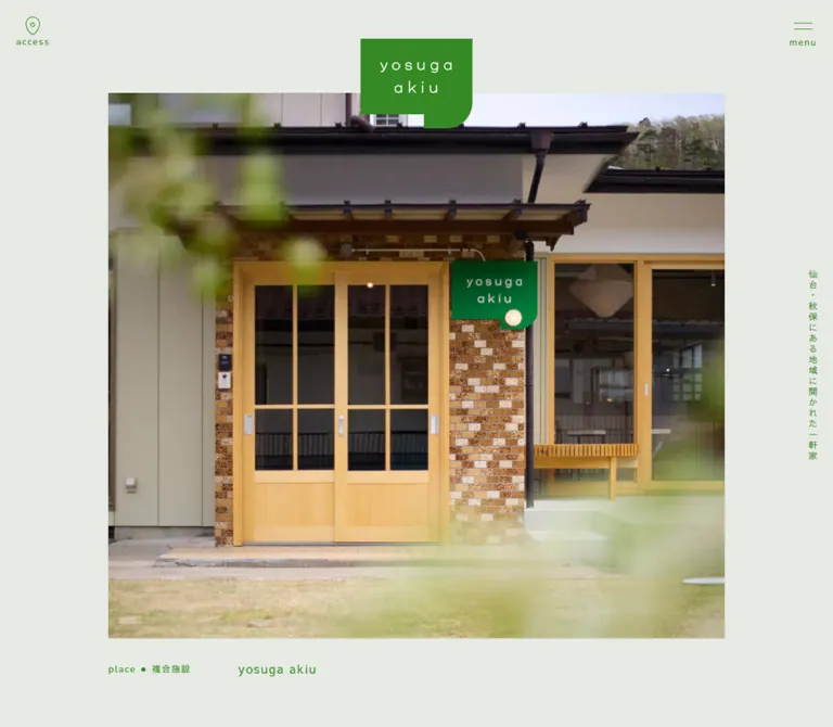
A large photograph sits inside broad canvas margins. The identity overlaps its top edge, centered on the viewport. The green mark contains the widely spaced, two-line lowercase wordmark yosuga akiu; its stepped lower edge and curved corner make it feel like a small architectural piece.
The desktop photograph shows the café counter, with timber cabinetry, pale vertical tiles, display cases, and a blurred person. The mobile photograph shows SIBI, with ceramics and glassware arranged inside a timber-framed room. Preserve natural material color and the sense of looking into a real house.
The mobile frame is much taller relative to its width. It is not a uniformly scaled desktop frame. The measured image estimates correspond to about 1.42:1 on desktop and 0.62:1 on mobile. Use deliberate crop selection for each format.
The small H1 sits vertically in the right margin: 仙台・秋保にある地域に開かれた一軒家. It describes the facility without becoming a large text overlay. The screenshot establishes vertical presentation; the Quick Start recommends writing-mode: vertical-rl as the implementation method.
Hero Caption
Role: identify the current space or tenant pictured above.
The caption combines an English category, a small green separator dot, a Japanese category, and a tenant or place name. Recorded variants include:
place/複合施設/yosuga akiu.cafe/カステラ店/はちとワルツ.shop/日日用品店/SIBI.space/レンタルスペース/よすがの2階.
On desktop, the category occupies a 185px-wide region beginning at the photograph's left edge. The tenant name starts 194px farther right. On mobile, category and tenant name stack at the same left edge, with the name reducing from 18px to 16px.
All four caption variants share the same recorded bounds within each viewport. Together with the different photographed states, this supports a multi-state hero. It does not establish autoplay, transition style, or breakpoint-specific image selection.
Introductory Copy
Role: explain the social purpose of the facility in a quieter passage between the photographic opening and news.
The source uses two short Japanese paragraphs describing the renovated house and the hope that connections formed there become a source of support. The typography is intentionally spacious: 18px text with 39.6px leading on desktop, and 15.6px with 34.32px leading on mobile.
The recorded section is approximately 1081px tall on desktop and 791px on mobile. Its first paragraph starts well below the section boundary: about 410px on desktop and 201px on mobile. These distances establish generous pacing, but the supplied screenshots do not show every decorative element within that interval.
The mobile text contains additional line breaks, including a short opening ここは、. Preserve editorial control of Japanese line breaks rather than forcing the desktop paragraph into an identical line pattern.
A centered ivory pill labeled 詳しくみる links to /about/.
Section Heading and Pill Link
Role: establish a repeatable hierarchy for news, tenant, and access.
The English title is centered and light, with wide tracking. A fine green ornament underneath echoes the stepped and curved identity. The smaller Japanese subtitle sits 15px below the heading box.
Desktop title boxes include 24px of lower padding. Their 32px text uses a 51.2px line height, so the complete heading box is approximately 75.2px high. Mobile reduces the text to 28px and lower padding to 18px, producing a 62.8px box.
The companion action is an ivory pill with a thin right-pointing arrow. Desktop pills sit at the right of the section header; mobile section-level actions occur after their associated content. Examples include 一覧をみる, フロアマップをみる, and 詳しくみる.
Desktop pill padding is measured at 21px 21px 22px. Mobile padding is 18px 21px. The label's child font was not separately sampled; using the body family at approximately 15px and 13.5px is a visual adaptation.
News Preview Grid
Role: expose recent updates while retaining a route to the complete news index.
The desktop DOM records three linked previews at x positions 72, 514, and 956, each 412px wide. Mobile records two previews at x positions 19.5 and 202.5, each 168px wide. The mobile treatment therefore retains two columns at the inspected width.
Each preview has a date, category, and H3 title within the link. The desktop title region is inset 45px from either side of its anchor; the mobile inset is about 11.7px. The opening announcement wraps to two title lines on desktop and three on mobile. Do not force every preview to an identical text height.
The desktop preview anchors have different total heights, approximately 484.6px and 455.8px. Mobile examples are approximately 296.7px and 275.1px. The supplied captures do not directly show the news grid, so image bounds, artwork subjects, and any inner panel treatment remain unverified. The sampled anchors themselves report transparent backgrounds.
The third desktop article is absent from the mobile rendered text and link extraction. The evidence does not establish a carousel or the exact visibility rule. The full news link remains available below the mobile previews.
Tenant Introduction Row
Role: give each tenant a distinct identity while keeping the facility's common visual framework.
The desktop composition places text and logo artwork on the left and a photograph on the right. Both columns are 588px wide, separated by 120px. The first visible photograph is approximately 588 × 417px, a landscape ratio near 1.41:1.
The left column contains:
- A compact category line with English label, dot, and Japanese category.
- Large tenant-specific logo artwork.
- A short green description at 15px with 27px leading.
- An additional pill where relevant, as recorded for the rental space.
The first tenant's distinctive black lettering occupies much more space than ordinary UI headings. A thin, tilted geometric outline crosses behind it. The next tenant retains its own black and gold identity. These differences are part of the design; the tenants are not normalized into interchangeable text cards.
On mobile, the logo and description records use the full 351px content width. The tenant section becomes taller despite the narrower page: approximately 2194px, compared with 1968px desktop. This supports a stacked composition, but the actual mobile photo rectangles and their precise placement were not supplied. The Quick Start chooses text followed by its photograph as a recommended ordering.
Access Information
Role: answer practical visit questions without breaking the calm visual system.
The recorded content includes the address, operating-hours note, contact email, and parking availability. The hours state that they vary by tenant; parking is listed as nine spaces. The observed Google Maps destination is https://maps.app.goo.gl/n9r6BfZ8z3oYDZSh6.
On desktop, the address region begins at x ≈ 187px, aligned to the narrower hero-width content area. The Google Maps action is an ivory 240 × 58px pill toward the right. On mobile, the address wraps onto two lines and the Maps action becomes an unfilled text link with an external-arrow treatment.
There is a substantial interval between the access heading and the address in the recorded layout. No supplied screenshot or element record establishes whether that region contains an embedded map, illustration, or another visual asset. Do not invent map controls or loading behavior.
Decorative Footer Frieze
Role: bridge the pale document and the large green closing field.
Oversized, overlapping geometric outlines stretch beyond both viewport edges. They resemble a loose chain of architectural fragments, with angular steps, short bars, circles, and occasional curves. Their stroke is visually about 1px.
The visible motif band is approximately 180px high on desktop and 120px on mobile. These are screenshot estimates. The shapes are clipped at the sides and remain green outlines on sage before the page switches to the solid green footer.
Repeated shapes alone do not prove a marquee or continuous motion. Treat the supplied state as static unless additional interaction evidence becomes available.
Footer
Role: close with a strong brand field and consolidate navigation and visit details.
Desktop divides the green field into two unequal regions. The left contains a small white character-like graphic, the slogan ひらく、つながる、縁側, and seven bilingual navigation links. The right contains the reversed identity and address/contact details.
The navigation is arranged as four entries on the first row and three on the second: about, floor, space, access, then news, faq, and contact. Measured link boxes are about 133.94px wide, with 45px horizontal gaps and 60px between the link rows. English labels are visually large and light; Japanese explanations remain small.
The right-hand desktop address block is approximately 329px wide. The reversed logo above it is visually about 135 × 108px. An Instagram outline icon sits near the lower-left edge of the footer.
Mobile changes the composition substantially: the logo is centered above the slogan, followed by a narrower address and contact block. The desktop navigation is absent from the rendered mobile text/link extraction and mobile footer capture, even though aggregate footer text includes those descendants. A text-style Google Maps link is present in the mobile footer. The menu's ability to expose the omitted routes was not tested.
Floating News Announcement
Role: keep a featured update visible while visitors explore the homepage.
The announcement remains in the lower-right area across the supplied hero, tenant, and footer captures. It combines a miniature green identity on the left with news, a separator dot, お知らせ, and an underlined article title on the right. The observed destination is /news/111/.
The anchor measures 380 × 112.13px on desktop and 273 × 79.98px on mobile. Its recorded right clearance is 24px desktop and 15px mobile. The anchor bottom sits 30px above the viewport bottom in the initial recorded states.
The ivory surface extends below the link box into a short lower-right tab, about 20px deep in the screenshots. A rounded outer corner softens the tab. This is a compact reuse of the identity geometry, not a shadowed toast card.
A green circular close affordance overlaps the top-right corner. Its measured box is 30 × 30px and its top-left sits 9px above and 9px beyond the announcement's upper-right region. Its action is not exercised in the evidence; dismissal persistence is unknown.
The announcement occupies 70% of the 390px mobile viewport and visibly overlaps content. Its title wraps to two lines on mobile. Preserve the wrapping and identity/text relationship rather than shrinking the entire desktop component proportionally.
Tokens — Motion & Interaction
| Feature | Evidence | Limit or implementation consequence |
|---|---|---|
| Multi-state hero | Four overlapping caption records; café visible on desktop and SIBI on mobile | Supports multiple states. Autoplay, duration, order, easing, swipe, and user controls are unverified. |
| Corner utilities | Present at consistent edge positions across scroll captures | Persistent placement is visually supported; detailed scroll behavior is not recorded. |
| Floating announcement | Present across supplied page regions | Persistence while browsing is visible. Close result and storage behavior are unverified. |
| Menu | Visible scripted anchor | Opened appearance, transition, keyboard behavior, and focus handling are unverified. |
| Navigation links | Original-site and Maps destinations recorded | Destinations are known; destination-page layouts were not inspected. |
| Footer frieze | Repeated outlined shapes | Repetition is not proof of animation. |
| Hover/focus feedback | No exercised state supplied | Do not assign an observed hover color, arrow shift, or focus treatment. |
| Sampled animation styles | Listed elements report animation: none |
Applies only to sampled elements and states, not to every image, pseudo-element, or script. |
| Sampled transition serialization | Listed elements report transition: all |
No useful duration or easing is established by this record. |
The inspection process waited for load, image decoding, and sampled layout/text stability, subject to finite limits. Perpetual animations were temporarily paused during readiness checks and then resumed. This supports reading the captures as settled visual states; it does not establish the complete motion system.
The blurred person in the café photograph is photographic content, not evidence of an animated person or transition effect.
For a new implementation, begin with a static selected hero state. If rotation is later added, provide accessible control and reduced-motion behavior, and keep the image and its caption synchronized. Any timing chosen for that implementation should be labeled as a design decision.
Surfaces
| Layer | Appearance | Purpose |
|---|---|---|
| Main canvas | Flat sage #e6eae3 |
Continuous, quiet background across sections |
| Photographic frame | Unbordered, square-cornered image | Carries material warmth and spatial detail |
| Navigation pill | Soft ivory with green text and arrow | Makes secondary routes discoverable without a heavy action color |
| Tenant identity region | Canvas with large artwork and thin outlines | Gives each tenant a distinct visual presence |
| Floating announcement | Ivory stepped surface with green close circle | Persistent featured update |
| Footer | Green field with ivory details | Strong closing identity and practical information |
No general elevation system is evident in the supplied captures. Boundaries come from color changes, whitespace, photographs, and selected outlined forms. The news-grid inner surfaces are not directly visible in the provided screenshots and should not be inferred from the general treatment.
Imagery
Photography supplies the warmth that the restrained interface deliberately leaves open. The café view includes worn timber, glass display cases, cream-and-brown tiles, and a person moving through the space. The shop view includes dishes, glasses, utensils, baskets, exposed beams, and daylight entering a renovated house.
The first tenant detail photograph shows packaged castella sandwiches in an open illustrated box, viewed diagonally on a wooden surface. Its close framing complements the wider interior photographs. Product color remains natural and slightly subdued.
Preserve these characteristics:
- Real rooms and material detail, with signs of ordinary use.
- A mix of room-scale photographs and closer product compositions.
- Warm wood and pale ceramics against the cool sage interface.
- Natural light, visible depth, and varied object scale.
- Deliberate portrait cropping for the phone hero.
- Clear separation between photographs and tenant-logo artwork.
Avoid heavy color overlays, generic stock-office imagery, excessive sharpening, or simulated paper texture across photographs. The interface palette should frame the images rather than recolor them.
Observed Asset References
No image src URLs, SVG paths, or font-file URLs were included in the supplied evidence. The inventory below identifies visible roles without inventing filenames.
| Asset role | Visible evidence | Reuse requirement |
|---|---|---|
| Main green identity | Desktop and mobile hero | Preserve the actual wordmark and stepped silhouette |
| Reversed identity | Desktop and mobile footer | Use the matching ivory version or an authorized color variant |
| Café interior photograph | Desktop hero | Retain counter, cabinetry, tiles, and human context in the crop |
| Household-goods interior photograph | Mobile hero | Select a portrait crop that keeps room depth and displayed objects |
| Castella product photograph | Desktop tenant capture | Preserve the diagonal gift-box composition |
| Tenant identities | Desktop tenant capture and large DOM heading boxes | Use actual artwork rather than substitute fonts |
| Footer outlines | Both footer captures | Preserve the varied, overlapping line shapes |
| Footer character-like mark | Both footer captures | Treat as identity artwork; do not assign an unverified name |
| Location, menu, and Instagram symbols | Edge controls and footer | Keep the thin outline weight and compact scale |
Layout & Responsive Behavior
The desktop layout alternates two useful widths. General sections use a 90vw container, while the opening photograph and desktop access information sit within a narrower, approximately 74vw region. This creates broad margins without forcing every section into the same alignment.
The opening photograph occupies most of the first viewport, but the page is not a fixed application shell. The measured hero is 1001px high on desktop and only 752.16px high on the 844px-tall phone. The mobile capture reveals the beginning of the following section beneath the caption.
| Relationship | Desktop observation | Mobile observation |
|---|---|---|
| Hero image | Broad landscape frame | Tall portrait frame |
| Main identity | 175px-wide link overlapping image | 117px-wide link overlapping image |
| Hero caption | Category and tenant name side by side | Category above tenant name |
| Vertical H1 | 13px at the far-right margin | 11px in the narrow right margin |
| General content | 1296px wide | 351px wide |
| News | Three 412px previews | Two 168px previews |
| Section action | Right of heading | After corresponding content |
| Tenant text | Left half of two-column composition | Full content width; photo placement not directly captured |
| Access Maps link | Filled pill | Plain text with external-arrow treatment |
| Footer | Navigation/slogan left, identity/details right | Centered identity, slogan, then details; navigation absent from rendered extraction |
| Announcement | 380px-wide lower-right surface | 273px-wide lower-right surface with wrapped title |
The mobile layout edits information density as well as dimensions. It reduces the visible news count, removes the desktop footer navigation from the rendered state, changes action placement, and allows different paragraph line breaks.
Only the two specified viewport sizes were inspected. Tablet layouts, landscape phones, browser text zoom, safe-area behavior, and intermediate breakpoint thresholds remain unverified. The Quick Start uses a 767px breakpoint as a recommended implementation boundary, not a measured source breakpoint.
Do’s and Don’ts
Do
- Use the measured sage, green, and ivory as the core palette.
- Let actual interiors and products supply the warmer secondary colors.
- Keep English section titles light, lowercase, and widely tracked.
- Use Sawarabi Gothic for the measured Japanese and content-text roles.
- Preserve generous line height, especially in the introduction.
- Keep the hero's small vertical H1 in the margin.
- Change the hero's crop and caption arrangement for mobile.
- Retain tenant-specific logo artwork and its differing proportions.
- Use thin linework and the stepped motif selectively.
- Keep mobile news at two columns when reproducing the inspected 390px state.
- Preserve the footer's strong green field and reorganized mobile composition.
- Label any added carousel behavior, breakpoint, or animation timing as a new decision.
Don’t
- Don't replace the facility homepage with a generic conversion funnel or oversized sales headline.
- Don't place a dark gradient or large block of text over the hero photograph.
- Don't turn every tenant into an identical rounded card.
- Don't use a serif body style because structural wrappers report
Times. - Don't treat WordPress preset gradients and shadows as the site's active design tokens.
- Don't recolor the actual tenant identities to force a single-color appearance.
- Don't assume the different hero captures indicate different tenant content by breakpoint.
- Don't invent menu panels, hover animations, swipe gestures, or dismissal persistence.
- Don't assume the access section contains an interactive embedded map.
- Don't animate the footer outlines solely because their shapes repeat.
- Don't remove mobile navigation routes without ensuring an accessible way to reach them.
- Don't let the fixed announcement permanently conceal essential links or contact information.
Recommended Implementation Additions
These are recommendations for a new implementation, not verified source features:
- Use a real button for the menu and announcement close action. Provide an accessible name, and expose menu expansion state when implemented.
- Keep the close circle visually 30px while expanding its interactive target to at least 44px.
- Give the identity a meaningful home-link name and tenant artwork useful alternative text. Mark purely decorative outlines as decorative.
- Use a darker green for small text where the measured palette does not provide sufficient contrast.
- Give keyboard focus a clear indicator on both sage and green surfaces.
- Reserve enough scroll-end clearance for the floating announcement, or offer a reliable dismissal action. Account for mobile safe areas.
- Keep all news entries reachable through the news index when showing only two previews on mobile.
- Ensure the mobile navigation exposes the routes absent from the footer; the supplied menu state cannot establish that behavior.
- Load the first selected hero image promptly, and defer lower-page photographs. Supply suitable image dimensions to reduce layout movement.
- If hero rotation is introduced, prevent hidden slides from creating duplicate accessible captions and provide a static reduced-motion state.
Agent Prompt Guide
Quick Color Reference
- Main canvas:
#e6eae3. - Interface green:
#358a25. - Pill surfaces and reversed details:
#fffffc. - Optional darker small-text color:
#2c701f, a recommendation only. - Secondary warmth: real timber, ceramics, food, and natural light in photography.
- Decorative treatment: thin green outlines and occasional stepped shapes; no general shadow or gradient system.
Overall Prompt
“Create a public-facing website for a small community facility in a renovated Japanese house. Use a pale sage canvas #e6eae3, green interface color #358a25, and ivory #fffffc for pills and reversed details. Center a large natural interior photograph beneath an overlapping identity mark. Keep a small vertical Japanese descriptor in the right margin and compact access/menu controls at the upper corners. Pair light, widely tracked Nunito Sans section titles with Sawarabi Gothic Japanese text. Build spacious introduction, news, tenant, and access sections, followed by a green footer. Use actual tenant artwork, thin architectural outlines, and a stepped lower-right shape on selected identity surfaces. On mobile, use a portrait hero, stacked caption, two news columns, actions below sections, and a vertically reorganized footer. Do not invent unobserved menu or carousel behavior.”
Example Component Prompts
- Hero: “A sage homepage opening with a square-cornered interior photograph approximately 74vw wide on desktop. Overlap its top edge with the supplied green identity. Keep a 13px vertical Japanese descriptor at the far right. Place the category and tenant name below the image; stack them on mobile and use a carefully chosen portrait crop.”
- Section header: “A centered lowercase
tenantheading in light Nunito Sans, 32px with 0.14em tracking. Add a thin stepped-and-curved green underline and a 13px Japanese subtitle. Place an ivory floor-map pill at the desktop right; move it below the section on mobile.” - Tenant row: “Two 588px columns separated by 120px within a 1296px container. Put a small bilingual category line, authentic tenant logo, and short green description on the left. Use a natural product or interior photograph near a 1.41:1 ratio on the right. Keep the background open and the image corners square.”
- Announcement: “A compact ivory announcement at the lower right, 380px wide on desktop and 273px at a 390px viewport. Place a small green identity beside category text and an underlined title. Extend the bottom-right edge into a short rounded tab. Overlap a green 30px close circle, with a larger accessible hit area.”
- Footer: “Transition from sage into a green footer through oversized overlapping green outline shapes. On desktop, place the slogan and bilingual navigation left and the reversed identity with visit details right. On mobile, center the identity above the slogan and contact block. Use the actual decorative artwork and leave its motion static unless specified.”
Quick Start
CSS Custom Properties
This is an implementation starter, not extracted source CSS. It preserves the measured colors, font roles, major desktop grid dimensions, and the observed mobile composition. Hero dimensions derived from screenshots, the heading ornament, the announcement silhouette, footer spacing, and the 767px breakpoint are approximations.
Load the named font families separately. Insert authorized photographs, tenant identities, the main logo, and footer outline artwork into the corresponding image elements. No original asset URLs were supplied. The .section-action link should follow .section-body in document order so it can move from the desktop heading area to the mobile section end without duplicating the link.
The starter intentionally contains no carousel, menu-opening, or dismissal logic. Those require separate state handling. Footer grid areas assume separate slogan, brand, navigation, and details elements.
:root {
  /* Measured palette; aliases are local to this adaptation. */
  --ys-canvas: #e6eae3;
  --ys-ink: #358a25;
  --ys-surface: #fffffc;
  --ys-readable-ink: #2c701f; /* Recommended alternative. */

  --ys-font-latin: 'Nunito Sans', sans-serif;
  --ys-font-jp: 'Sawarabi Gothic', sans-serif;
  --ys-body-size: 15px;
  --ys-title-size: 18px;
  --ys-heading-size: 32px;
  --ys-intro-size: 18px;
  --ys-subtitle-size: 13px;
  --ys-utility-size: 14px;

  --ys-gutter: 5vw;
  --ys-section-top: 96px;
  --ys-section-bottom: 120px;
  --ys-content-gap: 75px;
  --ys-tenant-gap: 120px;
  --ys-news-gap: 30px;
  --ys-edge: 24px;

  /* Screenshot-derived hero proportions. */
  --ys-hero-width: 74vw;
  --ys-hero-height: 75vh;
  --ys-pill-width: 240px;
  --ys-pill-height: 58px;
  --ys-pill-radius: 999px;
  --ys-rule: 1px;
  --ys-note-width: 380px;
  --ys-note-edge: 24px;
}

*,
*::before,
*::after {
  box-sizing: border-box;
}

body {
  margin: 0;
  color: var(--ys-ink);
  background: var(--ys-canvas);
  font-family: var(--ys-font-jp);
  font-size: var(--ys-body-size);
  font-weight: 400;
  line-height: 1.8;
  letter-spacing: 0.11em;
}

a { color: inherit; }
button { font: inherit; }
img { display: block; max-width: 100%; height: auto; }

.container {
  width: calc(100% - 2 * var(--ys-gutter));
  margin-inline: auto;
}

.site-tools {
  position: fixed;
  inset: 25px var(--ys-edge) auto;
  z-index: 30;
  display: flex;
  justify-content: space-between;
  pointer-events: none;
}

.site-tools > * {
  display: grid;
  justify-items: center;
  min-width: 44px; /* Recommended interaction target. */
  min-height: 50px;
  padding: 0;
  border: 0;
  color: var(--ys-ink);
  background: transparent;
  font-family: var(--ys-font-latin);
  font-size: var(--ys-utility-size);
  font-weight: 500;
  line-height: 1.6;
  letter-spacing: 0.11em;
  text-decoration: none;
  pointer-events: auto;
}

.tool-icon {
  width: 27px;
  height: 27px;
  fill: none;
  stroke: currentColor;
  stroke-width: 1px;
}

.site-hero {
  position: relative;
  min-height: calc(100vh + 1px);
  padding-top: 12.7vh;
}

.hero-figure {
  width: var(--ys-hero-width);
  margin: 0 auto;
}

.hero-photo {
  width: 100%;
  height: var(--ys-hero-height);
  object-fit: cover;
  border-radius: 0;
}

.hero-brand {
  position: absolute;
  z-index: 2;
  top: 55px;
  left: 50%;
  width: 175px;
  transform: translateX(-50%);
}

.hero-tagline {
  position: absolute;
  top: 50%;
  right: 24px;
  margin: 0;
  writing-mode: vertical-rl;
  transform: translateY(-50%);
  font-size: 13px;
  font-weight: 400;
  line-height: 1;
  letter-spacing: -2px;
}

.hero-caption {
  display: grid;
  grid-template-columns: 185px minmax(0, 1fr);
  align-items: center;
  gap: 9px;
  margin-top: 28px;
}

.hero-caption__title {
  margin: 0;
  font-size: 18px;
  line-height: 1.6;
}

.category {
  display: flex;
  align-items: center;
  gap: 8px;
  margin: 0;
  font-size: 13px; /* Visual approximation. */
  line-height: 1;
}

.category__latin {
  font-family: var(--ys-font-latin);
  font-weight: 500;
}

.category__dot {
  flex: 0 0 5px;
  width: 5px;
  height: 5px;
  border-radius: 50%;
  background: currentColor;
}

.intro-copy {
  font-size: var(--ys-intro-size);
  line-height: 2.2;
  letter-spacing: 0.08em;
}

.intro-copy + .intro-copy { margin-top: 45px; }

.section {
  padding-block: var(--ys-section-top) var(--ys-section-bottom);
}

.section > .container { position: relative; }
.section-heading { text-align: center; }

.section-title {
  position: relative;
  display: inline-block;
  margin: 0;
  padding: 0 15px 24px 9px;
  font-family: var(--ys-font-latin);
  font-size: var(--ys-heading-size);
  font-weight: 300;
  line-height: 1.6;
  letter-spacing: 0.14em;
}

/* Curved underline approximation; use artwork for the exact step. */
.section-title::after {
  content: '';
  position: absolute;
  right: 0;
  bottom: 0;
  left: 0;
  height: 24px;
  border-right: var(--ys-rule) solid currentColor;
  border-bottom: var(--ys-rule) solid currentColor;
  border-bottom-right-radius: 24px;
}

.section-subtitle {
  margin: 15px 0 0;
  font-size: var(--ys-subtitle-size);
  line-height: 1;
}

.section-body { margin-top: var(--ys-content-gap); }

.pill {
  display: inline-flex;
  align-items: center;
  justify-content: space-between;
  gap: 12px;
  min-width: var(--ys-pill-width);
  min-height: var(--ys-pill-height);
  padding: 21px 21px 22px;
  border: 0;
  border-radius: var(--ys-pill-radius);
  color: var(--ys-ink);
  background: var(--ys-surface);
  font-size: var(--ys-body-size);
  line-height: 1;
  text-decoration: none;
}

.pill svg { width: 20px; height: 16px; flex: none; }

.section-action {
  position: absolute;
  top: 22.6px;
  right: 0;
}

.news-grid {
  display: grid;
  grid-template-columns: repeat(3, minmax(0, 1fr));
  gap: var(--ys-news-gap);
}

.news-card { display: block; text-decoration: none; }
.news-card__copy { padding-inline: 45px; }

.news-card h3 {
  margin: 0.75em 0 0;
  font-size: var(--ys-title-size);
  font-weight: 400;
  line-height: 1.6;
}

/* Preview image ratios were not measured; retain asset proportions. */
.news-card img { width: 100%; height: auto; }

.tenant-row {
  display: grid;
  grid-template-columns: repeat(2, minmax(0, 1fr));
  align-items: center;
  gap: var(--ys-tenant-gap);
}

.tenant-row + .tenant-row { margin-top: 120px; }
.tenant-logo { width: 100%; height: auto; margin-block: 14px; }
.tenant-description { margin: 0; line-height: 1.8; }

.tenant-photo {
  width: 100%;
  aspect-ratio: 1.41;
  object-fit: cover;
  border-radius: 0;
}

.access-details {
  width: var(--ys-hero-width);
  margin-inline: auto;
}

.contact-list {
  display: grid;
  grid-template-columns: max-content minmax(0, 1fr);
  gap: 8px 24px;
}

.contact-list dt,
.contact-list dd { margin: 0; }

.site-footer { margin-top: 60px; }

.footer-frieze {
  height: 180px; /* Screenshot estimate. */
  overflow: hidden;
}

.footer-frieze img {
  width: auto;
  max-width: none;
  height: 100%;
}

.footer-field {
  padding: 90px 5vw 120px;
  color: var(--ys-surface);
  background: var(--ys-ink);
}

.footer-layout {
  display: grid;
  grid-template-columns: minmax(0, 670.75px) minmax(0, 329.02px);
  grid-template-areas: 'slogan brand' 'nav details';
  justify-content: space-between;
  align-items: start;
  gap: 48px 60px;
}

.footer-brand {
  grid-area: brand;
  width: 135px;
  margin-inline: auto;
}

.footer-slogan {
  grid-area: slogan;
  align-self: center;
  margin: 0;
  padding-block: 30px;
  font-size: 24px;
  font-weight: 500;
  line-height: 1.8;
}

.footer-nav {
  grid-area: nav;
  display: grid;
  grid-template-columns: repeat(4, minmax(0, 1fr));
  gap: 60px 45px;
}

.footer-nav a { text-decoration: none; }

.footer-nav .en {
  display: block;
  font-family: var(--ys-font-latin);
  font-size: 32px; /* Visual adaptation. */
  font-weight: 300;
  line-height: 1.6;
  letter-spacing: 0.14em;
}

.footer-nav .jp { font-size: 13px; }
.footer-details { grid-area: details; min-width: 0; }
.footer-details address { font-style: normal; }
.footer-details .contact-list { gap: 8px 20px; }

.news-note {
  position: fixed;
  z-index: 40;
  right: max(var(--ys-note-edge), env(safe-area-inset-right, 0px));
  bottom: calc(30px + env(safe-area-inset-bottom, 0px));
  width: min(var(--ys-note-width), calc(100vw - 30px));
  isolation: isolate;
  color: var(--ys-ink);
}

/* Approximation of the stepped surface, isolated from the close button. */
.news-note::before {
  content: '';
  position: absolute;
  z-index: -1;
  inset: 0 0 -20px;
  border-bottom-right-radius: 36px;
  background: var(--ys-surface);
  clip-path: polygon(
    0 0, 100% 0, 100% 100%, 84% 100%,
    84% calc(100% - 20px), 0 calc(100% - 20px)
  );
}

.news-note__link {
  display: grid;
  grid-template-columns: 64px minmax(0, 1fr);
  align-items: center;
  gap: 29px;
  min-height: 112px;
  padding: 24px 15px 24px 25px;
  text-decoration: none;
}

.news-note__meta {
  margin: 0 0 9px;
  font-size: 13px;
  line-height: 1;
}

.news-note__title {
  margin: 0;
  font-size: var(--ys-body-size);
  line-height: 1.6;
  text-decoration: underline;
  text-underline-offset: 3px;
}

.news-note__close {
  position: absolute;
  top: -16px;
  right: -16px;
  display: grid;
  place-items: center;
  width: 44px;
  height: 44px;
  padding: 0;
  border: 0;
  color: var(--ys-surface);
  background: transparent;
  cursor: pointer;
}

.news-note__close::before {
  content: '';
  position: absolute;
  inset: 7px;
  z-index: -1;
  border-radius: 50%;
  background: var(--ys-ink);
}

.news-note__close span { font-size: 24px; line-height: 1; }

/* Recommended focus and optional small-text color. */
:where(a, button):focus-visible {
  outline: 2px solid currentColor;
  outline-offset: 4px;
}

.readable-copy { color: var(--ys-readable-ink); }

/* Recommended breakpoint; only 390px and 1440px were inspected. */
@media (max-width: 767px) {
  :root {
    --ys-body-size: 13.5px;
    --ys-title-size: 13.5px;
    --ys-heading-size: 28px;
    --ys-intro-size: 4vw;
    --ys-subtitle-size: 11px;
    --ys-utility-size: 12px;
    --ys-section-top: 12vw;
    --ys-section-bottom: 15vw;
    --ys-content-gap: 12vw;
    --ys-news-gap: 15px;
    --ys-edge: 4vw;
    --ys-hero-width: 80vw;
    --ys-hero-height: 60vh;
    --ys-pill-width: 180px;
    --ys-pill-height: 49.5px;
    --ys-note-width: 70vw;
    --ys-note-edge: 15px;
  }

  .site-tools { top: 3vw; }

  .site-hero {
    min-height: 0;
    padding-top: 13.4vh;
    padding-bottom: 53px;
  }

  .hero-brand { top: 5vh; width: 30vw; }
  .hero-tagline { right: 3.5vw; font-size: 11px; }

  .hero-caption {
    grid-template-columns: minmax(0, 1fr);
    gap: 13px;
    margin-top: 29px;
  }

  .hero-caption__title { font-size: 16px; }
  .category { font-size: 12px; }
  .intro-copy + .intro-copy { margin-top: 6vw; }
  .section-title { padding-bottom: 18px; }
  .section-title::after { height: 18px; }
  .pill { padding: 18px 21px; }

  .section-action {
    position: static;
    display: flex;
    width: max-content;
    max-width: 100%;
    margin: 29.25px auto 0;
  }

  .news-grid { grid-template-columns: repeat(2, minmax(0, 1fr)); }
  .news-card__copy { padding-inline: 3vw; }

  /* Adaptation of the observed two-preview mobile excerpt. */
  .news-grid > :nth-child(n + 3) { display: none; }

  .tenant-row { grid-template-columns: minmax(0, 1fr); gap: 24px; }
  .tenant-row + .tenant-row { margin-top: 15vw; }
  .access-details { width: 88vw; }
  .contact-list { gap: 8px 16px; }
  .footer-frieze { height: 120px; }
  .footer-field { padding: 90px 0 120px; }

  .footer-layout {
    width: 76.54vw;
    margin-inline: auto;
    grid-template-columns: minmax(0, 1fr);
    grid-template-areas: 'brand' 'slogan' 'details';
    gap: 48px;
  }

  .footer-brand { width: 117px; }
  .footer-slogan { font-size: 18px; }

  /* Retain these routes in an accessible mobile navigation. */
  .footer-nav { display: none; }

  .news-note__link {
    grid-template-columns: 40px minmax(0, 1fr);
    gap: 26px;
    min-height: 80px;
    padding: 10px 15px 10px 20px;
  }

  .news-note__meta { margin-bottom: 3px; font-size: 11px; }
}
Do not set the original document heights as fixed heights. Content changes, fonts, and image crops should be allowed to alter page length. Likewise, the tenant and news components should grow with their text rather than clipping to the captured rectangles.
Tailwind v4 Token Mapping
Optional aliases for a project that already uses Tailwind v4. Define the custom properties above first. This mapping does not imply that the original site uses Tailwind.
@theme inline {
  --color-canvas: var(--ys-canvas);
  --color-ink: var(--ys-ink);
  --color-surface: var(--ys-surface);
  --color-readable-ink: var(--ys-readable-ink);

  --font-latin: var(--ys-font-latin);
  --font-japanese: var(--ys-font-jp);

  --text-copy: var(--ys-body-size);
  --text-section: var(--ys-heading-size);
  --text-intro: var(--ys-intro-size);
  --text-utility: var(--ys-utility-size);

  --spacing-page-gutter: var(--ys-gutter);
  --spacing-section-top: var(--ys-section-top);
  --spacing-section-bottom: var(--ys-section-bottom);
  --spacing-news-gap: var(--ys-news-gap);

  --radius-pill: var(--ys-pill-radius);
}
Sources & Evidence
- Original and final website: https://yosuga-akiu.jp/. The supplied record reports HTTP 200 with no URL change and the current title
yosuga akiu よすが 秋保|仙台・秋保にある地域に開かれた一軒家. - Capture record: September 12, 2026, 06:57:30.712 UTC / 15:57:30.712 JST. Desktop viewport 1440 × 1000; mobile viewport 390 × 844.
- Desktop visual evidence: photographic opening, tenant section, and footer captures.
- Mobile visual evidence: photographic opening and footer captures. No separate mobile tenant or news-grid screenshot was supplied.
- Rendered evidence: text, link destinations, element rectangles, computed foreground/background colors, declared font families, type metrics, padding, radii, and limited transition/animation serialization for both viewports.
- Observed navigation targets: homepage routes for About, News, Floor, Space, Access, FAQ, and Contact, plus Google Maps and the facility's Instagram link. These were recorded as destinations; their pages were not independently inspected here.
- Inspection limitations: no opened menu, exercised close control, verified hover/focus state, animation timeline, asset URL inventory, or intermediate viewport inspection. Readiness checks had finite limits and do not prove that all delayed content or interaction states were captured.
This reference describes the current homepage represented by the supplied original-page evidence. Numerical source observations, screenshot estimates, and recommended implementation choices are identified separately throughout.
# yosuga akiu — Style Reference

> A neighborhood house presented through green linework, generous breathing room, and photographs of everyday warmth.

**Website / original URL:** [yosuga-akiu.jp](https://yosuga-akiu.jp/)
**Final URL:** [https://yosuga-akiu.jp/](https://yosuga-akiu.jp/)
**Theme:** light sage canvas with green typography; a green footer reverses the foreground to ivory.
**Inspected:** September 12, 2026, at 06:57:30.712 UTC / 15:57:30.712 JST, according to the supplied inspection record.
**Viewports:** 1440 × 1000 desktop and 390 × 844 mobile, in CSS pixels.
**Scope:** the current facility homepage, including the photographic opening, introduction, news previews, tenant descriptions, access information, footer, persistent corner utilities, and floating announcement. Evidence consists of three desktop captures, two mobile captures, and rendered DOM/computed-style records. Linked pages and opened menu states were not inspected.

Yosuga is a small mixed-use facility in a renovated house in Akiu, Sendai. Its homepage introduces the place, its café and household-goods tenants, and its rental space. The design works as a public-facing facility website: it combines atmosphere with practical routes to floor information, news, access, and inquiries.

The visual system is unusually consistent. Green supplies nearly all interface text and linework. A pale gray-green background stays quiet around large photographs of wood, ceramics, glass, and food. Light English headings, carefully spaced Japanese text, and thin outlined graphics keep the presentation airy. The strongest recurring shape is a rectangular block with a stepped lower edge and a curved lower-right corner, visible in the identity and announcement treatment.

The page remains a long, normally scrolling document. Its small fixed-looking utilities and floating announcement occupy the edges while the photography and tenant identities retain the central space.

## How to Read This Reference

- **Measured** means a value appears in the supplied computed styles or element rectangles. Measurements describe the captured state, not necessarily the underlying CSS formula.
- **Calculated** means arithmetic derived from those measurements, such as column gaps or percentage widths.
- **Estimated** means a visual approximation from the supplied screenshots. Image boundaries, decorative strokes, and some artwork dimensions fall into this category.
- **Recommended** means an implementation choice for a new site. Breakpoints, accessibility changes, and the Quick Start are adaptations, not recovered source code.
- All `--ys-*` tokens below are descriptive aliases. They were not identified as original custom properties.
- The supplied custom-property inventory contains general WordPress presets. Those presets do not establish that their gradients, shadows, or bright colors are used in the visible design.
- Computed font families establish declared families. They do not independently verify the font file used for every glyph.

## Tokens — Colors

### Default Palette

| Name | Value | Suggested token | Evidence and role |
| --- | --- | --- | --- |
| Sage Canvas | `#e6eae3` | `--ys-canvas` | Measured `rgb(230, 234, 227)` on HTML and body at both viewports. Main page background and photographic margins. |
| Yosuga Green | `#358a25` | `--ys-ink` | Measured `rgb(53, 138, 37)` on text and controls. Visually also supplies the logo, decorative linework, close-control fill, and footer field. |
| Soft Ivory | `#fffffc` | `--ys-surface` | Measured `rgb(255, 255, 252)` on pill-link backgrounds and footer text. Use for the reversed identity and announcement surface. |
| Tenant Artwork Neutrals | No verified single value | Asset-owned | Near-black lettering and a muted gold detail are visible in tenant identities. These belong to the artwork rather than a general interface palette. |
| Interior Materials | No fixed token | Photography | Honey-brown wood, cream tiles, dark beams, ceramics, and glass provide most of the secondary color. |

The green footer is visually clear in both footer captures, but the sampled `FOOTER` element itself reports a transparent background. Its visible fill therefore belongs to an unsampled layer or descendant. Use the measured green as the reproduction token without claiming that the footer element directly declares it.

The canvas is flat color. No paper grain, background noise, gradient, or general shadow treatment is evident in the supplied captures.

### Theme Presets

No selectable theme or alternate palette is evidenced. The green footer is a section-level inversion of the same identity, not an observed dark-mode setting.

### Recommended Readability Variant

Calculated from the measured sRGB colors, green on sage has approximately **3.6:1** contrast; green against ivory has approximately **4.4:1**. Several observed text roles are small and regular weight.

For a new implementation, consider a darker green such as `#2c701f` for small body text, while retaining `#358a25` for identity fields and larger graphics. This is a recommended accessibility variation, not an observed source color. Validate the final text/background pairs after implementation.

## Tokens — Typography

### Nunito Sans — English Utilities and Section Titles

- **Measured family:** `'Nunito Sans', sans-serif`.
- **Section headings:** weight `300`, with broad `0.14em` tracking.
- **Corner utility labels:** weight `500`, with `0.11em` tracking.
- **Character:** light, open, and friendly. Lowercase labels such as `news`, `tenant`, `access`, and `menu` avoid the visual weight of conventional corporate navigation.
- **Suggested alias:** `--ys-font-latin`.

### Sawarabi Gothic — Japanese Copy and Content Titles

- **Measured family:** `'Sawarabi Gothic', sans-serif`.
- **Primary weight:** `400`; the footer slogan uses `500` in the supplied computed styles.
- **Body rhythm:** ordinary descriptions use `1.8` line height; introductory paragraphs use `2.2`.
- **Tracking:** usually `0.11em`, with `0.08em` in the introduction.
- **Scope:** the family is also declared on Latin text inside content roles, including hero tenant names. Do not automatically switch every Latin word to Nunito Sans.
- **Suggested alias:** `--ys-font-jp`.

### Wordmarks and Container Defaults

The main identity and large tenant names are artwork. The tenant `H3` records contain no text and occupy large graphic-sized boxes; the screenshot shows their distinctive logos. Do not reproduce these identities by selecting an approximate display font.

HTML, body, and many structural anchors report `Times` at `10px`. Their visible text descendants frequently override those values with the two families above. Treat the structural defaults as implementation context, not as evidence of a serif visual style.

### Type Scale

All values in this table are measured. Tracking expressed in `em` is calculated from the recorded pixel value.

| Role | Desktop size / line height | Mobile size / line height | Weight | Tracking |
| --- | --- | --- | --- | --- |
| English section heading | `32px / 51.2px` | `28px / 44.8px` | `300` | `0.14em` |
| Japanese section subtitle | `13px / 13px` | `11px / 11px` | `400` | `0.11em` |
| Corner utility label | `14px / 22.4px` | `12px / 19.2px` | `500` | `0.11em` |
| Vertical hero H1 | `13px / 13px` | `11px / 11px` | `400` | `-2px` |
| Hero tenant name | `18px / 28.8px` | `16px / 25.6px` | `400` | `0.11em` |
| Introductory paragraph | `18px / 39.6px` | `15.6px / 34.32px` | `400` | `0.08em` |
| Tenant description | `15px / 27px` | `13.5px / 24.3px` | `400` | `0.11em` |
| News preview title | `18px / 28.8px` | `13.5px / 21.6px` | `400` | `0.11em` |
| Access address | `15px / 27px` | `13.5px / 24.3px` | `400` | `0.11em` |
| Announcement title | `15px / 24px` | `13.5px / 21.6px` | `400` | `0.11em` |
| Footer slogan | `24px / 43.2px` | `18px / 32.4px` | `500` | `0.11em` |
| Copyright | `14px / 22.4px` | `12px / 19.2px` | `500` | `0.11em` |

The large English footer links visually resemble the section-title treatment, but their child text styles were not separately sampled. Reusing the heading scale there is an adaptation supported by appearance, not a measured declaration.

Category labels pair small English and Japanese text with a green dot. Their wrapper rectangles are recorded, but the font styles of their nested labels are not. The Quick Start uses approximately `13px` desktop and `12px` mobile for this role.

## Tokens — Spacing & Shapes

### Responsive Measurements

There is no recovered source scaling formula. The following relationships are supported by the captured geometry:

- The main content container is **90% of viewport width** at both inspected widths: `1296px` desktop and `351px` mobile.
- Its side margins are correspondingly **5vw**: `72px` and `19.5px`.
- The hero photograph is approximately **74vw** on desktop and **80vw** on mobile, estimated from the screenshots.
- Mobile section padding of `46.8px` and `58.5px` is numerically equivalent to `12vw` and `15vw` at 390px. That equivalence does not prove those units appear in the source.
- The root font size is measured at `10px` at both viewports. The adaptation below keeps a conventional document root and uses explicit component sizes.

### Spacing Scale

| Use | Desktop | Mobile | Status |
| --- | --- | --- | --- |
| Main content side margin | `72px` | `19.5px` | Measured; equivalent to `5vw` |
| Corner utility horizontal inset | `24px` | About `15.6px` | Measured |
| Corner utility top inset | `25px` | About `11.7px` | Measured |
| Standard section top padding | `96px` | `46.8px` | Measured for news, tenant, and access |
| News/tenant bottom padding | `120px` | `58.5px` | Measured |
| Heading lower padding | `24px` | `18px` | Measured |
| Heading-to-subtitle gap | `15px` | `15px` | Calculated from rectangles |
| News subtitle-to-preview gap | `75px` | `46.8px` | Calculated |
| News column gap | `30px` | `15px` | Calculated |
| Desktop tenant column gap | `120px` | Not applicable to full-width text | Calculated |
| Intro paragraph gap | `45px` | About `23.4px` | Calculated |
| Main-to-footer element gap | `60px` | `60px` | Calculated; separate from the decorative strip inside the footer region |
| Announcement anchor bottom clearance | `30px` | `30px` | Calculated in the recorded initial state; excludes the lower decorative extension |

### Border Radius

| Element | Treatment | Evidence |
| --- | --- | --- |
| Photographs | Square corners | Screenshot observation |
| Standard navigation pill | `999px` | Measured |
| Announcement close control | `100%`, in a `30 × 30px` box | Measured |
| Instagram outline | `6px`, in a `27 × 27px` box | Measured |
| Identity block | Stepped lower edge and rounded outer lower-right corner | Artwork observation; no source radius supplied |
| Announcement surface | Rectangular body with a short lower-right extension and rounded outer corner | Screenshot observation |
| Section-heading ornament | Thin stepped line terminating in a rounded curl | Screenshot observation |

The brand geometry is selective. Most images remain rectangular, links become pills, and only specific identity surfaces use the stepped shape. Applying the same rounded corner to every container would flatten that hierarchy.

### Layout Measurements

| Element | Desktop at 1440 × 1000 | Mobile at 390 × 844 | Evidence |
| --- | --- | --- | --- |
| Document height | `6982.73px` | `5969.02px` | Measured; rounded summary reports 6983 and 5969 |
| Hero section | `1001px` high | `752.16px` high | Measured |
| Main logo link | `175 × 139.59px`, at `632.5, 55` | `117 × 93.33px`, at `136.5, 42.19` | Measured link bounds; visible artwork has internal clear space |
| Hero photograph | Approximately `1066 × 750px`, at `187, 127` | Approximately `312 × 506px`, at `39, 113` | Screenshot estimate |
| Vertical H1 | `13 × 288px` | `11 × 234px` | Measured |
| Standard pill | `240 × 58px` | Usually `180 × 49.5px` | Measured |
| Mobile floor-map pill | — | `206.88 × 49.5px` | Measured; longer label expands the width |
| News preview widths | Three at `412px` | Two at `168px` | Measured |
| Tenant text width | `588px` | `351px` | Measured |
| First tenant photograph | Approximately `588 × 417px` | Not directly captured | Screenshot estimate |
| Footer element height | `764.30px` | `826.72px` | Measured; includes decorative space, not just the green field |
| Announcement anchor | `380 × 112.13px` | `273 × 79.98px` | Measured; excludes decorative extension |

## Components

### Corner Utilities

**Role:** keep location information and site navigation available without placing a full navigation bar over the photography.

The upper-left control combines a thin outline location pin with the lowercase label `access`. Its observed link target is `/access/`. The upper-right control combines two horizontal strokes with `menu`. Both use green on the pale canvas, without a filled button surface.

The same utilities remain visible in the supplied scrolled screenshots. This supports persistent viewport placement, although the sampled records do not include the actual `position` declaration. Desktop labels are 14px; mobile labels are 12px. The access link is approximately 50.45px wide on desktop and 43.25px on mobile. The menu link is narrower.

The menu target is a script placeholder in the DOM. No opened menu, route list, close state, focus behavior, or overlay animation is supplied.

### Hero Identity and Photograph

**Role:** introduce the physical place before asking visitors to read detailed information.

A large photograph sits inside broad canvas margins. The identity overlaps its top edge, centered on the viewport. The green mark contains the widely spaced, two-line lowercase wordmark `yosuga akiu`; its stepped lower edge and curved corner make it feel like a small architectural piece.

The desktop photograph shows the café counter, with timber cabinetry, pale vertical tiles, display cases, and a blurred person. The mobile photograph shows SIBI, with ceramics and glassware arranged inside a timber-framed room. Preserve natural material color and the sense of looking into a real house.

The mobile frame is much taller relative to its width. It is not a uniformly scaled desktop frame. The measured image estimates correspond to about 1.42:1 on desktop and 0.62:1 on mobile. Use deliberate crop selection for each format.

The small H1 sits vertically in the right margin: `仙台・秋保にある地域に開かれた一軒家`. It describes the facility without becoming a large text overlay. The screenshot establishes vertical presentation; the Quick Start recommends `writing-mode: vertical-rl` as the implementation method.

### Hero Caption

**Role:** identify the current space or tenant pictured above.

The caption combines an English category, a small green separator dot, a Japanese category, and a tenant or place name. Recorded variants include:

- `place` / `複合施設` / `yosuga akiu`.
- `cafe` / `カステラ店` / `はちとワルツ`.
- `shop` / `日日用品店` / `SIBI`.
- `space` / `レンタルスペース` / `よすがの2階`.

On desktop, the category occupies a 185px-wide region beginning at the photograph's left edge. The tenant name starts 194px farther right. On mobile, category and tenant name stack at the same left edge, with the name reducing from 18px to 16px.

All four caption variants share the same recorded bounds within each viewport. Together with the different photographed states, this supports a multi-state hero. It does not establish autoplay, transition style, or breakpoint-specific image selection.

### Introductory Copy

**Role:** explain the social purpose of the facility in a quieter passage between the photographic opening and news.

The source uses two short Japanese paragraphs describing the renovated house and the hope that connections formed there become a source of support. The typography is intentionally spacious: 18px text with 39.6px leading on desktop, and 15.6px with 34.32px leading on mobile.

The recorded section is approximately 1081px tall on desktop and 791px on mobile. Its first paragraph starts well below the section boundary: about 410px on desktop and 201px on mobile. These distances establish generous pacing, but the supplied screenshots do not show every decorative element within that interval.

The mobile text contains additional line breaks, including a short opening `ここは、`. Preserve editorial control of Japanese line breaks rather than forcing the desktop paragraph into an identical line pattern.

A centered ivory pill labeled `詳しくみる` links to `/about/`.

### Section Heading and Pill Link

**Role:** establish a repeatable hierarchy for `news`, `tenant`, and `access`.

The English title is centered and light, with wide tracking. A fine green ornament underneath echoes the stepped and curved identity. The smaller Japanese subtitle sits 15px below the heading box.

Desktop title boxes include 24px of lower padding. Their 32px text uses a 51.2px line height, so the complete heading box is approximately 75.2px high. Mobile reduces the text to 28px and lower padding to 18px, producing a 62.8px box.

The companion action is an ivory pill with a thin right-pointing arrow. Desktop pills sit at the right of the section header; mobile section-level actions occur after their associated content. Examples include `一覧をみる`, `フロアマップをみる`, and `詳しくみる`.

Desktop pill padding is measured at `21px 21px 22px`. Mobile padding is `18px 21px`. The label's child font was not separately sampled; using the body family at approximately 15px and 13.5px is a visual adaptation.

### News Preview Grid

**Role:** expose recent updates while retaining a route to the complete news index.

The desktop DOM records three linked previews at x positions 72, 514, and 956, each 412px wide. Mobile records two previews at x positions 19.5 and 202.5, each 168px wide. The mobile treatment therefore retains **two columns** at the inspected width.

Each preview has a date, category, and H3 title within the link. The desktop title region is inset 45px from either side of its anchor; the mobile inset is about 11.7px. The opening announcement wraps to two title lines on desktop and three on mobile. Do not force every preview to an identical text height.

The desktop preview anchors have different total heights, approximately 484.6px and 455.8px. Mobile examples are approximately 296.7px and 275.1px. The supplied captures do not directly show the news grid, so image bounds, artwork subjects, and any inner panel treatment remain unverified. The sampled anchors themselves report transparent backgrounds.

The third desktop article is absent from the mobile rendered text and link extraction. The evidence does not establish a carousel or the exact visibility rule. The full news link remains available below the mobile previews.

### Tenant Introduction Row

**Role:** give each tenant a distinct identity while keeping the facility's common visual framework.

The desktop composition places text and logo artwork on the left and a photograph on the right. Both columns are 588px wide, separated by 120px. The first visible photograph is approximately 588 × 417px, a landscape ratio near 1.41:1.

The left column contains:

1. A compact category line with English label, dot, and Japanese category.
2. Large tenant-specific logo artwork.
3. A short green description at 15px with 27px leading.
4. An additional pill where relevant, as recorded for the rental space.

The first tenant's distinctive black lettering occupies much more space than ordinary UI headings. A thin, tilted geometric outline crosses behind it. The next tenant retains its own black and gold identity. These differences are part of the design; the tenants are not normalized into interchangeable text cards.

On mobile, the logo and description records use the full 351px content width. The tenant section becomes taller despite the narrower page: approximately 2194px, compared with 1968px desktop. This supports a stacked composition, but the actual mobile photo rectangles and their precise placement were not supplied. The Quick Start chooses text followed by its photograph as a recommended ordering.

### Access Information

**Role:** answer practical visit questions without breaking the calm visual system.

The recorded content includes the address, operating-hours note, contact email, and parking availability. The hours state that they vary by tenant; parking is listed as nine spaces. The observed Google Maps destination is `https://maps.app.goo.gl/n9r6BfZ8z3oYDZSh6`.

On desktop, the address region begins at x ≈ 187px, aligned to the narrower hero-width content area. The Google Maps action is an ivory 240 × 58px pill toward the right. On mobile, the address wraps onto two lines and the Maps action becomes an unfilled text link with an external-arrow treatment.

There is a substantial interval between the access heading and the address in the recorded layout. No supplied screenshot or element record establishes whether that region contains an embedded map, illustration, or another visual asset. Do not invent map controls or loading behavior.

### Decorative Footer Frieze

**Role:** bridge the pale document and the large green closing field.

Oversized, overlapping geometric outlines stretch beyond both viewport edges. They resemble a loose chain of architectural fragments, with angular steps, short bars, circles, and occasional curves. Their stroke is visually about 1px.

The visible motif band is approximately 180px high on desktop and 120px on mobile. These are screenshot estimates. The shapes are clipped at the sides and remain green outlines on sage before the page switches to the solid green footer.

Repeated shapes alone do not prove a marquee or continuous motion. Treat the supplied state as static unless additional interaction evidence becomes available.

### Footer

**Role:** close with a strong brand field and consolidate navigation and visit details.

Desktop divides the green field into two unequal regions. The left contains a small white character-like graphic, the slogan `ひらく、つながる、縁側`, and seven bilingual navigation links. The right contains the reversed identity and address/contact details.

The navigation is arranged as four entries on the first row and three on the second: `about`, `floor`, `space`, `access`, then `news`, `faq`, and `contact`. Measured link boxes are about 133.94px wide, with 45px horizontal gaps and 60px between the link rows. English labels are visually large and light; Japanese explanations remain small.

The right-hand desktop address block is approximately 329px wide. The reversed logo above it is visually about 135 × 108px. An Instagram outline icon sits near the lower-left edge of the footer.

Mobile changes the composition substantially: the logo is centered above the slogan, followed by a narrower address and contact block. The desktop navigation is absent from the rendered mobile text/link extraction and mobile footer capture, even though aggregate footer text includes those descendants. A text-style Google Maps link is present in the mobile footer. The menu's ability to expose the omitted routes was not tested.

### Floating News Announcement

**Role:** keep a featured update visible while visitors explore the homepage.

The announcement remains in the lower-right area across the supplied hero, tenant, and footer captures. It combines a miniature green identity on the left with `news`, a separator dot, `お知らせ`, and an underlined article title on the right. The observed destination is `/news/111/`.

The anchor measures 380 × 112.13px on desktop and 273 × 79.98px on mobile. Its recorded right clearance is 24px desktop and 15px mobile. The anchor bottom sits 30px above the viewport bottom in the initial recorded states.

The ivory surface extends below the link box into a short lower-right tab, about 20px deep in the screenshots. A rounded outer corner softens the tab. This is a compact reuse of the identity geometry, not a shadowed toast card.

A green circular close affordance overlaps the top-right corner. Its measured box is 30 × 30px and its top-left sits 9px above and 9px beyond the announcement's upper-right region. Its action is not exercised in the evidence; dismissal persistence is unknown.

The announcement occupies 70% of the 390px mobile viewport and visibly overlaps content. Its title wraps to two lines on mobile. Preserve the wrapping and identity/text relationship rather than shrinking the entire desktop component proportionally.

## Tokens — Motion & Interaction

| Feature | Evidence | Limit or implementation consequence |
| --- | --- | --- |
| Multi-state hero | Four overlapping caption records; café visible on desktop and SIBI on mobile | Supports multiple states. Autoplay, duration, order, easing, swipe, and user controls are unverified. |
| Corner utilities | Present at consistent edge positions across scroll captures | Persistent placement is visually supported; detailed scroll behavior is not recorded. |
| Floating announcement | Present across supplied page regions | Persistence while browsing is visible. Close result and storage behavior are unverified. |
| Menu | Visible scripted anchor | Opened appearance, transition, keyboard behavior, and focus handling are unverified. |
| Navigation links | Original-site and Maps destinations recorded | Destinations are known; destination-page layouts were not inspected. |
| Footer frieze | Repeated outlined shapes | Repetition is not proof of animation. |
| Hover/focus feedback | No exercised state supplied | Do not assign an observed hover color, arrow shift, or focus treatment. |
| Sampled animation styles | Listed elements report `animation: none` | Applies only to sampled elements and states, not to every image, pseudo-element, or script. |
| Sampled transition serialization | Listed elements report `transition: all` | No useful duration or easing is established by this record. |

The inspection process waited for load, image decoding, and sampled layout/text stability, subject to finite limits. Perpetual animations were temporarily paused during readiness checks and then resumed. This supports reading the captures as settled visual states; it does not establish the complete motion system.

The blurred person in the café photograph is photographic content, not evidence of an animated person or transition effect.

For a new implementation, begin with a static selected hero state. If rotation is later added, provide accessible control and reduced-motion behavior, and keep the image and its caption synchronized. Any timing chosen for that implementation should be labeled as a design decision.

## Surfaces

| Layer | Appearance | Purpose |
| --- | --- | --- |
| Main canvas | Flat sage `#e6eae3` | Continuous, quiet background across sections |
| Photographic frame | Unbordered, square-cornered image | Carries material warmth and spatial detail |
| Navigation pill | Soft ivory with green text and arrow | Makes secondary routes discoverable without a heavy action color |
| Tenant identity region | Canvas with large artwork and thin outlines | Gives each tenant a distinct visual presence |
| Floating announcement | Ivory stepped surface with green close circle | Persistent featured update |
| Footer | Green field with ivory details | Strong closing identity and practical information |

No general elevation system is evident in the supplied captures. Boundaries come from color changes, whitespace, photographs, and selected outlined forms. The news-grid inner surfaces are not directly visible in the provided screenshots and should not be inferred from the general treatment.

## Imagery

Photography supplies the warmth that the restrained interface deliberately leaves open. The café view includes worn timber, glass display cases, cream-and-brown tiles, and a person moving through the space. The shop view includes dishes, glasses, utensils, baskets, exposed beams, and daylight entering a renovated house.

The first tenant detail photograph shows packaged castella sandwiches in an open illustrated box, viewed diagonally on a wooden surface. Its close framing complements the wider interior photographs. Product color remains natural and slightly subdued.

Preserve these characteristics:

- Real rooms and material detail, with signs of ordinary use.
- A mix of room-scale photographs and closer product compositions.
- Warm wood and pale ceramics against the cool sage interface.
- Natural light, visible depth, and varied object scale.
- Deliberate portrait cropping for the phone hero.
- Clear separation between photographs and tenant-logo artwork.

Avoid heavy color overlays, generic stock-office imagery, excessive sharpening, or simulated paper texture across photographs. The interface palette should frame the images rather than recolor them.

### Observed Asset References

No image `src` URLs, SVG paths, or font-file URLs were included in the supplied evidence. The inventory below identifies visible roles without inventing filenames.

| Asset role | Visible evidence | Reuse requirement |
| --- | --- | --- |
| Main green identity | Desktop and mobile hero | Preserve the actual wordmark and stepped silhouette |
| Reversed identity | Desktop and mobile footer | Use the matching ivory version or an authorized color variant |
| Café interior photograph | Desktop hero | Retain counter, cabinetry, tiles, and human context in the crop |
| Household-goods interior photograph | Mobile hero | Select a portrait crop that keeps room depth and displayed objects |
| Castella product photograph | Desktop tenant capture | Preserve the diagonal gift-box composition |
| Tenant identities | Desktop tenant capture and large DOM heading boxes | Use actual artwork rather than substitute fonts |
| Footer outlines | Both footer captures | Preserve the varied, overlapping line shapes |
| Footer character-like mark | Both footer captures | Treat as identity artwork; do not assign an unverified name |
| Location, menu, and Instagram symbols | Edge controls and footer | Keep the thin outline weight and compact scale |

## Layout & Responsive Behavior

The desktop layout alternates two useful widths. General sections use a 90vw container, while the opening photograph and desktop access information sit within a narrower, approximately 74vw region. This creates broad margins without forcing every section into the same alignment.

The opening photograph occupies most of the first viewport, but the page is not a fixed application shell. The measured hero is 1001px high on desktop and only 752.16px high on the 844px-tall phone. The mobile capture reveals the beginning of the following section beneath the caption.

| Relationship | Desktop observation | Mobile observation |
| --- | --- | --- |
| Hero image | Broad landscape frame | Tall portrait frame |
| Main identity | 175px-wide link overlapping image | 117px-wide link overlapping image |
| Hero caption | Category and tenant name side by side | Category above tenant name |
| Vertical H1 | 13px at the far-right margin | 11px in the narrow right margin |
| General content | 1296px wide | 351px wide |
| News | Three 412px previews | Two 168px previews |
| Section action | Right of heading | After corresponding content |
| Tenant text | Left half of two-column composition | Full content width; photo placement not directly captured |
| Access Maps link | Filled pill | Plain text with external-arrow treatment |
| Footer | Navigation/slogan left, identity/details right | Centered identity, slogan, then details; navigation absent from rendered extraction |
| Announcement | 380px-wide lower-right surface | 273px-wide lower-right surface with wrapped title |

The mobile layout edits information density as well as dimensions. It reduces the visible news count, removes the desktop footer navigation from the rendered state, changes action placement, and allows different paragraph line breaks.

Only the two specified viewport sizes were inspected. Tablet layouts, landscape phones, browser text zoom, safe-area behavior, and intermediate breakpoint thresholds remain unverified. The Quick Start uses a 767px breakpoint as a recommended implementation boundary, not a measured source breakpoint.

## Do’s and Don’ts

### Do

- Use the measured sage, green, and ivory as the core palette.
- Let actual interiors and products supply the warmer secondary colors.
- Keep English section titles light, lowercase, and widely tracked.
- Use Sawarabi Gothic for the measured Japanese and content-text roles.
- Preserve generous line height, especially in the introduction.
- Keep the hero's small vertical H1 in the margin.
- Change the hero's crop and caption arrangement for mobile.
- Retain tenant-specific logo artwork and its differing proportions.
- Use thin linework and the stepped motif selectively.
- Keep mobile news at two columns when reproducing the inspected 390px state.
- Preserve the footer's strong green field and reorganized mobile composition.
- Label any added carousel behavior, breakpoint, or animation timing as a new decision.

### Don’t

- Don't replace the facility homepage with a generic conversion funnel or oversized sales headline.
- Don't place a dark gradient or large block of text over the hero photograph.
- Don't turn every tenant into an identical rounded card.
- Don't use a serif body style because structural wrappers report `Times`.
- Don't treat WordPress preset gradients and shadows as the site's active design tokens.
- Don't recolor the actual tenant identities to force a single-color appearance.
- Don't assume the different hero captures indicate different tenant content by breakpoint.
- Don't invent menu panels, hover animations, swipe gestures, or dismissal persistence.
- Don't assume the access section contains an interactive embedded map.
- Don't animate the footer outlines solely because their shapes repeat.
- Don't remove mobile navigation routes without ensuring an accessible way to reach them.
- Don't let the fixed announcement permanently conceal essential links or contact information.

## Recommended Implementation Additions

These are recommendations for a new implementation, not verified source features:

- Use a real button for the menu and announcement close action. Provide an accessible name, and expose menu expansion state when implemented.
- Keep the close circle visually 30px while expanding its interactive target to at least 44px.
- Give the identity a meaningful home-link name and tenant artwork useful alternative text. Mark purely decorative outlines as decorative.
- Use a darker green for small text where the measured palette does not provide sufficient contrast.
- Give keyboard focus a clear indicator on both sage and green surfaces.
- Reserve enough scroll-end clearance for the floating announcement, or offer a reliable dismissal action. Account for mobile safe areas.
- Keep all news entries reachable through the news index when showing only two previews on mobile.
- Ensure the mobile navigation exposes the routes absent from the footer; the supplied menu state cannot establish that behavior.
- Load the first selected hero image promptly, and defer lower-page photographs. Supply suitable image dimensions to reduce layout movement.
- If hero rotation is introduced, prevent hidden slides from creating duplicate accessible captions and provide a static reduced-motion state.

## Agent Prompt Guide

### Quick Color Reference

- Main canvas: `#e6eae3`.
- Interface green: `#358a25`.
- Pill surfaces and reversed details: `#fffffc`.
- Optional darker small-text color: `#2c701f`, a recommendation only.
- Secondary warmth: real timber, ceramics, food, and natural light in photography.
- Decorative treatment: thin green outlines and occasional stepped shapes; no general shadow or gradient system.

### Overall Prompt

“Create a public-facing website for a small community facility in a renovated Japanese house. Use a pale sage canvas `#e6eae3`, green interface color `#358a25`, and ivory `#fffffc` for pills and reversed details. Center a large natural interior photograph beneath an overlapping identity mark. Keep a small vertical Japanese descriptor in the right margin and compact access/menu controls at the upper corners. Pair light, widely tracked Nunito Sans section titles with Sawarabi Gothic Japanese text. Build spacious introduction, news, tenant, and access sections, followed by a green footer. Use actual tenant artwork, thin architectural outlines, and a stepped lower-right shape on selected identity surfaces. On mobile, use a portrait hero, stacked caption, two news columns, actions below sections, and a vertically reorganized footer. Do not invent unobserved menu or carousel behavior.”

### Example Component Prompts

1. **Hero:** “A sage homepage opening with a square-cornered interior photograph approximately 74vw wide on desktop. Overlap its top edge with the supplied green identity. Keep a 13px vertical Japanese descriptor at the far right. Place the category and tenant name below the image; stack them on mobile and use a carefully chosen portrait crop.”
2. **Section header:** “A centered lowercase `tenant` heading in light Nunito Sans, 32px with 0.14em tracking. Add a thin stepped-and-curved green underline and a 13px Japanese subtitle. Place an ivory floor-map pill at the desktop right; move it below the section on mobile.”
3. **Tenant row:** “Two 588px columns separated by 120px within a 1296px container. Put a small bilingual category line, authentic tenant logo, and short green description on the left. Use a natural product or interior photograph near a 1.41:1 ratio on the right. Keep the background open and the image corners square.”
4. **Announcement:** “A compact ivory announcement at the lower right, 380px wide on desktop and 273px at a 390px viewport. Place a small green identity beside category text and an underlined title. Extend the bottom-right edge into a short rounded tab. Overlap a green 30px close circle, with a larger accessible hit area.”
5. **Footer:** “Transition from sage into a green footer through oversized overlapping green outline shapes. On desktop, place the slogan and bilingual navigation left and the reversed identity with visit details right. On mobile, center the identity above the slogan and contact block. Use the actual decorative artwork and leave its motion static unless specified.”

## Quick Start

### CSS Custom Properties

This is an implementation starter, not extracted source CSS. It preserves the measured colors, font roles, major desktop grid dimensions, and the observed mobile composition. Hero dimensions derived from screenshots, the heading ornament, the announcement silhouette, footer spacing, and the 767px breakpoint are approximations.

Load the named font families separately. Insert authorized photographs, tenant identities, the main logo, and footer outline artwork into the corresponding image elements. No original asset URLs were supplied. The `.section-action` link should follow `.section-body` in document order so it can move from the desktop heading area to the mobile section end without duplicating the link.

The starter intentionally contains no carousel, menu-opening, or dismissal logic. Those require separate state handling. Footer grid areas assume separate slogan, brand, navigation, and details elements.

```css
:root {
  /* Measured palette; aliases are local to this adaptation. */
  --ys-canvas: #e6eae3;
  --ys-ink: #358a25;
  --ys-surface: #fffffc;
  --ys-readable-ink: #2c701f; /* Recommended alternative. */

  --ys-font-latin: 'Nunito Sans', sans-serif;
  --ys-font-jp: 'Sawarabi Gothic', sans-serif;
  --ys-body-size: 15px;
  --ys-title-size: 18px;
  --ys-heading-size: 32px;
  --ys-intro-size: 18px;
  --ys-subtitle-size: 13px;
  --ys-utility-size: 14px;

  --ys-gutter: 5vw;
  --ys-section-top: 96px;
  --ys-section-bottom: 120px;
  --ys-content-gap: 75px;
  --ys-tenant-gap: 120px;
  --ys-news-gap: 30px;
  --ys-edge: 24px;

  /* Screenshot-derived hero proportions. */
  --ys-hero-width: 74vw;
  --ys-hero-height: 75vh;
  --ys-pill-width: 240px;
  --ys-pill-height: 58px;
  --ys-pill-radius: 999px;
  --ys-rule: 1px;
  --ys-note-width: 380px;
  --ys-note-edge: 24px;
}

*,
*::before,
*::after {
  box-sizing: border-box;
}

body {
  margin: 0;
  color: var(--ys-ink);
  background: var(--ys-canvas);
  font-family: var(--ys-font-jp);
  font-size: var(--ys-body-size);
  font-weight: 400;
  line-height: 1.8;
  letter-spacing: 0.11em;
}

a { color: inherit; }
button { font: inherit; }
img { display: block; max-width: 100%; height: auto; }

.container {
  width: calc(100% - 2 * var(--ys-gutter));
  margin-inline: auto;
}

.site-tools {
  position: fixed;
  inset: 25px var(--ys-edge) auto;
  z-index: 30;
  display: flex;
  justify-content: space-between;
  pointer-events: none;
}

.site-tools > * {
  display: grid;
  justify-items: center;
  min-width: 44px; /* Recommended interaction target. */
  min-height: 50px;
  padding: 0;
  border: 0;
  color: var(--ys-ink);
  background: transparent;
  font-family: var(--ys-font-latin);
  font-size: var(--ys-utility-size);
  font-weight: 500;
  line-height: 1.6;
  letter-spacing: 0.11em;
  text-decoration: none;
  pointer-events: auto;
}

.tool-icon {
  width: 27px;
  height: 27px;
  fill: none;
  stroke: currentColor;
  stroke-width: 1px;
}

.site-hero {
  position: relative;
  min-height: calc(100vh + 1px);
  padding-top: 12.7vh;
}

.hero-figure {
  width: var(--ys-hero-width);
  margin: 0 auto;
}

.hero-photo {
  width: 100%;
  height: var(--ys-hero-height);
  object-fit: cover;
  border-radius: 0;
}

.hero-brand {
  position: absolute;
  z-index: 2;
  top: 55px;
  left: 50%;
  width: 175px;
  transform: translateX(-50%);
}

.hero-tagline {
  position: absolute;
  top: 50%;
  right: 24px;
  margin: 0;
  writing-mode: vertical-rl;
  transform: translateY(-50%);
  font-size: 13px;
  font-weight: 400;
  line-height: 1;
  letter-spacing: -2px;
}

.hero-caption {
  display: grid;
  grid-template-columns: 185px minmax(0, 1fr);
  align-items: center;
  gap: 9px;
  margin-top: 28px;
}

.hero-caption__title {
  margin: 0;
  font-size: 18px;
  line-height: 1.6;
}

.category {
  display: flex;
  align-items: center;
  gap: 8px;
  margin: 0;
  font-size: 13px; /* Visual approximation. */
  line-height: 1;
}

.category__latin {
  font-family: var(--ys-font-latin);
  font-weight: 500;
}

.category__dot {
  flex: 0 0 5px;
  width: 5px;
  height: 5px;
  border-radius: 50%;
  background: currentColor;
}

.intro-copy {
  font-size: var(--ys-intro-size);
  line-height: 2.2;
  letter-spacing: 0.08em;
}

.intro-copy + .intro-copy { margin-top: 45px; }

.section {
  padding-block: var(--ys-section-top) var(--ys-section-bottom);
}

.section > .container { position: relative; }
.section-heading { text-align: center; }

.section-title {
  position: relative;
  display: inline-block;
  margin: 0;
  padding: 0 15px 24px 9px;
  font-family: var(--ys-font-latin);
  font-size: var(--ys-heading-size);
  font-weight: 300;
  line-height: 1.6;
  letter-spacing: 0.14em;
}

/* Curved underline approximation; use artwork for the exact step. */
.section-title::after {
  content: '';
  position: absolute;
  right: 0;
  bottom: 0;
  left: 0;
  height: 24px;
  border-right: var(--ys-rule) solid currentColor;
  border-bottom: var(--ys-rule) solid currentColor;
  border-bottom-right-radius: 24px;
}

.section-subtitle {
  margin: 15px 0 0;
  font-size: var(--ys-subtitle-size);
  line-height: 1;
}

.section-body { margin-top: var(--ys-content-gap); }

.pill {
  display: inline-flex;
  align-items: center;
  justify-content: space-between;
  gap: 12px;
  min-width: var(--ys-pill-width);
  min-height: var(--ys-pill-height);
  padding: 21px 21px 22px;
  border: 0;
  border-radius: var(--ys-pill-radius);
  color: var(--ys-ink);
  background: var(--ys-surface);
  font-size: var(--ys-body-size);
  line-height: 1;
  text-decoration: none;
}

.pill svg { width: 20px; height: 16px; flex: none; }

.section-action {
  position: absolute;
  top: 22.6px;
  right: 0;
}

.news-grid {
  display: grid;
  grid-template-columns: repeat(3, minmax(0, 1fr));
  gap: var(--ys-news-gap);
}

.news-card { display: block; text-decoration: none; }
.news-card__copy { padding-inline: 45px; }

.news-card h3 {
  margin: 0.75em 0 0;
  font-size: var(--ys-title-size);
  font-weight: 400;
  line-height: 1.6;
}

/* Preview image ratios were not measured; retain asset proportions. */
.news-card img { width: 100%; height: auto; }

.tenant-row {
  display: grid;
  grid-template-columns: repeat(2, minmax(0, 1fr));
  align-items: center;
  gap: var(--ys-tenant-gap);
}

.tenant-row + .tenant-row { margin-top: 120px; }
.tenant-logo { width: 100%; height: auto; margin-block: 14px; }
.tenant-description { margin: 0; line-height: 1.8; }

.tenant-photo {
  width: 100%;
  aspect-ratio: 1.41;
  object-fit: cover;
  border-radius: 0;
}

.access-details {
  width: var(--ys-hero-width);
  margin-inline: auto;
}

.contact-list {
  display: grid;
  grid-template-columns: max-content minmax(0, 1fr);
  gap: 8px 24px;
}

.contact-list dt,
.contact-list dd { margin: 0; }

.site-footer { margin-top: 60px; }

.footer-frieze {
  height: 180px; /* Screenshot estimate. */
  overflow: hidden;
}

.footer-frieze img {
  width: auto;
  max-width: none;
  height: 100%;
}

.footer-field {
  padding: 90px 5vw 120px;
  color: var(--ys-surface);
  background: var(--ys-ink);
}

.footer-layout {
  display: grid;
  grid-template-columns: minmax(0, 670.75px) minmax(0, 329.02px);
  grid-template-areas: 'slogan brand' 'nav details';
  justify-content: space-between;
  align-items: start;
  gap: 48px 60px;
}

.footer-brand {
  grid-area: brand;
  width: 135px;
  margin-inline: auto;
}

.footer-slogan {
  grid-area: slogan;
  align-self: center;
  margin: 0;
  padding-block: 30px;
  font-size: 24px;
  font-weight: 500;
  line-height: 1.8;
}

.footer-nav {
  grid-area: nav;
  display: grid;
  grid-template-columns: repeat(4, minmax(0, 1fr));
  gap: 60px 45px;
}

.footer-nav a { text-decoration: none; }

.footer-nav .en {
  display: block;
  font-family: var(--ys-font-latin);
  font-size: 32px; /* Visual adaptation. */
  font-weight: 300;
  line-height: 1.6;
  letter-spacing: 0.14em;
}

.footer-nav .jp { font-size: 13px; }
.footer-details { grid-area: details; min-width: 0; }
.footer-details address { font-style: normal; }
.footer-details .contact-list { gap: 8px 20px; }

.news-note {
  position: fixed;
  z-index: 40;
  right: max(var(--ys-note-edge), env(safe-area-inset-right, 0px));
  bottom: calc(30px + env(safe-area-inset-bottom, 0px));
  width: min(var(--ys-note-width), calc(100vw - 30px));
  isolation: isolate;
  color: var(--ys-ink);
}

/* Approximation of the stepped surface, isolated from the close button. */
.news-note::before {
  content: '';
  position: absolute;
  z-index: -1;
  inset: 0 0 -20px;
  border-bottom-right-radius: 36px;
  background: var(--ys-surface);
  clip-path: polygon(
    0 0, 100% 0, 100% 100%, 84% 100%,
    84% calc(100% - 20px), 0 calc(100% - 20px)
  );
}

.news-note__link {
  display: grid;
  grid-template-columns: 64px minmax(0, 1fr);
  align-items: center;
  gap: 29px;
  min-height: 112px;
  padding: 24px 15px 24px 25px;
  text-decoration: none;
}

.news-note__meta {
  margin: 0 0 9px;
  font-size: 13px;
  line-height: 1;
}

.news-note__title {
  margin: 0;
  font-size: var(--ys-body-size);
  line-height: 1.6;
  text-decoration: underline;
  text-underline-offset: 3px;
}

.news-note__close {
  position: absolute;
  top: -16px;
  right: -16px;
  display: grid;
  place-items: center;
  width: 44px;
  height: 44px;
  padding: 0;
  border: 0;
  color: var(--ys-surface);
  background: transparent;
  cursor: pointer;
}

.news-note__close::before {
  content: '';
  position: absolute;
  inset: 7px;
  z-index: -1;
  border-radius: 50%;
  background: var(--ys-ink);
}

.news-note__close span { font-size: 24px; line-height: 1; }

/* Recommended focus and optional small-text color. */
:where(a, button):focus-visible {
  outline: 2px solid currentColor;
  outline-offset: 4px;
}

.readable-copy { color: var(--ys-readable-ink); }

/* Recommended breakpoint; only 390px and 1440px were inspected. */
@media (max-width: 767px) {
  :root {
    --ys-body-size: 13.5px;
    --ys-title-size: 13.5px;
    --ys-heading-size: 28px;
    --ys-intro-size: 4vw;
    --ys-subtitle-size: 11px;
    --ys-utility-size: 12px;
    --ys-section-top: 12vw;
    --ys-section-bottom: 15vw;
    --ys-content-gap: 12vw;
    --ys-news-gap: 15px;
    --ys-edge: 4vw;
    --ys-hero-width: 80vw;
    --ys-hero-height: 60vh;
    --ys-pill-width: 180px;
    --ys-pill-height: 49.5px;
    --ys-note-width: 70vw;
    --ys-note-edge: 15px;
  }

  .site-tools { top: 3vw; }

  .site-hero {
    min-height: 0;
    padding-top: 13.4vh;
    padding-bottom: 53px;
  }

  .hero-brand { top: 5vh; width: 30vw; }
  .hero-tagline { right: 3.5vw; font-size: 11px; }

  .hero-caption {
    grid-template-columns: minmax(0, 1fr);
    gap: 13px;
    margin-top: 29px;
  }

  .hero-caption__title { font-size: 16px; }
  .category { font-size: 12px; }
  .intro-copy + .intro-copy { margin-top: 6vw; }
  .section-title { padding-bottom: 18px; }
  .section-title::after { height: 18px; }
  .pill { padding: 18px 21px; }

  .section-action {
    position: static;
    display: flex;
    width: max-content;
    max-width: 100%;
    margin: 29.25px auto 0;
  }

  .news-grid { grid-template-columns: repeat(2, minmax(0, 1fr)); }
  .news-card__copy { padding-inline: 3vw; }

  /* Adaptation of the observed two-preview mobile excerpt. */
  .news-grid > :nth-child(n + 3) { display: none; }

  .tenant-row { grid-template-columns: minmax(0, 1fr); gap: 24px; }
  .tenant-row + .tenant-row { margin-top: 15vw; }
  .access-details { width: 88vw; }
  .contact-list { gap: 8px 16px; }
  .footer-frieze { height: 120px; }
  .footer-field { padding: 90px 0 120px; }

  .footer-layout {
    width: 76.54vw;
    margin-inline: auto;
    grid-template-columns: minmax(0, 1fr);
    grid-template-areas: 'brand' 'slogan' 'details';
    gap: 48px;
  }

  .footer-brand { width: 117px; }
  .footer-slogan { font-size: 18px; }

  /* Retain these routes in an accessible mobile navigation. */
  .footer-nav { display: none; }

  .news-note__link {
    grid-template-columns: 40px minmax(0, 1fr);
    gap: 26px;
    min-height: 80px;
    padding: 10px 15px 10px 20px;
  }

  .news-note__meta { margin-bottom: 3px; font-size: 11px; }
}
```

Do not set the original document heights as fixed heights. Content changes, fonts, and image crops should be allowed to alter page length. Likewise, the tenant and news components should grow with their text rather than clipping to the captured rectangles.

### Tailwind v4 Token Mapping

Optional aliases for a project that already uses Tailwind v4. Define the custom properties above first. This mapping does not imply that the original site uses Tailwind.

```css
@theme inline {
  --color-canvas: var(--ys-canvas);
  --color-ink: var(--ys-ink);
  --color-surface: var(--ys-surface);
  --color-readable-ink: var(--ys-readable-ink);

  --font-latin: var(--ys-font-latin);
  --font-japanese: var(--ys-font-jp);

  --text-copy: var(--ys-body-size);
  --text-section: var(--ys-heading-size);
  --text-intro: var(--ys-intro-size);
  --text-utility: var(--ys-utility-size);

  --spacing-page-gutter: var(--ys-gutter);
  --spacing-section-top: var(--ys-section-top);
  --spacing-section-bottom: var(--ys-section-bottom);
  --spacing-news-gap: var(--ys-news-gap);

  --radius-pill: var(--ys-pill-radius);
}
```

## Sources & Evidence

- **Original and final website:** [https://yosuga-akiu.jp/](https://yosuga-akiu.jp/). The supplied record reports HTTP 200 with no URL change and the current title `yosuga akiu よすが 秋保|仙台・秋保にある地域に開かれた一軒家`.
- **Capture record:** September 12, 2026, 06:57:30.712 UTC / 15:57:30.712 JST. Desktop viewport 1440 × 1000; mobile viewport 390 × 844.
- **Desktop visual evidence:** photographic opening, tenant section, and footer captures.
- **Mobile visual evidence:** photographic opening and footer captures. No separate mobile tenant or news-grid screenshot was supplied.
- **Rendered evidence:** text, link destinations, element rectangles, computed foreground/background colors, declared font families, type metrics, padding, radii, and limited transition/animation serialization for both viewports.
- **Observed navigation targets:** homepage routes for About, News, Floor, Space, Access, FAQ, and Contact, plus Google Maps and the facility's Instagram link. These were recorded as destinations; their pages were not independently inspected here.
- **Inspection limitations:** no opened menu, exercised close control, verified hover/focus state, animation timeline, asset URL inventory, or intermediate viewport inspection. Readiness checks had finite limits and do not prove that all delayed content or interaction states were captured.

This reference describes the current homepage represented by the supplied original-page evidence. Numerical source observations, screenshot estimates, and recommended implementation choices are identified separately throughout.