
DESIGN REFERENCE
シンカ株式会社|コーポレートサイト
現場の人物映像、斜めの大胆なトリミング、大きな欧文タイポグラフィと手描きイラストを組み合わせた、通信インフラ企業のコーポレートサイト。
オリジナルサイトを見るSHINKA — Style Reference
Cinematic infrastructure work, diagonal brand geometry, and an illustrated portrait of the people behind the company.
Website / original URL: shinka-inc.com Final URL: https://shinka-inc.com/ Theme: white editorial surfaces, dark photographic sections, corporate blue, and vivid green illustration fields. Inspected: September 12, 2026, at 07:28:11.801 UTC / 16:28:11.801 JST, according to the supplied browser record. Viewports: desktop 1440 × 1000 and mobile 390 × 844, in CSS pixels. Scope: the current corporate homepage. Visual captures cover the desktop opening, a photographic transition into News, the desktop footer, the mobile opening, and the mobile footer. Rendered DOM and computed styles additionally describe the introduction, Cross Talk track, special-content modules, service links, navigation structures, and contact controls. Linked destination pages were not inspected.
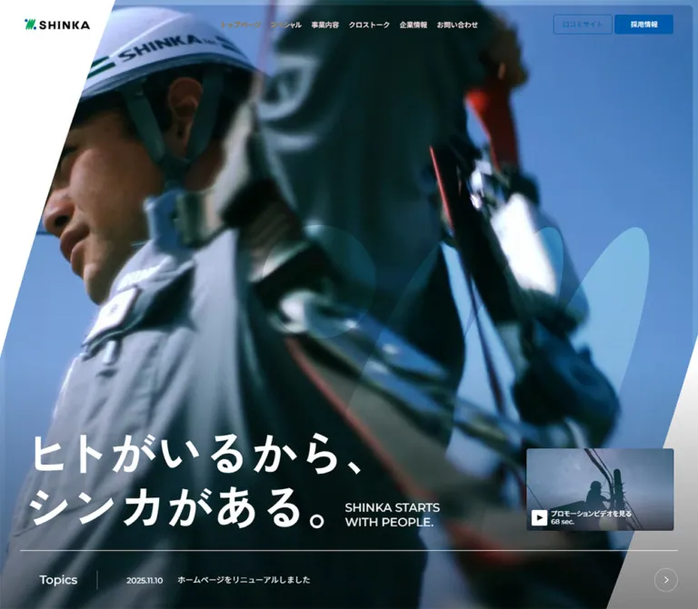
SHINKA presents an infrastructure company through people and work. The opening places a large white Japanese statement over tightly cropped workplace imagery. Broad diagonal cuts echo the slanted brand mark, while a much larger translucent emblem occupies the desktop image. Compact navigation and small blue utility buttons sit above this unusually expansive composition.
The page then alternates between immersive storytelling, tall interview cards, oversized repeated English lettering, colorful special-content modules, and restrained corporate information. Its closing green illustration panel introduces a deliberately different register: loose blue drawings of workers, equipment, vehicles, and everyday gestures surround expressive hand lettering. Both registers belong to the same identity. Preserve the contrast between serious workplace imagery and approachable illustration when extending the design.
How to Read This Reference
- Measured means a value appears in the supplied rendered element bounds or computed styles. Small fractional differences are rounded where they do not affect implementation.
- Source token means a custom property was supplied. Its existence does not prove that every visible component uses it.
- Estimated means a proportion, color, or dimension was judged from a screenshot without a corresponding computed declaration.
- Recommended means an implementation choice for a new build, including all accessibility additions and unspecified intermediate responsive behavior.
- Font families below are reported computed CSS families. Font-file URLs and the exact resolved face used for every glyph were not supplied.
- Nonempty element bounds do not establish visibility. Several navigation items are offscreen or belong to inactive structures. Their geometry is documented separately from visible page states.
- The supplied captures are observations of one current design. Differences between photographic frames are not evidence of separate color themes or historical versions.
Tokens — Colors
Core Palette
| Name | Value | Evidence | Role |
|---|---|---|---|
| Paper | #FFFFFF |
Measured body background | News, footer, navigation surfaces, reversed text, and white corner geometry |
| Ink | #000000 |
Source --color-txt; measured text |
Main information, labels, footer details, and simple icons |
| Utility Blue | #005BAC |
Measured recruitment-button background and review-link text; source --solid-accent2 |
Filled recruitment action and outlined review action |
| Accent Blue | #005FAC |
Source --color-accent |
Related brand accent; keep distinct from the measured utility-button blue |
| Bright Blue | #0070D3 |
Source --color-accent5 |
Available brighter accent; exact assignment to the footer CTA was not supplied |
| Vivid Green | #00C871 |
Source --color-main2 |
Brand-family green, related to the green emphasis visible in large lettering |
| Light Green | #20CF83 |
Source --color-main4 |
Secondary green variant; component assignment unverified |
| Finding Blue | #DFF2F6 |
Measured Finding panel background | Large exploratory special-content surface |
| Manga Coral | #F07F7F |
Measured mobile manga panel background | Dedicated manga-content surface |
| Secondary Text | rgba(0,0,0,.6) |
Source --color-txt3; measured navigation sublinks |
Quiet hierarchy on white |
| Dark Review Surface | Approximately #333333 |
Screenshot estimate | Broad review-information banner below News |
The footer illustration visibly uses saturated green with deep blue linework. Its exact artwork colors are not exposed in the supplied element samples. Do not automatically assign #00C871 to the entire footer image simply because that source variable exists. A starting approximation for a replacement background is #00AA66, explicitly an estimate; authorized original artwork should determine the final color.
Rules and Supporting Colors
| Token or treatment | Value | Status and use |
|---|---|---|
| Standard divider | 1px solid rgba(0,0,0,.15) |
Source --solid; consistent with the thin gray information dividers |
| Subtle divider | 1px solid rgba(0,0,0,.07) |
Source --solid5; assignment not fully exposed |
| Reversed divider | 1px solid rgba(255,255,255,.4) |
Source --solid6; suitable for the observed hero information strip |
| Very light line | rgba(0,0,0,.05) |
Source --color-line4 |
| Electrical category | #FF826C |
Source --color-electrical; not the same value as the manga panel coral |
| Security category | #AD42F4 |
Source --color-security; visible placement not verified |
| Translucent white | rgba(255,255,255,.7) |
Source --color-bg11; do not infer a global glass surface |
The opening's blue desktop frame and amber mobile frame belong to photography or media treatment. They should not become separate responsive background-color tokens. Likewise, the translucent cyan-looking desktop emblem is composited over an image; its underlying color and opacity were not measured.
Tokens — Typography
Japanese Interface — Noto Sans JP
- Computed family:
'Noto Sans JP', sans-serif. - Default body weight:
500. - Observed roles: primary navigation, Japanese headings, narrative paragraphs, card titles and summaries, news copy, and contact controls.
- Hierarchy: navigation is compact; narrative copy has unusually generous leading; interview summaries are heavier and denser.
- Implementation alias:
--font-jp.
The body and root both compute to 10px in the two inspected viewports. This is a source sizing convention, not the intended reading size of ordinary paragraphs. Do not apply the inherited 10px / 10px body metrics to all content in a new implementation.
Main English Display — Montserrat
- Computed family:
Montserrat, sans-serif. - Observed roles: the English hero statement, Topics, dates, Cross Talk headings, special-content lettering, and contact headings.
- Weights:
500for the hero tagline and dates,600for section headings, and400for the oversized Special Contents bands. - Character: broad geometric capitals provide a calm, organized counterweight to expressive photography and illustration.
Navigation Display and Numbers — Inter
- Computed family:
Inter, sans-serif; also supplied as source--font-sans-serif. - Observed roles: large English labels inside desktop navigation structures and circular Cross Talk numbers.
- Important distinction: the global Inter custom property does not mean every English title uses Inter. Cross Talk's main page heading is measured as Montserrat.
Manga Strip — Roboto Condensed
- Computed family:
'Roboto Condensed', sans-serif. - Observed role: the repeated mobile
MEET SHINKA IN MANGAlettering. - Measured treatment:
24px, weight700, line height24px, letter spacing-1.68px, equivalent to-0.07em. - Preserve this compressed accent as a local treatment; it is not the default navigation font.
Graphic Lettering
The Japanese hero statement, ヒトがいるから、シンカがある。, appears as a designed graphic lockup. The corresponding sampled paragraph has no extracted text and inherits 10px typography, which does not describe the visible headline. The measured graphic box is approximately 675 × 195px on desktop and 337 × 94.72px on mobile. Its original font and asset format are unknown.
The SHINKA logo and the hand-drawn lettering in the green footer panel must also be treated as artwork. Neither can be accurately reconstructed by assigning one of the measured interface fonts.
Type Scale
All values in this table are measured unless marked as estimates.
| Role | Desktop | Mobile | Family / weight | Notes |
|---|---|---|---|---|
| Primary navigation | 14px / 14px |
Replaced in the opening by a menu control | Noto Sans JP / 500 |
10px vertical link padding |
| Header utility actions | 13px / 13px |
Not visible in the opening | Noto Sans JP / 500 |
Recruitment and review links |
| Hero English statement | 24px / 29.256px |
Not visible in the opening | Montserrat / 500 |
Two lines |
| Video caption | 12px / 14.628px |
Same metrics in the sampled offscreen menu | Noto Sans JP / 500 |
Duration uses Montserrat |
| Topics label | 24px / 24px |
Hidden in the opening | Montserrat / 500 |
Separate desktop column |
| Hero news date | 16px / 16px |
14px / 14px |
Montserrat / 500 |
Date moves above headline |
| Hero news headline | 16px / 19.504px |
14px / 17.066px |
Noto Sans JP / 400 |
Compact information strip |
| Narrative paragraphs | 24px / 56px |
16px / 36px |
Noto Sans JP / 500 |
Spacious line rhythm |
| Cross Talk English heading | 64px / 64px |
36px / 43.884px |
Montserrat / 600 |
Paired with a Japanese heading |
| Cross Talk Japanese heading | 24px / 29.256px |
16px / 19.504px |
Noto Sans JP / 500 |
Beside English on desktop, below on mobile |
| Card number | 15px / 15px |
13px / 13px |
Inter / 600 |
Inside a circular badge |
| Card department title | 18px / 21.942px |
16px / 19.504px |
Noto Sans JP / 600 |
Top of card |
| Card summary | 20px / 30px |
18px / 26px |
Noto Sans JP / 600 |
Bottom of card |
| Special Contents band | 128px / 128px |
64px / 64px |
Montserrat / 400 |
-0.04em tracking |
| Finding description | 18px / 28px |
14px / 24px |
Noto Sans JP / 700 |
Within pale blue panel |
| Desktop navigation display | 64px / 57px |
Not established | Inter / 500 |
-0.04em tracking; inactive-panel evidence |
| Navigation sublinks | 16px / 19.504px in desktop panels |
15px / 18.285px in mobile structure |
Noto Sans JP / 500 desktop, 400 mobile |
Mobile examples were offscreen |
| News display heading | Approximately 64px |
Not visually documented | Screenshot estimate | Do not call this a computed value |
| Photographic slogan band | Approximately 150–160px |
Not visually documented | Screenshot estimate; family not sampled | Deliberately clipped beyond the viewport |
Tokens — Spacing & Shapes
Source Sizing Convention
At both supplied viewports, one source rem equals 10 CSS pixels. The source exposes many size aliases, but there is no need to copy its entire numeric scale. Preserve the values that establish the actual components.
Some aliases include minimum floors, such as --font-size13: max(1.3rem, 12px). The original root-size formula outside the two inspected widths was not supplied. The Quick Start therefore uses conventional readable text sizing and explicit pixel values for the recorded component dimensions.
Horizontal Layout Tokens
| Token | Desktop source | At 1440px | Mobile source | At 390px |
|---|---|---|---|---|
| Outer inset used by content width | 3.47222vw per side |
Approximately 50px |
5.12821vw per side |
Approximately 20px |
| Content width | 100svw - 2 × inset |
1340px |
100svw - 2 × inset |
Approximately 350px |
Source --grid |
6.71296vw |
Approximately 96.67px |
5.12821vw |
Approximately 20px |
Source --gap |
1.15741vw |
Approximately 16.67px |
2.5641vw |
Approximately 10px |
Source --outside-lg2 |
5.78704vw |
Approximately 83.33px |
7.69231vw |
Approximately 30px |
These are layout primitives, not proof of one universal column grid. For example, the measured Cross Talk card gap is 20px at both widths, rather than the source --gap value.
Component Spacing
| Use | Desktop | Mobile | Evidence |
|---|---|---|---|
| Header height token | 100px |
80px |
Source --header-height |
| Header logo top | 39px |
29px |
Measured bounds |
| Primary navigation gap | 20px |
Not applicable | Calculated from adjacent measured link bounds |
| Gap between header utility buttons | 5px |
Not applicable | Measured bounds |
| Hero Topics section height | 120px |
80px |
Measured section bounds |
| Cross Talk section padding | 200px 0 180px |
114px 0 120px |
Computed styles |
| Cross Talk heading-to-card gap | Approximately 40px |
40px |
Measured section/header/card bounds |
| Cross Talk card gap | 20px |
20px |
Measured bounds |
| Card top information inset | 20px |
10px |
Measured bounds |
| Card caption padding | 60px 20px 20px |
42px 20px 20px |
Computed styles |
| Finding panel padding | 72px 50px |
64px 20px |
Computed styles |
| White space before News content | Approximately 200px |
Not documented | Desktop screenshot estimate |
Shapes and Radii
| Element or token | Desktop | Mobile | Status |
|---|---|---|---|
| Header utility buttons | 5px |
Not visible in opening | Measured |
| Promotion-video button | 5px |
5px in menu structure |
Measured |
| Cross Talk cards | 10px |
10px |
Measured |
| Finding panel | 10px |
10px |
Measured |
| Manga panel | Not sampled | 10px |
Measured |
| Small detail link in desktop menu | 1000px |
Not sampled | Measured pill radius |
Source --radius-xs2 |
20px |
10px |
Source token only |
Source --radius-sm |
40px |
20px |
Source token only |
| Interview number badge | Circle, 36px diameter |
Circle, 32px diameter |
Measured |
| Section overview arrow | 48 × 48px |
32 × 32px |
Measured link bounds |
| Footer illustration CTA | Pill, approximately 300 × 65px |
Pill, approximately 260 × 49px |
Screenshot estimates |
Geometry is mostly flat and restrained. Rounded rectangles contain media and special content; circles contain numbers or arrows; fully rounded pills mark a small number of editorial links. The hero's diagonal silhouette is the strongest large-scale shape.
Components
Persistent Global Header
Role: maintain identity and access to the corporate site's main destinations.
At desktop width, the logo occupies 134 × 22px at approximately (50, 39). Six primary items run across the center: トップページ, スペシャル, 事業内容, クロストーク, 企業情報, and お問い合わせ. The measured navigation starts around x = 456px, with 20px gaps. Links use 14px type and 10px vertical padding, producing 34px layout heights.
Two 120 × 40px utility actions sit at the right, aligned at y = 30px. 口コミサイト has blue text and a blue outline; 採用情報 has a blue fill and white text. Their measured radius is 5px.
The logo and navigation remain at the top in the supplied scrolled captures. This supports a persistent-header interpretation, although the position declaration itself was not included. The sampled outer header has zero height because its visible descendants are laid out separately; zero is not the intended visual header height.
On mobile, the same 134 × 22px logo moves to (20, 29). A fine three-line menu glyph sits at the upper right. Its sampled button box is 60 × 31px, with 10px padding. The full desktop navigation and right-side utility buttons are absent from the visible opening.
The computed desktop navigation color is white in the opening sample, while its apparent screenshot tone varies against the imagery. No specific orange hover state or blend-mode rule was established.
Desktop Navigation Panels and Mobile Navigation Structure
Role: expose the site's editorial and business hierarchy without overloading the top row.
The desktop DOM contains large navigation structures for Special, Our Service, and Cross Talk. Their left title region is approximately 435.58px wide. English titles use Inter at 64px / 57px, with a smaller Japanese label below. To the right, item bounds form three columns of approximately 282.59px, separated by 20px, starting near x = 502px.
Special contains four destinations: the company deep dive, manga, numbers, and Finding. Service and Cross Talk each expose five business-related destinations. Some structures include a 110 × 40px outlined detail pill with 14px type.
These are structural measurements, not a verified screenshot of an opened menu. The mobile sample places corresponding navigation content around x = 410px, beyond the 390px viewport. It also contains separate controls beside expandable-looking category rows. An offscreen mobile navigation panel is therefore supported by the DOM, but its opening direction, expansion behavior, focus handling, and dismissal actions were not exercised.
Cinematic Opening
Role: introduce the company's human-centered statement before detailed business information.
The opening fills the captured viewport: 1440 × 1000px on desktop and 390 × 844px on mobile, including the bottom news strip. Workplace imagery occupies nearly the whole surface. The desktop frame emphasizes cables, poles, and strong dark diagonals against blue; the mobile frame shows a close crop of a worker's face and glasses in warm light.
A white triangular cut enters from the upper left. In the desktop screenshot it reaches roughly 235px across the top and 590px down the left edge. On mobile it reaches approximately 80px across and 170px down. A corresponding diagonal region enters from the lower right. These are screenshot estimates of the silhouette, not a recovered clip-path.
A large translucent SHINKA emblem overlays the center-right desktop image. The foreground Japanese statement occupies approximately (60, 640) with a 675 × 195px box. The smaller English statement, SHINKA STARTS WITH PEOPLE., sits near (704, 778.5) with a 193.38 × 58.5px box.
On mobile, the Japanese graphic is approximately (25, 647.28), 337 × 94.72px. It retains two strong lines and sits just above the news rule. The English statement and desktop video preview are not visible in this opening. Preserve the mobile focus on one headline and one compact news item.
The differing media frames and the explicit promotion-video control support a cinematic media direction. The evidence does not establish the background player's source, loop length, autoplay settings, audio state, or whether separate mobile footage is used.
Promotion-Video Preview
Role: provide an explicit entry into the company's film.
The desktop preview is a real button, approximately 300 × 168px, at (1090, 672). It has a 5px radius, 10px padding, and a photographic preview. A small white square play tile sits near the lower left, followed by プロモーションビデオを見る and the duration label 68 sec.. Both lines use 12px type; the duration uses Montserrat.
The same content appears again in the contact/navigation structures. The mobile offscreen navigation version measures approximately 350 × 196px, preserving the wide media ratio.
68 sec. is an observed interface label, not an independently timed duration. Clicking the button and viewing the playback surface were not part of the supplied interaction evidence.
Hero Topics Strip
Role: place a current corporate update inside the opening composition.
A thin white rule spans the content width at y = 880px on desktop. The section is 120px tall. A 157px left column contains Topics, with a short vertical divider. The remaining linked region is 1183px wide, with 60px left padding and 30px gaps between its main content parts.
The visible item contains the date 2025.11.10, the headline ホームページをリニューアルしました, and a circular right arrow. The link points to /news/28/.
On mobile, the strip begins at y = 764px and is 80px tall. Topics and the desktop arrow are absent from the visible presentation. The date and headline stack inside a 350px-wide link, using 14px type. The rule remains, maintaining the relationship to the headline above.
Narrative Introduction
Role: explain infrastructure through ordinary life and the people who maintain it.
Three Japanese paragraphs move from everyday infrastructure to the company's people and future. The sampled desktop copy occupies a right-side column approximately 566.66px wide, beginning around x = 823.34px. Its typography is white Noto Sans JP at 24px / 56px, weight 500.
On mobile, the column becomes approximately 350px wide at the standard 20px inset. Type reduces to 16px / 36px, retaining the unusually open leading. The copy's white computed color is recorded; the exact background layers behind every paragraph were not supplied.
Each paragraph has a declared opacity/transform transition lasting 1.5s, with delays of 0.5s, 0.7s, and 0.9s. Preserve the staggered reading rhythm if implementing a reveal, but keep content accessible without JavaScript. Do not copy sampled absolute document coordinates into a new layout.
Cross Talk Heading and Card Track
Role: introduce five department perspectives as editorial stories.
The section heading pairs a large Montserrat English title with a smaller Japanese heading. Desktop presents them side by side; mobile stacks the Japanese line below the English. An overview link sits at the far right, with bounds of 48 × 48px on desktop and 32 × 32px on mobile.
The five story links occupy one horizontal track. Desktop cards measure 480 × 720px; mobile cards measure 320 × 480px. Both preserve a 2:3 ratio, use 10px corners, and have 20px gaps. Desktop cards begin at x = 50, 550, 1050…; mobile cards begin at x = 20, 360, 700…. The partially visible next card makes continuation apparent.
Each card contains:
- A circular numbered badge near the upper left:
36pxdesktop or32pxmobile. - A department title beside the badge, with a
10pxgap. - A large central media area implied by the card structure; its precise image subjects were not supplied in these screenshots.
- A bottom summary area,
140pxhigh in both samples, with white semibold text.
Desktop summaries use 20px / 30px and 60px 20px 20px padding. Mobile summaries use 18px / 26px and 42px 20px 20px padding. The whole card is the destination link; the text is not an isolated button below an unrelated image.
A control group follows the track. Sampled previous/next button boxes are 30 × 30px. Pagination marks include an elongated 48 × 8px current mark and 8 × 8px inactive marks. Four pagination buttons appear in the desktop sample and five in the mobile sample. This is consistent with viewport-dependent page grouping; do not hardcode one marker per story at every width.
The track, offscreen cards, and controls establish a carousel-like component. Swipe behavior, autoplay, wrapping, and actual button-driven changes were not verified.
Oversized Special Contents Bands
Role: announce a change from corporate narrative to exploratory content.
Two rows of repeated SPECIAL CONTENTS text extend far beyond the viewport. The measured treatment is Montserrat 400, 128px / 128px on desktop and 64px / 64px on mobile, with -0.04em tracking.
The two sampled desktop rows are 190px apart at their top edges, leaving approximately 62px between line boxes. Mobile rows are 100px apart, leaving approximately 36px. The repeated strings are part of the visual band structure, not dozens of separate editorial headings.
Offscreen duplication strongly supports a marquee treatment. Its speed, direction, trigger, and synchronization were not supplied. A static clipped band is a defensible reduced-motion adaptation.
Finding Special-Content Panel
Role: invite visitors to discover where the company's infrastructure work appears in daily life.
The desktop panel is one large link to /finding/, measuring 1340 × 800px, with a pale blue #DFF2F6 background, 10px radius, and 72px 50px padding. Its heading graphic occupies approximately 603.19 × 176.78px. A right-side description uses 18px / 28px, weight 700, inside a roughly 504px column.
On mobile, the panel measures approximately 350 × 640px, with 64px 20px padding and block layout. The heading graphic becomes approximately 301 × 88.22px, followed by a secondary graphic and a 14px / 24px description.
The source copy invites exploration, but no gameplay or interactive scene was inspected. Reproduce the large editorial invitation and its destination link without inventing game controls.
Manga and Numbers Modules
Role: offer alternative ways to understand the company.
The mobile manga panel is a 350 × 640px link to /comic/, with a #F07F7F surface and 10px corners. Its central heading graphic measures approximately 303 × 72.22px. Repeated MEET SHINKA IN MANGA lettering uses Roboto Condensed 700 at 24px, with tight tracking.
The sampled strip lettering also computes to #F07F7F, but its backing layer was not included. Do not reproduce coral text directly on the coral panel merely by copying those isolated values; the full compositing structure remains unknown.
The Numbers destination is /numbers/. Its extracted content includes the numerical fragments 70.5, 44.6, 378, 295, and 4.8. Metric labels, units, exact visual hierarchy, and count-up behavior were not provided. Keep this module identified as company data; do not invent meanings for the numbers or claim an observed counter animation.
Photographic Slogan Band
Role: return the special-content sequence to the main people-centered statement.
The desktop capture above News shows a darkened workplace image with extremely large, partially clipped SHINKA STARTS WITH PEOPLE. lettering. A green portion of the brand name contrasts with white words. The text extends beyond both viewport edges, and the image retains diagonal edge treatment.
This is a broad transitional band, rather than a conventional section title inside the content grid. The screenshot suggests a type size around 150–160px, but the relevant element's computed typography was not supplied. Repeated slogan strings in the DOM support the repeated-band structure; they do not establish animation timing.
News and Review Information
Role: make factual updates easy to scan after the expressive content.
The desktop News section changes to a white canvas with black typography and fine gray rules. Its heading begins around x = 50px; the linked news list begins around x = 500px, creating a wide left label region and a larger right content region.
The visible news row is approximately 890px wide and 92px tall. A date appears first, followed by the Japanese headline. Its top and bottom rules provide structure without a surrounding card. In the screenshot, approximately 200px of white space separates the preceding image band's bottom from the news row's top.
Below the row, a broad dark review banner begins around (500, 920), also approximately 890px wide, with rounded upper corners. A small speech-bubble icon and 口コミサイト label sit beside explanatory copy. Its full height is outside the supplied crop.
The review destination is https://kai-z.net/companies/shinka-inc/. This is an observed outgoing link; the destination's design was not inspected.
Service Overview and Contact
Role: provide direct business information and a clear route to contact.
The rendered homepage contains an OUR SERVICE section with five numbered entries: infrastructure and telecommunications, electrical work, solutions, rental, and security. Each link includes its number, Japanese title, explanatory paragraph, and 詳しく見る label.
These entries correspond to the same five business areas used by Cross Talk, creating two complementary access paths: people and collaboration through interviews, and capabilities through service descriptions. Detailed service-section layout and imagery were not included in the supplied visual captures or element samples, so card dimensions and service-specific color assignments remain unverified.
Contact uses a bilingual heading and two labeled links: メールでのお問い合わせ and お電話でのお問い合わせ. Both supplied hrefs point to /contact/; they are not recorded as mailto: or tel: actions. In the sampled mobile navigation structure, these controls are approximately 350 × 60px, with 10px radii and 16px type.
Corporate Footer
Role: consolidate the site hierarchy and legal identity.
The desktop footer is a white information surface. The visible sitemap uses six broad columns for the homepage, special content, services, Cross Talk, company information, and other links. Group headings are dark and stronger; sublinks are gray and compact.
A thin rule separates the sitemap from the identity row. The screenshot places the larger footer logo at approximately x = 50px, address and contact information around x = 250px, and a small copyright line toward the right. The original page title and the footer label independently identify the operator as シンカ株式会社. The footer also displays a Fukuoka head-office address and a security-authorization line; these are page disclosures, not independently verified registrations.
On mobile, the visible footer navigation becomes a vertical sequence of labels and fine circular arrow icons. Group rows have separators, and expandable-looking groups include a separate control region. The capture does not demonstrate expansion behavior. The persistent logo and menu control remain at the top of the scrolled frame and overlap the underlying footer region; a new implementation should provide enough clearance for usable navigation.
Illustrated Deep-Dive Banner
Role: close the corporate page with an inviting route into the company's personality.
A saturated green panel follows the white footer information. Loose deep-blue line drawings show workers stretching, operating equipment, carrying materials, working at a computer, and handling cables. Equipment, a vehicle, a map, and small gestures fill the surrounding space. The main lettering reads SHINKAを大解剖, accompanied by the vertical phrase 意外とおもしろい会社です.
The desktop capture shows a broad composition with a large central title and illustrations distributed across the width. The mobile version rearranges this content into a tall composition: the main lettering stacks, the vertical phrase stays near the upper right, and figures occupy narrower surrounding spaces. This is evidence for responsive art direction rather than simply shrinking one wide image.
The visible green region is approximately 600px high in the desktop capture and 480px high in the mobile capture; the underlying assets' full dimensions were not supplied. A white pill links to /deep/, with blue text and a small blue dot. Its approximate size is 300 × 65px on desktop and 260 × 49px on mobile.
Tokens — Motion & Interaction
| Treatment | Supplied value or evidence | Confidence and limitation |
|---|---|---|
| Hero English text reveal | 750ms cubic-bezier(0.215, 0.61, 0.355, 1); 320ms delay |
Computed opacity and transform transitions; full entrance sequence not recorded |
| Cross Talk English heading reveal | Same 750ms easing; 360ms delay |
Computed declaration |
| Cross Talk Japanese heading reveal | Same 750ms easing; 520ms delay |
Computed declaration |
| Narrative paragraph reveals | 1500ms with the same easing; delays 500 / 700 / 900ms |
Computed opacity and transform transitions |
| Detail-pill color changes | 410ms cubic-bezier(0.215, 0.61, 0.355, 1) |
Computed background-color and color transitions; hover endpoint not supplied |
| Utility-button text changes | 410ms with the same easing |
Computed color transitions |
| Carousel pagination width | 500ms cubic-bezier(0.23, 1, 0.32, 1) |
Computed width transition; selection was not exercised |
| Global navigation transition | 500ms cubic-bezier(0.215, 0.61, 0.355, 1) |
Source --transition-gnav; component activation unverified |
| Modal transition | 600ms cubic-bezier(0.215, 0.61, 0.355, 1) |
Source --transition-modal; no opened modal capture |
| Slow hover transition | 700ms cubic-bezier(0.215, 0.61, 0.355, 1) |
Source token only |
| Eye animation | 3300ms ease infinite |
Source --animation-eye; animated element not identified |
| Repeated text bands | Multiple copies with extensive offscreen bounds | Marquee-like structure supported; speed and direction unknown |
| Hero moving imagery | Different photographic frames and a separate video control | Background playback behavior not established |
The measured transition vocabulary is smooth and decelerating, with longer text reveals and shorter control feedback. Do not replace it with stepped pixel motion or a universal spring.
Several elements report animation: none, but motion may exist on ancestors, pseudo-elements, or through scripts. Conversely, the presence of a custom animation variable does not prove that it is active on this page. Source values such as scale(2.8) and scale(0.8) are unassigned in the supplied evidence and should not become global image-hover rules.
Surfaces
| Surface | Appearance | Purpose |
|---|---|---|
| Opening media | Full-bleed workplace imagery, dark regions, diagonal cuts | Emotional introduction and brand recognition |
| Narrative area | White text with substantial open spacing | Slow, human-centered reading rhythm |
| Interview cards | Tall rounded media containers with white labels | Editorial access to departments |
| Finding panel | Pale blue, large rounded rectangle | Exploratory company content |
| Manga panel | Coral field with graphic lettering | A distinct illustrated content route |
| News and footer | White, black text, fine gray rules | Clear factual information and navigation |
| Review banner | Dark flat fill, white text, rounded corners | A secondary corporate information destination |
| Closing illustration | Saturated green, deep-blue drawing, white pill | Personality and renewed engagement |
There is no observed general-purpose elevation system. Depth comes from photographic layering and tonal overlays, while information surfaces rely on whitespace, rules, scale, and color fields. Gradients are appropriate for media legibility where needed; generic floating-card shadows would add a different visual language.
Imagery
The photographic direction is close, physical, and specific to infrastructure work. The supplied frames show cables, poles, a helmeted worker, a face behind glasses, and strong equipment silhouettes. Tight cropping and dark foreground shapes make the work feel immediate. Preserve focal subjects and the large dark areas that allow white text to remain clear.
The illustration direction is intentionally loose: uneven blue strokes, playful poses, irregular handwritten lettering, simple faces, and recognizable work equipment. Its character comes from individual drawings and their composition, not from a uniform outline-icon set.
These two image systems have different jobs. Photography establishes people, craft, and scale. Illustration makes the company approachable and encourages exploration. Use actual workplace imagery and approved illustrations when available; avoid substituting anonymous abstract technology graphics for every section.
Observed Asset References
No image src, video source, poster URL, or downloadable artwork path was included in the supplied record. The following are visual asset roles, not invented filenames.
| Asset role | Observed evidence | Implementation guidance |
|---|---|---|
| Header brand mark | 134 × 22px at both viewports |
Preserve the supplied logo's proportions; do not typeset a replacement |
| Japanese hero lockup | Approximately 675 × 195px desktop; 337 × 94.72px mobile |
Use an approved graphic or clearly labeled typographic approximation |
| Desktop emblem overlay | Large translucent mark over workplace imagery | Keep on a separate decorative layer; opacity and source color are unknown |
| Opening media | Cool desktop and warm mobile photographic frames | Select crops by subject; playback settings require separate implementation |
| Film preview | 300 × 168px desktop button |
Use a poster and a real media action with an accessible label |
| Finding title graphic | Approximately 603 × 177px desktop; 301 × 88px mobile |
Preserve the authored lockup |
| Manga title graphic | Approximately 303 × 72px in mobile panel |
Treat lettering as artwork |
| Footer illustration | Distinct broad and tall compositions | Supply responsive artwork through a picture element or equivalent art direction |
Page destinations such as /finding/ and /comic/ identify linked content, not asset locations.
Layout & Responsive Behavior
Observed Endpoint Changes
| Feature | Desktop: 1440 × 1000 | Mobile: 390 × 844 |
|---|---|---|
| Recorded document height | Approximately 18,031px |
Approximately 12,817px |
| Main horizontal inset | 50px |
20px |
| Header height token | 100px |
80px |
| Logo size | 134 × 22px |
Same |
| Opening navigation | Full centered navigation and two right-side actions | Logo and fine-line menu control |
| Opening headline graphic | 675 × 195px |
337 × 94.72px |
| English hero statement | Visible beside Japanese statement | Not visible |
| Hero film preview | Visible at lower right | Not visible |
| Topics | Horizontal label/date/headline/arrow | Stacked date and headline |
| Introduction | Right-side 566.66px text column |
Full content-width text |
| Cross Talk title | English and Japanese side by side | English above Japanese |
| Cross Talk card | 480 × 720px |
320 × 480px |
| Cross Talk gap | 20px |
20px |
| Special Contents lettering | 128px |
64px |
| Finding panel | 1340 × 800px, flex layout |
Approximately 350 × 640px, block layout |
| Footer navigation | Multiple columns | Vertical rows |
| Closing artwork | Wide composition | Tall, rearranged composition |
The mobile design is not a uniform scale reduction. The logo stays the same size, interview cards reduce to two thirds, some hero content disappears from the opening, narrative leading changes independently, and illustrated artwork is recomposed.
The source exposes --mqDown-md: 767, --mqUp-2xs: 391, and additional larger breakpoint labels. Their names and values are evidence of a responsive system, but the actual selector rules tied to each label were not supplied. Only the two recorded endpoint layouts are visually confirmed.
The viewport-wide media and text bands coexist with an inset content system. Contain intentional horizontal overflow inside those bands and the story track; do not let decorative repetition widen the whole document. Recorded document heights describe this content and capture state, not recommended fixed heights for an implementation.
Do’s and Don’ts
Do
- Build the page as a corporate content hub with business, interview, special-content, contact, and recruitment routes.
- Preserve the relationship between the diagonal logo, hero corner cuts, and large translucent desktop emblem.
- Keep the hero statement near the bottom, with a thin ruled news strip beneath it.
- Use Noto Sans JP for Japanese interface text, Montserrat for the measured main English roles, and Inter where its use is specifically recorded.
- Retain generous narrative leading:
24 / 56pxdesktop and16 / 36pxmobile. - Preserve the
2:3Cross Talk cards,20pxtrack gaps, numbered badges, and strong bottom captions. - Let oversized repeated lettering extend beyond its own clipped container.
- Separate special-content palettes from the restrained blue corporate actions.
- Use responsive illustration compositions for the closing green panel.
- Keep News and corporate footer information flat, ruled, and easy to scan.
Don’t
- Do not reduce the homepage to a single conversion funnel or replace its editorial routes with generic feature cards.
- Do not derive a mobile color theme from the warm photographic frame.
- Do not describe the Japanese hero graphic's inherited
10pxparagraph style as its visible headline size. - Do not replace every English font with Inter just because an Inter custom property exists.
- Do not treat offscreen menu bounds as a screenshot of an opened navigation state.
- Do not assume one pagination dot per interview across all widths.
- Do not invent counter meanings, carousel autoplay, video audio settings, or menu gestures.
- Do not copy repeated DOM text into the accessible reading order dozens of times.
- Do not use the source's unassigned hover scale values on every image.
- Do not stretch the wide footer illustration into a narrow mobile crop that removes the main lettering or workers.
- Do not add a general layer of glass blur, large shadows, or unrelated multicolor buttons.
Recommended Implementation Additions
These are recommendations for a new implementation, not verified features of the original website:
- Give the menu button, film button, carousel controls, and arrow-only links explicit accessible names. Provide expanded states and controlled-region relationships for navigation disclosures.
- Increase compact controls to at least
44 × 44pxinteraction areas while retaining their small visible glyphs. The measured mobile menu height and carousel arrows are smaller than this recommendation. - Provide one accessible text equivalent for each graphic heading. Hide duplicate decorative marquee copies from assistive technology.
- Keep a static poster and a pause mechanism for persistent background motion. Start audible media only after a clear user action, and provide captions for the film.
- Respect reduced-motion preferences by removing continuous decorative travel and reveal delays while keeping all content visible.
- Ensure white text stays readable across every media frame, not only the supplied captures. Use a stable local scrim where required.
- Make the story track keyboard accessible. If using snap scrolling, keep focusable cards reachable and derive pagination from the current viewport grouping.
- Distinguish navigation to the contact page from actual telephone or email actions. Use
tel:andmailto:only when those actions are intentionally implemented. - Load only the font families and weights needed by the chosen components. The reference's four families do not require downloading every available weight.
- Provide responsive image sources and preserve focal subjects. Reserve media dimensions to avoid content shifting during loading.
Agent Prompt Guide
Quick Color Reference
- Information canvas:
#FFFFFF. - Main text:
#000000. - Measured header action blue:
#005BAC. - Additional source blue:
#005FAC. - Source green variant:
#00C871; the footer artwork's exact green is unmeasured. - Finding panel:
#DFF2F6. - Mobile manga panel:
#F07F7F. - Dividers: black at
15%opacity, or white at40%over dark media. - Footer illustration: saturated green with deep-blue hand drawing and a white pill; use the original artwork to determine exact colors.
Overall Prompt
“Create a Japanese infrastructure company's corporate homepage inspired by SHINKA. Begin with a viewport-filling workplace media composition, white diagonal corner cuts, a large translucent brand emblem on desktop, and a bold two-line Japanese graphic statement near the bottom. Place a restrained fixed header above it, with a compact logo, centered Japanese navigation, and small outlined and filled blue utility actions. Add a thin ruled news strip at the hero bottom. Continue with spacious people-centered narrative copy, tall 2:3 interview cards in a horizontal track, oversized repeated English section lettering, and distinct pale-blue and coral special-content panels. Return to white ruled News and business information, then close with responsive green-and-blue hand-drawn company artwork. Use Noto Sans JP for Japanese text and Montserrat for the main English display roles. Preserve flat surfaces, limited radii, and smooth decelerating reveals. Treat all unprovided assets and interaction behavior as implementation work rather than claiming an exact reconstruction.”
Example Component Prompts
- Opening: “Build a full-viewport infrastructure-work hero with a diagonal white cut at the upper left and a corresponding cut at the lower right. Position the Japanese statement
ヒトがいるから、シンカがある。low in the frame. At 1440px, use approximately 50px content margins and a 300 × 168px film preview at lower right. At 390px, keep the logo at 134 × 22px, show a fine-line menu button, and prioritize the Japanese statement above an 80px date/headline strip.” - Interview track: “Create linked 2:3 editorial cards: 480 × 720px on desktop and 320 × 480px at a 390px viewport, with 20px gaps and 10px corners. Place a circular Inter number badge beside a semibold Japanese department title at the top. Anchor a white summary at the bottom using 20/30px desktop and 18/26px mobile typography. Show a partial next card and derive pagination from the visible grouping.”
- Special-content invitation: “Create a pale-blue #DFF2F6 company-discovery panel with an authored graphic heading and bold Japanese explanatory copy. Use a 1340 × 800px desktop reference with 72px 50px padding, and a 350 × 640px mobile reference with 64px 20px padding. Keep the whole panel linked to its editorial destination; do not add unverified game controls.”
- News: “Create a flat white News section with a large English heading and smaller Japanese label in the left column. Place dated links in the larger right column, separated by fine gray rules. Add a broad dark review-information banner beneath the list, with a small speech-bubble icon and white copy. Avoid floating card shadows.”
- Closing banner: “Art-direct a wide desktop and tall mobile company illustration on a saturated green field. Use loose deep-blue drawings of workers, tools, cables, a vehicle, and small workplace gestures around expressive
SHINKAを大解剖lettering. Place a white pill with blue text and a blue dot near the lower center. Recompose the artwork for mobile instead of squeezing a wide image.”
Quick Start
CSS Custom Properties
This is an adaptation of the observed proportions, not a recovered stylesheet. It keeps a conventional root font size. The media scrims, diagonal polygons, footer color approximation, accessible control sizing, and intermediate layout rules are recommendations.
The selectors expect semantic sections and links: a .site-header, a .hero containing media and graphic layers, a .topics strip, a .talk-track containing linked .talk-card elements, and standard content sections. Supply approved image and font assets separately. This CSS does not implement video playback, navigation state, or carousel pagination logic.
The recommended 1100px header handoff prevents crowded navigation at intermediate widths. It is not a verified original breakpoint. The 767px mobile adaptation follows a supplied source breakpoint value and the observed mobile endpoint.
:root {
  /* Measured colors and selected source tokens */
  --color-paper: #fff;
  --color-ink: #000;
  --color-action: #005bac;
  --color-accent: #005fac;
  --color-green: #00c871;
  --color-finding: #dff2f6;
  --color-manga: #f07f7f;
  --color-muted: rgb(0 0 0 / 60%);
  --line: 1px solid rgb(0 0 0 / 15%);
  --line-reverse: 1px solid rgb(255 255 255 / 40%);

  /* Screenshot approximation; replace with artwork-derived color */
  --color-poster: #00aa66;

  /* Computed font-family roles; load approved font files separately */
  --font-jp: 'Noto Sans JP', sans-serif;
  --font-display: 'Montserrat', sans-serif;
  --font-number: 'Inter', sans-serif;
  --font-comic: 'Roboto Condensed', sans-serif;

  --page-gutter: 3.47222vw;
  --header-height: 100px;
  --topics-height: 120px;
  --radius-control: 5px;
  --radius-panel: 10px;
  --card-width: 480px;
  --card-gap: 20px;

  --ease-out: cubic-bezier(0.215, 0.61, 0.355, 1);
  --motion-control: 410ms var(--ease-out);
  --motion-reveal: 750ms var(--ease-out);
  --motion-story: 1500ms var(--ease-out);
}

* { box-sizing: border-box; }

body {
  margin: 0;
  color: var(--color-ink);
  background: var(--color-paper);
  font-family: var(--font-jp);
  font-size: 16px;
  line-height: 1.7;
}

button, input, textarea { font: inherit; }
button, a { -webkit-tap-highlight-color: transparent; }
img, video { display: block; max-width: 100%; }

.container {
  width: calc(100% - 2 * var(--page-gutter));
  margin-inline: auto;
}

.site-header {
  position: fixed;
  z-index: 50;
  inset: 0 0 auto;
  height: var(--header-height);
  padding-inline: var(--page-gutter);
  display: grid;
  grid-template-columns: 134px minmax(0, 1fr) 245px;
  align-items: center;
  gap: 24px;
}

.site-header.is-over-media { color: white; }
.site-header.is-on-paper { color: black; background: white; }

.brand { display: block; width: 134px; height: 22px; }
.brand img { width: 100%; height: 100%; object-fit: contain; }

.primary-nav {
  display: flex;
  justify-content: center;
  align-items: center;
  gap: 20px;
}

.primary-nav a,
.primary-nav button {
  padding: 10px 0;
  border: 0;
  color: inherit;
  background: transparent;
  font-size: 14px;
  font-weight: 500;
  line-height: 1;
  text-decoration: none;
  white-space: nowrap;
}

.header-actions { display: flex; gap: 5px; }

.header-action {
  display: grid;
  place-items: center;
  width: 120px;
  height: 40px;
  border: 1px solid var(--color-action);
  border-radius: var(--radius-control);
  color: var(--color-action);
  font-size: 13px;
  line-height: 1;
  text-decoration: none;
  transition: color var(--motion-control),
    background-color var(--motion-control);
}

.header-action.is-filled {
  color: white;
  background: var(--color-action);
}

.menu-toggle {
  display: none;
  width: 60px;
  min-height: 44px; /* Recommended larger interaction area */
  padding: 10px;
  border: 0;
  background: transparent;
  color: inherit;
}

.menu-toggle span {
  display: block;
  width: 40px;
  height: 1px;
  margin-block: 4px;
  background: currentColor;
}

.hero {
  position: relative;
  isolation: isolate;
  min-height: 100vh;
  min-height: 100svh;
  overflow: hidden;
  color: white;
  background: #111;
}

.hero__media,
.hero__shade {
  position: absolute;
  inset: 0;
  width: 100%;
  height: 100%;
}

.hero__media { object-fit: cover; }

.hero__shade {
  /* Recommended stable text contrast, not a measured gradient */
  background: linear-gradient(
    to bottom,
    rgb(0 0 0 / 8%) 20%,
    rgb(0 0 0 / 72%) 100%
  );
}

.hero::before,
.hero::after {
  content: '';
  position: absolute;
  z-index: 1;
  pointer-events: none;
}

.hero::before {
  inset: 0 auto auto 0;
  width: 16.3vw;
  height: 59%;
  background: white;
  clip-path: polygon(0 0, 100% 0, 0 100%);
}

.hero::after {
  inset: auto 0 0 auto;
  width: 14.2vw;
  height: 50%;
  background: linear-gradient(white, #888);
  clip-path: polygon(100% 0, 100% 100%, 0 100%);
}

.hero__slogan {
  position: absolute;
  z-index: 2;
  left: calc(var(--page-gutter) + 10px);
  bottom: calc(var(--topics-height) + 45px);
  width: min(46.875vw, 675px);
  margin: 0;
}

.hero__slogan img { width: 100%; height: auto; }

.hero__tagline {
  position: absolute;
  z-index: 2;
  left: 48.8889%;
  bottom: calc(var(--topics-height) + 43px);
  margin: 0;
  font-family: var(--font-display);
  font-size: 24px;
  font-weight: 500;
  line-height: 1.219;
  text-transform: uppercase;
}

.hero__video {
  position: absolute;
  z-index: 2;
  right: var(--page-gutter);
  bottom: calc(var(--topics-height) + 40px);
  display: flex;
  align-items: flex-end;
  gap: 8px;
  width: 300px;
  aspect-ratio: 25 / 14;
  padding: 10px;
  overflow: hidden;
  border: 0;
  border-radius: 5px;
  color: white;
  background: #222;
  text-align: left;
  cursor: pointer;
}

.hero__video > img {
  position: absolute;
  inset: 0;
  width: 100%;
  height: 100%;
  object-fit: cover;
  opacity: .7;
}

.hero__video-label,
.hero__play { position: relative; }
.hero__video-label { font-size: 12px; line-height: 1.219; }
.hero__video-label small { font: inherit; font-family: var(--font-display); }

.hero__play {
  display: grid;
  place-items: center;
  flex: 0 0 32px;
  height: 32px;
  border-radius: 2px;
  background: white;
  color: black;
}

.topics {
  position: absolute;
  z-index: 2;
  inset: auto var(--page-gutter) 0;
  display: grid;
  grid-template-columns: 157px minmax(0, 1fr);
  align-items: center;
  height: var(--topics-height);
  border-top: var(--line-reverse);
}

.topics__title {
  display: grid;
  place-items: center;
  height: 39px;
  margin: 0;
  border-right: var(--line-reverse);
  font: 500 24px / 1 var(--font-display);
}

.topics__link {
  display: grid;
  grid-template-columns: auto minmax(0, 1fr) 48px;
  align-items: center;
  gap: 30px;
  min-width: 0;
  height: 100%;
  padding-left: 60px;
  color: inherit;
  text-decoration: none;
}

.topics time { font: 500 16px / 1 var(--font-display); }
.topics h3 { margin: 0; font-size: 16px; font-weight: 400; line-height: 1.219; }

.circle-arrow {
  display: grid;
  place-items: center;
  width: 48px;
  height: 48px;
  border: 1px solid currentColor;
  border-radius: 50%;
}

.story {
  padding-block: 160px;
  background: #000; /* Adaptation for the recorded white text */
  color: white;
}

.story__copy {
  max-width: 567px;
  margin-left: auto;
  font-size: 24px;
  font-weight: 500;
  line-height: 56px;
}

.story__copy p { margin: 0 0 1em; }

.cross-talk {
  padding-block: 200px 180px;
  color: white;
  background: #000;
}

.section-heading {
  display: flex;
  align-items: center;
  gap: 40px;
  margin-bottom: 40px;
}

.section-heading__en {
  margin: 0;
  font: 600 64px / 1 var(--font-display);
  text-transform: uppercase;
}

.section-heading__jp { margin: 0; font-size: 24px; font-weight: 500; }

.talk-track {
  display: flex;
  gap: var(--card-gap);
  padding-inline: var(--page-gutter);
  overflow-x: auto;
  scroll-snap-type: x proximity; /* Recommended interaction */
  scroll-padding-inline: var(--page-gutter);
}

.talk-card {
  position: relative;
  flex: 0 0 var(--card-width);
  aspect-ratio: 2 / 3;
  overflow: hidden;
  border-radius: var(--radius-panel);
  color: white;
  background: #222;
  text-decoration: none;
  scroll-snap-align: start;
}

.talk-card > img {
  position: absolute;
  inset: 0;
  width: 100%;
  height: 100%;
  object-fit: cover;
}

.talk-card__top {
  position: absolute;
  inset: 20px 20px auto;
  display: flex;
  align-items: center;
  gap: 10px;
}

.talk-card__number {
  display: grid;
  place-items: center;
  flex: 0 0 36px;
  height: 36px;
  border: 1px solid currentColor;
  border-radius: 50%;
  font: 600 15px / 1 var(--font-number);
}

.talk-card__title { margin: 0; font-size: 18px; font-weight: 600; line-height: 1.219; }

.talk-card__summary {
  position: absolute;
  inset: auto 0 0;
  margin: 0;
  padding: 60px 20px 20px;
  background: linear-gradient(transparent, rgb(0 0 0 / 80%));
  font-size: 20px;
  font-weight: 600;
  line-height: 30px;
}

.special-band {
  overflow: hidden;
  font: 400 128px / 1 var(--font-display);
  letter-spacing: -.04em;
  white-space: nowrap;
  text-transform: uppercase;
}

.finding-panel {
  display: grid;
  grid-template-columns: 1.2fr 1fr;
  align-content: start;
  gap: 50px;
  min-height: 800px;
  padding: 72px 50px;
  border-radius: 10px;
  color: black;
  background: var(--color-finding);
  text-decoration: none;
}

.finding-panel p { margin: 0; font-size: 18px; font-weight: 700; line-height: 28px; }

.news {
  display: grid;
  grid-template-columns: minmax(0, 400px) minmax(0, 1fr);
  gap: 50px;
  padding-block: 200px;
}

.news-row {
  display: grid;
  grid-template-columns: 178px minmax(0, 1fr);
  align-items: center;
  gap: 50px;
  padding-block: 32px;
  border-block: var(--line);
  color: inherit;
  text-decoration: none;
}

.news-row time { font-size: 16px; }
.news-row h3 { margin: 0; font-size: 20px; font-weight: 400; line-height: 26px; }

.review-banner {
  display: block;
  margin-top: 60px;
  padding: 32px 40px;
  border-radius: 10px;
  color: white;
  background: #333;
  text-decoration: none;
}

.footer-grid {
  display: grid;
  grid-template-columns: repeat(6, minmax(0, 1fr));
  gap: 24px;
  padding-block: 60px 100px;
}

.footer-grid a { color: var(--color-muted); text-decoration: none; }

.footer-legal {
  display: flex;
  align-items: center;
  gap: 40px;
  padding-block: 40px;
  border-top: var(--line);
  font-size: 14px;
  line-height: 20px;
}

.footer-legal small { margin-left: auto; font-size: 10px; }

.deep-banner {
  position: relative;
  min-height: 600px;
  overflow: hidden;
  background: var(--color-poster);
}

.deep-banner picture,
.deep-banner picture img {
  display: block;
  width: 100%;
  height: 100%;
}

.deep-banner picture { position: absolute; inset: 0; }
.deep-banner picture img { object-fit: cover; }

.deep-banner__link {
  position: absolute;
  left: 50%;
  bottom: 77px;
  transform: translateX(-50%);
  display: flex;
  align-items: center;
  justify-content: center;
  gap: 20px;
  width: 300px;
  min-height: 65px;
  padding: 12px 20px;
  border-radius: 999px;
  color: var(--color-action);
  background: white;
  text-decoration: none;
}

.deep-banner__link::after {
  content: '';
  width: 11px;
  height: 11px;
  flex: 0 0 11px;
  border-radius: 50%;
  background: currentColor;
}

/* Recommended focus treatment on mixed light and dark surfaces */
:where(a, button):focus-visible {
  outline: 3px solid var(--color-action);
  outline-offset: 4px;
  box-shadow: 0 0 0 2px white;
}

@media (max-width: 1100px) {
  /* Intermediate behavior is an adaptation, not a measured breakpoint */
  .site-header { grid-template-columns: 134px 1fr; }
  .primary-nav, .header-actions { display: none; }
  .menu-toggle { display: block; justify-self: end; }
  .hero__tagline, .hero__video { display: none; }
  .news { grid-template-columns: 1fr; gap: 32px; }
}

@media (max-width: 767px) {
  :root {
    --page-gutter: 5.12821vw;
    --header-height: 80px;
    --topics-height: 80px;
    --card-width: min(320px, calc(100vw - 70px));
  }

  .hero::before { width: 20.5vw; height: 20.3%; }
  .hero::after { width: 20.3vw; height: 20.8%; }

  .hero__slogan {
    left: calc(var(--page-gutter) + 5px);
    bottom: calc(var(--topics-height) + 22px);
    width: min(337px, calc(100% - 50px));
  }

  .topics { grid-template-columns: 1fr; }
  .topics__title, .topics .circle-arrow { display: none; }
  .topics__link {
    display: flex;
    flex-direction: column;
    align-items: flex-start;
    justify-content: center;
    gap: 5px;
    padding: 0;
  }
  .topics time, .topics h3 { font-size: 14px; }

  .story { padding-block: 100px; }
  .story__copy { max-width: none; font-size: 16px; line-height: 36px; }

  .cross-talk { padding-block: 114px 120px; }
  .section-heading { display: block; }
  .section-heading__en { font-size: 36px; line-height: 1.219; }
  .section-heading__jp { font-size: 16px; line-height: 1.219; }
  .talk-card__top { inset: 10px 10px auto; }
  .talk-card__number { flex-basis: 32px; height: 32px; font-size: 13px; }
  .talk-card__title { font-size: 16px; }
  .talk-card__summary { padding-top: 42px; font-size: 18px; line-height: 26px; }

  .special-band { font-size: 64px; }
  .finding-panel { display: block; min-height: 640px; padding: 64px 20px; }
  .finding-panel p { margin-top: 24px; font-size: 14px; line-height: 24px; }
  .manga-panel { min-height: 640px; border-radius: 10px; background: var(--color-manga); }

  .news { padding-block: 100px; }
  .news-row { grid-template-columns: 1fr; gap: 8px; padding-block: 24px; }
  .news-row h3 { font-size: 16px; }
  .review-banner { padding: 24px 20px; }

  .footer-grid { grid-template-columns: 1fr; padding-block: 40px 80px; }
  .footer-legal { align-items: flex-start; flex-direction: column; gap: 20px; }
  .footer-legal small { margin-left: 0; }
  .deep-banner { min-height: 480px; }
  .deep-banner__link { bottom: 63px; width: 260px; min-height: 49px; }
}

@media (prefers-reduced-motion: reduce) {
  html { scroll-behavior: auto; }
  .talk-track { scroll-behavior: auto; }
  .header-action { transition: none; }
  .decorative-marquee { animation: none; transform: none; }
  .reveal { opacity: 1; transform: none; transition: none; }
}
Use the graphic headline's actual accessible text once, whether supplied through an image alternative or a visually hidden heading. For the closing panel, the picture element should select a separately composed mobile asset. The CSS's cover behavior is only a fallback and cannot create that composition.
Tailwind v4 Token Mapping
Optional aliases for an implementation that already uses Tailwind v4. This does not identify the original site's framework. Define the custom properties above first.
@theme inline {
  --color-paper: var(--color-paper);
  --color-ink: var(--color-ink);
  --color-brand-action: var(--color-action);
  --color-brand-green: var(--color-green);
  --color-finding-surface: var(--color-finding);
  --color-manga-surface: var(--color-manga);

  --font-japanese: var(--font-jp);
  --font-english-display: var(--font-display);
  --font-card-number: var(--font-number);
  --font-manga-strip: var(--font-comic);

  --spacing-page-inset: var(--page-gutter);
  --spacing-story-card: var(--card-width);
  --spacing-story-gap: var(--card-gap);

  --radius-utility: 5px;
  --radius-media-panel: 10px;
  --text-section-desktop: 64px;
  --text-section-mobile: 36px;
  --text-band-desktop: 128px;
  --text-band-mobile: 64px;
}
Sources & Evidence
- Inspected original and final page: https://shinka-inc.com/. The supplied browser record reports HTTP
200, an unchanged final URL, and the titleシンカ株式会社. - Capture record: September 12, 2026,
07:28:11.801 UTC, equivalent to16:28:11.801 JST. The news item's2025.11.10date is page content, not the inspection date. - Visual evidence: three desktop captures at
1440 × 1000and two mobile captures at390 × 844, covering the opening, desktop News transition, and footer states described above. - Rendered evidence: supplied page text, link destinations, custom properties, element rectangles, font declarations, colors, radii, spacing, and transition declarations for both viewports. Element samples are partial and include offscreen or inactive navigation structures.
- Capture method: the supplied inspection waited at least five seconds initially, checked document loading, finite animation readiness, layout/text stability, and image decoding, and traversed intermediate scroll positions. Readiness checks used bounded waits and temporarily paused perpetual animations before resuming them. These procedures do not establish complete playback behavior or every delayed state.
- Unverified interactions: menu opening and expansion, video playback, carousel operation, hover endpoints, marquee timing, numeric animation, and destination-page behavior. No modal or media-player state was supplied.
- Asset limitations: original image, video, logo, and font-file URLs were not supplied. Graphic font identities and exact footer artwork colors remain unknown.
This reference analyzes the supplied current homepage evidence. Measured values, source-only tokens, screenshot estimates, and recommended implementation choices are identified separately throughout.
# SHINKA — Style Reference

> Cinematic infrastructure work, diagonal brand geometry, and an illustrated portrait of the people behind the company.

**Website / original URL:** [shinka-inc.com](https://shinka-inc.com/)
**Final URL:** [https://shinka-inc.com/](https://shinka-inc.com/)
**Theme:** white editorial surfaces, dark photographic sections, corporate blue, and vivid green illustration fields.
**Inspected:** September 12, 2026, at 07:28:11.801 UTC / 16:28:11.801 JST, according to the supplied browser record.
**Viewports:** desktop **1440 × 1000** and mobile **390 × 844**, in CSS pixels.
**Scope:** the current corporate homepage. Visual captures cover the desktop opening, a photographic transition into News, the desktop footer, the mobile opening, and the mobile footer. Rendered DOM and computed styles additionally describe the introduction, Cross Talk track, special-content modules, service links, navigation structures, and contact controls. Linked destination pages were not inspected.

SHINKA presents an infrastructure company through people and work. The opening places a large white Japanese statement over tightly cropped workplace imagery. Broad diagonal cuts echo the slanted brand mark, while a much larger translucent emblem occupies the desktop image. Compact navigation and small blue utility buttons sit above this unusually expansive composition.

The page then alternates between immersive storytelling, tall interview cards, oversized repeated English lettering, colorful special-content modules, and restrained corporate information. Its closing green illustration panel introduces a deliberately different register: loose blue drawings of workers, equipment, vehicles, and everyday gestures surround expressive hand lettering. Both registers belong to the same identity. Preserve the contrast between serious workplace imagery and approachable illustration when extending the design.

## How to Read This Reference

- **Measured** means a value appears in the supplied rendered element bounds or computed styles. Small fractional differences are rounded where they do not affect implementation.
- **Source token** means a custom property was supplied. Its existence does not prove that every visible component uses it.
- **Estimated** means a proportion, color, or dimension was judged from a screenshot without a corresponding computed declaration.
- **Recommended** means an implementation choice for a new build, including all accessibility additions and unspecified intermediate responsive behavior.
- Font families below are reported computed CSS families. Font-file URLs and the exact resolved face used for every glyph were not supplied.
- Nonempty element bounds do not establish visibility. Several navigation items are offscreen or belong to inactive structures. Their geometry is documented separately from visible page states.
- The supplied captures are observations of one current design. Differences between photographic frames are not evidence of separate color themes or historical versions.

## Tokens — Colors

### Core Palette

| Name | Value | Evidence | Role |
| --- | --- | --- | --- |
| Paper | `#FFFFFF` | Measured body background | News, footer, navigation surfaces, reversed text, and white corner geometry |
| Ink | `#000000` | Source `--color-txt`; measured text | Main information, labels, footer details, and simple icons |
| Utility Blue | `#005BAC` | Measured recruitment-button background and review-link text; source `--solid-accent2` | Filled recruitment action and outlined review action |
| Accent Blue | `#005FAC` | Source `--color-accent` | Related brand accent; keep distinct from the measured utility-button blue |
| Bright Blue | `#0070D3` | Source `--color-accent5` | Available brighter accent; exact assignment to the footer CTA was not supplied |
| Vivid Green | `#00C871` | Source `--color-main2` | Brand-family green, related to the green emphasis visible in large lettering |
| Light Green | `#20CF83` | Source `--color-main4` | Secondary green variant; component assignment unverified |
| Finding Blue | `#DFF2F6` | Measured Finding panel background | Large exploratory special-content surface |
| Manga Coral | `#F07F7F` | Measured mobile manga panel background | Dedicated manga-content surface |
| Secondary Text | `rgba(0,0,0,.6)` | Source `--color-txt3`; measured navigation sublinks | Quiet hierarchy on white |
| Dark Review Surface | Approximately `#333333` | Screenshot estimate | Broad review-information banner below News |

The footer illustration visibly uses saturated green with deep blue linework. Its exact artwork colors are not exposed in the supplied element samples. Do not automatically assign `#00C871` to the entire footer image simply because that source variable exists. A starting approximation for a replacement background is `#00AA66`, explicitly an estimate; authorized original artwork should determine the final color.

### Rules and Supporting Colors

| Token or treatment | Value | Status and use |
| --- | --- | --- |
| Standard divider | `1px solid rgba(0,0,0,.15)` | Source `--solid`; consistent with the thin gray information dividers |
| Subtle divider | `1px solid rgba(0,0,0,.07)` | Source `--solid5`; assignment not fully exposed |
| Reversed divider | `1px solid rgba(255,255,255,.4)` | Source `--solid6`; suitable for the observed hero information strip |
| Very light line | `rgba(0,0,0,.05)` | Source `--color-line4` |
| Electrical category | `#FF826C` | Source `--color-electrical`; not the same value as the manga panel coral |
| Security category | `#AD42F4` | Source `--color-security`; visible placement not verified |
| Translucent white | `rgba(255,255,255,.7)` | Source `--color-bg11`; do not infer a global glass surface |

The opening's blue desktop frame and amber mobile frame belong to photography or media treatment. They should not become separate responsive background-color tokens. Likewise, the translucent cyan-looking desktop emblem is composited over an image; its underlying color and opacity were not measured.

## Tokens — Typography

### Japanese Interface — Noto Sans JP

- **Computed family:** `'Noto Sans JP', sans-serif`.
- **Default body weight:** `500`.
- **Observed roles:** primary navigation, Japanese headings, narrative paragraphs, card titles and summaries, news copy, and contact controls.
- **Hierarchy:** navigation is compact; narrative copy has unusually generous leading; interview summaries are heavier and denser.
- **Implementation alias:** `--font-jp`.

The body and root both compute to `10px` in the two inspected viewports. This is a source sizing convention, not the intended reading size of ordinary paragraphs. Do not apply the inherited `10px / 10px` body metrics to all content in a new implementation.

### Main English Display — Montserrat

- **Computed family:** `Montserrat, sans-serif`.
- **Observed roles:** the English hero statement, Topics, dates, Cross Talk headings, special-content lettering, and contact headings.
- **Weights:** `500` for the hero tagline and dates, `600` for section headings, and `400` for the oversized Special Contents bands.
- **Character:** broad geometric capitals provide a calm, organized counterweight to expressive photography and illustration.

### Navigation Display and Numbers — Inter

- **Computed family:** `Inter, sans-serif`; also supplied as source `--font-sans-serif`.
- **Observed roles:** large English labels inside desktop navigation structures and circular Cross Talk numbers.
- **Important distinction:** the global Inter custom property does not mean every English title uses Inter. Cross Talk's main page heading is measured as Montserrat.

### Manga Strip — Roboto Condensed

- **Computed family:** `'Roboto Condensed', sans-serif`.
- **Observed role:** the repeated mobile `MEET SHINKA IN MANGA` lettering.
- **Measured treatment:** `24px`, weight `700`, line height `24px`, letter spacing `-1.68px`, equivalent to `-0.07em`.
- Preserve this compressed accent as a local treatment; it is not the default navigation font.

### Graphic Lettering

The Japanese hero statement, `ヒトがいるから、シンカがある。`, appears as a designed graphic lockup. The corresponding sampled paragraph has no extracted text and inherits `10px` typography, which does not describe the visible headline. The measured graphic box is approximately `675 × 195px` on desktop and `337 × 94.72px` on mobile. Its original font and asset format are unknown.

The SHINKA logo and the hand-drawn lettering in the green footer panel must also be treated as artwork. Neither can be accurately reconstructed by assigning one of the measured interface fonts.

### Type Scale

All values in this table are measured unless marked as estimates.

| Role | Desktop | Mobile | Family / weight | Notes |
| --- | --- | --- | --- | --- |
| Primary navigation | `14px / 14px` | Replaced in the opening by a menu control | Noto Sans JP / `500` | `10px` vertical link padding |
| Header utility actions | `13px / 13px` | Not visible in the opening | Noto Sans JP / `500` | Recruitment and review links |
| Hero English statement | `24px / 29.256px` | Not visible in the opening | Montserrat / `500` | Two lines |
| Video caption | `12px / 14.628px` | Same metrics in the sampled offscreen menu | Noto Sans JP / `500` | Duration uses Montserrat |
| Topics label | `24px / 24px` | Hidden in the opening | Montserrat / `500` | Separate desktop column |
| Hero news date | `16px / 16px` | `14px / 14px` | Montserrat / `500` | Date moves above headline |
| Hero news headline | `16px / 19.504px` | `14px / 17.066px` | Noto Sans JP / `400` | Compact information strip |
| Narrative paragraphs | `24px / 56px` | `16px / 36px` | Noto Sans JP / `500` | Spacious line rhythm |
| Cross Talk English heading | `64px / 64px` | `36px / 43.884px` | Montserrat / `600` | Paired with a Japanese heading |
| Cross Talk Japanese heading | `24px / 29.256px` | `16px / 19.504px` | Noto Sans JP / `500` | Beside English on desktop, below on mobile |
| Card number | `15px / 15px` | `13px / 13px` | Inter / `600` | Inside a circular badge |
| Card department title | `18px / 21.942px` | `16px / 19.504px` | Noto Sans JP / `600` | Top of card |
| Card summary | `20px / 30px` | `18px / 26px` | Noto Sans JP / `600` | Bottom of card |
| Special Contents band | `128px / 128px` | `64px / 64px` | Montserrat / `400` | `-0.04em` tracking |
| Finding description | `18px / 28px` | `14px / 24px` | Noto Sans JP / `700` | Within pale blue panel |
| Desktop navigation display | `64px / 57px` | Not established | Inter / `500` | `-0.04em` tracking; inactive-panel evidence |
| Navigation sublinks | `16px / 19.504px` in desktop panels | `15px / 18.285px` in mobile structure | Noto Sans JP / `500` desktop, `400` mobile | Mobile examples were offscreen |
| News display heading | Approximately `64px` | Not visually documented | Screenshot estimate | Do not call this a computed value |
| Photographic slogan band | Approximately `150–160px` | Not visually documented | Screenshot estimate; family not sampled | Deliberately clipped beyond the viewport |

## Tokens — Spacing & Shapes

### Source Sizing Convention

At both supplied viewports, **one source `rem` equals 10 CSS pixels**. The source exposes many size aliases, but there is no need to copy its entire numeric scale. Preserve the values that establish the actual components.

Some aliases include minimum floors, such as `--font-size13: max(1.3rem, 12px)`. The original root-size formula outside the two inspected widths was not supplied. The Quick Start therefore uses conventional readable text sizing and explicit pixel values for the recorded component dimensions.

### Horizontal Layout Tokens

| Token | Desktop source | At 1440px | Mobile source | At 390px |
| --- | --- | --- | --- | --- |
| Outer inset used by content width | `3.47222vw` per side | Approximately `50px` | `5.12821vw` per side | Approximately `20px` |
| Content width | `100svw - 2 × inset` | `1340px` | `100svw - 2 × inset` | Approximately `350px` |
| Source `--grid` | `6.71296vw` | Approximately `96.67px` | `5.12821vw` | Approximately `20px` |
| Source `--gap` | `1.15741vw` | Approximately `16.67px` | `2.5641vw` | Approximately `10px` |
| Source `--outside-lg2` | `5.78704vw` | Approximately `83.33px` | `7.69231vw` | Approximately `30px` |

These are layout primitives, not proof of one universal column grid. For example, the measured Cross Talk card gap is `20px` at both widths, rather than the source `--gap` value.

### Component Spacing

| Use | Desktop | Mobile | Evidence |
| --- | --- | --- | --- |
| Header height token | `100px` | `80px` | Source `--header-height` |
| Header logo top | `39px` | `29px` | Measured bounds |
| Primary navigation gap | `20px` | Not applicable | Calculated from adjacent measured link bounds |
| Gap between header utility buttons | `5px` | Not applicable | Measured bounds |
| Hero Topics section height | `120px` | `80px` | Measured section bounds |
| Cross Talk section padding | `200px 0 180px` | `114px 0 120px` | Computed styles |
| Cross Talk heading-to-card gap | Approximately `40px` | `40px` | Measured section/header/card bounds |
| Cross Talk card gap | `20px` | `20px` | Measured bounds |
| Card top information inset | `20px` | `10px` | Measured bounds |
| Card caption padding | `60px 20px 20px` | `42px 20px 20px` | Computed styles |
| Finding panel padding | `72px 50px` | `64px 20px` | Computed styles |
| White space before News content | Approximately `200px` | Not documented | Desktop screenshot estimate |

### Shapes and Radii

| Element or token | Desktop | Mobile | Status |
| --- | --- | --- | --- |
| Header utility buttons | `5px` | Not visible in opening | Measured |
| Promotion-video button | `5px` | `5px` in menu structure | Measured |
| Cross Talk cards | `10px` | `10px` | Measured |
| Finding panel | `10px` | `10px` | Measured |
| Manga panel | Not sampled | `10px` | Measured |
| Small detail link in desktop menu | `1000px` | Not sampled | Measured pill radius |
| Source `--radius-xs2` | `20px` | `10px` | Source token only |
| Source `--radius-sm` | `40px` | `20px` | Source token only |
| Interview number badge | Circle, `36px` diameter | Circle, `32px` diameter | Measured |
| Section overview arrow | `48 × 48px` | `32 × 32px` | Measured link bounds |
| Footer illustration CTA | Pill, approximately `300 × 65px` | Pill, approximately `260 × 49px` | Screenshot estimates |

Geometry is mostly flat and restrained. Rounded rectangles contain media and special content; circles contain numbers or arrows; fully rounded pills mark a small number of editorial links. The hero's diagonal silhouette is the strongest large-scale shape.

## Components

### Persistent Global Header

**Role:** maintain identity and access to the corporate site's main destinations.

At desktop width, the logo occupies `134 × 22px` at approximately `(50, 39)`. Six primary items run across the center: `トップページ`, `スペシャル`, `事業内容`, `クロストーク`, `企業情報`, and `お問い合わせ`. The measured navigation starts around `x = 456px`, with `20px` gaps. Links use `14px` type and `10px` vertical padding, producing `34px` layout heights.

Two `120 × 40px` utility actions sit at the right, aligned at `y = 30px`. `口コミサイト` has blue text and a blue outline; `採用情報` has a blue fill and white text. Their measured radius is `5px`.

The logo and navigation remain at the top in the supplied scrolled captures. This supports a persistent-header interpretation, although the `position` declaration itself was not included. The sampled outer header has zero height because its visible descendants are laid out separately; zero is not the intended visual header height.

On mobile, the same `134 × 22px` logo moves to `(20, 29)`. A fine three-line menu glyph sits at the upper right. Its sampled button box is `60 × 31px`, with `10px` padding. The full desktop navigation and right-side utility buttons are absent from the visible opening.

The computed desktop navigation color is white in the opening sample, while its apparent screenshot tone varies against the imagery. No specific orange hover state or blend-mode rule was established.

### Desktop Navigation Panels and Mobile Navigation Structure

**Role:** expose the site's editorial and business hierarchy without overloading the top row.

The desktop DOM contains large navigation structures for Special, Our Service, and Cross Talk. Their left title region is approximately `435.58px` wide. English titles use Inter at `64px / 57px`, with a smaller Japanese label below. To the right, item bounds form three columns of approximately `282.59px`, separated by `20px`, starting near `x = 502px`.

Special contains four destinations: the company deep dive, manga, numbers, and Finding. Service and Cross Talk each expose five business-related destinations. Some structures include a `110 × 40px` outlined detail pill with `14px` type.

These are structural measurements, not a verified screenshot of an opened menu. The mobile sample places corresponding navigation content around `x = 410px`, beyond the `390px` viewport. It also contains separate controls beside expandable-looking category rows. An offscreen mobile navigation panel is therefore supported by the DOM, but its opening direction, expansion behavior, focus handling, and dismissal actions were not exercised.

### Cinematic Opening

**Role:** introduce the company's human-centered statement before detailed business information.

The opening fills the captured viewport: `1440 × 1000px` on desktop and `390 × 844px` on mobile, including the bottom news strip. Workplace imagery occupies nearly the whole surface. The desktop frame emphasizes cables, poles, and strong dark diagonals against blue; the mobile frame shows a close crop of a worker's face and glasses in warm light.

A white triangular cut enters from the upper left. In the desktop screenshot it reaches roughly `235px` across the top and `590px` down the left edge. On mobile it reaches approximately `80px` across and `170px` down. A corresponding diagonal region enters from the lower right. These are screenshot estimates of the silhouette, not a recovered `clip-path`.

A large translucent SHINKA emblem overlays the center-right desktop image. The foreground Japanese statement occupies approximately `(60, 640)` with a `675 × 195px` box. The smaller English statement, `SHINKA STARTS WITH PEOPLE.`, sits near `(704, 778.5)` with a `193.38 × 58.5px` box.

On mobile, the Japanese graphic is approximately `(25, 647.28)`, `337 × 94.72px`. It retains two strong lines and sits just above the news rule. The English statement and desktop video preview are not visible in this opening. Preserve the mobile focus on one headline and one compact news item.

The differing media frames and the explicit promotion-video control support a cinematic media direction. The evidence does not establish the background player's source, loop length, autoplay settings, audio state, or whether separate mobile footage is used.

### Promotion-Video Preview

**Role:** provide an explicit entry into the company's film.

The desktop preview is a real button, approximately `300 × 168px`, at `(1090, 672)`. It has a `5px` radius, `10px` padding, and a photographic preview. A small white square play tile sits near the lower left, followed by `プロモーションビデオを見る` and the duration label `68 sec.`. Both lines use `12px` type; the duration uses Montserrat.

The same content appears again in the contact/navigation structures. The mobile offscreen navigation version measures approximately `350 × 196px`, preserving the wide media ratio.

`68 sec.` is an observed interface label, not an independently timed duration. Clicking the button and viewing the playback surface were not part of the supplied interaction evidence.

### Hero Topics Strip

**Role:** place a current corporate update inside the opening composition.

A thin white rule spans the content width at `y = 880px` on desktop. The section is `120px` tall. A `157px` left column contains Topics, with a short vertical divider. The remaining linked region is `1183px` wide, with `60px` left padding and `30px` gaps between its main content parts.

The visible item contains the date `2025.11.10`, the headline `ホームページをリニューアルしました`, and a circular right arrow. The link points to `/news/28/`.

On mobile, the strip begins at `y = 764px` and is `80px` tall. Topics and the desktop arrow are absent from the visible presentation. The date and headline stack inside a `350px`-wide link, using `14px` type. The rule remains, maintaining the relationship to the headline above.

### Narrative Introduction

**Role:** explain infrastructure through ordinary life and the people who maintain it.

Three Japanese paragraphs move from everyday infrastructure to the company's people and future. The sampled desktop copy occupies a right-side column approximately `566.66px` wide, beginning around `x = 823.34px`. Its typography is white Noto Sans JP at `24px / 56px`, weight `500`.

On mobile, the column becomes approximately `350px` wide at the standard `20px` inset. Type reduces to `16px / 36px`, retaining the unusually open leading. The copy's white computed color is recorded; the exact background layers behind every paragraph were not supplied.

Each paragraph has a declared opacity/transform transition lasting `1.5s`, with delays of `0.5s`, `0.7s`, and `0.9s`. Preserve the staggered reading rhythm if implementing a reveal, but keep content accessible without JavaScript. Do not copy sampled absolute document coordinates into a new layout.

### Cross Talk Heading and Card Track

**Role:** introduce five department perspectives as editorial stories.

The section heading pairs a large Montserrat English title with a smaller Japanese heading. Desktop presents them side by side; mobile stacks the Japanese line below the English. An overview link sits at the far right, with bounds of `48 × 48px` on desktop and `32 × 32px` on mobile.

The five story links occupy one horizontal track. Desktop cards measure `480 × 720px`; mobile cards measure `320 × 480px`. Both preserve a **2:3 ratio**, use `10px` corners, and have `20px` gaps. Desktop cards begin at `x = 50, 550, 1050…`; mobile cards begin at `x = 20, 360, 700…`. The partially visible next card makes continuation apparent.

Each card contains:

1. A circular numbered badge near the upper left: `36px` desktop or `32px` mobile.
2. A department title beside the badge, with a `10px` gap.
3. A large central media area implied by the card structure; its precise image subjects were not supplied in these screenshots.
4. A bottom summary area, `140px` high in both samples, with white semibold text.

Desktop summaries use `20px / 30px` and `60px 20px 20px` padding. Mobile summaries use `18px / 26px` and `42px 20px 20px` padding. The whole card is the destination link; the text is not an isolated button below an unrelated image.

A control group follows the track. Sampled previous/next button boxes are `30 × 30px`. Pagination marks include an elongated `48 × 8px` current mark and `8 × 8px` inactive marks. Four pagination buttons appear in the desktop sample and five in the mobile sample. This is consistent with viewport-dependent page grouping; do not hardcode one marker per story at every width.

The track, offscreen cards, and controls establish a carousel-like component. Swipe behavior, autoplay, wrapping, and actual button-driven changes were not verified.

### Oversized Special Contents Bands

**Role:** announce a change from corporate narrative to exploratory content.

Two rows of repeated `SPECIAL CONTENTS` text extend far beyond the viewport. The measured treatment is Montserrat `400`, `128px / 128px` on desktop and `64px / 64px` on mobile, with `-0.04em` tracking.

The two sampled desktop rows are `190px` apart at their top edges, leaving approximately `62px` between line boxes. Mobile rows are `100px` apart, leaving approximately `36px`. The repeated strings are part of the visual band structure, not dozens of separate editorial headings.

Offscreen duplication strongly supports a marquee treatment. Its speed, direction, trigger, and synchronization were not supplied. A static clipped band is a defensible reduced-motion adaptation.

### Finding Special-Content Panel

**Role:** invite visitors to discover where the company's infrastructure work appears in daily life.

The desktop panel is one large link to `/finding/`, measuring `1340 × 800px`, with a pale blue `#DFF2F6` background, `10px` radius, and `72px 50px` padding. Its heading graphic occupies approximately `603.19 × 176.78px`. A right-side description uses `18px / 28px`, weight `700`, inside a roughly `504px` column.

On mobile, the panel measures approximately `350 × 640px`, with `64px 20px` padding and block layout. The heading graphic becomes approximately `301 × 88.22px`, followed by a secondary graphic and a `14px / 24px` description.

The source copy invites exploration, but no gameplay or interactive scene was inspected. Reproduce the large editorial invitation and its destination link without inventing game controls.

### Manga and Numbers Modules

**Role:** offer alternative ways to understand the company.

The mobile manga panel is a `350 × 640px` link to `/comic/`, with a `#F07F7F` surface and `10px` corners. Its central heading graphic measures approximately `303 × 72.22px`. Repeated `MEET SHINKA IN MANGA` lettering uses Roboto Condensed `700` at `24px`, with tight tracking.

The sampled strip lettering also computes to `#F07F7F`, but its backing layer was not included. Do not reproduce coral text directly on the coral panel merely by copying those isolated values; the full compositing structure remains unknown.

The Numbers destination is `/numbers/`. Its extracted content includes the numerical fragments `70.5`, `44.6`, `378`, `295`, and `4.8`. Metric labels, units, exact visual hierarchy, and count-up behavior were not provided. Keep this module identified as company data; do not invent meanings for the numbers or claim an observed counter animation.

### Photographic Slogan Band

**Role:** return the special-content sequence to the main people-centered statement.

The desktop capture above News shows a darkened workplace image with extremely large, partially clipped `SHINKA STARTS WITH PEOPLE.` lettering. A green portion of the brand name contrasts with white words. The text extends beyond both viewport edges, and the image retains diagonal edge treatment.

This is a broad transitional band, rather than a conventional section title inside the content grid. The screenshot suggests a type size around `150–160px`, but the relevant element's computed typography was not supplied. Repeated slogan strings in the DOM support the repeated-band structure; they do not establish animation timing.

### News and Review Information

**Role:** make factual updates easy to scan after the expressive content.

The desktop News section changes to a white canvas with black typography and fine gray rules. Its heading begins around `x = 50px`; the linked news list begins around `x = 500px`, creating a wide left label region and a larger right content region.

The visible news row is approximately `890px` wide and `92px` tall. A date appears first, followed by the Japanese headline. Its top and bottom rules provide structure without a surrounding card. In the screenshot, approximately `200px` of white space separates the preceding image band's bottom from the news row's top.

Below the row, a broad dark review banner begins around `(500, 920)`, also approximately `890px` wide, with rounded upper corners. A small speech-bubble icon and `口コミサイト` label sit beside explanatory copy. Its full height is outside the supplied crop.

The review destination is `https://kai-z.net/companies/shinka-inc/`. This is an observed outgoing link; the destination's design was not inspected.

### Service Overview and Contact

**Role:** provide direct business information and a clear route to contact.

The rendered homepage contains an `OUR SERVICE` section with five numbered entries: infrastructure and telecommunications, electrical work, solutions, rental, and security. Each link includes its number, Japanese title, explanatory paragraph, and `詳しく見る` label.

These entries correspond to the same five business areas used by Cross Talk, creating two complementary access paths: people and collaboration through interviews, and capabilities through service descriptions. Detailed service-section layout and imagery were not included in the supplied visual captures or element samples, so card dimensions and service-specific color assignments remain unverified.

Contact uses a bilingual heading and two labeled links: `メールでのお問い合わせ` and `お電話でのお問い合わせ`. Both supplied hrefs point to `/contact/`; they are not recorded as `mailto:` or `tel:` actions. In the sampled mobile navigation structure, these controls are approximately `350 × 60px`, with `10px` radii and `16px` type.

### Corporate Footer

**Role:** consolidate the site hierarchy and legal identity.

The desktop footer is a white information surface. The visible sitemap uses six broad columns for the homepage, special content, services, Cross Talk, company information, and other links. Group headings are dark and stronger; sublinks are gray and compact.

A thin rule separates the sitemap from the identity row. The screenshot places the larger footer logo at approximately `x = 50px`, address and contact information around `x = 250px`, and a small copyright line toward the right. The original page title and the footer label independently identify the operator as シンカ株式会社. The footer also displays a Fukuoka head-office address and a security-authorization line; these are page disclosures, not independently verified registrations.

On mobile, the visible footer navigation becomes a vertical sequence of labels and fine circular arrow icons. Group rows have separators, and expandable-looking groups include a separate control region. The capture does not demonstrate expansion behavior. The persistent logo and menu control remain at the top of the scrolled frame and overlap the underlying footer region; a new implementation should provide enough clearance for usable navigation.

### Illustrated Deep-Dive Banner

**Role:** close the corporate page with an inviting route into the company's personality.

A saturated green panel follows the white footer information. Loose deep-blue line drawings show workers stretching, operating equipment, carrying materials, working at a computer, and handling cables. Equipment, a vehicle, a map, and small gestures fill the surrounding space. The main lettering reads `SHINKAを大解剖`, accompanied by the vertical phrase `意外とおもしろい会社です`.

The desktop capture shows a broad composition with a large central title and illustrations distributed across the width. The mobile version rearranges this content into a tall composition: the main lettering stacks, the vertical phrase stays near the upper right, and figures occupy narrower surrounding spaces. This is evidence for responsive art direction rather than simply shrinking one wide image.

The visible green region is approximately `600px` high in the desktop capture and `480px` high in the mobile capture; the underlying assets' full dimensions were not supplied. A white pill links to `/deep/`, with blue text and a small blue dot. Its approximate size is `300 × 65px` on desktop and `260 × 49px` on mobile.

## Tokens — Motion & Interaction

| Treatment | Supplied value or evidence | Confidence and limitation |
| --- | --- | --- |
| Hero English text reveal | `750ms cubic-bezier(0.215, 0.61, 0.355, 1)`; `320ms` delay | Computed opacity and transform transitions; full entrance sequence not recorded |
| Cross Talk English heading reveal | Same `750ms` easing; `360ms` delay | Computed declaration |
| Cross Talk Japanese heading reveal | Same `750ms` easing; `520ms` delay | Computed declaration |
| Narrative paragraph reveals | `1500ms` with the same easing; delays `500 / 700 / 900ms` | Computed opacity and transform transitions |
| Detail-pill color changes | `410ms cubic-bezier(0.215, 0.61, 0.355, 1)` | Computed background-color and color transitions; hover endpoint not supplied |
| Utility-button text changes | `410ms` with the same easing | Computed color transitions |
| Carousel pagination width | `500ms cubic-bezier(0.23, 1, 0.32, 1)` | Computed width transition; selection was not exercised |
| Global navigation transition | `500ms cubic-bezier(0.215, 0.61, 0.355, 1)` | Source `--transition-gnav`; component activation unverified |
| Modal transition | `600ms cubic-bezier(0.215, 0.61, 0.355, 1)` | Source `--transition-modal`; no opened modal capture |
| Slow hover transition | `700ms cubic-bezier(0.215, 0.61, 0.355, 1)` | Source token only |
| Eye animation | `3300ms ease infinite` | Source `--animation-eye`; animated element not identified |
| Repeated text bands | Multiple copies with extensive offscreen bounds | Marquee-like structure supported; speed and direction unknown |
| Hero moving imagery | Different photographic frames and a separate video control | Background playback behavior not established |

The measured transition vocabulary is smooth and decelerating, with longer text reveals and shorter control feedback. Do not replace it with stepped pixel motion or a universal spring.

Several elements report `animation: none`, but motion may exist on ancestors, pseudo-elements, or through scripts. Conversely, the presence of a custom animation variable does not prove that it is active on this page. Source values such as `scale(2.8)` and `scale(0.8)` are unassigned in the supplied evidence and should not become global image-hover rules.

## Surfaces

| Surface | Appearance | Purpose |
| --- | --- | --- |
| Opening media | Full-bleed workplace imagery, dark regions, diagonal cuts | Emotional introduction and brand recognition |
| Narrative area | White text with substantial open spacing | Slow, human-centered reading rhythm |
| Interview cards | Tall rounded media containers with white labels | Editorial access to departments |
| Finding panel | Pale blue, large rounded rectangle | Exploratory company content |
| Manga panel | Coral field with graphic lettering | A distinct illustrated content route |
| News and footer | White, black text, fine gray rules | Clear factual information and navigation |
| Review banner | Dark flat fill, white text, rounded corners | A secondary corporate information destination |
| Closing illustration | Saturated green, deep-blue drawing, white pill | Personality and renewed engagement |

There is no observed general-purpose elevation system. Depth comes from photographic layering and tonal overlays, while information surfaces rely on whitespace, rules, scale, and color fields. Gradients are appropriate for media legibility where needed; generic floating-card shadows would add a different visual language.

## Imagery

The photographic direction is close, physical, and specific to infrastructure work. The supplied frames show cables, poles, a helmeted worker, a face behind glasses, and strong equipment silhouettes. Tight cropping and dark foreground shapes make the work feel immediate. Preserve focal subjects and the large dark areas that allow white text to remain clear.

The illustration direction is intentionally loose: uneven blue strokes, playful poses, irregular handwritten lettering, simple faces, and recognizable work equipment. Its character comes from individual drawings and their composition, not from a uniform outline-icon set.

These two image systems have different jobs. Photography establishes people, craft, and scale. Illustration makes the company approachable and encourages exploration. Use actual workplace imagery and approved illustrations when available; avoid substituting anonymous abstract technology graphics for every section.

### Observed Asset References

No image `src`, video source, poster URL, or downloadable artwork path was included in the supplied record. The following are visual asset roles, not invented filenames.

| Asset role | Observed evidence | Implementation guidance |
| --- | --- | --- |
| Header brand mark | `134 × 22px` at both viewports | Preserve the supplied logo's proportions; do not typeset a replacement |
| Japanese hero lockup | Approximately `675 × 195px` desktop; `337 × 94.72px` mobile | Use an approved graphic or clearly labeled typographic approximation |
| Desktop emblem overlay | Large translucent mark over workplace imagery | Keep on a separate decorative layer; opacity and source color are unknown |
| Opening media | Cool desktop and warm mobile photographic frames | Select crops by subject; playback settings require separate implementation |
| Film preview | `300 × 168px` desktop button | Use a poster and a real media action with an accessible label |
| Finding title graphic | Approximately `603 × 177px` desktop; `301 × 88px` mobile | Preserve the authored lockup |
| Manga title graphic | Approximately `303 × 72px` in mobile panel | Treat lettering as artwork |
| Footer illustration | Distinct broad and tall compositions | Supply responsive artwork through a picture element or equivalent art direction |

Page destinations such as `/finding/` and `/comic/` identify linked content, not asset locations.

## Layout & Responsive Behavior

### Observed Endpoint Changes

| Feature | Desktop: 1440 × 1000 | Mobile: 390 × 844 |
| --- | --- | --- |
| Recorded document height | Approximately `18,031px` | Approximately `12,817px` |
| Main horizontal inset | `50px` | `20px` |
| Header height token | `100px` | `80px` |
| Logo size | `134 × 22px` | Same |
| Opening navigation | Full centered navigation and two right-side actions | Logo and fine-line menu control |
| Opening headline graphic | `675 × 195px` | `337 × 94.72px` |
| English hero statement | Visible beside Japanese statement | Not visible |
| Hero film preview | Visible at lower right | Not visible |
| Topics | Horizontal label/date/headline/arrow | Stacked date and headline |
| Introduction | Right-side `566.66px` text column | Full content-width text |
| Cross Talk title | English and Japanese side by side | English above Japanese |
| Cross Talk card | `480 × 720px` | `320 × 480px` |
| Cross Talk gap | `20px` | `20px` |
| Special Contents lettering | `128px` | `64px` |
| Finding panel | `1340 × 800px`, flex layout | Approximately `350 × 640px`, block layout |
| Footer navigation | Multiple columns | Vertical rows |
| Closing artwork | Wide composition | Tall, rearranged composition |

The mobile design is not a uniform scale reduction. The logo stays the same size, interview cards reduce to two thirds, some hero content disappears from the opening, narrative leading changes independently, and illustrated artwork is recomposed.

The source exposes `--mqDown-md: 767`, `--mqUp-2xs: 391`, and additional larger breakpoint labels. Their names and values are evidence of a responsive system, but the actual selector rules tied to each label were not supplied. Only the two recorded endpoint layouts are visually confirmed.

The viewport-wide media and text bands coexist with an inset content system. Contain intentional horizontal overflow inside those bands and the story track; do not let decorative repetition widen the whole document. Recorded document heights describe this content and capture state, not recommended fixed heights for an implementation.

## Do’s and Don’ts

### Do

- Build the page as a corporate content hub with business, interview, special-content, contact, and recruitment routes.
- Preserve the relationship between the diagonal logo, hero corner cuts, and large translucent desktop emblem.
- Keep the hero statement near the bottom, with a thin ruled news strip beneath it.
- Use Noto Sans JP for Japanese interface text, Montserrat for the measured main English roles, and Inter where its use is specifically recorded.
- Retain generous narrative leading: `24 / 56px` desktop and `16 / 36px` mobile.
- Preserve the `2:3` Cross Talk cards, `20px` track gaps, numbered badges, and strong bottom captions.
- Let oversized repeated lettering extend beyond its own clipped container.
- Separate special-content palettes from the restrained blue corporate actions.
- Use responsive illustration compositions for the closing green panel.
- Keep News and corporate footer information flat, ruled, and easy to scan.

### Don’t

- Do not reduce the homepage to a single conversion funnel or replace its editorial routes with generic feature cards.
- Do not derive a mobile color theme from the warm photographic frame.
- Do not describe the Japanese hero graphic's inherited `10px` paragraph style as its visible headline size.
- Do not replace every English font with Inter just because an Inter custom property exists.
- Do not treat offscreen menu bounds as a screenshot of an opened navigation state.
- Do not assume one pagination dot per interview across all widths.
- Do not invent counter meanings, carousel autoplay, video audio settings, or menu gestures.
- Do not copy repeated DOM text into the accessible reading order dozens of times.
- Do not use the source's unassigned hover scale values on every image.
- Do not stretch the wide footer illustration into a narrow mobile crop that removes the main lettering or workers.
- Do not add a general layer of glass blur, large shadows, or unrelated multicolor buttons.

## Recommended Implementation Additions

These are recommendations for a new implementation, not verified features of the original website:

- Give the menu button, film button, carousel controls, and arrow-only links explicit accessible names. Provide expanded states and controlled-region relationships for navigation disclosures.
- Increase compact controls to at least `44 × 44px` interaction areas while retaining their small visible glyphs. The measured mobile menu height and carousel arrows are smaller than this recommendation.
- Provide one accessible text equivalent for each graphic heading. Hide duplicate decorative marquee copies from assistive technology.
- Keep a static poster and a pause mechanism for persistent background motion. Start audible media only after a clear user action, and provide captions for the film.
- Respect reduced-motion preferences by removing continuous decorative travel and reveal delays while keeping all content visible.
- Ensure white text stays readable across every media frame, not only the supplied captures. Use a stable local scrim where required.
- Make the story track keyboard accessible. If using snap scrolling, keep focusable cards reachable and derive pagination from the current viewport grouping.
- Distinguish navigation to the contact page from actual telephone or email actions. Use `tel:` and `mailto:` only when those actions are intentionally implemented.
- Load only the font families and weights needed by the chosen components. The reference's four families do not require downloading every available weight.
- Provide responsive image sources and preserve focal subjects. Reserve media dimensions to avoid content shifting during loading.

## Agent Prompt Guide

### Quick Color Reference

- Information canvas: `#FFFFFF`.
- Main text: `#000000`.
- Measured header action blue: `#005BAC`.
- Additional source blue: `#005FAC`.
- Source green variant: `#00C871`; the footer artwork's exact green is unmeasured.
- Finding panel: `#DFF2F6`.
- Mobile manga panel: `#F07F7F`.
- Dividers: black at `15%` opacity, or white at `40%` over dark media.
- Footer illustration: saturated green with deep-blue hand drawing and a white pill; use the original artwork to determine exact colors.

### Overall Prompt

“Create a Japanese infrastructure company's corporate homepage inspired by SHINKA. Begin with a viewport-filling workplace media composition, white diagonal corner cuts, a large translucent brand emblem on desktop, and a bold two-line Japanese graphic statement near the bottom. Place a restrained fixed header above it, with a compact logo, centered Japanese navigation, and small outlined and filled blue utility actions. Add a thin ruled news strip at the hero bottom. Continue with spacious people-centered narrative copy, tall 2:3 interview cards in a horizontal track, oversized repeated English section lettering, and distinct pale-blue and coral special-content panels. Return to white ruled News and business information, then close with responsive green-and-blue hand-drawn company artwork. Use Noto Sans JP for Japanese text and Montserrat for the main English display roles. Preserve flat surfaces, limited radii, and smooth decelerating reveals. Treat all unprovided assets and interaction behavior as implementation work rather than claiming an exact reconstruction.”

### Example Component Prompts

1. **Opening:** “Build a full-viewport infrastructure-work hero with a diagonal white cut at the upper left and a corresponding cut at the lower right. Position the Japanese statement `ヒトがいるから、シンカがある。` low in the frame. At 1440px, use approximately 50px content margins and a 300 × 168px film preview at lower right. At 390px, keep the logo at 134 × 22px, show a fine-line menu button, and prioritize the Japanese statement above an 80px date/headline strip.”
2. **Interview track:** “Create linked 2:3 editorial cards: 480 × 720px on desktop and 320 × 480px at a 390px viewport, with 20px gaps and 10px corners. Place a circular Inter number badge beside a semibold Japanese department title at the top. Anchor a white summary at the bottom using 20/30px desktop and 18/26px mobile typography. Show a partial next card and derive pagination from the visible grouping.”
3. **Special-content invitation:** “Create a pale-blue #DFF2F6 company-discovery panel with an authored graphic heading and bold Japanese explanatory copy. Use a 1340 × 800px desktop reference with 72px 50px padding, and a 350 × 640px mobile reference with 64px 20px padding. Keep the whole panel linked to its editorial destination; do not add unverified game controls.”
4. **News:** “Create a flat white News section with a large English heading and smaller Japanese label in the left column. Place dated links in the larger right column, separated by fine gray rules. Add a broad dark review-information banner beneath the list, with a small speech-bubble icon and white copy. Avoid floating card shadows.”
5. **Closing banner:** “Art-direct a wide desktop and tall mobile company illustration on a saturated green field. Use loose deep-blue drawings of workers, tools, cables, a vehicle, and small workplace gestures around expressive `SHINKAを大解剖` lettering. Place a white pill with blue text and a blue dot near the lower center. Recompose the artwork for mobile instead of squeezing a wide image.”

## Quick Start

### CSS Custom Properties

This is an adaptation of the observed proportions, not a recovered stylesheet. It keeps a conventional root font size. The media scrims, diagonal polygons, footer color approximation, accessible control sizing, and intermediate layout rules are recommendations.

The selectors expect semantic sections and links: a `.site-header`, a `.hero` containing media and graphic layers, a `.topics` strip, a `.talk-track` containing linked `.talk-card` elements, and standard content sections. Supply approved image and font assets separately. This CSS does not implement video playback, navigation state, or carousel pagination logic.

The recommended `1100px` header handoff prevents crowded navigation at intermediate widths. It is not a verified original breakpoint. The `767px` mobile adaptation follows a supplied source breakpoint value and the observed mobile endpoint.

```css
:root {
  /* Measured colors and selected source tokens */
  --color-paper: #fff;
  --color-ink: #000;
  --color-action: #005bac;
  --color-accent: #005fac;
  --color-green: #00c871;
  --color-finding: #dff2f6;
  --color-manga: #f07f7f;
  --color-muted: rgb(0 0 0 / 60%);
  --line: 1px solid rgb(0 0 0 / 15%);
  --line-reverse: 1px solid rgb(255 255 255 / 40%);

  /* Screenshot approximation; replace with artwork-derived color */
  --color-poster: #00aa66;

  /* Computed font-family roles; load approved font files separately */
  --font-jp: 'Noto Sans JP', sans-serif;
  --font-display: 'Montserrat', sans-serif;
  --font-number: 'Inter', sans-serif;
  --font-comic: 'Roboto Condensed', sans-serif;

  --page-gutter: 3.47222vw;
  --header-height: 100px;
  --topics-height: 120px;
  --radius-control: 5px;
  --radius-panel: 10px;
  --card-width: 480px;
  --card-gap: 20px;

  --ease-out: cubic-bezier(0.215, 0.61, 0.355, 1);
  --motion-control: 410ms var(--ease-out);
  --motion-reveal: 750ms var(--ease-out);
  --motion-story: 1500ms var(--ease-out);
}

* { box-sizing: border-box; }

body {
  margin: 0;
  color: var(--color-ink);
  background: var(--color-paper);
  font-family: var(--font-jp);
  font-size: 16px;
  line-height: 1.7;
}

button, input, textarea { font: inherit; }
button, a { -webkit-tap-highlight-color: transparent; }
img, video { display: block; max-width: 100%; }

.container {
  width: calc(100% - 2 * var(--page-gutter));
  margin-inline: auto;
}

.site-header {
  position: fixed;
  z-index: 50;
  inset: 0 0 auto;
  height: var(--header-height);
  padding-inline: var(--page-gutter);
  display: grid;
  grid-template-columns: 134px minmax(0, 1fr) 245px;
  align-items: center;
  gap: 24px;
}

.site-header.is-over-media { color: white; }
.site-header.is-on-paper { color: black; background: white; }

.brand { display: block; width: 134px; height: 22px; }
.brand img { width: 100%; height: 100%; object-fit: contain; }

.primary-nav {
  display: flex;
  justify-content: center;
  align-items: center;
  gap: 20px;
}

.primary-nav a,
.primary-nav button {
  padding: 10px 0;
  border: 0;
  color: inherit;
  background: transparent;
  font-size: 14px;
  font-weight: 500;
  line-height: 1;
  text-decoration: none;
  white-space: nowrap;
}

.header-actions { display: flex; gap: 5px; }

.header-action {
  display: grid;
  place-items: center;
  width: 120px;
  height: 40px;
  border: 1px solid var(--color-action);
  border-radius: var(--radius-control);
  color: var(--color-action);
  font-size: 13px;
  line-height: 1;
  text-decoration: none;
  transition: color var(--motion-control),
    background-color var(--motion-control);
}

.header-action.is-filled {
  color: white;
  background: var(--color-action);
}

.menu-toggle {
  display: none;
  width: 60px;
  min-height: 44px; /* Recommended larger interaction area */
  padding: 10px;
  border: 0;
  background: transparent;
  color: inherit;
}

.menu-toggle span {
  display: block;
  width: 40px;
  height: 1px;
  margin-block: 4px;
  background: currentColor;
}

.hero {
  position: relative;
  isolation: isolate;
  min-height: 100vh;
  min-height: 100svh;
  overflow: hidden;
  color: white;
  background: #111;
}

.hero__media,
.hero__shade {
  position: absolute;
  inset: 0;
  width: 100%;
  height: 100%;
}

.hero__media { object-fit: cover; }

.hero__shade {
  /* Recommended stable text contrast, not a measured gradient */
  background: linear-gradient(
    to bottom,
    rgb(0 0 0 / 8%) 20%,
    rgb(0 0 0 / 72%) 100%
  );
}

.hero::before,
.hero::after {
  content: '';
  position: absolute;
  z-index: 1;
  pointer-events: none;
}

.hero::before {
  inset: 0 auto auto 0;
  width: 16.3vw;
  height: 59%;
  background: white;
  clip-path: polygon(0 0, 100% 0, 0 100%);
}

.hero::after {
  inset: auto 0 0 auto;
  width: 14.2vw;
  height: 50%;
  background: linear-gradient(white, #888);
  clip-path: polygon(100% 0, 100% 100%, 0 100%);
}

.hero__slogan {
  position: absolute;
  z-index: 2;
  left: calc(var(--page-gutter) + 10px);
  bottom: calc(var(--topics-height) + 45px);
  width: min(46.875vw, 675px);
  margin: 0;
}

.hero__slogan img { width: 100%; height: auto; }

.hero__tagline {
  position: absolute;
  z-index: 2;
  left: 48.8889%;
  bottom: calc(var(--topics-height) + 43px);
  margin: 0;
  font-family: var(--font-display);
  font-size: 24px;
  font-weight: 500;
  line-height: 1.219;
  text-transform: uppercase;
}

.hero__video {
  position: absolute;
  z-index: 2;
  right: var(--page-gutter);
  bottom: calc(var(--topics-height) + 40px);
  display: flex;
  align-items: flex-end;
  gap: 8px;
  width: 300px;
  aspect-ratio: 25 / 14;
  padding: 10px;
  overflow: hidden;
  border: 0;
  border-radius: 5px;
  color: white;
  background: #222;
  text-align: left;
  cursor: pointer;
}

.hero__video > img {
  position: absolute;
  inset: 0;
  width: 100%;
  height: 100%;
  object-fit: cover;
  opacity: .7;
}

.hero__video-label,
.hero__play { position: relative; }
.hero__video-label { font-size: 12px; line-height: 1.219; }
.hero__video-label small { font: inherit; font-family: var(--font-display); }

.hero__play {
  display: grid;
  place-items: center;
  flex: 0 0 32px;
  height: 32px;
  border-radius: 2px;
  background: white;
  color: black;
}

.topics {
  position: absolute;
  z-index: 2;
  inset: auto var(--page-gutter) 0;
  display: grid;
  grid-template-columns: 157px minmax(0, 1fr);
  align-items: center;
  height: var(--topics-height);
  border-top: var(--line-reverse);
}

.topics__title {
  display: grid;
  place-items: center;
  height: 39px;
  margin: 0;
  border-right: var(--line-reverse);
  font: 500 24px / 1 var(--font-display);
}

.topics__link {
  display: grid;
  grid-template-columns: auto minmax(0, 1fr) 48px;
  align-items: center;
  gap: 30px;
  min-width: 0;
  height: 100%;
  padding-left: 60px;
  color: inherit;
  text-decoration: none;
}

.topics time { font: 500 16px / 1 var(--font-display); }
.topics h3 { margin: 0; font-size: 16px; font-weight: 400; line-height: 1.219; }

.circle-arrow {
  display: grid;
  place-items: center;
  width: 48px;
  height: 48px;
  border: 1px solid currentColor;
  border-radius: 50%;
}

.story {
  padding-block: 160px;
  background: #000; /* Adaptation for the recorded white text */
  color: white;
}

.story__copy {
  max-width: 567px;
  margin-left: auto;
  font-size: 24px;
  font-weight: 500;
  line-height: 56px;
}

.story__copy p { margin: 0 0 1em; }

.cross-talk {
  padding-block: 200px 180px;
  color: white;
  background: #000;
}

.section-heading {
  display: flex;
  align-items: center;
  gap: 40px;
  margin-bottom: 40px;
}

.section-heading__en {
  margin: 0;
  font: 600 64px / 1 var(--font-display);
  text-transform: uppercase;
}

.section-heading__jp { margin: 0; font-size: 24px; font-weight: 500; }

.talk-track {
  display: flex;
  gap: var(--card-gap);
  padding-inline: var(--page-gutter);
  overflow-x: auto;
  scroll-snap-type: x proximity; /* Recommended interaction */
  scroll-padding-inline: var(--page-gutter);
}

.talk-card {
  position: relative;
  flex: 0 0 var(--card-width);
  aspect-ratio: 2 / 3;
  overflow: hidden;
  border-radius: var(--radius-panel);
  color: white;
  background: #222;
  text-decoration: none;
  scroll-snap-align: start;
}

.talk-card > img {
  position: absolute;
  inset: 0;
  width: 100%;
  height: 100%;
  object-fit: cover;
}

.talk-card__top {
  position: absolute;
  inset: 20px 20px auto;
  display: flex;
  align-items: center;
  gap: 10px;
}

.talk-card__number {
  display: grid;
  place-items: center;
  flex: 0 0 36px;
  height: 36px;
  border: 1px solid currentColor;
  border-radius: 50%;
  font: 600 15px / 1 var(--font-number);
}

.talk-card__title { margin: 0; font-size: 18px; font-weight: 600; line-height: 1.219; }

.talk-card__summary {
  position: absolute;
  inset: auto 0 0;
  margin: 0;
  padding: 60px 20px 20px;
  background: linear-gradient(transparent, rgb(0 0 0 / 80%));
  font-size: 20px;
  font-weight: 600;
  line-height: 30px;
}

.special-band {
  overflow: hidden;
  font: 400 128px / 1 var(--font-display);
  letter-spacing: -.04em;
  white-space: nowrap;
  text-transform: uppercase;
}

.finding-panel {
  display: grid;
  grid-template-columns: 1.2fr 1fr;
  align-content: start;
  gap: 50px;
  min-height: 800px;
  padding: 72px 50px;
  border-radius: 10px;
  color: black;
  background: var(--color-finding);
  text-decoration: none;
}

.finding-panel p { margin: 0; font-size: 18px; font-weight: 700; line-height: 28px; }

.news {
  display: grid;
  grid-template-columns: minmax(0, 400px) minmax(0, 1fr);
  gap: 50px;
  padding-block: 200px;
}

.news-row {
  display: grid;
  grid-template-columns: 178px minmax(0, 1fr);
  align-items: center;
  gap: 50px;
  padding-block: 32px;
  border-block: var(--line);
  color: inherit;
  text-decoration: none;
}

.news-row time { font-size: 16px; }
.news-row h3 { margin: 0; font-size: 20px; font-weight: 400; line-height: 26px; }

.review-banner {
  display: block;
  margin-top: 60px;
  padding: 32px 40px;
  border-radius: 10px;
  color: white;
  background: #333;
  text-decoration: none;
}

.footer-grid {
  display: grid;
  grid-template-columns: repeat(6, minmax(0, 1fr));
  gap: 24px;
  padding-block: 60px 100px;
}

.footer-grid a { color: var(--color-muted); text-decoration: none; }

.footer-legal {
  display: flex;
  align-items: center;
  gap: 40px;
  padding-block: 40px;
  border-top: var(--line);
  font-size: 14px;
  line-height: 20px;
}

.footer-legal small { margin-left: auto; font-size: 10px; }

.deep-banner {
  position: relative;
  min-height: 600px;
  overflow: hidden;
  background: var(--color-poster);
}

.deep-banner picture,
.deep-banner picture img {
  display: block;
  width: 100%;
  height: 100%;
}

.deep-banner picture { position: absolute; inset: 0; }
.deep-banner picture img { object-fit: cover; }

.deep-banner__link {
  position: absolute;
  left: 50%;
  bottom: 77px;
  transform: translateX(-50%);
  display: flex;
  align-items: center;
  justify-content: center;
  gap: 20px;
  width: 300px;
  min-height: 65px;
  padding: 12px 20px;
  border-radius: 999px;
  color: var(--color-action);
  background: white;
  text-decoration: none;
}

.deep-banner__link::after {
  content: '';
  width: 11px;
  height: 11px;
  flex: 0 0 11px;
  border-radius: 50%;
  background: currentColor;
}

/* Recommended focus treatment on mixed light and dark surfaces */
:where(a, button):focus-visible {
  outline: 3px solid var(--color-action);
  outline-offset: 4px;
  box-shadow: 0 0 0 2px white;
}

@media (max-width: 1100px) {
  /* Intermediate behavior is an adaptation, not a measured breakpoint */
  .site-header { grid-template-columns: 134px 1fr; }
  .primary-nav, .header-actions { display: none; }
  .menu-toggle { display: block; justify-self: end; }
  .hero__tagline, .hero__video { display: none; }
  .news { grid-template-columns: 1fr; gap: 32px; }
}

@media (max-width: 767px) {
  :root {
    --page-gutter: 5.12821vw;
    --header-height: 80px;
    --topics-height: 80px;
    --card-width: min(320px, calc(100vw - 70px));
  }

  .hero::before { width: 20.5vw; height: 20.3%; }
  .hero::after { width: 20.3vw; height: 20.8%; }

  .hero__slogan {
    left: calc(var(--page-gutter) + 5px);
    bottom: calc(var(--topics-height) + 22px);
    width: min(337px, calc(100% - 50px));
  }

  .topics { grid-template-columns: 1fr; }
  .topics__title, .topics .circle-arrow { display: none; }
  .topics__link {
    display: flex;
    flex-direction: column;
    align-items: flex-start;
    justify-content: center;
    gap: 5px;
    padding: 0;
  }
  .topics time, .topics h3 { font-size: 14px; }

  .story { padding-block: 100px; }
  .story__copy { max-width: none; font-size: 16px; line-height: 36px; }

  .cross-talk { padding-block: 114px 120px; }
  .section-heading { display: block; }
  .section-heading__en { font-size: 36px; line-height: 1.219; }
  .section-heading__jp { font-size: 16px; line-height: 1.219; }
  .talk-card__top { inset: 10px 10px auto; }
  .talk-card__number { flex-basis: 32px; height: 32px; font-size: 13px; }
  .talk-card__title { font-size: 16px; }
  .talk-card__summary { padding-top: 42px; font-size: 18px; line-height: 26px; }

  .special-band { font-size: 64px; }
  .finding-panel { display: block; min-height: 640px; padding: 64px 20px; }
  .finding-panel p { margin-top: 24px; font-size: 14px; line-height: 24px; }
  .manga-panel { min-height: 640px; border-radius: 10px; background: var(--color-manga); }

  .news { padding-block: 100px; }
  .news-row { grid-template-columns: 1fr; gap: 8px; padding-block: 24px; }
  .news-row h3 { font-size: 16px; }
  .review-banner { padding: 24px 20px; }

  .footer-grid { grid-template-columns: 1fr; padding-block: 40px 80px; }
  .footer-legal { align-items: flex-start; flex-direction: column; gap: 20px; }
  .footer-legal small { margin-left: 0; }
  .deep-banner { min-height: 480px; }
  .deep-banner__link { bottom: 63px; width: 260px; min-height: 49px; }
}

@media (prefers-reduced-motion: reduce) {
  html { scroll-behavior: auto; }
  .talk-track { scroll-behavior: auto; }
  .header-action { transition: none; }
  .decorative-marquee { animation: none; transform: none; }
  .reveal { opacity: 1; transform: none; transition: none; }
}
```

Use the graphic headline's actual accessible text once, whether supplied through an image alternative or a visually hidden heading. For the closing panel, the picture element should select a separately composed mobile asset. The CSS's cover behavior is only a fallback and cannot create that composition.

### Tailwind v4 Token Mapping

Optional aliases for an implementation that already uses Tailwind v4. This does not identify the original site's framework. Define the custom properties above first.

```css
@theme inline {
  --color-paper: var(--color-paper);
  --color-ink: var(--color-ink);
  --color-brand-action: var(--color-action);
  --color-brand-green: var(--color-green);
  --color-finding-surface: var(--color-finding);
  --color-manga-surface: var(--color-manga);

  --font-japanese: var(--font-jp);
  --font-english-display: var(--font-display);
  --font-card-number: var(--font-number);
  --font-manga-strip: var(--font-comic);

  --spacing-page-inset: var(--page-gutter);
  --spacing-story-card: var(--card-width);
  --spacing-story-gap: var(--card-gap);

  --radius-utility: 5px;
  --radius-media-panel: 10px;
  --text-section-desktop: 64px;
  --text-section-mobile: 36px;
  --text-band-desktop: 128px;
  --text-band-mobile: 64px;
}
```

## Sources & Evidence

- **Inspected original and final page:** [https://shinka-inc.com/](https://shinka-inc.com/). The supplied browser record reports HTTP `200`, an unchanged final URL, and the title `シンカ株式会社`.
- **Capture record:** September 12, 2026, `07:28:11.801 UTC`, equivalent to `16:28:11.801 JST`. The news item's `2025.11.10` date is page content, not the inspection date.
- **Visual evidence:** three desktop captures at `1440 × 1000` and two mobile captures at `390 × 844`, covering the opening, desktop News transition, and footer states described above.
- **Rendered evidence:** supplied page text, link destinations, custom properties, element rectangles, font declarations, colors, radii, spacing, and transition declarations for both viewports. Element samples are partial and include offscreen or inactive navigation structures.
- **Capture method:** the supplied inspection waited at least five seconds initially, checked document loading, finite animation readiness, layout/text stability, and image decoding, and traversed intermediate scroll positions. Readiness checks used bounded waits and temporarily paused perpetual animations before resuming them. These procedures do not establish complete playback behavior or every delayed state.
- **Unverified interactions:** menu opening and expansion, video playback, carousel operation, hover endpoints, marquee timing, numeric animation, and destination-page behavior. No modal or media-player state was supplied.
- **Asset limitations:** original image, video, logo, and font-file URLs were not supplied. Graphic font identities and exact footer artwork colors remain unknown.

This reference analyzes the supplied current homepage evidence. Measured values, source-only tokens, screenshot estimates, and recommended implementation choices are identified separately throughout.