
DESIGN REFERENCE
yuppa(ゆっぱ)|京生湯葉のヘルシーファストフード
オレンジとクリーム、大きなロゴと湯葉ラップの切り抜き写真が印象的な飲食ブランドサイト。カラフルな商品カルーセル、丸みのあるボタン、店舗情報の固定バーが特徴。
オリジナルサイトを見るyuppa — Style Reference
Sunshine orange, creamy paper, and oversized wraps give healthy food a playful storefront.
Website: yuppa.co.jp Original URL: https://yuppa.co.jp/ Final URL: https://yuppa.co.jp/ Theme: a light orange-and-cream identity, colorful product posters, and a dark brown footer; no theme selector was observed. Inspected: September 12, 2026, at 08:30:16.700 UTC / 17:30:16.700 JST. Viewports: desktop 1440 × 1000 and mobile 390 × 844 CSS pixels. Scope: the current Japanese homepage of a food and restaurant brand: hero, brand introduction, flavor carousel, shop introduction, news, recruitment, footer, and persistent utility controls. This is a homepage connecting several site sections, rather than a dedicated single-purpose landing page.
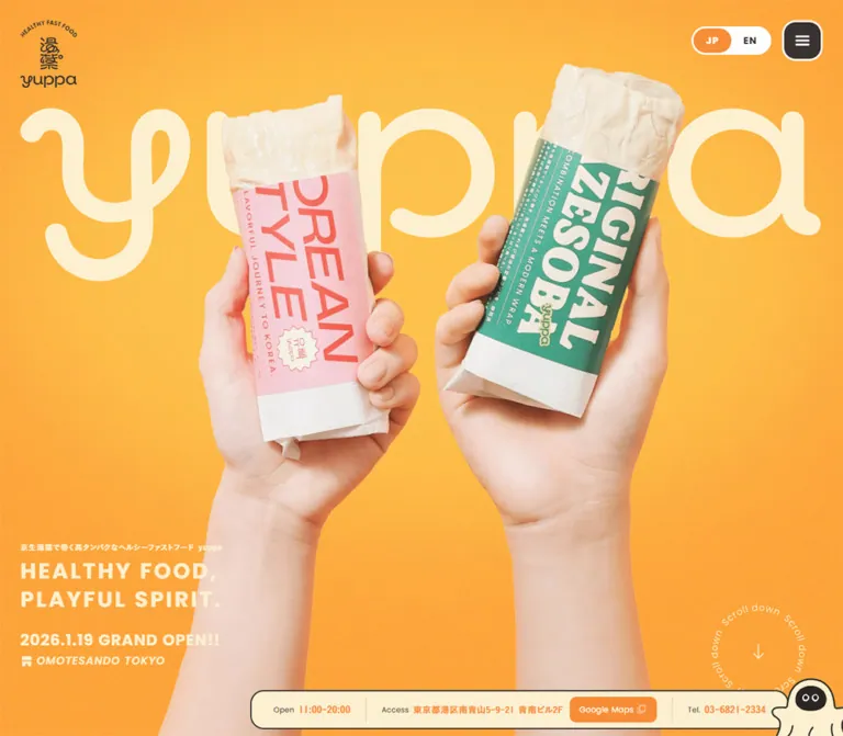
The design translates food packaging into a website. An enormous cream wordmark sits behind two hands holding wrapped products. Fine grain softens the orange backdrop; pink and green sleeves introduce the wider flavor palette. Small factual copy occupies a separate corner of the desktop composition, allowing the photography and logo to carry its scale.
Below the hero, cream surfaces make room for Japanese brand storytelling and saturated product posters. Broad rounded corners, thick white control outlines, and joined label-and-arrow buttons repeat throughout the page. A near-black brown footer gives the long page a firm ending. On desktop, a cream information bar and small outlined mascot keep the physical shop present during scrolling.
How to Read This Reference
- Measured means a value appears in the supplied rendered DOM, computed styles, or element rectangles. Measurements are CSS pixels unless stated otherwise.
- Calculated means arithmetic derived from those measurements, such as the gap between adjacent cards.
- Visual estimate means an approximation from the original-page captures. Estimated colors are not pixel samples or verified CSS declarations.
- Recommended identifies implementation guidance for a new build. The Quick Start is an adaptation, not the original stylesheet.
- Desktop captures show the hero, flavor carousel, and recruitment/footer. Mobile captures show the hero and recruitment/footer. Other sections have DOM evidence but no representative supplied screenshot.
- The desktop DOM places the creamy-flavor card in the central slot, while the flavor screenshot shows Lemon Chicken there. Use their shared geometry; do not attach a permanent active product to that position.
- Captures and sampled styles do not establish menu contents, product-detail behavior, hover states, autoplay timing, or every intermediate animation.
Tokens — Colors
Default Palette
| Name | Value | Source / implementation alias | Role and evidence |
|---|---|---|---|
| Hero Orange | #FFAB3D |
Computed hero section / --color-hero |
Measured orange behind the opening composition; also present in the supplied selection rule |
| Action Orange | #F78D37 |
Source --s-color-6e8d4476 / --color-action |
Measured CTA fills, section headings, shop-information values, and body background |
| Cream | #FCF0D0 |
Source --s-color-8d8150c8 / --color-paper |
Measured content sections, hero text, footer lettering, and supporting surfaces |
| Brown Ink | #393230 |
Source --s-color-9189ec91 / --color-ink |
Measured body copy, dark buttons, inactive language label, and utility labels |
| Footer Brown | #2C2624 |
Computed footer / --color-footer |
Measured footer background; darker than the standard control color |
| White | #FFFFFF |
Source --s-color-8eb9ff12 / --color-white |
Measured language-switch surface and reversed CTA/recruitment text; visible control outlines |
| Muted Ink | rgba(57, 50, 48, 0.4) |
Computed news dates / --color-muted |
Measured subdued date text; final appearance depends on the underlying surface |
Keep the two oranges separate. The hero uses #FFAB3D, while orange buttons and the flavor heading use #F78D37. Replacing both with a single orange removes a real distinction in the page.
The footer is also a separate color, not simply the standard brown button fill enlarged to cover the bottom of the page.
Product Accent Palette
These values are measured on product captions, prices, and card parent backgrounds. Parent background values do not necessarily describe the visible poster field.
| Product association | Measured accent | Evidence |
|---|---|---|
| Masala | #FFDA39 |
Caption and price for the masala-flavor entry |
| Korean style | #EF3631 |
Caption and price for the Korean-flavor entry |
| Original combination | #DFEC9C |
Caption and price for the original-combination entry |
| Creamy flavor | #FF724B |
Caption and price for the creamy-flavor entry |
| Lemon Chicken | #FBDC24 |
Caption and price for the lemon-chicken entry |
| Training-day flavor | #E91737 |
Caption and price for the training-day entry |
The screenshot shows Lemon Chicken as yellow lettering and food photography on a deep teal field. #0B7377 is a visual approximation of that teal, suitable as a starting token for an adaptation. Its exact source color is unavailable in the supplied element sample.
The neighboring posters show a luminous yellow-green field with coral lettering and a golden-yellow field with red lettering. Preserve these product-specific foreground/background pairings. Do not assign each measured accent as both the visible background and foreground simply because the parent and text samples share a color: the complete artwork and nested layer stack were not supplied.
Tokens — Typography
Poppins — English Headings and Interface
Measured computed family: Poppins.
The English interface uses geometric sans-serif lettering with substantial weight and open tracking. Section titles, CTA labels, language labels, prices, and footer navigation predominantly use weight 700. Supporting English captions and dates use 400; location and footer descriptor text use 600.
Uppercase titles create the major landmarks: FLAVOR LINE UP, SHOP, NEWS, and RECRUIT. CTA labels use title case, making them more conversational than the headings.
Japanese Text
Measured computed stack: 'こぶりなゴシック W6 JIS2004', 'Noto Sans JP'.
Most inspected Japanese paragraphs use weight 600 with approximately 0.06em tracking. Desktop introductory copy has a generous 2 line-height ratio. Mobile body copy reduces to 14px with 1.8 line height, while recruitment copy uses a tighter 1.6 ratio.
Additional source variables declare the W3 family and mixed Poppins/Japanese stacks. Their presence does not mean every paragraph uses them. The table below follows actual sampled elements. Computed family names establish the requested stack, but do not independently prove which font file supplied every glyph.
Wordmark and Product Lettering
The looping yuppa wordmark is brand artwork. Its rounded, continuous strokes should not be approximated by typing the name in Poppins or by selecting an invented script-font match.
The large flavor lettering also has distinct visual treatments, including heavy rounded letters, italic forms, and small illustrations. The supplied DOM does not identify a font for that artwork. Preserve it as supplied graphics when available; keep descriptions and prices as real text.
The Times family on outer HTML/body samples is not the visible typography system of the branded components.
Type Scale
Values below are measured. Tracking is expressed in equivalent em units for reuse.
| Role | Desktop size / line height | Mobile size / line height | Weight | Tracking |
|---|---|---|---|---|
| JP / EN | 14 / 14px |
14 / 14px |
700 | 0.08em |
| Hero Japanese descriptor | 11 / 15.4px |
11 / 15.4px |
600 | 0.09em |
| Hero English slogan | 32 / 41.6px |
17.55 / 22.815px |
700 | 0.10em |
| Opening announcement | 23 / 29.9px |
13 / 16.9px |
700 | 0.04em |
| Location caption | 16 / 20.8px |
12 / 15.6px |
600 | 0.06em |
| Brand and shop paragraphs | 16 / 32px |
14 / 25.2px |
600 | 0.06em |
| Flavor section title | 94 / 94px |
50 / 50px, two lines |
700 | 0.04em |
| Shop title | 88 / 88px |
40 / 40px |
700 | 0.05em |
| News title | 64 / 64px |
40 / 40px |
700 | 0.04em |
| Recruitment title | 88 / 88px |
40 / 40px |
700 | 0.04em |
| Recruitment paragraph | 16 / 28.8px |
14 / 22.4px |
600 | 0.06em |
| Main CTA label | 16 / 16px |
15 / 15px |
700 | 0.04em |
| Product caption | 14 / 18.2px |
10 / 13px |
400 | 0.12em |
| Price digits | 28 / 28px |
18 / 18px |
700 | Normal |
| Currency symbol | 20 / 20px |
14 / 14px |
700 | Normal |
| Tax suffix | 10 / 10px |
10 / 10px |
600 | Normal |
| News date | 14 / 14px |
12 / 12px |
400 | 0.02em |
| News category | 12 / 12px |
10 / 10px |
600 | 0.04em |
| News article title | 16 / 24px |
14 / 21px |
600 | 0.06em |
| Footer primary link | 18 / 18px |
16 / 16px |
700 | 0.08em |
| Footer external link | 14 / 14px |
14 / 14px |
700 | 0.08em |
| Footer descriptor | 30 / 39px |
20 / 26px |
600 | 0.10em / 0.08em |
| Copyright | 12 / 16.8px |
10 / 14px |
400 | 0.04em |
The mobile slogan's 17.55px equals 4.5vw at 390px, but one measurement does not prove the original responsive formula. The Quick Start uses that relationship as a recommended approximation.
Tokens — Spacing & Shapes
The geometry mixes small utility insets with broad section spacing. There is no evidence of a single universal spacing grid. Reusable values cluster around 8, 12, 16, 20, 24, 30, 32, 40, 48, 60, 80, and 100px.
Spacing Scale
| Relationship | Desktop | Mobile | Evidence |
|---|---|---|---|
| Header logo left / top | 30 / 30px |
24 / 16px |
Measured rectangles |
| Language-to-menu gap | 16px |
10px |
Calculated from rectangles |
| Language-switch inner padding | 3px |
3px |
Measured |
| Intro paragraph separation | 32px |
20px |
Calculated between paragraph boxes |
| Flavor section top padding | 100px |
50px |
Measured section padding |
| Flavor title-to-description gap | 30px |
30px |
Calculated |
| Description-to-card gap | 60px |
40px |
Calculated |
| Between product cards | 40px |
12px |
Calculated from adjacent positions |
| Cards-to-controls gap | 50px |
23px |
Calculated |
| Between carousel controls | 8px |
4px |
Calculated |
| News section outer padding | 80px 24px |
40px 24px |
Measured |
| News row padding | 26px 10px |
18px 0 |
Measured |
| Footer outer padding | 60px |
24px 32px |
Measured; nested spacing adds further visual clearance |
Border Radius
| Element | Desktop | Mobile | Status |
|---|---|---|---|
| Language-switch shell | 36px |
36px |
Measured; reads as a capsule |
| Menu button | 20px |
18px |
Measured |
| Main CTA label and carousel controls | 24px |
20px |
Measured |
| Product card | 44px |
16px |
Measured |
| News category | 20px |
20px |
Measured |
| Google Maps button | 10px |
Not displayed | Measured desktop |
| Recruitment photo panel | About 24px |
About 16px |
Visual estimate from visible corners |
| Store-information bar | About 20px |
Not displayed | Visual estimate |
White outlines around major controls appear approximately 3px thick. The store bar has a finer dark outline of approximately 2px. Border thickness was not included in the supplied computed-style fields, so these remain visual estimates.
Layout Measurements
| Element | Desktop | Mobile |
|---|---|---|
| Document height | 7072.875px |
5164.453px |
| Opening orange section | 1440 × 1000px |
390 × 800px |
| Header logo link | 84 × 100px |
64 × 76.188px |
| Language switch | 118 × 42px |
102 × 38px |
| Each language label box | 56 × 36px |
48 × 32px |
| Menu button | 60 × 60px |
52 × 52px |
| Product card | 786 × 580px |
330 × 320px |
| Centered card left edge | 327px |
30px |
| Carousel arrow control | 68 × 68px |
62 × 62px |
| All products link | 200 × 68px |
170 × 62px |
| Entire carousel control group | 352px wide |
302px wide |
| News list width | 852px, starting at x 294 |
294px, starting at x 48 |
| News row height | 113px |
109px |
| Recruitment text column | 500px |
294px |
| Footer height | 378.922px |
489.563px |
The mobile product card changes proportion: desktop is approximately 1.355:1, mobile approximately 1.031:1. It is not a uniformly scaled desktop poster.
Components
Persistent Header
Role: identity and global navigation access without a full-width navigation surface.
A small stacked brand emblem sits at the upper left. Its artwork combines an arched HEALTHY FAST FOOD caption, vertical Japanese lettering, and the yuppa wordmark. At the upper right, a white language capsule sits beside a dark rounded menu button with three white horizontal strokes.
The controls remain in the same screen locations in the supplied scrolled captures, supporting persistent positioning. Their surrounding header is visually transparent. The sampled header element itself is only 10px tall; that value does not represent the occupied space of its positioned children.
The language presentation has two labels, but the supplied DOM exposes one link to /english around JPEN. JP is visually selected in orange. Do not describe this as two independently verified toggle buttons. The menu is a button, but its expanded state was not inspected.
Hero Composition
Role: establish the product and brand before asking visitors to navigate.
The opening composition has four principal layers:
- A warm orange field with fine visible grain.
- A very large cream yuppa wordmark stretching almost edge to edge.
- Two photographed hands holding wraps, with pink packaging on the left and green packaging on the right.
- Small supporting copy, the opening announcement, location caption, and circular scroll cue.
On desktop, the hands rise from the bottom and overlap the wordmark. The Japanese descriptor begins at approximately (30, 714), followed by a two-line English slogan. The opening date and location sit below it. This compact block is separate from the central food imagery.
On mobile, the logo artwork occupies the area around y 120–193 as a visual estimate. Copy starts at measured y 213.938, with the English slogan on one line. The date follows at y 270.125; the products begin visually below that copy and extend toward the base of the orange section.
A cream convex curve rises into the bottom of the mobile hero, reaching roughly y 741 near its center. It creates a soft transition into the following content. The curve's exact source geometry is not supplied.
The opening announcement is observed content, not a timer or live opening-status component. There is no prominent purchase button in the inspected hero.
Brand Introduction
Role: explain the relationship between health, enjoyment, and everyday eating.
Four Japanese paragraph groups follow the opening image. Desktop paragraph boxes span the section with 24px side insets and measured 16px / 32px type. The evidence does not include a screenshot of their final alignment, so box width should not be mistaken for the actual length of a rendered line.
On mobile, the copy is constrained to 294px, starting at x 48, with 14px / 25.2px type and 20px gaps between groups. A centered orange Brand concept link follows, leading to /brand.
An additional section without readable text sits between this introduction and the flavors: approximately 763.953px tall on desktop and 368px on mobile. Its content cannot be identified from the provided captures and element sample. Do not recreate it as empty whitespace merely because its extracted text is empty.
Joined Label-and-Arrow Link
Role: a reusable navigation signature for brand, shop, news, and recruitment links.
Each link visually consists of a broad rounded label and a separate rounded square arrow lobe. Both use the same fill and white outline. Their edges meet tightly; the measured combined widths are consistent with an approximately 3px outline overlap.
| Link | Desktop total / label width | Mobile total / label width | Fill |
|---|---|---|---|
| Brand concept | 275 / 210px |
259 / 200px |
Action orange |
| Shop info | 255 / 190px |
239 / 180px |
Brown ink |
| All news | 255 / 190px |
239 / 180px |
Brown ink |
| Entry | 205 / 140px |
189 / 130px |
Action orange |
The arrow lobe is approximately one control-height wide. Entry visibly uses a northeast arrow for the external recruitment destination. Keep the two lobes inside one semantic link so they form one destination and one keyboard stop. The underlying overlap declaration was not supplied; negative margin in the Quick Start is an adaptation.
Flavor Carousel
Role: present food choices as colorful packaging posters.
A large orange FLAVOR LINE UP heading and Japanese explanation introduce a horizontal row of oversized cards. Desktop shows one complete central card and substantial pieces of its neighbors. Given a 786px card, a 40px gap, and a 1440px viewport, each neighboring card can expose 287px at the sides.
Mobile DOM measurements retain the horizontal structure: a 330px central card with 30px outside clearance and 12px gaps leaves approximately 18px of each neighbor visible. No supplied mobile screenshot directly shows the flavor section, so this is a geometry-derived observation.
Below the cards, previous and next buttons flank the All products link. Desktop controls measure 68 / 200 / 68px across, with 8px gaps. Mobile uses 62 / 170 / 62px, with 4px gaps.
The DOM includes repeated product entries. This is compatible with a looping carousel implementation, but does not prove looping, autoplay, swipe, or drag behavior.
Product Poster Card
Role: give each flavor a memorable identity and a clear detail affordance.
The whole card is represented as a button in the supplied DOM. The desktop Lemon Chicken capture shows:
- A small, centered uppercase benefit caption across the top.
- Large yellow
LEMON CHICKENlettering and a small flexed-arm illustration. - A cutout wrap cross-section overlapping the lower part of the lettering.
- A price at the bottom left: smaller currency symbol, bold digits, and tiny
(税込)suffix. - A yellow rounded square with a teal plus at the bottom right.
The visible plus square is approximately 48 × 48px, with about 30px clearance from the right and bottom edges. These are screenshot estimates. It should be a decorative affordance within the card button, not a nested interactive button.
Food photography is the focal point: chicken, vegetables, rice, and lemon remain individually legible. The card uses an isolated food cutout rather than a rectangular photo inset. Large flavor lettering can be partially overlapped by the food while the caption and price remain clear.
Click results were not supplied. Do not label the plus as an add-to-cart action or assume it opens a particular modal.
Shop Introduction
Role: connect the product presentation to the physical location.
The DOM describes the first shop opening in the Omotesando/Minami-Aoyama area after pop-ups, followed by a Shop info link to /shop.
On desktop, the text column begins at x 218 and measures 384px wide. Its white SHOP title is 88px; body copy is 16px / 32px. On mobile, the column becomes 294px wide at x 48, the title reduces to 40px, and the button centers beneath the copy.
The section occupies approximately 1080px vertically on desktop and 858.797px on mobile. Its full photographic or decorative composition is not present in the supplied captures; only its text hierarchy, positions, and link anatomy can be specified confidently.
News List
Role: provide current updates in a quieter editorial format.
The desktop list is centered within an 852px region. NEWS appears at the left of the heading row, with a joined All news link on the right. The mobile version moves that link below the three articles.
Each article is a square-cornered button row. A muted English date and cream category capsule sit above a Japanese headline. The observed category label is メディア掲載. Desktop metadata uses a calculated 12px gap between date and category; mobile uses 8px.
Rows measure 113px high on desktop and 109px on mobile. Mobile headline boxes are 248px wide inside 294px rows, reserving space at the right for additional content or an affordance. The complete right-side graphic is not established by the supplied style sample.
The row's button semantics are observed; its opened article state is not. Divider appearance and the complete surrounding surface also lack direct screenshot confirmation.
Recruitment Photo Panel
Role: introduce the people and work behind the product.
A large rounded photographic panel shows staff preparing food in a kitchen. In the desktop capture, a woman occupies the center-right while another worker is cropped at the right edge. White text sits over the quieter left side, followed by the orange joined Entry link.
The visible panel keeps 24px page margins on both viewports. Desktop copy starts at x 124, approximately 100px inside the image. Mobile copy starts at x 48, approximately 24px inside it. The image crop becomes much tighter on mobile while preserving the food-preparation activity.
The title changes from 88px to 40px; the description changes from a 500px to a 294px column. Entry remains a substantial 62px-high mobile target.
The mobile scrolled capture shows the persistent logo and controls overlapping the upper photo/title area. Preserve the observation, but provide sufficient scroll and focus clearance in a new implementation.
The source media type is unverified. A still capture of this panel does not establish video playback.
Footer
Role: close the page with strong identity and a compact site map.
The footer uses #2C2624 with cream artwork and text. Desktop places a large wordmark and HEALTHY FAST FOOD descriptor on the left. Three navigation groups begin at x 900, 1060, and 1220: primary pages, support/content pages, and external destinations.
The wordmark is approximately 366px wide on desktop and 220px on mobile, estimated visually. Mobile centers the identity, then places internal navigation in two columns. Recruitment and Instagram appear together on the row below. Copyright centers near the bottom.
The footer becomes taller on mobile—approximately 490px, compared with 379px on desktop—because the brand and navigation stack vertically. Retain its generous internal separation rather than compressing it into a dense list of links.
Desktop Store-Information Bar and Mascot
Role: make visiting information available throughout the long page.
A cream, dark-outlined bar floats near the bottom right in all supplied desktop captures. It contains opening hours, address, an orange Google Maps link, and telephone text, divided by pale vertical rules.
The visible bar is approximately 796px wide and 58px high, positioned about 10px above the bottom. A cream mascot with dark outlines and a dark face overlaps its right end and extends beyond the viewport edge.
Utility labels use measured 11px Poppins. Hours and telephone values use 14px Japanese-stack text; the address uses 13px. The map link is approximately 128.234 × 38px, with a measured 10px radius and 12px label.
The bar and mascot are absent from both supplied mobile captures; hours, address, map link, and telephone are also absent from the mobile visible-text extraction. The exact hide breakpoint was not provided. Telephone text is sampled as a paragraph, so a working telephone link is not verified.
Tokens — Motion & Interaction
Declared Motion
| Element / treatment | Supplied value | What it establishes |
|---|---|---|
| Common component transitions | 0.3s cubic-bezier(0.4, 0.4, 0, 1) |
A shared transition timing; not a verified hover transformation |
| Body background | 0.5s cubic-bezier(0.4, 0.4, 0, 1) |
Background changes are transitionable; trigger unverified |
| Desktop concept paragraphs | 0.6s cubic-bezier(0.6, 0, 0.4, 1) 0.1s |
Longer transition with a 100ms delay; actual reveal path unverified |
| Mobile concept paragraphs | 0.3s cubic-bezier(0.4, 0.4, 0, 1) |
Different sampled timing from desktop |
| Carousel arrow controls | 0.4s cubic-bezier(0.4, 0.4, 0, 1) |
Control transition timing |
| Product card transform | transform cubic-bezier(0.58, 0.21, 0.41, 0.96) |
Transform easing is present; the sample supplies no nonzero duration |
Many elements also list transitions for gradient-related custom properties. Those declarations do not prove a visible animated gradient. The captures primarily show textured color fields and imagery.
The sampled elements report animation: none, but the sample does not cover all descendants, pseudo-elements, scripts, or media. It cannot establish that the whole page is static.
Observed Affordances and Limits
| Affordance | Established evidence | Unverified behavior |
|---|---|---|
| Language capsule | Link to /english; JP visually selected |
English-page layout and transition |
| Menu icon | Button with hamburger artwork | Open menu, focus management, dismissal |
| Flavor arrows | Previous/next-looking buttons | Movement distance, speed, looping, autoplay |
| Product plus | Visible affordance inside a card button | Detail panel, navigation, or other click result |
| Circular scroll cue | Circular lettering and downward arrow | Rotation, click behavior, scroll animation |
| News row | Button containing metadata and headline | Opened article presentation |
| Entry | External recruitment href | Destination behavior |
| Google Maps | External map href | Destination opening behavior |
| Mascot | Persistent desktop illustration | Animation or interactivity |
The capture process waited for load, finite motion, layout/text stability, and image decoding within stated limits. Perpetual animations were temporarily paused during readiness checks and resumed afterward. These procedures improve capture stability but do not provide a temporal recording or verify every delayed state.
Surfaces
| Layer | Appearance | Purpose |
|---|---|---|
| Hero | Bright orange with fine grain | Immediate appetite, warmth, and brand recognition |
| Content canvas | Warm cream, visibly textured in supplied captures | Gives text and product colors breathing room |
| Product poster | Saturated flavor-specific field and isolated food imagery | Separates flavors through packaging-like identities |
| Main control | Brown or orange fill with a substantial white outline | Makes navigation feel tactile and friendly |
| Recruitment | Rounded kitchen photograph with white text | Introduces human activity and recruitment |
| Footer | Flat, very dark brown | Strong visual ending and readable navigation |
| Store bar | Cream fill, thin dark outline, pale separators | Keeps practical information distinct from page imagery |
No general soft-shadow elevation system is apparent in the supplied screenshots. Separation comes from color changes, outlines, clipping, scale, and whitespace. Keep grain subtle enough that it reads as material rather than visible dirt or a patterned grid.
Imagery
Food and Packaging
The hero presents the product in hands, at a scale large enough to see the thin pale wrapper and printed sleeves. Preserve natural skin tones, believable grip, soft food highlights, and the slight difference in the two wraps' angles. The sleeves contribute pink, red, green, and cream without requiring those colors to become global interface tokens.
Flavor cards switch to cross-sections. Their ingredients explain variety and freshness through visible texture and color. Keep the complete cutout visible with object-fit: contain; crop the containing poster only where necessary for the carousel's side previews.
Human Photography
The recruitment panel uses a real working kitchen and an active preparation gesture. Its composition reserves a relatively calm area for text. Desktop and mobile need different crops: a single centered crop is unlikely to preserve both the person and the copy area.
No specific shop photograph can be identified from the supplied captures. Choose or reproduce that imagery only after obtaining direct evidence or appropriate project assets.
Graphic Artwork
The brand emblem, wide wordmark, flavor titles, small flavor illustrations, circular scroll lettering, and mascot form an illustrated layer around the photography. Preserve their individual line weights and shapes instead of replacing them with an unrelated uniform icon set.
Font Awesome family variables are present, but this alone does not identify the implementation of every visible icon. Some supplied DOM fragments explicitly reference image-based pseudo-elements.
Observed Asset References
| Asset | Observed URL | Evidence and limitation |
|---|---|---|
| Shared 400 × 400 WebP | https://storage.googleapis.com/studio-design-asset-files/projects/bXqzen46OD/s-400x400_webp_e0797603-7096-4e39-b78d-b5d6e057826d.webp | Referenced by the hero and several mobile pseudo-elements; consistent with the repeated texture treatment, but its pixel contents and compositing settings were not independently inspected |

Other asset URLs in the supplied fragments are incomplete. Full paths for the wordmarks, food cutouts, recruitment media, and mascot are therefore not invented here. The supplied screenshots establish their appearance, not a downloadable asset inventory.
Layout & Responsive Behavior
Page Structure
| Region | Desktop measured vertical extent | Mobile measured vertical extent |
|---|---|---|
| Opening and brand introduction wrapper | y 0–2016 |
y 0–1537.609 |
| Section without readable text | y 2016–2779.953 |
y 1537.609–1905.609 |
| Flavor section | y 2779.953–4004.953 |
y 1905.609–2712.922 |
| Shop introduction | y 4004.953–5084.953 |
y 2712.922–3571.719 |
| News | y 5084.953–5853.953 |
y 3571.719–4219.719 |
| Recruitment | y 5853.953–6693.953 |
y 4219.719–4674.891 |
| Footer | y 6693.953–7072.875 |
y 4674.891–5164.453 |
These are capture-time section boundaries, not recommended fixed heights. Content, fonts, and motion state can affect them.
Desktop to Mobile Changes
- Hero composition changes order visually. Desktop copy sits near the lower left beside the hands. Mobile puts wordmark, descriptor, slogan, and opening details above the main product imagery.
- The orange opening area is not always exactly one viewport. It measures
1000pxin the1000px-high desktop viewport, but800pxin the844px-high mobile viewport. - Headers stay compact. The mobile logo and menu shrink modestly, while JP/EN text stays at
14px. - Product cards become nearly square. Their width reduces much more than their height, and corner radius changes from
44pxto16px. - Primary controls remain large. The common height changes only from
68pxto62px, preserving a substantial interaction target. - Reading columns tighten. Concept, shop, recruitment, and news commonly use a
294pxmobile text region, leaving48pxoverall side insets. - News navigation moves. The desktop
All newslink shares a row with the heading; mobile places it below the list. - The footer stacks and grows. Identity centers above two navigation columns, with external links below them.
- Desktop visit information disappears. The floating bar and mascot are not visible on mobile.
A max-width: 1140px rule is visible in a line-break stylesheet fragment. It establishes one source breakpoint for responsive line breaks, not the complete layout breakpoint system. Tablet widths, landscape mobile, safe-area behavior, and zoomed layouts were not supplied.
Do’s and Don’ts
Do
- Keep Hero Orange
#FFAB3Dseparate from Action Orange#F78D37. - Pair the warm cream with brown text and reserve the darker
#2C2624for the footer. - Let the large wordmark and hand-held products dominate the hero.
- Use Poppins for the measured Latin interface and the supplied Japanese stack for body copy.
- Preserve tracked uppercase headings, small supporting captions, and generous Japanese line height.
- Retain the joined label-and-arrow CTA shape as a repeated navigation motif.
- Give flavor posters their own paired colors and overlapping food/name artwork.
- Show neighboring product fragments to communicate horizontal browsing.
- Recompose the hero and photography for mobile rather than scaling the whole desktop canvas.
- Keep practical shop information compact and easy to scan.
Don’t
- Don’t replace the brand wordmark with a guessed script font.
- Don’t treat product-parent background samples as the final visible poster colors.
- Don’t turn the flavor cards into small white cards with generic photo thumbnails.
- Don’t reduce mobile controls in the same proportion as the large images.
- Don’t add glossy shadows, glass panels, or unrelated gradients to every surface.
- Don’t interpret the product plus as a verified cart control.
- Don’t invent menu contents, modal layouts, carousel speed, mascot motion, or video behavior.
- Don’t freeze all measured section heights into production CSS.
- Don’t use the desktop contact strip as a miniature mobile overlay.
- Don’t describe uncaptured sections as visually empty just because their text extraction is empty.
Recommended Implementation Additions
These are recommendations for a new implementation, not verified original features.
- Give the menu, carousel arrows, logo link, and product cards explicit accessible names. A product's name should remain available as text even when the visible title is artwork.
- Use one link for each joined CTA. Avoid nested buttons in the product cards; the plus can be an
aria-hiddenspan. - Provide keyboard navigation and a clear focus indicator for the carousel. If it advances automatically, include a pause mechanism and stop movement when users interact with it.
- Respect reduced-motion preferences for any reveal, scrolling, carousel, or circular-lettering animation.
- Check small cream-on-orange and white-on-orange text against contrast requirements. Preserve the palette while adjusting text color, supporting surface, or text size where needed.
- Keep hours, address, and contact information available in normal document flow or the shop destination when the desktop bar is hidden.
- Add scroll clearance for fixed header controls so focused headings and links are not obscured.
- Use meaningful heading semantics for shop and recruitment sections. Their sampled display titles are paragraphs, while the flavor and news titles are H2 elements.
- Reserve dimensions for food and brand artwork, supply responsive image sources, and defer below-fold imagery without delaying the principal hero image.
Agent Prompt Guide
Quick Color Reference
- Hero:
#FFAB3D. - Orange headings and CTA fill:
#F78D37. - Cream content and reversed brand lettering:
#FCF0D0. - Body text and dark controls:
#393230. - Footer:
#2C2624. - Control outlines and selected reversed labels:
#FFFFFF. - Lemon Chicken accent: measured
#FBDC24; teal poster approximation#0B7377. - Texture: fine grain with low visual prominence; exact opacity is unverified.
Overall Prompt
“Create a Japanese healthy-food brand homepage inspired by yuppa's observed visual system. Use a bright orange #FFAB3D hero, cream #FCF0D0 content, brown #393230 controls, and a darker #2C2624 footer. Build the hero around supplied looping wordmark artwork and two large photographic cutouts of hands holding packaged wraps. Place a compact emblem at upper left and a white JP/EN capsule with a dark rounded menu button at upper right. Use Poppins for bold tracked English labels and a Japanese Gothic stack for readable body copy. Follow with brand storytelling, a horizontal carousel of saturated food posters, shop information, restrained news rows, a kitchen recruitment photograph, and a spacious footer. Main navigation CTAs use joined rounded label and arrow lobes with thick white outlines. Recompose the mobile hero so text appears above the hands; keep controls large.”
Example Component Prompts
- Hero: “At 1440px, place an enormous cream wordmark behind two photographed hands holding pink- and green-sleeved wraps. Use a subtly grained orange background and small cream copy at the lower left. At 390px, move the wordmark and copy above the hands and finish with a convex cream transition.”
- Flavor card: “Create a 786 × 580 desktop food poster with a 44px radius, deep teal field, yellow benefit caption, supplied Lemon Chicken lettering, a central wrap cross-section, bottom-left price, and bottom-right yellow plus badge. Adapt to a nearly square 330 × 320 mobile card with a 16px radius. Keep the card one interactive target.”
- Joined CTA: “Create one navigation link made from an orange rounded label block and a matching rounded square northeast-arrow lobe. Use a roughly 3px white outline, a 68px desktop height, and a 24px radius. On mobile use 62px height and 20px radius.”
- Recruitment panel: “Use a rounded kitchen photograph with staff preparing food. Reserve the left side for a large white RECRUIT heading, a short Japanese paragraph, and an orange joined Entry link. Crop the image separately for mobile while retaining the worker's hands and activity.”
- Footer: “Use a flat dark brown background with cream brand artwork. Place identity left and three compact navigation groups right on desktop. On mobile, center the logo and descriptor above two navigation columns, followed by recruitment and Instagram links and small centered copyright text.”
Quick Start
CSS Custom Properties
This CSS is a reusable adaptation of the measured system. The 767px layout breakpoint and 1140px store-bar cutoff are recommended choices, not verified original component breakpoints. Hero-art placement, teal, photo cropping, texture compositing, and estimated outlines require visual calibration.
Load the chosen fonts and supply artwork separately. The CSS assumes optional separate wordmark, product-title, and food-cutout images; if supplied artwork combines these layers, do not duplicate them. JavaScript for menus, product details, and carousel controls is outside this visual starter.
:root {
  /* Measured core colors */
  --color-hero: #ffab3d;
  --color-action: #f78d37;
  --color-paper: #fcf0d0;
  --color-ink: #393230;
  --color-footer: #2c2624;
  --color-white: #fff;
  --color-muted: rgb(57 50 48 / 40%);
  --color-lemon: #fbdc24;

  /* Visual approximation, not a measured source color */
  --color-teal: #0b7377;

  /* Computed families with an added generic fallback */
  --font-latin: 'Poppins', sans-serif;
  --font-ja: 'こぶりなゴシック W6 JIS2004', 'Noto Sans JP', sans-serif;
  --font-body: var(--font-ja);
  --text-body: 16px;
  --leading-body: 2;
  --text-control: 16px;
  --text-section: 88px;
  --text-flavor: 94px;

  --edge: 24px;
  --header-x: 30px;
  --header-y: 30px;
  --logo-width: 84px;
  --menu-size: 60px;
  --menu-radius: 20px;
  --utility-gap: 16px;
  --language-width: 56px;
  --language-height: 36px;

  --control-height: 68px;
  --radius-control: 24px;
  --card-width: min(786px, calc(100vw - 60px));
  --card-height: 580px;
  --card-gap: 40px;
  --radius-card: 44px;

  /* Estimated border thicknesses */
  --outline-control: 3px;
  --outline-fine: 2px;

  /* Measured timing; applying it to new states is an adaptation */
  --ease-ui: cubic-bezier(0.4, 0.4, 0, 1);
  --duration-ui: 300ms;
  --texture-image: none;
}

* { box-sizing: border-box; }
body {
  margin: 0;
  color: var(--color-ink);
  background: var(--color-paper);
  font: 600 var(--text-body) / var(--leading-body) var(--font-body);
}
img { display: block; max-width: 100%; }
button, a { -webkit-tap-highlight-color: transparent; }
button { font: inherit; }
a { color: inherit; }
section { scroll-margin-top: 120px; }

/* Optional texture layer: set a supplied grain image on the variable. */
.textured { position: relative; isolation: isolate; }
.textured::before {
  content: '';
  position: absolute;
  inset: 0;
  z-index: -1;
  pointer-events: none;
  background-image: var(--texture-image);
  background-repeat: repeat;
  opacity: 0.12; /* Recommended starting strength */
}

.site-header {
  position: fixed;
  inset: 0 0 auto;
  z-index: 30;
  display: flex;
  justify-content: space-between;
  align-items: flex-start;
  padding: var(--header-y) var(--header-x);
  pointer-events: none;
}
.site-header a, .site-header button { pointer-events: auto; }
.site-logo { width: var(--logo-width); }
.site-logo img { width: 100%; height: auto; }
.header-utilities {
  display: flex;
  align-items: center;
  gap: var(--utility-gap);
}
.language-switch {
  display: flex;
  padding: 3px;
  border-radius: 36px;
  background: var(--color-white);
  text-decoration: none;
  font: 700 14px / 1 var(--font-latin);
  letter-spacing: 0.08em;
}
.language-switch span {
  display: grid;
  place-items: center;
  width: var(--language-width);
  height: var(--language-height);
  border-radius: 36px;
}
.language-switch .is-current {
  color: var(--color-white);
  background: var(--color-action);
}
.menu-button {
  display: grid;
  place-items: center;
  width: var(--menu-size);
  height: var(--menu-size);
  padding: 0;
  border: var(--outline-control) solid var(--color-white);
  border-radius: var(--menu-radius);
  color: var(--color-white);
  background: var(--color-ink);
  cursor: pointer;
}
.menu-button svg { width: 22px; height: 22px; }

/* Artwork positions are calibrated estimates. */
.hero {
  position: relative;
  min-height: 100svh;
  overflow: hidden;
  color: var(--color-paper);
  background: var(--color-hero);
}
.hero-wordmark {
  position: absolute;
  top: 16%;
  left: 30px;
  width: calc(100% - 60px);
}
.hero-products {
  position: absolute;
  left: 50%;
  bottom: 0;
  width: min(52vw, 750px);
  height: auto;
  transform: translateX(-50%);
}
.hero-copy {
  position: absolute;
  left: 30px;
  bottom: 100px;
  width: 330px;
}
.hero-eyebrow {
  margin: 0;
  font: 600 11px / 1.4 var(--font-ja);
  letter-spacing: 0.09em;
}
.hero-slogan {
  margin: 6px 0 26px;
  font: 700 32px / 1.3 var(--font-latin);
  letter-spacing: 0.1em;
}
.hero-opening {
  margin: 0;
  font: 700 23px / 1.3 var(--font-latin);
  letter-spacing: 0.04em;
}
.hero-location {
  margin: 5px 0 0;
  font: 600 16px / 1.3 var(--font-latin);
  letter-spacing: 0.06em;
}

.split-link {
  --cta-fill: var(--color-ink);
  --label-width: 190px;
  display: inline-flex;
  align-items: stretch;
  color: var(--color-white);
  text-decoration: none;
  font: 700 var(--text-control) / 1 var(--font-latin);
  letter-spacing: 0.04em;
}
.split-link--orange { --cta-fill: var(--color-action); }
.brand-link { --label-width: 210px; }
.entry-link { --label-width: 140px; }
.cta-label, .cta-arrow {
  display: grid;
  place-items: center;
  min-height: var(--control-height);
  border: var(--outline-control) solid var(--color-white);
  border-radius: var(--radius-control);
  background: var(--cta-fill);
}
.cta-label { min-width: var(--label-width); padding: 20px; }
.cta-arrow {
  width: var(--control-height);
  margin-left: calc(-1 * var(--outline-control));
  font-size: 24px;
}

.flavor-section { padding: 100px 0 120px; }
.flavor-heading {
  margin: 0 32px;
  color: var(--color-action);
  text-align: center;
  font: 700 var(--text-flavor) / 1 var(--font-latin);
  letter-spacing: 0.04em;
}
.flavor-intro {
  margin: 30px 32px 60px;
  text-align: center;
  letter-spacing: 0.06em;
}
.flavor-rail {
  display: flex;
  gap: var(--card-gap);
  overflow-x: auto;
  padding: 4px max(30px, calc((100% - var(--card-width)) / 2));
  scroll-snap-type: x mandatory;
  scroll-padding-inline: max(30px, calc((100% - var(--card-width)) / 2));
}
.flavor-card {
  --card-ink: var(--color-lemon);
  --card-surface: var(--color-teal);
  position: relative;
  flex: 0 0 var(--card-width);
  height: var(--card-height);
  overflow: hidden;
  padding: 0;
  border: 0;
  border-radius: var(--radius-card);
  color: var(--card-ink);
  background: var(--card-surface);
  scroll-snap-align: center;
  cursor: pointer;
}
.flavor-caption {
  position: absolute;
  inset: 30px 30px auto;
  margin: 0;
  text-align: center;
  font: 400 14px / 1.3 var(--font-latin);
  letter-spacing: 0.12em;
}
.flavor-name-art {
  position: absolute;
  top: 86px;
  left: 22.5%;
  width: 55%;
  max-height: 165px;
  object-fit: contain;
}
.flavor-food {
  position: absolute;
  bottom: 70px;
  left: 32%;
  width: 36%;
  height: 50%;
  object-fit: contain;
}
.flavor-price {
  position: absolute;
  bottom: 40px;
  left: 36px;
  display: flex;
  align-items: baseline;
  gap: 2px;
  font: 700 28px / 1 var(--font-latin);
}
.flavor-price .currency { font-size: 20px; }
.flavor-price .tax { font: 600 10px / 1 var(--font-ja); }
.flavor-plus {
  position: absolute;
  right: 30px;
  bottom: 30px;
  display: grid;
  place-items: center;
  width: 48px;
  height: 48px;
  border-radius: 16px;
  color: var(--card-surface);
  background: var(--card-ink);
  font: 400 30px / 1 var(--font-latin);
}
.carousel-controls {
  display: flex;
  justify-content: center;
  gap: 8px;
  margin-top: 50px;
}
.carousel-arrow, .catalog-link {
  display: grid;
  place-items: center;
  min-height: var(--control-height);
  border: var(--outline-control) solid var(--color-white);
  border-radius: var(--radius-control);
  color: var(--color-white);
  background: var(--color-ink);
  text-decoration: none;
  font: 700 var(--text-control) / 1 var(--font-latin);
}
.carousel-arrow { width: var(--control-height); cursor: pointer; }
.catalog-link { width: 200px; }

.news-inner { width: min(852px, calc(100% - 96px)); margin-inline: auto; }
.news-heading {
  display: flex;
  align-items: center;
  justify-content: space-between;
}
.news-title {
  color: var(--color-action);
  font: 700 64px / 1 var(--font-latin);
  letter-spacing: 0.04em;
}
.news-row { padding: 26px 10px; text-align: left; }
.news-meta { display: flex; align-items: center; gap: 12px; }
.news-date { color: var(--color-muted); font: 400 14px / 1 var(--font-latin); }
.news-category {
  padding: 6px 10px 5px;
  border-radius: 20px;
  background: var(--color-paper);
  font-size: 12px;
  line-height: 1;
}
.news-headline { margin: 10px 0 0; font-size: 16px; line-height: 1.5; }

.recruit-section { padding: 100px 24px; }
.recruit-panel {
  position: relative;
  display: grid;
  align-items: center;
  min-height: 640px;
  overflow: hidden;
  border-radius: 24px;
  color: var(--color-white);
  background: var(--color-ink);
}
.recruit-photo {
  position: absolute;
  inset: 0;
  width: 100%;
  height: 100%;
  object-fit: cover;
}
.recruit-content { position: relative; max-width: 700px; padding: 100px; }
.recruit-title {
  margin: 0;
  font: 700 var(--text-section) / 1 var(--font-latin);
  letter-spacing: 0.04em;
}
.recruit-copy { margin: 40px 0; line-height: 1.8; letter-spacing: 0.06em; }

/* Visual spacing combines the source's outer and nested clearances. */
.site-footer {
  display: grid;
  grid-template-columns: minmax(0, 1fr) 480px;
  gap: 60px;
  padding: 100px 60px 60px;
  color: var(--color-paper);
  background: var(--color-footer);
  font-family: var(--font-latin);
}
.footer-brand img { width: 366px; }
.footer-tagline { margin: 24px 0 0; font-size: 30px; line-height: 1.3; letter-spacing: 0.1em; }
.footer-nav { display: grid; grid-template-columns: repeat(3, 1fr); }
.footer-nav-group { display: flex; flex-direction: column; align-items: flex-start; gap: 14px; }
.footer-nav a { text-decoration: none; font-size: 18px; line-height: 1; font-weight: 700; letter-spacing: 0.08em; }
.footer-external { gap: 12px; }
.footer-external a { font-size: 14px; }
.footer-copyright { grid-column: 1 / -1; margin: 0; font-size: 12px; line-height: 1.4; font-weight: 400; letter-spacing: 0.04em; }

.store-bar {
  position: fixed;
  right: 80px;
  bottom: 10px;
  z-index: 25;
  display: flex;
  align-items: center;
  gap: 22px;
  min-height: 58px;
  padding: 8px 32px;
  border: var(--outline-fine) solid var(--color-ink);
  border-radius: 20px;
  background: var(--color-paper);
}
.store-group { display: flex; align-items: center; gap: 6px; }
.store-label { font: 400 11px / 1 var(--font-latin); }
.store-value { color: var(--color-action); font-size: 14px; line-height: 1; }
.store-map { padding: 12px 14px; border-radius: 10px; color: white; background: var(--color-action); text-decoration: none; font: 400 12px / 1 var(--font-latin); }

/* Recommended accessible feedback, not an observed source state. */
a:focus-visible, button:focus-visible {
  outline: 3px solid var(--color-ink);
  outline-offset: 5px;
}
.site-footer a:focus-visible, .recruit-panel a:focus-visible {
  outline-color: var(--color-white);
}
@media (hover: hover) {
  .split-link:hover .cta-label, .footer-nav a:hover {
    text-decoration: underline;
    text-underline-offset: 4px;
  }
}

@media (max-width: 1140px) {
  .store-bar { display: none; }
}
@media (max-width: 767px) {
  :root {
    --header-x: 24px;
    --header-y: 16px;
    --logo-width: 64px;
    --menu-size: 52px;
    --menu-radius: 18px;
    --utility-gap: 10px;
    --language-width: 48px;
    --language-height: 32px;
    --text-body: 14px;
    --leading-body: 1.8;
    --text-control: 15px;
    --text-section: 40px;
    --text-flavor: 50px;
    --control-height: 62px;
    --radius-control: 20px;
    --card-width: calc(100vw - 60px);
    --card-height: 320px;
    --card-gap: 12px;
    --radius-card: 16px;
  }
  .hero { min-height: 800px; }
  .hero-wordmark { top: 120px; left: 24px; width: calc(100% - 48px); }
  .hero-products { width: 100%; }
  .hero-copy { top: 214px; bottom: auto; left: 24px; width: calc(100% - 48px); }
  .hero-slogan { margin: 2px 0 16px; font-size: clamp(15px, 4.5vw, 24px); }
  .desktop-break { display: none; }
  .hero-opening { font-size: 13px; }
  .hero-location { margin-top: 2px; font-size: 12px; }
  .hero::after {
    content: '';
    position: absolute;
    inset: auto -10% -1px;
    height: 60px;
    border-radius: 50% 50% 0 0 / 100% 100% 0 0;
    background: var(--color-paper);
  }
  .split-link { --label-width: 180px; }
  .brand-link { --label-width: 200px; }
  .entry-link { --label-width: 130px; }
  .flavor-section { padding-block: 50px 75px; }
  .flavor-intro { margin-bottom: 40px; }
  .flavor-caption { inset: 20px 30px auto; font-size: 10px; }
  .flavor-name-art { top: 60px; left: 20%; width: 60%; max-height: 95px; }
  .flavor-food { bottom: 46px; left: 24%; width: 52%; height: 52%; }
  .flavor-price { bottom: 22px; left: 22px; font-size: 18px; }
  .flavor-price .currency { font-size: 14px; }
  .flavor-plus { right: 14px; bottom: 14px; width: 44px; height: 44px; border-radius: 14px; }
  .carousel-controls { gap: 4px; margin-top: 23px; }
  .catalog-link { width: 170px; }
  .news-heading { display: block; }
  .news-title { font-size: 40px; }
  .news-row { padding: 18px 0; }
  .news-meta { gap: 8px; }
  .news-date { font-size: 12px; }
  .news-category { font-size: 10px; }
  .news-headline { margin-top: 7px; font-size: 14px; }
  .recruit-section { padding-block: 40px; }
  .recruit-panel { min-height: 375px; border-radius: 16px; }
  .recruit-content { max-width: none; padding: 100px 24px 60px; }
  .recruit-photo { object-position: 62% center; }
  .recruit-copy { margin: 16px 0 30px; line-height: 1.6; }
  .site-footer { grid-template-columns: 1fr; gap: 0; padding: 60px 32px 44px; }
  .footer-brand { text-align: center; }
  .footer-brand img { width: 220px; margin-inline: auto; }
  .footer-tagline { margin-top: 16px; font-size: 20px; letter-spacing: 0.08em; }
  .footer-nav { width: min(280px, 100%); margin: 80px auto 0; grid-template-columns: repeat(2, minmax(0, 1fr)); gap: 20px; }
  .footer-nav a { font-size: 16px; }
  .footer-external { grid-column: 1 / -1; display: grid; grid-template-columns: repeat(2, minmax(0, 1fr)); gap: 20px; }
  .footer-external a { font-size: 14px; }
  .footer-copyright { margin-top: 60px; text-align: center; font-size: 10px; }
}
@media (prefers-reduced-motion: reduce) {
  html { scroll-behavior: auto; }
  .hero *, .flavor-rail, .flavor-card, .split-link * {
    animation: none;
    transition: none;
    scroll-behavior: auto;
  }
}
For mobile news, place the single All news link after the article list in semantic order and use desktop grid placement to move it into the heading row. This avoids creating duplicate keyboard targets merely to match the two layouts.
The recruitment photo may need a carefully tuned scrim for readable text. No source scrim opacity was measured; evaluate it against the actual selected photograph. The CSS intentionally leaves that decision to the image composition.
Tailwind v4 Token Mapping
Optional aliases for a project already using Tailwind v4. They do not imply that the original page uses Tailwind. Define the custom properties above first.
@theme inline {
  --color-hero: #ffab3d;
  --color-action: #f78d37;
  --color-paper: #fcf0d0;
  --color-ink: #393230;
  --color-footer: #2c2624;
  --color-lemon: #fbdc24;

  --font-display: var(--font-latin);
  --font-body: var(--font-ja);

  --text-control: var(--text-control-size, 1rem);
  --text-section: var(--text-section-size, 5.5rem);
  --spacing-page: 24px;
  --spacing-control: var(--control-height);
  --spacing-product: var(--card-width);
  --radius-cta: var(--radius-control);
  --radius-product: var(--radius-card);
}
For responsive Tailwind text utilities, set the mapping's size variables explicitly or use breakpoint utilities matching the measured typography table. The optional mapping does not automatically reproduce the source's type changes.
Sources & Evidence
- Current Japanese homepage: original and final URL are identical; supplied response status is HTTP 200.
- Retrieval timestamp: September 12, 2026, 08:30:16.700 UTC / 17:30:16.700 JST.
- Desktop inspection: 1440 × 1000 CSS pixels; supplied hero, flavor, and recruitment/footer captures, plus rendered text, link destinations, custom properties, element rectangles, and computed styles.
- Mobile inspection: 390 × 844 CSS pixels; supplied hero and recruitment/footer captures, plus corresponding rendered DOM and computed-style evidence.
- Scrolled captures support the persistent header and desktop information-bar observations. Differences between carousel samples establish differing states, without establishing their trigger or timing.
- The evidence includes readiness waits for loading, finite animations, layout/text stability, and image decoding. These checks have time limits and do not prove semantic completeness. SharedWorkers and service workers were disabled during inspection.
Analysis uses only the supplied original-page evidence. No additional browsing, interaction testing, command execution, or file inspection was performed. Exact uncaptured imagery, complete asset paths, menu and detail states, hover treatments, continuous motion, tablet behavior, and intermediate breakpoint rules remain unverified. CSS estimates and recommended additions are identified separately from measured values.
# yuppa — Style Reference

> Sunshine orange, creamy paper, and oversized wraps give healthy food a playful storefront.

**Website:** [yuppa.co.jp](https://yuppa.co.jp/)
**Original URL:** https://yuppa.co.jp/
**Final URL:** https://yuppa.co.jp/
**Theme:** a light orange-and-cream identity, colorful product posters, and a dark brown footer; no theme selector was observed.
**Inspected:** September 12, 2026, at 08:30:16.700 UTC / 17:30:16.700 JST.
**Viewports:** desktop 1440 × 1000 and mobile 390 × 844 CSS pixels.
**Scope:** the current Japanese homepage of a food and restaurant brand: hero, brand introduction, flavor carousel, shop introduction, news, recruitment, footer, and persistent utility controls. This is a homepage connecting several site sections, rather than a dedicated single-purpose landing page.

The design translates food packaging into a website. An enormous cream wordmark sits behind two hands holding wrapped products. Fine grain softens the orange backdrop; pink and green sleeves introduce the wider flavor palette. Small factual copy occupies a separate corner of the desktop composition, allowing the photography and logo to carry its scale.

Below the hero, cream surfaces make room for Japanese brand storytelling and saturated product posters. Broad rounded corners, thick white control outlines, and joined label-and-arrow buttons repeat throughout the page. A near-black brown footer gives the long page a firm ending. On desktop, a cream information bar and small outlined mascot keep the physical shop present during scrolling.

## How to Read This Reference

- **Measured** means a value appears in the supplied rendered DOM, computed styles, or element rectangles. Measurements are CSS pixels unless stated otherwise.
- **Calculated** means arithmetic derived from those measurements, such as the gap between adjacent cards.
- **Visual estimate** means an approximation from the original-page captures. Estimated colors are not pixel samples or verified CSS declarations.
- **Recommended** identifies implementation guidance for a new build. The Quick Start is an adaptation, not the original stylesheet.
- Desktop captures show the hero, flavor carousel, and recruitment/footer. Mobile captures show the hero and recruitment/footer. Other sections have DOM evidence but no representative supplied screenshot.
- The desktop DOM places the creamy-flavor card in the central slot, while the flavor screenshot shows Lemon Chicken there. Use their shared geometry; do not attach a permanent active product to that position.
- Captures and sampled styles do not establish menu contents, product-detail behavior, hover states, autoplay timing, or every intermediate animation.

## Tokens — Colors

### Default Palette

| Name | Value | Source / implementation alias | Role and evidence |
| --- | --- | --- | --- |
| Hero Orange | `#FFAB3D` | Computed hero section / `--color-hero` | Measured orange behind the opening composition; also present in the supplied selection rule |
| Action Orange | `#F78D37` | Source `--s-color-6e8d4476` / `--color-action` | Measured CTA fills, section headings, shop-information values, and body background |
| Cream | `#FCF0D0` | Source `--s-color-8d8150c8` / `--color-paper` | Measured content sections, hero text, footer lettering, and supporting surfaces |
| Brown Ink | `#393230` | Source `--s-color-9189ec91` / `--color-ink` | Measured body copy, dark buttons, inactive language label, and utility labels |
| Footer Brown | `#2C2624` | Computed footer / `--color-footer` | Measured footer background; darker than the standard control color |
| White | `#FFFFFF` | Source `--s-color-8eb9ff12` / `--color-white` | Measured language-switch surface and reversed CTA/recruitment text; visible control outlines |
| Muted Ink | `rgba(57, 50, 48, 0.4)` | Computed news dates / `--color-muted` | Measured subdued date text; final appearance depends on the underlying surface |

**Keep the two oranges separate.** The hero uses `#FFAB3D`, while orange buttons and the flavor heading use `#F78D37`. Replacing both with a single orange removes a real distinction in the page.

The footer is also a separate color, not simply the standard brown button fill enlarged to cover the bottom of the page.

### Product Accent Palette

These values are measured on product captions, prices, and card parent backgrounds. Parent background values do **not** necessarily describe the visible poster field.

| Product association | Measured accent | Evidence |
| --- | --- | --- |
| Masala | `#FFDA39` | Caption and price for the masala-flavor entry |
| Korean style | `#EF3631` | Caption and price for the Korean-flavor entry |
| Original combination | `#DFEC9C` | Caption and price for the original-combination entry |
| Creamy flavor | `#FF724B` | Caption and price for the creamy-flavor entry |
| Lemon Chicken | `#FBDC24` | Caption and price for the lemon-chicken entry |
| Training-day flavor | `#E91737` | Caption and price for the training-day entry |

The screenshot shows Lemon Chicken as yellow lettering and food photography on a deep teal field. **`#0B7377` is a visual approximation of that teal**, suitable as a starting token for an adaptation. Its exact source color is unavailable in the supplied element sample.

The neighboring posters show a luminous yellow-green field with coral lettering and a golden-yellow field with red lettering. Preserve these product-specific foreground/background pairings. Do not assign each measured accent as both the visible background and foreground simply because the parent and text samples share a color: the complete artwork and nested layer stack were not supplied.

## Tokens — Typography

### Poppins — English Headings and Interface

**Measured computed family:** `Poppins`.

The English interface uses geometric sans-serif lettering with substantial weight and open tracking. Section titles, CTA labels, language labels, prices, and footer navigation predominantly use weight `700`. Supporting English captions and dates use `400`; location and footer descriptor text use `600`.

Uppercase titles create the major landmarks: `FLAVOR LINE UP`, `SHOP`, `NEWS`, and `RECRUIT`. CTA labels use title case, making them more conversational than the headings.

### Japanese Text

**Measured computed stack:** `'こぶりなゴシック W6 JIS2004', 'Noto Sans JP'`.

Most inspected Japanese paragraphs use weight `600` with approximately `0.06em` tracking. Desktop introductory copy has a generous `2` line-height ratio. Mobile body copy reduces to `14px` with `1.8` line height, while recruitment copy uses a tighter `1.6` ratio.

Additional source variables declare the W3 family and mixed Poppins/Japanese stacks. Their presence does not mean every paragraph uses them. The table below follows actual sampled elements. Computed family names establish the requested stack, but do not independently prove which font file supplied every glyph.

### Wordmark and Product Lettering

The looping yuppa wordmark is brand artwork. Its rounded, continuous strokes should not be approximated by typing the name in Poppins or by selecting an invented script-font match.

The large flavor lettering also has distinct visual treatments, including heavy rounded letters, italic forms, and small illustrations. The supplied DOM does not identify a font for that artwork. Preserve it as supplied graphics when available; keep descriptions and prices as real text.

The `Times` family on outer HTML/body samples is not the visible typography system of the branded components.

### Type Scale

Values below are measured. Tracking is expressed in equivalent `em` units for reuse.

| Role | Desktop size / line height | Mobile size / line height | Weight | Tracking |
| --- | --- | --- | --- | --- |
| JP / EN | `14 / 14px` | `14 / 14px` | 700 | `0.08em` |
| Hero Japanese descriptor | `11 / 15.4px` | `11 / 15.4px` | 600 | `0.09em` |
| Hero English slogan | `32 / 41.6px` | `17.55 / 22.815px` | 700 | `0.10em` |
| Opening announcement | `23 / 29.9px` | `13 / 16.9px` | 700 | `0.04em` |
| Location caption | `16 / 20.8px` | `12 / 15.6px` | 600 | `0.06em` |
| Brand and shop paragraphs | `16 / 32px` | `14 / 25.2px` | 600 | `0.06em` |
| Flavor section title | `94 / 94px` | `50 / 50px`, two lines | 700 | `0.04em` |
| Shop title | `88 / 88px` | `40 / 40px` | 700 | `0.05em` |
| News title | `64 / 64px` | `40 / 40px` | 700 | `0.04em` |
| Recruitment title | `88 / 88px` | `40 / 40px` | 700 | `0.04em` |
| Recruitment paragraph | `16 / 28.8px` | `14 / 22.4px` | 600 | `0.06em` |
| Main CTA label | `16 / 16px` | `15 / 15px` | 700 | `0.04em` |
| Product caption | `14 / 18.2px` | `10 / 13px` | 400 | `0.12em` |
| Price digits | `28 / 28px` | `18 / 18px` | 700 | Normal |
| Currency symbol | `20 / 20px` | `14 / 14px` | 700 | Normal |
| Tax suffix | `10 / 10px` | `10 / 10px` | 600 | Normal |
| News date | `14 / 14px` | `12 / 12px` | 400 | `0.02em` |
| News category | `12 / 12px` | `10 / 10px` | 600 | `0.04em` |
| News article title | `16 / 24px` | `14 / 21px` | 600 | `0.06em` |
| Footer primary link | `18 / 18px` | `16 / 16px` | 700 | `0.08em` |
| Footer external link | `14 / 14px` | `14 / 14px` | 700 | `0.08em` |
| Footer descriptor | `30 / 39px` | `20 / 26px` | 600 | `0.10em` / `0.08em` |
| Copyright | `12 / 16.8px` | `10 / 14px` | 400 | `0.04em` |

The mobile slogan's `17.55px` equals `4.5vw` at 390px, but one measurement does not prove the original responsive formula. The Quick Start uses that relationship as a recommended approximation.

## Tokens — Spacing & Shapes

The geometry mixes small utility insets with broad section spacing. There is no evidence of a single universal spacing grid. Reusable values cluster around `8`, `12`, `16`, `20`, `24`, `30`, `32`, `40`, `48`, `60`, `80`, and `100px`.

### Spacing Scale

| Relationship | Desktop | Mobile | Evidence |
| --- | --- | --- | --- |
| Header logo left / top | `30 / 30px` | `24 / 16px` | Measured rectangles |
| Language-to-menu gap | `16px` | `10px` | Calculated from rectangles |
| Language-switch inner padding | `3px` | `3px` | Measured |
| Intro paragraph separation | `32px` | `20px` | Calculated between paragraph boxes |
| Flavor section top padding | `100px` | `50px` | Measured section padding |
| Flavor title-to-description gap | `30px` | `30px` | Calculated |
| Description-to-card gap | `60px` | `40px` | Calculated |
| Between product cards | `40px` | `12px` | Calculated from adjacent positions |
| Cards-to-controls gap | `50px` | `23px` | Calculated |
| Between carousel controls | `8px` | `4px` | Calculated |
| News section outer padding | `80px 24px` | `40px 24px` | Measured |
| News row padding | `26px 10px` | `18px 0` | Measured |
| Footer outer padding | `60px` | `24px 32px` | Measured; nested spacing adds further visual clearance |

### Border Radius

| Element | Desktop | Mobile | Status |
| --- | --- | --- | --- |
| Language-switch shell | `36px` | `36px` | Measured; reads as a capsule |
| Menu button | `20px` | `18px` | Measured |
| Main CTA label and carousel controls | `24px` | `20px` | Measured |
| Product card | `44px` | `16px` | Measured |
| News category | `20px` | `20px` | Measured |
| Google Maps button | `10px` | Not displayed | Measured desktop |
| Recruitment photo panel | About `24px` | About `16px` | Visual estimate from visible corners |
| Store-information bar | About `20px` | Not displayed | Visual estimate |

White outlines around major controls appear approximately `3px` thick. The store bar has a finer dark outline of approximately `2px`. Border thickness was not included in the supplied computed-style fields, so these remain visual estimates.

### Layout Measurements

| Element | Desktop | Mobile |
| --- | --- | --- |
| Document height | `7072.875px` | `5164.453px` |
| Opening orange section | `1440 × 1000px` | `390 × 800px` |
| Header logo link | `84 × 100px` | `64 × 76.188px` |
| Language switch | `118 × 42px` | `102 × 38px` |
| Each language label box | `56 × 36px` | `48 × 32px` |
| Menu button | `60 × 60px` | `52 × 52px` |
| Product card | `786 × 580px` | `330 × 320px` |
| Centered card left edge | `327px` | `30px` |
| Carousel arrow control | `68 × 68px` | `62 × 62px` |
| All products link | `200 × 68px` | `170 × 62px` |
| Entire carousel control group | `352px` wide | `302px` wide |
| News list width | `852px`, starting at x `294` | `294px`, starting at x `48` |
| News row height | `113px` | `109px` |
| Recruitment text column | `500px` | `294px` |
| Footer height | `378.922px` | `489.563px` |

The mobile product card changes proportion: desktop is approximately `1.355:1`, mobile approximately `1.031:1`. It is not a uniformly scaled desktop poster.

## Components

### Persistent Header

**Role:** identity and global navigation access without a full-width navigation surface.

A small stacked brand emblem sits at the upper left. Its artwork combines an arched `HEALTHY FAST FOOD` caption, vertical Japanese lettering, and the yuppa wordmark. At the upper right, a white language capsule sits beside a dark rounded menu button with three white horizontal strokes.

The controls remain in the same screen locations in the supplied scrolled captures, supporting persistent positioning. Their surrounding header is visually transparent. The sampled header element itself is only `10px` tall; that value does not represent the occupied space of its positioned children.

The language presentation has two labels, but the supplied DOM exposes **one link to `/english`** around `JPEN`. JP is visually selected in orange. Do not describe this as two independently verified toggle buttons. The menu is a button, but its expanded state was not inspected.

### Hero Composition

**Role:** establish the product and brand before asking visitors to navigate.

The opening composition has four principal layers:

1. A warm orange field with fine visible grain.
2. A very large cream yuppa wordmark stretching almost edge to edge.
3. Two photographed hands holding wraps, with pink packaging on the left and green packaging on the right.
4. Small supporting copy, the opening announcement, location caption, and circular scroll cue.

On desktop, the hands rise from the bottom and overlap the wordmark. The Japanese descriptor begins at approximately `(30, 714)`, followed by a two-line English slogan. The opening date and location sit below it. This compact block is separate from the central food imagery.

On mobile, the logo artwork occupies the area around y `120–193` as a visual estimate. Copy starts at measured y `213.938`, with the English slogan on one line. The date follows at y `270.125`; the products begin visually below that copy and extend toward the base of the orange section.

A cream convex curve rises into the bottom of the mobile hero, reaching roughly y `741` near its center. It creates a soft transition into the following content. The curve's exact source geometry is not supplied.

The opening announcement is observed content, not a timer or live opening-status component. There is no prominent purchase button in the inspected hero.

### Brand Introduction

**Role:** explain the relationship between health, enjoyment, and everyday eating.

Four Japanese paragraph groups follow the opening image. Desktop paragraph boxes span the section with `24px` side insets and measured `16px / 32px` type. The evidence does not include a screenshot of their final alignment, so box width should not be mistaken for the actual length of a rendered line.

On mobile, the copy is constrained to `294px`, starting at x `48`, with `14px / 25.2px` type and `20px` gaps between groups. A centered orange `Brand concept` link follows, leading to `/brand`.

An additional section without readable text sits between this introduction and the flavors: approximately `763.953px` tall on desktop and `368px` on mobile. Its content cannot be identified from the provided captures and element sample. Do not recreate it as empty whitespace merely because its extracted text is empty.

### Joined Label-and-Arrow Link

**Role:** a reusable navigation signature for brand, shop, news, and recruitment links.

Each link visually consists of a broad rounded label and a separate rounded square arrow lobe. Both use the same fill and white outline. Their edges meet tightly; the measured combined widths are consistent with an approximately `3px` outline overlap.

| Link | Desktop total / label width | Mobile total / label width | Fill |
| --- | --- | --- | --- |
| Brand concept | `275 / 210px` | `259 / 200px` | Action orange |
| Shop info | `255 / 190px` | `239 / 180px` | Brown ink |
| All news | `255 / 190px` | `239 / 180px` | Brown ink |
| Entry | `205 / 140px` | `189 / 130px` | Action orange |

The arrow lobe is approximately one control-height wide. Entry visibly uses a northeast arrow for the external recruitment destination. Keep the two lobes inside one semantic link so they form one destination and one keyboard stop. The underlying overlap declaration was not supplied; negative margin in the Quick Start is an adaptation.

### Flavor Carousel

**Role:** present food choices as colorful packaging posters.

A large orange `FLAVOR LINE UP` heading and Japanese explanation introduce a horizontal row of oversized cards. Desktop shows one complete central card and substantial pieces of its neighbors. Given a `786px` card, a `40px` gap, and a `1440px` viewport, each neighboring card can expose `287px` at the sides.

Mobile DOM measurements retain the horizontal structure: a `330px` central card with `30px` outside clearance and `12px` gaps leaves approximately `18px` of each neighbor visible. No supplied mobile screenshot directly shows the flavor section, so this is a geometry-derived observation.

Below the cards, previous and next buttons flank the `All products` link. Desktop controls measure `68 / 200 / 68px` across, with `8px` gaps. Mobile uses `62 / 170 / 62px`, with `4px` gaps.

The DOM includes repeated product entries. This is compatible with a looping carousel implementation, but does not prove looping, autoplay, swipe, or drag behavior.

### Product Poster Card

**Role:** give each flavor a memorable identity and a clear detail affordance.

The whole card is represented as a button in the supplied DOM. The desktop Lemon Chicken capture shows:

- A small, centered uppercase benefit caption across the top.
- Large yellow `LEMON CHICKEN` lettering and a small flexed-arm illustration.
- A cutout wrap cross-section overlapping the lower part of the lettering.
- A price at the bottom left: smaller currency symbol, bold digits, and tiny `(税込)` suffix.
- A yellow rounded square with a teal plus at the bottom right.

The visible plus square is approximately `48 × 48px`, with about `30px` clearance from the right and bottom edges. These are screenshot estimates. It should be a decorative affordance within the card button, not a nested interactive button.

Food photography is the focal point: chicken, vegetables, rice, and lemon remain individually legible. The card uses an isolated food cutout rather than a rectangular photo inset. Large flavor lettering can be partially overlapped by the food while the caption and price remain clear.

Click results were not supplied. Do not label the plus as an add-to-cart action or assume it opens a particular modal.

### Shop Introduction

**Role:** connect the product presentation to the physical location.

The DOM describes the first shop opening in the Omotesando/Minami-Aoyama area after pop-ups, followed by a `Shop info` link to `/shop`.

On desktop, the text column begins at x `218` and measures `384px` wide. Its white `SHOP` title is `88px`; body copy is `16px / 32px`. On mobile, the column becomes `294px` wide at x `48`, the title reduces to `40px`, and the button centers beneath the copy.

The section occupies approximately `1080px` vertically on desktop and `858.797px` on mobile. Its full photographic or decorative composition is not present in the supplied captures; only its text hierarchy, positions, and link anatomy can be specified confidently.

### News List

**Role:** provide current updates in a quieter editorial format.

The desktop list is centered within an `852px` region. `NEWS` appears at the left of the heading row, with a joined `All news` link on the right. The mobile version moves that link below the three articles.

Each article is a square-cornered button row. A muted English date and cream category capsule sit above a Japanese headline. The observed category label is `メディア掲載`. Desktop metadata uses a calculated `12px` gap between date and category; mobile uses `8px`.

Rows measure `113px` high on desktop and `109px` on mobile. Mobile headline boxes are `248px` wide inside `294px` rows, reserving space at the right for additional content or an affordance. The complete right-side graphic is not established by the supplied style sample.

The row's button semantics are observed; its opened article state is not. Divider appearance and the complete surrounding surface also lack direct screenshot confirmation.

### Recruitment Photo Panel

**Role:** introduce the people and work behind the product.

A large rounded photographic panel shows staff preparing food in a kitchen. In the desktop capture, a woman occupies the center-right while another worker is cropped at the right edge. White text sits over the quieter left side, followed by the orange joined `Entry` link.

The visible panel keeps `24px` page margins on both viewports. Desktop copy starts at x `124`, approximately `100px` inside the image. Mobile copy starts at x `48`, approximately `24px` inside it. The image crop becomes much tighter on mobile while preserving the food-preparation activity.

The title changes from `88px` to `40px`; the description changes from a `500px` to a `294px` column. Entry remains a substantial `62px`-high mobile target.

The mobile scrolled capture shows the persistent logo and controls overlapping the upper photo/title area. Preserve the observation, but provide sufficient scroll and focus clearance in a new implementation.

The source media type is unverified. A still capture of this panel does not establish video playback.

### Footer

**Role:** close the page with strong identity and a compact site map.

The footer uses `#2C2624` with cream artwork and text. Desktop places a large wordmark and `HEALTHY FAST FOOD` descriptor on the left. Three navigation groups begin at x `900`, `1060`, and `1220`: primary pages, support/content pages, and external destinations.

The wordmark is approximately `366px` wide on desktop and `220px` on mobile, estimated visually. Mobile centers the identity, then places internal navigation in two columns. Recruitment and Instagram appear together on the row below. Copyright centers near the bottom.

The footer becomes taller on mobile—approximately `490px`, compared with `379px` on desktop—because the brand and navigation stack vertically. Retain its generous internal separation rather than compressing it into a dense list of links.

### Desktop Store-Information Bar and Mascot

**Role:** make visiting information available throughout the long page.

A cream, dark-outlined bar floats near the bottom right in all supplied desktop captures. It contains opening hours, address, an orange `Google Maps` link, and telephone text, divided by pale vertical rules.

The visible bar is approximately `796px` wide and `58px` high, positioned about `10px` above the bottom. A cream mascot with dark outlines and a dark face overlaps its right end and extends beyond the viewport edge.

Utility labels use measured `11px` Poppins. Hours and telephone values use `14px` Japanese-stack text; the address uses `13px`. The map link is approximately `128.234 × 38px`, with a measured `10px` radius and `12px` label.

The bar and mascot are absent from both supplied mobile captures; hours, address, map link, and telephone are also absent from the mobile visible-text extraction. The exact hide breakpoint was not provided. Telephone text is sampled as a paragraph, so a working telephone link is not verified.

## Tokens — Motion & Interaction

### Declared Motion

| Element / treatment | Supplied value | What it establishes |
| --- | --- | --- |
| Common component transitions | `0.3s cubic-bezier(0.4, 0.4, 0, 1)` | A shared transition timing; not a verified hover transformation |
| Body background | `0.5s cubic-bezier(0.4, 0.4, 0, 1)` | Background changes are transitionable; trigger unverified |
| Desktop concept paragraphs | `0.6s cubic-bezier(0.6, 0, 0.4, 1) 0.1s` | Longer transition with a 100ms delay; actual reveal path unverified |
| Mobile concept paragraphs | `0.3s cubic-bezier(0.4, 0.4, 0, 1)` | Different sampled timing from desktop |
| Carousel arrow controls | `0.4s cubic-bezier(0.4, 0.4, 0, 1)` | Control transition timing |
| Product card transform | `transform cubic-bezier(0.58, 0.21, 0.41, 0.96)` | Transform easing is present; the sample supplies no nonzero duration |

Many elements also list transitions for gradient-related custom properties. Those declarations do not prove a visible animated gradient. The captures primarily show textured color fields and imagery.

The sampled elements report `animation: none`, but the sample does not cover all descendants, pseudo-elements, scripts, or media. It cannot establish that the whole page is static.

### Observed Affordances and Limits

| Affordance | Established evidence | Unverified behavior |
| --- | --- | --- |
| Language capsule | Link to `/english`; JP visually selected | English-page layout and transition |
| Menu icon | Button with hamburger artwork | Open menu, focus management, dismissal |
| Flavor arrows | Previous/next-looking buttons | Movement distance, speed, looping, autoplay |
| Product plus | Visible affordance inside a card button | Detail panel, navigation, or other click result |
| Circular scroll cue | Circular lettering and downward arrow | Rotation, click behavior, scroll animation |
| News row | Button containing metadata and headline | Opened article presentation |
| Entry | External recruitment href | Destination behavior |
| Google Maps | External map href | Destination opening behavior |
| Mascot | Persistent desktop illustration | Animation or interactivity |

The capture process waited for load, finite motion, layout/text stability, and image decoding within stated limits. Perpetual animations were temporarily paused during readiness checks and resumed afterward. These procedures improve capture stability but do not provide a temporal recording or verify every delayed state.

## Surfaces

| Layer | Appearance | Purpose |
| --- | --- | --- |
| Hero | Bright orange with fine grain | Immediate appetite, warmth, and brand recognition |
| Content canvas | Warm cream, visibly textured in supplied captures | Gives text and product colors breathing room |
| Product poster | Saturated flavor-specific field and isolated food imagery | Separates flavors through packaging-like identities |
| Main control | Brown or orange fill with a substantial white outline | Makes navigation feel tactile and friendly |
| Recruitment | Rounded kitchen photograph with white text | Introduces human activity and recruitment |
| Footer | Flat, very dark brown | Strong visual ending and readable navigation |
| Store bar | Cream fill, thin dark outline, pale separators | Keeps practical information distinct from page imagery |

No general soft-shadow elevation system is apparent in the supplied screenshots. Separation comes from color changes, outlines, clipping, scale, and whitespace. Keep grain subtle enough that it reads as material rather than visible dirt or a patterned grid.

## Imagery

### Food and Packaging

The hero presents the product in hands, at a scale large enough to see the thin pale wrapper and printed sleeves. Preserve natural skin tones, believable grip, soft food highlights, and the slight difference in the two wraps' angles. The sleeves contribute pink, red, green, and cream without requiring those colors to become global interface tokens.

Flavor cards switch to cross-sections. Their ingredients explain variety and freshness through visible texture and color. Keep the complete cutout visible with `object-fit: contain`; crop the containing poster only where necessary for the carousel's side previews.

### Human Photography

The recruitment panel uses a real working kitchen and an active preparation gesture. Its composition reserves a relatively calm area for text. Desktop and mobile need different crops: a single centered crop is unlikely to preserve both the person and the copy area.

No specific shop photograph can be identified from the supplied captures. Choose or reproduce that imagery only after obtaining direct evidence or appropriate project assets.

### Graphic Artwork

The brand emblem, wide wordmark, flavor titles, small flavor illustrations, circular scroll lettering, and mascot form an illustrated layer around the photography. Preserve their individual line weights and shapes instead of replacing them with an unrelated uniform icon set.

Font Awesome family variables are present, but this alone does not identify the implementation of every visible icon. Some supplied DOM fragments explicitly reference image-based pseudo-elements.

### Observed Asset References

| Asset | Observed URL | Evidence and limitation |
| --- | --- | --- |
| Shared 400 × 400 WebP | https://storage.googleapis.com/studio-design-asset-files/projects/bXqzen46OD/s-400x400_webp_e0797603-7096-4e39-b78d-b5d6e057826d.webp | Referenced by the hero and several mobile pseudo-elements; consistent with the repeated texture treatment, but its pixel contents and compositing settings were not independently inspected |

Other asset URLs in the supplied fragments are incomplete. Full paths for the wordmarks, food cutouts, recruitment media, and mascot are therefore not invented here. The supplied screenshots establish their appearance, not a downloadable asset inventory.

## Layout & Responsive Behavior

### Page Structure

| Region | Desktop measured vertical extent | Mobile measured vertical extent |
| --- | --- | --- |
| Opening and brand introduction wrapper | y `0–2016` | y `0–1537.609` |
| Section without readable text | y `2016–2779.953` | y `1537.609–1905.609` |
| Flavor section | y `2779.953–4004.953` | y `1905.609–2712.922` |
| Shop introduction | y `4004.953–5084.953` | y `2712.922–3571.719` |
| News | y `5084.953–5853.953` | y `3571.719–4219.719` |
| Recruitment | y `5853.953–6693.953` | y `4219.719–4674.891` |
| Footer | y `6693.953–7072.875` | y `4674.891–5164.453` |

These are capture-time section boundaries, not recommended fixed heights. Content, fonts, and motion state can affect them.

### Desktop to Mobile Changes

- **Hero composition changes order visually.** Desktop copy sits near the lower left beside the hands. Mobile puts wordmark, descriptor, slogan, and opening details above the main product imagery.
- **The orange opening area is not always exactly one viewport.** It measures `1000px` in the `1000px`-high desktop viewport, but `800px` in the `844px`-high mobile viewport.
- **Headers stay compact.** The mobile logo and menu shrink modestly, while JP/EN text stays at `14px`.
- **Product cards become nearly square.** Their width reduces much more than their height, and corner radius changes from `44px` to `16px`.
- **Primary controls remain large.** The common height changes only from `68px` to `62px`, preserving a substantial interaction target.
- **Reading columns tighten.** Concept, shop, recruitment, and news commonly use a `294px` mobile text region, leaving `48px` overall side insets.
- **News navigation moves.** The desktop `All news` link shares a row with the heading; mobile places it below the list.
- **The footer stacks and grows.** Identity centers above two navigation columns, with external links below them.
- **Desktop visit information disappears.** The floating bar and mascot are not visible on mobile.

A `max-width: 1140px` rule is visible in a line-break stylesheet fragment. It establishes one source breakpoint for responsive line breaks, not the complete layout breakpoint system. Tablet widths, landscape mobile, safe-area behavior, and zoomed layouts were not supplied.

## Do’s and Don’ts

### Do

- Keep Hero Orange `#FFAB3D` separate from Action Orange `#F78D37`.
- Pair the warm cream with brown text and reserve the darker `#2C2624` for the footer.
- Let the large wordmark and hand-held products dominate the hero.
- Use Poppins for the measured Latin interface and the supplied Japanese stack for body copy.
- Preserve tracked uppercase headings, small supporting captions, and generous Japanese line height.
- Retain the joined label-and-arrow CTA shape as a repeated navigation motif.
- Give flavor posters their own paired colors and overlapping food/name artwork.
- Show neighboring product fragments to communicate horizontal browsing.
- Recompose the hero and photography for mobile rather than scaling the whole desktop canvas.
- Keep practical shop information compact and easy to scan.

### Don’t

- Don’t replace the brand wordmark with a guessed script font.
- Don’t treat product-parent background samples as the final visible poster colors.
- Don’t turn the flavor cards into small white cards with generic photo thumbnails.
- Don’t reduce mobile controls in the same proportion as the large images.
- Don’t add glossy shadows, glass panels, or unrelated gradients to every surface.
- Don’t interpret the product plus as a verified cart control.
- Don’t invent menu contents, modal layouts, carousel speed, mascot motion, or video behavior.
- Don’t freeze all measured section heights into production CSS.
- Don’t use the desktop contact strip as a miniature mobile overlay.
- Don’t describe uncaptured sections as visually empty just because their text extraction is empty.

## Recommended Implementation Additions

These are recommendations for a new implementation, not verified original features.

- Give the menu, carousel arrows, logo link, and product cards explicit accessible names. A product's name should remain available as text even when the visible title is artwork.
- Use one link for each joined CTA. Avoid nested buttons in the product cards; the plus can be an `aria-hidden` span.
- Provide keyboard navigation and a clear focus indicator for the carousel. If it advances automatically, include a pause mechanism and stop movement when users interact with it.
- Respect reduced-motion preferences for any reveal, scrolling, carousel, or circular-lettering animation.
- Check small cream-on-orange and white-on-orange text against contrast requirements. Preserve the palette while adjusting text color, supporting surface, or text size where needed.
- Keep hours, address, and contact information available in normal document flow or the shop destination when the desktop bar is hidden.
- Add scroll clearance for fixed header controls so focused headings and links are not obscured.
- Use meaningful heading semantics for shop and recruitment sections. Their sampled display titles are paragraphs, while the flavor and news titles are H2 elements.
- Reserve dimensions for food and brand artwork, supply responsive image sources, and defer below-fold imagery without delaying the principal hero image.

## Agent Prompt Guide

### Quick Color Reference

- Hero: `#FFAB3D`.
- Orange headings and CTA fill: `#F78D37`.
- Cream content and reversed brand lettering: `#FCF0D0`.
- Body text and dark controls: `#393230`.
- Footer: `#2C2624`.
- Control outlines and selected reversed labels: `#FFFFFF`.
- Lemon Chicken accent: measured `#FBDC24`; teal poster approximation `#0B7377`.
- Texture: fine grain with low visual prominence; exact opacity is unverified.

### Overall Prompt

“Create a Japanese healthy-food brand homepage inspired by yuppa's observed visual system. Use a bright orange `#FFAB3D` hero, cream `#FCF0D0` content, brown `#393230` controls, and a darker `#2C2624` footer. Build the hero around supplied looping wordmark artwork and two large photographic cutouts of hands holding packaged wraps. Place a compact emblem at upper left and a white JP/EN capsule with a dark rounded menu button at upper right. Use Poppins for bold tracked English labels and a Japanese Gothic stack for readable body copy. Follow with brand storytelling, a horizontal carousel of saturated food posters, shop information, restrained news rows, a kitchen recruitment photograph, and a spacious footer. Main navigation CTAs use joined rounded label and arrow lobes with thick white outlines. Recompose the mobile hero so text appears above the hands; keep controls large.”

### Example Component Prompts

1. **Hero:** “At 1440px, place an enormous cream wordmark behind two photographed hands holding pink- and green-sleeved wraps. Use a subtly grained orange background and small cream copy at the lower left. At 390px, move the wordmark and copy above the hands and finish with a convex cream transition.”
2. **Flavor card:** “Create a 786 × 580 desktop food poster with a 44px radius, deep teal field, yellow benefit caption, supplied Lemon Chicken lettering, a central wrap cross-section, bottom-left price, and bottom-right yellow plus badge. Adapt to a nearly square 330 × 320 mobile card with a 16px radius. Keep the card one interactive target.”
3. **Joined CTA:** “Create one navigation link made from an orange rounded label block and a matching rounded square northeast-arrow lobe. Use a roughly 3px white outline, a 68px desktop height, and a 24px radius. On mobile use 62px height and 20px radius.”
4. **Recruitment panel:** “Use a rounded kitchen photograph with staff preparing food. Reserve the left side for a large white RECRUIT heading, a short Japanese paragraph, and an orange joined Entry link. Crop the image separately for mobile while retaining the worker's hands and activity.”
5. **Footer:** “Use a flat dark brown background with cream brand artwork. Place identity left and three compact navigation groups right on desktop. On mobile, center the logo and descriptor above two navigation columns, followed by recruitment and Instagram links and small centered copyright text.”

## Quick Start

### CSS Custom Properties

This CSS is a reusable adaptation of the measured system. The `767px` layout breakpoint and `1140px` store-bar cutoff are recommended choices, not verified original component breakpoints. Hero-art placement, teal, photo cropping, texture compositing, and estimated outlines require visual calibration.

Load the chosen fonts and supply artwork separately. The CSS assumes optional separate wordmark, product-title, and food-cutout images; if supplied artwork combines these layers, do not duplicate them. JavaScript for menus, product details, and carousel controls is outside this visual starter.

```css
:root {
  /* Measured core colors */
  --color-hero: #ffab3d;
  --color-action: #f78d37;
  --color-paper: #fcf0d0;
  --color-ink: #393230;
  --color-footer: #2c2624;
  --color-white: #fff;
  --color-muted: rgb(57 50 48 / 40%);
  --color-lemon: #fbdc24;

  /* Visual approximation, not a measured source color */
  --color-teal: #0b7377;

  /* Computed families with an added generic fallback */
  --font-latin: 'Poppins', sans-serif;
  --font-ja: 'こぶりなゴシック W6 JIS2004', 'Noto Sans JP', sans-serif;
  --font-body: var(--font-ja);
  --text-body: 16px;
  --leading-body: 2;
  --text-control: 16px;
  --text-section: 88px;
  --text-flavor: 94px;

  --edge: 24px;
  --header-x: 30px;
  --header-y: 30px;
  --logo-width: 84px;
  --menu-size: 60px;
  --menu-radius: 20px;
  --utility-gap: 16px;
  --language-width: 56px;
  --language-height: 36px;

  --control-height: 68px;
  --radius-control: 24px;
  --card-width: min(786px, calc(100vw - 60px));
  --card-height: 580px;
  --card-gap: 40px;
  --radius-card: 44px;

  /* Estimated border thicknesses */
  --outline-control: 3px;
  --outline-fine: 2px;

  /* Measured timing; applying it to new states is an adaptation */
  --ease-ui: cubic-bezier(0.4, 0.4, 0, 1);
  --duration-ui: 300ms;
  --texture-image: none;
}

* { box-sizing: border-box; }
body {
  margin: 0;
  color: var(--color-ink);
  background: var(--color-paper);
  font: 600 var(--text-body) / var(--leading-body) var(--font-body);
}
img { display: block; max-width: 100%; }
button, a { -webkit-tap-highlight-color: transparent; }
button { font: inherit; }
a { color: inherit; }
section { scroll-margin-top: 120px; }

/* Optional texture layer: set a supplied grain image on the variable. */
.textured { position: relative; isolation: isolate; }
.textured::before {
  content: '';
  position: absolute;
  inset: 0;
  z-index: -1;
  pointer-events: none;
  background-image: var(--texture-image);
  background-repeat: repeat;
  opacity: 0.12; /* Recommended starting strength */
}

.site-header {
  position: fixed;
  inset: 0 0 auto;
  z-index: 30;
  display: flex;
  justify-content: space-between;
  align-items: flex-start;
  padding: var(--header-y) var(--header-x);
  pointer-events: none;
}
.site-header a, .site-header button { pointer-events: auto; }
.site-logo { width: var(--logo-width); }
.site-logo img { width: 100%; height: auto; }
.header-utilities {
  display: flex;
  align-items: center;
  gap: var(--utility-gap);
}
.language-switch {
  display: flex;
  padding: 3px;
  border-radius: 36px;
  background: var(--color-white);
  text-decoration: none;
  font: 700 14px / 1 var(--font-latin);
  letter-spacing: 0.08em;
}
.language-switch span {
  display: grid;
  place-items: center;
  width: var(--language-width);
  height: var(--language-height);
  border-radius: 36px;
}
.language-switch .is-current {
  color: var(--color-white);
  background: var(--color-action);
}
.menu-button {
  display: grid;
  place-items: center;
  width: var(--menu-size);
  height: var(--menu-size);
  padding: 0;
  border: var(--outline-control) solid var(--color-white);
  border-radius: var(--menu-radius);
  color: var(--color-white);
  background: var(--color-ink);
  cursor: pointer;
}
.menu-button svg { width: 22px; height: 22px; }

/* Artwork positions are calibrated estimates. */
.hero {
  position: relative;
  min-height: 100svh;
  overflow: hidden;
  color: var(--color-paper);
  background: var(--color-hero);
}
.hero-wordmark {
  position: absolute;
  top: 16%;
  left: 30px;
  width: calc(100% - 60px);
}
.hero-products {
  position: absolute;
  left: 50%;
  bottom: 0;
  width: min(52vw, 750px);
  height: auto;
  transform: translateX(-50%);
}
.hero-copy {
  position: absolute;
  left: 30px;
  bottom: 100px;
  width: 330px;
}
.hero-eyebrow {
  margin: 0;
  font: 600 11px / 1.4 var(--font-ja);
  letter-spacing: 0.09em;
}
.hero-slogan {
  margin: 6px 0 26px;
  font: 700 32px / 1.3 var(--font-latin);
  letter-spacing: 0.1em;
}
.hero-opening {
  margin: 0;
  font: 700 23px / 1.3 var(--font-latin);
  letter-spacing: 0.04em;
}
.hero-location {
  margin: 5px 0 0;
  font: 600 16px / 1.3 var(--font-latin);
  letter-spacing: 0.06em;
}

.split-link {
  --cta-fill: var(--color-ink);
  --label-width: 190px;
  display: inline-flex;
  align-items: stretch;
  color: var(--color-white);
  text-decoration: none;
  font: 700 var(--text-control) / 1 var(--font-latin);
  letter-spacing: 0.04em;
}
.split-link--orange { --cta-fill: var(--color-action); }
.brand-link { --label-width: 210px; }
.entry-link { --label-width: 140px; }
.cta-label, .cta-arrow {
  display: grid;
  place-items: center;
  min-height: var(--control-height);
  border: var(--outline-control) solid var(--color-white);
  border-radius: var(--radius-control);
  background: var(--cta-fill);
}
.cta-label { min-width: var(--label-width); padding: 20px; }
.cta-arrow {
  width: var(--control-height);
  margin-left: calc(-1 * var(--outline-control));
  font-size: 24px;
}

.flavor-section { padding: 100px 0 120px; }
.flavor-heading {
  margin: 0 32px;
  color: var(--color-action);
  text-align: center;
  font: 700 var(--text-flavor) / 1 var(--font-latin);
  letter-spacing: 0.04em;
}
.flavor-intro {
  margin: 30px 32px 60px;
  text-align: center;
  letter-spacing: 0.06em;
}
.flavor-rail {
  display: flex;
  gap: var(--card-gap);
  overflow-x: auto;
  padding: 4px max(30px, calc((100% - var(--card-width)) / 2));
  scroll-snap-type: x mandatory;
  scroll-padding-inline: max(30px, calc((100% - var(--card-width)) / 2));
}
.flavor-card {
  --card-ink: var(--color-lemon);
  --card-surface: var(--color-teal);
  position: relative;
  flex: 0 0 var(--card-width);
  height: var(--card-height);
  overflow: hidden;
  padding: 0;
  border: 0;
  border-radius: var(--radius-card);
  color: var(--card-ink);
  background: var(--card-surface);
  scroll-snap-align: center;
  cursor: pointer;
}
.flavor-caption {
  position: absolute;
  inset: 30px 30px auto;
  margin: 0;
  text-align: center;
  font: 400 14px / 1.3 var(--font-latin);
  letter-spacing: 0.12em;
}
.flavor-name-art {
  position: absolute;
  top: 86px;
  left: 22.5%;
  width: 55%;
  max-height: 165px;
  object-fit: contain;
}
.flavor-food {
  position: absolute;
  bottom: 70px;
  left: 32%;
  width: 36%;
  height: 50%;
  object-fit: contain;
}
.flavor-price {
  position: absolute;
  bottom: 40px;
  left: 36px;
  display: flex;
  align-items: baseline;
  gap: 2px;
  font: 700 28px / 1 var(--font-latin);
}
.flavor-price .currency { font-size: 20px; }
.flavor-price .tax { font: 600 10px / 1 var(--font-ja); }
.flavor-plus {
  position: absolute;
  right: 30px;
  bottom: 30px;
  display: grid;
  place-items: center;
  width: 48px;
  height: 48px;
  border-radius: 16px;
  color: var(--card-surface);
  background: var(--card-ink);
  font: 400 30px / 1 var(--font-latin);
}
.carousel-controls {
  display: flex;
  justify-content: center;
  gap: 8px;
  margin-top: 50px;
}
.carousel-arrow, .catalog-link {
  display: grid;
  place-items: center;
  min-height: var(--control-height);
  border: var(--outline-control) solid var(--color-white);
  border-radius: var(--radius-control);
  color: var(--color-white);
  background: var(--color-ink);
  text-decoration: none;
  font: 700 var(--text-control) / 1 var(--font-latin);
}
.carousel-arrow { width: var(--control-height); cursor: pointer; }
.catalog-link { width: 200px; }

.news-inner { width: min(852px, calc(100% - 96px)); margin-inline: auto; }
.news-heading {
  display: flex;
  align-items: center;
  justify-content: space-between;
}
.news-title {
  color: var(--color-action);
  font: 700 64px / 1 var(--font-latin);
  letter-spacing: 0.04em;
}
.news-row { padding: 26px 10px; text-align: left; }
.news-meta { display: flex; align-items: center; gap: 12px; }
.news-date { color: var(--color-muted); font: 400 14px / 1 var(--font-latin); }
.news-category {
  padding: 6px 10px 5px;
  border-radius: 20px;
  background: var(--color-paper);
  font-size: 12px;
  line-height: 1;
}
.news-headline { margin: 10px 0 0; font-size: 16px; line-height: 1.5; }

.recruit-section { padding: 100px 24px; }
.recruit-panel {
  position: relative;
  display: grid;
  align-items: center;
  min-height: 640px;
  overflow: hidden;
  border-radius: 24px;
  color: var(--color-white);
  background: var(--color-ink);
}
.recruit-photo {
  position: absolute;
  inset: 0;
  width: 100%;
  height: 100%;
  object-fit: cover;
}
.recruit-content { position: relative; max-width: 700px; padding: 100px; }
.recruit-title {
  margin: 0;
  font: 700 var(--text-section) / 1 var(--font-latin);
  letter-spacing: 0.04em;
}
.recruit-copy { margin: 40px 0; line-height: 1.8; letter-spacing: 0.06em; }

/* Visual spacing combines the source's outer and nested clearances. */
.site-footer {
  display: grid;
  grid-template-columns: minmax(0, 1fr) 480px;
  gap: 60px;
  padding: 100px 60px 60px;
  color: var(--color-paper);
  background: var(--color-footer);
  font-family: var(--font-latin);
}
.footer-brand img { width: 366px; }
.footer-tagline { margin: 24px 0 0; font-size: 30px; line-height: 1.3; letter-spacing: 0.1em; }
.footer-nav { display: grid; grid-template-columns: repeat(3, 1fr); }
.footer-nav-group { display: flex; flex-direction: column; align-items: flex-start; gap: 14px; }
.footer-nav a { text-decoration: none; font-size: 18px; line-height: 1; font-weight: 700; letter-spacing: 0.08em; }
.footer-external { gap: 12px; }
.footer-external a { font-size: 14px; }
.footer-copyright { grid-column: 1 / -1; margin: 0; font-size: 12px; line-height: 1.4; font-weight: 400; letter-spacing: 0.04em; }

.store-bar {
  position: fixed;
  right: 80px;
  bottom: 10px;
  z-index: 25;
  display: flex;
  align-items: center;
  gap: 22px;
  min-height: 58px;
  padding: 8px 32px;
  border: var(--outline-fine) solid var(--color-ink);
  border-radius: 20px;
  background: var(--color-paper);
}
.store-group { display: flex; align-items: center; gap: 6px; }
.store-label { font: 400 11px / 1 var(--font-latin); }
.store-value { color: var(--color-action); font-size: 14px; line-height: 1; }
.store-map { padding: 12px 14px; border-radius: 10px; color: white; background: var(--color-action); text-decoration: none; font: 400 12px / 1 var(--font-latin); }

/* Recommended accessible feedback, not an observed source state. */
a:focus-visible, button:focus-visible {
  outline: 3px solid var(--color-ink);
  outline-offset: 5px;
}
.site-footer a:focus-visible, .recruit-panel a:focus-visible {
  outline-color: var(--color-white);
}
@media (hover: hover) {
  .split-link:hover .cta-label, .footer-nav a:hover {
    text-decoration: underline;
    text-underline-offset: 4px;
  }
}

@media (max-width: 1140px) {
  .store-bar { display: none; }
}
@media (max-width: 767px) {
  :root {
    --header-x: 24px;
    --header-y: 16px;
    --logo-width: 64px;
    --menu-size: 52px;
    --menu-radius: 18px;
    --utility-gap: 10px;
    --language-width: 48px;
    --language-height: 32px;
    --text-body: 14px;
    --leading-body: 1.8;
    --text-control: 15px;
    --text-section: 40px;
    --text-flavor: 50px;
    --control-height: 62px;
    --radius-control: 20px;
    --card-width: calc(100vw - 60px);
    --card-height: 320px;
    --card-gap: 12px;
    --radius-card: 16px;
  }
  .hero { min-height: 800px; }
  .hero-wordmark { top: 120px; left: 24px; width: calc(100% - 48px); }
  .hero-products { width: 100%; }
  .hero-copy { top: 214px; bottom: auto; left: 24px; width: calc(100% - 48px); }
  .hero-slogan { margin: 2px 0 16px; font-size: clamp(15px, 4.5vw, 24px); }
  .desktop-break { display: none; }
  .hero-opening { font-size: 13px; }
  .hero-location { margin-top: 2px; font-size: 12px; }
  .hero::after {
    content: '';
    position: absolute;
    inset: auto -10% -1px;
    height: 60px;
    border-radius: 50% 50% 0 0 / 100% 100% 0 0;
    background: var(--color-paper);
  }
  .split-link { --label-width: 180px; }
  .brand-link { --label-width: 200px; }
  .entry-link { --label-width: 130px; }
  .flavor-section { padding-block: 50px 75px; }
  .flavor-intro { margin-bottom: 40px; }
  .flavor-caption { inset: 20px 30px auto; font-size: 10px; }
  .flavor-name-art { top: 60px; left: 20%; width: 60%; max-height: 95px; }
  .flavor-food { bottom: 46px; left: 24%; width: 52%; height: 52%; }
  .flavor-price { bottom: 22px; left: 22px; font-size: 18px; }
  .flavor-price .currency { font-size: 14px; }
  .flavor-plus { right: 14px; bottom: 14px; width: 44px; height: 44px; border-radius: 14px; }
  .carousel-controls { gap: 4px; margin-top: 23px; }
  .catalog-link { width: 170px; }
  .news-heading { display: block; }
  .news-title { font-size: 40px; }
  .news-row { padding: 18px 0; }
  .news-meta { gap: 8px; }
  .news-date { font-size: 12px; }
  .news-category { font-size: 10px; }
  .news-headline { margin-top: 7px; font-size: 14px; }
  .recruit-section { padding-block: 40px; }
  .recruit-panel { min-height: 375px; border-radius: 16px; }
  .recruit-content { max-width: none; padding: 100px 24px 60px; }
  .recruit-photo { object-position: 62% center; }
  .recruit-copy { margin: 16px 0 30px; line-height: 1.6; }
  .site-footer { grid-template-columns: 1fr; gap: 0; padding: 60px 32px 44px; }
  .footer-brand { text-align: center; }
  .footer-brand img { width: 220px; margin-inline: auto; }
  .footer-tagline { margin-top: 16px; font-size: 20px; letter-spacing: 0.08em; }
  .footer-nav { width: min(280px, 100%); margin: 80px auto 0; grid-template-columns: repeat(2, minmax(0, 1fr)); gap: 20px; }
  .footer-nav a { font-size: 16px; }
  .footer-external { grid-column: 1 / -1; display: grid; grid-template-columns: repeat(2, minmax(0, 1fr)); gap: 20px; }
  .footer-external a { font-size: 14px; }
  .footer-copyright { margin-top: 60px; text-align: center; font-size: 10px; }
}
@media (prefers-reduced-motion: reduce) {
  html { scroll-behavior: auto; }
  .hero *, .flavor-rail, .flavor-card, .split-link * {
    animation: none;
    transition: none;
    scroll-behavior: auto;
  }
}
```

For mobile news, place the single `All news` link after the article list in semantic order and use desktop grid placement to move it into the heading row. This avoids creating duplicate keyboard targets merely to match the two layouts.

The recruitment photo may need a carefully tuned scrim for readable text. No source scrim opacity was measured; evaluate it against the actual selected photograph. The CSS intentionally leaves that decision to the image composition.

### Tailwind v4 Token Mapping

Optional aliases for a project already using Tailwind v4. They do not imply that the original page uses Tailwind. Define the custom properties above first.

```css
@theme inline {
  --color-hero: #ffab3d;
  --color-action: #f78d37;
  --color-paper: #fcf0d0;
  --color-ink: #393230;
  --color-footer: #2c2624;
  --color-lemon: #fbdc24;

  --font-display: var(--font-latin);
  --font-body: var(--font-ja);

  --text-control: var(--text-control-size, 1rem);
  --text-section: var(--text-section-size, 5.5rem);
  --spacing-page: 24px;
  --spacing-control: var(--control-height);
  --spacing-product: var(--card-width);
  --radius-cta: var(--radius-control);
  --radius-product: var(--radius-card);
}
```

For responsive Tailwind text utilities, set the mapping's size variables explicitly or use breakpoint utilities matching the measured typography table. The optional mapping does not automatically reproduce the source's type changes.

## Sources & Evidence

- [Current Japanese homepage](https://yuppa.co.jp/): original and final URL are identical; supplied response status is HTTP 200.
- Retrieval timestamp: September 12, 2026, 08:30:16.700 UTC / 17:30:16.700 JST.
- Desktop inspection: 1440 × 1000 CSS pixels; supplied hero, flavor, and recruitment/footer captures, plus rendered text, link destinations, custom properties, element rectangles, and computed styles.
- Mobile inspection: 390 × 844 CSS pixels; supplied hero and recruitment/footer captures, plus corresponding rendered DOM and computed-style evidence.
- Scrolled captures support the persistent header and desktop information-bar observations. Differences between carousel samples establish differing states, without establishing their trigger or timing.
- The evidence includes readiness waits for loading, finite animations, layout/text stability, and image decoding. These checks have time limits and do not prove semantic completeness. SharedWorkers and service workers were disabled during inspection.

Analysis uses only the supplied original-page evidence. No additional browsing, interaction testing, command execution, or file inspection was performed. Exact uncaptured imagery, complete asset paths, menu and detail states, hover treatments, continuous motion, tablet behavior, and intermediate breakpoint rules remain unverified. CSS estimates and recommended additions are identified separately from measured values.