
DESIGN REFERENCE
SORATO NRT(ソラト ナリタ)|成田空港を中心とするエアポートシティ
空と雲の全面ビジュアル、航空機の窓を思わせるグラデーションロゴ、縦組みコピーが印象的な構想紹介サイト。固定ナビゲーションと地図を軸に、地域のビジョン・ニュース・関連資料を長いスクロールで紹介しています。
オリジナルサイトを見るSORATO NRT / Airport City — Style Reference
An airport window suspended above the clouds, opening into a regional vision.
Website: SORATO NRT Original URL: https://sorato-nadc.com/ Final URL: https://sorato-nadc.com/ Theme: a dark blue sky opening, a soft green map scene, pale atmospheric information surfaces, and a white resource footer. No selectable theme was verified. Inspected: September 12, 2026, using supplied browser evidence retrieved at 07:27:54.649 UTC / 16:27:54.649 JST. Viewports: 1440 × 1000 desktop and 390 × 844 mobile, in CSS pixels. Scope: the current Japanese project homepage: opening identity, introductory narrative, airport expansion explanation, regional map section, vision, organizational introduction, news, events, downloads, and footer. Visual captures cover the desktop hero, map entrance, and footer, plus the mobile hero and footer. The intervening content is documented through rendered DOM and computed styles.
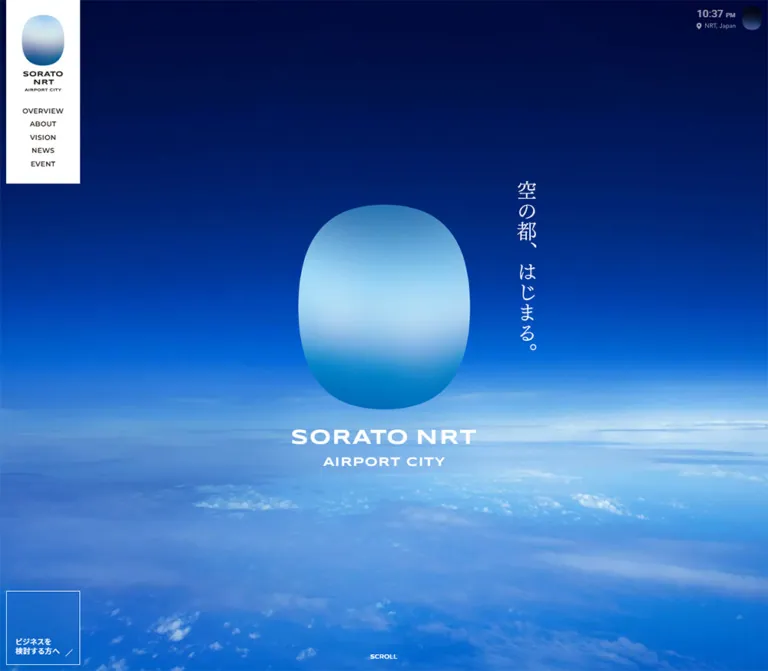
SORATO NRT presents an airport-centered urban development project through a long, atmospheric homepage. Its strongest visual relationship is between the expansive sky and a compact, rounded window-shaped emblem. A white wordmark sits below the emblem, while the Japanese statement “空の都、はじまる。” runs vertically to its right. The composition leaves most of the viewport open, allowing the cloud horizon and saturated blue field to establish scale.
The information architecture extends well beyond the opening scene. Editorial passages explain the project, a large geographic section introduces its areas, and practical news and resource links close the page. A narrow white navigation rail holds the desktop identity steady through these changing backgrounds. On mobile, the same identity moves into a compact top bar, while business access remains near the lower-left edge.
How to Read This Reference
- Measured means a value appears in the supplied computed styles or element bounds. Measurements describe the captured state, not every possible state of the site.
- Calculated means a value is derived directly from supplied measurements or CSS expressions.
- Estimated means a visual approximation from the screenshots. Estimated colors are implementation aids, not sampled source tokens.
- Recommended means an implementation choice for a new build. The CSS and prompts below are adaptations, not recovered source code.
- Source variables retain their observed names. Other token names are descriptive aliases.
- The desktop root box measured 1425px wide within a 1440px viewport; mobile measured 375px within 390px. The cause of this 15px difference is not established. Do not reproduce it as an intentional brand margin.
- Hidden or unrevealed content can still appear in the DOM. Some map paragraphs had zero-height boxes, and mobile navigation links had computed bounds despite being absent from the closed-menu screenshot.
- No additional browsing, file access, link activation, or interaction testing was performed for this reference.
Tokens — Colors
Default Palette
The interface uses deep blue text and white surfaces. The much brighter blues and greens belong primarily to imagery and atmospheric backgrounds.
| Name | Value | Evidence | Token / role |
|---|---|---|---|
| Primary Blue | #15476a |
Measured source variable and body color | Source --color-text-primary; main copy, headings, resource labels |
| White | #ffffff |
Measured | Source --color-white and --color-bg; navigation rail, footer, reversed text |
| Muted Blue | #88a1bd |
Measured from rgb(136, 161, 189) |
Alias --color-muted; dates, footer notes, policy links, download heading |
| Navigation Ink | #231815 |
Measured from navigation links | Alias --color-nav; desktop navigation and brand-adjacent text |
| Source Black | #262626 |
Declared source variable | Source --color-black; do not substitute it for measured primary blue |
| Translucent White | rgba(255,255,255,0.3) |
Measured on news and event links | Alias --surface-update; allows the background gradient to remain visible |
| Pale Rule | Approximately #d5dfeb |
Screenshot estimate | Alias --color-rule; thin download borders and quiet separators |
| Night Sky | Approximately #030b3b |
Screenshot estimate | Alias --scene-night; upper hero field |
| Vivid Sky | Approximately #0563cd |
Screenshot estimate | Alias --scene-blue; saturated middle of the hero |
| Cloud Light | Approximately #aad9ee |
Screenshot estimate | Alias --scene-cloud; atmospheric light and horizon |
| Map Mist | Approximately #c9e5dc |
Screenshot estimate | Alias --scene-mint; light upper map field |
| Map Depth | Approximately #287a6d |
Screenshot estimate | Alias --scene-teal; darker lower map field |
One airport-explanation section reports rgb(21, 70, 106), or #15466a, rather than the main #15476a. This is a measured one-channel difference, not evidence of a separate semantic color family.
The small auxiliary oval shows a coral upper edge fading into dark blue. Its warm accent is visible in the screenshots, but no matching computed token was supplied. Keep it confined to that emblem treatment; it is not an established action color.
Area Palette
These five exact values are declared in the original page. Their names indicate regional categories, but the supplied map screenshot does not expose every corresponding area state.
| Source variable | Value | Named category |
|---|---|---|
--color-sorato-airport |
#6dabde |
Airport |
--color-sorato-riverside |
#2d9b94 |
Riverside |
--color-sorato-seaside |
#3472a1 |
Seaside |
--color-sorato-urban |
#d796c0 |
Urban |
--color-sorato-naturallife |
#f6ae54 |
Natural life |
Preserve these as category colors when extending the regional explanation. Do not scatter all five across ordinary navigation, news badges, and footer controls.
The page also declares --color-link: #0000ff and --color-select: #9d9d9d. Neither is established as a dominant visible treatment in the supplied captures.
Tokens — Typography
Japanese Serif — Narrative and Major Headings
Computed stack: 'Noto Serif JP', serif.
The serif carries the project's more reflective voice: introductory prose, the airport expansion heading, regional headings, the main vision statement, and small Japanese subtitles under English section labels. Weights vary from 400 for opening prose to 500 for major headings and 600 for the vision's supporting statement.
Generous line height is central to the narrative. Desktop introduction paragraphs use 17px / 40.8px, a ratio of 2.4. Mobile keeps deliberate line breaks and uses 15px / 31.5px, a ratio of 2.1.
Japanese Sans — Body and Utility Text
Computed stack: 'Noto Sans JP', sans-serif.
This family carries explanatory copy, news titles, document labels, the business link, and footer utilities. The body element itself reports 16px / 18.4px, but actual content paragraphs usually override that compact inherited line height. Use the component values below rather than applying the body line height to all Japanese prose.
Geometric Latin Sans — Navigation and Section Labels
Computed stack: Montserrat, sans-serif.
Montserrat appears in the uppercase navigation, dates, OUR VISION, and the larger ABOUT NADC, NEWS, and EVENT labels. Navigation uses weight 600 and modest tracking. Section labels are considerably larger, creating a clear distinction between wayfinding and editorial hierarchy.
These are computed family stacks. Font-file URLs and successful loading of every requested weight were not independently inspected.
Brand Artwork and Vertical Copy
The hero H1 and vertical-copy paragraph have empty extracted text while their graphics remain visible. Their inherited 16px styles do not measure the visible wordmark or vertical lettering.
Treat the broad SORATO NRT wordmark and its AIRPORT CITY line as brand artwork. The vertical statement has a serif appearance, but its specific rendered font or asset format is not established. Prefer authorized original artwork for exact reproduction; a live-text serif adaptation is a recommendation.
Type Scale
Values are measured unless otherwise noted. Sizes and line heights are shown as size / line-height.
| Role | Desktop | Mobile | Weight / tracking |
|---|---|---|---|
| Primary navigation | 11 / 15.4px |
15 / 21px in menu DOM |
Montserrat 600; 0.04em |
| Language link | 11 / 15.4px |
11 / 15.4px |
Sans 600; 0.04em |
| Opening narrative | 17 / 40.8px |
15 / 31.5px |
Serif 400; normal tracking |
| Transitional statement | 21 / 37.8px |
16 / 28.8px |
Serif 500; 0.1em |
| Airport expansion heading | 48 / 72px |
32 / 48px |
Serif 500; 0.18em |
| Airport explanatory copy | 16 / 33.6px |
15 / 27px |
Sans 400; 0.04em |
| Regional headings | 48 / 64.8px |
32 / 43.2px |
Serif 500; generally 0.14em; mobile five-area heading uses 0.08em |
OUR VISION label |
19 / 25.65px |
14 / 18.9px |
Montserrat 600 |
| Main vision heading | 44 / 66px |
29 / 43.5px |
Serif 500; 0.04em |
| Vision supporting statement | 17 / 32.3px |
15 / 27px |
Serif 600; 0.1em |
| Four-approach introduction | 17 / 32.3px |
15 / 27px |
Serif 500; 0.1em |
| Approach descriptions | 15 / 27px |
13 / 23.4px |
Sans 400 |
| Large English section label | 45 / 60.75px |
32 / 43.2px |
Montserrat 600 |
| Japanese section subtitle | 15 / 21px |
12 / 16.8px |
Serif 500; 0.1em |
| Organizational description | 15 / 28.5px |
15 / 27px |
Sans 400; 0.02em |
| News date | 11 / 15.4px |
13 / 18.2px |
Montserrat 500; 0.1em |
| News title | 13 / 19.5px |
15 / 22.5px |
Sans 400; 0.1em |
| Event date | 11 / 15.4px |
11 / 15.4px |
Montserrat 500; 0.1em |
| Event title | 13 / 19.5px |
13 / 19.5px |
Sans 400; 0.1em |
| Archive-link label | 13 / 19.5px |
13 / 19.5px |
Sans 500; 0.1em |
| Download-section caption | 13 / 18.2px |
13 / 18.2px |
Sans 500; 0.1em |
| Footer notes and policies | 11 / 15.4px |
11 / 15.4px |
Sans 500 |
| Business-link label | 12 / 15.6px |
11 / 14.3px |
Sans 500; 0.04em |
The mobile news cards increase their date and title sizes, while event cards retain the smaller desktop sizes. This is a component-specific adjustment, not a uniform mobile scale-down.
The approach H3 wrappers expose a 16px inherited font and an icon/text grid, but their child heading styles were not supplied. Do not treat the wrapper value as a verified measurement of every visible heading glyph.
Tokens — Spacing & Shapes
Responsive Grid
The source declares a different underlying grid at the two inspected widths:
| Property | Desktop | Mobile |
|---|---|---|
--grid-columns |
12 |
16 |
--grid-space |
20px |
16px |
--grid-gutter |
16px |
8px |
--grid-width-total |
calc(100vw - 20px * 2 - 16px * (12 - 1)) |
calc(100vw - 16px * 2 - 8px * (16 - 1)) |
| Calculated single column | 102px at 1440px |
14.875px at 390px |
These are layout utilities, not a claim that the page displays twelve desktop cards or sixteen mobile cards. Component bounds remain the more useful guide for reproducing the visible layout.
Declared breakpoint tokens are 769px, 1024px, 1366px, and 1440px. Only the 1440px and 390px viewport states were supplied; exact media-query boundaries and intermediate layouts were not inspected.
Spacing Scale
The design uses several purposeful rhythms rather than one strict spacing multiple.
| Use | Measured or derived value | Application |
|---|---|---|
| Download-grid gap | 8px |
Between bordered document tiles |
| Update-card gap | 10px |
Between the two news or event items |
| Approach heading-to-body gap | 13px |
Consistent across sampled approach blocks |
| Download heading-to-grid gap | 16px |
Calculated from measured bounds |
| Approach icon-to-title gap | 21px |
Source H3 grid gap |
| Archive-link separation | 24px |
After the final update card |
| News text left inset | 25px |
Including the outer border offset |
| Mobile content inset | 32px |
Vision, news, events, and footer resources |
| Mobile approach separation | 40px |
From paragraph end to next heading |
| Mobile narrative paragraph gap | 50px |
Calculated from bounds |
| Desktop narrative paragraph gap | 64px |
Calculated from bounds |
| Desktop approach separation | 64px |
From paragraph end to next heading |
| Footer opening inset | 64px |
Footer top to download heading |
| Narrative opening inset | 71px |
Section top to introductory text |
| Desktop update-column gap | 74px |
Includes the centered vertical divider |
Border Radius
| Element | Treatment | Evidence |
|---|---|---|
| Navigation rail | Square corners | Screenshot |
| News and event links | 0px |
Computed style |
| Download links | 0px |
Computed style |
| Business access panel | Square outline | Screenshot and computed style |
| Brand emblem | Tall, softly rounded window silhouette | Screenshot; exact path not exposed |
| Auxiliary emblem | Small version of the rounded silhouette | Screenshot |
The emblem's curve is an identity feature. It does not establish a rounded-card system for the rest of the interface.
Layout Measurements
| Element | Desktop | Mobile | Evidence note |
|---|---|---|---|
| Root content width | 1425px |
375px |
Measured within larger capture viewports |
| Hero section | 1425 × 1000px |
375 × 844px |
Measured; mobile header overlays its upper portion |
| Hero H1 lockup | 310 × 424.77px |
170 × 240.30px |
Measured graphic container |
| Hero lockup position | x 557.5, y 287.61 |
x 102.5, y 297.84 |
Measured |
| Vertical-copy container | 32 × 275px |
23 × 197.66px |
Measured; not a font-size declaration |
| Vertical-copy position | x 928.5, y 249.61 |
x 296.5, y 205.84 |
Measured |
| Desktop navigation panel | Approximately 120 × 333px, 10px from left |
Replaced by top bar | Screenshot estimate |
| Mobile top bar | Not applicable | Approximately 47px high |
Screenshot estimate |
| Menu button | Not present in desktop sample | 44 × 44px |
Measured at x 329, y 1 |
| Introductory text column | 544px |
270px |
Measured, centered |
| Map section extent | 6000px |
5064px |
Measured; both equal six viewport heights |
| Map title content width | 829px |
307px |
Calculated after H2 horizontal padding |
| Vision content width | 1145px |
311px |
Measured |
| Approach-description column | Approximately 403.81px |
311px |
Measured |
| News / event column | 510.5px each |
311px each |
Measured |
| Update-card height | 130px |
145px |
Measured |
| Archive-link height | 66px |
66px |
Measured |
| Resource-grid width | 865px |
311px |
Measured |
| Download tile outer width | 283px |
311px |
Calculated from grid and border geometry |
| Business-link inner box | 118 × 118px |
119 × 49px |
Measured; enclosing outline is approximately 120 × 120px / 120 × 50px |
| Social-link hit box | 44 × 44px |
44 × 44px |
Measured |
| Document height | Approximately 16,989.64px |
Approximately 15,855.05px |
Captured state, not an implementation target |
The sampled header wrapper itself has zero height, and --header-height is also zero. Those values do not mean that the visible mobile header has no height; its chrome is positioned outside ordinary header flow.
Components
Desktop Identity Rail
Role: persistent brand recognition and primary navigation.
A narrow white rectangle sits at the upper-left edge, inset approximately 10px from the page boundary. Its content stacks vertically: the blue window emblem, compact brand lettering, five uppercase navigation links, then a globe symbol and JA / EN language choices.
The first navigation link begins around y173px. Successive link positions differ by approximately 21.4px. Labels use Montserrat 11px, weight 600, with 0.04em tracking. The small active-language treatment is pale blue with an underline beneath JA in the screenshot.
OVERVIEW, ABOUT, and VISION point to homepage anchors. NEWS and EVENT point to separate archive paths. EN points to /en/. These destinations are evidenced by links; their activated states were not inspected.
The rail remains in the same visible position across the desktop hero, map, and footer captures. It overlays full-width scenes rather than placing every scene inside a permanent narrow content column.
Mobile Header and Menu Trigger
Role: preserve identity while freeing horizontal space.
The mobile screenshot shows a white top bar approximately 47px high. A compact horizontal logo begins 16px from the left, and a thin three-line blue menu icon sits at the right. The button has a measured 44px square hit box, substantially larger than its visible strokes.
The closed screenshot does not show the desktop link list. The mobile DOM contains 15px Montserrat navigation links, but no opened-menu capture or activation result was supplied. Menu coverage, background, focus behavior, entrance motion, and close behavior remain unverified.
Opening Hero
Role: establish the airport-city identity before explanatory content.
Use a viewport-height sky field with a dark navy upper region, a luminous blue middle, and clouds across the lower portion. The centered brand lockup combines the softly rounded blue emblem with a white two-line wordmark. The cloud horizon sits below the emblem's center, leaving the vertical statement clearly legible against darker sky.
On desktop, the 310px-wide H1 container is centered at x712.5px and approximately y500px. The tagline begins 216px to the right of that horizontal center and 38px above the H1's top.
On mobile, the lockup reduces to 170px wide and remains centered in the 375px root box. The vertical statement moves relatively higher: its top is approximately 92px above the lockup's top. Preserve this asymmetric relationship rather than scaling every coordinate by the same factor.
The mobile capture also shows a fine vertical scroll guide with SCROLL beneath it near the lower center. Its animation and click behavior are not established. The desktop DOM contains the same label, although it is not clearly visible in the supplied opening still.
Time, Location, and Auxiliary Emblem
Role: add a small airport-style environmental detail.
The desktop upper-right corner contains 04:27 PM, a pin/location line reading NRT, Japan, and a small coral-to-blue oval. On mobile, this group appears near the lower-right corner of the opening scene.
The time agrees with the supplied capture's local hour and minute. That does not establish its update cadence, timezone implementation, or a connection between time and emblem color.
In the mobile footer capture, only the colored oval is clearly discernible. The evidence does not establish whether the accompanying text is hidden, recolored, or simply not visible against the white surface. The oval's click behavior is also unknown.
Persistent Business Access
Role: keep a specialist path available throughout the editorial experience.
The link labeled “ビジネスを検討する方へ” points to /business/. It occupies a square outlined panel near the desktop lower-left corner, approximately 120px on each side. The text sits near the bottom-left, accompanied by a fine diagonal stroke toward the lower-right.
On mobile, the panel becomes a shallow rectangle approximately 120 × 50px and touches the left and bottom edges. The label wraps into two lines and uses 11px sans-serif text.
The map capture uses a white outline and white lettering. The footer uses a blue outline and blue lettering. The link exists in the initial desktop DOM but is not visibly drawn in that supplied hero still; its precise visibility sequence is unverified.
Introductory Narrative and Airport Explanation
Role: turn the visual identity into a considered account of the project.
The opening narrative is a centered, narrow serif column. Desktop width is 544px; mobile width is 270px. Long line heights and generous paragraph spacing make the copy feel paced rather than dense. The mobile DOM includes different line breaks, retaining short phrases and deliberate pauses.
The airport expansion section changes scale. Its principal heading uses 48px serif text on desktop and 32px on mobile, with unusually open 0.18em tracking. The mobile heading breaks “成田空港” and “第2の開港” onto separate lines.
Supporting information switches to sans-serif. On mobile it becomes a conventional 311px-wide reading column with 32px side insets. Preserve this change of register: reflective introduction, prominent serif statement, then practical explanation.
Regional Map Scene
Role: explain the project's geographic scope and five-area structure.
The desktop map entrance fills the viewport with a blurred mint-to-teal field. Thin white geographic outlines cross the scene, and a simplified airport/runway silhouette appears in white. A large about / SORATO NRT title composition occupies the upper-left portion of the main scene, clear of the navigation rail.
The measured H2 includes 40px horizontal padding inside a 909px-wide desktop box, leaving a calculated 829px content width. Mobile leaves 307px after 34px side padding. The parent H2's inherited 16px font does not describe the large visible wordmark.
The page explicitly offers details through “マップをクリックで” on desktop and “マップをタップで” on mobile. This establishes an interaction affordance. No actual region activation, tooltip, modal, or detail-panel result was supplied.
The regional H3 headings are 48px desktop and 32px mobile. Their DOM positions suggest different presentation stages, and some following paragraphs have zero height in the sampled state. Do not present all those elements as simultaneously visible overlays based solely on their DOM presence.
The map section measures six viewport heights in both samples. This supports describing it as an extended scroll region, but does not prove six slides, a particular pinning mechanism, or any animation library.
Vision and Four Approaches
Role: articulate the project's long-term goals and implementation themes.
The section opens with a small uppercase OUR VISION label, a much larger Japanese serif statement, and a supporting serif paragraph. Desktop content begins at x200px, leaving clearance for the identity rail. On mobile, it uses 32px side insets.
The four approach descriptions form a vertical editorial sequence. Each heading wrapper is a two-column grid with an icon slot, a 21px gap, and the title area. Measured icon-column widths vary by topic: 32px, 31px, 52px, and 40px. A single fixed icon width would lose these observed proportions.
Paragraphs are approximately 404px wide on desktop and 311px on mobile. Desktop body type is 15px / 27px; mobile is 13px / 23.4px. The heading-to-paragraph gap is 13px, while successive approach blocks are separated by 64px desktop and 40px mobile.
The supplied screenshots do not show the vision artwork. The runtime property --vision-img-height reports 516px desktop and 31px mobile, but that isolated state does not establish the intended visible size of an illustration. Do not use 31px as a reusable mobile image-height token.
Organizational Introduction
Role: explain the organization behind the regional initiative.
ABOUT NADC uses the same large Montserrat label pattern as the news and event sections. A small Japanese serif subtitle follows, then a sans-serif description. The original page identifies NRT Area Design Center and describes its establishment and regional purpose.
The desktop description has a measured width of approximately 722.86px. Mobile uses the standard 311px column. A substantial mobile gap exists between subtitle and paragraph, but the supplied evidence does not reveal the intervening visual content; preserve the measured observation without inventing an illustration.
News and Event Cards
Role: provide current information in a compact, navigable format.
Desktop presents two columns, each 510.5px wide, separated by 74px and a fine vertical line. Each column begins with a 45px English label and a 15px Japanese serif subtitle. Two 130px-high update links follow, then a 66px archive link.
The surfaces are square-cornered white at 30% opacity over a pale blue-green background. There is no prominent visible shadow. A small white aircraft silhouette supplies the directional motif at the right of desktop cards and archive links.
News anatomy: date and category on the first line, Japanese title underneath, and the aircraft marker toward the right. Text begins 25px inside the card's left edge. Titles are blue; dates are muted blue.
Event anatomy: a small rectangular event image adds a visual entry point. In the desktop screenshot, thumbnails are approximately 100 × 75px. The title begins 133px from the card's left edge, leaving room for the image and gap.
On mobile the two sections stack vertically. Cards become 311 × 145px. News titles increase to 15px and dates to 13px. Event titles remain 13px and dates 11px; their measured positions indicate a distinct arrangement, with metadata near the upper-left and title content farther right. The mobile event composition is DOM-supported, not visually confirmed by a supplied mid-page screenshot.
Both card lists retain a 10px item gap and a 24px gap before their archive link. Archive labels stay 13px at both widths.
Download Tiles and Footer
Role: make project documents and institutional links easy to find after the narrative.
The atmospheric background ends at a clear white footer. A centered 865px-wide resource region starts 64px below its top. Its muted-blue heading reads “関連資料ダウンロード”.
Desktop uses three columns with 8px gaps; the fourth item begins a second row. Mobile stacks all four tiles in the 311px content column. Each tile has a thin pale-blue outline, square corners, left-aligned blue text, and a small downward arrow with a baseline at the right.
The sampled inner links use 22px vertical padding, 24px left padding, 21px right padding, and an 8px flex gap. Inner heights are approximately 62.19px for one text line and 80.38px for two lines. With the enclosing outline, visible heights are approximately 64px and 82px. Allow wrapping to determine height rather than forcing all mobile resources into identical boxes.
Below the downloads, two institutional logos remain side by side on desktop and mobile. Their link widths are 73px and 78px, with 64px between them. X and YouTube appear in a separate centered row of 44px hit boxes.
The analytics note, privacy link, social-media terms, and copyright complete the footer in small muted-blue type. Desktop policy items share a horizontal row; mobile stacks them with comfortable vertical separation. The white field and broad spacing make this a deliberate quiet ending to the page.
Tokens — Motion & Interaction
The evidence establishes transition declarations and several interaction affordances. It does not establish the complete scroll choreography.
| Treatment | Supplied value or observation | Interpretation / limitation |
|---|---|---|
| Navigation color transition | 0.8s cubic-bezier(0.33, 1, 0.68, 1) |
Measured transition; activated color not supplied |
| Update-card border transition | Same 800ms easing | Measured on news, event, and archive links |
| Download background transition | Same 800ms easing | Measured; hover fill not supplied |
| Social-link opacity transition | Same 800ms easing | Measured; no hovered screenshot |
| Policy underline transition | Same 800ms easing | Measured text-decoration-color transition |
| Source hover entry token | .01s cubic-bezier(.33, 1, .68, 1) |
Declared 10ms entry token; application to every control not verified |
| Source hover exit token | .8s cubic-bezier(.33, 1, .68, 1) |
Declared slow release token |
| Source hover opacity | .7 |
Declared target value, not an exercised state |
| Desktop rail persistence | Same location across supplied scroll captures | Visual evidence of persistent chrome |
| Map activation | Click instruction desktop; tap instruction mobile | Affordance verified; resulting UI unverified |
| Mobile menu | Visible button and navigation entries in DOM | Opening and closing behavior unverified |
| Hero sky / emblem motion | No time sequence or media asset details supplied | Cannot classify as video, animated canvas, or static imagery |
| Sampled element animations | animation: none on listed elements |
Does not exclude descendant, pseudo-element, media, or script-driven motion |
The capture process waited for document loading, finite visible motion, layout/text stability, and image decoding within bounded time limits. Perpetual animations were temporarily paused for readiness checks and then resumed. These checks reduce transitional capture errors but do not prove that all delayed content or interactions were exercised.
Some section bounds overlap in document coordinates. Combined with the extended map region and zero-height paragraphs, this makes a simple sequential interpretation of all recorded heights unreliable. Do not turn the approximately 17,000px document into a stack of fixed empty spacers.
Recommended motion direction: preserve calm pacing and restrained border, color, and opacity feedback. Verify any scroll-linked scene changes separately before reproducing them. Provide an ordinary readable document when enhanced motion is unavailable or reduced motion is requested.
Surfaces
| Layer | Appearance | Purpose |
|---|---|---|
| Opening scene | Saturated sky and cloud imagery | Establishes scale and airport identity |
| Desktop rail / mobile header | Opaque white | Keeps navigation legible over changing scenes |
| Regional scene | Soft mint and teal field with white linework | Supports geographic storytelling |
| Information background | Pale blue, green, and lightly lavender atmospheric blend | Connects organizational and update content |
| News / event link | White at 30% opacity, square edges | Separates entries without heavy containers |
| Footer | Solid white | Clear transition to reference material and institutional details |
| Resource tile | White or transparent over white, thin pale outline | Gives downloads a practical document-like treatment |
| Business panel | Transparent, outlined, light or blue foreground | Remains visually connected to the scene beneath it |
Translucent cards are measured, but no backdrop-blur effect was supplied. Avoid describing the update surfaces as verified glass effects.
The source declares high stacking levels for loading, menu, header, and auxiliary controls. These names and values describe implementation layers; they do not prove that a loading screen, menu state, or scroll-to-top action was observed.
Imagery
The defining imagery combines altitude, atmosphere, and regional geography. The opening uses a cloudscape with a broad horizon and a deep blue upper field. The rounded emblem echoes an aircraft window without adding a literal frame, bevel, or drop shadow. Its gradient shifts from pale sky blue through a luminous center into stronger blue below.
The geographic scene changes the emotional register without abandoning softness. White outlines and a white airport silhouette sit against a blended green field. The white drawing should remain crisp while the background remains diffuse. Do not reinterpret every outline as a road; the evidence does not identify the type of each geographic boundary.
Event thumbnails are practical poster-like images. Institutional logos and social marks retain their own recognizable colors or black artwork. They are exceptions to the otherwise coordinated blue-and-white interface.
Observed Asset References
Original image filenames, SVG paths, video URLs, and font-file URLs were not exposed in the supplied evidence. The following inventory identifies visible roles without inventing asset paths.
| Asset role | Evidence | Implementation guidance |
|---|---|---|
| Hero sky and clouds | Desktop and mobile screenshots | Use authorized aerial imagery with enough room for different crops |
| Main blue emblem | Both hero screenshots and header identities | Preserve original silhouette and internal gradient |
| White hero wordmark | Both hero screenshots | Use original brand artwork; preserve aspect ratio |
| Stacked desktop identity | Desktop rail screenshots | Keep the compact vertical lockup |
| Horizontal mobile identity | Mobile header screenshots | Use the responsive horizontal lockup |
| Vertical Japanese statement | Both hero screenshots | Preserve artwork or use an explicitly labeled live-text adaptation |
| White geographic drawing and airport shape | Desktop map screenshot | Use accurate project geography; do not invent regional boundaries |
| Event thumbnails | Desktop footer-adjacent capture | Retain image proportions and avoid unrelated stock photography |
| Institutional and social marks | Desktop and mobile footer screenshots | Keep recognizable original artwork and measured link spacing |
| Small warm-to-blue oval | Upper-right desktop / lower-right mobile | Treat as a separate observed emblem state; behavior is unknown |
Document links are present in the rendered page, but their contents were not opened and are not used to infer the site's imagery or design rules.
Layout & Responsive Behavior
The desktop page combines full-width visual scenes with later content that is offset to clear the left navigation rail. These are separate layout systems. The hero is centered on the root content box; the vision and update sections begin at x200px; the footer resource block returns to a centered 865px width.
The mobile adaptation makes several deliberate structural changes:
- The vertical rail becomes a horizontal top bar with a menu trigger.
- The hero lockup reduces from 310px to 170px wide, while the vertical copy is positioned relatively higher.
- The time/location group moves from the upper-right to the lower-right of the opening view.
- The business panel changes from a square to a shallow bottom-edge rectangle.
- Narrative copy narrows to 270px and uses different line breaks.
- General content uses 32px side insets, producing 311px columns in the measured 375px root box.
- News and event columns stack, and only the news typography becomes larger.
- Downloads change from a three-column grid to a single stack.
- Partner logos and social icons remain horizontal pairs, while policy links become vertical.
The mobile header visibly covers the upper part of the viewport-height hero. Do not subtract its approximate 47px from the measured 844px hero and then add a second header offset.
Only two widths were supplied. Tablet navigation, landscape behavior, browser zoom, safe-area handling, and the exact transition between rail and mobile header are unverified. The Quick Start uses a breakpoint below 769px as a recommendation informed by the declared mobile token.
Do’s and Don’ts
Do
- Preserve the relationship between the cloud horizon, centered window emblem, and vertical Japanese statement.
- Use exact primary blue
#15476afor ordinary text and white for clear structural surfaces. - Keep the desktop identity rail compact and allow imagery to extend behind the overall composition.
- Distinguish serif narrative text, sans-serif explanations, and Montserrat navigation or English labels.
- Retain deliberate Japanese line breaks and generous narrative line height.
- Use the five declared regional colors for their geographic categories.
- Keep update cards and downloads square, quiet, and free of prominent elevation shadows.
- Preserve the aircraft directional motif in the desktop update area and the downward-arrow treatment for documents.
- Give the footer a clear white background and generous separation between resources, partner marks, social links, and policies.
- Match mobile components individually, including the larger news type and unchanged event type.
Don't
- Do not replace the full project structure with a conversion-only hero and button sequence.
- Do not interpret the rounded emblem as permission to round every panel and card.
- Do not recreate the wordmark by guessing a font from the H1's inherited style.
- Do not treat screenshot-estimated sky colors as exact source declarations.
- Do not turn geographic category colors into a general rainbow of interface accents.
- Do not invent map popups, menu layouts, time-dependent themes, or video playback behavior.
- Do not hardcode the capture's 15px width difference into the page layout.
- Do not use zero-height map paragraphs or the 31px runtime image-height value as permanent design targets.
- Do not reproduce long section bounds as empty scroll padding without verifying the associated presentation behavior.
- Do not let fixed corner controls obscure footer links or mobile reading content.
Recommended Implementation Additions
These are recommendations for a new implementation, not verified features of the original page.
- Give the graphical H1 an accessible project name and provide an appropriate text equivalent for the vertical statement. Empty extracted text alone does not establish whether the original already has an accessible name.
- Make the mobile menu button expose its expanded state and controlled navigation region. Support keyboard dismissal and sensible focus restoration.
- Provide a text-based list of the five regional areas alongside any interactive map. Support keyboard access and visible selection without relying on color alone.
- Keep essential project text in readable document flow before adding scroll presentation effects. Reduced-motion mode should retain the full information sequence.
- Use visible focus indicators on navigation, cards, documents, and social links. Preserve the observed 44px menu and social hit boxes.
- Check muted-blue text and white labels against their actual backgrounds. The 11px footer text merits particular attention at zoomed and small-screen sizes.
- Reserve bottom clearance for the business panel and device safe areas.
- Let download labels grow naturally. Add document type and size when known; neither should be invented from a filename alone.
- Load the verified font families through appropriate licensed sources, with usable fallbacks. Do not invent original font-file URLs.
- Use responsive image crops and a static fallback for atmospheric media. Any optional animation should preserve the hero's legibility and composition.
Agent Prompt Guide
Quick Color Reference
- Main text: exact
#15476a. - Navigation ink: measured
#231815. - Structural white: exact
#ffffff. - Dates and footer utilities: measured
#88a1bd. - Update surfaces: exact
rgba(255,255,255,0.3). - Regional categories: exact
#6dabde,#2d9b94,#3472a1,#d796c0, and#f6ae54. - Hero and map gradients: approximate atmospheric colors; use the authorized imagery for visual fidelity.
- Resource borders: approximately
#d5dfeb, pending direct stylesheet verification.
Overall Prompt
“Create a Japanese airport-city project homepage inspired by the supplied SORATO NRT reference. Open with a viewport-height aerial cloudscape, deep navy upper sky, luminous blue horizon, a centered rounded window emblem, white brand artwork, and the vertical statement ‘空の都、はじまる。’ to its right. Keep a narrow white identity rail at the desktop upper-left and a small time/location detail at the upper-right. Continue into spacious serif narrative, an accurate regional map scene on soft mint and teal, a vision section, organizational information, separate news and event lists, and a white resource footer. Use Noto Serif JP for editorial Japanese, Noto Sans JP for explanatory copy, and Montserrat for English navigation and section labels. Main text is #15476a. Cards are square and translucent; downloads use fine outlines. On mobile, use a compact white header, 32px content insets, stacked update sections, and a shallow business link at the lower-left. Use supplied brand and geographic assets, and do not invent unverified interactions.”
Example Component Prompts
- Hero: “Compose a 1440 × 1000 desktop opening around a 310px-wide brand lockup centered over blue sky and clouds. Place a narrow vertical Japanese statement to the right and slightly above the lockup. Leave broad uninterrupted sky above and around the artwork. Use a small white navigation rail at the upper-left. For the 390 × 844 mobile viewport, reduce the lockup to 170px and move the vertical statement relatively higher.”
- Identity rail: “Build a square-cornered white panel approximately 120px wide and 333px high, inset 10px from the desktop left edge. Stack the supplied emblem and wordmark, five centered uppercase Montserrat navigation links at 11px, and a compact globe / JA / EN row. Replace it with a roughly 47px mobile header containing a horizontal logo and a 44px menu button.”
- Regional scene: “Use an accurate white airport and regional outline drawing over a soft mint-to-teal field. Place the supplied about / project title artwork prominently above the map. Provide click and tap instructions appropriate to the input context, plus a keyboard-accessible area list. Keep any detail interaction simple until its required behavior is specified.”
- Update area: “Create two desktop columns for NEWS and EVENT, each about 510px wide, separated by a 74px gap and a fine vertical rule. Use white at 30% opacity for square 130px-high links, muted-blue dates, blue titles, and small white aircraft direction marks. Include small event poster thumbnails. Stack the sections on mobile and increase news titles to 15px while retaining 13px event titles.”
- Resource footer: “Create a white footer with a centered 865px resource region and 64px opening space. Use three columns of thin pale-blue outlined document links with 8px gaps, blue labels, and right-aligned download arrows. On mobile, stack the four links within 32px side insets. Keep the partner logos as a horizontal pair, then center social links and small policy text below.”
Quick Start
CSS Custom Properties
This is a reusable visual adaptation. Exact source colors and type values are identified in comments; scene gradients, the rule color, hover targets, and responsive implementation choices are recommendations. It does not reproduce unverified scroll choreography or map behavior.
Use authorized image assets inside .hero__art, .brand--stacked, .brand--horizontal, and .about-scene__map. Original asset URLs were not exposed. The .hero__tagline rule is a live-text alternative to the graphical statement, not a recovered font declaration.
Suggested structure: a fixed .site-nav, a .hero containing sky media and the H1 lockup, editorial sections, .updates containing two .update-column sections, and a .site-footer containing .footer-inner. Apply data-surface='light' to fixed auxiliary elements when they need blue foregrounds over light content. A menu controller should manage the navigation's hidden attribute and the trigger's aria-expanded state.
:root {
  /* Exact measured interface colors */
  --color-primary: #15476a;
  --color-white: #ffffff;
  --color-nav: #231815;
  --color-muted: #88a1bd;
  --surface-update: rgb(255 255 255 / 30%);

  /* Exact declared regional colors */
  --area-airport: #6dabde;
  --area-riverside: #2d9b94;
  --area-seaside: #3472a1;
  --area-urban: #d796c0;
  --area-natural: #f6ae54;

  /* Visual approximations for fallback rendering */
  --color-rule: #d5dfeb;
  --scene-night: #030b3b;
  --scene-blue: #0563cd;
  --scene-cloud: #aad9ee;
  --scene-mint: #c9e5dc;
  --scene-teal: #287a6d;

  /* Computed family stacks; load fonts separately */
  --font-body: 'Noto Sans JP', sans-serif;
  --font-editorial: 'Noto Serif JP', serif;
  --font-latin: Montserrat, sans-serif;

  --text-body: 15px;
  --text-narrative: 17px;
  --text-section: 45px;
  --text-subtitle: 15px;
  --text-vision: 44px;
  --text-news: 13px;
  --text-date: 11px;
  --text-utility: 11px;

  /* Measured desktop geometry */
  --rail-width: 120px;
  --mobile-header-height: 47px;
  --content-left: 200px;
  --content-right: 80px;
  --resource-width: 865px;
  --narrative-width: 544px;
  --update-gap: 74px;
  --update-height: 130px;
  --archive-height: 66px;
  --rule-width: 1px;
  --radius-panel: 0px;

  /* Source transition values */
  --ease-release: cubic-bezier(.33, 1, .68, 1);
  --motion-enter: 10ms;
  --motion-leave: 800ms;

  /* Recommended compact stacking scheme */
  --layer-scene: 0;
  --layer-utility: 20;
  --layer-header: 30;
  --layer-menu: 40;
}

* {
  box-sizing: border-box;
}

body {
  margin: 0;
  color: var(--color-primary);
  background: var(--color-white);
  font-family: var(--font-body);
}

img {
  display: block;
  max-width: 100%;
}

button,
input {
  font: inherit;
}

[hidden] {
  display: none !important;
}

.site-nav {
  position: fixed;
  z-index: var(--layer-header);
  inset: 0 auto auto 10px;
  width: var(--rail-width);
  min-height: 333px;
  padding: 24px 18px;
  color: var(--color-nav);
  background: var(--color-white);
  text-align: center;
}

.brand--stacked {
  width: 70px;
  margin-inline: auto;
}

.brand--horizontal,
.menu-toggle {
  display: none;
}

.nav-links {
  display: grid;
  gap: 6px;
  margin: 24px 0 16px;
  padding: 0;
  list-style: none;
}

.nav-links a {
  color: inherit;
  font: 600 11px / 1.4 var(--font-latin);
  letter-spacing: .04em;
  text-decoration: none;
  transition: color var(--motion-leave) var(--ease-release);
}

.language-links {
  display: flex;
  align-items: center;
  justify-content: center;
  gap: 12px;
  font-size: 11px;
}

.language-links [aria-current] {
  color: var(--color-muted);
  text-decoration: underline;
  text-underline-offset: 6px;
}

.hero {
  position: relative;
  isolation: isolate;
  min-height: 100vh;
  min-height: 100svh;
  color: var(--color-white);
  background: linear-gradient(
    var(--scene-night),
    var(--scene-blue) 53%,
    var(--scene-cloud) 72%,
    var(--scene-blue)
  );
}

.hero__sky {
  position: absolute;
  z-index: -1;
  inset: 0;
  width: 100%;
  height: 100%;
  object-fit: cover;
  object-position: center;
}

.hero__lockup {
  position: absolute;
  top: 50%;
  left: 50%;
  width: 310px;
  margin: 0;
  transform: translate(-50%, -50%);
}

.hero__art {
  width: 100%;
  height: auto;
}

.hero__tagline {
  /* Recommended live-text alternative to source artwork */
  position: absolute;
  top: calc(50% - 250px);
  left: calc(50% + 216px);
  margin: 0;
  writing-mode: vertical-rl;
  font: 400 32px / 1 var(--font-editorial);
}

.hero__scroll {
  position: absolute;
  left: 50%;
  bottom: 80px;
  display: grid;
  justify-items: center;
  gap: 16px;
  transform: translateX(-50%);
  font: 600 10px / 1.4 var(--font-latin);
  letter-spacing: .04em;
}

.hero__scroll::before {
  content: '';
  width: 1px;
  height: 48px;
  background: rgb(255 255 255 / 35%);
}

.business-link {
  position: fixed;
  z-index: var(--layer-utility);
  left: 10px;
  bottom: 10px;
  display: flex;
  align-items: flex-end;
  justify-content: space-between;
  width: 120px;
  height: 120px;
  padding: 14px;
  border: 1px solid currentColor;
  color: var(--color-white);
  background: transparent;
  font: 500 12px / 1.3 var(--font-body);
  letter-spacing: .04em;
  text-decoration: none;
}

.business-link::after {
  content: '';
  flex: 0 0 16px;
  height: 1px;
  margin-bottom: 4px;
  background: currentColor;
  transform: rotate(-45deg);
}

.business-link[data-surface='light'] {
  color: var(--color-primary);
}

.site-status {
  position: fixed;
  z-index: var(--layer-utility);
  top: 10px;
  right: 10px;
  display: flex;
  align-items: center;
  gap: 12px;
  color: rgb(255 255 255 / 65%);
}

.site-status__mark {
  /* Approximation of the small auxiliary emblem */
  width: 32px;
  aspect-ratio: 32 / 39;
  border-radius: 48% / 44%;
  background: linear-gradient(#ef7564, #9da6b3 40%, #005282);
}

.intro {
  padding: 71px 24px 96px;
  color: var(--color-white);
  background: var(--scene-night);
}

.intro__copy {
  width: min(100%, var(--narrative-width));
  margin-inline: auto;
  font: 400 var(--text-narrative) / 2.4 var(--font-editorial);
}

.intro__copy p {
  margin: 0;
}

.intro__copy p + p {
  margin-top: 64px;
}

.about-scene {
  position: relative;
  min-height: 100svh;
  color: var(--color-white);
  background:
    radial-gradient(ellipse at 35% 20%, #d4eee1, transparent 65%),
    linear-gradient(var(--scene-mint), var(--scene-teal));
}

.about-scene__map {
  width: 100%;
  height: auto;
}

.content-frame {
  padding-inline: var(--content-left) var(--content-right);
}

.vision-title {
  margin: 0;
  font: 500 var(--text-vision) / 1.5 var(--font-editorial);
  letter-spacing: .04em;
}

.approach-list {
  max-width: 404px;
}

.approach + .approach {
  margin-top: 64px;
}

.approach__heading {
  display: grid;
  grid-template-columns: var(--approach-icon-width, 32px) minmax(0, 1fr);
  align-items: center;
  gap: 21px;
  margin: 0;
}

.approach p {
  margin: 13px 0 0;
  font: 400 15px / 1.8 var(--font-body);
}

.section-label {
  margin: 0;
  font: 600 var(--text-section) / 1.35 var(--font-latin);
}

.section-subtitle {
  margin: -2px 0 0;
  font: 500 var(--text-subtitle) / 1.4 var(--font-editorial);
  letter-spacing: .1em;
}

.updates {
  display: grid;
  grid-template-columns: repeat(2, minmax(0, 1fr));
  gap: var(--update-gap);
  padding: 80px 130px 124px 200px;
  background: linear-gradient(115deg, #c1d4e9, #deeee5 75%, #b7ced5);
}

.update-column {
  position: relative;
  min-width: 0;
}

.update-column + .update-column::before {
  content: '';
  position: absolute;
  top: 0;
  bottom: 0;
  left: -37px;
  width: 1px;
  background: rgb(255 255 255 / 45%);
}

.update-list {
  display: grid;
  gap: 10px;
  margin-top: 31px;
}

.news-card,
.archive-link {
  display: grid;
  grid-template-columns: minmax(0, 1fr) 63px;
  align-items: center;
  min-height: var(--update-height);
  padding: 24px;
  border: 1px solid transparent;
  border-radius: 0;
  color: var(--color-primary);
  background: var(--surface-update);
  text-decoration: none;
  transition: border-color var(--motion-leave) var(--ease-release);
}

.news-card__date {
  color: var(--color-muted);
  font: 500 var(--text-date) / 1.4 var(--font-latin);
  letter-spacing: .1em;
}

.news-card__title {
  margin: 8px 0 0;
  font: 400 var(--text-news) / 1.5 var(--font-body);
  letter-spacing: .1em;
}

.card-direction {
  justify-self: end;
  width: 20px;
  color: var(--color-white);
}

.archive-link {
  min-height: var(--archive-height);
  margin-top: 24px;
  font: 500 13px / 1.5 var(--font-body);
  letter-spacing: .1em;
}

.site-footer {
  padding: 64px 32px calc(64px + env(safe-area-inset-bottom, 0px));
  background: var(--color-white);
}

.footer-inner {
  max-width: var(--resource-width);
  margin-inline: auto;
}

.download-heading {
  margin: 0 0 16px;
  color: var(--color-muted);
  font: 500 13px / 1.4 var(--font-body);
  letter-spacing: .1em;
}

.download-grid {
  display: grid;
  grid-template-columns: repeat(3, minmax(0, 1fr));
  gap: 8px;
}

.download-link {
  display: flex;
  align-items: center;
  justify-content: space-between;
  gap: 8px;
  min-width: 0;
  padding: 22px 21px 22px 24px;
  border: 1px solid var(--color-rule);
  border-radius: 0;
  color: var(--color-primary);
  font: 500 13px / 1.4 var(--font-body);
  letter-spacing: .04em;
  text-decoration: none;
  transition: background-color var(--motion-leave) var(--ease-release);
}

.download-link__icon {
  flex: 0 0 16px;
  color: var(--color-muted);
}

.partner-links {
  display: flex;
  align-items: center;
  justify-content: center;
  gap: 64px;
  margin-top: 64px;
}

.social-links {
  display: flex;
  justify-content: center;
  margin-top: 64px;
}

.social-links a {
  display: grid;
  place-items: center;
  width: 44px;
  height: 44px;
  transition: opacity var(--motion-leave) var(--ease-release);
}

.footer-note,
.footer-policies {
  color: var(--color-muted);
  font: 500 11px / 1.4 var(--font-body);
  text-align: center;
}

.footer-note {
  margin: 24px 0;
}

.footer-policies {
  display: flex;
  align-items: center;
  justify-content: center;
  gap: 32px;
}

.footer-policies a {
  color: inherit;
  text-underline-offset: 3px;
}

/* Recommended feedback targets; original hover outcomes were not captured */
@media (hover: hover) {
  .nav-links a:hover {
    color: var(--color-muted);
    transition-duration: var(--motion-enter);
  }

  .news-card:hover,
  .archive-link:hover {
    border-color: rgb(255 255 255 / 75%);
    transition-duration: var(--motion-enter);
  }

  .download-link:hover {
    background: #f1f6fa;
    transition-duration: var(--motion-enter);
  }

  .social-links a:hover {
    opacity: .7;
    transition-duration: var(--motion-enter);
  }
}

/* Recommended mobile boundary, informed by the source 769px token */
@media (width < 769px) {
  :root {
    --content-left: 32px;
    --content-right: 32px;
    --narrative-width: 270px;
    --text-narrative: 15px;
    --text-section: 32px;
    --text-subtitle: 12px;
    --text-vision: 29px;
    --text-news: 15px;
    --text-date: 13px;
    --update-height: 145px;
  }

  .site-nav {
    inset: 0 0 auto;
    display: flex;
    align-items: center;
    justify-content: space-between;
    width: auto;
    min-height: 0;
    height: var(--mobile-header-height);
    padding: 0 2px 0 16px;
  }

  .brand--stacked {
    display: none;
  }

  .brand--horizontal {
    display: block;
    width: 137px;
  }

  .menu-toggle {
    display: grid;
    place-content: center;
    gap: 4px;
    width: 44px;
    height: 44px;
    padding: 0;
    border: 0;
    color: var(--color-primary);
    background: transparent;
  }

  .menu-toggle span {
    width: 16px;
    height: 1px;
    background: currentColor;
  }

  .nav-links a {
    font-size: 15px;
  }

  /* Optional menu panel; its open appearance is an adaptation */
  .mobile-menu {
    position: fixed;
    z-index: var(--layer-menu);
    inset: var(--mobile-header-height) 0 auto;
    max-height: calc(100svh - var(--mobile-header-height));
    overflow-y: auto;
    padding: 24px 32px 40px;
    background: var(--color-white);
    text-align: left;
  }

  .hero__lockup {
    top: calc(50% - 4px);
    width: 170px;
  }

  .hero__tagline {
    top: calc(50% - 216px);
    left: calc(50% + 109px);
    font-size: 23px;
  }

  .business-link {
    left: 0;
    bottom: 0;
    width: 120px;
    height: calc(50px + env(safe-area-inset-bottom, 0px));
    padding: 2px 12px calc(8px + env(safe-area-inset-bottom, 0px));
    font-size: 11px;
  }

  .site-status {
    top: auto;
    bottom: calc(8px + env(safe-area-inset-bottom, 0px));
    right: 8px;
  }

  .site-status__mark {
    width: 27px;
  }

  .intro__copy {
    line-height: 2.1;
  }

  .intro__copy p + p {
    margin-top: 50px;
  }

  .approach-list {
    max-width: none;
  }

  .approach + .approach {
    margin-top: 40px;
  }

  .approach p {
    font-size: 13px;
  }

  .updates {
    grid-template-columns: minmax(0, 1fr);
    gap: 120px;
    padding: 80px 32px 124px;
  }

  .update-column + .update-column::before {
    display: none;
  }

  .update-list {
    margin-top: 24px;
  }

  .news-card,
  .archive-link {
    grid-template-columns: minmax(0, 1fr) 42px;
  }

  .download-grid {
    grid-template-columns: minmax(0, 1fr);
  }

  .footer-note {
    margin-block: 16px;
  }

  .footer-policies {
    flex-direction: column;
    gap: 16px;
  }
}

/* Recommended accessibility additions */
:where(a, button):focus-visible {
  outline: 2px solid currentColor;
  outline-offset: 4px;
}

@media (prefers-reduced-motion: reduce) {
  html {
    scroll-behavior: auto;
  }

  .nav-links a,
  .news-card,
  .archive-link,
  .download-link,
  .social-links a {
    transition: none;
  }
}
The event thumbnail layout should remain a separate component from .news-card: the original uses different mobile typography and content offsets. The starter intentionally leaves that layout, map activation, menu state management, time updates, and any scroll scene controller to explicit implementation rather than implying that their behavior was recovered.
Tailwind v4 Token Mapping
Optional aliases for an implementation that already uses Tailwind v4. This does not imply that the original site uses Tailwind. Define the preceding custom properties first.
@theme inline {
  --color-primary: #15476a;
  --color-muted: #88a1bd;
  --color-nav: #231815;
  --color-rule: #d5dfeb;
  --color-airport: #6dabde;
  --color-riverside: #2d9b94;
  --color-seaside: #3472a1;
  --color-urban: #d796c0;
  --color-natural: #f6ae54;

  --font-body: 'Noto Sans JP', sans-serif;
  --font-editorial: 'Noto Serif JP', serif;
  --font-latin: Montserrat, sans-serif;

  --text-section: var(--text-section);
  --text-vision: var(--text-vision);
  --text-news: var(--text-news);
  --spacing-content-inset: 32px;
  --spacing-rail: 120px;
  --radius-panel: 0px;
}
Sources & Evidence
- Original and final website: https://sorato-nadc.com/. The supplied browser report records HTTP 200 and the same project identity at both URLs.
- Capture timestamp: September 12, 2026, 07:27:54.649 UTC / 16:27:54.649 JST.
- Desktop evidence: 1440 × 1000 CSS-pixel viewport; supplied opening, map-entrance, and footer-area screenshots; rendered root width 1425px; computed styles and element bounds across the homepage.
- Mobile evidence: 390 × 844 CSS-pixel viewport; supplied opening and footer screenshots; rendered root width 375px; computed styles and element bounds across the homepage.
- Original-page DOM: section text, navigation targets, news and event links, document-link labels, organizational introduction, footer links, custom properties, typography, colors, transitions, and element geometry.
- Observed interaction scope: capture-system scrolling and settled page views. No supplied results for opening the menu, activating a map region, following links, hovering cards, changing language, or using the auxiliary emblem.
- Inspection limitations: readiness checks were bounded; some content had zero-height or overlapping boxes; media formats and asset URLs were not exposed; intermediate responsive widths and complete motion sequences were not supplied. SharedWorkers and service workers were disabled during the browser inspection.
This reference describes the current homepage shown by the supplied evidence. Exact source values, screenshot estimates, and recommended implementation choices are kept distinct throughout.
# SORATO NRT / Airport City — Style Reference

> An airport window suspended above the clouds, opening into a regional vision.

**Website:** [SORATO NRT](https://sorato-nadc.com/)
**Original URL:** https://sorato-nadc.com/
**Final URL:** https://sorato-nadc.com/
**Theme:** a dark blue sky opening, a soft green map scene, pale atmospheric information surfaces, and a white resource footer. No selectable theme was verified.
**Inspected:** September 12, 2026, using supplied browser evidence retrieved at 07:27:54.649 UTC / 16:27:54.649 JST.
**Viewports:** 1440 × 1000 desktop and 390 × 844 mobile, in CSS pixels.
**Scope:** the current Japanese project homepage: opening identity, introductory narrative, airport expansion explanation, regional map section, vision, organizational introduction, news, events, downloads, and footer. Visual captures cover the desktop hero, map entrance, and footer, plus the mobile hero and footer. The intervening content is documented through rendered DOM and computed styles.

SORATO NRT presents an airport-centered urban development project through a long, atmospheric homepage. Its strongest visual relationship is between the expansive sky and a compact, rounded window-shaped emblem. A white wordmark sits below the emblem, while the Japanese statement “空の都、はじまる。” runs vertically to its right. The composition leaves most of the viewport open, allowing the cloud horizon and saturated blue field to establish scale.

The information architecture extends well beyond the opening scene. Editorial passages explain the project, a large geographic section introduces its areas, and practical news and resource links close the page. A narrow white navigation rail holds the desktop identity steady through these changing backgrounds. On mobile, the same identity moves into a compact top bar, while business access remains near the lower-left edge.

## How to Read This Reference

- **Measured** means a value appears in the supplied computed styles or element bounds. Measurements describe the captured state, not every possible state of the site.
- **Calculated** means a value is derived directly from supplied measurements or CSS expressions.
- **Estimated** means a visual approximation from the screenshots. Estimated colors are implementation aids, not sampled source tokens.
- **Recommended** means an implementation choice for a new build. The CSS and prompts below are adaptations, not recovered source code.
- **Source variables** retain their observed names. Other token names are descriptive aliases.
- The desktop root box measured **1425px** wide within a **1440px** viewport; mobile measured **375px** within **390px**. The cause of this 15px difference is not established. Do not reproduce it as an intentional brand margin.
- Hidden or unrevealed content can still appear in the DOM. Some map paragraphs had zero-height boxes, and mobile navigation links had computed bounds despite being absent from the closed-menu screenshot.
- No additional browsing, file access, link activation, or interaction testing was performed for this reference.

## Tokens — Colors

### Default Palette

The interface uses deep blue text and white surfaces. The much brighter blues and greens belong primarily to imagery and atmospheric backgrounds.

| Name | Value | Evidence | Token / role |
| --- | --- | --- | --- |
| Primary Blue | `#15476a` | Measured source variable and body color | Source `--color-text-primary`; main copy, headings, resource labels |
| White | `#ffffff` | Measured | Source `--color-white` and `--color-bg`; navigation rail, footer, reversed text |
| Muted Blue | `#88a1bd` | Measured from `rgb(136, 161, 189)` | Alias `--color-muted`; dates, footer notes, policy links, download heading |
| Navigation Ink | `#231815` | Measured from navigation links | Alias `--color-nav`; desktop navigation and brand-adjacent text |
| Source Black | `#262626` | Declared source variable | Source `--color-black`; do not substitute it for measured primary blue |
| Translucent White | `rgba(255,255,255,0.3)` | Measured on news and event links | Alias `--surface-update`; allows the background gradient to remain visible |
| Pale Rule | Approximately `#d5dfeb` | Screenshot estimate | Alias `--color-rule`; thin download borders and quiet separators |
| Night Sky | Approximately `#030b3b` | Screenshot estimate | Alias `--scene-night`; upper hero field |
| Vivid Sky | Approximately `#0563cd` | Screenshot estimate | Alias `--scene-blue`; saturated middle of the hero |
| Cloud Light | Approximately `#aad9ee` | Screenshot estimate | Alias `--scene-cloud`; atmospheric light and horizon |
| Map Mist | Approximately `#c9e5dc` | Screenshot estimate | Alias `--scene-mint`; light upper map field |
| Map Depth | Approximately `#287a6d` | Screenshot estimate | Alias `--scene-teal`; darker lower map field |

One airport-explanation section reports `rgb(21, 70, 106)`, or `#15466a`, rather than the main `#15476a`. This is a measured one-channel difference, not evidence of a separate semantic color family.

The small auxiliary oval shows a coral upper edge fading into dark blue. Its warm accent is visible in the screenshots, but no matching computed token was supplied. Keep it confined to that emblem treatment; it is not an established action color.

### Area Palette

These five exact values are declared in the original page. Their names indicate regional categories, but the supplied map screenshot does not expose every corresponding area state.

| Source variable | Value | Named category |
| --- | --- | --- |
| `--color-sorato-airport` | `#6dabde` | Airport |
| `--color-sorato-riverside` | `#2d9b94` | Riverside |
| `--color-sorato-seaside` | `#3472a1` | Seaside |
| `--color-sorato-urban` | `#d796c0` | Urban |
| `--color-sorato-naturallife` | `#f6ae54` | Natural life |

Preserve these as category colors when extending the regional explanation. Do not scatter all five across ordinary navigation, news badges, and footer controls.

The page also declares `--color-link: #0000ff` and `--color-select: #9d9d9d`. Neither is established as a dominant visible treatment in the supplied captures.

## Tokens — Typography

### Japanese Serif — Narrative and Major Headings

**Computed stack:** `'Noto Serif JP', serif`.

The serif carries the project's more reflective voice: introductory prose, the airport expansion heading, regional headings, the main vision statement, and small Japanese subtitles under English section labels. Weights vary from 400 for opening prose to 500 for major headings and 600 for the vision's supporting statement.

Generous line height is central to the narrative. Desktop introduction paragraphs use **17px / 40.8px**, a ratio of **2.4**. Mobile keeps deliberate line breaks and uses **15px / 31.5px**, a ratio of **2.1**.

### Japanese Sans — Body and Utility Text

**Computed stack:** `'Noto Sans JP', sans-serif`.

This family carries explanatory copy, news titles, document labels, the business link, and footer utilities. The body element itself reports 16px / 18.4px, but actual content paragraphs usually override that compact inherited line height. Use the component values below rather than applying the body line height to all Japanese prose.

### Geometric Latin Sans — Navigation and Section Labels

**Computed stack:** `Montserrat, sans-serif`.

Montserrat appears in the uppercase navigation, dates, `OUR VISION`, and the larger `ABOUT NADC`, `NEWS`, and `EVENT` labels. Navigation uses weight 600 and modest tracking. Section labels are considerably larger, creating a clear distinction between wayfinding and editorial hierarchy.

These are computed family stacks. Font-file URLs and successful loading of every requested weight were not independently inspected.

### Brand Artwork and Vertical Copy

The hero H1 and vertical-copy paragraph have empty extracted text while their graphics remain visible. Their inherited 16px styles do **not** measure the visible wordmark or vertical lettering.

Treat the broad `SORATO NRT` wordmark and its `AIRPORT CITY` line as brand artwork. The vertical statement has a serif appearance, but its specific rendered font or asset format is not established. Prefer authorized original artwork for exact reproduction; a live-text serif adaptation is a recommendation.

### Type Scale

Values are measured unless otherwise noted. Sizes and line heights are shown as `size / line-height`.

| Role | Desktop | Mobile | Weight / tracking |
| --- | --- | --- | --- |
| Primary navigation | `11 / 15.4px` | `15 / 21px` in menu DOM | Montserrat 600; `0.04em` |
| Language link | `11 / 15.4px` | `11 / 15.4px` | Sans 600; `0.04em` |
| Opening narrative | `17 / 40.8px` | `15 / 31.5px` | Serif 400; normal tracking |
| Transitional statement | `21 / 37.8px` | `16 / 28.8px` | Serif 500; `0.1em` |
| Airport expansion heading | `48 / 72px` | `32 / 48px` | Serif 500; `0.18em` |
| Airport explanatory copy | `16 / 33.6px` | `15 / 27px` | Sans 400; `0.04em` |
| Regional headings | `48 / 64.8px` | `32 / 43.2px` | Serif 500; generally `0.14em`; mobile five-area heading uses `0.08em` |
| `OUR VISION` label | `19 / 25.65px` | `14 / 18.9px` | Montserrat 600 |
| Main vision heading | `44 / 66px` | `29 / 43.5px` | Serif 500; `0.04em` |
| Vision supporting statement | `17 / 32.3px` | `15 / 27px` | Serif 600; `0.1em` |
| Four-approach introduction | `17 / 32.3px` | `15 / 27px` | Serif 500; `0.1em` |
| Approach descriptions | `15 / 27px` | `13 / 23.4px` | Sans 400 |
| Large English section label | `45 / 60.75px` | `32 / 43.2px` | Montserrat 600 |
| Japanese section subtitle | `15 / 21px` | `12 / 16.8px` | Serif 500; `0.1em` |
| Organizational description | `15 / 28.5px` | `15 / 27px` | Sans 400; `0.02em` |
| News date | `11 / 15.4px` | `13 / 18.2px` | Montserrat 500; `0.1em` |
| News title | `13 / 19.5px` | `15 / 22.5px` | Sans 400; `0.1em` |
| Event date | `11 / 15.4px` | `11 / 15.4px` | Montserrat 500; `0.1em` |
| Event title | `13 / 19.5px` | `13 / 19.5px` | Sans 400; `0.1em` |
| Archive-link label | `13 / 19.5px` | `13 / 19.5px` | Sans 500; `0.1em` |
| Download-section caption | `13 / 18.2px` | `13 / 18.2px` | Sans 500; `0.1em` |
| Footer notes and policies | `11 / 15.4px` | `11 / 15.4px` | Sans 500 |
| Business-link label | `12 / 15.6px` | `11 / 14.3px` | Sans 500; `0.04em` |

The mobile news cards increase their date and title sizes, while event cards retain the smaller desktop sizes. This is a component-specific adjustment, not a uniform mobile scale-down.

The approach H3 wrappers expose a 16px inherited font and an icon/text grid, but their child heading styles were not supplied. Do not treat the wrapper value as a verified measurement of every visible heading glyph.

## Tokens — Spacing & Shapes

### Responsive Grid

The source declares a different underlying grid at the two inspected widths:

| Property | Desktop | Mobile |
| --- | --- | --- |
| `--grid-columns` | `12` | `16` |
| `--grid-space` | `20px` | `16px` |
| `--grid-gutter` | `16px` | `8px` |
| `--grid-width-total` | `calc(100vw - 20px * 2 - 16px * (12 - 1))` | `calc(100vw - 16px * 2 - 8px * (16 - 1))` |
| Calculated single column | `102px` at 1440px | `14.875px` at 390px |

These are layout utilities, not a claim that the page displays twelve desktop cards or sixteen mobile cards. Component bounds remain the more useful guide for reproducing the visible layout.

Declared breakpoint tokens are **769px**, **1024px**, **1366px**, and **1440px**. Only the 1440px and 390px viewport states were supplied; exact media-query boundaries and intermediate layouts were not inspected.

### Spacing Scale

The design uses several purposeful rhythms rather than one strict spacing multiple.

| Use | Measured or derived value | Application |
| --- | --- | --- |
| Download-grid gap | `8px` | Between bordered document tiles |
| Update-card gap | `10px` | Between the two news or event items |
| Approach heading-to-body gap | `13px` | Consistent across sampled approach blocks |
| Download heading-to-grid gap | `16px` | Calculated from measured bounds |
| Approach icon-to-title gap | `21px` | Source H3 grid gap |
| Archive-link separation | `24px` | After the final update card |
| News text left inset | `25px` | Including the outer border offset |
| Mobile content inset | `32px` | Vision, news, events, and footer resources |
| Mobile approach separation | `40px` | From paragraph end to next heading |
| Mobile narrative paragraph gap | `50px` | Calculated from bounds |
| Desktop narrative paragraph gap | `64px` | Calculated from bounds |
| Desktop approach separation | `64px` | From paragraph end to next heading |
| Footer opening inset | `64px` | Footer top to download heading |
| Narrative opening inset | `71px` | Section top to introductory text |
| Desktop update-column gap | `74px` | Includes the centered vertical divider |

### Border Radius

| Element | Treatment | Evidence |
| --- | --- | --- |
| Navigation rail | Square corners | Screenshot |
| News and event links | `0px` | Computed style |
| Download links | `0px` | Computed style |
| Business access panel | Square outline | Screenshot and computed style |
| Brand emblem | Tall, softly rounded window silhouette | Screenshot; exact path not exposed |
| Auxiliary emblem | Small version of the rounded silhouette | Screenshot |

The emblem's curve is an identity feature. It does not establish a rounded-card system for the rest of the interface.

### Layout Measurements

| Element | Desktop | Mobile | Evidence note |
| --- | --- | --- | --- |
| Root content width | `1425px` | `375px` | Measured within larger capture viewports |
| Hero section | `1425 × 1000px` | `375 × 844px` | Measured; mobile header overlays its upper portion |
| Hero H1 lockup | `310 × 424.77px` | `170 × 240.30px` | Measured graphic container |
| Hero lockup position | `x 557.5, y 287.61` | `x 102.5, y 297.84` | Measured |
| Vertical-copy container | `32 × 275px` | `23 × 197.66px` | Measured; not a font-size declaration |
| Vertical-copy position | `x 928.5, y 249.61` | `x 296.5, y 205.84` | Measured |
| Desktop navigation panel | Approximately `120 × 333px`, `10px` from left | Replaced by top bar | Screenshot estimate |
| Mobile top bar | Not applicable | Approximately `47px` high | Screenshot estimate |
| Menu button | Not present in desktop sample | `44 × 44px` | Measured at `x 329, y 1` |
| Introductory text column | `544px` | `270px` | Measured, centered |
| Map section extent | `6000px` | `5064px` | Measured; both equal six viewport heights |
| Map title content width | `829px` | `307px` | Calculated after H2 horizontal padding |
| Vision content width | `1145px` | `311px` | Measured |
| Approach-description column | Approximately `403.81px` | `311px` | Measured |
| News / event column | `510.5px` each | `311px` each | Measured |
| Update-card height | `130px` | `145px` | Measured |
| Archive-link height | `66px` | `66px` | Measured |
| Resource-grid width | `865px` | `311px` | Measured |
| Download tile outer width | `283px` | `311px` | Calculated from grid and border geometry |
| Business-link inner box | `118 × 118px` | `119 × 49px` | Measured; enclosing outline is approximately `120 × 120px` / `120 × 50px` |
| Social-link hit box | `44 × 44px` | `44 × 44px` | Measured |
| Document height | Approximately `16,989.64px` | Approximately `15,855.05px` | Captured state, not an implementation target |

The sampled header wrapper itself has zero height, and `--header-height` is also zero. Those values do not mean that the visible mobile header has no height; its chrome is positioned outside ordinary header flow.

## Components

### Desktop Identity Rail

**Role:** persistent brand recognition and primary navigation.

A narrow white rectangle sits at the upper-left edge, inset approximately 10px from the page boundary. Its content stacks vertically: the blue window emblem, compact brand lettering, five uppercase navigation links, then a globe symbol and `JA` / `EN` language choices.

The first navigation link begins around y173px. Successive link positions differ by approximately 21.4px. Labels use Montserrat 11px, weight 600, with 0.04em tracking. The small active-language treatment is pale blue with an underline beneath `JA` in the screenshot.

`OVERVIEW`, `ABOUT`, and `VISION` point to homepage anchors. `NEWS` and `EVENT` point to separate archive paths. `EN` points to `/en/`. These destinations are evidenced by links; their activated states were not inspected.

The rail remains in the same visible position across the desktop hero, map, and footer captures. It overlays full-width scenes rather than placing every scene inside a permanent narrow content column.

### Mobile Header and Menu Trigger

**Role:** preserve identity while freeing horizontal space.

The mobile screenshot shows a white top bar approximately 47px high. A compact horizontal logo begins 16px from the left, and a thin three-line blue menu icon sits at the right. The button has a measured 44px square hit box, substantially larger than its visible strokes.

The closed screenshot does not show the desktop link list. The mobile DOM contains 15px Montserrat navigation links, but no opened-menu capture or activation result was supplied. Menu coverage, background, focus behavior, entrance motion, and close behavior remain unverified.

### Opening Hero

**Role:** establish the airport-city identity before explanatory content.

Use a viewport-height sky field with a dark navy upper region, a luminous blue middle, and clouds across the lower portion. The centered brand lockup combines the softly rounded blue emblem with a white two-line wordmark. The cloud horizon sits below the emblem's center, leaving the vertical statement clearly legible against darker sky.

On desktop, the 310px-wide H1 container is centered at x712.5px and approximately y500px. The tagline begins 216px to the right of that horizontal center and 38px above the H1's top.

On mobile, the lockup reduces to 170px wide and remains centered in the 375px root box. The vertical statement moves relatively higher: its top is approximately 92px above the lockup's top. Preserve this asymmetric relationship rather than scaling every coordinate by the same factor.

The mobile capture also shows a fine vertical scroll guide with `SCROLL` beneath it near the lower center. Its animation and click behavior are not established. The desktop DOM contains the same label, although it is not clearly visible in the supplied opening still.

### Time, Location, and Auxiliary Emblem

**Role:** add a small airport-style environmental detail.

The desktop upper-right corner contains `04:27 PM`, a pin/location line reading `NRT, Japan`, and a small coral-to-blue oval. On mobile, this group appears near the lower-right corner of the opening scene.

The time agrees with the supplied capture's local hour and minute. That does not establish its update cadence, timezone implementation, or a connection between time and emblem color.

In the mobile footer capture, only the colored oval is clearly discernible. The evidence does not establish whether the accompanying text is hidden, recolored, or simply not visible against the white surface. The oval's click behavior is also unknown.

### Persistent Business Access

**Role:** keep a specialist path available throughout the editorial experience.

The link labeled “ビジネスを検討する方へ” points to `/business/`. It occupies a square outlined panel near the desktop lower-left corner, approximately 120px on each side. The text sits near the bottom-left, accompanied by a fine diagonal stroke toward the lower-right.

On mobile, the panel becomes a shallow rectangle approximately 120 × 50px and touches the left and bottom edges. The label wraps into two lines and uses 11px sans-serif text.

The map capture uses a white outline and white lettering. The footer uses a blue outline and blue lettering. The link exists in the initial desktop DOM but is not visibly drawn in that supplied hero still; its precise visibility sequence is unverified.

### Introductory Narrative and Airport Explanation

**Role:** turn the visual identity into a considered account of the project.

The opening narrative is a centered, narrow serif column. Desktop width is 544px; mobile width is 270px. Long line heights and generous paragraph spacing make the copy feel paced rather than dense. The mobile DOM includes different line breaks, retaining short phrases and deliberate pauses.

The airport expansion section changes scale. Its principal heading uses 48px serif text on desktop and 32px on mobile, with unusually open 0.18em tracking. The mobile heading breaks “成田空港” and “第2の開港” onto separate lines.

Supporting information switches to sans-serif. On mobile it becomes a conventional 311px-wide reading column with 32px side insets. Preserve this change of register: reflective introduction, prominent serif statement, then practical explanation.

### Regional Map Scene

**Role:** explain the project's geographic scope and five-area structure.

The desktop map entrance fills the viewport with a blurred mint-to-teal field. Thin white geographic outlines cross the scene, and a simplified airport/runway silhouette appears in white. A large `about` / `SORATO NRT` title composition occupies the upper-left portion of the main scene, clear of the navigation rail.

The measured H2 includes 40px horizontal padding inside a 909px-wide desktop box, leaving a calculated 829px content width. Mobile leaves 307px after 34px side padding. The parent H2's inherited 16px font does not describe the large visible wordmark.

The page explicitly offers details through “マップをクリックで” on desktop and “マップをタップで” on mobile. This establishes an interaction affordance. No actual region activation, tooltip, modal, or detail-panel result was supplied.

The regional H3 headings are 48px desktop and 32px mobile. Their DOM positions suggest different presentation stages, and some following paragraphs have zero height in the sampled state. Do not present all those elements as simultaneously visible overlays based solely on their DOM presence.

The map section measures six viewport heights in both samples. This supports describing it as an extended scroll region, but does not prove six slides, a particular pinning mechanism, or any animation library.

### Vision and Four Approaches

**Role:** articulate the project's long-term goals and implementation themes.

The section opens with a small uppercase `OUR VISION` label, a much larger Japanese serif statement, and a supporting serif paragraph. Desktop content begins at x200px, leaving clearance for the identity rail. On mobile, it uses 32px side insets.

The four approach descriptions form a vertical editorial sequence. Each heading wrapper is a two-column grid with an icon slot, a 21px gap, and the title area. Measured icon-column widths vary by topic: 32px, 31px, 52px, and 40px. A single fixed icon width would lose these observed proportions.

Paragraphs are approximately 404px wide on desktop and 311px on mobile. Desktop body type is 15px / 27px; mobile is 13px / 23.4px. The heading-to-paragraph gap is 13px, while successive approach blocks are separated by 64px desktop and 40px mobile.

The supplied screenshots do not show the vision artwork. The runtime property `--vision-img-height` reports 516px desktop and 31px mobile, but that isolated state does not establish the intended visible size of an illustration. Do not use 31px as a reusable mobile image-height token.

### Organizational Introduction

**Role:** explain the organization behind the regional initiative.

`ABOUT NADC` uses the same large Montserrat label pattern as the news and event sections. A small Japanese serif subtitle follows, then a sans-serif description. The original page identifies NRT Area Design Center and describes its establishment and regional purpose.

The desktop description has a measured width of approximately 722.86px. Mobile uses the standard 311px column. A substantial mobile gap exists between subtitle and paragraph, but the supplied evidence does not reveal the intervening visual content; preserve the measured observation without inventing an illustration.

### News and Event Cards

**Role:** provide current information in a compact, navigable format.

Desktop presents two columns, each 510.5px wide, separated by 74px and a fine vertical line. Each column begins with a 45px English label and a 15px Japanese serif subtitle. Two 130px-high update links follow, then a 66px archive link.

The surfaces are square-cornered white at 30% opacity over a pale blue-green background. There is no prominent visible shadow. A small white aircraft silhouette supplies the directional motif at the right of desktop cards and archive links.

**News anatomy:** date and category on the first line, Japanese title underneath, and the aircraft marker toward the right. Text begins 25px inside the card's left edge. Titles are blue; dates are muted blue.

**Event anatomy:** a small rectangular event image adds a visual entry point. In the desktop screenshot, thumbnails are approximately 100 × 75px. The title begins 133px from the card's left edge, leaving room for the image and gap.

On mobile the two sections stack vertically. Cards become 311 × 145px. News titles increase to 15px and dates to 13px. Event titles remain 13px and dates 11px; their measured positions indicate a distinct arrangement, with metadata near the upper-left and title content farther right. The mobile event composition is DOM-supported, not visually confirmed by a supplied mid-page screenshot.

Both card lists retain a 10px item gap and a 24px gap before their archive link. Archive labels stay 13px at both widths.

### Download Tiles and Footer

**Role:** make project documents and institutional links easy to find after the narrative.

The atmospheric background ends at a clear white footer. A centered 865px-wide resource region starts 64px below its top. Its muted-blue heading reads “関連資料ダウンロード”.

Desktop uses three columns with 8px gaps; the fourth item begins a second row. Mobile stacks all four tiles in the 311px content column. Each tile has a thin pale-blue outline, square corners, left-aligned blue text, and a small downward arrow with a baseline at the right.

The sampled inner links use 22px vertical padding, 24px left padding, 21px right padding, and an 8px flex gap. Inner heights are approximately 62.19px for one text line and 80.38px for two lines. With the enclosing outline, visible heights are approximately 64px and 82px. Allow wrapping to determine height rather than forcing all mobile resources into identical boxes.

Below the downloads, two institutional logos remain side by side on desktop and mobile. Their link widths are 73px and 78px, with 64px between them. X and YouTube appear in a separate centered row of 44px hit boxes.

The analytics note, privacy link, social-media terms, and copyright complete the footer in small muted-blue type. Desktop policy items share a horizontal row; mobile stacks them with comfortable vertical separation. The white field and broad spacing make this a deliberate quiet ending to the page.

## Tokens — Motion & Interaction

The evidence establishes transition declarations and several interaction affordances. It does not establish the complete scroll choreography.

| Treatment | Supplied value or observation | Interpretation / limitation |
| --- | --- | --- |
| Navigation color transition | `0.8s cubic-bezier(0.33, 1, 0.68, 1)` | Measured transition; activated color not supplied |
| Update-card border transition | Same 800ms easing | Measured on news, event, and archive links |
| Download background transition | Same 800ms easing | Measured; hover fill not supplied |
| Social-link opacity transition | Same 800ms easing | Measured; no hovered screenshot |
| Policy underline transition | Same 800ms easing | Measured `text-decoration-color` transition |
| Source hover entry token | `.01s cubic-bezier(.33, 1, .68, 1)` | Declared 10ms entry token; application to every control not verified |
| Source hover exit token | `.8s cubic-bezier(.33, 1, .68, 1)` | Declared slow release token |
| Source hover opacity | `.7` | Declared target value, not an exercised state |
| Desktop rail persistence | Same location across supplied scroll captures | Visual evidence of persistent chrome |
| Map activation | Click instruction desktop; tap instruction mobile | Affordance verified; resulting UI unverified |
| Mobile menu | Visible button and navigation entries in DOM | Opening and closing behavior unverified |
| Hero sky / emblem motion | No time sequence or media asset details supplied | Cannot classify as video, animated canvas, or static imagery |
| Sampled element animations | `animation: none` on listed elements | Does not exclude descendant, pseudo-element, media, or script-driven motion |

The capture process waited for document loading, finite visible motion, layout/text stability, and image decoding within bounded time limits. Perpetual animations were temporarily paused for readiness checks and then resumed. These checks reduce transitional capture errors but do not prove that all delayed content or interactions were exercised.

Some section bounds overlap in document coordinates. Combined with the extended map region and zero-height paragraphs, this makes a simple sequential interpretation of all recorded heights unreliable. Do not turn the approximately 17,000px document into a stack of fixed empty spacers.

**Recommended motion direction:** preserve calm pacing and restrained border, color, and opacity feedback. Verify any scroll-linked scene changes separately before reproducing them. Provide an ordinary readable document when enhanced motion is unavailable or reduced motion is requested.

## Surfaces

| Layer | Appearance | Purpose |
| --- | --- | --- |
| Opening scene | Saturated sky and cloud imagery | Establishes scale and airport identity |
| Desktop rail / mobile header | Opaque white | Keeps navigation legible over changing scenes |
| Regional scene | Soft mint and teal field with white linework | Supports geographic storytelling |
| Information background | Pale blue, green, and lightly lavender atmospheric blend | Connects organizational and update content |
| News / event link | White at 30% opacity, square edges | Separates entries without heavy containers |
| Footer | Solid white | Clear transition to reference material and institutional details |
| Resource tile | White or transparent over white, thin pale outline | Gives downloads a practical document-like treatment |
| Business panel | Transparent, outlined, light or blue foreground | Remains visually connected to the scene beneath it |

Translucent cards are measured, but no backdrop-blur effect was supplied. Avoid describing the update surfaces as verified glass effects.

The source declares high stacking levels for loading, menu, header, and auxiliary controls. These names and values describe implementation layers; they do not prove that a loading screen, menu state, or scroll-to-top action was observed.

## Imagery

The defining imagery combines altitude, atmosphere, and regional geography. The opening uses a cloudscape with a broad horizon and a deep blue upper field. The rounded emblem echoes an aircraft window without adding a literal frame, bevel, or drop shadow. Its gradient shifts from pale sky blue through a luminous center into stronger blue below.

The geographic scene changes the emotional register without abandoning softness. White outlines and a white airport silhouette sit against a blended green field. The white drawing should remain crisp while the background remains diffuse. Do not reinterpret every outline as a road; the evidence does not identify the type of each geographic boundary.

Event thumbnails are practical poster-like images. Institutional logos and social marks retain their own recognizable colors or black artwork. They are exceptions to the otherwise coordinated blue-and-white interface.

### Observed Asset References

Original image filenames, SVG paths, video URLs, and font-file URLs were not exposed in the supplied evidence. The following inventory identifies visible roles without inventing asset paths.

| Asset role | Evidence | Implementation guidance |
| --- | --- | --- |
| Hero sky and clouds | Desktop and mobile screenshots | Use authorized aerial imagery with enough room for different crops |
| Main blue emblem | Both hero screenshots and header identities | Preserve original silhouette and internal gradient |
| White hero wordmark | Both hero screenshots | Use original brand artwork; preserve aspect ratio |
| Stacked desktop identity | Desktop rail screenshots | Keep the compact vertical lockup |
| Horizontal mobile identity | Mobile header screenshots | Use the responsive horizontal lockup |
| Vertical Japanese statement | Both hero screenshots | Preserve artwork or use an explicitly labeled live-text adaptation |
| White geographic drawing and airport shape | Desktop map screenshot | Use accurate project geography; do not invent regional boundaries |
| Event thumbnails | Desktop footer-adjacent capture | Retain image proportions and avoid unrelated stock photography |
| Institutional and social marks | Desktop and mobile footer screenshots | Keep recognizable original artwork and measured link spacing |
| Small warm-to-blue oval | Upper-right desktop / lower-right mobile | Treat as a separate observed emblem state; behavior is unknown |

Document links are present in the rendered page, but their contents were not opened and are not used to infer the site's imagery or design rules.

## Layout & Responsive Behavior

The desktop page combines full-width visual scenes with later content that is offset to clear the left navigation rail. These are separate layout systems. The hero is centered on the root content box; the vision and update sections begin at x200px; the footer resource block returns to a centered 865px width.

The mobile adaptation makes several deliberate structural changes:

1. The vertical rail becomes a horizontal top bar with a menu trigger.
2. The hero lockup reduces from 310px to 170px wide, while the vertical copy is positioned relatively higher.
3. The time/location group moves from the upper-right to the lower-right of the opening view.
4. The business panel changes from a square to a shallow bottom-edge rectangle.
5. Narrative copy narrows to 270px and uses different line breaks.
6. General content uses 32px side insets, producing 311px columns in the measured 375px root box.
7. News and event columns stack, and only the news typography becomes larger.
8. Downloads change from a three-column grid to a single stack.
9. Partner logos and social icons remain horizontal pairs, while policy links become vertical.

The mobile header visibly covers the upper part of the viewport-height hero. Do not subtract its approximate 47px from the measured 844px hero and then add a second header offset.

Only two widths were supplied. Tablet navigation, landscape behavior, browser zoom, safe-area handling, and the exact transition between rail and mobile header are unverified. The Quick Start uses a breakpoint below 769px as a recommendation informed by the declared mobile token.

## Do’s and Don’ts

### Do

- Preserve the relationship between the cloud horizon, centered window emblem, and vertical Japanese statement.
- Use exact primary blue `#15476a` for ordinary text and white for clear structural surfaces.
- Keep the desktop identity rail compact and allow imagery to extend behind the overall composition.
- Distinguish serif narrative text, sans-serif explanations, and Montserrat navigation or English labels.
- Retain deliberate Japanese line breaks and generous narrative line height.
- Use the five declared regional colors for their geographic categories.
- Keep update cards and downloads square, quiet, and free of prominent elevation shadows.
- Preserve the aircraft directional motif in the desktop update area and the downward-arrow treatment for documents.
- Give the footer a clear white background and generous separation between resources, partner marks, social links, and policies.
- Match mobile components individually, including the larger news type and unchanged event type.

### Don't

- Do not replace the full project structure with a conversion-only hero and button sequence.
- Do not interpret the rounded emblem as permission to round every panel and card.
- Do not recreate the wordmark by guessing a font from the H1's inherited style.
- Do not treat screenshot-estimated sky colors as exact source declarations.
- Do not turn geographic category colors into a general rainbow of interface accents.
- Do not invent map popups, menu layouts, time-dependent themes, or video playback behavior.
- Do not hardcode the capture's 15px width difference into the page layout.
- Do not use zero-height map paragraphs or the 31px runtime image-height value as permanent design targets.
- Do not reproduce long section bounds as empty scroll padding without verifying the associated presentation behavior.
- Do not let fixed corner controls obscure footer links or mobile reading content.

## Recommended Implementation Additions

These are recommendations for a new implementation, not verified features of the original page.

- Give the graphical H1 an accessible project name and provide an appropriate text equivalent for the vertical statement. Empty extracted text alone does not establish whether the original already has an accessible name.
- Make the mobile menu button expose its expanded state and controlled navigation region. Support keyboard dismissal and sensible focus restoration.
- Provide a text-based list of the five regional areas alongside any interactive map. Support keyboard access and visible selection without relying on color alone.
- Keep essential project text in readable document flow before adding scroll presentation effects. Reduced-motion mode should retain the full information sequence.
- Use visible focus indicators on navigation, cards, documents, and social links. Preserve the observed 44px menu and social hit boxes.
- Check muted-blue text and white labels against their actual backgrounds. The 11px footer text merits particular attention at zoomed and small-screen sizes.
- Reserve bottom clearance for the business panel and device safe areas.
- Let download labels grow naturally. Add document type and size when known; neither should be invented from a filename alone.
- Load the verified font families through appropriate licensed sources, with usable fallbacks. Do not invent original font-file URLs.
- Use responsive image crops and a static fallback for atmospheric media. Any optional animation should preserve the hero's legibility and composition.

## Agent Prompt Guide

### Quick Color Reference

- Main text: exact `#15476a`.
- Navigation ink: measured `#231815`.
- Structural white: exact `#ffffff`.
- Dates and footer utilities: measured `#88a1bd`.
- Update surfaces: exact `rgba(255,255,255,0.3)`.
- Regional categories: exact `#6dabde`, `#2d9b94`, `#3472a1`, `#d796c0`, and `#f6ae54`.
- Hero and map gradients: approximate atmospheric colors; use the authorized imagery for visual fidelity.
- Resource borders: approximately `#d5dfeb`, pending direct stylesheet verification.

### Overall Prompt

“Create a Japanese airport-city project homepage inspired by the supplied SORATO NRT reference. Open with a viewport-height aerial cloudscape, deep navy upper sky, luminous blue horizon, a centered rounded window emblem, white brand artwork, and the vertical statement ‘空の都、はじまる。’ to its right. Keep a narrow white identity rail at the desktop upper-left and a small time/location detail at the upper-right. Continue into spacious serif narrative, an accurate regional map scene on soft mint and teal, a vision section, organizational information, separate news and event lists, and a white resource footer. Use Noto Serif JP for editorial Japanese, Noto Sans JP for explanatory copy, and Montserrat for English navigation and section labels. Main text is #15476a. Cards are square and translucent; downloads use fine outlines. On mobile, use a compact white header, 32px content insets, stacked update sections, and a shallow business link at the lower-left. Use supplied brand and geographic assets, and do not invent unverified interactions.”

### Example Component Prompts

1. **Hero:** “Compose a 1440 × 1000 desktop opening around a 310px-wide brand lockup centered over blue sky and clouds. Place a narrow vertical Japanese statement to the right and slightly above the lockup. Leave broad uninterrupted sky above and around the artwork. Use a small white navigation rail at the upper-left. For the 390 × 844 mobile viewport, reduce the lockup to 170px and move the vertical statement relatively higher.”
2. **Identity rail:** “Build a square-cornered white panel approximately 120px wide and 333px high, inset 10px from the desktop left edge. Stack the supplied emblem and wordmark, five centered uppercase Montserrat navigation links at 11px, and a compact globe / JA / EN row. Replace it with a roughly 47px mobile header containing a horizontal logo and a 44px menu button.”
3. **Regional scene:** “Use an accurate white airport and regional outline drawing over a soft mint-to-teal field. Place the supplied about / project title artwork prominently above the map. Provide click and tap instructions appropriate to the input context, plus a keyboard-accessible area list. Keep any detail interaction simple until its required behavior is specified.”
4. **Update area:** “Create two desktop columns for NEWS and EVENT, each about 510px wide, separated by a 74px gap and a fine vertical rule. Use white at 30% opacity for square 130px-high links, muted-blue dates, blue titles, and small white aircraft direction marks. Include small event poster thumbnails. Stack the sections on mobile and increase news titles to 15px while retaining 13px event titles.”
5. **Resource footer:** “Create a white footer with a centered 865px resource region and 64px opening space. Use three columns of thin pale-blue outlined document links with 8px gaps, blue labels, and right-aligned download arrows. On mobile, stack the four links within 32px side insets. Keep the partner logos as a horizontal pair, then center social links and small policy text below.”

## Quick Start

### CSS Custom Properties

This is a reusable visual adaptation. Exact source colors and type values are identified in comments; scene gradients, the rule color, hover targets, and responsive implementation choices are recommendations. It does not reproduce unverified scroll choreography or map behavior.

Use authorized image assets inside `.hero__art`, `.brand--stacked`, `.brand--horizontal`, and `.about-scene__map`. Original asset URLs were not exposed. The `.hero__tagline` rule is a live-text alternative to the graphical statement, not a recovered font declaration.

Suggested structure: a fixed `.site-nav`, a `.hero` containing sky media and the H1 lockup, editorial sections, `.updates` containing two `.update-column` sections, and a `.site-footer` containing `.footer-inner`. Apply `data-surface='light'` to fixed auxiliary elements when they need blue foregrounds over light content. A menu controller should manage the navigation's `hidden` attribute and the trigger's `aria-expanded` state.

```css
:root {
  /* Exact measured interface colors */
  --color-primary: #15476a;
  --color-white: #ffffff;
  --color-nav: #231815;
  --color-muted: #88a1bd;
  --surface-update: rgb(255 255 255 / 30%);

  /* Exact declared regional colors */
  --area-airport: #6dabde;
  --area-riverside: #2d9b94;
  --area-seaside: #3472a1;
  --area-urban: #d796c0;
  --area-natural: #f6ae54;

  /* Visual approximations for fallback rendering */
  --color-rule: #d5dfeb;
  --scene-night: #030b3b;
  --scene-blue: #0563cd;
  --scene-cloud: #aad9ee;
  --scene-mint: #c9e5dc;
  --scene-teal: #287a6d;

  /* Computed family stacks; load fonts separately */
  --font-body: 'Noto Sans JP', sans-serif;
  --font-editorial: 'Noto Serif JP', serif;
  --font-latin: Montserrat, sans-serif;

  --text-body: 15px;
  --text-narrative: 17px;
  --text-section: 45px;
  --text-subtitle: 15px;
  --text-vision: 44px;
  --text-news: 13px;
  --text-date: 11px;
  --text-utility: 11px;

  /* Measured desktop geometry */
  --rail-width: 120px;
  --mobile-header-height: 47px;
  --content-left: 200px;
  --content-right: 80px;
  --resource-width: 865px;
  --narrative-width: 544px;
  --update-gap: 74px;
  --update-height: 130px;
  --archive-height: 66px;
  --rule-width: 1px;
  --radius-panel: 0px;

  /* Source transition values */
  --ease-release: cubic-bezier(.33, 1, .68, 1);
  --motion-enter: 10ms;
  --motion-leave: 800ms;

  /* Recommended compact stacking scheme */
  --layer-scene: 0;
  --layer-utility: 20;
  --layer-header: 30;
  --layer-menu: 40;
}

* {
  box-sizing: border-box;
}

body {
  margin: 0;
  color: var(--color-primary);
  background: var(--color-white);
  font-family: var(--font-body);
}

img {
  display: block;
  max-width: 100%;
}

button,
input {
  font: inherit;
}

[hidden] {
  display: none !important;
}

.site-nav {
  position: fixed;
  z-index: var(--layer-header);
  inset: 0 auto auto 10px;
  width: var(--rail-width);
  min-height: 333px;
  padding: 24px 18px;
  color: var(--color-nav);
  background: var(--color-white);
  text-align: center;
}

.brand--stacked {
  width: 70px;
  margin-inline: auto;
}

.brand--horizontal,
.menu-toggle {
  display: none;
}

.nav-links {
  display: grid;
  gap: 6px;
  margin: 24px 0 16px;
  padding: 0;
  list-style: none;
}

.nav-links a {
  color: inherit;
  font: 600 11px / 1.4 var(--font-latin);
  letter-spacing: .04em;
  text-decoration: none;
  transition: color var(--motion-leave) var(--ease-release);
}

.language-links {
  display: flex;
  align-items: center;
  justify-content: center;
  gap: 12px;
  font-size: 11px;
}

.language-links [aria-current] {
  color: var(--color-muted);
  text-decoration: underline;
  text-underline-offset: 6px;
}

.hero {
  position: relative;
  isolation: isolate;
  min-height: 100vh;
  min-height: 100svh;
  color: var(--color-white);
  background: linear-gradient(
    var(--scene-night),
    var(--scene-blue) 53%,
    var(--scene-cloud) 72%,
    var(--scene-blue)
  );
}

.hero__sky {
  position: absolute;
  z-index: -1;
  inset: 0;
  width: 100%;
  height: 100%;
  object-fit: cover;
  object-position: center;
}

.hero__lockup {
  position: absolute;
  top: 50%;
  left: 50%;
  width: 310px;
  margin: 0;
  transform: translate(-50%, -50%);
}

.hero__art {
  width: 100%;
  height: auto;
}

.hero__tagline {
  /* Recommended live-text alternative to source artwork */
  position: absolute;
  top: calc(50% - 250px);
  left: calc(50% + 216px);
  margin: 0;
  writing-mode: vertical-rl;
  font: 400 32px / 1 var(--font-editorial);
}

.hero__scroll {
  position: absolute;
  left: 50%;
  bottom: 80px;
  display: grid;
  justify-items: center;
  gap: 16px;
  transform: translateX(-50%);
  font: 600 10px / 1.4 var(--font-latin);
  letter-spacing: .04em;
}

.hero__scroll::before {
  content: '';
  width: 1px;
  height: 48px;
  background: rgb(255 255 255 / 35%);
}

.business-link {
  position: fixed;
  z-index: var(--layer-utility);
  left: 10px;
  bottom: 10px;
  display: flex;
  align-items: flex-end;
  justify-content: space-between;
  width: 120px;
  height: 120px;
  padding: 14px;
  border: 1px solid currentColor;
  color: var(--color-white);
  background: transparent;
  font: 500 12px / 1.3 var(--font-body);
  letter-spacing: .04em;
  text-decoration: none;
}

.business-link::after {
  content: '';
  flex: 0 0 16px;
  height: 1px;
  margin-bottom: 4px;
  background: currentColor;
  transform: rotate(-45deg);
}

.business-link[data-surface='light'] {
  color: var(--color-primary);
}

.site-status {
  position: fixed;
  z-index: var(--layer-utility);
  top: 10px;
  right: 10px;
  display: flex;
  align-items: center;
  gap: 12px;
  color: rgb(255 255 255 / 65%);
}

.site-status__mark {
  /* Approximation of the small auxiliary emblem */
  width: 32px;
  aspect-ratio: 32 / 39;
  border-radius: 48% / 44%;
  background: linear-gradient(#ef7564, #9da6b3 40%, #005282);
}

.intro {
  padding: 71px 24px 96px;
  color: var(--color-white);
  background: var(--scene-night);
}

.intro__copy {
  width: min(100%, var(--narrative-width));
  margin-inline: auto;
  font: 400 var(--text-narrative) / 2.4 var(--font-editorial);
}

.intro__copy p {
  margin: 0;
}

.intro__copy p + p {
  margin-top: 64px;
}

.about-scene {
  position: relative;
  min-height: 100svh;
  color: var(--color-white);
  background:
    radial-gradient(ellipse at 35% 20%, #d4eee1, transparent 65%),
    linear-gradient(var(--scene-mint), var(--scene-teal));
}

.about-scene__map {
  width: 100%;
  height: auto;
}

.content-frame {
  padding-inline: var(--content-left) var(--content-right);
}

.vision-title {
  margin: 0;
  font: 500 var(--text-vision) / 1.5 var(--font-editorial);
  letter-spacing: .04em;
}

.approach-list {
  max-width: 404px;
}

.approach + .approach {
  margin-top: 64px;
}

.approach__heading {
  display: grid;
  grid-template-columns: var(--approach-icon-width, 32px) minmax(0, 1fr);
  align-items: center;
  gap: 21px;
  margin: 0;
}

.approach p {
  margin: 13px 0 0;
  font: 400 15px / 1.8 var(--font-body);
}

.section-label {
  margin: 0;
  font: 600 var(--text-section) / 1.35 var(--font-latin);
}

.section-subtitle {
  margin: -2px 0 0;
  font: 500 var(--text-subtitle) / 1.4 var(--font-editorial);
  letter-spacing: .1em;
}

.updates {
  display: grid;
  grid-template-columns: repeat(2, minmax(0, 1fr));
  gap: var(--update-gap);
  padding: 80px 130px 124px 200px;
  background: linear-gradient(115deg, #c1d4e9, #deeee5 75%, #b7ced5);
}

.update-column {
  position: relative;
  min-width: 0;
}

.update-column + .update-column::before {
  content: '';
  position: absolute;
  top: 0;
  bottom: 0;
  left: -37px;
  width: 1px;
  background: rgb(255 255 255 / 45%);
}

.update-list {
  display: grid;
  gap: 10px;
  margin-top: 31px;
}

.news-card,
.archive-link {
  display: grid;
  grid-template-columns: minmax(0, 1fr) 63px;
  align-items: center;
  min-height: var(--update-height);
  padding: 24px;
  border: 1px solid transparent;
  border-radius: 0;
  color: var(--color-primary);
  background: var(--surface-update);
  text-decoration: none;
  transition: border-color var(--motion-leave) var(--ease-release);
}

.news-card__date {
  color: var(--color-muted);
  font: 500 var(--text-date) / 1.4 var(--font-latin);
  letter-spacing: .1em;
}

.news-card__title {
  margin: 8px 0 0;
  font: 400 var(--text-news) / 1.5 var(--font-body);
  letter-spacing: .1em;
}

.card-direction {
  justify-self: end;
  width: 20px;
  color: var(--color-white);
}

.archive-link {
  min-height: var(--archive-height);
  margin-top: 24px;
  font: 500 13px / 1.5 var(--font-body);
  letter-spacing: .1em;
}

.site-footer {
  padding: 64px 32px calc(64px + env(safe-area-inset-bottom, 0px));
  background: var(--color-white);
}

.footer-inner {
  max-width: var(--resource-width);
  margin-inline: auto;
}

.download-heading {
  margin: 0 0 16px;
  color: var(--color-muted);
  font: 500 13px / 1.4 var(--font-body);
  letter-spacing: .1em;
}

.download-grid {
  display: grid;
  grid-template-columns: repeat(3, minmax(0, 1fr));
  gap: 8px;
}

.download-link {
  display: flex;
  align-items: center;
  justify-content: space-between;
  gap: 8px;
  min-width: 0;
  padding: 22px 21px 22px 24px;
  border: 1px solid var(--color-rule);
  border-radius: 0;
  color: var(--color-primary);
  font: 500 13px / 1.4 var(--font-body);
  letter-spacing: .04em;
  text-decoration: none;
  transition: background-color var(--motion-leave) var(--ease-release);
}

.download-link__icon {
  flex: 0 0 16px;
  color: var(--color-muted);
}

.partner-links {
  display: flex;
  align-items: center;
  justify-content: center;
  gap: 64px;
  margin-top: 64px;
}

.social-links {
  display: flex;
  justify-content: center;
  margin-top: 64px;
}

.social-links a {
  display: grid;
  place-items: center;
  width: 44px;
  height: 44px;
  transition: opacity var(--motion-leave) var(--ease-release);
}

.footer-note,
.footer-policies {
  color: var(--color-muted);
  font: 500 11px / 1.4 var(--font-body);
  text-align: center;
}

.footer-note {
  margin: 24px 0;
}

.footer-policies {
  display: flex;
  align-items: center;
  justify-content: center;
  gap: 32px;
}

.footer-policies a {
  color: inherit;
  text-underline-offset: 3px;
}

/* Recommended feedback targets; original hover outcomes were not captured */
@media (hover: hover) {
  .nav-links a:hover {
    color: var(--color-muted);
    transition-duration: var(--motion-enter);
  }

  .news-card:hover,
  .archive-link:hover {
    border-color: rgb(255 255 255 / 75%);
    transition-duration: var(--motion-enter);
  }

  .download-link:hover {
    background: #f1f6fa;
    transition-duration: var(--motion-enter);
  }

  .social-links a:hover {
    opacity: .7;
    transition-duration: var(--motion-enter);
  }
}

/* Recommended mobile boundary, informed by the source 769px token */
@media (width < 769px) {
  :root {
    --content-left: 32px;
    --content-right: 32px;
    --narrative-width: 270px;
    --text-narrative: 15px;
    --text-section: 32px;
    --text-subtitle: 12px;
    --text-vision: 29px;
    --text-news: 15px;
    --text-date: 13px;
    --update-height: 145px;
  }

  .site-nav {
    inset: 0 0 auto;
    display: flex;
    align-items: center;
    justify-content: space-between;
    width: auto;
    min-height: 0;
    height: var(--mobile-header-height);
    padding: 0 2px 0 16px;
  }

  .brand--stacked {
    display: none;
  }

  .brand--horizontal {
    display: block;
    width: 137px;
  }

  .menu-toggle {
    display: grid;
    place-content: center;
    gap: 4px;
    width: 44px;
    height: 44px;
    padding: 0;
    border: 0;
    color: var(--color-primary);
    background: transparent;
  }

  .menu-toggle span {
    width: 16px;
    height: 1px;
    background: currentColor;
  }

  .nav-links a {
    font-size: 15px;
  }

  /* Optional menu panel; its open appearance is an adaptation */
  .mobile-menu {
    position: fixed;
    z-index: var(--layer-menu);
    inset: var(--mobile-header-height) 0 auto;
    max-height: calc(100svh - var(--mobile-header-height));
    overflow-y: auto;
    padding: 24px 32px 40px;
    background: var(--color-white);
    text-align: left;
  }

  .hero__lockup {
    top: calc(50% - 4px);
    width: 170px;
  }

  .hero__tagline {
    top: calc(50% - 216px);
    left: calc(50% + 109px);
    font-size: 23px;
  }

  .business-link {
    left: 0;
    bottom: 0;
    width: 120px;
    height: calc(50px + env(safe-area-inset-bottom, 0px));
    padding: 2px 12px calc(8px + env(safe-area-inset-bottom, 0px));
    font-size: 11px;
  }

  .site-status {
    top: auto;
    bottom: calc(8px + env(safe-area-inset-bottom, 0px));
    right: 8px;
  }

  .site-status__mark {
    width: 27px;
  }

  .intro__copy {
    line-height: 2.1;
  }

  .intro__copy p + p {
    margin-top: 50px;
  }

  .approach-list {
    max-width: none;
  }

  .approach + .approach {
    margin-top: 40px;
  }

  .approach p {
    font-size: 13px;
  }

  .updates {
    grid-template-columns: minmax(0, 1fr);
    gap: 120px;
    padding: 80px 32px 124px;
  }

  .update-column + .update-column::before {
    display: none;
  }

  .update-list {
    margin-top: 24px;
  }

  .news-card,
  .archive-link {
    grid-template-columns: minmax(0, 1fr) 42px;
  }

  .download-grid {
    grid-template-columns: minmax(0, 1fr);
  }

  .footer-note {
    margin-block: 16px;
  }

  .footer-policies {
    flex-direction: column;
    gap: 16px;
  }
}

/* Recommended accessibility additions */
:where(a, button):focus-visible {
  outline: 2px solid currentColor;
  outline-offset: 4px;
}

@media (prefers-reduced-motion: reduce) {
  html {
    scroll-behavior: auto;
  }

  .nav-links a,
  .news-card,
  .archive-link,
  .download-link,
  .social-links a {
    transition: none;
  }
}
```

The event thumbnail layout should remain a separate component from `.news-card`: the original uses different mobile typography and content offsets. The starter intentionally leaves that layout, map activation, menu state management, time updates, and any scroll scene controller to explicit implementation rather than implying that their behavior was recovered.

### Tailwind v4 Token Mapping

Optional aliases for an implementation that already uses Tailwind v4. This does not imply that the original site uses Tailwind. Define the preceding custom properties first.

```css
@theme inline {
  --color-primary: #15476a;
  --color-muted: #88a1bd;
  --color-nav: #231815;
  --color-rule: #d5dfeb;
  --color-airport: #6dabde;
  --color-riverside: #2d9b94;
  --color-seaside: #3472a1;
  --color-urban: #d796c0;
  --color-natural: #f6ae54;

  --font-body: 'Noto Sans JP', sans-serif;
  --font-editorial: 'Noto Serif JP', serif;
  --font-latin: Montserrat, sans-serif;

  --text-section: var(--text-section);
  --text-vision: var(--text-vision);
  --text-news: var(--text-news);
  --spacing-content-inset: 32px;
  --spacing-rail: 120px;
  --radius-panel: 0px;
}
```

## Sources & Evidence

- **Original and final website:** [https://sorato-nadc.com/](https://sorato-nadc.com/). The supplied browser report records HTTP 200 and the same project identity at both URLs.
- **Capture timestamp:** September 12, 2026, 07:27:54.649 UTC / 16:27:54.649 JST.
- **Desktop evidence:** 1440 × 1000 CSS-pixel viewport; supplied opening, map-entrance, and footer-area screenshots; rendered root width 1425px; computed styles and element bounds across the homepage.
- **Mobile evidence:** 390 × 844 CSS-pixel viewport; supplied opening and footer screenshots; rendered root width 375px; computed styles and element bounds across the homepage.
- **Original-page DOM:** section text, navigation targets, news and event links, document-link labels, organizational introduction, footer links, custom properties, typography, colors, transitions, and element geometry.
- **Observed interaction scope:** capture-system scrolling and settled page views. No supplied results for opening the menu, activating a map region, following links, hovering cards, changing language, or using the auxiliary emblem.
- **Inspection limitations:** readiness checks were bounded; some content had zero-height or overlapping boxes; media formats and asset URLs were not exposed; intermediate responsive widths and complete motion sequences were not supplied. SharedWorkers and service workers were disabled during the browser inspection.

This reference describes the current homepage shown by the supplied evidence. Exact source values, screenshot estimates, and recommended implementation choices are kept distinct throughout.