
DESIGN REFERENCE
株式会社ベンナーズ|青と赤の線画で伝える水産業の未来
青と赤の丸い線画、柔らかな紙の質感、日英の丸ゴシックを組み合わせた企業サイト。画面幅に応じたイラストの再配置、サービス紹介、ニュース一覧、フッターの構成を詳しく解説。
オリジナルサイトを見るBenners / Corporate Homepage — Style Reference
A seafood company explained through blue and red line drawings on softly textured, ocean-tinted paper.
Website: www.benners.co.jp Original URL: https://www.benners.co.jp/ Final URL: https://www.benners.co.jp/ Response: HTTP 200; the supplied inspection reports no URL change. Theme: light, with white and pale blue surfaces, blue actions, red illustration accents, and dark navy text. Inspected: September 13, 2026, at approximately 02:49 JST. The supplied retrieval timestamp is September 12, 2026, 17:49:13.579 UTC. Viewports: 1440 × 1000 and 390 × 844 CSS pixels. Scope: the current Japanese corporate homepage. Desktop captures show the opening composition, the patterned transition into News, and the closing cards/footer. Mobile captures show the opening composition and footer. Rendered DOM and computed styles additionally document About, Service, News, and Recruit. Linked pages, the expanded menu, hover outcomes, and form behavior were not inspected.
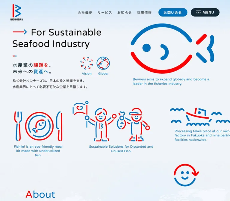
Benners uses a recognizable drawing system to make its corporate mission approachable. A large fish, a fishing boat, a meal setting, and two people holding a fish share rounded blue and red strokes. Their open contours leave the pale background visible. Rounded English lettering, substantial Japanese headings, tiny two-color arrows, and pill-shaped controls repeat the same friendly geometry at different scales.
The page is a long corporate introduction with several destinations: company information, consumer services, news, recruitment, and contact. Its opening behaves like an illustrated explanation rather than a single conversion panel. Below it, larger photographs, restrained news rows, a separate recruitment section, and a comprehensive footer provide more conventional information architecture. The strongest reusable relationship is between playful illustration and orderly corporate navigation.
How to Read This Reference
- Measured means a value explicitly present in the supplied computed styles or element rectangles. Measurements are CSS pixels unless stated otherwise.
- Derived means arithmetic using those measurements, such as a column gap or an aspect ratio.
- Estimated means a visual approximation from an original-page screenshot. This includes the hero headline size, several illustration bounds, and large surface corner radii.
- Recommended means guidance for a new implementation. The Quick Start uses descriptive classes and simplified layout rules; it is not recovered source code.
- Source custom properties are identified explicitly. Other token names are reusable aliases created for this document.
- Computed font-family declarations establish the requested face, but do not independently prove which font rendered every individual glyph.
- Some coordinates differ slightly between the DOM sample and subsequent scroll captures. For example, the desktop News heading has a sampled x-coordinate of 100px but appears near 120px in the supplied image. Preserve the consistent column relationships; do not treat every sampled coordinate as a permanent absolute position.
- Only the original-page captures and rendered evidence inform the design analysis.
Tokens — Colors
Default Palette
| Name | Value | Source or alias | Role and evidence |
|---|---|---|---|
| Ocean Blue | #0071bc |
Source --s-color-4cad80df; alias --color-blue |
Exact source token and computed color of English illustration captions, blue buttons, and category text; also visually dominant in the drawings |
| Signal Red | #ff0000 |
Source --s-color-4291a040; alias --color-red |
Exact source token and desktop heading parent color; visually used for selected letters, arrow shafts, and illustration segments |
| Deep Navy | #142b3a |
Source --s-color-60b6f459; alias --color-ink |
Exact computed color of mission text and service copy; fills the MENU pill |
| Body Charcoal | #333333 |
Computed paragraphs and navigation; alias --color-body |
Hero introduction, news titles, and desktop primary navigation |
| Cool Paper | #f4f7fb |
Source --s-color-21ad8913; alias --color-paper |
Declared pale surface token; useful base for the visually textured light canvas, whose final appearance includes additional layers |
| White | #ffffff |
Source --s-color-99848c95; alias --color-white |
Body background, footer destination cards, image category pills, reversed labels, and the EN control |
| Pale Rule | #d0dae1 |
Source --s-color-e3b37a6d; alias --color-rule |
Declared neutral suitable for the fine dividers visible in News and the footer; exact divider assignment was not included in the element sample |
| Recruit Cyan | #1fabe8 |
Computed Recruit section background; alias --color-recruit |
Exact section background declaration at both viewports; this section is documented by DOM rather than a supplied close-up screenshot |
| Muted Navy | rgba(20,43,58,0.8) |
Computed footer text; alias --color-muted |
Address, telephone, and copyright text |
The source also declares #e4e4e4, but its specific visible role is not established here. It should not become an additional prominent surface color by default.
Read the composed surface, not just its parent background. The opening section computes to white, while the screenshot shows a blue wash at the top and fine grain across a pale field. Several later sections compute to transparent while textured surfaces remain visible. A plain white fill reproduces the base, but misses the visible finish.
The heading color is also composed. In the desktop News and closing-card captures, the first letter is blue and the remaining letters are red. Their parent heading computes to red. Mobile heading parents compute to blue, but the supplied mobile captures do not show these headings; the final mobile letter-by-letter coloring is therefore unverified.
Theme Presets
Only the light presentation is evidenced. No theme selector or dark-mode state was inspected. The cyan recruitment section is a section treatment within the page, not evidence of another selectable theme.
Tokens — Typography
Rounded English Typography
Measured family: Varela Round, source --s-font-b1bae744.
The face is explicitly assigned to English section headings, illustration captions, Vision/Global labels, copyright, and some utility labels. Its regular weight gives large words a gentle, open appearance. The visible English hero headline has a compatible rounded character, but its own font declaration is absent from the supplied element sample; matching that headline with Varela Round is a recommendation, not a measured attribution.
Japanese Body and Navigation
Measured family: こぶりなゴシック W6 JIS2004, source --s-font-758a3349.
This declaration appears on the introduction, mission paragraphs, service titles and descriptions, news items, navigation, and footer information. Computed weights vary between 400, 500, and 600. Preserve that distinction: the W6 in the family name does not mean every element has CSS font-weight: 600.
Japanese Statement Headings
Measured family: 秀英丸ゴシック B, source --s-font-d5bf8a18.
About and Recruit statement headings use this family at computed weight 400. Their weight and rounded terminals come partly from the named face itself. MENU also uses this family, with a computed weight of 600.
Declared Families Without Established Roles
The root additionally declares こぶりなゴシック W3 JIS2004, Bricolage Grotesque, and an Inter, 'Noto Sans JP' stack. The supplied sampled content does not establish their application to the major visible components. Do not select them as the primary design fonts solely because they exist as custom properties.
The HTML/BODY default of Times is similarly not representative of the visible interface: component-level declarations override it.
Type Scale
Values below are measured unless explicitly marked as estimates. Size and line-height pairs are written as size / line-height.
| Role | Desktop | Mobile | Weight and tracking |
|---|---|---|---|
| English hero headline | Approximately 60 / 66px, estimated |
Approximately 36 / 44px, estimated |
Visually regular; exact family and metrics unavailable |
| Japanese hero statement | Approximately 36px, estimated |
Approximately 24px, estimated |
Visually substantial and rounded; exact source record unavailable |
| Hero introduction | 18 / 32.4px |
14 / 25.2px |
500; normal tracking |
| Vision / Global | 19 / 19px |
12 / 12px |
Varela Round 400; normal tracking |
| Illustration captions | 18 / 25.2px |
12 / 15.6px |
Varela Round 400; normal tracking |
| About / News headings | 56 / 56px |
48 / 48px |
Varela Round 400 |
| Service heading | 56 / 56px |
56 / 56px |
Varela Round 400; it does not shrink at the sampled phone width |
| Main Recruit heading | 72 / 72px |
56 / 56px |
Varela Round 400; white |
| About / Recruit statement | 36 / 64.8px |
24 / 38.4px |
Rounded Japanese face, 400; 0.05em tracking |
| About paragraph | 18 / 41.4px |
15 / 27px |
500; 0.05em tracking |
| Section subtitles | Usually 18 / 25.2px |
18 / 25.2px for About/News; 16 / 22.4px for Service/Recruit |
500; 0.1em tracking |
| Service title | 26 / 36.4px |
24 / 33.6px |
Japanese W6 family, 400 |
| Service description | 16 / 28.8px |
14 / 22.4px |
400; 0.05em tracking |
| News title | 18 / 28.8px |
13 / 20.8px |
500; 0.05em tracking |
| News date / badge text | 13–14px, line-height 1 |
12–13px, line-height 1 |
400; slight differences between the first and subsequent items |
| Main pill labels | 16 / 16px |
13 / 13px |
600; 0.1em tracking |
| Header navigation | 16 / 16px |
Not visible | Japanese W6 family, 500; 0.1em tracking |
| Closing-card English heading | 56 / 56px |
36 / 36px |
Varela Round 400 |
| Closing-card Japanese subtitle | 24 / 33.6px |
18 / 25.2px |
Computed Varela Round declaration, 500; Japanese glyph fallback not identified |
| Closing-card description | 20 / 32px |
14 / 22.4px |
Japanese W6 family, 400 |
| Footer address / telephone | 13 / 23.4px |
12 / 21.6px |
500; muted navy |
| Footer service titles | 14 / 19.6px |
14 / 19.6px |
500 |
| Copyright | 12 / 16.8px |
12 / 16.8px |
Varela Round 400 |
Large English labels remain visually separate from Japanese explanatory headings. Avoid collapsing these two levels into one generic heading style.
Tokens — Spacing & Shapes
Density: broad illustration and section spacing, with compact navigation and metadata.
Root size: 16px is recorded on HTML at both viewports. There is no evidence of a special viewport-derived root unit.
Recommended token strategy: use a small spacing vocabulary while retaining component-specific values such as 28px gaps, 35px leading button padding, and 47px mobile CTA height. The measurements do not establish one universal spacing grid.
Spacing Scale
| Use | Desktop | Mobile | Status |
|---|---|---|---|
| Header padding | 20px 50px |
10px |
Measured |
| Main content edge | Commonly 100–120px | Commonly 20px | Measured; section-specific |
| Header text-link gap | 24px | Links hidden | Derived from adjacent rectangles |
| Header utility gap | 16px between EN, contact, and menu | 10px between contact and menu | Derived |
| Service column gap | 24px | Stacked | Derived |
| Footer service / closing-card gap | 16px | 16px | Derived |
| Primary pill padding | 10px 10px 10px 35px |
6px 6px 6px 25px |
Measured |
| Primary pill internal gap | 28px; 35px on Recruit CTA | Same respective gaps | Measured |
| Service photo to title | 30px | Photo to category: 24px; category to title: 10px | Derived |
| News row vertical padding | Usually 30px; first row has no top padding | First row 30px; subsequent rows 20px | Measured |
| News section padding | 140px 0 115px |
80px 0 129px |
Measured |
| Footer opening padding | 100px | 60px | Measured |
Border Radius
| Element | Value | Evidence |
|---|---|---|
| Primary pills and header utilities | 96px | Measured; produces fully rounded ends at their actual heights |
| News category navigation | 48px | Measured |
| Main service image links | 8px desktop; 0px mobile | Measured |
| Footer service image links | 4px at both widths | Measured |
| Mobile service side link | 6px | Measured |
| Recruit / Contact closing cards | 10px | Measured |
| Broad News / footer surface corners | Approximately 80px on desktop | Screenshot estimate; rounded inner surfaces are not represented by the outer section's 0px radius |
| Anniversary artwork | Circular visible silhouette | Observed image; the outer link itself computes to 0px radius |
Layout Measurements
| Element | Desktop | Mobile | Interpretation |
|---|---|---|---|
| Header | 1440 × 118.11px |
390 × 66.86px |
Measured overall box, including logo and padding |
| Header logo link | 60 × 78.11px at (50,20) |
36 × 46.86px at (10,10) |
Measured |
| Contact pill | 155.13 × 40px |
135.42 × 37px |
Measured |
| MENU pill | 137.47 × 40px |
123.06 × 36.66px |
Measured |
| EN pill | 76.27 × 40px |
Not visible | Measured desktop |
| Main service image | 588 × 392px |
390 × 260px |
Measured; exactly 3:2 at both widths |
| Main service pair | 1200px total width | One image per row | Derived from two images and their gap |
| Closing-card pair | Two 592 × 327.59px cards |
Two stacked 350 × 186.97px cards |
Measured |
| Footer service images | 249.30 × 166.19px each |
167 × 111.33px each |
Measured; approximately 3:2 |
| Anniversary link | 200 × 200px |
100 × 100px |
Measured |
| Anniversary edge clearance | Right 20px; bottom 30px | Right 20px; bottom 30px | Derived |
| Desktop downward anchor | 27 × 139.97px |
Absent from visible mobile links | Measured desktop |
Components
Persistent Header
Role: keep identity, contact, and navigation available throughout the long page.
The logo sits alone at the left. Desktop navigation is grouped toward the right: 会社概要, サービス, お知らせ, and 採用情報, followed by the white EN pill, blue お問い合わせ pill, and navy MENU button. The MENU symbol resembles horizontal rules surrounding a small wave or zigzag, continuing the marine drawing vocabulary.
The header background computes to transparent. It remains at the viewport top across the supplied opening and footer captures, which supports persistent positioning. The evidence does not identify the exact fixed/sticky CSS declaration or a scroll-dependent background rule.
On mobile, the logo becomes 36px wide and the text navigation and EN control disappear from the visible header. Contact and MENU remain side by side. Their 13px labels retain 0.1em tracking. The icon width is approximately 24px desktop and 20px mobile, derived from the button width, padding, label width, and gap.
Keep the logo's tall mark and black BENNERS wordmark together. Its proportions are different from a typical horizontal corporate wordmark.
Illustrated Opening Composition
Role: explain the company's mission through an immediately recognizable visual world.
The desktop composition places the two-line English headline at upper left and a much larger fish drawing at upper right. Below the headline, a tiny red/blue dash introduces the Japanese statement 水産業の課題を、未来への資産へ。. Red and blue emphasize selected words. A two-line introduction follows, while the Vision and Global pictograms occupy the adjacent space.
The lower desktop arrangement distributes a meal setting, two people holding a fish, and a fishing boat across the page. Captions sit beneath their own illustrations, with intentionally different offsets. This is an art-directed arrangement, not a row of identical feature cards.
The measured caption padding preserves those offsets:
| Caption | Desktop padding | Mobile padding |
|---|---|---|
| Large fish | 15px 0 0 120px |
15px 0 0 |
| Meal setting | 15px 0 0 |
10px 0 0 |
| People holding fish | 15px 0 0 94px |
10px 0 0 30px |
| Fishing boat | 10px 0 0 50px |
5px 0 0 |
The fish drawing occupies approximately 490 × 310px in the desktop capture and roughly 250 × 160px on mobile; these are visible-art estimates, not asset or DOM dimensions.
On mobile, the headline stays at the top, Vision/Global move to the right of the introductory region, and the large fish appears below the Japanese copy. The boat follows toward the left. DOM caption coordinates place the people illustration's caption later, at y≈955px, and the meal caption at y≈1066px. Preserve this staggered sequence instead of shrinking the desktop collage as one image.
Vision and Global are evidenced as pictograms with paragraph labels. Their appearance does not establish clickable controls. The desktop downward arrow does have an observed /#about destination.
Bilingual Section Heading
Role: provide an expressive English section marker and a compact Japanese explanation.
Stack a regular rounded English heading over a smaller Japanese subtitle. The measured gap between their line boxes is 5px in the sampled About, Service, and News headings. English headings usually use line-height 1; Japanese subtitles use 1.4 and wider tracking.
The visible desktop News, Recruit, and Contact words split blue initials from red remaining letters. Keep each word as one accessible heading even when separate spans provide color. A parent computed color alone cannot describe the final multi-color word.
About Mission Block
Role: transition from the illustrative opening into the company's purpose.
The desktop DOM places the About label at x=120px and the mission statement at x≈395.33px. The statement is approximately 680.41px wide. Beneath it, the paragraph occupies a narrower 369.91px column, with generous 41.4px line-height. The CTA follows after a measured 44px gap.
At 390px, the heading group is centered in its measured box. Statement, paragraph, and CTA then align to the 20px content edge. The statement becomes 24/38.4px and the paragraph becomes 15/27px across 350px.
The mobile rendered text removes the desktop paragraph's forced line breaks, consistent with the inline responsive rules targeting #top_about_text br. The complete rule body was truncated, so its exact declaration is not reproduced.
The supplied screenshots do not show the full About artwork or background composition. These measurements support its text anatomy, not a reconstruction of every surrounding visual.
Primary Pill Link
Role: provide a consistent, compact route into a deeper corporate section.
A blue capsule contains one visible white label and a lighter circular arrow area at the right. Desktop height is 60px, with 35px leading padding, 10px trailing padding, and a 28px gap. About is approximately 304.38px wide; Service and News pills are approximately 236.20px wide.
The visible arrow circle is about 40px on desktop, consistent with the available height after padding. Mobile pills reduce to 47px high, 25px leading padding, and approximately 35px arrow circles. The Service/News version is approximately 194.11px wide on mobile.
The main Recruit CTA reverses the colors to a white fill with blue text. Its gap is 35px and its mobile measured height is 50px, so it is a small exception to the general 47px mobile rule.
Repeated label nodes appear in the rendered DOM, often offset vertically by 18px. The captures show one visible label. This supports a layered label structure, but does not verify a rolling-text hover animation. A new implementation should expose only one accessible name.
Service Feature
Role: connect the corporate story to two consumer businesses.
The main Service section uses two desktop columns. Each feature contains a 3:2 image link, a white category pill over the upper-left image area, a separate title link, and a description. The category pill is 133 × 32px with 14px text, 9px 13px padding, and 96px radius. It sits 20px inside the image bounds.
The observed destinations are https://fishlle.com/ for フィシュル! and https://genkaidon.jp/ for 玄海丼 GENKAI DON. These are link destinations extracted from the homepage; their pages were not inspected.
On mobile, each main image becomes full viewport width, 390 × 260px, with square corners. Category text moves below the image and changes to unboxed blue text. The title and description sit at x=20px. The description is only 270px wide, leaving room for a separate 50px-wide white link area at x=320px, with a 30px gap. That side link has a 6px radius and matches the text block's approximately 182.55px height. Its graphic was not supplied in a close-up capture.
The footer visibly shows colorful meal packs and a seafood bowl held in two hands. The main Service image boxes are measured, but their precise image selections and crops are not independently visible in the provided screenshots. Do not assume the main and footer crops are identical.
News Category Navigation
Role: route readers to the three news categories.
Desktop category links form a vertical stack under the News title: お知らせ, 商品開発・コラボ, and メディア. Each is a white capsule with blue text and a fine pale outline. Measured height is 42px, with 12px 20px padding, 16px type, and 0.1em tracking. Adjacent links have an 8px gap.
On mobile, the three links share one horizontal row at the sampled width. Heights reduce to 33px, padding to 9px 15px, and type to 13px. Their widths are approximately 88.69px, 138.88px, and 87.25px, with 8px gaps.
These are anchors to /news/category/news, /news/category/collaboration, and /news/category/media. An in-place filtering action or selected-tab state was not verified.
News Row
Role: present current updates in a compact, readable list.
The desktop News layout has a narrow heading/category column and a wider list beginning at x=460px. Each row pairs an image with a metadata-and-title block beginning at x=757px. The first two visible thumbnails are approximately 257 × 145px, leaving a roughly 40px gap before the text.
Inside the text block, a blue category badge and navy date share a line, separated by 15px. The headline begins 8px below the badge's lower edge. Fine horizontal rules separate rows; there is no visible card shadow or independent white card enclosure.
Four entries are present in the DOM, although only the first two appear in the supplied News screenshot. Individual desktop anchor widths vary with content, and later rows have different heights. The first two thumbnails therefore do not establish a universal image aspect ratio for every news item.
On mobile, the list retains the image/text relationship. Rows are 350px wide at x=20px; text begins at x=157px and occupies 213px. A practical reconstruction is approximately 117px of image width plus a 20px gap, but the image width is inferred from the text offset rather than measured directly. Titles use 13/20.8px with 0.05em tracking.
The desktop provides a News index CTA beside the list and another below it. Only the below-list index CTA is present among the visible mobile links.
Patterned Section Transition
Role: give the long page a strong graphic pause between Service and News.
The desktop capture shows a full-width white band containing large diagonal blue and red strokes with rounded ends, interspersed with small glyph-like groups of vertical and horizontal bars. Motifs extend beyond the viewport edges. Their geometry connects the line illustrations to the broad rounded surfaces below.
The separation between the measured end of Service and beginning of News is exactly 400px on desktop and 200px on mobile. The desktop screenshot identifies a patterned treatment in this interval; its mobile visual treatment was not captured.
No movement of this pattern was demonstrated. Treat it as static unless a separate motion specification is available.
Main Recruit Section
Role: establish recruitment as a distinct part of the corporate narrative.
Computed styles identify a cyan #1fabe8 section with white English and Japanese headings and white body copy. Desktop text uses a left English heading and a right statement/body/CTA group. The right group begins at x=720px; its paragraph is 600px wide.
On mobile, these groups stack within 20px side margins. The English heading becomes 56px, the Japanese statement becomes 24/38.4px, and the paragraph becomes 15/27px. The white CTA follows after 30px.
There is a substantial region before the text in the measured section, particularly on desktop. Its visual contents are not supplied. Do not fill it with an invented team photograph, video, or illustration and describe that as observed.
Recruit and Contact Closing Cards
Role: offer two clear final destinations before the detailed footer.
Two white cards sit side by side on desktop, each 592 × 327.59px, separated by 16px. They have a 10px radius and 48px padding. Center the English heading, Japanese subtitle, two-line explanation, and small two-color arrow. The treatment relies on whitespace and typography rather than a photograph or large colored button.
On mobile, the cards stack with the same 16px separation and retain 10px corners. Each measures 350 × 186.97px. Padding becomes 30px 30px 30px 20px, and the measured text aligns left. English headings reduce to 36px; descriptions reduce to 14/22.4px.
The cards themselves are links to /recruit and /contact. Their measured one-second transition declaration does not establish a particular hover transformation.
Footer Directory and Company Block
Role: end with useful navigation, service access, and clear company identification.
A broad pale-white surface with large rounded upper corners contains the footer. On desktop, the company block sits at x=120px; navigation and service links begin at x=540px. The logo is visibly larger than in the header, approximately 90px wide including its wordmark, estimated from the capture.
The right side contains a horizontal navigation row, a separate privacy link, a fine rule, and two 3:2 service thumbnails. Each thumbnail has a small white category pill over its upper-left corner and a 14px title below. Another rule leads toward the bird illustration and ページの上部へ戻る link.
The inspected footer identifies the company as 株式会社 ベンナーズ, followed by its Fukuoka address, telephone number, and ©Benners.
Mobile changes the hierarchy substantially. Navigation becomes full-width 53px rows with right-side arrows and bottom rules. The two service thumbnails remain side by side at 167px each. Their categories move below the images as blue text. A divider and a generous vertical interval then introduce the larger logo and company information. The bird and back-to-top label remain near the lower right.
Persistent Anniversary Link
Role: promote the Fishlle anniversary page across the homepage.
A circular promotional image sits near the lower-right viewport corner in all supplied original-page captures. The measured link is 200px square on desktop and 100px square on mobile, with 20px right clearance and 30px bottom clearance. It links to /fishlle_5th-anniversary.
Its imagery includes a large numeral 5, a cream background, food photography, and small celebratory lettering. Treat these as content within a campaign asset rather than adding their purple and gold tones to the general UI palette.
The square anchor computes to zero border radius, even though the artwork appears circular. The circle may come from the asset or an inner layer. A CSS circle is a valid adaptation, but is not the measured outer-anchor shape.
The badge visibly overlaps part of the desktop boat caption and the footer back-to-top region. A new implementation should retain its compact presence while improving those collisions.
Tokens — Motion & Interaction
| Treatment | Measured declaration or observation | What remains unverified |
|---|---|---|
| General component transitions | 0.3s cubic-bezier(0.4, 0.4, 0, 1) on many sections, links, and buttons |
Which properties visibly change for each action |
| Body background | background 0.5s cubic-bezier(0.4, 0.4, 0, 1) |
Trigger and resulting background state |
| Desktop navigation labels | 0.3s cubic-bezier(0.15, 0.87, 0.8, 1) |
Hover color, displacement, or other endpoint |
| Closing destination cards | 1s cubic-bezier(0.15, 0.87, 0.8, 1) |
Exact hover or reveal effect |
| Layered button labels | Duplicate nodes separated vertically by approximately 18px; one visible label in captures | Rolling-text animation, trigger, duration, and clipping implementation |
| Header persistence | Same top placement in opening and scrolled captures | Exact positioning declaration and any scroll-dependent state |
| Anniversary persistence | Same viewport-edge placement across captures | Rotation, entrance animation, dismissal, or hover behavior |
| In-page navigation | Desktop /#about and footer /#header anchors |
Smooth scrolling and focus management after navigation |
| MENU | Native button present in both viewport samples | Expanded panel, animation, keyboard handling, and close behavior |
The sampled text and link elements report animation: none. This does not prove that the whole page is static: illustrations, pseudo-elements, embedded media, and JavaScript-driven effects are not comprehensively represented by those records.
The capture process waited for finite motion and layout stability and temporarily paused perpetual animations during readiness checks. No frame sequence is supplied. Do not infer fish swimming, a rotating globe, drawing-on strokes, parallax, or a moving pattern from a single settled image.
Recommended adaptation: use the measured 300ms easing for small color or arrow feedback, keep the resting layout fully readable, and add reduced-motion behavior. Specific hover endpoints should be treated as new design decisions.
Surfaces
| Layer | Appearance | Purpose and confidence |
|---|---|---|
| Opening canvas | Pale cool field, blue wash near the top, very fine grain | Screenshot-observed; exact layer composition unavailable |
| Broad content surface | White or near-white textured field, occasionally with large rounded edges | Visible in News and footer; outer section styles alone do not describe the inner surface |
| Service content | Photography followed by unboxed text | Image geometry measured; footer photography visible |
| News list | Shared background, thin rules, small blue badges | Direct desktop visual evidence |
| Recruit section | Cyan background and white text | Computed-style evidence; complete visual composition unverified |
| Closing cards | White, 10px corners, spacious internal composition | Computed and desktop visual evidence |
| Controls | Solid blue, navy, or white capsules | Computed and visual evidence |
| Campaign overlay | Circular photographic artwork | Visible across supplied captures |
There is no visible general-purpose elevation system in the captured regions. Use rules, spacing, changes of scale, and filled controls to organize the page. Keep the grain subtle enough that it does not become a competing pattern behind small Japanese text.
Imagery
Line Illustration System
The identity illustrations use open contours, rounded caps, broad arcs, and interrupted strokes. Blue supplies most of the structure; red marks selected opposing segments. The large fish uses a blue upper contour and red lower contour, with a blue eye and curved interior detail. The plate, people, boat, globe, and bird reuse the same vocabulary at smaller scales.
Estimated stroke widths range from roughly 5–8px on the smaller desktop scenes to approximately 20–24px on the large fish. These are screenshot estimates, not measured vector attributes. Scale strokes with the artwork's visual size rather than applying one constant screen-pixel width to every illustration.
For new artwork, SVG is a useful implementation choice: use fill: none, rounded line caps and joins, and deliberate gaps. The current hero assets' file formats were not established by the evidence. Preserve authorized original artwork when available.
Photography
The visible footer combines two contrasting photographic subjects: a bright assortment of packaged fish meals and a richly colored seafood bowl held against a dark background. Both use landscape 3:2 frames with very small corner radii. Food color remains natural; it is not globally recolored into the illustration palette.
News imagery includes a quiet logo thumbnail and a denser anniversary composition. Match the frame to the content rather than forcing every image to carry equal visual density.
Observed Asset References
The following reference appears in the original page's rendered pseudo-element styles. Its URL was not independently opened for this document.
| Asset evidence | Reference | Established scope |
|---|---|---|
| Repeated 500 × 500 WebP reference | https://storage.googleapis.com/studio-design-asset-files/projects/1pqDlvv5qj/s-500x500_webp_4f01743a-556c-44ef-b8d1-4f217b762813.webp |
Repeated in About and several mobile section/footer records; association with the visible surface texture is plausible but its file contents were not separately verified |
| Anniversary image | Background-image reference present, full URL truncated | Visible campaign artwork and link dimensions are established; do not reconstruct a download URL from the prefix |
| Bird illustration | Mobile background-image reference present, full URL truncated | Footer visual and back-to-top destination are established |
| Hero and service imagery | Complete asset URLs not supplied | Use the screenshots for visual description, not invented file paths |
Do not replace the line illustration family with unrelated stock outline icons. The unusual fish, people, and bird are more important to the page's character than any individual CSS effect.
Layout & Responsive Behavior
Page Sequence and Measured Extent
These values describe the supplied document states, not recommended fixed heights.
| Region | Desktop start / height | Mobile start / height |
|---|---|---|
| Opening section | 0 / 885.30px |
0 / 1107.50px |
| About | 885.30 / 1514.70px |
1107.50 / 1264.20px |
| Service | 2400 / 991.97px |
2371.70 / 1513.48px |
| Interval before News | 3391.97 / 400px |
3885.19 / 200px |
| News | 3791.97 / 1251.09px |
4085.19 / 1030.95px |
| Main Recruit | 5043.06 / 1435.98px |
5116.14 / 792.83px |
| Footer including closing cards | 6479.05 / 1168.64px |
5908.97 / 1592.63px |
| Complete document | Approximately 7648px |
Approximately 7502px |
The opening section is not a strict one-screen hero: its desktop height is smaller than the sampled viewport, while its mobile height exceeds it. Decorative content from the following region can already appear near the lower desktop edge. Avoid implementing the opening with unconditional height: 100vh.
Desktop Organization
The page alternates broad illustrations, offset text columns, two-column service content, a sidebar-plus-list News area, and a spacious footer directory. Content frequently occupies a 1200px span, but heading and hero alignments vary between 100px and 120px side positions. Recruitment uses a wider text arrangement in its sampled state.
Mobile Recomposition
| Component | Actual change at 390px |
|---|---|
| Header | Smaller logo; direct navigation and EN hidden; contact and MENU retained |
| Opening collage | Fish moves below copy; scenes are staggered and reordered |
| About | Heading group centered; statement, paragraph, and CTA stack at the 20px edge |
| Main services | Single column; 3:2 images extend edge to edge; categories move below images |
| Service details | Narrow text column paired with a separate 50px side link |
| News categories | Vertical desktop stack becomes one horizontal row |
| News rows | Image and text remain side by side; typography and image allocation shrink |
| News index CTA | Sidebar version disappears; lower version remains |
| Recruit | English heading and explanatory content stack |
| Closing cards | Side-by-side cards become shorter stacked cards with left-aligned text |
| Footer navigation | Horizontal links become 53px rows |
| Footer service previews | Two columns remain; categories move below images |
| Company identity | Appears below directory/service content in the visible mobile layout |
| Anniversary link | Size halves; right and bottom clearances remain constant |
The rendered source includes a 540px responsive rule targeting selected line breaks and a 1280px rule for breakpoint-aware breaks. The complete component breakpoint map is not supplied. Neither value proves where every layout change occurs. Intermediate widths, landscape phones, zoomed layouts, and menu-open states remain untested.
Do’s and Don’ts
Do
- Preserve the exact Ocean Blue
#0071bcand Signal Red#ff0000as the central drawing pair. - Use navy for sustained reading and reserve bright red primarily for illustration and large textual accents.
- Pair regular rounded English headings with the evidenced Japanese body and statement families when licensed and available.
- Keep the English section label and Japanese subtitle as distinct levels.
- Maintain the opening's varied illustration sizes and caption offsets.
- Recompose the collage for mobile instead of scaling one large desktop image.
- Keep main service photography at 3:2 and make its mobile frames full width.
- Move image category labels into ordinary text flow on mobile.
- Retain the horizontal image/text anatomy of mobile News rows.
- Use thin dividers and generous whitespace to structure the footer.
- Preserve small two-color arrows and the bird illustration as part of the visual vocabulary.
- Keep original measurements, screenshot estimates, and proposed improvements distinguishable in implementation notes.
Don’t
- Don't force the corporate homepage into a single-action landing-page structure.
- Don't replace the hero collage with identical rounded feature cards.
- Don't turn all illustrations into solid filled icons or use sharp line caps.
- Don't assign a single generic sans-serif to every Japanese and English role.
- Don't treat declared but unassigned font tokens as proof of visible usage.
- Don't copy a heading's parent color and discard its visible blue/red letter treatment.
- Don't introduce heavy shadows, glass panels, or a dark footer into the captured light composition.
- Don't apply the campaign artwork's purple and gold to the entire UI.
- Don't render duplicate DOM labels as two visible lines or two accessible names.
- Don't invent an animated fish, rotating badge, sliding menu, or parallax sequence from static evidence.
- Don't hardcode the sampled full-section heights as empty spacers.
- Don't reproduce the anniversary badge's overlap with essential captions or the back-to-top control.
Recommended Implementation Additions
These are recommendations for a new implementation, not verified original features.
- Protect persistent overlays. Test the anniversary badge against captions, news text, and the footer control. Move it into document flow near the footer or reserve a clear region when those elements would collide.
- Improve header target size. The measured mobile contact and MENU controls are approximately 37px high. Provide at least a 44px interaction target while retaining their compact visual treatment where practical.
- Provide robust menu semantics. Use an accessible name,
aria-expanded, and an associated navigation region. If the eventual design uses a modal panel, implement appropriate focus management and Escape behavior. - Expose important hero copy as text. The visible English and Japanese headline artwork is not represented as ordinary text in the supplied sample. Preserve searchable, accessible equivalents without creating visible duplicates.
- Keep duplicate animation layers hidden from assistive technology. Prefer one readable label and decorative copies only when a verified or newly designed effect needs them.
- Check the recruitment contrast. White against the declared solid cyan has an approximate calculated sRGB contrast of 2.6:1. Verify the final composed surface and adjust the text or background for small copy. Red against white is approximately 4.0:1, so avoid extending that pairing to small essential text.
- Respect reduced motion. Remove nonessential movement and ensure that disabling reveal effects leaves content visible. CSS rules alone cannot pause motion embedded inside an image or other media asset.
- Preserve layout during asset loading. Give service photos their known 3:2 ratio and reserve suitable dimensions for illustrations and the logo.
- Allow natural wrapping. Keep news titles and Japanese paragraphs flexible under text enlargement. Do not add truncation merely to match a captured row height.
- Use descriptive alternatives. Give meaningful service photographs appropriate alt text; decorative arrows, surface texture, and redundant illustrations can use empty alternatives.
Agent Prompt Guide
Quick Color Reference
- Brand blue and primary actions:
#0071bc. - Drawing accents and selected heading letters:
#ff0000. - Main reading text and MENU fill:
#142b3a. - Secondary reading text:
#333333. - Light surface base:
#f4f7fb, with white cards and a subtle cool wash. - Fine-rule starting point:
#d0dae1. - Separate recruitment section: declared cyan
#1fabe8; verify text contrast in a new implementation. - Campaign colors belong to the campaign image, not the general interface.
Overall Prompt
“Create a Japanese seafood corporate homepage inspired by the current Benners reference. Use Ocean Blue #0071bc, Signal Red #ff0000, navy #142b3a, white, and softly textured pale blue surfaces. Build an art-directed opening with a rounded English headline at left, a large open-contour fish at right, Japanese mission copy, small Vision/Global pictograms, and unevenly sized meal, people, and boat illustrations with blue English captions. Continue into company information, two 3:2 service features, a category sidebar and ruled News list, recruitment, two closing destination cards, and a detailed light footer. Preserve separate English and Japanese typographic roles. At 390px, reorder the illustrations, use full-width service photos with categories below them, retain compact image/text News rows, and stack the closing cards. Treat unverified animation and menu behavior as separate implementation decisions.”
Example Component Prompts
- Header: “A transparent persistent corporate header with a tall blue/red logo at left. At desktop width, align four Japanese navigation links, a white EN capsule, a blue contact capsule, and a navy MENU capsule at right. At 390px, retain the 36px-wide logo, contact, and MENU only. Use rounded ends and tracked 13px mobile labels.”
- Illustration family: “Create open-contour seafood illustrations from thick rounded blue and red strokes. Use broad arcs, deliberate gaps, small circular eyes, and minimal interior detail. Include a large fish, a boat on scalloped waves, a plate with fish, and people holding a fish. Keep each illustration's visual scale distinct and provide a static composition.”
- Service feature: “A 3:2 landscape image with 8px desktop corners and a small white category capsule inset 20px from the upper left. Place a 26px Japanese title and 16/28.8px description below. On mobile, make the image edge to edge with square corners, move the category below it as blue text, and use a 270px text region beside a 50px white link area.”
- News block: “A light textured News section with a large rounded English label and small Japanese subtitle. Put outlined category capsules vertically at desktop left and a ruled image/text list at right. On mobile, place categories in one row and retain a small image beside each 13px headline. Use blue category badges and compact navy dates.”
- Closing cards: “Two flat white Recruit and Contact links with 10px corners, 48px desktop padding, large rounded English headings, Japanese subtitles, centered short descriptions, and tiny red/blue arrows. Stack them at mobile width, reduce English headings to 36px, and align text left.”
- Footer: “Build a spacious light footer with a large blue/red logo and small company details, a directory of corporate links, two 3:2 food-service previews, pale horizontal rules, and a small line-drawn bird beside back-to-top. On mobile, show directory rows and the two-column service previews before the company identity. Keep promotional overlays clear of the final navigation.”
Quick Start
CSS Custom Properties
This is a usable adaptation of the measured component system. Font files, authorized illustrations, photography, and surface texture must be supplied separately. The optional texture variable defaults to no image. The hero font size and large panel radius are screenshot-based estimates; the blue wash is an approximation.
The 1000px layout breakpoint below is a recommended implementation choice for intermediate widths. It is not a recovered source breakpoint. The 540px rules reproduce observed phone relationships without claiming that every original component changes at that width.
:root {
  /* Exact source colors and computed text colors */
  --color-blue: #0071bc;
  --color-red: #ff0000;
  --color-ink: #142b3a;
  --color-body: #333333;
  --color-paper: #f4f7fb;
  --color-white: #ffffff;
  --color-rule: #d0dae1;
  --color-recruit: #1fabe8;
  --color-muted: rgb(20 43 58 / 0.8);

  /* Observed family names; load licensed fonts separately */
  --font-en: 'Varela Round', sans-serif;
  --font-jp: 'こぶりなゴシック W6 JIS2004', sans-serif;
  --font-statement: '秀英丸ゴシック B', sans-serif;

  --text-section: 56px;
  --text-statement: 36px;
  --text-body: 16px;
  --text-lead: 18px;
  --text-caption: 18px;
  --text-action: 16px;
  --leading-body: 1.8;
  --tracking-copy: 0.05em;
  --tracking-label: 0.1em;

  --space-4: 4px;
  --space-8: 8px;
  --space-12: 12px;
  --space-16: 16px;
  --space-20: 20px;
  --space-24: 24px;
  --space-30: 30px;
  --space-40: 40px;
  --space-60: 60px;
  --space-80: 80px;
  --space-100: 100px;

  --content-max: 1200px;
  --gutter: 40px;
  --radius-photo: 8px;
  --radius-preview: 4px;
  --radius-card: 10px;
  --radius-pill: 96px;
  --radius-panel: 80px; /* Screenshot estimate */
  --texture-image: none;

  --ease-standard: cubic-bezier(0.4, 0.4, 0, 1);
  --ease-expressive: cubic-bezier(0.15, 0.87, 0.8, 1);
  --duration-standard: 300ms;
  --safe-bottom: env(safe-area-inset-bottom, 0px);
}

.benners,
.benners * {
  box-sizing: border-box;
}

.benners {
  margin: 0;
  color: var(--color-ink);
  background: var(--color-paper);
  font: 400 var(--text-body) / var(--leading-body) var(--font-jp);
}

.benners img {
  display: block;
  max-width: 100%;
}

.benners button {
  font: inherit;
  cursor: pointer;
}

.container {
  width: min(var(--content-max), calc(100% - 2 * var(--gutter)));
  margin-inline: auto;
}

.paper-surface {
  background-color: var(--color-white);
  background-image: var(--texture-image);
  background-repeat: repeat;
}

.rounded-surface {
  border-radius: var(--radius-panel) var(--radius-panel) 0 0;
}

/* Persistent closed-header adaptation */
.site-header {
  position: fixed;
  inset: 0 0 auto;
  z-index: 40;
  display: flex;
  align-items: center;
  justify-content: space-between;
  gap: 24px;
  padding: 20px 50px;
  background: transparent;
}

.site-logo {
  display: block;
  flex: 0 0 60px;
  width: 60px;
}

.site-logo img {
  width: 100%;
  height: auto;
}

.header-right,
.header-nav,
.header-actions {
  display: flex;
  align-items: center;
}

.header-right { gap: 31px; }
.header-nav { gap: 24px; }
.header-actions { gap: 16px; }

.header-nav a {
  color: var(--color-body);
  font-size: 16px;
  font-weight: 500;
  line-height: 1;
  letter-spacing: var(--tracking-label);
  text-decoration: none;
}

.header-action {
  display: inline-flex;
  align-items: center;
  justify-content: center;
  gap: 8px;
  min-height: 40px;
  padding: 12px 25px;
  border: 0;
  border-radius: var(--radius-pill);
  color: var(--color-white);
  background: var(--color-blue);
  font-size: 16px;
  font-weight: 600;
  line-height: 1;
  letter-spacing: var(--tracking-label);
  text-decoration: none;
  white-space: nowrap;
}

.header-action--language {
  color: var(--color-blue);
  background: var(--color-white);
  font-family: var(--font-en);
}

.header-action--menu {
  padding-block: 10px;
  background: var(--color-ink);
  font-family: var(--font-statement);
}

.header-action--menu svg {
  width: 24px;
  height: 20px;
  flex: none;
}

/* Typography and surface approximation for the opening */
.hero {
  padding: 130px 0 30px;
  background-color: var(--color-paper);
  background-image:
    var(--texture-image),
    linear-gradient(180deg, rgb(0 113 188 / 0.12), transparent 280px);
}

.hero-title {
  margin: 0;
  color: #000;
  font: 400 60px / 1.1 var(--font-en); /* Estimated */
}

.hero-statement {
  font: 400 36px / 1.4 var(--font-statement); /* Estimated */
  letter-spacing: 0.05em;
}

.hero-intro {
  color: var(--color-body);
  font-size: 18px;
  font-weight: 500;
  line-height: 1.8;
}

.illustration-caption {
  color: var(--color-blue);
  font: 400 var(--text-caption) / 1.4 var(--font-en);
}

.line-art {
  fill: none;
  stroke-linecap: round;
  stroke-linejoin: round;
}

.line-art__blue { stroke: var(--color-blue); }
.line-art__red { stroke: var(--color-red); }
.text-blue { color: var(--color-blue); }
.text-red { color: var(--color-red); }

.section-title {
  margin: 0;
  color: var(--color-red);
  font: 400 var(--text-section) / 1 var(--font-en);
}

.section-title__initial { color: var(--color-blue); }

.section-subtitle {
  margin: 5px 0 0;
  font-size: 18px;
  font-weight: 500;
  line-height: 1.4;
  letter-spacing: var(--tracking-label);
}

.statement {
  margin: 0;
  font: 400 var(--text-statement) / 1.8 var(--font-statement);
  letter-spacing: var(--tracking-copy);
}

/* One accessible label; no speculative duplicate text layers */
.pill {
  display: inline-flex;
  align-items: center;
  justify-content: space-between;
  gap: 28px;
  min-height: 60px;
  max-width: 100%;
  padding: 10px 10px 10px 35px;
  border: 0;
  border-radius: var(--radius-pill);
  color: var(--color-white);
  background: var(--color-blue);
  font-size: var(--text-action);
  font-weight: 600;
  line-height: 1.3;
  letter-spacing: var(--tracking-label);
  text-decoration: none;
}

.pill__arrow {
  display: grid;
  place-items: center;
  flex: 0 0 40px;
  width: 40px;
  height: 40px;
  border-radius: 50%;
  background: rgb(255 255 255 / 0.15); /* Visual approximation */
  transition: transform var(--duration-standard) var(--ease-standard);
}

.pill--inverse {
  gap: 35px;
  color: var(--color-blue);
  background: var(--color-white);
}

.pill--inverse .pill__arrow {
  background: rgb(0 113 188 / 0.1);
}

/* Main service features */
.service-grid {
  display: grid;
  grid-template-columns: repeat(2, minmax(0, 1fr));
  gap: 24px;
  margin-top: 40px;
}

.service-card {
  position: relative;
  min-width: 0;
}

.service-media {
  display: block;
  overflow: hidden;
  border-radius: var(--radius-photo);
}

.service-media img {
  width: 100%;
  aspect-ratio: 3 / 2;
  object-fit: cover;
}

.service-info { margin-top: 30px; }

.service-category {
  position: absolute;
  top: 20px;
  left: 20px;
  margin: 0;
  padding: 9px 13px;
  border-radius: var(--radius-pill);
  color: var(--color-ink);
  background: var(--color-white);
  font-size: 14px;
  font-weight: 500;
  line-height: 1;
  letter-spacing: 0.05em;
}

.service-title {
  margin: 0;
  font-size: 26px;
  font-weight: 400;
  line-height: 1.4;
}

.service-title a {
  color: inherit;
  text-decoration: none;
}

.service-description {
  margin: 16px 0 0;
  letter-spacing: var(--tracking-copy);
}

.service-side-link { display: none; }

/* News: first-row image proportions are an adaptation */
.news-section { padding-block: 140px 115px; }

.news-layout {
  display: grid;
  grid-template-columns: 240px minmax(0, 1fr);
  gap: 100px;
}

.news-categories {
  display: flex;
  flex-direction: column;
  align-items: flex-start;
  gap: 8px;
  margin-block: 16px 20px;
}

.category-link {
  display: inline-flex;
  padding: 12px 20px;
  border: 1px solid var(--color-rule);
  border-radius: 48px;
  color: var(--color-blue);
  background: var(--color-white);
  font-size: 16px;
  line-height: 1;
  letter-spacing: 0.1em;
  text-decoration: none;
}

.news-list { min-width: 0; }

.news-row {
  display: grid;
  grid-template-columns: 257px minmax(0, 1fr);
  gap: 40px;
  padding-block: 30px;
  border-bottom: 1px solid var(--color-rule);
  color: var(--color-body);
  text-decoration: none;
}

.news-row:first-child { padding-top: 0; }

.news-image {
  width: 100%;
  aspect-ratio: 16 / 9;
  object-fit: cover;
  border-radius: 4px;
}

.news-meta {
  display: flex;
  flex-wrap: wrap;
  align-items: center;
  gap: 8px 15px;
  color: var(--color-ink);
  font-size: 13px;
  line-height: 1;
}

.news-badge {
  padding: 8px 12px;
  border: 1px solid var(--color-blue);
  border-radius: var(--radius-pill);
  color: var(--color-white);
  background: var(--color-blue);
}

.news-title {
  margin: 8px 0 0;
  font-size: 18px;
  font-weight: 500;
  line-height: 1.6;
  letter-spacing: 0.05em;
}

/* Closing destination cards and footer directory */
.portal-grid {
  display: grid;
  grid-template-columns: repeat(2, minmax(0, 1fr));
  gap: 16px;
}

.portal {
  display: flex;
  flex-direction: column;
  align-items: center;
  padding: 48px;
  border-radius: 10px;
  color: var(--color-ink);
  background: var(--color-white);
  text-align: center;
  text-decoration: none;
}

.portal .section-subtitle { font-size: 24px; }

.portal-description {
  margin: 20px 0 30px;
  font-size: 20px;
  line-height: 1.6;
}

.footer-surface {
  margin-top: 100px;
  padding-block: 140px 40px;
}

.footer-grid {
  display: grid;
  grid-template-columns: 320px minmax(0, 1fr);
  gap: 100px;
}

.footer-company { grid-column: 1; grid-row: 1; }
.footer-links { grid-column: 2; grid-row: 1; }

.footer-nav {
  display: flex;
  flex-wrap: wrap;
  gap: 24px;
}

.footer-nav a {
  color: inherit;
  font-size: 16px;
  line-height: 1;
  text-decoration: none;
}

.footer-services {
  display: grid;
  grid-template-columns: repeat(2, minmax(0, 249.3px));
  gap: 16px;
  margin-top: 40px;
  padding-block: 40px;
  border-block: 1px solid var(--color-rule);
}

.footer-preview {
  position: relative;
  min-width: 0;
  color: inherit;
  text-decoration: none;
}

.footer-preview img {
  width: 100%;
  aspect-ratio: 3 / 2;
  object-fit: cover;
  border-radius: 4px;
}

.footer-preview-category {
  position: absolute;
  top: 10px;
  left: 10px;
  margin: 0;
  padding: 9px 13px;
  border-radius: 96px;
  background: var(--color-white);
  font-size: 13px;
  line-height: 1;
  letter-spacing: 0.05em;
}

.footer-preview-title {
  margin: 15px 0 0;
  font-size: 14px;
  line-height: 1.4;
}

.footer-address {
  color: var(--color-muted);
  font-size: 13px;
  font-style: normal;
  line-height: 1.8;
}

/* Optional campaign link: include only after collision testing */
.anniversary-link {
  position: fixed;
  right: 20px;
  bottom: calc(30px + var(--safe-bottom));
  z-index: 20;
  width: 200px;
  aspect-ratio: 1;
}

.anniversary-link img {
  width: 100%;
  height: 100%;
  object-fit: contain;
}

/* Recommended focus and hover feedback */
.benners :focus-visible {
  outline: 3px solid var(--color-ink);
  outline-offset: 4px;
}

@media (hover: hover) {
  .pill:hover .pill__arrow { transform: translateX(2px); }
  .header-nav a:hover { text-decoration: underline; }
}

/* Recommended intermediate-width layout */
@media (max-width: 1000px) {
  .site-header { padding: 10px; gap: 12px; }
  .site-logo { flex-basis: 36px; width: 36px; }
  .header-nav,
  .header-action--language { display: none; }
  .header-actions { gap: 10px; }
  .header-action { min-height: 37px; font-size: 13px; }
  .header-action--menu svg { width: 20px; height: 17px; }
  .news-layout { grid-template-columns: minmax(0, 1fr); gap: 30px; }
  .news-categories { flex-direction: row; flex-wrap: wrap; }
  .news-aside-cta { display: none; }
  .portal-grid { grid-template-columns: minmax(0, 1fr); }
  .footer-grid { display: flex; flex-direction: column; gap: 80px; }
  .footer-links { order: 0; }
  .footer-company { order: 1; }
}

@media (max-width: 540px) {
  :root {
    --gutter: 20px;
    --text-section: 48px;
    --text-statement: 24px;
    --text-body: 15px;
    --text-caption: 12px;
    --text-action: 13px;
    --radius-panel: 40px; /* Recommended; not measured on mobile */
  }

  .hero-title { font-size: 36px; line-height: 1.22; }
  .hero-statement { font-size: 24px; }
  .hero-intro { font-size: 14px; }
  .illustration-caption { line-height: 1.3; }
  .statement { line-height: 1.6; }
  .service-heading { font-size: 56px; }

  .pill { min-height: 47px; padding: 6px 6px 6px 25px; }
  .pill__arrow { flex-basis: 35px; width: 35px; height: 35px; }
  .pill--inverse { min-height: 50px; }

  .service-grid {
    width: 100%;
    grid-template-columns: minmax(0, 1fr);
    gap: 44px;
  }
  .service-media { border-radius: 0; }
  .service-info {
    display: grid;
    grid-template-columns: minmax(0, 1fr) 50px;
    gap: 30px;
    margin: 24px 20px 0;
  }
  .service-category {
    position: static;
    margin: 0 0 10px;
    padding: 0;
    color: var(--color-blue);
    background: transparent;
    font-weight: 600;
    letter-spacing: normal;
  }
  .service-title { font-size: 24px; }
  .service-description { margin-top: 13px; font-size: 14px; line-height: 1.6; }
  .service-side-link {
    display: grid;
    place-items: center;
    border-radius: 6px;
    color: var(--color-blue);
    background: var(--color-white);
    text-decoration: none;
  }

  .news-section { padding-block: 80px 129px; }
  .news-categories { margin-top: 35px; }
  .category-link { padding: 9px 15px; font-size: 13px; }
  .news-row { grid-template-columns: 117px minmax(0, 1fr); gap: 20px; padding-block: 20px; }
  .news-row:first-child { padding-block: 30px; }
  .news-meta { font-size: 12px; }
  .news-badge { padding: 5px 8px; }
  .news-title { font-size: 13px; }

  .portal { align-items: flex-start; padding: 30px 30px 30px 20px; text-align: left; }
  .portal .section-title { font-size: 36px; }
  .portal .section-subtitle { font-size: 18px; }
  .portal-description { margin: 15px 0 0; font-size: 14px; }

  .footer-surface { margin-top: 60px; padding-top: 50px; }
  .footer-nav { display: block; }
  .footer-nav a {
    display: flex;
    align-items: center;
    justify-content: space-between;
    min-height: 53px;
    padding-block: 15px;
    border-bottom: 1px solid var(--color-rule);
  }
  .footer-services { grid-template-columns: repeat(2, minmax(0, 1fr)); padding-top: 0; border-top: 0; }
  .footer-preview-category {
    position: static;
    margin-top: 12px;
    padding: 0;
    color: var(--color-blue);
    background: transparent;
    font-size: 12px;
  }
  .footer-preview-title { margin-top: 10px; }
  .footer-address { font-size: 12px; }
  .anniversary-link { width: 100px; }
}

@media (prefers-reduced-motion: reduce) {
  .benners *,
  .benners *::before,
  .benners *::after {
    animation: none !important;
    transition: none !important;
    scroll-behavior: auto !important;
  }
}
Component Markup
This example uses the measured service structure with separate image and title links. Asset paths are project placeholders, not observed original-site paths. The side-link arrow is a recommended static adaptation because that mobile control's graphic was not captured in detail.
<article class='service-card'>
  <a class='service-media' href='https://fishlle.com/'>
    <img
      src='/your-assets/fish-meal-packs.webp'
      width='588'
      height='392'
      alt='An assortment of packaged fish meals'
      loading='lazy'
    >
  </a>
  <div class='service-info'>
    <div class='service-text'>
      <p class='service-category'>宅配事業 / B2C</p>
      <h3 class='service-title'>
        <a href='https://fishlle.com/'>フィシュル!</a>
      </h3>
      <p class='service-description'>
        全国各地の天然魚・未利用魚を活用したお魚ごはんを、ご自宅へ。
      </p>
    </div>
    <a
      class='service-side-link'
      href='https://fishlle.com/'
      aria-label='Visit Fishlle'
    >
      <svg class='line-art' width='28' height='18' viewBox='0 0 28 18' aria-hidden='true'>
        <path class='line-art__red' d='M2 9H14' stroke-width='3'></path>
        <path class='line-art__blue' d='M18 2L25 9L18 16' stroke-width='3'></path>
      </svg>
    </a>
  </div>
</article>

<a class='pill' href='/service'>
  <span>サービス一覧へ</span>
  <span class='pill__arrow' aria-hidden='true'>→</span>
</a>
The shorter Japanese description above is example copy, not a verbatim transcription of the site's full service paragraph. Use a semantic H1 for the opening and H2 headings for page sections. The Quick Start deliberately leaves the unverified menu panel and precise hero artwork placement to a separate implementation specification.
Tailwind v4 Token Mapping
Optional aliases for a project already using Tailwind v4. These do not imply that the inspected site uses Tailwind. Define the custom properties above first.
@theme inline {
  --color-ocean: var(--color-blue);
  --color-signal: var(--color-red);
  --color-navy: var(--color-ink);
  --color-cool-paper: var(--color-paper);
  --color-divider: var(--color-rule);

  --font-round-en: var(--font-en);
  --font-body-jp: var(--font-jp);
  --font-rounded-jp: var(--font-statement);

  --text-section-label: var(--text-section);
  --text-mission: var(--text-statement);
  --text-illustration-caption: var(--text-caption);
  --text-pill-label: var(--text-action);

  --radius-service-photo: var(--radius-photo);
  --radius-footer-preview: var(--radius-preview);
  --radius-destination: var(--radius-card);
  --radius-capsule: var(--radius-pill);
}
Sources & Evidence
- Benners — current Japanese homepage: original and final inspected URL, HTTP 200, rendered page identity, homepage text, and observed link destinations.
- Supplied original-page captures: three desktop images at 1440 × 1000 and two mobile images at 390 × 844. They establish the visible opening, desktop News transition, closing desktop cards, and desktop/mobile footer treatments.
- Supplied rendered DOM and computed styles at both widths: exact color declarations, named font families, typography, element rectangles, padding, gaps, radii, transition declarations, and document extent. These also document text structures in regions without supplied close-up captures.
- Capture timestamp:
2026-09-12T17:49:13.579Z, equivalent to September 13, 2026, 02:49:13.579 JST. - The supplied inspection used an initial observation of at least five seconds, document/image readiness checks, finite-animation and layout-stability checks, and scrolling through intermediate positions. Perpetual animations were temporarily paused during readiness checks and subsequently resumed. These procedures do not establish semantic completeness or a motion sequence.
- No additional browsing, file access, destination-page inspection, or interactive testing was performed for this reference. Menu-open behavior, hover endpoints, focus behavior, delayed content, complete asset contents, and intermediate responsive widths remain unverified.
This document describes the current homepage represented by the supplied inspection. Its reusable CSS, prompts, accessibility adjustments, and intermediate-width rules are explicitly proposed adaptations of that evidence.
# Benners / Corporate Homepage — Style Reference

> A seafood company explained through blue and red line drawings on softly textured, ocean-tinted paper.

**Website:** [www.benners.co.jp](https://www.benners.co.jp/)
**Original URL:** https://www.benners.co.jp/
**Final URL:** https://www.benners.co.jp/
**Response:** HTTP 200; the supplied inspection reports no URL change.
**Theme:** light, with white and pale blue surfaces, blue actions, red illustration accents, and dark navy text.
**Inspected:** September 13, 2026, at approximately 02:49 JST. The supplied retrieval timestamp is September 12, 2026, 17:49:13.579 UTC.
**Viewports:** 1440 × 1000 and 390 × 844 CSS pixels.
**Scope:** the current Japanese corporate homepage. Desktop captures show the opening composition, the patterned transition into News, and the closing cards/footer. Mobile captures show the opening composition and footer. Rendered DOM and computed styles additionally document About, Service, News, and Recruit. Linked pages, the expanded menu, hover outcomes, and form behavior were not inspected.

Benners uses a recognizable drawing system to make its corporate mission approachable. A large fish, a fishing boat, a meal setting, and two people holding a fish share rounded blue and red strokes. Their open contours leave the pale background visible. Rounded English lettering, substantial Japanese headings, tiny two-color arrows, and pill-shaped controls repeat the same friendly geometry at different scales.

The page is a long corporate introduction with several destinations: company information, consumer services, news, recruitment, and contact. Its opening behaves like an illustrated explanation rather than a single conversion panel. Below it, larger photographs, restrained news rows, a separate recruitment section, and a comprehensive footer provide more conventional information architecture. The strongest reusable relationship is between playful illustration and orderly corporate navigation.

## How to Read This Reference

- **Measured** means a value explicitly present in the supplied computed styles or element rectangles. Measurements are CSS pixels unless stated otherwise.
- **Derived** means arithmetic using those measurements, such as a column gap or an aspect ratio.
- **Estimated** means a visual approximation from an original-page screenshot. This includes the hero headline size, several illustration bounds, and large surface corner radii.
- **Recommended** means guidance for a new implementation. The Quick Start uses descriptive classes and simplified layout rules; it is not recovered source code.
- Source custom properties are identified explicitly. Other token names are reusable aliases created for this document.
- Computed font-family declarations establish the requested face, but do not independently prove which font rendered every individual glyph.
- Some coordinates differ slightly between the DOM sample and subsequent scroll captures. For example, the desktop News heading has a sampled x-coordinate of 100px but appears near 120px in the supplied image. Preserve the consistent column relationships; do not treat every sampled coordinate as a permanent absolute position.
- Only the original-page captures and rendered evidence inform the design analysis.

## Tokens — Colors

### Default Palette

| Name | Value | Source or alias | Role and evidence |
| --- | --- | --- | --- |
| Ocean Blue | `#0071bc` | Source `--s-color-4cad80df`; alias `--color-blue` | Exact source token and computed color of English illustration captions, blue buttons, and category text; also visually dominant in the drawings |
| Signal Red | `#ff0000` | Source `--s-color-4291a040`; alias `--color-red` | Exact source token and desktop heading parent color; visually used for selected letters, arrow shafts, and illustration segments |
| Deep Navy | `#142b3a` | Source `--s-color-60b6f459`; alias `--color-ink` | Exact computed color of mission text and service copy; fills the MENU pill |
| Body Charcoal | `#333333` | Computed paragraphs and navigation; alias `--color-body` | Hero introduction, news titles, and desktop primary navigation |
| Cool Paper | `#f4f7fb` | Source `--s-color-21ad8913`; alias `--color-paper` | Declared pale surface token; useful base for the visually textured light canvas, whose final appearance includes additional layers |
| White | `#ffffff` | Source `--s-color-99848c95`; alias `--color-white` | Body background, footer destination cards, image category pills, reversed labels, and the EN control |
| Pale Rule | `#d0dae1` | Source `--s-color-e3b37a6d`; alias `--color-rule` | Declared neutral suitable for the fine dividers visible in News and the footer; exact divider assignment was not included in the element sample |
| Recruit Cyan | `#1fabe8` | Computed Recruit section background; alias `--color-recruit` | Exact section background declaration at both viewports; this section is documented by DOM rather than a supplied close-up screenshot |
| Muted Navy | `rgba(20,43,58,0.8)` | Computed footer text; alias `--color-muted` | Address, telephone, and copyright text |

The source also declares `#e4e4e4`, but its specific visible role is not established here. It should not become an additional prominent surface color by default.

**Read the composed surface, not just its parent background.** The opening section computes to white, while the screenshot shows a blue wash at the top and fine grain across a pale field. Several later sections compute to transparent while textured surfaces remain visible. A plain white fill reproduces the base, but misses the visible finish.

**The heading color is also composed.** In the desktop News and closing-card captures, the first letter is blue and the remaining letters are red. Their parent heading computes to red. Mobile heading parents compute to blue, but the supplied mobile captures do not show these headings; the final mobile letter-by-letter coloring is therefore unverified.

### Theme Presets

Only the light presentation is evidenced. No theme selector or dark-mode state was inspected. The cyan recruitment section is a section treatment within the page, not evidence of another selectable theme.

## Tokens — Typography

### Rounded English Typography

**Measured family:** `Varela Round`, source `--s-font-b1bae744`.

The face is explicitly assigned to English section headings, illustration captions, Vision/Global labels, copyright, and some utility labels. Its regular weight gives large words a gentle, open appearance. The visible English hero headline has a compatible rounded character, but its own font declaration is absent from the supplied element sample; matching that headline with Varela Round is a recommendation, not a measured attribution.

### Japanese Body and Navigation

**Measured family:** `こぶりなゴシック W6 JIS2004`, source `--s-font-758a3349`.

This declaration appears on the introduction, mission paragraphs, service titles and descriptions, news items, navigation, and footer information. Computed weights vary between 400, 500, and 600. Preserve that distinction: the W6 in the family name does not mean every element has CSS `font-weight: 600`.

### Japanese Statement Headings

**Measured family:** `秀英丸ゴシック B`, source `--s-font-d5bf8a18`.

About and Recruit statement headings use this family at computed weight 400. Their weight and rounded terminals come partly from the named face itself. MENU also uses this family, with a computed weight of 600.

### Declared Families Without Established Roles

The root additionally declares `こぶりなゴシック W3 JIS2004`, `Bricolage Grotesque`, and an `Inter, 'Noto Sans JP'` stack. The supplied sampled content does not establish their application to the major visible components. Do not select them as the primary design fonts solely because they exist as custom properties.

The HTML/BODY default of Times is similarly not representative of the visible interface: component-level declarations override it.

### Type Scale

Values below are measured unless explicitly marked as estimates. Size and line-height pairs are written as `size / line-height`.

| Role | Desktop | Mobile | Weight and tracking |
| --- | --- | --- | --- |
| English hero headline | Approximately `60 / 66px`, estimated | Approximately `36 / 44px`, estimated | Visually regular; exact family and metrics unavailable |
| Japanese hero statement | Approximately `36px`, estimated | Approximately `24px`, estimated | Visually substantial and rounded; exact source record unavailable |
| Hero introduction | `18 / 32.4px` | `14 / 25.2px` | 500; normal tracking |
| Vision / Global | `19 / 19px` | `12 / 12px` | Varela Round 400; normal tracking |
| Illustration captions | `18 / 25.2px` | `12 / 15.6px` | Varela Round 400; normal tracking |
| About / News headings | `56 / 56px` | `48 / 48px` | Varela Round 400 |
| Service heading | `56 / 56px` | `56 / 56px` | Varela Round 400; it does not shrink at the sampled phone width |
| Main Recruit heading | `72 / 72px` | `56 / 56px` | Varela Round 400; white |
| About / Recruit statement | `36 / 64.8px` | `24 / 38.4px` | Rounded Japanese face, 400; `0.05em` tracking |
| About paragraph | `18 / 41.4px` | `15 / 27px` | 500; `0.05em` tracking |
| Section subtitles | Usually `18 / 25.2px` | `18 / 25.2px` for About/News; `16 / 22.4px` for Service/Recruit | 500; `0.1em` tracking |
| Service title | `26 / 36.4px` | `24 / 33.6px` | Japanese W6 family, 400 |
| Service description | `16 / 28.8px` | `14 / 22.4px` | 400; `0.05em` tracking |
| News title | `18 / 28.8px` | `13 / 20.8px` | 500; `0.05em` tracking |
| News date / badge text | `13–14px`, line-height 1 | `12–13px`, line-height 1 | 400; slight differences between the first and subsequent items |
| Main pill labels | `16 / 16px` | `13 / 13px` | 600; `0.1em` tracking |
| Header navigation | `16 / 16px` | Not visible | Japanese W6 family, 500; `0.1em` tracking |
| Closing-card English heading | `56 / 56px` | `36 / 36px` | Varela Round 400 |
| Closing-card Japanese subtitle | `24 / 33.6px` | `18 / 25.2px` | Computed Varela Round declaration, 500; Japanese glyph fallback not identified |
| Closing-card description | `20 / 32px` | `14 / 22.4px` | Japanese W6 family, 400 |
| Footer address / telephone | `13 / 23.4px` | `12 / 21.6px` | 500; muted navy |
| Footer service titles | `14 / 19.6px` | `14 / 19.6px` | 500 |
| Copyright | `12 / 16.8px` | `12 / 16.8px` | Varela Round 400 |

Large English labels remain visually separate from Japanese explanatory headings. Avoid collapsing these two levels into one generic heading style.

## Tokens — Spacing & Shapes

**Density:** broad illustration and section spacing, with compact navigation and metadata.

**Root size:** 16px is recorded on HTML at both viewports. There is no evidence of a special viewport-derived root unit.

**Recommended token strategy:** use a small spacing vocabulary while retaining component-specific values such as 28px gaps, 35px leading button padding, and 47px mobile CTA height. The measurements do not establish one universal spacing grid.

### Spacing Scale

| Use | Desktop | Mobile | Status |
| --- | --- | --- | --- |
| Header padding | `20px 50px` | `10px` | Measured |
| Main content edge | Commonly 100–120px | Commonly 20px | Measured; section-specific |
| Header text-link gap | 24px | Links hidden | Derived from adjacent rectangles |
| Header utility gap | 16px between EN, contact, and menu | 10px between contact and menu | Derived |
| Service column gap | 24px | Stacked | Derived |
| Footer service / closing-card gap | 16px | 16px | Derived |
| Primary pill padding | `10px 10px 10px 35px` | `6px 6px 6px 25px` | Measured |
| Primary pill internal gap | 28px; 35px on Recruit CTA | Same respective gaps | Measured |
| Service photo to title | 30px | Photo to category: 24px; category to title: 10px | Derived |
| News row vertical padding | Usually 30px; first row has no top padding | First row 30px; subsequent rows 20px | Measured |
| News section padding | `140px 0 115px` | `80px 0 129px` | Measured |
| Footer opening padding | 100px | 60px | Measured |

### Border Radius

| Element | Value | Evidence |
| --- | --- | --- |
| Primary pills and header utilities | 96px | Measured; produces fully rounded ends at their actual heights |
| News category navigation | 48px | Measured |
| Main service image links | 8px desktop; 0px mobile | Measured |
| Footer service image links | 4px at both widths | Measured |
| Mobile service side link | 6px | Measured |
| Recruit / Contact closing cards | 10px | Measured |
| Broad News / footer surface corners | Approximately 80px on desktop | Screenshot estimate; rounded inner surfaces are not represented by the outer section's 0px radius |
| Anniversary artwork | Circular visible silhouette | Observed image; the outer link itself computes to 0px radius |

### Layout Measurements

| Element | Desktop | Mobile | Interpretation |
| --- | --- | --- | --- |
| Header | `1440 × 118.11px` | `390 × 66.86px` | Measured overall box, including logo and padding |
| Header logo link | `60 × 78.11px` at `(50,20)` | `36 × 46.86px` at `(10,10)` | Measured |
| Contact pill | `155.13 × 40px` | `135.42 × 37px` | Measured |
| MENU pill | `137.47 × 40px` | `123.06 × 36.66px` | Measured |
| EN pill | `76.27 × 40px` | Not visible | Measured desktop |
| Main service image | `588 × 392px` | `390 × 260px` | Measured; exactly 3:2 at both widths |
| Main service pair | 1200px total width | One image per row | Derived from two images and their gap |
| Closing-card pair | Two `592 × 327.59px` cards | Two stacked `350 × 186.97px` cards | Measured |
| Footer service images | `249.30 × 166.19px` each | `167 × 111.33px` each | Measured; approximately 3:2 |
| Anniversary link | `200 × 200px` | `100 × 100px` | Measured |
| Anniversary edge clearance | Right 20px; bottom 30px | Right 20px; bottom 30px | Derived |
| Desktop downward anchor | `27 × 139.97px` | Absent from visible mobile links | Measured desktop |

## Components

### Persistent Header

**Role:** keep identity, contact, and navigation available throughout the long page.

The logo sits alone at the left. Desktop navigation is grouped toward the right: `会社概要`, `サービス`, `お知らせ`, and `採用情報`, followed by the white EN pill, blue `お問い合わせ` pill, and navy MENU button. The MENU symbol resembles horizontal rules surrounding a small wave or zigzag, continuing the marine drawing vocabulary.

The header background computes to transparent. It remains at the viewport top across the supplied opening and footer captures, which supports persistent positioning. The evidence does not identify the exact fixed/sticky CSS declaration or a scroll-dependent background rule.

On mobile, the logo becomes 36px wide and the text navigation and EN control disappear from the visible header. Contact and MENU remain side by side. Their 13px labels retain `0.1em` tracking. The icon width is approximately 24px desktop and 20px mobile, derived from the button width, padding, label width, and gap.

Keep the logo's tall mark and black BENNERS wordmark together. Its proportions are different from a typical horizontal corporate wordmark.

### Illustrated Opening Composition

**Role:** explain the company's mission through an immediately recognizable visual world.

The desktop composition places the two-line English headline at upper left and a much larger fish drawing at upper right. Below the headline, a tiny red/blue dash introduces the Japanese statement `水産業の課題を、未来への資産へ。`. Red and blue emphasize selected words. A two-line introduction follows, while the Vision and Global pictograms occupy the adjacent space.

The lower desktop arrangement distributes a meal setting, two people holding a fish, and a fishing boat across the page. Captions sit beneath their own illustrations, with intentionally different offsets. This is an art-directed arrangement, not a row of identical feature cards.

The measured caption padding preserves those offsets:

| Caption | Desktop padding | Mobile padding |
| --- | --- | --- |
| Large fish | `15px 0 0 120px` | `15px 0 0` |
| Meal setting | `15px 0 0` | `10px 0 0` |
| People holding fish | `15px 0 0 94px` | `10px 0 0 30px` |
| Fishing boat | `10px 0 0 50px` | `5px 0 0` |

The fish drawing occupies approximately 490 × 310px in the desktop capture and roughly 250 × 160px on mobile; these are visible-art estimates, not asset or DOM dimensions.

On mobile, the headline stays at the top, Vision/Global move to the right of the introductory region, and the large fish appears below the Japanese copy. The boat follows toward the left. DOM caption coordinates place the people illustration's caption later, at y≈955px, and the meal caption at y≈1066px. Preserve this staggered sequence instead of shrinking the desktop collage as one image.

Vision and Global are evidenced as pictograms with paragraph labels. Their appearance does not establish clickable controls. The desktop downward arrow does have an observed `/#about` destination.

### Bilingual Section Heading

**Role:** provide an expressive English section marker and a compact Japanese explanation.

Stack a regular rounded English heading over a smaller Japanese subtitle. The measured gap between their line boxes is 5px in the sampled About, Service, and News headings. English headings usually use line-height 1; Japanese subtitles use 1.4 and wider tracking.

The visible desktop News, Recruit, and Contact words split blue initials from red remaining letters. Keep each word as one accessible heading even when separate spans provide color. A parent computed color alone cannot describe the final multi-color word.

### About Mission Block

**Role:** transition from the illustrative opening into the company's purpose.

The desktop DOM places the About label at x=120px and the mission statement at x≈395.33px. The statement is approximately 680.41px wide. Beneath it, the paragraph occupies a narrower 369.91px column, with generous 41.4px line-height. The CTA follows after a measured 44px gap.

At 390px, the heading group is centered in its measured box. Statement, paragraph, and CTA then align to the 20px content edge. The statement becomes 24/38.4px and the paragraph becomes 15/27px across 350px.

The mobile rendered text removes the desktop paragraph's forced line breaks, consistent with the inline responsive rules targeting `#top_about_text br`. The complete rule body was truncated, so its exact declaration is not reproduced.

The supplied screenshots do not show the full About artwork or background composition. These measurements support its text anatomy, not a reconstruction of every surrounding visual.

### Primary Pill Link

**Role:** provide a consistent, compact route into a deeper corporate section.

A blue capsule contains one visible white label and a lighter circular arrow area at the right. Desktop height is 60px, with 35px leading padding, 10px trailing padding, and a 28px gap. About is approximately 304.38px wide; Service and News pills are approximately 236.20px wide.

The visible arrow circle is about 40px on desktop, consistent with the available height after padding. Mobile pills reduce to 47px high, 25px leading padding, and approximately 35px arrow circles. The Service/News version is approximately 194.11px wide on mobile.

The main Recruit CTA reverses the colors to a white fill with blue text. Its gap is 35px and its mobile measured height is 50px, so it is a small exception to the general 47px mobile rule.

Repeated label nodes appear in the rendered DOM, often offset vertically by 18px. The captures show one visible label. This supports a layered label structure, but does not verify a rolling-text hover animation. A new implementation should expose only one accessible name.

### Service Feature

**Role:** connect the corporate story to two consumer businesses.

The main Service section uses two desktop columns. Each feature contains a 3:2 image link, a white category pill over the upper-left image area, a separate title link, and a description. The category pill is 133 × 32px with 14px text, `9px 13px` padding, and 96px radius. It sits 20px inside the image bounds.

The observed destinations are `https://fishlle.com/` for `フィシュル!` and `https://genkaidon.jp/` for `玄海丼 GENKAI DON`. These are link destinations extracted from the homepage; their pages were not inspected.

On mobile, each main image becomes full viewport width, 390 × 260px, with square corners. Category text moves below the image and changes to unboxed blue text. The title and description sit at x=20px. The description is only 270px wide, leaving room for a separate 50px-wide white link area at x=320px, with a 30px gap. That side link has a 6px radius and matches the text block's approximately 182.55px height. Its graphic was not supplied in a close-up capture.

The footer visibly shows colorful meal packs and a seafood bowl held in two hands. The main Service image boxes are measured, but their precise image selections and crops are not independently visible in the provided screenshots. Do not assume the main and footer crops are identical.

### News Category Navigation

**Role:** route readers to the three news categories.

Desktop category links form a vertical stack under the News title: `お知らせ`, `商品開発・コラボ`, and `メディア`. Each is a white capsule with blue text and a fine pale outline. Measured height is 42px, with `12px 20px` padding, 16px type, and `0.1em` tracking. Adjacent links have an 8px gap.

On mobile, the three links share one horizontal row at the sampled width. Heights reduce to 33px, padding to `9px 15px`, and type to 13px. Their widths are approximately 88.69px, 138.88px, and 87.25px, with 8px gaps.

These are anchors to `/news/category/news`, `/news/category/collaboration`, and `/news/category/media`. An in-place filtering action or selected-tab state was not verified.

### News Row

**Role:** present current updates in a compact, readable list.

The desktop News layout has a narrow heading/category column and a wider list beginning at x=460px. Each row pairs an image with a metadata-and-title block beginning at x=757px. The first two visible thumbnails are approximately 257 × 145px, leaving a roughly 40px gap before the text.

Inside the text block, a blue category badge and navy date share a line, separated by 15px. The headline begins 8px below the badge's lower edge. Fine horizontal rules separate rows; there is no visible card shadow or independent white card enclosure.

Four entries are present in the DOM, although only the first two appear in the supplied News screenshot. Individual desktop anchor widths vary with content, and later rows have different heights. The first two thumbnails therefore do not establish a universal image aspect ratio for every news item.

On mobile, the list retains the image/text relationship. Rows are 350px wide at x=20px; text begins at x=157px and occupies 213px. A practical reconstruction is approximately 117px of image width plus a 20px gap, but the image width is inferred from the text offset rather than measured directly. Titles use 13/20.8px with `0.05em` tracking.

The desktop provides a News index CTA beside the list and another below it. Only the below-list index CTA is present among the visible mobile links.

### Patterned Section Transition

**Role:** give the long page a strong graphic pause between Service and News.

The desktop capture shows a full-width white band containing large diagonal blue and red strokes with rounded ends, interspersed with small glyph-like groups of vertical and horizontal bars. Motifs extend beyond the viewport edges. Their geometry connects the line illustrations to the broad rounded surfaces below.

The separation between the measured end of Service and beginning of News is exactly 400px on desktop and 200px on mobile. The desktop screenshot identifies a patterned treatment in this interval; its mobile visual treatment was not captured.

No movement of this pattern was demonstrated. Treat it as static unless a separate motion specification is available.

### Main Recruit Section

**Role:** establish recruitment as a distinct part of the corporate narrative.

Computed styles identify a cyan `#1fabe8` section with white English and Japanese headings and white body copy. Desktop text uses a left English heading and a right statement/body/CTA group. The right group begins at x=720px; its paragraph is 600px wide.

On mobile, these groups stack within 20px side margins. The English heading becomes 56px, the Japanese statement becomes 24/38.4px, and the paragraph becomes 15/27px. The white CTA follows after 30px.

There is a substantial region before the text in the measured section, particularly on desktop. Its visual contents are not supplied. Do not fill it with an invented team photograph, video, or illustration and describe that as observed.

### Recruit and Contact Closing Cards

**Role:** offer two clear final destinations before the detailed footer.

Two white cards sit side by side on desktop, each 592 × 327.59px, separated by 16px. They have a 10px radius and 48px padding. Center the English heading, Japanese subtitle, two-line explanation, and small two-color arrow. The treatment relies on whitespace and typography rather than a photograph or large colored button.

On mobile, the cards stack with the same 16px separation and retain 10px corners. Each measures 350 × 186.97px. Padding becomes `30px 30px 30px 20px`, and the measured text aligns left. English headings reduce to 36px; descriptions reduce to 14/22.4px.

The cards themselves are links to `/recruit` and `/contact`. Their measured one-second transition declaration does not establish a particular hover transformation.

### Footer Directory and Company Block

**Role:** end with useful navigation, service access, and clear company identification.

A broad pale-white surface with large rounded upper corners contains the footer. On desktop, the company block sits at x=120px; navigation and service links begin at x=540px. The logo is visibly larger than in the header, approximately 90px wide including its wordmark, estimated from the capture.

The right side contains a horizontal navigation row, a separate privacy link, a fine rule, and two 3:2 service thumbnails. Each thumbnail has a small white category pill over its upper-left corner and a 14px title below. Another rule leads toward the bird illustration and `ページの上部へ戻る` link.

The inspected footer identifies the company as `株式会社 ベンナーズ`, followed by its Fukuoka address, telephone number, and `©Benners`.

Mobile changes the hierarchy substantially. Navigation becomes full-width 53px rows with right-side arrows and bottom rules. The two service thumbnails remain side by side at 167px each. Their categories move below the images as blue text. A divider and a generous vertical interval then introduce the larger logo and company information. The bird and back-to-top label remain near the lower right.

### Persistent Anniversary Link

**Role:** promote the Fishlle anniversary page across the homepage.

A circular promotional image sits near the lower-right viewport corner in all supplied original-page captures. The measured link is 200px square on desktop and 100px square on mobile, with 20px right clearance and 30px bottom clearance. It links to `/fishlle_5th-anniversary`.

Its imagery includes a large numeral 5, a cream background, food photography, and small celebratory lettering. Treat these as content within a campaign asset rather than adding their purple and gold tones to the general UI palette.

The square anchor computes to zero border radius, even though the artwork appears circular. The circle may come from the asset or an inner layer. A CSS circle is a valid adaptation, but is not the measured outer-anchor shape.

The badge visibly overlaps part of the desktop boat caption and the footer back-to-top region. A new implementation should retain its compact presence while improving those collisions.

## Tokens — Motion & Interaction

| Treatment | Measured declaration or observation | What remains unverified |
| --- | --- | --- |
| General component transitions | `0.3s cubic-bezier(0.4, 0.4, 0, 1)` on many sections, links, and buttons | Which properties visibly change for each action |
| Body background | `background 0.5s cubic-bezier(0.4, 0.4, 0, 1)` | Trigger and resulting background state |
| Desktop navigation labels | `0.3s cubic-bezier(0.15, 0.87, 0.8, 1)` | Hover color, displacement, or other endpoint |
| Closing destination cards | `1s cubic-bezier(0.15, 0.87, 0.8, 1)` | Exact hover or reveal effect |
| Layered button labels | Duplicate nodes separated vertically by approximately 18px; one visible label in captures | Rolling-text animation, trigger, duration, and clipping implementation |
| Header persistence | Same top placement in opening and scrolled captures | Exact positioning declaration and any scroll-dependent state |
| Anniversary persistence | Same viewport-edge placement across captures | Rotation, entrance animation, dismissal, or hover behavior |
| In-page navigation | Desktop `/#about` and footer `/#header` anchors | Smooth scrolling and focus management after navigation |
| MENU | Native button present in both viewport samples | Expanded panel, animation, keyboard handling, and close behavior |

The sampled text and link elements report `animation: none`. This does not prove that the whole page is static: illustrations, pseudo-elements, embedded media, and JavaScript-driven effects are not comprehensively represented by those records.

The capture process waited for finite motion and layout stability and temporarily paused perpetual animations during readiness checks. No frame sequence is supplied. Do not infer fish swimming, a rotating globe, drawing-on strokes, parallax, or a moving pattern from a single settled image.

**Recommended adaptation:** use the measured 300ms easing for small color or arrow feedback, keep the resting layout fully readable, and add reduced-motion behavior. Specific hover endpoints should be treated as new design decisions.

## Surfaces

| Layer | Appearance | Purpose and confidence |
| --- | --- | --- |
| Opening canvas | Pale cool field, blue wash near the top, very fine grain | Screenshot-observed; exact layer composition unavailable |
| Broad content surface | White or near-white textured field, occasionally with large rounded edges | Visible in News and footer; outer section styles alone do not describe the inner surface |
| Service content | Photography followed by unboxed text | Image geometry measured; footer photography visible |
| News list | Shared background, thin rules, small blue badges | Direct desktop visual evidence |
| Recruit section | Cyan background and white text | Computed-style evidence; complete visual composition unverified |
| Closing cards | White, 10px corners, spacious internal composition | Computed and desktop visual evidence |
| Controls | Solid blue, navy, or white capsules | Computed and visual evidence |
| Campaign overlay | Circular photographic artwork | Visible across supplied captures |

There is no visible general-purpose elevation system in the captured regions. Use rules, spacing, changes of scale, and filled controls to organize the page. Keep the grain subtle enough that it does not become a competing pattern behind small Japanese text.

## Imagery

### Line Illustration System

The identity illustrations use open contours, rounded caps, broad arcs, and interrupted strokes. Blue supplies most of the structure; red marks selected opposing segments. The large fish uses a blue upper contour and red lower contour, with a blue eye and curved interior detail. The plate, people, boat, globe, and bird reuse the same vocabulary at smaller scales.

Estimated stroke widths range from roughly 5–8px on the smaller desktop scenes to approximately 20–24px on the large fish. These are screenshot estimates, not measured vector attributes. Scale strokes with the artwork's visual size rather than applying one constant screen-pixel width to every illustration.

For new artwork, SVG is a useful implementation choice: use `fill: none`, rounded line caps and joins, and deliberate gaps. The current hero assets' file formats were not established by the evidence. Preserve authorized original artwork when available.

### Photography

The visible footer combines two contrasting photographic subjects: a bright assortment of packaged fish meals and a richly colored seafood bowl held against a dark background. Both use landscape 3:2 frames with very small corner radii. Food color remains natural; it is not globally recolored into the illustration palette.

News imagery includes a quiet logo thumbnail and a denser anniversary composition. Match the frame to the content rather than forcing every image to carry equal visual density.

### Observed Asset References

The following reference appears in the original page's rendered pseudo-element styles. Its URL was not independently opened for this document.

| Asset evidence | Reference | Established scope |
| --- | --- | --- |
| Repeated 500 × 500 WebP reference | `https://storage.googleapis.com/studio-design-asset-files/projects/1pqDlvv5qj/s-500x500_webp_4f01743a-556c-44ef-b8d1-4f217b762813.webp` | Repeated in About and several mobile section/footer records; association with the visible surface texture is plausible but its file contents were not separately verified |
| Anniversary image | Background-image reference present, full URL truncated | Visible campaign artwork and link dimensions are established; do not reconstruct a download URL from the prefix |
| Bird illustration | Mobile background-image reference present, full URL truncated | Footer visual and back-to-top destination are established |
| Hero and service imagery | Complete asset URLs not supplied | Use the screenshots for visual description, not invented file paths |

Do not replace the line illustration family with unrelated stock outline icons. The unusual fish, people, and bird are more important to the page's character than any individual CSS effect.

## Layout & Responsive Behavior

### Page Sequence and Measured Extent

These values describe the supplied document states, not recommended fixed heights.

| Region | Desktop start / height | Mobile start / height |
| --- | --- | --- |
| Opening section | `0 / 885.30px` | `0 / 1107.50px` |
| About | `885.30 / 1514.70px` | `1107.50 / 1264.20px` |
| Service | `2400 / 991.97px` | `2371.70 / 1513.48px` |
| Interval before News | `3391.97 / 400px` | `3885.19 / 200px` |
| News | `3791.97 / 1251.09px` | `4085.19 / 1030.95px` |
| Main Recruit | `5043.06 / 1435.98px` | `5116.14 / 792.83px` |
| Footer including closing cards | `6479.05 / 1168.64px` | `5908.97 / 1592.63px` |
| Complete document | Approximately `7648px` | Approximately `7502px` |

The opening section is not a strict one-screen hero: its desktop height is smaller than the sampled viewport, while its mobile height exceeds it. Decorative content from the following region can already appear near the lower desktop edge. Avoid implementing the opening with unconditional `height: 100vh`.

### Desktop Organization

The page alternates broad illustrations, offset text columns, two-column service content, a sidebar-plus-list News area, and a spacious footer directory. Content frequently occupies a 1200px span, but heading and hero alignments vary between 100px and 120px side positions. Recruitment uses a wider text arrangement in its sampled state.

### Mobile Recomposition

| Component | Actual change at 390px |
| --- | --- |
| Header | Smaller logo; direct navigation and EN hidden; contact and MENU retained |
| Opening collage | Fish moves below copy; scenes are staggered and reordered |
| About | Heading group centered; statement, paragraph, and CTA stack at the 20px edge |
| Main services | Single column; 3:2 images extend edge to edge; categories move below images |
| Service details | Narrow text column paired with a separate 50px side link |
| News categories | Vertical desktop stack becomes one horizontal row |
| News rows | Image and text remain side by side; typography and image allocation shrink |
| News index CTA | Sidebar version disappears; lower version remains |
| Recruit | English heading and explanatory content stack |
| Closing cards | Side-by-side cards become shorter stacked cards with left-aligned text |
| Footer navigation | Horizontal links become 53px rows |
| Footer service previews | Two columns remain; categories move below images |
| Company identity | Appears below directory/service content in the visible mobile layout |
| Anniversary link | Size halves; right and bottom clearances remain constant |

The rendered source includes a 540px responsive rule targeting selected line breaks and a 1280px rule for breakpoint-aware breaks. The complete component breakpoint map is not supplied. Neither value proves where every layout change occurs. Intermediate widths, landscape phones, zoomed layouts, and menu-open states remain untested.

## Do’s and Don’ts

### Do

- Preserve the exact Ocean Blue `#0071bc` and Signal Red `#ff0000` as the central drawing pair.
- Use navy for sustained reading and reserve bright red primarily for illustration and large textual accents.
- Pair regular rounded English headings with the evidenced Japanese body and statement families when licensed and available.
- Keep the English section label and Japanese subtitle as distinct levels.
- Maintain the opening's varied illustration sizes and caption offsets.
- Recompose the collage for mobile instead of scaling one large desktop image.
- Keep main service photography at 3:2 and make its mobile frames full width.
- Move image category labels into ordinary text flow on mobile.
- Retain the horizontal image/text anatomy of mobile News rows.
- Use thin dividers and generous whitespace to structure the footer.
- Preserve small two-color arrows and the bird illustration as part of the visual vocabulary.
- Keep original measurements, screenshot estimates, and proposed improvements distinguishable in implementation notes.

### Don’t

- Don't force the corporate homepage into a single-action landing-page structure.
- Don't replace the hero collage with identical rounded feature cards.
- Don't turn all illustrations into solid filled icons or use sharp line caps.
- Don't assign a single generic sans-serif to every Japanese and English role.
- Don't treat declared but unassigned font tokens as proof of visible usage.
- Don't copy a heading's parent color and discard its visible blue/red letter treatment.
- Don't introduce heavy shadows, glass panels, or a dark footer into the captured light composition.
- Don't apply the campaign artwork's purple and gold to the entire UI.
- Don't render duplicate DOM labels as two visible lines or two accessible names.
- Don't invent an animated fish, rotating badge, sliding menu, or parallax sequence from static evidence.
- Don't hardcode the sampled full-section heights as empty spacers.
- Don't reproduce the anniversary badge's overlap with essential captions or the back-to-top control.

## Recommended Implementation Additions

These are recommendations for a new implementation, not verified original features.

- **Protect persistent overlays.** Test the anniversary badge against captions, news text, and the footer control. Move it into document flow near the footer or reserve a clear region when those elements would collide.
- **Improve header target size.** The measured mobile contact and MENU controls are approximately 37px high. Provide at least a 44px interaction target while retaining their compact visual treatment where practical.
- **Provide robust menu semantics.** Use an accessible name, `aria-expanded`, and an associated navigation region. If the eventual design uses a modal panel, implement appropriate focus management and Escape behavior.
- **Expose important hero copy as text.** The visible English and Japanese headline artwork is not represented as ordinary text in the supplied sample. Preserve searchable, accessible equivalents without creating visible duplicates.
- **Keep duplicate animation layers hidden from assistive technology.** Prefer one readable label and decorative copies only when a verified or newly designed effect needs them.
- **Check the recruitment contrast.** White against the declared solid cyan has an approximate calculated sRGB contrast of 2.6:1. Verify the final composed surface and adjust the text or background for small copy. Red against white is approximately 4.0:1, so avoid extending that pairing to small essential text.
- **Respect reduced motion.** Remove nonessential movement and ensure that disabling reveal effects leaves content visible. CSS rules alone cannot pause motion embedded inside an image or other media asset.
- **Preserve layout during asset loading.** Give service photos their known 3:2 ratio and reserve suitable dimensions for illustrations and the logo.
- **Allow natural wrapping.** Keep news titles and Japanese paragraphs flexible under text enlargement. Do not add truncation merely to match a captured row height.
- **Use descriptive alternatives.** Give meaningful service photographs appropriate alt text; decorative arrows, surface texture, and redundant illustrations can use empty alternatives.

## Agent Prompt Guide

### Quick Color Reference

- Brand blue and primary actions: `#0071bc`.
- Drawing accents and selected heading letters: `#ff0000`.
- Main reading text and MENU fill: `#142b3a`.
- Secondary reading text: `#333333`.
- Light surface base: `#f4f7fb`, with white cards and a subtle cool wash.
- Fine-rule starting point: `#d0dae1`.
- Separate recruitment section: declared cyan `#1fabe8`; verify text contrast in a new implementation.
- Campaign colors belong to the campaign image, not the general interface.

### Overall Prompt

“Create a Japanese seafood corporate homepage inspired by the current Benners reference. Use Ocean Blue #0071bc, Signal Red #ff0000, navy #142b3a, white, and softly textured pale blue surfaces. Build an art-directed opening with a rounded English headline at left, a large open-contour fish at right, Japanese mission copy, small Vision/Global pictograms, and unevenly sized meal, people, and boat illustrations with blue English captions. Continue into company information, two 3:2 service features, a category sidebar and ruled News list, recruitment, two closing destination cards, and a detailed light footer. Preserve separate English and Japanese typographic roles. At 390px, reorder the illustrations, use full-width service photos with categories below them, retain compact image/text News rows, and stack the closing cards. Treat unverified animation and menu behavior as separate implementation decisions.”

### Example Component Prompts

1. **Header:** “A transparent persistent corporate header with a tall blue/red logo at left. At desktop width, align four Japanese navigation links, a white EN capsule, a blue contact capsule, and a navy MENU capsule at right. At 390px, retain the 36px-wide logo, contact, and MENU only. Use rounded ends and tracked 13px mobile labels.”
2. **Illustration family:** “Create open-contour seafood illustrations from thick rounded blue and red strokes. Use broad arcs, deliberate gaps, small circular eyes, and minimal interior detail. Include a large fish, a boat on scalloped waves, a plate with fish, and people holding a fish. Keep each illustration's visual scale distinct and provide a static composition.”
3. **Service feature:** “A 3:2 landscape image with 8px desktop corners and a small white category capsule inset 20px from the upper left. Place a 26px Japanese title and 16/28.8px description below. On mobile, make the image edge to edge with square corners, move the category below it as blue text, and use a 270px text region beside a 50px white link area.”
4. **News block:** “A light textured News section with a large rounded English label and small Japanese subtitle. Put outlined category capsules vertically at desktop left and a ruled image/text list at right. On mobile, place categories in one row and retain a small image beside each 13px headline. Use blue category badges and compact navy dates.”
5. **Closing cards:** “Two flat white Recruit and Contact links with 10px corners, 48px desktop padding, large rounded English headings, Japanese subtitles, centered short descriptions, and tiny red/blue arrows. Stack them at mobile width, reduce English headings to 36px, and align text left.”
6. **Footer:** “Build a spacious light footer with a large blue/red logo and small company details, a directory of corporate links, two 3:2 food-service previews, pale horizontal rules, and a small line-drawn bird beside back-to-top. On mobile, show directory rows and the two-column service previews before the company identity. Keep promotional overlays clear of the final navigation.”

## Quick Start

### CSS Custom Properties

This is a usable adaptation of the measured component system. Font files, authorized illustrations, photography, and surface texture must be supplied separately. The optional texture variable defaults to no image. The hero font size and large panel radius are screenshot-based estimates; the blue wash is an approximation.

The 1000px layout breakpoint below is a recommended implementation choice for intermediate widths. It is not a recovered source breakpoint. The 540px rules reproduce observed phone relationships without claiming that every original component changes at that width.

```css
:root {
  /* Exact source colors and computed text colors */
  --color-blue: #0071bc;
  --color-red: #ff0000;
  --color-ink: #142b3a;
  --color-body: #333333;
  --color-paper: #f4f7fb;
  --color-white: #ffffff;
  --color-rule: #d0dae1;
  --color-recruit: #1fabe8;
  --color-muted: rgb(20 43 58 / 0.8);

  /* Observed family names; load licensed fonts separately */
  --font-en: 'Varela Round', sans-serif;
  --font-jp: 'こぶりなゴシック W6 JIS2004', sans-serif;
  --font-statement: '秀英丸ゴシック B', sans-serif;

  --text-section: 56px;
  --text-statement: 36px;
  --text-body: 16px;
  --text-lead: 18px;
  --text-caption: 18px;
  --text-action: 16px;
  --leading-body: 1.8;
  --tracking-copy: 0.05em;
  --tracking-label: 0.1em;

  --space-4: 4px;
  --space-8: 8px;
  --space-12: 12px;
  --space-16: 16px;
  --space-20: 20px;
  --space-24: 24px;
  --space-30: 30px;
  --space-40: 40px;
  --space-60: 60px;
  --space-80: 80px;
  --space-100: 100px;

  --content-max: 1200px;
  --gutter: 40px;
  --radius-photo: 8px;
  --radius-preview: 4px;
  --radius-card: 10px;
  --radius-pill: 96px;
  --radius-panel: 80px; /* Screenshot estimate */
  --texture-image: none;

  --ease-standard: cubic-bezier(0.4, 0.4, 0, 1);
  --ease-expressive: cubic-bezier(0.15, 0.87, 0.8, 1);
  --duration-standard: 300ms;
  --safe-bottom: env(safe-area-inset-bottom, 0px);
}

.benners,
.benners * {
  box-sizing: border-box;
}

.benners {
  margin: 0;
  color: var(--color-ink);
  background: var(--color-paper);
  font: 400 var(--text-body) / var(--leading-body) var(--font-jp);
}

.benners img {
  display: block;
  max-width: 100%;
}

.benners button {
  font: inherit;
  cursor: pointer;
}

.container {
  width: min(var(--content-max), calc(100% - 2 * var(--gutter)));
  margin-inline: auto;
}

.paper-surface {
  background-color: var(--color-white);
  background-image: var(--texture-image);
  background-repeat: repeat;
}

.rounded-surface {
  border-radius: var(--radius-panel) var(--radius-panel) 0 0;
}

/* Persistent closed-header adaptation */
.site-header {
  position: fixed;
  inset: 0 0 auto;
  z-index: 40;
  display: flex;
  align-items: center;
  justify-content: space-between;
  gap: 24px;
  padding: 20px 50px;
  background: transparent;
}

.site-logo {
  display: block;
  flex: 0 0 60px;
  width: 60px;
}

.site-logo img {
  width: 100%;
  height: auto;
}

.header-right,
.header-nav,
.header-actions {
  display: flex;
  align-items: center;
}

.header-right { gap: 31px; }
.header-nav { gap: 24px; }
.header-actions { gap: 16px; }

.header-nav a {
  color: var(--color-body);
  font-size: 16px;
  font-weight: 500;
  line-height: 1;
  letter-spacing: var(--tracking-label);
  text-decoration: none;
}

.header-action {
  display: inline-flex;
  align-items: center;
  justify-content: center;
  gap: 8px;
  min-height: 40px;
  padding: 12px 25px;
  border: 0;
  border-radius: var(--radius-pill);
  color: var(--color-white);
  background: var(--color-blue);
  font-size: 16px;
  font-weight: 600;
  line-height: 1;
  letter-spacing: var(--tracking-label);
  text-decoration: none;
  white-space: nowrap;
}

.header-action--language {
  color: var(--color-blue);
  background: var(--color-white);
  font-family: var(--font-en);
}

.header-action--menu {
  padding-block: 10px;
  background: var(--color-ink);
  font-family: var(--font-statement);
}

.header-action--menu svg {
  width: 24px;
  height: 20px;
  flex: none;
}

/* Typography and surface approximation for the opening */
.hero {
  padding: 130px 0 30px;
  background-color: var(--color-paper);
  background-image:
    var(--texture-image),
    linear-gradient(180deg, rgb(0 113 188 / 0.12), transparent 280px);
}

.hero-title {
  margin: 0;
  color: #000;
  font: 400 60px / 1.1 var(--font-en); /* Estimated */
}

.hero-statement {
  font: 400 36px / 1.4 var(--font-statement); /* Estimated */
  letter-spacing: 0.05em;
}

.hero-intro {
  color: var(--color-body);
  font-size: 18px;
  font-weight: 500;
  line-height: 1.8;
}

.illustration-caption {
  color: var(--color-blue);
  font: 400 var(--text-caption) / 1.4 var(--font-en);
}

.line-art {
  fill: none;
  stroke-linecap: round;
  stroke-linejoin: round;
}

.line-art__blue { stroke: var(--color-blue); }
.line-art__red { stroke: var(--color-red); }
.text-blue { color: var(--color-blue); }
.text-red { color: var(--color-red); }

.section-title {
  margin: 0;
  color: var(--color-red);
  font: 400 var(--text-section) / 1 var(--font-en);
}

.section-title__initial { color: var(--color-blue); }

.section-subtitle {
  margin: 5px 0 0;
  font-size: 18px;
  font-weight: 500;
  line-height: 1.4;
  letter-spacing: var(--tracking-label);
}

.statement {
  margin: 0;
  font: 400 var(--text-statement) / 1.8 var(--font-statement);
  letter-spacing: var(--tracking-copy);
}

/* One accessible label; no speculative duplicate text layers */
.pill {
  display: inline-flex;
  align-items: center;
  justify-content: space-between;
  gap: 28px;
  min-height: 60px;
  max-width: 100%;
  padding: 10px 10px 10px 35px;
  border: 0;
  border-radius: var(--radius-pill);
  color: var(--color-white);
  background: var(--color-blue);
  font-size: var(--text-action);
  font-weight: 600;
  line-height: 1.3;
  letter-spacing: var(--tracking-label);
  text-decoration: none;
}

.pill__arrow {
  display: grid;
  place-items: center;
  flex: 0 0 40px;
  width: 40px;
  height: 40px;
  border-radius: 50%;
  background: rgb(255 255 255 / 0.15); /* Visual approximation */
  transition: transform var(--duration-standard) var(--ease-standard);
}

.pill--inverse {
  gap: 35px;
  color: var(--color-blue);
  background: var(--color-white);
}

.pill--inverse .pill__arrow {
  background: rgb(0 113 188 / 0.1);
}

/* Main service features */
.service-grid {
  display: grid;
  grid-template-columns: repeat(2, minmax(0, 1fr));
  gap: 24px;
  margin-top: 40px;
}

.service-card {
  position: relative;
  min-width: 0;
}

.service-media {
  display: block;
  overflow: hidden;
  border-radius: var(--radius-photo);
}

.service-media img {
  width: 100%;
  aspect-ratio: 3 / 2;
  object-fit: cover;
}

.service-info { margin-top: 30px; }

.service-category {
  position: absolute;
  top: 20px;
  left: 20px;
  margin: 0;
  padding: 9px 13px;
  border-radius: var(--radius-pill);
  color: var(--color-ink);
  background: var(--color-white);
  font-size: 14px;
  font-weight: 500;
  line-height: 1;
  letter-spacing: 0.05em;
}

.service-title {
  margin: 0;
  font-size: 26px;
  font-weight: 400;
  line-height: 1.4;
}

.service-title a {
  color: inherit;
  text-decoration: none;
}

.service-description {
  margin: 16px 0 0;
  letter-spacing: var(--tracking-copy);
}

.service-side-link { display: none; }

/* News: first-row image proportions are an adaptation */
.news-section { padding-block: 140px 115px; }

.news-layout {
  display: grid;
  grid-template-columns: 240px minmax(0, 1fr);
  gap: 100px;
}

.news-categories {
  display: flex;
  flex-direction: column;
  align-items: flex-start;
  gap: 8px;
  margin-block: 16px 20px;
}

.category-link {
  display: inline-flex;
  padding: 12px 20px;
  border: 1px solid var(--color-rule);
  border-radius: 48px;
  color: var(--color-blue);
  background: var(--color-white);
  font-size: 16px;
  line-height: 1;
  letter-spacing: 0.1em;
  text-decoration: none;
}

.news-list { min-width: 0; }

.news-row {
  display: grid;
  grid-template-columns: 257px minmax(0, 1fr);
  gap: 40px;
  padding-block: 30px;
  border-bottom: 1px solid var(--color-rule);
  color: var(--color-body);
  text-decoration: none;
}

.news-row:first-child { padding-top: 0; }

.news-image {
  width: 100%;
  aspect-ratio: 16 / 9;
  object-fit: cover;
  border-radius: 4px;
}

.news-meta {
  display: flex;
  flex-wrap: wrap;
  align-items: center;
  gap: 8px 15px;
  color: var(--color-ink);
  font-size: 13px;
  line-height: 1;
}

.news-badge {
  padding: 8px 12px;
  border: 1px solid var(--color-blue);
  border-radius: var(--radius-pill);
  color: var(--color-white);
  background: var(--color-blue);
}

.news-title {
  margin: 8px 0 0;
  font-size: 18px;
  font-weight: 500;
  line-height: 1.6;
  letter-spacing: 0.05em;
}

/* Closing destination cards and footer directory */
.portal-grid {
  display: grid;
  grid-template-columns: repeat(2, minmax(0, 1fr));
  gap: 16px;
}

.portal {
  display: flex;
  flex-direction: column;
  align-items: center;
  padding: 48px;
  border-radius: 10px;
  color: var(--color-ink);
  background: var(--color-white);
  text-align: center;
  text-decoration: none;
}

.portal .section-subtitle { font-size: 24px; }

.portal-description {
  margin: 20px 0 30px;
  font-size: 20px;
  line-height: 1.6;
}

.footer-surface {
  margin-top: 100px;
  padding-block: 140px 40px;
}

.footer-grid {
  display: grid;
  grid-template-columns: 320px minmax(0, 1fr);
  gap: 100px;
}

.footer-company { grid-column: 1; grid-row: 1; }
.footer-links { grid-column: 2; grid-row: 1; }

.footer-nav {
  display: flex;
  flex-wrap: wrap;
  gap: 24px;
}

.footer-nav a {
  color: inherit;
  font-size: 16px;
  line-height: 1;
  text-decoration: none;
}

.footer-services {
  display: grid;
  grid-template-columns: repeat(2, minmax(0, 249.3px));
  gap: 16px;
  margin-top: 40px;
  padding-block: 40px;
  border-block: 1px solid var(--color-rule);
}

.footer-preview {
  position: relative;
  min-width: 0;
  color: inherit;
  text-decoration: none;
}

.footer-preview img {
  width: 100%;
  aspect-ratio: 3 / 2;
  object-fit: cover;
  border-radius: 4px;
}

.footer-preview-category {
  position: absolute;
  top: 10px;
  left: 10px;
  margin: 0;
  padding: 9px 13px;
  border-radius: 96px;
  background: var(--color-white);
  font-size: 13px;
  line-height: 1;
  letter-spacing: 0.05em;
}

.footer-preview-title {
  margin: 15px 0 0;
  font-size: 14px;
  line-height: 1.4;
}

.footer-address {
  color: var(--color-muted);
  font-size: 13px;
  font-style: normal;
  line-height: 1.8;
}

/* Optional campaign link: include only after collision testing */
.anniversary-link {
  position: fixed;
  right: 20px;
  bottom: calc(30px + var(--safe-bottom));
  z-index: 20;
  width: 200px;
  aspect-ratio: 1;
}

.anniversary-link img {
  width: 100%;
  height: 100%;
  object-fit: contain;
}

/* Recommended focus and hover feedback */
.benners :focus-visible {
  outline: 3px solid var(--color-ink);
  outline-offset: 4px;
}

@media (hover: hover) {
  .pill:hover .pill__arrow { transform: translateX(2px); }
  .header-nav a:hover { text-decoration: underline; }
}

/* Recommended intermediate-width layout */
@media (max-width: 1000px) {
  .site-header { padding: 10px; gap: 12px; }
  .site-logo { flex-basis: 36px; width: 36px; }
  .header-nav,
  .header-action--language { display: none; }
  .header-actions { gap: 10px; }
  .header-action { min-height: 37px; font-size: 13px; }
  .header-action--menu svg { width: 20px; height: 17px; }
  .news-layout { grid-template-columns: minmax(0, 1fr); gap: 30px; }
  .news-categories { flex-direction: row; flex-wrap: wrap; }
  .news-aside-cta { display: none; }
  .portal-grid { grid-template-columns: minmax(0, 1fr); }
  .footer-grid { display: flex; flex-direction: column; gap: 80px; }
  .footer-links { order: 0; }
  .footer-company { order: 1; }
}

@media (max-width: 540px) {
  :root {
    --gutter: 20px;
    --text-section: 48px;
    --text-statement: 24px;
    --text-body: 15px;
    --text-caption: 12px;
    --text-action: 13px;
    --radius-panel: 40px; /* Recommended; not measured on mobile */
  }

  .hero-title { font-size: 36px; line-height: 1.22; }
  .hero-statement { font-size: 24px; }
  .hero-intro { font-size: 14px; }
  .illustration-caption { line-height: 1.3; }
  .statement { line-height: 1.6; }
  .service-heading { font-size: 56px; }

  .pill { min-height: 47px; padding: 6px 6px 6px 25px; }
  .pill__arrow { flex-basis: 35px; width: 35px; height: 35px; }
  .pill--inverse { min-height: 50px; }

  .service-grid {
    width: 100%;
    grid-template-columns: minmax(0, 1fr);
    gap: 44px;
  }
  .service-media { border-radius: 0; }
  .service-info {
    display: grid;
    grid-template-columns: minmax(0, 1fr) 50px;
    gap: 30px;
    margin: 24px 20px 0;
  }
  .service-category {
    position: static;
    margin: 0 0 10px;
    padding: 0;
    color: var(--color-blue);
    background: transparent;
    font-weight: 600;
    letter-spacing: normal;
  }
  .service-title { font-size: 24px; }
  .service-description { margin-top: 13px; font-size: 14px; line-height: 1.6; }
  .service-side-link {
    display: grid;
    place-items: center;
    border-radius: 6px;
    color: var(--color-blue);
    background: var(--color-white);
    text-decoration: none;
  }

  .news-section { padding-block: 80px 129px; }
  .news-categories { margin-top: 35px; }
  .category-link { padding: 9px 15px; font-size: 13px; }
  .news-row { grid-template-columns: 117px minmax(0, 1fr); gap: 20px; padding-block: 20px; }
  .news-row:first-child { padding-block: 30px; }
  .news-meta { font-size: 12px; }
  .news-badge { padding: 5px 8px; }
  .news-title { font-size: 13px; }

  .portal { align-items: flex-start; padding: 30px 30px 30px 20px; text-align: left; }
  .portal .section-title { font-size: 36px; }
  .portal .section-subtitle { font-size: 18px; }
  .portal-description { margin: 15px 0 0; font-size: 14px; }

  .footer-surface { margin-top: 60px; padding-top: 50px; }
  .footer-nav { display: block; }
  .footer-nav a {
    display: flex;
    align-items: center;
    justify-content: space-between;
    min-height: 53px;
    padding-block: 15px;
    border-bottom: 1px solid var(--color-rule);
  }
  .footer-services { grid-template-columns: repeat(2, minmax(0, 1fr)); padding-top: 0; border-top: 0; }
  .footer-preview-category {
    position: static;
    margin-top: 12px;
    padding: 0;
    color: var(--color-blue);
    background: transparent;
    font-size: 12px;
  }
  .footer-preview-title { margin-top: 10px; }
  .footer-address { font-size: 12px; }
  .anniversary-link { width: 100px; }
}

@media (prefers-reduced-motion: reduce) {
  .benners *,
  .benners *::before,
  .benners *::after {
    animation: none !important;
    transition: none !important;
    scroll-behavior: auto !important;
  }
}
```

### Component Markup

This example uses the measured service structure with separate image and title links. Asset paths are project placeholders, not observed original-site paths. The side-link arrow is a recommended static adaptation because that mobile control's graphic was not captured in detail.

```html
<article class='service-card'>
  <a class='service-media' href='https://fishlle.com/'>
    <img
      src='/your-assets/fish-meal-packs.webp'
      width='588'
      height='392'
      alt='An assortment of packaged fish meals'
      loading='lazy'
    >
  </a>
  <div class='service-info'>
    <div class='service-text'>
      <p class='service-category'>宅配事業 / B2C</p>
      <h3 class='service-title'>
        <a href='https://fishlle.com/'>フィシュル!</a>
      </h3>
      <p class='service-description'>
        全国各地の天然魚・未利用魚を活用したお魚ごはんを、ご自宅へ。
      </p>
    </div>
    <a
      class='service-side-link'
      href='https://fishlle.com/'
      aria-label='Visit Fishlle'
    >
      <svg class='line-art' width='28' height='18' viewBox='0 0 28 18' aria-hidden='true'>
        <path class='line-art__red' d='M2 9H14' stroke-width='3'></path>
        <path class='line-art__blue' d='M18 2L25 9L18 16' stroke-width='3'></path>
      </svg>
    </a>
  </div>
</article>

<a class='pill' href='/service'>
  <span>サービス一覧へ</span>
  <span class='pill__arrow' aria-hidden='true'>→</span>
</a>
```

The shorter Japanese description above is example copy, not a verbatim transcription of the site's full service paragraph. Use a semantic H1 for the opening and H2 headings for page sections. The Quick Start deliberately leaves the unverified menu panel and precise hero artwork placement to a separate implementation specification.

### Tailwind v4 Token Mapping

Optional aliases for a project already using Tailwind v4. These do not imply that the inspected site uses Tailwind. Define the custom properties above first.

```css
@theme inline {
  --color-ocean: var(--color-blue);
  --color-signal: var(--color-red);
  --color-navy: var(--color-ink);
  --color-cool-paper: var(--color-paper);
  --color-divider: var(--color-rule);

  --font-round-en: var(--font-en);
  --font-body-jp: var(--font-jp);
  --font-rounded-jp: var(--font-statement);

  --text-section-label: var(--text-section);
  --text-mission: var(--text-statement);
  --text-illustration-caption: var(--text-caption);
  --text-pill-label: var(--text-action);

  --radius-service-photo: var(--radius-photo);
  --radius-footer-preview: var(--radius-preview);
  --radius-destination: var(--radius-card);
  --radius-capsule: var(--radius-pill);
}
```

## Sources & Evidence

- [Benners — current Japanese homepage](https://www.benners.co.jp/): original and final inspected URL, HTTP 200, rendered page identity, homepage text, and observed link destinations.
- Supplied original-page captures: three desktop images at 1440 × 1000 and two mobile images at 390 × 844. They establish the visible opening, desktop News transition, closing desktop cards, and desktop/mobile footer treatments.
- Supplied rendered DOM and computed styles at both widths: exact color declarations, named font families, typography, element rectangles, padding, gaps, radii, transition declarations, and document extent. These also document text structures in regions without supplied close-up captures.
- Capture timestamp: `2026-09-12T17:49:13.579Z`, equivalent to September 13, 2026, 02:49:13.579 JST.
- The supplied inspection used an initial observation of at least five seconds, document/image readiness checks, finite-animation and layout-stability checks, and scrolling through intermediate positions. Perpetual animations were temporarily paused during readiness checks and subsequently resumed. These procedures do not establish semantic completeness or a motion sequence.
- No additional browsing, file access, destination-page inspection, or interactive testing was performed for this reference. Menu-open behavior, hover endpoints, focus behavior, delayed content, complete asset contents, and intermediate responsive widths remain unverified.

This document describes the current homepage represented by the supplied inspection. Its reusable CSS, prompts, accessibility adjustments, and intermediate-width rules are explicitly proposed adaptations of that evidence.