DESIGN REFERENCE
株式会社KEEPs | 雨漏りの窓口キープス
地域の暮らしを描くパステルカラーのイラストと丸ゴシックが印象的な、雨漏り診断・外壁塗装の企業サイト。波形のセクション境界や親しみやすいサービスカード、スマートフォンで画面下部に固定される相談導線が特徴。
オリジナルサイトを見るKEEPs — Style Reference
A neighborhood of everyday life, drawn in cheerful pastels on warm paper.
Website: keeps.homes Original URL: https://keeps.homes/ Final URL: https://keeps.homes/ Theme: light in the supplied captures; no alternate theme is evidenced. Inspected: September 12, 2026. Supplied retrieval timestamp: 06:32:49 UTC / 15:32:49 JST. Viewports: desktop 1440 × 1000 CSS pixels; mobile 390 × 844 CSS pixels. Scope: the current corporate home page. Visual evidence covers the desktop hero, service cards, social area and footer, plus the mobile hero and footer. Rendered DOM evidence additionally covers News, About, Works, inspection methods, the service inventory, LINE consultation steps, recruitment, and FAQ previews. Linked pages and activated control states were not inspected.
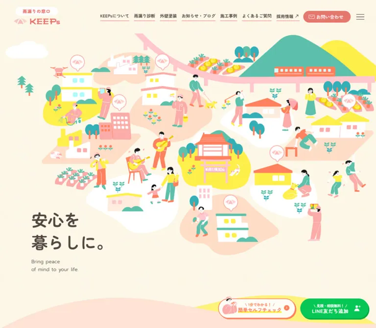
KEEPs presents home maintenance through a friendly picture of the community it serves. Houses, repair workers, musicians, families, pets, vegetable plots, trees, a bridge, and a mountain share one sprawling illustrated landscape. The short promise “安心を / 暮らしに。” occupies a quiet pocket near the lower left. Rounded Japanese lettering, warm brown text, coral headings, and generous space give the technical services an approachable tone.
This is a substantial corporate home page with editorial updates, company information, project examples, service explanations, recruitment, and social links. Its conversion system runs alongside that content: a coral contact link remains in the header, while a self-check invitation and green LINE action persist near the bottom. Broad landscape curves connect the illustrated opening to later sections and the pink footer.
How to Read This Reference
- Computed values are copied from the supplied rendered element styles and bounding rectangles.
- Source tokens are declared custom properties. Their presence does not prove that every token is visibly used.
- Derived values are arithmetic relationships between supplied measurements, such as column gaps or content widths.
- Visual estimates describe screenshot geometry or colors without a corresponding computed value. Approximate hexadecimal colors were not sampled with an image tool.
- Recommendations and the Quick Start are implementation guidance, not claims about the original code or untested behavior.
- All measurements describe the supplied capture session. Document coordinates and screenshot coordinates differ after scrolling; exact scroll offsets were not supplied.
The screenshots establish rendered appearance. Some section containers report a gray background even where the corresponding capture looks cream. The available evidence does not identify the complete compositing or background-layer mechanism. Preserve the visible treatment, and do not assume that copying one ancestor's background declaration reproduces it.
Tokens — Colors
Default Palette
Opaque eight-digit source colors are normalized to six digits below. Token aliases are proposed names for reuse.
| Name | Value | Suggested token | Evidence and role |
|---|---|---|---|
| Warm Paper | #fffcf3 |
--color-paper |
Source --s-color-999f83ed; suitable base for the warm ivory canvas visible around the artwork and service area. The rendered canvas has subtle tonal variation. |
| Brown Ink | #534741 |
--color-ink |
Source --s-color-f6940b8f; computed on hero copy, navigation, paragraphs, and service titles. |
| Brand Coral | #e5776e |
--color-coral |
Sources --s-color-b38f9251 and --s-color-59895633; computed on section headings and filled contact/list buttons. |
| Peach | #ffe4d5 |
--color-peach |
Source --s-color-42a0dc9f; visually consistent with the broad peach fields and social-area surround. Exact element binding was not supplied. |
| Lemon Yellow | #ffef4b |
--color-yellow |
Source --s-color-6e8c6dfd; computed exterior-painting card background. Also visually echoed in roofs and landscape accents. |
| Service Blue | #b0e2ef |
--color-blue |
Source --s-color-2f94fd39; computed leak-diagnosis card background. |
| Action Orange | #ff825e |
--color-orange |
Source --s-color-1d94e0e7; visually consistent with the outlined self-check action. Its exact CTA binding is not in the selected element records. |
| White | #ffffff |
--color-white |
Source white tokens and computed button-label color; visible on houses, social cards, circular controls, and reversed branding. |
| Date Gray | #9f9d9c |
--color-muted |
Source --s-color-72b8ffdc; computed News and Works dates. |
| LINE Green | #06c755 |
--color-line |
Computed on the in-content LINE link; the persistent LINE actions use a visually corresponding green. |
Illustration and Footer Colors
These are visual approximations for planning new artwork, not exact source tokens.
| Appearance | Approximation | Role |
|---|---|---|
| Blush pink | Approximately #ffc7c8 |
Large footer field and bridge-like landscape elements. |
| Clothing pink | Approximately #ffa9b0 |
Workers, clothing, roofs, and small character details. |
| Leaf teal | Approximately #5bbdac |
Trees, mountain, clothing, and vegetation. |
| Strong turquoise | Approximately #2eabb6 |
Selected trees and small landscape accents. |
Keep these colors primarily within the illustrations and large environmental surfaces. The interface itself has a clearer hierarchy: brown for reading, coral for identity and navigation, blue/yellow for the two main services, and green for LINE.
Additional Source Tokens
The declared palette also includes #ffd742, #f9d7ca, #ffece5, #fff0e7, and #333333. Their exact visible component assignments are not established here. Do not create extra semantic categories merely because these variables exist.
A source highlight token is declared as:
linear-gradient(0deg, #ffef4bff 31%, #ffef4b00 32%)
This creates a yellow band across roughly the lower third of a text box. It is consistent with the visual vocabulary of the self-check label's yellow underline, although the supplied records do not establish that exact binding.
Tokens — Typography
Rounded Japanese Typography
Verified family: Zen Maru Gothic, exposed through source --s-font-eda88717 and computed on the inspected Japanese text.
The family supplies the soft terminals and rounded character shapes that connect the interface to the illustrations. Most paragraphs use weight 500; headings and principal labels use 700; the small brand descriptor uses 900. Avoid replacing this with a heavy geometric display face: the original remains conversational even at its largest size.
The umbrella symbol and KEEPs wordmark should be treated as logo artwork. No font identification for the wordmark is established by the supplied text measurements.
English Labels and Dates
Verified family: Prompt, exposed through source --s-font-41bcac79.
The English hero translation uses weight 300. Section eyebrows such as “News,” “Service,” and “Our Services,” along with dates, use weight 400. English labels are deliberately subordinate to the Japanese headings: generally 12px on desktop and 11px on mobile.
Icons
The menu button explicitly computes to Material Symbols Rounded, 40px. The DOM also contains icon ligatures such as keyboard_arrow_right and call_made. Render these as icons rather than literal text strings.
Font Awesome brand and solid font variables are declared, but this alone does not identify the rendering method of every social icon. Visually, the page combines envelope outlines, thin chevrons, northeast arrows, person-add symbols, and recognizable Instagram and Spotify marks.
Other declared font tokens, including Jost and Zen Kaku Gothic New, are not enough to assign those fonts to the components described here. The browser's Times declaration on the root is also not the visible content typography.
Type Scale
Values below are computed unless otherwise stated. Sizes and line heights are in CSS pixels.
| Role | Family / weight | Desktop size / line height | Mobile size / line height |
|---|---|---|---|
| Hero promise | Zen Maru Gothic / 700 | 54 / 75.6 |
38 / 53.2 |
| Hero translation | Prompt / 300 | 16 / 25.6 |
12 / 19.2 |
| Brand descriptor | Zen Maru Gothic / 900 | 14 / 22.4 |
12 / 19.2 |
| Desktop navigation | Zen Maru Gothic / 700 | 14 / 14 |
Hidden in the supplied mobile state |
| Header contact label | Zen Maru Gothic / 500 | 15 / 15 |
13 / 13 |
| English section eyebrow | Prompt / 400 | 12 / 12 |
11 / 11 |
| Standard section heading | Zen Maru Gothic / 700 | 32 / 32 |
26 / 26 |
| Main service title | Zen Maru Gothic / 700 | 28 / 39.2 |
24 / 33.6 |
| Main service description | Zen Maru Gothic / 500 | 16 / 32 |
15 / 24 |
| News title | Zen Maru Gothic / 500 | 16 / 25.6 |
15 / 21 |
| Works title | Zen Maru Gothic / 500 | 16 / 25.6 |
15 / 24 |
| News and Works date | Prompt / 400 | 14 / 14 |
14 / 14 |
| About paragraph | Zen Maru Gothic / 500 | 16 / 35.2 |
15 / 27 |
| Inspection-method title | Zen Maru Gothic / 700 | 24 / 33.6 |
26 / 36.4 |
| Service inventory item | Zen Maru Gothic / 500 | 20 / 28 |
16 / 19.2 |
| LINE step title | Zen Maru Gothic / 700 | 24 / 28.8 |
18 / 21.6 |
| LINE step paragraph | Zen Maru Gothic / 500 | 16 / 25.6 |
13 / 20.8 |
| In-content LINE button | Zen Maru Gothic / 700 | 20 / 20 |
18 / 18 |
| Recruitment statement | Zen Maru Gothic / 700 | 28 / 39.2 |
26 / 36.4 |
| Recruitment benefit title | Zen Maru Gothic / 700 | 24 / 28.8 |
22 / 26.4 |
| Standard list/detail button label | Zen Maru Gothic / 700 | 16 / 16 |
15 / 15 |
The brand descriptor uses 0.1em tracking: 1.4px desktop and 1.2px mobile. Some LINE introductory copy uses 0.03em. Most inspected text uses normal letter spacing.
Do not scale every role by the same mobile multiplier. Dates remain 14px, while inspection-method titles actually increase from 24px to 26px when their layout becomes a vertical sequence.
Tokens — Spacing & Shapes
Observed rhythm: many reusable values fall on 4px or 8px increments. This is an inferred organizing principle, not a verified global base-unit variable.
Density: compact navigation and labels, comfortable card interiors, and large intervals between major content groups.
Spacing Scale
| Use | Desktop | Mobile | Evidence |
|---|---|---|---|
| Brand stack gap | 4px |
4px |
Computed link gap |
| English eyebrow to Japanese heading | 8px |
8px |
Derived from text rectangles |
| Hero promise to translation | 16px |
8px |
Derived from text rectangles |
| News card padding | 24px |
16px |
Computed |
| News card internal gap | 16px |
16px |
Computed |
| Gap between News cards | 16px |
16px |
Derived |
| Main service card padding | 48px 48px 0 |
32px 32px 0 |
Computed |
| Main service card gap | 40px horizontally |
24px vertically |
Derived |
| About paragraph separation | 40px |
16px |
Derived |
| News section padding | 120px 80px 144px |
64px 32px |
Computed |
| Recruitment section padding | 144px 80px |
64px 32px |
Computed |
| FAQ section padding | 80px |
64px 32px |
Computed |
| Service section top padding | 120px |
40px |
Computed |
The desktop service heading's bottom edge sits 74px above the measured card tops; mobile reduces this interval to 32px. This is a relationship between rendered bounds, not proof of a single margin declaration.
Border Radius
| Element | Desktop | Mobile | Evidence |
|---|---|---|---|
| News cards | 12px |
12px |
Computed |
| Main service cards | 32px |
24px |
Computed |
| Header contact link | 40px |
40px |
Computed; produces a pill at these heights |
| Standard list/detail links | 80px |
80px |
Computed; pill appearance |
| In-content LINE link | 999px |
999px |
Computed |
| Works arrow buttons | 50% |
50% |
Computed |
| FAQ question buttons | Not supplied | 24px |
Computed mobile record |
| Social cards | Approximately 24–32px |
Not visually established | Desktop visual estimate |
| Persistent bottom actions | Large pills | Square adjoining panels | Screenshot observation |
Organic landscape edges belong to a separate shape system. They are wide, shallow, irregular curves, often carrying a tiny house or pair of trees. They should not be approximated by applying the same corner radius to every section.
Layout Measurements
| Element | Desktop 1440 × 1000 | Mobile 390 × 844 | Evidence |
|---|---|---|---|
| Document height | 9651.86px |
10389.61px |
Computed root rectangle |
| Start of News | Document y 1028px |
Document y 794.03px |
Computed; useful opening-region reference |
| Brand link | 163 × 65.09px, x 40, y 23 |
127.20 × 54.06px, x 16, y 15 |
Computed |
| Header contact link | 157 × 39px |
129 × 37px |
Computed |
| Menu button | 40 × 40px |
40 × 40px |
Computed |
| Hero promise box | x 104, y 609.63, width 270px |
x 24, y 566.84, width 190px |
Computed |
| News collection | Four cards across a 1040px span |
One column, 326px wide |
Derived |
| News card | 248 × 286.58px |
326px wide; observed heights 126.39–147.39px |
Computed |
| Service collection | 1080px wide, from x 180 to 1260 |
326px wide at x 32 |
Derived |
| Leak-diagnosis card | 520 × 361.19px |
326 × 278.53px |
Computed |
| Exterior-painting card | 520 × 361.19px |
326 × 323.72px |
Computed |
| Works item | 320px wide, including 16px side padding |
200px wide, including 12px side padding |
Computed |
| Standard list/detail link | 180 × 50px |
176 × 50px |
Computed |
| In-content LINE link | 319.33 × 68px |
291.09 × 51.47px |
Computed |
| Persistent CTA group | Approximately 500px wide at bottom right |
Full width; two approximately 195px halves |
Visual estimate |
| Persistent CTA height | Approximately 68px, plus a small hard shadow |
Approximately 58px |
Visual estimate |
Components
Persistent Header
Role: maintain identity, section access, and a direct contact route while the long page scrolls.
The header appears in the same top region across the supplied hero, service, and footer captures. Its transparent appearance allows the underlying scenery or section color to remain visible. The screenshots establish persistence; the selected style records do not expose whether the implementation uses fixed positioning or a sticky mechanism.
The desktop anatomy is a brand block at left, a large flexible gap, seven navigation items, a coral contact pill, and a menu icon. The main link row begins near x 526. Adjacent text links are generally separated by 16px. Thin coral underlines are visible beneath the navigation; their thickness is approximately 1px. The recruitment item includes a northeast arrow and links to a separate recruitment domain.
The contact link contains an envelope icon, a 5px gap, and “お問い合わせ”. Desktop padding is 12px 24px 12px 18px; mobile padding becomes 12px 16px 12px 14px. Its white label uses weight 500 rather than the navigation's 700.
At 390px, the navigation row disappears. The brand remains at x 16, contact begins at x 197, and the menu occupies x 334–374. Contact and menu are separated by 8px. The menu remains visible on desktop as well as mobile; it is not exclusively a replacement for the desktop links.
No open-menu state, menu animation, or keyboard behavior was supplied.
Illustrated Hero
Role: establish reassurance through a picture of everyday community life.
The hero is an expansive illustration field with short copy, rather than a large block of explanatory text. Small scenes occupy irregular peach, yellow, and white islands. Buildings have simple rectangular windows and bright roofs. People wear coral, pink, yellow, and teal; black is largely restricted to small hair and facial details. The bridge and mountain create larger directional shapes above the scattered scenes.
The Japanese promise has a deliberate two-line break. Its desktop text box starts at x 104, y 609.63, followed by the two-line English translation at y 776.81. The copy sits directly on the warm canvas without a card, border, or backdrop.
On mobile, the illustration becomes a larger-than-viewport scene cropped horizontally. The supplied image preserves recognizable left and central neighborhood details while much of the right side continues beyond the screen. Visible artwork begins around y 112. The promise starts at y 566.84, still left aligned, with the English translation below.
Keep the copy as live text. The original promise is recorded as a paragraph; using an h1 with the same appearance is a recommended semantic improvement. Artwork cropping must be tuned independently of text size.
Bilingual Section Heading
Role: give the long page a consistent, easy-to-scan hierarchy.
Stack a small brown Prompt eyebrow over a coral Zen Maru Gothic heading, with an 8px interval. Typical desktop geometry is 12px eyebrow + 8px gap + 32px heading; mobile uses 11px + 8px + 26px.
News, Works, Service, the service inventory, and FAQ use centered headings in the available evidence. About and Recruitment align their headings with the relevant text column. Preserve this distinction instead of centering every section automatically.
News Cards
Role: provide recent editorial and company updates.
Desktop has four equal cards in a centered row. Each card is a full anchor with a white background, 12px radius, 24px padding, and an image above its metadata. The content sequence is date, Japanese title, then a coral category label such as “ブログ”. The first two card widths and positions establish a 16px inter-card gap.
Mobile changes the component's internal direction: the image occupies the left side and the text sits to its right. Cards stack vertically at x 32 with a width of 326px and 16px padding. The metadata column starts at x 208 and measures 134px wide. Assuming the recorded single 16px gap, the left media allocation is 144px wide; this is a derived measurement.
Card heights depend on wrapping. The first observed mobile card is approximately 147px high, while the following cards are approximately 126px. Avoid fixing every row to one height. A centered coral list link follows the collection.
The exact imagery and any card shadow are not visually established by the supplied screenshots. The computed white surface and radius are verified.
About Block
Role: connect the company identity with local trust and continuity.
The desktop text column begins at x 808 and is 385px wide. It contains the bilingual heading, two paragraphs, and a left-aligned detail link. Paragraphs use unusually relaxed 16px / 35.2px typography, with 40px between the measured paragraph boxes.
On mobile, the text moves to x 32 and expands to the 326px content width. The type becomes 15px / 27px, paragraph separation falls to 16px, and the detail link remains aligned with the text. There is a substantial region above the mobile heading within the About section, but the supplied screenshots do not establish its complete media composition.
The source copy names the company and discusses its history, experience, and local credentials. Those are content observations; this reference does not independently verify the business claims.
Works Carousel
Role: expose multiple repair projects without making every project a full-width section.
The DOM establishes a horizontal sequence of linked project items with previous/next buttons. Items include a media area, a gray Prompt date, a brown title, and coral category labels. Desktop items are 320px wide with 16px horizontal padding; mobile items are 200px wide with 12px padding, leaving a 176px content width.
The captured mobile geometry places a complete item at x 95–295, with neighboring items extending beyond the viewport. Arrow buttons are 40px coral circles at x 16 and x 334. A centered list link sits below the track. This produces a browsable preview with partial neighbors, not a vertically stacked mobile project list.
Duplicate project records and different active positions appear in the desktop and mobile snapshots. They support a carousel structure but do not establish autoplay, looping rules, swipe support, or a slide interval. Some initial desktop media references are empty SVG placeholders; mobile records contain raster-image references. Do not interpret those placeholders as an intentional blank-media style.
Inspection-Method Features
Role: explain how diagnosis is performed through three concrete methods.
The page presents drone inspection, infrared thermography, and a wood-compatible moisture meter. Each feature contains a compact category label, a coral method title, and a brown explanatory paragraph.
Desktop text columns begin near x 151, 565, and 979, each approximately 310px wide. Mobile lays out the three methods sequentially with 326px text widths and 32px outer gutters. Method titles increase to 26px on mobile; explanatory copy is 15px with 27px or 30px line height, depending on the feature.
The introductory statement uses coral text and emphasizes making a home's problems visible. Its type changes from 24px / 33.6px on desktop to 16px / 22.4px on mobile, with additional line breaks. Media subjects and animation within these feature blocks are not visually verified here.
Main Service Cards
Role: provide two unmistakable service entry points.
The two whole-card links sit side by side on desktop: blue for “雨漏り診断” and yellow for “外壁塗装”. Each measures approximately 520 × 361px with a 32px radius. The pair occupies 1080px, including a 40px gap.
Their anatomy is:
- A top content area inset 48px from the card edges.
- A bold brown service title at
28px / 39.2px. - An 8px interval before the description, which uses
16px / 32px. - A white circular chevron near the top right, approximately 36px across in the screenshot.
- A large illustration below the copy, aligned with and cropped by the lower card edge.
The blue card shows a house with a pink roof and a white speech bubble containing two aqua drops. The yellow card shows a helmeted worker applying pink paint with a roller, against a pale peach panel. These are service-specific illustrations with a shared palette and drawing language.
Mobile stacks the links with a 24px gap. Width becomes 326px, radius 24px, and padding 32px 32px 0. Titles become 24px and descriptions 15px. The blue card is approximately 279px high; the yellow card is approximately 324px high. Different wrapping and artwork proportions are retained rather than forced into equal mobile heights.
Both cards have direct service URLs in the supplied DOM. No hover transformation or destination-page design was inspected.
Service Inventory Panel
Role: show the breadth of available work beneath the two primary services.
The desktop screenshot reveals a broad white rounded panel with small peach circular corner accents. Inside, the bilingual heading introduces a compact inventory of thirteen services. The DOM establishes four text columns on desktop and two on mobile, ordered across rows.
Desktop inventory text uses 20px / 28px, with successive rows 44px apart, giving a derived 16px vertical gap. Mobile uses 16px / 19.2px, with approximately 29.19px row pitch, giving a derived 10px gap. A coral invitation follows the list and wraps to two lines on mobile.
Treat the inventory as a grouped service list. Individual text entries are recorded as paragraphs, so their appearance does not establish individual link behavior.
LINE Consultation Steps
Role: explain the consultation process before the external messaging handoff.
The page describes three stages: add the official account, photograph the affected exterior or leak, and send the photographs for review. A coral introduction precedes the steps, and a large green LINE link follows them.
Desktop step text occupies three columns of approximately 234px each. Titles use 24px / 28.8px; supporting text uses 16px / 25.6px. On mobile, steps become a vertical sequence. Their text occupies a narrow right-hand column at x 196 with a width of 138px, implying an accompanying left-side media region. The supplied images do not show that region in detail.
Mobile titles use 18px / 21.6px, and paragraphs use 13px / 20.8px. This is a notably compact part of the mobile design. A new implementation should test this arrangement with longer copy and text enlargement.
The final link uses the observed https://lin.ee/syG1dX4 destination. A QR-code route is mentioned by the page text; scanning or completing the consultation flow was not tested.
Recruitment Block
Role: make employment information part of the company's broader community story.
The block contains a bilingual heading, a two-line brown statement, explanatory copy, three benefits, and a coral detail link with a northeast arrow. Desktop introductory copy begins at x 180 and spans up to 560px. Benefit text forms three columns. Mobile moves the introduction to the 326px content width, then stacks the benefits in centered 200px text columns.
Benefit titles use coral and remain prominent: 24px desktop and 22px mobile. The mobile layout has generous intervals between benefits despite its relatively narrow text measure. The detail link points to a separate recruitment site; that site's design is outside this reference.
FAQ Preview
Role: surface common concerns before users enter the full FAQ page.
The mobile DOM records a horizontal strip of question buttons, including repeated offscreen entries. Recorded buttons are 198 × 152px with 24px radius and 40px 24px padding. Their brown question text uses 15px / 24px, weight 700. Adjacent button positions establish a 24px gap.
This evidence supports question cards on a horizontal track. It does not support describing the home-page component as an accordion. No answer reveal, dialog, button activation, or automatic movement was supplied. Preserve the separately evidenced link to the FAQ index.
Social Links Panel
Role: offer ongoing contact through social content.
The desktop footer capture shows a peach rounded surround with a coral “公式SNS” heading and two white cards. Each card is approximately 344px wide; the pair has an approximately 32px gap. An icon sits above a small explanatory line, followed by the platform or program name and a small circular external-link indicator.
Instagram uses coral, while the radio link uses Spotify green. The program name “でれあれやんラジオ” is visible. The cards are centered and spacious; the social area works as a distinct destination before the footer landscape begins.
The mobile capture shows only the lower edge of this panel. Its complete mobile card arrangement is not visually established.
Landscape Footer
Role: close the page inside the same illustrated world as the hero.
A yellow hill appears behind a broad blush-pink foreground. Small houses sit on the left crest and trees near the right. The visible pink field has subtle tonal variation; its exact texture asset and color declaration are not supplied.
On desktop, the white umbrella wordmark and stacked contact/social controls sit near the left edge. Navigation is grouped into three columns on the right, with a large open area between brand and links. Small coral bullets mark group headings; sublinks use restrained dash-like prefixes and brown text. This is an intentionally spacious footer, not a dense legal-information slab.
On mobile, the footer becomes a single left-aligned sequence: white brand, contact pill, LINE pill, circular social links, then the navigation groups and privacy link. Main content begins around x 24. The header and bottom CTA bar remain visible over this footer state.
Persistent Self-Check and LINE Actions
Role: keep two consultation entry points available throughout the page.
Desktop shows two neighboring pills near the lower-right corner. The self-check pill has a pale fill, orange outline, a small worker illustration protruding near its left edge, a two-line label, yellow emphasis beneath the main label, and a circular chevron. The LINE pill has a saturated green fill, white two-line text, and a person-add icon. Both have a small hard offset edge or shadow rather than a diffuse floating shadow.
In the 1440px captures, the group occupies roughly x 917–1418 and y 902–972. Exact CSS dimensions for these fixed controls are not included in the selected records.
Mobile converts them into an edge-to-edge bottom bar. Each action occupies half the 390px width; the panels meet without a gap, lose their pill silhouettes, and occupy approximately the bottom 58px. The small worker still protrudes above the left panel. This is a structural breakpoint change, not merely smaller desktop buttons.
The self-check's destination or activation behavior is not established. Do not invent a questionnaire, modal, scoring system, or completion state from its label alone.
Tokens — Motion & Interaction
Declared Transition Values
| Element or treatment | Supplied value | What is established |
|---|---|---|
| Many links and text elements | 0.3s cubic-bezier(0.4, 0.4, 0, 1) |
A shared transition declaration; no specific changed property or visual response is established for every element. |
| Body background | background 0.5s cubic-bezier(0.4, 0.4, 0, 1) |
Background transition is declared; its trigger was not supplied. |
| News cards | transform 0.3s cubic-bezier(0.58, 0.21, 0.41, 0.96) |
Transform timing is available; direction and distance were not tested. |
| Works arrow buttons | 0.4s cubic-bezier(0.4, 0.4, 0, 1) |
Control transition timing; not the carousel's proven slide duration. |
| Desktop main service cards | 0.5s cubic-bezier(0.4, 0.4, 0, 1) 0.3s |
500ms duration with 300ms delay is declared. Trigger and animated properties remain unverified. |
| Mobile main service cards | 0.3s cubic-bezier(0.4, 0.4, 0, 1) |
The selected mobile records omit the desktop delay. |
| Desktop LINE introductory callout | 0.5s cubic-bezier(0.4, 0.4, 0, 1) 0.8s |
A delayed transition is declared; it is not proof of a particular entrance sequence. |
| Mobile LINE introductory callout | 0.3s cubic-bezier(0.4, 0.4, 0, 1) |
Shorter, undelayed declaration in the supplied mobile record. |
Works item records contain a transform transition and easing without a numeric duration in the supplied string. A duration should not be inferred from a neighboring control.
Observed Behavior and Limits
Scrolling was part of the supplied inspection. The header and consultation actions remain visible in captures from widely separated page positions. Standard navigation and service targets are evidenced by anchor URLs. Works has previous/next buttons, and FAQ questions are buttons.
No click-through, hover comparison, open menu, expanded FAQ, or self-check result was supplied. Static captures cannot establish character motion, train movement, parallax, or an animation loop. The sampled elements report animation: none; that does not rule out animation in unlisted descendants, pseudo-elements, media, or JavaScript.
Recommended adaptation: use restrained 200–300ms transitions for explicit hover/focus feedback, keep decorative movement optional, and implement a reduced-motion alternative. Do not make content depend on a delayed reveal. The Quick Start's small hover lift is a recommendation, not a reconstructed original interaction.
Surfaces
| Layer | Rendered appearance | Implementation guidance |
|---|---|---|
| Main environmental canvas | Warm ivory with very subtle variation | Begin with the source paper token; add texture only through an identified or newly created asset. |
| Illustration islands | Flat peach, yellow, and white organic fields | Keep edges clean and shapes irregular; use the artwork's own silhouettes. |
| Main service cards | Solid blue and yellow with large rounded corners | Use exact computed fills, brown text, and bottom-aligned illustration. |
| Information panels | White rounded surfaces with occasional corner dots | Use a small radius hierarchy rather than one radius everywhere. |
| Standard action | Coral pill with white label and arrow | Compact, consistent shape; little visible elevation. |
| Messaging action | Green pill or mobile bar panel | Reserve the green action treatment for the LINE route. |
| Footer | Blush-pink landscape beneath yellow hills | Let the wave transition carry the section identity. |
| Persistent consultation controls | Flat fills, outline, small hard offset shadow | Avoid large blurred shadows that make them feel detached from the illustration style. |
Computed container backgrounds include #eeeeee for About, Works, Service, and the inventory, and white for several other sections. These raw values do not fully explain the supplied cream rendering. No blend mode, filter, or overlay mechanism is asserted here.
Imagery
The illustration language is flat, friendly, and lightly irregular. Characters have small heads, simplified faces, expressive poses, and long uncomplicated limbs. Buildings use plain blocks, triangular or shallow roofs, and repeated rounded windows. Vegetation alternates between geometric evergreen trees, rounded canopies, and tiny repeated flower clusters.
The hero includes both work and leisure: inspection equipment and paint rollers appear alongside music, gardening, walking, children, wheelchair use, and pets. This mixture makes housing maintenance part of ordinary life. A new illustration brief should preserve that breadth rather than filling the scene entirely with construction tools.
The palette stays bright but softened by the cream setting. White is an active illustration color. Black details are small; heavy black outlines do not define the scene. There is no evidence of pixelated rendering, glossy 3D material, or dramatic photographic lighting in the supplied hero and service artwork.
Observed Asset References
| Asset group | Evidence | Reuse guidance |
|---|---|---|
| Panoramic neighborhood scene | Desktop hero capture #1; mobile hero capture #4 | Obtain an authorized original or commission an equivalent composition. Prepare deliberate mobile cropping. |
| House and water-drop illustration | Desktop service capture #2 | Preserve the white bubble, aqua drops, pink roof, and lower-edge cropping. |
| Painting worker illustration | Desktop service capture #2 | Preserve the roller action, pink workwear, pale panel, and yellow surrounding card. |
| Houses, trees, and landscape waves | Captures #1–#5 | Reuse a coherent motif family across section transitions and footer. |
| Umbrella wordmark | Header and footer captures | Use the appropriate coral and white logo variants as artwork. |
| Small self-check worker | Persistent actions in desktop and mobile captures | Keep its intentional overlap above the control while protecting the label's readable area. |
| News and Works media slots | DOM background-image references | Image subjects, photographic treatment, and exact crops are not visually verified by the supplied frames. |
Complete, reliably mapped URLs for the principal illustrations are not supplied. No asset filenames are invented in this reference. Several DOM snippets reference raster files through CSS backgrounds, but a background declaration alone does not establish the asset's visible subject.
Layout & Responsive Behavior
The page remains a long, normally scrolling document at both inspected widths. Content order stays substantially consistent: hero, News, About, Works, inspection methods, services and inventory, LINE consultation, recruitment, FAQ, social links, and footer.
Desktop uses several content measures rather than one universal container: 1040px for the four News cards, 1080px for the main service pair, a narrower 385px About text column, and full-width regions for illustration and carousel overflow. Mobile commonly uses 32px content gutters, with 24px for hero copy and footer navigation and 16px around header controls.
Confirmed Responsive Changes
| Component | Desktop | Mobile |
|---|---|---|
| Header | Brand, full navigation, contact, and menu | Brand, contact, and menu |
| Hero art | Broad neighborhood panorama | Horizontally cropped scene above and beside the lower-left copy |
| Hero type | 54px promise; 16px translation | 38px promise; 12px translation |
| News | Four vertical cards in one row | Four stacked horizontal image/text cards |
| About | Narrow text column on the right | Full content-width text below the preceding region |
| Works | 320px items on a horizontal track | 200px items, centered item with partial neighbors |
| Inspection methods | Three text columns | Three sequential feature blocks |
| Main services | Two equal-height cards | Two stacked cards with different heights |
| Service inventory | Four columns | Two columns |
| LINE steps | Three columns of text | Vertical sequence with narrow right-side text columns |
| Recruitment benefits | Three columns | Centered stacked text groups |
| Footer | Brand left, three navigation columns right | One left-aligned sequence |
| Persistent actions | Separate bottom-right pills | Two adjoining full-width bottom panels |
A max-width: 1140px rule is visible in the supplied responsive line-break stylesheet fragment. The exact breakpoints governing navigation, card stacking, and the bottom bar were not provided. Only the endpoint layouts above are verified. The Quick Start uses proposed breakpoints and identifies them as such.
Recommended implementation behavior: reserve space for the mobile bottom bar and device safe area, keep focused content clear of persistent controls, and clip only the decorative or carousel regions that require it. Do not hide all horizontal overflow globally as a substitute for fixing layout errors.
Do’s and Don’ts
Do
- Anchor reading text in the measured brown
#534741and section identity in coral#e5776e. - Use Zen Maru Gothic for the rounded Japanese voice and Prompt for English eyebrows and dates.
- Preserve the two-line hero promise and its quiet lower-left placement.
- Let a broad illustrated neighborhood carry the opening's visual density.
- Keep the service pair blue and yellow, with distinct explanatory illustrations.
- Preserve different card structures for News, Works, and the main services.
- Retain the service cards' unequal mobile heights and natural text wrapping.
- Repeat houses, trees, and wide landscape curves at meaningful transitions.
- Keep the footer's large desktop breathing room and simple mobile sequence.
- Convert the desktop CTA pills into two adjoining mobile panels.
- Distinguish direct contact, self-check, and LINE as separate actions.
Don't
- Don't reduce the corporate home page to only a hero and a single conversion block.
- Don't introduce heavy black typography or thick black illustration outlines.
- Don't substitute a generic house icon for the service-specific illustrated scenes.
- Don't scale the complete desktop hero down until all of its characters become tiny on a phone.
- Don't use one universal mobile font reduction: the inspected type roles change independently.
- Don't turn the mobile News collection into four miniature desktop columns.
- Don't describe the FAQ preview as an accordion without inspecting its activated state.
- Don't infer autoplay, parallax, or character animation from static images and generic transition declarations.
- Don't reproduce raw gray ancestor backgrounds when they contradict the visible cream surface.
- Don't use green indiscriminately for unrelated interface categories.
- Don't let the bottom bar obscure the final links or keyboard focus.
Recommended Implementation Additions
These are improvements for a new implementation, not verified original features.
- Use a semantic
h1for the hero promise,h2elements for sections, and suitable subheadings within service and feature cards. - Give the menu, carousel arrows, social icons, and self-check control explicit accessible names. Decorative icon ligatures should be hidden from assistive technology.
- Provide at least 44px interactive targets where practical. The recorded menu and Works arrow boxes are 40px; their visible icons can remain smaller than improved hit areas.
- Add a strong visible focus indicator and account for both persistent header and bottom bar when scrolling focused content into view.
- Test contrast for small white labels on coral or green, and for gray dates on light surfaces. Any darker accessible variant should be documented separately from the measured reference palette.
- Test mobile News rows and LINE step text with longer Japanese copy and enlarged text. Allow media/text proportions to change before columns become unreadably narrow.
- Hide carousel duplicates from the accessibility tree where appropriate and provide deliberate keyboard navigation. If automatic movement is added, provide a pause mechanism.
- Give decorative scenery empty alternatives; provide meaningful alternatives for informative project imagery. Keep essential service information outside artwork.
- Validate footer destinations. The supplied link records associate some News/Blog labels with the leak-diagnosis URL and some Works category labels with an individual project. Use intentional destinations in a new implementation.
- Offer reduced motion and ensure content is readable without entrance-animation execution.
Agent Prompt Guide
Quick Color Reference
- Warm canvas: source token
#fffcf3; visible texture is separate. - Reading text:
#534741. - Brand headings and standard pills:
#e5776e. - Leak-diagnosis service:
#b0e2ef. - Exterior-painting service:
#ffef4b. - Peach support field:
#ffe4d5. - LINE action: measured
#06c755. - Self-check outline: source orange
#ff825e, with yellow text emphasis. - Footer blush: approximately
#ffc7c8; visually estimated, not an exact source value.
Overall Prompt
“Create a Japanese corporate home page for a local housing-maintenance company using the visual language of the supplied KEEPs reference. Use warm ivory, brown reading text, coral headings, Zen Maru Gothic Japanese typography, and small Prompt English labels. Build a panoramic flat illustration of neighborhood life with homes, workers, families, musicians, gardening, pets, teal vegetation, and pastel landscape islands. Place the short live-text promise near the lower left. Continue into editorial updates, company information, a horizontal project preview, three inspection methods, blue and yellow illustrated service cards, a service inventory, consultation steps, recruitment, FAQ previews, social links, and a pink landscape footer. Keep contact in the persistent header. Use separate self-check and LINE pills on desktop and a two-panel bottom bar on mobile. Use the documented component-specific responsive changes; treat unverified interaction behavior as a separate implementation decision.”
Example Component Prompts
- Service pair: “Create two 520px-wide whole-card links in a centered 1080px desktop row with a 40px gap. Use a 32px radius, 48px top/side padding, brown 28px rounded Japanese titles, 16px descriptions, and a white circular chevron. Make the left card light blue with a house and water-drop illustration, and the right card lemon yellow with a painting worker. Stack them on mobile at 326px width, 24px radius, 32px padding, and a 24px gap; allow their heights to differ.”
- News collection: “Create four white editorial cards with 12px corners, 24px desktop padding, landscape media, gray Prompt dates, brown rounded Japanese titles, and coral category labels. On a 390px phone, use 32px outer gutters and stacked horizontal cards with media left and metadata right. Use 16px card padding and natural row heights.”
- Hero: “Arrange a busy flat pastel neighborhood across a warm-paper canvas, leaving a calm lower-left pocket for ‘安心を / 暮らしに。’ in 54px bold Zen Maru Gothic and a small two-line Prompt translation. At 390px, crop the illustration horizontally at a useful character scale and reduce the promise to 38px. Keep the wording live and readable.”
- Persistent actions: “Create an orange-outlined self-check pill with a small overlapping worker, yellow label emphasis, and circular arrow beside a green LINE pill with white copy and a person-add icon. Place the pair at the desktop bottom right. On mobile, remove the gap and pill corners and turn them into equal-width bottom panels. Reserve space beneath the document and include the safe area.”
- Footer: “Create a wide blush-pink footer entered through a shallow irregular hill, with a yellow hill behind it and tiny houses and trees on the crests. Use a white umbrella wordmark and stacked contact/social links at left, three restrained brown navigation columns at right, and substantial empty space between. Stack everything into one left-aligned sequence on mobile.”
Quick Start
CSS Custom Properties
This is a reusable adaptation, not extracted production CSS. It uses measured typography, colors, padding, and endpoint dimensions. Footer blush, hero art fitting, hard CTA shadows, and hover feedback are approximations or recommendations. The proposed 1140px navigation threshold and 768px content threshold are not verified original component breakpoints.
Load authorized copies of the two font families separately. Insert authorized or newly commissioned illustrations into the media slots; this CSS does not provide the original assets. Keep the page in normal document flow, with only the header and consultation dock made fixed in this adaptation.
:root {
  /* Measured colors and declared source palette */
  --color-paper: #fffcf3;
  --color-ink: #534741;
  --color-coral: #e5776e;
  --color-peach: #ffe4d5;
  --color-yellow: #ffef4b;
  --color-blue: #b0e2ef;
  --color-orange: #ff825e;
  --color-white: #fff;
  --color-muted: #9f9d9c;
  --color-line: #06c755;

  /* Visual approximation, not a measured source color */
  --color-footer: #ffc7c8;

  --font-jp: 'Zen Maru Gothic', sans-serif;
  --font-en: 'Prompt', sans-serif;
  --text-hero: 3.375rem;
  --text-section: 2rem;
  --text-service: 1.75rem;
  --text-body: 1rem;
  --text-eyebrow: 0.75rem;
  --leading-body: 2;

  --space-1: 4px;
  --space-2: 8px;
  --space-3: 12px;
  --space-4: 16px;
  --space-6: 24px;
  --space-8: 32px;
  --space-10: 40px;
  --space-12: 48px;
  --space-16: 64px;
  --space-20: 80px;
  --space-30: 120px;
  --space-36: 144px;

  --content-width: 1080px;
  --news-width: 1040px;
  --page-gutter: 80px;
  --radius-news: 12px;
  --radius-service: 32px;
  --radius-pill: 999px;
  --ease-brand: cubic-bezier(0.4, 0.4, 0, 1);
  --ease-card: cubic-bezier(0.58, 0.21, 0.41, 0.96);
  --safe-bottom: env(safe-area-inset-bottom, 0px);
}

* {
  box-sizing: border-box;
}

html {
  scroll-padding-top: 112px;
}

body {
  margin: 0;
  color: var(--color-ink);
  background: var(--color-paper);
  font-family: var(--font-jp);
  font-size: var(--text-body);
  font-weight: 500;
  line-height: var(--leading-body);
}

button,
a {
  -webkit-tap-highlight-color: transparent;
}

button {
  font: inherit;
}

img,
svg {
  display: block;
  max-width: 100%;
}

.container {
  width: min(
    var(--content-width),
    calc(100% - var(--page-gutter) - var(--page-gutter))
  );
  margin-inline: auto;
}

.section {
  padding-block: 120px;
}

.section-heading {
  display: grid;
  gap: 8px;
  justify-items: center;
}

.section-heading--left {
  justify-items: start;
}

.section-heading p,
.section-heading h2 {
  margin: 0;
}

.section-heading p {
  font: 400 var(--text-eyebrow) / 1 var(--font-en);
}

.section-heading h2 {
  color: var(--color-coral);
  font-size: var(--text-section);
  font-weight: 700;
  line-height: 1;
}

.site-header {
  position: fixed;
  inset: 0 0 auto;
  z-index: 40;
  display: flex;
  align-items: center;
  gap: 12px;
  padding: 23px 32px 16px 40px;
}

.brand {
  display: grid;
  justify-items: center;
  gap: 4px;
  flex: 0 0 auto;
  width: 163px;
  color: var(--color-coral);
  text-decoration: none;
}

.brand__descriptor {
  margin: 0;
  padding: 3px 24px;
  border-radius: var(--radius-pill);
  background: var(--color-white);
  font-size: 14px;
  font-weight: 900;
  line-height: 1.6;
  letter-spacing: 0.1em;
  white-space: nowrap;
}

.brand__logo {
  width: 100%;
  height: auto;
}

.desktop-nav {
  display: flex;
  align-items: center;
  gap: 16px;
  margin-left: auto;
}

.desktop-nav a {
  padding-bottom: 10px;
  border-bottom: 1px solid var(--color-coral);
  color: var(--color-ink);
  font-size: 14px;
  font-weight: 700;
  line-height: 1;
  text-decoration: none;
  white-space: nowrap;
}

.contact-link {
  display: inline-flex;
  align-items: center;
  justify-content: center;
  gap: 5px;
  flex: 0 0 auto;
  padding: 12px 24px 12px 18px;
  border-radius: 40px;
  color: var(--color-white);
  background: var(--color-coral);
  font-size: 15px;
  line-height: 1;
  text-decoration: none;
}

.menu-button {
  display: grid;
  place-items: center;
  flex: 0 0 auto;
  width: 40px;
  height: 40px;
  padding: 0;
  border: 0;
  color: var(--color-ink);
  background: transparent;
  cursor: pointer;
}

/* Endpoint-based hero spacing; actual artwork needs crop tuning. */
.hero {
  position: relative;
  isolation: isolate;
  min-height: 1028px;
  padding-block: 610px 200px;
}

.hero__art {
  position: absolute;
  inset: 0 0 auto;
  z-index: -1;
  height: 900px;
  overflow: clip;
  pointer-events: none;
}

.hero__art img {
  width: 100%;
  height: 100%;
  object-fit: contain;
  object-position: center top;
}

.hero__copy {
  margin-inline: max(24px, calc((100% - 1232px) / 2));
}

.hero__copy h1 {
  margin: 0;
  font-size: var(--text-hero);
  font-weight: 700;
  line-height: 1.4;
}

.hero__translation {
  margin: 16px 0 0;
  font: 300 1rem / 1.6 var(--font-en);
}

.pill-link {
  display: inline-flex;
  align-items: center;
  justify-content: center;
  gap: 12px;
  min-height: 50px;
  padding: 16px 26px 16px 28px;
  border-radius: 80px;
  color: var(--color-white);
  background: var(--color-coral);
  font-size: 1rem;
  font-weight: 700;
  line-height: 1;
  text-decoration: none;
}

.services .section-heading {
  margin-bottom: 74px;
}

.service-grid {
  display: grid;
  grid-template-columns: repeat(2, minmax(0, 1fr));
  align-items: stretch;
  gap: 40px;
}

.service-card {
  display: flex;
  flex-direction: column;
  gap: 16px;
  min-width: 0;
  padding: 48px 48px 0;
  overflow: hidden;
  border-radius: var(--radius-service);
  color: var(--color-ink);
  text-decoration: none;
  transition: transform 300ms var(--ease-brand);
}

.service-card--leak {
  background: var(--color-blue);
}

.service-card--paint {
  background: var(--color-yellow);
}

.service-card__top {
  display: grid;
  grid-template-columns: minmax(0, 1fr) 36px;
  align-items: start;
  gap: 16px;
}

.service-card h3 {
  margin: 0 0 8px;
  font-size: var(--text-service);
  font-weight: 700;
  line-height: 1.4;
}

.service-card p {
  margin: 0;
  font-size: var(--text-body);
  line-height: 2;
}

.round-arrow {
  display: grid;
  place-items: center;
  width: 36px;
  height: 36px;
  border-radius: 50%;
  background: var(--color-white);
  font: 400 20px / 1 sans-serif;
}

/* Media height approximates the remaining measured desktop card space. */
.service-card__art {
  display: grid;
  place-items: end center;
  height: 186px;
  margin-top: auto;
}

.service-card__art img {
  width: auto;
  height: auto;
  max-height: 100%;
  object-fit: contain;
  object-position: center bottom;
}

.news-list {
  display: grid;
  grid-template-columns: repeat(4, minmax(0, 1fr));
  gap: 16px;
  max-width: var(--news-width);
  margin: 64px auto 0;
}

.news-card {
  display: grid;
  align-content: start;
  gap: 16px;
  min-width: 0;
  padding: 24px;
  border-radius: var(--radius-news);
  color: var(--color-ink);
  background: var(--color-white);
  text-decoration: none;
  transition: transform 300ms var(--ease-card);
}

.news-card__media {
  width: 100%;
  aspect-ratio: 16 / 9;
  object-fit: cover;
}

.news-card time {
  display: block;
  color: var(--color-muted);
  font: 400 14px / 1 var(--font-en);
}

.news-card h3 {
  margin: 8px 0;
  font-size: 1rem;
  font-weight: 500;
  line-height: 1.6;
}

.news-card__category {
  color: var(--color-coral);
  font-size: 14px;
  line-height: 1.6;
}

.contact-dock {
  position: fixed;
  right: 24px;
  bottom: 32px;
  z-index: 50;
  display: grid;
  grid-template-columns: 256px 228px;
  gap: 16px;
}

.dock-action {
  position: relative;
  display: flex;
  align-items: center;
  justify-content: center;
  gap: 12px;
  min-height: 68px;
  padding: 12px 16px;
  border: 0;
  border-radius: var(--radius-pill);
  font-family: var(--font-jp);
  text-align: center;
  text-decoration: none;
  cursor: pointer;
}

.dock-action small,
.dock-action strong {
  display: block;
}

/* Dock text sizes and shadows are visual approximations. */
.dock-action small {
  font-size: 12px;
  line-height: 1.3;
}

.dock-action strong {
  font-size: 16px;
  line-height: 1.3;
}

.dock-action--check {
  border: 2px solid var(--color-orange);
  color: var(--color-orange);
  background: var(--color-paper);
  box-shadow: 2px 4px 0 var(--color-orange);
}

.dock-action--check strong {
  background: linear-gradient(
    0deg,
    var(--color-yellow) 31%,
    transparent 32%
  );
}

.dock-action--line {
  color: var(--color-white);
  background: var(--color-line);
  box-shadow: 0 4px 0 color-mix(
    in srgb,
    var(--color-line) 85%,
    var(--color-ink)
  );
}

.landscape-divider {
  width: 100%;
  height: clamp(60px, 10vw, 150px);
}

.site-footer {
  padding: 80px 40px 128px;
  background: var(--color-footer);
}

.footer-layout {
  display: flex;
  align-items: start;
  justify-content: space-between;
  gap: 80px;
}

.footer-nav {
  display: grid;
  grid-template-columns: repeat(3, minmax(0, 1fr));
  gap: 48px;
  font-size: 14px;
}

.footer-nav a {
  color: var(--color-ink);
  text-decoration: none;
}

/* Recommended interaction feedback; original hover state is unverified. */
@media (hover: hover) {
  .service-card:hover,
  .news-card:hover {
    transform: translateY(-3px);
  }
}

:where(a, button):focus-visible {
  outline: 3px solid var(--color-ink);
  outline-offset: 4px;
}

/* Proposed navigation threshold, not a verified original menu breakpoint. */
@media (max-width: 1140px) {
  .desktop-nav {
    display: none;
  }

  .site-header .contact-link {
    margin-left: auto;
  }

  .news-list {
    grid-template-columns: repeat(2, minmax(0, 1fr));
  }
}

/* Proposed content breakpoint; values target the supplied phone geometry. */
@media (max-width: 768px) {
  :root {
    --page-gutter: 32px;
    --text-hero: 2.375rem;
    --text-section: 1.625rem;
    --text-service: 1.5rem;
    --text-body: 0.9375rem;
    --text-eyebrow: 0.6875rem;
    --radius-service: 24px;
    --leading-body: 1.8;
  }

  html {
    scroll-padding-top: 88px;
    scroll-padding-bottom: calc(74px + var(--safe-bottom));
  }

  body {
    padding-bottom: calc(58px + var(--safe-bottom));
  }

  .site-header {
    gap: 8px;
    padding: 15px 16px;
  }

  .brand {
    width: 127.2px;
  }

  .brand__descriptor {
    font-size: 12px;
  }

  .brand__logo {
    max-width: 120px;
  }

  .contact-link {
    padding: 12px 16px 12px 14px;
    font-size: 13px;
  }

  .hero {
    min-height: 794px;
    padding-block: 567px 74px;
  }

  .hero__art {
    top: 112px;
    height: 500px;
  }

  /* Starting crop only; adjust to the actual illustration's composition. */
  .hero__art img {
    object-fit: cover;
    object-position: 25% top;
  }

  .hero__translation {
    margin-top: 8px;
    font-size: 12px;
  }

  .section {
    padding-block: 64px;
  }

  .services .section-heading {
    margin-bottom: 32px;
  }

  .service-grid {
    grid-template-columns: minmax(0, 1fr);
    gap: 24px;
  }

  .service-card {
    padding: 32px 32px 0;
  }

  .service-card p {
    line-height: 1.6;
  }

  /* Derived remaining media space, rounded to practical values. */
  .service-card--leak .service-card__art {
    height: 141px;
  }

  .service-card--paint .service-card__art {
    height: 162px;
  }

  .news-list {
    grid-template-columns: minmax(0, 1fr);
    margin-top: 40px;
  }

  .news-card {
    grid-template-columns: 144px minmax(0, 1fr);
    padding: 16px;
  }

  .news-card h3 {
    font-size: 15px;
    line-height: 1.4;
  }

  .pill-link {
    gap: 16px;
    padding-inline: 28px 24px;
    font-size: 15px;
  }

  .contact-dock {
    inset: auto 0 0;
    grid-template-columns: repeat(2, minmax(0, 1fr));
    gap: 0;
  }

  .dock-action {
    min-width: 0;
    min-height: calc(58px + var(--safe-bottom));
    padding: 8px 12px calc(8px + var(--safe-bottom));
    border-radius: 0;
    box-shadow: none;
  }

  .dock-action small {
    font-size: 11px;
  }

  .dock-action strong {
    font-size: 14px;
  }

  .site-footer {
    padding: 48px 24px 64px;
  }

  .footer-layout {
    display: grid;
    gap: 40px;
  }

  .footer-nav {
    grid-template-columns: minmax(0, 1fr);
    gap: 24px;
  }
}

/* Recommended fallback below the inspected phone width. */
@media (max-width: 360px) {
  .site-header {
    padding-inline: 12px;
  }

  .contact-link {
    padding-inline: 10px;
    font-size: 12px;
  }

  .news-card {
    grid-template-columns: minmax(0, 40%) minmax(0, 1fr);
  }
}

@media (prefers-reduced-motion: reduce) {
  .service-card,
  .news-card {
    transition: none;
  }

  .service-card:hover,
  .news-card:hover {
    transform: none;
  }
}
Example Service Card Markup
The entire card is one link. The circular arrow is decorative, avoiding a nested interactive control. Insert the illustration in the reserved art slot; its absence should not remove the service title or description.
<a
  class='service-card service-card--leak'
  href='https://keeps.homes/service/leak-detection'
>
  <div class='service-card__top'>
    <div>
      <h3>雨漏り診断</h3>
      <p>
        一滴の雨漏りも逃さない。<br>
        住まいを芯から守る技術。
      </p>
    </div>
    <span class='round-arrow' aria-hidden='true'>›</span>
  </div>
  <div class='service-card__art' aria-hidden='true'>
    <!-- Insert the authorized house and water-drop illustration here. -->
  </div>
</a>
The exterior-painting variant uses service-card--paint, its corresponding service URL, its own copy, and the painting-worker illustration. Footer waves should be supplied as decorative artwork or custom SVG paths in normal flow; no exact original wave path is claimed.
Tailwind v4 Token Mapping
Optional aliases for a project already using Tailwind v4. This is not evidence that the original page uses Tailwind. Responsive component behavior still needs the rules above or equivalent utilities.
@theme inline {
  --color-paper: #fffcf3;
  --color-ink: #534741;
  --color-coral: #e5776e;
  --color-peach: #ffe4d5;
  --color-service-blue: #b0e2ef;
  --color-service-yellow: #ffef4b;
  --color-action-orange: #ff825e;
  --color-line-green: #06c755;

  --font-brand: 'Zen Maru Gothic', sans-serif;
  --font-latin: 'Prompt', sans-serif;

  --text-hero-desktop: 3.375rem;
  --text-hero-mobile: 2.375rem;
  --text-section-desktop: 2rem;
  --text-section-mobile: 1.625rem;

  --radius-news-card: 12px;
  --radius-service-desktop: 32px;
  --radius-service-mobile: 24px;

  --spacing-content-gutter: 32px;
  --spacing-service-gap: 40px;
}
Sources & Evidence
- Original and final page: KEEPs. The supplied inspection reports HTTP 200 and no URL change. The rendered document title is “株式会社KEEPs | 雨漏りの窓口キープス”; the About copy independently names the company.
- Capture session: September 12, 2026, with retrieval recorded at
2026-09-12T06:32:49.376Z. The supplied viewports are 1440 × 1000 and 390 × 844 CSS pixels. - Visual material: three desktop captures showing the hero, service area, and social/footer area; two mobile captures showing the hero and footer. These establish the illustration vocabulary, visible surface treatment, persistent chrome, and mobile bottom-bar conversion.
- Rendered evidence: supplied text, anchor destinations, custom properties, computed font/color/spacing/radius/transition values, and element rectangles. These support measurements for sections not shown in the five images. Media appearance in those sections remains less certain.
- Inspection procedure: the supplied record describes at least five seconds of initial observation, readiness checks for layout and images, waiting for finite motion, temporary pausing of perpetual animation during readiness checks, and traversal through intermediate scroll positions. These waiting limits are capture procedures, not website animation timings.
- Limitations: no new browsing or command execution was performed for this reference. No linked page, hover state, open menu, carousel activation, FAQ answer, self-check flow, or external messaging completion was independently inspected. SharedWorkers and service workers were disabled in the supplied inspection. Exact responsive thresholds, principal illustration asset mappings, and the complete background compositing mechanism remain unverified.
This reference describes the current supplied home-page evidence. CSS examples are proposed adaptations and have not been rendered or tested in this analysis.
# KEEPs — Style Reference

> A neighborhood of everyday life, drawn in cheerful pastels on warm paper.

**Website:** [keeps.homes](https://keeps.homes/)
**Original URL:** https://keeps.homes/
**Final URL:** https://keeps.homes/
**Theme:** light in the supplied captures; no alternate theme is evidenced.
**Inspected:** September 12, 2026. Supplied retrieval timestamp: 06:32:49 UTC / 15:32:49 JST.
**Viewports:** desktop 1440 × 1000 CSS pixels; mobile 390 × 844 CSS pixels.
**Scope:** the current corporate home page. Visual evidence covers the desktop hero, service cards, social area and footer, plus the mobile hero and footer. Rendered DOM evidence additionally covers News, About, Works, inspection methods, the service inventory, LINE consultation steps, recruitment, and FAQ previews. Linked pages and activated control states were not inspected.

KEEPs presents home maintenance through a friendly picture of the community it serves. Houses, repair workers, musicians, families, pets, vegetable plots, trees, a bridge, and a mountain share one sprawling illustrated landscape. The short promise “安心を / 暮らしに。” occupies a quiet pocket near the lower left. Rounded Japanese lettering, warm brown text, coral headings, and generous space give the technical services an approachable tone.

This is a substantial corporate home page with editorial updates, company information, project examples, service explanations, recruitment, and social links. Its conversion system runs alongside that content: a coral contact link remains in the header, while a self-check invitation and green LINE action persist near the bottom. Broad landscape curves connect the illustrated opening to later sections and the pink footer.

## How to Read This Reference

- **Computed values** are copied from the supplied rendered element styles and bounding rectangles.
- **Source tokens** are declared custom properties. Their presence does not prove that every token is visibly used.
- **Derived values** are arithmetic relationships between supplied measurements, such as column gaps or content widths.
- **Visual estimates** describe screenshot geometry or colors without a corresponding computed value. Approximate hexadecimal colors were not sampled with an image tool.
- **Recommendations** and the Quick Start are implementation guidance, not claims about the original code or untested behavior.
- All measurements describe the supplied capture session. Document coordinates and screenshot coordinates differ after scrolling; exact scroll offsets were not supplied.

The screenshots establish rendered appearance. Some section containers report a gray background even where the corresponding capture looks cream. The available evidence does not identify the complete compositing or background-layer mechanism. Preserve the visible treatment, and do not assume that copying one ancestor's background declaration reproduces it.

## Tokens — Colors

### Default Palette

Opaque eight-digit source colors are normalized to six digits below. Token aliases are proposed names for reuse.

| Name | Value | Suggested token | Evidence and role |
| --- | --- | --- | --- |
| Warm Paper | `#fffcf3` | `--color-paper` | Source `--s-color-999f83ed`; suitable base for the warm ivory canvas visible around the artwork and service area. The rendered canvas has subtle tonal variation. |
| Brown Ink | `#534741` | `--color-ink` | Source `--s-color-f6940b8f`; computed on hero copy, navigation, paragraphs, and service titles. |
| Brand Coral | `#e5776e` | `--color-coral` | Sources `--s-color-b38f9251` and `--s-color-59895633`; computed on section headings and filled contact/list buttons. |
| Peach | `#ffe4d5` | `--color-peach` | Source `--s-color-42a0dc9f`; visually consistent with the broad peach fields and social-area surround. Exact element binding was not supplied. |
| Lemon Yellow | `#ffef4b` | `--color-yellow` | Source `--s-color-6e8c6dfd`; computed exterior-painting card background. Also visually echoed in roofs and landscape accents. |
| Service Blue | `#b0e2ef` | `--color-blue` | Source `--s-color-2f94fd39`; computed leak-diagnosis card background. |
| Action Orange | `#ff825e` | `--color-orange` | Source `--s-color-1d94e0e7`; visually consistent with the outlined self-check action. Its exact CTA binding is not in the selected element records. |
| White | `#ffffff` | `--color-white` | Source white tokens and computed button-label color; visible on houses, social cards, circular controls, and reversed branding. |
| Date Gray | `#9f9d9c` | `--color-muted` | Source `--s-color-72b8ffdc`; computed News and Works dates. |
| LINE Green | `#06c755` | `--color-line` | Computed on the in-content LINE link; the persistent LINE actions use a visually corresponding green. |

### Illustration and Footer Colors

These are visual approximations for planning new artwork, not exact source tokens.

| Appearance | Approximation | Role |
| --- | --- | --- |
| Blush pink | Approximately `#ffc7c8` | Large footer field and bridge-like landscape elements. |
| Clothing pink | Approximately `#ffa9b0` | Workers, clothing, roofs, and small character details. |
| Leaf teal | Approximately `#5bbdac` | Trees, mountain, clothing, and vegetation. |
| Strong turquoise | Approximately `#2eabb6` | Selected trees and small landscape accents. |

Keep these colors primarily within the illustrations and large environmental surfaces. The interface itself has a clearer hierarchy: brown for reading, coral for identity and navigation, blue/yellow for the two main services, and green for LINE.

### Additional Source Tokens

The declared palette also includes `#ffd742`, `#f9d7ca`, `#ffece5`, `#fff0e7`, and `#333333`. Their exact visible component assignments are not established here. Do not create extra semantic categories merely because these variables exist.

A source highlight token is declared as:

```css
linear-gradient(0deg, #ffef4bff 31%, #ffef4b00 32%)
```

This creates a yellow band across roughly the lower third of a text box. It is consistent with the visual vocabulary of the self-check label's yellow underline, although the supplied records do not establish that exact binding.

## Tokens — Typography

### Rounded Japanese Typography

**Verified family:** `Zen Maru Gothic`, exposed through source `--s-font-eda88717` and computed on the inspected Japanese text.

The family supplies the soft terminals and rounded character shapes that connect the interface to the illustrations. Most paragraphs use weight `500`; headings and principal labels use `700`; the small brand descriptor uses `900`. Avoid replacing this with a heavy geometric display face: the original remains conversational even at its largest size.

The umbrella symbol and KEEPs wordmark should be treated as logo artwork. No font identification for the wordmark is established by the supplied text measurements.

### English Labels and Dates

**Verified family:** `Prompt`, exposed through source `--s-font-41bcac79`.

The English hero translation uses weight `300`. Section eyebrows such as “News,” “Service,” and “Our Services,” along with dates, use weight `400`. English labels are deliberately subordinate to the Japanese headings: generally 12px on desktop and 11px on mobile.

### Icons

The menu button explicitly computes to `Material Symbols Rounded`, 40px. The DOM also contains icon ligatures such as `keyboard_arrow_right` and `call_made`. Render these as icons rather than literal text strings.

Font Awesome brand and solid font variables are declared, but this alone does not identify the rendering method of every social icon. Visually, the page combines envelope outlines, thin chevrons, northeast arrows, person-add symbols, and recognizable Instagram and Spotify marks.

Other declared font tokens, including Jost and Zen Kaku Gothic New, are not enough to assign those fonts to the components described here. The browser's Times declaration on the root is also not the visible content typography.

### Type Scale

Values below are computed unless otherwise stated. Sizes and line heights are in CSS pixels.

| Role | Family / weight | Desktop size / line height | Mobile size / line height |
| --- | --- | --- | --- |
| Hero promise | Zen Maru Gothic / 700 | `54 / 75.6` | `38 / 53.2` |
| Hero translation | Prompt / 300 | `16 / 25.6` | `12 / 19.2` |
| Brand descriptor | Zen Maru Gothic / 900 | `14 / 22.4` | `12 / 19.2` |
| Desktop navigation | Zen Maru Gothic / 700 | `14 / 14` | Hidden in the supplied mobile state |
| Header contact label | Zen Maru Gothic / 500 | `15 / 15` | `13 / 13` |
| English section eyebrow | Prompt / 400 | `12 / 12` | `11 / 11` |
| Standard section heading | Zen Maru Gothic / 700 | `32 / 32` | `26 / 26` |
| Main service title | Zen Maru Gothic / 700 | `28 / 39.2` | `24 / 33.6` |
| Main service description | Zen Maru Gothic / 500 | `16 / 32` | `15 / 24` |
| News title | Zen Maru Gothic / 500 | `16 / 25.6` | `15 / 21` |
| Works title | Zen Maru Gothic / 500 | `16 / 25.6` | `15 / 24` |
| News and Works date | Prompt / 400 | `14 / 14` | `14 / 14` |
| About paragraph | Zen Maru Gothic / 500 | `16 / 35.2` | `15 / 27` |
| Inspection-method title | Zen Maru Gothic / 700 | `24 / 33.6` | `26 / 36.4` |
| Service inventory item | Zen Maru Gothic / 500 | `20 / 28` | `16 / 19.2` |
| LINE step title | Zen Maru Gothic / 700 | `24 / 28.8` | `18 / 21.6` |
| LINE step paragraph | Zen Maru Gothic / 500 | `16 / 25.6` | `13 / 20.8` |
| In-content LINE button | Zen Maru Gothic / 700 | `20 / 20` | `18 / 18` |
| Recruitment statement | Zen Maru Gothic / 700 | `28 / 39.2` | `26 / 36.4` |
| Recruitment benefit title | Zen Maru Gothic / 700 | `24 / 28.8` | `22 / 26.4` |
| Standard list/detail button label | Zen Maru Gothic / 700 | `16 / 16` | `15 / 15` |

The brand descriptor uses `0.1em` tracking: 1.4px desktop and 1.2px mobile. Some LINE introductory copy uses `0.03em`. Most inspected text uses normal letter spacing.

Do not scale every role by the same mobile multiplier. Dates remain 14px, while inspection-method titles actually increase from 24px to 26px when their layout becomes a vertical sequence.

## Tokens — Spacing & Shapes

**Observed rhythm:** many reusable values fall on 4px or 8px increments. This is an inferred organizing principle, not a verified global base-unit variable.

**Density:** compact navigation and labels, comfortable card interiors, and large intervals between major content groups.

### Spacing Scale

| Use | Desktop | Mobile | Evidence |
| --- | --- | --- | --- |
| Brand stack gap | `4px` | `4px` | Computed link gap |
| English eyebrow to Japanese heading | `8px` | `8px` | Derived from text rectangles |
| Hero promise to translation | `16px` | `8px` | Derived from text rectangles |
| News card padding | `24px` | `16px` | Computed |
| News card internal gap | `16px` | `16px` | Computed |
| Gap between News cards | `16px` | `16px` | Derived |
| Main service card padding | `48px 48px 0` | `32px 32px 0` | Computed |
| Main service card gap | `40px` horizontally | `24px` vertically | Derived |
| About paragraph separation | `40px` | `16px` | Derived |
| News section padding | `120px 80px 144px` | `64px 32px` | Computed |
| Recruitment section padding | `144px 80px` | `64px 32px` | Computed |
| FAQ section padding | `80px` | `64px 32px` | Computed |
| Service section top padding | `120px` | `40px` | Computed |

The desktop service heading's bottom edge sits 74px above the measured card tops; mobile reduces this interval to 32px. This is a relationship between rendered bounds, not proof of a single margin declaration.

### Border Radius

| Element | Desktop | Mobile | Evidence |
| --- | --- | --- | --- |
| News cards | `12px` | `12px` | Computed |
| Main service cards | `32px` | `24px` | Computed |
| Header contact link | `40px` | `40px` | Computed; produces a pill at these heights |
| Standard list/detail links | `80px` | `80px` | Computed; pill appearance |
| In-content LINE link | `999px` | `999px` | Computed |
| Works arrow buttons | `50%` | `50%` | Computed |
| FAQ question buttons | Not supplied | `24px` | Computed mobile record |
| Social cards | Approximately `24–32px` | Not visually established | Desktop visual estimate |
| Persistent bottom actions | Large pills | Square adjoining panels | Screenshot observation |

Organic landscape edges belong to a separate shape system. They are wide, shallow, irregular curves, often carrying a tiny house or pair of trees. They should not be approximated by applying the same corner radius to every section.

### Layout Measurements

| Element | Desktop 1440 × 1000 | Mobile 390 × 844 | Evidence |
| --- | --- | --- | --- |
| Document height | `9651.86px` | `10389.61px` | Computed root rectangle |
| Start of News | Document y `1028px` | Document y `794.03px` | Computed; useful opening-region reference |
| Brand link | `163 × 65.09px`, x `40`, y `23` | `127.20 × 54.06px`, x `16`, y `15` | Computed |
| Header contact link | `157 × 39px` | `129 × 37px` | Computed |
| Menu button | `40 × 40px` | `40 × 40px` | Computed |
| Hero promise box | x `104`, y `609.63`, width `270px` | x `24`, y `566.84`, width `190px` | Computed |
| News collection | Four cards across a `1040px` span | One column, `326px` wide | Derived |
| News card | `248 × 286.58px` | `326px` wide; observed heights `126.39–147.39px` | Computed |
| Service collection | `1080px` wide, from x `180` to `1260` | `326px` wide at x `32` | Derived |
| Leak-diagnosis card | `520 × 361.19px` | `326 × 278.53px` | Computed |
| Exterior-painting card | `520 × 361.19px` | `326 × 323.72px` | Computed |
| Works item | `320px` wide, including `16px` side padding | `200px` wide, including `12px` side padding | Computed |
| Standard list/detail link | `180 × 50px` | `176 × 50px` | Computed |
| In-content LINE link | `319.33 × 68px` | `291.09 × 51.47px` | Computed |
| Persistent CTA group | Approximately `500px` wide at bottom right | Full width; two approximately `195px` halves | Visual estimate |
| Persistent CTA height | Approximately `68px`, plus a small hard shadow | Approximately `58px` | Visual estimate |

## Components

### Persistent Header

**Role:** maintain identity, section access, and a direct contact route while the long page scrolls.

The header appears in the same top region across the supplied hero, service, and footer captures. Its transparent appearance allows the underlying scenery or section color to remain visible. The screenshots establish persistence; the selected style records do not expose whether the implementation uses fixed positioning or a sticky mechanism.

The desktop anatomy is a brand block at left, a large flexible gap, seven navigation items, a coral contact pill, and a menu icon. The main link row begins near x 526. Adjacent text links are generally separated by 16px. Thin coral underlines are visible beneath the navigation; their thickness is approximately 1px. The recruitment item includes a northeast arrow and links to a separate recruitment domain.

The contact link contains an envelope icon, a 5px gap, and “お問い合わせ”. Desktop padding is `12px 24px 12px 18px`; mobile padding becomes `12px 16px 12px 14px`. Its white label uses weight 500 rather than the navigation's 700.

At 390px, the navigation row disappears. The brand remains at x 16, contact begins at x 197, and the menu occupies x 334–374. Contact and menu are separated by 8px. The menu remains visible on desktop as well as mobile; it is not exclusively a replacement for the desktop links.

No open-menu state, menu animation, or keyboard behavior was supplied.

### Illustrated Hero

**Role:** establish reassurance through a picture of everyday community life.

The hero is an expansive illustration field with short copy, rather than a large block of explanatory text. Small scenes occupy irregular peach, yellow, and white islands. Buildings have simple rectangular windows and bright roofs. People wear coral, pink, yellow, and teal; black is largely restricted to small hair and facial details. The bridge and mountain create larger directional shapes above the scattered scenes.

The Japanese promise has a deliberate two-line break. Its desktop text box starts at x 104, y 609.63, followed by the two-line English translation at y 776.81. The copy sits directly on the warm canvas without a card, border, or backdrop.

On mobile, the illustration becomes a larger-than-viewport scene cropped horizontally. The supplied image preserves recognizable left and central neighborhood details while much of the right side continues beyond the screen. Visible artwork begins around y 112. The promise starts at y 566.84, still left aligned, with the English translation below.

Keep the copy as live text. The original promise is recorded as a paragraph; using an `h1` with the same appearance is a recommended semantic improvement. Artwork cropping must be tuned independently of text size.

### Bilingual Section Heading

**Role:** give the long page a consistent, easy-to-scan hierarchy.

Stack a small brown Prompt eyebrow over a coral Zen Maru Gothic heading, with an 8px interval. Typical desktop geometry is `12px` eyebrow + `8px` gap + `32px` heading; mobile uses `11px + 8px + 26px`.

News, Works, Service, the service inventory, and FAQ use centered headings in the available evidence. About and Recruitment align their headings with the relevant text column. Preserve this distinction instead of centering every section automatically.

### News Cards

**Role:** provide recent editorial and company updates.

Desktop has four equal cards in a centered row. Each card is a full anchor with a white background, 12px radius, 24px padding, and an image above its metadata. The content sequence is date, Japanese title, then a coral category label such as “ブログ”. The first two card widths and positions establish a 16px inter-card gap.

Mobile changes the component's internal direction: the image occupies the left side and the text sits to its right. Cards stack vertically at x 32 with a width of 326px and 16px padding. The metadata column starts at x 208 and measures 134px wide. Assuming the recorded single 16px gap, the left media allocation is 144px wide; this is a derived measurement.

Card heights depend on wrapping. The first observed mobile card is approximately 147px high, while the following cards are approximately 126px. Avoid fixing every row to one height. A centered coral list link follows the collection.

The exact imagery and any card shadow are not visually established by the supplied screenshots. The computed white surface and radius are verified.

### About Block

**Role:** connect the company identity with local trust and continuity.

The desktop text column begins at x 808 and is 385px wide. It contains the bilingual heading, two paragraphs, and a left-aligned detail link. Paragraphs use unusually relaxed `16px / 35.2px` typography, with 40px between the measured paragraph boxes.

On mobile, the text moves to x 32 and expands to the 326px content width. The type becomes `15px / 27px`, paragraph separation falls to 16px, and the detail link remains aligned with the text. There is a substantial region above the mobile heading within the About section, but the supplied screenshots do not establish its complete media composition.

The source copy names the company and discusses its history, experience, and local credentials. Those are content observations; this reference does not independently verify the business claims.

### Works Carousel

**Role:** expose multiple repair projects without making every project a full-width section.

The DOM establishes a horizontal sequence of linked project items with previous/next buttons. Items include a media area, a gray Prompt date, a brown title, and coral category labels. Desktop items are 320px wide with 16px horizontal padding; mobile items are 200px wide with 12px padding, leaving a 176px content width.

The captured mobile geometry places a complete item at x 95–295, with neighboring items extending beyond the viewport. Arrow buttons are 40px coral circles at x 16 and x 334. A centered list link sits below the track. This produces a browsable preview with partial neighbors, not a vertically stacked mobile project list.

Duplicate project records and different active positions appear in the desktop and mobile snapshots. They support a carousel structure but do not establish autoplay, looping rules, swipe support, or a slide interval. Some initial desktop media references are empty SVG placeholders; mobile records contain raster-image references. Do not interpret those placeholders as an intentional blank-media style.

### Inspection-Method Features

**Role:** explain how diagnosis is performed through three concrete methods.

The page presents drone inspection, infrared thermography, and a wood-compatible moisture meter. Each feature contains a compact category label, a coral method title, and a brown explanatory paragraph.

Desktop text columns begin near x 151, 565, and 979, each approximately 310px wide. Mobile lays out the three methods sequentially with 326px text widths and 32px outer gutters. Method titles increase to 26px on mobile; explanatory copy is 15px with 27px or 30px line height, depending on the feature.

The introductory statement uses coral text and emphasizes making a home's problems visible. Its type changes from `24px / 33.6px` on desktop to `16px / 22.4px` on mobile, with additional line breaks. Media subjects and animation within these feature blocks are not visually verified here.

### Main Service Cards

**Role:** provide two unmistakable service entry points.

The two whole-card links sit side by side on desktop: blue for “雨漏り診断” and yellow for “外壁塗装”. Each measures approximately 520 × 361px with a 32px radius. The pair occupies 1080px, including a 40px gap.

Their anatomy is:

1. A top content area inset 48px from the card edges.
2. A bold brown service title at `28px / 39.2px`.
3. An 8px interval before the description, which uses `16px / 32px`.
4. A white circular chevron near the top right, approximately 36px across in the screenshot.
5. A large illustration below the copy, aligned with and cropped by the lower card edge.

The blue card shows a house with a pink roof and a white speech bubble containing two aqua drops. The yellow card shows a helmeted worker applying pink paint with a roller, against a pale peach panel. These are service-specific illustrations with a shared palette and drawing language.

Mobile stacks the links with a 24px gap. Width becomes 326px, radius 24px, and padding `32px 32px 0`. Titles become 24px and descriptions 15px. The blue card is approximately 279px high; the yellow card is approximately 324px high. Different wrapping and artwork proportions are retained rather than forced into equal mobile heights.

Both cards have direct service URLs in the supplied DOM. No hover transformation or destination-page design was inspected.

### Service Inventory Panel

**Role:** show the breadth of available work beneath the two primary services.

The desktop screenshot reveals a broad white rounded panel with small peach circular corner accents. Inside, the bilingual heading introduces a compact inventory of thirteen services. The DOM establishes four text columns on desktop and two on mobile, ordered across rows.

Desktop inventory text uses `20px / 28px`, with successive rows 44px apart, giving a derived 16px vertical gap. Mobile uses `16px / 19.2px`, with approximately 29.19px row pitch, giving a derived 10px gap. A coral invitation follows the list and wraps to two lines on mobile.

Treat the inventory as a grouped service list. Individual text entries are recorded as paragraphs, so their appearance does not establish individual link behavior.

### LINE Consultation Steps

**Role:** explain the consultation process before the external messaging handoff.

The page describes three stages: add the official account, photograph the affected exterior or leak, and send the photographs for review. A coral introduction precedes the steps, and a large green LINE link follows them.

Desktop step text occupies three columns of approximately 234px each. Titles use `24px / 28.8px`; supporting text uses `16px / 25.6px`. On mobile, steps become a vertical sequence. Their text occupies a narrow right-hand column at x 196 with a width of 138px, implying an accompanying left-side media region. The supplied images do not show that region in detail.

Mobile titles use `18px / 21.6px`, and paragraphs use `13px / 20.8px`. This is a notably compact part of the mobile design. A new implementation should test this arrangement with longer copy and text enlargement.

The final link uses the observed `https://lin.ee/syG1dX4` destination. A QR-code route is mentioned by the page text; scanning or completing the consultation flow was not tested.

### Recruitment Block

**Role:** make employment information part of the company's broader community story.

The block contains a bilingual heading, a two-line brown statement, explanatory copy, three benefits, and a coral detail link with a northeast arrow. Desktop introductory copy begins at x 180 and spans up to 560px. Benefit text forms three columns. Mobile moves the introduction to the 326px content width, then stacks the benefits in centered 200px text columns.

Benefit titles use coral and remain prominent: 24px desktop and 22px mobile. The mobile layout has generous intervals between benefits despite its relatively narrow text measure. The detail link points to a separate recruitment site; that site's design is outside this reference.

### FAQ Preview

**Role:** surface common concerns before users enter the full FAQ page.

The mobile DOM records a horizontal strip of question buttons, including repeated offscreen entries. Recorded buttons are 198 × 152px with 24px radius and `40px 24px` padding. Their brown question text uses `15px / 24px`, weight 700. Adjacent button positions establish a 24px gap.

This evidence supports question cards on a horizontal track. It does not support describing the home-page component as an accordion. No answer reveal, dialog, button activation, or automatic movement was supplied. Preserve the separately evidenced link to the FAQ index.

### Social Links Panel

**Role:** offer ongoing contact through social content.

The desktop footer capture shows a peach rounded surround with a coral “公式SNS” heading and two white cards. Each card is approximately 344px wide; the pair has an approximately 32px gap. An icon sits above a small explanatory line, followed by the platform or program name and a small circular external-link indicator.

Instagram uses coral, while the radio link uses Spotify green. The program name “でれあれやんラジオ” is visible. The cards are centered and spacious; the social area works as a distinct destination before the footer landscape begins.

The mobile capture shows only the lower edge of this panel. Its complete mobile card arrangement is not visually established.

### Landscape Footer

**Role:** close the page inside the same illustrated world as the hero.

A yellow hill appears behind a broad blush-pink foreground. Small houses sit on the left crest and trees near the right. The visible pink field has subtle tonal variation; its exact texture asset and color declaration are not supplied.

On desktop, the white umbrella wordmark and stacked contact/social controls sit near the left edge. Navigation is grouped into three columns on the right, with a large open area between brand and links. Small coral bullets mark group headings; sublinks use restrained dash-like prefixes and brown text. This is an intentionally spacious footer, not a dense legal-information slab.

On mobile, the footer becomes a single left-aligned sequence: white brand, contact pill, LINE pill, circular social links, then the navigation groups and privacy link. Main content begins around x 24. The header and bottom CTA bar remain visible over this footer state.

### Persistent Self-Check and LINE Actions

**Role:** keep two consultation entry points available throughout the page.

Desktop shows two neighboring pills near the lower-right corner. The self-check pill has a pale fill, orange outline, a small worker illustration protruding near its left edge, a two-line label, yellow emphasis beneath the main label, and a circular chevron. The LINE pill has a saturated green fill, white two-line text, and a person-add icon. Both have a small hard offset edge or shadow rather than a diffuse floating shadow.

In the 1440px captures, the group occupies roughly x 917–1418 and y 902–972. Exact CSS dimensions for these fixed controls are not included in the selected records.

Mobile converts them into an edge-to-edge bottom bar. Each action occupies half the 390px width; the panels meet without a gap, lose their pill silhouettes, and occupy approximately the bottom 58px. The small worker still protrudes above the left panel. This is a structural breakpoint change, not merely smaller desktop buttons.

The self-check's destination or activation behavior is not established. Do not invent a questionnaire, modal, scoring system, or completion state from its label alone.

## Tokens — Motion & Interaction

### Declared Transition Values

| Element or treatment | Supplied value | What is established |
| --- | --- | --- |
| Many links and text elements | `0.3s cubic-bezier(0.4, 0.4, 0, 1)` | A shared transition declaration; no specific changed property or visual response is established for every element. |
| Body background | `background 0.5s cubic-bezier(0.4, 0.4, 0, 1)` | Background transition is declared; its trigger was not supplied. |
| News cards | `transform 0.3s cubic-bezier(0.58, 0.21, 0.41, 0.96)` | Transform timing is available; direction and distance were not tested. |
| Works arrow buttons | `0.4s cubic-bezier(0.4, 0.4, 0, 1)` | Control transition timing; not the carousel's proven slide duration. |
| Desktop main service cards | `0.5s cubic-bezier(0.4, 0.4, 0, 1) 0.3s` | 500ms duration with 300ms delay is declared. Trigger and animated properties remain unverified. |
| Mobile main service cards | `0.3s cubic-bezier(0.4, 0.4, 0, 1)` | The selected mobile records omit the desktop delay. |
| Desktop LINE introductory callout | `0.5s cubic-bezier(0.4, 0.4, 0, 1) 0.8s` | A delayed transition is declared; it is not proof of a particular entrance sequence. |
| Mobile LINE introductory callout | `0.3s cubic-bezier(0.4, 0.4, 0, 1)` | Shorter, undelayed declaration in the supplied mobile record. |

Works item records contain a transform transition and easing without a numeric duration in the supplied string. A duration should not be inferred from a neighboring control.

### Observed Behavior and Limits

Scrolling was part of the supplied inspection. The header and consultation actions remain visible in captures from widely separated page positions. Standard navigation and service targets are evidenced by anchor URLs. Works has previous/next buttons, and FAQ questions are buttons.

No click-through, hover comparison, open menu, expanded FAQ, or self-check result was supplied. Static captures cannot establish character motion, train movement, parallax, or an animation loop. The sampled elements report `animation: none`; that does not rule out animation in unlisted descendants, pseudo-elements, media, or JavaScript.

**Recommended adaptation:** use restrained 200–300ms transitions for explicit hover/focus feedback, keep decorative movement optional, and implement a reduced-motion alternative. Do not make content depend on a delayed reveal. The Quick Start's small hover lift is a recommendation, not a reconstructed original interaction.

## Surfaces

| Layer | Rendered appearance | Implementation guidance |
| --- | --- | --- |
| Main environmental canvas | Warm ivory with very subtle variation | Begin with the source paper token; add texture only through an identified or newly created asset. |
| Illustration islands | Flat peach, yellow, and white organic fields | Keep edges clean and shapes irregular; use the artwork's own silhouettes. |
| Main service cards | Solid blue and yellow with large rounded corners | Use exact computed fills, brown text, and bottom-aligned illustration. |
| Information panels | White rounded surfaces with occasional corner dots | Use a small radius hierarchy rather than one radius everywhere. |
| Standard action | Coral pill with white label and arrow | Compact, consistent shape; little visible elevation. |
| Messaging action | Green pill or mobile bar panel | Reserve the green action treatment for the LINE route. |
| Footer | Blush-pink landscape beneath yellow hills | Let the wave transition carry the section identity. |
| Persistent consultation controls | Flat fills, outline, small hard offset shadow | Avoid large blurred shadows that make them feel detached from the illustration style. |

Computed container backgrounds include `#eeeeee` for About, Works, Service, and the inventory, and white for several other sections. These raw values do not fully explain the supplied cream rendering. No blend mode, filter, or overlay mechanism is asserted here.

## Imagery

The illustration language is flat, friendly, and lightly irregular. Characters have small heads, simplified faces, expressive poses, and long uncomplicated limbs. Buildings use plain blocks, triangular or shallow roofs, and repeated rounded windows. Vegetation alternates between geometric evergreen trees, rounded canopies, and tiny repeated flower clusters.

The hero includes both work and leisure: inspection equipment and paint rollers appear alongside music, gardening, walking, children, wheelchair use, and pets. This mixture makes housing maintenance part of ordinary life. A new illustration brief should preserve that breadth rather than filling the scene entirely with construction tools.

The palette stays bright but softened by the cream setting. White is an active illustration color. Black details are small; heavy black outlines do not define the scene. There is no evidence of pixelated rendering, glossy 3D material, or dramatic photographic lighting in the supplied hero and service artwork.

### Observed Asset References

| Asset group | Evidence | Reuse guidance |
| --- | --- | --- |
| Panoramic neighborhood scene | Desktop hero capture #1; mobile hero capture #4 | Obtain an authorized original or commission an equivalent composition. Prepare deliberate mobile cropping. |
| House and water-drop illustration | Desktop service capture #2 | Preserve the white bubble, aqua drops, pink roof, and lower-edge cropping. |
| Painting worker illustration | Desktop service capture #2 | Preserve the roller action, pink workwear, pale panel, and yellow surrounding card. |
| Houses, trees, and landscape waves | Captures #1–#5 | Reuse a coherent motif family across section transitions and footer. |
| Umbrella wordmark | Header and footer captures | Use the appropriate coral and white logo variants as artwork. |
| Small self-check worker | Persistent actions in desktop and mobile captures | Keep its intentional overlap above the control while protecting the label's readable area. |
| News and Works media slots | DOM background-image references | Image subjects, photographic treatment, and exact crops are not visually verified by the supplied frames. |

Complete, reliably mapped URLs for the principal illustrations are not supplied. No asset filenames are invented in this reference. Several DOM snippets reference raster files through CSS backgrounds, but a background declaration alone does not establish the asset's visible subject.

## Layout & Responsive Behavior

The page remains a long, normally scrolling document at both inspected widths. Content order stays substantially consistent: hero, News, About, Works, inspection methods, services and inventory, LINE consultation, recruitment, FAQ, social links, and footer.

Desktop uses several content measures rather than one universal container: 1040px for the four News cards, 1080px for the main service pair, a narrower 385px About text column, and full-width regions for illustration and carousel overflow. Mobile commonly uses 32px content gutters, with 24px for hero copy and footer navigation and 16px around header controls.

### Confirmed Responsive Changes

| Component | Desktop | Mobile |
| --- | --- | --- |
| Header | Brand, full navigation, contact, and menu | Brand, contact, and menu |
| Hero art | Broad neighborhood panorama | Horizontally cropped scene above and beside the lower-left copy |
| Hero type | 54px promise; 16px translation | 38px promise; 12px translation |
| News | Four vertical cards in one row | Four stacked horizontal image/text cards |
| About | Narrow text column on the right | Full content-width text below the preceding region |
| Works | 320px items on a horizontal track | 200px items, centered item with partial neighbors |
| Inspection methods | Three text columns | Three sequential feature blocks |
| Main services | Two equal-height cards | Two stacked cards with different heights |
| Service inventory | Four columns | Two columns |
| LINE steps | Three columns of text | Vertical sequence with narrow right-side text columns |
| Recruitment benefits | Three columns | Centered stacked text groups |
| Footer | Brand left, three navigation columns right | One left-aligned sequence |
| Persistent actions | Separate bottom-right pills | Two adjoining full-width bottom panels |

A `max-width: 1140px` rule is visible in the supplied responsive line-break stylesheet fragment. The exact breakpoints governing navigation, card stacking, and the bottom bar were not provided. Only the endpoint layouts above are verified. The Quick Start uses proposed breakpoints and identifies them as such.

**Recommended implementation behavior:** reserve space for the mobile bottom bar and device safe area, keep focused content clear of persistent controls, and clip only the decorative or carousel regions that require it. Do not hide all horizontal overflow globally as a substitute for fixing layout errors.

## Do’s and Don’ts

### Do

- Anchor reading text in the measured brown `#534741` and section identity in coral `#e5776e`.
- Use Zen Maru Gothic for the rounded Japanese voice and Prompt for English eyebrows and dates.
- Preserve the two-line hero promise and its quiet lower-left placement.
- Let a broad illustrated neighborhood carry the opening's visual density.
- Keep the service pair blue and yellow, with distinct explanatory illustrations.
- Preserve different card structures for News, Works, and the main services.
- Retain the service cards' unequal mobile heights and natural text wrapping.
- Repeat houses, trees, and wide landscape curves at meaningful transitions.
- Keep the footer's large desktop breathing room and simple mobile sequence.
- Convert the desktop CTA pills into two adjoining mobile panels.
- Distinguish direct contact, self-check, and LINE as separate actions.

### Don't

- Don't reduce the corporate home page to only a hero and a single conversion block.
- Don't introduce heavy black typography or thick black illustration outlines.
- Don't substitute a generic house icon for the service-specific illustrated scenes.
- Don't scale the complete desktop hero down until all of its characters become tiny on a phone.
- Don't use one universal mobile font reduction: the inspected type roles change independently.
- Don't turn the mobile News collection into four miniature desktop columns.
- Don't describe the FAQ preview as an accordion without inspecting its activated state.
- Don't infer autoplay, parallax, or character animation from static images and generic transition declarations.
- Don't reproduce raw gray ancestor backgrounds when they contradict the visible cream surface.
- Don't use green indiscriminately for unrelated interface categories.
- Don't let the bottom bar obscure the final links or keyboard focus.

## Recommended Implementation Additions

These are improvements for a new implementation, not verified original features.

- Use a semantic `h1` for the hero promise, `h2` elements for sections, and suitable subheadings within service and feature cards.
- Give the menu, carousel arrows, social icons, and self-check control explicit accessible names. Decorative icon ligatures should be hidden from assistive technology.
- Provide at least 44px interactive targets where practical. The recorded menu and Works arrow boxes are 40px; their visible icons can remain smaller than improved hit areas.
- Add a strong visible focus indicator and account for both persistent header and bottom bar when scrolling focused content into view.
- Test contrast for small white labels on coral or green, and for gray dates on light surfaces. Any darker accessible variant should be documented separately from the measured reference palette.
- Test mobile News rows and LINE step text with longer Japanese copy and enlarged text. Allow media/text proportions to change before columns become unreadably narrow.
- Hide carousel duplicates from the accessibility tree where appropriate and provide deliberate keyboard navigation. If automatic movement is added, provide a pause mechanism.
- Give decorative scenery empty alternatives; provide meaningful alternatives for informative project imagery. Keep essential service information outside artwork.
- Validate footer destinations. The supplied link records associate some News/Blog labels with the leak-diagnosis URL and some Works category labels with an individual project. Use intentional destinations in a new implementation.
- Offer reduced motion and ensure content is readable without entrance-animation execution.

## Agent Prompt Guide

### Quick Color Reference

- Warm canvas: source token `#fffcf3`; visible texture is separate.
- Reading text: `#534741`.
- Brand headings and standard pills: `#e5776e`.
- Leak-diagnosis service: `#b0e2ef`.
- Exterior-painting service: `#ffef4b`.
- Peach support field: `#ffe4d5`.
- LINE action: measured `#06c755`.
- Self-check outline: source orange `#ff825e`, with yellow text emphasis.
- Footer blush: approximately `#ffc7c8`; visually estimated, not an exact source value.

### Overall Prompt

“Create a Japanese corporate home page for a local housing-maintenance company using the visual language of the supplied KEEPs reference. Use warm ivory, brown reading text, coral headings, Zen Maru Gothic Japanese typography, and small Prompt English labels. Build a panoramic flat illustration of neighborhood life with homes, workers, families, musicians, gardening, pets, teal vegetation, and pastel landscape islands. Place the short live-text promise near the lower left. Continue into editorial updates, company information, a horizontal project preview, three inspection methods, blue and yellow illustrated service cards, a service inventory, consultation steps, recruitment, FAQ previews, social links, and a pink landscape footer. Keep contact in the persistent header. Use separate self-check and LINE pills on desktop and a two-panel bottom bar on mobile. Use the documented component-specific responsive changes; treat unverified interaction behavior as a separate implementation decision.”

### Example Component Prompts

1. **Service pair:** “Create two 520px-wide whole-card links in a centered 1080px desktop row with a 40px gap. Use a 32px radius, 48px top/side padding, brown 28px rounded Japanese titles, 16px descriptions, and a white circular chevron. Make the left card light blue with a house and water-drop illustration, and the right card lemon yellow with a painting worker. Stack them on mobile at 326px width, 24px radius, 32px padding, and a 24px gap; allow their heights to differ.”
2. **News collection:** “Create four white editorial cards with 12px corners, 24px desktop padding, landscape media, gray Prompt dates, brown rounded Japanese titles, and coral category labels. On a 390px phone, use 32px outer gutters and stacked horizontal cards with media left and metadata right. Use 16px card padding and natural row heights.”
3. **Hero:** “Arrange a busy flat pastel neighborhood across a warm-paper canvas, leaving a calm lower-left pocket for ‘安心を / 暮らしに。’ in 54px bold Zen Maru Gothic and a small two-line Prompt translation. At 390px, crop the illustration horizontally at a useful character scale and reduce the promise to 38px. Keep the wording live and readable.”
4. **Persistent actions:** “Create an orange-outlined self-check pill with a small overlapping worker, yellow label emphasis, and circular arrow beside a green LINE pill with white copy and a person-add icon. Place the pair at the desktop bottom right. On mobile, remove the gap and pill corners and turn them into equal-width bottom panels. Reserve space beneath the document and include the safe area.”
5. **Footer:** “Create a wide blush-pink footer entered through a shallow irregular hill, with a yellow hill behind it and tiny houses and trees on the crests. Use a white umbrella wordmark and stacked contact/social links at left, three restrained brown navigation columns at right, and substantial empty space between. Stack everything into one left-aligned sequence on mobile.”

## Quick Start

### CSS Custom Properties

This is a reusable adaptation, not extracted production CSS. It uses measured typography, colors, padding, and endpoint dimensions. Footer blush, hero art fitting, hard CTA shadows, and hover feedback are approximations or recommendations. The proposed 1140px navigation threshold and 768px content threshold are not verified original component breakpoints.

Load authorized copies of the two font families separately. Insert authorized or newly commissioned illustrations into the media slots; this CSS does not provide the original assets. Keep the page in normal document flow, with only the header and consultation dock made fixed in this adaptation.

```css
:root {
  /* Measured colors and declared source palette */
  --color-paper: #fffcf3;
  --color-ink: #534741;
  --color-coral: #e5776e;
  --color-peach: #ffe4d5;
  --color-yellow: #ffef4b;
  --color-blue: #b0e2ef;
  --color-orange: #ff825e;
  --color-white: #fff;
  --color-muted: #9f9d9c;
  --color-line: #06c755;

  /* Visual approximation, not a measured source color */
  --color-footer: #ffc7c8;

  --font-jp: 'Zen Maru Gothic', sans-serif;
  --font-en: 'Prompt', sans-serif;
  --text-hero: 3.375rem;
  --text-section: 2rem;
  --text-service: 1.75rem;
  --text-body: 1rem;
  --text-eyebrow: 0.75rem;
  --leading-body: 2;

  --space-1: 4px;
  --space-2: 8px;
  --space-3: 12px;
  --space-4: 16px;
  --space-6: 24px;
  --space-8: 32px;
  --space-10: 40px;
  --space-12: 48px;
  --space-16: 64px;
  --space-20: 80px;
  --space-30: 120px;
  --space-36: 144px;

  --content-width: 1080px;
  --news-width: 1040px;
  --page-gutter: 80px;
  --radius-news: 12px;
  --radius-service: 32px;
  --radius-pill: 999px;
  --ease-brand: cubic-bezier(0.4, 0.4, 0, 1);
  --ease-card: cubic-bezier(0.58, 0.21, 0.41, 0.96);
  --safe-bottom: env(safe-area-inset-bottom, 0px);
}

* {
  box-sizing: border-box;
}

html {
  scroll-padding-top: 112px;
}

body {
  margin: 0;
  color: var(--color-ink);
  background: var(--color-paper);
  font-family: var(--font-jp);
  font-size: var(--text-body);
  font-weight: 500;
  line-height: var(--leading-body);
}

button,
a {
  -webkit-tap-highlight-color: transparent;
}

button {
  font: inherit;
}

img,
svg {
  display: block;
  max-width: 100%;
}

.container {
  width: min(
    var(--content-width),
    calc(100% - var(--page-gutter) - var(--page-gutter))
  );
  margin-inline: auto;
}

.section {
  padding-block: 120px;
}

.section-heading {
  display: grid;
  gap: 8px;
  justify-items: center;
}

.section-heading--left {
  justify-items: start;
}

.section-heading p,
.section-heading h2 {
  margin: 0;
}

.section-heading p {
  font: 400 var(--text-eyebrow) / 1 var(--font-en);
}

.section-heading h2 {
  color: var(--color-coral);
  font-size: var(--text-section);
  font-weight: 700;
  line-height: 1;
}

.site-header {
  position: fixed;
  inset: 0 0 auto;
  z-index: 40;
  display: flex;
  align-items: center;
  gap: 12px;
  padding: 23px 32px 16px 40px;
}

.brand {
  display: grid;
  justify-items: center;
  gap: 4px;
  flex: 0 0 auto;
  width: 163px;
  color: var(--color-coral);
  text-decoration: none;
}

.brand__descriptor {
  margin: 0;
  padding: 3px 24px;
  border-radius: var(--radius-pill);
  background: var(--color-white);
  font-size: 14px;
  font-weight: 900;
  line-height: 1.6;
  letter-spacing: 0.1em;
  white-space: nowrap;
}

.brand__logo {
  width: 100%;
  height: auto;
}

.desktop-nav {
  display: flex;
  align-items: center;
  gap: 16px;
  margin-left: auto;
}

.desktop-nav a {
  padding-bottom: 10px;
  border-bottom: 1px solid var(--color-coral);
  color: var(--color-ink);
  font-size: 14px;
  font-weight: 700;
  line-height: 1;
  text-decoration: none;
  white-space: nowrap;
}

.contact-link {
  display: inline-flex;
  align-items: center;
  justify-content: center;
  gap: 5px;
  flex: 0 0 auto;
  padding: 12px 24px 12px 18px;
  border-radius: 40px;
  color: var(--color-white);
  background: var(--color-coral);
  font-size: 15px;
  line-height: 1;
  text-decoration: none;
}

.menu-button {
  display: grid;
  place-items: center;
  flex: 0 0 auto;
  width: 40px;
  height: 40px;
  padding: 0;
  border: 0;
  color: var(--color-ink);
  background: transparent;
  cursor: pointer;
}

/* Endpoint-based hero spacing; actual artwork needs crop tuning. */
.hero {
  position: relative;
  isolation: isolate;
  min-height: 1028px;
  padding-block: 610px 200px;
}

.hero__art {
  position: absolute;
  inset: 0 0 auto;
  z-index: -1;
  height: 900px;
  overflow: clip;
  pointer-events: none;
}

.hero__art img {
  width: 100%;
  height: 100%;
  object-fit: contain;
  object-position: center top;
}

.hero__copy {
  margin-inline: max(24px, calc((100% - 1232px) / 2));
}

.hero__copy h1 {
  margin: 0;
  font-size: var(--text-hero);
  font-weight: 700;
  line-height: 1.4;
}

.hero__translation {
  margin: 16px 0 0;
  font: 300 1rem / 1.6 var(--font-en);
}

.pill-link {
  display: inline-flex;
  align-items: center;
  justify-content: center;
  gap: 12px;
  min-height: 50px;
  padding: 16px 26px 16px 28px;
  border-radius: 80px;
  color: var(--color-white);
  background: var(--color-coral);
  font-size: 1rem;
  font-weight: 700;
  line-height: 1;
  text-decoration: none;
}

.services .section-heading {
  margin-bottom: 74px;
}

.service-grid {
  display: grid;
  grid-template-columns: repeat(2, minmax(0, 1fr));
  align-items: stretch;
  gap: 40px;
}

.service-card {
  display: flex;
  flex-direction: column;
  gap: 16px;
  min-width: 0;
  padding: 48px 48px 0;
  overflow: hidden;
  border-radius: var(--radius-service);
  color: var(--color-ink);
  text-decoration: none;
  transition: transform 300ms var(--ease-brand);
}

.service-card--leak {
  background: var(--color-blue);
}

.service-card--paint {
  background: var(--color-yellow);
}

.service-card__top {
  display: grid;
  grid-template-columns: minmax(0, 1fr) 36px;
  align-items: start;
  gap: 16px;
}

.service-card h3 {
  margin: 0 0 8px;
  font-size: var(--text-service);
  font-weight: 700;
  line-height: 1.4;
}

.service-card p {
  margin: 0;
  font-size: var(--text-body);
  line-height: 2;
}

.round-arrow {
  display: grid;
  place-items: center;
  width: 36px;
  height: 36px;
  border-radius: 50%;
  background: var(--color-white);
  font: 400 20px / 1 sans-serif;
}

/* Media height approximates the remaining measured desktop card space. */
.service-card__art {
  display: grid;
  place-items: end center;
  height: 186px;
  margin-top: auto;
}

.service-card__art img {
  width: auto;
  height: auto;
  max-height: 100%;
  object-fit: contain;
  object-position: center bottom;
}

.news-list {
  display: grid;
  grid-template-columns: repeat(4, minmax(0, 1fr));
  gap: 16px;
  max-width: var(--news-width);
  margin: 64px auto 0;
}

.news-card {
  display: grid;
  align-content: start;
  gap: 16px;
  min-width: 0;
  padding: 24px;
  border-radius: var(--radius-news);
  color: var(--color-ink);
  background: var(--color-white);
  text-decoration: none;
  transition: transform 300ms var(--ease-card);
}

.news-card__media {
  width: 100%;
  aspect-ratio: 16 / 9;
  object-fit: cover;
}

.news-card time {
  display: block;
  color: var(--color-muted);
  font: 400 14px / 1 var(--font-en);
}

.news-card h3 {
  margin: 8px 0;
  font-size: 1rem;
  font-weight: 500;
  line-height: 1.6;
}

.news-card__category {
  color: var(--color-coral);
  font-size: 14px;
  line-height: 1.6;
}

.contact-dock {
  position: fixed;
  right: 24px;
  bottom: 32px;
  z-index: 50;
  display: grid;
  grid-template-columns: 256px 228px;
  gap: 16px;
}

.dock-action {
  position: relative;
  display: flex;
  align-items: center;
  justify-content: center;
  gap: 12px;
  min-height: 68px;
  padding: 12px 16px;
  border: 0;
  border-radius: var(--radius-pill);
  font-family: var(--font-jp);
  text-align: center;
  text-decoration: none;
  cursor: pointer;
}

.dock-action small,
.dock-action strong {
  display: block;
}

/* Dock text sizes and shadows are visual approximations. */
.dock-action small {
  font-size: 12px;
  line-height: 1.3;
}

.dock-action strong {
  font-size: 16px;
  line-height: 1.3;
}

.dock-action--check {
  border: 2px solid var(--color-orange);
  color: var(--color-orange);
  background: var(--color-paper);
  box-shadow: 2px 4px 0 var(--color-orange);
}

.dock-action--check strong {
  background: linear-gradient(
    0deg,
    var(--color-yellow) 31%,
    transparent 32%
  );
}

.dock-action--line {
  color: var(--color-white);
  background: var(--color-line);
  box-shadow: 0 4px 0 color-mix(
    in srgb,
    var(--color-line) 85%,
    var(--color-ink)
  );
}

.landscape-divider {
  width: 100%;
  height: clamp(60px, 10vw, 150px);
}

.site-footer {
  padding: 80px 40px 128px;
  background: var(--color-footer);
}

.footer-layout {
  display: flex;
  align-items: start;
  justify-content: space-between;
  gap: 80px;
}

.footer-nav {
  display: grid;
  grid-template-columns: repeat(3, minmax(0, 1fr));
  gap: 48px;
  font-size: 14px;
}

.footer-nav a {
  color: var(--color-ink);
  text-decoration: none;
}

/* Recommended interaction feedback; original hover state is unverified. */
@media (hover: hover) {
  .service-card:hover,
  .news-card:hover {
    transform: translateY(-3px);
  }
}

:where(a, button):focus-visible {
  outline: 3px solid var(--color-ink);
  outline-offset: 4px;
}

/* Proposed navigation threshold, not a verified original menu breakpoint. */
@media (max-width: 1140px) {
  .desktop-nav {
    display: none;
  }

  .site-header .contact-link {
    margin-left: auto;
  }

  .news-list {
    grid-template-columns: repeat(2, minmax(0, 1fr));
  }
}

/* Proposed content breakpoint; values target the supplied phone geometry. */
@media (max-width: 768px) {
  :root {
    --page-gutter: 32px;
    --text-hero: 2.375rem;
    --text-section: 1.625rem;
    --text-service: 1.5rem;
    --text-body: 0.9375rem;
    --text-eyebrow: 0.6875rem;
    --radius-service: 24px;
    --leading-body: 1.8;
  }

  html {
    scroll-padding-top: 88px;
    scroll-padding-bottom: calc(74px + var(--safe-bottom));
  }

  body {
    padding-bottom: calc(58px + var(--safe-bottom));
  }

  .site-header {
    gap: 8px;
    padding: 15px 16px;
  }

  .brand {
    width: 127.2px;
  }

  .brand__descriptor {
    font-size: 12px;
  }

  .brand__logo {
    max-width: 120px;
  }

  .contact-link {
    padding: 12px 16px 12px 14px;
    font-size: 13px;
  }

  .hero {
    min-height: 794px;
    padding-block: 567px 74px;
  }

  .hero__art {
    top: 112px;
    height: 500px;
  }

  /* Starting crop only; adjust to the actual illustration's composition. */
  .hero__art img {
    object-fit: cover;
    object-position: 25% top;
  }

  .hero__translation {
    margin-top: 8px;
    font-size: 12px;
  }

  .section {
    padding-block: 64px;
  }

  .services .section-heading {
    margin-bottom: 32px;
  }

  .service-grid {
    grid-template-columns: minmax(0, 1fr);
    gap: 24px;
  }

  .service-card {
    padding: 32px 32px 0;
  }

  .service-card p {
    line-height: 1.6;
  }

  /* Derived remaining media space, rounded to practical values. */
  .service-card--leak .service-card__art {
    height: 141px;
  }

  .service-card--paint .service-card__art {
    height: 162px;
  }

  .news-list {
    grid-template-columns: minmax(0, 1fr);
    margin-top: 40px;
  }

  .news-card {
    grid-template-columns: 144px minmax(0, 1fr);
    padding: 16px;
  }

  .news-card h3 {
    font-size: 15px;
    line-height: 1.4;
  }

  .pill-link {
    gap: 16px;
    padding-inline: 28px 24px;
    font-size: 15px;
  }

  .contact-dock {
    inset: auto 0 0;
    grid-template-columns: repeat(2, minmax(0, 1fr));
    gap: 0;
  }

  .dock-action {
    min-width: 0;
    min-height: calc(58px + var(--safe-bottom));
    padding: 8px 12px calc(8px + var(--safe-bottom));
    border-radius: 0;
    box-shadow: none;
  }

  .dock-action small {
    font-size: 11px;
  }

  .dock-action strong {
    font-size: 14px;
  }

  .site-footer {
    padding: 48px 24px 64px;
  }

  .footer-layout {
    display: grid;
    gap: 40px;
  }

  .footer-nav {
    grid-template-columns: minmax(0, 1fr);
    gap: 24px;
  }
}

/* Recommended fallback below the inspected phone width. */
@media (max-width: 360px) {
  .site-header {
    padding-inline: 12px;
  }

  .contact-link {
    padding-inline: 10px;
    font-size: 12px;
  }

  .news-card {
    grid-template-columns: minmax(0, 40%) minmax(0, 1fr);
  }
}

@media (prefers-reduced-motion: reduce) {
  .service-card,
  .news-card {
    transition: none;
  }

  .service-card:hover,
  .news-card:hover {
    transform: none;
  }
}
```

### Example Service Card Markup

The entire card is one link. The circular arrow is decorative, avoiding a nested interactive control. Insert the illustration in the reserved art slot; its absence should not remove the service title or description.

```html
<a
  class='service-card service-card--leak'
  href='https://keeps.homes/service/leak-detection'
>
  <div class='service-card__top'>
    <div>
      <h3>雨漏り診断</h3>
      <p>
        一滴の雨漏りも逃さない。<br>
        住まいを芯から守る技術。
      </p>
    </div>
    <span class='round-arrow' aria-hidden='true'>›</span>
  </div>
  <div class='service-card__art' aria-hidden='true'>
    <!-- Insert the authorized house and water-drop illustration here. -->
  </div>
</a>
```

The exterior-painting variant uses `service-card--paint`, its corresponding service URL, its own copy, and the painting-worker illustration. Footer waves should be supplied as decorative artwork or custom SVG paths in normal flow; no exact original wave path is claimed.

### Tailwind v4 Token Mapping

Optional aliases for a project already using Tailwind v4. This is not evidence that the original page uses Tailwind. Responsive component behavior still needs the rules above or equivalent utilities.

```css
@theme inline {
  --color-paper: #fffcf3;
  --color-ink: #534741;
  --color-coral: #e5776e;
  --color-peach: #ffe4d5;
  --color-service-blue: #b0e2ef;
  --color-service-yellow: #ffef4b;
  --color-action-orange: #ff825e;
  --color-line-green: #06c755;

  --font-brand: 'Zen Maru Gothic', sans-serif;
  --font-latin: 'Prompt', sans-serif;

  --text-hero-desktop: 3.375rem;
  --text-hero-mobile: 2.375rem;
  --text-section-desktop: 2rem;
  --text-section-mobile: 1.625rem;

  --radius-news-card: 12px;
  --radius-service-desktop: 32px;
  --radius-service-mobile: 24px;

  --spacing-content-gutter: 32px;
  --spacing-service-gap: 40px;
}
```

## Sources & Evidence

- **Original and final page:** [KEEPs](https://keeps.homes/). The supplied inspection reports HTTP 200 and no URL change. The rendered document title is “株式会社KEEPs | 雨漏りの窓口キープス”; the About copy independently names the company.
- **Capture session:** September 12, 2026, with retrieval recorded at `2026-09-12T06:32:49.376Z`. The supplied viewports are 1440 × 1000 and 390 × 844 CSS pixels.
- **Visual material:** three desktop captures showing the hero, service area, and social/footer area; two mobile captures showing the hero and footer. These establish the illustration vocabulary, visible surface treatment, persistent chrome, and mobile bottom-bar conversion.
- **Rendered evidence:** supplied text, anchor destinations, custom properties, computed font/color/spacing/radius/transition values, and element rectangles. These support measurements for sections not shown in the five images. Media appearance in those sections remains less certain.
- **Inspection procedure:** the supplied record describes at least five seconds of initial observation, readiness checks for layout and images, waiting for finite motion, temporary pausing of perpetual animation during readiness checks, and traversal through intermediate scroll positions. These waiting limits are capture procedures, not website animation timings.
- **Limitations:** no new browsing or command execution was performed for this reference. No linked page, hover state, open menu, carousel activation, FAQ answer, self-check flow, or external messaging completion was independently inspected. SharedWorkers and service workers were disabled in the supplied inspection. Exact responsive thresholds, principal illustration asset mappings, and the complete background compositing mechanism remain unverified.

This reference describes the current supplied home-page evidence. CSS examples are proposed adaptations and have not been rendered or tested in this analysis.