DESIGN REFERENCE
お米で超えてく|パルシステム
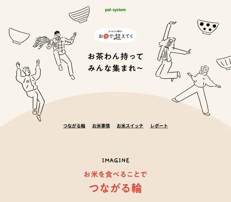
お米と食卓、産地、自然のつながりを伝えるパルシステムの特設ページ。手描きの人物や茶わん、章ごとに切り替わる背景色、参加数付きのTRYボタンで、学びから行動へと誘います。
オリジナルサイトを見るお米で超えてく / Palsystem — Style Reference
An illustrated gathering around rice, with warm paper, dancing figures, and small invitations to participate.
Original URL: pal-system.co.jp/koeteku/okome/
Final URL: pal-system.co.jp/koeteku/okome/
Theme: a light canvas with different solid colors for successive editorial chapters.
Inspected: September 12, 2026; supplied retrieval timestamp 2026-09-12T06:46:36.915Z, or 15:46:36.915 JST.
Viewports: desktop 1440 × 1000 and mobile 390 × 844 CSS pixels.
Scope: the current rice education and participation page: opening illustration, chapter navigation, narrative content, rice statistics, TRY cards, initiative links, reports, questionnaire, and closing brand panel. Visual evidence consists of three desktop captures and two mobile captures; additional sections are documented through supplied rendered DOM and computed styles. Linked destinations and post-click states were not inspected.
The page presents rice as a connection between everyday meals, growers, and the natural environment. Its identity comes from loose black drawings, friendly Japanese lettering, rice-grain shapes, and generous open space. A small green Palsystem wordmark anchors the opening. Coral lettering provides energy against cream, pale peach, and tan; larger teal and coral fields distinguish the educational and action chapters farther down the document.
This is a long editorial and participation experience. Four underlined chapter links provide shortcuts through it, while illustrated narratives, statistical panels, expressions of interest, and a current report collection supply different ways to engage. The opening has no dominant purchase button. The characteristic action control is a white pill with a crisp black outline, a solid downward black shadow, and informal red lettering.
How to Read This Reference
- Measured means a value was supplied in the rendered DOM, computed styles, or browser viewport metadata. Decimal geometry is rounded where that improves readability.
- Visual estimate means an approximate reading of an attached capture. Estimated colors were not obtained through a pixel-sampling tool.
- Recommendation means an implementation choice for a new page, including the Quick Start CSS. It is not a claim about the original source.
- Graphic text and live text are different. The visible opening headline and several chapter titles sit in wrappers with no extracted text. Their inherited font sizes do not describe the painted lettering.
- Bounds are not always CSS dimensions. Some linked content has unusually shaped or offset bounding rectangles. Without transform declarations, those rectangles cannot establish an original width, rotation, or motion path.
- Coverage varies by section. The opening, desktop TRY cards, and closing areas have direct visual evidence. Statistics, initiative groups, and report geometry have DOM evidence but no corresponding detailed screenshot in the supplied set.
- All custom-property names introduced below are implementation aliases unless explicitly identified as supplied source properties.
Tokens — Colors
Measured Palette
| Name | Value | Suggested token | Observed role |
|---|---|---|---|
| Rice Paper | #f8f3e8 |
--color-paper |
Body background and TRY section base |
| Pale Peach | #f1e3d4 |
--color-story |
Opening narrative section; also matches the broad curved field visible beneath the hero |
| Field Teal | #5eb1a3 |
--color-study |
Statistics chapter background and headings inside its information track |
| Action Coral | #f15d4e |
--color-action |
Large initiative and report chapter background |
| Counter Red | #e84130 |
--color-accent |
Handwritten participation counts |
| Sand Lettering | #e8c9a6 |
--color-sand-type |
Large initiative headings such as “食卓 × 産地” |
| Tally Tan | #dfbb92 |
--color-tally |
Report-count text node |
| Ink | #000000 |
--color-ink |
Main copy, navigation, visible illustration strokes, and control outlines |
| White | #ffffff |
--color-white |
Report card backgrounds; white introductory copy on teal and coral sections |
| Citation Gray | #999999 |
--color-muted |
Statistical source notes |
Visually Estimated Surface Colors
These approximations support a reusable palette; they are not recovered source declarations.
| Name | Approximation | Suggested token | Visible role |
|---|---|---|---|
| Blush | About #f5d2cb |
--color-blush |
Alternating TRY card surfaces |
| Warm Sand | About #eacba7 |
--color-sand |
Other TRY cards and the closing questionnaire field |
| Lemon | About #f7ef59 |
--color-lemon |
The small “詳しく見る” link in the white footer |
The painted red in title graphics and button lettering may differ from the measured Counter Red. Preserve the original authorized graphic assets when an exact match is needed. Likewise, retain the supplied green wordmark rather than recoloring it to a nearby generic green.
Color Assignment
Color changes identify chapters rather than selectable themes. The visible progression and DOM evidence support cream and peach storytelling, teal study content, cream participation cards, coral initiatives and reports, then a tan questionnaire and white closing panel.
The supplied custom properties also contain --swiper-theme-color: #007aff and --swiper-navigation-size: 44px. These are library-related declarations. They do not establish a visible blue brand accent or prove that controls have 44px touch targets. Several image-link wrappers inherit #007700; their visible text children can still be white or black. Use the actual child styles and rendered appearance when assigning tokens.
Tokens — Typography
Japanese Reading Text
The measured family stack is:
font-family:
  "Noto Sans JP",
  "游ゴシック Medium",
  "Yu Gothic Medium",
  YuGothic,
  "ヒラギノ角ゴ ProN W3",
  "Hiragino Kaku Gothic ProN",
  "MS Pゴシック",
  "MS PGothic",
  sans-serif;
Noto Sans JP is the first declared family. The supplied evidence does not identify the font file used for every glyph or independently verify fallback resolution.
Body copy uses regular weight with unusually comfortable leading. Narrative passages reach 18px / 45px on desktop. Navigation and small statistical headings use weight 700, while the large initiative headings use a much lighter declared weight of 100.
Handwritten Numbers
Participation-count elements explicitly declare Gaegu, cursive, weight 700. Their open, uneven numeral shapes fit the surrounding drawings.
The visible TRY and YES lettering also looks handwritten, but the supplied computed records do not identify the font or asset mechanism responsible for that lettering. Using Gaegu for replacement control text is a recommendation, not a recovered fact about those labels.
Graphic Headings
The opening headline reads “お茶わん持って みんな集まれ〜” across two lines. Its wrapper measures 342 × 119.41px on desktop and 237.11 × 82.78px on mobile. The corresponding computed H1 font size is only the inherited 18px or 16px; it must not be used as the visible headline size.
Several H2 wrappers likewise contain graphic-led chapter titles. In the opening desktop capture, a small handwritten English chapter marker sits above a red Japanese title with a stronger final line. The exact typeface used inside those graphics is unverified.
Type Scale
All rows below are measured live-text styles unless marked otherwise.
| Role | Desktop | Mobile | Weight / family | Notes |
|---|---|---|---|---|
| Root | 16px / 25.6px |
Same | 400, Japanese stack |
Conventional root size |
| Default body | 18px / 28.8px |
16px / 25.6px |
400, Japanese stack |
Base for ordinary content |
| Chapter links | 24px / 38.4px |
14px / 22.4px |
700, Japanese stack |
Underlined, normal tracking |
| Opening narrative | 18px / 45px |
16px / 36px |
400, Japanese stack |
Short, deliberately broken lines |
| Rice-product narrative | 18px / 45px |
16px / 40px |
400, Japanese stack |
More open mobile leading than default body |
| Study introduction | 18px / 36px |
16px / 32px |
400, Japanese stack |
White on teal |
| Study-panel heading | 24px / 38.4px |
18px / 32px |
700, Japanese stack |
Teal text |
| Study explanation | 16px / 32px |
14px / 28px |
400, Japanese stack |
Compact editorial copy |
| Chart year label | 16px / 25.6px |
14px / 22.4px |
400, Japanese stack |
Distinct from adjacent numeric graphics |
| Chart unit wrapper | 15px / 24px |
12px / 19.2px |
700, Japanese stack |
Does not establish every nested numeral size |
| Citation | 12px / 19px |
Same | 400, Japanese stack |
Gray, with 36px left padding |
| TRY introduction | 20px / 40px |
16px / 32px |
400, Japanese stack |
Explains expressions of interest |
| TRY card label | 20px / 32px |
16px / 25.6px |
400, Japanese stack |
Centered, one to three lines |
| Participation count | 30px / 39px |
20px / 26px |
700, Gaegu |
Red, with flanking strokes visible in the screenshot |
| Initiative heading | 80px / 128px |
44px / 70.4px |
100, Japanese stack |
Sand-colored live text |
| Initiative description | 16px / 32px |
14px / 28px |
400, Japanese stack |
White on coral |
| Initiative category pill | 14px / 22.4px |
Same | 700, Japanese stack |
Small, fully rounded label |
| Report date | 14px / 22.4px |
Same | 700, Japanese stack |
Strong compact metadata |
| Report title | 16px / 32px |
14px / 28px |
400, Japanese stack |
Multiline black copy on white |
Most sampled live text has normal letter spacing. The generous feeling primarily comes from line height, deliberate line breaks, and large spaces between compositions.
Tokens — Spacing & Shapes
There is no recovered universal spacing scale. The source mixes fixed text measures, viewport-related decorative space, and individually composed sections. The following measurements are more useful than imposing a single grid on everything.
Layout Measurements
| Element | Desktop | Mobile | Evidence |
|---|---|---|---|
| Document height | 14,572.33px |
12,922.69px |
Measured DOM bounds; browser summary rounds these values |
| Standard H2 wrapper width | 980px, starting at x = 230 |
350px, starting at x = 20 |
Measured |
| Wide initiative wrapper | 1300px, starting at x = 70 |
350px, starting at x = 20 |
Measured |
| Common prose measure | 680px |
Varies, approximately 267–350px |
Measured across several roles |
| Study-panel text measure | 420px |
235px |
Measured; excludes unknown outer panel geometry |
| Research banner | 600 × 300px |
350 × 175px |
Measured, preserves 2:1 ratio |
| TRY face wrapper | 96 × 40px |
96 × 32px |
Measured P wrapper; full clickable bounds are unreported |
| First report link bounds | About 328.11 × 433.31px |
About 234.24 × 368.68px |
Measured rendered bounds, potentially affected by transforms |
| Report-card padding | 20px |
14px |
Measured |
Spacing Relationships
| Relationship | Desktop | Mobile | Interpretation |
|---|---|---|---|
| Space between adjacent chapter-link rectangles | About 36.67px |
16px |
Calculated from measured positions |
| Campaign badge bottom to H1 top | 54px |
About 28.8px |
Calculated from measured bounds |
| TRY label to count | Commonly 16px |
Commonly 20px |
Calculated for sampled label/count pairs |
| Alternating TRY content offset | 36px |
24px |
Measured difference in corresponding label positions |
| Initiative link column gap | Unreported | 16px |
Measured mobile flex gap |
| Report section top padding | 240px |
120px |
Measured |
| Some chapter bottom padding | 288px |
78px in the product chapter |
Both equal 20vw at the respective widths; a relationship, not proof of a universal formula |
| Opening story bottom padding | 864px |
234px |
Both equal 60vw; tied to the larger composition |
The action section also reports very large bottom padding: 2317px on desktop and 2187px on mobile. Section bounds overlap elsewhere in the document. These values belong to the complete staged page and should not become generic whitespace tokens in a smaller adaptation.
Shape Vocabulary
| Element | Shape | Status |
|---|---|---|
| Campaign badge | White, softly irregular horizontal capsule | Visible in both opening captures |
| Hero-to-story boundary | A very broad convex peach arc | Visible; ellipse dimensions unreported |
| TRY card | Three generously rounded corners and a square lower-left corner | Visible desktop estimate: approximately 225px wide, 205–211px tall |
| TRY card corner radius | Approximately 40–45px |
Visual estimate |
| TRY / YES control | White pill, roughly 2px black edge, solid downward black shadow | Visual estimate |
| Initiative category label | 9999px radius |
Measured |
| Report card | 0px border radius |
Measured |
| Research banner | Thin black outline and broad rounded corners | Visible top portion; full link dimensions measured |
| Footer detail link | Small yellow capsule | Visible estimate: about 150 × 37px at both widths |
Components
Opening Brand and Illustration Stage
Role: establish a shared, welcoming world before introducing detailed content.
The opening has three centered identity layers: the small Palsystem wordmark, the white campaign badge, and the two-line black headline. Hand-drawn people and empty rice bowls surround this center. The figures have long limbs, expressive faces, everyday clothing, and a few meaningful details, including a farmer carrying rice stalks.
Measured desktop positions are approximately:
- Wordmark wrapper: x =
656.25, y =48.95, size127.5 × 25.36px. - Campaign badge: x =
588.75, y =172.80, size262.5 × 91.11px. - Headline: x =
549, y =317.91, size342 × 119.41px.
The people flank the headline on desktop. On mobile, the text moves into the upper portion while enlarged figures occupy the lower stage and are intentionally cropped at the side edges. This is a recomposed scene, not one desktop illustration uniformly reduced to fit.
Preserve a clear central reading area, natural line irregularity, and edge cropping of decorative artwork. Do not crop the headline or brand marks.
Chapter Navigation
Role: provide direct access through a long page.
Four bold, underlined links form one centered row. They have no surrounding boxes or filled backgrounds.
| Visible label | Observed target |
|---|---|
| “つながる輪” | #imagine__bg |
| “お米事情” | #study__bg |
| “お米スイッチ” | #try__bg |
| “レポート” | #actionReport |
The row spans approximately x = 437–1003px on desktop and 38–352px on mobile. All four links remain visible at 390px; there is no mobile menu replacement in the opening capture.
These are confirmed fragment destinations. Smooth scrolling, active-section highlighting, and sticky behavior were not exercised.
Chapter Heading and Narrative Spread
Role: separate the story into approachable scenes.
The first visible heading places “IMAGINE” above red Japanese lettering. The larger chapter-title wrappers are centered, while supporting prose appears in smaller composed blocks. On desktop, the first narrative paragraph occupies a narrow left-side area and later paragraphs appear on the right. On mobile, sampled paragraphs return to a 350px-wide region with 20px side margins.
The first story H2 begins at y = 790.06px on desktop. On mobile, its section begins at approximately 754.89px, but the H2 starts 90px farther down, at 844.89px. This explains why the mobile opening capture ends before its chapter title becomes visible.
Retain the editorial pauses between text and imagery. The paragraph leading of 2–2.5 times the font size supports this quiet pace.
Everyday Rice-Product Composition
Role: expand the theme from bowls of rice into daily choices.
The DOM identifies five labeled examples: “ドリア”, “せんべい”, “甘酒”, “米粉パン”, and “お米由来のスキンケア”. Their caption positions form a dispersed composition rather than a uniform product grid.
At desktop width, the caption rectangles spread from approximately x = 184px to 1398px. On mobile, they occupy alternating positions over a taller sequence, and their visual order changes: the rice-cracker label precedes the gratin label.
The supplied captures do not show this entire section, so the precise media treatment, image crops, and file formats are unverified. Reuse the concept of individually placed everyday examples without inventing unseen photography or claiming a recovered asset arrangement.
Rice Statistics Track
Role: explain consumption, production, and the number of growers through three related information panels.
The chapter background is measured teal. Its introduction and closing explanation are white. Within the track, headings are teal, ordinary explanations are black, and citation text is gray. The exact inner panel background and border were not supplied; a white panel is a recommended implementation choice.
Each panel contains a heading, a short explanation, year/value rows, unit notes, and citations. The consumption panel includes five entries, from five bowls in 1962 to a question-marked one-bowl value for 2040. That future value is part of the page's editorial presentation, not a verified forecast in this reference. The other panels use bag and person units with explicit scaling notes.
The three heading origins are 740px apart on desktop and 295px apart on mobile. Their positions extend beyond the viewport, supporting a horizontal track layout. The internal text width reduces from 420px to 235px.
Keep the unit notes attached to their data. Do not treat the illustrative bowl, bag, or person counts as literal totals. Dragging, arrows, pagination, autoplay, and keyboard behavior were not tested.
TRY Participation Cards
Role: invite a small expression of intent tied to an everyday action.
The introduction explicitly asks visitors to press TRY to share what they would like to attempt. The desktop layout contains four cards in the first group and three centered cards in the second. The first group concerns eating rice; the second concerns rice-derived products.
Each card has this anatomy:
- A blush or tan surface with three rounded corners and one square lower-left corner.
- A centered Japanese action label, generally one or two lines on desktop.
- A red Gaegu count with two short diagonal emphasis strokes.
- A compact white TRY pill, outlined and offset against a solid black shadow.
The desktop screenshot shows snapshot counts of 828, 354, 703, and 493 in the first group, then 554, 484, and 312 in the second. These values are content at capture time, not reusable design constants. Some corresponding desktop text records are empty even though the screenshot or mobile evidence shows numbers; an empty extraction must not be interpreted as a zero or an intentionally blank state.
Alternating columns sit 36px higher or lower on desktop. On mobile, the first group becomes two rows of two; the second becomes two cards followed by one. The content offset reduces to 24px. Longer labels are allowed to grow to three lines.
Tactile Pill Control
Role: make small actions feel approachable and tangible.
The visible control consists of a white face, black outline, black downward offset, and red handwritten label. It uses flat layers; the black base is not a blurred elevation shadow.
The measured TRY wrapper is 96 × 40px on desktop and 96 × 32px on mobile. The questionnaire uses substantially larger pills: visually about 200 × 100px on desktop and 96 × 48px on mobile, before including the downward shadow.
No pressed, hovered, disabled, pending, or selected state was supplied. A short press that reduces the visible black offset is a suitable recommended addition. The original action result and count-update behavior remain unverified.
Research Banner
Role: connect participation cards to a deeper collection of rice-related responses.
A centered image-led link follows the TRY groups. Its measured dimensions preserve a 2:1 ratio: 600 × 300px on desktop and 350 × 175px on mobile.
The visible upper portion has a white surface, black outline, rounded corners, mixed black/red title lettering, a red badge, small handwriting, and a photographic fragment. This is a composed graphic, not simply a text button in a large rectangle.
Its observed destination is /koeteku/okome/research/?via=okome-de-koeteku. The destination itself was not opened. The full banner composition and image URL are unavailable in the supplied evidence.
Initiative Link Groups
Role: connect the campaign story to products, growers, education, and environmental work.
The coral chapter introduces two large sand-colored headings: “食卓 × 産地” and “自然 × 人”. Each is followed by three linked content units. The links combine a media region, white descriptive copy, and a small rounded category label such as “動画”, “商品紹介”, or “読み物”.
On desktop, the units occupy three columns. Their measured link bounds are approximately 331 × 506px, but these are rendered rectangles rather than established untransformed dimensions. On mobile, each link becomes a horizontal flex composition with a measured 16px gap. Descriptions alternate between the left and right sides across successive items.
Some mobile link bounds extend beyond the viewport, while the text remains in a narrower region. This supports an edge-reaching composition, but without screenshots of this section the exact cropping and angle cannot be established. Keep text within readable margins when adapting the arrangement.
Report Collection
Role: show that the initiative continues through dated activities and updates.
The report section includes a graphic-led heading, a count node showing 201, introductory copy, and a horizontal sequence of white linked cards. Cards have square corners, date metadata, multiline titles, and a media area above the text. The latest supplied entry is dated 2026/08/28.
The first desktop report link has approximately 328 × 433px rendered bounds and 20px padding. Its mobile counterpart has approximately 234 × 369px bounds and 14px padding. Successive origins are 348px apart on desktop and 258px apart on mobile. This is evidence for a horizontal collection, not a conventional full-width vertical news list.
The supplied DOM contains 20 dated report links and separate “レポート一覧” and “募集イベント” destinations. It does not establish that every card was visible at once or that the collection was manually advanced.
The mobile tally node is positioned at x = -108px with a width of 113px in the recorded state. Its presence in the DOM does not prove that its full count was readable in that state. Do not reproduce that position as a required badge layout without additional verification.
Closing Questionnaire
Role: end with a light, direct question about the visitor's interest in rice.
The mobile capture shows red introductory lettering, a large pale Q behind the question, and the bold black line “今日お米食べたくなった?”. Two white pills both say YES, followed by the underlined “みんなの回答” control.
Preserve the two visible YES labels when documenting this design. Their difference in meaning or processing is unknown; changing one to NO would misrepresent the source. All three links use JavaScript placeholders in the supplied DOM. No result chart, modal, submission response, or persistence behavior was captured.
The tan background fills the entire width. Desktop controls have much larger faces and wider separation, while the mobile pair remains centered on one row.
Closing Brand Panel
Role: connect the rice page back to the broader sustainability initiative.
The page finishes on plain white. It contains a short sustainability statement, the larger parent-campaign mark, a small lemon-colored “詳しく見る” capsule, and the copyright line “© Palsystem Consumers' Co-operative Union”. This visible wording independently establishes the Palsystem identity of the inspected page.
The desktop layout centers the statement and mark with broad surrounding whitespace. On mobile, the statement becomes left-aligned over two lines while the mark, link, and copyright stay centered. The detail link remains approximately 150px wide in both captures.
The observed destination is /koeteku/?via=okome-de-koeteku. The footer is a quiet identity panel with one onward link; no multi-column corporate sitemap is visible here.
Tokens — Motion & Interaction
| Item | Supplied evidence | What can safely be concluded |
|---|---|---|
| Opening wordmark | animation: 0.5s forwards logo__appear |
A half-second named appearance animation is declared; its keyframes and exact visual path are unavailable |
| Several section wrappers | transition: 0.3s |
A short transition is declared; the properties changed during interaction were not supplied |
| Many ordinary elements | transition: all without a nonzero duration |
This alone is not evidence of visible animation |
| Chapter navigation | Four fragment links | In-page destinations are established; scroll timing and easing are not |
| Statistics and report tracks | Repeated offscreen horizontal positions; Swiper-related properties | Track structure is supported; autoplay, swipe, snapping, and arrow behavior remain unverified |
| TRY cards | Instructional copy, counts, and visible controls | An expression-of-interest action is presented; backend writes and count updates were not tested |
| Questionnaire | Two YES links and an answer-view link using JavaScript placeholders | Interactive hooks exist; no post-click state is established |
| Dancing figures | Static captures of energetic poses | Pose does not prove continuous floating, dancing, or parallax animation |
The capture process waited for load, image decoding, sampled stability, and finite animations within bounded time limits. Perpetual animations were temporarily paused during readiness checks and then resumed. These procedures do not establish the timing or full repertoire of the site's motion.
Recommended motion: retain small tactile feedback on pills, keep any appearance transition brief, and offer reduced-motion behavior. Do not invent a large scroll-synchronized choreography and label it as observed.
Surfaces
| Surface | Appearance | Structural purpose |
|---|---|---|
| Opening paper | Solid cream with black drawings | Welcoming introduction and visual breathing room |
| Story field | Pale peach, entering through a broad arc | Connects the opening stage to the first narrative |
| Study chapter | Solid teal with white prose | Separates factual context from the warmer story |
| TRY canvas | Cream with repeated pale rice-grain motifs | Makes a repeated set of actions feel playful |
| TRY cards | Alternating blush and tan | Groups one label, count, and control without an outer border |
| Initiative chapter | Solid coral with white descriptions | Gives onward content a distinct chapter identity |
| Report cards | White, square-cornered, with black copy | Readable editorial objects within the coral chapter |
| Questionnaire | Full-width tan | A simple closing participation moment |
| Footer | Plain white with one yellow capsule | Quiet return to the parent initiative |
The interface does not use a general soft-shadow system. Solid black offsets belong to the action pills. Most other hierarchy comes from color fields, whitespace, graphic shapes, and typography.
Imagery
The dominant style is loose black outline drawing on flat, light backgrounds. Bodies bend and stretch; faces have individual expressions; bowls carry varied line and dot patterns. The illustration stroke is irregular but legible, with little shading. Open space inside and around the drawings is essential.
On desktop, the people form a loose ring around the title. Mobile crops that ring into a taller scene with prominent figures below the headline. Decorative bowls can enter from beyond the viewport edge. Keep the source drawings smooth at ordinary display scale; there is no evidence for a pixelated rendering treatment.
The TRY background repeats large, pale, diagonally oriented rice-grain shapes. Their outlines are softly irregular, not perfect repeated circles. The motif reads as subject-specific texture without becoming a dense pattern behind the labels.
Observed Asset References
No original image URLs, file names, formats, or native dimensions were supplied. The entries below identify required visual roles without inventing downloadable paths.
| Visual role | Evidence | Reuse guidance |
|---|---|---|
| Palsystem wordmark | Desktop and mobile opening captures | Preserve its green/red artwork and aspect ratio |
| Rice campaign badge | Both opening captures | Preserve the white organic capsule and Japanese lettering |
| Two-line opening headline | Both captures and measured H1 bounds | Use authorized artwork or a clearly labeled typographic approximation |
| People, rice stalks, and bowls | Both opening captures | Prepare separate decorative layers for responsive composition |
| Chapter-heading graphics | Opening screenshot and empty-text H2 wrappers | Preserve meaningful headings in accessible text |
| Rice-grain repeat | Desktop TRY capture | Use a low-contrast motif; original tile dimensions are unknown |
| Research banner | Partial desktop view and measured link bounds | Maintain its 2:1 ratio; only its upper portion is directly visible |
| Parent-campaign mark | Desktop and mobile closing captures | Center it above the yellow onward link |
| Product and initiative media | Caption/link geometry in DOM | Exact imagery and crops need additional source assets |
No production-credit names are established by the inspected original-page evidence supplied for this reference.
Layout & Responsive Behavior
Two Inspected Layouts
| Relationship | Desktop, 1440px wide | Mobile, 390px wide |
|---|---|---|
| Wordmark width | 127.5px |
104px |
| Campaign badge width | 262.5px |
228.78px |
| Headline width | 342px |
237.11px |
| Headline top | 317.91px |
201.80px |
| Navigation top | 666.28px |
732.30px |
| Standard heading wrapper | 980px |
350px |
| TRY groups | Four cards, then three centered | Two columns, with a final unpaired card |
| TRY label type | 20px |
16px |
| Statistics text width | 420px |
235px |
| Initiative groups | Three vertical content units per row | Sequential horizontal media/text units with alternating sides |
| Report sequence | Several cards across a horizontal track | One full card and part of the next fit within the viewport geometry |
| Footer statement | Centered, one line in the capture | Left-aligned, two lines |
The three opening identity layers scale by different amounts. Meanwhile, navigation moves lower in absolute page coordinates on mobile even though the headline moves higher. This is strong evidence for independent responsive positioning.
Chapter Positions
These are recorded section origins, not a recipe for fixed-height blocks.
| Chapter | Desktop y | Mobile y |
|---|---|---|
| Opening narrative | 790.06px |
754.89px |
| Everyday rice products | 2960.20px |
2728.48px |
| Rice statistics | 4560.02px |
4396.64px |
| TRY participation | 6363.83px |
5792.16px |
| Initiatives | 8368.28px |
7628.42px |
| Nested report section | 10233.39px |
9792.34px |
Some section rectangles overlap: for example, the next narrative composition begins before the first section's reported bottom. Product captions can also extend into the following chapter's vertical range. The precise CSS mechanism is not supplied. Avoid summing these section heights or converting them into a stack of isolated full-height rectangles.
No breakpoint values or tablet captures were supplied. The Quick Start uses a recommended 48rem breakpoint and flexible widths. The original source may use different thresholds. Small-phone, landscape, zoomed-text, and intermediate-width behavior remain unverified.
Do’s and Don’ts
Do
- Keep cream paper, loose black linework, and coral emphasis at the center of the identity.
- Use chapter-specific color fields to help readers navigate the long document.
- Preserve the hierarchy of small brand mark, campaign badge, and separate two-line headline.
- Recompose decorative figures for mobile while protecting all meaningful text.
- Keep all four chapter links visible at the inspected mobile width.
- Give TRY cards a square lower-left corner and alternating vertical positions.
- Use handwritten numbers alongside restrained Japanese sans-serif labels.
- Keep black button offsets crisp and unblurred.
- Preserve historical years, unit notes, and question marks when reproducing the source data presentation.
- Retain report dates and allow titles to wrap naturally.
- Finish with the spacious white parent-brand panel and its small yellow onward link.
Don’t
- Don’t reduce the page to a generic hero and purchase CTA; its educational and participation content is central.
- Don’t use the inherited H1 font size to reconstruct artwork lettering.
- Don’t infer an exact font for every handwritten graphic from its appearance.
- Don’t turn all content into identical rounded cards; report cards are square-cornered.
- Don’t apply soft elevation shadows to every surface.
- Don’t uniformly shrink the desktop hero and expect the mobile composition to match.
- Don’t promote library blue or inherited link green into general campaign accents.
- Don’t hardcode participation counts or the report total as permanent interface values.
- Don’t replace the second YES label with NO when describing the observed page.
- Don’t assume offscreen DOM elements were visible, clicked, or animated.
- Don’t invent original asset paths, carousel settings, or poll results.
Recommended Implementation Additions
These are recommendations for a new implementation, not verified features of the original site.
- Use semantic buttons for expressions of interest and questionnaire actions. Use ordinary links for fragment navigation and onward destinations.
- Provide meaningful text alternatives for graphic headings and campaign marks. Decorative figures, bowls, and background grains should not add repetitive announcements.
- Expand compact controls to at least a 44px interaction height while retaining the visual character of the small pill. The supplied TRY wrappers are only 32px high on mobile.
- Provide visible keyboard focus and accessible controls for any horizontal collection. A drag gesture should not be the only way to reach later statistics or reports.
- Keep counts tied to real application state. If values update, announce a concise result and prevent accidental duplicate submissions according to the actual product rules.
- Review the two YES actions against their real behavior before assigning distinct accessible names. The supplied evidence does not establish a semantic difference.
- Check contrast for white body text on teal/coral, very light initiative headings, and small gray citations. Accessible alternatives may require darker foregrounds or lighter backing surfaces.
- Supply an accessible tabular equivalent for statistics, including units, source notes, and any uncertain or illustrative future value.
- Respect reduced motion and reserve space for image-led headings before images load. Keep decorative cropping confined to decorative layers.
Agent Prompt Guide
Quick Color Reference
- Main paper:
#f8f3e8. - Story field:
#f1e3d4. - Study chapter:
#5eb1a3, with white introduction text. - Initiative/report chapter:
#f15d4e. - Measured participation-count red:
#e84130. - Main text and linework:
#000000. - TRY cards: approximate blush
#f5d2cband sand#eacba7. - Action face: white with a black outline and solid black downward offset.
- Footer onward link: approximate lemon
#f7ef59.
Overall Prompt
“Create an illustrated Japanese educational and participation page about rice and everyday life. Use warm paper #f8f3e8, loose black line drawings of people and rice bowls, a small centered brand mark, a white organic campaign badge, and a two-line Japanese headline. Place four underlined chapter links below the opening scene. Build a long narrative using pale peach, teal, cream, and coral chapter fields. Use readable Japanese sans-serif copy with generous leading, graphic-led chapter titles, and Gaegu-style handwritten participation numbers. Include staggered blush and tan action cards with a square lower-left corner, small white TRY pills with solid black offsets, horizontal statistical and report collections, a tan closing questionnaire, and a spacious white brand footer. Recompose the illustrations and card groups for mobile. Treat unverified motion and submission states as implementation decisions.”
Example Component Prompts
- Opening stage: “A cream canvas with a small green brand mark at the top center, a white campaign capsule below it, and the Japanese headline ‘お茶わん持って みんな集まれ〜’. Surround the central text with expressive black outline figures and patterned rice bowls. Introduce a broad peach arc beneath the figures. On mobile, move the figures below the text and allow decorative edge cropping.”
- TRY card: “A roughly 225px-wide blush or tan card with three rounded corners and a square lower-left corner. Center a short Japanese action label, a red handwritten count with two emphasis strokes, and a white TRY pill with a thin black border and hard downward shadow. Stagger alternating cards vertically; use two columns on mobile.”
- Study panel: “An editorial rice-statistics panel within a teal chapter. Use a bold teal heading, clear year/value pairs, small unit explanations, and attached citations. Keep inner text approximately 420px wide on desktop and 235px on mobile. Use white as a recommended contrasting panel surface and provide an accessible data table.”
- Initiative group: “Three media-led links on a coral background beneath a large, very light sand-colored Japanese heading. Use white descriptive text and small rounded category labels. On mobile, make sequential media/text rows with alternating sides and a 16px internal gap.”
- Report card: “A white, square-cornered editorial card with a media region, a bold 14px date, and a multiline Japanese title with generous leading. Place cards in a horizontal sequence that reveals the next item on mobile. Keep the card sizing flexible; any tilt is an optional adaptation.”
- Questionnaire and footer: “A tan closing panel with a pale decorative Q, a bold Japanese question, two outlined white YES pills, and an underlined answer-view control. Follow it with a white panel containing a short sustainability statement, a centered parent-campaign mark, a small lemon-colored link, and compact copyright text. Do not invent the questionnaire result state.”
Quick Start
CSS Custom Properties
This is a recommended implementation scaffold, not recovered source CSS. It preserves measured colors, text roles, opening positions at the two inspected sizes, and representative component relationships. Surface estimates are labeled. The 48rem breakpoint, flexible panel shells, native scrolling, focus styling, and press feedback are implementation choices.
Load authorized artwork and the intended font resources separately. The CSS does not fetch original assets, submit votes, update counts, or implement questionnaire results. The generated rice-grain tile below is an authored approximation rather than an original asset.
:root {
  /* Measured colors */
  --color-paper: #f8f3e8;
  --color-story: #f1e3d4;
  --color-study: #5eb1a3;
  --color-action: #f15d4e;
  --color-accent: #e84130;
  --color-sand-type: #e8c9a6;
  --color-tally: #dfbb92;
  --color-ink: #000;
  --color-white: #fff;
  --color-muted: #999;

  /* Visual approximations */
  --color-blush: #f5d2cb;
  --color-sand: #eacba7;
  --color-lemon: #f7ef59;

  /* Abbreviated reuse of the measured family stack */
  --font-body: "Noto Sans JP", "Yu Gothic Medium", YuGothic,
    "Hiragino Kaku Gothic ProN", "MS PGothic", sans-serif;
  --font-hand: Gaegu, cursive;
  --text-body: 18px;
  --text-nav: 24px;
  --text-card: 20px;
  --text-count: 30px;
  --text-initiative: 80px;

  /* Measured content widths and recommended shape aliases */
  --content-width: 980px;
  --wide-width: 1300px;
  --prose-width: 680px;
  --page-gutter: 20px;
  --radius-card: 44px 44px 44px 0;
  --radius-pill: 9999px;
  --control-edge: 2px;
  --control-depth: 6px;
  --motion-press: 120ms ease-out;
}

*,
*::before,
*::after {
  box-sizing: border-box;
}

body {
  margin: 0;
}

.okome-reference {
  color: var(--color-ink);
  background: var(--color-paper);
  font-family: var(--font-body);
  font-size: var(--text-body);
  line-height: 1.6;
}

.okome-reference :where(h1, h2, h3, h4, p) {
  margin: 0;
}

.okome-reference img {
  display: block;
  max-width: 100%;
  height: auto;
}

.content {
  width: min(var(--content-width), calc(100% - 40px));
  margin-inline: auto;
}

.content--wide {
  width: min(var(--wide-width), calc(100% - 40px));
}

.reading-copy {
  width: min(var(--prose-width), calc(100% - 80px));
  margin-inline: auto;
  line-height: 2.5;
}

.chapter {
  padding-block: 64px 100px;
  scroll-margin-top: 24px;
}

.chapter-title {
  margin-bottom: 48px;
  text-align: center;
}

.chapter-title img {
  margin-inline: auto;
}

/* Opening coordinates match the inspected desktop composition. */
.hero {
  position: relative;
  isolation: isolate;
  min-height: 790px;
  overflow: hidden;
  background: var(--color-paper);
}

/* Approximation of the large curved story boundary. */
.hero::before {
  content: '';
  position: absolute;
  z-index: -1;
  top: 560px;
  left: 50%;
  width: 140%;
  height: 740px;
  transform: translateX(-50%);
  border-radius: 50% 50% 0 0 / 100% 100% 0 0;
  background: var(--color-story);
}

.hero__brand,
.hero__badge,
.hero__headline {
  position: absolute;
  left: 50%;
  transform: translateX(-50%);
}

.hero__brand {
  top: 48.95px;
  width: 127.5px;
}

.hero__badge {
  top: 172.8px;
  width: 262.5px;
}

.hero__headline {
  top: 317.91px;
  width: 342px;
}

/* Insert separate authorized drawings and tune each art position. */
.hero__art {
  position: absolute;
  inset: 0;
  z-index: -1;
  pointer-events: none;
}

.hero__art img {
  position: absolute;
  width: var(--art-width, 220px);
  top: var(--art-top, 180px);
  left: var(--art-left, 0px);
}

.chapter-nav {
  display: flex;
  flex-wrap: wrap;
  justify-content: center;
  gap: 12px 36.67px;
  font-size: var(--text-nav);
  font-weight: 700;
  line-height: 1.6;
}

.hero .chapter-nav {
  position: absolute;
  top: 666.28px;
  inset-inline: 20px;
}

.chapter-nav a {
  color: var(--color-ink);
  text-decoration: underline;
  text-underline-offset: 3px;
}

.story {
  padding-top: 0;
  background: var(--color-story);
}

.study {
  color: var(--color-white);
  background: var(--color-study);
}

.study .reading-copy {
  line-height: 2;
}

/* Native horizontal scrolling is a recommended accessible baseline. */
.study-rail,
.report-rail {
  display: flex;
  gap: 40px;
  overflow-x: auto;
  padding: 32px 20px;
  scroll-snap-type: x proximity;
}

.study-panel {
  flex: 0 0 500px;
  padding: 40px;
  color: var(--color-ink);
  background: var(--color-white);
  scroll-snap-align: center;
}

.study-panel h3 {
  color: var(--color-study);
  font-size: 24px;
  font-weight: 700;
  line-height: 1.6;
}

.study-panel p {
  margin-top: 12px;
  font-size: 16px;
  line-height: 2;
}

/* Darker than the source gray as an accessibility recommendation. */
.study-panel .citation {
  padding-left: 36px;
  color: #666;
  font-size: 12px;
  line-height: 19px;
}

/* Authored grain motif; replace with authorized artwork if available. */
.try-section {
  background-color: var(--color-paper);
  background-image: url("data:image/svg+xml,%3Csvg xmlns='http://www.w3.org/2000/svg' width='132' height='110' viewBox='0 0 132 110'%3E%3Cpath fill='%23ffffff' fill-opacity='.65' d='M18 80C-1 63 23 27 55 15C73 8 85 17 79 31C74 45 67 56 54 68C40 81 26 86 18 80Z'/%3E%3C/svg%3E");
}

.step-title {
  font-size: 28px;
  font-weight: 700;
  text-align: center;
}

.pledge-row {
  display: flex;
  flex-wrap: wrap;
  align-items: flex-start;
  justify-content: center;
  gap: 28px 26.66px;
  margin-block: 60px 100px;
  padding-bottom: 36px;
}

.pledge-card {
  flex: 0 0 225px;
  padding: 24px 20px;
  border-radius: var(--radius-card);
  background: var(--color-blush);
  text-align: center;
}

.pledge-card:nth-child(odd) {
  transform: translateY(36px);
}

.pledge-card:nth-child(even) {
  background: var(--color-sand);
}

.pledge-label {
  display: grid;
  place-items: center;
  min-height: 64px;
  font-size: var(--text-card);
  font-weight: 400;
  line-height: 1.6;
}

.pledge-count {
  display: flex;
  align-items: center;
  justify-content: center;
  gap: 12px;
  margin-top: 16px !important;
  color: var(--color-accent);
  font: 700 var(--text-count) / 1.3 var(--font-hand);
}

.pledge-count::before,
.pledge-count::after {
  content: '';
  width: 3px;
  height: 22px;
  border-radius: 2px;
  background: currentColor;
  transform: rotate(-24deg);
}

.pledge-count::after {
  transform: rotate(24deg);
}

/* A 44px minimum enlarges the source's compact mobile face. */
.tactile-button {
  display: inline-grid;
  place-items: center;
  width: 96px;
  min-height: 44px;
  padding: 0 12px;
  border: var(--control-edge) solid var(--color-ink);
  border-radius: var(--radius-pill);
  color: var(--color-accent);
  background: var(--color-white);
  box-shadow: 0 var(--control-depth) 0 var(--color-ink);
  font: 700 28px / 1 var(--font-hand);
  text-decoration: none;
  cursor: pointer;
  transition: transform var(--motion-press),
    box-shadow var(--motion-press);
}

.tactile-button:active {
  transform: translateY(4px);
  box-shadow: 0 2px 0 var(--color-ink);
}

.research-banner {
  display: block;
  width: min(600px, calc(100% - 40px));
  aspect-ratio: 2 / 1;
  margin-inline: auto;
}

.research-banner img {
  width: 100%;
  height: 100%;
  object-fit: contain;
}

.action-section {
  color: var(--color-white);
  background: var(--color-action);
}

.initiative-heading {
  color: var(--color-sand-type);
  font-size: var(--text-initiative);
  font-weight: 100;
  line-height: 1.6;
  text-align: center;
}

.initiative-grid {
  display: grid;
  grid-template-columns: repeat(3, minmax(0, 1fr));
  gap: 60px;
  margin-block: 56px 80px;
}

.initiative {
  display: block;
  color: inherit;
  text-decoration: none;
}

.initiative__copy {
  margin-top: 24px;
  font-size: 16px;
  line-height: 2;
}

.category-pill {
  display: table;
  margin: 16px auto 0;
  padding: 7px 8px;
  border: 1px solid currentColor;
  border-radius: var(--radius-pill);
  font-size: 14px;
  font-weight: 700;
  line-height: 1.6;
}

/* Approximate untransformed sizing, not recovered card dimensions. */
.report-card {
  flex: 0 0 300px;
  padding: 20px;
  border-radius: 0;
  color: var(--color-ink);
  background: var(--color-white);
  text-decoration: none;
  scroll-snap-align: start;
}

.report-card time {
  display: block;
  margin-top: 18px;
  font-size: 14px;
  font-weight: 700;
}

.report-card p {
  margin-top: 12px;
  font-size: 16px;
  line-height: 2;
}

.questionnaire {
  padding: 80px 20px 160px;
  background: var(--color-sand);
  text-align: center;
}

.questionnaire__heading {
  color: var(--color-accent);
  font-size: 28px;
  font-weight: 700;
}

.questionnaire__question {
  margin-block: 80px 60px !important;
  font-size: 24px;
  font-weight: 700;
}

.poll-options {
  display: flex;
  justify-content: center;
  gap: 60px;
}

.poll-options .tactile-button {
  width: 200px;
  min-height: 100px;
  font-size: 56px;
  box-shadow: 0 10px 0 var(--color-ink);
}

.answer-link {
  display: inline-block;
  margin-top: 64px;
  color: var(--color-ink);
  text-decoration: underline;
}

.brand-footer {
  padding: 126px 40px 60px;
  color: var(--color-ink);
  background: var(--color-white);
  text-align: center;
}

.brand-footer__intro {
  font-size: 16px;
  line-height: 2;
}

.brand-footer__mark {
  width: 214px;
  margin: 40px auto 20px;
}

.detail-link {
  display: inline-grid;
  place-items: center;
  width: 150px;
  min-height: 37px;
  border-radius: var(--radius-pill);
  color: var(--color-ink);
  background: var(--color-lemon);
  font-size: 16px;
  text-decoration: none;
}

.brand-footer__copyright {
  margin-top: 120px !important;
  font-size: 12px;
}

.okome-reference :where(a, button, [tabindex]):focus-visible {
  outline: 3px solid var(--color-ink);
  outline-offset: 5px;
}

/* Recommended breakpoint; the source threshold was not supplied. */
@media (max-width: 48rem) {
  :root {
    --text-body: 16px;
    --text-nav: 14px;
    --text-card: 16px;
    --text-count: 20px;
    --text-initiative: 44px;
  }

  .hero { min-height: 755px; }
  .hero::before { top: 630px; height: 275px; }
  .hero__brand { top: 24.78px; width: 104px; }
  .hero__badge { top: 93.59px; width: 228.78px; }
  .hero__headline { top: 201.8px; width: 237.11px; }
  .hero .chapter-nav { top: 732.3px; }
  .chapter-nav { column-gap: 16px; }
  .story { padding-top: 90px; }
  .reading-copy { line-height: 2.25; }
  .chapter-title { margin-bottom: 40px; }

  .study-rail { gap: 20px; }
  .study-panel { flex-basis: 275px; padding: 20px; }
  .study-panel h3 { font-size: 18px; line-height: 32px; }
  .study-panel p { font-size: 14px; line-height: 28px; }
  .study-panel .citation { font-size: 12px; line-height: 19px; }

  .step-title { font-size: 20px; }
  .pledge-row { gap: 28px 24px; padding-bottom: 24px; }
  .pledge-card { flex-basis: calc((100% - 24px) / 2); padding-inline: 12px; }
  .pledge-card:nth-child(odd) { transform: translateY(24px); }
  .pledge-label { min-height: 58px; }
  .pledge-count::before,
  .pledge-count::after { height: 16px; }

  .initiative-grid { grid-template-columns: 1fr; gap: 40px; }
  .initiative { display: flex; align-items: center; gap: 16px; }
  .initiative__media,
  .initiative__copy { flex: 1 1 0; min-width: 0; }
  .initiative:nth-child(even) .initiative__media { order: 2; }
  .initiative__copy { margin-top: 0; font-size: 14px; line-height: 28px; }
  .category-pill { padding-block: 5.6px; }

  .report-rail { gap: 48px; }
  .report-card { flex-basis: 210px; padding: 14px; }
  .report-card p { font-size: 14px; line-height: 28px; }

  .questionnaire { padding: 24px 20px 88px; }
  .questionnaire__question { font-size: 20px; }
  .poll-options { gap: 24px; }
  .poll-options .tactile-button { width: 96px; min-height: 48px; font-size: 30px; }
  .answer-link { margin-top: 32px; }

  .brand-footer { padding: 54px 46px 28px; }
  .brand-footer__intro { font-size: 14px; line-height: 32px; text-align: left; }
  .brand-footer__mark { width: 178px; margin-top: 36px; }
  .brand-footer__copyright { margin-top: 58px !important; }
}

@media (prefers-reduced-motion: reduce) {
  .okome-reference *,
  .okome-reference *::before,
  .okome-reference *::after {
    animation: none !important;
    transition: none !important;
    scroll-behavior: auto !important;
  }
}
Component Markup Example
The count below is an illustrative capture-time value. Connect the button to the actual participation behavior before using it in a functioning product. The original's handwritten control lettering is approximated with the declared Gaegu family in this starter.
<article class="pledge-card">
  <h4 class="pledge-label">毎日いただきます</h4>
  <p class="pledge-count" aria-label="828 expressions of interest">828</p>
  <button
    class="tactile-button"
    type="button"
    aria-label="Express interest in eating rice every day"
  >
    TRY
  </button>
</article>
For the opening, put authorized image assets inside .hero__brand, .hero__badge, and .hero__headline. Place decorative images in .hero__art with empty alt text and individual position variables. Add mobile overrides for those artwork positions; the source does not supply coordinates sufficient to reconstruct every figure.
Tailwind v4 Token Mapping
Optional mapping for an existing Tailwind v4 project. These aliases do not imply that the original page uses Tailwind. Define the custom properties above first.
@theme inline {
  --color-paper: #f8f3e8;
  --color-story: #f1e3d4;
  --color-study: #5eb1a3;
  --color-action: #f15d4e;
  --color-accent: #e84130;
  --color-ink: #000;
  --color-blush: #f5d2cb;
  --color-sand: #eacba7;
  --color-lemon: #f7ef59;

  --font-body: "Noto Sans JP", "Yu Gothic Medium", sans-serif;
  --font-hand: Gaegu, cursive;

  --text-body: var(--text-body);
  --text-count: var(--text-count);
  --radius-pill: 9999px;
  --spacing-page: 20px;
  --container-content: 980px;
  --container-wide: 1300px;
  --container-prose: 680px;
}
Use the custom .pledge-card class for the asymmetric corners; a single uniform border-radius utility does not describe that shape.
Sources & Evidence
- Current original page — お米で超えてく: supplied HTTP status
200, matching original/final URLs, page title, rendered text, links, element bounds, and computed styles. - Capture date: September 12, 2026, with retrieval timestamp
2026-09-12T06:46:36.915Z. This is the supplied browser observation time, not a newly performed visit. - Desktop evidence:
1440 × 1000CSS-pixel viewport; opening, TRY-card area, and closing-area captures; document bounds approximately1440 × 14572.33px. - Mobile evidence:
390 × 844CSS-pixel viewport; opening and closing-area captures; document bounds approximately390 × 12922.69px; additional mobile layout records for the middle chapters. - Computed-style evidence: Japanese font stack, Gaegu count styles, foreground/background colors, text sizing and leading, link positions, section bounds, padding, report-card radii, and the named wordmark animation declaration.
- Interaction coverage: the supplied browser traversed scroll positions. Fragment links, action affordances, and horizontal geometry were recorded. No TRY submission, questionnaire response, answer-view state, carousel advance, hover state, or destination page was independently exercised for this reference.
- Inspection limitations: source image paths, full stylesheet rules, keyframes, breakpoint declarations, font-file resolution, and complete middle-section screenshots were not supplied. Readiness checks were time-bounded and cannot rule out delayed content. SharedWorkers and service workers were disabled during inspection.
This reference describes the current supplied page. The measured values, visual estimates, and implementation recommendations remain explicitly separate throughout.
# お米で超えてく / Palsystem — Style Reference

> An illustrated gathering around rice, with warm paper, dancing figures, and small invitations to participate.

**Original URL:** [pal-system.co.jp/koeteku/okome/](https://www.pal-system.co.jp/koeteku/okome/)
**Final URL:** [pal-system.co.jp/koeteku/okome/](https://www.pal-system.co.jp/koeteku/okome/)
**Theme:** a light canvas with different solid colors for successive editorial chapters.
**Inspected:** September 12, 2026; supplied retrieval timestamp `2026-09-12T06:46:36.915Z`, or 15:46:36.915 JST.
**Viewports:** desktop `1440 × 1000` and mobile `390 × 844` CSS pixels.
**Scope:** the current rice education and participation page: opening illustration, chapter navigation, narrative content, rice statistics, TRY cards, initiative links, reports, questionnaire, and closing brand panel. Visual evidence consists of three desktop captures and two mobile captures; additional sections are documented through supplied rendered DOM and computed styles. Linked destinations and post-click states were not inspected.

The page presents rice as a connection between everyday meals, growers, and the natural environment. Its identity comes from loose black drawings, friendly Japanese lettering, rice-grain shapes, and generous open space. A small green Palsystem wordmark anchors the opening. Coral lettering provides energy against cream, pale peach, and tan; larger teal and coral fields distinguish the educational and action chapters farther down the document.

This is a long editorial and participation experience. Four underlined chapter links provide shortcuts through it, while illustrated narratives, statistical panels, expressions of interest, and a current report collection supply different ways to engage. The opening has no dominant purchase button. The characteristic action control is a white pill with a crisp black outline, a solid downward black shadow, and informal red lettering.

## How to Read This Reference

- **Measured** means a value was supplied in the rendered DOM, computed styles, or browser viewport metadata. Decimal geometry is rounded where that improves readability.
- **Visual estimate** means an approximate reading of an attached capture. Estimated colors were not obtained through a pixel-sampling tool.
- **Recommendation** means an implementation choice for a new page, including the Quick Start CSS. It is not a claim about the original source.
- **Graphic text and live text are different.** The visible opening headline and several chapter titles sit in wrappers with no extracted text. Their inherited font sizes do not describe the painted lettering.
- **Bounds are not always CSS dimensions.** Some linked content has unusually shaped or offset bounding rectangles. Without transform declarations, those rectangles cannot establish an original width, rotation, or motion path.
- **Coverage varies by section.** The opening, desktop TRY cards, and closing areas have direct visual evidence. Statistics, initiative groups, and report geometry have DOM evidence but no corresponding detailed screenshot in the supplied set.
- All custom-property names introduced below are implementation aliases unless explicitly identified as supplied source properties.

## Tokens — Colors

### Measured Palette

| Name | Value | Suggested token | Observed role |
| --- | --- | --- | --- |
| Rice Paper | `#f8f3e8` | `--color-paper` | Body background and TRY section base |
| Pale Peach | `#f1e3d4` | `--color-story` | Opening narrative section; also matches the broad curved field visible beneath the hero |
| Field Teal | `#5eb1a3` | `--color-study` | Statistics chapter background and headings inside its information track |
| Action Coral | `#f15d4e` | `--color-action` | Large initiative and report chapter background |
| Counter Red | `#e84130` | `--color-accent` | Handwritten participation counts |
| Sand Lettering | `#e8c9a6` | `--color-sand-type` | Large initiative headings such as “食卓 × 産地” |
| Tally Tan | `#dfbb92` | `--color-tally` | Report-count text node |
| Ink | `#000000` | `--color-ink` | Main copy, navigation, visible illustration strokes, and control outlines |
| White | `#ffffff` | `--color-white` | Report card backgrounds; white introductory copy on teal and coral sections |
| Citation Gray | `#999999` | `--color-muted` | Statistical source notes |

### Visually Estimated Surface Colors

These approximations support a reusable palette; they are not recovered source declarations.

| Name | Approximation | Suggested token | Visible role |
| --- | --- | --- | --- |
| Blush | About `#f5d2cb` | `--color-blush` | Alternating TRY card surfaces |
| Warm Sand | About `#eacba7` | `--color-sand` | Other TRY cards and the closing questionnaire field |
| Lemon | About `#f7ef59` | `--color-lemon` | The small “詳しく見る” link in the white footer |

The painted red in title graphics and button lettering may differ from the measured Counter Red. Preserve the original authorized graphic assets when an exact match is needed. Likewise, retain the supplied green wordmark rather than recoloring it to a nearby generic green.

### Color Assignment

Color changes identify chapters rather than selectable themes. The visible progression and DOM evidence support cream and peach storytelling, teal study content, cream participation cards, coral initiatives and reports, then a tan questionnaire and white closing panel.

The supplied custom properties also contain `--swiper-theme-color: #007aff` and `--swiper-navigation-size: 44px`. These are library-related declarations. They do not establish a visible blue brand accent or prove that controls have 44px touch targets. Several image-link wrappers inherit `#007700`; their visible text children can still be white or black. Use the actual child styles and rendered appearance when assigning tokens.

## Tokens — Typography

### Japanese Reading Text

The measured family stack is:

```css
font-family:
  "Noto Sans JP",
  "游ゴシック Medium",
  "Yu Gothic Medium",
  YuGothic,
  "ヒラギノ角ゴ ProN W3",
  "Hiragino Kaku Gothic ProN",
  "MS Pゴシック",
  "MS PGothic",
  sans-serif;
```

Noto Sans JP is the first declared family. The supplied evidence does not identify the font file used for every glyph or independently verify fallback resolution.

Body copy uses regular weight with unusually comfortable leading. Narrative passages reach `18px / 45px` on desktop. Navigation and small statistical headings use weight `700`, while the large initiative headings use a much lighter declared weight of `100`.

### Handwritten Numbers

Participation-count elements explicitly declare `Gaegu, cursive`, weight `700`. Their open, uneven numeral shapes fit the surrounding drawings.

The visible TRY and YES lettering also looks handwritten, but the supplied computed records do not identify the font or asset mechanism responsible for that lettering. Using Gaegu for replacement control text is a recommendation, not a recovered fact about those labels.

### Graphic Headings

The opening headline reads “お茶わん持って みんな集まれ〜” across two lines. Its wrapper measures `342 × 119.41px` on desktop and `237.11 × 82.78px` on mobile. The corresponding computed H1 font size is only the inherited `18px` or `16px`; it must not be used as the visible headline size.

Several H2 wrappers likewise contain graphic-led chapter titles. In the opening desktop capture, a small handwritten English chapter marker sits above a red Japanese title with a stronger final line. The exact typeface used inside those graphics is unverified.

### Type Scale

All rows below are measured live-text styles unless marked otherwise.

| Role | Desktop | Mobile | Weight / family | Notes |
| --- | --- | --- | --- | --- |
| Root | `16px / 25.6px` | Same | `400`, Japanese stack | Conventional root size |
| Default body | `18px / 28.8px` | `16px / 25.6px` | `400`, Japanese stack | Base for ordinary content |
| Chapter links | `24px / 38.4px` | `14px / 22.4px` | `700`, Japanese stack | Underlined, normal tracking |
| Opening narrative | `18px / 45px` | `16px / 36px` | `400`, Japanese stack | Short, deliberately broken lines |
| Rice-product narrative | `18px / 45px` | `16px / 40px` | `400`, Japanese stack | More open mobile leading than default body |
| Study introduction | `18px / 36px` | `16px / 32px` | `400`, Japanese stack | White on teal |
| Study-panel heading | `24px / 38.4px` | `18px / 32px` | `700`, Japanese stack | Teal text |
| Study explanation | `16px / 32px` | `14px / 28px` | `400`, Japanese stack | Compact editorial copy |
| Chart year label | `16px / 25.6px` | `14px / 22.4px` | `400`, Japanese stack | Distinct from adjacent numeric graphics |
| Chart unit wrapper | `15px / 24px` | `12px / 19.2px` | `700`, Japanese stack | Does not establish every nested numeral size |
| Citation | `12px / 19px` | Same | `400`, Japanese stack | Gray, with 36px left padding |
| TRY introduction | `20px / 40px` | `16px / 32px` | `400`, Japanese stack | Explains expressions of interest |
| TRY card label | `20px / 32px` | `16px / 25.6px` | `400`, Japanese stack | Centered, one to three lines |
| Participation count | `30px / 39px` | `20px / 26px` | `700`, Gaegu | Red, with flanking strokes visible in the screenshot |
| Initiative heading | `80px / 128px` | `44px / 70.4px` | `100`, Japanese stack | Sand-colored live text |
| Initiative description | `16px / 32px` | `14px / 28px` | `400`, Japanese stack | White on coral |
| Initiative category pill | `14px / 22.4px` | Same | `700`, Japanese stack | Small, fully rounded label |
| Report date | `14px / 22.4px` | Same | `700`, Japanese stack | Strong compact metadata |
| Report title | `16px / 32px` | `14px / 28px` | `400`, Japanese stack | Multiline black copy on white |

Most sampled live text has normal letter spacing. The generous feeling primarily comes from line height, deliberate line breaks, and large spaces between compositions.

## Tokens — Spacing & Shapes

There is no recovered universal spacing scale. The source mixes fixed text measures, viewport-related decorative space, and individually composed sections. The following measurements are more useful than imposing a single grid on everything.

### Layout Measurements

| Element | Desktop | Mobile | Evidence |
| --- | --- | --- | --- |
| Document height | `14,572.33px` | `12,922.69px` | Measured DOM bounds; browser summary rounds these values |
| Standard H2 wrapper width | `980px`, starting at x = 230 | `350px`, starting at x = 20 | Measured |
| Wide initiative wrapper | `1300px`, starting at x = 70 | `350px`, starting at x = 20 | Measured |
| Common prose measure | `680px` | Varies, approximately `267–350px` | Measured across several roles |
| Study-panel text measure | `420px` | `235px` | Measured; excludes unknown outer panel geometry |
| Research banner | `600 × 300px` | `350 × 175px` | Measured, preserves `2:1` ratio |
| TRY face wrapper | `96 × 40px` | `96 × 32px` | Measured P wrapper; full clickable bounds are unreported |
| First report link bounds | About `328.11 × 433.31px` | About `234.24 × 368.68px` | Measured rendered bounds, potentially affected by transforms |
| Report-card padding | `20px` | `14px` | Measured |

### Spacing Relationships

| Relationship | Desktop | Mobile | Interpretation |
| --- | --- | --- | --- |
| Space between adjacent chapter-link rectangles | About `36.67px` | `16px` | Calculated from measured positions |
| Campaign badge bottom to H1 top | `54px` | About `28.8px` | Calculated from measured bounds |
| TRY label to count | Commonly `16px` | Commonly `20px` | Calculated for sampled label/count pairs |
| Alternating TRY content offset | `36px` | `24px` | Measured difference in corresponding label positions |
| Initiative link column gap | Unreported | `16px` | Measured mobile flex gap |
| Report section top padding | `240px` | `120px` | Measured |
| Some chapter bottom padding | `288px` | `78px` in the product chapter | Both equal `20vw` at the respective widths; a relationship, not proof of a universal formula |
| Opening story bottom padding | `864px` | `234px` | Both equal `60vw`; tied to the larger composition |

The action section also reports very large bottom padding: `2317px` on desktop and `2187px` on mobile. Section bounds overlap elsewhere in the document. These values belong to the complete staged page and should not become generic whitespace tokens in a smaller adaptation.

### Shape Vocabulary

| Element | Shape | Status |
| --- | --- | --- |
| Campaign badge | White, softly irregular horizontal capsule | Visible in both opening captures |
| Hero-to-story boundary | A very broad convex peach arc | Visible; ellipse dimensions unreported |
| TRY card | Three generously rounded corners and a square lower-left corner | Visible desktop estimate: approximately 225px wide, 205–211px tall |
| TRY card corner radius | Approximately `40–45px` | Visual estimate |
| TRY / YES control | White pill, roughly 2px black edge, solid downward black shadow | Visual estimate |
| Initiative category label | `9999px` radius | Measured |
| Report card | `0px` border radius | Measured |
| Research banner | Thin black outline and broad rounded corners | Visible top portion; full link dimensions measured |
| Footer detail link | Small yellow capsule | Visible estimate: about `150 × 37px` at both widths |

## Components

### Opening Brand and Illustration Stage

**Role:** establish a shared, welcoming world before introducing detailed content.

The opening has three centered identity layers: the small Palsystem wordmark, the white campaign badge, and the two-line black headline. Hand-drawn people and empty rice bowls surround this center. The figures have long limbs, expressive faces, everyday clothing, and a few meaningful details, including a farmer carrying rice stalks.

Measured desktop positions are approximately:

- Wordmark wrapper: x = `656.25`, y = `48.95`, size `127.5 × 25.36px`.
- Campaign badge: x = `588.75`, y = `172.80`, size `262.5 × 91.11px`.
- Headline: x = `549`, y = `317.91`, size `342 × 119.41px`.

The people flank the headline on desktop. On mobile, the text moves into the upper portion while enlarged figures occupy the lower stage and are intentionally cropped at the side edges. This is a recomposed scene, not one desktop illustration uniformly reduced to fit.

Preserve a clear central reading area, natural line irregularity, and edge cropping of decorative artwork. Do not crop the headline or brand marks.

### Chapter Navigation

**Role:** provide direct access through a long page.

Four bold, underlined links form one centered row. They have no surrounding boxes or filled backgrounds.

| Visible label | Observed target |
| --- | --- |
| “つながる輪” | `#imagine__bg` |
| “お米事情” | `#study__bg` |
| “お米スイッチ” | `#try__bg` |
| “レポート” | `#actionReport` |

The row spans approximately x = `437–1003px` on desktop and `38–352px` on mobile. All four links remain visible at 390px; there is no mobile menu replacement in the opening capture.

These are confirmed fragment destinations. Smooth scrolling, active-section highlighting, and sticky behavior were not exercised.

### Chapter Heading and Narrative Spread

**Role:** separate the story into approachable scenes.

The first visible heading places “IMAGINE” above red Japanese lettering. The larger chapter-title wrappers are centered, while supporting prose appears in smaller composed blocks. On desktop, the first narrative paragraph occupies a narrow left-side area and later paragraphs appear on the right. On mobile, sampled paragraphs return to a 350px-wide region with 20px side margins.

The first story H2 begins at y = `790.06px` on desktop. On mobile, its section begins at approximately `754.89px`, but the H2 starts 90px farther down, at `844.89px`. This explains why the mobile opening capture ends before its chapter title becomes visible.

Retain the editorial pauses between text and imagery. The paragraph leading of 2–2.5 times the font size supports this quiet pace.

### Everyday Rice-Product Composition

**Role:** expand the theme from bowls of rice into daily choices.

The DOM identifies five labeled examples: “ドリア”, “せんべい”, “甘酒”, “米粉パン”, and “お米由来のスキンケア”. Their caption positions form a dispersed composition rather than a uniform product grid.

At desktop width, the caption rectangles spread from approximately x = `184px` to `1398px`. On mobile, they occupy alternating positions over a taller sequence, and their visual order changes: the rice-cracker label precedes the gratin label.

The supplied captures do not show this entire section, so the precise media treatment, image crops, and file formats are unverified. Reuse the concept of individually placed everyday examples without inventing unseen photography or claiming a recovered asset arrangement.

### Rice Statistics Track

**Role:** explain consumption, production, and the number of growers through three related information panels.

The chapter background is measured teal. Its introduction and closing explanation are white. Within the track, headings are teal, ordinary explanations are black, and citation text is gray. The exact inner panel background and border were not supplied; a white panel is a recommended implementation choice.

Each panel contains a heading, a short explanation, year/value rows, unit notes, and citations. The consumption panel includes five entries, from five bowls in 1962 to a question-marked one-bowl value for 2040. That future value is part of the page's editorial presentation, not a verified forecast in this reference. The other panels use bag and person units with explicit scaling notes.

The three heading origins are `740px` apart on desktop and `295px` apart on mobile. Their positions extend beyond the viewport, supporting a horizontal track layout. The internal text width reduces from `420px` to `235px`.

Keep the unit notes attached to their data. Do not treat the illustrative bowl, bag, or person counts as literal totals. Dragging, arrows, pagination, autoplay, and keyboard behavior were not tested.

### TRY Participation Cards

**Role:** invite a small expression of intent tied to an everyday action.

The introduction explicitly asks visitors to press TRY to share what they would like to attempt. The desktop layout contains four cards in the first group and three centered cards in the second. The first group concerns eating rice; the second concerns rice-derived products.

Each card has this anatomy:

1. A blush or tan surface with three rounded corners and one square lower-left corner.
2. A centered Japanese action label, generally one or two lines on desktop.
3. A red Gaegu count with two short diagonal emphasis strokes.
4. A compact white TRY pill, outlined and offset against a solid black shadow.

The desktop screenshot shows snapshot counts of `828`, `354`, `703`, and `493` in the first group, then `554`, `484`, and `312` in the second. These values are content at capture time, not reusable design constants. Some corresponding desktop text records are empty even though the screenshot or mobile evidence shows numbers; an empty extraction must not be interpreted as a zero or an intentionally blank state.

Alternating columns sit 36px higher or lower on desktop. On mobile, the first group becomes two rows of two; the second becomes two cards followed by one. The content offset reduces to 24px. Longer labels are allowed to grow to three lines.

### Tactile Pill Control

**Role:** make small actions feel approachable and tangible.

The visible control consists of a white face, black outline, black downward offset, and red handwritten label. It uses flat layers; the black base is not a blurred elevation shadow.

The measured TRY wrapper is `96 × 40px` on desktop and `96 × 32px` on mobile. The questionnaire uses substantially larger pills: visually about `200 × 100px` on desktop and `96 × 48px` on mobile, before including the downward shadow.

No pressed, hovered, disabled, pending, or selected state was supplied. A short press that reduces the visible black offset is a suitable recommended addition. The original action result and count-update behavior remain unverified.

### Research Banner

**Role:** connect participation cards to a deeper collection of rice-related responses.

A centered image-led link follows the TRY groups. Its measured dimensions preserve a `2:1` ratio: `600 × 300px` on desktop and `350 × 175px` on mobile.

The visible upper portion has a white surface, black outline, rounded corners, mixed black/red title lettering, a red badge, small handwriting, and a photographic fragment. This is a composed graphic, not simply a text button in a large rectangle.

Its observed destination is `/koeteku/okome/research/?via=okome-de-koeteku`. The destination itself was not opened. The full banner composition and image URL are unavailable in the supplied evidence.

### Initiative Link Groups

**Role:** connect the campaign story to products, growers, education, and environmental work.

The coral chapter introduces two large sand-colored headings: “食卓 × 産地” and “自然 × 人”. Each is followed by three linked content units. The links combine a media region, white descriptive copy, and a small rounded category label such as “動画”, “商品紹介”, or “読み物”.

On desktop, the units occupy three columns. Their measured link bounds are approximately `331 × 506px`, but these are rendered rectangles rather than established untransformed dimensions. On mobile, each link becomes a horizontal flex composition with a measured 16px gap. Descriptions alternate between the left and right sides across successive items.

Some mobile link bounds extend beyond the viewport, while the text remains in a narrower region. This supports an edge-reaching composition, but without screenshots of this section the exact cropping and angle cannot be established. Keep text within readable margins when adapting the arrangement.

### Report Collection

**Role:** show that the initiative continues through dated activities and updates.

The report section includes a graphic-led heading, a count node showing `201`, introductory copy, and a horizontal sequence of white linked cards. Cards have square corners, date metadata, multiline titles, and a media area above the text. The latest supplied entry is dated `2026/08/28`.

The first desktop report link has approximately `328 × 433px` rendered bounds and 20px padding. Its mobile counterpart has approximately `234 × 369px` bounds and 14px padding. Successive origins are 348px apart on desktop and 258px apart on mobile. This is evidence for a horizontal collection, not a conventional full-width vertical news list.

The supplied DOM contains 20 dated report links and separate “レポート一覧” and “募集イベント” destinations. It does not establish that every card was visible at once or that the collection was manually advanced.

The mobile tally node is positioned at x = `-108px` with a width of `113px` in the recorded state. Its presence in the DOM does not prove that its full count was readable in that state. Do not reproduce that position as a required badge layout without additional verification.

### Closing Questionnaire

**Role:** end with a light, direct question about the visitor's interest in rice.

The mobile capture shows red introductory lettering, a large pale Q behind the question, and the bold black line “今日お米食べたくなった?”. Two white pills both say YES, followed by the underlined “みんなの回答” control.

Preserve the two visible YES labels when documenting this design. Their difference in meaning or processing is unknown; changing one to NO would misrepresent the source. All three links use JavaScript placeholders in the supplied DOM. No result chart, modal, submission response, or persistence behavior was captured.

The tan background fills the entire width. Desktop controls have much larger faces and wider separation, while the mobile pair remains centered on one row.

### Closing Brand Panel

**Role:** connect the rice page back to the broader sustainability initiative.

The page finishes on plain white. It contains a short sustainability statement, the larger parent-campaign mark, a small lemon-colored “詳しく見る” capsule, and the copyright line “© Palsystem Consumers' Co-operative Union”. This visible wording independently establishes the Palsystem identity of the inspected page.

The desktop layout centers the statement and mark with broad surrounding whitespace. On mobile, the statement becomes left-aligned over two lines while the mark, link, and copyright stay centered. The detail link remains approximately 150px wide in both captures.

The observed destination is `/koeteku/?via=okome-de-koeteku`. The footer is a quiet identity panel with one onward link; no multi-column corporate sitemap is visible here.

## Tokens — Motion & Interaction

| Item | Supplied evidence | What can safely be concluded |
| --- | --- | --- |
| Opening wordmark | `animation: 0.5s forwards logo__appear` | A half-second named appearance animation is declared; its keyframes and exact visual path are unavailable |
| Several section wrappers | `transition: 0.3s` | A short transition is declared; the properties changed during interaction were not supplied |
| Many ordinary elements | `transition: all` without a nonzero duration | This alone is not evidence of visible animation |
| Chapter navigation | Four fragment links | In-page destinations are established; scroll timing and easing are not |
| Statistics and report tracks | Repeated offscreen horizontal positions; Swiper-related properties | Track structure is supported; autoplay, swipe, snapping, and arrow behavior remain unverified |
| TRY cards | Instructional copy, counts, and visible controls | An expression-of-interest action is presented; backend writes and count updates were not tested |
| Questionnaire | Two YES links and an answer-view link using JavaScript placeholders | Interactive hooks exist; no post-click state is established |
| Dancing figures | Static captures of energetic poses | Pose does not prove continuous floating, dancing, or parallax animation |

The capture process waited for load, image decoding, sampled stability, and finite animations within bounded time limits. Perpetual animations were temporarily paused during readiness checks and then resumed. These procedures do not establish the timing or full repertoire of the site's motion.

**Recommended motion:** retain small tactile feedback on pills, keep any appearance transition brief, and offer reduced-motion behavior. Do not invent a large scroll-synchronized choreography and label it as observed.

## Surfaces

| Surface | Appearance | Structural purpose |
| --- | --- | --- |
| Opening paper | Solid cream with black drawings | Welcoming introduction and visual breathing room |
| Story field | Pale peach, entering through a broad arc | Connects the opening stage to the first narrative |
| Study chapter | Solid teal with white prose | Separates factual context from the warmer story |
| TRY canvas | Cream with repeated pale rice-grain motifs | Makes a repeated set of actions feel playful |
| TRY cards | Alternating blush and tan | Groups one label, count, and control without an outer border |
| Initiative chapter | Solid coral with white descriptions | Gives onward content a distinct chapter identity |
| Report cards | White, square-cornered, with black copy | Readable editorial objects within the coral chapter |
| Questionnaire | Full-width tan | A simple closing participation moment |
| Footer | Plain white with one yellow capsule | Quiet return to the parent initiative |

The interface does not use a general soft-shadow system. Solid black offsets belong to the action pills. Most other hierarchy comes from color fields, whitespace, graphic shapes, and typography.

## Imagery

The dominant style is loose black outline drawing on flat, light backgrounds. Bodies bend and stretch; faces have individual expressions; bowls carry varied line and dot patterns. The illustration stroke is irregular but legible, with little shading. Open space inside and around the drawings is essential.

On desktop, the people form a loose ring around the title. Mobile crops that ring into a taller scene with prominent figures below the headline. Decorative bowls can enter from beyond the viewport edge. Keep the source drawings smooth at ordinary display scale; there is no evidence for a pixelated rendering treatment.

The TRY background repeats large, pale, diagonally oriented rice-grain shapes. Their outlines are softly irregular, not perfect repeated circles. The motif reads as subject-specific texture without becoming a dense pattern behind the labels.

### Observed Asset References

No original image URLs, file names, formats, or native dimensions were supplied. The entries below identify required visual roles without inventing downloadable paths.

| Visual role | Evidence | Reuse guidance |
| --- | --- | --- |
| Palsystem wordmark | Desktop and mobile opening captures | Preserve its green/red artwork and aspect ratio |
| Rice campaign badge | Both opening captures | Preserve the white organic capsule and Japanese lettering |
| Two-line opening headline | Both captures and measured H1 bounds | Use authorized artwork or a clearly labeled typographic approximation |
| People, rice stalks, and bowls | Both opening captures | Prepare separate decorative layers for responsive composition |
| Chapter-heading graphics | Opening screenshot and empty-text H2 wrappers | Preserve meaningful headings in accessible text |
| Rice-grain repeat | Desktop TRY capture | Use a low-contrast motif; original tile dimensions are unknown |
| Research banner | Partial desktop view and measured link bounds | Maintain its `2:1` ratio; only its upper portion is directly visible |
| Parent-campaign mark | Desktop and mobile closing captures | Center it above the yellow onward link |
| Product and initiative media | Caption/link geometry in DOM | Exact imagery and crops need additional source assets |

No production-credit names are established by the inspected original-page evidence supplied for this reference.

## Layout & Responsive Behavior

### Two Inspected Layouts

| Relationship | Desktop, 1440px wide | Mobile, 390px wide |
| --- | --- | --- |
| Wordmark width | `127.5px` | `104px` |
| Campaign badge width | `262.5px` | `228.78px` |
| Headline width | `342px` | `237.11px` |
| Headline top | `317.91px` | `201.80px` |
| Navigation top | `666.28px` | `732.30px` |
| Standard heading wrapper | `980px` | `350px` |
| TRY groups | Four cards, then three centered | Two columns, with a final unpaired card |
| TRY label type | `20px` | `16px` |
| Statistics text width | `420px` | `235px` |
| Initiative groups | Three vertical content units per row | Sequential horizontal media/text units with alternating sides |
| Report sequence | Several cards across a horizontal track | One full card and part of the next fit within the viewport geometry |
| Footer statement | Centered, one line in the capture | Left-aligned, two lines |

The three opening identity layers scale by different amounts. Meanwhile, navigation moves lower in absolute page coordinates on mobile even though the headline moves higher. This is strong evidence for independent responsive positioning.

### Chapter Positions

These are recorded section origins, not a recipe for fixed-height blocks.

| Chapter | Desktop y | Mobile y |
| --- | --- | --- |
| Opening narrative | `790.06px` | `754.89px` |
| Everyday rice products | `2960.20px` | `2728.48px` |
| Rice statistics | `4560.02px` | `4396.64px` |
| TRY participation | `6363.83px` | `5792.16px` |
| Initiatives | `8368.28px` | `7628.42px` |
| Nested report section | `10233.39px` | `9792.34px` |

Some section rectangles overlap: for example, the next narrative composition begins before the first section's reported bottom. Product captions can also extend into the following chapter's vertical range. The precise CSS mechanism is not supplied. Avoid summing these section heights or converting them into a stack of isolated full-height rectangles.

No breakpoint values or tablet captures were supplied. The Quick Start uses a recommended 48rem breakpoint and flexible widths. The original source may use different thresholds. Small-phone, landscape, zoomed-text, and intermediate-width behavior remain unverified.

## Do’s and Don’ts

### Do

- Keep cream paper, loose black linework, and coral emphasis at the center of the identity.
- Use chapter-specific color fields to help readers navigate the long document.
- Preserve the hierarchy of small brand mark, campaign badge, and separate two-line headline.
- Recompose decorative figures for mobile while protecting all meaningful text.
- Keep all four chapter links visible at the inspected mobile width.
- Give TRY cards a square lower-left corner and alternating vertical positions.
- Use handwritten numbers alongside restrained Japanese sans-serif labels.
- Keep black button offsets crisp and unblurred.
- Preserve historical years, unit notes, and question marks when reproducing the source data presentation.
- Retain report dates and allow titles to wrap naturally.
- Finish with the spacious white parent-brand panel and its small yellow onward link.

### Don’t

- Don’t reduce the page to a generic hero and purchase CTA; its educational and participation content is central.
- Don’t use the inherited H1 font size to reconstruct artwork lettering.
- Don’t infer an exact font for every handwritten graphic from its appearance.
- Don’t turn all content into identical rounded cards; report cards are square-cornered.
- Don’t apply soft elevation shadows to every surface.
- Don’t uniformly shrink the desktop hero and expect the mobile composition to match.
- Don’t promote library blue or inherited link green into general campaign accents.
- Don’t hardcode participation counts or the report total as permanent interface values.
- Don’t replace the second YES label with NO when describing the observed page.
- Don’t assume offscreen DOM elements were visible, clicked, or animated.
- Don’t invent original asset paths, carousel settings, or poll results.

## Recommended Implementation Additions

These are recommendations for a new implementation, not verified features of the original site.

- Use semantic buttons for expressions of interest and questionnaire actions. Use ordinary links for fragment navigation and onward destinations.
- Provide meaningful text alternatives for graphic headings and campaign marks. Decorative figures, bowls, and background grains should not add repetitive announcements.
- Expand compact controls to at least a 44px interaction height while retaining the visual character of the small pill. The supplied TRY wrappers are only 32px high on mobile.
- Provide visible keyboard focus and accessible controls for any horizontal collection. A drag gesture should not be the only way to reach later statistics or reports.
- Keep counts tied to real application state. If values update, announce a concise result and prevent accidental duplicate submissions according to the actual product rules.
- Review the two YES actions against their real behavior before assigning distinct accessible names. The supplied evidence does not establish a semantic difference.
- Check contrast for white body text on teal/coral, very light initiative headings, and small gray citations. Accessible alternatives may require darker foregrounds or lighter backing surfaces.
- Supply an accessible tabular equivalent for statistics, including units, source notes, and any uncertain or illustrative future value.
- Respect reduced motion and reserve space for image-led headings before images load. Keep decorative cropping confined to decorative layers.

## Agent Prompt Guide

### Quick Color Reference

- Main paper: `#f8f3e8`.
- Story field: `#f1e3d4`.
- Study chapter: `#5eb1a3`, with white introduction text.
- Initiative/report chapter: `#f15d4e`.
- Measured participation-count red: `#e84130`.
- Main text and linework: `#000000`.
- TRY cards: approximate blush `#f5d2cb` and sand `#eacba7`.
- Action face: white with a black outline and solid black downward offset.
- Footer onward link: approximate lemon `#f7ef59`.

### Overall Prompt

“Create an illustrated Japanese educational and participation page about rice and everyday life. Use warm paper `#f8f3e8`, loose black line drawings of people and rice bowls, a small centered brand mark, a white organic campaign badge, and a two-line Japanese headline. Place four underlined chapter links below the opening scene. Build a long narrative using pale peach, teal, cream, and coral chapter fields. Use readable Japanese sans-serif copy with generous leading, graphic-led chapter titles, and Gaegu-style handwritten participation numbers. Include staggered blush and tan action cards with a square lower-left corner, small white TRY pills with solid black offsets, horizontal statistical and report collections, a tan closing questionnaire, and a spacious white brand footer. Recompose the illustrations and card groups for mobile. Treat unverified motion and submission states as implementation decisions.”

### Example Component Prompts

1. **Opening stage:** “A cream canvas with a small green brand mark at the top center, a white campaign capsule below it, and the Japanese headline ‘お茶わん持って みんな集まれ〜’. Surround the central text with expressive black outline figures and patterned rice bowls. Introduce a broad peach arc beneath the figures. On mobile, move the figures below the text and allow decorative edge cropping.”
2. **TRY card:** “A roughly 225px-wide blush or tan card with three rounded corners and a square lower-left corner. Center a short Japanese action label, a red handwritten count with two emphasis strokes, and a white TRY pill with a thin black border and hard downward shadow. Stagger alternating cards vertically; use two columns on mobile.”
3. **Study panel:** “An editorial rice-statistics panel within a teal chapter. Use a bold teal heading, clear year/value pairs, small unit explanations, and attached citations. Keep inner text approximately 420px wide on desktop and 235px on mobile. Use white as a recommended contrasting panel surface and provide an accessible data table.”
4. **Initiative group:** “Three media-led links on a coral background beneath a large, very light sand-colored Japanese heading. Use white descriptive text and small rounded category labels. On mobile, make sequential media/text rows with alternating sides and a 16px internal gap.”
5. **Report card:** “A white, square-cornered editorial card with a media region, a bold 14px date, and a multiline Japanese title with generous leading. Place cards in a horizontal sequence that reveals the next item on mobile. Keep the card sizing flexible; any tilt is an optional adaptation.”
6. **Questionnaire and footer:** “A tan closing panel with a pale decorative Q, a bold Japanese question, two outlined white YES pills, and an underlined answer-view control. Follow it with a white panel containing a short sustainability statement, a centered parent-campaign mark, a small lemon-colored link, and compact copyright text. Do not invent the questionnaire result state.”

## Quick Start

### CSS Custom Properties

This is a recommended implementation scaffold, not recovered source CSS. It preserves measured colors, text roles, opening positions at the two inspected sizes, and representative component relationships. Surface estimates are labeled. The 48rem breakpoint, flexible panel shells, native scrolling, focus styling, and press feedback are implementation choices.

Load authorized artwork and the intended font resources separately. The CSS does not fetch original assets, submit votes, update counts, or implement questionnaire results. The generated rice-grain tile below is an authored approximation rather than an original asset.

```css
:root {
  /* Measured colors */
  --color-paper: #f8f3e8;
  --color-story: #f1e3d4;
  --color-study: #5eb1a3;
  --color-action: #f15d4e;
  --color-accent: #e84130;
  --color-sand-type: #e8c9a6;
  --color-tally: #dfbb92;
  --color-ink: #000;
  --color-white: #fff;
  --color-muted: #999;

  /* Visual approximations */
  --color-blush: #f5d2cb;
  --color-sand: #eacba7;
  --color-lemon: #f7ef59;

  /* Abbreviated reuse of the measured family stack */
  --font-body: "Noto Sans JP", "Yu Gothic Medium", YuGothic,
    "Hiragino Kaku Gothic ProN", "MS PGothic", sans-serif;
  --font-hand: Gaegu, cursive;
  --text-body: 18px;
  --text-nav: 24px;
  --text-card: 20px;
  --text-count: 30px;
  --text-initiative: 80px;

  /* Measured content widths and recommended shape aliases */
  --content-width: 980px;
  --wide-width: 1300px;
  --prose-width: 680px;
  --page-gutter: 20px;
  --radius-card: 44px 44px 44px 0;
  --radius-pill: 9999px;
  --control-edge: 2px;
  --control-depth: 6px;
  --motion-press: 120ms ease-out;
}

*,
*::before,
*::after {
  box-sizing: border-box;
}

body {
  margin: 0;
}

.okome-reference {
  color: var(--color-ink);
  background: var(--color-paper);
  font-family: var(--font-body);
  font-size: var(--text-body);
  line-height: 1.6;
}

.okome-reference :where(h1, h2, h3, h4, p) {
  margin: 0;
}

.okome-reference img {
  display: block;
  max-width: 100%;
  height: auto;
}

.content {
  width: min(var(--content-width), calc(100% - 40px));
  margin-inline: auto;
}

.content--wide {
  width: min(var(--wide-width), calc(100% - 40px));
}

.reading-copy {
  width: min(var(--prose-width), calc(100% - 80px));
  margin-inline: auto;
  line-height: 2.5;
}

.chapter {
  padding-block: 64px 100px;
  scroll-margin-top: 24px;
}

.chapter-title {
  margin-bottom: 48px;
  text-align: center;
}

.chapter-title img {
  margin-inline: auto;
}

/* Opening coordinates match the inspected desktop composition. */
.hero {
  position: relative;
  isolation: isolate;
  min-height: 790px;
  overflow: hidden;
  background: var(--color-paper);
}

/* Approximation of the large curved story boundary. */
.hero::before {
  content: '';
  position: absolute;
  z-index: -1;
  top: 560px;
  left: 50%;
  width: 140%;
  height: 740px;
  transform: translateX(-50%);
  border-radius: 50% 50% 0 0 / 100% 100% 0 0;
  background: var(--color-story);
}

.hero__brand,
.hero__badge,
.hero__headline {
  position: absolute;
  left: 50%;
  transform: translateX(-50%);
}

.hero__brand {
  top: 48.95px;
  width: 127.5px;
}

.hero__badge {
  top: 172.8px;
  width: 262.5px;
}

.hero__headline {
  top: 317.91px;
  width: 342px;
}

/* Insert separate authorized drawings and tune each art position. */
.hero__art {
  position: absolute;
  inset: 0;
  z-index: -1;
  pointer-events: none;
}

.hero__art img {
  position: absolute;
  width: var(--art-width, 220px);
  top: var(--art-top, 180px);
  left: var(--art-left, 0px);
}

.chapter-nav {
  display: flex;
  flex-wrap: wrap;
  justify-content: center;
  gap: 12px 36.67px;
  font-size: var(--text-nav);
  font-weight: 700;
  line-height: 1.6;
}

.hero .chapter-nav {
  position: absolute;
  top: 666.28px;
  inset-inline: 20px;
}

.chapter-nav a {
  color: var(--color-ink);
  text-decoration: underline;
  text-underline-offset: 3px;
}

.story {
  padding-top: 0;
  background: var(--color-story);
}

.study {
  color: var(--color-white);
  background: var(--color-study);
}

.study .reading-copy {
  line-height: 2;
}

/* Native horizontal scrolling is a recommended accessible baseline. */
.study-rail,
.report-rail {
  display: flex;
  gap: 40px;
  overflow-x: auto;
  padding: 32px 20px;
  scroll-snap-type: x proximity;
}

.study-panel {
  flex: 0 0 500px;
  padding: 40px;
  color: var(--color-ink);
  background: var(--color-white);
  scroll-snap-align: center;
}

.study-panel h3 {
  color: var(--color-study);
  font-size: 24px;
  font-weight: 700;
  line-height: 1.6;
}

.study-panel p {
  margin-top: 12px;
  font-size: 16px;
  line-height: 2;
}

/* Darker than the source gray as an accessibility recommendation. */
.study-panel .citation {
  padding-left: 36px;
  color: #666;
  font-size: 12px;
  line-height: 19px;
}

/* Authored grain motif; replace with authorized artwork if available. */
.try-section {
  background-color: var(--color-paper);
  background-image: url("data:image/svg+xml,%3Csvg xmlns='http://www.w3.org/2000/svg' width='132' height='110' viewBox='0 0 132 110'%3E%3Cpath fill='%23ffffff' fill-opacity='.65' d='M18 80C-1 63 23 27 55 15C73 8 85 17 79 31C74 45 67 56 54 68C40 81 26 86 18 80Z'/%3E%3C/svg%3E");
}

.step-title {
  font-size: 28px;
  font-weight: 700;
  text-align: center;
}

.pledge-row {
  display: flex;
  flex-wrap: wrap;
  align-items: flex-start;
  justify-content: center;
  gap: 28px 26.66px;
  margin-block: 60px 100px;
  padding-bottom: 36px;
}

.pledge-card {
  flex: 0 0 225px;
  padding: 24px 20px;
  border-radius: var(--radius-card);
  background: var(--color-blush);
  text-align: center;
}

.pledge-card:nth-child(odd) {
  transform: translateY(36px);
}

.pledge-card:nth-child(even) {
  background: var(--color-sand);
}

.pledge-label {
  display: grid;
  place-items: center;
  min-height: 64px;
  font-size: var(--text-card);
  font-weight: 400;
  line-height: 1.6;
}

.pledge-count {
  display: flex;
  align-items: center;
  justify-content: center;
  gap: 12px;
  margin-top: 16px !important;
  color: var(--color-accent);
  font: 700 var(--text-count) / 1.3 var(--font-hand);
}

.pledge-count::before,
.pledge-count::after {
  content: '';
  width: 3px;
  height: 22px;
  border-radius: 2px;
  background: currentColor;
  transform: rotate(-24deg);
}

.pledge-count::after {
  transform: rotate(24deg);
}

/* A 44px minimum enlarges the source's compact mobile face. */
.tactile-button {
  display: inline-grid;
  place-items: center;
  width: 96px;
  min-height: 44px;
  padding: 0 12px;
  border: var(--control-edge) solid var(--color-ink);
  border-radius: var(--radius-pill);
  color: var(--color-accent);
  background: var(--color-white);
  box-shadow: 0 var(--control-depth) 0 var(--color-ink);
  font: 700 28px / 1 var(--font-hand);
  text-decoration: none;
  cursor: pointer;
  transition: transform var(--motion-press),
    box-shadow var(--motion-press);
}

.tactile-button:active {
  transform: translateY(4px);
  box-shadow: 0 2px 0 var(--color-ink);
}

.research-banner {
  display: block;
  width: min(600px, calc(100% - 40px));
  aspect-ratio: 2 / 1;
  margin-inline: auto;
}

.research-banner img {
  width: 100%;
  height: 100%;
  object-fit: contain;
}

.action-section {
  color: var(--color-white);
  background: var(--color-action);
}

.initiative-heading {
  color: var(--color-sand-type);
  font-size: var(--text-initiative);
  font-weight: 100;
  line-height: 1.6;
  text-align: center;
}

.initiative-grid {
  display: grid;
  grid-template-columns: repeat(3, minmax(0, 1fr));
  gap: 60px;
  margin-block: 56px 80px;
}

.initiative {
  display: block;
  color: inherit;
  text-decoration: none;
}

.initiative__copy {
  margin-top: 24px;
  font-size: 16px;
  line-height: 2;
}

.category-pill {
  display: table;
  margin: 16px auto 0;
  padding: 7px 8px;
  border: 1px solid currentColor;
  border-radius: var(--radius-pill);
  font-size: 14px;
  font-weight: 700;
  line-height: 1.6;
}

/* Approximate untransformed sizing, not recovered card dimensions. */
.report-card {
  flex: 0 0 300px;
  padding: 20px;
  border-radius: 0;
  color: var(--color-ink);
  background: var(--color-white);
  text-decoration: none;
  scroll-snap-align: start;
}

.report-card time {
  display: block;
  margin-top: 18px;
  font-size: 14px;
  font-weight: 700;
}

.report-card p {
  margin-top: 12px;
  font-size: 16px;
  line-height: 2;
}

.questionnaire {
  padding: 80px 20px 160px;
  background: var(--color-sand);
  text-align: center;
}

.questionnaire__heading {
  color: var(--color-accent);
  font-size: 28px;
  font-weight: 700;
}

.questionnaire__question {
  margin-block: 80px 60px !important;
  font-size: 24px;
  font-weight: 700;
}

.poll-options {
  display: flex;
  justify-content: center;
  gap: 60px;
}

.poll-options .tactile-button {
  width: 200px;
  min-height: 100px;
  font-size: 56px;
  box-shadow: 0 10px 0 var(--color-ink);
}

.answer-link {
  display: inline-block;
  margin-top: 64px;
  color: var(--color-ink);
  text-decoration: underline;
}

.brand-footer {
  padding: 126px 40px 60px;
  color: var(--color-ink);
  background: var(--color-white);
  text-align: center;
}

.brand-footer__intro {
  font-size: 16px;
  line-height: 2;
}

.brand-footer__mark {
  width: 214px;
  margin: 40px auto 20px;
}

.detail-link {
  display: inline-grid;
  place-items: center;
  width: 150px;
  min-height: 37px;
  border-radius: var(--radius-pill);
  color: var(--color-ink);
  background: var(--color-lemon);
  font-size: 16px;
  text-decoration: none;
}

.brand-footer__copyright {
  margin-top: 120px !important;
  font-size: 12px;
}

.okome-reference :where(a, button, [tabindex]):focus-visible {
  outline: 3px solid var(--color-ink);
  outline-offset: 5px;
}

/* Recommended breakpoint; the source threshold was not supplied. */
@media (max-width: 48rem) {
  :root {
    --text-body: 16px;
    --text-nav: 14px;
    --text-card: 16px;
    --text-count: 20px;
    --text-initiative: 44px;
  }

  .hero { min-height: 755px; }
  .hero::before { top: 630px; height: 275px; }
  .hero__brand { top: 24.78px; width: 104px; }
  .hero__badge { top: 93.59px; width: 228.78px; }
  .hero__headline { top: 201.8px; width: 237.11px; }
  .hero .chapter-nav { top: 732.3px; }
  .chapter-nav { column-gap: 16px; }
  .story { padding-top: 90px; }
  .reading-copy { line-height: 2.25; }
  .chapter-title { margin-bottom: 40px; }

  .study-rail { gap: 20px; }
  .study-panel { flex-basis: 275px; padding: 20px; }
  .study-panel h3 { font-size: 18px; line-height: 32px; }
  .study-panel p { font-size: 14px; line-height: 28px; }
  .study-panel .citation { font-size: 12px; line-height: 19px; }

  .step-title { font-size: 20px; }
  .pledge-row { gap: 28px 24px; padding-bottom: 24px; }
  .pledge-card { flex-basis: calc((100% - 24px) / 2); padding-inline: 12px; }
  .pledge-card:nth-child(odd) { transform: translateY(24px); }
  .pledge-label { min-height: 58px; }
  .pledge-count::before,
  .pledge-count::after { height: 16px; }

  .initiative-grid { grid-template-columns: 1fr; gap: 40px; }
  .initiative { display: flex; align-items: center; gap: 16px; }
  .initiative__media,
  .initiative__copy { flex: 1 1 0; min-width: 0; }
  .initiative:nth-child(even) .initiative__media { order: 2; }
  .initiative__copy { margin-top: 0; font-size: 14px; line-height: 28px; }
  .category-pill { padding-block: 5.6px; }

  .report-rail { gap: 48px; }
  .report-card { flex-basis: 210px; padding: 14px; }
  .report-card p { font-size: 14px; line-height: 28px; }

  .questionnaire { padding: 24px 20px 88px; }
  .questionnaire__question { font-size: 20px; }
  .poll-options { gap: 24px; }
  .poll-options .tactile-button { width: 96px; min-height: 48px; font-size: 30px; }
  .answer-link { margin-top: 32px; }

  .brand-footer { padding: 54px 46px 28px; }
  .brand-footer__intro { font-size: 14px; line-height: 32px; text-align: left; }
  .brand-footer__mark { width: 178px; margin-top: 36px; }
  .brand-footer__copyright { margin-top: 58px !important; }
}

@media (prefers-reduced-motion: reduce) {
  .okome-reference *,
  .okome-reference *::before,
  .okome-reference *::after {
    animation: none !important;
    transition: none !important;
    scroll-behavior: auto !important;
  }
}
```

### Component Markup Example

The count below is an illustrative capture-time value. Connect the button to the actual participation behavior before using it in a functioning product. The original's handwritten control lettering is approximated with the declared Gaegu family in this starter.

```html
<article class="pledge-card">
  <h4 class="pledge-label">毎日いただきます</h4>
  <p class="pledge-count" aria-label="828 expressions of interest">828</p>
  <button
    class="tactile-button"
    type="button"
    aria-label="Express interest in eating rice every day"
  >
    TRY
  </button>
</article>
```

For the opening, put authorized image assets inside `.hero__brand`, `.hero__badge`, and `.hero__headline`. Place decorative images in `.hero__art` with empty alt text and individual position variables. Add mobile overrides for those artwork positions; the source does not supply coordinates sufficient to reconstruct every figure.

### Tailwind v4 Token Mapping

Optional mapping for an existing Tailwind v4 project. These aliases do not imply that the original page uses Tailwind. Define the custom properties above first.

```css
@theme inline {
  --color-paper: #f8f3e8;
  --color-story: #f1e3d4;
  --color-study: #5eb1a3;
  --color-action: #f15d4e;
  --color-accent: #e84130;
  --color-ink: #000;
  --color-blush: #f5d2cb;
  --color-sand: #eacba7;
  --color-lemon: #f7ef59;

  --font-body: "Noto Sans JP", "Yu Gothic Medium", sans-serif;
  --font-hand: Gaegu, cursive;

  --text-body: var(--text-body);
  --text-count: var(--text-count);
  --radius-pill: 9999px;
  --spacing-page: 20px;
  --container-content: 980px;
  --container-wide: 1300px;
  --container-prose: 680px;
}
```

Use the custom `.pledge-card` class for the asymmetric corners; a single uniform border-radius utility does not describe that shape.

## Sources & Evidence

- [Current original page — お米で超えてく](https://www.pal-system.co.jp/koeteku/okome/): supplied HTTP status `200`, matching original/final URLs, page title, rendered text, links, element bounds, and computed styles.
- **Capture date:** September 12, 2026, with retrieval timestamp `2026-09-12T06:46:36.915Z`. This is the supplied browser observation time, not a newly performed visit.
- **Desktop evidence:** `1440 × 1000` CSS-pixel viewport; opening, TRY-card area, and closing-area captures; document bounds approximately `1440 × 14572.33px`.
- **Mobile evidence:** `390 × 844` CSS-pixel viewport; opening and closing-area captures; document bounds approximately `390 × 12922.69px`; additional mobile layout records for the middle chapters.
- **Computed-style evidence:** Japanese font stack, Gaegu count styles, foreground/background colors, text sizing and leading, link positions, section bounds, padding, report-card radii, and the named wordmark animation declaration.
- **Interaction coverage:** the supplied browser traversed scroll positions. Fragment links, action affordances, and horizontal geometry were recorded. No TRY submission, questionnaire response, answer-view state, carousel advance, hover state, or destination page was independently exercised for this reference.
- **Inspection limitations:** source image paths, full stylesheet rules, keyframes, breakpoint declarations, font-file resolution, and complete middle-section screenshots were not supplied. Readiness checks were time-bounded and cannot rule out delayed content. SharedWorkers and service workers were disabled during inspection.

This reference describes the current supplied page. The measured values, visual estimates, and implementation recommendations remain explicitly separate throughout.