DESIGN REFERENCE
サンダルガード|靴下屋公式通販 Tabio オンラインストア
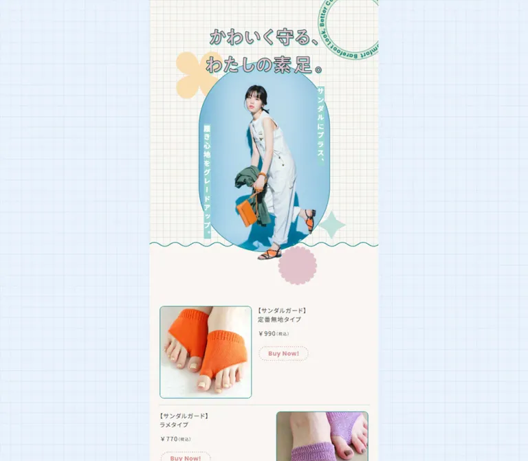
淡いブルーの方眼背景に、切り抜きモデル写真とパステルカラーの図形を組み合わせた商品特集。デスクトップでも細い縦長のコンテンツを中央に据え、ドット線の購入ボタンで商品詳細へつなぎます。
オリジナルサイトを見るTabio / Sandal Guard — Style Reference
A pocket fashion lookbook on blue graph paper, with pastel cutouts and dotted shopping links.
Website: tabio.com/jp/2026ss-sandal-guard/
Original URL: https://tabio.com/jp/2026ss-sandal-guard/
Final URL: https://tabio.com/jp/2026ss-sandal-guard/
Theme: light appearance in the supplied evidence
Inspected: September 12, 2026, at 05:41 JST; supplied retrieval timestamp: 2026-09-11T20:41:22.329Z
Viewports: desktop 1440 × 1000; mobile 390 × 844
Scope: the current seasonal product feature: opening fashion composition, four-item product introduction, explanatory introduction, numbered sections 01–04, repeated product links, and store/social footer. Visual evidence includes three desktop captures and two mobile captures; the rendered DOM covers the complete text sequence.
Sandal Guard presents practical foot protection through summer fashion photography. A pale blue graph-paper surround, fine teal outlines, creamy surfaces, yellow and pink photo backgrounds, and small scalloped ornaments make the page feel like an illustrated fashion insert. The purchase links remain modest: dusty pink lettering inside dotted pills, placed beside small product photographs.
The defining desktop composition is a narrow central window surrounded by persistent decoration. A vertical Japanese headline sits to the left, a black curved Sandal Guard wordmark sits to the right, and small full-body fashion cutouts line the lower margins. The content remains close to phone width even on a large screen. On mobile, the surround disappears and the editorial sequence fills the viewport, preserving its image-led pacing and compact product rows.
How to Read This Reference
- Measured values come from the supplied rendered DOM and computed-style records. They are CSS-pixel values, not inferred source declarations.
- Visual estimates describe screenshot geometry or colors whose computed values were not supplied. Estimated hex colors are starting points for reconstruction, not pixel samples.
- Calculated values are arithmetic relationships between recorded measurements, such as spacing between text blocks.
- Recommended values and behavior belong to a reusable implementation. They do not establish how the original site was built.
- All custom-property names below are implementation aliases. The supplied custom-property collection was empty; it does not prove the original stylesheets contain no variables.
- Several offscreen desktop rectangles are consistently smaller than their computed typography would suggest. For example, a
123 × 34pxpurchase link appears elsewhere as104.55 × 28.9px, exactly0.85×. This is consistent with transformed rendering, but the transform declaration and trigger were not recorded. Do not turn those rectangles into a second desktop font scale.
Tokens — Colors
Default Palette
| Name | Value | Suggested token | Evidence and role |
|---|---|---|---|
| Warm Paper | #f9f6f2 |
--sg-paper |
Measured background of sections 02, 04, and the footer; visually the dominant neutral surface |
| Cool Mist | #e8f0ef |
--sg-mist |
Measured background of section 01 |
| Pale Sage | #e3f0e5 |
--sg-sage |
Measured background of section 03 |
| Body Charcoal | #454545 |
--sg-ink |
Measured body, product-name, price, and explanatory text color |
| Utility Teal | #097c7a |
--sg-teal |
Measured store-link and copyright color; suitable semantic alias for the outline system |
| Purchase Rose | #d89498 |
--sg-buy |
Measured Buy Now! text color |
| Graph Sky | approximately #e8f3fd |
--sg-sky |
Visual estimate of the desktop exterior background |
| Graph Line | approximately #d2e5ec |
--sg-grid |
Visual estimate of the thin grid lines |
| Decorative Teal | approximately #008986 |
— | Visual estimate of the window and image outlines; exact stroke colors were not supplied |
| Soft Mint | approximately #c7e2dc |
--sg-mint |
Visual estimate for stars and stacked semicircles |
| Petal Pink | approximately #e2c1ce |
--sg-petal |
Visual estimate for the scalloped flower near the hero |
| Butter Yellow | approximately #fae0ae |
--sg-butter |
Visual estimate for the hero's pale yellow ornament |
Use the measured paper, mist, and sage values to distinguish long editorial chapters. Keep utility teal and purchase rose in separate roles: teal handles outlines and navigation; rose identifies shopping links.
The saturated cyan, yellow, and pink fields inside the photographs belong to the art direction. Their lighting, shadows, and color variation should remain photographic. A flat CSS swatch cannot reproduce those scenes by itself.
Only one light appearance is evidenced. No alternate theme or theme-selection interaction was inspected.
Tokens — Typography
Japanese Body and Product Information
- Recorded stack:
"Noto Sans JP", sans-serif. - Regular weight:
400. - Base body:
16px / 24px. - Product information:
14px / 21px, with1.4pxtracking, equivalent to0.1em. - Editorial explanations:
14px / 28px, with0.7pxtracking, equivalent to0.05em.
The difference between tight product information and airy explanatory paragraphs is important. Both use the same recorded size, but the editorial copy has twice-size leading and generous paragraph separation. Product titles stay left aligned beside their images; explanatory passages are centered in the visual captures.
The stack is directly evidenced. Font-file delivery and the exact face used for every glyph were not independently verified.
Purchase Links
- Recorded stack:
Poppins, sans-serif. - Size and weight:
14px,700. - Line height:
21px. - Tracking:
0.7px, or0.05em. - Label:
Buy Now!.
The bold, rounded Latin lettering gives the small shopping links enough presence without increasing their footprint. Keep this distinction from the regular Japanese text.
Graphic Headlines and Wordmark
The opening headline reads “かわいく守る、わたしの素足。” It uses a gray-pink interior with teal edging or an offset outline, arranged horizontally in the main hero and vertically in the desktop surround. The Sandal Guard wordmark uses expressive serif lettering inside a curved outline.
Treat these as artwork references. The supplied extraction reports an empty-text H1 with a 274 × 109.69px box and inherited 32px / 48px typography. Those computed font values do not identify the lettering visible in the image. Similarly, empty-text section headings do not establish a display font or their accessible names.
Type Scale
| Role | Recorded size / line height | Weight | Tracking | Notes |
|---|---|---|---|---|
| Body defaults | 16px / 24px |
400 |
Normal | Inherited baseline, not the size of every visible paragraph |
| Product name | 14px / 21px |
400 |
1.4px |
Often two lines; final fingerless product uses a longer block |
| Product price | 14px / 21px |
400 |
1.4px |
Tax annotation appears smaller visually; its child style was not supplied |
| Editorial copy | 14px / 28px |
400 |
0.7px |
Airy, centered benefit statements |
| Feature caption | 14px / 28px |
400 |
0.7px |
Short descriptions beside close-up photographs |
| Purchase link | 14px / 21px |
700 |
0.7px |
Poppins stack |
| Copyright | 10px / 15px |
400 |
0.5px |
Teal, centered |
| Hero vertical captions | approximately 16–18px visually |
Bold appearance | Not measured | White text on mint strips |
Do not use the HTML element's browser-default Times value as the page's design font. The body and sampled content explicitly use the Japanese sans-serif stack.
Tokens — Spacing & Shapes
The page does not expose a uniform spacing system. Its measured values include deliberately different chapter paddings, fixed artwork widths, compact shopping rows, and long photographic intervals. Preserve those relationships instead of rounding everything to an eight-pixel scale.
Spacing Scale
| Use | Value | Evidence |
|---|---|---|
| Opening section padding | 66px 0 72px |
Measured at both viewports |
| Opening section to first product row | 30px |
Calculated from the section bottom and first product-name top |
| Initial product-list side inset | 24px |
Measured mobile text position for the reversed rows; also consistent with the first image position |
| Product image-to-copy gap | approximately 14px |
Visual/layout estimate |
| Product name-to-price gap | 12px |
Calculated from recorded text rectangles |
| Price-to-purchase-link gap | 20px |
Calculated from recorded text rectangles |
| Introduction padding | 70px 0 |
Measured |
| Editorial paragraph gap | 28px |
Calculated from unscaled mobile paragraph rectangles |
Sections 01 and 03 padding |
90px 0 |
Measured |
Sections 02 and 04 padding |
47px 0 |
Measured |
| Store link to social row | 45px |
Calculated after the 34px link box |
| Social icon spacing | 19px between 17px boxes |
Calculated from 36px horizontal steps |
| Social row to copyright | 40px |
Calculated after the 15px social-link boxes |
| Footer bottom padding | Desktop 90px; mobile 10px |
Measured; interpretation depends on the surrounding scroll layout |
Border Radius and Decorative Geometry
| Element | Value or appearance | Status |
|---|---|---|
| Purchase and store links | 50px radius |
Measured computed value |
| Desktop content window | approximately 15–16px radius |
Visual estimate |
| Product thumbnails | approximately 10px radius, fine teal border |
Visual estimate |
| Hero photograph | Tall oval or softly rounded capsule, approximately 310px wide |
Visual estimate |
| Close-up photograph | Rounded diamond, approximately 340px visible span on mobile |
Visual estimate; edges intentionally exceed the column |
| Small ornaments | Scalloped circles, four-point stars, paired semicircles | Observed shapes; construction method unknown |
| Desktop grid | approximately 25px pitch with 1px lines |
Visual estimate |
| Hero grid | approximately 16px pitch with 1px lines |
Visual estimate |
The hero flower is roughly 90px across in the supplied mobile view. The paired mint semicircles near the final close-up occupy roughly 75 × 75px. These are secondary accents, not a repeated icon vocabulary for controls.
Layout Measurements
| Element | Desktop 1440 × 1000 |
Mobile 390 × 844 |
Status |
|---|---|---|---|
| Main content width | 371px |
390px |
Measured |
| Main origin | x: 534.5px, y: 42px |
x: 0, y: 0 |
Measured |
| Visible desktop window | approximately 375 × 920px |
No exterior frame visible | Screenshot estimate; consistent with a 371px interior plus borders |
| Exterior window clearance | approximately 40px top and bottom |
None | Screenshot estimate |
| Opening section height | 693.39px |
693.39px |
Measured |
| Opening title box | 274 × 109.69px |
274 × 109.69px |
Measured |
| First product information width | 166.31px |
176.92px |
Measured |
| First purchase link | 123 × 34px |
123 × 34px |
Measured |
| Store-home link | 156 × 34px |
156 × 34px |
Measured |
| Social link box | 17 × 15px |
17 × 15px |
Measured; accessible hit areas were not recorded |
| Footer element height | 239px |
159px |
Measured |
| Reported document height | 10925px |
11104px |
Supplied document metrics; mobile HTML rectangle was 11103.625px |
Components
Desktop Decorative Surround
Role: maintain campaign identity while the central content changes with scrolling.
The exterior is a full-screen pale blue grid. Its left side carries the vertical outlined headline; its right side carries the dark Sandal Guard wordmark. Four small fashion cutouts appear along each lower side, leaving the central window clear. Repeated outfits connect these perimeter figures to the larger editorial photographs.
Across the desktop opening, middle, and footer captures, the surround and window remain in substantially the same viewport positions while the center shows different content. This supports a visually persistent frame. The supplied computed records do not identify whether the original implements it with fixed layers, clipping, or a particular scroll container.
Keep the side figures decorative. There is no evidence that they are navigation links, draggable objects, or a carousel.
Opening Hero
Role: introduce the fashion identity before explaining the product.
Its visible anatomy is:
- A cream graph-paper field using a finer grid than the desktop surround.
- The two-line outlined headline, centered in a measured
274pxtitle box. - A tall cyan photo field containing a model in a pale jumpsuit with an orange bag and sandals.
- Two slim mint strips with white vertical copy: “サンダルにプラス、” and “履き心地をグレードアップ。”
- A partial circular stamp near the upper-right edge, a yellow ornament, a mint star, and a pink scalloped flower.
- A fine teal wave separating the grid field from the plain cream area below.
The model's sandal extends past the lower photo boundary. That overlap is central to the collage effect: the photograph feels assembled over the paper rather than enclosed in a conventional card.
The main grid-to-paper boundary sits at approximately 576px from the mobile page top. The overall hero section continues to about 693px, leaving breathing room around the flower and before the product list. The headline and photo overlap; they are not stacked with a large clean gap.
The exact image layering is unrecorded. A supplied composite image, a masked photograph plus a separate cutout, or another asset arrangement could produce this result. Do not present a particular implementation as verified source anatomy.
Initial Product List
Role: make all four products directly available before the longer explanations.
The rendered content contains four compact shopping rows. Each combines a near-square product photograph, product name, tax-inclusive price, and Buy Now! link. The mobile DOM shows alternating copy positions: the first and third rows place information on the right, while the second and fourth place it on the left.
The first product image is approximately 151px wide on mobile and 142px on desktop. The row itself has no enclosing card background, shadow, or heavy border. Only the thumbnail is outlined. Use a two-column layout with about a 14px gap and retain the list's 24px side insets.
| Product label from the page | Observed price | Recorded destination |
|---|---|---|
| “定番無地タイプ” | ¥990(税込) |
Product 011190054 |
| “ラメタイプ” | ¥770(税込) |
Product 011190077 |
| “クッションレースタイプ” | ¥880(税込) |
Product 011190070 |
| “デオドラント/浅履き フィンガーレス パーツソックス” | ¥660(税込) |
Product 051190019 |
These are captured page values, not a verification of current stock or prices on the destination pages. Each destination appears twice in the supplied link list: once near the opening and once in its detailed section.
Purchase Link
Role: move from editorial context to the corresponding store product page.
A 123 × 34px inline-flex anchor with a measured 50px radius, bold Poppins label, and dusty pink color. The dotted outline is visible in the screenshots; its exact border declaration was not supplied.
Place it beneath the price with 20px separation. Keep the interior unfilled in its captured resting appearance. The purchase link is separate from the text and image; the evidence does not establish that the entire row is clickable.
These links have product-detail URLs. No add-to-cart action, modal, or checkout behavior was exercised.
Editorial Introduction
Role: connect the fashion imagery to the product's comfort benefits.
After the initial four-product list, the page introduces the collection with the line “サンダルスタイルを、もっと快適に。” and short centered statements. The recorded section has 70px vertical padding, a small heading box of 133 × 97.33px, and regular 14px / 28px copy.
This is a quiet reading pause. Preserve the short paragraphs and broad vertical spacing instead of turning them into a feature grid or dense bullet list.
Numbered Product Chapters
Role: give each product its own editorial explanation and repeat the purchase opportunity.
The text sequence contains four numbered chapters, each with a heading element, benefit copy, and a product row. Their backgrounds and padding alternate as follows:
| Chapter | Content focus | Background | Vertical padding | Recorded heading footprint |
|---|---|---|---|---|
01 |
Solid, seamless protection around sandal contact points | #e8f0ef |
90px |
235 × 95.31px |
02 |
Glitter finish and summer styling | #f9f6f2 |
47px |
319 × 148.06px |
03 |
Cushioning and moisture-management benefits | #e3f0e5 |
90px |
289 × 106.05px |
04 |
Shallow fingerless coverage and odor/moisture benefits | #f9f6f2 |
47px |
311 × 104.41px |
The heading footprints are measured at both viewports. Their extracted text is empty, so their exact lettering and assets cannot be reconstructed from the DOM records alone.
The desktop middle capture shows chapter 02: a fashion photograph within a yellow four-lobed shape, centered explanatory paragraphs, a mint scalloped ornament, and a tilted close-up of purple glitter fabric worn with dark sandals. The final desktop and mobile captures show chapter 04: a silver sandal against a pink photographic background within a rounded diamond, followed by a compact product row.
The full visual compositions of chapters 01 and 03 were not supplied. Their content, surface colors, padding, and text measurements are evidenced; additional photographic arrangements should not be invented as observed details.
Feature Close-up
Role: show how the small product looks when worn.
The close-up uses a rounded diamond boundary with a thin teal outline. Its large footprint reaches or passes the right edge of the narrow content column. The final mobile capture places the silver sandal and forefoot against pink, with two mint semicircles to the lower left.
Keep the photograph's intended orientation while shaping its boundary. A rotated container with a counter-rotated image is one possible adaptation; the original masking method is unknown. If an authorized source asset already includes its mask and border, do not crop it a second time.
Detailed Product Row
Role: provide a purchase link immediately after the relevant explanation.
The final row uses a smaller product image than the opening row: approximately 122px wide on mobile, starting around 21px from the left edge. Its information starts at the measured x: 156.89px. The long product title wraps naturally across several lines, followed by the same price and purchase-link rhythm.
Allow the information column to shrink with minmax(0, 1fr) and preserve natural Japanese wrapping. Avoid fixed text heights: the final title is substantially longer than the two-line names elsewhere.
Store and Social Footer
Role: return to the wider store and expose official social destinations.
A centered dotted teal pill contains a left-pointing arrow and the label TOP. Its recorded destination is https://tabio.com/jp/. It is a store-home link, not an evidenced scroll-to-top control.
Below it are four teal social icons, in this order: TikTok, Instagram, X, and YouTube. Their measured anchor boxes are 17 × 15px, separated by 19px gaps. The footer closes with the visible original-page text “© tabio corporation” in 10px / 15px teal type.
The extracted links have no text, but accessible names and image alternatives were not included in the record. Empty extracted text alone does not prove those links lack accessible names.
Tokens — Motion & Interaction
| Treatment | Recorded evidence | What can be concluded |
|---|---|---|
| Hero and desktop headline transitions | opacity 0.35s ease-out, transform 0.65s cubic-bezier(0.22, 1.61, 0.36, 1) |
The declared transform curve permits overshoot; exact starting positions and triggers are unrecorded |
| Editorial paragraph transitions | The same opacity and transform transitions | Consistent reveal styling is declared across multiple sections |
| Purchase links | Transition shorthand serialized as 0.45s |
Duration is evidenced; hover colors, opacity changes, and other endpoints were not captured |
| Store and social links | Transition duration 0.45s |
A transition is declared; behavior was not exercised |
| Smaller offscreen desktop rectangles | Multiple dimensions equal 0.85× their unscaled equivalents |
A transformed sampled state is plausible; permanent desktop downsizing is not established |
| Keyframe animation on sampled elements | animation: none |
No active keyframe animation was reported on those sampled elements; this does not describe every descendant or pseudo-element |
| Scrolling | Different settled content appears inside the persistent desktop surround | The vertical reading sequence is observed; exact scroll ownership and any snapping behavior are unverified |
| Product and footer navigation | Explicit anchor destinations | Destination intent is recorded, but destination-page behavior was not tested |
For an adaptation, a short fade combined with a restrained overshoot can complement the cut-paper aesthetic. The recorded 350ms opacity and 650ms transform durations are useful tokens. Starting offsets, a scale(0.85) entrance, Intersection Observer thresholds, and hover effects must be labeled implementation choices.
The captures were prepared after loading and stability checks, not recorded as a continuous motion study. Perpetual animations were temporarily paused during readiness checks and resumed afterward. Do not infer an absence of motion from the still images, or claim looping motion without evidence.
Surfaces
| Layer | Appearance | Purpose |
|---|---|---|
| Desktop exterior | Pale blue graph paper | Holds the persistent campaign identity and fashion cutouts |
| Hero paper | Cream with a finer grid | Gives the opening composition its illustrated stationery character |
| Main editorial surface | Warm paper | Supports photography and airy text without card boundaries |
| Alternate chapters | Cool mist and pale sage | Separates long sections through subtle color shifts |
| Product thumbnail | Light photographic background, thin teal edge, small rounded corners | Distinguishes the purchasable item from fashion imagery |
| Purchase control | Transparent interior, pink dotted perimeter | Small but recognizable shopping affordance |
| Utility control | Transparent interior, teal dotted perimeter | Connects the feature back to the store |
There is no visible general-purpose elevation system. Structure comes from flat color fields, fine outlines, photo masks, and overlapping assets. The strong shadows inside the fashion photographs belong to their studio lighting, not to CSS card elevation.
Imagery
Use fashion photography that clearly shows complete outfits and the relationship between sandals and the small protective socks. The opening pale jumpsuit, bright orange accessories, blue backdrop, and natural studio shadow establish an upbeat summer editorial tone.
The desktop lower margins use isolated full-body figures with their photographic backgrounds removed. They are small enough to read as a decorative procession, while the central hero remains the dominant image. Preserve clean cutout edges and natural body proportions.
Three image roles should remain distinct:
- Fashion scenes: large outfit photographs, bright studio backgrounds, and deliberate overlap with geometric frames.
- Wear close-ups: feet and sandals, with enough detail to understand coverage and texture.
- Product thumbnails: smaller, quieter images that sit beside names, prices, and links.
Do not apply pixelation, heavy filters, or a uniform monochrome treatment. The interface is restrained so the full-color photography can carry the variation.
Observed Asset References
No image src URLs, filenames, or intrinsic dimensions were included in the supplied records. The following are visual references, not downloadable asset paths.
| Asset role | Supplied visual reference | Evidence scope |
|---|---|---|
| Main campaign headline | Outlined two-line Japanese lettering | Desktop and mobile opening captures |
| Desktop headline variant | The same message arranged vertically | All three desktop captures |
| Sandal Guard wordmark | Dark curved serif lettering and U-shaped outline | Desktop surround |
| Hero fashion image | Pale jumpsuit, orange bag, cyan background | Desktop and mobile opening captures |
| Perimeter fashion figures | Four cutout figures on each side | Desktop surround |
| Glitter-product fashion scene | Olive trousers over a yellow four-lobed photo field | Desktop middle capture |
| Glitter wear detail | Purple glitter fabric with dark sandals | Desktop middle capture |
| Final wear detail | Silver sandal against pink inside a rounded diamond | Desktop and mobile closing captures |
| Product thumbnails | Orange fabric worn over the forefoot; beige fingerless product | Opening and closing captures |
| Social symbols | TikTok, Instagram, X, YouTube | Desktop and mobile footer captures |
Use authorized artwork when available. CSS can reproduce the graph paper, borders, spacing, and approximate masks; it cannot recover the campaign photography or graphic lettering from the DOM measurements.
Layout & Responsive Behavior
At 1440px wide, the measured main column is only 371px, roughly one quarter of the viewport. The visual frame is approximately 375px wide and leaves about 40px above and below it. The side areas are deliberately spacious and decorative; the page does not expand into a desktop product grid.
At 390px wide, the main begins at the viewport origin and fills its width. The desktop side headline, wordmark, figures, blue surround, and exterior frame are absent from the supplied mobile captures. The hero retains the same measured height and 274px title width. Product and editorial type also retain their recorded sizes.
This is not uniform scaling. The mobile content column is wider than the desktop interior, while key artwork widths remain fixed. The first product information column increases from 166.31px to 176.92px, and long product names wrap within their available space.
The phone's first Buy Now! link begins at y: 818.39px and is 34px high, so its bottom falls slightly below the 844px opening capture. That is ordinary viewport cropping within the long page, not evidence of a missing control.
The desktop frame visibly clips content at its top and bottom as different sections are shown. The DOM also reports a long document. These facts do not, by themselves, identify the original scroll container. Avoid asserting that it is an iframe, an embedded mobile site, or a nested scroller.
Breakpoint limitation: only the two supplied widths were inspected. A 64rem desktop breakpoint is a reasonable recommendation for a reusable version, but it is not a recovered source breakpoint. Tablet, landscape-phone, browser-zoom, and safe-area behavior remain unverified.
Do’s and Don’ts
Do
- Preserve the narrow desktop column and generous graph-paper surround.
- Keep the
#f9f6f2,#e8f0ef, and#e3f0e5chapter surfaces distinct but subtle. - Use fine teal boundaries and dusty pink dotted shopping links.
- Pair compact
14px / 21pxproduct information with airy14px / 28pxeditorial copy. - Retain the graphic headline and wordmark as artwork when authorized assets are available.
- Let selected photographic figures overlap their background shapes.
- Keep product thumbnails smaller and calmer than the fashion scenes.
- Repeat each product link after its detailed explanation.
- Allow the long fingerless-product name to wrap naturally.
- Preserve the store-home destination of the footer's
TOPlink.
Don’t
- Don't stretch the central content across desktop width or convert the sequence into a multi-column shop grid.
- Don't add a heavy navigation bar that displaces the campaign's opening composition.
- Don't turn every product row into a large filled card.
- Don't add glossy gradients, glass blur, or general-purpose drop shadows.
- Don't replace the dotted shopping links with oversized solid buttons without identifying that as a redesign.
- Don't invent a display-font name from the headline artwork.
- Don't interpret empty heading text as proof of missing accessible alternatives.
- Don't copy the
0.85×offscreen bounds as a permanent typography rule. - Don't label the footer home link as a verified back-to-top interaction.
- Don't invent animation loops, hover endpoints, unseen chapter imagery, or asset filenames.
Recommended Implementation Additions
These are recommendations for a new implementation, not verified features of the original page:
- Give every purchase link a programmatic name that includes its product, while retaining the short visible
Buy Now!label. - Provide descriptive alternatives for informative product and wear photographs. Mark purely decorative shapes and perimeter figures as decorative.
- Preserve a meaningful heading hierarchy when using graphic headline assets. Accessible names were not included in the supplied evidence.
- Provide a clear teal focus outline and ensure focus indicators are not clipped by photo masks or the desktop frame.
- Increase touch targets to approximately
44pxwithout forcing the visible pill artwork or social symbol to become equally large. The recorded34pxpills and17 × 15pxsocial boxes are compact. - Check contrast before shipping. Calculated from the measured flat colors,
#d89498on#f9f6f2is approximately2.3:1. A darker rose such as#9b545ais a recommended text alternative; the lighter rose can remain on the dotted outline. - Keep content visible when JavaScript fails. Only apply pending reveal states after the observer has initialized, and remove transforms under reduced-motion preferences.
- Test long product names, narrow screens, text enlargement, and keyboard navigation through the full reading sequence.
- Reserve image dimensions to reduce layout movement, and load below-the-fold photography progressively without delaying the opening composition.
Agent Prompt Guide
Quick Color Reference
- Main paper: measured
#f9f6f2. - Alternate chapters: measured
#e8f0efand#e3f0e5. - Body text: measured
#454545. - Utility teal: measured
#097c7a; use it as a consistent implementation outline color. - Purchase lettering: measured
#d89498; a darker accessible variant is a recommendation. - Desktop sky and grid: approximate
#e8f3fdand#d2e5ec. - Photo accents: cyan, yellow, and pink studio backgrounds; retain photographic variation.
Overall Prompt
“Create a Japanese seasonal product feature with the visual character of Tabio's Sandal Guard page. Keep a roughly 375px-wide framed editorial column centered on desktop, surrounded by pale blue graph paper, a vertical outlined campaign headline on the left, a dark curved wordmark on the right, and small full-body fashion cutouts near the lower corners. On mobile, remove the surround and use the full viewport width. Inside, combine warm paper, pale mist and sage sections, thin teal outlines, fashion photography in oval and rounded-diamond shapes, mint and pink ornaments, and occasional figure overlap. Use Noto Sans JP at 14px with 21px leading for product information and 28px leading for centered explanations. Place compact dotted rose Buy Now! links beside near-square product thumbnails. Preserve a long, single-column sequence with four numbered product stories and a small store/social footer.”
Example Component Prompts
- Hero: “Build a cream graph-paper hero with a 274px-wide graphic headline, a tall cyan fashion photograph, slim vertical mint caption strips, a fine wave boundary, and a pink scalloped ornament. Let the model's sandal overlap the lower photo boundary. Use supplied campaign artwork rather than guessing its display font.”
- Product row: “Create an unboxed two-column shopping row with a fine teal rounded thumbnail, regular 14px Japanese product text, a separate price line, and a 123 × 34px dotted rose Buy Now! link in bold Poppins. Use about 14px between columns, 12px before the price, and 20px before the link.”
- Feature detail: “Place a sandal wear close-up against a pink photographic background inside a large rounded diamond. Let the shape extend slightly beyond the right edge of a narrow cream column. Add two small mint semicircles nearby and keep explanatory copy centered with generous leading.”
- Desktop surround: “Frame a phone-width editorial column with a persistent blue graph-paper scene. Position a vertical headline to the left, a curved black wordmark to the right, and small isolated fashion figures along the lower side margins. Keep those figures decorative and leave the content unobstructed.”
- Footer: “Use a centered teal dotted pill with a left arrow and TOP label linking to the store homepage, followed by four small teal social icons and a quiet copyright line. Do not substitute a scroll-to-top action.”
Quick Start
CSS Custom Properties
This is an implementation adaptation, not recovered source CSS. Measured colors and text values are retained; grid colors, masks, decorative placement, and the 64rem breakpoint are approximations.
The example deliberately uses one explicit scrolling window on desktop and normal document flow on mobile. The original scroll owner was not recorded. Keep .campaign-scroll keyboard reachable and labelled if adopting this structure. Its internal footer uses 10px end clearance; copying the original document's 90px desktop footer padding into this different scroll architecture would create a larger visible end gap.
Use .campaign-viewport > .campaign-scroll around the main content and footer. Keep .desktop-decor outside that window. The artwork classes expect authorized image assets; no original asset URLs were supplied.
:root {
  /* Measured colors */
  --sg-paper: #f9f6f2;
  --sg-mist: #e8f0ef;
  --sg-sage: #e3f0e5;
  --sg-ink: #454545;
  --sg-teal: #097c7a;
  --sg-buy: #d89498;

  /* Visual estimates and recommended alternatives */
  --sg-sky: #e8f3fd;
  --sg-grid: #d2e5ec;
  --sg-mint: #c7e2dc;
  --sg-petal: #e2c1ce;
  --sg-buy-readable: #9b545a;

  /* Recorded font stacks */
  --sg-font-body: 'Noto Sans JP', sans-serif;
  --sg-font-action: Poppins, sans-serif;
  --sg-text-product: 14px;
  --sg-leading-product: 21px;
  --sg-leading-copy: 28px;
  --sg-tracking-product: 0.1em;
  --sg-tracking-copy: 0.05em;

  /* Measured spacing and approximate geometry */
  --sg-list-inset: 24px;
  --sg-product-gap: 14px;
  --sg-price-gap: 12px;
  --sg-action-gap: 20px;
  --sg-paragraph-gap: 28px;
  --sg-window-width: 375px;
  --sg-window-inset: 40px;
  --sg-window-radius: 16px;
  --sg-photo-radius: 10px;
  --sg-pill-radius: 50px;

  /* Recorded transition values */
  --sg-motion-opacity: 350ms ease-out;
  --sg-motion-transform: 650ms cubic-bezier(0.22, 1.61, 0.36, 1);
  --sg-motion-link: 450ms;
}

* {
  box-sizing: border-box;
}

body {
  margin: 0;
  color: var(--sg-ink);
  background: var(--sg-paper);
  font: 400 16px / 24px var(--sg-font-body);
}

img {
  display: block;
  max-width: 100%;
}

.desktop-decor {
  display: none;
}

.campaign-viewport {
  width: 100%;
  background: var(--sg-paper);
}

.hero {
  position: relative;
  isolation: isolate;
  min-height: 693px;
  padding: 66px 0 72px;
}

/* Approximate background extent; add authorized wave artwork. */
.hero-grid {
  position: absolute;
  z-index: -1;
  inset: 0 0 auto;
  height: 576px;
  background-color: var(--sg-paper);
  background-image:
    linear-gradient(to right, var(--sg-grid) 1px, transparent 1px),
    linear-gradient(to bottom, var(--sg-grid) 1px, transparent 1px);
  background-size: 16px 16px;
}

.campaign-title {
  width: min(274px, calc(100% - 40px));
  margin: 0 auto;
}

.campaign-title img {
  width: 100%;
  height: auto;
}

/* Approximate overlap, not a recovered source layout. */
.hero-art {
  position: relative;
  width: min(310px, calc(100% - 56px));
  margin: -26px auto 0;
}

.hero-art img {
  width: 100%;
  height: auto;
}

.product-index {
  display: grid;
  gap: 30px;
  padding: 30px var(--sg-list-inset);
}

.product-row {
  display: grid;
  grid-template-columns: 44.2% minmax(0, 1fr);
  align-items: start;
  gap: var(--sg-product-gap);
}

.product-row--reverse {
  grid-template-columns: minmax(0, 1fr) 44.2%;
}

.product-row--reverse .product-media {
  grid-column: 2;
  grid-row: 1;
}

.product-row--reverse .product-info {
  grid-column: 1;
  grid-row: 1;
}

.product-row--detail {
  margin-inline: 21px;
}

.product-row--compact {
  grid-template-columns: 35% minmax(0, 1fr);
}

.product-media {
  margin: 0;
  overflow: hidden;
  border: 1px solid var(--sg-teal);
  border-radius: var(--sg-photo-radius);
}

.product-media img {
  width: 100%;
  height: auto;
}

.product-info {
  min-width: 0;
}

.product-name,
.product-price {
  margin: 0;
  font-size: var(--sg-text-product);
  font-weight: 400;
  line-height: var(--sg-leading-product);
  letter-spacing: var(--sg-tracking-product);
  overflow-wrap: anywhere;
}

.product-name {
  margin-bottom: var(--sg-price-gap);
}

.product-price {
  margin-bottom: var(--sg-action-gap);
}

.buy-link {
  display: inline-flex;
  align-items: center;
  justify-content: center;
  width: 123px;
  min-height: 34px;
  border: 2px dotted currentColor;
  border-radius: var(--sg-pill-radius);
  color: var(--sg-buy);
  background: transparent;
  font: 700 14px / 21px var(--sg-font-action);
  letter-spacing: 0.05em;
  text-decoration: none;
}

.section-intro {
  padding: 70px 20px;
}

.section-copy {
  margin-inline: 17px;
  font-size: 14px;
  line-height: var(--sg-leading-copy);
  letter-spacing: var(--sg-tracking-copy);
  text-align: center;
}

.section-intro .section-copy {
  margin-inline: 0;
}

.section-copy p {
  margin: 0;
}

.section-copy p + p {
  margin-top: var(--sg-paragraph-gap);
}

.chapter {
  padding: 90px 0;
  background: var(--sg-mist);
}

.chapter[data-chapter='02'],
.chapter[data-chapter='04'] {
  padding-block: 47px;
  background: var(--sg-paper);
}

.chapter[data-chapter='03'] {
  background: var(--sg-sage);
}

.chapter-title {
  max-width: calc(100% - 40px);
  margin-inline: auto;
}

.chapter[data-chapter='01'] .chapter-title { width: 235px; }
.chapter[data-chapter='02'] .chapter-title { width: 319px; }
.chapter[data-chapter='03'] .chapter-title { width: 289px; }
.chapter[data-chapter='04'] .chapter-title { width: 311px; }

/* Optional mask for an unmasked photograph. */
.image-stage {
  display: flow-root;
  overflow: clip;
}

.diamond-photo {
  width: 64%;
  aspect-ratio: 1;
  margin: 72px 8% 72px auto;
  overflow: hidden;
  border: 1px solid var(--sg-teal);
  border-radius: 26px;
  transform: rotate(45deg);
}

.diamond-photo img {
  width: 100%;
  height: 100%;
  object-fit: cover;
  transform: rotate(-45deg) scale(1.42);
}

.campaign-footer {
  padding-bottom: 10px;
  background: var(--sg-paper);
}

.store-link {
  display: flex;
  align-items: center;
  justify-content: center;
  gap: 12px;
  width: 156px;
  min-height: 34px;
  margin-inline: auto;
  border: 2px dotted var(--sg-teal);
  border-radius: var(--sg-pill-radius);
  color: var(--sg-teal);
  text-decoration: none;
}

.social-list {
  display: flex;
  align-items: center;
  justify-content: center;
  gap: 19px;
  margin: 45px 0 40px;
  padding: 0;
  list-style: none;
}

.social-link {
  display: flex;
  align-items: center;
  justify-content: center;
  width: 17px;
  height: 15px;
  color: var(--sg-teal);
}

.social-link svg {
  width: 17px;
  height: 15px;
}

.copyright {
  margin: 0 20px;
  color: var(--sg-teal);
  font-size: 10px;
  line-height: 15px;
  letter-spacing: 0.05em;
  text-align: center;
}

/* Content remains visible unless an initialized script opts in. */
.reveal {
  opacity: 1;
  transform: none;
  transition:
    opacity var(--sg-motion-opacity),
    transform var(--sg-motion-transform);
}

/* Recommended entrance state; starting transform is not measured. */
[data-motion-ready] .reveal.is-pending {
  opacity: 0;
  transform: translateY(20px) scale(0.85);
}

/* Only the duration is sourced; no hover endpoint is assumed. */
.buy-link,
.store-link,
.social-link {
  transition: opacity var(--sg-motion-link);
}

:focus-visible {
  outline: 2px solid var(--sg-teal);
  outline-offset: 4px;
}

/* Optional accessibility variants. */
.accessible-colors .buy-link {
  color: var(--sg-buy-readable);
  border-color: var(--sg-buy);
}

.accessible-targets .buy-link,
.accessible-targets .store-link {
  min-height: 44px;
}

.accessible-targets .social-list {
  gap: 4px;
}

.accessible-targets .social-link {
  width: 44px;
  height: 44px;
}

/* Recommended breakpoint and explicit desktop scroll architecture. */
@media (min-width: 64rem) {
  body {
    height: 100dvh;
    overflow: hidden;
    background-color: var(--sg-sky);
    background-image:
      linear-gradient(to right, var(--sg-grid) 1px, transparent 1px),
      linear-gradient(to bottom, var(--sg-grid) 1px, transparent 1px);
    background-size: 25px 25px;
  }

  .desktop-decor {
    position: fixed;
    inset: 0;
    display: block;
    pointer-events: none;
  }

  .campaign-viewport {
    position: fixed;
    inset-block: var(--sg-window-inset);
    left: 50%;
    width: var(--sg-window-width);
    overflow: hidden;
    border: 2px solid var(--sg-teal);
    border-radius: var(--sg-window-radius);
    transform: translateX(-50%);
  }

  .campaign-scroll {
    height: 100%;
    overflow-y: auto;
    overscroll-behavior-y: contain;
  }
}

@media (prefers-reduced-motion: reduce) {
  .reveal,
  [data-motion-ready] .reveal.is-pending {
    opacity: 1;
    transform: none;
    transition: none;
  }

  .buy-link,
  .store-link,
  .social-link {
    transition: none;
  }
}
Native scrollbars can reduce the inner width on some platforms. Validate that behavior when choosing between this recommended scroll window and a document-scrolling implementation. The decorative side-art positions, chapter photography, hero wave, and exact graphic masks still require composition using authorized assets.
Tailwind v4 Token Mapping
Optional mapping for a project already using Tailwind v4. Define the custom properties above first. This does not imply that the original website uses Tailwind.
@theme inline {
  --color-paper: var(--sg-paper);
  --color-mist: var(--sg-mist);
  --color-sage: var(--sg-sage);
  --color-ink: var(--sg-ink);
  --color-teal: var(--sg-teal);
  --color-buy: var(--sg-buy);
  --color-sky: var(--sg-sky);
  --color-grid: var(--sg-grid);

  --font-body: var(--sg-font-body);
  --font-action: var(--sg-font-action);

  --text-product: 14px;
  --text-product--line-height: 21px;
  --text-editorial: 14px;
  --text-editorial--line-height: 28px;
  --text-copyright: 10px;
  --text-copyright--line-height: 15px;

  --spacing-product-gap: 14px;
  --spacing-list-inset: 24px;
  --spacing-paragraph: 28px;
  --spacing-window: 375px;

  --radius-photo: 10px;
  --radius-window: 16px;
  --radius-pill: 50px;
}
Sources & Evidence
- Inspected original and final website: Sandal Guard — Tabio Online Store. The supplied record reports HTTP
200, with identical original and final URLs. - Capture timestamp:
2026-09-11T20:41:22.329Z, corresponding to September 12, 2026, 05:41 JST. This is the supplied browser inspection time, not a claim of a separate visit during preparation of this document. - Desktop visual evidence: three
1440 × 1000captures showing the opening, a middle portion of chapter02, and the closing portion of chapter04with the footer. - Mobile visual evidence: two
390 × 844captures showing the opening and closing portions of the page. - Rendered evidence: complete supplied page text, anchor destinations, document metrics, element rectangles, font stacks, sizes, tracking, line heights, selected background colors, padding, radii, and transition records for both viewports.
- Interaction scope: scrolling between captured positions is evidenced. Product destinations, the store-home destination, and social URLs are recorded as anchors. Click outcomes, hover states, keyboard behavior, reveal triggers, and continuous animation were not exercised in the supplied record.
- Inspection limitations: the capture process included at least five seconds of initial observation plus bounded loading, image-decoding, animation, and stability checks. These checks can miss delayed or unexercised behavior. Full stylesheets, image paths, font-file URLs, accessible-name details, exact breakpoints, and scroll-owner declarations were not supplied. SharedWorkers and service workers were disabled during inspection.
This reference describes the supplied current page. Measured values, screenshot estimates, and recommended implementation choices are identified separately throughout.
# Tabio / Sandal Guard — Style Reference

> A pocket fashion lookbook on blue graph paper, with pastel cutouts and dotted shopping links.

**Website:** [tabio.com/jp/2026ss-sandal-guard/](https://tabio.com/jp/2026ss-sandal-guard/)
**Original URL:** https://tabio.com/jp/2026ss-sandal-guard/
**Final URL:** https://tabio.com/jp/2026ss-sandal-guard/
**Theme:** light appearance in the supplied evidence
**Inspected:** September 12, 2026, at 05:41 JST; supplied retrieval timestamp: `2026-09-11T20:41:22.329Z`
**Viewports:** desktop `1440 × 1000`; mobile `390 × 844`
**Scope:** the current seasonal product feature: opening fashion composition, four-item product introduction, explanatory introduction, numbered sections `01–04`, repeated product links, and store/social footer. Visual evidence includes three desktop captures and two mobile captures; the rendered DOM covers the complete text sequence.

Sandal Guard presents practical foot protection through summer fashion photography. A pale blue graph-paper surround, fine teal outlines, creamy surfaces, yellow and pink photo backgrounds, and small scalloped ornaments make the page feel like an illustrated fashion insert. The purchase links remain modest: dusty pink lettering inside dotted pills, placed beside small product photographs.

The defining desktop composition is a narrow central window surrounded by persistent decoration. A vertical Japanese headline sits to the left, a black curved Sandal Guard wordmark sits to the right, and small full-body fashion cutouts line the lower margins. The content remains close to phone width even on a large screen. On mobile, the surround disappears and the editorial sequence fills the viewport, preserving its image-led pacing and compact product rows.

## How to Read This Reference

- **Measured** values come from the supplied rendered DOM and computed-style records. They are CSS-pixel values, not inferred source declarations.
- **Visual estimates** describe screenshot geometry or colors whose computed values were not supplied. Estimated hex colors are starting points for reconstruction, not pixel samples.
- **Calculated** values are arithmetic relationships between recorded measurements, such as spacing between text blocks.
- **Recommended** values and behavior belong to a reusable implementation. They do not establish how the original site was built.
- All custom-property names below are implementation aliases. The supplied custom-property collection was empty; it does not prove the original stylesheets contain no variables.
- Several offscreen desktop rectangles are consistently smaller than their computed typography would suggest. For example, a `123 × 34px` purchase link appears elsewhere as `104.55 × 28.9px`, exactly `0.85×`. This is consistent with transformed rendering, but the transform declaration and trigger were not recorded. Do not turn those rectangles into a second desktop font scale.

## Tokens — Colors

### Default Palette

| Name | Value | Suggested token | Evidence and role |
| --- | --- | --- | --- |
| Warm Paper | `#f9f6f2` | `--sg-paper` | Measured background of sections `02`, `04`, and the footer; visually the dominant neutral surface |
| Cool Mist | `#e8f0ef` | `--sg-mist` | Measured background of section `01` |
| Pale Sage | `#e3f0e5` | `--sg-sage` | Measured background of section `03` |
| Body Charcoal | `#454545` | `--sg-ink` | Measured body, product-name, price, and explanatory text color |
| Utility Teal | `#097c7a` | `--sg-teal` | Measured store-link and copyright color; suitable semantic alias for the outline system |
| Purchase Rose | `#d89498` | `--sg-buy` | Measured `Buy Now!` text color |
| Graph Sky | approximately `#e8f3fd` | `--sg-sky` | Visual estimate of the desktop exterior background |
| Graph Line | approximately `#d2e5ec` | `--sg-grid` | Visual estimate of the thin grid lines |
| Decorative Teal | approximately `#008986` | — | Visual estimate of the window and image outlines; exact stroke colors were not supplied |
| Soft Mint | approximately `#c7e2dc` | `--sg-mint` | Visual estimate for stars and stacked semicircles |
| Petal Pink | approximately `#e2c1ce` | `--sg-petal` | Visual estimate for the scalloped flower near the hero |
| Butter Yellow | approximately `#fae0ae` | `--sg-butter` | Visual estimate for the hero's pale yellow ornament |

Use the measured paper, mist, and sage values to distinguish long editorial chapters. Keep utility teal and purchase rose in separate roles: teal handles outlines and navigation; rose identifies shopping links.

The saturated cyan, yellow, and pink fields inside the photographs belong to the art direction. Their lighting, shadows, and color variation should remain photographic. A flat CSS swatch cannot reproduce those scenes by itself.

Only one light appearance is evidenced. No alternate theme or theme-selection interaction was inspected.

## Tokens — Typography

### Japanese Body and Product Information

- **Recorded stack:** `"Noto Sans JP", sans-serif`.
- **Regular weight:** `400`.
- **Base body:** `16px / 24px`.
- **Product information:** `14px / 21px`, with `1.4px` tracking, equivalent to `0.1em`.
- **Editorial explanations:** `14px / 28px`, with `0.7px` tracking, equivalent to `0.05em`.

The difference between tight product information and airy explanatory paragraphs is important. Both use the same recorded size, but the editorial copy has twice-size leading and generous paragraph separation. Product titles stay left aligned beside their images; explanatory passages are centered in the visual captures.

The stack is directly evidenced. Font-file delivery and the exact face used for every glyph were not independently verified.

### Purchase Links

- **Recorded stack:** `Poppins, sans-serif`.
- **Size and weight:** `14px`, `700`.
- **Line height:** `21px`.
- **Tracking:** `0.7px`, or `0.05em`.
- **Label:** `Buy Now!`.

The bold, rounded Latin lettering gives the small shopping links enough presence without increasing their footprint. Keep this distinction from the regular Japanese text.

### Graphic Headlines and Wordmark

The opening headline reads “かわいく守る、わたしの素足。” It uses a gray-pink interior with teal edging or an offset outline, arranged horizontally in the main hero and vertically in the desktop surround. The Sandal Guard wordmark uses expressive serif lettering inside a curved outline.

Treat these as artwork references. The supplied extraction reports an empty-text `H1` with a `274 × 109.69px` box and inherited `32px / 48px` typography. Those computed font values do not identify the lettering visible in the image. Similarly, empty-text section headings do not establish a display font or their accessible names.

### Type Scale

| Role | Recorded size / line height | Weight | Tracking | Notes |
| --- | --- | --- | --- | --- |
| Body defaults | `16px / 24px` | `400` | Normal | Inherited baseline, not the size of every visible paragraph |
| Product name | `14px / 21px` | `400` | `1.4px` | Often two lines; final fingerless product uses a longer block |
| Product price | `14px / 21px` | `400` | `1.4px` | Tax annotation appears smaller visually; its child style was not supplied |
| Editorial copy | `14px / 28px` | `400` | `0.7px` | Airy, centered benefit statements |
| Feature caption | `14px / 28px` | `400` | `0.7px` | Short descriptions beside close-up photographs |
| Purchase link | `14px / 21px` | `700` | `0.7px` | Poppins stack |
| Copyright | `10px / 15px` | `400` | `0.5px` | Teal, centered |
| Hero vertical captions | approximately `16–18px` visually | Bold appearance | Not measured | White text on mint strips |

Do not use the HTML element's browser-default `Times` value as the page's design font. The body and sampled content explicitly use the Japanese sans-serif stack.

## Tokens — Spacing & Shapes

The page does not expose a uniform spacing system. Its measured values include deliberately different chapter paddings, fixed artwork widths, compact shopping rows, and long photographic intervals. Preserve those relationships instead of rounding everything to an eight-pixel scale.

### Spacing Scale

| Use | Value | Evidence |
| --- | --- | --- |
| Opening section padding | `66px 0 72px` | Measured at both viewports |
| Opening section to first product row | `30px` | Calculated from the section bottom and first product-name top |
| Initial product-list side inset | `24px` | Measured mobile text position for the reversed rows; also consistent with the first image position |
| Product image-to-copy gap | approximately `14px` | Visual/layout estimate |
| Product name-to-price gap | `12px` | Calculated from recorded text rectangles |
| Price-to-purchase-link gap | `20px` | Calculated from recorded text rectangles |
| Introduction padding | `70px 0` | Measured |
| Editorial paragraph gap | `28px` | Calculated from unscaled mobile paragraph rectangles |
| Sections `01` and `03` padding | `90px 0` | Measured |
| Sections `02` and `04` padding | `47px 0` | Measured |
| Store link to social row | `45px` | Calculated after the `34px` link box |
| Social icon spacing | `19px` between `17px` boxes | Calculated from `36px` horizontal steps |
| Social row to copyright | `40px` | Calculated after the `15px` social-link boxes |
| Footer bottom padding | Desktop `90px`; mobile `10px` | Measured; interpretation depends on the surrounding scroll layout |

### Border Radius and Decorative Geometry

| Element | Value or appearance | Status |
| --- | --- | --- |
| Purchase and store links | `50px` radius | Measured computed value |
| Desktop content window | approximately `15–16px` radius | Visual estimate |
| Product thumbnails | approximately `10px` radius, fine teal border | Visual estimate |
| Hero photograph | Tall oval or softly rounded capsule, approximately `310px` wide | Visual estimate |
| Close-up photograph | Rounded diamond, approximately `340px` visible span on mobile | Visual estimate; edges intentionally exceed the column |
| Small ornaments | Scalloped circles, four-point stars, paired semicircles | Observed shapes; construction method unknown |
| Desktop grid | approximately `25px` pitch with `1px` lines | Visual estimate |
| Hero grid | approximately `16px` pitch with `1px` lines | Visual estimate |

The hero flower is roughly `90px` across in the supplied mobile view. The paired mint semicircles near the final close-up occupy roughly `75 × 75px`. These are secondary accents, not a repeated icon vocabulary for controls.

### Layout Measurements

| Element | Desktop `1440 × 1000` | Mobile `390 × 844` | Status |
| --- | --- | --- | --- |
| Main content width | `371px` | `390px` | Measured |
| Main origin | `x: 534.5px`, `y: 42px` | `x: 0`, `y: 0` | Measured |
| Visible desktop window | approximately `375 × 920px` | No exterior frame visible | Screenshot estimate; consistent with a `371px` interior plus borders |
| Exterior window clearance | approximately `40px` top and bottom | None | Screenshot estimate |
| Opening section height | `693.39px` | `693.39px` | Measured |
| Opening title box | `274 × 109.69px` | `274 × 109.69px` | Measured |
| First product information width | `166.31px` | `176.92px` | Measured |
| First purchase link | `123 × 34px` | `123 × 34px` | Measured |
| Store-home link | `156 × 34px` | `156 × 34px` | Measured |
| Social link box | `17 × 15px` | `17 × 15px` | Measured; accessible hit areas were not recorded |
| Footer element height | `239px` | `159px` | Measured |
| Reported document height | `10925px` | `11104px` | Supplied document metrics; mobile HTML rectangle was `11103.625px` |

## Components

### Desktop Decorative Surround

**Role:** maintain campaign identity while the central content changes with scrolling.

The exterior is a full-screen pale blue grid. Its left side carries the vertical outlined headline; its right side carries the dark Sandal Guard wordmark. Four small fashion cutouts appear along each lower side, leaving the central window clear. Repeated outfits connect these perimeter figures to the larger editorial photographs.

Across the desktop opening, middle, and footer captures, the surround and window remain in substantially the same viewport positions while the center shows different content. This supports a visually persistent frame. The supplied computed records do not identify whether the original implements it with fixed layers, clipping, or a particular scroll container.

Keep the side figures decorative. There is no evidence that they are navigation links, draggable objects, or a carousel.

### Opening Hero

**Role:** introduce the fashion identity before explaining the product.

Its visible anatomy is:

1. A cream graph-paper field using a finer grid than the desktop surround.
2. The two-line outlined headline, centered in a measured `274px` title box.
3. A tall cyan photo field containing a model in a pale jumpsuit with an orange bag and sandals.
4. Two slim mint strips with white vertical copy: “サンダルにプラス、” and “履き心地をグレードアップ。”
5. A partial circular stamp near the upper-right edge, a yellow ornament, a mint star, and a pink scalloped flower.
6. A fine teal wave separating the grid field from the plain cream area below.

The model's sandal extends past the lower photo boundary. That overlap is central to the collage effect: the photograph feels assembled over the paper rather than enclosed in a conventional card.

The main grid-to-paper boundary sits at approximately `576px` from the mobile page top. The overall hero section continues to about `693px`, leaving breathing room around the flower and before the product list. The headline and photo overlap; they are not stacked with a large clean gap.

The exact image layering is unrecorded. A supplied composite image, a masked photograph plus a separate cutout, or another asset arrangement could produce this result. Do not present a particular implementation as verified source anatomy.

### Initial Product List

**Role:** make all four products directly available before the longer explanations.

The rendered content contains four compact shopping rows. Each combines a near-square product photograph, product name, tax-inclusive price, and `Buy Now!` link. The mobile DOM shows alternating copy positions: the first and third rows place information on the right, while the second and fourth place it on the left.

The first product image is approximately `151px` wide on mobile and `142px` on desktop. The row itself has no enclosing card background, shadow, or heavy border. Only the thumbnail is outlined. Use a two-column layout with about a `14px` gap and retain the list's `24px` side insets.

| Product label from the page | Observed price | Recorded destination |
| --- | --- | --- |
| “定番無地タイプ” | `¥990(税込)` | [Product 011190054](https://tabio.com/jp/detail/011190054/) |
| “ラメタイプ” | `¥770(税込)` | [Product 011190077](https://tabio.com/jp/detail/011190077/) |
| “クッションレースタイプ” | `¥880(税込)` | [Product 011190070](https://tabio.com/jp/detail/011190070/) |
| “デオドラント/浅履き フィンガーレス パーツソックス” | `¥660(税込)` | [Product 051190019](https://tabio.com/jp/detail/051190019/) |

These are captured page values, not a verification of current stock or prices on the destination pages. Each destination appears twice in the supplied link list: once near the opening and once in its detailed section.

### Purchase Link

**Role:** move from editorial context to the corresponding store product page.

A `123 × 34px` inline-flex anchor with a measured `50px` radius, bold Poppins label, and dusty pink color. The dotted outline is visible in the screenshots; its exact border declaration was not supplied.

Place it beneath the price with `20px` separation. Keep the interior unfilled in its captured resting appearance. The purchase link is separate from the text and image; the evidence does not establish that the entire row is clickable.

These links have product-detail URLs. No add-to-cart action, modal, or checkout behavior was exercised.

### Editorial Introduction

**Role:** connect the fashion imagery to the product's comfort benefits.

After the initial four-product list, the page introduces the collection with the line “サンダルスタイルを、もっと快適に。” and short centered statements. The recorded section has `70px` vertical padding, a small heading box of `133 × 97.33px`, and regular `14px / 28px` copy.

This is a quiet reading pause. Preserve the short paragraphs and broad vertical spacing instead of turning them into a feature grid or dense bullet list.

### Numbered Product Chapters

**Role:** give each product its own editorial explanation and repeat the purchase opportunity.

The text sequence contains four numbered chapters, each with a heading element, benefit copy, and a product row. Their backgrounds and padding alternate as follows:

| Chapter | Content focus | Background | Vertical padding | Recorded heading footprint |
| --- | --- | --- | --- | --- |
| `01` | Solid, seamless protection around sandal contact points | `#e8f0ef` | `90px` | `235 × 95.31px` |
| `02` | Glitter finish and summer styling | `#f9f6f2` | `47px` | `319 × 148.06px` |
| `03` | Cushioning and moisture-management benefits | `#e3f0e5` | `90px` | `289 × 106.05px` |
| `04` | Shallow fingerless coverage and odor/moisture benefits | `#f9f6f2` | `47px` | `311 × 104.41px` |

The heading footprints are measured at both viewports. Their extracted text is empty, so their exact lettering and assets cannot be reconstructed from the DOM records alone.

The desktop middle capture shows chapter `02`: a fashion photograph within a yellow four-lobed shape, centered explanatory paragraphs, a mint scalloped ornament, and a tilted close-up of purple glitter fabric worn with dark sandals. The final desktop and mobile captures show chapter `04`: a silver sandal against a pink photographic background within a rounded diamond, followed by a compact product row.

The full visual compositions of chapters `01` and `03` were not supplied. Their content, surface colors, padding, and text measurements are evidenced; additional photographic arrangements should not be invented as observed details.

### Feature Close-up

**Role:** show how the small product looks when worn.

The close-up uses a rounded diamond boundary with a thin teal outline. Its large footprint reaches or passes the right edge of the narrow content column. The final mobile capture places the silver sandal and forefoot against pink, with two mint semicircles to the lower left.

Keep the photograph's intended orientation while shaping its boundary. A rotated container with a counter-rotated image is one possible adaptation; the original masking method is unknown. If an authorized source asset already includes its mask and border, do not crop it a second time.

### Detailed Product Row

**Role:** provide a purchase link immediately after the relevant explanation.

The final row uses a smaller product image than the opening row: approximately `122px` wide on mobile, starting around `21px` from the left edge. Its information starts at the measured `x: 156.89px`. The long product title wraps naturally across several lines, followed by the same price and purchase-link rhythm.

Allow the information column to shrink with `minmax(0, 1fr)` and preserve natural Japanese wrapping. Avoid fixed text heights: the final title is substantially longer than the two-line names elsewhere.

### Store and Social Footer

**Role:** return to the wider store and expose official social destinations.

A centered dotted teal pill contains a left-pointing arrow and the label `TOP`. Its recorded destination is `https://tabio.com/jp/`. It is a store-home link, not an evidenced scroll-to-top control.

Below it are four teal social icons, in this order: TikTok, Instagram, X, and YouTube. Their measured anchor boxes are `17 × 15px`, separated by `19px` gaps. The footer closes with the visible original-page text “© tabio corporation” in `10px / 15px` teal type.

The extracted links have no text, but accessible names and image alternatives were not included in the record. Empty extracted text alone does not prove those links lack accessible names.

## Tokens — Motion & Interaction

| Treatment | Recorded evidence | What can be concluded |
| --- | --- | --- |
| Hero and desktop headline transitions | `opacity 0.35s ease-out`, `transform 0.65s cubic-bezier(0.22, 1.61, 0.36, 1)` | The declared transform curve permits overshoot; exact starting positions and triggers are unrecorded |
| Editorial paragraph transitions | The same opacity and transform transitions | Consistent reveal styling is declared across multiple sections |
| Purchase links | Transition shorthand serialized as `0.45s` | Duration is evidenced; hover colors, opacity changes, and other endpoints were not captured |
| Store and social links | Transition duration `0.45s` | A transition is declared; behavior was not exercised |
| Smaller offscreen desktop rectangles | Multiple dimensions equal `0.85×` their unscaled equivalents | A transformed sampled state is plausible; permanent desktop downsizing is not established |
| Keyframe animation on sampled elements | `animation: none` | No active keyframe animation was reported on those sampled elements; this does not describe every descendant or pseudo-element |
| Scrolling | Different settled content appears inside the persistent desktop surround | The vertical reading sequence is observed; exact scroll ownership and any snapping behavior are unverified |
| Product and footer navigation | Explicit anchor destinations | Destination intent is recorded, but destination-page behavior was not tested |

For an adaptation, a short fade combined with a restrained overshoot can complement the cut-paper aesthetic. The recorded `350ms` opacity and `650ms` transform durations are useful tokens. Starting offsets, a `scale(0.85)` entrance, Intersection Observer thresholds, and hover effects must be labeled implementation choices.

The captures were prepared after loading and stability checks, not recorded as a continuous motion study. Perpetual animations were temporarily paused during readiness checks and resumed afterward. Do not infer an absence of motion from the still images, or claim looping motion without evidence.

## Surfaces

| Layer | Appearance | Purpose |
| --- | --- | --- |
| Desktop exterior | Pale blue graph paper | Holds the persistent campaign identity and fashion cutouts |
| Hero paper | Cream with a finer grid | Gives the opening composition its illustrated stationery character |
| Main editorial surface | Warm paper | Supports photography and airy text without card boundaries |
| Alternate chapters | Cool mist and pale sage | Separates long sections through subtle color shifts |
| Product thumbnail | Light photographic background, thin teal edge, small rounded corners | Distinguishes the purchasable item from fashion imagery |
| Purchase control | Transparent interior, pink dotted perimeter | Small but recognizable shopping affordance |
| Utility control | Transparent interior, teal dotted perimeter | Connects the feature back to the store |

There is no visible general-purpose elevation system. Structure comes from flat color fields, fine outlines, photo masks, and overlapping assets. The strong shadows inside the fashion photographs belong to their studio lighting, not to CSS card elevation.

## Imagery

Use fashion photography that clearly shows complete outfits and the relationship between sandals and the small protective socks. The opening pale jumpsuit, bright orange accessories, blue backdrop, and natural studio shadow establish an upbeat summer editorial tone.

The desktop lower margins use isolated full-body figures with their photographic backgrounds removed. They are small enough to read as a decorative procession, while the central hero remains the dominant image. Preserve clean cutout edges and natural body proportions.

Three image roles should remain distinct:

- **Fashion scenes:** large outfit photographs, bright studio backgrounds, and deliberate overlap with geometric frames.
- **Wear close-ups:** feet and sandals, with enough detail to understand coverage and texture.
- **Product thumbnails:** smaller, quieter images that sit beside names, prices, and links.

Do not apply pixelation, heavy filters, or a uniform monochrome treatment. The interface is restrained so the full-color photography can carry the variation.

### Observed Asset References

No image `src` URLs, filenames, or intrinsic dimensions were included in the supplied records. The following are visual references, not downloadable asset paths.

| Asset role | Supplied visual reference | Evidence scope |
| --- | --- | --- |
| Main campaign headline | Outlined two-line Japanese lettering | Desktop and mobile opening captures |
| Desktop headline variant | The same message arranged vertically | All three desktop captures |
| Sandal Guard wordmark | Dark curved serif lettering and U-shaped outline | Desktop surround |
| Hero fashion image | Pale jumpsuit, orange bag, cyan background | Desktop and mobile opening captures |
| Perimeter fashion figures | Four cutout figures on each side | Desktop surround |
| Glitter-product fashion scene | Olive trousers over a yellow four-lobed photo field | Desktop middle capture |
| Glitter wear detail | Purple glitter fabric with dark sandals | Desktop middle capture |
| Final wear detail | Silver sandal against pink inside a rounded diamond | Desktop and mobile closing captures |
| Product thumbnails | Orange fabric worn over the forefoot; beige fingerless product | Opening and closing captures |
| Social symbols | TikTok, Instagram, X, YouTube | Desktop and mobile footer captures |

Use authorized artwork when available. CSS can reproduce the graph paper, borders, spacing, and approximate masks; it cannot recover the campaign photography or graphic lettering from the DOM measurements.

## Layout & Responsive Behavior

At `1440px` wide, the measured main column is only `371px`, roughly one quarter of the viewport. The visual frame is approximately `375px` wide and leaves about `40px` above and below it. The side areas are deliberately spacious and decorative; the page does not expand into a desktop product grid.

At `390px` wide, the main begins at the viewport origin and fills its width. The desktop side headline, wordmark, figures, blue surround, and exterior frame are absent from the supplied mobile captures. The hero retains the same measured height and `274px` title width. Product and editorial type also retain their recorded sizes.

This is not uniform scaling. The mobile content column is wider than the desktop interior, while key artwork widths remain fixed. The first product information column increases from `166.31px` to `176.92px`, and long product names wrap within their available space.

The phone's first `Buy Now!` link begins at `y: 818.39px` and is `34px` high, so its bottom falls slightly below the `844px` opening capture. That is ordinary viewport cropping within the long page, not evidence of a missing control.

The desktop frame visibly clips content at its top and bottom as different sections are shown. The DOM also reports a long document. These facts do not, by themselves, identify the original scroll container. Avoid asserting that it is an iframe, an embedded mobile site, or a nested scroller.

**Breakpoint limitation:** only the two supplied widths were inspected. A `64rem` desktop breakpoint is a reasonable recommendation for a reusable version, but it is not a recovered source breakpoint. Tablet, landscape-phone, browser-zoom, and safe-area behavior remain unverified.

## Do’s and Don’ts

### Do

- Preserve the narrow desktop column and generous graph-paper surround.
- Keep the `#f9f6f2`, `#e8f0ef`, and `#e3f0e5` chapter surfaces distinct but subtle.
- Use fine teal boundaries and dusty pink dotted shopping links.
- Pair compact `14px / 21px` product information with airy `14px / 28px` editorial copy.
- Retain the graphic headline and wordmark as artwork when authorized assets are available.
- Let selected photographic figures overlap their background shapes.
- Keep product thumbnails smaller and calmer than the fashion scenes.
- Repeat each product link after its detailed explanation.
- Allow the long fingerless-product name to wrap naturally.
- Preserve the store-home destination of the footer's `TOP` link.

### Don’t

- Don't stretch the central content across desktop width or convert the sequence into a multi-column shop grid.
- Don't add a heavy navigation bar that displaces the campaign's opening composition.
- Don't turn every product row into a large filled card.
- Don't add glossy gradients, glass blur, or general-purpose drop shadows.
- Don't replace the dotted shopping links with oversized solid buttons without identifying that as a redesign.
- Don't invent a display-font name from the headline artwork.
- Don't interpret empty heading text as proof of missing accessible alternatives.
- Don't copy the `0.85×` offscreen bounds as a permanent typography rule.
- Don't label the footer home link as a verified back-to-top interaction.
- Don't invent animation loops, hover endpoints, unseen chapter imagery, or asset filenames.

## Recommended Implementation Additions

These are recommendations for a new implementation, not verified features of the original page:

- Give every purchase link a programmatic name that includes its product, while retaining the short visible `Buy Now!` label.
- Provide descriptive alternatives for informative product and wear photographs. Mark purely decorative shapes and perimeter figures as decorative.
- Preserve a meaningful heading hierarchy when using graphic headline assets. Accessible names were not included in the supplied evidence.
- Provide a clear teal focus outline and ensure focus indicators are not clipped by photo masks or the desktop frame.
- Increase touch targets to approximately `44px` without forcing the visible pill artwork or social symbol to become equally large. The recorded `34px` pills and `17 × 15px` social boxes are compact.
- Check contrast before shipping. Calculated from the measured flat colors, `#d89498` on `#f9f6f2` is approximately `2.3:1`. A darker rose such as `#9b545a` is a recommended text alternative; the lighter rose can remain on the dotted outline.
- Keep content visible when JavaScript fails. Only apply pending reveal states after the observer has initialized, and remove transforms under reduced-motion preferences.
- Test long product names, narrow screens, text enlargement, and keyboard navigation through the full reading sequence.
- Reserve image dimensions to reduce layout movement, and load below-the-fold photography progressively without delaying the opening composition.

## Agent Prompt Guide

### Quick Color Reference

- Main paper: measured `#f9f6f2`.
- Alternate chapters: measured `#e8f0ef` and `#e3f0e5`.
- Body text: measured `#454545`.
- Utility teal: measured `#097c7a`; use it as a consistent implementation outline color.
- Purchase lettering: measured `#d89498`; a darker accessible variant is a recommendation.
- Desktop sky and grid: approximate `#e8f3fd` and `#d2e5ec`.
- Photo accents: cyan, yellow, and pink studio backgrounds; retain photographic variation.

### Overall Prompt

“Create a Japanese seasonal product feature with the visual character of Tabio's Sandal Guard page. Keep a roughly 375px-wide framed editorial column centered on desktop, surrounded by pale blue graph paper, a vertical outlined campaign headline on the left, a dark curved wordmark on the right, and small full-body fashion cutouts near the lower corners. On mobile, remove the surround and use the full viewport width. Inside, combine warm paper, pale mist and sage sections, thin teal outlines, fashion photography in oval and rounded-diamond shapes, mint and pink ornaments, and occasional figure overlap. Use Noto Sans JP at 14px with 21px leading for product information and 28px leading for centered explanations. Place compact dotted rose Buy Now! links beside near-square product thumbnails. Preserve a long, single-column sequence with four numbered product stories and a small store/social footer.”

### Example Component Prompts

1. **Hero:** “Build a cream graph-paper hero with a 274px-wide graphic headline, a tall cyan fashion photograph, slim vertical mint caption strips, a fine wave boundary, and a pink scalloped ornament. Let the model's sandal overlap the lower photo boundary. Use supplied campaign artwork rather than guessing its display font.”
2. **Product row:** “Create an unboxed two-column shopping row with a fine teal rounded thumbnail, regular 14px Japanese product text, a separate price line, and a 123 × 34px dotted rose Buy Now! link in bold Poppins. Use about 14px between columns, 12px before the price, and 20px before the link.”
3. **Feature detail:** “Place a sandal wear close-up against a pink photographic background inside a large rounded diamond. Let the shape extend slightly beyond the right edge of a narrow cream column. Add two small mint semicircles nearby and keep explanatory copy centered with generous leading.”
4. **Desktop surround:** “Frame a phone-width editorial column with a persistent blue graph-paper scene. Position a vertical headline to the left, a curved black wordmark to the right, and small isolated fashion figures along the lower side margins. Keep those figures decorative and leave the content unobstructed.”
5. **Footer:** “Use a centered teal dotted pill with a left arrow and TOP label linking to the store homepage, followed by four small teal social icons and a quiet copyright line. Do not substitute a scroll-to-top action.”

## Quick Start

### CSS Custom Properties

This is an implementation adaptation, not recovered source CSS. Measured colors and text values are retained; grid colors, masks, decorative placement, and the `64rem` breakpoint are approximations.

The example deliberately uses one explicit scrolling window on desktop and normal document flow on mobile. The original scroll owner was not recorded. Keep `.campaign-scroll` keyboard reachable and labelled if adopting this structure. Its internal footer uses `10px` end clearance; copying the original document's `90px` desktop footer padding into this different scroll architecture would create a larger visible end gap.

Use `.campaign-viewport > .campaign-scroll` around the main content and footer. Keep `.desktop-decor` outside that window. The artwork classes expect authorized image assets; no original asset URLs were supplied.

```css
:root {
  /* Measured colors */
  --sg-paper: #f9f6f2;
  --sg-mist: #e8f0ef;
  --sg-sage: #e3f0e5;
  --sg-ink: #454545;
  --sg-teal: #097c7a;
  --sg-buy: #d89498;

  /* Visual estimates and recommended alternatives */
  --sg-sky: #e8f3fd;
  --sg-grid: #d2e5ec;
  --sg-mint: #c7e2dc;
  --sg-petal: #e2c1ce;
  --sg-buy-readable: #9b545a;

  /* Recorded font stacks */
  --sg-font-body: 'Noto Sans JP', sans-serif;
  --sg-font-action: Poppins, sans-serif;
  --sg-text-product: 14px;
  --sg-leading-product: 21px;
  --sg-leading-copy: 28px;
  --sg-tracking-product: 0.1em;
  --sg-tracking-copy: 0.05em;

  /* Measured spacing and approximate geometry */
  --sg-list-inset: 24px;
  --sg-product-gap: 14px;
  --sg-price-gap: 12px;
  --sg-action-gap: 20px;
  --sg-paragraph-gap: 28px;
  --sg-window-width: 375px;
  --sg-window-inset: 40px;
  --sg-window-radius: 16px;
  --sg-photo-radius: 10px;
  --sg-pill-radius: 50px;

  /* Recorded transition values */
  --sg-motion-opacity: 350ms ease-out;
  --sg-motion-transform: 650ms cubic-bezier(0.22, 1.61, 0.36, 1);
  --sg-motion-link: 450ms;
}

* {
  box-sizing: border-box;
}

body {
  margin: 0;
  color: var(--sg-ink);
  background: var(--sg-paper);
  font: 400 16px / 24px var(--sg-font-body);
}

img {
  display: block;
  max-width: 100%;
}

.desktop-decor {
  display: none;
}

.campaign-viewport {
  width: 100%;
  background: var(--sg-paper);
}

.hero {
  position: relative;
  isolation: isolate;
  min-height: 693px;
  padding: 66px 0 72px;
}

/* Approximate background extent; add authorized wave artwork. */
.hero-grid {
  position: absolute;
  z-index: -1;
  inset: 0 0 auto;
  height: 576px;
  background-color: var(--sg-paper);
  background-image:
    linear-gradient(to right, var(--sg-grid) 1px, transparent 1px),
    linear-gradient(to bottom, var(--sg-grid) 1px, transparent 1px);
  background-size: 16px 16px;
}

.campaign-title {
  width: min(274px, calc(100% - 40px));
  margin: 0 auto;
}

.campaign-title img {
  width: 100%;
  height: auto;
}

/* Approximate overlap, not a recovered source layout. */
.hero-art {
  position: relative;
  width: min(310px, calc(100% - 56px));
  margin: -26px auto 0;
}

.hero-art img {
  width: 100%;
  height: auto;
}

.product-index {
  display: grid;
  gap: 30px;
  padding: 30px var(--sg-list-inset);
}

.product-row {
  display: grid;
  grid-template-columns: 44.2% minmax(0, 1fr);
  align-items: start;
  gap: var(--sg-product-gap);
}

.product-row--reverse {
  grid-template-columns: minmax(0, 1fr) 44.2%;
}

.product-row--reverse .product-media {
  grid-column: 2;
  grid-row: 1;
}

.product-row--reverse .product-info {
  grid-column: 1;
  grid-row: 1;
}

.product-row--detail {
  margin-inline: 21px;
}

.product-row--compact {
  grid-template-columns: 35% minmax(0, 1fr);
}

.product-media {
  margin: 0;
  overflow: hidden;
  border: 1px solid var(--sg-teal);
  border-radius: var(--sg-photo-radius);
}

.product-media img {
  width: 100%;
  height: auto;
}

.product-info {
  min-width: 0;
}

.product-name,
.product-price {
  margin: 0;
  font-size: var(--sg-text-product);
  font-weight: 400;
  line-height: var(--sg-leading-product);
  letter-spacing: var(--sg-tracking-product);
  overflow-wrap: anywhere;
}

.product-name {
  margin-bottom: var(--sg-price-gap);
}

.product-price {
  margin-bottom: var(--sg-action-gap);
}

.buy-link {
  display: inline-flex;
  align-items: center;
  justify-content: center;
  width: 123px;
  min-height: 34px;
  border: 2px dotted currentColor;
  border-radius: var(--sg-pill-radius);
  color: var(--sg-buy);
  background: transparent;
  font: 700 14px / 21px var(--sg-font-action);
  letter-spacing: 0.05em;
  text-decoration: none;
}

.section-intro {
  padding: 70px 20px;
}

.section-copy {
  margin-inline: 17px;
  font-size: 14px;
  line-height: var(--sg-leading-copy);
  letter-spacing: var(--sg-tracking-copy);
  text-align: center;
}

.section-intro .section-copy {
  margin-inline: 0;
}

.section-copy p {
  margin: 0;
}

.section-copy p + p {
  margin-top: var(--sg-paragraph-gap);
}

.chapter {
  padding: 90px 0;
  background: var(--sg-mist);
}

.chapter[data-chapter='02'],
.chapter[data-chapter='04'] {
  padding-block: 47px;
  background: var(--sg-paper);
}

.chapter[data-chapter='03'] {
  background: var(--sg-sage);
}

.chapter-title {
  max-width: calc(100% - 40px);
  margin-inline: auto;
}

.chapter[data-chapter='01'] .chapter-title { width: 235px; }
.chapter[data-chapter='02'] .chapter-title { width: 319px; }
.chapter[data-chapter='03'] .chapter-title { width: 289px; }
.chapter[data-chapter='04'] .chapter-title { width: 311px; }

/* Optional mask for an unmasked photograph. */
.image-stage {
  display: flow-root;
  overflow: clip;
}

.diamond-photo {
  width: 64%;
  aspect-ratio: 1;
  margin: 72px 8% 72px auto;
  overflow: hidden;
  border: 1px solid var(--sg-teal);
  border-radius: 26px;
  transform: rotate(45deg);
}

.diamond-photo img {
  width: 100%;
  height: 100%;
  object-fit: cover;
  transform: rotate(-45deg) scale(1.42);
}

.campaign-footer {
  padding-bottom: 10px;
  background: var(--sg-paper);
}

.store-link {
  display: flex;
  align-items: center;
  justify-content: center;
  gap: 12px;
  width: 156px;
  min-height: 34px;
  margin-inline: auto;
  border: 2px dotted var(--sg-teal);
  border-radius: var(--sg-pill-radius);
  color: var(--sg-teal);
  text-decoration: none;
}

.social-list {
  display: flex;
  align-items: center;
  justify-content: center;
  gap: 19px;
  margin: 45px 0 40px;
  padding: 0;
  list-style: none;
}

.social-link {
  display: flex;
  align-items: center;
  justify-content: center;
  width: 17px;
  height: 15px;
  color: var(--sg-teal);
}

.social-link svg {
  width: 17px;
  height: 15px;
}

.copyright {
  margin: 0 20px;
  color: var(--sg-teal);
  font-size: 10px;
  line-height: 15px;
  letter-spacing: 0.05em;
  text-align: center;
}

/* Content remains visible unless an initialized script opts in. */
.reveal {
  opacity: 1;
  transform: none;
  transition:
    opacity var(--sg-motion-opacity),
    transform var(--sg-motion-transform);
}

/* Recommended entrance state; starting transform is not measured. */
[data-motion-ready] .reveal.is-pending {
  opacity: 0;
  transform: translateY(20px) scale(0.85);
}

/* Only the duration is sourced; no hover endpoint is assumed. */
.buy-link,
.store-link,
.social-link {
  transition: opacity var(--sg-motion-link);
}

:focus-visible {
  outline: 2px solid var(--sg-teal);
  outline-offset: 4px;
}

/* Optional accessibility variants. */
.accessible-colors .buy-link {
  color: var(--sg-buy-readable);
  border-color: var(--sg-buy);
}

.accessible-targets .buy-link,
.accessible-targets .store-link {
  min-height: 44px;
}

.accessible-targets .social-list {
  gap: 4px;
}

.accessible-targets .social-link {
  width: 44px;
  height: 44px;
}

/* Recommended breakpoint and explicit desktop scroll architecture. */
@media (min-width: 64rem) {
  body {
    height: 100dvh;
    overflow: hidden;
    background-color: var(--sg-sky);
    background-image:
      linear-gradient(to right, var(--sg-grid) 1px, transparent 1px),
      linear-gradient(to bottom, var(--sg-grid) 1px, transparent 1px);
    background-size: 25px 25px;
  }

  .desktop-decor {
    position: fixed;
    inset: 0;
    display: block;
    pointer-events: none;
  }

  .campaign-viewport {
    position: fixed;
    inset-block: var(--sg-window-inset);
    left: 50%;
    width: var(--sg-window-width);
    overflow: hidden;
    border: 2px solid var(--sg-teal);
    border-radius: var(--sg-window-radius);
    transform: translateX(-50%);
  }

  .campaign-scroll {
    height: 100%;
    overflow-y: auto;
    overscroll-behavior-y: contain;
  }
}

@media (prefers-reduced-motion: reduce) {
  .reveal,
  [data-motion-ready] .reveal.is-pending {
    opacity: 1;
    transform: none;
    transition: none;
  }

  .buy-link,
  .store-link,
  .social-link {
    transition: none;
  }
}
```

Native scrollbars can reduce the inner width on some platforms. Validate that behavior when choosing between this recommended scroll window and a document-scrolling implementation. The decorative side-art positions, chapter photography, hero wave, and exact graphic masks still require composition using authorized assets.

### Tailwind v4 Token Mapping

Optional mapping for a project already using Tailwind v4. Define the custom properties above first. This does not imply that the original website uses Tailwind.

```css
@theme inline {
  --color-paper: var(--sg-paper);
  --color-mist: var(--sg-mist);
  --color-sage: var(--sg-sage);
  --color-ink: var(--sg-ink);
  --color-teal: var(--sg-teal);
  --color-buy: var(--sg-buy);
  --color-sky: var(--sg-sky);
  --color-grid: var(--sg-grid);

  --font-body: var(--sg-font-body);
  --font-action: var(--sg-font-action);

  --text-product: 14px;
  --text-product--line-height: 21px;
  --text-editorial: 14px;
  --text-editorial--line-height: 28px;
  --text-copyright: 10px;
  --text-copyright--line-height: 15px;

  --spacing-product-gap: 14px;
  --spacing-list-inset: 24px;
  --spacing-paragraph: 28px;
  --spacing-window: 375px;

  --radius-photo: 10px;
  --radius-window: 16px;
  --radius-pill: 50px;
}
```

## Sources & Evidence

- **Inspected original and final website:** [Sandal Guard — Tabio Online Store](https://tabio.com/jp/2026ss-sandal-guard/). The supplied record reports HTTP `200`, with identical original and final URLs.
- **Capture timestamp:** `2026-09-11T20:41:22.329Z`, corresponding to September 12, 2026, 05:41 JST. This is the supplied browser inspection time, not a claim of a separate visit during preparation of this document.
- **Desktop visual evidence:** three `1440 × 1000` captures showing the opening, a middle portion of chapter `02`, and the closing portion of chapter `04` with the footer.
- **Mobile visual evidence:** two `390 × 844` captures showing the opening and closing portions of the page.
- **Rendered evidence:** complete supplied page text, anchor destinations, document metrics, element rectangles, font stacks, sizes, tracking, line heights, selected background colors, padding, radii, and transition records for both viewports.
- **Interaction scope:** scrolling between captured positions is evidenced. Product destinations, the store-home destination, and social URLs are recorded as anchors. Click outcomes, hover states, keyboard behavior, reveal triggers, and continuous animation were not exercised in the supplied record.
- **Inspection limitations:** the capture process included at least five seconds of initial observation plus bounded loading, image-decoding, animation, and stability checks. These checks can miss delayed or unexercised behavior. Full stylesheets, image paths, font-file URLs, accessible-name details, exact breakpoints, and scroll-owner declarations were not supplied. SharedWorkers and service workers were disabled during inspection.

This reference describes the supplied current page. Measured values, screenshot estimates, and recommended implementation choices are identified separately throughout.