
DESIGN REFERENCE
NPO法人アクション | チャレンジの連鎖で共に子どもの未来を拓く
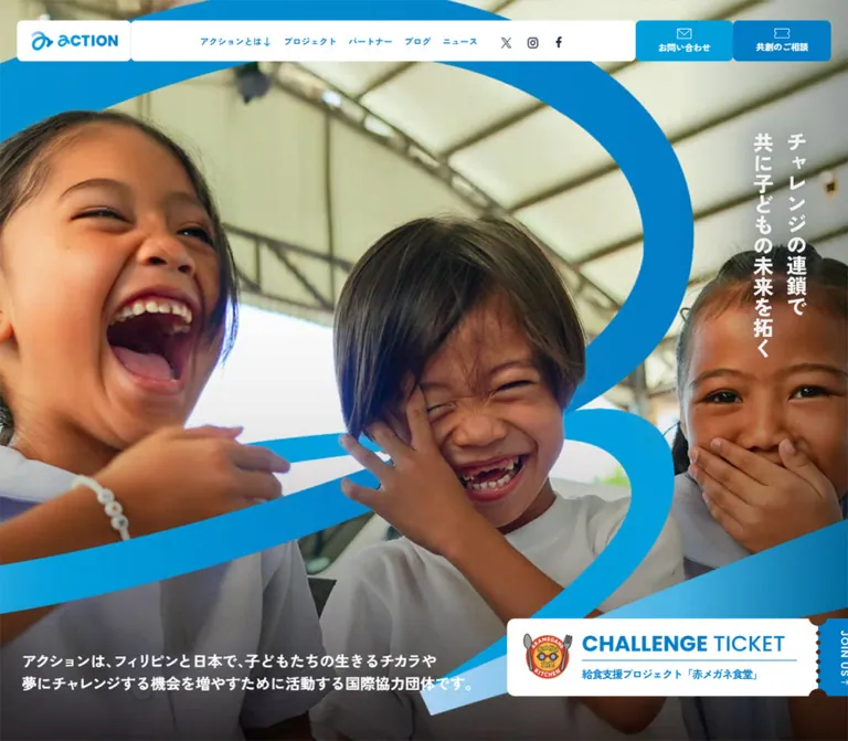
子どもたちの笑顔を大きく見せる写真と、ブルーを基調にした国際協力団体のサイト。縦書きのメッセージ、ミシン目や切り欠きを備えたチケット型の導線が、参加・協賛・共創をつなぎます。
オリジナルサイトを見るACTION — Style Reference
Candid smiles, open blue space, and invitations shaped like tickets.
Website: action.or.jp
Original URL: https://www.action.or.jp/
Final URL: https://www.action.or.jp/
Theme: light blue and white, with navy body text and a darkened photographic opening.
Inspected: September 12, 2026; supplied retrieval timestamp 2026-09-12T12:13:24.576Z, equivalent to 21:13:24.576 JST.
Viewports: desktop 1440 × 1000 and mobile 390 × 844 CSS pixels.
Scope: the current organization homepage. Visual evidence covers the desktop opening, participation cards, closing contact/donation panels, desktop footer, mobile opening, and mobile footer. Rendered text and selected computed element records extend through additional homepage sections. Linked pages and expanded navigation states were not inspected.
ACTION presents international cooperation through people and opportunities. A close photograph of laughing children fills the desktop opening, while a two-column vertical Japanese slogan occupies the right edge. The lower page shifts to a pale blue canvas with white project cards, strong blue headings, and generous spacing. Documentary photography provides warmth; the interface supplies a clear, consistent organizational structure.
The distinctive device is the ticket. Campaign banners have detachable-looking end stubs, project cards have perforated seams and side notches, and action buttons separate their label from an arrow or icon compartment. This directly connects to the homepage's description of opportunities as “チャレンジ券.” Large, faint brand curves appear behind the participation area, while a tapered blue flourish occupies the desktop footer.
This is a substantial organization website with several routes into its work: understanding the mission, exploring programs, participating, sponsoring, collaborating, reading reports, and donating. Its homepage combines narrative and navigation across a long document.
How to Read This Reference
- Measured — M: values explicitly supplied by rendered DOM rectangles, computed styles, or root custom properties. These are observations at the recorded viewport and state, not necessarily universal authoring rules.
- Visual estimate — V: dimensions, colors, or treatments estimated from the five original-page captures. These have not been independently sampled or extracted from CSS.
- Calculated — C: arithmetic based on measured values, such as the inner width of a padded section.
- Recommendation — R: an implementation choice for reuse. Proposed breakpoints, accessibility changes, and reconstructed CSS belong to this category.
- Aliases: readable token names below are new implementation aliases. Original custom-property identifiers are shown where available.
The DOM includes offscreen carousel copies, duplicate header structures, overlapping ticket text layers, and numeric fallback/animation text. Their presence does not mean that all copies were visible together. Use the captures to establish visible appearance and the element records to establish specific measurements.
Tokens — Colors
Default Palette
| Name | Value | Implementation alias / source variable | Role and evidence |
|---|---|---|---|
| Sky Canvas | #D7EEFF |
--color-sky / --s-color-78a0328c |
M: body background at both viewports; V: participation area and footer canvas |
| Action Blue | #007DC5 |
--color-blue / --s-color-61822dcc |
M: navigation text, major headings, statistics, ticket copy, and back-to-top fill |
| Action Cyan | #009EDB |
--color-cyan / --s-color-ce850b4f |
M: declared brand color; V: brighter contact treatment and logo accents |
| Navy Text | #202D49 |
--color-ink / --s-color-119d1498 |
M: narrative and explanatory text; V: footer links and social symbols |
| White Surface | #FFFFFF |
--color-white / --s-color-f4903532 |
M: logo-link surface and reversed labels; V: navigation panels, tickets, project cards, closing buttons |
| Deep Blue | #01659F |
--color-blue-deep / --s-color-1d982c66 |
M: root declaration; its specific visible component/state assignment was not established |
| Translucent White | rgba(255,255,255,.6) |
--color-soft-surface |
M: the three in-page navigation links below the mission statement |
Sky Canvas supplies continuity across a very long homepage. Action Blue marks navigation and opportunities, while navy keeps explanatory paragraphs quieter. White surfaces are mostly flat and opaque. Translucent white is used selectively for the in-page links; it is not evidence of a general glass treatment.
Visual Treatments Without Exact Source Colors
| Treatment | Evidence | Reuse guidance |
|---|---|---|
| Mobile campaign strip | V: a medium, muted light blue beneath the hero photograph | R: #9DC9E8 is a starting approximation, not a measured source token |
| Hero text scrim | V: transparent-to-dark shading, strongest along the bottom | R: tune opacity against the actual photograph; preserve natural skin color above the copy |
| Background brand shapes | V: very low-contrast blue curves behind the participation cards | R: keep contrast subordinate to headings and white card boundaries |
| Closing panel gradients | V: stronger blue/cyan near the top, lighter blue toward the bottom, with oversized brand artwork | Exact stops, angle, and compositing are unverified |
| Footer flourish | V: tapered cyan/blue curves with fading sections | Treat as approved artwork; a plain ellipse will not reproduce its changing width |
Other root declarations include warm colors such as #E76858, #D1452C, #FF4727, #EB9C8E, #FFEFEC, and #330D0D. Their roles are not established by the supplied visual states. They are not part of the core palette recommended here.
No alternate theme selector or dark-mode behavior was documented.
Tokens — Typography
Japanese Interface and Narrative
Measured family: "Zen Kaku Gothic New", also declared through source --s-font-b3890410.
The sampled navigation uses weight 700; regular paragraphs use 400; major section headings use 900. The combination produces substantial, friendly headings above restrained, generously led text. Navigation tracking is measured as normal, despite the visually open character of the lettering.
Narrative paragraphs sometimes tighten tracking slightly. The founder's message uses -0.02em, while the blue introductory statement above the statistics uses -0.04em. These are local treatments rather than a global tracking rule.
English Labels and Numbers
Measured family: Poppins, also declared through source --s-font-e9af144e.
Poppins appears in the campaign ticket heading, carousel fractions, and large statistics. Ticket heading containers measure weight 700, while the visible word “TICKET” appears lighter than “CHALLENGE.” The exact nested span weight is not included in the evidence.
Large numbers retain their 48px size on mobile. The layout changes around them instead of reducing every element proportionally.
Brand and Vertical Slogan
The ACTION wordmark is graphic artwork. Its H1 wrapper has an empty extracted text value; the wrapper's default 32px font size is not a measurement of the logo lettering.
The right-side slogan reads “チャレンジの連鎖で 共に子どもの未来を拓く.” Its vertical composition is visible, but its own computed font declaration was not supplied. The size is approximately 34px on desktop and 24px on mobile. A reusable implementation can use live Japanese text with writing-mode: vertical-rl; that is a recommendation, not a claim about the original asset format.
Type Scale
| Role | Desktop | Mobile | Weight / tracking | Evidence |
|---|---|---|---|---|
| Major section heading | 62px / 80.6px |
38px / 49.4px |
900, -0.02em |
M |
| Vertical hero slogan | Approximately 34px |
Approximately 24px |
Visually heavy; exact declaration unknown | V |
| Hero introduction | 22px / 33px |
16px / 24px |
700, normal tracking |
M |
| Founder message | 18px / 32.4px |
15px / 27px |
400, -0.02em |
M |
| General explanatory copy | 16px / 28.8px |
14px / 25.2px in sampled concept copy |
400, normal tracking |
M |
| Participation/sponsorship introduction | Approximately 16px / 29px |
16px / 28.8px |
Regular | V desktop; M mobile |
| Blue statement above statistics | 20px / 32px |
20px / 32px |
700, -0.04em |
M |
| Concept subheading | 24px / 24px |
24px / 24px |
700, normal tracking |
M |
| Participation group heading | Approximately 32px |
24px / 31.2px |
700 on mobile |
V desktop; M mobile |
| Desktop navigation | 16px / 22.4px |
Hidden in the opening mobile presentation | 700, normal tracking |
M and V |
| Representative submenu label | 14px / 22.4px |
Not inspected as an open menu | 500 |
M declaration only |
| Project card title | Approximately 20px |
20px / 20px |
700 on mobile |
V desktop; M mobile |
| Project card paragraph | Approximately 16px / 29px |
13px / 23.4px |
400 on mobile |
V desktop; M mobile |
| Project category label | Approximately 14px |
14px / 14px |
700 on mobile |
V desktop; M mobile |
| Ticket heading | 32px / 32px |
20.2222px / 20.2222px |
Poppins container 700, normal tracking |
M |
| Ticket description | 16px / 22.4px |
12.2778px / 15.9611px |
700; tracking -0.08em desktop, -0.05em mobile |
M |
| Carousel numeral | 13px / 13px |
Same | Poppins 500, 0.05em |
M |
| Carousel slash | 12px / 12px |
Same | Poppins 300, 0.05em |
M |
| Statistic number | 48px / 48px |
Same | Poppins 600, 0.02em |
M |
| Statistic unit | 16px / 32px |
Same | Japanese family 900 |
M |
| About-link label | 18px / 18px |
16px / 16px |
700 |
M |
| Mobile card button label | Not separately measured | 16px / 16px |
700 |
M |
| Mobile external-link label | Not separately measured | 14px / 15.4px |
700, -0.02em |
M |
The HTML and BODY records report a Times default, while visible text descendants explicitly use the two families above. Do not use the root fallback as the visual typography specification.
Tokens — Spacing & Shapes
Character: spacious sections, compact labels, shallow corner rounding, and repeated perforated joints.
There is no evidence of a single fluid unit controlling the whole page. The original combines fixed dimensions, viewport-specific values, constrained content widths, and fractional mobile ticket type sizes.
Spacing Scale
| Use | Value | Evidence |
|---|---|---|
| Header action icon-to-label gap | 8px in the opening desktop controls |
M |
| External link text-to-icon gap | 8px in sampled mobile links |
M |
| Opening desktop navigation gaps | Approximately 17.92px between sampled anchors |
C from measured rectangles |
| Compact desktop navigation gaps | Approximately 20.14px between sampled anchors |
C |
| Mobile hero/header horizontal inset | Header 15px; hero copy starts at 14px |
M |
| Standard mobile section padding | 20px horizontally |
M |
| Desktop card image inset | Approximately 20px |
V |
| Mobile card text/button inset | 15px inside a 350px card |
C from measured 320px inner rectangles |
| Desktop project card gutter | Approximately 30px |
V |
| Mobile sponsorship card gap | 40px between consecutive measured card rectangles |
C |
| Section internal gap | Sampled desktop 80px; mobile 40px |
M |
| Section top padding | 100px in sampled sections at both viewports |
M |
| MAIN gap declaration | Desktop 160px; mobile 120px |
M; nested spacing and positioning also affect visible separation |
Keep these levels distinct. A 20px card inset should not become the margin between major narrative sections, and the measured MAIN gap should not be applied indiscriminately between every nested block.
Border Radius and Rules
| Element | Geometry | Evidence |
|---|---|---|
| Opening desktop logo panel | 8px radius |
M |
| Compact desktop logo panel | 0 0 8px 8px |
M |
| Opening mobile menu | 8px radius |
M |
| Compact mobile menu | 0 0 0 8px |
M |
| Representative submenu panel | 4px radius |
M; open behavior unverified |
| Back-to-top square | 3px radius |
M |
| Project cards and photographs | Approximately 8px radius |
V |
| Campaign ticket | Approximately 10px outer radius |
V |
| Category badge | Capsule, approximately 30px high on desktop |
V |
| Numbered participation seal | Two fine concentric circular outlines | V |
| Card perforation | Approximately 3px dotted horizontal rule, with approximately 10px side-notch radius |
V |
| Split action button | Separate rounded label and icon compartments, joined by a fine dotted seam | V |
| Footer divider | Fine, low-contrast horizontal line | V |
The ticket's holes are structural cues. Large end notches and small perforations should align to the same seam. Ordinary paragraph separators remain simple, fine rules.
Layout Measurements
| Element | Desktop 1440 × 1000 |
Mobile 390 × 844 |
Evidence |
|---|---|---|---|
| Document height | 13545.95px |
18089.34px |
M |
| MAIN start | y = 1000px |
y = 776.47px |
M |
| Opening header | Visible run approximately 1370 × 80px, at (35,30) |
Visible run approximately 360 × 52px, at (15,20) |
V overall; M component positions |
| Opening logo link | 232.89 × 80px |
160 × 52px |
M |
| Opening logo artwork wrapper | 172.89 × 36.88px |
120 × 25.59px |
M |
| Opening header action | Two controls, each 180 × 80px |
Menu 84 × 52px |
M |
| Compact header | 1440 × 62px |
390 × 60px |
M |
| Compact mobile menu | — | 74 × 60px, at x = 316px |
M |
| Main content wrapper | 1280px wide with 100px inner horizontal padding |
Sections span 390px, generally with 20px horizontal padding |
M |
| Main inner width | 1080px, beginning at x = 180px |
Common inner width 350px |
C / M |
| Founder text column | 530px wide at x = 730px |
Sampled paragraphs 360px wide at x = 20px |
M; some children differ from the general inner width |
| Desktop participation grid | Three approximately 340px cards with 30px gutters |
One column of measured 350px cards |
V desktop; M mobile |
| Participation image | Approximately 300 × 200px |
Image rectangle not supplied | V desktop |
| Active desktop campaign link | 528 × 112.83px, at (882,820) |
Slide wrapper 390 × 120px, beginning near y = 614.47px |
M |
| Visible mobile ticket | — | Approximately 360 × 97px, at (15,629) |
V; distinct from its slide wrapper |
| Hero carousel arrow button | 35 × 19.64px |
Same | M |
| About action | 404 × 64px |
350 × 64px |
M |
| Mobile project action | — | 320 × 54px |
M |
| Back-to-top link box | 22 × 22px |
Same | M |
| Closing panel pair | Approximately 630px each, 40px gutter, 70px outer margins |
Panel geometry not visually documented | V desktop |
Components
Opening Header
Role: establish identity and offer the site's main destinations immediately.
The opening desktop header floats over the photograph, inset 35px from each side and 30px from the top. Its adjoining panels form a nearly continuous strip: a white logo compartment, a wider white navigation compartment, a cyan contact compartment, and a blue collaboration compartment.
The logo panel has 20px 30px measured padding. Navigation combines five visible text destinations, an arrow beside “アクションとは,” and X, Instagram, and Facebook symbols. The two right-hand actions place a small outline icon above their Japanese label. Both measure 180 × 80px.
There is no visible soft shadow. White surfaces and colored end compartments create separation from the photograph. The faint dotted boundary after the logo echoes the ticket construction used elsewhere.
Compact Header
Role: maintain access to navigation while reading the long homepage.
The supplied scrolled desktop captures show a full-width header against the top edge, 62px high. Contact and collaboration controls become shorter, with their icons beside their labels. Their measured widths are 164px and 167px respectively.
The source evidence contains both opening and compact header structures. The transition threshold and mechanism are unknown; the captures establish two presentations rather than a particular morphing animation.
On mobile, the opening header has a visible white area approximately 276px wide and an 84px menu block. The measured logo link itself is only 160px wide; adjacent white structure completes the visible surface. In the compact footer capture, the white area reaches x = 316px, followed by the 74px menu. The visible blue logo remains small and left aligned.
The three-line menu is a recorded button. No expanded mobile menu was supplied. Its panel geometry, focus behavior, and opening animation are unverified.
Photographic Hero
Role: introduce the people behind the mission and communicate the organization's purpose.
The desktop opening is a full-viewport photograph of three laughing children beneath a covered structure. Faces are large and close to the viewer. The vertical slogan sits at the upper right, separate from the horizontal introduction near the lower left.
The measured introduction begins at (32,865), occupies approximately 673 × 66px, and uses bold white 22px / 33px text. Dark shading at the bottom supports readability while the upper photograph retains its natural color.
At 390px wide, the photograph crops toward the middle and right children. It ends around y = 614px. The introduction remains on the photograph at 16px / 24px, with its measured text block starting near y = 522px. The slogan remains vertical at the right rather than converting to a centered horizontal headline.
Reuse: choose an image with a viable portrait crop and preserve faces as focal points. Use separate positioning for slogan, introduction, and campaign ticket. The source image's native dimensions and exact object-position values were not provided.
Challenge Ticket Banner
Role: promote a current opportunity without replacing the homepage's broader navigation.
The active desktop ticket sits at the lower right over the photograph. Its measured link is 528 × 112.83px. The visible anatomy is a white main body and a blue right stub approximately 70px wide. Large circular notches cut into the top and bottom of their shared boundary, and a vertical row of small perforations reinforces the separation.
Inside the white body, stack the Poppins “CHALLENGE TICKET” heading, a thin blue rule, and compact Japanese opportunity copy. The right stub carries the sideways English invitation “JOIN US ↑.” The mobile tour ticket visibly includes an ACTION mark at the left. That leading area is visually empty in the supplied desktop tour state; its cause is not established.
Two distinct campaign destinations are recorded: the school-meal project and the overseas volunteer/study tour. Repeated DOM copies belong to their horizontal track and should not be counted as separate campaigns.
On mobile, the ticket moves into a muted blue strip below the photograph. Its visible white/blue shape is approximately 360px wide with 15px outer margins. Heading size falls to 20.2222px, and Japanese detail copy to 12.2778px. The measured slide wrapper remains wider and taller than the ticket artwork.
Carousel Controls
Role: navigate the campaign ticket and the separate project overview carousel.
The hero control row places a left outlined arrow, a compact fraction such as 02/02, and a right outlined arrow toward the lower right. Numerals use Poppins 13px, weight 500, with 0.05em tracking. Both arrow button rectangles measure only 35 × 19.64px.
The project overview has a separate pair of buttons measuring 38 × 24.56px. Its repeated offscreen content has a different horizontal spacing from the campaign track.
The evidence establishes a carousel interface and its destinations. It does not establish autoplay intervals, swipe support, wrapping behavior, pause behavior, or the result of clicking either arrow.
Founder Message
Role: give the organization a personal narrative before presenting its programs.
The sampled desktop section uses a 1280px outer wrapper, 100px horizontal padding, and an 80px internal gap. Its paragraphs occupy a 530px column on the right, with the representative's signature aligned toward that column's right edge. An About link follows at 404 × 64px.
On mobile, the message uses 15px / 27px paragraphs and a full-width 350 × 64px About action. Paragraph gaps measured from adjacent blocks are approximately 14px, compared with 16px in the desktop text column.
The section is not fully shown in the supplied captures. The recorded empty heading wrapper and the space above the mobile paragraphs are insufficient to specify its full artwork arrangement.
Mission Heading and In-Page Navigation
Role: explain the central idea and provide shortcuts through the homepage.
The mission statement uses blue Japanese text at 62px, weight 900, line-height 1.3, and tracking -0.02em. At the measured desktop width, its 1000px text box is two lines high. At mobile, it becomes 38px / 49.4px and occupies four lines.
Below it are three translucent white links: “チャレンジ券について,” “私たちのプロジェクト,” and “チャレンジパートナー.” Desktop rectangles are approximately 346.67 × 64.39px, with 20px gaps. Mobile rectangles are 350 × 64px and stack with 20px gaps.
The following concept subheading uses two 24px text fragments. They appear on the same horizontal line in the desktop measurements and on separate rows on mobile. This is a content-aware line arrangement rather than uniform scaling.
Project Overview and Statistics
Role: connect areas of work with evidence of sustained activity.
Rendered content identifies three program themes: safe societies, healthy environments, and learning/experience opportunities. The overview has repeated horizontal items and its own arrow controls. Sampled text columns measure 320px on desktop and 235px on mobile. Mobile overview copy is compact at 13px / 23.4px.
The statistics use a label, a large blue number, and a smaller Japanese unit. Recorded values include 4,000, 5,500, 156 with a ten-thousand-meals unit, and 960 municipalities. These are the site's reported figures, not independently validated totals.
Desktop measurements place the first two metrics side by side. Mobile measurements place all four in a vertical sequence, while their numbers remain 48px / 48px. Some extracted strings include both final and fallback values. They do not establish that visitors see doubled numbers, nor do they prove a particular counting animation.
Participation Group Introduction
Role: explain a way to support the organization before presenting specific projects.
The visually documented group is “プロジェクトへの参加.” A circular seal approximately 200px in diameter sits left of its heading and introduction. The seal has two thin outlines, a small two-line English caption, the large number 02, a horizontal divider, and a two-line Japanese caption below.
To the right, the blue heading is paired with the pale audience badge “法人・個人.” Two lines of navy explanatory copy follow. In the desktop capture, the seal begins around x = 180px; the text begins around x = 410px, giving approximately 30px of separation after the seal.
The wider content structure distinguishes sponsorship, participation, and project co-creation. Audience labels distinguish individuals/organizations from corporate-only collaboration. Preserve this information hierarchy in reuse.
On mobile, the participation heading is measured at 24px / 31.2px; its audience badge appears on the following row. The introduction remains 16px / 28.8px. The mobile geometry of the circular artwork itself is not sufficiently documented to prescribe an exact arrangement.
Project Ticket Card
Role: present a concrete program and its next action.
The desktop participation capture shows three approximately 340px white cards inside a 1080px content area. Each card has the following anatomy:
- A landscape documentary photograph, approximately
300 × 200px, inset20pxfrom the top and sides, with shallow rounded corners. - A dotted horizontal seam below the photograph, with semicircular cutouts at the card's left and right edges.
- A centered pale blue category capsule.
- A blue project title, centered as a block; the tour title uses two short lines.
- A fine pale blue separator below the title.
- A left-aligned navy description with generous line-height.
- A blue split action at the bottom, with a wide text compartment and a narrower arrow compartment.
The photographs show a volunteer holding a child, a person reading training material, and an outdoor conversation around a table. They are specific views of participation and learning.
The cards share their image and seam alignment. Title and paragraph starts vary with title length, while the visible button tops align near the bottom of the capture. Use flexible space above the action to preserve this relationship.
Mobile DOM measurements establish a single column of 350px cards, with 320px text and action widths. The tour card measures 560.5px high; the sampled life-skills card measures 540.5px. These are content-dependent heights. Mobile card titles remain 20px, while paragraphs reduce to 13px / 23.4px.
Split Action and External-Link Variant
Role: turn the ticket metaphor into a repeatable navigation affordance.
The standard filled action visually consists of adjoining rounded compartments. A narrow dotted seam separates the centered label from an arrow or outline icon. Desktop card actions appear approximately 300px wide, with an 84px icon compartment. Larger About and closing-panel actions measure or visually approximate 404 × 64px.
The mobile project action is measured at 320 × 54px, with 16px bold white text. The mobile About action stays 64px high and uses a different label alignment. Do not assume that every action shares identical internal geometry.
External program links use a lighter treatment: blue text reading “詳しくみる (外部サイトへ)” plus an external-link symbol. The sampled mobile link has an 8px text/icon gap and a 14px label. Preserve the visible external-site cue.
Co-Creation, Partners, Blog, and News
Role: extend the homepage beyond program selection into collaboration, institutional relationships, and current reporting.
The rendered text contains a corporate co-creation introduction, repeated case-study entries, partner groupings, dated blog items with category labels, and a separate news list. These establish the site's information architecture. Their complete visual layouts are not supplied, so exact grids, image proportions, and hover treatments should not be inferred.
The case studies name program collaborators; these names are content relationships, not website production credits.
The desktop text extraction places the blog/news index links before their items, while the mobile extraction places them after the respective lists. This is evidence of different rendered ordering, without establishing the precise visual position of every element.
Closing Contact and Donation Panels
Role: offer two clear next steps after the content.
The desktop closing area has two large panels, approximately 630px wide, separated by 40px. Their visible lower corners are rounded. Each combines a blue gradient field, oversized low-contrast brand artwork, centered white copy, and a white split action.
The left panel offers “お問い合わせ”; the right offers “寄付で応援.” The white button's label uses the corresponding blue/cyan, with an outline envelope or ticket symbol in the end compartment. The available screenshot crops the top of these panels, so their full height and exact heading size are not measured.
Mobile rendered text uses a different contact paragraph from desktop. A reusable design should support purposeful short copy by viewport without duplicating accessible content unnecessarily.
Footer and Back-to-Top Controls
Role: repeat the organization's identity and complete the site's navigation.
The desktop footer remains on Sky Canvas. A large blue logo anchors the left, followed by the operator name “特定非営利活動法人アクション” and its address. A sweeping tapered blue flourish fills the right side. Below, a horizontal primary navigation row shares space with the three social icons, followed by a fine divider, legal links, copyright, and a right-aligned “BACK TO TOP” link.
The mobile footer stacks the primary links vertically, with approximately 50–54px between row starts. Social symbols form a short row beneath them. A divider separates the primary links from vertically stacked legal links. The desktop flourish is not visible in the supplied mobile footer region.
Both a small standalone arrow square and the footer's text-plus-arrow return link appear in the mobile closing capture. Their destination is #wrapper. The measured square is 22 × 22px; its scroll animation was not tested.
Recorded Link Destinations
These are href observations from the homepage, not inspections of the destination pages.
| Control | Recorded destination | Note |
|---|---|---|
| Contact | https://www.action.or.jp/contact |
Header and closing contact panel |
| Header collaboration | https://www.action.or.jp/co-donation |
Desktop header |
| In-content collaboration | Desktop: https://www.action.or.jp/co-donation; mobile: https://actionman.jp/info.html |
Observed viewport-dependent difference; reconcile intentionally in a new implementation |
| Study tour | https://www.action.or.jp/projects/tour |
Campaign ticket and project card |
| Life-skills training | https://www.action.or.jp/projects/lifeskil |
Preserve the recorded spelling when referencing the original route |
| Donation | https://actionman.jp/support.html |
Closing panel and footer |
| Return to top | https://www.action.or.jp/#wrapper |
Anchor target; scroll behavior unverified |
Tokens — Motion & Interaction
Measured Declarations
| Element group | Recorded transition | What it establishes |
|---|---|---|
| Header, links, and many text elements | 0.3s cubic-bezier(0.4, 0.4, 0, 1) |
A common transition duration and easing; specific triggers and changed properties are not fully documented |
| Hero and project carousel buttons | 0.4s cubic-bezier(0.4, 0.4, 0, 1) |
Button transition declaration, not a measured slide duration |
| BODY background | background 0.5s cubic-bezier(0.4, 0.4, 0, 1) |
Background changes are configured to transition; a theme or color-change trigger was not established |
| Several desktop sections | 1s cubic-bezier(0.4, 0.4, 0, 1) |
Longer section transition declaration |
| Corresponding sampled mobile sections | 0.3s cubic-bezier(0.4, 0.4, 0, 1) |
Viewport-specific declaration change |
| Sampled element animations | none |
No active CSS animation on those sampled elements at extraction time |
Many transition strings also enumerate gradient-related custom properties. Those registrations do not establish that each element visibly animates a gradient.
Observed States and Limits
- The header appears inset over the opening and flush to the viewport top in scrolled captures. The exact switching threshold and transition sequence are unknown.
- The campaign shows a two-item fraction and repeated horizontal track content. The evidence does not distinguish automatic progression from another cause of the recorded active state.
- The project overview has its own track and controls. Dragging, keyboard navigation, and looping were not exercised.
- The representative submenu exists in the DOM with a blue surface and white text. Its visible opening state and trigger are unverified.
- Statistics have final and fallback/duplicate values in extracted text. Counter timing and triggering are unverified.
- The brand curves are visible decoration in lower-page captures. Their movement, if any, is unverified.
Recommended motion direction: use the measured easing for restrained color or opacity feedback. Keep content visible without animation. Any reveal, menu movement, or carousel timing added to a new implementation must be treated as a new design decision.
Surfaces
| Layer | Appearance | Structural purpose |
|---|---|---|
| Opening image | Natural-color photograph with dark lower shading | Emotional introduction and readable white copy |
| Opening navigation | White panels with blue/cyan end compartments | Identity and navigation over photography |
| Main canvas | Solid #D7EEFF with occasional faint brand shapes |
Continuity across the long document |
| In-page navigation | White at 60% opacity |
Gentle grouping below the mission statement |
| Program cards | Opaque white, shallow rounding, perforations | Clearly bounded opportunities |
| Category badge | Pale blue capsule with navy text | Quiet content classification |
| Filled action | Blue fill with white text and a separated icon compartment | Strong next-step affordance |
| Closing panels | Blue/cyan gradients and oversized brand artwork | Contact and donation emphasis |
| Footer | Same pale blue canvas, navy links, blue identity artwork | Calm navigation and organizational details |
No general elevation or card-shadow system is visible in the supplied captures. Separation comes from color, whitespace, image edges, and ticket seams.
Imagery
The photographic language is candid and close. The opening prioritizes facial expression, with the roof structure and daylight providing environmental context. Program photographs describe actual kinds of involvement: time with children, reading course materials, and talking with local participants.
Use natural color and ordinary environments. Preserve enough context for a photograph to communicate an activity. Card images share a consistent landscape crop, while the hero requires a separately considered mobile focal position.
Brand artwork supplies a second visual scale: small logos inside navigation, a large circular numbered seal beside a group heading, faint oversized curves behind cards, and the expansive footer flourish. Keep these roles separate so decoration does not crowd faces or body copy.
Icons are visually simple: thin envelope, ticket, directional-arrow, and external-link forms, alongside recognizable social symbols. No specific icon library was established.
Observed Asset References
| Asset role | Confirmed appearance or evidence | Asset-path status |
|---|---|---|
| Hero photograph | Three laughing children under a covered structure; portrait crop favors the middle/right subjects | Complete asset URL not supplied |
| ACTION wordmark | Blue symbol and wordmark in opening/compact headers and desktop footer | Complete asset URL not supplied |
| Mobile campaign mark | ACTION mark in the tour ticket's leading area | Complete asset URL not supplied |
| Participation photographs | Volunteer and child; training booklet; outdoor discussion | Complete asset URLs not supplied |
| Numbered seal | Double-ring circular artwork with 02 |
Complete asset URL not supplied |
| Brand background artwork | Faint curves in participation area and tapered footer flourish | Complete asset URLs not supplied |
| Some image and decorative resources | Rendered pseudo-element text references a cloud asset host | Supplied strings are truncated and cannot serve as usable file references |
No filenames or downloadable asset URLs are reconstructed here. The Quick Start uses explicit replacement placeholders. Approved image and logo files must be supplied separately.
Layout & Responsive Behavior
Desktop Structure
The opening consumes the first 1000px of the desktop document. The campaign ticket overlays its lower right, while the introduction remains at the lower left. The main content then uses repeated constrained regions: a measured 1280px wrapper with 100px internal padding produces a 1080px working width.
The participation grid makes that width concrete: three approximately 340px cards plus two 30px gutters. The closing action panels widen to approximately 1300px overall, and the footer uses approximately 40px side insets. These different widths create variation without losing alignment discipline.
Mobile Structure
The opening is reorganized. At 390 × 844, the photograph ends near 614px, followed by the campaign strip and controls. MAIN begins at approximately 776.47px, allowing a small portion of the following pale blue area to enter the first capture.
Primary navigation is represented by the logo and menu button. Major section headings reduce from 62px to 38px, and narrative copy reduces locally. Statistics remain 48px. The three in-page navigation links stack into full-width rows, project cards stack into a single column, and the footer becomes a long vertical navigation block.
The general section inset is 20px, producing 350px of inner width. Some measured children reach 360px or 360.5px, and the hero copy has asymmetric measured margins. These local exceptions should not be extrapolated into a universal container formula.
Breakpoints and Reuse
The supplied stylesheet excerpt explicitly references max-width: 1280px for responsive line-break rules. It does not establish the menu-collapse or card-grid breakpoint.
Recommended implementation: choose a navigation breakpoint based on the width required by the actual labels and controls. The Quick Start uses 1100px for a compact navigation arrangement, 1000px for an intermediate card grid, and 700px for the small-screen content layout. These are proposed values, not recovered source breakpoints.
Preserve ordinary document scrolling. The page is approximately 13.5kpx tall on desktop and 18.1kpx on mobile; a fixed application shell with internal scrolling would not represent the documented structure.
Do’s and Don’ts
Do
- Anchor the interface in
#D7EEFF,#007DC5, white, and navy. - Give the opening photograph enough space for expressions and environmental context.
- Preserve the vertical Japanese slogan and the separate horizontal introduction.
- Use Zen Kaku Gothic New for Japanese interface text and Poppins for measured English/numeric roles.
- Keep major headings heavy, with
1.3line-height and slightly tight tracking. - Repeat the ticket idea through aligned notches, perforations, and separated action compartments.
- Keep project photography at a consistent landscape proportion.
- Center category/title groups while left-aligning explanatory card copy.
- Preserve meaningful distinctions between participation, sponsorship, collaboration, and donation.
- Move the campaign ticket beneath the photograph on small screens.
- Let mobile cards grow with content and retain prominent statistics.
- Keep footer navigation comprehensive and visually calm.
Don’t
- Do not flatten the homepage into a single campaign with one conversion route.
- Do not put every paragraph or heading inside a ticket shape.
- Do not use the declared warm colors as a new general accent system without further evidence.
- Do not replace the candid photographs with unrelated generic business imagery.
- Do not force the desktop image crop onto mobile.
- Do not apply broad letter-spacing to all Japanese text; several measured roles use normal or negative tracking.
- Do not convert every button into a pill or add soft shadows to every card.
- Do not assume the mobile footer capture is an expanded hamburger menu.
- Do not treat repeated carousel nodes as additional visible content.
- Do not infer autoplay, parallax, counting effects, or hover transformations from transition declarations alone.
- Do not copy numeric fallback duplicates into visible statistics.
- Do not invent full asset URLs from truncated resource strings.
Recommended Implementation Additions
These are recommendations for a new implementation, not verified capabilities of the original page:
- Increase carousel and back-to-top hit areas to at least
44 × 44px, retaining the smaller visible arrow artwork if desired. - Give icon-only controls clear accessible names. Implement the menu button with
aria-expandedand an associated navigation region. - Keep one authoritative accessible navigation structure, even if separate visual header presentations are needed.
- Make the vertical slogan selectable text where feasible, with coherent reading order and appropriate Japanese language metadata.
- Exclude inactive carousel duplicates and decorative numeric layers from keyboard navigation and assistive output.
- If a carousel advances automatically, provide pause controls and stop advancement while users interact with it.
- Check small text on both brand blues, especially white text on cyan. Use the available deeper blue where a stronger text contrast is needed.
- Preserve content and navigation with reduced motion, failed images, or delayed font loading.
- Keep sponsorship/participation labels and complete project descriptions available at text zoom; avoid fixed card heights on mobile.
- Resolve the recorded desktop/mobile collaboration-link difference deliberately rather than reproducing it accidentally.
- Use authentic, approved photography and describe meaningful activities in image alternatives; mark purely decorative curves and perforations as decorative.
Agent Prompt Guide
Quick Color Reference
- Main canvas:
#D7EEFF. - Headings, navigation, project actions:
#007DC5. - Brighter contact accent:
#009EDB. - Body and footer text:
#202D49. - Navigation, tickets, cards, and reversed buttons:
#FFFFFF. - Optional stronger-contrast action treatment: source-declared
#01659F. - Background artwork: restrained blue/cyan tones at low visual contrast.
- Mobile campaign strip: muted light blue;
#9DC9E8is an approximation only.
Overall Prompt
“Create a Japanese international-cooperation organization homepage using pale blue #D7EEFF, Action Blue #007DC5, cyan #009EDB, navy #202D49, and white. Lead with an approved documentary photograph of children in a real activity setting. Place a heavy vertical Japanese mission slogan at the right and a short bold white introduction over a dark lower scrim. Float a segmented white navigation bar above the photograph, ending in cyan contact and blue collaboration compartments. Use Zen Kaku Gothic New for Japanese copy and Poppins for campaign labels and statistics. Build a long homepage with mission narrative, program overview, participation and sponsorship opportunities, collaboration, reports, news, and a complete footer. Make the invitation motif a ticket: punched seams, small circular notches, and buttons with separate arrow compartments. On mobile, crop the image intentionally, use logo-plus-menu navigation, move the campaign ticket below the photograph, and stack the cards.”
Example Component Prompts
- Campaign ticket: “Design a white campaign ticket approximately 528px wide with a blue 70px right stub, top/bottom circular notches on the stub boundary, and small perforations along the same seam. Use a blue Poppins ‘CHALLENGE TICKET’ heading, a thin rule, and compact Japanese opportunity copy. Set ‘JOIN US ↑’ sideways in the stub. On mobile, fit the ticket within 15px side margins in its own light-blue strip.”
- Project card: “Create a flat white project card approximately 340px wide, with 20px image insets and a 3:2 documentary photograph. Add a pale-blue dotted seam and side notches below the image. Center a pale category capsule and blue 20px title; place navy descriptive copy below a fine rule. Anchor a blue split label/arrow action to the bottom. Stack cards at 350px working width on a 390px screen.”
- Participation introduction: “Pair a 200px double-outline circular ‘02’ seal with a blue participation heading, a pale audience badge reading ‘法人・個人,’ and two lines of navy explanatory copy. Keep the surrounding pale-blue canvas spacious and use faint oversized brand curves behind the content.”
- Header states: “Provide an inset 80px desktop opening header and a compact 62px header at the top edge for scrolled content. Keep white identity/navigation areas, a cyan contact compartment, and a blue collaboration compartment. On mobile, use a small blue logo on white and a separate blue three-line menu block. Treat the opening threshold and menu animation as implementation decisions.”
- Footer: “Use the same pale-blue canvas with a large blue logo, organization details, a horizontal primary navigation row, social icons, a fine divider, and legal links. Add approved tapered blue brand artwork at the right on desktop. Stack the navigation and legal links on mobile, maintaining generous row spacing.”
Evidence-Aware Extension Prompt
“Use the measured palette, font roles, ticket construction, and documented desktop/mobile arrangements in this reference. Mark any new breakpoint, animation, menu panel, or unsupplied section layout as a recommendation. Supply project photography and brand artwork through explicit asset inputs. Do not infer interaction results from static captures or duplicate DOM nodes.”
Quick Start
CSS Custom Properties
This is a reusable adaptation, not the original stylesheet. It uses a conventional 16px root. Exact palette and measured type roles are retained; intermediate layouts, hero sizing outside the captured viewports, focus treatments, and breakpoints are recommendations. Load approved font files separately.
:root {
  /* Measured source palette */
  --color-sky: #d7eeff;
  --color-blue: #007dc5;
  --color-cyan: #009edb;
  --color-ink: #202d49;
  --color-white: #ffffff;
  --color-blue-deep: #01659f;
  --color-soft-surface: rgb(255 255 255 / 60%);

  /* Visual approximation and recommended rule color */
  --color-ticket-strip: #9dc9e8;
  --color-rule: rgb(32 45 73 / 20%);

  /* Source families; fallback is an implementation addition */
  --font-ja: 'Zen Kaku Gothic New', sans-serif;
  --font-latin: 'Poppins', sans-serif;
  --text-section: 62px;
  --text-body: 16px;
  --text-story: 18px;
  --text-hero-copy: 22px;
  --leading-body: 1.8;
  --leading-heading: 1.3;

  /* Measured or visually reconstructed geometry */
  --content-width: 1080px;
  --wide-width: 1300px;
  --space-section: 160px;
  --space-group: 80px;
  --radius-panel: 8px;
  --radius-ticket: 10px;
  --header-height: 80px;

  /* Measured timing vocabulary; triggers are implemented separately */
  --ease-action: cubic-bezier(0.4, 0.4, 0, 1);
  --motion-ui: 300ms;
}

* { box-sizing: border-box; }

body {
  margin: 0;
  color: var(--color-ink);
  background: var(--color-sky);
  font-family: var(--font-ja);
  font-size: var(--text-body);
  line-height: var(--leading-body);
}

button, input, textarea, select { font: inherit; }
img { display: block; max-width: 100%; }
a { color: inherit; }
button { cursor: pointer; }

.content-shell {
  width: min(var(--content-width), calc(100% - 40px));
  margin-inline: auto;
}

.wide-shell {
  width: min(var(--wide-width), calc(100% - 40px));
  margin-inline: auto;
}

.content-flow {
  display: flex;
  flex-direction: column;
  gap: var(--space-section);
}

.section-title {
  margin: 0;
  color: var(--color-blue);
  font-size: var(--text-section);
  font-weight: 900;
  line-height: var(--leading-heading);
  letter-spacing: -0.02em;
}

.story-copy {
  font-size: var(--text-story);
  line-height: 1.8;
  letter-spacing: -0.02em;
}

/* Suggested header structure: brand, nav, two actions, menu button */
.site-header {
  position: absolute;
  z-index: 20;
  inset: 30px 35px auto;
  display: grid;
  grid-template-columns: 233px minmax(0, 1fr) 180px 180px;
  min-height: var(--header-height);
}

.header-brand,
.header-nav,
.header-action,
.header-menu {
  min-height: var(--header-height);
  border-radius: var(--radius-panel);
}

.header-brand {
  display: flex;
  align-items: center;
  padding-inline: 30px;
  background: var(--color-white);
}

.header-brand img { width: 173px; height: auto; }

.header-nav {
  display: flex;
  align-items: center;
  justify-content: center;
  gap: 18px;
  padding-inline: 16px;
  background: var(--color-white);
}

.header-nav a {
  color: var(--color-blue);
  font-size: 16px;
  font-weight: 700;
  line-height: 1.4;
  text-decoration: none;
  white-space: nowrap;
}

.header-socials { display: flex; gap: 18px; }
.header-socials a { color: var(--color-ink); }

.header-action {
  display: flex;
  flex-direction: column;
  align-items: center;
  justify-content: center;
  gap: 8px;
  padding: 12px;
  color: var(--color-white);
  background: var(--color-blue);
  font-size: 16px;
  font-weight: 700;
  line-height: 1.4;
  text-decoration: none;
}

.header-action--contact { background: var(--color-cyan); }
.header-menu { display: none; }

/* Set this state separately; the original threshold is unknown. */
.site-header[data-compact='true'] {
  position: fixed;
  inset: 0 0 auto;
  --header-height: 62px;
  grid-template-columns: 245px minmax(0, 1fr) 164px 167px;
}

.site-header[data-compact='true'] > * {
  border-radius: 0 0 8px 8px;
}

.site-header[data-compact='true'] .header-action {
  flex-direction: row;
}

/* Hero: photo and copy inside .hero-visual; promotion is its sibling. */
.hero { position: relative; }

.hero-visual {
  position: relative;
  isolation: isolate;
  min-height: 100svh;
  color: var(--color-white);
  background: var(--color-ink);
}

.hero-photo {
  position: absolute;
  z-index: -2;
  inset: 0;
  width: 100%;
  height: 100%;
  object-fit: cover;
  object-position: var(--hero-focal-point, 50% 50%);
}

.hero-visual::after {
  content: '';
  position: absolute;
  z-index: -1;
  inset: 0;
  pointer-events: none;
  /* Recommended approximation; tune against the approved image. */
  background: linear-gradient(
    to bottom,
    transparent 38%,
    rgb(0 0 0 / 10%) 58%,
    rgb(0 0 0 / 78%) 100%
  );
}

.hero-slogan {
  position: absolute;
  top: 198px;
  right: 60px;
  margin: 0;
  writing-mode: vertical-rl;
  text-orientation: upright;
  font-size: 34px;
  font-weight: 900;
  line-height: 1.65;
}

.hero-copy {
  position: absolute;
  left: 32px;
  bottom: 69px;
  width: min(673px, 48%);
  margin: 0;
  font-size: var(--text-hero-copy);
  font-weight: 700;
  line-height: 1.5;
}

.hero-promotion {
  position: absolute;
  right: 30px;
  bottom: 12px;
  width: 528px;
}

/* Keep the focusable link outside the masked ticket artwork. */
.ticket-link {
  display: block;
  color: var(--color-blue);
  border-radius: var(--radius-ticket);
  text-decoration: none;
}

.challenge-ticket {
  --stub: 70px;
  --notch: 14px;
  --seam: calc(100% - var(--stub));
  display: grid;
  grid-template-columns: 110px minmax(0, 1fr) var(--stub);
  min-height: 114px;
  border-radius: var(--radius-ticket);
  background: linear-gradient(
    90deg,
    var(--color-white) 0 var(--seam),
    var(--color-blue) var(--seam) 100%
  );
  /* Transparent holes preserve the actual background beneath. */
  mask-image:
    radial-gradient(circle at var(--seam) 0,
      transparent var(--notch), #000 calc(var(--notch) + .5px)),
    radial-gradient(circle at var(--seam) 100%,
      transparent var(--notch), #000 calc(var(--notch) + .5px)),
    radial-gradient(circle at var(--seam) 50%,
      transparent 3px, #000 3.5px);
  mask-size: 100% 100%, 100% 100%, 100% 14px;
  mask-repeat: no-repeat, no-repeat, repeat-y;
  mask-composite: intersect, intersect;
}

.ticket-mark { display: grid; place-items: center; padding: 12px; }
.ticket-mark img { width: 60px; height: auto; }
.ticket-body { align-self: center; min-width: 0; padding: 10px 20px 10px 0; }

.ticket-title {
  margin: 0;
  padding-bottom: 8px;
  border-bottom: 1px solid currentColor;
  font-family: var(--font-latin);
  font-size: 32px;
  font-weight: 700;
  line-height: 1;
}

/* Recommended approximation of the visibly lighter second word. */
.ticket-title span { font-weight: 400; }

.ticket-description {
  margin: 8px 0 0;
  font-size: 16px;
  font-weight: 700;
  line-height: 1.4;
  letter-spacing: -0.08em;
}

.ticket-stub {
  display: flex;
  align-items: center;
  justify-content: center;
  padding: 14px;
  color: var(--color-white);
  writing-mode: vertical-rl;
  font-family: var(--font-latin);
  font-size: 14px;
  font-weight: 600;
  line-height: 1;
}

.carousel-controls {
  display: flex;
  align-items: center;
  justify-content: flex-end;
  gap: 8px;
  min-height: 44px;
  margin-top: 10px;
  color: var(--color-white);
  font: 500 13px/1 var(--font-latin);
  letter-spacing: .05em;
}

.carousel-controls button {
  display: grid;
  place-items: center;
  width: 44px;
  height: 44px;
  padding: 0;
  border: 0;
  color: inherit;
  background: transparent;
}

.carousel-controls .arrow-art {
  display: grid;
  place-items: center;
  width: 35px;
  height: 20px;
  border: 1px solid currentColor;
  border-radius: 3px;
}

/* Opportunity sections */
.join-intro {
  display: grid;
  grid-template-columns: 200px minmax(0, 1fr);
  align-items: center;
  gap: 30px;
  margin-bottom: 48px;
}

.join-seal { width: 200px; height: auto; }

.join-heading-row {
  display: flex;
  flex-wrap: wrap;
  align-items: center;
  gap: 20px;
}

.join-heading-row h3 {
  margin: 0;
  color: var(--color-blue);
  font-size: 32px;
  line-height: 1.3;
}

.audience-badge {
  padding: 8px 15px;
  color: var(--color-blue);
  background: var(--color-soft-surface);
  border-radius: 8px;
  font-size: 16px;
  font-weight: 700;
  line-height: 1.5;
}

.join-intro p { margin: 24px 0 0; font-size: 16px; line-height: 1.8; }

.project-grid {
  display: grid;
  grid-template-columns: repeat(3, minmax(0, 1fr));
  gap: 30px;
}

.project-card {
  display: flex;
  flex-direction: column;
  min-width: 0;
  background: var(--color-white);
  border-radius: var(--radius-panel);
}

.project-image {
  width: calc(100% - 40px);
  aspect-ratio: 3 / 2;
  object-fit: cover;
  margin: 20px 20px 0;
  border-radius: 8px;
}

.card-seam {
  position: relative;
  margin-top: 18px;
  border-top: 3px dotted var(--color-sky);
}

/* Flat-canvas notch approximation; use a mask over patterned canvases. */
.card-seam::before,
.card-seam::after {
  content: '';
  position: absolute;
  top: -1.5px;
  width: 20px;
  height: 20px;
  border-radius: 50%;
  background: var(--color-sky);
  transform: translateY(-50%);
}

.card-seam::before { left: -10px; }
.card-seam::after { right: -10px; }

.card-body {
  display: flex;
  flex: 1;
  flex-direction: column;
  align-items: stretch;
  padding: 20px;
}

.category-badge {
  align-self: center;
  padding: 8px 10px;
  border-radius: 999px;
  background: var(--color-sky);
  font-size: 14px;
  font-weight: 700;
  line-height: 1;
}

.card-title {
  margin: 16px 0;
  padding-bottom: 16px;
  border-bottom: 1px solid var(--color-sky);
  color: var(--color-blue);
  font-size: 20px;
  font-weight: 700;
  line-height: 1.2;
  text-align: center;
}

.card-copy { margin: 0 0 24px; font-size: 16px; line-height: 1.8; }

.ticket-button {
  --button-fill: var(--color-blue);
  display: grid;
  grid-template-columns: minmax(0, 1fr) 84px;
  min-height: 64px;
  margin-top: auto;
  color: var(--color-white);
  font-size: 18px;
  font-weight: 700;
  line-height: 1.4;
  text-decoration: none;
}

.ticket-button > span {
  display: grid;
  place-items: center;
  padding: 12px;
  background: var(--button-fill);
  border-radius: 8px;
}

.ticket-button > span + span {
  border-left: 2px dotted var(--color-sky);
}

.ticket-button--contrast { --button-fill: var(--color-blue-deep); }
.ticket-button--reverse { --button-fill: var(--color-white); color: var(--color-blue); }

.metric-number {
  color: var(--color-blue);
  font: 600 48px/1 var(--font-latin);
  letter-spacing: .02em;
}

.metric-unit { color: var(--color-blue); font-size: 16px; font-weight: 900; }

/* Closing panels: gradient and spacing are recommended approximations. */
.support-grid { display: grid; grid-template-columns: repeat(2, minmax(0, 1fr)); gap: 40px; }

.support-panel {
  padding: 64px 40px 100px;
  color: var(--color-white);
  background: linear-gradient(160deg, var(--color-blue), var(--color-cyan), var(--color-ticket-strip));
  border-radius: 8px;
  text-align: center;
}

.support-panel .ticket-button { max-width: 404px; margin: 48px auto 0; }

.site-footer { position: relative; padding: 160px 40px 40px; }
.footer-logo { width: 300px; height: auto; }
.footer-address { margin-top: 24px; font-style: normal; }
.footer-nav { display: flex; flex-wrap: wrap; gap: 24px 32px; margin-top: 80px; }
.footer-nav a { font-weight: 700; text-decoration: none; }
.footer-legal { display: flex; flex-wrap: wrap; gap: 24px; margin-top: 32px; padding-top: 32px; border-top: 1px solid var(--color-rule); }
.footer-legal a { font-size: 14px; text-decoration: none; }

/* Recommended keyboard focus and pointer feedback */
:where(a, button):focus-visible { outline: 3px solid var(--color-ink); outline-offset: 4px; }
[id] { scroll-margin-top: 90px; }

@media (hover: hover) {
  .header-nav a:hover,
  .footer-nav a:hover,
  .footer-legal a:hover { text-decoration: underline; text-underline-offset: .25em; }
  .ticket-button:hover { text-decoration: underline; }
}

/* Proposed breakpoints; original component thresholds are unknown. */
@media (max-width: 1100px) {
  .site-header {
    --header-height: 52px;
    inset: 20px 15px auto;
    grid-template-columns: minmax(0, 1fr) 84px;
  }
  .header-brand { padding-inline: 20px; }
  .header-brand img { width: 120px; }
  .header-nav, .header-action { display: none; }
  .header-menu {
    display: grid;
    place-items: center;
    padding: 0;
    border: 0;
    color: var(--color-white);
    background: var(--color-blue);
  }
  .site-header[data-compact='true'] {
    --header-height: 60px;
    grid-template-columns: minmax(0, 1fr) 74px;
  }
  .hero-slogan { top: 110px; right: 20px; font-size: 24px; }
  .hero-copy { font-size: 16px; }
  .hero-promotion { width: 440px; }
  .challenge-ticket { grid-template-columns: 90px minmax(0, 1fr) var(--stub); }
  .ticket-title { font-size: 26px; }
}

@media (max-width: 1000px) {
  .project-grid { grid-template-columns: repeat(2, minmax(0, 1fr)); }
}

@media (max-width: 700px) {
  :root {
    --text-section: 38px;
    --text-body: 14px;
    --text-story: 15px;
    --space-section: 120px;
    --space-group: 40px;
  }
  .hero-visual {
    display: flex;
    align-items: flex-end;
    min-height: 614px;
    padding: 440px 14px 20px;
  }
  .hero-photo { object-position: var(--hero-mobile-focal-point, 75% 50%); }
  .hero-copy { position: static; width: 100%; }
  .hero-promotion {
    position: static;
    width: 100%;
    padding: 15px 15px 0;
    background: var(--color-ticket-strip);
  }
  .challenge-ticket {
    --stub: 40px;
    --notch: 10px;
    grid-template-columns: 92px minmax(0, 1fr) var(--stub);
    min-height: 97px;
    mask-size: 100% 100%, 100% 100%, 100% 12px;
  }
  .ticket-body { padding-right: 14px; }
  .ticket-title { font-size: 20.2222px; }
  .ticket-description { font-size: 12.2778px; line-height: 1.3; letter-spacing: -.05em; }
  .ticket-stub { padding: 10px; font-size: 12px; }
  .carousel-controls { margin-top: 6px; }
  .join-intro { grid-template-columns: 1fr; gap: 24px; }
  .join-seal { width: 180px; }
  .join-heading-row h3 { font-size: 24px; }
  .project-grid { grid-template-columns: 1fr; gap: 40px; }
  .project-image { width: calc(100% - 30px); margin: 15px 15px 0; }
  .card-body { padding: 20px 15px 30px; }
  .card-copy { font-size: 13px; line-height: 1.8; }
  .ticket-button { grid-template-columns: minmax(0, 1fr) 64px; min-height: 54px; font-size: 16px; }
  .support-grid { grid-template-columns: 1fr; gap: 24px; }
  .support-panel { padding: 48px 20px; }
  .site-footer { padding: 80px 20px 24px; }
  .footer-logo { width: 220px; }
  .footer-nav { flex-direction: column; align-items: flex-start; gap: 26px; margin-top: 36px; }
  .footer-nav a { font-size: 16px; line-height: 1.6; }
  .footer-legal { flex-direction: column; align-items: flex-start; gap: 16px; }
}

@media (prefers-reduced-motion: reduce) {
  .site-header, .ticket-button, .hero-promotion {
    animation: none;
    transition: none;
  }
}
The hero's 614px mobile minimum and 75% focal position are reconstruction starting points. They are not recovered source formulas. Let the hero grow when copy wraps, and adjust the focal position using the approved image.
The ticket mask is applied to an inner visual element so the outer link's focus outline remains visible. The project-card notch example uses the flat canvas color; use genuine transparency if a decorative background must show through those holes.
Suggested Component Markup
The replacement strings below are deliberate asset placeholders, not original website filenames. The example uses a single card action instead of nested clickable cards and buttons.
<a class='ticket-link' href='https://www.action.or.jp/projects/tour'>
  <div class='challenge-ticket'>
    <div class='ticket-mark'>
      <img src='REPLACE_WITH_APPROVED_ACTION_MARK' alt='ACTION'>
    </div>
    <div class='ticket-body'>
      <p class='ticket-title'>CHALLENGE <span>TICKET</span></p>
      <p class='ticket-description' lang='ja'>
        海外ボランティア/スタディツアー<br>
        【申し込み受付中!】
      </p>
    </div>
    <span class='ticket-stub' aria-hidden='true'>JOIN US ↑</span>
  </div>
</a>

<div class='project-grid'>
  <article class='project-card'>
    <img
      class='project-image'
      src='REPLACE_WITH_APPROVED_PROJECT_PHOTO'
      alt='A volunteer spending time with a child during a community activity'
      loading='lazy'
      width='600'
      height='400'
    >
    <div class='card-seam' aria-hidden='true'></div>
    <div class='card-body' lang='ja'>
      <span class='category-badge'>学びと体験の機会提供</span>
      <h3 class='card-title'>海外ボランティア<br>スタディツアー</h3>
      <p class='card-copy'>
        フィリピンの児童養護施設や地域に滞在しながら子どもが抱える課題や貧困問題を深く学ぶ機会を提供しています
      </p>
      <a class='ticket-button ticket-button--contrast'
         href='https://www.action.or.jp/projects/tour'>
        <span>詳しくみる</span>
        <span aria-hidden='true'>→</span>
      </a>
    </div>
  </article>
</div>
The HTML image dimensions reserve a recommended 3:2 box; they do not assert the native dimensions of an original asset. Set alternative text to match the final photograph and interface language.
Tailwind v4 Token Mapping
Optional aliases for a project already using Tailwind v4. This mapping does not identify the original site's implementation framework. Define the properties above first.
@theme inline {
  --color-action-sky: var(--color-sky);
  --color-action-blue: var(--color-blue);
  --color-action-cyan: var(--color-cyan);
  --color-action-ink: var(--color-ink);
  --color-action-deep: var(--color-blue-deep);
  --color-action-surface: var(--color-white);

  --font-japanese: var(--font-ja);
  --font-latin: var(--font-latin);

  --text-section: var(--text-section);
  --text-statistic: 48px;
  --text-project: 20px;

  --radius-panel: 8px;
  --radius-ticket: 10px;
  --spacing-card-gap: 30px;
  --spacing-mobile-inset: 20px;
  --ease-action: cubic-bezier(0.4, 0.4, 0, 1);
}
For production use, avoid self-referencing custom-property aliases when integrating this mapping into an existing token system. Give underlying properties distinct names if the build tool emits the same names into the final CSS.
Sources & Evidence
- Original and final website: ACTION homepage. The supplied inspection records HTTP
200and the same original/final URL. - Capture date: September 12, 2026. Retrieval timestamp:
2026-09-12T12:13:24.576Z. - Desktop evidence: three original-page captures at
1440 × 1000, showing the opening, a participation-card section, and the closing/footer region. Supplied document height: approximately13545.95px. - Mobile evidence: two original-page captures at
390 × 844, showing the opening and footer region. Supplied document height: approximately18089.34px. - Rendered evidence: homepage text, link destinations, root custom properties, and selected element rectangles/computed styles at both viewports. These establish the measured colors, families, typography, spacing, and declared transitions.
- Operator evidence: the homepage footer displays “特定非営利活動法人アクション,” its address, and matching copyright text.
- Recorded process: the supplied browser inspection included an initial observation of at least five seconds, bounded waits for layout/text stability and visible image decoding, and scrolling through intermediate positions. Perpetual animations were temporarily paused during readiness checks and resumed afterward. SharedWorkers and service workers were disabled.
- Inspection limits: no expanded menu, hover sequence, carousel click/drag, form submission, donation flow, or destination-page inspection was supplied. Exact image files, some decorative geometry, semantic completeness, delayed content, and motion triggers remain unverified. The CSS starter was authored from this evidence and was not browser-tested in this analysis.
This reference describes the current homepage represented by the supplied original-page evidence. Numerical observations, visual estimates, and implementation recommendations remain distinct throughout.
# ACTION — Style Reference

> Candid smiles, open blue space, and invitations shaped like tickets.

**Website:** [action.or.jp](https://www.action.or.jp/)
**Original URL:** https://www.action.or.jp/
**Final URL:** https://www.action.or.jp/
**Theme:** light blue and white, with navy body text and a darkened photographic opening.
**Inspected:** September 12, 2026; supplied retrieval timestamp `2026-09-12T12:13:24.576Z`, equivalent to 21:13:24.576 JST.
**Viewports:** desktop `1440 × 1000` and mobile `390 × 844` CSS pixels.
**Scope:** the current organization homepage. Visual evidence covers the desktop opening, participation cards, closing contact/donation panels, desktop footer, mobile opening, and mobile footer. Rendered text and selected computed element records extend through additional homepage sections. Linked pages and expanded navigation states were not inspected.

ACTION presents international cooperation through people and opportunities. A close photograph of laughing children fills the desktop opening, while a two-column vertical Japanese slogan occupies the right edge. The lower page shifts to a pale blue canvas with white project cards, strong blue headings, and generous spacing. Documentary photography provides warmth; the interface supplies a clear, consistent organizational structure.

The distinctive device is the ticket. Campaign banners have detachable-looking end stubs, project cards have perforated seams and side notches, and action buttons separate their label from an arrow or icon compartment. This directly connects to the homepage's description of opportunities as “チャレンジ券.” Large, faint brand curves appear behind the participation area, while a tapered blue flourish occupies the desktop footer.

This is a substantial organization website with several routes into its work: understanding the mission, exploring programs, participating, sponsoring, collaborating, reading reports, and donating. Its homepage combines narrative and navigation across a long document.

## How to Read This Reference

- **Measured — M:** values explicitly supplied by rendered DOM rectangles, computed styles, or root custom properties. These are observations at the recorded viewport and state, not necessarily universal authoring rules.
- **Visual estimate — V:** dimensions, colors, or treatments estimated from the five original-page captures. These have not been independently sampled or extracted from CSS.
- **Calculated — C:** arithmetic based on measured values, such as the inner width of a padded section.
- **Recommendation — R:** an implementation choice for reuse. Proposed breakpoints, accessibility changes, and reconstructed CSS belong to this category.
- **Aliases:** readable token names below are new implementation aliases. Original custom-property identifiers are shown where available.

The DOM includes offscreen carousel copies, duplicate header structures, overlapping ticket text layers, and numeric fallback/animation text. Their presence does not mean that all copies were visible together. Use the captures to establish visible appearance and the element records to establish specific measurements.

## Tokens — Colors

### Default Palette

| Name | Value | Implementation alias / source variable | Role and evidence |
| --- | --- | --- | --- |
| Sky Canvas | `#D7EEFF` | `--color-sky` / `--s-color-78a0328c` | M: body background at both viewports; V: participation area and footer canvas |
| Action Blue | `#007DC5` | `--color-blue` / `--s-color-61822dcc` | M: navigation text, major headings, statistics, ticket copy, and back-to-top fill |
| Action Cyan | `#009EDB` | `--color-cyan` / `--s-color-ce850b4f` | M: declared brand color; V: brighter contact treatment and logo accents |
| Navy Text | `#202D49` | `--color-ink` / `--s-color-119d1498` | M: narrative and explanatory text; V: footer links and social symbols |
| White Surface | `#FFFFFF` | `--color-white` / `--s-color-f4903532` | M: logo-link surface and reversed labels; V: navigation panels, tickets, project cards, closing buttons |
| Deep Blue | `#01659F` | `--color-blue-deep` / `--s-color-1d982c66` | M: root declaration; its specific visible component/state assignment was not established |
| Translucent White | `rgba(255,255,255,.6)` | `--color-soft-surface` | M: the three in-page navigation links below the mission statement |

Sky Canvas supplies continuity across a very long homepage. Action Blue marks navigation and opportunities, while navy keeps explanatory paragraphs quieter. White surfaces are mostly flat and opaque. Translucent white is used selectively for the in-page links; it is not evidence of a general glass treatment.

### Visual Treatments Without Exact Source Colors

| Treatment | Evidence | Reuse guidance |
| --- | --- | --- |
| Mobile campaign strip | V: a medium, muted light blue beneath the hero photograph | R: `#9DC9E8` is a starting approximation, not a measured source token |
| Hero text scrim | V: transparent-to-dark shading, strongest along the bottom | R: tune opacity against the actual photograph; preserve natural skin color above the copy |
| Background brand shapes | V: very low-contrast blue curves behind the participation cards | R: keep contrast subordinate to headings and white card boundaries |
| Closing panel gradients | V: stronger blue/cyan near the top, lighter blue toward the bottom, with oversized brand artwork | Exact stops, angle, and compositing are unverified |
| Footer flourish | V: tapered cyan/blue curves with fading sections | Treat as approved artwork; a plain ellipse will not reproduce its changing width |

Other root declarations include warm colors such as `#E76858`, `#D1452C`, `#FF4727`, `#EB9C8E`, `#FFEFEC`, and `#330D0D`. Their roles are not established by the supplied visual states. They are not part of the core palette recommended here.

No alternate theme selector or dark-mode behavior was documented.

## Tokens — Typography

### Japanese Interface and Narrative

**Measured family:** `"Zen Kaku Gothic New"`, also declared through source `--s-font-b3890410`.

The sampled navigation uses weight `700`; regular paragraphs use `400`; major section headings use `900`. The combination produces substantial, friendly headings above restrained, generously led text. Navigation tracking is measured as normal, despite the visually open character of the lettering.

Narrative paragraphs sometimes tighten tracking slightly. The founder's message uses `-0.02em`, while the blue introductory statement above the statistics uses `-0.04em`. These are local treatments rather than a global tracking rule.

### English Labels and Numbers

**Measured family:** `Poppins`, also declared through source `--s-font-e9af144e`.

Poppins appears in the campaign ticket heading, carousel fractions, and large statistics. Ticket heading containers measure weight `700`, while the visible word “TICKET” appears lighter than “CHALLENGE.” The exact nested span weight is not included in the evidence.

Large numbers retain their `48px` size on mobile. The layout changes around them instead of reducing every element proportionally.

### Brand and Vertical Slogan

The ACTION wordmark is graphic artwork. Its H1 wrapper has an empty extracted text value; the wrapper's default `32px` font size is not a measurement of the logo lettering.

The right-side slogan reads “チャレンジの連鎖で 共に子どもの未来を拓く.” Its vertical composition is visible, but its own computed font declaration was not supplied. The size is approximately `34px` on desktop and `24px` on mobile. A reusable implementation can use live Japanese text with `writing-mode: vertical-rl`; that is a recommendation, not a claim about the original asset format.

### Type Scale

| Role | Desktop | Mobile | Weight / tracking | Evidence |
| --- | --- | --- | --- | --- |
| Major section heading | `62px / 80.6px` | `38px / 49.4px` | `900`, `-0.02em` | M |
| Vertical hero slogan | Approximately `34px` | Approximately `24px` | Visually heavy; exact declaration unknown | V |
| Hero introduction | `22px / 33px` | `16px / 24px` | `700`, normal tracking | M |
| Founder message | `18px / 32.4px` | `15px / 27px` | `400`, `-0.02em` | M |
| General explanatory copy | `16px / 28.8px` | `14px / 25.2px` in sampled concept copy | `400`, normal tracking | M |
| Participation/sponsorship introduction | Approximately `16px / 29px` | `16px / 28.8px` | Regular | V desktop; M mobile |
| Blue statement above statistics | `20px / 32px` | `20px / 32px` | `700`, `-0.04em` | M |
| Concept subheading | `24px / 24px` | `24px / 24px` | `700`, normal tracking | M |
| Participation group heading | Approximately `32px` | `24px / 31.2px` | `700` on mobile | V desktop; M mobile |
| Desktop navigation | `16px / 22.4px` | Hidden in the opening mobile presentation | `700`, normal tracking | M and V |
| Representative submenu label | `14px / 22.4px` | Not inspected as an open menu | `500` | M declaration only |
| Project card title | Approximately `20px` | `20px / 20px` | `700` on mobile | V desktop; M mobile |
| Project card paragraph | Approximately `16px / 29px` | `13px / 23.4px` | `400` on mobile | V desktop; M mobile |
| Project category label | Approximately `14px` | `14px / 14px` | `700` on mobile | V desktop; M mobile |
| Ticket heading | `32px / 32px` | `20.2222px / 20.2222px` | Poppins container `700`, normal tracking | M |
| Ticket description | `16px / 22.4px` | `12.2778px / 15.9611px` | `700`; tracking `-0.08em` desktop, `-0.05em` mobile | M |
| Carousel numeral | `13px / 13px` | Same | Poppins `500`, `0.05em` | M |
| Carousel slash | `12px / 12px` | Same | Poppins `300`, `0.05em` | M |
| Statistic number | `48px / 48px` | Same | Poppins `600`, `0.02em` | M |
| Statistic unit | `16px / 32px` | Same | Japanese family `900` | M |
| About-link label | `18px / 18px` | `16px / 16px` | `700` | M |
| Mobile card button label | Not separately measured | `16px / 16px` | `700` | M |
| Mobile external-link label | Not separately measured | `14px / 15.4px` | `700`, `-0.02em` | M |

The HTML and BODY records report a Times default, while visible text descendants explicitly use the two families above. Do not use the root fallback as the visual typography specification.

## Tokens — Spacing & Shapes

**Character:** spacious sections, compact labels, shallow corner rounding, and repeated perforated joints.

There is no evidence of a single fluid unit controlling the whole page. The original combines fixed dimensions, viewport-specific values, constrained content widths, and fractional mobile ticket type sizes.

### Spacing Scale

| Use | Value | Evidence |
| --- | --- | --- |
| Header action icon-to-label gap | `8px` in the opening desktop controls | M |
| External link text-to-icon gap | `8px` in sampled mobile links | M |
| Opening desktop navigation gaps | Approximately `17.92px` between sampled anchors | C from measured rectangles |
| Compact desktop navigation gaps | Approximately `20.14px` between sampled anchors | C |
| Mobile hero/header horizontal inset | Header `15px`; hero copy starts at `14px` | M |
| Standard mobile section padding | `20px` horizontally | M |
| Desktop card image inset | Approximately `20px` | V |
| Mobile card text/button inset | `15px` inside a `350px` card | C from measured `320px` inner rectangles |
| Desktop project card gutter | Approximately `30px` | V |
| Mobile sponsorship card gap | `40px` between consecutive measured card rectangles | C |
| Section internal gap | Sampled desktop `80px`; mobile `40px` | M |
| Section top padding | `100px` in sampled sections at both viewports | M |
| MAIN gap declaration | Desktop `160px`; mobile `120px` | M; nested spacing and positioning also affect visible separation |

Keep these levels distinct. A `20px` card inset should not become the margin between major narrative sections, and the measured MAIN gap should not be applied indiscriminately between every nested block.

### Border Radius and Rules

| Element | Geometry | Evidence |
| --- | --- | --- |
| Opening desktop logo panel | `8px` radius | M |
| Compact desktop logo panel | `0 0 8px 8px` | M |
| Opening mobile menu | `8px` radius | M |
| Compact mobile menu | `0 0 0 8px` | M |
| Representative submenu panel | `4px` radius | M; open behavior unverified |
| Back-to-top square | `3px` radius | M |
| Project cards and photographs | Approximately `8px` radius | V |
| Campaign ticket | Approximately `10px` outer radius | V |
| Category badge | Capsule, approximately `30px` high on desktop | V |
| Numbered participation seal | Two fine concentric circular outlines | V |
| Card perforation | Approximately `3px` dotted horizontal rule, with approximately `10px` side-notch radius | V |
| Split action button | Separate rounded label and icon compartments, joined by a fine dotted seam | V |
| Footer divider | Fine, low-contrast horizontal line | V |

The ticket's holes are structural cues. Large end notches and small perforations should align to the same seam. Ordinary paragraph separators remain simple, fine rules.

### Layout Measurements

| Element | Desktop `1440 × 1000` | Mobile `390 × 844` | Evidence |
| --- | --- | --- | --- |
| Document height | `13545.95px` | `18089.34px` | M |
| MAIN start | `y = 1000px` | `y = 776.47px` | M |
| Opening header | Visible run approximately `1370 × 80px`, at `(35,30)` | Visible run approximately `360 × 52px`, at `(15,20)` | V overall; M component positions |
| Opening logo link | `232.89 × 80px` | `160 × 52px` | M |
| Opening logo artwork wrapper | `172.89 × 36.88px` | `120 × 25.59px` | M |
| Opening header action | Two controls, each `180 × 80px` | Menu `84 × 52px` | M |
| Compact header | `1440 × 62px` | `390 × 60px` | M |
| Compact mobile menu | — | `74 × 60px`, at `x = 316px` | M |
| Main content wrapper | `1280px` wide with `100px` inner horizontal padding | Sections span `390px`, generally with `20px` horizontal padding | M |
| Main inner width | `1080px`, beginning at `x = 180px` | Common inner width `350px` | C / M |
| Founder text column | `530px` wide at `x = 730px` | Sampled paragraphs `360px` wide at `x = 20px` | M; some children differ from the general inner width |
| Desktop participation grid | Three approximately `340px` cards with `30px` gutters | One column of measured `350px` cards | V desktop; M mobile |
| Participation image | Approximately `300 × 200px` | Image rectangle not supplied | V desktop |
| Active desktop campaign link | `528 × 112.83px`, at `(882,820)` | Slide wrapper `390 × 120px`, beginning near `y = 614.47px` | M |
| Visible mobile ticket | — | Approximately `360 × 97px`, at `(15,629)` | V; distinct from its slide wrapper |
| Hero carousel arrow button | `35 × 19.64px` | Same | M |
| About action | `404 × 64px` | `350 × 64px` | M |
| Mobile project action | — | `320 × 54px` | M |
| Back-to-top link box | `22 × 22px` | Same | M |
| Closing panel pair | Approximately `630px` each, `40px` gutter, `70px` outer margins | Panel geometry not visually documented | V desktop |

## Components

### Opening Header

**Role:** establish identity and offer the site's main destinations immediately.

The opening desktop header floats over the photograph, inset `35px` from each side and `30px` from the top. Its adjoining panels form a nearly continuous strip: a white logo compartment, a wider white navigation compartment, a cyan contact compartment, and a blue collaboration compartment.

The logo panel has `20px 30px` measured padding. Navigation combines five visible text destinations, an arrow beside “アクションとは,” and X, Instagram, and Facebook symbols. The two right-hand actions place a small outline icon above their Japanese label. Both measure `180 × 80px`.

There is no visible soft shadow. White surfaces and colored end compartments create separation from the photograph. The faint dotted boundary after the logo echoes the ticket construction used elsewhere.

### Compact Header

**Role:** maintain access to navigation while reading the long homepage.

The supplied scrolled desktop captures show a full-width header against the top edge, `62px` high. Contact and collaboration controls become shorter, with their icons beside their labels. Their measured widths are `164px` and `167px` respectively.

The source evidence contains both opening and compact header structures. The transition threshold and mechanism are unknown; the captures establish two presentations rather than a particular morphing animation.

On mobile, the opening header has a visible white area approximately `276px` wide and an `84px` menu block. The measured logo link itself is only `160px` wide; adjacent white structure completes the visible surface. In the compact footer capture, the white area reaches `x = 316px`, followed by the `74px` menu. The visible blue logo remains small and left aligned.

The three-line menu is a recorded button. No expanded mobile menu was supplied. Its panel geometry, focus behavior, and opening animation are unverified.

### Photographic Hero

**Role:** introduce the people behind the mission and communicate the organization's purpose.

The desktop opening is a full-viewport photograph of three laughing children beneath a covered structure. Faces are large and close to the viewer. The vertical slogan sits at the upper right, separate from the horizontal introduction near the lower left.

The measured introduction begins at `(32,865)`, occupies approximately `673 × 66px`, and uses bold white `22px / 33px` text. Dark shading at the bottom supports readability while the upper photograph retains its natural color.

At `390px` wide, the photograph crops toward the middle and right children. It ends around `y = 614px`. The introduction remains on the photograph at `16px / 24px`, with its measured text block starting near `y = 522px`. The slogan remains vertical at the right rather than converting to a centered horizontal headline.

**Reuse:** choose an image with a viable portrait crop and preserve faces as focal points. Use separate positioning for slogan, introduction, and campaign ticket. The source image's native dimensions and exact object-position values were not provided.

### Challenge Ticket Banner

**Role:** promote a current opportunity without replacing the homepage's broader navigation.

The active desktop ticket sits at the lower right over the photograph. Its measured link is `528 × 112.83px`. The visible anatomy is a white main body and a blue right stub approximately `70px` wide. Large circular notches cut into the top and bottom of their shared boundary, and a vertical row of small perforations reinforces the separation.

Inside the white body, stack the Poppins “CHALLENGE TICKET” heading, a thin blue rule, and compact Japanese opportunity copy. The right stub carries the sideways English invitation “JOIN US ↑.” The mobile tour ticket visibly includes an ACTION mark at the left. That leading area is visually empty in the supplied desktop tour state; its cause is not established.

Two distinct campaign destinations are recorded: the school-meal project and the overseas volunteer/study tour. Repeated DOM copies belong to their horizontal track and should not be counted as separate campaigns.

On mobile, the ticket moves into a muted blue strip below the photograph. Its visible white/blue shape is approximately `360px` wide with `15px` outer margins. Heading size falls to `20.2222px`, and Japanese detail copy to `12.2778px`. The measured slide wrapper remains wider and taller than the ticket artwork.

### Carousel Controls

**Role:** navigate the campaign ticket and the separate project overview carousel.

The hero control row places a left outlined arrow, a compact fraction such as `02/02`, and a right outlined arrow toward the lower right. Numerals use Poppins `13px`, weight `500`, with `0.05em` tracking. Both arrow button rectangles measure only `35 × 19.64px`.

The project overview has a separate pair of buttons measuring `38 × 24.56px`. Its repeated offscreen content has a different horizontal spacing from the campaign track.

The evidence establishes a carousel interface and its destinations. It does not establish autoplay intervals, swipe support, wrapping behavior, pause behavior, or the result of clicking either arrow.

### Founder Message

**Role:** give the organization a personal narrative before presenting its programs.

The sampled desktop section uses a `1280px` outer wrapper, `100px` horizontal padding, and an `80px` internal gap. Its paragraphs occupy a `530px` column on the right, with the representative's signature aligned toward that column's right edge. An About link follows at `404 × 64px`.

On mobile, the message uses `15px / 27px` paragraphs and a full-width `350 × 64px` About action. Paragraph gaps measured from adjacent blocks are approximately `14px`, compared with `16px` in the desktop text column.

The section is not fully shown in the supplied captures. The recorded empty heading wrapper and the space above the mobile paragraphs are insufficient to specify its full artwork arrangement.

### Mission Heading and In-Page Navigation

**Role:** explain the central idea and provide shortcuts through the homepage.

The mission statement uses blue Japanese text at `62px`, weight `900`, line-height `1.3`, and tracking `-0.02em`. At the measured desktop width, its `1000px` text box is two lines high. At mobile, it becomes `38px / 49.4px` and occupies four lines.

Below it are three translucent white links: “チャレンジ券について,” “私たちのプロジェクト,” and “チャレンジパートナー.” Desktop rectangles are approximately `346.67 × 64.39px`, with `20px` gaps. Mobile rectangles are `350 × 64px` and stack with `20px` gaps.

The following concept subheading uses two `24px` text fragments. They appear on the same horizontal line in the desktop measurements and on separate rows on mobile. This is a content-aware line arrangement rather than uniform scaling.

### Project Overview and Statistics

**Role:** connect areas of work with evidence of sustained activity.

Rendered content identifies three program themes: safe societies, healthy environments, and learning/experience opportunities. The overview has repeated horizontal items and its own arrow controls. Sampled text columns measure `320px` on desktop and `235px` on mobile. Mobile overview copy is compact at `13px / 23.4px`.

The statistics use a label, a large blue number, and a smaller Japanese unit. Recorded values include `4,000`, `5,500`, `156` with a ten-thousand-meals unit, and `960` municipalities. These are the site's reported figures, not independently validated totals.

Desktop measurements place the first two metrics side by side. Mobile measurements place all four in a vertical sequence, while their numbers remain `48px / 48px`. Some extracted strings include both final and fallback values. They do not establish that visitors see doubled numbers, nor do they prove a particular counting animation.

### Participation Group Introduction

**Role:** explain a way to support the organization before presenting specific projects.

The visually documented group is “プロジェクトへの参加.” A circular seal approximately `200px` in diameter sits left of its heading and introduction. The seal has two thin outlines, a small two-line English caption, the large number `02`, a horizontal divider, and a two-line Japanese caption below.

To the right, the blue heading is paired with the pale audience badge “法人・個人.” Two lines of navy explanatory copy follow. In the desktop capture, the seal begins around `x = 180px`; the text begins around `x = 410px`, giving approximately `30px` of separation after the seal.

The wider content structure distinguishes sponsorship, participation, and project co-creation. Audience labels distinguish individuals/organizations from corporate-only collaboration. Preserve this information hierarchy in reuse.

On mobile, the participation heading is measured at `24px / 31.2px`; its audience badge appears on the following row. The introduction remains `16px / 28.8px`. The mobile geometry of the circular artwork itself is not sufficiently documented to prescribe an exact arrangement.

### Project Ticket Card

**Role:** present a concrete program and its next action.

The desktop participation capture shows three approximately `340px` white cards inside a `1080px` content area. Each card has the following anatomy:

1. A landscape documentary photograph, approximately `300 × 200px`, inset `20px` from the top and sides, with shallow rounded corners.
2. A dotted horizontal seam below the photograph, with semicircular cutouts at the card's left and right edges.
3. A centered pale blue category capsule.
4. A blue project title, centered as a block; the tour title uses two short lines.
5. A fine pale blue separator below the title.
6. A left-aligned navy description with generous line-height.
7. A blue split action at the bottom, with a wide text compartment and a narrower arrow compartment.

The photographs show a volunteer holding a child, a person reading training material, and an outdoor conversation around a table. They are specific views of participation and learning.

The cards share their image and seam alignment. Title and paragraph starts vary with title length, while the visible button tops align near the bottom of the capture. Use flexible space above the action to preserve this relationship.

Mobile DOM measurements establish a single column of `350px` cards, with `320px` text and action widths. The tour card measures `560.5px` high; the sampled life-skills card measures `540.5px`. These are content-dependent heights. Mobile card titles remain `20px`, while paragraphs reduce to `13px / 23.4px`.

### Split Action and External-Link Variant

**Role:** turn the ticket metaphor into a repeatable navigation affordance.

The standard filled action visually consists of adjoining rounded compartments. A narrow dotted seam separates the centered label from an arrow or outline icon. Desktop card actions appear approximately `300px` wide, with an `84px` icon compartment. Larger About and closing-panel actions measure or visually approximate `404 × 64px`.

The mobile project action is measured at `320 × 54px`, with `16px` bold white text. The mobile About action stays `64px` high and uses a different label alignment. Do not assume that every action shares identical internal geometry.

External program links use a lighter treatment: blue text reading “詳しくみる (外部サイトへ)” plus an external-link symbol. The sampled mobile link has an `8px` text/icon gap and a `14px` label. Preserve the visible external-site cue.

### Co-Creation, Partners, Blog, and News

**Role:** extend the homepage beyond program selection into collaboration, institutional relationships, and current reporting.

The rendered text contains a corporate co-creation introduction, repeated case-study entries, partner groupings, dated blog items with category labels, and a separate news list. These establish the site's information architecture. Their complete visual layouts are not supplied, so exact grids, image proportions, and hover treatments should not be inferred.

The case studies name program collaborators; these names are content relationships, not website production credits.

The desktop text extraction places the blog/news index links before their items, while the mobile extraction places them after the respective lists. This is evidence of different rendered ordering, without establishing the precise visual position of every element.

### Closing Contact and Donation Panels

**Role:** offer two clear next steps after the content.

The desktop closing area has two large panels, approximately `630px` wide, separated by `40px`. Their visible lower corners are rounded. Each combines a blue gradient field, oversized low-contrast brand artwork, centered white copy, and a white split action.

The left panel offers “お問い合わせ”; the right offers “寄付で応援.” The white button's label uses the corresponding blue/cyan, with an outline envelope or ticket symbol in the end compartment. The available screenshot crops the top of these panels, so their full height and exact heading size are not measured.

Mobile rendered text uses a different contact paragraph from desktop. A reusable design should support purposeful short copy by viewport without duplicating accessible content unnecessarily.

### Footer and Back-to-Top Controls

**Role:** repeat the organization's identity and complete the site's navigation.

The desktop footer remains on Sky Canvas. A large blue logo anchors the left, followed by the operator name “特定非営利活動法人アクション” and its address. A sweeping tapered blue flourish fills the right side. Below, a horizontal primary navigation row shares space with the three social icons, followed by a fine divider, legal links, copyright, and a right-aligned “BACK TO TOP” link.

The mobile footer stacks the primary links vertically, with approximately `50–54px` between row starts. Social symbols form a short row beneath them. A divider separates the primary links from vertically stacked legal links. The desktop flourish is not visible in the supplied mobile footer region.

Both a small standalone arrow square and the footer's text-plus-arrow return link appear in the mobile closing capture. Their destination is `#wrapper`. The measured square is `22 × 22px`; its scroll animation was not tested.

### Recorded Link Destinations

These are href observations from the homepage, not inspections of the destination pages.

| Control | Recorded destination | Note |
| --- | --- | --- |
| Contact | `https://www.action.or.jp/contact` | Header and closing contact panel |
| Header collaboration | `https://www.action.or.jp/co-donation` | Desktop header |
| In-content collaboration | Desktop: `https://www.action.or.jp/co-donation`; mobile: `https://actionman.jp/info.html` | Observed viewport-dependent difference; reconcile intentionally in a new implementation |
| Study tour | `https://www.action.or.jp/projects/tour` | Campaign ticket and project card |
| Life-skills training | `https://www.action.or.jp/projects/lifeskil` | Preserve the recorded spelling when referencing the original route |
| Donation | `https://actionman.jp/support.html` | Closing panel and footer |
| Return to top | `https://www.action.or.jp/#wrapper` | Anchor target; scroll behavior unverified |

## Tokens — Motion & Interaction

### Measured Declarations

| Element group | Recorded transition | What it establishes |
| --- | --- | --- |
| Header, links, and many text elements | `0.3s cubic-bezier(0.4, 0.4, 0, 1)` | A common transition duration and easing; specific triggers and changed properties are not fully documented |
| Hero and project carousel buttons | `0.4s cubic-bezier(0.4, 0.4, 0, 1)` | Button transition declaration, not a measured slide duration |
| BODY background | `background 0.5s cubic-bezier(0.4, 0.4, 0, 1)` | Background changes are configured to transition; a theme or color-change trigger was not established |
| Several desktop sections | `1s cubic-bezier(0.4, 0.4, 0, 1)` | Longer section transition declaration |
| Corresponding sampled mobile sections | `0.3s cubic-bezier(0.4, 0.4, 0, 1)` | Viewport-specific declaration change |
| Sampled element animations | `none` | No active CSS animation on those sampled elements at extraction time |

Many transition strings also enumerate gradient-related custom properties. Those registrations do not establish that each element visibly animates a gradient.

### Observed States and Limits

- The header appears inset over the opening and flush to the viewport top in scrolled captures. The exact switching threshold and transition sequence are unknown.
- The campaign shows a two-item fraction and repeated horizontal track content. The evidence does not distinguish automatic progression from another cause of the recorded active state.
- The project overview has its own track and controls. Dragging, keyboard navigation, and looping were not exercised.
- The representative submenu exists in the DOM with a blue surface and white text. Its visible opening state and trigger are unverified.
- Statistics have final and fallback/duplicate values in extracted text. Counter timing and triggering are unverified.
- The brand curves are visible decoration in lower-page captures. Their movement, if any, is unverified.

**Recommended motion direction:** use the measured easing for restrained color or opacity feedback. Keep content visible without animation. Any reveal, menu movement, or carousel timing added to a new implementation must be treated as a new design decision.

## Surfaces

| Layer | Appearance | Structural purpose |
| --- | --- | --- |
| Opening image | Natural-color photograph with dark lower shading | Emotional introduction and readable white copy |
| Opening navigation | White panels with blue/cyan end compartments | Identity and navigation over photography |
| Main canvas | Solid `#D7EEFF` with occasional faint brand shapes | Continuity across the long document |
| In-page navigation | White at `60%` opacity | Gentle grouping below the mission statement |
| Program cards | Opaque white, shallow rounding, perforations | Clearly bounded opportunities |
| Category badge | Pale blue capsule with navy text | Quiet content classification |
| Filled action | Blue fill with white text and a separated icon compartment | Strong next-step affordance |
| Closing panels | Blue/cyan gradients and oversized brand artwork | Contact and donation emphasis |
| Footer | Same pale blue canvas, navy links, blue identity artwork | Calm navigation and organizational details |

No general elevation or card-shadow system is visible in the supplied captures. Separation comes from color, whitespace, image edges, and ticket seams.

## Imagery

The photographic language is candid and close. The opening prioritizes facial expression, with the roof structure and daylight providing environmental context. Program photographs describe actual kinds of involvement: time with children, reading course materials, and talking with local participants.

Use natural color and ordinary environments. Preserve enough context for a photograph to communicate an activity. Card images share a consistent landscape crop, while the hero requires a separately considered mobile focal position.

Brand artwork supplies a second visual scale: small logos inside navigation, a large circular numbered seal beside a group heading, faint oversized curves behind cards, and the expansive footer flourish. Keep these roles separate so decoration does not crowd faces or body copy.

Icons are visually simple: thin envelope, ticket, directional-arrow, and external-link forms, alongside recognizable social symbols. No specific icon library was established.

### Observed Asset References

| Asset role | Confirmed appearance or evidence | Asset-path status |
| --- | --- | --- |
| Hero photograph | Three laughing children under a covered structure; portrait crop favors the middle/right subjects | Complete asset URL not supplied |
| ACTION wordmark | Blue symbol and wordmark in opening/compact headers and desktop footer | Complete asset URL not supplied |
| Mobile campaign mark | ACTION mark in the tour ticket's leading area | Complete asset URL not supplied |
| Participation photographs | Volunteer and child; training booklet; outdoor discussion | Complete asset URLs not supplied |
| Numbered seal | Double-ring circular artwork with `02` | Complete asset URL not supplied |
| Brand background artwork | Faint curves in participation area and tapered footer flourish | Complete asset URLs not supplied |
| Some image and decorative resources | Rendered pseudo-element text references a cloud asset host | Supplied strings are truncated and cannot serve as usable file references |

No filenames or downloadable asset URLs are reconstructed here. The Quick Start uses explicit replacement placeholders. Approved image and logo files must be supplied separately.

## Layout & Responsive Behavior

### Desktop Structure

The opening consumes the first `1000px` of the desktop document. The campaign ticket overlays its lower right, while the introduction remains at the lower left. The main content then uses repeated constrained regions: a measured `1280px` wrapper with `100px` internal padding produces a `1080px` working width.

The participation grid makes that width concrete: three approximately `340px` cards plus two `30px` gutters. The closing action panels widen to approximately `1300px` overall, and the footer uses approximately `40px` side insets. These different widths create variation without losing alignment discipline.

### Mobile Structure

The opening is reorganized. At `390 × 844`, the photograph ends near `614px`, followed by the campaign strip and controls. MAIN begins at approximately `776.47px`, allowing a small portion of the following pale blue area to enter the first capture.

Primary navigation is represented by the logo and menu button. Major section headings reduce from `62px` to `38px`, and narrative copy reduces locally. Statistics remain `48px`. The three in-page navigation links stack into full-width rows, project cards stack into a single column, and the footer becomes a long vertical navigation block.

The general section inset is `20px`, producing `350px` of inner width. Some measured children reach `360px` or `360.5px`, and the hero copy has asymmetric measured margins. These local exceptions should not be extrapolated into a universal container formula.

### Breakpoints and Reuse

The supplied stylesheet excerpt explicitly references `max-width: 1280px` for responsive line-break rules. It does not establish the menu-collapse or card-grid breakpoint.

**Recommended implementation:** choose a navigation breakpoint based on the width required by the actual labels and controls. The Quick Start uses `1100px` for a compact navigation arrangement, `1000px` for an intermediate card grid, and `700px` for the small-screen content layout. These are proposed values, not recovered source breakpoints.

Preserve ordinary document scrolling. The page is approximately `13.5kpx` tall on desktop and `18.1kpx` on mobile; a fixed application shell with internal scrolling would not represent the documented structure.

## Do’s and Don’ts

### Do

- Anchor the interface in `#D7EEFF`, `#007DC5`, white, and navy.
- Give the opening photograph enough space for expressions and environmental context.
- Preserve the vertical Japanese slogan and the separate horizontal introduction.
- Use Zen Kaku Gothic New for Japanese interface text and Poppins for measured English/numeric roles.
- Keep major headings heavy, with `1.3` line-height and slightly tight tracking.
- Repeat the ticket idea through aligned notches, perforations, and separated action compartments.
- Keep project photography at a consistent landscape proportion.
- Center category/title groups while left-aligning explanatory card copy.
- Preserve meaningful distinctions between participation, sponsorship, collaboration, and donation.
- Move the campaign ticket beneath the photograph on small screens.
- Let mobile cards grow with content and retain prominent statistics.
- Keep footer navigation comprehensive and visually calm.

### Don’t

- Do not flatten the homepage into a single campaign with one conversion route.
- Do not put every paragraph or heading inside a ticket shape.
- Do not use the declared warm colors as a new general accent system without further evidence.
- Do not replace the candid photographs with unrelated generic business imagery.
- Do not force the desktop image crop onto mobile.
- Do not apply broad letter-spacing to all Japanese text; several measured roles use normal or negative tracking.
- Do not convert every button into a pill or add soft shadows to every card.
- Do not assume the mobile footer capture is an expanded hamburger menu.
- Do not treat repeated carousel nodes as additional visible content.
- Do not infer autoplay, parallax, counting effects, or hover transformations from transition declarations alone.
- Do not copy numeric fallback duplicates into visible statistics.
- Do not invent full asset URLs from truncated resource strings.

## Recommended Implementation Additions

These are recommendations for a new implementation, not verified capabilities of the original page:

- Increase carousel and back-to-top hit areas to at least `44 × 44px`, retaining the smaller visible arrow artwork if desired.
- Give icon-only controls clear accessible names. Implement the menu button with `aria-expanded` and an associated navigation region.
- Keep one authoritative accessible navigation structure, even if separate visual header presentations are needed.
- Make the vertical slogan selectable text where feasible, with coherent reading order and appropriate Japanese language metadata.
- Exclude inactive carousel duplicates and decorative numeric layers from keyboard navigation and assistive output.
- If a carousel advances automatically, provide pause controls and stop advancement while users interact with it.
- Check small text on both brand blues, especially white text on cyan. Use the available deeper blue where a stronger text contrast is needed.
- Preserve content and navigation with reduced motion, failed images, or delayed font loading.
- Keep sponsorship/participation labels and complete project descriptions available at text zoom; avoid fixed card heights on mobile.
- Resolve the recorded desktop/mobile collaboration-link difference deliberately rather than reproducing it accidentally.
- Use authentic, approved photography and describe meaningful activities in image alternatives; mark purely decorative curves and perforations as decorative.

## Agent Prompt Guide

### Quick Color Reference

- Main canvas: `#D7EEFF`.
- Headings, navigation, project actions: `#007DC5`.
- Brighter contact accent: `#009EDB`.
- Body and footer text: `#202D49`.
- Navigation, tickets, cards, and reversed buttons: `#FFFFFF`.
- Optional stronger-contrast action treatment: source-declared `#01659F`.
- Background artwork: restrained blue/cyan tones at low visual contrast.
- Mobile campaign strip: muted light blue; `#9DC9E8` is an approximation only.

### Overall Prompt

“Create a Japanese international-cooperation organization homepage using pale blue `#D7EEFF`, Action Blue `#007DC5`, cyan `#009EDB`, navy `#202D49`, and white. Lead with an approved documentary photograph of children in a real activity setting. Place a heavy vertical Japanese mission slogan at the right and a short bold white introduction over a dark lower scrim. Float a segmented white navigation bar above the photograph, ending in cyan contact and blue collaboration compartments. Use Zen Kaku Gothic New for Japanese copy and Poppins for campaign labels and statistics. Build a long homepage with mission narrative, program overview, participation and sponsorship opportunities, collaboration, reports, news, and a complete footer. Make the invitation motif a ticket: punched seams, small circular notches, and buttons with separate arrow compartments. On mobile, crop the image intentionally, use logo-plus-menu navigation, move the campaign ticket below the photograph, and stack the cards.”

### Example Component Prompts

1. **Campaign ticket:** “Design a white campaign ticket approximately 528px wide with a blue 70px right stub, top/bottom circular notches on the stub boundary, and small perforations along the same seam. Use a blue Poppins ‘CHALLENGE TICKET’ heading, a thin rule, and compact Japanese opportunity copy. Set ‘JOIN US ↑’ sideways in the stub. On mobile, fit the ticket within 15px side margins in its own light-blue strip.”
2. **Project card:** “Create a flat white project card approximately 340px wide, with 20px image insets and a 3:2 documentary photograph. Add a pale-blue dotted seam and side notches below the image. Center a pale category capsule and blue 20px title; place navy descriptive copy below a fine rule. Anchor a blue split label/arrow action to the bottom. Stack cards at 350px working width on a 390px screen.”
3. **Participation introduction:** “Pair a 200px double-outline circular ‘02’ seal with a blue participation heading, a pale audience badge reading ‘法人・個人,’ and two lines of navy explanatory copy. Keep the surrounding pale-blue canvas spacious and use faint oversized brand curves behind the content.”
4. **Header states:** “Provide an inset 80px desktop opening header and a compact 62px header at the top edge for scrolled content. Keep white identity/navigation areas, a cyan contact compartment, and a blue collaboration compartment. On mobile, use a small blue logo on white and a separate blue three-line menu block. Treat the opening threshold and menu animation as implementation decisions.”
5. **Footer:** “Use the same pale-blue canvas with a large blue logo, organization details, a horizontal primary navigation row, social icons, a fine divider, and legal links. Add approved tapered blue brand artwork at the right on desktop. Stack the navigation and legal links on mobile, maintaining generous row spacing.”

### Evidence-Aware Extension Prompt

“Use the measured palette, font roles, ticket construction, and documented desktop/mobile arrangements in this reference. Mark any new breakpoint, animation, menu panel, or unsupplied section layout as a recommendation. Supply project photography and brand artwork through explicit asset inputs. Do not infer interaction results from static captures or duplicate DOM nodes.”

## Quick Start

### CSS Custom Properties

This is a reusable adaptation, not the original stylesheet. It uses a conventional `16px` root. Exact palette and measured type roles are retained; intermediate layouts, hero sizing outside the captured viewports, focus treatments, and breakpoints are recommendations. Load approved font files separately.

```css
:root {
  /* Measured source palette */
  --color-sky: #d7eeff;
  --color-blue: #007dc5;
  --color-cyan: #009edb;
  --color-ink: #202d49;
  --color-white: #ffffff;
  --color-blue-deep: #01659f;
  --color-soft-surface: rgb(255 255 255 / 60%);

  /* Visual approximation and recommended rule color */
  --color-ticket-strip: #9dc9e8;
  --color-rule: rgb(32 45 73 / 20%);

  /* Source families; fallback is an implementation addition */
  --font-ja: 'Zen Kaku Gothic New', sans-serif;
  --font-latin: 'Poppins', sans-serif;
  --text-section: 62px;
  --text-body: 16px;
  --text-story: 18px;
  --text-hero-copy: 22px;
  --leading-body: 1.8;
  --leading-heading: 1.3;

  /* Measured or visually reconstructed geometry */
  --content-width: 1080px;
  --wide-width: 1300px;
  --space-section: 160px;
  --space-group: 80px;
  --radius-panel: 8px;
  --radius-ticket: 10px;
  --header-height: 80px;

  /* Measured timing vocabulary; triggers are implemented separately */
  --ease-action: cubic-bezier(0.4, 0.4, 0, 1);
  --motion-ui: 300ms;
}

* { box-sizing: border-box; }

body {
  margin: 0;
  color: var(--color-ink);
  background: var(--color-sky);
  font-family: var(--font-ja);
  font-size: var(--text-body);
  line-height: var(--leading-body);
}

button, input, textarea, select { font: inherit; }
img { display: block; max-width: 100%; }
a { color: inherit; }
button { cursor: pointer; }

.content-shell {
  width: min(var(--content-width), calc(100% - 40px));
  margin-inline: auto;
}

.wide-shell {
  width: min(var(--wide-width), calc(100% - 40px));
  margin-inline: auto;
}

.content-flow {
  display: flex;
  flex-direction: column;
  gap: var(--space-section);
}

.section-title {
  margin: 0;
  color: var(--color-blue);
  font-size: var(--text-section);
  font-weight: 900;
  line-height: var(--leading-heading);
  letter-spacing: -0.02em;
}

.story-copy {
  font-size: var(--text-story);
  line-height: 1.8;
  letter-spacing: -0.02em;
}

/* Suggested header structure: brand, nav, two actions, menu button */
.site-header {
  position: absolute;
  z-index: 20;
  inset: 30px 35px auto;
  display: grid;
  grid-template-columns: 233px minmax(0, 1fr) 180px 180px;
  min-height: var(--header-height);
}

.header-brand,
.header-nav,
.header-action,
.header-menu {
  min-height: var(--header-height);
  border-radius: var(--radius-panel);
}

.header-brand {
  display: flex;
  align-items: center;
  padding-inline: 30px;
  background: var(--color-white);
}

.header-brand img { width: 173px; height: auto; }

.header-nav {
  display: flex;
  align-items: center;
  justify-content: center;
  gap: 18px;
  padding-inline: 16px;
  background: var(--color-white);
}

.header-nav a {
  color: var(--color-blue);
  font-size: 16px;
  font-weight: 700;
  line-height: 1.4;
  text-decoration: none;
  white-space: nowrap;
}

.header-socials { display: flex; gap: 18px; }
.header-socials a { color: var(--color-ink); }

.header-action {
  display: flex;
  flex-direction: column;
  align-items: center;
  justify-content: center;
  gap: 8px;
  padding: 12px;
  color: var(--color-white);
  background: var(--color-blue);
  font-size: 16px;
  font-weight: 700;
  line-height: 1.4;
  text-decoration: none;
}

.header-action--contact { background: var(--color-cyan); }
.header-menu { display: none; }

/* Set this state separately; the original threshold is unknown. */
.site-header[data-compact='true'] {
  position: fixed;
  inset: 0 0 auto;
  --header-height: 62px;
  grid-template-columns: 245px minmax(0, 1fr) 164px 167px;
}

.site-header[data-compact='true'] > * {
  border-radius: 0 0 8px 8px;
}

.site-header[data-compact='true'] .header-action {
  flex-direction: row;
}

/* Hero: photo and copy inside .hero-visual; promotion is its sibling. */
.hero { position: relative; }

.hero-visual {
  position: relative;
  isolation: isolate;
  min-height: 100svh;
  color: var(--color-white);
  background: var(--color-ink);
}

.hero-photo {
  position: absolute;
  z-index: -2;
  inset: 0;
  width: 100%;
  height: 100%;
  object-fit: cover;
  object-position: var(--hero-focal-point, 50% 50%);
}

.hero-visual::after {
  content: '';
  position: absolute;
  z-index: -1;
  inset: 0;
  pointer-events: none;
  /* Recommended approximation; tune against the approved image. */
  background: linear-gradient(
    to bottom,
    transparent 38%,
    rgb(0 0 0 / 10%) 58%,
    rgb(0 0 0 / 78%) 100%
  );
}

.hero-slogan {
  position: absolute;
  top: 198px;
  right: 60px;
  margin: 0;
  writing-mode: vertical-rl;
  text-orientation: upright;
  font-size: 34px;
  font-weight: 900;
  line-height: 1.65;
}

.hero-copy {
  position: absolute;
  left: 32px;
  bottom: 69px;
  width: min(673px, 48%);
  margin: 0;
  font-size: var(--text-hero-copy);
  font-weight: 700;
  line-height: 1.5;
}

.hero-promotion {
  position: absolute;
  right: 30px;
  bottom: 12px;
  width: 528px;
}

/* Keep the focusable link outside the masked ticket artwork. */
.ticket-link {
  display: block;
  color: var(--color-blue);
  border-radius: var(--radius-ticket);
  text-decoration: none;
}

.challenge-ticket {
  --stub: 70px;
  --notch: 14px;
  --seam: calc(100% - var(--stub));
  display: grid;
  grid-template-columns: 110px minmax(0, 1fr) var(--stub);
  min-height: 114px;
  border-radius: var(--radius-ticket);
  background: linear-gradient(
    90deg,
    var(--color-white) 0 var(--seam),
    var(--color-blue) var(--seam) 100%
  );
  /* Transparent holes preserve the actual background beneath. */
  mask-image:
    radial-gradient(circle at var(--seam) 0,
      transparent var(--notch), #000 calc(var(--notch) + .5px)),
    radial-gradient(circle at var(--seam) 100%,
      transparent var(--notch), #000 calc(var(--notch) + .5px)),
    radial-gradient(circle at var(--seam) 50%,
      transparent 3px, #000 3.5px);
  mask-size: 100% 100%, 100% 100%, 100% 14px;
  mask-repeat: no-repeat, no-repeat, repeat-y;
  mask-composite: intersect, intersect;
}

.ticket-mark { display: grid; place-items: center; padding: 12px; }
.ticket-mark img { width: 60px; height: auto; }
.ticket-body { align-self: center; min-width: 0; padding: 10px 20px 10px 0; }

.ticket-title {
  margin: 0;
  padding-bottom: 8px;
  border-bottom: 1px solid currentColor;
  font-family: var(--font-latin);
  font-size: 32px;
  font-weight: 700;
  line-height: 1;
}

/* Recommended approximation of the visibly lighter second word. */
.ticket-title span { font-weight: 400; }

.ticket-description {
  margin: 8px 0 0;
  font-size: 16px;
  font-weight: 700;
  line-height: 1.4;
  letter-spacing: -0.08em;
}

.ticket-stub {
  display: flex;
  align-items: center;
  justify-content: center;
  padding: 14px;
  color: var(--color-white);
  writing-mode: vertical-rl;
  font-family: var(--font-latin);
  font-size: 14px;
  font-weight: 600;
  line-height: 1;
}

.carousel-controls {
  display: flex;
  align-items: center;
  justify-content: flex-end;
  gap: 8px;
  min-height: 44px;
  margin-top: 10px;
  color: var(--color-white);
  font: 500 13px/1 var(--font-latin);
  letter-spacing: .05em;
}

.carousel-controls button {
  display: grid;
  place-items: center;
  width: 44px;
  height: 44px;
  padding: 0;
  border: 0;
  color: inherit;
  background: transparent;
}

.carousel-controls .arrow-art {
  display: grid;
  place-items: center;
  width: 35px;
  height: 20px;
  border: 1px solid currentColor;
  border-radius: 3px;
}

/* Opportunity sections */
.join-intro {
  display: grid;
  grid-template-columns: 200px minmax(0, 1fr);
  align-items: center;
  gap: 30px;
  margin-bottom: 48px;
}

.join-seal { width: 200px; height: auto; }

.join-heading-row {
  display: flex;
  flex-wrap: wrap;
  align-items: center;
  gap: 20px;
}

.join-heading-row h3 {
  margin: 0;
  color: var(--color-blue);
  font-size: 32px;
  line-height: 1.3;
}

.audience-badge {
  padding: 8px 15px;
  color: var(--color-blue);
  background: var(--color-soft-surface);
  border-radius: 8px;
  font-size: 16px;
  font-weight: 700;
  line-height: 1.5;
}

.join-intro p { margin: 24px 0 0; font-size: 16px; line-height: 1.8; }

.project-grid {
  display: grid;
  grid-template-columns: repeat(3, minmax(0, 1fr));
  gap: 30px;
}

.project-card {
  display: flex;
  flex-direction: column;
  min-width: 0;
  background: var(--color-white);
  border-radius: var(--radius-panel);
}

.project-image {
  width: calc(100% - 40px);
  aspect-ratio: 3 / 2;
  object-fit: cover;
  margin: 20px 20px 0;
  border-radius: 8px;
}

.card-seam {
  position: relative;
  margin-top: 18px;
  border-top: 3px dotted var(--color-sky);
}

/* Flat-canvas notch approximation; use a mask over patterned canvases. */
.card-seam::before,
.card-seam::after {
  content: '';
  position: absolute;
  top: -1.5px;
  width: 20px;
  height: 20px;
  border-radius: 50%;
  background: var(--color-sky);
  transform: translateY(-50%);
}

.card-seam::before { left: -10px; }
.card-seam::after { right: -10px; }

.card-body {
  display: flex;
  flex: 1;
  flex-direction: column;
  align-items: stretch;
  padding: 20px;
}

.category-badge {
  align-self: center;
  padding: 8px 10px;
  border-radius: 999px;
  background: var(--color-sky);
  font-size: 14px;
  font-weight: 700;
  line-height: 1;
}

.card-title {
  margin: 16px 0;
  padding-bottom: 16px;
  border-bottom: 1px solid var(--color-sky);
  color: var(--color-blue);
  font-size: 20px;
  font-weight: 700;
  line-height: 1.2;
  text-align: center;
}

.card-copy { margin: 0 0 24px; font-size: 16px; line-height: 1.8; }

.ticket-button {
  --button-fill: var(--color-blue);
  display: grid;
  grid-template-columns: minmax(0, 1fr) 84px;
  min-height: 64px;
  margin-top: auto;
  color: var(--color-white);
  font-size: 18px;
  font-weight: 700;
  line-height: 1.4;
  text-decoration: none;
}

.ticket-button > span {
  display: grid;
  place-items: center;
  padding: 12px;
  background: var(--button-fill);
  border-radius: 8px;
}

.ticket-button > span + span {
  border-left: 2px dotted var(--color-sky);
}

.ticket-button--contrast { --button-fill: var(--color-blue-deep); }
.ticket-button--reverse { --button-fill: var(--color-white); color: var(--color-blue); }

.metric-number {
  color: var(--color-blue);
  font: 600 48px/1 var(--font-latin);
  letter-spacing: .02em;
}

.metric-unit { color: var(--color-blue); font-size: 16px; font-weight: 900; }

/* Closing panels: gradient and spacing are recommended approximations. */
.support-grid { display: grid; grid-template-columns: repeat(2, minmax(0, 1fr)); gap: 40px; }

.support-panel {
  padding: 64px 40px 100px;
  color: var(--color-white);
  background: linear-gradient(160deg, var(--color-blue), var(--color-cyan), var(--color-ticket-strip));
  border-radius: 8px;
  text-align: center;
}

.support-panel .ticket-button { max-width: 404px; margin: 48px auto 0; }

.site-footer { position: relative; padding: 160px 40px 40px; }
.footer-logo { width: 300px; height: auto; }
.footer-address { margin-top: 24px; font-style: normal; }
.footer-nav { display: flex; flex-wrap: wrap; gap: 24px 32px; margin-top: 80px; }
.footer-nav a { font-weight: 700; text-decoration: none; }
.footer-legal { display: flex; flex-wrap: wrap; gap: 24px; margin-top: 32px; padding-top: 32px; border-top: 1px solid var(--color-rule); }
.footer-legal a { font-size: 14px; text-decoration: none; }

/* Recommended keyboard focus and pointer feedback */
:where(a, button):focus-visible { outline: 3px solid var(--color-ink); outline-offset: 4px; }
[id] { scroll-margin-top: 90px; }

@media (hover: hover) {
  .header-nav a:hover,
  .footer-nav a:hover,
  .footer-legal a:hover { text-decoration: underline; text-underline-offset: .25em; }
  .ticket-button:hover { text-decoration: underline; }
}

/* Proposed breakpoints; original component thresholds are unknown. */
@media (max-width: 1100px) {
  .site-header {
    --header-height: 52px;
    inset: 20px 15px auto;
    grid-template-columns: minmax(0, 1fr) 84px;
  }
  .header-brand { padding-inline: 20px; }
  .header-brand img { width: 120px; }
  .header-nav, .header-action { display: none; }
  .header-menu {
    display: grid;
    place-items: center;
    padding: 0;
    border: 0;
    color: var(--color-white);
    background: var(--color-blue);
  }
  .site-header[data-compact='true'] {
    --header-height: 60px;
    grid-template-columns: minmax(0, 1fr) 74px;
  }
  .hero-slogan { top: 110px; right: 20px; font-size: 24px; }
  .hero-copy { font-size: 16px; }
  .hero-promotion { width: 440px; }
  .challenge-ticket { grid-template-columns: 90px minmax(0, 1fr) var(--stub); }
  .ticket-title { font-size: 26px; }
}

@media (max-width: 1000px) {
  .project-grid { grid-template-columns: repeat(2, minmax(0, 1fr)); }
}

@media (max-width: 700px) {
  :root {
    --text-section: 38px;
    --text-body: 14px;
    --text-story: 15px;
    --space-section: 120px;
    --space-group: 40px;
  }
  .hero-visual {
    display: flex;
    align-items: flex-end;
    min-height: 614px;
    padding: 440px 14px 20px;
  }
  .hero-photo { object-position: var(--hero-mobile-focal-point, 75% 50%); }
  .hero-copy { position: static; width: 100%; }
  .hero-promotion {
    position: static;
    width: 100%;
    padding: 15px 15px 0;
    background: var(--color-ticket-strip);
  }
  .challenge-ticket {
    --stub: 40px;
    --notch: 10px;
    grid-template-columns: 92px minmax(0, 1fr) var(--stub);
    min-height: 97px;
    mask-size: 100% 100%, 100% 100%, 100% 12px;
  }
  .ticket-body { padding-right: 14px; }
  .ticket-title { font-size: 20.2222px; }
  .ticket-description { font-size: 12.2778px; line-height: 1.3; letter-spacing: -.05em; }
  .ticket-stub { padding: 10px; font-size: 12px; }
  .carousel-controls { margin-top: 6px; }
  .join-intro { grid-template-columns: 1fr; gap: 24px; }
  .join-seal { width: 180px; }
  .join-heading-row h3 { font-size: 24px; }
  .project-grid { grid-template-columns: 1fr; gap: 40px; }
  .project-image { width: calc(100% - 30px); margin: 15px 15px 0; }
  .card-body { padding: 20px 15px 30px; }
  .card-copy { font-size: 13px; line-height: 1.8; }
  .ticket-button { grid-template-columns: minmax(0, 1fr) 64px; min-height: 54px; font-size: 16px; }
  .support-grid { grid-template-columns: 1fr; gap: 24px; }
  .support-panel { padding: 48px 20px; }
  .site-footer { padding: 80px 20px 24px; }
  .footer-logo { width: 220px; }
  .footer-nav { flex-direction: column; align-items: flex-start; gap: 26px; margin-top: 36px; }
  .footer-nav a { font-size: 16px; line-height: 1.6; }
  .footer-legal { flex-direction: column; align-items: flex-start; gap: 16px; }
}

@media (prefers-reduced-motion: reduce) {
  .site-header, .ticket-button, .hero-promotion {
    animation: none;
    transition: none;
  }
}
```

The hero's `614px` mobile minimum and `75%` focal position are reconstruction starting points. They are not recovered source formulas. Let the hero grow when copy wraps, and adjust the focal position using the approved image.

The ticket mask is applied to an inner visual element so the outer link's focus outline remains visible. The project-card notch example uses the flat canvas color; use genuine transparency if a decorative background must show through those holes.

### Suggested Component Markup

The replacement strings below are deliberate asset placeholders, not original website filenames. The example uses a single card action instead of nested clickable cards and buttons.

```html
<a class='ticket-link' href='https://www.action.or.jp/projects/tour'>
  <div class='challenge-ticket'>
    <div class='ticket-mark'>
      <img src='REPLACE_WITH_APPROVED_ACTION_MARK' alt='ACTION'>
    </div>
    <div class='ticket-body'>
      <p class='ticket-title'>CHALLENGE <span>TICKET</span></p>
      <p class='ticket-description' lang='ja'>
        海外ボランティア/スタディツアー<br>
        【申し込み受付中!】
      </p>
    </div>
    <span class='ticket-stub' aria-hidden='true'>JOIN US ↑</span>
  </div>
</a>

<div class='project-grid'>
  <article class='project-card'>
    <img
      class='project-image'
      src='REPLACE_WITH_APPROVED_PROJECT_PHOTO'
      alt='A volunteer spending time with a child during a community activity'
      loading='lazy'
      width='600'
      height='400'
    >
    <div class='card-seam' aria-hidden='true'></div>
    <div class='card-body' lang='ja'>
      <span class='category-badge'>学びと体験の機会提供</span>
      <h3 class='card-title'>海外ボランティア<br>スタディツアー</h3>
      <p class='card-copy'>
        フィリピンの児童養護施設や地域に滞在しながら子どもが抱える課題や貧困問題を深く学ぶ機会を提供しています
      </p>
      <a class='ticket-button ticket-button--contrast'
         href='https://www.action.or.jp/projects/tour'>
        <span>詳しくみる</span>
        <span aria-hidden='true'>→</span>
      </a>
    </div>
  </article>
</div>
```

The HTML image dimensions reserve a recommended `3:2` box; they do not assert the native dimensions of an original asset. Set alternative text to match the final photograph and interface language.

### Tailwind v4 Token Mapping

Optional aliases for a project already using Tailwind v4. This mapping does not identify the original site's implementation framework. Define the properties above first.

```css
@theme inline {
  --color-action-sky: var(--color-sky);
  --color-action-blue: var(--color-blue);
  --color-action-cyan: var(--color-cyan);
  --color-action-ink: var(--color-ink);
  --color-action-deep: var(--color-blue-deep);
  --color-action-surface: var(--color-white);

  --font-japanese: var(--font-ja);
  --font-latin: var(--font-latin);

  --text-section: var(--text-section);
  --text-statistic: 48px;
  --text-project: 20px;

  --radius-panel: 8px;
  --radius-ticket: 10px;
  --spacing-card-gap: 30px;
  --spacing-mobile-inset: 20px;
  --ease-action: cubic-bezier(0.4, 0.4, 0, 1);
}
```

For production use, avoid self-referencing custom-property aliases when integrating this mapping into an existing token system. Give underlying properties distinct names if the build tool emits the same names into the final CSS.

## Sources & Evidence

- **Original and final website:** [ACTION homepage](https://www.action.or.jp/). The supplied inspection records HTTP `200` and the same original/final URL.
- **Capture date:** September 12, 2026. Retrieval timestamp: `2026-09-12T12:13:24.576Z`.
- **Desktop evidence:** three original-page captures at `1440 × 1000`, showing the opening, a participation-card section, and the closing/footer region. Supplied document height: approximately `13545.95px`.
- **Mobile evidence:** two original-page captures at `390 × 844`, showing the opening and footer region. Supplied document height: approximately `18089.34px`.
- **Rendered evidence:** homepage text, link destinations, root custom properties, and selected element rectangles/computed styles at both viewports. These establish the measured colors, families, typography, spacing, and declared transitions.
- **Operator evidence:** the homepage footer displays “特定非営利活動法人アクション,” its address, and matching copyright text.
- **Recorded process:** the supplied browser inspection included an initial observation of at least five seconds, bounded waits for layout/text stability and visible image decoding, and scrolling through intermediate positions. Perpetual animations were temporarily paused during readiness checks and resumed afterward. SharedWorkers and service workers were disabled.
- **Inspection limits:** no expanded menu, hover sequence, carousel click/drag, form submission, donation flow, or destination-page inspection was supplied. Exact image files, some decorative geometry, semantic completeness, delayed content, and motion triggers remain unverified. The CSS starter was authored from this evidence and was not browser-tested in this analysis.

This reference describes the current homepage represented by the supplied original-page evidence. Numerical observations, visual estimates, and implementation recommendations remain distinct throughout.