DESIGN REFERENCE
5歳児健診ポータル
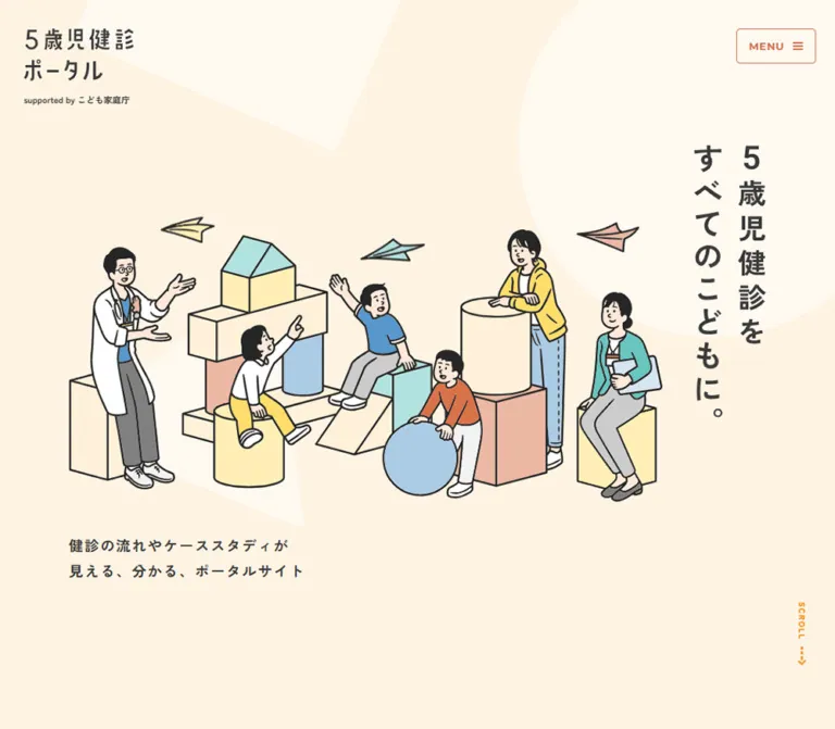
温かなクリーム色と親しみやすい人物イラストを基調に、4色の対象者別導線、縦組みコピー、丸みのあるカードで健診情報を案内するポータルサイト。
オリジナルサイトを見るFive-Year-Old Health Checkup Portal — Style Reference
A reassuring public-health information portal built from warm paper, illustrated people, and four clear audience colors.
Website: gosaiji-kenshin.com Original URL: https://gosaiji-kenshin.com/ Final URL: https://gosaiji-kenshin.com/ Theme: observed light presentation with a cream canvas and colored navigation surfaces; no alternate theme was inspected. Inspected: September 13, 2026, at 04:58 JST. The supplied retrieval timestamp is September 12, 2026, at 19:58:08.467 UTC. Viewports: desktop 1440 × 1000 CSS pixels; mobile 390 × 844 CSS pixels. Scope: the current homepage, including its hero, navigation, promotional links, audience routes, data and video introductions, six-step process, content carousels, FAQ preview, topics, and footer. Screenshots directly show the desktop hero, video/process area, and footer, plus the mobile hero and lower footer. Other component details come from the supplied rendered DOM and computed-style samples.
The portal makes a potentially anxious subject approachable through human illustration and spacious composition. Children, caregivers, and professionals gather around oversized building blocks. Thin dark outlines connect those figures to the interface icons, while muted yellow, mint, blue, and peach fill the artwork. The surrounding UI uses stronger yellow, green, blue, and terracotta to distinguish audiences and information categories.
The defining structure is a long information homepage with several useful ways into its content. A compact desktop navigation rail remains visible beside a broad illustrated canvas. On mobile, a small brand and persistent menu control replace the visible rail, and the hero message moves beneath the artwork. Repeated audience links, explanatory panels, process steps, and editorial previews support exploration throughout the page.
How to Read This Reference
- Measured values come from the supplied computed styles and element rectangles. They are CSS-pixel measurements unless otherwise stated.
- Calculated values are arithmetic derived from those rectangles, such as the gap between adjacent cards.
- Estimated values describe visible screenshot geometry or color that was not separately sampled in the DOM.
- Recommended values are implementation choices for a new adaptation. They do not establish the original source CSS or behavior.
- Token names are descriptive aliases created for this reference. The supplied global custom-property list does not expose a complete semantic design-token system.
- A computed style on a heading or button wrapper does not necessarily describe its visible lettering. Several prominent titles appear to use graphical or separately styled descendants that were not individually sampled.
- No additional browsing or interaction testing was performed for this reference. Link destinations are known from the supplied evidence; their destination pages were not inspected.
Tokens — Colors
Default Palette
| Name | Value | Suggested token | Evidence and role |
|---|---|---|---|
| Cream Canvas | #fff4e3 |
--color-canvas |
Measured body background at both viewports; the dominant page field |
| Warm Peach | #ffe9ca |
--color-peach |
Measured report locality-label background; the footer visually uses a closely corresponding peach, but its own computed fill was not supplied |
| Pale Cream | #fff9f0 |
--color-pale |
Measured mobile menu-button background; the large hero decorations have a similar pale appearance |
| Charcoal | #3a3a3a |
--color-ink |
Measured body text, navigation text, and neutral labels |
| White | #ffffff |
--color-white |
Measured pill backgrounds and reversed text; also visible in the desktop rail |
| Parent Yellow | #ffd954 |
--color-parent |
Measured main audience-card fill for parents; paired with charcoal text |
| Municipality Green | #17aa6c |
--color-government |
Measured municipality audience card and promotional banner; also used for data-link text |
| Doctor Blue | #257ec7 |
--color-doctor |
Measured doctor audience card, video-link text, process heading, and selected movie indicator |
| Nurse Terracotta | #d26e49 |
--color-nurse |
Measured public-health-nurse audience card and report-link text |
| Indicator Gray | #bcbcbc |
--color-indicator |
Measured inactive movie pagination and a contrasting report pagination state |
Estimated Supporting Colors
| Name | Approximation | Use and limitation |
|---|---|---|
| Warm Rule | #d9d3c8 |
Screenshot estimate for process-circle outlines, dotted connectors, and muted rail icons |
| Menu Orange | #e66c45 |
Screenshot estimate for the mobile menu outline and visible label; the sampled outer button inherits charcoal, so descendant styling is unresolved |
| Scroll Orange | #ff8a00 |
Screenshot estimate for the vertical scroll cue |
Use measured colors for the structural palette. The estimated accent colors are suitable starting points for an adaptation, not exact source declarations.
Semantic Color Assignments
The four audience colors recur at different scales: circular portraits in the rail, large audience cards in the main page, and compact illustrated links in the footer. Keep that association stable:
| Audience | Source label | Color | Related content treatment |
|---|---|---|---|
| Parents | 保護者の方 |
Yellow with charcoal text | Family-oriented entry point |
| Municipalities | 自治体の方 |
Green with white text | Data introduction and the featured comparison link also use green |
| Doctors | 医師の方 |
Blue with white text | Video guidance and process navigation also use blue |
| Public health nurses | 保健師の方 |
Terracotta with white text | Report-link text uses the same terracotta |
These are navigation and content associations. They should not automatically become success, warning, or error colors in another interface.
Tokens — Typography
Japanese Interface — Zen Kaku Gothic New
- Measured family:
"Zen Kaku Gothic New", sans-serif. - Body default:
16px, weight700, line height24pxat both inspected widths. - Character: firm, friendly Japanese sans-serif lettering with generous spacing in explanatory copy.
- Roles: navigation, descriptive paragraphs, audience labels, article titles, and most controls.
- Additional measured weights:
600for movie captions and500for a funding-note paragraph in the mobile navigation subtree.
Much of the interface is bold. The warmth comes from illustration, spacing, and color rather than from light-weight typography. Preserve the contrast between strong short labels and the smaller, lighter institutional note.
English Section Labels — Montserrat
- Measured stack:
Montserrat, "Helvetica Neue", Arial, serif. - Measured settings:
20px / 31px, weight700, tracking2px. - Verified examples:
FLOWandMOVIE LIST, unchanged in size between desktop and mobile.
These compact English labels organize the page without competing with its Japanese headings. Montserrat was not independently confirmed for the menu label, step numbers, or every other Latin character.
Graphic Identity and Headline
The desktop brand occupies a measured 162 × 74px home-link rectangle, but the link contains no extracted text. The visible wordmark therefore should not be recreated by assuming that its wrapper's 16px font declaration controls the logo.
The hero H1 similarly reports 16px / 24px while its visible lettering is much larger. Its measured bounds are 90 × 343px on desktop and 390 × 90px on mobile, with 30px mobile horizontal padding. The desktop message is arranged in two vertical columns. On mobile it becomes two horizontal lines beneath the illustration.
Visual estimates: approximately 36–40px for the desktop hero lettering and 30px on mobile. These are visual targets for a live-text adaptation, not verified descendant font sizes.
Type Scale
| Role | Desktop | Mobile | Weight | Tracking / notes |
|---|---|---|---|---|
| Body default | 16 / 24px |
16 / 24px |
700 |
Normal |
| Rail navigation wrappers | 16 / 24px |
Same values in navigation subtree | 700 |
Visible mobile closed state does not show these links |
| Header support line | 12 / 17.4px |
11 / 15.95px |
700 |
Normal |
| Hero description | 18 / 32.4px |
15 / 25.5px |
700 |
0.1em |
| Portal introduction | 20 / 40px |
15 / 27px |
700 |
0.1em |
| Audience-section heading | 24 / 43.2px |
18 / 32.4px |
700 |
0.1em |
| Storybook description | 14 / 25.2px |
14 / 25.2px |
700 |
0.03em |
| Data/video/FAQ description | 18 / 29.7px |
16 / 26.4px |
700 |
0.1em |
| Data/video/FAQ pill label | 16 / 26.4px |
15 / 24.75px |
700 |
0.1em |
| English section label | 20 / 31px |
20 / 31px |
700 |
2px; Montserrat stack |
| Movie caption | 18 / 27.9px |
15 / 23.25px |
600 |
0.06em |
| Report locality label | 16 / 24.8px |
13 / 20.15px |
700 |
Normal |
| Report title | 20 / 30px |
15 / 22.5px |
700 |
Normal |
| Funding note in navigation | Not sampled separately | 12 / 21.6px |
500 |
0.05em; not a verified footer declaration |
The process labels visually correspond to approximately 24px desktop and 19px mobile lettering. Those estimates are consistent with the measured link heights after subtracting the number circle and 20px gap; the label descendants were not directly sampled.
Tokens — Spacing & Shapes
The site combines substantial section spacing with compact internal navigation. It does not follow one clearly exposed base-unit formula. Reuse the observed values as a small practical scale rather than inventing a universal source grid.
Spacing Scale
| Use | Observed or calculated value | Status |
|---|---|---|
| Navigation vertical padding | 8px |
Measured |
| Rail icon-to-label gap | 12px |
Measured |
| Brand-to-support spacing | 16px |
Calculated from desktop bounds |
| Process circle-to-label gap | 20px |
Measured |
| Mobile H1-to-description gap | 24px |
Calculated |
| General mobile content inset | 30px |
Measured |
| Main audience-card padding | Desktop 32px; mobile 30px |
Measured |
| Feature inner horizontal inset | About desktop 40px; mobile 36px |
Estimated from the panel appearance and measured child bounds |
| Desktop audience-grid gap | 40px in both directions |
Calculated |
| Mobile audience-card gap | 44px |
Calculated |
| Audience heading-to-grid gap | Desktop 56px; mobile 24px |
Calculated |
| Common section separation | 100–160px |
Measured or calculated at several section boundaries; not universal |
| Large data-to-video separation | Desktop 360px; mobile 320px between section bounds |
Calculated; decorative content may occupy some of this space |
| Main bottom padding | Desktop 160px; mobile 150px |
Measured |
Border Radius
| Element | Value | Evidence |
|---|---|---|
| Mobile menu | 5px |
Measured |
| Footer audience link | Approximately 10px |
Screenshot estimate |
| Report locality label | 0 10px 0 0 |
Measured |
| Desktop navigation panel | Approximately 15px |
Screenshot estimate |
| Storybook and featured comparison links | 20px |
Measured |
| Main audience cards | 30px |
Measured |
| Report title surface | 0 30px 0 0 |
Measured |
| Video introduction panel | Approximately 30px |
Screenshot estimate |
| Footer upper corners | Approximately 100px on desktop |
Screenshot estimate |
| Pill links and circular controls | 9999px |
Measured on sampled elements |
The asymmetric corners on report captions are a distinctive detail. They should not be replaced with the same fully rounded rectangle used for audience cards.
Layout Measurements
| Element | Desktop 1440 × 1000 | Mobile 390 × 844 |
|---|---|---|
| Document height | 8710.42px |
9938.47px |
| Reserved left region in many main sections | 270px |
0px |
| Standard content column | 1000px, beginning at x = 355px |
330px, beginning at x = 30px |
| Navigation panel | Approximately 230 × 670px, at x = 40px, y = 142px |
Not visible in the closed-menu hero |
| Mobile brand link including support line | Not applicable | 138 × 97.83px, at (30, 36) |
| Mobile menu button | Not visible | 100 × 44px, at (266, 36) |
| Hero H1 wrapper | 90 × 343px, at (1264, 90) |
390 × 90px, at (0, 532.34) |
| Main audience card | 480 × 390px |
330 × 390px |
| Feature pill | 330 × 66.41px |
258 × 66.75px |
| Process number/link width | 46px |
36px |
| Movie card | 471.39 × 358.59px |
307.19 × 257.11px |
| Movie previous/next button | 50 × 50px |
36 × 36px |
| Report card | 644.59 × 464.94px |
330 × 298.23px |
| Footer height | Approximately 821.88px |
Approximately 1373.92px |
Footer heights are calculated from document height minus the measured main-element height. Screenshot estimates should not be treated as measured DOM rectangles.
Components
Desktop Navigation Rail
Role: persistent access to content categories and audience routes.
A white, dark-outlined panel sits 40px from the desktop's left edge. Its approximately 230px width includes a thin border and roughly 32px internal horizontal padding. The brand and support line occupy the top, followed by four content links, a larger separation, and four audience links.
The content links use small muted icons for data, video, reports, and questions. Their measured grids reserve 20–22px for an icon and use a 12px gap. Row heights are 38–40px, including 8px vertical padding. Audience links instead reserve 44px for a colored circular character portrait and measure 60px high.
The underlined このサイトの運営者 control sits outside and below the panel. It is a button in the supplied DOM. Its opened state was not captured; do not infer a dialog's appearance or contents.
The panel occupies the same visible position in the hero and middle desktop captures. It is absent from the footer capture. This supports persistent navigation through the main content, but the exact positioning rule and footer-hiding mechanism were not supplied.
Mobile Brand and Menu Control
Role: retain identity and navigation access without consuming the reading column.
At 390px, the brand begins at (30, 36) and the menu button at (266, 36). The button is 100 × 44px, with a 5px radius, pale fill, orange-looking outline, and a small menu glyph beside MENU.
The same menu control remains at the upper right in the lower-footer screenshot. The mobile brand is visible in the opening capture, but its persistence farther down the page is not established.
The DOM includes navigation descendants with nonzero rectangles even though the closed-state screenshot does not show them. Those rectangles do not prove an open menu, overlay width, or drawer animation. Only the closed control is visually verified.
Illustrated Hero
Role: introduce the health-checkup subject through a calm, shared scene.
The desktop artwork spans approximately 850px across the main area and occupies roughly the middle 400px of the first viewport. Children and adults sit, lean, point, and play around stacked cylinders, cubes, a ramp, and a small house-like block. Three small paper planes extend the composition upward. Pale oversized geometric shapes form the background.
The H1 sits high at the right in two vertical columns: 5歳児健診を and すべてのこどもに。. The description sits below the illustration, aligned to the content column's left edge, at measured y = 750.59px.
On mobile, the scene moves above the copy and extends to the viewport edges, cropping peripheral figures. The H1 starts at y = 532.34px; the description starts at 646.34px. Keep the text inside the 30px gutter while allowing the illustration its wider frame.
A small orange vertical SCROLL cue sits near the lower-right edge. Its visible arrow and dashed continuation are evidence of a directional cue, not proof of a clickable scroll control.
The storybook link begins exactly at y = 1000px on desktop and 844px on mobile. The opening composition therefore occupies the first captured viewport. The enclosing source section also contains subsequent promotions and introduction copy; its full height is not the hero height.
Storybook and Featured Comparison Links
Role: expose specific useful resources before the broader audience selection.
The storybook link points to https://storybook.gosaiji-kenshin.com/. Its measured outer box changes from 1000 × 216.19px on desktop to 330 × 438.08px on mobile. It retains a 20px radius, and its display changes from a grid to a block layout. The description remains 14px / 25.2px with 0.03em tracking.
The next promotion links to /for-local-government/nidankai-comparison/ and includes Pick Up. It uses measured green #17aa6c and a 20px radius. Its dimensions change from 1000 × 93.70px to 330 × 127.63px. The trailing grid column narrows from 50px to 24px.
Neither promotion is visible in the supplied screenshot crops. Their geometry, text, destinations, and sampled styles are verified by the DOM; their complete artwork and arrow designs are not.
Main Audience Card
Role: let visitors identify their role and a relevant question.
Each entire card is a link. It contains an audience label and a short concern, such as the parent's wish to know the examination flow or the municipality's question about securing doctors.
The four cards form a desktop 2 × 2 arrangement with 480 × 390px cards and 40px gaps. Mobile uses one column of 330 × 390px cards with 44px gaps. The retained 390px height is important: these cards reflow rather than shrinking proportionally.
Use 30px corners and generous internal padding: 32px desktop and 30px mobile. Yellow uses charcoal text; green, blue, and terracotta use white text. The supplied screenshots confirm the matching audience characters in navigation and footer variants, but the complete illustration placement inside these large cards was not visually captured.
Data and Video Introduction Panel
Role: present a content category, a short explanation, and one clear route into it.
The visible blue video panel consists of an illustrated doctor and speech bubble protruding above a rounded rectangle, a circular play symbol beside a two-line title, a thick dotted white divider, centered descriptive copy, and a white pill link.
Its desktop outer width is approximately 410px; measured inner content and the pill are 330px wide. The title wrapper uses an approximately 69.3px icon column and a 20px gap. On mobile, the sampled inner width is 258px, with a 60px icon column and the same gap.
The video description changes from 18px / 29.7px to 16px / 26.4px. The pill remains about 66–67px high. Its label uses the panel's blue on white.
The data introduction follows the same measured title, paragraph, and pill pattern, using green. Its full surrounding illustration is outside the supplied screenshots. Do not infer a map, chart design, or data interaction from the subject alone.
Six-Step Process Navigation
Role: show the checkup sequence and provide direct links to the relevant video-page sections.
A blue FLOW label sits above six white numbered circles connected by a pale dotted horizontal line. Each circle has a vertically arranged Japanese label beneath it. The steps are:
事前カンファレンス— preparation conference.問診— interview.計測— measurement.診察— examination.保健指導・専門相談— health guidance and specialist consultation.健診後カンファレンス— post-checkup conference.
The links point to /movie/#flow-section-1 through /movie/#flow-section-6. They are navigation links, not verified in-place video controls.
Desktop link widths are 46px, with approximately 26.8px between adjacent links. Mobile widths become 36px, with approximately 22.8px between them. The complete six-step row consequently fits the measured 330px mobile content width. The vertical labels remain vertical on mobile; this component does not become a six-row list.
Movie Carousel Card and Controls
Role: expose individual examination topics below the process overview.
The rendered DOM contains horizontally distributed cards, repeated entries, previous/next buttons, and fifteen small pagination buttons. Some cards have large negative or positive horizontal coordinates. Together, these establish a carousel-like structure rather than a normal wrapped grid.
Desktop cards measure 471.39 × 358.59px, with 30px 30px 22px padding. Their calculated horizontal gap is approximately 27.69px. Mobile cards measure 307.19 × 257.11px, with 20px 20px 12px padding and an approximately 13.19px gap.
Captions use blue text, weight 600, and 0.06em tracking. The longest sampled mobile caption occupies two lines. Previous/next buttons shrink from 50px to 36px; pagination marks remain 8 × 4px, with blue and gray states.
The media assets and control glyphs were not included in the visual crops. Autoplay, swipe behavior, movement duration, and keyboard behavior remain unverified.
Report Carousel Card
Role: introduce locality-specific accounts of how checkups are implemented.
The card combines a large leading media region with two distinctive text surfaces: a peach locality label and a white article title. The locality label rounds only its upper-right corner by 10px; the title rounds only its upper-right corner by 30px.
Desktop card bounds are 644.59 × 464.94px. The title panel is 483.44px wide, calculated as approximately 75% of the card width. It uses 20px / 30px bold text and 12px 30px 20px padding. The locality label uses 16px / 24.8px text with 10px 30px padding.
On mobile, the card and title both become 330px wide. Title type drops to 15px / 22.5px, and horizontal padding becomes 16px. The locality label drops to 13px / 20.15px.
The report-index pill appears alongside the introduction in the desktop DOM order and after the report cards in the mobile order. This is a useful responsive change: the phone layout places the route to all reports after the preview sequence.
Media subjects and photographic treatment cannot be established from the supplied text and rectangles. Preserve the caption anatomy without inventing an observed photography style.
FAQ Preview
Role: acknowledge common worries and direct visitors to the question-and-answer section.
The homepage includes a category title, a short introduction, a white pill link, and concern text about findings, implementation, and how to speak to a child. Its measured description and pill follow the same sizing system as the data and video panels.
The link leads to /faq/. The evidence does not show an expanded answer or an exercised accordion. Treat this homepage component as a preview and navigation point.
Topics List
Role: show dated updates to the portal's content.
The supplied text contains three recent updates with dates formatted as YYYY.MM.DD. At desktop, the sampled first row is a two-column grid: 195px for its leading region, a 30px gap, and approximately 475.59px for the remaining content. The complete row measures approximately 700.59 × 131.33px.
A measured 300ms opacity transition is attached to that row. Its hover endpoint was not recorded. The mobile text confirms the same update content, but corresponding mobile row geometry was not supplied.
Footer
Role: repeat the complete information architecture and provide institutional context.
A large peach field with broad rounded upper corners closes the page. In the desktop screenshot, its inner content spans approximately 1080px, from x = 180px to 1260px. Three groups run across it: brand and support logo, six utility links with outline icons, and four colored audience links. The funding note sits beneath the latter two groups.
The compact audience links are approximately 337 × 88px, separated by 20px. Each combines a character illustration at the left, a bold audience label, and a white circle containing a gray chevron at the right. Characters extend to the bottom boundary of the colored link. Corners are approximately 10px.
The mobile lower-footer screenshot shows the utility links above a single stack of four audience links. These are approximately 334 × 98px, with 14px gaps and 28px side margins. The funding note follows beneath. The upper mobile footer branding is outside the supplied crop.
The visible support line names こども家庭庁, and a footer logo links to cfa.go.jp. The funding text explains the research-grant context. These observations establish support and funding context; they do not independently identify a production agency or prove the identity behind the unopened operator control.
Tokens — Motion & Interaction
| Treatment | Supplied evidence | Interpretation and limitation |
|---|---|---|
| Hero heading reveal | opacity 1.8s cubic-bezier(0.4, 0, 0.2, 1) 1.2s |
Measured transition declaration; initial and final opacity states were not supplied |
| Mobile brand entrance | 1.4s 2.4s forwards fadeIn |
Measured animation declaration; the named keyframes were not included |
| Mobile menu entrance | 1.4s 2.4s forwards fadeIn |
Same measured entrance timing as the mobile brand |
| Rail link feedback | 0.3s cubic-bezier(0.4, 0, 0.2, 1) for color, background, border, decoration, fill, and stroke |
Measured; exact hover colors were not captured |
| Topic-row feedback | opacity 0.3s cubic-bezier(0.4, 0, 0.2, 1) |
Measured; opacity endpoint unverified |
| Movie/report navigation | Repeated horizontal items, buttons, and pagination states | Slider structure is supported; autoplay, swipe, easing, and timing are not |
| Hero planes and scroll cue | Visible in settled screenshots | No specific motion declaration or observed trajectory supplied |
| Menu and operator button | Buttons present in the DOM | Open states and behavior were not exercised |
The capture process waited for initial rendering and finite motion, with at least five seconds of initial observation. It also used layout/text stability checks and image-decoding waits. This improves confidence in the settled appearance, but it is not a recording of every transition. Perpetual animations were temporarily paused during readiness checks and then resumed; that procedure alone does not establish which decorations animate.
A sampled animation: none on a wrapper does not rule out motion on descendants, pseudo-elements, or JavaScript-controlled slider tracks. Likewise, a bare transition: all without a duration is not evidence of a visible timed transition.
Recommended adaptation: keep ordinary control feedback around 300ms, use optional opacity entrances only where they do not delay essential navigation, and avoid adding perpetual motion without a clear purpose.
Surfaces
| Layer | Appearance | Purpose |
|---|---|---|
| Page canvas | Solid warm cream | Connects the entire information page |
| Hero decoration | Very pale oversized geometry | Adds gentle depth around the illustration |
| Navigation rail | White fill, thin charcoal outline | Separates dense navigation from open content |
| Audience surfaces | Flat yellow, green, blue, and terracotta | Provides consistent audience recognition |
| Introduction panels | Rounded saturated color with white details | Groups category title, explanation, and route |
| Pill links | White capsule with category-colored text | Supplies a calm, repeatable navigation control |
| Report captions | Peach tab plus white title surface | Creates editorial hierarchy around media |
| Video-section transition | Broad white curve visible beneath the process area | Changes the page field without a hard horizontal rule |
| Footer | Peach field with large upper corners | Provides a clear ending while retaining warmth |
The visible design does not rely on a general drop-shadow elevation system. Separation comes from flat color, thin outlines, whitespace, and silhouette. Keep gradients, gloss, and blur out of the core surface vocabulary.
Imagery
The principal illustration is a shared social scene. Adults and children have expressive but restrained faces, dark hair, simple clothing, and slightly irregular charcoal outlines. Professionals are recognizable through a white coat, stethoscope, clipboard, and apron; caregivers and children remain central to the composition.
Building blocks provide scale and structure without forming a realistic clinical room. Their muted pastel fills are lighter than the UI's audience colors. Paper planes and oversized background shapes extend the playful theme into the empty space.
Repeated characters connect the opening illustration, navigation portraits, speech bubbles, and footer links. This repetition is more valuable than introducing a different illustration style for each content section. The doctor's callout above the video card also turns a functional explanation into a friendly human moment.
Observed Asset References
The supplied evidence does not include image src values, original vector paths, intrinsic image dimensions, or font-file URLs. No asset filenames should be inferred from the site's domain or appearance.
| Asset group | Verified appearance | Reuse guidance |
|---|---|---|
| Portal wordmark | Two-line Japanese identity in header/rail and footer | Use the authorized brand asset or explicitly label a live-text approximation |
| Hero scene | People, pastel blocks, and paper planes | Preserve the central relationships and mobile edge cropping |
| Audience portraits | Four circular portraits in the desktop rail | Keep character-to-audience mappings consistent |
| Footer characters | Larger cropped figures integrated into colored links | Anchor figures to the link's lower edge |
| Video callout | Doctor, light-bulb motif, and rounded speech bubble | Keep the illustration visibly attached to its content panel |
| Navigation icons | Small content symbols in the rail; larger outline symbols in the footer | Match the dark, simple line character rather than selecting an unrelated icon style |
| Storybook and carousel media | Containers and destinations are documented; images are not visually established | Bind approved assets without claiming an observed style or source path |
Use smooth, clean rendering for the artwork. Pixelated image rendering, photographic texture overlays, and artificial paper grain are not evidenced here.
Layout & Responsive Behavior
The desktop content offset can be reconstructed directly from the measured bounds:
1440px viewport − 270px reserved left region = 1170px available region
(1170px − 1000px content width) / 2 = 85px internal margin
270px + 85px = 355px content start
On mobile, the repeated pattern is simply 390px − 30px − 30px = 330px. The footer uses a slightly different visually estimated 28px inset.
Verified Changes
| Component | Desktop behavior | Mobile behavior |
|---|---|---|
| Navigation | Visible left panel | Closed menu control at upper right |
| Hero message | Two vertical columns at upper right | Two horizontal lines beneath the artwork |
| Hero artwork | Broad scene within the main region | Edge-to-edge frame with peripheral cropping |
| Hero description | 18px, beneath the desktop illustration |
15px, beneath the mobile H1 |
| Audience cards | Two columns, 480px wide |
One column, 330px wide; same 390px height |
| Storybook promotion | Horizontal grid, about 216px high |
Block layout, about 438px high |
| Video panel and process | Side by side | Video panel before the process row |
| Process sequence | Six narrow columns | Still six columns, with smaller circles and labels |
| Movie cards | Approximately 471px wide |
Approximately 307px wide, retaining horizontal continuation |
| Report title surface | Approximately 75% of card width | Full card width |
| Report-index link | Near the introduction in DOM order | After the preview cards |
| Footer | Three broad groups | Utility links and audience links stack vertically in the visible crop |
The page grows from approximately 8710px to 9938px in document height. Its content reflows selectively: some typography shrinks, major audience-card heights remain unchanged, and process steps stay compact and horizontal.
Only two viewport sizes were inspected. The original breakpoint values, intermediate tablet layouts, short landscape behavior, safe-area handling, and zoom behavior were not supplied. A breakpoint chosen in the Quick Start is a recommendation, not an extracted source rule.
Do’s and Don’ts
Do
- Keep the warm cream canvas and charcoal text as the continuous foundation.
- Preserve the four audience-color associations throughout navigation and content.
- Use Zen Kaku Gothic New for the Japanese interface and the measured Montserrat stack for small English section labels.
- Give illustrated people substantial space; let them establish the portal's tone.
- Retain the desktop rail and the mobile separation between brand, menu, artwork, and copy.
- Reflow the hero headline from vertical desktop columns to horizontal mobile lines.
- Keep the six-step process in one horizontal sequence at the inspected phone width.
- Distinguish large
30pxaudience cards, capsule links, and asymmetric report captions. - Repeat useful audience routes in the footer with the same characters and colors.
- Keep article titles, process labels, and supporting text available as meaningful content when using graphical assets.
Don’t
- Don't collapse the portal's audience routes and editorial content into one conversion action.
- Don't apply a universal card grid to every section; the page alternates illustrations, panels, process navigation, and editorial previews.
- Don't use the H1 wrapper's computed
16pxvalue as the visible hero-title size. - Don't treat navigation descendants in the mobile DOM as proof of a visible open menu.
- Don't scale the entire desktop composition down as one image for mobile.
- Don't crop the central children and shared block arrangement merely to fill a generic image box.
- Don't replace the pale artwork palette with the stronger UI colors everywhere.
- Don't add shadows, glass effects, glossy gradients, or pixel-art rendering to the core visual system.
- Don't invent carousel timing, video playback, menu transitions, or paper-plane animation.
- Don't treat support wording or funding text as a verified production credit.
Recommended Implementation Additions
These are improvements for an adaptation, not verified features of the original page:
- Provide a skip link, semantic navigation landmarks, and a visible focus indicator that remains clear on cream, white, and saturated surfaces.
- Give the menu an accessible name,
aria-expanded, and an explicit controlled region. If implemented as a modal, provide appropriate focus handling, Escape dismissal, and focus return. - Keep essential identity and navigation available immediately. Offer reduced-motion behavior that removes entrance delays and reveals content without animation.
- Review text contrast separately from brand-color fidelity. Calculated from the measured solid colors, white against green is approximately
3.0:1, blue4.3:1, and terracotta3.5:1. Small white text and the corresponding colored text on white need attention; introduce darker text-specific tokens where necessary. - Make carousel controls usable without dragging. The observed tiny pagination marks can remain visual indicators while adequately sized previous/next buttons provide navigation. Avoid enlarged invisible targets that overlap adjacent controls.
- Use captions or transcripts for video content and useful text alternatives for meaningful imagery. Repeated decorative portraits can have empty alternatives when adjacent link text already supplies their meaning.
- Preserve logical source order and avoid duplicate announcements for graphical headings or cloned carousel slides.
- Test the persistent menu and rail at zoomed text sizes and short viewport heights. Let cards grow when translated or enlarged text exceeds the reference dimensions.
Agent Prompt Guide
Quick Color Reference
- Main page:
#fff4e3. - Main text:
#3a3a3a. - Secondary peach:
#ffe9ca. - Pale control surface:
#fff9f0. - Parents:
#ffd954with charcoal text. - Municipalities/data:
#17aa6c. - Doctors/video/process:
#257ec7. - Public health nurses/report accent:
#d26e49. - Navigation rail and capsule links: white.
- Orange menu and scroll accents: use separately labeled approximations until exact descendant styles are available.
Overall Prompt
“Create a Japanese public-health information portal about five-year-old checkups. Use a warm cream #fff4e3 canvas, charcoal #3a3a3a typography, Zen Kaku Gothic New for Japanese text, and small tracked Montserrat section labels. Build a spacious illustrated opening with children, caregivers, and professionals gathered around pastel building blocks. Place a slim white outlined navigation panel at the left on wide screens and a compact brand plus menu control on phones. Use vertical hero copy on desktop and horizontal copy beneath the artwork on mobile. Repeat yellow, green, blue, and terracotta audience routes through large cards and the footer. Include explanatory category panels, white capsule links, a six-step horizontal process with vertical labels, and editorial previews with asymmetric caption corners. Keep surfaces flat and illustrations consistent. Use only approved artwork and explicitly distinguish inferred styling from measured behavior.”
Example Component Prompts
- Desktop rail: “Create a roughly 230px-wide white navigation panel with a thin charcoal border and 15px corners. Stack a two-line portal wordmark, a small support line, four compact icon links, and four 44px illustrated audience portraits. Use 12px icon gaps and ample separation between the two navigation groups. Place a small underlined operator button below the panel.”
- Responsive hero: “Compose an unboxed scene of adults and children around pale geometric blocks on cream. At 1440px, reserve the left navigation region and put two vertical columns of Japanese headline text at the upper right. At 390px, place a cropped edge-to-edge illustration above two horizontal headline lines and a 15px description within 30px gutters. Leave generous empty space around the header.”
- Audience card: “Build a whole-card audience link with 30px corners, a 390px reference height, a role label, and a short concern. Use the established audience color. Arrange four cards in two 480px columns on the reference desktop and one 330px column on the reference phone. Allow additional height when text enlargement requires it.”
- Video and process: “Pair a blue rounded introduction panel with a doctor callout, outline play icon, dotted white divider, short explanation, and white pill link. Beside it, show six numbered white circles joined by a pale dotted line, with vertical Japanese labels below. On phones, place the process below the panel and keep all six steps in one row.”
- Report card: “Create an editorial preview with approved media and a peach locality tab above a white title panel. Round only the upper-right corner of the locality tab by 10px and the title by 30px. Make the title panel approximately 75% of the desktop card width and full width on phones. Do not invent a photographic treatment from missing evidence.”
- Footer audience link: “Create a flat colored horizontal link with 10px corners, an audience character anchored at the lower left, a bold Japanese label, and a white circular chevron at the right. Use roughly 337 × 88px on desktop and 334 × 98px on the reference phone. Stack four links in the established audience-color order.”
Quick Start
CSS Custom Properties
This is an implementation starter, not recovered source code. It combines measured colors and component dimensions with explicitly recommended interpolation, focus styling, and layout rules. The 75rem desktop breakpoint is a recommendation. Hero type sizes, artwork positioning, footer geometry, and orange accents are approximations.
Use a conventional 16px root. Load licensed copies of the observed fonts separately; no font URLs were supplied. Bind approved artwork rather than inventing original asset paths.
Suggested structure: place .portal-rail, .mobile-brand, and .menu-toggle outside the main content. Wrap ordinary main sections in .content-region > .content-inner. Inside the hero, use .hero-viewport > .content-inner containing .hero-art, .hero-title, and .hero-description. Keep the footer outside the reserved desktop rail region. The hero title should contain two spans, one per source phrase.
:root {
  /* Measured colors */
  --color-canvas: #fff4e3;
  --color-peach: #ffe9ca;
  --color-pale: #fff9f0;
  --color-ink: #3a3a3a;
  --color-white: #ffffff;
  --color-parent: #ffd954;
  --color-government: #17aa6c;
  --color-doctor: #257ec7;
  --color-nurse: #d26e49;
  --color-indicator: #bcbcbc;

  /* Screenshot approximations */
  --color-rule: #d9d3c8;
  --color-menu: #e66c45;
  --color-scroll: #ff8a00;

  /* Observed font stacks */
  --font-japanese: 'Zen Kaku Gothic New', sans-serif;
  --font-latin: Montserrat, 'Helvetica Neue', Arial, serif;

  --content-max: 1000px;
  --content-gutter: 30px;
  --rail-reserve: 0px;
  --section-space: 100px;
  --radius-promotion: 20px;
  --radius-card: 30px;
  --radius-pill: 9999px;
  --motion-feedback: 300ms cubic-bezier(0.4, 0, 0.2, 1);
}

* { box-sizing: border-box; }

body {
  margin: 0;
  background: var(--color-canvas);
  color: var(--color-ink);
  font-family: var(--font-japanese);
  font-size: 16px;
  font-weight: 700;
  line-height: 1.5;
}

button { font: inherit; }
img { display: block; max-width: 100%; }
a { color: inherit; }

.portal-main { padding-block-end: 150px; }
.content-region { padding-inline-start: var(--rail-reserve); }
.content-inner {
  width: min(var(--content-max), calc(100% - 2 * var(--content-gutter)));
  margin-inline: auto;
}
.section-block { margin-block-start: var(--section-space); }
.portal-rail { display: none; }

.mobile-brand {
  position: absolute;
  z-index: 20;
  inset-block-start: 36px;
  inset-inline-start: 30px;
  width: 138px;
}

.support-line {
  margin: 16px 0 0;
  font-size: 11px;
  line-height: 1.45;
}

.menu-toggle {
  position: fixed;
  z-index: 30;
  inset-block-start: 36px;
  inset-inline-end: 24px;
  display: inline-flex;
  align-items: center;
  justify-content: center;
  gap: 12px;
  width: 100px;
  height: 44px;
  border: 1px solid var(--color-menu);
  border-radius: 5px;
  background: var(--color-pale);
  color: var(--color-menu);
  font-size: 13px;
  letter-spacing: 0.06em;
  cursor: pointer;
}

/* Hero geometry is an adaptation of the two supplied captures. */
.hero-viewport {
  position: relative;
  min-height: max(100svh, 820px);
}
.hero-viewport > .content-inner {
  position: relative;
  min-height: inherit;
}
.hero-art {
  position: absolute;
  top: 300px;
  left: 50%;
  width: calc(100% + 60px);
  height: 190px;
  transform: translateX(-50%);
  overflow: hidden;
}
.hero-art img {
  position: relative;
  left: 50%;
  width: 440px;
  max-width: none;
  height: 100%;
  object-fit: contain;
  transform: translateX(-50%);
}
.hero-title {
  margin: 0;
  padding-block-start: 532px;
  font-size: 30px;
  line-height: 1.5;
  letter-spacing: 0.1em;
}
.hero-title > span { display: block; }
.hero-description {
  margin: 24px 0 0;
  font-size: 15px;
  line-height: 1.7;
  letter-spacing: 0.1em;
}
.hero-scroll {
  position: absolute;
  right: 0;
  bottom: 54px;
  writing-mode: vertical-rl;
  color: var(--color-scroll);
  font-size: 11px;
  letter-spacing: 0.12em;
}

.section-title {
  margin: 0 0 24px;
  font-size: 18px;
  line-height: 1.8;
  letter-spacing: 0.1em;
}
.section-label {
  margin: 0;
  color: var(--color-doctor);
  font-family: var(--font-latin);
  font-size: 20px;
  line-height: 1.55;
  letter-spacing: 2px;
  text-transform: uppercase;
}

.is-parent {
  --role-color: var(--color-parent);
  --on-role: var(--color-ink);
}
.is-government {
  --role-color: var(--color-government);
  --on-role: var(--color-white);
}
.is-doctor {
  --role-color: var(--color-doctor);
  --on-role: var(--color-white);
}
.is-nurse {
  --role-color: var(--color-nurse);
  --on-role: var(--color-white);
}

.audience-grid {
  display: grid;
  gap: 44px;
}
.audience-card {
  position: relative;
  display: block;
  min-height: 390px;
  padding: 30px;
  border-radius: var(--radius-card);
  background: var(--role-color);
  color: var(--on-role);
  text-decoration: none;
}

.video-layout {
  display: grid;
  gap: 56px;
  align-items: start;
}
.feature-panel {
  position: relative;
  padding: 36px;
  border-radius: var(--radius-card);
  background: var(--role-color, var(--color-doctor));
  color: var(--on-role, var(--color-white));
}
.feature-heading {
  display: grid;
  grid-template-columns: 60px minmax(0, 1fr);
  align-items: center;
  gap: 20px;
  margin: 0;
  font-size: 23px;
  line-height: 1.5;
}
.feature-divider {
  margin-block: 32px;
  border: 0;
  border-top: 6px dotted currentColor;
}
.feature-description {
  margin: 0;
  text-align: center;
  font-size: 16px;
  line-height: 1.65;
  letter-spacing: 0.1em;
}
.pill-link {
  display: flex;
  align-items: center;
  justify-content: center;
  min-height: 66px;
  margin-block-start: 32px;
  padding: 20px 16px 22px;
  border-radius: var(--radius-pill);
  background: var(--color-white);
  color: var(--role-color, var(--color-ink));
  text-align: center;
  text-decoration: none;
  font-size: 15px;
  line-height: 1.65;
  letter-spacing: 0.1em;
}

.flow-list {
  position: relative;
  display: flex;
  justify-content: space-between;
  max-width: 410px;
  margin: 36px 0 0;
  padding: 0;
  list-style: none;
}
.flow-list::before {
  content: '';
  position: absolute;
  top: 18px;
  left: 18px;
  right: 18px;
  border-top: 3px dotted var(--color-rule);
}
.flow-list > li { width: 36px; }
.flow-link {
  position: relative;
  display: flex;
  flex-direction: column;
  align-items: center;
  gap: 20px;
  text-decoration: none;
}
.flow-number {
  display: grid;
  place-items: center;
  width: 36px;
  aspect-ratio: 1;
  border: 3px solid var(--color-rule);
  border-radius: 50%;
  background: var(--color-white);
  font-size: 16px;
}
.flow-text {
  writing-mode: vertical-rl;
  text-orientation: upright;
  font-size: 19px;
  line-height: 1.1;
  letter-spacing: 0.1em;
}

/* Report caption anatomy; carousel behavior is separate. */
.report-locality {
  width: fit-content;
  margin: 0;
  padding: 10px 16px;
  border-radius: 0 10px 0 0;
  background: var(--color-peach);
  font-size: 13px;
  line-height: 1.55;
}
.report-title {
  margin: 0;
  padding: 12px 16px 16px;
  border-radius: 0 30px 0 0;
  background: var(--color-white);
  color: var(--color-ink);
  font-size: 15px;
  line-height: 1.5;
}

/* Footer geometry and its fill are screenshot-based adaptations. */
.site-footer {
  padding: 80px 28px;
  border-radius: 64px 64px 0 0;
  background: var(--color-peach);
}
.footer-inner {
  display: grid;
  gap: 56px;
  max-width: 1080px;
  margin-inline: auto;
}
.footer-brand { max-width: 220px; }
.footer-nav {
  display: grid;
  gap: 28px;
}
.footer-nav a {
  display: grid;
  grid-template-columns: 36px minmax(0, 1fr);
  align-items: center;
  gap: 24px;
  min-height: 44px;
  text-decoration: none;
}
.footer-audiences {
  display: grid;
  gap: 14px;
}
.audience-link {
  position: relative;
  display: grid;
  grid-template-columns: minmax(0, 1fr) 36px;
  align-items: center;
  gap: 12px;
  min-height: 98px;
  padding: 16px 24px 16px 126px;
  border-radius: 10px;
  background: var(--role-color);
  color: var(--on-role);
  text-decoration: none;
  font-size: 20px;
}
.audience-link .character {
  position: absolute;
  bottom: 0;
  left: 24px;
  width: 90px;
  height: 88px;
  object-fit: contain;
  object-position: bottom;
}
.audience-arrow {
  display: grid;
  place-items: center;
  width: 36px;
  aspect-ratio: 1;
  border-radius: 50%;
  background: var(--color-white);
  color: #808080;
}
.footer-note {
  margin: 0;
  font-size: 12px;
  font-weight: 500;
  line-height: 1.8;
  letter-spacing: 0.05em;
}

/* Recommended focus treatment, independent of hover. */
a:focus-visible,
button:focus-visible {
  outline: 3px solid var(--color-ink);
  outline-offset: 5px;
}

/* Recommended feedback using the observed duration and easing. */
@media (hover: hover) {
  .pill-link,
  .audience-link { transition: opacity var(--motion-feedback); }
  .pill-link:hover,
  .audience-link:hover { opacity: 0.85; }
}

/* Recommended breakpoint; the source breakpoint is unknown. */
@media (min-width: 75rem) {
  :root { --rail-reserve: 270px; }
  .portal-main { padding-block-end: 160px; }
  .mobile-brand,
  .menu-toggle { display: none; }

  .portal-rail {
    position: fixed;
    z-index: 20;
    top: max(24px, calc((100svh - 716px) / 2));
    left: 40px;
    display: block;
    width: 230px;
    max-height: calc(100svh - 48px);
    overflow-y: auto;
  }
  .rail-panel {
    padding: 42px 32px;
    border: 2px solid var(--color-ink);
    border-radius: 15px;
    background: var(--color-white);
  }
  .rail-brand { display: block; width: 162px; }
  .rail-panel .support-line { font-size: 12px; }
  .rail-nav { display: grid; gap: 4px; margin-top: 38px; }
  .rail-link {
    display: grid;
    grid-template-columns: 22px minmax(0, 1fr);
    align-items: center;
    gap: 12px;
    padding-block: 8px;
    text-decoration: none;
    font-size: 16px;
    line-height: 22px;
  }
  .rail-audiences { margin-top: 28px; }
  .rail-audiences .rail-link {
    grid-template-columns: 44px minmax(0, 1fr);
    min-height: 60px;
  }
  .rail-operator {
    display: block;
    margin: 20px auto 0;
    padding: 0;
    border: 0;
    background: transparent;
    color: inherit;
    text-decoration: underline;
  }

  .hero-viewport { min-height: max(100svh, 840px); }
  .hero-art {
    left: 0;
    width: min(850px, calc(100% - 150px));
    height: 410px;
    transform: none;
  }
  .hero-art img { width: 100%; }
  .hero-title {
    position: absolute;
    top: 90px;
    right: 0;
    display: flex;
    flex-direction: row-reverse;
    padding: 0;
    font-size: 36px;
    line-height: 1.25;
    letter-spacing: 0.05em;
  }
  .hero-title > span {
    writing-mode: vertical-rl;
    text-orientation: upright;
  }
  .hero-description {
    position: absolute;
    top: 750px;
    left: 0;
    width: min(850px, 100%);
    margin: 0;
    font-size: 18px;
    line-height: 1.8;
  }

  .section-title { margin-bottom: 56px; font-size: 24px; }
  .audience-grid { grid-template-columns: repeat(2, minmax(0, 1fr)); gap: 40px; }
  .audience-card { padding: 32px; }
  .video-layout { grid-template-columns: 410px minmax(0, 1fr); gap: 74px; }
  .feature-panel { padding: 40px; }
  .feature-heading { grid-template-columns: 69.3px minmax(0, 1fr); font-size: 28px; }
  .feature-description { font-size: 18px; }
  .pill-link { padding-block: 18px 22px; font-size: 16px; }
  .flow-list > li,
  .flow-number { width: 46px; }
  .flow-list::before { top: 23px; left: 23px; right: 23px; }
  .flow-text { font-size: 24px; }
  .report-locality { padding-inline: 30px; font-size: 16px; }
  .report-title { width: 75%; padding: 12px 30px 20px; font-size: 20px; }

  .site-footer { padding: 160px 30px; border-radius: 100px 100px 0 0; }
  .footer-inner { grid-template-columns: 320px 263px 337px; column-gap: 80px; }
  .footer-note { grid-column: 2 / -1; }
  .footer-audiences { gap: 20px; }
  .audience-link {
    grid-template-columns: minmax(0, 1fr) 40px;
    min-height: 88px;
    padding-inline: 128px 28px;
  }
  .audience-link .character { height: 80px; }
  .audience-arrow { width: 40px; }
}

/* Recommended: content must remain visible without entrance motion. */
@media (prefers-reduced-motion: reduce) {
  .hero-title,
  .mobile-brand,
  .menu-toggle {
    animation: none !important;
    transition: none !important;
    opacity: 1 !important;
  }
  .pill-link,
  .audience-link { transition: none; }
}
A minimal semantic example for a footer audience link and one process step:
<a class='audience-link is-parent' href='/for-parent/'>
  <!-- Insert approved character artwork with class character and empty alt. -->
  <span>保護者の方</span>
  <span class='audience-arrow' aria-hidden='true'>›</span>
</a>

<ol class='flow-list'>
  <li>
    <a class='flow-link' href='/movie/#flow-section-1'>
      <span class='flow-number'>01</span>
      <span class='flow-text'>事前カンファレンス</span>
    </a>
  </li>
  <!-- Add steps 02 through 06 using the documented destinations. -->
</ol>
The starter leaves content visible by default. Menu state management, carousel logic, operator-control behavior, character callouts, decorative curves, and the desktop rail's disappearance near the footer require separate implementation. Verify intermediate widths and enlarged text before treating the starter as production-ready.
Tailwind v4 Token Mapping
Optional aliases for a project already using Tailwind v4. Define the preceding custom properties first. This mapping is an adaptation, not evidence about the original site's framework configuration.
@theme inline {
  --color-canvas: var(--color-canvas);
  --color-paper-peach: var(--color-peach);
  --color-paper-pale: var(--color-pale);
  --color-charcoal: var(--color-ink);
  --color-audience-parent: var(--color-parent);
  --color-audience-government: var(--color-government);
  --color-audience-doctor: var(--color-doctor);
  --color-audience-nurse: var(--color-nurse);

  --font-jp: var(--font-japanese);
  --font-section-label: var(--font-latin);

  --spacing-page-gutter: 30px;
  --spacing-rail-reserve: 270px;
  --radius-audience: 30px;
  --radius-promotion: 20px;
  --radius-audience-link: 10px;
}
Sources & Evidence
- Current homepage: supplied original and final URL, both identical; supplied HTTP status
200. - Capture timestamp:
2026-09-12T19:58:08.467Z, equivalent to September 13, 2026, at 04:58:08.467 JST. - Desktop evidence: 1440 × 1000 CSS pixels; hero, video/process, and footer screenshots; rendered page text, links, sampled computed styles, and element rectangles. Measured document height approximately
8710.42px. - Mobile evidence: 390 × 844 CSS pixels; hero and lower-footer screenshots; rendered page text, links, sampled computed styles, and element rectangles. Measured document height approximately
9938.47px. - Original-page destinations: data, movie, report, FAQ, audience, topics, contact, storybook, and process-anchor links were present in the supplied homepage evidence. Their destination interfaces were not inspected.
- Motion evidence: supplied transition and animation declarations, settled screenshots, and the capture-readiness notes. No independent hover, menu, operator-button, slider, or media-playback testing was performed.
- Limitations: no original image paths, full stylesheet, font files, heading-descendant measurements, menu-open capture, or interaction recording was supplied. Some DOM entries belong to hidden navigation or offscreen carousel content. Exact breakpoints, animation endpoints, and delayed content remain unverified.
This reference describes the current homepage represented by the supplied evidence. Measurements, screenshot estimates, calculated relationships, and implementation recommendations are identified separately throughout.
# Five-Year-Old Health Checkup Portal — Style Reference

> A reassuring public-health information portal built from warm paper, illustrated people, and four clear audience colors.

**Website:** [gosaiji-kenshin.com](https://gosaiji-kenshin.com/)
**Original URL:** https://gosaiji-kenshin.com/
**Final URL:** https://gosaiji-kenshin.com/
**Theme:** observed light presentation with a cream canvas and colored navigation surfaces; no alternate theme was inspected.
**Inspected:** September 13, 2026, at 04:58 JST. The supplied retrieval timestamp is September 12, 2026, at 19:58:08.467 UTC.
**Viewports:** desktop 1440 × 1000 CSS pixels; mobile 390 × 844 CSS pixels.
**Scope:** the current homepage, including its hero, navigation, promotional links, audience routes, data and video introductions, six-step process, content carousels, FAQ preview, topics, and footer. Screenshots directly show the desktop hero, video/process area, and footer, plus the mobile hero and lower footer. Other component details come from the supplied rendered DOM and computed-style samples.

The portal makes a potentially anxious subject approachable through human illustration and spacious composition. Children, caregivers, and professionals gather around oversized building blocks. Thin dark outlines connect those figures to the interface icons, while muted yellow, mint, blue, and peach fill the artwork. The surrounding UI uses stronger yellow, green, blue, and terracotta to distinguish audiences and information categories.

The defining structure is a long information homepage with several useful ways into its content. A compact desktop navigation rail remains visible beside a broad illustrated canvas. On mobile, a small brand and persistent menu control replace the visible rail, and the hero message moves beneath the artwork. Repeated audience links, explanatory panels, process steps, and editorial previews support exploration throughout the page.

## How to Read This Reference

- **Measured** values come from the supplied computed styles and element rectangles. They are CSS-pixel measurements unless otherwise stated.
- **Calculated** values are arithmetic derived from those rectangles, such as the gap between adjacent cards.
- **Estimated** values describe visible screenshot geometry or color that was not separately sampled in the DOM.
- **Recommended** values are implementation choices for a new adaptation. They do not establish the original source CSS or behavior.
- Token names are descriptive aliases created for this reference. The supplied global custom-property list does not expose a complete semantic design-token system.
- A computed style on a heading or button wrapper does not necessarily describe its visible lettering. Several prominent titles appear to use graphical or separately styled descendants that were not individually sampled.
- No additional browsing or interaction testing was performed for this reference. Link destinations are known from the supplied evidence; their destination pages were not inspected.

## Tokens — Colors

### Default Palette

| Name | Value | Suggested token | Evidence and role |
| --- | --- | --- | --- |
| Cream Canvas | `#fff4e3` | `--color-canvas` | Measured body background at both viewports; the dominant page field |
| Warm Peach | `#ffe9ca` | `--color-peach` | Measured report locality-label background; the footer visually uses a closely corresponding peach, but its own computed fill was not supplied |
| Pale Cream | `#fff9f0` | `--color-pale` | Measured mobile menu-button background; the large hero decorations have a similar pale appearance |
| Charcoal | `#3a3a3a` | `--color-ink` | Measured body text, navigation text, and neutral labels |
| White | `#ffffff` | `--color-white` | Measured pill backgrounds and reversed text; also visible in the desktop rail |
| Parent Yellow | `#ffd954` | `--color-parent` | Measured main audience-card fill for parents; paired with charcoal text |
| Municipality Green | `#17aa6c` | `--color-government` | Measured municipality audience card and promotional banner; also used for data-link text |
| Doctor Blue | `#257ec7` | `--color-doctor` | Measured doctor audience card, video-link text, process heading, and selected movie indicator |
| Nurse Terracotta | `#d26e49` | `--color-nurse` | Measured public-health-nurse audience card and report-link text |
| Indicator Gray | `#bcbcbc` | `--color-indicator` | Measured inactive movie pagination and a contrasting report pagination state |

### Estimated Supporting Colors

| Name | Approximation | Use and limitation |
| --- | --- | --- |
| Warm Rule | `#d9d3c8` | Screenshot estimate for process-circle outlines, dotted connectors, and muted rail icons |
| Menu Orange | `#e66c45` | Screenshot estimate for the mobile menu outline and visible label; the sampled outer button inherits charcoal, so descendant styling is unresolved |
| Scroll Orange | `#ff8a00` | Screenshot estimate for the vertical scroll cue |

Use measured colors for the structural palette. The estimated accent colors are suitable starting points for an adaptation, not exact source declarations.

### Semantic Color Assignments

The four audience colors recur at different scales: circular portraits in the rail, large audience cards in the main page, and compact illustrated links in the footer. Keep that association stable:

| Audience | Source label | Color | Related content treatment |
| --- | --- | --- | --- |
| Parents | `保護者の方` | Yellow with charcoal text | Family-oriented entry point |
| Municipalities | `自治体の方` | Green with white text | Data introduction and the featured comparison link also use green |
| Doctors | `医師の方` | Blue with white text | Video guidance and process navigation also use blue |
| Public health nurses | `保健師の方` | Terracotta with white text | Report-link text uses the same terracotta |

These are navigation and content associations. They should not automatically become success, warning, or error colors in another interface.

## Tokens — Typography

### Japanese Interface — Zen Kaku Gothic New

- **Measured family:** `"Zen Kaku Gothic New", sans-serif`.
- **Body default:** `16px`, weight `700`, line height `24px` at both inspected widths.
- **Character:** firm, friendly Japanese sans-serif lettering with generous spacing in explanatory copy.
- **Roles:** navigation, descriptive paragraphs, audience labels, article titles, and most controls.
- **Additional measured weights:** `600` for movie captions and `500` for a funding-note paragraph in the mobile navigation subtree.

Much of the interface is bold. The warmth comes from illustration, spacing, and color rather than from light-weight typography. Preserve the contrast between strong short labels and the smaller, lighter institutional note.

### English Section Labels — Montserrat

- **Measured stack:** `Montserrat, "Helvetica Neue", Arial, serif`.
- **Measured settings:** `20px / 31px`, weight `700`, tracking `2px`.
- **Verified examples:** `FLOW` and `MOVIE LIST`, unchanged in size between desktop and mobile.

These compact English labels organize the page without competing with its Japanese headings. Montserrat was not independently confirmed for the menu label, step numbers, or every other Latin character.

### Graphic Identity and Headline

The desktop brand occupies a measured `162 × 74px` home-link rectangle, but the link contains no extracted text. The visible wordmark therefore should not be recreated by assuming that its wrapper's `16px` font declaration controls the logo.

The hero H1 similarly reports `16px / 24px` while its visible lettering is much larger. Its measured bounds are `90 × 343px` on desktop and `390 × 90px` on mobile, with `30px` mobile horizontal padding. The desktop message is arranged in two vertical columns. On mobile it becomes two horizontal lines beneath the illustration.

**Visual estimates:** approximately `36–40px` for the desktop hero lettering and `30px` on mobile. These are visual targets for a live-text adaptation, not verified descendant font sizes.

### Type Scale

| Role | Desktop | Mobile | Weight | Tracking / notes |
| --- | --- | --- | --- | --- |
| Body default | `16 / 24px` | `16 / 24px` | `700` | Normal |
| Rail navigation wrappers | `16 / 24px` | Same values in navigation subtree | `700` | Visible mobile closed state does not show these links |
| Header support line | `12 / 17.4px` | `11 / 15.95px` | `700` | Normal |
| Hero description | `18 / 32.4px` | `15 / 25.5px` | `700` | `0.1em` |
| Portal introduction | `20 / 40px` | `15 / 27px` | `700` | `0.1em` |
| Audience-section heading | `24 / 43.2px` | `18 / 32.4px` | `700` | `0.1em` |
| Storybook description | `14 / 25.2px` | `14 / 25.2px` | `700` | `0.03em` |
| Data/video/FAQ description | `18 / 29.7px` | `16 / 26.4px` | `700` | `0.1em` |
| Data/video/FAQ pill label | `16 / 26.4px` | `15 / 24.75px` | `700` | `0.1em` |
| English section label | `20 / 31px` | `20 / 31px` | `700` | `2px`; Montserrat stack |
| Movie caption | `18 / 27.9px` | `15 / 23.25px` | `600` | `0.06em` |
| Report locality label | `16 / 24.8px` | `13 / 20.15px` | `700` | Normal |
| Report title | `20 / 30px` | `15 / 22.5px` | `700` | Normal |
| Funding note in navigation | Not sampled separately | `12 / 21.6px` | `500` | `0.05em`; not a verified footer declaration |

The process labels visually correspond to approximately `24px` desktop and `19px` mobile lettering. Those estimates are consistent with the measured link heights after subtracting the number circle and `20px` gap; the label descendants were not directly sampled.

## Tokens — Spacing & Shapes

The site combines substantial section spacing with compact internal navigation. It does not follow one clearly exposed base-unit formula. Reuse the observed values as a small practical scale rather than inventing a universal source grid.

### Spacing Scale

| Use | Observed or calculated value | Status |
| --- | --- | --- |
| Navigation vertical padding | `8px` | Measured |
| Rail icon-to-label gap | `12px` | Measured |
| Brand-to-support spacing | `16px` | Calculated from desktop bounds |
| Process circle-to-label gap | `20px` | Measured |
| Mobile H1-to-description gap | `24px` | Calculated |
| General mobile content inset | `30px` | Measured |
| Main audience-card padding | Desktop `32px`; mobile `30px` | Measured |
| Feature inner horizontal inset | About desktop `40px`; mobile `36px` | Estimated from the panel appearance and measured child bounds |
| Desktop audience-grid gap | `40px` in both directions | Calculated |
| Mobile audience-card gap | `44px` | Calculated |
| Audience heading-to-grid gap | Desktop `56px`; mobile `24px` | Calculated |
| Common section separation | `100–160px` | Measured or calculated at several section boundaries; not universal |
| Large data-to-video separation | Desktop `360px`; mobile `320px` between section bounds | Calculated; decorative content may occupy some of this space |
| Main bottom padding | Desktop `160px`; mobile `150px` | Measured |

### Border Radius

| Element | Value | Evidence |
| --- | --- | --- |
| Mobile menu | `5px` | Measured |
| Footer audience link | Approximately `10px` | Screenshot estimate |
| Report locality label | `0 10px 0 0` | Measured |
| Desktop navigation panel | Approximately `15px` | Screenshot estimate |
| Storybook and featured comparison links | `20px` | Measured |
| Main audience cards | `30px` | Measured |
| Report title surface | `0 30px 0 0` | Measured |
| Video introduction panel | Approximately `30px` | Screenshot estimate |
| Footer upper corners | Approximately `100px` on desktop | Screenshot estimate |
| Pill links and circular controls | `9999px` | Measured on sampled elements |

The asymmetric corners on report captions are a distinctive detail. They should not be replaced with the same fully rounded rectangle used for audience cards.

### Layout Measurements

| Element | Desktop 1440 × 1000 | Mobile 390 × 844 |
| --- | --- | --- |
| Document height | `8710.42px` | `9938.47px` |
| Reserved left region in many main sections | `270px` | `0px` |
| Standard content column | `1000px`, beginning at `x = 355px` | `330px`, beginning at `x = 30px` |
| Navigation panel | Approximately `230 × 670px`, at `x = 40px`, `y = 142px` | Not visible in the closed-menu hero |
| Mobile brand link including support line | Not applicable | `138 × 97.83px`, at `(30, 36)` |
| Mobile menu button | Not visible | `100 × 44px`, at `(266, 36)` |
| Hero H1 wrapper | `90 × 343px`, at `(1264, 90)` | `390 × 90px`, at `(0, 532.34)` |
| Main audience card | `480 × 390px` | `330 × 390px` |
| Feature pill | `330 × 66.41px` | `258 × 66.75px` |
| Process number/link width | `46px` | `36px` |
| Movie card | `471.39 × 358.59px` | `307.19 × 257.11px` |
| Movie previous/next button | `50 × 50px` | `36 × 36px` |
| Report card | `644.59 × 464.94px` | `330 × 298.23px` |
| Footer height | Approximately `821.88px` | Approximately `1373.92px` |

Footer heights are calculated from document height minus the measured main-element height. Screenshot estimates should not be treated as measured DOM rectangles.

## Components

### Desktop Navigation Rail

**Role:** persistent access to content categories and audience routes.

A white, dark-outlined panel sits `40px` from the desktop's left edge. Its approximately `230px` width includes a thin border and roughly `32px` internal horizontal padding. The brand and support line occupy the top, followed by four content links, a larger separation, and four audience links.

The content links use small muted icons for data, video, reports, and questions. Their measured grids reserve `20–22px` for an icon and use a `12px` gap. Row heights are `38–40px`, including `8px` vertical padding. Audience links instead reserve `44px` for a colored circular character portrait and measure `60px` high.

The underlined `このサイトの運営者` control sits outside and below the panel. It is a button in the supplied DOM. Its opened state was not captured; do not infer a dialog's appearance or contents.

The panel occupies the same visible position in the hero and middle desktop captures. It is absent from the footer capture. This supports persistent navigation through the main content, but the exact positioning rule and footer-hiding mechanism were not supplied.

### Mobile Brand and Menu Control

**Role:** retain identity and navigation access without consuming the reading column.

At 390px, the brand begins at `(30, 36)` and the menu button at `(266, 36)`. The button is `100 × 44px`, with a `5px` radius, pale fill, orange-looking outline, and a small menu glyph beside `MENU`.

The same menu control remains at the upper right in the lower-footer screenshot. The mobile brand is visible in the opening capture, but its persistence farther down the page is not established.

The DOM includes navigation descendants with nonzero rectangles even though the closed-state screenshot does not show them. Those rectangles do not prove an open menu, overlay width, or drawer animation. Only the closed control is visually verified.

### Illustrated Hero

**Role:** introduce the health-checkup subject through a calm, shared scene.

The desktop artwork spans approximately `850px` across the main area and occupies roughly the middle `400px` of the first viewport. Children and adults sit, lean, point, and play around stacked cylinders, cubes, a ramp, and a small house-like block. Three small paper planes extend the composition upward. Pale oversized geometric shapes form the background.

The H1 sits high at the right in two vertical columns: `5歳児健診を` and `すべてのこどもに。`. The description sits below the illustration, aligned to the content column's left edge, at measured `y = 750.59px`.

On mobile, the scene moves above the copy and extends to the viewport edges, cropping peripheral figures. The H1 starts at `y = 532.34px`; the description starts at `646.34px`. Keep the text inside the `30px` gutter while allowing the illustration its wider frame.

A small orange vertical `SCROLL` cue sits near the lower-right edge. Its visible arrow and dashed continuation are evidence of a directional cue, not proof of a clickable scroll control.

The storybook link begins exactly at `y = 1000px` on desktop and `844px` on mobile. The opening composition therefore occupies the first captured viewport. The enclosing source section also contains subsequent promotions and introduction copy; its full height is not the hero height.

### Storybook and Featured Comparison Links

**Role:** expose specific useful resources before the broader audience selection.

The storybook link points to `https://storybook.gosaiji-kenshin.com/`. Its measured outer box changes from `1000 × 216.19px` on desktop to `330 × 438.08px` on mobile. It retains a `20px` radius, and its display changes from a grid to a block layout. The description remains `14px / 25.2px` with `0.03em` tracking.

The next promotion links to `/for-local-government/nidankai-comparison/` and includes `Pick Up`. It uses measured green `#17aa6c` and a `20px` radius. Its dimensions change from `1000 × 93.70px` to `330 × 127.63px`. The trailing grid column narrows from `50px` to `24px`.

Neither promotion is visible in the supplied screenshot crops. Their geometry, text, destinations, and sampled styles are verified by the DOM; their complete artwork and arrow designs are not.

### Main Audience Card

**Role:** let visitors identify their role and a relevant question.

Each entire card is a link. It contains an audience label and a short concern, such as the parent's wish to know the examination flow or the municipality's question about securing doctors.

The four cards form a desktop `2 × 2` arrangement with `480 × 390px` cards and `40px` gaps. Mobile uses one column of `330 × 390px` cards with `44px` gaps. The retained `390px` height is important: these cards reflow rather than shrinking proportionally.

Use `30px` corners and generous internal padding: `32px` desktop and `30px` mobile. Yellow uses charcoal text; green, blue, and terracotta use white text. The supplied screenshots confirm the matching audience characters in navigation and footer variants, but the complete illustration placement inside these large cards was not visually captured.

### Data and Video Introduction Panel

**Role:** present a content category, a short explanation, and one clear route into it.

The visible blue video panel consists of an illustrated doctor and speech bubble protruding above a rounded rectangle, a circular play symbol beside a two-line title, a thick dotted white divider, centered descriptive copy, and a white pill link.

Its desktop outer width is approximately `410px`; measured inner content and the pill are `330px` wide. The title wrapper uses an approximately `69.3px` icon column and a `20px` gap. On mobile, the sampled inner width is `258px`, with a `60px` icon column and the same gap.

The video description changes from `18px / 29.7px` to `16px / 26.4px`. The pill remains about `66–67px` high. Its label uses the panel's blue on white.

The data introduction follows the same measured title, paragraph, and pill pattern, using green. Its full surrounding illustration is outside the supplied screenshots. Do not infer a map, chart design, or data interaction from the subject alone.

### Six-Step Process Navigation

**Role:** show the checkup sequence and provide direct links to the relevant video-page sections.

A blue `FLOW` label sits above six white numbered circles connected by a pale dotted horizontal line. Each circle has a vertically arranged Japanese label beneath it. The steps are:

1. `事前カンファレンス` — preparation conference.
2. `問診` — interview.
3. `計測` — measurement.
4. `診察` — examination.
5. `保健指導・専門相談` — health guidance and specialist consultation.
6. `健診後カンファレンス` — post-checkup conference.

The links point to `/movie/#flow-section-1` through `/movie/#flow-section-6`. They are navigation links, not verified in-place video controls.

Desktop link widths are `46px`, with approximately `26.8px` between adjacent links. Mobile widths become `36px`, with approximately `22.8px` between them. The complete six-step row consequently fits the measured `330px` mobile content width. The vertical labels remain vertical on mobile; this component does not become a six-row list.

### Movie Carousel Card and Controls

**Role:** expose individual examination topics below the process overview.

The rendered DOM contains horizontally distributed cards, repeated entries, previous/next buttons, and fifteen small pagination buttons. Some cards have large negative or positive horizontal coordinates. Together, these establish a carousel-like structure rather than a normal wrapped grid.

Desktop cards measure `471.39 × 358.59px`, with `30px 30px 22px` padding. Their calculated horizontal gap is approximately `27.69px`. Mobile cards measure `307.19 × 257.11px`, with `20px 20px 12px` padding and an approximately `13.19px` gap.

Captions use blue text, weight `600`, and `0.06em` tracking. The longest sampled mobile caption occupies two lines. Previous/next buttons shrink from `50px` to `36px`; pagination marks remain `8 × 4px`, with blue and gray states.

The media assets and control glyphs were not included in the visual crops. Autoplay, swipe behavior, movement duration, and keyboard behavior remain unverified.

### Report Carousel Card

**Role:** introduce locality-specific accounts of how checkups are implemented.

The card combines a large leading media region with two distinctive text surfaces: a peach locality label and a white article title. The locality label rounds only its upper-right corner by `10px`; the title rounds only its upper-right corner by `30px`.

Desktop card bounds are `644.59 × 464.94px`. The title panel is `483.44px` wide, calculated as approximately 75% of the card width. It uses `20px / 30px` bold text and `12px 30px 20px` padding. The locality label uses `16px / 24.8px` text with `10px 30px` padding.

On mobile, the card and title both become `330px` wide. Title type drops to `15px / 22.5px`, and horizontal padding becomes `16px`. The locality label drops to `13px / 20.15px`.

The report-index pill appears alongside the introduction in the desktop DOM order and after the report cards in the mobile order. This is a useful responsive change: the phone layout places the route to all reports after the preview sequence.

Media subjects and photographic treatment cannot be established from the supplied text and rectangles. Preserve the caption anatomy without inventing an observed photography style.

### FAQ Preview

**Role:** acknowledge common worries and direct visitors to the question-and-answer section.

The homepage includes a category title, a short introduction, a white pill link, and concern text about findings, implementation, and how to speak to a child. Its measured description and pill follow the same sizing system as the data and video panels.

The link leads to `/faq/`. The evidence does not show an expanded answer or an exercised accordion. Treat this homepage component as a preview and navigation point.

### Topics List

**Role:** show dated updates to the portal's content.

The supplied text contains three recent updates with dates formatted as `YYYY.MM.DD`. At desktop, the sampled first row is a two-column grid: `195px` for its leading region, a `30px` gap, and approximately `475.59px` for the remaining content. The complete row measures approximately `700.59 × 131.33px`.

A measured `300ms` opacity transition is attached to that row. Its hover endpoint was not recorded. The mobile text confirms the same update content, but corresponding mobile row geometry was not supplied.

### Footer

**Role:** repeat the complete information architecture and provide institutional context.

A large peach field with broad rounded upper corners closes the page. In the desktop screenshot, its inner content spans approximately `1080px`, from `x = 180px` to `1260px`. Three groups run across it: brand and support logo, six utility links with outline icons, and four colored audience links. The funding note sits beneath the latter two groups.

The compact audience links are approximately `337 × 88px`, separated by `20px`. Each combines a character illustration at the left, a bold audience label, and a white circle containing a gray chevron at the right. Characters extend to the bottom boundary of the colored link. Corners are approximately `10px`.

The mobile lower-footer screenshot shows the utility links above a single stack of four audience links. These are approximately `334 × 98px`, with `14px` gaps and `28px` side margins. The funding note follows beneath. The upper mobile footer branding is outside the supplied crop.

The visible support line names `こども家庭庁`, and a footer logo links to [cfa.go.jp](https://www.cfa.go.jp/). The funding text explains the research-grant context. These observations establish support and funding context; they do not independently identify a production agency or prove the identity behind the unopened operator control.

## Tokens — Motion & Interaction

| Treatment | Supplied evidence | Interpretation and limitation |
| --- | --- | --- |
| Hero heading reveal | `opacity 1.8s cubic-bezier(0.4, 0, 0.2, 1) 1.2s` | Measured transition declaration; initial and final opacity states were not supplied |
| Mobile brand entrance | `1.4s 2.4s forwards fadeIn` | Measured animation declaration; the named keyframes were not included |
| Mobile menu entrance | `1.4s 2.4s forwards fadeIn` | Same measured entrance timing as the mobile brand |
| Rail link feedback | `0.3s cubic-bezier(0.4, 0, 0.2, 1)` for color, background, border, decoration, fill, and stroke | Measured; exact hover colors were not captured |
| Topic-row feedback | `opacity 0.3s cubic-bezier(0.4, 0, 0.2, 1)` | Measured; opacity endpoint unverified |
| Movie/report navigation | Repeated horizontal items, buttons, and pagination states | Slider structure is supported; autoplay, swipe, easing, and timing are not |
| Hero planes and scroll cue | Visible in settled screenshots | No specific motion declaration or observed trajectory supplied |
| Menu and operator button | Buttons present in the DOM | Open states and behavior were not exercised |

The capture process waited for initial rendering and finite motion, with at least five seconds of initial observation. It also used layout/text stability checks and image-decoding waits. This improves confidence in the settled appearance, but it is not a recording of every transition. Perpetual animations were temporarily paused during readiness checks and then resumed; that procedure alone does not establish which decorations animate.

A sampled `animation: none` on a wrapper does not rule out motion on descendants, pseudo-elements, or JavaScript-controlled slider tracks. Likewise, a bare `transition: all` without a duration is not evidence of a visible timed transition.

**Recommended adaptation:** keep ordinary control feedback around `300ms`, use optional opacity entrances only where they do not delay essential navigation, and avoid adding perpetual motion without a clear purpose.

## Surfaces

| Layer | Appearance | Purpose |
| --- | --- | --- |
| Page canvas | Solid warm cream | Connects the entire information page |
| Hero decoration | Very pale oversized geometry | Adds gentle depth around the illustration |
| Navigation rail | White fill, thin charcoal outline | Separates dense navigation from open content |
| Audience surfaces | Flat yellow, green, blue, and terracotta | Provides consistent audience recognition |
| Introduction panels | Rounded saturated color with white details | Groups category title, explanation, and route |
| Pill links | White capsule with category-colored text | Supplies a calm, repeatable navigation control |
| Report captions | Peach tab plus white title surface | Creates editorial hierarchy around media |
| Video-section transition | Broad white curve visible beneath the process area | Changes the page field without a hard horizontal rule |
| Footer | Peach field with large upper corners | Provides a clear ending while retaining warmth |

The visible design does not rely on a general drop-shadow elevation system. Separation comes from flat color, thin outlines, whitespace, and silhouette. Keep gradients, gloss, and blur out of the core surface vocabulary.

## Imagery

The principal illustration is a shared social scene. Adults and children have expressive but restrained faces, dark hair, simple clothing, and slightly irregular charcoal outlines. Professionals are recognizable through a white coat, stethoscope, clipboard, and apron; caregivers and children remain central to the composition.

Building blocks provide scale and structure without forming a realistic clinical room. Their muted pastel fills are lighter than the UI's audience colors. Paper planes and oversized background shapes extend the playful theme into the empty space.

Repeated characters connect the opening illustration, navigation portraits, speech bubbles, and footer links. This repetition is more valuable than introducing a different illustration style for each content section. The doctor's callout above the video card also turns a functional explanation into a friendly human moment.

### Observed Asset References

The supplied evidence does not include image `src` values, original vector paths, intrinsic image dimensions, or font-file URLs. No asset filenames should be inferred from the site's domain or appearance.

| Asset group | Verified appearance | Reuse guidance |
| --- | --- | --- |
| Portal wordmark | Two-line Japanese identity in header/rail and footer | Use the authorized brand asset or explicitly label a live-text approximation |
| Hero scene | People, pastel blocks, and paper planes | Preserve the central relationships and mobile edge cropping |
| Audience portraits | Four circular portraits in the desktop rail | Keep character-to-audience mappings consistent |
| Footer characters | Larger cropped figures integrated into colored links | Anchor figures to the link's lower edge |
| Video callout | Doctor, light-bulb motif, and rounded speech bubble | Keep the illustration visibly attached to its content panel |
| Navigation icons | Small content symbols in the rail; larger outline symbols in the footer | Match the dark, simple line character rather than selecting an unrelated icon style |
| Storybook and carousel media | Containers and destinations are documented; images are not visually established | Bind approved assets without claiming an observed style or source path |

Use smooth, clean rendering for the artwork. Pixelated image rendering, photographic texture overlays, and artificial paper grain are not evidenced here.

## Layout & Responsive Behavior

The desktop content offset can be reconstructed directly from the measured bounds:

`1440px viewport − 270px reserved left region = 1170px available region`

`(1170px − 1000px content width) / 2 = 85px internal margin`

`270px + 85px = 355px content start`

On mobile, the repeated pattern is simply `390px − 30px − 30px = 330px`. The footer uses a slightly different visually estimated `28px` inset.

### Verified Changes

| Component | Desktop behavior | Mobile behavior |
| --- | --- | --- |
| Navigation | Visible left panel | Closed menu control at upper right |
| Hero message | Two vertical columns at upper right | Two horizontal lines beneath the artwork |
| Hero artwork | Broad scene within the main region | Edge-to-edge frame with peripheral cropping |
| Hero description | `18px`, beneath the desktop illustration | `15px`, beneath the mobile H1 |
| Audience cards | Two columns, `480px` wide | One column, `330px` wide; same `390px` height |
| Storybook promotion | Horizontal grid, about `216px` high | Block layout, about `438px` high |
| Video panel and process | Side by side | Video panel before the process row |
| Process sequence | Six narrow columns | Still six columns, with smaller circles and labels |
| Movie cards | Approximately `471px` wide | Approximately `307px` wide, retaining horizontal continuation |
| Report title surface | Approximately 75% of card width | Full card width |
| Report-index link | Near the introduction in DOM order | After the preview cards |
| Footer | Three broad groups | Utility links and audience links stack vertically in the visible crop |

The page grows from approximately `8710px` to `9938px` in document height. Its content reflows selectively: some typography shrinks, major audience-card heights remain unchanged, and process steps stay compact and horizontal.

Only two viewport sizes were inspected. The original breakpoint values, intermediate tablet layouts, short landscape behavior, safe-area handling, and zoom behavior were not supplied. A breakpoint chosen in the Quick Start is a recommendation, not an extracted source rule.

## Do’s and Don’ts

### Do

- Keep the warm cream canvas and charcoal text as the continuous foundation.
- Preserve the four audience-color associations throughout navigation and content.
- Use Zen Kaku Gothic New for the Japanese interface and the measured Montserrat stack for small English section labels.
- Give illustrated people substantial space; let them establish the portal's tone.
- Retain the desktop rail and the mobile separation between brand, menu, artwork, and copy.
- Reflow the hero headline from vertical desktop columns to horizontal mobile lines.
- Keep the six-step process in one horizontal sequence at the inspected phone width.
- Distinguish large `30px` audience cards, capsule links, and asymmetric report captions.
- Repeat useful audience routes in the footer with the same characters and colors.
- Keep article titles, process labels, and supporting text available as meaningful content when using graphical assets.

### Don’t

- Don't collapse the portal's audience routes and editorial content into one conversion action.
- Don't apply a universal card grid to every section; the page alternates illustrations, panels, process navigation, and editorial previews.
- Don't use the H1 wrapper's computed `16px` value as the visible hero-title size.
- Don't treat navigation descendants in the mobile DOM as proof of a visible open menu.
- Don't scale the entire desktop composition down as one image for mobile.
- Don't crop the central children and shared block arrangement merely to fill a generic image box.
- Don't replace the pale artwork palette with the stronger UI colors everywhere.
- Don't add shadows, glass effects, glossy gradients, or pixel-art rendering to the core visual system.
- Don't invent carousel timing, video playback, menu transitions, or paper-plane animation.
- Don't treat support wording or funding text as a verified production credit.

## Recommended Implementation Additions

These are improvements for an adaptation, not verified features of the original page:

- Provide a skip link, semantic navigation landmarks, and a visible focus indicator that remains clear on cream, white, and saturated surfaces.
- Give the menu an accessible name, `aria-expanded`, and an explicit controlled region. If implemented as a modal, provide appropriate focus handling, Escape dismissal, and focus return.
- Keep essential identity and navigation available immediately. Offer reduced-motion behavior that removes entrance delays and reveals content without animation.
- Review text contrast separately from brand-color fidelity. Calculated from the measured solid colors, white against green is approximately `3.0:1`, blue `4.3:1`, and terracotta `3.5:1`. Small white text and the corresponding colored text on white need attention; introduce darker text-specific tokens where necessary.
- Make carousel controls usable without dragging. The observed tiny pagination marks can remain visual indicators while adequately sized previous/next buttons provide navigation. Avoid enlarged invisible targets that overlap adjacent controls.
- Use captions or transcripts for video content and useful text alternatives for meaningful imagery. Repeated decorative portraits can have empty alternatives when adjacent link text already supplies their meaning.
- Preserve logical source order and avoid duplicate announcements for graphical headings or cloned carousel slides.
- Test the persistent menu and rail at zoomed text sizes and short viewport heights. Let cards grow when translated or enlarged text exceeds the reference dimensions.

## Agent Prompt Guide

### Quick Color Reference

- Main page: `#fff4e3`.
- Main text: `#3a3a3a`.
- Secondary peach: `#ffe9ca`.
- Pale control surface: `#fff9f0`.
- Parents: `#ffd954` with charcoal text.
- Municipalities/data: `#17aa6c`.
- Doctors/video/process: `#257ec7`.
- Public health nurses/report accent: `#d26e49`.
- Navigation rail and capsule links: white.
- Orange menu and scroll accents: use separately labeled approximations until exact descendant styles are available.

### Overall Prompt

“Create a Japanese public-health information portal about five-year-old checkups. Use a warm cream `#fff4e3` canvas, charcoal `#3a3a3a` typography, Zen Kaku Gothic New for Japanese text, and small tracked Montserrat section labels. Build a spacious illustrated opening with children, caregivers, and professionals gathered around pastel building blocks. Place a slim white outlined navigation panel at the left on wide screens and a compact brand plus menu control on phones. Use vertical hero copy on desktop and horizontal copy beneath the artwork on mobile. Repeat yellow, green, blue, and terracotta audience routes through large cards and the footer. Include explanatory category panels, white capsule links, a six-step horizontal process with vertical labels, and editorial previews with asymmetric caption corners. Keep surfaces flat and illustrations consistent. Use only approved artwork and explicitly distinguish inferred styling from measured behavior.”

### Example Component Prompts

1. **Desktop rail:** “Create a roughly 230px-wide white navigation panel with a thin charcoal border and 15px corners. Stack a two-line portal wordmark, a small support line, four compact icon links, and four 44px illustrated audience portraits. Use 12px icon gaps and ample separation between the two navigation groups. Place a small underlined operator button below the panel.”
2. **Responsive hero:** “Compose an unboxed scene of adults and children around pale geometric blocks on cream. At 1440px, reserve the left navigation region and put two vertical columns of Japanese headline text at the upper right. At 390px, place a cropped edge-to-edge illustration above two horizontal headline lines and a 15px description within 30px gutters. Leave generous empty space around the header.”
3. **Audience card:** “Build a whole-card audience link with 30px corners, a 390px reference height, a role label, and a short concern. Use the established audience color. Arrange four cards in two 480px columns on the reference desktop and one 330px column on the reference phone. Allow additional height when text enlargement requires it.”
4. **Video and process:** “Pair a blue rounded introduction panel with a doctor callout, outline play icon, dotted white divider, short explanation, and white pill link. Beside it, show six numbered white circles joined by a pale dotted line, with vertical Japanese labels below. On phones, place the process below the panel and keep all six steps in one row.”
5. **Report card:** “Create an editorial preview with approved media and a peach locality tab above a white title panel. Round only the upper-right corner of the locality tab by 10px and the title by 30px. Make the title panel approximately 75% of the desktop card width and full width on phones. Do not invent a photographic treatment from missing evidence.”
6. **Footer audience link:** “Create a flat colored horizontal link with 10px corners, an audience character anchored at the lower left, a bold Japanese label, and a white circular chevron at the right. Use roughly 337 × 88px on desktop and 334 × 98px on the reference phone. Stack four links in the established audience-color order.”

## Quick Start

### CSS Custom Properties

This is an implementation starter, not recovered source code. It combines measured colors and component dimensions with explicitly recommended interpolation, focus styling, and layout rules. The `75rem` desktop breakpoint is a recommendation. Hero type sizes, artwork positioning, footer geometry, and orange accents are approximations.

Use a conventional `16px` root. Load licensed copies of the observed fonts separately; no font URLs were supplied. Bind approved artwork rather than inventing original asset paths.

Suggested structure: place `.portal-rail`, `.mobile-brand`, and `.menu-toggle` outside the main content. Wrap ordinary main sections in `.content-region > .content-inner`. Inside the hero, use `.hero-viewport > .content-inner` containing `.hero-art`, `.hero-title`, and `.hero-description`. Keep the footer outside the reserved desktop rail region. The hero title should contain two spans, one per source phrase.

```css
:root {
  /* Measured colors */
  --color-canvas: #fff4e3;
  --color-peach: #ffe9ca;
  --color-pale: #fff9f0;
  --color-ink: #3a3a3a;
  --color-white: #ffffff;
  --color-parent: #ffd954;
  --color-government: #17aa6c;
  --color-doctor: #257ec7;
  --color-nurse: #d26e49;
  --color-indicator: #bcbcbc;

  /* Screenshot approximations */
  --color-rule: #d9d3c8;
  --color-menu: #e66c45;
  --color-scroll: #ff8a00;

  /* Observed font stacks */
  --font-japanese: 'Zen Kaku Gothic New', sans-serif;
  --font-latin: Montserrat, 'Helvetica Neue', Arial, serif;

  --content-max: 1000px;
  --content-gutter: 30px;
  --rail-reserve: 0px;
  --section-space: 100px;
  --radius-promotion: 20px;
  --radius-card: 30px;
  --radius-pill: 9999px;
  --motion-feedback: 300ms cubic-bezier(0.4, 0, 0.2, 1);
}

* { box-sizing: border-box; }

body {
  margin: 0;
  background: var(--color-canvas);
  color: var(--color-ink);
  font-family: var(--font-japanese);
  font-size: 16px;
  font-weight: 700;
  line-height: 1.5;
}

button { font: inherit; }
img { display: block; max-width: 100%; }
a { color: inherit; }

.portal-main { padding-block-end: 150px; }
.content-region { padding-inline-start: var(--rail-reserve); }
.content-inner {
  width: min(var(--content-max), calc(100% - 2 * var(--content-gutter)));
  margin-inline: auto;
}
.section-block { margin-block-start: var(--section-space); }
.portal-rail { display: none; }

.mobile-brand {
  position: absolute;
  z-index: 20;
  inset-block-start: 36px;
  inset-inline-start: 30px;
  width: 138px;
}

.support-line {
  margin: 16px 0 0;
  font-size: 11px;
  line-height: 1.45;
}

.menu-toggle {
  position: fixed;
  z-index: 30;
  inset-block-start: 36px;
  inset-inline-end: 24px;
  display: inline-flex;
  align-items: center;
  justify-content: center;
  gap: 12px;
  width: 100px;
  height: 44px;
  border: 1px solid var(--color-menu);
  border-radius: 5px;
  background: var(--color-pale);
  color: var(--color-menu);
  font-size: 13px;
  letter-spacing: 0.06em;
  cursor: pointer;
}

/* Hero geometry is an adaptation of the two supplied captures. */
.hero-viewport {
  position: relative;
  min-height: max(100svh, 820px);
}
.hero-viewport > .content-inner {
  position: relative;
  min-height: inherit;
}
.hero-art {
  position: absolute;
  top: 300px;
  left: 50%;
  width: calc(100% + 60px);
  height: 190px;
  transform: translateX(-50%);
  overflow: hidden;
}
.hero-art img {
  position: relative;
  left: 50%;
  width: 440px;
  max-width: none;
  height: 100%;
  object-fit: contain;
  transform: translateX(-50%);
}
.hero-title {
  margin: 0;
  padding-block-start: 532px;
  font-size: 30px;
  line-height: 1.5;
  letter-spacing: 0.1em;
}
.hero-title > span { display: block; }
.hero-description {
  margin: 24px 0 0;
  font-size: 15px;
  line-height: 1.7;
  letter-spacing: 0.1em;
}
.hero-scroll {
  position: absolute;
  right: 0;
  bottom: 54px;
  writing-mode: vertical-rl;
  color: var(--color-scroll);
  font-size: 11px;
  letter-spacing: 0.12em;
}

.section-title {
  margin: 0 0 24px;
  font-size: 18px;
  line-height: 1.8;
  letter-spacing: 0.1em;
}
.section-label {
  margin: 0;
  color: var(--color-doctor);
  font-family: var(--font-latin);
  font-size: 20px;
  line-height: 1.55;
  letter-spacing: 2px;
  text-transform: uppercase;
}

.is-parent {
  --role-color: var(--color-parent);
  --on-role: var(--color-ink);
}
.is-government {
  --role-color: var(--color-government);
  --on-role: var(--color-white);
}
.is-doctor {
  --role-color: var(--color-doctor);
  --on-role: var(--color-white);
}
.is-nurse {
  --role-color: var(--color-nurse);
  --on-role: var(--color-white);
}

.audience-grid {
  display: grid;
  gap: 44px;
}
.audience-card {
  position: relative;
  display: block;
  min-height: 390px;
  padding: 30px;
  border-radius: var(--radius-card);
  background: var(--role-color);
  color: var(--on-role);
  text-decoration: none;
}

.video-layout {
  display: grid;
  gap: 56px;
  align-items: start;
}
.feature-panel {
  position: relative;
  padding: 36px;
  border-radius: var(--radius-card);
  background: var(--role-color, var(--color-doctor));
  color: var(--on-role, var(--color-white));
}
.feature-heading {
  display: grid;
  grid-template-columns: 60px minmax(0, 1fr);
  align-items: center;
  gap: 20px;
  margin: 0;
  font-size: 23px;
  line-height: 1.5;
}
.feature-divider {
  margin-block: 32px;
  border: 0;
  border-top: 6px dotted currentColor;
}
.feature-description {
  margin: 0;
  text-align: center;
  font-size: 16px;
  line-height: 1.65;
  letter-spacing: 0.1em;
}
.pill-link {
  display: flex;
  align-items: center;
  justify-content: center;
  min-height: 66px;
  margin-block-start: 32px;
  padding: 20px 16px 22px;
  border-radius: var(--radius-pill);
  background: var(--color-white);
  color: var(--role-color, var(--color-ink));
  text-align: center;
  text-decoration: none;
  font-size: 15px;
  line-height: 1.65;
  letter-spacing: 0.1em;
}

.flow-list {
  position: relative;
  display: flex;
  justify-content: space-between;
  max-width: 410px;
  margin: 36px 0 0;
  padding: 0;
  list-style: none;
}
.flow-list::before {
  content: '';
  position: absolute;
  top: 18px;
  left: 18px;
  right: 18px;
  border-top: 3px dotted var(--color-rule);
}
.flow-list > li { width: 36px; }
.flow-link {
  position: relative;
  display: flex;
  flex-direction: column;
  align-items: center;
  gap: 20px;
  text-decoration: none;
}
.flow-number {
  display: grid;
  place-items: center;
  width: 36px;
  aspect-ratio: 1;
  border: 3px solid var(--color-rule);
  border-radius: 50%;
  background: var(--color-white);
  font-size: 16px;
}
.flow-text {
  writing-mode: vertical-rl;
  text-orientation: upright;
  font-size: 19px;
  line-height: 1.1;
  letter-spacing: 0.1em;
}

/* Report caption anatomy; carousel behavior is separate. */
.report-locality {
  width: fit-content;
  margin: 0;
  padding: 10px 16px;
  border-radius: 0 10px 0 0;
  background: var(--color-peach);
  font-size: 13px;
  line-height: 1.55;
}
.report-title {
  margin: 0;
  padding: 12px 16px 16px;
  border-radius: 0 30px 0 0;
  background: var(--color-white);
  color: var(--color-ink);
  font-size: 15px;
  line-height: 1.5;
}

/* Footer geometry and its fill are screenshot-based adaptations. */
.site-footer {
  padding: 80px 28px;
  border-radius: 64px 64px 0 0;
  background: var(--color-peach);
}
.footer-inner {
  display: grid;
  gap: 56px;
  max-width: 1080px;
  margin-inline: auto;
}
.footer-brand { max-width: 220px; }
.footer-nav {
  display: grid;
  gap: 28px;
}
.footer-nav a {
  display: grid;
  grid-template-columns: 36px minmax(0, 1fr);
  align-items: center;
  gap: 24px;
  min-height: 44px;
  text-decoration: none;
}
.footer-audiences {
  display: grid;
  gap: 14px;
}
.audience-link {
  position: relative;
  display: grid;
  grid-template-columns: minmax(0, 1fr) 36px;
  align-items: center;
  gap: 12px;
  min-height: 98px;
  padding: 16px 24px 16px 126px;
  border-radius: 10px;
  background: var(--role-color);
  color: var(--on-role);
  text-decoration: none;
  font-size: 20px;
}
.audience-link .character {
  position: absolute;
  bottom: 0;
  left: 24px;
  width: 90px;
  height: 88px;
  object-fit: contain;
  object-position: bottom;
}
.audience-arrow {
  display: grid;
  place-items: center;
  width: 36px;
  aspect-ratio: 1;
  border-radius: 50%;
  background: var(--color-white);
  color: #808080;
}
.footer-note {
  margin: 0;
  font-size: 12px;
  font-weight: 500;
  line-height: 1.8;
  letter-spacing: 0.05em;
}

/* Recommended focus treatment, independent of hover. */
a:focus-visible,
button:focus-visible {
  outline: 3px solid var(--color-ink);
  outline-offset: 5px;
}

/* Recommended feedback using the observed duration and easing. */
@media (hover: hover) {
  .pill-link,
  .audience-link { transition: opacity var(--motion-feedback); }
  .pill-link:hover,
  .audience-link:hover { opacity: 0.85; }
}

/* Recommended breakpoint; the source breakpoint is unknown. */
@media (min-width: 75rem) {
  :root { --rail-reserve: 270px; }
  .portal-main { padding-block-end: 160px; }
  .mobile-brand,
  .menu-toggle { display: none; }

  .portal-rail {
    position: fixed;
    z-index: 20;
    top: max(24px, calc((100svh - 716px) / 2));
    left: 40px;
    display: block;
    width: 230px;
    max-height: calc(100svh - 48px);
    overflow-y: auto;
  }
  .rail-panel {
    padding: 42px 32px;
    border: 2px solid var(--color-ink);
    border-radius: 15px;
    background: var(--color-white);
  }
  .rail-brand { display: block; width: 162px; }
  .rail-panel .support-line { font-size: 12px; }
  .rail-nav { display: grid; gap: 4px; margin-top: 38px; }
  .rail-link {
    display: grid;
    grid-template-columns: 22px minmax(0, 1fr);
    align-items: center;
    gap: 12px;
    padding-block: 8px;
    text-decoration: none;
    font-size: 16px;
    line-height: 22px;
  }
  .rail-audiences { margin-top: 28px; }
  .rail-audiences .rail-link {
    grid-template-columns: 44px minmax(0, 1fr);
    min-height: 60px;
  }
  .rail-operator {
    display: block;
    margin: 20px auto 0;
    padding: 0;
    border: 0;
    background: transparent;
    color: inherit;
    text-decoration: underline;
  }

  .hero-viewport { min-height: max(100svh, 840px); }
  .hero-art {
    left: 0;
    width: min(850px, calc(100% - 150px));
    height: 410px;
    transform: none;
  }
  .hero-art img { width: 100%; }
  .hero-title {
    position: absolute;
    top: 90px;
    right: 0;
    display: flex;
    flex-direction: row-reverse;
    padding: 0;
    font-size: 36px;
    line-height: 1.25;
    letter-spacing: 0.05em;
  }
  .hero-title > span {
    writing-mode: vertical-rl;
    text-orientation: upright;
  }
  .hero-description {
    position: absolute;
    top: 750px;
    left: 0;
    width: min(850px, 100%);
    margin: 0;
    font-size: 18px;
    line-height: 1.8;
  }

  .section-title { margin-bottom: 56px; font-size: 24px; }
  .audience-grid { grid-template-columns: repeat(2, minmax(0, 1fr)); gap: 40px; }
  .audience-card { padding: 32px; }
  .video-layout { grid-template-columns: 410px minmax(0, 1fr); gap: 74px; }
  .feature-panel { padding: 40px; }
  .feature-heading { grid-template-columns: 69.3px minmax(0, 1fr); font-size: 28px; }
  .feature-description { font-size: 18px; }
  .pill-link { padding-block: 18px 22px; font-size: 16px; }
  .flow-list > li,
  .flow-number { width: 46px; }
  .flow-list::before { top: 23px; left: 23px; right: 23px; }
  .flow-text { font-size: 24px; }
  .report-locality { padding-inline: 30px; font-size: 16px; }
  .report-title { width: 75%; padding: 12px 30px 20px; font-size: 20px; }

  .site-footer { padding: 160px 30px; border-radius: 100px 100px 0 0; }
  .footer-inner { grid-template-columns: 320px 263px 337px; column-gap: 80px; }
  .footer-note { grid-column: 2 / -1; }
  .footer-audiences { gap: 20px; }
  .audience-link {
    grid-template-columns: minmax(0, 1fr) 40px;
    min-height: 88px;
    padding-inline: 128px 28px;
  }
  .audience-link .character { height: 80px; }
  .audience-arrow { width: 40px; }
}

/* Recommended: content must remain visible without entrance motion. */
@media (prefers-reduced-motion: reduce) {
  .hero-title,
  .mobile-brand,
  .menu-toggle {
    animation: none !important;
    transition: none !important;
    opacity: 1 !important;
  }
  .pill-link,
  .audience-link { transition: none; }
}
```

A minimal semantic example for a footer audience link and one process step:

```html
<a class='audience-link is-parent' href='/for-parent/'>
  <!-- Insert approved character artwork with class character and empty alt. -->
  <span>保護者の方</span>
  <span class='audience-arrow' aria-hidden='true'>›</span>
</a>

<ol class='flow-list'>
  <li>
    <a class='flow-link' href='/movie/#flow-section-1'>
      <span class='flow-number'>01</span>
      <span class='flow-text'>事前カンファレンス</span>
    </a>
  </li>
  <!-- Add steps 02 through 06 using the documented destinations. -->
</ol>
```

The starter leaves content visible by default. Menu state management, carousel logic, operator-control behavior, character callouts, decorative curves, and the desktop rail's disappearance near the footer require separate implementation. Verify intermediate widths and enlarged text before treating the starter as production-ready.

### Tailwind v4 Token Mapping

Optional aliases for a project already using Tailwind v4. Define the preceding custom properties first. This mapping is an adaptation, not evidence about the original site's framework configuration.

```css
@theme inline {
  --color-canvas: var(--color-canvas);
  --color-paper-peach: var(--color-peach);
  --color-paper-pale: var(--color-pale);
  --color-charcoal: var(--color-ink);
  --color-audience-parent: var(--color-parent);
  --color-audience-government: var(--color-government);
  --color-audience-doctor: var(--color-doctor);
  --color-audience-nurse: var(--color-nurse);

  --font-jp: var(--font-japanese);
  --font-section-label: var(--font-latin);

  --spacing-page-gutter: 30px;
  --spacing-rail-reserve: 270px;
  --radius-audience: 30px;
  --radius-promotion: 20px;
  --radius-audience-link: 10px;
}
```

## Sources & Evidence

- [Current homepage](https://gosaiji-kenshin.com/): supplied original and final URL, both identical; supplied HTTP status `200`.
- **Capture timestamp:** `2026-09-12T19:58:08.467Z`, equivalent to September 13, 2026, at 04:58:08.467 JST.
- **Desktop evidence:** 1440 × 1000 CSS pixels; hero, video/process, and footer screenshots; rendered page text, links, sampled computed styles, and element rectangles. Measured document height approximately `8710.42px`.
- **Mobile evidence:** 390 × 844 CSS pixels; hero and lower-footer screenshots; rendered page text, links, sampled computed styles, and element rectangles. Measured document height approximately `9938.47px`.
- **Original-page destinations:** data, movie, report, FAQ, audience, topics, contact, storybook, and process-anchor links were present in the supplied homepage evidence. Their destination interfaces were not inspected.
- **Motion evidence:** supplied transition and animation declarations, settled screenshots, and the capture-readiness notes. No independent hover, menu, operator-button, slider, or media-playback testing was performed.
- **Limitations:** no original image paths, full stylesheet, font files, heading-descendant measurements, menu-open capture, or interaction recording was supplied. Some DOM entries belong to hidden navigation or offscreen carousel content. Exact breakpoints, animation endpoints, and delayed content remain unverified.

This reference describes the current homepage represented by the supplied evidence. Measurements, screenshot estimates, calculated relationships, and implementation recommendations are identified separately throughout.