
DESIGN REFERENCE
ロペピクニック 2024秋カタログ「MY BASIC 10 THINGS」
深い青の背景と白い縦長カラムに、切り抜きコラージュ、フレンチシックな写真、赤い商品情報を組み合わせた秋のファッションカタログ。
オリジナルサイトを見るROPÉ PICNIC / MY BASIC 10 THINGS — Style Reference
A French wardrobe scrapbook unfolding through a white column inside a deep-blue frame.
Original URL: ROPÉ PICNIC 2024 Autumn catalog Final URL: Same catalog URL Theme: white editorial surfaces, deep-blue desktop surroundings, and brick-red campaign and shopping accents. Inspected: September 17, 2026, Japan time. The supplied retrieval timestamp is September 16, 2026, 19:19:33.185 UTC, equivalent to September 17, 04:19:33.185 JST. Viewports: desktop 1440 × 1000 and mobile 390 × 844 CSS pixels. Scope: supplied original-page captures and rendered DOM/computed-style evidence. Visual coverage includes the mobile opening collage and introduction, a desktop fashion photograph, and desktop/mobile footer views. The DOM also covers the longer catalog and supplementary product panels whose interaction states were not demonstrated.
This is a shoppable seasonal editorial catalog on JUN ONLINE. Its design is organized around ten wardrobe staples, fashion photography, short product annotations, and links to individual products. Although the campaign identifies itself as 2024 Autumn, this reference describes the page currently served at the inspected URL in September 2026.
The strongest structural feature is the contrast between a narrow white reading column and broad blue desktop margins. A dog cutout and handwritten lettering occupy the left margin; a blue-toned portrait and illustrated speech bubbles occupy the right. Inside the column, full-width photographs alternate with smaller images, compact red shopping information, and emphatic sans-serif chapter typography. On mobile, the blue surround disappears from the supplied views, and the editorial content occupies the screen width.
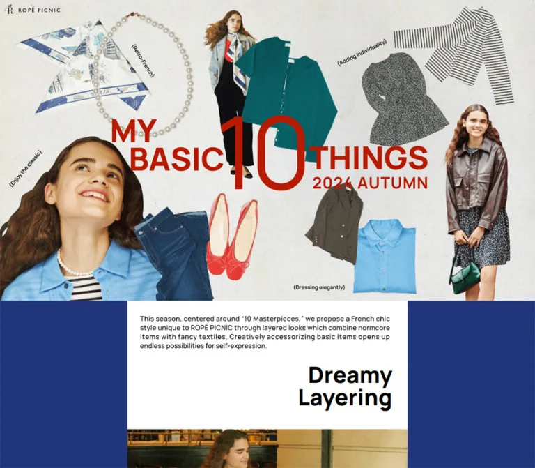
The opening mobile collage establishes the campaign's character: lightly textured paper, independently arranged clothing cutouts, model portraits, a large red numeral, and small angled annotations. The rest of the page combines this playful art direction with restrained catalog information. Preserve the relationship between expressive imagery and small, precise commerce details.
How to Read This Reference
- Computed means a value appears in the supplied computed-style records. Font-family records establish the declared stack, not which font file actually rendered each glyph.
- Measured means dimensions or coordinates come from supplied DOM rectangles. Values are rounded where extra precision would not help implementation.
- Visual estimate means an appearance was judged from an original-page screenshot. Estimated colors are not sampled or verified source declarations.
- Calculated means simple arithmetic using measured dimensions, such as desktop side-margin width.
- Recommended means an implementation choice for a new build, not a verified feature of the original.
- Token names in this document are reusable aliases. No campaign-specific source token names were supplied.
The initial desktop image is a solid red field. Its cause is unresolved: the evidence does not establish whether this is a deliberate opening layer, a delayed reveal, or another rendering state. The later desktop captures and mobile opening provide enough evidence for the catalog reference, but the resolved desktop opening composition is not visually verified.
Some desktop introduction rectangles appear displaced relative to their section and have transform transitions. Treat their widths and computed typography as evidence; do not convert every recorded vertical offset into a permanent margin.
Tokens — Colors
Core Palette
| Name | Value | Suggested token | Role | Evidence |
|---|---|---|---|---|
| Catalog White | #ffffff |
--color-paper |
Main content, footer, and supplementary BUY surfaces | Computed on body, main, footer, and sampled BUY links |
| Editorial Black | #000000 |
--color-ink |
Chapter headings, explanatory text, credits, footer text | Computed |
| Campaign Red | #b61a00 |
--color-accent |
Product names, descriptions, prices, purchase links, and large editorial statement | Computed as rgb(182, 26, 0) |
| Surround Blue | Approximately #223675 |
--color-surround |
Large desktop side fields; visual basis of blue-toned side artwork | Visual estimate; exact source declaration unavailable |
| Collage Paper | Approximately #e8e7df |
--color-collage-paper |
Warm gray paper appearance within the opening artwork | Visual estimate; textured rather than uniformly filled |
| Utility Gray | Approximately #555555 |
--color-utility |
Social icon artwork | Visual estimate |
| Fine Rule Gray | Approximately #b5b5b5 |
--color-rule |
Footer group rules, FOLLOW US underline, legal divider | Visual estimate |
Use blue as a large environmental field and red as a concentrated editorial and commerce signal. The white column remains neutral so natural clothing and location colors stay prominent.
The desktop side portraits contain many pale-blue and white tones. They should be treated as processed image assets, not as additional interface color tokens. Likewise, green knitwear, a blue shirt, red shoes, and warm brickwork belong to the photography and collage.
The DOM exposes --swiper-theme-color: #007aff and --swiper-navigation-size: 44px. These are library-level values. Neither establishes a visible bright-blue campaign accent or a verified navigation control in the supplied screenshots.
Color-State Limits
No theme selector or alternate palette is demonstrated. The red desktop opening capture should not be promoted into a documented theme, loading sequence, or mandatory full-screen transition.
Tokens — Typography
Main Sans-Serif Stack
Computed family: Manrope, 'Zen Kaku Gothic New', sans-serif.
This stack is assigned to the body, chapter typography, product labels, prices, credits, and most footer links. The larger chapter words use weight 800, while product labels use 600 and ordinary shopping rows use 400.
The contrast in scale is deliberate: large, tightly stacked chapter words coexist with very small product information. Most sampled text has normal letter spacing. Avoid adding broad tracking across the interface merely because the logo uses spaced lettering.
Product Description Serif
Computed family: Lora, serif.
Lora is declared for the short descriptive sentences attached to products. In the main catalog these descriptions use weight 500, tiny sizes, and compact leading. Supplementary product-panel descriptions are larger but use the same serif stack.
Footer Heading Serif
Computed family: athelas, serif.
FOLLOW US, Share On, JUN GROUP Online Store, and Help use 14px, weight 700, and 21px line height at both supplied viewports. Preserve the browser fallback when Athelas is unavailable; the evidence does not establish a delivered font file.
Logo and Artwork Lettering
The brand mark is graphic content inside a link. The surrounding H1's computed 32px font size does not describe the logo lettering. The collage title, angled notes, and handwritten side captions should also be handled as artwork unless editable source assets are available. Their font identities were not established.
The introduction's English paragraph is visible in the mobile capture, but its sampled P element has empty extracted text. Its lettering looks approximately 10px high on mobile; the wrapper's computed 16px is not evidence that the visible lettering itself uses that size.
Type Scale
| Role | Desktop size / line height | Mobile size / line height | Weight | Basis |
|---|---|---|---|---|
| Body default | 16 / 24px |
16 / 24px |
400 | Computed inheritance; not every visible text run |
| Dreamy Layering | 44 / 44px |
31.2 / 31.2px |
800 | Computed |
| A masterpiece / of French chic | 58.67 / 58.67px |
41.6 / 41.6px |
800 | Computed |
| Editorial statement paragraph | 13.2 / 17.6px |
9.36 / 12.48px |
500 | Computed |
| Main product heading | 13 / 18px |
10.4 / 15.4px |
600 | Computed |
| Main product row / price context | 13 / 19.5px |
10.4 / 15.6px |
400 | Computed anchor styles |
| Main product description | 10 / 12px |
8.32 / 10.4px |
500 | Computed, Lora |
| Campaign credits | 10 / 14px |
10.4 / 14.56px |
500 | Computed |
| Footer section heading | 14 / 21px |
14 / 21px |
700 | Computed, Athelas stack |
| Footer store/help links | 11 / 16.5px |
11 / 16.5px |
400 | Computed |
| Legal links | 10 / 15px |
10 / 15px |
700 | Computed |
| Supplementary panel heading | 36 / 41px |
37.44 / 42.44px |
700 | DOM-only panel evidence |
| Supplementary panel English description | 12.6 / 16.2px |
13.104 / 16.848px |
500 | DOM-only panel evidence, Lora |
| Supplementary panel Japanese description | 11.7 / 16.8px |
12.168 / 17.472px |
400 | DOM-only panel evidence |
| Supplementary panel BUY | 10.8 / 10.8px |
11.232 / 11.232px |
600 | DOM-only panel evidence, Lora |
The source HTML root computes to 10px; the body computes to 16px. This does not establish a universal scaling unit. Chapter sizes, product captions, supplementary panels, and footer utilities follow different responsive behavior.
For a new implementation, retain the hierarchy while offering larger captions. The observed 8.32px mobile description is a fidelity measurement, not a recommended readability target.
Tokens — Spacing & Shapes
Layout character: broad imagery, irregular editorial placement, small shopping annotations, and a spacious utility footer.
Measured Geometry
| Element | Desktop at 1440 × 1000 | Mobile at 390 × 844 | Interpretation |
|---|---|---|---|
| Main editorial column | 550px, from x=445 to x=995 |
390px, from x=0 |
Measured |
| Each desktop side region | 445px |
No side region visible | Calculated as (1440 − 550) / 2 |
| Introduction section | 550 × 252px |
390 × 167.41px |
Measured |
| Introduction padding | 30px 30px 30px 25px |
20.8px on all sides |
Computed |
| First post-introduction image section | 550 × 707.78px |
390 × 498.31px |
Measured section, not verified asset dimensions |
| Typical product block width | Commonly 202px; some 208px, 193px, or 167px |
Approximately 139–170px |
Measured; varies by spread |
| Common left product inset | 40px within the column |
20.8px |
Calculated from coordinates |
| Border tops / Shirt pair | Two 208px blocks, 60px between |
Two 169.52px blocks, about 16.63px between |
Measured and calculated |
| Statement left inset | 44px |
31.19px |
Calculated |
| Credit padding | 30px 20px 0 |
20.8px 20.8px 0 |
Computed |
| Footer height | 999px |
1039px |
Measured; mobile adds 40px top padding |
| Footer group text inset | 50px |
50px |
Relative to column |
| Legal area left inset | 35px |
35px |
Relative to column |
The paired product blocks are not universally symmetrical. For Border tops and Shirt, desktop positions leave approximately 40px at the left and 34px at the right. On mobile, the corresponding outer spaces are approximately 20.8px and 13.55px. Treat this as spread-specific art direction, not a rule to normalize away.
Spacing Rhythm
| Use | Observed value | Practical interpretation |
|---|---|---|
| Typical related-product row interval | 29.5px desktop; 26px mobile |
Compact lists below the main description |
| Gap between several neighboring editorial sections | Roughly 13–16px desktop; 10.4px mobile |
Fine separations between larger image sequences |
| Larger section separations | Examples around 40–45px desktop; 31.2px mobile |
Breathing room at narrative changes |
| Footer logo to FOLLOW US heading | 50px |
Deliberate brand-space pause |
| FOLLOW US heading box to social icons | 12px |
Small utility gap |
| Gap between follow icons | 18px |
Calculated from icon rectangles |
| Footer store/help row pitch | 20.5px |
16.5px leading plus about 4px separation |
| Legal-link row pitch | 23px |
Compact two-column grid |
| Space beneath bottom logos | About 50px |
Measured from document end |
These measurements do not form one consistent 8px grid. A reusable implementation can consolidate them, but should retain the distinction between tiny product spacing, medium spread breaks, and larger footer pauses.
Shapes and Rules
Sampled content sections and anchors have 0px border radius. Photos have square visible boundaries. Purchase stamps are small rectangular outlines rather than large rounded buttons. Fine gray vertical and horizontal rules structure the footer.
Irregular speech bubbles and cutout contours belong to the decorative artwork. They do not imply a rounded-card system for ordinary interface content. No general shadow-based elevation system is visible in the supplied captures.
Components
Brand Mark
Role: persistent brand recognition with a link to the brand website.
The desktop captures show a small white ROPÉ PICNIC mark at the upper-left of the viewport, around x=13 and y=13. Its H1 rectangle measures approximately 146.88 × 24.27px. Its repeated placement across the middle and footer captures is consistent with fixed positioning, although the supplied records do not include the position property.
On mobile, a dark mark appears over the opening collage at approximately x=10.39 and y=10.39, measuring 114.39 × 18.91px. A separate persistent mobile mark is not visible in the bottom capture.
The link destination is https://www.ropepicnic.com/. The supplied header rectangle has zero height, so do not allocate a conventional navigation bar above the artwork based on this evidence.
Opening Mobile Collage
Role: introduce the campaign as a curated collection of ten everyday pieces.
At 390px wide, the opening artwork occupies approximately 530.39px of vertical space before the introduction begins. The brand sits in the upper-left. Clothing cutouts and model images overlap a pale textured ground, while the red MY BASIC 10 THINGS title stretches across the middle with an oversized numeral 10. The year and season sit beneath the right-hand portion of the title.
Visible pieces include green knitwear, a striped top, a gray textured garment, a blue shirt, a pearl necklace, a scarf, dark trousers or denim, red ballet shoes, and styled model cutouts. A large smiling portrait anchors the lower-left. Smaller angled annotations add an informal magazine quality.
The collage is deliberately composed for a tall viewport. Keep clothing silhouettes legible and preserve their relative scale. A single generic crop of a wide image is not a reliable substitute for this observed mobile arrangement.
The desktop DOM places the following introduction at y=809.59. This provides a boundary for the opening region, but its resolved visual composition was not captured.
Desktop Side Frame
Role: maintain campaign atmosphere around the scrolling catalog.
Both supplied desktop content views show the same broad blue surroundings. The left side contains a pale blue-and-white dog cutout near the bottom, topped by irregular handwritten MY BASIC 10 THINGS lettering. The right side contains a large blue-toned portrait rising from the lower edge, with two white speech bubbles above it.
Much of the upper side area remains empty blue. This generous negative space allows the narrow white column to read as the active content zone. The side artwork remains in approximately the same viewport position across the two desktop captures, supporting a fixed-frame interpretation. Exact positioning rules and any parallax behavior are unverified.
For a new implementation, use decorative layers outside the reading column, mark them as decorative for assistive technology, and prevent them from intercepting pointer events.
Introduction and Dreamy Layering Heading
Role: transition from the dense opening artwork to the photographic narrative.
A white section contains a compact English introduction above a bold, right-aligned, two-line Dreamy / Layering heading. On mobile, the introductory artwork/text region starts around x=20.8 and y=551.19. The heading begins around y=608.38 and uses 31.2px type with equal line height.
The section ends around y=697.80, where a café photograph begins edge-to-edge. The juxtaposition is important: small editorial copy first, a large compact title to the right, then an immediate photographic scene.
The desktop heading uses 44px / 44px. Both introductory P elements have a declared transform transition, but the exact reveal trigger and travel distance were not provided.
Photographic Spread
Role: demonstrate styling through atmosphere and human scale.
The mobile opening of the photo sequence shows a seated model and dog in a café setting. The desktop middle capture shows a full-width portrait against orange brickwork: a brown jacket, patterned dress, and green handbag supply strong natural color against the blue surround.
The desktop photograph spans the 550px column. Beneath it, a white gutter leads to a smaller, left-aligned image approximately half the column width, leaving open white space to its right. This alternating use of full-column photography and partial-width imagery is more characteristic than a uniform repeating card layout.
Keep image boundaries crisp and square. Use natural aspect ratios when available. Do not infer every photograph's full dimensions from a viewport crop.
Product Annotation
Role: connect an editorial look to specific purchasable items.
A primary product annotation contains:
- A short sans-serif product heading.
- A compact Lora description, usually two or three lines.
- A price and small BUY treatment.
- Related-product rows beneath it, each with a name, price, and BUY label.
The annotation is red throughout and rests directly on white without a card outline or shadow. Desktop primary blocks commonly measure 202px wide. Their placement alternates between the left and right sides of the column.
The Jacket example links to /products/d/GDV54010 and displays ¥8,789, followed by Blouse, Skirt, and Pants rows. This is evidence of the page's recorded content, not verification of current product availability or current checkout pricing.
The main product anchor includes the heading, description, and purchase information. Related products have separate anchors. Preserve this grouping without nesting interactive links.
Paired Product Annotations
Role: associate related wardrobe staples within one spread.
Border tops and Shirt occupy two adjacent blocks at the same vertical position. Denim and Ballet shoes also appear as a pair, with a small vertical offset between their headings. These pairs remain side by side at 390px in the DOM evidence.
On mobile, this produces very small descriptive text and narrow columns. For a faithful reference, preserve the measured pairing. For a production adaptation, permit larger text or stacking when user preferences and available width require it.
The ten main product categories are Jacket, Pearl, Border tops, Shirt, One-piece, Denim, Ballet shoes, Ensemble, Pea Coat, and Scarf. They form the editorial sequence rather than ten identical visual cards.
Editorial Statement
Role: interrupt the product sequence with a strong campaign message.
The One-piece section also contains the large red phrase A / masterpiece followed by of French / chic. Each two-line text block is bold Manrope-stack typography with line height equal to font size. The recorded sizes are 58.67px on desktop and 41.6px on mobile.
The statement is inset approximately 44px from the desktop column's left edge and 31.19px on mobile. A narrower black paragraph follows, measuring approximately 318px wide on desktop and 225.67px on mobile.
Keep the intentional line breaks and the large separation between the two headline fragments. The intervening visual content is not fully shown in the supplied screenshots, so its exact composition should not be invented from the text rectangles.
Supplementary Product Panels — DOM Evidence Only
Role indicated by content: expanded explanations of the ten staple items, including Japanese descriptions and BUY links.
The DOM contains repeated product groups whose x coordinates advance by 550px on desktop and 390px on mobile. The first group's inner content is approximately 252px wide on desktop and 262.08px on mobile. The groups contain larger headings, Lora English descriptions, a narrow vertically arranged MY BASIC 10 THINGS label, Japanese copy, and purchase links.
A sampled BUY link measures 91.19 × 21.80px on desktop and 94.84 × 22.58px on mobile. An unlabeled button near the upper-right measures about 20.70px square on desktop and 21.53px square on mobile.
These records are consistent with a horizontal detail presentation, but no supplied screenshot demonstrates it open. The trigger, overlay appearance, button purpose, swipe behavior, navigation controls, focus handling, and closing behavior remain unverified. Do not turn this evidence into a claimed working modal or carousel specification.
Campaign Credits
Role: conclude the editorial production before the commerce footer.
Credits form a compact, unboxed text block. Desktop text uses 10px / 14px, weight 500, with 30px 20px 0 padding. Mobile uses 10.4px / 14.56px with 20.8px top and side padding.
The original page explicitly names Reiko Toyama (LESEN inc.) for photography, Lisa Sato (BE NATURAL) for styling, Ryoki Shimonagata for hair and make-up, Geena (AUBE) as model, Kana Mizoguchi (Mo-Green) as creative director, and Mo-Green Co.,Ltd. for creative direction. It also lists AUX BACCHANALES GINZA and Institut français de Tokyo as locations.
These are campaign credits. They do not establish who implemented the website, wrote its code, or designed every interface component.
Brand and Follow Block
Role: reconnect the editorial experience with the brand's ongoing channels.
The footer begins with a centered black ROPÉ PICNIC graphic approximately 121.03 × 80px. FOLLOW US sits beneath it in the Athelas serif stack, centered over a fine rule. Three approximately 20px social icons follow: LINE, Instagram, and X, separated by 18px gaps.
The brand graphic and social icon sizes remain essentially unchanged between the two viewports. The footer gains 40px of top padding on mobile instead of uniformly shrinking.
Footer Navigation Groups
Role: provide social, store, and support destinations.
Share On, JUN GROUP Online Store, and Help are stacked groups marked by thin vertical gray rules. Rules sit about 35px from the column edge, with text beginning at 50px. Heading typography is 14px / 21px bold serif. Store and help links use 11px / 16.5px sans-serif.
Share On uses two columns for four labeled social links. Although the heading says Share On, the supplied hrefs point to social profiles. Opening a sharing dialog was not demonstrated.
The store group contains seven destinations. Help contains User Guide, Q&A, and Contact; the recorded Q&A and Contact links both point to the FAQ URL. Keep footer behavior tied to actual hrefs instead of inferring functionality from labels.
Legal and Corporate Footer
Role: finish the page with required information and parent-service identity.
A small right-aligned ©JUN CO.,LTD. line sits above a full-column gray divider. Beneath the divider, six Japanese legal and company links form a two-column, three-row arrangement. They use 10px, weight 700, and 15px line height.
The final row places the J’aDoRe JUN ONLINE mark on the left and the YOU ARE CULTURE / JUN graphic on the right, aligned near their lower edges. Measured graphic sizes are approximately 115.88 × 39.98px and 160 × 12.47px, respectively, at both viewports. The page ends with about 50px of white space beneath them.
The footer remains inside the 550px column on desktop. Its typography and marks retain their size on mobile, giving it a more conventional utility rhythm than the scaled editorial content above.
Tokens — Motion & Interaction
| Element or behavior | Supplied evidence | What can be stated |
|---|---|---|
| Brand and follow links | opacity 0.3s cubic-bezier(0.45, 0.01, 0.33, 1) |
An opacity transition is declared; endpoint and trigger not exercised |
| Product and many footer links | Opacity, color, background, and border transitions, each 0.3s with the same curve |
Multiple properties are prepared for state changes; actual hover appearance is unverified |
| Introduction copy and chapter heading | transform 0.6s cubic-bezier(0.45, 0.01, 0.33, 1) |
Transform-based transitions are declared; trigger and distance unknown |
| Desktop side frame | Similar viewport placement in middle and bottom captures | Consistent with fixed decoration; no verified parallax |
| Supplementary product groups | Repeated horizontal geometry and Swiper custom properties | A horizontal presentation is suggested; operation is unverified |
| Red desktop opening | One solid-color capture | Cause, duration, exit condition, and intended sequence unknown |
| Sampled element animations | Records report animation: none |
This does not rule out JavaScript, transitions, image animation, or unrecorded elements |
The meaningful reusable timing values are 300ms for small interface transitions and 600ms for introductory transforms, with cubic-bezier(0.45, 0.01, 0.33, 1).
Do not interpret a bare computed transition: all as evidence of a timed animation. No click-through purchase flow, hover endpoint, keyboard flow, touch gesture, autoplay sequence, or reduced-motion behavior was demonstrated.
For a new build, use short, restrained transitions and keep content visible before enhancement. Any scroll reveal should have a static fallback and a reduced-motion alternative.
Surfaces
| Layer | Appearance | Function |
|---|---|---|
| Desktop surroundings | Flat deep blue with pale photographic cutouts | Campaign atmosphere around the reading column |
| Main reading column | Pure white, square boundaries | Continuous editorial and shopping surface |
| Opening artwork | Textured warm gray paper with overlapping cutouts | Campaign identity and wardrobe overview |
| Fashion imagery | Full color, natural environments, square image edges | Styling and material context |
| Product annotations | Red text directly on white | Compact links between photography and merchandise |
| Editorial statement | Large red typography on the catalog surface | Narrative emphasis |
| Footer | White, black text, gray rules and icons | Utility navigation and institutional information |
Hierarchy comes from image scale, white space, text contrast, and position. There is no observed need for a general system of floating panels, gradients, blur, or elevated cards.
Imagery
The imagery combines magazine collage with approachable fashion photography. Clothing is presented both as isolated objects and as worn looks. Smiling portraits, a dog, café furniture, window details, and brick walls make the catalog feel inhabited rather than purely transactional.
The mobile collage uses overlapping cutouts at different scales, including a large face crop and much smaller complete outfits. Preserve this imbalance: equally sized product cutouts would lose the editorial energy. Red typography ties the objects together without enclosing them in boxes.
Desktop margin artwork is treated differently from the main photography. The dog and portrait use blue-and-white tonal processing, visually merging them into the surround. Their contours are cut out; they do not sit inside rectangular photo cards. Handwriting and irregular speech bubbles provide a second texture against the clean body typography.
Use normal photographic rendering. The evidence does not suggest intentional pixelation. Preserve garment texture, fine hair edges, fabric detail, and the soft paper surface of the collage.
Observed Asset References
No original image src paths were supplied. The following inventory identifies asset roles without inventing filenames or download URLs.
| Asset role | Original-page evidence | Implementation handling |
|---|---|---|
| Mobile opening collage | Fully visible at 390px width, approximately 530.39px tall | Dedicated portrait composition; preserve internal lettering and overlaps |
| Small header brand mark | Desktop and mobile captures plus linked H1 rectangles | Graphic logo with appropriate light/dark variant |
| Desktop left decoration | Dog cutout and handwritten campaign phrase | Transparent decorative artwork outside the content column |
| Desktop right decoration | Blue-toned portrait and two speech bubbles | Transparent decorative artwork with generous surrounding blue space |
| Café scene | Lower portion of mobile opening capture | Full-column editorial photograph |
| Brick-wall fashion portrait | Desktop middle capture | Full-column color photograph |
| Smaller architectural photograph | Partially visible below the brick-wall image | Partial-width image with adjacent white space |
| Footer brand and service marks | Desktop/mobile footer captures and measured link rectangles | Preserve supplied brand proportions |
| Social icons | Footer captures and approximately 20px rectangles | Recognizable monochrome platform artwork |
Use licensed or authorized imagery. CSS can reproduce the surrounding layout and type hierarchy, but the photographed styling and composed cutouts carry much of the identity.
Layout & Responsive Behavior
Desktop
At 1440px, the main catalog and footer occupy x=445 through x=995: a 550px-wide strip centered in the viewport. Each side region is therefore 445px wide. The opening region precedes this strip's introduction, whose top is recorded at y=809.59.
The supplied middle and footer captures preserve the narrow strip and the blue decorative frame. The page does not expand its editorial photographs or utility footer across all available desktop width. Recorded document height is approximately 12,083.81px.
Mobile
At 390px, the content column reaches both screen edges. The opening collage ends at y=530.39, the introduction ends at y=697.80, and the café image begins immediately afterward. Recorded document height is approximately 9,006.22px.
Product pairs remain in two columns. Larger chapter typography shrinks, while footer typography, brand marks, and social icons largely retain their desktop dimensions. The side artwork is absent from the supplied mobile views.
Responsive Relationships
| Relationship | Desktop | Mobile | Meaning |
|---|---|---|---|
| Column width | 550px |
390px |
Mobile is about 70.91% of the desktop strip |
| Dreamy Layering size | 44px |
31.2px |
Approximately proportional to strip width |
| Large statement size | 58.67px |
41.6px |
Approximately proportional to strip width |
| Main product label | 13px |
10.4px |
80% scaling, different from the column ratio |
| Product description | 10px |
8.32px |
83.2% scaling |
| Footer heading | 14px |
14px |
Fixed in supplied states |
| Supplementary panel heading | 36px |
37.44px |
Slightly larger on mobile; independent sizing system |
The source breakpoint and interpolation formulas were not provided. A width: min(100%, 550px) content rail reproduces the two measured widths, but remains a recommended implementation rule. The Quick Start uses a 900px decorative-frame breakpoint as an explicit adaptation choice, not a recovered source value.
Only these two viewport sizes were inspected. Tablet layout, short landscape screens, browser zoom, large-text settings, and safe-area behavior remain unverified.
Do’s and Don’ts
Do
- Preserve the 550px desktop reading strip and its strong contrast with the blue surroundings.
- Let the mobile catalog occupy the full viewport width.
- Use the measured
#b61a00for shopping annotations and major red editorial typography. - Keep Manrope-stack sans-serif labels, Lora product descriptions, and serif footer headings distinct.
- Alternate full-column photography with smaller images and intentionally placed product notes.
- Maintain the mobile collage's overlaps, varied object scales, and dominant numeral.
- Keep the desktop dog, portrait, and handwritten graphics outside the active reading column.
- Use square image edges and small rectangular purchase treatments.
- Preserve the footer's compact typography, vertical group rules, and fixed-size marks.
- Label inferred breakpoints, estimated colors, and untested interactions clearly.
Don’t
- Don’t widen every catalog image to fill the desktop viewport.
- Don’t replace the editorial sequence with ten identical product cards.
- Don’t convert BUY labels into oversized pill buttons that dominate the photography.
- Don’t assume a source font for lettering embedded in the collage or logo.
- Don’t use the inherited 16px P style to describe image-based introduction lettering.
- Don’t introduce the library's
#007affas a visible brand color without visual evidence. - Don’t treat the solid-red desktop capture as a verified loading animation.
- Don’t claim swipe, modal, hover, or sharing behavior from DOM structure alone.
- Don’t uniformly scale the footer down with the editorial column.
- Don’t hardcode recorded product prices as current commerce data.
- Don’t reproduce the smallest observed captions without considering readable alternatives.
Recommended Implementation Additions
These are recommendations for a new implementation, not verified features of the original:
- Provide a semantic campaign H1 and proper section headings. Dreamy Layering and the large editorial statement are P elements in the supplied records; their visual role can be represented with headings in a new build.
- Supply accessible text for lettering embedded in artwork, while avoiding duplicate announcements when equivalent visible text exists.
- Give brand and social links clear accessible names. Mark purely decorative side portraits, dog cutouts, and speech bubbles as decorative.
- Include the product name in each purchase link's accessible name, so repeated BUY labels remain understandable outside their visual context.
- Offer a readable-caption mode, increasing product labels to around 14px and descriptions to at least 12px. Permit product pairs to stack when necessary.
- Increase effective touch targets to approximately 44px without enlarging every visible outline. Keep neighboring targets from overlapping.
- Use visible keyboard focus and keyboard-operable product destinations.
- If supplementary panels are implemented, verify their actual intended behavior first, then provide focus management, labeled controls, keyboard navigation, and a reliable return path.
- Keep all primary content visible when JavaScript or motion enhancement fails. Do not require a full-screen opening layer to disappear before links can be reached.
- Reserve image dimensions, use responsive assets, and defer offscreen photographs while prioritizing the opening artwork.
- Read product availability and pricing from current commerce data in any live adaptation.
Agent Prompt Guide
Quick Color Reference
- Reading surface and footer:
#ffffff, computed. - Ordinary text and chapter headings:
#000000, computed. - Product details and campaign red:
#b61a00, computed. - Desktop surroundings: approximately
#223675, visual estimate. - Collage paper: approximately
#e8e7df, visual estimate with texture. - Footer rules and icon gray: neutral gray estimates, subordinate to black text.
Overall Prompt
“Create a shoppable fashion editorial inspired by the currently observed ROPÉ PICNIC MY BASIC 10 THINGS catalog. Center a 550px white reading column within deep-blue desktop surroundings, approximately #223675. Place decorative blue-and-white dog and portrait cutouts near the lower edges of the side regions, with irregular handwriting and speech bubbles. On mobile, use the full screen width and a dedicated portrait collage of clothing, styled models, pale textured paper, and a large red numeral. Use #b61a00 for compact product information and large editorial statements. Combine Manrope-style sans-serif hierarchy with Lora product descriptions and serif footer headings. Alternate large photographs, smaller inset images, and asymmetric product annotations. Finish with a white, finely ruled brand and utility footer. Treat unverified opening and detail-panel behavior as separate implementation decisions.”
Example Component Prompts
- Mobile opening: “Compose a 390px-wide portrait fashion collage around a large red 10. Use a smiling portrait, smaller full-body looks, green knitwear, striped fabric, a blue shirt, pearls, and red ballet shoes on subtly textured gray paper. Keep the small brand mark at upper-left and vary the scale and angle of the cutouts. Prepare real accessible campaign text alongside the artwork.”
- Desktop frame: “Surround a centered 550px white catalog with solid deep blue. Leave the upper margins mostly empty. Anchor a pale dog cutout and handwritten title low on the left, and a blue-toned portrait with white speech bubbles low on the right. Decorative assets must not cover or intercept the reading column.”
- Product annotation: “Build a compact red product note directly on white: small semibold sans-serif heading, two or three lines of Lora description, then price and a tiny outlined BUY stamp. Related items follow as short individual link rows. No enclosing card, shadow, or rounded container.”
- Editorial transition: “After a dense fashion collage, create a white introductory block with a small paragraph and a right-aligned Dreamy / Layering heading. At 390px, use 20.8px insets and 31.2px bold type with equal leading. Continue directly into a full-width café photograph.”
- Statement typography: “Set A / masterpiece and of French / chic as separated, strongly weighted red text groups. Use 58.67px desktop and 41.6px mobile type with tight equal leading. Follow with a narrower black explanatory paragraph. Preserve editorial white space and intentional line breaks.”
- Footer: “Create a white footer inside the catalog width. Center a black brand graphic, FOLLOW US in a 14px bold serif, and three 20px monochrome social icons. Stack left-ruled navigation groups below. Finish with a fine horizontal divider, a compact two-column legal list, and two bottom-aligned service marks.”
Quick Start
CSS Custom Properties
This is an implementation starter, not copied source CSS. It reproduces the measured column widths and selected typography at the supplied viewports. The blue and gray colors are estimates; the 900px breakpoint, intermediate scaling, hover endpoint, and accessible mode are recommendations.
Use .catalog-page as the outer container, .side-frame for decorative artwork, .opening for an art-directed picture, and .story-rail for the introduction, photo spreads, product notes, credits, and footer. Keep .side-frame decorative in the markup. Supply authorized assets; no source image filenames were available.
The desktop opening ratio below follows the recorded next-section boundary. It does not specify an unseen desktop collage arrangement. The starter intentionally adds no red opening cover or unverified detail-panel interaction.
:root {
  /* Computed colors */
  --color-paper: #ffffff;
  --color-ink: #000000;
  --color-accent: #b61a00;

  /* Visual estimates */
  --color-surround: #223675;
  --color-collage-paper: #e8e7df;
  --color-utility: #555555;
  --color-rule: #b5b5b5;

  /* Declared source stacks; load fonts separately if authorized */
  --font-ui: 'Manrope', 'Zen Kaku Gothic New', sans-serif;
  --font-description: 'Lora', serif;
  --font-footer-heading: 'athelas', serif;

  /* Measured endpoint geometry */
  --story-width: 550px;
  --radius-editorial: 0px;
  --rule-width: 1px;

  /* Recommended interpolation between observed sizes */
  --size-chapter: clamp(25.6px, 8vw, 44px);
  --size-statement: clamp(34px, 10.66667vw, 58.67px);
  --size-product: clamp(10.4px, 2.66667vw, 13px);
  --size-description: clamp(8.32px, 2.13333vw, 10px);
  --leading-description: clamp(10.4px, 2.66667vw, 12px);
  --leading-product-heading: clamp(15.4px, 3.94872vw, 18px);
  --intro-inset: clamp(16px, 5.33333vw, 30px);
  --caption-gap: clamp(7.28px, 1.86667vw, 9px);

  /* Measured transition declarations */
  --ease-editorial: cubic-bezier(0.45, 0.01, 0.33, 1);
  --motion-link: 300ms;
  --motion-reveal: 600ms;
}

.catalog-page,
.catalog-page * {
  box-sizing: border-box;
}

.catalog-page {
  --meta-inset: 20.8px;
  --pair-gap: 16.625px;
  --pair-end-inset: 13.55px;
  position: relative;
  isolation: isolate;
  margin: 0;
  color: var(--color-ink);
  background: var(--color-paper);
  font-family: var(--font-ui);
  font-size: 16px;
  line-height: 1.5;
}

.catalog-page img {
  display: block;
  max-width: 100%;
  height: auto;
}

.catalog-page a {
  color: inherit;
  transition:
    opacity var(--motion-link) var(--ease-editorial),
    color var(--motion-link) var(--ease-editorial),
    background-color var(--motion-link) var(--ease-editorial),
    border-color var(--motion-link) var(--ease-editorial);
}

.brand-mark {
  position: absolute;
  z-index: 3;
  top: 10.4px;
  left: 10.4px;
  width: 114.4px;
}

.brand-mark img {
  width: 100%;
}

.side-frame {
  display: none;
  pointer-events: none;
}

.opening {
  position: relative;
  z-index: 2;
  width: 100%;
  aspect-ratio: 390 / 530.39;
  background: var(--color-collage-paper);
}

.opening picture,
.opening img {
  display: block;
  width: 100%;
  height: 100%;
}

.opening img {
  object-fit: contain;
}

.story-rail {
  position: relative;
  z-index: 1;
  width: min(100%, var(--story-width));
  margin-inline: auto;
  background: var(--color-paper);
}

.catalog-intro {
  padding: var(--intro-inset);
}

.intro-copy {
  margin: 0;
  /* Readable live-text adaptation of the visual introduction */
  font-size: 12px;
  line-height: 1.35;
}

.chapter-title {
  margin: 12px 0 0;
  font-size: var(--size-chapter);
  font-weight: 800;
  line-height: 1;
  text-align: right;
}

.intro-copy,
.chapter-title {
  transition: transform var(--motion-reveal) var(--ease-editorial);
}

.photo-spread {
  margin: 0;
}

.photo-spread > img {
  width: 100%;
  border-radius: var(--radius-editorial);
}

.photo-spread--half {
  width: 50%;
  margin-top: 24px;
}

.product-block {
  width: min(202px, 41.86%);
  margin-inline-start: var(--meta-inset);
  color: var(--color-accent);
  font-size: var(--size-product);
  line-height: 1.5;
}

.product-block--right {
  margin-inline-start: auto;
  margin-inline-end: var(--meta-inset);
}

.product-primary {
  display: block;
  text-decoration: none;
}

.product-heading {
  margin: 0 0 var(--caption-gap);
  font-size: inherit;
  font-weight: 600;
  line-height: var(--leading-product-heading);
}

.product-description {
  margin: 0 0 10px;
  font-family: var(--font-description);
  font-size: var(--size-description);
  font-weight: 500;
  line-height: var(--leading-description);
}

.price-line,
.product-row {
  display: flex;
  align-items: center;
  justify-content: space-between;
  gap: 8px;
}

.product-row {
  margin-top: 10px;
  text-decoration: none;
}

.buy-stamp {
  /* Approximation of the small inline purchase treatment */
  display: inline-grid;
  flex: none;
  place-items: center;
  min-width: 3.8em;
  padding: 1px 6px;
  border: 1px solid currentColor;
  border-radius: 0;
  font-family: var(--font-description);
  font-size: 0.8em;
  line-height: 1.1;
}

.product-pair {
  display: grid;
  grid-template-columns: repeat(2, minmax(0, 1fr));
  gap: var(--pair-gap);
  padding-inline: var(--meta-inset) var(--pair-end-inset);
}

.product-pair .product-block {
  width: auto;
  min-width: 0;
  margin: 0;
}

.editorial-statement {
  padding-inline: 8%;
}

.statement-title {
  margin: 0;
  color: var(--color-accent);
  font-size: var(--size-statement);
  font-weight: 800;
  line-height: 1;
}

.statement-copy {
  max-width: 318px;
  margin-top: 40px;
  font-size: 13.2px;
  line-height: 1.3333;
}

.campaign-credits {
  margin: 0;
  padding: 20.8px 20.8px 0;
  font-size: 10.4px;
  font-weight: 500;
  line-height: 1.4;
}

.catalog-footer {
  padding-top: 40px;
  color: var(--color-ink);
  background: var(--color-paper);
}

.footer-brand {
  display: block;
  width: 121.03px;
  margin: 50px auto;
}

.follow-heading,
.footer-group-title {
  font-family: var(--font-footer-heading);
  font-size: 14px;
  font-weight: 700;
  line-height: 21px;
}

.follow-heading {
  width: 90px;
  margin: 0 auto;
  padding-bottom: 1px;
  border-bottom: 1px solid var(--color-rule);
  text-align: center;
}

.follow-icons {
  display: flex;
  justify-content: center;
  gap: 18px;
  margin-top: 12px;
  color: var(--color-utility);
}

.follow-icons img,
.follow-icons svg {
  display: block;
  width: 20px;
  height: 20px;
}

.footer-navigation {
  margin-top: 66px;
}

.footer-group {
  margin: 0 15px 32px 35px;
  padding-left: 14px;
  border-left: 1px solid var(--color-rule);
}

.footer-group-title {
  margin: 0 0 10px;
}

.footer-group ul {
  margin: 0;
  padding-left: 21px;
  font-size: 11px;
  line-height: 16.5px;
}

.footer-group li + li {
  margin-top: 4px;
}

.footer-group a,
.footer-legal a {
  text-decoration: none;
}

.share-links {
  display: grid;
  grid-template-columns: repeat(2, 110px);
  gap: 2px 0;
  font-size: 11px;
  line-height: 16.5px;
}

.footer-copyright {
  margin: 32px 15px 4px;
  font-size: 10px;
  text-align: right;
}

.footer-legal {
  padding: 30px 15px 50px 35px;
  border-top: 1px solid var(--color-rule);
}

.legal-links {
  display: grid;
  grid-template-columns: 120px minmax(0, 1fr);
  gap: 8px 20px;
  font-size: 10px;
  font-weight: 700;
  line-height: 15px;
}

.footer-marks {
  display: flex;
  flex-wrap: wrap;
  align-items: flex-end;
  justify-content: space-between;
  gap: 24px;
  margin-top: 80px;
}

.footer-mark-store {
  width: 115.88px;
}

.footer-mark-corporate {
  width: 160px;
}

/* Recommended desktop threshold, not recovered source CSS */
@media (min-width: 900px) {
  .catalog-page {
    --meta-inset: 40px;
    --pair-gap: 60px;
    --pair-end-inset: 34px;
  }

  .brand-mark {
    position: fixed;
    top: 12.64px;
    left: 12.64px;
    width: 146.88px;
  }

  .side-frame {
    position: fixed;
    z-index: 0;
    inset: 0;
    display: block;
    background: var(--color-surround);
  }

  .side-region {
    position: absolute;
    top: 0;
    bottom: 0;
    width: calc((100% - var(--story-width)) / 2);
    overflow: hidden;
  }

  .side-region--left { left: 0; }
  .side-region--right { right: 0; }

  .side-art {
    position: absolute;
    bottom: 0;
    width: 100%;
  }

  .opening {
    aspect-ratio: 1440 / 809.594;
  }

  .catalog-intro {
    padding: 30px 30px 30px 25px;
  }

  .campaign-credits {
    padding: 30px 20px 0;
    font-size: 10px;
    line-height: 14px;
  }

  .catalog-footer {
    padding-top: 0;
  }
}

/* Recommended interaction feedback; original endpoint unverified */
@media (hover: hover) {
  .product-primary:hover,
  .product-row:hover {
    text-decoration: underline;
    text-underline-offset: 3px;
  }

  .brand-mark:hover,
  .follow-icons a:hover {
    opacity: 0.75;
  }
}

.catalog-page :focus-visible {
  outline: 2px solid var(--color-accent);
  outline-offset: 4px;
}

/* Optional readable mode; intentionally departs from tiny captions */
.catalog-page[data-readable='true'] {
  --size-product: 14px;
  --size-description: 12px;
  --leading-description: 18px;
  --leading-product-heading: 20px;
}

.catalog-page[data-readable='true'] .product-row {
  min-height: 44px;
}

@media (max-width: 480px) {
  .catalog-page[data-readable='true'] .product-pair {
    grid-template-columns: 1fr;
    gap: 24px;
    padding-inline: 20px;
  }

  .catalog-page[data-readable='true'] .product-block {
    width: auto;
    margin-inline: 20px;
  }

  .catalog-page[data-readable='true'] .product-pair .product-block {
    margin: 0;
  }
}

@media (prefers-reduced-motion: reduce) {
  .catalog-page *,
  .catalog-page *::before,
  .catalog-page *::after {
    animation: none !important;
    transition: none !important;
    scroll-behavior: auto !important;
  }
}
Individual spreads still need composition-specific image placement and spacing. Avoid applying one absolute coordinate map to every product section. The full document heights are observations, not heights to hardcode.
Tailwind v4 Token Mapping
Optional aliases for a project already using Tailwind v4. Define the custom properties above first. This is not evidence that the original website uses Tailwind.
@theme inline {
  --color-catalog-paper: var(--color-paper);
  --color-catalog-ink: var(--color-ink);
  --color-catalog-red: var(--color-accent);
  --color-catalog-blue: var(--color-surround);
  --color-catalog-rule: var(--color-rule);

  --font-catalog: var(--font-ui);
  --font-catalog-description: var(--font-description);
  --font-catalog-footer: var(--font-footer-heading);

  --text-catalog-chapter: var(--size-chapter);
  --text-catalog-statement: var(--size-statement);
  --text-catalog-product: var(--size-product);
  --text-catalog-description: var(--size-description);

  --spacing-catalog-width: var(--story-width);
  --radius-catalog: 0px;
}
Sources & Evidence
- Original and final page: ROPÉ PICNIC 2024 Autumn catalog. The supplied record reports HTTP 200 and identical original/final URLs. The recorded browser title is “ロペピクニックの2024 Autumn catalogが公開”.
- Inspection timestamp: September 16, 2026, 19:19:33.185 UTC; September 17, 2026, 04:19:33.185 JST. This is the supplied retrieval timestamp; individual screenshot timestamps were not separately provided.
- Desktop evidence: 1440 × 1000 viewport; reported document height approximately 12,084px. Supplied original-page images show a solid-red opening state, an intermediate fashion spread, and the footer with blue side artwork.
- Mobile evidence: 390 × 844 viewport; reported document height approximately 9,006px. Supplied original-page images show the opening collage, introduction, start of the café photograph, and lower footer.
- Rendered DOM and computed styles: text, hrefs, element rectangles, font stacks, sizes, weights, line heights, colors, selected padding, radii, transitions, and a small set of custom properties. Full stylesheets, image source paths, font-loading results, and event handlers were not supplied.
- Original-page attribution evidence: the campaign credit block names the creative and photographic team. The footer displays ©JUN CO.,LTD. and links to the site's company page. These observations do not establish web-development authorship.
- Interaction coverage: the supplied collection process traversed intermediate scroll positions and waited for loading, image decoding, finite motion, and sampled layout stability within time limits. No demonstrated click, hover, gesture, or keyboard sequence was included.
- Inspection limitations: readiness checks cannot prove semantic completeness. Perpetual animations were paused during checks and resumed; SharedWorkers and service workers were disabled. The unresolved red desktop opening, potentially delayed content, supplementary panel visibility, actual font resolution, exact decorative colors, breakpoint rules, and unexercised interactions remain uncertain.
This reference uses the supplied current original-page evidence only. No additional browsing, command execution, file inspection, or historical reconstruction was performed.
# ROPÉ PICNIC / MY BASIC 10 THINGS — Style Reference

> A French wardrobe scrapbook unfolding through a white column inside a deep-blue frame.

**Original URL:** [ROPÉ PICNIC 2024 Autumn catalog](https://www.junonline.jp/special/ropepicnic_collection_24autumn/index.html)
**Final URL:** [Same catalog URL](https://www.junonline.jp/special/ropepicnic_collection_24autumn/index.html)
**Theme:** white editorial surfaces, deep-blue desktop surroundings, and brick-red campaign and shopping accents.
**Inspected:** September 17, 2026, Japan time. The supplied retrieval timestamp is September 16, 2026, 19:19:33.185 UTC, equivalent to September 17, 04:19:33.185 JST.
**Viewports:** desktop 1440 × 1000 and mobile 390 × 844 CSS pixels.
**Scope:** supplied original-page captures and rendered DOM/computed-style evidence. Visual coverage includes the mobile opening collage and introduction, a desktop fashion photograph, and desktop/mobile footer views. The DOM also covers the longer catalog and supplementary product panels whose interaction states were not demonstrated.

This is a shoppable seasonal editorial catalog on JUN ONLINE. Its design is organized around ten wardrobe staples, fashion photography, short product annotations, and links to individual products. Although the campaign identifies itself as 2024 Autumn, this reference describes the page currently served at the inspected URL in September 2026.

The strongest structural feature is the contrast between a narrow white reading column and broad blue desktop margins. A dog cutout and handwritten lettering occupy the left margin; a blue-toned portrait and illustrated speech bubbles occupy the right. Inside the column, full-width photographs alternate with smaller images, compact red shopping information, and emphatic sans-serif chapter typography. On mobile, the blue surround disappears from the supplied views, and the editorial content occupies the screen width.

The opening mobile collage establishes the campaign's character: lightly textured paper, independently arranged clothing cutouts, model portraits, a large red numeral, and small angled annotations. The rest of the page combines this playful art direction with restrained catalog information. Preserve the relationship between expressive imagery and small, precise commerce details.

## How to Read This Reference

- **Computed** means a value appears in the supplied computed-style records. Font-family records establish the declared stack, not which font file actually rendered each glyph.
- **Measured** means dimensions or coordinates come from supplied DOM rectangles. Values are rounded where extra precision would not help implementation.
- **Visual estimate** means an appearance was judged from an original-page screenshot. Estimated colors are not sampled or verified source declarations.
- **Calculated** means simple arithmetic using measured dimensions, such as desktop side-margin width.
- **Recommended** means an implementation choice for a new build, not a verified feature of the original.
- Token names in this document are reusable aliases. No campaign-specific source token names were supplied.

The initial desktop image is a solid red field. Its cause is unresolved: the evidence does not establish whether this is a deliberate opening layer, a delayed reveal, or another rendering state. The later desktop captures and mobile opening provide enough evidence for the catalog reference, but the resolved desktop opening composition is not visually verified.

Some desktop introduction rectangles appear displaced relative to their section and have transform transitions. Treat their widths and computed typography as evidence; do not convert every recorded vertical offset into a permanent margin.

## Tokens — Colors

### Core Palette

| Name | Value | Suggested token | Role | Evidence |
| --- | --- | --- | --- | --- |
| Catalog White | `#ffffff` | `--color-paper` | Main content, footer, and supplementary BUY surfaces | Computed on body, main, footer, and sampled BUY links |
| Editorial Black | `#000000` | `--color-ink` | Chapter headings, explanatory text, credits, footer text | Computed |
| Campaign Red | `#b61a00` | `--color-accent` | Product names, descriptions, prices, purchase links, and large editorial statement | Computed as `rgb(182, 26, 0)` |
| Surround Blue | Approximately `#223675` | `--color-surround` | Large desktop side fields; visual basis of blue-toned side artwork | Visual estimate; exact source declaration unavailable |
| Collage Paper | Approximately `#e8e7df` | `--color-collage-paper` | Warm gray paper appearance within the opening artwork | Visual estimate; textured rather than uniformly filled |
| Utility Gray | Approximately `#555555` | `--color-utility` | Social icon artwork | Visual estimate |
| Fine Rule Gray | Approximately `#b5b5b5` | `--color-rule` | Footer group rules, FOLLOW US underline, legal divider | Visual estimate |

Use blue as a large environmental field and red as a concentrated editorial and commerce signal. The white column remains neutral so natural clothing and location colors stay prominent.

The desktop side portraits contain many pale-blue and white tones. They should be treated as processed image assets, not as additional interface color tokens. Likewise, green knitwear, a blue shirt, red shoes, and warm brickwork belong to the photography and collage.

The DOM exposes `--swiper-theme-color: #007aff` and `--swiper-navigation-size: 44px`. These are library-level values. Neither establishes a visible bright-blue campaign accent or a verified navigation control in the supplied screenshots.

### Color-State Limits

No theme selector or alternate palette is demonstrated. The red desktop opening capture should not be promoted into a documented theme, loading sequence, or mandatory full-screen transition.

## Tokens — Typography

### Main Sans-Serif Stack

**Computed family:** `Manrope, 'Zen Kaku Gothic New', sans-serif`.

This stack is assigned to the body, chapter typography, product labels, prices, credits, and most footer links. The larger chapter words use weight `800`, while product labels use `600` and ordinary shopping rows use `400`.

The contrast in scale is deliberate: large, tightly stacked chapter words coexist with very small product information. Most sampled text has normal letter spacing. Avoid adding broad tracking across the interface merely because the logo uses spaced lettering.

### Product Description Serif

**Computed family:** `Lora, serif`.

Lora is declared for the short descriptive sentences attached to products. In the main catalog these descriptions use weight `500`, tiny sizes, and compact leading. Supplementary product-panel descriptions are larger but use the same serif stack.

### Footer Heading Serif

**Computed family:** `athelas, serif`.

FOLLOW US, Share On, JUN GROUP Online Store, and Help use `14px`, weight `700`, and `21px` line height at both supplied viewports. Preserve the browser fallback when Athelas is unavailable; the evidence does not establish a delivered font file.

### Logo and Artwork Lettering

The brand mark is graphic content inside a link. The surrounding H1's computed `32px` font size does not describe the logo lettering. The collage title, angled notes, and handwritten side captions should also be handled as artwork unless editable source assets are available. Their font identities were not established.

The introduction's English paragraph is visible in the mobile capture, but its sampled P element has empty extracted text. Its lettering looks approximately 10px high on mobile; the wrapper's computed `16px` is not evidence that the visible lettering itself uses that size.

### Type Scale

| Role | Desktop size / line height | Mobile size / line height | Weight | Basis |
| --- | --- | --- | --- | --- |
| Body default | `16 / 24px` | `16 / 24px` | 400 | Computed inheritance; not every visible text run |
| Dreamy Layering | `44 / 44px` | `31.2 / 31.2px` | 800 | Computed |
| A masterpiece / of French chic | `58.67 / 58.67px` | `41.6 / 41.6px` | 800 | Computed |
| Editorial statement paragraph | `13.2 / 17.6px` | `9.36 / 12.48px` | 500 | Computed |
| Main product heading | `13 / 18px` | `10.4 / 15.4px` | 600 | Computed |
| Main product row / price context | `13 / 19.5px` | `10.4 / 15.6px` | 400 | Computed anchor styles |
| Main product description | `10 / 12px` | `8.32 / 10.4px` | 500 | Computed, Lora |
| Campaign credits | `10 / 14px` | `10.4 / 14.56px` | 500 | Computed |
| Footer section heading | `14 / 21px` | `14 / 21px` | 700 | Computed, Athelas stack |
| Footer store/help links | `11 / 16.5px` | `11 / 16.5px` | 400 | Computed |
| Legal links | `10 / 15px` | `10 / 15px` | 700 | Computed |
| Supplementary panel heading | `36 / 41px` | `37.44 / 42.44px` | 700 | DOM-only panel evidence |
| Supplementary panel English description | `12.6 / 16.2px` | `13.104 / 16.848px` | 500 | DOM-only panel evidence, Lora |
| Supplementary panel Japanese description | `11.7 / 16.8px` | `12.168 / 17.472px` | 400 | DOM-only panel evidence |
| Supplementary panel BUY | `10.8 / 10.8px` | `11.232 / 11.232px` | 600 | DOM-only panel evidence, Lora |

The source HTML root computes to `10px`; the body computes to `16px`. This does not establish a universal scaling unit. Chapter sizes, product captions, supplementary panels, and footer utilities follow different responsive behavior.

For a new implementation, retain the hierarchy while offering larger captions. The observed `8.32px` mobile description is a fidelity measurement, not a recommended readability target.

## Tokens — Spacing & Shapes

**Layout character:** broad imagery, irregular editorial placement, small shopping annotations, and a spacious utility footer.

### Measured Geometry

| Element | Desktop at 1440 × 1000 | Mobile at 390 × 844 | Interpretation |
| --- | --- | --- | --- |
| Main editorial column | `550px`, from x=445 to x=995 | `390px`, from x=0 | Measured |
| Each desktop side region | `445px` | No side region visible | Calculated as `(1440 − 550) / 2` |
| Introduction section | `550 × 252px` | `390 × 167.41px` | Measured |
| Introduction padding | `30px 30px 30px 25px` | `20.8px` on all sides | Computed |
| First post-introduction image section | `550 × 707.78px` | `390 × 498.31px` | Measured section, not verified asset dimensions |
| Typical product block width | Commonly `202px`; some `208px`, `193px`, or `167px` | Approximately `139–170px` | Measured; varies by spread |
| Common left product inset | `40px` within the column | `20.8px` | Calculated from coordinates |
| Border tops / Shirt pair | Two `208px` blocks, `60px` between | Two `169.52px` blocks, about `16.63px` between | Measured and calculated |
| Statement left inset | `44px` | `31.19px` | Calculated |
| Credit padding | `30px 20px 0` | `20.8px 20.8px 0` | Computed |
| Footer height | `999px` | `1039px` | Measured; mobile adds `40px` top padding |
| Footer group text inset | `50px` | `50px` | Relative to column |
| Legal area left inset | `35px` | `35px` | Relative to column |

The paired product blocks are not universally symmetrical. For Border tops and Shirt, desktop positions leave approximately 40px at the left and 34px at the right. On mobile, the corresponding outer spaces are approximately 20.8px and 13.55px. Treat this as spread-specific art direction, not a rule to normalize away.

### Spacing Rhythm

| Use | Observed value | Practical interpretation |
| --- | --- | --- |
| Typical related-product row interval | `29.5px` desktop; `26px` mobile | Compact lists below the main description |
| Gap between several neighboring editorial sections | Roughly `13–16px` desktop; `10.4px` mobile | Fine separations between larger image sequences |
| Larger section separations | Examples around `40–45px` desktop; `31.2px` mobile | Breathing room at narrative changes |
| Footer logo to FOLLOW US heading | `50px` | Deliberate brand-space pause |
| FOLLOW US heading box to social icons | `12px` | Small utility gap |
| Gap between follow icons | `18px` | Calculated from icon rectangles |
| Footer store/help row pitch | `20.5px` | `16.5px` leading plus about 4px separation |
| Legal-link row pitch | `23px` | Compact two-column grid |
| Space beneath bottom logos | About `50px` | Measured from document end |

These measurements do not form one consistent 8px grid. A reusable implementation can consolidate them, but should retain the distinction between tiny product spacing, medium spread breaks, and larger footer pauses.

### Shapes and Rules

Sampled content sections and anchors have `0px` border radius. Photos have square visible boundaries. Purchase stamps are small rectangular outlines rather than large rounded buttons. Fine gray vertical and horizontal rules structure the footer.

Irregular speech bubbles and cutout contours belong to the decorative artwork. They do not imply a rounded-card system for ordinary interface content. No general shadow-based elevation system is visible in the supplied captures.

## Components

### Brand Mark

**Role:** persistent brand recognition with a link to the brand website.

The desktop captures show a small white ROPÉ PICNIC mark at the upper-left of the viewport, around x=13 and y=13. Its H1 rectangle measures approximately `146.88 × 24.27px`. Its repeated placement across the middle and footer captures is consistent with fixed positioning, although the supplied records do not include the position property.

On mobile, a dark mark appears over the opening collage at approximately x=10.39 and y=10.39, measuring `114.39 × 18.91px`. A separate persistent mobile mark is not visible in the bottom capture.

The link destination is `https://www.ropepicnic.com/`. The supplied header rectangle has zero height, so do not allocate a conventional navigation bar above the artwork based on this evidence.

### Opening Mobile Collage

**Role:** introduce the campaign as a curated collection of ten everyday pieces.

At 390px wide, the opening artwork occupies approximately 530.39px of vertical space before the introduction begins. The brand sits in the upper-left. Clothing cutouts and model images overlap a pale textured ground, while the red MY BASIC 10 THINGS title stretches across the middle with an oversized numeral 10. The year and season sit beneath the right-hand portion of the title.

Visible pieces include green knitwear, a striped top, a gray textured garment, a blue shirt, a pearl necklace, a scarf, dark trousers or denim, red ballet shoes, and styled model cutouts. A large smiling portrait anchors the lower-left. Smaller angled annotations add an informal magazine quality.

The collage is deliberately composed for a tall viewport. Keep clothing silhouettes legible and preserve their relative scale. A single generic crop of a wide image is not a reliable substitute for this observed mobile arrangement.

The desktop DOM places the following introduction at y=809.59. This provides a boundary for the opening region, but its resolved visual composition was not captured.

### Desktop Side Frame

**Role:** maintain campaign atmosphere around the scrolling catalog.

Both supplied desktop content views show the same broad blue surroundings. The left side contains a pale blue-and-white dog cutout near the bottom, topped by irregular handwritten MY BASIC 10 THINGS lettering. The right side contains a large blue-toned portrait rising from the lower edge, with two white speech bubbles above it.

Much of the upper side area remains empty blue. This generous negative space allows the narrow white column to read as the active content zone. The side artwork remains in approximately the same viewport position across the two desktop captures, supporting a fixed-frame interpretation. Exact positioning rules and any parallax behavior are unverified.

For a new implementation, use decorative layers outside the reading column, mark them as decorative for assistive technology, and prevent them from intercepting pointer events.

### Introduction and Dreamy Layering Heading

**Role:** transition from the dense opening artwork to the photographic narrative.

A white section contains a compact English introduction above a bold, right-aligned, two-line Dreamy / Layering heading. On mobile, the introductory artwork/text region starts around x=20.8 and y=551.19. The heading begins around y=608.38 and uses `31.2px` type with equal line height.

The section ends around y=697.80, where a café photograph begins edge-to-edge. The juxtaposition is important: small editorial copy first, a large compact title to the right, then an immediate photographic scene.

The desktop heading uses `44px / 44px`. Both introductory P elements have a declared transform transition, but the exact reveal trigger and travel distance were not provided.

### Photographic Spread

**Role:** demonstrate styling through atmosphere and human scale.

The mobile opening of the photo sequence shows a seated model and dog in a café setting. The desktop middle capture shows a full-width portrait against orange brickwork: a brown jacket, patterned dress, and green handbag supply strong natural color against the blue surround.

The desktop photograph spans the 550px column. Beneath it, a white gutter leads to a smaller, left-aligned image approximately half the column width, leaving open white space to its right. This alternating use of full-column photography and partial-width imagery is more characteristic than a uniform repeating card layout.

Keep image boundaries crisp and square. Use natural aspect ratios when available. Do not infer every photograph's full dimensions from a viewport crop.

### Product Annotation

**Role:** connect an editorial look to specific purchasable items.

A primary product annotation contains:

1. A short sans-serif product heading.
2. A compact Lora description, usually two or three lines.
3. A price and small BUY treatment.
4. Related-product rows beneath it, each with a name, price, and BUY label.

The annotation is red throughout and rests directly on white without a card outline or shadow. Desktop primary blocks commonly measure 202px wide. Their placement alternates between the left and right sides of the column.

The Jacket example links to `/products/d/GDV54010` and displays ¥8,789, followed by Blouse, Skirt, and Pants rows. This is evidence of the page's recorded content, not verification of current product availability or current checkout pricing.

The main product anchor includes the heading, description, and purchase information. Related products have separate anchors. Preserve this grouping without nesting interactive links.

### Paired Product Annotations

**Role:** associate related wardrobe staples within one spread.

Border tops and Shirt occupy two adjacent blocks at the same vertical position. Denim and Ballet shoes also appear as a pair, with a small vertical offset between their headings. These pairs remain side by side at 390px in the DOM evidence.

On mobile, this produces very small descriptive text and narrow columns. For a faithful reference, preserve the measured pairing. For a production adaptation, permit larger text or stacking when user preferences and available width require it.

The ten main product categories are Jacket, Pearl, Border tops, Shirt, One-piece, Denim, Ballet shoes, Ensemble, Pea Coat, and Scarf. They form the editorial sequence rather than ten identical visual cards.

### Editorial Statement

**Role:** interrupt the product sequence with a strong campaign message.

The One-piece section also contains the large red phrase A / masterpiece followed by of French / chic. Each two-line text block is bold Manrope-stack typography with line height equal to font size. The recorded sizes are `58.67px` on desktop and `41.6px` on mobile.

The statement is inset approximately 44px from the desktop column's left edge and 31.19px on mobile. A narrower black paragraph follows, measuring approximately 318px wide on desktop and 225.67px on mobile.

Keep the intentional line breaks and the large separation between the two headline fragments. The intervening visual content is not fully shown in the supplied screenshots, so its exact composition should not be invented from the text rectangles.

### Supplementary Product Panels — DOM Evidence Only

**Role indicated by content:** expanded explanations of the ten staple items, including Japanese descriptions and BUY links.

The DOM contains repeated product groups whose x coordinates advance by 550px on desktop and 390px on mobile. The first group's inner content is approximately 252px wide on desktop and 262.08px on mobile. The groups contain larger headings, Lora English descriptions, a narrow vertically arranged MY BASIC 10 THINGS label, Japanese copy, and purchase links.

A sampled BUY link measures `91.19 × 21.80px` on desktop and `94.84 × 22.58px` on mobile. An unlabeled button near the upper-right measures about 20.70px square on desktop and 21.53px square on mobile.

These records are consistent with a horizontal detail presentation, but no supplied screenshot demonstrates it open. The trigger, overlay appearance, button purpose, swipe behavior, navigation controls, focus handling, and closing behavior remain unverified. Do not turn this evidence into a claimed working modal or carousel specification.

### Campaign Credits

**Role:** conclude the editorial production before the commerce footer.

Credits form a compact, unboxed text block. Desktop text uses `10px / 14px`, weight `500`, with `30px 20px 0` padding. Mobile uses `10.4px / 14.56px` with 20.8px top and side padding.

The original page explicitly names Reiko Toyama (LESEN inc.) for photography, Lisa Sato (BE NATURAL) for styling, Ryoki Shimonagata for hair and make-up, Geena (AUBE) as model, Kana Mizoguchi (Mo-Green) as creative director, and Mo-Green Co.,Ltd. for creative direction. It also lists AUX BACCHANALES GINZA and Institut français de Tokyo as locations.

These are campaign credits. They do not establish who implemented the website, wrote its code, or designed every interface component.

### Brand and Follow Block

**Role:** reconnect the editorial experience with the brand's ongoing channels.

The footer begins with a centered black ROPÉ PICNIC graphic approximately `121.03 × 80px`. FOLLOW US sits beneath it in the Athelas serif stack, centered over a fine rule. Three approximately 20px social icons follow: LINE, Instagram, and X, separated by 18px gaps.

The brand graphic and social icon sizes remain essentially unchanged between the two viewports. The footer gains 40px of top padding on mobile instead of uniformly shrinking.

### Footer Navigation Groups

**Role:** provide social, store, and support destinations.

Share On, JUN GROUP Online Store, and Help are stacked groups marked by thin vertical gray rules. Rules sit about 35px from the column edge, with text beginning at 50px. Heading typography is `14px / 21px` bold serif. Store and help links use `11px / 16.5px` sans-serif.

Share On uses two columns for four labeled social links. Although the heading says Share On, the supplied hrefs point to social profiles. Opening a sharing dialog was not demonstrated.

The store group contains seven destinations. Help contains User Guide, Q&A, and Contact; the recorded Q&A and Contact links both point to the FAQ URL. Keep footer behavior tied to actual hrefs instead of inferring functionality from labels.

### Legal and Corporate Footer

**Role:** finish the page with required information and parent-service identity.

A small right-aligned ©JUN CO.,LTD. line sits above a full-column gray divider. Beneath the divider, six Japanese legal and company links form a two-column, three-row arrangement. They use `10px`, weight `700`, and `15px` line height.

The final row places the J’aDoRe JUN ONLINE mark on the left and the YOU ARE CULTURE / JUN graphic on the right, aligned near their lower edges. Measured graphic sizes are approximately `115.88 × 39.98px` and `160 × 12.47px`, respectively, at both viewports. The page ends with about 50px of white space beneath them.

The footer remains inside the 550px column on desktop. Its typography and marks retain their size on mobile, giving it a more conventional utility rhythm than the scaled editorial content above.

## Tokens — Motion & Interaction

| Element or behavior | Supplied evidence | What can be stated |
| --- | --- | --- |
| Brand and follow links | `opacity 0.3s cubic-bezier(0.45, 0.01, 0.33, 1)` | An opacity transition is declared; endpoint and trigger not exercised |
| Product and many footer links | Opacity, color, background, and border transitions, each `0.3s` with the same curve | Multiple properties are prepared for state changes; actual hover appearance is unverified |
| Introduction copy and chapter heading | `transform 0.6s cubic-bezier(0.45, 0.01, 0.33, 1)` | Transform-based transitions are declared; trigger and distance unknown |
| Desktop side frame | Similar viewport placement in middle and bottom captures | Consistent with fixed decoration; no verified parallax |
| Supplementary product groups | Repeated horizontal geometry and Swiper custom properties | A horizontal presentation is suggested; operation is unverified |
| Red desktop opening | One solid-color capture | Cause, duration, exit condition, and intended sequence unknown |
| Sampled element animations | Records report `animation: none` | This does not rule out JavaScript, transitions, image animation, or unrecorded elements |

The meaningful reusable timing values are **300ms for small interface transitions** and **600ms for introductory transforms**, with `cubic-bezier(0.45, 0.01, 0.33, 1)`.

Do not interpret a bare computed `transition: all` as evidence of a timed animation. No click-through purchase flow, hover endpoint, keyboard flow, touch gesture, autoplay sequence, or reduced-motion behavior was demonstrated.

For a new build, use short, restrained transitions and keep content visible before enhancement. Any scroll reveal should have a static fallback and a reduced-motion alternative.

## Surfaces

| Layer | Appearance | Function |
| --- | --- | --- |
| Desktop surroundings | Flat deep blue with pale photographic cutouts | Campaign atmosphere around the reading column |
| Main reading column | Pure white, square boundaries | Continuous editorial and shopping surface |
| Opening artwork | Textured warm gray paper with overlapping cutouts | Campaign identity and wardrobe overview |
| Fashion imagery | Full color, natural environments, square image edges | Styling and material context |
| Product annotations | Red text directly on white | Compact links between photography and merchandise |
| Editorial statement | Large red typography on the catalog surface | Narrative emphasis |
| Footer | White, black text, gray rules and icons | Utility navigation and institutional information |

Hierarchy comes from image scale, white space, text contrast, and position. There is no observed need for a general system of floating panels, gradients, blur, or elevated cards.

## Imagery

The imagery combines magazine collage with approachable fashion photography. Clothing is presented both as isolated objects and as worn looks. Smiling portraits, a dog, café furniture, window details, and brick walls make the catalog feel inhabited rather than purely transactional.

The mobile collage uses overlapping cutouts at different scales, including a large face crop and much smaller complete outfits. Preserve this imbalance: equally sized product cutouts would lose the editorial energy. Red typography ties the objects together without enclosing them in boxes.

Desktop margin artwork is treated differently from the main photography. The dog and portrait use blue-and-white tonal processing, visually merging them into the surround. Their contours are cut out; they do not sit inside rectangular photo cards. Handwriting and irregular speech bubbles provide a second texture against the clean body typography.

Use normal photographic rendering. The evidence does not suggest intentional pixelation. Preserve garment texture, fine hair edges, fabric detail, and the soft paper surface of the collage.

### Observed Asset References

No original image `src` paths were supplied. The following inventory identifies asset roles without inventing filenames or download URLs.

| Asset role | Original-page evidence | Implementation handling |
| --- | --- | --- |
| Mobile opening collage | Fully visible at 390px width, approximately 530.39px tall | Dedicated portrait composition; preserve internal lettering and overlaps |
| Small header brand mark | Desktop and mobile captures plus linked H1 rectangles | Graphic logo with appropriate light/dark variant |
| Desktop left decoration | Dog cutout and handwritten campaign phrase | Transparent decorative artwork outside the content column |
| Desktop right decoration | Blue-toned portrait and two speech bubbles | Transparent decorative artwork with generous surrounding blue space |
| Café scene | Lower portion of mobile opening capture | Full-column editorial photograph |
| Brick-wall fashion portrait | Desktop middle capture | Full-column color photograph |
| Smaller architectural photograph | Partially visible below the brick-wall image | Partial-width image with adjacent white space |
| Footer brand and service marks | Desktop/mobile footer captures and measured link rectangles | Preserve supplied brand proportions |
| Social icons | Footer captures and approximately 20px rectangles | Recognizable monochrome platform artwork |

Use licensed or authorized imagery. CSS can reproduce the surrounding layout and type hierarchy, but the photographed styling and composed cutouts carry much of the identity.

## Layout & Responsive Behavior

### Desktop

At 1440px, the main catalog and footer occupy x=445 through x=995: a 550px-wide strip centered in the viewport. Each side region is therefore 445px wide. The opening region precedes this strip's introduction, whose top is recorded at y=809.59.

The supplied middle and footer captures preserve the narrow strip and the blue decorative frame. The page does not expand its editorial photographs or utility footer across all available desktop width. Recorded document height is approximately 12,083.81px.

### Mobile

At 390px, the content column reaches both screen edges. The opening collage ends at y=530.39, the introduction ends at y=697.80, and the café image begins immediately afterward. Recorded document height is approximately 9,006.22px.

Product pairs remain in two columns. Larger chapter typography shrinks, while footer typography, brand marks, and social icons largely retain their desktop dimensions. The side artwork is absent from the supplied mobile views.

### Responsive Relationships

| Relationship | Desktop | Mobile | Meaning |
| --- | --- | --- | --- |
| Column width | `550px` | `390px` | Mobile is about 70.91% of the desktop strip |
| Dreamy Layering size | `44px` | `31.2px` | Approximately proportional to strip width |
| Large statement size | `58.67px` | `41.6px` | Approximately proportional to strip width |
| Main product label | `13px` | `10.4px` | 80% scaling, different from the column ratio |
| Product description | `10px` | `8.32px` | 83.2% scaling |
| Footer heading | `14px` | `14px` | Fixed in supplied states |
| Supplementary panel heading | `36px` | `37.44px` | Slightly larger on mobile; independent sizing system |

The source breakpoint and interpolation formulas were not provided. A `width: min(100%, 550px)` content rail reproduces the two measured widths, but remains a recommended implementation rule. The Quick Start uses a 900px decorative-frame breakpoint as an explicit adaptation choice, not a recovered source value.

Only these two viewport sizes were inspected. Tablet layout, short landscape screens, browser zoom, large-text settings, and safe-area behavior remain unverified.

## Do’s and Don’ts

### Do

- Preserve the 550px desktop reading strip and its strong contrast with the blue surroundings.
- Let the mobile catalog occupy the full viewport width.
- Use the measured `#b61a00` for shopping annotations and major red editorial typography.
- Keep Manrope-stack sans-serif labels, Lora product descriptions, and serif footer headings distinct.
- Alternate full-column photography with smaller images and intentionally placed product notes.
- Maintain the mobile collage's overlaps, varied object scales, and dominant numeral.
- Keep the desktop dog, portrait, and handwritten graphics outside the active reading column.
- Use square image edges and small rectangular purchase treatments.
- Preserve the footer's compact typography, vertical group rules, and fixed-size marks.
- Label inferred breakpoints, estimated colors, and untested interactions clearly.

### Don’t

- Don’t widen every catalog image to fill the desktop viewport.
- Don’t replace the editorial sequence with ten identical product cards.
- Don’t convert BUY labels into oversized pill buttons that dominate the photography.
- Don’t assume a source font for lettering embedded in the collage or logo.
- Don’t use the inherited 16px P style to describe image-based introduction lettering.
- Don’t introduce the library's `#007aff` as a visible brand color without visual evidence.
- Don’t treat the solid-red desktop capture as a verified loading animation.
- Don’t claim swipe, modal, hover, or sharing behavior from DOM structure alone.
- Don’t uniformly scale the footer down with the editorial column.
- Don’t hardcode recorded product prices as current commerce data.
- Don’t reproduce the smallest observed captions without considering readable alternatives.

## Recommended Implementation Additions

These are recommendations for a new implementation, not verified features of the original:

- Provide a semantic campaign H1 and proper section headings. Dreamy Layering and the large editorial statement are P elements in the supplied records; their visual role can be represented with headings in a new build.
- Supply accessible text for lettering embedded in artwork, while avoiding duplicate announcements when equivalent visible text exists.
- Give brand and social links clear accessible names. Mark purely decorative side portraits, dog cutouts, and speech bubbles as decorative.
- Include the product name in each purchase link's accessible name, so repeated BUY labels remain understandable outside their visual context.
- Offer a readable-caption mode, increasing product labels to around 14px and descriptions to at least 12px. Permit product pairs to stack when necessary.
- Increase effective touch targets to approximately 44px without enlarging every visible outline. Keep neighboring targets from overlapping.
- Use visible keyboard focus and keyboard-operable product destinations.
- If supplementary panels are implemented, verify their actual intended behavior first, then provide focus management, labeled controls, keyboard navigation, and a reliable return path.
- Keep all primary content visible when JavaScript or motion enhancement fails. Do not require a full-screen opening layer to disappear before links can be reached.
- Reserve image dimensions, use responsive assets, and defer offscreen photographs while prioritizing the opening artwork.
- Read product availability and pricing from current commerce data in any live adaptation.

## Agent Prompt Guide

### Quick Color Reference

- Reading surface and footer: `#ffffff`, computed.
- Ordinary text and chapter headings: `#000000`, computed.
- Product details and campaign red: `#b61a00`, computed.
- Desktop surroundings: approximately `#223675`, visual estimate.
- Collage paper: approximately `#e8e7df`, visual estimate with texture.
- Footer rules and icon gray: neutral gray estimates, subordinate to black text.

### Overall Prompt

“Create a shoppable fashion editorial inspired by the currently observed ROPÉ PICNIC MY BASIC 10 THINGS catalog. Center a 550px white reading column within deep-blue desktop surroundings, approximately #223675. Place decorative blue-and-white dog and portrait cutouts near the lower edges of the side regions, with irregular handwriting and speech bubbles. On mobile, use the full screen width and a dedicated portrait collage of clothing, styled models, pale textured paper, and a large red numeral. Use #b61a00 for compact product information and large editorial statements. Combine Manrope-style sans-serif hierarchy with Lora product descriptions and serif footer headings. Alternate large photographs, smaller inset images, and asymmetric product annotations. Finish with a white, finely ruled brand and utility footer. Treat unverified opening and detail-panel behavior as separate implementation decisions.”

### Example Component Prompts

1. **Mobile opening:** “Compose a 390px-wide portrait fashion collage around a large red 10. Use a smiling portrait, smaller full-body looks, green knitwear, striped fabric, a blue shirt, pearls, and red ballet shoes on subtly textured gray paper. Keep the small brand mark at upper-left and vary the scale and angle of the cutouts. Prepare real accessible campaign text alongside the artwork.”
2. **Desktop frame:** “Surround a centered 550px white catalog with solid deep blue. Leave the upper margins mostly empty. Anchor a pale dog cutout and handwritten title low on the left, and a blue-toned portrait with white speech bubbles low on the right. Decorative assets must not cover or intercept the reading column.”
3. **Product annotation:** “Build a compact red product note directly on white: small semibold sans-serif heading, two or three lines of Lora description, then price and a tiny outlined BUY stamp. Related items follow as short individual link rows. No enclosing card, shadow, or rounded container.”
4. **Editorial transition:** “After a dense fashion collage, create a white introductory block with a small paragraph and a right-aligned Dreamy / Layering heading. At 390px, use 20.8px insets and 31.2px bold type with equal leading. Continue directly into a full-width café photograph.”
5. **Statement typography:** “Set A / masterpiece and of French / chic as separated, strongly weighted red text groups. Use 58.67px desktop and 41.6px mobile type with tight equal leading. Follow with a narrower black explanatory paragraph. Preserve editorial white space and intentional line breaks.”
6. **Footer:** “Create a white footer inside the catalog width. Center a black brand graphic, FOLLOW US in a 14px bold serif, and three 20px monochrome social icons. Stack left-ruled navigation groups below. Finish with a fine horizontal divider, a compact two-column legal list, and two bottom-aligned service marks.”

## Quick Start

### CSS Custom Properties

This is an implementation starter, not copied source CSS. It reproduces the measured column widths and selected typography at the supplied viewports. The blue and gray colors are estimates; the 900px breakpoint, intermediate scaling, hover endpoint, and accessible mode are recommendations.

Use `.catalog-page` as the outer container, `.side-frame` for decorative artwork, `.opening` for an art-directed picture, and `.story-rail` for the introduction, photo spreads, product notes, credits, and footer. Keep `.side-frame` decorative in the markup. Supply authorized assets; no source image filenames were available.

The desktop opening ratio below follows the recorded next-section boundary. It does not specify an unseen desktop collage arrangement. The starter intentionally adds no red opening cover or unverified detail-panel interaction.

```css
:root {
  /* Computed colors */
  --color-paper: #ffffff;
  --color-ink: #000000;
  --color-accent: #b61a00;

  /* Visual estimates */
  --color-surround: #223675;
  --color-collage-paper: #e8e7df;
  --color-utility: #555555;
  --color-rule: #b5b5b5;

  /* Declared source stacks; load fonts separately if authorized */
  --font-ui: 'Manrope', 'Zen Kaku Gothic New', sans-serif;
  --font-description: 'Lora', serif;
  --font-footer-heading: 'athelas', serif;

  /* Measured endpoint geometry */
  --story-width: 550px;
  --radius-editorial: 0px;
  --rule-width: 1px;

  /* Recommended interpolation between observed sizes */
  --size-chapter: clamp(25.6px, 8vw, 44px);
  --size-statement: clamp(34px, 10.66667vw, 58.67px);
  --size-product: clamp(10.4px, 2.66667vw, 13px);
  --size-description: clamp(8.32px, 2.13333vw, 10px);
  --leading-description: clamp(10.4px, 2.66667vw, 12px);
  --leading-product-heading: clamp(15.4px, 3.94872vw, 18px);
  --intro-inset: clamp(16px, 5.33333vw, 30px);
  --caption-gap: clamp(7.28px, 1.86667vw, 9px);

  /* Measured transition declarations */
  --ease-editorial: cubic-bezier(0.45, 0.01, 0.33, 1);
  --motion-link: 300ms;
  --motion-reveal: 600ms;
}

.catalog-page,
.catalog-page * {
  box-sizing: border-box;
}

.catalog-page {
  --meta-inset: 20.8px;
  --pair-gap: 16.625px;
  --pair-end-inset: 13.55px;
  position: relative;
  isolation: isolate;
  margin: 0;
  color: var(--color-ink);
  background: var(--color-paper);
  font-family: var(--font-ui);
  font-size: 16px;
  line-height: 1.5;
}

.catalog-page img {
  display: block;
  max-width: 100%;
  height: auto;
}

.catalog-page a {
  color: inherit;
  transition:
    opacity var(--motion-link) var(--ease-editorial),
    color var(--motion-link) var(--ease-editorial),
    background-color var(--motion-link) var(--ease-editorial),
    border-color var(--motion-link) var(--ease-editorial);
}

.brand-mark {
  position: absolute;
  z-index: 3;
  top: 10.4px;
  left: 10.4px;
  width: 114.4px;
}

.brand-mark img {
  width: 100%;
}

.side-frame {
  display: none;
  pointer-events: none;
}

.opening {
  position: relative;
  z-index: 2;
  width: 100%;
  aspect-ratio: 390 / 530.39;
  background: var(--color-collage-paper);
}

.opening picture,
.opening img {
  display: block;
  width: 100%;
  height: 100%;
}

.opening img {
  object-fit: contain;
}

.story-rail {
  position: relative;
  z-index: 1;
  width: min(100%, var(--story-width));
  margin-inline: auto;
  background: var(--color-paper);
}

.catalog-intro {
  padding: var(--intro-inset);
}

.intro-copy {
  margin: 0;
  /* Readable live-text adaptation of the visual introduction */
  font-size: 12px;
  line-height: 1.35;
}

.chapter-title {
  margin: 12px 0 0;
  font-size: var(--size-chapter);
  font-weight: 800;
  line-height: 1;
  text-align: right;
}

.intro-copy,
.chapter-title {
  transition: transform var(--motion-reveal) var(--ease-editorial);
}

.photo-spread {
  margin: 0;
}

.photo-spread > img {
  width: 100%;
  border-radius: var(--radius-editorial);
}

.photo-spread--half {
  width: 50%;
  margin-top: 24px;
}

.product-block {
  width: min(202px, 41.86%);
  margin-inline-start: var(--meta-inset);
  color: var(--color-accent);
  font-size: var(--size-product);
  line-height: 1.5;
}

.product-block--right {
  margin-inline-start: auto;
  margin-inline-end: var(--meta-inset);
}

.product-primary {
  display: block;
  text-decoration: none;
}

.product-heading {
  margin: 0 0 var(--caption-gap);
  font-size: inherit;
  font-weight: 600;
  line-height: var(--leading-product-heading);
}

.product-description {
  margin: 0 0 10px;
  font-family: var(--font-description);
  font-size: var(--size-description);
  font-weight: 500;
  line-height: var(--leading-description);
}

.price-line,
.product-row {
  display: flex;
  align-items: center;
  justify-content: space-between;
  gap: 8px;
}

.product-row {
  margin-top: 10px;
  text-decoration: none;
}

.buy-stamp {
  /* Approximation of the small inline purchase treatment */
  display: inline-grid;
  flex: none;
  place-items: center;
  min-width: 3.8em;
  padding: 1px 6px;
  border: 1px solid currentColor;
  border-radius: 0;
  font-family: var(--font-description);
  font-size: 0.8em;
  line-height: 1.1;
}

.product-pair {
  display: grid;
  grid-template-columns: repeat(2, minmax(0, 1fr));
  gap: var(--pair-gap);
  padding-inline: var(--meta-inset) var(--pair-end-inset);
}

.product-pair .product-block {
  width: auto;
  min-width: 0;
  margin: 0;
}

.editorial-statement {
  padding-inline: 8%;
}

.statement-title {
  margin: 0;
  color: var(--color-accent);
  font-size: var(--size-statement);
  font-weight: 800;
  line-height: 1;
}

.statement-copy {
  max-width: 318px;
  margin-top: 40px;
  font-size: 13.2px;
  line-height: 1.3333;
}

.campaign-credits {
  margin: 0;
  padding: 20.8px 20.8px 0;
  font-size: 10.4px;
  font-weight: 500;
  line-height: 1.4;
}

.catalog-footer {
  padding-top: 40px;
  color: var(--color-ink);
  background: var(--color-paper);
}

.footer-brand {
  display: block;
  width: 121.03px;
  margin: 50px auto;
}

.follow-heading,
.footer-group-title {
  font-family: var(--font-footer-heading);
  font-size: 14px;
  font-weight: 700;
  line-height: 21px;
}

.follow-heading {
  width: 90px;
  margin: 0 auto;
  padding-bottom: 1px;
  border-bottom: 1px solid var(--color-rule);
  text-align: center;
}

.follow-icons {
  display: flex;
  justify-content: center;
  gap: 18px;
  margin-top: 12px;
  color: var(--color-utility);
}

.follow-icons img,
.follow-icons svg {
  display: block;
  width: 20px;
  height: 20px;
}

.footer-navigation {
  margin-top: 66px;
}

.footer-group {
  margin: 0 15px 32px 35px;
  padding-left: 14px;
  border-left: 1px solid var(--color-rule);
}

.footer-group-title {
  margin: 0 0 10px;
}

.footer-group ul {
  margin: 0;
  padding-left: 21px;
  font-size: 11px;
  line-height: 16.5px;
}

.footer-group li + li {
  margin-top: 4px;
}

.footer-group a,
.footer-legal a {
  text-decoration: none;
}

.share-links {
  display: grid;
  grid-template-columns: repeat(2, 110px);
  gap: 2px 0;
  font-size: 11px;
  line-height: 16.5px;
}

.footer-copyright {
  margin: 32px 15px 4px;
  font-size: 10px;
  text-align: right;
}

.footer-legal {
  padding: 30px 15px 50px 35px;
  border-top: 1px solid var(--color-rule);
}

.legal-links {
  display: grid;
  grid-template-columns: 120px minmax(0, 1fr);
  gap: 8px 20px;
  font-size: 10px;
  font-weight: 700;
  line-height: 15px;
}

.footer-marks {
  display: flex;
  flex-wrap: wrap;
  align-items: flex-end;
  justify-content: space-between;
  gap: 24px;
  margin-top: 80px;
}

.footer-mark-store {
  width: 115.88px;
}

.footer-mark-corporate {
  width: 160px;
}

/* Recommended desktop threshold, not recovered source CSS */
@media (min-width: 900px) {
  .catalog-page {
    --meta-inset: 40px;
    --pair-gap: 60px;
    --pair-end-inset: 34px;
  }

  .brand-mark {
    position: fixed;
    top: 12.64px;
    left: 12.64px;
    width: 146.88px;
  }

  .side-frame {
    position: fixed;
    z-index: 0;
    inset: 0;
    display: block;
    background: var(--color-surround);
  }

  .side-region {
    position: absolute;
    top: 0;
    bottom: 0;
    width: calc((100% - var(--story-width)) / 2);
    overflow: hidden;
  }

  .side-region--left { left: 0; }
  .side-region--right { right: 0; }

  .side-art {
    position: absolute;
    bottom: 0;
    width: 100%;
  }

  .opening {
    aspect-ratio: 1440 / 809.594;
  }

  .catalog-intro {
    padding: 30px 30px 30px 25px;
  }

  .campaign-credits {
    padding: 30px 20px 0;
    font-size: 10px;
    line-height: 14px;
  }

  .catalog-footer {
    padding-top: 0;
  }
}

/* Recommended interaction feedback; original endpoint unverified */
@media (hover: hover) {
  .product-primary:hover,
  .product-row:hover {
    text-decoration: underline;
    text-underline-offset: 3px;
  }

  .brand-mark:hover,
  .follow-icons a:hover {
    opacity: 0.75;
  }
}

.catalog-page :focus-visible {
  outline: 2px solid var(--color-accent);
  outline-offset: 4px;
}

/* Optional readable mode; intentionally departs from tiny captions */
.catalog-page[data-readable='true'] {
  --size-product: 14px;
  --size-description: 12px;
  --leading-description: 18px;
  --leading-product-heading: 20px;
}

.catalog-page[data-readable='true'] .product-row {
  min-height: 44px;
}

@media (max-width: 480px) {
  .catalog-page[data-readable='true'] .product-pair {
    grid-template-columns: 1fr;
    gap: 24px;
    padding-inline: 20px;
  }

  .catalog-page[data-readable='true'] .product-block {
    width: auto;
    margin-inline: 20px;
  }

  .catalog-page[data-readable='true'] .product-pair .product-block {
    margin: 0;
  }
}

@media (prefers-reduced-motion: reduce) {
  .catalog-page *,
  .catalog-page *::before,
  .catalog-page *::after {
    animation: none !important;
    transition: none !important;
    scroll-behavior: auto !important;
  }
}
```

Individual spreads still need composition-specific image placement and spacing. Avoid applying one absolute coordinate map to every product section. The full document heights are observations, not heights to hardcode.

### Tailwind v4 Token Mapping

Optional aliases for a project already using Tailwind v4. Define the custom properties above first. This is not evidence that the original website uses Tailwind.

```css
@theme inline {
  --color-catalog-paper: var(--color-paper);
  --color-catalog-ink: var(--color-ink);
  --color-catalog-red: var(--color-accent);
  --color-catalog-blue: var(--color-surround);
  --color-catalog-rule: var(--color-rule);

  --font-catalog: var(--font-ui);
  --font-catalog-description: var(--font-description);
  --font-catalog-footer: var(--font-footer-heading);

  --text-catalog-chapter: var(--size-chapter);
  --text-catalog-statement: var(--size-statement);
  --text-catalog-product: var(--size-product);
  --text-catalog-description: var(--size-description);

  --spacing-catalog-width: var(--story-width);
  --radius-catalog: 0px;
}
```

## Sources & Evidence

- **Original and final page:** [ROPÉ PICNIC 2024 Autumn catalog](https://www.junonline.jp/special/ropepicnic_collection_24autumn/index.html). The supplied record reports HTTP 200 and identical original/final URLs. The recorded browser title is “ロペピクニックの2024 Autumn catalogが公開”.
- **Inspection timestamp:** September 16, 2026, 19:19:33.185 UTC; September 17, 2026, 04:19:33.185 JST. This is the supplied retrieval timestamp; individual screenshot timestamps were not separately provided.
- **Desktop evidence:** 1440 × 1000 viewport; reported document height approximately 12,084px. Supplied original-page images show a solid-red opening state, an intermediate fashion spread, and the footer with blue side artwork.
- **Mobile evidence:** 390 × 844 viewport; reported document height approximately 9,006px. Supplied original-page images show the opening collage, introduction, start of the café photograph, and lower footer.
- **Rendered DOM and computed styles:** text, hrefs, element rectangles, font stacks, sizes, weights, line heights, colors, selected padding, radii, transitions, and a small set of custom properties. Full stylesheets, image source paths, font-loading results, and event handlers were not supplied.
- **Original-page attribution evidence:** the campaign credit block names the creative and photographic team. The footer displays ©JUN CO.,LTD. and links to the site's company page. These observations do not establish web-development authorship.
- **Interaction coverage:** the supplied collection process traversed intermediate scroll positions and waited for loading, image decoding, finite motion, and sampled layout stability within time limits. No demonstrated click, hover, gesture, or keyboard sequence was included.
- **Inspection limitations:** readiness checks cannot prove semantic completeness. Perpetual animations were paused during checks and resumed; SharedWorkers and service workers were disabled. The unresolved red desktop opening, potentially delayed content, supplementary panel visibility, actual font resolution, exact decorative colors, breakpoint rules, and unexercised interactions remain uncertain.

This reference uses the supplied current original-page evidence only. No additional browsing, command execution, file inspection, or historical reconstruction was performed.