
DESIGN REFERENCE
Osolo(オソロ)|メリット|花王株式会社
自然光の映像と鮮やかなオレンジ、白い手書き風の見出しで親子のヘアケアを伝えるブランドサイト。波形の背景、丸みのある文字、購入先への導線が特徴。
オリジナルサイトを見るOsolo / Merit — Style Reference
Sunlit amber bottles, intimate family imagery, and white handwritten lettering flowing through an orange landscape.
Original URL: https://www.kao.co.jp/merit/osolo/ Final URL: https://www.kao.co.jp/merit/osolo/ Theme: a warm orange brand canvas, white lettering, and a separate white corporate interface; no alternate theme was evidenced. Inspected: September 12, 2026. Supplied browser evidence was retrieved at 13:58:44 UTC / 22:58:44 JST. Viewports: 1440 × 1000 desktop and 390 × 844 mobile, in CSS pixels. Scope: the current Osolo brand homepage, including its hero, release announcement, concept narrative, product overview, commercial gallery, Q&A, retailer directory, social links, Merit cross-link, corporate footer, and consent banner. Visual captures cover the desktop hero, commercial gallery, and footer, plus the mobile hero and footer. Other sections are documented through the supplied rendered DOM and computed styles.
Osolo presents a parent-and-child haircare range through photography and a long, deliberately spacious narrative. Translucent amber bottles, soft window light, and close family portraits establish the emotional tone. The surrounding orange field uses broad curves and tonal variation rather than a regular sequence of boxed cards. White script-like English lettering and bold rounded Japanese copy make the presentation feel personal and approachable.
Two visual systems coexist. The Osolo experience is warm, expressive, and media-led; Kao’s corporate header, footer, and consent controls are compact, neutral, and functional. Preserve that distinction. The teal consent buttons belong to corporate utilities, while the brand’s purchase links use brown lettering on translucent white pills.
The page combines product storytelling, commercials, practical information, and links to retailers. It does not show an on-page checkout. The current sequence also includes a release announcement before Concept; the opening should not be simplified to hero → Concept.
How to Read This Reference
- Measured values come directly from the supplied element rectangles or computed styles. They describe the two inspected viewport states, not every possible screen size.
- Visual estimates describe the supplied current-page screenshots. Estimated colors were not sampled with a pixel-reading tool.
- Calculated values are arithmetic derived from measurements, such as spacing between adjacent elements.
- Recommendations are implementation choices for a new build. They are not verified original behavior.
- Token names beginning with
--osolo-are reference aliases, not original source variables. - Several visible logos, navigation labels, and section titles have empty text in the sampled nodes. Their appearance cannot be reconstructed from the inherited font declaration alone. The complete accessible-name and image-attribute data was not supplied.
- Some inline links have text-line-height rectangles even though their visible artwork is much taller. For example, the Merit banner’s link reports a 16px-high desktop rectangle; the screenshot shows a substantial illustrated banner. Do not use that inline height as the image height.
Tokens — Colors
Default Palette
| Name | Value | Reference token | Evidence | Role |
|---|---|---|---|---|
| Brand Orange | #e05e0e |
--osolo-orange |
Measured | Main element’s base background |
| White | #ffffff |
--osolo-white |
Measured | Brand text, white surfaces, corporate link backgrounds |
| Warm Brown | #724404 |
--osolo-brown |
Measured | Q&A text and retailer labels |
| Corporate Gray | #4e4d4e |
--osolo-corporate-ink |
Measured | Kao navigation and footer text |
| Corporate Teal | #005856 |
--osolo-corporate-teal |
Measured | Consent action fills and settings text |
| Privacy Link Blue | #3860be |
--osolo-policy-link |
Measured | Privacy-policy link inside the consent notice |
| Translucent White | rgba(255,255,255,0.65) |
--osolo-shop-surface |
Measured | Retailer pill backgrounds |
| Bright Orange | Approximately #f47700 |
--osolo-orange-bright |
Visual estimate | Brighter areas of the flowing orange background |
| Peach Glow | Approximately #f68b42 |
--osolo-peach |
Visual estimate | Lighter curves and soft background variation |
| Corporate Off-White | Approximately #f6f6f4 |
--osolo-corporate-surface |
Visual estimate | Pickup-content and corporate social region |
| Pale Utility Border | Approximately #d8d8d1 |
--osolo-utility-border |
Visual estimate | Footer link outlines and separators |
The orange base is an exact computed value; it is not the color of every visible orange pixel. The screenshots show brighter orange, deeper orange-red, and peach variation across the brand background. Preserve that tonal breadth without describing an unverified gradient formula or animation system.
The corporate header appears white in both screenshots even though the sampled outer HEADER reports #005856. A nested surface evidently determines the visible result, but its individual background declaration was not supplied. Reproduce the visible white header rather than filling it teal from the outer node alone.
The source also exposes --swiper-theme-color: #007aff. This is a library variable, not evidence of a visible blue brand accent or an active carousel. Similarly, default blue colors on empty-text artwork links do not describe the visible white logos.
Surface Color Limitations
The Q&A’s brown typography is measured, but its section background was not included in the sampled container styles or current screenshots. Do not present a particular cream fill as an observed token. The Quick Start uses a clearly labeled recommended pale surface for readable brown text.
There is no evidenced dark mode, palette selector, or general translucent-glass treatment.
Tokens — Typography
Rounded Japanese Brand Copy
Measured stack: "FOT-TsukuARdGothic Std", fot-tsukuardgothic-std, sans-serif.
The main brand region uses weight 700, with a base size of 16px / 24px on desktop and 14px / 21px on mobile. This rounded, substantial Japanese typography gives the emotional copy warmth without requiring oversized headlines.
The main region’s tracking is -0.384px on desktop and -0.336px on mobile. Most sampled descendants inherit those absolute values. Do not replace them with a blanket -0.024em on every heading: that would tighten larger text more than the measured result.
Q&A Answer Copy
Measured stack: koburina-gothic-std, sans-serif.
Answers use weight 700, brown text, and a smaller scale than questions. Desktop answers are 18px / 26px; mobile answers are 13.52px / 20.8px. This is a separate text treatment from the rounded brand narrative.
Corporate Typography
Measured regular family: FP-HiraginoUDSansStdN-W3, sans-serif.
Measured stronger family: FP-HiraginoUDSansStdN-W6, sans-serif.
Corporate links use restrained sans-serif text with normal tracking. Desktop header utilities are 14px. Footer pickup links stay at 16px / 24px on both viewports. Legal links use 12px / 18px.
Some corporate navigation uses the W6 family with a computed weight of 400; the stronger appearance is partly encoded in the family selection. Do not infer all visible boldness from font-weight alone.
English Lettering and Wordmarks
The Osolo wordmark is fine, flowing script. English navigation and section titles have a loose handwritten appearance, with white strokes and a slight slant. The supplied evidence does not identify their actual display typeface or asset implementation.
Use authorized wordmark and title artwork where available. A generic cursive font is only an approximation for a prototype. The nominal 36px computed size on a desktop section heading does not establish the size or family of its visible graphical lettering.
Type Scale
Sizes below are measured CSS font declarations, expressed as size / line height.
| Role | Desktop | Mobile | Notes |
|---|---|---|---|
| Main inherited text | 16 / 24px |
14 / 21px |
Weight 700 |
| Release announcement | 33 / 49.5px |
21.84 / 32.76px |
Actual text heading |
| Section-heading node | 36 / 54px |
24.96 / 37.44px |
Visible lettering may be graphical |
| Concept paragraphs | 22 / 39px |
15.6 / 27.65px |
Broad leading and deliberate line breaks |
| Concept emphasis | 30 / 53.18px |
18.72 / 33.19px |
Enlarged closing statement |
| Product explanation heading | 34 / 51px |
23.92 / 35.88px |
Rounded brand family |
| Product explanation paragraphs | 28 / 55px |
19.76 / 34.32px |
Particularly generous desktop leading |
| Commercial captions | 28 / 42px |
15.6 / 23.4px |
Centered above media |
| Movie Concept heading | 33 / 49.5px |
21.84 / 32.76px |
Text node |
| Movie Concept body | 22 / 33px |
15.6 / 23.4px |
Denser than Concept copy |
| Q&A question | 25 / 53px |
17.68 / 21.84px |
Tracking -0.6px / -0.42432px |
| Q&A answer | 18 / 26px |
13.52 / 20.8px |
Koburina Gothic stack |
| Retailer label | 22 / 25px |
15.6 / 17.68px |
Brown, weight 700 |
| Consent button | 13.008 / 15.6096px |
Same | Generic sans-serif, weight 600 |
The concept text’s line-height ratio is approximately 1.77 at both sizes. Product explanation leading changes more substantially between desktop and mobile. Preserve these distinct rhythms rather than assigning every paragraph line-height: 1.5.
Tokens — Spacing & Shapes
Layout Measurements
| Element | Desktop, 1440px wide | Mobile, 390px wide | Evidence |
|---|---|---|---|
| Corporate header height | 68px |
47px |
Measured |
| Corporate logo | 90 × 26px, x = 52px |
70 × 20.22px, x = 20px |
Measured link bounds |
| Osolo header height | 115.22px |
83.11px |
Measured |
| Osolo logo | 137 × 75.22px |
83.19 × 45.67px |
Measured |
| Osolo logo horizontal inset | 55px |
17.67px |
Measured |
| Common narrative container | 988px, x = 226px |
354.63px, x = 17.69px |
Measured |
| Commercial caption container | 960px, x = 240px |
364px, x = 13px |
Measured |
| Hero play target | 100 × 100px |
62.39 × 62.39px |
Measured |
| Floating purchase target | 124 × 124px |
95.67 × 95.67px |
Measured bounds; visibility varies |
| View Products link | 319 × 71px |
222.55 × 49.91px |
Measured |
| Retailer link | 315 × 71px |
222.55 × 48.88px |
Measured |
| Q&A marker box | 78 × 78px |
44.72 × 44.72px |
Measured; artwork not supplied |
| Corporate footer inner width | 1050px |
342px for pickup links |
Measured |
| Footer pickup-link height | 44px |
44px |
Measured |
| Consent-banner height | Approximately 71px |
Approximately 307px |
Visual estimate |
The screenshot’s desktop commercial player is approximately 960 × 540px, a 16:9 frame. The mobile player itself was not visually supplied; its caption container is measured at 364px. A matching 16:9 frame would be 204.75px tall, which is a calculation, not an inspected media height.
Spacing Scale
| Use | Desktop | Mobile | Evidence |
|---|---|---|---|
| Brand-navigation item gap | 20px |
Navigation replaced by menu trigger | Calculated from adjacent bounds |
| Brand-header top inset | 20px |
18.72px |
Calculated |
| Regular Concept paragraph gap | 34px |
Approximately 24.95px |
Calculated; emphasis uses a smaller mobile gap |
| Q&A marker-to-text gap | 18px |
Approximately 8.31px |
Calculated |
| Retailer column / row gap | 20px / 20px |
Single column / approximately 15.59px |
Calculated |
| Footer pickup-link row gap | 16px |
12px |
Calculated |
| Consent action gap | Approximately 18.33px horizontally |
16px vertically |
Calculated |
| Mobile consent side padding | — | 20px |
Measured action inset |
Use a small set of spacing families: compact corporate utilities, moderately spaced controls, and large narrative intervals. The document positions should not become absolute layout coordinates.
Border Radius and Linework
| Element | Treatment | Evidence |
|---|---|---|
| Retailer pills | 36px desktop radius; 31.2px mobile radius |
Measured |
| Corporate pickup links | 10px radius |
Measured |
| Consent buttons | 2px radius |
Measured |
| Hero play control | Thin white circular outline | Visual; the sampled button itself reports zero radius |
| Commercial player | Approximately 28px corner radius |
Visual estimate |
| Merit cross-link banner | Approximately 16px corner radius |
Visual estimate |
| Floating purchase link | Circular, with fine concentric white rings | Visual |
| Section-title underline | Approximately 108 × 4px for desktop CM Gallery |
Visual estimate |
The circular play control illustrates why rendered appearance takes precedence over a wrapper’s radius: the circle can be carried by artwork inside a square button.
Components
Corporate Header
Role: corporate identity and general support navigation.
A white full-width strip places the teal Kao logo at the left and a compact utility row at the right. Desktop utilities include corporate information, My Kao, product Q&A, contact, and site search. Gray 14px labels and small teal icons keep this layer quiet.
On mobile, the header becomes 47px tall. The logo shrinks to 70px wide, while search and a conventional menu icon occupy the right side. The sampled search target is 24 × 24px; the menu button’s reported bounds are 22 × 16px. Larger invisible touch targets are a recommended addition, not a measured feature.
Osolo Brand Header
Role: persistent brand identity and navigation through the product story.
The brand header initially overlays the hero below the corporate strip. Desktop places the white Osolo wordmark at x = 55px and a six-item navigation row at x = 772px. Its right edge is 55px from the viewport edge.
The visible labels are Top, Concept, Products, CM Gallery, Q&A, and Online Shop. Link evidence distinguishes their behavior:
- Top, Concept, CM Gallery, Q&A, and Online Shop point to homepage fragments.
- Products navigates to
/merit/osolo/products/.
The white brand header remains visible in the gallery and footer captures after the corporate strip has scrolled away. This supports persistent positioning, but does not establish whether the original uses CSS sticky positioning, fixed positioning, or a scripted combination.
Mobile replaces the horizontal links with a separate white, approximately 36.39 × 34.31px brand-menu control. Its sunrise/wave-like graphic and small menu lettering differ from the corporate hamburger above it. No open-menu state was supplied.
Hero Video and Controls
Role: establish the product’s emotional and sensory setting before explanatory copy.
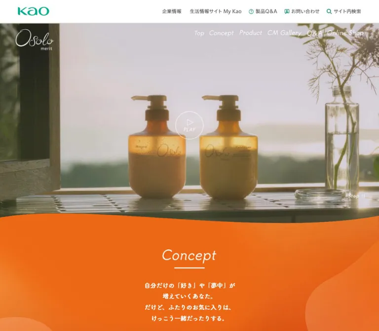
The desktop hero fills the page width beneath the corporate header. In the supplied desktop frame, a person washing their hair is seen through wet or textured glass, with a dark window structure and diffuse light. The mobile capture shows paired amber pump bottles against a softly lit background.
Both compositions leave generous space around the subject. There is no large text headline covering the opening frame. The Osolo wordmark, navigation, a central outlined PLAY control, and a small Stop control provide the visible interface.
The desktop play target is centered at approximately (720, 450.23) in the viewport. The mobile target is centered at approximately (195, 369.39). The lower-right Stop control is measured at roughly 62 × 20px; it is obscured by the mobile consent panel.
A broad orange wave overlaps the lower edge of the desktop image. Its asymmetry and shallow curvature make the transition feel organic rather than like a straight section divider. The mobile hero’s lower edge is covered by consent, so its exact visible boundary cannot be established from that screenshot.
Current Release Announcement
Role: introduce the current additional product before the evergreen narrative.
The rendered document contains the heading NEW 2026.4.4 発売, followed by a link to /merit/osolo/products/#water. Its heading is 33px / 49.5px on desktop and 21.84px / 32.76px on mobile.
This block precedes Concept in both records. Its artwork and full composition are outside the supplied visual captures, so only its order, text, link, and measured container should be treated as established. Do not invent a product-card arrangement for it.
Concept and Product Narrative
Role: connect shared family routines with the product’s haircare proposition.
Concept uses centered, deliberately broken Japanese lines within a wide container. The text develops in several short paragraphs, then increases in size for its closing statement. The content region is broad on desktop, but the actual line lengths remain controlled by intentional breaks.
The later product explanation increases the body scale to 28px / 55px on desktop. Its text boxes and closing statement form a more arranged composition: one closing statement sits toward the right at x ≈ 1012px. On mobile, that statement appears substantially later in the vertical flow. This supports responsive recomposition, rather than a uniformly reduced desktop layout.
A centered View Products link concludes the overview. Its measured target is 319 × 71px on desktop and approximately 222.55 × 49.91px on mobile. The link is transparent with white text in the sampled styles; its complete border or decorative artwork was not supplied.
Section Title
Role: give each major chapter a consistent, light visual marker.
The gallery capture shows centered white handwritten lettering above a short white horizontal rule. The title is isolated by substantial orange space, rather than placed in a boxed header.
The desktop CM Gallery heading box measures 282 × 76px; the mobile box measures approximately 144.55 × 51.97px. Other titles have different widths. Concept measures 191px wide on desktop, while the shop title measures 299px. Preserve the individual word proportions instead of forcing every heading image to a universal width.
Commercial Gallery
Role: present campaign films and their emotional context.
The section stacks two captioned films, followed by Movie Concept copy. The first visible caption is 「あなたと私に」篇; the second is 「親子で使える」篇.
On desktop, the first player occupies an approximately 960 × 540px rounded rectangle centered with 240px side margins. The captured poster shows a parent and child embracing in warm evening light. Native YouTube presentation is visible, including the red play control, title overlay, and platform branding. Do not replace this with an invented custom player when documenting the observed state.
The section background retains orange tonal variation and a large peach curve on the right. Movie Concept then switches to a text heading and a smaller, more closely led paragraph. Mobile text includes additional line breaks; it is not simply a scaled desktop paragraph image.
Q&A Sequence
Role: answer practical questions about shared use, application amount, washing technique, and care water.
Question and answer rows use a marker column on the left and text on the right. On desktop, marker boxes begin at x = 246px, measure 78px square, and precede text starting at x = 342px. Answer text can occupy 852px of width.
On mobile, markers start at x ≈ 35.36px and measure 44.72px square. Text starts at x ≈ 88.39px, leaving approximately 266.25px for longer answers. Questions retain the rounded brand family; answers switch to Koburina Gothic. Both are brown.
Answers occupy substantial layout height in the records. No accordion buttons or tested collapse behavior were supplied. Treat this as an open Q&A sequence for reference purposes, not a verified accordion. Marker artwork and the section’s actual background remain unverified.
Retailer Directory
Role: let visitors choose an external purchase destination.
Six links appear in this order: Rakuten, My Kao Mall, @cosme SHOPPING, Amazon, LOHACO, and CAINZ. The source UI uses Japanese where appropriate, including 楽天 and @cosmeSHOPPING.
Desktop uses three columns and two rows. Each measured pill is 315 × 71px, with 20px gaps. The visible treatment is brown bold text on 65%-opaque white, with a large radius. Mobile changes to one centered column of approximately 222.55 × 48.88px pills separated by 15.59px.
The group is introduced by a short purchase-direction sentence. These are destination links, not product cards, price comparisons, or an internal cart.
Floating Purchase Link
Role: provide a persistent shortcut to the retailer section.
The desktop gallery capture shows an orange circular badge near the lower-right corner. It combines a white outline cart, the label ご購入はコチラ, fine concentric rings, and a soft surrounding shadow.
The desktop rectangle is 124 × 124px, with a 23px right inset and 50px bottom inset. Mobile records a 95.67px square with approximately 15.6px right and 41.6px bottom clearance. Its destination is #shop.
The desktop consent banner overlaps the badge’s lower edge; the mobile banner covers its recorded position entirely. Its exact appearance threshold and footer-hiding logic were not exercised.
Brand Social Links and Merit Cross-Link
Role: close the Osolo story and connect it to the wider product family.
The DOM places Osolo social information and X/Instagram links after the retailer directory. This is followed by the source label [メリットブランドサイト] and a link to the Merit homepage.
The desktop capture shows the Merit link as an approximately 456 × 152px white rounded banner containing the Merit wordmark and two pale product bottles. A wide orange field surrounds it. The mobile link’s measured width is approximately 315.11px, but its complete banner height was not supplied.
Corporate Footer
Role: return to Kao’s broader information architecture.
The brand’s orange background ends above a neutral pickup-content region. Desktop centers six outlined white utility links in two rows, followed by a horizontal separator and the corporate social row. The next white region contains corporate navigation, smaller legal links, the Kao logo, and copyright.
Mobile keeps the first four pickup links full width at 342 × 44px, then places Q&A and contact side by side at 163 × 44px. Corporate navigation becomes two columns of approximately 194–195px-wide cells. Social icons remain recognizable platform artwork rather than being recolored into the orange palette.
The persistent white Osolo logo and menu remain visible over the pale mobile footer in the supplied capture, reducing their contrast. A contrasting header state is a recommended improvement.
Consent Banner
Role: explain cookie use and expose settings, rejection, acceptance, and closing controls.
A fixed white panel spans the bottom of every supplied current-page capture. Desktop places explanatory text at the left, followed by Cookie settings, rejection, acceptance, and a close target. Rejection and acceptance share the same dark teal fill and white type; settings is an underlined teal text treatment on white.
On mobile, the banner becomes a tall bottom panel: close control at the upper right, explanatory paragraph, settings, rejection, then acceptance. Settings and both decision buttons are 350px wide with 20px side insets. The filled buttons are approximately 41.61px tall, with 16px vertical separation.
The mobile panel occupies approximately 307px, or 36.4% of the 844px viewport. This is a significant part of the captured composition. Neither cookie choices nor the settings panel were exercised, so their subsequent states and persistence are unverified.
Tokens — Motion & Interaction
| Treatment | Evidence | What can be concluded |
|---|---|---|
| Hero media | Player text reports a 15-second duration, with desktop time near 0:10 and mobile time near 0:02 | The capture includes an active media state; these are separate samples, not a continuous playback test |
| Hero media controls | Visible PLAY and Stop controls; player DOM includes Pause and Unmute labels | Playback and sound controls exist; their click behavior was not tested |
| Brand-header background | background-color 0.5s |
A 500ms background transition is defined; trigger and endpoint colors are unknown |
| Brand links and product link | opacity 0.3s |
A 300ms opacity transition is defined; hover target opacity is unknown |
| Section headings and selected links | opacity 1s, filter 1s, transform 1s |
A one-second transition across those properties is defined |
| Fade custom properties | --fade-duration: 1000ms; settled x/y translation variables are 0px |
Confirms timing and settled values, not starting displacement or blur strength |
| Internal section navigation | Fragment destinations in rendered links | Targets are known; smooth scrolling and offset behavior were not exercised |
| Q&A | Full answer rectangles are present | Does not establish accordion interaction |
| Mobile menu, search, consent settings | Controls are present | Open states and transitions are unverified |
The evidence supports a moving photographic introduction and restrained fade-oriented interface motion. It does not establish parallax, animated background waves, a carousel, or a specific scroll-trigger library.
Do not interpret a bare computed transition: all as a measured animation with a known duration. Likewise, zero settled translation does not prove that reveal elements never move.
Recommended motion extension: keep text readable before scripts initialize, use the evidenced 300ms and 1000ms timing families, and avoid adding spring motion or large travel distances. Reduced-motion handling should separately stop decorative video and expose a useful poster; disabling CSS transitions alone does not pause media.
Surfaces
| Layer | Appearance | Purpose and confidence |
|---|---|---|
| Corporate header | White with teal identity and gray utilities | Visually confirmed |
| Hero | Full-width photographic/video surface | Visually confirmed; mobile lower edge is obscured |
| Brand canvas | Orange base with broad tonal curves | Base color measured; decorative construction unverified |
| Retailer links | Translucent white pills with brown text | Computed styles confirmed |
| Q&A | Brown text; underlying section surface unspecified | Text confirmed, background unverified |
| Commercial player | Dark photographic rectangle with rounded corners | Desktop visually confirmed |
| Merit cross-link | White rounded illustrated banner | Desktop visually confirmed |
| Corporate footer | Off-white utility area, then white navigation area | Visually confirmed; off-white hex estimated |
| Consent | White fixed surface with teal controls and slight top separation | Visually confirmed; controls measured |
There is no broad card-elevation system. Most separation comes from space, large color fields, curves, typography, and media boundaries. Shadows are localized to overlay separation and the floating purchase badge.
Imagery
The imagery should feel like a quiet moment in an inhabited home. Favor natural window light, shallow focus, subdued backgrounds, and warmth transmitted through amber packaging. The bottle pair is a recurring visual unit: rounded shoulders, squat translucent bodies, dark pump tops, and a shared tabletop setting.
The desktop shower frame is more muted, with gray-green light, wet glass, and dark architectural divisions. The gallery poster introduces warmer skin tones and an embrace. These variations belong to one photographic world; do not force every image into an identical orange filter.
The orange background supplies the saturated color. Broad asymmetrical curves, softly changing orange tones, and fine grain-like variation soften the transition between photographic sections and text. The screenshots establish the appearance, but do not identify whether it is assembled from images, vectors, CSS gradients, or multiple layers.
Use smooth image rendering. Preserve facial expressions, hair detail, translucent packaging, and the quiet negative space around the bottles. Pixelation, hard duotone processing, or generic isolated packshots would change the character.
Observed Asset References
No original image, SVG, font-file, or video src URLs were included in the supplied evidence. The following inventory identifies observed uses without inventing filenames.
| Asset or media | Observed use | Available evidence |
|---|---|---|
| Kao wordmark | Corporate header and footer | Current screenshots and link bounds |
| Osolo wordmark | Brand header and later brand region | Current screenshots and element bounds |
| Hero film | Hair washing and amber bottle imagery | Current captures; player DOM reports 15 seconds |
| English title/navigation lettering | White handwritten visual treatment | Current desktop and mobile captures; exact typeface unknown |
| First commercial poster | Parent and child embracing outdoors | Current desktop gallery capture |
| Background curves | Orange/peach transitions and large soft shapes | Current desktop captures |
| Purchase badge artwork | Cart, circular rings, Japanese label | Current desktop gallery capture |
| Merit banner | Merit logo and two pale bottles | Current desktop footer capture |
| Platform icons | Brand and corporate social links | Screenshots and rendered destinations |
Use authorized assets when available. CSS can reproduce the surrounding geometry, but it cannot replace the identity of the original wordmark, film, or photographic direction.
Layout & Responsive Behavior
The desktop document is approximately 11,823px tall; the mobile document is approximately 9,099px tall. Mobile is shorter overall because much of the large desktop imagery, type, and spacing contracts, even though retailer links and corporate navigation stack into more rows.
Current Document Sequence
Positions below are rounded measured heading or region starts in the supplied document records. They establish order and scale, not values to hardcode.
| Region | Desktop y | Mobile y |
|---|---|---|
| Main begins | 68px |
47px |
| Release heading | 955px |
771px |
| Concept heading | 1874px |
1236px |
| Product-overview heading | 3518px |
2560px |
| CM Gallery heading | 5654px |
3951px |
| Q&A heading | 7864px |
5065px |
| Shop heading | 9824px |
6788px |
| Corporate footer | 11276px |
8271px |
Responsive Rules Supported by the Evidence
- Navigation changes form. Desktop exposes the six brand destinations; mobile uses a separate brand-menu trigger below the corporate controls.
- The hero composition changes substantially. Desktop is wide and cinematic; the mobile frame gives the paired bottles a tall, prominent crop. Different playback times prevent a definitive conclusion about alternate source files.
- Content widths are section-specific. The mobile narrative width is approximately 90.93% of the viewport, while commercial caption width is approximately 93.33%. Q&A and shop introductory content use a narrower inner region.
- Retailers change from three columns to one. Mobile pills remain centered and narrower than the narrative container.
- Q&A retains a marker column. It does not become an undifferentiated block of full-width text. The marker and its gap shrink substantially.
- Corporate pickup links restructure. Four full-width links are followed by a two-column pair. Corporate navigation also becomes a two-column grid.
- Consent changes from a horizontal bar to a vertical panel. Its height directly affects how much of the mobile hero and fixed purchase link can be seen.
Many mobile measurements are consistent with viewport-based sizing: for example, 15.6px at 390px equals 4vw, and 24.96px equals 6.4vw. This is a calculation, not proof of the original CSS formula. The source breakpoints and intermediate layouts were not supplied.
Additional vertical brand-navigation link boxes appear near the end of the mobile main region. Their complete visual presentation and relationship to the menu are not established by the supplied screenshots.
Do’s and Don’ts
Do
- Build the brand region around the measured orange
#e05e0e, white lettering, and warm photographic light. - Keep Kao’s corporate utilities visually distinct from the Osolo experience.
- Preserve paired bottles, intimate family imagery, and generous photographic negative space.
- Use flowing white wordmark/title artwork and rounded, substantial Japanese copy.
- Retain the current release announcement before Concept.
- Give the narrative room to breathe through intentional line breaks and generous leading.
- Use broad asymmetric waves and tonal orange variation as section continuity.
- Keep commercials large and centered, with captions above the media.
- Preserve the retailer directory’s translucent white pills and brown text.
- Treat the mobile consent panel as a major layout condition during testing.
Don’t
- Don’t turn the content into a generic product-card grid or add an invented checkout.
- Don’t use corporate teal as the default brand purchase color.
- Don’t assume the handwritten labels use the Japanese font inherited by their wrappers.
- Don’t claim a cream Q&A background, accordion, drawer animation, or parallax effect without evidence.
- Don’t replace the photographic hero with a large promotional headline over a plain orange block.
- Don’t repeat small decorative blobs where the original uses broad, slow curves.
- Don’t impose one mobile scale factor across typography, spacing, and media.
- Don’t copy inline link heights as artwork dimensions.
- Don’t infer a carousel from Swiper variables alone.
- Don’t allow fixed navigation or purchase controls to become unreadable over the corporate footer in a new implementation.
Recommended Implementation Additions
These are recommendations for a new implementation, not verified original features:
- Give graphical navigation, wordmarks, play/stop controls, social links, and menu triggers explicit accessible names. The sampled empty text alone is insufficient to audit existing names.
- Expand compact mobile search and menu targets to at least 44px without enlarging their visible artwork.
- Add a contrasting persistent-header state over light corporate surfaces.
- Coordinate the floating purchase link with the live consent-panel height so it remains reachable.
- Consider increasing mobile Q&A answers from the measured 13.52px to at least 14–16px, adjusting the marker column if necessary.
- Provide a paused poster and separate reduced-motion handling for the hero video. Do not assume CSS alone can stop it.
- Keep accessible text equivalents for graphical headings and preserve a meaningful heading hierarchy.
- Reserve media space before loading, provide descriptive player titles, and keep controls keyboard-operable.
- Retain distinct and equally legible rejection and acceptance controls; implement their actual consent behavior separately from styling.
- Test 320px-wide screens, intermediate tablet widths, text zoom, keyboard focus, and the combination of consent plus persistent navigation.
Agent Prompt Guide
Quick Color Reference
- Brand base:
#e05e0e. - Brand lettering and linework:
#ffffff. - Q&A and retailer text:
#724404. - Retailer fill:
rgba(255,255,255,0.65). - Corporate text:
#4e4d4e. - Consent actions:
#005856with white text. - Bright orange and peach are visual-estimate supporting tones, not additional measured brand swatches.
Overall Prompt
“Create a Japanese haircare brand homepage inspired by Osolo’s current visual system. Begin with a white corporate utility header and a full-width photographic video hero featuring natural window light and paired amber pump bottles. Overlay a fine white script wordmark, handwritten English navigation, and a thin circular play control. Continue into a saturated orange world with broad asymmetric wave boundaries, subtle peach tonal variation, centered rounded Japanese copy, and generous vertical spacing. Include a release announcement before the concept narrative, a product overview, large rounded commercial embeds, an open Q&A sequence, and translucent white retailer pills with brown labels. End with a distinct neutral corporate footer. On mobile, use a tall hero composition, a separate brand-menu trigger, stacked retailer links, and a vertically arranged consent panel. Treat unknown artwork and interaction details as implementation choices rather than source facts.”
Example Component Prompts
- Hero: “A quiet, naturally lit haircare film surface with paired amber bottles or a close hair-washing scene. White Osolo-style graphical identity at top left, sparse white navigation at top right, and a 100px outlined circular play target in the desktop center. Finish the image with one broad orange wave. Avoid a large text headline covering the subject.”
- Commercial gallery: “Center a 960px-wide, 16:9 commercial player with approximately 28px corners on a flowing orange and peach background. Place a white handwritten section title and short white underline above a bold Japanese film caption. Retain native embedded-player controls.”
- Retailer directory: “Six brown-text destination links on 65%-opaque white pills. Desktop: three columns, approximately 315 × 71px links and 20px gaps. Mobile: one centered column, approximately 223 × 49px links and 16px gaps. No prices or cart controls.”
- Q&A: “Use a separate marker column beside each question and answer. Rounded bold Japanese questions, smaller Koburina-style answer text, and warm brown ink. Keep answers open. Use a clearly labeled recommended pale surface because the original section fill is unverified.”
- Corporate footer: “Switch from the orange brand world to a neutral off-white utility region with white 44px-high links, 10px corners, gray borders, and standard corporate sans-serif text. Stack the first four links on mobile and keep Q&A/contact as a two-column pair.”
- Consent: “A white fixed bottom panel with a compact explanatory paragraph, underlined teal settings, and equally styled dark-teal reject/accept buttons. Desktop uses a horizontal arrangement; mobile uses 20px side padding and stacked 350px-wide actions at a 390px viewport.”
Quick Start
CSS Custom Properties
This is an implementation adaptation, not extracted source CSS. It reproduces the principal measured colors, type relationships, and component proportions. The 48rem breakpoint, gradient recipe, hero height formula, pale Q&A surface, and hover opacity are recommendations. The mobile Q&A size is raised to 14px. Load the named source fonts only when licensed and available; no font-file URLs were supplied.
The classes assume ordinary semantic HTML: a corporate header, a brand main containing its persistent header and hero, content sections, and a separate corporate footer and consent panel. Media playback, menu state, consent storage, and reveal triggers require separate behavior.
:root {
  /* Measured colors */
  --osolo-orange: #e05e0e;
  --osolo-white: #ffffff;
  --osolo-brown: #724404;
  --osolo-corporate-ink: #4e4d4e;
  --osolo-corporate-teal: #005856;
  --osolo-policy-link: #3860be;
  --osolo-shop-surface: rgb(255 255 255 / 65%);

  /* Visual estimates and a recommended Q&A surface */
  --osolo-orange-bright: #f47700;
  --osolo-peach: #f68b42;
  --osolo-corporate-surface: #f6f6f4;
  --osolo-utility-border: #d8d8d1;
  --osolo-qa-surface: #fff2df;

  /* Measured family declarations; fonts are not bundled */
  --osolo-font-brand: 'FOT-TsukuARdGothic Std',
    fot-tsukuardgothic-std, sans-serif;
  --osolo-font-answer: koburina-gothic-std, sans-serif;
  --osolo-font-corporate: FP-HiraginoUDSansStdN-W3, sans-serif;

  --osolo-content-width: 988px;
  --osolo-media-width: 960px;
  --osolo-brand-header-height: 115.22px;
  --osolo-copy-size: 22px;
  --osolo-tracking: -0.384px;
  --osolo-link-duration: 300ms;
  --osolo-reveal-duration: 1000ms;

  /* Populate dynamically when coordinating fixed controls */
  --consent-height: 0px;
}

* {
  box-sizing: border-box;
}

body {
  margin: 0;
  background: var(--osolo-white);
}

button, a {
  -webkit-tap-highlight-color: transparent;
}

button {
  font: inherit;
}

.corporate-header {
  height: 68px;
  padding-inline: 52px;
  display: flex;
  align-items: center;
  justify-content: space-between;
  background: var(--osolo-white);
  color: var(--osolo-corporate-ink);
  font: 14px var(--osolo-font-corporate);
}

.corporate-logo {
  display: block;
  width: 90px;
  height: auto;
}

.corporate-actions {
  display: flex;
  align-items: center;
  gap: 20px;
}

.osolo-page {
  color: var(--osolo-white);
  background: var(--osolo-orange);
  font-family: var(--osolo-font-brand);
  font-size: 16px;
  font-weight: 700;
  line-height: 1.5;
  letter-spacing: var(--osolo-tracking);
}

/* Recommended background approximation, not the original recipe */
.osolo-warm-field {
  background:
    radial-gradient(ellipse at 0% 65%, #f68b4280, transparent 48%),
    radial-gradient(ellipse at 100% 20%, #cc430b80, transparent 56%),
    linear-gradient(115deg, var(--osolo-orange-bright), var(--osolo-orange));
}

.osolo-brand-header {
  position: sticky;
  top: 0;
  z-index: 30;
  height: var(--osolo-brand-header-height);
  margin-bottom: calc(-1 * var(--osolo-brand-header-height));
  padding: 20px 55px;
  display: flex;
  align-items: flex-start;
  justify-content: space-between;
  transition: background-color 500ms;
}

.osolo-logo {
  display: block;
  width: 137px;
  height: auto;
}

.osolo-brand-nav {
  display: flex;
  align-items: center;
  gap: 20px;
}

.osolo-brand-nav a,
.osolo-product-link {
  color: inherit;
  text-decoration: none;
  transition: opacity var(--osolo-link-duration);
}

.osolo-brand-menu {
  display: none;
}

.osolo-hero {
  position: relative;
  height: clamp(560px, 53.1vw, 860px);
  overflow: hidden;
}

.osolo-hero__media {
  position: absolute;
  inset: 0;
  width: 100%;
  height: 100%;
  object-fit: cover;
}

.osolo-hero__play {
  position: absolute;
  top: 50%;
  left: 50%;
  transform: translate(-50%, -50%);
  width: 100px;
  height: 100px;
  padding: 0;
  border: 1px solid currentColor;
  border-radius: 50%;
  color: white;
  background: transparent;
  cursor: pointer;
}

.osolo-hero__stop {
  position: absolute;
  right: 40px;
  bottom: 100px;
  border: 0;
  padding: 0;
  color: white;
  background: transparent;
  cursor: pointer;
}

.osolo-hero__wave {
  position: absolute;
  bottom: -1px;
  left: 0;
  width: 100%;
  height: 64px;
  fill: var(--osolo-orange);
  pointer-events: none;
}

.osolo-container {
  width: min(var(--osolo-content-width), 90.93%);
  margin-inline: auto;
}

.osolo-media-container {
  width: min(var(--osolo-media-width), 93.33%);
  margin-inline: auto;
}

.osolo-section {
  padding-block: clamp(80px, 10vw, 160px);
  scroll-margin-top: var(--osolo-brand-header-height);
}

.osolo-section-title {
  display: grid;
  justify-items: center;
  gap: 18px;
  margin: 0 0 40px;
  text-align: center;
}

.osolo-section-title::after {
  content: '';
  width: 108px;
  height: 4px;
  background: currentColor;
}

.osolo-section-title__art {
  display: block;
  width: var(--title-width, 282px);
  max-width: 100%;
  height: auto;
}

/* Prototype fallback only; the original display font is unknown */
.osolo-section-title__fallback {
  font-family: cursive;
  font-size: 56px;
  font-style: italic;
  font-weight: 400;
  line-height: 1;
}

.osolo-story-copy {
  font-size: var(--osolo-copy-size);
  line-height: 1.7727;
  text-align: center;
}

.osolo-story-copy p {
  margin: 0;
}

.osolo-story-copy p + p {
  margin-top: 34px;
}

.osolo-product-link {
  display: flex;
  align-items: center;
  justify-content: center;
  width: min(319px, 100%);
  min-height: 71px;
  margin-inline: auto;
  font-size: 22px;
}

.osolo-film {
  margin: 0 0 80px;
}

.osolo-film figcaption {
  margin-bottom: 20px;
  font-size: 28px;
  line-height: 1.5;
  text-align: center;
}

.osolo-film__frame {
  aspect-ratio: 16 / 9;
  overflow: hidden;
  border-radius: 28px;
  background: #191919;
}

.osolo-film__frame :is(iframe, video, img) {
  display: block;
  width: 100%;
  height: 100%;
  border: 0;
  object-fit: cover;
}

/* The pale Q&A background is a recommendation */
.osolo-qa {
  color: var(--osolo-brown);
  background: var(--osolo-qa-surface);
}

.osolo-qa__inner {
  width: min(948px, 90.93%);
  margin-inline: auto;
}

.osolo-qa__row {
  display: grid;
  grid-template-columns: 78px minmax(0, 1fr);
  gap: 18px;
  align-items: start;
}

.osolo-qa__row + .osolo-qa__row {
  margin-top: 42px;
}

.osolo-qa__marker {
  width: 78px;
  height: 78px;
}

.osolo-qa__question {
  margin: 12.5px 0 0;
  font-size: 25px;
  line-height: 53px;
  letter-spacing: -0.6px;
}

.osolo-qa__answer {
  margin: 0;
  font-family: var(--osolo-font-answer);
  font-size: 18px;
  line-height: 26px;
}

.osolo-shop-grid {
  display: grid;
  grid-template-columns: repeat(3, minmax(0, 1fr));
  gap: 20px;
}

.osolo-shop-link {
  display: flex;
  align-items: center;
  justify-content: center;
  min-height: 71px;
  padding: 20px 12px;
  border-radius: 36px;
  color: var(--osolo-brown);
  background: var(--osolo-shop-surface);
  font-size: 22px;
  line-height: 25px;
  text-align: center;
  text-decoration: none;
}

.osolo-shop-float {
  position: fixed;
  right: 23px;
  bottom: max(50px, calc(var(--consent-height) + 16px));
  z-index: 40;
  width: 124px;
  height: 124px;
  border-radius: 50%;
}

.corporate-footer {
  color: var(--osolo-corporate-ink);
  background: var(--osolo-corporate-surface);
  font: 16px / 24px var(--osolo-font-corporate);
}

.corporate-footer__inner {
  width: min(1050px, calc(100% - 48px));
  margin-inline: auto;
  padding-block: 32px;
}

.corporate-pickup-links {
  display: flex;
  flex-wrap: wrap;
  justify-content: center;
  gap: 16px;
  max-width: 640px;
  margin-inline: auto;
}

.corporate-pickup-links a {
  display: flex;
  align-items: center;
  justify-content: center;
  min-height: 44px;
  padding-inline: 16px;
  border: 2px solid var(--osolo-utility-border);
  border-radius: 10px;
  color: inherit;
  background: white;
  text-decoration: none;
}

.consent {
  position: fixed;
  inset: auto 0 0;
  z-index: 100;
  display: grid;
  grid-template-columns: minmax(0, 1fr) auto 44px;
  align-items: center;
  gap: 24px;
  min-height: 71px;
  padding: 12px 10px 12px 32px;
  color: #666;
  background: white;
  box-shadow: 0 -5px 18px rgb(0 0 0 / 8%);
  font: 13.008px / 19.512px sans-serif;
}

.consent p {
  margin: 0;
}

.consent__policy {
  color: var(--osolo-policy-link);
  font-weight: 700;
  text-decoration: underline;
}

.consent__actions {
  display: flex;
  align-items: center;
  gap: 18px;
}

.consent__action {
  min-width: 125px;
  padding: 12px 10px;
  border: 1px solid var(--osolo-corporate-teal);
  border-radius: 2px;
  color: white;
  background: var(--osolo-corporate-teal);
  font: 600 13.008px / 15.6096px sans-serif;
  letter-spacing: 0.13008px;
  cursor: pointer;
}

.consent__action--accept {
  min-width: 210px;
}

.consent__action--settings {
  border: 0;
  color: var(--osolo-corporate-teal);
  background: white;
  text-decoration: underline;
}

.consent__close {
  width: 44px;
  height: 44px;
  padding: 0;
  border: 0;
  color: #555;
  background: transparent;
  cursor: pointer;
}

/* Recommended focus and hover states */
:where(a, button):focus-visible {
  outline: 3px solid currentColor;
  outline-offset: 4px;
}

@media (hover: hover) {
  .osolo-brand-nav a:hover,
  .osolo-product-link:hover {
    opacity: 0.75;
  }
}

/* Recommended breakpoint; only the two capture sizes are measured */
@media (max-width: 48rem) {
  :root {
    --osolo-brand-header-height: 83.11px;
    --osolo-copy-size: clamp(15.6px, 4vw, 20px);
    --osolo-tracking: -0.336px;
  }

  .corporate-header {
    height: 47px;
    padding-inline: 20px;
  }

  .corporate-logo { width: 70px; }
  .corporate-actions--desktop { display: none; }

  .osolo-page {
    font-size: 14px;
    line-height: 21px;
  }

  .osolo-brand-header {
    padding: 18.72px 4.535%;
  }

  .osolo-logo { width: 83.19px; }
  .osolo-brand-nav { display: none; }

  .osolo-brand-menu {
    display: grid;
    place-items: center;
    width: 44px;
    min-height: 44px;
    padding: 0;
    border: 0;
    color: white;
    background: transparent;
  }

  /* Approximation: the mobile lower hero boundary is obscured */
  .osolo-hero { height: 165.3vw; }

  .osolo-hero__play {
    width: 62.39px;
    height: 62.39px;
  }

  .osolo-hero__stop {
    right: 20.8px;
    bottom: 41.6px;
  }

  .osolo-section-title {
    gap: 14.56px;
    margin-bottom: 25px;
  }

  .osolo-section-title__art {
    width: var(--title-width-mobile, 144.55px);
  }

  .osolo-section-title__fallback { font-size: 28px; }
  .osolo-section-title::after { width: 58px; height: 3px; }
  .osolo-story-copy p + p { margin-top: 24.95px; }

  .osolo-product-link {
    width: min(222.55px, 100%);
    min-height: 49.91px;
    font-size: 15.6px;
  }

  .osolo-film { margin-bottom: 32px; }

  .osolo-film figcaption {
    margin-bottom: 12px;
    font-size: 15.6px;
    line-height: 23.4px;
  }

  .osolo-film__frame { border-radius: 16px; }
  .osolo-qa__inner { width: 81.87%; }

  .osolo-qa__row {
    grid-template-columns: 44.72px minmax(0, 1fr);
    gap: 8.31px;
  }

  .osolo-qa__row + .osolo-qa__row { margin-top: 26px; }
  .osolo-qa__marker { width: 44.72px; height: 44.72px; }

  .osolo-qa__question {
    margin-top: 11.44px;
    font-size: 17.68px;
    line-height: 21.84px;
    letter-spacing: -0.42432px;
  }

  .osolo-qa__answer {
    font-size: 14px;
    line-height: 21px;
  }

  .osolo-shop-grid {
    grid-template-columns: minmax(0, 222.55px);
    justify-content: center;
    gap: 15.59px;
  }

  .osolo-shop-link {
    min-height: 48.88px;
    padding: 14.56px 10px;
    border-radius: 31.2px;
    font-size: 15.6px;
    line-height: 17.68px;
  }

  .osolo-shop-float {
    right: 15.6px;
    bottom: max(41.6px, calc(var(--consent-height) + 16px));
    width: 95.67px;
    height: 95.67px;
  }

  .corporate-footer__inner { padding-block: 24px; }

  .corporate-pickup-links {
    display: grid;
    grid-template-columns: repeat(2, minmax(0, 1fr));
    gap: 12px 16px;
  }

  .corporate-pickup-links a:nth-child(-n + 4) {
    grid-column: 1 / -1;
  }

  .corporate-pickup-links a { padding-inline: 10px; }

  .consent {
    display: block;
    padding: 48px 20px calc(16px + env(safe-area-inset-bottom));
    max-height: 90dvh;
    overflow-y: auto;
  }

  .consent p { margin-bottom: 10px; }

  .consent__actions {
    display: grid;
    gap: 16px;
  }

  .consent__action {
    width: 100%;
    min-width: 0;
  }

  .consent__close {
    position: absolute;
    top: 6px;
    right: 2px;
  }
}

/* Content stays visible unless a script deliberately changes state */
.osolo-page [data-reveal] {
  transition:
    opacity var(--osolo-reveal-duration),
    filter var(--osolo-reveal-duration),
    transform var(--osolo-reveal-duration);
}

@media (prefers-reduced-motion: reduce) {
  .osolo-page *,
  .osolo-page *::before,
  .osolo-page *::after {
    animation: none !important;
    transition: none !important;
  }

  .osolo-page [data-reveal] {
    opacity: 1 !important;
    filter: none !important;
    transform: none !important;
  }
}
An optional wave approximation for the hero follows. This is newly authored geometry, not an original asset. Its shallow asymmetric contour should be adjusted against authorized imagery and the surrounding background.
<svg
  class="osolo-hero__wave"
  viewBox="0 0 1440 80"
  preserveAspectRatio="none"
  aria-hidden="true"
>
  <path d="M0 24 C180 -14 450 22 730 36 C1030 53 1260 50 1440 14 V80 H0Z" />
</svg>
Tailwind v4 Token Mapping
Optional aliases for a project already using Tailwind v4. This is not evidence that the original site uses Tailwind. Define the custom properties above first.
@theme inline {
  --color-brand-orange: var(--osolo-orange);
  --color-brand-brown: var(--osolo-brown);
  --color-brand-white: var(--osolo-white);
  --color-corporate-teal: var(--osolo-corporate-teal);
  --color-corporate-ink: var(--osolo-corporate-ink);
  --font-brand: var(--osolo-font-brand);
  --font-answer: var(--osolo-font-answer);
  --font-corporate: var(--osolo-font-corporate);
  --radius-retailer: 36px;
  --radius-utility: 10px;
  --radius-consent: 2px;
  --spacing-brand-content: 988px;
  --spacing-brand-media: 960px;
}
Sources & Evidence
- Osolo — current original and final page: supplied browser record reports HTTP 200 with no URL change. The rendered title is
Osolo | メリット | 花王株式会社. - Evidence retrieval: September 12, 2026, at
2026-09-12T13:58:44.407Z. Desktop viewport: 1440 × 1000; mobile viewport: 390 × 844. Recorded document heights: 11,823px and 9,099px respectively. - Visual evidence: three current desktop captures showing the opening, commercial gallery, and footer; two current mobile captures showing the opening and corporate footer. Consent remains visible throughout these captures.
- DOM/computed-style evidence: element bounds, font declarations, text, destinations, backgrounds, radii, transition declarations, and the reported fade/library custom properties for both viewport records.
- Current destinations established from the page: section fragments,
/merit/osolo/products/, its#waterand#stepdestinations, the Merit homepage, retailer links, corporate links, and social links. Linked pages were not inspected for this reference. - Capture limitations: the supplied process observed the initial page for at least five seconds and waited for bounded layout, animation, and image readiness. Perpetual animation was temporarily paused during readiness checks and resumed. These checks do not establish semantic completeness or reveal every delayed state. SharedWorkers and service workers were disabled.
- Interaction limitations: no manual menu opening, search submission, consent choice, retailer navigation, Q&A toggling, or media-control test was reported. Exact source breakpoints, asset URLs, initial reveal transforms, and Q&A background styling were not supplied.
This reference uses only the supplied current-page screenshots and rendered evidence. No additional browsing or asset retrieval was performed. Estimated visuals and recommended implementation choices are identified separately from measured source values.
# Osolo / Merit — Style Reference

> Sunlit amber bottles, intimate family imagery, and white handwritten lettering flowing through an orange landscape.

**Original URL:** [https://www.kao.co.jp/merit/osolo/](https://www.kao.co.jp/merit/osolo/)
**Final URL:** [https://www.kao.co.jp/merit/osolo/](https://www.kao.co.jp/merit/osolo/)
**Theme:** a warm orange brand canvas, white lettering, and a separate white corporate interface; no alternate theme was evidenced.
**Inspected:** September 12, 2026. Supplied browser evidence was retrieved at 13:58:44 UTC / 22:58:44 JST.
**Viewports:** 1440 × 1000 desktop and 390 × 844 mobile, in CSS pixels.
**Scope:** the current Osolo brand homepage, including its hero, release announcement, concept narrative, product overview, commercial gallery, Q&A, retailer directory, social links, Merit cross-link, corporate footer, and consent banner. Visual captures cover the desktop hero, commercial gallery, and footer, plus the mobile hero and footer. Other sections are documented through the supplied rendered DOM and computed styles.

Osolo presents a parent-and-child haircare range through photography and a long, deliberately spacious narrative. Translucent amber bottles, soft window light, and close family portraits establish the emotional tone. The surrounding orange field uses broad curves and tonal variation rather than a regular sequence of boxed cards. White script-like English lettering and bold rounded Japanese copy make the presentation feel personal and approachable.

Two visual systems coexist. The Osolo experience is warm, expressive, and media-led; Kao’s corporate header, footer, and consent controls are compact, neutral, and functional. Preserve that distinction. The teal consent buttons belong to corporate utilities, while the brand’s purchase links use brown lettering on translucent white pills.

The page combines product storytelling, commercials, practical information, and links to retailers. It does not show an on-page checkout. The current sequence also includes a release announcement before Concept; the opening should not be simplified to hero → Concept.

## How to Read This Reference

- **Measured** values come directly from the supplied element rectangles or computed styles. They describe the two inspected viewport states, not every possible screen size.
- **Visual estimates** describe the supplied current-page screenshots. Estimated colors were not sampled with a pixel-reading tool.
- **Calculated** values are arithmetic derived from measurements, such as spacing between adjacent elements.
- **Recommendations** are implementation choices for a new build. They are not verified original behavior.
- Token names beginning with `--osolo-` are reference aliases, not original source variables.
- Several visible logos, navigation labels, and section titles have empty text in the sampled nodes. Their appearance cannot be reconstructed from the inherited font declaration alone. The complete accessible-name and image-attribute data was not supplied.
- Some inline links have text-line-height rectangles even though their visible artwork is much taller. For example, the Merit banner’s link reports a 16px-high desktop rectangle; the screenshot shows a substantial illustrated banner. Do not use that inline height as the image height.

## Tokens — Colors

### Default Palette

| Name | Value | Reference token | Evidence | Role |
| --- | --- | --- | --- | --- |
| Brand Orange | `#e05e0e` | `--osolo-orange` | Measured | Main element’s base background |
| White | `#ffffff` | `--osolo-white` | Measured | Brand text, white surfaces, corporate link backgrounds |
| Warm Brown | `#724404` | `--osolo-brown` | Measured | Q&A text and retailer labels |
| Corporate Gray | `#4e4d4e` | `--osolo-corporate-ink` | Measured | Kao navigation and footer text |
| Corporate Teal | `#005856` | `--osolo-corporate-teal` | Measured | Consent action fills and settings text |
| Privacy Link Blue | `#3860be` | `--osolo-policy-link` | Measured | Privacy-policy link inside the consent notice |
| Translucent White | `rgba(255,255,255,0.65)` | `--osolo-shop-surface` | Measured | Retailer pill backgrounds |
| Bright Orange | Approximately `#f47700` | `--osolo-orange-bright` | Visual estimate | Brighter areas of the flowing orange background |
| Peach Glow | Approximately `#f68b42` | `--osolo-peach` | Visual estimate | Lighter curves and soft background variation |
| Corporate Off-White | Approximately `#f6f6f4` | `--osolo-corporate-surface` | Visual estimate | Pickup-content and corporate social region |
| Pale Utility Border | Approximately `#d8d8d1` | `--osolo-utility-border` | Visual estimate | Footer link outlines and separators |

The orange base is an exact computed value; it is not the color of every visible orange pixel. The screenshots show brighter orange, deeper orange-red, and peach variation across the brand background. Preserve that tonal breadth without describing an unverified gradient formula or animation system.

The corporate header appears white in both screenshots even though the sampled outer `HEADER` reports `#005856`. A nested surface evidently determines the visible result, but its individual background declaration was not supplied. Reproduce the visible white header rather than filling it teal from the outer node alone.

The source also exposes `--swiper-theme-color: #007aff`. This is a library variable, not evidence of a visible blue brand accent or an active carousel. Similarly, default blue colors on empty-text artwork links do not describe the visible white logos.

### Surface Color Limitations

The Q&A’s brown typography is measured, but its section background was not included in the sampled container styles or current screenshots. Do not present a particular cream fill as an observed token. The Quick Start uses a clearly labeled recommended pale surface for readable brown text.

There is no evidenced dark mode, palette selector, or general translucent-glass treatment.

## Tokens — Typography

### Rounded Japanese Brand Copy

**Measured stack:** `"FOT-TsukuARdGothic Std", fot-tsukuardgothic-std, sans-serif`.

The main brand region uses weight `700`, with a base size of `16px / 24px` on desktop and `14px / 21px` on mobile. This rounded, substantial Japanese typography gives the emotional copy warmth without requiring oversized headlines.

The main region’s tracking is `-0.384px` on desktop and `-0.336px` on mobile. Most sampled descendants inherit those absolute values. Do not replace them with a blanket `-0.024em` on every heading: that would tighten larger text more than the measured result.

### Q&A Answer Copy

**Measured stack:** `koburina-gothic-std, sans-serif`.

Answers use weight `700`, brown text, and a smaller scale than questions. Desktop answers are `18px / 26px`; mobile answers are `13.52px / 20.8px`. This is a separate text treatment from the rounded brand narrative.

### Corporate Typography

**Measured regular family:** `FP-HiraginoUDSansStdN-W3, sans-serif`.

**Measured stronger family:** `FP-HiraginoUDSansStdN-W6, sans-serif`.

Corporate links use restrained sans-serif text with normal tracking. Desktop header utilities are 14px. Footer pickup links stay at `16px / 24px` on both viewports. Legal links use `12px / 18px`.

Some corporate navigation uses the W6 family with a computed weight of `400`; the stronger appearance is partly encoded in the family selection. Do not infer all visible boldness from `font-weight` alone.

### English Lettering and Wordmarks

The Osolo wordmark is fine, flowing script. English navigation and section titles have a loose handwritten appearance, with white strokes and a slight slant. The supplied evidence does not identify their actual display typeface or asset implementation.

Use authorized wordmark and title artwork where available. A generic cursive font is only an approximation for a prototype. The nominal `36px` computed size on a desktop section heading does not establish the size or family of its visible graphical lettering.

### Type Scale

Sizes below are measured CSS font declarations, expressed as size / line height.

| Role | Desktop | Mobile | Notes |
| --- | --- | --- | --- |
| Main inherited text | `16 / 24px` | `14 / 21px` | Weight 700 |
| Release announcement | `33 / 49.5px` | `21.84 / 32.76px` | Actual text heading |
| Section-heading node | `36 / 54px` | `24.96 / 37.44px` | Visible lettering may be graphical |
| Concept paragraphs | `22 / 39px` | `15.6 / 27.65px` | Broad leading and deliberate line breaks |
| Concept emphasis | `30 / 53.18px` | `18.72 / 33.19px` | Enlarged closing statement |
| Product explanation heading | `34 / 51px` | `23.92 / 35.88px` | Rounded brand family |
| Product explanation paragraphs | `28 / 55px` | `19.76 / 34.32px` | Particularly generous desktop leading |
| Commercial captions | `28 / 42px` | `15.6 / 23.4px` | Centered above media |
| Movie Concept heading | `33 / 49.5px` | `21.84 / 32.76px` | Text node |
| Movie Concept body | `22 / 33px` | `15.6 / 23.4px` | Denser than Concept copy |
| Q&A question | `25 / 53px` | `17.68 / 21.84px` | Tracking `-0.6px` / `-0.42432px` |
| Q&A answer | `18 / 26px` | `13.52 / 20.8px` | Koburina Gothic stack |
| Retailer label | `22 / 25px` | `15.6 / 17.68px` | Brown, weight 700 |
| Consent button | `13.008 / 15.6096px` | Same | Generic sans-serif, weight 600 |

The concept text’s line-height ratio is approximately 1.77 at both sizes. Product explanation leading changes more substantially between desktop and mobile. Preserve these distinct rhythms rather than assigning every paragraph `line-height: 1.5`.

## Tokens — Spacing & Shapes

### Layout Measurements

| Element | Desktop, 1440px wide | Mobile, 390px wide | Evidence |
| --- | --- | --- | --- |
| Corporate header height | `68px` | `47px` | Measured |
| Corporate logo | `90 × 26px`, x = `52px` | `70 × 20.22px`, x = `20px` | Measured link bounds |
| Osolo header height | `115.22px` | `83.11px` | Measured |
| Osolo logo | `137 × 75.22px` | `83.19 × 45.67px` | Measured |
| Osolo logo horizontal inset | `55px` | `17.67px` | Measured |
| Common narrative container | `988px`, x = `226px` | `354.63px`, x = `17.69px` | Measured |
| Commercial caption container | `960px`, x = `240px` | `364px`, x = `13px` | Measured |
| Hero play target | `100 × 100px` | `62.39 × 62.39px` | Measured |
| Floating purchase target | `124 × 124px` | `95.67 × 95.67px` | Measured bounds; visibility varies |
| View Products link | `319 × 71px` | `222.55 × 49.91px` | Measured |
| Retailer link | `315 × 71px` | `222.55 × 48.88px` | Measured |
| Q&A marker box | `78 × 78px` | `44.72 × 44.72px` | Measured; artwork not supplied |
| Corporate footer inner width | `1050px` | `342px` for pickup links | Measured |
| Footer pickup-link height | `44px` | `44px` | Measured |
| Consent-banner height | Approximately `71px` | Approximately `307px` | Visual estimate |

The screenshot’s desktop commercial player is approximately `960 × 540px`, a 16:9 frame. The mobile player itself was not visually supplied; its caption container is measured at 364px. A matching 16:9 frame would be 204.75px tall, which is a calculation, not an inspected media height.

### Spacing Scale

| Use | Desktop | Mobile | Evidence |
| --- | --- | --- | --- |
| Brand-navigation item gap | `20px` | Navigation replaced by menu trigger | Calculated from adjacent bounds |
| Brand-header top inset | `20px` | `18.72px` | Calculated |
| Regular Concept paragraph gap | `34px` | Approximately `24.95px` | Calculated; emphasis uses a smaller mobile gap |
| Q&A marker-to-text gap | `18px` | Approximately `8.31px` | Calculated |
| Retailer column / row gap | `20px / 20px` | Single column / approximately `15.59px` | Calculated |
| Footer pickup-link row gap | `16px` | `12px` | Calculated |
| Consent action gap | Approximately `18.33px` horizontally | `16px` vertically | Calculated |
| Mobile consent side padding | — | `20px` | Measured action inset |

Use a small set of spacing families: compact corporate utilities, moderately spaced controls, and large narrative intervals. The document positions should not become absolute layout coordinates.

### Border Radius and Linework

| Element | Treatment | Evidence |
| --- | --- | --- |
| Retailer pills | `36px` desktop radius; `31.2px` mobile radius | Measured |
| Corporate pickup links | `10px` radius | Measured |
| Consent buttons | `2px` radius | Measured |
| Hero play control | Thin white circular outline | Visual; the sampled button itself reports zero radius |
| Commercial player | Approximately `28px` corner radius | Visual estimate |
| Merit cross-link banner | Approximately `16px` corner radius | Visual estimate |
| Floating purchase link | Circular, with fine concentric white rings | Visual |
| Section-title underline | Approximately `108 × 4px` for desktop CM Gallery | Visual estimate |

The circular play control illustrates why rendered appearance takes precedence over a wrapper’s radius: the circle can be carried by artwork inside a square button.

## Components

### Corporate Header

**Role:** corporate identity and general support navigation.

A white full-width strip places the teal Kao logo at the left and a compact utility row at the right. Desktop utilities include corporate information, My Kao, product Q&A, contact, and site search. Gray 14px labels and small teal icons keep this layer quiet.

On mobile, the header becomes 47px tall. The logo shrinks to 70px wide, while search and a conventional menu icon occupy the right side. The sampled search target is `24 × 24px`; the menu button’s reported bounds are `22 × 16px`. Larger invisible touch targets are a recommended addition, not a measured feature.

### Osolo Brand Header

**Role:** persistent brand identity and navigation through the product story.

The brand header initially overlays the hero below the corporate strip. Desktop places the white Osolo wordmark at x = 55px and a six-item navigation row at x = 772px. Its right edge is 55px from the viewport edge.

The visible labels are Top, Concept, Products, CM Gallery, Q&A, and Online Shop. Link evidence distinguishes their behavior:

- Top, Concept, CM Gallery, Q&A, and Online Shop point to homepage fragments.
- Products navigates to `/merit/osolo/products/`.

The white brand header remains visible in the gallery and footer captures after the corporate strip has scrolled away. This supports persistent positioning, but does not establish whether the original uses CSS sticky positioning, fixed positioning, or a scripted combination.

Mobile replaces the horizontal links with a separate white, approximately `36.39 × 34.31px` brand-menu control. Its sunrise/wave-like graphic and small menu lettering differ from the corporate hamburger above it. No open-menu state was supplied.

### Hero Video and Controls

**Role:** establish the product’s emotional and sensory setting before explanatory copy.

The desktop hero fills the page width beneath the corporate header. In the supplied desktop frame, a person washing their hair is seen through wet or textured glass, with a dark window structure and diffuse light. The mobile capture shows paired amber pump bottles against a softly lit background.

Both compositions leave generous space around the subject. There is no large text headline covering the opening frame. The Osolo wordmark, navigation, a central outlined PLAY control, and a small Stop control provide the visible interface.

The desktop play target is centered at approximately `(720, 450.23)` in the viewport. The mobile target is centered at approximately `(195, 369.39)`. The lower-right Stop control is measured at roughly `62 × 20px`; it is obscured by the mobile consent panel.

A broad orange wave overlaps the lower edge of the desktop image. Its asymmetry and shallow curvature make the transition feel organic rather than like a straight section divider. The mobile hero’s lower edge is covered by consent, so its exact visible boundary cannot be established from that screenshot.

### Current Release Announcement

**Role:** introduce the current additional product before the evergreen narrative.

The rendered document contains the heading `NEW 2026.4.4 発売`, followed by a link to `/merit/osolo/products/#water`. Its heading is `33px / 49.5px` on desktop and `21.84px / 32.76px` on mobile.

This block precedes Concept in both records. Its artwork and full composition are outside the supplied visual captures, so only its order, text, link, and measured container should be treated as established. Do not invent a product-card arrangement for it.

### Concept and Product Narrative

**Role:** connect shared family routines with the product’s haircare proposition.

Concept uses centered, deliberately broken Japanese lines within a wide container. The text develops in several short paragraphs, then increases in size for its closing statement. The content region is broad on desktop, but the actual line lengths remain controlled by intentional breaks.

The later product explanation increases the body scale to `28px / 55px` on desktop. Its text boxes and closing statement form a more arranged composition: one closing statement sits toward the right at x ≈ 1012px. On mobile, that statement appears substantially later in the vertical flow. This supports responsive recomposition, rather than a uniformly reduced desktop layout.

A centered View Products link concludes the overview. Its measured target is `319 × 71px` on desktop and approximately `222.55 × 49.91px` on mobile. The link is transparent with white text in the sampled styles; its complete border or decorative artwork was not supplied.

### Section Title

**Role:** give each major chapter a consistent, light visual marker.

The gallery capture shows centered white handwritten lettering above a short white horizontal rule. The title is isolated by substantial orange space, rather than placed in a boxed header.

The desktop CM Gallery heading box measures `282 × 76px`; the mobile box measures approximately `144.55 × 51.97px`. Other titles have different widths. Concept measures 191px wide on desktop, while the shop title measures 299px. Preserve the individual word proportions instead of forcing every heading image to a universal width.

### Commercial Gallery

**Role:** present campaign films and their emotional context.

The section stacks two captioned films, followed by Movie Concept copy. The first visible caption is `「あなたと私に」篇`; the second is `「親子で使える」篇`.

On desktop, the first player occupies an approximately `960 × 540px` rounded rectangle centered with 240px side margins. The captured poster shows a parent and child embracing in warm evening light. Native YouTube presentation is visible, including the red play control, title overlay, and platform branding. Do not replace this with an invented custom player when documenting the observed state.

The section background retains orange tonal variation and a large peach curve on the right. Movie Concept then switches to a text heading and a smaller, more closely led paragraph. Mobile text includes additional line breaks; it is not simply a scaled desktop paragraph image.

### Q&A Sequence

**Role:** answer practical questions about shared use, application amount, washing technique, and care water.

Question and answer rows use a marker column on the left and text on the right. On desktop, marker boxes begin at x = 246px, measure 78px square, and precede text starting at x = 342px. Answer text can occupy 852px of width.

On mobile, markers start at x ≈ 35.36px and measure 44.72px square. Text starts at x ≈ 88.39px, leaving approximately 266.25px for longer answers. Questions retain the rounded brand family; answers switch to Koburina Gothic. Both are brown.

Answers occupy substantial layout height in the records. No accordion buttons or tested collapse behavior were supplied. Treat this as an open Q&A sequence for reference purposes, not a verified accordion. Marker artwork and the section’s actual background remain unverified.

### Retailer Directory

**Role:** let visitors choose an external purchase destination.

Six links appear in this order: Rakuten, My Kao Mall, @cosme SHOPPING, Amazon, LOHACO, and CAINZ. The source UI uses Japanese where appropriate, including `楽天` and `@cosmeSHOPPING`.

Desktop uses three columns and two rows. Each measured pill is `315 × 71px`, with 20px gaps. The visible treatment is brown bold text on 65%-opaque white, with a large radius. Mobile changes to one centered column of approximately `222.55 × 48.88px` pills separated by 15.59px.

The group is introduced by a short purchase-direction sentence. These are destination links, not product cards, price comparisons, or an internal cart.

### Floating Purchase Link

**Role:** provide a persistent shortcut to the retailer section.

The desktop gallery capture shows an orange circular badge near the lower-right corner. It combines a white outline cart, the label `ご購入はコチラ`, fine concentric rings, and a soft surrounding shadow.

The desktop rectangle is `124 × 124px`, with a 23px right inset and 50px bottom inset. Mobile records a `95.67px` square with approximately 15.6px right and 41.6px bottom clearance. Its destination is `#shop`.

The desktop consent banner overlaps the badge’s lower edge; the mobile banner covers its recorded position entirely. Its exact appearance threshold and footer-hiding logic were not exercised.

### Brand Social Links and Merit Cross-Link

**Role:** close the Osolo story and connect it to the wider product family.

The DOM places Osolo social information and X/Instagram links after the retailer directory. This is followed by the source label `[メリットブランドサイト]` and a link to the Merit homepage.

The desktop capture shows the Merit link as an approximately `456 × 152px` white rounded banner containing the Merit wordmark and two pale product bottles. A wide orange field surrounds it. The mobile link’s measured width is approximately 315.11px, but its complete banner height was not supplied.

### Corporate Footer

**Role:** return to Kao’s broader information architecture.

The brand’s orange background ends above a neutral pickup-content region. Desktop centers six outlined white utility links in two rows, followed by a horizontal separator and the corporate social row. The next white region contains corporate navigation, smaller legal links, the Kao logo, and copyright.

Mobile keeps the first four pickup links full width at `342 × 44px`, then places Q&A and contact side by side at `163 × 44px`. Corporate navigation becomes two columns of approximately 194–195px-wide cells. Social icons remain recognizable platform artwork rather than being recolored into the orange palette.

The persistent white Osolo logo and menu remain visible over the pale mobile footer in the supplied capture, reducing their contrast. A contrasting header state is a recommended improvement.

### Consent Banner

**Role:** explain cookie use and expose settings, rejection, acceptance, and closing controls.

A fixed white panel spans the bottom of every supplied current-page capture. Desktop places explanatory text at the left, followed by Cookie settings, rejection, acceptance, and a close target. Rejection and acceptance share the same dark teal fill and white type; settings is an underlined teal text treatment on white.

On mobile, the banner becomes a tall bottom panel: close control at the upper right, explanatory paragraph, settings, rejection, then acceptance. Settings and both decision buttons are 350px wide with 20px side insets. The filled buttons are approximately 41.61px tall, with 16px vertical separation.

The mobile panel occupies approximately 307px, or 36.4% of the 844px viewport. This is a significant part of the captured composition. Neither cookie choices nor the settings panel were exercised, so their subsequent states and persistence are unverified.

## Tokens — Motion & Interaction

| Treatment | Evidence | What can be concluded |
| --- | --- | --- |
| Hero media | Player text reports a 15-second duration, with desktop time near 0:10 and mobile time near 0:02 | The capture includes an active media state; these are separate samples, not a continuous playback test |
| Hero media controls | Visible PLAY and Stop controls; player DOM includes Pause and Unmute labels | Playback and sound controls exist; their click behavior was not tested |
| Brand-header background | `background-color 0.5s` | A 500ms background transition is defined; trigger and endpoint colors are unknown |
| Brand links and product link | `opacity 0.3s` | A 300ms opacity transition is defined; hover target opacity is unknown |
| Section headings and selected links | `opacity 1s, filter 1s, transform 1s` | A one-second transition across those properties is defined |
| Fade custom properties | `--fade-duration: 1000ms`; settled x/y translation variables are `0px` | Confirms timing and settled values, not starting displacement or blur strength |
| Internal section navigation | Fragment destinations in rendered links | Targets are known; smooth scrolling and offset behavior were not exercised |
| Q&A | Full answer rectangles are present | Does not establish accordion interaction |
| Mobile menu, search, consent settings | Controls are present | Open states and transitions are unverified |

The evidence supports a moving photographic introduction and restrained fade-oriented interface motion. It does not establish parallax, animated background waves, a carousel, or a specific scroll-trigger library.

Do not interpret a bare computed `transition: all` as a measured animation with a known duration. Likewise, zero settled translation does not prove that reveal elements never move.

**Recommended motion extension:** keep text readable before scripts initialize, use the evidenced 300ms and 1000ms timing families, and avoid adding spring motion or large travel distances. Reduced-motion handling should separately stop decorative video and expose a useful poster; disabling CSS transitions alone does not pause media.

## Surfaces

| Layer | Appearance | Purpose and confidence |
| --- | --- | --- |
| Corporate header | White with teal identity and gray utilities | Visually confirmed |
| Hero | Full-width photographic/video surface | Visually confirmed; mobile lower edge is obscured |
| Brand canvas | Orange base with broad tonal curves | Base color measured; decorative construction unverified |
| Retailer links | Translucent white pills with brown text | Computed styles confirmed |
| Q&A | Brown text; underlying section surface unspecified | Text confirmed, background unverified |
| Commercial player | Dark photographic rectangle with rounded corners | Desktop visually confirmed |
| Merit cross-link | White rounded illustrated banner | Desktop visually confirmed |
| Corporate footer | Off-white utility area, then white navigation area | Visually confirmed; off-white hex estimated |
| Consent | White fixed surface with teal controls and slight top separation | Visually confirmed; controls measured |

There is no broad card-elevation system. Most separation comes from space, large color fields, curves, typography, and media boundaries. Shadows are localized to overlay separation and the floating purchase badge.

## Imagery

The imagery should feel like a quiet moment in an inhabited home. Favor natural window light, shallow focus, subdued backgrounds, and warmth transmitted through amber packaging. The bottle pair is a recurring visual unit: rounded shoulders, squat translucent bodies, dark pump tops, and a shared tabletop setting.

The desktop shower frame is more muted, with gray-green light, wet glass, and dark architectural divisions. The gallery poster introduces warmer skin tones and an embrace. These variations belong to one photographic world; do not force every image into an identical orange filter.

The orange background supplies the saturated color. Broad asymmetrical curves, softly changing orange tones, and fine grain-like variation soften the transition between photographic sections and text. The screenshots establish the appearance, but do not identify whether it is assembled from images, vectors, CSS gradients, or multiple layers.

Use smooth image rendering. Preserve facial expressions, hair detail, translucent packaging, and the quiet negative space around the bottles. Pixelation, hard duotone processing, or generic isolated packshots would change the character.

### Observed Asset References

No original image, SVG, font-file, or video `src` URLs were included in the supplied evidence. The following inventory identifies observed uses without inventing filenames.

| Asset or media | Observed use | Available evidence |
| --- | --- | --- |
| Kao wordmark | Corporate header and footer | Current screenshots and link bounds |
| Osolo wordmark | Brand header and later brand region | Current screenshots and element bounds |
| Hero film | Hair washing and amber bottle imagery | Current captures; player DOM reports 15 seconds |
| English title/navigation lettering | White handwritten visual treatment | Current desktop and mobile captures; exact typeface unknown |
| First commercial poster | Parent and child embracing outdoors | Current desktop gallery capture |
| Background curves | Orange/peach transitions and large soft shapes | Current desktop captures |
| Purchase badge artwork | Cart, circular rings, Japanese label | Current desktop gallery capture |
| Merit banner | Merit logo and two pale bottles | Current desktop footer capture |
| Platform icons | Brand and corporate social links | Screenshots and rendered destinations |

Use authorized assets when available. CSS can reproduce the surrounding geometry, but it cannot replace the identity of the original wordmark, film, or photographic direction.

## Layout & Responsive Behavior

The desktop document is approximately 11,823px tall; the mobile document is approximately 9,099px tall. Mobile is shorter overall because much of the large desktop imagery, type, and spacing contracts, even though retailer links and corporate navigation stack into more rows.

### Current Document Sequence

Positions below are rounded measured heading or region starts in the supplied document records. They establish order and scale, not values to hardcode.

| Region | Desktop y | Mobile y |
| --- | --- | --- |
| Main begins | `68px` | `47px` |
| Release heading | `955px` | `771px` |
| Concept heading | `1874px` | `1236px` |
| Product-overview heading | `3518px` | `2560px` |
| CM Gallery heading | `5654px` | `3951px` |
| Q&A heading | `7864px` | `5065px` |
| Shop heading | `9824px` | `6788px` |
| Corporate footer | `11276px` | `8271px` |

### Responsive Rules Supported by the Evidence

- **Navigation changes form.** Desktop exposes the six brand destinations; mobile uses a separate brand-menu trigger below the corporate controls.
- **The hero composition changes substantially.** Desktop is wide and cinematic; the mobile frame gives the paired bottles a tall, prominent crop. Different playback times prevent a definitive conclusion about alternate source files.
- **Content widths are section-specific.** The mobile narrative width is approximately 90.93% of the viewport, while commercial caption width is approximately 93.33%. Q&A and shop introductory content use a narrower inner region.
- **Retailers change from three columns to one.** Mobile pills remain centered and narrower than the narrative container.
- **Q&A retains a marker column.** It does not become an undifferentiated block of full-width text. The marker and its gap shrink substantially.
- **Corporate pickup links restructure.** Four full-width links are followed by a two-column pair. Corporate navigation also becomes a two-column grid.
- **Consent changes from a horizontal bar to a vertical panel.** Its height directly affects how much of the mobile hero and fixed purchase link can be seen.

Many mobile measurements are consistent with viewport-based sizing: for example, 15.6px at 390px equals 4vw, and 24.96px equals 6.4vw. This is a calculation, not proof of the original CSS formula. The source breakpoints and intermediate layouts were not supplied.

Additional vertical brand-navigation link boxes appear near the end of the mobile main region. Their complete visual presentation and relationship to the menu are not established by the supplied screenshots.

## Do’s and Don’ts

### Do

- Build the brand region around the measured orange `#e05e0e`, white lettering, and warm photographic light.
- Keep Kao’s corporate utilities visually distinct from the Osolo experience.
- Preserve paired bottles, intimate family imagery, and generous photographic negative space.
- Use flowing white wordmark/title artwork and rounded, substantial Japanese copy.
- Retain the current release announcement before Concept.
- Give the narrative room to breathe through intentional line breaks and generous leading.
- Use broad asymmetric waves and tonal orange variation as section continuity.
- Keep commercials large and centered, with captions above the media.
- Preserve the retailer directory’s translucent white pills and brown text.
- Treat the mobile consent panel as a major layout condition during testing.

### Don’t

- Don’t turn the content into a generic product-card grid or add an invented checkout.
- Don’t use corporate teal as the default brand purchase color.
- Don’t assume the handwritten labels use the Japanese font inherited by their wrappers.
- Don’t claim a cream Q&A background, accordion, drawer animation, or parallax effect without evidence.
- Don’t replace the photographic hero with a large promotional headline over a plain orange block.
- Don’t repeat small decorative blobs where the original uses broad, slow curves.
- Don’t impose one mobile scale factor across typography, spacing, and media.
- Don’t copy inline link heights as artwork dimensions.
- Don’t infer a carousel from Swiper variables alone.
- Don’t allow fixed navigation or purchase controls to become unreadable over the corporate footer in a new implementation.

## Recommended Implementation Additions

These are recommendations for a new implementation, not verified original features:

- Give graphical navigation, wordmarks, play/stop controls, social links, and menu triggers explicit accessible names. The sampled empty text alone is insufficient to audit existing names.
- Expand compact mobile search and menu targets to at least 44px without enlarging their visible artwork.
- Add a contrasting persistent-header state over light corporate surfaces.
- Coordinate the floating purchase link with the live consent-panel height so it remains reachable.
- Consider increasing mobile Q&A answers from the measured 13.52px to at least 14–16px, adjusting the marker column if necessary.
- Provide a paused poster and separate reduced-motion handling for the hero video. Do not assume CSS alone can stop it.
- Keep accessible text equivalents for graphical headings and preserve a meaningful heading hierarchy.
- Reserve media space before loading, provide descriptive player titles, and keep controls keyboard-operable.
- Retain distinct and equally legible rejection and acceptance controls; implement their actual consent behavior separately from styling.
- Test 320px-wide screens, intermediate tablet widths, text zoom, keyboard focus, and the combination of consent plus persistent navigation.

## Agent Prompt Guide

### Quick Color Reference

- Brand base: `#e05e0e`.
- Brand lettering and linework: `#ffffff`.
- Q&A and retailer text: `#724404`.
- Retailer fill: `rgba(255,255,255,0.65)`.
- Corporate text: `#4e4d4e`.
- Consent actions: `#005856` with white text.
- Bright orange and peach are visual-estimate supporting tones, not additional measured brand swatches.

### Overall Prompt

“Create a Japanese haircare brand homepage inspired by Osolo’s current visual system. Begin with a white corporate utility header and a full-width photographic video hero featuring natural window light and paired amber pump bottles. Overlay a fine white script wordmark, handwritten English navigation, and a thin circular play control. Continue into a saturated orange world with broad asymmetric wave boundaries, subtle peach tonal variation, centered rounded Japanese copy, and generous vertical spacing. Include a release announcement before the concept narrative, a product overview, large rounded commercial embeds, an open Q&A sequence, and translucent white retailer pills with brown labels. End with a distinct neutral corporate footer. On mobile, use a tall hero composition, a separate brand-menu trigger, stacked retailer links, and a vertically arranged consent panel. Treat unknown artwork and interaction details as implementation choices rather than source facts.”

### Example Component Prompts

1. **Hero:** “A quiet, naturally lit haircare film surface with paired amber bottles or a close hair-washing scene. White Osolo-style graphical identity at top left, sparse white navigation at top right, and a 100px outlined circular play target in the desktop center. Finish the image with one broad orange wave. Avoid a large text headline covering the subject.”
2. **Commercial gallery:** “Center a 960px-wide, 16:9 commercial player with approximately 28px corners on a flowing orange and peach background. Place a white handwritten section title and short white underline above a bold Japanese film caption. Retain native embedded-player controls.”
3. **Retailer directory:** “Six brown-text destination links on 65%-opaque white pills. Desktop: three columns, approximately 315 × 71px links and 20px gaps. Mobile: one centered column, approximately 223 × 49px links and 16px gaps. No prices or cart controls.”
4. **Q&A:** “Use a separate marker column beside each question and answer. Rounded bold Japanese questions, smaller Koburina-style answer text, and warm brown ink. Keep answers open. Use a clearly labeled recommended pale surface because the original section fill is unverified.”
5. **Corporate footer:** “Switch from the orange brand world to a neutral off-white utility region with white 44px-high links, 10px corners, gray borders, and standard corporate sans-serif text. Stack the first four links on mobile and keep Q&A/contact as a two-column pair.”
6. **Consent:** “A white fixed bottom panel with a compact explanatory paragraph, underlined teal settings, and equally styled dark-teal reject/accept buttons. Desktop uses a horizontal arrangement; mobile uses 20px side padding and stacked 350px-wide actions at a 390px viewport.”

## Quick Start

### CSS Custom Properties

This is an implementation adaptation, not extracted source CSS. It reproduces the principal measured colors, type relationships, and component proportions. The 48rem breakpoint, gradient recipe, hero height formula, pale Q&A surface, and hover opacity are recommendations. The mobile Q&A size is raised to 14px. Load the named source fonts only when licensed and available; no font-file URLs were supplied.

The classes assume ordinary semantic HTML: a corporate header, a brand main containing its persistent header and hero, content sections, and a separate corporate footer and consent panel. Media playback, menu state, consent storage, and reveal triggers require separate behavior.

```css
:root {
  /* Measured colors */
  --osolo-orange: #e05e0e;
  --osolo-white: #ffffff;
  --osolo-brown: #724404;
  --osolo-corporate-ink: #4e4d4e;
  --osolo-corporate-teal: #005856;
  --osolo-policy-link: #3860be;
  --osolo-shop-surface: rgb(255 255 255 / 65%);

  /* Visual estimates and a recommended Q&A surface */
  --osolo-orange-bright: #f47700;
  --osolo-peach: #f68b42;
  --osolo-corporate-surface: #f6f6f4;
  --osolo-utility-border: #d8d8d1;
  --osolo-qa-surface: #fff2df;

  /* Measured family declarations; fonts are not bundled */
  --osolo-font-brand: 'FOT-TsukuARdGothic Std',
    fot-tsukuardgothic-std, sans-serif;
  --osolo-font-answer: koburina-gothic-std, sans-serif;
  --osolo-font-corporate: FP-HiraginoUDSansStdN-W3, sans-serif;

  --osolo-content-width: 988px;
  --osolo-media-width: 960px;
  --osolo-brand-header-height: 115.22px;
  --osolo-copy-size: 22px;
  --osolo-tracking: -0.384px;
  --osolo-link-duration: 300ms;
  --osolo-reveal-duration: 1000ms;

  /* Populate dynamically when coordinating fixed controls */
  --consent-height: 0px;
}

* {
  box-sizing: border-box;
}

body {
  margin: 0;
  background: var(--osolo-white);
}

button, a {
  -webkit-tap-highlight-color: transparent;
}

button {
  font: inherit;
}

.corporate-header {
  height: 68px;
  padding-inline: 52px;
  display: flex;
  align-items: center;
  justify-content: space-between;
  background: var(--osolo-white);
  color: var(--osolo-corporate-ink);
  font: 14px var(--osolo-font-corporate);
}

.corporate-logo {
  display: block;
  width: 90px;
  height: auto;
}

.corporate-actions {
  display: flex;
  align-items: center;
  gap: 20px;
}

.osolo-page {
  color: var(--osolo-white);
  background: var(--osolo-orange);
  font-family: var(--osolo-font-brand);
  font-size: 16px;
  font-weight: 700;
  line-height: 1.5;
  letter-spacing: var(--osolo-tracking);
}

/* Recommended background approximation, not the original recipe */
.osolo-warm-field {
  background:
    radial-gradient(ellipse at 0% 65%, #f68b4280, transparent 48%),
    radial-gradient(ellipse at 100% 20%, #cc430b80, transparent 56%),
    linear-gradient(115deg, var(--osolo-orange-bright), var(--osolo-orange));
}

.osolo-brand-header {
  position: sticky;
  top: 0;
  z-index: 30;
  height: var(--osolo-brand-header-height);
  margin-bottom: calc(-1 * var(--osolo-brand-header-height));
  padding: 20px 55px;
  display: flex;
  align-items: flex-start;
  justify-content: space-between;
  transition: background-color 500ms;
}

.osolo-logo {
  display: block;
  width: 137px;
  height: auto;
}

.osolo-brand-nav {
  display: flex;
  align-items: center;
  gap: 20px;
}

.osolo-brand-nav a,
.osolo-product-link {
  color: inherit;
  text-decoration: none;
  transition: opacity var(--osolo-link-duration);
}

.osolo-brand-menu {
  display: none;
}

.osolo-hero {
  position: relative;
  height: clamp(560px, 53.1vw, 860px);
  overflow: hidden;
}

.osolo-hero__media {
  position: absolute;
  inset: 0;
  width: 100%;
  height: 100%;
  object-fit: cover;
}

.osolo-hero__play {
  position: absolute;
  top: 50%;
  left: 50%;
  transform: translate(-50%, -50%);
  width: 100px;
  height: 100px;
  padding: 0;
  border: 1px solid currentColor;
  border-radius: 50%;
  color: white;
  background: transparent;
  cursor: pointer;
}

.osolo-hero__stop {
  position: absolute;
  right: 40px;
  bottom: 100px;
  border: 0;
  padding: 0;
  color: white;
  background: transparent;
  cursor: pointer;
}

.osolo-hero__wave {
  position: absolute;
  bottom: -1px;
  left: 0;
  width: 100%;
  height: 64px;
  fill: var(--osolo-orange);
  pointer-events: none;
}

.osolo-container {
  width: min(var(--osolo-content-width), 90.93%);
  margin-inline: auto;
}

.osolo-media-container {
  width: min(var(--osolo-media-width), 93.33%);
  margin-inline: auto;
}

.osolo-section {
  padding-block: clamp(80px, 10vw, 160px);
  scroll-margin-top: var(--osolo-brand-header-height);
}

.osolo-section-title {
  display: grid;
  justify-items: center;
  gap: 18px;
  margin: 0 0 40px;
  text-align: center;
}

.osolo-section-title::after {
  content: '';
  width: 108px;
  height: 4px;
  background: currentColor;
}

.osolo-section-title__art {
  display: block;
  width: var(--title-width, 282px);
  max-width: 100%;
  height: auto;
}

/* Prototype fallback only; the original display font is unknown */
.osolo-section-title__fallback {
  font-family: cursive;
  font-size: 56px;
  font-style: italic;
  font-weight: 400;
  line-height: 1;
}

.osolo-story-copy {
  font-size: var(--osolo-copy-size);
  line-height: 1.7727;
  text-align: center;
}

.osolo-story-copy p {
  margin: 0;
}

.osolo-story-copy p + p {
  margin-top: 34px;
}

.osolo-product-link {
  display: flex;
  align-items: center;
  justify-content: center;
  width: min(319px, 100%);
  min-height: 71px;
  margin-inline: auto;
  font-size: 22px;
}

.osolo-film {
  margin: 0 0 80px;
}

.osolo-film figcaption {
  margin-bottom: 20px;
  font-size: 28px;
  line-height: 1.5;
  text-align: center;
}

.osolo-film__frame {
  aspect-ratio: 16 / 9;
  overflow: hidden;
  border-radius: 28px;
  background: #191919;
}

.osolo-film__frame :is(iframe, video, img) {
  display: block;
  width: 100%;
  height: 100%;
  border: 0;
  object-fit: cover;
}

/* The pale Q&A background is a recommendation */
.osolo-qa {
  color: var(--osolo-brown);
  background: var(--osolo-qa-surface);
}

.osolo-qa__inner {
  width: min(948px, 90.93%);
  margin-inline: auto;
}

.osolo-qa__row {
  display: grid;
  grid-template-columns: 78px minmax(0, 1fr);
  gap: 18px;
  align-items: start;
}

.osolo-qa__row + .osolo-qa__row {
  margin-top: 42px;
}

.osolo-qa__marker {
  width: 78px;
  height: 78px;
}

.osolo-qa__question {
  margin: 12.5px 0 0;
  font-size: 25px;
  line-height: 53px;
  letter-spacing: -0.6px;
}

.osolo-qa__answer {
  margin: 0;
  font-family: var(--osolo-font-answer);
  font-size: 18px;
  line-height: 26px;
}

.osolo-shop-grid {
  display: grid;
  grid-template-columns: repeat(3, minmax(0, 1fr));
  gap: 20px;
}

.osolo-shop-link {
  display: flex;
  align-items: center;
  justify-content: center;
  min-height: 71px;
  padding: 20px 12px;
  border-radius: 36px;
  color: var(--osolo-brown);
  background: var(--osolo-shop-surface);
  font-size: 22px;
  line-height: 25px;
  text-align: center;
  text-decoration: none;
}

.osolo-shop-float {
  position: fixed;
  right: 23px;
  bottom: max(50px, calc(var(--consent-height) + 16px));
  z-index: 40;
  width: 124px;
  height: 124px;
  border-radius: 50%;
}

.corporate-footer {
  color: var(--osolo-corporate-ink);
  background: var(--osolo-corporate-surface);
  font: 16px / 24px var(--osolo-font-corporate);
}

.corporate-footer__inner {
  width: min(1050px, calc(100% - 48px));
  margin-inline: auto;
  padding-block: 32px;
}

.corporate-pickup-links {
  display: flex;
  flex-wrap: wrap;
  justify-content: center;
  gap: 16px;
  max-width: 640px;
  margin-inline: auto;
}

.corporate-pickup-links a {
  display: flex;
  align-items: center;
  justify-content: center;
  min-height: 44px;
  padding-inline: 16px;
  border: 2px solid var(--osolo-utility-border);
  border-radius: 10px;
  color: inherit;
  background: white;
  text-decoration: none;
}

.consent {
  position: fixed;
  inset: auto 0 0;
  z-index: 100;
  display: grid;
  grid-template-columns: minmax(0, 1fr) auto 44px;
  align-items: center;
  gap: 24px;
  min-height: 71px;
  padding: 12px 10px 12px 32px;
  color: #666;
  background: white;
  box-shadow: 0 -5px 18px rgb(0 0 0 / 8%);
  font: 13.008px / 19.512px sans-serif;
}

.consent p {
  margin: 0;
}

.consent__policy {
  color: var(--osolo-policy-link);
  font-weight: 700;
  text-decoration: underline;
}

.consent__actions {
  display: flex;
  align-items: center;
  gap: 18px;
}

.consent__action {
  min-width: 125px;
  padding: 12px 10px;
  border: 1px solid var(--osolo-corporate-teal);
  border-radius: 2px;
  color: white;
  background: var(--osolo-corporate-teal);
  font: 600 13.008px / 15.6096px sans-serif;
  letter-spacing: 0.13008px;
  cursor: pointer;
}

.consent__action--accept {
  min-width: 210px;
}

.consent__action--settings {
  border: 0;
  color: var(--osolo-corporate-teal);
  background: white;
  text-decoration: underline;
}

.consent__close {
  width: 44px;
  height: 44px;
  padding: 0;
  border: 0;
  color: #555;
  background: transparent;
  cursor: pointer;
}

/* Recommended focus and hover states */
:where(a, button):focus-visible {
  outline: 3px solid currentColor;
  outline-offset: 4px;
}

@media (hover: hover) {
  .osolo-brand-nav a:hover,
  .osolo-product-link:hover {
    opacity: 0.75;
  }
}

/* Recommended breakpoint; only the two capture sizes are measured */
@media (max-width: 48rem) {
  :root {
    --osolo-brand-header-height: 83.11px;
    --osolo-copy-size: clamp(15.6px, 4vw, 20px);
    --osolo-tracking: -0.336px;
  }

  .corporate-header {
    height: 47px;
    padding-inline: 20px;
  }

  .corporate-logo { width: 70px; }
  .corporate-actions--desktop { display: none; }

  .osolo-page {
    font-size: 14px;
    line-height: 21px;
  }

  .osolo-brand-header {
    padding: 18.72px 4.535%;
  }

  .osolo-logo { width: 83.19px; }
  .osolo-brand-nav { display: none; }

  .osolo-brand-menu {
    display: grid;
    place-items: center;
    width: 44px;
    min-height: 44px;
    padding: 0;
    border: 0;
    color: white;
    background: transparent;
  }

  /* Approximation: the mobile lower hero boundary is obscured */
  .osolo-hero { height: 165.3vw; }

  .osolo-hero__play {
    width: 62.39px;
    height: 62.39px;
  }

  .osolo-hero__stop {
    right: 20.8px;
    bottom: 41.6px;
  }

  .osolo-section-title {
    gap: 14.56px;
    margin-bottom: 25px;
  }

  .osolo-section-title__art {
    width: var(--title-width-mobile, 144.55px);
  }

  .osolo-section-title__fallback { font-size: 28px; }
  .osolo-section-title::after { width: 58px; height: 3px; }
  .osolo-story-copy p + p { margin-top: 24.95px; }

  .osolo-product-link {
    width: min(222.55px, 100%);
    min-height: 49.91px;
    font-size: 15.6px;
  }

  .osolo-film { margin-bottom: 32px; }

  .osolo-film figcaption {
    margin-bottom: 12px;
    font-size: 15.6px;
    line-height: 23.4px;
  }

  .osolo-film__frame { border-radius: 16px; }
  .osolo-qa__inner { width: 81.87%; }

  .osolo-qa__row {
    grid-template-columns: 44.72px minmax(0, 1fr);
    gap: 8.31px;
  }

  .osolo-qa__row + .osolo-qa__row { margin-top: 26px; }
  .osolo-qa__marker { width: 44.72px; height: 44.72px; }

  .osolo-qa__question {
    margin-top: 11.44px;
    font-size: 17.68px;
    line-height: 21.84px;
    letter-spacing: -0.42432px;
  }

  .osolo-qa__answer {
    font-size: 14px;
    line-height: 21px;
  }

  .osolo-shop-grid {
    grid-template-columns: minmax(0, 222.55px);
    justify-content: center;
    gap: 15.59px;
  }

  .osolo-shop-link {
    min-height: 48.88px;
    padding: 14.56px 10px;
    border-radius: 31.2px;
    font-size: 15.6px;
    line-height: 17.68px;
  }

  .osolo-shop-float {
    right: 15.6px;
    bottom: max(41.6px, calc(var(--consent-height) + 16px));
    width: 95.67px;
    height: 95.67px;
  }

  .corporate-footer__inner { padding-block: 24px; }

  .corporate-pickup-links {
    display: grid;
    grid-template-columns: repeat(2, minmax(0, 1fr));
    gap: 12px 16px;
  }

  .corporate-pickup-links a:nth-child(-n + 4) {
    grid-column: 1 / -1;
  }

  .corporate-pickup-links a { padding-inline: 10px; }

  .consent {
    display: block;
    padding: 48px 20px calc(16px + env(safe-area-inset-bottom));
    max-height: 90dvh;
    overflow-y: auto;
  }

  .consent p { margin-bottom: 10px; }

  .consent__actions {
    display: grid;
    gap: 16px;
  }

  .consent__action {
    width: 100%;
    min-width: 0;
  }

  .consent__close {
    position: absolute;
    top: 6px;
    right: 2px;
  }
}

/* Content stays visible unless a script deliberately changes state */
.osolo-page [data-reveal] {
  transition:
    opacity var(--osolo-reveal-duration),
    filter var(--osolo-reveal-duration),
    transform var(--osolo-reveal-duration);
}

@media (prefers-reduced-motion: reduce) {
  .osolo-page *,
  .osolo-page *::before,
  .osolo-page *::after {
    animation: none !important;
    transition: none !important;
  }

  .osolo-page [data-reveal] {
    opacity: 1 !important;
    filter: none !important;
    transform: none !important;
  }
}
```

An optional wave approximation for the hero follows. This is newly authored geometry, not an original asset. Its shallow asymmetric contour should be adjusted against authorized imagery and the surrounding background.

```html
<svg
  class="osolo-hero__wave"
  viewBox="0 0 1440 80"
  preserveAspectRatio="none"
  aria-hidden="true"
>
  <path d="M0 24 C180 -14 450 22 730 36 C1030 53 1260 50 1440 14 V80 H0Z" />
</svg>
```

### Tailwind v4 Token Mapping

Optional aliases for a project already using Tailwind v4. This is not evidence that the original site uses Tailwind. Define the custom properties above first.

```css
@theme inline {
  --color-brand-orange: var(--osolo-orange);
  --color-brand-brown: var(--osolo-brown);
  --color-brand-white: var(--osolo-white);
  --color-corporate-teal: var(--osolo-corporate-teal);
  --color-corporate-ink: var(--osolo-corporate-ink);
  --font-brand: var(--osolo-font-brand);
  --font-answer: var(--osolo-font-answer);
  --font-corporate: var(--osolo-font-corporate);
  --radius-retailer: 36px;
  --radius-utility: 10px;
  --radius-consent: 2px;
  --spacing-brand-content: 988px;
  --spacing-brand-media: 960px;
}
```

## Sources & Evidence

- [Osolo — current original and final page](https://www.kao.co.jp/merit/osolo/): supplied browser record reports HTTP 200 with no URL change. The rendered title is `Osolo | メリット | 花王株式会社`.
- **Evidence retrieval:** September 12, 2026, at `2026-09-12T13:58:44.407Z`. Desktop viewport: 1440 × 1000; mobile viewport: 390 × 844. Recorded document heights: 11,823px and 9,099px respectively.
- **Visual evidence:** three current desktop captures showing the opening, commercial gallery, and footer; two current mobile captures showing the opening and corporate footer. Consent remains visible throughout these captures.
- **DOM/computed-style evidence:** element bounds, font declarations, text, destinations, backgrounds, radii, transition declarations, and the reported fade/library custom properties for both viewport records.
- **Current destinations established from the page:** section fragments, `/merit/osolo/products/`, its `#water` and `#step` destinations, the Merit homepage, retailer links, corporate links, and social links. Linked pages were not inspected for this reference.
- **Capture limitations:** the supplied process observed the initial page for at least five seconds and waited for bounded layout, animation, and image readiness. Perpetual animation was temporarily paused during readiness checks and resumed. These checks do not establish semantic completeness or reveal every delayed state. SharedWorkers and service workers were disabled.
- **Interaction limitations:** no manual menu opening, search submission, consent choice, retailer navigation, Q&A toggling, or media-control test was reported. Exact source breakpoints, asset URLs, initial reveal transforms, and Q&A background styling were not supplied.

This reference uses only the supplied current-page screenshots and rendered evidence. No additional browsing or asset retrieval was performed. Estimated visuals and recommended implementation choices are identified separately from measured source values.