DESIGN REFERENCE
いいコーヒー、いい時間。/びっくりドンキー
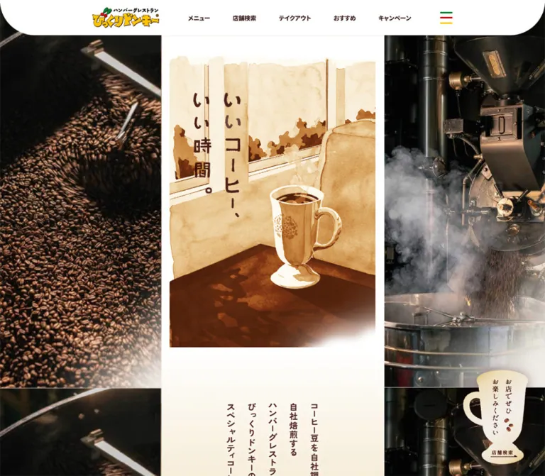
細い中央カラムにコーヒーの物語を展開する特設ページ。水彩画、縦書き、温かな写真を組み合わせ、デスクトップでは左右の大きな画像が物語を囲みます。
オリジナルサイトを見るBikkuri Donkey / Coffee Story — Style Reference
A narrow coffee story in watercolor and brown ink, surrounded by the scale and texture of coffee production.
Website: Bikkuri Donkey — Coffee Story Original URL: https://www.bikkuri-donkey.com/lp/2024_coffee/ Final URL: https://www.bikkuri-donkey.com/lp/2024_coffee/ Response: HTTP 200; the supplied original and final URLs are identical. Source page title: “いいコーヒー、いい時間。/びっくりドンキー” Theme: white and warm cream, sepia illustration, dark brown text, and stronger restaurant-brand colors in the shared navigation and footer. Inspected: September 13, 2026, Japan Standard Time. The supplied capture batch is timestamped September 12, 2026, at 19:44:03.151 UTC, equivalent to September 13 at 04:44:03.151 JST. Viewports: desktop 1440 × 1000 CSS pixels; mobile 390 × 844 CSS pixels. Scope: the current coffee feature within the restaurant website. Visual evidence covers the desktop opening, an intermediate story scene, the page ending, and the mobile opening and footer. Selected rendered DOM and computed styles extend through the long document. Linked destinations and menu-open behavior were not inspected.
The page presents specialty coffee as a patient, illustrated story. A slim central column alternates watercolor scenes, vertically arranged Japanese statements, photographs, and explanatory copy. Cream paper, coffee-brown lettering, sunlight, and soft image edges give the feature a quiet, tactile character. The shared restaurant header remains highly recognizable: a colorful logo, heavy compact navigation, a white curved surface, and a green-red-yellow menu symbol.
Desktop composition is the defining feature. The story occupies just 450px of a 1440px viewport, while two 495px image rails fill the sides. The rails carry large coffee-related scenes and give the small central narrative an immersive setting. On mobile, those rails disappear and the story becomes the main screen-width experience. At the end, a bright red app banner and a broad brown footer return the visitor to the wider restaurant website.
How to Read This Reference
- Measured values come from the supplied rendered element rectangles or computed styles. They apply to the two inspected viewports, not necessarily every browser size.
- Visual estimates describe screenshot colors, visible artwork dimensions, spacing, and shapes that were not included in the computed-style sample. Approximate hexadecimal colors are implementation targets, not pixel samples.
- Calculated values are arithmetic relationships between measurements, such as the central column's percentage of the desktop viewport.
- Recommendations describe a new implementation. Breakpoints, accessible target sizes, fallback typography, and the CSS starter are explicitly adaptations.
- Token names are descriptive aliases. No populated custom-property map was supplied, so these names are not original source variables.
- Artwork and text require different interpretation. Several visible headings correspond to sampled elements with empty text content. Their inherited 8px or 10px font sizes do not describe the visible lettering.
- DOM presence does not establish visibility. The evidence includes additional navigation entries that are absent from the closed-header screenshots. Their styles can be documented without claiming that an expanded menu was tested.
Tokens — Colors
Default Palette
| Name | Value | Evidence | Suggested token | Role |
|---|---|---|---|---|
| White | #FFFFFF |
Measured body background and reversed text | --coffee-white |
Header, opening paper, clear margins, and footer lettering |
| Warm Paper | Approximately #F0E4C7 |
Visual estimate | --coffee-paper |
Cream narrative fields and the warm transition below the opening artwork |
| Navigation Ink | #3B201B |
Measured navigation text: rgb(59, 32, 27) |
--coffee-ink |
Compact navigation; a suitable approximation for other dark brown labels |
| Closing Coffee Brown | #352317 |
Measured terminal store-search section background | --coffee-dark |
Deep final story field behind the large mug-shaped action |
| Footer Brown | Approximately #633A30 |
Visual estimate | --coffee-footer |
Full-width footer surface; visibly warmer and redder than the closing story field |
| App Red | Approximately #CC0012 |
Visual estimate | --coffee-red |
Full-width app-promotion band and small brand accents |
| Brand Yellow | Approximately #FFCC00 |
Visual estimate | --coffee-yellow |
App-banner arrow disk, logo, menu stroke, and decorative shapes |
| Brand Green | Approximately #008A36 |
Visual estimate | --coffee-green |
Menu stroke and small brand decorations |
| Muted Copyright | #A38680 |
Measured copyright text | --coffee-muted |
Low-emphasis footer copyright |
| Secondary Language Ink | #8B675F |
Measured language-link text in the navigation DOM | --coffee-language |
Secondary navigation styling; expanded presentation unverified |
The story and the shared site shell use different color intensities. Most of the narrative remains within white, cream, and brown. Saturated red, yellow, and green become more prominent in navigation details and the app/footer area. Keep that distribution: broad red story panels would change the pace and hierarchy.
Watercolor scenes contain many intermediate ochres, tans, and dark browns. They should remain image colors rather than becoming a large set of unrelated UI tokens. The pale fades around artwork are visible, but their implementation as image transparency, background treatment, masks, or overlays is not established.
Color Application Rules
- Use white for the header and the clearest opening margins.
- Use warm cream for slower explanatory sections.
- Use dark brown for short labels and editable narrative headings, while preserving supplied artwork lettering.
- Keep the terminal coffee-brown surface distinct from the warmer shared footer brown.
- Reserve the broad saturated red field for the app-promotion component.
- Treat exact values and visual estimates separately when evaluating implementation fidelity.
Tokens — Typography
Shared Interface — Noto Sans JP
Measured family: 'Noto Sans JP', sans-serif.
The body declares this stack, and the primary navigation uses weight 900. Desktop navigation is 13.6px; mobile navigation is 10px. The heavy weight keeps the small labels visible against the white header. Footer navigation uses weight 700, with slightly expanded tracking.
The supplied computed family confirms the declared stack. It does not separately verify which font file or fallback rendered each glyph.
Narrative Copy — Zen Kaku Gothic New
Measured family: 'Zen Kaku Gothic New', sans-serif.
This family appears on narrative paragraph and heading wrappers, with weight 700. A late, text-bearing paragraph about roasting freshness provides the most reliable reading-copy measurement: 16px / 34.24px on desktop and 14.547px / 31.1306px on mobile, with -0.6px letter spacing in both cases.
Both line-height ratios are approximately 2.14. That generous leading is central to the calm, spacious reading rhythm. Do not replace it with the tighter leading used in the compact navigation.
Artwork Lettering
The visible opening statement, “いいコーヒー、いい時間。”, has the irregular, substantial character of lettering integrated with the illustration. Other short statements are arranged vertically, including “商社を通さず、直接取引。” in the intermediate desktop capture.
Several sampled H2, H3, and P elements contain no extracted text despite visible narrative lettering elsewhere in the captures. Exact asset formats and text alternatives were not supplied. Preserve the distinction between editable UI type and composed artwork; do not infer a special display-font name from the illustration.
Type Scale
| Role | Desktop | Mobile | Weight / spacing | Status |
|---|---|---|---|---|
| Root font size | 8px |
10px |
Regular inherited base | Measured; not the reading-copy size |
| Primary navigation | 13.6px / 15.64px |
10px / 11.5px |
900; normal tracking |
Measured |
| Late narrative paragraph | 16px / 34.24px |
14.547px / 31.1306px |
700; -0.6px tracking |
Measured |
| Footer navigation | 10.4px / 11.96px |
11px / 18.7px |
700; 0.78px desktop, 0.825px mobile tracking |
Measured |
| Copyright | 8.8px / 10.12px |
10px / 11.5px |
700; 0.66px desktop, 0.75px mobile tracking |
Measured |
| Additional mobile navigation, primary group | Not equivalent to the visible desktop row | 21px / 24.15px |
700; 1.68px tracking |
DOM-only; expanded state not inspected |
| Additional mobile navigation, secondary group | — | 14px / 16.1px |
700; 1.12px tracking |
DOM-only |
| Language navigation | 8.8px / 10.12px |
11px / 12.65px |
700; 0.06em tracking |
Measured styles; not visible in closed-header captures |
| Opening artwork lettering | Approximately 30–36px apparent character size |
Approximately 28–34px |
Artwork-specific | Visual estimate, not a CSS font size |
| App-banner lettering | Approximately 24–26px |
Approximately 17–19px |
Visually heavy | Visual estimate; no text-bearing style measurement supplied |
Do not reproduce the page by applying an 8px root and guessing the rest of its rem values. The root changes between viewports, while the reading copy becomes smaller and footer copy becomes slightly larger. These elements follow different sizing rules.
Tokens — Spacing & Shapes
Overall density: very compact shared navigation surrounding a deliberately spacious, narrow story.
The page does not expose a consistent spacing-token system in the supplied evidence. Reuse measured relationships first: the fixed desktop story width, proportional image insets, broad narrative pauses, and the late paragraph's narrow measure.
Layout Measurements
| Element | Desktop: 1440 × 1000 | Mobile: 390 × 844 | Evidence and interpretation |
|---|---|---|---|
| Document height | 20,846.02px |
18,781.22px |
Measured snapshot heights; not implementation targets |
| Main content height | 20,337.11px |
18,123.73px |
Measured; footer follows main |
| Central story | 450px, starting at x = 495px |
390px, starting at x = 0 |
Measured |
| Side rails | 495px each; sampled height 1000px |
Absent from the visible composition and sampled main children | Measured desktop dimensions; observed mobile removal |
| Central share of viewport | 31.25% |
100% |
Calculated |
| Visible header height | Approximately 70px |
Approximately 60px |
Screenshot estimate; outer HEADER rectangle itself has zero height |
| Logo link width | 134px |
90px |
Measured inline-link widths; link heights do not describe the logo artwork |
| Opening section | 450 × 704.05px |
390 × 610.17px |
Measured |
| Visible opening-art inset | Approximately 18px each side |
Approximately 16px each side |
Visual estimate, close to 4% of story width |
| Visible opening-art width | Approximately 414px |
Approximately 359px |
Visual estimate, close to 92% of story width |
| Introductory section top padding | 104px |
104px |
Measured; does not simply scale with column width |
| Late paragraph width | 337.5px |
292.5px |
Measured; exactly 75% of the respective story widths |
| Late paragraph left inset | 60.75px within the story |
52.64px |
Measured; approximately 13.5% of story width |
| Terminal action section | 450 × 766.16px |
390 × 524.25px |
Measured |
| Terminal section padding | 79px top, 220px bottom |
68.64px top, 191.1px bottom |
Measured |
| Terminal store-search link width | 254.47px |
220.53px |
Measured; approximately 56.55% of story width |
| Footer, including app banner | 508.91px |
657.48px |
Measured |
| App-banner visible height | Approximately 134px |
Approximately 99px |
Screenshot estimate |
The late paragraph is slightly offset to the right: its left inset is approximately 13.5%, while its remaining right inset is approximately 11.5%. A reproduction can preserve this relationship instead of automatically centering every text block.
Narrative Spacing
| Use | Desktop | Mobile | Status |
|---|---|---|---|
| Introductory top pause | 104px |
104px |
Measured |
| Sample section top padding | 140px |
126.75px |
Measured |
| Sample section bottom padding | 160px |
136.5px |
Measured |
| Larger section bottom padding | 221px |
191.1px |
Measured |
| Another long section bottom padding | 237px |
205.92px |
Measured |
| Footer horizontal inset | Link grid begins near x = 279px |
31.58px, approximately 8.1% |
Measured link positions |
| Footer first-column row pitch | Approximately 33px |
Approximately 33.69px, increasing when a row wraps |
Calculated from link positions |
These are editorial pauses, not card gutters. Large empty intervals allow isolated statements and images to become separate story beats.
Border Radius and Shape
| Element | Treatment | Evidence |
|---|---|---|
| Header | Large rounded lower corners; approximately 70px desktop and 40px mobile |
Visual estimate |
| Story column | Straight vertical edges | Observed |
| Photographic regions | Rectangular crops, sometimes fading at an edge | Observed |
| Watercolor scenes | Irregular painted boundaries and soft white falloff | Observed artwork treatment |
| Store-search action | Mug silhouette with an irregular illustrated outline | Observed; not a rounded rectangle |
| App arrow | Yellow disk with a long white arrow | Observed |
| Footer decoration | Cropped, irregular colored shapes along the lower edge | Observed |
No general system of elevated cards or repeated rounded containers appears in the supplied captures.
Components
Persistent Restaurant Header
Role: retain brand identity and immediate access to restaurant services throughout the coffee story.
The visible component is a white, full-width strip with strongly curved lower corners. Its inner content is centered within an approximately 950px-wide desktop span. The logo sits at the left; five short navigation links span the middle; a three-stroke menu symbol sits at the right.
Desktop labels are “メニュー”, “店舗検索”, “SNS一覧”, “テイクアウト”, and “おすすめ”. Mobile keeps the logo, the first three labels, and the menu symbol. The mobile logo is 90px wide, while the primary labels use heavy 10px type.
The strokes of the menu symbol are green, red, and yellow. Preserve this small branded detail rather than replacing it with an unrelated monochrome icon.
The header remains at the top of every supplied scroll capture. Its outer HEADER element has a zero-height rectangle, so that rectangle must not be interpreted as the visible strip's height. The evidence does not include the positioning declaration of its visible descendant.
Interaction limitation: additional navigation groups exist in the DOM, but opening, closing, focus behavior, and menu animation were not exercised.
Desktop Image Rails
Role: surround the narrow narrative with coffee imagery at an environmental scale.
The main element is measured as a flex container with three principal sections: 495px left, 450px center, and 495px right. Both side sections have viewport-height rectangles at the sampled desktop position.
The opening capture shows coffee tasting on the left and a watercolor coffee cup on the right. Tall scenes are stacked or repeated vertically; visible image boundaries occur around the lower portion of the first viewport. Another capture shows overlapping imagery, including coffee beans and illustrated forms.
The rails remain beside the narrative in the supplied middle view and finish above the full-width footer. A sticky, viewport-height rail is a practical adaptation of this behavior, but the original sticky/fixed rules and any independent image movement were not supplied.
Use close, tactile crops: hands, grounds, beans, cups, and working surfaces. The rails should feel related to the story without becoming extra columns of readable content.
Central Opening Artwork
Role: establish the coffee feature's title, mood, and visual vocabulary.
The opening section is approximately 1.565 times its width at both inspected sizes. Inside it, the visible artwork begins about one quarter of a story-column width below the page's top and leaves approximately 4% side margins.
Desktop shows a tall watercolor cup beside a sunlit window, with vertical brown lettering. Mobile shows a coffee-harvesting scene with the same title. The evidence cannot distinguish deliberate responsive art direction from different animation or scene states; do not hardcode a mobile-only harvesting illustration on that basis.
The artwork retains its portrait composition, textured washes, uneven edges, and fade into white at the bottom. It is not framed as a card. The narrow desktop presentation is intentional: increasing it to a conventional wide hero would remove the page's distinctive structure.
Vertical Introductory Statement
Role: slow the reading pace and introduce the coffee proposition.
Below the opening image, white transitions into a warm cream field. Several short columns of Japanese text sit together near the center. Characters read vertically, and the columns create a compact composition within generous surrounding space.
A measured 104px top padding is retained on both desktop and mobile. In the opening screenshots, the first part of this statement appears near the lower edge of the viewport, encouraging continued scrolling without an explicit oversized scroll prompt.
For editable replacement copy, writing-mode: vertical-rl is an appropriate recommendation. It is not proof that the original artwork lettering uses CSS writing mode. Keep sentences short enough to preserve the composed column lengths.
Image and Chapter Statement Sequence
Role: explain sourcing and preparation through alternating human imagery and concise statements.
The intermediate desktop capture places a photograph of hands holding green coffee beans at the top of the central strip. Below it, a cream field contains the vertically arranged statement “商社を通さず、直接取引。”. Further down, dark horizontal explanatory copy begins within a narrow inset.
This sequence is built from distinct elements: a full-column image, an isolated vertical statement, substantial breathing room, and then a more conventional paragraph block. Keep these roles separate in the layout.
Many long-document headings are empty in the text extraction. The available evidence supports the rhythm and visible example, but not a complete transcription or visual description of every chapter.
Late Freshness Paragraph
Role: explain the relationship between roasting, delivery, and individual preparation.
The extracted paragraph states that beans are roasted in response to store orders and that drinks are prepared after customers order. It is one of the clearest examples of live narrative text in the supplied DOM.
Its anatomy is a 75%-width block, offset approximately 13.5% from the story's left edge, using bold Zen Kaku Gothic New, generous 2.14 leading, and slightly negative tracking. Computed text color is white.
The immediate background beneath this paragraph is not included in the supplied visual captures or measured as an opaque paragraph surface. For an adaptation, place reversed copy on a sufficiently dark, stable background and verify its contrast through any image changes.
Story Continuation Link
Role: provide access to additional coffee content.
The original page contains a link to /lp/2024_coffee/story_index/. Its sampled text is empty, and its inline rectangle is not a trustworthy measurement of the complete visual action.
Document the destination and reserve an appropriately placed continuation component in an implementation. The supplied evidence does not establish its exact artwork, label, hover treatment, or the design of the destination page.
Mug-Shaped Store Search
Role: translate interest in the coffee story into a restaurant visit.
A cream mug silhouette carries vertical invitation text, small coffee-bean illustrations, and a “店舗検索” label with an arrow at the base. The desktop side-rail version sits near the lower-right area of the image composition. The large terminal version is centered on a solid #352317 field.
The terminal link width is approximately 56.55% of the story width: 254.47px desktop and 220.53px mobile. Its measured link heights differ substantially—467.16px and 264.53px—so those rectangles should not be treated as proof of a shared artwork aspect ratio.
Two store-search links are present in the desktop evidence, while the mobile evidence contains the central story action without the desktop rail duplicate. Both supported destinations use /shop_search/.
Use the mug artwork as the visible identity of the action. Provide an accessible link name and a clear focus treatment around a practical hit region. The original accessible name and hover effect were not verified.
Return-to-Opening Tab
Role: offer a compact route back to the opening scene.
A small pale tab with a brown upward chevron appears at the right edge of the story column, near the upper part of the viewport. The sampled link points to #mv on the current page.
Its measured inline width is 24px desktop and approximately 20.66px mobile. As with other image links, the inline rectangle does not establish the entire painted or clickable area.
The destination is confirmed; smooth scrolling, focus placement after navigation, and the tab's appearance/disappearance rules are unverified.
App-Promotion Banner
Role: connect the coffee feature to the restaurant's official app.
This is a full-width saturated red band immediately after the story. Its internal anatomy is a hand-and-phone illustration, a heavy white Japanese download message, and a yellow disk crossed by a long white arrow.
Desktop keeps the message on one line within an approximately 878px-wide inner composition. Mobile uses two lines, a smaller icon, and a smaller arrow disk. The visible band is approximately 134px tall on desktop and 99px on mobile.
The destination is /appli/. The sampled link text is empty, so the screenshot's apparent lettering size should not be represented as a measured font declaration.
Shared Site Footer
Role: provide the restaurant site's service, information, policy, and social navigation.
Below the red banner, the footer uses a warm brown background, small white links, generous outer space, and a centered social row. The desktop links form four visible columns. Mobile reorganizes them into two columns and includes “WEB来店予約” in its visible link set.
This is a responsive change in arrangement and available navigation, not just uniform scaling. Long mobile labels wrap, and their rows grow accordingly. The first mobile column begins at approximately 31.58px; the second begins at 195px.
The social row contains X, YouTube, Instagram, and LINE marks. Their measured link widths are approximately 17–21px; this does not establish their full interactive target sizes. Muted copyright text sits beneath them.
Irregular red, yellow, green, white, and brown shapes enter from the bottom edge. They give the shared footer a playful restaurant identity without adding another content panel. No production team is named in the supplied original-page evidence.
Tokens — Motion & Interaction
Measured Animation Declarations
| Element or group | Supplied computed declaration | What it establishes | What remains unknown |
|---|---|---|---|
| One mobile chapter heading | 1.4s ease-out forwards blur-02 |
Duration, easing, fill mode, and animation name | Actual blur values, opacity changes, and trigger |
| Mobile terminal store-search link | 1.4s ease-out forwards blur-02 |
The same timing treatment is assigned to this action | Exact reveal appearance and replay rules |
| Two mobile narrative headings | 2.5s steps(35) forwards mask-anime |
A stepped 2.5-second animation with 35 timing steps | Mask asset, keyframes, and initial visibility |
| Later mobile headings | 1.75s steps(35) forwards mask-anime |
A shorter stepped treatment with the same step count | Exact spatial reveal and trigger thresholds |
| Most sampled desktop elements | animation: none |
No active animation declaration on those sampled elements at that state | Earlier animation, descendant animation, and script-driven motion |
Animation names are evidence identifiers, not complete effect specifications. In particular, steps(35) does not independently establish an image sprite with 35 frames.
Visible Behavior and Limits
- The desktop middle capture contains overlapping imagery consistent with a crossfade or composited transition. Its timing, trigger, and implementation are not established by a still capture.
- The desktop and mobile opening scenes differ. This confirms visual scene variation, but not whether viewport size or playback state caused it.
- The header stays visible across supplied scroll positions.
- Side imagery remains beside the central story in the supplied desktop views and ends before the full-width footer. Relative scroll speed and parallax behavior were not measured.
- A generic computed
transition: allappears in the element sample without usable duration details. It is not evidence for a particular site-wide transition. - Link destinations are available, but clicks, hover states, menu operation, keyboard interaction, and destination rendering were not tested.
For a new implementation, reveal artwork without moving the paragraph layout. Use the measured durations as timing references only after choosing an appropriate mask or dissolve treatment. Keep the full document readable when motion is reduced or initialization fails.
Surfaces
| Surface | Appearance | Purpose and evidence |
|---|---|---|
| Header | Opaque white with large curved lower corners | Persistent shared navigation; shape visually observed |
| Opening story | White margins around portrait watercolor | Keeps the opening illustration separate from the surrounding imagery |
| Narrative paper | Pale warm cream, sometimes reached through a soft white fade | Calm reading field; color and transition are visual estimates |
| Side rails | Large photographic and illustrated crops | Environmental context; no card elevation |
| Late copy region | White computed paragraph text over an unsampled underlying surface | Exact background requires separate verification |
| Terminal store action | Solid #352317 |
Measured dark closing field |
| App promotion | Saturated red with white and yellow artwork | Strong full-width navigation handoff |
| Footer | Warm brown with white links and colored lower-edge decoration | Shared restaurant-site navigation |
The strongest boundaries are changes in image, width, background color, and whitespace. Avoid introducing repeated shadows or container borders where the source relies on continuous storytelling.
Imagery
The imagery combines documentary coffee subjects with sepia watercolor. Photographs emphasize material detail: hands stirring tasting glasses, dry grounds, green beans cupped in palms, and wooden work surfaces. The illustrations soften this material into a more reflective experience: a tall cup beside a window, warm light, leaves, and a harvesting figure.
Preserve the visible pigment variation, paper-like pale areas, rough silhouettes, and white edge fades. The images are soft and textured rather than pixelated. Do not apply pixel-art rendering or sharpen the painted edges into flat vector shapes.
Observed Visual References
No image source paths, intrinsic dimensions, or downloadable asset inventory were supplied. The descriptions below identify visible assets without inventing filenames.
| Reference | Appearance | Observed use |
|---|---|---|
| Coffee-cup watercolor | Tall handled cup on a dark table beside a sunlit window | Desktop opening artwork and a right-side scene |
| Coffee-harvest watercolor | Figure gathering fruit among leaves and branches, rendered in ochre and brown | Mobile opening scene |
| Coffee-tasting photograph | Three glasses of grounds or coffee on wood, hand with spoon, metal cup, and paper record | Left desktop rail |
| Green-bean photograph | Hands holding unroasted beans | Intermediate central story scene |
| Mug-shaped store invitation | Pale illustrated cup, vertical lettering, small beans, and an arrow | Desktop rail and terminal action |
| App-promotion artwork | Hand holding a phone, large white lettering, yellow arrow disk | Full-width banner before footer navigation |
| Footer decoration | Irregular colored pieces cropped by the lower page edge | Desktop and mobile footer |
Cropping and Asset Guidance
- Preserve the central artwork's full portrait composition and title relationship.
- Crop side photographs independently to fill their wider environmental role.
- Use licensed original artwork when available. Generic stock images cannot reproduce the relationship between the cup, sunlight, lettering, and watercolor edges.
- If replacement artwork is commissioned, provide both central portrait compositions and separate rail crops.
- Keep decorative repeats out of the accessibility reading order while preserving meaningful alternatives for story imagery.
- Confirm where lettering is embedded before building editable overlays, so the visible title is not duplicated.
Layout & Responsive Behavior
Desktop Composition
At 1440px, the central story is 450px wide and begins at x = 495px. The remaining width is split evenly between two 495px rails. This is a narrow reading strip surrounded by imagery, rather than three equally weighted content columns.
The header spans the entire viewport above this arrangement. The app banner and footer also span the viewport, breaking out of the story width at the end. This change from narrow narrative to broad service navigation is an important part of the page's hierarchy.
The supplied main element uses flex layout. A three-column grid can reproduce the measured proportions in a new implementation, but should be described as an adaptation rather than original source code.
Mobile Composition
At 390px, the story begins at x = 0 and fills the viewport width. The desktop rails and their extra store-search action disappear from the visible composition. Portrait art retains approximately 16px side insets.
The header becomes approximately 60px tall, reduces the logo to 90px, and retains three visible navigation labels. The full-page story remains long: the measured document is approximately 18,781px tall.
The app-banner message wraps onto two lines. Footer navigation becomes two columns, gains a visible reservation entry, and allows long labels to occupy multiple lines. Its complete region is therefore taller than desktop despite the smaller screen.
Scaling Relationships
| Relationship | Calculation | Design consequence |
|---|---|---|
| Story-width change | 390 / 450 ≈ 0.867 |
Many artwork dimensions scale proportionally |
| Opening-section height change | 610.17 / 704.05 ≈ 0.867 |
The opening keeps essentially the same section proportion |
| Late paragraph measure | 75% at both sizes |
Text stays narrow inside the central story |
| Late body font change | 14.547 / 16 ≈ 0.909 |
Type does not shrink as much as the column, so wrapping increases |
| Introductory top padding | 104px at both sizes |
Some editorial pauses remain fixed |
| Root font change | 8px to 10px |
Root size is not a reliable proxy for visual scaling |
The evidence contains no tablet capture or source media-query definitions. A breakpoint such as 768px is a reasonable implementation starting point, but it is a recommendation. Test widths between the observed desktop and mobile cases before treating any breakpoint as final.
Scrolling and Reachability
The measured page is a long document with the footer after the main story. Preserve natural page scrolling for an adaptation. Do not turn the central column into a separate scroll pane merely because it resembles a phone-width layout.
A sticky rail implementation should release at the main section's end so the app banner and footer remain unobstructed. A fixed header should not hide anchor targets or focused elements. The original scroll container rules, safe-area handling, and exact anchor offsets were not included in the evidence.
Do’s and Don’ts
Do
- Keep the desktop story close to the measured 450px width at the inspected size.
- Give the surrounding imagery substantial width and visual presence.
- Remove the rails on narrow screens and let the story occupy the available width.
- Preserve watercolor texture, sunlight, coffee-brown lettering, and soft artwork edges.
- Alternate portrait imagery, short vertical statements, and generous narrative pauses.
- Use Noto Sans JP for the shared interface and Zen Kaku Gothic New for editable narrative copy, subject to font availability.
- Retain the measured spacious
2.14leading for the late reading-copy treatment. - Keep the colorful logo and three-color menu symbol recognizable.
- Preserve the mug silhouette as the store-search action's main visual identity.
- Let the red app banner and brown footer span the full viewport.
- Reorganize mobile footer links deliberately and allow long labels to wrap.
- Label uncertain motion and approximate screenshot colors honestly.
Don’t
- Don't stretch the central story into a full-width desktop hero.
- Don't treat the image rails as additional text-heavy columns.
- Don't replace the narrative with a grid of generic feature cards.
- Don't apply bright brand colors uniformly throughout the coffee story.
- Don't convert every watercolor edge into a clean rounded rectangle.
- Don't infer display-font names from artwork lettering.
- Don't copy 8px or 10px heading-wrapper font sizes as visible title sizes.
- Don't assume the different opening scenes prove a mobile-specific asset swap.
- Don't describe parallax, video, autoplay timing, or hover effects as verified.
- Don't use inline image-link heights as the dimensions of complete visual components.
- Don't infer a production agency or corporate legal name from a domain alone.
- Don't hardcode the measured total document height; let content and responsive wrapping determine it.
Recommended Implementation Additions
These are recommendations for a new implementation, not verified features of the original page:
- Provide a semantic page heading and text equivalents for important lettering embedded in artwork.
- Give the menu, mug action, social icons, and return tab explicit accessible names.
- Implement an expanded menu with correct focus handling, an accessible expanded state, keyboard dismissal, and reliable access to all navigation entries.
- Increase small icon controls to practical hit areas of about 44 × 44px without enlarging their visible artwork unnecessarily.
- Offer reduced-motion behavior that shows completed artwork and text immediately, including removal of any reveal masks that could leave content hidden.
- Ensure side-rail imagery is decorative in the reading order unless it conveys information unavailable in the story.
- Reserve image dimensions to prevent layout shifts; load below-the-fold artwork progressively while prioritizing the visible opening.
- Check reversed text over every relevant image state and consider increasing the small footer and mobile-navigation text where accessibility requirements call for it.
- Test anchor offsets, footer reachability, and narrow-screen wrapping with the fixed header enabled.
Agent Prompt Guide
Quick Color Reference
- Measured white:
#FFFFFF. - Measured navigation ink:
#3B201B. - Measured terminal story brown:
#352317. - Measured muted copyright:
#A38680. - Estimated narrative paper:
#F0E4C7. - Estimated footer brown:
#633A30. - Estimated app red and yellow:
#CC0012and#FFCC00. - Use saturated colors mainly in shared-brand controls, the app banner, and footer decoration.
Overall Prompt
“Create a long-form coffee feature for a Japanese restaurant brand. At a 1440px desktop viewport, place a 450px story column between two 495px image rails. Use portrait watercolor scenes in sepia, tactile coffee photography, white-to-cream narrative fields, short vertical Japanese statements, and generous whitespace. Keep a full-width white header with large rounded lower corners, a colorful restaurant logo, compact heavy navigation, and a green-red-yellow menu symbol. On a 390px mobile viewport, hide the rails and use the full-width story with approximately 16px artwork insets. Finish with a mug-shaped store-search action on deep brown, a full-width red app banner, and a brown footer that changes from four link columns to two. Treat artwork lettering separately from live UI fonts.”
Example Component Prompts
- Opening composition: “Design a narrow portrait opening with a watercolor coffee scene, vertical brown title lettering, irregular pigment edges, and a soft white fade at the bottom. Leave roughly 4% side insets inside the story column. Preserve the portrait composition instead of cropping it into a wide hero.”
- Story chapter: “Place a close photograph of hands holding green coffee beans above a warm cream field. Center a short vertical Japanese statement within broad whitespace, then follow it with a narrow block of bold, generously spaced explanatory copy. Use no cards or elevation shadows.”
- Header: “Create a persistent white restaurant header with strongly rounded lower corners. Use a 134px desktop logo, five compact heavy navigation labels, and a three-color menu symbol. On mobile, use a 90px logo and retain three visible labels. Keep the visible icon small while providing a usable hit area.”
- Store-search action: “Use a pale illustrated mug silhouette on a solid
#352317field. Integrate a short vertical invitation, small coffee-bean details, and a store-search label with an arrow at the base. Size the action to approximately 56.55% of the story column's width.” - App banner and footer: “Follow the narrow coffee story with a full-width red app banner containing a phone illustration, heavy white copy, and a yellow arrow disk. Beneath it, use warm brown, compact white navigation, centered social icons, muted copyright, and irregular colored decorations entering from the bottom edge.”
- Motion adaptation: “Use restrained artwork reveals that leave layout dimensions stable. Timing references are 1.4 seconds with ease-out and 1.75 or 2.5 seconds with 35 timing steps. Create suitable reveal assets separately; do not claim a generic fade reproduces the original masks. Show completed content immediately under reduced motion.”
Quick Start
CSS Custom Properties
This stylesheet is an implementation adaptation, not recovered source CSS. It keeps a conventional root font size and uses the measured desktop column width, typography, paragraph proportions, and responsive endpoint values. Estimated colors and geometry are marked in comments.
Expected anatomy: .coffee-layout contains a left .coffee-rail, the .coffee-story, and a right .coffee-rail. Inside the story, use .coffee-hero, .coffee-intro, narrative sections, and .coffee-close. The .app-banner and .site-footer follow the main layout at full width. Header and footer classes style the shared site shell.
Supply authorized artwork separately. Scene sequencing, reveal masks, expanded-menu behavior, and asset loading are not implemented by this CSS.
:root {
  /* Colors confirmed by the supplied computed styles. */
  --coffee-white: #ffffff;
  --coffee-ink: #3b201b;
  --coffee-dark: #352317;
  --coffee-muted: #a38680;
  --coffee-language: #8b675f;

  /* Visual estimates; refine against authorized artwork. */
  --coffee-paper: #f0e4c7;
  --coffee-footer: #633a30;
  --coffee-red: #cc0012;
  --coffee-yellow: #ffcc00;
  --coffee-green: #008a36;

  /* Declared source font families; load separately if available. */
  --font-ui: 'Noto Sans JP', sans-serif;
  --font-story: 'Zen Kaku Gothic New', sans-serif;

  /* Measured geometry and type. */
  --story-max: 450px;
  --story-copy-width: 75%;
  --story-copy-left: 13.5%;
  --story-body-size: 16px;
  --story-body-leading: 2.14;
  --story-body-tracking: -0.6px;
  --intro-pause: 104px;

  /* Header geometry estimated from the captures. */
  --header-height: 70px;
  --header-curve: 70px;

  /* Confirmed animation timings; keyframes are not supplied. */
  --reveal-soft: 1.4s ease-out;
  --reveal-mask-long: 2.5s steps(35);
  --reveal-mask-short: 1.75s steps(35);
}

* {
  box-sizing: border-box;
}

html {
  scroll-padding-top: calc(var(--header-height) + 16px);
}

body {
  margin: 0;
  color: var(--coffee-ink);
  background: var(--coffee-white);
  font-family: var(--font-ui);
}

img {
  display: block;
  max-inline-size: 100%;
  block-size: auto;
}

.site-header {
  position: fixed;
  z-index: 100;
  inset: 0 0 auto;
  min-block-size: var(--header-height);
  background: var(--coffee-white);
  border-radius: 0 0 var(--header-curve) var(--header-curve);
}

.header-inner {
  display: flex;
  align-items: center;
  justify-content: space-between;
  inline-size: min(950px, calc(100% - 64px));
  min-block-size: var(--header-height);
  margin-inline: auto;
}

.brand {
  flex: 0 0 auto;
  inline-size: 134px;
}

.primary-nav {
  display: flex;
  align-items: center;
  gap: clamp(24px, 5.3vw, 76px);
}

.primary-nav a {
  color: var(--coffee-ink);
  font-size: 13.6px;
  font-weight: 900;
  line-height: 1.15;
  text-decoration: none;
  white-space: nowrap;
}

.menu-button {
  position: relative;
  display: grid;
  align-content: space-between;
  flex: 0 0 24px;
  inline-size: 24px;
  block-size: 24px;
  padding: 0;
  border: 0;
  background: transparent;
  cursor: pointer;
}

/* Recommended enlarged hit region around the small visible icon. */
.menu-button::before {
  content: '';
  position: absolute;
  inset: -10px;
}

.menu-button span {
  display: block;
  block-size: 3px;
  background: var(--coffee-green);
}

.menu-button span:nth-child(2) {
  background: var(--coffee-red);
}

.menu-button span:nth-child(3) {
  background: var(--coffee-yellow);
}

/* Grid adaptation of the measured three-part flex composition. */
.coffee-layout {
  display: grid;
  grid-template-columns:
    minmax(0, 1fr) minmax(0, var(--story-max)) minmax(0, 1fr);
  align-items: start;
}

/* Recommended rail behavior; the original positioning rule is unknown. */
.coffee-rail {
  position: sticky;
  top: 0;
  min-inline-size: 0;
  block-size: 100svh;
  margin: 0;
  overflow: hidden;
}

.coffee-rail__scene {
  inline-size: 100%;
  aspect-ratio: 495 / 780;
  object-fit: cover;
}

.rail-shop {
  position: absolute;
  right: 0;
  bottom: 24px;
  inline-size: 199px;
}

.coffee-story {
  position: relative;
  min-inline-size: 0;
  background: var(--coffee-paper);
}

/* Approximate visible artwork placement, not an original CSS formula. */
.coffee-hero {
  padding: 25.1% 4% 0;
  background: var(--coffee-white);
}

.coffee-hero img {
  inline-size: 100%;
}

/* The fade length is a recommended approximation. */
.coffee-intro {
  padding-block-start: var(--intro-pause);
  background: linear-gradient(
    to bottom,
    var(--coffee-white),
    var(--coffee-paper) 220px
  );
}

/* Editable-copy alternative; this does not recreate artwork lettering. */
.vertical-copy {
  inline-size: 18em;
  margin: 0 auto;
  writing-mode: vertical-rl;
  text-orientation: upright;
  font-family: var(--font-story);
  font-size: 16px;
  font-weight: 700;
  line-height: 2.6;
  letter-spacing: 0.12em;
}

.story-copy {
  inline-size: var(--story-copy-width);
  margin: 0 0 0 var(--story-copy-left);
  font-family: var(--font-story);
  font-size: var(--story-body-size);
  font-weight: 700;
  line-height: var(--story-body-leading);
  letter-spacing: var(--story-body-tracking);
}

/* Apply only over a verified dark background. */
.story-copy--inverse {
  color: var(--coffee-white);
}

.coffee-close {
  padding: 79px 0 220px;
  background: var(--coffee-dark);
}

.mug-link {
  display: block;
  inline-size: 56.55%;
  margin-inline: auto;
}

.mug-link img {
  inline-size: 100%;
}

.app-banner {
  color: var(--coffee-white);
  background: var(--coffee-red);
}

/* Live-text adaptation of the visible banner composition. */
.app-banner__link {
  display: grid;
  grid-template-columns: 60px minmax(0, 1fr) 56px;
  align-items: center;
  gap: 28px;
  inline-size: min(878px, calc(100% - 48px));
  min-block-size: 134px;
  margin-inline: auto;
  padding-block: 24px;
  color: inherit;
  font-size: 24px;
  font-weight: 900;
  line-height: 1.5;
  text-decoration: none;
}

.app-arrow {
  position: relative;
  inline-size: 56px;
  block-size: 56px;
  border-radius: 50%;
  background: var(--coffee-yellow);
}

.app-arrow::before {
  content: '';
  position: absolute;
  top: 50%;
  right: 25px;
  left: -50px;
  border-top: 2px solid currentColor;
}

.app-arrow::after {
  content: '';
  position: absolute;
  top: calc(50% - 5px);
  right: 25px;
  inline-size: 10px;
  block-size: 10px;
  border-top: 2px solid currentColor;
  border-right: 2px solid currentColor;
  transform: rotate(45deg);
}

.site-footer {
  position: relative;
  color: var(--coffee-white);
  background: var(--coffee-footer);
}

.footer-inner {
  inline-size: min(882px, calc(100% - 64px));
  margin-inline: auto;
  padding-block: 68px 70px;
}

.footer-links {
  display: grid;
  grid-template-columns: repeat(4, minmax(0, 1fr));
  gap: 18px 40px;
}

.footer-links a {
  color: inherit;
  font-size: 10.4px;
  font-weight: 700;
  line-height: 1.15;
  letter-spacing: 0.075em;
  text-decoration: none;
  overflow-wrap: anywhere;
}

.social-links {
  display: flex;
  justify-content: center;
  gap: 18px;
  margin-block-start: 32px;
}

/* Recommended targets; keep the artwork itself near its observed size. */
.social-links a {
  display: grid;
  place-items: center;
  inline-size: 44px;
  block-size: 44px;
  color: inherit;
}

.social-links img,
.social-links svg {
  inline-size: 20px;
  block-size: 20px;
}

.copyright {
  margin: 8px 0 0;
  color: var(--coffee-muted);
  font-family: var(--font-story);
  font-size: 8.8px;
  font-weight: 700;
  line-height: 1.15;
  letter-spacing: 0.075em;
  text-align: center;
}

/* Recommended focus treatment for both pale and dark surfaces. */
:where(a, button):focus-visible {
  outline: 2px solid currentColor;
  outline-offset: 5px;
}

/* Proposed breakpoint; the source breakpoint was not supplied. */
@media (max-width: 767px) {
  :root {
    --header-height: 60px;
    --header-curve: 40px;
    --story-body-size: 14.547px;
  }

  .header-inner {
    inline-size: 82%;
  }

  .brand {
    inline-size: 90px;
  }

  .primary-nav {
    gap: 20px;
  }

  .primary-nav a {
    font-size: 10px;
  }

  .primary-nav .nav-wide {
    display: none;
  }

  .menu-button {
    flex-basis: 19px;
    inline-size: 19px;
    block-size: 19px;
  }

  .menu-button::before {
    inset: -12.5px;
  }

  .coffee-layout {
    display: block;
  }

  .coffee-rail {
    display: none;
  }

  .coffee-story {
    inline-size: min(100%, var(--story-max));
    margin-inline: auto;
  }

  .coffee-close {
    padding-block: 68.64px 191.1px;
  }

  .app-banner__link {
    grid-template-columns: 48px minmax(0, 1fr) 38px;
    gap: 14px;
    inline-size: calc(100% - 46px);
    min-block-size: 99px;
    padding-block: 18px;
    font-size: 18px;
    line-height: 1.65;
  }

  .app-arrow {
    inline-size: 38px;
    block-size: 38px;
  }

  .app-arrow::before {
    right: 18px;
    left: -18px;
  }

  .app-arrow::after {
    right: 18px;
  }

  .footer-inner {
    inline-size: 83.8%;
    padding-block: 38px 86px;
  }

  .footer-links {
    grid-template-columns: repeat(2, minmax(0, 1fr));
    gap: 15px 24px;
  }

  .footer-links a {
    font-size: 11px;
    line-height: 1.7;
  }

  .social-links {
    gap: 6px;
  }

  .copyright {
    font-size: 10px;
  }
}

/* Additional narrow-screen recommendation, beyond the inspected sizes. */
@media (max-width: 359px) {
  .header-inner {
    inline-size: calc(100% - 32px);
  }

  .brand {
    inline-size: 80px;
  }

  .primary-nav {
    gap: 12px;
  }
}

/* Apply to any reveal system added by the implementation. */
@media (prefers-reduced-motion: reduce) {
  html {
    scroll-behavior: auto;
  }

  [data-reveal] {
    animation: none !important;
    opacity: 1 !important;
    filter: none !important;
    mask: none !important;
    clip-path: none !important;
    transform: none !important;
  }
}
The footer grid above preserves the four-to-two-column structure with simpler equal columns. The original desktop column starts were approximately 279px, 486px, 702px, and 945px. Refine track widths and ordering when exact matching is required. Use proper footer artwork for the lower-edge decorations rather than expecting these layout rules to recreate it.
Tailwind v4 Token Mapping
Optional mapping for a project already using Tailwind v4. This does not imply that the original website uses Tailwind. Define the custom properties above first.
@theme inline {
  --color-coffee-white: var(--coffee-white);
  --color-coffee-paper: var(--coffee-paper);
  --color-coffee-ink: var(--coffee-ink);
  --color-coffee-dark: var(--coffee-dark);
  --color-coffee-footer: var(--coffee-footer);
  --color-coffee-red: var(--coffee-red);
  --color-coffee-yellow: var(--coffee-yellow);
  --color-coffee-muted: var(--coffee-muted);

  --font-coffee-ui: var(--font-ui);
  --font-coffee-story: var(--font-story);

  --text-coffee-body: var(--story-body-size);
  --spacing-coffee-column: var(--story-max);
  --spacing-coffee-intro: var(--intro-pause);
  --radius-coffee-header: var(--header-curve);
}
Sources & Evidence
- Current coffee feature: authority for page identity, the supplied HTTP 200 result, current screenshots, rendered text, link destinations, selected element rectangles, and computed styles. The original and final URLs are the same.
- Capture batch: September 12, 2026, 19:44:03.151 UTC / September 13, 2026, 04:44:03.151 JST. Separate timestamps for individual images were not supplied.
- Desktop visual coverage: three captures at 1440 × 1000, showing the opening composition, one intermediate narrative scene, and the transition into the app banner and footer.
- Mobile visual coverage: two captures at 390 × 844, showing the opening and page ending. No mobile middle-section screenshot was supplied.
- Rendered evidence: selected DOM and computed styles at both viewports, including main-column dimensions, document heights, declared font stacks, text styles, the closing brown surface, and several mobile animation declarations.
- Original-page destinations: store search at
https://www.bikkuri-donkey.com/shop_search/, app information athttps://www.bikkuri-donkey.com/appli/, story continuation athttps://www.bikkuri-donkey.com/lp/2024_coffee/story_index/, and the opening anchor athttps://www.bikkuri-donkey.com/lp/2024_coffee/#mv. These were found in the supplied original-page links; their destination pages were not inspected. - Capture procedure: the supplied browser process included an initial observation of at least five seconds, readiness checks for document loading, finite animation and layout stability, and visible image decoding. Scrolling traversed intermediate positions. These checks do not establish that every delayed state or interaction was observed.
- Limitations: no independent browsing, asset-file inspection, source stylesheet inspection, menu clicks, hover tests, keyboard tests, or motion playback analysis was performed for this reference. SharedWorkers and service workers were disabled in the supplied inspection. Exact breakpoints, image formats, reveal keyframes, and scene sequencing remain unverified.
This reference describes the currently supplied page evidence. Measured values are separated from screenshot estimates, and the reusable CSS, accessibility additions, and responsive breakpoint choices are implementation recommendations.
# Bikkuri Donkey / Coffee Story — Style Reference

> A narrow coffee story in watercolor and brown ink, surrounded by the scale and texture of coffee production.

**Website:** [Bikkuri Donkey — Coffee Story](https://www.bikkuri-donkey.com/lp/2024_coffee/)
**Original URL:** https://www.bikkuri-donkey.com/lp/2024_coffee/
**Final URL:** https://www.bikkuri-donkey.com/lp/2024_coffee/
**Response:** HTTP 200; the supplied original and final URLs are identical.
**Source page title:** “いいコーヒー、いい時間。/びっくりドンキー”
**Theme:** white and warm cream, sepia illustration, dark brown text, and stronger restaurant-brand colors in the shared navigation and footer.
**Inspected:** September 13, 2026, Japan Standard Time. The supplied capture batch is timestamped September 12, 2026, at 19:44:03.151 UTC, equivalent to September 13 at 04:44:03.151 JST.
**Viewports:** desktop 1440 × 1000 CSS pixels; mobile 390 × 844 CSS pixels.
**Scope:** the current coffee feature within the restaurant website. Visual evidence covers the desktop opening, an intermediate story scene, the page ending, and the mobile opening and footer. Selected rendered DOM and computed styles extend through the long document. Linked destinations and menu-open behavior were not inspected.

The page presents specialty coffee as a patient, illustrated story. A slim central column alternates watercolor scenes, vertically arranged Japanese statements, photographs, and explanatory copy. Cream paper, coffee-brown lettering, sunlight, and soft image edges give the feature a quiet, tactile character. The shared restaurant header remains highly recognizable: a colorful logo, heavy compact navigation, a white curved surface, and a green-red-yellow menu symbol.

Desktop composition is the defining feature. The story occupies just 450px of a 1440px viewport, while two 495px image rails fill the sides. The rails carry large coffee-related scenes and give the small central narrative an immersive setting. On mobile, those rails disappear and the story becomes the main screen-width experience. At the end, a bright red app banner and a broad brown footer return the visitor to the wider restaurant website.

## How to Read This Reference

- **Measured** values come from the supplied rendered element rectangles or computed styles. They apply to the two inspected viewports, not necessarily every browser size.
- **Visual estimates** describe screenshot colors, visible artwork dimensions, spacing, and shapes that were not included in the computed-style sample. Approximate hexadecimal colors are implementation targets, not pixel samples.
- **Calculated** values are arithmetic relationships between measurements, such as the central column's percentage of the desktop viewport.
- **Recommendations** describe a new implementation. Breakpoints, accessible target sizes, fallback typography, and the CSS starter are explicitly adaptations.
- **Token names** are descriptive aliases. No populated custom-property map was supplied, so these names are not original source variables.
- **Artwork and text require different interpretation.** Several visible headings correspond to sampled elements with empty text content. Their inherited 8px or 10px font sizes do not describe the visible lettering.
- **DOM presence does not establish visibility.** The evidence includes additional navigation entries that are absent from the closed-header screenshots. Their styles can be documented without claiming that an expanded menu was tested.

## Tokens — Colors

### Default Palette

| Name | Value | Evidence | Suggested token | Role |
| --- | --- | --- | --- | --- |
| White | `#FFFFFF` | Measured body background and reversed text | `--coffee-white` | Header, opening paper, clear margins, and footer lettering |
| Warm Paper | Approximately `#F0E4C7` | Visual estimate | `--coffee-paper` | Cream narrative fields and the warm transition below the opening artwork |
| Navigation Ink | `#3B201B` | Measured navigation text: `rgb(59, 32, 27)` | `--coffee-ink` | Compact navigation; a suitable approximation for other dark brown labels |
| Closing Coffee Brown | `#352317` | Measured terminal store-search section background | `--coffee-dark` | Deep final story field behind the large mug-shaped action |
| Footer Brown | Approximately `#633A30` | Visual estimate | `--coffee-footer` | Full-width footer surface; visibly warmer and redder than the closing story field |
| App Red | Approximately `#CC0012` | Visual estimate | `--coffee-red` | Full-width app-promotion band and small brand accents |
| Brand Yellow | Approximately `#FFCC00` | Visual estimate | `--coffee-yellow` | App-banner arrow disk, logo, menu stroke, and decorative shapes |
| Brand Green | Approximately `#008A36` | Visual estimate | `--coffee-green` | Menu stroke and small brand decorations |
| Muted Copyright | `#A38680` | Measured copyright text | `--coffee-muted` | Low-emphasis footer copyright |
| Secondary Language Ink | `#8B675F` | Measured language-link text in the navigation DOM | `--coffee-language` | Secondary navigation styling; expanded presentation unverified |

The story and the shared site shell use different color intensities. Most of the narrative remains within white, cream, and brown. Saturated red, yellow, and green become more prominent in navigation details and the app/footer area. Keep that distribution: broad red story panels would change the pace and hierarchy.

Watercolor scenes contain many intermediate ochres, tans, and dark browns. They should remain image colors rather than becoming a large set of unrelated UI tokens. The pale fades around artwork are visible, but their implementation as image transparency, background treatment, masks, or overlays is not established.

### Color Application Rules

- Use white for the header and the clearest opening margins.
- Use warm cream for slower explanatory sections.
- Use dark brown for short labels and editable narrative headings, while preserving supplied artwork lettering.
- Keep the terminal coffee-brown surface distinct from the warmer shared footer brown.
- Reserve the broad saturated red field for the app-promotion component.
- Treat exact values and visual estimates separately when evaluating implementation fidelity.

## Tokens — Typography

### Shared Interface — Noto Sans JP

**Measured family:** `'Noto Sans JP', sans-serif`.

The body declares this stack, and the primary navigation uses weight `900`. Desktop navigation is `13.6px`; mobile navigation is `10px`. The heavy weight keeps the small labels visible against the white header. Footer navigation uses weight `700`, with slightly expanded tracking.

The supplied computed family confirms the declared stack. It does not separately verify which font file or fallback rendered each glyph.

### Narrative Copy — Zen Kaku Gothic New

**Measured family:** `'Zen Kaku Gothic New', sans-serif`.

This family appears on narrative paragraph and heading wrappers, with weight `700`. A late, text-bearing paragraph about roasting freshness provides the most reliable reading-copy measurement: `16px / 34.24px` on desktop and `14.547px / 31.1306px` on mobile, with `-0.6px` letter spacing in both cases.

Both line-height ratios are approximately `2.14`. That generous leading is central to the calm, spacious reading rhythm. Do not replace it with the tighter leading used in the compact navigation.

### Artwork Lettering

The visible opening statement, “いいコーヒー、いい時間。”, has the irregular, substantial character of lettering integrated with the illustration. Other short statements are arranged vertically, including “商社を通さず、直接取引。” in the intermediate desktop capture.

Several sampled `H2`, `H3`, and `P` elements contain no extracted text despite visible narrative lettering elsewhere in the captures. Exact asset formats and text alternatives were not supplied. Preserve the distinction between editable UI type and composed artwork; do not infer a special display-font name from the illustration.

### Type Scale

| Role | Desktop | Mobile | Weight / spacing | Status |
| --- | --- | --- | --- | --- |
| Root font size | `8px` | `10px` | Regular inherited base | Measured; not the reading-copy size |
| Primary navigation | `13.6px / 15.64px` | `10px / 11.5px` | `900`; normal tracking | Measured |
| Late narrative paragraph | `16px / 34.24px` | `14.547px / 31.1306px` | `700`; `-0.6px` tracking | Measured |
| Footer navigation | `10.4px / 11.96px` | `11px / 18.7px` | `700`; `0.78px` desktop, `0.825px` mobile tracking | Measured |
| Copyright | `8.8px / 10.12px` | `10px / 11.5px` | `700`; `0.66px` desktop, `0.75px` mobile tracking | Measured |
| Additional mobile navigation, primary group | Not equivalent to the visible desktop row | `21px / 24.15px` | `700`; `1.68px` tracking | DOM-only; expanded state not inspected |
| Additional mobile navigation, secondary group | — | `14px / 16.1px` | `700`; `1.12px` tracking | DOM-only |
| Language navigation | `8.8px / 10.12px` | `11px / 12.65px` | `700`; `0.06em` tracking | Measured styles; not visible in closed-header captures |
| Opening artwork lettering | Approximately `30–36px` apparent character size | Approximately `28–34px` | Artwork-specific | Visual estimate, not a CSS font size |
| App-banner lettering | Approximately `24–26px` | Approximately `17–19px` | Visually heavy | Visual estimate; no text-bearing style measurement supplied |

Do not reproduce the page by applying an 8px root and guessing the rest of its rem values. The root changes between viewports, while the reading copy becomes smaller and footer copy becomes slightly larger. These elements follow different sizing rules.

## Tokens — Spacing & Shapes

**Overall density:** very compact shared navigation surrounding a deliberately spacious, narrow story.

The page does not expose a consistent spacing-token system in the supplied evidence. Reuse measured relationships first: the fixed desktop story width, proportional image insets, broad narrative pauses, and the late paragraph's narrow measure.

### Layout Measurements

| Element | Desktop: 1440 × 1000 | Mobile: 390 × 844 | Evidence and interpretation |
| --- | --- | --- | --- |
| Document height | `20,846.02px` | `18,781.22px` | Measured snapshot heights; not implementation targets |
| Main content height | `20,337.11px` | `18,123.73px` | Measured; footer follows main |
| Central story | `450px`, starting at `x = 495px` | `390px`, starting at `x = 0` | Measured |
| Side rails | `495px` each; sampled height `1000px` | Absent from the visible composition and sampled main children | Measured desktop dimensions; observed mobile removal |
| Central share of viewport | `31.25%` | `100%` | Calculated |
| Visible header height | Approximately `70px` | Approximately `60px` | Screenshot estimate; outer `HEADER` rectangle itself has zero height |
| Logo link width | `134px` | `90px` | Measured inline-link widths; link heights do not describe the logo artwork |
| Opening section | `450 × 704.05px` | `390 × 610.17px` | Measured |
| Visible opening-art inset | Approximately `18px` each side | Approximately `16px` each side | Visual estimate, close to `4%` of story width |
| Visible opening-art width | Approximately `414px` | Approximately `359px` | Visual estimate, close to `92%` of story width |
| Introductory section top padding | `104px` | `104px` | Measured; does not simply scale with column width |
| Late paragraph width | `337.5px` | `292.5px` | Measured; exactly `75%` of the respective story widths |
| Late paragraph left inset | `60.75px` within the story | `52.64px` | Measured; approximately `13.5%` of story width |
| Terminal action section | `450 × 766.16px` | `390 × 524.25px` | Measured |
| Terminal section padding | `79px` top, `220px` bottom | `68.64px` top, `191.1px` bottom | Measured |
| Terminal store-search link width | `254.47px` | `220.53px` | Measured; approximately `56.55%` of story width |
| Footer, including app banner | `508.91px` | `657.48px` | Measured |
| App-banner visible height | Approximately `134px` | Approximately `99px` | Screenshot estimate |

The late paragraph is slightly offset to the right: its left inset is approximately `13.5%`, while its remaining right inset is approximately `11.5%`. A reproduction can preserve this relationship instead of automatically centering every text block.

### Narrative Spacing

| Use | Desktop | Mobile | Status |
| --- | --- | --- | --- |
| Introductory top pause | `104px` | `104px` | Measured |
| Sample section top padding | `140px` | `126.75px` | Measured |
| Sample section bottom padding | `160px` | `136.5px` | Measured |
| Larger section bottom padding | `221px` | `191.1px` | Measured |
| Another long section bottom padding | `237px` | `205.92px` | Measured |
| Footer horizontal inset | Link grid begins near `x = 279px` | `31.58px`, approximately `8.1%` | Measured link positions |
| Footer first-column row pitch | Approximately `33px` | Approximately `33.69px`, increasing when a row wraps | Calculated from link positions |

These are editorial pauses, not card gutters. Large empty intervals allow isolated statements and images to become separate story beats.

### Border Radius and Shape

| Element | Treatment | Evidence |
| --- | --- | --- |
| Header | Large rounded lower corners; approximately `70px` desktop and `40px` mobile | Visual estimate |
| Story column | Straight vertical edges | Observed |
| Photographic regions | Rectangular crops, sometimes fading at an edge | Observed |
| Watercolor scenes | Irregular painted boundaries and soft white falloff | Observed artwork treatment |
| Store-search action | Mug silhouette with an irregular illustrated outline | Observed; not a rounded rectangle |
| App arrow | Yellow disk with a long white arrow | Observed |
| Footer decoration | Cropped, irregular colored shapes along the lower edge | Observed |

No general system of elevated cards or repeated rounded containers appears in the supplied captures.

## Components

### Persistent Restaurant Header

**Role:** retain brand identity and immediate access to restaurant services throughout the coffee story.

The visible component is a white, full-width strip with strongly curved lower corners. Its inner content is centered within an approximately 950px-wide desktop span. The logo sits at the left; five short navigation links span the middle; a three-stroke menu symbol sits at the right.

Desktop labels are “メニュー”, “店舗検索”, “SNS一覧”, “テイクアウト”, and “おすすめ”. Mobile keeps the logo, the first three labels, and the menu symbol. The mobile logo is 90px wide, while the primary labels use heavy 10px type.

The strokes of the menu symbol are green, red, and yellow. Preserve this small branded detail rather than replacing it with an unrelated monochrome icon.

The header remains at the top of every supplied scroll capture. Its outer `HEADER` element has a zero-height rectangle, so that rectangle must not be interpreted as the visible strip's height. The evidence does not include the positioning declaration of its visible descendant.

**Interaction limitation:** additional navigation groups exist in the DOM, but opening, closing, focus behavior, and menu animation were not exercised.

### Desktop Image Rails

**Role:** surround the narrow narrative with coffee imagery at an environmental scale.

The main element is measured as a flex container with three principal sections: 495px left, 450px center, and 495px right. Both side sections have viewport-height rectangles at the sampled desktop position.

The opening capture shows coffee tasting on the left and a watercolor coffee cup on the right. Tall scenes are stacked or repeated vertically; visible image boundaries occur around the lower portion of the first viewport. Another capture shows overlapping imagery, including coffee beans and illustrated forms.

The rails remain beside the narrative in the supplied middle view and finish above the full-width footer. A sticky, viewport-height rail is a practical adaptation of this behavior, but the original sticky/fixed rules and any independent image movement were not supplied.

Use close, tactile crops: hands, grounds, beans, cups, and working surfaces. The rails should feel related to the story without becoming extra columns of readable content.

### Central Opening Artwork

**Role:** establish the coffee feature's title, mood, and visual vocabulary.

The opening section is approximately `1.565` times its width at both inspected sizes. Inside it, the visible artwork begins about one quarter of a story-column width below the page's top and leaves approximately 4% side margins.

Desktop shows a tall watercolor cup beside a sunlit window, with vertical brown lettering. Mobile shows a coffee-harvesting scene with the same title. The evidence cannot distinguish deliberate responsive art direction from different animation or scene states; do not hardcode a mobile-only harvesting illustration on that basis.

The artwork retains its portrait composition, textured washes, uneven edges, and fade into white at the bottom. It is not framed as a card. The narrow desktop presentation is intentional: increasing it to a conventional wide hero would remove the page's distinctive structure.

### Vertical Introductory Statement

**Role:** slow the reading pace and introduce the coffee proposition.

Below the opening image, white transitions into a warm cream field. Several short columns of Japanese text sit together near the center. Characters read vertically, and the columns create a compact composition within generous surrounding space.

A measured 104px top padding is retained on both desktop and mobile. In the opening screenshots, the first part of this statement appears near the lower edge of the viewport, encouraging continued scrolling without an explicit oversized scroll prompt.

For editable replacement copy, `writing-mode: vertical-rl` is an appropriate recommendation. It is not proof that the original artwork lettering uses CSS writing mode. Keep sentences short enough to preserve the composed column lengths.

### Image and Chapter Statement Sequence

**Role:** explain sourcing and preparation through alternating human imagery and concise statements.

The intermediate desktop capture places a photograph of hands holding green coffee beans at the top of the central strip. Below it, a cream field contains the vertically arranged statement “商社を通さず、直接取引。”. Further down, dark horizontal explanatory copy begins within a narrow inset.

This sequence is built from distinct elements: a full-column image, an isolated vertical statement, substantial breathing room, and then a more conventional paragraph block. Keep these roles separate in the layout.

Many long-document headings are empty in the text extraction. The available evidence supports the rhythm and visible example, but not a complete transcription or visual description of every chapter.

### Late Freshness Paragraph

**Role:** explain the relationship between roasting, delivery, and individual preparation.

The extracted paragraph states that beans are roasted in response to store orders and that drinks are prepared after customers order. It is one of the clearest examples of live narrative text in the supplied DOM.

Its anatomy is a 75%-width block, offset approximately 13.5% from the story's left edge, using bold Zen Kaku Gothic New, generous `2.14` leading, and slightly negative tracking. Computed text color is white.

The immediate background beneath this paragraph is not included in the supplied visual captures or measured as an opaque paragraph surface. For an adaptation, place reversed copy on a sufficiently dark, stable background and verify its contrast through any image changes.

### Story Continuation Link

**Role:** provide access to additional coffee content.

The original page contains a link to `/lp/2024_coffee/story_index/`. Its sampled text is empty, and its inline rectangle is not a trustworthy measurement of the complete visual action.

Document the destination and reserve an appropriately placed continuation component in an implementation. The supplied evidence does not establish its exact artwork, label, hover treatment, or the design of the destination page.

### Mug-Shaped Store Search

**Role:** translate interest in the coffee story into a restaurant visit.

A cream mug silhouette carries vertical invitation text, small coffee-bean illustrations, and a “店舗検索” label with an arrow at the base. The desktop side-rail version sits near the lower-right area of the image composition. The large terminal version is centered on a solid `#352317` field.

The terminal link width is approximately 56.55% of the story width: 254.47px desktop and 220.53px mobile. Its measured link heights differ substantially—467.16px and 264.53px—so those rectangles should not be treated as proof of a shared artwork aspect ratio.

Two store-search links are present in the desktop evidence, while the mobile evidence contains the central story action without the desktop rail duplicate. Both supported destinations use `/shop_search/`.

Use the mug artwork as the visible identity of the action. Provide an accessible link name and a clear focus treatment around a practical hit region. The original accessible name and hover effect were not verified.

### Return-to-Opening Tab

**Role:** offer a compact route back to the opening scene.

A small pale tab with a brown upward chevron appears at the right edge of the story column, near the upper part of the viewport. The sampled link points to `#mv` on the current page.

Its measured inline width is 24px desktop and approximately 20.66px mobile. As with other image links, the inline rectangle does not establish the entire painted or clickable area.

The destination is confirmed; smooth scrolling, focus placement after navigation, and the tab's appearance/disappearance rules are unverified.

### App-Promotion Banner

**Role:** connect the coffee feature to the restaurant's official app.

This is a full-width saturated red band immediately after the story. Its internal anatomy is a hand-and-phone illustration, a heavy white Japanese download message, and a yellow disk crossed by a long white arrow.

Desktop keeps the message on one line within an approximately 878px-wide inner composition. Mobile uses two lines, a smaller icon, and a smaller arrow disk. The visible band is approximately 134px tall on desktop and 99px on mobile.

The destination is `/appli/`. The sampled link text is empty, so the screenshot's apparent lettering size should not be represented as a measured font declaration.

### Shared Site Footer

**Role:** provide the restaurant site's service, information, policy, and social navigation.

Below the red banner, the footer uses a warm brown background, small white links, generous outer space, and a centered social row. The desktop links form four visible columns. Mobile reorganizes them into two columns and includes “WEB来店予約” in its visible link set.

This is a responsive change in arrangement and available navigation, not just uniform scaling. Long mobile labels wrap, and their rows grow accordingly. The first mobile column begins at approximately 31.58px; the second begins at 195px.

The social row contains X, YouTube, Instagram, and LINE marks. Their measured link widths are approximately 17–21px; this does not establish their full interactive target sizes. Muted copyright text sits beneath them.

Irregular red, yellow, green, white, and brown shapes enter from the bottom edge. They give the shared footer a playful restaurant identity without adding another content panel. No production team is named in the supplied original-page evidence.

## Tokens — Motion & Interaction

### Measured Animation Declarations

| Element or group | Supplied computed declaration | What it establishes | What remains unknown |
| --- | --- | --- | --- |
| One mobile chapter heading | `1.4s ease-out forwards blur-02` | Duration, easing, fill mode, and animation name | Actual blur values, opacity changes, and trigger |
| Mobile terminal store-search link | `1.4s ease-out forwards blur-02` | The same timing treatment is assigned to this action | Exact reveal appearance and replay rules |
| Two mobile narrative headings | `2.5s steps(35) forwards mask-anime` | A stepped 2.5-second animation with 35 timing steps | Mask asset, keyframes, and initial visibility |
| Later mobile headings | `1.75s steps(35) forwards mask-anime` | A shorter stepped treatment with the same step count | Exact spatial reveal and trigger thresholds |
| Most sampled desktop elements | `animation: none` | No active animation declaration on those sampled elements at that state | Earlier animation, descendant animation, and script-driven motion |

Animation names are evidence identifiers, not complete effect specifications. In particular, `steps(35)` does not independently establish an image sprite with 35 frames.

### Visible Behavior and Limits

- The desktop middle capture contains overlapping imagery consistent with a crossfade or composited transition. Its timing, trigger, and implementation are not established by a still capture.
- The desktop and mobile opening scenes differ. This confirms visual scene variation, but not whether viewport size or playback state caused it.
- The header stays visible across supplied scroll positions.
- Side imagery remains beside the central story in the supplied desktop views and ends before the full-width footer. Relative scroll speed and parallax behavior were not measured.
- A generic computed `transition: all` appears in the element sample without usable duration details. It is not evidence for a particular site-wide transition.
- Link destinations are available, but clicks, hover states, menu operation, keyboard interaction, and destination rendering were not tested.

For a new implementation, reveal artwork without moving the paragraph layout. Use the measured durations as timing references only after choosing an appropriate mask or dissolve treatment. Keep the full document readable when motion is reduced or initialization fails.

## Surfaces

| Surface | Appearance | Purpose and evidence |
| --- | --- | --- |
| Header | Opaque white with large curved lower corners | Persistent shared navigation; shape visually observed |
| Opening story | White margins around portrait watercolor | Keeps the opening illustration separate from the surrounding imagery |
| Narrative paper | Pale warm cream, sometimes reached through a soft white fade | Calm reading field; color and transition are visual estimates |
| Side rails | Large photographic and illustrated crops | Environmental context; no card elevation |
| Late copy region | White computed paragraph text over an unsampled underlying surface | Exact background requires separate verification |
| Terminal store action | Solid `#352317` | Measured dark closing field |
| App promotion | Saturated red with white and yellow artwork | Strong full-width navigation handoff |
| Footer | Warm brown with white links and colored lower-edge decoration | Shared restaurant-site navigation |

The strongest boundaries are changes in image, width, background color, and whitespace. Avoid introducing repeated shadows or container borders where the source relies on continuous storytelling.

## Imagery

The imagery combines documentary coffee subjects with sepia watercolor. Photographs emphasize material detail: hands stirring tasting glasses, dry grounds, green beans cupped in palms, and wooden work surfaces. The illustrations soften this material into a more reflective experience: a tall cup beside a window, warm light, leaves, and a harvesting figure.

Preserve the visible pigment variation, paper-like pale areas, rough silhouettes, and white edge fades. The images are soft and textured rather than pixelated. Do not apply pixel-art rendering or sharpen the painted edges into flat vector shapes.

### Observed Visual References

No image source paths, intrinsic dimensions, or downloadable asset inventory were supplied. The descriptions below identify visible assets without inventing filenames.

| Reference | Appearance | Observed use |
| --- | --- | --- |
| Coffee-cup watercolor | Tall handled cup on a dark table beside a sunlit window | Desktop opening artwork and a right-side scene |
| Coffee-harvest watercolor | Figure gathering fruit among leaves and branches, rendered in ochre and brown | Mobile opening scene |
| Coffee-tasting photograph | Three glasses of grounds or coffee on wood, hand with spoon, metal cup, and paper record | Left desktop rail |
| Green-bean photograph | Hands holding unroasted beans | Intermediate central story scene |
| Mug-shaped store invitation | Pale illustrated cup, vertical lettering, small beans, and an arrow | Desktop rail and terminal action |
| App-promotion artwork | Hand holding a phone, large white lettering, yellow arrow disk | Full-width banner before footer navigation |
| Footer decoration | Irregular colored pieces cropped by the lower page edge | Desktop and mobile footer |

### Cropping and Asset Guidance

- Preserve the central artwork's full portrait composition and title relationship.
- Crop side photographs independently to fill their wider environmental role.
- Use licensed original artwork when available. Generic stock images cannot reproduce the relationship between the cup, sunlight, lettering, and watercolor edges.
- If replacement artwork is commissioned, provide both central portrait compositions and separate rail crops.
- Keep decorative repeats out of the accessibility reading order while preserving meaningful alternatives for story imagery.
- Confirm where lettering is embedded before building editable overlays, so the visible title is not duplicated.

## Layout & Responsive Behavior

### Desktop Composition

At 1440px, the central story is 450px wide and begins at x = 495px. The remaining width is split evenly between two 495px rails. This is a narrow reading strip surrounded by imagery, rather than three equally weighted content columns.

The header spans the entire viewport above this arrangement. The app banner and footer also span the viewport, breaking out of the story width at the end. This change from narrow narrative to broad service navigation is an important part of the page's hierarchy.

The supplied main element uses flex layout. A three-column grid can reproduce the measured proportions in a new implementation, but should be described as an adaptation rather than original source code.

### Mobile Composition

At 390px, the story begins at x = 0 and fills the viewport width. The desktop rails and their extra store-search action disappear from the visible composition. Portrait art retains approximately 16px side insets.

The header becomes approximately 60px tall, reduces the logo to 90px, and retains three visible navigation labels. The full-page story remains long: the measured document is approximately 18,781px tall.

The app-banner message wraps onto two lines. Footer navigation becomes two columns, gains a visible reservation entry, and allows long labels to occupy multiple lines. Its complete region is therefore taller than desktop despite the smaller screen.

### Scaling Relationships

| Relationship | Calculation | Design consequence |
| --- | --- | --- |
| Story-width change | `390 / 450 ≈ 0.867` | Many artwork dimensions scale proportionally |
| Opening-section height change | `610.17 / 704.05 ≈ 0.867` | The opening keeps essentially the same section proportion |
| Late paragraph measure | `75%` at both sizes | Text stays narrow inside the central story |
| Late body font change | `14.547 / 16 ≈ 0.909` | Type does not shrink as much as the column, so wrapping increases |
| Introductory top padding | `104px` at both sizes | Some editorial pauses remain fixed |
| Root font change | `8px` to `10px` | Root size is not a reliable proxy for visual scaling |

The evidence contains no tablet capture or source media-query definitions. A breakpoint such as 768px is a reasonable implementation starting point, but it is a recommendation. Test widths between the observed desktop and mobile cases before treating any breakpoint as final.

### Scrolling and Reachability

The measured page is a long document with the footer after the main story. Preserve natural page scrolling for an adaptation. Do not turn the central column into a separate scroll pane merely because it resembles a phone-width layout.

A sticky rail implementation should release at the main section's end so the app banner and footer remain unobstructed. A fixed header should not hide anchor targets or focused elements. The original scroll container rules, safe-area handling, and exact anchor offsets were not included in the evidence.

## Do’s and Don’ts

### Do

- Keep the desktop story close to the measured 450px width at the inspected size.
- Give the surrounding imagery substantial width and visual presence.
- Remove the rails on narrow screens and let the story occupy the available width.
- Preserve watercolor texture, sunlight, coffee-brown lettering, and soft artwork edges.
- Alternate portrait imagery, short vertical statements, and generous narrative pauses.
- Use Noto Sans JP for the shared interface and Zen Kaku Gothic New for editable narrative copy, subject to font availability.
- Retain the measured spacious `2.14` leading for the late reading-copy treatment.
- Keep the colorful logo and three-color menu symbol recognizable.
- Preserve the mug silhouette as the store-search action's main visual identity.
- Let the red app banner and brown footer span the full viewport.
- Reorganize mobile footer links deliberately and allow long labels to wrap.
- Label uncertain motion and approximate screenshot colors honestly.

### Don’t

- Don't stretch the central story into a full-width desktop hero.
- Don't treat the image rails as additional text-heavy columns.
- Don't replace the narrative with a grid of generic feature cards.
- Don't apply bright brand colors uniformly throughout the coffee story.
- Don't convert every watercolor edge into a clean rounded rectangle.
- Don't infer display-font names from artwork lettering.
- Don't copy 8px or 10px heading-wrapper font sizes as visible title sizes.
- Don't assume the different opening scenes prove a mobile-specific asset swap.
- Don't describe parallax, video, autoplay timing, or hover effects as verified.
- Don't use inline image-link heights as the dimensions of complete visual components.
- Don't infer a production agency or corporate legal name from a domain alone.
- Don't hardcode the measured total document height; let content and responsive wrapping determine it.

## Recommended Implementation Additions

These are recommendations for a new implementation, not verified features of the original page:

- Provide a semantic page heading and text equivalents for important lettering embedded in artwork.
- Give the menu, mug action, social icons, and return tab explicit accessible names.
- Implement an expanded menu with correct focus handling, an accessible expanded state, keyboard dismissal, and reliable access to all navigation entries.
- Increase small icon controls to practical hit areas of about 44 × 44px without enlarging their visible artwork unnecessarily.
- Offer reduced-motion behavior that shows completed artwork and text immediately, including removal of any reveal masks that could leave content hidden.
- Ensure side-rail imagery is decorative in the reading order unless it conveys information unavailable in the story.
- Reserve image dimensions to prevent layout shifts; load below-the-fold artwork progressively while prioritizing the visible opening.
- Check reversed text over every relevant image state and consider increasing the small footer and mobile-navigation text where accessibility requirements call for it.
- Test anchor offsets, footer reachability, and narrow-screen wrapping with the fixed header enabled.

## Agent Prompt Guide

### Quick Color Reference

- Measured white: `#FFFFFF`.
- Measured navigation ink: `#3B201B`.
- Measured terminal story brown: `#352317`.
- Measured muted copyright: `#A38680`.
- Estimated narrative paper: `#F0E4C7`.
- Estimated footer brown: `#633A30`.
- Estimated app red and yellow: `#CC0012` and `#FFCC00`.
- Use saturated colors mainly in shared-brand controls, the app banner, and footer decoration.

### Overall Prompt

“Create a long-form coffee feature for a Japanese restaurant brand. At a 1440px desktop viewport, place a 450px story column between two 495px image rails. Use portrait watercolor scenes in sepia, tactile coffee photography, white-to-cream narrative fields, short vertical Japanese statements, and generous whitespace. Keep a full-width white header with large rounded lower corners, a colorful restaurant logo, compact heavy navigation, and a green-red-yellow menu symbol. On a 390px mobile viewport, hide the rails and use the full-width story with approximately 16px artwork insets. Finish with a mug-shaped store-search action on deep brown, a full-width red app banner, and a brown footer that changes from four link columns to two. Treat artwork lettering separately from live UI fonts.”

### Example Component Prompts

1. **Opening composition:** “Design a narrow portrait opening with a watercolor coffee scene, vertical brown title lettering, irregular pigment edges, and a soft white fade at the bottom. Leave roughly 4% side insets inside the story column. Preserve the portrait composition instead of cropping it into a wide hero.”
2. **Story chapter:** “Place a close photograph of hands holding green coffee beans above a warm cream field. Center a short vertical Japanese statement within broad whitespace, then follow it with a narrow block of bold, generously spaced explanatory copy. Use no cards or elevation shadows.”
3. **Header:** “Create a persistent white restaurant header with strongly rounded lower corners. Use a 134px desktop logo, five compact heavy navigation labels, and a three-color menu symbol. On mobile, use a 90px logo and retain three visible labels. Keep the visible icon small while providing a usable hit area.”
4. **Store-search action:** “Use a pale illustrated mug silhouette on a solid `#352317` field. Integrate a short vertical invitation, small coffee-bean details, and a store-search label with an arrow at the base. Size the action to approximately 56.55% of the story column's width.”
5. **App banner and footer:** “Follow the narrow coffee story with a full-width red app banner containing a phone illustration, heavy white copy, and a yellow arrow disk. Beneath it, use warm brown, compact white navigation, centered social icons, muted copyright, and irregular colored decorations entering from the bottom edge.”
6. **Motion adaptation:** “Use restrained artwork reveals that leave layout dimensions stable. Timing references are 1.4 seconds with ease-out and 1.75 or 2.5 seconds with 35 timing steps. Create suitable reveal assets separately; do not claim a generic fade reproduces the original masks. Show completed content immediately under reduced motion.”

## Quick Start

### CSS Custom Properties

This stylesheet is an implementation adaptation, not recovered source CSS. It keeps a conventional root font size and uses the measured desktop column width, typography, paragraph proportions, and responsive endpoint values. Estimated colors and geometry are marked in comments.

Expected anatomy: `.coffee-layout` contains a left `.coffee-rail`, the `.coffee-story`, and a right `.coffee-rail`. Inside the story, use `.coffee-hero`, `.coffee-intro`, narrative sections, and `.coffee-close`. The `.app-banner` and `.site-footer` follow the main layout at full width. Header and footer classes style the shared site shell.

Supply authorized artwork separately. Scene sequencing, reveal masks, expanded-menu behavior, and asset loading are not implemented by this CSS.

```css
:root {
  /* Colors confirmed by the supplied computed styles. */
  --coffee-white: #ffffff;
  --coffee-ink: #3b201b;
  --coffee-dark: #352317;
  --coffee-muted: #a38680;
  --coffee-language: #8b675f;

  /* Visual estimates; refine against authorized artwork. */
  --coffee-paper: #f0e4c7;
  --coffee-footer: #633a30;
  --coffee-red: #cc0012;
  --coffee-yellow: #ffcc00;
  --coffee-green: #008a36;

  /* Declared source font families; load separately if available. */
  --font-ui: 'Noto Sans JP', sans-serif;
  --font-story: 'Zen Kaku Gothic New', sans-serif;

  /* Measured geometry and type. */
  --story-max: 450px;
  --story-copy-width: 75%;
  --story-copy-left: 13.5%;
  --story-body-size: 16px;
  --story-body-leading: 2.14;
  --story-body-tracking: -0.6px;
  --intro-pause: 104px;

  /* Header geometry estimated from the captures. */
  --header-height: 70px;
  --header-curve: 70px;

  /* Confirmed animation timings; keyframes are not supplied. */
  --reveal-soft: 1.4s ease-out;
  --reveal-mask-long: 2.5s steps(35);
  --reveal-mask-short: 1.75s steps(35);
}

* {
  box-sizing: border-box;
}

html {
  scroll-padding-top: calc(var(--header-height) + 16px);
}

body {
  margin: 0;
  color: var(--coffee-ink);
  background: var(--coffee-white);
  font-family: var(--font-ui);
}

img {
  display: block;
  max-inline-size: 100%;
  block-size: auto;
}

.site-header {
  position: fixed;
  z-index: 100;
  inset: 0 0 auto;
  min-block-size: var(--header-height);
  background: var(--coffee-white);
  border-radius: 0 0 var(--header-curve) var(--header-curve);
}

.header-inner {
  display: flex;
  align-items: center;
  justify-content: space-between;
  inline-size: min(950px, calc(100% - 64px));
  min-block-size: var(--header-height);
  margin-inline: auto;
}

.brand {
  flex: 0 0 auto;
  inline-size: 134px;
}

.primary-nav {
  display: flex;
  align-items: center;
  gap: clamp(24px, 5.3vw, 76px);
}

.primary-nav a {
  color: var(--coffee-ink);
  font-size: 13.6px;
  font-weight: 900;
  line-height: 1.15;
  text-decoration: none;
  white-space: nowrap;
}

.menu-button {
  position: relative;
  display: grid;
  align-content: space-between;
  flex: 0 0 24px;
  inline-size: 24px;
  block-size: 24px;
  padding: 0;
  border: 0;
  background: transparent;
  cursor: pointer;
}

/* Recommended enlarged hit region around the small visible icon. */
.menu-button::before {
  content: '';
  position: absolute;
  inset: -10px;
}

.menu-button span {
  display: block;
  block-size: 3px;
  background: var(--coffee-green);
}

.menu-button span:nth-child(2) {
  background: var(--coffee-red);
}

.menu-button span:nth-child(3) {
  background: var(--coffee-yellow);
}

/* Grid adaptation of the measured three-part flex composition. */
.coffee-layout {
  display: grid;
  grid-template-columns:
    minmax(0, 1fr) minmax(0, var(--story-max)) minmax(0, 1fr);
  align-items: start;
}

/* Recommended rail behavior; the original positioning rule is unknown. */
.coffee-rail {
  position: sticky;
  top: 0;
  min-inline-size: 0;
  block-size: 100svh;
  margin: 0;
  overflow: hidden;
}

.coffee-rail__scene {
  inline-size: 100%;
  aspect-ratio: 495 / 780;
  object-fit: cover;
}

.rail-shop {
  position: absolute;
  right: 0;
  bottom: 24px;
  inline-size: 199px;
}

.coffee-story {
  position: relative;
  min-inline-size: 0;
  background: var(--coffee-paper);
}

/* Approximate visible artwork placement, not an original CSS formula. */
.coffee-hero {
  padding: 25.1% 4% 0;
  background: var(--coffee-white);
}

.coffee-hero img {
  inline-size: 100%;
}

/* The fade length is a recommended approximation. */
.coffee-intro {
  padding-block-start: var(--intro-pause);
  background: linear-gradient(
    to bottom,
    var(--coffee-white),
    var(--coffee-paper) 220px
  );
}

/* Editable-copy alternative; this does not recreate artwork lettering. */
.vertical-copy {
  inline-size: 18em;
  margin: 0 auto;
  writing-mode: vertical-rl;
  text-orientation: upright;
  font-family: var(--font-story);
  font-size: 16px;
  font-weight: 700;
  line-height: 2.6;
  letter-spacing: 0.12em;
}

.story-copy {
  inline-size: var(--story-copy-width);
  margin: 0 0 0 var(--story-copy-left);
  font-family: var(--font-story);
  font-size: var(--story-body-size);
  font-weight: 700;
  line-height: var(--story-body-leading);
  letter-spacing: var(--story-body-tracking);
}

/* Apply only over a verified dark background. */
.story-copy--inverse {
  color: var(--coffee-white);
}

.coffee-close {
  padding: 79px 0 220px;
  background: var(--coffee-dark);
}

.mug-link {
  display: block;
  inline-size: 56.55%;
  margin-inline: auto;
}

.mug-link img {
  inline-size: 100%;
}

.app-banner {
  color: var(--coffee-white);
  background: var(--coffee-red);
}

/* Live-text adaptation of the visible banner composition. */
.app-banner__link {
  display: grid;
  grid-template-columns: 60px minmax(0, 1fr) 56px;
  align-items: center;
  gap: 28px;
  inline-size: min(878px, calc(100% - 48px));
  min-block-size: 134px;
  margin-inline: auto;
  padding-block: 24px;
  color: inherit;
  font-size: 24px;
  font-weight: 900;
  line-height: 1.5;
  text-decoration: none;
}

.app-arrow {
  position: relative;
  inline-size: 56px;
  block-size: 56px;
  border-radius: 50%;
  background: var(--coffee-yellow);
}

.app-arrow::before {
  content: '';
  position: absolute;
  top: 50%;
  right: 25px;
  left: -50px;
  border-top: 2px solid currentColor;
}

.app-arrow::after {
  content: '';
  position: absolute;
  top: calc(50% - 5px);
  right: 25px;
  inline-size: 10px;
  block-size: 10px;
  border-top: 2px solid currentColor;
  border-right: 2px solid currentColor;
  transform: rotate(45deg);
}

.site-footer {
  position: relative;
  color: var(--coffee-white);
  background: var(--coffee-footer);
}

.footer-inner {
  inline-size: min(882px, calc(100% - 64px));
  margin-inline: auto;
  padding-block: 68px 70px;
}

.footer-links {
  display: grid;
  grid-template-columns: repeat(4, minmax(0, 1fr));
  gap: 18px 40px;
}

.footer-links a {
  color: inherit;
  font-size: 10.4px;
  font-weight: 700;
  line-height: 1.15;
  letter-spacing: 0.075em;
  text-decoration: none;
  overflow-wrap: anywhere;
}

.social-links {
  display: flex;
  justify-content: center;
  gap: 18px;
  margin-block-start: 32px;
}

/* Recommended targets; keep the artwork itself near its observed size. */
.social-links a {
  display: grid;
  place-items: center;
  inline-size: 44px;
  block-size: 44px;
  color: inherit;
}

.social-links img,
.social-links svg {
  inline-size: 20px;
  block-size: 20px;
}

.copyright {
  margin: 8px 0 0;
  color: var(--coffee-muted);
  font-family: var(--font-story);
  font-size: 8.8px;
  font-weight: 700;
  line-height: 1.15;
  letter-spacing: 0.075em;
  text-align: center;
}

/* Recommended focus treatment for both pale and dark surfaces. */
:where(a, button):focus-visible {
  outline: 2px solid currentColor;
  outline-offset: 5px;
}

/* Proposed breakpoint; the source breakpoint was not supplied. */
@media (max-width: 767px) {
  :root {
    --header-height: 60px;
    --header-curve: 40px;
    --story-body-size: 14.547px;
  }

  .header-inner {
    inline-size: 82%;
  }

  .brand {
    inline-size: 90px;
  }

  .primary-nav {
    gap: 20px;
  }

  .primary-nav a {
    font-size: 10px;
  }

  .primary-nav .nav-wide {
    display: none;
  }

  .menu-button {
    flex-basis: 19px;
    inline-size: 19px;
    block-size: 19px;
  }

  .menu-button::before {
    inset: -12.5px;
  }

  .coffee-layout {
    display: block;
  }

  .coffee-rail {
    display: none;
  }

  .coffee-story {
    inline-size: min(100%, var(--story-max));
    margin-inline: auto;
  }

  .coffee-close {
    padding-block: 68.64px 191.1px;
  }

  .app-banner__link {
    grid-template-columns: 48px minmax(0, 1fr) 38px;
    gap: 14px;
    inline-size: calc(100% - 46px);
    min-block-size: 99px;
    padding-block: 18px;
    font-size: 18px;
    line-height: 1.65;
  }

  .app-arrow {
    inline-size: 38px;
    block-size: 38px;
  }

  .app-arrow::before {
    right: 18px;
    left: -18px;
  }

  .app-arrow::after {
    right: 18px;
  }

  .footer-inner {
    inline-size: 83.8%;
    padding-block: 38px 86px;
  }

  .footer-links {
    grid-template-columns: repeat(2, minmax(0, 1fr));
    gap: 15px 24px;
  }

  .footer-links a {
    font-size: 11px;
    line-height: 1.7;
  }

  .social-links {
    gap: 6px;
  }

  .copyright {
    font-size: 10px;
  }
}

/* Additional narrow-screen recommendation, beyond the inspected sizes. */
@media (max-width: 359px) {
  .header-inner {
    inline-size: calc(100% - 32px);
  }

  .brand {
    inline-size: 80px;
  }

  .primary-nav {
    gap: 12px;
  }
}

/* Apply to any reveal system added by the implementation. */
@media (prefers-reduced-motion: reduce) {
  html {
    scroll-behavior: auto;
  }

  [data-reveal] {
    animation: none !important;
    opacity: 1 !important;
    filter: none !important;
    mask: none !important;
    clip-path: none !important;
    transform: none !important;
  }
}
```

The footer grid above preserves the four-to-two-column structure with simpler equal columns. The original desktop column starts were approximately 279px, 486px, 702px, and 945px. Refine track widths and ordering when exact matching is required. Use proper footer artwork for the lower-edge decorations rather than expecting these layout rules to recreate it.

### Tailwind v4 Token Mapping

Optional mapping for a project already using Tailwind v4. This does not imply that the original website uses Tailwind. Define the custom properties above first.

```css
@theme inline {
  --color-coffee-white: var(--coffee-white);
  --color-coffee-paper: var(--coffee-paper);
  --color-coffee-ink: var(--coffee-ink);
  --color-coffee-dark: var(--coffee-dark);
  --color-coffee-footer: var(--coffee-footer);
  --color-coffee-red: var(--coffee-red);
  --color-coffee-yellow: var(--coffee-yellow);
  --color-coffee-muted: var(--coffee-muted);

  --font-coffee-ui: var(--font-ui);
  --font-coffee-story: var(--font-story);

  --text-coffee-body: var(--story-body-size);
  --spacing-coffee-column: var(--story-max);
  --spacing-coffee-intro: var(--intro-pause);
  --radius-coffee-header: var(--header-curve);
}
```

## Sources & Evidence

- [Current coffee feature](https://www.bikkuri-donkey.com/lp/2024_coffee/): authority for page identity, the supplied HTTP 200 result, current screenshots, rendered text, link destinations, selected element rectangles, and computed styles. The original and final URLs are the same.
- **Capture batch:** September 12, 2026, 19:44:03.151 UTC / September 13, 2026, 04:44:03.151 JST. Separate timestamps for individual images were not supplied.
- **Desktop visual coverage:** three captures at 1440 × 1000, showing the opening composition, one intermediate narrative scene, and the transition into the app banner and footer.
- **Mobile visual coverage:** two captures at 390 × 844, showing the opening and page ending. No mobile middle-section screenshot was supplied.
- **Rendered evidence:** selected DOM and computed styles at both viewports, including main-column dimensions, document heights, declared font stacks, text styles, the closing brown surface, and several mobile animation declarations.
- **Original-page destinations:** store search at `https://www.bikkuri-donkey.com/shop_search/`, app information at `https://www.bikkuri-donkey.com/appli/`, story continuation at `https://www.bikkuri-donkey.com/lp/2024_coffee/story_index/`, and the opening anchor at `https://www.bikkuri-donkey.com/lp/2024_coffee/#mv`. These were found in the supplied original-page links; their destination pages were not inspected.
- **Capture procedure:** the supplied browser process included an initial observation of at least five seconds, readiness checks for document loading, finite animation and layout stability, and visible image decoding. Scrolling traversed intermediate positions. These checks do not establish that every delayed state or interaction was observed.
- **Limitations:** no independent browsing, asset-file inspection, source stylesheet inspection, menu clicks, hover tests, keyboard tests, or motion playback analysis was performed for this reference. SharedWorkers and service workers were disabled in the supplied inspection. Exact breakpoints, image formats, reveal keyframes, and scene sequencing remain unverified.

This reference describes the currently supplied page evidence. Measured values are separated from screenshot estimates, and the reusable CSS, accessibility additions, and responsive breakpoint choices are implementation recommendations.