
DESIGN REFERENCE
乗鞍高原はなびりうむ|公式サイト
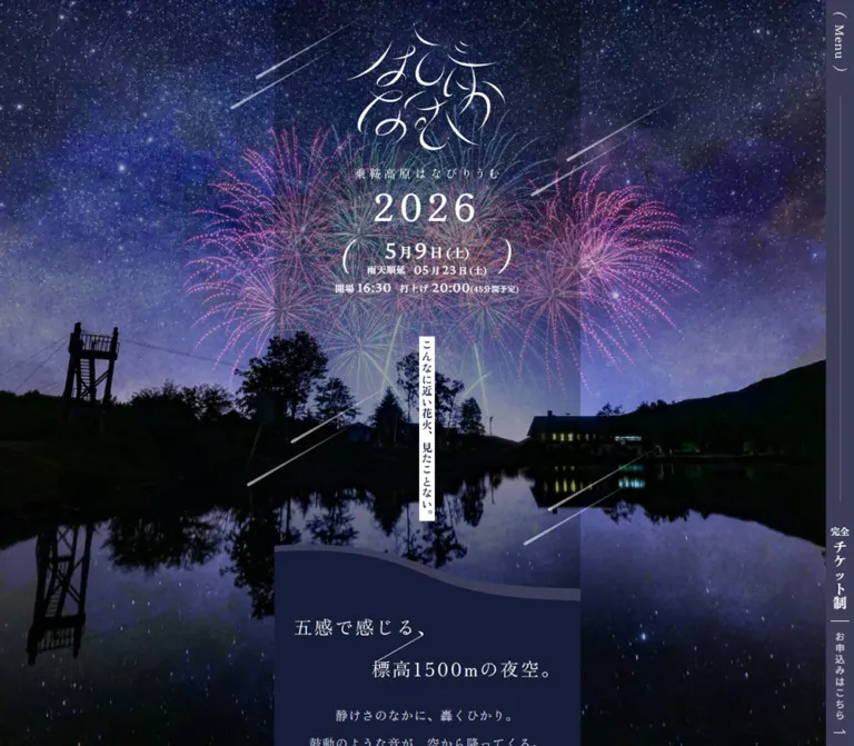
星空と花火、水面の写真に、繊細なロゴと縦書きコピーを重ねた公式イベントサイト。中央の細幅コンテンツ、固定ナビゲーション、金色の会場マップ導線が特徴。
オリジナルサイトを見るNorikura Kogen Hanabirium — Style Reference
A narrow festival program suspended over a star-filled mountain lake.
Website: 乗鞍高原はなびりうむ Original URL: https://www.norikura-hanabi.com/ Final URL: https://www.norikura-hanabi.com/ Theme: dark navy, white lettering, a pale blue-to-pink interlude, and a muted gold map link. Inspected: September 12, 2026. The supplied inspection bundle was retrieved at 12:28:34.631 UTC / 21:28:34.631 JST. Viewports: 1440 × 1000 desktop and 390 × 844 mobile, in CSS pixels. Scope: the current official event homepage: opening identity and schedule, introductory poetry, About, Feature, visitor comments, Enjoy listings, FAQ links, access and ticket information, accommodation, cautions, footer, and persistent navigation. Visual evidence comprises three desktop captures and two mobile captures; rendered DOM evidence covers the longer homepage. Linked destination pages and expanded menu states were not inspected.
The page places delicate Japanese lettering inside a dramatic landscape of stars, fireworks, dark trees, and reflected light. Its typography is quiet enough to leave the photography dominant: a custom calligraphic logo, widely tracked serif numerals, short vertical statements, and small navigation labels. Opaque navy sections make the long content sequence readable while retaining the surrounding night scene.
Its defining desktop structure is a 393px column centered in the entire viewport. A persistent news item occupies the left scenery, while a separate full-height navigation panel occupies the far right. On mobile, the content expands to the viewport width and reserves 40px along the right edge for a vertical utility rail. The result is an official event information site with a highly composed editorial homepage, including routes to news, accommodation, practical guidance, and ticket information.
How to Read This Reference
- Measured means a value appears in the supplied rendered DOM, computed styles, or custom properties. Measurements describe the captured state, not every possible state.
- Calculated means arithmetic derived from those measurements, such as usable content width or overlapping section extents.
- Estimated means a visual approximation from the five original-page captures. These estimates were not obtained through pixel sampling.
- Recommended means an implementation choice for reuse, including the Quick Start. It is not a claim about the original implementation.
- Semantic token names such as
--color-nightare new aliases. Original variable identifiers are included where available. - Font-family measurements identify computed CSS families. They do not independently verify every downloaded font file or glyph fallback.
- The current homepage still displays the 2026 schedule while the desktop news item announces the 2027 event. Preserve that distinction when describing this inspection; dates are content, not permanent design tokens.
Tokens — Colors
Default Palette
Opaque eight-digit source hex values are normalized below to six digits.
| Name | Value | Suggested token / source variable | Role and evidence |
|---|---|---|---|
| Night Navy | #161d39 |
--color-night / --s-color-37901d55, --s-color-84bcc650 |
Measured About background and dark ribbon text; visually corresponds to the main reading surfaces and desktop navigation panel |
| Deep Night | #070c23 |
--color-deep / --s-color-a699096d |
Measured body background; visually corresponds to the darker footer |
| Slate Violet | #3b3d59 |
--color-slate / --s-color-558e1aac |
Declared source color; visually consistent with the mobile rail and secondary contour layer, although their individual fills were not extracted |
| Mid Slate | #626482 |
--color-rule / --s-color-8e950fb8 |
Declared source color; useful for subdued rules and secondary linework; exact component assignment is unverified |
| Mist Text | #c5cade |
--color-muted / --s-color-7a80f30b |
Measured feature descriptions and introductory secondary copy |
| White Light | #ffffff |
--color-light / --s-color-92bd08f9, --s-color-9a88605c |
Measured schedule, headings, and primary text; visible logo, arrows, rules, and ribbon surface |
| Evening Blue | #8bb3e4 |
--color-evening / --s-color-698b16bc |
Declared gradient endpoint; visible at the upper portion of the visitor-comment panel |
| Pale Blossom | #fae1f8 |
--color-blossom / --s-color-d0ada493 |
Declared gradient endpoint; visible toward the bottom of that panel |
| Map Gold | approximately #877623 |
--color-map |
Visual estimate for the circular map link; no corresponding computed fill was supplied |
| Transparent Navy | rgba(22, 29, 57, 0.3) |
--color-night-veil |
Measured background on the combined access/ticket and accommodation section |
Gradient Treatment
The source declares --s-color-62857c40: linear-gradient(#8bb3e4ff, #fae1f8ff). Its visible counterpart is a vertical blue-to-pink panel surrounding visitor comments and a pair of photographs. Dark navy text replaces white within this light interval.
The gradient is bounded by uneven, soft-edged contours. It provides a brief change of atmosphere in a predominantly dark page. It does not establish a general gradient treatment for buttons, navigation, or every section.
Implementation guidance: retain separate navy values for the reading surface and footer. Use white for primary information and Mist Text for secondary paragraphs. Keep gold concentrated on the map circle; the prominent ticket action uses white lettering and large curved brackets on navy.
Tokens — Typography
Japanese Editorial Serif
Measured family: Zen Old Mincho, declared through --s-font-db91e4eb.
This family handles the event year, Japanese schedule units, introductory poetry, vertical concept copy, Japanese section subtitles, feature titles, FAQ questions, and vendor names. Most editorial text is weight 400. Section subtitles use 700, small schedule labels use 600 or 700, and the narrow hero statement uses 900.
The character comes from thin strokes, generous tracking, and spacious composition. Heavy weight is localized; the page does not use bold Japanese headings everywhere.
Latin Serif and Numerals
Measured family: Crimson Pro, declared through --s-font-26be2042 and --s-font-d1ac862a.
Used for English section markers and the month/day and time numerals. The event year is an exception: its computed family is Zen Old Mincho. Preserve this distinction when reproducing the schedule.
Explanatory Sans Serif
Measured family: Noto Sans JP, declared through --s-font-639100a8.
Used for feature explanations, vendor descriptions, category references, small notices, and practical entry instructions. Feature paragraphs use weight 300; the sampled entry instructions use 400. This provides a clearer informational register within the otherwise poetic page.
Text-Link Serif
Measured family: Noto Serif JP, declared through --s-font-339d445c.
The sampled links to the story, complete FAQ, ticket information, and accommodation use this family at 14px, weight 600, with 0.1em tracking. Their appearance is compact and deliberate.
Logo and Unassigned Families
The hero H1 has an empty extracted text value and a measured 215 × 200px box. The visible identity is custom lettering with a small Japanese name beneath it. Treat the lockup as artwork; the H1's inherited 32px sans-serif declaration does not describe its visible lettering.
Lato is also declared in the source variables, but no supplied sampled text establishes its role. The exact computed families of the fixed navigation and footer labels were not included. Their serif appearance is visible, but assigning a specific family to every one of them would exceed the evidence.
Type Scale
Values are measured unless explicitly marked as estimates. Desktop and mobile values match where one value is given.
| Role | Family | Size: desktop / mobile | Weight | Line height | Tracking |
|---|---|---|---|---|---|
| Event year | Zen Old Mincho | 48 / 36px |
400 | 38.4 / 28.8px |
0.13em |
| Main month/day numerals | Crimson Pro | 34px |
400 | 27.2px |
0.04em |
| Main Japanese month/day units | Zen Old Mincho | 18px |
700 | 21.6px |
0.04em |
| Main weekday | Zen Old Mincho | 16px |
700 | 19.2px |
0.04em |
| Postponement numerals | Crimson Pro | 18px |
400 | 14.4px |
0.04em |
| Opening and launch times | Crimson Pro | 19px |
400 | 15.2px |
0.04em |
| Small schedule labels | Zen Old Mincho | 12px |
600–700 | 12px |
0.04em |
| Duration note | Zen Old Mincho | 10px |
600 | 10px |
0.04em |
| Vertical hero statement | Zen Old Mincho | 14px |
900 | 16.1px |
0.04em |
| Introductory horizontal poetry | Zen Old Mincho | 16px |
400 | 35.2px, or 2.2 |
0.05em |
| Vertical concept copy | Zen Old Mincho | 16px |
400 | 16px |
0.04em |
| Main English section marker | Crimson Pro | 36px |
400 | 36px |
0.1em |
| Access, Stay, Caution marker | Crimson Pro | 32px |
400 | 32px |
0.1em |
| Main Japanese section subtitle | Zen Old Mincho | 14px |
700 | 15.4px |
0.04em |
| Access, Stay, Caution subtitle | Zen Old Mincho | 15px |
700 | 16.5px |
0.04em |
| Feature title | Zen Old Mincho | 28px |
400 | 36.4px |
0.1em |
| Feature explanation | Noto Sans JP | 14 / 13px |
300 | 28 / 26px |
0.05em |
| Visitor-comment heading | Zen Old Mincho | 18 / 13px |
400 | 23.4 / 16.9px |
0.05em |
| Visitor quote | Zen Old Mincho | 14 / 13px |
500 | 23.8 / 22.1px |
Normal |
| Visitor attribution | Noto Sans JP | 12 / 13px |
300 | 20.4 / 22.1px |
0.04em |
| Vendor name | Zen Old Mincho | 14px |
400 | 19.6px |
0.04em |
| Vendor description | Noto Sans JP | 13px |
300 | 18.2px |
0.04em |
| FAQ number and question | Zen Old Mincho | 18px |
400 | 23.4px |
0.05em |
| FAQ category reference | Noto Sans JP | 12 / 13px |
300 | 15.6 / 16.9px |
0.1em |
| Secondary text link | Noto Serif JP | 14px |
600 | 16.8px |
0.1em |
| Additional experience title | Zen Old Mincho | 24px |
400 | 40.8px |
0.1em |
| Entry instructions | Noto Sans JP | 14px |
400 | 30.8px |
0.05em |
The tight 0.8 line height belongs to isolated schedule numerals. Do not apply it to paragraphs or general navigation. Conversely, 2.2 leading is a major part of the horizontal poetic copy's breathing room.
Tokens — Spacing & Shapes
The evidence uses ordinary CSS-pixel dimensions. It does not establish a global fluid unit system. Small component spacing remains relatively stable between desktop and mobile; the available reading width and selected type sizes change.
Spacing Scale
| Use | Value | Evidence |
|---|---|---|
| English marker to Japanese subtitle | 4px desktop; 2px mobile |
Calculated from sampled text rectangles |
| Feature title to description | 8px |
Calculated from consecutive rectangles |
| Vendor item interval | 8px |
Calculated: 168px position pitch minus 160px item width |
| Standard content inset | 16px |
Measured About padding and repeated content coordinates |
| FAQ row vertical padding | 16px each side |
Measured anchor padding |
| Main section content gap | 24px |
Measured About gap; repeated heading/body separation |
| Vertical concept column pitch | 32px |
Calculated from consecutive x coordinates |
| Vertical concept start stagger | 20px |
Calculated between adjacent column tops |
| Mobile utility reservation | 40px |
Measured extra right padding |
| Hero top inset | 30px |
Measured on both viewports |
| Hero major group gap | 56px |
Measured section gap |
| About top inset | 80px |
Measured on both viewports |
| Decorative section overlap | 87px |
Calculated from adjacent section extents |
| Hero bottom padding | 117px |
Measured on both viewports |
| Map circle bottom clearance | approximately 24px |
Visual estimate in all five captures |
The 87px overlap is visible in the geometry: the desktop hero ends at 786.125px, while the introduction begins at 699.125px. The mobile equivalents are 763.531px and 676.531px. Other major section boundaries also overlap by 87px. This supports layered contour transitions; it does not establish the exact margin or positioning declaration that creates them.
Border Radius and Linework
| Element | Treatment | Evidence |
|---|---|---|
| Main sections and sampled links | 0px radius |
Computed styles |
| Map link | Circle | Visible; about 130px desktop and 110px mobile in diameter |
| News photograph | Nearly square corners | Visible; any small radius is unmeasured |
| Navigation underlines | Short white hairlines, about 24px long |
Visual estimate |
| Standard text-link underline | Approximately the full 228px link width |
Visual appearance plus measured link width |
| Ticket framing | Tall curved parentheses around text | Visible desktop treatment |
| Section-heading framing | Two thin diagonal strokes | Visible in the desktop Enjoy heading |
| Visitor quote framing | Opposing open corner brackets | Visible top-left and bottom-right around the centered quote |
| Section boundaries | Broad wave or irregular soft contour | Visible; exact asset geometry unavailable |
Layout Measurements
| Element | Desktop: 1440 × 1000 | Mobile: 390 × 844 | Status |
|---|---|---|---|
| Document height | 10693.05px |
10277.64px |
Measured, rounded |
| Main section width | 393px |
390px |
Measured |
| Main section left edge | 523.5px |
0px |
Measured |
| Standard readable content width | 361px |
318px |
Measured |
| Standard content insets | 16px / 16px |
16px / 56px |
Measured; left/right |
| Hero content center | x = 720px |
x = 175px |
Calculated from year and ribbon positions |
| Hero lockup box | 215 × 200px |
215 × 200px |
Measured |
| Hero section height | 786.125px |
763.531px |
Measured |
| Vertical statement text box | 20 × 232.97px |
20 × 232.97px |
Measured |
| About section height | 2299.45px |
2143.06px |
Measured |
| Feature section height | 2269.42px |
2230.28px |
Measured |
| Standard text link | 228 × 32.8px |
228 × 32.8px |
Measured |
| Vendor text width | 160px |
160px |
Measured |
| Access/Stay copy width | 298px |
296px |
Measured |
| Right navigation panel | About 393px, starting at x = 1047px |
Compact rail with 40px reserved |
Desktop estimate; mobile reservation measured |
| News photograph | About 304 × 204px |
Persistent news block absent | Visual estimate and rendered text comparison |
| Floating map circle | About 130 × 130px |
About 110 × 110px |
Visual estimate |
Components
Scenic Desktop Frame
Role: maintains the event's atmosphere throughout the long reading sequence.
The scene covers the left and middle portions of the desktop viewport. Stars fill the upper field; pink and violet fireworks spread behind the logo; a dark treeline and building divide sky from water; reflections continue into the lower field. A few long diagonal streaks cross the composition.
Across the three desktop scroll captures, the scenery, left slogan, news block, and right navigation remain in the same viewport positions while the central content changes. This establishes persistent visual framing. The precise CSS mechanism for every layer was not included.
The central column is centered at x = 720px, rather than centered within the approximately 1047px region left of the navigation. Consequently, a roughly 130.5px scenic gap remains between the column's right edge and the navigation panel. Preserve this asymmetry.
Hero Identity and Schedule
Role: establishes the event name, edition year, date, postponement date, and opening/launch times.
The anatomy is a stacked lockup, year, compact date group, small operational timing row, and a narrow vertical statement. The lockup starts 30px from the top and retains its 215 × 200px box on both viewports. Its fine, curved white lettering is the primary brand asset.
The year begins at y = 244px on both desktop and mobile. Its font size changes from 48px to 36px, while the main date numerals remain 34px. The gap from the year line box to the main date is calculated as 25px desktop and 12px mobile. Large white parentheses frame the date group.
The captured schedule reads 2026, 5月9日(土), with 雨天順延 and 05月23日(土), followed by 開場 16:30 and 打上げ 20:00. Keep the numerals, Japanese units, and small notes as separately styled text while exposing a coherent date and time to assistive technology.
Vertical Hero Ribbon
Role: delivers one short sensory promise against a complex photograph.
The source copy is こんなに近い花火、見たことない。. Dark navy lettering sits on a very narrow white strip, centered below the schedule. The text box is 20px wide and approximately 233px tall on both viewports. Its computed type is Zen Old Mincho, 14px, weight 900, with 0.04em tracking.
The sampled paragraph background is transparent; the white surface visible in the captures belongs to another layer or enclosing element. Reproduce the visual unit as a wrapper plus text instead of assuming the paragraph owns that fill. Use Japanese vertical writing in a new implementation, keeping punctuation correctly oriented.
Introductory Wave and Poetry
Role: moves from panoramic spectacle into an intimate reading surface.
A broad navy wave rises into the bottom of the hero. A second, lighter slate contour follows its upper edge. Below it, the phrase 五感で感じる、標高1500mの夜空。 appears as two offset lines, followed by smaller centered poetry.
The supporting text uses 16px / 35.2px Zen Old Mincho and Mist Text. The source paragraph stays approximately 313px wide on both viewports. The wave establishes continuity with the landscape while the solid fill provides a calmer background for reading.
Use a dedicated contour asset or an SVG approximation. A rounded rectangle cannot reproduce the sloping boundary and its secondary edge.
Section Heading
Role: supplies a recognizable chapter marker throughout the homepage.
The observed main pattern pairs an uppercase English marker such as ABOUT, FEATURE, ENJOY, or FAQ with a smaller Japanese subtitle beneath it. English uses Crimson Pro at 36px / 1, with 0.1em tracking. Japanese uses Zen Old Mincho at 14px, weight 700.
The visible Enjoy heading has thin diagonal strokes on both sides. At desktop, its text begins 44px inside the standard content edge; the corresponding mobile heading offset is 42px. The subtitle follows the English line box by 4px desktop and 2px mobile.
Access, Stay, and Caution use a 32px English size and 15px Japanese subtitle. Preserve the source label ACCES&TICKET only when quoting or reproducing the inspected UI; new English copy may use corrected wording.
About: Staggered Vertical Copy
Role: slows the reader into a sequence of short atmospheric statements.
The About section is unusually tall: roughly 2299px desktop and 2143px mobile. Its concept text is distributed into groups of narrow vertical columns. Sampled columns are 16px wide with 32px horizontal pitch and 20px staggered starting positions.
The first sampled cluster sits toward the left of the column, a later cluster shifts toward the right, and the closing cluster returns nearer the middle. This produces an editorial rhythm across the narrow canvas without widening it into a conventional desktop article.
Maintain vertical text as selectable content and preserve its logical reading order. The supplied DOM gives the text and geometry, but not a complete visual inventory of the media between these clusters. Do not infer specific unseen images from the large gaps alone.
Feature Narrative
Role: explains the experience through three distinct themes.
The source contains three feature titles: 観るを超えて、浴びる花火, 華松煙火プロデュース, and 大自然と満天の星空の乗鞍BASE. Titles use 28px / 36.4px Zen Old Mincho with 0.1em tracking. An 8px gap leads to light-weight Noto Sans JP descriptions in Mist Text.
The explanations change from 14px / 28px desktop to 13px / 26px mobile, while the titles remain 28px. This preserves the title's presence as the reading width decreases from 361px to 318px.
The section is a vertical narrative within the existing narrow column. Its complete image anatomy is not visible in the supplied screenshots, so exact feature-image crops and dimensions remain unverified. The named fireworks producer is event content, not evidence of website authorship.
Visitor-Comment Panel
Role: introduces human testimony and a lighter visual pause.
A pale blue-to-pink gradient spans the central column with soft irregular navy boundaries above and below. A small dark heading, 来場者コメント, sits beside a long horizontal rule. The central quote is framed by thick, open corner marks at its top-left and bottom-right. Neighboring quote fragments appear at the clipped sides.
Desktop quote text measures 258px wide; the mobile sampled quote text measures 278px. These are text widths, not verified slide widths. The desktop screenshot centers the Tokyo visitor's comment, while the mobile DOM positions the Yokohama comment within the visible area. This is consistent with a carousel or movable strip, but no trigger, autoplay interval, drag response, or looping behavior was recorded.
Below the comments, two rectangular photographs show food service and fireworks. In the desktop capture, each appears approximately 180 × 130px, with about 22px between them. Their edge treatment is soft, while their subjects remain photographic.
Enjoy Listings
Role: catalogs food, workshops, performances, and additional experiences.
The section starts with the bilingual heading and a short serif introduction. Its categories include food trucks, shops/workshops, performances, and other activities. Category headings are 18px / 23.4px Zen Old Mincho. Small publication-status notices sit beneath them.
Vendor entries form horizontal sequences. Text blocks remain 160px wide on both viewports, with an observed 168px positional pitch. Names use 14px serif; descriptions use 13px sans serif. Several entries lie beyond the central viewport in the DOM, so the evidence supports a horizontal track rather than a fully visible multi-column grid. Its actual controls were not exercised.
Two larger linked experiences follow: メッセージ花火 and 花火現場裏側ツアー. Each anchor spans the readable content width: 361px desktop and 318px mobile. Their titles use 24px serif and supporting lines use 14px sans serif. The recorded links lead to an external shop; the destination experience was not inspected.
FAQ Link Row
Role: directs visitors to categorized answers on the separate FAQ page.
Each row combines a Q1.–Q5. marker, an 18px serif question, and a smaller sans-serif category reference below. The anchor has 16px vertical padding and an 8px component gap. Sampled desktop row heights are approximately 89px or 103px; mobile examples are approximately 84px or 105px.
These are anchors to /faq#access, /faq#venue, /faq#ticket, and /faq#other. No in-place answer expansion was observed. Implementing them as accordions would introduce a different interaction.
One long mobile question's extracted rectangle extends beyond the standard 318px text region. A new implementation should allow natural wrapping within minmax(0, 1fr) rather than hardcoding that overflow. A centered 228px text link leads to the complete FAQ after the five questions.
Underlined Text Link
Role: offers a consistent, understated next step.
The recurring anatomy is a serif label, a small rightward arrow, and a thin underline spanning a 228px anchor. Sampled anchors are approximately 32.8px tall, with 14px / 16.8px Noto Serif JP labels at weight 600 and 0.1em tracking.
The story link aligns to the right of its section. Complete FAQ and practical-information links are centered. The caution link is shown left-aligned near the end of the content. Keep alignment contextual while sharing the same type and linework.
For reuse, enlarge the interactive height to at least 44px without turning the visual into a filled button. The original hover and focus appearance was not captured.
Access, Tickets, Accommodation, and Caution
Role: turns interest into practical visit planning.
Access/ticket and accommodation information share a measured rgba(22, 29, 57, 0.3) section background. Their copy is centered in an approximately 298px desktop or 296px mobile region. They use 32px English markers, small Japanese subtitles, spacious 16px / 35.2px serif paragraphs, and the recurring underlined link.
Caution follows with three numbered entry methods. The sampled instruction text is Noto Sans JP at 14px / 30.8px, weight 400, while circled numbers use 16px Zen Old Mincho. The hierarchy stays within the established navy-and-white system rather than introducing an unrelated alert color.
These sections are established by rendered DOM measurements. Their complete backgrounds and decorative media are not shown in the supplied captures.
Persistent Desktop News
Role: surfaces a recent announcement independently of the long central narrative.
The lower-left block combines a vertical 最新情報 label, a landscape fireworks photograph, a small date, a two-line announcement, and an underlined detail link. The image is approximately 304 × 204px, beginning around x = 138px, y = 620px in the 1440 × 1000 capture. The detail underline sits near y = 950px.
This block stays in place across the desktop captures. Its current date is 2026.07.03, and the headline announces the 2027 event. The mobile rendered text and screenshots omit this persistent block. A separate /news route remains available through footer navigation.
Desktop Navigation and Ticket Panel
Role: provides continuous access to the wider event site.
The rightmost panel is approximately 393px wide with an opaque navy fill. A vertical ( Menu ) label appears near its upper-left interior. Six navigation links form a vertical list beginning around x = 1143px, with approximately 47px row pitch. Each has a short underline beneath the label and a small arrow at the far right.
An Instagram symbol and a short information prompt follow the primary links. A quieter row contains caution, sponsorship, and contact links, followed by small email guidance. A long vertical hairline separates this upper information group from the large ticket action near the bottom.
The ticket action reads 完全チケット制 above お申込みはこちら, framed by oversized curved parentheses. Its recorded destination is /access-ticket#ticket. It has no gold fill: size, whitespace, white type, and the curved marks provide emphasis.
Mobile Utility Rail
Role: retains navigation and ticket access while conserving reading width.
The mobile layout reserves 40px at the right. The visible rail is slate-colored, with vertical ( Menu ) near the top, a fine rule running through the middle, and a vertical ticket prompt near the bottom. It remains visible in both the opening and footer captures.
The hero and practical information center at x = 175px, the center of the 350px region left of that reservation. Standard sections use 16px left padding and 56px right padding, leaving 318px for text.
No menu-opening interaction is supplied. The lower mobile screenshot shows the page footer, including copyright; it should not be interpreted as evidence of an opened menu overlay.
Floating Map Circle
Role: provides an immediately available route to the venue map.
A muted gold circle sits at the lower-right of the reading region, above the scrolling content. It contains the white label 会場マップ, a smaller こちらから, and a fine arrow. Its destination is /access-ticket#map; the extracted anchor has no text, so its accessible name cannot be confirmed from this evidence.
The visible diameter is approximately 130px desktop and 110px mobile. Its bottom clearance is approximately 24px. On desktop its right edge is roughly 16px inside the central column; on mobile its right edge is at approximately x = 334px, leaving the 40px rail plus a 16px gap.
The circle overlaps introductory text in the first desktop capture and portions of footer contact/copyright content in later captures. Preserve its recognizable placement, but reserve additional end-of-document space in a new implementation so every footer detail can scroll clear of it.
Footer
Role: closes the reading sequence and repeats the site's main destinations.
The footer uses the deeper #070c23 appearance. A large white lockup is centered above six unboxed navigation links, followed by the Instagram prompt, secondary links, email guidance, and a small copyright line. The navigation repeats the desktop panel's short underlines and right-aligned arrows.
On desktop, the footer stays inside the 393px column while the wider scenic frame and navigation panel remain visible. On mobile, the footer occupies the page width beneath the persistent rail. Do not spread it into a wide multi-column desktop footer; its narrow, stacked structure completes the visual sequence.
Tokens — Motion & Interaction
Recorded Motion Values
| Target | Computed value | What this establishes |
|---|---|---|
| Most sampled sections, text, and links | 0.3s cubic-bezier(0.4, 0.4, 0, 1) |
A common transition timing is declared; the supplied state does not identify every transitioned property or trigger |
| Body background | background 0.5s cubic-bezier(0.4, 0.4, 0, 1) |
Background changes have a declared duration; this is not evidence of a theme switch |
| Selected desktop feature H3 elements | 0.8s cubic-bezier(0, 0.41, 0.25, 1) |
Longer transition timing exists on these titles; entry direction and opacity endpoints are unverified |
| One sampled desktop vertical concept line | 0.8s cubic-bezier(0, 0.41, 0.25, 1) |
A longer transition is declared for that element |
| Corresponding sampled mobile titles and concept line | 0.3s cubic-bezier(0.4, 0.4, 0, 1) |
Their captured mobile timing differs from the longer desktop examples |
| Sampled element animations | none |
No CSS keyframe animation is reported for those specific elements at extraction time |
Observed Behavior and Limits
- Desktop scroll captures show changing central content with persistent scenery, news, navigation, and map access.
- Mobile opening and footer captures retain the right rail and map circle.
- FAQ items and the map/ticket controls expose link destinations in the DOM. Their destination pages were not opened.
- Visitor comments and vendor entries have horizontal track geometry. Autoplay, drag, arrow controls, keyboard behavior, and looping were not verified.
- The diagonal streaks and fireworks are visible artwork. The evidence does not establish moving fireworks, parallax speed, particle effects, or audio playback.
- No hover, focus, expanded navigation, loading sequence, or reduced-motion state is demonstrated.
The capture process waited for document load, visible images, finite animation readiness, and sampled layout/text stability, within stated time limits. Perpetual animations were temporarily paused during readiness checks and then resumed. That inspection procedure is not itself proof of any particular site animation. JavaScript-driven or pseudo-element motion may fall outside the sampled element records.
Recommended motion direction: use the measured easing family for restrained link feedback and optional short reveals. Keep content visible by default. Add reduced-motion behavior, and do not invent continuous spectacle merely because the subject is fireworks.
Surfaces
| Layer | Appearance | Structural purpose |
|---|---|---|
| Scenic background | Dense photographic night scene | Creates place, scale, and immersion |
| Transparent hero | White identity over scenery | Allows the event artwork to dominate |
| Reading sections | Opaque Night Navy | Supports long text and editorial pacing |
| Introductory contour | Navy wave with slate edge | Connects photography to the reading surface |
| Visitor-comment interval | Blue-to-pink gradient with dark text | Changes atmosphere and distinguishes testimonials |
| Access/Stay section | Measured 30% navy background | Adds another translucent layer; complete visual result is unverified |
| Desktop navigation | Opaque navy panel | Separates persistent utility information from photography |
| Mobile rail | Slate appearance | Holds compact utilities along the right edge |
| Footer | Deep Night | Marks the end of the central sequence |
| Map control | Solid muted gold | Creates one isolated, recognizable utility accent |
The observed design does not rely on a general shadow or elevation system. Boundaries come from color changes, contours, rules, type hierarchy, and image edges.
Imagery
The main visual is a photographic composition of a star-filled sky, fireworks, mountain-side silhouettes, a lakeside building, and mirrored light on water. Blue and violet dominate the sky. Pink fireworks supply warm color without changing the interface palette. Dark silhouettes create a stable horizon and a quieter area behind the lower vertical statement.
The white brand lettering echoes the fine, curving lines of fireworks. Diagonal streaks introduce directional energy without adding another large text element. Their exact construction and motion are unverified.
Supporting photography includes a dense fireworks display above spectators in the desktop news item, food in takeaway containers in the visitor panel, and a close view of golden fireworks beside it. A partial pale-sky image appears at the bottom of the middle desktop capture; its full subject is outside the supplied view.
Use photographic detail at normal image rendering quality. Preserve the contrast between dense celestial imagery and quiet navy sections. Do not apply pixelated rendering or a uniform blur to the artwork.
Observed Asset References
No complete, reusable image asset URLs or filenames are present in the supplied evidence. Truncated background-image declarations are insufficient to identify assets reliably.
| Asset role | Original-page evidence | Reuse guidance |
|---|---|---|
| Hero landscape and fireworks composition | Desktop opening capture and mobile opening capture | Supply an authorized high-resolution image; establish separate desktop and mobile focal positions |
| White event lockup | Opening and footer captures | Use authorized logo artwork with a meaningful text alternative |
| News photograph | All three desktop captures | Preserve the approximately 3:2 landscape presentation |
| Food and golden-fireworks pair | Middle desktop capture | Use rectangular crops with a restrained soft edge treatment |
| Wave and irregular separators | Opening and middle desktop captures; mobile opening | Use supplied masks or explicitly approximate with SVG |
| Map lettering and arrow | All five original-page captures | Can be implemented as live text and simple linework when matching artwork is unavailable |
| Instagram symbol | Desktop navigation/footer and mobile footer | Use a recognizable mark with an accessible link name |
The logo, scenery, and decorative boundaries carry much of the identity. The CSS shell can reproduce their placement, but cannot replace the actual artwork.
Layout & Responsive Behavior
Desktop Composition
At 1440 × 1000, the main column's measured left edge is 523.5px, exactly (1440 - 393) / 2. Its right edge is 916.5px. The navigation panel begins around 1047px, leaving scenery between the two.
The left slogan and news act as persistent companions to the article. The center remains a single reading column throughout. Increasing viewport width does not turn the observed feature narrative into a multi-column layout.
The document is approximately 10693px tall. Captured section rectangles overlap at decorative boundaries, so summing section heights would overstate the total page length. Preserve normal document navigation in an adaptation unless a separately verified reason calls for an internal scroller.
Mobile Composition
At 390 × 844, section boxes measure 390px wide. Standard content occupies 318px, calculated as 390 - 16 - 56. The extra 40px in the right inset accounts for the utility rail. Full section surfaces can extend beneath that rail while text stays clear of it.
The hero uses 40px right padding and no left padding, centering its schedule and ribbon in the remaining 350px. The logo box remains 215 × 200px; the year reduces to 36px; main date numerals remain 34px. The first wave starts around y = 676.5px.
Feature titles and principal English markers retain their desktop sizes. Feature paragraphs become slightly smaller. Some utility labels become larger: FAQ categories and publication-status notices move from 12px desktop to 13px mobile. This is selective adaptation, not uniform scaling.
The persistent desktop news block and expanded right navigation are absent from the mobile rendered page. Footer links provide the wider site structure. The background is cropped to maintain the central fireworks, dark horizon, and water within the narrower view.
Breakpoints and Untested Ranges
A max-width: 1200px rule appears in an extracted line-break stylesheet fragment. It establishes a responsive text rule, not the exact breakpoint for switching navigation layouts. No intermediate or landscape viewport was supplied.
The Quick Start therefore uses recommended breakpoints: 1200px for the compact utility treatment and 600px for a full-width mobile column. These reproduce the two inspected endpoints while providing an explicit adaptation for the untested range. Verify them with the actual assets and content.
Do’s and Don’ts
Do
- Keep the desktop reading column close to the measured
393pxand center it in the full viewport. - Preserve the scenic gap between the central column and the far-right navigation.
- Use Night Navy and Deep Night as separate surfaces.
- Pair Zen Old Mincho editorial copy with Crimson Pro section markers and Noto Sans JP explanations.
- Retain the custom logo as artwork at a controlled size across viewports.
- Keep the hero date hierarchy compact and the vertical statement narrow.
- Preserve staggered vertical concept text and generous space between narrative stages.
- Use waves, irregular boundaries, diagonal strokes, and sparse underlines as the main decorative vocabulary.
- Concentrate the gold accent on the floating map circle.
- Reserve mobile width for the persistent rail instead of letting it cover ordinary text.
- Keep FAQ items as links to their recorded categories when reproducing the observed behavior.
- Distinguish horizontal track geometry from verified carousel interaction.
Don't
- Don't expand the central content into a broad desktop marketing grid.
- Don't center the column only within the area left of the navigation panel.
- Don't replace the custom logo with ordinary Japanese heading text and call it equivalent.
- Don't apply one sans-serif family to every text role.
- Don't use gold for every call to action or fill the ticket panel with it.
- Don't replace the wave boundary with generic rounded cards.
- Don't add drop shadows, glass blur, or glossy surfaces throughout the page.
- Don't interpret the mobile footer capture as an opened menu.
- Don't assume FAQ expansion, carousel autoplay, fireworks animation, or audio.
- Don't copy offscreen carousel coordinates into page-wide overflow rules.
- Don't hardcode clipped mobile questions or permit the map link to make footer information unreachable.
- Don't treat the captured event year and schedule as immutable styling.
Recommended Implementation Additions
These are improvements for a new implementation, not verified original features:
- Give the logo a coherent accessible name even when its visible lettering is an image. The empty H1 text extraction alone does not establish whether the original has an adequate alternative.
- Give the map link an explicit accessible name and retain a text equivalent for decorative lettering.
- Make the narrow rail controls keyboard-operable. If they open a panel, implement expanded state, focus management, closing behavior, and an accessible name.
- Provide a functional link to footer navigation if an expanded menu has not yet been implemented.
- Increase short text-link hit areas to at least
44pxhigh and consider a wider mobile rail when touch usability takes priority over exact proportions. - Reserve enough footer space to scroll contact details and copyright above the floating map circle.
- Keep horizontal listings reachable with native scrolling or accessible previous/next controls. If autoplay is introduced, provide a pause mechanism.
- Use semantic blockquotes and attribution elements for visitor comments. Keep vertical Japanese copy in a sensible document order.
- Allow long FAQ text to wrap and verify the reading area at increased text size.
- Keep essential content visible without reveal scripts. Respect reduced-motion preferences for optional transitions.
- Load only the font families and weights actually used. Give images dimensions, provide responsive sources, and defer below-the-fold media without delaying the primary scene.
- Keep the schedule and news edition independently editable so annual updates do not require layout changes.
Agent Prompt Guide
Quick Color Reference
- Reading surface and desktop utility panel:
#161d39. - Deep background and footer:
#070c23. - Primary text and linework:
#ffffff. - Secondary paragraph text:
#c5cade. - Secondary contour and compact rail approximation:
#3b3d59. - Visitor panel: vertical
#8bb3e4to#fae1f8, with navy text. - Map circle: approximately
#877623; this is an estimated match, not an extracted fill. - Ticket action: white type and curved brackets on navy.
Overall Prompt
“Create an official Japanese mountain-fireworks event homepage inspired by Norikura Kogen Hanabirium. At a 1440px desktop width, center a 393px reading column in the whole viewport. Place it over an atmospheric photograph of stars, pink-violet fireworks, dark trees, and reflections on a mountain lake. Keep a small news feature in the lower-left scenery and a separate navy navigation panel at the far right. Use authorized white calligraphic logo artwork, Zen Old Mincho Japanese editorial text, Crimson Pro numerals and English section markers, and light Noto Sans JP explanations. Build a long sequence of navy reading sections with staggered vertical poetry, wave boundaries, thin diagonal heading strokes, a pale blue-to-pink visitor-comment interval, horizontal vendor strips, FAQ category links, and practical visit information. Keep a muted gold circular map link near the reading region's lower-right corner. On a 390px phone, reserve 40px for a vertical right utility rail and retain approximately 318px for standard text. Treat unverified menu and carousel behavior as explicit implementation choices.”
Example Component Prompts
- Hero schedule: “Place a 215 × 200px white logo lockup above the event year and compact Japanese date. Use Zen Old Mincho for the year at 48px desktop and 36px mobile; keep Crimson Pro month/day numerals at 34px. Frame the date with large curved parentheses and add small postponement and opening-time lines. Center a 20px-wide white vertical statement beneath it.”
- Section heading: “Create a chapter marker on #161d39 with a 36px Crimson Pro uppercase label, 0.1em tracking, and a 14px bold Zen Old Mincho Japanese subtitle. Add a thin diagonal stroke on each side. Leave 24px before the next content group.”
- Visitor comments: “Use a vertical #8bb3e4-to-#fae1f8 panel bounded by irregular navy edges. Set the quote in small navy Japanese serif text, framed with opposing top-left and bottom-right corner marks. Show partial neighboring entries and a pair of rectangular food/fireworks photographs. Specify any scrolling controls separately; do not assume autoplay.”
- Desktop navigation: “Build an opaque navy panel at the far right of the viewport. Stack six compact serif navigation links with short underlines and tiny right-aligned arrows. Follow with an Instagram link, subdued secondary links, and a long vertical rule. Put a large white ticket prompt between oversized curved parentheses near the bottom.”
- Vendor strip: “Create a horizontal row of 160px vendor entries with 8px gaps. Use photographic media above 14px Japanese serif names and 13px light sans-serif descriptions. Keep entries unboxed and square, with native horizontal scrolling as an accessible implementation choice.”
- Mobile utilities: “Reserve a 40px slate rail on the right of a 390px page. Place a vertical menu label at the top and ticket access near the bottom, joined visually by a fine rule. Position a 110px muted-gold map circle 16px left of the rail and 24px above the viewport bottom. Ensure footer content can scroll fully clear of it.”
Quick Start
CSS Custom Properties
This is a recommended adaptation of the measured proportions, not a copy of the original stylesheet. It retains ordinary root sizing and normal document scrolling. It adds visible focus, larger text-link hit areas, native horizontal tracks, and extra footer clearance.
Use .scene as a decorative fixed background, .page-column as the main document, .ambient for desktop slogan/news, .desktop-rail and .mobile-rail for persistent navigation, and .map-link for the floating map anchor. Place these persistent layers outside transformed ancestors. Supply authorized imagery and logo artwork separately; no original asset paths are assumed here. Font-family declarations require separately loaded font files to reproduce the measured typography.
:root {
  /* Measured source colors, expressed as semantic aliases. */
  --color-night: #161d39;
  --color-deep: #070c23;
  --color-slate: #3b3d59;
  --color-rule: #626482;
  --color-muted: #c5cade;
  --color-light: #ffffff;
  --color-evening: #8bb3e4;
  --color-blossom: #fae1f8;
  --color-night-veil: rgb(22 29 57 / 30%);

  /* Visual estimate; replace if the original fill is measured. */
  --color-map: #877623;

  --font-editorial: 'Zen Old Mincho', serif;
  --font-display: 'Crimson Pro', serif;
  --font-body: 'Noto Sans JP', sans-serif;
  --font-link: 'Noto Serif JP', serif;

  --text-year: 48px;
  --text-section: 36px;
  --text-feature: 28px;
  --text-poetry: 16px;
  --text-copy: 14px;
  --text-caption: 12px;

  --space-4: 4px;
  --space-8: 8px;
  --space-16: 16px;
  --space-24: 24px;
  --space-40: 40px;
  --space-56: 56px;
  --space-80: 80px;

  --column-width: 393px;
  --desktop-rail-width: 393px;
  --compact-rail-width: 40px;
  --rail-reserve: 0px;
  --gutter: 16px;
  --map-size: 130px;
  --contour-overlap: 87px;
  --safe-bottom: env(safe-area-inset-bottom, 0px);

  --ease-ui: cubic-bezier(0.4, 0.4, 0, 1);
  --ease-editorial: cubic-bezier(0, 0.41, 0.25, 1);
  --duration-ui: 300ms;
  --duration-editorial: 800ms;

  /* Set this to url(...) for an authorized scenic image. */
  --scene-image: none;
  --scene-position: center;
}

* { box-sizing: border-box; }

body {
  margin: 0;
  color: var(--color-light);
  background: var(--color-deep);
  font-family: var(--font-body);
}

a { color: inherit; }

img {
  display: block;
  max-width: 100%;
  height: auto;
}

.scene {
  position: fixed;
  inset: 0;
  z-index: 0;
  pointer-events: none;
  background-image: var(--scene-image);
  background-position: var(--scene-position);
  background-size: cover;
}

.page-column {
  position: relative;
  z-index: 1;
  width: min(100%, var(--column-width));
  margin-inline: auto;
}

.hero {
  min-height: 786px;
  padding: 30px var(--rail-reserve) 117px 0;
  text-align: center;
}

.brand-lockup {
  width: min(215px, 100%);
  height: 200px;
  margin: 0 auto;
}

.brand-lockup img {
  width: 100%;
  height: 100%;
  object-fit: contain;
}

.event-year {
  margin: 14px 0 25px;
  font: 400 var(--text-year) / 0.8 var(--font-editorial);
  letter-spacing: 0.13em;
}

.event-schedule {
  display: grid;
  justify-items: center;
  gap: 4px;
  font-family: var(--font-editorial);
  letter-spacing: 0.04em;
}

.date-row,
.time-row {
  display: flex;
  flex-wrap: wrap;
  align-items: baseline;
  justify-content: center;
  gap: 2px;
}

.date-number {
  font: 400 34px / 0.8 var(--font-display);
}

.date-unit { font: 700 18px / 1.2 var(--font-editorial); }
.date-weekday { font: 700 16px / 1.2 var(--font-editorial); }
.rain-date { font: 600 12px / 1 var(--font-editorial); }
.rain-date .date-number { font-size: 18px; }
.time-row { margin-top: 4px; gap: 4px; }
.time-label { font-size: 12px; font-weight: 600; }
.time-number { font: 400 19px / 0.8 var(--font-display); }
.duration-note { font-size: 10px; }

.vertical-ribbon {
  width: 20px;
  margin: 56px auto 0;
  padding-block: 4px;
  writing-mode: vertical-rl;
  text-orientation: mixed;
  white-space: nowrap;
  color: var(--color-night);
  background: var(--color-light);
  font: 900 14px / 1.15 var(--font-editorial);
  letter-spacing: 0.04em;
}

.panel {
  position: relative;
  padding: 80px calc(var(--gutter) + var(--rail-reserve))
    80px var(--gutter);
  background: var(--color-night);
}

/* Place an authorized or newly drawn SVG contour before the panel. */
.contour-section { margin-top: calc(-1 * var(--contour-overlap)); }
.contour-section > .contour {
  display: block;
  width: 100%;
  height: var(--contour-overlap);
}

.section-heading {
  position: relative;
  width: fit-content;
  max-width: 100%;
  margin-bottom: 24px;
  padding-inline: 44px;
}

.section-heading::before,
.section-heading::after {
  content: '';
  position: absolute;
  top: 0;
  width: 1px;
  height: 52px;
  background: currentColor;
  transform: skewX(-30deg);
}

.section-heading::before { left: 14px; }
.section-heading::after { right: 14px; }

.section-heading .english {
  margin: 0;
  font: 400 var(--text-section) / 1 var(--font-display);
  letter-spacing: 0.1em;
}

.section-heading .japanese {
  margin: 4px 0 0;
  font: 700 14px / 1.1 var(--font-editorial);
  letter-spacing: 0.04em;
}

.poetry {
  margin: 0;
  font: 400 16px / 2.2 var(--font-editorial);
  letter-spacing: 0.05em;
}

.vertical-poetry {
  display: flex;
  justify-content: center;
  gap: 16px;
  margin-block: 80px;
}

.vertical-poetry p {
  margin: 0;
  writing-mode: vertical-rl;
  font: 400 16px / 1 var(--font-editorial);
  letter-spacing: 0.04em;
}

/* Recommended approximation of the measured stagger. */
.vertical-poetry p:nth-child(2) { margin-top: 20px; }
.vertical-poetry p:nth-child(3) { margin-top: 40px; }

.feature-title {
  margin: 0 0 8px;
  font: 400 28px / 1.3 var(--font-editorial);
  letter-spacing: 0.1em;
}

.feature-copy {
  margin: 0;
  color: var(--color-muted);
  font: 300 var(--text-copy) / 2 var(--font-body);
  letter-spacing: 0.05em;
}

.visitor-panel {
  color: var(--color-night);
  background: linear-gradient(var(--color-evening), var(--color-blossom));
  padding: 80px calc(var(--gutter) + var(--rail-reserve))
    80px var(--gutter);
}

/* Native scrolling is an adaptation, not a verified source interaction. */
.quote-track,
.vendor-track {
  display: flex;
  gap: 16px;
  overflow-x: auto;
  overscroll-behavior-x: contain;
  padding-block: 20px;
}

.quote {
  position: relative;
  flex: 0 0 290px;
  max-width: 100%;
  margin: 0;
  padding: 16px;
  text-align: center;
  font: 500 14px / 1.7 var(--font-editorial);
}

.quote::before,
.quote::after {
  content: '';
  position: absolute;
  width: 30px;
  height: 30px;
  border-color: var(--color-slate);
  border-style: solid;
}

.quote::before {
  top: 0;
  left: 0;
  border-width: 5px 0 0 5px;
}

.quote::after {
  right: 0;
  bottom: 0;
  border-width: 0 5px 5px 0;
}

.quote cite {
  display: block;
  margin-top: 10px;
  font: 300 var(--text-caption) / 1.7 var(--font-body);
  letter-spacing: 0.04em;
}

.photo-pair {
  display: grid;
  grid-template-columns: repeat(2, minmax(0, 1fr));
  gap: 22px;
  margin-top: 24px;
}

.photo-pair img {
  width: 100%;
  aspect-ratio: 18 / 13;
  object-fit: cover;
}

.vendor-track { gap: 8px; }
.vendor { flex: 0 0 160px; }
.vendor-name {
  margin: 8px 0 0;
  font: 400 14px / 1.4 var(--font-editorial);
  letter-spacing: 0.04em;
}
.vendor-description {
  margin: 0;
  color: var(--color-muted);
  font: 300 13px / 1.4 var(--font-body);
  letter-spacing: 0.04em;
}

.faq-row {
  display: grid;
  grid-template-columns: auto minmax(0, 1fr);
  gap: 8px;
  padding-block: 16px;
  text-decoration: none;
}

.faq-number,
.faq-question {
  margin: 0;
  font: 400 18px / 1.3 var(--font-editorial);
  letter-spacing: 0.05em;
}

.faq-category {
  grid-column: 2;
  margin: 0;
  color: var(--color-muted);
  text-align: right;
  font: 300 var(--text-caption) / 1.3 var(--font-body);
  letter-spacing: 0.1em;
}

.text-link {
  display: flex;
  align-items: center;
  justify-content: space-between;
  gap: 8px;
  width: min(228px, 100%);
  min-height: 44px;
  padding-block: 8px;
  border-bottom: 1px solid currentColor;
  text-decoration: none;
  font: 600 14px / 1.2 var(--font-link);
  letter-spacing: 0.1em;
  transition: color var(--duration-ui) var(--ease-ui);
}

.text-link.centered { margin-inline: auto; }
.text-link.aligned-right { margin-left: auto; }

.ambient {
  position: fixed;
  inset: 0 auto 0 0;
  z-index: 2;
  width: calc((100% - var(--column-width)) / 2);
  pointer-events: none;
}

.ambient-tagline {
  position: absolute;
  top: 100px;
  left: 82px;
  margin: 0;
  font: 400 24px / 2.3 var(--font-editorial);
  letter-spacing: 0.1em;
}

.ambient-tagline span { display: block; margin-left: 105px; }

.news-feature {
  position: absolute;
  right: 82px;
  bottom: 50px;
  width: 304px;
  pointer-events: auto;
}

.news-feature img {
  width: 100%;
  aspect-ratio: 3 / 2;
  object-fit: cover;
}

.desktop-rail {
  position: fixed;
  inset: 0 0 0 auto;
  z-index: 4;
  display: flex;
  flex-direction: column;
  width: var(--desktop-rail-width);
  padding: 80px 40px;
  overflow-y: auto;
  background: var(--color-night);
}

.desktop-rail .rail-content { padding-left: 56px; }

.nav-link {
  position: relative;
  display: flex;
  align-items: center;
  justify-content: space-between;
  gap: 12px;
  min-height: 47px;
  text-decoration: none;
  font: 400 14px / 1.5 var(--font-link);
  letter-spacing: 0.04em;
}

.nav-link::after {
  content: '';
  position: absolute;
  left: 0;
  bottom: 7px;
  width: 24px;
  height: 1px;
  background: currentColor;
}

.rail-divider {
  flex: 1 0 48px;
  width: 1px;
  margin: 32px auto;
  background: var(--color-rule);
}

.ticket-link {
  display: flex;
  align-items: center;
  justify-content: space-between;
  gap: 12px;
  text-align: center;
  text-decoration: none;
  font: 700 30px / 1.3 var(--font-editorial);
}

.ticket-link small {
  display: block;
  margin-top: 4px;
  color: var(--color-muted);
  font: 400 16px / 1.4 var(--font-body);
}

/* Supply decorative curved brackets as aria-hidden markup or SVG. */
.ticket-bracket { font: 400 72px / 1 var(--font-display); }
.mobile-rail { display: none; }

.map-link {
  position: fixed;
  z-index: 5;
  left: calc(50% + var(--column-width) / 2 - var(--map-size) - 16px);
  bottom: calc(24px + var(--safe-bottom));
  display: flex;
  flex-direction: column;
  align-items: center;
  justify-content: center;
  width: var(--map-size);
  height: var(--map-size);
  border-radius: 50%;
  color: var(--color-light);
  background: var(--color-map);
  text-align: center;
  text-decoration: none;
  font: 400 20px / 1.25 var(--font-editorial);
  letter-spacing: 0.04em;
}

.map-link small { font-size: 12px; letter-spacing: 0.1em; }

.site-footer {
  padding: 80px calc(var(--gutter) + var(--rail-reserve))
    calc(var(--map-size) + 48px + var(--safe-bottom)) var(--gutter);
  background: var(--color-deep);
}

.site-footer .brand-lockup { margin-bottom: 40px; }
.footer-meta { color: var(--color-muted); overflow-wrap: anywhere; }

:where(a, button, [tabindex]):focus-visible {
  outline: 2px solid var(--color-evening);
  outline-offset: 4px;
}

@media (hover: hover) {
  .text-link:hover { color: var(--color-muted); }
}

/* Recommended compact breakpoint; the original rail breakpoint is unknown. */
@media (max-width: 1200px) {
  .ambient,
  .desktop-rail { display: none; }

  .mobile-rail {
    position: fixed;
    inset: 0 0 0 auto;
    z-index: 4;
    display: flex;
    flex-direction: column;
    align-items: center;
    width: var(--compact-rail-width);
    padding: 16px 4px calc(24px + var(--safe-bottom));
    background: var(--color-slate);
  }

  .mobile-rail a {
    text-decoration: none;
    font: 400 14px / 1.2 var(--font-editorial);
  }

  .mobile-menu { writing-mode: vertical-rl; min-height: 72px; }
  .mobile-ticket { writing-mode: vertical-rl; }
  .mobile-rail .rail-divider { margin: 16px auto; }
}

/* Recommended full-width threshold, matched to the inspected phone. */
@media (max-width: 600px) {
  :root {
    --column-width: 100%;
    --rail-reserve: 40px;
    --map-size: 110px;
    --text-year: 36px;
    --text-copy: 13px;
    --text-caption: 13px;
  }

  .hero { min-height: 763px; }
  .event-year { margin-bottom: 12px; }
  .section-heading { padding-inline: 42px; }
  .section-heading .japanese { margin-top: 2px; }
  .quote { font-size: 13px; }

  .map-link {
    left: auto;
    right: calc(var(--rail-reserve) + 16px);
    font-size: 18px;
  }
}

/* Recommended reduced-motion behavior for this adaptation. */
@media (prefers-reduced-motion: reduce) {
  .text-link { transition: none; }
  .quote-track,
  .vendor-track { scroll-behavior: auto; }
}
The contour class expects a decorative SVG before its solid panel. Use an 87px-high SVG viewport with a navy fill and a separate slate upper edge; the path is an approximation until matching artwork is available. The visitor panel similarly needs independent irregular boundary artwork. Neither treatment should be simulated by blurring all section content.
For a working compact-navigation fallback, use the following markup and place id="footer-navigation" on the footer. This deliberately provides an in-page navigation shortcut; it does not claim to reproduce an uninspected menu overlay.
<nav class="mobile-rail" aria-label="Event shortcuts">
  <a class="mobile-menu" href="#footer-navigation">( Menu )</a>
  <span class="rail-divider" aria-hidden="true"></span>
  <a class="mobile-ticket" href="https://www.norikura-hanabi.com/access-ticket#ticket">
    完全チケット制 お申込みはこちら
  </a>
</nav>

<a class="map-link"
   href="https://www.norikura-hanabi.com/access-ticket#map"
   aria-label="会場マップ">
  <span>会場マップ</span>
  <small>こちらから</small>
  <span aria-hidden="true">→</span>
</a>
Tailwind v4 Token Mapping
Optional mapping for an implementation that already uses Tailwind v4. This is not evidence that the original site uses Tailwind. Define the custom properties above first.
@theme inline {
  --color-night: #161d39;
  --color-deep: #070c23;
  --color-slate: #3b3d59;
  --color-mist: #c5cade;
  --color-evening: #8bb3e4;
  --color-blossom: #fae1f8;
  --color-light: #ffffff;
  /* Estimated map accent. */
  --color-map-gold: #877623;

  --font-editorial: 'Zen Old Mincho', serif;
  --font-display: 'Crimson Pro', serif;
  --font-body: 'Noto Sans JP', sans-serif;
  --font-link: 'Noto Serif JP', serif;

  --text-event-year: var(--text-year);
  --text-chapter: 36px;
  --text-feature-title: 28px;
  --text-poem: 16px;
  --text-explanation: var(--text-copy);
  --text-small-note: var(--text-caption);

  --spacing-reading-column: 393px;
  --spacing-content-inset: 16px;
  --spacing-compact-rail: 40px;
  --spacing-vendor: 160px;
  --spacing-contour: 87px;
  --radius-orbit: 9999px;
}
Sources & Evidence
- Inspected original and final page: 乗鞍高原はなびりうむ — official homepage. Both URLs are identical in the supplied report; recorded HTTP status is
200. - Inspection date: September 12, 2026. Bundle retrieval timestamp:
2026-09-12T12:28:34.631Z. Individual screenshot timestamps were not separately provided. - Original-page visual captures: desktop opening, middle, and footer views at
1440 × 1000; mobile opening and footer views at390 × 844. - Rendered DOM and computed styles: section and text rectangles, font families, sizes, weights, leading, tracking, padding, gaps, backgrounds, radius values, transition declarations, and custom properties for both viewports.
- Recorded homepage links:
/story,/faqand its category fragments,/access-ticketwith#ticketand#map,/stay,/note,/news, and/sponsorship. These destinations establish the homepage's information architecture; their pages were not inspected. - Observed state comparison: persistent desktop scenery/news/navigation while central content changes across scroll captures; persistent mobile rail/map controls at the beginning and end of the page.
- Limitations: no independent browsing, command execution, asset retrieval, or additional file inspection was performed for this reference. Complete asset URLs, expanded menu behavior, pointer and keyboard states, carousel controls, motion endpoints, intermediate widths, landscape layouts, and reduced-motion behavior remain unverified. The Quick Start has not been browser-tested in this task and includes explicitly identified recommendations and visual approximations.
# Norikura Kogen Hanabirium — Style Reference

> A narrow festival program suspended over a star-filled mountain lake.

**Website:** [乗鞍高原はなびりうむ](https://www.norikura-hanabi.com/)
**Original URL:** https://www.norikura-hanabi.com/
**Final URL:** https://www.norikura-hanabi.com/
**Theme:** dark navy, white lettering, a pale blue-to-pink interlude, and a muted gold map link.
**Inspected:** September 12, 2026. The supplied inspection bundle was retrieved at 12:28:34.631 UTC / 21:28:34.631 JST.
**Viewports:** 1440 × 1000 desktop and 390 × 844 mobile, in CSS pixels.
**Scope:** the current official event homepage: opening identity and schedule, introductory poetry, About, Feature, visitor comments, Enjoy listings, FAQ links, access and ticket information, accommodation, cautions, footer, and persistent navigation. Visual evidence comprises three desktop captures and two mobile captures; rendered DOM evidence covers the longer homepage. Linked destination pages and expanded menu states were not inspected.

The page places delicate Japanese lettering inside a dramatic landscape of stars, fireworks, dark trees, and reflected light. Its typography is quiet enough to leave the photography dominant: a custom calligraphic logo, widely tracked serif numerals, short vertical statements, and small navigation labels. Opaque navy sections make the long content sequence readable while retaining the surrounding night scene.

Its defining desktop structure is a **393px column centered in the entire viewport**. A persistent news item occupies the left scenery, while a separate full-height navigation panel occupies the far right. On mobile, the content expands to the viewport width and reserves 40px along the right edge for a vertical utility rail. The result is an official event information site with a highly composed editorial homepage, including routes to news, accommodation, practical guidance, and ticket information.

## How to Read This Reference

- **Measured** means a value appears in the supplied rendered DOM, computed styles, or custom properties. Measurements describe the captured state, not every possible state.
- **Calculated** means arithmetic derived from those measurements, such as usable content width or overlapping section extents.
- **Estimated** means a visual approximation from the five original-page captures. These estimates were not obtained through pixel sampling.
- **Recommended** means an implementation choice for reuse, including the Quick Start. It is not a claim about the original implementation.
- Semantic token names such as `--color-night` are new aliases. Original variable identifiers are included where available.
- Font-family measurements identify computed CSS families. They do not independently verify every downloaded font file or glyph fallback.
- The current homepage still displays the 2026 schedule while the desktop news item announces the 2027 event. Preserve that distinction when describing this inspection; dates are content, not permanent design tokens.

## Tokens — Colors

### Default Palette

Opaque eight-digit source hex values are normalized below to six digits.

| Name | Value | Suggested token / source variable | Role and evidence |
| --- | --- | --- | --- |
| Night Navy | `#161d39` | `--color-night` / `--s-color-37901d55`, `--s-color-84bcc650` | Measured About background and dark ribbon text; visually corresponds to the main reading surfaces and desktop navigation panel |
| Deep Night | `#070c23` | `--color-deep` / `--s-color-a699096d` | Measured body background; visually corresponds to the darker footer |
| Slate Violet | `#3b3d59` | `--color-slate` / `--s-color-558e1aac` | Declared source color; visually consistent with the mobile rail and secondary contour layer, although their individual fills were not extracted |
| Mid Slate | `#626482` | `--color-rule` / `--s-color-8e950fb8` | Declared source color; useful for subdued rules and secondary linework; exact component assignment is unverified |
| Mist Text | `#c5cade` | `--color-muted` / `--s-color-7a80f30b` | Measured feature descriptions and introductory secondary copy |
| White Light | `#ffffff` | `--color-light` / `--s-color-92bd08f9`, `--s-color-9a88605c` | Measured schedule, headings, and primary text; visible logo, arrows, rules, and ribbon surface |
| Evening Blue | `#8bb3e4` | `--color-evening` / `--s-color-698b16bc` | Declared gradient endpoint; visible at the upper portion of the visitor-comment panel |
| Pale Blossom | `#fae1f8` | `--color-blossom` / `--s-color-d0ada493` | Declared gradient endpoint; visible toward the bottom of that panel |
| Map Gold | approximately `#877623` | `--color-map` | Visual estimate for the circular map link; no corresponding computed fill was supplied |
| Transparent Navy | `rgba(22, 29, 57, 0.3)` | `--color-night-veil` | Measured background on the combined access/ticket and accommodation section |

### Gradient Treatment

The source declares `--s-color-62857c40: linear-gradient(#8bb3e4ff, #fae1f8ff)`. Its visible counterpart is a vertical blue-to-pink panel surrounding visitor comments and a pair of photographs. Dark navy text replaces white within this light interval.

The gradient is bounded by uneven, soft-edged contours. It provides a brief change of atmosphere in a predominantly dark page. It does not establish a general gradient treatment for buttons, navigation, or every section.

**Implementation guidance:** retain separate navy values for the reading surface and footer. Use white for primary information and Mist Text for secondary paragraphs. Keep gold concentrated on the map circle; the prominent ticket action uses white lettering and large curved brackets on navy.

## Tokens — Typography

### Japanese Editorial Serif

**Measured family:** `Zen Old Mincho`, declared through `--s-font-db91e4eb`.

This family handles the event year, Japanese schedule units, introductory poetry, vertical concept copy, Japanese section subtitles, feature titles, FAQ questions, and vendor names. Most editorial text is weight `400`. Section subtitles use `700`, small schedule labels use `600` or `700`, and the narrow hero statement uses `900`.

The character comes from thin strokes, generous tracking, and spacious composition. Heavy weight is localized; the page does not use bold Japanese headings everywhere.

### Latin Serif and Numerals

**Measured family:** `Crimson Pro`, declared through `--s-font-26be2042` and `--s-font-d1ac862a`.

Used for English section markers and the month/day and time numerals. The event year is an exception: its computed family is Zen Old Mincho. Preserve this distinction when reproducing the schedule.

### Explanatory Sans Serif

**Measured family:** `Noto Sans JP`, declared through `--s-font-639100a8`.

Used for feature explanations, vendor descriptions, category references, small notices, and practical entry instructions. Feature paragraphs use weight `300`; the sampled entry instructions use `400`. This provides a clearer informational register within the otherwise poetic page.

### Text-Link Serif

**Measured family:** `Noto Serif JP`, declared through `--s-font-339d445c`.

The sampled links to the story, complete FAQ, ticket information, and accommodation use this family at `14px`, weight `600`, with `0.1em` tracking. Their appearance is compact and deliberate.

### Logo and Unassigned Families

The hero H1 has an empty extracted text value and a measured `215 × 200px` box. The visible identity is custom lettering with a small Japanese name beneath it. Treat the lockup as artwork; the H1's inherited `32px sans-serif` declaration does not describe its visible lettering.

`Lato` is also declared in the source variables, but no supplied sampled text establishes its role. The exact computed families of the fixed navigation and footer labels were not included. Their serif appearance is visible, but assigning a specific family to every one of them would exceed the evidence.

### Type Scale

Values are measured unless explicitly marked as estimates. Desktop and mobile values match where one value is given.

| Role | Family | Size: desktop / mobile | Weight | Line height | Tracking |
| --- | --- | --- | --- | --- | --- |
| Event year | Zen Old Mincho | `48 / 36px` | 400 | `38.4 / 28.8px` | `0.13em` |
| Main month/day numerals | Crimson Pro | `34px` | 400 | `27.2px` | `0.04em` |
| Main Japanese month/day units | Zen Old Mincho | `18px` | 700 | `21.6px` | `0.04em` |
| Main weekday | Zen Old Mincho | `16px` | 700 | `19.2px` | `0.04em` |
| Postponement numerals | Crimson Pro | `18px` | 400 | `14.4px` | `0.04em` |
| Opening and launch times | Crimson Pro | `19px` | 400 | `15.2px` | `0.04em` |
| Small schedule labels | Zen Old Mincho | `12px` | 600–700 | `12px` | `0.04em` |
| Duration note | Zen Old Mincho | `10px` | 600 | `10px` | `0.04em` |
| Vertical hero statement | Zen Old Mincho | `14px` | 900 | `16.1px` | `0.04em` |
| Introductory horizontal poetry | Zen Old Mincho | `16px` | 400 | `35.2px`, or `2.2` | `0.05em` |
| Vertical concept copy | Zen Old Mincho | `16px` | 400 | `16px` | `0.04em` |
| Main English section marker | Crimson Pro | `36px` | 400 | `36px` | `0.1em` |
| Access, Stay, Caution marker | Crimson Pro | `32px` | 400 | `32px` | `0.1em` |
| Main Japanese section subtitle | Zen Old Mincho | `14px` | 700 | `15.4px` | `0.04em` |
| Access, Stay, Caution subtitle | Zen Old Mincho | `15px` | 700 | `16.5px` | `0.04em` |
| Feature title | Zen Old Mincho | `28px` | 400 | `36.4px` | `0.1em` |
| Feature explanation | Noto Sans JP | `14 / 13px` | 300 | `28 / 26px` | `0.05em` |
| Visitor-comment heading | Zen Old Mincho | `18 / 13px` | 400 | `23.4 / 16.9px` | `0.05em` |
| Visitor quote | Zen Old Mincho | `14 / 13px` | 500 | `23.8 / 22.1px` | Normal |
| Visitor attribution | Noto Sans JP | `12 / 13px` | 300 | `20.4 / 22.1px` | `0.04em` |
| Vendor name | Zen Old Mincho | `14px` | 400 | `19.6px` | `0.04em` |
| Vendor description | Noto Sans JP | `13px` | 300 | `18.2px` | `0.04em` |
| FAQ number and question | Zen Old Mincho | `18px` | 400 | `23.4px` | `0.05em` |
| FAQ category reference | Noto Sans JP | `12 / 13px` | 300 | `15.6 / 16.9px` | `0.1em` |
| Secondary text link | Noto Serif JP | `14px` | 600 | `16.8px` | `0.1em` |
| Additional experience title | Zen Old Mincho | `24px` | 400 | `40.8px` | `0.1em` |
| Entry instructions | Noto Sans JP | `14px` | 400 | `30.8px` | `0.05em` |

The tight `0.8` line height belongs to isolated schedule numerals. Do not apply it to paragraphs or general navigation. Conversely, `2.2` leading is a major part of the horizontal poetic copy's breathing room.

## Tokens — Spacing & Shapes

The evidence uses ordinary CSS-pixel dimensions. It does not establish a global fluid unit system. Small component spacing remains relatively stable between desktop and mobile; the available reading width and selected type sizes change.

### Spacing Scale

| Use | Value | Evidence |
| --- | --- | --- |
| English marker to Japanese subtitle | `4px` desktop; `2px` mobile | Calculated from sampled text rectangles |
| Feature title to description | `8px` | Calculated from consecutive rectangles |
| Vendor item interval | `8px` | Calculated: `168px` position pitch minus `160px` item width |
| Standard content inset | `16px` | Measured About padding and repeated content coordinates |
| FAQ row vertical padding | `16px` each side | Measured anchor padding |
| Main section content gap | `24px` | Measured About gap; repeated heading/body separation |
| Vertical concept column pitch | `32px` | Calculated from consecutive x coordinates |
| Vertical concept start stagger | `20px` | Calculated between adjacent column tops |
| Mobile utility reservation | `40px` | Measured extra right padding |
| Hero top inset | `30px` | Measured on both viewports |
| Hero major group gap | `56px` | Measured section gap |
| About top inset | `80px` | Measured on both viewports |
| Decorative section overlap | `87px` | Calculated from adjacent section extents |
| Hero bottom padding | `117px` | Measured on both viewports |
| Map circle bottom clearance | approximately `24px` | Visual estimate in all five captures |

The `87px` overlap is visible in the geometry: the desktop hero ends at `786.125px`, while the introduction begins at `699.125px`. The mobile equivalents are `763.531px` and `676.531px`. Other major section boundaries also overlap by 87px. This supports layered contour transitions; it does not establish the exact margin or positioning declaration that creates them.

### Border Radius and Linework

| Element | Treatment | Evidence |
| --- | --- | --- |
| Main sections and sampled links | `0px` radius | Computed styles |
| Map link | Circle | Visible; about `130px` desktop and `110px` mobile in diameter |
| News photograph | Nearly square corners | Visible; any small radius is unmeasured |
| Navigation underlines | Short white hairlines, about `24px` long | Visual estimate |
| Standard text-link underline | Approximately the full `228px` link width | Visual appearance plus measured link width |
| Ticket framing | Tall curved parentheses around text | Visible desktop treatment |
| Section-heading framing | Two thin diagonal strokes | Visible in the desktop Enjoy heading |
| Visitor quote framing | Opposing open corner brackets | Visible top-left and bottom-right around the centered quote |
| Section boundaries | Broad wave or irregular soft contour | Visible; exact asset geometry unavailable |

### Layout Measurements

| Element | Desktop: 1440 × 1000 | Mobile: 390 × 844 | Status |
| --- | --- | --- | --- |
| Document height | `10693.05px` | `10277.64px` | Measured, rounded |
| Main section width | `393px` | `390px` | Measured |
| Main section left edge | `523.5px` | `0px` | Measured |
| Standard readable content width | `361px` | `318px` | Measured |
| Standard content insets | `16px / 16px` | `16px / 56px` | Measured; left/right |
| Hero content center | `x = 720px` | `x = 175px` | Calculated from year and ribbon positions |
| Hero lockup box | `215 × 200px` | `215 × 200px` | Measured |
| Hero section height | `786.125px` | `763.531px` | Measured |
| Vertical statement text box | `20 × 232.97px` | `20 × 232.97px` | Measured |
| About section height | `2299.45px` | `2143.06px` | Measured |
| Feature section height | `2269.42px` | `2230.28px` | Measured |
| Standard text link | `228 × 32.8px` | `228 × 32.8px` | Measured |
| Vendor text width | `160px` | `160px` | Measured |
| Access/Stay copy width | `298px` | `296px` | Measured |
| Right navigation panel | About `393px`, starting at `x = 1047px` | Compact rail with `40px` reserved | Desktop estimate; mobile reservation measured |
| News photograph | About `304 × 204px` | Persistent news block absent | Visual estimate and rendered text comparison |
| Floating map circle | About `130 × 130px` | About `110 × 110px` | Visual estimate |

## Components

### Scenic Desktop Frame

**Role:** maintains the event's atmosphere throughout the long reading sequence.

The scene covers the left and middle portions of the desktop viewport. Stars fill the upper field; pink and violet fireworks spread behind the logo; a dark treeline and building divide sky from water; reflections continue into the lower field. A few long diagonal streaks cross the composition.

Across the three desktop scroll captures, the scenery, left slogan, news block, and right navigation remain in the same viewport positions while the central content changes. This establishes persistent visual framing. The precise CSS mechanism for every layer was not included.

The central column is centered at `x = 720px`, rather than centered within the approximately 1047px region left of the navigation. Consequently, a roughly `130.5px` scenic gap remains between the column's right edge and the navigation panel. Preserve this asymmetry.

### Hero Identity and Schedule

**Role:** establishes the event name, edition year, date, postponement date, and opening/launch times.

The anatomy is a stacked lockup, year, compact date group, small operational timing row, and a narrow vertical statement. The lockup starts `30px` from the top and retains its `215 × 200px` box on both viewports. Its fine, curved white lettering is the primary brand asset.

The year begins at `y = 244px` on both desktop and mobile. Its font size changes from `48px` to `36px`, while the main date numerals remain `34px`. The gap from the year line box to the main date is calculated as `25px` desktop and `12px` mobile. Large white parentheses frame the date group.

The captured schedule reads `2026`, `5月9日(土)`, with `雨天順延` and `05月23日(土)`, followed by `開場 16:30` and `打上げ 20:00`. Keep the numerals, Japanese units, and small notes as separately styled text while exposing a coherent date and time to assistive technology.

### Vertical Hero Ribbon

**Role:** delivers one short sensory promise against a complex photograph.

The source copy is `こんなに近い花火、見たことない。`. Dark navy lettering sits on a very narrow white strip, centered below the schedule. The text box is `20px` wide and approximately `233px` tall on both viewports. Its computed type is Zen Old Mincho, `14px`, weight `900`, with `0.04em` tracking.

The sampled paragraph background is transparent; the white surface visible in the captures belongs to another layer or enclosing element. Reproduce the visual unit as a wrapper plus text instead of assuming the paragraph owns that fill. Use Japanese vertical writing in a new implementation, keeping punctuation correctly oriented.

### Introductory Wave and Poetry

**Role:** moves from panoramic spectacle into an intimate reading surface.

A broad navy wave rises into the bottom of the hero. A second, lighter slate contour follows its upper edge. Below it, the phrase `五感で感じる、標高1500mの夜空。` appears as two offset lines, followed by smaller centered poetry.

The supporting text uses `16px / 35.2px` Zen Old Mincho and Mist Text. The source paragraph stays approximately `313px` wide on both viewports. The wave establishes continuity with the landscape while the solid fill provides a calmer background for reading.

Use a dedicated contour asset or an SVG approximation. A rounded rectangle cannot reproduce the sloping boundary and its secondary edge.

### Section Heading

**Role:** supplies a recognizable chapter marker throughout the homepage.

The observed main pattern pairs an uppercase English marker such as `ABOUT`, `FEATURE`, `ENJOY`, or `FAQ` with a smaller Japanese subtitle beneath it. English uses Crimson Pro at `36px / 1`, with `0.1em` tracking. Japanese uses Zen Old Mincho at `14px`, weight `700`.

The visible Enjoy heading has thin diagonal strokes on both sides. At desktop, its text begins `44px` inside the standard content edge; the corresponding mobile heading offset is `42px`. The subtitle follows the English line box by `4px` desktop and `2px` mobile.

Access, Stay, and Caution use a `32px` English size and `15px` Japanese subtitle. Preserve the source label `ACCES&TICKET` only when quoting or reproducing the inspected UI; new English copy may use corrected wording.

### About: Staggered Vertical Copy

**Role:** slows the reader into a sequence of short atmospheric statements.

The About section is unusually tall: roughly `2299px` desktop and `2143px` mobile. Its concept text is distributed into groups of narrow vertical columns. Sampled columns are `16px` wide with `32px` horizontal pitch and `20px` staggered starting positions.

The first sampled cluster sits toward the left of the column, a later cluster shifts toward the right, and the closing cluster returns nearer the middle. This produces an editorial rhythm across the narrow canvas without widening it into a conventional desktop article.

Maintain vertical text as selectable content and preserve its logical reading order. The supplied DOM gives the text and geometry, but not a complete visual inventory of the media between these clusters. Do not infer specific unseen images from the large gaps alone.

### Feature Narrative

**Role:** explains the experience through three distinct themes.

The source contains three feature titles: `観るを超えて、浴びる花火`, `華松煙火プロデュース`, and `大自然と満天の星空の乗鞍BASE`. Titles use `28px / 36.4px` Zen Old Mincho with `0.1em` tracking. An `8px` gap leads to light-weight Noto Sans JP descriptions in Mist Text.

The explanations change from `14px / 28px` desktop to `13px / 26px` mobile, while the titles remain `28px`. This preserves the title's presence as the reading width decreases from `361px` to `318px`.

The section is a vertical narrative within the existing narrow column. Its complete image anatomy is not visible in the supplied screenshots, so exact feature-image crops and dimensions remain unverified. The named fireworks producer is event content, not evidence of website authorship.

### Visitor-Comment Panel

**Role:** introduces human testimony and a lighter visual pause.

A pale blue-to-pink gradient spans the central column with soft irregular navy boundaries above and below. A small dark heading, `来場者コメント`, sits beside a long horizontal rule. The central quote is framed by thick, open corner marks at its top-left and bottom-right. Neighboring quote fragments appear at the clipped sides.

Desktop quote text measures `258px` wide; the mobile sampled quote text measures `278px`. These are text widths, not verified slide widths. The desktop screenshot centers the Tokyo visitor's comment, while the mobile DOM positions the Yokohama comment within the visible area. This is consistent with a carousel or movable strip, but no trigger, autoplay interval, drag response, or looping behavior was recorded.

Below the comments, two rectangular photographs show food service and fireworks. In the desktop capture, each appears approximately `180 × 130px`, with about `22px` between them. Their edge treatment is soft, while their subjects remain photographic.

### Enjoy Listings

**Role:** catalogs food, workshops, performances, and additional experiences.

The section starts with the bilingual heading and a short serif introduction. Its categories include food trucks, shops/workshops, performances, and other activities. Category headings are `18px / 23.4px` Zen Old Mincho. Small publication-status notices sit beneath them.

Vendor entries form horizontal sequences. Text blocks remain `160px` wide on both viewports, with an observed `168px` positional pitch. Names use `14px` serif; descriptions use `13px` sans serif. Several entries lie beyond the central viewport in the DOM, so the evidence supports a horizontal track rather than a fully visible multi-column grid. Its actual controls were not exercised.

Two larger linked experiences follow: `メッセージ花火` and `花火現場裏側ツアー`. Each anchor spans the readable content width: `361px` desktop and `318px` mobile. Their titles use `24px` serif and supporting lines use `14px` sans serif. The recorded links lead to an external shop; the destination experience was not inspected.

### FAQ Link Row

**Role:** directs visitors to categorized answers on the separate FAQ page.

Each row combines a `Q1.`–`Q5.` marker, an `18px` serif question, and a smaller sans-serif category reference below. The anchor has `16px` vertical padding and an `8px` component gap. Sampled desktop row heights are approximately `89px` or `103px`; mobile examples are approximately `84px` or `105px`.

These are anchors to `/faq#access`, `/faq#venue`, `/faq#ticket`, and `/faq#other`. No in-place answer expansion was observed. Implementing them as accordions would introduce a different interaction.

One long mobile question's extracted rectangle extends beyond the standard `318px` text region. A new implementation should allow natural wrapping within `minmax(0, 1fr)` rather than hardcoding that overflow. A centered `228px` text link leads to the complete FAQ after the five questions.

### Underlined Text Link

**Role:** offers a consistent, understated next step.

The recurring anatomy is a serif label, a small rightward arrow, and a thin underline spanning a `228px` anchor. Sampled anchors are approximately `32.8px` tall, with `14px / 16.8px` Noto Serif JP labels at weight `600` and `0.1em` tracking.

The story link aligns to the right of its section. Complete FAQ and practical-information links are centered. The caution link is shown left-aligned near the end of the content. Keep alignment contextual while sharing the same type and linework.

For reuse, enlarge the interactive height to at least `44px` without turning the visual into a filled button. The original hover and focus appearance was not captured.

### Access, Tickets, Accommodation, and Caution

**Role:** turns interest into practical visit planning.

Access/ticket and accommodation information share a measured `rgba(22, 29, 57, 0.3)` section background. Their copy is centered in an approximately `298px` desktop or `296px` mobile region. They use `32px` English markers, small Japanese subtitles, spacious `16px / 35.2px` serif paragraphs, and the recurring underlined link.

Caution follows with three numbered entry methods. The sampled instruction text is Noto Sans JP at `14px / 30.8px`, weight `400`, while circled numbers use `16px` Zen Old Mincho. The hierarchy stays within the established navy-and-white system rather than introducing an unrelated alert color.

These sections are established by rendered DOM measurements. Their complete backgrounds and decorative media are not shown in the supplied captures.

### Persistent Desktop News

**Role:** surfaces a recent announcement independently of the long central narrative.

The lower-left block combines a vertical `最新情報` label, a landscape fireworks photograph, a small date, a two-line announcement, and an underlined detail link. The image is approximately `304 × 204px`, beginning around `x = 138px`, `y = 620px` in the 1440 × 1000 capture. The detail underline sits near `y = 950px`.

This block stays in place across the desktop captures. Its current date is `2026.07.03`, and the headline announces the 2027 event. The mobile rendered text and screenshots omit this persistent block. A separate `/news` route remains available through footer navigation.

### Desktop Navigation and Ticket Panel

**Role:** provides continuous access to the wider event site.

The rightmost panel is approximately `393px` wide with an opaque navy fill. A vertical `( Menu )` label appears near its upper-left interior. Six navigation links form a vertical list beginning around `x = 1143px`, with approximately `47px` row pitch. Each has a short underline beneath the label and a small arrow at the far right.

An Instagram symbol and a short information prompt follow the primary links. A quieter row contains caution, sponsorship, and contact links, followed by small email guidance. A long vertical hairline separates this upper information group from the large ticket action near the bottom.

The ticket action reads `完全チケット制` above `お申込みはこちら`, framed by oversized curved parentheses. Its recorded destination is `/access-ticket#ticket`. It has no gold fill: size, whitespace, white type, and the curved marks provide emphasis.

### Mobile Utility Rail

**Role:** retains navigation and ticket access while conserving reading width.

The mobile layout reserves `40px` at the right. The visible rail is slate-colored, with vertical `( Menu )` near the top, a fine rule running through the middle, and a vertical ticket prompt near the bottom. It remains visible in both the opening and footer captures.

The hero and practical information center at `x = 175px`, the center of the `350px` region left of that reservation. Standard sections use `16px` left padding and `56px` right padding, leaving `318px` for text.

No menu-opening interaction is supplied. The lower mobile screenshot shows the page footer, including copyright; it should not be interpreted as evidence of an opened menu overlay.

### Floating Map Circle

**Role:** provides an immediately available route to the venue map.

A muted gold circle sits at the lower-right of the reading region, above the scrolling content. It contains the white label `会場マップ`, a smaller `こちらから`, and a fine arrow. Its destination is `/access-ticket#map`; the extracted anchor has no text, so its accessible name cannot be confirmed from this evidence.

The visible diameter is approximately `130px` desktop and `110px` mobile. Its bottom clearance is approximately `24px`. On desktop its right edge is roughly `16px` inside the central column; on mobile its right edge is at approximately `x = 334px`, leaving the `40px` rail plus a `16px` gap.

The circle overlaps introductory text in the first desktop capture and portions of footer contact/copyright content in later captures. Preserve its recognizable placement, but reserve additional end-of-document space in a new implementation so every footer detail can scroll clear of it.

### Footer

**Role:** closes the reading sequence and repeats the site's main destinations.

The footer uses the deeper `#070c23` appearance. A large white lockup is centered above six unboxed navigation links, followed by the Instagram prompt, secondary links, email guidance, and a small copyright line. The navigation repeats the desktop panel's short underlines and right-aligned arrows.

On desktop, the footer stays inside the `393px` column while the wider scenic frame and navigation panel remain visible. On mobile, the footer occupies the page width beneath the persistent rail. Do not spread it into a wide multi-column desktop footer; its narrow, stacked structure completes the visual sequence.

## Tokens — Motion & Interaction

### Recorded Motion Values

| Target | Computed value | What this establishes |
| --- | --- | --- |
| Most sampled sections, text, and links | `0.3s cubic-bezier(0.4, 0.4, 0, 1)` | A common transition timing is declared; the supplied state does not identify every transitioned property or trigger |
| Body background | `background 0.5s cubic-bezier(0.4, 0.4, 0, 1)` | Background changes have a declared duration; this is not evidence of a theme switch |
| Selected desktop feature H3 elements | `0.8s cubic-bezier(0, 0.41, 0.25, 1)` | Longer transition timing exists on these titles; entry direction and opacity endpoints are unverified |
| One sampled desktop vertical concept line | `0.8s cubic-bezier(0, 0.41, 0.25, 1)` | A longer transition is declared for that element |
| Corresponding sampled mobile titles and concept line | `0.3s cubic-bezier(0.4, 0.4, 0, 1)` | Their captured mobile timing differs from the longer desktop examples |
| Sampled element animations | `none` | No CSS keyframe animation is reported for those specific elements at extraction time |

### Observed Behavior and Limits

- Desktop scroll captures show changing central content with persistent scenery, news, navigation, and map access.
- Mobile opening and footer captures retain the right rail and map circle.
- FAQ items and the map/ticket controls expose link destinations in the DOM. Their destination pages were not opened.
- Visitor comments and vendor entries have horizontal track geometry. Autoplay, drag, arrow controls, keyboard behavior, and looping were not verified.
- The diagonal streaks and fireworks are visible artwork. The evidence does not establish moving fireworks, parallax speed, particle effects, or audio playback.
- No hover, focus, expanded navigation, loading sequence, or reduced-motion state is demonstrated.

The capture process waited for document load, visible images, finite animation readiness, and sampled layout/text stability, within stated time limits. Perpetual animations were temporarily paused during readiness checks and then resumed. That inspection procedure is not itself proof of any particular site animation. JavaScript-driven or pseudo-element motion may fall outside the sampled element records.

**Recommended motion direction:** use the measured easing family for restrained link feedback and optional short reveals. Keep content visible by default. Add reduced-motion behavior, and do not invent continuous spectacle merely because the subject is fireworks.

## Surfaces

| Layer | Appearance | Structural purpose |
| --- | --- | --- |
| Scenic background | Dense photographic night scene | Creates place, scale, and immersion |
| Transparent hero | White identity over scenery | Allows the event artwork to dominate |
| Reading sections | Opaque Night Navy | Supports long text and editorial pacing |
| Introductory contour | Navy wave with slate edge | Connects photography to the reading surface |
| Visitor-comment interval | Blue-to-pink gradient with dark text | Changes atmosphere and distinguishes testimonials |
| Access/Stay section | Measured 30% navy background | Adds another translucent layer; complete visual result is unverified |
| Desktop navigation | Opaque navy panel | Separates persistent utility information from photography |
| Mobile rail | Slate appearance | Holds compact utilities along the right edge |
| Footer | Deep Night | Marks the end of the central sequence |
| Map control | Solid muted gold | Creates one isolated, recognizable utility accent |

The observed design does not rely on a general shadow or elevation system. Boundaries come from color changes, contours, rules, type hierarchy, and image edges.

## Imagery

The main visual is a photographic composition of a star-filled sky, fireworks, mountain-side silhouettes, a lakeside building, and mirrored light on water. Blue and violet dominate the sky. Pink fireworks supply warm color without changing the interface palette. Dark silhouettes create a stable horizon and a quieter area behind the lower vertical statement.

The white brand lettering echoes the fine, curving lines of fireworks. Diagonal streaks introduce directional energy without adding another large text element. Their exact construction and motion are unverified.

Supporting photography includes a dense fireworks display above spectators in the desktop news item, food in takeaway containers in the visitor panel, and a close view of golden fireworks beside it. A partial pale-sky image appears at the bottom of the middle desktop capture; its full subject is outside the supplied view.

Use photographic detail at normal image rendering quality. Preserve the contrast between dense celestial imagery and quiet navy sections. Do not apply pixelated rendering or a uniform blur to the artwork.

### Observed Asset References

No complete, reusable image asset URLs or filenames are present in the supplied evidence. Truncated background-image declarations are insufficient to identify assets reliably.

| Asset role | Original-page evidence | Reuse guidance |
| --- | --- | --- |
| Hero landscape and fireworks composition | Desktop opening capture and mobile opening capture | Supply an authorized high-resolution image; establish separate desktop and mobile focal positions |
| White event lockup | Opening and footer captures | Use authorized logo artwork with a meaningful text alternative |
| News photograph | All three desktop captures | Preserve the approximately 3:2 landscape presentation |
| Food and golden-fireworks pair | Middle desktop capture | Use rectangular crops with a restrained soft edge treatment |
| Wave and irregular separators | Opening and middle desktop captures; mobile opening | Use supplied masks or explicitly approximate with SVG |
| Map lettering and arrow | All five original-page captures | Can be implemented as live text and simple linework when matching artwork is unavailable |
| Instagram symbol | Desktop navigation/footer and mobile footer | Use a recognizable mark with an accessible link name |

The logo, scenery, and decorative boundaries carry much of the identity. The CSS shell can reproduce their placement, but cannot replace the actual artwork.

## Layout & Responsive Behavior

### Desktop Composition

At 1440 × 1000, the main column's measured left edge is `523.5px`, exactly `(1440 - 393) / 2`. Its right edge is `916.5px`. The navigation panel begins around `1047px`, leaving scenery between the two.

The left slogan and news act as persistent companions to the article. The center remains a single reading column throughout. Increasing viewport width does not turn the observed feature narrative into a multi-column layout.

The document is approximately `10693px` tall. Captured section rectangles overlap at decorative boundaries, so summing section heights would overstate the total page length. Preserve normal document navigation in an adaptation unless a separately verified reason calls for an internal scroller.

### Mobile Composition

At 390 × 844, section boxes measure `390px` wide. Standard content occupies `318px`, calculated as `390 - 16 - 56`. The extra `40px` in the right inset accounts for the utility rail. Full section surfaces can extend beneath that rail while text stays clear of it.

The hero uses `40px` right padding and no left padding, centering its schedule and ribbon in the remaining `350px`. The logo box remains `215 × 200px`; the year reduces to `36px`; main date numerals remain `34px`. The first wave starts around `y = 676.5px`.

Feature titles and principal English markers retain their desktop sizes. Feature paragraphs become slightly smaller. Some utility labels become larger: FAQ categories and publication-status notices move from `12px` desktop to `13px` mobile. This is selective adaptation, not uniform scaling.

The persistent desktop news block and expanded right navigation are absent from the mobile rendered page. Footer links provide the wider site structure. The background is cropped to maintain the central fireworks, dark horizon, and water within the narrower view.

### Breakpoints and Untested Ranges

A `max-width: 1200px` rule appears in an extracted line-break stylesheet fragment. It establishes a responsive text rule, not the exact breakpoint for switching navigation layouts. No intermediate or landscape viewport was supplied.

The Quick Start therefore uses recommended breakpoints: `1200px` for the compact utility treatment and `600px` for a full-width mobile column. These reproduce the two inspected endpoints while providing an explicit adaptation for the untested range. Verify them with the actual assets and content.

## Do’s and Don’ts

### Do

- Keep the desktop reading column close to the measured `393px` and center it in the full viewport.
- Preserve the scenic gap between the central column and the far-right navigation.
- Use Night Navy and Deep Night as separate surfaces.
- Pair Zen Old Mincho editorial copy with Crimson Pro section markers and Noto Sans JP explanations.
- Retain the custom logo as artwork at a controlled size across viewports.
- Keep the hero date hierarchy compact and the vertical statement narrow.
- Preserve staggered vertical concept text and generous space between narrative stages.
- Use waves, irregular boundaries, diagonal strokes, and sparse underlines as the main decorative vocabulary.
- Concentrate the gold accent on the floating map circle.
- Reserve mobile width for the persistent rail instead of letting it cover ordinary text.
- Keep FAQ items as links to their recorded categories when reproducing the observed behavior.
- Distinguish horizontal track geometry from verified carousel interaction.

### Don't

- Don't expand the central content into a broad desktop marketing grid.
- Don't center the column only within the area left of the navigation panel.
- Don't replace the custom logo with ordinary Japanese heading text and call it equivalent.
- Don't apply one sans-serif family to every text role.
- Don't use gold for every call to action or fill the ticket panel with it.
- Don't replace the wave boundary with generic rounded cards.
- Don't add drop shadows, glass blur, or glossy surfaces throughout the page.
- Don't interpret the mobile footer capture as an opened menu.
- Don't assume FAQ expansion, carousel autoplay, fireworks animation, or audio.
- Don't copy offscreen carousel coordinates into page-wide overflow rules.
- Don't hardcode clipped mobile questions or permit the map link to make footer information unreachable.
- Don't treat the captured event year and schedule as immutable styling.

## Recommended Implementation Additions

These are improvements for a new implementation, not verified original features:

- Give the logo a coherent accessible name even when its visible lettering is an image. The empty H1 text extraction alone does not establish whether the original has an adequate alternative.
- Give the map link an explicit accessible name and retain a text equivalent for decorative lettering.
- Make the narrow rail controls keyboard-operable. If they open a panel, implement expanded state, focus management, closing behavior, and an accessible name.
- Provide a functional link to footer navigation if an expanded menu has not yet been implemented.
- Increase short text-link hit areas to at least `44px` high and consider a wider mobile rail when touch usability takes priority over exact proportions.
- Reserve enough footer space to scroll contact details and copyright above the floating map circle.
- Keep horizontal listings reachable with native scrolling or accessible previous/next controls. If autoplay is introduced, provide a pause mechanism.
- Use semantic blockquotes and attribution elements for visitor comments. Keep vertical Japanese copy in a sensible document order.
- Allow long FAQ text to wrap and verify the reading area at increased text size.
- Keep essential content visible without reveal scripts. Respect reduced-motion preferences for optional transitions.
- Load only the font families and weights actually used. Give images dimensions, provide responsive sources, and defer below-the-fold media without delaying the primary scene.
- Keep the schedule and news edition independently editable so annual updates do not require layout changes.

## Agent Prompt Guide

### Quick Color Reference

- Reading surface and desktop utility panel: `#161d39`.
- Deep background and footer: `#070c23`.
- Primary text and linework: `#ffffff`.
- Secondary paragraph text: `#c5cade`.
- Secondary contour and compact rail approximation: `#3b3d59`.
- Visitor panel: vertical `#8bb3e4` to `#fae1f8`, with navy text.
- Map circle: approximately `#877623`; this is an estimated match, not an extracted fill.
- Ticket action: white type and curved brackets on navy.

### Overall Prompt

“Create an official Japanese mountain-fireworks event homepage inspired by Norikura Kogen Hanabirium. At a 1440px desktop width, center a 393px reading column in the whole viewport. Place it over an atmospheric photograph of stars, pink-violet fireworks, dark trees, and reflections on a mountain lake. Keep a small news feature in the lower-left scenery and a separate navy navigation panel at the far right. Use authorized white calligraphic logo artwork, Zen Old Mincho Japanese editorial text, Crimson Pro numerals and English section markers, and light Noto Sans JP explanations. Build a long sequence of navy reading sections with staggered vertical poetry, wave boundaries, thin diagonal heading strokes, a pale blue-to-pink visitor-comment interval, horizontal vendor strips, FAQ category links, and practical visit information. Keep a muted gold circular map link near the reading region's lower-right corner. On a 390px phone, reserve 40px for a vertical right utility rail and retain approximately 318px for standard text. Treat unverified menu and carousel behavior as explicit implementation choices.”

### Example Component Prompts

1. **Hero schedule:** “Place a 215 × 200px white logo lockup above the event year and compact Japanese date. Use Zen Old Mincho for the year at 48px desktop and 36px mobile; keep Crimson Pro month/day numerals at 34px. Frame the date with large curved parentheses and add small postponement and opening-time lines. Center a 20px-wide white vertical statement beneath it.”
2. **Section heading:** “Create a chapter marker on #161d39 with a 36px Crimson Pro uppercase label, 0.1em tracking, and a 14px bold Zen Old Mincho Japanese subtitle. Add a thin diagonal stroke on each side. Leave 24px before the next content group.”
3. **Visitor comments:** “Use a vertical #8bb3e4-to-#fae1f8 panel bounded by irregular navy edges. Set the quote in small navy Japanese serif text, framed with opposing top-left and bottom-right corner marks. Show partial neighboring entries and a pair of rectangular food/fireworks photographs. Specify any scrolling controls separately; do not assume autoplay.”
4. **Desktop navigation:** “Build an opaque navy panel at the far right of the viewport. Stack six compact serif navigation links with short underlines and tiny right-aligned arrows. Follow with an Instagram link, subdued secondary links, and a long vertical rule. Put a large white ticket prompt between oversized curved parentheses near the bottom.”
5. **Vendor strip:** “Create a horizontal row of 160px vendor entries with 8px gaps. Use photographic media above 14px Japanese serif names and 13px light sans-serif descriptions. Keep entries unboxed and square, with native horizontal scrolling as an accessible implementation choice.”
6. **Mobile utilities:** “Reserve a 40px slate rail on the right of a 390px page. Place a vertical menu label at the top and ticket access near the bottom, joined visually by a fine rule. Position a 110px muted-gold map circle 16px left of the rail and 24px above the viewport bottom. Ensure footer content can scroll fully clear of it.”

## Quick Start

### CSS Custom Properties

This is a recommended adaptation of the measured proportions, not a copy of the original stylesheet. It retains ordinary root sizing and normal document scrolling. It adds visible focus, larger text-link hit areas, native horizontal tracks, and extra footer clearance.

Use `.scene` as a decorative fixed background, `.page-column` as the main document, `.ambient` for desktop slogan/news, `.desktop-rail` and `.mobile-rail` for persistent navigation, and `.map-link` for the floating map anchor. Place these persistent layers outside transformed ancestors. Supply authorized imagery and logo artwork separately; no original asset paths are assumed here. Font-family declarations require separately loaded font files to reproduce the measured typography.

```css
:root {
  /* Measured source colors, expressed as semantic aliases. */
  --color-night: #161d39;
  --color-deep: #070c23;
  --color-slate: #3b3d59;
  --color-rule: #626482;
  --color-muted: #c5cade;
  --color-light: #ffffff;
  --color-evening: #8bb3e4;
  --color-blossom: #fae1f8;
  --color-night-veil: rgb(22 29 57 / 30%);

  /* Visual estimate; replace if the original fill is measured. */
  --color-map: #877623;

  --font-editorial: 'Zen Old Mincho', serif;
  --font-display: 'Crimson Pro', serif;
  --font-body: 'Noto Sans JP', sans-serif;
  --font-link: 'Noto Serif JP', serif;

  --text-year: 48px;
  --text-section: 36px;
  --text-feature: 28px;
  --text-poetry: 16px;
  --text-copy: 14px;
  --text-caption: 12px;

  --space-4: 4px;
  --space-8: 8px;
  --space-16: 16px;
  --space-24: 24px;
  --space-40: 40px;
  --space-56: 56px;
  --space-80: 80px;

  --column-width: 393px;
  --desktop-rail-width: 393px;
  --compact-rail-width: 40px;
  --rail-reserve: 0px;
  --gutter: 16px;
  --map-size: 130px;
  --contour-overlap: 87px;
  --safe-bottom: env(safe-area-inset-bottom, 0px);

  --ease-ui: cubic-bezier(0.4, 0.4, 0, 1);
  --ease-editorial: cubic-bezier(0, 0.41, 0.25, 1);
  --duration-ui: 300ms;
  --duration-editorial: 800ms;

  /* Set this to url(...) for an authorized scenic image. */
  --scene-image: none;
  --scene-position: center;
}

* { box-sizing: border-box; }

body {
  margin: 0;
  color: var(--color-light);
  background: var(--color-deep);
  font-family: var(--font-body);
}

a { color: inherit; }

img {
  display: block;
  max-width: 100%;
  height: auto;
}

.scene {
  position: fixed;
  inset: 0;
  z-index: 0;
  pointer-events: none;
  background-image: var(--scene-image);
  background-position: var(--scene-position);
  background-size: cover;
}

.page-column {
  position: relative;
  z-index: 1;
  width: min(100%, var(--column-width));
  margin-inline: auto;
}

.hero {
  min-height: 786px;
  padding: 30px var(--rail-reserve) 117px 0;
  text-align: center;
}

.brand-lockup {
  width: min(215px, 100%);
  height: 200px;
  margin: 0 auto;
}

.brand-lockup img {
  width: 100%;
  height: 100%;
  object-fit: contain;
}

.event-year {
  margin: 14px 0 25px;
  font: 400 var(--text-year) / 0.8 var(--font-editorial);
  letter-spacing: 0.13em;
}

.event-schedule {
  display: grid;
  justify-items: center;
  gap: 4px;
  font-family: var(--font-editorial);
  letter-spacing: 0.04em;
}

.date-row,
.time-row {
  display: flex;
  flex-wrap: wrap;
  align-items: baseline;
  justify-content: center;
  gap: 2px;
}

.date-number {
  font: 400 34px / 0.8 var(--font-display);
}

.date-unit { font: 700 18px / 1.2 var(--font-editorial); }
.date-weekday { font: 700 16px / 1.2 var(--font-editorial); }
.rain-date { font: 600 12px / 1 var(--font-editorial); }
.rain-date .date-number { font-size: 18px; }
.time-row { margin-top: 4px; gap: 4px; }
.time-label { font-size: 12px; font-weight: 600; }
.time-number { font: 400 19px / 0.8 var(--font-display); }
.duration-note { font-size: 10px; }

.vertical-ribbon {
  width: 20px;
  margin: 56px auto 0;
  padding-block: 4px;
  writing-mode: vertical-rl;
  text-orientation: mixed;
  white-space: nowrap;
  color: var(--color-night);
  background: var(--color-light);
  font: 900 14px / 1.15 var(--font-editorial);
  letter-spacing: 0.04em;
}

.panel {
  position: relative;
  padding: 80px calc(var(--gutter) + var(--rail-reserve))
    80px var(--gutter);
  background: var(--color-night);
}

/* Place an authorized or newly drawn SVG contour before the panel. */
.contour-section { margin-top: calc(-1 * var(--contour-overlap)); }
.contour-section > .contour {
  display: block;
  width: 100%;
  height: var(--contour-overlap);
}

.section-heading {
  position: relative;
  width: fit-content;
  max-width: 100%;
  margin-bottom: 24px;
  padding-inline: 44px;
}

.section-heading::before,
.section-heading::after {
  content: '';
  position: absolute;
  top: 0;
  width: 1px;
  height: 52px;
  background: currentColor;
  transform: skewX(-30deg);
}

.section-heading::before { left: 14px; }
.section-heading::after { right: 14px; }

.section-heading .english {
  margin: 0;
  font: 400 var(--text-section) / 1 var(--font-display);
  letter-spacing: 0.1em;
}

.section-heading .japanese {
  margin: 4px 0 0;
  font: 700 14px / 1.1 var(--font-editorial);
  letter-spacing: 0.04em;
}

.poetry {
  margin: 0;
  font: 400 16px / 2.2 var(--font-editorial);
  letter-spacing: 0.05em;
}

.vertical-poetry {
  display: flex;
  justify-content: center;
  gap: 16px;
  margin-block: 80px;
}

.vertical-poetry p {
  margin: 0;
  writing-mode: vertical-rl;
  font: 400 16px / 1 var(--font-editorial);
  letter-spacing: 0.04em;
}

/* Recommended approximation of the measured stagger. */
.vertical-poetry p:nth-child(2) { margin-top: 20px; }
.vertical-poetry p:nth-child(3) { margin-top: 40px; }

.feature-title {
  margin: 0 0 8px;
  font: 400 28px / 1.3 var(--font-editorial);
  letter-spacing: 0.1em;
}

.feature-copy {
  margin: 0;
  color: var(--color-muted);
  font: 300 var(--text-copy) / 2 var(--font-body);
  letter-spacing: 0.05em;
}

.visitor-panel {
  color: var(--color-night);
  background: linear-gradient(var(--color-evening), var(--color-blossom));
  padding: 80px calc(var(--gutter) + var(--rail-reserve))
    80px var(--gutter);
}

/* Native scrolling is an adaptation, not a verified source interaction. */
.quote-track,
.vendor-track {
  display: flex;
  gap: 16px;
  overflow-x: auto;
  overscroll-behavior-x: contain;
  padding-block: 20px;
}

.quote {
  position: relative;
  flex: 0 0 290px;
  max-width: 100%;
  margin: 0;
  padding: 16px;
  text-align: center;
  font: 500 14px / 1.7 var(--font-editorial);
}

.quote::before,
.quote::after {
  content: '';
  position: absolute;
  width: 30px;
  height: 30px;
  border-color: var(--color-slate);
  border-style: solid;
}

.quote::before {
  top: 0;
  left: 0;
  border-width: 5px 0 0 5px;
}

.quote::after {
  right: 0;
  bottom: 0;
  border-width: 0 5px 5px 0;
}

.quote cite {
  display: block;
  margin-top: 10px;
  font: 300 var(--text-caption) / 1.7 var(--font-body);
  letter-spacing: 0.04em;
}

.photo-pair {
  display: grid;
  grid-template-columns: repeat(2, minmax(0, 1fr));
  gap: 22px;
  margin-top: 24px;
}

.photo-pair img {
  width: 100%;
  aspect-ratio: 18 / 13;
  object-fit: cover;
}

.vendor-track { gap: 8px; }
.vendor { flex: 0 0 160px; }
.vendor-name {
  margin: 8px 0 0;
  font: 400 14px / 1.4 var(--font-editorial);
  letter-spacing: 0.04em;
}
.vendor-description {
  margin: 0;
  color: var(--color-muted);
  font: 300 13px / 1.4 var(--font-body);
  letter-spacing: 0.04em;
}

.faq-row {
  display: grid;
  grid-template-columns: auto minmax(0, 1fr);
  gap: 8px;
  padding-block: 16px;
  text-decoration: none;
}

.faq-number,
.faq-question {
  margin: 0;
  font: 400 18px / 1.3 var(--font-editorial);
  letter-spacing: 0.05em;
}

.faq-category {
  grid-column: 2;
  margin: 0;
  color: var(--color-muted);
  text-align: right;
  font: 300 var(--text-caption) / 1.3 var(--font-body);
  letter-spacing: 0.1em;
}

.text-link {
  display: flex;
  align-items: center;
  justify-content: space-between;
  gap: 8px;
  width: min(228px, 100%);
  min-height: 44px;
  padding-block: 8px;
  border-bottom: 1px solid currentColor;
  text-decoration: none;
  font: 600 14px / 1.2 var(--font-link);
  letter-spacing: 0.1em;
  transition: color var(--duration-ui) var(--ease-ui);
}

.text-link.centered { margin-inline: auto; }
.text-link.aligned-right { margin-left: auto; }

.ambient {
  position: fixed;
  inset: 0 auto 0 0;
  z-index: 2;
  width: calc((100% - var(--column-width)) / 2);
  pointer-events: none;
}

.ambient-tagline {
  position: absolute;
  top: 100px;
  left: 82px;
  margin: 0;
  font: 400 24px / 2.3 var(--font-editorial);
  letter-spacing: 0.1em;
}

.ambient-tagline span { display: block; margin-left: 105px; }

.news-feature {
  position: absolute;
  right: 82px;
  bottom: 50px;
  width: 304px;
  pointer-events: auto;
}

.news-feature img {
  width: 100%;
  aspect-ratio: 3 / 2;
  object-fit: cover;
}

.desktop-rail {
  position: fixed;
  inset: 0 0 0 auto;
  z-index: 4;
  display: flex;
  flex-direction: column;
  width: var(--desktop-rail-width);
  padding: 80px 40px;
  overflow-y: auto;
  background: var(--color-night);
}

.desktop-rail .rail-content { padding-left: 56px; }

.nav-link {
  position: relative;
  display: flex;
  align-items: center;
  justify-content: space-between;
  gap: 12px;
  min-height: 47px;
  text-decoration: none;
  font: 400 14px / 1.5 var(--font-link);
  letter-spacing: 0.04em;
}

.nav-link::after {
  content: '';
  position: absolute;
  left: 0;
  bottom: 7px;
  width: 24px;
  height: 1px;
  background: currentColor;
}

.rail-divider {
  flex: 1 0 48px;
  width: 1px;
  margin: 32px auto;
  background: var(--color-rule);
}

.ticket-link {
  display: flex;
  align-items: center;
  justify-content: space-between;
  gap: 12px;
  text-align: center;
  text-decoration: none;
  font: 700 30px / 1.3 var(--font-editorial);
}

.ticket-link small {
  display: block;
  margin-top: 4px;
  color: var(--color-muted);
  font: 400 16px / 1.4 var(--font-body);
}

/* Supply decorative curved brackets as aria-hidden markup or SVG. */
.ticket-bracket { font: 400 72px / 1 var(--font-display); }
.mobile-rail { display: none; }

.map-link {
  position: fixed;
  z-index: 5;
  left: calc(50% + var(--column-width) / 2 - var(--map-size) - 16px);
  bottom: calc(24px + var(--safe-bottom));
  display: flex;
  flex-direction: column;
  align-items: center;
  justify-content: center;
  width: var(--map-size);
  height: var(--map-size);
  border-radius: 50%;
  color: var(--color-light);
  background: var(--color-map);
  text-align: center;
  text-decoration: none;
  font: 400 20px / 1.25 var(--font-editorial);
  letter-spacing: 0.04em;
}

.map-link small { font-size: 12px; letter-spacing: 0.1em; }

.site-footer {
  padding: 80px calc(var(--gutter) + var(--rail-reserve))
    calc(var(--map-size) + 48px + var(--safe-bottom)) var(--gutter);
  background: var(--color-deep);
}

.site-footer .brand-lockup { margin-bottom: 40px; }
.footer-meta { color: var(--color-muted); overflow-wrap: anywhere; }

:where(a, button, [tabindex]):focus-visible {
  outline: 2px solid var(--color-evening);
  outline-offset: 4px;
}

@media (hover: hover) {
  .text-link:hover { color: var(--color-muted); }
}

/* Recommended compact breakpoint; the original rail breakpoint is unknown. */
@media (max-width: 1200px) {
  .ambient,
  .desktop-rail { display: none; }

  .mobile-rail {
    position: fixed;
    inset: 0 0 0 auto;
    z-index: 4;
    display: flex;
    flex-direction: column;
    align-items: center;
    width: var(--compact-rail-width);
    padding: 16px 4px calc(24px + var(--safe-bottom));
    background: var(--color-slate);
  }

  .mobile-rail a {
    text-decoration: none;
    font: 400 14px / 1.2 var(--font-editorial);
  }

  .mobile-menu { writing-mode: vertical-rl; min-height: 72px; }
  .mobile-ticket { writing-mode: vertical-rl; }
  .mobile-rail .rail-divider { margin: 16px auto; }
}

/* Recommended full-width threshold, matched to the inspected phone. */
@media (max-width: 600px) {
  :root {
    --column-width: 100%;
    --rail-reserve: 40px;
    --map-size: 110px;
    --text-year: 36px;
    --text-copy: 13px;
    --text-caption: 13px;
  }

  .hero { min-height: 763px; }
  .event-year { margin-bottom: 12px; }
  .section-heading { padding-inline: 42px; }
  .section-heading .japanese { margin-top: 2px; }
  .quote { font-size: 13px; }

  .map-link {
    left: auto;
    right: calc(var(--rail-reserve) + 16px);
    font-size: 18px;
  }
}

/* Recommended reduced-motion behavior for this adaptation. */
@media (prefers-reduced-motion: reduce) {
  .text-link { transition: none; }
  .quote-track,
  .vendor-track { scroll-behavior: auto; }
}
```

The contour class expects a decorative SVG before its solid panel. Use an `87px`-high SVG viewport with a navy fill and a separate slate upper edge; the path is an approximation until matching artwork is available. The visitor panel similarly needs independent irregular boundary artwork. Neither treatment should be simulated by blurring all section content.

For a working compact-navigation fallback, use the following markup and place `id="footer-navigation"` on the footer. This deliberately provides an in-page navigation shortcut; it does not claim to reproduce an uninspected menu overlay.

```html
<nav class="mobile-rail" aria-label="Event shortcuts">
  <a class="mobile-menu" href="#footer-navigation">( Menu )</a>
  <span class="rail-divider" aria-hidden="true"></span>
  <a class="mobile-ticket" href="https://www.norikura-hanabi.com/access-ticket#ticket">
    完全チケット制 お申込みはこちら
  </a>
</nav>

<a class="map-link"
   href="https://www.norikura-hanabi.com/access-ticket#map"
   aria-label="会場マップ">
  <span>会場マップ</span>
  <small>こちらから</small>
  <span aria-hidden="true">→</span>
</a>
```

### Tailwind v4 Token Mapping

Optional mapping for an implementation that already uses Tailwind v4. This is not evidence that the original site uses Tailwind. Define the custom properties above first.

```css
@theme inline {
  --color-night: #161d39;
  --color-deep: #070c23;
  --color-slate: #3b3d59;
  --color-mist: #c5cade;
  --color-evening: #8bb3e4;
  --color-blossom: #fae1f8;
  --color-light: #ffffff;
  /* Estimated map accent. */
  --color-map-gold: #877623;

  --font-editorial: 'Zen Old Mincho', serif;
  --font-display: 'Crimson Pro', serif;
  --font-body: 'Noto Sans JP', sans-serif;
  --font-link: 'Noto Serif JP', serif;

  --text-event-year: var(--text-year);
  --text-chapter: 36px;
  --text-feature-title: 28px;
  --text-poem: 16px;
  --text-explanation: var(--text-copy);
  --text-small-note: var(--text-caption);

  --spacing-reading-column: 393px;
  --spacing-content-inset: 16px;
  --spacing-compact-rail: 40px;
  --spacing-vendor: 160px;
  --spacing-contour: 87px;
  --radius-orbit: 9999px;
}
```

## Sources & Evidence

- **Inspected original and final page:** [乗鞍高原はなびりうむ — official homepage](https://www.norikura-hanabi.com/). Both URLs are identical in the supplied report; recorded HTTP status is `200`.
- **Inspection date:** September 12, 2026. Bundle retrieval timestamp: `2026-09-12T12:28:34.631Z`. Individual screenshot timestamps were not separately provided.
- **Original-page visual captures:** desktop opening, middle, and footer views at `1440 × 1000`; mobile opening and footer views at `390 × 844`.
- **Rendered DOM and computed styles:** section and text rectangles, font families, sizes, weights, leading, tracking, padding, gaps, backgrounds, radius values, transition declarations, and custom properties for both viewports.
- **Recorded homepage links:** `/story`, `/faq` and its category fragments, `/access-ticket` with `#ticket` and `#map`, `/stay`, `/note`, `/news`, and `/sponsorship`. These destinations establish the homepage's information architecture; their pages were not inspected.
- **Observed state comparison:** persistent desktop scenery/news/navigation while central content changes across scroll captures; persistent mobile rail/map controls at the beginning and end of the page.
- **Limitations:** no independent browsing, command execution, asset retrieval, or additional file inspection was performed for this reference. Complete asset URLs, expanded menu behavior, pointer and keyboard states, carousel controls, motion endpoints, intermediate widths, landscape layouts, and reduced-motion behavior remain unverified. The Quick Start has not been browser-tested in this task and includes explicitly identified recommendations and visual approximations.