
DESIGN REFERENCE
UNI9UE PARK ’24|ニコアンドの野外フェス公式サイト
会場写真を全面に敷き、クリーム色の本文を固定サイドバーで挟むイベントサイト。ターコイズの案内ボタン、コンパクトな出演者一覧、モバイルの全画面導入が特徴。
オリジナルサイトを見るUNI9UE PARK ’24 — Style Reference
A compact festival program on cream paper, surrounded by the crowd and stage it documents.
Website: UNI9UE PARK ’24 Original URL: https://www.nikoand.jp/uni9ue_park_2024/ Final URL: https://www.nikoand.jp/uni9ue_park_2024/ Theme: light, with cream content surfaces, turquoise accents, black typography, and photographic surroundings. Inspected: September 16, 2026 at 19:53:57.799 UTC; September 17, 2026 at 04:53:57.799 JST, according to the supplied browser record. Viewports: 1440 × 1000 desktop and 390 × 844 mobile, in CSS pixels. Scope: the current event homepage, including its opening, artist/shop area, footer, full-page text, link inventory, and sampled computed styles. Linked destinations, menu opening, artist dialogs, and checkout were not independently exercised.
UNI9UE PARK ’24 is an event information microsite with news, artists, schedules, shopping, a market directory, visitor guidance, and links to dedicated pages. Its desktop composition places a narrow scrolling program between two persistent utility rails. A full-viewport photograph supplies the atmosphere; cream panels and small black text make the dense event information readable. Turquoise identifies dates, destinations, and actions. Coral marks updates and the current thank-you message.
The current opening promotes a Photo Report and thanks attendees. The countdown reads zero, while ticket links and the label “チケット販売中” remain present. These are observations of the page as served in 2026, not evidence that tickets can currently be purchased. The design reference follows this current report-led state.
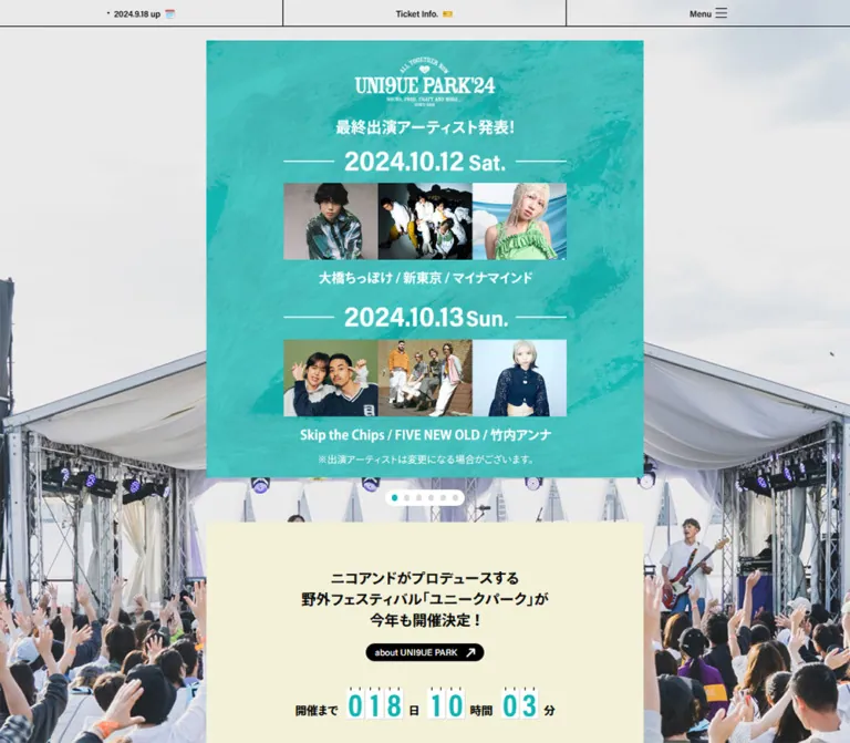
On mobile, the desktop rails disappear. A 33px utility strip remains at the top, and a large event mark sits over the stage photograph before the report artwork. The opening occupies the inspected 844px viewport height. Below it, the page becomes a continuous cream program with compact image grids, practical information, and a restrained sponsor footer.
How to Read This Reference
- Measured means a value appears in the supplied computed styles or element rectangles. Measurements are specific to the captured states.
- Visually estimated means a dimension or treatment is inferred from the five current-page screenshots. Such estimates are not original CSS declarations.
- Calculated means a relationship is derived from measured coordinates, such as the desktop rail gaps or mobile image width ratio.
- Recommended means an implementation choice for reuse. The CSS below is an adaptation, not recovered source code.
- Font stacks are supported by computed styles. Font loading, variable-font axes, and exact font files were not separately verified.
- Offscreen menu entries, repeated report links, and artist detail records appear in the DOM. Their presence does not establish that those interfaces were opened or visible.
- No intermediate viewport was supplied. The exact responsive breakpoint remains unknown.
Tokens — Colors
Default Palette
| Name | Value | Source / reusable alias | Role | Evidence |
|---|---|---|---|---|
| Program Cream | #f3f1d8 |
Source --background-color; alias --color-paper |
Main information sections and footer | Measured |
| Festival Turquoise | #12b5b2 |
Source --theme-color; alias --color-theme |
Dates, countdown digits, action pills, pagination, ticket tab | Measured |
| Update Coral | #eb6877 |
Source --highlight-color; alias --color-highlight |
Thank-you copy and filled New badges |
Measured |
| Black Ink | #000000 |
Alias --color-ink |
Body text, rules, logos, small secondary pills | Measured |
| Panel White | #ffffff |
Alias --color-white |
Desktop navigation panel, promotional cards, notice panel, reversed control text | Measured text/background values and visible surfaces |
| Aqua Photo Wash | No verified single value | No source token established | Pale cyan treatment over the desktop photograph in lower-page captures | Visually observed; compositing method unknown |
The three named source colors are present at both inspected widths. There is no evidence of a selectable color theme or dark mode.
Color Distribution
Cream belongs to the reading surface. Turquoise belongs to small, repeated navigation and event-information accents. Black provides most of the structure through typography, one-pixel rules, and brand marks. White creates discrete utility panels against the photograph.
The right-side market banner contains a strong red strip. The Make Stuff mark uses orange and gray, and sponsor logos introduce other colors. These belong to specific artwork; they are not evidence of additional general-purpose interface tokens.
The first desktop capture shows the stage photograph in relatively natural color. Lower captures show the same surroundings through a pale aqua treatment. Reproduce the difference as a background state if needed, but do not claim an exact overlay opacity, blend mode, or scroll threshold from these captures.
Tokens — Typography
Japanese Text — Ryo Gothic Stack
The body declares:
ryo-gothic-plusn, Hiragino Kaku Gothic ProN, Hiragino Kaku Gothic Pro, Hiragino Sans, sans-serif
The supplied declaration also contains Japanese aliases for the Hiragino families. The shortened stack above preserves the main family order for this reference.
Regular information uses weight 400; desktop navigation uses 500; artist names, venue emphasis, and thank-you copy use 700. The effect is compact and practical, with hierarchy created through weight, color, and grouping rather than large display copy.
English Labels and Numerals — Acumin Stack
The measured stack is:
acumin-variable, ryo-gothic-plusn, sans-serif
It appears on section titles, English utility labels, dates, small pills, and menu headings. Section titles such as Information and Artists compute to weight 400, while the offscreen menu’s English headings compute to 700. Variable-font axis settings were not supplied; do not infer them from the apparent weight alone.
Event and Section Marks
The event mark is graphic artwork: arched lettering, a small emblem, a heavy condensed wordmark, and supporting lines. Its character should be preserved through the original authorized asset. The 16px computed size on its empty H1 container does not describe the visible logo lettering.
The Make Stuff Special Shop heading is also distinctive graphic lettering. It should not be recreated by assigning a guessed handwriting font to ordinary text.
Type Scale
| Role | Size / line height | Weight | Family | Evidence |
|---|---|---|---|---|
| Section subtitle | 10px / 10px |
400 | Japanese stack | Measured |
New badge |
10px / 10px within a 35 × 15px box |
500 | Japanese stack | Measured on mobile |
| Ticket-tab caption | 10px / 12px |
700 | Japanese stack | Measured |
| Desktop navigation | 11px / 11px within a 30px link box |
500 | Japanese stack | Measured |
| Mobile utility labels | 11px / 11px |
400 | Acumin stack | Measured |
| Small pill label | 11px / 11px |
400 | Usually Acumin stack | Measured |
| News title | 12px / 19px |
400 | Japanese stack | Measured |
| Artist name | 12px / 16.8px |
700 | Japanese stack | Measured |
| Weekday / small English information | 12px / 12px |
400 | Acumin stack | Measured |
| Desktop countdown labels | 13.5px / 13.5px |
700 | Japanese stack | Measured |
| Mobile countdown labels | 14px / 14px |
700 | Japanese stack | Measured |
| Main ticket action | 14px / 14px |
400 | Japanese stack | Measured |
| Thank-you message | 18px / 26px |
700 | Japanese stack | Measured at both widths |
| Venue emphasis | 18px / 25px |
700 | Japanese stack | Measured |
| Ticket-panel title | 18px / 18px |
400 | Acumin stack | Measured |
| Artist detail title | 21px / 27.3px |
700 | Japanese stack | Measured in unexercised detail records |
| Main English section title | 24px / 24px |
400 | Acumin stack | Measured |
| Artist-section date | 34px / 34px |
400 | Acumin stack | Measured |
| Large calendar day | 80px / 56px |
400 | Acumin stack | Measured at both widths |
Letter spacing is normal across the sampled text. Avoid adding widespread tracking to imitate a fashion editorial. The large 80px numerals are a specific calendar treatment, not a general heading scale.
The body’s inherited 16px / 16px is not representative of most visible content. Many components explicitly use smaller sizes. For a new implementation, retain the hierarchy while reviewing the smallest captions and touch targets for usability.
Tokens — Spacing & Shapes
Unit system: ordinary CSS pixels, including fractional dimensions. No global spacing formula or source unit scale was established.
Density: tightly grouped information inside a narrow strip, separated by generous section spacing. Photographs and brand artwork carry the visual weight.
Spacing Scale
| Use | Value | Status |
|---|---|---|
| Fine divider | About 1px |
Visible; also consistent with navigation row coordinates |
| Main artist-grid horizontal gap | About 3.45px desktop; 2.61px mobile |
Calculated from measured columns |
| Navigation label left inset | 10px |
Measured |
| News-row vertical gap | 20px |
Calculated from row positions |
| Right-rail card gap | 20px |
Calculated |
| Desktop column gap | 30px |
Calculated |
| Ticket-tab bottom clearance | 30px |
Calculated at both viewports |
| Standard desktop content inset | 40px per side inside the 540px strip |
Calculated for 460px-wide sections |
| Standard mobile content inset | About 20.8px per side |
Measured |
| Desktop opening top padding | 50px |
Measured |
| Desktop opening bottom padding | 55px |
Measured |
| Standard section top padding | 60px |
Measured in multiple sections |
| Mobile thank-you section top padding | 40px |
Measured |
These values form a useful vocabulary, but they should not be presented as a verified universal 5px or 10px spacing system.
Border Radius
| Element | Value | Status |
|---|---|---|
| Report artwork and artist photographs | Square | Visually observed |
| Desktop identity panel | Approximately 10–12px |
Visually estimated |
| Right-rail promotional cards | Approximately 10px |
Visually estimated |
| Notice panel | Approximately 10px, with a fine black border |
Visually estimated |
| Ticket-panel heading | 10px 10px 0 0 |
Measured |
| Small black pill | 11px radius on a 22px-high control |
Measured |
| Main ticket action | 20px radius on a 40px-high control |
Measured |
| Floating ticket tab | 5px 0 0 5px |
Measured |
| Active pagination dot | 50% |
Measured |
Layout Measurements
| Element | Desktop: 1440 × 1000 | Mobile: 390 × 844 | Evidence |
|---|---|---|---|
| Main content strip | 540px wide at x = 450 |
390px wide at x = 0 |
Measured |
| Complete desktop composition | Approximately 1200px wide, from x = 120 to 1320 |
Not applicable | Calculated from rail and main positions |
| Identity rail | Approximately 300 × 622px, starting at 120, 50 |
Not visible | Screenshot estimate, supported by child coordinates |
| Sidebar logo container | 151 × 148.69px |
Separate opening logo treatment | Measured |
| Sidebar navigation link | 221.5 × 30px |
Not applicable | Measured |
| Right market banner | 300 × 98.5px at 1020, 120.5 |
Not present as a side rail | Measured |
| Right Instagram banner | 300 × 144.5px at 1020, 239 |
Not present as a side rail | Measured |
| Opening section | 540 × 645px |
390 × 844px |
Measured |
| Main report poster | Approximately 540 × 540px |
Approximately 358.8px square |
Desktop screenshot/section dimensions; mobile measured link width |
| Standard inner content | 460px |
348.39px |
Measured |
| Introductory report image | 482.39 × 259.91px |
348.39 × 187.70px |
Measured link rectangles |
| Ticket panel/action width | 335px |
335px |
Measured |
| Calendar day column | 164px |
164px |
Measured |
| Main artist column | 151.03px |
114.39px |
Measured |
| News row | 460 × 125px |
348.39 × 125px |
Measured |
| Floating ticket tab | 64.5 × 64.5px |
64.5 × 64.5px |
Measured |
| Total document height | Approximately 12,282.53px |
Approximately 12,619.02px |
Measured |
Layering
The source exposes --header-zindex: 1000, --menu-zindex: 999, --modal-zindex: 888, and --intro-zindex: 1001. These are declared layer values, not proof that every corresponding interface was active. In particular, the intro variable does not establish a visible loading splash.
For an adaptation, define the layer hierarchy intentionally and ensure open dialogs remain usable relative to persistent navigation.
Components
Photographic Backdrop and Program Strip
Role: connect practical event information to the atmosphere of the festival.
A wide photograph shows the stage canopy, crowd, lighting rigs, and event banners. On desktop, the narrow content strip leaves substantial photography visible on both sides. The stage remains in a consistent viewport position across the supplied scroll captures, supporting a fixed-backdrop interpretation.
The main element itself is transparent in the measured desktop state, while its information sections have cream backgrounds. This distinction preserves the exposed photograph around the opening report poster. On mobile, the main element computes to cream, while the opening still presents the photographic scene.
Use a separate background layer and an opaque content surface. Do not apply the aqua wash to the entire document: portraits, promotional artwork, white panels, and text retain their normal colors.
Desktop Identity and Navigation Panel
Role: keep the event identity and major destinations available during a long scroll.
The white panel sits about 50px below the top of the viewport. Its anatomy is:
- Centered black event logo, approximately 151px wide.
- Bold event dates for October 12–13, 2024.
- A small centered venue line.
- A substantial gap before the navigation list.
- Compact destination rows separated by thin black rules.
- Coral
Newmarkers aligned to the right of selected rows. - An archive row with a plus sign.
The navigation labels use 11px text and 30px link boxes, with approximately 31px between row starts. The list is narrower than the panel, leaving about 39px of space on either side.
The panel stays at the same screen position in the opening, middle, and footer screenshots. The archive appears collapsed visually, although links to earlier event years exist in the DOM. Expansion behavior was not tested.
Desktop Utility Rail
Role: provide a countdown, market entry point, and official social account without interrupting the program.
The right rail begins at x = 1020 in the desktop capture. It contains three distinct items:
- A compact countdown with turquoise digits on white rectangular tiles and black Japanese unit labels.
- A 300px-wide market banner with expressive black lettering and a red lower action strip.
- A white Instagram promotion showing a phone image, the Instagram symbol, descriptive text, a handle, and a black follow pill.
The banner and Instagram promotion are image-led links. Their visual anatomy should not be mistaken for proof that each embedded label is a separate DOM control.
All displayed countdown values are zero. Digit-changing animation and time calculation were not verified.
Mobile Utility Header
Role: provide essential navigation without consuming the photographic opening.
A fixed-looking top strip spans the 390px viewport and measures 33px high. It is divided into three nearly equal cells by thin black vertical rules, with a thin bottom rule:
2024.10.8 upwith a calendar symbol, linking to information.Ticket Info.with a ticket symbol, linking to ticket information.Menubeside a small hamburger mark.
The first two link boxes measure approximately 128.98 × 32px; labels use 11px Acumin-stack text. The header background computes to transparent in the sampled state. The screenshots do not establish a blur effect.
The same strip is visible at the bottom-page capture, supporting persistent positioning. Menu content exists to the right of the viewport in the DOM, but its open appearance, animation, focus management, and dismissal behavior remain unverified.
Photo Report Opening
Role: direct attention to the current event report.
On desktop, a square report graphic begins 50px from the viewport top and fills the 540px center column. The graphic combines a large black event mark, Photo Report, extensive white sky, and a photograph of the stage and attendees. A small turquoise pagination dot sits below it with a white surround.
The opening section is 645px high: 50px top padding, approximately 540px of artwork, and 55px bottom space.
On mobile, the opening is reorganized rather than simply reduced. A separate event logo sits in a tall area above the report poster. The measured H1 container begins at y = 32 and is approximately 402px high. The poster region is approximately 92% of the viewport width, leaving about 15.6px on either side.
The mobile capture shows horizontally offset, repeated report artwork within the poster region. The DOM likewise contains repeated report links outside the visible area. This supports a slider implementation, but does not establish autoplay speed, slide count, swipe behavior, or a permanent split-image composition. A reusable implementation should begin with a stable, complete report image and add slider behavior only when specified.
Thank-You and Report Section
Role: establish the current event status before the retained program information.
A cream section follows the opening. Its centered coral message reads:
“ご来場いただいた皆様、ありがとうございました。またお会いできる日を楽しみにしています。”
The message is 18px / 26px, weight 700, and occupies three lines in the supplied state. Desktop top padding is 60px; mobile top padding is 40px.
Below it, a linked report photograph uses about 89.33% of the main width. That produces approximately 482.4px on desktop and 348.4px on mobile. A small black about UNI9UE PARK button is also present. Its effect was not tested.
Event Facts and Ticket Information
Role: present the dates, location, map, and ticket categories in a compact program format.
The calendar retains two 164px-wide day columns at both inspected widths. Large turquoise 12 and 13 numerals use an 80px font with a compressed 56px line box. Small day labels, weekday names, and opening/closing times complete each column.
The venue treatment combines a small Japanese section label, an 18px turquoise venue name, an 11px address, and a small turquoise Google map pill. The recorded destination for that pill is a park-access page; the label alone should not be used to infer a Google Maps embed.
The ticket panel is 335px wide at both widths. Its turquoise heading is 40px high with rounded upper corners. The page lists one-day and two-day prices, followed by a small admission note and a 335 × 40px turquoise purchase-information pill. These are retained event details, not verified current inventory.
Section Heading System
Role: make a long page easy to scan while keeping the content column quiet.
English section titles such as Information and Artists use 24px Acumin-stack text. A centered Japanese subtitle follows in 10px text. The titles are substantially smaller than the event artwork and large calendar numerals.
Most sampled sections begin with 60px top padding. Center titles within the full program strip, then align detailed rows and grids to the narrower inner width.
Information Rows
Role: expose dated updates without turning the page into a large card dashboard.
Each measured news link is 125px high. Rows are 460px wide on desktop and 348.39px on mobile, with 20px between rows. Titles are 12px / 19px, followed by dates and compact New or Check labels.
The title begins 143px to the right of the row’s left edge at both widths. This establishes a fixed media-and-gap allocation. A 125px thumbnail plus an 18px gap is a plausible reconstruction, but the thumbnail itself was not separately measured.
On mobile, the media allocation remains fixed while the text area narrows from 317px to approximately 205.39px. The sampled titles wrap to two lines. Preserve this relationship rather than stacking every news image above its title.
A small black View more pill measures 99.5 × 22px and follows the list.
Artist Grids and Day Dividers
Role: present a dense, image-led lineup organized by event day.
The section begins with a paid-area label and a short explanatory note. Day dividers combine a left-aligned Day 1 or Day 2, a thin horizontal rule, and a large turquoise date with a small weekday at the right.
The main artist grid remains three columns at both inspected widths. Artist-name boxes measure approximately 151.03px on desktop and 114.39px on mobile. Names use 12px bold text and can wrap; role prefixes such as -Opening Act- or -Guest- remain attached to their artists. Coral New badges are small rectangular stamps, not rounded chips.
The visible band-member row uses four square photographs, approximately 110px wide on desktop, with names and smaller instrument captions below. Keep this subgroup distinct from the main three-column artist grid. Its mobile column behavior was not supplied visually.
A centered turquoise timetable pill is approximately 240 × 40px in the middle desktop capture, with a clock symbol, Japanese label, and diagonal arrow. That size is a visual estimate.
Artist Detail Records
Role indicated by the DOM: expose official social and website links for individual artists.
The DOM includes repeated detail groups with an artist title, Official SNS & Web, social destinations, a turquoise official-site pill where available, and a small black Close button. The measured content width is 260px at both viewports; social links use two 130px columns in the sampled records. Titles are 21px bold, and the Close control is 68.5 × 22px.
No supplied screenshot shows an opened artist detail interface. The trigger, dialog surface, backdrop, entry animation, scroll behavior, and keyboard handling must therefore remain unclaimed.
Make Stuff Special Shop and Goods
Role: connect the festival program to the brand’s staff and merchandise.
The visible Make Stuff section starts with a thin horizontal rule and a centered orange-and-gray graphic mark. A small subtitle sits below it, followed by another rule. A paid-area notice precedes a large rectangular staff group portrait.
At desktop width, the portrait spans the approximately 460px inner column. It has square corners and natural photographic color. The people and clothing provide the warmth; the surrounding layout remains cream, black, and lightly ruled.
The Goods section is established by the rendered text: an English section title, product description, dimensions, ticket-bundle prices, sale dates, and a purchase destination. Its detailed image arrangement is not visible in the supplied screenshots. Reuse the confirmed section and action vocabulary without inventing an unobserved product carousel or commerce interface.
Market Directory and Recruitment
Role: explain the free market area and direct visitors to vendors and participation information.
The DOM contains introductory copy, a free-area label, category names with counts, vendor entries with category labels, Check links, and View all. It also contains a Join Us section with requirements and the explicit closed-application message “応募受付は終了しました。”
The evidence establishes the content hierarchy and destinations. It does not establish whether category labels act as tabs, live filters, or ordinary links, nor does it establish a particular vendor-card grid. Keep those interactions unspecified until tested.
Social and Music Content
Role: extend the event beyond schedules and ticket information.
The page includes the event hashtag, official Instagram account, a follow action, and a Play List on Spotify heading with explanatory copy. The right desktop rail repeats the Instagram promotion.
The supplied evidence does not establish whether a playable Spotify embed successfully loaded. Do not add an autoplay claim or infer an audio interaction from the section heading alone.
Floating Ticket Tab
Role: provide a persistent shortcut once the visitor is farther down the page.
The turquoise tab measures 64.5 × 64.5px, sits 30px above the viewport bottom, and meets the right edge with square right corners and 5px left corners. A 24px ticket emoji sits above a two-line, 10px bold white caption.
The initial DOM places the tab outside the right edge. Lower-page screenshots show it inside the viewport. Its hidden displacement is equivalent to approximately translateX(110%) relative to a right-aligned resting position, calculated from its measured coordinates. The actual source transform was not supplied.
A 0.4s ease-in-out transition is measured. The reveal threshold and controlling event remain unknown. The mobile footer also shows a small shadow around the tab; no general shadow system is evident elsewhere.
Notice Panel and Footer
Role: contain visitor guidance, support information, sponsors, and event identity.
The lower page includes a centered DISK GARAGE contact block followed by a white notice panel. In the desktop screenshot, the panel is approximately 460 × 400px, with a thin black outline, approximately 10px corners, a centered heading, and dense left-aligned bullet lists.
The content is visibly bounded by the panel. The captures do not prove whether internal scrolling was exercised or whether clipping is used. An adaptation should provide accessible overflow rather than silently hide the remaining guidance.
Below the notice panel, a centered sponsor label precedes three logos in one row and a fourth centered beneath them. Generous cream space separates the sponsor group, event-credit lines, the black niko and ... mark, and the copyright line. The mobile footer retains this centered hierarchy.
The inspected footer identifies event organizers as niko and ... / DISK GARAGE / J-WAVE, planning and production as UNI9UE PARK’24実行委員会, and production support as 808株式会社 / DISK GARAGE. It also displays Copyright © Adastria Co., Ltd. All rights reserved. These are event and copyright statements; they do not establish website design or development authorship.
Tokens — Motion & Interaction
| Element or behavior | Supplied evidence | Safe interpretation |
|---|---|---|
| Desktop navigation links | 0.3s transition |
A transition is declared; the changed property and hover endpoint were not supplied |
| Floating ticket tab | 0.4s ease-in-out; outside viewport initially, visible lower down |
Stateful reveal is supported; trigger threshold remains unknown |
| Right market promotion | 0.5s duration with 0.3s delay |
A delayed transition is declared; exact entry trajectory is unverified |
| Right Instagram promotion | 0.5s duration with 0.6s delay |
Staggered timing is present in styles; full choreography is unverified |
| Thank-you message and report link | 0.5s transition |
Consistent with reveal treatment, but its properties were not captured |
| Several mobile content controls | 0.5s transition |
Do not assume every component uses the same effect |
| Map-detail and artist-detail controls | 0.3s transition on sampled controls |
Timing is known; hover appearance is not |
| Report poster | Repeated offscreen links, pagination dot, horizontally offset mobile artwork | Slider structure is likely; playback interval, gestures, and distinct slide count are unknown |
| Background photograph | Natural opening state; aqua lower-page state | A visual state change is observed across scroll captures; compositing and trigger are unknown |
| Countdown | All displayed values are zero | No digit motion or active counting was demonstrated |
| Menu, archive, About, artist details | Controls or content exist in the DOM | Opening and dismissal behavior were not tested |
A computed transition string of all without a nonzero duration is not evidence of visible animation. Likewise, sampled animation: none values do not rule out JavaScript-driven movement elsewhere.
The inspection waited for document loading, image decoding, and finite visible motion within bounded time limits. Perpetual animations were temporarily paused for readiness checks and resumed. These precautions improve capture stability but do not establish complete interaction behavior.
For reuse, prefer short, restrained transitions around the existing program structure. Do not introduce parallax, bouncing cards, or elaborate page transitions without a separate design decision.
Surfaces
| Surface | Appearance | Purpose |
|---|---|---|
| Desktop surroundings | Full-viewport stage and crowd photograph | Event atmosphere and visual continuity |
| Lower-page photographic treatment | Pale aqua wash over the surroundings | Reduces competition with dense program content |
| Program strip | Flat cream | Continuous reading surface |
| Identity panel | White, softly rounded | Persistent event identity and navigation |
| Promotional banners | Branded image surfaces with rounded visible edges | Market and social destinations |
| News and artist groups | Images and text directly on cream | Compact browsing without unnecessary containers |
| Secondary action | Small black pill with white label | Supplementary navigation |
| Primary information action | Turquoise pill with white label | Ticket, timetable, or destination emphasis |
| Notice panel | White, fine black outline, modest radius | Separates dense visitor guidance |
| Floating shortcut | Turquoise tab, small left radius, subtle visible shadow | Persistent ticket-information access |
There is no broad system of elevated cards. Most separation comes from background changes, spacing, rules, and image edges.
Imagery
The main photographic language is documentary and social: crowds with raised hands, a tented outdoor stage, performers, artist portraits, and a closely grouped staff photograph. Natural clothing colors and skin tones provide warmth against the cream and turquoise interface.
The opening report artwork uses large areas of white sky and a black event mark above the concert scene. Preserve this internal composition. Cropping the poster to fill a wide hero would remove the relationship between logo, report label, and photograph.
Artist images are compact and regularly aligned. The Make Stuff group photograph is larger and more intimate. Sponsor marks retain their original colors and relative visual identities. The event logo and section artwork should remain graphics rather than approximate CSS typography.
Small ticket, clock, shopping, and calendar symbols add informal utility cues. The ticket symbol explicitly computes to the Noto Color Emoji stack in the sampled tab. Other icon asset formats were not established.
Observed Asset References
Image source URLs and native image dimensions were not included in the evidence. The destinations below are observed link targets, not image-file paths.
| Asset or artwork | Observed use | Known destination or evidence |
|---|---|---|
| Wide stage/crowd photograph | Desktop surroundings and mobile opening | Current-page screenshots; image URL unknown |
| Black event mark | Sidebar, mobile opening, report artwork | Current-page screenshots; logo source URL unknown |
| Photo Report poster | Main opening artwork | Link to /uni9ue_park_2024/report/ |
| Introductory report photograph | Below the thank-you message | Link to /uni9ue_park_2024/report/ |
| Market promotion | Right rail and program links | Link to /uni9ue_park_2024/marche/ |
| Instagram promotion | Right rail and social content | Link to https://www.instagram.com/uni9ue_park_official/ |
| Artist portraits | Day-specific lineup and band members | Visible portrait group plus artist records in the DOM |
| Make Stuff mark and staff photograph | Special-shop section | Visible middle-page capture; details link to /uni9ue_park_2024/information/10214/ |
| Sponsor marks and brand footer | Lower-page sponsor group and closing identity | Desktop and mobile footer captures |
Use authorized artwork with known dimensions. CSS can recreate the layout, but the event mark, concert photography, artist portraits, and partner marks carry much of the identity.
Layout & Responsive Behavior
Desktop Composition
At 1440px wide, the arrangement is approximately:
120px margin + 300px rail + 30px gap + 540px main + 30px gap + 300px rail + 120px margin
The center strip scrolls through a document more than 12,000px tall. Both side rails stay in the same viewport positions across the supplied captures. This keeps navigation and promotions present while the main program remains deliberately narrow.
The page does not expand artist information across the entire desktop width. The surrounding photography is a major part of the composition.
Mobile Composition
At 390px wide, the main element fills the viewport. The desktop rails are absent, the 33px utility header is visible, and the opening uses the entire measured viewport height.
The large mobile logo is part of the photographic opening. It is not a miniature copy of the desktop sidebar. Below the first screen, the cream surface extends to the viewport edges, while most text and image groups retain approximately 20.8px side insets.
The countdown appears within the document on mobile, after the introductory content, rather than in a persistent right rail.
Responsive Rules Supported by Measurements
| Relationship | Evidence | Reuse implication |
|---|---|---|
| Main strip | 540px desktop, 390px mobile | Cap the program width rather than enlarging it indefinitely |
| Standard content group | 460px desktop, 348.39px mobile | Use a capped proportional inner width |
| Introductory report image | Approximately 89.33% of the main width at both sizes | Keep a separate wider-image rule |
| Mobile report poster | Approximately 92% of viewport width | Preserve narrow photographic side margins |
| Calendar columns | 164px at both widths | Maintain the compact two-day comparison |
| Ticket panel | 335px at both widths | Retain a fixed preferred width with a small-screen maximum |
| Main artist grid | Three columns at both widths | Allow names to wrap instead of automatically switching to one column |
| News rows | 125px high and 143px reserved before text at both widths | Preserve the thumbnail/text row arrangement |
| Most sampled type | Same sizes at both widths | Layout changes more than typography |
| Artist section height | 2558px desktop; 2675.75px mobile | Wrapping and narrower imagery affect section height |
The actual breakpoint is unknown. A recommended breakpoint of 1280px accommodates the measured 1200px desktop composition with 40px outer margins. This is a practical adaptation, not a recovered source rule.
Use natural document scrolling. Do not convert the long program into a fixed-height application with the entire page scrolling inside a panel. Only bounded components such as the notice box may need independent overflow.
Do’s and Don’ts
Do
- Keep the desktop program narrow and let the stage photograph remain visible around it.
- Preserve the exact cream, turquoise, and coral source colors as the starting palette.
- Separate the fixed utility rails from the main scrolling content.
- Use the current Photo Report and thank-you hierarchy when reproducing this captured state.
- Keep most headings modest; reserve large numerals for the calendar.
- Preserve the three-column primary artist grid at the inspected phone width.
- Keep natural photographic color inside the content area.
- Use thin black rules, small update stamps, and compact pill controls.
- Maintain a distinct mobile opening with its own large event logo.
- Keep event credits separate from website design/development attribution.
- Treat graphic logos and promotional banners as artwork with their own typography.
Don’t
- Don’t enlarge the desktop content to fill the available screen width.
- Don’t turn every artist, news item, and section into a raised rounded card.
- Don’t use the root’s Times fallback as the visible site font.
- Don’t assign a guessed serif font to reconstruct the event logo.
- Don’t apply the aqua photographic wash to portraits, sponsor marks, or interface text.
- Don’t treat an offset slider frame as a permanently cropped poster design.
- Don’t invent autoplay timing, menu choreography, category filtering, or modal behavior.
- Don’t interpret the retained ticket label as verified current sales availability.
- Don’t assume every DOM element was visible; several menu and detail records were offscreen or unexercised.
- Don’t reduce all content proportionally on mobile: several panels and type sizes remain fixed.
Recommended Implementation Additions
These are recommendations for a new implementation, not verified features of the original.
- Give image-only report and promotional links meaningful accessible names. Distinguish decorative background photography from informative images.
- Implement the mobile Menu control as a button with an expanded state. If it opens a dialog or drawer, provide keyboard dismissal and return focus to the trigger.
- Increase practical touch targets around 22px pills, the 33px header cells, and the tiny pagination dot. A 44px hit area can surround a smaller visible control.
- Review small-text contrast, especially white labels on turquoise and coral text on cream. A darker turquoise such as
#087c7ais a recommended alternative for text-bearing actions; it is not an observed source token. - Ensure the notice panel exposes all content through keyboard-accessible scrolling or an expandable full-text presentation.
- Keep hidden slider clones and closed artist details out of the keyboard and accessibility navigation order.
- Provide reduced-motion behavior and a stable first report image. If automatic sliding is added, provide appropriate playback control.
- Model event status explicitly so archived pages can present ended registration and sales clearly. Preserve current labels only when documenting the observed page.
- Reserve image dimensions to avoid layout shifts, prioritize the opening image, and defer lower-page portraits where appropriate.
- Add safe-area clearance to persistent mobile controls and sufficient anchor offset below the utility header.
Agent Prompt Guide
Quick Color Reference
- Program and footer:
#f3f1d8. - Text, rules, secondary pills, and black brand artwork:
#000000. - Dates, pagination, timetable actions, and ticket shortcut:
#12b5b2. - Thank-you copy and
Newstamps:#eb6877. - Utility panels and notice surface:
#ffffff. - Desktop surroundings: natural concert photograph at the opening, pale aqua treatment in the lower-page state; exact compositing is unspecified.
Overall Prompt
“Create a Japanese outdoor-festival information microsite inspired by the current UNI9UE PARK ’24 homepage. At a 1440px desktop viewport, center a 540px scrolling program between two 300px persistent rails with 30px gaps. Place the composition over a full-viewport stage-and-crowd photograph. Use cream #f3f1d8, turquoise #12b5b2, coral #eb6877, black text, and white utility panels. Lead with a square Photo Report graphic and a coral thank-you message. Use compact Japanese sans-serif information, restrained English section titles, large turquoise calendar numerals, square artist photographs, thin rules, and small pills. At 390px, replace the rails with a 33px three-cell utility bar and a full-screen photographic opening with a separate large event mark. Preserve three columns for the main artist lineup. Treat menu, carousel, and modal behavior as separate implementation decisions.”
Example Component Prompts
- Desktop identity panel: “A white panel about 300px wide with 10px corners. Center an authorized black festival logo above bold dates and a small venue line. Below, place a 221.5px-wide list of 30px navigation rows with thin black dividers, 11px labels, coral New markers, and an archive row with a plus sign. Keep the panel at about 50px from the viewport top.”
- Report opening: “A square Photo Report poster filling a 540px desktop column, with 50px space above and a small turquoise dot in a white surround below. Keep the artwork uncropped. On a 390px phone, introduce a separate large festival logo over the stage photograph and display the report poster at about 92% viewport width.”
- Artist lineup: “A cream section with a centered 24px English heading and a small Japanese subtitle. Add a thin ruled day divider with a 34px turquoise date. Use three tightly spaced columns of square photographs, 12px bold names, optional role prefixes, and tiny rectangular coral New stamps. Allow phone labels to wrap.”
- News row: “A compact horizontal news link, 125px tall, with a fixed media area on the left and a 12px title on the right. Reserve about 143px before the text. Include a small date and concise status labels. Keep the row directly on cream with a 20px gap to the next item.”
- Footer: “A cream event footer with a white outlined notice panel, centered sponsor heading, three sponsor marks in one row and a fourth beneath, small centered event-credit lines, a black brand mark, and a discreet copyright line. Keep wide vertical spacing and preserve original logo colors.”
Quick Start
CSS Custom Properties
This CSS recreates the measured layout relationships with conventional pixel units. It does not implement a carousel, countdown clock, menu, or artist dialog. Set --scene-image to an authorized background image, place authorized artwork in the image elements, and use .is-scrolled only after choosing the desired background and ticket-tab state behavior.
The 1280px breakpoint, background-wash formula, focus style, and 44px pagination hit area are recommendations. The code’s font stacks require the corresponding fonts to be available; no font files are bundled or inferred.
:root {
  /* Confirmed source colors */
  --color-paper: #f3f1d8;
  --color-theme: #12b5b2;
  --color-highlight: #eb6877;
  --color-ink: #000000;
  --color-white: #ffffff;

  /* Confirmed family names, with shortened fallback stacks */
  --font-jp: ryo-gothic-plusn, 'Hiragino Kaku Gothic ProN',
    'Hiragino Kaku Gothic Pro', 'Hiragino Sans', sans-serif;
  --font-en: acumin-variable, ryo-gothic-plusn, sans-serif;

  /* Measured geometry */
  --main-width: 540px;
  --inner-width: 460px;
  --rail-width: 300px;
  --rail-gap: 30px;
  --frame-width: 1200px;
  --utility-height: 33px;
  --ticket-width: 335px;
  --ticket-tab-size: 64.5px;

  --text-caption: 10px;
  --text-utility: 11px;
  --text-body: 12px;
  --text-action: 14px;
  --text-emphasis: 18px;
  --text-section: 24px;
  --text-date: 34px;
  --text-day: 80px;

  --space-row: 20px;
  --space-section: 60px;
  --radius-panel: 10px;
  --radius-pill: 999px;
  --rule: 1px solid var(--color-ink);

  /* Supply an authorized image in the consuming project. */
  --scene-image: none;

  /* Recommended approximation, not recovered source CSS. */
  --scene-wash: linear-gradient(
    to bottom,
    rgb(255 255 255 / 88%),
    rgb(18 181 178 / 45%)
  );
}

* {
  box-sizing: border-box;
}

body.festival-page {
  margin: 0;
  color: var(--color-ink);
  background: var(--color-paper);
  font-family: var(--font-jp);
  font-size: var(--text-body);
  line-height: 1.6;
}

.festival-page img {
  display: block;
  max-width: 100%;
  height: auto;
}

.festival-page button,
.festival-page a {
  -webkit-tap-highlight-color: transparent;
}

.festival-backdrop {
  position: fixed;
  inset: 0;
  z-index: 0;
  pointer-events: none;
  background: var(--scene-image) center / cover no-repeat;
}

.festival-backdrop::after {
  content: '';
  position: absolute;
  inset: 0;
  background: var(--scene-wash);
  opacity: 0;
  transition: opacity 0.5s ease;
}

.is-scrolled .festival-backdrop::after {
  opacity: 1;
}

.festival-main {
  position: relative;
  z-index: 1;
  width: min(100%, var(--main-width));
  margin-inline: auto;
  background: var(--color-paper);
}

.identity-rail,
.utility-rail {
  display: none;
}

.mobile-utility {
  position: fixed;
  inset: 0 0 auto;
  z-index: 1000;
  display: grid;
  grid-template-columns: repeat(3, minmax(0, 1fr));
  height: var(--utility-height);
  border-bottom: var(--rule);
  background: rgb(255 255 255 / 90%);
}

.mobile-utility > * {
  display: flex;
  align-items: center;
  justify-content: center;
  gap: 5px;
  min-width: 0;
  padding: 0;
  border: 0;
  color: inherit;
  background: transparent;
  font: 400 var(--text-utility) / 1 var(--font-en);
  text-decoration: none;
}

.mobile-utility > * + * {
  border-left: var(--rule);
}

.photo-hero {
  position: relative;
  display: flex;
  flex-direction: column;
  min-height: 100svh;
  padding: var(--utility-height) 0 51px;
  background: var(--scene-image) center / cover no-repeat;
}

.hero-brand {
  display: grid;
  flex: 1;
  min-height: 240px;
  place-items: center;
  margin: 0;
}

.hero-brand img {
  width: 180px;
}

.hero-frame {
  width: 92%;
  aspect-ratio: 1;
  margin-inline: auto;
  overflow: hidden;
}

.hero-frame img {
  width: 100%;
}

/* A larger hit area surrounds the measured small visual dot. */
.hero-dot {
  position: absolute;
  bottom: 4.5px;
  left: 50%;
  display: grid;
  width: 44px;
  height: 44px;
  padding: 0;
  place-items: center;
  border: 0;
  background: transparent;
  transform: translateX(-50%);
}

.hero-dot::before {
  content: '';
  width: 7.5px;
  height: 7.5px;
  border-radius: 50%;
  background: var(--color-theme);
  box-shadow: 0 0 0 7.5px var(--color-white);
}

.program-section {
  padding-block-start: var(--space-section);
  background: var(--color-paper);
  scroll-margin-top: calc(var(--utility-height) + 16px);
}

.section-inner {
  width: min(89.333333%, var(--inner-width));
  margin-inline: auto;
}

.thank-you-section {
  padding-block-start: 40px;
}

.thank-you {
  margin: 0;
  color: var(--color-highlight);
  font-size: var(--text-emphasis);
  font-weight: 700;
  line-height: 26px;
  text-align: center;
}

.report-image {
  display: block;
  width: 89.333333%;
  margin: 26px auto 0;
}

.report-image img {
  width: 100%;
}

.section-title {
  margin: 0;
  font: 400 var(--text-section) / 1 var(--font-en);
  text-align: center;
}

.section-subtitle {
  margin: 9px 0 0;
  font-size: var(--text-caption);
  line-height: 1.4;
  text-align: center;
}

.pill {
  display: inline-flex;
  align-items: center;
  justify-content: center;
  gap: 8px;
  min-height: 22px;
  padding-inline: 16px;
  border: 0;
  border-radius: var(--radius-pill);
  color: var(--color-white);
  background: var(--color-ink);
  font: 400 var(--text-utility) / 1 var(--font-en);
  text-decoration: none;
}

.pill--theme {
  background: var(--color-theme);
}

.pill--large {
  min-height: 40px;
  font-family: var(--font-jp);
  font-size: var(--text-action);
}

.ticket-panel {
  width: min(var(--ticket-width), calc(100% - 32px));
  margin-inline: auto;
}

.ticket-heading {
  display: grid;
  min-height: 40px;
  margin: 0;
  place-items: center;
  border-radius: 10px 10px 0 0;
  color: var(--color-white);
  background: var(--color-theme);
  font: 400 18px / 1 var(--font-en);
}

.ticket-panel > .pill {
  display: flex;
  width: 100%;
}

.calendar-grid {
  display: grid;
  grid-template-columns: repeat(2, minmax(0, 164px));
  justify-content: center;
  gap: 5px;
  text-align: center;
}

.calendar-number {
  margin-block: 24px 8px;
  color: var(--color-theme);
  font: 400 var(--text-day) / 56px var(--font-en);
}

.news-list {
  display: grid;
  gap: var(--space-row);
}

.news-row {
  display: grid;
  grid-template-columns: 125px minmax(0, 1fr);
  align-items: center;
  gap: 18px;
  min-height: 125px;
  color: inherit;
  text-decoration: none;
}

.news-row img {
  width: 125px;
  aspect-ratio: 1;
  object-fit: cover;
}

.news-title {
  margin: 0;
  font-size: var(--text-body);
  font-weight: 400;
  line-height: 19px;
}

.artist-grid {
  display: grid;
  grid-template-columns: repeat(3, minmax(0, 1fr));
  column-gap: 0.75%;
  row-gap: 24px;
}

.artist-card {
  min-width: 0;
  text-align: center;
}

.artist-card img {
  width: 100%;
  aspect-ratio: 1;
  object-fit: cover;
}

.artist-name {
  margin: 8px 0 0;
  font-size: var(--text-body);
  font-weight: 700;
  line-height: 1.4;
}

.new-stamp {
  display: inline-flex;
  align-items: center;
  justify-content: center;
  min-width: 35px;
  min-height: 15px;
  margin-top: 7px;
  color: var(--color-white);
  background: var(--color-highlight);
  font-size: var(--text-caption);
  font-weight: 500;
  line-height: 1;
}

.notice-panel {
  max-height: 400px;
  padding: 28px 36px;
  overflow-y: auto;
  border: var(--rule);
  border-radius: var(--radius-panel);
  background: var(--color-white);
  line-height: 1.7;
}

.notice-panel h2 {
  margin: 0 0 24px;
  font-size: 18px;
  text-align: center;
}

.festival-footer {
  padding: 60px 0 28px;
  background: var(--color-paper);
  text-align: center;
}

.sponsor-grid {
  display: grid;
  grid-template-columns: repeat(3, minmax(0, 1fr));
  align-items: center;
  gap: 24px 16px;
  max-width: 330px;
  margin: 24px auto 56px;
}

.sponsor-grid > :last-child:nth-child(4) {
  grid-column: 2;
}

.sponsor-grid img {
  width: 100%;
  max-height: 48px;
  object-fit: contain;
}

.ticket-tab {
  position: fixed;
  right: 0;
  bottom: calc(30px + env(safe-area-inset-bottom, 0px));
  z-index: 30;
  display: flex;
  flex-direction: column;
  align-items: center;
  justify-content: center;
  gap: 3px;
  width: var(--ticket-tab-size);
  height: var(--ticket-tab-size);
  border-radius: 5px 0 0 5px;
  color: var(--color-white);
  background: var(--color-theme);
  font-size: 10px;
  font-weight: 700;
  line-height: 12px;
  text-align: center;
  text-decoration: none;
  transform: translateX(110%);
  transition: transform 0.4s ease-in-out;
}

.ticket-tab-icon {
  font: 400 24px / 1 'Noto Color Emoji', sans-serif;
}

.is-scrolled .ticket-tab {
  transform: translateX(0);
}

/* Recommended breakpoint; the original breakpoint is unknown. */
@media (min-width: 1280px) {
  .mobile-utility {
    display: none;
  }

  .festival-main {
    background: transparent;
  }

  .identity-rail,
  .utility-rail {
    position: fixed;
    z-index: 20;
    display: block;
    width: var(--rail-width);
  }

  .identity-rail {
    top: 50px;
    left: calc(50% - 600px);
    max-height: calc(100dvh - 75px);
    padding: 31px 0 25px;
    overflow-y: auto;
    border-radius: var(--radius-panel);
    background: var(--color-white);
    text-align: center;
  }

  .identity-logo {
    width: 151px;
    margin-inline: auto;
  }

  .identity-date {
    margin: 24px 0 8px;
    font: 700 30px / 1 var(--font-en);
  }

  .identity-venue {
    margin: 0;
    font-size: 11.4px;
    font-weight: 700;
    line-height: 1;
  }

  .identity-nav {
    width: 221.5px;
    margin: 35px auto 0;
    text-align: left;
  }

  .identity-nav > * {
    display: flex;
    align-items: center;
    justify-content: space-between;
    min-height: 31px;
    padding-left: 10px;
    border-bottom: var(--rule);
    color: inherit;
    font-size: 11px;
    font-weight: 500;
    line-height: 1;
    text-decoration: none;
  }

  .identity-nav > :last-child {
    border-bottom: 0;
  }

  .nav-update {
    padding-right: 10px;
    color: var(--color-highlight);
    font-size: 10px;
  }

  .utility-rail {
    top: 60px;
    left: calc(50% + 300px);
  }

  .rail-promotion {
    display: block;
    margin-top: 20px;
    overflow: hidden;
    border-radius: var(--radius-panel);
    background: var(--color-white);
  }

  .rail-promotion img {
    width: 100%;
  }

  .photo-hero {
    display: block;
    min-height: 0;
    padding: 50px 0 55px;
    background: none;
  }

  .hero-brand {
    display: none;
  }

  .hero-frame {
    width: 100%;
  }

  .hero-dot {
    bottom: 8px;
  }

  .thank-you-section {
    padding-top: 60px;
  }
}

/* Recommended keyboard visibility. */
.festival-page :focus-visible {
  outline: 2px solid var(--color-ink);
  outline-offset: 4px;
}

@media (prefers-reduced-motion: reduce) {
  .festival-backdrop::after,
  .ticket-tab {
    transition: none;
  }
}
The .mobile-utility background in this adaptation deliberately supplies a readable light surface; the measured source header was transparent. The news thumbnail dimensions, notice padding, sponsor gaps, and sidebar date typography are reconstruction choices where separate source measurements were unavailable.
Use .section-inner around standard news, artist, and notice content. Keep .report-image outside that wrapper so its wider desktop proportion is preserved. The main artist grid remains three columns by default; a separate four-column band-member group should be implemented independently.
Tailwind v4 Token Mapping
Optional aliases for a project that already uses Tailwind v4. This does not imply that the original site uses Tailwind. Define the custom properties above first.
@theme inline {
  --color-paper: var(--color-paper);
  --color-festival: var(--color-theme);
  --color-update: var(--color-highlight);
  --color-ink: var(--color-ink);
  --color-panel: var(--color-white);

  --font-japanese: var(--font-jp);
  --font-english: var(--font-en);

  --text-caption: 10px;
  --text-utility: 11px;
  --text-program: 12px;
  --text-action: 14px;
  --text-emphasis: 18px;
  --text-section: 24px;
  --text-event-date: 34px;
  --text-calendar-day: 80px;

  --spacing-program: 540px;
  --spacing-program-inner: 460px;
  --spacing-rail: 300px;
  --spacing-rail-gap: 30px;
  --spacing-section: 60px;
  --spacing-utility-bar: 33px;

  --radius-panel: 10px;
  --radius-pill: 999px;
}
Sources & Evidence
- UNI9UE PARK ’24 — original and final inspected page: HTTP 200, with no recorded URL change. This is the authority for the page identity, current content, and original-page footer statements.
- Supplied browser retrieval timestamp:
2026-09-16T19:53:57.799Z, equivalent to September 17, 2026 in Japan. - Three current desktop captures at 1440 × 1000 show the opening, artist/shop area, and footer. Two current mobile captures at 390 × 844 show the opening and footer.
- Rendered DOM evidence at both widths supplies page text, link destinations, custom properties, element rectangles, font stacks, font sizes, colors, spacing, radii, and transition strings.
- Reported document heights are approximately 12,282.53px desktop and 12,619.02px mobile. These are capture-state measurements, not values to hardcode.
- The supplied capture process included an initial observation of at least five seconds, bounded layout and image readiness checks, and intermediate scrolling before settled captures. SharedWorkers and service workers were disabled during inspection.
- Interaction limits: no demonstrated menu opening, archive expansion, About action, artist-detail opening, carousel control, market filtering, internal notice scrolling, playlist playback, or ticket purchase. Link destinations were recorded but their pages were not inspected here.
- Asset limits: image source paths, native image dimensions, font-file URLs, complete stylesheets, and script implementations were not supplied. Screenshot-based geometry and the CSS adaptation are labeled accordingly.
This reference describes the current page supported by those captures and measurements. Its reusable code supplies a practical layout foundation while keeping unverified behaviors and recommended improvements distinct from observed features.
# UNI9UE PARK ’24 — Style Reference

> A compact festival program on cream paper, surrounded by the crowd and stage it documents.

**Website:** [UNI9UE PARK ’24](https://www.nikoand.jp/uni9ue_park_2024/)
**Original URL:** https://www.nikoand.jp/uni9ue_park_2024/
**Final URL:** https://www.nikoand.jp/uni9ue_park_2024/
**Theme:** light, with cream content surfaces, turquoise accents, black typography, and photographic surroundings.
**Inspected:** September 16, 2026 at 19:53:57.799 UTC; September 17, 2026 at 04:53:57.799 JST, according to the supplied browser record.
**Viewports:** 1440 × 1000 desktop and 390 × 844 mobile, in CSS pixels.
**Scope:** the current event homepage, including its opening, artist/shop area, footer, full-page text, link inventory, and sampled computed styles. Linked destinations, menu opening, artist dialogs, and checkout were not independently exercised.

UNI9UE PARK ’24 is an event information microsite with news, artists, schedules, shopping, a market directory, visitor guidance, and links to dedicated pages. Its desktop composition places a narrow scrolling program between two persistent utility rails. A full-viewport photograph supplies the atmosphere; cream panels and small black text make the dense event information readable. Turquoise identifies dates, destinations, and actions. Coral marks updates and the current thank-you message.

The current opening promotes a **Photo Report** and thanks attendees. The countdown reads zero, while ticket links and the label “チケット販売中” remain present. These are observations of the page as served in 2026, not evidence that tickets can currently be purchased. The design reference follows this current report-led state.

On mobile, the desktop rails disappear. A 33px utility strip remains at the top, and a large event mark sits over the stage photograph before the report artwork. The opening occupies the inspected 844px viewport height. Below it, the page becomes a continuous cream program with compact image grids, practical information, and a restrained sponsor footer.

## How to Read This Reference

- **Measured** means a value appears in the supplied computed styles or element rectangles. Measurements are specific to the captured states.
- **Visually estimated** means a dimension or treatment is inferred from the five current-page screenshots. Such estimates are not original CSS declarations.
- **Calculated** means a relationship is derived from measured coordinates, such as the desktop rail gaps or mobile image width ratio.
- **Recommended** means an implementation choice for reuse. The CSS below is an adaptation, not recovered source code.
- Font stacks are supported by computed styles. Font loading, variable-font axes, and exact font files were not separately verified.
- Offscreen menu entries, repeated report links, and artist detail records appear in the DOM. Their presence does not establish that those interfaces were opened or visible.
- No intermediate viewport was supplied. The exact responsive breakpoint remains unknown.

## Tokens — Colors

### Default Palette

| Name | Value | Source / reusable alias | Role | Evidence |
| --- | --- | --- | --- | --- |
| Program Cream | `#f3f1d8` | Source `--background-color`; alias `--color-paper` | Main information sections and footer | Measured |
| Festival Turquoise | `#12b5b2` | Source `--theme-color`; alias `--color-theme` | Dates, countdown digits, action pills, pagination, ticket tab | Measured |
| Update Coral | `#eb6877` | Source `--highlight-color`; alias `--color-highlight` | Thank-you copy and filled `New` badges | Measured |
| Black Ink | `#000000` | Alias `--color-ink` | Body text, rules, logos, small secondary pills | Measured |
| Panel White | `#ffffff` | Alias `--color-white` | Desktop navigation panel, promotional cards, notice panel, reversed control text | Measured text/background values and visible surfaces |
| Aqua Photo Wash | No verified single value | No source token established | Pale cyan treatment over the desktop photograph in lower-page captures | Visually observed; compositing method unknown |

The three named source colors are present at both inspected widths. There is no evidence of a selectable color theme or dark mode.

### Color Distribution

Cream belongs to the reading surface. Turquoise belongs to small, repeated navigation and event-information accents. Black provides most of the structure through typography, one-pixel rules, and brand marks. White creates discrete utility panels against the photograph.

The right-side market banner contains a strong red strip. The Make Stuff mark uses orange and gray, and sponsor logos introduce other colors. These belong to specific artwork; they are not evidence of additional general-purpose interface tokens.

The first desktop capture shows the stage photograph in relatively natural color. Lower captures show the same surroundings through a pale aqua treatment. Reproduce the difference as a background state if needed, but do not claim an exact overlay opacity, blend mode, or scroll threshold from these captures.

## Tokens — Typography

### Japanese Text — Ryo Gothic Stack

The body declares:

`ryo-gothic-plusn, Hiragino Kaku Gothic ProN, Hiragino Kaku Gothic Pro, Hiragino Sans, sans-serif`

The supplied declaration also contains Japanese aliases for the Hiragino families. The shortened stack above preserves the main family order for this reference.

Regular information uses weight `400`; desktop navigation uses `500`; artist names, venue emphasis, and thank-you copy use `700`. The effect is compact and practical, with hierarchy created through weight, color, and grouping rather than large display copy.

### English Labels and Numerals — Acumin Stack

The measured stack is:

`acumin-variable, ryo-gothic-plusn, sans-serif`

It appears on section titles, English utility labels, dates, small pills, and menu headings. Section titles such as `Information` and `Artists` compute to weight `400`, while the offscreen menu’s English headings compute to `700`. Variable-font axis settings were not supplied; do not infer them from the apparent weight alone.

### Event and Section Marks

The event mark is graphic artwork: arched lettering, a small emblem, a heavy condensed wordmark, and supporting lines. Its character should be preserved through the original authorized asset. The `16px` computed size on its empty H1 container does not describe the visible logo lettering.

The Make Stuff Special Shop heading is also distinctive graphic lettering. It should not be recreated by assigning a guessed handwriting font to ordinary text.

### Type Scale

| Role | Size / line height | Weight | Family | Evidence |
| --- | --- | --- | --- | --- |
| Section subtitle | `10px / 10px` | 400 | Japanese stack | Measured |
| `New` badge | `10px / 10px` within a `35 × 15px` box | 500 | Japanese stack | Measured on mobile |
| Ticket-tab caption | `10px / 12px` | 700 | Japanese stack | Measured |
| Desktop navigation | `11px / 11px` within a 30px link box | 500 | Japanese stack | Measured |
| Mobile utility labels | `11px / 11px` | 400 | Acumin stack | Measured |
| Small pill label | `11px / 11px` | 400 | Usually Acumin stack | Measured |
| News title | `12px / 19px` | 400 | Japanese stack | Measured |
| Artist name | `12px / 16.8px` | 700 | Japanese stack | Measured |
| Weekday / small English information | `12px / 12px` | 400 | Acumin stack | Measured |
| Desktop countdown labels | `13.5px / 13.5px` | 700 | Japanese stack | Measured |
| Mobile countdown labels | `14px / 14px` | 700 | Japanese stack | Measured |
| Main ticket action | `14px / 14px` | 400 | Japanese stack | Measured |
| Thank-you message | `18px / 26px` | 700 | Japanese stack | Measured at both widths |
| Venue emphasis | `18px / 25px` | 700 | Japanese stack | Measured |
| Ticket-panel title | `18px / 18px` | 400 | Acumin stack | Measured |
| Artist detail title | `21px / 27.3px` | 700 | Japanese stack | Measured in unexercised detail records |
| Main English section title | `24px / 24px` | 400 | Acumin stack | Measured |
| Artist-section date | `34px / 34px` | 400 | Acumin stack | Measured |
| Large calendar day | `80px / 56px` | 400 | Acumin stack | Measured at both widths |

Letter spacing is `normal` across the sampled text. Avoid adding widespread tracking to imitate a fashion editorial. The large 80px numerals are a specific calendar treatment, not a general heading scale.

The body’s inherited `16px / 16px` is not representative of most visible content. Many components explicitly use smaller sizes. For a new implementation, retain the hierarchy while reviewing the smallest captions and touch targets for usability.

## Tokens — Spacing & Shapes

**Unit system:** ordinary CSS pixels, including fractional dimensions. No global spacing formula or source unit scale was established.

**Density:** tightly grouped information inside a narrow strip, separated by generous section spacing. Photographs and brand artwork carry the visual weight.

### Spacing Scale

| Use | Value | Status |
| --- | --- | --- |
| Fine divider | About `1px` | Visible; also consistent with navigation row coordinates |
| Main artist-grid horizontal gap | About `3.45px` desktop; `2.61px` mobile | Calculated from measured columns |
| Navigation label left inset | `10px` | Measured |
| News-row vertical gap | `20px` | Calculated from row positions |
| Right-rail card gap | `20px` | Calculated |
| Desktop column gap | `30px` | Calculated |
| Ticket-tab bottom clearance | `30px` | Calculated at both viewports |
| Standard desktop content inset | `40px` per side inside the 540px strip | Calculated for 460px-wide sections |
| Standard mobile content inset | About `20.8px` per side | Measured |
| Desktop opening top padding | `50px` | Measured |
| Desktop opening bottom padding | `55px` | Measured |
| Standard section top padding | `60px` | Measured in multiple sections |
| Mobile thank-you section top padding | `40px` | Measured |

These values form a useful vocabulary, but they should not be presented as a verified universal 5px or 10px spacing system.

### Border Radius

| Element | Value | Status |
| --- | --- | --- |
| Report artwork and artist photographs | Square | Visually observed |
| Desktop identity panel | Approximately `10–12px` | Visually estimated |
| Right-rail promotional cards | Approximately `10px` | Visually estimated |
| Notice panel | Approximately `10px`, with a fine black border | Visually estimated |
| Ticket-panel heading | `10px 10px 0 0` | Measured |
| Small black pill | `11px` radius on a 22px-high control | Measured |
| Main ticket action | `20px` radius on a 40px-high control | Measured |
| Floating ticket tab | `5px 0 0 5px` | Measured |
| Active pagination dot | `50%` | Measured |

### Layout Measurements

| Element | Desktop: 1440 × 1000 | Mobile: 390 × 844 | Evidence |
| --- | --- | --- | --- |
| Main content strip | `540px` wide at `x = 450` | `390px` wide at `x = 0` | Measured |
| Complete desktop composition | Approximately `1200px` wide, from `x = 120` to `1320` | Not applicable | Calculated from rail and main positions |
| Identity rail | Approximately `300 × 622px`, starting at `120, 50` | Not visible | Screenshot estimate, supported by child coordinates |
| Sidebar logo container | `151 × 148.69px` | Separate opening logo treatment | Measured |
| Sidebar navigation link | `221.5 × 30px` | Not applicable | Measured |
| Right market banner | `300 × 98.5px` at `1020, 120.5` | Not present as a side rail | Measured |
| Right Instagram banner | `300 × 144.5px` at `1020, 239` | Not present as a side rail | Measured |
| Opening section | `540 × 645px` | `390 × 844px` | Measured |
| Main report poster | Approximately `540 × 540px` | Approximately `358.8px` square | Desktop screenshot/section dimensions; mobile measured link width |
| Standard inner content | `460px` | `348.39px` | Measured |
| Introductory report image | `482.39 × 259.91px` | `348.39 × 187.70px` | Measured link rectangles |
| Ticket panel/action width | `335px` | `335px` | Measured |
| Calendar day column | `164px` | `164px` | Measured |
| Main artist column | `151.03px` | `114.39px` | Measured |
| News row | `460 × 125px` | `348.39 × 125px` | Measured |
| Floating ticket tab | `64.5 × 64.5px` | `64.5 × 64.5px` | Measured |
| Total document height | Approximately `12,282.53px` | Approximately `12,619.02px` | Measured |

### Layering

The source exposes `--header-zindex: 1000`, `--menu-zindex: 999`, `--modal-zindex: 888`, and `--intro-zindex: 1001`. These are declared layer values, not proof that every corresponding interface was active. In particular, the intro variable does not establish a visible loading splash.

For an adaptation, define the layer hierarchy intentionally and ensure open dialogs remain usable relative to persistent navigation.

## Components

### Photographic Backdrop and Program Strip

**Role:** connect practical event information to the atmosphere of the festival.

A wide photograph shows the stage canopy, crowd, lighting rigs, and event banners. On desktop, the narrow content strip leaves substantial photography visible on both sides. The stage remains in a consistent viewport position across the supplied scroll captures, supporting a fixed-backdrop interpretation.

The main element itself is transparent in the measured desktop state, while its information sections have cream backgrounds. This distinction preserves the exposed photograph around the opening report poster. On mobile, the main element computes to cream, while the opening still presents the photographic scene.

Use a separate background layer and an opaque content surface. Do not apply the aqua wash to the entire document: portraits, promotional artwork, white panels, and text retain their normal colors.

### Desktop Identity and Navigation Panel

**Role:** keep the event identity and major destinations available during a long scroll.

The white panel sits about 50px below the top of the viewport. Its anatomy is:

1. Centered black event logo, approximately 151px wide.
2. Bold event dates for October 12–13, 2024.
3. A small centered venue line.
4. A substantial gap before the navigation list.
5. Compact destination rows separated by thin black rules.
6. Coral `New` markers aligned to the right of selected rows.
7. An archive row with a plus sign.

The navigation labels use 11px text and 30px link boxes, with approximately 31px between row starts. The list is narrower than the panel, leaving about 39px of space on either side.

The panel stays at the same screen position in the opening, middle, and footer screenshots. The archive appears collapsed visually, although links to earlier event years exist in the DOM. Expansion behavior was not tested.

### Desktop Utility Rail

**Role:** provide a countdown, market entry point, and official social account without interrupting the program.

The right rail begins at `x = 1020` in the desktop capture. It contains three distinct items:

- A compact countdown with turquoise digits on white rectangular tiles and black Japanese unit labels.
- A 300px-wide market banner with expressive black lettering and a red lower action strip.
- A white Instagram promotion showing a phone image, the Instagram symbol, descriptive text, a handle, and a black follow pill.

The banner and Instagram promotion are image-led links. Their visual anatomy should not be mistaken for proof that each embedded label is a separate DOM control.

All displayed countdown values are zero. Digit-changing animation and time calculation were not verified.

### Mobile Utility Header

**Role:** provide essential navigation without consuming the photographic opening.

A fixed-looking top strip spans the 390px viewport and measures 33px high. It is divided into three nearly equal cells by thin black vertical rules, with a thin bottom rule:

- `2024.10.8 up` with a calendar symbol, linking to information.
- `Ticket Info.` with a ticket symbol, linking to ticket information.
- `Menu` beside a small hamburger mark.

The first two link boxes measure approximately `128.98 × 32px`; labels use 11px Acumin-stack text. The header background computes to transparent in the sampled state. The screenshots do not establish a blur effect.

The same strip is visible at the bottom-page capture, supporting persistent positioning. Menu content exists to the right of the viewport in the DOM, but its open appearance, animation, focus management, and dismissal behavior remain unverified.

### Photo Report Opening

**Role:** direct attention to the current event report.

On desktop, a square report graphic begins 50px from the viewport top and fills the 540px center column. The graphic combines a large black event mark, `Photo Report`, extensive white sky, and a photograph of the stage and attendees. A small turquoise pagination dot sits below it with a white surround.

The opening section is 645px high: 50px top padding, approximately 540px of artwork, and 55px bottom space.

On mobile, the opening is reorganized rather than simply reduced. A separate event logo sits in a tall area above the report poster. The measured H1 container begins at `y = 32` and is approximately 402px high. The poster region is approximately 92% of the viewport width, leaving about 15.6px on either side.

The mobile capture shows horizontally offset, repeated report artwork within the poster region. The DOM likewise contains repeated report links outside the visible area. This supports a slider implementation, but does not establish autoplay speed, slide count, swipe behavior, or a permanent split-image composition. A reusable implementation should begin with a stable, complete report image and add slider behavior only when specified.

### Thank-You and Report Section

**Role:** establish the current event status before the retained program information.

A cream section follows the opening. Its centered coral message reads:

“ご来場いただいた皆様、ありがとうございました。またお会いできる日を楽しみにしています。”

The message is `18px / 26px`, weight `700`, and occupies three lines in the supplied state. Desktop top padding is 60px; mobile top padding is 40px.

Below it, a linked report photograph uses about 89.33% of the main width. That produces approximately 482.4px on desktop and 348.4px on mobile. A small black `about UNI9UE PARK` button is also present. Its effect was not tested.

### Event Facts and Ticket Information

**Role:** present the dates, location, map, and ticket categories in a compact program format.

The calendar retains two 164px-wide day columns at both inspected widths. Large turquoise `12` and `13` numerals use an 80px font with a compressed 56px line box. Small day labels, weekday names, and opening/closing times complete each column.

The venue treatment combines a small Japanese section label, an 18px turquoise venue name, an 11px address, and a small turquoise `Google map` pill. The recorded destination for that pill is a park-access page; the label alone should not be used to infer a Google Maps embed.

The ticket panel is 335px wide at both widths. Its turquoise heading is 40px high with rounded upper corners. The page lists one-day and two-day prices, followed by a small admission note and a `335 × 40px` turquoise purchase-information pill. These are retained event details, not verified current inventory.

### Section Heading System

**Role:** make a long page easy to scan while keeping the content column quiet.

English section titles such as `Information` and `Artists` use 24px Acumin-stack text. A centered Japanese subtitle follows in 10px text. The titles are substantially smaller than the event artwork and large calendar numerals.

Most sampled sections begin with 60px top padding. Center titles within the full program strip, then align detailed rows and grids to the narrower inner width.

### Information Rows

**Role:** expose dated updates without turning the page into a large card dashboard.

Each measured news link is 125px high. Rows are 460px wide on desktop and 348.39px on mobile, with 20px between rows. Titles are `12px / 19px`, followed by dates and compact `New` or `Check` labels.

The title begins 143px to the right of the row’s left edge at both widths. This establishes a fixed media-and-gap allocation. A 125px thumbnail plus an 18px gap is a plausible reconstruction, but the thumbnail itself was not separately measured.

On mobile, the media allocation remains fixed while the text area narrows from 317px to approximately 205.39px. The sampled titles wrap to two lines. Preserve this relationship rather than stacking every news image above its title.

A small black `View more` pill measures `99.5 × 22px` and follows the list.

### Artist Grids and Day Dividers

**Role:** present a dense, image-led lineup organized by event day.

The section begins with a paid-area label and a short explanatory note. Day dividers combine a left-aligned `Day 1` or `Day 2`, a thin horizontal rule, and a large turquoise date with a small weekday at the right.

The main artist grid remains **three columns at both inspected widths**. Artist-name boxes measure approximately 151.03px on desktop and 114.39px on mobile. Names use 12px bold text and can wrap; role prefixes such as `-Opening Act-` or `-Guest-` remain attached to their artists. Coral `New` badges are small rectangular stamps, not rounded chips.

The visible band-member row uses four square photographs, approximately 110px wide on desktop, with names and smaller instrument captions below. Keep this subgroup distinct from the main three-column artist grid. Its mobile column behavior was not supplied visually.

A centered turquoise timetable pill is approximately `240 × 40px` in the middle desktop capture, with a clock symbol, Japanese label, and diagonal arrow. That size is a visual estimate.

### Artist Detail Records

**Role indicated by the DOM:** expose official social and website links for individual artists.

The DOM includes repeated detail groups with an artist title, `Official SNS & Web`, social destinations, a turquoise official-site pill where available, and a small black `Close` button. The measured content width is 260px at both viewports; social links use two 130px columns in the sampled records. Titles are 21px bold, and the Close control is `68.5 × 22px`.

No supplied screenshot shows an opened artist detail interface. The trigger, dialog surface, backdrop, entry animation, scroll behavior, and keyboard handling must therefore remain unclaimed.

### Make Stuff Special Shop and Goods

**Role:** connect the festival program to the brand’s staff and merchandise.

The visible Make Stuff section starts with a thin horizontal rule and a centered orange-and-gray graphic mark. A small subtitle sits below it, followed by another rule. A paid-area notice precedes a large rectangular staff group portrait.

At desktop width, the portrait spans the approximately 460px inner column. It has square corners and natural photographic color. The people and clothing provide the warmth; the surrounding layout remains cream, black, and lightly ruled.

The Goods section is established by the rendered text: an English section title, product description, dimensions, ticket-bundle prices, sale dates, and a purchase destination. Its detailed image arrangement is not visible in the supplied screenshots. Reuse the confirmed section and action vocabulary without inventing an unobserved product carousel or commerce interface.

### Market Directory and Recruitment

**Role:** explain the free market area and direct visitors to vendors and participation information.

The DOM contains introductory copy, a free-area label, category names with counts, vendor entries with category labels, `Check` links, and `View all`. It also contains a `Join Us` section with requirements and the explicit closed-application message “応募受付は終了しました。”

The evidence establishes the content hierarchy and destinations. It does not establish whether category labels act as tabs, live filters, or ordinary links, nor does it establish a particular vendor-card grid. Keep those interactions unspecified until tested.

### Social and Music Content

**Role:** extend the event beyond schedules and ticket information.

The page includes the event hashtag, official Instagram account, a follow action, and a `Play List on Spotify` heading with explanatory copy. The right desktop rail repeats the Instagram promotion.

The supplied evidence does not establish whether a playable Spotify embed successfully loaded. Do not add an autoplay claim or infer an audio interaction from the section heading alone.

### Floating Ticket Tab

**Role:** provide a persistent shortcut once the visitor is farther down the page.

The turquoise tab measures `64.5 × 64.5px`, sits 30px above the viewport bottom, and meets the right edge with square right corners and 5px left corners. A 24px ticket emoji sits above a two-line, 10px bold white caption.

The initial DOM places the tab outside the right edge. Lower-page screenshots show it inside the viewport. Its hidden displacement is equivalent to approximately `translateX(110%)` relative to a right-aligned resting position, calculated from its measured coordinates. The actual source transform was not supplied.

A `0.4s ease-in-out` transition is measured. The reveal threshold and controlling event remain unknown. The mobile footer also shows a small shadow around the tab; no general shadow system is evident elsewhere.

### Notice Panel and Footer

**Role:** contain visitor guidance, support information, sponsors, and event identity.

The lower page includes a centered DISK GARAGE contact block followed by a white notice panel. In the desktop screenshot, the panel is approximately `460 × 400px`, with a thin black outline, approximately 10px corners, a centered heading, and dense left-aligned bullet lists.

The content is visibly bounded by the panel. The captures do not prove whether internal scrolling was exercised or whether clipping is used. An adaptation should provide accessible overflow rather than silently hide the remaining guidance.

Below the notice panel, a centered sponsor label precedes three logos in one row and a fourth centered beneath them. Generous cream space separates the sponsor group, event-credit lines, the black `niko and ...` mark, and the copyright line. The mobile footer retains this centered hierarchy.

The inspected footer identifies event organizers as `niko and ... / DISK GARAGE / J-WAVE`, planning and production as `UNI9UE PARK’24実行委員会`, and production support as `808株式会社 / DISK GARAGE`. It also displays `Copyright © Adastria Co., Ltd. All rights reserved.` These are event and copyright statements; they do not establish website design or development authorship.

## Tokens — Motion & Interaction

| Element or behavior | Supplied evidence | Safe interpretation |
| --- | --- | --- |
| Desktop navigation links | `0.3s` transition | A transition is declared; the changed property and hover endpoint were not supplied |
| Floating ticket tab | `0.4s ease-in-out`; outside viewport initially, visible lower down | Stateful reveal is supported; trigger threshold remains unknown |
| Right market promotion | `0.5s` duration with `0.3s` delay | A delayed transition is declared; exact entry trajectory is unverified |
| Right Instagram promotion | `0.5s` duration with `0.6s` delay | Staggered timing is present in styles; full choreography is unverified |
| Thank-you message and report link | `0.5s` transition | Consistent with reveal treatment, but its properties were not captured |
| Several mobile content controls | `0.5s` transition | Do not assume every component uses the same effect |
| Map-detail and artist-detail controls | `0.3s` transition on sampled controls | Timing is known; hover appearance is not |
| Report poster | Repeated offscreen links, pagination dot, horizontally offset mobile artwork | Slider structure is likely; playback interval, gestures, and distinct slide count are unknown |
| Background photograph | Natural opening state; aqua lower-page state | A visual state change is observed across scroll captures; compositing and trigger are unknown |
| Countdown | All displayed values are zero | No digit motion or active counting was demonstrated |
| Menu, archive, About, artist details | Controls or content exist in the DOM | Opening and dismissal behavior were not tested |

A computed transition string of `all` without a nonzero duration is not evidence of visible animation. Likewise, sampled `animation: none` values do not rule out JavaScript-driven movement elsewhere.

The inspection waited for document loading, image decoding, and finite visible motion within bounded time limits. Perpetual animations were temporarily paused for readiness checks and resumed. These precautions improve capture stability but do not establish complete interaction behavior.

For reuse, prefer short, restrained transitions around the existing program structure. Do not introduce parallax, bouncing cards, or elaborate page transitions without a separate design decision.

## Surfaces

| Surface | Appearance | Purpose |
| --- | --- | --- |
| Desktop surroundings | Full-viewport stage and crowd photograph | Event atmosphere and visual continuity |
| Lower-page photographic treatment | Pale aqua wash over the surroundings | Reduces competition with dense program content |
| Program strip | Flat cream | Continuous reading surface |
| Identity panel | White, softly rounded | Persistent event identity and navigation |
| Promotional banners | Branded image surfaces with rounded visible edges | Market and social destinations |
| News and artist groups | Images and text directly on cream | Compact browsing without unnecessary containers |
| Secondary action | Small black pill with white label | Supplementary navigation |
| Primary information action | Turquoise pill with white label | Ticket, timetable, or destination emphasis |
| Notice panel | White, fine black outline, modest radius | Separates dense visitor guidance |
| Floating shortcut | Turquoise tab, small left radius, subtle visible shadow | Persistent ticket-information access |

There is no broad system of elevated cards. Most separation comes from background changes, spacing, rules, and image edges.

## Imagery

The main photographic language is documentary and social: crowds with raised hands, a tented outdoor stage, performers, artist portraits, and a closely grouped staff photograph. Natural clothing colors and skin tones provide warmth against the cream and turquoise interface.

The opening report artwork uses large areas of white sky and a black event mark above the concert scene. Preserve this internal composition. Cropping the poster to fill a wide hero would remove the relationship between logo, report label, and photograph.

Artist images are compact and regularly aligned. The Make Stuff group photograph is larger and more intimate. Sponsor marks retain their original colors and relative visual identities. The event logo and section artwork should remain graphics rather than approximate CSS typography.

Small ticket, clock, shopping, and calendar symbols add informal utility cues. The ticket symbol explicitly computes to the `Noto Color Emoji` stack in the sampled tab. Other icon asset formats were not established.

### Observed Asset References

Image source URLs and native image dimensions were not included in the evidence. The destinations below are observed link targets, **not image-file paths**.

| Asset or artwork | Observed use | Known destination or evidence |
| --- | --- | --- |
| Wide stage/crowd photograph | Desktop surroundings and mobile opening | Current-page screenshots; image URL unknown |
| Black event mark | Sidebar, mobile opening, report artwork | Current-page screenshots; logo source URL unknown |
| Photo Report poster | Main opening artwork | Link to `/uni9ue_park_2024/report/` |
| Introductory report photograph | Below the thank-you message | Link to `/uni9ue_park_2024/report/` |
| Market promotion | Right rail and program links | Link to `/uni9ue_park_2024/marche/` |
| Instagram promotion | Right rail and social content | Link to `https://www.instagram.com/uni9ue_park_official/` |
| Artist portraits | Day-specific lineup and band members | Visible portrait group plus artist records in the DOM |
| Make Stuff mark and staff photograph | Special-shop section | Visible middle-page capture; details link to `/uni9ue_park_2024/information/10214/` |
| Sponsor marks and brand footer | Lower-page sponsor group and closing identity | Desktop and mobile footer captures |

Use authorized artwork with known dimensions. CSS can recreate the layout, but the event mark, concert photography, artist portraits, and partner marks carry much of the identity.

## Layout & Responsive Behavior

### Desktop Composition

At 1440px wide, the arrangement is approximately:

`120px margin + 300px rail + 30px gap + 540px main + 30px gap + 300px rail + 120px margin`

The center strip scrolls through a document more than 12,000px tall. Both side rails stay in the same viewport positions across the supplied captures. This keeps navigation and promotions present while the main program remains deliberately narrow.

The page does not expand artist information across the entire desktop width. The surrounding photography is a major part of the composition.

### Mobile Composition

At 390px wide, the main element fills the viewport. The desktop rails are absent, the 33px utility header is visible, and the opening uses the entire measured viewport height.

The large mobile logo is part of the photographic opening. It is not a miniature copy of the desktop sidebar. Below the first screen, the cream surface extends to the viewport edges, while most text and image groups retain approximately 20.8px side insets.

The countdown appears within the document on mobile, after the introductory content, rather than in a persistent right rail.

### Responsive Rules Supported by Measurements

| Relationship | Evidence | Reuse implication |
| --- | --- | --- |
| Main strip | 540px desktop, 390px mobile | Cap the program width rather than enlarging it indefinitely |
| Standard content group | 460px desktop, 348.39px mobile | Use a capped proportional inner width |
| Introductory report image | Approximately 89.33% of the main width at both sizes | Keep a separate wider-image rule |
| Mobile report poster | Approximately 92% of viewport width | Preserve narrow photographic side margins |
| Calendar columns | 164px at both widths | Maintain the compact two-day comparison |
| Ticket panel | 335px at both widths | Retain a fixed preferred width with a small-screen maximum |
| Main artist grid | Three columns at both widths | Allow names to wrap instead of automatically switching to one column |
| News rows | 125px high and 143px reserved before text at both widths | Preserve the thumbnail/text row arrangement |
| Most sampled type | Same sizes at both widths | Layout changes more than typography |
| Artist section height | 2558px desktop; 2675.75px mobile | Wrapping and narrower imagery affect section height |

The actual breakpoint is unknown. A **recommended** breakpoint of 1280px accommodates the measured 1200px desktop composition with 40px outer margins. This is a practical adaptation, not a recovered source rule.

Use natural document scrolling. Do not convert the long program into a fixed-height application with the entire page scrolling inside a panel. Only bounded components such as the notice box may need independent overflow.

## Do’s and Don’ts

### Do

- Keep the desktop program narrow and let the stage photograph remain visible around it.
- Preserve the exact cream, turquoise, and coral source colors as the starting palette.
- Separate the fixed utility rails from the main scrolling content.
- Use the current Photo Report and thank-you hierarchy when reproducing this captured state.
- Keep most headings modest; reserve large numerals for the calendar.
- Preserve the three-column primary artist grid at the inspected phone width.
- Keep natural photographic color inside the content area.
- Use thin black rules, small update stamps, and compact pill controls.
- Maintain a distinct mobile opening with its own large event logo.
- Keep event credits separate from website design/development attribution.
- Treat graphic logos and promotional banners as artwork with their own typography.

### Don’t

- Don’t enlarge the desktop content to fill the available screen width.
- Don’t turn every artist, news item, and section into a raised rounded card.
- Don’t use the root’s Times fallback as the visible site font.
- Don’t assign a guessed serif font to reconstruct the event logo.
- Don’t apply the aqua photographic wash to portraits, sponsor marks, or interface text.
- Don’t treat an offset slider frame as a permanently cropped poster design.
- Don’t invent autoplay timing, menu choreography, category filtering, or modal behavior.
- Don’t interpret the retained ticket label as verified current sales availability.
- Don’t assume every DOM element was visible; several menu and detail records were offscreen or unexercised.
- Don’t reduce all content proportionally on mobile: several panels and type sizes remain fixed.

## Recommended Implementation Additions

These are recommendations for a new implementation, not verified features of the original.

- Give image-only report and promotional links meaningful accessible names. Distinguish decorative background photography from informative images.
- Implement the mobile Menu control as a button with an expanded state. If it opens a dialog or drawer, provide keyboard dismissal and return focus to the trigger.
- Increase practical touch targets around 22px pills, the 33px header cells, and the tiny pagination dot. A 44px hit area can surround a smaller visible control.
- Review small-text contrast, especially white labels on turquoise and coral text on cream. A darker turquoise such as `#087c7a` is a recommended alternative for text-bearing actions; it is not an observed source token.
- Ensure the notice panel exposes all content through keyboard-accessible scrolling or an expandable full-text presentation.
- Keep hidden slider clones and closed artist details out of the keyboard and accessibility navigation order.
- Provide reduced-motion behavior and a stable first report image. If automatic sliding is added, provide appropriate playback control.
- Model event status explicitly so archived pages can present ended registration and sales clearly. Preserve current labels only when documenting the observed page.
- Reserve image dimensions to avoid layout shifts, prioritize the opening image, and defer lower-page portraits where appropriate.
- Add safe-area clearance to persistent mobile controls and sufficient anchor offset below the utility header.

## Agent Prompt Guide

### Quick Color Reference

- Program and footer: `#f3f1d8`.
- Text, rules, secondary pills, and black brand artwork: `#000000`.
- Dates, pagination, timetable actions, and ticket shortcut: `#12b5b2`.
- Thank-you copy and `New` stamps: `#eb6877`.
- Utility panels and notice surface: `#ffffff`.
- Desktop surroundings: natural concert photograph at the opening, pale aqua treatment in the lower-page state; exact compositing is unspecified.

### Overall Prompt

“Create a Japanese outdoor-festival information microsite inspired by the current UNI9UE PARK ’24 homepage. At a 1440px desktop viewport, center a 540px scrolling program between two 300px persistent rails with 30px gaps. Place the composition over a full-viewport stage-and-crowd photograph. Use cream `#f3f1d8`, turquoise `#12b5b2`, coral `#eb6877`, black text, and white utility panels. Lead with a square Photo Report graphic and a coral thank-you message. Use compact Japanese sans-serif information, restrained English section titles, large turquoise calendar numerals, square artist photographs, thin rules, and small pills. At 390px, replace the rails with a 33px three-cell utility bar and a full-screen photographic opening with a separate large event mark. Preserve three columns for the main artist lineup. Treat menu, carousel, and modal behavior as separate implementation decisions.”

### Example Component Prompts

1. **Desktop identity panel:** “A white panel about 300px wide with 10px corners. Center an authorized black festival logo above bold dates and a small venue line. Below, place a 221.5px-wide list of 30px navigation rows with thin black dividers, 11px labels, coral New markers, and an archive row with a plus sign. Keep the panel at about 50px from the viewport top.”
2. **Report opening:** “A square Photo Report poster filling a 540px desktop column, with 50px space above and a small turquoise dot in a white surround below. Keep the artwork uncropped. On a 390px phone, introduce a separate large festival logo over the stage photograph and display the report poster at about 92% viewport width.”
3. **Artist lineup:** “A cream section with a centered 24px English heading and a small Japanese subtitle. Add a thin ruled day divider with a 34px turquoise date. Use three tightly spaced columns of square photographs, 12px bold names, optional role prefixes, and tiny rectangular coral New stamps. Allow phone labels to wrap.”
4. **News row:** “A compact horizontal news link, 125px tall, with a fixed media area on the left and a 12px title on the right. Reserve about 143px before the text. Include a small date and concise status labels. Keep the row directly on cream with a 20px gap to the next item.”
5. **Footer:** “A cream event footer with a white outlined notice panel, centered sponsor heading, three sponsor marks in one row and a fourth beneath, small centered event-credit lines, a black brand mark, and a discreet copyright line. Keep wide vertical spacing and preserve original logo colors.”

## Quick Start

### CSS Custom Properties

This CSS recreates the measured layout relationships with conventional pixel units. It does not implement a carousel, countdown clock, menu, or artist dialog. Set `--scene-image` to an authorized background image, place authorized artwork in the image elements, and use `.is-scrolled` only after choosing the desired background and ticket-tab state behavior.

The 1280px breakpoint, background-wash formula, focus style, and 44px pagination hit area are recommendations. The code’s font stacks require the corresponding fonts to be available; no font files are bundled or inferred.

```css
:root {
  /* Confirmed source colors */
  --color-paper: #f3f1d8;
  --color-theme: #12b5b2;
  --color-highlight: #eb6877;
  --color-ink: #000000;
  --color-white: #ffffff;

  /* Confirmed family names, with shortened fallback stacks */
  --font-jp: ryo-gothic-plusn, 'Hiragino Kaku Gothic ProN',
    'Hiragino Kaku Gothic Pro', 'Hiragino Sans', sans-serif;
  --font-en: acumin-variable, ryo-gothic-plusn, sans-serif;

  /* Measured geometry */
  --main-width: 540px;
  --inner-width: 460px;
  --rail-width: 300px;
  --rail-gap: 30px;
  --frame-width: 1200px;
  --utility-height: 33px;
  --ticket-width: 335px;
  --ticket-tab-size: 64.5px;

  --text-caption: 10px;
  --text-utility: 11px;
  --text-body: 12px;
  --text-action: 14px;
  --text-emphasis: 18px;
  --text-section: 24px;
  --text-date: 34px;
  --text-day: 80px;

  --space-row: 20px;
  --space-section: 60px;
  --radius-panel: 10px;
  --radius-pill: 999px;
  --rule: 1px solid var(--color-ink);

  /* Supply an authorized image in the consuming project. */
  --scene-image: none;

  /* Recommended approximation, not recovered source CSS. */
  --scene-wash: linear-gradient(
    to bottom,
    rgb(255 255 255 / 88%),
    rgb(18 181 178 / 45%)
  );
}

* {
  box-sizing: border-box;
}

body.festival-page {
  margin: 0;
  color: var(--color-ink);
  background: var(--color-paper);
  font-family: var(--font-jp);
  font-size: var(--text-body);
  line-height: 1.6;
}

.festival-page img {
  display: block;
  max-width: 100%;
  height: auto;
}

.festival-page button,
.festival-page a {
  -webkit-tap-highlight-color: transparent;
}

.festival-backdrop {
  position: fixed;
  inset: 0;
  z-index: 0;
  pointer-events: none;
  background: var(--scene-image) center / cover no-repeat;
}

.festival-backdrop::after {
  content: '';
  position: absolute;
  inset: 0;
  background: var(--scene-wash);
  opacity: 0;
  transition: opacity 0.5s ease;
}

.is-scrolled .festival-backdrop::after {
  opacity: 1;
}

.festival-main {
  position: relative;
  z-index: 1;
  width: min(100%, var(--main-width));
  margin-inline: auto;
  background: var(--color-paper);
}

.identity-rail,
.utility-rail {
  display: none;
}

.mobile-utility {
  position: fixed;
  inset: 0 0 auto;
  z-index: 1000;
  display: grid;
  grid-template-columns: repeat(3, minmax(0, 1fr));
  height: var(--utility-height);
  border-bottom: var(--rule);
  background: rgb(255 255 255 / 90%);
}

.mobile-utility > * {
  display: flex;
  align-items: center;
  justify-content: center;
  gap: 5px;
  min-width: 0;
  padding: 0;
  border: 0;
  color: inherit;
  background: transparent;
  font: 400 var(--text-utility) / 1 var(--font-en);
  text-decoration: none;
}

.mobile-utility > * + * {
  border-left: var(--rule);
}

.photo-hero {
  position: relative;
  display: flex;
  flex-direction: column;
  min-height: 100svh;
  padding: var(--utility-height) 0 51px;
  background: var(--scene-image) center / cover no-repeat;
}

.hero-brand {
  display: grid;
  flex: 1;
  min-height: 240px;
  place-items: center;
  margin: 0;
}

.hero-brand img {
  width: 180px;
}

.hero-frame {
  width: 92%;
  aspect-ratio: 1;
  margin-inline: auto;
  overflow: hidden;
}

.hero-frame img {
  width: 100%;
}

/* A larger hit area surrounds the measured small visual dot. */
.hero-dot {
  position: absolute;
  bottom: 4.5px;
  left: 50%;
  display: grid;
  width: 44px;
  height: 44px;
  padding: 0;
  place-items: center;
  border: 0;
  background: transparent;
  transform: translateX(-50%);
}

.hero-dot::before {
  content: '';
  width: 7.5px;
  height: 7.5px;
  border-radius: 50%;
  background: var(--color-theme);
  box-shadow: 0 0 0 7.5px var(--color-white);
}

.program-section {
  padding-block-start: var(--space-section);
  background: var(--color-paper);
  scroll-margin-top: calc(var(--utility-height) + 16px);
}

.section-inner {
  width: min(89.333333%, var(--inner-width));
  margin-inline: auto;
}

.thank-you-section {
  padding-block-start: 40px;
}

.thank-you {
  margin: 0;
  color: var(--color-highlight);
  font-size: var(--text-emphasis);
  font-weight: 700;
  line-height: 26px;
  text-align: center;
}

.report-image {
  display: block;
  width: 89.333333%;
  margin: 26px auto 0;
}

.report-image img {
  width: 100%;
}

.section-title {
  margin: 0;
  font: 400 var(--text-section) / 1 var(--font-en);
  text-align: center;
}

.section-subtitle {
  margin: 9px 0 0;
  font-size: var(--text-caption);
  line-height: 1.4;
  text-align: center;
}

.pill {
  display: inline-flex;
  align-items: center;
  justify-content: center;
  gap: 8px;
  min-height: 22px;
  padding-inline: 16px;
  border: 0;
  border-radius: var(--radius-pill);
  color: var(--color-white);
  background: var(--color-ink);
  font: 400 var(--text-utility) / 1 var(--font-en);
  text-decoration: none;
}

.pill--theme {
  background: var(--color-theme);
}

.pill--large {
  min-height: 40px;
  font-family: var(--font-jp);
  font-size: var(--text-action);
}

.ticket-panel {
  width: min(var(--ticket-width), calc(100% - 32px));
  margin-inline: auto;
}

.ticket-heading {
  display: grid;
  min-height: 40px;
  margin: 0;
  place-items: center;
  border-radius: 10px 10px 0 0;
  color: var(--color-white);
  background: var(--color-theme);
  font: 400 18px / 1 var(--font-en);
}

.ticket-panel > .pill {
  display: flex;
  width: 100%;
}

.calendar-grid {
  display: grid;
  grid-template-columns: repeat(2, minmax(0, 164px));
  justify-content: center;
  gap: 5px;
  text-align: center;
}

.calendar-number {
  margin-block: 24px 8px;
  color: var(--color-theme);
  font: 400 var(--text-day) / 56px var(--font-en);
}

.news-list {
  display: grid;
  gap: var(--space-row);
}

.news-row {
  display: grid;
  grid-template-columns: 125px minmax(0, 1fr);
  align-items: center;
  gap: 18px;
  min-height: 125px;
  color: inherit;
  text-decoration: none;
}

.news-row img {
  width: 125px;
  aspect-ratio: 1;
  object-fit: cover;
}

.news-title {
  margin: 0;
  font-size: var(--text-body);
  font-weight: 400;
  line-height: 19px;
}

.artist-grid {
  display: grid;
  grid-template-columns: repeat(3, minmax(0, 1fr));
  column-gap: 0.75%;
  row-gap: 24px;
}

.artist-card {
  min-width: 0;
  text-align: center;
}

.artist-card img {
  width: 100%;
  aspect-ratio: 1;
  object-fit: cover;
}

.artist-name {
  margin: 8px 0 0;
  font-size: var(--text-body);
  font-weight: 700;
  line-height: 1.4;
}

.new-stamp {
  display: inline-flex;
  align-items: center;
  justify-content: center;
  min-width: 35px;
  min-height: 15px;
  margin-top: 7px;
  color: var(--color-white);
  background: var(--color-highlight);
  font-size: var(--text-caption);
  font-weight: 500;
  line-height: 1;
}

.notice-panel {
  max-height: 400px;
  padding: 28px 36px;
  overflow-y: auto;
  border: var(--rule);
  border-radius: var(--radius-panel);
  background: var(--color-white);
  line-height: 1.7;
}

.notice-panel h2 {
  margin: 0 0 24px;
  font-size: 18px;
  text-align: center;
}

.festival-footer {
  padding: 60px 0 28px;
  background: var(--color-paper);
  text-align: center;
}

.sponsor-grid {
  display: grid;
  grid-template-columns: repeat(3, minmax(0, 1fr));
  align-items: center;
  gap: 24px 16px;
  max-width: 330px;
  margin: 24px auto 56px;
}

.sponsor-grid > :last-child:nth-child(4) {
  grid-column: 2;
}

.sponsor-grid img {
  width: 100%;
  max-height: 48px;
  object-fit: contain;
}

.ticket-tab {
  position: fixed;
  right: 0;
  bottom: calc(30px + env(safe-area-inset-bottom, 0px));
  z-index: 30;
  display: flex;
  flex-direction: column;
  align-items: center;
  justify-content: center;
  gap: 3px;
  width: var(--ticket-tab-size);
  height: var(--ticket-tab-size);
  border-radius: 5px 0 0 5px;
  color: var(--color-white);
  background: var(--color-theme);
  font-size: 10px;
  font-weight: 700;
  line-height: 12px;
  text-align: center;
  text-decoration: none;
  transform: translateX(110%);
  transition: transform 0.4s ease-in-out;
}

.ticket-tab-icon {
  font: 400 24px / 1 'Noto Color Emoji', sans-serif;
}

.is-scrolled .ticket-tab {
  transform: translateX(0);
}

/* Recommended breakpoint; the original breakpoint is unknown. */
@media (min-width: 1280px) {
  .mobile-utility {
    display: none;
  }

  .festival-main {
    background: transparent;
  }

  .identity-rail,
  .utility-rail {
    position: fixed;
    z-index: 20;
    display: block;
    width: var(--rail-width);
  }

  .identity-rail {
    top: 50px;
    left: calc(50% - 600px);
    max-height: calc(100dvh - 75px);
    padding: 31px 0 25px;
    overflow-y: auto;
    border-radius: var(--radius-panel);
    background: var(--color-white);
    text-align: center;
  }

  .identity-logo {
    width: 151px;
    margin-inline: auto;
  }

  .identity-date {
    margin: 24px 0 8px;
    font: 700 30px / 1 var(--font-en);
  }

  .identity-venue {
    margin: 0;
    font-size: 11.4px;
    font-weight: 700;
    line-height: 1;
  }

  .identity-nav {
    width: 221.5px;
    margin: 35px auto 0;
    text-align: left;
  }

  .identity-nav > * {
    display: flex;
    align-items: center;
    justify-content: space-between;
    min-height: 31px;
    padding-left: 10px;
    border-bottom: var(--rule);
    color: inherit;
    font-size: 11px;
    font-weight: 500;
    line-height: 1;
    text-decoration: none;
  }

  .identity-nav > :last-child {
    border-bottom: 0;
  }

  .nav-update {
    padding-right: 10px;
    color: var(--color-highlight);
    font-size: 10px;
  }

  .utility-rail {
    top: 60px;
    left: calc(50% + 300px);
  }

  .rail-promotion {
    display: block;
    margin-top: 20px;
    overflow: hidden;
    border-radius: var(--radius-panel);
    background: var(--color-white);
  }

  .rail-promotion img {
    width: 100%;
  }

  .photo-hero {
    display: block;
    min-height: 0;
    padding: 50px 0 55px;
    background: none;
  }

  .hero-brand {
    display: none;
  }

  .hero-frame {
    width: 100%;
  }

  .hero-dot {
    bottom: 8px;
  }

  .thank-you-section {
    padding-top: 60px;
  }
}

/* Recommended keyboard visibility. */
.festival-page :focus-visible {
  outline: 2px solid var(--color-ink);
  outline-offset: 4px;
}

@media (prefers-reduced-motion: reduce) {
  .festival-backdrop::after,
  .ticket-tab {
    transition: none;
  }
}
```

The `.mobile-utility` background in this adaptation deliberately supplies a readable light surface; the measured source header was transparent. The news thumbnail dimensions, notice padding, sponsor gaps, and sidebar date typography are reconstruction choices where separate source measurements were unavailable.

Use `.section-inner` around standard news, artist, and notice content. Keep `.report-image` outside that wrapper so its wider desktop proportion is preserved. The main artist grid remains three columns by default; a separate four-column band-member group should be implemented independently.

### Tailwind v4 Token Mapping

Optional aliases for a project that already uses Tailwind v4. This does not imply that the original site uses Tailwind. Define the custom properties above first.

```css
@theme inline {
  --color-paper: var(--color-paper);
  --color-festival: var(--color-theme);
  --color-update: var(--color-highlight);
  --color-ink: var(--color-ink);
  --color-panel: var(--color-white);

  --font-japanese: var(--font-jp);
  --font-english: var(--font-en);

  --text-caption: 10px;
  --text-utility: 11px;
  --text-program: 12px;
  --text-action: 14px;
  --text-emphasis: 18px;
  --text-section: 24px;
  --text-event-date: 34px;
  --text-calendar-day: 80px;

  --spacing-program: 540px;
  --spacing-program-inner: 460px;
  --spacing-rail: 300px;
  --spacing-rail-gap: 30px;
  --spacing-section: 60px;
  --spacing-utility-bar: 33px;

  --radius-panel: 10px;
  --radius-pill: 999px;
}
```

## Sources & Evidence

- [UNI9UE PARK ’24 — original and final inspected page](https://www.nikoand.jp/uni9ue_park_2024/): HTTP 200, with no recorded URL change. This is the authority for the page identity, current content, and original-page footer statements.
- Supplied browser retrieval timestamp: `2026-09-16T19:53:57.799Z`, equivalent to September 17, 2026 in Japan.
- Three current desktop captures at **1440 × 1000** show the opening, artist/shop area, and footer. Two current mobile captures at **390 × 844** show the opening and footer.
- Rendered DOM evidence at both widths supplies page text, link destinations, custom properties, element rectangles, font stacks, font sizes, colors, spacing, radii, and transition strings.
- Reported document heights are approximately **12,282.53px desktop** and **12,619.02px mobile**. These are capture-state measurements, not values to hardcode.
- The supplied capture process included an initial observation of at least five seconds, bounded layout and image readiness checks, and intermediate scrolling before settled captures. SharedWorkers and service workers were disabled during inspection.
- Interaction limits: no demonstrated menu opening, archive expansion, About action, artist-detail opening, carousel control, market filtering, internal notice scrolling, playlist playback, or ticket purchase. Link destinations were recorded but their pages were not inspected here.
- Asset limits: image source paths, native image dimensions, font-file URLs, complete stylesheets, and script implementations were not supplied. Screenshot-based geometry and the CSS adaptation are labeled accordingly.

This reference describes the current page supported by those captures and measurements. Its reusable code supplies a practical layout foundation while keeping unverified behaviors and recommended improvements distinct from observed features.