DESIGN REFERENCE
toreluna(トレルナ)|生理用ナプキン無償提供サービス
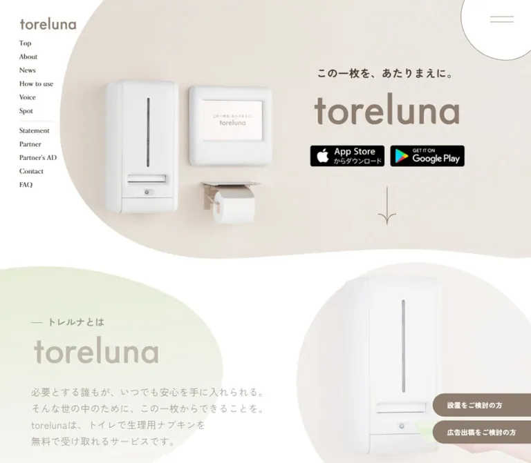
白とベージュ、淡いグリーンを基調に、有機的な曲線と製品写真を組み合わせたサービスサイト。ブラウンの文字とセリフ体の英字、ピンクの固定お問い合わせ導線が特徴です。
オリジナルサイトを見るtoreluna — Style Reference
A calm service website shaped by warm bathroom photography, pale botanical curves, and precise brown linework.
Website: toreluna.com Original URL: https://toreluna.com/ Final URL: https://toreluna.com/ Theme: light content surfaces with a deep brown footer Inspected evidence: September 13, 2026, 03:19 JST; supplied retrieval timestamp: September 12, 2026, 18:19:18.505 UTC Viewports: 1440 × 1000 desktop and 390 × 844 mobile, in CSS pixels Scope: the current service homepage. Desktop captures show the opening hero, the lower usage instructions and download band, and the contents/partner/footer area. Mobile captures show the opening hero and footer. Supplied DOM evidence additionally covers the intervening homepage sections. Linked pages, an opened menu, and active media playback were not inspected.
Toreluna presents a service for receiving free menstrual pads from dispensers installed in toilet cubicles. The homepage connects consumer information and app downloads with installation, advertising, news, and editorial content. Its navigation combines section anchors with separate information pages.
The visual identity rests on white space, warm neutral photography, taupe branding, and broad organic silhouettes. A pale green shape overlaps the photographic hero and reappears around the download area. Japanese explanatory text is paired with delicate English serif labels. Small store badges retain their black brand artwork, while a pink advertising contact action remains visible across captured scroll positions.
The page changes composition substantially on mobile. The product scene sits above the centered message, the desktop navigation rail disappears, partner buttons stack, and the edge-mounted contact tab becomes a full-width bottom strip. The footer preserves the same information hierarchy through a taller two-column navigation arrangement.
How to Read This Reference
- Measured values come from the supplied rendered DOM, computed styles, element rectangles, or source custom properties. Measurements describe these two captures, not every possible viewport.
- Visually observed details come from the current-page screenshots. Approximate dimensions or colors inferred from those screenshots are marked as estimates.
- Declared values are present in the supplied custom properties or computed styles. Their existence does not establish that every value appears in the visible page.
- Recommended values and behaviors belong to the implementation guidance and Quick Start. They are not claims about the original source.
- Visibility matters: the DOM includes menu content and section rectangles that are not painted in the corresponding screenshots. A nonzero rectangle alone does not prove that an element was visible.
- Typography needs descendant evidence: several sampled anchors and heading wrappers report inherited black, 16px sans-serif styling even where the screenshot shows serif or reversed artwork. Wrapper styles must not be substituted for the appearance of their contents.
Tokens — Colors
Default Palette
The following aliases are proposed for reuse. Source property names are reproduced where supplied.
| Name | Value | Suggested token / source | Role and evidence |
|---|---|---|---|
| White | #ffffff |
--paper / --dl-color-gray-white |
Measured body background; visible main canvas, menu shape, and mobile contact pill |
| Warm Cream | #f5f0eb |
--cream / --dl-color-brandcolor-f5f0eb |
Declared brand surface; visually consistent with the download band. The textured hero contains many photographic colors rather than one flat fill |
| Brand Taupe | #8c7d6e |
--brand / --dl-color-brandcolor-primary8c7d6e |
Measured partner-button fill; visually corresponds to the wordmark and fine outlines |
| Deep Brown | #473c31 |
--ink / --dl-color-textcolor-main473c31 |
Measured paragraph text and footer background |
| Leaf Green | #9fbe56 |
--leaf / --dl-color-brandcolor-secondary9FBE56 |
Measured project-details button fill; stronger than the pale decorative background shapes |
| Contact Pink | #f27888 |
--contact / --dl-color-brandcolor-stickyf27888 |
Measured desktop contact fill and mobile contact text; visible mobile bottom-strip fill |
| Deeper Pink | #e06171 |
--contact-deep / --dl-color-brandcolor-stickye06171 |
Declared companion token. Its visible state and exact application were not exercised |
| Pale Sage Wash | approximately #e7edd7 |
--sage-wash |
Screenshot estimate for the lighter part of the large green decoration; exact fill, opacity, and blending are unavailable |
The decorative green should remain much lighter than the project button. Applying the solid #9fbe56 accent to a large background shape would create substantially more contrast than the captures show.
Additional Declared Colors
The supplied variables also include warm peach #d9b19a, warm gray #d1cbc5, gray #c5c0c2, and several general gray, required-field, and error colors. These are available source tokens, but their use on the captured homepage is not established.
The declared --swiper-theme-color: #007aff is not evidence of a blue homepage action system. The visible blue in the contents banner belongs to its illustrated campaign artwork.
Tokens — Typography
Japanese Body Copy
- Measured family:
"Zen Kaku Gothic New", sans-serif. - Measured paragraph size:
16pxon both inspected viewports. - Weight:
400for the About and Project paragraphs. - Line height:
27.2px, equivalent to1.7. - Letter spacing:
0.32px, equivalent to0.02em. - Color:
#473c31.
This produces open, readable Japanese paragraphs without making the text excessively large. Mobile responsiveness comes mainly from wrapping and composition changes; these measured paragraphs do not shrink below 16px.
English Editorial Labels
Two serif stacks are declared:
--font-orpheus-pro: "orpheuspro", serif;
--font-orpheus-pro-condensed: "orpheus-pro-condensed", serif;
The screenshots show fine serif lettering in the navigation and narrow, elegant display lettering in labels such as Click here to download and We want partners. The declared families are consistent with that appearance. The evidence does not include computed styles for every visible text descendant, so the exact assignment and successful font loading are not independently confirmed.
For an adaptation, use the first stack for English navigation and the condensed stack for short editorial headings when those fonts are available. A generic serif fallback is preferable to inventing another source font.
Wordmark and Graphic Text
The visible toreluna wordmark is a rounded sans-serif brand treatment. The sampled H1 has empty extracted text and a layout box larger than the visible lettering. Its computed 32px font size is not a reliable measurement of the logo.
Use authorized wordmark artwork where available. Do not reconstruct the logo by assuming that the body font produces its letterforms.
Type Scale
| Role | Desktop | Mobile | Evidence status |
|---|---|---|---|
| Main explanatory paragraph | 16px / 27.2px, weight 400, tracking 0.02em |
Same | Directly measured |
| Japanese H2 wrapper | 24px / 27.6px, weight 700 |
Same computed style | Wrapper measurement; visible descendant sizing is incomplete |
| H1 artwork container | 370 × 70px |
390 × 48px |
Measured container, not a text size |
| Visible hero wordmark | About 300 × 70px |
About 210 × 48px |
Screenshot estimate of painted lettering |
| Hero Japanese tagline | About 22px, bold |
About 18px, bold |
Screenshot estimate |
| English navigation | About 14–16px |
Footer labels about 18px |
Screenshot estimate; sampled parent styles do not resolve the serif descendants |
| English download/partner heading | About 30–32px |
Partner heading has a measured 38px container height |
Desktop visual estimate; mobile glyph size unverified |
| Project-details action | 14px / 16.1px, weight 600 |
16px / 18.4px, weight 600 |
Directly measured |
| Persistent contact action | 14px / 16.1px, weight 700 |
16px / 18.4px, weight 700 |
Directly measured; tracking 0.02em |
| Footer legal labels | About 12px |
About 12px |
Screenshot estimate; link boxes measure 17px high |
The heading wrappers sometimes measure 29px high on desktop and approximately 23.8px on mobile despite identical reported font sizes. This is another reason to separate container measurements from visible text styling.
Tokens — Spacing & Shapes
Root size: measured 16px at both viewports.
Overall density: spacious sections, compact navigation, and restrained button groups.
Primary geometry: large irregular silhouettes, thin outlines, and pill-shaped actions. News cards remain square-cornered.
Spacing Scale
| Use | Value | Evidence |
|---|---|---|
| Heading-wrapper internal gap | 8px |
Measured |
| Desktop hero badge gap | 10px |
Calculated from measured rectangles |
| Bilingual menu-label gap | 12px |
Measured, menu presentation unverified |
| Partner-button gap | 16px |
Measured horizontally on desktop and vertically on mobile |
| News-card inset | 20px |
Measured |
| Mobile news-card gap | 20px |
Calculated from x positions |
| Mobile page gutter | 24px |
Repeated measured alignment |
| Desktop download-badge gap | 24px |
Calculated from measured rectangles |
| Desktop Project column gap | 32px |
Calculated from measured rectangles |
| Desktop content-grid gap | 40px |
Three measured 296px cards within 968px |
| Contents banner to partner heading | 80px |
Calculated at both viewports |
Border Radius
| Element | Treatment | Evidence |
|---|---|---|
| News cards | 0 |
Measured |
| Partner and Project buttons | 100px |
Measured pill radius |
| Desktop persistent contact tab | 100px 0 0 100px |
Measured |
| Mobile persistent contact pill | 64px |
Measured |
| Menu and circular utility controls | Changing elliptical radii | Computed infinite morphing animation |
| Usage photographs | Deep rounded lower contour with fine brown edge | Visible desktop screenshot; exact radius unavailable |
| Illustrated contents banner | Approximately 40px outer corner radius |
Desktop screenshot estimate |
| Hero and green background fields | Broad irregular curves | Visible; original mask geometry unavailable |
The organic controls are not fixed circles. One desktop sample reports 93.5006% 100.502% 87.0013% 126.499% / 106.499% 100.502%; the mobile sample reports a different radius combination. These are animation-phase values, not permanent design constants.
Layout Measurements
| Element | Desktop: 1440 × 1000 | Mobile: 390 × 844 |
|---|---|---|
| Document height | About 7463.7px |
About 8387.8px |
| Common content alignment | x = 236px, width 968px |
x = 24px, width 342px |
| Opening navigation rail | Links start at x = 40px; first at y = 82px |
Not visible in the opening capture |
| Menu shape | 170 × 170px, x = 1295px, y = -45px |
105 × 105px, x = 307px, y = -32px |
| Menu-line wrapper | 48 × 14px |
24 × 8px |
| Hero store links | 155 × 45px each |
122 × 35px each |
| Download-band store links | 206 × 60px each |
122 × 35px each |
| News card | 296 × 247.6px |
297px wide; sampled heights 191px and 171px |
| Partner action | 240 × 60px |
325 × 60px in the page body |
| Project media button | About 457.6 × 257.4px |
342 × 192.4px |
| Contents link container | 968 × 500px |
342 × 510.4px |
| Footer | 384px high |
794px high |
| Persistent contact link | About 259.9 × 48px |
About 308.5 × 46px |
The desktop 968px content width is a repeated measurement. A max-width: 968px container is a useful adaptation, but the original maximum-width declaration was not supplied.
Components
Opening Navigation Rail
Role: establishes identity and exposes the site's information structure without covering the hero.
The desktop opening view places a small taupe wordmark near the upper-left corner, with a narrow vertical list beneath it. The links have a measured 28px vertical pitch. A fine divider separates eight homepage anchors from five separate-page links.
The anchor group is Top, About, News, How to use, Voice, Spot, Project, and Contents. The page-link group is Statement, Partner, Partner's AD, Contact, and FAQ.
The rail uses delicate serif lettering and generous white space around its narrow footprint. It is absent from the supplied scrolled desktop views, so continuous sticky behavior should not be assumed. Mobile retains the small upper-left wordmark and the corner menu trigger.
Organic Menu Trigger
Role: provides compact access to the broader navigation.
A white outlined shape extends beyond the top and right viewport edges. Its two fine horizontal lines sit inside the visible portion, rather than at the center of a perfectly circular disc. The desktop shape measures 170px square; mobile reduces it to 105px.
The control remains in the upper-right corner across the supplied scroll captures. Its source defines a ten-second infinite morphing animation.
The DOM contains a bilingual menu structure with 39px-high link rows, a 12px gap between English and Japanese labels, and partner contact links. Desktop menu rows begin around x = 760px; mobile rows begin at x = 24px. These elements are not visible as an opened menu in the screenshots. Opening direction, backdrop, focus behavior, and the actual expanded composition remain unverified.
Product Hero
Role: makes the physical service understandable before introducing longer explanatory content.
The desktop hero is dominated by a warm, textured bathroom wall photograph. A white dispenser, a separate square screen, and a toilet-paper holder form a recognizable installation scene on the left. On the right, the message stacks in this order:
- The Japanese line
この一枚を、あたりまえに。. - A large taupe
torelunawordmark. - App Store and Google Play badges.
- A thin downward arrow linking to
#about.
The photographic region has a broad curved left edge and an uneven lower boundary. Its lowest visible area is approximately 675px from the top of the desktop capture. A translucent-looking pale green form enters from the lower left and overlaps that boundary.
The desktop H1 wrapper starts near (806.4, 233). Store links begin at y = 343px, with a 10px gap. The arrow link measures 38 × 78px and begins at y = 430px.
On mobile, the product scene moves above the message. The devices occupy roughly x = 62–341px, y = 135–372px in the screenshot. The tagline sits near the bottom of the installation scene, followed by the wordmark and the two badges at y = 478px. The desktop downward-arrow link is absent from the mobile link evidence.
Keep the mobile product grouping legible. A simple narrow crop of the desktop's right-hand text area would lose the explanation carried by the installation photograph.
Section Headings and Service Introduction
Role: guide readers through a long homepage with clear English/Japanese labeling.
The DOM establishes sections for About, News, How to use, Voice, Spot, Project, and Contents. English titles sit alongside Japanese descriptions in the page's content hierarchy; the screenshots confirm the pairing of fine English display lettering and heavier Japanese text in the download and partner areas.
The About paragraph has a measured width of 818px on desktop and 342px on mobile. It retains 16px / 1.7 type in both cases. Its captured text explains the dispenser, the delivery of information to users, and the advertising-supported model.
A Play the movie button measures 200px square on desktop and 100px square on mobile. It uses its own ten-second morphing animation. The supplied text also repeats About toreluna; repetition alone does not establish a marquee or a scrolling-text effect.
The initial screenshots show open space where some later-section DOM rectangles are recorded. The reference does not treat that space as evidence that those sections are absent, nor does it reconstruct an unseen reveal effect.
News Cards
Role: demonstrate that the service website is actively maintained and connect readers to current announcements.
Desktop places three white rectangular cards in one row. Each measures 296px wide with 20px internal padding and a 4px internal flex gap. Their x positions are 236, 572, and 908px, producing 40px gutters. Each entire card is an anchor containing a date and a Japanese title.
Mobile preserves card width instead of squeezing three cards into the viewport. The measured x positions are 24, 341, and 658px, with 297px widths and 20px gaps. This supports a horizontal-strip layout. Swipe behavior, snapping, autoplay, and control buttons were not exercised.
The Read more link uses an organic white control measuring 150px square on desktop and 102px square on mobile. The evidence does not justify adding a general rounded-card or shadow system to the news cards.
Three-Step Usage Guide
Role: explain the app-to-dispenser interaction in a short visual sequence.
The current desktop screenshot shows three aligned photographic panels with deep rounded lower contours and thin taupe outlines. Hands hold a phone in the first two panels and a packaged pad in the third. Centered Japanese captions explain the sequence:
- Download the toreluna app.
- Scan the QR code at the lower right of the tablet signage.
- Receive a free pad.
The DOM includes step labels and the numbers 1–3. Their upper visual treatment is outside the supplied screenshot crop, so exact number typography and placement are not established.
The photographs use subdued backgrounds and soft light. Keep the phone and packet visible at a practical scale. The mobile arrangement of these panels was not visually captured; stacking them is a reasonable implementation recommendation, not a verified source behavior.
App Download Band
Role: repeat the consumer action immediately after the usage instructions.
The desktop band spans the viewport and is approximately 232px high in the screenshot. It has a warm cream fill and fine taupe top and bottom rules. A large outlined chevron divides the editorial label area from the store badges.
The left area centers a narrow serif Click here to download heading above the bold Japanese label アプリのダウンロードはこちらから. The right area contains two larger store badges, each 206 × 60px, separated by 24px.
The band crosses the large pale green background form. It reads as a structural strip through the page, with no raised card treatment.
Mobile badge measurements reduce to 122 × 35px; their x positions are 64 and 204px, giving an 18px gap. The mobile band's complete surface and separator treatment were not captured.
Voice and Spot Sections
Role: connect the service explanation with personal usefulness and real-world availability.
The DOM contains four user testimonials. Their exact card shapes, illustration treatment, and arrangement are not visible in the supplied screenshots. The Voice heading is centered in its desktop measurement and left-aligned at the 24px gutter on mobile. The much greater mobile distance between Voice and Spot is consistent with substantial reflow, but does not establish a specific testimonial layout.
The Spot section has an organic List of spots link measuring 150px square on desktop and 100px square on mobile. It links to /spots.
The extracted location count differs between captures: desktop reports 0, while mobile reports 174. The evidence does not resolve whether this comes from loading, animation, or another state difference. Treat the number as dynamic data and do not promote either snapshot to a verified service-wide total.
Project Feature
Role: explain the 1minute,1napkin initiative and offer a dedicated detail route.
Desktop uses a two-column arrangement: a roughly 457.6 × 257.4px media button at left and a 478.4px-wide paragraph region at right, separated by 32px. The media frame is 16:9.
The body copy describes the relationship between advertising time and delivered pads. A leaf-green pill links to /torelunavision-1minute1napkin. It measures about 238 × 56.1px on desktop, with 14px semibold white text and 20px 70px padding.
Mobile places the 342 × 192.4px media frame above the paragraph. The action expands to 325 × 58.4px with 16px type. Media playback, player controls, and any modal presentation are unverified.
Illustrated Contents Banner
Role: introduce an editorial interaction with a more playful visual register.
The lower part of the desktop banner is visible above the partner invitation. It contains colorful outlined characters, prominent Japanese explanatory copy, and a pink illustrated action labeled 診断スタート. A thin taupe outline and generously rounded corners connect it to the surrounding site.
The measured link container is 968 × 500px on desktop and 342 × 510.4px on mobile. This is a significant composition change: the mobile container becomes taller than it is wide. The evidence does not identify whether the site uses alternate artwork, responsive descendants, or another implementation.
The DOM exposes one outer anchor to /contents/seirichu-shindan. It does not establish a separate interactive button inside the illustrated action. Preserve a single clear click target if the apparent button is part of the graphic.
Partner Invitation
Role: close the main narrative with two business audiences.
An 80px gap follows the contents banner before the We want partners heading at both measured widths. The desktop screenshot shows a narrow serif heading, a centered bold Japanese invitation, and two taupe pills:
設置をご検討の方広告出稿をご検討の方
Both links point to /contact. Each desktop pill is 240 × 60px, with a 16px gap and a 100px radius. Mobile stacks 325 × 60px pills with the same 16px gap. The mobile invitation explicitly wraps onto two lines in the DOM.
A fine upward arrow and PageTop label follow. The desktop control sits near the content's right edge; mobile centers the same roughly 53 × 64px link below the buttons.
Footer
Role: provide a substantial navigation endpoint and a clear visual conclusion to the white content area.
The footer is a full-width #473c31 rectangle with a reversed wordmark, social symbols, English navigation, and small Japanese legal links. Its strong dark surface supplies separation without a decorative transition or shadow.
Desktop measures 384px high with 50px 20px 80px outer padding. The inner content aligns with the common 968px column. The brand and social group starts at x = 236px; the three link groups begin at x = 750, 862, and 1030px. English navigation rows have a 34px pitch. Social icons measure 20px with 16px gaps.
Mobile measures 794px high with 50px 24px padding. The brand and social row come first, followed by two widely separated English navigation columns. Legal links form a separate full-width group underneath. English rows have a 42px pitch; social icons grow to 24px with 20px gaps.
The footer includes the source label 運営会社 and a corresponding external link. The linked company page was not inspected. No production credit is established by the supplied original-page evidence.
The source variable --footer-height: 280px does not match either measured footer. Use the actual layout evidence when setting proportions.
Persistent Advertising Contact Action
Role: retain a direct advertising inquiry route while readers move through the site.
Desktop shows a pink tab attached to the right edge, 40px above the viewport bottom. The measured link is approximately 259.9 × 48px, with a rounded left end and square right edge. Its white label is 広告出稿をご検討の方はこちら.
Mobile transforms this into a 66px-high pink bottom strip containing a centered white pill. The pill measures approximately 308.5 × 46px, starts at y = 788px in the 844px viewport, and uses pink 16px bold text.
The same placement appears in the top and footer captures, supporting persistent viewport positioning. The mobile document extends 66px beyond the measured footer end, consistent with space being reserved for this bottom treatment. Safe-area behavior was not separately tested.
Tokens — Motion & Interaction
| Treatment | Supplied value or evidence | What can be concluded |
|---|---|---|
| Organic menu shape | 10s linear infinite morphing |
A continuous shape animation is defined |
Read more and List of spots controls |
10s linear infinite morphing |
Organic geometry is shared by utility links |
| Movie trigger | 10s linear infinite movie-trigger-morphing |
A separate named shape animation is defined |
| Menu-shape transition | 0.6s with 1.2s delay |
A delayed transition exists; changed properties and visual trajectory are unavailable |
| H1 wrapper transition | 0.6s with 1.6s delay |
A later transition is defined; exact appearance is unverified |
| Desktop hero arrow transition | 0.6s with 2s delay |
A further delayed transition is defined |
| Many anchors and buttons | 0.3s |
Short transitions are declared; this does not establish a particular hover transform |
| Desktop persistent contact link | background-color 0.3s |
Color changes are supported by the source transition |
| Mobile persistent contact link | opacity 0.3s |
Opacity changes are supported by the source transition |
The strongest motion evidence is slow organic morphing. The exact keyframe paths were not supplied, and still captures cannot establish their full amplitude.
The capture procedure waited for document loading, finite animation, sampled layout stability, and image decoding within bounded time limits. Perpetual animations were temporarily paused for readiness checks and resumed afterward. This reduces transient capture noise but does not prove that every delayed reveal completed.
No menu toggle, movie playback, news swipe, form submission, store-link activation, or anchor-scroll animation was recorded. Link destinations demonstrate navigation intent; they do not verify the resulting interactions. A computed transition shown merely as all without a duration should not be cataloged as a visible animation.
Surfaces
| Layer | Appearance | Purpose |
|---|---|---|
| Main canvas | White | Preserves generous breathing room between content groups |
| Hero | Warm textured photography with organic boundary | Makes the physical installation familiar and tangible |
| Decorative field | Very pale green with soft tonal variation | Carries the organic motif between major sections |
| Download band | Warm cream with fine taupe rules | Creates a clear horizontal action zone |
| News cards | White, square-cornered | Holds dated content without introducing another shape language |
| Organic controls | White with fine brown edge | Connects navigation and media actions to the larger curves |
| Partner buttons | Solid taupe pills | Groups business actions calmly |
| Persistent contact area | Pink, with a white pill on mobile | Maintains a distinct inquiry route |
| Footer | Deep brown with light contents | Anchors the end of the page and organizes dense navigation |
There is no visible general elevation system. Shadows in the hero belong to the photographic installation. Keep those separate from CSS shadows on interface components.
Imagery
The main photographic language is quiet, practical, and softly lit. The hero uses a cream wall, white hardware, modest shadows, and minimal environmental clutter. Usage images introduce hands and devices while maintaining subdued backgrounds. The product's purpose is conveyed through recognizable objects rather than a large lifestyle portrait.
The illustrated contents banner is a localized shift in tone. Its colorful characters and expressive outlines belong to that editorial feature. Extending its saturated palette to the entire navigation or footer would weaken the broader neutral system.
Brand marks and app-store badges should retain their supplied proportions and internal lettering. The navigation arrows use slender stems with curved, branching arrowheads. Social symbols are compact and reversed against the footer.
Observed Asset References
No original image src paths, image filenames, or font-file URLs were included in the supplied evidence. The following inventory identifies visible assets without inventing paths.
| Asset | Observed use | Sizing or implementation note |
|---|---|---|
| Bathroom installation photograph | Desktop and mobile hero | Requires viewport-appropriate composition; exact crop rules unavailable |
| Toreluna wordmark | Opening identity, hero, and footer | Taupe on light surfaces and light on brown; preserve artwork proportions |
| App Store and Google Play badges | Hero and download band | Measured at 155 × 45, 206 × 60, or 122 × 35px, depending on placement |
| Three usage photographs | Download, scan, receive sequence | Visible desktop panels with rounded lower contours |
| Contents illustration | Diagnosis feature | Desktop and mobile link containers have substantially different aspect ratios |
| Directional arrow artwork | Hero continuation and page-top link | Fine taupe linework; asset format unavailable |
| X, Instagram, and TikTok symbols | Footer social links | Measured 20px desktop and 24px mobile layout boxes |
The store-link destinations are present in the DOM, but those URLs are not image asset URLs. Use legitimate badge artwork and meaningful link names when implementing equivalent components.
Layout & Responsive Behavior
| Area | Desktop observation | Mobile observation |
|---|---|---|
| Main content | Repeated 968px-wide centered alignment | 342px content width with 24px gutters |
| Opening identity | Left navigation rail beside a broad hero | Small wordmark above the product scene; no visible rail |
| Hero | Installation left, message and badges right | Installation above centered message and badges |
| Corner menu | Cropped 170px organic shape | Cropped 105px organic shape |
| News | Three 296px cards across | 297px cards continue horizontally outside the first viewport |
| Main body paragraphs | 16px with 1.7 line height | Same type metrics, narrower line length |
| Project | Media and copy in two columns | Media above copy; wider action relative to content |
| Contents banner | Wide 968 × 500px container |
Tall 342 × 510.4px container |
| Partner actions | Two 240px pills in one row | Two 325px pills stacked |
| Page-top link | Near the right edge | Centered |
| Footer | Brand group plus three link groups | Brand first, two navigation columns, legal links below |
| Persistent contact | Right-edge tab above the bottom | Full-width bottom strip with centered white pill |
No breakpoint values were supplied. The two captures establish endpoint behavior, not the exact width at which each change occurs. Tablet, landscape-phone, zoomed, and safe-area layouts remain unverified.
The mobile news geometry should not be mistaken for three vertically stacked cards. Conversely, the supplied evidence does not establish the mobile usage-photo layout. Keep those levels of certainty separate when reproducing the page.
The tall mobile contents container also needs deliberate art direction. Uniformly shrinking a 968 × 500 composition would produce a height of approximately 177px at 342px wide, far below the measured 510px mobile container.
Do’s and Don’ts
Do
- Preserve the relationship between white space, warm photography, taupe branding, and dark brown text.
- Keep the pale decorative green distinct from the stronger project-action green.
- Pair readable Japanese sans-serif paragraphs with delicate English serif labels.
- Use the actual wordmark and store artwork when available.
- Maintain the desktop hero's installation/message balance and the mobile vertical composition.
- Repeat organic contours across large backgrounds and selected utility controls.
- Keep partner actions as simple taupe pills with a consistent 16px gap.
- Preserve the 24px mobile gutter and the clear grouping of footer navigation.
- Treat news, service instructions, editorial content, and partner routes as distinct parts of the homepage.
- Reserve layout space for the mobile contact strip.
Don't
- Don't apply the pale-green background treatment as a saturated green panel.
- Don't replace the wordmark with a guessed font or use the H1 wrapper's 32px value as its visual size.
- Don't give every content item a rounded, elevated card.
- Don't add interface shadows to imitate shadows that belong to product photography.
- Don't assume the desktop left rail remains fixed throughout scrolling.
- Don't describe the hidden menu's DOM rectangles as an inspected open-menu design.
- Don't invent autoplay, parallax, swipe gestures, or video-modal behavior from static evidence.
- Don't stretch the desktop contents artwork into the tall mobile container.
- Don't reproduce a dynamic installation count as permanent marketing copy.
- Don't treat declared error colors or library variables as visible brand accents.
Recommended Implementation Additions
These are recommendations for a new implementation, not verified features of the original site.
- Give the menu trigger an accessible name,
aria-expanded, and a relationship to its controlled navigation. Use one semantic button for the trigger and decorative elements for its two lines. - Give image-only store, social, media, and contents links meaningful accessible names. Empty extracted text does not establish whether the original already has suitable names.
- Provide visible keyboard focus and adequate interactive areas around small social symbols and thin arrow artwork.
- Audit action-label contrast. Calculated from the declared solid colors, white on Contact Pink is approximately
2.7:1, white on Leaf Green approximately2.1:1, and white on Brand Taupe approximately4.0:1. Adjust text or action colors where necessary while retaining the surrounding palette. - Respect reduced-motion preferences by stopping continuous morphing and removing delayed entrances. Essential content should remain visible when animation or scripting is unavailable.
- Give a mobile navigation overlay its own reachable scrolling area if it contains all recorded menu rows and partner actions. The recorded mobile menu content extends beyond an 844px viewport.
- Reserve the contact strip's height plus
env(safe-area-inset-bottom)and keep focused elements and anchor targets clear of it. - Render a location count only after valid data is available. Use an explicit loading or unavailable state instead of briefly presenting zero as a confirmed total.
- Supply an appropriate mobile composition for editorial artwork, with text alternatives or real text for essential information.
Agent Prompt Guide
Quick Color Reference
- Canvas:
#ffffff. - Warm supporting surface:
#f5f0eb. - Wordmark and partner-action family:
#8c7d6e. - Main copy and footer:
#473c31. - Project action:
#9fbe56. - Persistent advertising contact:
#f27888. - Pale background decoration: approximately
#e7edd7; this is an estimated adaptation color. - Edges: fine taupe outlines; no general card-shadow system.
Overall Prompt
“Create a Japanese service homepage inspired by toreluna's current design. Use a white canvas, cream bathroom photography, taupe branding, dark brown Japanese body text, and large pale-green organic background shapes. Build a broad desktop hero with a recognizable dispenser installation on the left and a short Japanese message, supplied wordmark, and two black app-store badges on the right. Place a narrow serif navigation rail at the upper left and a white outlined organic menu control partly outside the upper-right corner. Use a centered content width near 968px, spacious sections, a three-card news row, photographic usage instructions, a ruled cream download band, a media-and-copy project feature, an illustrated contents feature, and two taupe partner pills. Finish with a substantial dark brown footer. On mobile, use 24px gutters, place the product scene above the hero message, stack partner actions, and turn the contact tab into a pink bottom strip containing a white pill. Keep organic motion slow and optional.”
Example Component Prompts
- Desktop hero: “A warm bathroom installation photograph inside a broad irregular cream silhouette, with a white dispenser, square screen, and paper holder clearly visible. Set the short line
この一枚を、あたりまえに。above a supplied taupe wordmark on the right. Place two 155 × 45px store badges beneath it with a 10px gap. Overlap a very pale green organic shape at the lower left.” - Mobile hero: “For a 390px-wide screen, place the installation photograph above the centered tagline, supplied wordmark, and two 122 × 35px store badges. Retain the cropped organic menu shape at the top right. Leave generous space around the product and preserve the curved transition into the following white area.”
- Usage and download: “Arrange three muted photographs across a 968px desktop column, with deep rounded lower contours, thin taupe outlines, and centered Japanese captions. Follow them with a full-width cream band, fine horizontal rules, a large outlined chevron, narrow serif download heading, and two 206 × 60px store badges.”
- Partner invitation: “Center a delicate English serif heading above bold Japanese invitation copy. Use two taupe 240 × 60px pills with a 16px gap. At phone width, use two centered 325 × 60px pills in a vertical stack. Add a fine upward arrow with a small PageTop label.”
- Footer: “Build a deep brown footer with a reversed supplied wordmark and compact social symbols. On desktop, place the brand at left and two English navigation columns plus a smaller Japanese legal column at right. On mobile, keep the brand first, use two separated navigation columns, and put legal links below.”
- Persistent contact: “Use a pink right-edge tab with a rounded left end, 48px height, and 14px bold white label on desktop. On mobile, use a 66px pink bottom strip containing a centered white pill with 16px bold pink text. Reserve content space and add bottom safe-area padding.”
Quick Start
CSS Custom Properties
This is an implementation scaffold using the measured palette, common container width, body type, and key control dimensions. Hero masks, the sample morphing keyframes, estimated text sizes, and the 768px/1024px breakpoints are recommended approximations. They are not extracted original CSS.
Load the declared fonts only when available to your project. Provide authorized wordmark, store-badge, and photographic assets separately. The hero surface should contain a responsive picture; the contents banner needs suitable mobile artwork or a responsive composition.
The footer structure assumes .footer-inner contains .footer-brand and .footer-links, with two .footer-nav groups and one .footer-legal group. The persistent .contact-bar contains a single .contact-link.
:root {
  /* Measured or declared source colors */
  --paper: #ffffff;
  --cream: #f5f0eb;
  --brand: #8c7d6e;
  --ink: #473c31;
  --leaf: #9fbe56;
  --contact: #f27888;
  --contact-deep: #e06171;

  /* Estimated decorative color */
  --sage-wash: #e7edd7;

  /* Declared font stacks; role mapping is an adaptation */
  --font-body: 'Zen Kaku Gothic New', sans-serif;
  --font-latin: 'orpheuspro', serif;
  --font-display: 'orpheus-pro-condensed', serif;
  --body-size: 16px;
  --body-leading: 1.7;
  --body-tracking: 0.02em;

  /* Measured dimensions and reusable aliases */
  --content-width: 968px;
  --mobile-gutter: 24px;
  --space-8: 8px;
  --space-12: 12px;
  --space-16: 16px;
  --space-20: 20px;
  --space-24: 24px;
  --space-32: 32px;
  --space-40: 40px;
  --space-80: 80px;
  --pill-radius: 100px;
  --contact-strip-height: 66px;
  --safe-bottom: env(safe-area-inset-bottom, 0px);

  /* Outline thickness is a visual approximation */
  --rule: 1px solid var(--brand);
  --motion-fast: 300ms ease;
  --motion-organic: 10s linear infinite;
}

* {
  box-sizing: border-box;
}

body {
  margin: 0;
  color: var(--ink);
  background: var(--paper);
  font-family: var(--font-body);
  font-size: var(--body-size);
  line-height: var(--body-leading);
  letter-spacing: var(--body-tracking);
}

img {
  display: block;
  max-width: 100%;
}

button,
input,
textarea {
  font: inherit;
}

a {
  color: inherit;
}

.container {
  width: min(var(--content-width), calc(100% - 48px));
  margin-inline: auto;
}

.section {
  /* Recommended rhythm; original section spacing varies */
  padding-block: clamp(80px, 9vw, 140px);
}

.section-title {
  margin: 0 0 16px;
  font-family: var(--font-display);
  font-size: 32px;
  font-weight: 400;
  line-height: 1.2;
  letter-spacing: normal;
}

.body-copy {
  margin: 0;
  font-size: 16px;
  line-height: 1.7;
  letter-spacing: 0.02em;
}

.opening-nav {
  position: absolute;
  z-index: 3;
  top: 40px;
  left: 40px;
  font-family: var(--font-latin);
  font-size: 16px;
  line-height: 16px;
  letter-spacing: normal;
}

.opening-nav ul {
  display: grid;
  gap: 12px;
  margin: 16px 0 0;
  padding: 0;
  list-style: none;
}

.opening-nav a {
  text-decoration: none;
}

.opening-nav .secondary-links {
  padding-top: 12px;
  border-top: var(--rule);
}

.organic-control {
  display: grid;
  place-items: center;
  padding: 0;
  color: var(--brand);
  background: var(--paper);
  border: var(--rule);
  border-radius: 48% 52% 45% 55% / 54% 47% 53% 46%;
  animation: gentle-blob var(--motion-organic);
}

.menu-toggle {
  position: fixed;
  z-index: 60;
  top: -45px;
  right: -25px;
  width: 170px;
  height: 170px;
  cursor: pointer;
}

.menu-lines {
  position: absolute;
  top: 80px;
  left: 57px;
  width: 48px;
  height: 14px;
}

.menu-lines::before,
.menu-lines::after {
  content: '';
  position: absolute;
  inset-inline: 0;
  height: 1px;
  background: var(--brand);
}

.menu-lines::before { top: 0; }
.menu-lines::after { bottom: 0; }

.hero {
  position: relative;
  isolation: isolate;
  min-height: 675px;
  overflow: clip;
}

.hero-surface {
  position: absolute;
  z-index: -2;
  inset: 0 0 auto auto;
  width: 86%;
  height: 675px;
  overflow: hidden;
  background: var(--cream);
  /* Approximate silhouette; replace with approved mask artwork */
  border-radius: 9% 0 0 31% / 46% 0 0 36%;
}

.hero-surface picture,
.hero-surface img {
  width: 100%;
  height: 100%;
}

.hero-surface img {
  object-fit: cover;
}

.hero::after {
  content: '';
  position: absolute;
  z-index: -1;
  top: 551px;
  left: -142px;
  width: 780px;
  height: 460px;
  border-radius: 50%;
  background: linear-gradient(var(--sage-wash), #f7f7f3);
  opacity: 0.8;
  pointer-events: none;
}

.hero-copy {
  position: absolute;
  top: 185px;
  left: 56%;
  width: 370px;
  text-align: center;
}

.hero-tagline {
  margin: 0 0 18px;
  font-size: 22px;
  font-weight: 700;
  line-height: 1.4;
}

.hero-wordmark {
  display: flex;
  justify-content: center;
  height: 70px;
  margin: 0;
}

.hero-wordmark img {
  width: auto;
  height: 100%;
  object-fit: contain;
}

.store-links {
  display: flex;
  justify-content: center;
  align-items: center;
  gap: 10px;
}

.hero-copy .store-links {
  margin-top: 40px;
}

.store-badge {
  display: flex;
  width: 155px;
  height: 45px;
  flex: 0 0 auto;
}

.store-badge img {
  width: 100%;
  height: 100%;
  object-fit: contain;
}

.hero-arrow {
  display: block;
  width: 38px;
  height: 78px;
  margin: 42px auto 0;
}

.news-strip,
.steps-grid {
  display: grid;
  grid-template-columns: repeat(3, minmax(0, 1fr));
  gap: 40px;
}

.news-card {
  display: flex;
  flex-direction: column;
  gap: 4px;
  min-height: 247.6px;
  padding: 20px;
  background: var(--paper);
  border-radius: 0;
  text-decoration: none;
}

.round-link {
  width: 150px;
  height: 150px;
  margin-left: auto;
  font-family: var(--font-latin);
  text-align: center;
  text-decoration: none;
}

.movie-trigger {
  width: 200px;
  height: 200px;
}

.step {
  margin: 0;
  text-align: center;
}

.step-image {
  width: 100%;
  height: auto;
  border: var(--rule);
  border-radius: 0 0 50% 50%;
}

.step figcaption {
  margin-top: 28px;
}

.download-band {
  background: var(--cream);
  border-block: var(--rule);
}

.download-inner {
  display: grid;
  grid-template-columns: 1fr 1fr;
  min-height: 230px;
}

.download-copy {
  position: relative;
  display: flex;
  flex-direction: column;
  justify-content: center;
  align-items: flex-start;
  padding-left: 24px;
}

.download-copy::after {
  content: '';
  position: absolute;
  inset-block: 0;
  right: -12px;
  width: 120px;
  background: var(--brand);
  clip-path: polygon(
    0 0, 1px 0, 100% 50%, 1px 100%,
    0 100%, calc(100% - 1px) 50%
  );
}

.download-copy h3 {
  margin: 0;
  font-family: var(--font-display);
  font-size: 32px;
  font-weight: 400;
  line-height: 1.2;
}

.download-copy p {
  margin: 8px 0 0;
  font-size: 14px;
  font-weight: 700;
}

.download-badges {
  justify-content: flex-end;
  gap: 24px;
}

.download-badges .store-badge {
  width: 206px;
  height: 60px;
}

.project-grid {
  display: grid;
  grid-template-columns: minmax(0, 1fr) minmax(0, 1.045fr);
  align-items: center;
  gap: 32px;
}

.project-media {
  display: block;
  width: 100%;
  aspect-ratio: 16 / 9;
  padding: 0;
  overflow: hidden;
  border: 0;
  background: transparent;
}

.pill {
  display: flex;
  justify-content: center;
  align-items: center;
  width: 240px;
  min-height: 60px;
  padding: 10px 20px;
  border-radius: var(--pill-radius);
  background: var(--brand);
  color: var(--paper);
  font-size: 14px;
  font-weight: 700;
  text-align: center;
  text-decoration: none;
}

.project-action {
  width: 238px;
  min-height: 56px;
  margin: 32px 0 0 auto;
  background: var(--leaf);
  font-weight: 600;
}

.content-banner {
  display: block;
  aspect-ratio: 968 / 500;
  overflow: hidden;
  border: var(--rule);
  border-radius: 40px;
}

.content-banner picture,
.content-banner img {
  width: 100%;
  height: 100%;
}

.content-banner img {
  object-fit: contain;
}

.partner-block {
  padding-top: 80px;
  text-align: center;
}

.partner-actions {
  display: flex;
  justify-content: center;
  gap: 16px;
  margin-top: 28px;
}

.page-top {
  display: flex;
  flex-direction: column;
  align-items: center;
  gap: 7px;
  width: 53px;
  min-height: 64px;
  margin: 30px 0 28px auto;
  font-family: var(--font-latin);
  text-decoration: none;
}

.site-footer {
  padding: 50px 0 80px;
  background: var(--ink);
  color: var(--paper);
}

.footer-inner {
  display: grid;
  grid-template-columns: minmax(0, 1fr) 454px;
  gap: 60px;
}

.footer-logo {
  width: 116px;
  height: 30px;
  object-fit: contain;
}

.footer-social {
  display: flex;
  gap: 16px;
  margin-top: 36px;
}

.footer-social a {
  display: block;
  width: 20px;
  height: 20px;
}

.footer-links {
  display: grid;
  grid-template-columns: 72px 128px 174px;
  gap: 40px;
}

.footer-nav,
.footer-legal {
  display: grid;
  align-content: start;
  margin: 0;
  padding: 0;
  list-style: none;
}

.footer-nav {
  gap: 18px;
  font-family: var(--font-latin);
  font-size: 16px;
  line-height: 16px;
  letter-spacing: normal;
}

.footer-legal {
  gap: 16px;
  font-size: 12px;
  line-height: 17px;
}

.footer-links a {
  text-decoration: none;
}

.contact-bar {
  position: fixed;
  z-index: 50;
  right: 0;
  bottom: 40px;
}

.contact-link {
  display: flex;
  justify-content: center;
  align-items: center;
  min-height: 48px;
  padding: 10px 30px;
  border-radius: 100px 0 0 100px;
  color: var(--paper);
  background: var(--contact);
  font-size: 14px;
  font-weight: 700;
  line-height: 1.15;
  letter-spacing: 0.02em;
  text-decoration: none;
  transition: background-color var(--motion-fast);
}

/* Recommended interaction treatment, not an observed hover state */
@media (hover: hover) {
  .contact-link:hover {
    background: var(--contact-deep);
  }
}

/* Recommended intermediate-width behavior */
@media (max-width: 1023px) {
  .opening-nav {
    display: none;
  }

  .hero-copy {
    left: auto;
    right: 24px;
  }

  .download-inner {
    grid-template-columns: 1fr;
    gap: 24px;
    padding-block: 40px;
  }

  .download-copy {
    align-items: center;
    padding: 0;
  }

  .download-copy::after {
    display: none;
  }

  .download-badges {
    justify-content: center;
  }
}

/* Recommended breakpoint reproducing the observed phone endpoints */
@media (max-width: 767px) {
  body {
    padding-bottom: calc(var(--contact-strip-height) + var(--safe-bottom));
  }

  .menu-toggle {
    top: -32px;
    right: -22px;
    width: 105px;
    height: 105px;
  }

  .menu-lines {
    top: 56px;
    left: 35px;
    width: 24px;
    height: 8px;
  }

  .hero {
    min-height: 662px;
  }

  .hero-surface {
    width: 100%;
    height: 662px;
    border-radius: 0 0 45% 28% / 0 0 7% 13%;
  }

  .hero::after {
    top: 578px;
    left: -90px;
    width: 360px;
    height: 240px;
  }

  .hero-copy {
    top: 367px;
    inset-inline: 0;
    width: 100%;
  }

  .hero-tagline {
    margin-bottom: 4px;
    font-size: 18px;
  }

  .hero-wordmark {
    height: 48px;
  }

  .hero-copy .store-links {
    gap: 13px;
    margin-top: 34px;
  }

  .store-badge,
  .download-badges .store-badge {
    width: 122px;
    height: 35px;
  }

  .hero-arrow {
    display: none;
  }

  .news-strip {
    grid-template-columns: none;
    grid-auto-flow: column;
    grid-auto-columns: 297px;
    gap: 20px;
    margin-right: -24px;
    padding-right: 24px;
    overflow-x: auto;
    /* Recommended enhancement; original snapping is unverified */
    scroll-snap-type: x proximity;
  }

  .news-card {
    align-self: start;
    min-height: 171px;
    scroll-snap-align: start;
  }

  .round-link,
  .movie-trigger {
    width: 100px;
    height: 100px;
  }

  .steps-grid {
    /* Recommended layout; mobile usage panels were not captured */
    grid-template-columns: 1fr;
  }

  .download-badges {
    gap: 18px;
  }

  .project-grid {
    grid-template-columns: 1fr;
  }

  .content-banner {
    aspect-ratio: 342 / 510.375;
    border-radius: 32px;
  }

  .partner-actions {
    flex-direction: column;
    align-items: center;
  }

  .pill {
    width: min(325px, 100%);
  }

  .project-action {
    min-height: 58px;
    margin-inline: auto;
    font-size: 16px;
  }

  .page-top {
    margin: 30px auto 80px;
  }

  .site-footer {
    padding-block: 50px;
  }

  .footer-inner {
    grid-template-columns: 1fr;
    gap: 103px;
  }

  .footer-social {
    gap: 20px;
    margin-top: 28px;
  }

  .footer-social a {
    width: 24px;
    height: 24px;
  }

  .footer-links {
    grid-template-columns: minmax(0, 1fr) auto;
    column-gap: 24px;
    row-gap: 40px;
  }

  .footer-nav {
    gap: 16px;
    font-size: 18px;
    line-height: 26px;
  }

  .footer-legal {
    grid-column: 1 / -1;
  }

  .contact-bar {
    inset-inline: 0;
    bottom: 0;
    padding: 10px 24px calc(10px + var(--safe-bottom));
    background: var(--contact);
  }

  .contact-link {
    width: max-content;
    max-width: 100%;
    min-height: 46px;
    margin-inline: auto;
    padding: 12px 40px;
    border-radius: 64px;
    color: var(--contact);
    background: var(--paper);
    font-size: 16px;
    transition: opacity var(--motion-fast);
  }

  .contact-link:hover {
    background: var(--paper);
  }
}

/* Approximation of slow organic motion, not original keyframes */
@keyframes gentle-blob {
  0%, 100% {
    border-radius: 48% 52% 45% 55% / 54% 47% 53% 46%;
  }
  50% {
    border-radius: 55% 45% 52% 48% / 47% 54% 46% 53%;
  }
}

/* Recommended accessible focus and motion behavior */
a:focus-visible,
button:focus-visible {
  outline: 3px solid currentColor;
  outline-offset: 5px;
}

[id] {
  scroll-margin-top: 24px;
}

@media (prefers-reduced-motion: reduce) {
  .organic-control {
    animation: none;
  }

  .contact-link {
    transition: none;
  }
}
The sample clips decorative hero shapes to keep the scaffold self-contained. For the overlapping continuation visible in the captures, place an additional noninteractive decorative layer in the following section or use a shared page-background layer. Avoid clipping text, navigation, or focus indicators to the photographic mask.
The CSS preserves the observed action colors as reference values. Apply the contrast improvements described above before using those combinations for production text.
Tailwind v4 Token Mapping
Optional aliases for a project that already uses Tailwind v4. This is not evidence that the original site uses Tailwind. Define the root properties above first.
@theme inline {
  --color-paper: var(--paper);
  --color-cream: var(--cream);
  --color-brand: var(--brand);
  --color-ink: var(--ink);
  --color-leaf: var(--leaf);
  --color-contact: var(--contact);
  --color-contact-deep: var(--contact-deep);
  --color-sage-wash: var(--sage-wash);

  --font-sans: var(--font-body);
  --font-editorial: var(--font-latin);
  --font-display-serif: var(--font-display);

  --text-body: 16px;
  --text-body--line-height: 1.7;
  --text-body--letter-spacing: 0.02em;
  --text-editorial: 32px;

  --spacing-page-gutter: 24px;
  --spacing-section-gap: 80px;
  --container-content: 968px;
  --radius-pill: 100px;
}
Sources & Evidence
- Toreluna homepage: original and final URL are identical; the supplied browser observation reports HTTP 200 and the current service title.
- Capture timestamp: September 12, 2026, 18:19:18.505 UTC, equivalent to September 13, 2026, 03:19:18.505 JST.
- Desktop evidence: 1440 × 1000 CSS-pixel viewport; current-page captures of the hero, usage/download area, and contents/partner/footer area. Supplied DOM document height is approximately 7463.7px.
- Mobile evidence: 390 × 844 CSS-pixel viewport; current-page captures of the hero and footer. Supplied DOM document height is approximately 8387.8px.
- Style evidence: rendered element rectangles, selected computed properties, source custom properties, extracted page text, and anchor destinations supplied with those two viewport observations.
- Interaction evidence: the capture procedure traversed scroll positions and recorded settled views. Computed animation names and timings establish declared morphing behavior. No clicked menu, media player, carousel gesture, or destination-page interaction was supplied.
- Limitations: no complete stylesheet, original image-path inventory, exact keyframes, font-file verification, expanded-menu capture, tablet capture, or full accessibility tree was provided. Some recorded DOM boxes do not correspond to painted content in the attached screenshots, and the installation count differs between snapshots.
This reference describes the current homepage through the supplied original-page evidence. It separates measured layout, visible appearance, declared motion, and recommended implementation choices throughout.
# toreluna — Style Reference

> A calm service website shaped by warm bathroom photography, pale botanical curves, and precise brown linework.

**Website:** [toreluna.com](https://toreluna.com/)
**Original URL:** https://toreluna.com/
**Final URL:** https://toreluna.com/
**Theme:** light content surfaces with a deep brown footer
**Inspected evidence:** September 13, 2026, 03:19 JST; supplied retrieval timestamp: September 12, 2026, 18:19:18.505 UTC
**Viewports:** 1440 × 1000 desktop and 390 × 844 mobile, in CSS pixels
**Scope:** the current service homepage. Desktop captures show the opening hero, the lower usage instructions and download band, and the contents/partner/footer area. Mobile captures show the opening hero and footer. Supplied DOM evidence additionally covers the intervening homepage sections. Linked pages, an opened menu, and active media playback were not inspected.

Toreluna presents a service for receiving free menstrual pads from dispensers installed in toilet cubicles. The homepage connects consumer information and app downloads with installation, advertising, news, and editorial content. Its navigation combines section anchors with separate information pages.

The visual identity rests on white space, warm neutral photography, taupe branding, and broad organic silhouettes. A pale green shape overlaps the photographic hero and reappears around the download area. Japanese explanatory text is paired with delicate English serif labels. Small store badges retain their black brand artwork, while a pink advertising contact action remains visible across captured scroll positions.

The page changes composition substantially on mobile. The product scene sits above the centered message, the desktop navigation rail disappears, partner buttons stack, and the edge-mounted contact tab becomes a full-width bottom strip. The footer preserves the same information hierarchy through a taller two-column navigation arrangement.

## How to Read This Reference

- **Measured** values come from the supplied rendered DOM, computed styles, element rectangles, or source custom properties. Measurements describe these two captures, not every possible viewport.
- **Visually observed** details come from the current-page screenshots. Approximate dimensions or colors inferred from those screenshots are marked as estimates.
- **Declared** values are present in the supplied custom properties or computed styles. Their existence does not establish that every value appears in the visible page.
- **Recommended** values and behaviors belong to the implementation guidance and Quick Start. They are not claims about the original source.
- **Visibility matters:** the DOM includes menu content and section rectangles that are not painted in the corresponding screenshots. A nonzero rectangle alone does not prove that an element was visible.
- **Typography needs descendant evidence:** several sampled anchors and heading wrappers report inherited black, 16px sans-serif styling even where the screenshot shows serif or reversed artwork. Wrapper styles must not be substituted for the appearance of their contents.

## Tokens — Colors

### Default Palette

The following aliases are proposed for reuse. Source property names are reproduced where supplied.

| Name | Value | Suggested token / source | Role and evidence |
| --- | --- | --- | --- |
| White | `#ffffff` | `--paper` / `--dl-color-gray-white` | Measured body background; visible main canvas, menu shape, and mobile contact pill |
| Warm Cream | `#f5f0eb` | `--cream` / `--dl-color-brandcolor-f5f0eb` | Declared brand surface; visually consistent with the download band. The textured hero contains many photographic colors rather than one flat fill |
| Brand Taupe | `#8c7d6e` | `--brand` / `--dl-color-brandcolor-primary8c7d6e` | Measured partner-button fill; visually corresponds to the wordmark and fine outlines |
| Deep Brown | `#473c31` | `--ink` / `--dl-color-textcolor-main473c31` | Measured paragraph text and footer background |
| Leaf Green | `#9fbe56` | `--leaf` / `--dl-color-brandcolor-secondary9FBE56` | Measured project-details button fill; stronger than the pale decorative background shapes |
| Contact Pink | `#f27888` | `--contact` / `--dl-color-brandcolor-stickyf27888` | Measured desktop contact fill and mobile contact text; visible mobile bottom-strip fill |
| Deeper Pink | `#e06171` | `--contact-deep` / `--dl-color-brandcolor-stickye06171` | Declared companion token. Its visible state and exact application were not exercised |
| Pale Sage Wash | approximately `#e7edd7` | `--sage-wash` | Screenshot estimate for the lighter part of the large green decoration; exact fill, opacity, and blending are unavailable |

The decorative green should remain much lighter than the project button. Applying the solid `#9fbe56` accent to a large background shape would create substantially more contrast than the captures show.

### Additional Declared Colors

The supplied variables also include warm peach `#d9b19a`, warm gray `#d1cbc5`, gray `#c5c0c2`, and several general gray, required-field, and error colors. These are available source tokens, but their use on the captured homepage is not established.

The declared `--swiper-theme-color: #007aff` is not evidence of a blue homepage action system. The visible blue in the contents banner belongs to its illustrated campaign artwork.

## Tokens — Typography

### Japanese Body Copy

- **Measured family:** `"Zen Kaku Gothic New", sans-serif`.
- **Measured paragraph size:** `16px` on both inspected viewports.
- **Weight:** `400` for the About and Project paragraphs.
- **Line height:** `27.2px`, equivalent to `1.7`.
- **Letter spacing:** `0.32px`, equivalent to `0.02em`.
- **Color:** `#473c31`.

This produces open, readable Japanese paragraphs without making the text excessively large. Mobile responsiveness comes mainly from wrapping and composition changes; these measured paragraphs do not shrink below 16px.

### English Editorial Labels

Two serif stacks are declared:

```css
--font-orpheus-pro: "orpheuspro", serif;
--font-orpheus-pro-condensed: "orpheus-pro-condensed", serif;
```

The screenshots show fine serif lettering in the navigation and narrow, elegant display lettering in labels such as `Click here to download` and `We want partners`. The declared families are consistent with that appearance. The evidence does not include computed styles for every visible text descendant, so the exact assignment and successful font loading are not independently confirmed.

For an adaptation, use the first stack for English navigation and the condensed stack for short editorial headings when those fonts are available. A generic serif fallback is preferable to inventing another source font.

### Wordmark and Graphic Text

The visible `toreluna` wordmark is a rounded sans-serif brand treatment. The sampled H1 has empty extracted text and a layout box larger than the visible lettering. Its computed `32px` font size is not a reliable measurement of the logo.

Use authorized wordmark artwork where available. Do not reconstruct the logo by assuming that the body font produces its letterforms.

### Type Scale

| Role | Desktop | Mobile | Evidence status |
| --- | --- | --- | --- |
| Main explanatory paragraph | `16px / 27.2px`, weight `400`, tracking `0.02em` | Same | Directly measured |
| Japanese H2 wrapper | `24px / 27.6px`, weight `700` | Same computed style | Wrapper measurement; visible descendant sizing is incomplete |
| H1 artwork container | `370 × 70px` | `390 × 48px` | Measured container, not a text size |
| Visible hero wordmark | About `300 × 70px` | About `210 × 48px` | Screenshot estimate of painted lettering |
| Hero Japanese tagline | About `22px`, bold | About `18px`, bold | Screenshot estimate |
| English navigation | About `14–16px` | Footer labels about `18px` | Screenshot estimate; sampled parent styles do not resolve the serif descendants |
| English download/partner heading | About `30–32px` | Partner heading has a measured `38px` container height | Desktop visual estimate; mobile glyph size unverified |
| Project-details action | `14px / 16.1px`, weight `600` | `16px / 18.4px`, weight `600` | Directly measured |
| Persistent contact action | `14px / 16.1px`, weight `700` | `16px / 18.4px`, weight `700` | Directly measured; tracking `0.02em` |
| Footer legal labels | About `12px` | About `12px` | Screenshot estimate; link boxes measure `17px` high |

The heading wrappers sometimes measure 29px high on desktop and approximately 23.8px on mobile despite identical reported font sizes. This is another reason to separate container measurements from visible text styling.

## Tokens — Spacing & Shapes

**Root size:** measured `16px` at both viewports.
**Overall density:** spacious sections, compact navigation, and restrained button groups.
**Primary geometry:** large irregular silhouettes, thin outlines, and pill-shaped actions. News cards remain square-cornered.

### Spacing Scale

| Use | Value | Evidence |
| --- | --- | --- |
| Heading-wrapper internal gap | `8px` | Measured |
| Desktop hero badge gap | `10px` | Calculated from measured rectangles |
| Bilingual menu-label gap | `12px` | Measured, menu presentation unverified |
| Partner-button gap | `16px` | Measured horizontally on desktop and vertically on mobile |
| News-card inset | `20px` | Measured |
| Mobile news-card gap | `20px` | Calculated from x positions |
| Mobile page gutter | `24px` | Repeated measured alignment |
| Desktop download-badge gap | `24px` | Calculated from measured rectangles |
| Desktop Project column gap | `32px` | Calculated from measured rectangles |
| Desktop content-grid gap | `40px` | Three measured 296px cards within 968px |
| Contents banner to partner heading | `80px` | Calculated at both viewports |

### Border Radius

| Element | Treatment | Evidence |
| --- | --- | --- |
| News cards | `0` | Measured |
| Partner and Project buttons | `100px` | Measured pill radius |
| Desktop persistent contact tab | `100px 0 0 100px` | Measured |
| Mobile persistent contact pill | `64px` | Measured |
| Menu and circular utility controls | Changing elliptical radii | Computed infinite morphing animation |
| Usage photographs | Deep rounded lower contour with fine brown edge | Visible desktop screenshot; exact radius unavailable |
| Illustrated contents banner | Approximately `40px` outer corner radius | Desktop screenshot estimate |
| Hero and green background fields | Broad irregular curves | Visible; original mask geometry unavailable |

The organic controls are not fixed circles. One desktop sample reports `93.5006% 100.502% 87.0013% 126.499% / 106.499% 100.502%`; the mobile sample reports a different radius combination. These are animation-phase values, not permanent design constants.

### Layout Measurements

| Element | Desktop: 1440 × 1000 | Mobile: 390 × 844 |
| --- | --- | --- |
| Document height | About `7463.7px` | About `8387.8px` |
| Common content alignment | `x = 236px`, width `968px` | `x = 24px`, width `342px` |
| Opening navigation rail | Links start at `x = 40px`; first at `y = 82px` | Not visible in the opening capture |
| Menu shape | `170 × 170px`, `x = 1295px`, `y = -45px` | `105 × 105px`, `x = 307px`, `y = -32px` |
| Menu-line wrapper | `48 × 14px` | `24 × 8px` |
| Hero store links | `155 × 45px` each | `122 × 35px` each |
| Download-band store links | `206 × 60px` each | `122 × 35px` each |
| News card | `296 × 247.6px` | `297px` wide; sampled heights `191px` and `171px` |
| Partner action | `240 × 60px` | `325 × 60px` in the page body |
| Project media button | About `457.6 × 257.4px` | `342 × 192.4px` |
| Contents link container | `968 × 500px` | `342 × 510.4px` |
| Footer | `384px` high | `794px` high |
| Persistent contact link | About `259.9 × 48px` | About `308.5 × 46px` |

The desktop 968px content width is a repeated measurement. A `max-width: 968px` container is a useful adaptation, but the original maximum-width declaration was not supplied.

## Components

### Opening Navigation Rail

**Role:** establishes identity and exposes the site's information structure without covering the hero.

The desktop opening view places a small taupe wordmark near the upper-left corner, with a narrow vertical list beneath it. The links have a measured 28px vertical pitch. A fine divider separates eight homepage anchors from five separate-page links.

The anchor group is `Top`, `About`, `News`, `How to use`, `Voice`, `Spot`, `Project`, and `Contents`. The page-link group is `Statement`, `Partner`, `Partner's AD`, `Contact`, and `FAQ`.

The rail uses delicate serif lettering and generous white space around its narrow footprint. It is absent from the supplied scrolled desktop views, so continuous sticky behavior should not be assumed. Mobile retains the small upper-left wordmark and the corner menu trigger.

### Organic Menu Trigger

**Role:** provides compact access to the broader navigation.

A white outlined shape extends beyond the top and right viewport edges. Its two fine horizontal lines sit inside the visible portion, rather than at the center of a perfectly circular disc. The desktop shape measures 170px square; mobile reduces it to 105px.

The control remains in the upper-right corner across the supplied scroll captures. Its source defines a ten-second infinite morphing animation.

The DOM contains a bilingual menu structure with 39px-high link rows, a 12px gap between English and Japanese labels, and partner contact links. Desktop menu rows begin around `x = 760px`; mobile rows begin at `x = 24px`. These elements are not visible as an opened menu in the screenshots. Opening direction, backdrop, focus behavior, and the actual expanded composition remain unverified.

### Product Hero

**Role:** makes the physical service understandable before introducing longer explanatory content.

The desktop hero is dominated by a warm, textured bathroom wall photograph. A white dispenser, a separate square screen, and a toilet-paper holder form a recognizable installation scene on the left. On the right, the message stacks in this order:

1. The Japanese line `この一枚を、あたりまえに。`.
2. A large taupe `toreluna` wordmark.
3. App Store and Google Play badges.
4. A thin downward arrow linking to `#about`.

The photographic region has a broad curved left edge and an uneven lower boundary. Its lowest visible area is approximately 675px from the top of the desktop capture. A translucent-looking pale green form enters from the lower left and overlaps that boundary.

The desktop H1 wrapper starts near `(806.4, 233)`. Store links begin at `y = 343px`, with a 10px gap. The arrow link measures `38 × 78px` and begins at `y = 430px`.

On mobile, the product scene moves above the message. The devices occupy roughly `x = 62–341px`, `y = 135–372px` in the screenshot. The tagline sits near the bottom of the installation scene, followed by the wordmark and the two badges at `y = 478px`. The desktop downward-arrow link is absent from the mobile link evidence.

Keep the mobile product grouping legible. A simple narrow crop of the desktop's right-hand text area would lose the explanation carried by the installation photograph.

### Section Headings and Service Introduction

**Role:** guide readers through a long homepage with clear English/Japanese labeling.

The DOM establishes sections for About, News, How to use, Voice, Spot, Project, and Contents. English titles sit alongside Japanese descriptions in the page's content hierarchy; the screenshots confirm the pairing of fine English display lettering and heavier Japanese text in the download and partner areas.

The About paragraph has a measured width of 818px on desktop and 342px on mobile. It retains `16px / 1.7` type in both cases. Its captured text explains the dispenser, the delivery of information to users, and the advertising-supported model.

A `Play the movie` button measures 200px square on desktop and 100px square on mobile. It uses its own ten-second morphing animation. The supplied text also repeats `About toreluna`; repetition alone does not establish a marquee or a scrolling-text effect.

The initial screenshots show open space where some later-section DOM rectangles are recorded. The reference does not treat that space as evidence that those sections are absent, nor does it reconstruct an unseen reveal effect.

### News Cards

**Role:** demonstrate that the service website is actively maintained and connect readers to current announcements.

Desktop places three white rectangular cards in one row. Each measures 296px wide with 20px internal padding and a 4px internal flex gap. Their x positions are 236, 572, and 908px, producing 40px gutters. Each entire card is an anchor containing a date and a Japanese title.

Mobile preserves card width instead of squeezing three cards into the viewport. The measured x positions are 24, 341, and 658px, with 297px widths and 20px gaps. This supports a horizontal-strip layout. Swipe behavior, snapping, autoplay, and control buttons were not exercised.

The `Read more` link uses an organic white control measuring 150px square on desktop and 102px square on mobile. The evidence does not justify adding a general rounded-card or shadow system to the news cards.

### Three-Step Usage Guide

**Role:** explain the app-to-dispenser interaction in a short visual sequence.

The current desktop screenshot shows three aligned photographic panels with deep rounded lower contours and thin taupe outlines. Hands hold a phone in the first two panels and a packaged pad in the third. Centered Japanese captions explain the sequence:

1. Download the toreluna app.
2. Scan the QR code at the lower right of the tablet signage.
3. Receive a free pad.

The DOM includes `step` labels and the numbers 1–3. Their upper visual treatment is outside the supplied screenshot crop, so exact number typography and placement are not established.

The photographs use subdued backgrounds and soft light. Keep the phone and packet visible at a practical scale. The mobile arrangement of these panels was not visually captured; stacking them is a reasonable implementation recommendation, not a verified source behavior.

### App Download Band

**Role:** repeat the consumer action immediately after the usage instructions.

The desktop band spans the viewport and is approximately 232px high in the screenshot. It has a warm cream fill and fine taupe top and bottom rules. A large outlined chevron divides the editorial label area from the store badges.

The left area centers a narrow serif `Click here to download` heading above the bold Japanese label `アプリのダウンロードはこちらから`. The right area contains two larger store badges, each `206 × 60px`, separated by 24px.

The band crosses the large pale green background form. It reads as a structural strip through the page, with no raised card treatment.

Mobile badge measurements reduce to `122 × 35px`; their x positions are 64 and 204px, giving an 18px gap. The mobile band's complete surface and separator treatment were not captured.

### Voice and Spot Sections

**Role:** connect the service explanation with personal usefulness and real-world availability.

The DOM contains four user testimonials. Their exact card shapes, illustration treatment, and arrangement are not visible in the supplied screenshots. The Voice heading is centered in its desktop measurement and left-aligned at the 24px gutter on mobile. The much greater mobile distance between Voice and Spot is consistent with substantial reflow, but does not establish a specific testimonial layout.

The Spot section has an organic `List of spots` link measuring 150px square on desktop and 100px square on mobile. It links to `/spots`.

The extracted location count differs between captures: desktop reports `0`, while mobile reports `174`. The evidence does not resolve whether this comes from loading, animation, or another state difference. Treat the number as dynamic data and do not promote either snapshot to a verified service-wide total.

### Project Feature

**Role:** explain the `1minute,1napkin` initiative and offer a dedicated detail route.

Desktop uses a two-column arrangement: a roughly `457.6 × 257.4px` media button at left and a 478.4px-wide paragraph region at right, separated by 32px. The media frame is 16:9.

The body copy describes the relationship between advertising time and delivered pads. A leaf-green pill links to `/torelunavision-1minute1napkin`. It measures about `238 × 56.1px` on desktop, with 14px semibold white text and `20px 70px` padding.

Mobile places the `342 × 192.4px` media frame above the paragraph. The action expands to `325 × 58.4px` with 16px type. Media playback, player controls, and any modal presentation are unverified.

### Illustrated Contents Banner

**Role:** introduce an editorial interaction with a more playful visual register.

The lower part of the desktop banner is visible above the partner invitation. It contains colorful outlined characters, prominent Japanese explanatory copy, and a pink illustrated action labeled `診断スタート`. A thin taupe outline and generously rounded corners connect it to the surrounding site.

The measured link container is `968 × 500px` on desktop and `342 × 510.4px` on mobile. This is a significant composition change: the mobile container becomes taller than it is wide. The evidence does not identify whether the site uses alternate artwork, responsive descendants, or another implementation.

The DOM exposes one outer anchor to `/contents/seirichu-shindan`. It does not establish a separate interactive button inside the illustrated action. Preserve a single clear click target if the apparent button is part of the graphic.

### Partner Invitation

**Role:** close the main narrative with two business audiences.

An 80px gap follows the contents banner before the `We want partners` heading at both measured widths. The desktop screenshot shows a narrow serif heading, a centered bold Japanese invitation, and two taupe pills:

- `設置をご検討の方`
- `広告出稿をご検討の方`

Both links point to `/contact`. Each desktop pill is `240 × 60px`, with a 16px gap and a 100px radius. Mobile stacks `325 × 60px` pills with the same 16px gap. The mobile invitation explicitly wraps onto two lines in the DOM.

A fine upward arrow and `PageTop` label follow. The desktop control sits near the content's right edge; mobile centers the same roughly `53 × 64px` link below the buttons.

### Footer

**Role:** provide a substantial navigation endpoint and a clear visual conclusion to the white content area.

The footer is a full-width `#473c31` rectangle with a reversed wordmark, social symbols, English navigation, and small Japanese legal links. Its strong dark surface supplies separation without a decorative transition or shadow.

Desktop measures 384px high with `50px 20px 80px` outer padding. The inner content aligns with the common 968px column. The brand and social group starts at x = 236px; the three link groups begin at x = 750, 862, and 1030px. English navigation rows have a 34px pitch. Social icons measure 20px with 16px gaps.

Mobile measures 794px high with `50px 24px` padding. The brand and social row come first, followed by two widely separated English navigation columns. Legal links form a separate full-width group underneath. English rows have a 42px pitch; social icons grow to 24px with 20px gaps.

The footer includes the source label `運営会社` and a corresponding external link. The linked company page was not inspected. No production credit is established by the supplied original-page evidence.

The source variable `--footer-height: 280px` does not match either measured footer. Use the actual layout evidence when setting proportions.

### Persistent Advertising Contact Action

**Role:** retain a direct advertising inquiry route while readers move through the site.

Desktop shows a pink tab attached to the right edge, 40px above the viewport bottom. The measured link is approximately `259.9 × 48px`, with a rounded left end and square right edge. Its white label is `広告出稿をご検討の方はこちら`.

Mobile transforms this into a 66px-high pink bottom strip containing a centered white pill. The pill measures approximately `308.5 × 46px`, starts at y = 788px in the 844px viewport, and uses pink 16px bold text.

The same placement appears in the top and footer captures, supporting persistent viewport positioning. The mobile document extends 66px beyond the measured footer end, consistent with space being reserved for this bottom treatment. Safe-area behavior was not separately tested.

## Tokens — Motion & Interaction

| Treatment | Supplied value or evidence | What can be concluded |
| --- | --- | --- |
| Organic menu shape | `10s linear infinite morphing` | A continuous shape animation is defined |
| `Read more` and `List of spots` controls | `10s linear infinite morphing` | Organic geometry is shared by utility links |
| Movie trigger | `10s linear infinite movie-trigger-morphing` | A separate named shape animation is defined |
| Menu-shape transition | `0.6s` with `1.2s` delay | A delayed transition exists; changed properties and visual trajectory are unavailable |
| H1 wrapper transition | `0.6s` with `1.6s` delay | A later transition is defined; exact appearance is unverified |
| Desktop hero arrow transition | `0.6s` with `2s` delay | A further delayed transition is defined |
| Many anchors and buttons | `0.3s` | Short transitions are declared; this does not establish a particular hover transform |
| Desktop persistent contact link | `background-color 0.3s` | Color changes are supported by the source transition |
| Mobile persistent contact link | `opacity 0.3s` | Opacity changes are supported by the source transition |

The strongest motion evidence is slow organic morphing. The exact keyframe paths were not supplied, and still captures cannot establish their full amplitude.

The capture procedure waited for document loading, finite animation, sampled layout stability, and image decoding within bounded time limits. Perpetual animations were temporarily paused for readiness checks and resumed afterward. This reduces transient capture noise but does not prove that every delayed reveal completed.

No menu toggle, movie playback, news swipe, form submission, store-link activation, or anchor-scroll animation was recorded. Link destinations demonstrate navigation intent; they do not verify the resulting interactions. A computed transition shown merely as `all` without a duration should not be cataloged as a visible animation.

## Surfaces

| Layer | Appearance | Purpose |
| --- | --- | --- |
| Main canvas | White | Preserves generous breathing room between content groups |
| Hero | Warm textured photography with organic boundary | Makes the physical installation familiar and tangible |
| Decorative field | Very pale green with soft tonal variation | Carries the organic motif between major sections |
| Download band | Warm cream with fine taupe rules | Creates a clear horizontal action zone |
| News cards | White, square-cornered | Holds dated content without introducing another shape language |
| Organic controls | White with fine brown edge | Connects navigation and media actions to the larger curves |
| Partner buttons | Solid taupe pills | Groups business actions calmly |
| Persistent contact area | Pink, with a white pill on mobile | Maintains a distinct inquiry route |
| Footer | Deep brown with light contents | Anchors the end of the page and organizes dense navigation |

There is no visible general elevation system. Shadows in the hero belong to the photographic installation. Keep those separate from CSS shadows on interface components.

## Imagery

The main photographic language is quiet, practical, and softly lit. The hero uses a cream wall, white hardware, modest shadows, and minimal environmental clutter. Usage images introduce hands and devices while maintaining subdued backgrounds. The product's purpose is conveyed through recognizable objects rather than a large lifestyle portrait.

The illustrated contents banner is a localized shift in tone. Its colorful characters and expressive outlines belong to that editorial feature. Extending its saturated palette to the entire navigation or footer would weaken the broader neutral system.

Brand marks and app-store badges should retain their supplied proportions and internal lettering. The navigation arrows use slender stems with curved, branching arrowheads. Social symbols are compact and reversed against the footer.

### Observed Asset References

No original image `src` paths, image filenames, or font-file URLs were included in the supplied evidence. The following inventory identifies visible assets without inventing paths.

| Asset | Observed use | Sizing or implementation note |
| --- | --- | --- |
| Bathroom installation photograph | Desktop and mobile hero | Requires viewport-appropriate composition; exact crop rules unavailable |
| Toreluna wordmark | Opening identity, hero, and footer | Taupe on light surfaces and light on brown; preserve artwork proportions |
| App Store and Google Play badges | Hero and download band | Measured at `155 × 45`, `206 × 60`, or `122 × 35px`, depending on placement |
| Three usage photographs | Download, scan, receive sequence | Visible desktop panels with rounded lower contours |
| Contents illustration | Diagnosis feature | Desktop and mobile link containers have substantially different aspect ratios |
| Directional arrow artwork | Hero continuation and page-top link | Fine taupe linework; asset format unavailable |
| X, Instagram, and TikTok symbols | Footer social links | Measured 20px desktop and 24px mobile layout boxes |

The store-link destinations are present in the DOM, but those URLs are not image asset URLs. Use legitimate badge artwork and meaningful link names when implementing equivalent components.

## Layout & Responsive Behavior

| Area | Desktop observation | Mobile observation |
| --- | --- | --- |
| Main content | Repeated 968px-wide centered alignment | 342px content width with 24px gutters |
| Opening identity | Left navigation rail beside a broad hero | Small wordmark above the product scene; no visible rail |
| Hero | Installation left, message and badges right | Installation above centered message and badges |
| Corner menu | Cropped 170px organic shape | Cropped 105px organic shape |
| News | Three 296px cards across | 297px cards continue horizontally outside the first viewport |
| Main body paragraphs | 16px with 1.7 line height | Same type metrics, narrower line length |
| Project | Media and copy in two columns | Media above copy; wider action relative to content |
| Contents banner | Wide `968 × 500px` container | Tall `342 × 510.4px` container |
| Partner actions | Two 240px pills in one row | Two 325px pills stacked |
| Page-top link | Near the right edge | Centered |
| Footer | Brand group plus three link groups | Brand first, two navigation columns, legal links below |
| Persistent contact | Right-edge tab above the bottom | Full-width bottom strip with centered white pill |

No breakpoint values were supplied. The two captures establish endpoint behavior, not the exact width at which each change occurs. Tablet, landscape-phone, zoomed, and safe-area layouts remain unverified.

The mobile news geometry should not be mistaken for three vertically stacked cards. Conversely, the supplied evidence does not establish the mobile usage-photo layout. Keep those levels of certainty separate when reproducing the page.

The tall mobile contents container also needs deliberate art direction. Uniformly shrinking a 968 × 500 composition would produce a height of approximately 177px at 342px wide, far below the measured 510px mobile container.

## Do’s and Don’ts

### Do

- Preserve the relationship between white space, warm photography, taupe branding, and dark brown text.
- Keep the pale decorative green distinct from the stronger project-action green.
- Pair readable Japanese sans-serif paragraphs with delicate English serif labels.
- Use the actual wordmark and store artwork when available.
- Maintain the desktop hero's installation/message balance and the mobile vertical composition.
- Repeat organic contours across large backgrounds and selected utility controls.
- Keep partner actions as simple taupe pills with a consistent 16px gap.
- Preserve the 24px mobile gutter and the clear grouping of footer navigation.
- Treat news, service instructions, editorial content, and partner routes as distinct parts of the homepage.
- Reserve layout space for the mobile contact strip.

### Don't

- Don't apply the pale-green background treatment as a saturated green panel.
- Don't replace the wordmark with a guessed font or use the H1 wrapper's 32px value as its visual size.
- Don't give every content item a rounded, elevated card.
- Don't add interface shadows to imitate shadows that belong to product photography.
- Don't assume the desktop left rail remains fixed throughout scrolling.
- Don't describe the hidden menu's DOM rectangles as an inspected open-menu design.
- Don't invent autoplay, parallax, swipe gestures, or video-modal behavior from static evidence.
- Don't stretch the desktop contents artwork into the tall mobile container.
- Don't reproduce a dynamic installation count as permanent marketing copy.
- Don't treat declared error colors or library variables as visible brand accents.

## Recommended Implementation Additions

These are recommendations for a new implementation, not verified features of the original site.

- Give the menu trigger an accessible name, `aria-expanded`, and a relationship to its controlled navigation. Use one semantic button for the trigger and decorative elements for its two lines.
- Give image-only store, social, media, and contents links meaningful accessible names. Empty extracted text does not establish whether the original already has suitable names.
- Provide visible keyboard focus and adequate interactive areas around small social symbols and thin arrow artwork.
- Audit action-label contrast. Calculated from the declared solid colors, white on Contact Pink is approximately `2.7:1`, white on Leaf Green approximately `2.1:1`, and white on Brand Taupe approximately `4.0:1`. Adjust text or action colors where necessary while retaining the surrounding palette.
- Respect reduced-motion preferences by stopping continuous morphing and removing delayed entrances. Essential content should remain visible when animation or scripting is unavailable.
- Give a mobile navigation overlay its own reachable scrolling area if it contains all recorded menu rows and partner actions. The recorded mobile menu content extends beyond an 844px viewport.
- Reserve the contact strip's height plus `env(safe-area-inset-bottom)` and keep focused elements and anchor targets clear of it.
- Render a location count only after valid data is available. Use an explicit loading or unavailable state instead of briefly presenting zero as a confirmed total.
- Supply an appropriate mobile composition for editorial artwork, with text alternatives or real text for essential information.

## Agent Prompt Guide

### Quick Color Reference

- Canvas: `#ffffff`.
- Warm supporting surface: `#f5f0eb`.
- Wordmark and partner-action family: `#8c7d6e`.
- Main copy and footer: `#473c31`.
- Project action: `#9fbe56`.
- Persistent advertising contact: `#f27888`.
- Pale background decoration: approximately `#e7edd7`; this is an estimated adaptation color.
- Edges: fine taupe outlines; no general card-shadow system.

### Overall Prompt

“Create a Japanese service homepage inspired by toreluna's current design. Use a white canvas, cream bathroom photography, taupe branding, dark brown Japanese body text, and large pale-green organic background shapes. Build a broad desktop hero with a recognizable dispenser installation on the left and a short Japanese message, supplied wordmark, and two black app-store badges on the right. Place a narrow serif navigation rail at the upper left and a white outlined organic menu control partly outside the upper-right corner. Use a centered content width near 968px, spacious sections, a three-card news row, photographic usage instructions, a ruled cream download band, a media-and-copy project feature, an illustrated contents feature, and two taupe partner pills. Finish with a substantial dark brown footer. On mobile, use 24px gutters, place the product scene above the hero message, stack partner actions, and turn the contact tab into a pink bottom strip containing a white pill. Keep organic motion slow and optional.”

### Example Component Prompts

1. **Desktop hero:** “A warm bathroom installation photograph inside a broad irregular cream silhouette, with a white dispenser, square screen, and paper holder clearly visible. Set the short line `この一枚を、あたりまえに。` above a supplied taupe wordmark on the right. Place two 155 × 45px store badges beneath it with a 10px gap. Overlap a very pale green organic shape at the lower left.”
2. **Mobile hero:** “For a 390px-wide screen, place the installation photograph above the centered tagline, supplied wordmark, and two 122 × 35px store badges. Retain the cropped organic menu shape at the top right. Leave generous space around the product and preserve the curved transition into the following white area.”
3. **Usage and download:** “Arrange three muted photographs across a 968px desktop column, with deep rounded lower contours, thin taupe outlines, and centered Japanese captions. Follow them with a full-width cream band, fine horizontal rules, a large outlined chevron, narrow serif download heading, and two 206 × 60px store badges.”
4. **Partner invitation:** “Center a delicate English serif heading above bold Japanese invitation copy. Use two taupe 240 × 60px pills with a 16px gap. At phone width, use two centered 325 × 60px pills in a vertical stack. Add a fine upward arrow with a small PageTop label.”
5. **Footer:** “Build a deep brown footer with a reversed supplied wordmark and compact social symbols. On desktop, place the brand at left and two English navigation columns plus a smaller Japanese legal column at right. On mobile, keep the brand first, use two separated navigation columns, and put legal links below.”
6. **Persistent contact:** “Use a pink right-edge tab with a rounded left end, 48px height, and 14px bold white label on desktop. On mobile, use a 66px pink bottom strip containing a centered white pill with 16px bold pink text. Reserve content space and add bottom safe-area padding.”

## Quick Start

### CSS Custom Properties

This is an implementation scaffold using the measured palette, common container width, body type, and key control dimensions. Hero masks, the sample morphing keyframes, estimated text sizes, and the 768px/1024px breakpoints are recommended approximations. They are not extracted original CSS.

Load the declared fonts only when available to your project. Provide authorized wordmark, store-badge, and photographic assets separately. The hero surface should contain a responsive `picture`; the contents banner needs suitable mobile artwork or a responsive composition.

The footer structure assumes `.footer-inner` contains `.footer-brand` and `.footer-links`, with two `.footer-nav` groups and one `.footer-legal` group. The persistent `.contact-bar` contains a single `.contact-link`.

```css
:root {
  /* Measured or declared source colors */
  --paper: #ffffff;
  --cream: #f5f0eb;
  --brand: #8c7d6e;
  --ink: #473c31;
  --leaf: #9fbe56;
  --contact: #f27888;
  --contact-deep: #e06171;

  /* Estimated decorative color */
  --sage-wash: #e7edd7;

  /* Declared font stacks; role mapping is an adaptation */
  --font-body: 'Zen Kaku Gothic New', sans-serif;
  --font-latin: 'orpheuspro', serif;
  --font-display: 'orpheus-pro-condensed', serif;
  --body-size: 16px;
  --body-leading: 1.7;
  --body-tracking: 0.02em;

  /* Measured dimensions and reusable aliases */
  --content-width: 968px;
  --mobile-gutter: 24px;
  --space-8: 8px;
  --space-12: 12px;
  --space-16: 16px;
  --space-20: 20px;
  --space-24: 24px;
  --space-32: 32px;
  --space-40: 40px;
  --space-80: 80px;
  --pill-radius: 100px;
  --contact-strip-height: 66px;
  --safe-bottom: env(safe-area-inset-bottom, 0px);

  /* Outline thickness is a visual approximation */
  --rule: 1px solid var(--brand);
  --motion-fast: 300ms ease;
  --motion-organic: 10s linear infinite;
}

* {
  box-sizing: border-box;
}

body {
  margin: 0;
  color: var(--ink);
  background: var(--paper);
  font-family: var(--font-body);
  font-size: var(--body-size);
  line-height: var(--body-leading);
  letter-spacing: var(--body-tracking);
}

img {
  display: block;
  max-width: 100%;
}

button,
input,
textarea {
  font: inherit;
}

a {
  color: inherit;
}

.container {
  width: min(var(--content-width), calc(100% - 48px));
  margin-inline: auto;
}

.section {
  /* Recommended rhythm; original section spacing varies */
  padding-block: clamp(80px, 9vw, 140px);
}

.section-title {
  margin: 0 0 16px;
  font-family: var(--font-display);
  font-size: 32px;
  font-weight: 400;
  line-height: 1.2;
  letter-spacing: normal;
}

.body-copy {
  margin: 0;
  font-size: 16px;
  line-height: 1.7;
  letter-spacing: 0.02em;
}

.opening-nav {
  position: absolute;
  z-index: 3;
  top: 40px;
  left: 40px;
  font-family: var(--font-latin);
  font-size: 16px;
  line-height: 16px;
  letter-spacing: normal;
}

.opening-nav ul {
  display: grid;
  gap: 12px;
  margin: 16px 0 0;
  padding: 0;
  list-style: none;
}

.opening-nav a {
  text-decoration: none;
}

.opening-nav .secondary-links {
  padding-top: 12px;
  border-top: var(--rule);
}

.organic-control {
  display: grid;
  place-items: center;
  padding: 0;
  color: var(--brand);
  background: var(--paper);
  border: var(--rule);
  border-radius: 48% 52% 45% 55% / 54% 47% 53% 46%;
  animation: gentle-blob var(--motion-organic);
}

.menu-toggle {
  position: fixed;
  z-index: 60;
  top: -45px;
  right: -25px;
  width: 170px;
  height: 170px;
  cursor: pointer;
}

.menu-lines {
  position: absolute;
  top: 80px;
  left: 57px;
  width: 48px;
  height: 14px;
}

.menu-lines::before,
.menu-lines::after {
  content: '';
  position: absolute;
  inset-inline: 0;
  height: 1px;
  background: var(--brand);
}

.menu-lines::before { top: 0; }
.menu-lines::after { bottom: 0; }

.hero {
  position: relative;
  isolation: isolate;
  min-height: 675px;
  overflow: clip;
}

.hero-surface {
  position: absolute;
  z-index: -2;
  inset: 0 0 auto auto;
  width: 86%;
  height: 675px;
  overflow: hidden;
  background: var(--cream);
  /* Approximate silhouette; replace with approved mask artwork */
  border-radius: 9% 0 0 31% / 46% 0 0 36%;
}

.hero-surface picture,
.hero-surface img {
  width: 100%;
  height: 100%;
}

.hero-surface img {
  object-fit: cover;
}

.hero::after {
  content: '';
  position: absolute;
  z-index: -1;
  top: 551px;
  left: -142px;
  width: 780px;
  height: 460px;
  border-radius: 50%;
  background: linear-gradient(var(--sage-wash), #f7f7f3);
  opacity: 0.8;
  pointer-events: none;
}

.hero-copy {
  position: absolute;
  top: 185px;
  left: 56%;
  width: 370px;
  text-align: center;
}

.hero-tagline {
  margin: 0 0 18px;
  font-size: 22px;
  font-weight: 700;
  line-height: 1.4;
}

.hero-wordmark {
  display: flex;
  justify-content: center;
  height: 70px;
  margin: 0;
}

.hero-wordmark img {
  width: auto;
  height: 100%;
  object-fit: contain;
}

.store-links {
  display: flex;
  justify-content: center;
  align-items: center;
  gap: 10px;
}

.hero-copy .store-links {
  margin-top: 40px;
}

.store-badge {
  display: flex;
  width: 155px;
  height: 45px;
  flex: 0 0 auto;
}

.store-badge img {
  width: 100%;
  height: 100%;
  object-fit: contain;
}

.hero-arrow {
  display: block;
  width: 38px;
  height: 78px;
  margin: 42px auto 0;
}

.news-strip,
.steps-grid {
  display: grid;
  grid-template-columns: repeat(3, minmax(0, 1fr));
  gap: 40px;
}

.news-card {
  display: flex;
  flex-direction: column;
  gap: 4px;
  min-height: 247.6px;
  padding: 20px;
  background: var(--paper);
  border-radius: 0;
  text-decoration: none;
}

.round-link {
  width: 150px;
  height: 150px;
  margin-left: auto;
  font-family: var(--font-latin);
  text-align: center;
  text-decoration: none;
}

.movie-trigger {
  width: 200px;
  height: 200px;
}

.step {
  margin: 0;
  text-align: center;
}

.step-image {
  width: 100%;
  height: auto;
  border: var(--rule);
  border-radius: 0 0 50% 50%;
}

.step figcaption {
  margin-top: 28px;
}

.download-band {
  background: var(--cream);
  border-block: var(--rule);
}

.download-inner {
  display: grid;
  grid-template-columns: 1fr 1fr;
  min-height: 230px;
}

.download-copy {
  position: relative;
  display: flex;
  flex-direction: column;
  justify-content: center;
  align-items: flex-start;
  padding-left: 24px;
}

.download-copy::after {
  content: '';
  position: absolute;
  inset-block: 0;
  right: -12px;
  width: 120px;
  background: var(--brand);
  clip-path: polygon(
    0 0, 1px 0, 100% 50%, 1px 100%,
    0 100%, calc(100% - 1px) 50%
  );
}

.download-copy h3 {
  margin: 0;
  font-family: var(--font-display);
  font-size: 32px;
  font-weight: 400;
  line-height: 1.2;
}

.download-copy p {
  margin: 8px 0 0;
  font-size: 14px;
  font-weight: 700;
}

.download-badges {
  justify-content: flex-end;
  gap: 24px;
}

.download-badges .store-badge {
  width: 206px;
  height: 60px;
}

.project-grid {
  display: grid;
  grid-template-columns: minmax(0, 1fr) minmax(0, 1.045fr);
  align-items: center;
  gap: 32px;
}

.project-media {
  display: block;
  width: 100%;
  aspect-ratio: 16 / 9;
  padding: 0;
  overflow: hidden;
  border: 0;
  background: transparent;
}

.pill {
  display: flex;
  justify-content: center;
  align-items: center;
  width: 240px;
  min-height: 60px;
  padding: 10px 20px;
  border-radius: var(--pill-radius);
  background: var(--brand);
  color: var(--paper);
  font-size: 14px;
  font-weight: 700;
  text-align: center;
  text-decoration: none;
}

.project-action {
  width: 238px;
  min-height: 56px;
  margin: 32px 0 0 auto;
  background: var(--leaf);
  font-weight: 600;
}

.content-banner {
  display: block;
  aspect-ratio: 968 / 500;
  overflow: hidden;
  border: var(--rule);
  border-radius: 40px;
}

.content-banner picture,
.content-banner img {
  width: 100%;
  height: 100%;
}

.content-banner img {
  object-fit: contain;
}

.partner-block {
  padding-top: 80px;
  text-align: center;
}

.partner-actions {
  display: flex;
  justify-content: center;
  gap: 16px;
  margin-top: 28px;
}

.page-top {
  display: flex;
  flex-direction: column;
  align-items: center;
  gap: 7px;
  width: 53px;
  min-height: 64px;
  margin: 30px 0 28px auto;
  font-family: var(--font-latin);
  text-decoration: none;
}

.site-footer {
  padding: 50px 0 80px;
  background: var(--ink);
  color: var(--paper);
}

.footer-inner {
  display: grid;
  grid-template-columns: minmax(0, 1fr) 454px;
  gap: 60px;
}

.footer-logo {
  width: 116px;
  height: 30px;
  object-fit: contain;
}

.footer-social {
  display: flex;
  gap: 16px;
  margin-top: 36px;
}

.footer-social a {
  display: block;
  width: 20px;
  height: 20px;
}

.footer-links {
  display: grid;
  grid-template-columns: 72px 128px 174px;
  gap: 40px;
}

.footer-nav,
.footer-legal {
  display: grid;
  align-content: start;
  margin: 0;
  padding: 0;
  list-style: none;
}

.footer-nav {
  gap: 18px;
  font-family: var(--font-latin);
  font-size: 16px;
  line-height: 16px;
  letter-spacing: normal;
}

.footer-legal {
  gap: 16px;
  font-size: 12px;
  line-height: 17px;
}

.footer-links a {
  text-decoration: none;
}

.contact-bar {
  position: fixed;
  z-index: 50;
  right: 0;
  bottom: 40px;
}

.contact-link {
  display: flex;
  justify-content: center;
  align-items: center;
  min-height: 48px;
  padding: 10px 30px;
  border-radius: 100px 0 0 100px;
  color: var(--paper);
  background: var(--contact);
  font-size: 14px;
  font-weight: 700;
  line-height: 1.15;
  letter-spacing: 0.02em;
  text-decoration: none;
  transition: background-color var(--motion-fast);
}

/* Recommended interaction treatment, not an observed hover state */
@media (hover: hover) {
  .contact-link:hover {
    background: var(--contact-deep);
  }
}

/* Recommended intermediate-width behavior */
@media (max-width: 1023px) {
  .opening-nav {
    display: none;
  }

  .hero-copy {
    left: auto;
    right: 24px;
  }

  .download-inner {
    grid-template-columns: 1fr;
    gap: 24px;
    padding-block: 40px;
  }

  .download-copy {
    align-items: center;
    padding: 0;
  }

  .download-copy::after {
    display: none;
  }

  .download-badges {
    justify-content: center;
  }
}

/* Recommended breakpoint reproducing the observed phone endpoints */
@media (max-width: 767px) {
  body {
    padding-bottom: calc(var(--contact-strip-height) + var(--safe-bottom));
  }

  .menu-toggle {
    top: -32px;
    right: -22px;
    width: 105px;
    height: 105px;
  }

  .menu-lines {
    top: 56px;
    left: 35px;
    width: 24px;
    height: 8px;
  }

  .hero {
    min-height: 662px;
  }

  .hero-surface {
    width: 100%;
    height: 662px;
    border-radius: 0 0 45% 28% / 0 0 7% 13%;
  }

  .hero::after {
    top: 578px;
    left: -90px;
    width: 360px;
    height: 240px;
  }

  .hero-copy {
    top: 367px;
    inset-inline: 0;
    width: 100%;
  }

  .hero-tagline {
    margin-bottom: 4px;
    font-size: 18px;
  }

  .hero-wordmark {
    height: 48px;
  }

  .hero-copy .store-links {
    gap: 13px;
    margin-top: 34px;
  }

  .store-badge,
  .download-badges .store-badge {
    width: 122px;
    height: 35px;
  }

  .hero-arrow {
    display: none;
  }

  .news-strip {
    grid-template-columns: none;
    grid-auto-flow: column;
    grid-auto-columns: 297px;
    gap: 20px;
    margin-right: -24px;
    padding-right: 24px;
    overflow-x: auto;
    /* Recommended enhancement; original snapping is unverified */
    scroll-snap-type: x proximity;
  }

  .news-card {
    align-self: start;
    min-height: 171px;
    scroll-snap-align: start;
  }

  .round-link,
  .movie-trigger {
    width: 100px;
    height: 100px;
  }

  .steps-grid {
    /* Recommended layout; mobile usage panels were not captured */
    grid-template-columns: 1fr;
  }

  .download-badges {
    gap: 18px;
  }

  .project-grid {
    grid-template-columns: 1fr;
  }

  .content-banner {
    aspect-ratio: 342 / 510.375;
    border-radius: 32px;
  }

  .partner-actions {
    flex-direction: column;
    align-items: center;
  }

  .pill {
    width: min(325px, 100%);
  }

  .project-action {
    min-height: 58px;
    margin-inline: auto;
    font-size: 16px;
  }

  .page-top {
    margin: 30px auto 80px;
  }

  .site-footer {
    padding-block: 50px;
  }

  .footer-inner {
    grid-template-columns: 1fr;
    gap: 103px;
  }

  .footer-social {
    gap: 20px;
    margin-top: 28px;
  }

  .footer-social a {
    width: 24px;
    height: 24px;
  }

  .footer-links {
    grid-template-columns: minmax(0, 1fr) auto;
    column-gap: 24px;
    row-gap: 40px;
  }

  .footer-nav {
    gap: 16px;
    font-size: 18px;
    line-height: 26px;
  }

  .footer-legal {
    grid-column: 1 / -1;
  }

  .contact-bar {
    inset-inline: 0;
    bottom: 0;
    padding: 10px 24px calc(10px + var(--safe-bottom));
    background: var(--contact);
  }

  .contact-link {
    width: max-content;
    max-width: 100%;
    min-height: 46px;
    margin-inline: auto;
    padding: 12px 40px;
    border-radius: 64px;
    color: var(--contact);
    background: var(--paper);
    font-size: 16px;
    transition: opacity var(--motion-fast);
  }

  .contact-link:hover {
    background: var(--paper);
  }
}

/* Approximation of slow organic motion, not original keyframes */
@keyframes gentle-blob {
  0%, 100% {
    border-radius: 48% 52% 45% 55% / 54% 47% 53% 46%;
  }
  50% {
    border-radius: 55% 45% 52% 48% / 47% 54% 46% 53%;
  }
}

/* Recommended accessible focus and motion behavior */
a:focus-visible,
button:focus-visible {
  outline: 3px solid currentColor;
  outline-offset: 5px;
}

[id] {
  scroll-margin-top: 24px;
}

@media (prefers-reduced-motion: reduce) {
  .organic-control {
    animation: none;
  }

  .contact-link {
    transition: none;
  }
}
```

The sample clips decorative hero shapes to keep the scaffold self-contained. For the overlapping continuation visible in the captures, place an additional noninteractive decorative layer in the following section or use a shared page-background layer. Avoid clipping text, navigation, or focus indicators to the photographic mask.

The CSS preserves the observed action colors as reference values. Apply the contrast improvements described above before using those combinations for production text.

### Tailwind v4 Token Mapping

Optional aliases for a project that already uses Tailwind v4. This is not evidence that the original site uses Tailwind. Define the root properties above first.

```css
@theme inline {
  --color-paper: var(--paper);
  --color-cream: var(--cream);
  --color-brand: var(--brand);
  --color-ink: var(--ink);
  --color-leaf: var(--leaf);
  --color-contact: var(--contact);
  --color-contact-deep: var(--contact-deep);
  --color-sage-wash: var(--sage-wash);

  --font-sans: var(--font-body);
  --font-editorial: var(--font-latin);
  --font-display-serif: var(--font-display);

  --text-body: 16px;
  --text-body--line-height: 1.7;
  --text-body--letter-spacing: 0.02em;
  --text-editorial: 32px;

  --spacing-page-gutter: 24px;
  --spacing-section-gap: 80px;
  --container-content: 968px;
  --radius-pill: 100px;
}
```

## Sources & Evidence

- [Toreluna homepage](https://toreluna.com/): original and final URL are identical; the supplied browser observation reports HTTP 200 and the current service title.
- **Capture timestamp:** September 12, 2026, 18:19:18.505 UTC, equivalent to September 13, 2026, 03:19:18.505 JST.
- **Desktop evidence:** 1440 × 1000 CSS-pixel viewport; current-page captures of the hero, usage/download area, and contents/partner/footer area. Supplied DOM document height is approximately 7463.7px.
- **Mobile evidence:** 390 × 844 CSS-pixel viewport; current-page captures of the hero and footer. Supplied DOM document height is approximately 8387.8px.
- **Style evidence:** rendered element rectangles, selected computed properties, source custom properties, extracted page text, and anchor destinations supplied with those two viewport observations.
- **Interaction evidence:** the capture procedure traversed scroll positions and recorded settled views. Computed animation names and timings establish declared morphing behavior. No clicked menu, media player, carousel gesture, or destination-page interaction was supplied.
- **Limitations:** no complete stylesheet, original image-path inventory, exact keyframes, font-file verification, expanded-menu capture, tablet capture, or full accessibility tree was provided. Some recorded DOM boxes do not correspond to painted content in the attached screenshots, and the installation count differs between snapshots.

This reference describes the current homepage through the supplied original-page evidence. It separates measured layout, visible appearance, declared motion, and recommended implementation choices throughout.