
DESIGN REFERENCE
森の企画室|自然と社会をつなぐデザイン
生成りの背景と深緑の文字に、手描きイラストや曲線、黄色のアーチを組み合わせた企画・デザインの企業サイト。余白を大きく取り、事例と自主事業を紹介する構成。
オリジナルサイトを見る森の企画室 — Style Reference
A spacious cream canvas where botanical lettering, wandering lines, and small green invitations connect nature with everyday life.
Website: kikaku.yamatowa.co.jp Original URL: https://kikaku.yamatowa.co.jp/ Final URL: https://kikaku.yamatowa.co.jp/ Theme: warm cream content pages with dark green typography; white foreground graphics in the opening media composition. Inspected: September 17, 2026, 04:55 JST; supplied retrieval timestamp September 16, 2026, 19:55:17.638 UTC. Viewports: desktop 1440 × 1000 and mobile 390 × 844 CSS pixels. Scope: the current Japanese homepage, including its opening composition, navigation presentations, introductory copy, services, case-study and business listings, and footer. Visual evidence consists of three desktop captures and two mobile captures, supplemented by rendered DOM measurements across the document. Linked pages and expanded menus were not inspected.
森の企画室 is a corporate and project showcase website. Its identity comes from generous cream space, modest Japanese typography, a distinctive botanical wordmark, and illustrations that share the page with simple geometric shapes. Green identifies section headings and contact actions. Bright yellow arches, pale mint circles, white cutout shapes, and a fine wandering line provide rhythm between relatively small text blocks.
The homepage alternates large illustrated intervals with compact explanations, then presents two sets of three linked entries. Desktop copy occupies deliberately different horizontal positions instead of repeating one rigid alignment. Mobile preserves the small typography and rounded controls while stacking the entries and rearranging the footer into a centered composition.
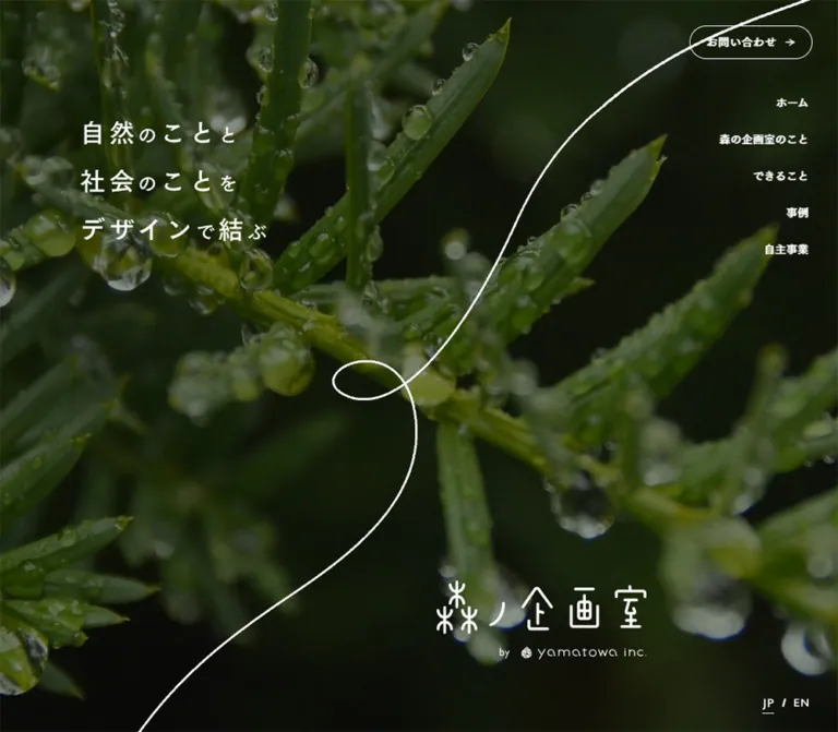
Capture limitation: the opening media area rendered black with an English connection-security restriction. The slogan, logo, decorative line, and navigation remained visible above it. This reference documents those foreground elements but does not identify the unavailable footage, reproduce the restriction message as design, or treat black as a verified intentional hero background.
How to Read This Reference
- Measured means a value appears in the supplied computed styles or element bounds. Measurements are CSS pixels; long decimal coordinates are rounded for readability.
- Calculated means arithmetic from those measurements, such as the space between adjacent columns.
- Visual estimate means an approximation from the original-page captures. Decorative colors, shadow softness, and slogan lettering fall into this category.
- Recommendation means implementation guidance for a new build. Suggested breakpoints, fallback media treatment, accessibility improvements, and the Quick Start are not claims about the original source.
- Token names are descriptive aliases, except the two explicitly identified source font variables.
- Element rectangles can include nested or overlapping sections. Do not add every section height together or use all recorded coordinates as permanent positioning rules.
- A declared transition establishes available styling, not proof that a particular hover or scroll animation occurred.
Tokens — Colors
Default Palette
| Name | Value | Suggested token | Evidence and role |
|---|---|---|---|
| Cream Canvas | #f4f4e4 |
--color-canvas |
Measured body, normal header, and listing-section background |
| Forest Ink | #10210d |
--color-ink |
Measured navigation, paragraphs, titles, and major text |
| Leaf Green | #4b9a56 |
--color-green |
Measured section labels and filled contact controls |
| Muted Ink | #5a645c |
--color-muted |
Measured secondary button labels and privacy-link text |
| White | #ffffff |
--color-white |
Measured secondary button surfaces and reversed contact labels; also visible in decorative shapes |
| Legal Black | #000000 |
--color-legal |
Measured provider caption, organizational statement, footer invitation, and copyright text |
The main background is a pale yellow-green cream rather than neutral white. Preserve its relationship with the almost-black green text. White remains visible as a separate surface on buttons and large decorative shapes.
Decorative Palette
These are visual approximations, not extracted stylesheet values.
| Name | Approximation | Suggested token | Use |
|---|---|---|---|
| Sun Yellow | #fff000 |
--color-yellow |
Thick, cropped, repeated semicircular arches and small geometric accents |
| Mint Wash | #c2f5b2 |
--color-mint |
Grainy circular accents near illustrations and the footer invitation |
| Pale Thread | #d4dcc8 |
--color-thread |
Low-contrast lines crossing cream sections |
| Quiet Rule | #bdc39d |
--color-rule |
Thin dividers beneath desktop business entries |
Mint and yellow artwork contains visible texture and tonal variation. A single hex value is a base approximation, not a complete replacement for that artwork.
Page Treatments
The supplied evidence shows two presentation contexts, not a selectable theme system:
- Opening composition: white slogan, white logo, white winding line, outlined contact/menu control, and white navigation over an embedded media area.
- Scrolled content: cream background, dark logo and navigation, filled green contact/menu control, white secondary links, and colored illustrations.
The gray security message belongs to the failed media response. Exclude it from the site's color tokens. Transparent --g-color-* properties in the evidence also do not establish a visible gradient palette.
Tokens — Typography
Japanese Text — Zen Kaku Gothic Antique
- Measured family:
Zen Kaku Gothic Antique. - Source variable:
--s-font-2c86f599. - Observed weights:
500for most body copy and navigation,600for several headings and controls, and700for card titles and the service heading. - Character: clear, compact Japanese sans-serif text with substantial vertical breathing room.
- Suggested stack:
'Zen Kaku Gothic Antique', sans-serif. The generic fallback is a recommendation, not an extracted complete source stack.
The page relies on line height more than oversized type. Body copy is usually 14px, but narrative paragraphs reach a 33.6px line height on desktop.
Latin Utilities — Josefin Sans
- Measured family:
Josefin Sans. - Source variable:
--s-font-91a60bee. - Verified uses: the language separator,
Provided by, and copyright text. - Observed weights:
400,500, and600, depending on role. - Tracking: 0.05em for the language separator and copyright.
Do not apply this family to every English phrase: the measured business names YAMAZUTO. and pioneer plants use Zen Kaku Gothic Antique.
Wordmark and Opening Slogan
The logo uses thin, rounded, botanical and architectural strokes. It is artwork, not a font to approximate by typing the brand name. Its tree-like glyphs recur in the large opening lockup, compact header mark, and footer signature.
The opening slogan is visible as three lines: “自然のことと”, “社会のことを”, and “デザインで結ぶ”. Larger main characters alternate with smaller connecting characters. Its actual lettering family and font-size declarations are not supplied. Visually, the larger characters are approximately 46–48px on desktop and 30–32px on mobile, with unusually generous line separation.
The sampled H1 has empty text and bounds matching the logo region. Its inherited 32px font declaration is not a measurement of the visible slogan or logo lettering.
Type Scale
Unless marked otherwise, values below are measured.
| Role | Desktop size / line height | Mobile size / line height | Weight | Tracking |
|---|---|---|---|---|
| Desktop navigation | 14px / 14px | Hidden in the closed mobile presentation | 500 | Normal |
| Pill labels | 14px / 14px | 14px / 14px | 500–600 | 0.7px |
| Introductory statement | 16px / 32px | 14px / 28px | 500 | 0.8px desktop; normal mobile |
| About heading | 26px / 26px | 22px / 22px | 600 | 1.3px desktop; 1.1px mobile |
| Service heading | 20px / 20px | 22px / 22px | 700 | Normal |
| Case/business section heading | 20px / 20px | 22px / 22px | 600 | Normal |
| Narrative paragraph | 14px / 33.6px | 14px / 28px | 500 | Normal |
| Case title | 16px / 22.4px | 16px / 22.4px | 700 | Normal |
| Business name | 16px / 16px | 16px / 16px | 700 | Normal |
| Card description | 14px / 28px | 14px / 28px | 500 | Normal |
| Provider caption | 14px / 14px | 14px / 14px | 500 | Normal |
| Organizational statement | 12px / 19.2px | 12px / 19.2px | 500 | Normal |
| Footer invitation | 14px / 14px | 13px / 13px | 500 | Normal |
| Privacy link | 12px / 12px | 14px / 14px | 500 | Normal |
| Copyright | 12px / 16.8px | 12px / 12px | 400 | 0.6px |
The root is a conventional measured 16px. There is no evidence of a special miniature-rem scaling system. Generic Times, Arial, and sans-serif declarations on outer elements should not override the measured families on their visible children.
Tokens — Spacing & Shapes
Density: sparse narrative composition with compact controls and readable, closely grouped entry information.
Spacing Scale
| Use | Value | Evidence |
|---|---|---|
| Button label-to-arrow gap | 10px | Measured |
| Standard button padding | 13px 20px | Measured |
| Footer button padding | 20px 35px | Measured |
| Main header padding | 24px 32px desktop; 24px 20px mobile | Measured |
| Desktop navigation separation | 32px | Calculated from neighboring link bounds |
| Hero navigation vertical separation | 32px between 14px line boxes | Calculated; successive rows begin 46px apart |
| Section heading-to-paragraph space | Usually 20px | Calculated from service, case, and business text bounds |
| About heading-to-paragraph space | 40px desktop; 20px mobile | Calculated |
| Narrative paragraph-to-link space | 40px | Calculated at both viewports |
| Card root gap | 48px desktop | Measured |
| Mobile case/business root gap | 36px / 32px | Measured |
| Card title-to-description space | 12px desktop; 20px mobile | Calculated |
| Desktop column separation | 55px | Calculated |
| Mobile card-to-card separation | 40px | Calculated |
| Footer padding | 300px 100px 60px desktop; 100px 30px 70px mobile | Measured |
These values do not imply a single strict spacing grid. Large illustration zones and individually placed text groups create the wider page rhythm.
Border Radius
| Element | Value | Evidence |
|---|---|---|
| Standard pill | 24px | Measured |
| Footer contact pill | 28px | Measured |
| Mobile filled menu control | 24px | Measured |
| Card link container | 0 | Measured |
| Mint accents | Circular | Visible; exact source geometry unavailable |
| White footer shape | Large angled shape with softened corners | Visible; exact path/radius unavailable |
Soft shadows are visible beneath white buttons and the main footer contact control. Their blur, offset, and opacity were not included in the computed-style sample. Use a restrained approximation rather than treating shadow values as measured tokens.
Layout Measurements
| Element | Desktop 1440 × 1000 | Mobile 390 × 844 |
|---|---|---|
| Document height | 7972.16px | 9416.50px |
| Opening section height | 1010px | 852.44px |
| Normal header height | 88px | 88px |
| Header logo bounds | 144.08 × 36.28px | 135.50 × 34.11px |
| Opening logo bounds | 359 × 91px at x841, y777.94 | 245 × 62.09px at x125, y615.88 |
| Introductory statement width | 352.81px | 294px |
| Case-card width | 376.06px | 330px |
| Case-card arrangement | Three columns | One column |
| Case-list section height | 633.48px | 1723.95px |
| Business-list section height | 664.70px | 1800px |
| Footer height | 700px | 844px |
| Footer logo bounds | 260.30 × 65.55px | 260.30 × 65.55px |
| Footer contact bounds | 211.61 × 54px | 213.61 × 54px |
The opening section is consistent with approximately 101% of viewport height at both inspected sizes. This is a calculated relationship; the section's actual height declaration was not supplied.
Components
Opening Composition
Role: establishes the connection between nature, society, and the studio's identity.
Place the three-line white slogan toward the upper left and the large white brand lockup toward the lower right. A fine white line enters from the upper/right boundary, bends inward, forms a small loop near the center, and exits toward the lower left. The line crosses a large amount of empty space without becoming a container border.
On desktop, the slogan starts approximately 100px from the left. The contact control sits 32px from the right and 32px from the top. Five right-aligned navigation links follow beneath it. The language selection sits near the lower-right edge, separate from the logo.
On mobile, the slogan moves to approximately 20px from the left. An outlined MENU pill occupies the upper-right corner. The brand lockup ends 20px from the right edge. The winding line is recomposed or cropped for the narrow view; its shape is not evidence of an animated drawing effect.
The background content was unavailable during capture. A new implementation should provide a stable, authorized fallback image or dark fill underneath independently rendered foreground elements.
Normal Site Header
Role: keeps navigation available through the long content sequence.
The scrolled captures show an opaque cream strip at the top of the viewport. Its measured height is 88px. On desktop, the compact logo is left aligned, five navigation links occupy the middle area, and language controls plus a green contact pill sit at the right.
The inner header uses flex layout, 24px vertical padding, 32px horizontal padding, and a recorded 40px gap. Individual navigation links have 32px of horizontal separation.
The mobile header keeps the logo at x20 and replaces the visible navigation and contact group with a green menu pill at x269. That pill measures approximately 101 × 32.44px. The visible menu graphic combines two short horizontal lines with MENU.
Both header presentations appear in the DOM evidence. The captures establish their visible endpoints, but the exact scroll threshold and visibility mechanism were not recorded. Do not render both desktop navigation systems simultaneously just because both exist in the extract.
Navigation and Language Selection
Role: routes visitors to the studio overview, services, examples, businesses, and contact page.
Verified destinations include /about, /service, /casestudy, /business, /contact, and /en. The home link in the evidence is /1#wrapper; preserve it only when reproducing the original routing context.
The visible language control reads JP / EN, with a short underline beneath JP. An /en link is present, but navigation to the English page was not exercised. The closed mobile captures do not establish where language controls appear inside the menu.
Pill Link System
Role: provides small, consistent invitations to continue reading or make contact.
The core anatomy is a rounded horizontal surface, a 14px Japanese label, a 10px gap, and a small right arrow. The arrow's nominal 14px allocation can be calculated from the measured standard button width and text bounds.
| Variant | Surface | Label and arrow | Geometry |
|---|---|---|---|
| Secondary reading link | White | Muted label; green arrow visible in captures | 40px high, 24px radius, 13px 20px padding |
| Header contact | Leaf Green | White | 152.20 × 40px on desktop |
| Hero contact | Transparent over media | White text, arrow, and fine outline | 154.20 × 42px on desktop |
| Footer contact | Leaf Green | White | Approximately 212–214 × 54px; 28px radius |
Verified secondary labels include “森の企画室のことを知る”, “できることを詳しく見る”, “事例一覧を見る”, and “詳しく見る”. Width follows the label: the first two measure 225.70px, while the listing link measures 166.91px.
The larger footer action reads “お問い合わせする”. It is still a compact pill, surrounded by space and illustration rather than expanded to fill the entire screen width.
Introductory Statement
Role: articulates the studio's outlook before detailed services and examples.
A narrow, centered paragraph follows a large illustration region. It consists of three Japanese statements about imagining a shared future, history, and present-day life. Desktop typography is 16px/32px with 0.8px tracking; mobile reduces it to 14px/28px with normal tracking.
The desktop paragraph measures 352.81px wide and 96px high. Mobile measures 294px wide and 84px high. The white about link is centered 40px below the paragraph at both sizes.
Maintain this modest text measure. Increasing its width to match the case-study grid would remove the intimate pause between the opening composition and the rest of the site.
About and Service Text Groups
Role: explains the organization and what it can do.
Each group combines a heading, a compact paragraph, and, where present, a white reading link. About uses a larger dark heading; service uses a smaller green heading on desktop.
The desktop About paragraph is positioned far right at x1030 with a width of 238px. On mobile it moves to x20 and widens to 315px. Its desktop line height is 33.6px, changing to 28px on mobile.
The service group occupies x785.09 with a 400px text width on desktop. On mobile it appears at x45 with a 315px width. Its heading grows from 20px to 22px instead of shrinking. This is a deliberate change in hierarchy within a narrower composition.
The recorded About/media section includes an embedded video reference. Its successful playback, cropping, and visible subject are not established by the supplied captures.
Illustrated Section Introductions
Role: creates a visual pause before the case-study and business lists.
The case-study capture shows a small green heading and compact text toward the lower left, while a partly cropped drawing of people and a large animal-like figure occupies the lower right. A large white circle sits behind the linework. Pale mint and yellow shapes provide smaller accents.
Above and around this group, a fine pale line changes direction across the cream field. Yellow arches are cropped against the left edge. Large empty areas are part of the observed composition; they are not evidence that a hidden text block should be invented.
The business introduction has a large illustration asset identified in the DOM. Its full appearance is outside the supplied visual crops, so its detailed subject and crop should remain unspecified.
Case-Study Entry
Role: links to a complete project or editorial example.
The original DOM represents each complete entry as one anchor. Its structure combines an upper visual area, a bold title, descriptive text, a pill-shaped “詳しく見る” treatment, and spacing that aligns actions across the desktop row.
Three desktop entries measure 376.06px wide and begin at x100.91, x531.97, and x963.03. Their equal outer height is 633.48px, even though titles wrap differently. Their action-label baselines align.
Titles use 16px/22.4px bold Japanese text. The title begins 18px inward from the card's left edge; the description returns to the full card width. The cause of this title inset is not fully visible in the supplied captures, so do not invent a specific icon for it.
Descriptions use 14px/28px. The sampled desktop title-to-description space is 12px, increasing to 20px on mobile. The link container has no rounded card shell and no separate filled background.
On mobile, entries become 330px wide with 30px side margins and 40px between successive card bounds. Heights vary with content. Keep the entire card as one link; use a noninteractive span for the internal pill treatment rather than nesting another anchor or button.
The image rectangles and complete card visuals were not included in the supplied crops. A 4:3 image slot is a reasonable implementation starting point, but it is not a measured source aspect ratio.
Independent-Business Entry
Role: introduces the operator's brands through the same quiet listing system.
The three recorded entries are YAMAZUTO., 信州経木Shiki, and pioneer plants. Desktop uses the same 376.06px columns and 55px separation as the case-study row. The entries measure 664.70px high.
Business names use 16px bold type with a 16px line height. Paragraphs use 14px/28px. The supplied lower desktop capture shows white reading pills and a fine horizontal divider beneath each column. These open columns sit directly on cream; the button is the prominent rounded surface.
Mobile stacks the entries at 330px wide. The measured root gap is 32px, and card heights vary between 541px and 569px in the supplied sample.
The introductory business link visibly uses “事例一覧を見る” while pointing to /business. That label/destination combination is an observed content detail, not evidence that the two listing sections share a destination.
Footer Identity and Contact Composition
Role: closes the long page with identity, organizational context, and a final invitation.
Desktop places a dark botanical logo and provider lockup toward the left. The logo measures 260.30 × 65.55px. A small Provided by caption sits above the 200px-wide provider link region. The organizational statement explicitly identifies 森の企画室 as part of 株式会社やまとわ, with a link to https://yamatowa.co.jp/.
A pale looping line crosses the large empty central area. Yellow arches enter from the left, while a textured mint circle overlaps a large tilted white shape on the right. The contact invitation and green pill sit on that white shape. Two diagonal strokes frame the invitation text.
Desktop footer height is 700px with recorded padding of 300px 100px 60px. Copyright sits near the lower center, and the underlined privacy link appears at the lower right.
Mobile turns the footer into an 844px-tall centered composition. The logo retains its desktop width rather than shrinking to the header size. Provider information follows beneath it, then the invitation and contact pill. Privacy and copyright appear near the bottom over the white shape. Yellow arches move toward the upper right; the mint circle is cropped along the left edge.
The footer establishes the organizational relationship, but supplies no verified website-production roles.
Tokens — Motion & Interaction
| Treatment | Recorded evidence | What can be concluded |
|---|---|---|
| General element transitions | 0.3s cubic-bezier(0.4, 0.4, 0, 1) across many sampled elements |
A shared short transition timing is declared; individual triggers and endpoints are unverified |
| Body background transition | background 0.5s cubic-bezier(0.4, 0.4, 0, 1) |
Background changes can transition over half a second; no theme-switching interaction was demonstrated |
| Normal versus opening header | Different presentations visible at opening and scrolled positions | Header appearance changes with page context; exact switching behavior was not recorded |
| Mobile menu | Closed outlined and filled buttons visible | A menu affordance exists; expanded layout, focus handling, and animation are unverified |
| Embedded media | Media markup present; hero displays a security restriction | Successful playback, audio, autoplay, and looping cannot be confirmed |
| Winding lines and illustrations | Static positions visible; sampled elements report animation: none |
Their presence is verified; path drawing, parallax, and continuous movement are not |
| Card and CTA links | Anchor destinations supplied | Navigation targets are known, but click results and hover treatments were not tested |
The capture process waited for document loading, finite animations, layout/text stability, and visible image decoding within stated time limits. Perpetual animations were temporarily paused for readiness checks and then resumed. These procedures do not establish that all delayed content appeared or that every animation was observed.
Recommended adaptation: use the measured 300ms easing for modest color and opacity feedback. Keep decorative paths static until motion has a clear purpose. A reduced-motion version should preserve every text block and navigation route without requiring entrance animations.
Surfaces
| Layer | Appearance | Purpose |
|---|---|---|
| Main document | Flat Cream Canvas | Unifies the long homepage |
| Normal header | Opaque cream strip | Keeps utilities legible over changing content |
| Reading links | White pills with visually soft shadows | Separates small actions from the cream background |
| Contact controls | Solid Leaf Green with white labels | Marks the primary contact route |
| Listings | Open cream columns with fine lower rules | Groups projects without heavy card containers |
| Illustrations | Dark linework over cream or white shapes | Supplies character and visual scale |
| Footer contact area | Oversized angled white shape | Creates a distinct final invitation area |
| Opening foreground | White lettering and linework | Maintains a clear graphic composition over media |
Elevation is concentrated around small controls. Broad section structure comes from space, artwork, and changes in alignment rather than repeated panels or strong shadows.
Imagery
The verified imagery language combines thin hand-drawn figures, botanical logo strokes, clean geometric forms, and selectively grainy color. The linework has slight irregularities, while circles and arch silhouettes are comparatively precise. That combination gives the page warmth without making every element rough.
Use texture locally. The cream canvas itself appears flat; the mint circles and yellow accents carry visible grain. Applying noise uniformly to the page would obscure this distinction.
The long pale line serves as a compositional connector. In the middle desktop capture it includes straight and diagonal segments; near the footer it becomes a loose loop. The hero uses a brighter white curve. These are related motifs, but a single scaled path will not necessarily reproduce all their compositions.
The current hero's media content is unavailable. The supplied material also does not show the complete case-study and business images, so their photographic subjects, processing, and exact cropping are not described here.
Observed Asset References
The following URLs were recorded in original-page DOM evidence. They were not fetched separately. Dimensions below are encoded in the asset names, not newly measured image-decoding results.
| Reference | Recorded URL | Evidence-supported association |
|---|---|---|
| Introduction asset, 2400 × 1395 | https://storage.googleapis.com/studio-design-asset-files/projects/Kwa531KEOX/s-2400x1395_v-frms_webp_563cfb4f-f9f9-4531-8243-2dcb49db6cc4_small.webp | Referenced within the opening main-content section |
| Service-region asset, 961 × 2014 | https://storage.googleapis.com/studio-design-asset-files/projects/Kwa531KEOX/s-961x2014_v-frms_webp_3fbeaf55-c6cb-4a97-bc61-79e43aa6f973_small.webp | Referenced in the section containing service content |
| Business illustration, 1338 × 1137 | https://storage.googleapis.com/studio-design-asset-files/projects/Kwa531KEOX/s-1338x1137_v-fms_webp_c45bdddc-a78a-4fad-aab4-e25f97d4e82f_small.webp | DOM alt text identifies a large business illustration |
| Embedded video reference | https://player.vimeo.com/video/950603507 | Recorded in the About/media section; query parameters are truncated in the extract |


The video reference above is not independently identified as the hero's video. Several other asset references were truncated, so their full paths are intentionally omitted.
Use authorized logo and illustration assets when available. CSS can reproduce the surfaces and placement, but substituting an ordinary text logo or generic icon set will substantially change the identity.
Layout & Responsive Behavior
Desktop Composition
The page begins with an approximately viewport-height opening, then continues into a long illustrated narrative. The main content starts at document y1010. A narrow centered introduction precedes About, services, cases, and businesses.
Text groups move across the canvas. About sits far right; service occupies a broader right-side column; case introduction text moves left; business introduction text returns toward the center-right. This variation matters more than an identical margin on every section.
The two listing rows are more regular. Their measured total span is approximately 1238.19px, leaving 100.91px on each side at 1440px. Three equal columns are separated by 55px. A rounded 1240px content maximum is a useful implementation approximation.
The middle capture includes a large cream interval with decorative lines and arches before the case introduction reaches the bottom of the viewport. Preserve some of that pacing, while recognizing that a static capture cannot prove the semantic completeness of every empty region.
Mobile Changes
| Feature | Verified desktop behavior | Verified mobile behavior |
|---|---|---|
| Header controls | Full navigation, language control, contact pill | Compact logo and menu pill |
| Header horizontal inset | 32px | 20px |
| Opening logo | 359px wide | 245px wide; right edge at x370 |
| Introductory text | 16px/32px, 352.81px wide | 14px/28px, 294px wide |
| Section labels | 20px for service/cases/businesses | 22px |
| Narrative leading | Commonly 33.6px | 28px |
| Case/business entries | Three columns | One 330px column with 30px side margins |
| Card titles and descriptions | 16px and 14px | Same sizes; wrapping changes |
| Footer organization | Identity left, invitation right | Centered vertical sequence |
| Footer logo | 260.30px wide | Same width |
| Privacy link | 12px | 14px |
Mobile text insets remain composition-specific: About uses x20, service x45, cases x15, and business introduction x20. Do not assume a universal mobile gutter from the 30px card margin.
The narrower viewport produces a taller overall document: approximately 9417px versus 7972px. Listing stacks account for much of that growth, even though several illustrated sections become shorter.
Media Cover Geometry
Embedded markup in the evidence contains this sizing strategy:
/* Recorded media-wrapper geometry */
width: max(100vw, calc(100vh / 0.5625));
left: 50%;
transform: translateX(-50%);
A child uses 56.25% top padding, corresponding to a 16:9 media box. Calculated wrapper widths are about 1777.78px at the desktop viewport and 1500.44px at the mobile viewport. This intentionally oversized, centered media area is consistent with the restriction message being horizontally cropped on mobile.
That cropping does not establish a horizontal overflow problem in the main document. Keep oversized media inside a clipped wrapper while allowing actual body copy to reflow normally.
Breakpoint Limitations
Only two viewport sizes were supplied. The original breakpoints, tablet layout, orientation changes, and safe-area behavior are unknown. The Quick Start uses 1000px for compact navigation and 760px for single-column content as explicit recommendations.
Do’s and Don’ts
Do
- Keep the measured cream, forest ink, and leaf green as the foundation.
- Preserve 14px body copy with generous 28–33.6px line height.
- Use Zen Kaku Gothic Antique for the measured Japanese roles and Josefin Sans for verified Latin utilities.
- Treat the botanical wordmark as supplied artwork.
- Let illustration regions and fine wandering lines occupy generous space.
- Confine grain mainly to colored decorative shapes.
- Use white reading pills and green contact pills with small right arrows.
- Keep desktop entries open on the cream background, with aligned actions and fine dividers.
- Stack cards on mobile while retaining readable type sizes.
- Recompose the footer and decorative crops for narrow screens.
- Provide a media fallback that preserves the foreground identity and navigation.
Don't
- Don't reproduce the media restriction message or classify its gray text as branding.
- Don't infer current footage from an unavailable media area.
- Don't replace the logo with a standard font or generic tree icon.
- Don't convert every illustration section into a uniform boxed feature card.
- Don't fill the cream canvas with a heavy global grain filter.
- Don't turn yellow decorative arches into an additional CTA color.
- Don't use the empty-text
H1font size as the slogan's measured size. - Don't shrink all desktop measurements proportionally for mobile.
- Don't add nested clickable buttons inside a card that is already an anchor.
- Don't claim parallax, line drawing, autoplay, or menu animation from static captures.
Recommended Implementation Additions
These are improvements for a new implementation, not verified features of the inspected site.
- Provide an accessible name for logo links and menu controls. The extracted text fields are empty for some graphical controls, but their complete accessibility attributes were not supplied.
- Use a real menu button with
aria-expandedandaria-controls. If the menu is modal, implement focus containment, Escape handling, and focus return. - Keep only the active header presentation available to keyboard and assistive-technology users. Avoid duplicate focusable navigation when switching presentations.
- Expand the approximately 32–34px visible mobile menu treatment to at least a 44px interaction target without enlarging the visual pill unnecessarily.
- Check contrast for small green headings and white labels on green. Calculated from the measured colors, white on
#4b9a56is approximately 3.5:1; a darker action variant is advisable where normal-text AA contrast is required. - Add a visible focus indicator, meaningful image alternatives, and readable text equivalents for important lettering embedded in artwork.
- Use a stable media fallback and avoid displaying a third-party error as the primary visual. Keep essential content independent of media loading.
- Honor reduced-motion preferences. Decorative SVGs should be noninteractive and hidden from assistive technology when they convey no content.
Agent Prompt Guide
Quick Color Reference
- Main canvas: measured
#f4f4e4. - Main text: measured
#10210d. - Section labels and contact fills: measured
#4b9a56. - Secondary labels: measured
#5a645c. - Reading pills and large cutout shapes: white.
- Decorative approximations: yellow
#fff000, mint#c2f5b2, pale thread#d4dcc8. - Texture: local grain in decorative colors; flat cream behind the content.
Overall Prompt
“Create a Japanese corporate and project-showcase homepage inspired by 森の企画室. Use a warm cream #f4f4e4 canvas, dark green #10210d text, leaf-green #4b9a56 section labels and contact controls, and white secondary pills. Set Japanese copy in Zen Kaku Gothic Antique, mostly 14px with a 28px line height, with Josefin Sans for small Latin utilities. Compose generous illustrated sections using thin hand-drawn figures, botanical artwork, pale winding lines, textured mint circles, and cropped yellow arches. Vary the horizontal placement of short narrative text blocks. Follow them with two three-column desktop listings that become single columns on mobile. Finish with a large identity lockup and contact invitation over an angled white shape. Supply authorized media and a dependable fallback; do not reproduce capture errors or invent unverified animation.”
Example Component Prompts
- Normal header: “Build an 88px cream header with a compact botanical logo, five 14px Japanese links, a small JP/EN control, and a 40px green contact pill. At narrow widths use a logo and compact MENU pill with 20px side insets. Include a larger invisible touch target and keyboard focus styling.”
- Narrative section: “Place a small green heading above a short 14px Japanese paragraph with a 33.6px desktop line height. Leave 20px after the heading and 40px before a white reading pill. Pair the group with sparse line illustration and large cream space. Use 28px paragraph leading and a 22px heading on mobile.”
- Linked entry: “Create an unboxed project link on cream with an image area, a 16px bold title, 14px/28px description, and a white pill-shaped reading label. Use three approximately 376px columns separated by 55px at 1440px. On a 390px screen use one 330px column with 40px between entries. Make the entire entry one link.”
- Footer: “Create an airy cream footer with a large dark botanical wordmark and provider signature. Place the contact invitation over a tilted white shape, accented by a grainy mint circle and yellow arches. Use a 54px-high green contact pill. Center the identity, invitation, privacy link, and copyright in a vertical mobile composition.”
- Opening foreground: “Arrange a three-line Japanese slogan at the upper left, a thin looping white path across the canvas, and an authorized white brand lockup at the lower right. On desktop use right-aligned navigation; on mobile use an outlined MENU pill. Keep foreground content usable with a static fallback underneath.”
Quick Start
CSS Custom Properties
This is an implementation scaffold, not the original stylesheet. Core colors, font roles, control dimensions, and text sizes are measured. Decorative colors, shadow values, intermediate breakpoints, image aspect ratio, and simplified positioning are recommendations. Load the named fonts separately and supply authorized logo, illustration, and media assets.
:root {
  /* Measured core colors */
  --color-canvas: #f4f4e4;
  --color-ink: #10210d;
  --color-green: #4b9a56;
  --color-muted: #5a645c;
  --color-white: #ffffff;
  --color-legal: #000000;

  /* Visual approximations for decorative artwork */
  --color-yellow: #fff000;
  --color-mint: #c2f5b2;
  --color-thread: #d4dcc8;
  --color-rule: #bdc39d;

  /* Recommended darker option for small action labels */
  --color-green-accessible: #34723e;

  /* Verified families with recommended generic fallbacks */
  --font-jp: 'Zen Kaku Gothic Antique', sans-serif;
  --font-latin: 'Josefin Sans', sans-serif;
  --text-small: 12px;
  --text-body: 14px;
  --text-title: 16px;
  --text-section: 20px;
  --text-about: 26px;
  --leading-body: 2;
  --leading-narrative: 2.4;
  --tracking-control: 0.05em;

  /* Measured recurring spacing */
  --space-icon: 10px;
  --space-copy: 20px;
  --space-action: 40px;
  --space-card: 48px;
  --gap-columns: 55px;
  --header-height: 88px;
  --header-inset: 32px;
  --radius-pill: 24px;
  --radius-contact: 28px;

  /* Rounded layout approximation and recommended shadow */
  --content-max: 1240px;
  --shadow-pill: 0 8px 24px rgb(16 33 13 / 5%);

  /* Measured transition timing */
  --ease-site: cubic-bezier(0.4, 0.4, 0, 1);
  --motion-ui: 300ms;
}

* { box-sizing: border-box; }

body {
  margin: 0;
  background: var(--color-canvas);
  color: var(--color-ink);
  font-family: var(--font-jp);
  font-size: var(--text-body);
  font-weight: 500;
  line-height: var(--leading-body);
}

img, svg { display: block; max-width: 100%; }
button, input, textarea { font: inherit; }
a { color: inherit; }
[hidden] { display: none !important; }

.site-header {
  position: fixed;
  z-index: 50;
  inset: 0 0 auto;
  display: flex;
  align-items: center;
  gap: 40px;
  height: var(--header-height);
  padding: 24px var(--header-inset);
  background: var(--color-canvas);
}

.site-header__logo {
  flex: 0 0 auto;
  width: 144.08px;
}

.site-nav {
  display: flex;
  flex: 1;
  justify-content: center;
  align-items: center;
  gap: 32px;
}

.site-nav a {
  font-size: 14px;
  line-height: 1;
  text-decoration: none;
  white-space: nowrap;
}

.header-utilities {
  display: flex;
  align-items: center;
  gap: 40px;
}

.language-switch {
  display: flex;
  align-items: center;
  gap: 10px;
  font: 600 14px/1 var(--font-latin);
  letter-spacing: 0.05em;
}

.language-switch [aria-current] {
  text-decoration: underline;
  text-underline-offset: 7px;
}

.pill {
  display: inline-flex;
  width: fit-content;
  max-width: 100%;
  align-items: center;
  justify-content: center;
  gap: var(--space-icon);
  min-height: 40px;
  padding: 13px 20px;
  border: 0;
  border-radius: var(--radius-pill);
  background: var(--color-white);
  color: var(--color-muted);
  box-shadow: var(--shadow-pill);
  font-size: 14px;
  font-weight: 500;
  line-height: 1;
  letter-spacing: var(--tracking-control);
  text-decoration: none;
  transition:
    color var(--motion-ui) var(--ease-site),
    background-color var(--motion-ui) var(--ease-site);
}

.pill__arrow {
  flex: 0 0 14px;
  width: 14px;
  color: var(--color-green);
}

.pill--primary {
  color: var(--color-white);
  background: var(--color-green);
}

.pill--primary .pill__arrow,
.pill--outline .pill__arrow { color: currentColor; }

.pill--outline {
  color: var(--color-white);
  background: transparent;
  border: 1px solid currentColor;
  box-shadow: none;
}

.pill--contact {
  min-height: 54px;
  padding: 20px 35px;
  border-radius: var(--radius-contact);
}

/* Optional contrast improvement; not an observed source color. */
.pill--accessible { background: var(--color-green-accessible); }

.menu-toggle { display: none; }

.hero {
  position: relative;
  isolation: isolate;
  min-height: 101vh;
  min-height: 101svh;
  overflow: hidden;
  color: var(--color-white);
  /* Recommended fallback while authorized media is unavailable. */
  background: var(--color-ink);
}

.hero__media {
  position: absolute;
  z-index: -1;
  inset: 0;
  overflow: hidden;
}

.hero__media > img,
.hero__media > video {
  width: 100%;
  height: 100%;
  object-fit: cover;
}

/* Live-text approximation; original slogan lettering is unmeasured. */
.hero__claim {
  position: absolute;
  top: 18vh;
  left: 7vw;
  margin: 0;
  font-size: 48px;
  font-weight: 700;
  line-height: 1.95;
  letter-spacing: 0.1em;
}

.hero__claim > span { display: block; }
.hero__claim small { font-size: 0.75em; }

.hero__brand {
  position: absolute;
  right: 16.67vw;
  bottom: 10vh;
  width: 359px;
}

.hero__utilities {
  position: absolute;
  top: 32px;
  right: 32px;
  display: flex;
  flex-direction: column;
  align-items: flex-end;
  gap: 48px;
}

.hero__nav {
  display: flex;
  flex-direction: column;
  align-items: flex-end;
  gap: 32px;
  font-size: 14px;
  line-height: 1;
}

.hero__nav a { text-decoration: none; }

.hero__languages {
  position: absolute;
  right: 32px;
  bottom: 24px;
}

.art-stage {
  position: relative;
  isolation: isolate;
}

.art-stage__decoration {
  position: absolute;
  z-index: -1;
  inset: 0;
  overflow: hidden;
  pointer-events: none;
}

.thread {
  width: 100%;
  height: 100%;
  fill: none;
  stroke: var(--color-thread);
  stroke-width: 2;
}

.thread path { vector-effect: non-scaling-stroke; }
.hero .thread { stroke: var(--color-white); }

.intro-copy {
  width: min(352.81px, calc(100% - 40px));
  margin-inline: auto;
  font-size: 16px;
  line-height: 2;
  letter-spacing: 0.05em;
}

.intro-action {
  display: flex;
  justify-content: center;
  margin-top: 40px;
}

.story-copy { width: min(400px, calc(100% - 40px)); }
.story--service .story-copy { margin-left: 54.52%; }
.story--cases .story-copy { width: 336px; margin-left: 19.86%; }
.story--business .story-copy { width: 336px; margin-left: 46.12%; }

.section-title {
  margin: 0 0 20px;
  color: var(--color-green);
  font-size: var(--text-section);
  font-weight: 600;
  line-height: 1;
}

.story--service .section-title { font-weight: 700; }

.story-copy p {
  margin: 0;
  line-height: var(--leading-narrative);
}

.story-copy .pill { margin-top: 40px; }

.entry-grid {
  display: grid;
  grid-template-columns: repeat(3, minmax(0, 1fr));
  gap: var(--gap-columns);
  width: min(var(--content-max), calc(100% - 60px));
  margin-inline: auto;
}

.entry {
  display: flex;
  flex-direction: column;
  gap: var(--space-card);
  min-width: 0;
  padding-bottom: 48px;
  border-bottom: 1px solid var(--color-rule);
  text-decoration: none;
}

.entry__image {
  width: 100%;
  /* Recommended slot; the source image ratio was not measured. */
  aspect-ratio: 4 / 3;
  object-fit: cover;
}

.entry__title {
  margin: 0 0 12px;
  padding-left: 18px;
  font-size: 16px;
  font-weight: 700;
  line-height: 1.4;
}

.entry__description { margin: 0; font-size: 14px; line-height: 2; }
.entry > .pill { align-self: flex-start; margin-top: auto; }

.site-footer {
  position: relative;
  isolation: isolate;
  display: grid;
  grid-template-columns: 1fr 1fr;
  align-content: end;
  align-items: start;
  gap: 40px;
  min-height: 700px;
  padding: 300px 100px 60px;
}

.footer-brand { width: 274px; }
.footer-brand__logo { width: 260.30px; margin-inline: auto; }
.footer-brand__provider { width: 200px; margin: 16px auto 0; }
.footer-brand__caption { font: 500 14px/1 var(--font-latin); }
.footer-brand__statement { margin: 40px 0 0; font-size: 12px; line-height: 1.6; }
.footer-contact { justify-self: end; text-align: center; }
.footer-contact__caption { margin: 0 0 27px; font-size: 14px; line-height: 1; }
.footer-legal { grid-column: 1 / -1; display: flex; align-items: center; gap: 32px; }
.footer-copyright { margin: 0 auto; font: 400 12px/1.4 var(--font-latin); letter-spacing: 0.05em; }
.footer-policy { color: var(--color-muted); font-size: 12px; text-underline-offset: 5px; }

/* Recommended feedback; exact source hover colors were not tested. */
@media (hover: hover) {
  .site-nav a:hover { color: var(--color-green); }
  .entry:hover .entry__title { text-decoration: underline; }
}

:where(a, button):focus-visible {
  outline: 2px solid currentColor;
  outline-offset: 5px;
}

/* Recommended navigation breakpoint. */
@media (max-width: 1000px) {
  .site-header { --header-inset: 20px; justify-content: space-between; }
  .site-header__logo { width: 135.5px; }
  .site-nav, .header-utilities, .hero__utilities, .hero__languages { display: none; }

  .menu-toggle {
    position: relative;
    display: inline-flex;
    align-items: center;
    justify-content: center;
    gap: 8px;
    width: 101px;
    height: 33px;
    border: 0;
    border-radius: 24px;
    color: white;
    background: var(--color-green);
    font: 600 12px/1 var(--font-latin);
  }

  .menu-toggle::before { content: ''; width: 14px; height: 5px; border-block: 1px solid; }
  .menu-toggle::after { content: ''; position: absolute; inset: -6px 0; }
  .hero > .menu-toggle { position: absolute; top: 20px; right: 20px; border: 1px solid; background: transparent; }
}

/* Recommended content breakpoint; endpoints follow the captures. */
@media (max-width: 760px) {
  :root { --text-section: 22px; --leading-narrative: 2; }

  .hero__claim { top: 64px; left: 20px; font-size: clamp(28px, 8.2vw, 32px); }
  .hero__brand { right: 20px; bottom: 16.7svh; width: min(245px, calc(100% - 40px)); }
  .intro-copy { width: min(294px, calc(100% - 40px)); font-size: 14px; letter-spacing: normal; }

  .story--service .story-copy { width: min(315px, calc(100% - 75px)); margin-left: 45px; }
  .story--cases .story-copy { width: min(224px, calc(100% - 30px)); margin-left: 15px; }
  .story--business .story-copy { width: min(294px, calc(100% - 40px)); margin-left: 20px; }

  .entry-grid { grid-template-columns: 1fr; gap: 40px; }
  .entry { gap: 36px; padding-bottom: 0; border-bottom: 0; }
  .entry-grid--business .entry { gap: 32px; }
  .entry__title { margin-bottom: 20px; }

  .site-footer {
    grid-template-columns: 1fr;
    justify-items: center;
    align-content: end;
    min-height: 100svh;
    padding: 100px 30px 70px;
    text-align: center;
  }

  .footer-brand__provider { margin-top: 20px; }
  .footer-brand__statement { margin-top: 20px; }
  .footer-contact { justify-self: center; margin-top: 20px; }
  .footer-contact__caption { font-size: 13px; margin-bottom: 24px; }
  .footer-legal { flex-direction: column; gap: 16px; margin-top: 80px; }
  .footer-policy { order: -1; font-size: 14px; }
  .footer-copyright { line-height: 1.4; }
}

@media (prefers-reduced-motion: reduce) {
  *, *::before, *::after {
    animation: none !important;
    transition: none !important;
    scroll-behavior: auto !important;
  }
}
Keep the menu label as real text and place the arrow artwork in a .pill__arrow span. Within an .entry anchor, the visual .pill must also be a span. Mark decorative line SVGs as hidden from assistive technology and nonfocusable.
The scaffold deliberately leaves illustration-stage heights and SVG paths to the actual artwork. Header switching and menu behavior require separate scripting; the supplied CSS does not implement or verify either interaction. If both header presentations exist, toggle the inactive presentation with hidden or an equivalent accessible mechanism.
Tailwind v4 Token Mapping
Optional aliases for a project already using Tailwind v4. This does not imply that the inspected site uses Tailwind. Define the custom properties above first.
@theme inline {
  --color-canvas: var(--color-canvas);
  --color-forest: var(--color-ink);
  --color-leaf: var(--color-green);
  --color-muted-ink: var(--color-muted);
  --color-thread-line: var(--color-thread);

  --font-body: var(--font-jp);
  --font-utility: var(--font-latin);

  --text-caption: 12px;
  --text-copy: 14px;
  --text-entry-title: 16px;
  --text-section-heading: var(--text-section);

  --spacing-header: 88px;
  --spacing-action-gap: 40px;
  --spacing-column-gap: 55px;

  --radius-control: 24px;
  --radius-contact-control: 28px;
}
For the canvas mapping, a project can instead use the literal --color-canvas: #f4f4e4 inside @theme to avoid redefining an identically named source variable. The aliases are optional; the standalone CSS works without Tailwind.
Sources & Evidence
- Inspected original and final page: 森の企画室. Both URLs are identical. The supplied browser observation records HTTP 200 and the page title “森の企画室”.
- Capture session: September 16, 2026, 19:55:17.638 UTC, equivalent to September 17, 2026, 04:55:17.638 JST. Desktop viewport 1440 × 1000; mobile viewport 390 × 844 CSS pixels.
- Original-page visual evidence: desktop opening, middle-content, and footer captures; mobile opening and footer captures. These establish visible compositions, artwork treatments, header presentations, and responsive footer arrangement.
- Rendered DOM and computed styles: supplied for both viewports, including text, anchor destinations, element bounds, font declarations, colors, padding, gaps, radii, transition declarations, and selected asset references. These support the measured tables and the mobile listing behavior.
- Observed navigation context: captures span opening and scrolled positions. Link destinations were recorded, but no click-result sequence, expanded menu, form submission, keyboard test, or hover test was supplied.
- Inspection limits: the hero media displayed a connection restriction; its footage and playback remain unverified. The screenshots do not expose every intermediate illustration or complete card image. Breakpoints, tablet states, accessibility attributes, animation keyframes, and full asset inventory were not supplied. SharedWorkers and service workers were disabled during the provided inspection.
This reference describes the currently supplied homepage evidence. The CSS and prompts are reusable adaptations with explicitly identified estimates and recommendations; they have not been executed or browser-tested as part of this analysis.
# 森の企画室 — Style Reference

> A spacious cream canvas where botanical lettering, wandering lines, and small green invitations connect nature with everyday life.

**Website:** [kikaku.yamatowa.co.jp](https://kikaku.yamatowa.co.jp/)
**Original URL:** https://kikaku.yamatowa.co.jp/
**Final URL:** https://kikaku.yamatowa.co.jp/
**Theme:** warm cream content pages with dark green typography; white foreground graphics in the opening media composition.
**Inspected:** September 17, 2026, 04:55 JST; supplied retrieval timestamp September 16, 2026, 19:55:17.638 UTC.
**Viewports:** desktop 1440 × 1000 and mobile 390 × 844 CSS pixels.
**Scope:** the current Japanese homepage, including its opening composition, navigation presentations, introductory copy, services, case-study and business listings, and footer. Visual evidence consists of three desktop captures and two mobile captures, supplemented by rendered DOM measurements across the document. Linked pages and expanded menus were not inspected.

森の企画室 is a corporate and project showcase website. Its identity comes from generous cream space, modest Japanese typography, a distinctive botanical wordmark, and illustrations that share the page with simple geometric shapes. Green identifies section headings and contact actions. Bright yellow arches, pale mint circles, white cutout shapes, and a fine wandering line provide rhythm between relatively small text blocks.

The homepage alternates large illustrated intervals with compact explanations, then presents two sets of three linked entries. Desktop copy occupies deliberately different horizontal positions instead of repeating one rigid alignment. Mobile preserves the small typography and rounded controls while stacking the entries and rearranging the footer into a centered composition.

**Capture limitation:** the opening media area rendered black with an English connection-security restriction. The slogan, logo, decorative line, and navigation remained visible above it. This reference documents those foreground elements but does not identify the unavailable footage, reproduce the restriction message as design, or treat black as a verified intentional hero background.

## How to Read This Reference

- **Measured** means a value appears in the supplied computed styles or element bounds. Measurements are CSS pixels; long decimal coordinates are rounded for readability.
- **Calculated** means arithmetic from those measurements, such as the space between adjacent columns.
- **Visual estimate** means an approximation from the original-page captures. Decorative colors, shadow softness, and slogan lettering fall into this category.
- **Recommendation** means implementation guidance for a new build. Suggested breakpoints, fallback media treatment, accessibility improvements, and the Quick Start are not claims about the original source.
- Token names are descriptive aliases, except the two explicitly identified source font variables.
- Element rectangles can include nested or overlapping sections. Do not add every section height together or use all recorded coordinates as permanent positioning rules.
- A declared transition establishes available styling, not proof that a particular hover or scroll animation occurred.

## Tokens — Colors

### Default Palette

| Name | Value | Suggested token | Evidence and role |
| --- | --- | --- | --- |
| Cream Canvas | `#f4f4e4` | `--color-canvas` | Measured body, normal header, and listing-section background |
| Forest Ink | `#10210d` | `--color-ink` | Measured navigation, paragraphs, titles, and major text |
| Leaf Green | `#4b9a56` | `--color-green` | Measured section labels and filled contact controls |
| Muted Ink | `#5a645c` | `--color-muted` | Measured secondary button labels and privacy-link text |
| White | `#ffffff` | `--color-white` | Measured secondary button surfaces and reversed contact labels; also visible in decorative shapes |
| Legal Black | `#000000` | `--color-legal` | Measured provider caption, organizational statement, footer invitation, and copyright text |

The main background is a pale yellow-green cream rather than neutral white. Preserve its relationship with the almost-black green text. White remains visible as a separate surface on buttons and large decorative shapes.

### Decorative Palette

These are **visual approximations**, not extracted stylesheet values.

| Name | Approximation | Suggested token | Use |
| --- | --- | --- | --- |
| Sun Yellow | `#fff000` | `--color-yellow` | Thick, cropped, repeated semicircular arches and small geometric accents |
| Mint Wash | `#c2f5b2` | `--color-mint` | Grainy circular accents near illustrations and the footer invitation |
| Pale Thread | `#d4dcc8` | `--color-thread` | Low-contrast lines crossing cream sections |
| Quiet Rule | `#bdc39d` | `--color-rule` | Thin dividers beneath desktop business entries |

Mint and yellow artwork contains visible texture and tonal variation. A single hex value is a base approximation, not a complete replacement for that artwork.

### Page Treatments

The supplied evidence shows two presentation contexts, not a selectable theme system:

- **Opening composition:** white slogan, white logo, white winding line, outlined contact/menu control, and white navigation over an embedded media area.
- **Scrolled content:** cream background, dark logo and navigation, filled green contact/menu control, white secondary links, and colored illustrations.

The gray security message belongs to the failed media response. Exclude it from the site's color tokens. Transparent `--g-color-*` properties in the evidence also do not establish a visible gradient palette.

## Tokens — Typography

### Japanese Text — Zen Kaku Gothic Antique

- **Measured family:** `Zen Kaku Gothic Antique`.
- **Source variable:** `--s-font-2c86f599`.
- **Observed weights:** `500` for most body copy and navigation, `600` for several headings and controls, and `700` for card titles and the service heading.
- **Character:** clear, compact Japanese sans-serif text with substantial vertical breathing room.
- **Suggested stack:** `'Zen Kaku Gothic Antique', sans-serif`. The generic fallback is a recommendation, not an extracted complete source stack.

The page relies on line height more than oversized type. Body copy is usually 14px, but narrative paragraphs reach a 33.6px line height on desktop.

### Latin Utilities — Josefin Sans

- **Measured family:** `Josefin Sans`.
- **Source variable:** `--s-font-91a60bee`.
- **Verified uses:** the language separator, `Provided by`, and copyright text.
- **Observed weights:** `400`, `500`, and `600`, depending on role.
- **Tracking:** 0.05em for the language separator and copyright.

Do not apply this family to every English phrase: the measured business names `YAMAZUTO.` and `pioneer plants` use Zen Kaku Gothic Antique.

### Wordmark and Opening Slogan

The logo uses thin, rounded, botanical and architectural strokes. It is artwork, not a font to approximate by typing the brand name. Its tree-like glyphs recur in the large opening lockup, compact header mark, and footer signature.

The opening slogan is visible as three lines: “自然のことと”, “社会のことを”, and “デザインで結ぶ”. Larger main characters alternate with smaller connecting characters. Its actual lettering family and font-size declarations are not supplied. Visually, the larger characters are approximately 46–48px on desktop and 30–32px on mobile, with unusually generous line separation.

The sampled `H1` has empty text and bounds matching the logo region. Its inherited 32px font declaration is not a measurement of the visible slogan or logo lettering.

### Type Scale

Unless marked otherwise, values below are measured.

| Role | Desktop size / line height | Mobile size / line height | Weight | Tracking |
| --- | --- | --- | --- | --- |
| Desktop navigation | 14px / 14px | Hidden in the closed mobile presentation | 500 | Normal |
| Pill labels | 14px / 14px | 14px / 14px | 500–600 | 0.7px |
| Introductory statement | 16px / 32px | 14px / 28px | 500 | 0.8px desktop; normal mobile |
| About heading | 26px / 26px | 22px / 22px | 600 | 1.3px desktop; 1.1px mobile |
| Service heading | 20px / 20px | 22px / 22px | 700 | Normal |
| Case/business section heading | 20px / 20px | 22px / 22px | 600 | Normal |
| Narrative paragraph | 14px / 33.6px | 14px / 28px | 500 | Normal |
| Case title | 16px / 22.4px | 16px / 22.4px | 700 | Normal |
| Business name | 16px / 16px | 16px / 16px | 700 | Normal |
| Card description | 14px / 28px | 14px / 28px | 500 | Normal |
| Provider caption | 14px / 14px | 14px / 14px | 500 | Normal |
| Organizational statement | 12px / 19.2px | 12px / 19.2px | 500 | Normal |
| Footer invitation | 14px / 14px | 13px / 13px | 500 | Normal |
| Privacy link | 12px / 12px | 14px / 14px | 500 | Normal |
| Copyright | 12px / 16.8px | 12px / 12px | 400 | 0.6px |

The root is a conventional measured 16px. There is no evidence of a special miniature-rem scaling system. Generic Times, Arial, and sans-serif declarations on outer elements should not override the measured families on their visible children.

## Tokens — Spacing & Shapes

**Density:** sparse narrative composition with compact controls and readable, closely grouped entry information.

### Spacing Scale

| Use | Value | Evidence |
| --- | --- | --- |
| Button label-to-arrow gap | 10px | Measured |
| Standard button padding | 13px 20px | Measured |
| Footer button padding | 20px 35px | Measured |
| Main header padding | 24px 32px desktop; 24px 20px mobile | Measured |
| Desktop navigation separation | 32px | Calculated from neighboring link bounds |
| Hero navigation vertical separation | 32px between 14px line boxes | Calculated; successive rows begin 46px apart |
| Section heading-to-paragraph space | Usually 20px | Calculated from service, case, and business text bounds |
| About heading-to-paragraph space | 40px desktop; 20px mobile | Calculated |
| Narrative paragraph-to-link space | 40px | Calculated at both viewports |
| Card root gap | 48px desktop | Measured |
| Mobile case/business root gap | 36px / 32px | Measured |
| Card title-to-description space | 12px desktop; 20px mobile | Calculated |
| Desktop column separation | 55px | Calculated |
| Mobile card-to-card separation | 40px | Calculated |
| Footer padding | 300px 100px 60px desktop; 100px 30px 70px mobile | Measured |

These values do not imply a single strict spacing grid. Large illustration zones and individually placed text groups create the wider page rhythm.

### Border Radius

| Element | Value | Evidence |
| --- | --- | --- |
| Standard pill | 24px | Measured |
| Footer contact pill | 28px | Measured |
| Mobile filled menu control | 24px | Measured |
| Card link container | 0 | Measured |
| Mint accents | Circular | Visible; exact source geometry unavailable |
| White footer shape | Large angled shape with softened corners | Visible; exact path/radius unavailable |

Soft shadows are visible beneath white buttons and the main footer contact control. Their blur, offset, and opacity were not included in the computed-style sample. Use a restrained approximation rather than treating shadow values as measured tokens.

### Layout Measurements

| Element | Desktop 1440 × 1000 | Mobile 390 × 844 |
| --- | --- | --- |
| Document height | 7972.16px | 9416.50px |
| Opening section height | 1010px | 852.44px |
| Normal header height | 88px | 88px |
| Header logo bounds | 144.08 × 36.28px | 135.50 × 34.11px |
| Opening logo bounds | 359 × 91px at x841, y777.94 | 245 × 62.09px at x125, y615.88 |
| Introductory statement width | 352.81px | 294px |
| Case-card width | 376.06px | 330px |
| Case-card arrangement | Three columns | One column |
| Case-list section height | 633.48px | 1723.95px |
| Business-list section height | 664.70px | 1800px |
| Footer height | 700px | 844px |
| Footer logo bounds | 260.30 × 65.55px | 260.30 × 65.55px |
| Footer contact bounds | 211.61 × 54px | 213.61 × 54px |

The opening section is consistent with approximately 101% of viewport height at both inspected sizes. This is a calculated relationship; the section's actual height declaration was not supplied.

## Components

### Opening Composition

**Role:** establishes the connection between nature, society, and the studio's identity.

Place the three-line white slogan toward the upper left and the large white brand lockup toward the lower right. A fine white line enters from the upper/right boundary, bends inward, forms a small loop near the center, and exits toward the lower left. The line crosses a large amount of empty space without becoming a container border.

On desktop, the slogan starts approximately 100px from the left. The contact control sits 32px from the right and 32px from the top. Five right-aligned navigation links follow beneath it. The language selection sits near the lower-right edge, separate from the logo.

On mobile, the slogan moves to approximately 20px from the left. An outlined `MENU` pill occupies the upper-right corner. The brand lockup ends 20px from the right edge. The winding line is recomposed or cropped for the narrow view; its shape is not evidence of an animated drawing effect.

The background content was unavailable during capture. A new implementation should provide a stable, authorized fallback image or dark fill underneath independently rendered foreground elements.

### Normal Site Header

**Role:** keeps navigation available through the long content sequence.

The scrolled captures show an opaque cream strip at the top of the viewport. Its measured height is 88px. On desktop, the compact logo is left aligned, five navigation links occupy the middle area, and language controls plus a green contact pill sit at the right.

The inner header uses flex layout, 24px vertical padding, 32px horizontal padding, and a recorded 40px gap. Individual navigation links have 32px of horizontal separation.

The mobile header keeps the logo at x20 and replaces the visible navigation and contact group with a green menu pill at x269. That pill measures approximately 101 × 32.44px. The visible menu graphic combines two short horizontal lines with `MENU`.

Both header presentations appear in the DOM evidence. The captures establish their visible endpoints, but the exact scroll threshold and visibility mechanism were not recorded. Do not render both desktop navigation systems simultaneously just because both exist in the extract.

### Navigation and Language Selection

**Role:** routes visitors to the studio overview, services, examples, businesses, and contact page.

Verified destinations include `/about`, `/service`, `/casestudy`, `/business`, `/contact`, and `/en`. The home link in the evidence is `/1#wrapper`; preserve it only when reproducing the original routing context.

The visible language control reads `JP / EN`, with a short underline beneath `JP`. An `/en` link is present, but navigation to the English page was not exercised. The closed mobile captures do not establish where language controls appear inside the menu.

### Pill Link System

**Role:** provides small, consistent invitations to continue reading or make contact.

The core anatomy is a rounded horizontal surface, a 14px Japanese label, a 10px gap, and a small right arrow. The arrow's nominal 14px allocation can be calculated from the measured standard button width and text bounds.

| Variant | Surface | Label and arrow | Geometry |
| --- | --- | --- | --- |
| Secondary reading link | White | Muted label; green arrow visible in captures | 40px high, 24px radius, 13px 20px padding |
| Header contact | Leaf Green | White | 152.20 × 40px on desktop |
| Hero contact | Transparent over media | White text, arrow, and fine outline | 154.20 × 42px on desktop |
| Footer contact | Leaf Green | White | Approximately 212–214 × 54px; 28px radius |

Verified secondary labels include “森の企画室のことを知る”, “できることを詳しく見る”, “事例一覧を見る”, and “詳しく見る”. Width follows the label: the first two measure 225.70px, while the listing link measures 166.91px.

The larger footer action reads “お問い合わせする”. It is still a compact pill, surrounded by space and illustration rather than expanded to fill the entire screen width.

### Introductory Statement

**Role:** articulates the studio's outlook before detailed services and examples.

A narrow, centered paragraph follows a large illustration region. It consists of three Japanese statements about imagining a shared future, history, and present-day life. Desktop typography is 16px/32px with 0.8px tracking; mobile reduces it to 14px/28px with normal tracking.

The desktop paragraph measures 352.81px wide and 96px high. Mobile measures 294px wide and 84px high. The white about link is centered 40px below the paragraph at both sizes.

Maintain this modest text measure. Increasing its width to match the case-study grid would remove the intimate pause between the opening composition and the rest of the site.

### About and Service Text Groups

**Role:** explains the organization and what it can do.

Each group combines a heading, a compact paragraph, and, where present, a white reading link. About uses a larger dark heading; service uses a smaller green heading on desktop.

The desktop About paragraph is positioned far right at x1030 with a width of 238px. On mobile it moves to x20 and widens to 315px. Its desktop line height is 33.6px, changing to 28px on mobile.

The service group occupies x785.09 with a 400px text width on desktop. On mobile it appears at x45 with a 315px width. Its heading grows from 20px to 22px instead of shrinking. This is a deliberate change in hierarchy within a narrower composition.

The recorded About/media section includes an embedded video reference. Its successful playback, cropping, and visible subject are not established by the supplied captures.

### Illustrated Section Introductions

**Role:** creates a visual pause before the case-study and business lists.

The case-study capture shows a small green heading and compact text toward the lower left, while a partly cropped drawing of people and a large animal-like figure occupies the lower right. A large white circle sits behind the linework. Pale mint and yellow shapes provide smaller accents.

Above and around this group, a fine pale line changes direction across the cream field. Yellow arches are cropped against the left edge. Large empty areas are part of the observed composition; they are not evidence that a hidden text block should be invented.

The business introduction has a large illustration asset identified in the DOM. Its full appearance is outside the supplied visual crops, so its detailed subject and crop should remain unspecified.

### Case-Study Entry

**Role:** links to a complete project or editorial example.

The original DOM represents each complete entry as one anchor. Its structure combines an upper visual area, a bold title, descriptive text, a pill-shaped “詳しく見る” treatment, and spacing that aligns actions across the desktop row.

Three desktop entries measure 376.06px wide and begin at x100.91, x531.97, and x963.03. Their equal outer height is 633.48px, even though titles wrap differently. Their action-label baselines align.

Titles use 16px/22.4px bold Japanese text. The title begins 18px inward from the card's left edge; the description returns to the full card width. The cause of this title inset is not fully visible in the supplied captures, so do not invent a specific icon for it.

Descriptions use 14px/28px. The sampled desktop title-to-description space is 12px, increasing to 20px on mobile. The link container has no rounded card shell and no separate filled background.

On mobile, entries become 330px wide with 30px side margins and 40px between successive card bounds. Heights vary with content. Keep the entire card as one link; use a noninteractive span for the internal pill treatment rather than nesting another anchor or button.

The image rectangles and complete card visuals were not included in the supplied crops. A 4:3 image slot is a reasonable implementation starting point, but it is not a measured source aspect ratio.

### Independent-Business Entry

**Role:** introduces the operator's brands through the same quiet listing system.

The three recorded entries are `YAMAZUTO.`, `信州経木Shiki`, and `pioneer plants`. Desktop uses the same 376.06px columns and 55px separation as the case-study row. The entries measure 664.70px high.

Business names use 16px bold type with a 16px line height. Paragraphs use 14px/28px. The supplied lower desktop capture shows white reading pills and a fine horizontal divider beneath each column. These open columns sit directly on cream; the button is the prominent rounded surface.

Mobile stacks the entries at 330px wide. The measured root gap is 32px, and card heights vary between 541px and 569px in the supplied sample.

The introductory business link visibly uses “事例一覧を見る” while pointing to `/business`. That label/destination combination is an observed content detail, not evidence that the two listing sections share a destination.

### Footer Identity and Contact Composition

**Role:** closes the long page with identity, organizational context, and a final invitation.

Desktop places a dark botanical logo and provider lockup toward the left. The logo measures 260.30 × 65.55px. A small `Provided by` caption sits above the 200px-wide provider link region. The organizational statement explicitly identifies 森の企画室 as part of 株式会社やまとわ, with a link to `https://yamatowa.co.jp/`.

A pale looping line crosses the large empty central area. Yellow arches enter from the left, while a textured mint circle overlaps a large tilted white shape on the right. The contact invitation and green pill sit on that white shape. Two diagonal strokes frame the invitation text.

Desktop footer height is 700px with recorded padding of 300px 100px 60px. Copyright sits near the lower center, and the underlined privacy link appears at the lower right.

Mobile turns the footer into an 844px-tall centered composition. The logo retains its desktop width rather than shrinking to the header size. Provider information follows beneath it, then the invitation and contact pill. Privacy and copyright appear near the bottom over the white shape. Yellow arches move toward the upper right; the mint circle is cropped along the left edge.

The footer establishes the organizational relationship, but supplies no verified website-production roles.

## Tokens — Motion & Interaction

| Treatment | Recorded evidence | What can be concluded |
| --- | --- | --- |
| General element transitions | `0.3s cubic-bezier(0.4, 0.4, 0, 1)` across many sampled elements | A shared short transition timing is declared; individual triggers and endpoints are unverified |
| Body background transition | `background 0.5s cubic-bezier(0.4, 0.4, 0, 1)` | Background changes can transition over half a second; no theme-switching interaction was demonstrated |
| Normal versus opening header | Different presentations visible at opening and scrolled positions | Header appearance changes with page context; exact switching behavior was not recorded |
| Mobile menu | Closed outlined and filled buttons visible | A menu affordance exists; expanded layout, focus handling, and animation are unverified |
| Embedded media | Media markup present; hero displays a security restriction | Successful playback, audio, autoplay, and looping cannot be confirmed |
| Winding lines and illustrations | Static positions visible; sampled elements report `animation: none` | Their presence is verified; path drawing, parallax, and continuous movement are not |
| Card and CTA links | Anchor destinations supplied | Navigation targets are known, but click results and hover treatments were not tested |

The capture process waited for document loading, finite animations, layout/text stability, and visible image decoding within stated time limits. Perpetual animations were temporarily paused for readiness checks and then resumed. These procedures do not establish that all delayed content appeared or that every animation was observed.

**Recommended adaptation:** use the measured 300ms easing for modest color and opacity feedback. Keep decorative paths static until motion has a clear purpose. A reduced-motion version should preserve every text block and navigation route without requiring entrance animations.

## Surfaces

| Layer | Appearance | Purpose |
| --- | --- | --- |
| Main document | Flat Cream Canvas | Unifies the long homepage |
| Normal header | Opaque cream strip | Keeps utilities legible over changing content |
| Reading links | White pills with visually soft shadows | Separates small actions from the cream background |
| Contact controls | Solid Leaf Green with white labels | Marks the primary contact route |
| Listings | Open cream columns with fine lower rules | Groups projects without heavy card containers |
| Illustrations | Dark linework over cream or white shapes | Supplies character and visual scale |
| Footer contact area | Oversized angled white shape | Creates a distinct final invitation area |
| Opening foreground | White lettering and linework | Maintains a clear graphic composition over media |

Elevation is concentrated around small controls. Broad section structure comes from space, artwork, and changes in alignment rather than repeated panels or strong shadows.

## Imagery

The verified imagery language combines thin hand-drawn figures, botanical logo strokes, clean geometric forms, and selectively grainy color. The linework has slight irregularities, while circles and arch silhouettes are comparatively precise. That combination gives the page warmth without making every element rough.

Use texture locally. The cream canvas itself appears flat; the mint circles and yellow accents carry visible grain. Applying noise uniformly to the page would obscure this distinction.

The long pale line serves as a compositional connector. In the middle desktop capture it includes straight and diagonal segments; near the footer it becomes a loose loop. The hero uses a brighter white curve. These are related motifs, but a single scaled path will not necessarily reproduce all their compositions.

The current hero's media content is unavailable. The supplied material also does not show the complete case-study and business images, so their photographic subjects, processing, and exact cropping are not described here.

### Observed Asset References

The following URLs were recorded in original-page DOM evidence. They were not fetched separately. Dimensions below are encoded in the asset names, not newly measured image-decoding results.

| Reference | Recorded URL | Evidence-supported association |
| --- | --- | --- |
| Introduction asset, 2400 × 1395 | https://storage.googleapis.com/studio-design-asset-files/projects/Kwa531KEOX/s-2400x1395_v-frms_webp_563cfb4f-f9f9-4531-8243-2dcb49db6cc4_small.webp | Referenced within the opening main-content section |
| Service-region asset, 961 × 2014 | https://storage.googleapis.com/studio-design-asset-files/projects/Kwa531KEOX/s-961x2014_v-frms_webp_3fbeaf55-c6cb-4a97-bc61-79e43aa6f973_small.webp | Referenced in the section containing service content |
| Business illustration, 1338 × 1137 | https://storage.googleapis.com/studio-design-asset-files/projects/Kwa531KEOX/s-1338x1137_v-fms_webp_c45bdddc-a78a-4fad-aab4-e25f97d4e82f_small.webp | DOM alt text identifies a large business illustration |
| Embedded video reference | https://player.vimeo.com/video/950603507 | Recorded in the About/media section; query parameters are truncated in the extract |

The video reference above is not independently identified as the hero's video. Several other asset references were truncated, so their full paths are intentionally omitted.

Use authorized logo and illustration assets when available. CSS can reproduce the surfaces and placement, but substituting an ordinary text logo or generic icon set will substantially change the identity.

## Layout & Responsive Behavior

### Desktop Composition

The page begins with an approximately viewport-height opening, then continues into a long illustrated narrative. The main content starts at document y1010. A narrow centered introduction precedes About, services, cases, and businesses.

Text groups move across the canvas. About sits far right; service occupies a broader right-side column; case introduction text moves left; business introduction text returns toward the center-right. This variation matters more than an identical margin on every section.

The two listing rows are more regular. Their measured total span is approximately 1238.19px, leaving 100.91px on each side at 1440px. Three equal columns are separated by 55px. A rounded 1240px content maximum is a useful implementation approximation.

The middle capture includes a large cream interval with decorative lines and arches before the case introduction reaches the bottom of the viewport. Preserve some of that pacing, while recognizing that a static capture cannot prove the semantic completeness of every empty region.

### Mobile Changes

| Feature | Verified desktop behavior | Verified mobile behavior |
| --- | --- | --- |
| Header controls | Full navigation, language control, contact pill | Compact logo and menu pill |
| Header horizontal inset | 32px | 20px |
| Opening logo | 359px wide | 245px wide; right edge at x370 |
| Introductory text | 16px/32px, 352.81px wide | 14px/28px, 294px wide |
| Section labels | 20px for service/cases/businesses | 22px |
| Narrative leading | Commonly 33.6px | 28px |
| Case/business entries | Three columns | One 330px column with 30px side margins |
| Card titles and descriptions | 16px and 14px | Same sizes; wrapping changes |
| Footer organization | Identity left, invitation right | Centered vertical sequence |
| Footer logo | 260.30px wide | Same width |
| Privacy link | 12px | 14px |

Mobile text insets remain composition-specific: About uses x20, service x45, cases x15, and business introduction x20. Do not assume a universal mobile gutter from the 30px card margin.

The narrower viewport produces a taller overall document: approximately 9417px versus 7972px. Listing stacks account for much of that growth, even though several illustrated sections become shorter.

### Media Cover Geometry

Embedded markup in the evidence contains this sizing strategy:

```css
/* Recorded media-wrapper geometry */
width: max(100vw, calc(100vh / 0.5625));
left: 50%;
transform: translateX(-50%);
```

A child uses 56.25% top padding, corresponding to a 16:9 media box. Calculated wrapper widths are about 1777.78px at the desktop viewport and 1500.44px at the mobile viewport. This intentionally oversized, centered media area is consistent with the restriction message being horizontally cropped on mobile.

That cropping does not establish a horizontal overflow problem in the main document. Keep oversized media inside a clipped wrapper while allowing actual body copy to reflow normally.

### Breakpoint Limitations

Only two viewport sizes were supplied. The original breakpoints, tablet layout, orientation changes, and safe-area behavior are unknown. The Quick Start uses 1000px for compact navigation and 760px for single-column content as explicit recommendations.

## Do’s and Don’ts

### Do

- Keep the measured cream, forest ink, and leaf green as the foundation.
- Preserve 14px body copy with generous 28–33.6px line height.
- Use Zen Kaku Gothic Antique for the measured Japanese roles and Josefin Sans for verified Latin utilities.
- Treat the botanical wordmark as supplied artwork.
- Let illustration regions and fine wandering lines occupy generous space.
- Confine grain mainly to colored decorative shapes.
- Use white reading pills and green contact pills with small right arrows.
- Keep desktop entries open on the cream background, with aligned actions and fine dividers.
- Stack cards on mobile while retaining readable type sizes.
- Recompose the footer and decorative crops for narrow screens.
- Provide a media fallback that preserves the foreground identity and navigation.

### Don't

- Don't reproduce the media restriction message or classify its gray text as branding.
- Don't infer current footage from an unavailable media area.
- Don't replace the logo with a standard font or generic tree icon.
- Don't convert every illustration section into a uniform boxed feature card.
- Don't fill the cream canvas with a heavy global grain filter.
- Don't turn yellow decorative arches into an additional CTA color.
- Don't use the empty-text `H1` font size as the slogan's measured size.
- Don't shrink all desktop measurements proportionally for mobile.
- Don't add nested clickable buttons inside a card that is already an anchor.
- Don't claim parallax, line drawing, autoplay, or menu animation from static captures.

## Recommended Implementation Additions

These are improvements for a new implementation, not verified features of the inspected site.

- Provide an accessible name for logo links and menu controls. The extracted text fields are empty for some graphical controls, but their complete accessibility attributes were not supplied.
- Use a real menu button with `aria-expanded` and `aria-controls`. If the menu is modal, implement focus containment, Escape handling, and focus return.
- Keep only the active header presentation available to keyboard and assistive-technology users. Avoid duplicate focusable navigation when switching presentations.
- Expand the approximately 32–34px visible mobile menu treatment to at least a 44px interaction target without enlarging the visual pill unnecessarily.
- Check contrast for small green headings and white labels on green. Calculated from the measured colors, white on `#4b9a56` is approximately 3.5:1; a darker action variant is advisable where normal-text AA contrast is required.
- Add a visible focus indicator, meaningful image alternatives, and readable text equivalents for important lettering embedded in artwork.
- Use a stable media fallback and avoid displaying a third-party error as the primary visual. Keep essential content independent of media loading.
- Honor reduced-motion preferences. Decorative SVGs should be noninteractive and hidden from assistive technology when they convey no content.

## Agent Prompt Guide

### Quick Color Reference

- Main canvas: measured `#f4f4e4`.
- Main text: measured `#10210d`.
- Section labels and contact fills: measured `#4b9a56`.
- Secondary labels: measured `#5a645c`.
- Reading pills and large cutout shapes: white.
- Decorative approximations: yellow `#fff000`, mint `#c2f5b2`, pale thread `#d4dcc8`.
- Texture: local grain in decorative colors; flat cream behind the content.

### Overall Prompt

“Create a Japanese corporate and project-showcase homepage inspired by 森の企画室. Use a warm cream `#f4f4e4` canvas, dark green `#10210d` text, leaf-green `#4b9a56` section labels and contact controls, and white secondary pills. Set Japanese copy in Zen Kaku Gothic Antique, mostly 14px with a 28px line height, with Josefin Sans for small Latin utilities. Compose generous illustrated sections using thin hand-drawn figures, botanical artwork, pale winding lines, textured mint circles, and cropped yellow arches. Vary the horizontal placement of short narrative text blocks. Follow them with two three-column desktop listings that become single columns on mobile. Finish with a large identity lockup and contact invitation over an angled white shape. Supply authorized media and a dependable fallback; do not reproduce capture errors or invent unverified animation.”

### Example Component Prompts

1. **Normal header:** “Build an 88px cream header with a compact botanical logo, five 14px Japanese links, a small JP/EN control, and a 40px green contact pill. At narrow widths use a logo and compact MENU pill with 20px side insets. Include a larger invisible touch target and keyboard focus styling.”
2. **Narrative section:** “Place a small green heading above a short 14px Japanese paragraph with a 33.6px desktop line height. Leave 20px after the heading and 40px before a white reading pill. Pair the group with sparse line illustration and large cream space. Use 28px paragraph leading and a 22px heading on mobile.”
3. **Linked entry:** “Create an unboxed project link on cream with an image area, a 16px bold title, 14px/28px description, and a white pill-shaped reading label. Use three approximately 376px columns separated by 55px at 1440px. On a 390px screen use one 330px column with 40px between entries. Make the entire entry one link.”
4. **Footer:** “Create an airy cream footer with a large dark botanical wordmark and provider signature. Place the contact invitation over a tilted white shape, accented by a grainy mint circle and yellow arches. Use a 54px-high green contact pill. Center the identity, invitation, privacy link, and copyright in a vertical mobile composition.”
5. **Opening foreground:** “Arrange a three-line Japanese slogan at the upper left, a thin looping white path across the canvas, and an authorized white brand lockup at the lower right. On desktop use right-aligned navigation; on mobile use an outlined MENU pill. Keep foreground content usable with a static fallback underneath.”

## Quick Start

### CSS Custom Properties

This is an implementation scaffold, not the original stylesheet. Core colors, font roles, control dimensions, and text sizes are measured. Decorative colors, shadow values, intermediate breakpoints, image aspect ratio, and simplified positioning are recommendations. Load the named fonts separately and supply authorized logo, illustration, and media assets.

```css
:root {
  /* Measured core colors */
  --color-canvas: #f4f4e4;
  --color-ink: #10210d;
  --color-green: #4b9a56;
  --color-muted: #5a645c;
  --color-white: #ffffff;
  --color-legal: #000000;

  /* Visual approximations for decorative artwork */
  --color-yellow: #fff000;
  --color-mint: #c2f5b2;
  --color-thread: #d4dcc8;
  --color-rule: #bdc39d;

  /* Recommended darker option for small action labels */
  --color-green-accessible: #34723e;

  /* Verified families with recommended generic fallbacks */
  --font-jp: 'Zen Kaku Gothic Antique', sans-serif;
  --font-latin: 'Josefin Sans', sans-serif;
  --text-small: 12px;
  --text-body: 14px;
  --text-title: 16px;
  --text-section: 20px;
  --text-about: 26px;
  --leading-body: 2;
  --leading-narrative: 2.4;
  --tracking-control: 0.05em;

  /* Measured recurring spacing */
  --space-icon: 10px;
  --space-copy: 20px;
  --space-action: 40px;
  --space-card: 48px;
  --gap-columns: 55px;
  --header-height: 88px;
  --header-inset: 32px;
  --radius-pill: 24px;
  --radius-contact: 28px;

  /* Rounded layout approximation and recommended shadow */
  --content-max: 1240px;
  --shadow-pill: 0 8px 24px rgb(16 33 13 / 5%);

  /* Measured transition timing */
  --ease-site: cubic-bezier(0.4, 0.4, 0, 1);
  --motion-ui: 300ms;
}

* { box-sizing: border-box; }

body {
  margin: 0;
  background: var(--color-canvas);
  color: var(--color-ink);
  font-family: var(--font-jp);
  font-size: var(--text-body);
  font-weight: 500;
  line-height: var(--leading-body);
}

img, svg { display: block; max-width: 100%; }
button, input, textarea { font: inherit; }
a { color: inherit; }
[hidden] { display: none !important; }

.site-header {
  position: fixed;
  z-index: 50;
  inset: 0 0 auto;
  display: flex;
  align-items: center;
  gap: 40px;
  height: var(--header-height);
  padding: 24px var(--header-inset);
  background: var(--color-canvas);
}

.site-header__logo {
  flex: 0 0 auto;
  width: 144.08px;
}

.site-nav {
  display: flex;
  flex: 1;
  justify-content: center;
  align-items: center;
  gap: 32px;
}

.site-nav a {
  font-size: 14px;
  line-height: 1;
  text-decoration: none;
  white-space: nowrap;
}

.header-utilities {
  display: flex;
  align-items: center;
  gap: 40px;
}

.language-switch {
  display: flex;
  align-items: center;
  gap: 10px;
  font: 600 14px/1 var(--font-latin);
  letter-spacing: 0.05em;
}

.language-switch [aria-current] {
  text-decoration: underline;
  text-underline-offset: 7px;
}

.pill {
  display: inline-flex;
  width: fit-content;
  max-width: 100%;
  align-items: center;
  justify-content: center;
  gap: var(--space-icon);
  min-height: 40px;
  padding: 13px 20px;
  border: 0;
  border-radius: var(--radius-pill);
  background: var(--color-white);
  color: var(--color-muted);
  box-shadow: var(--shadow-pill);
  font-size: 14px;
  font-weight: 500;
  line-height: 1;
  letter-spacing: var(--tracking-control);
  text-decoration: none;
  transition:
    color var(--motion-ui) var(--ease-site),
    background-color var(--motion-ui) var(--ease-site);
}

.pill__arrow {
  flex: 0 0 14px;
  width: 14px;
  color: var(--color-green);
}

.pill--primary {
  color: var(--color-white);
  background: var(--color-green);
}

.pill--primary .pill__arrow,
.pill--outline .pill__arrow { color: currentColor; }

.pill--outline {
  color: var(--color-white);
  background: transparent;
  border: 1px solid currentColor;
  box-shadow: none;
}

.pill--contact {
  min-height: 54px;
  padding: 20px 35px;
  border-radius: var(--radius-contact);
}

/* Optional contrast improvement; not an observed source color. */
.pill--accessible { background: var(--color-green-accessible); }

.menu-toggle { display: none; }

.hero {
  position: relative;
  isolation: isolate;
  min-height: 101vh;
  min-height: 101svh;
  overflow: hidden;
  color: var(--color-white);
  /* Recommended fallback while authorized media is unavailable. */
  background: var(--color-ink);
}

.hero__media {
  position: absolute;
  z-index: -1;
  inset: 0;
  overflow: hidden;
}

.hero__media > img,
.hero__media > video {
  width: 100%;
  height: 100%;
  object-fit: cover;
}

/* Live-text approximation; original slogan lettering is unmeasured. */
.hero__claim {
  position: absolute;
  top: 18vh;
  left: 7vw;
  margin: 0;
  font-size: 48px;
  font-weight: 700;
  line-height: 1.95;
  letter-spacing: 0.1em;
}

.hero__claim > span { display: block; }
.hero__claim small { font-size: 0.75em; }

.hero__brand {
  position: absolute;
  right: 16.67vw;
  bottom: 10vh;
  width: 359px;
}

.hero__utilities {
  position: absolute;
  top: 32px;
  right: 32px;
  display: flex;
  flex-direction: column;
  align-items: flex-end;
  gap: 48px;
}

.hero__nav {
  display: flex;
  flex-direction: column;
  align-items: flex-end;
  gap: 32px;
  font-size: 14px;
  line-height: 1;
}

.hero__nav a { text-decoration: none; }

.hero__languages {
  position: absolute;
  right: 32px;
  bottom: 24px;
}

.art-stage {
  position: relative;
  isolation: isolate;
}

.art-stage__decoration {
  position: absolute;
  z-index: -1;
  inset: 0;
  overflow: hidden;
  pointer-events: none;
}

.thread {
  width: 100%;
  height: 100%;
  fill: none;
  stroke: var(--color-thread);
  stroke-width: 2;
}

.thread path { vector-effect: non-scaling-stroke; }
.hero .thread { stroke: var(--color-white); }

.intro-copy {
  width: min(352.81px, calc(100% - 40px));
  margin-inline: auto;
  font-size: 16px;
  line-height: 2;
  letter-spacing: 0.05em;
}

.intro-action {
  display: flex;
  justify-content: center;
  margin-top: 40px;
}

.story-copy { width: min(400px, calc(100% - 40px)); }
.story--service .story-copy { margin-left: 54.52%; }
.story--cases .story-copy { width: 336px; margin-left: 19.86%; }
.story--business .story-copy { width: 336px; margin-left: 46.12%; }

.section-title {
  margin: 0 0 20px;
  color: var(--color-green);
  font-size: var(--text-section);
  font-weight: 600;
  line-height: 1;
}

.story--service .section-title { font-weight: 700; }

.story-copy p {
  margin: 0;
  line-height: var(--leading-narrative);
}

.story-copy .pill { margin-top: 40px; }

.entry-grid {
  display: grid;
  grid-template-columns: repeat(3, minmax(0, 1fr));
  gap: var(--gap-columns);
  width: min(var(--content-max), calc(100% - 60px));
  margin-inline: auto;
}

.entry {
  display: flex;
  flex-direction: column;
  gap: var(--space-card);
  min-width: 0;
  padding-bottom: 48px;
  border-bottom: 1px solid var(--color-rule);
  text-decoration: none;
}

.entry__image {
  width: 100%;
  /* Recommended slot; the source image ratio was not measured. */
  aspect-ratio: 4 / 3;
  object-fit: cover;
}

.entry__title {
  margin: 0 0 12px;
  padding-left: 18px;
  font-size: 16px;
  font-weight: 700;
  line-height: 1.4;
}

.entry__description { margin: 0; font-size: 14px; line-height: 2; }
.entry > .pill { align-self: flex-start; margin-top: auto; }

.site-footer {
  position: relative;
  isolation: isolate;
  display: grid;
  grid-template-columns: 1fr 1fr;
  align-content: end;
  align-items: start;
  gap: 40px;
  min-height: 700px;
  padding: 300px 100px 60px;
}

.footer-brand { width: 274px; }
.footer-brand__logo { width: 260.30px; margin-inline: auto; }
.footer-brand__provider { width: 200px; margin: 16px auto 0; }
.footer-brand__caption { font: 500 14px/1 var(--font-latin); }
.footer-brand__statement { margin: 40px 0 0; font-size: 12px; line-height: 1.6; }
.footer-contact { justify-self: end; text-align: center; }
.footer-contact__caption { margin: 0 0 27px; font-size: 14px; line-height: 1; }
.footer-legal { grid-column: 1 / -1; display: flex; align-items: center; gap: 32px; }
.footer-copyright { margin: 0 auto; font: 400 12px/1.4 var(--font-latin); letter-spacing: 0.05em; }
.footer-policy { color: var(--color-muted); font-size: 12px; text-underline-offset: 5px; }

/* Recommended feedback; exact source hover colors were not tested. */
@media (hover: hover) {
  .site-nav a:hover { color: var(--color-green); }
  .entry:hover .entry__title { text-decoration: underline; }
}

:where(a, button):focus-visible {
  outline: 2px solid currentColor;
  outline-offset: 5px;
}

/* Recommended navigation breakpoint. */
@media (max-width: 1000px) {
  .site-header { --header-inset: 20px; justify-content: space-between; }
  .site-header__logo { width: 135.5px; }
  .site-nav, .header-utilities, .hero__utilities, .hero__languages { display: none; }

  .menu-toggle {
    position: relative;
    display: inline-flex;
    align-items: center;
    justify-content: center;
    gap: 8px;
    width: 101px;
    height: 33px;
    border: 0;
    border-radius: 24px;
    color: white;
    background: var(--color-green);
    font: 600 12px/1 var(--font-latin);
  }

  .menu-toggle::before { content: ''; width: 14px; height: 5px; border-block: 1px solid; }
  .menu-toggle::after { content: ''; position: absolute; inset: -6px 0; }
  .hero > .menu-toggle { position: absolute; top: 20px; right: 20px; border: 1px solid; background: transparent; }
}

/* Recommended content breakpoint; endpoints follow the captures. */
@media (max-width: 760px) {
  :root { --text-section: 22px; --leading-narrative: 2; }

  .hero__claim { top: 64px; left: 20px; font-size: clamp(28px, 8.2vw, 32px); }
  .hero__brand { right: 20px; bottom: 16.7svh; width: min(245px, calc(100% - 40px)); }
  .intro-copy { width: min(294px, calc(100% - 40px)); font-size: 14px; letter-spacing: normal; }

  .story--service .story-copy { width: min(315px, calc(100% - 75px)); margin-left: 45px; }
  .story--cases .story-copy { width: min(224px, calc(100% - 30px)); margin-left: 15px; }
  .story--business .story-copy { width: min(294px, calc(100% - 40px)); margin-left: 20px; }

  .entry-grid { grid-template-columns: 1fr; gap: 40px; }
  .entry { gap: 36px; padding-bottom: 0; border-bottom: 0; }
  .entry-grid--business .entry { gap: 32px; }
  .entry__title { margin-bottom: 20px; }

  .site-footer {
    grid-template-columns: 1fr;
    justify-items: center;
    align-content: end;
    min-height: 100svh;
    padding: 100px 30px 70px;
    text-align: center;
  }

  .footer-brand__provider { margin-top: 20px; }
  .footer-brand__statement { margin-top: 20px; }
  .footer-contact { justify-self: center; margin-top: 20px; }
  .footer-contact__caption { font-size: 13px; margin-bottom: 24px; }
  .footer-legal { flex-direction: column; gap: 16px; margin-top: 80px; }
  .footer-policy { order: -1; font-size: 14px; }
  .footer-copyright { line-height: 1.4; }
}

@media (prefers-reduced-motion: reduce) {
  *, *::before, *::after {
    animation: none !important;
    transition: none !important;
    scroll-behavior: auto !important;
  }
}
```

Keep the menu label as real text and place the arrow artwork in a `.pill__arrow` span. Within an `.entry` anchor, the visual `.pill` must also be a span. Mark decorative line SVGs as hidden from assistive technology and nonfocusable.

The scaffold deliberately leaves illustration-stage heights and SVG paths to the actual artwork. Header switching and menu behavior require separate scripting; the supplied CSS does not implement or verify either interaction. If both header presentations exist, toggle the inactive presentation with `hidden` or an equivalent accessible mechanism.

### Tailwind v4 Token Mapping

Optional aliases for a project already using Tailwind v4. This does not imply that the inspected site uses Tailwind. Define the custom properties above first.

```css
@theme inline {
  --color-canvas: var(--color-canvas);
  --color-forest: var(--color-ink);
  --color-leaf: var(--color-green);
  --color-muted-ink: var(--color-muted);
  --color-thread-line: var(--color-thread);

  --font-body: var(--font-jp);
  --font-utility: var(--font-latin);

  --text-caption: 12px;
  --text-copy: 14px;
  --text-entry-title: 16px;
  --text-section-heading: var(--text-section);

  --spacing-header: 88px;
  --spacing-action-gap: 40px;
  --spacing-column-gap: 55px;

  --radius-control: 24px;
  --radius-contact-control: 28px;
}
```

For the canvas mapping, a project can instead use the literal `--color-canvas: #f4f4e4` inside `@theme` to avoid redefining an identically named source variable. The aliases are optional; the standalone CSS works without Tailwind.

## Sources & Evidence

- **Inspected original and final page:** [森の企画室](https://kikaku.yamatowa.co.jp/). Both URLs are identical. The supplied browser observation records HTTP 200 and the page title “森の企画室”.
- **Capture session:** September 16, 2026, 19:55:17.638 UTC, equivalent to September 17, 2026, 04:55:17.638 JST. Desktop viewport 1440 × 1000; mobile viewport 390 × 844 CSS pixels.
- **Original-page visual evidence:** desktop opening, middle-content, and footer captures; mobile opening and footer captures. These establish visible compositions, artwork treatments, header presentations, and responsive footer arrangement.
- **Rendered DOM and computed styles:** supplied for both viewports, including text, anchor destinations, element bounds, font declarations, colors, padding, gaps, radii, transition declarations, and selected asset references. These support the measured tables and the mobile listing behavior.
- **Observed navigation context:** captures span opening and scrolled positions. Link destinations were recorded, but no click-result sequence, expanded menu, form submission, keyboard test, or hover test was supplied.
- **Inspection limits:** the hero media displayed a connection restriction; its footage and playback remain unverified. The screenshots do not expose every intermediate illustration or complete card image. Breakpoints, tablet states, accessibility attributes, animation keyframes, and full asset inventory were not supplied. SharedWorkers and service workers were disabled during the provided inspection.

This reference describes the currently supplied homepage evidence. The CSS and prompts are reusable adaptations with explicitly identified estimates and recommendations; they have not been executed or browser-tested as part of this analysis.