DESIGN REFERENCE
Lumiarch(ルミアーチ)|地域共創メディア
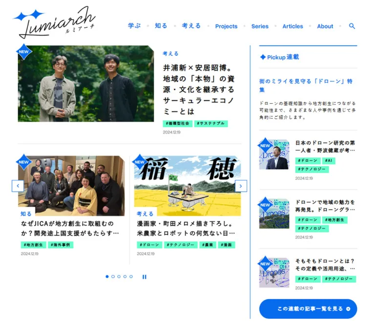
地域の実践や文化を伝えるオウンドメディア。白地に鮮やかな青の罫線・見出し、ミント色のタグ、角を切り落とした写真を組み合わせ、記事を探しやすい編集型レイアウトを構成しています。
オリジナルサイトを見るLumiarch / ルミアーチ — Style Reference
A regional editorial magazine organized with blue rules, mint index tabs, and photographs with clipped corners.
Website: lumiarch.ntt-east.co.jp Original URL: https://lumiarch.ntt-east.co.jp/ Final URL: https://lumiarch.ntt-east.co.jp/ Theme: light in the supplied captures; no alternate theme was inspected. Inspected: September 13, 2026, Japan Standard Time. The supplied evidence retrieval timestamp is September 12, 2026, 19:59:35.782 UTC, equivalent to September 13 at 04:59:35.782 JST. Viewports: 1440 × 1000 desktop and 390 × 844 mobile, in CSS pixels. Scope: the current editorial homepage. Visual evidence covers the desktop opening, part of the category section, the tag directory and footer, plus the mobile opening and footer. Rendered text documents the remaining homepage sections. Article destinations, search results, open navigation panels, and map interactions were not inspected.
Lumiarch is a content discovery homepage for regional stories, practical knowledge, and community initiatives. Its identity comes from a restrained interface around varied editorial imagery: white surfaces, bright blue navigation and structural lines, black Japanese headlines, and compact mint topic links. A handwritten wordmark and blue sparkle motif introduce a more personal character alongside the orderly grid.
The opening composition gives the main editorial selection eight columns and recommendations four columns. Within the main area, one lead story pairs a wide image with a narrower headline column; a two-card carousel follows below. Further down, category introductions combine oversized blue labels and line illustrations with article grids and horizontal rows. Mobile preserves the same hierarchy through stacking, compact metadata, and a visible sliver of the next carousel item.
How to Read This Reference
- Measured means a value appears in the supplied rendered DOM, element rectangle, computed style, or custom-property inventory. Measurements describe the captured state, not every viewport.
- Estimated means a dimension or treatment is assessed from the current screenshots. This applies particularly to lower-page typography, illustration dimensions, and corner cuts.
- Derived means arithmetic based on measured values, such as column spans or image aspect ratios.
- Recommended means implementation guidance for a new project. Suggested breakpoints, accessible target sizes, and the Quick Start are adaptations.
- Descriptive token names are implementation aliases. Original variables are identified explicitly with the word source.
- Font-family declarations establish the requested stack. The evidence does not identify the actual rendered font file for every glyph.
- Rendered DOM includes offscreen headers, submenu content, and repeated carousel items. Their presence does not establish that they were visible or interacted with.
The configured viewports were 1440px and 390px wide, while the measured document widths were 1425px and 375px. The 15px difference is consistent with reserved scrollbar space in the inspection environment. Do not reproduce it as an artificial right margin.
Tokens — Colors
Default Palette
| Name | Value | Implementation alias / source variable | Role and evidence |
|---|---|---|---|
| White | #ffffff |
--color-paper / source --White |
Visible canvas and header; computed header background is white |
| Lumiarch Blue | #076bed |
--color-blue / source --Lumiarch-Blue |
Computed navigation, category labels, recommendation heading, and carousel control color |
| Mint | #66ffcc |
--color-mint / source --Aqua-Blue, --Hashtag |
Computed topic-pill background; repeated prominently in the tag directory |
| Black | #000000 |
--color-ink / source --Black |
Computed editorial headings and tag text |
| Light Blue | #f2f8ff |
--color-wash / source --Light-Blue |
Source token matching the pale blue tag-directory surface visible in the captures |
| Rule Gray | #e0e0e0 |
--color-rule / source --Line-Grey |
Source token matching the fine article separators and navigation dots |
| Date Gray | #707070 |
--color-muted / source --Grey |
Computed publication-date text |
| Series Gray | #f2f2f2 |
--color-series / source --Light-Grey |
Computed background of the 47 Local Stories series pill |
| Corporate Blue | #0072bc |
--color-corporate / source --NTT-Blue |
Source corporate color; the footer displays the NTT EAST mark in its separate blue treatment |
Blue identifies navigation, section hierarchy, and controls. Mint identifies topics and geographic filters. Black carries the editorial reading content. Keep these assignments consistent: the page does not assign a different badge color to every topic or prefecture.
Supporting Source Tokens
These values exist in the supplied custom properties, but their application was not established in the visible component samples.
| Source variable | Value | Interpretation limit |
|---|---|---|
--Aqua-Blue-Hover |
#20ed07 |
Named as a hover token; an actual hovered tag was not captured |
--Highlight-Blue |
#cce2ff |
Available highlight color; no specific selected state verified |
--Line-Blue |
rgba(7,111,247,.12157) |
Translucent blue token; do not substitute it for every visible solid blue rule |
--Line-Blue-Blend-White |
#e1edfe |
Opaque pale blue token; individual use unverified |
--Approximate-Blue |
#0033cc |
Additional source blue, not the measured primary navigation color |
--Approximate-Grey |
#d1d1d1 |
Additional neutral with unverified component use |
--Yellow |
#fcff66 |
Available source color; not established as a general interface accent |
The mint-to-warm-yellow gradient in the lead feature belongs to that editorial image. It is not evidence of a gradient background system for the interface.
Tokens — Typography
Japanese Editorial Text
The measured body and article-heading stack is:
'游ゴシック Medium', 'Yu Gothic Medium', 游ゴシック体,
YuGothic, 游ゴシック, 'Yu Gothic',
'Hiragino Kaku Gothic ProN', 'Hiragino Sans', Meiryo, sans-serif
Body weight is 500; article headings, navigation, category labels, and topic pills use 700 in the sampled elements. The Japanese text feels deliberate and open because headings combine bold strokes with roughly 0.1em tracking.
The same absolute body tracking is inherited by some much smaller elements. Desktop topic pills have a measured 1.488px letter spacing at 10.23px type; mobile pills have 1.6px at 11px. That is wider than simply applying 0.1em to the pill itself.
Latin Utility Text
Publication dates declare 'Overused Grotesk Variable' before the Japanese stack. They use weight 400, a tight line height, and normal letter spacing. The same leading family appears in the computed category submenu links, although the submenu was not visibly opened.
The large Trending Tags heading has a bold Latin sans-serif appearance. Its computed font family was not included in the supplied samples. Reusing Overused Grotesk there is a reasonable adaptation, not a separately measured finding.
Brand Lettering
The Lumiarch wordmark is handwritten artwork with long, fine black strokes and blue sparkle shapes. No typeface name for this lettering is established. Use an authorized logo asset; a generic script font will not preserve its distinctive proportions.
Type Scale
| Role | Desktop measurement | Mobile measurement | Weight / tracking | Evidence |
|---|---|---|---|---|
| Root and body size | 14.88px |
16px |
Body 500; tracking 1.488px / 1.6px |
Computed |
| Primary navigation | 16.74px |
Text navigation absent from opening header | 700; 1.488px |
Computed desktop |
| Header tagline | 13.95px |
11px |
700; -0.05em |
Computed |
| Lead headline | 20.46px / 30.69px |
18px / 27px |
700; 0.1em |
Computed |
| Carousel headline | 16.74px / 27.2862px |
15px / 21px |
700; 0.1em |
Computed |
| Lead category label | 13.95px / 13.95px |
13px, normal line height |
700 |
Computed |
| Carousel category label | 14.88px, normal line height |
13px, normal line height |
700 |
Computed |
| Recommendation heading | 16.74px |
15px |
700 |
Computed |
| Recommendation headline | 13.95px / 20.925px |
13px / 18.2px |
700; 0.1em |
Computed |
| Article topic / series pill | 10.23px |
11px |
700; inherited body tracking |
Computed |
| Publication date | 12.09px / 12.09px |
11px / 11px |
400; normal tracking |
Computed |
Trending Tags heading |
Approximately 40px |
Not visible in supplied mobile crop | Bold | Screenshot estimate |
| Large directory tag | Approximately 15–16px |
Approximately 14px |
Bold | Screenshot estimate |
| Category introduction paragraph | Approximately 14–15px / 25px |
Not visually sampled | Regular-to-medium appearance | Screenshot estimate |
The lead heading is three lines in both supplied opening captures. Carousel headings occupy two lines, with truncation visible where the title is longer. Do not apply one universal headline size to lead stories, carousel cards, and recommendations.
Tokens — Spacing & Shapes
Responsive Unit
The supplied source exposes --root-font-size: 16, but the actual computed root is 14.88px on desktop and 16px on mobile. The complete formula and breakpoint rules were not supplied.
Viewport-related properties also change between captures: --cw is 14.4px / 3.9px, and --ch is 10px / 8.44px. These match one percent of the configured viewport dimensions. Their presence does not establish how every layout dimension is calculated.
The Quick Start keeps a conventional root and uses explicit component tokens. It does not invent a source scaling formula from two samples.
Spacing Scale
| Use | Desktop | Mobile | Status |
|---|---|---|---|
| Main horizontal inset | 50.21875px |
20px |
Measured section position |
| Main grid gap | 25.11px |
15px |
Computed section gap |
| Pill horizontal padding | 8.37px |
8px |
Computed |
| Gap between adjacent pills | Approximately 4.64px |
4px |
Derived from rectangles |
| Date top padding | 8.37px |
8px |
Computed |
| Recommendation image/text gap | 16.74px |
18px |
Computed |
| Carousel item gap | Approximately 25.11px |
30px |
Derived from item positions |
| Lead image bottom to carousel image top | Approximately 59.58px |
Not comparable: metadata stacks below image | Derived desktop |
| Mobile lead metadata bottom to carousel image top | — | 55px |
Derived from rectangles |
| Desktop category-row image/text gap | Approximately 17px |
Not visually sampled | Screenshot estimate |
| Footer top breathing room | Approximately 100px |
Approximately 60px |
Screenshot estimate |
The opening uses tight local spacing around labels and dates, but substantially larger gaps between editorial modules. Preserve both levels of density.
Border Radius
| Element | Treatment | Evidence |
|---|---|---|
| Article containers | Square and unboxed | Visible screenshots; sampled containers have 0px radius |
| Topic and series pills | 10.23px desktop; 11px mobile |
Computed; pill heights are about twice the radius |
| Carousel arrow face | Square | Computed 0px radius |
| Pagination dots | Circular | Computed 999px radius |
| Editorial photographs | Diagonal cuts at the upper corners | Visually observed; cut depth estimated around 14–17px on large images |
| Large browse-link shape | Rounded blue end visible near the category section bottom | Partially captured; full geometry unverified |
The root exposes --cutout-size: 0 and a polygon variable. This does not reveal the effective per-image treatment: the visible images still have angular upper corners. The clip-path in the Quick Start reproduces that appearance as a recommendation, rather than claiming to recover the original image rule.
Layout Measurements
| Element | Desktop | Mobile | Status |
|---|---|---|---|
| Document width | 1425px |
375px |
Measured |
| Document height | Approximately 9826px |
Approximately 10395px |
Measured, rounded |
| Initial header height | 127.40625px |
105px |
Measured |
| Alternate compact header height | 83.6875px |
75px |
Measured DOM; desktop variant visible after scrolling |
| Opening section width | 1324.5625px |
335px |
Measured |
| Opening grid | 12 tracks of about 87.36px |
Two tracks of 160px |
Computed; major mobile modules span both tracks |
| Main editorial span | 874.67px |
335px |
Measured |
| Lead image | Approximately 537 × 302px |
Approximately 335 × 188px |
Screenshot and layout-derived |
| Lead desktop text column | 312.31px |
Stacked beneath image | Measured |
| Carousel item width | 424.77px |
310px |
Measured |
| Recommendation content width | 398.67px |
335px |
Measured |
| Recommendation image column | 122.09px |
90px |
Computed grid tracks |
| Recommendation text column | 259.84px |
227px |
Computed grid tracks |
| Carousel arrow button | 33.47 × 33.47px |
30 × 30px |
Measured |
| Pagination dot | 8.36px diameter |
9px diameter |
Measured |
| Pause button layout box | 50.22px square |
45px square |
Measured; visible pause glyph is much smaller |
The desktop logo link has a much wider measured box than the visible wordmark artwork. Do not use the entire link rectangle as the intended logo-image width.
Components
Application Header
Role: establish the publication identity and provide primary discovery routes.
The opening desktop header is white, approximately 127px high. The large handwritten logo sits toward the upper left. The tagline, 「街」のミライを輝かす、地域共創メディア, occupies the upper-right area, with the blue navigation beneath it.
The visible desktop links are カテゴリー, 連載, 記事一覧, and ルミアーチとは, followed by a search icon. Small gray dots separate the text groups. A small downward triangle accompanies the category link. Navigation is bold, tracked, and unboxed.
After scrolling, the desktop captures show a compact white header with a smaller logo and an approximately 2px blue bottom rule. Its measured alternate-header height is 83.69px. The exact activation threshold and direction-dependent behavior are not provided.
Mobile shows a 140px-wide logo link at the left and two blue icon buttons at the right: search and a three-line menu. Each button has an approximately 30px layout box. The tagline moves below this row and remains above the lead image. The mobile opening header is 105px high.
Category Navigation and Search
Role: expose the publication's three editorial perspectives and search entry point.
The rendered link evidence contains 知識を学ぶ, 事例を知る, and ミライを考える, leading respectively to /learn/, /know/, and /think/. These submenu entries have computed styles, but the supplied opening screenshot does not show an expanded menu.
The search icon and mobile menu button are visible controls. Their opened panels, focus management, dismissal behavior, and search submission flow were not tested. Reuse the visible trigger anatomy without presenting an invented overlay as an observed component.
Lead Story
Role: give one editorial story priority through image size and headline hierarchy.
On desktop, the lead occupies eight columns. Its image spans approximately five of those columns, and the text spans three, separated by the standard 25.11px gutter. The image has an approximately 16:9 footprint and diagonal cuts at both upper corners.
The desktop text sequence is:
- A small blue category label.
- A black, bold, three-line headline.
- A wrapping metadata group containing a gray series pill and mint topic pills.
- A small gray publication date.
The current lead is the Kyoto installment of 47 Local Stories. Its art combines three circular portraits, black name strips, a pale regional-map pattern, and a mint-to-warm-yellow background. The artwork's lettering is separate from the live article heading.
On mobile, the image becomes 335px wide and the text stacks beneath it. A white category tab overlaps the lower-left image edge. The headline has an 8px inset relative to the image edge; the pills and date align back to the main 20px page inset. This small alignment difference gives the caption area a cut-and-pasted editorial character.
Implementation anatomy: keep the article destination and individual taxonomy destinations independently operable. Do not nest tag links inside an enclosing article link. The Quick Start uses separate image and headline links as a semantic adaptation.
Story Carousel
Role: place additional timely stories beside the lead without extending the opening into a long static list.
A fine gray horizontal rule separates it from the lead. Desktop shows two complete article cards, approximately 424.77px wide, with a 25.11px gutter and a thin vertical separator between them. Each card contains a 16:9 image, a white category tab overlapping its lower-left edge, a two-line bold title, wrapping mint tags, and a gray date.
Square white arrow buttons with blue outlines overlap the outer left and right edges near the image midline. Four small pagination dots sit below the cards; one is filled blue. A separate blue pause glyph follows the dots.
Mobile shows one 310px card and a small preview of the following card. Items advance by 340px in the measured DOM, giving a 30px item gap. The visible first card begins at x=20; the next begins at x=360. The arrow controls sit close to the document edges rather than inside the headline area.
The repeated offscreen article entries are consistent with carousel looping. They represent repeated instances of four stories, not twelve distinct editorial selections. The screenshots show different selected positions between viewport captures, but do not establish autoplay timing or the effect of pressing a control.
Topic and Series Pills
Role: offer compact, reusable routes to related content.
Topic pills have mint fill, black bold text, wide tracking, no visible outline, and fully rounded ends. A hash prefix is visible in the screenshots. Tags wrap naturally; geography and subject matter share the same treatment.
Article pills measure 19.52px high on desktop and 21px on mobile. Horizontal padding is 8.37px / 8px. Their small size contributes strongly to the page's information density.
The series pill uses the same compact family of shapes with a light gray fill. 47 Local Stories is therefore visually distinct from the mint taxonomy while remaining part of the same metadata group.
The link evidence establishes real destinations such as /articles/?tag=chihousosei and /articles/?tag=kyoto. Do not model these as inert decorative labels.
Editorial Recommendations
Role: present a parallel list selected by the editorial team.
On desktop, the recommendation rail is separated from the main content by a thin blue vertical line and approximately 25px of inner clearance. Its content begins with a 2px blue top rule, a small blue sparkle, and the heading 編集部のおすすめ.
Four compact entries follow. Each uses a square photograph at left and a text column at right. The first measured row has a 122.09px image track, 16.74px gap, and 259.84px text track. The text contains a two-line headline, several mint pills, and a date. Fine gray horizontal rules divide the entries.
Mobile moves this module below the carousel. It begins at approximately y=884.81 in the measured document, just below the supplied opening crop. The DOM confirms a 90px image track, 18px gap, and 227px text track. The module remains present; it is not removed to simplify the phone layout.
Category Section
Role: organize articles around 学ぶ, 知る, and 考える.
The desktop middle capture shows part of 知る. A broad introduction column at left contains the large blue category label, explanatory Japanese copy, and an oversized blue line illustration of a hand holding a magnifying glass. A thin gray vertical divider separates this introduction from the article area.
The article area at right begins with two large image-led cards. Below them are three horizontal article rows, separated by gray rules. The visible rows use images approximately 200 × 112px, with headlines and metadata to their right. A blue NEW sparkle overlaps the corner of the newest row's image.
The full text evidence documents the same editorial sequence for each category: an introduction, five article entries, and a category-specific browse link. Only the captured portion of 知る establishes the visual layout described here; the exact phone arrangement of these lower-page category modules is not visually sampled.
Section Headings and Browse Links
Role: distinguish broader discovery modes from individual stories.
The visible Trending Tags section pairs a large blue English heading with a much smaller blue Japanese subtitle on the same desktop line. The rendered text also includes Ranking, Search From Map, Categories, and Series, each paired with Japanese explanatory labeling.
Category and series browse destinations are established by the rendered links, including 「知る」記事をもっと見る and この連載の記事一覧を見る. A large rounded blue shape is partially visible at the bottom of the category screenshot, but the complete button contents and dimensions are outside the crop.
For a new implementation, use a consistent English-heading/Japanese-subtitle relationship and a clearly operable browse link. Treat exact lower-section heading sizes and button anatomy as implementation choices where the evidence is incomplete.
Ranking and Map Discovery
Role: provide popularity-based and geographic ways into the archive.
The rendered text documents five ranking articles followed by Search From Map and 地図から記事を探す. These establish the presence and purpose of the sections.
No supplied screenshot shows the ranking layout or map itself. Rank-number styling, map geometry, region colors, pin treatments, hover states, and result behavior remain unverified. Do not invent these details as part of the current visual reference.
Series Collections
Role: give recurring editorial themes their own introductions and article groups.
The homepage text documents three series: なぜ?の真相究明所, 歴史に学ぶ地域づくり, and 47 Local Stories. Each includes an explanatory passage, article entries, and a link to its archive. A separate link leads to all series.
The mobile DOM contains repeated article instances within these groups, suggesting a carousel implementation. No supplied visual capture covers this section, so exact slide geometry, active states, and movement are not established.
Trending Tags
Role: provide a broad topic directory before the footer.
This is the clearest large surface change in the supplied screenshots. A pale blue band spans the page and is bounded by thin blue rules. On desktop, its content aligns to the approximately 50px page inset. The large blue heading and small Japanese subtitle sit above a long gray divider, followed by two rows of generously sized mint pills.
Fifteen topics are present, including 地方創生, 地域資源, 観光, コミュニティ, and サステナビリティ. The directory pills are substantially larger than article metadata pills: approximately 42px high on desktop, compared with about 20px in article cards.
The phone footer capture shows the bottom of this band. Tags wrap into additional rows, with approximately 30px-high pills. Preserve content-driven widths and wrapping rather than forcing equal-width topic cells.
Footer
Role: close the editorial experience with site navigation, corporate identity, and utility links.
The desktop footer returns to white. The Lumiarch wordmark sits left, with the NTT EAST logo at the far right. A primary link row includes the categories, series, article archive, About page, and 取材協力者. The latter is a contributor destination, not evidence of website production credits.
A second, smaller row contains contact and policy links. Small gray dots separate link groups, and several external destinations have tiny external-link marks. Social icons for X, Facebook, Instagram, and YouTube appear in black near the corporate side of the layout. Their destinations were not supplied in the rendered link inventory.
Mobile centers and stacks the groups: publication logo, wrapping primary links, corporate logo, social icons, legal links, and copyright. The source footer displays ©2024 NTT東日本株式会社; the year is visible content, not the inspection date.
A square blue-outlined up-arrow control is visible at the lower-right edge in the scrolled captures. Its appearance suggests a return-to-top action, but its activated behavior and scrolling animation were not tested.
Tokens — Motion & Interaction
| Element or behavior | Supplied evidence | What can be concluded |
|---|---|---|
| Navigation links | color 0.2s on category link; 0.2s on other sampled links |
Short transitions are declared; hovered destination colors were not captured |
| Article headings | 0.2s transition |
A transition is available; its actual visual property change is unverified |
| Topic and series pills | 0.2s transition |
Short state changes are declared; mint-to-green hover behavior is not proven by the token name alone |
| Search button | background-color 0.2s, border-color 0.2s, box-shadow 0.2s, color 0.2s |
Multiple visual properties can transition; no open or hover state inspected |
| Compact header | Separate offscreen header in opening DOM; 0.2s; compact version visible after scrolling on desktop |
Two header presentations are supported; trigger threshold and movement path unknown |
| Carousel arrows | 0.3s transition |
Control styling duration is known; slide transition duration is not |
| Pagination and pause | 0.2s transition; filled active dot and pause glyph visible |
Visible control states established; activation results not tested |
| Root timing function | cubic-bezier(0.8, 0, 0.3, 1) appears in root computed transition/animation data |
Root timing declaration only; do not assume all descendants use it |
| Carousel movement | Repeated offscreen items and different selected snapshots | Carousel structure established; autoplay interval, swipe behavior, and looping mechanics unverified |
| Return-to-top control | Up-arrow visible in scrolled captures | Appearance established; scroll duration and easing unknown |
Many sampled elements report animation: none. This does not prove the page has no motion: JavaScript-driven carousel movement and untested states may not appear as CSS animations on those sampled elements.
Recommended motion adaptation: use restrained 200ms color transitions, keep carousel movement separate from control feedback, and implement an explicit pause state if automatic advancement is added. Avoid assigning an arbitrary autoplay interval to the original design.
Surfaces
| Layer | Appearance | Purpose |
|---|---|---|
| Main canvas | White | Continuous editorial reading surface |
| Article grouping | White with gray separators | Creates structure without elevated cards |
| Navigation and structural emphasis | Bright blue text, icons, and rules | Defines hierarchy and routes through the page |
| Topic metadata | Mint pills with black text | Repeated subject and geographic navigation |
| Series metadata | Light gray pills with black text | Distinguishes recurring publications from topics |
| Tag directory | Very pale blue band with blue boundaries | Marks a broad discovery section near the page end |
| Carousel arrow | White square with blue outline | Remains legible over varied photographic content |
| Recency marker | Blue sparkle with white NEW text |
Adds a small editorial signal at an image corner |
No general shadow-based elevation system is visible in the supplied captures. Hierarchy comes from grid position, image scale, line weight, typography, and selective fill colors.
Imagery
The current homepage combines documentary photography with article-specific graphic covers. People are photographed in local settings: storefronts, fields, temples, workshops, and waterfronts. Images preserve recognizable surroundings so that place contributes to the story.
The lead cover is more designed than the surrounding photographs. It combines portraits, names, map outlines, and a series title. Other visible covers include documentary group portraits, a graphic anime-and-town-development title over a location photograph, printed publications, and fishing scenes.
Use broad 16:9 crops for main articles and horizontal list thumbnails. The recommendation rail uses square crops. Keep focal subjects clear when generating both versions of an image; the square crop should be an intentional editorial crop.
Large blue outline illustration provides a quieter counterweight to photography. The visible magnifying-glass drawing has a white interior, an approximately 2px blue stroke, and an oversized crop inside the category introduction. It is not a small generic search icon.
Observed Asset References
The supplied evidence does not include image src values or downloadable asset paths. The following are image-to-article associations established by the screenshots and rendered article links, not image-file URLs.
| Visible imagery | Associated destination | Treatment |
|---|---|---|
Kyoto three-portrait 47 Local Stories cover |
Kyoto feature | Wide cover with embedded lettering and clipped upper corners |
| Two people outside a local restaurant | Heda deep-sea fish story | Documentary landscape photograph |
| Anime-and-town-development graphic over a stairway scene | Anime feature | Editorial graphic cover |
| Three people with a sign in a rice field | Rice-field story | Landscape photograph; visible mobile recency marker |
| Small publications arranged on a surface | Local ZINE story | Horizontal article-row thumbnail |
| People at a waterfront work site | Fisheries story | Horizontal article-row thumbnail |
| Hand and magnifying-glass line drawing | Visible within the homepage category introduction | Blue outline illustration; asset URL unavailable |
Do not pixelate these photographs or apply a universal duotone filter. Their natural color is part of the contrast with the limited interface palette.
Layout & Responsive Behavior
The desktop opening grid has 12 columns with 25.11px gutters. The main story region spans eight columns, and the recommendation region spans four. The rail's left border and padding reduce its usable content width to approximately 398.67px.
Within the eight-column main region, the lead divides into five image columns and three text columns. The carousel beneath divides into two equal cards. This nested alignment is more important than choosing an arbitrary maximum-width container.
The mobile opening section has a measured two-track grid, but the major editorial modules span both tracks. The lead becomes a vertical composition, then the carousel appears, then recommendations continue below. Mobile should therefore be implemented as a content reflow, not as a uniformly scaled desktop composition.
| Relationship | Desktop observation | Mobile observation |
|---|---|---|
| Header identity | Large logo with right-aligned tagline and navigation | Smaller logo; search and menu icons; tagline below |
| Lead story | Image beside headline and metadata | Image above headline and metadata |
| Main carousel | Two complete cards | One card plus next-card preview |
| Recommendations | Right rail with blue vertical divider | Full-width section below carousel, confirmed by DOM |
| Topic pills | Small wrapping groups | Slightly larger type and pill height; additional wrapping |
| Tag directory | Two broad rows in the visible desktop band | Multiple rows in a narrow band |
| Footer | Distributed left/right groups | Centered vertical sequence |
The exact breakpoints and behavior between the two inspected widths are unknown. The Quick Start uses 64rem as a recommended adaptation threshold. Test intermediate widths instead of treating that threshold as recovered source CSS.
Keep the carousel's horizontal overflow inside a deliberate viewport. Do not allow cloned slides to enlarge the document width. Also avoid hiding overflow on the whole page as a substitute for correctly containing the carousel.
Do’s and Don’ts
Do
- Preserve the white, blue, mint, and black color roles.
- Align the desktop opening to an eight-column main area and four-column recommendation area.
- Keep the lead image and text side by side on wide screens, then stack them on phones.
- Use bold Japanese headlines with measured tracking and distinct sizes for each article tier.
- Preserve the white category tab overlapping the lower-left image edge on stacked cards.
- Use diagonal upper-corner cuts on editorial imagery.
- Keep topic pills mint and series pills light gray.
- Let metadata wrap naturally and retain real topic destinations.
- Maintain a visible next-card preview in the phone carousel.
- Use thin rules and whitespace to separate content.
- Preserve documentary context in photographs and the oversized blue line illustration.
- Keep the footer's publication and corporate identities visually distinct.
Don’t
- Don’t replace this editorial homepage with a conversion-oriented hero and feature-card sequence.
- Don’t place every article in a rounded, shadowed container.
- Don’t turn the lead cover's gradient into a page-wide interface treatment.
- Don’t assign a different accent color to every category or prefecture.
- Don’t replace the logo artwork with an approximate script font.
- Don’t count carousel clones as additional stories.
- Don’t infer open menus, map behavior, or autoplay timing from static controls.
- Don’t treat the root cutout value as proof that visible images have square upper corners.
- Don’t hardcode the inspection environment's 15px scrollbar allowance.
- Don’t hide recommendations on mobile merely because they fall below the first screenshot.
Recommended Implementation Additions
These are recommendations for a new implementation, not verified features of the current site.
- Expand the interactive area around the observed 30–33px arrow faces and mobile header icons to approximately 44px while retaining the compact visible artwork.
- Give search, menu, carousel arrows, pagination, pause, social links, and return-to-top controls explicit accessible names.
- Keep a visible blue focus outline and ensure it is not clipped by the image mask or carousel viewport.
- Use one logical navigation structure, or correctly remove hidden duplicate navigation from keyboard and assistive-technology access.
- If the carousel uses clones, keep duplicate slides out of the tab order and avoid repeated IDs.
- Implement a persistent pause state for automatic movement, plus reduced-motion behavior and keyboard-accessible manual navigation.
- Consider increasing article metadata to at least 12px where readability is more important than exact screenshot density. The baseline measurements remain documented above.
- Preserve complete article titles in the DOM when visually clamping them to two lines.
- Use
<time datetime>for publication dates and provide descriptive image alternatives appropriate to each story. - Supply responsive image candidates and intrinsic dimensions. Prioritize the lead image; defer lower-page imagery without shifting surrounding content.
- If implementing geographic discovery, provide an equivalent text-based region selector.
Agent Prompt Guide
Quick Color Reference
- Canvas and article surfaces:
#ffffff. - Navigation, section accents, rules, and controls:
#076bed. - Topic pills:
#66ffccwith#000000text. - Series pills:
#f2f2f2with black text. - Dates:
#707070. - Fine separators:
#e0e0e0. - Tag-directory band:
#f2f8ff. - Keep the corporate mark's blue separate from the editorial accent.
Overall Prompt
“Create a Japanese regional editorial homepage inspired by the current Lumiarch interface. Use white surfaces, bright blue #076bed navigation and structural rules, mint #66ffcc topic pills, black bold Japanese headlines, and gray publication dates. Build a 12-column desktop opening with an eight-column editorial area and a four-column recommendation rail. Pair a 16:9 lead image with a narrower headline column, then place a two-card story carousel below. Use diagonally clipped upper image corners, white category tabs overlapping stacked images, fine gray separators, and documentary photography. On phones, stack the lead and recommendations and show one carousel card with a preview of the next. Finish with a pale blue wrapping tag directory and a spacious footer. Keep unknown menu, map, and autoplay behavior explicitly outside the reference.”
Example Component Prompts
- Lead story: “A white editorial feature with a wide 16:9 image on the left and a compact text column on the right. Cut both upper image corners diagonally. Stack a blue
考えるlabel, a bold three-line Japanese headline, a gray series pill, mint topic pills, and a small gray date. On mobile, place the text below and overlap the category label onto the lower-left image edge.” - Recommendation rail: “A narrow white article rail separated by a blue vertical rule. Add a blue top rule and a sparkle beside
編集部のおすすめ. Use four rows with square photographs, compact two-line black headings, mint wrapping topic pills, and gray dates. Separate rows with thin gray lines; no shadows.” - Mobile carousel: “Show one 310px editorial card within a narrow phone layout, with the next card peeking in from the right. Use a clipped-corner photograph, white category tab, two-line 15px headline, small mint tags, and an 11px gray date. Place square blue-outline arrows near the image edges and four dots with a pause control below. Treat slide timing as a separate implementation decision.”
- Category module: “A desktop editorial category section with an introduction column on the left and articles on the right. Use an oversized blue Japanese category label, concise explanatory copy, and a large blue outline illustration. Separate the columns with a fine gray line. Place two image-led articles above three horizontal thumbnail-and-text rows.”
- Tag directory and footer: “A pale blue full-width band bounded by blue rules, with a large blue
Trending Tagsheading and a smaller人気のタグsubtitle. Below a gray divider, wrap mint pills at their natural widths. Follow with a white footer containing publication identity, navigation, corporate identity, black social icons, small policy links, and copyright. Center and stack these groups on phones.”
Quick Start
CSS Custom Properties
This is a reusable adaptation, not a copy of the complete original stylesheet. The opening grid, article typography, metadata dimensions, and colors use measured values. Image masks, lower-page spacing, the 64rem breakpoint, native scroll snapping, and larger control targets are recommendations or screenshot-based approximations.
The CSS retains a conventional root font size. It expects authorized image and logo assets. Overused Grotesk must be supplied separately if available; no font URL was provided in the evidence. Menu state, compact-header activation, carousel button behavior, and any automatic advancement require separate application logic.
:root {
  /* Measured palette, exposed through reusable aliases. */
  --color-paper: #ffffff;
  --color-ink: #000000;
  --color-blue: #076bed;
  --color-mint: #66ffcc;
  --color-wash: #f2f8ff;
  --color-rule: #e0e0e0;
  --color-muted: #707070;
  --color-series: #f2f2f2;
  --color-corporate: #0072bc;

  --font-jp: '游ゴシック Medium', 'Yu Gothic Medium', 游ゴシック体,
    YuGothic, 游ゴシック, 'Yu Gothic', 'Hiragino Kaku Gothic ProN',
    'Hiragino Sans', Meiryo, sans-serif;
  --font-latin: 'Overused Grotesk Variable', var(--font-jp);

  --text-body: 14.88px;
  --text-nav: 16.74px;
  --text-lead: 20.46px;
  --text-card: 16.74px;
  --text-small-title: 13.95px;
  --text-tag: 10.23px;
  --text-date: 12.09px;
  --tracking-body: 1.488px;
  --leading-card: 1.63;

  --page-gutter: 50.21875px;
  --grid-gap: 25.11px;
  --space-small: 8.37px;
  --tag-gap: 4.64px;
  --tag-height: 19.515625px;
  --tag-radius: 10.23px;
  --rail-image: 122.094px;
  --rail-gap: 16.74px;
  --control-face: 33.46875px;
  --dot-size: 8.359375px;

  /* Screenshot-based geometry and recommended motion. */
  --image-cut: 16px;
  --section-space: 96px;
  --motion-fast: 200ms ease;
}

* {
  box-sizing: border-box;
}

body {
  margin: 0;
  color: var(--color-ink);
  background: var(--color-paper);
  font-family: var(--font-jp);
  font-size: var(--text-body);
  font-weight: 500;
  letter-spacing: var(--tracking-body);
}

img {
  display: block;
  max-inline-size: 100%;
}

a {
  color: inherit;
}

button {
  font: inherit;
}

.page-container {
  inline-size: calc(100% - 2 * var(--page-gutter));
  margin-inline: auto;
}

.masthead {
  display: grid;
  grid-template-columns: auto minmax(0, 1fr);
  grid-template-areas: 'brand tagline' 'brand nav';
  align-items: center;
  min-block-size: 127.40625px;
  background: var(--color-paper);
}

.brand {
  grid-area: brand;
  inline-size: 235px;
}

.brand img {
  inline-size: 100%;
  block-size: auto;
}

.tagline {
  grid-area: tagline;
  justify-self: end;
  margin: 0;
  font-size: 13.95px;
  font-weight: 700;
  letter-spacing: -0.05em;
}

.primary-nav {
  grid-area: nav;
  display: flex;
  justify-content: flex-end;
  align-items: center;
  flex-wrap: wrap;
  gap: 20px;
  color: var(--color-blue);
  font-size: var(--text-nav);
  font-weight: 700;
}

.primary-nav a {
  text-decoration: none;
}

.mobile-tools {
  display: none;
}

/* Apply this variant through explicit header state logic. */
.site-header.is-compact {
  position: sticky;
  inset-block-start: 0;
  z-index: 20;
  background: var(--color-paper);
  border-block-end: 2px solid var(--color-blue);
}

.is-compact .masthead {
  min-block-size: 81.6875px;
  grid-template-areas: 'brand nav';
}

.is-compact .brand {
  inline-size: 128px;
}

.is-compact .tagline {
  display: none;
}

.opening-grid {
  display: grid;
  grid-template-columns: repeat(12, minmax(0, 1fr));
  gap: var(--grid-gap);
}

.opening-main {
  grid-column: span 8;
  min-inline-size: 0;
}

.editor-rail {
  grid-column: span 4;
  min-inline-size: 0;
  padding-inline-start: var(--grid-gap);
  border-inline-start: 1px solid var(--color-blue);
}

.story,
.story__body {
  min-inline-size: 0;
}

.story__image {
  display: block;
}

.story__image img {
  inline-size: 100%;
  aspect-ratio: 16 / 9;
  object-fit: cover;
  clip-path: polygon(
    var(--image-cut) 0,
    calc(100% - var(--image-cut)) 0,
    100% var(--image-cut),
    100% 100%,
    0 100%,
    0 var(--image-cut)
  );
}

.story__link {
  display: block;
  text-decoration: none;
}

.story__title {
  margin: 4px var(--space-small) 0;
  font-size: var(--text-card);
  line-height: var(--leading-card);
  font-weight: 700;
  letter-spacing: 0.1em;
}

.story__title--clamped {
  display: -webkit-box;
  -webkit-box-orient: vertical;
  -webkit-line-clamp: 2;
  overflow: hidden;
}

.story__category {
  display: table;
  position: relative;
  margin: 0;
  padding: var(--space-small) var(--space-small) 0;
  color: var(--color-blue);
  background: var(--color-paper);
  font-size: 14.88px;
  line-height: 22px;
  font-weight: 700;
}

.story--stacked .story__body {
  position: relative;
  margin-block-start: -26px;
}

.story--lead {
  display: grid;
  grid-template-columns: repeat(8, minmax(0, 1fr));
  gap: var(--grid-gap);
}

.story--lead > .story__image {
  grid-column: span 5;
}

.story--lead > .story__body {
  grid-column: span 3;
  padding-block-start: 16.74px;
}

.story--lead .story__category {
  padding: 0 0 var(--space-small);
  font-size: 13.95px;
  line-height: 1;
}

.story--lead .story__title {
  margin: 0;
  font-size: var(--text-lead);
  line-height: 1.5;
}

.tag-list {
  display: flex;
  flex-wrap: wrap;
  gap: var(--tag-gap);
  margin-block-start: var(--space-small);
}

.tag {
  display: inline-flex;
  align-items: center;
  min-block-size: var(--tag-height);
  max-inline-size: 100%;
  padding-inline: var(--space-small);
  border-radius: var(--tag-radius);
  color: var(--color-ink);
  background: var(--color-mint);
  font-size: var(--text-tag);
  font-weight: 700;
  line-height: 1.4;
  text-decoration: none;
  overflow-wrap: anywhere;
  transition: background-color var(--motion-fast);
}

.tag--series {
  background: var(--color-series);
}

.story__date {
  display: block;
  margin-block-start: var(--space-small);
  color: var(--color-muted);
  font-family: var(--font-latin);
  font-size: var(--text-date);
  font-weight: 400;
  line-height: 1;
  letter-spacing: normal;
}

.story-carousel {
  margin-block-start: 25.11px;
  padding-block-start: 33.48px;
  border-block-start: 1px solid var(--color-rule);
}

/* Native scrolling is a recommended functional baseline. */
.carousel-track {
  display: grid;
  grid-auto-flow: column;
  grid-auto-columns: calc((100% - var(--grid-gap)) / 2);
  gap: var(--grid-gap);
  margin: 0;
  padding: 0 0 8px;
  list-style: none;
  overflow-x: auto;
  scroll-snap-type: x proximity;
}

.carousel-track > li {
  min-inline-size: 0;
  scroll-snap-align: start;
}

.carousel-controls {
  display: flex;
  justify-content: center;
  align-items: center;
  gap: 4px;
  margin-block-start: 16px;
}

/* Larger targets retain compact visible control faces. */
.icon-button,
.dot-button {
  display: inline-grid;
  place-items: center;
  padding: 0;
  border: 0;
  color: var(--color-blue);
  background: transparent;
  cursor: pointer;
}

.icon-button {
  inline-size: 44px;
  block-size: 44px;
}

.icon-button__face {
  display: grid;
  place-items: center;
  inline-size: var(--control-face);
  block-size: var(--control-face);
  border: 1px solid var(--color-blue);
  background: var(--color-paper);
}

.dot-button {
  inline-size: 24px;
  block-size: 24px;
}

.dot-button::before {
  content: '';
  inline-size: var(--dot-size);
  block-size: var(--dot-size);
  border: 1px solid var(--color-blue);
  border-radius: 50%;
}

.dot-button[aria-current='true']::before {
  background: var(--color-blue);
}

.editor-rail__heading {
  margin: 0;
  padding-block: 16.74px;
  border-block-start: 2px solid var(--color-blue);
  border-block-end: 1px solid var(--color-rule);
  color: var(--color-blue);
  font-size: 16.74px;
  font-weight: 700;
}

.story--compact {
  display: grid;
  grid-template-columns: var(--rail-image) minmax(0, 1fr);
  gap: var(--rail-gap);
  padding-block: 25.11px;
}

.story--compact + .story--compact {
  border-block-start: 1px solid var(--color-rule);
}

.story--compact .story__image img {
  aspect-ratio: 1;
  --image-cut: 9px;
}

.story--compact .story__title {
  margin: 0;
  font-size: var(--text-small-title);
  line-height: 1.5;
}

.category-section {
  display: grid;
  grid-template-columns: repeat(12, minmax(0, 1fr));
  gap: var(--grid-gap);
  margin-block: var(--section-space);
}

.category-intro {
  grid-column: span 4;
  padding-inline-end: var(--grid-gap);
  border-inline-end: 1px solid var(--color-rule);
}

.category-content {
  grid-column: span 8;
  min-inline-size: 0;
}

.category-feature-grid {
  display: grid;
  grid-template-columns: repeat(2, minmax(0, 1fr));
  gap: var(--grid-gap);
}

.article-row {
  display: grid;
  grid-template-columns: minmax(120px, 200px) minmax(0, 1fr);
  gap: 17px;
  padding-block: 25px;
  border-block-start: 1px solid var(--color-rule);
}

.trending-tags {
  margin-block-start: var(--section-space);
  padding-block: 96px;
  border-block: 2px solid var(--color-blue);
  background: var(--color-wash);
}

.section-heading {
  display: flex;
  align-items: baseline;
  flex-wrap: wrap;
  gap: 24px;
  margin: 0;
  color: var(--color-blue);
}

.section-heading__en {
  font-family: var(--font-latin);
  font-size: 40px;
  font-weight: 700;
  letter-spacing: normal;
}

.section-heading__ja {
  font-size: 14px;
  font-weight: 700;
}

.trending-tags .tag-list {
  gap: 8px;
  margin-block-start: 48px;
  padding-block-start: 48px;
  border-block-start: 1px solid var(--color-rule);
}

.trending-tags .tag {
  min-block-size: 42px;
  padding-inline: 17px;
  border-radius: 999px;
  font-size: 15px;
}

.footer-grid {
  display: grid;
  grid-template-columns: minmax(0, 1fr) auto;
  grid-template-areas:
    'brand corporate'
    'links socials'
    'legal copyright';
  align-items: center;
  gap: 40px 24px;
  padding-block: 100px;
}

.footer-brand { grid-area: brand; }
.footer-corporate { grid-area: corporate; }
.footer-links { grid-area: links; }
.footer-socials { grid-area: socials; }
.footer-legal { grid-area: legal; }
.footer-copyright { grid-area: copyright; }

.footer-links,
.footer-legal,
.footer-socials {
  display: flex;
  flex-wrap: wrap;
  align-items: center;
  gap: 20px;
}

.footer-links,
.footer-legal {
  color: var(--color-blue);
  font-weight: 700;
}

.footer-legal {
  font-size: 12px;
}

.footer-copyright {
  margin: 0;
  font-size: 12px;
}

/* Recommended feedback; original activated states were not inspected. */
@media (hover: hover) {
  .story__link:hover,
  .primary-nav a:hover {
    color: var(--color-blue);
    text-decoration: underline;
    text-underline-offset: 0.2em;
  }
}

:where(a, button):focus-visible {
  outline: 2px solid var(--color-blue);
  outline-offset: 3px;
}

/* Recommended breakpoint; only the endpoint layouts were inspected. */
@media (max-width: 64rem) {
  :root {
    --text-body: 16px;
    --text-lead: 18px;
    --text-card: 15px;
    --text-small-title: 13px;
    --text-tag: 11px;
    --text-date: 11px;
    --tracking-body: 1.6px;
    --leading-card: 1.4;
    --page-gutter: 20px;
    --grid-gap: 15px;
    --space-small: 8px;
    --tag-gap: 4px;
    --tag-height: 21px;
    --tag-radius: 11px;
    --rail-image: 90px;
    --rail-gap: 18px;
    --control-face: 30px;
    --dot-size: 9px;
    --section-space: 56px;
  }

  .masthead {
    grid-template-columns: 1fr auto;
    grid-template-areas: 'brand tools' 'tagline tagline';
    min-block-size: 105px;
  }

  .brand,
  .is-compact .brand {
    inline-size: 140px;
  }

  .primary-nav {
    display: none;
  }

  .mobile-tools {
    grid-area: tools;
    display: flex;
    align-items: center;
  }

  .tagline {
    justify-self: center;
    font-size: 11px;
  }

  .is-compact .masthead {
    min-block-size: 73px;
    grid-template-areas: 'brand tools';
  }

  .opening-grid {
    grid-template-columns: repeat(2, minmax(0, 1fr));
  }

  .opening-main,
  .editor-rail {
    grid-column: 1 / -1;
  }

  .editor-rail {
    margin-block-start: 24px;
    padding-inline-start: 0;
    border-inline-start: 0;
  }

  .story--lead {
    display: block;
  }

  .story--lead > .story__body,
  .story--stacked > .story__body {
    position: relative;
    margin-block-start: -24px;
    padding-block-start: 0;
  }

  .story__category,
  .story--lead .story__category {
    padding: 8px 8px 0;
    font-size: 13px;
    line-height: 20px;
  }

  .story--lead .story__title {
    margin: 4px 8px 0;
  }

  .story-carousel {
    margin-block-start: 15px;
    padding-block-start: 39px;
  }

  .carousel-track {
    inline-size: calc(100% + var(--page-gutter));
    grid-auto-columns: calc(100% - 45px);
    gap: 30px;
  }

  .editor-rail__heading {
    padding-block: 15px;
    font-size: 15px;
  }

  .story--compact {
    padding-block: 15px;
  }

  .story--compact .story__title {
    line-height: 1.4;
  }

  /* Lower-page mobile arrangements are recommended adaptations. */
  .category-section {
    display: block;
  }

  .category-intro {
    margin-block-end: 32px;
    padding-inline-end: 0;
    border-inline-end: 0;
  }

  .category-feature-grid {
    grid-template-columns: 1fr;
  }

  .article-row {
    grid-template-columns: 100px minmax(0, 1fr);
    gap: 15px;
  }

  .trending-tags {
    padding-block: 48px;
  }

  .section-heading {
    display: grid;
    gap: 8px;
  }

  .section-heading__en {
    font-size: 28px;
  }

  .trending-tags .tag-list {
    margin-block-start: 28px;
    padding-block-start: 28px;
    gap: 14px 8px;
  }

  .trending-tags .tag {
    min-block-size: 30px;
    padding-inline: 15px;
    font-size: 14px;
  }

  .footer-grid {
    grid-template-columns: minmax(0, 1fr);
    grid-template-areas:
      'brand'
      'links'
      'corporate'
      'socials'
      'legal'
      'copyright';
    justify-items: center;
    gap: 40px;
    padding-block: 60px;
    text-align: center;
  }

  .footer-links,
  .footer-legal,
  .footer-socials {
    justify-content: center;
  }
}

@media (prefers-reduced-motion: reduce) {
  .tag,
  .story__link,
  .primary-nav a {
    transition: none;
  }

  .carousel-track {
    scroll-behavior: auto;
  }
}
Use .story--lead for the opening feature, .story--stacked for image-over-caption cards, and .story--compact for recommendations. A story expects a .story__image link and a sibling .story__body containing its headline link, .tag-list, and .story__date. Apply .story__title--clamped only to titles that should occupy two visible lines.
The native scroller deliberately provides a working horizontal layout without claiming the original carousel engine. The control styles do not wire buttons to scrolling or implement pause. Keep controls synchronized with the selected item when adding that behavior, and retain manual scrolling if script initialization fails.
Tailwind v4 Token Mapping
Optional aliases for an implementation already using Tailwind v4. Define the properties above first. This mapping is not evidence of the original site's complete build stack.
@theme inline {
  --color-editorial-paper: var(--color-paper);
  --color-editorial-ink: var(--color-ink);
  --color-editorial-blue: var(--color-blue);
  --color-editorial-mint: var(--color-mint);
  --color-editorial-wash: var(--color-wash);
  --color-editorial-rule: var(--color-rule);
  --color-editorial-muted: var(--color-muted);
  --color-editorial-series: var(--color-series);

  --font-editorial: var(--font-jp);
  --font-editorial-latin: var(--font-latin);

  --text-editorial-lead: var(--text-lead);
  --text-editorial-card: var(--text-card);
  --text-editorial-tag: var(--text-tag);
  --text-editorial-date: var(--text-date);

  --spacing-editorial-gutter: var(--page-gutter);
  --spacing-editorial-gap: var(--grid-gap);
  --spacing-editorial-small: var(--space-small);
  --radius-editorial-tag: var(--tag-radius);
}
Sources & Evidence
- Lumiarch homepage: original and final URL are identical; the supplied browser observation reports HTTP 200.
- Retrieval record:
2026-09-12T19:59:35.782Z, equivalent to September 13, 2026, 04:59:35.782 JST. Individual screenshot timestamps were not separately supplied. - Desktop evidence: three current 1440 × 1000 captures covering the opening, part of the category content, and the tag-directory/footer area. Rendered element rectangles, computed styles, custom properties, text, and links accompany the opening state.
- Mobile evidence: two current 390 × 844 captures covering the opening and footer, plus rendered DOM and computed styles. Measured document width is 375px in this environment.
- Inspection procedure supplied with the captures: readiness checks waited for document load, relevant finite animations, sampled layout/text stability, and image decoding within bounded time limits. The initial observation lasted at least five seconds. Perpetual animations were paused during readiness checks and resumed afterward. Scrolling traversed intermediate positions.
- Interaction limits: no click-result evidence was supplied for carousel controls, search, menus, the map, social destinations, or the return-to-top control. The desktop compact header is visible in scrolled captures, but its exact trigger is unknown.
- Asset and implementation limits: no image-source inventory, font-file inventory, complete stylesheet, or source breakpoint rules were supplied. The article links above identify associated stories, not downloaded image assets. The CSS adaptation was not executed or visually tested.
This reference describes the current homepage supported by the supplied original-page captures and rendered evidence. Screenshot estimates and proposed implementation behavior are labeled separately from measured values.
# Lumiarch / ルミアーチ — Style Reference

> A regional editorial magazine organized with blue rules, mint index tabs, and photographs with clipped corners.

**Website:** [lumiarch.ntt-east.co.jp](https://lumiarch.ntt-east.co.jp/)
**Original URL:** https://lumiarch.ntt-east.co.jp/
**Final URL:** https://lumiarch.ntt-east.co.jp/
**Theme:** light in the supplied captures; no alternate theme was inspected.
**Inspected:** September 13, 2026, Japan Standard Time. The supplied evidence retrieval timestamp is September 12, 2026, 19:59:35.782 UTC, equivalent to September 13 at 04:59:35.782 JST.
**Viewports:** 1440 × 1000 desktop and 390 × 844 mobile, in CSS pixels.
**Scope:** the current editorial homepage. Visual evidence covers the desktop opening, part of the category section, the tag directory and footer, plus the mobile opening and footer. Rendered text documents the remaining homepage sections. Article destinations, search results, open navigation panels, and map interactions were not inspected.

Lumiarch is a content discovery homepage for regional stories, practical knowledge, and community initiatives. Its identity comes from a restrained interface around varied editorial imagery: white surfaces, bright blue navigation and structural lines, black Japanese headlines, and compact mint topic links. A handwritten wordmark and blue sparkle motif introduce a more personal character alongside the orderly grid.

The opening composition gives the main editorial selection eight columns and recommendations four columns. Within the main area, one lead story pairs a wide image with a narrower headline column; a two-card carousel follows below. Further down, category introductions combine oversized blue labels and line illustrations with article grids and horizontal rows. Mobile preserves the same hierarchy through stacking, compact metadata, and a visible sliver of the next carousel item.

## How to Read This Reference

- **Measured** means a value appears in the supplied rendered DOM, element rectangle, computed style, or custom-property inventory. Measurements describe the captured state, not every viewport.
- **Estimated** means a dimension or treatment is assessed from the current screenshots. This applies particularly to lower-page typography, illustration dimensions, and corner cuts.
- **Derived** means arithmetic based on measured values, such as column spans or image aspect ratios.
- **Recommended** means implementation guidance for a new project. Suggested breakpoints, accessible target sizes, and the Quick Start are adaptations.
- Descriptive token names are implementation aliases. Original variables are identified explicitly with the word **source**.
- Font-family declarations establish the requested stack. The evidence does not identify the actual rendered font file for every glyph.
- Rendered DOM includes offscreen headers, submenu content, and repeated carousel items. Their presence does not establish that they were visible or interacted with.

The configured viewports were 1440px and 390px wide, while the measured document widths were 1425px and 375px. The 15px difference is consistent with reserved scrollbar space in the inspection environment. Do not reproduce it as an artificial right margin.

## Tokens — Colors

### Default Palette

| Name | Value | Implementation alias / source variable | Role and evidence |
| --- | --- | --- | --- |
| White | `#ffffff` | `--color-paper` / source `--White` | Visible canvas and header; computed header background is white |
| Lumiarch Blue | `#076bed` | `--color-blue` / source `--Lumiarch-Blue` | Computed navigation, category labels, recommendation heading, and carousel control color |
| Mint | `#66ffcc` | `--color-mint` / source `--Aqua-Blue`, `--Hashtag` | Computed topic-pill background; repeated prominently in the tag directory |
| Black | `#000000` | `--color-ink` / source `--Black` | Computed editorial headings and tag text |
| Light Blue | `#f2f8ff` | `--color-wash` / source `--Light-Blue` | Source token matching the pale blue tag-directory surface visible in the captures |
| Rule Gray | `#e0e0e0` | `--color-rule` / source `--Line-Grey` | Source token matching the fine article separators and navigation dots |
| Date Gray | `#707070` | `--color-muted` / source `--Grey` | Computed publication-date text |
| Series Gray | `#f2f2f2` | `--color-series` / source `--Light-Grey` | Computed background of the `47 Local Stories` series pill |
| Corporate Blue | `#0072bc` | `--color-corporate` / source `--NTT-Blue` | Source corporate color; the footer displays the NTT EAST mark in its separate blue treatment |

Blue identifies navigation, section hierarchy, and controls. Mint identifies topics and geographic filters. Black carries the editorial reading content. Keep these assignments consistent: the page does not assign a different badge color to every topic or prefecture.

### Supporting Source Tokens

These values exist in the supplied custom properties, but their application was not established in the visible component samples.

| Source variable | Value | Interpretation limit |
| --- | --- | --- |
| `--Aqua-Blue-Hover` | `#20ed07` | Named as a hover token; an actual hovered tag was not captured |
| `--Highlight-Blue` | `#cce2ff` | Available highlight color; no specific selected state verified |
| `--Line-Blue` | `rgba(7,111,247,.12157)` | Translucent blue token; do not substitute it for every visible solid blue rule |
| `--Line-Blue-Blend-White` | `#e1edfe` | Opaque pale blue token; individual use unverified |
| `--Approximate-Blue` | `#0033cc` | Additional source blue, not the measured primary navigation color |
| `--Approximate-Grey` | `#d1d1d1` | Additional neutral with unverified component use |
| `--Yellow` | `#fcff66` | Available source color; not established as a general interface accent |

The mint-to-warm-yellow gradient in the lead feature belongs to that editorial image. It is not evidence of a gradient background system for the interface.

## Tokens — Typography

### Japanese Editorial Text

The measured body and article-heading stack is:

```css
'游ゴシック Medium', 'Yu Gothic Medium', 游ゴシック体,
YuGothic, 游ゴシック, 'Yu Gothic',
'Hiragino Kaku Gothic ProN', 'Hiragino Sans', Meiryo, sans-serif
```

Body weight is `500`; article headings, navigation, category labels, and topic pills use `700` in the sampled elements. The Japanese text feels deliberate and open because headings combine bold strokes with roughly `0.1em` tracking.

The same absolute body tracking is inherited by some much smaller elements. Desktop topic pills have a measured `1.488px` letter spacing at `10.23px` type; mobile pills have `1.6px` at `11px`. That is wider than simply applying `0.1em` to the pill itself.

### Latin Utility Text

Publication dates declare `'Overused Grotesk Variable'` before the Japanese stack. They use weight `400`, a tight line height, and normal letter spacing. The same leading family appears in the computed category submenu links, although the submenu was not visibly opened.

The large `Trending Tags` heading has a bold Latin sans-serif appearance. Its computed font family was not included in the supplied samples. Reusing Overused Grotesk there is a reasonable adaptation, not a separately measured finding.

### Brand Lettering

The Lumiarch wordmark is handwritten artwork with long, fine black strokes and blue sparkle shapes. No typeface name for this lettering is established. Use an authorized logo asset; a generic script font will not preserve its distinctive proportions.

### Type Scale

| Role | Desktop measurement | Mobile measurement | Weight / tracking | Evidence |
| --- | --- | --- | --- | --- |
| Root and body size | `14.88px` | `16px` | Body `500`; tracking `1.488px` / `1.6px` | Computed |
| Primary navigation | `16.74px` | Text navigation absent from opening header | `700`; `1.488px` | Computed desktop |
| Header tagline | `13.95px` | `11px` | `700`; `-0.05em` | Computed |
| Lead headline | `20.46px / 30.69px` | `18px / 27px` | `700`; `0.1em` | Computed |
| Carousel headline | `16.74px / 27.2862px` | `15px / 21px` | `700`; `0.1em` | Computed |
| Lead category label | `13.95px / 13.95px` | `13px`, normal line height | `700` | Computed |
| Carousel category label | `14.88px`, normal line height | `13px`, normal line height | `700` | Computed |
| Recommendation heading | `16.74px` | `15px` | `700` | Computed |
| Recommendation headline | `13.95px / 20.925px` | `13px / 18.2px` | `700`; `0.1em` | Computed |
| Article topic / series pill | `10.23px` | `11px` | `700`; inherited body tracking | Computed |
| Publication date | `12.09px / 12.09px` | `11px / 11px` | `400`; normal tracking | Computed |
| `Trending Tags` heading | Approximately `40px` | Not visible in supplied mobile crop | Bold | Screenshot estimate |
| Large directory tag | Approximately `15–16px` | Approximately `14px` | Bold | Screenshot estimate |
| Category introduction paragraph | Approximately `14–15px / 25px` | Not visually sampled | Regular-to-medium appearance | Screenshot estimate |

The lead heading is three lines in both supplied opening captures. Carousel headings occupy two lines, with truncation visible where the title is longer. Do not apply one universal headline size to lead stories, carousel cards, and recommendations.

## Tokens — Spacing & Shapes

### Responsive Unit

The supplied source exposes `--root-font-size: 16`, but the actual computed root is `14.88px` on desktop and `16px` on mobile. The complete formula and breakpoint rules were not supplied.

Viewport-related properties also change between captures: `--cw` is `14.4px` / `3.9px`, and `--ch` is `10px` / `8.44px`. These match one percent of the configured viewport dimensions. Their presence does not establish how every layout dimension is calculated.

The Quick Start keeps a conventional root and uses explicit component tokens. It does not invent a source scaling formula from two samples.

### Spacing Scale

| Use | Desktop | Mobile | Status |
| --- | --- | --- | --- |
| Main horizontal inset | `50.21875px` | `20px` | Measured section position |
| Main grid gap | `25.11px` | `15px` | Computed section gap |
| Pill horizontal padding | `8.37px` | `8px` | Computed |
| Gap between adjacent pills | Approximately `4.64px` | `4px` | Derived from rectangles |
| Date top padding | `8.37px` | `8px` | Computed |
| Recommendation image/text gap | `16.74px` | `18px` | Computed |
| Carousel item gap | Approximately `25.11px` | `30px` | Derived from item positions |
| Lead image bottom to carousel image top | Approximately `59.58px` | Not comparable: metadata stacks below image | Derived desktop |
| Mobile lead metadata bottom to carousel image top | — | `55px` | Derived from rectangles |
| Desktop category-row image/text gap | Approximately `17px` | Not visually sampled | Screenshot estimate |
| Footer top breathing room | Approximately `100px` | Approximately `60px` | Screenshot estimate |

The opening uses tight local spacing around labels and dates, but substantially larger gaps between editorial modules. Preserve both levels of density.

### Border Radius

| Element | Treatment | Evidence |
| --- | --- | --- |
| Article containers | Square and unboxed | Visible screenshots; sampled containers have `0px` radius |
| Topic and series pills | `10.23px` desktop; `11px` mobile | Computed; pill heights are about twice the radius |
| Carousel arrow face | Square | Computed `0px` radius |
| Pagination dots | Circular | Computed `999px` radius |
| Editorial photographs | Diagonal cuts at the upper corners | Visually observed; cut depth estimated around `14–17px` on large images |
| Large browse-link shape | Rounded blue end visible near the category section bottom | Partially captured; full geometry unverified |

The root exposes `--cutout-size: 0` and a polygon variable. This does not reveal the effective per-image treatment: the visible images still have angular upper corners. The clip-path in the Quick Start reproduces that appearance as a recommendation, rather than claiming to recover the original image rule.

### Layout Measurements

| Element | Desktop | Mobile | Status |
| --- | --- | --- | --- |
| Document width | `1425px` | `375px` | Measured |
| Document height | Approximately `9826px` | Approximately `10395px` | Measured, rounded |
| Initial header height | `127.40625px` | `105px` | Measured |
| Alternate compact header height | `83.6875px` | `75px` | Measured DOM; desktop variant visible after scrolling |
| Opening section width | `1324.5625px` | `335px` | Measured |
| Opening grid | 12 tracks of about `87.36px` | Two tracks of `160px` | Computed; major mobile modules span both tracks |
| Main editorial span | `874.67px` | `335px` | Measured |
| Lead image | Approximately `537 × 302px` | Approximately `335 × 188px` | Screenshot and layout-derived |
| Lead desktop text column | `312.31px` | Stacked beneath image | Measured |
| Carousel item width | `424.77px` | `310px` | Measured |
| Recommendation content width | `398.67px` | `335px` | Measured |
| Recommendation image column | `122.09px` | `90px` | Computed grid tracks |
| Recommendation text column | `259.84px` | `227px` | Computed grid tracks |
| Carousel arrow button | `33.47 × 33.47px` | `30 × 30px` | Measured |
| Pagination dot | `8.36px` diameter | `9px` diameter | Measured |
| Pause button layout box | `50.22px` square | `45px` square | Measured; visible pause glyph is much smaller |

The desktop logo link has a much wider measured box than the visible wordmark artwork. Do not use the entire link rectangle as the intended logo-image width.

## Components

### Application Header

**Role:** establish the publication identity and provide primary discovery routes.

The opening desktop header is white, approximately 127px high. The large handwritten logo sits toward the upper left. The tagline, `「街」のミライを輝かす、地域共創メディア`, occupies the upper-right area, with the blue navigation beneath it.

The visible desktop links are `カテゴリー`, `連載`, `記事一覧`, and `ルミアーチとは`, followed by a search icon. Small gray dots separate the text groups. A small downward triangle accompanies the category link. Navigation is bold, tracked, and unboxed.

After scrolling, the desktop captures show a compact white header with a smaller logo and an approximately 2px blue bottom rule. Its measured alternate-header height is 83.69px. The exact activation threshold and direction-dependent behavior are not provided.

Mobile shows a 140px-wide logo link at the left and two blue icon buttons at the right: search and a three-line menu. Each button has an approximately 30px layout box. The tagline moves below this row and remains above the lead image. The mobile opening header is 105px high.

### Category Navigation and Search

**Role:** expose the publication's three editorial perspectives and search entry point.

The rendered link evidence contains `知識を学ぶ`, `事例を知る`, and `ミライを考える`, leading respectively to `/learn/`, `/know/`, and `/think/`. These submenu entries have computed styles, but the supplied opening screenshot does not show an expanded menu.

The search icon and mobile menu button are visible controls. Their opened panels, focus management, dismissal behavior, and search submission flow were not tested. Reuse the visible trigger anatomy without presenting an invented overlay as an observed component.

### Lead Story

**Role:** give one editorial story priority through image size and headline hierarchy.

On desktop, the lead occupies eight columns. Its image spans approximately five of those columns, and the text spans three, separated by the standard 25.11px gutter. The image has an approximately 16:9 footprint and diagonal cuts at both upper corners.

The desktop text sequence is:

1. A small blue category label.
2. A black, bold, three-line headline.
3. A wrapping metadata group containing a gray series pill and mint topic pills.
4. A small gray publication date.

The current lead is the Kyoto installment of `47 Local Stories`. Its art combines three circular portraits, black name strips, a pale regional-map pattern, and a mint-to-warm-yellow background. The artwork's lettering is separate from the live article heading.

On mobile, the image becomes 335px wide and the text stacks beneath it. A white category tab overlaps the lower-left image edge. The headline has an 8px inset relative to the image edge; the pills and date align back to the main 20px page inset. This small alignment difference gives the caption area a cut-and-pasted editorial character.

**Implementation anatomy:** keep the article destination and individual taxonomy destinations independently operable. Do not nest tag links inside an enclosing article link. The Quick Start uses separate image and headline links as a semantic adaptation.

### Story Carousel

**Role:** place additional timely stories beside the lead without extending the opening into a long static list.

A fine gray horizontal rule separates it from the lead. Desktop shows two complete article cards, approximately 424.77px wide, with a 25.11px gutter and a thin vertical separator between them. Each card contains a 16:9 image, a white category tab overlapping its lower-left edge, a two-line bold title, wrapping mint tags, and a gray date.

Square white arrow buttons with blue outlines overlap the outer left and right edges near the image midline. Four small pagination dots sit below the cards; one is filled blue. A separate blue pause glyph follows the dots.

Mobile shows one 310px card and a small preview of the following card. Items advance by 340px in the measured DOM, giving a 30px item gap. The visible first card begins at x=20; the next begins at x=360. The arrow controls sit close to the document edges rather than inside the headline area.

The repeated offscreen article entries are consistent with carousel looping. They represent repeated instances of four stories, not twelve distinct editorial selections. The screenshots show different selected positions between viewport captures, but do not establish autoplay timing or the effect of pressing a control.

### Topic and Series Pills

**Role:** offer compact, reusable routes to related content.

Topic pills have mint fill, black bold text, wide tracking, no visible outline, and fully rounded ends. A hash prefix is visible in the screenshots. Tags wrap naturally; geography and subject matter share the same treatment.

Article pills measure 19.52px high on desktop and 21px on mobile. Horizontal padding is 8.37px / 8px. Their small size contributes strongly to the page's information density.

The series pill uses the same compact family of shapes with a light gray fill. `47 Local Stories` is therefore visually distinct from the mint taxonomy while remaining part of the same metadata group.

The link evidence establishes real destinations such as `/articles/?tag=chihousosei` and `/articles/?tag=kyoto`. Do not model these as inert decorative labels.

### Editorial Recommendations

**Role:** present a parallel list selected by the editorial team.

On desktop, the recommendation rail is separated from the main content by a thin blue vertical line and approximately 25px of inner clearance. Its content begins with a 2px blue top rule, a small blue sparkle, and the heading `編集部のおすすめ`.

Four compact entries follow. Each uses a square photograph at left and a text column at right. The first measured row has a 122.09px image track, 16.74px gap, and 259.84px text track. The text contains a two-line headline, several mint pills, and a date. Fine gray horizontal rules divide the entries.

Mobile moves this module below the carousel. It begins at approximately y=884.81 in the measured document, just below the supplied opening crop. The DOM confirms a 90px image track, 18px gap, and 227px text track. The module remains present; it is not removed to simplify the phone layout.

### Category Section

**Role:** organize articles around `学ぶ`, `知る`, and `考える`.

The desktop middle capture shows part of `知る`. A broad introduction column at left contains the large blue category label, explanatory Japanese copy, and an oversized blue line illustration of a hand holding a magnifying glass. A thin gray vertical divider separates this introduction from the article area.

The article area at right begins with two large image-led cards. Below them are three horizontal article rows, separated by gray rules. The visible rows use images approximately 200 × 112px, with headlines and metadata to their right. A blue `NEW` sparkle overlaps the corner of the newest row's image.

The full text evidence documents the same editorial sequence for each category: an introduction, five article entries, and a category-specific browse link. Only the captured portion of `知る` establishes the visual layout described here; the exact phone arrangement of these lower-page category modules is not visually sampled.

### Section Headings and Browse Links

**Role:** distinguish broader discovery modes from individual stories.

The visible `Trending Tags` section pairs a large blue English heading with a much smaller blue Japanese subtitle on the same desktop line. The rendered text also includes `Ranking`, `Search From Map`, `Categories`, and `Series`, each paired with Japanese explanatory labeling.

Category and series browse destinations are established by the rendered links, including `「知る」記事をもっと見る` and `この連載の記事一覧を見る`. A large rounded blue shape is partially visible at the bottom of the category screenshot, but the complete button contents and dimensions are outside the crop.

For a new implementation, use a consistent English-heading/Japanese-subtitle relationship and a clearly operable browse link. Treat exact lower-section heading sizes and button anatomy as implementation choices where the evidence is incomplete.

### Ranking and Map Discovery

**Role:** provide popularity-based and geographic ways into the archive.

The rendered text documents five ranking articles followed by `Search From Map` and `地図から記事を探す`. These establish the presence and purpose of the sections.

No supplied screenshot shows the ranking layout or map itself. Rank-number styling, map geometry, region colors, pin treatments, hover states, and result behavior remain unverified. Do not invent these details as part of the current visual reference.

### Series Collections

**Role:** give recurring editorial themes their own introductions and article groups.

The homepage text documents three series: `なぜ?の真相究明所`, `歴史に学ぶ地域づくり`, and `47 Local Stories`. Each includes an explanatory passage, article entries, and a link to its archive. A separate link leads to all series.

The mobile DOM contains repeated article instances within these groups, suggesting a carousel implementation. No supplied visual capture covers this section, so exact slide geometry, active states, and movement are not established.

### Trending Tags

**Role:** provide a broad topic directory before the footer.

This is the clearest large surface change in the supplied screenshots. A pale blue band spans the page and is bounded by thin blue rules. On desktop, its content aligns to the approximately 50px page inset. The large blue heading and small Japanese subtitle sit above a long gray divider, followed by two rows of generously sized mint pills.

Fifteen topics are present, including `地方創生`, `地域資源`, `観光`, `コミュニティ`, and `サステナビリティ`. The directory pills are substantially larger than article metadata pills: approximately 42px high on desktop, compared with about 20px in article cards.

The phone footer capture shows the bottom of this band. Tags wrap into additional rows, with approximately 30px-high pills. Preserve content-driven widths and wrapping rather than forcing equal-width topic cells.

### Footer

**Role:** close the editorial experience with site navigation, corporate identity, and utility links.

The desktop footer returns to white. The Lumiarch wordmark sits left, with the NTT EAST logo at the far right. A primary link row includes the categories, series, article archive, About page, and `取材協力者`. The latter is a contributor destination, not evidence of website production credits.

A second, smaller row contains contact and policy links. Small gray dots separate link groups, and several external destinations have tiny external-link marks. Social icons for X, Facebook, Instagram, and YouTube appear in black near the corporate side of the layout. Their destinations were not supplied in the rendered link inventory.

Mobile centers and stacks the groups: publication logo, wrapping primary links, corporate logo, social icons, legal links, and copyright. The source footer displays `©2024 NTT東日本株式会社`; the year is visible content, not the inspection date.

A square blue-outlined up-arrow control is visible at the lower-right edge in the scrolled captures. Its appearance suggests a return-to-top action, but its activated behavior and scrolling animation were not tested.

## Tokens — Motion & Interaction

| Element or behavior | Supplied evidence | What can be concluded |
| --- | --- | --- |
| Navigation links | `color 0.2s` on category link; `0.2s` on other sampled links | Short transitions are declared; hovered destination colors were not captured |
| Article headings | `0.2s` transition | A transition is available; its actual visual property change is unverified |
| Topic and series pills | `0.2s` transition | Short state changes are declared; mint-to-green hover behavior is not proven by the token name alone |
| Search button | `background-color 0.2s, border-color 0.2s, box-shadow 0.2s, color 0.2s` | Multiple visual properties can transition; no open or hover state inspected |
| Compact header | Separate offscreen header in opening DOM; `0.2s`; compact version visible after scrolling on desktop | Two header presentations are supported; trigger threshold and movement path unknown |
| Carousel arrows | `0.3s` transition | Control styling duration is known; slide transition duration is not |
| Pagination and pause | `0.2s` transition; filled active dot and pause glyph visible | Visible control states established; activation results not tested |
| Root timing function | `cubic-bezier(0.8, 0, 0.3, 1)` appears in root computed transition/animation data | Root timing declaration only; do not assume all descendants use it |
| Carousel movement | Repeated offscreen items and different selected snapshots | Carousel structure established; autoplay interval, swipe behavior, and looping mechanics unverified |
| Return-to-top control | Up-arrow visible in scrolled captures | Appearance established; scroll duration and easing unknown |

Many sampled elements report `animation: none`. This does not prove the page has no motion: JavaScript-driven carousel movement and untested states may not appear as CSS animations on those sampled elements.

**Recommended motion adaptation:** use restrained 200ms color transitions, keep carousel movement separate from control feedback, and implement an explicit pause state if automatic advancement is added. Avoid assigning an arbitrary autoplay interval to the original design.

## Surfaces

| Layer | Appearance | Purpose |
| --- | --- | --- |
| Main canvas | White | Continuous editorial reading surface |
| Article grouping | White with gray separators | Creates structure without elevated cards |
| Navigation and structural emphasis | Bright blue text, icons, and rules | Defines hierarchy and routes through the page |
| Topic metadata | Mint pills with black text | Repeated subject and geographic navigation |
| Series metadata | Light gray pills with black text | Distinguishes recurring publications from topics |
| Tag directory | Very pale blue band with blue boundaries | Marks a broad discovery section near the page end |
| Carousel arrow | White square with blue outline | Remains legible over varied photographic content |
| Recency marker | Blue sparkle with white `NEW` text | Adds a small editorial signal at an image corner |

No general shadow-based elevation system is visible in the supplied captures. Hierarchy comes from grid position, image scale, line weight, typography, and selective fill colors.

## Imagery

The current homepage combines documentary photography with article-specific graphic covers. People are photographed in local settings: storefronts, fields, temples, workshops, and waterfronts. Images preserve recognizable surroundings so that place contributes to the story.

The lead cover is more designed than the surrounding photographs. It combines portraits, names, map outlines, and a series title. Other visible covers include documentary group portraits, a graphic anime-and-town-development title over a location photograph, printed publications, and fishing scenes.

Use broad 16:9 crops for main articles and horizontal list thumbnails. The recommendation rail uses square crops. Keep focal subjects clear when generating both versions of an image; the square crop should be an intentional editorial crop.

Large blue outline illustration provides a quieter counterweight to photography. The visible magnifying-glass drawing has a white interior, an approximately 2px blue stroke, and an oversized crop inside the category introduction. It is not a small generic search icon.

### Observed Asset References

The supplied evidence does not include image `src` values or downloadable asset paths. The following are image-to-article associations established by the screenshots and rendered article links, not image-file URLs.

| Visible imagery | Associated destination | Treatment |
| --- | --- | --- |
| Kyoto three-portrait `47 Local Stories` cover | [Kyoto feature](https://lumiarch.ntt-east.co.jp/articles/202602_47ls_kyoto/) | Wide cover with embedded lettering and clipped upper corners |
| Two people outside a local restaurant | [Heda deep-sea fish story](https://lumiarch.ntt-east.co.jp/articles/202608_heda_shinkaigyo/) | Documentary landscape photograph |
| Anime-and-town-development graphic over a stairway scene | [Anime feature](https://lumiarch.ntt-east.co.jp/articles/202509_anime/) | Editorial graphic cover |
| Three people with a sign in a rice field | [Rice-field story](https://lumiarch.ntt-east.co.jp/articles/202609_yurikagosuiden/) | Landscape photograph; visible mobile recency marker |
| Small publications arranged on a surface | [Local ZINE story](https://lumiarch.ntt-east.co.jp/articles/202608_local-zine/) | Horizontal article-row thumbnail |
| People at a waterfront work site | [Fisheries story](https://lumiarch.ntt-east.co.jp/articles/202607_fisheries/) | Horizontal article-row thumbnail |
| Hand and magnifying-glass line drawing | Visible within the homepage category introduction | Blue outline illustration; asset URL unavailable |

Do not pixelate these photographs or apply a universal duotone filter. Their natural color is part of the contrast with the limited interface palette.

## Layout & Responsive Behavior

The desktop opening grid has 12 columns with 25.11px gutters. The main story region spans eight columns, and the recommendation region spans four. The rail's left border and padding reduce its usable content width to approximately 398.67px.

Within the eight-column main region, the lead divides into five image columns and three text columns. The carousel beneath divides into two equal cards. This nested alignment is more important than choosing an arbitrary maximum-width container.

The mobile opening section has a measured two-track grid, but the major editorial modules span both tracks. The lead becomes a vertical composition, then the carousel appears, then recommendations continue below. Mobile should therefore be implemented as a content reflow, not as a uniformly scaled desktop composition.

| Relationship | Desktop observation | Mobile observation |
| --- | --- | --- |
| Header identity | Large logo with right-aligned tagline and navigation | Smaller logo; search and menu icons; tagline below |
| Lead story | Image beside headline and metadata | Image above headline and metadata |
| Main carousel | Two complete cards | One card plus next-card preview |
| Recommendations | Right rail with blue vertical divider | Full-width section below carousel, confirmed by DOM |
| Topic pills | Small wrapping groups | Slightly larger type and pill height; additional wrapping |
| Tag directory | Two broad rows in the visible desktop band | Multiple rows in a narrow band |
| Footer | Distributed left/right groups | Centered vertical sequence |

The exact breakpoints and behavior between the two inspected widths are unknown. The Quick Start uses 64rem as a recommended adaptation threshold. Test intermediate widths instead of treating that threshold as recovered source CSS.

Keep the carousel's horizontal overflow inside a deliberate viewport. Do not allow cloned slides to enlarge the document width. Also avoid hiding overflow on the whole page as a substitute for correctly containing the carousel.

## Do’s and Don’ts

### Do

- Preserve the white, blue, mint, and black color roles.
- Align the desktop opening to an eight-column main area and four-column recommendation area.
- Keep the lead image and text side by side on wide screens, then stack them on phones.
- Use bold Japanese headlines with measured tracking and distinct sizes for each article tier.
- Preserve the white category tab overlapping the lower-left image edge on stacked cards.
- Use diagonal upper-corner cuts on editorial imagery.
- Keep topic pills mint and series pills light gray.
- Let metadata wrap naturally and retain real topic destinations.
- Maintain a visible next-card preview in the phone carousel.
- Use thin rules and whitespace to separate content.
- Preserve documentary context in photographs and the oversized blue line illustration.
- Keep the footer's publication and corporate identities visually distinct.

### Don’t

- Don’t replace this editorial homepage with a conversion-oriented hero and feature-card sequence.
- Don’t place every article in a rounded, shadowed container.
- Don’t turn the lead cover's gradient into a page-wide interface treatment.
- Don’t assign a different accent color to every category or prefecture.
- Don’t replace the logo artwork with an approximate script font.
- Don’t count carousel clones as additional stories.
- Don’t infer open menus, map behavior, or autoplay timing from static controls.
- Don’t treat the root cutout value as proof that visible images have square upper corners.
- Don’t hardcode the inspection environment's 15px scrollbar allowance.
- Don’t hide recommendations on mobile merely because they fall below the first screenshot.

## Recommended Implementation Additions

These are recommendations for a new implementation, not verified features of the current site.

- Expand the interactive area around the observed 30–33px arrow faces and mobile header icons to approximately 44px while retaining the compact visible artwork.
- Give search, menu, carousel arrows, pagination, pause, social links, and return-to-top controls explicit accessible names.
- Keep a visible blue focus outline and ensure it is not clipped by the image mask or carousel viewport.
- Use one logical navigation structure, or correctly remove hidden duplicate navigation from keyboard and assistive-technology access.
- If the carousel uses clones, keep duplicate slides out of the tab order and avoid repeated IDs.
- Implement a persistent pause state for automatic movement, plus reduced-motion behavior and keyboard-accessible manual navigation.
- Consider increasing article metadata to at least 12px where readability is more important than exact screenshot density. The baseline measurements remain documented above.
- Preserve complete article titles in the DOM when visually clamping them to two lines.
- Use `<time datetime>` for publication dates and provide descriptive image alternatives appropriate to each story.
- Supply responsive image candidates and intrinsic dimensions. Prioritize the lead image; defer lower-page imagery without shifting surrounding content.
- If implementing geographic discovery, provide an equivalent text-based region selector.

## Agent Prompt Guide

### Quick Color Reference

- Canvas and article surfaces: `#ffffff`.
- Navigation, section accents, rules, and controls: `#076bed`.
- Topic pills: `#66ffcc` with `#000000` text.
- Series pills: `#f2f2f2` with black text.
- Dates: `#707070`.
- Fine separators: `#e0e0e0`.
- Tag-directory band: `#f2f8ff`.
- Keep the corporate mark's blue separate from the editorial accent.

### Overall Prompt

“Create a Japanese regional editorial homepage inspired by the current Lumiarch interface. Use white surfaces, bright blue `#076bed` navigation and structural rules, mint `#66ffcc` topic pills, black bold Japanese headlines, and gray publication dates. Build a 12-column desktop opening with an eight-column editorial area and a four-column recommendation rail. Pair a 16:9 lead image with a narrower headline column, then place a two-card story carousel below. Use diagonally clipped upper image corners, white category tabs overlapping stacked images, fine gray separators, and documentary photography. On phones, stack the lead and recommendations and show one carousel card with a preview of the next. Finish with a pale blue wrapping tag directory and a spacious footer. Keep unknown menu, map, and autoplay behavior explicitly outside the reference.”

### Example Component Prompts

1. **Lead story:** “A white editorial feature with a wide 16:9 image on the left and a compact text column on the right. Cut both upper image corners diagonally. Stack a blue `考える` label, a bold three-line Japanese headline, a gray series pill, mint topic pills, and a small gray date. On mobile, place the text below and overlap the category label onto the lower-left image edge.”
2. **Recommendation rail:** “A narrow white article rail separated by a blue vertical rule. Add a blue top rule and a sparkle beside `編集部のおすすめ`. Use four rows with square photographs, compact two-line black headings, mint wrapping topic pills, and gray dates. Separate rows with thin gray lines; no shadows.”
3. **Mobile carousel:** “Show one 310px editorial card within a narrow phone layout, with the next card peeking in from the right. Use a clipped-corner photograph, white category tab, two-line 15px headline, small mint tags, and an 11px gray date. Place square blue-outline arrows near the image edges and four dots with a pause control below. Treat slide timing as a separate implementation decision.”
4. **Category module:** “A desktop editorial category section with an introduction column on the left and articles on the right. Use an oversized blue Japanese category label, concise explanatory copy, and a large blue outline illustration. Separate the columns with a fine gray line. Place two image-led articles above three horizontal thumbnail-and-text rows.”
5. **Tag directory and footer:** “A pale blue full-width band bounded by blue rules, with a large blue `Trending Tags` heading and a smaller `人気のタグ` subtitle. Below a gray divider, wrap mint pills at their natural widths. Follow with a white footer containing publication identity, navigation, corporate identity, black social icons, small policy links, and copyright. Center and stack these groups on phones.”

## Quick Start

### CSS Custom Properties

This is a reusable adaptation, not a copy of the complete original stylesheet. The opening grid, article typography, metadata dimensions, and colors use measured values. Image masks, lower-page spacing, the 64rem breakpoint, native scroll snapping, and larger control targets are recommendations or screenshot-based approximations.

The CSS retains a conventional root font size. It expects authorized image and logo assets. Overused Grotesk must be supplied separately if available; no font URL was provided in the evidence. Menu state, compact-header activation, carousel button behavior, and any automatic advancement require separate application logic.

```css
:root {
  /* Measured palette, exposed through reusable aliases. */
  --color-paper: #ffffff;
  --color-ink: #000000;
  --color-blue: #076bed;
  --color-mint: #66ffcc;
  --color-wash: #f2f8ff;
  --color-rule: #e0e0e0;
  --color-muted: #707070;
  --color-series: #f2f2f2;
  --color-corporate: #0072bc;

  --font-jp: '游ゴシック Medium', 'Yu Gothic Medium', 游ゴシック体,
    YuGothic, 游ゴシック, 'Yu Gothic', 'Hiragino Kaku Gothic ProN',
    'Hiragino Sans', Meiryo, sans-serif;
  --font-latin: 'Overused Grotesk Variable', var(--font-jp);

  --text-body: 14.88px;
  --text-nav: 16.74px;
  --text-lead: 20.46px;
  --text-card: 16.74px;
  --text-small-title: 13.95px;
  --text-tag: 10.23px;
  --text-date: 12.09px;
  --tracking-body: 1.488px;
  --leading-card: 1.63;

  --page-gutter: 50.21875px;
  --grid-gap: 25.11px;
  --space-small: 8.37px;
  --tag-gap: 4.64px;
  --tag-height: 19.515625px;
  --tag-radius: 10.23px;
  --rail-image: 122.094px;
  --rail-gap: 16.74px;
  --control-face: 33.46875px;
  --dot-size: 8.359375px;

  /* Screenshot-based geometry and recommended motion. */
  --image-cut: 16px;
  --section-space: 96px;
  --motion-fast: 200ms ease;
}

* {
  box-sizing: border-box;
}

body {
  margin: 0;
  color: var(--color-ink);
  background: var(--color-paper);
  font-family: var(--font-jp);
  font-size: var(--text-body);
  font-weight: 500;
  letter-spacing: var(--tracking-body);
}

img {
  display: block;
  max-inline-size: 100%;
}

a {
  color: inherit;
}

button {
  font: inherit;
}

.page-container {
  inline-size: calc(100% - 2 * var(--page-gutter));
  margin-inline: auto;
}

.masthead {
  display: grid;
  grid-template-columns: auto minmax(0, 1fr);
  grid-template-areas: 'brand tagline' 'brand nav';
  align-items: center;
  min-block-size: 127.40625px;
  background: var(--color-paper);
}

.brand {
  grid-area: brand;
  inline-size: 235px;
}

.brand img {
  inline-size: 100%;
  block-size: auto;
}

.tagline {
  grid-area: tagline;
  justify-self: end;
  margin: 0;
  font-size: 13.95px;
  font-weight: 700;
  letter-spacing: -0.05em;
}

.primary-nav {
  grid-area: nav;
  display: flex;
  justify-content: flex-end;
  align-items: center;
  flex-wrap: wrap;
  gap: 20px;
  color: var(--color-blue);
  font-size: var(--text-nav);
  font-weight: 700;
}

.primary-nav a {
  text-decoration: none;
}

.mobile-tools {
  display: none;
}

/* Apply this variant through explicit header state logic. */
.site-header.is-compact {
  position: sticky;
  inset-block-start: 0;
  z-index: 20;
  background: var(--color-paper);
  border-block-end: 2px solid var(--color-blue);
}

.is-compact .masthead {
  min-block-size: 81.6875px;
  grid-template-areas: 'brand nav';
}

.is-compact .brand {
  inline-size: 128px;
}

.is-compact .tagline {
  display: none;
}

.opening-grid {
  display: grid;
  grid-template-columns: repeat(12, minmax(0, 1fr));
  gap: var(--grid-gap);
}

.opening-main {
  grid-column: span 8;
  min-inline-size: 0;
}

.editor-rail {
  grid-column: span 4;
  min-inline-size: 0;
  padding-inline-start: var(--grid-gap);
  border-inline-start: 1px solid var(--color-blue);
}

.story,
.story__body {
  min-inline-size: 0;
}

.story__image {
  display: block;
}

.story__image img {
  inline-size: 100%;
  aspect-ratio: 16 / 9;
  object-fit: cover;
  clip-path: polygon(
    var(--image-cut) 0,
    calc(100% - var(--image-cut)) 0,
    100% var(--image-cut),
    100% 100%,
    0 100%,
    0 var(--image-cut)
  );
}

.story__link {
  display: block;
  text-decoration: none;
}

.story__title {
  margin: 4px var(--space-small) 0;
  font-size: var(--text-card);
  line-height: var(--leading-card);
  font-weight: 700;
  letter-spacing: 0.1em;
}

.story__title--clamped {
  display: -webkit-box;
  -webkit-box-orient: vertical;
  -webkit-line-clamp: 2;
  overflow: hidden;
}

.story__category {
  display: table;
  position: relative;
  margin: 0;
  padding: var(--space-small) var(--space-small) 0;
  color: var(--color-blue);
  background: var(--color-paper);
  font-size: 14.88px;
  line-height: 22px;
  font-weight: 700;
}

.story--stacked .story__body {
  position: relative;
  margin-block-start: -26px;
}

.story--lead {
  display: grid;
  grid-template-columns: repeat(8, minmax(0, 1fr));
  gap: var(--grid-gap);
}

.story--lead > .story__image {
  grid-column: span 5;
}

.story--lead > .story__body {
  grid-column: span 3;
  padding-block-start: 16.74px;
}

.story--lead .story__category {
  padding: 0 0 var(--space-small);
  font-size: 13.95px;
  line-height: 1;
}

.story--lead .story__title {
  margin: 0;
  font-size: var(--text-lead);
  line-height: 1.5;
}

.tag-list {
  display: flex;
  flex-wrap: wrap;
  gap: var(--tag-gap);
  margin-block-start: var(--space-small);
}

.tag {
  display: inline-flex;
  align-items: center;
  min-block-size: var(--tag-height);
  max-inline-size: 100%;
  padding-inline: var(--space-small);
  border-radius: var(--tag-radius);
  color: var(--color-ink);
  background: var(--color-mint);
  font-size: var(--text-tag);
  font-weight: 700;
  line-height: 1.4;
  text-decoration: none;
  overflow-wrap: anywhere;
  transition: background-color var(--motion-fast);
}

.tag--series {
  background: var(--color-series);
}

.story__date {
  display: block;
  margin-block-start: var(--space-small);
  color: var(--color-muted);
  font-family: var(--font-latin);
  font-size: var(--text-date);
  font-weight: 400;
  line-height: 1;
  letter-spacing: normal;
}

.story-carousel {
  margin-block-start: 25.11px;
  padding-block-start: 33.48px;
  border-block-start: 1px solid var(--color-rule);
}

/* Native scrolling is a recommended functional baseline. */
.carousel-track {
  display: grid;
  grid-auto-flow: column;
  grid-auto-columns: calc((100% - var(--grid-gap)) / 2);
  gap: var(--grid-gap);
  margin: 0;
  padding: 0 0 8px;
  list-style: none;
  overflow-x: auto;
  scroll-snap-type: x proximity;
}

.carousel-track > li {
  min-inline-size: 0;
  scroll-snap-align: start;
}

.carousel-controls {
  display: flex;
  justify-content: center;
  align-items: center;
  gap: 4px;
  margin-block-start: 16px;
}

/* Larger targets retain compact visible control faces. */
.icon-button,
.dot-button {
  display: inline-grid;
  place-items: center;
  padding: 0;
  border: 0;
  color: var(--color-blue);
  background: transparent;
  cursor: pointer;
}

.icon-button {
  inline-size: 44px;
  block-size: 44px;
}

.icon-button__face {
  display: grid;
  place-items: center;
  inline-size: var(--control-face);
  block-size: var(--control-face);
  border: 1px solid var(--color-blue);
  background: var(--color-paper);
}

.dot-button {
  inline-size: 24px;
  block-size: 24px;
}

.dot-button::before {
  content: '';
  inline-size: var(--dot-size);
  block-size: var(--dot-size);
  border: 1px solid var(--color-blue);
  border-radius: 50%;
}

.dot-button[aria-current='true']::before {
  background: var(--color-blue);
}

.editor-rail__heading {
  margin: 0;
  padding-block: 16.74px;
  border-block-start: 2px solid var(--color-blue);
  border-block-end: 1px solid var(--color-rule);
  color: var(--color-blue);
  font-size: 16.74px;
  font-weight: 700;
}

.story--compact {
  display: grid;
  grid-template-columns: var(--rail-image) minmax(0, 1fr);
  gap: var(--rail-gap);
  padding-block: 25.11px;
}

.story--compact + .story--compact {
  border-block-start: 1px solid var(--color-rule);
}

.story--compact .story__image img {
  aspect-ratio: 1;
  --image-cut: 9px;
}

.story--compact .story__title {
  margin: 0;
  font-size: var(--text-small-title);
  line-height: 1.5;
}

.category-section {
  display: grid;
  grid-template-columns: repeat(12, minmax(0, 1fr));
  gap: var(--grid-gap);
  margin-block: var(--section-space);
}

.category-intro {
  grid-column: span 4;
  padding-inline-end: var(--grid-gap);
  border-inline-end: 1px solid var(--color-rule);
}

.category-content {
  grid-column: span 8;
  min-inline-size: 0;
}

.category-feature-grid {
  display: grid;
  grid-template-columns: repeat(2, minmax(0, 1fr));
  gap: var(--grid-gap);
}

.article-row {
  display: grid;
  grid-template-columns: minmax(120px, 200px) minmax(0, 1fr);
  gap: 17px;
  padding-block: 25px;
  border-block-start: 1px solid var(--color-rule);
}

.trending-tags {
  margin-block-start: var(--section-space);
  padding-block: 96px;
  border-block: 2px solid var(--color-blue);
  background: var(--color-wash);
}

.section-heading {
  display: flex;
  align-items: baseline;
  flex-wrap: wrap;
  gap: 24px;
  margin: 0;
  color: var(--color-blue);
}

.section-heading__en {
  font-family: var(--font-latin);
  font-size: 40px;
  font-weight: 700;
  letter-spacing: normal;
}

.section-heading__ja {
  font-size: 14px;
  font-weight: 700;
}

.trending-tags .tag-list {
  gap: 8px;
  margin-block-start: 48px;
  padding-block-start: 48px;
  border-block-start: 1px solid var(--color-rule);
}

.trending-tags .tag {
  min-block-size: 42px;
  padding-inline: 17px;
  border-radius: 999px;
  font-size: 15px;
}

.footer-grid {
  display: grid;
  grid-template-columns: minmax(0, 1fr) auto;
  grid-template-areas:
    'brand corporate'
    'links socials'
    'legal copyright';
  align-items: center;
  gap: 40px 24px;
  padding-block: 100px;
}

.footer-brand { grid-area: brand; }
.footer-corporate { grid-area: corporate; }
.footer-links { grid-area: links; }
.footer-socials { grid-area: socials; }
.footer-legal { grid-area: legal; }
.footer-copyright { grid-area: copyright; }

.footer-links,
.footer-legal,
.footer-socials {
  display: flex;
  flex-wrap: wrap;
  align-items: center;
  gap: 20px;
}

.footer-links,
.footer-legal {
  color: var(--color-blue);
  font-weight: 700;
}

.footer-legal {
  font-size: 12px;
}

.footer-copyright {
  margin: 0;
  font-size: 12px;
}

/* Recommended feedback; original activated states were not inspected. */
@media (hover: hover) {
  .story__link:hover,
  .primary-nav a:hover {
    color: var(--color-blue);
    text-decoration: underline;
    text-underline-offset: 0.2em;
  }
}

:where(a, button):focus-visible {
  outline: 2px solid var(--color-blue);
  outline-offset: 3px;
}

/* Recommended breakpoint; only the endpoint layouts were inspected. */
@media (max-width: 64rem) {
  :root {
    --text-body: 16px;
    --text-lead: 18px;
    --text-card: 15px;
    --text-small-title: 13px;
    --text-tag: 11px;
    --text-date: 11px;
    --tracking-body: 1.6px;
    --leading-card: 1.4;
    --page-gutter: 20px;
    --grid-gap: 15px;
    --space-small: 8px;
    --tag-gap: 4px;
    --tag-height: 21px;
    --tag-radius: 11px;
    --rail-image: 90px;
    --rail-gap: 18px;
    --control-face: 30px;
    --dot-size: 9px;
    --section-space: 56px;
  }

  .masthead {
    grid-template-columns: 1fr auto;
    grid-template-areas: 'brand tools' 'tagline tagline';
    min-block-size: 105px;
  }

  .brand,
  .is-compact .brand {
    inline-size: 140px;
  }

  .primary-nav {
    display: none;
  }

  .mobile-tools {
    grid-area: tools;
    display: flex;
    align-items: center;
  }

  .tagline {
    justify-self: center;
    font-size: 11px;
  }

  .is-compact .masthead {
    min-block-size: 73px;
    grid-template-areas: 'brand tools';
  }

  .opening-grid {
    grid-template-columns: repeat(2, minmax(0, 1fr));
  }

  .opening-main,
  .editor-rail {
    grid-column: 1 / -1;
  }

  .editor-rail {
    margin-block-start: 24px;
    padding-inline-start: 0;
    border-inline-start: 0;
  }

  .story--lead {
    display: block;
  }

  .story--lead > .story__body,
  .story--stacked > .story__body {
    position: relative;
    margin-block-start: -24px;
    padding-block-start: 0;
  }

  .story__category,
  .story--lead .story__category {
    padding: 8px 8px 0;
    font-size: 13px;
    line-height: 20px;
  }

  .story--lead .story__title {
    margin: 4px 8px 0;
  }

  .story-carousel {
    margin-block-start: 15px;
    padding-block-start: 39px;
  }

  .carousel-track {
    inline-size: calc(100% + var(--page-gutter));
    grid-auto-columns: calc(100% - 45px);
    gap: 30px;
  }

  .editor-rail__heading {
    padding-block: 15px;
    font-size: 15px;
  }

  .story--compact {
    padding-block: 15px;
  }

  .story--compact .story__title {
    line-height: 1.4;
  }

  /* Lower-page mobile arrangements are recommended adaptations. */
  .category-section {
    display: block;
  }

  .category-intro {
    margin-block-end: 32px;
    padding-inline-end: 0;
    border-inline-end: 0;
  }

  .category-feature-grid {
    grid-template-columns: 1fr;
  }

  .article-row {
    grid-template-columns: 100px minmax(0, 1fr);
    gap: 15px;
  }

  .trending-tags {
    padding-block: 48px;
  }

  .section-heading {
    display: grid;
    gap: 8px;
  }

  .section-heading__en {
    font-size: 28px;
  }

  .trending-tags .tag-list {
    margin-block-start: 28px;
    padding-block-start: 28px;
    gap: 14px 8px;
  }

  .trending-tags .tag {
    min-block-size: 30px;
    padding-inline: 15px;
    font-size: 14px;
  }

  .footer-grid {
    grid-template-columns: minmax(0, 1fr);
    grid-template-areas:
      'brand'
      'links'
      'corporate'
      'socials'
      'legal'
      'copyright';
    justify-items: center;
    gap: 40px;
    padding-block: 60px;
    text-align: center;
  }

  .footer-links,
  .footer-legal,
  .footer-socials {
    justify-content: center;
  }
}

@media (prefers-reduced-motion: reduce) {
  .tag,
  .story__link,
  .primary-nav a {
    transition: none;
  }

  .carousel-track {
    scroll-behavior: auto;
  }
}
```

Use `.story--lead` for the opening feature, `.story--stacked` for image-over-caption cards, and `.story--compact` for recommendations. A story expects a `.story__image` link and a sibling `.story__body` containing its headline link, `.tag-list`, and `.story__date`. Apply `.story__title--clamped` only to titles that should occupy two visible lines.

The native scroller deliberately provides a working horizontal layout without claiming the original carousel engine. The control styles do not wire buttons to scrolling or implement pause. Keep controls synchronized with the selected item when adding that behavior, and retain manual scrolling if script initialization fails.

### Tailwind v4 Token Mapping

Optional aliases for an implementation already using Tailwind v4. Define the properties above first. This mapping is not evidence of the original site's complete build stack.

```css
@theme inline {
  --color-editorial-paper: var(--color-paper);
  --color-editorial-ink: var(--color-ink);
  --color-editorial-blue: var(--color-blue);
  --color-editorial-mint: var(--color-mint);
  --color-editorial-wash: var(--color-wash);
  --color-editorial-rule: var(--color-rule);
  --color-editorial-muted: var(--color-muted);
  --color-editorial-series: var(--color-series);

  --font-editorial: var(--font-jp);
  --font-editorial-latin: var(--font-latin);

  --text-editorial-lead: var(--text-lead);
  --text-editorial-card: var(--text-card);
  --text-editorial-tag: var(--text-tag);
  --text-editorial-date: var(--text-date);

  --spacing-editorial-gutter: var(--page-gutter);
  --spacing-editorial-gap: var(--grid-gap);
  --spacing-editorial-small: var(--space-small);
  --radius-editorial-tag: var(--tag-radius);
}
```

## Sources & Evidence

- [Lumiarch homepage](https://lumiarch.ntt-east.co.jp/): original and final URL are identical; the supplied browser observation reports HTTP 200.
- **Retrieval record:** `2026-09-12T19:59:35.782Z`, equivalent to September 13, 2026, 04:59:35.782 JST. Individual screenshot timestamps were not separately supplied.
- **Desktop evidence:** three current 1440 × 1000 captures covering the opening, part of the category content, and the tag-directory/footer area. Rendered element rectangles, computed styles, custom properties, text, and links accompany the opening state.
- **Mobile evidence:** two current 390 × 844 captures covering the opening and footer, plus rendered DOM and computed styles. Measured document width is 375px in this environment.
- **Inspection procedure supplied with the captures:** readiness checks waited for document load, relevant finite animations, sampled layout/text stability, and image decoding within bounded time limits. The initial observation lasted at least five seconds. Perpetual animations were paused during readiness checks and resumed afterward. Scrolling traversed intermediate positions.
- **Interaction limits:** no click-result evidence was supplied for carousel controls, search, menus, the map, social destinations, or the return-to-top control. The desktop compact header is visible in scrolled captures, but its exact trigger is unknown.
- **Asset and implementation limits:** no image-source inventory, font-file inventory, complete stylesheet, or source breakpoint rules were supplied. The article links above identify associated stories, not downloaded image assets. The CSS adaptation was not executed or visually tested.

This reference describes the current homepage supported by the supplied original-page captures and rendered evidence. Screenshot estimates and proposed implementation behavior are labeled separately from measured values.