DESIGN REFERENCE
Tarzan Web(ターザンウェブ)
紫の文字と細い罫線、自然な人物写真が印象的な健康・ライフスタイルメディア。大胆な写真の重ね使いと整然とした記事グリッドを、スマートフォンでは読みやすい縦構成へ切り替える。
オリジナルサイトを見るTarzan Web — Style Reference
A photographic magazine homepage held together by purple ink, fine rules, and an oversized oval masthead.
Website: Tarzan Web
Original URL: https://tarzanweb.jp/
Final URL: https://tarzanweb.jp/
Theme: captured light state, with purple editorial UI, white content surfaces, and a gray footer.
Inspected: September 12, 2026. Supplied collection timestamp: 2026-09-12T06:49:29.136Z, or 15:49:29 JST.
Viewports: desktop 1440 × 1000 and mobile 390 × 844 CSS pixels.
Scope: the current homepage, using supplied desktop opening, article-grid, and footer captures; mobile opening and footer captures; and rendered DOM/computed-style evidence throughout both page layouts. Article destinations, expanded navigation, search, form submissions, and carousel operations were not inspected.
Tarzan Web presents fitness, wellbeing, outdoor activity, and everyday culture through a magazine sensibility. Natural photography provides the atmosphere and color variation. Purple supplies a consistent editorial voice through headlines, dates, category outlines, fine dividers, and navigation. White space remains conspicuous even inside a dense publishing page.
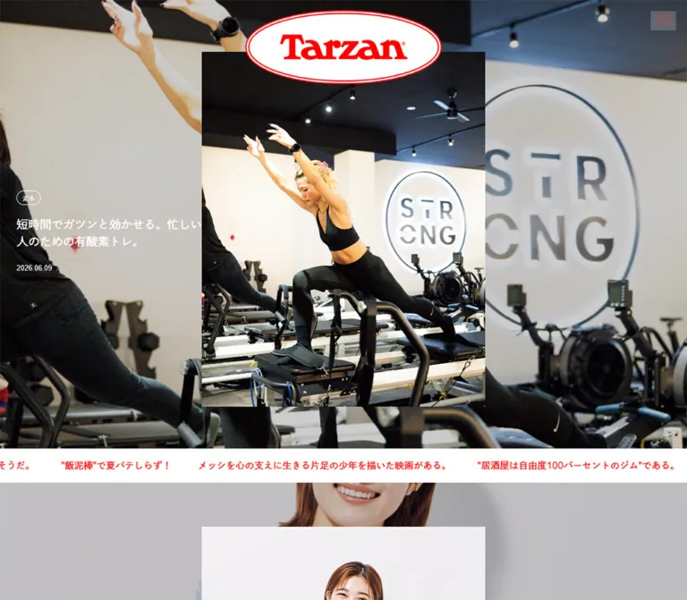
The opening desktop composition layers a sharp portrait over an enlarged crop of the same forest scene. A large white oval masthead overlaps the portrait, while the story text sits separately at the left in white. Farther down, the layout becomes a ruled grid: two substantial article columns occupy the left two thirds, and smaller series and subscription modules occupy the right third. Mobile changes the composition substantially, placing the lead story on white and moving its purple text below the image.
This is an editorial homepage with multiple discovery routes. Its reusable identity comes from the relationship between photography, compact typography, column rules, and selective changes of scale.
How to Read This Reference
- Measured values come from supplied computed styles and element rectangles. Coordinates describe the captured state, not necessarily the original CSS positioning formula.
- Visual estimates describe features visible in screenshots whose exact CSS was not supplied, such as the compact masthead height and outlined pill geometry.
- Calculated values are arithmetic relationships between measurements, such as column proportions or image aspect ratios.
- Recommendations and Quick Start code are implementation guidance. They do not establish untested behavior on the original site.
- Font declarations identify the configured families. Actual font selection for every glyph and successful loading of every face were not independently verified.
- The two captured widths establish responsive endpoints. Intermediate breakpoints and tablet behavior remain unverified.
Tokens — Colors
Default Palette
| Name | Value | Token | Role and evidence |
|---|---|---|---|
| Editorial Purple | #89029d |
Source --theme-main-color; alias --color-ink |
Measured body text color, article text, ticker links, newsletter button fill, and active pagination dot. Screenshots also show purple rules and outlines. |
| Page White | #ffffff |
Source --theme-bg-color; alias --color-paper |
Measured page background and the white editorial canvas. |
| Reversed White | #ffffff |
Source --theme-sub-color; alias --color-reversed |
Measured desktop lead-story text and newsletter registration-button text. Visually also the oval masthead field. |
| Footer Gray | #ececec |
Alias --color-footer |
Measured footer background, rgb(236, 236, 236). |
| Footer Charcoal | #222222 |
Alias --color-footer-ink |
Measured footer text, rgb(34, 34, 34). Screenshots show matching dark social symbols and wordmark. |
Purple is a working text color across the main editorial area, rather than an occasional button accent. Dates and secondary article information generally retain it instead of falling into a gray metadata system.
White has two distinct roles: the page surface and reversed text over photography. Keep those semantic roles separate even though their captured values match.
The forest greens, warm brown clothing, blue mountain scenery, and colorful equipment belong to photography. They are not additional measured interface tokens. No alternate theme or theme selector was verified.
Tokens — Typography
Editorial Sans Serif
Measured body declaration:
font-family: __Inter_fa2f99, __Inter_Fallback_fa2f99,
  dnp-shuei-gothic-gin-std, sans-serif;
The generated family names identify Inter and its associated fallback. The Japanese family is declared as dnp-shuei-gothic-gin-std. Preserve this evidence without assuming every Japanese glyph used that face during capture.
The main text is restrained and moderately weighted. Story titles commonly use 500; ordinary copy and dates use 400. Most measured text has normal letter spacing. English series kickers and newsletter consent copy introduce small, explicit tracking.
Reusable alias: --font-body: Inter, dnp-shuei-gothic-gin-std, system-ui, sans-serif. This simplifies the generated family names and adds a practical system fallback; it does not load the fonts.
Editorial Serif
Measured display declaration:
font-family: __Cormorant_Garamond_054274,
  __Cormorant_Garamond_Fallback_054274;
Cormorant Garamond is explicitly declared on Weekly Watch List and Newsletter. Its delicate serif forms provide a magazine-style counterpoint to the Japanese sans serif.
The supplied measurements for several bilingual section headings describe their parent containers rather than all child spans. Do not automatically assign the parent's computed size or family to every visible word. Applying Cormorant Garamond consistently to other English section labels is an adaptation in the Quick Start.
Masthead Artwork
Treat the Tarzan wordmark as artwork. Its distinctive letterforms and double oval outline are visible in the captures, but no logo asset URL or font construction was supplied.
The H1's computed 16px font size does not describe the visible wordmark size. The homepage logo link measures 360 × 137.52px on desktop and 190 × 72.58px on mobile.
Type Scale
All values below are measured unless stated otherwise.
| Role | Desktop size / line height | Mobile size / line height | Weight | Notes |
|---|---|---|---|---|
| Body baseline | 16 / 24px |
16 / 24px |
400 |
Root font size is a conventional 16px. |
| Lead-story title | 21 / 31px |
17 / 22px |
500 |
White over the desktop photograph; purple below the mobile image. |
| Recent-article title | 14 / 23px |
17 / 23px |
500 |
Article titles become larger on mobile. |
| Special-article title | 14 / 19px |
13 / 19px |
500 |
This smaller promotional grid follows a different responsive scale. |
| Series panel title | 17 / 34px |
17 / 34px |
500 |
Observed on the scrapbook and wellbeing panels. |
| Sidebar series label | 14 / 23px |
14 / 20px |
500 |
Short heading beside an image. |
| Lead category label | 11 / 22px |
11 / 22px |
400 |
Inline text measurements exclude the surrounding pill outline. |
| Lead publication date | 12 / 26px |
12 / 18px |
400 |
Same size, tighter line box on mobile. |
| News-strip link | 17 / 26px |
14 / 26px |
500 |
Single-line horizontal headlines. |
| Weekly Watch List heading | 32 / 33px |
32 / 33px |
400 |
Cormorant Garamond; its size remains unchanged. |
| Weekly list description | 13 / 24px |
13 / 24px |
400 |
Narrower mobile text column produces additional wrapping. |
| Series kicker | 12 / 12px |
12 / 16px |
400 |
Inter declaration; 0.6px tracking. |
| Newsletter heading | 34 / 42px |
30 / 33px |
500 |
Cormorant Garamond. |
| Newsletter description | 14 / 22px |
14 / 22px |
400 |
Three measured lines at both widths. |
| Newsletter consent text | 11 / 22px |
11 / 22px |
400 |
0.55px tracking. |
| Registration label | 10 / 24px |
10 / 24px |
400 |
White text on a purple rectangular button. |
| Footer category label | 15 / 22px |
13 / 22px |
500 |
Inside larger category navigation targets. |
Several recent-article title boxes measure 61px high, including 15px top padding and two 23px text lines. Long text inside these boxes is consistent with truncation, but the actual clamping property was not supplied. The complete headline remains present in the extracted text.
Lower footer utility and legal text appears approximately 10–11px in the desktop screenshot and approximately 11px on mobile. These are visual estimates, separate from the measured upper-footer typography.
Tokens — Spacing & Shapes
Density: small text and fine dividers surrounding large photographs.
Primary insets: measured 30px in many desktop sections and 20px on mobile.
Geometry: rectangular images and modules, with rounded shapes concentrated in the masthead, category pills, and pagination dots.
Spacing Scale
| Value | Use | Evidence status |
|---|---|---|
1px |
Grid rules, ticker boundaries, thin outlines | Visual estimate from captures. |
5px |
Mobile lead-title top padding and title-to-date separation | Measured padding; separation calculated from rectangles. |
8px |
Space between 8px feature-pagination dots |
Calculated from their 16px horizontal pitch. |
About 10px |
Category-pill gaps and horizontal internal padding | Visual estimate supported by text and outline positions. |
11px |
Gap inside the featured wellbeing-story link | Measured flex gap. |
15px |
Recent-article title top padding | Measured. |
16px |
Main article-link vertical gap | Measured. |
20px |
Mobile content inset; mobile image/text gaps | Measured. |
30px |
Desktop panel inset; desktop feature image/text gap | Measured. |
Typically 36px |
Mobile news-strip inter-link separation | Calculated from adjacent link rectangles; some separations are larger. |
Typically 48px |
Desktop news-strip inter-link separation | Calculated; not a universal gap for every item. |
60px |
Top padding before Feature and Articles sections | Measured at both viewports. |
72px / 50px |
Desktop / mobile footer top padding | Measured. |
Border Radius
| Element | Treatment | Evidence |
|---|---|---|
| Article links, photographs, content sections | Square | Sampled wrappers report 0px; captures show sharp image corners. |
| Registration button | Square | Measured 0px. |
| Category chips | Capsule outline | Visible in both opening captures; wrapper radius was not sampled. Use 9999px as an implementation alias. |
| Feature-pagination dots | Circle | Measured 8 × 8px, radius 9999px. |
| Masthead | Wide double-outlined oval | Visible artwork; preserve the asset's proportions. |
A rounded rectangle visible inside the playlist artwork belongs to that media presentation. It does not establish a general rounded-card system.
Layout Measurements
| Element | Desktop | Mobile |
|---|---|---|
| Document height | 7786.08px |
14082.22px |
| Opening logo link | 360 × 137.52px, x 540, y 17.25 |
190 × 72.58px, x 100, y 18.72 |
| Lead portrait link | 514 × 644px, x 463, y 94 |
350 × 437.5px, x 20, y 61 |
| Lead headline width | 336px |
350px |
| Recent-article link width | Approximately 418–419px within each left-column cell |
350px |
| Featured wellbeing-story link | 300 × 470px |
300 × 470px |
| Sidebar series image slot | 194.14 × 242.67px |
165 × 206.25px |
| Main article-index link | 237 × 74px |
205 × 65px |
| Footer height | 1534px |
3022.14px |
The desktop foreground portrait is approximately 4:5; the mobile rectangle is exactly 4:5. The opening desktop photographic field ends around y 814px in the screenshot. That field height is a visual estimate, not a supplied section measurement.
Components
Masthead and Utility Control
Role: strong publication identity with minimal visible navigation chrome.
At the opening, the white oval masthead is centered horizontally and overlaps the top of the foreground photograph. Its double purple outline and broad wordmark create a large emblem without introducing a separate marketing headline.
The top-right utility symbol combines short horizontal lines and a magnifying-glass shape. The visible drawing is approximately 30px wide. Its exact accessible name, hit area, and action were not supplied. Expanded navigation text appears in the header's extracted content, but the corresponding open interface was not captured.
The desktop article-grid screenshot shows a second header state: an approximately 67px white strip with purple boundaries and a centered oval logo around 120px wide. This establishes a compact header visible while browsing lower content. The positioning mechanism, scroll threshold, and transition between masthead sizes remain unverified.
The measured header wrapper has zero height at the opening while its logo descendant is visibly positioned over the page. Do not recreate the unusual negative H1 rectangle as a typography requirement; preserve the visible overlap and sensible document semantics.
Lead Editorial Story
Role: introduce a featured interview through a photographic composition.
The desktop anatomy has four layers:
- An enlarged, full-width crop of the forest portrait scene.
- A sharp foreground portrait centered at x
463, y94, measuring514 × 644px. - The overlapping oval masthead.
- A left-aligned story block beginning around x
30, with category chips, a four-line title, and a date.
The backdrop appears softer and darker than the foreground portrait. Its exact preparation is unknown: the evidence does not establish CSS blur, a scrim opacity, or a separately processed image.
The lead title measures 21px / 31px, weight 500, within a 336px column. The date begins 20px below the title's box. White type and thin white capsule outlines remain visually separate from the centered portrait.
On mobile, the enlarged background disappears from the visible composition. The portrait occupies the 350px content width, starting at y 61px. Category chips, title, and date follow on white, all in purple. The full lead headline is allowed to wrap across four lines at 17px / 22px.
The foreground image has a confirmed article destination, /post-378824. The sampled title is an H2; its own click behavior is not established by the element record.
Secondary Featured Story
Role: continue the large editorial introduction before the modular content grid.
A second prominent story appears in the DOM after the news strip, linked to /post-378969. Its portrait link uses the same desktop 514 × 644px and mobile 350 × 437.5px dimensions as the lead story.
It begins at y 976px on desktop and y 778.09px on mobile. The mobile screenshot shows the start of this image below the ticker. Its typography follows the same responsive title and category system.
The desktop opening capture does not fully display this second story. Use the measured structure without inventing additional photographic details or a slide-switching interaction.
Category Pills
Role: expose the editorial classification of a story.
The lead displays 鍛える, 整える, and 走る as small outlined capsules. The text stays 11px / 22px at both widths. Visible pill heights are approximately 25–26px, with roughly 10px gaps.
These lead labels are separate category links. They use white outlines over the desktop background and purple outlines on the mobile white surface.
In the recent-article list, category text is included inside the larger article anchor in the supplied link evidence. Preserve the distinction between independent category navigation and category labels contained within a story link. Avoid nested anchors in a new implementation.
Horizontal News Strip
Role: surface a small rotating-looking collection of topical reading suggestions.
The strip follows the first lead story and spans the viewport. Purple headlines sit on white, remain on one line, and clip at the viewport edges. The mobile strip is approximately 58px high, bounded by thin purple horizontal rules.
Desktop text is 17px / 26px; mobile text is 14px / 26px. The DOM contains repeated sequences of the same five destinations, including items positioned outside both visible edges.
This supports a looping-track interpretation, but a static capture cannot establish direction, speed, autoplay, hover pause, or keyboard behavior. A reusable implementation can begin with an accessible horizontal list and add motion only with explicit pause and reduced-motion handling.
Weekly Watch List
Role: connect the publication to a short calendar of activities and viewing suggestions.
On desktop, this module occupies the first of three approximately 480px columns. Its section measures 480.33 × 635px, with 30px top and horizontal padding. On mobile, it becomes a 350px section inside 20px page margins, with approximately 20px additional inner horizontal padding.
Use the measured 32px / 33px Cormorant Garamond heading and compact date/weekday information beside 13px / 24px descriptions. The description column begins about 88px to the right of the inner left edge on desktop and 86px on mobile.
The mobile descriptions have 222px available width, compared with approximately 332px on desktop. Preserve this date-column relationship and let descriptions wrap.
The full module is represented by a link to the weekly list. Its upper visual content is not shown in the supplied screenshots, so the large interval between heading and first measured entry should not be filled with an invented calendar illustration or widget.
Scrapbook Series Panel
Role: introduce a recurring series through a small overlapping composition.
The desktop panel occupies the middle column of the three-panel row. An Inter Series kicker sits above a 17px / 34px Japanese title. Five linked media rectangles overlap beneath the heading.
The measured linked rectangles are approximately 127 × 167px on desktop and 105 × 132px on mobile. Their different x/y positions establish a clustered composition. The evidence does not identify native asset dimensions, rotation angles, dragging, or reordering.
Keep this local compositional variation within the larger ruled layout. It is one distinctive series module, not a reason to scatter all article imagery.
Featured Series Portrait
Role: give a recurring series a quieter, self-contained editorial spotlight.
The wellbeing series panel uses the same kicker/title hierarchy as the scrapbook panel, followed by a centered 300px-wide story link. That link remains 300 × 470px at both captured widths.
Its first title line begins 386px below the top of the link, consistent with a 375px portrait image followed by the measured 11px gap. The image dimensions are therefore a calculated interpretation, not a directly sampled image rectangle.
The story title is 14px / 22px at both sizes and occupies a two-line box. The fixed-width inner composition creates extra white space in the desktop column and smaller, balanced margins on mobile.
Bilingual Section Heading
Role: make the site's recurring editorial departments easy to scan.
Headings pair short English names such as Feature, Articles, Series, and Special with Japanese descriptors. Desktop heading containers are generally 40px high with a measured 20px internal gap. Mobile containers become 63px high with a 4px gap, consistent with the labels stacking vertically.
Where present, an archive link sits at the right, such as 特集一覧 or 連載一覧. Measured link widths are approximately 102px on desktop and 94px on mobile. Keep this small navigation action aligned with the heading group rather than turning it into a large filled CTA.
Feature Story Row and Mobile Pagination
Role: group several articles beneath one thematic feature.
The inspected feature concerns oral care. A linked theme title precedes three compact article links. Desktop links are arranged across the page at approximately 419 × 156px, using 30px image/text gaps.
On mobile, the three link rectangles remain in a horizontal sequence: x positions are approximately 19, 410, and 801px, with widths of 352px. Only the first fits the current viewport. Three circular buttons below the sequence measure 8 × 8px; the first is purple and the others white.
This is evidence of a paginated mobile presentation. Swipe support, button response, looping, transition speed, and accessibility states were not exercised. The offscreen rectangles should not be mistaken for three vertically stacked mobile cards.
Recent-Article Grid
Role: provide the primary chronological reading index.
The desktop composition uses a two-column article grid within the left two thirds of the page. A sidebar occupies the right third. Vertical rules fall near x 480 and x 960; the article content begins around x 31 and x 511 after internal padding.
Each story combines:
- A large, square-cornered photograph or editorial image.
- A category-label row.
- A moderately weighted headline.
- A small publication date.
The screenshot's self-hug portrait fills approximately 419 × 524px. The adjacent equipment flat lay is approximately 419 × 334px, vertically centered in the same taller media region. Their category rows align despite the different image proportions.
This is a significant implementation detail: preserve the relationship between intrinsic image shape and shared row alignment. A universal crop would enlarge the equipment and remove the surrounding white space.
Measured desktop article links in this row have equal heights of approximately 661px. On mobile, the portrait story is 574.5px tall while the equipment story is 417px tall. The 157.5px difference equals the difference between a 350 × 437.5px portrait and a 350 × 280px landscape image. This supports content-dependent mobile image heights.
Mobile articles form one column with 20px margins. Recent-article titles increase from desktop 14px to mobile 17px, retaining 23px line height. The desktop's compact text and aligned media become a more readable sequential feed.
Sidebar Series Rows
Role: provide alternative reading routes beside the chronological grid.
Each observed row places a short underlined series label on the left and a portrait-shaped media slot on the right. Desktop columns measure approximately 194px each, separated by 30px; mobile columns measure 165px each, separated by 20px.
The visible examples include a playlist presentation, mountain photography, and a herb cutout. The image slots share a 4:5 ratio, while the media inside them can have its own framing and white space.
The playlist image visibly contains a play symbol and waveform-like graphics. Its sampled link points to an article. This does not establish a functioning embedded player on the homepage.
The at series introduces a horizontal sequence of approximately 210px-wide linked items, with repeated content and offscreen positions. Its clipping and movement mechanism were not fully supplied; do not treat every offscreen item rectangle as visible outside the sidebar.
Latest-Issue Promotion and Social Links
Role: connect the website to the magazine and its broader publishing channels.
The latest-issue promotion is a measured two-column grid. On desktop it is 342px wide with two 171px columns. On mobile it is 350px wide with two 165px columns and a 20px gap. The title occupies the second column at 14px / 19px, weight 500, with 0.7px tracking.
The supplied evidence identifies the issue and release date but does not provide a close visual inspection of its artwork. Do not invent a magazine-cover design.
Eight social destinations appear in a four-column, two-row group in the main content's supporting area. Each target is approximately 121 × 68px on desktop and 97.5 × 68px on mobile. The lower desktop footer instead shows a single horizontal row of dark platform symbols.
Newsletter Module
Role: offer an ongoing connection after editorial browsing.
The main newsletter module contains a Cormorant Garamond heading, a short description, a registration control, and smaller consent/unsubscribe information.
The heading changes from 34px / 42px on desktop to 30px / 33px on mobile. Description text remains 14px / 22px. The 登録 button is a square purple rectangle with white 10px text, measuring approximately 80.56 × 53px on desktop and 77.52 × 53px on mobile.
Consent information uses 11px / 22px text with 0.55px tracking. The inline 配信停止 control is approximately 46.2 × 22px.
Input geometry, labels, validation, submission results, and unsubscribe behavior were not captured. Any complete form added to a new implementation needs those behaviors specified separately.
Special Articles and More Controls
Role: present a smaller collection of highlighted and sponsored stories.
Desktop Special links form a horizontal sequence approximately 204.66px wide with 30px gaps. Seven entries exist in the supplied evidence, with the seventh beginning beyond the viewport's right edge.
Mobile shows four entries in a two-by-two arrangement. Each link is 163px wide, with a calculated 24px column gap. Its titles use 13px / 19px, compared with desktop 14px / 19px. Sponsorship indicators such as PR remain explicit metadata.
Two similarly worded controls have different semantics. The main article index ends with a View More Articles anchor linking to /articles. The mobile Special section ends with a button of the same wording, measuring 205 × 63px. Its action was not tested; it should not be described as a verified pagination or loading operation.
Directory and Legal Footer
Role: provide comprehensive navigation and a clear publishing/legal endpoint.
The entire footer switches to measured #ececec with #222222 text. Its desktop padding is 72px 30px 35px; mobile outer padding is 50px 0 45px, with inner groups generally aligned to 20px margins.
The upper footer contains categories, a long series directory, membership/event links, newsletter content, and the current issue. Two sampled desktop directory columns are 299.5px wide and separated by 60px.
The category navigation changes independently of the overall footer stacking. Desktop uses two columns of 108 × 58px targets. Mobile uses four columns of 79 × 42px targets, placing all eight categories in two rows.
In the lower desktop capture, social icons share a horizontal band with publication utility links. A dark rule separates these from a wrapping list of related publications. Legal paragraphs follow with substantial vertical separation before the trademark and copyright information. The dark Tarzan wordmark anchors the bottom right at approximately 237px wide.
On mobile, utility links form a vertical list. Related publication links wrap across several short rows. Legal copy uses the full inner width, and the approximately 140px wordmark moves to the left above the copyright line.
The original-page footer explicitly includes the Magazine House copyright and trademark-license statement. This is publishing/legal evidence; it does not identify the website's designers or developers.
Tokens — Motion & Interaction
The evidence contains computed transition declarations and settled screenshots, rather than a complete interaction recording.
| Treatment | Supplied evidence | Supported conclusion and limitation |
|---|---|---|
| General links | 0.3s cubic-bezier(0.4, 0, 0.2, 1) across color and several visual properties |
A shared transition vocabulary is declared. Actual hover colors, image scaling, and other endpoints were not captured. |
| First lead image link | opacity 1s 0.1s, transform 1s 0.1s |
Opacity and transform changes are configured for one second with a 100ms delay. Initial transform and trigger are unknown. |
| Second lead image link | Desktop opacity 1s, transform 1s; mobile includes 0.1s delay |
Similar treatment with a captured delay difference. It does not prove slideshow behavior. |
| Footer category links | opacity 0.3s cubic-bezier(0.4, 0, 0.2, 1) |
Opacity transition is declared; the target opacity was not supplied. |
| News strip | Repeated headlines, horizontal offsets, clipped edges | Loop-like structure is supported. Direction, duration, pause behavior, and input response remain unverified. |
| Compact desktop masthead | Small masthead visible above lower-page content | Two visual header states exist. Threshold and animation mechanism remain unverified. |
| Mobile Feature pagination | Three 8px button circles; first filled |
Active/inactive visual states exist. Navigation response was not tested. |
at sequence |
Repeated article links positioned horizontally | A track structure is supported; timing and drag/swipe behavior are unknown. |
| Newsletter and More buttons | Rendered button elements | Controls exist; their resulting states were not exercised. |
Many sampled text and link elements report animation: none. That does not rule out motion on ancestors, pseudo-elements, or through scripting.
Recommended implementation approach: keep content visible by default, use the measured 300ms easing for modest feedback, and treat longer image transitions as progressive enhancement. Do not introduce an arbitrary parallax effect or autoplay carousel and label it as observed behavior.
Surfaces
| Layer | Appearance | Purpose |
|---|---|---|
| Opening photographic field | Enlarged, naturally colored forest scene | Immersive desktop editorial introduction. |
| Foreground photograph | Crisp rectangular portrait | Establishes the featured person and maintains a stable focal point. |
| Oval masthead | White field with double purple outline | Publication identity and controlled overlap. |
| Main canvas | Solid white with purple text | Continuous reading and browsing surface. |
| Article and sidebar cells | Same white canvas, fine shared rules | Organization through alignment and boundaries. |
| Filled action | Purple rectangle with white label | Newsletter registration. |
| Footer | Light gray with charcoal content | Separates directory and legal material from editorial browsing. |
The supplied captures show no general shadow-based elevation system. White space, image edges, column rules, and typography provide the hierarchy.
Imagery
Photography is natural and specific: a runner standing in a shaded forest, a person stretching near a window, an equipment flat lay, a mountain basin, and an isolated sprig of greenery. These subjects connect physical wellbeing to ordinary environments and personal routines.
The lead image uses a central standing figure, tall tree trunks, deep green shadows, and bright gaps through the forest. Its enlarged background repeats the scene at a different scale, while the foreground remains legible and sharply bounded.
The article grid accommodates different photographic proportions. Portraits can fill a tall media area; equipment imagery retains a wider presentation with substantial white space around it. Sidebar media is smaller and paired with labels rather than large promotional overlays.
Observed Asset References
No image src, srcset, native file dimensions, or logo file paths were included in the supplied evidence. The links below are associated story destinations found on the homepage, not image-download URLs; their destination pages were not inspected.
| Visible media | Associated original-page link | Reusable guidance |
|---|---|---|
| Runner in a forest | Featured interview | Preserve the portrait focal point and separate foreground/background crops. |
| Self-hug portrait near a window | Conditioning article | Use natural interior light and a tall, uncrowded portrait composition. |
| Trail-running equipment flat lay | Equipment article | Retain the complete arrangement and its landscape proportions. |
| Mountain basin photograph | Mountain article | Preserve scenic depth within the smaller sidebar slot. |
| Herb cutout | Herb article | Keep the isolated subject and surrounding white space. |
| Playlist artwork with play/waveform graphics | Playlist article | Treat visible player graphics as artwork until actual media controls are verified. |
| Oval and plain Tarzan wordmarks | Homepage | Use authorized identity assets rather than a font approximation. |
For a new publication, commission or select photography with comparable composition and tonal restraint. The shell can be reproduced with CSS; the editorial credibility depends on the quality and specificity of the imagery.
Layout & Responsive Behavior
Desktop Composition
The homepage spans the available width. Large editorial stories precede a three-column promotional row. Feature stories then stretch across the page, followed by the two-column article feed and one-column sidebar. The footer returns to a broad directory layout.
The article/sidebar split is approximately 2:1. Within the article region, two equally sized cells create a visible three-column rhythm across the full page. Shared one-pixel-looking rules matter more than separate card containers.
The large photographs and unusually compact desktop headlines are intentional counterparts. Preserve generous image scale even when the metadata occupies only a few short lines.
Mobile Composition
The mobile layout is selectively reorganized:
| Area | Desktop observation | Mobile observation |
|---|---|---|
| Lead story | Foreground portrait over a full-width scene; white text at left | Portrait on white; purple metadata below. |
| Masthead | 360px opening logo |
190px opening logo. |
| Promotional trio | Three adjacent columns | Separate vertical modules. |
| Feature articles | Three links across | Horizontal sequence with three pagination dots. |
| Recent articles | Two columns beside sidebar | One 350px-wide column; larger headlines. |
| Series support content | Right-hand sidebar | Full-width supporting sections after the main feed. |
| Latest issue | Near the top of the desktop sidebar | Positioned below the mobile series content in measured visual coordinates. |
| Special articles | Horizontal sequence | Two columns, four initial entries, then a button. |
| Footer categories | Two columns within a directory column | Four columns within the full mobile width. |
| Lower footer | Horizontal utility band and right-aligned wordmark | Stacked links, wrapping publication names, left-aligned wordmark. |
The mobile latest-issue position also demonstrates that DOM extraction order is not always visual order. Use the measured rectangles when interpreting the captured arrangement.
At 390px, the recurring inner content width is 390 − 20 − 20 = 350px. Preserve that inset while allowing designated strips and rules to reach the viewport edges.
The document grows from approximately 7,786px to 14,082px as content stacks. These are capture-specific heights affected by editorial content and state; do not implement them as fixed page heights.
Recommended breakpoint: the Quick Start uses 64rem for its desktop composition. This is an implementation choice, not a recovered source breakpoint. Test intermediate widths, long Japanese titles, and landscape phones separately.
Do’s and Don’ts
Do
- Use the measured purple
#89029dthroughout the main editorial UI. - Preserve the enlarged photographic backdrop and separate foreground portrait on desktop.
- Move the mobile lead's text below its image and return it to purple.
- Keep the oval masthead prominent at the opening and use real artwork for its letterforms.
- Build the desktop feed as two article columns beside a one-column supporting area.
- Let portrait and landscape imagery retain different proportions while aligning metadata within desktop rows.
- Increase recent-article headlines to the measured mobile
17pxsize. - Use Cormorant Garamond where verified, particularly Weekly Watch List and Newsletter.
- Keep category labels small, outlined, and visually consistent.
- Preserve the gray/charcoal footer as a distinct publishing surface.
- Keep sponsorship labels and dates visible.
Don’t
- Don't replace the editorial homepage with a generic conversion funnel.
- Don't crop every image into the same landscape thumbnail.
- Don't turn shared grid cells into floating rounded cards with shadows.
- Don't replace the measured purple with green simply because the hero photograph is green.
- Don't make all mobile text smaller; the main article headlines explicitly grow.
- Don't force every mobile section into one column; the Special grid and footer categories retain multiple columns.
- Don't infer a working video player from play graphics inside an image.
- Don't invent ticker speed, hover effects, search behavior, or scroll thresholds.
- Don't use offscreen track coordinates as ordinary page overflow.
- Don't reproduce generated font-family hashes as portable font assets.
Recommended Implementation Additions
These are recommendations for a new implementation, not verified features of the original:
- Give the menu/search control, social links, and pagination buttons explicit accessible names.
- Use clear focus indicators and increase the clickable area around small category labels and pagination dots.
- Provide a pause control for any automatically moving ticker; pause movement while its links receive keyboard focus.
- Use one semantic copy of repeated headlines, keeping purely visual duplicates out of keyboard and accessibility navigation.
- Preserve full accessible article titles when applying visual line limits.
- Add explicit email labels, validation, success/error feedback, and appropriate input autocomplete to newsletter forms.
- Supply responsive image sizes and intrinsic dimensions. Prioritize the opening portrait and defer lower-page imagery.
- Mark a repeated decorative hero backdrop as decorative so the same subject is not announced twice.
- Check white lead text against each new background photograph. The captured treatment does not guarantee contrast for replacement images.
- Keep content available without reveal animations and respect reduced-motion preferences.
Agent Prompt Guide
Quick Color Reference
- Main canvas:
#ffffff. - Main text, article metadata, fine rules, and category outlines:
#89029d. - Desktop lead text:
#ffffffover photography. - Registration control: purple fill with white text, square corners.
- Footer:
#ecececwith#222222text and symbols. - Image colors: natural and content-dependent; do not translate them into new UI accents.
Overall Prompt
“Create an editorial homepage for a Japanese wellbeing publication using white surfaces, purple #89029d typography, thin shared grid rules, and natural lifestyle photography. On desktop, center a tall portrait over an enlarged crop of the same scene, overlap its top edge with a large oval publication masthead, and place compact white category labels, headline, and date to the left. Follow with a horizontal news strip, distinct editorial modules, a two-column article feed, and a one-column series/sidebar area. Use Inter and the declared Japanese gothic family for body content, with Cormorant Garamond for selected English editorial headings. On mobile, remove the enlarged hero backdrop, place purple story text below the portrait, use 20px margins, and stack the main feed. Finish with a gray directory footer. Keep imagery rectangular and avoid floating-card shadows.”
Example Component Prompts
- Lead story: “At 1440px, compose a roughly 514 × 644px portrait centered near the top of a full-width photographic field. Add a large white oval masthead overlapping its upper edge. Place a 336px-wide story block at the left with 11px outlined category labels, a 21px/31px medium-weight title, and a 12px date. At 390px, use a 350 × 437.5px portrait and move the purple 17px/22px headline below it.”
- Article grid: “Create two ruled editorial columns within the left two thirds of a desktop page. Use about 30px inner padding, large natural photographs, small purple categories, 14px/23px headlines, and dates. Align metadata across each desktop pair while keeping a landscape flat lay centered beside a taller portrait. On mobile, use one column, 20px margins, intrinsic image heights, and 17px headlines.”
- Series row: “Place an underlined purple series label in the left half of a white module and a 4:5 image slot in the right half. Use a 30px desktop gap, 20px mobile gap, and generous vertical separation. Let isolated objects retain their surrounding white space.”
- Newsletter: “Use a restrained Cormorant Garamond Newsletter heading, 14px/22px Japanese description, a clearly labeled email field, and a square purple registration button. Add small consent text and an unsubscribe control. Keep validation and focus feedback accessible; these are implementation additions.”
- Footer: “Build a broad light-gray publishing footer with charcoal text, category navigation, a long series directory, social links, related-publication links, and separated legal paragraphs. On mobile, stack utility links, wrap publication names, retain four category columns, and place the plain wordmark above the copyright.”
Quick Start
CSS Custom Properties
This is a usable adaptation of the measured visual system, not an extracted stylesheet. It requires HTML using the indicated classes and separately supplied images and fonts. No source asset paths were available.
The 64rem breakpoint, proportional desktop lead sizing, accessible control areas, and serif styling of general English section labels are recommendations. The ticker begins as a manually scrollable list. An optional data-compact='true' masthead state represents the observed compact desktop appearance; its activation logic is deliberately unspecified.
:root {
  /* Captured source palette */
  --theme-main-color: #89029d;
  --theme-sub-color: #ffffff;
  --theme-bg-color: #ffffff;

  --color-ink: var(--theme-main-color);
  --color-paper: var(--theme-bg-color);
  --color-reversed: var(--theme-sub-color);
  --color-footer: #ececec;
  --color-footer-ink: #222222;

  /* Load licensed font files separately. */
  --font-body: Inter, dnp-shuei-gothic-gin-std, system-ui, sans-serif;
  --font-display: 'Cormorant Garamond', Georgia, serif;

  --text-lead: 17px;
  --leading-lead: 22px;
  --text-article: 17px;
  --leading-article: 23px;
  --text-category: 11px;
  --text-date: 12px;
  --text-ticker: 14px;

  --space-inset: 20px;
  --space-small: 10px;
  --space-media: 16px;
  --space-panel: 30px;
  --space-section: 60px;
  --rule-width: 1px;
  --radius-pill: 9999px;
  --motion-link: 300ms cubic-bezier(0.4, 0, 0.2, 1);
}

.tarzan-reference,
.tarzan-reference * {
  box-sizing: border-box;
}

.tarzan-reference {
  position: relative;
  margin: 0;
  color: var(--color-ink);
  background: var(--color-paper);
  font-family: var(--font-body);
  font-size: 16px;
  line-height: 24px;
}

.tarzan-reference :where(a) {
  color: inherit;
  text-decoration: none;
  transition: color var(--motion-link), opacity var(--motion-link);
}

.tarzan-reference :where(button, input) {
  font: inherit;
}

.tarzan-reference img {
  display: block;
  max-width: 100%;
}

.tarzan-reference :focus-visible {
  outline: 2px solid currentColor;
  outline-offset: 4px;
}

/* Opening masthead artwork sits above the lead photograph. */
.masthead {
  position: absolute;
  inset: 0 0 auto;
  z-index: 30;
  pointer-events: none;
}

.masthead :where(a, button) {
  pointer-events: auto;
}

.brand-link {
  position: absolute;
  top: 19px;
  left: 50%;
  width: 190px;
  transform: translateX(-50%);
}

.brand-link img {
  width: 100%;
  height: auto;
}

.masthead-utility {
  position: absolute;
  top: 10px;
  right: 14px;
  display: grid;
  place-items: center;
  width: 44px;
  height: 44px;
  padding: 0;
  border: 0;
  color: inherit;
  background: transparent;
  cursor: pointer;
}

.masthead-utility svg {
  width: 30px;
  height: 24px;
}

.lead-story {
  position: relative;
  isolation: isolate;
  padding: 61px var(--space-inset) 30px;
}

.lead-story--secondary {
  padding-top: 30px;
}

.lead-story-backdrop {
  display: none;
}

.lead-story-media {
  display: block;
  width: 100%;
  aspect-ratio: 4 / 5;
}

.lead-story-media img {
  width: 100%;
  height: 100%;
  object-fit: cover;
}

.lead-story-meta {
  margin-top: var(--space-media);
}

.category-list {
  display: flex;
  flex-wrap: wrap;
  gap: 10px;
}

.category-pill {
  display: inline-flex;
  align-items: center;
  padding: 1px 10px;
  border: var(--rule-width) solid currentColor;
  border-radius: var(--radius-pill);
  font-size: var(--text-category);
  font-weight: 400;
  line-height: 22px;
}

.lead-story-title {
  margin: 5px 0 0;
  padding-top: 5px;
  font-size: var(--text-lead);
  font-weight: 500;
  line-height: var(--leading-lead);
}

.story-date {
  display: block;
  margin-top: 5px;
  font-size: var(--text-date);
  font-weight: 400;
  line-height: 18px;
}

/* Accessible static baseline; automatic motion is not assumed. */
.news-strip {
  padding-block: 15px;
  border-block: var(--rule-width) solid currentColor;
  background: var(--color-paper);
}

.news-strip-list {
  display: flex;
  gap: 36px;
  margin: 0;
  padding: 0 var(--space-inset);
  overflow-x: auto;
  list-style: none;
}

.news-strip-list li {
  flex: 0 0 auto;
}

.news-strip-list a {
  white-space: nowrap;
  font-size: var(--text-ticker);
  font-weight: 500;
  line-height: 26px;
}

.editorial-section {
  padding-top: var(--space-section);
}

.section-heading {
  display: flex;
  align-items: flex-end;
  justify-content: space-between;
  gap: 20px;
  margin: 0 var(--space-inset) 30px;
}

.section-heading-title {
  display: flex;
  flex-direction: column;
  gap: 4px;
  margin: 0;
}

/* General English heading styling is an adaptation. */
.section-heading-en {
  font-family: var(--font-display);
  font-size: 34px;
  font-weight: 500;
  line-height: 40px;
}

.section-heading-ja {
  font-size: 14px;
  font-weight: 500;
  line-height: 19px;
}

.section-heading-more {
  flex-shrink: 0;
  border-bottom: var(--rule-width) solid currentColor;
  font-size: 14px;
  line-height: 23px;
}

.promo-grid,
.article-layout,
.article-grid {
  display: grid;
  grid-template-columns: minmax(0, 1fr);
}

.promo-panel {
  min-width: 0;
  padding: 30px var(--space-inset);
  border-bottom: var(--rule-width) solid currentColor;
}

.weekly-title {
  margin: 0;
  font-family: var(--font-display);
  font-size: 32px;
  font-weight: 400;
  line-height: 33px;
}

.weekly-entry {
  display: grid;
  grid-template-columns: 66px minmax(0, 1fr);
  gap: 20px;
  padding-block: 12px;
  font-size: 13px;
  line-height: 24px;
}

.article-card {
  display: flex;
  flex-direction: column;
  gap: var(--space-media);
  min-width: 0;
  padding: 30px var(--space-inset);
  border-bottom: var(--rule-width) solid currentColor;
}

.article-media {
  display: flex;
  align-items: center;
  justify-content: center;
  min-width: 0;
  margin: 0;
}

.article-media img {
  width: 100%;
  height: auto;
}

.article-title {
  margin: 15px 0 10px;
  font-size: var(--text-article);
  font-weight: 500;
  line-height: var(--leading-article);
}

/* Full titles remain visible in this baseline. */
.article-support {
  min-width: 0;
  padding: 30px var(--space-inset);
}

.series-row {
  display: grid;
  grid-template-columns: repeat(2, minmax(0, 1fr));
  gap: 20px;
  margin-bottom: 40px;
}

.series-row-title {
  align-self: start;
  margin: 0;
  border-bottom: var(--rule-width) solid currentColor;
  font-size: 14px;
  font-weight: 500;
  line-height: 20px;
}

.series-row-media {
  display: grid;
  place-items: center;
  aspect-ratio: 4 / 5;
}

.series-row-media img {
  width: 100%;
  height: 100%;
  object-fit: contain;
}

.newsletter-title {
  margin: 0 0 35px;
  font-family: var(--font-display);
  font-size: 30px;
  font-weight: 500;
  line-height: 33px;
}

.newsletter-description {
  margin: 0 0 20px;
  font-size: 14px;
  line-height: 22px;
}

/* Field styling is recommended; source input geometry is unknown. */
.newsletter-controls {
  display: grid;
  grid-template-columns: minmax(0, 1fr) 80px;
}

.newsletter-controls input {
  min-width: 0;
  height: 53px;
  padding-inline: 12px;
  border: 1px solid var(--color-ink);
  border-radius: 0;
  color: var(--color-ink);
  background: var(--color-paper);
}

.newsletter-submit {
  height: 53px;
  border: 1px solid var(--color-ink);
  border-radius: 0;
  color: var(--color-reversed);
  background: var(--color-ink);
  font-size: 10px;
  line-height: 24px;
  cursor: pointer;
}

.newsletter-note {
  margin-top: 24px;
  font-size: 11px;
  line-height: 22px;
  letter-spacing: 0.05em;
}

.special-grid {
  display: grid;
  grid-template-columns: repeat(2, minmax(0, 1fr));
  gap: 30px 24px;
  padding-inline: var(--space-inset);
}

.special-title {
  font-size: 13px;
  font-weight: 500;
  line-height: 19px;
}

.site-footer {
  padding: 50px 20px 45px;
  color: var(--color-footer-ink);
  background: var(--color-footer);
}

.footer-directory {
  display: grid;
  grid-template-columns: minmax(0, 1fr);
  gap: 40px;
}

.footer-categories {
  display: grid;
  grid-template-columns: repeat(4, minmax(0, 1fr));
  gap: 17px 10px;
}

.footer-categories a {
  display: grid;
  place-items: center;
  min-height: 42px;
  font-size: 13px;
  font-weight: 500;
  line-height: 22px;
}

.footer-utilities {
  display: flex;
  flex-direction: column;
  gap: 16px;
  margin-block: 40px 25px;
  font-size: 14px;
}

.footer-publications {
  display: flex;
  flex-wrap: wrap;
  gap: 8px 20px;
  padding-top: 25px;
  border-top: 1px solid currentColor;
  font-size: 11px;
  line-height: 18px;
}

/* Lower legal typography approximates the screenshots. */
.footer-legal {
  margin-top: 35px;
  font-size: 11px;
  line-height: 20px;
}

.footer-bottom {
  display: grid;
  grid-template-areas: 'legal' 'brand' 'copyright';
  gap: 25px;
  margin-top: 45px;
}

.footer-bottom-legal { grid-area: legal; }
.footer-copyright { grid-area: copyright; }

.footer-brand {
  grid-area: brand;
  width: 140px;
  align-self: end;
}

@media (min-width: 64rem) {
  :root {
    --space-inset: 30px;
    --text-lead: 21px;
    --leading-lead: 31px;
    --text-article: 14px;
    --text-ticker: 17px;
  }

  .brand-link {
    top: 17.25px;
    width: 360px;
  }

  .masthead-utility {
    top: 16px;
    right: 20px;
  }

  /* Proportional adaptation of the captured 1440px composition. */
  .lead-story {
    height: min(56.53vw, 814px);
    padding: 0;
  }

  .lead-story-backdrop {
    position: absolute;
    inset: 0;
    z-index: -1;
    display: block;
    overflow: hidden;
  }

  .lead-story-backdrop img {
    width: 100%;
    height: 100%;
    object-fit: cover;
  }

  .lead-story-media {
    position: absolute;
    top: min(6.528vw, 94px);
    left: 50%;
    width: min(35.694vw, 514px);
    aspect-ratio: 514 / 644;
    transform: translateX(-50%);
  }

  .lead-story-meta {
    position: absolute;
    top: 42.5%;
    left: 30px;
    width: min(23.333vw, 336px);
    margin: 0;
    color: var(--color-reversed);
  }

  .lead-story-title {
    margin-top: 20px;
    padding: 0;
  }

  .lead-story-meta .story-date {
    margin-top: 20px;
    line-height: 26px;
  }

  .masthead[data-compact='true'] {
    position: fixed;
    height: 67px;
    border-block: 1px solid var(--color-ink);
    background: var(--color-paper);
  }

  .masthead[data-compact='true'] .brand-link {
    top: 11px;
    width: 120px;
  }

  .news-strip-list { gap: 48px; }

  .section-heading-title {
    flex-direction: row;
    align-items: baseline;
    gap: 20px;
  }

  .promo-grid {
    grid-template-columns: repeat(3, minmax(0, 1fr));
  }

  .promo-panel + .promo-panel {
    border-left: 1px solid currentColor;
  }

  .article-layout {
    grid-template-columns: minmax(0, 2fr) minmax(0, 1fr);
  }

  .article-grid {
    grid-template-columns: repeat(2, minmax(0, 1fr));
  }

  /* Shared media rows align portrait and landscape pairs. */
  .article-card {
    display: grid;
    grid-template-rows: subgrid;
    grid-row: span 2;
    row-gap: 16px;
    border-right: 1px solid currentColor;
  }

  .series-row {
    gap: 30px;
    margin-bottom: 34px;
  }

  .series-row-title { line-height: 23px; }

  .newsletter-title {
    font-size: 34px;
    line-height: 42px;
  }

  .special-grid {
    grid-template-columns: none;
    grid-auto-flow: column;
    grid-auto-columns: calc((100% - 150px) / 6);
    gap: 30px;
    overflow-x: auto;
  }

  .special-title { font-size: 14px; }

  .site-footer { padding: 72px 30px 35px; }

  .footer-directory {
    grid-template-columns: repeat(4, minmax(0, 1fr));
    gap: 60px;
  }

  .footer-categories {
    grid-template-columns: repeat(2, 108px);
    justify-content: center;
    gap: 17px 12px;
  }

  .footer-categories a {
    min-height: 58px;
    font-size: 15px;
  }

  .footer-utilities {
    flex-direction: row;
    flex-wrap: wrap;
    align-items: center;
    gap: 24px;
    font-size: 11px;
  }

  .footer-bottom {
    grid-template-areas: 'legal brand' 'copyright brand';
    grid-template-columns: minmax(0, 1fr) auto;
  }

  .footer-brand { width: 237px; }
}

@media (prefers-reduced-motion: reduce) {
  .tarzan-reference *,
  .tarzan-reference *::before,
  .tarzan-reference *::after {
    animation: none !important;
    transition: none !important;
    scroll-behavior: auto !important;
  }
}
For the desktop article grid, each .article-card should be one article anchor with exactly two direct layout children: .article-media and an information wrapper containing category labels, headline, and date. The subgrid shares the media row across each pair. Mobile returns to ordinary vertical flow. The starter intentionally keeps full titles visible.
Place masthead artwork inside .brand-link. Supply a foreground image inside .lead-story-media and a decorative, appropriately prepared background image inside .lead-story-backdrop. No CSS blur or darkening value is presented as a recovered source token.
The stylesheet covers the main visual relationships. Feature pagination, scrapbook positioning, compact-header activation, newsletter submission, and any automatic track movement require separately specified behavior.
Tailwind v4 Token Mapping
Optional aliases for a project already using Tailwind v4. The supplied --tw-* properties do not establish the original site's Tailwind version. Define the custom properties above before using this mapping.
@theme inline {
  --color-editorial: var(--color-ink);
  --color-paper: #ffffff;
  --color-footer: #ececec;
  --color-charcoal: #222222;

  --font-sans: var(--font-body);
  --font-editorial: var(--font-display);

  --text-story: var(--text-lead);
  --text-card: var(--text-article);
  --text-caption: 12px;
  --text-category: 11px;

  --spacing-inset: var(--space-inset);
  --spacing-media: 16px;
  --spacing-panel: 30px;
  --spacing-section: 60px;

  --radius-pill: 9999px;
}
Sources & Evidence
- Original and final page: https://tarzanweb.jp/. The supplied browser record reports HTTP
200, with the same URL before and after navigation and the titleTarzan Web | ターザンウェブ. - Capture date: September 12, 2026; collection timestamp
2026-09-12T06:49:29.136Z. Individual screenshot timestamps were not separately supplied. - Desktop evidence:
1440 × 1000viewport; opening photographic composition, lower article/sidebar grid with compact masthead, lower footer, and rendered measurements across a7786.08pxdocument. - Mobile evidence:
390 × 844viewport; opening portrait/story composition, lower footer, and rendered measurements across a14082.22pxdocument. - Computed-style evidence: source theme variables; body and display-family declarations; typography, padding, gaps, element geometry, footer colors, button dimensions, and transition declarations.
- Observation procedure: the supplied collector waited for document loading, visible image decoding, sampled layout/text stability, and finite motion within stated time limits. Initial observation lasted at least five seconds. Perpetual animations were temporarily paused during readiness checks and resumed afterward; scrolling traversed intermediate positions.
- Limitations: no additional browsing, commands, or file access were performed for this reference. No navigation opening, search action, form submission, carousel operation, media playback, hover endpoint, or reduced-motion state was tested. SharedWorkers and service workers were disabled during the supplied inspection. Delayed content and unexercised states may differ.
This reference describes the current homepage represented by the supplied captures. Measurements belong to those specific viewports and content states; estimates and implementation recommendations are labeled separately.
# Tarzan Web — Style Reference

> A photographic magazine homepage held together by purple ink, fine rules, and an oversized oval masthead.

**Website:** [Tarzan Web](https://tarzanweb.jp/)
**Original URL:** https://tarzanweb.jp/
**Final URL:** https://tarzanweb.jp/
**Theme:** captured light state, with purple editorial UI, white content surfaces, and a gray footer.
**Inspected:** September 12, 2026. Supplied collection timestamp: `2026-09-12T06:49:29.136Z`, or 15:49:29 JST.
**Viewports:** desktop `1440 × 1000` and mobile `390 × 844` CSS pixels.
**Scope:** the current homepage, using supplied desktop opening, article-grid, and footer captures; mobile opening and footer captures; and rendered DOM/computed-style evidence throughout both page layouts. Article destinations, expanded navigation, search, form submissions, and carousel operations were not inspected.

Tarzan Web presents fitness, wellbeing, outdoor activity, and everyday culture through a magazine sensibility. Natural photography provides the atmosphere and color variation. Purple supplies a consistent editorial voice through headlines, dates, category outlines, fine dividers, and navigation. White space remains conspicuous even inside a dense publishing page.

The opening desktop composition layers a sharp portrait over an enlarged crop of the same forest scene. A large white oval masthead overlaps the portrait, while the story text sits separately at the left in white. Farther down, the layout becomes a ruled grid: two substantial article columns occupy the left two thirds, and smaller series and subscription modules occupy the right third. Mobile changes the composition substantially, placing the lead story on white and moving its purple text below the image.

This is an editorial homepage with multiple discovery routes. Its reusable identity comes from the relationship between photography, compact typography, column rules, and selective changes of scale.

## How to Read This Reference

- **Measured** values come from supplied computed styles and element rectangles. Coordinates describe the captured state, not necessarily the original CSS positioning formula.
- **Visual estimates** describe features visible in screenshots whose exact CSS was not supplied, such as the compact masthead height and outlined pill geometry.
- **Calculated** values are arithmetic relationships between measurements, such as column proportions or image aspect ratios.
- **Recommendations** and Quick Start code are implementation guidance. They do not establish untested behavior on the original site.
- Font declarations identify the configured families. Actual font selection for every glyph and successful loading of every face were not independently verified.
- The two captured widths establish responsive endpoints. Intermediate breakpoints and tablet behavior remain unverified.

## Tokens — Colors

### Default Palette

| Name | Value | Token | Role and evidence |
| --- | --- | --- | --- |
| Editorial Purple | `#89029d` | Source `--theme-main-color`; alias `--color-ink` | Measured body text color, article text, ticker links, newsletter button fill, and active pagination dot. Screenshots also show purple rules and outlines. |
| Page White | `#ffffff` | Source `--theme-bg-color`; alias `--color-paper` | Measured page background and the white editorial canvas. |
| Reversed White | `#ffffff` | Source `--theme-sub-color`; alias `--color-reversed` | Measured desktop lead-story text and newsletter registration-button text. Visually also the oval masthead field. |
| Footer Gray | `#ececec` | Alias `--color-footer` | Measured footer background, `rgb(236, 236, 236)`. |
| Footer Charcoal | `#222222` | Alias `--color-footer-ink` | Measured footer text, `rgb(34, 34, 34)`. Screenshots show matching dark social symbols and wordmark. |

Purple is a working text color across the main editorial area, rather than an occasional button accent. Dates and secondary article information generally retain it instead of falling into a gray metadata system.

White has two distinct roles: the page surface and reversed text over photography. Keep those semantic roles separate even though their captured values match.

The forest greens, warm brown clothing, blue mountain scenery, and colorful equipment belong to photography. They are not additional measured interface tokens. No alternate theme or theme selector was verified.

## Tokens — Typography

### Editorial Sans Serif

**Measured body declaration:**

```css
font-family: __Inter_fa2f99, __Inter_Fallback_fa2f99,
  dnp-shuei-gothic-gin-std, sans-serif;
```

The generated family names identify Inter and its associated fallback. The Japanese family is declared as `dnp-shuei-gothic-gin-std`. Preserve this evidence without assuming every Japanese glyph used that face during capture.

The main text is restrained and moderately weighted. Story titles commonly use `500`; ordinary copy and dates use `400`. Most measured text has normal letter spacing. English series kickers and newsletter consent copy introduce small, explicit tracking.

**Reusable alias:** `--font-body: Inter, dnp-shuei-gothic-gin-std, system-ui, sans-serif`. This simplifies the generated family names and adds a practical system fallback; it does not load the fonts.

### Editorial Serif

**Measured display declaration:**

```css
font-family: __Cormorant_Garamond_054274,
  __Cormorant_Garamond_Fallback_054274;
```

Cormorant Garamond is explicitly declared on `Weekly Watch List` and `Newsletter`. Its delicate serif forms provide a magazine-style counterpoint to the Japanese sans serif.

The supplied measurements for several bilingual section headings describe their parent containers rather than all child spans. Do not automatically assign the parent's computed size or family to every visible word. Applying Cormorant Garamond consistently to other English section labels is an adaptation in the Quick Start.

### Masthead Artwork

Treat the Tarzan wordmark as artwork. Its distinctive letterforms and double oval outline are visible in the captures, but no logo asset URL or font construction was supplied.

The H1's computed `16px` font size does not describe the visible wordmark size. The homepage logo link measures `360 × 137.52px` on desktop and `190 × 72.58px` on mobile.

### Type Scale

All values below are measured unless stated otherwise.

| Role | Desktop size / line height | Mobile size / line height | Weight | Notes |
| --- | --- | --- | --- | --- |
| Body baseline | `16 / 24px` | `16 / 24px` | `400` | Root font size is a conventional `16px`. |
| Lead-story title | `21 / 31px` | `17 / 22px` | `500` | White over the desktop photograph; purple below the mobile image. |
| Recent-article title | `14 / 23px` | `17 / 23px` | `500` | Article titles become larger on mobile. |
| Special-article title | `14 / 19px` | `13 / 19px` | `500` | This smaller promotional grid follows a different responsive scale. |
| Series panel title | `17 / 34px` | `17 / 34px` | `500` | Observed on the scrapbook and wellbeing panels. |
| Sidebar series label | `14 / 23px` | `14 / 20px` | `500` | Short heading beside an image. |
| Lead category label | `11 / 22px` | `11 / 22px` | `400` | Inline text measurements exclude the surrounding pill outline. |
| Lead publication date | `12 / 26px` | `12 / 18px` | `400` | Same size, tighter line box on mobile. |
| News-strip link | `17 / 26px` | `14 / 26px` | `500` | Single-line horizontal headlines. |
| Weekly Watch List heading | `32 / 33px` | `32 / 33px` | `400` | Cormorant Garamond; its size remains unchanged. |
| Weekly list description | `13 / 24px` | `13 / 24px` | `400` | Narrower mobile text column produces additional wrapping. |
| Series kicker | `12 / 12px` | `12 / 16px` | `400` | Inter declaration; `0.6px` tracking. |
| Newsletter heading | `34 / 42px` | `30 / 33px` | `500` | Cormorant Garamond. |
| Newsletter description | `14 / 22px` | `14 / 22px` | `400` | Three measured lines at both widths. |
| Newsletter consent text | `11 / 22px` | `11 / 22px` | `400` | `0.55px` tracking. |
| Registration label | `10 / 24px` | `10 / 24px` | `400` | White text on a purple rectangular button. |
| Footer category label | `15 / 22px` | `13 / 22px` | `500` | Inside larger category navigation targets. |

Several recent-article title boxes measure `61px` high, including `15px` top padding and two `23px` text lines. Long text inside these boxes is consistent with truncation, but the actual clamping property was not supplied. The complete headline remains present in the extracted text.

Lower footer utility and legal text appears approximately `10–11px` in the desktop screenshot and approximately `11px` on mobile. These are visual estimates, separate from the measured upper-footer typography.

## Tokens — Spacing & Shapes

**Density:** small text and fine dividers surrounding large photographs.
**Primary insets:** measured `30px` in many desktop sections and `20px` on mobile.
**Geometry:** rectangular images and modules, with rounded shapes concentrated in the masthead, category pills, and pagination dots.

### Spacing Scale

| Value | Use | Evidence status |
| --- | --- | --- |
| `1px` | Grid rules, ticker boundaries, thin outlines | Visual estimate from captures. |
| `5px` | Mobile lead-title top padding and title-to-date separation | Measured padding; separation calculated from rectangles. |
| `8px` | Space between `8px` feature-pagination dots | Calculated from their `16px` horizontal pitch. |
| About `10px` | Category-pill gaps and horizontal internal padding | Visual estimate supported by text and outline positions. |
| `11px` | Gap inside the featured wellbeing-story link | Measured flex gap. |
| `15px` | Recent-article title top padding | Measured. |
| `16px` | Main article-link vertical gap | Measured. |
| `20px` | Mobile content inset; mobile image/text gaps | Measured. |
| `30px` | Desktop panel inset; desktop feature image/text gap | Measured. |
| Typically `36px` | Mobile news-strip inter-link separation | Calculated from adjacent link rectangles; some separations are larger. |
| Typically `48px` | Desktop news-strip inter-link separation | Calculated; not a universal gap for every item. |
| `60px` | Top padding before Feature and Articles sections | Measured at both viewports. |
| `72px` / `50px` | Desktop / mobile footer top padding | Measured. |

### Border Radius

| Element | Treatment | Evidence |
| --- | --- | --- |
| Article links, photographs, content sections | Square | Sampled wrappers report `0px`; captures show sharp image corners. |
| Registration button | Square | Measured `0px`. |
| Category chips | Capsule outline | Visible in both opening captures; wrapper radius was not sampled. Use `9999px` as an implementation alias. |
| Feature-pagination dots | Circle | Measured `8 × 8px`, radius `9999px`. |
| Masthead | Wide double-outlined oval | Visible artwork; preserve the asset's proportions. |

A rounded rectangle visible inside the playlist artwork belongs to that media presentation. It does not establish a general rounded-card system.

### Layout Measurements

| Element | Desktop | Mobile |
| --- | --- | --- |
| Document height | `7786.08px` | `14082.22px` |
| Opening logo link | `360 × 137.52px`, x `540`, y `17.25` | `190 × 72.58px`, x `100`, y `18.72` |
| Lead portrait link | `514 × 644px`, x `463`, y `94` | `350 × 437.5px`, x `20`, y `61` |
| Lead headline width | `336px` | `350px` |
| Recent-article link width | Approximately `418–419px` within each left-column cell | `350px` |
| Featured wellbeing-story link | `300 × 470px` | `300 × 470px` |
| Sidebar series image slot | `194.14 × 242.67px` | `165 × 206.25px` |
| Main article-index link | `237 × 74px` | `205 × 65px` |
| Footer height | `1534px` | `3022.14px` |

The desktop foreground portrait is approximately `4:5`; the mobile rectangle is exactly `4:5`. The opening desktop photographic field ends around y `814px` in the screenshot. That field height is a visual estimate, not a supplied section measurement.

## Components

### Masthead and Utility Control

**Role:** strong publication identity with minimal visible navigation chrome.

At the opening, the white oval masthead is centered horizontally and overlaps the top of the foreground photograph. Its double purple outline and broad wordmark create a large emblem without introducing a separate marketing headline.

The top-right utility symbol combines short horizontal lines and a magnifying-glass shape. The visible drawing is approximately `30px` wide. Its exact accessible name, hit area, and action were not supplied. Expanded navigation text appears in the header's extracted content, but the corresponding open interface was not captured.

The desktop article-grid screenshot shows a second header state: an approximately `67px` white strip with purple boundaries and a centered oval logo around `120px` wide. This establishes a compact header visible while browsing lower content. The positioning mechanism, scroll threshold, and transition between masthead sizes remain unverified.

The measured header wrapper has zero height at the opening while its logo descendant is visibly positioned over the page. Do not recreate the unusual negative H1 rectangle as a typography requirement; preserve the visible overlap and sensible document semantics.

### Lead Editorial Story

**Role:** introduce a featured interview through a photographic composition.

The desktop anatomy has four layers:

1. An enlarged, full-width crop of the forest portrait scene.
2. A sharp foreground portrait centered at x `463`, y `94`, measuring `514 × 644px`.
3. The overlapping oval masthead.
4. A left-aligned story block beginning around x `30`, with category chips, a four-line title, and a date.

The backdrop appears softer and darker than the foreground portrait. Its exact preparation is unknown: the evidence does not establish CSS blur, a scrim opacity, or a separately processed image.

The lead title measures `21px / 31px`, weight `500`, within a `336px` column. The date begins `20px` below the title's box. White type and thin white capsule outlines remain visually separate from the centered portrait.

On mobile, the enlarged background disappears from the visible composition. The portrait occupies the `350px` content width, starting at y `61px`. Category chips, title, and date follow on white, all in purple. The full lead headline is allowed to wrap across four lines at `17px / 22px`.

The foreground image has a confirmed article destination, `/post-378824`. The sampled title is an H2; its own click behavior is not established by the element record.

### Secondary Featured Story

**Role:** continue the large editorial introduction before the modular content grid.

A second prominent story appears in the DOM after the news strip, linked to `/post-378969`. Its portrait link uses the same desktop `514 × 644px` and mobile `350 × 437.5px` dimensions as the lead story.

It begins at y `976px` on desktop and y `778.09px` on mobile. The mobile screenshot shows the start of this image below the ticker. Its typography follows the same responsive title and category system.

The desktop opening capture does not fully display this second story. Use the measured structure without inventing additional photographic details or a slide-switching interaction.

### Category Pills

**Role:** expose the editorial classification of a story.

The lead displays `鍛える`, `整える`, and `走る` as small outlined capsules. The text stays `11px / 22px` at both widths. Visible pill heights are approximately `25–26px`, with roughly `10px` gaps.

These lead labels are separate category links. They use white outlines over the desktop background and purple outlines on the mobile white surface.

In the recent-article list, category text is included inside the larger article anchor in the supplied link evidence. Preserve the distinction between independent category navigation and category labels contained within a story link. Avoid nested anchors in a new implementation.

### Horizontal News Strip

**Role:** surface a small rotating-looking collection of topical reading suggestions.

The strip follows the first lead story and spans the viewport. Purple headlines sit on white, remain on one line, and clip at the viewport edges. The mobile strip is approximately `58px` high, bounded by thin purple horizontal rules.

Desktop text is `17px / 26px`; mobile text is `14px / 26px`. The DOM contains repeated sequences of the same five destinations, including items positioned outside both visible edges.

This supports a looping-track interpretation, but a static capture cannot establish direction, speed, autoplay, hover pause, or keyboard behavior. A reusable implementation can begin with an accessible horizontal list and add motion only with explicit pause and reduced-motion handling.

### Weekly Watch List

**Role:** connect the publication to a short calendar of activities and viewing suggestions.

On desktop, this module occupies the first of three approximately `480px` columns. Its section measures `480.33 × 635px`, with `30px` top and horizontal padding. On mobile, it becomes a `350px` section inside `20px` page margins, with approximately `20px` additional inner horizontal padding.

Use the measured `32px / 33px` Cormorant Garamond heading and compact date/weekday information beside `13px / 24px` descriptions. The description column begins about `88px` to the right of the inner left edge on desktop and `86px` on mobile.

The mobile descriptions have `222px` available width, compared with approximately `332px` on desktop. Preserve this date-column relationship and let descriptions wrap.

The full module is represented by a link to the weekly list. Its upper visual content is not shown in the supplied screenshots, so the large interval between heading and first measured entry should not be filled with an invented calendar illustration or widget.

### Scrapbook Series Panel

**Role:** introduce a recurring series through a small overlapping composition.

The desktop panel occupies the middle column of the three-panel row. An Inter `Series` kicker sits above a `17px / 34px` Japanese title. Five linked media rectangles overlap beneath the heading.

The measured linked rectangles are approximately `127 × 167px` on desktop and `105 × 132px` on mobile. Their different x/y positions establish a clustered composition. The evidence does not identify native asset dimensions, rotation angles, dragging, or reordering.

Keep this local compositional variation within the larger ruled layout. It is one distinctive series module, not a reason to scatter all article imagery.

### Featured Series Portrait

**Role:** give a recurring series a quieter, self-contained editorial spotlight.

The wellbeing series panel uses the same kicker/title hierarchy as the scrapbook panel, followed by a centered `300px`-wide story link. That link remains `300 × 470px` at both captured widths.

Its first title line begins `386px` below the top of the link, consistent with a `375px` portrait image followed by the measured `11px` gap. The image dimensions are therefore a calculated interpretation, not a directly sampled image rectangle.

The story title is `14px / 22px` at both sizes and occupies a two-line box. The fixed-width inner composition creates extra white space in the desktop column and smaller, balanced margins on mobile.

### Bilingual Section Heading

**Role:** make the site's recurring editorial departments easy to scan.

Headings pair short English names such as `Feature`, `Articles`, `Series`, and `Special` with Japanese descriptors. Desktop heading containers are generally `40px` high with a measured `20px` internal gap. Mobile containers become `63px` high with a `4px` gap, consistent with the labels stacking vertically.

Where present, an archive link sits at the right, such as `特集一覧` or `連載一覧`. Measured link widths are approximately `102px` on desktop and `94px` on mobile. Keep this small navigation action aligned with the heading group rather than turning it into a large filled CTA.

### Feature Story Row and Mobile Pagination

**Role:** group several articles beneath one thematic feature.

The inspected feature concerns oral care. A linked theme title precedes three compact article links. Desktop links are arranged across the page at approximately `419 × 156px`, using `30px` image/text gaps.

On mobile, the three link rectangles remain in a horizontal sequence: x positions are approximately `19`, `410`, and `801px`, with widths of `352px`. Only the first fits the current viewport. Three circular buttons below the sequence measure `8 × 8px`; the first is purple and the others white.

This is evidence of a paginated mobile presentation. Swipe support, button response, looping, transition speed, and accessibility states were not exercised. The offscreen rectangles should not be mistaken for three vertically stacked mobile cards.

### Recent-Article Grid

**Role:** provide the primary chronological reading index.

The desktop composition uses a two-column article grid within the left two thirds of the page. A sidebar occupies the right third. Vertical rules fall near x `480` and x `960`; the article content begins around x `31` and x `511` after internal padding.

Each story combines:

- A large, square-cornered photograph or editorial image.
- A category-label row.
- A moderately weighted headline.
- A small publication date.

The screenshot's self-hug portrait fills approximately `419 × 524px`. The adjacent equipment flat lay is approximately `419 × 334px`, vertically centered in the same taller media region. Their category rows align despite the different image proportions.

This is a significant implementation detail: preserve the relationship between intrinsic image shape and shared row alignment. A universal crop would enlarge the equipment and remove the surrounding white space.

Measured desktop article links in this row have equal heights of approximately `661px`. On mobile, the portrait story is `574.5px` tall while the equipment story is `417px` tall. The `157.5px` difference equals the difference between a `350 × 437.5px` portrait and a `350 × 280px` landscape image. This supports content-dependent mobile image heights.

Mobile articles form one column with `20px` margins. Recent-article titles increase from desktop `14px` to mobile `17px`, retaining `23px` line height. The desktop's compact text and aligned media become a more readable sequential feed.

### Sidebar Series Rows

**Role:** provide alternative reading routes beside the chronological grid.

Each observed row places a short underlined series label on the left and a portrait-shaped media slot on the right. Desktop columns measure approximately `194px` each, separated by `30px`; mobile columns measure `165px` each, separated by `20px`.

The visible examples include a playlist presentation, mountain photography, and a herb cutout. The image slots share a `4:5` ratio, while the media inside them can have its own framing and white space.

The playlist image visibly contains a play symbol and waveform-like graphics. Its sampled link points to an article. This does not establish a functioning embedded player on the homepage.

The `at` series introduces a horizontal sequence of approximately `210px`-wide linked items, with repeated content and offscreen positions. Its clipping and movement mechanism were not fully supplied; do not treat every offscreen item rectangle as visible outside the sidebar.

### Latest-Issue Promotion and Social Links

**Role:** connect the website to the magazine and its broader publishing channels.

The latest-issue promotion is a measured two-column grid. On desktop it is `342px` wide with two `171px` columns. On mobile it is `350px` wide with two `165px` columns and a `20px` gap. The title occupies the second column at `14px / 19px`, weight `500`, with `0.7px` tracking.

The supplied evidence identifies the issue and release date but does not provide a close visual inspection of its artwork. Do not invent a magazine-cover design.

Eight social destinations appear in a four-column, two-row group in the main content's supporting area. Each target is approximately `121 × 68px` on desktop and `97.5 × 68px` on mobile. The lower desktop footer instead shows a single horizontal row of dark platform symbols.

### Newsletter Module

**Role:** offer an ongoing connection after editorial browsing.

The main newsletter module contains a Cormorant Garamond heading, a short description, a registration control, and smaller consent/unsubscribe information.

The heading changes from `34px / 42px` on desktop to `30px / 33px` on mobile. Description text remains `14px / 22px`. The `登録` button is a square purple rectangle with white `10px` text, measuring approximately `80.56 × 53px` on desktop and `77.52 × 53px` on mobile.

Consent information uses `11px / 22px` text with `0.55px` tracking. The inline `配信停止` control is approximately `46.2 × 22px`.

Input geometry, labels, validation, submission results, and unsubscribe behavior were not captured. Any complete form added to a new implementation needs those behaviors specified separately.

### Special Articles and More Controls

**Role:** present a smaller collection of highlighted and sponsored stories.

Desktop Special links form a horizontal sequence approximately `204.66px` wide with `30px` gaps. Seven entries exist in the supplied evidence, with the seventh beginning beyond the viewport's right edge.

Mobile shows four entries in a two-by-two arrangement. Each link is `163px` wide, with a calculated `24px` column gap. Its titles use `13px / 19px`, compared with desktop `14px / 19px`. Sponsorship indicators such as `PR` remain explicit metadata.

Two similarly worded controls have different semantics. The main article index ends with a `View More Articles` anchor linking to `/articles`. The mobile Special section ends with a button of the same wording, measuring `205 × 63px`. Its action was not tested; it should not be described as a verified pagination or loading operation.

### Directory and Legal Footer

**Role:** provide comprehensive navigation and a clear publishing/legal endpoint.

The entire footer switches to measured `#ececec` with `#222222` text. Its desktop padding is `72px 30px 35px`; mobile outer padding is `50px 0 45px`, with inner groups generally aligned to `20px` margins.

The upper footer contains categories, a long series directory, membership/event links, newsletter content, and the current issue. Two sampled desktop directory columns are `299.5px` wide and separated by `60px`.

The category navigation changes independently of the overall footer stacking. Desktop uses two columns of `108 × 58px` targets. Mobile uses four columns of `79 × 42px` targets, placing all eight categories in two rows.

In the lower desktop capture, social icons share a horizontal band with publication utility links. A dark rule separates these from a wrapping list of related publications. Legal paragraphs follow with substantial vertical separation before the trademark and copyright information. The dark Tarzan wordmark anchors the bottom right at approximately `237px` wide.

On mobile, utility links form a vertical list. Related publication links wrap across several short rows. Legal copy uses the full inner width, and the approximately `140px` wordmark moves to the left above the copyright line.

The original-page footer explicitly includes the Magazine House copyright and trademark-license statement. This is publishing/legal evidence; it does not identify the website's designers or developers.

## Tokens — Motion & Interaction

The evidence contains computed transition declarations and settled screenshots, rather than a complete interaction recording.

| Treatment | Supplied evidence | Supported conclusion and limitation |
| --- | --- | --- |
| General links | `0.3s cubic-bezier(0.4, 0, 0.2, 1)` across color and several visual properties | A shared transition vocabulary is declared. Actual hover colors, image scaling, and other endpoints were not captured. |
| First lead image link | `opacity 1s 0.1s, transform 1s 0.1s` | Opacity and transform changes are configured for one second with a `100ms` delay. Initial transform and trigger are unknown. |
| Second lead image link | Desktop `opacity 1s, transform 1s`; mobile includes `0.1s` delay | Similar treatment with a captured delay difference. It does not prove slideshow behavior. |
| Footer category links | `opacity 0.3s cubic-bezier(0.4, 0, 0.2, 1)` | Opacity transition is declared; the target opacity was not supplied. |
| News strip | Repeated headlines, horizontal offsets, clipped edges | Loop-like structure is supported. Direction, duration, pause behavior, and input response remain unverified. |
| Compact desktop masthead | Small masthead visible above lower-page content | Two visual header states exist. Threshold and animation mechanism remain unverified. |
| Mobile Feature pagination | Three `8px` button circles; first filled | Active/inactive visual states exist. Navigation response was not tested. |
| `at` sequence | Repeated article links positioned horizontally | A track structure is supported; timing and drag/swipe behavior are unknown. |
| Newsletter and More buttons | Rendered button elements | Controls exist; their resulting states were not exercised. |

Many sampled text and link elements report `animation: none`. That does not rule out motion on ancestors, pseudo-elements, or through scripting.

**Recommended implementation approach:** keep content visible by default, use the measured `300ms` easing for modest feedback, and treat longer image transitions as progressive enhancement. Do not introduce an arbitrary parallax effect or autoplay carousel and label it as observed behavior.

## Surfaces

| Layer | Appearance | Purpose |
| --- | --- | --- |
| Opening photographic field | Enlarged, naturally colored forest scene | Immersive desktop editorial introduction. |
| Foreground photograph | Crisp rectangular portrait | Establishes the featured person and maintains a stable focal point. |
| Oval masthead | White field with double purple outline | Publication identity and controlled overlap. |
| Main canvas | Solid white with purple text | Continuous reading and browsing surface. |
| Article and sidebar cells | Same white canvas, fine shared rules | Organization through alignment and boundaries. |
| Filled action | Purple rectangle with white label | Newsletter registration. |
| Footer | Light gray with charcoal content | Separates directory and legal material from editorial browsing. |

The supplied captures show no general shadow-based elevation system. White space, image edges, column rules, and typography provide the hierarchy.

## Imagery

Photography is natural and specific: a runner standing in a shaded forest, a person stretching near a window, an equipment flat lay, a mountain basin, and an isolated sprig of greenery. These subjects connect physical wellbeing to ordinary environments and personal routines.

The lead image uses a central standing figure, tall tree trunks, deep green shadows, and bright gaps through the forest. Its enlarged background repeats the scene at a different scale, while the foreground remains legible and sharply bounded.

The article grid accommodates different photographic proportions. Portraits can fill a tall media area; equipment imagery retains a wider presentation with substantial white space around it. Sidebar media is smaller and paired with labels rather than large promotional overlays.

### Observed Asset References

No image `src`, `srcset`, native file dimensions, or logo file paths were included in the supplied evidence. The links below are associated story destinations found on the homepage, not image-download URLs; their destination pages were not inspected.

| Visible media | Associated original-page link | Reusable guidance |
| --- | --- | --- |
| Runner in a forest | [Featured interview](https://tarzanweb.jp/post-378824) | Preserve the portrait focal point and separate foreground/background crops. |
| Self-hug portrait near a window | [Conditioning article](https://tarzanweb.jp/post-373848) | Use natural interior light and a tall, uncrowded portrait composition. |
| Trail-running equipment flat lay | [Equipment article](https://tarzanweb.jp/post-377458) | Retain the complete arrangement and its landscape proportions. |
| Mountain basin photograph | [Mountain article](https://tarzanweb.jp/post-379711) | Preserve scenic depth within the smaller sidebar slot. |
| Herb cutout | [Herb article](https://tarzanweb.jp/post-379712) | Keep the isolated subject and surrounding white space. |
| Playlist artwork with play/waveform graphics | [Playlist article](https://tarzanweb.jp/post-375417) | Treat visible player graphics as artwork until actual media controls are verified. |
| Oval and plain Tarzan wordmarks | [Homepage](https://tarzanweb.jp/) | Use authorized identity assets rather than a font approximation. |

For a new publication, commission or select photography with comparable composition and tonal restraint. The shell can be reproduced with CSS; the editorial credibility depends on the quality and specificity of the imagery.

## Layout & Responsive Behavior

### Desktop Composition

The homepage spans the available width. Large editorial stories precede a three-column promotional row. Feature stories then stretch across the page, followed by the two-column article feed and one-column sidebar. The footer returns to a broad directory layout.

The article/sidebar split is approximately `2:1`. Within the article region, two equally sized cells create a visible three-column rhythm across the full page. Shared one-pixel-looking rules matter more than separate card containers.

The large photographs and unusually compact desktop headlines are intentional counterparts. Preserve generous image scale even when the metadata occupies only a few short lines.

### Mobile Composition

The mobile layout is selectively reorganized:

| Area | Desktop observation | Mobile observation |
| --- | --- | --- |
| Lead story | Foreground portrait over a full-width scene; white text at left | Portrait on white; purple metadata below. |
| Masthead | `360px` opening logo | `190px` opening logo. |
| Promotional trio | Three adjacent columns | Separate vertical modules. |
| Feature articles | Three links across | Horizontal sequence with three pagination dots. |
| Recent articles | Two columns beside sidebar | One `350px`-wide column; larger headlines. |
| Series support content | Right-hand sidebar | Full-width supporting sections after the main feed. |
| Latest issue | Near the top of the desktop sidebar | Positioned below the mobile series content in measured visual coordinates. |
| Special articles | Horizontal sequence | Two columns, four initial entries, then a button. |
| Footer categories | Two columns within a directory column | Four columns within the full mobile width. |
| Lower footer | Horizontal utility band and right-aligned wordmark | Stacked links, wrapping publication names, left-aligned wordmark. |

The mobile latest-issue position also demonstrates that DOM extraction order is not always visual order. Use the measured rectangles when interpreting the captured arrangement.

At `390px`, the recurring inner content width is `390 − 20 − 20 = 350px`. Preserve that inset while allowing designated strips and rules to reach the viewport edges.

The document grows from approximately `7,786px` to `14,082px` as content stacks. These are capture-specific heights affected by editorial content and state; do not implement them as fixed page heights.

**Recommended breakpoint:** the Quick Start uses `64rem` for its desktop composition. This is an implementation choice, not a recovered source breakpoint. Test intermediate widths, long Japanese titles, and landscape phones separately.

## Do’s and Don’ts

### Do

- Use the measured purple `#89029d` throughout the main editorial UI.
- Preserve the enlarged photographic backdrop and separate foreground portrait on desktop.
- Move the mobile lead's text below its image and return it to purple.
- Keep the oval masthead prominent at the opening and use real artwork for its letterforms.
- Build the desktop feed as two article columns beside a one-column supporting area.
- Let portrait and landscape imagery retain different proportions while aligning metadata within desktop rows.
- Increase recent-article headlines to the measured mobile `17px` size.
- Use Cormorant Garamond where verified, particularly Weekly Watch List and Newsletter.
- Keep category labels small, outlined, and visually consistent.
- Preserve the gray/charcoal footer as a distinct publishing surface.
- Keep sponsorship labels and dates visible.

### Don’t

- Don't replace the editorial homepage with a generic conversion funnel.
- Don't crop every image into the same landscape thumbnail.
- Don't turn shared grid cells into floating rounded cards with shadows.
- Don't replace the measured purple with green simply because the hero photograph is green.
- Don't make all mobile text smaller; the main article headlines explicitly grow.
- Don't force every mobile section into one column; the Special grid and footer categories retain multiple columns.
- Don't infer a working video player from play graphics inside an image.
- Don't invent ticker speed, hover effects, search behavior, or scroll thresholds.
- Don't use offscreen track coordinates as ordinary page overflow.
- Don't reproduce generated font-family hashes as portable font assets.

## Recommended Implementation Additions

These are recommendations for a new implementation, not verified features of the original:

- Give the menu/search control, social links, and pagination buttons explicit accessible names.
- Use clear focus indicators and increase the clickable area around small category labels and pagination dots.
- Provide a pause control for any automatically moving ticker; pause movement while its links receive keyboard focus.
- Use one semantic copy of repeated headlines, keeping purely visual duplicates out of keyboard and accessibility navigation.
- Preserve full accessible article titles when applying visual line limits.
- Add explicit email labels, validation, success/error feedback, and appropriate input autocomplete to newsletter forms.
- Supply responsive image sizes and intrinsic dimensions. Prioritize the opening portrait and defer lower-page imagery.
- Mark a repeated decorative hero backdrop as decorative so the same subject is not announced twice.
- Check white lead text against each new background photograph. The captured treatment does not guarantee contrast for replacement images.
- Keep content available without reveal animations and respect reduced-motion preferences.

## Agent Prompt Guide

### Quick Color Reference

- Main canvas: `#ffffff`.
- Main text, article metadata, fine rules, and category outlines: `#89029d`.
- Desktop lead text: `#ffffff` over photography.
- Registration control: purple fill with white text, square corners.
- Footer: `#ececec` with `#222222` text and symbols.
- Image colors: natural and content-dependent; do not translate them into new UI accents.

### Overall Prompt

“Create an editorial homepage for a Japanese wellbeing publication using white surfaces, purple `#89029d` typography, thin shared grid rules, and natural lifestyle photography. On desktop, center a tall portrait over an enlarged crop of the same scene, overlap its top edge with a large oval publication masthead, and place compact white category labels, headline, and date to the left. Follow with a horizontal news strip, distinct editorial modules, a two-column article feed, and a one-column series/sidebar area. Use Inter and the declared Japanese gothic family for body content, with Cormorant Garamond for selected English editorial headings. On mobile, remove the enlarged hero backdrop, place purple story text below the portrait, use 20px margins, and stack the main feed. Finish with a gray directory footer. Keep imagery rectangular and avoid floating-card shadows.”

### Example Component Prompts

1. **Lead story:** “At 1440px, compose a roughly 514 × 644px portrait centered near the top of a full-width photographic field. Add a large white oval masthead overlapping its upper edge. Place a 336px-wide story block at the left with 11px outlined category labels, a 21px/31px medium-weight title, and a 12px date. At 390px, use a 350 × 437.5px portrait and move the purple 17px/22px headline below it.”
2. **Article grid:** “Create two ruled editorial columns within the left two thirds of a desktop page. Use about 30px inner padding, large natural photographs, small purple categories, 14px/23px headlines, and dates. Align metadata across each desktop pair while keeping a landscape flat lay centered beside a taller portrait. On mobile, use one column, 20px margins, intrinsic image heights, and 17px headlines.”
3. **Series row:** “Place an underlined purple series label in the left half of a white module and a 4:5 image slot in the right half. Use a 30px desktop gap, 20px mobile gap, and generous vertical separation. Let isolated objects retain their surrounding white space.”
4. **Newsletter:** “Use a restrained Cormorant Garamond Newsletter heading, 14px/22px Japanese description, a clearly labeled email field, and a square purple registration button. Add small consent text and an unsubscribe control. Keep validation and focus feedback accessible; these are implementation additions.”
5. **Footer:** “Build a broad light-gray publishing footer with charcoal text, category navigation, a long series directory, social links, related-publication links, and separated legal paragraphs. On mobile, stack utility links, wrap publication names, retain four category columns, and place the plain wordmark above the copyright.”

## Quick Start

### CSS Custom Properties

This is a usable adaptation of the measured visual system, not an extracted stylesheet. It requires HTML using the indicated classes and separately supplied images and fonts. No source asset paths were available.

The `64rem` breakpoint, proportional desktop lead sizing, accessible control areas, and serif styling of general English section labels are recommendations. The ticker begins as a manually scrollable list. An optional `data-compact='true'` masthead state represents the observed compact desktop appearance; its activation logic is deliberately unspecified.

```css
:root {
  /* Captured source palette */
  --theme-main-color: #89029d;
  --theme-sub-color: #ffffff;
  --theme-bg-color: #ffffff;

  --color-ink: var(--theme-main-color);
  --color-paper: var(--theme-bg-color);
  --color-reversed: var(--theme-sub-color);
  --color-footer: #ececec;
  --color-footer-ink: #222222;

  /* Load licensed font files separately. */
  --font-body: Inter, dnp-shuei-gothic-gin-std, system-ui, sans-serif;
  --font-display: 'Cormorant Garamond', Georgia, serif;

  --text-lead: 17px;
  --leading-lead: 22px;
  --text-article: 17px;
  --leading-article: 23px;
  --text-category: 11px;
  --text-date: 12px;
  --text-ticker: 14px;

  --space-inset: 20px;
  --space-small: 10px;
  --space-media: 16px;
  --space-panel: 30px;
  --space-section: 60px;
  --rule-width: 1px;
  --radius-pill: 9999px;
  --motion-link: 300ms cubic-bezier(0.4, 0, 0.2, 1);
}

.tarzan-reference,
.tarzan-reference * {
  box-sizing: border-box;
}

.tarzan-reference {
  position: relative;
  margin: 0;
  color: var(--color-ink);
  background: var(--color-paper);
  font-family: var(--font-body);
  font-size: 16px;
  line-height: 24px;
}

.tarzan-reference :where(a) {
  color: inherit;
  text-decoration: none;
  transition: color var(--motion-link), opacity var(--motion-link);
}

.tarzan-reference :where(button, input) {
  font: inherit;
}

.tarzan-reference img {
  display: block;
  max-width: 100%;
}

.tarzan-reference :focus-visible {
  outline: 2px solid currentColor;
  outline-offset: 4px;
}

/* Opening masthead artwork sits above the lead photograph. */
.masthead {
  position: absolute;
  inset: 0 0 auto;
  z-index: 30;
  pointer-events: none;
}

.masthead :where(a, button) {
  pointer-events: auto;
}

.brand-link {
  position: absolute;
  top: 19px;
  left: 50%;
  width: 190px;
  transform: translateX(-50%);
}

.brand-link img {
  width: 100%;
  height: auto;
}

.masthead-utility {
  position: absolute;
  top: 10px;
  right: 14px;
  display: grid;
  place-items: center;
  width: 44px;
  height: 44px;
  padding: 0;
  border: 0;
  color: inherit;
  background: transparent;
  cursor: pointer;
}

.masthead-utility svg {
  width: 30px;
  height: 24px;
}

.lead-story {
  position: relative;
  isolation: isolate;
  padding: 61px var(--space-inset) 30px;
}

.lead-story--secondary {
  padding-top: 30px;
}

.lead-story-backdrop {
  display: none;
}

.lead-story-media {
  display: block;
  width: 100%;
  aspect-ratio: 4 / 5;
}

.lead-story-media img {
  width: 100%;
  height: 100%;
  object-fit: cover;
}

.lead-story-meta {
  margin-top: var(--space-media);
}

.category-list {
  display: flex;
  flex-wrap: wrap;
  gap: 10px;
}

.category-pill {
  display: inline-flex;
  align-items: center;
  padding: 1px 10px;
  border: var(--rule-width) solid currentColor;
  border-radius: var(--radius-pill);
  font-size: var(--text-category);
  font-weight: 400;
  line-height: 22px;
}

.lead-story-title {
  margin: 5px 0 0;
  padding-top: 5px;
  font-size: var(--text-lead);
  font-weight: 500;
  line-height: var(--leading-lead);
}

.story-date {
  display: block;
  margin-top: 5px;
  font-size: var(--text-date);
  font-weight: 400;
  line-height: 18px;
}

/* Accessible static baseline; automatic motion is not assumed. */
.news-strip {
  padding-block: 15px;
  border-block: var(--rule-width) solid currentColor;
  background: var(--color-paper);
}

.news-strip-list {
  display: flex;
  gap: 36px;
  margin: 0;
  padding: 0 var(--space-inset);
  overflow-x: auto;
  list-style: none;
}

.news-strip-list li {
  flex: 0 0 auto;
}

.news-strip-list a {
  white-space: nowrap;
  font-size: var(--text-ticker);
  font-weight: 500;
  line-height: 26px;
}

.editorial-section {
  padding-top: var(--space-section);
}

.section-heading {
  display: flex;
  align-items: flex-end;
  justify-content: space-between;
  gap: 20px;
  margin: 0 var(--space-inset) 30px;
}

.section-heading-title {
  display: flex;
  flex-direction: column;
  gap: 4px;
  margin: 0;
}

/* General English heading styling is an adaptation. */
.section-heading-en {
  font-family: var(--font-display);
  font-size: 34px;
  font-weight: 500;
  line-height: 40px;
}

.section-heading-ja {
  font-size: 14px;
  font-weight: 500;
  line-height: 19px;
}

.section-heading-more {
  flex-shrink: 0;
  border-bottom: var(--rule-width) solid currentColor;
  font-size: 14px;
  line-height: 23px;
}

.promo-grid,
.article-layout,
.article-grid {
  display: grid;
  grid-template-columns: minmax(0, 1fr);
}

.promo-panel {
  min-width: 0;
  padding: 30px var(--space-inset);
  border-bottom: var(--rule-width) solid currentColor;
}

.weekly-title {
  margin: 0;
  font-family: var(--font-display);
  font-size: 32px;
  font-weight: 400;
  line-height: 33px;
}

.weekly-entry {
  display: grid;
  grid-template-columns: 66px minmax(0, 1fr);
  gap: 20px;
  padding-block: 12px;
  font-size: 13px;
  line-height: 24px;
}

.article-card {
  display: flex;
  flex-direction: column;
  gap: var(--space-media);
  min-width: 0;
  padding: 30px var(--space-inset);
  border-bottom: var(--rule-width) solid currentColor;
}

.article-media {
  display: flex;
  align-items: center;
  justify-content: center;
  min-width: 0;
  margin: 0;
}

.article-media img {
  width: 100%;
  height: auto;
}

.article-title {
  margin: 15px 0 10px;
  font-size: var(--text-article);
  font-weight: 500;
  line-height: var(--leading-article);
}

/* Full titles remain visible in this baseline. */
.article-support {
  min-width: 0;
  padding: 30px var(--space-inset);
}

.series-row {
  display: grid;
  grid-template-columns: repeat(2, minmax(0, 1fr));
  gap: 20px;
  margin-bottom: 40px;
}

.series-row-title {
  align-self: start;
  margin: 0;
  border-bottom: var(--rule-width) solid currentColor;
  font-size: 14px;
  font-weight: 500;
  line-height: 20px;
}

.series-row-media {
  display: grid;
  place-items: center;
  aspect-ratio: 4 / 5;
}

.series-row-media img {
  width: 100%;
  height: 100%;
  object-fit: contain;
}

.newsletter-title {
  margin: 0 0 35px;
  font-family: var(--font-display);
  font-size: 30px;
  font-weight: 500;
  line-height: 33px;
}

.newsletter-description {
  margin: 0 0 20px;
  font-size: 14px;
  line-height: 22px;
}

/* Field styling is recommended; source input geometry is unknown. */
.newsletter-controls {
  display: grid;
  grid-template-columns: minmax(0, 1fr) 80px;
}

.newsletter-controls input {
  min-width: 0;
  height: 53px;
  padding-inline: 12px;
  border: 1px solid var(--color-ink);
  border-radius: 0;
  color: var(--color-ink);
  background: var(--color-paper);
}

.newsletter-submit {
  height: 53px;
  border: 1px solid var(--color-ink);
  border-radius: 0;
  color: var(--color-reversed);
  background: var(--color-ink);
  font-size: 10px;
  line-height: 24px;
  cursor: pointer;
}

.newsletter-note {
  margin-top: 24px;
  font-size: 11px;
  line-height: 22px;
  letter-spacing: 0.05em;
}

.special-grid {
  display: grid;
  grid-template-columns: repeat(2, minmax(0, 1fr));
  gap: 30px 24px;
  padding-inline: var(--space-inset);
}

.special-title {
  font-size: 13px;
  font-weight: 500;
  line-height: 19px;
}

.site-footer {
  padding: 50px 20px 45px;
  color: var(--color-footer-ink);
  background: var(--color-footer);
}

.footer-directory {
  display: grid;
  grid-template-columns: minmax(0, 1fr);
  gap: 40px;
}

.footer-categories {
  display: grid;
  grid-template-columns: repeat(4, minmax(0, 1fr));
  gap: 17px 10px;
}

.footer-categories a {
  display: grid;
  place-items: center;
  min-height: 42px;
  font-size: 13px;
  font-weight: 500;
  line-height: 22px;
}

.footer-utilities {
  display: flex;
  flex-direction: column;
  gap: 16px;
  margin-block: 40px 25px;
  font-size: 14px;
}

.footer-publications {
  display: flex;
  flex-wrap: wrap;
  gap: 8px 20px;
  padding-top: 25px;
  border-top: 1px solid currentColor;
  font-size: 11px;
  line-height: 18px;
}

/* Lower legal typography approximates the screenshots. */
.footer-legal {
  margin-top: 35px;
  font-size: 11px;
  line-height: 20px;
}

.footer-bottom {
  display: grid;
  grid-template-areas: 'legal' 'brand' 'copyright';
  gap: 25px;
  margin-top: 45px;
}

.footer-bottom-legal { grid-area: legal; }
.footer-copyright { grid-area: copyright; }

.footer-brand {
  grid-area: brand;
  width: 140px;
  align-self: end;
}

@media (min-width: 64rem) {
  :root {
    --space-inset: 30px;
    --text-lead: 21px;
    --leading-lead: 31px;
    --text-article: 14px;
    --text-ticker: 17px;
  }

  .brand-link {
    top: 17.25px;
    width: 360px;
  }

  .masthead-utility {
    top: 16px;
    right: 20px;
  }

  /* Proportional adaptation of the captured 1440px composition. */
  .lead-story {
    height: min(56.53vw, 814px);
    padding: 0;
  }

  .lead-story-backdrop {
    position: absolute;
    inset: 0;
    z-index: -1;
    display: block;
    overflow: hidden;
  }

  .lead-story-backdrop img {
    width: 100%;
    height: 100%;
    object-fit: cover;
  }

  .lead-story-media {
    position: absolute;
    top: min(6.528vw, 94px);
    left: 50%;
    width: min(35.694vw, 514px);
    aspect-ratio: 514 / 644;
    transform: translateX(-50%);
  }

  .lead-story-meta {
    position: absolute;
    top: 42.5%;
    left: 30px;
    width: min(23.333vw, 336px);
    margin: 0;
    color: var(--color-reversed);
  }

  .lead-story-title {
    margin-top: 20px;
    padding: 0;
  }

  .lead-story-meta .story-date {
    margin-top: 20px;
    line-height: 26px;
  }

  .masthead[data-compact='true'] {
    position: fixed;
    height: 67px;
    border-block: 1px solid var(--color-ink);
    background: var(--color-paper);
  }

  .masthead[data-compact='true'] .brand-link {
    top: 11px;
    width: 120px;
  }

  .news-strip-list { gap: 48px; }

  .section-heading-title {
    flex-direction: row;
    align-items: baseline;
    gap: 20px;
  }

  .promo-grid {
    grid-template-columns: repeat(3, minmax(0, 1fr));
  }

  .promo-panel + .promo-panel {
    border-left: 1px solid currentColor;
  }

  .article-layout {
    grid-template-columns: minmax(0, 2fr) minmax(0, 1fr);
  }

  .article-grid {
    grid-template-columns: repeat(2, minmax(0, 1fr));
  }

  /* Shared media rows align portrait and landscape pairs. */
  .article-card {
    display: grid;
    grid-template-rows: subgrid;
    grid-row: span 2;
    row-gap: 16px;
    border-right: 1px solid currentColor;
  }

  .series-row {
    gap: 30px;
    margin-bottom: 34px;
  }

  .series-row-title { line-height: 23px; }

  .newsletter-title {
    font-size: 34px;
    line-height: 42px;
  }

  .special-grid {
    grid-template-columns: none;
    grid-auto-flow: column;
    grid-auto-columns: calc((100% - 150px) / 6);
    gap: 30px;
    overflow-x: auto;
  }

  .special-title { font-size: 14px; }

  .site-footer { padding: 72px 30px 35px; }

  .footer-directory {
    grid-template-columns: repeat(4, minmax(0, 1fr));
    gap: 60px;
  }

  .footer-categories {
    grid-template-columns: repeat(2, 108px);
    justify-content: center;
    gap: 17px 12px;
  }

  .footer-categories a {
    min-height: 58px;
    font-size: 15px;
  }

  .footer-utilities {
    flex-direction: row;
    flex-wrap: wrap;
    align-items: center;
    gap: 24px;
    font-size: 11px;
  }

  .footer-bottom {
    grid-template-areas: 'legal brand' 'copyright brand';
    grid-template-columns: minmax(0, 1fr) auto;
  }

  .footer-brand { width: 237px; }
}

@media (prefers-reduced-motion: reduce) {
  .tarzan-reference *,
  .tarzan-reference *::before,
  .tarzan-reference *::after {
    animation: none !important;
    transition: none !important;
    scroll-behavior: auto !important;
  }
}
```

For the desktop article grid, each `.article-card` should be one article anchor with exactly two direct layout children: `.article-media` and an information wrapper containing category labels, headline, and date. The subgrid shares the media row across each pair. Mobile returns to ordinary vertical flow. The starter intentionally keeps full titles visible.

Place masthead artwork inside `.brand-link`. Supply a foreground image inside `.lead-story-media` and a decorative, appropriately prepared background image inside `.lead-story-backdrop`. No CSS blur or darkening value is presented as a recovered source token.

The stylesheet covers the main visual relationships. Feature pagination, scrapbook positioning, compact-header activation, newsletter submission, and any automatic track movement require separately specified behavior.

### Tailwind v4 Token Mapping

Optional aliases for a project already using Tailwind v4. The supplied `--tw-*` properties do not establish the original site's Tailwind version. Define the custom properties above before using this mapping.

```css
@theme inline {
  --color-editorial: var(--color-ink);
  --color-paper: #ffffff;
  --color-footer: #ececec;
  --color-charcoal: #222222;

  --font-sans: var(--font-body);
  --font-editorial: var(--font-display);

  --text-story: var(--text-lead);
  --text-card: var(--text-article);
  --text-caption: 12px;
  --text-category: 11px;

  --spacing-inset: var(--space-inset);
  --spacing-media: 16px;
  --spacing-panel: 30px;
  --spacing-section: 60px;

  --radius-pill: 9999px;
}
```

## Sources & Evidence

- **Original and final page:** [https://tarzanweb.jp/](https://tarzanweb.jp/). The supplied browser record reports HTTP `200`, with the same URL before and after navigation and the title `Tarzan Web | ターザンウェブ`.
- **Capture date:** September 12, 2026; collection timestamp `2026-09-12T06:49:29.136Z`. Individual screenshot timestamps were not separately supplied.
- **Desktop evidence:** `1440 × 1000` viewport; opening photographic composition, lower article/sidebar grid with compact masthead, lower footer, and rendered measurements across a `7786.08px` document.
- **Mobile evidence:** `390 × 844` viewport; opening portrait/story composition, lower footer, and rendered measurements across a `14082.22px` document.
- **Computed-style evidence:** source theme variables; body and display-family declarations; typography, padding, gaps, element geometry, footer colors, button dimensions, and transition declarations.
- **Observation procedure:** the supplied collector waited for document loading, visible image decoding, sampled layout/text stability, and finite motion within stated time limits. Initial observation lasted at least five seconds. Perpetual animations were temporarily paused during readiness checks and resumed afterward; scrolling traversed intermediate positions.
- **Limitations:** no additional browsing, commands, or file access were performed for this reference. No navigation opening, search action, form submission, carousel operation, media playback, hover endpoint, or reduced-motion state was tested. SharedWorkers and service workers were disabled during the supplied inspection. Delayed content and unexercised states may differ.

This reference describes the current homepage represented by the supplied captures. Measurements belong to those specific viewports and content states; estimates and implementation recommendations are labeled separately.