
DESIGN REFERENCE
TOTOPA|都立明治公園のスパ・サウナ
黄土色とスレートブルー、明朝体、幾何学的なグラフィックを組み合わせた温浴施設サイト。フロア図、施設紹介、料金・利用案内を掲載し、告知モーダルが大きく表示される。
オリジナルサイトを見るTOTOPA — Style Reference
A park-side spa identity expressed through muted mineral colors, airy serif typography, and angular graphic symbols.
Original URL: https://totopa.jp/ Final URL: https://totopa.jp/ — supplied response status: HTTP 200. Theme: warm ochre canvas with slate-blue text; the captured men's-floor view uses a blue field with beige details. An open blue announcement overlays every supplied current-page screenshot. Inspected: September 17, 2026, 04:56 JST. Supplied retrieval timestamp: September 16, 2026, 19:56:26.498 UTC. Viewports: desktop, 1440 × 1000 CSS pixels; mobile, 390 × 844 CSS pixels. Scope: the current facility website, including its opening scene, introduction, women's and men's facilities, pricing and membership, 23 numbered Q&A entries, access information, footer, and announcement. Direct screenshots show the opening, men's floor plan, and access/footer on desktop, plus the opening and access/footer on mobile. Other sections are documented from the supplied rendered DOM and computed styles.
TOTOPA combines a restrained editorial reading experience with unusually expressive graphic marks. Ochre, slate blue, terracotta, and muted green connect the interface to the park and bathing environment. Serif text supplies a quiet, established tone, while the angular menu, floor identifiers, NEWS artwork, and shopping cart make the identity playful without relying on rounded cards or bright action buttons.
The site is a long facility guide. Its hierarchy moves from atmosphere and introductory prose into floor diagrams, horizontally arranged facility descriptions, practical pricing, membership information, questions, and directions. The most prominent element in the inspected state is an announcement: a square blue panel framed by a terracotta-to-green edge, with a large graphic on one side and widely tracked text on the other. On mobile, those regions stack vertically while the announcement typography remains almost desktop-sized.
How to Read This Reference
- Measured values are supplied computed CSS values or rendered DOM rectangles. Coordinates and dimensions are CSS pixels unless stated otherwise.
- Visual estimates describe screenshot geometry where the relevant element was not included in the measurement record. Approximate values are marked accordingly.
- Derived values are arithmetic relationships between supplied measurements, such as the distance between adjacent facility descriptions.
- Source variables retain their original names. Other token names are implementation aliases introduced here.
- Recommended additions and the Quick Start are adaptations for a new implementation. They are not claims about the original site's code or behavior.
- The announcement obscures substantial content. Extracted text and offscreen rectangles establish content and some layout relationships, but do not prove that every item was simultaneously visible.
- No announcement dismissal, menu opening, language switching, facility navigation, Q&A expansion, or external destination was exercised in the supplied evidence.
Tokens — Colors
Default Palette
| Name | Value | Source / implementation alias | Role and evidence |
|---|---|---|---|
| Warm Ochre | #cabc81 |
Source --background-color, --secondary-color; alias --totopa-ochre |
Exact root background in both DOM snapshots; visible beneath the dimming layer in the access/footer views |
| Slate Blue | #3a5373 |
Source --blue-color; alias --totopa-blue |
Exact default text color; visually corresponds to the announcement surface and the blue men's-floor state |
| Terracotta | #b85346 |
Source --primary-color; alias --totopa-rust |
Exact women's-floor text color; visually associated with the store graphic, some header states, and the announcement's upper frame |
| Floor Beige | #c6b880 |
Source --beige-color; alias --totopa-beige |
Exact men's-floor label and facility-description color |
| Muted Green | #85b390 |
Source --green-color; alias --totopa-green |
Declared brand color; green regions appear in the floor diagram and lower announcement frame, although their individual fills were not measured |
| Announcement Cream | #e2dcbf |
Computed rgb(226, 220, 191); alias --totopa-cream |
Exact announcement heading, paragraph, and link color |
| Dimming Veil | Approximately rgb(0 0 0 / 55%) |
Recommended approximation, not a recorded declaration | Darkens the underlying page while leaving the announcement readable |
The two beige values serve different roles. #cabc81 is the measured page canvas, while #c6b880 is the measured men's-floor text color. Announcement text is lighter again at #e2dcbf.
Do not sample the dimmed screenshots to redefine the underlying palette. The access view appears olive-brown because a dark veil covers the ochre canvas. The source root background is still recorded as #cabc81 in the supplied snapshot.
The custom-property inventory also contains editor and slider defaults. Their presence does not establish them as visible brand colors; they are excluded from this palette.
Section and Overlay Color Relationships
| Region | Established treatment | Limitation |
|---|---|---|
| Introduction and access | Slate text; root ochre canvas | Introduction is measured in the DOM but not shown unobstructed |
| Women's facilities | Terracotta headings and descriptions | A dedicated unobstructed screenshot of this section was not supplied |
| Men's floor view | Blue field, beige lettering, multicolor plan | Screenshot is darkened by the announcement backdrop |
| Announcement | Blue surface, cream text, multicolor perimeter | Surface assignment is visually supported; exact frame stops and construction are unavailable |
| Opening scene | Dark foliage and a hazy lower region | Much of the center is covered; the media format and movement are unknown |
These are section/state relationships, not evidence of selectable user themes.
Tokens — Typography
Main Serif Stack
The supplied computed stack begins with:
'nib-variable-proportional-pro', 'Noto Serif JP', '游明朝体',
'Yu Mincho', YuMincho, 'ヒラギノ明朝 Pro', 'Hiragino Mincho Pro',
'MS P明朝', 'MS PMincho'
This is a recorded family declaration, not a font-file audit. The evidence does not identify which font rendered every glyph or prove successful loading of each named family.
The visual role is consistent: expressive Latin serif forms sit beside Japanese Mincho-style text. Body copy is measured at weight 400; major headings commonly report 700. Japanese facility names and their English descriptors form compact bilingual groups.
Japanese Heading Stack
The pricing heading explicitly uses the Japanese stack beginning with Noto Serif JP, followed by the Mincho fallbacks and a generic serif. It omits the Latin family at the beginning of the main stack.
Weight Tokens
Source custom properties include axis strings for weights 500, 600, 700, and 900, plus a separate property containing 300. Their presence does not establish the applied variable-font axes. Use the measured font-weight values below when reproducing the supplied state; do not copy the standalone 300 value into a CSS axis declaration.
Graphic Lettering
The NEWS mark, floor identifiers, and other distinctive symbols should be treated as artwork. Their angular cuts and irregular silhouettes are not reproduced by selecting a generic display font. The small header wordmark is also an image-like identity element rather than a conventional oversized text heading.
Type Scale
Values are measured and rounded for readability. Size and line height are shown as size / line height.
| Role | Desktop | Mobile | Weight | Tracking / notes |
|---|---|---|---|---|
| Root unit | 9px |
6.09375px |
400 | Source root size, not a recommended body size |
| Base body | 14.4 / 21.6px |
9.75 / 14.625px |
400 | Several components override this |
| Offscreen navigation label | 25.2 / 35.28px |
23.156 / 32.419px |
400 | Menu-open appearance was not tested |
| Introduction heading | 31.5 / 47.25px |
21.328 / 35.191px |
700 | -0.1em |
| Introduction prose | 23.4 / 51.48px |
15.844 / 34.856px |
400 | 0.05em; line height 2.2 |
| Floor label | 28.8 / 43.2px |
19.5 / 29.25px |
400 | Normal tracking |
| Facility heading | 28.8 / 28.8px |
18.281 / 18.281px |
700 | Bilingual block; child styling may differ |
| Facility description | 19.8 / 35.64px |
13.406 / 24.131px |
400 | Line height 1.8 |
| Pricing heading | 29.7 / 34.2px |
20.109 / 23.156px |
700 | Japanese-first stack |
| Q&A heading | 27 / 31.5px |
24.375 / 27.422px |
700 | 1.8px desktop; 1.219px mobile |
| Q&A answer | 14.4 / 26.64px |
9.75 / 18.038px |
400 | Line height 1.85 |
| Announcement heading | 28.8 / 37.44px |
27.422 / 35.648px |
700 | 0.15em |
| Announcement body | 14.4 / 23.04px |
14.625 / 23.4px |
400 | 0.1em |
| Access address | 19.8 / 39.6px |
13.406 / 26.813px |
400 | Line height 2 |
| Footer legal link | 12.6 / 18.9px |
8.531 / 12.797px |
400 | Normal tracking |
The announcement is an important responsive exception. Its body text becomes slightly larger on mobile, while ordinary facility and Q&A text becomes substantially smaller. Its heading retains about 95% of its desktop size. Preserve that prominence in an adaptation, but provide sufficient scrolling space.
Tokens — Spacing & Shapes
Measurement Unit
For comparison, this document uses 1u = the measured source root size:
- Desktop:
1u = 9px. - Mobile:
1u = 6.09375px.
Many measurements are exact multiples of this unit. The original responsive formula and breakpoints were not supplied. The mobile value happens to equal 390 / 64; that relationship alone is insufficient to establish a global source formula.
Spacing Scale
| Use | Relationship | Desktop | Mobile | Evidence |
|---|---|---|---|---|
| Facility paragraph top padding | 2u |
18px |
12.1875px |
Computed padding |
| Announcement heading bottom padding | 3u |
27px |
18.28125px |
Computed padding |
| Footer outer padding | 4u |
36px |
24.375px |
Computed padding |
| Mobile introduction side inset | 6u on mobile |
— | 36.5625px |
Measured x-coordinate |
| Q&A section top padding | 12u |
108px |
73.125px |
Computed padding |
| Major section vertical padding | 20u |
180px |
121.875px |
Introduction, facilities, pricing, and access |
| Facility-description gap | Derived from adjacent boxes | About 86px |
54.375px |
Horizontal step minus paragraph width |
The rhythm alternates broad vertical breathing room with tightly grouped operational details. A single generic spacing scale should not erase the much larger section intervals.
Shapes and Edges
| Element | Observed treatment |
|---|---|
| Announcement | Square corners; approximately 6–7px desktop frame and 4–5px mobile frame |
| Announcement close control | Cream square with a blue diagonal cross; approximately 36px desktop and 30px mobile artwork |
| Menu mark | Three broad, slightly skewed horizontal bands |
| Floor diagram | Thin route and room outlines, block fills, patterned areas, pictograms, and locally softened room corners |
| NEWS artwork | Irregular geometric lettering with cutouts and rotated edges |
| Store link | Large stylized shopping cart with an integrated label |
| General content | Open layout; sampled text containers have zero radius and transparent backgrounds |
No general shadow-based elevation system is visible in the supplied views. The announcement separates itself through the dark veil, opaque surface, and colored frame.
Layout Measurements
| Element | Desktop | Mobile | Status |
|---|---|---|---|
| Document height | 10,745.22px |
8,374.45px |
Measured DOM height |
| Opening section height | 1300px |
1097.19px |
Measured; consistent with approximately 130vh at both viewports |
| Header box height | 100.53px |
74.67px |
Measured |
| Header identity width | 108px |
109.69px |
Measured image-like heading box |
| Introduction paragraph width | 630px |
316.875px |
Measured |
| Introduction paragraph left edge | 405px |
36.5625px |
Measured |
| Facility description width | 416.22px |
254.78px |
Measured |
| Adjacent facility-description step | 502.22px |
309.16px |
Derived from x-coordinates |
| Q&A answer width | 486px |
310.78px |
Measured |
| Opening store-link box | 126 × 140.97px |
94.45 × 105.67px |
Measured |
| Announcement outer panel | About 720 × 456px |
About 292.5 × 585px |
Screenshot estimate |
| Announcement text-column width | 244.81px |
234px |
Measured |
| Announcement heading origin | 774, 319.47px |
78, 417.125px |
Measured viewport coordinates |
Components
Site Header and Navigation
Role: persistent identity, language access, and section navigation.
The visible header places Jp En at the upper left, the menu mark at the upper right, and a small centered TOTOPA wordmark in the captured interior-page states. The opening capture does not expose a centered header identity in the same way. Do not infer its complete entrance sequence from that difference.
The desktop menu artwork is approximately 62px wide; the mobile artwork is approximately 42px wide. These are visual estimates, not measured button hit areas. The mark consists of broad geometric strips rather than thin, evenly spaced lines.
The rendered DOM contains bilingual navigation for Introduction, Facilities, Price and membership, Q&A, and Access, with social and store links. Those navigation rows are positioned above the viewport in the supplied measurements. Their presence supports the navigation inventory but does not establish the open panel's exact appearance or interaction.
The header remains visible in the supplied scrolled screenshots. Its precise positioning implementation and palette-switching trigger were not included in the evidence.
Opening Scene
Role: establish the spa's relationship to the park before detailed information begins.
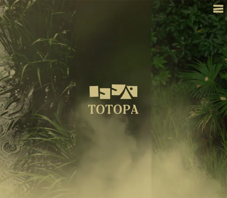
The desktop capture shows a full-width natural scene around the announcement: textured tree bark at the left, long grasses, dense foliage at the right, a dark center, and a hazy lower edge. The framing is immersive rather than contained in a card.
The measured opening section is approximately 1.3 viewport heights on both devices. This gives the opening more document space than a single screen, although it does not prove a particular scroll effect.
The current mobile opening screenshot shows the dimmed ochre field around the announcement rather than a clearly visible foliage scene. It is not possible to establish whether that difference comes from media loading, responsive presentation, animation state, or another condition.
The media format, playback, loop duration, central hero graphics, and exact unobstructed crop are unverified.
Announcement Overlay
Role: communicate a current operating-hours exception and an additional recruitment link.
This is the most completely documented component and the dominant initial state.
Its anatomy is:
- A viewport-sized layer that dims the underlying page.
- A centered, square-cornered blue panel.
- A narrow perimeter changing from terracotta at the top through pale tones to green at the bottom.
- A large cream NEWS graphic.
- A heading, short explanatory text, operating hours, and an underlined recruitment link.
- A square close affordance aligned to the upper-right corner of the frame.
Desktop geometry: the panel extends approximately from (360, 272) to (1080, 728). NEWS occupies the left region, approximately 260px wide. The text begins at x = 774px and occupies a 244.81px column. The heading uses 28.8px type, 1.3 leading, and 0.15em tracking; the body uses 14.4px, 1.6 leading, and 0.1em tracking.
The source heading is 9/28(月) 3階男性フロア営業時間変更のお知らせ. Its long title wraps into four lines in both supplied viewport sizes. The underlined recruitment link remains part of the editorial text column rather than becoming a filled CTA.
Mobile geometry: the outer panel is approximately 75% of the viewport width, centered with about 49px side margins. The graphic moves above the text and shrinks to approximately 140px wide. A large upper stage separates the graphic from the heading, whose measured top is 417.125px.
The mobile panel ends around y = 715px, but the recruitment paragraph begins at 718.31px and extends farther downward. The screenshots visibly cut off lower body content and do not show the recruitment link inside the panel. Internal scrolling was not exercised, so this establishes a captured clipping condition, not proof that the content is permanently unreachable.
The overlay remains at the same screen position while the capture process moves through the underlying page. This supports viewport-persistent presentation; it does not establish normal wheel/touch scroll locking. Closing, Escape handling, focus behavior, and repeat-visit persistence are unverified.
Introduction Block
Role: explain the facility's purpose in a slow, readable editorial section.
The Japanese introduction heading begins お湯、冷水、サウナ、湯気によって. At desktop it forms a two-line block; the supplied mobile text introduces an additional line break. The heading and paragraph are left aligned within a centered reading column.
The paragraph width changes from 630px to 316.875px. Its 2.2 line height creates much of the relaxed character: 51.48px between desktop baselines and approximately 34.86px on mobile. Tracking is 0.05em.
The gap between the measured heading box and paragraph is approximately 40.5px on desktop and 18.28px on mobile. Maintain the broad section padding around this group rather than distributing equal gaps between every line of content.
Floor Diagram
Role: make the spatial organization of the facility legible and visually distinctive.
The desktop men's-floor screenshot shows a large plan occupying approximately 1224 × 648px, beginning around x = 108px, or 7.5% of the viewport width. A large geometric 3F identifier sits near the right edge, below the menu. The floor label appears near the upper-right portion of the page.
Visible plan details include thin beige room boundaries, green and terracotta blocks, dense small-scale patterns, bilingual room labels, an entrance label, stairs, an elevator pictogram, and restroom symbols. This combination resembles physical wayfinding rather than a collection of web cards.
The announcement hides the plan's center. Exact room topology, hotspot targets, selected states, and plan interactions are not available. The mobile DOM records a compact floor identifier toward the left and the floor label toward the right, but no mobile floor-plan screenshot was supplied.
For a new implementation, keep the diagram as dedicated artwork with accessible supporting text. Do not invent room relationships when an authorized plan is unavailable.
Facility Description Rail
Role: expand on individual spaces after the floor overview.
The DOM contains eight women's-facility entries and nine men's-facility entries. Each combines a Japanese name, an English descriptor, and Japanese explanatory copy. Examples include ロッカールーム / Locker room and 左室 / Sauna.
The descriptions occupy a horizontal sequence extending beyond the viewport. On desktop, paragraph boxes begin at approximately 198px, 700.22px, and 1202.44px. On mobile they begin at 36.56px, 345.72px, and 654.88px. These positions establish a horizontal arrangement at both sizes.
Paragraph widths are approximately 416.22px desktop and 254.78px mobile. Headings do not always align to the paragraph's left edge; several are inset within their item. Avoid flattening that composition into a rigid grid of identical boxed cards.
The women's entries use terracotta text, while the men's entries use beige text. Descriptions use 1.8 leading and a measured top padding of 2u.
Sliding, dragging, autoplay, arrows, pagination, and the associated media are unverified. Slider-related custom properties alone do not prove any of those behaviors.
Pricing and Membership
Role: present visit costs and explain registration requirements.
The DOM establishes two price groups, weekdays and weekends/holidays, each with six duration bands. Pre-tax amounts and tax-inclusive amounts are differentiated in the content. A separate runner's-locker price follows the main facility information.
A tall link to the LINE membership destination is measured beside the pricing region: approximately 211.38 × 450px on desktop and 152.34 × 304.69px on mobile. Its visual contents are not exposed in the screenshots. The mobile pricing heading begins around x = 194.66px, so the evidence supports retained side-by-side regions at this width rather than a complete single-column stack.
The source uses a Japanese-first serif stack for the pricing heading. Preserve clear duration/amount alignment and the distinction between base price, tax-inclusive price, and explanatory notes. Exact rules, cell spacing, and price-row typography were not measured.
Q&A
Role: answer practical questions before a visit.
The content includes 23 numbered entries, from tattoo and reservation policies to membership, payment, amenities, and contact information. Supporting links lead to social accounts, LINE, email, and other sections of the page.
The heading is centered. Measured answer text occupies a narrow column: 486px on desktop and 310.78px on mobile. Answer line height is 1.85.
The extracted record includes answers and links whose rectangles can overlap subsequent entries. It therefore cannot establish that all answers were visibly expanded. No disclosure toggle, open-state icon, or expansion animation was inspected.
For an adaptation, native disclosures are a reasonable implementation option, but they are a recommendation. The original open/closed behavior should remain undocumented until directly tested.
Access and Footer
Role: close the page with location, hours, contact, social links, and policies.
A map appears above the contact information. In the desktop screenshot its visible container spans approximately 1080px, from x = 180px to 1260px; its upper edge is outside the captured viewport. The mobile map is approximately full viewport width and about 244px high in the supplied view. Its provider controls and geographic labels remain recognizable.
Desktop contact text begins at x = 207px, with social links arranged separately toward the right at approximately x = 1040px. On mobile, address, hours, email, and social links share a left inset of 24.375px; the social links move below the contact details.
The footer places the copyright at the left and four legal links at the right. Desktop padding is 36px; mobile padding is 24.375px. The mobile footer still fits a very compact horizontal arrangement, with legal text measured at only 8.53125px.
That small type is an observation to document, not a recommended accessibility target. A reusable version should allow the legal links to wrap and maintain a readable minimum size.
Store Shortcut
Role: provide a recognizable route to the external online store.
The opening scene includes a terracotta shopping-cart graphic labeled TOTOPA STORE. The cart uses broad, irregular geometric segments rather than a standard line icon.
Its measured box is 126 × 140.97px on desktop, positioned 36px from the right and approximately 39px from the bottom of the initial viewport. On mobile it is 94.45 × 105.67px, approximately 21.33px from the right and 22.30px from the bottom.
The link destination is present in the original-page DOM. Its presence in the opening and offscreen navigation does not prove that it is fixed throughout the entire document.
Tokens — Motion & Interaction
| Element | Recorded declaration | What is established | What remains unknown |
|---|---|---|---|
| Root canvas | background-color 0.8s, color |
An 800ms background-color transition is declared | Trigger and full palette sequence; no explicit color duration is shown in the supplied string |
| Announcement section | opacity 0.65s ease-in-out |
A 650ms opacity transition is declared | Actual entrance/dismissal sequence and persistence |
| Mobile header identity | 0.95s cubic-bezier(0.34, 1.46, 0.64, 1) forwards fade-up |
A named 950ms animation and its easing are recorded | Keyframes, travel distance, and visible replay |
| Membership link | opacity 0.85s ease-in-out, transform 0.8s ease-in-out |
Opacity and transform transitions are declared | Trigger and transform values |
| Q&A supporting links | transform 0.4s ease-in-out |
A 400ms transform transition is declared | Whether activated by hover, focus, or another state |
The repeated computed value transition: all without a duration is not evidence of a visible timed animation. Likewise, animation: none on sampled text elements says little about unmeasured media or pseudo-elements.
The supplied capture process waited for document loading, relevant finite motion, sampled layout/text stability, and visible image decoding within stated limits. Perpetual animation was temporarily paused during readiness checks and resumed afterward. Those checks improve capture stability but do not establish video playback, parallax, carousel behavior, delayed content, or reduced-motion support.
For an adaptation, a restrained 650–850ms fade can reflect the measured timing language. Do not add scroll-linked movement or autoplay merely because the opening imagery looks atmospheric.
Surfaces
| Layer | Appearance | Structural purpose |
|---|---|---|
| Main canvas | Flat warm ochre | Unifies introduction and practical information |
| Men's-floor state | Blue field with beige detail | Gives the facility overview a distinct color relationship |
| Diagram | Flat color regions, fine outlines, patterned areas | Encodes spatial information without card elevation |
| Editorial content | Transparent text blocks on the section canvas | Creates hierarchy through type, width, and spacing |
| Announcement veil | Dark translucent layer | Separates the current notice from the page |
| Announcement panel | Opaque blue, cream text, multicolor edge | Forms the strongest foreground surface |
| Map | Provider-rendered geographic imagery | Supplies practical location information |
The announcement frame is a localized gradient treatment. Its slightly varied edge texture is visible, but the evidence does not identify whether it is produced by an image, CSS, or another technique. It should not become a general gradient fill for every component.
Imagery
The visible imagery has two complementary modes. The opening uses natural photographic detail: foliage, rough bark, grasses, darkness, and haze. The interface artwork uses flattened color, angular silhouettes, geometric lettering, and patterned plan regions.
The contrast between those modes is central to the design. Keep photography spacious and immersive; keep functional graphics deliberate and distinctive. Smooth generic wellness icons would lose the character of the menu, NEWS mark, floor identifier, and cart.
The visible floor plan is not a photographic collage. It relies on labeled shapes and small symbols. The embedded map is a separate information source with its own visual language.
Facility descriptions are present in the DOM, but their associated photographs, aspect ratios, and crops cannot be characterized from the supplied screenshots.
Observed Asset References
No original image, SVG, video, or font-file paths were supplied. The following are visual references, not downloadable asset identifiers.
| Visual | Current-page evidence | Reuse guidance |
|---|---|---|
| Opening vegetation | Desktop opening capture, visible around the notice | Use authorized media; do not infer video playback or the hidden central crop |
| NEWS artwork | All five current-page captures | Preserve angular artwork; plain text is only a fallback |
| Menu symbol | Desktop and mobile header views | Preserve broad, skewed bands and generous visual weight |
Men's-floor diagram and 3F |
Desktop middle capture | Preserve actual room relationships and bilingual labels |
| Store cart | Desktop and mobile opening views | Treat the cart and label as a single graphic identity element |
| Geographic map | Desktop and mobile access views | Retain a usable address link alongside the map |
Layout & Responsive Behavior
Document Structure
The measured sequence is opening scene → introduction → women's facilities → men's facilities → pricing/membership → Q&A → access → footer. Total document height is approximately 10,745px on desktop and 8,374px on mobile.
Major sections retain generous vertical spacing on mobile: 180px desktop padding becomes 121.875px. This is still substantial relative to a 390px-wide screen. The page's relaxed pace should not be reduced to tight conventional content blocks.
Responsive Relationships
| Relationship | Desktop | Mobile |
|---|---|---|
| Introduction | Centered 630px reading column | 316.875px column with 36.5625px side insets |
| Facility descriptions | Horizontal sequence of 416.22px text regions | Horizontal sequence remains; text regions narrow to 254.78px |
| Announcement | NEWS left, text right | NEWS above text; text size largely preserved |
| Announcement width | Approximately 50% of viewport | Approximately 75% of viewport |
| Pricing region | Membership link beside pricing | Measured positions still indicate adjacent regions |
| Contact/social arrangement | Details left, social links right | Social links move below the details |
| Footer | Small legal links on the right | Very small legal links remain in a compact row |
The header identity width stays close to 109px across both viewports, while many text sizes shrink. Navigation labels and the announcement also resist the general reduction. Responsive behavior is therefore component-specific, not a uniform scaled desktop canvas.
Captured Mobile Constraint
The announcement's upper artwork region consumes nearly 288px between the panel top and heading start. The heading then occupies approximately 161px including its bottom padding. This leaves too little visible space for the complete body and recruitment link within the captured 585px panel.
A new implementation should preserve the stacked composition while allowing the content region to scroll. On short screens, reduce decorative stage height before reducing essential text size. Keep the close control outside that scrolling content.
The original breakpoint, safe-area handling, orientation behavior, zoom behavior, and intermediate-width layouts were not supplied. The Quick Start uses an explicitly recommended breakpoint rather than presenting one as measured source CSS.
Do’s and Don’ts
Do
- Start with ochre
#cabc81and slate blue#3a5373as the main canvas/text relationship. - Preserve the distinction between floor beige and the lighter announcement cream.
- Use the recorded serif stacks when the fonts are available and appropriately licensed.
- Keep the introduction narrow, left aligned, and generously led.
- Treat NEWS, floor identifiers, the menu, and the cart as distinctive artwork.
- Preserve the announcement's square outline and narrow multicolor perimeter.
- Retain bilingual facility naming and the spatial logic of the floor diagram.
- Keep horizontal facility content distinct from the main vertical document flow.
- Give pricing, membership, Q&A, and directions enough hierarchy to support an actual visit.
- Separate recorded transition values from unverified interaction behavior.
Don't
- Don't replace the facility guide with a generic campaign layout and repeated conversion buttons.
- Don't use the dimmed screenshot colors as the underlying brand palette.
- Don't turn all content into rounded white cards with shadows.
- Don't reproduce the NEWS lettering with an unrelated display font and call it equivalent artwork.
- Don't spread the announcement gradient across every section or action.
- Don't assume the foliage is video, or add parallax without a separate design decision.
- Don't claim carousel autoplay, clickable floor hotspots, or accordion behavior from DOM presence alone.
- Don't make the store shortcut globally fixed solely because it appears near the opening viewport's corner.
- Don't reproduce the captured mobile clipping or tiny legal text as required behavior.
- Don't copy numeric source
remvalues into a conventional 16px-root project without conversion.
Recommended Implementation Additions
These are recommendations for a new implementation, not verified features of the inspected site.
- Use a semantic modal dialog with an accessible heading, keyboard dismissal, focus management, and focus restoration. Keep its close control visible while the content scrolls.
- Give icon controls at least a 44px interaction target. The artwork itself can remain approximately 30–36px where needed.
- Keep essential body copy around 16px on small screens and allow legal links to wrap. This intentionally improves on the measured mobile Q&A and footer sizes.
- Provide a text equivalent for floor-plan information and visible, keyboard-operable navigation for any horizontal facility rail.
- If Q&A items become disclosures, use native
details/summaryor equivalent tested semantics. Do not make answers depend on pointer-only interaction. - Provide visible focus styling and check small terracotta text against the ochre canvas. Slate is a suitable existing palette option for extended reading.
- Honor reduced-motion preferences. If motion media is added, provide appropriate playback control and a stable visual fallback.
- Keep all announcement content reachable at increased text size and on short landscape screens; shorten the decorative upper stage when necessary.
Agent Prompt Guide
Quick Color Reference
- Page canvas:
#cabc81. - Default reading text:
#3a5373. - Terracotta accents and women's-facility text:
#b85346. - Men's-facility text:
#c6b880. - Green accent:
#85b390. - Announcement text:
#e2dcbfon blue. - Announcement frame: terracotta upper edge, pale intermediate tones, green lower edge; exact stops are an adaptation.
- Backdrop: dark translucent dimming, approximately 55% black as a starting estimate.
Overall Prompt
“Create a long-form website for a park-side spa using TOTOPA's observed visual relationships: warm ochre #cabc81, slate blue #3a5373, terracotta #b85346, muted green #85b390, and serif typography with Japanese Mincho character. Use broad section spacing, a narrow introduction with generous leading, large illustrated floor plans, horizontal bilingual facility descriptions, practical pricing and membership information, Q&A, and an access map. Keep the header light, with language controls at left, a small centered identity in interior states, and a broad angular menu mark at right. Use custom geometric artwork for major symbols. Include a square blue announcement with cream text, NEWS artwork, a narrow terracotta-to-green frame, and a corner close control. On mobile, stack the announcement artwork above the text and make the full content safely scrollable.”
Example Component Prompts
- Announcement: “Build a desktop notice approximately 720px wide and 456px tall, with a 260px NEWS graphic at left and a 245px text column at right. Use blue
#3a5373, cream#e2dcbf, a square gradient frame, a 28.8px serif heading with 0.15em tracking, and compact underlined supporting links. On a 390px screen, use roughly 75vw width, stack the regions, retain readable text, and scroll overflow beneath a persistent close control.” - Introduction: “Place a left-aligned Japanese serif introduction in a centered 630px column. Use a 31.5px heading, followed by 23.4px prose with 2.2 line height and 0.05em tracking. Surround the section with generous ochre space. Narrow the column on mobile without centering the text.”
- Floor diagram: “Present an authorized facility plan as a large blue-and-beige wayfinding graphic with terracotta and muted-green room regions, thin boundaries, patterned zones, bilingual labels, and a geometric floor identifier. Preserve the supplied room topology. Pair the diagram with accessible room descriptions.”
- Facility rail: “Arrange unboxed facility entries in a horizontal sequence. Pair Japanese names with English descriptors and serif explanatory copy. Use terracotta text for one section and beige on blue for another. Keep substantial gaps and allow some heading offsets within each entry. Any scrolling controls are an explicit implementation addition.”
- Access/footer: “Place a wide location map above serif address and contact information. On desktop, align social links to a separate right column; on mobile, move them below the address. End with a quiet copyright and policy row that wraps at readable sizes.”
Quick Start
CSS Custom Properties
This is a usable adaptation, not recovered source CSS. It keeps the application root at a conventional size and uses --totopa-u to reproduce selected measured proportions. The 767px breakpoint, size caps, scrolling behavior, and readability floors are recommendations. The mobile unit matches the supplied 390px measurement but is not claimed as the original formula.
The announcement expects .notice__scroll to contain .notice__art and .notice__copy, with .notice__close outside the scrolling region. Use authorized graphic assets inside the artwork containers. No asset URLs are invented here.
:root {
  /* Exact source colors and measured announcement text color. */
  --totopa-ochre: #cabc81;
  --totopa-blue: #3a5373;
  --totopa-rust: #b85346;
  --totopa-beige: #c6b880;
  --totopa-green: #85b390;
  --totopa-cream: #e2dcbf;

  --totopa-serif: 'nib-variable-proportional-pro', 'Noto Serif JP',
    '游明朝体', 'Yu Mincho', YuMincho, 'ヒラギノ明朝 Pro',
    'Hiragino Mincho Pro', 'MS P明朝', 'MS PMincho', serif;
  --totopa-ja: 'Noto Serif JP', '游明朝体', 'Yu Mincho',
    YuMincho, 'ヒラギノ明朝 Pro', 'Hiragino Mincho Pro',
    'MS P明朝', 'MS PMincho', serif;

  /* Measured desktop unit; responsive adaptation below. */
  --totopa-u: 9px;
  --totopa-section-space: calc(20 * var(--totopa-u));
  --totopa-notice-fade: 650ms ease-in-out;
  --totopa-canvas-fade: 800ms ease;
}

.totopa-page,
.totopa-page *,
.notice,
.notice * {
  box-sizing: border-box;
}

.totopa-page {
  margin: 0;
  color: var(--totopa-blue);
  background: var(--totopa-ochre);
  font-family: var(--totopa-serif);
  font-size: 16px; /* Recommended readable base. */
  line-height: 1.8;
  transition: background-color var(--totopa-canvas-fade);
}

/* Optional state hook; the source trigger was not inspected. */
.totopa-page[data-palette='blue'] {
  color: var(--totopa-beige);
  background: var(--totopa-blue);
}

.site-header {
  position: fixed;
  inset: 0 0 auto;
  z-index: 20;
  display: grid;
  grid-template-columns: 1fr auto 1fr;
  align-items: center;
  min-height: 100.53px;
  padding-inline: 27px;
}

.site-header__brand {
  justify-self: center;
  width: 108px;
}

.site-header__menu {
  justify-self: end;
  min-width: 44px;
  min-height: 44px;
  border: 0;
  color: inherit;
  background: transparent;
}

.hero {
  min-height: 130svh;
}

.hero__scene {
  position: relative;
  height: 100svh;
}

.hero__media {
  position: absolute;
  inset: 0;
  width: 100%;
  height: 100%;
  object-fit: cover;
}

.store-shortcut {
  position: absolute;
  right: 36px;
  bottom: 39px;
  width: 126px;
  color: var(--totopa-rust);
}

.store-shortcut img,
.site-header__brand img,
.floor-plan {
  display: block;
  width: 100%;
  height: auto;
}

.editorial-section {
  padding-block: var(--totopa-section-space);
}

.introduction__inner {
  width: min(630px, calc(100% - 12 * var(--totopa-u)));
  margin-inline: auto;
}

.introduction h1 {
  margin: 0;
  font-size: calc(3.5 * var(--totopa-u));
  font-weight: 700;
  line-height: 1.5;
  letter-spacing: -0.1em;
}

.introduction p {
  margin: calc(4.5 * var(--totopa-u)) 0 0;
  font-size: max(16px, calc(2.6 * var(--totopa-u)));
  line-height: 2.2;
  letter-spacing: 0.05em;
}

.floor-plan-wrap {
  width: 85%;
  margin-inline: auto;
}

/* Native horizontal scrolling is an adaptation. */
.facility-rail {
  display: grid;
  grid-auto-flow: column;
  grid-auto-columns: 416.22px;
  gap: 86px;
  padding-inline: max(36px, calc((100vw - 1044px) / 2));
  overflow-x: auto;
  scroll-snap-type: x proximity;
}

.facility-item {
  scroll-snap-align: start;
}

.facility-item h3 {
  margin: 0;
  font-size: calc(3.2 * var(--totopa-u));
  line-height: 1;
}

.facility-item p {
  padding-top: calc(2 * var(--totopa-u));
  font-size: max(16px, calc(2.2 * var(--totopa-u)));
  line-height: 1.8;
}

.facilities--women {
  color: var(--totopa-rust);
}

.facilities--men {
  color: var(--totopa-beige);
  background: var(--totopa-blue);
}

.faq__inner {
  width: min(486px, calc(100% - 13 * var(--totopa-u)));
  margin-inline: auto;
  font-size: 16px;
  line-height: 1.85;
}

.access__inner {
  width: min(1080px, 100%);
  margin-inline: auto;
}

.access__details {
  display: grid;
  grid-template-columns: minmax(0, 1fr) auto;
  gap: 27px;
  padding: 36px 27px 0;
  font-size: 19.8px;
}

.site-footer {
  display: flex;
  justify-content: space-between;
  flex-wrap: wrap;
  gap: 16px;
  padding: calc(4 * var(--totopa-u));
  font-size: 12.6px;
}

.site-footer nav {
  display: flex;
  flex-wrap: wrap;
  gap: 12px;
}

.notice {
  position: fixed;
  inset: 0;
  width: min(720px, calc(100vw - 48px));
  max-width: none;
  max-height: calc(100dvh - 32px);
  margin: auto;
  padding: 0;
  border: 7px solid transparent;
  border-radius: 0;
  overflow: visible;
  color: var(--totopa-cream);
  font-family: var(--totopa-serif);
  background:
    linear-gradient(var(--totopa-blue), var(--totopa-blue)) padding-box,
    linear-gradient(
      180deg,
      var(--totopa-rust),
      var(--totopa-cream) 52%,
      var(--totopa-green)
    ) border-box;
}

.notice::backdrop {
  background: rgb(0 0 0 / 55%); /* Visual approximation. */
}

.notice__scroll {
  display: grid;
  grid-template-columns: minmax(0, 1fr) 245px;
  align-items: center;
  gap: 100px;
  min-height: min(442px, calc(100dvh - 48px));
  max-height: calc(100dvh - 48px);
  padding: 40px 54px 40px 44px;
  overflow-y: auto;
  overscroll-behavior: contain;
}

.notice__art {
  display: grid;
  place-items: center;
}

.notice__art img {
  display: block;
  width: 100%;
  height: auto;
}

.notice__copy {
  min-width: 0;
  font-size: 14.4px;
  line-height: 1.6;
  letter-spacing: 0.1em;
  overflow-wrap: anywhere;
}

.notice__copy h2 {
  margin: 0 0 27px;
  font-size: 28.8px;
  font-weight: 700;
  line-height: 1.3;
  letter-spacing: 0.15em;
}

.notice__copy p {
  margin: 0;
}

.notice__copy a {
  color: inherit;
  text-decoration: underline;
  text-underline-offset: 0.15em;
}

.notice__close {
  position: absolute;
  z-index: 1;
  top: -7px;
  right: -7px;
  width: 44px;
  height: 44px;
  padding: 0;
  border: 0;
  border-radius: 0;
  color: var(--totopa-blue);
  background: var(--totopa-cream);
  font: 36px/1 serif;
  cursor: pointer;
}

.totopa-page :focus-visible,
.notice :focus-visible {
  outline: 2px solid currentColor;
  outline-offset: 4px;
}

@media (max-width: 767px) {
  :root {
    --totopa-u: clamp(6px, 1.5625vw, 9px);
  }

  .site-header {
    min-height: 74.67px;
    padding-inline: 18px;
  }

  .site-header__brand {
    width: 109.69px;
  }

  .store-shortcut {
    right: 21.33px;
    bottom: 22.3px;
    width: 94.45px;
  }

  .introduction h1 {
    line-height: 1.65;
  }

  .introduction p {
    margin-top: calc(3 * var(--totopa-u));
  }

  .floor-plan-wrap {
    width: 100%; /* Recommended mobile presentation. */
  }

  .facility-rail {
    grid-auto-columns: 254.78px;
    gap: 54.375px;
    padding-inline: calc(6 * var(--totopa-u));
  }

  .facility-item h3 {
    font-size: calc(3 * var(--totopa-u));
  }

  .access__details {
    grid-template-columns: 1fr;
    padding: calc(4 * var(--totopa-u));
    font-size: 16px;
  }

  .notice {
    width: 75vw;
    height: min(69.3svh, calc(100dvh - 32px));
    border-width: 5px;
  }

  .notice__scroll {
    display: block;
    min-height: 0;
    height: 100%;
    max-height: 100%;
    padding: 0 max(16px, calc(7.5vw - 5px)) 28px;
  }

  .notice__art {
    min-height: 282.5px;
  }

  .notice__art img {
    width: min(140px, 100%);
  }

  .notice__copy {
    font-size: 14.625px;
  }

  .notice__copy h2 {
    margin-bottom: 18.281px;
    font-size: 27.422px;
  }

  .notice__close {
    top: -5px;
    right: -5px;
  }
}

@media (max-height: 650px) and (max-width: 767px) {
  .notice__art {
    min-height: 140px;
  }
}

@media (prefers-reduced-motion: reduce) {
  .totopa-page,
  .notice {
    transition: none;
    animation: none;
  }
}
Use a native dialog for .notice. Place its close button inside a form with method='dialog', and associate the dialog with the notice heading using aria-labelledby. Open it with showModal() only when required by the new implementation's announcement policy. CSS alone does not provide announcement scheduling, persistence, media behavior, language switching, or navigation logic.
The CSS deliberately uses a 44px close target, readable body-text floors, wrapping footer links, and scrollable notice content. Those choices improve the captured mobile constraints while retaining the color and composition relationships.
Tailwind v4 Token Mapping
Optional aliases for a project already using Tailwind v4. Define the custom properties above first. This is not evidence that the original site uses Tailwind.
@theme inline {
  --color-ochre: var(--totopa-ochre);
  --color-slate-spa: var(--totopa-blue);
  --color-terracotta: var(--totopa-rust);
  --color-floor-beige: var(--totopa-beige);
  --color-muted-green: var(--totopa-green);
  --color-notice-cream: var(--totopa-cream);

  --font-editorial: var(--totopa-serif);
  --font-japanese: var(--totopa-ja);

  --spacing-unit: var(--totopa-u);
  --spacing-section: var(--totopa-section-space);
  --text-introduction: calc(2.6 * var(--totopa-u));
  --text-notice-title: 28.8px;
  --radius-notice: 0px;
}
Sources & Evidence
- TOTOPA — original and final inspected URL: supplied HTTP 200 response, page title, rendered text, links, DOM rectangles, custom properties, and computed styles.
- Capture timestamp: September 16, 2026, 19:56:26.498 UTC, equivalent to September 17, 2026, 04:56:26.498 JST.
- Desktop evidence: three current-page screenshots at 1440 × 1000, showing the opening scene, men's-floor diagram, and access/footer. The announcement remains open in each.
- Mobile evidence: two current-page screenshots at 390 × 844, showing the opening and access/footer. Both expose the stacked announcement and its captured lower-content clipping.
- DOM scope: measurements include offscreen navigation, introduction, facility descriptions, pricing, Q&A, access, announcement text, and footer. Offscreen presence does not establish visibility or successful interaction.
- Observed interaction scope: the supplied capture process traversed the page while the announcement remained visible. No direct control activation or external destination inspection was recorded.
- Limitations: no complete stylesheet, original asset paths, font-file verification, animation keyframes, unobstructed announcement-dismissed screenshots, or intermediate-width tests were supplied. SharedWorkers and service workers were disabled during the browser inspection. Delayed content and unexercised behaviors remain unverified.
This reference describes the current page in the supplied inspection. Numerical source values, visual estimates, and implementation recommendations are identified separately throughout.
# TOTOPA — Style Reference

> A park-side spa identity expressed through muted mineral colors, airy serif typography, and angular graphic symbols.

**Original URL:** [https://totopa.jp/](https://totopa.jp/)
**Final URL:** [https://totopa.jp/](https://totopa.jp/) — supplied response status: HTTP 200.
**Theme:** warm ochre canvas with slate-blue text; the captured men's-floor view uses a blue field with beige details. An open blue announcement overlays every supplied current-page screenshot.
**Inspected:** September 17, 2026, 04:56 JST. Supplied retrieval timestamp: September 16, 2026, 19:56:26.498 UTC.
**Viewports:** desktop, 1440 × 1000 CSS pixels; mobile, 390 × 844 CSS pixels.
**Scope:** the current facility website, including its opening scene, introduction, women's and men's facilities, pricing and membership, 23 numbered Q&A entries, access information, footer, and announcement. Direct screenshots show the opening, men's floor plan, and access/footer on desktop, plus the opening and access/footer on mobile. Other sections are documented from the supplied rendered DOM and computed styles.

TOTOPA combines a restrained editorial reading experience with unusually expressive graphic marks. Ochre, slate blue, terracotta, and muted green connect the interface to the park and bathing environment. Serif text supplies a quiet, established tone, while the angular menu, floor identifiers, NEWS artwork, and shopping cart make the identity playful without relying on rounded cards or bright action buttons.

The site is a long facility guide. Its hierarchy moves from atmosphere and introductory prose into floor diagrams, horizontally arranged facility descriptions, practical pricing, membership information, questions, and directions. The most prominent element in the inspected state is an announcement: a square blue panel framed by a terracotta-to-green edge, with a large graphic on one side and widely tracked text on the other. On mobile, those regions stack vertically while the announcement typography remains almost desktop-sized.

## How to Read This Reference

- **Measured values** are supplied computed CSS values or rendered DOM rectangles. Coordinates and dimensions are CSS pixels unless stated otherwise.
- **Visual estimates** describe screenshot geometry where the relevant element was not included in the measurement record. Approximate values are marked accordingly.
- **Derived values** are arithmetic relationships between supplied measurements, such as the distance between adjacent facility descriptions.
- **Source variables** retain their original names. Other token names are implementation aliases introduced here.
- **Recommended additions** and the Quick Start are adaptations for a new implementation. They are not claims about the original site's code or behavior.
- The announcement obscures substantial content. Extracted text and offscreen rectangles establish content and some layout relationships, but do not prove that every item was simultaneously visible.
- No announcement dismissal, menu opening, language switching, facility navigation, Q&A expansion, or external destination was exercised in the supplied evidence.

## Tokens — Colors

### Default Palette

| Name | Value | Source / implementation alias | Role and evidence |
| --- | --- | --- | --- |
| Warm Ochre | `#cabc81` | Source `--background-color`, `--secondary-color`; alias `--totopa-ochre` | Exact root background in both DOM snapshots; visible beneath the dimming layer in the access/footer views |
| Slate Blue | `#3a5373` | Source `--blue-color`; alias `--totopa-blue` | Exact default text color; visually corresponds to the announcement surface and the blue men's-floor state |
| Terracotta | `#b85346` | Source `--primary-color`; alias `--totopa-rust` | Exact women's-floor text color; visually associated with the store graphic, some header states, and the announcement's upper frame |
| Floor Beige | `#c6b880` | Source `--beige-color`; alias `--totopa-beige` | Exact men's-floor label and facility-description color |
| Muted Green | `#85b390` | Source `--green-color`; alias `--totopa-green` | Declared brand color; green regions appear in the floor diagram and lower announcement frame, although their individual fills were not measured |
| Announcement Cream | `#e2dcbf` | Computed `rgb(226, 220, 191)`; alias `--totopa-cream` | Exact announcement heading, paragraph, and link color |
| Dimming Veil | Approximately `rgb(0 0 0 / 55%)` | Recommended approximation, not a recorded declaration | Darkens the underlying page while leaving the announcement readable |

The two beige values serve different roles. `#cabc81` is the measured page canvas, while `#c6b880` is the measured men's-floor text color. Announcement text is lighter again at `#e2dcbf`.

**Do not sample the dimmed screenshots to redefine the underlying palette.** The access view appears olive-brown because a dark veil covers the ochre canvas. The source root background is still recorded as `#cabc81` in the supplied snapshot.

The custom-property inventory also contains editor and slider defaults. Their presence does not establish them as visible brand colors; they are excluded from this palette.

### Section and Overlay Color Relationships

| Region | Established treatment | Limitation |
| --- | --- | --- |
| Introduction and access | Slate text; root ochre canvas | Introduction is measured in the DOM but not shown unobstructed |
| Women's facilities | Terracotta headings and descriptions | A dedicated unobstructed screenshot of this section was not supplied |
| Men's floor view | Blue field, beige lettering, multicolor plan | Screenshot is darkened by the announcement backdrop |
| Announcement | Blue surface, cream text, multicolor perimeter | Surface assignment is visually supported; exact frame stops and construction are unavailable |
| Opening scene | Dark foliage and a hazy lower region | Much of the center is covered; the media format and movement are unknown |

These are section/state relationships, not evidence of selectable user themes.

## Tokens — Typography

### Main Serif Stack

The supplied computed stack begins with:

```css
'nib-variable-proportional-pro', 'Noto Serif JP', '游明朝体',
'Yu Mincho', YuMincho, 'ヒラギノ明朝 Pro', 'Hiragino Mincho Pro',
'MS P明朝', 'MS PMincho'
```

This is a recorded family declaration, not a font-file audit. The evidence does not identify which font rendered every glyph or prove successful loading of each named family.

The visual role is consistent: expressive Latin serif forms sit beside Japanese Mincho-style text. Body copy is measured at weight `400`; major headings commonly report `700`. Japanese facility names and their English descriptors form compact bilingual groups.

### Japanese Heading Stack

The pricing heading explicitly uses the Japanese stack beginning with `Noto Serif JP`, followed by the Mincho fallbacks and a generic `serif`. It omits the Latin family at the beginning of the main stack.

### Weight Tokens

Source custom properties include axis strings for weights `500`, `600`, `700`, and `900`, plus a separate property containing `300`. Their presence does not establish the applied variable-font axes. Use the measured `font-weight` values below when reproducing the supplied state; do not copy the standalone `300` value into a CSS axis declaration.

### Graphic Lettering

The NEWS mark, floor identifiers, and other distinctive symbols should be treated as artwork. Their angular cuts and irregular silhouettes are not reproduced by selecting a generic display font. The small header wordmark is also an image-like identity element rather than a conventional oversized text heading.

### Type Scale

Values are measured and rounded for readability. Size and line height are shown as `size / line height`.

| Role | Desktop | Mobile | Weight | Tracking / notes |
| --- | --- | --- | --- | --- |
| Root unit | `9px` | `6.09375px` | 400 | Source root size, not a recommended body size |
| Base body | `14.4 / 21.6px` | `9.75 / 14.625px` | 400 | Several components override this |
| Offscreen navigation label | `25.2 / 35.28px` | `23.156 / 32.419px` | 400 | Menu-open appearance was not tested |
| Introduction heading | `31.5 / 47.25px` | `21.328 / 35.191px` | 700 | `-0.1em` |
| Introduction prose | `23.4 / 51.48px` | `15.844 / 34.856px` | 400 | `0.05em`; line height `2.2` |
| Floor label | `28.8 / 43.2px` | `19.5 / 29.25px` | 400 | Normal tracking |
| Facility heading | `28.8 / 28.8px` | `18.281 / 18.281px` | 700 | Bilingual block; child styling may differ |
| Facility description | `19.8 / 35.64px` | `13.406 / 24.131px` | 400 | Line height `1.8` |
| Pricing heading | `29.7 / 34.2px` | `20.109 / 23.156px` | 700 | Japanese-first stack |
| Q&A heading | `27 / 31.5px` | `24.375 / 27.422px` | 700 | `1.8px` desktop; `1.219px` mobile |
| Q&A answer | `14.4 / 26.64px` | `9.75 / 18.038px` | 400 | Line height `1.85` |
| Announcement heading | `28.8 / 37.44px` | `27.422 / 35.648px` | 700 | `0.15em` |
| Announcement body | `14.4 / 23.04px` | `14.625 / 23.4px` | 400 | `0.1em` |
| Access address | `19.8 / 39.6px` | `13.406 / 26.813px` | 400 | Line height `2` |
| Footer legal link | `12.6 / 18.9px` | `8.531 / 12.797px` | 400 | Normal tracking |

The announcement is an important responsive exception. Its body text becomes slightly larger on mobile, while ordinary facility and Q&A text becomes substantially smaller. Its heading retains about 95% of its desktop size. Preserve that prominence in an adaptation, but provide sufficient scrolling space.

## Tokens — Spacing & Shapes

### Measurement Unit

For comparison, this document uses **1u = the measured source root size**:

- Desktop: `1u = 9px`.
- Mobile: `1u = 6.09375px`.

Many measurements are exact multiples of this unit. The original responsive formula and breakpoints were not supplied. The mobile value happens to equal `390 / 64`; that relationship alone is insufficient to establish a global source formula.

### Spacing Scale

| Use | Relationship | Desktop | Mobile | Evidence |
| --- | --- | --- | --- | --- |
| Facility paragraph top padding | `2u` | `18px` | `12.1875px` | Computed padding |
| Announcement heading bottom padding | `3u` | `27px` | `18.28125px` | Computed padding |
| Footer outer padding | `4u` | `36px` | `24.375px` | Computed padding |
| Mobile introduction side inset | `6u` on mobile | — | `36.5625px` | Measured x-coordinate |
| Q&A section top padding | `12u` | `108px` | `73.125px` | Computed padding |
| Major section vertical padding | `20u` | `180px` | `121.875px` | Introduction, facilities, pricing, and access |
| Facility-description gap | Derived from adjacent boxes | About `86px` | `54.375px` | Horizontal step minus paragraph width |

The rhythm alternates broad vertical breathing room with tightly grouped operational details. A single generic spacing scale should not erase the much larger section intervals.

### Shapes and Edges

| Element | Observed treatment |
| --- | --- |
| Announcement | Square corners; approximately 6–7px desktop frame and 4–5px mobile frame |
| Announcement close control | Cream square with a blue diagonal cross; approximately 36px desktop and 30px mobile artwork |
| Menu mark | Three broad, slightly skewed horizontal bands |
| Floor diagram | Thin route and room outlines, block fills, patterned areas, pictograms, and locally softened room corners |
| NEWS artwork | Irregular geometric lettering with cutouts and rotated edges |
| Store link | Large stylized shopping cart with an integrated label |
| General content | Open layout; sampled text containers have zero radius and transparent backgrounds |

No general shadow-based elevation system is visible in the supplied views. The announcement separates itself through the dark veil, opaque surface, and colored frame.

### Layout Measurements

| Element | Desktop | Mobile | Status |
| --- | --- | --- | --- |
| Document height | `10,745.22px` | `8,374.45px` | Measured DOM height |
| Opening section height | `1300px` | `1097.19px` | Measured; consistent with approximately `130vh` at both viewports |
| Header box height | `100.53px` | `74.67px` | Measured |
| Header identity width | `108px` | `109.69px` | Measured image-like heading box |
| Introduction paragraph width | `630px` | `316.875px` | Measured |
| Introduction paragraph left edge | `405px` | `36.5625px` | Measured |
| Facility description width | `416.22px` | `254.78px` | Measured |
| Adjacent facility-description step | `502.22px` | `309.16px` | Derived from x-coordinates |
| Q&A answer width | `486px` | `310.78px` | Measured |
| Opening store-link box | `126 × 140.97px` | `94.45 × 105.67px` | Measured |
| Announcement outer panel | About `720 × 456px` | About `292.5 × 585px` | Screenshot estimate |
| Announcement text-column width | `244.81px` | `234px` | Measured |
| Announcement heading origin | `774, 319.47px` | `78, 417.125px` | Measured viewport coordinates |

## Components

### Site Header and Navigation

**Role:** persistent identity, language access, and section navigation.

The visible header places `Jp En` at the upper left, the menu mark at the upper right, and a small centered TOTOPA wordmark in the captured interior-page states. The opening capture does not expose a centered header identity in the same way. Do not infer its complete entrance sequence from that difference.

The desktop menu artwork is approximately 62px wide; the mobile artwork is approximately 42px wide. These are visual estimates, not measured button hit areas. The mark consists of broad geometric strips rather than thin, evenly spaced lines.

The rendered DOM contains bilingual navigation for Introduction, Facilities, Price and membership, Q&A, and Access, with social and store links. Those navigation rows are positioned above the viewport in the supplied measurements. Their presence supports the navigation inventory but does not establish the open panel's exact appearance or interaction.

The header remains visible in the supplied scrolled screenshots. Its precise positioning implementation and palette-switching trigger were not included in the evidence.

### Opening Scene

**Role:** establish the spa's relationship to the park before detailed information begins.

The desktop capture shows a full-width natural scene around the announcement: textured tree bark at the left, long grasses, dense foliage at the right, a dark center, and a hazy lower edge. The framing is immersive rather than contained in a card.

The measured opening section is approximately 1.3 viewport heights on both devices. This gives the opening more document space than a single screen, although it does not prove a particular scroll effect.

The current mobile opening screenshot shows the dimmed ochre field around the announcement rather than a clearly visible foliage scene. It is not possible to establish whether that difference comes from media loading, responsive presentation, animation state, or another condition.

The media format, playback, loop duration, central hero graphics, and exact unobstructed crop are unverified.

### Announcement Overlay

**Role:** communicate a current operating-hours exception and an additional recruitment link.

This is the most completely documented component and the dominant initial state.

Its anatomy is:

1. A viewport-sized layer that dims the underlying page.
2. A centered, square-cornered blue panel.
3. A narrow perimeter changing from terracotta at the top through pale tones to green at the bottom.
4. A large cream NEWS graphic.
5. A heading, short explanatory text, operating hours, and an underlined recruitment link.
6. A square close affordance aligned to the upper-right corner of the frame.

**Desktop geometry:** the panel extends approximately from `(360, 272)` to `(1080, 728)`. NEWS occupies the left region, approximately 260px wide. The text begins at `x = 774px` and occupies a `244.81px` column. The heading uses `28.8px` type, `1.3` leading, and `0.15em` tracking; the body uses `14.4px`, `1.6` leading, and `0.1em` tracking.

The source heading is `9/28(月) 3階男性フロア営業時間変更のお知らせ`. Its long title wraps into four lines in both supplied viewport sizes. The underlined recruitment link remains part of the editorial text column rather than becoming a filled CTA.

**Mobile geometry:** the outer panel is approximately 75% of the viewport width, centered with about 49px side margins. The graphic moves above the text and shrinks to approximately 140px wide. A large upper stage separates the graphic from the heading, whose measured top is `417.125px`.

The mobile panel ends around `y = 715px`, but the recruitment paragraph begins at `718.31px` and extends farther downward. The screenshots visibly cut off lower body content and do not show the recruitment link inside the panel. Internal scrolling was not exercised, so this establishes a captured clipping condition, not proof that the content is permanently unreachable.

The overlay remains at the same screen position while the capture process moves through the underlying page. This supports viewport-persistent presentation; it does not establish normal wheel/touch scroll locking. Closing, Escape handling, focus behavior, and repeat-visit persistence are unverified.

### Introduction Block

**Role:** explain the facility's purpose in a slow, readable editorial section.

The Japanese introduction heading begins `お湯、冷水、サウナ、湯気によって`. At desktop it forms a two-line block; the supplied mobile text introduces an additional line break. The heading and paragraph are left aligned within a centered reading column.

The paragraph width changes from `630px` to `316.875px`. Its `2.2` line height creates much of the relaxed character: `51.48px` between desktop baselines and approximately `34.86px` on mobile. Tracking is `0.05em`.

The gap between the measured heading box and paragraph is approximately `40.5px` on desktop and `18.28px` on mobile. Maintain the broad section padding around this group rather than distributing equal gaps between every line of content.

### Floor Diagram

**Role:** make the spatial organization of the facility legible and visually distinctive.

The desktop men's-floor screenshot shows a large plan occupying approximately `1224 × 648px`, beginning around `x = 108px`, or 7.5% of the viewport width. A large geometric `3F` identifier sits near the right edge, below the menu. The floor label appears near the upper-right portion of the page.

Visible plan details include thin beige room boundaries, green and terracotta blocks, dense small-scale patterns, bilingual room labels, an entrance label, stairs, an elevator pictogram, and restroom symbols. This combination resembles physical wayfinding rather than a collection of web cards.

The announcement hides the plan's center. Exact room topology, hotspot targets, selected states, and plan interactions are not available. The mobile DOM records a compact floor identifier toward the left and the floor label toward the right, but no mobile floor-plan screenshot was supplied.

For a new implementation, keep the diagram as dedicated artwork with accessible supporting text. Do not invent room relationships when an authorized plan is unavailable.

### Facility Description Rail

**Role:** expand on individual spaces after the floor overview.

The DOM contains eight women's-facility entries and nine men's-facility entries. Each combines a Japanese name, an English descriptor, and Japanese explanatory copy. Examples include `ロッカールーム` / Locker room and `左室` / Sauna.

The descriptions occupy a horizontal sequence extending beyond the viewport. On desktop, paragraph boxes begin at approximately `198px`, `700.22px`, and `1202.44px`. On mobile they begin at `36.56px`, `345.72px`, and `654.88px`. These positions establish a horizontal arrangement at both sizes.

Paragraph widths are approximately `416.22px` desktop and `254.78px` mobile. Headings do not always align to the paragraph's left edge; several are inset within their item. Avoid flattening that composition into a rigid grid of identical boxed cards.

The women's entries use terracotta text, while the men's entries use beige text. Descriptions use `1.8` leading and a measured top padding of `2u`.

Sliding, dragging, autoplay, arrows, pagination, and the associated media are unverified. Slider-related custom properties alone do not prove any of those behaviors.

### Pricing and Membership

**Role:** present visit costs and explain registration requirements.

The DOM establishes two price groups, weekdays and weekends/holidays, each with six duration bands. Pre-tax amounts and tax-inclusive amounts are differentiated in the content. A separate runner's-locker price follows the main facility information.

A tall link to the LINE membership destination is measured beside the pricing region: approximately `211.38 × 450px` on desktop and `152.34 × 304.69px` on mobile. Its visual contents are not exposed in the screenshots. The mobile pricing heading begins around `x = 194.66px`, so the evidence supports retained side-by-side regions at this width rather than a complete single-column stack.

The source uses a Japanese-first serif stack for the pricing heading. Preserve clear duration/amount alignment and the distinction between base price, tax-inclusive price, and explanatory notes. Exact rules, cell spacing, and price-row typography were not measured.

### Q&A

**Role:** answer practical questions before a visit.

The content includes 23 numbered entries, from tattoo and reservation policies to membership, payment, amenities, and contact information. Supporting links lead to social accounts, LINE, email, and other sections of the page.

The heading is centered. Measured answer text occupies a narrow column: `486px` on desktop and `310.78px` on mobile. Answer line height is `1.85`.

The extracted record includes answers and links whose rectangles can overlap subsequent entries. It therefore cannot establish that all answers were visibly expanded. No disclosure toggle, open-state icon, or expansion animation was inspected.

For an adaptation, native disclosures are a reasonable implementation option, but they are a recommendation. The original open/closed behavior should remain undocumented until directly tested.

### Access and Footer

**Role:** close the page with location, hours, contact, social links, and policies.

A map appears above the contact information. In the desktop screenshot its visible container spans approximately `1080px`, from `x = 180px` to `1260px`; its upper edge is outside the captured viewport. The mobile map is approximately full viewport width and about `244px` high in the supplied view. Its provider controls and geographic labels remain recognizable.

Desktop contact text begins at `x = 207px`, with social links arranged separately toward the right at approximately `x = 1040px`. On mobile, address, hours, email, and social links share a left inset of `24.375px`; the social links move below the contact details.

The footer places the copyright at the left and four legal links at the right. Desktop padding is `36px`; mobile padding is `24.375px`. The mobile footer still fits a very compact horizontal arrangement, with legal text measured at only `8.53125px`.

That small type is an observation to document, not a recommended accessibility target. A reusable version should allow the legal links to wrap and maintain a readable minimum size.

### Store Shortcut

**Role:** provide a recognizable route to the external online store.

The opening scene includes a terracotta shopping-cart graphic labeled TOTOPA STORE. The cart uses broad, irregular geometric segments rather than a standard line icon.

Its measured box is `126 × 140.97px` on desktop, positioned `36px` from the right and approximately `39px` from the bottom of the initial viewport. On mobile it is `94.45 × 105.67px`, approximately `21.33px` from the right and `22.30px` from the bottom.

The link destination is present in the original-page DOM. Its presence in the opening and offscreen navigation does not prove that it is fixed throughout the entire document.

## Tokens — Motion & Interaction

| Element | Recorded declaration | What is established | What remains unknown |
| --- | --- | --- | --- |
| Root canvas | `background-color 0.8s, color` | An 800ms background-color transition is declared | Trigger and full palette sequence; no explicit color duration is shown in the supplied string |
| Announcement section | `opacity 0.65s ease-in-out` | A 650ms opacity transition is declared | Actual entrance/dismissal sequence and persistence |
| Mobile header identity | `0.95s cubic-bezier(0.34, 1.46, 0.64, 1) forwards fade-up` | A named 950ms animation and its easing are recorded | Keyframes, travel distance, and visible replay |
| Membership link | `opacity 0.85s ease-in-out, transform 0.8s ease-in-out` | Opacity and transform transitions are declared | Trigger and transform values |
| Q&A supporting links | `transform 0.4s ease-in-out` | A 400ms transform transition is declared | Whether activated by hover, focus, or another state |

The repeated computed value `transition: all` without a duration is not evidence of a visible timed animation. Likewise, `animation: none` on sampled text elements says little about unmeasured media or pseudo-elements.

The supplied capture process waited for document loading, relevant finite motion, sampled layout/text stability, and visible image decoding within stated limits. Perpetual animation was temporarily paused during readiness checks and resumed afterward. Those checks improve capture stability but do not establish video playback, parallax, carousel behavior, delayed content, or reduced-motion support.

For an adaptation, a restrained 650–850ms fade can reflect the measured timing language. Do not add scroll-linked movement or autoplay merely because the opening imagery looks atmospheric.

## Surfaces

| Layer | Appearance | Structural purpose |
| --- | --- | --- |
| Main canvas | Flat warm ochre | Unifies introduction and practical information |
| Men's-floor state | Blue field with beige detail | Gives the facility overview a distinct color relationship |
| Diagram | Flat color regions, fine outlines, patterned areas | Encodes spatial information without card elevation |
| Editorial content | Transparent text blocks on the section canvas | Creates hierarchy through type, width, and spacing |
| Announcement veil | Dark translucent layer | Separates the current notice from the page |
| Announcement panel | Opaque blue, cream text, multicolor edge | Forms the strongest foreground surface |
| Map | Provider-rendered geographic imagery | Supplies practical location information |

The announcement frame is a localized gradient treatment. Its slightly varied edge texture is visible, but the evidence does not identify whether it is produced by an image, CSS, or another technique. It should not become a general gradient fill for every component.

## Imagery

The visible imagery has two complementary modes. The opening uses natural photographic detail: foliage, rough bark, grasses, darkness, and haze. The interface artwork uses flattened color, angular silhouettes, geometric lettering, and patterned plan regions.

The contrast between those modes is central to the design. Keep photography spacious and immersive; keep functional graphics deliberate and distinctive. Smooth generic wellness icons would lose the character of the menu, NEWS mark, floor identifier, and cart.

The visible floor plan is not a photographic collage. It relies on labeled shapes and small symbols. The embedded map is a separate information source with its own visual language.

Facility descriptions are present in the DOM, but their associated photographs, aspect ratios, and crops cannot be characterized from the supplied screenshots.

### Observed Asset References

No original image, SVG, video, or font-file paths were supplied. The following are visual references, not downloadable asset identifiers.

| Visual | Current-page evidence | Reuse guidance |
| --- | --- | --- |
| Opening vegetation | Desktop opening capture, visible around the notice | Use authorized media; do not infer video playback or the hidden central crop |
| NEWS artwork | All five current-page captures | Preserve angular artwork; plain text is only a fallback |
| Menu symbol | Desktop and mobile header views | Preserve broad, skewed bands and generous visual weight |
| Men's-floor diagram and `3F` | Desktop middle capture | Preserve actual room relationships and bilingual labels |
| Store cart | Desktop and mobile opening views | Treat the cart and label as a single graphic identity element |
| Geographic map | Desktop and mobile access views | Retain a usable address link alongside the map |

## Layout & Responsive Behavior

### Document Structure

The measured sequence is opening scene → introduction → women's facilities → men's facilities → pricing/membership → Q&A → access → footer. Total document height is approximately 10,745px on desktop and 8,374px on mobile.

Major sections retain generous vertical spacing on mobile: `180px` desktop padding becomes `121.875px`. This is still substantial relative to a 390px-wide screen. The page's relaxed pace should not be reduced to tight conventional content blocks.

### Responsive Relationships

| Relationship | Desktop | Mobile |
| --- | --- | --- |
| Introduction | Centered 630px reading column | 316.875px column with 36.5625px side insets |
| Facility descriptions | Horizontal sequence of 416.22px text regions | Horizontal sequence remains; text regions narrow to 254.78px |
| Announcement | NEWS left, text right | NEWS above text; text size largely preserved |
| Announcement width | Approximately 50% of viewport | Approximately 75% of viewport |
| Pricing region | Membership link beside pricing | Measured positions still indicate adjacent regions |
| Contact/social arrangement | Details left, social links right | Social links move below the details |
| Footer | Small legal links on the right | Very small legal links remain in a compact row |

The header identity width stays close to 109px across both viewports, while many text sizes shrink. Navigation labels and the announcement also resist the general reduction. Responsive behavior is therefore component-specific, not a uniform scaled desktop canvas.

### Captured Mobile Constraint

The announcement's upper artwork region consumes nearly 288px between the panel top and heading start. The heading then occupies approximately 161px including its bottom padding. This leaves too little visible space for the complete body and recruitment link within the captured 585px panel.

A new implementation should preserve the stacked composition while allowing the content region to scroll. On short screens, reduce decorative stage height before reducing essential text size. Keep the close control outside that scrolling content.

The original breakpoint, safe-area handling, orientation behavior, zoom behavior, and intermediate-width layouts were not supplied. The Quick Start uses an explicitly recommended breakpoint rather than presenting one as measured source CSS.

## Do’s and Don’ts

### Do

- Start with ochre `#cabc81` and slate blue `#3a5373` as the main canvas/text relationship.
- Preserve the distinction between floor beige and the lighter announcement cream.
- Use the recorded serif stacks when the fonts are available and appropriately licensed.
- Keep the introduction narrow, left aligned, and generously led.
- Treat NEWS, floor identifiers, the menu, and the cart as distinctive artwork.
- Preserve the announcement's square outline and narrow multicolor perimeter.
- Retain bilingual facility naming and the spatial logic of the floor diagram.
- Keep horizontal facility content distinct from the main vertical document flow.
- Give pricing, membership, Q&A, and directions enough hierarchy to support an actual visit.
- Separate recorded transition values from unverified interaction behavior.

### Don't

- Don't replace the facility guide with a generic campaign layout and repeated conversion buttons.
- Don't use the dimmed screenshot colors as the underlying brand palette.
- Don't turn all content into rounded white cards with shadows.
- Don't reproduce the NEWS lettering with an unrelated display font and call it equivalent artwork.
- Don't spread the announcement gradient across every section or action.
- Don't assume the foliage is video, or add parallax without a separate design decision.
- Don't claim carousel autoplay, clickable floor hotspots, or accordion behavior from DOM presence alone.
- Don't make the store shortcut globally fixed solely because it appears near the opening viewport's corner.
- Don't reproduce the captured mobile clipping or tiny legal text as required behavior.
- Don't copy numeric source `rem` values into a conventional 16px-root project without conversion.

## Recommended Implementation Additions

These are recommendations for a new implementation, not verified features of the inspected site.

- Use a semantic modal dialog with an accessible heading, keyboard dismissal, focus management, and focus restoration. Keep its close control visible while the content scrolls.
- Give icon controls at least a 44px interaction target. The artwork itself can remain approximately 30–36px where needed.
- Keep essential body copy around 16px on small screens and allow legal links to wrap. This intentionally improves on the measured mobile Q&A and footer sizes.
- Provide a text equivalent for floor-plan information and visible, keyboard-operable navigation for any horizontal facility rail.
- If Q&A items become disclosures, use native `details`/`summary` or equivalent tested semantics. Do not make answers depend on pointer-only interaction.
- Provide visible focus styling and check small terracotta text against the ochre canvas. Slate is a suitable existing palette option for extended reading.
- Honor reduced-motion preferences. If motion media is added, provide appropriate playback control and a stable visual fallback.
- Keep all announcement content reachable at increased text size and on short landscape screens; shorten the decorative upper stage when necessary.

## Agent Prompt Guide

### Quick Color Reference

- Page canvas: `#cabc81`.
- Default reading text: `#3a5373`.
- Terracotta accents and women's-facility text: `#b85346`.
- Men's-facility text: `#c6b880`.
- Green accent: `#85b390`.
- Announcement text: `#e2dcbf` on blue.
- Announcement frame: terracotta upper edge, pale intermediate tones, green lower edge; exact stops are an adaptation.
- Backdrop: dark translucent dimming, approximately 55% black as a starting estimate.

### Overall Prompt

“Create a long-form website for a park-side spa using TOTOPA's observed visual relationships: warm ochre `#cabc81`, slate blue `#3a5373`, terracotta `#b85346`, muted green `#85b390`, and serif typography with Japanese Mincho character. Use broad section spacing, a narrow introduction with generous leading, large illustrated floor plans, horizontal bilingual facility descriptions, practical pricing and membership information, Q&A, and an access map. Keep the header light, with language controls at left, a small centered identity in interior states, and a broad angular menu mark at right. Use custom geometric artwork for major symbols. Include a square blue announcement with cream text, NEWS artwork, a narrow terracotta-to-green frame, and a corner close control. On mobile, stack the announcement artwork above the text and make the full content safely scrollable.”

### Example Component Prompts

1. **Announcement:** “Build a desktop notice approximately 720px wide and 456px tall, with a 260px NEWS graphic at left and a 245px text column at right. Use blue `#3a5373`, cream `#e2dcbf`, a square gradient frame, a 28.8px serif heading with 0.15em tracking, and compact underlined supporting links. On a 390px screen, use roughly 75vw width, stack the regions, retain readable text, and scroll overflow beneath a persistent close control.”
2. **Introduction:** “Place a left-aligned Japanese serif introduction in a centered 630px column. Use a 31.5px heading, followed by 23.4px prose with 2.2 line height and 0.05em tracking. Surround the section with generous ochre space. Narrow the column on mobile without centering the text.”
3. **Floor diagram:** “Present an authorized facility plan as a large blue-and-beige wayfinding graphic with terracotta and muted-green room regions, thin boundaries, patterned zones, bilingual labels, and a geometric floor identifier. Preserve the supplied room topology. Pair the diagram with accessible room descriptions.”
4. **Facility rail:** “Arrange unboxed facility entries in a horizontal sequence. Pair Japanese names with English descriptors and serif explanatory copy. Use terracotta text for one section and beige on blue for another. Keep substantial gaps and allow some heading offsets within each entry. Any scrolling controls are an explicit implementation addition.”
5. **Access/footer:** “Place a wide location map above serif address and contact information. On desktop, align social links to a separate right column; on mobile, move them below the address. End with a quiet copyright and policy row that wraps at readable sizes.”

## Quick Start

### CSS Custom Properties

This is a usable adaptation, not recovered source CSS. It keeps the application root at a conventional size and uses `--totopa-u` to reproduce selected measured proportions. The 767px breakpoint, size caps, scrolling behavior, and readability floors are recommendations. The mobile unit matches the supplied 390px measurement but is not claimed as the original formula.

The announcement expects `.notice__scroll` to contain `.notice__art` and `.notice__copy`, with `.notice__close` outside the scrolling region. Use authorized graphic assets inside the artwork containers. No asset URLs are invented here.

```css
:root {
  /* Exact source colors and measured announcement text color. */
  --totopa-ochre: #cabc81;
  --totopa-blue: #3a5373;
  --totopa-rust: #b85346;
  --totopa-beige: #c6b880;
  --totopa-green: #85b390;
  --totopa-cream: #e2dcbf;

  --totopa-serif: 'nib-variable-proportional-pro', 'Noto Serif JP',
    '游明朝体', 'Yu Mincho', YuMincho, 'ヒラギノ明朝 Pro',
    'Hiragino Mincho Pro', 'MS P明朝', 'MS PMincho', serif;
  --totopa-ja: 'Noto Serif JP', '游明朝体', 'Yu Mincho',
    YuMincho, 'ヒラギノ明朝 Pro', 'Hiragino Mincho Pro',
    'MS P明朝', 'MS PMincho', serif;

  /* Measured desktop unit; responsive adaptation below. */
  --totopa-u: 9px;
  --totopa-section-space: calc(20 * var(--totopa-u));
  --totopa-notice-fade: 650ms ease-in-out;
  --totopa-canvas-fade: 800ms ease;
}

.totopa-page,
.totopa-page *,
.notice,
.notice * {
  box-sizing: border-box;
}

.totopa-page {
  margin: 0;
  color: var(--totopa-blue);
  background: var(--totopa-ochre);
  font-family: var(--totopa-serif);
  font-size: 16px; /* Recommended readable base. */
  line-height: 1.8;
  transition: background-color var(--totopa-canvas-fade);
}

/* Optional state hook; the source trigger was not inspected. */
.totopa-page[data-palette='blue'] {
  color: var(--totopa-beige);
  background: var(--totopa-blue);
}

.site-header {
  position: fixed;
  inset: 0 0 auto;
  z-index: 20;
  display: grid;
  grid-template-columns: 1fr auto 1fr;
  align-items: center;
  min-height: 100.53px;
  padding-inline: 27px;
}

.site-header__brand {
  justify-self: center;
  width: 108px;
}

.site-header__menu {
  justify-self: end;
  min-width: 44px;
  min-height: 44px;
  border: 0;
  color: inherit;
  background: transparent;
}

.hero {
  min-height: 130svh;
}

.hero__scene {
  position: relative;
  height: 100svh;
}

.hero__media {
  position: absolute;
  inset: 0;
  width: 100%;
  height: 100%;
  object-fit: cover;
}

.store-shortcut {
  position: absolute;
  right: 36px;
  bottom: 39px;
  width: 126px;
  color: var(--totopa-rust);
}

.store-shortcut img,
.site-header__brand img,
.floor-plan {
  display: block;
  width: 100%;
  height: auto;
}

.editorial-section {
  padding-block: var(--totopa-section-space);
}

.introduction__inner {
  width: min(630px, calc(100% - 12 * var(--totopa-u)));
  margin-inline: auto;
}

.introduction h1 {
  margin: 0;
  font-size: calc(3.5 * var(--totopa-u));
  font-weight: 700;
  line-height: 1.5;
  letter-spacing: -0.1em;
}

.introduction p {
  margin: calc(4.5 * var(--totopa-u)) 0 0;
  font-size: max(16px, calc(2.6 * var(--totopa-u)));
  line-height: 2.2;
  letter-spacing: 0.05em;
}

.floor-plan-wrap {
  width: 85%;
  margin-inline: auto;
}

/* Native horizontal scrolling is an adaptation. */
.facility-rail {
  display: grid;
  grid-auto-flow: column;
  grid-auto-columns: 416.22px;
  gap: 86px;
  padding-inline: max(36px, calc((100vw - 1044px) / 2));
  overflow-x: auto;
  scroll-snap-type: x proximity;
}

.facility-item {
  scroll-snap-align: start;
}

.facility-item h3 {
  margin: 0;
  font-size: calc(3.2 * var(--totopa-u));
  line-height: 1;
}

.facility-item p {
  padding-top: calc(2 * var(--totopa-u));
  font-size: max(16px, calc(2.2 * var(--totopa-u)));
  line-height: 1.8;
}

.facilities--women {
  color: var(--totopa-rust);
}

.facilities--men {
  color: var(--totopa-beige);
  background: var(--totopa-blue);
}

.faq__inner {
  width: min(486px, calc(100% - 13 * var(--totopa-u)));
  margin-inline: auto;
  font-size: 16px;
  line-height: 1.85;
}

.access__inner {
  width: min(1080px, 100%);
  margin-inline: auto;
}

.access__details {
  display: grid;
  grid-template-columns: minmax(0, 1fr) auto;
  gap: 27px;
  padding: 36px 27px 0;
  font-size: 19.8px;
}

.site-footer {
  display: flex;
  justify-content: space-between;
  flex-wrap: wrap;
  gap: 16px;
  padding: calc(4 * var(--totopa-u));
  font-size: 12.6px;
}

.site-footer nav {
  display: flex;
  flex-wrap: wrap;
  gap: 12px;
}

.notice {
  position: fixed;
  inset: 0;
  width: min(720px, calc(100vw - 48px));
  max-width: none;
  max-height: calc(100dvh - 32px);
  margin: auto;
  padding: 0;
  border: 7px solid transparent;
  border-radius: 0;
  overflow: visible;
  color: var(--totopa-cream);
  font-family: var(--totopa-serif);
  background:
    linear-gradient(var(--totopa-blue), var(--totopa-blue)) padding-box,
    linear-gradient(
      180deg,
      var(--totopa-rust),
      var(--totopa-cream) 52%,
      var(--totopa-green)
    ) border-box;
}

.notice::backdrop {
  background: rgb(0 0 0 / 55%); /* Visual approximation. */
}

.notice__scroll {
  display: grid;
  grid-template-columns: minmax(0, 1fr) 245px;
  align-items: center;
  gap: 100px;
  min-height: min(442px, calc(100dvh - 48px));
  max-height: calc(100dvh - 48px);
  padding: 40px 54px 40px 44px;
  overflow-y: auto;
  overscroll-behavior: contain;
}

.notice__art {
  display: grid;
  place-items: center;
}

.notice__art img {
  display: block;
  width: 100%;
  height: auto;
}

.notice__copy {
  min-width: 0;
  font-size: 14.4px;
  line-height: 1.6;
  letter-spacing: 0.1em;
  overflow-wrap: anywhere;
}

.notice__copy h2 {
  margin: 0 0 27px;
  font-size: 28.8px;
  font-weight: 700;
  line-height: 1.3;
  letter-spacing: 0.15em;
}

.notice__copy p {
  margin: 0;
}

.notice__copy a {
  color: inherit;
  text-decoration: underline;
  text-underline-offset: 0.15em;
}

.notice__close {
  position: absolute;
  z-index: 1;
  top: -7px;
  right: -7px;
  width: 44px;
  height: 44px;
  padding: 0;
  border: 0;
  border-radius: 0;
  color: var(--totopa-blue);
  background: var(--totopa-cream);
  font: 36px/1 serif;
  cursor: pointer;
}

.totopa-page :focus-visible,
.notice :focus-visible {
  outline: 2px solid currentColor;
  outline-offset: 4px;
}

@media (max-width: 767px) {
  :root {
    --totopa-u: clamp(6px, 1.5625vw, 9px);
  }

  .site-header {
    min-height: 74.67px;
    padding-inline: 18px;
  }

  .site-header__brand {
    width: 109.69px;
  }

  .store-shortcut {
    right: 21.33px;
    bottom: 22.3px;
    width: 94.45px;
  }

  .introduction h1 {
    line-height: 1.65;
  }

  .introduction p {
    margin-top: calc(3 * var(--totopa-u));
  }

  .floor-plan-wrap {
    width: 100%; /* Recommended mobile presentation. */
  }

  .facility-rail {
    grid-auto-columns: 254.78px;
    gap: 54.375px;
    padding-inline: calc(6 * var(--totopa-u));
  }

  .facility-item h3 {
    font-size: calc(3 * var(--totopa-u));
  }

  .access__details {
    grid-template-columns: 1fr;
    padding: calc(4 * var(--totopa-u));
    font-size: 16px;
  }

  .notice {
    width: 75vw;
    height: min(69.3svh, calc(100dvh - 32px));
    border-width: 5px;
  }

  .notice__scroll {
    display: block;
    min-height: 0;
    height: 100%;
    max-height: 100%;
    padding: 0 max(16px, calc(7.5vw - 5px)) 28px;
  }

  .notice__art {
    min-height: 282.5px;
  }

  .notice__art img {
    width: min(140px, 100%);
  }

  .notice__copy {
    font-size: 14.625px;
  }

  .notice__copy h2 {
    margin-bottom: 18.281px;
    font-size: 27.422px;
  }

  .notice__close {
    top: -5px;
    right: -5px;
  }
}

@media (max-height: 650px) and (max-width: 767px) {
  .notice__art {
    min-height: 140px;
  }
}

@media (prefers-reduced-motion: reduce) {
  .totopa-page,
  .notice {
    transition: none;
    animation: none;
  }
}
```

Use a native `dialog` for `.notice`. Place its close button inside a `form` with `method='dialog'`, and associate the dialog with the notice heading using `aria-labelledby`. Open it with `showModal()` only when required by the new implementation's announcement policy. CSS alone does not provide announcement scheduling, persistence, media behavior, language switching, or navigation logic.

The CSS deliberately uses a 44px close target, readable body-text floors, wrapping footer links, and scrollable notice content. Those choices improve the captured mobile constraints while retaining the color and composition relationships.

### Tailwind v4 Token Mapping

Optional aliases for a project already using Tailwind v4. Define the custom properties above first. This is not evidence that the original site uses Tailwind.

```css
@theme inline {
  --color-ochre: var(--totopa-ochre);
  --color-slate-spa: var(--totopa-blue);
  --color-terracotta: var(--totopa-rust);
  --color-floor-beige: var(--totopa-beige);
  --color-muted-green: var(--totopa-green);
  --color-notice-cream: var(--totopa-cream);

  --font-editorial: var(--totopa-serif);
  --font-japanese: var(--totopa-ja);

  --spacing-unit: var(--totopa-u);
  --spacing-section: var(--totopa-section-space);
  --text-introduction: calc(2.6 * var(--totopa-u));
  --text-notice-title: 28.8px;
  --radius-notice: 0px;
}
```

## Sources & Evidence

- [TOTOPA — original and final inspected URL](https://totopa.jp/): supplied HTTP 200 response, page title, rendered text, links, DOM rectangles, custom properties, and computed styles.
- **Capture timestamp:** September 16, 2026, 19:56:26.498 UTC, equivalent to September 17, 2026, 04:56:26.498 JST.
- **Desktop evidence:** three current-page screenshots at 1440 × 1000, showing the opening scene, men's-floor diagram, and access/footer. The announcement remains open in each.
- **Mobile evidence:** two current-page screenshots at 390 × 844, showing the opening and access/footer. Both expose the stacked announcement and its captured lower-content clipping.
- **DOM scope:** measurements include offscreen navigation, introduction, facility descriptions, pricing, Q&A, access, announcement text, and footer. Offscreen presence does not establish visibility or successful interaction.
- **Observed interaction scope:** the supplied capture process traversed the page while the announcement remained visible. No direct control activation or external destination inspection was recorded.
- **Limitations:** no complete stylesheet, original asset paths, font-file verification, animation keyframes, unobstructed announcement-dismissed screenshots, or intermediate-width tests were supplied. SharedWorkers and service workers were disabled during the browser inspection. Delayed content and unexercised behaviors remain unverified.

This reference describes the current page in the supplied inspection. Numerical source values, visual estimates, and implementation recommendations are identified separately throughout.