
DESIGN REFERENCE
HERM(エルム)|ラグジュアリーリゾートブランドの企業サイト
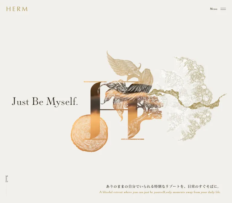
温かなアイボリーに深いブラウンと落ち着いたゴールドを合わせ、繊細な自然モチーフと日英併記の明朝・セリフ体で上質な世界観を表現する企業サイト。
オリジナルサイトを見るHERM — Style Reference
Warm ivory, restrained gold, and an engraved landscape growing through a monumental H.
Website: herm.co.jp
Original URL: https://www.herm.co.jp/
Final URL: https://www.herm.co.jp/
Theme: warm light canvas, with a dark photographic concept scene
Inspected: September 17, 2026, at 04:30 JST; supplied retrieval timestamp: 2026-09-16T19:30:48.123Z
Viewports: desktop 1440 × 1000 and mobile 390 × 844 CSS pixels
Scope: the current corporate homepage. Visual evidence covers the desktop and mobile opening composition, desktop concept chapter 03, and desktop/mobile footer regions. Rendered DOM and computed styles additionally document the concept sequence, Company/Brand/Resorts gateways, resort entries, Journal, and recruitment banner. Destination pages and an opened menu were not inspected.
HERM presents a luxury resort brand through patient spacing, delicate typography, and a small material palette. Ivory supplies the continuous page surface; dark brown carries Japanese copy and navigation; muted gold identifies the wordmark, English translations, chapter numbers, and selected actions. The opening artwork combines a large serif H with intricate botanical and landscape forms. Its fine lines and translucent regions provide visual complexity without filling the whole screen.
This is a substantial corporate website with several audiences. Brand storytelling leads into company information, resort projects, editorial updates, recruitment, partnerships, and contact routes. Its reusable structure is the relationship between expressive imagery and quiet bilingual information: broad scenes establish atmosphere, while compact type and measured spacing organize the practical content.
How to Read This Reference
- Measured values come from the supplied rendered DOM and computed-style records. Values are CSS pixels unless noted otherwise.
- Visual estimates describe the supplied original-page captures. They are identified explicitly and should not be treated as extracted CSS.
- Calculated values are simple relationships between measured bounds, such as column widths or gaps.
- Recommendations describe a practical adaptation, including accessibility improvements and the Quick Start. They are not claims about existing behavior.
- Token names in this document are implementation aliases. The evidence exposes many generic CMS preset variables, but those presets do not establish the visible brand palette.
- An element's computed font size may belong to a wrapper. Several headings contain descendants whose styles were not included. Their outer measurements must not be mistaken for the size of every visible glyph.
- The browser supplied static captures and sampled styles, not a complete recording. Transitions can be documented precisely where declared; their triggers and full visual sequences often remain unverified.
Tokens — Colors
Default Palette
| Name | Value | Suggested token | Evidence and role |
|---|---|---|---|
| Warm Ivory | #F2F0EC |
--color-paper |
Measured HTML, opening section, and footer background: rgb(242, 240, 236) |
| Deep Brown | #241D14 |
--color-ink |
Measured body text, footer links, resort names, and active Journal filter |
| Muted Gold | #A78F45 |
--color-gold |
Measured wordmark treatment, English paragraphs, concept numerals, recruitment banner, and Journal button |
| Quiet Taupe | #A7A08C |
--color-muted |
Measured inactive Journal filter text |
| White | #FFFFFF |
--color-white |
Measured reversed copy and action text; visibly used over the concept photograph |
| Fine Divider | approximately #DCD5C5 |
--color-rule |
Visual approximation of pale footer separators; border color was not supplied |
The design uses gold as a secondary reading voice as well as an accent. English translations often occupy substantial gold paragraphs, while Japanese copy uses brown on ivory or white over dark media. Preserve this language hierarchy deliberately.
Do not expand the palette using every variable found in the DOM. The exposed blue, red, vivid gradients, and shadow presets are generic available values; the inspected interface does not establish their use as HERM design tokens.
Color Across Scenes
The opening and footer share the same measured ivory. The concept capture changes to a darkened architectural scene with white Japanese text and gold English text. The exact overlay color, opacity, and compositing method are not provided.
Olive, pale gold, white, brown, and small highlights also appear inside the opening illustration. These are artwork colors, not evidence of additional interface themes. No theme selector or alternate user-selectable palette was observed.
Tokens — Typography
Japanese Editorial Text
- Measured family stack:
游明朝, "Yu Mincho", YuMincho, "Hiragino Mincho Pro", serif. - Measured body weight:
500. - Measured body size:
13pxon both inspected viewports. - Measured body line height:
24.96px, equivalent to1.92at 13px. - Measured tracking:
0.78px, equivalent to0.06emat 13px. - Character: fine Mincho strokes with generous vertical breathing room. The compact size leaves space for both languages without making the page visually heavy.
English Display and Translation Text
The computed family stack begins with paganini, followed by the Japanese Mincho stack and serif. English navigation, resort names, concept numerals, translations, and several actions declare weight 300.
The evidence confirms the declared family name, not its font-file URL, licensing, version, or successful glyph-level loading. A new implementation needs an authorized font resource; the family declaration alone will fall back if that resource is unavailable.
English paragraphs generally use tighter leading than Japanese paragraphs. This contrast is structural: a Japanese passage forms a spacious reading block, followed by a finer gold translation.
Wordmark and Opening Headline
The visible HERM wordmark is a small, widely spaced graphic mark. Its DOM link has a gold background treatment and a descriptive H1 text string, but that does not identify the lettering's font or rendering mechanism. Use an authorized logo asset instead of typing HERM in the body font.
The opening headline reads “Just Be Myself.” It is a delicate serif statement, visually estimated at about 48px on desktop and 40px on mobile. Its own computed typography was not included. Reusing the declared English family is a reasonable implementation choice, not a directly measured headline declaration.
Type Scale
Unless marked as an estimate, the following values are measured declarations. Tracking is commonly the inherited 0.78px; do not replace it with one relative tracking value at every size.
| Role | Desktop size / line height | Mobile size / line height | Weight and notes |
|---|---|---|---|
| Japanese body | 13 / 24.96px |
13 / 24.96px |
500; unchanged between captures |
| Concept English body | 14 / 18.2px |
13 / 16.9px |
300, gold |
| Resort English body | 13 / 16.991px |
13 / 16.991px |
300, gold |
| Footer English body | 13 / 18.2px |
13 / 18.2px |
300, gold |
| Main concept numeral | 50 / 50px |
30 / 30px |
300, gold |
| Concept side indicator | 15 / 15px |
Not present in mobile rendered text | Desktop chapter utility |
| Company/Brand/Resorts gateway title | 32 / 32px |
28 / 28px |
300, white |
| Resort name | 29 / 34.8px |
21 / 25.2px |
300, brown |
| Journal Japanese title | 15 / 22.5px |
13 / 19.5px |
500 |
| Journal list English title | 13 / 19.5px |
13 / 16.9px |
300; featured mobile item retains 19.5px leading |
| Journal filter | 15 / 15px |
13 / 13px |
300; additional 10px bottom padding |
| Journal date | 12 / 12px |
12 / 12px |
500 |
| Journal View More | 15 / 15px |
15 / 15px |
300 |
| Footer navigation | 26 / 49.92px |
23 / 44.16px |
300 |
| Footer Privacy Policy | 16 / 30.72px |
14 / 26.88px |
300 |
| Footer Page Top | 15 / 28.8px |
14 / 26.88px |
300 |
| Recruitment banner Japanese | 24 / 24px |
21 / 28.014px |
500; tracking 0.96px / 0.84px |
| Recruitment banner English | 13 / 19.006px |
12 / 19.0008px |
300; tracking 0.52px / 0.48px |
| Opening headline | approximately 48px |
approximately 40px |
Visual estimate; exact declaration unavailable |
| Footer route title | approximately 32px |
approximately 28–30px |
Visual estimate of English lettering inside the link |
The offscreen header navigation separately declares 27px English links on desktop and 29px on mobile. These values belong to an unshown menu state, not the visible footer navigation.
The source HTML root is 10px. The Quick Start uses explicit pixel values and does not require changing a project's root size. Avoid copying source-derived rem numbers into a conventional root without conversion.
Tokens — Spacing & Shapes
Density: small text inside spacious, carefully aligned regions.
Shape language: mostly square content areas, fine rules, small circular arrows, and a limited number of pill actions.
Primary content measure: 1100px on the inspected desktop and 330px on mobile.
Spacing Scale
These measurements describe recurring relationships, not a proven global spacing system.
| Use | Desktop | Mobile | Status |
|---|---|---|---|
| Header logo inset | 30px top and left |
20px top and left |
Measured |
| Main content side margins | 170px at 1440px |
30px at 390px |
Measured |
| Concept copy inset | approximately 129.6px |
25px |
Measured |
| Japanese-to-English gap in resort copy | 15px |
15px |
Calculated from paragraph bounds |
| Japanese-to-English gap in footer copy | 10px |
10px |
Calculated |
| Journal row vertical padding | 30px |
25px |
Measured |
| Resort entry separation | 100px |
50px |
Calculated between link bounds |
| Resorts section bottom padding | 300px |
90px |
Measured |
| Journal section bottom padding | 230px |
90px |
Measured |
| Footer outer padding | 150px top and bottom |
90px top, 50px bottom |
Measured |
| Mobile concept section top padding | — | 80px |
Measured |
| Mobile opening section bottom padding | — | 150px |
Measured |
Border Radius
| Element | Value | Evidence |
|---|---|---|
| Main sections, resort entries, recruitment banner | 0 |
Measured |
| Journal View More | 45px |
Measured; pill around a 45px-high control |
| Recruitment link inside the unshown menu | 100px |
Measured offscreen declaration only |
| Footer arrow disc | Circle | Visible; approximately 36px diameter desktop and 25px mobile |
| General card rounding | None established | No rounded-card system in the inspected captures |
Layout Measurements
| Element | Desktop at 1440 × 1000 | Mobile at 390 × 844 |
|---|---|---|
| Header wordmark bounds | 93 × 20px, at (30, 30) |
80 × 17px, at (20, 20) |
| Menu activation bounds | 90 × 60px, at (1340, 10) |
90 × 60px, at (300, 0) |
| Opening section | 1440 × 1000px, at y 0 |
390 × 710.08px, at y 50 |
| Concept copy region | About 1180.81px wide |
340px wide |
| Concept language columns | Two 590.41px paragraph regions |
Languages stack within 340px |
| Gateway panels | Three adjacent 480 × 764.30px sections |
Three stacked 390 × 490px sections |
| Main editorial container | x 170, width 1100px |
x 30, width 330px |
| Resorts section split | 360px heading region + 740px entry region |
Heading above 330px entries |
| Resort details below media region | 340.39px name region + 399.59px copy region |
Full-width name followed by copy |
| Journal composition | 300px feature + 80px gap + 720px list |
Feature and list stack at 330px |
| Journal list text region | 490px inside a 720px row |
200px inside a 330px row |
| Journal View More | About 156.64 × 45px |
Same measured dimensions |
| Recruitment banner | 1120 × 160px, x 160 |
390 × 170px, full width |
| Footer descriptive column | 605px |
330px |
| Footer wordmark | 80 × 17px |
68 × 15px |
The remaining width inside Journal rows is not fully described by the supplied element sample. Do not treat it as a verified image width. The Quick Start demonstrates a reserved secondary slot as an implementation choice.
The sampled document heights are approximately 18,067px desktop and 17,724px mobile. Both records contain a 9333.33px inner concept section. These are state-dependent document measurements, not recommended fixed heights for a reconstruction.
Components
Persistent Brand Header
Role: maintains a light brand signature and access to navigation.
Place the small gold wordmark at the upper left and “Menu” with a two-line icon at the upper right. The desktop logo sits 30px from the top and left; mobile uses 20px. The menu's measured activation area is substantially larger than its visible label and approximately 24px-wide icon.
The header wrapper measures zero height in document flow, and the identity remains at the top of the supplied opening and footer captures. This supports a persistent overlay treatment, although the precise fixed/sticky declaration was not supplied.
The mobile footer capture shows content passing behind the header. That overlap is part of the observed state. A new implementation should evaluate whether a subtle reading-state backing or different visibility treatment is needed.
The visible wordmark should remain an asset. The descriptive H1 string in the DOM is not a visible paragraph to place beside it.
Opening Brand Composition
Role: establishes the brand's visual world before the corporate content.
Desktop anatomy:
- A full-viewport ivory field.
- A large, intricately illustrated H toward the center and right.
- “Just Be Myself.” at the left, near the vertical middle.
- A right-aligned Japanese promise near the lower-right corner, with a smaller gold English translation underneath.
- A small vertical “Scroll” cue and fine line near the lower-left edge.
The artwork's visible desktop extent is roughly x 440–1400 and y 180–815; these are visual estimates of painted content, not measured image bounds. Empty space around and within it is essential.
On mobile, the layout becomes a centered vertical composition. The illustrated H occupies the upper area; a pale organic strand continues down behind the headline and bilingual copy. The headline begins around y 450, with Japanese copy around y 520 and English around y 580, all approximate visual positions. The artwork should be art-directed for this narrower composition rather than reduced mechanically from desktop.
The source Japanese promise is “ありのままの自分でいられる特別なリゾートを、日常のすぐそばに。” Both languages remain present on mobile, with intentional line breaks. There is no visible language-switching control in the supplied opening state.
Concept Introduction and Three Chapters
Role: explains the brand through three numbered ideas.
The DOM establishes an “Our Concept” introduction and chapters 01, 02, and 03. The desktop capture shows chapter 03 over a full-screen architectural dining scene. A gold numeral anchors the upper-left content area; a larger Japanese statement and smaller Japanese paragraphs occupy the left. An English heading and compact gold prose occupy the right.
In the visible scene, the Japanese content is white and the background is substantially darkened. A small left-side rail contains an up chevron, current chapter number, and down chevron. A thin vertical gold line appears near the right edge. Its exact progress semantics were not established.
“SKIP” sits near the lower-right corner and has a confirmed #megalinks destination. The top-return control points to #wrapper. Intermediate chapter controls include # links whose JavaScript behavior was not exercised.
On mobile, the rendered order becomes numeral, Japanese heading, Japanese body, English heading, and English body. Paragraphs occupy 340px with 25px side insets. The desktop rail and SKIP label are absent from the mobile rendered-text/link inventory; hidden markup still appears in the section sample. Do not assume equivalent mobile controls without verification.
The large concept wrapper and overlapping desktop bounds indicate staged content, but exact pinning, scroll mapping, and chapter transition mechanics are not documented.
Company, Brand, and Resorts Gateways
Role: moves visitors from the conceptual introduction into the site's main information branches.
Three full-panel links lead to /company/, /brand/, and /resorts/. Each contains an English title, Japanese description, gold English translation, and “View More.”
At desktop, the measured sections divide the viewport equally into three 480px columns. Titles declare 32px Paganini at weight 300. At mobile, the sections become consecutive 390 × 490px panels; titles reduce to 28px and text starts at x 30.
White primary text and gold translations are measured, but these panels are not pictured in the supplied original-page captures. Their exact media subjects, background crops, and final visible states remain unverified.
Width, opacity, and transform transitions are declared. The evidence does not establish that hovering a panel expands it, nor does it establish expansion proportions.
Resort Entry
Role: introduces each resort project with location identity and bilingual context.
The homepage lists KAWANA, LAKE TOYA, and SOWAKA, linking to their respective anchors on /resorts/.
On desktop, “Our Resorts” occupies the left part of the 1100px content measure, while the entries form a 740px-wide sequence on the right. Within each entry, the resort name occupies the left portion of the details region and the Japanese/English description occupies the right. English names use 29px type; Japanese copy uses 13px with 24.96px leading.
The DOM leaves a substantial region before each name and description, consistent with a media-led entry. Exact image bounds and source paths were not supplied, so no image aspect ratio is claimed as measured.
Mobile removes the nested columns. Each entry becomes a 330px-wide sequence with the name above Japanese copy and a gold translation. Names reduce to 21px; body text stays 13px. A 50px gap separates entries, compared with 100px on desktop.
Maintain this editorial hierarchy. The resort link contains meaningful descriptive material, not just an image and a booking button.
Journal Feature and List
Role: exposes project news, press releases, and company updates.
The desktop Journal region uses a 300px featured entry at left and a 720px list at right, separated by 80px. Its introduction spans the main container above both.
The feature is labeled “Pickup Journal.” In the supplied DOM it highlights SOWAKA's first four-star rating in the Forbes Travel Guide 2025, dated 2025.02.13. The chronological list separately begins with an entry dated 2025.12.16; the feature is therefore not simply a duplicate of the latest item by position.
Each list link includes a Japanese title, gold English translation, date, and category label. Rows use 30px vertical padding on desktop and 25px on mobile. Successive measured row bounds have approximately 1px separation, consistent with fine dividing rules; their exact color was not extracted.
The visible filter labels in the DOM are All, INFORMATION, and PRESS RELEASE. All is brown in the sampled state; the other two are taupe. Their links use #. Actual filtering, selected-state updates, and keyboard behavior were not tested.
Mobile places the feature before the filter/list region. List rows remain internally divided: the text region is 200px inside a 330px row, so the adaptation is more specific than turning every child into a full-width block.
Gold View More Pill
Role: provides a compact continuation action after the Journal list.
The measured control is approximately 156.64 × 45px, with a gold fill, white Paganini text at 15px, 14px 40px padding, and a 45px radius. It remains the same size in both captures and links to /journal/.
Background and text-color transitions are declared at 0.9 seconds. The supplied evidence does not identify their hover endpoints.
Recruitment Banner
Role: gives new and recent graduates a separate route into recruitment content.
A broad square-cornered gold banner precedes the footer's descriptive links. It measures 1120 × 160px on desktop and spans the full 390px mobile viewport at 170px high. Primary Japanese text and its English translation are white.
The banner uses a flex layout with a measured horizontal gap of 32px on desktop and 17px on mobile. The text begins well inside the banner, but the preceding graphic's identity is not described in the supplied sample. Do not invent an icon or photograph to explain that space.
It links to /recruit/. Keep this audience-specific route distinct from the mid-career Careers link below.
Footer Route Blocks
Role: gives recruitment, business, and inquiry audiences enough context to choose a destination.
The three visible blocks are Careers, Partnerships, and Contact. Each has:
- A small gold circular arrow.
- A large dark English title.
- A smaller Japanese companion label on the same heading line.
- Japanese explanatory copy.
- A smaller gold English translation.
- A fine horizontal divider.
Desktop paragraphs occupy a 605px left column. The heading links reserve 57.6px of left padding, matching the visible separation between arrow disc and title. The measured heading-link line box is 64.8px high; the visible text inside it has its own larger display styling.
Mobile uses a 330px reading width and 35px heading-link left padding. The arrow disc reduces to approximately 25px. Separators extend across the viewport in the supplied capture, while text remains inset 30px.
Only the heading links are established as anchors in this evidence. Do not claim that each entire descriptive block is clickable.
Footer Navigation and Address
Role: closes the page with a complete navigation map and company identity.
Desktop places the primary navigation in a right-aligned vertical column: Home, Journal, Company, Team, Brand, and Resorts. Privacy Policy sits below at a smaller size. The gold wordmark and bilingual Tokyo address sit farther down on the same right alignment.
Mobile changes this into two wrapping rows: Home / Journal / Company, followed by Team / Brand / Resorts. Measured horizontal gaps between neighboring links are 25px. Privacy Policy follows on a separate line, then the wordmark and address become left-aligned.
The final row places “© HERM Inc.” at the left and “Page Top” with a small upward chevron at the right. Page Top has a confirmed #wrapper href; animated scrolling was not tested.
Menu Contents — Evidence Boundary
The rendered DOM contains another navigation set positioned outside the viewport. It includes the main six destinations, a graduate recruitment link, Careers, Partnerships, Contact, and Privacy Policy. Its text is measured as white.
This confirms the menu's available content and declared typography. It does not confirm its opened background, overlay dimensions, entrance direction, focus management, or closing behavior. The visible right-hand navigation in the desktop footer capture is the footer, not evidence of an opened menu.
Tokens — Motion & Interaction
Measured Transition Declarations
The recurring easing is cubic-bezier(0.16, 1, 0.3, 1) with a duration of 0.9s.
| Element | Declared transition | What the evidence establishes |
|---|---|---|
| Header wordmark treatment | background-color 0.9s with the recurring easing |
A color transition is configured; trigger unverified |
| Menu activation element | Background, bottom, top, and right, each 0.9s |
Position/color properties are transitionable; menu opening was not exercised |
| Opening section | Opacity and visibility, each 0.9s |
Section visibility can transition; exact sequence unverified |
| Concept paragraphs | Color 0.9s |
Text supports scene-related color changes |
| Gateway section | Width 0.9s eased; opacity 0.9s linear |
Geometric and opacity changes are declared; endpoints unverified |
| Gateway link | Transform and opacity, each 0.9s |
A reveal or movement treatment is configured; trigger unverified |
| Journal filters | Color 0.9s |
Color-state transitions are declared; actual filtering untested |
| Journal View More | Background and color, each 0.9s |
Action-state color transitions are configured |
| Recruitment banner | Opacity 0.9s |
Opacity response is configured; endpoint unverified |
A bare computed transition: all without useful timing does not establish a visible animation. Likewise, sampled animation: none values do not exclude JavaScript-driven transforms, media playback, or animation on unsampled descendants.
Visible States and Limitations
The desktop evidence shows a completed opening composition and a later concept chapter 03 state. It does not show the path between them. The desktop and mobile opening artwork differ in tint and arrangement, but responsive art direction and capture state are both possible explanations. No loop duration, playback technology, autoplay behavior, parallax depth, or synchronization rule can be recovered from these stills.
The declared 900ms easing supports a restrained, settling motion vocabulary. For a new implementation, use it selectively for section reveals and color changes. Keep essential navigation responsive and do not require a visitor to wait through a long scene before accessing content.
Surfaces
| Layer | Appearance | Function |
|---|---|---|
| Main canvas | Solid #F2F0EC |
Opening, editorial content, and footer continuity |
| Text regions | Mostly transparent over the canvas | Structure through spacing and alignment |
| Concept scene | Full-bleed architectural media with visible darkening | Atmosphere behind white/gold bilingual copy |
| Fine separators | Pale warm hairlines | Footer blocks and list rhythm |
| Small action discs | Solid gold circles with light arrows | Directional cues beside footer headings |
| Journal continuation | Gold pill with white text | Compact destination action |
| Recruitment banner | Broad rectangular gold field | Higher-emphasis audience route |
No general shadow or elevation system is established. Generic shadow presets in the DOM are not evidence that the visible components use them. Separation comes from space, fine rules, image fields, and the contrast between paper and gold.
Imagery
Opening Illustration
The opening artwork is the strongest identity carrier. A monumental H is interwoven with engraved-looking leaves, branches, a tree silhouette, a circular wood-grain or growth-ring form, and airy mesh-like organic shapes. Some regions contain photographic-looking texture or changing tonal fragments, while others remain almost transparent.
Preserve fine linework and generous transparent areas. The composition needs to read as one connected artwork, not as a collection of unrelated nature icons. Its visible colors include olive, muted gold, cream, and dark brown. The desktop artwork spreads horizontally; mobile emphasizes a taller arrangement with a trailing pale strand.
Its production method is unknown. Do not label it WebGL, SVG, video, or canvas without additional evidence. A raster export may approximate a still state, but it does not establish the original implementation.
Concept Photography
The chapter 03 capture shows a dining interior with dark timber overhead, hanging lights, a foreground table setting, and a broad window framing a distant mountain landscape. The media is cropped to fill the scene and visibly darkened beneath the text.
The capture does not identify the location, photographer, or whether the source is a photograph, visualization, or video frame. Treat it as visual atmosphere rather than evidence of a particular operating property.
Observed Asset References
No original asset URLs or filenames were included in the supplied evidence.
| Asset or region | Evidence | Reuse guidance |
|---|---|---|
| HERM header wordmark | Visible desktop/mobile; measured bounds | Use an authorized brand asset; preserve its proportions |
| Illustrated H composition | Visible desktop/mobile opening captures | Supply desktop and mobile art direction; keep delicate edges |
| Chapter 03 background | Visible desktop concept capture | Preserve full-bleed scale and sufficient text separation |
| Footer wordmark | Visible and measured at two sizes | Reuse the same identity at the smaller footer scale |
| Gateway and resort media | Layout/content evidence only | Obtain and verify assets before choosing subjects or crops |
| Journal media | Featured/list structure documented; exact asset paths absent | Keep content-specific media separate from decorative artwork |
Use ordinary high-quality image rendering for this site. Pixelated scaling, coarse halftones, heavy grain overlays, and generic icon collages would change the observed visual character.
Layout & Responsive Behavior
Desktop Composition
The opening uses the whole viewport, while the practical editorial content settles into a centered 1100px measure. Concept prose is slightly wider at approximately 1180.81px. This creates three distinct scales: immersive media, broad bilingual storytelling, and a narrower corporate reading layout.
The gateway section spans the viewport in thirds. Resorts then use an asymmetric 360/740 split. Journal uses a different 300/80/720 arrangement. The footer's left descriptive column measures 605px, with navigation and the address aligned to the container's right edge.
Do not flatten these sections into a universal equal-column grid. Their differing proportions are a major part of the page's rhythm.
Mobile Composition
At 390px, the main reading width is 330px with 30px margins. Concept paragraphs use a slightly wider 340px measure with 25px margins. Header controls use 20px logo insets and a separate 90px-wide menu area.
The opening becomes a vertical poster-like arrangement. Its measured section starts at y 50 and ends near y 760; it is not simply a 100vh copy of the desktop hero. The concept introduction begins below it, with its heading near y 840.
Desktop language columns stack into Japanese content followed by English content. Gateway panels stack at full width. Resort names and descriptions stack. Journal places its feature before the list while retaining a narrower text region inside each list row. Footer navigation wraps into two rows and the address switches from right to left alignment.
Body type remains 13px. Responsive changes are concentrated in arrangement, section spacing, and selected display sizes rather than uniform scaling.
Staging and Breakpoint Limits
Only two viewports were supplied. The source breakpoint, tablet treatment, landscape behavior, and safe-area implementation are unknown. The Quick Start uses an explicitly recommended 800px breakpoint to demonstrate these two layout modes.
The concept wrapper retains a large measured height on mobile even though chapter text appears much earlier within it. This is a reason to avoid deriving a normal document layout directly from absolute y coordinates. Use readable natural-flow content first, then add verified scene behavior separately.
Do’s and Don’ts
Do
- Keep the measured ivory, brown, and gold palette:
#F2F0EC,#241D14, and#A78F45. - Pair Japanese Mincho text with a fine English serif voice.
- Preserve both languages and their different leading, weight, and color roles.
- Make the illustrated H the opening's main visual object, surrounded by open space.
- Art-direct the mobile illustration and move the headline into the centered vertical composition.
- Use the measured 1100px desktop and 330px mobile reading measures as starting points.
- Preserve the distinct gateway, resort, Journal, and footer column proportions.
- Keep most content unboxed, with square media regions and fine separators.
- Reserve filled gold surfaces for the small continuation action, arrow discs, and recruitment banner.
- Provide meaningful routes for corporate, recruitment, partnership, and inquiry audiences.
- Treat motion timing as verified only where the computed declarations support it.
Don’t
- Don't replace the corporate structure with a generic booking funnel, pricing grid, or oversized conversion button.
- Don't turn every resort and news item into a rounded elevated card.
- Don't promote unused CMS colors and gradients into the brand palette.
- Don't render the wordmark as ordinary body text.
- Don't mistake a wrapper's 13px declaration for every visible heading's font size.
- Don't label the hero artwork as video or WebGL based on a still capture.
- Don't infer an opened-menu design from the footer navigation or offscreen DOM positions.
- Don't invent hover expansion, carousel behavior, scroll snapping, or automatic chapter advancement.
- Don't hardcode the measured 9333px concept wrapper as a content height.
- Don't shrink all mobile typography proportionally; the measured body size stays constant.
- Don't remove the English passages solely to make the mobile page shorter.
Recommended Implementation Additions
These are recommendations for a new implementation, not verified original features.
- Test gold text against both ivory and changing media. The observed 13px, light-weight gold translations deserve particular contrast review; a darker gold text token may be needed while retaining the original gold for decoration.
- Use real buttons for menu toggling and filtering, with accessible names, focus visibility, and appropriate expanded or selected states. Preserve anchors for destination navigation.
- Keep the visual arrow discs small while providing at least 44px interactive targets where practical. The measured mobile footer heading links are only 28px high.
- Provide a reduced-motion path with all content available in natural order. If moving hero media is introduced, offer a stable still and avoid making text visibility depend on playback.
- Keep an accessible bypass route around a long concept sequence on every layout, even though the mobile evidence does not expose the desktop SKIP link.
- Mark Japanese and English blocks with appropriate
langattributes. Treat purely ornamental artwork as decorative while retaining meaningful logo and editorial-image alternatives. - Verify the persistent header over dense mobile text. Its captured overlap should be reviewed rather than reproduced automatically.
- Reserve media dimensions to prevent layout movement, and defer below-the-fold media without delaying the first readable state.
- Validate font availability and wrapping before refining exact widths. A substitute serif can substantially change English line lengths.
Agent Prompt Guide
Quick Color Reference
- Canvas:
#F2F0EC. - Main text:
#241D14. - Brand accent and English translation color:
#A78F45. - Inactive Journal categories:
#A7A08C. - Reversed scene/action text:
#FFFFFF. - Footer rule approximation:
#DCD5C5, not a measured source value. - Photographic darkening: tune per asset; no original opacity was supplied.
Overall Prompt
“Create a bilingual corporate homepage for a Japanese luxury resort brand using warm ivory #F2F0EC, deep brown #241D14, and muted gold #A78F45. Use fine Japanese Mincho text and a light English serif treatment, with Japanese body text around 13px/24.96px and smaller-looking gold translations. Begin with an expansive illustrated H woven from delicate botanical and landscape forms, a restrained ‘Just Be Myself.’ statement, and small corner-mounted identity/navigation. Follow with three numbered brand concepts, Company/Brand/Resorts gateway links, an asymmetric resort sequence, a featured Journal item with a news list, a graduate recruitment banner, and a detailed bilingual footer. Preserve broad whitespace, square content regions, hairline rules, circular arrow accents, and limited gold-filled actions. On mobile, art-direct the opening vertically and stack content using 25–30px insets. Treat unverified animation and menu behavior as implementation decisions requiring separate specification.”
Example Component Prompts
- Opening: “Use a full-height ivory desktop canvas. Place a fine serif headline at the left middle and an intricate transparent H artwork across the center-right. Anchor a short Japanese promise and gold English translation at the lower right. On a 390px phone, move the artwork above a centered headline and two bilingual copy blocks; preserve a pale trailing organic form behind the text.”
- Concept chapter: “Build a numbered luxury-brand narrative scene over darkened architectural media. Use a 50px gold chapter numeral, white Japanese copy in the left half, and finer gold English text in the right half. Include a discreet chapter rail and an explicit bypass link. Stack the language blocks on mobile and keep a readable static mode.”
- Resort entry: “Inside an ivory 1100px editorial container, reserve a 360px left heading region and a 740px project sequence. Each project has a substantial media region followed by a light serif resort name beside Japanese copy and a gold English translation. At mobile width, use a 330px column and stack name and descriptions. Avoid decorative card backgrounds.”
- Journal: “Create a 300px featured story beside a 720px news list with an 80px gap. Use bilingual titles, small dates, understated uppercase categories, warm fine rules, and a compact gold View More pill. Stack the feature above the list on mobile while retaining a secondary slot inside each row where content requires it.”
- Footer: “Create Careers, Partnerships, and Contact blocks with small gold arrow discs, dark English serif titles, Japanese companion labels, Japanese descriptions, and gold English translations. Use a 605px descriptive column on desktop and right-align the site map and address. On mobile, use full-width separators, 30px text insets, two wrapping navigation rows, and a left-aligned address.”
Quick Start
CSS Custom Properties
This is an implementation scaffold, not recovered source code. Core colors, body typography, major desktop widths, and several component sizes come from measured evidence. Hero placement, divider color, media ratios, overlay opacity, hover endpoints, and the 800px breakpoint are recommendations or visual approximations.
The scaffold expects authorized logo/artwork/media elements supplied by the project. It includes no invented source asset URLs. Load the declared English font through an authorized resource if available. The concept scene remains readable without recreating the original staging system.
:root {
  /* Measured palette */
  --color-paper: #f2f0ec;
  --color-ink: #241d14;
  --color-gold: #a78f45;
  --color-muted: #a7a08c;
  --color-white: #fff;

  /* Visual approximation, not an extracted border color */
  --color-rule: #dcd5c5;

  /* Declared source families; font resources are not bundled */
  --font-ja: '游明朝', 'Yu Mincho', YuMincho,
    'Hiragino Mincho Pro', serif;
  --font-en: paganini, var(--font-ja);
  --weight-ja: 500;
  --weight-en: 300;
  --text-body: 13px;
  --leading-ja: 1.92;
  --tracking-base: 0.78px;

  /* Measured layout anchors */
  --content-width: 1100px;
  --gutter: 30px;
  --logo-width: 93px;
  --logo-height: 20px;
  --header-inset: 30px;
  --radius-pill: 45px;

  /* Measured transition vocabulary */
  --motion-duration: 900ms;
  --motion-ease: cubic-bezier(0.16, 1, 0.3, 1);
}

* { box-sizing: border-box; }

body {
  margin: 0;
  color: var(--color-ink);
  background: var(--color-paper);
  font-family: var(--font-ja);
  font-size: var(--text-body);
  font-weight: var(--weight-ja);
  line-height: var(--leading-ja);
  letter-spacing: var(--tracking-base);
}

img { display: block; max-width: 100%; }
a { color: inherit; }
button { font: inherit; letter-spacing: inherit; }
h1, h2, h3, p { margin: 0; }

.container {
  width: min(var(--content-width), calc(100% - 2 * var(--gutter)));
  margin-inline: auto;
}

.english,
.display {
  font-family: var(--font-en);
  font-weight: var(--weight-en);
}

.english {
  color: var(--color-gold);
  line-height: 1.4;
}

/* Recommended persistent shell based on the captured placement */
.site-header {
  position: fixed;
  inset: 0 0 auto;
  height: 80px;
  z-index: 50;
  pointer-events: none;
}

.site-logo {
  position: absolute;
  top: var(--header-inset);
  left: var(--header-inset);
  width: var(--logo-width);
  height: var(--logo-height);
  pointer-events: auto;
}

.site-logo img {
  width: 100%;
  height: 100%;
  object-fit: contain;
}

.menu-toggle {
  position: absolute;
  top: 10px;
  right: 10px;
  display: flex;
  align-items: center;
  justify-content: flex-start;
  gap: 14px;
  width: 90px;
  height: 60px;
  padding: 0;
  border: 0;
  color: var(--color-ink);
  background: transparent;
  font-family: var(--font-en);
  cursor: pointer;
  pointer-events: auto;
}

.menu-lines {
  display: grid;
  gap: 6px;
  width: 24px;
}

.menu-lines::before,
.menu-lines::after {
  content: '';
  height: 1px;
  background: currentColor;
}

/* Hero sizes and offsets below are capture-based approximations */
.hero {
  position: relative;
  isolation: isolate;
  min-height: 100svh;
  background: var(--color-paper);
}

.hero-art {
  position: absolute;
  top: 18%;
  right: 2%;
  width: 68%;
  height: 64%;
  pointer-events: none;
  z-index: -1;
}

.hero-art img {
  width: 100%;
  height: 100%;
  object-fit: contain;
}

.hero-title {
  position: absolute;
  top: 47%;
  left: 5%;
  font-family: var(--font-en);
  font-size: 48px;
  font-weight: 300;
  line-height: 1.15;
}

.hero-caption {
  position: absolute;
  right: 50px;
  bottom: 40px;
  max-width: 620px;
  text-align: right;
}

.hero-caption .japanese {
  font-size: 16px;
  line-height: 26px;
}

.hero-caption .english {
  margin-top: 2px;
  font-size: 14px;
  line-height: 1.3;
}

.scroll-cue {
  position: absolute;
  left: 24px;
  bottom: 30px;
  display: flex;
  align-items: center;
  gap: 12px;
  writing-mode: vertical-rl;
  font-family: var(--font-en);
  font-size: 12px;
}

.scroll-cue::after {
  content: '';
  width: 1px;
  height: 50px;
  background: var(--color-rule);
}

/* Readable scene scaffold; no inferred scroll timeline */
.concept-panel {
  position: relative;
  isolation: isolate;
  display: grid;
  align-content: center;
  min-height: 100svh;
  padding: 100px 9%;
  color: var(--color-white);
  background: var(--color-ink);
}

.concept-media {
  position: absolute;
  inset: 0;
  width: 100%;
  height: 100%;
  object-fit: cover;
  z-index: -2;
}

.concept-panel::before {
  content: '';
  position: absolute;
  inset: 0;
  /* Recommended starting opacity; tune against actual media */
  background: rgb(0 0 0 / 52%);
  z-index: -1;
}

.concept-number {
  margin-bottom: 30px;
  color: var(--color-gold);
  font: 300 50px/1 var(--font-en);
}

.concept-languages {
  display: grid;
  grid-template-columns: repeat(2, minmax(0, 1fr));
}

.concept-heading {
  margin-bottom: 34px;
  /* Visual approximation; descendant source size was unavailable */
  font-size: 24px;
  font-weight: 500;
  line-height: 1.45;
}

.concept-en {
  align-self: center;
  color: var(--color-gold);
  font: 300 14px/1.3 var(--font-en);
  text-align: center;
}

.concept-en h3 {
  margin: 0 0 34px auto;
  max-width: 340px;
  font-size: 18px;
  font-weight: 300;
  line-height: 1.45;
  text-align: left;
}

.gateway-grid {
  display: grid;
  grid-template-columns: repeat(3, minmax(0, 1fr));
}

.gateway-link {
  display: grid;
  align-content: center;
  min-height: 764px;
  padding: 40px;
  color: var(--color-white);
  /* Neutral placeholder until verified media is supplied */
  background: var(--color-ink);
  text-decoration: none;
}

.gateway-title {
  margin-bottom: 30px;
  font: 300 32px/1 var(--font-en);
}

.gateway-link .english { margin-top: 10px; }

.resorts-layout {
  display: grid;
  grid-template-columns: 360px minmax(0, 1fr);
  padding-bottom: 300px;
}

.section-title {
  /* Recommended display size, not the wrapper's computed size */
  font: 300 42px/1.15 var(--font-en);
}

.resort-entry {
  display: block;
  color: inherit;
  text-decoration: none;
}

.resort-entry + .resort-entry { margin-top: 100px; }

.resort-media {
  width: 100%;
  /* Recommended ratio; original image bounds were not supplied */
  aspect-ratio: 16 / 9;
  object-fit: cover;
  margin-bottom: 50px;
}

.resort-details {
  display: grid;
  grid-template-columns: 46% 54%;
}

.resort-name {
  font: 300 29px/1.2 var(--font-en);
}

.resort-copy .english {
  margin-top: 15px;
  line-height: 1.307;
}

.journal { padding-bottom: 230px; }
.journal-intro { margin-block: 50px; }

.journal-layout {
  display: grid;
  grid-template-columns: 300px minmax(0, 1fr);
  gap: 80px;
}

.journal-filters {
  display: flex;
  flex-wrap: wrap;
  gap: 40px;
  margin-bottom: 10px;
}

.journal-filter {
  padding: 0 0 10px;
  border: 0;
  color: var(--color-muted);
  background: transparent;
  font: 300 15px/1 var(--font-en);
  cursor: pointer;
  transition: color var(--motion-duration) var(--motion-ease);
}

.journal-filter[aria-pressed='true'] { color: var(--color-ink); }

.journal-row {
  display: grid;
  /* Recommended secondary slot reproduces measured text width */
  grid-template-columns: minmax(0, 1fr) 200px;
  gap: 30px;
  padding-block: 30px;
  border-bottom: 1px solid var(--color-rule);
  text-decoration: none;
}

.journal-title {
  font-size: 15px;
  font-weight: 500;
  line-height: 1.5;
}

.journal-row .english {
  margin-top: 10px;
  line-height: 1.5;
}

.journal-date {
  display: block;
  margin-top: 18px;
  font-size: 12px;
  line-height: 1;
}

.journal-more { margin-top: 40px; text-align: center; }

.pill {
  display: inline-flex;
  align-items: center;
  justify-content: center;
  min-height: 45px;
  padding: 14px 40px;
  border-radius: var(--radius-pill);
  color: var(--color-white);
  background: var(--color-gold);
  font: 300 15px/1 var(--font-en);
  text-decoration: none;
  transition:
    background-color var(--motion-duration) var(--motion-ease),
    color var(--motion-duration) var(--motion-ease);
}

/* Recommended hover endpoint; original endpoint was not supplied */
@media (hover: hover) {
  .pill:hover { background: var(--color-ink); }
}

.site-footer { padding-block: 150px; }

.recruit-banner {
  display: flex;
  align-items: center;
  justify-content: center;
  gap: 32px;
  width: min(1120px, calc(100% - 40px));
  min-height: 160px;
  margin: 0 auto 70px;
  padding: 21px 30px 26px;
  color: var(--color-white);
  background: var(--color-gold);
  text-decoration: none;
}

.recruit-banner .japanese { font-size: 24px; line-height: 1; }
.recruit-banner .english { margin-top: 13px; color: inherit; }

.footer-grid {
  display: grid;
  grid-template-columns: 55% 45%;
}

.footer-route {
  margin-bottom: 30px;
  padding-bottom: 30px;
  border-bottom: 1px solid var(--color-rule);
}

.footer-route-link {
  display: flex;
  align-items: center;
  flex-wrap: wrap;
  gap: 16px;
  min-height: 64.8px;
  text-decoration: none;
}

.arrow-disc {
  display: inline-grid;
  place-items: center;
  flex: 0 0 36px;
  width: 36px;
  height: 36px;
  margin-right: 6px;
  border-radius: 50%;
  color: var(--color-white);
  background: var(--color-gold);
  line-height: 1;
}

.footer-route-title { font: 300 32px/1.2 var(--font-en); }
.footer-route > p { margin-top: 10px; }

.footer-side {
  display: flex;
  flex-direction: column;
  align-items: flex-end;
  justify-content: space-between;
  text-align: right;
}

.footer-nav {
  display: flex;
  flex-direction: column;
  align-items: flex-end;
  gap: 5px;
}

.footer-nav a {
  font: 300 26px/1.92 var(--font-en);
  text-decoration: none;
}

.footer-privacy {
  display: inline-block;
  margin-top: 30px;
  font: 300 16px/1.92 var(--font-en);
  text-decoration: none;
}

.footer-logo { width: 80px; height: 17px; margin: 0 0 15px auto; }
.footer-address { font-style: normal; line-height: 1.5; }
.footer-address .english { display: block; margin-top: 10px; }

.footer-bottom {
  grid-column: 1 / -1;
  display: flex;
  justify-content: space-between;
  align-items: center;
  gap: 20px;
  margin-top: 40px;
  font-family: var(--font-en);
  font-weight: 300;
}

.page-top { font-size: 15px; text-decoration: none; }

/* Recommended visible focus and anchor clearance */
:where(a, button):focus-visible {
  outline: 2px solid currentColor;
  outline-offset: 5px;
}

section[id] { scroll-margin-top: 80px; }

/* Recommended breakpoint; only desktop and phone were measured */
@media (max-width: 800px) {
  :root {
    --logo-width: 80px;
    --logo-height: 17px;
    --header-inset: 20px;
  }

  .menu-toggle { top: 0; right: 0; }

  .hero {
    min-height: 710px;
    margin-top: 50px;
    padding: 390px 30px 150px;
    text-align: center;
  }

  .hero-art {
    top: 10px;
    right: 20px;
    width: calc(100% - 40px);
    height: 650px;
  }

  .hero-title {
    position: relative;
    top: auto;
    left: auto;
    font-size: 40px;
  }

  .hero-caption {
    position: relative;
    right: auto;
    bottom: auto;
    margin-top: 22px;
    text-align: center;
  }

  .hero-caption .japanese { font-size: 14px; }
  .hero-caption .english { margin-top: 12px; }
  .scroll-cue { display: none; }

  .concept-panel { min-height: 0; padding: 80px 25px; }
  .concept-number { font-size: 30px; margin-bottom: 20px; }
  .concept-languages { grid-template-columns: 1fr; gap: 25px; }
  .concept-heading { font-size: 19px; margin-bottom: 20px; }
  .concept-en { font-size: 13px; text-align: left; }
  .concept-en h3 { margin: 0 0 10px; font-size: 16px; }

  .gateway-grid { grid-template-columns: 1fr; }
  .gateway-link { min-height: 490px; padding: 60px 30px; }
  .gateway-title { font-size: 28px; margin-bottom: 20px; }

  .resorts-layout { grid-template-columns: 1fr; padding-bottom: 90px; }
  .section-title { font-size: 32px; margin-bottom: 40px; }
  .resort-entry + .resort-entry { margin-top: 50px; }
  .resort-media { margin-bottom: 30px; }
  .resort-details { grid-template-columns: 1fr; gap: 20px; }
  .resort-name { font-size: 21px; }

  .journal { padding-bottom: 90px; }
  .journal-intro { margin-block: 40px; }
  .journal-layout { grid-template-columns: 1fr; gap: 45px; }
  .journal-filters { gap: 30px; }
  .journal-filter { font-size: 13px; }
  .journal-row { grid-template-columns: minmax(0, 1fr) 100px; padding-block: 25px; }
  .journal-title { font-size: 13px; }
  .journal-row .english { line-height: 1.3; }
  .journal-more { margin-top: 30px; }

  .site-footer { padding-block: 90px 50px; }
  .recruit-banner {
    width: 100%;
    min-height: 170px;
    margin-bottom: 0;
    padding: 40px 20px 37px;
    gap: 17px;
  }
  .recruit-banner .japanese { font-size: 21px; line-height: 1.334; }
  .recruit-banner .english { font-size: 12px; margin-top: 5px; }

  .footer-grid { width: 100%; grid-template-columns: 1fr; }
  .footer-route { margin: 0; padding: 50px 30px; }
  .footer-route-link {
    /* Recommended larger target than the measured 28px link */
    min-height: 44px;
    gap: 10px;
  }
  .arrow-disc {
    flex-basis: 25px;
    width: 25px;
    height: 25px;
    margin-right: 0;
  }
  .footer-route-title { font-size: 28px; }
  .footer-side { align-items: stretch; padding: 50px 30px 0; text-align: left; }
  .footer-nav { flex-direction: row; flex-wrap: wrap; gap: 0 25px; }
  .footer-nav a { font-size: 23px; }
  .footer-privacy { margin-top: 20px; font-size: 14px; }
  .footer-address { margin-top: 60px; }
  .footer-logo { width: 68px; height: 15px; margin: 0 0 20px; }
  .footer-bottom { margin: 30px 30px 0; }
  .page-top { font-size: 14px; }
}

/* Recommended motion accommodation for this scaffold */
@media (prefers-reduced-motion: reduce) {
  :root { --motion-duration: 0ms; }
  html { scroll-behavior: auto; }
}
Use .hero-art on a picture element with separately composed desktop/mobile sources. Keep decorative artwork outside the accessible reading sequence. The menu button still needs an implemented open/close behavior; the Journal filters need real filtering logic. Neither is supplied by these styles.
For a footer route, a minimal semantic pattern is:
<section class="footer-route">
  <h3>
    <a class="footer-route-link" href="/contact/">
      <span class="arrow-disc" aria-hidden="true">→</span>
      <span class="footer-route-title" lang="en">Contact</span>
      <span lang="ja">お問い合わせ</span>
    </a>
  </h3>
  <p lang="ja">メディア関係の方、協業のご提案等、その他のお問い合わせについてはこちらからご連絡ください。</p>
  <p class="english" lang="en">For other inquiries, including media relations and collaboration proposals, please contact us here.</p>
</section>
Tailwind v4 Token Mapping
Optional aliases for a project already using Tailwind v4. This does not imply that the original site uses Tailwind. Define the custom properties above first.
@theme inline {
  --color-herm-paper: var(--color-paper);
  --color-herm-ink: var(--color-ink);
  --color-herm-gold: var(--color-gold);
  --color-herm-muted: var(--color-muted);
  --color-herm-rule: var(--color-rule);

  --font-herm-ja: var(--font-ja);
  --font-herm-en: var(--font-en);

  --text-herm-body: 13px;
  --text-herm-date: 12px;
  --text-herm-resort: 29px;
  --text-herm-gateway: 32px;
  --text-herm-chapter: 50px;

  --spacing-herm-gutter: 30px;
  --spacing-herm-section-mobile: 90px;
  --radius-herm-pill: 45px;
  --ease-herm: cubic-bezier(0.16, 1, 0.3, 1);
}
Sources & Evidence
- Inspected original and final website: HERM homepage. Both supplied URLs are identical; the supplied response status is HTTP 200.
- Capture time:
2026-09-16T19:30:48.123Z, equivalent to September 17, 2026, 04:30:48.123 JST. This reference analyzes the supplied capture set; it does not claim an additional live visit. - Desktop visual evidence: three original-page captures at
1440 × 1000, showing the opening, concept chapter 03, and lower footer. - Mobile visual evidence: two original-page captures at
390 × 844, showing the opening and lower footer. - Rendered DOM/computed styles: title, text, hrefs, element rectangles, colors, typography, padding, radius, and transition declarations for both viewports. These support the additional structural analysis of gateways, resort entries, Journal, recruitment, and offscreen menu contents.
- Observed navigation targets: homepage links establish the Company, Team, Brand, Resorts, Journal, recruitment, Careers, Partnerships, Contact, and Privacy routes, plus
#megalinksand#wrapper. Those destination pages were not independently inspected. - Capture procedure: the supplied browser observation included at least five seconds of initial observation, bounded readiness checks for layout/text stability and image decoding, and traversal through intermediate scroll positions. Perpetual animations were paused during readiness checks and resumed afterward. These checks do not prove that every delayed state or interaction was exposed.
- Inspection limits: no opened-menu capture, hover sequence, filter result, focus traversal, playback inspection, complete scroll recording, original media paths, or font-file inspection was supplied. SharedWorkers and service workers were disabled during capture.
All measured claims in this document refer to the current original-page evidence. Estimates, recommended accessibility changes, and the reusable implementation scaffold are labeled separately.
# HERM — Style Reference

> Warm ivory, restrained gold, and an engraved landscape growing through a monumental H.

**Website:** [herm.co.jp](https://www.herm.co.jp/)
**Original URL:** https://www.herm.co.jp/
**Final URL:** https://www.herm.co.jp/
**Theme:** warm light canvas, with a dark photographic concept scene
**Inspected:** September 17, 2026, at 04:30 JST; supplied retrieval timestamp: `2026-09-16T19:30:48.123Z`
**Viewports:** desktop `1440 × 1000` and mobile `390 × 844` CSS pixels
**Scope:** the current corporate homepage. Visual evidence covers the desktop and mobile opening composition, desktop concept chapter 03, and desktop/mobile footer regions. Rendered DOM and computed styles additionally document the concept sequence, Company/Brand/Resorts gateways, resort entries, Journal, and recruitment banner. Destination pages and an opened menu were not inspected.

HERM presents a luxury resort brand through patient spacing, delicate typography, and a small material palette. Ivory supplies the continuous page surface; dark brown carries Japanese copy and navigation; muted gold identifies the wordmark, English translations, chapter numbers, and selected actions. The opening artwork combines a large serif H with intricate botanical and landscape forms. Its fine lines and translucent regions provide visual complexity without filling the whole screen.

This is a substantial corporate website with several audiences. Brand storytelling leads into company information, resort projects, editorial updates, recruitment, partnerships, and contact routes. Its reusable structure is the relationship between expressive imagery and quiet bilingual information: broad scenes establish atmosphere, while compact type and measured spacing organize the practical content.

## How to Read This Reference

- **Measured** values come from the supplied rendered DOM and computed-style records. Values are CSS pixels unless noted otherwise.
- **Visual estimates** describe the supplied original-page captures. They are identified explicitly and should not be treated as extracted CSS.
- **Calculated** values are simple relationships between measured bounds, such as column widths or gaps.
- **Recommendations** describe a practical adaptation, including accessibility improvements and the Quick Start. They are not claims about existing behavior.
- Token names in this document are implementation aliases. The evidence exposes many generic CMS preset variables, but those presets do not establish the visible brand palette.
- An element's computed font size may belong to a wrapper. Several headings contain descendants whose styles were not included. Their outer measurements must not be mistaken for the size of every visible glyph.
- The browser supplied static captures and sampled styles, not a complete recording. Transitions can be documented precisely where declared; their triggers and full visual sequences often remain unverified.

## Tokens — Colors

### Default Palette

| Name | Value | Suggested token | Evidence and role |
| --- | --- | --- | --- |
| Warm Ivory | `#F2F0EC` | `--color-paper` | Measured HTML, opening section, and footer background: `rgb(242, 240, 236)` |
| Deep Brown | `#241D14` | `--color-ink` | Measured body text, footer links, resort names, and active Journal filter |
| Muted Gold | `#A78F45` | `--color-gold` | Measured wordmark treatment, English paragraphs, concept numerals, recruitment banner, and Journal button |
| Quiet Taupe | `#A7A08C` | `--color-muted` | Measured inactive Journal filter text |
| White | `#FFFFFF` | `--color-white` | Measured reversed copy and action text; visibly used over the concept photograph |
| Fine Divider | approximately `#DCD5C5` | `--color-rule` | Visual approximation of pale footer separators; border color was not supplied |

The design uses gold as a secondary reading voice as well as an accent. English translations often occupy substantial gold paragraphs, while Japanese copy uses brown on ivory or white over dark media. Preserve this language hierarchy deliberately.

Do not expand the palette using every variable found in the DOM. The exposed blue, red, vivid gradients, and shadow presets are generic available values; the inspected interface does not establish their use as HERM design tokens.

### Color Across Scenes

The opening and footer share the same measured ivory. The concept capture changes to a darkened architectural scene with white Japanese text and gold English text. The exact overlay color, opacity, and compositing method are not provided.

Olive, pale gold, white, brown, and small highlights also appear inside the opening illustration. These are artwork colors, not evidence of additional interface themes. No theme selector or alternate user-selectable palette was observed.

## Tokens — Typography

### Japanese Editorial Text

- **Measured family stack:** `游明朝, "Yu Mincho", YuMincho, "Hiragino Mincho Pro", serif`.
- **Measured body weight:** `500`.
- **Measured body size:** `13px` on both inspected viewports.
- **Measured body line height:** `24.96px`, equivalent to `1.92` at 13px.
- **Measured tracking:** `0.78px`, equivalent to `0.06em` at 13px.
- **Character:** fine Mincho strokes with generous vertical breathing room. The compact size leaves space for both languages without making the page visually heavy.

### English Display and Translation Text

The computed family stack begins with `paganini`, followed by the Japanese Mincho stack and `serif`. English navigation, resort names, concept numerals, translations, and several actions declare weight `300`.

The evidence confirms the declared family name, not its font-file URL, licensing, version, or successful glyph-level loading. A new implementation needs an authorized font resource; the family declaration alone will fall back if that resource is unavailable.

English paragraphs generally use tighter leading than Japanese paragraphs. This contrast is structural: a Japanese passage forms a spacious reading block, followed by a finer gold translation.

### Wordmark and Opening Headline

The visible HERM wordmark is a small, widely spaced graphic mark. Its DOM link has a gold background treatment and a descriptive H1 text string, but that does not identify the lettering's font or rendering mechanism. Use an authorized logo asset instead of typing HERM in the body font.

The opening headline reads “Just Be Myself.” It is a delicate serif statement, visually estimated at about `48px` on desktop and `40px` on mobile. Its own computed typography was not included. Reusing the declared English family is a reasonable implementation choice, not a directly measured headline declaration.

### Type Scale

Unless marked as an estimate, the following values are measured declarations. Tracking is commonly the inherited `0.78px`; do not replace it with one relative tracking value at every size.

| Role | Desktop size / line height | Mobile size / line height | Weight and notes |
| --- | --- | --- | --- |
| Japanese body | `13 / 24.96px` | `13 / 24.96px` | `500`; unchanged between captures |
| Concept English body | `14 / 18.2px` | `13 / 16.9px` | `300`, gold |
| Resort English body | `13 / 16.991px` | `13 / 16.991px` | `300`, gold |
| Footer English body | `13 / 18.2px` | `13 / 18.2px` | `300`, gold |
| Main concept numeral | `50 / 50px` | `30 / 30px` | `300`, gold |
| Concept side indicator | `15 / 15px` | Not present in mobile rendered text | Desktop chapter utility |
| Company/Brand/Resorts gateway title | `32 / 32px` | `28 / 28px` | `300`, white |
| Resort name | `29 / 34.8px` | `21 / 25.2px` | `300`, brown |
| Journal Japanese title | `15 / 22.5px` | `13 / 19.5px` | `500` |
| Journal list English title | `13 / 19.5px` | `13 / 16.9px` | `300`; featured mobile item retains `19.5px` leading |
| Journal filter | `15 / 15px` | `13 / 13px` | `300`; additional `10px` bottom padding |
| Journal date | `12 / 12px` | `12 / 12px` | `500` |
| Journal View More | `15 / 15px` | `15 / 15px` | `300` |
| Footer navigation | `26 / 49.92px` | `23 / 44.16px` | `300` |
| Footer Privacy Policy | `16 / 30.72px` | `14 / 26.88px` | `300` |
| Footer Page Top | `15 / 28.8px` | `14 / 26.88px` | `300` |
| Recruitment banner Japanese | `24 / 24px` | `21 / 28.014px` | `500`; tracking `0.96px` / `0.84px` |
| Recruitment banner English | `13 / 19.006px` | `12 / 19.0008px` | `300`; tracking `0.52px` / `0.48px` |
| Opening headline | approximately `48px` | approximately `40px` | Visual estimate; exact declaration unavailable |
| Footer route title | approximately `32px` | approximately `28–30px` | Visual estimate of English lettering inside the link |

The offscreen header navigation separately declares `27px` English links on desktop and `29px` on mobile. These values belong to an unshown menu state, not the visible footer navigation.

The source HTML root is `10px`. The Quick Start uses explicit pixel values and does not require changing a project's root size. Avoid copying source-derived rem numbers into a conventional root without conversion.

## Tokens — Spacing & Shapes

**Density:** small text inside spacious, carefully aligned regions.
**Shape language:** mostly square content areas, fine rules, small circular arrows, and a limited number of pill actions.
**Primary content measure:** `1100px` on the inspected desktop and `330px` on mobile.

### Spacing Scale

These measurements describe recurring relationships, not a proven global spacing system.

| Use | Desktop | Mobile | Status |
| --- | --- | --- | --- |
| Header logo inset | `30px` top and left | `20px` top and left | Measured |
| Main content side margins | `170px` at 1440px | `30px` at 390px | Measured |
| Concept copy inset | approximately `129.6px` | `25px` | Measured |
| Japanese-to-English gap in resort copy | `15px` | `15px` | Calculated from paragraph bounds |
| Japanese-to-English gap in footer copy | `10px` | `10px` | Calculated |
| Journal row vertical padding | `30px` | `25px` | Measured |
| Resort entry separation | `100px` | `50px` | Calculated between link bounds |
| Resorts section bottom padding | `300px` | `90px` | Measured |
| Journal section bottom padding | `230px` | `90px` | Measured |
| Footer outer padding | `150px` top and bottom | `90px` top, `50px` bottom | Measured |
| Mobile concept section top padding | — | `80px` | Measured |
| Mobile opening section bottom padding | — | `150px` | Measured |

### Border Radius

| Element | Value | Evidence |
| --- | --- | --- |
| Main sections, resort entries, recruitment banner | `0` | Measured |
| Journal View More | `45px` | Measured; pill around a 45px-high control |
| Recruitment link inside the unshown menu | `100px` | Measured offscreen declaration only |
| Footer arrow disc | Circle | Visible; approximately `36px` diameter desktop and `25px` mobile |
| General card rounding | None established | No rounded-card system in the inspected captures |

### Layout Measurements

| Element | Desktop at 1440 × 1000 | Mobile at 390 × 844 |
| --- | --- | --- |
| Header wordmark bounds | `93 × 20px`, at `(30, 30)` | `80 × 17px`, at `(20, 20)` |
| Menu activation bounds | `90 × 60px`, at `(1340, 10)` | `90 × 60px`, at `(300, 0)` |
| Opening section | `1440 × 1000px`, at y `0` | `390 × 710.08px`, at y `50` |
| Concept copy region | About `1180.81px` wide | `340px` wide |
| Concept language columns | Two `590.41px` paragraph regions | Languages stack within `340px` |
| Gateway panels | Three adjacent `480 × 764.30px` sections | Three stacked `390 × 490px` sections |
| Main editorial container | x `170`, width `1100px` | x `30`, width `330px` |
| Resorts section split | `360px` heading region + `740px` entry region | Heading above `330px` entries |
| Resort details below media region | `340.39px` name region + `399.59px` copy region | Full-width name followed by copy |
| Journal composition | `300px` feature + `80px` gap + `720px` list | Feature and list stack at `330px` |
| Journal list text region | `490px` inside a `720px` row | `200px` inside a `330px` row |
| Journal View More | About `156.64 × 45px` | Same measured dimensions |
| Recruitment banner | `1120 × 160px`, x `160` | `390 × 170px`, full width |
| Footer descriptive column | `605px` | `330px` |
| Footer wordmark | `80 × 17px` | `68 × 15px` |

The remaining width inside Journal rows is not fully described by the supplied element sample. Do not treat it as a verified image width. The Quick Start demonstrates a reserved secondary slot as an implementation choice.

The sampled document heights are approximately `18,067px` desktop and `17,724px` mobile. Both records contain a `9333.33px` inner concept section. These are state-dependent document measurements, not recommended fixed heights for a reconstruction.

## Components

### Persistent Brand Header

**Role:** maintains a light brand signature and access to navigation.

Place the small gold wordmark at the upper left and “Menu” with a two-line icon at the upper right. The desktop logo sits 30px from the top and left; mobile uses 20px. The menu's measured activation area is substantially larger than its visible label and approximately 24px-wide icon.

The header wrapper measures zero height in document flow, and the identity remains at the top of the supplied opening and footer captures. This supports a persistent overlay treatment, although the precise fixed/sticky declaration was not supplied.

The mobile footer capture shows content passing behind the header. That overlap is part of the observed state. A new implementation should evaluate whether a subtle reading-state backing or different visibility treatment is needed.

The visible wordmark should remain an asset. The descriptive H1 string in the DOM is not a visible paragraph to place beside it.

### Opening Brand Composition

**Role:** establishes the brand's visual world before the corporate content.

Desktop anatomy:

1. A full-viewport ivory field.
2. A large, intricately illustrated H toward the center and right.
3. “Just Be Myself.” at the left, near the vertical middle.
4. A right-aligned Japanese promise near the lower-right corner, with a smaller gold English translation underneath.
5. A small vertical “Scroll” cue and fine line near the lower-left edge.

The artwork's visible desktop extent is roughly x `440–1400` and y `180–815`; these are visual estimates of painted content, not measured image bounds. Empty space around and within it is essential.

On mobile, the layout becomes a centered vertical composition. The illustrated H occupies the upper area; a pale organic strand continues down behind the headline and bilingual copy. The headline begins around y `450`, with Japanese copy around y `520` and English around y `580`, all approximate visual positions. The artwork should be art-directed for this narrower composition rather than reduced mechanically from desktop.

The source Japanese promise is “ありのままの自分でいられる特別なリゾートを、日常のすぐそばに。” Both languages remain present on mobile, with intentional line breaks. There is no visible language-switching control in the supplied opening state.

### Concept Introduction and Three Chapters

**Role:** explains the brand through three numbered ideas.

The DOM establishes an “Our Concept” introduction and chapters `01`, `02`, and `03`. The desktop capture shows chapter 03 over a full-screen architectural dining scene. A gold numeral anchors the upper-left content area; a larger Japanese statement and smaller Japanese paragraphs occupy the left. An English heading and compact gold prose occupy the right.

In the visible scene, the Japanese content is white and the background is substantially darkened. A small left-side rail contains an up chevron, current chapter number, and down chevron. A thin vertical gold line appears near the right edge. Its exact progress semantics were not established.

“SKIP” sits near the lower-right corner and has a confirmed `#megalinks` destination. The top-return control points to `#wrapper`. Intermediate chapter controls include `#` links whose JavaScript behavior was not exercised.

On mobile, the rendered order becomes numeral, Japanese heading, Japanese body, English heading, and English body. Paragraphs occupy 340px with 25px side insets. The desktop rail and SKIP label are absent from the mobile rendered-text/link inventory; hidden markup still appears in the section sample. Do not assume equivalent mobile controls without verification.

The large concept wrapper and overlapping desktop bounds indicate staged content, but exact pinning, scroll mapping, and chapter transition mechanics are not documented.

### Company, Brand, and Resorts Gateways

**Role:** moves visitors from the conceptual introduction into the site's main information branches.

Three full-panel links lead to `/company/`, `/brand/`, and `/resorts/`. Each contains an English title, Japanese description, gold English translation, and “View More.”

At desktop, the measured sections divide the viewport equally into three 480px columns. Titles declare `32px` Paganini at weight 300. At mobile, the sections become consecutive 390 × 490px panels; titles reduce to 28px and text starts at x 30.

White primary text and gold translations are measured, but these panels are not pictured in the supplied original-page captures. Their exact media subjects, background crops, and final visible states remain unverified.

Width, opacity, and transform transitions are declared. The evidence does not establish that hovering a panel expands it, nor does it establish expansion proportions.

### Resort Entry

**Role:** introduces each resort project with location identity and bilingual context.

The homepage lists `KAWANA`, `LAKE TOYA`, and `SOWAKA`, linking to their respective anchors on `/resorts/`.

On desktop, “Our Resorts” occupies the left part of the 1100px content measure, while the entries form a 740px-wide sequence on the right. Within each entry, the resort name occupies the left portion of the details region and the Japanese/English description occupies the right. English names use 29px type; Japanese copy uses 13px with 24.96px leading.

The DOM leaves a substantial region before each name and description, consistent with a media-led entry. Exact image bounds and source paths were not supplied, so no image aspect ratio is claimed as measured.

Mobile removes the nested columns. Each entry becomes a 330px-wide sequence with the name above Japanese copy and a gold translation. Names reduce to 21px; body text stays 13px. A 50px gap separates entries, compared with 100px on desktop.

Maintain this editorial hierarchy. The resort link contains meaningful descriptive material, not just an image and a booking button.

### Journal Feature and List

**Role:** exposes project news, press releases, and company updates.

The desktop Journal region uses a 300px featured entry at left and a 720px list at right, separated by 80px. Its introduction spans the main container above both.

The feature is labeled “Pickup Journal.” In the supplied DOM it highlights SOWAKA's first four-star rating in the Forbes Travel Guide 2025, dated `2025.02.13`. The chronological list separately begins with an entry dated `2025.12.16`; the feature is therefore not simply a duplicate of the latest item by position.

Each list link includes a Japanese title, gold English translation, date, and category label. Rows use 30px vertical padding on desktop and 25px on mobile. Successive measured row bounds have approximately 1px separation, consistent with fine dividing rules; their exact color was not extracted.

The visible filter labels in the DOM are `All`, `INFORMATION`, and `PRESS RELEASE`. `All` is brown in the sampled state; the other two are taupe. Their links use `#`. Actual filtering, selected-state updates, and keyboard behavior were not tested.

Mobile places the feature before the filter/list region. List rows remain internally divided: the text region is 200px inside a 330px row, so the adaptation is more specific than turning every child into a full-width block.

### Gold View More Pill

**Role:** provides a compact continuation action after the Journal list.

The measured control is approximately 156.64 × 45px, with a gold fill, white Paganini text at 15px, `14px 40px` padding, and a 45px radius. It remains the same size in both captures and links to `/journal/`.

Background and text-color transitions are declared at 0.9 seconds. The supplied evidence does not identify their hover endpoints.

### Recruitment Banner

**Role:** gives new and recent graduates a separate route into recruitment content.

A broad square-cornered gold banner precedes the footer's descriptive links. It measures 1120 × 160px on desktop and spans the full 390px mobile viewport at 170px high. Primary Japanese text and its English translation are white.

The banner uses a flex layout with a measured horizontal gap of 32px on desktop and 17px on mobile. The text begins well inside the banner, but the preceding graphic's identity is not described in the supplied sample. Do not invent an icon or photograph to explain that space.

It links to `/recruit/`. Keep this audience-specific route distinct from the mid-career Careers link below.

### Footer Route Blocks

**Role:** gives recruitment, business, and inquiry audiences enough context to choose a destination.

The three visible blocks are Careers, Partnerships, and Contact. Each has:

- A small gold circular arrow.
- A large dark English title.
- A smaller Japanese companion label on the same heading line.
- Japanese explanatory copy.
- A smaller gold English translation.
- A fine horizontal divider.

Desktop paragraphs occupy a 605px left column. The heading links reserve 57.6px of left padding, matching the visible separation between arrow disc and title. The measured heading-link line box is 64.8px high; the visible text inside it has its own larger display styling.

Mobile uses a 330px reading width and 35px heading-link left padding. The arrow disc reduces to approximately 25px. Separators extend across the viewport in the supplied capture, while text remains inset 30px.

Only the heading links are established as anchors in this evidence. Do not claim that each entire descriptive block is clickable.

### Footer Navigation and Address

**Role:** closes the page with a complete navigation map and company identity.

Desktop places the primary navigation in a right-aligned vertical column: Home, Journal, Company, Team, Brand, and Resorts. Privacy Policy sits below at a smaller size. The gold wordmark and bilingual Tokyo address sit farther down on the same right alignment.

Mobile changes this into two wrapping rows: Home / Journal / Company, followed by Team / Brand / Resorts. Measured horizontal gaps between neighboring links are 25px. Privacy Policy follows on a separate line, then the wordmark and address become left-aligned.

The final row places “© HERM Inc.” at the left and “Page Top” with a small upward chevron at the right. Page Top has a confirmed `#wrapper` href; animated scrolling was not tested.

### Menu Contents — Evidence Boundary

The rendered DOM contains another navigation set positioned outside the viewport. It includes the main six destinations, a graduate recruitment link, Careers, Partnerships, Contact, and Privacy Policy. Its text is measured as white.

This confirms the menu's available content and declared typography. It does not confirm its opened background, overlay dimensions, entrance direction, focus management, or closing behavior. The visible right-hand navigation in the desktop footer capture is the footer, not evidence of an opened menu.

## Tokens — Motion & Interaction

### Measured Transition Declarations

The recurring easing is `cubic-bezier(0.16, 1, 0.3, 1)` with a duration of `0.9s`.

| Element | Declared transition | What the evidence establishes |
| --- | --- | --- |
| Header wordmark treatment | `background-color 0.9s` with the recurring easing | A color transition is configured; trigger unverified |
| Menu activation element | Background, bottom, top, and right, each `0.9s` | Position/color properties are transitionable; menu opening was not exercised |
| Opening section | Opacity and visibility, each `0.9s` | Section visibility can transition; exact sequence unverified |
| Concept paragraphs | Color `0.9s` | Text supports scene-related color changes |
| Gateway section | Width `0.9s` eased; opacity `0.9s linear` | Geometric and opacity changes are declared; endpoints unverified |
| Gateway link | Transform and opacity, each `0.9s` | A reveal or movement treatment is configured; trigger unverified |
| Journal filters | Color `0.9s` | Color-state transitions are declared; actual filtering untested |
| Journal View More | Background and color, each `0.9s` | Action-state color transitions are configured |
| Recruitment banner | Opacity `0.9s` | Opacity response is configured; endpoint unverified |

A bare computed `transition: all` without useful timing does not establish a visible animation. Likewise, sampled `animation: none` values do not exclude JavaScript-driven transforms, media playback, or animation on unsampled descendants.

### Visible States and Limitations

The desktop evidence shows a completed opening composition and a later concept chapter 03 state. It does not show the path between them. The desktop and mobile opening artwork differ in tint and arrangement, but responsive art direction and capture state are both possible explanations. No loop duration, playback technology, autoplay behavior, parallax depth, or synchronization rule can be recovered from these stills.

The declared 900ms easing supports a restrained, settling motion vocabulary. For a new implementation, use it selectively for section reveals and color changes. Keep essential navigation responsive and do not require a visitor to wait through a long scene before accessing content.

## Surfaces

| Layer | Appearance | Function |
| --- | --- | --- |
| Main canvas | Solid `#F2F0EC` | Opening, editorial content, and footer continuity |
| Text regions | Mostly transparent over the canvas | Structure through spacing and alignment |
| Concept scene | Full-bleed architectural media with visible darkening | Atmosphere behind white/gold bilingual copy |
| Fine separators | Pale warm hairlines | Footer blocks and list rhythm |
| Small action discs | Solid gold circles with light arrows | Directional cues beside footer headings |
| Journal continuation | Gold pill with white text | Compact destination action |
| Recruitment banner | Broad rectangular gold field | Higher-emphasis audience route |

No general shadow or elevation system is established. Generic shadow presets in the DOM are not evidence that the visible components use them. Separation comes from space, fine rules, image fields, and the contrast between paper and gold.

## Imagery

### Opening Illustration

The opening artwork is the strongest identity carrier. A monumental H is interwoven with engraved-looking leaves, branches, a tree silhouette, a circular wood-grain or growth-ring form, and airy mesh-like organic shapes. Some regions contain photographic-looking texture or changing tonal fragments, while others remain almost transparent.

Preserve fine linework and generous transparent areas. The composition needs to read as one connected artwork, not as a collection of unrelated nature icons. Its visible colors include olive, muted gold, cream, and dark brown. The desktop artwork spreads horizontally; mobile emphasizes a taller arrangement with a trailing pale strand.

Its production method is unknown. Do not label it WebGL, SVG, video, or canvas without additional evidence. A raster export may approximate a still state, but it does not establish the original implementation.

### Concept Photography

The chapter 03 capture shows a dining interior with dark timber overhead, hanging lights, a foreground table setting, and a broad window framing a distant mountain landscape. The media is cropped to fill the scene and visibly darkened beneath the text.

The capture does not identify the location, photographer, or whether the source is a photograph, visualization, or video frame. Treat it as visual atmosphere rather than evidence of a particular operating property.

### Observed Asset References

No original asset URLs or filenames were included in the supplied evidence.

| Asset or region | Evidence | Reuse guidance |
| --- | --- | --- |
| HERM header wordmark | Visible desktop/mobile; measured bounds | Use an authorized brand asset; preserve its proportions |
| Illustrated H composition | Visible desktop/mobile opening captures | Supply desktop and mobile art direction; keep delicate edges |
| Chapter 03 background | Visible desktop concept capture | Preserve full-bleed scale and sufficient text separation |
| Footer wordmark | Visible and measured at two sizes | Reuse the same identity at the smaller footer scale |
| Gateway and resort media | Layout/content evidence only | Obtain and verify assets before choosing subjects or crops |
| Journal media | Featured/list structure documented; exact asset paths absent | Keep content-specific media separate from decorative artwork |

Use ordinary high-quality image rendering for this site. Pixelated scaling, coarse halftones, heavy grain overlays, and generic icon collages would change the observed visual character.

## Layout & Responsive Behavior

### Desktop Composition

The opening uses the whole viewport, while the practical editorial content settles into a centered 1100px measure. Concept prose is slightly wider at approximately 1180.81px. This creates three distinct scales: immersive media, broad bilingual storytelling, and a narrower corporate reading layout.

The gateway section spans the viewport in thirds. Resorts then use an asymmetric 360/740 split. Journal uses a different 300/80/720 arrangement. The footer's left descriptive column measures 605px, with navigation and the address aligned to the container's right edge.

Do not flatten these sections into a universal equal-column grid. Their differing proportions are a major part of the page's rhythm.

### Mobile Composition

At 390px, the main reading width is 330px with 30px margins. Concept paragraphs use a slightly wider 340px measure with 25px margins. Header controls use 20px logo insets and a separate 90px-wide menu area.

The opening becomes a vertical poster-like arrangement. Its measured section starts at y 50 and ends near y 760; it is not simply a 100vh copy of the desktop hero. The concept introduction begins below it, with its heading near y 840.

Desktop language columns stack into Japanese content followed by English content. Gateway panels stack at full width. Resort names and descriptions stack. Journal places its feature before the list while retaining a narrower text region inside each list row. Footer navigation wraps into two rows and the address switches from right to left alignment.

Body type remains 13px. Responsive changes are concentrated in arrangement, section spacing, and selected display sizes rather than uniform scaling.

### Staging and Breakpoint Limits

Only two viewports were supplied. The source breakpoint, tablet treatment, landscape behavior, and safe-area implementation are unknown. The Quick Start uses an explicitly recommended `800px` breakpoint to demonstrate these two layout modes.

The concept wrapper retains a large measured height on mobile even though chapter text appears much earlier within it. This is a reason to avoid deriving a normal document layout directly from absolute y coordinates. Use readable natural-flow content first, then add verified scene behavior separately.

## Do’s and Don’ts

### Do

- Keep the measured ivory, brown, and gold palette: `#F2F0EC`, `#241D14`, and `#A78F45`.
- Pair Japanese Mincho text with a fine English serif voice.
- Preserve both languages and their different leading, weight, and color roles.
- Make the illustrated H the opening's main visual object, surrounded by open space.
- Art-direct the mobile illustration and move the headline into the centered vertical composition.
- Use the measured 1100px desktop and 330px mobile reading measures as starting points.
- Preserve the distinct gateway, resort, Journal, and footer column proportions.
- Keep most content unboxed, with square media regions and fine separators.
- Reserve filled gold surfaces for the small continuation action, arrow discs, and recruitment banner.
- Provide meaningful routes for corporate, recruitment, partnership, and inquiry audiences.
- Treat motion timing as verified only where the computed declarations support it.

### Don’t

- Don't replace the corporate structure with a generic booking funnel, pricing grid, or oversized conversion button.
- Don't turn every resort and news item into a rounded elevated card.
- Don't promote unused CMS colors and gradients into the brand palette.
- Don't render the wordmark as ordinary body text.
- Don't mistake a wrapper's 13px declaration for every visible heading's font size.
- Don't label the hero artwork as video or WebGL based on a still capture.
- Don't infer an opened-menu design from the footer navigation or offscreen DOM positions.
- Don't invent hover expansion, carousel behavior, scroll snapping, or automatic chapter advancement.
- Don't hardcode the measured 9333px concept wrapper as a content height.
- Don't shrink all mobile typography proportionally; the measured body size stays constant.
- Don't remove the English passages solely to make the mobile page shorter.

## Recommended Implementation Additions

These are recommendations for a new implementation, not verified original features.

- Test gold text against both ivory and changing media. The observed 13px, light-weight gold translations deserve particular contrast review; a darker gold text token may be needed while retaining the original gold for decoration.
- Use real buttons for menu toggling and filtering, with accessible names, focus visibility, and appropriate expanded or selected states. Preserve anchors for destination navigation.
- Keep the visual arrow discs small while providing at least 44px interactive targets where practical. The measured mobile footer heading links are only 28px high.
- Provide a reduced-motion path with all content available in natural order. If moving hero media is introduced, offer a stable still and avoid making text visibility depend on playback.
- Keep an accessible bypass route around a long concept sequence on every layout, even though the mobile evidence does not expose the desktop SKIP link.
- Mark Japanese and English blocks with appropriate `lang` attributes. Treat purely ornamental artwork as decorative while retaining meaningful logo and editorial-image alternatives.
- Verify the persistent header over dense mobile text. Its captured overlap should be reviewed rather than reproduced automatically.
- Reserve media dimensions to prevent layout movement, and defer below-the-fold media without delaying the first readable state.
- Validate font availability and wrapping before refining exact widths. A substitute serif can substantially change English line lengths.

## Agent Prompt Guide

### Quick Color Reference

- Canvas: `#F2F0EC`.
- Main text: `#241D14`.
- Brand accent and English translation color: `#A78F45`.
- Inactive Journal categories: `#A7A08C`.
- Reversed scene/action text: `#FFFFFF`.
- Footer rule approximation: `#DCD5C5`, not a measured source value.
- Photographic darkening: tune per asset; no original opacity was supplied.

### Overall Prompt

“Create a bilingual corporate homepage for a Japanese luxury resort brand using warm ivory #F2F0EC, deep brown #241D14, and muted gold #A78F45. Use fine Japanese Mincho text and a light English serif treatment, with Japanese body text around 13px/24.96px and smaller-looking gold translations. Begin with an expansive illustrated H woven from delicate botanical and landscape forms, a restrained ‘Just Be Myself.’ statement, and small corner-mounted identity/navigation. Follow with three numbered brand concepts, Company/Brand/Resorts gateway links, an asymmetric resort sequence, a featured Journal item with a news list, a graduate recruitment banner, and a detailed bilingual footer. Preserve broad whitespace, square content regions, hairline rules, circular arrow accents, and limited gold-filled actions. On mobile, art-direct the opening vertically and stack content using 25–30px insets. Treat unverified animation and menu behavior as implementation decisions requiring separate specification.”

### Example Component Prompts

1. **Opening:** “Use a full-height ivory desktop canvas. Place a fine serif headline at the left middle and an intricate transparent H artwork across the center-right. Anchor a short Japanese promise and gold English translation at the lower right. On a 390px phone, move the artwork above a centered headline and two bilingual copy blocks; preserve a pale trailing organic form behind the text.”
2. **Concept chapter:** “Build a numbered luxury-brand narrative scene over darkened architectural media. Use a 50px gold chapter numeral, white Japanese copy in the left half, and finer gold English text in the right half. Include a discreet chapter rail and an explicit bypass link. Stack the language blocks on mobile and keep a readable static mode.”
3. **Resort entry:** “Inside an ivory 1100px editorial container, reserve a 360px left heading region and a 740px project sequence. Each project has a substantial media region followed by a light serif resort name beside Japanese copy and a gold English translation. At mobile width, use a 330px column and stack name and descriptions. Avoid decorative card backgrounds.”
4. **Journal:** “Create a 300px featured story beside a 720px news list with an 80px gap. Use bilingual titles, small dates, understated uppercase categories, warm fine rules, and a compact gold View More pill. Stack the feature above the list on mobile while retaining a secondary slot inside each row where content requires it.”
5. **Footer:** “Create Careers, Partnerships, and Contact blocks with small gold arrow discs, dark English serif titles, Japanese companion labels, Japanese descriptions, and gold English translations. Use a 605px descriptive column on desktop and right-align the site map and address. On mobile, use full-width separators, 30px text insets, two wrapping navigation rows, and a left-aligned address.”

## Quick Start

### CSS Custom Properties

This is an implementation scaffold, not recovered source code. Core colors, body typography, major desktop widths, and several component sizes come from measured evidence. Hero placement, divider color, media ratios, overlay opacity, hover endpoints, and the 800px breakpoint are recommendations or visual approximations.

The scaffold expects authorized logo/artwork/media elements supplied by the project. It includes no invented source asset URLs. Load the declared English font through an authorized resource if available. The concept scene remains readable without recreating the original staging system.

```css
:root {
  /* Measured palette */
  --color-paper: #f2f0ec;
  --color-ink: #241d14;
  --color-gold: #a78f45;
  --color-muted: #a7a08c;
  --color-white: #fff;

  /* Visual approximation, not an extracted border color */
  --color-rule: #dcd5c5;

  /* Declared source families; font resources are not bundled */
  --font-ja: '游明朝', 'Yu Mincho', YuMincho,
    'Hiragino Mincho Pro', serif;
  --font-en: paganini, var(--font-ja);
  --weight-ja: 500;
  --weight-en: 300;
  --text-body: 13px;
  --leading-ja: 1.92;
  --tracking-base: 0.78px;

  /* Measured layout anchors */
  --content-width: 1100px;
  --gutter: 30px;
  --logo-width: 93px;
  --logo-height: 20px;
  --header-inset: 30px;
  --radius-pill: 45px;

  /* Measured transition vocabulary */
  --motion-duration: 900ms;
  --motion-ease: cubic-bezier(0.16, 1, 0.3, 1);
}

* { box-sizing: border-box; }

body {
  margin: 0;
  color: var(--color-ink);
  background: var(--color-paper);
  font-family: var(--font-ja);
  font-size: var(--text-body);
  font-weight: var(--weight-ja);
  line-height: var(--leading-ja);
  letter-spacing: var(--tracking-base);
}

img { display: block; max-width: 100%; }
a { color: inherit; }
button { font: inherit; letter-spacing: inherit; }
h1, h2, h3, p { margin: 0; }

.container {
  width: min(var(--content-width), calc(100% - 2 * var(--gutter)));
  margin-inline: auto;
}

.english,
.display {
  font-family: var(--font-en);
  font-weight: var(--weight-en);
}

.english {
  color: var(--color-gold);
  line-height: 1.4;
}

/* Recommended persistent shell based on the captured placement */
.site-header {
  position: fixed;
  inset: 0 0 auto;
  height: 80px;
  z-index: 50;
  pointer-events: none;
}

.site-logo {
  position: absolute;
  top: var(--header-inset);
  left: var(--header-inset);
  width: var(--logo-width);
  height: var(--logo-height);
  pointer-events: auto;
}

.site-logo img {
  width: 100%;
  height: 100%;
  object-fit: contain;
}

.menu-toggle {
  position: absolute;
  top: 10px;
  right: 10px;
  display: flex;
  align-items: center;
  justify-content: flex-start;
  gap: 14px;
  width: 90px;
  height: 60px;
  padding: 0;
  border: 0;
  color: var(--color-ink);
  background: transparent;
  font-family: var(--font-en);
  cursor: pointer;
  pointer-events: auto;
}

.menu-lines {
  display: grid;
  gap: 6px;
  width: 24px;
}

.menu-lines::before,
.menu-lines::after {
  content: '';
  height: 1px;
  background: currentColor;
}

/* Hero sizes and offsets below are capture-based approximations */
.hero {
  position: relative;
  isolation: isolate;
  min-height: 100svh;
  background: var(--color-paper);
}

.hero-art {
  position: absolute;
  top: 18%;
  right: 2%;
  width: 68%;
  height: 64%;
  pointer-events: none;
  z-index: -1;
}

.hero-art img {
  width: 100%;
  height: 100%;
  object-fit: contain;
}

.hero-title {
  position: absolute;
  top: 47%;
  left: 5%;
  font-family: var(--font-en);
  font-size: 48px;
  font-weight: 300;
  line-height: 1.15;
}

.hero-caption {
  position: absolute;
  right: 50px;
  bottom: 40px;
  max-width: 620px;
  text-align: right;
}

.hero-caption .japanese {
  font-size: 16px;
  line-height: 26px;
}

.hero-caption .english {
  margin-top: 2px;
  font-size: 14px;
  line-height: 1.3;
}

.scroll-cue {
  position: absolute;
  left: 24px;
  bottom: 30px;
  display: flex;
  align-items: center;
  gap: 12px;
  writing-mode: vertical-rl;
  font-family: var(--font-en);
  font-size: 12px;
}

.scroll-cue::after {
  content: '';
  width: 1px;
  height: 50px;
  background: var(--color-rule);
}

/* Readable scene scaffold; no inferred scroll timeline */
.concept-panel {
  position: relative;
  isolation: isolate;
  display: grid;
  align-content: center;
  min-height: 100svh;
  padding: 100px 9%;
  color: var(--color-white);
  background: var(--color-ink);
}

.concept-media {
  position: absolute;
  inset: 0;
  width: 100%;
  height: 100%;
  object-fit: cover;
  z-index: -2;
}

.concept-panel::before {
  content: '';
  position: absolute;
  inset: 0;
  /* Recommended starting opacity; tune against actual media */
  background: rgb(0 0 0 / 52%);
  z-index: -1;
}

.concept-number {
  margin-bottom: 30px;
  color: var(--color-gold);
  font: 300 50px/1 var(--font-en);
}

.concept-languages {
  display: grid;
  grid-template-columns: repeat(2, minmax(0, 1fr));
}

.concept-heading {
  margin-bottom: 34px;
  /* Visual approximation; descendant source size was unavailable */
  font-size: 24px;
  font-weight: 500;
  line-height: 1.45;
}

.concept-en {
  align-self: center;
  color: var(--color-gold);
  font: 300 14px/1.3 var(--font-en);
  text-align: center;
}

.concept-en h3 {
  margin: 0 0 34px auto;
  max-width: 340px;
  font-size: 18px;
  font-weight: 300;
  line-height: 1.45;
  text-align: left;
}

.gateway-grid {
  display: grid;
  grid-template-columns: repeat(3, minmax(0, 1fr));
}

.gateway-link {
  display: grid;
  align-content: center;
  min-height: 764px;
  padding: 40px;
  color: var(--color-white);
  /* Neutral placeholder until verified media is supplied */
  background: var(--color-ink);
  text-decoration: none;
}

.gateway-title {
  margin-bottom: 30px;
  font: 300 32px/1 var(--font-en);
}

.gateway-link .english { margin-top: 10px; }

.resorts-layout {
  display: grid;
  grid-template-columns: 360px minmax(0, 1fr);
  padding-bottom: 300px;
}

.section-title {
  /* Recommended display size, not the wrapper's computed size */
  font: 300 42px/1.15 var(--font-en);
}

.resort-entry {
  display: block;
  color: inherit;
  text-decoration: none;
}

.resort-entry + .resort-entry { margin-top: 100px; }

.resort-media {
  width: 100%;
  /* Recommended ratio; original image bounds were not supplied */
  aspect-ratio: 16 / 9;
  object-fit: cover;
  margin-bottom: 50px;
}

.resort-details {
  display: grid;
  grid-template-columns: 46% 54%;
}

.resort-name {
  font: 300 29px/1.2 var(--font-en);
}

.resort-copy .english {
  margin-top: 15px;
  line-height: 1.307;
}

.journal { padding-bottom: 230px; }
.journal-intro { margin-block: 50px; }

.journal-layout {
  display: grid;
  grid-template-columns: 300px minmax(0, 1fr);
  gap: 80px;
}

.journal-filters {
  display: flex;
  flex-wrap: wrap;
  gap: 40px;
  margin-bottom: 10px;
}

.journal-filter {
  padding: 0 0 10px;
  border: 0;
  color: var(--color-muted);
  background: transparent;
  font: 300 15px/1 var(--font-en);
  cursor: pointer;
  transition: color var(--motion-duration) var(--motion-ease);
}

.journal-filter[aria-pressed='true'] { color: var(--color-ink); }

.journal-row {
  display: grid;
  /* Recommended secondary slot reproduces measured text width */
  grid-template-columns: minmax(0, 1fr) 200px;
  gap: 30px;
  padding-block: 30px;
  border-bottom: 1px solid var(--color-rule);
  text-decoration: none;
}

.journal-title {
  font-size: 15px;
  font-weight: 500;
  line-height: 1.5;
}

.journal-row .english {
  margin-top: 10px;
  line-height: 1.5;
}

.journal-date {
  display: block;
  margin-top: 18px;
  font-size: 12px;
  line-height: 1;
}

.journal-more { margin-top: 40px; text-align: center; }

.pill {
  display: inline-flex;
  align-items: center;
  justify-content: center;
  min-height: 45px;
  padding: 14px 40px;
  border-radius: var(--radius-pill);
  color: var(--color-white);
  background: var(--color-gold);
  font: 300 15px/1 var(--font-en);
  text-decoration: none;
  transition:
    background-color var(--motion-duration) var(--motion-ease),
    color var(--motion-duration) var(--motion-ease);
}

/* Recommended hover endpoint; original endpoint was not supplied */
@media (hover: hover) {
  .pill:hover { background: var(--color-ink); }
}

.site-footer { padding-block: 150px; }

.recruit-banner {
  display: flex;
  align-items: center;
  justify-content: center;
  gap: 32px;
  width: min(1120px, calc(100% - 40px));
  min-height: 160px;
  margin: 0 auto 70px;
  padding: 21px 30px 26px;
  color: var(--color-white);
  background: var(--color-gold);
  text-decoration: none;
}

.recruit-banner .japanese { font-size: 24px; line-height: 1; }
.recruit-banner .english { margin-top: 13px; color: inherit; }

.footer-grid {
  display: grid;
  grid-template-columns: 55% 45%;
}

.footer-route {
  margin-bottom: 30px;
  padding-bottom: 30px;
  border-bottom: 1px solid var(--color-rule);
}

.footer-route-link {
  display: flex;
  align-items: center;
  flex-wrap: wrap;
  gap: 16px;
  min-height: 64.8px;
  text-decoration: none;
}

.arrow-disc {
  display: inline-grid;
  place-items: center;
  flex: 0 0 36px;
  width: 36px;
  height: 36px;
  margin-right: 6px;
  border-radius: 50%;
  color: var(--color-white);
  background: var(--color-gold);
  line-height: 1;
}

.footer-route-title { font: 300 32px/1.2 var(--font-en); }
.footer-route > p { margin-top: 10px; }

.footer-side {
  display: flex;
  flex-direction: column;
  align-items: flex-end;
  justify-content: space-between;
  text-align: right;
}

.footer-nav {
  display: flex;
  flex-direction: column;
  align-items: flex-end;
  gap: 5px;
}

.footer-nav a {
  font: 300 26px/1.92 var(--font-en);
  text-decoration: none;
}

.footer-privacy {
  display: inline-block;
  margin-top: 30px;
  font: 300 16px/1.92 var(--font-en);
  text-decoration: none;
}

.footer-logo { width: 80px; height: 17px; margin: 0 0 15px auto; }
.footer-address { font-style: normal; line-height: 1.5; }
.footer-address .english { display: block; margin-top: 10px; }

.footer-bottom {
  grid-column: 1 / -1;
  display: flex;
  justify-content: space-between;
  align-items: center;
  gap: 20px;
  margin-top: 40px;
  font-family: var(--font-en);
  font-weight: 300;
}

.page-top { font-size: 15px; text-decoration: none; }

/* Recommended visible focus and anchor clearance */
:where(a, button):focus-visible {
  outline: 2px solid currentColor;
  outline-offset: 5px;
}

section[id] { scroll-margin-top: 80px; }

/* Recommended breakpoint; only desktop and phone were measured */
@media (max-width: 800px) {
  :root {
    --logo-width: 80px;
    --logo-height: 17px;
    --header-inset: 20px;
  }

  .menu-toggle { top: 0; right: 0; }

  .hero {
    min-height: 710px;
    margin-top: 50px;
    padding: 390px 30px 150px;
    text-align: center;
  }

  .hero-art {
    top: 10px;
    right: 20px;
    width: calc(100% - 40px);
    height: 650px;
  }

  .hero-title {
    position: relative;
    top: auto;
    left: auto;
    font-size: 40px;
  }

  .hero-caption {
    position: relative;
    right: auto;
    bottom: auto;
    margin-top: 22px;
    text-align: center;
  }

  .hero-caption .japanese { font-size: 14px; }
  .hero-caption .english { margin-top: 12px; }
  .scroll-cue { display: none; }

  .concept-panel { min-height: 0; padding: 80px 25px; }
  .concept-number { font-size: 30px; margin-bottom: 20px; }
  .concept-languages { grid-template-columns: 1fr; gap: 25px; }
  .concept-heading { font-size: 19px; margin-bottom: 20px; }
  .concept-en { font-size: 13px; text-align: left; }
  .concept-en h3 { margin: 0 0 10px; font-size: 16px; }

  .gateway-grid { grid-template-columns: 1fr; }
  .gateway-link { min-height: 490px; padding: 60px 30px; }
  .gateway-title { font-size: 28px; margin-bottom: 20px; }

  .resorts-layout { grid-template-columns: 1fr; padding-bottom: 90px; }
  .section-title { font-size: 32px; margin-bottom: 40px; }
  .resort-entry + .resort-entry { margin-top: 50px; }
  .resort-media { margin-bottom: 30px; }
  .resort-details { grid-template-columns: 1fr; gap: 20px; }
  .resort-name { font-size: 21px; }

  .journal { padding-bottom: 90px; }
  .journal-intro { margin-block: 40px; }
  .journal-layout { grid-template-columns: 1fr; gap: 45px; }
  .journal-filters { gap: 30px; }
  .journal-filter { font-size: 13px; }
  .journal-row { grid-template-columns: minmax(0, 1fr) 100px; padding-block: 25px; }
  .journal-title { font-size: 13px; }
  .journal-row .english { line-height: 1.3; }
  .journal-more { margin-top: 30px; }

  .site-footer { padding-block: 90px 50px; }
  .recruit-banner {
    width: 100%;
    min-height: 170px;
    margin-bottom: 0;
    padding: 40px 20px 37px;
    gap: 17px;
  }
  .recruit-banner .japanese { font-size: 21px; line-height: 1.334; }
  .recruit-banner .english { font-size: 12px; margin-top: 5px; }

  .footer-grid { width: 100%; grid-template-columns: 1fr; }
  .footer-route { margin: 0; padding: 50px 30px; }
  .footer-route-link {
    /* Recommended larger target than the measured 28px link */
    min-height: 44px;
    gap: 10px;
  }
  .arrow-disc {
    flex-basis: 25px;
    width: 25px;
    height: 25px;
    margin-right: 0;
  }
  .footer-route-title { font-size: 28px; }
  .footer-side { align-items: stretch; padding: 50px 30px 0; text-align: left; }
  .footer-nav { flex-direction: row; flex-wrap: wrap; gap: 0 25px; }
  .footer-nav a { font-size: 23px; }
  .footer-privacy { margin-top: 20px; font-size: 14px; }
  .footer-address { margin-top: 60px; }
  .footer-logo { width: 68px; height: 15px; margin: 0 0 20px; }
  .footer-bottom { margin: 30px 30px 0; }
  .page-top { font-size: 14px; }
}

/* Recommended motion accommodation for this scaffold */
@media (prefers-reduced-motion: reduce) {
  :root { --motion-duration: 0ms; }
  html { scroll-behavior: auto; }
}
```

Use `.hero-art` on a picture element with separately composed desktop/mobile sources. Keep decorative artwork outside the accessible reading sequence. The menu button still needs an implemented open/close behavior; the Journal filters need real filtering logic. Neither is supplied by these styles.

For a footer route, a minimal semantic pattern is:

```html
<section class="footer-route">
  <h3>
    <a class="footer-route-link" href="/contact/">
      <span class="arrow-disc" aria-hidden="true">→</span>
      <span class="footer-route-title" lang="en">Contact</span>
      <span lang="ja">お問い合わせ</span>
    </a>
  </h3>
  <p lang="ja">メディア関係の方、協業のご提案等、その他のお問い合わせについてはこちらからご連絡ください。</p>
  <p class="english" lang="en">For other inquiries, including media relations and collaboration proposals, please contact us here.</p>
</section>
```

### Tailwind v4 Token Mapping

Optional aliases for a project already using Tailwind v4. This does not imply that the original site uses Tailwind. Define the custom properties above first.

```css
@theme inline {
  --color-herm-paper: var(--color-paper);
  --color-herm-ink: var(--color-ink);
  --color-herm-gold: var(--color-gold);
  --color-herm-muted: var(--color-muted);
  --color-herm-rule: var(--color-rule);

  --font-herm-ja: var(--font-ja);
  --font-herm-en: var(--font-en);

  --text-herm-body: 13px;
  --text-herm-date: 12px;
  --text-herm-resort: 29px;
  --text-herm-gateway: 32px;
  --text-herm-chapter: 50px;

  --spacing-herm-gutter: 30px;
  --spacing-herm-section-mobile: 90px;
  --radius-herm-pill: 45px;
  --ease-herm: cubic-bezier(0.16, 1, 0.3, 1);
}
```

## Sources & Evidence

- **Inspected original and final website:** [HERM homepage](https://www.herm.co.jp/). Both supplied URLs are identical; the supplied response status is HTTP 200.
- **Capture time:** `2026-09-16T19:30:48.123Z`, equivalent to September 17, 2026, 04:30:48.123 JST. This reference analyzes the supplied capture set; it does not claim an additional live visit.
- **Desktop visual evidence:** three original-page captures at `1440 × 1000`, showing the opening, concept chapter 03, and lower footer.
- **Mobile visual evidence:** two original-page captures at `390 × 844`, showing the opening and lower footer.
- **Rendered DOM/computed styles:** title, text, hrefs, element rectangles, colors, typography, padding, radius, and transition declarations for both viewports. These support the additional structural analysis of gateways, resort entries, Journal, recruitment, and offscreen menu contents.
- **Observed navigation targets:** homepage links establish the Company, Team, Brand, Resorts, Journal, recruitment, Careers, Partnerships, Contact, and Privacy routes, plus `#megalinks` and `#wrapper`. Those destination pages were not independently inspected.
- **Capture procedure:** the supplied browser observation included at least five seconds of initial observation, bounded readiness checks for layout/text stability and image decoding, and traversal through intermediate scroll positions. Perpetual animations were paused during readiness checks and resumed afterward. These checks do not prove that every delayed state or interaction was exposed.
- **Inspection limits:** no opened-menu capture, hover sequence, filter result, focus traversal, playback inspection, complete scroll recording, original media paths, or font-file inspection was supplied. SharedWorkers and service workers were disabled during capture.

All measured claims in this document refer to the current original-page evidence. Estimates, recommended accessibility changes, and the reusable implementation scaffold are labeled separately.