DESIGN REFERENCE
YURUMARU(ゆるまる)|クッションソファ公式オンラインストア
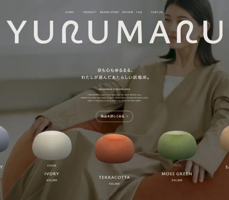
大きなロゴと生活シーンの写真、丸い商品の切り抜きを組み合わせた家具ブランドのECサイト。温かいグレーと繊細な文字、広い余白でくつろぎを表現しています。
オリジナルサイトを見るYURUMARU — Style Reference
A soft furniture showroom built from warm gray space, oversized lettering, and rounded objects.
Website: yurumaru.life Original URL: https://yurumaru.life/ Final URL: https://yurumaru.life/ Theme: warm gray editorial surfaces, pale text over lifestyle imagery, and a dark brown footer; no user-selectable theme was verified. Inspected: September 12, 2026, using the supplied browser observation retrieved at 12:57:33.774 UTC / 21:57:33.774 JST. Viewports: desktop 1440 × 1000 CSS pixels; mobile 390 × 844 CSS pixels. Scope: the current homepage of a cushion-sofa brand and online shop. Visual evidence covers the desktop opening, a desktop product-story/use-flow transition, the desktop footer, the mobile opening, and the mobile footer. Rendered text covers the longer homepage. Product details, cart, checkout, open navigation, material switching, and movie playback were not inspected.
YURUMARU expresses softness through scale, material, and spacing. An almost edge-to-edge wordmark sits above a small, centered Japanese statement. Lifestyle imagery supplies fabric folds, human posture, and the impression of yielding furniture. Separate product cutouts form a horizontal procession across the foreground, bringing the cushion's rounded silhouette directly into the interface.
The main page alternates expansive storytelling with shopping links. Warm gray replaces bright white as the resting canvas. Thin Japanese lettering, tracked English small caps, fine outlines, and large pauses between content keep the composition quiet. Product colors provide local variation without becoming a general rainbow of interface accents.
This is a brand-led storefront homepage with navigation to products, reviews, FAQ, and cart. Its long editorial sequence should remain connected to those practical shopping destinations.
How to Read This Reference
- Measured values come from supplied rendered element rectangles, computed styles, or custom properties. Measurements apply to the recorded state and viewport.
- Calculated values are arithmetic derived from supplied measurements or CSS expressions. A viewport-equivalent value does not establish the original CSS formula.
- Estimated values describe geometry visible in screenshots where corresponding element measurements were not supplied.
- Recommended values and implementation choices are adaptations for a new build, not verified behavior of the original.
- Source custom properties are identified explicitly. Other token names are descriptive aliases.
- A computed font-family stack establishes the declared family order, not which font file rendered every glyph.
- DOM entries include repeated products and navigation content that is not visible in the captures. Their presence does not prove an open menu, animation, or simultaneous visibility.
The recorded document heights are approximately 13,017.05px on desktop and 12,638.09px on mobile. These describe the captured document states, not implementation targets.
Tokens — Colors
Default Palette
| Name | Value | Source / implementation alias | Evidence and role |
|---|---|---|---|
| Warm Gray Canvas | #d0ccc9 |
Source --Base1, --BasicBase1; alias --yr-canvas |
Measured body and sampled section background at both viewports |
| Brown Ink | #2f2b28 |
Source --BasicTitle; alias --yr-ink |
Measured body text; also a close visual match for the dark footer surface, whose background was not separately computed |
| Soft White | #e9e6e4 |
Source --BasicWhite; alias --yr-white |
Measured hero copy, navigation, product names, and prices; visually consistent with the large brand graphics |
| Footer Secondary | #6b6666 |
Source --FooterSubText; alias --yr-muted-source |
Declared token; footer legal text appears subdued, but its individual computed color was not supplied |
| Terracotta Detail | #8b4e30 |
Measured product label; alias --yr-terracotta |
The TERRACOTTA item's COLOR label; a suitable adaptation accent for small support controls |
The footer is visibly a deep warm brown, while the middle-page background is a flat warm gray. The hero combines pale foreground elements with darkened photographic imagery. Its overlay color, opacity, and compositing method were not provided, so do not treat the apparent darkness as a measured black overlay percentage.
Product Color Labels
These are measured text colors on the small COLOR labels, not sampled fabric colors. Product imagery contains lighting, shading, and texture that cannot be represented by a single swatch.
| Product label | Measured color | Suggested alias |
|---|---|---|
| HONEY YELLOW | #ae8e4f |
--product-honey |
| INDIGO | #365a80 |
--product-indigo |
| IVY GREEN | #42503f |
--product-ivy |
| MOCHA BROWN | #58402d |
--product-mocha |
| SAKURA | #be8c8c |
--product-sakura |
| MILK BEIGE | #b9ad9e |
--product-milk |
| TERRACOTTA | #8b4e30 |
--product-terracotta |
| MOSS GREEN | #74745a |
--product-moss |
| SAND BEIGE | #bfa784 |
--product-sand |
| COOL GRAY | #a5a5a5 |
--product-gray |
| IVORY | #deddce |
--product-ivory |
The current hero DOM contains eleven distinct color names, repeated across the horizontal sequence. The five miniature cushions in the footer are a visual brand signature, not evidence that the current catalog has only five colors.
Other Declared Colors
The supplied variables also include --Key1: #437365, --Key3: #d99f59, --Yellow: #e2a408, and --Attention: #c21f1f. Their presence does not make them dominant homepage colors. The inspected primary CTA is outlined and transparent, without a green, yellow, or red fill.
Numerous light, dark, and inverse variables are declared. No theme control or complete alternate theme was demonstrated.
Tokens — Typography
Japanese Body and Interface
- Measured leading family:
MFW-KoburinaGoStdN-W3. - Source variable:
--ff. - Fallbacks: the supplied stack includes Yu Gothic variants, Hiragino Kaku Gothic Pro, Osaka, MS PGothic, Meiryo, and generic sans-serif.
- Measured weight: generally
400in the sampled body, hero, and CTA elements. - Character: light, open, and gently rounded, with deliberate letter spacing and generous line spacing in narrative passages.
Japanese Story Display
The mobile brand-story statement declares MFW-KoburinaGoStdN-W1, with a computed weight of 400. Its light appearance comes from the named face; do not automatically translate the W1 suffix into font-weight: 100 on another font.
The source also declares MFW-KoburinaGoStdN-W6 in --jp_go_title. Its use on the visible large statements was not established by the supplied element samples.
English Navigation and Editorial Labels
- Measured family:
Ysabeau SC, followed by sans-serif. - Roles: navigation, small English explanations, COLOR labels, product color names, and the mobile NEW / PLACE / TO / RELAX typography.
- Weights:
200,400, and500occur in the measured samples. - Treatment: small-cap character, restrained weight, and tracking that becomes especially wide in display words.
Prices
Prices declare Ysabeau Infant, followed by sans-serif, at weight 500. Keep this distinction from the SC family used for product names.
Brand Graphics
The large opening wordmark and abbreviated footer mark are distinctive graphic lettering. The curved R forms are part of the identity. Their construction and asset URLs were not supplied; do not assign them an invented font family or recreate them by changing one character in a normal text face.
Type Scale
Values below are measured unless marked as estimates.
| Role | Desktop | Mobile | Tracking | Family / weight |
|---|---|---|---|---|
| Root and default body size | 15px |
14px |
Normal at body level | W3 stack / 400 |
| Visible header links | 12px / 21.6px |
14px / 25.2px for MENU and CART |
0.08em |
Ysabeau SC / 400 |
| Hero Japanese statement | 20px / 34px |
20px / 34px |
0.13em |
W3 stack / 400 |
| BRANDNEW CUSHION SOFA | 10px / 18px |
Same | 0.08em |
Ysabeau SC / 500 |
| Hero English explanation | 10px / 14px |
Same | 0.04em |
Ysabeau SC / 200 |
| Hero CTA | 15px / 15px |
14px / 14px |
0.05em |
W3 stack / 400 |
| Product COLOR label | 12px / 12px |
Same | 0.04em |
Ysabeau SC / 500 |
| Product color name | 20px / 20px |
Same | 0.1em |
Ysabeau SC / 500 |
| Product price | 16px / 28.8px |
14.0282px / 25.2507px |
0.1em |
Ysabeau Infant / 500 |
| Internal menu link samples | 20px / 20px |
Same | 0.08em |
Ysabeau SC / 400; open state unverified |
| Mobile story statement | Not supplied | 32px / 70.4px |
0.06em |
W1 stack / 400 |
| Mobile story paragraph | Not supplied | 14px / 30.8px |
0.12em |
W3 stack / 400 |
| Mobile NEW / PLACE / TO / RELAX | Not supplied | 85.8px / 85.8px |
20.592px, or 0.24em |
Ysabeau SC / 400 |
| Desktop footer statement | Approximately 32–36px visually |
Not visible in the supplied footer crop | Visibly generous; not measured | Exact footer declaration unavailable |
The Japanese hero statement retains its size on mobile and changes from two lines to three. The site therefore adapts through composition as well as scaling.
The mobile display size of 85.8px equals 22vw at 390px. That is a calculated equivalence, not a verified source rule.
Tokens — Spacing & Shapes
Density: sparse editorial composition with compact utility text.
Shape language: cushion silhouettes, irregular rounded image windows, long pill outlines, circles, and broad curved section boundaries.
Source root: conventional-sized 15px on desktop and 14px on mobile. Source rem values must be interpreted accordingly.
Responsive Content Width
The source declares different content widths and grid-gap expressions at the two inspected widths.
| Quantity | Desktop, 1440px wide | Mobile, 390px wide | Evidence |
|---|---|---|---|
| Content width | 94.4vw = 1359.36px |
78.66vw = 306.774px |
Source --contentWidth |
| Centered outside margin | 40.32px |
41.613px |
Calculated from the content width |
| Grid gap term | 2.5vw = 36px |
5vw = 19.5px |
Supplied grid expressions |
| Grid track term | 80.28px |
7.6895px |
Calculated as (content + gap) / 12 - gap |
| Maximum content width | 999999px |
Same | Source --contentMaxWidth; effectively uncapped at these widths |
The narrow mobile track term belongs to a twelve-part sizing system. It does not mean that the page displays twelve readable mobile columns. The measured mobile story paragraph occupies approximately 306.77px, starting at x = 41.61px.
Full-bleed hero media, the large logo, product rails, and footer graphics use their own widths. Do not apply the narrow editorial container to every component.
Spacing Scale
| Relationship | Desktop | Mobile | Status |
|---|---|---|---|
| Hero Japanese block → category line | 30px |
20px |
Calculated from measured rectangles |
| Category line → English explanation | 10px |
10px |
Calculated |
| English explanation → hero CTA | 43px |
27px |
Calculated |
| Product COLOR label → color name | 24px clear gap |
Same | Calculated |
| Product color name → price | 10px |
Same | Calculated |
| Gap between adjacent product image-link boxes | 144px |
58.5px |
Calculated from horizontal positions |
| Middle-page caption → large product CTA | Approximately 170px |
Not captured | Screenshot estimate |
| Large product CTA → use-flow heading | Approximately 170px |
Not captured | Screenshot estimate |
Declared source size tokens include --pow0: 15px on desktop and 14px on mobile, --pow1: 16px, --pow3: 20px, --fzs: 12px, and --fzmin: 10px. These are useful scale anchors; they do not establish a universal spacing grid.
Border Radius
| Element | Value / form | Evidence |
|---|---|---|
| Hero CTA | 150px desktop; 140px mobile |
Computed radius; consistent with source --buttonRadius: 10rem |
| Large middle-page CTA | Full pill, approximately 256 × 110px overall |
Screenshot estimate |
| Feature image windows | Uneven, generously rounded ovals and rounded rectangles | Visible; exact radius or mask paths unavailable |
| Use-flow fields | Large circles | Upper portions visible in desktop capture |
| Support launcher | Rounded square, approximately 80 × 80px |
Screenshot estimate |
| Product cutouts | Natural object silhouettes | Image content, not CSS-rounded cards |
Fine CTA and connector strokes appear approximately 1px wide. Their exact border or SVG stroke declarations were not included.
Layout Measurements
| Element | Desktop | Mobile |
|---|---|---|
| Initial header rectangle | 1440 × 82.59px |
390 × 52.78px |
| Hero statement rectangle | y = 419.52px, height 68px |
y = 375.03px, height 102px |
| Hero CTA rectangle | x = 631.03px, y = 630.52px, 177.92 × 52.5px |
x = 111.97px, y = 594.03px, 166.05 × 48.98px |
| Product image-link box | 249.59 × 240px |
195 × 195px |
| Horizontal product pitch | 393.59px |
253.5px |
| Center MOSS GREEN image-link position | x = 595.20px, y = 726.20px |
x = 97.5px, y = 693.70px |
| Opening wordmark visible footprint | Approximately 1360 × 145px |
Approximately 350 × 180px, split into two rows |
The product measurements describe link containers. The visible cushion occupies only part of each container because the artwork has transparent space around its silhouette.
The first sampled section is approximately 3054.81px tall on desktop and 2604.25px on mobile. It includes the opening and subsequent storytelling; it is not the height of the photographic hero alone.
Components
Header and Primary Navigation
Role: provide restrained access to the shop and its supporting information.
The desktop opening shows a centered line of HOME, PRODUCT, BRAND STORY, REVIEW, FAQ, and CART (0). The links use pale 12px Ysabeau SC lettering. Fine vertical separators create pauses within the row. Measured link boxes have 14px top and bottom padding, producing approximately 49.59px of height despite the small visible lettering.
A different desktop presentation is visible at the top of the middle-page capture: an approximately 51px-high gray bar, a small wordmark at left, navigation centered, and cart at the far right. A faint bottom rule separates it from the page. The change is consistent with a compact scrolling-header state, but its trigger and positioning logic were not supplied. The footer capture does not show this bar, so perpetual visibility should not be assumed.
On mobile, the initial header reduces to a small dot plus MENU at left and CART (0) at right. Their computed font size increases to 14px. The giant brand graphic remains in the hero rather than being squeezed into the center of the utility row.
The DOM includes product links for the sofa, two cover materials, and refill filling. It also includes MENU and CLOSE text. No open-menu capture or toggle result was supplied, so the menu's panel appearance and behavior remain unverified.
Opening Brand Stage
Role: establish the product's emotional and physical character before detailed explanation.
Build the visible stack as:
- Full-width lifestyle imagery with a darkened appearance.
- A very large pale brand graphic near the top.
- Centered Japanese brand copy.
- A small BRANDNEW CUSHION SOFA line.
- A three-line English explanation.
- One outlined product-detail link.
- A foreground horizontal sequence of cushion cutouts.
In the desktop capture, fabric, a resting hand, and the terracotta cushion fill most of the background. The mobile composition shows a reclining person and more of the cushion's overall form. These frames establish art direction and crop differences; they do not independently establish video playback.
The Japanese copy is the readable message. The oversized logo is the main graphic impact, and the small English paragraph acts as a quiet secondary layer. Avoid enlarging all three until they compete.
Outlined Product Link
Role: connect the brand scene directly to the product page.
The hero link reads “商品を詳しくみる” and points to /products/yurumaru-cushion-sofa. Its anatomy is a transparent pill, a thin pale outline, a Japanese label, and a small right-facing chevron.
Measured desktop padding is 15px 18px 16.5px 22.5px, with a 3px flex gap. Mobile padding is 14px 16.8px 15.4px 21px, with a 2.8px gap. The larger left inset helps balance the short arrow at the right.
A substantially larger pill appears after the feature narrative, reading “商品を詳しく見る”. In the middle-page screenshot it is approximately 256px wide and 110px high, with dark text and outline against the gray canvas. Preserve both sizes as context-specific variants.
Foreground Product Rail
Role: make product form and color immediately available as shopping choices.
Each item contains a linked cutout image and a separate metadata link with:
- A small COLOR label tinted to the product color.
- An uppercase English color name in pale 20px type.
- A pale price using Ysabeau Infant.
The recorded price is ¥32,000. This is captured content, not a permanent price to hardcode.
The desktop view shows three substantial cushions with partial neighbors at both edges. The center item sits approximately 20px lower than the adjacent terracotta and sand items in the measured state. On mobile, one 195px-wide item is centered with narrow slices of its neighbors visible.
There are no rectangular card surfaces around these products. The cutouts remain visually detached from the photographic background. Repeated DOM groups and offscreen coordinates are consistent with a looping or slider arrangement, but autoplay, dragging, wrapping rules, and timing were not verified.
Variant destinations are directly evidenced by product URLs with ?variant= parameters. Preserve the connection between each color label and its corresponding product variant.
Brand Story
Role: slow the page into a statement about rest and personal space.
Rendered content introduces NEW PLACE TO RELAX and BRAND STORY before a longer Japanese narrative. On mobile, the English display words become four separate rows. Their measured x positions vary, creating a staggered arrangement rather than one rigid centered text block.
The mobile Japanese statement uses a light W1 face at 32px with a 70.4px line height. The following narrative uses a roughly 307px-wide column, 14px text, 30.8px line height, and 0.12em tracking. This unusually spacious leading is an important part of the tone.
The sampled text color is pale, but a complete screenshot of this section was not supplied. Its exact background imagery and layering should remain unspecified.
Product Feature Narrative
Role: explain softness, flexible use, portability, and interior compatibility.
The rendered sequence contains a PRODUCT introduction followed by three numbered topics. The visible desktop capture covers the end of the third topic: a large rounded image of someone using a green cushion sits near the center, while Japanese copy occupies a separate left-side region. Smaller rounded photographs appear near the outer edges, including a roughly 164px-wide image at right.
Below the central image are the small marker “( POINT.03 )” and a two-line English explanation. The large image's visible width is approximately 516px. Broad empty space separates this composition from the large product CTA beneath it.
This is an editorial arrangement of differently sized image windows and text regions. The visible feature should not be generalized into three identical boxed cards. The exact layouts of the first two features were not visually supplied.
The link “使い方を見る” points to /products/yurumaru-cushion-sofa#features-3. That destination is evidenced; the target section's appearance was not inspected.
Use-Flow Introduction
Role: explain the transition from ordering to home use.
The desktop screenshot shows “ご利用の流れ” centered above three large circular fields. Thin connecting lines use rounded elbows and small dark nodes near the tops of the circles. The circles' contents continue below the capture.
Rendered text establishes three steps: ordering, compressed delivery, and relaxing at home. Preserve this three-step sequence. Illustrations, full circle dimensions, and the mobile arrangement were not supplied, so those details require design decisions rather than reconstruction claims.
Color and Material Section
Role: support a more considered product choice after the introductory rail.
The DOM contains a COLOR heading, the material labels “ふんわり” and “さらさら”, repeated color entries, Japanese and English descriptions, and “商品を見る” links to specific variants.
This establishes the content anatomy, but not the selected material, switching interaction, panel layout, or transition. Do not describe these labels as working tabs without verifying their behavior. A new implementation may use accessible tabs if changing the material actually changes the displayed collection.
Owner Reviews
Role: introduce real-home experiences and a route to the full reviews page.
The supplied text includes an OWNER'S VOICE heading and six review entries. Entries contain a title, narrative, author, and date; several also carry a PR label. The section ends with “他のレビューを見る”, linked to /pages/reviews.
The mobile heading is split as OWNER'S / VOICE. The screenshot set does not establish review-card dimensions, image placement, star ratings, or carousel behavior. Keep PR disclosures associated with the relevant review if reproducing the content structure.
Brand Movie Entry
Role: offer a separate media experience near the end of the homepage.
The DOM contains BRAND MOVIE, a short Japanese statement, and “ブランドムービーを見る”. The last control uses a JavaScript placeholder destination. This supports the existence of a media trigger, but does not reveal whether it opens a modal, inline player, or another interface. No playback, audio, duration, or player controls were observed.
Footer Brand Signature
Role: close the narrative while retaining navigation and shopping support.
The desktop footer is a broad dark brown field. Its upper portion repeats the brand statement in large, light Japanese lettering, followed by a faint English explanation and five small cushion cutouts. The cutouts are arranged with small vertical offsets and retain their fabric shading.
The lower desktop composition distributes content across three zones:
- Left: a vertical primary navigation list and social links below.
- Center: BRANDNEW CUSHION SOFA between dotted rules, followed by a very large four-character abbreviated brand graphic.
- Right: a quiet legal-link list and copyright near the bottom.
The abbreviated footer graphic visually reads as YRMR; its accessible identity remains YURUMARU. Do not replace the full homepage identity with the abbreviation throughout the site.
The mobile capture stacks the signature vertically: miniature cushions, caption with dotted side rules, abbreviated mark, centered primary navigation, social row, wrapped legal links, external company link, and copyright. The mark spans approximately 350px within the 390px viewport.
Social icons correspond to Instagram, X, YouTube, and TikTok. Legal links include privacy, terms, legal sales information, and information security. An external company link is labeled “運営会社”; no company name is printed in the inspected footer text.
Support Launcher
A terracotta-colored rounded square with a speech-bubble icon and “サポート” appears near the lower-right corner of the desktop middle-page capture. Its visible footprint is approximately 80px square, about 20px from the right and 16px from the bottom.
Its open state, provider, position rules, and mobile availability were not established. Treat only its closed appearance as observed.
Tokens — Motion & Interaction
The supplied computed styles establish several transition definitions. They do not establish every transition's trigger or prove that it ran during a capture.
| Treatment | Supplied definition | Evidence boundary |
|---|---|---|
| Body background | 0.2s cubic-bezier(.25, .1, .25, 1) |
Computed transition; state-changing trigger unavailable |
| Sampled section background | 0.4s cubic-bezier(.25, .1, .25, 1) |
Computed transition |
| Navigation text color | 0.2s cubic-bezier(.25, .1, .25, 1) |
Target color and hover result not supplied |
| Hero CTA color and fill | 0.2s cubic-bezier(.25, .1, .25, 1) |
Does not prove a particular fill inversion |
| Header opacity and visibility | 1s cubic-bezier(.77, 0, .175, 1) with 4.8s delay |
Declared timing, not a measured startup duration |
| Header top position | 0.4s cubic-bezier(.25, .1, .25, 1) |
Trigger and scroll threshold unavailable |
| Internal menu-link transform | 1.2s cubic-bezier(.77, 0, .175, 1) |
Menu was not opened |
| Internal menu-link opacity | 1.2s cubic-bezier(.25, .1, .25, 1) |
Menu was not opened |
| Mobile story heading opacity and transform | 0.6s cubic-bezier(.25, .1, .25, 1) |
Definition supplied; reveal trigger unverified |
| Additional easing variable | --ease-out-quart: cubic-bezier(.83, 0, .17, 1) |
Declared token; application not established |
Repeated product groups suggest a rail capable of wrapping. Repeated YURUMARU CUSHION SOFA text appears in the desktop text evidence, but a moving marquee was not visually demonstrated. Still captures cannot establish floating loops, parallax, background-video playback, or scroll-scrubbed animation.
Many sampled elements report animation: none. That does not exclude motion driven by ancestors, media, or JavaScript.
The capture procedure waited for load, visible image decoding, and sampled layout/text stability, and handled finite and perpetual animation separately during readiness checks. This improves capture reliability but does not verify delayed content or unexercised controls.
Recommended motion character: short color feedback for controls and restrained, slower opacity/position reveals for editorial content. Keep shopping links usable immediately. Do not make a 4.8-second delay a mandatory condition for navigation.
Surfaces
| Surface | Appearance | Structural purpose |
|---|---|---|
| Main editorial canvas | Flat warm gray #d0ccc9 |
Gives photographs and rounded forms room to stand apart |
| Opening media field | Darkened lifestyle imagery | Supports pale wordmark, copy, and outline link |
| Compact desktop header | Gray strip with a fine lower boundary | Organizes navigation above mid-page content |
| Product rail | Transparent containers | Lets fabric silhouettes provide the shape |
| Feature imagery | Rounded masks over photographs | Echoes the cushion without introducing card chrome |
| Primary links | Transparent pill with a thin outline | Indicates action while retaining the calm palette |
| Footer | Deep brown, visually consistent with #2f2b28 |
Creates a strong closing field for pale brand graphics |
| Support control | Small warm terracotta fill | Makes assistance distinct from editorial links |
The visible interface has no general card-shadow or glossy elevation system. Volume comes from photographed cushions; the surrounding UI remains flat.
Imagery
Lifestyle imagery concentrates on the physical experience of rest: a hand pressing into fabric, loose neutral clothing, reclining posture, soft upholstery, and quiet domestic surroundings. The product's terracotta and green colors stand out against muted beige, gray, and brown environments.
Use three complementary image treatments:
- Immersive background imagery: large photographic scenes cropped around the person and cushion, with enough tonal separation for pale text.
- Detached product cutouts: consistent three-quarter or frontal views, visible fabric texture, softly flattened rounded silhouettes, and transparent surroundings.
- Rounded editorial windows: usage photographs clipped into generous, slightly irregular shapes, with smaller satellite crops near larger scenes.
The footer repeats product cutouts at miniature scale. Preserve their actual object geometry and material shading; generic colored circles would lose the relationship between product and graphic identity.
Observed Asset References
No image, video, or logo source URLs were included in the supplied evidence. The known inventory is visual rather than a downloadable asset manifest.
| Asset class | Observed use | Implementation guidance |
|---|---|---|
| Full horizontal wordmark | Desktop opening | Use authorized brand artwork with its original proportions |
| Two-row wordmark | Mobile opening | Supply a dedicated narrow-screen composition |
| Abbreviated brand mark | Desktop and mobile footer | Keep its distinct four-character arrangement |
| Lifestyle imagery | Opening and product-feature windows | Prepare crops around both human posture and product form |
| Cushion cutouts | Hero rail and footer miniatures | Retain transparency and consistent rendering angle |
| Social symbols | Footer | Use recognizable, accessible platform links |
| Speech-bubble symbol | Support launcher | Preserve the simple small-icon treatment |
Asset format, native resolution, media encoding, and logo construction remain unknown. The Quick Start filenames below are explicit local placeholders, not observed website paths.
Layout & Responsive Behavior
Desktop Composition
The opening uses the full viewport width, with a nearly edge-to-edge single-line wordmark. The Japanese statement begins around 420px from the top. Supporting English text and a small CTA occupy a narrow visual area at the center despite having wide DOM boxes.
The product rail expands horizontally beyond the viewport. Three large objects and partial outer neighbors create continuity without enclosing the items in cards. The middle-page feature composition distributes text and rounded images across a wide field, followed by a large vertical pause and an isolated CTA.
The footer spreads navigation, identity, and legal links across the width. Its central graphic is much larger than its utility text.
Mobile Composition
The opening logo becomes two rows, visually YURU / MARU. The header exposes only MENU and CART (0). The Japanese hero statement remains 20px and wraps into three lines, while the English category line and explanation remain at 10px.
The hero CTA shrinks modestly, from approximately 178 × 53px to 166 × 49px. Product image-link boxes become exactly 195px square at the supplied 390px viewport, equivalent to half the viewport width. Product color names remain at 20px in the DOM, although they lie below the first captured screen.
The mobile story column becomes proportionally narrower while retaining approximately the same absolute outside margins as desktop. NEW PLACE TO RELAX changes into four staggered display rows. Product introduction copy also receives additional line breaks.
The footer changes hierarchy as well as column count: the abbreviated mark moves above the centered navigation. Legal links wrap into short rows, followed by a separately spaced company link and copyright. The 844px footer image is a bottom crop, not a measurement of the entire footer's height.
Responsive Limits
No tablet or landscape capture was supplied. The exact breakpoint is unknown. The CSS Quick Start uses 767px as a recommended implementation breakpoint, not a source value.
Mobile arrangements for the feature imagery, use-flow circles, review entries, material selector, and movie interface were not visually established. Their text exists in the mobile DOM, but that alone does not establish their layout.
Do’s and Don’ts
Do
- Start with the measured canvas, ink, and pale-text colors:
#d0ccc9,#2f2b28, and#e9e6e4. - Preserve the large brand graphics and their dedicated desktop/mobile compositions.
- Keep Japanese hero copy at a readable scale while changing its line breaks on narrow screens.
- Pair light Japanese typography with tracked Ysabeau SC utility lettering.
- Let rounded product silhouettes and fabric texture supply the visual volume.
- Keep product cutouts on transparent containers with visible neighboring fragments at viewport edges.
- Use long pill outlines for shopping links and broad whitespace around major editorial actions.
- Retain direct links to product variants, reviews, FAQ, and cart.
- Recompose the footer into a centered mobile sequence rather than shrinking desktop columns.
- Keep review disclosures and product names attached to the content they describe.
Don’t
- Don’t replace the warm gray canvas with pure white or the footer with a cool blue-black.
- Don’t typeset the custom wordmark in an unrelated font and call it an exact reproduction.
- Don’t add rectangular white cards, heavy borders, or drop shadows around every cushion.
- Don’t use the entire product palette as competing CTA colors.
- Don’t flatten all image masks into identical rounded rectangles.
- Don’t shrink every type size in proportion to viewport width; several measured roles remain unchanged.
- Don’t mistake duplicate DOM items for additional products or proof of autoplay.
- Don’t infer a five-color catalog from the footer's five miniature cushions.
- Don’t invent menu overlays, film-player styling, review ratings, or switching behavior from control labels alone.
- Don’t impose the multi-thousand-pixel first-section measurement on the hero itself.
- Don’t reproduce very faint legal or descriptive text where it prevents reading essential information.
Recommended Implementation Additions
These recommendations are not verified features of the original site:
- Implement MENU and movie triggers as buttons with accessible names and appropriate expanded or dialog state. Keep navigational destinations as links.
- Give navigation, social links, product options, and support controls visible keyboard focus and practical touch targets. The original mobile menu/cart rectangles are only about 25px high.
- If the rail moves automatically, provide pause controls and stop motion during keyboard interaction. Keep decorative duplicates out of the accessibility tree and tab order.
- Provide a static, horizontally scrollable product rail when scripting or motion is unavailable.
- Keep essential product information readable without relying on a 10px English caption or a low-contrast color label.
- Check pale text against the actual media frames. Use a localized or media-only scrim where needed rather than reducing the opacity of the whole interface.
- Improve legal-link contrast while preserving the footer's hierarchy.
- Use reduced-motion preferences to remove decorative movement and delayed reveals. Never leave content hidden when animation is disabled.
- Provide captions and explicit playback controls for the brand film. Do not infer permission for audible autoplay from the photographic hero.
- Reserve image dimensions, prepare responsive crops, and defer nonessential lower-page media to reduce layout shifts and transfer size.
Agent Prompt Guide
Quick Color Reference
- Main canvas:
#d0ccc9. - Body text:
#2f2b28. - Hero lettering and reversed interface text:
#e9e6e4. - Footer adaptation:
#2f2b28, based on its visual correspondence with the ink token. - Product-label accents: terracotta
#8b4e30, moss#74745a, sand#bfa784. - Primary action: transparent pill, thin current-color outline, small chevron.
- Image treatment: natural fabric texture, muted surroundings, transparent product cutouts.
Overall Prompt
“Create a furniture-brand storefront homepage inspired by YURUMARU's current visual system. Use warm gray #d0ccc9, brown text #2f2b28, and pale lettering #e9e6e4. Place a very large custom brand graphic above centered Japanese copy over subdued lifestyle imagery. Add small tracked English labels, a thin outlined product link, and a horizontal procession of detached cushion cutouts with color names and prices. Continue with spacious brand storytelling, rounded usage photographs, a three-step delivery explanation, product color content, reviews, and a movie entry. Close with a dark footer, five miniature cushions, an oversized abbreviated brand graphic, primary navigation, social links, and legal links. On mobile, use a two-row opening wordmark, MENU and CART utilities, one central cushion with partial neighbors, a narrow narrative column, and a centered stacked footer. Treat unverified interactions as implementation decisions.”
Example Component Prompts
- Hero: “A full-width muted photograph of someone relaxing on a terracotta cushion sofa. Overlay a large pale brand graphic, a centered Japanese statement at 20px with 34px line spacing, small English small caps, and a transparent outlined pill link. Keep text above the media scrim.”
- Product rail: “Transparent product items with rounded fabric cushion cutouts, a 12px COLOR label tinted per variant, a 20px tracked English color name, and a smaller price. At 1440px, use image boxes around 250 × 240px with generous spacing. At 390px, center a 195px item and show partial neighbors. Do not add card surfaces.”
- Feature composition: “A warm gray editorial field with a large softly rounded usage photograph near the center, Japanese explanatory copy in a separate region, and smaller rounded photographic details near the edges. Add a tiny point number and English caption below the main image, then leave a large pause before an isolated outlined pill CTA.”
- Footer: “A deep brown footer with five miniature cushion cutouts, a small English caption between dotted rules, and a large authorized abbreviated brand graphic. Arrange navigation left and legal links right on desktop; stack the identity above centered navigation on mobile. Use pale text and readable muted legal links.”
Quick Start
CSS Custom Properties
This is a recommended adaptation, not extracted source CSS. It retains a conventional root font size, uses measured pixel values for key text roles, and keeps the rail manually scrollable. It does not implement a looping slider, open menu, compact-header trigger, material switcher, support panel, or movie player.
Load appropriately licensed font files separately. The shortened fallback stacks below preserve the measured leading family names without claiming the fonts are bundled. The media scrim, irregular mask, section spacing, hover fill, and 767px breakpoint are recommendations.
:root {
  /* Measured core colors */
  --yr-canvas: #d0ccc9;
  --yr-ink: #2f2b28;
  --yr-white: #e9e6e4;
  --yr-terracotta: #8b4e30;
  --yr-moss: #74745a;
  --yr-sand: #bfa784;
  --yr-muted-source: #6b6666;

  /* Recommended readable footer secondary color */
  --yr-muted-readable: #aaa39e;

  /* Measured leading families; font files are not included */
  --yr-font-jp: 'MFW-KoburinaGoStdN-W3', 'Yu Gothic Medium',
    'Yu Gothic', 'Hiragino Kaku Gothic Pro', Meiryo, sans-serif;
  --yr-font-jp-light: 'MFW-KoburinaGoStdN-W1', 'Yu Gothic',
    'Hiragino Kaku Gothic Pro', Meiryo, sans-serif;
  --yr-font-en: 'Ysabeau SC', sans-serif;
  --yr-font-price: 'Ysabeau Infant', sans-serif;

  --yr-body-size: 15px;
  --yr-nav-size: 12px;
  --yr-cta-size: 15px;
  --yr-price-size: 16px;
  --yr-content-width: 94.4vw;
  --yr-grid-gap: 2.5vw;
  --yr-pill-radius: 150px;

  /* Rail proportions approximate the measured desktop */
  --yr-product-width: 17.333vw;
  --yr-product-gap: 10vw;
  --yr-product-ratio: 1.04;

  /* Recommended media treatment; opacity was not measured */
  --yr-media-scrim: rgb(25 22 18 / 38%);
  --yr-soft-radius: 46% 44% 43% 48% / 42% 46% 45% 48%;

  /* Source-derived transition timing */
  --yr-ease: cubic-bezier(.25, .1, .25, 1);
  --yr-feedback: 200ms var(--yr-ease);
  --yr-section-motion: 400ms var(--yr-ease);
}

* { box-sizing: border-box; }

body.yurumaru {
  margin: 0;
  color: var(--yr-ink);
  background: var(--yr-canvas);
  font-family: var(--yr-font-jp);
  font-size: var(--yr-body-size);
  font-weight: 400;
}

.yurumaru img { display: block; max-width: 100%; }
.yurumaru a { color: inherit; }

.editorial-container {
  width: var(--yr-content-width);
  margin-inline: auto;
}

.site-header {
  position: absolute;
  inset: 0 0 auto;
  z-index: 10;
  display: flex;
  justify-content: center;
  align-items: center;
  gap: 40px;
  min-height: 82.6px;
  padding: 33px 20px 0;
  color: var(--yr-white);
  font-family: var(--yr-font-en);
  font-size: var(--yr-nav-size);
  letter-spacing: .08em;
}

.site-nav { display: flex; align-items: center; gap: 15px; }
.site-header a { text-decoration: none; padding-block: 14px; }
.site-header__brand, .site-menu { display: none; }

/* Recommended state hook; a controller must set this attribute */
.site-header[data-compact='true'] {
  position: fixed;
  display: grid;
  grid-template-columns: 1fr auto 1fr;
  min-height: 51px;
  padding: 0 22px;
  color: var(--yr-ink);
  background: var(--yr-canvas);
  border-bottom: 1px solid rgb(47 43 40 / 10%);
}

.site-header[data-compact='true'] .site-header__brand {
  display: block;
  width: 150px;
}

.site-header[data-compact='true'] .site-cart { justify-self: end; }

.hero {
  position: relative;
  isolation: isolate;
  min-height: 100svh;
  padding-top: clamp(90px, 8.96vw, 129px);
  padding-bottom: 40px;
  color: var(--yr-white);
  background: var(--yr-ink);
}

.hero__media, .hero::before {
  position: absolute;
  inset: 0;
  width: 100%;
  height: 100%;
  pointer-events: none;
}

.hero__media { z-index: -2; object-fit: cover; }
.hero::before { content: ''; z-index: -1; background: var(--yr-media-scrim); }

.hero__brand {
  display: block;
  width: 94.4vw;
  margin-inline: auto;
}

.hero__brand img { width: 100%; height: auto; }
.hero__copy { margin-top: clamp(100px, 10.1vw, 146px); text-align: center; }

.hero__statement {
  margin: 0;
  padding-inline: 12px;
  font-size: 20px;
  font-weight: 400;
  line-height: 34px;
  letter-spacing: .13em;
}

.mobile-break { display: none; }

.hero__eyebrow {
  margin: 30px 0 0;
  font: 500 10px / 18px var(--yr-font-en);
  letter-spacing: .08em;
}

.hero__english {
  max-width: 380px;
  margin: 10px auto 0;
  padding-inline: 12px;
  font: 200 10px / 14px var(--yr-font-en);
  letter-spacing: .04em;
}

.pill-link {
  display: inline-flex;
  align-items: center;
  justify-content: center;
  gap: .2em;
  max-width: calc(100% - 32px);
  min-height: 3.5em;
  padding: 1em 1.2em 1.1em 1.5em;
  border: 1px solid currentColor;
  border-radius: var(--yr-pill-radius);
  background: transparent;
  color: inherit;
  font: 400 var(--yr-cta-size) / 1 var(--yr-font-jp);
  letter-spacing: .05em;
  text-decoration: none;
  transition: color var(--yr-feedback), background-color var(--yr-feedback);
}

.hero__cta { margin-top: 43px; }
.pill-link__arrow { margin-left: .35em; }

.pill-link--large {
  min-width: min(256px, calc(100% - 32px));
  min-height: 110px;
  gap: 28px;
}

/* Manual scrolling is an adaptation, not verified source behavior */
.color-rail {
  display: flex;
  gap: var(--yr-product-gap);
  overflow-x: auto;
  margin: 23px 0 0;
  padding: 0 calc((100% - var(--yr-product-width)) / 2) 28px;
  list-style: none;
  scroll-snap-type: x proximity;
  scroll-padding-inline: calc((100% - var(--yr-product-width)) / 2);
}

.color-card {
  flex: 0 0 var(--yr-product-width);
  min-width: 0;
  text-align: center;
  scroll-snap-align: center;
}

.color-card a { display: block; text-decoration: none; }

.color-card__image {
  display: grid;
  place-items: center;
  aspect-ratio: var(--yr-product-ratio);
}

.color-card__image img { width: 100%; height: 100%; object-fit: contain; }

.color-card__label {
  margin: 0;
  color: var(--variant-color, var(--yr-sand));
  font: 500 12px / 12px var(--yr-font-en);
  letter-spacing: .04em;
}

.color-card__name {
  margin: 24px 0 0;
  font: 500 20px / 20px var(--yr-font-en);
  letter-spacing: .1em;
}

.color-card__price {
  margin: 10px 0 0;
  font: 500 var(--yr-price-size) / 1.8 var(--yr-font-price);
  letter-spacing: .1em;
}

.story { padding-block: clamp(96px, 10vw, 180px); }
.story__statement { font-family: var(--yr-font-jp-light); font-weight: 400; }
.soft-mask { overflow: hidden; border-radius: var(--yr-soft-radius); }
.soft-mask img { width: 100%; height: 100%; object-fit: cover; }

.site-footer {
  padding: 100px 4.2vw 76px;
  color: var(--yr-white);
  background: var(--yr-ink);
}

.footer-colors {
  display: flex;
  align-items: center;
  justify-content: space-between;
  width: min(448px, 78.66vw);
  margin: 0 auto 88px;
}

.footer-colors img { width: clamp(42px, 4.444vw, 64px); height: auto; }

.footer-grid {
  display: grid;
  grid-template-columns: 1fr minmax(0, 2.7fr) 1fr;
  grid-template-areas: 'nav identity legal' 'social identity copyright';
  gap: 48px 32px;
  align-items: start;
}

.footer-nav { grid-area: nav; display: grid; gap: 20px; }
.footer-identity { grid-area: identity; min-width: 0; }
.footer-legal { grid-area: legal; display: grid; gap: 20px; text-align: right; }
.footer-social { grid-area: social; display: flex; align-items: center; gap: 12px; }
.footer-copyright { grid-area: copyright; align-self: end; text-align: right; }

.footer-nav, .footer-social, .footer-copyright {
  font-family: var(--yr-font-en);
  letter-spacing: .08em;
}

.footer-nav a, .footer-legal a { text-decoration: none; }
.footer-legal { color: var(--yr-muted-readable); font-size: 12px; }
.footer-copyright { font-size: 11px; }

.footer-caption {
  display: flex;
  align-items: center;
  gap: 12px;
  margin: 0 0 64px;
  font: 400 11px / 1.8 var(--yr-font-en);
  letter-spacing: .08em;
  white-space: nowrap;
}

.footer-caption::before, .footer-caption::after {
  content: '';
  flex: 1;
  border-top: 2px dotted rgb(233 230 228 / 24%);
}

.footer-mark { width: 100%; height: auto; }

/* Recommended focus and hover treatments */
.yurumaru :focus-visible { outline: 2px solid currentColor; outline-offset: 5px; }

@media (hover: hover) {
  .pill-link:hover { color: var(--yr-canvas); background: var(--yr-ink); }
  .hero .pill-link:hover { color: var(--yr-ink); background: var(--yr-white); }
  .footer-nav a:hover, .footer-legal a:hover { text-decoration: underline; }
}

/* Recommended breakpoint; the source breakpoint was not supplied */
@media (max-width: 767px) {
  :root {
    --yr-body-size: 14px;
    --yr-nav-size: 14px;
    --yr-cta-size: 14px;
    --yr-price-size: 14.0282px;
    --yr-content-width: 78.66vw;
    --yr-grid-gap: 5vw;
    --yr-pill-radius: 140px;
    --yr-product-width: 50vw;
    --yr-product-gap: 15vw;
    --yr-product-ratio: 1;
  }

  .site-header {
    justify-content: space-between;
    min-height: 53px;
    padding: 5px 16px;
    gap: 16px;
  }

  .site-nav { display: none; }
  .site-menu { display: inline-flex; align-items: center; gap: 10px; }
  .site-menu::before { content: ''; width: 6px; height: 6px; border-radius: 50%; background: currentColor; }
  .site-menu, .site-cart { min-height: 44px; align-content: center; }
  .site-menu { border: 0; background: none; color: inherit; font: inherit; letter-spacing: inherit; }
  .site-header[data-compact='true'] { display: flex; padding: 5px 16px; }
  .site-header[data-compact='true'] .site-header__brand { display: none; }

  .hero { padding-top: 92px; }
  .hero__brand { width: 90vw; }
  .hero__copy { margin-top: 100px; }
  .mobile-break { display: initial; }
  .hero__eyebrow { margin-top: 20px; }
  .hero__cta { margin-top: 27px; }
  .color-rail { margin-top: 33px; }

  .story__statement { font-size: 32px; line-height: 2.2; letter-spacing: .06em; }
  .story__body { font-size: 14px; line-height: 2.2; letter-spacing: .12em; }

  .site-footer { padding: 64px 5vw calc(76px + env(safe-area-inset-bottom, 0px)); }
  .footer-grid {
    grid-template-columns: minmax(0, 1fr);
    grid-template-areas: 'identity' 'nav' 'social' 'legal' 'copyright';
    gap: 40px;
    text-align: center;
  }
  .footer-caption { margin-bottom: 48px; font-size: 10px; }
  .footer-nav { justify-items: center; gap: 20px; }
  .footer-social { justify-content: center; }
  .footer-legal { display: flex; flex-wrap: wrap; justify-content: center; gap: 16px; text-align: center; }
  .footer-copyright { margin-top: 24px; text-align: center; }
}

@media (prefers-reduced-motion: reduce) {
  .yurumaru *, .yurumaru *::before, .yurumaru *::after {
    animation: none !important;
    transition: none !important;
    scroll-behavior: auto !important;
  }
  .color-rail { scroll-snap-type: none; }
}
Example hero wiring below uses placeholder local assets. Supply the horizontal and stacked brand graphics at their intended aspect ratios. The link destination is evidenced by the original page; media filenames are not.
<section class='hero' aria-label='YURUMARU cushion sofa'>
  <img class='hero__media' src='hero-lifestyle.jpg' alt=''>
  <picture class='hero__brand'>
    <source media='(max-width: 767px)' srcset='brand-stacked.svg'>
    <img src='brand-horizontal.svg' alt='YURUMARU'>
  </picture>

  <div class='hero__copy'>
    <h1 class='hero__statement' lang='ja'>
      身も心もゆるまる、<br>
      わたしが選んだ<br class='mobile-break'>あたらしい居場所。
    </h1>
    <p class='hero__eyebrow'>BRANDNEW CUSHION SOFA</p>
    <p class='hero__english'>
      YURUMARU gently returns you to your truest self,<br>
      embracing body and mind in soft, plush ease.
    </p>
    <a class='pill-link hero__cta'
       href='https://yurumaru.life/products/yurumaru-cushion-sofa'>
      <span lang='ja'>商品を詳しくみる</span>
      <span class='pill-link__arrow' aria-hidden='true'>›</span>
    </a>
  </div>

  <!-- Add unique product items with current prices and variant URLs. -->
  <ul class='color-rail' aria-label='Cushion colors'></ul>
</section>
The starter allows the hero to grow with its content. It deliberately does not fix the entire opening section to the measured document coordinates. Asset proportions, the complete product rail, and actual media crops will affect the final height.
Tailwind v4 Token Mapping
Optional aliases for a project already using Tailwind v4. Define the custom properties above first. This is not evidence that the original website uses Tailwind.
@theme inline {
  --color-canvas: var(--yr-canvas);
  --color-ink: var(--yr-ink);
  --color-soft-white: var(--yr-white);
  --color-terracotta: var(--yr-terracotta);
  --color-moss: var(--yr-moss);
  --color-sand: var(--yr-sand);
  --color-footer-muted: var(--yr-muted-readable);

  --font-jp: var(--yr-font-jp);
  --font-jp-light: var(--yr-font-jp-light);
  --font-editorial-en: var(--yr-font-en);
  --font-price: var(--yr-font-price);

  --text-body: var(--yr-body-size);
  --text-nav: var(--yr-nav-size);
  --text-caption: 10px;
  --text-hero-copy: 20px;
  --text-product-name: 20px;
  --text-price: var(--yr-price-size);

  --spacing-editorial-gap: var(--yr-grid-gap);
  --spacing-product: var(--yr-product-width);
  --radius-pill: var(--yr-pill-radius);
}
Sources & Evidence
- Inspected original and final website: YURUMARU. The supplied browser observation reports HTTP 200 with no URL change.
- Capture record: September 12, 2026, retrieved at
2026-09-12T12:57:33.774Z. Desktop viewport: 1440 × 1000 CSS pixels. Mobile viewport: 390 × 844 CSS pixels. - Visual coverage: three desktop captures showing the opening, a feature/use-flow transition, and the footer; two mobile captures showing the opening and the lower footer. Individual scroll offsets were not supplied.
- Rendered evidence: homepage text, link destinations, custom properties, and computed element styles/rectangles. Detailed element samples are concentrated around navigation and the opening rail; mobile evidence also includes the brand story and product-section boundary.
- Navigation evidence: homepage anchors and links to the product, variant URLs, reviews, FAQ, cart, policies, and social profiles. Destinations were recorded but not opened as part of this analysis.
- Interaction coverage: the supplied collection process traversed page scroll positions. No open menu, material selection result, movie playback, support panel, product purchase action, or checkout state was supplied.
- Limitations: no asset manifest, complete stylesheet, full motion recording, tablet capture, or independently verified font-loading result was provided. Lower-page text establishes content structure where screenshots do not establish component styling. SharedWorkers and service workers were disabled during the supplied inspection.
All site-specific findings above concern the current page represented by this evidence. Estimated geometry, proposed accessibility improvements, and starter implementation choices are labeled separately from measured values.
# YURUMARU — Style Reference

> A soft furniture showroom built from warm gray space, oversized lettering, and rounded objects.

**Website:** [yurumaru.life](https://yurumaru.life/)
**Original URL:** https://yurumaru.life/
**Final URL:** https://yurumaru.life/
**Theme:** warm gray editorial surfaces, pale text over lifestyle imagery, and a dark brown footer; no user-selectable theme was verified.
**Inspected:** September 12, 2026, using the supplied browser observation retrieved at 12:57:33.774 UTC / 21:57:33.774 JST.
**Viewports:** desktop 1440 × 1000 CSS pixels; mobile 390 × 844 CSS pixels.
**Scope:** the current homepage of a cushion-sofa brand and online shop. Visual evidence covers the desktop opening, a desktop product-story/use-flow transition, the desktop footer, the mobile opening, and the mobile footer. Rendered text covers the longer homepage. Product details, cart, checkout, open navigation, material switching, and movie playback were not inspected.

YURUMARU expresses softness through scale, material, and spacing. An almost edge-to-edge wordmark sits above a small, centered Japanese statement. Lifestyle imagery supplies fabric folds, human posture, and the impression of yielding furniture. Separate product cutouts form a horizontal procession across the foreground, bringing the cushion's rounded silhouette directly into the interface.

The main page alternates expansive storytelling with shopping links. Warm gray replaces bright white as the resting canvas. Thin Japanese lettering, tracked English small caps, fine outlines, and large pauses between content keep the composition quiet. Product colors provide local variation without becoming a general rainbow of interface accents.

This is a brand-led storefront homepage with navigation to products, reviews, FAQ, and cart. Its long editorial sequence should remain connected to those practical shopping destinations.

## How to Read This Reference

- **Measured** values come from supplied rendered element rectangles, computed styles, or custom properties. Measurements apply to the recorded state and viewport.
- **Calculated** values are arithmetic derived from supplied measurements or CSS expressions. A viewport-equivalent value does not establish the original CSS formula.
- **Estimated** values describe geometry visible in screenshots where corresponding element measurements were not supplied.
- **Recommended** values and implementation choices are adaptations for a new build, not verified behavior of the original.
- Source custom properties are identified explicitly. Other token names are descriptive aliases.
- A computed font-family stack establishes the declared family order, not which font file rendered every glyph.
- DOM entries include repeated products and navigation content that is not visible in the captures. Their presence does not prove an open menu, animation, or simultaneous visibility.

The recorded document heights are approximately **13,017.05px on desktop** and **12,638.09px on mobile**. These describe the captured document states, not implementation targets.

## Tokens — Colors

### Default Palette

| Name | Value | Source / implementation alias | Evidence and role |
| --- | --- | --- | --- |
| Warm Gray Canvas | `#d0ccc9` | Source `--Base1`, `--BasicBase1`; alias `--yr-canvas` | Measured body and sampled section background at both viewports |
| Brown Ink | `#2f2b28` | Source `--BasicTitle`; alias `--yr-ink` | Measured body text; also a close visual match for the dark footer surface, whose background was not separately computed |
| Soft White | `#e9e6e4` | Source `--BasicWhite`; alias `--yr-white` | Measured hero copy, navigation, product names, and prices; visually consistent with the large brand graphics |
| Footer Secondary | `#6b6666` | Source `--FooterSubText`; alias `--yr-muted-source` | Declared token; footer legal text appears subdued, but its individual computed color was not supplied |
| Terracotta Detail | `#8b4e30` | Measured product label; alias `--yr-terracotta` | The TERRACOTTA item's COLOR label; a suitable adaptation accent for small support controls |

The footer is visibly a deep warm brown, while the middle-page background is a flat warm gray. The hero combines pale foreground elements with darkened photographic imagery. Its overlay color, opacity, and compositing method were not provided, so do not treat the apparent darkness as a measured black overlay percentage.

### Product Color Labels

These are **measured text colors on the small COLOR labels**, not sampled fabric colors. Product imagery contains lighting, shading, and texture that cannot be represented by a single swatch.

| Product label | Measured color | Suggested alias |
| --- | --- | --- |
| HONEY YELLOW | `#ae8e4f` | `--product-honey` |
| INDIGO | `#365a80` | `--product-indigo` |
| IVY GREEN | `#42503f` | `--product-ivy` |
| MOCHA BROWN | `#58402d` | `--product-mocha` |
| SAKURA | `#be8c8c` | `--product-sakura` |
| MILK BEIGE | `#b9ad9e` | `--product-milk` |
| TERRACOTTA | `#8b4e30` | `--product-terracotta` |
| MOSS GREEN | `#74745a` | `--product-moss` |
| SAND BEIGE | `#bfa784` | `--product-sand` |
| COOL GRAY | `#a5a5a5` | `--product-gray` |
| IVORY | `#deddce` | `--product-ivory` |

The current hero DOM contains **eleven distinct color names**, repeated across the horizontal sequence. The five miniature cushions in the footer are a visual brand signature, not evidence that the current catalog has only five colors.

### Other Declared Colors

The supplied variables also include `--Key1: #437365`, `--Key3: #d99f59`, `--Yellow: #e2a408`, and `--Attention: #c21f1f`. Their presence does not make them dominant homepage colors. The inspected primary CTA is outlined and transparent, without a green, yellow, or red fill.

Numerous light, dark, and inverse variables are declared. No theme control or complete alternate theme was demonstrated.

## Tokens — Typography

### Japanese Body and Interface

- **Measured leading family:** `MFW-KoburinaGoStdN-W3`.
- **Source variable:** `--ff`.
- **Fallbacks:** the supplied stack includes Yu Gothic variants, Hiragino Kaku Gothic Pro, Osaka, MS PGothic, Meiryo, and generic sans-serif.
- **Measured weight:** generally `400` in the sampled body, hero, and CTA elements.
- **Character:** light, open, and gently rounded, with deliberate letter spacing and generous line spacing in narrative passages.

### Japanese Story Display

The mobile brand-story statement declares `MFW-KoburinaGoStdN-W1`, with a computed weight of `400`. Its light appearance comes from the named face; do not automatically translate the W1 suffix into `font-weight: 100` on another font.

The source also declares `MFW-KoburinaGoStdN-W6` in `--jp_go_title`. Its use on the visible large statements was not established by the supplied element samples.

### English Navigation and Editorial Labels

- **Measured family:** `Ysabeau SC`, followed by sans-serif.
- **Roles:** navigation, small English explanations, COLOR labels, product color names, and the mobile NEW / PLACE / TO / RELAX typography.
- **Weights:** `200`, `400`, and `500` occur in the measured samples.
- **Treatment:** small-cap character, restrained weight, and tracking that becomes especially wide in display words.

### Prices

Prices declare `Ysabeau Infant`, followed by sans-serif, at weight `500`. Keep this distinction from the SC family used for product names.

### Brand Graphics

The large opening wordmark and abbreviated footer mark are distinctive graphic lettering. The curved R forms are part of the identity. Their construction and asset URLs were not supplied; do not assign them an invented font family or recreate them by changing one character in a normal text face.

### Type Scale

Values below are measured unless marked as estimates.

| Role | Desktop | Mobile | Tracking | Family / weight |
| --- | --- | --- | --- | --- |
| Root and default body size | `15px` | `14px` | Normal at body level | W3 stack / 400 |
| Visible header links | `12px / 21.6px` | `14px / 25.2px` for MENU and CART | `0.08em` | Ysabeau SC / 400 |
| Hero Japanese statement | `20px / 34px` | `20px / 34px` | `0.13em` | W3 stack / 400 |
| BRANDNEW CUSHION SOFA | `10px / 18px` | Same | `0.08em` | Ysabeau SC / 500 |
| Hero English explanation | `10px / 14px` | Same | `0.04em` | Ysabeau SC / 200 |
| Hero CTA | `15px / 15px` | `14px / 14px` | `0.05em` | W3 stack / 400 |
| Product COLOR label | `12px / 12px` | Same | `0.04em` | Ysabeau SC / 500 |
| Product color name | `20px / 20px` | Same | `0.1em` | Ysabeau SC / 500 |
| Product price | `16px / 28.8px` | `14.0282px / 25.2507px` | `0.1em` | Ysabeau Infant / 500 |
| Internal menu link samples | `20px / 20px` | Same | `0.08em` | Ysabeau SC / 400; open state unverified |
| Mobile story statement | Not supplied | `32px / 70.4px` | `0.06em` | W1 stack / 400 |
| Mobile story paragraph | Not supplied | `14px / 30.8px` | `0.12em` | W3 stack / 400 |
| Mobile NEW / PLACE / TO / RELAX | Not supplied | `85.8px / 85.8px` | `20.592px`, or `0.24em` | Ysabeau SC / 400 |
| Desktop footer statement | Approximately `32–36px` visually | Not visible in the supplied footer crop | Visibly generous; not measured | Exact footer declaration unavailable |

The Japanese hero statement retains its size on mobile and changes from two lines to three. The site therefore adapts through composition as well as scaling.

The mobile display size of `85.8px` equals `22vw` at 390px. That is a calculated equivalence, not a verified source rule.

## Tokens — Spacing & Shapes

**Density:** sparse editorial composition with compact utility text.
**Shape language:** cushion silhouettes, irregular rounded image windows, long pill outlines, circles, and broad curved section boundaries.
**Source root:** conventional-sized `15px` on desktop and `14px` on mobile. Source `rem` values must be interpreted accordingly.

### Responsive Content Width

The source declares different content widths and grid-gap expressions at the two inspected widths.

| Quantity | Desktop, 1440px wide | Mobile, 390px wide | Evidence |
| --- | --- | --- | --- |
| Content width | `94.4vw` = `1359.36px` | `78.66vw` = `306.774px` | Source `--contentWidth` |
| Centered outside margin | `40.32px` | `41.613px` | Calculated from the content width |
| Grid gap term | `2.5vw` = `36px` | `5vw` = `19.5px` | Supplied grid expressions |
| Grid track term | `80.28px` | `7.6895px` | Calculated as `(content + gap) / 12 - gap` |
| Maximum content width | `999999px` | Same | Source `--contentMaxWidth`; effectively uncapped at these widths |

The narrow mobile track term belongs to a twelve-part sizing system. It does not mean that the page displays twelve readable mobile columns. The measured mobile story paragraph occupies approximately `306.77px`, starting at `x = 41.61px`.

Full-bleed hero media, the large logo, product rails, and footer graphics use their own widths. Do not apply the narrow editorial container to every component.

### Spacing Scale

| Relationship | Desktop | Mobile | Status |
| --- | --- | --- | --- |
| Hero Japanese block → category line | `30px` | `20px` | Calculated from measured rectangles |
| Category line → English explanation | `10px` | `10px` | Calculated |
| English explanation → hero CTA | `43px` | `27px` | Calculated |
| Product COLOR label → color name | `24px` clear gap | Same | Calculated |
| Product color name → price | `10px` | Same | Calculated |
| Gap between adjacent product image-link boxes | `144px` | `58.5px` | Calculated from horizontal positions |
| Middle-page caption → large product CTA | Approximately `170px` | Not captured | Screenshot estimate |
| Large product CTA → use-flow heading | Approximately `170px` | Not captured | Screenshot estimate |

Declared source size tokens include `--pow0: 15px` on desktop and `14px` on mobile, `--pow1: 16px`, `--pow3: 20px`, `--fzs: 12px`, and `--fzmin: 10px`. These are useful scale anchors; they do not establish a universal spacing grid.

### Border Radius

| Element | Value / form | Evidence |
| --- | --- | --- |
| Hero CTA | `150px` desktop; `140px` mobile | Computed radius; consistent with source `--buttonRadius: 10rem` |
| Large middle-page CTA | Full pill, approximately `256 × 110px` overall | Screenshot estimate |
| Feature image windows | Uneven, generously rounded ovals and rounded rectangles | Visible; exact radius or mask paths unavailable |
| Use-flow fields | Large circles | Upper portions visible in desktop capture |
| Support launcher | Rounded square, approximately `80 × 80px` | Screenshot estimate |
| Product cutouts | Natural object silhouettes | Image content, not CSS-rounded cards |

Fine CTA and connector strokes appear approximately 1px wide. Their exact border or SVG stroke declarations were not included.

### Layout Measurements

| Element | Desktop | Mobile |
| --- | --- | --- |
| Initial header rectangle | `1440 × 82.59px` | `390 × 52.78px` |
| Hero statement rectangle | `y = 419.52px`, height `68px` | `y = 375.03px`, height `102px` |
| Hero CTA rectangle | `x = 631.03px`, `y = 630.52px`, `177.92 × 52.5px` | `x = 111.97px`, `y = 594.03px`, `166.05 × 48.98px` |
| Product image-link box | `249.59 × 240px` | `195 × 195px` |
| Horizontal product pitch | `393.59px` | `253.5px` |
| Center MOSS GREEN image-link position | `x = 595.20px`, `y = 726.20px` | `x = 97.5px`, `y = 693.70px` |
| Opening wordmark visible footprint | Approximately `1360 × 145px` | Approximately `350 × 180px`, split into two rows |

The product measurements describe link containers. The visible cushion occupies only part of each container because the artwork has transparent space around its silhouette.

The first sampled section is approximately `3054.81px` tall on desktop and `2604.25px` on mobile. It includes the opening and subsequent storytelling; it is not the height of the photographic hero alone.

## Components

### Header and Primary Navigation

**Role:** provide restrained access to the shop and its supporting information.

The desktop opening shows a centered line of HOME, PRODUCT, BRAND STORY, REVIEW, FAQ, and CART (0). The links use pale 12px Ysabeau SC lettering. Fine vertical separators create pauses within the row. Measured link boxes have 14px top and bottom padding, producing approximately 49.59px of height despite the small visible lettering.

A different desktop presentation is visible at the top of the middle-page capture: an approximately 51px-high gray bar, a small wordmark at left, navigation centered, and cart at the far right. A faint bottom rule separates it from the page. The change is consistent with a compact scrolling-header state, but its trigger and positioning logic were not supplied. The footer capture does not show this bar, so perpetual visibility should not be assumed.

On mobile, the initial header reduces to a small dot plus MENU at left and CART (0) at right. Their computed font size increases to 14px. The giant brand graphic remains in the hero rather than being squeezed into the center of the utility row.

The DOM includes product links for the sofa, two cover materials, and refill filling. It also includes MENU and CLOSE text. No open-menu capture or toggle result was supplied, so the menu's panel appearance and behavior remain unverified.

### Opening Brand Stage

**Role:** establish the product's emotional and physical character before detailed explanation.

Build the visible stack as:

1. Full-width lifestyle imagery with a darkened appearance.
2. A very large pale brand graphic near the top.
3. Centered Japanese brand copy.
4. A small BRANDNEW CUSHION SOFA line.
5. A three-line English explanation.
6. One outlined product-detail link.
7. A foreground horizontal sequence of cushion cutouts.

In the desktop capture, fabric, a resting hand, and the terracotta cushion fill most of the background. The mobile composition shows a reclining person and more of the cushion's overall form. These frames establish art direction and crop differences; they do not independently establish video playback.

The Japanese copy is the readable message. The oversized logo is the main graphic impact, and the small English paragraph acts as a quiet secondary layer. Avoid enlarging all three until they compete.

### Outlined Product Link

**Role:** connect the brand scene directly to the product page.

The hero link reads “商品を詳しくみる” and points to `/products/yurumaru-cushion-sofa`. Its anatomy is a transparent pill, a thin pale outline, a Japanese label, and a small right-facing chevron.

Measured desktop padding is `15px 18px 16.5px 22.5px`, with a 3px flex gap. Mobile padding is `14px 16.8px 15.4px 21px`, with a 2.8px gap. The larger left inset helps balance the short arrow at the right.

A substantially larger pill appears after the feature narrative, reading “商品を詳しく見る”. In the middle-page screenshot it is approximately 256px wide and 110px high, with dark text and outline against the gray canvas. Preserve both sizes as context-specific variants.

### Foreground Product Rail

**Role:** make product form and color immediately available as shopping choices.

Each item contains a linked cutout image and a separate metadata link with:

- A small COLOR label tinted to the product color.
- An uppercase English color name in pale 20px type.
- A pale price using Ysabeau Infant.

The recorded price is ¥32,000. This is captured content, not a permanent price to hardcode.

The desktop view shows three substantial cushions with partial neighbors at both edges. The center item sits approximately 20px lower than the adjacent terracotta and sand items in the measured state. On mobile, one 195px-wide item is centered with narrow slices of its neighbors visible.

There are no rectangular card surfaces around these products. The cutouts remain visually detached from the photographic background. Repeated DOM groups and offscreen coordinates are consistent with a looping or slider arrangement, but autoplay, dragging, wrapping rules, and timing were not verified.

Variant destinations are directly evidenced by product URLs with `?variant=` parameters. Preserve the connection between each color label and its corresponding product variant.

### Brand Story

**Role:** slow the page into a statement about rest and personal space.

Rendered content introduces NEW PLACE TO RELAX and BRAND STORY before a longer Japanese narrative. On mobile, the English display words become four separate rows. Their measured x positions vary, creating a staggered arrangement rather than one rigid centered text block.

The mobile Japanese statement uses a light W1 face at 32px with a 70.4px line height. The following narrative uses a roughly 307px-wide column, 14px text, 30.8px line height, and 0.12em tracking. This unusually spacious leading is an important part of the tone.

The sampled text color is pale, but a complete screenshot of this section was not supplied. Its exact background imagery and layering should remain unspecified.

### Product Feature Narrative

**Role:** explain softness, flexible use, portability, and interior compatibility.

The rendered sequence contains a PRODUCT introduction followed by three numbered topics. The visible desktop capture covers the end of the third topic: a large rounded image of someone using a green cushion sits near the center, while Japanese copy occupies a separate left-side region. Smaller rounded photographs appear near the outer edges, including a roughly 164px-wide image at right.

Below the central image are the small marker “( POINT.03 )” and a two-line English explanation. The large image's visible width is approximately 516px. Broad empty space separates this composition from the large product CTA beneath it.

This is an editorial arrangement of differently sized image windows and text regions. The visible feature should not be generalized into three identical boxed cards. The exact layouts of the first two features were not visually supplied.

The link “使い方を見る” points to `/products/yurumaru-cushion-sofa#features-3`. That destination is evidenced; the target section's appearance was not inspected.

### Use-Flow Introduction

**Role:** explain the transition from ordering to home use.

The desktop screenshot shows “ご利用の流れ” centered above three large circular fields. Thin connecting lines use rounded elbows and small dark nodes near the tops of the circles. The circles' contents continue below the capture.

Rendered text establishes three steps: ordering, compressed delivery, and relaxing at home. Preserve this three-step sequence. Illustrations, full circle dimensions, and the mobile arrangement were not supplied, so those details require design decisions rather than reconstruction claims.

### Color and Material Section

**Role:** support a more considered product choice after the introductory rail.

The DOM contains a COLOR heading, the material labels “ふんわり” and “さらさら”, repeated color entries, Japanese and English descriptions, and “商品を見る” links to specific variants.

This establishes the content anatomy, but not the selected material, switching interaction, panel layout, or transition. Do not describe these labels as working tabs without verifying their behavior. A new implementation may use accessible tabs if changing the material actually changes the displayed collection.

### Owner Reviews

**Role:** introduce real-home experiences and a route to the full reviews page.

The supplied text includes an OWNER'S VOICE heading and six review entries. Entries contain a title, narrative, author, and date; several also carry a PR label. The section ends with “他のレビューを見る”, linked to `/pages/reviews`.

The mobile heading is split as OWNER'S / VOICE. The screenshot set does not establish review-card dimensions, image placement, star ratings, or carousel behavior. Keep PR disclosures associated with the relevant review if reproducing the content structure.

### Brand Movie Entry

**Role:** offer a separate media experience near the end of the homepage.

The DOM contains BRAND MOVIE, a short Japanese statement, and “ブランドムービーを見る”. The last control uses a JavaScript placeholder destination. This supports the existence of a media trigger, but does not reveal whether it opens a modal, inline player, or another interface. No playback, audio, duration, or player controls were observed.

### Footer Brand Signature

**Role:** close the narrative while retaining navigation and shopping support.

The desktop footer is a broad dark brown field. Its upper portion repeats the brand statement in large, light Japanese lettering, followed by a faint English explanation and five small cushion cutouts. The cutouts are arranged with small vertical offsets and retain their fabric shading.

The lower desktop composition distributes content across three zones:

- Left: a vertical primary navigation list and social links below.
- Center: BRANDNEW CUSHION SOFA between dotted rules, followed by a very large four-character abbreviated brand graphic.
- Right: a quiet legal-link list and copyright near the bottom.

The abbreviated footer graphic visually reads as YRMR; its accessible identity remains YURUMARU. Do not replace the full homepage identity with the abbreviation throughout the site.

The mobile capture stacks the signature vertically: miniature cushions, caption with dotted side rules, abbreviated mark, centered primary navigation, social row, wrapped legal links, external company link, and copyright. The mark spans approximately 350px within the 390px viewport.

Social icons correspond to Instagram, X, YouTube, and TikTok. Legal links include privacy, terms, legal sales information, and information security. An external company link is labeled “運営会社”; no company name is printed in the inspected footer text.

### Support Launcher

A terracotta-colored rounded square with a speech-bubble icon and “サポート” appears near the lower-right corner of the desktop middle-page capture. Its visible footprint is approximately 80px square, about 20px from the right and 16px from the bottom.

Its open state, provider, position rules, and mobile availability were not established. Treat only its closed appearance as observed.

## Tokens — Motion & Interaction

The supplied computed styles establish several transition definitions. They do not establish every transition's trigger or prove that it ran during a capture.

| Treatment | Supplied definition | Evidence boundary |
| --- | --- | --- |
| Body background | `0.2s cubic-bezier(.25, .1, .25, 1)` | Computed transition; state-changing trigger unavailable |
| Sampled section background | `0.4s cubic-bezier(.25, .1, .25, 1)` | Computed transition |
| Navigation text color | `0.2s cubic-bezier(.25, .1, .25, 1)` | Target color and hover result not supplied |
| Hero CTA color and fill | `0.2s cubic-bezier(.25, .1, .25, 1)` | Does not prove a particular fill inversion |
| Header opacity and visibility | `1s cubic-bezier(.77, 0, .175, 1)` with `4.8s` delay | Declared timing, not a measured startup duration |
| Header top position | `0.4s cubic-bezier(.25, .1, .25, 1)` | Trigger and scroll threshold unavailable |
| Internal menu-link transform | `1.2s cubic-bezier(.77, 0, .175, 1)` | Menu was not opened |
| Internal menu-link opacity | `1.2s cubic-bezier(.25, .1, .25, 1)` | Menu was not opened |
| Mobile story heading opacity and transform | `0.6s cubic-bezier(.25, .1, .25, 1)` | Definition supplied; reveal trigger unverified |
| Additional easing variable | `--ease-out-quart: cubic-bezier(.83, 0, .17, 1)` | Declared token; application not established |

Repeated product groups suggest a rail capable of wrapping. Repeated YURUMARU CUSHION SOFA text appears in the desktop text evidence, but a moving marquee was not visually demonstrated. Still captures cannot establish floating loops, parallax, background-video playback, or scroll-scrubbed animation.

Many sampled elements report `animation: none`. That does not exclude motion driven by ancestors, media, or JavaScript.

The capture procedure waited for load, visible image decoding, and sampled layout/text stability, and handled finite and perpetual animation separately during readiness checks. This improves capture reliability but does not verify delayed content or unexercised controls.

**Recommended motion character:** short color feedback for controls and restrained, slower opacity/position reveals for editorial content. Keep shopping links usable immediately. Do not make a 4.8-second delay a mandatory condition for navigation.

## Surfaces

| Surface | Appearance | Structural purpose |
| --- | --- | --- |
| Main editorial canvas | Flat warm gray `#d0ccc9` | Gives photographs and rounded forms room to stand apart |
| Opening media field | Darkened lifestyle imagery | Supports pale wordmark, copy, and outline link |
| Compact desktop header | Gray strip with a fine lower boundary | Organizes navigation above mid-page content |
| Product rail | Transparent containers | Lets fabric silhouettes provide the shape |
| Feature imagery | Rounded masks over photographs | Echoes the cushion without introducing card chrome |
| Primary links | Transparent pill with a thin outline | Indicates action while retaining the calm palette |
| Footer | Deep brown, visually consistent with `#2f2b28` | Creates a strong closing field for pale brand graphics |
| Support control | Small warm terracotta fill | Makes assistance distinct from editorial links |

The visible interface has no general card-shadow or glossy elevation system. Volume comes from photographed cushions; the surrounding UI remains flat.

## Imagery

Lifestyle imagery concentrates on the physical experience of rest: a hand pressing into fabric, loose neutral clothing, reclining posture, soft upholstery, and quiet domestic surroundings. The product's terracotta and green colors stand out against muted beige, gray, and brown environments.

Use three complementary image treatments:

1. **Immersive background imagery:** large photographic scenes cropped around the person and cushion, with enough tonal separation for pale text.
2. **Detached product cutouts:** consistent three-quarter or frontal views, visible fabric texture, softly flattened rounded silhouettes, and transparent surroundings.
3. **Rounded editorial windows:** usage photographs clipped into generous, slightly irregular shapes, with smaller satellite crops near larger scenes.

The footer repeats product cutouts at miniature scale. Preserve their actual object geometry and material shading; generic colored circles would lose the relationship between product and graphic identity.

### Observed Asset References

No image, video, or logo source URLs were included in the supplied evidence. The known inventory is visual rather than a downloadable asset manifest.

| Asset class | Observed use | Implementation guidance |
| --- | --- | --- |
| Full horizontal wordmark | Desktop opening | Use authorized brand artwork with its original proportions |
| Two-row wordmark | Mobile opening | Supply a dedicated narrow-screen composition |
| Abbreviated brand mark | Desktop and mobile footer | Keep its distinct four-character arrangement |
| Lifestyle imagery | Opening and product-feature windows | Prepare crops around both human posture and product form |
| Cushion cutouts | Hero rail and footer miniatures | Retain transparency and consistent rendering angle |
| Social symbols | Footer | Use recognizable, accessible platform links |
| Speech-bubble symbol | Support launcher | Preserve the simple small-icon treatment |

Asset format, native resolution, media encoding, and logo construction remain unknown. The Quick Start filenames below are explicit local placeholders, not observed website paths.

## Layout & Responsive Behavior

### Desktop Composition

The opening uses the full viewport width, with a nearly edge-to-edge single-line wordmark. The Japanese statement begins around 420px from the top. Supporting English text and a small CTA occupy a narrow visual area at the center despite having wide DOM boxes.

The product rail expands horizontally beyond the viewport. Three large objects and partial outer neighbors create continuity without enclosing the items in cards. The middle-page feature composition distributes text and rounded images across a wide field, followed by a large vertical pause and an isolated CTA.

The footer spreads navigation, identity, and legal links across the width. Its central graphic is much larger than its utility text.

### Mobile Composition

The opening logo becomes two rows, visually YURU / MARU. The header exposes only MENU and CART (0). The Japanese hero statement remains 20px and wraps into three lines, while the English category line and explanation remain at 10px.

The hero CTA shrinks modestly, from approximately 178 × 53px to 166 × 49px. Product image-link boxes become exactly 195px square at the supplied 390px viewport, equivalent to half the viewport width. Product color names remain at 20px in the DOM, although they lie below the first captured screen.

The mobile story column becomes proportionally narrower while retaining approximately the same absolute outside margins as desktop. NEW PLACE TO RELAX changes into four staggered display rows. Product introduction copy also receives additional line breaks.

The footer changes hierarchy as well as column count: the abbreviated mark moves above the centered navigation. Legal links wrap into short rows, followed by a separately spaced company link and copyright. The 844px footer image is a bottom crop, not a measurement of the entire footer's height.

### Responsive Limits

No tablet or landscape capture was supplied. The exact breakpoint is unknown. The CSS Quick Start uses 767px as a recommended implementation breakpoint, not a source value.

Mobile arrangements for the feature imagery, use-flow circles, review entries, material selector, and movie interface were not visually established. Their text exists in the mobile DOM, but that alone does not establish their layout.

## Do’s and Don’ts

### Do

- Start with the measured canvas, ink, and pale-text colors: `#d0ccc9`, `#2f2b28`, and `#e9e6e4`.
- Preserve the large brand graphics and their dedicated desktop/mobile compositions.
- Keep Japanese hero copy at a readable scale while changing its line breaks on narrow screens.
- Pair light Japanese typography with tracked Ysabeau SC utility lettering.
- Let rounded product silhouettes and fabric texture supply the visual volume.
- Keep product cutouts on transparent containers with visible neighboring fragments at viewport edges.
- Use long pill outlines for shopping links and broad whitespace around major editorial actions.
- Retain direct links to product variants, reviews, FAQ, and cart.
- Recompose the footer into a centered mobile sequence rather than shrinking desktop columns.
- Keep review disclosures and product names attached to the content they describe.

### Don’t

- Don’t replace the warm gray canvas with pure white or the footer with a cool blue-black.
- Don’t typeset the custom wordmark in an unrelated font and call it an exact reproduction.
- Don’t add rectangular white cards, heavy borders, or drop shadows around every cushion.
- Don’t use the entire product palette as competing CTA colors.
- Don’t flatten all image masks into identical rounded rectangles.
- Don’t shrink every type size in proportion to viewport width; several measured roles remain unchanged.
- Don’t mistake duplicate DOM items for additional products or proof of autoplay.
- Don’t infer a five-color catalog from the footer's five miniature cushions.
- Don’t invent menu overlays, film-player styling, review ratings, or switching behavior from control labels alone.
- Don’t impose the multi-thousand-pixel first-section measurement on the hero itself.
- Don’t reproduce very faint legal or descriptive text where it prevents reading essential information.

## Recommended Implementation Additions

These recommendations are not verified features of the original site:

- Implement MENU and movie triggers as buttons with accessible names and appropriate expanded or dialog state. Keep navigational destinations as links.
- Give navigation, social links, product options, and support controls visible keyboard focus and practical touch targets. The original mobile menu/cart rectangles are only about 25px high.
- If the rail moves automatically, provide pause controls and stop motion during keyboard interaction. Keep decorative duplicates out of the accessibility tree and tab order.
- Provide a static, horizontally scrollable product rail when scripting or motion is unavailable.
- Keep essential product information readable without relying on a 10px English caption or a low-contrast color label.
- Check pale text against the actual media frames. Use a localized or media-only scrim where needed rather than reducing the opacity of the whole interface.
- Improve legal-link contrast while preserving the footer's hierarchy.
- Use reduced-motion preferences to remove decorative movement and delayed reveals. Never leave content hidden when animation is disabled.
- Provide captions and explicit playback controls for the brand film. Do not infer permission for audible autoplay from the photographic hero.
- Reserve image dimensions, prepare responsive crops, and defer nonessential lower-page media to reduce layout shifts and transfer size.

## Agent Prompt Guide

### Quick Color Reference

- Main canvas: `#d0ccc9`.
- Body text: `#2f2b28`.
- Hero lettering and reversed interface text: `#e9e6e4`.
- Footer adaptation: `#2f2b28`, based on its visual correspondence with the ink token.
- Product-label accents: terracotta `#8b4e30`, moss `#74745a`, sand `#bfa784`.
- Primary action: transparent pill, thin current-color outline, small chevron.
- Image treatment: natural fabric texture, muted surroundings, transparent product cutouts.

### Overall Prompt

“Create a furniture-brand storefront homepage inspired by YURUMARU's current visual system. Use warm gray `#d0ccc9`, brown text `#2f2b28`, and pale lettering `#e9e6e4`. Place a very large custom brand graphic above centered Japanese copy over subdued lifestyle imagery. Add small tracked English labels, a thin outlined product link, and a horizontal procession of detached cushion cutouts with color names and prices. Continue with spacious brand storytelling, rounded usage photographs, a three-step delivery explanation, product color content, reviews, and a movie entry. Close with a dark footer, five miniature cushions, an oversized abbreviated brand graphic, primary navigation, social links, and legal links. On mobile, use a two-row opening wordmark, MENU and CART utilities, one central cushion with partial neighbors, a narrow narrative column, and a centered stacked footer. Treat unverified interactions as implementation decisions.”

### Example Component Prompts

1. **Hero:** “A full-width muted photograph of someone relaxing on a terracotta cushion sofa. Overlay a large pale brand graphic, a centered Japanese statement at 20px with 34px line spacing, small English small caps, and a transparent outlined pill link. Keep text above the media scrim.”
2. **Product rail:** “Transparent product items with rounded fabric cushion cutouts, a 12px COLOR label tinted per variant, a 20px tracked English color name, and a smaller price. At 1440px, use image boxes around 250 × 240px with generous spacing. At 390px, center a 195px item and show partial neighbors. Do not add card surfaces.”
3. **Feature composition:** “A warm gray editorial field with a large softly rounded usage photograph near the center, Japanese explanatory copy in a separate region, and smaller rounded photographic details near the edges. Add a tiny point number and English caption below the main image, then leave a large pause before an isolated outlined pill CTA.”
4. **Footer:** “A deep brown footer with five miniature cushion cutouts, a small English caption between dotted rules, and a large authorized abbreviated brand graphic. Arrange navigation left and legal links right on desktop; stack the identity above centered navigation on mobile. Use pale text and readable muted legal links.”

## Quick Start

### CSS Custom Properties

This is a **recommended adaptation**, not extracted source CSS. It retains a conventional root font size, uses measured pixel values for key text roles, and keeps the rail manually scrollable. It does not implement a looping slider, open menu, compact-header trigger, material switcher, support panel, or movie player.

Load appropriately licensed font files separately. The shortened fallback stacks below preserve the measured leading family names without claiming the fonts are bundled. The media scrim, irregular mask, section spacing, hover fill, and 767px breakpoint are recommendations.

```css
:root {
  /* Measured core colors */
  --yr-canvas: #d0ccc9;
  --yr-ink: #2f2b28;
  --yr-white: #e9e6e4;
  --yr-terracotta: #8b4e30;
  --yr-moss: #74745a;
  --yr-sand: #bfa784;
  --yr-muted-source: #6b6666;

  /* Recommended readable footer secondary color */
  --yr-muted-readable: #aaa39e;

  /* Measured leading families; font files are not included */
  --yr-font-jp: 'MFW-KoburinaGoStdN-W3', 'Yu Gothic Medium',
    'Yu Gothic', 'Hiragino Kaku Gothic Pro', Meiryo, sans-serif;
  --yr-font-jp-light: 'MFW-KoburinaGoStdN-W1', 'Yu Gothic',
    'Hiragino Kaku Gothic Pro', Meiryo, sans-serif;
  --yr-font-en: 'Ysabeau SC', sans-serif;
  --yr-font-price: 'Ysabeau Infant', sans-serif;

  --yr-body-size: 15px;
  --yr-nav-size: 12px;
  --yr-cta-size: 15px;
  --yr-price-size: 16px;
  --yr-content-width: 94.4vw;
  --yr-grid-gap: 2.5vw;
  --yr-pill-radius: 150px;

  /* Rail proportions approximate the measured desktop */
  --yr-product-width: 17.333vw;
  --yr-product-gap: 10vw;
  --yr-product-ratio: 1.04;

  /* Recommended media treatment; opacity was not measured */
  --yr-media-scrim: rgb(25 22 18 / 38%);
  --yr-soft-radius: 46% 44% 43% 48% / 42% 46% 45% 48%;

  /* Source-derived transition timing */
  --yr-ease: cubic-bezier(.25, .1, .25, 1);
  --yr-feedback: 200ms var(--yr-ease);
  --yr-section-motion: 400ms var(--yr-ease);
}

* { box-sizing: border-box; }

body.yurumaru {
  margin: 0;
  color: var(--yr-ink);
  background: var(--yr-canvas);
  font-family: var(--yr-font-jp);
  font-size: var(--yr-body-size);
  font-weight: 400;
}

.yurumaru img { display: block; max-width: 100%; }
.yurumaru a { color: inherit; }

.editorial-container {
  width: var(--yr-content-width);
  margin-inline: auto;
}

.site-header {
  position: absolute;
  inset: 0 0 auto;
  z-index: 10;
  display: flex;
  justify-content: center;
  align-items: center;
  gap: 40px;
  min-height: 82.6px;
  padding: 33px 20px 0;
  color: var(--yr-white);
  font-family: var(--yr-font-en);
  font-size: var(--yr-nav-size);
  letter-spacing: .08em;
}

.site-nav { display: flex; align-items: center; gap: 15px; }
.site-header a { text-decoration: none; padding-block: 14px; }
.site-header__brand, .site-menu { display: none; }

/* Recommended state hook; a controller must set this attribute */
.site-header[data-compact='true'] {
  position: fixed;
  display: grid;
  grid-template-columns: 1fr auto 1fr;
  min-height: 51px;
  padding: 0 22px;
  color: var(--yr-ink);
  background: var(--yr-canvas);
  border-bottom: 1px solid rgb(47 43 40 / 10%);
}

.site-header[data-compact='true'] .site-header__brand {
  display: block;
  width: 150px;
}

.site-header[data-compact='true'] .site-cart { justify-self: end; }

.hero {
  position: relative;
  isolation: isolate;
  min-height: 100svh;
  padding-top: clamp(90px, 8.96vw, 129px);
  padding-bottom: 40px;
  color: var(--yr-white);
  background: var(--yr-ink);
}

.hero__media, .hero::before {
  position: absolute;
  inset: 0;
  width: 100%;
  height: 100%;
  pointer-events: none;
}

.hero__media { z-index: -2; object-fit: cover; }
.hero::before { content: ''; z-index: -1; background: var(--yr-media-scrim); }

.hero__brand {
  display: block;
  width: 94.4vw;
  margin-inline: auto;
}

.hero__brand img { width: 100%; height: auto; }
.hero__copy { margin-top: clamp(100px, 10.1vw, 146px); text-align: center; }

.hero__statement {
  margin: 0;
  padding-inline: 12px;
  font-size: 20px;
  font-weight: 400;
  line-height: 34px;
  letter-spacing: .13em;
}

.mobile-break { display: none; }

.hero__eyebrow {
  margin: 30px 0 0;
  font: 500 10px / 18px var(--yr-font-en);
  letter-spacing: .08em;
}

.hero__english {
  max-width: 380px;
  margin: 10px auto 0;
  padding-inline: 12px;
  font: 200 10px / 14px var(--yr-font-en);
  letter-spacing: .04em;
}

.pill-link {
  display: inline-flex;
  align-items: center;
  justify-content: center;
  gap: .2em;
  max-width: calc(100% - 32px);
  min-height: 3.5em;
  padding: 1em 1.2em 1.1em 1.5em;
  border: 1px solid currentColor;
  border-radius: var(--yr-pill-radius);
  background: transparent;
  color: inherit;
  font: 400 var(--yr-cta-size) / 1 var(--yr-font-jp);
  letter-spacing: .05em;
  text-decoration: none;
  transition: color var(--yr-feedback), background-color var(--yr-feedback);
}

.hero__cta { margin-top: 43px; }
.pill-link__arrow { margin-left: .35em; }

.pill-link--large {
  min-width: min(256px, calc(100% - 32px));
  min-height: 110px;
  gap: 28px;
}

/* Manual scrolling is an adaptation, not verified source behavior */
.color-rail {
  display: flex;
  gap: var(--yr-product-gap);
  overflow-x: auto;
  margin: 23px 0 0;
  padding: 0 calc((100% - var(--yr-product-width)) / 2) 28px;
  list-style: none;
  scroll-snap-type: x proximity;
  scroll-padding-inline: calc((100% - var(--yr-product-width)) / 2);
}

.color-card {
  flex: 0 0 var(--yr-product-width);
  min-width: 0;
  text-align: center;
  scroll-snap-align: center;
}

.color-card a { display: block; text-decoration: none; }

.color-card__image {
  display: grid;
  place-items: center;
  aspect-ratio: var(--yr-product-ratio);
}

.color-card__image img { width: 100%; height: 100%; object-fit: contain; }

.color-card__label {
  margin: 0;
  color: var(--variant-color, var(--yr-sand));
  font: 500 12px / 12px var(--yr-font-en);
  letter-spacing: .04em;
}

.color-card__name {
  margin: 24px 0 0;
  font: 500 20px / 20px var(--yr-font-en);
  letter-spacing: .1em;
}

.color-card__price {
  margin: 10px 0 0;
  font: 500 var(--yr-price-size) / 1.8 var(--yr-font-price);
  letter-spacing: .1em;
}

.story { padding-block: clamp(96px, 10vw, 180px); }
.story__statement { font-family: var(--yr-font-jp-light); font-weight: 400; }
.soft-mask { overflow: hidden; border-radius: var(--yr-soft-radius); }
.soft-mask img { width: 100%; height: 100%; object-fit: cover; }

.site-footer {
  padding: 100px 4.2vw 76px;
  color: var(--yr-white);
  background: var(--yr-ink);
}

.footer-colors {
  display: flex;
  align-items: center;
  justify-content: space-between;
  width: min(448px, 78.66vw);
  margin: 0 auto 88px;
}

.footer-colors img { width: clamp(42px, 4.444vw, 64px); height: auto; }

.footer-grid {
  display: grid;
  grid-template-columns: 1fr minmax(0, 2.7fr) 1fr;
  grid-template-areas: 'nav identity legal' 'social identity copyright';
  gap: 48px 32px;
  align-items: start;
}

.footer-nav { grid-area: nav; display: grid; gap: 20px; }
.footer-identity { grid-area: identity; min-width: 0; }
.footer-legal { grid-area: legal; display: grid; gap: 20px; text-align: right; }
.footer-social { grid-area: social; display: flex; align-items: center; gap: 12px; }
.footer-copyright { grid-area: copyright; align-self: end; text-align: right; }

.footer-nav, .footer-social, .footer-copyright {
  font-family: var(--yr-font-en);
  letter-spacing: .08em;
}

.footer-nav a, .footer-legal a { text-decoration: none; }
.footer-legal { color: var(--yr-muted-readable); font-size: 12px; }
.footer-copyright { font-size: 11px; }

.footer-caption {
  display: flex;
  align-items: center;
  gap: 12px;
  margin: 0 0 64px;
  font: 400 11px / 1.8 var(--yr-font-en);
  letter-spacing: .08em;
  white-space: nowrap;
}

.footer-caption::before, .footer-caption::after {
  content: '';
  flex: 1;
  border-top: 2px dotted rgb(233 230 228 / 24%);
}

.footer-mark { width: 100%; height: auto; }

/* Recommended focus and hover treatments */
.yurumaru :focus-visible { outline: 2px solid currentColor; outline-offset: 5px; }

@media (hover: hover) {
  .pill-link:hover { color: var(--yr-canvas); background: var(--yr-ink); }
  .hero .pill-link:hover { color: var(--yr-ink); background: var(--yr-white); }
  .footer-nav a:hover, .footer-legal a:hover { text-decoration: underline; }
}

/* Recommended breakpoint; the source breakpoint was not supplied */
@media (max-width: 767px) {
  :root {
    --yr-body-size: 14px;
    --yr-nav-size: 14px;
    --yr-cta-size: 14px;
    --yr-price-size: 14.0282px;
    --yr-content-width: 78.66vw;
    --yr-grid-gap: 5vw;
    --yr-pill-radius: 140px;
    --yr-product-width: 50vw;
    --yr-product-gap: 15vw;
    --yr-product-ratio: 1;
  }

  .site-header {
    justify-content: space-between;
    min-height: 53px;
    padding: 5px 16px;
    gap: 16px;
  }

  .site-nav { display: none; }
  .site-menu { display: inline-flex; align-items: center; gap: 10px; }
  .site-menu::before { content: ''; width: 6px; height: 6px; border-radius: 50%; background: currentColor; }
  .site-menu, .site-cart { min-height: 44px; align-content: center; }
  .site-menu { border: 0; background: none; color: inherit; font: inherit; letter-spacing: inherit; }
  .site-header[data-compact='true'] { display: flex; padding: 5px 16px; }
  .site-header[data-compact='true'] .site-header__brand { display: none; }

  .hero { padding-top: 92px; }
  .hero__brand { width: 90vw; }
  .hero__copy { margin-top: 100px; }
  .mobile-break { display: initial; }
  .hero__eyebrow { margin-top: 20px; }
  .hero__cta { margin-top: 27px; }
  .color-rail { margin-top: 33px; }

  .story__statement { font-size: 32px; line-height: 2.2; letter-spacing: .06em; }
  .story__body { font-size: 14px; line-height: 2.2; letter-spacing: .12em; }

  .site-footer { padding: 64px 5vw calc(76px + env(safe-area-inset-bottom, 0px)); }
  .footer-grid {
    grid-template-columns: minmax(0, 1fr);
    grid-template-areas: 'identity' 'nav' 'social' 'legal' 'copyright';
    gap: 40px;
    text-align: center;
  }
  .footer-caption { margin-bottom: 48px; font-size: 10px; }
  .footer-nav { justify-items: center; gap: 20px; }
  .footer-social { justify-content: center; }
  .footer-legal { display: flex; flex-wrap: wrap; justify-content: center; gap: 16px; text-align: center; }
  .footer-copyright { margin-top: 24px; text-align: center; }
}

@media (prefers-reduced-motion: reduce) {
  .yurumaru *, .yurumaru *::before, .yurumaru *::after {
    animation: none !important;
    transition: none !important;
    scroll-behavior: auto !important;
  }
  .color-rail { scroll-snap-type: none; }
}
```

Example hero wiring below uses **placeholder local assets**. Supply the horizontal and stacked brand graphics at their intended aspect ratios. The link destination is evidenced by the original page; media filenames are not.

```html
<section class='hero' aria-label='YURUMARU cushion sofa'>
  <img class='hero__media' src='hero-lifestyle.jpg' alt=''>
  <picture class='hero__brand'>
    <source media='(max-width: 767px)' srcset='brand-stacked.svg'>
    <img src='brand-horizontal.svg' alt='YURUMARU'>
  </picture>

  <div class='hero__copy'>
    <h1 class='hero__statement' lang='ja'>
      身も心もゆるまる、<br>
      わたしが選んだ<br class='mobile-break'>あたらしい居場所。
    </h1>
    <p class='hero__eyebrow'>BRANDNEW CUSHION SOFA</p>
    <p class='hero__english'>
      YURUMARU gently returns you to your truest self,<br>
      embracing body and mind in soft, plush ease.
    </p>
    <a class='pill-link hero__cta'
       href='https://yurumaru.life/products/yurumaru-cushion-sofa'>
      <span lang='ja'>商品を詳しくみる</span>
      <span class='pill-link__arrow' aria-hidden='true'>›</span>
    </a>
  </div>

  <!-- Add unique product items with current prices and variant URLs. -->
  <ul class='color-rail' aria-label='Cushion colors'></ul>
</section>
```

The starter allows the hero to grow with its content. It deliberately does not fix the entire opening section to the measured document coordinates. Asset proportions, the complete product rail, and actual media crops will affect the final height.

### Tailwind v4 Token Mapping

Optional aliases for a project already using Tailwind v4. Define the custom properties above first. This is not evidence that the original website uses Tailwind.

```css
@theme inline {
  --color-canvas: var(--yr-canvas);
  --color-ink: var(--yr-ink);
  --color-soft-white: var(--yr-white);
  --color-terracotta: var(--yr-terracotta);
  --color-moss: var(--yr-moss);
  --color-sand: var(--yr-sand);
  --color-footer-muted: var(--yr-muted-readable);

  --font-jp: var(--yr-font-jp);
  --font-jp-light: var(--yr-font-jp-light);
  --font-editorial-en: var(--yr-font-en);
  --font-price: var(--yr-font-price);

  --text-body: var(--yr-body-size);
  --text-nav: var(--yr-nav-size);
  --text-caption: 10px;
  --text-hero-copy: 20px;
  --text-product-name: 20px;
  --text-price: var(--yr-price-size);

  --spacing-editorial-gap: var(--yr-grid-gap);
  --spacing-product: var(--yr-product-width);
  --radius-pill: var(--yr-pill-radius);
}
```

## Sources & Evidence

- **Inspected original and final website:** [YURUMARU](https://yurumaru.life/). The supplied browser observation reports HTTP 200 with no URL change.
- **Capture record:** September 12, 2026, retrieved at `2026-09-12T12:57:33.774Z`. Desktop viewport: 1440 × 1000 CSS pixels. Mobile viewport: 390 × 844 CSS pixels.
- **Visual coverage:** three desktop captures showing the opening, a feature/use-flow transition, and the footer; two mobile captures showing the opening and the lower footer. Individual scroll offsets were not supplied.
- **Rendered evidence:** homepage text, link destinations, custom properties, and computed element styles/rectangles. Detailed element samples are concentrated around navigation and the opening rail; mobile evidence also includes the brand story and product-section boundary.
- **Navigation evidence:** homepage anchors and links to the product, variant URLs, reviews, FAQ, cart, policies, and social profiles. Destinations were recorded but not opened as part of this analysis.
- **Interaction coverage:** the supplied collection process traversed page scroll positions. No open menu, material selection result, movie playback, support panel, product purchase action, or checkout state was supplied.
- **Limitations:** no asset manifest, complete stylesheet, full motion recording, tablet capture, or independently verified font-loading result was provided. Lower-page text establishes content structure where screenshots do not establish component styling. SharedWorkers and service workers were disabled during the supplied inspection.

All site-specific findings above concern the current page represented by this evidence. Estimated geometry, proposed accessibility improvements, and starter implementation choices are labeled separately from measured values.