
DESIGN REFERENCE
ジェネラティブエージェンツ|AIエージェントの企業サイト
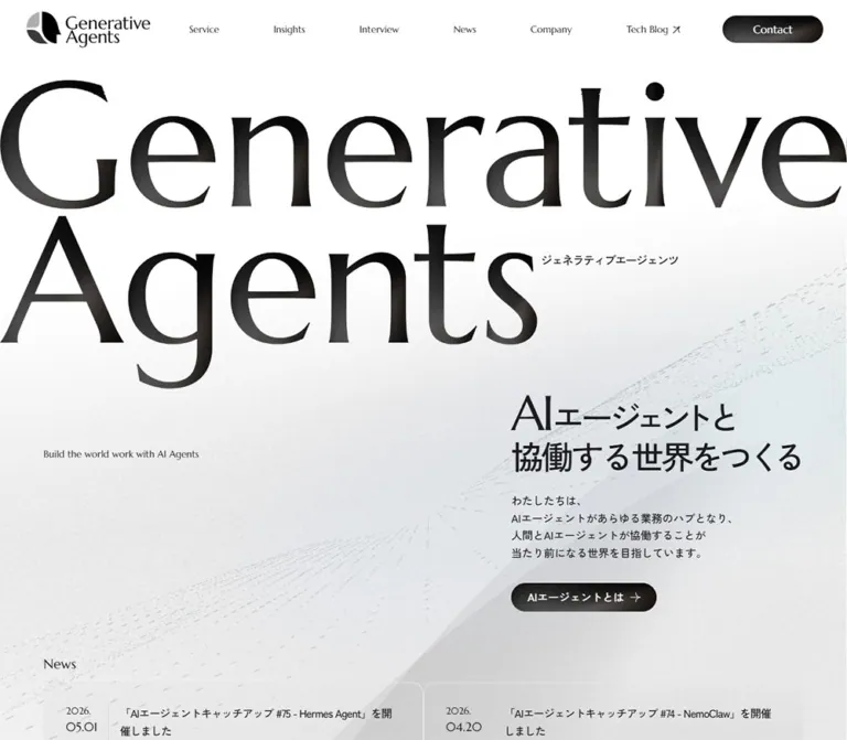
巨大なセリフ体のブランド名と非対称レイアウトが印象的な企業サイト。白い粒子状の背景から、立体的なサービスマップと金属調のフッターへ展開します。
オリジナルサイトを見るGenerative Agents — Style Reference
Monumental serif lettering above a pale atmospheric field, followed by charcoal service diagrams and a brushed-metal footer.
Website: generative-agents.co.jp Original URL: https://generative-agents.co.jp/ Final URL: https://generative-agents.co.jp/ Theme: a light opening, a dark service section, and a textured gray footer; no selectable theme control was established. Inspected: September 12, 2026, at 11:19:43.614 UTC / 20:19:43.614 JST, according to the supplied collection record. Viewports: desktop 1440 × 1000 and mobile 390 × 844 CSS pixels. Scope: the current corporate homepage. Visual evidence covers the desktop opening, a lower service-map region, the desktop footer, the mobile opening, and the mobile footer. Rendered text, link targets, and sampled computed styles extend through additional homepage sections. Linked pages and open-menu behavior were not inspected.
Generative Agents combines an unusually large English identity with restrained Japanese business information. The opening wordmark reaches both viewport edges, while the mission statement sits far to the right. Fine grain, pale blue-gray atmospheric color, and diagonal streams of tiny marks soften the otherwise stark black-and-white composition. Dark, glossy pill links provide concentrated points of contrast.
The page develops into a substantial corporate information hub: publications establish expertise, a role-based guide routes visitors, a service map explains relationships between offerings, and editorial sections provide interviews, news, and media appearances. In the captured service region, translucent outlined panels sit over large stacked geometric slabs. The footer continues this material language through broad gray gradients, fine texture, vertical rules, and bilingual navigation.
The most reusable relationships are scale versus restraint, asymmetric placement versus precise alignment, and textured scenery versus legible information. Preserve those relationships when adapting the design.
How to Read This Reference
- Measured means a value appears in the supplied rendered DOM or computed-style records. Coordinates describe the recorded layout, not universal CSS positioning rules.
- Calculated means a value follows from supplied measurements, such as a gap between two element rectangles.
- Visual estimate means an approximation from an original-page screenshot. Estimated colors were not sampled with a pixel-analysis tool.
- Recommended means an implementation choice for a new project. It is not evidence of existing website behavior.
- Named tokens are descriptive aliases unless explicitly identified as source properties.
- DOM-only anatomy describes content and geometry without claiming that an unavailable screenshot established its imagery or surface treatment.
Parent styles require particular care here. The large h1 reports an inherited 16px Japanese sans-serif style, although its visible lettering is enormous and serif-like. Several dark-looking buttons report a white background-color. These records do not expose every child, image, background layer, or pseudo-element responsible for the final appearance.
Tokens — Colors
Default Palette
| Name | Value | Suggested token | Role and evidence |
|---|---|---|---|
| White Canvas | #ffffff |
--color-canvas |
Measured body background; the opening also contains decorative tonal layers |
| Main Ink | #1a1b1f |
--color-ink |
Measured body text, mission copy, guide headings, and news titles |
| Secondary Ink | #4f4f4f |
--color-muted |
Measured publication metadata and guide descriptions |
| Badge Ink | #727272 |
--color-badge-ink |
Measured audience-label text in the guide |
| Badge Gray | #e7e7e7 |
--color-badge |
Measured audience-label background |
| Reversed White | #ffffff |
--color-on-dark |
Measured service introduction and map-label text; also visible in the footer |
| Reversed Muted | #c3c3c3 |
--color-on-dark-muted |
Measured English service introduction and example descriptions |
| Translucent White | rgba(255,255,255,0.4) |
--surface-guide-link |
Measured background of guide navigation pills |
These are the dependable CSS colors. They do not describe every color produced by gradients, textures, illustrations, or transparency.
Atmospheric Palette — Visual Estimates
| Name | Approximation | Suggested token | Visible use |
|---|---|---|---|
| Service Charcoal | #282828 |
--color-charcoal |
Broad dark field behind the captured service map and cards |
| Cool Haze | #e4edf0 |
--color-haze |
Very pale blue-gray atmosphere toward the lower opening |
| Graphite Highlight | #55514f |
--color-graphite |
Soft warm-gray highlight within dark pills and geometric surfaces |
| Pill Edge | #111111 |
--color-pill-edge |
Near-black perimeter of glossy action links |
| Light Dark-Surface Rule | rgba(255,255,255,0.18) |
--rule-on-dark |
Approximation of delicate panel boundaries over charcoal |
Use these estimates as starting points for visual matching. The footer spans a broad tonal range and should not be reduced to one supposedly exact gray.
Compositing limitation: the hero action and desktop Download link look dark in the screenshots, despite sampled white background declarations. The supplied records do not establish whether their visible fill comes from a background image, child layer, pseudo-element, or another rendering mechanism. The Quick Start reproduces the appearance with direct CSS gradients as a recommendation.
Theme Presets
No user-selectable presets were verified. The contrasting treatments belong to page sections:
| Section treatment | Surface | Foreground | Design purpose |
|---|---|---|---|
| Opening | White, fine grain, pale cool atmosphere | Dark lettering | Makes the identity and mission dominant |
| Services | Charcoal, translucent frames, layered slabs | White with muted gray supporting text | Organizes technical relationships within a spatial composition |
| Footer | Textured silver-to-charcoal gradients | White and subdued gray | Creates a substantial closing directory |
The sampled --tw-* properties include utility defaults. They do not establish a visible blue accent, active backdrop blur, or scroll snapping.
Tokens — Typography
Zen Kaku Gothic New — Japanese Information
- Measured family:
'Zen Kaku Gothic New', sans-serif. - Weights: body defaults to
400; mission copy, publication titles, guide headings, and several service labels use500. - Role: Japanese explanatory copy, titles, metadata, service descriptions, and action labels.
- Character: clean and relatively light, allowing dense business content to sit beside oversized display lettering.
- Implementation alias:
--font-jp.
The mission headline uses unusually tight tracking: -0.08em at both inspected widths. This is a display treatment, not a body-text default.
Marcellus — English Editorial Labels
- Measured family:
Marcellus, sans-serif. - Verified uses: the opening English tagline, the small News heading, the English service introduction, and English links within the mobile navigation subtree.
- Measured weight:
400. - Role: provides the quieter editorial counterpart to Japanese sans-serif text.
- Implementation alias:
--font-editorial.
The visible desktop navigation has a serif appearance, but its sampled anchor parents declare the Japanese body stack. Child-run font declarations were not supplied. Do not treat the parent record as proof of the exact visible English navigation font.
Display Wordmark and Logo
The huge two-line identity has high-contrast, serif-like forms. The supplied h1 record establishes its overall rectangle, not its visible font or rendering mechanism. Do not identify this lettering as Marcellus merely because Marcellus appears elsewhere.
For faithful reproduction, use an authorized wordmark asset when available. For a new brand, create an equivalent large display lockup and keep it separate from ordinary heading typography. The compact header logo combines a segmented circular/profile symbol with a stacked English name. Its exact asset URL was not supplied.
Type Scale
All numeric entries below are measured unless marked otherwise.
| Role | Desktop | Mobile | Weight / tracking | Notes |
|---|---|---|---|---|
| Body default | 16px / 24px |
16px / 24px |
400, normal |
Inherited baseline, not every visible paragraph |
| Mission headline | 48px / 52.8px |
30px / 33px |
500, -0.08em |
Segmented content creates a larger total box than two plain line boxes |
| Mission paragraph | 16px / 25.6px |
14px / 22.4px |
500, normal |
Four visible lines in the supplied opening captures |
| Opening tagline | 14px / 19.6px |
10px / 14px |
Marcellus 400 |
Small counterweight to the wordmark |
| News section label | 20px / 28px |
20px / 28px |
Marcellus 400 |
Retains its size on mobile |
| Opening news title | 16px / 25.6px |
14px / 19.6px |
500, -0.05em |
Wraps beside a separate date column |
| Publication title | 20px / 32px |
14px / 16.8px |
500; desktop -0.05em |
Mobile tracking returns to normal |
| Publication publisher | 14px / 19.6px |
10px / 16px |
400, normal |
Secondary ink |
| Publication author | 16px / 25.6px |
12px / 16.8px |
400, normal |
Secondary ink |
| Guide audience badge | 12px / 16.8px |
Same | 500, normal |
Compact pill label |
| Guide title | 18px / 26.1px |
Same | 500, normal |
Does not shrink on mobile |
| Guide description | 14px / 23.8px |
Same | 400, normal |
Readable paragraph rhythm |
| Guide link | 14px / 20.3px |
Same | 500, normal |
Full-width translucent pill |
| Service introduction | 38.88px / 54.432px |
24px / 33.6px |
500; -0.05em / -0.08em |
A distinct scale from the opening headline |
| Service English support | 13.968px / 19.5552px |
14px / 19.6px |
Marcellus 400 |
Muted reversed text |
| Mobile menu primary link | Not established | 24px / 33.6px |
Marcellus 400 |
DOM evidence; open state not visually verified |
| Mobile menu service link | Not established | 14px / 22.4px |
500, -0.02em |
DOM evidence only |
Wordmark bounds: desktop 1440 × 525px; mobile 390 × 142.47px. Both are close to a 2.74:1 overall ratio. These are graphic/container measurements, not font sizes.
The bilingual major-section heading wrappers also inherit 16px text styles in the sample. Their individual display-letter sizes are unavailable. A 44–100px English section-heading range in a new implementation is a recommendation, not a measured source token.
Tokens — Spacing & Shapes
Base unit: the measured root is a conventional 16px; no special fluid root scale was established.
Density: large compositional gaps around compact text and controls. Many small spaces are multiples of four, but deliberate offsets such as 27px and 70px matter.
Spacing Scale
| Use | Value | Evidence |
|---|---|---|
| Guide badge inset | 4px 12px |
Measured padding |
| Hero action inset | 8px 24px |
Measured padding |
| Hero action icon gap | 8px |
Measured gap |
| Guide link inset | 8px 16px |
Measured padding |
| Guide link internal gap | 12px |
Measured gap |
| Guide link vertical separation | 8px |
Calculated from 40px links on 48px intervals |
| Service overview card inset | 24px |
Measured first desktop card |
| Opening news card inset | 32px desktop; 24px mobile |
Measured padding |
| Mission headline-to-paragraph gap | 27px |
Calculated at both viewports |
| Mission paragraph-to-action gap | 32px |
Calculated at both viewports |
| Action-to-News-heading gap | 64px desktop; 76px mobile |
Calculated from recorded rectangles |
| Mobile tagline-to-mission gap | 112px |
Calculated from tagline bottom to headline top |
| News-to-Publications gap | 124px desktop; 80px mobile |
Calculated section separation |
| Publications-to-Guide gap | 124px desktop; 80px mobile |
Calculated section separation |
Border Radius
| Element | Value | Evidence |
|---|---|---|
| Primary action pills | 9999px |
Measured |
| Audience badges and guide links | 9999px |
Measured |
| Opening news cards | 16px desktop; 12px mobile |
Measured |
| Service overview cards | 24px |
Measured desktop example |
| Visible service-map bar surface | Approximately 8px |
Screenshot estimate; sampled outer links report 0px |
| Service track panels | Approximately 16px |
Screenshot estimate |
The map demonstrates why component layers matter: square-cornered outer anchors can contain visibly rounded inner surfaces.
Layout Measurements
| Element | Desktop 1440 × 1000 | Mobile 390 × 844 |
|---|---|---|
| Document height | 15192.38px |
18776.81px |
| Header rectangle | 1440 × 84.53px |
390 × 72px |
| Header padding | 17px 31px 15px 39px |
24px 24px 0 |
| Header logo | 182 × 52.53px, at 39,17 |
140 × 40.41px, at 24,27.80 |
| Mobile menu button | Not visible | 48 × 48px, at 318,24 |
| Standard content region | 1224px, left 108px |
342px, left 24px |
| Wordmark | Top 118px, full width |
Top 119px, full width |
| Mission content column | 492px, left 840px |
272px, left 94px |
| Mission headline top | 643px |
403.47px |
| Hero action | 214.41 × 41.59px |
Same recorded size |
| Header Download link | 148 × 40px |
Replaced by compact menu presentation |
| Opening news item | 612 × 163.19px |
342 × 140.78px |
| First service overview card | 297 × 349.89px |
Not supplied |
| Service-map section | 1280px, left 52px |
390px outer region with 16px side padding |
The source property --header-height is 84px in both snapshots. The mobile header itself measures 72px. Use the actual mobile geometry when reproducing the capture rather than treating this property as the measured height of every header state.
Components
Persistent Header
Role: identity, corporate navigation, and access to service materials.
The desktop header is transparent and sits over the page composition. The logo occupies the far left; a widely distributed English navigation row follows; the dark Download pill anchors the right. Visible labels are Service, Insights, Interview, News, Media, Company, Recruit, and Download. Japanese equivalents are present in the DOM, but the default desktop screenshot does not show two permanently stacked labels for every item.
At the inspected desktop width, the header has a measured 40px flex gap, but this does not explain every navigation interval: internal layout distributes the individual links across the remaining space.
The header remains at the top of the supplied opening, service, and footer captures. This supports persistent positioning; the supplied style fields do not identify whether the source uses fixed positioning, sticky positioning, or another mechanism. The black logo and navigation remain visible over dark or gray content in the supplied frames. An automatic light-logo switch was not established.
Mobile Header and Navigation Subtree
The phone header uses the same logo at 140px wide and a 48px square button on the right. The visible icon consists of two thin horizontal strokes of unequal length, giving it a quieter appearance than a conventional three-line hamburger.
The DOM contains a navigation hierarchy with 24px English links and indented 14px service links. Main links begin at x=48px; service links begin at x=72px. A large Download destination is also present in this subtree. These records establish available content and styling, not a visually verified open-menu state.
Opening, closing, focus handling, body-scroll locking, and the panel entrance animation remain unverified.
Hero Wordmark
Role: establishes brand scale before explaining the business.
The two-line wordmark begins at the viewport edge without the content container's normal inset. The first line, Generative, occupies almost the entire width. The shorter Agents line leaves space on the right for the small Japanese brand reading. Desktop lettering dominates approximately the upper two-thirds of the opening capture.
On mobile, the overall graphic scales to the viewport while preserving its two-line arrangement. It remains full bleed. Do not reflow the name into three lines or place it inside a rounded hero card.
A thin horizontal interruption is visible within the upper lettering in the supplied mobile frame. Its cause is not established; it should not be promoted into an intentional animation or decorative rule.
Mission Block and English Tagline
Role: pairs a compact business proposition with a deliberately spacious opening.
The desktop mission block is right aligned within the 1224px content region. Its left edge is x=840px, with 492px available for text. The English tagline sits separately at x=108px and y=730px.
The mission headline reads “AIエージェントと協働する世界をつくる”. Its Latin AI segment appears larger and lighter than the surrounding Japanese lettering. The precise child typography was not supplied; only the parent headline values are measured.
A 27px gap separates the headline box from the explanatory paragraph. The dark action pill follows after another 32px. Its label is “AIエージェントとは”, followed by a fine arrow.
On mobile, the tagline moves below the wordmark and aligns to the standard 24px margin. The mission block follows after a 112px open interval and remains offset to x=94px. This creates a 70px inset inside the normal content region while retaining the same 24px right margin. The asymmetric composition survives the responsive change.
Glossy Pill Link
Role: marks a primary destination with compact, concentrated contrast.
The visible treatment is a near-black capsule with a broad gray highlight, white text, and, where applicable, a thin directional arrow. It resembles polished graphite more than a flat black button. The hero example measures about 214 × 42px at both widths.
The desktop Download variant measures 148 × 40px. Publication actions reuse pill geometry, while guide links use a pale translucent variant.
The hero action links to /ai-agents/. Download links to /contact/education-service/. The evidence establishes those destinations; it does not establish an immediate file download or a modal interaction.
Opening News Pair
Role: introduces current activity immediately after the opening composition.
A small Marcellus News heading sits above two linked items. Each item groups a date column, a separating vertical rule, a Japanese title, and category information. The date treatment visually separates the year from the month and day.
Desktop items sit side by side at 612px each. Their title text is 16px with a 25.6px line height. Mobile items stack at 342px wide, with 24px padding, 12px corners, and 14px titles. The mobile screenshot shows the start of the first item near the bottom of the initial viewport.
This compact pair is distinct from the later News section, which contains four entries in the rendered text. Preserve that difference in purpose rather than merging both locations into one oversized feed.
Publications Grid
Role: demonstrates expertise through published work.
Evidence scope: titles, publisher and author metadata, link anatomy, and responsive geometry are established by the DOM. Publication artwork is outside the supplied visual crops.
The current homepage contains ten publication entries. Each entry includes a title, publisher, author information, and two outbound actions labeled “出版社” and Amazon.
Desktop title rectangles begin at x=141, 557, and 973px, establishing three aligned columns. Each inner text region is 326px wide. Assuming equal cards and symmetric insets, these positions correspond to approximately 392px cards, 24px gaps, and 33px inner offsets; those wrapper dimensions are calculated, not directly sampled.
Mobile retains two columns. Inner text regions are 133px wide at x=41 and 216px. Equal-card reconstruction gives approximately 167px cards, an 8px gap, and 17px inner offsets. Titles reduce to 14px, publisher labels to 10px, and author text to 12px.
The desktop action pair is horizontal, with two 159px-wide links separated by 8px. On mobile, the actions stack at 133px wide. Their recorded heights are only about 24–25px, an important usability consideration for an adaptation.
Audience Guide
Role: routes visitors according to the question they need to resolve.
Six groups cover management and AI adoption, operational teams, training planners, technical leads, learners, and recruitment or collaboration interests. Each group contains a muted audience badge, an 18px problem statement, a supporting paragraph, and several destination pills.
The desktop inner columns begin at x=141, 554.33, and 967.66px. Their 331.33px widths support a three-column arrangement. Mobile groups form one vertical sequence with 308px inner content widths.
This section retains its 18px headings, 14px descriptions, and 14px link text on mobile. It changes structure instead of uniformly shrinking. Link pills are 40px high, use white at 40% opacity, and sit on a 48px vertical rhythm.
The guide is navigation, not a filter widget. There is no evidence that selecting an audience dynamically replaces the other groups.
Service Introduction and Growth Diagram
Role: introduces the service taxonomy before presenting individual offerings.
The desktop introduction occupies a 600px-wide region starting at x=108px. The white Japanese statement uses 38.88px text with generous 54.432px leading. A short English paragraph below uses muted gray Marcellus.
On mobile, this region expands to 358px with 16px side margins. The Japanese statement becomes 24px. The accompanying diagram's accessible description identifies a triangle with AI Agent in the center, Scale Up above, Scale Out at lower left, and AI First at lower right. This establishes the diagram's meaning, but its exact artwork and rendering technology are not available.
The three explanatory tracks align across desktop and become vertically separated on mobile, as shown by their measured text coordinates. Preserve the distinction between improving individual productivity, parallel autonomous work, and event-driven AI-first operation.
Service Map
Role: shows where services apply across stages of AI adoption.
The map extends left of the standard desktop content region. Its overall rectangle is 1280px wide at x=52px, ending at the shared x=1332px right edge. A category rail precedes three broad growth-track columns. Within those tracks, five phases describe the progression from generative-AI use to AI-agent-driven operations.
In the supplied desktop crop, category labels run vertically down rounded tabs. Thin vertical outlines establish the track panels; dashed horizontal rules separate service categories. Long translucent bars span different parts of the map. Their differing start and end positions communicate coverage.
Examples from the desktop geometry:
| Service bar | Outer link start | Outer width | Relationship |
|---|---|---|---|
| Introductory leader training | 124px |
1208px |
Spans the full service-track region |
| Agent developer training | 529.33px |
802.67px |
Begins in the later tracks |
| Practical AI coding | 124px |
1005.33px |
Starts early and ends before the final edge |
| Advanced AI coding | 326.66px |
1005.34px |
Starts partway through the early region |
| BYNAME | 529.33px |
802.67px |
Occupies the later tracks |
| Task Zero | 124px |
1208px |
Spans the full service-track region |
Measured desktop bar-link heights are approximately 58.8px. The first mobile bar is approximately 37.6px high.
On mobile, the map does not compress into the 390px viewport. Its first broad track measures 228px, and the next two extend from x=308 to x=772px. A full-width service bar measures 700px. This establishes an overwide internal layout. Horizontal scrolling is a sensible implementation, but overflow properties and a swipe test were not supplied, so its current accessibility cannot be confirmed.
Several bars have a narrow divider before a delicate arrow terminal. Do not make every descriptive surface clickable: the link evidence distinguishes linked offerings from text-only entries.
Service Overview Cards
Role: provides readable summaries after the relational map.
The supplied desktop screenshot shows four cards in a row over large stacked slabs. The first measured card is 297px wide, approximately 350px tall, with 24px padding and 24px corners. Four such cards and three 12px gaps fill the 1224px standard region.
Anatomy is consistent: a small category label enclosed visually by parentheses, a service title, a fine horizontal rule, a short summary, and a longer explanation. White text sits on a translucent dark surface with a faint border. The illustration remains visible through and around the cards.
The sampled outer anchor inherits dark body text, while the visible card text is white. Use the screenshot for the final appearance; the anchor alone does not expose the descendant colors.
The first card carries an opacity-and-transform transition, detailed below. Other cards' timing patterns and the mobile card-column count were not supplied. A four-to-two-to-one adaptation is recommended for a new implementation, not claimed as source behavior.
Editorial Sections and Material Request
Role: supports ongoing research, customer evidence, updates, and contact.
The rendered homepage continues through Insights, Interview, News, Media, Tech Blog, and a contact invitation. Four insight entries include titles, dates, and author names. Four interviews include titles and company names. Media entries combine activity type, date, event or publication, contribution title, speaker or writer, and venue or format.
A service-material request block appears among the interview-related content. Its text explains that materials support internal consideration with service information, examples, and costs. The contact invitation later links to /contact/.
These content relationships are verified. Exact card crops, image treatments, column counts, and hover behavior for these lower editorial sections are outside the supplied visual and element samples. Do not invent a portrait system, carousel, or particular image ratio for them.
Footer Directory
Role: closes the page with company identity and a comprehensive bilingual directory.
The desktop footer is a broad textured gray field. A large white logo occupies the left column above the company name and address. The inspected original page identifies the company as “株式会社ジェネラティブエージェンツ”.
The middle region lists services. The right region lists corporate, editorial, recruitment, download, blog, contact, and privacy destinations. English labels appear subdued and right aligned toward thin vertical rules; Japanese labels sit to the right in brighter white. Small horizontal ticks introduce nested service links.
The footer's material effect includes broad vertical tonal variation, fine grain, and a dark horizontal seam above a lighter copyright strip. Copyright aligns toward the right on desktop.
The mobile footer crop preserves the bilingual label/value relationship. Its divider is approximately x=143px, and Japanese destinations begin near x=160px. Rows are approximately 47px apart. The copyright becomes centered and smaller. These are screenshot estimates; exact footer CSS was not supplied.
The header remains visible above both footer captures. The phone image shows the tail of a long footer directory, not an opened navigation panel.
Tokens — Motion & Interaction
| Treatment | Supplied value or observation | What is established | What remains unverified |
|---|---|---|---|
| Desktop Download link | 0.5s cubic-bezier(0.4,0,0.2,1) |
A half-second transition is declared | Changed properties and end states |
| Hero and publication pills | 0.5s |
A half-second transition is declared | Full easing details, hover appearance, and arrow movement |
| Guide links | 0.15s cubic-bezier(0.4,0,0.2,1) |
Color, background, border, decoration, fill, and stroke transitions | Actual hovered or focused colors |
| Mobile menu button | 0.1s ease-out |
A short button transition | Icon transformation and menu opening behavior |
| First service overview card | opacity 0.6s ease-out 0.27s, transform 0.6s ease-out 0.27s |
Duration, delay, and transitioned properties for one card | Initial offset, trigger, repetition, and timings of other cards |
| Header persistence | Same top placement in multiple scroll captures | Persistent visible header behavior | Source positioning mechanism and contrast-state logic |
| Headline segmentation | Separate text fragments in the DOM | The headline is composed from smaller pieces | A letter-by-letter reveal or its timing |
| Atmospheric marks and slabs | Visible in still captures | Their appearance and placement | Movement, parallax, pointer response, or rendering technology |
Many sampled elements report animation: none. This is not proof that the page has no animation: child elements, pseudo-elements, scripts, and other rendering layers were not fully represented.
The collection waited for finite animation and sampled layout stability. Perpetual animations were temporarily paused during readiness checks and resumed afterward. These steps improve screenshot reliability but do not supply a motion recording.
Recommended adaptation: use quiet color changes for controls and optional short opacity/translation reveals for supporting cards. Keep essential content visible without animation. Treat any animated particle field or moving slabs as an additional design decision requiring its own performance and reduced-motion behavior.
Surfaces
| Layer | Appearance | Structural role |
|---|---|---|
| Opening canvas | White with fine grain and pale atmospheric gradients | Supports extreme wordmark scale without a hard-edged hero box |
| Decorative flow | Sparse diagonal marks and faint broad planes | Connects empty space to the mission block |
| Primary action | Dark glossy capsule | Creates concentrated contrast |
| Guide navigation | White at 40% opacity | Separates destinations without adding a strong accent color |
| Service field | Deep charcoal | Establishes a distinct explanatory chapter |
| Service-map panels | Thin outlines, translucent fills, dashed separators | Expresses categories and relationships |
| Overview cards | Rounded transparent dark panels | Keeps prose readable over geometry |
| Footer | Grainy gray gradients and horizontal seam | Gives the directory visual weight |
Depth belongs chiefly to the illustration, gradients, and layered surfaces. There is no evidence of a universal floating-card shadow system. The service panels have a translucent appearance, but actual backdrop blur was not established.
Imagery
The visible image language is abstract and material. The opening uses extremely pale directional marks that suggest a distributed flow. These cross broad, almost invisible diagonal planes. Fine grain prevents the white field from feeling digitally empty.
The service crop introduces large stacked quadrilateral slabs in perspective. Their broad faces, dark edges, and muted gray-to-brown shading create an architectural impression. They extend beneath the map and overview cards instead of becoming small decorative thumbnails inside each card.
The footer resembles a textured metal or graphite surface. This is an appearance description, not a claim about the source asset or a physical material photograph.
Keep decorative contrast subordinate to reading. The page's small text and fine rules would become difficult to follow over a much denser particle pattern or brighter slab highlights.
Observed Asset References
No image src, background-image URL, or downloadable illustration path was supplied. The following table records roles without inventing filenames.
| Asset role | Evidence | Implementation implication |
|---|---|---|
| Header identity | Visible compact symbol and stacked name | Use an authorized vector or image asset when available |
| Full-width hero wordmark | Original desktop/mobile captures and h1 bounds |
Preserve aspect ratio; exact display font remains unidentified |
| Opening flow and grain | Original desktop/mobile captures | Use a subtle decorative layer; motion is optional and unverified |
| AI growth triangle | Rendered accessible description | Preserve the central label and three growth directions |
| Stacked slabs | Original desktop service capture | Use large perspective geometry behind information |
| White footer identity | Original desktop footer capture | Provide an appropriate reversed identity asset |
| Publication and editorial artwork | Not visible in supplied crops; no asset records | Do not infer cover crops, photography, or image filters |
The Quick Start supplies surface approximations. It does not reproduce the original identity artwork, grain texture, flow field, or slab illustration.
Layout & Responsive Behavior
The current homepage is a long document with several distinct information layouts. Its measured height grows from approximately 15,192px on desktop to 18,777px on mobile. This is content-dependent, not a target height to hardcode.
| Region | Desktop observation | Mobile observation |
|---|---|---|
| Header | Logo, distributed navigation, Download pill | Smaller logo and menu button |
| Wordmark | Full-width two-line composition | Same two-line composition scaled to width |
| Mission | Right-side 492px column; separate left tagline | 272px column offset inside a 342px region |
| Opening news | Two columns | One column |
| Publications | Three columns | Two columns; actions stack |
| Audience guide | Three columns | One column; heading sizes retained |
| Growth explanations | Three aligned tracks | Vertical sequence |
| Service map | Wide relational map within the desktop page | Internal columns extend beyond the viewport |
| Overview cards | Four columns visible | Column count not established |
| Footer | Identity plus two directory regions | Long directory preserving paired language columns |
The standard mobile inset is 24px, but the service chapter uses 16px in the measured regions. Preserve this distinction if reproducing the observed composition.
The wordmark begins at almost the same absolute y-coordinate on desktop and mobile: 118px versus 119px. Its width-driven height changes dramatically. This is a different responsive behavior from the mission, whose typography and arrangement switch independently.
Only two viewport widths were supplied. Exact breakpoint thresholds and interpolation formulas are unknown. The Quick Start uses recommended thresholds and a capped content container that reproduce the two endpoint widths. It does not claim to recover the original media queries.
Do’s and Don’ts
Do
- Keep the hero identity full bleed and preserve its two-line proportions.
- Retain the mission block's right alignment and its deliberate mobile inset.
- Use Zen Kaku Gothic New for verified Japanese text roles and Marcellus for verified English editorial roles.
- Keep body copy calm while reserving tight tracking for selected display text.
- Use white, charcoal, gray, and a very pale cool atmosphere as the principal color relationships.
- Give primary pills a restrained graphite highlight and a fine arrow treatment.
- Preserve different layouts for publications, audience navigation, service relationships, and editorial content.
- Keep service-bar spans meaningful within the adoption map.
- Place large decorative geometry behind information with sufficient tonal separation.
- Preserve the footer's bilingual alignment and fine vertical rules.
Don't
- Don't turn the corporate homepage into a single-purpose campaign page with repeated conversion blocks.
- Don't identify the huge wordmark's font from the inherited
h1style. - Don't center every mobile block; that removes a defining compositional feature.
- Don't collapse every grid to one column when publications are observed in two columns.
- Don't shrink the service map until all of its labels fit on one phone screen.
- Don't replace the abstract scenery with unsupported robot portraits, neon circuitry, or colorful AI badges.
- Don't flatten the glossy pills into a bright brand-color action system.
- Don't add strong shadows or heavy blur to every panel.
- Don't assume that DOM-present menu content was visibly open during capture.
- Don't claim parallax, pointer tracking, scroll-linked animation, or a particular rendering engine from still imagery.
- Don't reuse publication authors or interview subjects as website production credits.
Recommended Implementation Additions
These are recommendations for an adaptation, not verified features of the inspected website:
- Give the mobile menu button an accessible name,
aria-expanded, and a relationship to its controlled navigation. If implemented as a modal panel, manage focus and Escape behavior. - Add a persistent-header contrast strategy. The captured black header over dark content deserves explicit readability testing.
- Enlarge publication action hit areas to at least 44px high while retaining their narrow pill appearance where appropriate.
- Review the 10px mobile publisher labels and tagline. Increase them when text comprehension matters more than exact visual matching.
- Make the overwide service map a keyboard-accessible scroll region with a visible overflow cue and a readable linear alternative.
- Use semantic links for destinations, a real button for the menu, and appropriate date markup for news.
- Provide visible focus outlines on both pale and charcoal surfaces. Translucency should not be the only state indicator.
- Keep decorative backgrounds outside the accessibility tree and prevent them from intercepting pointer events.
- Provide reduced-motion behavior for any added reveals or moving scenery. Do not hide core content until JavaScript animation completes.
- Test Japanese wrapping at larger text settings, especially in guide pills and service bars. Allow control height to grow rather than clipping labels.
Agent Prompt Guide
Quick Color Reference
- Measured base canvas:
#ffffff. - Measured primary text:
#1a1b1f. - Measured secondary text:
#4f4f4f. - Measured audience badge:
#e7e7e7with#727272text. - Measured dark-section support text:
#c3c3c3. - Measured guide-link fill:
rgba(255,255,255,0.4). - Estimated service field: approximately
#282828. - Estimated atmospheric tint: approximately
#e4edf0. - Primary action appearance: near-black capsule with a subdued gray highlight and white lettering.
Overall Prompt
“Create a Japanese corporate homepage with monumental two-line English branding, a white grainy opening, pale diagonal streams of tiny marks, and an asymmetric mission block. Use Zen Kaku Gothic New for Japanese information and Marcellus for small English editorial labels. Keep the large wordmark as independent brand artwork rather than assuming its font. At desktop width, place the mission at the right edge of a 1224px content region; on a 390px phone, retain a 70px inset inside the normal 24px page margin. Use glossy black pill links. Follow the opening with a publication grid, an audience guide, and a charcoal service chapter containing a relational map and translucent overview cards over large stacked slabs. Finish with a textured gray footer and aligned English/Japanese navigation pairs. Keep motion optional and restrained.”
Example Component Prompts
- Opening: “Build a full-width two-line brand lockup beginning about 118px from the page top. Place a small English tagline below it and a Japanese mission block toward the right. Use white, very pale blue-gray atmosphere, fine grain, and sparse diagonal flow marks. Keep the phone composition asymmetric.”
- Primary action: “Create a compact 214 × 42px graphite pill with white Japanese text, a subtle broad gray highlight, and a delicate arrow. Use a fully rounded perimeter. Add an accessible focus state; hover end-state styling is a new implementation choice.”
- Audience guide: “Create six role-based navigation groups. Each contains a 12px gray audience badge, an 18px Japanese problem statement, 14px supporting copy, and stacked translucent white destination pills. Use three columns on desktop and one column on mobile without shrinking the headings.”
- Service map: “Build a charcoal relationship map with vertical category tabs, three broad growth tracks, five nested adoption phases, thin panel outlines, and dashed category separators. Draw service bars with different horizontal spans. Preserve readable internal widths on mobile through an accessible horizontal scroll region.”
- Service overview: “Create four desktop summary cards, approximately 297px wide, with 24px padding and corners. Stack a small parenthesized category, a service title, a fine rule, and two prose sections. Use translucent dark fills and white text over a large illustration of layered graphite slabs.”
- Footer: “Design a broad textured gray footer with a reversed logo and company information at left. Align subdued English labels against vertical rules and brighter Japanese destination labels to their right. Preserve these language pairs on mobile and center the small copyright line within a horizontal material band.”
Quick Start
CSS Custom Properties
This is an implementation adaptation, not extracted source CSS. Exact text colors and selected dimensions come from the measured records. Atmospheric gradients, border opacities, unmeasured card surfaces, hover end states, and breakpoints are recommendations.
Load the two verified font families separately. Supply your own authorized identity and decorative assets. The optional grain property defaults to no image, so the stylesheet works without an invented asset path.
:root {
  /* Measured colors */
  --color-canvas: #ffffff;
  --color-ink: #1a1b1f;
  --color-muted: #4f4f4f;
  --color-badge: #e7e7e7;
  --color-badge-ink: #727272;
  --color-on-dark: #ffffff;
  --color-on-dark-muted: #c3c3c3;
  --surface-guide-link: rgb(255 255 255 / 40%);

  /* Visual approximations */
  --color-charcoal: #282828;
  --color-haze: #e4edf0;
  --color-graphite: #55514f;
  --color-pill-edge: #111111;
  --rule-on-dark: rgb(255 255 255 / 18%);
  --surface-grain: none;

  /* Verified family declarations */
  --font-jp: 'Zen Kaku Gothic New', sans-serif;
  --font-editorial: Marcellus, sans-serif;
  --weight-regular: 400;
  --weight-medium: 500;

  /* Endpoint geometry */
  --content-max: 1224px;
  --page-inset: 24px;
  --header-size: 84px;
  --radius-pill: 9999px;
  --radius-news: 16px;
  --radius-service: 24px;
  --section-gap: 124px;

  /* Measured timing references */
  --motion-control: 500ms cubic-bezier(0.4, 0, 0.2, 1);
  --motion-guide: 150ms cubic-bezier(0.4, 0, 0.2, 1);
}

* { box-sizing: border-box; }

body {
  margin: 0;
  color: var(--color-ink);
  background: var(--color-canvas);
  font: 400 16px/1.5 var(--font-jp);
}

button, input, select, textarea { font: inherit; }
img, svg { max-inline-size: 100%; }
a { color: inherit; }

.ga-container {
  inline-size: min(var(--content-max), calc(100% - 48px));
  margin-inline: auto;
}

.ga-section { margin-block-start: var(--section-gap); }

.ga-header {
  position: fixed;
  z-index: 50;
  inset: 0 0 auto;
  min-block-size: var(--header-size);
  display: flex;
  align-items: center;
  gap: 40px;
  padding: 17px 31px 15px 39px;
}

.ga-logo {
  display: block;
  flex: 0 0 182px;
  inline-size: 182px;
}

.ga-logo > img, .ga-logo > svg {
  display: block;
  inline-size: 100%;
  block-size: auto;
}

.ga-header__nav {
  display: flex;
  align-items: center;
  justify-content: space-between;
  gap: 24px;
  flex: 1;
  margin-inline-start: 84px;
}

.ga-header__nav > a {
  font-size: 14px;
  text-decoration: none;
}

.ga-menu-button {
  display: none;
  position: relative;
  flex: 0 0 48px;
  inline-size: 48px;
  block-size: 48px;
  padding: 0;
  border: 0;
  color: inherit;
  background: transparent;
  cursor: pointer;
}

.ga-menu-button::before,
.ga-menu-button::after {
  content: '';
  position: absolute;
  inset-inline-end: 0;
  block-size: 1px;
  background: currentColor;
}

.ga-menu-button::before { inline-size: 24px; top: 20px; }
.ga-menu-button::after { inline-size: 40px; top: 28px; }

.ga-pill {
  display: inline-flex;
  align-items: center;
  justify-content: center;
  gap: 8px;
  min-block-size: 42px;
  max-inline-size: 100%;
  padding: 8px 24px;
  border: 0;
  border-radius: var(--radius-pill);
  color: var(--color-on-dark);
  background:
    radial-gradient(ellipse at 36% 100%,
      var(--color-graphite), transparent 70%),
    linear-gradient(110deg, #111111, #211b18 65%, #090909);
  font-size: 16px;
  line-height: 1.5;
  text-decoration: none;
  transition: filter var(--motion-control);
}

.ga-header__download {
  flex: 0 0 148px;
  min-block-size: 40px;
  padding: 0 16px;
  font-size: 14px;
}

.ga-hero {
  position: relative;
  isolation: isolate;
  padding-block-start: 118px;
  background:
    radial-gradient(ellipse at 87% 87%,
      var(--color-haze), transparent 58%),
    linear-gradient(160deg, #ffffff 35%, #eeeeee 100%);
}

.ga-hero::before,
.ga-footer::before {
  content: '';
  position: absolute;
  z-index: -1;
  inset: 0;
  pointer-events: none;
  background-image: var(--surface-grain);
  opacity: 0.08;
}

.ga-wordmark {
  margin: 0;
  line-height: 0;
}

/* Supply brand artwork; this does not identify its original font. */
.ga-wordmark > img,
.ga-wordmark > svg {
  display: block;
  inline-size: 100%;
  block-size: auto;
}

.ga-hero__details {
  display: grid;
  grid-template-columns: minmax(0, 1fr) minmax(0, 492px);
  gap: 32px;
}

.ga-hero__tagline {
  align-self: start;
  margin: 87px 0 0;
  font: 400 14px/1.4 var(--font-editorial);
}

.ga-hero__headline {
  margin: 0;
  font-size: 48px;
  font-weight: 500;
  line-height: 1.1;
  letter-spacing: -0.08em;
}

.ga-hero__headline-line { display: block; }

/* Recommended approximation of the enlarged Latin opening. */
.ga-hero__latin {
  font-size: 1.333em;
  font-weight: 400;
}

.ga-hero__body {
  margin: 27px 0 32px;
  font-size: 16px;
  font-weight: 500;
  line-height: 1.6;
}

.ga-hero__copy > .ga-pill { min-inline-size: 214px; }

.ga-news { margin-block-start: 64px; }

.ga-news__heading {
  margin: 0 0 12px;
  font: 400 20px/1.4 var(--font-editorial);
}

.ga-news__grid {
  display: grid;
  grid-template-columns: repeat(2, minmax(0, 1fr));
}

.ga-news__item {
  display: grid;
  grid-template-columns: auto minmax(0, 1fr);
  gap: 24px;
  min-inline-size: 0;
  padding: 32px;
  border: 1px solid rgb(255 255 255 / 45%);
  border-radius: var(--radius-news);
  text-decoration: none;
}

.ga-news__date {
  padding-inline-end: 20px;
  border-inline-end: 1px solid rgb(26 27 31 / 12%);
  font-family: var(--font-editorial);
}

.ga-news__title {
  margin: 0;
  font-size: 16px;
  font-weight: 500;
  line-height: 1.6;
  letter-spacing: -0.05em;
}

.ga-publications {
  display: grid;
  grid-template-columns: repeat(3, minmax(0, 1fr));
  gap: 24px;
}

.ga-publication {
  min-inline-size: 0;
  padding: 32px;
  border: 1px solid rgb(26 27 31 / 12%);
}

.ga-publication__title {
  margin: 0 0 8px;
  font-size: 20px;
  font-weight: 500;
  line-height: 1.6;
  letter-spacing: -0.05em;
}

.ga-publication__publisher {
  color: var(--color-muted);
  font-size: 14px;
  line-height: 1.4;
}

.ga-publication__author {
  color: var(--color-muted);
  font-size: 16px;
  line-height: 1.6;
}

.ga-publication__actions {
  display: grid;
  grid-template-columns: repeat(2, minmax(0, 1fr));
  gap: 8px;
  margin-block-start: 32px;
}

.ga-guide {
  display: grid;
  grid-template-columns: repeat(3, minmax(0, 1fr));
  gap: 16px;
}

/* Card border and radius are recommended wrapper treatments. */
.ga-guide__card {
  min-inline-size: 0;
  padding: 32px;
  border: 1px solid rgb(26 27 31 / 12%);
  border-radius: 16px;
}

.ga-guide__badge {
  display: inline-block;
  padding: 4px 12px;
  border-radius: var(--radius-pill);
  color: var(--color-badge-ink);
  background: var(--color-badge);
  font-size: 12px;
  font-weight: 500;
  line-height: 1.4;
}

.ga-guide__title {
  margin: 12px 0 32px;
  font-size: 18px;
  font-weight: 500;
  line-height: 1.45;
}

.ga-guide__description {
  margin: 0 0 20px;
  color: var(--color-muted);
  font-size: 14px;
  line-height: 1.7;
}

.ga-guide__links { display: grid; gap: 8px; }

.ga-guide__link {
  display: flex;
  align-items: center;
  justify-content: space-between;
  gap: 12px;
  min-block-size: 40px;
  padding: 8px 16px;
  border-radius: var(--radius-pill);
  background: var(--surface-guide-link);
  font-size: 14px;
  font-weight: 500;
  line-height: 1.45;
  text-decoration: none;
  transition: background-color var(--motion-guide);
}

.ga-services {
  position: relative;
  isolation: isolate;
  color: var(--color-on-dark);
  background: var(--color-charcoal);
  padding-block: 96px;
}

.ga-services__intro {
  max-inline-size: 600px;
  font-size: 38.88px;
  font-weight: 500;
  line-height: 1.4;
  letter-spacing: -0.05em;
}

.ga-services__english {
  color: var(--color-on-dark-muted);
  font: 400 14px/1.4 var(--font-editorial);
}

/* Content-specific bar spans and phase headings need their own markup. */
.ga-map-scroll {
  overflow-x: auto;
  overscroll-behavior-inline: contain;
  margin-block: 48px;
}

.ga-map {
  display: grid;
  grid-template-columns: 72px minmax(0, 1fr);
  min-inline-size: 756px;
}

.ga-map__tracks {
  display: grid;
  grid-template-columns: repeat(3, minmax(0, 1fr));
  gap: 8px;
}

.ga-map__track {
  border: 1px solid var(--rule-on-dark);
  border-radius: 16px;
}

.ga-map__bar {
  display: flex;
  align-items: center;
  justify-content: space-between;
  gap: 16px;
  min-block-size: 59px;
  padding: 12px 32px;
  border: 1px solid rgb(255 255 255 / 35%);
  border-radius: 8px;
  color: var(--color-on-dark);
  background: linear-gradient(120deg,
    rgb(255 255 255 / 4%), rgb(255 255 255 / 12%));
  text-decoration: none;
}

.ga-service-cards {
  display: grid;
  grid-template-columns: repeat(4, minmax(0, 1fr));
  gap: 12px;
}

.ga-service-card {
  min-inline-size: 0;
  padding: 24px;
  border: 1px solid var(--rule-on-dark);
  border-radius: var(--radius-service);
  color: var(--color-on-dark);
  background: rgb(255 255 255 / 4%);
  text-decoration: none;
}

.ga-service-card__heading {
  padding-block-end: 16px;
  border-block-end: 1px solid rgb(255 255 255 / 30%);
}

.ga-service-card__title {
  margin: 0;
  font-size: 18px;
  font-weight: 500;
  line-height: 1.4;
}

.ga-service-card p { line-height: 1.5; }

.ga-footer {
  position: relative;
  isolation: isolate;
  padding-block: 100px 0;
  color: var(--color-on-dark);
  background: linear-gradient(155deg, #aaaaaa, #676767 42%, #292929);
}

.ga-footer__grid {
  display: grid;
  grid-template-columns: 1.15fr 1fr 1fr;
  gap: 48px;
}

.ga-footer__pair {
  display: grid;
  grid-template-columns: 100px minmax(0, 1fr);
  min-block-size: 47px;
}

.ga-footer__english {
  padding-inline-end: 24px;
  color: var(--color-on-dark-muted);
  text-align: end;
  font: 400 14px/1.6 var(--font-editorial);
}

.ga-footer__japanese {
  padding-inline-start: 24px;
  border-inline-start: 1px solid var(--rule-on-dark);
  font-size: 14px;
  line-height: 1.6;
}

.ga-footer__copyright {
  margin-block-start: 100px;
  padding: 24px;
  border-block-start: 8px solid rgb(0 0 0 / 45%);
  color: var(--color-on-dark-muted);
  background: rgb(255 255 255 / 12%);
  text-align: end;
  font-family: var(--font-editorial);
}

/* Recommended interaction end states. */
@media (hover: hover) {
  .ga-pill:hover { filter: brightness(1.14); }
  .ga-guide__link:hover { background: rgb(255 255 255 / 75%); }
}

:where(a, button, [tabindex]):focus-visible {
  outline: 2px solid currentColor;
  outline-offset: 4px;
}

/* Recommended intermediate breakpoint, not recovered source CSS. */
@media (max-width: 1199px) {
  .ga-header { justify-content: space-between; }
  .ga-header__nav, .ga-header__download { display: none; }
  .ga-menu-button { display: block; }
  .ga-service-cards { grid-template-columns: repeat(2, minmax(0, 1fr)); }
}

/* Recommended threshold; rules target the measured phone composition. */
@media (max-width: 767px) {
  :root {
    --header-size: 72px;
    --radius-news: 12px;
    --section-gap: 80px;
  }

  .ga-header { padding: 24px 24px 0; }
  .ga-logo { flex-basis: 140px; inline-size: 140px; }
  .ga-hero { padding-block-start: 119px; }
  .ga-hero__details { display: block; }

  .ga-hero__tagline {
    margin: 16px 0 0;
    font-size: 10px;
    line-height: 14px;
  }

  .ga-hero__copy {
    inline-size: calc(100% - 70px);
    margin: 112px 0 0 auto;
  }

  .ga-hero__headline { font-size: 30px; }
  .ga-hero__body { font-size: 14px; }
  .ga-news { margin-block-start: 76px; }
  .ga-news__heading { margin-block-end: 8px; }
  .ga-news__grid { grid-template-columns: 1fr; }
  .ga-news__item { padding: 24px; gap: 16px; }
  .ga-news__title { font-size: 14px; line-height: 1.4; }

  .ga-publications {
    grid-template-columns: repeat(2, minmax(0, 1fr));
    gap: 8px;
  }

  .ga-publication { padding: 16px; }
  .ga-publication__title {
    font-size: 14px;
    line-height: 1.2;
    letter-spacing: normal;
  }
  .ga-publication__publisher { font-size: 10px; line-height: 1.6; }
  .ga-publication__author { font-size: 12px; line-height: 1.4; }
  .ga-publication__actions { grid-template-columns: 1fr; }

  /* Larger than the captured 24–25px controls for easier touch use. */
  .ga-publication__actions .ga-pill {
    min-block-size: 44px;
    padding-inline: 12px;
    font-size: 14px;
  }

  .ga-guide { grid-template-columns: 1fr; }
  .ga-guide__card { padding: 16px; }
  .ga-services > .ga-container { inline-size: calc(100% - 32px); }
  .ga-services__intro { font-size: 24px; letter-spacing: -0.08em; }
  .ga-map { grid-template-columns: 56px minmax(700px, 1fr); }
  .ga-service-cards { grid-template-columns: 1fr; }
  .ga-footer__grid { grid-template-columns: 1fr; gap: 48px; }
  .ga-footer__pair { grid-template-columns: 120px minmax(0, 1fr); }
  .ga-footer__english { padding-inline-end: 16px; }
  .ga-footer__japanese { padding-inline-start: 16px; }
  .ga-footer__copyright { text-align: center; font-size: 12px; }
}

/* Recommended adaptation for narrower phones and enlarged text. */
@media (max-width: 359px) {
  .ga-hero__copy { inline-size: calc(100% - 32px); }
  .ga-hero__headline { font-size: 28px; }
}

@media (prefers-reduced-motion: reduce) {
  .ga-pill, .ga-guide__link, .ga-menu-button {
    transition: none;
  }
}
The hero artwork should use the observed approximate 2.74:1 overall ratio. Use a normal text alternative for the wordmark, real text for the mission, and semantic headings for the remaining sections. The CSS menu button does not implement a navigation panel; its accessible state and behavior require separate markup and logic.
Tailwind v4 Token Mapping
Optional mapping for a project already using Tailwind v4. The supplied utility properties do not identify the original framework version. These aliases map the adaptation above.
@theme inline {
  --color-canvas: #ffffff;
  --color-ink: #1a1b1f;
  --color-muted: #4f4f4f;
  --color-badge: #e7e7e7;
  --color-badge-ink: #727272;
  --color-charcoal: #282828;
  --color-haze: #e4edf0;
  --color-on-dark: #ffffff;
  --color-on-dark-muted: #c3c3c3;

  --font-japanese: 'Zen Kaku Gothic New', sans-serif;
  --font-editorial: Marcellus, sans-serif;

  --text-caption: 0.75rem;
  --text-small: 0.875rem;
  --text-body: 1rem;
  --text-guide: 1.125rem;
  --text-news-label: 1.25rem;
  --text-mission-mobile: 1.875rem;
  --text-mission-desktop: 3rem;

  --spacing-page-inset: 24px;
  --spacing-service-inset: 16px;
  --spacing-content-max: 1224px;
  --radius-pill: 9999px;
  --radius-news: 16px;
  --radius-service: 24px;
}
Sources & Evidence
- Inspected original page: Generative Agents. Original and final URLs are identical; the supplied response status is HTTP 200.
- Capture record: September 12, 2026,
2026-09-12T11:19:43.614Z; desktop 1440 × 1000 and mobile 390 × 844 CSS pixels. - Original-page visual evidence: three desktop captures showing the opening, a lower service-map/card region, and the footer; two mobile captures showing the opening and footer. Exact scroll offsets were not supplied.
- Rendered evidence: homepage text, link destinations, custom properties, computed typography and selected element rectangles. Style sampling extends through the first service overview card on desktop and through the beginning of the service bars on mobile; it is not a complete stylesheet or asset inventory.
- Identity evidence: the original homepage footer displays the company name, address, and copyright identity. This supports the operator identification independently of any external material.
- Interaction evidence: collected scroll positions and declared CSS transitions. No menu activation, link navigation, hover-state comparison, keyboard test, or form submission was provided.
The collection included an initial observation of at least five seconds, finite-animation and layout-stability checks, and image-decoding waits within stated limits. Perpetual animation was paused during readiness checks and resumed afterward. Scroll collection traversed intermediate positions with a ten-second limit per position. SharedWorkers and service workers were disabled.
These checks do not prove that delayed content, every image, or every interaction was fully exercised. This reference uses only the supplied original-page captures and rendered evidence; no additional browsing, file reads, or interaction tests were performed. Unmeasured gradients, artwork behavior, intermediate breakpoints, and implementation improvements are explicitly labeled as estimates or recommendations.
# Generative Agents — Style Reference

> Monumental serif lettering above a pale atmospheric field, followed by charcoal service diagrams and a brushed-metal footer.

**Website:** [generative-agents.co.jp](https://generative-agents.co.jp/)
**Original URL:** https://generative-agents.co.jp/
**Final URL:** https://generative-agents.co.jp/
**Theme:** a light opening, a dark service section, and a textured gray footer; no selectable theme control was established.
**Inspected:** September 12, 2026, at 11:19:43.614 UTC / 20:19:43.614 JST, according to the supplied collection record.
**Viewports:** desktop 1440 × 1000 and mobile 390 × 844 CSS pixels.
**Scope:** the current corporate homepage. Visual evidence covers the desktop opening, a lower service-map region, the desktop footer, the mobile opening, and the mobile footer. Rendered text, link targets, and sampled computed styles extend through additional homepage sections. Linked pages and open-menu behavior were not inspected.

Generative Agents combines an unusually large English identity with restrained Japanese business information. The opening wordmark reaches both viewport edges, while the mission statement sits far to the right. Fine grain, pale blue-gray atmospheric color, and diagonal streams of tiny marks soften the otherwise stark black-and-white composition. Dark, glossy pill links provide concentrated points of contrast.

The page develops into a substantial corporate information hub: publications establish expertise, a role-based guide routes visitors, a service map explains relationships between offerings, and editorial sections provide interviews, news, and media appearances. In the captured service region, translucent outlined panels sit over large stacked geometric slabs. The footer continues this material language through broad gray gradients, fine texture, vertical rules, and bilingual navigation.

The most reusable relationships are scale versus restraint, asymmetric placement versus precise alignment, and textured scenery versus legible information. Preserve those relationships when adapting the design.

## How to Read This Reference

- **Measured** means a value appears in the supplied rendered DOM or computed-style records. Coordinates describe the recorded layout, not universal CSS positioning rules.
- **Calculated** means a value follows from supplied measurements, such as a gap between two element rectangles.
- **Visual estimate** means an approximation from an original-page screenshot. Estimated colors were not sampled with a pixel-analysis tool.
- **Recommended** means an implementation choice for a new project. It is not evidence of existing website behavior.
- **Named tokens** are descriptive aliases unless explicitly identified as source properties.
- **DOM-only anatomy** describes content and geometry without claiming that an unavailable screenshot established its imagery or surface treatment.

Parent styles require particular care here. The large `h1` reports an inherited 16px Japanese sans-serif style, although its visible lettering is enormous and serif-like. Several dark-looking buttons report a white `background-color`. These records do not expose every child, image, background layer, or pseudo-element responsible for the final appearance.

## Tokens — Colors

### Default Palette

| Name | Value | Suggested token | Role and evidence |
| --- | --- | --- | --- |
| White Canvas | `#ffffff` | `--color-canvas` | Measured body background; the opening also contains decorative tonal layers |
| Main Ink | `#1a1b1f` | `--color-ink` | Measured body text, mission copy, guide headings, and news titles |
| Secondary Ink | `#4f4f4f` | `--color-muted` | Measured publication metadata and guide descriptions |
| Badge Ink | `#727272` | `--color-badge-ink` | Measured audience-label text in the guide |
| Badge Gray | `#e7e7e7` | `--color-badge` | Measured audience-label background |
| Reversed White | `#ffffff` | `--color-on-dark` | Measured service introduction and map-label text; also visible in the footer |
| Reversed Muted | `#c3c3c3` | `--color-on-dark-muted` | Measured English service introduction and example descriptions |
| Translucent White | `rgba(255,255,255,0.4)` | `--surface-guide-link` | Measured background of guide navigation pills |

These are the dependable CSS colors. They do not describe every color produced by gradients, textures, illustrations, or transparency.

### Atmospheric Palette — Visual Estimates

| Name | Approximation | Suggested token | Visible use |
| --- | --- | --- | --- |
| Service Charcoal | `#282828` | `--color-charcoal` | Broad dark field behind the captured service map and cards |
| Cool Haze | `#e4edf0` | `--color-haze` | Very pale blue-gray atmosphere toward the lower opening |
| Graphite Highlight | `#55514f` | `--color-graphite` | Soft warm-gray highlight within dark pills and geometric surfaces |
| Pill Edge | `#111111` | `--color-pill-edge` | Near-black perimeter of glossy action links |
| Light Dark-Surface Rule | `rgba(255,255,255,0.18)` | `--rule-on-dark` | Approximation of delicate panel boundaries over charcoal |

Use these estimates as starting points for visual matching. The footer spans a broad tonal range and should not be reduced to one supposedly exact gray.

**Compositing limitation:** the hero action and desktop Download link look dark in the screenshots, despite sampled white background declarations. The supplied records do not establish whether their visible fill comes from a background image, child layer, pseudo-element, or another rendering mechanism. The Quick Start reproduces the appearance with direct CSS gradients as a recommendation.

### Theme Presets

No user-selectable presets were verified. The contrasting treatments belong to page sections:

| Section treatment | Surface | Foreground | Design purpose |
| --- | --- | --- | --- |
| Opening | White, fine grain, pale cool atmosphere | Dark lettering | Makes the identity and mission dominant |
| Services | Charcoal, translucent frames, layered slabs | White with muted gray supporting text | Organizes technical relationships within a spatial composition |
| Footer | Textured silver-to-charcoal gradients | White and subdued gray | Creates a substantial closing directory |

The sampled `--tw-*` properties include utility defaults. They do not establish a visible blue accent, active backdrop blur, or scroll snapping.

## Tokens — Typography

### Zen Kaku Gothic New — Japanese Information

- **Measured family:** `'Zen Kaku Gothic New', sans-serif`.
- **Weights:** body defaults to `400`; mission copy, publication titles, guide headings, and several service labels use `500`.
- **Role:** Japanese explanatory copy, titles, metadata, service descriptions, and action labels.
- **Character:** clean and relatively light, allowing dense business content to sit beside oversized display lettering.
- **Implementation alias:** `--font-jp`.

The mission headline uses unusually tight tracking: `-0.08em` at both inspected widths. This is a display treatment, not a body-text default.

### Marcellus — English Editorial Labels

- **Measured family:** `Marcellus, sans-serif`.
- **Verified uses:** the opening English tagline, the small News heading, the English service introduction, and English links within the mobile navigation subtree.
- **Measured weight:** `400`.
- **Role:** provides the quieter editorial counterpart to Japanese sans-serif text.
- **Implementation alias:** `--font-editorial`.

The visible desktop navigation has a serif appearance, but its sampled anchor parents declare the Japanese body stack. Child-run font declarations were not supplied. Do not treat the parent record as proof of the exact visible English navigation font.

### Display Wordmark and Logo

The huge two-line identity has high-contrast, serif-like forms. The supplied `h1` record establishes its overall rectangle, not its visible font or rendering mechanism. Do not identify this lettering as Marcellus merely because Marcellus appears elsewhere.

For faithful reproduction, use an authorized wordmark asset when available. For a new brand, create an equivalent large display lockup and keep it separate from ordinary heading typography. The compact header logo combines a segmented circular/profile symbol with a stacked English name. Its exact asset URL was not supplied.

### Type Scale

All numeric entries below are measured unless marked otherwise.

| Role | Desktop | Mobile | Weight / tracking | Notes |
| --- | --- | --- | --- | --- |
| Body default | `16px / 24px` | `16px / 24px` | `400`, normal | Inherited baseline, not every visible paragraph |
| Mission headline | `48px / 52.8px` | `30px / 33px` | `500`, `-0.08em` | Segmented content creates a larger total box than two plain line boxes |
| Mission paragraph | `16px / 25.6px` | `14px / 22.4px` | `500`, normal | Four visible lines in the supplied opening captures |
| Opening tagline | `14px / 19.6px` | `10px / 14px` | Marcellus `400` | Small counterweight to the wordmark |
| News section label | `20px / 28px` | `20px / 28px` | Marcellus `400` | Retains its size on mobile |
| Opening news title | `16px / 25.6px` | `14px / 19.6px` | `500`, `-0.05em` | Wraps beside a separate date column |
| Publication title | `20px / 32px` | `14px / 16.8px` | `500`; desktop `-0.05em` | Mobile tracking returns to normal |
| Publication publisher | `14px / 19.6px` | `10px / 16px` | `400`, normal | Secondary ink |
| Publication author | `16px / 25.6px` | `12px / 16.8px` | `400`, normal | Secondary ink |
| Guide audience badge | `12px / 16.8px` | Same | `500`, normal | Compact pill label |
| Guide title | `18px / 26.1px` | Same | `500`, normal | Does not shrink on mobile |
| Guide description | `14px / 23.8px` | Same | `400`, normal | Readable paragraph rhythm |
| Guide link | `14px / 20.3px` | Same | `500`, normal | Full-width translucent pill |
| Service introduction | `38.88px / 54.432px` | `24px / 33.6px` | `500`; `-0.05em` / `-0.08em` | A distinct scale from the opening headline |
| Service English support | `13.968px / 19.5552px` | `14px / 19.6px` | Marcellus `400` | Muted reversed text |
| Mobile menu primary link | Not established | `24px / 33.6px` | Marcellus `400` | DOM evidence; open state not visually verified |
| Mobile menu service link | Not established | `14px / 22.4px` | `500`, `-0.02em` | DOM evidence only |

**Wordmark bounds:** desktop `1440 × 525px`; mobile `390 × 142.47px`. Both are close to a `2.74:1` overall ratio. These are graphic/container measurements, not font sizes.

The bilingual major-section heading wrappers also inherit 16px text styles in the sample. Their individual display-letter sizes are unavailable. A `44–100px` English section-heading range in a new implementation is a recommendation, not a measured source token.

## Tokens — Spacing & Shapes

**Base unit:** the measured root is a conventional `16px`; no special fluid root scale was established.
**Density:** large compositional gaps around compact text and controls. Many small spaces are multiples of four, but deliberate offsets such as 27px and 70px matter.

### Spacing Scale

| Use | Value | Evidence |
| --- | --- | --- |
| Guide badge inset | `4px 12px` | Measured padding |
| Hero action inset | `8px 24px` | Measured padding |
| Hero action icon gap | `8px` | Measured gap |
| Guide link inset | `8px 16px` | Measured padding |
| Guide link internal gap | `12px` | Measured gap |
| Guide link vertical separation | `8px` | Calculated from 40px links on 48px intervals |
| Service overview card inset | `24px` | Measured first desktop card |
| Opening news card inset | `32px` desktop; `24px` mobile | Measured padding |
| Mission headline-to-paragraph gap | `27px` | Calculated at both viewports |
| Mission paragraph-to-action gap | `32px` | Calculated at both viewports |
| Action-to-News-heading gap | `64px` desktop; `76px` mobile | Calculated from recorded rectangles |
| Mobile tagline-to-mission gap | `112px` | Calculated from tagline bottom to headline top |
| News-to-Publications gap | `124px` desktop; `80px` mobile | Calculated section separation |
| Publications-to-Guide gap | `124px` desktop; `80px` mobile | Calculated section separation |

### Border Radius

| Element | Value | Evidence |
| --- | --- | --- |
| Primary action pills | `9999px` | Measured |
| Audience badges and guide links | `9999px` | Measured |
| Opening news cards | `16px` desktop; `12px` mobile | Measured |
| Service overview cards | `24px` | Measured desktop example |
| Visible service-map bar surface | Approximately `8px` | Screenshot estimate; sampled outer links report `0px` |
| Service track panels | Approximately `16px` | Screenshot estimate |

The map demonstrates why component layers matter: square-cornered outer anchors can contain visibly rounded inner surfaces.

### Layout Measurements

| Element | Desktop 1440 × 1000 | Mobile 390 × 844 |
| --- | --- | --- |
| Document height | `15192.38px` | `18776.81px` |
| Header rectangle | `1440 × 84.53px` | `390 × 72px` |
| Header padding | `17px 31px 15px 39px` | `24px 24px 0` |
| Header logo | `182 × 52.53px`, at `39,17` | `140 × 40.41px`, at `24,27.80` |
| Mobile menu button | Not visible | `48 × 48px`, at `318,24` |
| Standard content region | `1224px`, left `108px` | `342px`, left `24px` |
| Wordmark | Top `118px`, full width | Top `119px`, full width |
| Mission content column | `492px`, left `840px` | `272px`, left `94px` |
| Mission headline top | `643px` | `403.47px` |
| Hero action | `214.41 × 41.59px` | Same recorded size |
| Header Download link | `148 × 40px` | Replaced by compact menu presentation |
| Opening news item | `612 × 163.19px` | `342 × 140.78px` |
| First service overview card | `297 × 349.89px` | Not supplied |
| Service-map section | `1280px`, left `52px` | `390px` outer region with `16px` side padding |

The source property `--header-height` is `84px` in both snapshots. The mobile header itself measures 72px. Use the actual mobile geometry when reproducing the capture rather than treating this property as the measured height of every header state.

## Components

### Persistent Header

**Role:** identity, corporate navigation, and access to service materials.

The desktop header is transparent and sits over the page composition. The logo occupies the far left; a widely distributed English navigation row follows; the dark Download pill anchors the right. Visible labels are Service, Insights, Interview, News, Media, Company, Recruit, and Download. Japanese equivalents are present in the DOM, but the default desktop screenshot does not show two permanently stacked labels for every item.

At the inspected desktop width, the header has a measured 40px flex gap, but this does not explain every navigation interval: internal layout distributes the individual links across the remaining space.

The header remains at the top of the supplied opening, service, and footer captures. This supports persistent positioning; the supplied style fields do not identify whether the source uses fixed positioning, sticky positioning, or another mechanism. The black logo and navigation remain visible over dark or gray content in the supplied frames. An automatic light-logo switch was not established.

### Mobile Header and Navigation Subtree

The phone header uses the same logo at 140px wide and a 48px square button on the right. The visible icon consists of two thin horizontal strokes of unequal length, giving it a quieter appearance than a conventional three-line hamburger.

The DOM contains a navigation hierarchy with 24px English links and indented 14px service links. Main links begin at x=48px; service links begin at x=72px. A large Download destination is also present in this subtree. These records establish available content and styling, not a visually verified open-menu state.

Opening, closing, focus handling, body-scroll locking, and the panel entrance animation remain unverified.

### Hero Wordmark

**Role:** establishes brand scale before explaining the business.

The two-line wordmark begins at the viewport edge without the content container's normal inset. The first line, Generative, occupies almost the entire width. The shorter Agents line leaves space on the right for the small Japanese brand reading. Desktop lettering dominates approximately the upper two-thirds of the opening capture.

On mobile, the overall graphic scales to the viewport while preserving its two-line arrangement. It remains full bleed. Do not reflow the name into three lines or place it inside a rounded hero card.

A thin horizontal interruption is visible within the upper lettering in the supplied mobile frame. Its cause is not established; it should not be promoted into an intentional animation or decorative rule.

### Mission Block and English Tagline

**Role:** pairs a compact business proposition with a deliberately spacious opening.

The desktop mission block is right aligned within the 1224px content region. Its left edge is x=840px, with 492px available for text. The English tagline sits separately at x=108px and y=730px.

The mission headline reads “AIエージェントと協働する世界をつくる”. Its Latin AI segment appears larger and lighter than the surrounding Japanese lettering. The precise child typography was not supplied; only the parent headline values are measured.

A 27px gap separates the headline box from the explanatory paragraph. The dark action pill follows after another 32px. Its label is “AIエージェントとは”, followed by a fine arrow.

On mobile, the tagline moves below the wordmark and aligns to the standard 24px margin. The mission block follows after a 112px open interval and remains offset to x=94px. This creates a 70px inset inside the normal content region while retaining the same 24px right margin. The asymmetric composition survives the responsive change.

### Glossy Pill Link

**Role:** marks a primary destination with compact, concentrated contrast.

The visible treatment is a near-black capsule with a broad gray highlight, white text, and, where applicable, a thin directional arrow. It resembles polished graphite more than a flat black button. The hero example measures about 214 × 42px at both widths.

The desktop Download variant measures 148 × 40px. Publication actions reuse pill geometry, while guide links use a pale translucent variant.

The hero action links to `/ai-agents/`. Download links to `/contact/education-service/`. The evidence establishes those destinations; it does not establish an immediate file download or a modal interaction.

### Opening News Pair

**Role:** introduces current activity immediately after the opening composition.

A small Marcellus News heading sits above two linked items. Each item groups a date column, a separating vertical rule, a Japanese title, and category information. The date treatment visually separates the year from the month and day.

Desktop items sit side by side at 612px each. Their title text is 16px with a 25.6px line height. Mobile items stack at 342px wide, with 24px padding, 12px corners, and 14px titles. The mobile screenshot shows the start of the first item near the bottom of the initial viewport.

This compact pair is distinct from the later News section, which contains four entries in the rendered text. Preserve that difference in purpose rather than merging both locations into one oversized feed.

### Publications Grid

**Role:** demonstrates expertise through published work.

**Evidence scope:** titles, publisher and author metadata, link anatomy, and responsive geometry are established by the DOM. Publication artwork is outside the supplied visual crops.

The current homepage contains ten publication entries. Each entry includes a title, publisher, author information, and two outbound actions labeled “出版社” and Amazon.

Desktop title rectangles begin at x=141, 557, and 973px, establishing three aligned columns. Each inner text region is 326px wide. Assuming equal cards and symmetric insets, these positions correspond to approximately 392px cards, 24px gaps, and 33px inner offsets; those wrapper dimensions are calculated, not directly sampled.

Mobile retains two columns. Inner text regions are 133px wide at x=41 and 216px. Equal-card reconstruction gives approximately 167px cards, an 8px gap, and 17px inner offsets. Titles reduce to 14px, publisher labels to 10px, and author text to 12px.

The desktop action pair is horizontal, with two 159px-wide links separated by 8px. On mobile, the actions stack at 133px wide. Their recorded heights are only about 24–25px, an important usability consideration for an adaptation.

### Audience Guide

**Role:** routes visitors according to the question they need to resolve.

Six groups cover management and AI adoption, operational teams, training planners, technical leads, learners, and recruitment or collaboration interests. Each group contains a muted audience badge, an 18px problem statement, a supporting paragraph, and several destination pills.

The desktop inner columns begin at x=141, 554.33, and 967.66px. Their 331.33px widths support a three-column arrangement. Mobile groups form one vertical sequence with 308px inner content widths.

This section retains its 18px headings, 14px descriptions, and 14px link text on mobile. It changes structure instead of uniformly shrinking. Link pills are 40px high, use white at 40% opacity, and sit on a 48px vertical rhythm.

The guide is navigation, not a filter widget. There is no evidence that selecting an audience dynamically replaces the other groups.

### Service Introduction and Growth Diagram

**Role:** introduces the service taxonomy before presenting individual offerings.

The desktop introduction occupies a 600px-wide region starting at x=108px. The white Japanese statement uses 38.88px text with generous 54.432px leading. A short English paragraph below uses muted gray Marcellus.

On mobile, this region expands to 358px with 16px side margins. The Japanese statement becomes 24px. The accompanying diagram's accessible description identifies a triangle with AI Agent in the center, Scale Up above, Scale Out at lower left, and AI First at lower right. This establishes the diagram's meaning, but its exact artwork and rendering technology are not available.

The three explanatory tracks align across desktop and become vertically separated on mobile, as shown by their measured text coordinates. Preserve the distinction between improving individual productivity, parallel autonomous work, and event-driven AI-first operation.

### Service Map

**Role:** shows where services apply across stages of AI adoption.

The map extends left of the standard desktop content region. Its overall rectangle is 1280px wide at x=52px, ending at the shared x=1332px right edge. A category rail precedes three broad growth-track columns. Within those tracks, five phases describe the progression from generative-AI use to AI-agent-driven operations.

In the supplied desktop crop, category labels run vertically down rounded tabs. Thin vertical outlines establish the track panels; dashed horizontal rules separate service categories. Long translucent bars span different parts of the map. Their differing start and end positions communicate coverage.

Examples from the desktop geometry:

| Service bar | Outer link start | Outer width | Relationship |
| --- | --- | --- | --- |
| Introductory leader training | `124px` | `1208px` | Spans the full service-track region |
| Agent developer training | `529.33px` | `802.67px` | Begins in the later tracks |
| Practical AI coding | `124px` | `1005.33px` | Starts early and ends before the final edge |
| Advanced AI coding | `326.66px` | `1005.34px` | Starts partway through the early region |
| BYNAME | `529.33px` | `802.67px` | Occupies the later tracks |
| Task Zero | `124px` | `1208px` | Spans the full service-track region |

Measured desktop bar-link heights are approximately 58.8px. The first mobile bar is approximately 37.6px high.

On mobile, the map does not compress into the 390px viewport. Its first broad track measures 228px, and the next two extend from x=308 to x=772px. A full-width service bar measures 700px. This establishes an overwide internal layout. Horizontal scrolling is a sensible implementation, but overflow properties and a swipe test were not supplied, so its current accessibility cannot be confirmed.

Several bars have a narrow divider before a delicate arrow terminal. Do not make every descriptive surface clickable: the link evidence distinguishes linked offerings from text-only entries.

### Service Overview Cards

**Role:** provides readable summaries after the relational map.

The supplied desktop screenshot shows four cards in a row over large stacked slabs. The first measured card is 297px wide, approximately 350px tall, with 24px padding and 24px corners. Four such cards and three 12px gaps fill the 1224px standard region.

Anatomy is consistent: a small category label enclosed visually by parentheses, a service title, a fine horizontal rule, a short summary, and a longer explanation. White text sits on a translucent dark surface with a faint border. The illustration remains visible through and around the cards.

The sampled outer anchor inherits dark body text, while the visible card text is white. Use the screenshot for the final appearance; the anchor alone does not expose the descendant colors.

The first card carries an opacity-and-transform transition, detailed below. Other cards' timing patterns and the mobile card-column count were not supplied. A four-to-two-to-one adaptation is recommended for a new implementation, not claimed as source behavior.

### Editorial Sections and Material Request

**Role:** supports ongoing research, customer evidence, updates, and contact.

The rendered homepage continues through Insights, Interview, News, Media, Tech Blog, and a contact invitation. Four insight entries include titles, dates, and author names. Four interviews include titles and company names. Media entries combine activity type, date, event or publication, contribution title, speaker or writer, and venue or format.

A service-material request block appears among the interview-related content. Its text explains that materials support internal consideration with service information, examples, and costs. The contact invitation later links to `/contact/`.

These content relationships are verified. Exact card crops, image treatments, column counts, and hover behavior for these lower editorial sections are outside the supplied visual and element samples. Do not invent a portrait system, carousel, or particular image ratio for them.

### Footer Directory

**Role:** closes the page with company identity and a comprehensive bilingual directory.

The desktop footer is a broad textured gray field. A large white logo occupies the left column above the company name and address. The inspected original page identifies the company as “株式会社ジェネラティブエージェンツ”.

The middle region lists services. The right region lists corporate, editorial, recruitment, download, blog, contact, and privacy destinations. English labels appear subdued and right aligned toward thin vertical rules; Japanese labels sit to the right in brighter white. Small horizontal ticks introduce nested service links.

The footer's material effect includes broad vertical tonal variation, fine grain, and a dark horizontal seam above a lighter copyright strip. Copyright aligns toward the right on desktop.

The mobile footer crop preserves the bilingual label/value relationship. Its divider is approximately x=143px, and Japanese destinations begin near x=160px. Rows are approximately 47px apart. The copyright becomes centered and smaller. These are screenshot estimates; exact footer CSS was not supplied.

The header remains visible above both footer captures. The phone image shows the tail of a long footer directory, not an opened navigation panel.

## Tokens — Motion & Interaction

| Treatment | Supplied value or observation | What is established | What remains unverified |
| --- | --- | --- | --- |
| Desktop Download link | `0.5s cubic-bezier(0.4,0,0.2,1)` | A half-second transition is declared | Changed properties and end states |
| Hero and publication pills | `0.5s` | A half-second transition is declared | Full easing details, hover appearance, and arrow movement |
| Guide links | `0.15s cubic-bezier(0.4,0,0.2,1)` | Color, background, border, decoration, fill, and stroke transitions | Actual hovered or focused colors |
| Mobile menu button | `0.1s ease-out` | A short button transition | Icon transformation and menu opening behavior |
| First service overview card | `opacity 0.6s ease-out 0.27s, transform 0.6s ease-out 0.27s` | Duration, delay, and transitioned properties for one card | Initial offset, trigger, repetition, and timings of other cards |
| Header persistence | Same top placement in multiple scroll captures | Persistent visible header behavior | Source positioning mechanism and contrast-state logic |
| Headline segmentation | Separate text fragments in the DOM | The headline is composed from smaller pieces | A letter-by-letter reveal or its timing |
| Atmospheric marks and slabs | Visible in still captures | Their appearance and placement | Movement, parallax, pointer response, or rendering technology |

Many sampled elements report `animation: none`. This is not proof that the page has no animation: child elements, pseudo-elements, scripts, and other rendering layers were not fully represented.

The collection waited for finite animation and sampled layout stability. Perpetual animations were temporarily paused during readiness checks and resumed afterward. These steps improve screenshot reliability but do not supply a motion recording.

**Recommended adaptation:** use quiet color changes for controls and optional short opacity/translation reveals for supporting cards. Keep essential content visible without animation. Treat any animated particle field or moving slabs as an additional design decision requiring its own performance and reduced-motion behavior.

## Surfaces

| Layer | Appearance | Structural role |
| --- | --- | --- |
| Opening canvas | White with fine grain and pale atmospheric gradients | Supports extreme wordmark scale without a hard-edged hero box |
| Decorative flow | Sparse diagonal marks and faint broad planes | Connects empty space to the mission block |
| Primary action | Dark glossy capsule | Creates concentrated contrast |
| Guide navigation | White at 40% opacity | Separates destinations without adding a strong accent color |
| Service field | Deep charcoal | Establishes a distinct explanatory chapter |
| Service-map panels | Thin outlines, translucent fills, dashed separators | Expresses categories and relationships |
| Overview cards | Rounded transparent dark panels | Keeps prose readable over geometry |
| Footer | Grainy gray gradients and horizontal seam | Gives the directory visual weight |

Depth belongs chiefly to the illustration, gradients, and layered surfaces. There is no evidence of a universal floating-card shadow system. The service panels have a translucent appearance, but actual backdrop blur was not established.

## Imagery

The visible image language is abstract and material. The opening uses extremely pale directional marks that suggest a distributed flow. These cross broad, almost invisible diagonal planes. Fine grain prevents the white field from feeling digitally empty.

The service crop introduces large stacked quadrilateral slabs in perspective. Their broad faces, dark edges, and muted gray-to-brown shading create an architectural impression. They extend beneath the map and overview cards instead of becoming small decorative thumbnails inside each card.

The footer resembles a textured metal or graphite surface. This is an appearance description, not a claim about the source asset or a physical material photograph.

Keep decorative contrast subordinate to reading. The page's small text and fine rules would become difficult to follow over a much denser particle pattern or brighter slab highlights.

### Observed Asset References

No image `src`, background-image URL, or downloadable illustration path was supplied. The following table records roles without inventing filenames.

| Asset role | Evidence | Implementation implication |
| --- | --- | --- |
| Header identity | Visible compact symbol and stacked name | Use an authorized vector or image asset when available |
| Full-width hero wordmark | Original desktop/mobile captures and `h1` bounds | Preserve aspect ratio; exact display font remains unidentified |
| Opening flow and grain | Original desktop/mobile captures | Use a subtle decorative layer; motion is optional and unverified |
| AI growth triangle | Rendered accessible description | Preserve the central label and three growth directions |
| Stacked slabs | Original desktop service capture | Use large perspective geometry behind information |
| White footer identity | Original desktop footer capture | Provide an appropriate reversed identity asset |
| Publication and editorial artwork | Not visible in supplied crops; no asset records | Do not infer cover crops, photography, or image filters |

The Quick Start supplies surface approximations. It does not reproduce the original identity artwork, grain texture, flow field, or slab illustration.

## Layout & Responsive Behavior

The current homepage is a long document with several distinct information layouts. Its measured height grows from approximately 15,192px on desktop to 18,777px on mobile. This is content-dependent, not a target height to hardcode.

| Region | Desktop observation | Mobile observation |
| --- | --- | --- |
| Header | Logo, distributed navigation, Download pill | Smaller logo and menu button |
| Wordmark | Full-width two-line composition | Same two-line composition scaled to width |
| Mission | Right-side 492px column; separate left tagline | 272px column offset inside a 342px region |
| Opening news | Two columns | One column |
| Publications | Three columns | Two columns; actions stack |
| Audience guide | Three columns | One column; heading sizes retained |
| Growth explanations | Three aligned tracks | Vertical sequence |
| Service map | Wide relational map within the desktop page | Internal columns extend beyond the viewport |
| Overview cards | Four columns visible | Column count not established |
| Footer | Identity plus two directory regions | Long directory preserving paired language columns |

The standard mobile inset is 24px, but the service chapter uses 16px in the measured regions. Preserve this distinction if reproducing the observed composition.

The wordmark begins at almost the same absolute y-coordinate on desktop and mobile: 118px versus 119px. Its width-driven height changes dramatically. This is a different responsive behavior from the mission, whose typography and arrangement switch independently.

Only two viewport widths were supplied. Exact breakpoint thresholds and interpolation formulas are unknown. The Quick Start uses recommended thresholds and a capped content container that reproduce the two endpoint widths. It does not claim to recover the original media queries.

## Do’s and Don’ts

### Do

- Keep the hero identity full bleed and preserve its two-line proportions.
- Retain the mission block's right alignment and its deliberate mobile inset.
- Use Zen Kaku Gothic New for verified Japanese text roles and Marcellus for verified English editorial roles.
- Keep body copy calm while reserving tight tracking for selected display text.
- Use white, charcoal, gray, and a very pale cool atmosphere as the principal color relationships.
- Give primary pills a restrained graphite highlight and a fine arrow treatment.
- Preserve different layouts for publications, audience navigation, service relationships, and editorial content.
- Keep service-bar spans meaningful within the adoption map.
- Place large decorative geometry behind information with sufficient tonal separation.
- Preserve the footer's bilingual alignment and fine vertical rules.

### Don't

- Don't turn the corporate homepage into a single-purpose campaign page with repeated conversion blocks.
- Don't identify the huge wordmark's font from the inherited `h1` style.
- Don't center every mobile block; that removes a defining compositional feature.
- Don't collapse every grid to one column when publications are observed in two columns.
- Don't shrink the service map until all of its labels fit on one phone screen.
- Don't replace the abstract scenery with unsupported robot portraits, neon circuitry, or colorful AI badges.
- Don't flatten the glossy pills into a bright brand-color action system.
- Don't add strong shadows or heavy blur to every panel.
- Don't assume that DOM-present menu content was visibly open during capture.
- Don't claim parallax, pointer tracking, scroll-linked animation, or a particular rendering engine from still imagery.
- Don't reuse publication authors or interview subjects as website production credits.

## Recommended Implementation Additions

These are recommendations for an adaptation, not verified features of the inspected website:

- Give the mobile menu button an accessible name, `aria-expanded`, and a relationship to its controlled navigation. If implemented as a modal panel, manage focus and Escape behavior.
- Add a persistent-header contrast strategy. The captured black header over dark content deserves explicit readability testing.
- Enlarge publication action hit areas to at least 44px high while retaining their narrow pill appearance where appropriate.
- Review the 10px mobile publisher labels and tagline. Increase them when text comprehension matters more than exact visual matching.
- Make the overwide service map a keyboard-accessible scroll region with a visible overflow cue and a readable linear alternative.
- Use semantic links for destinations, a real button for the menu, and appropriate date markup for news.
- Provide visible focus outlines on both pale and charcoal surfaces. Translucency should not be the only state indicator.
- Keep decorative backgrounds outside the accessibility tree and prevent them from intercepting pointer events.
- Provide reduced-motion behavior for any added reveals or moving scenery. Do not hide core content until JavaScript animation completes.
- Test Japanese wrapping at larger text settings, especially in guide pills and service bars. Allow control height to grow rather than clipping labels.

## Agent Prompt Guide

### Quick Color Reference

- Measured base canvas: `#ffffff`.
- Measured primary text: `#1a1b1f`.
- Measured secondary text: `#4f4f4f`.
- Measured audience badge: `#e7e7e7` with `#727272` text.
- Measured dark-section support text: `#c3c3c3`.
- Measured guide-link fill: `rgba(255,255,255,0.4)`.
- Estimated service field: approximately `#282828`.
- Estimated atmospheric tint: approximately `#e4edf0`.
- Primary action appearance: near-black capsule with a subdued gray highlight and white lettering.

### Overall Prompt

“Create a Japanese corporate homepage with monumental two-line English branding, a white grainy opening, pale diagonal streams of tiny marks, and an asymmetric mission block. Use Zen Kaku Gothic New for Japanese information and Marcellus for small English editorial labels. Keep the large wordmark as independent brand artwork rather than assuming its font. At desktop width, place the mission at the right edge of a 1224px content region; on a 390px phone, retain a 70px inset inside the normal 24px page margin. Use glossy black pill links. Follow the opening with a publication grid, an audience guide, and a charcoal service chapter containing a relational map and translucent overview cards over large stacked slabs. Finish with a textured gray footer and aligned English/Japanese navigation pairs. Keep motion optional and restrained.”

### Example Component Prompts

1. **Opening:** “Build a full-width two-line brand lockup beginning about 118px from the page top. Place a small English tagline below it and a Japanese mission block toward the right. Use white, very pale blue-gray atmosphere, fine grain, and sparse diagonal flow marks. Keep the phone composition asymmetric.”
2. **Primary action:** “Create a compact 214 × 42px graphite pill with white Japanese text, a subtle broad gray highlight, and a delicate arrow. Use a fully rounded perimeter. Add an accessible focus state; hover end-state styling is a new implementation choice.”
3. **Audience guide:** “Create six role-based navigation groups. Each contains a 12px gray audience badge, an 18px Japanese problem statement, 14px supporting copy, and stacked translucent white destination pills. Use three columns on desktop and one column on mobile without shrinking the headings.”
4. **Service map:** “Build a charcoal relationship map with vertical category tabs, three broad growth tracks, five nested adoption phases, thin panel outlines, and dashed category separators. Draw service bars with different horizontal spans. Preserve readable internal widths on mobile through an accessible horizontal scroll region.”
5. **Service overview:** “Create four desktop summary cards, approximately 297px wide, with 24px padding and corners. Stack a small parenthesized category, a service title, a fine rule, and two prose sections. Use translucent dark fills and white text over a large illustration of layered graphite slabs.”
6. **Footer:** “Design a broad textured gray footer with a reversed logo and company information at left. Align subdued English labels against vertical rules and brighter Japanese destination labels to their right. Preserve these language pairs on mobile and center the small copyright line within a horizontal material band.”

## Quick Start

### CSS Custom Properties

This is an implementation adaptation, not extracted source CSS. Exact text colors and selected dimensions come from the measured records. Atmospheric gradients, border opacities, unmeasured card surfaces, hover end states, and breakpoints are recommendations.

Load the two verified font families separately. Supply your own authorized identity and decorative assets. The optional grain property defaults to no image, so the stylesheet works without an invented asset path.

```css
:root {
  /* Measured colors */
  --color-canvas: #ffffff;
  --color-ink: #1a1b1f;
  --color-muted: #4f4f4f;
  --color-badge: #e7e7e7;
  --color-badge-ink: #727272;
  --color-on-dark: #ffffff;
  --color-on-dark-muted: #c3c3c3;
  --surface-guide-link: rgb(255 255 255 / 40%);

  /* Visual approximations */
  --color-charcoal: #282828;
  --color-haze: #e4edf0;
  --color-graphite: #55514f;
  --color-pill-edge: #111111;
  --rule-on-dark: rgb(255 255 255 / 18%);
  --surface-grain: none;

  /* Verified family declarations */
  --font-jp: 'Zen Kaku Gothic New', sans-serif;
  --font-editorial: Marcellus, sans-serif;
  --weight-regular: 400;
  --weight-medium: 500;

  /* Endpoint geometry */
  --content-max: 1224px;
  --page-inset: 24px;
  --header-size: 84px;
  --radius-pill: 9999px;
  --radius-news: 16px;
  --radius-service: 24px;
  --section-gap: 124px;

  /* Measured timing references */
  --motion-control: 500ms cubic-bezier(0.4, 0, 0.2, 1);
  --motion-guide: 150ms cubic-bezier(0.4, 0, 0.2, 1);
}

* { box-sizing: border-box; }

body {
  margin: 0;
  color: var(--color-ink);
  background: var(--color-canvas);
  font: 400 16px/1.5 var(--font-jp);
}

button, input, select, textarea { font: inherit; }
img, svg { max-inline-size: 100%; }
a { color: inherit; }

.ga-container {
  inline-size: min(var(--content-max), calc(100% - 48px));
  margin-inline: auto;
}

.ga-section { margin-block-start: var(--section-gap); }

.ga-header {
  position: fixed;
  z-index: 50;
  inset: 0 0 auto;
  min-block-size: var(--header-size);
  display: flex;
  align-items: center;
  gap: 40px;
  padding: 17px 31px 15px 39px;
}

.ga-logo {
  display: block;
  flex: 0 0 182px;
  inline-size: 182px;
}

.ga-logo > img, .ga-logo > svg {
  display: block;
  inline-size: 100%;
  block-size: auto;
}

.ga-header__nav {
  display: flex;
  align-items: center;
  justify-content: space-between;
  gap: 24px;
  flex: 1;
  margin-inline-start: 84px;
}

.ga-header__nav > a {
  font-size: 14px;
  text-decoration: none;
}

.ga-menu-button {
  display: none;
  position: relative;
  flex: 0 0 48px;
  inline-size: 48px;
  block-size: 48px;
  padding: 0;
  border: 0;
  color: inherit;
  background: transparent;
  cursor: pointer;
}

.ga-menu-button::before,
.ga-menu-button::after {
  content: '';
  position: absolute;
  inset-inline-end: 0;
  block-size: 1px;
  background: currentColor;
}

.ga-menu-button::before { inline-size: 24px; top: 20px; }
.ga-menu-button::after { inline-size: 40px; top: 28px; }

.ga-pill {
  display: inline-flex;
  align-items: center;
  justify-content: center;
  gap: 8px;
  min-block-size: 42px;
  max-inline-size: 100%;
  padding: 8px 24px;
  border: 0;
  border-radius: var(--radius-pill);
  color: var(--color-on-dark);
  background:
    radial-gradient(ellipse at 36% 100%,
      var(--color-graphite), transparent 70%),
    linear-gradient(110deg, #111111, #211b18 65%, #090909);
  font-size: 16px;
  line-height: 1.5;
  text-decoration: none;
  transition: filter var(--motion-control);
}

.ga-header__download {
  flex: 0 0 148px;
  min-block-size: 40px;
  padding: 0 16px;
  font-size: 14px;
}

.ga-hero {
  position: relative;
  isolation: isolate;
  padding-block-start: 118px;
  background:
    radial-gradient(ellipse at 87% 87%,
      var(--color-haze), transparent 58%),
    linear-gradient(160deg, #ffffff 35%, #eeeeee 100%);
}

.ga-hero::before,
.ga-footer::before {
  content: '';
  position: absolute;
  z-index: -1;
  inset: 0;
  pointer-events: none;
  background-image: var(--surface-grain);
  opacity: 0.08;
}

.ga-wordmark {
  margin: 0;
  line-height: 0;
}

/* Supply brand artwork; this does not identify its original font. */
.ga-wordmark > img,
.ga-wordmark > svg {
  display: block;
  inline-size: 100%;
  block-size: auto;
}

.ga-hero__details {
  display: grid;
  grid-template-columns: minmax(0, 1fr) minmax(0, 492px);
  gap: 32px;
}

.ga-hero__tagline {
  align-self: start;
  margin: 87px 0 0;
  font: 400 14px/1.4 var(--font-editorial);
}

.ga-hero__headline {
  margin: 0;
  font-size: 48px;
  font-weight: 500;
  line-height: 1.1;
  letter-spacing: -0.08em;
}

.ga-hero__headline-line { display: block; }

/* Recommended approximation of the enlarged Latin opening. */
.ga-hero__latin {
  font-size: 1.333em;
  font-weight: 400;
}

.ga-hero__body {
  margin: 27px 0 32px;
  font-size: 16px;
  font-weight: 500;
  line-height: 1.6;
}

.ga-hero__copy > .ga-pill { min-inline-size: 214px; }

.ga-news { margin-block-start: 64px; }

.ga-news__heading {
  margin: 0 0 12px;
  font: 400 20px/1.4 var(--font-editorial);
}

.ga-news__grid {
  display: grid;
  grid-template-columns: repeat(2, minmax(0, 1fr));
}

.ga-news__item {
  display: grid;
  grid-template-columns: auto minmax(0, 1fr);
  gap: 24px;
  min-inline-size: 0;
  padding: 32px;
  border: 1px solid rgb(255 255 255 / 45%);
  border-radius: var(--radius-news);
  text-decoration: none;
}

.ga-news__date {
  padding-inline-end: 20px;
  border-inline-end: 1px solid rgb(26 27 31 / 12%);
  font-family: var(--font-editorial);
}

.ga-news__title {
  margin: 0;
  font-size: 16px;
  font-weight: 500;
  line-height: 1.6;
  letter-spacing: -0.05em;
}

.ga-publications {
  display: grid;
  grid-template-columns: repeat(3, minmax(0, 1fr));
  gap: 24px;
}

.ga-publication {
  min-inline-size: 0;
  padding: 32px;
  border: 1px solid rgb(26 27 31 / 12%);
}

.ga-publication__title {
  margin: 0 0 8px;
  font-size: 20px;
  font-weight: 500;
  line-height: 1.6;
  letter-spacing: -0.05em;
}

.ga-publication__publisher {
  color: var(--color-muted);
  font-size: 14px;
  line-height: 1.4;
}

.ga-publication__author {
  color: var(--color-muted);
  font-size: 16px;
  line-height: 1.6;
}

.ga-publication__actions {
  display: grid;
  grid-template-columns: repeat(2, minmax(0, 1fr));
  gap: 8px;
  margin-block-start: 32px;
}

.ga-guide {
  display: grid;
  grid-template-columns: repeat(3, minmax(0, 1fr));
  gap: 16px;
}

/* Card border and radius are recommended wrapper treatments. */
.ga-guide__card {
  min-inline-size: 0;
  padding: 32px;
  border: 1px solid rgb(26 27 31 / 12%);
  border-radius: 16px;
}

.ga-guide__badge {
  display: inline-block;
  padding: 4px 12px;
  border-radius: var(--radius-pill);
  color: var(--color-badge-ink);
  background: var(--color-badge);
  font-size: 12px;
  font-weight: 500;
  line-height: 1.4;
}

.ga-guide__title {
  margin: 12px 0 32px;
  font-size: 18px;
  font-weight: 500;
  line-height: 1.45;
}

.ga-guide__description {
  margin: 0 0 20px;
  color: var(--color-muted);
  font-size: 14px;
  line-height: 1.7;
}

.ga-guide__links { display: grid; gap: 8px; }

.ga-guide__link {
  display: flex;
  align-items: center;
  justify-content: space-between;
  gap: 12px;
  min-block-size: 40px;
  padding: 8px 16px;
  border-radius: var(--radius-pill);
  background: var(--surface-guide-link);
  font-size: 14px;
  font-weight: 500;
  line-height: 1.45;
  text-decoration: none;
  transition: background-color var(--motion-guide);
}

.ga-services {
  position: relative;
  isolation: isolate;
  color: var(--color-on-dark);
  background: var(--color-charcoal);
  padding-block: 96px;
}

.ga-services__intro {
  max-inline-size: 600px;
  font-size: 38.88px;
  font-weight: 500;
  line-height: 1.4;
  letter-spacing: -0.05em;
}

.ga-services__english {
  color: var(--color-on-dark-muted);
  font: 400 14px/1.4 var(--font-editorial);
}

/* Content-specific bar spans and phase headings need their own markup. */
.ga-map-scroll {
  overflow-x: auto;
  overscroll-behavior-inline: contain;
  margin-block: 48px;
}

.ga-map {
  display: grid;
  grid-template-columns: 72px minmax(0, 1fr);
  min-inline-size: 756px;
}

.ga-map__tracks {
  display: grid;
  grid-template-columns: repeat(3, minmax(0, 1fr));
  gap: 8px;
}

.ga-map__track {
  border: 1px solid var(--rule-on-dark);
  border-radius: 16px;
}

.ga-map__bar {
  display: flex;
  align-items: center;
  justify-content: space-between;
  gap: 16px;
  min-block-size: 59px;
  padding: 12px 32px;
  border: 1px solid rgb(255 255 255 / 35%);
  border-radius: 8px;
  color: var(--color-on-dark);
  background: linear-gradient(120deg,
    rgb(255 255 255 / 4%), rgb(255 255 255 / 12%));
  text-decoration: none;
}

.ga-service-cards {
  display: grid;
  grid-template-columns: repeat(4, minmax(0, 1fr));
  gap: 12px;
}

.ga-service-card {
  min-inline-size: 0;
  padding: 24px;
  border: 1px solid var(--rule-on-dark);
  border-radius: var(--radius-service);
  color: var(--color-on-dark);
  background: rgb(255 255 255 / 4%);
  text-decoration: none;
}

.ga-service-card__heading {
  padding-block-end: 16px;
  border-block-end: 1px solid rgb(255 255 255 / 30%);
}

.ga-service-card__title {
  margin: 0;
  font-size: 18px;
  font-weight: 500;
  line-height: 1.4;
}

.ga-service-card p { line-height: 1.5; }

.ga-footer {
  position: relative;
  isolation: isolate;
  padding-block: 100px 0;
  color: var(--color-on-dark);
  background: linear-gradient(155deg, #aaaaaa, #676767 42%, #292929);
}

.ga-footer__grid {
  display: grid;
  grid-template-columns: 1.15fr 1fr 1fr;
  gap: 48px;
}

.ga-footer__pair {
  display: grid;
  grid-template-columns: 100px minmax(0, 1fr);
  min-block-size: 47px;
}

.ga-footer__english {
  padding-inline-end: 24px;
  color: var(--color-on-dark-muted);
  text-align: end;
  font: 400 14px/1.6 var(--font-editorial);
}

.ga-footer__japanese {
  padding-inline-start: 24px;
  border-inline-start: 1px solid var(--rule-on-dark);
  font-size: 14px;
  line-height: 1.6;
}

.ga-footer__copyright {
  margin-block-start: 100px;
  padding: 24px;
  border-block-start: 8px solid rgb(0 0 0 / 45%);
  color: var(--color-on-dark-muted);
  background: rgb(255 255 255 / 12%);
  text-align: end;
  font-family: var(--font-editorial);
}

/* Recommended interaction end states. */
@media (hover: hover) {
  .ga-pill:hover { filter: brightness(1.14); }
  .ga-guide__link:hover { background: rgb(255 255 255 / 75%); }
}

:where(a, button, [tabindex]):focus-visible {
  outline: 2px solid currentColor;
  outline-offset: 4px;
}

/* Recommended intermediate breakpoint, not recovered source CSS. */
@media (max-width: 1199px) {
  .ga-header { justify-content: space-between; }
  .ga-header__nav, .ga-header__download { display: none; }
  .ga-menu-button { display: block; }
  .ga-service-cards { grid-template-columns: repeat(2, minmax(0, 1fr)); }
}

/* Recommended threshold; rules target the measured phone composition. */
@media (max-width: 767px) {
  :root {
    --header-size: 72px;
    --radius-news: 12px;
    --section-gap: 80px;
  }

  .ga-header { padding: 24px 24px 0; }
  .ga-logo { flex-basis: 140px; inline-size: 140px; }
  .ga-hero { padding-block-start: 119px; }
  .ga-hero__details { display: block; }

  .ga-hero__tagline {
    margin: 16px 0 0;
    font-size: 10px;
    line-height: 14px;
  }

  .ga-hero__copy {
    inline-size: calc(100% - 70px);
    margin: 112px 0 0 auto;
  }

  .ga-hero__headline { font-size: 30px; }
  .ga-hero__body { font-size: 14px; }
  .ga-news { margin-block-start: 76px; }
  .ga-news__heading { margin-block-end: 8px; }
  .ga-news__grid { grid-template-columns: 1fr; }
  .ga-news__item { padding: 24px; gap: 16px; }
  .ga-news__title { font-size: 14px; line-height: 1.4; }

  .ga-publications {
    grid-template-columns: repeat(2, minmax(0, 1fr));
    gap: 8px;
  }

  .ga-publication { padding: 16px; }
  .ga-publication__title {
    font-size: 14px;
    line-height: 1.2;
    letter-spacing: normal;
  }
  .ga-publication__publisher { font-size: 10px; line-height: 1.6; }
  .ga-publication__author { font-size: 12px; line-height: 1.4; }
  .ga-publication__actions { grid-template-columns: 1fr; }

  /* Larger than the captured 24–25px controls for easier touch use. */
  .ga-publication__actions .ga-pill {
    min-block-size: 44px;
    padding-inline: 12px;
    font-size: 14px;
  }

  .ga-guide { grid-template-columns: 1fr; }
  .ga-guide__card { padding: 16px; }
  .ga-services > .ga-container { inline-size: calc(100% - 32px); }
  .ga-services__intro { font-size: 24px; letter-spacing: -0.08em; }
  .ga-map { grid-template-columns: 56px minmax(700px, 1fr); }
  .ga-service-cards { grid-template-columns: 1fr; }
  .ga-footer__grid { grid-template-columns: 1fr; gap: 48px; }
  .ga-footer__pair { grid-template-columns: 120px minmax(0, 1fr); }
  .ga-footer__english { padding-inline-end: 16px; }
  .ga-footer__japanese { padding-inline-start: 16px; }
  .ga-footer__copyright { text-align: center; font-size: 12px; }
}

/* Recommended adaptation for narrower phones and enlarged text. */
@media (max-width: 359px) {
  .ga-hero__copy { inline-size: calc(100% - 32px); }
  .ga-hero__headline { font-size: 28px; }
}

@media (prefers-reduced-motion: reduce) {
  .ga-pill, .ga-guide__link, .ga-menu-button {
    transition: none;
  }
}
```

The hero artwork should use the observed approximate `2.74:1` overall ratio. Use a normal text alternative for the wordmark, real text for the mission, and semantic headings for the remaining sections. The CSS menu button does not implement a navigation panel; its accessible state and behavior require separate markup and logic.

### Tailwind v4 Token Mapping

Optional mapping for a project already using Tailwind v4. The supplied utility properties do not identify the original framework version. These aliases map the adaptation above.

```css
@theme inline {
  --color-canvas: #ffffff;
  --color-ink: #1a1b1f;
  --color-muted: #4f4f4f;
  --color-badge: #e7e7e7;
  --color-badge-ink: #727272;
  --color-charcoal: #282828;
  --color-haze: #e4edf0;
  --color-on-dark: #ffffff;
  --color-on-dark-muted: #c3c3c3;

  --font-japanese: 'Zen Kaku Gothic New', sans-serif;
  --font-editorial: Marcellus, sans-serif;

  --text-caption: 0.75rem;
  --text-small: 0.875rem;
  --text-body: 1rem;
  --text-guide: 1.125rem;
  --text-news-label: 1.25rem;
  --text-mission-mobile: 1.875rem;
  --text-mission-desktop: 3rem;

  --spacing-page-inset: 24px;
  --spacing-service-inset: 16px;
  --spacing-content-max: 1224px;
  --radius-pill: 9999px;
  --radius-news: 16px;
  --radius-service: 24px;
}
```

## Sources & Evidence

- **Inspected original page:** [Generative Agents](https://generative-agents.co.jp/). Original and final URLs are identical; the supplied response status is HTTP 200.
- **Capture record:** September 12, 2026, `2026-09-12T11:19:43.614Z`; desktop 1440 × 1000 and mobile 390 × 844 CSS pixels.
- **Original-page visual evidence:** three desktop captures showing the opening, a lower service-map/card region, and the footer; two mobile captures showing the opening and footer. Exact scroll offsets were not supplied.
- **Rendered evidence:** homepage text, link destinations, custom properties, computed typography and selected element rectangles. Style sampling extends through the first service overview card on desktop and through the beginning of the service bars on mobile; it is not a complete stylesheet or asset inventory.
- **Identity evidence:** the original homepage footer displays the company name, address, and copyright identity. This supports the operator identification independently of any external material.
- **Interaction evidence:** collected scroll positions and declared CSS transitions. No menu activation, link navigation, hover-state comparison, keyboard test, or form submission was provided.

The collection included an initial observation of at least five seconds, finite-animation and layout-stability checks, and image-decoding waits within stated limits. Perpetual animation was paused during readiness checks and resumed afterward. Scroll collection traversed intermediate positions with a ten-second limit per position. SharedWorkers and service workers were disabled.

These checks do not prove that delayed content, every image, or every interaction was fully exercised. This reference uses only the supplied original-page captures and rendered evidence; no additional browsing, file reads, or interaction tests were performed. Unmeasured gradients, artwork behavior, intermediate breakpoints, and implementation improvements are explicitly labeled as estimates or recommendations.