DESIGN REFERENCE
クラウドローン株式会社 コーポレートサイト
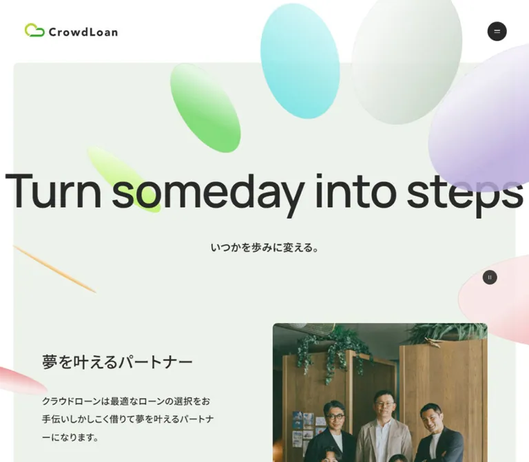
淡いセージグリーンに粒子感のあるパステルの楕円と大きな欧文見出しを重ね、金融サービスや企業情報を伝えるコーポレートサイト。
オリジナルサイトを見るCrowdLoan — Corporate Website Style Reference
Oversized charcoal lettering and translucent pastel discs bring warmth to a precise financial-services grid.
Website: corp.crowdloan.jp Original URL: https://corp.crowdloan.jp/ Final URL: https://corp.crowdloan.jp/ Theme: light, with pale sage content surfaces, green feature panels, and a charcoal footer; no theme selector was evidenced. Inspected: September 12, 2026. Supplied evidence was retrieved at 14:54:58.175 UTC / 23:54:58.175 JST. Viewports: desktop 1440 × 1000 CSS pixels; mobile 390 × 844 CSS pixels. Scope: the current corporate homepage: navigation, opening scene, introduction, AX vision, services, research articles, news, company links, recruitment, contact banner, and footer. Visual captures show selected regions; rendered DOM and computed styles cover the wider page. Destination pages and open-menu states were not inspected.
CrowdLoan combines a disciplined corporate information structure with a spacious, expressive opening. A pale sage field supports an enormous English statement, small Japanese supporting copy, and translucent elliptical forms in green, cyan, pink, orange, and lavender. Their fine grain and changing apparent thickness make the forms feel like lightweight discs suspended around the typography.
The rest of the page alternates open editorial sections with broad inset panels. Manrope provides the English display voice; Noto Sans JP carries Japanese content and navigation. Black capsules, white circular arrows, small corner radii, and generous section spacing connect the experience. The page serves multiple corporate audiences through service explanations, research, company information, careers, and contact routes.
How to Read This Reference
- Measured means a value appears directly in the supplied rendered DOM, computed styles, or custom properties. Measurements describe the captured state.
- Calculated means a value is derived from those measurements or source formulas under stated assumptions.
- Visual estimate means an appearance or dimension is read from the supplied original-page screenshots, without a corresponding element measurement.
- Recommendation means guidance for a new implementation. The Quick Start is an adaptation, not recovered source code.
- Token aliases are descriptive implementation names unless explicitly identified as source variables.
- Desktop screenshots cover the opening, the end of the service panel and beginning of the research section, and the contact/footer region. Mobile screenshots cover the opening and footer. Other component descriptions rely primarily on DOM evidence.
- Transparent text, duplicated labels, and zero-size text wrappers require care: their computed styles do not necessarily describe the visible lettering painted above them.
Tokens — Colors
Default Palette
All hexadecimal values in this table are declared source custom properties. Their visual roles are distinguished from cases where only token availability is established.
| Name | Value | Source variable | Role and evidence |
|---|---|---|---|
| Charcoal | #292929 |
--color-black-01 |
Measured body text, dark capsules, mobile menu fill, and footer background |
| Control charcoal | #3d3d3d |
--color-black-02 |
Measured circular animation-control background |
| Secondary ink | #444444 |
--color-black-03 |
Measured AX audience labels |
| Near white | #fefffc |
--color-white-01 |
Measured news-card fill and reversed text; also matches the light circular-control language |
| Pale sage | #edf3eb |
--color-white-03 |
Declared token matching the dominant captured content background |
| Soft white | #f5f9f3 |
--color-white-02 |
Available secondary surface token; its exact component assignment is not established |
| Feature green | #66cd76 |
--color-green-03 |
Measured contact-banner background; visually consistent with the broad green service panel |
| Deep green | #319528 |
--color-green-01 |
Available brand/supporting green; exact use within the logo artwork is unverified |
| Mid green | #38a92d |
--color-green-02 |
Available supporting green; small green navigation indicators are visible |
| Water cyan | #53cacd |
--color-water-01 |
Supporting decorative palette; cyan appears in the large floating forms |
| Soft cyan | #91d5d6 |
--color-water-02 |
Available lighter cyan for the same color family |
| Apricot | #f4c787 |
--color-orange-01 |
Supporting palette corresponding to the warm orange disc |
| Pink | #ffa0a0 |
--color-pink-01 |
Supporting palette corresponding to the pink forms |
| Soft pink | #ffb1b1 |
--color-pink-02 |
Available lighter pink |
The painted discs contain gradients, texture, highlights, and transparency. Their screenshot colors should not be equated with a single flat source token. The yellow-lime and lavender forms are visible, but their exact base colors were not supplied.
Supporting Neutrals and Rules
| Value | Source variable | Interpretation |
|---|---|---|
#ffffff33 |
--color-line-subtle-01 |
White at 20% opacity; suitable to the subtle divider visible in the dark footer |
#fefffc80 |
--color-line-subtle-02, --color-subtle-01 |
Near white at approximately 50% opacity; consistent with the fine rules over green |
#8e8e8e |
--color-gray-01 |
Available gray; individual use unverified |
#dddddd |
--color-gray-02 |
Available neutral |
#e8e8e8 |
--color-gray-03 |
Available neutral |
#e6ece4 |
--color-gray-04 |
Available sage-tinted neutral |
#d12a00 |
--color-red-01 |
Declared red; no corresponding visible homepage state was established |
Layering matters: the header and body samples have transparent backgrounds. The header contact link also reports a transparent background even though its captured appearance is green. Use the visible composition together with child and background-layer evidence; do not interpret one transparent wrapper as the absence of a painted surface.
Tokens — Typography
Manrope — English Display
- Source family:
"Manrope", "Noto Sans JP", sans-serifthrough--font-family-en. - Hero measurement:
Manrope, sans-serif. - Weights:
600for large English headings;700for the small AX eyebrow and audience labels;600for copyright text. - Tracking: normal for section headings;
-0.02emon the measured hero text layer. - Character: broad, clean letterforms with enough geometric weight to anchor the soft decorative scene.
These are declared and computed family names. Font-file URLs and individual loaded font resources were not supplied.
Noto Sans JP — Japanese Content and Navigation
- Source family:
"Noto Sans JP", sans-serifthrough--font-family-ja. - Body weight:
400. - Most headings, article titles, navigation labels, and capsules:
500. - Hero Japanese tagline:
600. - Body line height:
1.6at both inspected widths. - Body tracking:
0.05em, measured as0.8pxon desktop and approximately0.751pxon mobile.
The introduction and research lead use a more generous desktop line height of 2, returning to approximately 1.6 on mobile.
Type Scale
Values below are measured. Desktop and mobile line heights are shown where useful.
| Role | Desktop size / line height | Mobile size / line height | Weight |
|---|---|---|---|
| Transparent hero text layer | 124.92 / 199.87px |
33.83 / 54.13px |
600 |
| Japanese hero tagline | 27.98 / 44.77px |
19.76 / 31.61px |
600 |
| English section heading | 60 / 72px |
38.37 / 46.04px |
600 |
| Contact display heading | 70 / 84px |
40.48 / 48.58px |
600 |
| Japanese section label | 18 / 28.8px |
16.03 / 25.65px |
500 |
| Introduction / AX statement | 36 / 50.4px |
26.14 / 36.6px |
500 |
| Service title | 36 / 57.6px |
26.14 / 41.83px |
500 |
| AX audience title | 24 / 38.4px |
22.03 / 35.25px |
500 |
| Recruitment statement | 32 / 51.2px |
22.14 / 35.43px |
500 |
| Lead paragraph | 20 / 40px |
16.06 / 25.69px |
500 |
| General body | 16 / 25.6px |
15.02 / 24.04px |
400 |
| Research article title | 20 / 32px |
17.06 / 27.29px |
500 |
| News title | 16 / 25.6px |
16 / 25.6px |
500 |
| Company-row label | 24 / 38.4px |
18.09 / 28.95px |
500 |
| Capsule label | 14 / 21.7px |
14 / 21.7px |
500 |
| Footer links | 14 / 25.2px |
12.03 / 21.66px |
400 |
| Copyright | 12 / 21.6px |
12 / 21.6px |
600 |
Hero Measurement Caveat
The measured English hero paragraph has transparent text. Its size follows 8.675vw at both inspected widths, calculated from the supplied values. That relationship describes this DOM layer only.
The desktop screenshot shows a visible headline at approximately the same large scale. The mobile screenshot instead shows enormous, cropped fragments over three visual lines. Their apparent type size is roughly 140–165px, a visual estimate that is clearly incompatible with the transparent paragraph's 33.83px measurement.
The mobile Japanese tagline also has a sampled rectangle near document y = 2782px, despite belonging to the opening content in the text sequence. Its final visible placement cannot be reconstructed from that rectangle alone. Do not use these measurements to conclude that the visible mobile hero is a conventional 34px heading, or that the tagline intentionally belongs inside the AX section.
Tokens — Spacing & Shapes
Density: generous section spacing, compact utility controls, and large areas of uninterrupted color.
Root: measured 16px at both viewports.
Structure: a 12-column desktop grid, with component-specific mobile grids and stacked layouts.
Responsive Unit
The source provides --window-width, --scale, --px, and --rem, alongside fluid spacing and typography tokens.
With the observed 16px root, the source expressions simplify to:
W = viewport width expressed as a number of CSS pixels
S = max(1, W / 1440)
source --px = 1px × S
source --rem = 1rem × S
At both inspected widths, S = 1. The page therefore uses ordinary 1px and 16px base units at these widths, while individual clamp expressions provide fluid values. Above 1440px, the source scale can grow; the --max-width expression should not be interpreted as an unconditional fixed 1440px cap.
This simplification assumes the captured 16px root. The original expressions also account for the root measurement, so it should not be treated as an exact replacement under every zoom or font-size setting.
Spacing Scale
The endpoint values are source bounds. The viewport values are calculated from the supplied formulas and agree with matching measured paddings.
| Source token | Bounds | At 1440px | At 390px | Typical evidenced use |
|---|---|---|---|---|
--spacing-xs |
30–40px |
40px |
30.14px |
News-card padding and smaller section details |
--spacing-sm |
40–60px |
60px |
40.29px |
Content/action separation |
--spacing-md |
60–80px |
80px |
60.29px |
Larger internal gaps |
--spacing-lg |
80–120px |
120px |
80.58px |
Major section top padding |
--spacing-xl |
120–160px |
160px |
120.58px |
Available largest spacing token |
--grid-gutter |
20–40px |
40px |
20.29px |
Grid spacing where applied |
Not every measured gap uses a fluid token. For example, mobile service grids retain a 40px row gap, while news cards remain separated by 20px.
Border Radius
| Element | Value | Evidence |
|---|---|---|
| News cards | 10px |
Computed on desktop and mobile |
| Contact banner | 10px |
Computed on desktop and mobile |
| Opening background and service panel | Approximately 10px |
Visual estimate |
| Main capsules | Fully rounded | Source computes an oversized 159984px radius |
| Mobile menu | Circle | Measured 40 × 40px; oversized radius |
| Animation control | Circle | Measured 30 × 30px, 50% radius |
| Decorative forms | Ellipses with variable proportions | Visual observation; exact geometry unavailable |
A practical capsule alias is 9999px. Copying the enormous computed radius provides no useful additional fidelity.
Layout Measurements
| Element | Desktop | Mobile | Evidence |
|---|---|---|---|
| Header outer box | 1440 × 105px |
390 × 70px |
Measured |
| Header top padding | 25px |
10px |
Measured |
| Header inner-height token | 80px |
60px |
Calculated from source token |
| Header logo link | 192px wide, x 80px |
150px wide, x 20px |
Measured |
| Opening pale field | x 40px, y 130px, width 1360px |
x 10px, y 80px, width 370px |
Screenshot estimate |
| Standard content area | x 140px, width 1160px |
x about 20.41px, width 349.19px |
Measured |
| Inset panel content | x 140px, width 1160px |
x 30px, width 330px |
Measured service/company content |
| Service text column | 460px |
330px |
Measured |
| Service right visual area | About 560px wide |
A 330px upper slot is implied by layout |
Desktop image estimate; mobile derived |
| Standard capsule | 260 × 62px |
217.64 × 53.13px |
Measured |
| News card | 760px wide |
370px wide |
Measured |
| Contact banner | 1360 × 402.80px |
370 × 385.41px |
Measured |
| Footer | 483.75px tall |
839.08px tall |
Measured |
| Whole document | About 10124px tall |
About 11585px tall |
Reported document heights |
Desktop Grid Anatomy
The News and Recruit sections explicitly expose twelve 60px tracks with 40px gutters:
12 × 60px + 11 × 40px = 1160px
The service text column spans five tracks: 460px. The right visual occupies approximately six tracks: 560px. Their visible separation is 140px, accommodating one unused track and its adjacent gutters.
News uses a four-track heading area of 360px, a 40px gap, and an eight-track content area of 760px. These relationships are more useful than treating each section as an unrelated two-column block.
Components
Corporate Header
Role: identify the company and expose its main information routes.
On desktop, the logo sits at the left with substantial clear space before the navigation. Two text buttons, 企業情報 and 事業紹介, carry small green downward indicators. They are followed by News and Fintech AI Nexus Lab links, then a dark recruitment capsule and a green contact capsule.
The recruitment capsule measures approximately 151 × 51px; contact measures 179 × 51px. Both use 14px medium-weight labels, a 20px internal gap, and an inset light circle at the right. The recruitment marker depicts an external destination; contact uses a right arrow.
The DOM includes company and service submenu links. Their open appearance, trigger mode, focus handling, and dismissal behavior were not exercised. Hidden descendants can still appear in the supplied element inventory, so their rectangles do not establish that a dropdown was visibly open.
At 390px, desktop navigation is absent from the visible state. A 40px charcoal menu circle sits at x 330px, y 20px, opposite the 150px logo. The open mobile menu was not supplied.
The header has a translate 0.25s transition declaration. Its positioning and scroll-trigger behavior were not established by the provided interaction evidence.
Opening Scene
Role: express the corporate promise before introducing specific products.
The desktop composition places Turn someday into steps across almost the complete viewport width, extending beyond the inset pale background's content grid. The measured text layer uses 124.92px Manrope at weight 600, 1.6 line height, and negative tracking. The Japanese line いつかを歩みに変える。 is centered below it.
Large elliptical forms cross the background, text area, and outer margins. A yellow-green upright ellipse and a green disc occupy the upper center; a cyan form is heavily cropped at the right edge. Smaller orange, pink, lavender, and pale forms add diagonal movement. Keep the scene's overflow as part of its composition while containing actual document overflow.
The mobile capture preserves a similarly large decorative scale. English text appears as cropped fragments rather than a reduced desktop sentence. This is an observed state, not enough evidence to reconstruct the full animation or decide whether every word becomes readable over time.
Animation Control
Role: provide an explicit stop/resume affordance for the decorative scene.
A 30px dark circle contains a small pause symbol. Its desktop rectangle is approximately x 1334px, y 744px; the mobile rectangle is x 339px, y 593px.
The DOM contains the labels アニメーションを停止する and アニメーションを再生する. This supports the intended two-state control, but no click result was supplied. Its border and background have 0.25s transitions.
For a new implementation, keep the 30px visual circle inside a larger hit area and connect its state to every animated layer. A CSS-only paused decoration is insufficient if another animation loop continues independently.
Introduction Block
Role: connect the expressive opening to a readable explanation of the company.
The desktop text occupies a 460px column beginning at x 140px. It contains the 36px statement 夢を叶えるパートナー, a 20px lead paragraph with 40px line height, and a dark Vision capsule measuring 260 × 62px.
The first screenshot shows the top of a rounded interior photograph at x approximately 740px, y 868px, with warm wood and greenery. Only the visible crop is established; subjects outside it are not part of the evidence.
On mobile, the text column becomes about 349px wide, the statement becomes 26.14px, and the lead becomes 16.06px. The text begins below the initial viewport. Its full relationship to the mobile photograph was not visually captured.
AX Vision Sequence
Role: explain the company's AI direction for users, partners, and its team.
Start with a compact English eyebrow, AI Nexus - Our AX Vision, at 16px, weight 700. Follow it with a larger Japanese statement. Three numbered narratives then repeat the same hierarchy:
- A two-digit number and audience label:
01/for User,02/for Partner, or03/for Team. - A medium Japanese headline.
- A short explanatory paragraph.
The audience label uses 14px Manrope, weight 700, with a 10px number-to-label gap. Desktop narrative text occupies 660px; mobile text occupies the standard approximately 349px content width.
This is a tall sequence. The sampled label starts are 440px apart on desktop and approximately 695px apart on mobile. The entire section measures about 1580px and 2289px respectively. Preserve the breathing room when interpreting the layout, but do not infer pinned scenes, scroll-linked diagrams, or transition choreography from these heights alone.
Bilingual Section Heading
Role: establish consistent navigation through the long homepage.
English labels such as Service, News, Company, and Recruit use Manrope at 60px / 1.2 on desktop and 38.37px / 1.2 on mobile. A small dot precedes the English line. The measured left padding is 30px on desktop and 19.184px on mobile, both half the corresponding font size.
A Japanese label follows with a 10px gap: 18px on desktop and about 16px on mobile. The long Fintech AI Nexus Lab heading occupies two lines at 390px.
Several DOM text values contain duplicate English labels. The screenshots show a single readable heading treatment. Duplication may support a visual effect, but the effect itself is unverified. Render one semantic heading and hide any decorative duplicates from assistive technology.
Service Panel and Service Feature
Role: explain the consumer and business financing services and route visitors to their details.
A broad green panel sits inside the page margins. The captured lower portion has fine grain, rounded corners, and translucent decorative forms behind or across it. Within this panel, text aligns to the main content grid.
Each service feature combines:
- A Japanese service name at
36px, weight 500. - A 460px-wide descriptive paragraph at
16px / 1.6. - Two full-width ruled links.
- A large service diagram in the right column.
The visible Tasukari diagram uses a blue field divided into lighter and darker halves. A central smartphone connects to circular portraits of users and colored bank symbols. The pale circles, fine connecting lines, and currency/location details explain a matching network.
At 390px, the feature becomes a single-column arrangement. The service heading starts 370px below its section top: consistent with a 330px visual slot followed by the measured 40px row gap. The mobile image crop itself was not supplied, so this is a layout-derived image-first interpretation.
Ruled Service Link
Role: offer an internal explanation and a separate service-site destination without adding standalone cards.
The desktop anchor is 460 × 121px with 40px vertical padding. Thin light rules separate the rows. A label is aligned left and an approximately 40px white circle is aligned right. Internal routes use a right arrow; service-site routes use an external-link marker.
The mobile anchor becomes 330px wide and approximately 76.63px tall, with 20.29px vertical padding. Preserve the distinction between the large row target and its small visual arrow.
The observed destinations include the corporate service detail routes and the separate consumer/business service domains. An external-link symbol does not establish a new-tab policy; that behavior was not inspected.
Partner Network Insert
Role: introduce the business partnership route between the two service features.
The desktop insert places a title and paragraph in the left 460px column and a wide linked invitation in the right 560px area. The invitation combines the smaller recruitment message 提携パートナー募集中! with the main network label.
On mobile, both parts occupy a 330px column. The invitation follows the paragraph with a 40px row gap. Its measured link height is about 91px, accommodating the two-part label.
The supplied snapshot contains a partnership count qualified by a year. Treat such figures as editorial content, not permanent layout constants.
Research Article Pair
Role: give the company an editorial and research voice.
The section begins with the bilingual Fintech AI Nexus Lab heading and a generous lead paragraph. Two article anchors combine an upper visual region, date, article title, and topic labels. The supplied DOM establishes the titles and tags, but the complete article artwork was not visually supplied.
Desktop article widths are 520px, with x positions 140px and 780px: a 120px horizontal gap. Their measured top positions are staggered by approximately 120px, with the right article higher. This creates an editorial rhythm distinct from an evenly aligned card grid.
On mobile, both anchors are approximately 349px wide and stack in reading order. The gap between them is approximately 60.58px. Titles use 17.06px / 1.6, and topic labels wrap as needed. A centered dark capsule links to the article index.
News List
Role: provide current corporate updates in a highly scannable format.
Desktop uses a left heading/action column and a right stack of four near-white cards. Each card is a whole anchor, 760px wide, with 40px padding, 10px corners, and a 20px internal gap. Card-to-card spacing is 20px.
The content hierarchy is date and optional category, followed by a Japanese title at 16px, weight 500, line height 25.6px. The first title wraps and produces a taller card. Avoid fixed card heights: desktop examples range from about 148px to 174px.
Mobile cards span 370px, starting 10px from each viewport edge. Padding becomes approximately 30.14px; title size remains 16px. The longest sample becomes about 198px tall. The heading moves above the list and the index capsule moves below it.
The sampled title column leaves a trailing area inside the card. The exact trailing graphic was not included in the visual evidence; its appearance should not be invented as a measured component feature.
Company Link Rows
Role: provide direct access to company profile, financial partners, and management information.
Three rows link to 会社概要, 取引先金融機関, and 役員紹介. On desktop each row is 760px wide and about 254–255px tall, with 40px vertical padding. Its grid columns are 260px 380px 40px, separated by 40px gaps.
The central label uses 24px / 1.6. The supplied element inventory does not show the actual leading and trailing visual assets, so those columns are documented as slots rather than assigned invented imagery.
On mobile, the row remains horizontally organized within 330px. Tracks become approximately 100.63px 153.75px 35.06px, with 20.29px gaps. Labels become 18.09px; rows are approximately 161–162px tall. The section heading and company-index capsule move above and below the rows.
Recruitment Feature
Role: introduce the careers destination within the corporate narrative.
On desktop, the heading and text occupy a 460px right-hand column beginning at x 840px. The section pairs the English Recruit heading with 採用情報, then the statement 今日も、人を向いて。, a short paragraph, and a dark careers capsule.
The desktop statement uses 32px type. On mobile it becomes about 22.14px, and all text uses the standard content width. A substantial vertical region separates the section heading from the statement in the mobile DOM; its visual content was not supplied. Preserve space for the intended media without inventing a particular photograph or treatment.
Contact Banner
Role: provide a prominent final route to the contact page.
The entire green panel is one anchor. At desktop it measures 1360 × 402.80px, with 140px vertical and 100px horizontal padding. The left group contains Get in Touch at 70px / 1.2 and the Japanese label below it. A short paragraph sits to the right, followed by an approximately 80px white arrow circle.
The green surface contains fine grain. Large translucent forms remain visible around and through the composition, connecting this closing action to the opening scene. No raised shadow is visible.
At mobile width, the panel becomes 370 × 385.41px, with approximately 41.41px vertical and 30px horizontal padding. The display heading becomes 40.48px, and the paragraph occupies a 310px column beneath it. The mobile arrow's exact position and size were not supplied.
Footer
Role: close the page with complete navigation and company identity.
The footer uses a solid #292929 background and near-white content. Desktop places the 161px white logo and four social icons at the left, with three navigation groups beginning at x 540px, 840px, and 1140px.
Social icons are 20 × 20px with 20px gaps. X, Instagram, TikTok, and Facebook destinations are present in the original-page links. The footer screenshot retains a small colored detail in the TikTok mark.
Company and service group labels use 16px medium text; subordinate links use 14px regular text with comfortable vertical spacing. A thin divider separates the bottom legal strip. Privacy is left aligned; the 12px Manrope copyright line is right aligned.
Mobile preserves the 161px logo and 20px social icons. Groups stack vertically with approximately 20px left inset. Subordinate links become about 12px, while group labels remain about 15px. Privacy and copyright also stack. The resulting footer is approximately 839px tall, with substantial vertical breathing room.
Tokens — Motion & Interaction
| Treatment | Source evidence | What is established |
|---|---|---|
| General duration | --transition-duration: .25s |
Available shared timing token |
| Header translation | translate 0.25s |
Transition declaration; trigger and sticky behavior unverified |
| Logo scaling | scale 0.25s |
Declared property transition; end states unverified |
| Capsule text and border | 0.35s cubic-bezier(.455, .03, .515, .955) |
Explicit color and border-color timing; exact hover colors unverified |
| Social-icon opacity | 0.25s cubic-bezier(.33, 1, .68, 1) |
Explicit opacity transition; endpoint unverified |
| Mobile menu background | background-color 0.25s |
Declared transition; open menu not exercised |
| Animation-control surface | Border/background 0.25s |
Surface-transition timing |
| Japanese hero tagline | Opacity and transform 1.9s cubic-bezier(.19, 1, .22, 1), delay .9s |
Reveal-related declaration; full sequence not observed |
| Circular-arrow delay | --circle-delay-arrow: .25s |
Declared delay token; corresponding choreography unverified |
| Circular-color delay | --circle-delay-color: .1s |
Declared delay token; endpoint and target unverified |
| Additional easing | cubic-bezier(.23, 1, .32, 1) |
Available smooth easing token |
The floating forms and the stop/resume control establish an animated presentation intent. Static screenshots do not establish paths, speeds, rotation axes, loop length, or rendering technology. No WebGL, canvas, shader, or animation-library implementation should be asserted from this evidence alone.
Likewise, a sampled animation: none on a text wrapper does not prove that its visible counterpart is static. Animation can belong to descendants, pseudo-elements, or another rendering layer.
The collection process waited for initial rendering and finite motion and temporarily paused perpetual animations during readiness checks. These measures improve capture stability; they do not replace interaction testing. Menu opening, hover outcomes, pause/resume results, and reduced-motion behavior remain unverified.
Surfaces
| Layer | Appearance | Structural purpose |
|---|---|---|
| Header surroundings | Visually white, with transparent sampled wrappers | Keeps navigation crisp above the decorative scene |
| Main canvas | Pale sage | Connects the long page without frequent hard section boundaries |
| Feature panel | Green with fine grain and modest corners | Groups service information and emphasizes contact |
| News card | Flat near white, 10px corners |
Separates individual updates from the sage background |
| Main capsule | Charcoal, reversed label, inset white circle | Repeated section-level action |
| Contact capsule | Green, dark label, inset white circle | Header contact emphasis |
| Service row | Transparent over green, fine pale rules | Makes navigation clear without introducing another card surface |
| Footer | Full-width charcoal with a fine divider | Provides a strong visual ending and complete navigation |
There is no broad shadow-based elevation system in the supplied captures. Contrast, spacing, grain, and rounded boundaries provide most of the separation. Translucent decorative discs should not be generalized into blurred glass navigation or frosted content cards.
Imagery
The defining imagery is a field of pastel elliptical discs. They appear broad and face-on in some positions, narrow and almost edge-on in others. Highlights fade toward near white; saturated color gathers toward another edge. Fine grain softens the gradients without turning them into visibly pixelated artwork.
Keep the forms large enough to cross structural boundaries. Their scale relative to the headline and panel margins matters more than the exact position of one captured frame. Maintain intentional negative space around the Japanese reading copy and essential controls.
The service diagram adds a more explanatory visual language: a central phone, circular portraits, bank symbols, currency details, and thin network lines. Its strong blue background contrasts with the green panel while retaining round shapes already present elsewhere.
The visible introductory photograph uses warm wood and greenery. It introduces a physical, human setting, but the supplied crop does not establish every subject in the complete image. Research artwork and recruitment media were not shown in sufficient visual detail to characterize their photographic style.
Observed Asset References
Asset file URLs were not supplied. The following inventory identifies observed uses without inventing paths or filenames.
| Asset or visual | Evidence | Reuse guidance |
|---|---|---|
| Green cloud mark and dark wordmark | Desktop/mobile headers | Use an authorized logo asset; do not rebuild the wordmark as ordinary text |
| White logo variant | Desktop/mobile footers | Preserve the dedicated reversed treatment |
| Pastel discs | Opening and lower desktop captures | Preserve transparency, fine grain, variable ellipse proportions, and edge cropping |
| Interior photograph | Partial desktop introduction crop | Retain natural color and rounded presentation; full crop is unverified |
| Tasukari matching diagram | Desktop service capture | Preserve the phone-centered network and readable circular nodes |
| Consumer service diagram | Original-page descriptive text | Its purpose is established; complete visual treatment was not captured |
| Social marks | Desktop/mobile footer captures and links | Keep brand-specific shapes and accessible names |
| Direction and external-link symbols | Header, service rows, contact, footer | Preserve their differing meanings; no icon-library identity was supplied |
Use authorized source assets where available. CSS can approximate the shell and static decorative forms, but it does not recover the original motion renderer or the exact textured artwork.
Layout & Responsive Behavior
Page Sequence
The current homepage proceeds through the opening and introduction, AX vision, a combined service area, research articles, news, company links, recruitment, contact, and footer. This is a long corporate homepage with multiple destinations and audience needs.
The desktop DOM reports roughly 10124px of document height. Mobile increases to roughly 11585px. These are captured results, not target heights for implementation; content, fonts, and animation state can affect them.
Observed Reflow
| Area | Desktop behavior | Mobile behavior |
|---|---|---|
| Header | Full horizontal navigation and two capsules | Logo plus circular menu button |
| Opening | Single wide English statement | Oversized cropped text fragments across multiple visual lines |
| Main content | 1160px content region within 1440px | About 349px width for open sections |
| Inset panels | 40px outer margin, 100px internal horizontal inset | 10px outer margin, 20px inner inset for service/company content |
| Service feature | Text left, large diagram right | Single column; upper media slot inferred from measured positions |
| AX narratives | 660px text region, tall repeated sections | About 349px text region and larger vertical intervals |
| Research articles | Two 520px anchors with about 120px stagger | Single stack with about 61px between anchors |
| News | Heading left, cards right | Heading, full-width cards, then centered index action |
| Company | Heading left and three structured rows right | Heading above; rows retain internal horizontal slots |
| Recruitment | Text in right column | Heading and content occupy the standard single-column width |
| Contact | Heading, explanatory copy, and arrow across the panel | Heading and copy stack within a 310px inner width |
| Footer | Brand area plus three navigation groups | All groups stack; legal text stacks below a divider |
Breakpoint and Overflow Limits
Only 1440px and 390px viewports were supplied for original-page inspection. The exact navigation and layout breakpoints are unknown. Do not promote the Quick Start's chosen breakpoint into a source fact.
The mobile opening's visible cropping is a material characteristic of the supplied state. It should be documented rather than silently replaced in a purported pixel-exact reproduction. For a new site, a readable static heading is a reasonable accessibility adaptation; the Quick Start takes that approach explicitly.
Clip decorative overflow at the decorative layer. Preserve reachable links, focus indicators, and normal vertical document scrolling. No evidence establishes a full-screen application shell or mandatory scroll snapping for this page.
Do’s and Don’ts
Do
- Use pale sage
#edf3eb, charcoal#292929, and feature green#66cd76as the main structural colors. - Pair Manrope English display headings with Noto Sans JP Japanese reading text.
- Preserve the unusually wide desktop hero typography and its negative tracking.
- Keep the pastel discs translucent, grainy, large, and capable of crossing panel boundaries.
- Align the main desktop content to the measured 1160px grid.
- Reuse the small-dot English heading and Japanese subtitle pairing.
- Distinguish dark section capsules from ruled service links and the large green contact banner.
- Give news cards content-driven heights and keep their mobile titles at 16px.
- Preserve the research pair's stagger on desktop and straightforward reading order on mobile.
- Retain the footer's complete navigation and generous vertical space when it stacks.
- Provide a visible animation control and ensure it governs every moving layer in a new implementation.
Don’t
- Do not turn the corporate homepage into a single conversion funnel with every section repeating the same action.
- Do not replace the large green feature field with a collection of unrelated small feature cards.
- Do not introduce heavy shadows, glossy glass panels, or thick borders as a general surface system.
- Do not use the pastel accent colors indiscriminately for navigation, body text, or category badges.
- Do not make every text style bold; the measured hierarchy relies on 400, 500, 600, and occasional 700 weights.
- Do not use the transparent 33.83px mobile hero measurement as the size of the visible giant lettering.
- Do not interpret duplicate DOM labels as instructions to show duplicate headings.
- Do not infer dropdown behavior, pause outcomes, rendering technology, or animation paths from static captures.
- Do not force fixed heights on wrapped news titles or stacked mobile sections.
- Do not invent asset filenames, image subjects, production credits, or exact breakpoints absent from the original-page evidence.
Recommended Implementation Additions
These are recommendations for a new implementation, not verified features of the original:
- Give the mobile menu an accessible name,
aria-expanded, and a relationship to its controlled navigation. Define keyboard opening, Escape dismissal, and focus return. - Keep a readable semantic hero heading available without animation or specialized rendering. Mark purely decorative lettering and discs as hidden from assistive technology.
- Respect
prefers-reduced-motionwith a composed static scene. Synchronize the animation control's visible state, accessible name, and actual renderer state. - Expand the 30px pause control and 20px social icons to comfortable hit areas while preserving their visual dimensions.
- Provide visible focus indicators on full-row links, capsules, cards, and the whole contact banner.
- Keep meaningful service-diagram descriptions available. The original DOM supplies descriptive text, but its accessibility-tree exposure was not verified.
- Ensure decorative overlays never intercept pointer events or obscure essential Japanese copy.
- Treat news dates, service claims, and partnership figures as managed content rather than constants embedded in component styling.
- Use responsive image sources and reserved image dimensions. Load below-the-fold media without delaying essential opening text.
- Test intermediate widths, browser zoom, and longer Japanese titles before adopting any inferred breakpoint or fixed visual slot.
Agent Prompt Guide
Quick Color Reference
- Main background: pale sage
#edf3eb. - Text and footer: charcoal
#292929. - Green feature fields:
#66cd76with subtle fine grain. - Cards and reversed details: near white
#fefffc. - Decorative palette: cyan
#53cacd, pink#ffa0a0, and apricot#f4c787, with translucent highlights. - Supporting controls:
#3d3d3d. - Rules: low-opacity white over dark or green surfaces.
- Lavender and yellow-lime are visually present, but exact source values are unknown.
Overall Prompt
“Create a Japanese corporate website for a financial-services company using the current CrowdLoan homepage as a visual reference. Use a pale sage background, charcoal typography, broad green feature panels with fine grain, and oversized Manrope English display headings paired with Noto Sans JP Japanese content. Open with the statement ‘Turn someday into steps’ surrounded by large translucent pastel discs in varying elliptical proportions. Organize the long page around a 1160px desktop content grid, service explanations with large network diagrams, staggered research articles, near-white news cards, company link rows, recruitment, a large Get in Touch panel, and a complete dark footer. Reuse fully rounded dark capsules with inset white arrow circles. On mobile, stack content clearly and collapse navigation to a circular menu control. Include a readable static hero and reduced-motion handling as deliberate implementation additions.”
Example Component Prompts
- Header: “A white corporate header with a green cloud wordmark at left, restrained Japanese navigation, two green downward indicators, a charcoal recruitment capsule, and a green contact capsule. Each capsule ends in a white circular icon. At narrow widths, retain the logo and replace navigation with a 40px dark menu circle.”
- Opening scene: “An inset pale sage field with a very large charcoal Manrope headline spanning beyond the normal text grid. Add translucent pastel discs with fine grain, soft highlights, diagonal orientations, and deliberate edge cropping. Place a small Japanese promise beneath the desktop headline and a visible pause control at the right.”
- Service feature: “Inside a broad textured green panel, align a 460px Japanese text column left and a roughly 560px explanatory diagram right. Use a 36px medium service heading, 16px body copy, and two tall links separated by fine pale rules, each ending in a white circular arrow or external-link marker.”
- News list: “A pale sage section with a dot-prefixed English News heading and Japanese subtitle at left. At right, stack flat near-white cards with 10px corners, 40px desktop padding, compact dates, and 16px Japanese titles. On mobile, use 370px-wide cards with approximately 30px padding and place the index capsule beneath the list.”
- Contact banner: “A 1360px-wide green panel with 10px corners and fine grain. Set Get in Touch in 70px Manrope at left, add a Japanese subtitle, place a short explanation toward the right, and finish with an 80px white arrow circle. Stack the text groups on mobile. Make the full panel one accessible link.”
- Footer: “A charcoal footer with a white logo, a compact row of four social marks, and three navigation groups. Use near-white text, restrained 14px links, a thin legal divider, and wide desktop spacing. Stack groups on mobile while retaining clear gaps and a left-aligned privacy/copyright area.”
Quick Start
CSS Custom Properties
This is a usable adaptation of the measured shell and component proportions. It retains a conventional root size and uses a simpler maximum content width. It does not reproduce the source's scaling beyond 1440px, its animated hero renderer, or its untested menu behavior.
The mobile breakpoint is a recommendation. The mobile hero intentionally uses readable stacked text rather than reproducing the captured oversized fragments. Gradient stops and decorative geometry below are approximations. Fine grain requires an authorized texture assigned to --texture-grain; no asset path was supplied.
:root {
  /* Measured source colors */
  --color-paper: #edf3eb;
  --color-white: #fefffc;
  --color-ink: #292929;
  --color-control: #3d3d3d;
  --color-green: #66cd76;
  --color-green-deep: #319528;
  --color-cyan: #53cacd;
  --color-pink: #ffa0a0;
  --color-apricot: #f4c787;
  --color-line-light: #fefffc80;
  --color-line-footer: #ffffff33;

  /* Declared source font families */
  --font-ja: 'Noto Sans JP', sans-serif;
  --font-en: 'Manrope', 'Noto Sans JP', sans-serif;

  /* Source-derived sizing at a 16px root, up to 1440px */
  --text-body: clamp(15px, calc(14.656px + 0.09392vw), 16px);
  --text-service: clamp(26px, calc(22.48px + 0.9392vw), 36px);
  --text-lead: clamp(16px, calc(14.592px + 0.376vw), 20px);
  --text-label: clamp(16px, calc(15.296px + 0.1888vw), 18px);

  /* Recommended interpolation between measured display sizes */
  --text-section: clamp(38px, calc(30.334px + 2.0602vw), 60px);
  --text-contact: clamp(40px, calc(29.52px + 2.812vw), 70px);

  --space-xs: clamp(30px, calc(26.479px + 0.939vw), 40px);
  --space-sm: clamp(40px, calc(32.958px + 1.88vw), 60px);
  --space-md: clamp(60px, calc(52.958px + 1.88vw), 80px);
  --space-lg: clamp(80px, calc(65.915px + 3.76vw), 120px);
  --space-xl: clamp(120px, calc(105.915px + 3.76vw), 160px);
  --grid-gap: clamp(20px, calc(12.958px + 1.88vw), 40px);

  /* Recommended shell aliases */
  --outer: clamp(10px, calc(2.857vw - 1.143px), 40px);
  --content-width: 1160px;
  --radius-panel: 10px;
  --radius-pill: 9999px;
  --texture-grain: none;

  /* Declared source timing */
  --duration-ui: 250ms;
  --duration-pill: 350ms;
  --ease-out: cubic-bezier(.33, 1, .68, 1);
  --ease-quad: cubic-bezier(.455, .03, .515, .955);
}

* { box-sizing: border-box; }

body {
  margin: 0;
  color: var(--color-ink);
  background: var(--color-paper);
  font-family: var(--font-ja);
  font-size: var(--text-body);
  line-height: 1.6;
  letter-spacing: .05em;
}

img { display: block; max-width: 100%; }
button { font: inherit; }
a { color: inherit; }

.container {
  width: min(var(--content-width), calc(100% - 2 * var(--grid-gap)));
  margin-inline: auto;
}

.section { padding-block-start: var(--space-lg); }

.section-heading {
  position: relative;
  margin: 0;
  padding-inline-start: .5em;
  font: 600 var(--text-section) / 1.2 var(--font-en);
  letter-spacing: normal;
}

.section-heading::before {
  content: '';
  position: absolute;
  inset-inline-start: 0;
  inset-block-start: .48em;
  width: .12em;
  aspect-ratio: 1;
  border-radius: 50%;
  background: currentColor;
}

.section-label {
  margin: 10px 0 0;
  font-size: var(--text-label);
  font-weight: 500;
  line-height: 1.6;
}

/* Header structure; opening behavior requires separate JavaScript. */
.site-header {
  position: absolute;
  z-index: 20;
  inset: 0 0 auto;
  padding: 25px var(--outer) 0;
}

.site-header__inner {
  display: flex;
  align-items: center;
  min-height: 80px;
  padding-inline: 40px;
  gap: 30px;
}

.site-brand { flex: 0 0 192px; }
.site-brand img { width: 100%; }

.site-nav {
  display: flex;
  align-items: center;
  gap: 30px;
  margin-inline-start: auto;
  font-size: 15px;
  font-weight: 500;
}

.site-nav a { text-decoration: none; }
.menu-toggle { display: none; }

/* Shared action anatomy */
.circle {
  display: inline-grid;
  flex: 0 0 auto;
  place-items: center;
  width: 40px;
  aspect-ratio: 1;
  border-radius: 50%;
  color: var(--color-ink);
  background: var(--color-white);
  line-height: 1;
  letter-spacing: normal;
}

.pill {
  display: inline-flex;
  align-items: center;
  justify-content: space-between;
  width: 260px;
  max-width: 100%;
  min-height: 62px;
  gap: 15px;
  padding: 10px 10px 10px 25px;
  border: 1px solid transparent;
  border-radius: var(--radius-pill);
  color: var(--color-white);
  background: var(--color-ink);
  font-size: 14px;
  font-weight: 500;
  line-height: 1.55;
  text-decoration: none;
  transition:
    color var(--duration-pill) var(--ease-quad),
    background-color var(--duration-pill) var(--ease-quad),
    border-color var(--duration-pill) var(--ease-quad);
}

.pill--compact {
  width: auto;
  min-height: 51px;
  gap: 20px;
  padding-block: 7px;
}

.pill--compact .circle { width: 35px; }
.pill--green { color: var(--color-ink); background: var(--color-green); }

/* Static opening approximation */
.opening {
  position: relative;
  isolation: isolate;
  padding-block-start: 130px;
  background: var(--color-white);
}

.opening::before {
  content: '';
  position: absolute;
  z-index: -1;
  inset: 130px var(--outer) 0;
  border-radius: var(--radius-panel);
  background: var(--color-paper);
}

.hero {
  position: relative;
  min-height: 738px;
  padding-block-start: 280px;
  text-align: center;
}

.hero__title {
  position: relative;
  z-index: 2;
  margin: 0;
  font: 600 min(8.675vw, 124.92px) / 1.6 var(--font-en);
  letter-spacing: -.02em;
  white-space: nowrap;
}

.hero__tagline {
  position: relative;
  z-index: 2;
  margin: 32px 0 0;
  font-size: clamp(20px, 1.943vw, 28px);
  font-weight: 600;
}

.hero__decoration {
  position: absolute;
  z-index: 3;
  inset: -110px 0 0;
  overflow: clip;
  pointer-events: none;
}

.orb {
  position: absolute;
  width: var(--orb-width, 240px);
  height: var(--orb-height, 340px);
  border-radius: 50%;
  background: linear-gradient(145deg, #fefffccc, var(--orb-color));
  border: 1px solid color-mix(in srgb, var(--orb-color) 40%, transparent);
  opacity: .82;
  rotate: var(--orb-angle, 15deg);
}

.orb--green {
  --orb-color: var(--color-green);
  inset: 0 auto auto 58%;
}

.orb--cyan {
  --orb-color: var(--color-cyan);
  --orb-width: 430px;
  --orb-height: 300px;
  --orb-angle: -45deg;
  inset: 110px -70px auto auto;
}

.orb--pink {
  --orb-color: var(--color-pink);
  --orb-width: 230px;
  --orb-height: 70px;
  --orb-angle: 35deg;
  inset: 510px auto auto 12%;
}

.motion-toggle {
  position: absolute;
  z-index: 5;
  inset: auto max(20px, 5.3vw) 90px auto;
  display: grid;
  place-items: center;
  width: 44px;
  height: 44px;
  padding: 0;
  border: 0;
  background: transparent;
  cursor: pointer;
}

.motion-toggle__disc {
  display: grid;
  place-items: center;
  width: 30px;
  height: 30px;
  border-radius: 50%;
  color: var(--color-white);
  background: var(--color-control);
}

/* Texture is optional until an authorized local asset is assigned. */
.textured { position: relative; isolation: isolate; }
.textured > * { position: relative; z-index: 1; }
.textured::after {
  content: '';
  position: absolute;
  z-index: 0;
  inset: 0;
  border-radius: inherit;
  background-image: var(--texture-grain);
  opacity: .16;
  pointer-events: none;
}

.panel {
  margin-inline: var(--outer);
  padding: var(--space-lg) max(20px, calc((100vw - 1240px) / 2));
  border-radius: var(--radius-panel);
  background: var(--color-green);
}

.service-feature {
  display: grid;
  grid-template-columns: minmax(0, 460fr) minmax(0, 560fr);
  column-gap: clamp(40px, 9.722vw, 140px);
  row-gap: 40px;
  align-items: start;
  margin-block-start: var(--space-md);
}

.service-copy h3 {
  margin: 0 0 var(--grid-gap);
  font-size: var(--text-service);
  font-weight: 500;
  line-height: 1.6;
}

.service-copy p { margin: 0; }
.service-media { margin: 0; min-width: 0; }
.service-media img { width: 100%; border-radius: 10px; }
.service-links { margin-block-start: var(--space-sm); }

.ruled-link {
  display: flex;
  align-items: center;
  justify-content: space-between;
  gap: 20px;
  min-height: 121px;
  padding-block: 40px;
  border-block-start: 1px solid var(--color-line-light);
  font-weight: 500;
  text-decoration: none;
}

.ruled-link:last-child { border-block-end: 1px solid var(--color-line-light); }

/* Desktop research stagger */
.article-grid {
  display: grid;
  grid-template-columns: repeat(2, minmax(0, 1fr));
  gap: 120px;
  margin-block-start: 60px;
  align-items: start;
}

.article-card { display: block; min-width: 0; text-decoration: none; }
.article-card:first-child { margin-block-start: 120px; }
.article-card__title { font-size: 20px; font-weight: 500; line-height: 1.6; }

.news-layout {
  display: grid;
  grid-template-columns: minmax(0, 360fr) minmax(0, 760fr);
  gap: 40px;
}

.news-list { display: grid; gap: 20px; }
.news-card {
  display: grid;
  gap: 20px;
  padding: var(--space-xs);
  border-radius: var(--radius-panel);
  background: var(--color-white);
  text-decoration: none;
}

.news-card__title { margin: 0; font-size: 16px; font-weight: 500; line-height: 1.6; }

.contact {
  display: grid;
  grid-template-columns: minmax(0, 1fr) minmax(0, 423px) 80px;
  align-items: center;
  gap: 77px;
  margin: var(--space-lg) var(--outer) 40px;
  padding: 140px 100px;
  border-radius: var(--radius-panel);
  background: var(--color-green);
  text-decoration: none;
}

.contact__title {
  margin: 0;
  font: 600 var(--text-contact) / 1.2 var(--font-en);
  letter-spacing: normal;
}

.contact__copy { margin: 0; }
.contact > .circle { width: 80px; font-size: 28px; }

.site-footer { color: var(--color-white); background: var(--color-ink); }
.footer-main {
  display: grid;
  grid-template-columns: minmax(0, 460fr) repeat(3, minmax(0, 260fr));
  gap: 40px;
  padding: 120px var(--outer);
}

.footer-logo { width: 161px; }
.footer-social { display: flex; gap: 20px; margin-block-start: 45px; }
.footer-social img { width: 20px; height: 20px; }
.footer-group h3 { margin: 0 0 18px; font-size: 16px; font-weight: 500; }
.footer-group ul { display: grid; gap: 6px; margin: 0; padding: 0; list-style: none; }
.footer-group a { display: inline-block; padding-block: 2px; font-size: 14px; line-height: 1.8; text-decoration: none; }

.footer-legal {
  display: flex;
  align-items: center;
  justify-content: space-between;
  gap: 20px;
  padding: 40px var(--outer);
  border-block-start: 1px solid var(--color-line-footer);
  font-size: 12px;
}

.footer-legal p { margin: 0; font-family: var(--font-en); font-weight: 600; letter-spacing: normal; }

/* Recommended interaction feedback; original endpoints were not inspected. */
a:focus-visible,
button:focus-visible {
  outline: 3px solid currentColor;
  outline-offset: 5px;
}

@media (hover: hover) {
  .pill:not(.pill--green):hover {
    color: var(--color-ink);
    background: var(--color-green);
  }
  .footer-group a:hover { text-decoration: underline; text-underline-offset: 4px; }
}

/* Recommended breakpoint, not an extracted source breakpoint. */
@media (max-width: 64em) {
  .site-header { padding: 10px 10px 0; }
  .site-header__inner { min-height: 60px; padding-inline: 10px; }
  .site-brand { flex-basis: 150px; }
  .site-nav { display: none; }
  .menu-toggle {
    display: grid;
    place-items: center;
    width: 40px;
    height: 40px;
    margin-inline-start: auto;
    padding: 0;
    border: 0;
    border-radius: 50%;
    color: var(--color-white);
    background: var(--color-ink);
  }

  .opening { padding-block-start: 80px; }
  .opening::before { inset-block-start: 80px; }
  .hero { min-height: 720px; padding: 120px 20px 80px; }

  /* Readable static mobile adaptation using three phrase spans. */
  .hero__title { font-size: clamp(48px, 12vw, 72px); line-height: 1.08; white-space: normal; }
  .hero__title span { display: block; }
  .hero__decoration { z-index: 1; opacity: .55; }
  .hero__tagline { margin-block-start: 36px; }

  .panel { padding-inline: 20px; }
  .service-feature { grid-template-columns: minmax(0, 1fr); }
  .service-media { order: -1; }
  .ruled-link { min-height: 77px; padding-block: var(--grid-gap); }
  .ruled-link .circle { width: 35px; }

  .pill:not(.pill--compact) { width: 218px; min-height: 53px; padding-block: 8px; }
  .pill:not(.pill--compact) .circle { width: 35px; }
  .pill--wide { width: fit-content !important; }

  .article-grid { grid-template-columns: 1fr; gap: var(--space-md); }
  .article-card:first-child { margin-block-start: 0; }
  .article-card__title { font-size: 17px; }
  .news-layout { grid-template-columns: 1fr; }

  .contact {
    grid-template-columns: minmax(0, 1fr);
    gap: 32px;
    margin-block-end: 20px;
    padding: 42px 30px;
  }
  .contact > .circle { width: 48px; justify-self: end; font-size: 22px; }

  .footer-main { grid-template-columns: 1fr; gap: 28px; padding: var(--space-lg) var(--grid-gap); }
  .footer-brand { margin-block-end: 32px; }
  .footer-social { margin-block-start: 30px; }
  .footer-group h3 { font-size: 15px; }
  .footer-group a { font-size: 12px; }
  .footer-legal { align-items: flex-start; flex-direction: column; padding-inline: var(--grid-gap); }
}

/* Also disable any non-CSS rendering loop in application code. */
@media (prefers-reduced-motion: reduce) {
  .orb,
  .hero__title,
  .hero__tagline {
    animation: none !important;
    transition: none !important;
  }
}
The pause button requires application logic; the CSS intentionally does not invent a decorative animation timeline. Keep a static scene until that control can actually stop and resume the chosen renderer.
A minimal action example using the classes above:
<a class='pill' href='https://corp.crowdloan.jp/company/vision/'>
  <span>Vision</span>
  <span class='circle' aria-hidden='true'>→</span>
</a>

<a class='contact textured' href='https://corp.crowdloan.jp/contact/'>
  <div class='contact__heading'>
    <h2 class='contact__title'>Get in Touch</h2>
    <p class='section-label' lang='ja'>お問い合わせ</p>
  </div>
  <p class='contact__copy' lang='ja'>
    サービスに関するご質問やご相談のお問い合わせください。
    内容を確認のうえ、担当よりご連絡させていただきます。
  </p>
  <span class='circle' aria-hidden='true'>→</span>
</a>
Tailwind v4 Token Mapping
Optional aliases for an implementation that already uses Tailwind v4. This is not evidence that the original site uses Tailwind. Define the custom properties above first.
@theme inline {
  --color-paper: #edf3eb;
  --color-ink: #292929;
  --color-near-white: #fefffc;
  --color-feature-green: #66cd76;
  --color-water: #53cacd;
  --color-soft-pink: #ffa0a0;
  --color-apricot: #f4c787;

  --font-japanese: 'Noto Sans JP', sans-serif;
  --font-display: 'Manrope', 'Noto Sans JP', sans-serif;

  --text-copy: var(--text-body);
  --text-display-section: var(--text-section);
  --text-display-contact: var(--text-contact);
  --text-service-title: var(--text-service);

  --spacing-page-edge: var(--outer);
  --spacing-grid: var(--grid-gap);
  --spacing-section: var(--space-lg);
  --container-content: 1160px;
  --radius-panel: 10px;
  --radius-capsule: 9999px;
}
Sources & Evidence
- CrowdLoan corporate homepage: both the requested and final URL. The supplied observation reports HTTP 200 with no redirect.
- Inspection date: September 12, 2026; evidence retrieval timestamp
2026-09-12T14:54:58.175Z. Separate timestamps for individual screenshots were not supplied. - Desktop: 1440 × 1000 CSS pixels. Three original-page captures cover the opening, service-to-research transition, and contact/footer area. The rendered DOM reports approximately 10124px document height.
- Mobile: 390 × 844 CSS pixels. Two original-page captures cover the opening and footer. The rendered DOM reports approximately 11585px document height.
- Style evidence: supplied computed element rectangles, font families, font sizes, weights, line heights, letter spacing, padding, grid columns, radii, transition declarations, and CSS custom properties. These support the measured tables and layout calculations.
- Interaction evidence: visible navigation affordances, original-page link destinations, and stop/resume labels. No supplied click sequence establishes menu opening, hover endpoints, animation-control results, or contact-form behavior.
- Capture limitations: readiness checks included initial observation, layout/text stability, image decoding, and waiting for finite motion. Perpetual animations were temporarily paused during readiness checks and resumed. These checks do not establish delayed-content completeness or a complete animation sequence. SharedWorkers and service workers were disabled during inspection.
- Analysis scope: only the supplied original-page screenshots and rendered evidence were used. No additional browsing or file access was performed. Asset URLs, exact responsive breakpoints, complete animation implementation, and destination-page designs remain unverified.
This reference describes the current homepage represented by the supplied September 12, 2026 evidence. Visual estimates and implementation recommendations are separated from measured source values throughout.
# CrowdLoan — Corporate Website Style Reference

> Oversized charcoal lettering and translucent pastel discs bring warmth to a precise financial-services grid.

**Website:** [corp.crowdloan.jp](https://corp.crowdloan.jp/)
**Original URL:** https://corp.crowdloan.jp/
**Final URL:** https://corp.crowdloan.jp/
**Theme:** light, with pale sage content surfaces, green feature panels, and a charcoal footer; no theme selector was evidenced.
**Inspected:** September 12, 2026. Supplied evidence was retrieved at 14:54:58.175 UTC / 23:54:58.175 JST.
**Viewports:** desktop 1440 × 1000 CSS pixels; mobile 390 × 844 CSS pixels.
**Scope:** the current corporate homepage: navigation, opening scene, introduction, AX vision, services, research articles, news, company links, recruitment, contact banner, and footer. Visual captures show selected regions; rendered DOM and computed styles cover the wider page. Destination pages and open-menu states were not inspected.

CrowdLoan combines a disciplined corporate information structure with a spacious, expressive opening. A pale sage field supports an enormous English statement, small Japanese supporting copy, and translucent elliptical forms in green, cyan, pink, orange, and lavender. Their fine grain and changing apparent thickness make the forms feel like lightweight discs suspended around the typography.

The rest of the page alternates open editorial sections with broad inset panels. Manrope provides the English display voice; Noto Sans JP carries Japanese content and navigation. Black capsules, white circular arrows, small corner radii, and generous section spacing connect the experience. The page serves multiple corporate audiences through service explanations, research, company information, careers, and contact routes.

## How to Read This Reference

- **Measured** means a value appears directly in the supplied rendered DOM, computed styles, or custom properties. Measurements describe the captured state.
- **Calculated** means a value is derived from those measurements or source formulas under stated assumptions.
- **Visual estimate** means an appearance or dimension is read from the supplied original-page screenshots, without a corresponding element measurement.
- **Recommendation** means guidance for a new implementation. The Quick Start is an adaptation, not recovered source code.
- **Token aliases** are descriptive implementation names unless explicitly identified as source variables.
- Desktop screenshots cover the opening, the end of the service panel and beginning of the research section, and the contact/footer region. Mobile screenshots cover the opening and footer. Other component descriptions rely primarily on DOM evidence.
- Transparent text, duplicated labels, and zero-size text wrappers require care: their computed styles do not necessarily describe the visible lettering painted above them.

## Tokens — Colors

### Default Palette

All hexadecimal values in this table are declared source custom properties. Their visual roles are distinguished from cases where only token availability is established.

| Name | Value | Source variable | Role and evidence |
| --- | --- | --- | --- |
| Charcoal | `#292929` | `--color-black-01` | Measured body text, dark capsules, mobile menu fill, and footer background |
| Control charcoal | `#3d3d3d` | `--color-black-02` | Measured circular animation-control background |
| Secondary ink | `#444444` | `--color-black-03` | Measured AX audience labels |
| Near white | `#fefffc` | `--color-white-01` | Measured news-card fill and reversed text; also matches the light circular-control language |
| Pale sage | `#edf3eb` | `--color-white-03` | Declared token matching the dominant captured content background |
| Soft white | `#f5f9f3` | `--color-white-02` | Available secondary surface token; its exact component assignment is not established |
| Feature green | `#66cd76` | `--color-green-03` | Measured contact-banner background; visually consistent with the broad green service panel |
| Deep green | `#319528` | `--color-green-01` | Available brand/supporting green; exact use within the logo artwork is unverified |
| Mid green | `#38a92d` | `--color-green-02` | Available supporting green; small green navigation indicators are visible |
| Water cyan | `#53cacd` | `--color-water-01` | Supporting decorative palette; cyan appears in the large floating forms |
| Soft cyan | `#91d5d6` | `--color-water-02` | Available lighter cyan for the same color family |
| Apricot | `#f4c787` | `--color-orange-01` | Supporting palette corresponding to the warm orange disc |
| Pink | `#ffa0a0` | `--color-pink-01` | Supporting palette corresponding to the pink forms |
| Soft pink | `#ffb1b1` | `--color-pink-02` | Available lighter pink |

The painted discs contain gradients, texture, highlights, and transparency. Their screenshot colors should not be equated with a single flat source token. The yellow-lime and lavender forms are visible, but their exact base colors were not supplied.

### Supporting Neutrals and Rules

| Value | Source variable | Interpretation |
| --- | --- | --- |
| `#ffffff33` | `--color-line-subtle-01` | White at 20% opacity; suitable to the subtle divider visible in the dark footer |
| `#fefffc80` | `--color-line-subtle-02`, `--color-subtle-01` | Near white at approximately 50% opacity; consistent with the fine rules over green |
| `#8e8e8e` | `--color-gray-01` | Available gray; individual use unverified |
| `#dddddd` | `--color-gray-02` | Available neutral |
| `#e8e8e8` | `--color-gray-03` | Available neutral |
| `#e6ece4` | `--color-gray-04` | Available sage-tinted neutral |
| `#d12a00` | `--color-red-01` | Declared red; no corresponding visible homepage state was established |

**Layering matters:** the header and body samples have transparent backgrounds. The header contact link also reports a transparent background even though its captured appearance is green. Use the visible composition together with child and background-layer evidence; do not interpret one transparent wrapper as the absence of a painted surface.

## Tokens — Typography

### Manrope — English Display

- **Source family:** `"Manrope", "Noto Sans JP", sans-serif` through `--font-family-en`.
- **Hero measurement:** `Manrope, sans-serif`.
- **Weights:** `600` for large English headings; `700` for the small AX eyebrow and audience labels; `600` for copyright text.
- **Tracking:** normal for section headings; `-0.02em` on the measured hero text layer.
- **Character:** broad, clean letterforms with enough geometric weight to anchor the soft decorative scene.

These are declared and computed family names. Font-file URLs and individual loaded font resources were not supplied.

### Noto Sans JP — Japanese Content and Navigation

- **Source family:** `"Noto Sans JP", sans-serif` through `--font-family-ja`.
- **Body weight:** `400`.
- **Most headings, article titles, navigation labels, and capsules:** `500`.
- **Hero Japanese tagline:** `600`.
- **Body line height:** `1.6` at both inspected widths.
- **Body tracking:** `0.05em`, measured as `0.8px` on desktop and approximately `0.751px` on mobile.

The introduction and research lead use a more generous desktop line height of `2`, returning to approximately `1.6` on mobile.

### Type Scale

Values below are measured. Desktop and mobile line heights are shown where useful.

| Role | Desktop size / line height | Mobile size / line height | Weight |
| --- | --- | --- | --- |
| Transparent hero text layer | `124.92 / 199.87px` | `33.83 / 54.13px` | `600` |
| Japanese hero tagline | `27.98 / 44.77px` | `19.76 / 31.61px` | `600` |
| English section heading | `60 / 72px` | `38.37 / 46.04px` | `600` |
| Contact display heading | `70 / 84px` | `40.48 / 48.58px` | `600` |
| Japanese section label | `18 / 28.8px` | `16.03 / 25.65px` | `500` |
| Introduction / AX statement | `36 / 50.4px` | `26.14 / 36.6px` | `500` |
| Service title | `36 / 57.6px` | `26.14 / 41.83px` | `500` |
| AX audience title | `24 / 38.4px` | `22.03 / 35.25px` | `500` |
| Recruitment statement | `32 / 51.2px` | `22.14 / 35.43px` | `500` |
| Lead paragraph | `20 / 40px` | `16.06 / 25.69px` | `500` |
| General body | `16 / 25.6px` | `15.02 / 24.04px` | `400` |
| Research article title | `20 / 32px` | `17.06 / 27.29px` | `500` |
| News title | `16 / 25.6px` | `16 / 25.6px` | `500` |
| Company-row label | `24 / 38.4px` | `18.09 / 28.95px` | `500` |
| Capsule label | `14 / 21.7px` | `14 / 21.7px` | `500` |
| Footer links | `14 / 25.2px` | `12.03 / 21.66px` | `400` |
| Copyright | `12 / 21.6px` | `12 / 21.6px` | `600` |

### Hero Measurement Caveat

The measured English hero paragraph has transparent text. Its size follows `8.675vw` at both inspected widths, calculated from the supplied values. That relationship describes this DOM layer only.

The desktop screenshot shows a visible headline at approximately the same large scale. The mobile screenshot instead shows enormous, cropped fragments over three visual lines. Their apparent type size is roughly `140–165px`, a visual estimate that is clearly incompatible with the transparent paragraph's `33.83px` measurement.

The mobile Japanese tagline also has a sampled rectangle near document `y = 2782px`, despite belonging to the opening content in the text sequence. Its final visible placement cannot be reconstructed from that rectangle alone. Do not use these measurements to conclude that the visible mobile hero is a conventional 34px heading, or that the tagline intentionally belongs inside the AX section.

## Tokens — Spacing & Shapes

**Density:** generous section spacing, compact utility controls, and large areas of uninterrupted color.
**Root:** measured `16px` at both viewports.
**Structure:** a 12-column desktop grid, with component-specific mobile grids and stacked layouts.

### Responsive Unit

The source provides `--window-width`, `--scale`, `--px`, and `--rem`, alongside fluid spacing and typography tokens.

With the observed 16px root, the source expressions simplify to:

```text
W = viewport width expressed as a number of CSS pixels
S = max(1, W / 1440)
source --px = 1px × S
source --rem = 1rem × S
```

At both inspected widths, `S = 1`. The page therefore uses ordinary 1px and 16px base units at these widths, while individual clamp expressions provide fluid values. Above 1440px, the source scale can grow; the `--max-width` expression should not be interpreted as an unconditional fixed 1440px cap.

This simplification assumes the captured 16px root. The original expressions also account for the root measurement, so it should not be treated as an exact replacement under every zoom or font-size setting.

### Spacing Scale

The endpoint values are source bounds. The viewport values are calculated from the supplied formulas and agree with matching measured paddings.

| Source token | Bounds | At 1440px | At 390px | Typical evidenced use |
| --- | --- | --- | --- | --- |
| `--spacing-xs` | `30–40px` | `40px` | `30.14px` | News-card padding and smaller section details |
| `--spacing-sm` | `40–60px` | `60px` | `40.29px` | Content/action separation |
| `--spacing-md` | `60–80px` | `80px` | `60.29px` | Larger internal gaps |
| `--spacing-lg` | `80–120px` | `120px` | `80.58px` | Major section top padding |
| `--spacing-xl` | `120–160px` | `160px` | `120.58px` | Available largest spacing token |
| `--grid-gutter` | `20–40px` | `40px` | `20.29px` | Grid spacing where applied |

Not every measured gap uses a fluid token. For example, mobile service grids retain a `40px` row gap, while news cards remain separated by `20px`.

### Border Radius

| Element | Value | Evidence |
| --- | --- | --- |
| News cards | `10px` | Computed on desktop and mobile |
| Contact banner | `10px` | Computed on desktop and mobile |
| Opening background and service panel | Approximately `10px` | Visual estimate |
| Main capsules | Fully rounded | Source computes an oversized `159984px` radius |
| Mobile menu | Circle | Measured `40 × 40px`; oversized radius |
| Animation control | Circle | Measured `30 × 30px`, `50%` radius |
| Decorative forms | Ellipses with variable proportions | Visual observation; exact geometry unavailable |

A practical capsule alias is `9999px`. Copying the enormous computed radius provides no useful additional fidelity.

### Layout Measurements

| Element | Desktop | Mobile | Evidence |
| --- | --- | --- | --- |
| Header outer box | `1440 × 105px` | `390 × 70px` | Measured |
| Header top padding | `25px` | `10px` | Measured |
| Header inner-height token | `80px` | `60px` | Calculated from source token |
| Header logo link | `192px` wide, x `80px` | `150px` wide, x `20px` | Measured |
| Opening pale field | x `40px`, y `130px`, width `1360px` | x `10px`, y `80px`, width `370px` | Screenshot estimate |
| Standard content area | x `140px`, width `1160px` | x about `20.41px`, width `349.19px` | Measured |
| Inset panel content | x `140px`, width `1160px` | x `30px`, width `330px` | Measured service/company content |
| Service text column | `460px` | `330px` | Measured |
| Service right visual area | About `560px` wide | A `330px` upper slot is implied by layout | Desktop image estimate; mobile derived |
| Standard capsule | `260 × 62px` | `217.64 × 53.13px` | Measured |
| News card | `760px` wide | `370px` wide | Measured |
| Contact banner | `1360 × 402.80px` | `370 × 385.41px` | Measured |
| Footer | `483.75px` tall | `839.08px` tall | Measured |
| Whole document | About `10124px` tall | About `11585px` tall | Reported document heights |

### Desktop Grid Anatomy

The News and Recruit sections explicitly expose twelve `60px` tracks with `40px` gutters:

```text
12 × 60px + 11 × 40px = 1160px
```

The service text column spans five tracks: `460px`. The right visual occupies approximately six tracks: `560px`. Their visible separation is `140px`, accommodating one unused track and its adjacent gutters.

News uses a four-track heading area of `360px`, a `40px` gap, and an eight-track content area of `760px`. These relationships are more useful than treating each section as an unrelated two-column block.

## Components

### Corporate Header

**Role:** identify the company and expose its main information routes.

On desktop, the logo sits at the left with substantial clear space before the navigation. Two text buttons, `企業情報` and `事業紹介`, carry small green downward indicators. They are followed by News and Fintech AI Nexus Lab links, then a dark recruitment capsule and a green contact capsule.

The recruitment capsule measures approximately `151 × 51px`; contact measures `179 × 51px`. Both use 14px medium-weight labels, a 20px internal gap, and an inset light circle at the right. The recruitment marker depicts an external destination; contact uses a right arrow.

The DOM includes company and service submenu links. Their open appearance, trigger mode, focus handling, and dismissal behavior were not exercised. Hidden descendants can still appear in the supplied element inventory, so their rectangles do not establish that a dropdown was visibly open.

At 390px, desktop navigation is absent from the visible state. A `40px` charcoal menu circle sits at x `330px`, y `20px`, opposite the 150px logo. The open mobile menu was not supplied.

The header has a `translate 0.25s` transition declaration. Its positioning and scroll-trigger behavior were not established by the provided interaction evidence.

### Opening Scene

**Role:** express the corporate promise before introducing specific products.

The desktop composition places `Turn someday into steps` across almost the complete viewport width, extending beyond the inset pale background's content grid. The measured text layer uses `124.92px` Manrope at weight 600, `1.6` line height, and negative tracking. The Japanese line `いつかを歩みに変える。` is centered below it.

Large elliptical forms cross the background, text area, and outer margins. A yellow-green upright ellipse and a green disc occupy the upper center; a cyan form is heavily cropped at the right edge. Smaller orange, pink, lavender, and pale forms add diagonal movement. Keep the scene's overflow as part of its composition while containing actual document overflow.

The mobile capture preserves a similarly large decorative scale. English text appears as cropped fragments rather than a reduced desktop sentence. This is an observed state, not enough evidence to reconstruct the full animation or decide whether every word becomes readable over time.

### Animation Control

**Role:** provide an explicit stop/resume affordance for the decorative scene.

A `30px` dark circle contains a small pause symbol. Its desktop rectangle is approximately x `1334px`, y `744px`; the mobile rectangle is x `339px`, y `593px`.

The DOM contains the labels `アニメーションを停止する` and `アニメーションを再生する`. This supports the intended two-state control, but no click result was supplied. Its border and background have `0.25s` transitions.

For a new implementation, keep the 30px visual circle inside a larger hit area and connect its state to every animated layer. A CSS-only paused decoration is insufficient if another animation loop continues independently.

### Introduction Block

**Role:** connect the expressive opening to a readable explanation of the company.

The desktop text occupies a `460px` column beginning at x `140px`. It contains the 36px statement `夢を叶えるパートナー`, a 20px lead paragraph with 40px line height, and a dark `Vision` capsule measuring `260 × 62px`.

The first screenshot shows the top of a rounded interior photograph at x approximately `740px`, y `868px`, with warm wood and greenery. Only the visible crop is established; subjects outside it are not part of the evidence.

On mobile, the text column becomes about `349px` wide, the statement becomes `26.14px`, and the lead becomes `16.06px`. The text begins below the initial viewport. Its full relationship to the mobile photograph was not visually captured.

### AX Vision Sequence

**Role:** explain the company's AI direction for users, partners, and its team.

Start with a compact English eyebrow, `AI Nexus - Our AX Vision`, at `16px`, weight 700. Follow it with a larger Japanese statement. Three numbered narratives then repeat the same hierarchy:

1. A two-digit number and audience label: `01` / `for User`, `02` / `for Partner`, or `03` / `for Team`.
2. A medium Japanese headline.
3. A short explanatory paragraph.

The audience label uses 14px Manrope, weight 700, with a 10px number-to-label gap. Desktop narrative text occupies `660px`; mobile text occupies the standard approximately `349px` content width.

This is a tall sequence. The sampled label starts are `440px` apart on desktop and approximately `695px` apart on mobile. The entire section measures about `1580px` and `2289px` respectively. Preserve the breathing room when interpreting the layout, but do not infer pinned scenes, scroll-linked diagrams, or transition choreography from these heights alone.

### Bilingual Section Heading

**Role:** establish consistent navigation through the long homepage.

English labels such as Service, News, Company, and Recruit use Manrope at `60px / 1.2` on desktop and `38.37px / 1.2` on mobile. A small dot precedes the English line. The measured left padding is `30px` on desktop and `19.184px` on mobile, both half the corresponding font size.

A Japanese label follows with a 10px gap: `18px` on desktop and about `16px` on mobile. The long Fintech AI Nexus Lab heading occupies two lines at 390px.

Several DOM text values contain duplicate English labels. The screenshots show a single readable heading treatment. Duplication may support a visual effect, but the effect itself is unverified. Render one semantic heading and hide any decorative duplicates from assistive technology.

### Service Panel and Service Feature

**Role:** explain the consumer and business financing services and route visitors to their details.

A broad green panel sits inside the page margins. The captured lower portion has fine grain, rounded corners, and translucent decorative forms behind or across it. Within this panel, text aligns to the main content grid.

Each service feature combines:

- A Japanese service name at `36px`, weight 500.
- A 460px-wide descriptive paragraph at `16px / 1.6`.
- Two full-width ruled links.
- A large service diagram in the right column.

The visible Tasukari diagram uses a blue field divided into lighter and darker halves. A central smartphone connects to circular portraits of users and colored bank symbols. The pale circles, fine connecting lines, and currency/location details explain a matching network.

At 390px, the feature becomes a single-column arrangement. The service heading starts `370px` below its section top: consistent with a 330px visual slot followed by the measured 40px row gap. The mobile image crop itself was not supplied, so this is a layout-derived image-first interpretation.

### Ruled Service Link

**Role:** offer an internal explanation and a separate service-site destination without adding standalone cards.

The desktop anchor is `460 × 121px` with `40px` vertical padding. Thin light rules separate the rows. A label is aligned left and an approximately 40px white circle is aligned right. Internal routes use a right arrow; service-site routes use an external-link marker.

The mobile anchor becomes `330px` wide and approximately `76.63px` tall, with `20.29px` vertical padding. Preserve the distinction between the large row target and its small visual arrow.

The observed destinations include the corporate service detail routes and the separate consumer/business service domains. An external-link symbol does not establish a new-tab policy; that behavior was not inspected.

### Partner Network Insert

**Role:** introduce the business partnership route between the two service features.

The desktop insert places a title and paragraph in the left `460px` column and a wide linked invitation in the right `560px` area. The invitation combines the smaller recruitment message `提携パートナー募集中!` with the main network label.

On mobile, both parts occupy a `330px` column. The invitation follows the paragraph with a `40px` row gap. Its measured link height is about `91px`, accommodating the two-part label.

The supplied snapshot contains a partnership count qualified by a year. Treat such figures as editorial content, not permanent layout constants.

### Research Article Pair

**Role:** give the company an editorial and research voice.

The section begins with the bilingual Fintech AI Nexus Lab heading and a generous lead paragraph. Two article anchors combine an upper visual region, date, article title, and topic labels. The supplied DOM establishes the titles and tags, but the complete article artwork was not visually supplied.

Desktop article widths are `520px`, with x positions `140px` and `780px`: a `120px` horizontal gap. Their measured top positions are staggered by approximately `120px`, with the right article higher. This creates an editorial rhythm distinct from an evenly aligned card grid.

On mobile, both anchors are approximately `349px` wide and stack in reading order. The gap between them is approximately `60.58px`. Titles use `17.06px / 1.6`, and topic labels wrap as needed. A centered dark capsule links to the article index.

### News List

**Role:** provide current corporate updates in a highly scannable format.

Desktop uses a left heading/action column and a right stack of four near-white cards. Each card is a whole anchor, `760px` wide, with `40px` padding, `10px` corners, and a `20px` internal gap. Card-to-card spacing is `20px`.

The content hierarchy is date and optional category, followed by a Japanese title at `16px`, weight 500, line height `25.6px`. The first title wraps and produces a taller card. Avoid fixed card heights: desktop examples range from about `148px` to `174px`.

Mobile cards span `370px`, starting 10px from each viewport edge. Padding becomes approximately `30.14px`; title size remains 16px. The longest sample becomes about `198px` tall. The heading moves above the list and the index capsule moves below it.

The sampled title column leaves a trailing area inside the card. The exact trailing graphic was not included in the visual evidence; its appearance should not be invented as a measured component feature.

### Company Link Rows

**Role:** provide direct access to company profile, financial partners, and management information.

Three rows link to `会社概要`, `取引先金融機関`, and `役員紹介`. On desktop each row is `760px` wide and about `254–255px` tall, with `40px` vertical padding. Its grid columns are `260px 380px 40px`, separated by `40px` gaps.

The central label uses `24px / 1.6`. The supplied element inventory does not show the actual leading and trailing visual assets, so those columns are documented as slots rather than assigned invented imagery.

On mobile, the row remains horizontally organized within `330px`. Tracks become approximately `100.63px 153.75px 35.06px`, with `20.29px` gaps. Labels become `18.09px`; rows are approximately `161–162px` tall. The section heading and company-index capsule move above and below the rows.

### Recruitment Feature

**Role:** introduce the careers destination within the corporate narrative.

On desktop, the heading and text occupy a `460px` right-hand column beginning at x `840px`. The section pairs the English Recruit heading with `採用情報`, then the statement `今日も、人を向いて。`, a short paragraph, and a dark careers capsule.

The desktop statement uses 32px type. On mobile it becomes about 22.14px, and all text uses the standard content width. A substantial vertical region separates the section heading from the statement in the mobile DOM; its visual content was not supplied. Preserve space for the intended media without inventing a particular photograph or treatment.

### Contact Banner

**Role:** provide a prominent final route to the contact page.

The entire green panel is one anchor. At desktop it measures `1360 × 402.80px`, with `140px` vertical and `100px` horizontal padding. The left group contains `Get in Touch` at `70px / 1.2` and the Japanese label below it. A short paragraph sits to the right, followed by an approximately 80px white arrow circle.

The green surface contains fine grain. Large translucent forms remain visible around and through the composition, connecting this closing action to the opening scene. No raised shadow is visible.

At mobile width, the panel becomes `370 × 385.41px`, with approximately `41.41px` vertical and `30px` horizontal padding. The display heading becomes `40.48px`, and the paragraph occupies a 310px column beneath it. The mobile arrow's exact position and size were not supplied.

### Footer

**Role:** close the page with complete navigation and company identity.

The footer uses a solid `#292929` background and near-white content. Desktop places the 161px white logo and four social icons at the left, with three navigation groups beginning at x `540px`, `840px`, and `1140px`.

Social icons are `20 × 20px` with `20px` gaps. X, Instagram, TikTok, and Facebook destinations are present in the original-page links. The footer screenshot retains a small colored detail in the TikTok mark.

Company and service group labels use 16px medium text; subordinate links use 14px regular text with comfortable vertical spacing. A thin divider separates the bottom legal strip. Privacy is left aligned; the 12px Manrope copyright line is right aligned.

Mobile preserves the 161px logo and 20px social icons. Groups stack vertically with approximately 20px left inset. Subordinate links become about 12px, while group labels remain about 15px. Privacy and copyright also stack. The resulting footer is approximately 839px tall, with substantial vertical breathing room.

## Tokens — Motion & Interaction

| Treatment | Source evidence | What is established |
| --- | --- | --- |
| General duration | `--transition-duration: .25s` | Available shared timing token |
| Header translation | `translate 0.25s` | Transition declaration; trigger and sticky behavior unverified |
| Logo scaling | `scale 0.25s` | Declared property transition; end states unverified |
| Capsule text and border | `0.35s cubic-bezier(.455, .03, .515, .955)` | Explicit color and border-color timing; exact hover colors unverified |
| Social-icon opacity | `0.25s cubic-bezier(.33, 1, .68, 1)` | Explicit opacity transition; endpoint unverified |
| Mobile menu background | `background-color 0.25s` | Declared transition; open menu not exercised |
| Animation-control surface | Border/background `0.25s` | Surface-transition timing |
| Japanese hero tagline | Opacity and transform `1.9s cubic-bezier(.19, 1, .22, 1)`, delay `.9s` | Reveal-related declaration; full sequence not observed |
| Circular-arrow delay | `--circle-delay-arrow: .25s` | Declared delay token; corresponding choreography unverified |
| Circular-color delay | `--circle-delay-color: .1s` | Declared delay token; endpoint and target unverified |
| Additional easing | `cubic-bezier(.23, 1, .32, 1)` | Available smooth easing token |

The floating forms and the stop/resume control establish an animated presentation intent. Static screenshots do not establish paths, speeds, rotation axes, loop length, or rendering technology. No WebGL, canvas, shader, or animation-library implementation should be asserted from this evidence alone.

Likewise, a sampled `animation: none` on a text wrapper does not prove that its visible counterpart is static. Animation can belong to descendants, pseudo-elements, or another rendering layer.

The collection process waited for initial rendering and finite motion and temporarily paused perpetual animations during readiness checks. These measures improve capture stability; they do not replace interaction testing. Menu opening, hover outcomes, pause/resume results, and reduced-motion behavior remain unverified.

## Surfaces

| Layer | Appearance | Structural purpose |
| --- | --- | --- |
| Header surroundings | Visually white, with transparent sampled wrappers | Keeps navigation crisp above the decorative scene |
| Main canvas | Pale sage | Connects the long page without frequent hard section boundaries |
| Feature panel | Green with fine grain and modest corners | Groups service information and emphasizes contact |
| News card | Flat near white, `10px` corners | Separates individual updates from the sage background |
| Main capsule | Charcoal, reversed label, inset white circle | Repeated section-level action |
| Contact capsule | Green, dark label, inset white circle | Header contact emphasis |
| Service row | Transparent over green, fine pale rules | Makes navigation clear without introducing another card surface |
| Footer | Full-width charcoal with a fine divider | Provides a strong visual ending and complete navigation |

There is no broad shadow-based elevation system in the supplied captures. Contrast, spacing, grain, and rounded boundaries provide most of the separation. Translucent decorative discs should not be generalized into blurred glass navigation or frosted content cards.

## Imagery

The defining imagery is a field of pastel elliptical discs. They appear broad and face-on in some positions, narrow and almost edge-on in others. Highlights fade toward near white; saturated color gathers toward another edge. Fine grain softens the gradients without turning them into visibly pixelated artwork.

Keep the forms large enough to cross structural boundaries. Their scale relative to the headline and panel margins matters more than the exact position of one captured frame. Maintain intentional negative space around the Japanese reading copy and essential controls.

The service diagram adds a more explanatory visual language: a central phone, circular portraits, bank symbols, currency details, and thin network lines. Its strong blue background contrasts with the green panel while retaining round shapes already present elsewhere.

The visible introductory photograph uses warm wood and greenery. It introduces a physical, human setting, but the supplied crop does not establish every subject in the complete image. Research artwork and recruitment media were not shown in sufficient visual detail to characterize their photographic style.

### Observed Asset References

Asset file URLs were not supplied. The following inventory identifies observed uses without inventing paths or filenames.

| Asset or visual | Evidence | Reuse guidance |
| --- | --- | --- |
| Green cloud mark and dark wordmark | Desktop/mobile headers | Use an authorized logo asset; do not rebuild the wordmark as ordinary text |
| White logo variant | Desktop/mobile footers | Preserve the dedicated reversed treatment |
| Pastel discs | Opening and lower desktop captures | Preserve transparency, fine grain, variable ellipse proportions, and edge cropping |
| Interior photograph | Partial desktop introduction crop | Retain natural color and rounded presentation; full crop is unverified |
| Tasukari matching diagram | Desktop service capture | Preserve the phone-centered network and readable circular nodes |
| Consumer service diagram | Original-page descriptive text | Its purpose is established; complete visual treatment was not captured |
| Social marks | Desktop/mobile footer captures and links | Keep brand-specific shapes and accessible names |
| Direction and external-link symbols | Header, service rows, contact, footer | Preserve their differing meanings; no icon-library identity was supplied |

Use authorized source assets where available. CSS can approximate the shell and static decorative forms, but it does not recover the original motion renderer or the exact textured artwork.

## Layout & Responsive Behavior

### Page Sequence

The current homepage proceeds through the opening and introduction, AX vision, a combined service area, research articles, news, company links, recruitment, contact, and footer. This is a long corporate homepage with multiple destinations and audience needs.

The desktop DOM reports roughly 10124px of document height. Mobile increases to roughly 11585px. These are captured results, not target heights for implementation; content, fonts, and animation state can affect them.

### Observed Reflow

| Area | Desktop behavior | Mobile behavior |
| --- | --- | --- |
| Header | Full horizontal navigation and two capsules | Logo plus circular menu button |
| Opening | Single wide English statement | Oversized cropped text fragments across multiple visual lines |
| Main content | 1160px content region within 1440px | About 349px width for open sections |
| Inset panels | 40px outer margin, 100px internal horizontal inset | 10px outer margin, 20px inner inset for service/company content |
| Service feature | Text left, large diagram right | Single column; upper media slot inferred from measured positions |
| AX narratives | 660px text region, tall repeated sections | About 349px text region and larger vertical intervals |
| Research articles | Two 520px anchors with about 120px stagger | Single stack with about 61px between anchors |
| News | Heading left, cards right | Heading, full-width cards, then centered index action |
| Company | Heading left and three structured rows right | Heading above; rows retain internal horizontal slots |
| Recruitment | Text in right column | Heading and content occupy the standard single-column width |
| Contact | Heading, explanatory copy, and arrow across the panel | Heading and copy stack within a 310px inner width |
| Footer | Brand area plus three navigation groups | All groups stack; legal text stacks below a divider |

### Breakpoint and Overflow Limits

Only 1440px and 390px viewports were supplied for original-page inspection. The exact navigation and layout breakpoints are unknown. Do not promote the Quick Start's chosen breakpoint into a source fact.

The mobile opening's visible cropping is a material characteristic of the supplied state. It should be documented rather than silently replaced in a purported pixel-exact reproduction. For a new site, a readable static heading is a reasonable accessibility adaptation; the Quick Start takes that approach explicitly.

Clip decorative overflow at the decorative layer. Preserve reachable links, focus indicators, and normal vertical document scrolling. No evidence establishes a full-screen application shell or mandatory scroll snapping for this page.

## Do’s and Don’ts

### Do

- Use pale sage `#edf3eb`, charcoal `#292929`, and feature green `#66cd76` as the main structural colors.
- Pair Manrope English display headings with Noto Sans JP Japanese reading text.
- Preserve the unusually wide desktop hero typography and its negative tracking.
- Keep the pastel discs translucent, grainy, large, and capable of crossing panel boundaries.
- Align the main desktop content to the measured 1160px grid.
- Reuse the small-dot English heading and Japanese subtitle pairing.
- Distinguish dark section capsules from ruled service links and the large green contact banner.
- Give news cards content-driven heights and keep their mobile titles at 16px.
- Preserve the research pair's stagger on desktop and straightforward reading order on mobile.
- Retain the footer's complete navigation and generous vertical space when it stacks.
- Provide a visible animation control and ensure it governs every moving layer in a new implementation.

### Don’t

- Do not turn the corporate homepage into a single conversion funnel with every section repeating the same action.
- Do not replace the large green feature field with a collection of unrelated small feature cards.
- Do not introduce heavy shadows, glossy glass panels, or thick borders as a general surface system.
- Do not use the pastel accent colors indiscriminately for navigation, body text, or category badges.
- Do not make every text style bold; the measured hierarchy relies on 400, 500, 600, and occasional 700 weights.
- Do not use the transparent 33.83px mobile hero measurement as the size of the visible giant lettering.
- Do not interpret duplicate DOM labels as instructions to show duplicate headings.
- Do not infer dropdown behavior, pause outcomes, rendering technology, or animation paths from static captures.
- Do not force fixed heights on wrapped news titles or stacked mobile sections.
- Do not invent asset filenames, image subjects, production credits, or exact breakpoints absent from the original-page evidence.

## Recommended Implementation Additions

These are recommendations for a new implementation, not verified features of the original:

- Give the mobile menu an accessible name, `aria-expanded`, and a relationship to its controlled navigation. Define keyboard opening, Escape dismissal, and focus return.
- Keep a readable semantic hero heading available without animation or specialized rendering. Mark purely decorative lettering and discs as hidden from assistive technology.
- Respect `prefers-reduced-motion` with a composed static scene. Synchronize the animation control's visible state, accessible name, and actual renderer state.
- Expand the 30px pause control and 20px social icons to comfortable hit areas while preserving their visual dimensions.
- Provide visible focus indicators on full-row links, capsules, cards, and the whole contact banner.
- Keep meaningful service-diagram descriptions available. The original DOM supplies descriptive text, but its accessibility-tree exposure was not verified.
- Ensure decorative overlays never intercept pointer events or obscure essential Japanese copy.
- Treat news dates, service claims, and partnership figures as managed content rather than constants embedded in component styling.
- Use responsive image sources and reserved image dimensions. Load below-the-fold media without delaying essential opening text.
- Test intermediate widths, browser zoom, and longer Japanese titles before adopting any inferred breakpoint or fixed visual slot.

## Agent Prompt Guide

### Quick Color Reference

- Main background: pale sage `#edf3eb`.
- Text and footer: charcoal `#292929`.
- Green feature fields: `#66cd76` with subtle fine grain.
- Cards and reversed details: near white `#fefffc`.
- Decorative palette: cyan `#53cacd`, pink `#ffa0a0`, and apricot `#f4c787`, with translucent highlights.
- Supporting controls: `#3d3d3d`.
- Rules: low-opacity white over dark or green surfaces.
- Lavender and yellow-lime are visually present, but exact source values are unknown.

### Overall Prompt

“Create a Japanese corporate website for a financial-services company using the current CrowdLoan homepage as a visual reference. Use a pale sage background, charcoal typography, broad green feature panels with fine grain, and oversized Manrope English display headings paired with Noto Sans JP Japanese content. Open with the statement ‘Turn someday into steps’ surrounded by large translucent pastel discs in varying elliptical proportions. Organize the long page around a 1160px desktop content grid, service explanations with large network diagrams, staggered research articles, near-white news cards, company link rows, recruitment, a large Get in Touch panel, and a complete dark footer. Reuse fully rounded dark capsules with inset white arrow circles. On mobile, stack content clearly and collapse navigation to a circular menu control. Include a readable static hero and reduced-motion handling as deliberate implementation additions.”

### Example Component Prompts

1. **Header:** “A white corporate header with a green cloud wordmark at left, restrained Japanese navigation, two green downward indicators, a charcoal recruitment capsule, and a green contact capsule. Each capsule ends in a white circular icon. At narrow widths, retain the logo and replace navigation with a 40px dark menu circle.”
2. **Opening scene:** “An inset pale sage field with a very large charcoal Manrope headline spanning beyond the normal text grid. Add translucent pastel discs with fine grain, soft highlights, diagonal orientations, and deliberate edge cropping. Place a small Japanese promise beneath the desktop headline and a visible pause control at the right.”
3. **Service feature:** “Inside a broad textured green panel, align a 460px Japanese text column left and a roughly 560px explanatory diagram right. Use a 36px medium service heading, 16px body copy, and two tall links separated by fine pale rules, each ending in a white circular arrow or external-link marker.”
4. **News list:** “A pale sage section with a dot-prefixed English News heading and Japanese subtitle at left. At right, stack flat near-white cards with 10px corners, 40px desktop padding, compact dates, and 16px Japanese titles. On mobile, use 370px-wide cards with approximately 30px padding and place the index capsule beneath the list.”
5. **Contact banner:** “A 1360px-wide green panel with 10px corners and fine grain. Set Get in Touch in 70px Manrope at left, add a Japanese subtitle, place a short explanation toward the right, and finish with an 80px white arrow circle. Stack the text groups on mobile. Make the full panel one accessible link.”
6. **Footer:** “A charcoal footer with a white logo, a compact row of four social marks, and three navigation groups. Use near-white text, restrained 14px links, a thin legal divider, and wide desktop spacing. Stack groups on mobile while retaining clear gaps and a left-aligned privacy/copyright area.”

## Quick Start

### CSS Custom Properties

This is a usable adaptation of the measured shell and component proportions. It retains a conventional root size and uses a simpler maximum content width. It does not reproduce the source's scaling beyond 1440px, its animated hero renderer, or its untested menu behavior.

The mobile breakpoint is a recommendation. The mobile hero intentionally uses readable stacked text rather than reproducing the captured oversized fragments. Gradient stops and decorative geometry below are approximations. Fine grain requires an authorized texture assigned to `--texture-grain`; no asset path was supplied.

```css
:root {
  /* Measured source colors */
  --color-paper: #edf3eb;
  --color-white: #fefffc;
  --color-ink: #292929;
  --color-control: #3d3d3d;
  --color-green: #66cd76;
  --color-green-deep: #319528;
  --color-cyan: #53cacd;
  --color-pink: #ffa0a0;
  --color-apricot: #f4c787;
  --color-line-light: #fefffc80;
  --color-line-footer: #ffffff33;

  /* Declared source font families */
  --font-ja: 'Noto Sans JP', sans-serif;
  --font-en: 'Manrope', 'Noto Sans JP', sans-serif;

  /* Source-derived sizing at a 16px root, up to 1440px */
  --text-body: clamp(15px, calc(14.656px + 0.09392vw), 16px);
  --text-service: clamp(26px, calc(22.48px + 0.9392vw), 36px);
  --text-lead: clamp(16px, calc(14.592px + 0.376vw), 20px);
  --text-label: clamp(16px, calc(15.296px + 0.1888vw), 18px);

  /* Recommended interpolation between measured display sizes */
  --text-section: clamp(38px, calc(30.334px + 2.0602vw), 60px);
  --text-contact: clamp(40px, calc(29.52px + 2.812vw), 70px);

  --space-xs: clamp(30px, calc(26.479px + 0.939vw), 40px);
  --space-sm: clamp(40px, calc(32.958px + 1.88vw), 60px);
  --space-md: clamp(60px, calc(52.958px + 1.88vw), 80px);
  --space-lg: clamp(80px, calc(65.915px + 3.76vw), 120px);
  --space-xl: clamp(120px, calc(105.915px + 3.76vw), 160px);
  --grid-gap: clamp(20px, calc(12.958px + 1.88vw), 40px);

  /* Recommended shell aliases */
  --outer: clamp(10px, calc(2.857vw - 1.143px), 40px);
  --content-width: 1160px;
  --radius-panel: 10px;
  --radius-pill: 9999px;
  --texture-grain: none;

  /* Declared source timing */
  --duration-ui: 250ms;
  --duration-pill: 350ms;
  --ease-out: cubic-bezier(.33, 1, .68, 1);
  --ease-quad: cubic-bezier(.455, .03, .515, .955);
}

* { box-sizing: border-box; }

body {
  margin: 0;
  color: var(--color-ink);
  background: var(--color-paper);
  font-family: var(--font-ja);
  font-size: var(--text-body);
  line-height: 1.6;
  letter-spacing: .05em;
}

img { display: block; max-width: 100%; }
button { font: inherit; }
a { color: inherit; }

.container {
  width: min(var(--content-width), calc(100% - 2 * var(--grid-gap)));
  margin-inline: auto;
}

.section { padding-block-start: var(--space-lg); }

.section-heading {
  position: relative;
  margin: 0;
  padding-inline-start: .5em;
  font: 600 var(--text-section) / 1.2 var(--font-en);
  letter-spacing: normal;
}

.section-heading::before {
  content: '';
  position: absolute;
  inset-inline-start: 0;
  inset-block-start: .48em;
  width: .12em;
  aspect-ratio: 1;
  border-radius: 50%;
  background: currentColor;
}

.section-label {
  margin: 10px 0 0;
  font-size: var(--text-label);
  font-weight: 500;
  line-height: 1.6;
}

/* Header structure; opening behavior requires separate JavaScript. */
.site-header {
  position: absolute;
  z-index: 20;
  inset: 0 0 auto;
  padding: 25px var(--outer) 0;
}

.site-header__inner {
  display: flex;
  align-items: center;
  min-height: 80px;
  padding-inline: 40px;
  gap: 30px;
}

.site-brand { flex: 0 0 192px; }
.site-brand img { width: 100%; }

.site-nav {
  display: flex;
  align-items: center;
  gap: 30px;
  margin-inline-start: auto;
  font-size: 15px;
  font-weight: 500;
}

.site-nav a { text-decoration: none; }
.menu-toggle { display: none; }

/* Shared action anatomy */
.circle {
  display: inline-grid;
  flex: 0 0 auto;
  place-items: center;
  width: 40px;
  aspect-ratio: 1;
  border-radius: 50%;
  color: var(--color-ink);
  background: var(--color-white);
  line-height: 1;
  letter-spacing: normal;
}

.pill {
  display: inline-flex;
  align-items: center;
  justify-content: space-between;
  width: 260px;
  max-width: 100%;
  min-height: 62px;
  gap: 15px;
  padding: 10px 10px 10px 25px;
  border: 1px solid transparent;
  border-radius: var(--radius-pill);
  color: var(--color-white);
  background: var(--color-ink);
  font-size: 14px;
  font-weight: 500;
  line-height: 1.55;
  text-decoration: none;
  transition:
    color var(--duration-pill) var(--ease-quad),
    background-color var(--duration-pill) var(--ease-quad),
    border-color var(--duration-pill) var(--ease-quad);
}

.pill--compact {
  width: auto;
  min-height: 51px;
  gap: 20px;
  padding-block: 7px;
}

.pill--compact .circle { width: 35px; }
.pill--green { color: var(--color-ink); background: var(--color-green); }

/* Static opening approximation */
.opening {
  position: relative;
  isolation: isolate;
  padding-block-start: 130px;
  background: var(--color-white);
}

.opening::before {
  content: '';
  position: absolute;
  z-index: -1;
  inset: 130px var(--outer) 0;
  border-radius: var(--radius-panel);
  background: var(--color-paper);
}

.hero {
  position: relative;
  min-height: 738px;
  padding-block-start: 280px;
  text-align: center;
}

.hero__title {
  position: relative;
  z-index: 2;
  margin: 0;
  font: 600 min(8.675vw, 124.92px) / 1.6 var(--font-en);
  letter-spacing: -.02em;
  white-space: nowrap;
}

.hero__tagline {
  position: relative;
  z-index: 2;
  margin: 32px 0 0;
  font-size: clamp(20px, 1.943vw, 28px);
  font-weight: 600;
}

.hero__decoration {
  position: absolute;
  z-index: 3;
  inset: -110px 0 0;
  overflow: clip;
  pointer-events: none;
}

.orb {
  position: absolute;
  width: var(--orb-width, 240px);
  height: var(--orb-height, 340px);
  border-radius: 50%;
  background: linear-gradient(145deg, #fefffccc, var(--orb-color));
  border: 1px solid color-mix(in srgb, var(--orb-color) 40%, transparent);
  opacity: .82;
  rotate: var(--orb-angle, 15deg);
}

.orb--green {
  --orb-color: var(--color-green);
  inset: 0 auto auto 58%;
}

.orb--cyan {
  --orb-color: var(--color-cyan);
  --orb-width: 430px;
  --orb-height: 300px;
  --orb-angle: -45deg;
  inset: 110px -70px auto auto;
}

.orb--pink {
  --orb-color: var(--color-pink);
  --orb-width: 230px;
  --orb-height: 70px;
  --orb-angle: 35deg;
  inset: 510px auto auto 12%;
}

.motion-toggle {
  position: absolute;
  z-index: 5;
  inset: auto max(20px, 5.3vw) 90px auto;
  display: grid;
  place-items: center;
  width: 44px;
  height: 44px;
  padding: 0;
  border: 0;
  background: transparent;
  cursor: pointer;
}

.motion-toggle__disc {
  display: grid;
  place-items: center;
  width: 30px;
  height: 30px;
  border-radius: 50%;
  color: var(--color-white);
  background: var(--color-control);
}

/* Texture is optional until an authorized local asset is assigned. */
.textured { position: relative; isolation: isolate; }
.textured > * { position: relative; z-index: 1; }
.textured::after {
  content: '';
  position: absolute;
  z-index: 0;
  inset: 0;
  border-radius: inherit;
  background-image: var(--texture-grain);
  opacity: .16;
  pointer-events: none;
}

.panel {
  margin-inline: var(--outer);
  padding: var(--space-lg) max(20px, calc((100vw - 1240px) / 2));
  border-radius: var(--radius-panel);
  background: var(--color-green);
}

.service-feature {
  display: grid;
  grid-template-columns: minmax(0, 460fr) minmax(0, 560fr);
  column-gap: clamp(40px, 9.722vw, 140px);
  row-gap: 40px;
  align-items: start;
  margin-block-start: var(--space-md);
}

.service-copy h3 {
  margin: 0 0 var(--grid-gap);
  font-size: var(--text-service);
  font-weight: 500;
  line-height: 1.6;
}

.service-copy p { margin: 0; }
.service-media { margin: 0; min-width: 0; }
.service-media img { width: 100%; border-radius: 10px; }
.service-links { margin-block-start: var(--space-sm); }

.ruled-link {
  display: flex;
  align-items: center;
  justify-content: space-between;
  gap: 20px;
  min-height: 121px;
  padding-block: 40px;
  border-block-start: 1px solid var(--color-line-light);
  font-weight: 500;
  text-decoration: none;
}

.ruled-link:last-child { border-block-end: 1px solid var(--color-line-light); }

/* Desktop research stagger */
.article-grid {
  display: grid;
  grid-template-columns: repeat(2, minmax(0, 1fr));
  gap: 120px;
  margin-block-start: 60px;
  align-items: start;
}

.article-card { display: block; min-width: 0; text-decoration: none; }
.article-card:first-child { margin-block-start: 120px; }
.article-card__title { font-size: 20px; font-weight: 500; line-height: 1.6; }

.news-layout {
  display: grid;
  grid-template-columns: minmax(0, 360fr) minmax(0, 760fr);
  gap: 40px;
}

.news-list { display: grid; gap: 20px; }
.news-card {
  display: grid;
  gap: 20px;
  padding: var(--space-xs);
  border-radius: var(--radius-panel);
  background: var(--color-white);
  text-decoration: none;
}

.news-card__title { margin: 0; font-size: 16px; font-weight: 500; line-height: 1.6; }

.contact {
  display: grid;
  grid-template-columns: minmax(0, 1fr) minmax(0, 423px) 80px;
  align-items: center;
  gap: 77px;
  margin: var(--space-lg) var(--outer) 40px;
  padding: 140px 100px;
  border-radius: var(--radius-panel);
  background: var(--color-green);
  text-decoration: none;
}

.contact__title {
  margin: 0;
  font: 600 var(--text-contact) / 1.2 var(--font-en);
  letter-spacing: normal;
}

.contact__copy { margin: 0; }
.contact > .circle { width: 80px; font-size: 28px; }

.site-footer { color: var(--color-white); background: var(--color-ink); }
.footer-main {
  display: grid;
  grid-template-columns: minmax(0, 460fr) repeat(3, minmax(0, 260fr));
  gap: 40px;
  padding: 120px var(--outer);
}

.footer-logo { width: 161px; }
.footer-social { display: flex; gap: 20px; margin-block-start: 45px; }
.footer-social img { width: 20px; height: 20px; }
.footer-group h3 { margin: 0 0 18px; font-size: 16px; font-weight: 500; }
.footer-group ul { display: grid; gap: 6px; margin: 0; padding: 0; list-style: none; }
.footer-group a { display: inline-block; padding-block: 2px; font-size: 14px; line-height: 1.8; text-decoration: none; }

.footer-legal {
  display: flex;
  align-items: center;
  justify-content: space-between;
  gap: 20px;
  padding: 40px var(--outer);
  border-block-start: 1px solid var(--color-line-footer);
  font-size: 12px;
}

.footer-legal p { margin: 0; font-family: var(--font-en); font-weight: 600; letter-spacing: normal; }

/* Recommended interaction feedback; original endpoints were not inspected. */
a:focus-visible,
button:focus-visible {
  outline: 3px solid currentColor;
  outline-offset: 5px;
}

@media (hover: hover) {
  .pill:not(.pill--green):hover {
    color: var(--color-ink);
    background: var(--color-green);
  }
  .footer-group a:hover { text-decoration: underline; text-underline-offset: 4px; }
}

/* Recommended breakpoint, not an extracted source breakpoint. */
@media (max-width: 64em) {
  .site-header { padding: 10px 10px 0; }
  .site-header__inner { min-height: 60px; padding-inline: 10px; }
  .site-brand { flex-basis: 150px; }
  .site-nav { display: none; }
  .menu-toggle {
    display: grid;
    place-items: center;
    width: 40px;
    height: 40px;
    margin-inline-start: auto;
    padding: 0;
    border: 0;
    border-radius: 50%;
    color: var(--color-white);
    background: var(--color-ink);
  }

  .opening { padding-block-start: 80px; }
  .opening::before { inset-block-start: 80px; }
  .hero { min-height: 720px; padding: 120px 20px 80px; }

  /* Readable static mobile adaptation using three phrase spans. */
  .hero__title { font-size: clamp(48px, 12vw, 72px); line-height: 1.08; white-space: normal; }
  .hero__title span { display: block; }
  .hero__decoration { z-index: 1; opacity: .55; }
  .hero__tagline { margin-block-start: 36px; }

  .panel { padding-inline: 20px; }
  .service-feature { grid-template-columns: minmax(0, 1fr); }
  .service-media { order: -1; }
  .ruled-link { min-height: 77px; padding-block: var(--grid-gap); }
  .ruled-link .circle { width: 35px; }

  .pill:not(.pill--compact) { width: 218px; min-height: 53px; padding-block: 8px; }
  .pill:not(.pill--compact) .circle { width: 35px; }
  .pill--wide { width: fit-content !important; }

  .article-grid { grid-template-columns: 1fr; gap: var(--space-md); }
  .article-card:first-child { margin-block-start: 0; }
  .article-card__title { font-size: 17px; }
  .news-layout { grid-template-columns: 1fr; }

  .contact {
    grid-template-columns: minmax(0, 1fr);
    gap: 32px;
    margin-block-end: 20px;
    padding: 42px 30px;
  }
  .contact > .circle { width: 48px; justify-self: end; font-size: 22px; }

  .footer-main { grid-template-columns: 1fr; gap: 28px; padding: var(--space-lg) var(--grid-gap); }
  .footer-brand { margin-block-end: 32px; }
  .footer-social { margin-block-start: 30px; }
  .footer-group h3 { font-size: 15px; }
  .footer-group a { font-size: 12px; }
  .footer-legal { align-items: flex-start; flex-direction: column; padding-inline: var(--grid-gap); }
}

/* Also disable any non-CSS rendering loop in application code. */
@media (prefers-reduced-motion: reduce) {
  .orb,
  .hero__title,
  .hero__tagline {
    animation: none !important;
    transition: none !important;
  }
}
```

The pause button requires application logic; the CSS intentionally does not invent a decorative animation timeline. Keep a static scene until that control can actually stop and resume the chosen renderer.

A minimal action example using the classes above:

```html
<a class='pill' href='https://corp.crowdloan.jp/company/vision/'>
  <span>Vision</span>
  <span class='circle' aria-hidden='true'>→</span>
</a>

<a class='contact textured' href='https://corp.crowdloan.jp/contact/'>
  <div class='contact__heading'>
    <h2 class='contact__title'>Get in Touch</h2>
    <p class='section-label' lang='ja'>お問い合わせ</p>
  </div>
  <p class='contact__copy' lang='ja'>
    サービスに関するご質問やご相談のお問い合わせください。
    内容を確認のうえ、担当よりご連絡させていただきます。
  </p>
  <span class='circle' aria-hidden='true'>→</span>
</a>
```

### Tailwind v4 Token Mapping

Optional aliases for an implementation that already uses Tailwind v4. This is not evidence that the original site uses Tailwind. Define the custom properties above first.

```css
@theme inline {
  --color-paper: #edf3eb;
  --color-ink: #292929;
  --color-near-white: #fefffc;
  --color-feature-green: #66cd76;
  --color-water: #53cacd;
  --color-soft-pink: #ffa0a0;
  --color-apricot: #f4c787;

  --font-japanese: 'Noto Sans JP', sans-serif;
  --font-display: 'Manrope', 'Noto Sans JP', sans-serif;

  --text-copy: var(--text-body);
  --text-display-section: var(--text-section);
  --text-display-contact: var(--text-contact);
  --text-service-title: var(--text-service);

  --spacing-page-edge: var(--outer);
  --spacing-grid: var(--grid-gap);
  --spacing-section: var(--space-lg);
  --container-content: 1160px;
  --radius-panel: 10px;
  --radius-capsule: 9999px;
}
```

## Sources & Evidence

- [CrowdLoan corporate homepage](https://corp.crowdloan.jp/): both the requested and final URL. The supplied observation reports HTTP 200 with no redirect.
- **Inspection date:** September 12, 2026; evidence retrieval timestamp `2026-09-12T14:54:58.175Z`. Separate timestamps for individual screenshots were not supplied.
- **Desktop:** 1440 × 1000 CSS pixels. Three original-page captures cover the opening, service-to-research transition, and contact/footer area. The rendered DOM reports approximately 10124px document height.
- **Mobile:** 390 × 844 CSS pixels. Two original-page captures cover the opening and footer. The rendered DOM reports approximately 11585px document height.
- **Style evidence:** supplied computed element rectangles, font families, font sizes, weights, line heights, letter spacing, padding, grid columns, radii, transition declarations, and CSS custom properties. These support the measured tables and layout calculations.
- **Interaction evidence:** visible navigation affordances, original-page link destinations, and stop/resume labels. No supplied click sequence establishes menu opening, hover endpoints, animation-control results, or contact-form behavior.
- **Capture limitations:** readiness checks included initial observation, layout/text stability, image decoding, and waiting for finite motion. Perpetual animations were temporarily paused during readiness checks and resumed. These checks do not establish delayed-content completeness or a complete animation sequence. SharedWorkers and service workers were disabled during inspection.
- **Analysis scope:** only the supplied original-page screenshots and rendered evidence were used. No additional browsing or file access was performed. Asset URLs, exact responsive breakpoints, complete animation implementation, and destination-page designs remain unverified.

This reference describes the current homepage represented by the supplied September 12, 2026 evidence. Visual estimates and implementation recommendations are separated from measured source values throughout.