DESIGN REFERENCE
よこはま動物園ズーラシア×フェリシモ
水彩の森に動物イラストと商品写真を重ねたコラボ特集。細い縦長の商品紹介、ピンクの手書き風見出し、紫の購入ボタンが特徴。
オリジナルサイトを見るZOORASIA × FELISSIMO — Style Reference
A watercolor zoo walk woven into a working shopping collection.
Website: ZOORASIA × FELISSIMO
Original URL: https://www.felissimo.co.jp/collect/zoorasia_fsc
Final URL: https://www.felissimo.co.jp/collect/zoorasia_fsc
Theme: light retail shell surrounding a green illustrated campaign.
Inspected: September 12, 2026, through the supplied browser inspection. Evidence retrieval timestamp: 07:42:57.681 UTC / 16:42:57.681 JST. Individual screenshot timestamps were not supplied.
Viewports: desktop 1440 × 1000 CSS px; mobile 390 × 844 CSS px.
Scope: desktop opening, a middle product chapter, and footer; mobile opening and footer; supplied page text, links, element geometry, and computed styles covering the campaign and subsequent shopping collection. Animal information content is represented in the DOM, but no opened information panel is shown.
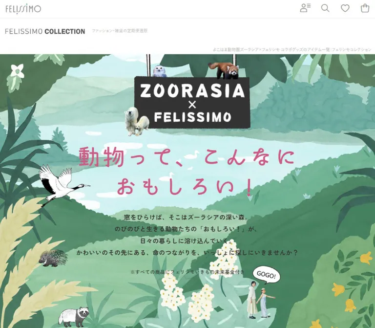
The page combines an immersive collaboration feature with FELISSIMO’s regular commerce interface. A hanging black collaboration sign introduces a forest of translucent green foliage, pale water, white flowers, animal drawings, and photographic cutouts. The pink Japanese headline feels loose and handwritten. Below it, product stories follow a narrow central path through the scenery, pairing descriptive copy with texture details, lifestyle photographs, circular animal controls, and purple BUY pills.
The surrounding store remains visually distinct. White headers, thin gray utility icons, a conventional product grid, category links, and a restrained footer frame the illustrated section. This relationship is essential: the experience includes eight narrative product groups, ten purchase links, and a ten-result catalog, followed by recommendations and store navigation. Its design is more extensive than an isolated promotional hero.
How to Read This Reference
- Measured means supplied computed styles or element rectangles. Values are rounded for readability where appropriate.
- Derived means arithmetic using those measurements, such as column gaps or proportional scaling. A derived relationship is not a recovered CSS declaration.
- Estimated means a visual approximation from the supplied screenshots. Estimated colors were not sampled programmatically.
- Recommended means implementation guidance for a new build. Proposed breakpoints, accessibility improvements, hover treatments, and positioning techniques are not claims about the original implementation.
- Font families below are reported declarations. The evidence does not include font-file requests or a glyph-by-glyph font resolution audit.
- DOM descendants can retain rectangles inside concealed interface regions. Their presence does not prove that a menu or information panel was visibly open.
All custom-property names introduced here are implementation aliases unless explicitly identified as source properties.
Tokens — Colors
Default Palette
| Name | Value | Suggested token | Role and evidence |
|---|---|---|---|
| Store White | #FFFFFF |
--color-store |
Measured body background; visible header, catalog, and footer canvas |
| Store Ink | #202020 |
--color-store-ink |
Measured retail body text and purchase-link text |
| Forest Ink | #333333 |
--color-story-ink |
Measured campaign prose and product headings; also a useful approximation for the dark collaboration sign |
| Blossom Pink | #CC5A82 |
--color-blossom |
Measured campaign headline, fund link, and director-message heading background |
| Utility Gray | #777777 |
--color-utility |
Measured primary utility-icon color |
| Quiet Gray | #BBBBBB |
--color-quiet |
Measured small collection descriptor and page-identification heading |
| Filter Surface | #F6F6F5 |
--color-filter |
Measured selected-condition chip background |
| Forest Green | approximately #4D8064 |
--color-forest |
Estimated middle-value foliage; the artwork contains many darker and lighter greens |
| Path Green | approximately #CDDEAD |
--color-path |
Estimated pale central product-story surface in the desktop middle capture |
| River Mint | approximately #BCE5DE |
--color-river |
Estimated light water and atmospheric clearing behind the hero |
| Purchase Purple | approximately #3D376F |
--color-buy |
Estimated BUY pill fill; its background was not included in the sampled element styles |
| Route Yellow | approximately #F4FF43 |
--color-route |
Estimated route line, endpoint accents, and selected chapter tab |
| Fine Rule | approximately #E8E8E8 |
--color-rule |
Estimated dividers in the store footer and header |
The illustrated greens are a tonal family, not flat section colors. Preserve translucent brush variation, pale gaps between leaves, and darker foreground silhouettes. A solid green background can provide a loading fallback, but it does not reproduce the forest.
Pink supplies the editorial voice; purple identifies purchase actions; bright yellow belongs to the desktop route guide. Keep those jobs separate. The white commerce shell provides a clear visual reset after the illustrated narrative.
Source Properties and Visible Appearance
The supplied root properties include --primary: #00a1e0, --pink: #e83e8c, and --purple: #6f42c1. These are not the observed campaign headline or BUY colors. Likewise, the declared --skin-header-font: 'Dosis' is not evidence that the campaign headings use Dosis.
Prefer the computed styles of the actual element over generic properties inherited from the larger shopping platform. No alternate color theme or theme-selection control is evidenced.
Tokens — Typography
Handwritten Campaign Headline
- Reported family:
"はるかぜ B AP", sans-serif. - Measured weight:
700. - Measured color:
#CC5A82. - Desktop:
72px / 86.4px, with0.54pxletter spacing. - Mobile:
45.76px / 54.912px, with normal letter spacing.
The source headline is live H1 text, even though its irregular strokes resemble lettering embedded in an illustration. Preserve that distinction when rebuilding: the collaboration sign is artwork, while the pink headline can remain selectable text.
Desktop copy occupies two lines: “動物って、こんなに” and “おもしろい!”. Mobile uses three: “動物って、”, “こんなに”, and “おもしろい!”. These breaks are part of the composition, keeping the title inside the pale clearing while animals occupy its edges.
Campaign Product Copy
- Reported family:
"Sawarabi Gothic", sans-serif. - Typical product names, prices, and explanatory paragraphs:
20.5333px / 34.9067pxdesktop;14.56px / 24.752pxmobile; weight400. - Campaign wrapper defaults:
18px / 30.6pxdesktop and14px / 23.8pxmobile. - Tracking: generally
0.54pxdesktop and normal mobile.
The explicit product-copy sizes exceed the wrapper’s inherited size. Copying only the wrapper declaration would make the actual purchasing information too small on desktop.
Introduction and Fund Heading
- Reported family:
"Zen Kaku Gothic New", sans-serif. - Hero introduction: weight
700,18px / 34.2pxdesktop;14.56px / 24.752pxmobile. - Fund note: weight
500,14px / 23.8pxdesktop;14.56px / 24.752pxmobile. - Fund section heading: weight
700,29.3333px / 35.2pxdesktop;20.8px / 24.96pxmobile.
The introduction has a firmer, more compact character than the product prose. It is centered over the lightest region of the illustration. Desktop line height is deliberately generous at 1.9; mobile uses 1.7 and additional line breaks.
Store Interface
The measured body stack begins with 游ゴシック, "Yu Gothic", YuGothic, followed by Hiragino variants, Meiryo, Noto Sans variants, system UI, and sans-serif. The body is 16px / 24px, weight 500, at both inspected widths.
This retail typography takes over in the product catalog and footer. Maintain this change in voice rather than applying the campaign display font to utility controls or product-result metadata.
Animal Information Labels
DOM content headed “ZOORASIA FILE” reports Montserrat, sans-serif, weight 600, at 20.5333px / 30.8px desktop and 14.56px / 21.84px mobile. The corresponding animal descriptions use the retail Japanese stack with a 1.9 line-height ratio.
These measurements document available content. They do not establish the appearance or behavior of an opened overlay.
Type Scale
| Role | Desktop measured size / line height | Mobile measured size / line height | Weight |
|---|---|---|---|
| Overseas banner text | 20 / 24px |
13 / 15.6px |
700 |
| Small page-identification H1 | 12 / 14.4px |
11 / 15.4px |
500 |
| Campaign headline | 72 / 86.4px |
45.76 / 54.912px |
700 |
| Hero introduction | 18 / 34.2px |
14.56 / 24.752px |
700 |
| Product heading H2 wrapper | 32 / 58.6667px |
32 / 41.6px |
400 |
| Product prose and purchase copy | 20.5333 / 34.9067px |
14.56 / 24.752px |
400 |
| Fund heading | 29.3333 / 35.2px |
20.8 / 24.96px |
700 |
| Catalog promotional phrase | 19 / 28.5px |
13 / 19.5px |
700 |
| Catalog product name | 18 / 27px |
12 / 18px |
500 |
| Catalog price | 16 / 19.2px |
14 / 16.8px |
500 |
| Selected filter text | 14 / 19.6px |
11 / 15.4px |
400 |
Product-heading limitation: H2 rectangles form narrow, tall side columns, but writing-mode, transforms, and descendant styles were not supplied. Their 32px wrapper font size is not sufficient to reconstruct the final glyph arrangement. Vertical typesetting is a reasonable implementation approach, explicitly recommended below rather than presented as recovered source CSS.
Tokens — Spacing & Shapes
Density: a spacious illustrated narrative followed by a denser retail interface.
Primary relationship: a full-width forest around an approximately 550px desktop story strip, expanding to the full 390px mobile width.
Responsive Unit
Several independent measurements share the same desktop-to-mobile ratio:
- Product-copy size:
20.5333 / 14.56 ≈ 1.4103. - Animal-control diameter:
176 / 124.8 ≈ 1.4103. - Purchase-link width:
497.22 / 352.56 ≈ 1.4103. - The estimated story-width ratio:
550 / 390 ≈ 1.4103.
A useful derived reconstruction model is a 375-unit illustration canvas capped at 550px. One illustration unit is approximately 1.4667px on the inspected desktop and 1.04px on mobile.
/* Derived adaptation; the original sizing formula was not supplied. */
--art-u: min(0.2666667vw, 1.4666667px);
This relationship explains many chapter measurements, but not every element. The root font remains 16px, the headline has separate responsive sizes, and the sampled H2 wrapper remains 32px at both widths.
Spacing Scale
| Use | Desktop | Mobile | Evidence |
|---|---|---|---|
| Overseas frame thickness | about 8px |
about 6px |
Derived from white inset rectangles and screenshots |
| Animal-control inner padding | 5.8667px |
4.16px |
Measured |
| Purchase-copy to pill gap | 14.6667px |
10.4px |
Measured anchor grid gap |
| Headline to introduction | about 29.33px |
about 20.80px |
Derived from element rectangles |
| Introduction to fund note | about 29.33px |
about 20.80px |
Derived from element rectangles |
| Separate purchase-block gap in towel chapter | 44px |
about 31.19px |
Derived from consecutive anchor rectangles |
| Extra inset for explanatory paragraphs | 15px per side |
15px per side |
Derived relative to purchase-copy width |
| Catalog horizontal card gap | 30px |
about 10.19px |
Derived from adjacent image rectangles |
| Catalog image to first text line | 12px |
11px |
Derived |
Border Radius
| Element | Value | Evidence |
|---|---|---|
| Animal controls | 9999px |
Measured; circular controls |
| BUY pill | Fully rounded | Screenshot estimate |
| Director-message heading | 7.3333px desktop; 5.2px mobile |
Measured |
| Catalog image link | 8px at both widths |
Measured |
| Selected-condition chip | 4px at both widths |
Measured |
| Collaboration sign | Irregular, predominantly square silhouette | Artwork observation |
| Socks detail photograph | Slightly rounded square | Screenshot observation; exact radius unknown |
| Worn-socks photograph | Tall oval | Screenshot observation |
Layout Measurements
| Element | Desktop 1440 × 1000 | Mobile 390 × 844 | Evidence |
|---|---|---|---|
| Full document height | 17021.14px |
12695.47px |
Measured body rectangles |
| Overseas banner, including frame | about 1170 × 100px |
about 390 × 80px |
Derived and visually confirmed |
| Global header below banner | 130px high |
97px high |
Measured |
| Illustrated campaign start | document Y 258.39px |
document Y 222.78px |
Measured |
| Illustrated campaign height | 12009.05px |
8626.75px |
Measured |
| Central story strip | approximately 550px wide |
390px wide |
Desktop screenshot estimate; mobile viewport relationship |
| Purchase-link text region | 497.22px |
352.56px |
Measured; approximately 90.4% of story width |
| Fund and zoo-description text region | 418.03px |
296.41px |
Measured; approximately 76% of story width |
| Animal-control diameter | 176px |
124.8px |
Measured |
| BUY pill | approximately 235 × 59px |
height approximately 41.58px; width unmeasured |
Desktop visual estimate; mobile height derived from anchor contents |
| Retail content width | 1170px, starting at X 135px |
370px, starting at X 10px |
Measured catalog geometry |
| Catalog image | 370 × 370px |
179.91 × 179.91px |
Measured |
The first narrative purchase link begins around document Y 1698.75px desktop and 1297.5px mobile. The opening viewport prioritizes atmosphere and explanation; a BUY control is not shown above the fold in either supplied opening capture.
Components
Overseas Customer Banner
Role: directs international shoppers to the global store before they enter the collection.
A white horizontal link is surrounded by diagonal red, blue, and white airmail stripes. A gray airplane-and-postmark drawing sits left, the English sentence occupies the middle, and a small right chevron closes the row.
Desktop uses the same approximately 1170px alignment as the main store shell. The white inner link measures 1154 × 84px. Mobile fills the viewport with a 378 × 68px inner link and reduces the text from 20px to 13px.
The mobile capture shows tight spacing between the postmark and the beginning of the sentence. For a new implementation, reserve explicit space for the illustration and allow the text to wrap when necessary.
Store Header and Collection Identity
Role: preserves access to account, search, favorites, shopping bag, and collection navigation.
Desktop places the FELISSIMO wordmark at the left of the upper utility row and four thin gray icon controls at the right. Their measured boxes are 58 × 52px. A second row contains the FELISSIMO COLLECTION mark and a small gray descriptor.
Mobile centers the main wordmark, places the account control at the far left, and groups search, favorites, and bag at the right. The three right-side controls measure 42 × 48px. A separate 48px collection row includes a right-side menu button.
The small page-identification H1 sits between the white shell and the illustration. It is right aligned visually on desktop and wraps to two lines on mobile. Its quiet 11–12px treatment should not be confused with the large campaign headline.
Additional mobile navigation labels exist in the DOM but are absent from the opening screenshot. An expanded menu layout was not verified.
Illustrated Hero
Role: establishes the collaboration and the idea of discovering animals through everyday objects.
Layer the composition in this order:
- A pale river and distant green landscape provide a readable central clearing.
- Larger leaves, flowering branches, and grasses frame the edges.
- A dark hanging collaboration sign carries white irregular lettering.
- Animal cutouts overlap the sign and foliage.
- Pink live headline text introduces the campaign.
- Centered dark introductory copy and a fund note explain its purpose.
- A small photographic adult-and-child cutout and a “GOGO!” speech bubble suggest continuing the walk.
The desktop sign’s dark rectangle is approximately 340 × 152px; its hanging lines and animals extend beyond those bounds. Mobile reduces the dark sign to roughly 190 × 90px and brings the surrounding animals much closer to the text.
Preserve an open area behind the headline and prose. Edge cropping is part of the scene: the crane and dark primate extend beyond the narrow mobile viewport, while the center remains readable.
Central Product Story
Role: turns the merchandise into a sequence of discoveries.
In the desktop middle capture, a pale green strip runs from approximately X 445px to 995px. Product photography, explanations, and purchasing information sit inside it while the forest remains visible on both sides.
The arrangement varies within the strip. Tall heading boxes alternate between left and right sides; detail images can form pairs; circular animal controls overlap the story edge. These variations create an editorial rhythm without changing the central reading width.
The DOM documents eight groups:
| Group | Evidenced content structure |
|---|---|
| Wearable bath towel | Polar-bear control, narrow heading, separate adult and child purchase blocks |
| Absorbent hair cap | Narrow heading and one purchase block |
| Animal-back shirts | Animal-information control, explanatory paragraph, separate men’s and women’s purchase blocks |
| Animal portrait puzzle | Side heading, introductory prose, two detail captions, purchase block |
| Zoo handkerchiefs | Side heading, area explanation, several variant captions, purchase block |
| White animal socks | Hare and owl controls, material explanation, detail imagery, purchase block |
| Stickers and masking tape | Two animal controls, side heading, purchase block |
| Glasses cloths | Animal-information control, side heading, purchase block |
Only the socks chapter has a supplied middle screenshot. The other group descriptions above come from DOM content and geometry; their complete photographic compositions were not visually inspected.
Product Detail Pair
Role: makes a material or usage benefit tangible.
The socks chapter places a square close-up of the raised owl motif on the left and a larger oval photograph of socks worn with sandals on the right. The close-up is approximately 208 × 208px in the desktop screenshot. A short left-aligned explanation sits directly below it.
The photography has soft natural light and clear fabric texture. Different masks help distinguish material detail from lifestyle context. Keep the object recognizable and leave enough space for the caption; avoid forcing both photographs into identical cards.
A small adult-and-child cutout and loose handwritten-style callout appear near the chapter’s lower edge. An irregular green boundary then leads into the next part of the path.
Purchase Block
Role: provides a clear product-detail destination at the end of a story.
The actual anchor groups the product name, quantity or purchase cadence, tax-inclusive price, and BUY treatment. The anchor is a single-column grid with a measured gap of 14.6667px desktop or 10.4px mobile.
In the socks example, the centered text reads “白い動物たちのアニマルソックス” followed by “月1足 ¥1,090(税込み)”. Beneath it is a dark purple pill with bold white BUY text and a thin right chevron. The chevron sits toward the right edge while the word stays centered.
The link points to a product-detail URL. It is not evidenced as an immediate add-to-cart action. Preserve source purchase labels such as “月1枚” or “1着” as product-specific information rather than applying a single universal cadence.
Animal Information Control
Role: offers animal context alongside the product story.
Measured controls are white circular buttons, 176px desktop and approximately 124.8px mobile, with a small inset. Their descendant labels include animal names or prompts such as “シャツに登場する動物たち!”. White text is reported on some descendants, but the sampled styles do not include the complete image or overlay layers behind it.
The leftmost mobile control extends about 12.47px beyond the viewport in the supplied geometry. Treat that as observed placement, not an accessibility recommendation. Keep the entire actionable area reachable in a new implementation.
Animal File Content — DOM Evidence Only
The DOM includes repeated “ZOORASIA FILE” headings, Japanese and English animal names, and descriptions of habitats or distinguishing features. Content covers polar bears, hares, snowy owls, tree-kangaroos, langurs, and animals used on the glasses cloths.
Measured heading-content widths are about 408.69px desktop and 289.22px mobile. Description regions are narrower: about 350.03px and 247.63px respectively.
No supplied screenshot shows these panels open. Their backdrop, outer frame, opening animation, close control, focus handling, and scroll behavior remain unverified. If implemented as dialogs, those behaviors must be specified separately.
Desktop Route Guide
Role: helps orient the visitor within the long product narrative.
The desktop middle capture shows a vertical route in the right forest gutter. Circular animal or product thumbnails sit along a bright yellow line between START! and GOAL! markers. Small white labels extend to the right, with speech-tab pointers aimed toward their circles.
Eight labels correspond to the story groups: “着るバスタオル”, “吸水キャップ”, “おしりシャツ”, “動物パズルキューブ”, “ズーラシアハンカチ”, “くつ下”, “マスキングテープ”, and “めがねふき”. The socks label is yellow in the socks screenshot, and a small family cutout sits nearby.
That frame supports a selected-chapter appearance. It does not prove click-to-scroll behavior, automatic scroll tracking, or the exact fixed/sticky positioning rule. The route labels are absent from the supplied mobile page text; no mobile middle screenshot verifies an alternative guide.
A second collaboration sign appears low in the left desktop gutter, reinforcing identity while the central story continues.
Fund and Zoo Information
Role: connects the merchandise to animal conservation and the collaboration’s purpose.
These sections use a narrower text measure of approximately 76% of the story strip. The fund heading uses bold Zen Kaku Gothic New; body paragraphs use Sawarabi Gothic. The fund’s related-items link is pink.
The director-message title is a small pink rounded rectangle with white text. Its measured padding scales from 14.6667px 26.4px desktop to 10.4px 18.72px mobile. The message itself returns to dark text without a colored enclosing card.
The supplied page copy states that the products include a contribution to the FELISSIMO animal-future fund. This is the page’s stated context; the visual reference does not independently verify fund operations.
Collection Controls and Product Grid
Role: provides conventional shopping access after the illustrated introduction.
The campaign ends around document Y 12267.44px desktop and 8849.53px mobile. The collection then presents a ten-result count, filter, view-switch, and sort controls, followed by the selected-condition chip and products.
Desktop has three columns with 370px square image links and 30px gaps inside a 1170px container. Mobile has two approximately 179.91px columns with a 10.19px gap inside a 370px region.
Each product groups:
- A square image link with an 8px radius.
- A bold promotional phrase.
- A regular product name.
- A fund label and applicable size information.
- A price and a small favorite control.
Measured favorite-button boxes are 24px desktop and 20px mobile. Larger invisible hit areas would be a recommended improvement; none is established by the supplied rectangles.
Sort links exist for popularity, ascending price, descending price, and new arrivals. Their destinations are evidenced, but applying a sort or filter was not tested.
Recommendations and Recently Viewed Items
The page text includes recommended products and recently viewed products after the main collection. These extend the store experience beyond the ten collaboration results.
Do not interpret the specific recently viewed inventory as permanent campaign content. The supplied evidence establishes the presence of these modules, but not their personalization logic or a stable item order. No carousel interaction was demonstrated.
Category Discovery and Footer
The desktop ending shows four promotional tiles above eight photographic category links in one row. Each category uses an isolated product image, a centered label, and generous white space. Mobile arranges the eight categories into two rows of four.
A pale breadcrumb band separates discovery content from support navigation. The desktop footer contains two item-search destinations and four support destinations in horizontal groups divided by fine rules. Mobile retains two columns and wraps the support links into two rows.
The back-to-top link is right aligned on desktop. Mobile places it in a centered pale-gray strip roughly 50px high. Legal links wrap above a black FELISSIMO logo block and a small copyright line.
The mobile breadcrumb is visibly truncated at the right edge. Its horizontal scrolling behavior was not tested. A new implementation should make the complete trail reachable without relying on clipping alone.
Tokens — Motion & Interaction
| Element or treatment | Supplied evidence | What can be concluded |
|---|---|---|
| Campaign headline | 0.8s cubic-bezier(0.34, 1.56, 0.64, 1) 0.8s transition |
An 800ms transition with an 800ms delay is declared; the easing permits overshoot. Changed properties and initial geometry are not supplied |
| Introduction and fund note | opacity 0.5s 0.8s |
A delayed 500ms opacity transition is declared |
| Narrative product anchors | 0.5s transition |
A transition is declared; the hover destination values are unknown |
| Fund-related link | 0.5s transition |
Same limitation as product links |
| Other sampled elements | Many report transition: all and animation: none |
This is not evidence of a visible timed animation; no duration is established by all alone |
| Desktop route | Socks label highlighted in the middle capture | A selected-looking state is visible; updating behavior is unverified |
| Forest surround | Similar scenic framing across desktop captures | Stationary scenery is suggested; fixed positioning, sticky positioning, and parallax cannot be distinguished conclusively |
| Animal buttons and file content | Buttons and corresponding content exist in DOM | An information affordance is present; opening and closing behavior was not exercised |
| Product and top links | Product-detail URLs and #top destination supplied |
Navigation destinations are established; scroll animation and destination rendering were not tested |
The inspection waited for finite motion and stable layouts and temporarily paused perpetual animations during readiness checks when applicable. This capture protocol is not evidence that a specific perpetual animation exists on this page. Static captures cannot establish animal movement, sign swinging, or parallax speed.
For a new build, use the measured headline timing only for a deliberate entrance. Keep the settled page readable by default, and do not hide content indefinitely while waiting for an animation trigger. Any extra animal motion should be treated as a new design decision.
Surfaces
| Layer | Appearance | Purpose |
|---|---|---|
| Retail shell | White with dark text and fine gray rules | Familiar navigation and shopping structure |
| Forest surround | Layered watercolor foliage with mint clearings | Environmental continuity through the campaign |
| Story path | Pale green textured strip with irregular transitions | Readable surface for product narrative |
| Collaboration sign | Dark rough-edged artwork with white lettering | Strong identity anchor within organic scenery |
| Product photography | Unboxed cutouts, square details, and oval masks | Shows material and everyday use |
| Purchase action | Purple pill with white text | Repeated, easily recognized product destination |
| Route labels | White tabs, yellow selected tab | Chapter identification in the desktop gutter |
| Fund-message heading | Pink rounded bar with white text | Separates contextual information from product copy |
| Catalog image | Square with modest corner rounding | Predictable retail comparison surface |
The visible page has no broad shadow-elevation system. Depth comes primarily from overlapping artwork, foreground foliage, masks, and changes in scale. Avoid adding shadows to every product section or enclosing each story in a floating card.
Imagery
The campaign mixes three image languages: watercolor environments, drawn animals, and photography. The forest uses soft pigment edges and overlapping translucent greens. Several animals have crisp black-and-white linework, while the collaboration sign includes more photographic-looking animal cutouts. People and merchandise remain recognizably photographic.
This mixed treatment makes the page feel like an illustrated outing assembled around real objects. The animals need not share one perfectly uniform rendering style, but their placement should feel intentional: perched on the sign, emerging from foliage, crossing the edge, or appearing as a small guide beside the story.
Product imagery should show actual use and construction. The socks photograph makes the fuzzy raised motif legible; the worn view demonstrates scale and styling. Neutral clothing and soft photographic backgrounds keep those images compatible with the surrounding greens.
Observed Asset References
The evidence does not provide campaign image src values, background-image URLs, native dimensions, or font-file URLs. No asset paths can be responsibly reconstructed from it.
| Visible asset group | Capture evidence | Reuse guidance |
|---|---|---|
| Airmail border and postmark | Desktop and mobile opening captures | Keep separate from campaign artwork; it belongs to the store shell |
| Hanging collaboration sign | Desktop and mobile opening captures | Preserve irregular lettering and animal overlap as artwork |
| Watercolor forest and river | Opening captures and desktop middle capture | Prepare an art-directed mobile composition, not just an arbitrary center crop |
| Crane, primates, flowers, and other edge animals | Opening and middle captures | Use transparent layers where available; keep the text clearing open |
| Adult-and-child cutouts with speech bubble | Opening and desktop middle captures | Retain their small scale as guide figures |
| Socks close-up and worn photograph | Desktop middle capture | Use distinct square and oval crops |
| Route thumbnails and lower-left sign | Desktop middle capture | Keep readable separation from the forest and central story |
| Retail promotional and category imagery | Desktop and mobile ending captures | Use clean photography on the white commerce canvas |
Use authorized artwork and product photographs when available. CSS can reproduce layout, masks, and controls; it cannot recreate the particular watercolor composition or branded illustration simply by setting the palette.
Layout & Responsive Behavior
Desktop
The 1440px view has a centered 1170px retail shell with 135px side margins. The illustration starts below 258.39px of banner, header, and page identification. Its opening composition spans the entire width.
Product storytelling then narrows to an approximately 550px strip. The desktop middle capture uses the remaining space for scenic foliage, a lower-left collaboration sign, and a right-side route guide. The forest gutters carry useful identity and orientation rather than empty margin.
After the campaign, the layout expands back to the 1170px commerce width. The product catalog uses three columns, promotional content uses four visible columns, and category discovery uses eight entries across.
Mobile
The 390px opening keeps the same banner, utilities, collection mark, and page identification, but rearranges the controls and shortens their rows. The illustration begins at Y 222.78px.
The hero is recomposed vertically. The headline changes from two lines to three. Introductory copy changes from four measured lines to six; the fund note changes from one to two. The dark primate is much larger relative to the available width, and several edge animals are cropped.
The product story uses the full viewport width, with purchase text inset about 18.72px on each side. Its general copy scales down proportionally. Two detail-caption columns remain present in the DOM, so the entire chapter does not simply collapse into a single stack.
The catalog changes to two columns. Category links change to four columns. Footer support navigation keeps two columns. These are distinct responsive systems; a single global scale transform would not reproduce them.
Breakpoints and Limits
The source exposes breakpoint properties at 544px, 769px, 992px, and 1200px. Their presence does not establish which component switches at which value. Only 390px and 1440px were inspected, so tablet behavior, intermediate scene crops, and exact route visibility thresholds remain unknown.
The CSS below chooses 769px for the retail desktop layout and 1200px for the side route. Those are implementation recommendations informed by available space. The measured source behavior at intermediate widths must be verified separately if exact reproduction is required.
Do’s and Don’ts
Do
- Preserve the sequence of store shell, illustrated narrative, product catalog, and store footer.
- Keep the hero wide and the desktop product story narrow.
- Use exact Blossom Pink
#CC5A82for the campaign headline and contextual accents. - Reserve purple for the repeated purchase pill and yellow for route emphasis.
- Keep a pale, visually quiet clearing behind the hero copy.
- Mix watercolor scenery, animal drawings, photographic people, and product imagery deliberately.
- Retain the live headline and product information as text.
- Use product names, quantity labels, prices, and BUY as one coherent destination block.
- Preserve small material details and varied image masks within the story.
- Keep the catalog’s three-to-two-column change and the categories’ eight-to-four-column change independent.
- Document DOM-only panels separately from visibly inspected states.
Don’t
- Don’t reduce the page to its opening hero or omit the catalog below the campaign.
- Don’t stretch the narrow product narrative to fill the whole desktop screen.
- Don’t replace the forest with a single flat green fill in the finished design.
- Don’t apply generic platform blue to campaign actions because it appears in root properties.
- Don’t use the handwritten display face for prices, footer links, or every heading.
- Don’t make each product story an identical rounded card with a drop shadow.
- Don’t assume a BUY link adds an item directly to the cart.
- Don’t invent parallax, looping animal motion, or dialog transitions from still images.
- Don’t treat hidden-menu descendants as proof that the menu was visibly expanded.
- Don’t let decorative overlap obscure essential text or make controls unreachable on mobile.
- Don’t infer unknown image paths or font-loading methods from brand names.
Recommended Implementation Additions
These are improvements for a new implementation, not verified original features:
- Give every icon control a descriptive accessible name and a visible focus state.
- Increase small favorite controls and the approximately 41.6px mobile purchase pill to at least 44px touch targets.
- Keep animal-information buttons fully reachable, even when their decoration overlaps a chapter edge.
- If animal files open as dialogs, implement an accessible name, close button, Escape handling, focus containment, and focus return.
- Implement route entries as ordinary section links. If active tracking is added, expose the selected location with
aria-current='location'and retain a usable link when JavaScript is unavailable. - Offer an unobtrusive mobile chapter index or skip-to-products link for the long narrative.
- Keep the full breadcrumb accessible through wrapping or a clearly usable horizontal scroll region.
- Respect reduced-motion preferences and render all essential copy in its settled state without an animation dependency.
- Provide useful product-image alternatives and empty alternatives for purely decorative leaves and animals.
- Reserve image dimensions to reduce layout shifts, load below-the-fold photography lazily, and supply appropriately sized mobile scene assets.
- Review the low-contrast 11–12px page-identification text and the small mobile catalog type when setting accessibility targets.
Agent Prompt Guide
Quick Color Reference
- Store canvas: measured
#FFFFFF. - Store text: measured
#202020. - Campaign text: measured
#333333. - Campaign headline and contextual accents: measured
#CC5A82. - Forest: estimated
#4D8064, with multiple translucent green variations. - Story path: estimated
#CDDEAD. - River clearing: estimated
#BCE5DE. - BUY pill: estimated
#3D376F, with white text. - Desktop route highlight: estimated
#F4FF43.
Overall Prompt
“Create a zoo collaboration collection page with a watercolor forest narrative inside a white retail website. Begin with a restrained shopping header, then a full-width illustrated clearing containing a hanging dark collaboration sign, animal cutouts, a pink handwritten Japanese headline, and centered dark introductory text. On desktop, continue through an approximately 550px central product-story strip with pale green texture, material close-ups, oval lifestyle photographs, circular animal-information controls, and centered purple BUY pills. Use the side gutters for scenery and a compact animal-thumbnail route guide. Follow the narrative with a conventional three-column product catalog that becomes two columns on mobile, category discovery, and a fine-rule support footer. Keep all essential copy as live text. Treat animation and panel behavior as separately specified features.”
Example Component Prompts
- Hero: “Compose a pale mint river clearing inside layered watercolor foliage. Hang a rough dark collaboration sign near the top, with small animals overlapping it. Set ‘動物って、こんなにおもしろい!’ in pink irregular display lettering, using two lines on desktop and three on mobile. Keep the centered introduction in a calm clearing below.”
- Product chapter: “Use a narrow pale green story strip. Pair a square close-up of a fuzzy animal motif with a larger oval photograph of the product being worn. Place a short material explanation below the close-up, then center the product name, quantity, price, and a purple BUY pill. Add small guide figures near an irregular green section boundary.”
- Route guide: “Create a desktop gutter guide with eight circular animal or product thumbnails on a thin yellow vertical route. Extend small white speech tabs to the right and highlight the current tab in yellow. Include compact START! and GOAL! markers. Implement navigation semantics separately from the decorative route.”
- Purchase block: “Build one product-detail anchor containing a centered Japanese product name, a separate quantity-and-price line, and a roughly 235 × 59px purple pill on desktop. Keep BUY centered and position a fine white chevron near the right end. Scale the block for mobile while retaining a 44px minimum action target.”
- Retail catalog: “Return to a white 1170px container with three 370px product-image columns and 30px gaps. Use 8px image corners, a bold promotional phrase, a regular product name, fund and size metadata, price, and a small favorite control. At 390px, use two approximately 180px columns with 10px gaps.”
Quick Start
CSS Custom Properties
This is a reusable adaptation, not the original stylesheet. Exact colors and typography are marked separately from estimated artwork colors and the derived illustration unit. The source fonts must be supplied through appropriate font files or services; naming a family does not load it.
Assign authorized artwork to --forest-art and --path-art, or leave the solid fallback colors during development. Put the scenic layer at the start of the campaign, followed by the hero; place the route layer after the hero and before the story column. The sticky scenic and route layers below are recommended implementation choices, not recovered positioning rules.
:root {
  /* Measured interface colors */
  --color-store: #fff;
  --color-store-ink: #202020;
  --color-story-ink: #333;
  --color-blossom: #cc5a82;
  --color-utility: #777;
  --color-quiet: #bbb;
  --color-filter: #f6f6f5;

  /* Estimated artwork and action colors */
  --color-forest: #4d8064;
  --color-path: #cddead;
  --color-river: #bce5de;
  --color-buy: #3d376f;
  --color-route: #f4ff43;
  --color-rule: #e8e8e8;

  /* Reported font families; loading is a separate integration step */
  --font-store: 'Yu Gothic', YuGothic, 'Hiragino Kaku Gothic ProN',
    Meiryo, 'Noto Sans', 'Noto Sans CJK JP', system-ui, sans-serif;
  --font-story: 'Sawarabi Gothic', sans-serif;
  --font-intro: 'Zen Kaku Gothic New', sans-serif;
  --font-display: 'はるかぜ B AP', sans-serif;
  --font-file: Montserrat, sans-serif;

  /* Derived proportions, with a conventional root font size */
  --art-u: min(0.2666667vw, 1.4666667px);
  --story-width: 550px;
  --shop-width: 1170px;
  --story-copy: calc(14 * var(--art-u));
  --space-copy-action: calc(10 * var(--art-u));
  --animal-size: calc(120 * var(--art-u));
  --buy-width: calc(160 * var(--art-u));
  --radius-product: 8px;
  --radius-filter: 4px;

  /* Supply project-owned image URLs when available */
  --forest-art: none;
  --path-art: none;
}

* { box-sizing: border-box; }

body {
  margin: 0;
  color: var(--color-store-ink);
  background: var(--color-store);
  font: 500 16px/1.5 var(--font-store);
}

img { max-inline-size: 100%; }
button { font: inherit; }

.shop-shell {
  inline-size: min(calc(100% - 20px), var(--shop-width));
  margin-inline: auto;
}

/* Recommended CSS approximation of the airmail frame */
.overseas-banner {
  min-block-size: 80px;
  padding: 6px;
  background: repeating-linear-gradient(
    135deg,
    #ff4b5c 0 8px,
    #fff 8px 16px,
    #008bdc 16px 24px,
    #fff 24px 32px
  );
}

.overseas-banner > a {
  display: flex;
  align-items: center;
  justify-content: center;
  min-block-size: 68px;
  padding: 10px 18px;
  color: inherit;
  background: #fff;
  text-align: center;
  text-decoration: none;
  font-size: 13px;
  font-weight: 700;
  line-height: 1.2;
}

.campaign {
  position: relative;
  isolation: isolate;
  color: var(--color-story-ink);
  font: 400 14px/1.7 var(--font-story);
}

/* Recommended scene-bound sticky surround */
.campaign-surround {
  position: sticky;
  inset-block-start: 0;
  block-size: 100svh;
  margin-block-end: -100svh;
  background-color: var(--color-forest);
  background-image: var(--forest-art);
  background-position: center top;
  background-size: cover;
  pointer-events: none;
  z-index: 0;
}

.campaign-hero,
.story-column {
  position: relative;
  z-index: 1;
}

.campaign-hero {
  padding-block: 20px calc(50 * var(--art-u));
  text-align: center;
}

.campaign-brand {
  display: block;
  inline-size: min(48.7vw, 340px);
  block-size: auto;
  margin: 0 auto calc(18 * var(--art-u));
}

.campaign-title {
  margin: 0;
  color: var(--color-blossom);
  font: 700 calc(44 * var(--art-u))/1.2 var(--font-display);
}

/* Apply line breaks in markup to match each composition. */
.campaign-intro,
.campaign-note {
  margin: calc(20 * var(--art-u)) auto 0;
  padding-inline: 20px;
  font-family: var(--font-intro);
  font-size: var(--story-copy);
  line-height: 1.7;
}

.campaign-intro { font-weight: 700; }
.campaign-note { font-weight: 500; }

.story-column {
  inline-size: min(100%, var(--story-width));
  margin-inline: auto;
  background-color: var(--color-path);
  background-image: var(--path-art);
  background-size: 100% auto;
}

.story-inner {
  inline-size: 90.4%;
  margin-inline: auto;
}

.story-chapter {
  position: relative;
  padding-block: calc(40 * var(--art-u));
  scroll-margin-block-start: 24px;
}

/* Recommended approach; original writing-mode was not supplied. */
.chapter-heading {
  margin: 0;
  writing-mode: vertical-rl;
  font: 400 32px/1.3 var(--font-story);
}

.story-copy {
  margin-inline: 15px;
  font-size: var(--story-copy);
  line-height: 1.7;
}

.detail-pair {
  display: grid;
  grid-template-columns: 1fr 1.35fr;
  gap: calc(20 * var(--art-u));
  align-items: start;
}

.detail-pair figure { margin: 0; }
.detail-pair img { display: block; inline-size: 100%; }
.detail-closeup { border-radius: calc(5 * var(--art-u)); }
.detail-worn { border-radius: 50%; }

.detail-pair figcaption {
  margin-block-start: calc(10 * var(--art-u));
  font-size: var(--story-copy);
  line-height: 1.7;
}

.animal-trigger {
  inline-size: var(--animal-size);
  aspect-ratio: 1;
  padding: calc(4 * var(--art-u));
  border: 0;
  border-radius: 9999px;
  background: #fff;
  color: var(--color-story-ink);
  cursor: pointer;
}

.purchase {
  display: grid;
  justify-items: center;
  gap: var(--space-copy-action);
  inline-size: 100%;
  color: var(--color-store-ink);
  font: 400 var(--story-copy)/1.7 var(--font-story);
  text-align: center;
  text-decoration: none;
}

.purchase-copy { margin: 0; }
.purchase + .purchase { margin-block-start: calc(30 * var(--art-u)); }

.buy-pill {
  position: relative;
  display: grid;
  place-items: center;
  inline-size: min(100%, var(--buy-width));
  min-block-size: max(44px, calc(40 * var(--art-u)));
  padding: 8px 35px;
  border-radius: 9999px;
  color: #fff;
  background: var(--color-buy);
  font-family: var(--font-store);
  font-weight: 700;
  line-height: 1.2;
  transition: background-color 500ms;
}

.buy-pill::after {
  content: '';
  position: absolute;
  inset-inline-end: 24px;
  inline-size: 10px;
  block-size: 10px;
  border-block-start: 1px solid currentColor;
  border-inline-end: 1px solid currentColor;
  transform: rotate(45deg);
}

.fund-block {
  inline-size: 76%;
  margin-inline: auto;
  padding-block: calc(35 * var(--art-u));
  font-size: var(--story-copy);
  line-height: 1.7;
}

.fund-heading {
  font: 700 calc(20 * var(--art-u))/1.2 var(--font-intro);
}

.fund-link { color: var(--color-blossom); }

.director-heading {
  padding: calc(10 * var(--art-u)) calc(18 * var(--art-u));
  border-radius: calc(5 * var(--art-u));
  color: #fff;
  background: var(--color-blossom);
  font-size: var(--story-copy);
  font-weight: 400;
  line-height: 1.2;
}

.route-layer { display: none; }

.product-grid {
  display: grid;
  grid-template-columns: repeat(2, minmax(0, 1fr));
  gap: 22px 10px;
}

.product-image {
  display: block;
  overflow: hidden;
  border-radius: var(--radius-product);
}

.product-image img {
  display: block;
  inline-size: 100%;
  aspect-ratio: 1;
  object-fit: cover;
}

.product-phrase {
  margin: 11px 0 4px;
  font-size: 13px;
  font-weight: 700;
  line-height: 1.5;
}

.product-name { margin: 0; font-size: 12px; line-height: 1.5; }
.product-price { font-size: 14px; line-height: 1.2; }

.selected-filter {
  padding: 7px 10px;
  border: 0;
  border-radius: var(--radius-filter);
  background: var(--color-filter);
  font-size: 11px;
  line-height: 1.4;
}

.category-grid {
  display: grid;
  grid-template-columns: repeat(4, minmax(0, 1fr));
  gap: 20px 10px;
  text-align: center;
}

.support-grid {
  display: grid;
  grid-template-columns: repeat(2, minmax(0, 1fr));
}

.support-grid a {
  display: flex;
  align-items: center;
  min-block-size: 50px;
  padding: 12px 15px;
  border-block-end: 1px solid var(--color-rule);
  color: inherit;
  text-decoration: none;
}

/* Recommended readable alternative to inaccessible clipping */
.breadcrumb {
  overflow-x: auto;
  padding: 14px 10px;
  background: var(--color-filter);
  white-space: nowrap;
}

/* Chosen integration breakpoint, not a recovered component rule */
@media (min-width: 769px) {
  .overseas-banner { min-block-size: 100px; padding: 8px; }
  .overseas-banner > a { min-block-size: 84px; font-size: 20px; }
  .campaign { font-size: 18px; letter-spacing: 0.54px; }
  .campaign-title { font-size: 72px; }
  .campaign-intro { font-size: 18px; line-height: 1.9; }
  .campaign-note { font-size: 14px; }
  .chapter-heading { line-height: 1.833334; }
  .product-grid { grid-template-columns: repeat(3, minmax(0, 1fr)); gap: 32px 30px; }
  .product-phrase { margin-block-start: 12px; font-size: 19px; }
  .product-name { font-size: 18px; }
  .product-price { font-size: 16px; }
  .selected-filter { padding-inline: 16px; font-size: 14px; }
  .category-grid { grid-template-columns: repeat(8, minmax(0, 1fr)); }
  .support-grid { grid-template-columns: repeat(4, minmax(0, 1fr)); }
}

/* Recommended scene-bound desktop route */
@media (min-width: 1200px) {
  .route-layer {
    display: block;
    position: sticky;
    inset-block-start: 0;
    block-size: 100svh;
    margin-block-end: -100svh;
    pointer-events: none;
    z-index: 2;
  }
  .route-nav {
    position: absolute;
    inset-inline-start: calc(50% + 365px);
    inset-block-end: 24px;
    pointer-events: auto;
  }
  .route-nav ol {
    position: relative;
    display: grid;
    gap: 8px;
    margin: 0;
    padding: 0;
    list-style: none;
  }
  .route-nav ol::before {
    content: '';
    position: absolute;
    inset-block: 0;
    inset-inline-start: 21px;
    inline-size: 3px;
    background: var(--color-route);
  }
  .route-nav a {
    position: relative;
    display: flex;
    align-items: center;
    gap: 14px;
    color: var(--color-story-ink);
    text-decoration: none;
  }
  .route-nav img {
    inline-size: 44px;
    block-size: 44px;
    border-radius: 50%;
    object-fit: cover;
    background: #fff;
  }
  .route-label {
    position: relative;
    padding: 6px 10px;
    border-radius: 5px;
    background: #fff;
    font-size: 13px;
    line-height: 1.4;
  }
  .route-label::before {
    content: '';
    position: absolute;
    inset-inline-start: -7px;
    inset-block-start: calc(50% - 6px);
    border-block: 6px solid transparent;
    border-inline-end: 8px solid #fff;
  }
  .route-nav [aria-current='location'] .route-label {
    background: var(--color-route);
  }
  .route-nav [aria-current='location'] .route-label::before {
    border-inline-end-color: var(--color-route);
  }
}

/* Recommended interaction feedback; source hover colors are unknown */
@media (hover: hover) {
  .purchase:hover .buy-pill {
    background: color-mix(in srgb, var(--color-buy), #000 12%);
  }
}

a:focus-visible,
button:focus-visible {
  outline: 3px solid var(--color-buy);
  outline-offset: 4px;
}

@media (prefers-reduced-motion: reduce) {
  .campaign *,
  .campaign *::before,
  .campaign *::after {
    animation: none !important;
    transition: none !important;
    scroll-behavior: auto !important;
  }
}
Use an anchor for the complete purchase block, matching the evidenced anatomy:
<a class='purchase' href='https://www.felissimo.co.jp/flufeel/418887.html'>
  <p class='purchase-copy'>
    白い動物たちのアニマルソックス<br>
    月1足 ¥1,090(税込み)
  </p>
  <span class='buy-pill'>BUY</span>
</a>
This example reproduces the captured product text and destination. In a production implementation, product names, purchase units, and prices should come from current commerce data. Route selection, animal dialogs, header menus, and catalog controls require separate behavior; the CSS does not implement them.
Tailwind v4 Token Mapping
Optional aliases for a project already using Tailwind v4. This is not evidence that the original page uses Tailwind. Define the properties above first.
@theme inline {
  --color-store: #fff;
  --color-store-ink: #202020;
  --color-story-ink: #333;
  --color-blossom: #cc5a82;
  --color-forest: #4d8064;
  --color-path: #cddead;
  --color-buy: #3d376f;
  --color-route: #f4ff43;

  --font-story: 'Sawarabi Gothic', sans-serif;
  --font-intro: 'Zen Kaku Gothic New', sans-serif;
  --font-display: 'はるかぜ B AP', sans-serif;

  --text-story: calc(14 * var(--art-u));
  --text-fund: calc(20 * var(--art-u));
  --spacing-art: var(--art-u);
  --spacing-story: 550px;
  --spacing-shop: 1170px;
  --radius-product: 8px;
  --radius-filter: 4px;
}
Sources & Evidence
- Current original and final page: supplied HTTP 200 result, page identity, page text, product and navigation destinations, computed styles, and element rectangles. Original and final URLs are identical.
- Evidence retrieval time: September 12, 2026,
07:42:57.681 UTC, equivalent to16:42:57.681 JST. Individual capture times were not separately provided. - Desktop evidence: three supplied captures at
1440 × 1000, showing the opening, socks chapter, and ending; sampled document height17021.14px. - Mobile evidence: two supplied captures at
390 × 844, showing the opening and ending; sampled document height12695.47px. No mobile middle-chapter screenshot was supplied. - Rendered links include the socks product, the fund-related collection, sorting destinations, and the page’s
#toplink. These establish link targets only; their destination pages were not inspected for this reference. - The original page’s FELISSIMO wordmarks, home links, and copyright identify the retail brand. No production-credit claim is made.
The supplied inspection observed the initial page for at least five seconds, waited for load and sampled layout/text stability, and checked visible image decoding within bounded time limits. It traversed intermediate scroll positions before accepting settled captures. Those procedures improve capture stability but do not establish semantic completeness or exercise every control.
No additional browsing, commands, or file access was performed for this analysis. Exact image URLs, loaded font files, complete stylesheets, intermediate-width behavior, opened menus, opened animal panels, hover outcomes, and detailed motion remain outside the evidence. Measurements, visual estimates, derived proportions, and recommended implementation choices are labeled accordingly.
# ZOORASIA × FELISSIMO — Style Reference

> A watercolor zoo walk woven into a working shopping collection.

**Website:** [ZOORASIA × FELISSIMO](https://www.felissimo.co.jp/collect/zoorasia_fsc)
**Original URL:** https://www.felissimo.co.jp/collect/zoorasia_fsc
**Final URL:** https://www.felissimo.co.jp/collect/zoorasia_fsc
**Theme:** light retail shell surrounding a green illustrated campaign.
**Inspected:** September 12, 2026, through the supplied browser inspection. Evidence retrieval timestamp: 07:42:57.681 UTC / 16:42:57.681 JST. Individual screenshot timestamps were not supplied.
**Viewports:** desktop 1440 × 1000 CSS px; mobile 390 × 844 CSS px.
**Scope:** desktop opening, a middle product chapter, and footer; mobile opening and footer; supplied page text, links, element geometry, and computed styles covering the campaign and subsequent shopping collection. Animal information content is represented in the DOM, but no opened information panel is shown.

The page combines an immersive collaboration feature with FELISSIMO’s regular commerce interface. A hanging black collaboration sign introduces a forest of translucent green foliage, pale water, white flowers, animal drawings, and photographic cutouts. The pink Japanese headline feels loose and handwritten. Below it, product stories follow a narrow central path through the scenery, pairing descriptive copy with texture details, lifestyle photographs, circular animal controls, and purple BUY pills.

The surrounding store remains visually distinct. White headers, thin gray utility icons, a conventional product grid, category links, and a restrained footer frame the illustrated section. This relationship is essential: the experience includes eight narrative product groups, ten purchase links, and a ten-result catalog, followed by recommendations and store navigation. Its design is more extensive than an isolated promotional hero.

## How to Read This Reference

- **Measured** means supplied computed styles or element rectangles. Values are rounded for readability where appropriate.
- **Derived** means arithmetic using those measurements, such as column gaps or proportional scaling. A derived relationship is not a recovered CSS declaration.
- **Estimated** means a visual approximation from the supplied screenshots. Estimated colors were not sampled programmatically.
- **Recommended** means implementation guidance for a new build. Proposed breakpoints, accessibility improvements, hover treatments, and positioning techniques are not claims about the original implementation.
- Font families below are reported declarations. The evidence does not include font-file requests or a glyph-by-glyph font resolution audit.
- DOM descendants can retain rectangles inside concealed interface regions. Their presence does not prove that a menu or information panel was visibly open.

All custom-property names introduced here are implementation aliases unless explicitly identified as source properties.

## Tokens — Colors

### Default Palette

| Name | Value | Suggested token | Role and evidence |
| --- | --- | --- | --- |
| Store White | `#FFFFFF` | `--color-store` | Measured body background; visible header, catalog, and footer canvas |
| Store Ink | `#202020` | `--color-store-ink` | Measured retail body text and purchase-link text |
| Forest Ink | `#333333` | `--color-story-ink` | Measured campaign prose and product headings; also a useful approximation for the dark collaboration sign |
| Blossom Pink | `#CC5A82` | `--color-blossom` | Measured campaign headline, fund link, and director-message heading background |
| Utility Gray | `#777777` | `--color-utility` | Measured primary utility-icon color |
| Quiet Gray | `#BBBBBB` | `--color-quiet` | Measured small collection descriptor and page-identification heading |
| Filter Surface | `#F6F6F5` | `--color-filter` | Measured selected-condition chip background |
| Forest Green | approximately `#4D8064` | `--color-forest` | Estimated middle-value foliage; the artwork contains many darker and lighter greens |
| Path Green | approximately `#CDDEAD` | `--color-path` | Estimated pale central product-story surface in the desktop middle capture |
| River Mint | approximately `#BCE5DE` | `--color-river` | Estimated light water and atmospheric clearing behind the hero |
| Purchase Purple | approximately `#3D376F` | `--color-buy` | Estimated BUY pill fill; its background was not included in the sampled element styles |
| Route Yellow | approximately `#F4FF43` | `--color-route` | Estimated route line, endpoint accents, and selected chapter tab |
| Fine Rule | approximately `#E8E8E8` | `--color-rule` | Estimated dividers in the store footer and header |

The illustrated greens are a tonal family, not flat section colors. Preserve translucent brush variation, pale gaps between leaves, and darker foreground silhouettes. A solid green background can provide a loading fallback, but it does not reproduce the forest.

Pink supplies the editorial voice; purple identifies purchase actions; bright yellow belongs to the desktop route guide. Keep those jobs separate. The white commerce shell provides a clear visual reset after the illustrated narrative.

### Source Properties and Visible Appearance

The supplied root properties include `--primary: #00a1e0`, `--pink: #e83e8c`, and `--purple: #6f42c1`. These are not the observed campaign headline or BUY colors. Likewise, the declared `--skin-header-font: 'Dosis'` is not evidence that the campaign headings use Dosis.

Prefer the computed styles of the actual element over generic properties inherited from the larger shopping platform. No alternate color theme or theme-selection control is evidenced.

## Tokens — Typography

### Handwritten Campaign Headline

- **Reported family:** `"はるかぜ B AP", sans-serif`.
- **Measured weight:** `700`.
- **Measured color:** `#CC5A82`.
- **Desktop:** `72px / 86.4px`, with `0.54px` letter spacing.
- **Mobile:** `45.76px / 54.912px`, with normal letter spacing.

The source headline is live H1 text, even though its irregular strokes resemble lettering embedded in an illustration. Preserve that distinction when rebuilding: the collaboration sign is artwork, while the pink headline can remain selectable text.

Desktop copy occupies two lines: “動物って、こんなに” and “おもしろい!”. Mobile uses three: “動物って、”, “こんなに”, and “おもしろい!”. These breaks are part of the composition, keeping the title inside the pale clearing while animals occupy its edges.

### Campaign Product Copy

- **Reported family:** `"Sawarabi Gothic", sans-serif`.
- **Typical product names, prices, and explanatory paragraphs:** `20.5333px / 34.9067px` desktop; `14.56px / 24.752px` mobile; weight `400`.
- **Campaign wrapper defaults:** `18px / 30.6px` desktop and `14px / 23.8px` mobile.
- **Tracking:** generally `0.54px` desktop and normal mobile.

The explicit product-copy sizes exceed the wrapper’s inherited size. Copying only the wrapper declaration would make the actual purchasing information too small on desktop.

### Introduction and Fund Heading

- **Reported family:** `"Zen Kaku Gothic New", sans-serif`.
- **Hero introduction:** weight `700`, `18px / 34.2px` desktop; `14.56px / 24.752px` mobile.
- **Fund note:** weight `500`, `14px / 23.8px` desktop; `14.56px / 24.752px` mobile.
- **Fund section heading:** weight `700`, `29.3333px / 35.2px` desktop; `20.8px / 24.96px` mobile.

The introduction has a firmer, more compact character than the product prose. It is centered over the lightest region of the illustration. Desktop line height is deliberately generous at `1.9`; mobile uses `1.7` and additional line breaks.

### Store Interface

The measured body stack begins with `游ゴシック, "Yu Gothic", YuGothic`, followed by Hiragino variants, Meiryo, Noto Sans variants, system UI, and sans-serif. The body is `16px / 24px`, weight `500`, at both inspected widths.

This retail typography takes over in the product catalog and footer. Maintain this change in voice rather than applying the campaign display font to utility controls or product-result metadata.

### Animal Information Labels

DOM content headed “ZOORASIA FILE” reports `Montserrat, sans-serif`, weight `600`, at `20.5333px / 30.8px` desktop and `14.56px / 21.84px` mobile. The corresponding animal descriptions use the retail Japanese stack with a `1.9` line-height ratio.

These measurements document available content. They do not establish the appearance or behavior of an opened overlay.

### Type Scale

| Role | Desktop measured size / line height | Mobile measured size / line height | Weight |
| --- | --- | --- | --- |
| Overseas banner text | `20 / 24px` | `13 / 15.6px` | 700 |
| Small page-identification H1 | `12 / 14.4px` | `11 / 15.4px` | 500 |
| Campaign headline | `72 / 86.4px` | `45.76 / 54.912px` | 700 |
| Hero introduction | `18 / 34.2px` | `14.56 / 24.752px` | 700 |
| Product heading H2 wrapper | `32 / 58.6667px` | `32 / 41.6px` | 400 |
| Product prose and purchase copy | `20.5333 / 34.9067px` | `14.56 / 24.752px` | 400 |
| Fund heading | `29.3333 / 35.2px` | `20.8 / 24.96px` | 700 |
| Catalog promotional phrase | `19 / 28.5px` | `13 / 19.5px` | 700 |
| Catalog product name | `18 / 27px` | `12 / 18px` | 500 |
| Catalog price | `16 / 19.2px` | `14 / 16.8px` | 500 |
| Selected filter text | `14 / 19.6px` | `11 / 15.4px` | 400 |

**Product-heading limitation:** H2 rectangles form narrow, tall side columns, but `writing-mode`, transforms, and descendant styles were not supplied. Their `32px` wrapper font size is not sufficient to reconstruct the final glyph arrangement. Vertical typesetting is a reasonable implementation approach, explicitly recommended below rather than presented as recovered source CSS.

## Tokens — Spacing & Shapes

**Density:** a spacious illustrated narrative followed by a denser retail interface.
**Primary relationship:** a full-width forest around an approximately 550px desktop story strip, expanding to the full 390px mobile width.

### Responsive Unit

Several independent measurements share the same desktop-to-mobile ratio:

- Product-copy size: `20.5333 / 14.56 ≈ 1.4103`.
- Animal-control diameter: `176 / 124.8 ≈ 1.4103`.
- Purchase-link width: `497.22 / 352.56 ≈ 1.4103`.
- The estimated story-width ratio: `550 / 390 ≈ 1.4103`.

A useful **derived reconstruction model** is a 375-unit illustration canvas capped at 550px. One illustration unit is approximately `1.4667px` on the inspected desktop and `1.04px` on mobile.

```css
/* Derived adaptation; the original sizing formula was not supplied. */
--art-u: min(0.2666667vw, 1.4666667px);
```

This relationship explains many chapter measurements, but not every element. The root font remains 16px, the headline has separate responsive sizes, and the sampled H2 wrapper remains 32px at both widths.

### Spacing Scale

| Use | Desktop | Mobile | Evidence |
| --- | --- | --- | --- |
| Overseas frame thickness | about `8px` | about `6px` | Derived from white inset rectangles and screenshots |
| Animal-control inner padding | `5.8667px` | `4.16px` | Measured |
| Purchase-copy to pill gap | `14.6667px` | `10.4px` | Measured anchor grid gap |
| Headline to introduction | about `29.33px` | about `20.80px` | Derived from element rectangles |
| Introduction to fund note | about `29.33px` | about `20.80px` | Derived from element rectangles |
| Separate purchase-block gap in towel chapter | `44px` | about `31.19px` | Derived from consecutive anchor rectangles |
| Extra inset for explanatory paragraphs | `15px` per side | `15px` per side | Derived relative to purchase-copy width |
| Catalog horizontal card gap | `30px` | about `10.19px` | Derived from adjacent image rectangles |
| Catalog image to first text line | `12px` | `11px` | Derived |

### Border Radius

| Element | Value | Evidence |
| --- | --- | --- |
| Animal controls | `9999px` | Measured; circular controls |
| BUY pill | Fully rounded | Screenshot estimate |
| Director-message heading | `7.3333px` desktop; `5.2px` mobile | Measured |
| Catalog image link | `8px` at both widths | Measured |
| Selected-condition chip | `4px` at both widths | Measured |
| Collaboration sign | Irregular, predominantly square silhouette | Artwork observation |
| Socks detail photograph | Slightly rounded square | Screenshot observation; exact radius unknown |
| Worn-socks photograph | Tall oval | Screenshot observation |

### Layout Measurements

| Element | Desktop 1440 × 1000 | Mobile 390 × 844 | Evidence |
| --- | --- | --- | --- |
| Full document height | `17021.14px` | `12695.47px` | Measured body rectangles |
| Overseas banner, including frame | about `1170 × 100px` | about `390 × 80px` | Derived and visually confirmed |
| Global header below banner | `130px` high | `97px` high | Measured |
| Illustrated campaign start | document Y `258.39px` | document Y `222.78px` | Measured |
| Illustrated campaign height | `12009.05px` | `8626.75px` | Measured |
| Central story strip | approximately `550px` wide | `390px` wide | Desktop screenshot estimate; mobile viewport relationship |
| Purchase-link text region | `497.22px` | `352.56px` | Measured; approximately 90.4% of story width |
| Fund and zoo-description text region | `418.03px` | `296.41px` | Measured; approximately 76% of story width |
| Animal-control diameter | `176px` | `124.8px` | Measured |
| BUY pill | approximately `235 × 59px` | height approximately `41.58px`; width unmeasured | Desktop visual estimate; mobile height derived from anchor contents |
| Retail content width | `1170px`, starting at X `135px` | `370px`, starting at X `10px` | Measured catalog geometry |
| Catalog image | `370 × 370px` | `179.91 × 179.91px` | Measured |

The first narrative purchase link begins around document Y `1698.75px` desktop and `1297.5px` mobile. The opening viewport prioritizes atmosphere and explanation; a BUY control is not shown above the fold in either supplied opening capture.

## Components

### Overseas Customer Banner

**Role:** directs international shoppers to the global store before they enter the collection.

A white horizontal link is surrounded by diagonal red, blue, and white airmail stripes. A gray airplane-and-postmark drawing sits left, the English sentence occupies the middle, and a small right chevron closes the row.

Desktop uses the same approximately 1170px alignment as the main store shell. The white inner link measures `1154 × 84px`. Mobile fills the viewport with a `378 × 68px` inner link and reduces the text from 20px to 13px.

The mobile capture shows tight spacing between the postmark and the beginning of the sentence. For a new implementation, reserve explicit space for the illustration and allow the text to wrap when necessary.

### Store Header and Collection Identity

**Role:** preserves access to account, search, favorites, shopping bag, and collection navigation.

Desktop places the FELISSIMO wordmark at the left of the upper utility row and four thin gray icon controls at the right. Their measured boxes are `58 × 52px`. A second row contains the FELISSIMO COLLECTION mark and a small gray descriptor.

Mobile centers the main wordmark, places the account control at the far left, and groups search, favorites, and bag at the right. The three right-side controls measure `42 × 48px`. A separate 48px collection row includes a right-side menu button.

The small page-identification H1 sits between the white shell and the illustration. It is right aligned visually on desktop and wraps to two lines on mobile. Its quiet 11–12px treatment should not be confused with the large campaign headline.

Additional mobile navigation labels exist in the DOM but are absent from the opening screenshot. An expanded menu layout was not verified.

### Illustrated Hero

**Role:** establishes the collaboration and the idea of discovering animals through everyday objects.

Layer the composition in this order:

1. A pale river and distant green landscape provide a readable central clearing.
2. Larger leaves, flowering branches, and grasses frame the edges.
3. A dark hanging collaboration sign carries white irregular lettering.
4. Animal cutouts overlap the sign and foliage.
5. Pink live headline text introduces the campaign.
6. Centered dark introductory copy and a fund note explain its purpose.
7. A small photographic adult-and-child cutout and a “GOGO!” speech bubble suggest continuing the walk.

The desktop sign’s dark rectangle is approximately `340 × 152px`; its hanging lines and animals extend beyond those bounds. Mobile reduces the dark sign to roughly `190 × 90px` and brings the surrounding animals much closer to the text.

Preserve an open area behind the headline and prose. Edge cropping is part of the scene: the crane and dark primate extend beyond the narrow mobile viewport, while the center remains readable.

### Central Product Story

**Role:** turns the merchandise into a sequence of discoveries.

In the desktop middle capture, a pale green strip runs from approximately X `445px` to `995px`. Product photography, explanations, and purchasing information sit inside it while the forest remains visible on both sides.

The arrangement varies within the strip. Tall heading boxes alternate between left and right sides; detail images can form pairs; circular animal controls overlap the story edge. These variations create an editorial rhythm without changing the central reading width.

The DOM documents eight groups:

| Group | Evidenced content structure |
| --- | --- |
| Wearable bath towel | Polar-bear control, narrow heading, separate adult and child purchase blocks |
| Absorbent hair cap | Narrow heading and one purchase block |
| Animal-back shirts | Animal-information control, explanatory paragraph, separate men’s and women’s purchase blocks |
| Animal portrait puzzle | Side heading, introductory prose, two detail captions, purchase block |
| Zoo handkerchiefs | Side heading, area explanation, several variant captions, purchase block |
| White animal socks | Hare and owl controls, material explanation, detail imagery, purchase block |
| Stickers and masking tape | Two animal controls, side heading, purchase block |
| Glasses cloths | Animal-information control, side heading, purchase block |

Only the socks chapter has a supplied middle screenshot. The other group descriptions above come from DOM content and geometry; their complete photographic compositions were not visually inspected.

### Product Detail Pair

**Role:** makes a material or usage benefit tangible.

The socks chapter places a square close-up of the raised owl motif on the left and a larger oval photograph of socks worn with sandals on the right. The close-up is approximately `208 × 208px` in the desktop screenshot. A short left-aligned explanation sits directly below it.

The photography has soft natural light and clear fabric texture. Different masks help distinguish material detail from lifestyle context. Keep the object recognizable and leave enough space for the caption; avoid forcing both photographs into identical cards.

A small adult-and-child cutout and loose handwritten-style callout appear near the chapter’s lower edge. An irregular green boundary then leads into the next part of the path.

### Purchase Block

**Role:** provides a clear product-detail destination at the end of a story.

The actual anchor groups the product name, quantity or purchase cadence, tax-inclusive price, and BUY treatment. The anchor is a single-column grid with a measured gap of `14.6667px` desktop or `10.4px` mobile.

In the socks example, the centered text reads “白い動物たちのアニマルソックス” followed by “月1足 ¥1,090(税込み)”. Beneath it is a dark purple pill with bold white BUY text and a thin right chevron. The chevron sits toward the right edge while the word stays centered.

The link points to a product-detail URL. It is not evidenced as an immediate add-to-cart action. Preserve source purchase labels such as “月1枚” or “1着” as product-specific information rather than applying a single universal cadence.

### Animal Information Control

**Role:** offers animal context alongside the product story.

Measured controls are white circular buttons, 176px desktop and approximately 124.8px mobile, with a small inset. Their descendant labels include animal names or prompts such as “シャツに登場する動物たち!”. White text is reported on some descendants, but the sampled styles do not include the complete image or overlay layers behind it.

The leftmost mobile control extends about 12.47px beyond the viewport in the supplied geometry. Treat that as observed placement, not an accessibility recommendation. Keep the entire actionable area reachable in a new implementation.

### Animal File Content — DOM Evidence Only

The DOM includes repeated “ZOORASIA FILE” headings, Japanese and English animal names, and descriptions of habitats or distinguishing features. Content covers polar bears, hares, snowy owls, tree-kangaroos, langurs, and animals used on the glasses cloths.

Measured heading-content widths are about `408.69px` desktop and `289.22px` mobile. Description regions are narrower: about `350.03px` and `247.63px` respectively.

No supplied screenshot shows these panels open. Their backdrop, outer frame, opening animation, close control, focus handling, and scroll behavior remain unverified. If implemented as dialogs, those behaviors must be specified separately.

### Desktop Route Guide

**Role:** helps orient the visitor within the long product narrative.

The desktop middle capture shows a vertical route in the right forest gutter. Circular animal or product thumbnails sit along a bright yellow line between START! and GOAL! markers. Small white labels extend to the right, with speech-tab pointers aimed toward their circles.

Eight labels correspond to the story groups: “着るバスタオル”, “吸水キャップ”, “おしりシャツ”, “動物パズルキューブ”, “ズーラシアハンカチ”, “くつ下”, “マスキングテープ”, and “めがねふき”. The socks label is yellow in the socks screenshot, and a small family cutout sits nearby.

That frame supports a selected-chapter appearance. It does not prove click-to-scroll behavior, automatic scroll tracking, or the exact fixed/sticky positioning rule. The route labels are absent from the supplied mobile page text; no mobile middle screenshot verifies an alternative guide.

A second collaboration sign appears low in the left desktop gutter, reinforcing identity while the central story continues.

### Fund and Zoo Information

**Role:** connects the merchandise to animal conservation and the collaboration’s purpose.

These sections use a narrower text measure of approximately 76% of the story strip. The fund heading uses bold Zen Kaku Gothic New; body paragraphs use Sawarabi Gothic. The fund’s related-items link is pink.

The director-message title is a small pink rounded rectangle with white text. Its measured padding scales from `14.6667px 26.4px` desktop to `10.4px 18.72px` mobile. The message itself returns to dark text without a colored enclosing card.

The supplied page copy states that the products include a contribution to the FELISSIMO animal-future fund. This is the page’s stated context; the visual reference does not independently verify fund operations.

### Collection Controls and Product Grid

**Role:** provides conventional shopping access after the illustrated introduction.

The campaign ends around document Y `12267.44px` desktop and `8849.53px` mobile. The collection then presents a ten-result count, filter, view-switch, and sort controls, followed by the selected-condition chip and products.

Desktop has three columns with `370px` square image links and `30px` gaps inside a 1170px container. Mobile has two approximately `179.91px` columns with a `10.19px` gap inside a 370px region.

Each product groups:

- A square image link with an 8px radius.
- A bold promotional phrase.
- A regular product name.
- A fund label and applicable size information.
- A price and a small favorite control.

Measured favorite-button boxes are 24px desktop and 20px mobile. Larger invisible hit areas would be a recommended improvement; none is established by the supplied rectangles.

Sort links exist for popularity, ascending price, descending price, and new arrivals. Their destinations are evidenced, but applying a sort or filter was not tested.

### Recommendations and Recently Viewed Items

The page text includes recommended products and recently viewed products after the main collection. These extend the store experience beyond the ten collaboration results.

Do not interpret the specific recently viewed inventory as permanent campaign content. The supplied evidence establishes the presence of these modules, but not their personalization logic or a stable item order. No carousel interaction was demonstrated.

### Category Discovery and Footer

The desktop ending shows four promotional tiles above eight photographic category links in one row. Each category uses an isolated product image, a centered label, and generous white space. Mobile arranges the eight categories into two rows of four.

A pale breadcrumb band separates discovery content from support navigation. The desktop footer contains two item-search destinations and four support destinations in horizontal groups divided by fine rules. Mobile retains two columns and wraps the support links into two rows.

The back-to-top link is right aligned on desktop. Mobile places it in a centered pale-gray strip roughly 50px high. Legal links wrap above a black FELISSIMO logo block and a small copyright line.

The mobile breadcrumb is visibly truncated at the right edge. Its horizontal scrolling behavior was not tested. A new implementation should make the complete trail reachable without relying on clipping alone.

## Tokens — Motion & Interaction

| Element or treatment | Supplied evidence | What can be concluded |
| --- | --- | --- |
| Campaign headline | `0.8s cubic-bezier(0.34, 1.56, 0.64, 1) 0.8s` transition | An 800ms transition with an 800ms delay is declared; the easing permits overshoot. Changed properties and initial geometry are not supplied |
| Introduction and fund note | `opacity 0.5s 0.8s` | A delayed 500ms opacity transition is declared |
| Narrative product anchors | `0.5s` transition | A transition is declared; the hover destination values are unknown |
| Fund-related link | `0.5s` transition | Same limitation as product links |
| Other sampled elements | Many report `transition: all` and `animation: none` | This is not evidence of a visible timed animation; no duration is established by `all` alone |
| Desktop route | Socks label highlighted in the middle capture | A selected-looking state is visible; updating behavior is unverified |
| Forest surround | Similar scenic framing across desktop captures | Stationary scenery is suggested; fixed positioning, sticky positioning, and parallax cannot be distinguished conclusively |
| Animal buttons and file content | Buttons and corresponding content exist in DOM | An information affordance is present; opening and closing behavior was not exercised |
| Product and top links | Product-detail URLs and `#top` destination supplied | Navigation destinations are established; scroll animation and destination rendering were not tested |

The inspection waited for finite motion and stable layouts and temporarily paused perpetual animations during readiness checks when applicable. This capture protocol is not evidence that a specific perpetual animation exists on this page. Static captures cannot establish animal movement, sign swinging, or parallax speed.

For a new build, use the measured headline timing only for a deliberate entrance. Keep the settled page readable by default, and do not hide content indefinitely while waiting for an animation trigger. Any extra animal motion should be treated as a new design decision.

## Surfaces

| Layer | Appearance | Purpose |
| --- | --- | --- |
| Retail shell | White with dark text and fine gray rules | Familiar navigation and shopping structure |
| Forest surround | Layered watercolor foliage with mint clearings | Environmental continuity through the campaign |
| Story path | Pale green textured strip with irregular transitions | Readable surface for product narrative |
| Collaboration sign | Dark rough-edged artwork with white lettering | Strong identity anchor within organic scenery |
| Product photography | Unboxed cutouts, square details, and oval masks | Shows material and everyday use |
| Purchase action | Purple pill with white text | Repeated, easily recognized product destination |
| Route labels | White tabs, yellow selected tab | Chapter identification in the desktop gutter |
| Fund-message heading | Pink rounded bar with white text | Separates contextual information from product copy |
| Catalog image | Square with modest corner rounding | Predictable retail comparison surface |

The visible page has no broad shadow-elevation system. Depth comes primarily from overlapping artwork, foreground foliage, masks, and changes in scale. Avoid adding shadows to every product section or enclosing each story in a floating card.

## Imagery

The campaign mixes three image languages: watercolor environments, drawn animals, and photography. The forest uses soft pigment edges and overlapping translucent greens. Several animals have crisp black-and-white linework, while the collaboration sign includes more photographic-looking animal cutouts. People and merchandise remain recognizably photographic.

This mixed treatment makes the page feel like an illustrated outing assembled around real objects. The animals need not share one perfectly uniform rendering style, but their placement should feel intentional: perched on the sign, emerging from foliage, crossing the edge, or appearing as a small guide beside the story.

Product imagery should show actual use and construction. The socks photograph makes the fuzzy raised motif legible; the worn view demonstrates scale and styling. Neutral clothing and soft photographic backgrounds keep those images compatible with the surrounding greens.

### Observed Asset References

The evidence does not provide campaign image `src` values, background-image URLs, native dimensions, or font-file URLs. No asset paths can be responsibly reconstructed from it.

| Visible asset group | Capture evidence | Reuse guidance |
| --- | --- | --- |
| Airmail border and postmark | Desktop and mobile opening captures | Keep separate from campaign artwork; it belongs to the store shell |
| Hanging collaboration sign | Desktop and mobile opening captures | Preserve irregular lettering and animal overlap as artwork |
| Watercolor forest and river | Opening captures and desktop middle capture | Prepare an art-directed mobile composition, not just an arbitrary center crop |
| Crane, primates, flowers, and other edge animals | Opening and middle captures | Use transparent layers where available; keep the text clearing open |
| Adult-and-child cutouts with speech bubble | Opening and desktop middle captures | Retain their small scale as guide figures |
| Socks close-up and worn photograph | Desktop middle capture | Use distinct square and oval crops |
| Route thumbnails and lower-left sign | Desktop middle capture | Keep readable separation from the forest and central story |
| Retail promotional and category imagery | Desktop and mobile ending captures | Use clean photography on the white commerce canvas |

Use authorized artwork and product photographs when available. CSS can reproduce layout, masks, and controls; it cannot recreate the particular watercolor composition or branded illustration simply by setting the palette.

## Layout & Responsive Behavior

### Desktop

The 1440px view has a centered 1170px retail shell with 135px side margins. The illustration starts below 258.39px of banner, header, and page identification. Its opening composition spans the entire width.

Product storytelling then narrows to an approximately 550px strip. The desktop middle capture uses the remaining space for scenic foliage, a lower-left collaboration sign, and a right-side route guide. The forest gutters carry useful identity and orientation rather than empty margin.

After the campaign, the layout expands back to the 1170px commerce width. The product catalog uses three columns, promotional content uses four visible columns, and category discovery uses eight entries across.

### Mobile

The 390px opening keeps the same banner, utilities, collection mark, and page identification, but rearranges the controls and shortens their rows. The illustration begins at Y `222.78px`.

The hero is recomposed vertically. The headline changes from two lines to three. Introductory copy changes from four measured lines to six; the fund note changes from one to two. The dark primate is much larger relative to the available width, and several edge animals are cropped.

The product story uses the full viewport width, with purchase text inset about `18.72px` on each side. Its general copy scales down proportionally. Two detail-caption columns remain present in the DOM, so the entire chapter does not simply collapse into a single stack.

The catalog changes to two columns. Category links change to four columns. Footer support navigation keeps two columns. These are distinct responsive systems; a single global scale transform would not reproduce them.

### Breakpoints and Limits

The source exposes breakpoint properties at `544px`, `769px`, `992px`, and `1200px`. Their presence does not establish which component switches at which value. Only 390px and 1440px were inspected, so tablet behavior, intermediate scene crops, and exact route visibility thresholds remain unknown.

The CSS below chooses 769px for the retail desktop layout and 1200px for the side route. Those are implementation recommendations informed by available space. The measured source behavior at intermediate widths must be verified separately if exact reproduction is required.

## Do’s and Don’ts

### Do

- Preserve the sequence of store shell, illustrated narrative, product catalog, and store footer.
- Keep the hero wide and the desktop product story narrow.
- Use exact Blossom Pink `#CC5A82` for the campaign headline and contextual accents.
- Reserve purple for the repeated purchase pill and yellow for route emphasis.
- Keep a pale, visually quiet clearing behind the hero copy.
- Mix watercolor scenery, animal drawings, photographic people, and product imagery deliberately.
- Retain the live headline and product information as text.
- Use product names, quantity labels, prices, and BUY as one coherent destination block.
- Preserve small material details and varied image masks within the story.
- Keep the catalog’s three-to-two-column change and the categories’ eight-to-four-column change independent.
- Document DOM-only panels separately from visibly inspected states.

### Don’t

- Don’t reduce the page to its opening hero or omit the catalog below the campaign.
- Don’t stretch the narrow product narrative to fill the whole desktop screen.
- Don’t replace the forest with a single flat green fill in the finished design.
- Don’t apply generic platform blue to campaign actions because it appears in root properties.
- Don’t use the handwritten display face for prices, footer links, or every heading.
- Don’t make each product story an identical rounded card with a drop shadow.
- Don’t assume a BUY link adds an item directly to the cart.
- Don’t invent parallax, looping animal motion, or dialog transitions from still images.
- Don’t treat hidden-menu descendants as proof that the menu was visibly expanded.
- Don’t let decorative overlap obscure essential text or make controls unreachable on mobile.
- Don’t infer unknown image paths or font-loading methods from brand names.

## Recommended Implementation Additions

These are improvements for a new implementation, not verified original features:

- Give every icon control a descriptive accessible name and a visible focus state.
- Increase small favorite controls and the approximately 41.6px mobile purchase pill to at least 44px touch targets.
- Keep animal-information buttons fully reachable, even when their decoration overlaps a chapter edge.
- If animal files open as dialogs, implement an accessible name, close button, Escape handling, focus containment, and focus return.
- Implement route entries as ordinary section links. If active tracking is added, expose the selected location with `aria-current='location'` and retain a usable link when JavaScript is unavailable.
- Offer an unobtrusive mobile chapter index or skip-to-products link for the long narrative.
- Keep the full breadcrumb accessible through wrapping or a clearly usable horizontal scroll region.
- Respect reduced-motion preferences and render all essential copy in its settled state without an animation dependency.
- Provide useful product-image alternatives and empty alternatives for purely decorative leaves and animals.
- Reserve image dimensions to reduce layout shifts, load below-the-fold photography lazily, and supply appropriately sized mobile scene assets.
- Review the low-contrast 11–12px page-identification text and the small mobile catalog type when setting accessibility targets.

## Agent Prompt Guide

### Quick Color Reference

- Store canvas: measured `#FFFFFF`.
- Store text: measured `#202020`.
- Campaign text: measured `#333333`.
- Campaign headline and contextual accents: measured `#CC5A82`.
- Forest: estimated `#4D8064`, with multiple translucent green variations.
- Story path: estimated `#CDDEAD`.
- River clearing: estimated `#BCE5DE`.
- BUY pill: estimated `#3D376F`, with white text.
- Desktop route highlight: estimated `#F4FF43`.

### Overall Prompt

“Create a zoo collaboration collection page with a watercolor forest narrative inside a white retail website. Begin with a restrained shopping header, then a full-width illustrated clearing containing a hanging dark collaboration sign, animal cutouts, a pink handwritten Japanese headline, and centered dark introductory text. On desktop, continue through an approximately 550px central product-story strip with pale green texture, material close-ups, oval lifestyle photographs, circular animal-information controls, and centered purple BUY pills. Use the side gutters for scenery and a compact animal-thumbnail route guide. Follow the narrative with a conventional three-column product catalog that becomes two columns on mobile, category discovery, and a fine-rule support footer. Keep all essential copy as live text. Treat animation and panel behavior as separately specified features.”

### Example Component Prompts

1. **Hero:** “Compose a pale mint river clearing inside layered watercolor foliage. Hang a rough dark collaboration sign near the top, with small animals overlapping it. Set ‘動物って、こんなにおもしろい!’ in pink irregular display lettering, using two lines on desktop and three on mobile. Keep the centered introduction in a calm clearing below.”
2. **Product chapter:** “Use a narrow pale green story strip. Pair a square close-up of a fuzzy animal motif with a larger oval photograph of the product being worn. Place a short material explanation below the close-up, then center the product name, quantity, price, and a purple BUY pill. Add small guide figures near an irregular green section boundary.”
3. **Route guide:** “Create a desktop gutter guide with eight circular animal or product thumbnails on a thin yellow vertical route. Extend small white speech tabs to the right and highlight the current tab in yellow. Include compact START! and GOAL! markers. Implement navigation semantics separately from the decorative route.”
4. **Purchase block:** “Build one product-detail anchor containing a centered Japanese product name, a separate quantity-and-price line, and a roughly 235 × 59px purple pill on desktop. Keep BUY centered and position a fine white chevron near the right end. Scale the block for mobile while retaining a 44px minimum action target.”
5. **Retail catalog:** “Return to a white 1170px container with three 370px product-image columns and 30px gaps. Use 8px image corners, a bold promotional phrase, a regular product name, fund and size metadata, price, and a small favorite control. At 390px, use two approximately 180px columns with 10px gaps.”

## Quick Start

### CSS Custom Properties

This is a reusable adaptation, not the original stylesheet. Exact colors and typography are marked separately from estimated artwork colors and the derived illustration unit. The source fonts must be supplied through appropriate font files or services; naming a family does not load it.

Assign authorized artwork to `--forest-art` and `--path-art`, or leave the solid fallback colors during development. Put the scenic layer at the start of the campaign, followed by the hero; place the route layer after the hero and before the story column. The sticky scenic and route layers below are recommended implementation choices, not recovered positioning rules.

```css
:root {
  /* Measured interface colors */
  --color-store: #fff;
  --color-store-ink: #202020;
  --color-story-ink: #333;
  --color-blossom: #cc5a82;
  --color-utility: #777;
  --color-quiet: #bbb;
  --color-filter: #f6f6f5;

  /* Estimated artwork and action colors */
  --color-forest: #4d8064;
  --color-path: #cddead;
  --color-river: #bce5de;
  --color-buy: #3d376f;
  --color-route: #f4ff43;
  --color-rule: #e8e8e8;

  /* Reported font families; loading is a separate integration step */
  --font-store: 'Yu Gothic', YuGothic, 'Hiragino Kaku Gothic ProN',
    Meiryo, 'Noto Sans', 'Noto Sans CJK JP', system-ui, sans-serif;
  --font-story: 'Sawarabi Gothic', sans-serif;
  --font-intro: 'Zen Kaku Gothic New', sans-serif;
  --font-display: 'はるかぜ B AP', sans-serif;
  --font-file: Montserrat, sans-serif;

  /* Derived proportions, with a conventional root font size */
  --art-u: min(0.2666667vw, 1.4666667px);
  --story-width: 550px;
  --shop-width: 1170px;
  --story-copy: calc(14 * var(--art-u));
  --space-copy-action: calc(10 * var(--art-u));
  --animal-size: calc(120 * var(--art-u));
  --buy-width: calc(160 * var(--art-u));
  --radius-product: 8px;
  --radius-filter: 4px;

  /* Supply project-owned image URLs when available */
  --forest-art: none;
  --path-art: none;
}

* { box-sizing: border-box; }

body {
  margin: 0;
  color: var(--color-store-ink);
  background: var(--color-store);
  font: 500 16px/1.5 var(--font-store);
}

img { max-inline-size: 100%; }
button { font: inherit; }

.shop-shell {
  inline-size: min(calc(100% - 20px), var(--shop-width));
  margin-inline: auto;
}

/* Recommended CSS approximation of the airmail frame */
.overseas-banner {
  min-block-size: 80px;
  padding: 6px;
  background: repeating-linear-gradient(
    135deg,
    #ff4b5c 0 8px,
    #fff 8px 16px,
    #008bdc 16px 24px,
    #fff 24px 32px
  );
}

.overseas-banner > a {
  display: flex;
  align-items: center;
  justify-content: center;
  min-block-size: 68px;
  padding: 10px 18px;
  color: inherit;
  background: #fff;
  text-align: center;
  text-decoration: none;
  font-size: 13px;
  font-weight: 700;
  line-height: 1.2;
}

.campaign {
  position: relative;
  isolation: isolate;
  color: var(--color-story-ink);
  font: 400 14px/1.7 var(--font-story);
}

/* Recommended scene-bound sticky surround */
.campaign-surround {
  position: sticky;
  inset-block-start: 0;
  block-size: 100svh;
  margin-block-end: -100svh;
  background-color: var(--color-forest);
  background-image: var(--forest-art);
  background-position: center top;
  background-size: cover;
  pointer-events: none;
  z-index: 0;
}

.campaign-hero,
.story-column {
  position: relative;
  z-index: 1;
}

.campaign-hero {
  padding-block: 20px calc(50 * var(--art-u));
  text-align: center;
}

.campaign-brand {
  display: block;
  inline-size: min(48.7vw, 340px);
  block-size: auto;
  margin: 0 auto calc(18 * var(--art-u));
}

.campaign-title {
  margin: 0;
  color: var(--color-blossom);
  font: 700 calc(44 * var(--art-u))/1.2 var(--font-display);
}

/* Apply line breaks in markup to match each composition. */
.campaign-intro,
.campaign-note {
  margin: calc(20 * var(--art-u)) auto 0;
  padding-inline: 20px;
  font-family: var(--font-intro);
  font-size: var(--story-copy);
  line-height: 1.7;
}

.campaign-intro { font-weight: 700; }
.campaign-note { font-weight: 500; }

.story-column {
  inline-size: min(100%, var(--story-width));
  margin-inline: auto;
  background-color: var(--color-path);
  background-image: var(--path-art);
  background-size: 100% auto;
}

.story-inner {
  inline-size: 90.4%;
  margin-inline: auto;
}

.story-chapter {
  position: relative;
  padding-block: calc(40 * var(--art-u));
  scroll-margin-block-start: 24px;
}

/* Recommended approach; original writing-mode was not supplied. */
.chapter-heading {
  margin: 0;
  writing-mode: vertical-rl;
  font: 400 32px/1.3 var(--font-story);
}

.story-copy {
  margin-inline: 15px;
  font-size: var(--story-copy);
  line-height: 1.7;
}

.detail-pair {
  display: grid;
  grid-template-columns: 1fr 1.35fr;
  gap: calc(20 * var(--art-u));
  align-items: start;
}

.detail-pair figure { margin: 0; }
.detail-pair img { display: block; inline-size: 100%; }
.detail-closeup { border-radius: calc(5 * var(--art-u)); }
.detail-worn { border-radius: 50%; }

.detail-pair figcaption {
  margin-block-start: calc(10 * var(--art-u));
  font-size: var(--story-copy);
  line-height: 1.7;
}

.animal-trigger {
  inline-size: var(--animal-size);
  aspect-ratio: 1;
  padding: calc(4 * var(--art-u));
  border: 0;
  border-radius: 9999px;
  background: #fff;
  color: var(--color-story-ink);
  cursor: pointer;
}

.purchase {
  display: grid;
  justify-items: center;
  gap: var(--space-copy-action);
  inline-size: 100%;
  color: var(--color-store-ink);
  font: 400 var(--story-copy)/1.7 var(--font-story);
  text-align: center;
  text-decoration: none;
}

.purchase-copy { margin: 0; }
.purchase + .purchase { margin-block-start: calc(30 * var(--art-u)); }

.buy-pill {
  position: relative;
  display: grid;
  place-items: center;
  inline-size: min(100%, var(--buy-width));
  min-block-size: max(44px, calc(40 * var(--art-u)));
  padding: 8px 35px;
  border-radius: 9999px;
  color: #fff;
  background: var(--color-buy);
  font-family: var(--font-store);
  font-weight: 700;
  line-height: 1.2;
  transition: background-color 500ms;
}

.buy-pill::after {
  content: '';
  position: absolute;
  inset-inline-end: 24px;
  inline-size: 10px;
  block-size: 10px;
  border-block-start: 1px solid currentColor;
  border-inline-end: 1px solid currentColor;
  transform: rotate(45deg);
}

.fund-block {
  inline-size: 76%;
  margin-inline: auto;
  padding-block: calc(35 * var(--art-u));
  font-size: var(--story-copy);
  line-height: 1.7;
}

.fund-heading {
  font: 700 calc(20 * var(--art-u))/1.2 var(--font-intro);
}

.fund-link { color: var(--color-blossom); }

.director-heading {
  padding: calc(10 * var(--art-u)) calc(18 * var(--art-u));
  border-radius: calc(5 * var(--art-u));
  color: #fff;
  background: var(--color-blossom);
  font-size: var(--story-copy);
  font-weight: 400;
  line-height: 1.2;
}

.route-layer { display: none; }

.product-grid {
  display: grid;
  grid-template-columns: repeat(2, minmax(0, 1fr));
  gap: 22px 10px;
}

.product-image {
  display: block;
  overflow: hidden;
  border-radius: var(--radius-product);
}

.product-image img {
  display: block;
  inline-size: 100%;
  aspect-ratio: 1;
  object-fit: cover;
}

.product-phrase {
  margin: 11px 0 4px;
  font-size: 13px;
  font-weight: 700;
  line-height: 1.5;
}

.product-name { margin: 0; font-size: 12px; line-height: 1.5; }
.product-price { font-size: 14px; line-height: 1.2; }

.selected-filter {
  padding: 7px 10px;
  border: 0;
  border-radius: var(--radius-filter);
  background: var(--color-filter);
  font-size: 11px;
  line-height: 1.4;
}

.category-grid {
  display: grid;
  grid-template-columns: repeat(4, minmax(0, 1fr));
  gap: 20px 10px;
  text-align: center;
}

.support-grid {
  display: grid;
  grid-template-columns: repeat(2, minmax(0, 1fr));
}

.support-grid a {
  display: flex;
  align-items: center;
  min-block-size: 50px;
  padding: 12px 15px;
  border-block-end: 1px solid var(--color-rule);
  color: inherit;
  text-decoration: none;
}

/* Recommended readable alternative to inaccessible clipping */
.breadcrumb {
  overflow-x: auto;
  padding: 14px 10px;
  background: var(--color-filter);
  white-space: nowrap;
}

/* Chosen integration breakpoint, not a recovered component rule */
@media (min-width: 769px) {
  .overseas-banner { min-block-size: 100px; padding: 8px; }
  .overseas-banner > a { min-block-size: 84px; font-size: 20px; }
  .campaign { font-size: 18px; letter-spacing: 0.54px; }
  .campaign-title { font-size: 72px; }
  .campaign-intro { font-size: 18px; line-height: 1.9; }
  .campaign-note { font-size: 14px; }
  .chapter-heading { line-height: 1.833334; }
  .product-grid { grid-template-columns: repeat(3, minmax(0, 1fr)); gap: 32px 30px; }
  .product-phrase { margin-block-start: 12px; font-size: 19px; }
  .product-name { font-size: 18px; }
  .product-price { font-size: 16px; }
  .selected-filter { padding-inline: 16px; font-size: 14px; }
  .category-grid { grid-template-columns: repeat(8, minmax(0, 1fr)); }
  .support-grid { grid-template-columns: repeat(4, minmax(0, 1fr)); }
}

/* Recommended scene-bound desktop route */
@media (min-width: 1200px) {
  .route-layer {
    display: block;
    position: sticky;
    inset-block-start: 0;
    block-size: 100svh;
    margin-block-end: -100svh;
    pointer-events: none;
    z-index: 2;
  }
  .route-nav {
    position: absolute;
    inset-inline-start: calc(50% + 365px);
    inset-block-end: 24px;
    pointer-events: auto;
  }
  .route-nav ol {
    position: relative;
    display: grid;
    gap: 8px;
    margin: 0;
    padding: 0;
    list-style: none;
  }
  .route-nav ol::before {
    content: '';
    position: absolute;
    inset-block: 0;
    inset-inline-start: 21px;
    inline-size: 3px;
    background: var(--color-route);
  }
  .route-nav a {
    position: relative;
    display: flex;
    align-items: center;
    gap: 14px;
    color: var(--color-story-ink);
    text-decoration: none;
  }
  .route-nav img {
    inline-size: 44px;
    block-size: 44px;
    border-radius: 50%;
    object-fit: cover;
    background: #fff;
  }
  .route-label {
    position: relative;
    padding: 6px 10px;
    border-radius: 5px;
    background: #fff;
    font-size: 13px;
    line-height: 1.4;
  }
  .route-label::before {
    content: '';
    position: absolute;
    inset-inline-start: -7px;
    inset-block-start: calc(50% - 6px);
    border-block: 6px solid transparent;
    border-inline-end: 8px solid #fff;
  }
  .route-nav [aria-current='location'] .route-label {
    background: var(--color-route);
  }
  .route-nav [aria-current='location'] .route-label::before {
    border-inline-end-color: var(--color-route);
  }
}

/* Recommended interaction feedback; source hover colors are unknown */
@media (hover: hover) {
  .purchase:hover .buy-pill {
    background: color-mix(in srgb, var(--color-buy), #000 12%);
  }
}

a:focus-visible,
button:focus-visible {
  outline: 3px solid var(--color-buy);
  outline-offset: 4px;
}

@media (prefers-reduced-motion: reduce) {
  .campaign *,
  .campaign *::before,
  .campaign *::after {
    animation: none !important;
    transition: none !important;
    scroll-behavior: auto !important;
  }
}
```

Use an anchor for the complete purchase block, matching the evidenced anatomy:

```html
<a class='purchase' href='https://www.felissimo.co.jp/flufeel/418887.html'>
  <p class='purchase-copy'>
    白い動物たちのアニマルソックス<br>
    月1足 ¥1,090(税込み)
  </p>
  <span class='buy-pill'>BUY</span>
</a>
```

This example reproduces the captured product text and destination. In a production implementation, product names, purchase units, and prices should come from current commerce data. Route selection, animal dialogs, header menus, and catalog controls require separate behavior; the CSS does not implement them.

### Tailwind v4 Token Mapping

Optional aliases for a project already using Tailwind v4. This is not evidence that the original page uses Tailwind. Define the properties above first.

```css
@theme inline {
  --color-store: #fff;
  --color-store-ink: #202020;
  --color-story-ink: #333;
  --color-blossom: #cc5a82;
  --color-forest: #4d8064;
  --color-path: #cddead;
  --color-buy: #3d376f;
  --color-route: #f4ff43;

  --font-story: 'Sawarabi Gothic', sans-serif;
  --font-intro: 'Zen Kaku Gothic New', sans-serif;
  --font-display: 'はるかぜ B AP', sans-serif;

  --text-story: calc(14 * var(--art-u));
  --text-fund: calc(20 * var(--art-u));
  --spacing-art: var(--art-u);
  --spacing-story: 550px;
  --spacing-shop: 1170px;
  --radius-product: 8px;
  --radius-filter: 4px;
}
```

## Sources & Evidence

- [Current original and final page](https://www.felissimo.co.jp/collect/zoorasia_fsc): supplied HTTP 200 result, page identity, page text, product and navigation destinations, computed styles, and element rectangles. Original and final URLs are identical.
- Evidence retrieval time: September 12, 2026, `07:42:57.681 UTC`, equivalent to `16:42:57.681 JST`. Individual capture times were not separately provided.
- Desktop evidence: three supplied captures at `1440 × 1000`, showing the opening, socks chapter, and ending; sampled document height `17021.14px`.
- Mobile evidence: two supplied captures at `390 × 844`, showing the opening and ending; sampled document height `12695.47px`. No mobile middle-chapter screenshot was supplied.
- Rendered links include [the socks product](https://www.felissimo.co.jp/flufeel/418887.html), the fund-related collection, sorting destinations, and the page’s `#top` link. These establish link targets only; their destination pages were not inspected for this reference.
- The original page’s FELISSIMO wordmarks, home links, and copyright identify the retail brand. No production-credit claim is made.

The supplied inspection observed the initial page for at least five seconds, waited for load and sampled layout/text stability, and checked visible image decoding within bounded time limits. It traversed intermediate scroll positions before accepting settled captures. Those procedures improve capture stability but do not establish semantic completeness or exercise every control.

No additional browsing, commands, or file access was performed for this analysis. Exact image URLs, loaded font files, complete stylesheets, intermediate-width behavior, opened menus, opened animal panels, hover outcomes, and detailed motion remain outside the evidence. Measurements, visual estimates, derived proportions, and recommended implementation choices are labeled accordingly.