
DESIGN REFERENCE
リンナイ青山|余白と建築写真のショールームサイト
白いサイドナビと建築写真、和文セリフ体を組み合わせた施設サイト。スマートフォンでは下部ナビに切り替わり、フロア別の体験案内や商品紹介、来館予約へつなぎます。
オリジナルサイトを見るRinnai Aoyama — Style Reference
An architectural showroom presented through quiet typography, precise columns, and generous intervals of space.
Original URL: https://aoyama.rinnai.jp/
Final URL: https://aoyama.rinnai.jp/ — HTTP 200, unchanged.
Theme: light editorial surfaces with dark architectural media.
Inspected: September 12, 2026. Supplied browser evidence timestamp: 2026-09-12T14:30:02.328Z, equivalent to 23:30:02.328 JST.
Viewports: 1440 × 1000 desktop and 390 × 844 mobile, in CSS pixels.
Scope: the current Japanese showroom homepage: navigation, opening media, concept narrative, six floor-based experiences, featured products, news, reservation information, and partially captured access/footer content. Linked pages and expanded controls were not inspected.
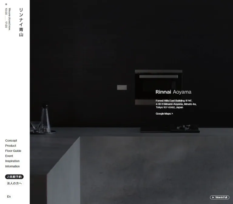
Rinnai Aoyama introduces a physical place and provides several routes into its services. The page combines a brand narrative with product discovery, floor information, events, editorial content, and visit reservations. Its long homepage functions as a guide to the wider website.
The defining desktop relationship is a narrow white navigation rail beside a much larger visual field. Dark interiors establish atmosphere; pale content sections introduce information with fine rules, compact links, and deliberately separated text and photographs. English labels provide a consistent navigational framework, while Japanese serif headings give service descriptions an editorial character.
On mobile, navigation moves to a bottom bar and the opening media becomes a 400px-high scene. The concept section preserves an asymmetric composition. Service information becomes vertically arranged, while featured products receive a distinct one-large-plus-two-small layout. Preserve these changes in hierarchy when adapting the design.
How to Read This Reference
- Measured means a value appears in the supplied rendered DOM or computed-style evidence. Coordinates describe the captured state, not necessarily a universal CSS rule.
- Calculated means arithmetic derived from those measurements, such as column gaps or section intervals.
- Estimated means a visual approximation from the five current-page screenshots. Estimated colors are not pixel samples.
- Recommended means implementation guidance for a new project. The CSS below is an adaptation, not recovered source code.
- Font-family strings identify declared stacks. They do not independently prove which font file rendered every glyph.
- Parent styles do not always describe visible child artwork or lettering. This matters particularly for wordmarks and large headings.
- DOM presence does not establish visibility: several submenu links have rectangles despite not appearing in the closed navigation captures.
- The supplied
--f-*custom properties cannot be mapped confidently to the visible primary controls. Their 40px button dimensions are therefore excluded from the main button tokens.
Tokens — Colors
Default Palette
| Name | Value | Suggested token | Evidence and role |
|---|---|---|---|
| Rail White | #ffffff |
--color-paper |
Measured: desktop rail and mobile bar backgrounds; also computed text color on Maps and reservation links over dark media. |
| Editorial Canvas | approximately #f8f8f8 |
--color-canvas |
Estimated: very light gray behind the concept and experience content. The exact enclosing background declaration was not supplied. |
| Primary Ink | #222123 |
--color-ink |
Measured: rgb(34, 33, 35) on body text, navigation, and filled reservation links. |
| Secondary Text | #797c7a |
--color-muted |
Measured: rgb(121, 124, 122) on experience descriptions. |
| Inactive Floor Labels | approximately #b9b9b9 |
--color-soft |
Estimated: lighter service names beneath the floor number in the desktop capture. |
| Hairline Gray | approximately #858883 |
--color-rule |
Estimated: service separators and short footer rule. Exact border colors were not supplied. |
| Pale Footer Mark | approximately #d9d9d9 |
--color-mark |
Estimated: the wordmark in the captured footer state. Its final opacity is unverified. |
The warmth comes primarily from photographed wood, upholstery, lighting, and stone. Brown and slate tones belong to the imagery; they are not established interface accent colors.
Computed parent colors require care. The hero H1 reports Primary Ink, but its visible wordmark is light against the photograph. Likewise, a reservation anchor reports dark text at the parent while its visible label is white. Preserve the visible foreground/background relationship instead of applying a parent color to every nested element.
Theme Presets
No theme selector was observed. White navigation, pale editorial content, and dark media sections are simultaneous surface treatments within one presentation. They are not evidence of selectable light and dark themes.
Tokens — Typography
Primary Sans-Serif
Declared stack: NHaasGroteskDSPro-55Rg, CezannePro-M, sans-serif.
This stack appears on body copy, navigation, service links, news titles, and sampled hero containers. Its role is quiet and functional: compact English labels sit comfortably beside Japanese text without requiring large button shapes.
The body computes to 13px, weight 500, line height 13px, and tracking 0.52px. Paragraphs override that compact line height. Experience descriptions use 14px / 25.2px; concept paragraphs use 14px / 28px. Both sizes persist across the inspected desktop and mobile viewports.
Editorial Serif
Declared stack: SeasonSerif-Regular, DNPShueiMinPr6-M, sans-serif.
This is directly measured on the news heading お知らせ and reservation heading ご来館のご予約: 24px, weight 500, line height 24px, and tracking 0.96px.
Japanese service titles also visibly use a serif treatment in the desktop photograph-and-copy rows. Their individual computed font-family declarations were not included; reusing the measured editorial stack for those titles is a recommendation. The source stack's final fallback is explicitly sans-serif.
Identity and Large Display Text
The rail carries the vertical Japanese identity リンナイ青山. Its home-link rectangle measures 20 × 133px; the link's inherited 13px font size is not a reliable measurement of the visible identity artwork.
The hero combines a heavier Rinnai mark with lighter Aoyama lettering. Its H1 computes to 26px / 26px, weight 400, at both viewports, while its measured height is 22px on desktop and 20px on mobile. Treat the graphic or nested content separately from the H1 container.
The mobile concept heading, Echoes / of Warmth, appears approximately 40px with tight leading. Its sampled H2 parent reports only 19.5px. Similarly, the Experiences and Featured heading boxes measure 80px high on desktop and 48px on mobile without supplying the inner display-text styles. Do not label those box heights as measured font sizes.
Type Scale
| Role | Value | Status | Application |
|---|---|---|---|
| Navigation and utility links | 13px, weight 500, tracking 0.52px |
Measured | Main links, language control, and service destinations. |
| Native button text | approximately 13.333px, weight 600 |
Measured parent | Information and View in Full controls; nested styling can differ. |
| Experience paragraphs | 14px / 25.2px, weight 500, tracking 0.56px |
Measured | Muted service explanations. |
| Concept paragraphs | 14px / 28px, weight 500, tracking 0.56px |
Measured | More spacious narrative reading. |
| News titles | 14px / 25.2px, weight 400 |
Measured | Linked editorial entries. |
| News and reservation headings | 24px / 24px, weight 500, tracking 0.96px |
Measured | Editorial serif headings. |
| Hero H1 container | 26px / 26px, weight 400 |
Measured | Container typography, not guaranteed wordmark dimensions. |
| Service category label | approximately 18px |
Estimated | Experience and Consultant labels above Japanese titles. |
| Japanese service title | approximately 24px |
Estimated | Serif benefit-oriented heading within each row. |
| Desktop floor numeral | approximately 48px |
Estimated | Large 1F and 4F identifiers. |
| Mobile concept display | approximately 40px |
Estimated | Two-line English statement. |
| Other major display headings | 80px desktop / 48px mobile starting point |
Recommended | An adaptation to test against actual heading artwork and content. |
The source root font size is 10px at both inspected widths. A direct copy of source rem values would need that context. The starter uses explicit pixel values and leaves the host project's root size unchanged.
Tokens — Spacing & Shapes
Responsive Unit
No source formula for a fluid spacing unit or breakpoint was supplied. The evidence instead establishes a set of fixed measurements and viewport-specific layouts.
Two scales coexist: 18–24px controls and navigation rows, surrounded by editorial intervals frequently exceeding 70px. Avoid reducing both to the same small spacing rhythm.
Spacing Scale
| Use | Desktop | Mobile | Evidence |
|---|---|---|---|
| Main content edge inset | 24px after the rail |
16px |
Measured Experiences and Featured bounds. |
| Narrow reading inset | Centered 828px news region | 39px on each side |
Measured; mobile news width is 312px. |
| Main navigation row | 24px |
38px in menu DOM |
Measured; expanded mobile menu not visually inspected. |
| Experience paragraph leading | 25.2px |
25.2px |
Measured. |
| Concept paragraph separation | 15px between adjacent blocks |
15px |
Calculated from paragraph rectangles. |
| Opening media to concept section | 96px |
76px |
Calculated. |
| Concept to Experiences | 150px |
95px |
Calculated. |
| Between floor groups | 70px |
72px |
Calculated. |
| Experiences to Featured | 100px |
75px |
Calculated. |
| Featured to news | 160px |
120px |
Calculated. |
| News to reservation section | 125px |
76px |
Calculated. |
These are content intervals in the captured layout, not proof of a universal spacing scale.
Border Radius
| Element | Value | Status |
|---|---|---|
| Reservation, business, and language pills | 11px |
Measured on 22px-high controls. |
| View in Full | 9px |
Measured on an 18px-high control. |
| Photographs and content regions | Square appearance | Observed; no visible rounded-card system. |
| Opening-status dot | Circular | Observed; approximately 8–10px across. |
| Rules | Approximately 1px |
Estimated from screenshots. |
Layout Measurements
| Element | Desktop: 1440 × 1000 | Mobile: 390 × 844 |
|---|---|---|
| Navigation shell | 140 × 1000px, left edge |
390 × 72px, at viewport y = 772 |
| Opening media | 1300 × 1000px, x = 140 |
390 × 400px, x = 0 |
| Concept section | 1160 × 1276px, x = 210 |
390 × 1484.59px, x = 0 |
| Experiences region | 1252 × 2650px, x = 164 |
358 × 3904.03px, x = 16 |
| Each floor group | 1252 × 1215px |
358 × 1873.02px |
| Experience paragraph | 320px wide, x = 482 |
335.09px wide, x = 38.91 |
| News region | 828px wide, x = 376 |
312px wide, x = 39 |
| Reservation section | 1300 × 900px |
390 × 844px |
| Reported document height | Approximately 8326px |
Approximately 9155px |
All values in this table are measured. The reported document extends 900px beyond the sampled BODY bounds at both widths. Footer element measurements were not supplied, so that difference should not be assigned to a specific footer positioning technique.
Components
Desktop Navigation Rail
Role: persistent identity, orientation, opening information, and access to reservations.
The white rail occupies 140px, or approximately 9.72% of the inspected desktop width. It remains at the same screen position in the opening and middle captures. The exact positioning declaration was not supplied.
Its anatomy has four distinct groups:
- A small gray status dot and vertically oriented opening information near the upper-left corner.
- The vertical Japanese home mark at x = 90, y = 38, measuring 20 × 133px.
- A lower navigation stack beginning at x = 25, y = 690, with 95px-wide links and 24px rows.
- Compact utility pills beneath the navigation: reservation at 87 × 22px, business at 87 × 22px, and language at 35 × 22px.
The visible primary navigation is Concept, Product, Floor Guide, Event, Inspiration, and Information. Information is a button in the DOM. Journal, Event Report, Access, News, and Downloads are also present in the DOM, but their expansion behavior was not exercised.
The captured opening state reads We are closed now. and displays 10:00 and 17:00. Do not infer holiday rules, timezone handling, or automatic schedule updates from this single state.
Mobile Bottom Bar
Role: keeps opening status, reservation access, and the menu within reach while preserving the page width.
At 390 × 844, the header becomes a white bottom bar at y = 772 with a height of 72px. Its computed top padding is 20px.
Status text and the gray dot sit at the left. The reservation pill measures approximately 93.11 × 22px at x = 213.05. The right-hand menu button measures 40 × 25px at x = 328.72 and contains two thin horizontal strokes.
The desktop identity rail is absent from the mobile opening capture. The menu destinations remain in the DOM, where primary links occupy 312px-wide rows beginning at x = 39. This establishes available content, not the appearance of an opened menu.
The bottom bar is not visible in the supplied final mobile capture. Its hiding or release behavior near the footer is unverified. A new implementation should make that decision explicitly rather than assuming it always overlays the footer.
Opening Architectural Media
Role: introduces the atmosphere and location before the detailed narrative.
The desktop media fills the entire area to the right of the rail. Its first captured scene is a close architectural detail dominated by broad brown and gray forms. The mobile opening shows a dark counter and wall composition.
The identity block sits well to the right on desktop: H1 x = 1015.13, y = 443, with a 190.88px-wide rectangle. Calculated within the 1300px media region, the block starts approximately 67.3% across; its right edge leaves an 18% inset.
On mobile, the identity moves to x = 39.38, y = 209.42, approximately 10% from the left and just below the scene's vertical midpoint. The address wraps differently while retaining the same destination information. Google Maps remains a small light text link beneath it.
View in Full is a transparent, white-outlined capsule with a play triangle, positioned near the lower-right edge. Its measured size is approximately 90.73 × 18px on both viewports. The desktop lower clearance is 22px; the mobile lower clearance is 17px.
The control and differing architectural scenes suggest a media experience. No video element, playback sequence, audio behavior, modal, or fullscreen result was supplied. Describe this as an opening media treatment; do not claim verified autoplay or looping.
Concept Narrative
Role: translates the site's theme of warmth into a spatial editorial sequence.
Echoes / of Warmth and 熱と移ろい introduce short Japanese paragraphs about heat, exchange, and creating new value. Copy is distributed across several horizontal positions rather than contained in one reading column.
At desktop width, the first paragraph group begins around x = 837.83, a later group around x = 377.98, and the final group at x = 908. Text widths vary from approximately 301px to 404px.
The mobile layout keeps that displacement: paragraph groups begin around x = 92.03, 36.27, and 148.58. Their measured boxes extend to the viewport's right edge. For a new implementation, preserve the staggered alignment while adding enough right padding for comfortable reading and text enlargement.
The mobile opening capture shows a narrow chair-detail photograph aligned to the right, starting around x = 239, y = 596. Approximately 135 × 176px is visible before the bottom bar begins. This is a visible crop, not a verified intrinsic asset ratio.
Use normal document flow or a deliberate editorial grid for an adaptation. The measured positions do not establish parallax, pinned storytelling, or scroll-scrubbed motion.
Floor Index and Experience Rows
Role: organizes the facility by floor and by the visitor's intended activity.
The homepage has two floor groups:
- 1F: Display, Lounge, Event.
- 4F: Experience, Consultant, Order Kitchen.
The desktop group is measured as a flex container. Its visible arrangement reads as three zones: floor index, service copy, and photograph. At the inspected width, the index rectangle is 267px wide; copy begins at x = 482; photographs begin around x = 906.
Calculated from those boundaries, the index-to-content gap is approximately 51px. A service paragraph is 320px wide, followed by approximately 104px of separation before the 510px-wide photograph.
Each row contains:
- A thin top rule spanning the service area.
- A small English category label.
- A Japanese serif heading describing the activity.
- A muted paragraph at 14px / 25.2px.
- A compact underlined destination link with a right arrow.
- A square-cornered architectural photograph.
The visible bath photograph measures approximately 510 × 340px, a 3:2 rendered rectangle. Adjacent service dividers are approximately 405px apart. The image starts about 17px below the rule and leaves about 48px before the next rule.
The floor index is visually independent of the individual row contents. In the middle capture, the 1F label remains near the top while the Event row is visible, which is consistent with sticky indexing. Its exact threshold and behavior were not verified.
On mobile, floor groups change from display: flex to display: block. Service paragraphs begin at x = 38.91 within the 16px section boundary, leaving an additional 22.91px inset. The supplied mobile images do not show these rows, so the precise photograph ordering and cropping remain unverified.
Compact Action Vocabulary
Role: makes destinations available without competing with the architectural imagery.
Three treatments recur:
| Treatment | Anatomy | Examples |
|---|---|---|
| Filled pill | Dark fill, light visible label, 22px height, 11px radius | ご来館予約, product View More, footer actions. |
| Light outlined pill | Transparent or white surface, fine pale outline, 22px height | 法人の方へ, En. |
| Editorial text link | Small label, fine underline, separated directional arrow | Product List, Floor Guide, Event, reservation destination. |
Several action labels occur twice in the DOM while appearing once in screenshots. Layered labels are possible, but a rolling-text hover effect was not observed. An adaptation should expose one accessible name and hide any decorative duplicate from assistive technology.
Featured Products
Role: presents three product destinations with a responsive change in priority.
The observed items are G:LINE, Air Bubble Technology, and 乾太くん. G:LINE and 乾太くん link to other Rinnai URLs; Air Bubble Technology links within the showroom site. Those destinations were not visited.
Desktop links form three equal columns, each approximately 298.03px wide and 392.03px high, separated by approximately 20.03px. These are complete anchor rectangles, not image-only dimensions.
Mobile is deliberately unequal. G:LINE occupies a 312px-wide first row at x = 39. Air Bubble Technology and 乾太くん then occupy 144px-wide columns at x = 39 and x = 207, with a 24px gap. The second row starts 35px below the first anchor's bottom. Air Bubble Technology wraps to multiple lines and produces a taller item.
Preserve this hierarchy. A uniform stack of three identical mobile cards would lose an observed design decision. Product image aspect ratios were not supplied.
News List
Role: connects the showroom to ongoing editorial and event activity.
The news section is a centered 828px-wide region on desktop and a 312px-wide region on mobile. Its Japanese serif heading uses the measured 24px editorial style.
Three entries were present, dated September 1, August 18, and July 31, 2026. Each combines a title and date. Desktop anchors use flex layout, with dates aligned at the right. Mobile titles and dates occupy successive lines; the longer event title wraps to two lines.
The desktop View More link is right aligned. The mobile equivalent begins at the left edge of the reading column. This is a quiet textual list, without evidence of thumbnail cards or category badges in this section.
Reservation Section
Role: explains the reservation requirement and directs visitors to booking.
The section measures 900px high on desktop and 844px high on mobile. Its heading and paragraph compute to white text. The supplied screenshots show portions of dark lower-page media, but not the complete reservation composition.
Desktop content occupies an approximately 825px-wide inner region, beginning at x = 377.5. A roughly 394px-wide explanatory paragraph sits left, while the small 予約する link sits toward the right.
On mobile, the heading, 312px-wide paragraph, and reservation link share x = 39. The action follows the paragraph vertically. The paragraph states that consultations and product experiences require reservations and includes a business-oriented inline link.
The link destination is verified as /reservation/; the booking form and completion flow are outside the inspected scope.
Access and Footer
Role: closes the page with location context, identity, and final contact routes.
The mobile end capture includes part of a dark Access area, followed by a large white footer. Both final captures show a short horizontal rule, a pale Rinnai Aoyama mark, and small Reservation and Contact capsules.
The rule appears approximately 102px wide. The mobile actions begin near x = 39, while the desktop actions sit farther to the right of the wordmark. Broad white space dominates both captures.
Footer elements were not included in the sampled DOM measurements, and much of this region is blank or faint in the screenshots. Record that as the captured state. Do not infer final reveal timing, deliberately hidden contact details, or an exact footer height. The Contact destination is not available in the supplied evidence.
Tokens — Motion & Interaction
| Element or treatment | Supplied value or evidence | What it establishes |
|---|---|---|
| Desktop navigation links | 0.8s cubic-bezier(0.165, 0.84, 0.44, 1) |
A computed transition duration and easing; the changed property and hover result were not supplied. |
| Maps link | Same 0.8s easing |
Transition styling exists on the link; activation was not tested. |
| Desktop news links | Same 0.8s easing |
Shared transition language in the editorial list. |
| Mobile bottom header | 1.2s cubic-bezier(0.19, 1, 0.22, 1) |
A comparatively long, strongly decelerating transition; its trigger is unverified. |
| Mobile primary menu entries | 1s cubic-bezier(0.075, 0.82, 0.165, 1) |
Defined menu-entry transition styling, not a visually tested menu sequence. |
| Mobile menu delays | 0.30s, 0.37s, 0.44s, 0.51s, 0.58s, 0.65s |
Calculated 70ms staggering across primary entries. |
| View in Full | Visible button and play symbol | A media affordance exists; its resulting interface is unknown. |
| Repeated button labels | Two DOM copies, one visible label | Duplicate text structure exists; animation mechanics remain unknown. |
| Sampled element animations | Usually animation: none |
Only those sampled elements lack named CSS animation at capture time. Children, media, and script-driven motion remain possible. |
The available timing values favor gradual deceleration. They do not establish parallax, cursor effects, image zoom, or page-transition choreography.
The capture process temporarily paused perpetual animations during readiness checks and resumed them afterward. Static images therefore cannot establish media cadence or a complete motion sequence. For a new implementation, use subtle transitions, keep content visible by default, and treat any reveal animation as progressive enhancement.
Surfaces
| Layer | Appearance | Function |
|---|---|---|
| Navigation rail and mobile bar | Solid white | Stable orientation and utility access. |
| Editorial content | Very pale neutral canvas | Allows typography and photographs to carry structure. |
| Opening media | Darkened architectural scene | Establishes atmosphere and supports light location text. |
| Experience content | Shared canvas with fine separators | Organizes services without individual card containers. |
| Primary action | Small dark capsule | Adds a concentrated action marker. |
| Lower media region | Dark imagery or material texture with light text | Provides contrast around access and reservation content. |
| Footer | Broad white field, pale mark, compact dark actions | Creates a spacious closing interval in the captured state. |
No general shadow-based elevation system is visible. Separation comes from rules, alignment, photograph edges, and transitions between light and dark fields.
Imagery
The current captures emphasize architecture and material detail: dark tiled bathing spaces, a consultation lounge with timber shelving and leather seating, tables and chairs, and close views of furniture and interior surfaces.
Photographs have restrained saturation and substantial tonal depth. Vertical architectural lines remain important compositional anchors. Timber provides warmth while dark stone, metal, and upholstery keep the overall impression controlled.
Use several scales of view: an immersive opening scene, medium room photographs for services, and narrow detail crops for the concept narrative. Avoid repeating a single full-width photograph treatment throughout the page. The contrast between a small detail and a large room image contributes to the rhythm.
Observed Asset References
No direct image or video asset URLs, intrinsic dimensions, poster paths, or media metadata were supplied. The following references describe visible subjects only.
| Reference | Current-page evidence | Reuse guidance |
|---|---|---|
| Opening architectural scene | Desktop opening and mobile opening captures | Use authorized architectural media with space for light identity text; adjust the crop by viewport. |
| Chair detail | Mobile concept capture | Preserve its narrow, right-aligned role; full image dimensions are unknown. |
| Event or lounge seating | Upper portion of desktop middle capture | Use a contextual room view rather than an isolated product cutout. |
| Bath experience | Desktop middle capture | Approximately 510 × 340px visible rectangle; retain room geometry and dark material detail. |
| Consultation lounge | Desktop middle capture | Timber shelving, dark seats, and soft illumination communicate the service setting. |
| Lower-page dark surface | Desktop and mobile end captures | Full subject and section boundaries are only partially visible. |
Keep natural photographic detail and smooth image rendering. Asset authorship and usage rights were not established by the supplied original-page evidence.
Layout & Responsive Behavior
The desktop page reserves 140px for navigation and lets the remaining 1300px form the main canvas. Content does not use one universal container: Experiences spans 1252px, the concept section spans 1160px, and the news list narrows to 828px. This variation creates distinct reading modes within the same page.
On mobile, the rail reservation disappears and sections occupy the full 390px viewport. Two common horizontal insets remain visible: 16px for broad section boundaries and 39px for narrower reading regions. The concept narrative uses additional asymmetric offsets.
| Relationship | Desktop behavior | Mobile behavior |
|---|---|---|
| Navigation | Persistent left rail in opening and middle captures | Bottom status/reservation/menu bar in opening capture. |
| Opening scene | Full inspected viewport height | 400px-high scene; concept content is visible below it. |
| Hero identity | Far-right placement | Approximately 10% left inset, lower half of the scene. |
| Concept text | Distributed across the wide canvas | Staggered narrow groups retained. |
| Floor groups | Flex layout with separate index and service region | Block layout with inset copy. |
| Featured products | Three equal-width items | Full-width first item above two half-width items. |
| News entries | Title and date share a horizontal row | Date follows title vertically. |
| Reservation content | Paragraph and action separated horizontally | Heading, paragraph, and action stack. |
| Footer | Mark and actions widely separated | Actions grouped beneath the mark in the supplied capture. |
Only two viewport widths were inspected. The breakpoint, intermediate tablet layout, landscape behavior, safe-area rules, and browser-toolbar responses remain unknown. The starter's 1024px breakpoint is a recommendation.
Most reading text stays at the same size between the two captured widths. Responsive adaptation happens primarily through composition, available width, wrapping, and navigation placement. Do not simply scale the desktop page down.
Do’s and Don’ts
Do
- Reserve a distinct desktop rail and a compact mobile utility bar.
- Keep the main ink close to the measured
#222123and service copy at#797c7awhen contrast permits. - Let architectural materials provide warmth and color variation.
- Pair compact sans-serif utilities with selective Japanese serif headings.
- Preserve separate widths for broad service sections and narrow reading sections.
- Build service information from floor identifiers, rules, copy, links, and photographs.
- Keep action silhouettes small and pill-shaped while providing larger usable hit areas.
- Preserve the mobile featured-product hierarchy: one wide item, then two smaller items.
- Retain asymmetry in the concept narrative without compromising reading order.
- Keep operational details such as opening status, location, and reservation access easy to find.
Don’t
- Don't turn every section into an identical rounded card grid.
- Don't introduce a bright CTA color unsupported by the current interface.
- Don't use heavy shadows, decorative gradients, or glass panels over the editorial content.
- Don't treat parent heading font sizes as measured artwork dimensions.
- Don't infer visible menu states from hidden or overlapping DOM link rectangles.
- Don't assume all featured-product anchor heights are image aspect ratios.
- Don't invent a fullscreen player, hover rollover, parallax sequence, or audio behavior.
- Don't copy the faint footer state as a requirement to hide essential information.
- Don't force desktop-wide images into the mobile layout without reconsidering their focal point.
- Don't require animation to reveal the only copy of navigation or booking information.
Recommended Implementation Additions
These are recommendations for a new implementation, not verified original-site features:
- Give 18–22px visual pills larger, nonoverlapping hit areas, ideally at least 44px high.
- Provide an accessible name for the menu button, an expanded state, predictable focus handling, and keyboard dismissal if a modal menu is implemented.
- Maintain one accessible label when decorative duplicate text is used.
- Add visible focus indicators to both dark-media links and pale-surface controls.
- Check muted text contrast against the actual canvas. Reserve very pale gray for nonessential decorative marks.
- If the opening asset is video, provide a suitable poster, explicit playback controls, and a reduced-motion/static alternative. Do not make audio automatic.
- Preserve semantic reading order when visually offsetting concept paragraphs or reordering product items.
- Allow all content to remain visible when scripts or animation initialization fail.
- Account for safe-area insets and ensure a bottom bar cannot cover focused content or the final links.
- Make opening-status logic explicit, including the facility timezone and exceptions, if implementing a live schedule.
Agent Prompt Guide
Quick Color Reference
- Navigation white:
#ffffff, measured. - Main ink and filled pills:
#222123, measured. - Service paragraph gray:
#797c7a, measured. - Editorial canvas: approximately
#f8f8f8, estimated. - Fine rules: approximately
#858883, estimated. - Warm browns and charcoal tones: supplied through architectural photography, not an added interface accent palette.
Overall Prompt
“Create a Japanese showroom website with the spatial restraint of an architectural publication. Use a 140px white desktop navigation rail with vertical Japanese identity, small opening information, lower navigation links, and compact reservation pills. Place an immersive dark architectural scene beside it, with a modest light location block toward the right. Continue into pale editorial sections with asymmetric concept copy, large floor identifiers, fine rules, Japanese serif service headings, muted 14px body text, and square room photographs. Use a bottom utility bar on mobile, a 400px opening scene at the 390px reference width, and one wide featured product above two smaller products. Keep imagery and spacing dominant. Treat unverified media and menu behavior as implementation decisions.”
Example Component Prompts
- Desktop rail: “Build a 140px white navigation rail. Position a vertical Japanese home mark near its upper-right side, gray opening status near the upper-left, and six compact navigation rows near the bottom. Use dark 22px visual pills for reservations and light outlined pills for business and language. Provide visible keyboard focus.”
- Experience row: “Create an architectural showroom service row with a separate floor-index column, a thin top rule, an 18px English category label, an approximately 24px Japanese serif heading, muted 14px / 25.2px copy, and a small underlined arrow link. Place a square-cornered 3:2 room photograph at the right. Avoid card backgrounds and shadows.”
- Concept section: “Arrange the two-line heading ‘Echoes of Warmth’, a small Japanese subtitle, narrow furniture details, and short paragraphs across a spacious editorial grid. Retain staggered text positions on mobile while keeping DOM reading order logical. Content must remain visible without animation.”
- Featured products: “Use three equal product columns on desktop. At mobile width, make the first item span a 312px content region and place the next two in 144px columns separated by 24px. Let long product names wrap naturally; do not force equal text heights.”
- Mobile utility bar: “Create a white bottom bar approximately 72px high, with a gray status dot and opening hours at left, a compact dark reservation pill toward the right, and a two-line menu icon at the end. Include safe-area space and larger invisible hit areas without enlarging the visual pill.”
Quick Start
CSS Custom Properties
This starter uses measured colors, body typography, rail width, pill geometry, and the two observed layout modes. The grid percentages reproduce the measured desktop experience columns approximately, although the source floor container uses flex layout.
The 1024px breakpoint, display-heading sizes, concept grid slots, contrast overlay, and footer spacing are recommendations. The hero title is a text stand-in for the original wordmark. Pill backgrounds live on an inner span so the clickable target can be larger than the observed silhouette.
Use .floor__index and .floor__body as siblings. Each .service contains .service__copy and an image with .service__image. The CSS provides layout and appearance; menu state, opening schedules, and media controls require separate behavior.
:root {
  /* Measured interface colors */
  --color-paper: #ffffff;
  --color-ink: #222123;
  --color-muted: #797c7a;

  /* Visual estimates; validate against final assets */
  --color-canvas: #f8f8f8;
  --color-soft: #b9b9b9;
  --color-rule: #858883;
  --color-mark: #d9d9d9;

  /* Declared source stacks; font files are not bundled */
  --font-ui: 'NHaasGroteskDSPro-55Rg', 'CezannePro-M', sans-serif;
  --font-editorial: 'SeasonSerif-Regular', 'DNPShueiMinPr6-M', sans-serif;

  --text-utility: 13px;
  --text-body: 14px;
  --text-editorial: 24px;
  --tracking: 0.04em;
  --leading-body: 1.8;
  --leading-concept: 2;

  --rail-width: 140px;
  --bar-height: 72px;
  --page-inset: 24px;
  --pill-height: 22px;
  --pill-radius: 11px;
  --rule-width: 1px;
  --safe-bottom: env(safe-area-inset-bottom, 0px);

  /* Derived desktop proportions, expressed as a grid adaptation */
  --floor-index-width: 21.3259%;
  --floor-gap: 4.0735%;
  --service-copy-width: 34.2612%;
  --service-gap: 11.135%;

  /* Computed timings; transition properties below are recommendations */
  --ease-link: cubic-bezier(0.165, 0.84, 0.44, 1);
  --ease-bar: cubic-bezier(0.19, 1, 0.22, 1);
  --ease-menu: cubic-bezier(0.075, 0.82, 0.165, 1);
}

* { box-sizing: border-box; }

body {
  margin: 0;
  color: var(--color-ink);
  background: var(--color-canvas);
  font-family: var(--font-ui);
  font-size: var(--text-utility);
  font-weight: 500;
  line-height: 1;
  letter-spacing: var(--tracking);
}

a { color: inherit; }
button { font: inherit; }
img, video { display: block; max-inline-size: 100%; }

.page { margin-inline-start: var(--rail-width); }
.section { margin-inline: var(--page-inset); }

.rail {
  position: fixed;
  inset: 0 auto 0 0;
  z-index: 30;
  inline-size: var(--rail-width);
  background: var(--color-paper);
}

.rail__brand {
  position: absolute;
  inset-block-start: 38px;
  inset-inline-start: 90px;
  writing-mode: vertical-rl;
  text-decoration: none;
}

.rail__status {
  position: absolute;
  inset-block-start: 16px;
  inset-inline-start: 24px;
  writing-mode: vertical-rl;
  font-size: 11px;
  line-height: 1.5;
}

.rail__nav {
  position: absolute;
  inset-inline: 25px 20px;
  inset-block-end: 164px;
}

.rail__nav a {
  display: block;
  min-block-size: 24px;
  padding-block: 5px;
  text-decoration: none;
  transition: opacity 800ms var(--ease-link);
}

.rail__actions {
  position: absolute;
  inset-inline-start: 24px;
  inset-block-end: 12px;
  display: grid;
  justify-items: start;
}

.rail__language { margin-block-start: 20px; }
.mobile-bar { display: none; }

/* Larger targets; the inner silhouette remains 22px high. */
.pill {
  display: inline-flex;
  align-items: center;
  justify-content: center;
  min-block-size: 44px;
  padding: 0;
  border: 0;
  background: transparent;
  text-decoration: none;
  cursor: pointer;
}

.pill > span {
  display: inline-flex;
  align-items: center;
  justify-content: center;
  min-block-size: var(--pill-height);
  padding-inline: 12px;
  border-radius: var(--pill-radius);
  color: var(--color-paper);
  background: var(--color-ink);
  line-height: 1;
  white-space: nowrap;
}

.pill--outline > span {
  border: 1px solid #e5e5e5;
  color: var(--color-ink);
  background: transparent;
}

.text-link {
  display: inline-flex;
  align-items: center;
  gap: 12px;
  padding-block-end: 3px;
  border-block-end: 1px solid #c9ccc7;
  text-decoration: none;
  line-height: 1.1;
}

.hero {
  position: relative;
  isolation: isolate;
  block-size: 100svh;
  color: var(--color-paper);
  background: var(--color-ink);
  overflow: hidden;
}

.hero__media {
  position: absolute;
  inset: 0;
  z-index: -2;
  inline-size: 100%;
  block-size: 100%;
  object-fit: cover;
}

/* Recommended legibility overlay; opacity is not source-measured. */
.hero::before {
  content: '';
  position: absolute;
  inset: 0;
  z-index: -1;
  background: rgb(0 0 0 / 18%);
  pointer-events: none;
}

.hero__identity {
  position: absolute;
  inset-block-start: 44.3%;
  inset-inline-end: 18%;
  inline-size: 191px;
}

.hero__title {
  margin: 0 0 24px;
  font-size: 26px;
  font-weight: 400;
  line-height: 1;
  letter-spacing: 0;
}

.hero__address {
  margin: 0 0 16px;
  font-style: normal;
  font-size: 13px;
  line-height: 1.2;
  letter-spacing: 0;
}

.hero__full {
  position: absolute;
  inset-inline-end: 24px;
  inset-block-end: 9px;
}

.hero__full > span {
  min-block-size: 18px;
  padding-inline: 10px;
  border: 1px solid currentColor;
  border-radius: 9px;
  background: transparent;
}

/* Recommended editorial slots, not recovered source positioning. */
.concept {
  display: grid;
  grid-template-columns: repeat(12, minmax(0, 1fr));
  gap: 96px 24px;
  margin: 96px 70px 150px;
}

.concept__title {
  grid-column: 1 / 6;
  margin: 0;
  font-size: clamp(40px, 5.6vw, 80px);
  font-weight: 400;
  line-height: 1;
  letter-spacing: -0.04em;
}

.concept__image { grid-column: 8 / -1; justify-self: end; }
.concept__copy--a { grid-column: 8 / -1; }
.concept__copy--b { grid-column: 3 / 7; }
.concept__copy--c { grid-column: 9 / -1; }
.concept p { margin: 0 0 15px; font-size: 14px; line-height: 2; }

.section-title {
  margin: 0 0 70px;
  font-size: 80px;
  font-weight: 400;
  line-height: 1;
  letter-spacing: -0.03em;
}

.floor {
  display: grid;
  grid-template-columns: var(--floor-index-width) minmax(0, 1fr);
  column-gap: var(--floor-gap);
}

.floor + .floor { margin-block-start: 70px; }

.floor__index {
  align-self: start;
  margin: 0;
}

.floor__number {
  display: block;
  margin-block-end: 10px;
  font-size: 48px;
  font-weight: 400;
  line-height: 1;
}

.floor__categories {
  color: var(--color-soft);
  font-size: 18px;
  line-height: 1;
}

.floor__categories .is-current { color: var(--color-ink); }

.service {
  display: grid;
  grid-template-columns: var(--service-copy-width) minmax(0, 1fr);
  column-gap: var(--service-gap);
  padding-block: 16px 48px;
  border-block-start: var(--rule-width) solid var(--color-rule);
}

.service__eyebrow { margin: 0; font-size: 18px; line-height: 1; }

.service__title {
  margin: 84px 0 18px;
  font-family: var(--font-editorial);
  font-size: var(--text-editorial);
  font-weight: 500;
  line-height: 1.35;
}

.service__description {
  margin: 0;
  color: var(--color-muted);
  font-size: var(--text-body);
  line-height: var(--leading-body);
}

.service__copy .text-link { margin-block-start: 35px; }

.service__image {
  inline-size: 100%;
  aspect-ratio: 3 / 2;
  object-fit: cover;
}

.featured { margin-block-start: 100px; }

.featured__grid {
  display: grid;
  grid-template-columns: repeat(3, minmax(0, 1fr));
  gap: 20px;
  max-inline-size: 934px;
  margin-inline: auto 8.6%;
}

/* Let supplied product assets determine their image ratios. */
.product { min-inline-size: 0; text-decoration: none; }
.product img { inline-size: 100%; block-size: auto; }

.news {
  inline-size: min(828px, 80%);
  margin: 160px auto 125px;
}

.editorial-heading {
  margin: 0 0 64px;
  font-family: var(--font-editorial);
  font-size: 24px;
  font-weight: 500;
  line-height: 1;
}

.news__link {
  display: grid;
  grid-template-columns: minmax(0, 1fr) auto;
  gap: 20px;
  align-items: baseline;
  margin-block-end: 28px;
  text-decoration: none;
}

.news__title { margin: 0; font-size: 14px; font-weight: 400; line-height: 1.8; }
.news__more { display: flex; justify-content: flex-end; margin-block-start: 60px; }

.reservation {
  display: grid;
  align-content: center;
  min-block-size: 90svh;
  padding-block: 80px;
  color: var(--color-paper);
  background: var(--color-ink);
}

.reservation__inner { inline-size: min(825px, 80%); margin-inline: auto; }
.reservation__body { display: grid; grid-template-columns: 1fr 1fr; gap: 36px; }
.reservation__body p { margin: 0; font-size: 14px; line-height: 1.8; }
.reservation__action { justify-self: end; align-self: start; }

.site-footer {
  display: flex;
  flex-direction: column;
  gap: 24px;
  min-block-size: 700px;
  padding: 80px 10% 96px;
  background: var(--color-paper);
}

.site-footer__rule { inline-size: 102px; border-block-start: 1px solid var(--color-rule); }
.site-footer__mark { margin-block-start: auto; color: var(--color-mark); font-size: 44px; }
.site-footer__actions { display: flex; flex-wrap: wrap; gap: 24px; }

:where(a, button):focus-visible {
  outline: 2px solid currentColor;
  outline-offset: 4px;
}

@media (hover: hover) {
  .rail__nav a:hover { opacity: 0.6; }
}

/* Recommended breakpoint; the original breakpoint was not supplied. */
@media (max-width: 1023px) {
  :root { --page-inset: 16px; }
  .rail { display: none; }
  .page { margin-inline-start: 0; padding-block-end: calc(72px + var(--safe-bottom)); }

  .mobile-bar {
    position: fixed;
    inset: auto 0 0;
    z-index: 30;
    display: grid;
    grid-template-columns: minmax(0, 1fr) auto 44px;
    align-items: center;
    gap: 22px;
    min-block-size: calc(var(--bar-height) + var(--safe-bottom));
    padding: 0 16px var(--safe-bottom);
    background: var(--color-paper);
    transition: transform 1.2s var(--ease-bar);
  }

  .mobile-bar__status { line-height: 1.4; letter-spacing: 0; }

  .mobile-bar__menu {
    display: grid;
    align-content: center;
    justify-items: center;
    gap: 4px;
    inline-size: 44px;
    block-size: 44px;
    padding: 0;
    border: 0;
    color: var(--color-ink);
    background: transparent;
  }

  .mobile-bar__menu::before,
  .mobile-bar__menu::after {
    content: '';
    inline-size: 40px;
    block-size: 1px;
    background: currentColor;
  }

  .hero { block-size: 400px; }
  .hero__identity { inset: 52.35% 18% auto 10%; inline-size: auto; }
  .hero__title { font-size: 22px; }
  .hero__full { inset-inline-end: 16px; inset-block-end: 4px; }

  .concept { gap: 40px 16px; margin: 76px 0 95px; padding-inline: 16px; }
  .concept__title { grid-column: 1 / -1; font-size: 40px; }
  .concept__image { grid-column: 8 / -1; inline-size: min(135px, 100%); }
  .concept__copy--a { grid-column: 4 / -1; }
  .concept__copy--b { grid-column: 2 / -1; }
  .concept__copy--c { grid-column: 6 / -1; }

  .section-title { margin-block-end: 38px; font-size: 48px; }
  .floor { display: block; }
  .floor + .floor { margin-block-start: 72px; }
  .floor__index, .floor__body { margin-inline-start: 6.398%; }
  .floor__index { margin-block-end: 40px; }
  .service { grid-template-columns: minmax(0, 1fr); row-gap: 32px; }
  .service__title { margin-block-start: 48px; }
  .service__copy .text-link { margin-block-start: 55px; }

  .featured { margin-block-start: 75px; }
  .featured__grid {
    inline-size: 80vw;
    margin-inline: auto;
    grid-template-columns: repeat(2, minmax(0, 1fr));
    gap: 35px 24px;
  }
  .product:first-child { grid-column: 1 / -1; }

  .news { margin-block: 120px 76px; }
  .news__link { grid-template-columns: minmax(0, 1fr); gap: 4px; }
  .news__more { justify-content: flex-start; margin-block-start: 40px; }

  .reservation { min-block-size: 100svh; }
  .reservation__body { grid-template-columns: minmax(0, 1fr); gap: 60px; }
  .reservation__action { justify-self: start; }
  .site-footer__mark { font-size: 26px; }
  .site-footer__actions { gap: 15px; }
}

@media (prefers-reduced-motion: reduce) {
  .rail__nav a, .mobile-bar { transition: none; }
  /* Select a static media alternative in the application layer. */
}
Minimal Component Markup
The image slot below intentionally has no invented asset URL. Insert an authorized photograph with a useful text alternative. The service order shown on mobile is a recommended implementation choice because the supplied mobile screenshots do not show this region.
<section class='floor' aria-labelledby='floor-4f'>
  <h3 class='floor__index' id='floor-4f'>
    <span class='floor__number'>4F</span>
    <span class='floor__categories'>
      <span class='is-current'>Experience</span>, Consultant, Order Kitchen
    </span>
  </h3>

  <div class='floor__body'>
    <article class='service'>
      <div class='service__copy'>
        <p class='service__eyebrow'>Experience</p>
        <h4 class='service__title' lang='ja'>Rinnaiの商品を体験する</h4>
        <p class='service__description' lang='ja'>
          Rinnaiの技術を集結させた厨房機器や、バスユニット、
          ミストサウナ、ガス衣類乾燥機を体験することができます。
        </p>
        <a class='text-link' href='https://aoyama.rinnai.jp/floor-guide/#floor-4f'>
          4F Rinnai Showroom <span aria-hidden='true'>→</span>
        </a>
      </div>
      <!-- Insert an authorized image with class='service__image'. -->
    </article>
  </div>
</section>

<a class='pill' href='https://aoyama.rinnai.jp/reservation/'>
  <span lang='ja'>ご来館予約</span>
</a>
Tailwind v4 Token Mapping
Optional aliases for a project already using Tailwind v4. This is not evidence that the original website uses Tailwind. Define the custom properties above first.
@theme inline {
  --color-paper: #ffffff;
  --color-canvas: #f8f8f8;
  --color-ink: #222123;
  --color-muted: #797c7a;
  --color-rule: #858883;

  --font-sans: var(--font-ui);
  --font-serif: var(--font-editorial);

  --text-utility: 13px;
  --text-body: 14px;
  --text-editorial: 24px;

  --spacing-rail: 140px;
  --spacing-bar: 72px;
  --spacing-page: 24px;
  --spacing-page-mobile: 16px;
  --radius-pill: 11px;
}
Sources & Evidence
- Inspected original and final website: Rinnai Aoyama. The supplied response status is 200 and the final URL matches the original URL.
- Capture batch: September 12, 2026, timestamp
2026-09-12T14:30:02.328Z. Individual screenshot timestamps were not supplied. - Visual evidence: three current-page desktop captures at 1440 × 1000 and two current-page mobile captures at 390 × 844, covering opening, middle desktop content, and page-end states.
- Rendered evidence: page title, text, destination URLs, element rectangles, computed font stacks, sizes, colors, line heights, display values, transitions, and exposed custom properties at both viewports.
- Observation process: the supplied browser inspection included an initial observation of at least five seconds and scrolling through intermediate positions. Readiness checks waited for layout/text stability, finite animation, and image decoding within bounded time limits. Those checks do not prove complete delayed content or reveal sequences.
- Interaction scope: scrolling and captured resting states are represented. No opened navigation menu, Information expansion, View in Full result, booking flow, language switch, or hover sequence was supplied.
- Limitations: perpetual motion was paused during readiness checks and resumed afterward; SharedWorkers and service workers were disabled. Asset URLs, full stylesheets, nested heading styles, footer element measurements, and intermediate responsive widths were unavailable. No additional browsing was performed for this reference.
This reference describes the current supplied page evidence. Estimated visual tokens and recommended implementation behavior are explicitly distinguished from measured values.
# Rinnai Aoyama — Style Reference

> An architectural showroom presented through quiet typography, precise columns, and generous intervals of space.

**Original URL:** [https://aoyama.rinnai.jp/](https://aoyama.rinnai.jp/)
**Final URL:** [https://aoyama.rinnai.jp/](https://aoyama.rinnai.jp/) — HTTP 200, unchanged.
**Theme:** light editorial surfaces with dark architectural media.
**Inspected:** September 12, 2026. Supplied browser evidence timestamp: `2026-09-12T14:30:02.328Z`, equivalent to 23:30:02.328 JST.
**Viewports:** 1440 × 1000 desktop and 390 × 844 mobile, in CSS pixels.
**Scope:** the current Japanese showroom homepage: navigation, opening media, concept narrative, six floor-based experiences, featured products, news, reservation information, and partially captured access/footer content. Linked pages and expanded controls were not inspected.

Rinnai Aoyama introduces a physical place and provides several routes into its services. The page combines a brand narrative with product discovery, floor information, events, editorial content, and visit reservations. Its long homepage functions as a guide to the wider website.

The defining desktop relationship is a narrow white navigation rail beside a much larger visual field. Dark interiors establish atmosphere; pale content sections introduce information with fine rules, compact links, and deliberately separated text and photographs. English labels provide a consistent navigational framework, while Japanese serif headings give service descriptions an editorial character.

On mobile, navigation moves to a bottom bar and the opening media becomes a 400px-high scene. The concept section preserves an asymmetric composition. Service information becomes vertically arranged, while featured products receive a distinct one-large-plus-two-small layout. Preserve these changes in hierarchy when adapting the design.

## How to Read This Reference

- **Measured** means a value appears in the supplied rendered DOM or computed-style evidence. Coordinates describe the captured state, not necessarily a universal CSS rule.
- **Calculated** means arithmetic derived from those measurements, such as column gaps or section intervals.
- **Estimated** means a visual approximation from the five current-page screenshots. Estimated colors are not pixel samples.
- **Recommended** means implementation guidance for a new project. The CSS below is an adaptation, not recovered source code.
- Font-family strings identify declared stacks. They do not independently prove which font file rendered every glyph.
- Parent styles do not always describe visible child artwork or lettering. This matters particularly for wordmarks and large headings.
- DOM presence does not establish visibility: several submenu links have rectangles despite not appearing in the closed navigation captures.
- The supplied `--f-*` custom properties cannot be mapped confidently to the visible primary controls. Their 40px button dimensions are therefore excluded from the main button tokens.

## Tokens — Colors

### Default Palette

| Name | Value | Suggested token | Evidence and role |
| --- | --- | --- | --- |
| Rail White | `#ffffff` | `--color-paper` | **Measured:** desktop rail and mobile bar backgrounds; also computed text color on Maps and reservation links over dark media. |
| Editorial Canvas | approximately `#f8f8f8` | `--color-canvas` | **Estimated:** very light gray behind the concept and experience content. The exact enclosing background declaration was not supplied. |
| Primary Ink | `#222123` | `--color-ink` | **Measured:** `rgb(34, 33, 35)` on body text, navigation, and filled reservation links. |
| Secondary Text | `#797c7a` | `--color-muted` | **Measured:** `rgb(121, 124, 122)` on experience descriptions. |
| Inactive Floor Labels | approximately `#b9b9b9` | `--color-soft` | **Estimated:** lighter service names beneath the floor number in the desktop capture. |
| Hairline Gray | approximately `#858883` | `--color-rule` | **Estimated:** service separators and short footer rule. Exact border colors were not supplied. |
| Pale Footer Mark | approximately `#d9d9d9` | `--color-mark` | **Estimated:** the wordmark in the captured footer state. Its final opacity is unverified. |

The warmth comes primarily from photographed wood, upholstery, lighting, and stone. Brown and slate tones belong to the imagery; they are not established interface accent colors.

Computed parent colors require care. The hero H1 reports Primary Ink, but its visible wordmark is light against the photograph. Likewise, a reservation anchor reports dark text at the parent while its visible label is white. Preserve the visible foreground/background relationship instead of applying a parent color to every nested element.

### Theme Presets

No theme selector was observed. White navigation, pale editorial content, and dark media sections are simultaneous surface treatments within one presentation. They are not evidence of selectable light and dark themes.

## Tokens — Typography

### Primary Sans-Serif

**Declared stack:** `NHaasGroteskDSPro-55Rg, CezannePro-M, sans-serif`.

This stack appears on body copy, navigation, service links, news titles, and sampled hero containers. Its role is quiet and functional: compact English labels sit comfortably beside Japanese text without requiring large button shapes.

The body computes to `13px`, weight `500`, line height `13px`, and tracking `0.52px`. Paragraphs override that compact line height. Experience descriptions use `14px / 25.2px`; concept paragraphs use `14px / 28px`. Both sizes persist across the inspected desktop and mobile viewports.

### Editorial Serif

**Declared stack:** `SeasonSerif-Regular, DNPShueiMinPr6-M, sans-serif`.

This is directly measured on the news heading `お知らせ` and reservation heading `ご来館のご予約`: `24px`, weight `500`, line height `24px`, and tracking `0.96px`.

Japanese service titles also visibly use a serif treatment in the desktop photograph-and-copy rows. Their individual computed font-family declarations were not included; reusing the measured editorial stack for those titles is a recommendation. The source stack's final fallback is explicitly `sans-serif`.

### Identity and Large Display Text

The rail carries the vertical Japanese identity `リンナイ青山`. Its home-link rectangle measures `20 × 133px`; the link's inherited `13px` font size is not a reliable measurement of the visible identity artwork.

The hero combines a heavier Rinnai mark with lighter Aoyama lettering. Its H1 computes to `26px / 26px`, weight `400`, at both viewports, while its measured height is 22px on desktop and 20px on mobile. Treat the graphic or nested content separately from the H1 container.

The mobile concept heading, `Echoes / of Warmth`, appears approximately 40px with tight leading. Its sampled H2 parent reports only 19.5px. Similarly, the Experiences and Featured heading boxes measure 80px high on desktop and 48px on mobile without supplying the inner display-text styles. Do not label those box heights as measured font sizes.

### Type Scale

| Role | Value | Status | Application |
| --- | --- | --- | --- |
| Navigation and utility links | `13px`, weight `500`, tracking `0.52px` | Measured | Main links, language control, and service destinations. |
| Native button text | approximately `13.333px`, weight `600` | Measured parent | Information and View in Full controls; nested styling can differ. |
| Experience paragraphs | `14px / 25.2px`, weight `500`, tracking `0.56px` | Measured | Muted service explanations. |
| Concept paragraphs | `14px / 28px`, weight `500`, tracking `0.56px` | Measured | More spacious narrative reading. |
| News titles | `14px / 25.2px`, weight `400` | Measured | Linked editorial entries. |
| News and reservation headings | `24px / 24px`, weight `500`, tracking `0.96px` | Measured | Editorial serif headings. |
| Hero H1 container | `26px / 26px`, weight `400` | Measured | Container typography, not guaranteed wordmark dimensions. |
| Service category label | approximately `18px` | Estimated | Experience and Consultant labels above Japanese titles. |
| Japanese service title | approximately `24px` | Estimated | Serif benefit-oriented heading within each row. |
| Desktop floor numeral | approximately `48px` | Estimated | Large 1F and 4F identifiers. |
| Mobile concept display | approximately `40px` | Estimated | Two-line English statement. |
| Other major display headings | `80px` desktop / `48px` mobile starting point | Recommended | An adaptation to test against actual heading artwork and content. |

The source root font size is 10px at both inspected widths. A direct copy of source `rem` values would need that context. The starter uses explicit pixel values and leaves the host project's root size unchanged.

## Tokens — Spacing & Shapes

### Responsive Unit

No source formula for a fluid spacing unit or breakpoint was supplied. The evidence instead establishes a set of fixed measurements and viewport-specific layouts.

Two scales coexist: 18–24px controls and navigation rows, surrounded by editorial intervals frequently exceeding 70px. Avoid reducing both to the same small spacing rhythm.

### Spacing Scale

| Use | Desktop | Mobile | Evidence |
| --- | --- | --- | --- |
| Main content edge inset | `24px` after the rail | `16px` | Measured Experiences and Featured bounds. |
| Narrow reading inset | Centered 828px news region | `39px` on each side | Measured; mobile news width is 312px. |
| Main navigation row | `24px` | `38px` in menu DOM | Measured; expanded mobile menu not visually inspected. |
| Experience paragraph leading | `25.2px` | `25.2px` | Measured. |
| Concept paragraph separation | `15px` between adjacent blocks | `15px` | Calculated from paragraph rectangles. |
| Opening media to concept section | `96px` | `76px` | Calculated. |
| Concept to Experiences | `150px` | `95px` | Calculated. |
| Between floor groups | `70px` | `72px` | Calculated. |
| Experiences to Featured | `100px` | `75px` | Calculated. |
| Featured to news | `160px` | `120px` | Calculated. |
| News to reservation section | `125px` | `76px` | Calculated. |

These are content intervals in the captured layout, not proof of a universal spacing scale.

### Border Radius

| Element | Value | Status |
| --- | --- | --- |
| Reservation, business, and language pills | `11px` | Measured on 22px-high controls. |
| View in Full | `9px` | Measured on an 18px-high control. |
| Photographs and content regions | Square appearance | Observed; no visible rounded-card system. |
| Opening-status dot | Circular | Observed; approximately 8–10px across. |
| Rules | Approximately `1px` | Estimated from screenshots. |

### Layout Measurements

| Element | Desktop: 1440 × 1000 | Mobile: 390 × 844 |
| --- | --- | --- |
| Navigation shell | `140 × 1000px`, left edge | `390 × 72px`, at viewport y = 772 |
| Opening media | `1300 × 1000px`, x = 140 | `390 × 400px`, x = 0 |
| Concept section | `1160 × 1276px`, x = 210 | `390 × 1484.59px`, x = 0 |
| Experiences region | `1252 × 2650px`, x = 164 | `358 × 3904.03px`, x = 16 |
| Each floor group | `1252 × 1215px` | `358 × 1873.02px` |
| Experience paragraph | `320px` wide, x = 482 | `335.09px` wide, x = 38.91 |
| News region | `828px` wide, x = 376 | `312px` wide, x = 39 |
| Reservation section | `1300 × 900px` | `390 × 844px` |
| Reported document height | Approximately `8326px` | Approximately `9155px` |

All values in this table are measured. The reported document extends 900px beyond the sampled BODY bounds at both widths. Footer element measurements were not supplied, so that difference should not be assigned to a specific footer positioning technique.

## Components

### Desktop Navigation Rail

**Role:** persistent identity, orientation, opening information, and access to reservations.

The white rail occupies 140px, or approximately 9.72% of the inspected desktop width. It remains at the same screen position in the opening and middle captures. The exact positioning declaration was not supplied.

Its anatomy has four distinct groups:

1. A small gray status dot and vertically oriented opening information near the upper-left corner.
2. The vertical Japanese home mark at x = 90, y = 38, measuring 20 × 133px.
3. A lower navigation stack beginning at x = 25, y = 690, with 95px-wide links and 24px rows.
4. Compact utility pills beneath the navigation: reservation at 87 × 22px, business at 87 × 22px, and language at 35 × 22px.

The visible primary navigation is Concept, Product, Floor Guide, Event, Inspiration, and Information. Information is a button in the DOM. Journal, Event Report, Access, News, and Downloads are also present in the DOM, but their expansion behavior was not exercised.

The captured opening state reads `We are closed now.` and displays `10:00` and `17:00`. Do not infer holiday rules, timezone handling, or automatic schedule updates from this single state.

### Mobile Bottom Bar

**Role:** keeps opening status, reservation access, and the menu within reach while preserving the page width.

At 390 × 844, the header becomes a white bottom bar at y = 772 with a height of 72px. Its computed top padding is 20px.

Status text and the gray dot sit at the left. The reservation pill measures approximately 93.11 × 22px at x = 213.05. The right-hand menu button measures 40 × 25px at x = 328.72 and contains two thin horizontal strokes.

The desktop identity rail is absent from the mobile opening capture. The menu destinations remain in the DOM, where primary links occupy 312px-wide rows beginning at x = 39. This establishes available content, not the appearance of an opened menu.

The bottom bar is not visible in the supplied final mobile capture. Its hiding or release behavior near the footer is unverified. A new implementation should make that decision explicitly rather than assuming it always overlays the footer.

### Opening Architectural Media

**Role:** introduces the atmosphere and location before the detailed narrative.

The desktop media fills the entire area to the right of the rail. Its first captured scene is a close architectural detail dominated by broad brown and gray forms. The mobile opening shows a dark counter and wall composition.

The identity block sits well to the right on desktop: H1 x = 1015.13, y = 443, with a 190.88px-wide rectangle. Calculated within the 1300px media region, the block starts approximately 67.3% across; its right edge leaves an 18% inset.

On mobile, the identity moves to x = 39.38, y = 209.42, approximately 10% from the left and just below the scene's vertical midpoint. The address wraps differently while retaining the same destination information. Google Maps remains a small light text link beneath it.

View in Full is a transparent, white-outlined capsule with a play triangle, positioned near the lower-right edge. Its measured size is approximately 90.73 × 18px on both viewports. The desktop lower clearance is 22px; the mobile lower clearance is 17px.

The control and differing architectural scenes suggest a media experience. No video element, playback sequence, audio behavior, modal, or fullscreen result was supplied. Describe this as an opening media treatment; do not claim verified autoplay or looping.

### Concept Narrative

**Role:** translates the site's theme of warmth into a spatial editorial sequence.

`Echoes / of Warmth` and `熱と移ろい` introduce short Japanese paragraphs about heat, exchange, and creating new value. Copy is distributed across several horizontal positions rather than contained in one reading column.

At desktop width, the first paragraph group begins around x = 837.83, a later group around x = 377.98, and the final group at x = 908. Text widths vary from approximately 301px to 404px.

The mobile layout keeps that displacement: paragraph groups begin around x = 92.03, 36.27, and 148.58. Their measured boxes extend to the viewport's right edge. For a new implementation, preserve the staggered alignment while adding enough right padding for comfortable reading and text enlargement.

The mobile opening capture shows a narrow chair-detail photograph aligned to the right, starting around x = 239, y = 596. Approximately 135 × 176px is visible before the bottom bar begins. This is a visible crop, not a verified intrinsic asset ratio.

Use normal document flow or a deliberate editorial grid for an adaptation. The measured positions do not establish parallax, pinned storytelling, or scroll-scrubbed motion.

### Floor Index and Experience Rows

**Role:** organizes the facility by floor and by the visitor's intended activity.

The homepage has two floor groups:

- **1F:** Display, Lounge, Event.
- **4F:** Experience, Consultant, Order Kitchen.

The desktop group is measured as a flex container. Its visible arrangement reads as three zones: floor index, service copy, and photograph. At the inspected width, the index rectangle is 267px wide; copy begins at x = 482; photographs begin around x = 906.

Calculated from those boundaries, the index-to-content gap is approximately 51px. A service paragraph is 320px wide, followed by approximately 104px of separation before the 510px-wide photograph.

Each row contains:

1. A thin top rule spanning the service area.
2. A small English category label.
3. A Japanese serif heading describing the activity.
4. A muted paragraph at 14px / 25.2px.
5. A compact underlined destination link with a right arrow.
6. A square-cornered architectural photograph.

The visible bath photograph measures approximately 510 × 340px, a 3:2 rendered rectangle. Adjacent service dividers are approximately 405px apart. The image starts about 17px below the rule and leaves about 48px before the next rule.

The floor index is visually independent of the individual row contents. In the middle capture, the 1F label remains near the top while the Event row is visible, which is consistent with sticky indexing. Its exact threshold and behavior were not verified.

On mobile, floor groups change from `display: flex` to `display: block`. Service paragraphs begin at x = 38.91 within the 16px section boundary, leaving an additional 22.91px inset. The supplied mobile images do not show these rows, so the precise photograph ordering and cropping remain unverified.

### Compact Action Vocabulary

**Role:** makes destinations available without competing with the architectural imagery.

Three treatments recur:

| Treatment | Anatomy | Examples |
| --- | --- | --- |
| Filled pill | Dark fill, light visible label, 22px height, 11px radius | `ご来館予約`, product View More, footer actions. |
| Light outlined pill | Transparent or white surface, fine pale outline, 22px height | `法人の方へ`, En. |
| Editorial text link | Small label, fine underline, separated directional arrow | Product List, Floor Guide, Event, reservation destination. |

Several action labels occur twice in the DOM while appearing once in screenshots. Layered labels are possible, but a rolling-text hover effect was not observed. An adaptation should expose one accessible name and hide any decorative duplicate from assistive technology.

### Featured Products

**Role:** presents three product destinations with a responsive change in priority.

The observed items are G:LINE, Air Bubble Technology, and `乾太くん`. G:LINE and `乾太くん` link to other Rinnai URLs; Air Bubble Technology links within the showroom site. Those destinations were not visited.

Desktop links form three equal columns, each approximately 298.03px wide and 392.03px high, separated by approximately 20.03px. These are complete anchor rectangles, not image-only dimensions.

Mobile is deliberately unequal. G:LINE occupies a 312px-wide first row at x = 39. Air Bubble Technology and `乾太くん` then occupy 144px-wide columns at x = 39 and x = 207, with a 24px gap. The second row starts 35px below the first anchor's bottom. Air Bubble Technology wraps to multiple lines and produces a taller item.

Preserve this hierarchy. A uniform stack of three identical mobile cards would lose an observed design decision. Product image aspect ratios were not supplied.

### News List

**Role:** connects the showroom to ongoing editorial and event activity.

The news section is a centered 828px-wide region on desktop and a 312px-wide region on mobile. Its Japanese serif heading uses the measured 24px editorial style.

Three entries were present, dated September 1, August 18, and July 31, 2026. Each combines a title and date. Desktop anchors use flex layout, with dates aligned at the right. Mobile titles and dates occupy successive lines; the longer event title wraps to two lines.

The desktop View More link is right aligned. The mobile equivalent begins at the left edge of the reading column. This is a quiet textual list, without evidence of thumbnail cards or category badges in this section.

### Reservation Section

**Role:** explains the reservation requirement and directs visitors to booking.

The section measures 900px high on desktop and 844px high on mobile. Its heading and paragraph compute to white text. The supplied screenshots show portions of dark lower-page media, but not the complete reservation composition.

Desktop content occupies an approximately 825px-wide inner region, beginning at x = 377.5. A roughly 394px-wide explanatory paragraph sits left, while the small `予約する` link sits toward the right.

On mobile, the heading, 312px-wide paragraph, and reservation link share x = 39. The action follows the paragraph vertically. The paragraph states that consultations and product experiences require reservations and includes a business-oriented inline link.

The link destination is verified as `/reservation/`; the booking form and completion flow are outside the inspected scope.

### Access and Footer

**Role:** closes the page with location context, identity, and final contact routes.

The mobile end capture includes part of a dark Access area, followed by a large white footer. Both final captures show a short horizontal rule, a pale Rinnai Aoyama mark, and small Reservation and Contact capsules.

The rule appears approximately 102px wide. The mobile actions begin near x = 39, while the desktop actions sit farther to the right of the wordmark. Broad white space dominates both captures.

Footer elements were not included in the sampled DOM measurements, and much of this region is blank or faint in the screenshots. Record that as the captured state. Do not infer final reveal timing, deliberately hidden contact details, or an exact footer height. The Contact destination is not available in the supplied evidence.

## Tokens — Motion & Interaction

| Element or treatment | Supplied value or evidence | What it establishes |
| --- | --- | --- |
| Desktop navigation links | `0.8s cubic-bezier(0.165, 0.84, 0.44, 1)` | A computed transition duration and easing; the changed property and hover result were not supplied. |
| Maps link | Same `0.8s` easing | Transition styling exists on the link; activation was not tested. |
| Desktop news links | Same `0.8s` easing | Shared transition language in the editorial list. |
| Mobile bottom header | `1.2s cubic-bezier(0.19, 1, 0.22, 1)` | A comparatively long, strongly decelerating transition; its trigger is unverified. |
| Mobile primary menu entries | `1s cubic-bezier(0.075, 0.82, 0.165, 1)` | Defined menu-entry transition styling, not a visually tested menu sequence. |
| Mobile menu delays | `0.30s`, `0.37s`, `0.44s`, `0.51s`, `0.58s`, `0.65s` | Calculated 70ms staggering across primary entries. |
| View in Full | Visible button and play symbol | A media affordance exists; its resulting interface is unknown. |
| Repeated button labels | Two DOM copies, one visible label | Duplicate text structure exists; animation mechanics remain unknown. |
| Sampled element animations | Usually `animation: none` | Only those sampled elements lack named CSS animation at capture time. Children, media, and script-driven motion remain possible. |

The available timing values favor gradual deceleration. They do not establish parallax, cursor effects, image zoom, or page-transition choreography.

The capture process temporarily paused perpetual animations during readiness checks and resumed them afterward. Static images therefore cannot establish media cadence or a complete motion sequence. For a new implementation, use subtle transitions, keep content visible by default, and treat any reveal animation as progressive enhancement.

## Surfaces

| Layer | Appearance | Function |
| --- | --- | --- |
| Navigation rail and mobile bar | Solid white | Stable orientation and utility access. |
| Editorial content | Very pale neutral canvas | Allows typography and photographs to carry structure. |
| Opening media | Darkened architectural scene | Establishes atmosphere and supports light location text. |
| Experience content | Shared canvas with fine separators | Organizes services without individual card containers. |
| Primary action | Small dark capsule | Adds a concentrated action marker. |
| Lower media region | Dark imagery or material texture with light text | Provides contrast around access and reservation content. |
| Footer | Broad white field, pale mark, compact dark actions | Creates a spacious closing interval in the captured state. |

No general shadow-based elevation system is visible. Separation comes from rules, alignment, photograph edges, and transitions between light and dark fields.

## Imagery

The current captures emphasize architecture and material detail: dark tiled bathing spaces, a consultation lounge with timber shelving and leather seating, tables and chairs, and close views of furniture and interior surfaces.

Photographs have restrained saturation and substantial tonal depth. Vertical architectural lines remain important compositional anchors. Timber provides warmth while dark stone, metal, and upholstery keep the overall impression controlled.

Use several scales of view: an immersive opening scene, medium room photographs for services, and narrow detail crops for the concept narrative. Avoid repeating a single full-width photograph treatment throughout the page. The contrast between a small detail and a large room image contributes to the rhythm.

### Observed Asset References

No direct image or video asset URLs, intrinsic dimensions, poster paths, or media metadata were supplied. The following references describe visible subjects only.

| Reference | Current-page evidence | Reuse guidance |
| --- | --- | --- |
| Opening architectural scene | Desktop opening and mobile opening captures | Use authorized architectural media with space for light identity text; adjust the crop by viewport. |
| Chair detail | Mobile concept capture | Preserve its narrow, right-aligned role; full image dimensions are unknown. |
| Event or lounge seating | Upper portion of desktop middle capture | Use a contextual room view rather than an isolated product cutout. |
| Bath experience | Desktop middle capture | Approximately 510 × 340px visible rectangle; retain room geometry and dark material detail. |
| Consultation lounge | Desktop middle capture | Timber shelving, dark seats, and soft illumination communicate the service setting. |
| Lower-page dark surface | Desktop and mobile end captures | Full subject and section boundaries are only partially visible. |

Keep natural photographic detail and smooth image rendering. Asset authorship and usage rights were not established by the supplied original-page evidence.

## Layout & Responsive Behavior

The desktop page reserves 140px for navigation and lets the remaining 1300px form the main canvas. Content does not use one universal container: Experiences spans 1252px, the concept section spans 1160px, and the news list narrows to 828px. This variation creates distinct reading modes within the same page.

On mobile, the rail reservation disappears and sections occupy the full 390px viewport. Two common horizontal insets remain visible: 16px for broad section boundaries and 39px for narrower reading regions. The concept narrative uses additional asymmetric offsets.

| Relationship | Desktop behavior | Mobile behavior |
| --- | --- | --- |
| Navigation | Persistent left rail in opening and middle captures | Bottom status/reservation/menu bar in opening capture. |
| Opening scene | Full inspected viewport height | 400px-high scene; concept content is visible below it. |
| Hero identity | Far-right placement | Approximately 10% left inset, lower half of the scene. |
| Concept text | Distributed across the wide canvas | Staggered narrow groups retained. |
| Floor groups | Flex layout with separate index and service region | Block layout with inset copy. |
| Featured products | Three equal-width items | Full-width first item above two half-width items. |
| News entries | Title and date share a horizontal row | Date follows title vertically. |
| Reservation content | Paragraph and action separated horizontally | Heading, paragraph, and action stack. |
| Footer | Mark and actions widely separated | Actions grouped beneath the mark in the supplied capture. |

Only two viewport widths were inspected. The breakpoint, intermediate tablet layout, landscape behavior, safe-area rules, and browser-toolbar responses remain unknown. The starter's 1024px breakpoint is a recommendation.

Most reading text stays at the same size between the two captured widths. Responsive adaptation happens primarily through composition, available width, wrapping, and navigation placement. Do not simply scale the desktop page down.

## Do’s and Don’ts

### Do

- Reserve a distinct desktop rail and a compact mobile utility bar.
- Keep the main ink close to the measured `#222123` and service copy at `#797c7a` when contrast permits.
- Let architectural materials provide warmth and color variation.
- Pair compact sans-serif utilities with selective Japanese serif headings.
- Preserve separate widths for broad service sections and narrow reading sections.
- Build service information from floor identifiers, rules, copy, links, and photographs.
- Keep action silhouettes small and pill-shaped while providing larger usable hit areas.
- Preserve the mobile featured-product hierarchy: one wide item, then two smaller items.
- Retain asymmetry in the concept narrative without compromising reading order.
- Keep operational details such as opening status, location, and reservation access easy to find.

### Don’t

- Don't turn every section into an identical rounded card grid.
- Don't introduce a bright CTA color unsupported by the current interface.
- Don't use heavy shadows, decorative gradients, or glass panels over the editorial content.
- Don't treat parent heading font sizes as measured artwork dimensions.
- Don't infer visible menu states from hidden or overlapping DOM link rectangles.
- Don't assume all featured-product anchor heights are image aspect ratios.
- Don't invent a fullscreen player, hover rollover, parallax sequence, or audio behavior.
- Don't copy the faint footer state as a requirement to hide essential information.
- Don't force desktop-wide images into the mobile layout without reconsidering their focal point.
- Don't require animation to reveal the only copy of navigation or booking information.

## Recommended Implementation Additions

These are recommendations for a new implementation, not verified original-site features:

- Give 18–22px visual pills larger, nonoverlapping hit areas, ideally at least 44px high.
- Provide an accessible name for the menu button, an expanded state, predictable focus handling, and keyboard dismissal if a modal menu is implemented.
- Maintain one accessible label when decorative duplicate text is used.
- Add visible focus indicators to both dark-media links and pale-surface controls.
- Check muted text contrast against the actual canvas. Reserve very pale gray for nonessential decorative marks.
- If the opening asset is video, provide a suitable poster, explicit playback controls, and a reduced-motion/static alternative. Do not make audio automatic.
- Preserve semantic reading order when visually offsetting concept paragraphs or reordering product items.
- Allow all content to remain visible when scripts or animation initialization fail.
- Account for safe-area insets and ensure a bottom bar cannot cover focused content or the final links.
- Make opening-status logic explicit, including the facility timezone and exceptions, if implementing a live schedule.

## Agent Prompt Guide

### Quick Color Reference

- Navigation white: `#ffffff`, measured.
- Main ink and filled pills: `#222123`, measured.
- Service paragraph gray: `#797c7a`, measured.
- Editorial canvas: approximately `#f8f8f8`, estimated.
- Fine rules: approximately `#858883`, estimated.
- Warm browns and charcoal tones: supplied through architectural photography, not an added interface accent palette.

### Overall Prompt

“Create a Japanese showroom website with the spatial restraint of an architectural publication. Use a 140px white desktop navigation rail with vertical Japanese identity, small opening information, lower navigation links, and compact reservation pills. Place an immersive dark architectural scene beside it, with a modest light location block toward the right. Continue into pale editorial sections with asymmetric concept copy, large floor identifiers, fine rules, Japanese serif service headings, muted 14px body text, and square room photographs. Use a bottom utility bar on mobile, a 400px opening scene at the 390px reference width, and one wide featured product above two smaller products. Keep imagery and spacing dominant. Treat unverified media and menu behavior as implementation decisions.”

### Example Component Prompts

1. **Desktop rail:** “Build a 140px white navigation rail. Position a vertical Japanese home mark near its upper-right side, gray opening status near the upper-left, and six compact navigation rows near the bottom. Use dark 22px visual pills for reservations and light outlined pills for business and language. Provide visible keyboard focus.”
2. **Experience row:** “Create an architectural showroom service row with a separate floor-index column, a thin top rule, an 18px English category label, an approximately 24px Japanese serif heading, muted 14px / 25.2px copy, and a small underlined arrow link. Place a square-cornered 3:2 room photograph at the right. Avoid card backgrounds and shadows.”
3. **Concept section:** “Arrange the two-line heading ‘Echoes of Warmth’, a small Japanese subtitle, narrow furniture details, and short paragraphs across a spacious editorial grid. Retain staggered text positions on mobile while keeping DOM reading order logical. Content must remain visible without animation.”
4. **Featured products:** “Use three equal product columns on desktop. At mobile width, make the first item span a 312px content region and place the next two in 144px columns separated by 24px. Let long product names wrap naturally; do not force equal text heights.”
5. **Mobile utility bar:** “Create a white bottom bar approximately 72px high, with a gray status dot and opening hours at left, a compact dark reservation pill toward the right, and a two-line menu icon at the end. Include safe-area space and larger invisible hit areas without enlarging the visual pill.”

## Quick Start

### CSS Custom Properties

This starter uses measured colors, body typography, rail width, pill geometry, and the two observed layout modes. The grid percentages reproduce the measured desktop experience columns approximately, although the source floor container uses flex layout.

The 1024px breakpoint, display-heading sizes, concept grid slots, contrast overlay, and footer spacing are recommendations. The hero title is a text stand-in for the original wordmark. Pill backgrounds live on an inner span so the clickable target can be larger than the observed silhouette.

Use `.floor__index` and `.floor__body` as siblings. Each `.service` contains `.service__copy` and an image with `.service__image`. The CSS provides layout and appearance; menu state, opening schedules, and media controls require separate behavior.

```css
:root {
  /* Measured interface colors */
  --color-paper: #ffffff;
  --color-ink: #222123;
  --color-muted: #797c7a;

  /* Visual estimates; validate against final assets */
  --color-canvas: #f8f8f8;
  --color-soft: #b9b9b9;
  --color-rule: #858883;
  --color-mark: #d9d9d9;

  /* Declared source stacks; font files are not bundled */
  --font-ui: 'NHaasGroteskDSPro-55Rg', 'CezannePro-M', sans-serif;
  --font-editorial: 'SeasonSerif-Regular', 'DNPShueiMinPr6-M', sans-serif;

  --text-utility: 13px;
  --text-body: 14px;
  --text-editorial: 24px;
  --tracking: 0.04em;
  --leading-body: 1.8;
  --leading-concept: 2;

  --rail-width: 140px;
  --bar-height: 72px;
  --page-inset: 24px;
  --pill-height: 22px;
  --pill-radius: 11px;
  --rule-width: 1px;
  --safe-bottom: env(safe-area-inset-bottom, 0px);

  /* Derived desktop proportions, expressed as a grid adaptation */
  --floor-index-width: 21.3259%;
  --floor-gap: 4.0735%;
  --service-copy-width: 34.2612%;
  --service-gap: 11.135%;

  /* Computed timings; transition properties below are recommendations */
  --ease-link: cubic-bezier(0.165, 0.84, 0.44, 1);
  --ease-bar: cubic-bezier(0.19, 1, 0.22, 1);
  --ease-menu: cubic-bezier(0.075, 0.82, 0.165, 1);
}

* { box-sizing: border-box; }

body {
  margin: 0;
  color: var(--color-ink);
  background: var(--color-canvas);
  font-family: var(--font-ui);
  font-size: var(--text-utility);
  font-weight: 500;
  line-height: 1;
  letter-spacing: var(--tracking);
}

a { color: inherit; }
button { font: inherit; }
img, video { display: block; max-inline-size: 100%; }

.page { margin-inline-start: var(--rail-width); }
.section { margin-inline: var(--page-inset); }

.rail {
  position: fixed;
  inset: 0 auto 0 0;
  z-index: 30;
  inline-size: var(--rail-width);
  background: var(--color-paper);
}

.rail__brand {
  position: absolute;
  inset-block-start: 38px;
  inset-inline-start: 90px;
  writing-mode: vertical-rl;
  text-decoration: none;
}

.rail__status {
  position: absolute;
  inset-block-start: 16px;
  inset-inline-start: 24px;
  writing-mode: vertical-rl;
  font-size: 11px;
  line-height: 1.5;
}

.rail__nav {
  position: absolute;
  inset-inline: 25px 20px;
  inset-block-end: 164px;
}

.rail__nav a {
  display: block;
  min-block-size: 24px;
  padding-block: 5px;
  text-decoration: none;
  transition: opacity 800ms var(--ease-link);
}

.rail__actions {
  position: absolute;
  inset-inline-start: 24px;
  inset-block-end: 12px;
  display: grid;
  justify-items: start;
}

.rail__language { margin-block-start: 20px; }
.mobile-bar { display: none; }

/* Larger targets; the inner silhouette remains 22px high. */
.pill {
  display: inline-flex;
  align-items: center;
  justify-content: center;
  min-block-size: 44px;
  padding: 0;
  border: 0;
  background: transparent;
  text-decoration: none;
  cursor: pointer;
}

.pill > span {
  display: inline-flex;
  align-items: center;
  justify-content: center;
  min-block-size: var(--pill-height);
  padding-inline: 12px;
  border-radius: var(--pill-radius);
  color: var(--color-paper);
  background: var(--color-ink);
  line-height: 1;
  white-space: nowrap;
}

.pill--outline > span {
  border: 1px solid #e5e5e5;
  color: var(--color-ink);
  background: transparent;
}

.text-link {
  display: inline-flex;
  align-items: center;
  gap: 12px;
  padding-block-end: 3px;
  border-block-end: 1px solid #c9ccc7;
  text-decoration: none;
  line-height: 1.1;
}

.hero {
  position: relative;
  isolation: isolate;
  block-size: 100svh;
  color: var(--color-paper);
  background: var(--color-ink);
  overflow: hidden;
}

.hero__media {
  position: absolute;
  inset: 0;
  z-index: -2;
  inline-size: 100%;
  block-size: 100%;
  object-fit: cover;
}

/* Recommended legibility overlay; opacity is not source-measured. */
.hero::before {
  content: '';
  position: absolute;
  inset: 0;
  z-index: -1;
  background: rgb(0 0 0 / 18%);
  pointer-events: none;
}

.hero__identity {
  position: absolute;
  inset-block-start: 44.3%;
  inset-inline-end: 18%;
  inline-size: 191px;
}

.hero__title {
  margin: 0 0 24px;
  font-size: 26px;
  font-weight: 400;
  line-height: 1;
  letter-spacing: 0;
}

.hero__address {
  margin: 0 0 16px;
  font-style: normal;
  font-size: 13px;
  line-height: 1.2;
  letter-spacing: 0;
}

.hero__full {
  position: absolute;
  inset-inline-end: 24px;
  inset-block-end: 9px;
}

.hero__full > span {
  min-block-size: 18px;
  padding-inline: 10px;
  border: 1px solid currentColor;
  border-radius: 9px;
  background: transparent;
}

/* Recommended editorial slots, not recovered source positioning. */
.concept {
  display: grid;
  grid-template-columns: repeat(12, minmax(0, 1fr));
  gap: 96px 24px;
  margin: 96px 70px 150px;
}

.concept__title {
  grid-column: 1 / 6;
  margin: 0;
  font-size: clamp(40px, 5.6vw, 80px);
  font-weight: 400;
  line-height: 1;
  letter-spacing: -0.04em;
}

.concept__image { grid-column: 8 / -1; justify-self: end; }
.concept__copy--a { grid-column: 8 / -1; }
.concept__copy--b { grid-column: 3 / 7; }
.concept__copy--c { grid-column: 9 / -1; }
.concept p { margin: 0 0 15px; font-size: 14px; line-height: 2; }

.section-title {
  margin: 0 0 70px;
  font-size: 80px;
  font-weight: 400;
  line-height: 1;
  letter-spacing: -0.03em;
}

.floor {
  display: grid;
  grid-template-columns: var(--floor-index-width) minmax(0, 1fr);
  column-gap: var(--floor-gap);
}

.floor + .floor { margin-block-start: 70px; }

.floor__index {
  align-self: start;
  margin: 0;
}

.floor__number {
  display: block;
  margin-block-end: 10px;
  font-size: 48px;
  font-weight: 400;
  line-height: 1;
}

.floor__categories {
  color: var(--color-soft);
  font-size: 18px;
  line-height: 1;
}

.floor__categories .is-current { color: var(--color-ink); }

.service {
  display: grid;
  grid-template-columns: var(--service-copy-width) minmax(0, 1fr);
  column-gap: var(--service-gap);
  padding-block: 16px 48px;
  border-block-start: var(--rule-width) solid var(--color-rule);
}

.service__eyebrow { margin: 0; font-size: 18px; line-height: 1; }

.service__title {
  margin: 84px 0 18px;
  font-family: var(--font-editorial);
  font-size: var(--text-editorial);
  font-weight: 500;
  line-height: 1.35;
}

.service__description {
  margin: 0;
  color: var(--color-muted);
  font-size: var(--text-body);
  line-height: var(--leading-body);
}

.service__copy .text-link { margin-block-start: 35px; }

.service__image {
  inline-size: 100%;
  aspect-ratio: 3 / 2;
  object-fit: cover;
}

.featured { margin-block-start: 100px; }

.featured__grid {
  display: grid;
  grid-template-columns: repeat(3, minmax(0, 1fr));
  gap: 20px;
  max-inline-size: 934px;
  margin-inline: auto 8.6%;
}

/* Let supplied product assets determine their image ratios. */
.product { min-inline-size: 0; text-decoration: none; }
.product img { inline-size: 100%; block-size: auto; }

.news {
  inline-size: min(828px, 80%);
  margin: 160px auto 125px;
}

.editorial-heading {
  margin: 0 0 64px;
  font-family: var(--font-editorial);
  font-size: 24px;
  font-weight: 500;
  line-height: 1;
}

.news__link {
  display: grid;
  grid-template-columns: minmax(0, 1fr) auto;
  gap: 20px;
  align-items: baseline;
  margin-block-end: 28px;
  text-decoration: none;
}

.news__title { margin: 0; font-size: 14px; font-weight: 400; line-height: 1.8; }
.news__more { display: flex; justify-content: flex-end; margin-block-start: 60px; }

.reservation {
  display: grid;
  align-content: center;
  min-block-size: 90svh;
  padding-block: 80px;
  color: var(--color-paper);
  background: var(--color-ink);
}

.reservation__inner { inline-size: min(825px, 80%); margin-inline: auto; }
.reservation__body { display: grid; grid-template-columns: 1fr 1fr; gap: 36px; }
.reservation__body p { margin: 0; font-size: 14px; line-height: 1.8; }
.reservation__action { justify-self: end; align-self: start; }

.site-footer {
  display: flex;
  flex-direction: column;
  gap: 24px;
  min-block-size: 700px;
  padding: 80px 10% 96px;
  background: var(--color-paper);
}

.site-footer__rule { inline-size: 102px; border-block-start: 1px solid var(--color-rule); }
.site-footer__mark { margin-block-start: auto; color: var(--color-mark); font-size: 44px; }
.site-footer__actions { display: flex; flex-wrap: wrap; gap: 24px; }

:where(a, button):focus-visible {
  outline: 2px solid currentColor;
  outline-offset: 4px;
}

@media (hover: hover) {
  .rail__nav a:hover { opacity: 0.6; }
}

/* Recommended breakpoint; the original breakpoint was not supplied. */
@media (max-width: 1023px) {
  :root { --page-inset: 16px; }
  .rail { display: none; }
  .page { margin-inline-start: 0; padding-block-end: calc(72px + var(--safe-bottom)); }

  .mobile-bar {
    position: fixed;
    inset: auto 0 0;
    z-index: 30;
    display: grid;
    grid-template-columns: minmax(0, 1fr) auto 44px;
    align-items: center;
    gap: 22px;
    min-block-size: calc(var(--bar-height) + var(--safe-bottom));
    padding: 0 16px var(--safe-bottom);
    background: var(--color-paper);
    transition: transform 1.2s var(--ease-bar);
  }

  .mobile-bar__status { line-height: 1.4; letter-spacing: 0; }

  .mobile-bar__menu {
    display: grid;
    align-content: center;
    justify-items: center;
    gap: 4px;
    inline-size: 44px;
    block-size: 44px;
    padding: 0;
    border: 0;
    color: var(--color-ink);
    background: transparent;
  }

  .mobile-bar__menu::before,
  .mobile-bar__menu::after {
    content: '';
    inline-size: 40px;
    block-size: 1px;
    background: currentColor;
  }

  .hero { block-size: 400px; }
  .hero__identity { inset: 52.35% 18% auto 10%; inline-size: auto; }
  .hero__title { font-size: 22px; }
  .hero__full { inset-inline-end: 16px; inset-block-end: 4px; }

  .concept { gap: 40px 16px; margin: 76px 0 95px; padding-inline: 16px; }
  .concept__title { grid-column: 1 / -1; font-size: 40px; }
  .concept__image { grid-column: 8 / -1; inline-size: min(135px, 100%); }
  .concept__copy--a { grid-column: 4 / -1; }
  .concept__copy--b { grid-column: 2 / -1; }
  .concept__copy--c { grid-column: 6 / -1; }

  .section-title { margin-block-end: 38px; font-size: 48px; }
  .floor { display: block; }
  .floor + .floor { margin-block-start: 72px; }
  .floor__index, .floor__body { margin-inline-start: 6.398%; }
  .floor__index { margin-block-end: 40px; }
  .service { grid-template-columns: minmax(0, 1fr); row-gap: 32px; }
  .service__title { margin-block-start: 48px; }
  .service__copy .text-link { margin-block-start: 55px; }

  .featured { margin-block-start: 75px; }
  .featured__grid {
    inline-size: 80vw;
    margin-inline: auto;
    grid-template-columns: repeat(2, minmax(0, 1fr));
    gap: 35px 24px;
  }
  .product:first-child { grid-column: 1 / -1; }

  .news { margin-block: 120px 76px; }
  .news__link { grid-template-columns: minmax(0, 1fr); gap: 4px; }
  .news__more { justify-content: flex-start; margin-block-start: 40px; }

  .reservation { min-block-size: 100svh; }
  .reservation__body { grid-template-columns: minmax(0, 1fr); gap: 60px; }
  .reservation__action { justify-self: start; }
  .site-footer__mark { font-size: 26px; }
  .site-footer__actions { gap: 15px; }
}

@media (prefers-reduced-motion: reduce) {
  .rail__nav a, .mobile-bar { transition: none; }
  /* Select a static media alternative in the application layer. */
}
```

### Minimal Component Markup

The image slot below intentionally has no invented asset URL. Insert an authorized photograph with a useful text alternative. The service order shown on mobile is a recommended implementation choice because the supplied mobile screenshots do not show this region.

```html
<section class='floor' aria-labelledby='floor-4f'>
  <h3 class='floor__index' id='floor-4f'>
    <span class='floor__number'>4F</span>
    <span class='floor__categories'>
      <span class='is-current'>Experience</span>, Consultant, Order Kitchen
    </span>
  </h3>

  <div class='floor__body'>
    <article class='service'>
      <div class='service__copy'>
        <p class='service__eyebrow'>Experience</p>
        <h4 class='service__title' lang='ja'>Rinnaiの商品を体験する</h4>
        <p class='service__description' lang='ja'>
          Rinnaiの技術を集結させた厨房機器や、バスユニット、
          ミストサウナ、ガス衣類乾燥機を体験することができます。
        </p>
        <a class='text-link' href='https://aoyama.rinnai.jp/floor-guide/#floor-4f'>
          4F Rinnai Showroom <span aria-hidden='true'>→</span>
        </a>
      </div>
      <!-- Insert an authorized image with class='service__image'. -->
    </article>
  </div>
</section>

<a class='pill' href='https://aoyama.rinnai.jp/reservation/'>
  <span lang='ja'>ご来館予約</span>
</a>
```

### Tailwind v4 Token Mapping

Optional aliases for a project already using Tailwind v4. This is not evidence that the original website uses Tailwind. Define the custom properties above first.

```css
@theme inline {
  --color-paper: #ffffff;
  --color-canvas: #f8f8f8;
  --color-ink: #222123;
  --color-muted: #797c7a;
  --color-rule: #858883;

  --font-sans: var(--font-ui);
  --font-serif: var(--font-editorial);

  --text-utility: 13px;
  --text-body: 14px;
  --text-editorial: 24px;

  --spacing-rail: 140px;
  --spacing-bar: 72px;
  --spacing-page: 24px;
  --spacing-page-mobile: 16px;
  --radius-pill: 11px;
}
```

## Sources & Evidence

- **Inspected original and final website:** [Rinnai Aoyama](https://aoyama.rinnai.jp/). The supplied response status is 200 and the final URL matches the original URL.
- **Capture batch:** September 12, 2026, timestamp `2026-09-12T14:30:02.328Z`. Individual screenshot timestamps were not supplied.
- **Visual evidence:** three current-page desktop captures at 1440 × 1000 and two current-page mobile captures at 390 × 844, covering opening, middle desktop content, and page-end states.
- **Rendered evidence:** page title, text, destination URLs, element rectangles, computed font stacks, sizes, colors, line heights, display values, transitions, and exposed custom properties at both viewports.
- **Observation process:** the supplied browser inspection included an initial observation of at least five seconds and scrolling through intermediate positions. Readiness checks waited for layout/text stability, finite animation, and image decoding within bounded time limits. Those checks do not prove complete delayed content or reveal sequences.
- **Interaction scope:** scrolling and captured resting states are represented. No opened navigation menu, Information expansion, View in Full result, booking flow, language switch, or hover sequence was supplied.
- **Limitations:** perpetual motion was paused during readiness checks and resumed afterward; SharedWorkers and service workers were disabled. Asset URLs, full stylesheets, nested heading styles, footer element measurements, and intermediate responsive widths were unavailable. No additional browsing was performed for this reference.

This reference describes the current supplied page evidence. Estimated visual tokens and recommended implementation behavior are explicitly distinguished from measured values.