
DESIGN REFERENCE
ワンダー WANDER|全国の不動産情報メディア
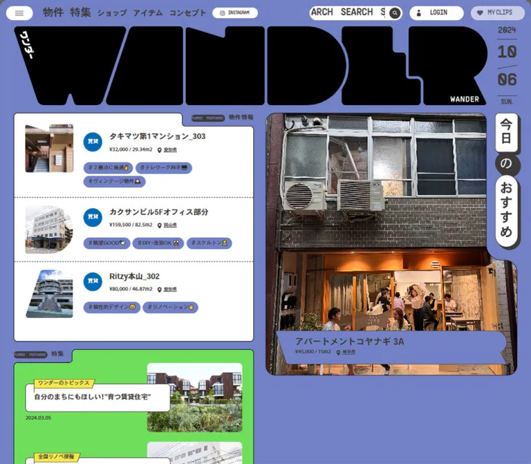
ミントグリーンを基調に、巨大な図形的ロゴ、切り抜き写真、ピル型タグを組み合わせた不動産メディア。特集はライム、リノベーションはピンクで区分し、モバイルではおすすめ物件を先頭に再配置。
オリジナルサイトを見るWANDER — Style Reference
A property magazine built from oversized lettering, colorful folders, photographic cutouts, and small discovery tags.
Original URL: https://wander.co.jp/
Final URL: https://wander.co.jp/
Theme: mint canvas, white information panels, lime editorial sections, pink renovation sections, and a black footer.
Inspected: September 17, 2026, at approximately 04:40 JST. The supplied retrieval record is 2026-09-16T19:40:43.123Z.
Viewports: desktop 1440 × 1000 and mobile 390 × 844 CSS pixels.
Scope: the current homepage, using supplied desktop opening, middle, and footer captures; mobile opening and footer captures; and rendered text, links, custom properties, and sampled computed styles. Search, account, menu, saved-property, and carousel actions were not exercised in the supplied evidence.
WANDER combines property discovery, editorial stories, and a directory of renovation providers. Its visual identity comes from the relationship between an enormous geometric wordmark and compact, practical listing information. Prices, floor areas, locations, and linked lifestyle tags sit inside a playful arrangement of white panels and saturated section backgrounds.
The page uses several distinct kinds of shape. The wordmark is almost solid geometry. Property thumbnails borrow slanted edges and rounded silhouettes. Featured panels have stepped folder-like headers. The daily recommendation combines a large room photograph, a side cutout for a vertical label, and a ribbon-shaped caption. Ordinary controls remain simple white capsules.
Desktop presents the opening content as an asymmetric editorial spread. Mobile gives the recommendation photograph first priority, then stacks the featured listings beneath it. The footer changes from a broad horizontal navigation composition into three compact columns and a two-row wordmark.
How to Read This Reference
- Measured means a value appears in the supplied computed styles or element rectangles. Measurements are specific to the recorded viewport and element.
- Visual estimate means a dimension or shape was read from a supplied current-page screenshot. These values are approximate.
- Recommended means implementation guidance for a new project. Proposed breakpoints, fallback fonts, focus treatments, and CSS formulas are not original-site findings.
- Named tokens are reusable aliases unless explicitly identified as source custom properties.
- Some sampled navigation and recommendation nodes have coordinates that do not correspond to the visible opening composition. Ancestor visibility and complete stacking information were not supplied. Their local styles can be documented, but their rectangles do not prove that a menu or additional recommendation panel was visible.
- The captures establish two responsive endpoints. They do not establish the exact breakpoint, every intermediate layout, or a universal viewport-scaling formula.
Tokens — Colors
Default Palette
The source custom properties store comma-separated RGB channels. Wrap those values in rgb(...) when using them as CSS colors.
| Name | Value | Source / suggested alias | Role and evidence |
|---|---|---|---|
| Mint | #3ce4b3 |
Source --keyColor-base: 60, 228, 179; alias --wander-mint |
Measured body background and property-tag fill; visible opening canvas and recommendation ribbon |
| Editorial Lime | #a1ed33 |
Source --keyColor-special: 161, 237, 51; alias --wander-lime |
Source token; current screenshots show lime behind editorial cards and the featured-story panel |
| Renovation Pink | #fd4b8e |
Source --keyColor-shopItem: 253, 75, 142; alias --wander-pink |
Source token; visible outer background around the renovation-provider section |
| Charcoal | #3e3a39 |
Source --color-text: 62, 58, 57; alias --wander-ink |
Measured body and control text; visually consistent with rules and dark label details |
| White | #ffffff |
Alias --wander-paper |
Measured utility-button and content-surface color; reversed footer artwork |
| Black | #000000 |
Alias --wander-black |
Visual reproduction target for the solid wordmark and footer; no corresponding source custom property was supplied |
| Rental Blue | #0069b6 |
Source --color-lent: 0, 105, 182; alias --wander-rent |
Source token; blue circular 賃貸 badges are visible |
| Purchase Orange | #e9460a |
Source --color-buy: 233, 70, 10; alias --wander-buy |
Source token; orange circular 売買 badges are visible |
| Pale Gray | #efefef |
Source --color-gray: 239, 239, 239; alias --wander-muted |
Source token; visually consistent with secondary service tags |
| Dock Gray | #606060 |
Measured header background; alias --wander-dock |
Visible mobile Instagram/menu dock |
The computed header background is gray, while the visible desktop top strip is mint. This is a useful example of why a node's background alone does not establish the final composited surface. Use the screenshots to identify the visible desktop strip and the mobile dock.
Supporting Source Colors
| Source property | Value | Interpretation limit |
|---|---|---|
--color-category |
#f3e84d |
Available category color; a specific current visible component assignment was not established |
--color-yellow |
#fff000 |
Available yellow accent; do not automatically apply it to primary actions |
--color-red |
#ed2314 |
Available red accent; no verified error or destructive-action state was supplied |
The palette is organized primarily by content area. Mint supports property discovery, lime supports editorial content, and pink frames renovation providers. Blue and orange distinguish property transaction types. There is no observed user-selectable theme system.
Tokens — Typography
Japanese Interface and Body Copy
Measured family declaration: YakuHanJP, heisei-kaku-gothic-std, sans-serif.
The body uses weight 500; sampled headings and listing titles use 700. The resulting appearance is compact, firm, and highly legible against bright backgrounds. Japanese titles are generally short and descriptive, while prices and locations form a smaller secondary line.
This is a computed family declaration, not independent confirmation of every font file or rendered glyph. Preserve the declared names when licensed assets are available. A Japanese system sans-serif is a recommended fallback for a new implementation.
The root HTML node reports Times, but visible body and interface elements override it. Times is not the page's editorial typeface.
English Utility Labels
Measured family declaration: YakuHanJP, PPSupplySans-Semibold.
This stack appears on SEARCH, INSTAGRAM, MY PAGE, MY CLIPS, and the follow caption. It creates a condensed, industrial contrast with the Japanese text. Computed weight is 500, despite the font-family name containing Semibold; do not replace this with an assumed CSS weight of 600.
The follow caption uses 0.1em tracking: 1.68668px on desktop and 1.456px on mobile. Most other sampled text has normal letter spacing.
Brand Lettering
The giant WANDER mark is artwork, not an ordinary heading set in either measured text family. It uses heavy filled silhouettes, a slanted opening letter, a rounded bowl, and a stepped internal contour. Small Japanese and English labels sit within the artwork.
Preserve the supplied brand geometry when authorized. Increasing the weight of a generic sans-serif will not reproduce it. The footer uses a reversed white version, arranged in one line on desktop and two rows on mobile.
Type Scale
Values below are measured unless marked otherwise. Size and line height are shown as size / line-height.
| Role | Desktop | Mobile | Weight / qualification |
|---|---|---|---|
| Body default | 16.8668 / 30.3602px |
13.52 / 24.336px |
500; line-height ratio 1.8 |
| Primary desktop navigation | 28.4627 / 28.4627px |
Not visible in the mobile top strip | 700; sampled paragraph inside the link |
| Search lettering | 26.3543 / 36.896px |
20.8 / 14.56px |
500; mobile label has a deliberately tight line box |
| Account and clips labels | 16.8668 / 37.9502px |
13.52 / 31.2px |
500; utility font stack |
| Small Instagram label | 11.5959 / 27.4085px |
10.4 / 26px |
500 |
| Sampled recommendation heading | 34.7877 / 70.6296px |
20.8 / 41.6px |
700; tracking 0.05em; visibility of this sampled block is not established |
| Sampled recommendation-card title | 15.8126 / 23.7189px |
13.52 / 20.28px |
700; separate from the opening featured-list title |
| Opening featured-list title | Approximately 20px |
Approximately 13–14px |
Visual estimate; bold |
| Property tag text | 13.7042 / 28.4627px |
10.92 / 22.88px |
500; sampled tag treatment |
| Small location label | 11.5959 / 20.8726px |
10.4 / 18.72px |
500 |
| View-all label | 17.9209 / 37.9502px |
11.44 / 26px |
700; outlined capsule |
| Primary navigation-group heading | 25.3001 / 32.8902px |
20.8 / 27.04px |
700; measured navigation treatment |
| Smaller navigation-group link | 20.0293 / 26.0381px |
15.6 / 20.28px |
700 |
| Navigation sublink | 14.7584 / 19.1859px |
12.48 / 16.224px |
500 |
Do not apply the mobile search line-height to ordinary text. It belongs to a vertically positioned, clipped utility label. Reading copy needs a normal line box.
Tokens — Spacing & Shapes
Density: large photographic and brand areas paired with tightly grouped metadata.
Repeated desktop values include 5.27, 10.54, 21.08, 31.63, and 36.90px. Mobile samples include 5.2, 10.4, 15.6, 20.8, and 31.2px. These suggest coordinated scaling, but the source formula and breakpoint rules were not supplied.
Spacing Scale
| Use | Desktop measurement | Mobile measurement | Reuse guidance |
|---|---|---|---|
| Small navigation inset | 5.27086px |
Component-dependent | Use approximately 5px for fine adjustments |
| Tag horizontal padding | 10.5417px |
6.24px |
Keep tags compact without compressing the text |
| Small panel inset | 10.5417px |
10.4px |
A useful small-spacing token |
| Common inner spacing | 21.0835px |
20.8px in sampled values |
Approximately 21px |
| Sampled recommendation-panel top padding | 31.6252px |
31.2px |
Local measurement, not a rule for every panel |
| Shared section side inset | 36.890625px |
15.59375px |
Approximately 37px desktop and 16px mobile |
| Opening column gap | Approximately 32px |
Stacked with approximately 10px between recommendation and listings |
Visual estimate |
Border Radius and Edge Treatments
| Element | Value / appearance | Evidence |
|---|---|---|
| Utility capsules and tags | 9999px |
Measured |
| Sampled white recommendation surface | Upper-right radius 21.0835px desktop; 10.4px mobile |
Measured local component |
| Mobile dock | 10.4px 10.4px 0 0 |
Measured |
| Sampled follow panel | 17.9209px desktop; 10.4px mobile |
Measured; dashed border visible in captures |
| Featured-list outer corners | Approximately 10–12px |
Visual estimate |
| Large photo frame | Approximately 24–30px desktop; 14–18px mobile |
Visual estimate; includes a separate concave side contour |
| Major section upper corners | Approximately 30–34px desktop |
Visual estimate |
| Card and panel rules | Approximately 1px |
Visual estimate; crisp dark outlines |
| Listing separators | Fine dashed horizontal rules | Visible in both opening captures |
| Daily-label offset | Approximately 7–9px desktop; 4–6px mobile |
Visual estimate; hard charcoal backing, without blur |
Layout Measurements
| Element | Desktop 1440 × 1000 |
Mobile 390 × 844 |
Basis |
|---|---|---|---|
| Recorded document height | 10257.4375px |
10126.6875px |
Measured; content-dependent |
| Shared content width | 1366.21875px |
358.8125px |
Measured sampled sections; visually consistent with page gutters |
| Desktop top strip / mobile dock height | 69.5625px top strip |
46.796875px dock |
Measured; these are different responsive arrangements |
| Search capsule | 248.78125 × 37.9375px |
156 × 31.1875px |
Measured |
| Account or clips capsule | 144.40625 × 37.9375px |
100.875 × 31.1875px |
Measured |
| Mobile dock | Not applicable | 208px wide, centered at x = 91px |
Measured |
| Opening wordmark | Approximately 1286 × 214px |
Approximately 358 × 60px |
Visual estimate |
| Featured-list panel | Approximately 651px wide |
Approximately 358px wide |
Visual estimate |
| Recommendation composition | Approximately 683px wide; extends below the opening capture |
Approximately 358 × 411px |
Visual estimate; width includes the side-label area |
| Opening property thumbnail | Approximately 131 × 132px |
Approximately 91 × 92px |
Visual estimate |
| Transaction badge | Approximately 50px diameter |
Approximately 41px diameter |
Visual estimate |
| Footer wordmark | Approximately 1356 × 226px, one row |
Approximately 358 × 202px, two rows |
Visual estimate |
Components
Persistent Navigation and Utility Strip
Role: keep search, account access, saved items, and global navigation available while browsing a long page.
On desktop, a mint strip approximately 70px high spans the viewport. From left to right it contains a white hamburger capsule, the prominent Japanese links 物件を探す and リノベする, a smaller Instagram capsule, a wide flexible gap, then search, account, and clips controls.
The search capsule is approximately 249 × 38px. Repeated SEARCH lettering is clipped within its left portion; a charcoal circle with a white magnifying glass anchors the right edge. A narrow divider separates the icon area from the lettering.
The account and clips capsules are approximately 144 × 38px. The screenshots show LOGIN in the top account control, while the corresponding sampled text contains a transparent MY PAGE paragraph. Document the visible label and the shared /mypage destination without assuming an authentication transition was tested.
On mobile, search, account, and clips remain together at the top. Instagram and the hamburger move into the centered gray bottom dock. The primary Japanese navigation links are absent from the visible top strip. Persistence is visible across the supplied scroll positions; the original distinction between CSS fixed and sticky was not supplied.
Masthead and Calendar
Role: establish the publication identity before the content modules.
The desktop wordmark stretches from roughly x = 37px to x = 1323px. A narrow date column fills the remaining right-hand space. The date is stacked as year, month, day, and weekday, with thin rules and a slightly angled divider.
The mobile wordmark occupies almost the full content width below the utility controls. The date moves visually below its right edge, beside the recommendation photograph. The captured date is September 17, 2026, with THU. beneath it. Automatic date updates were not verified.
Keep this masthead close to the content: the desktop photograph and list start about 21px below the wordmark; the mobile photograph begins about 6px below it.
Featured Property Panel
Role: present three selected listings in a compact editorial list.
A white panel has a fine dark outline, rounded outer corners, and a stepped upper-right boundary. A small charcoal capsule containing repeated FEATURED text sits beside the Japanese section label 物件情報 in the mint recess.
Each row contains:
- A photograph inside a distinctive silhouette.
- A blue rental or orange purchase circle.
- A bold property title.
- A price, optional floor area, and a pin-marked location.
- Mint lifestyle-tag links, with emoji retained as part of their labels.
The first visible title is 家がいちばん好き。; its metadata reads ¥298,000 / 57.35m2 and 東京都. The second item demonstrates a listing with no displayed floor-area value. Do not infer or populate a missing area from the surrounding pattern.
Desktop rows use approximately 131px thumbnails, 50px badges, and broad separation between image and text. Mobile retains the image/text relationship instead of converting each row into a full-width photograph. Thumbnails shrink to approximately 91px, and the title and metadata become more compact.
Three tags per featured listing are present in the desktop evidence. The mobile text and links contain two for each of these same rows. This is an observed endpoint difference; the condition that determines which tags remain is unknown.
The row is a composite of property-detail and tag links. A new implementation should keep the tags as separate links and avoid nesting them inside a whole-row anchor.
Daily Recommendation
Role: give one property a large photographic presence.
On desktop, the recommendation fills the right column beside the featured list. On mobile, it becomes the first major content block beneath the masthead.
The captured photograph shows a sunlit room with a wooden ceiling, track lighting, pale walls, a broad window, and a timber floor. Its crop places the ceiling and window prominently in both layouts. A side cutout creates room for the vertical 今日のおすすめ marker. The photo frame expands to the full composition width below that cutout.
The marker is assembled from white vertical blocks and a charcoal circular connector containing の. Hard offset backing gives it the appearance of layered signage. This localized shadow is distinct from the flat treatment of ordinary cards.
A mint caption ribbon overlaps the photograph near its bottom. It has a slanted left edge and a folded/notched right end. The caption contains a bold title, then price, floor area, and location. The desktop title is visible in full; the mobile title ends with an ellipsis while its metadata remains readable.
The recommendation links to the supplied property-detail destination /objects/detail/4731. A rotated blue rental badge is visible over the mobile photograph. Its movement, positioning algorithm, and any relationship to pointer input were not established.
Featured Story and Daily Tags Panels
Role: offer editorial and interest-based routes alongside property listings.
Below the opening property panel, the desktop capture begins a lime story panel with another stepped header and a 特集 label. Rendered text confirms two highlighted editorial entries, each with a category, title, and date. It also confirms a separate 今日のタグ group with seven linked lifestyle tags.
Their complete layout is not shown in the supplied opening crop. Preserve the confirmed hierarchy and the visible folder-header treatment, but do not infer unseen image proportions or a mobile grid from text alone.
Property Discovery Sections
Role: continue the homepage with current inventory and browsing routes.
The rendered page includes 新着物件, category links for 賃貸, 売買, and 店舗/オフィス, a すべてみる link, and 条件からさがす. These category controls are anchors to category URLs. An in-place filtering interaction was not verified.
The supplied element sample also contains a horizontal recommendation structure with cards approximately 307.84px wide on desktop and 310.58px wide on mobile. Successive card positions advance by approximately 327.84px and 320.58px, respectively. This supports a rail-like local layout, but it does not establish that the sampled structure was visible in the opening screenshot.
Use these measurements only when reproducing that component. Do not assign its geometry to the visible three-row featured panel or claim that the entire new-listings section uses the same rail.
Editorial Cards
Role: connect property discovery with neighborhood and lifestyle stories.
The desktop middle capture shows the bottoms of three white editorial cards on lime. Each card has a fine dark outline, modest rounded corners, an inset photograph, a bold title, and a small date. The visible columns are approximately 426px wide with 42px gaps.
The photographs depict real places and people, including restaurant and street scenes. Titles retain conversational punctuation and emoji. Dates use a compact numeric format such as 2026.05.20.
Only part of this card row is visible. Its full image ratio and mobile column count were not established.
Renovation Provider Directory
Role: introduce service providers and their projects without leaving the editorial homepage.
A broad pink section with rounded upper corners contains a large white inner panel. The panel begins with リノベする at the left and an outlined すべてみる capsule at the right.
Each provider row has a profile column followed by a project rail. In the visible first row, the profile includes a circular logo, the name ponte不動産一級建築士事務所, multiple pin-marked service areas, and a short description. The adjacent project card uses the provider's own logo as its main image, followed by a short explanation and a pale-gray service tag.
The profile occupies roughly 250–270px; project cards are approximately 210px wide. Small outlined square arrow controls sit at the sides of the project area. These are visible affordances; clicking, dragging, autoplay, wrapping, and disabled states were not tested.
The first row contains substantial white space after its single visible project. The next row begins with multiple project photographs. Allow variable content counts instead of filling every provider row with invented cards.
These provider names are directory content. Their presence does not identify the website operator or its production team.
Lifestyle Tag Collage
Role: provide a lively transition into the footer and another route into property interests.
Above the desktop footer, large white capsules sit at varied angles on charcoal. Each contains a hashtag-style Japanese label and an emoji. Visible examples include #ペットと一緒😺, #料理好き🍳, and #レトロ感あり📺.
The capsules extend beyond the viewport edges and overlap the visual boundary of the footer area. Their rotation and cropping are visible; falling, dragging, collision, and physics behavior are unverified. A static arrangement can reproduce the evidenced state.
Footer Navigation
Role: provide a complete map of the publication and a strong final brand impression.
The desktop footer is black with rounded upper corners. Its first band contains the white brand phrase ありそうでない、がある。, navigation groups, and a tall dashed-outline Instagram follow panel.
Property links, renovation, publishers, concept, and editorial categories form the navigation. Search, account, and clips capsules repeat below. A separate row contains publication, contact, publisher-login, terms, commercial-disclosure, and privacy links.
The large reversed wordmark occupies the bottom. Copyright text follows the slanted edge of its opening letter instead of sitting in a conventional centered footer line.
On mobile, the phrase comes first. Three navigation columns follow: property links; a middle stack of renovation, publisher, and concept links; and editorial categories. Utilities span a separate row. Legal links wrap naturally, the follow box becomes wide and shallow, and the wordmark rearranges into two rows.
Mobile Bottom Dock
Role: retain Instagram and menu access without consuming the narrow top utility row.
The measured dock is 208 × 46.796875px, centered at x = 91px and anchored at the bottom of the 844px capture. It uses #606060, 10.4px upper corner radii, and 15.6px horizontal padding.
The Instagram capsule is 104 × 26px. A separate white hamburger capsule sits to its right. The dock is visible over both the opening listings and the footer artwork.
For a new implementation, reserve sufficient scroll clearance beneath content and include safe-area padding. Those are recommendations, not verified source rules.
Tokens — Motion & Interaction
Measured Transition Declarations
| Element | Supplied computed transition | What is established |
|---|---|---|
| Primary navigation text | 0.2s cubic-bezier(0.4, 0.4, 0, 1) |
Timing declaration exists; changed property and trigger were not exercised |
| Search capsule and lettering | 0.2s cubic-bezier(0.4, 0.4, 0, 1) |
Local transition timing; does not specify marquee speed |
| Instagram controls | 0.2s cubic-bezier(0.4, 0.4, 0, 1) |
Local transition timing |
| Property tags and view-all links | 0.2s cubic-bezier(0.4, 0.4, 0, 1) |
Local transition timing |
| Account and clips anchors | 1s cubic-bezier(0.075, 0.82, 0.165, 1) |
Longer wrapper transition |
| Account and clips text | 0.5s cubic-bezier(0.075, 0.82, 0.165, 1) |
Separate label transition |
Visible Behavior and Limits
Repeated SEARCH spans and different clipped text positions across captures support a marquee-like presentation. The exact direction, cycle duration, animation driver, and pause behavior were not supplied. Small repeated FEATURED labels suggest a related visual motif, but their movement is not proven by a still frame.
Sampled elements report animation: none. This does not exclude animation on descendants, pseudo-elements, or JavaScript-driven transforms. Likewise, a transition: all entry without an effective duration is not evidence of visible motion.
The supplied inspection waited at least five seconds initially, awaited finite motion and image decoding within bounded time limits, and temporarily paused perpetual animations during readiness checks. These procedures improve capture stability; they do not constitute a recording of every animation or a test of interaction outcomes.
For reuse, retain the measured 200ms easing for small control feedback. Add reduced-motion behavior and an accessible static search label. Treat any marquee timing, menu animation, photo zoom, or carousel autoplay as a new design decision until independently verified.
Surfaces
| Layer | Appearance | Purpose |
|---|---|---|
| Opening canvas | Solid mint | Connects masthead, property discovery, and small tags |
| Listing panel | White with a fine charcoal outline and dashed internal separators | Makes dense property information scannable |
| Editorial zone | Lime surrounding white cards | Separates stories from property inventory |
| Renovation zone | Pink outer field with a large white inner panel | Frames provider profiles and projects |
| Main photograph | Natural-color photography inside a shaped outline | Supplies scale, texture, and emotional appeal |
| Utility control | White capsule with charcoal label and icon | Consistent global action treatment |
| Daily marker | White blocks, charcoal connector, hard offset backing | A small dimensional accent |
| Tag transition | Charcoal field with angled white capsules | Connects discovery links to the footer |
| Footer | Black with white text, controls, and brand artwork | Strong visual closure and complete navigation |
| Mobile dock | Opaque medium gray with white capsules | Persistent secondary controls |
There is no general soft-shadow elevation system in the supplied captures. Fine outlines, contrasting fills, shaped boundaries, and the daily marker's hard backing provide separation.
Imagery
Photography remains in natural color. The opening room image emphasizes warm wood, daylight, and architectural detail. Smaller property images show interiors and building exteriors with varied materials and everyday surroundings. Editorial photography includes people, storefronts, restaurants, and street life. Provider projects add architectural photographs and individual business logos.
The surrounding graphics supply the abstraction. Keep photos recognizable and comparatively unprocessed while using silhouettes, ribbons, circles, and large brand lettering around them. Do not apply a uniform duotone or decorative grain treatment that is absent from the evidence.
For property thumbnails, choose a crop that preserves a meaningful architectural feature before applying the mask. For provider logos, retain the full mark and its proportions. The large recommendation image needs its own responsive crop; simply shrinking the desktop frame would change the mobile balance of ceiling, window, and floor.
Observed Asset References
No original image src values, font-file URLs, or SVG path data were included. The following links identify associated content, not downloadable image assets.
| Visible asset | Associated original-page destination | Treatment |
|---|---|---|
| WANDER masthead and footer artwork | Homepage | Black opening mark; reversed white footer mark; responsive arrangement |
| Daily recommendation room photograph | Property 4731 | Large shaped frame with overlaid ribbon |
| First featured interior | Property 4505 | Thumbnail with a slanted edge |
| Second featured building exterior | Property 4306 | Thumbnail with a rounded right silhouette |
| Third featured interior | Property 4733 | Thumbnail with a stepped upper contour |
| First visible provider identity | Provider 476 | Circular profile presentation and larger project-card logo |
| First visible provider service | Item 5785 | Logo, description, and gray service tag |
These destinations were present in the supplied homepage evidence; their detail pages were not independently inspected. Obtain authorized image and brand files before implementation rather than inventing asset paths.
Layout & Responsive Behavior
Desktop Composition
The page has approximately 37px side gutters at 1440px. The masthead begins immediately beneath the persistent utility strip. Its wordmark occupies most of the width, leaving a narrow calendar rail.
The opening content uses two unequal columns: an approximately 651px featured-content column, a 32px gap, and an approximately 683px recommendation composition. The photograph is the largest individual content object, but the left column remains dense with useful listing information.
Further down, colored sections span the viewport while their white cards and inner panels respect the shared gutter. The supplied middle capture shows a three-column editorial row followed by the large renovation directory. The footer expands its navigation horizontally and finishes with a single-line wordmark.
Mobile Composition
At 390px, the shared content width is approximately 359px, leaving 15.6px gutters. The top controls retain three separate capsules with roughly 6px gaps. Search is wider than account or clips.
The opening order changes:
- Top utility controls.
- Full-width brand mark.
- Daily recommendation, with calendar and vertical marker at the right.
- Featured property rows.
- Subsequent editorial and discovery content.
The recommendation is approximately 411px tall. Its caption title truncates to one line, while its price and location remain visible. Featured property rows retain their small image, badge, metadata, and tags rather than becoming oversized cards.
Instagram and the menu remain in the bottom dock. In the footer, navigation becomes three columns, the social follow panel spans the content width, and the brand mark becomes two rows.
What Is Not Established
The mobile middle sections were not supplied as screenshots. Their text is present in the rendered evidence, but the exact mobile editorial grid and provider-rail layout remain unverified. No tablet or landscape capture was supplied.
The similar recorded desktop and mobile document heights do not prove identical section heights or content flow. Different arrangements, clipping, rails, and content density can produce similar totals.
Recommended breakpoint strategy: choose the point at which the desktop navigation and two opening columns stop fitting comfortably. A starting breakpoint around 900px is reasonable for the adaptation below, but it is not a measured source breakpoint. Validate intermediate widths and keyboard order when visually reordering content.
Do’s and Don’ts
Do
- Preserve the giant geometric wordmark as a primary layout element.
- Use the measured mint, lime, and pink as content-area colors.
- Keep white information panels crisp with fine dark outlines.
- Retain the stepped folder headers and varied thumbnail silhouettes.
- Pair blue rental and orange purchase badges with explicit text labels.
- Keep prices, areas, and locations close to the property title.
- Treat lifestyle tags as actual discovery links, including their emoji.
- Place the daily recommendation before the featured list on mobile.
- Preserve the footer's three-column mobile navigation and stacked mark.
- Allow provider rows to contain different numbers of projects.
- Use natural-color architectural and neighborhood photography.
Don’t
- Do not replace the homepage with a generic sales headline and a single conversion button.
- Do not typeset the WANDER mark in an unrelated heavy font.
- Do not turn every panel into the same rounded rectangle.
- Do not introduce soft floating-card shadows or glass effects.
- Do not use transaction colors as arbitrary decoration elsewhere.
- Do not reduce the mobile page to a scaled-down desktop screenshot.
- Do not treat category anchors as verified client-side filter tabs.
- Do not assume the angled footer tags have a physics interaction.
- Do not infer menu-open appearance or carousel behavior from hidden or unmatched DOM boxes.
- Do not substitute missing property facts with invented values.
Recommended Implementation Additions
These are recommendations for a new implementation, not verified features of the inspected page.
- Give search, menu, arrow, account, and saved-item controls explicit accessible names. Repeated decorative lettering should produce a single accessible label.
- Keep property-detail links and tag links as separate interactive elements. Avoid nested anchors or an invisible whole-card link that blocks tag access.
- Provide visible keyboard focus on white, colored, and black surfaces. Keep focus outlines outside clipped image layers.
- Preserve transaction text alongside badge color so rental and purchase states do not depend on color alone.
- Increase invisible hit areas around the compact mobile controls where needed. The measured
31pxutility height and smaller tag heights are visual targets, not an accessibility requirement. - Reserve bottom scroll space for the dock and device safe area. Test focused content near the page end.
- Keep the full recommendation title available to assistive technology when the visual line is truncated.
- If marquees are implemented, provide a reduced-motion static state and avoid repeatedly announcing duplicate labels.
- Give provider rails keyboard-operable controls and meaningful disabled states. Do not add autoplay solely because arrows are visible.
- Use responsive image sources and explicit dimensions. Load the opening recommendation promptly and defer distant directory images without changing card geometry.
- Verify logical reading and focus order when moving the recommendation ahead of the featured list on mobile.
Agent Prompt Guide
Quick Color Reference
- Main property canvas and lifestyle tags:
#3ce4b3. - Editorial section background:
#a1ed33. - Renovation section background:
#fd4b8e. - Main text and fine rules:
#3e3a39. - Information panels and utility capsules:
#ffffff. - Masthead silhouette and footer: solid black.
- Rental badge:
#0069b6with white text. - Purchase badge:
#e9460awith white text. - Secondary service tags:
#efefef. - Mobile Instagram/menu dock:
#606060.
Overall Prompt
“Create a Japanese property-discovery and renovation-media homepage inspired by the supplied current WANDER reference. Use a mint #3ce4b3 canvas, an enormous custom geometric black wordmark, compact white utility capsules, and bold Japanese sans-serif text paired with condensed English utility lettering. On desktop, place a white folder-shaped panel of three property rows at left and a large architectural recommendation photograph at right. Give thumbnails varied cutout silhouettes, transaction types blue or orange circles, and lifestyle links mint emoji tags. Add a vertical daily-recommendation marker and a mint ribbon caption over the photograph. Continue with lime editorial sections, a pink renovation directory surrounding a white provider panel, and a black footer with a large reversed wordmark. On mobile, put the recommendation first, preserve compact image-and-text property rows, and move Instagram/menu controls into a centered gray bottom dock. Keep unverified interactions static until specified.”
Example Component Prompts
- Featured property panel: “Build a white outlined panel with rounded corners and a stepped upper-right header recess containing a tiny FEATURED capsule and
物件情報. Each row has a masked property thumbnail, a circular transaction badge, a bold Japanese title, compact price/area/location metadata, and separate mint lifestyle-tag links. Use dashed row separators. Keep the same image/text structure on mobile.” - Daily recommendation: “Use a large natural-color room photograph with rounded corners and a concave right-side area reserved for a vertical
今日のおすすめmarker. Overlay a mint ribbon near the bottom with a bold title and smaller price/location line. Use hard offset backing only on the vertical marker. Truncate the visual title on mobile without removing its accessible text.” - Search utility: “Create a white capsule with clipped repeated SEARCH lettering, a thin separator, and a charcoal circular magnifying-glass area at the right. Target approximately 249 × 38px on desktop and 156 × 31px on mobile. Give the link one accessible search label. Keep it static unless motion timing is explicitly provided.”
- Provider row: “Inside a wide white panel on pink, place a provider profile with a circular logo, bold name, linked service areas, and a short description beside a horizontal project area. Project cards contain photographs or logos, concise copy, and small gray service tags. Permit a single-card row with open white space.”
- Footer: “Create a black footer with a white brand phrase, property/editorial navigation, repeated utility pills, wrapped legal links, and a dashed Instagram follow box. Finish with oversized reversed geometric brand artwork. At mobile width, use three navigation columns, a full-width follow box, and a two-row wordmark.”
Responsive Verification Prompt
“Check the page at 1440 × 1000 and 390 × 844. Confirm desktop gutters near 37px and mobile gutters near 16px; recommendation-first mobile ordering; intact price/location text; independent tag links; persistent top utilities; and a centered 208px mobile bottom dock. Check intermediate widths separately because the original breakpoint is unknown. Report any proposed behavior as an adaptation rather than an observed source feature.”
Quick Start
CSS Custom Properties
This is a practical adaptation, not recovered source CSS. It uses the measured colors and control sizes, screenshot-derived opening proportions, and a recommended 900px breakpoint. Fluid formulas are implementation choices.
The source font families are referenced without invented font-file URLs. Supply licensed fonts and authorized brand/image assets separately. The CSS approximates the folder, thumbnail, and ribbon shapes; the recommendation's continuous curved cutout and the wordmark require dedicated artwork or SVG geometry for a close reproduction.
:root {
  /* Measured source channels */
  --keyColor-base: 60, 228, 179;
  --keyColor-special: 161, 237, 51;
  --keyColor-shopItem: 253, 75, 142;
  --color-text: 62, 58, 57;
  --color-lent: 0, 105, 182;
  --color-buy: 233, 70, 10;

  /* Semantic aliases */
  --wander-mint: rgb(var(--keyColor-base));
  --wander-lime: rgb(var(--keyColor-special));
  --wander-pink: rgb(var(--keyColor-shopItem));
  --wander-ink: rgb(var(--color-text));
  --wander-rent: rgb(var(--color-lent));
  --wander-buy: rgb(var(--color-buy));
  --wander-paper: #fff;
  --wander-black: #000;
  --wander-muted: #efefef;
  --wander-dock: #606060;

  /* Observed families with recommended fallbacks */
  --font-jp: YakuHanJP, heisei-kaku-gothic-std,
    'Hiragino Kaku Gothic ProN', 'Yu Gothic', sans-serif;
  --font-utility: YakuHanJP, PPSupplySans-Semibold,
    'Arial Narrow', sans-serif;

  /* Adaptation values */
  --gutter: clamp(15.6px, 2.563vw, 36.9px);
  --header-height: 69.56px;
  --utility-height: 37.94px;
  --radius-panel: 11px;
  --radius-large: 30px;
  --radius-pill: 9999px;
  --rule: 1px solid var(--wander-ink);
  --focus-color: var(--wander-ink);
  --safe-bottom: env(safe-area-inset-bottom, 0px);

  /* Measured transition timing */
  --ease-control: cubic-bezier(0.4, 0.4, 0, 1);
  --ease-account: cubic-bezier(0.075, 0.82, 0.165, 1);
  --motion-control: 200ms var(--ease-control);
}

* { box-sizing: border-box; }

body.wander-page {
  margin: 0;
  color: var(--wander-ink);
  background: var(--wander-mint);
  font-family: var(--font-jp);
  font-size: clamp(13.52px, 1.172vw, 16.8668px);
  font-weight: 500;
  line-height: 1.8;
}

.wander-page a { color: inherit; }
.wander-page button { font: inherit; }
.wander-page img { max-width: 100%; }

.wander-page :focus-visible {
  outline: 3px solid var(--focus-color);
  outline-offset: 4px;
}

.page-inner { margin-inline: var(--gutter); }

/* Fixed positioning is an adaptation of observed persistence. */
.site-topbar {
  position: fixed;
  inset: 0 0 auto;
  z-index: 30;
  display: flex;
  align-items: center;
  gap: 18px;
  height: var(--header-height);
  padding-inline: 16px;
  background: var(--wander-mint);
}

.desktop-nav,
.utility-group {
  display: flex;
  align-items: center;
  gap: 18px;
}

.desktop-nav a {
  font-size: 28.46px;
  font-weight: 700;
  line-height: 1;
  text-decoration: none;
}

.site-topbar .utility-group { margin-left: auto; }

.utility-pill {
  display: inline-flex;
  align-items: center;
  justify-content: center;
  gap: 10px;
  min-height: var(--utility-height);
  padding-inline: 16px;
  border: 0;
  border-radius: var(--radius-pill);
  color: var(--wander-ink);
  background: var(--wander-paper);
  font-family: var(--font-utility);
  font-size: 16.87px;
  line-height: 1;
  text-decoration: none;
  white-space: nowrap;
  transition: opacity var(--motion-control);
}

.utility-pill--account,
.utility-pill--clips { width: 144.41px; }

.search-pill {
  position: relative;
  width: 248.78px;
  justify-content: flex-start;
  padding: 0 44px 0 7px;
}

.search-copy {
  display: block;
  overflow: hidden;
  width: 100%;
  font-size: 26.35px;
  line-height: 1.4;
  white-space: nowrap;
}

.search-icon {
  position: absolute;
  top: 4px;
  right: 4px;
  display: grid;
  place-items: center;
  width: 30px;
  aspect-ratio: 1;
  border-radius: 50%;
  color: white;
  background: var(--wander-ink);
}

/* Decorative repeated text stays static until motion is specified. */
.home-main { padding-top: var(--header-height); }

.masthead {
  position: relative;
  display: grid;
  grid-template-columns: minmax(0, 1fr) 53px;
  gap: 27px;
  align-items: stretch;
  margin-bottom: 21px;
}

.brand-art {
  display: block;
  width: 100%;
  height: auto;
}

.calendar {
  display: flex;
  flex-direction: column;
  justify-content: space-between;
  text-align: center;
  font-family: var(--font-utility);
  line-height: 1;
}

.opening-grid {
  display: grid;
  grid-template-columns: minmax(0, 0.953fr) minmax(0, 1fr);
  grid-template-areas: 'featured recommendation';
  gap: 32.4px;
  align-items: start;
}

.featured-panel {
  grid-area: featured;
  position: relative;
  min-width: 0;
  border: var(--rule);
  border-radius: var(--radius-panel);
  background: var(--wander-paper);
}

.panel-kicker {
  position: absolute;
  top: -1px;
  right: -1px;
  display: flex;
  align-items: center;
  justify-content: flex-end;
  gap: 10px;
  min-height: 36px;
  padding: 0 0 7px 22px;
  border-left: var(--rule);
  border-bottom: var(--rule);
  border-radius: 0 0 0 9px;
  background: var(--wander-mint);
  font-size: 14px;
  line-height: 1;
}

.featured-stamp {
  max-width: 90px;
  overflow: hidden;
  padding: 4px 9px;
  border-radius: var(--radius-pill);
  color: var(--wander-mint);
  background: var(--wander-ink);
  font-family: var(--font-utility);
  font-size: 9px;
  white-space: nowrap;
}

.property-row {
  display: grid;
  grid-template-columns: 131px minmax(0, 1fr);
  gap: 27px;
  padding: 21px 29px;
}

.property-row:first-of-type { padding-top: 30px; }
.property-row + .property-row {
  border-top: 1px dashed var(--wander-ink);
}

.property-cover { display: block; }
.property-cover img {
  display: block;
  width: 100%;
  aspect-ratio: 1;
  object-fit: cover;
  border-radius: 6px;
}

.property-cover--slant img {
  clip-path: polygon(32% 0, 100% 0, 100% 100%, 0 100%);
}

.property-cover--round img {
  border-radius: 6px 50% 50% 6px;
}

.property-body { min-width: 0; }
.property-topline {
  display: grid;
  grid-template-columns: 50px minmax(0, 1fr);
  gap: 19px;
  align-items: center;
}

.transaction-badge {
  display: grid;
  place-items: center;
  width: 50px;
  aspect-ratio: 1;
  border-radius: 50%;
  color: white;
  background: var(--wander-rent);
  font-size: 14px;
  font-weight: 700;
  line-height: 1;
}

.transaction-badge--buy { background: var(--wander-buy); }

.property-title {
  margin: 0;
  font-size: 20px;
  font-weight: 700;
  line-height: 1.4;
}

.property-title a { text-decoration: none; }
.property-meta {
  margin: 6px 0 0;
  font-size: 13px;
  line-height: 1.5;
}

.property-tags {
  display: flex;
  flex-wrap: wrap;
  gap: 5px 6px;
  margin-top: 16px;
}

.tag {
  display: inline-flex;
  align-items: center;
  min-height: 30.45px;
  padding-inline: 10.54px;
  border-radius: var(--radius-pill);
  background: var(--wander-mint);
  font-size: 13.7042px;
  line-height: 1.4;
  text-decoration: none;
  transition: opacity var(--motion-control);
}

.tag--service { background: var(--wander-muted); }

.daily-recommendation {
  grid-area: recommendation;
  position: relative;
  min-width: 0;
  aspect-ratio: 0.97;
}

/* Replace this simple frame with the verified curved SVG contour. */
.daily-photo {
  display: block;
  width: 100%;
  height: 100%;
  object-fit: cover;
  border: var(--rule);
  border-radius: 26px;
}

.daily-caption {
  position: absolute;
  inset: auto 4% 3%;
  padding: 18px 7%;
  border: var(--rule);
  background: var(--wander-mint);
  clip-path: polygon(0 0, 96% 0, 100% 35%, 96% 65%,
    100% 100%, 5% 100%);
}

.daily-title {
  display: block;
  overflow: hidden;
  font-size: 23px;
  font-weight: 700;
  line-height: 1.4;
  text-overflow: ellipsis;
  white-space: nowrap;
}

.section-band {
  margin-top: 40px;
  padding: 42px var(--gutter);
  border-radius: var(--radius-large) var(--radius-large) 0 0;
}

.section-band--editorial { background: var(--wander-lime); }
.section-band--renovation { background: var(--wander-pink); }

.section-panel {
  padding: 32px 40px;
  border-radius: 21px;
  background: var(--wander-paper);
}

.section-heading {
  display: flex;
  align-items: center;
  justify-content: space-between;
  gap: 20px;
  margin-bottom: 40px;
}

.section-heading h2 {
  margin: 0;
  font-size: 26px;
  line-height: 1.3;
}

.view-all {
  display: inline-flex;
  align-items: center;
  gap: 20px;
  min-height: 40px;
  padding-inline: 23px;
  border: var(--rule);
  border-radius: var(--radius-pill);
  background: white;
  font-size: 17.92px;
  font-weight: 700;
  text-decoration: none;
}

.provider-row {
  display: grid;
  grid-template-columns: 260px minmax(0, 1fr);
  gap: 46px;
  margin-bottom: 64px;
}

.provider-rail {
  display: flex;
  gap: 42px;
  min-width: 0;
  overflow-x: auto;
}

.project-card { flex: 0 0 210px; }
.project-card img {
  display: block;
  width: 100%;
  border-radius: 10px;
}

.site-footer {
  --focus-color: white;
  padding: 42px var(--gutter) 20px;
  border-radius: 32px 32px 0 0;
  color: white;
  background: black;
}

.footer-layout {
  display: grid;
  grid-template-columns: 260px minmax(0, 1fr) 220px;
  grid-template-areas:
    'phrase navigation follow'
    '. utilities follow'
    'legal legal legal'
    'wordmark wordmark wordmark';
  gap: 38px 84px;
}

.footer-phrase { grid-area: phrase; }
.footer-nav {
  grid-area: navigation;
  display: grid;
  grid-template-columns: repeat(5, minmax(0, 1fr));
  gap: 14px;
}

/* Three middle links become separate columns on desktop. */
.footer-middle { display: contents; }
.footer-utilities { grid-area: utilities; }
.footer-legal {
  grid-area: legal;
  display: flex;
  flex-wrap: wrap;
  gap: 10px 30px;
}

.footer-follow {
  grid-area: follow;
  display: grid;
  place-content: center;
  min-height: 310px;
  border: 1px dashed white;
  border-radius: 18px;
  text-align: center;
}

.footer-wordmark { grid-area: wordmark; }
.brand-art--stacked { display: none; }
.mobile-dock { display: none; }

/* Recommended feedback; the original hover result was not tested. */
@media (hover: hover) {
  .utility-pill:hover,
  .tag:hover { opacity: 0.8; }
}

/* Recommended breakpoint, not a recovered source media query. */
@media (max-width: 900px) {
  :root {
    --header-height: 46.8px;
    --utility-height: 31.2px;
  }

  .site-topbar { padding-inline: 10.4px; }
  .desktop-nav,
  .desktop-menu,
  .desktop-instagram { display: none; }
  .site-topbar .utility-group { width: 100%; margin: 0; }
  .utility-group { gap: 6.2px; }
  .utility-pill { gap: 6px; padding-inline: 8px; font-size: 13.52px; }
  .search-pill { width: 156px; padding-right: 34px; flex-shrink: 1; }
  .search-copy { font-size: 20.8px; }
  .search-icon { width: 24px; top: 3.6px; right: 3.6px; }
  .utility-pill--account,
  .utility-pill--clips { width: 100.875px; flex-shrink: 1; }

  .masthead { display: block; margin-bottom: 6px; }
  .calendar {
    position: absolute;
    top: calc(100% + 6px);
    right: 0;
    z-index: 2;
    width: 26px;
    min-height: 92px;
  }

  .opening-grid {
    grid-template-columns: minmax(0, 1fr);
    grid-template-areas: 'recommendation' 'featured';
    gap: 10px;
  }

  .daily-recommendation { aspect-ratio: 358.8 / 411; }
  .daily-photo { border-radius: 16px; }
  .daily-caption { inset: auto 4.5% 3.5%; padding: 11px 10%; }
  .daily-title { font-size: 16px; }

  .panel-kicker { min-height: 26px; gap: 8px; padding-left: 13px; font-size: 11px; }
  .featured-stamp { max-width: 68px; font-size: 7px; }
  .property-row { grid-template-columns: 91px minmax(0, 1fr); gap: 16px; padding: 16px; }
  .property-row:first-of-type { padding-top: 24px; }
  .property-topline { grid-template-columns: 41px minmax(0, 1fr); gap: 9px; }
  .transaction-badge { width: 41px; font-size: 12px; }
  .property-title { font-size: 13.52px; line-height: 1.4; }
  .property-meta { margin-top: 4px; font-size: 11px; }
  .property-tags { gap: 5px; margin-top: 9px; }
  .tag { min-height: 24.88px; padding-inline: 6.24px; font-size: 10.92px; }

  /* Proposed middle-section adaptation; mobile screenshots were absent. */
  .section-band { padding: 24px var(--gutter); }
  .section-panel { padding: 22px 16px; border-radius: 14px; }
  .section-heading { gap: 12px; margin-bottom: 24px; }
  .section-heading h2 { font-size: 20.8px; }
  .view-all { min-height: 28px; gap: 10px; padding-inline: 11px; font-size: 11.44px; }
  .provider-row { grid-template-columns: 1fr; gap: 24px; }
  .provider-rail { gap: 20px; }

  .site-footer { padding-bottom: calc(72px + var(--safe-bottom)); }
  .footer-layout {
    grid-template-columns: minmax(0, 1fr);
    grid-template-areas: 'phrase' 'navigation' 'utilities' 'legal' 'follow' 'wordmark';
    gap: 24px;
  }
  .footer-nav { grid-template-columns: repeat(3, minmax(0, 1fr)); gap: 10px; }
  .footer-middle { display: flex; flex-direction: column; gap: 14px; }
  .footer-legal { gap: 10px 18px; font-size: 12.48px; }
  .footer-follow { min-height: 143px; border-radius: 10.4px; }
  .brand-art--wide { display: none; }
  .brand-art--stacked { display: block; }

  .mobile-dock {
    position: fixed;
    inset: auto auto 0 50%;
    z-index: 40;
    display: flex;
    align-items: center;
    justify-content: space-between;
    gap: 15px;
    width: 208px;
    min-height: calc(46.8px + var(--safe-bottom));
    padding: 8px 15.6px calc(8px + var(--safe-bottom));
    border-radius: 10.4px 10.4px 0 0;
    background: var(--wander-dock);
    transform: translateX(-50%);
  }
  .mobile-dock .utility-pill { min-height: 26px; font-size: 10.4px; }
}

@media (prefers-reduced-motion: reduce) {
  .wander-page *,
  .wander-page *::before,
  .wander-page *::after {
    animation: none !important;
    transition: none !important;
    scroll-behavior: auto !important;
  }
}
Component Assembly Notes
Use body.wander-page as the page root. The top bar contains a desktop-navigation group and a utility group. The main content starts with .masthead, followed by .opening-grid containing .featured-panel and .daily-recommendation.
Inside each .property-row, keep a linked .property-cover beside .property-body. Place the transaction badge and title/metadata group within .property-topline; place independent tag links in .property-tags. Give images meaningful alternative text without repeating every nearby metadata field.
Provide authorized wide and stacked brand renderings for the footer's .brand-art--wide and .brand-art--stacked elements. Those class names describe this adaptation; they are not original asset filenames.
The simple recommendation frame in the CSS does not reproduce the side cutout. For a close implementation, use a responsive SVG clipping path and a matching stroked outline, with the vertical label outside the clipped photographic layer. Keep the caption text and focusable property link in ordinary HTML. Use separate desktop/mobile contour geometry if needed to preserve the observed proportions.
The snippet also leaves the calendar's detailed typography, vertical recommendation marker, precise ribbon stroke, and functional menu/carousel behavior to component implementation. It does not hide the third tag automatically: that content choice should be explicit rather than a general nth-child rule.
Tailwind v4 Token Mapping
Optional mapping for a project already using Tailwind v4. This is not evidence that the original website uses Tailwind. Define the custom properties above first.
@theme inline {
  --color-wander-mint: var(--wander-mint);
  --color-wander-lime: var(--wander-lime);
  --color-wander-pink: var(--wander-pink);
  --color-wander-ink: var(--wander-ink);
  --color-wander-paper: var(--wander-paper);
  --color-wander-rent: var(--wander-rent);
  --color-wander-buy: var(--wander-buy);
  --color-wander-muted: var(--wander-muted);
  --color-wander-dock: var(--wander-dock);

  --font-wander-jp: var(--font-jp);
  --font-wander-utility: var(--font-utility);

  --spacing-page-gutter: var(--gutter);
  --spacing-utility-height: var(--utility-height);
  --radius-wander-panel: var(--radius-panel);
  --radius-wander-large: var(--radius-large);
  --radius-wander-pill: var(--radius-pill);
}
Sources & Evidence
- WANDER homepage: original and final URL; supplied HTTP status
200; retrieval recorded at2026-09-16T19:40:43.123Z, corresponding to September 17, 2026, 04:40 JST. - Supplied current desktop captures at
1440 × 1000: opening masthead/property composition, editorial-to-renovation transition, and tag/footer composition. - Supplied current mobile captures at
390 × 844: opening recommendation/property sequence and footer, with persistent top utilities and bottom dock. - Supplied rendered DOM evidence at both viewports: page title, content text, anchor destinations, source custom properties, sampled font declarations, transition declarations, and element rectangles.
- The recorded document heights were approximately
10257pxdesktop and10127pxmobile. Individual screenshots cover selected positions rather than the complete page. - Inspection limitations: no independent browsing or commands were performed for this reference. Linked detail pages were not inspected. No menu, search, account, clip, hover, or carousel outcome was verified. Complete stylesheet rules, image URLs, SVG geometry, font files, ancestor visibility, and exact responsive breakpoints were not supplied. SharedWorkers and service workers were disabled during the supplied inspection; delayed content remains outside what the captures can establish.
This reference describes the current supplied homepage evidence. Exact computed values, visual estimates, and recommended implementation choices remain explicitly distinguished.
# WANDER — Style Reference

> A property magazine built from oversized lettering, colorful folders, photographic cutouts, and small discovery tags.

**Original URL:** [https://wander.co.jp/](https://wander.co.jp/)
**Final URL:** [https://wander.co.jp/](https://wander.co.jp/)
**Theme:** mint canvas, white information panels, lime editorial sections, pink renovation sections, and a black footer.
**Inspected:** September 17, 2026, at approximately 04:40 JST. The supplied retrieval record is `2026-09-16T19:40:43.123Z`.
**Viewports:** desktop `1440 × 1000` and mobile `390 × 844` CSS pixels.
**Scope:** the current homepage, using supplied desktop opening, middle, and footer captures; mobile opening and footer captures; and rendered text, links, custom properties, and sampled computed styles. Search, account, menu, saved-property, and carousel actions were not exercised in the supplied evidence.

WANDER combines property discovery, editorial stories, and a directory of renovation providers. Its visual identity comes from the relationship between an enormous geometric wordmark and compact, practical listing information. Prices, floor areas, locations, and linked lifestyle tags sit inside a playful arrangement of white panels and saturated section backgrounds.

The page uses several distinct kinds of shape. The wordmark is almost solid geometry. Property thumbnails borrow slanted edges and rounded silhouettes. Featured panels have stepped folder-like headers. The daily recommendation combines a large room photograph, a side cutout for a vertical label, and a ribbon-shaped caption. Ordinary controls remain simple white capsules.

Desktop presents the opening content as an asymmetric editorial spread. Mobile gives the recommendation photograph first priority, then stacks the featured listings beneath it. The footer changes from a broad horizontal navigation composition into three compact columns and a two-row wordmark.

## How to Read This Reference

- **Measured** means a value appears in the supplied computed styles or element rectangles. Measurements are specific to the recorded viewport and element.
- **Visual estimate** means a dimension or shape was read from a supplied current-page screenshot. These values are approximate.
- **Recommended** means implementation guidance for a new project. Proposed breakpoints, fallback fonts, focus treatments, and CSS formulas are not original-site findings.
- **Named tokens** are reusable aliases unless explicitly identified as source custom properties.
- Some sampled navigation and recommendation nodes have coordinates that do not correspond to the visible opening composition. Ancestor visibility and complete stacking information were not supplied. Their local styles can be documented, but their rectangles do not prove that a menu or additional recommendation panel was visible.
- The captures establish two responsive endpoints. They do not establish the exact breakpoint, every intermediate layout, or a universal viewport-scaling formula.

## Tokens — Colors

### Default Palette

The source custom properties store comma-separated RGB channels. Wrap those values in `rgb(...)` when using them as CSS colors.

| Name | Value | Source / suggested alias | Role and evidence |
| --- | --- | --- | --- |
| Mint | `#3ce4b3` | Source `--keyColor-base: 60, 228, 179`; alias `--wander-mint` | Measured body background and property-tag fill; visible opening canvas and recommendation ribbon |
| Editorial Lime | `#a1ed33` | Source `--keyColor-special: 161, 237, 51`; alias `--wander-lime` | Source token; current screenshots show lime behind editorial cards and the featured-story panel |
| Renovation Pink | `#fd4b8e` | Source `--keyColor-shopItem: 253, 75, 142`; alias `--wander-pink` | Source token; visible outer background around the renovation-provider section |
| Charcoal | `#3e3a39` | Source `--color-text: 62, 58, 57`; alias `--wander-ink` | Measured body and control text; visually consistent with rules and dark label details |
| White | `#ffffff` | Alias `--wander-paper` | Measured utility-button and content-surface color; reversed footer artwork |
| Black | `#000000` | Alias `--wander-black` | Visual reproduction target for the solid wordmark and footer; no corresponding source custom property was supplied |
| Rental Blue | `#0069b6` | Source `--color-lent: 0, 105, 182`; alias `--wander-rent` | Source token; blue circular `賃貸` badges are visible |
| Purchase Orange | `#e9460a` | Source `--color-buy: 233, 70, 10`; alias `--wander-buy` | Source token; orange circular `売買` badges are visible |
| Pale Gray | `#efefef` | Source `--color-gray: 239, 239, 239`; alias `--wander-muted` | Source token; visually consistent with secondary service tags |
| Dock Gray | `#606060` | Measured header background; alias `--wander-dock` | Visible mobile Instagram/menu dock |

The computed header background is gray, while the visible desktop top strip is mint. This is a useful example of why a node's background alone does not establish the final composited surface. Use the screenshots to identify the visible desktop strip and the mobile dock.

### Supporting Source Colors

| Source property | Value | Interpretation limit |
| --- | --- | --- |
| `--color-category` | `#f3e84d` | Available category color; a specific current visible component assignment was not established |
| `--color-yellow` | `#fff000` | Available yellow accent; do not automatically apply it to primary actions |
| `--color-red` | `#ed2314` | Available red accent; no verified error or destructive-action state was supplied |

The palette is organized primarily by content area. Mint supports property discovery, lime supports editorial content, and pink frames renovation providers. Blue and orange distinguish property transaction types. There is no observed user-selectable theme system.

## Tokens — Typography

### Japanese Interface and Body Copy

**Measured family declaration:** `YakuHanJP, heisei-kaku-gothic-std, sans-serif`.

The body uses weight `500`; sampled headings and listing titles use `700`. The resulting appearance is compact, firm, and highly legible against bright backgrounds. Japanese titles are generally short and descriptive, while prices and locations form a smaller secondary line.

This is a computed family declaration, not independent confirmation of every font file or rendered glyph. Preserve the declared names when licensed assets are available. A Japanese system sans-serif is a recommended fallback for a new implementation.

The root HTML node reports Times, but visible body and interface elements override it. Times is not the page's editorial typeface.

### English Utility Labels

**Measured family declaration:** `YakuHanJP, PPSupplySans-Semibold`.

This stack appears on `SEARCH`, `INSTAGRAM`, `MY PAGE`, `MY CLIPS`, and the follow caption. It creates a condensed, industrial contrast with the Japanese text. Computed weight is `500`, despite the font-family name containing Semibold; do not replace this with an assumed CSS weight of `600`.

The follow caption uses `0.1em` tracking: `1.68668px` on desktop and `1.456px` on mobile. Most other sampled text has normal letter spacing.

### Brand Lettering

The giant WANDER mark is artwork, not an ordinary heading set in either measured text family. It uses heavy filled silhouettes, a slanted opening letter, a rounded bowl, and a stepped internal contour. Small Japanese and English labels sit within the artwork.

Preserve the supplied brand geometry when authorized. Increasing the weight of a generic sans-serif will not reproduce it. The footer uses a reversed white version, arranged in one line on desktop and two rows on mobile.

### Type Scale

Values below are measured unless marked otherwise. Size and line height are shown as `size / line-height`.

| Role | Desktop | Mobile | Weight / qualification |
| --- | --- | --- | --- |
| Body default | `16.8668 / 30.3602px` | `13.52 / 24.336px` | `500`; line-height ratio `1.8` |
| Primary desktop navigation | `28.4627 / 28.4627px` | Not visible in the mobile top strip | `700`; sampled paragraph inside the link |
| Search lettering | `26.3543 / 36.896px` | `20.8 / 14.56px` | `500`; mobile label has a deliberately tight line box |
| Account and clips labels | `16.8668 / 37.9502px` | `13.52 / 31.2px` | `500`; utility font stack |
| Small Instagram label | `11.5959 / 27.4085px` | `10.4 / 26px` | `500` |
| Sampled recommendation heading | `34.7877 / 70.6296px` | `20.8 / 41.6px` | `700`; tracking `0.05em`; visibility of this sampled block is not established |
| Sampled recommendation-card title | `15.8126 / 23.7189px` | `13.52 / 20.28px` | `700`; separate from the opening featured-list title |
| Opening featured-list title | Approximately `20px` | Approximately `13–14px` | Visual estimate; bold |
| Property tag text | `13.7042 / 28.4627px` | `10.92 / 22.88px` | `500`; sampled tag treatment |
| Small location label | `11.5959 / 20.8726px` | `10.4 / 18.72px` | `500` |
| View-all label | `17.9209 / 37.9502px` | `11.44 / 26px` | `700`; outlined capsule |
| Primary navigation-group heading | `25.3001 / 32.8902px` | `20.8 / 27.04px` | `700`; measured navigation treatment |
| Smaller navigation-group link | `20.0293 / 26.0381px` | `15.6 / 20.28px` | `700` |
| Navigation sublink | `14.7584 / 19.1859px` | `12.48 / 16.224px` | `500` |

Do not apply the mobile search line-height to ordinary text. It belongs to a vertically positioned, clipped utility label. Reading copy needs a normal line box.

## Tokens — Spacing & Shapes

**Density:** large photographic and brand areas paired with tightly grouped metadata.

Repeated desktop values include `5.27`, `10.54`, `21.08`, `31.63`, and `36.90px`. Mobile samples include `5.2`, `10.4`, `15.6`, `20.8`, and `31.2px`. These suggest coordinated scaling, but the source formula and breakpoint rules were not supplied.

### Spacing Scale

| Use | Desktop measurement | Mobile measurement | Reuse guidance |
| --- | --- | --- | --- |
| Small navigation inset | `5.27086px` | Component-dependent | Use approximately `5px` for fine adjustments |
| Tag horizontal padding | `10.5417px` | `6.24px` | Keep tags compact without compressing the text |
| Small panel inset | `10.5417px` | `10.4px` | A useful small-spacing token |
| Common inner spacing | `21.0835px` | `20.8px` in sampled values | Approximately `21px` |
| Sampled recommendation-panel top padding | `31.6252px` | `31.2px` | Local measurement, not a rule for every panel |
| Shared section side inset | `36.890625px` | `15.59375px` | Approximately `37px` desktop and `16px` mobile |
| Opening column gap | Approximately `32px` | Stacked with approximately `10px` between recommendation and listings | Visual estimate |

### Border Radius and Edge Treatments

| Element | Value / appearance | Evidence |
| --- | --- | --- |
| Utility capsules and tags | `9999px` | Measured |
| Sampled white recommendation surface | Upper-right radius `21.0835px` desktop; `10.4px` mobile | Measured local component |
| Mobile dock | `10.4px 10.4px 0 0` | Measured |
| Sampled follow panel | `17.9209px` desktop; `10.4px` mobile | Measured; dashed border visible in captures |
| Featured-list outer corners | Approximately `10–12px` | Visual estimate |
| Large photo frame | Approximately `24–30px` desktop; `14–18px` mobile | Visual estimate; includes a separate concave side contour |
| Major section upper corners | Approximately `30–34px` desktop | Visual estimate |
| Card and panel rules | Approximately `1px` | Visual estimate; crisp dark outlines |
| Listing separators | Fine dashed horizontal rules | Visible in both opening captures |
| Daily-label offset | Approximately `7–9px` desktop; `4–6px` mobile | Visual estimate; hard charcoal backing, without blur |

### Layout Measurements

| Element | Desktop `1440 × 1000` | Mobile `390 × 844` | Basis |
| --- | --- | --- | --- |
| Recorded document height | `10257.4375px` | `10126.6875px` | Measured; content-dependent |
| Shared content width | `1366.21875px` | `358.8125px` | Measured sampled sections; visually consistent with page gutters |
| Desktop top strip / mobile dock height | `69.5625px` top strip | `46.796875px` dock | Measured; these are different responsive arrangements |
| Search capsule | `248.78125 × 37.9375px` | `156 × 31.1875px` | Measured |
| Account or clips capsule | `144.40625 × 37.9375px` | `100.875 × 31.1875px` | Measured |
| Mobile dock | Not applicable | `208px` wide, centered at `x = 91px` | Measured |
| Opening wordmark | Approximately `1286 × 214px` | Approximately `358 × 60px` | Visual estimate |
| Featured-list panel | Approximately `651px` wide | Approximately `358px` wide | Visual estimate |
| Recommendation composition | Approximately `683px` wide; extends below the opening capture | Approximately `358 × 411px` | Visual estimate; width includes the side-label area |
| Opening property thumbnail | Approximately `131 × 132px` | Approximately `91 × 92px` | Visual estimate |
| Transaction badge | Approximately `50px` diameter | Approximately `41px` diameter | Visual estimate |
| Footer wordmark | Approximately `1356 × 226px`, one row | Approximately `358 × 202px`, two rows | Visual estimate |

## Components

### Persistent Navigation and Utility Strip

**Role:** keep search, account access, saved items, and global navigation available while browsing a long page.

On desktop, a mint strip approximately `70px` high spans the viewport. From left to right it contains a white hamburger capsule, the prominent Japanese links `物件を探す` and `リノベする`, a smaller Instagram capsule, a wide flexible gap, then search, account, and clips controls.

The search capsule is approximately `249 × 38px`. Repeated `SEARCH` lettering is clipped within its left portion; a charcoal circle with a white magnifying glass anchors the right edge. A narrow divider separates the icon area from the lettering.

The account and clips capsules are approximately `144 × 38px`. The screenshots show `LOGIN` in the top account control, while the corresponding sampled text contains a transparent `MY PAGE` paragraph. Document the visible label and the shared `/mypage` destination without assuming an authentication transition was tested.

On mobile, search, account, and clips remain together at the top. Instagram and the hamburger move into the centered gray bottom dock. The primary Japanese navigation links are absent from the visible top strip. Persistence is visible across the supplied scroll positions; the original distinction between CSS `fixed` and `sticky` was not supplied.

### Masthead and Calendar

**Role:** establish the publication identity before the content modules.

The desktop wordmark stretches from roughly `x = 37px` to `x = 1323px`. A narrow date column fills the remaining right-hand space. The date is stacked as year, month, day, and weekday, with thin rules and a slightly angled divider.

The mobile wordmark occupies almost the full content width below the utility controls. The date moves visually below its right edge, beside the recommendation photograph. The captured date is September 17, 2026, with `THU.` beneath it. Automatic date updates were not verified.

Keep this masthead close to the content: the desktop photograph and list start about `21px` below the wordmark; the mobile photograph begins about `6px` below it.

### Featured Property Panel

**Role:** present three selected listings in a compact editorial list.

A white panel has a fine dark outline, rounded outer corners, and a stepped upper-right boundary. A small charcoal capsule containing repeated `FEATURED` text sits beside the Japanese section label `物件情報` in the mint recess.

Each row contains:

1. A photograph inside a distinctive silhouette.
2. A blue rental or orange purchase circle.
3. A bold property title.
4. A price, optional floor area, and a pin-marked location.
5. Mint lifestyle-tag links, with emoji retained as part of their labels.

The first visible title is `家がいちばん好き。`; its metadata reads `¥298,000 / 57.35m2` and `東京都`. The second item demonstrates a listing with no displayed floor-area value. Do not infer or populate a missing area from the surrounding pattern.

Desktop rows use approximately `131px` thumbnails, `50px` badges, and broad separation between image and text. Mobile retains the image/text relationship instead of converting each row into a full-width photograph. Thumbnails shrink to approximately `91px`, and the title and metadata become more compact.

Three tags per featured listing are present in the desktop evidence. The mobile text and links contain two for each of these same rows. This is an observed endpoint difference; the condition that determines which tags remain is unknown.

The row is a composite of property-detail and tag links. A new implementation should keep the tags as separate links and avoid nesting them inside a whole-row anchor.

### Daily Recommendation

**Role:** give one property a large photographic presence.

On desktop, the recommendation fills the right column beside the featured list. On mobile, it becomes the first major content block beneath the masthead.

The captured photograph shows a sunlit room with a wooden ceiling, track lighting, pale walls, a broad window, and a timber floor. Its crop places the ceiling and window prominently in both layouts. A side cutout creates room for the vertical `今日のおすすめ` marker. The photo frame expands to the full composition width below that cutout.

The marker is assembled from white vertical blocks and a charcoal circular connector containing `の`. Hard offset backing gives it the appearance of layered signage. This localized shadow is distinct from the flat treatment of ordinary cards.

A mint caption ribbon overlaps the photograph near its bottom. It has a slanted left edge and a folded/notched right end. The caption contains a bold title, then price, floor area, and location. The desktop title is visible in full; the mobile title ends with an ellipsis while its metadata remains readable.

The recommendation links to the supplied property-detail destination `/objects/detail/4731`. A rotated blue rental badge is visible over the mobile photograph. Its movement, positioning algorithm, and any relationship to pointer input were not established.

### Featured Story and Daily Tags Panels

**Role:** offer editorial and interest-based routes alongside property listings.

Below the opening property panel, the desktop capture begins a lime story panel with another stepped header and a `特集` label. Rendered text confirms two highlighted editorial entries, each with a category, title, and date. It also confirms a separate `今日のタグ` group with seven linked lifestyle tags.

Their complete layout is not shown in the supplied opening crop. Preserve the confirmed hierarchy and the visible folder-header treatment, but do not infer unseen image proportions or a mobile grid from text alone.

### Property Discovery Sections

**Role:** continue the homepage with current inventory and browsing routes.

The rendered page includes `新着物件`, category links for `賃貸`, `売買`, and `店舗/オフィス`, a `すべてみる` link, and `条件からさがす`. These category controls are anchors to category URLs. An in-place filtering interaction was not verified.

The supplied element sample also contains a horizontal recommendation structure with cards approximately `307.84px` wide on desktop and `310.58px` wide on mobile. Successive card positions advance by approximately `327.84px` and `320.58px`, respectively. This supports a rail-like local layout, but it does not establish that the sampled structure was visible in the opening screenshot.

Use these measurements only when reproducing that component. Do not assign its geometry to the visible three-row featured panel or claim that the entire new-listings section uses the same rail.

### Editorial Cards

**Role:** connect property discovery with neighborhood and lifestyle stories.

The desktop middle capture shows the bottoms of three white editorial cards on lime. Each card has a fine dark outline, modest rounded corners, an inset photograph, a bold title, and a small date. The visible columns are approximately `426px` wide with `42px` gaps.

The photographs depict real places and people, including restaurant and street scenes. Titles retain conversational punctuation and emoji. Dates use a compact numeric format such as `2026.05.20`.

Only part of this card row is visible. Its full image ratio and mobile column count were not established.

### Renovation Provider Directory

**Role:** introduce service providers and their projects without leaving the editorial homepage.

A broad pink section with rounded upper corners contains a large white inner panel. The panel begins with `リノベする` at the left and an outlined `すべてみる` capsule at the right.

Each provider row has a profile column followed by a project rail. In the visible first row, the profile includes a circular logo, the name `ponte不動産一級建築士事務所`, multiple pin-marked service areas, and a short description. The adjacent project card uses the provider's own logo as its main image, followed by a short explanation and a pale-gray service tag.

The profile occupies roughly `250–270px`; project cards are approximately `210px` wide. Small outlined square arrow controls sit at the sides of the project area. These are visible affordances; clicking, dragging, autoplay, wrapping, and disabled states were not tested.

The first row contains substantial white space after its single visible project. The next row begins with multiple project photographs. Allow variable content counts instead of filling every provider row with invented cards.

These provider names are directory content. Their presence does not identify the website operator or its production team.

### Lifestyle Tag Collage

**Role:** provide a lively transition into the footer and another route into property interests.

Above the desktop footer, large white capsules sit at varied angles on charcoal. Each contains a hashtag-style Japanese label and an emoji. Visible examples include `#ペットと一緒😺`, `#料理好き🍳`, and `#レトロ感あり📺`.

The capsules extend beyond the viewport edges and overlap the visual boundary of the footer area. Their rotation and cropping are visible; falling, dragging, collision, and physics behavior are unverified. A static arrangement can reproduce the evidenced state.

### Footer Navigation

**Role:** provide a complete map of the publication and a strong final brand impression.

The desktop footer is black with rounded upper corners. Its first band contains the white brand phrase `ありそうでない、がある。`, navigation groups, and a tall dashed-outline Instagram follow panel.

Property links, renovation, publishers, concept, and editorial categories form the navigation. Search, account, and clips capsules repeat below. A separate row contains publication, contact, publisher-login, terms, commercial-disclosure, and privacy links.

The large reversed wordmark occupies the bottom. Copyright text follows the slanted edge of its opening letter instead of sitting in a conventional centered footer line.

On mobile, the phrase comes first. Three navigation columns follow: property links; a middle stack of renovation, publisher, and concept links; and editorial categories. Utilities span a separate row. Legal links wrap naturally, the follow box becomes wide and shallow, and the wordmark rearranges into two rows.

### Mobile Bottom Dock

**Role:** retain Instagram and menu access without consuming the narrow top utility row.

The measured dock is `208 × 46.796875px`, centered at `x = 91px` and anchored at the bottom of the `844px` capture. It uses `#606060`, `10.4px` upper corner radii, and `15.6px` horizontal padding.

The Instagram capsule is `104 × 26px`. A separate white hamburger capsule sits to its right. The dock is visible over both the opening listings and the footer artwork.

For a new implementation, reserve sufficient scroll clearance beneath content and include safe-area padding. Those are recommendations, not verified source rules.

## Tokens — Motion & Interaction

### Measured Transition Declarations

| Element | Supplied computed transition | What is established |
| --- | --- | --- |
| Primary navigation text | `0.2s cubic-bezier(0.4, 0.4, 0, 1)` | Timing declaration exists; changed property and trigger were not exercised |
| Search capsule and lettering | `0.2s cubic-bezier(0.4, 0.4, 0, 1)` | Local transition timing; does not specify marquee speed |
| Instagram controls | `0.2s cubic-bezier(0.4, 0.4, 0, 1)` | Local transition timing |
| Property tags and view-all links | `0.2s cubic-bezier(0.4, 0.4, 0, 1)` | Local transition timing |
| Account and clips anchors | `1s cubic-bezier(0.075, 0.82, 0.165, 1)` | Longer wrapper transition |
| Account and clips text | `0.5s cubic-bezier(0.075, 0.82, 0.165, 1)` | Separate label transition |

### Visible Behavior and Limits

Repeated `SEARCH` spans and different clipped text positions across captures support a marquee-like presentation. The exact direction, cycle duration, animation driver, and pause behavior were not supplied. Small repeated `FEATURED` labels suggest a related visual motif, but their movement is not proven by a still frame.

Sampled elements report `animation: none`. This does not exclude animation on descendants, pseudo-elements, or JavaScript-driven transforms. Likewise, a `transition: all` entry without an effective duration is not evidence of visible motion.

The supplied inspection waited at least five seconds initially, awaited finite motion and image decoding within bounded time limits, and temporarily paused perpetual animations during readiness checks. These procedures improve capture stability; they do not constitute a recording of every animation or a test of interaction outcomes.

For reuse, retain the measured `200ms` easing for small control feedback. Add reduced-motion behavior and an accessible static search label. Treat any marquee timing, menu animation, photo zoom, or carousel autoplay as a new design decision until independently verified.

## Surfaces

| Layer | Appearance | Purpose |
| --- | --- | --- |
| Opening canvas | Solid mint | Connects masthead, property discovery, and small tags |
| Listing panel | White with a fine charcoal outline and dashed internal separators | Makes dense property information scannable |
| Editorial zone | Lime surrounding white cards | Separates stories from property inventory |
| Renovation zone | Pink outer field with a large white inner panel | Frames provider profiles and projects |
| Main photograph | Natural-color photography inside a shaped outline | Supplies scale, texture, and emotional appeal |
| Utility control | White capsule with charcoal label and icon | Consistent global action treatment |
| Daily marker | White blocks, charcoal connector, hard offset backing | A small dimensional accent |
| Tag transition | Charcoal field with angled white capsules | Connects discovery links to the footer |
| Footer | Black with white text, controls, and brand artwork | Strong visual closure and complete navigation |
| Mobile dock | Opaque medium gray with white capsules | Persistent secondary controls |

There is no general soft-shadow elevation system in the supplied captures. Fine outlines, contrasting fills, shaped boundaries, and the daily marker's hard backing provide separation.

## Imagery

Photography remains in natural color. The opening room image emphasizes warm wood, daylight, and architectural detail. Smaller property images show interiors and building exteriors with varied materials and everyday surroundings. Editorial photography includes people, storefronts, restaurants, and street life. Provider projects add architectural photographs and individual business logos.

The surrounding graphics supply the abstraction. Keep photos recognizable and comparatively unprocessed while using silhouettes, ribbons, circles, and large brand lettering around them. Do not apply a uniform duotone or decorative grain treatment that is absent from the evidence.

For property thumbnails, choose a crop that preserves a meaningful architectural feature before applying the mask. For provider logos, retain the full mark and its proportions. The large recommendation image needs its own responsive crop; simply shrinking the desktop frame would change the mobile balance of ceiling, window, and floor.

### Observed Asset References

No original image `src` values, font-file URLs, or SVG path data were included. The following links identify associated content, not downloadable image assets.

| Visible asset | Associated original-page destination | Treatment |
| --- | --- | --- |
| WANDER masthead and footer artwork | [Homepage](https://wander.co.jp/) | Black opening mark; reversed white footer mark; responsive arrangement |
| Daily recommendation room photograph | [Property 4731](https://wander.co.jp/objects/detail/4731) | Large shaped frame with overlaid ribbon |
| First featured interior | [Property 4505](https://wander.co.jp/objects/detail/4505) | Thumbnail with a slanted edge |
| Second featured building exterior | [Property 4306](https://wander.co.jp/objects/detail/4306) | Thumbnail with a rounded right silhouette |
| Third featured interior | [Property 4733](https://wander.co.jp/objects/detail/4733) | Thumbnail with a stepped upper contour |
| First visible provider identity | [Provider 476](https://wander.co.jp/shop/476) | Circular profile presentation and larger project-card logo |
| First visible provider service | [Item 5785](https://wander.co.jp/item/detail/5785) | Logo, description, and gray service tag |

These destinations were present in the supplied homepage evidence; their detail pages were not independently inspected. Obtain authorized image and brand files before implementation rather than inventing asset paths.

## Layout & Responsive Behavior

### Desktop Composition

The page has approximately `37px` side gutters at `1440px`. The masthead begins immediately beneath the persistent utility strip. Its wordmark occupies most of the width, leaving a narrow calendar rail.

The opening content uses two unequal columns: an approximately `651px` featured-content column, a `32px` gap, and an approximately `683px` recommendation composition. The photograph is the largest individual content object, but the left column remains dense with useful listing information.

Further down, colored sections span the viewport while their white cards and inner panels respect the shared gutter. The supplied middle capture shows a three-column editorial row followed by the large renovation directory. The footer expands its navigation horizontally and finishes with a single-line wordmark.

### Mobile Composition

At `390px`, the shared content width is approximately `359px`, leaving `15.6px` gutters. The top controls retain three separate capsules with roughly `6px` gaps. Search is wider than account or clips.

The opening order changes:

1. Top utility controls.
2. Full-width brand mark.
3. Daily recommendation, with calendar and vertical marker at the right.
4. Featured property rows.
5. Subsequent editorial and discovery content.

The recommendation is approximately `411px` tall. Its caption title truncates to one line, while its price and location remain visible. Featured property rows retain their small image, badge, metadata, and tags rather than becoming oversized cards.

Instagram and the menu remain in the bottom dock. In the footer, navigation becomes three columns, the social follow panel spans the content width, and the brand mark becomes two rows.

### What Is Not Established

The mobile middle sections were not supplied as screenshots. Their text is present in the rendered evidence, but the exact mobile editorial grid and provider-rail layout remain unverified. No tablet or landscape capture was supplied.

The similar recorded desktop and mobile document heights do not prove identical section heights or content flow. Different arrangements, clipping, rails, and content density can produce similar totals.

**Recommended breakpoint strategy:** choose the point at which the desktop navigation and two opening columns stop fitting comfortably. A starting breakpoint around `900px` is reasonable for the adaptation below, but it is not a measured source breakpoint. Validate intermediate widths and keyboard order when visually reordering content.

## Do’s and Don’ts

### Do

- Preserve the giant geometric wordmark as a primary layout element.
- Use the measured mint, lime, and pink as content-area colors.
- Keep white information panels crisp with fine dark outlines.
- Retain the stepped folder headers and varied thumbnail silhouettes.
- Pair blue rental and orange purchase badges with explicit text labels.
- Keep prices, areas, and locations close to the property title.
- Treat lifestyle tags as actual discovery links, including their emoji.
- Place the daily recommendation before the featured list on mobile.
- Preserve the footer's three-column mobile navigation and stacked mark.
- Allow provider rows to contain different numbers of projects.
- Use natural-color architectural and neighborhood photography.

### Don’t

- Do not replace the homepage with a generic sales headline and a single conversion button.
- Do not typeset the WANDER mark in an unrelated heavy font.
- Do not turn every panel into the same rounded rectangle.
- Do not introduce soft floating-card shadows or glass effects.
- Do not use transaction colors as arbitrary decoration elsewhere.
- Do not reduce the mobile page to a scaled-down desktop screenshot.
- Do not treat category anchors as verified client-side filter tabs.
- Do not assume the angled footer tags have a physics interaction.
- Do not infer menu-open appearance or carousel behavior from hidden or unmatched DOM boxes.
- Do not substitute missing property facts with invented values.

## Recommended Implementation Additions

These are recommendations for a new implementation, not verified features of the inspected page.

- Give search, menu, arrow, account, and saved-item controls explicit accessible names. Repeated decorative lettering should produce a single accessible label.
- Keep property-detail links and tag links as separate interactive elements. Avoid nested anchors or an invisible whole-card link that blocks tag access.
- Provide visible keyboard focus on white, colored, and black surfaces. Keep focus outlines outside clipped image layers.
- Preserve transaction text alongside badge color so rental and purchase states do not depend on color alone.
- Increase invisible hit areas around the compact mobile controls where needed. The measured `31px` utility height and smaller tag heights are visual targets, not an accessibility requirement.
- Reserve bottom scroll space for the dock and device safe area. Test focused content near the page end.
- Keep the full recommendation title available to assistive technology when the visual line is truncated.
- If marquees are implemented, provide a reduced-motion static state and avoid repeatedly announcing duplicate labels.
- Give provider rails keyboard-operable controls and meaningful disabled states. Do not add autoplay solely because arrows are visible.
- Use responsive image sources and explicit dimensions. Load the opening recommendation promptly and defer distant directory images without changing card geometry.
- Verify logical reading and focus order when moving the recommendation ahead of the featured list on mobile.

## Agent Prompt Guide

### Quick Color Reference

- Main property canvas and lifestyle tags: `#3ce4b3`.
- Editorial section background: `#a1ed33`.
- Renovation section background: `#fd4b8e`.
- Main text and fine rules: `#3e3a39`.
- Information panels and utility capsules: `#ffffff`.
- Masthead silhouette and footer: solid black.
- Rental badge: `#0069b6` with white text.
- Purchase badge: `#e9460a` with white text.
- Secondary service tags: `#efefef`.
- Mobile Instagram/menu dock: `#606060`.

### Overall Prompt

“Create a Japanese property-discovery and renovation-media homepage inspired by the supplied current WANDER reference. Use a mint `#3ce4b3` canvas, an enormous custom geometric black wordmark, compact white utility capsules, and bold Japanese sans-serif text paired with condensed English utility lettering. On desktop, place a white folder-shaped panel of three property rows at left and a large architectural recommendation photograph at right. Give thumbnails varied cutout silhouettes, transaction types blue or orange circles, and lifestyle links mint emoji tags. Add a vertical daily-recommendation marker and a mint ribbon caption over the photograph. Continue with lime editorial sections, a pink renovation directory surrounding a white provider panel, and a black footer with a large reversed wordmark. On mobile, put the recommendation first, preserve compact image-and-text property rows, and move Instagram/menu controls into a centered gray bottom dock. Keep unverified interactions static until specified.”

### Example Component Prompts

1. **Featured property panel:** “Build a white outlined panel with rounded corners and a stepped upper-right header recess containing a tiny FEATURED capsule and `物件情報`. Each row has a masked property thumbnail, a circular transaction badge, a bold Japanese title, compact price/area/location metadata, and separate mint lifestyle-tag links. Use dashed row separators. Keep the same image/text structure on mobile.”
2. **Daily recommendation:** “Use a large natural-color room photograph with rounded corners and a concave right-side area reserved for a vertical `今日のおすすめ` marker. Overlay a mint ribbon near the bottom with a bold title and smaller price/location line. Use hard offset backing only on the vertical marker. Truncate the visual title on mobile without removing its accessible text.”
3. **Search utility:** “Create a white capsule with clipped repeated SEARCH lettering, a thin separator, and a charcoal circular magnifying-glass area at the right. Target approximately 249 × 38px on desktop and 156 × 31px on mobile. Give the link one accessible search label. Keep it static unless motion timing is explicitly provided.”
4. **Provider row:** “Inside a wide white panel on pink, place a provider profile with a circular logo, bold name, linked service areas, and a short description beside a horizontal project area. Project cards contain photographs or logos, concise copy, and small gray service tags. Permit a single-card row with open white space.”
5. **Footer:** “Create a black footer with a white brand phrase, property/editorial navigation, repeated utility pills, wrapped legal links, and a dashed Instagram follow box. Finish with oversized reversed geometric brand artwork. At mobile width, use three navigation columns, a full-width follow box, and a two-row wordmark.”

### Responsive Verification Prompt

“Check the page at 1440 × 1000 and 390 × 844. Confirm desktop gutters near 37px and mobile gutters near 16px; recommendation-first mobile ordering; intact price/location text; independent tag links; persistent top utilities; and a centered 208px mobile bottom dock. Check intermediate widths separately because the original breakpoint is unknown. Report any proposed behavior as an adaptation rather than an observed source feature.”

## Quick Start

### CSS Custom Properties

This is a practical adaptation, not recovered source CSS. It uses the measured colors and control sizes, screenshot-derived opening proportions, and a recommended `900px` breakpoint. Fluid formulas are implementation choices.

The source font families are referenced without invented font-file URLs. Supply licensed fonts and authorized brand/image assets separately. The CSS approximates the folder, thumbnail, and ribbon shapes; the recommendation's continuous curved cutout and the wordmark require dedicated artwork or SVG geometry for a close reproduction.

```css
:root {
  /* Measured source channels */
  --keyColor-base: 60, 228, 179;
  --keyColor-special: 161, 237, 51;
  --keyColor-shopItem: 253, 75, 142;
  --color-text: 62, 58, 57;
  --color-lent: 0, 105, 182;
  --color-buy: 233, 70, 10;

  /* Semantic aliases */
  --wander-mint: rgb(var(--keyColor-base));
  --wander-lime: rgb(var(--keyColor-special));
  --wander-pink: rgb(var(--keyColor-shopItem));
  --wander-ink: rgb(var(--color-text));
  --wander-rent: rgb(var(--color-lent));
  --wander-buy: rgb(var(--color-buy));
  --wander-paper: #fff;
  --wander-black: #000;
  --wander-muted: #efefef;
  --wander-dock: #606060;

  /* Observed families with recommended fallbacks */
  --font-jp: YakuHanJP, heisei-kaku-gothic-std,
    'Hiragino Kaku Gothic ProN', 'Yu Gothic', sans-serif;
  --font-utility: YakuHanJP, PPSupplySans-Semibold,
    'Arial Narrow', sans-serif;

  /* Adaptation values */
  --gutter: clamp(15.6px, 2.563vw, 36.9px);
  --header-height: 69.56px;
  --utility-height: 37.94px;
  --radius-panel: 11px;
  --radius-large: 30px;
  --radius-pill: 9999px;
  --rule: 1px solid var(--wander-ink);
  --focus-color: var(--wander-ink);
  --safe-bottom: env(safe-area-inset-bottom, 0px);

  /* Measured transition timing */
  --ease-control: cubic-bezier(0.4, 0.4, 0, 1);
  --ease-account: cubic-bezier(0.075, 0.82, 0.165, 1);
  --motion-control: 200ms var(--ease-control);
}

* { box-sizing: border-box; }

body.wander-page {
  margin: 0;
  color: var(--wander-ink);
  background: var(--wander-mint);
  font-family: var(--font-jp);
  font-size: clamp(13.52px, 1.172vw, 16.8668px);
  font-weight: 500;
  line-height: 1.8;
}

.wander-page a { color: inherit; }
.wander-page button { font: inherit; }
.wander-page img { max-width: 100%; }

.wander-page :focus-visible {
  outline: 3px solid var(--focus-color);
  outline-offset: 4px;
}

.page-inner { margin-inline: var(--gutter); }

/* Fixed positioning is an adaptation of observed persistence. */
.site-topbar {
  position: fixed;
  inset: 0 0 auto;
  z-index: 30;
  display: flex;
  align-items: center;
  gap: 18px;
  height: var(--header-height);
  padding-inline: 16px;
  background: var(--wander-mint);
}

.desktop-nav,
.utility-group {
  display: flex;
  align-items: center;
  gap: 18px;
}

.desktop-nav a {
  font-size: 28.46px;
  font-weight: 700;
  line-height: 1;
  text-decoration: none;
}

.site-topbar .utility-group { margin-left: auto; }

.utility-pill {
  display: inline-flex;
  align-items: center;
  justify-content: center;
  gap: 10px;
  min-height: var(--utility-height);
  padding-inline: 16px;
  border: 0;
  border-radius: var(--radius-pill);
  color: var(--wander-ink);
  background: var(--wander-paper);
  font-family: var(--font-utility);
  font-size: 16.87px;
  line-height: 1;
  text-decoration: none;
  white-space: nowrap;
  transition: opacity var(--motion-control);
}

.utility-pill--account,
.utility-pill--clips { width: 144.41px; }

.search-pill {
  position: relative;
  width: 248.78px;
  justify-content: flex-start;
  padding: 0 44px 0 7px;
}

.search-copy {
  display: block;
  overflow: hidden;
  width: 100%;
  font-size: 26.35px;
  line-height: 1.4;
  white-space: nowrap;
}

.search-icon {
  position: absolute;
  top: 4px;
  right: 4px;
  display: grid;
  place-items: center;
  width: 30px;
  aspect-ratio: 1;
  border-radius: 50%;
  color: white;
  background: var(--wander-ink);
}

/* Decorative repeated text stays static until motion is specified. */
.home-main { padding-top: var(--header-height); }

.masthead {
  position: relative;
  display: grid;
  grid-template-columns: minmax(0, 1fr) 53px;
  gap: 27px;
  align-items: stretch;
  margin-bottom: 21px;
}

.brand-art {
  display: block;
  width: 100%;
  height: auto;
}

.calendar {
  display: flex;
  flex-direction: column;
  justify-content: space-between;
  text-align: center;
  font-family: var(--font-utility);
  line-height: 1;
}

.opening-grid {
  display: grid;
  grid-template-columns: minmax(0, 0.953fr) minmax(0, 1fr);
  grid-template-areas: 'featured recommendation';
  gap: 32.4px;
  align-items: start;
}

.featured-panel {
  grid-area: featured;
  position: relative;
  min-width: 0;
  border: var(--rule);
  border-radius: var(--radius-panel);
  background: var(--wander-paper);
}

.panel-kicker {
  position: absolute;
  top: -1px;
  right: -1px;
  display: flex;
  align-items: center;
  justify-content: flex-end;
  gap: 10px;
  min-height: 36px;
  padding: 0 0 7px 22px;
  border-left: var(--rule);
  border-bottom: var(--rule);
  border-radius: 0 0 0 9px;
  background: var(--wander-mint);
  font-size: 14px;
  line-height: 1;
}

.featured-stamp {
  max-width: 90px;
  overflow: hidden;
  padding: 4px 9px;
  border-radius: var(--radius-pill);
  color: var(--wander-mint);
  background: var(--wander-ink);
  font-family: var(--font-utility);
  font-size: 9px;
  white-space: nowrap;
}

.property-row {
  display: grid;
  grid-template-columns: 131px minmax(0, 1fr);
  gap: 27px;
  padding: 21px 29px;
}

.property-row:first-of-type { padding-top: 30px; }
.property-row + .property-row {
  border-top: 1px dashed var(--wander-ink);
}

.property-cover { display: block; }
.property-cover img {
  display: block;
  width: 100%;
  aspect-ratio: 1;
  object-fit: cover;
  border-radius: 6px;
}

.property-cover--slant img {
  clip-path: polygon(32% 0, 100% 0, 100% 100%, 0 100%);
}

.property-cover--round img {
  border-radius: 6px 50% 50% 6px;
}

.property-body { min-width: 0; }
.property-topline {
  display: grid;
  grid-template-columns: 50px minmax(0, 1fr);
  gap: 19px;
  align-items: center;
}

.transaction-badge {
  display: grid;
  place-items: center;
  width: 50px;
  aspect-ratio: 1;
  border-radius: 50%;
  color: white;
  background: var(--wander-rent);
  font-size: 14px;
  font-weight: 700;
  line-height: 1;
}

.transaction-badge--buy { background: var(--wander-buy); }

.property-title {
  margin: 0;
  font-size: 20px;
  font-weight: 700;
  line-height: 1.4;
}

.property-title a { text-decoration: none; }
.property-meta {
  margin: 6px 0 0;
  font-size: 13px;
  line-height: 1.5;
}

.property-tags {
  display: flex;
  flex-wrap: wrap;
  gap: 5px 6px;
  margin-top: 16px;
}

.tag {
  display: inline-flex;
  align-items: center;
  min-height: 30.45px;
  padding-inline: 10.54px;
  border-radius: var(--radius-pill);
  background: var(--wander-mint);
  font-size: 13.7042px;
  line-height: 1.4;
  text-decoration: none;
  transition: opacity var(--motion-control);
}

.tag--service { background: var(--wander-muted); }

.daily-recommendation {
  grid-area: recommendation;
  position: relative;
  min-width: 0;
  aspect-ratio: 0.97;
}

/* Replace this simple frame with the verified curved SVG contour. */
.daily-photo {
  display: block;
  width: 100%;
  height: 100%;
  object-fit: cover;
  border: var(--rule);
  border-radius: 26px;
}

.daily-caption {
  position: absolute;
  inset: auto 4% 3%;
  padding: 18px 7%;
  border: var(--rule);
  background: var(--wander-mint);
  clip-path: polygon(0 0, 96% 0, 100% 35%, 96% 65%,
    100% 100%, 5% 100%);
}

.daily-title {
  display: block;
  overflow: hidden;
  font-size: 23px;
  font-weight: 700;
  line-height: 1.4;
  text-overflow: ellipsis;
  white-space: nowrap;
}

.section-band {
  margin-top: 40px;
  padding: 42px var(--gutter);
  border-radius: var(--radius-large) var(--radius-large) 0 0;
}

.section-band--editorial { background: var(--wander-lime); }
.section-band--renovation { background: var(--wander-pink); }

.section-panel {
  padding: 32px 40px;
  border-radius: 21px;
  background: var(--wander-paper);
}

.section-heading {
  display: flex;
  align-items: center;
  justify-content: space-between;
  gap: 20px;
  margin-bottom: 40px;
}

.section-heading h2 {
  margin: 0;
  font-size: 26px;
  line-height: 1.3;
}

.view-all {
  display: inline-flex;
  align-items: center;
  gap: 20px;
  min-height: 40px;
  padding-inline: 23px;
  border: var(--rule);
  border-radius: var(--radius-pill);
  background: white;
  font-size: 17.92px;
  font-weight: 700;
  text-decoration: none;
}

.provider-row {
  display: grid;
  grid-template-columns: 260px minmax(0, 1fr);
  gap: 46px;
  margin-bottom: 64px;
}

.provider-rail {
  display: flex;
  gap: 42px;
  min-width: 0;
  overflow-x: auto;
}

.project-card { flex: 0 0 210px; }
.project-card img {
  display: block;
  width: 100%;
  border-radius: 10px;
}

.site-footer {
  --focus-color: white;
  padding: 42px var(--gutter) 20px;
  border-radius: 32px 32px 0 0;
  color: white;
  background: black;
}

.footer-layout {
  display: grid;
  grid-template-columns: 260px minmax(0, 1fr) 220px;
  grid-template-areas:
    'phrase navigation follow'
    '. utilities follow'
    'legal legal legal'
    'wordmark wordmark wordmark';
  gap: 38px 84px;
}

.footer-phrase { grid-area: phrase; }
.footer-nav {
  grid-area: navigation;
  display: grid;
  grid-template-columns: repeat(5, minmax(0, 1fr));
  gap: 14px;
}

/* Three middle links become separate columns on desktop. */
.footer-middle { display: contents; }
.footer-utilities { grid-area: utilities; }
.footer-legal {
  grid-area: legal;
  display: flex;
  flex-wrap: wrap;
  gap: 10px 30px;
}

.footer-follow {
  grid-area: follow;
  display: grid;
  place-content: center;
  min-height: 310px;
  border: 1px dashed white;
  border-radius: 18px;
  text-align: center;
}

.footer-wordmark { grid-area: wordmark; }
.brand-art--stacked { display: none; }
.mobile-dock { display: none; }

/* Recommended feedback; the original hover result was not tested. */
@media (hover: hover) {
  .utility-pill:hover,
  .tag:hover { opacity: 0.8; }
}

/* Recommended breakpoint, not a recovered source media query. */
@media (max-width: 900px) {
  :root {
    --header-height: 46.8px;
    --utility-height: 31.2px;
  }

  .site-topbar { padding-inline: 10.4px; }
  .desktop-nav,
  .desktop-menu,
  .desktop-instagram { display: none; }
  .site-topbar .utility-group { width: 100%; margin: 0; }
  .utility-group { gap: 6.2px; }
  .utility-pill { gap: 6px; padding-inline: 8px; font-size: 13.52px; }
  .search-pill { width: 156px; padding-right: 34px; flex-shrink: 1; }
  .search-copy { font-size: 20.8px; }
  .search-icon { width: 24px; top: 3.6px; right: 3.6px; }
  .utility-pill--account,
  .utility-pill--clips { width: 100.875px; flex-shrink: 1; }

  .masthead { display: block; margin-bottom: 6px; }
  .calendar {
    position: absolute;
    top: calc(100% + 6px);
    right: 0;
    z-index: 2;
    width: 26px;
    min-height: 92px;
  }

  .opening-grid {
    grid-template-columns: minmax(0, 1fr);
    grid-template-areas: 'recommendation' 'featured';
    gap: 10px;
  }

  .daily-recommendation { aspect-ratio: 358.8 / 411; }
  .daily-photo { border-radius: 16px; }
  .daily-caption { inset: auto 4.5% 3.5%; padding: 11px 10%; }
  .daily-title { font-size: 16px; }

  .panel-kicker { min-height: 26px; gap: 8px; padding-left: 13px; font-size: 11px; }
  .featured-stamp { max-width: 68px; font-size: 7px; }
  .property-row { grid-template-columns: 91px minmax(0, 1fr); gap: 16px; padding: 16px; }
  .property-row:first-of-type { padding-top: 24px; }
  .property-topline { grid-template-columns: 41px minmax(0, 1fr); gap: 9px; }
  .transaction-badge { width: 41px; font-size: 12px; }
  .property-title { font-size: 13.52px; line-height: 1.4; }
  .property-meta { margin-top: 4px; font-size: 11px; }
  .property-tags { gap: 5px; margin-top: 9px; }
  .tag { min-height: 24.88px; padding-inline: 6.24px; font-size: 10.92px; }

  /* Proposed middle-section adaptation; mobile screenshots were absent. */
  .section-band { padding: 24px var(--gutter); }
  .section-panel { padding: 22px 16px; border-radius: 14px; }
  .section-heading { gap: 12px; margin-bottom: 24px; }
  .section-heading h2 { font-size: 20.8px; }
  .view-all { min-height: 28px; gap: 10px; padding-inline: 11px; font-size: 11.44px; }
  .provider-row { grid-template-columns: 1fr; gap: 24px; }
  .provider-rail { gap: 20px; }

  .site-footer { padding-bottom: calc(72px + var(--safe-bottom)); }
  .footer-layout {
    grid-template-columns: minmax(0, 1fr);
    grid-template-areas: 'phrase' 'navigation' 'utilities' 'legal' 'follow' 'wordmark';
    gap: 24px;
  }
  .footer-nav { grid-template-columns: repeat(3, minmax(0, 1fr)); gap: 10px; }
  .footer-middle { display: flex; flex-direction: column; gap: 14px; }
  .footer-legal { gap: 10px 18px; font-size: 12.48px; }
  .footer-follow { min-height: 143px; border-radius: 10.4px; }
  .brand-art--wide { display: none; }
  .brand-art--stacked { display: block; }

  .mobile-dock {
    position: fixed;
    inset: auto auto 0 50%;
    z-index: 40;
    display: flex;
    align-items: center;
    justify-content: space-between;
    gap: 15px;
    width: 208px;
    min-height: calc(46.8px + var(--safe-bottom));
    padding: 8px 15.6px calc(8px + var(--safe-bottom));
    border-radius: 10.4px 10.4px 0 0;
    background: var(--wander-dock);
    transform: translateX(-50%);
  }
  .mobile-dock .utility-pill { min-height: 26px; font-size: 10.4px; }
}

@media (prefers-reduced-motion: reduce) {
  .wander-page *,
  .wander-page *::before,
  .wander-page *::after {
    animation: none !important;
    transition: none !important;
    scroll-behavior: auto !important;
  }
}
```

### Component Assembly Notes

Use `body.wander-page` as the page root. The top bar contains a desktop-navigation group and a utility group. The main content starts with `.masthead`, followed by `.opening-grid` containing `.featured-panel` and `.daily-recommendation`.

Inside each `.property-row`, keep a linked `.property-cover` beside `.property-body`. Place the transaction badge and title/metadata group within `.property-topline`; place independent tag links in `.property-tags`. Give images meaningful alternative text without repeating every nearby metadata field.

Provide authorized wide and stacked brand renderings for the footer's `.brand-art--wide` and `.brand-art--stacked` elements. Those class names describe this adaptation; they are not original asset filenames.

The simple recommendation frame in the CSS does not reproduce the side cutout. For a close implementation, use a responsive SVG clipping path and a matching stroked outline, with the vertical label outside the clipped photographic layer. Keep the caption text and focusable property link in ordinary HTML. Use separate desktop/mobile contour geometry if needed to preserve the observed proportions.

The snippet also leaves the calendar's detailed typography, vertical recommendation marker, precise ribbon stroke, and functional menu/carousel behavior to component implementation. It does not hide the third tag automatically: that content choice should be explicit rather than a general `nth-child` rule.

### Tailwind v4 Token Mapping

Optional mapping for a project already using Tailwind v4. This is not evidence that the original website uses Tailwind. Define the custom properties above first.

```css
@theme inline {
  --color-wander-mint: var(--wander-mint);
  --color-wander-lime: var(--wander-lime);
  --color-wander-pink: var(--wander-pink);
  --color-wander-ink: var(--wander-ink);
  --color-wander-paper: var(--wander-paper);
  --color-wander-rent: var(--wander-rent);
  --color-wander-buy: var(--wander-buy);
  --color-wander-muted: var(--wander-muted);
  --color-wander-dock: var(--wander-dock);

  --font-wander-jp: var(--font-jp);
  --font-wander-utility: var(--font-utility);

  --spacing-page-gutter: var(--gutter);
  --spacing-utility-height: var(--utility-height);
  --radius-wander-panel: var(--radius-panel);
  --radius-wander-large: var(--radius-large);
  --radius-wander-pill: var(--radius-pill);
}
```

## Sources & Evidence

- [WANDER homepage](https://wander.co.jp/): original and final URL; supplied HTTP status `200`; retrieval recorded at `2026-09-16T19:40:43.123Z`, corresponding to September 17, 2026, 04:40 JST.
- Supplied current desktop captures at `1440 × 1000`: opening masthead/property composition, editorial-to-renovation transition, and tag/footer composition.
- Supplied current mobile captures at `390 × 844`: opening recommendation/property sequence and footer, with persistent top utilities and bottom dock.
- Supplied rendered DOM evidence at both viewports: page title, content text, anchor destinations, source custom properties, sampled font declarations, transition declarations, and element rectangles.
- The recorded document heights were approximately `10257px` desktop and `10127px` mobile. Individual screenshots cover selected positions rather than the complete page.
- Inspection limitations: no independent browsing or commands were performed for this reference. Linked detail pages were not inspected. No menu, search, account, clip, hover, or carousel outcome was verified. Complete stylesheet rules, image URLs, SVG geometry, font files, ancestor visibility, and exact responsive breakpoints were not supplied. SharedWorkers and service workers were disabled during the supplied inspection; delayed content remains outside what the captures can establish.

This reference describes the current supplied homepage evidence. Exact computed values, visual estimates, and recommended implementation choices remain explicitly distinguished.