
DESIGN REFERENCE
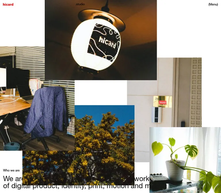
hicard|写真コラージュと余白が印象的なスタジオサイト
白地に黒いタイポグラフィと赤いロゴを配し、日常の写真を大胆に重ねたクリエイティブスタジオのサイト。非対称の段組みとテキスト主体の実績・記事一覧が特徴です。
オリジナルサイトを見るhicard.studio — Style Reference
A quiet studio index threaded through oversized photographs of everyday life.
Website: hicard.studio/ja
Original URL: https://hicard.studio/ja
Final URL: https://hicard.studio/ja — HTTP 200
Theme: white canvas, black typography, a small red identity mark, and full-color photography
Inspected: September 13, 2026, at 01:35 JST; supplied retrieval timestamp: September 12, 2026, 16:35:42.592 UTC
Viewports: 1440 × 1000 and 390 × 844 CSS pixels
Scope: the current Japanese studio homepage: opening photographic composition, Who we are, Projects, Journal, Album, closing photographs, footer, and the closed navigation header. This reference analyzes supplied browser captures and rendered DOM evidence; it does not include a separate live browsing session.
hicard presents its studio through two complementary systems. One is spare and orderly: black sans-serif text, small section labels, right-aligned collection counts, and a repeated content edge approximately one third of the way across the page. The other is photographic and irregular: rectangular pictures of plants, furniture, a doorway, a lantern, cookware, and rooftop equipment overlap one another at very different scales.
The photographs carry nearly all the color and texture. White space remains conspicuous between them, while project names and Japanese journal headlines form an unboxed editorial index. The red wordmark is small and isolated at the upper left; its .studio suffix sits separately on the main content alignment. Preserve that relationship between modest navigation, offset text, and oversized everyday imagery when adapting the design.
This is a studio homepage combining a portfolio, editorial links, an album introduction, and contact information. Its organization follows those content types rather than a conversion-focused landing-page sequence.
How to Read This Reference
- Measured values come from the supplied element rectangles and computed styles. Coordinates are document-relative unless identified as screenshot-relative.
- Visual estimates describe features visible in the supplied original-page captures whose individual computed styles were not provided. Approximate values use
≈. - Derived measurements are calculations from supplied rectangles. They explain relationships without claiming access to the original layout declarations.
- Recommended values belong to the reusable implementation below. Breakpoints, unsampled headline sizes, and accessible interaction treatments are explicitly adaptations.
- Named tokens are implementation aliases. The supplied custom-property inventory was empty.
- Desktop captures show the opening, the Journal/Album transition, and the closing/footer region. Mobile captures show the opening and closing/footer region; mobile project and journal geometry is available through the DOM evidence, but their internal visual styling was not separately captured.
- Link destinations are evidenced by rendered anchors. Their destination pages, hover states, and navigation transitions were not inspected.
Tokens — Colors
Default Palette
| Name | Value | Suggested token | Evidence and role |
|---|---|---|---|
| Canvas White | #ffffff |
--color-canvas |
Visual approximation of the white page canvas in both viewport captures |
| Text Black | #000000 |
--color-ink |
Measured rgb(0, 0, 0) on sampled text, links, headings, and footer elements |
| Wordmark Red | ≈#ff0000 |
--color-brand |
Visual approximation of the small red hicard graphic; its fill was not included in the computed-style sample |
| Transparent Element Surface | rgba(0, 0, 0, 0) |
No separate paint token needed | Measured on the sampled root, body, header, text blocks, links, and footer |
The sampled body and root backgrounds are transparent. The white appearance therefore describes the rendered canvas, not a verified white body declaration. An explicit white background is appropriate in a new implementation.
Blue sky, green leaves, ochre flowers, warm wood, and dark fabric belong to the photographs. They are not evidenced as interface color tokens. Keep category metadata and navigation black instead of extracting a different accent color from every photograph.
No selectable color theme or dark-mode state was inspected.
Tokens — Typography
Declared Interface Stack
The sampled body and content elements declare:
font-family:
  HelveticaNeueLTPro55,
  'Hiragino Kaku Gothic ProN',
  'ヒラギノ角ゴ ProN W3',
  'Hiragino Sans',
  ヒラギノ角ゴシック,
  Meiryo,
  sans-serif;
HelveticaNeueLTPro55 is an evidenced family identifier. The supplied data does not establish which font file successfully rendered every glyph. Retain the declared family when an authorized font is available; otherwise, use an explicitly chosen sans-serif fallback and check wrapping again.
Sampled text uses weight 400 and normal letter spacing. Hierarchy comes mainly from size, placement, and empty space. The red wordmark is a graphic in a home link, so its lettering should not be reconstructed by assuming that it uses the body font.
Source Root Behavior
The root element computes to 1px / 1.15px, while the body computes to 20px / 20px at both inspected widths. Mobile descendants then use smaller explicit sizes. This is not evidence that the entire mobile body changes to 13px.
The Quick Start keeps a conventional browser root and uses explicit pixel-based tokens. Do not copy hypothetical source rem values into a standard-root project: the supplied evidence contains computed sizes, not the complete original unit system.
Type Scale
| Role | Desktop | Mobile | Evidence |
|---|---|---|---|
| Body base | 20px / 20px |
20px / 20px |
Measured on BODY |
.studio identity suffix |
20px / 20px |
13px / 13px |
Measured on the visible heading |
| Who we are label | 20px / 26px |
13px / 16.9px |
Measured |
| Projects, Journal, Album labels | 20px / 22px |
13px / 14.3px |
Measured |
| English studio statement | 46px / 46px |
20px / 20px |
Measured; two desktop lines and four mobile lines in the supplied rectangles |
| Japanese studio description | 20px / 26px |
13px / 16.9px |
Measured |
| Project anchor base | 20px / 22px |
13px / 14.3px |
Measured on the anchor, not every descendant |
| Project display title | ≈78px with tight leading |
Not sampled | Desktop estimate from the visible Mindland title and row geometry |
| Journal headline | ≈30–32px, with ≈42px line spacing |
Not sampled | Desktop screenshot estimate; headline descendant styles were not supplied |
| Journal anchor base | 20px / 22px |
13px / 14.3px |
Measured; does not establish headline size |
| View More link | 20px / 22px |
13px / 14.3px |
Measured; total rectangles include additional arrow-related height |
| Album description | 20px / 26px |
13px / 16.9px |
Measured |
| Footer text | 20px / 20px |
13px / 13px |
Measured on the footer and sampled links |
The desktop journal titles are visibly larger than their dates. The title and date should remain two distinct typographic levels even when a mobile adaptation uses recommended sizes.
Tokens — Spacing & Shapes
Spacing Scale
The page combines small fixed insets with much larger photographic intervals. It does not appear to use one uniformly scaled spacing unit.
| Relationship | Desktop | Mobile | Evidence |
|---|---|---|---|
| Main horizontal inset | 20px |
10px |
Measured text and footer edges |
| Logo top inset | 20px |
10px |
Measured home-link rectangle |
.studio top padding |
20px |
11px |
Measured |
| Who we are label to English statement | 20px |
20px |
Derived from consecutive rectangles |
| English statement to Japanese description | 40px |
20px |
Derived |
| Japanese description to About link | 60px |
40px |
Derived |
| Section View More bottom to next section label | 60px |
60px |
Repeated measured relationship |
| Journal heading bottom to first entry | 40px |
20px |
Derived |
| Gap between journal entry rectangles | 40px |
20px |
Derived |
| Last journal entry to View More | 40px |
40px |
Derived |
| Project anchor padding | 5px 0 20px |
0 0 20px |
Measured |
| Gap between X and Instagram links | 10px |
10px |
Derived from link rectangles |
| Footer bottom padding | 20px |
10px |
Measured |
Use descriptive spacing tokens such as --page-inset, --entry-gap, and --section-gap. A rigid eight-point scale would miss the observed 5px project inset and the different desktop/mobile relationships.
Border Radius
| Element | Treatment | Evidence |
|---|---|---|
| Sampled content and link boxes | 0px radius |
Measured |
| Photographs | Square corners | Visually observed |
| Project and journal entries | Unboxed | Visually observed where captured |
| Navigation and View More controls | Plain text without a button surface | Visually observed |
No shadow-based elevation system, rounded content cards, or decorative section dividers is visible in the captured regions.
Layout Measurements
| Element or alignment | 1440 × 1000 | 390 × 844 | Interpretation |
|---|---|---|---|
| Document height | 4467px reported; MAIN 4466.56px |
3909px reported; precise root 3909.22px |
Rounding differences in supplied measurements |
| Main inset content width | 1400px |
370px |
Viewport minus two outer insets |
| Repeated content start | x ≈493.33px |
x ≈136.66px |
Japanese introduction, View More links, journal entries, and map link |
| Right content region | 926.67px |
243.34px |
Full width from the repeated content edge to the right inset |
| Japanese introduction width | 808.34px |
221.69px |
Narrower than the full right content region |
| Album description width | 808.34px |
243.34px |
Mobile album copy uses the full right region |
| Logo graphic box | 65 × 17.33px |
46 × 12.27px |
Measured home-link box; consistent aspect ratio |
| Who we are label top | y 845px |
y 717.09px |
Approximately 85% of the viewport height; no source formula supplied |
| English statement box | 1400 × 92px |
370 × 80px |
Full inset width |
| Project anchor box | 926.67 × 103px |
370 × 170.86px |
Mobile project anchors expand to the full inset width |
| Project start-to-start interval | 98px |
180.86px |
Derived from successive anchor positions |
| Footer box | 1400 × 262px |
370 × 208px |
Measured |
The repeated content edge can be reproduced with three equal columns and two gutters, where each gutter equals the outer inset. With viewport width W and inset g:
Column width = (W - 4g) / 3
Content start = g + column width + g
              = (W + 2g) / 3
This gives 493.33px at desktop and 136.67px on mobile. It is a reconstruction of the measured alignment, not a claim that the original stylesheet uses CSS Grid.
Desktop project anchor rectangles overlap vertically by 5px because their measured height is 103px while their start interval is 98px. The evidence does not identify the underlying rule. A new implementation should avoid overlapping interactive hit areas.
Components
Persistent Identity Header
Role: maintain identity and navigation while the page scrolls.
Place the red hicard graphic at the upper-left inset. Align .studio to the repeated content start, approximately 493px on desktop and 137px on mobile. Place (Menu) at the upper-right inset. The suffix is deliberately offset from the logo and is not centered in the viewport.
These three elements remain at the same viewport edges in the opening and scrolled screenshots, consistent with a fixed overlay. The sampled HEADER itself has zero height, and no opaque header strip is visible. Its exact positioning declarations were not supplied.
The wordmark measures 65px wide on desktop and 46px on mobile. The suffix measures 20px and 13px respectively. Photographs can pass beneath this sparse header, including behind the suffix.
Closed Menu Affordance
Role: expose primary navigation through a compact text control.
The captured control reads (Menu), with literal parentheses and no enclosing button shape. Hidden or otherwise non-visible header text in the DOM includes En, Ja, Close, About, Projects, Journal, Album, Contact, X, and Instagram.
Those strings establish available markup, not an inspected open-menu design. The menu panel's geometry, colors, transition, focus behavior, and working destinations remain unverified. Do not infer a fullscreen overlay or animated drawer from the label alone.
Opening Photographic Composition
Role: introduce the studio through its environment and visual sensibility.
Use individual rectangular images with square edges and no frames. The captured opening includes a doorway, a potted plant beside a window, a chair draped with a blue jacket, a wooden table above a colorful rug, and a flowering tree against blue sky.
Photographs overlap one another and, in the supplied opening states, obscure portions of the introductory text. This overlap is part of the observed composition; the captures do not establish whether it is a permanent arrangement or one state of a changing presentation.
Approximate visible placement:
| Photograph | Desktop opening | Mobile opening |
|---|---|---|
| Doorway | Left edge x ≈144px; width ≈480px; begins at the top |
x ≈39px; width ≈163px; visible height ≈228px |
| Plant | x ≈144px, y ≈240px; width ≈480px |
x ≈78px, y ≈101px; ≈163 × 228px |
| Chair | x ≈960px, y ≈288px; width ≈480px |
x ≈228px, y ≈304px; ≈162 × 228px |
| Table and rug | x ≈0px, y ≈528px; width ≈480px |
x ≈0px, y ≈481px; ≈163 × 228px |
| Flowering tree | x ≈576px, y ≈325px; ≈720 × 514px |
x ≈91px, y ≈675px; width ≈260px, continuing below the capture |
These are screenshot estimates. The desktop photographs are not simply scaled down for mobile: their relative horizontal and vertical positions change substantially.
Studio Introduction
Role: explain the studio after the opening photographs establish its character.
Start with the small Who we are label at the left page inset. The English statement follows after 20px and spans the full inset page width:
We are a creative studio based in Tokyo, working across the fields of digital product, identity, print, motion and music.
Use regular-weight type with unusually tight 1 line height: 46px on desktop and 20px on mobile. Below it, place the Japanese description on the offset content column, followed by View More and a right-pointing arrow.
The Japanese paragraph is narrower than the full content region. This produces a second, more intimate reading measure within the larger grid. Its About link points to /ja/about.
Section Label and Count
Role: introduce each collection with minimal visual weight.
Projects, Journal, and Album have small black labels at the left page inset. Their counts sit at the far right as (10), (7), and (10). Parentheses are part of the visible treatment.
The homepage shows six project links and three journal links despite the larger section counts. Keep counts data-driven; do not assume they equal the number of preview entries currently displayed.
There are no visible count badges, colored pills, or separating rules. The large distance between label, count, and content makes the page width legible.
Project Index Entry
Role: provide a direct route into a selected project.
Each observed project is one linked entry containing a project name, year, and discipline metadata. The homepage includes Yugeisha, Tokyo Chai Party, DUNBAR, Kyash, Yuka Ohishi, and Mindland.
The visible desktop Mindland entry places a very large regular-weight title at the content edge. Its year and discipline text sit immediately to the right in much smaller type. The disciplines wrap as ordinary text, without boxes: Brand Identity, Mobile Application, Visual Identity, and Website are visible in that entry.
The entire measured desktop anchor is approximately 927px wide. On mobile, each project anchor moves to the left page inset and becomes 370px wide and approximately 171px tall. The internal mobile title, image, and metadata arrangement is not established by the supplied screenshots; do not infer thumbnails from the taller row alone.
A View More link below the list returns to the offset content column and points to /ja/projects.
Journal Entry
Role: connect studio activity and thinking to longer editorial content.
Each journal anchor contains a large Japanese headline followed by a smaller date. Desktop headlines occupy roughly two lines in the supplied middle capture. Entries remain within the right content region, with an uninterrupted white margin to their left.
The first visible title is:
「起業しなくても、ここで実現できる」- hicardで見つけた理想のチームと環境
The dates are displayed as 2025.02.13, 2025.01.30, and 2025.01.10. Preserve that dotted year-month-day format when reproducing the reference content.
Desktop entry rectangles are about 115.19px tall, separated by 40px. Mobile entries retain the offset column, but their heights vary: about 123.48px for the first and 86.69px for the next two, with 20px gaps. This is evidence of content-dependent wrapping, not fixed-height cards.
The three article anchors point to note.com/hicard/...; the section's View More points to /ja/journal. Opening behavior and destination-page design were not tested.
View More Link
Role: provide a repeated, quiet continuation action.
Use regular black text followed by a thin right-pointing arrow. The desktop link rectangle is approximately 118.59 × 25px; mobile is 79.34 × 17.30px. The measured text line heights are 22px and 14.3px respectively.
The link is unfilled and unboxed in the captured resting state. Its position is more important than decorative styling: the About, Projects, Journal, and Album continuation links share the same offset content edge.
The arrow's implementation was not supplied. A text arrow or small SVG is an adaptation, not a verified asset choice.
Album Introduction and Closing Photographs
Role: connect the studio's photographic material to its album and close the editorial sequence.
The Album section uses the same left label/right count structure. Its short description reads hicardの写真アルバムです。, followed by View More linking to /ja/album.
The closing captures show another loose photographic grouping: cookware near the upper left, a glowing hicard lantern on the left, and rooftop air-conditioning equipment on the right. The images retain square corners and substantial differences in scale.
On mobile, the lantern is approximately 260 × 186px, while the equipment image is approximately 162 × 228px. The composition preserves white gaps between image groups instead of filling every available cell.
Contact Footer
Role: provide location, social links, and legal identity in the same sparse layout language.
Place hicard.studio at the upper left of the footer and @2020-2025 at the upper right. Put the address and View on Google Maps link on the repeated content edge. Place X and Instagram at the lower left and ©︎hicard, Inc. at the lower right.
The address is shown as:
201 Junohanegikoen, 6-9-17 Matsubara, Setagaya,Tokyo 156-0043, Japan
It fits on one desktop line in the capture and wraps into three compact mobile lines. External links use northeast-pointing arrows. The legal name is independently evidenced by the original-page footer; no website production credit is visible in the supplied original-page evidence.
The printed @2020-2025 range is page content, not the inspection date or a verified last-update date.
Tokens — Motion & Interaction
| Feature | Evidence | What can be implemented confidently |
|---|---|---|
| Scrolling page | Opening, intermediate desktop, and bottom captures plus document heights | A normal vertically navigable homepage |
| Persistent header | Identity and Menu remain at the same viewport edges in scrolled captures | A fixed transparent header is a reasonable reconstruction |
| Internal continuation links | Rendered hrefs for About, Projects, Journal, and Album | Ordinary navigable anchors |
| Project links | Six project-specific hrefs | Entire project entries can be linked |
| Journal and footer links | External hrefs in rendered anchors | Correct link destinations; new-tab behavior is unverified |
| Menu opening | Only the closed state was captured | Preserve the visible control; treat open-state design as separate work |
| Photograph movement | Overlapping image positions are visible, but no motion sequence is supplied | Reproduce a static composition; animation triggers and trajectories are unknown |
| Hover and focus | No exercised states supplied | Add accessible feedback as an implementation recommendation |
| Animation timing | Sampled elements report animation: none; transition data only says all |
No verified duration, easing, delay, or photo-layer animation rule |
The browser observation included an initial period of at least five seconds and readiness checks for layout, image decoding, and finite animations. Perpetual animations were temporarily paused during readiness checks and then resumed. These procedures do not establish that the photographic presentation is static or that every delayed state was captured.
Do not infer dragging, parallax, automatic shuffling, cursor-following previews, or scroll-linked transforms from these still images. The Quick Start intentionally supplies no such behavior.
Surfaces
| Layer | Appearance | Purpose |
|---|---|---|
| Page canvas | Visually white | Gives both photographs and typography room |
| Header | Transparent, sparse text and graphic identity | Remains present without a navigation bar surface |
| Editorial content | Black text directly on the canvas | Builds hierarchy through size and alignment |
| Photographs | Full-color, square-edged rectangles | Supplies texture, atmosphere, and most visual density |
| Continuation links | Plain black text and an arrow | Repeated navigation without filled buttons |
| Footer | Same white canvas and black type | Continues the page grid rather than creating a separate panel |
The visual hierarchy depends on image overlap, scale changes, and empty space. No card elevation system is needed to explain the captured design.
Imagery
The photographs show ordinary objects and studio surroundings: a plant on a cluttered shelf, a jacket over an office chair, furniture above a colorful rug, building hardware, and a lantern carrying the studio's name. Their atmosphere is candid and inhabited. Visible grain, uneven lighting, warm interiors, and dark shadows help the images feel collected rather than staged as polished product photography.
Keep the native photographic color. The interface does not apply an evidenced monochrome treatment, duotone filter, or uniform tinted overlay. Use normal photographic interpolation; pixelated rendering would change the material quality.
Portrait frames are approximately 5:7 in the clearly bounded mobile opening images. The tree and lantern landscape frames are approximately 7:5. These are estimates of displayed rectangles, not verified native asset dimensions.
Observed Asset References
Original image URLs and native image dimensions were not included in the supplied evidence. The following identifies visible material without inventing file paths.
| Subject | Appearance | Captured use |
|---|---|---|
| Studio doorway | Pale wall, entry hardware, small colored details | Opening, desktop and mobile |
| Potted plant | Bright leaves against a window, shelves and nearby objects | Opening, desktop and mobile |
| Desk chair | Blue jacket, blinds, wooden desk | Opening, desktop and mobile |
| Table and rug | Warm tabletop over saturated patterned fabric | Opening, desktop and mobile |
| Flowering tree | Yellow-green foliage against a strong blue sky | Opening, desktop and mobile |
| Cookware | Dark circular lid and surrounding kitchen objects | Closing, desktop and mobile |
| hicard lantern | Warm illuminated paper lantern with printed identity | Closing, desktop and mobile |
| Rooftop equipment | Industrial fans and outdoor units | Closing, desktop and mobile |
Use authorized photography with comparable framing and tonal variety. Preserve independent image boxes and their overlap; a single flattened collage would make responsive rearrangement and meaningful image alternatives harder.
Layout & Responsive Behavior
The homepage has two layout systems: a repeated text alignment and a freely arranged photographic composition. They should remain independently controllable.
For text, the desktop page uses a 20px outer inset and an approximately 493px content start. At 390px wide, the inset halves to 10px and the content start becomes approximately 137px. The Japanese introduction, journal list, continuation links, and footer address keep that offset. The English studio statement remains full width within the page insets.
Projects are the clear mobile exception: their links expand from the desktop right region to the full 370px inset width. Do not apply the offset column indiscriminately to every mobile content block.
The opening image widths also change proportionally. Several desktop portrait frames are approximately one third of the viewport width; the corresponding mobile frames are approximately five twelfths. Landscape frames grow from approximately one half of desktop width to two thirds of mobile width. Their placement changes as well: the tree moves from the middle of the desktop composition to near the lower edge of the phone opening.
The Who we are label begins at 845px on desktop and 717.09px on mobile, roughly 85% of the corresponding viewport height. This supports an approximately viewport-height opening, but the exact source height formula and breakpoint are unknown.
Large blank areas remain on mobile. In the closing captures, the last visible photograph ends at approximately screenshot y352 on mobile and y588 on desktop. The footer begins around y636 and y738 respectively, leaving about 284px and 150px of visible white space. These are capture-specific visual estimates, not verified section-padding declarations.
The desktop page is approximately 4467px tall and the mobile page approximately 3909px tall. The shorter mobile document does not mean every component shrinks: project links become taller while photographic spacing and type sizes change elsewhere.
Only the two supplied viewport sizes were inspected. Intermediate widths, landscape phones, zoom behavior, orientation changes, and the exact breakpoint remain unverified.
Do’s and Don’ts
Do
- Keep the canvas white and ordinary interface text black.
- Reserve the strong red accent for the small identity graphic.
- Separate the logo and
.studiosuffix across the page grid. - Preserve the repeated one-third content start for editorial text and continuation links.
- Let the mobile project list use the full inset page width.
- Keep photographs square-edged, individually positioned, and varied in scale.
- Use candid surroundings and everyday objects as the principal imagery.
- Retain regular-weight typography and the tight English statement leading.
- Pair section labels with plain parenthesized counts at the far right.
- Keep journal headlines, dates, and project metadata as ordinary text rather than badges.
- Preserve the substantial white interval before the footer.
- Separate measured typography from recommended sizes for unsampled descendants.
Don't
- Don't replace the portfolio and journal index with a generic feature-card layout.
- Don't center
.studioin the viewport or join it tightly to the red logo. - Don't force the photography into a uniform masonry grid.
- Don't add rounded photo corners, card shadows, gradients, or glass panels.
- Don't promote photograph colors into a multicolored UI palette.
- Don't collapse all mobile content to the same left edge.
- Don't interpret the collection counts as the number of visible preview entries.
- Don't claim that the photos are draggable or animated without further evidence.
- Don't treat an anchor's inherited font size as proof of its headline child's size.
- Don't reproduce overlapping desktop link hit areas merely to match rectangle measurements.
- Don't use a printed footer year range as evidence that the current page is discontinued.
Recommended Implementation Additions
These are recommendations for a new implementation, not verified features of the original:
- Give the Menu control a semantic button, an accessible name, and accurate expanded-state information. Define keyboard and focus behavior when an open state is designed.
- Verify the graphic home link's accessible name. An empty text extraction does not establish whether the original image has an accessible alternative.
- Enlarge the interactive area around the compact mobile controls without enlarging their visible typography or disturbing their alignment.
- Add a clear focus outline and an underline on interactive text. Preserve a usable focused state where images sit beneath the header.
- Keep essential introduction text and links readable in the final resting composition. If photographs move across text, provide a readable static or reduced-motion arrangement.
- Use meaningful image alternatives for documentary photographs and empty alternatives only for truly decorative duplicates.
- Provide intrinsic image dimensions and responsive sources to reduce layout movement and unnecessary downloads. No original asset sizes or performance metrics were supplied.
- Use semantic dates and sensible heading levels. Apply language attributes to Japanese and English passages where appropriate.
- Test the narrow mobile editorial column with long titles, text enlargement, and different Japanese fallback fonts. A 13px utility size may need adjustment for the intended audience.
Agent Prompt Guide
Quick Color Reference
- Canvas:
#ffffff, a visual approximation made explicit for implementation. - Interface text: measured
#000000. - Wordmark: approximately
#ff0000; prefer the authorized original graphic. - Photography: retain natural full color.
- Controls: black text and thin arrows on the white canvas.
- Surface treatment: square edges, no visible card fills or shadows.
Overall Prompt
“Create a creative-studio homepage with a white canvas, black regular-weight sans-serif typography, and a small red wordmark at the upper left. Separate the .studio suffix from the logo and align it with a content column beginning approximately one third across the page. Place (Menu) at the upper right. Build an opening composition from overlapping square-edged photographs of studio surroundings: a doorway, plant, chair, table and rug, and flowering tree. Follow it with a full-width English studio statement, an offset Japanese introduction, a large-type project index, Japanese journal headlines with small dates, an album introduction, and a sparse contact footer. Use left section labels and right parenthesized counts. Preserve broad white areas and allow the mobile project list to expand to full width. Treat any photo animation or menu-open behavior as a separate, explicitly designed feature.”
Example Component Prompts
- Identity header: “Build a transparent fixed header with a 65px-wide red wordmark 20px from the upper-left edge,
.studioaligned near x493 at a 1440px viewport, and(Menu)20px from the right. At 390px, use a 46px wordmark, 10px insets, and a suffix start near x137. Keep controls unboxed.” - Photographic composition: “Arrange independent portrait and landscape photographs over white space, using hard rectangular edges and overlapping layers. At phone width, use approximately 163px-wide portrait frames and 260px-wide landscape frames. Reposition the images for the narrow viewport. Do not imply dragging or parallax.”
- Project index: “Create a plain linked project entry with an approximately 78px desktop project name and smaller year and discipline text to its right. Use normal black text without badges, borders, or shadows. On mobile, expand the link to the full page width and choose a clearly labeled responsive title size.”
- Journal list: “Place Japanese article titles and small dotted-format dates in the right two-thirds content region. Use approximately 32px desktop headlines as an estimate, regular weight, generous line spacing, and 40px between entries. Keep the mobile content offset and reduce the entry gap to 20px.”
- Footer: “Continue the white page into a sparse footer: studio name left, printed year range right, address and map link on the one-third content alignment, social links bottom left, and copyright bottom right. Preserve a large white interval above it and compact 13px mobile typography.”
Quick Start
CSS Custom Properties
This is a reusable reconstruction, not extracted source CSS. It keeps a conventional root size and reproduces the measured text alignment, insets, utility typography, and key component relationships.
The 767px breakpoint is recommended. Desktop project and journal title sizes are estimates. Their mobile sizes are implementation choices because the corresponding child styles were not supplied. The collage coordinates approximate the captured opening states; they are not animation keyframes.
Use .content-grid on each text section. Put offset content in .content-column, place the English statement across all columns, and add .projects to the project section. Photo modifiers expect independently supplied, authorized assets.
:root {
  /* White and red are visual approximations; black is measured. */
  --color-canvas: #ffffff;
  --color-ink: #000000;
  --color-brand: #ff0000;

  /* Declared family identifier; font files are not bundled here. */
  --font-interface: HelveticaNeueLTPro55,
    'Hiragino Kaku Gothic ProN', 'ヒラギノ角ゴ ProN W3',
    'Hiragino Sans', ヒラギノ角ゴシック, Meiryo, sans-serif;

  --page-inset: 20px;
  --section-gap: 60px;
  --entry-gap: 40px;
  --text-ui: 20px;
  --text-statement: 46px;
  --text-project: 78px; /* Desktop estimate. */
  --text-journal: 32px; /* Desktop estimate. */
  --logo-width: 65px;
  --leading-ui: 1.1;
  --leading-copy: 1.3;
}

* {
  box-sizing: border-box;
}

body {
  margin: 0;
  color: var(--color-ink);
  background: var(--color-canvas);
  font-family: var(--font-interface);
  font-size: 20px;
  font-weight: 400;
  line-height: 1;
  letter-spacing: normal;
}

img {
  display: block;
  max-width: 100%;
}

a {
  color: inherit;
  text-decoration: none;
}

button {
  color: inherit;
  font: inherit;
}

.content-grid {
  display: grid;
  grid-template-columns: repeat(3, minmax(0, 1fr));
  column-gap: var(--page-inset);
  margin-inline: var(--page-inset);
  font-size: var(--text-ui);
}

.content-column {
  grid-column: 2 / -1;
  min-width: 0;
}

.site-header {
  position: fixed;
  inset: 0 0 auto;
  z-index: 20;
  display: grid;
  grid-template-columns: repeat(3, minmax(0, 1fr));
  gap: var(--page-inset);
  padding: var(--page-inset);
  font-size: var(--text-ui);
  line-height: 1;
  pointer-events: none;
}

.site-header > * {
  pointer-events: auto;
}

.brand {
  justify-self: start;
}

.brand img {
  width: var(--logo-width);
  height: auto;
}

.site-suffix {
  margin: 0;
  font: inherit;
}

.menu-trigger {
  justify-self: end;
  align-self: start;
  padding: 0;
  border: 0;
  background: none;
  cursor: pointer;
}

/* Snapshot approximation; no movement behavior is implied. */
.opening-collage {
  position: relative;
  z-index: 1;
  height: 85vh;
  height: 85svh;
  pointer-events: none;
}

.opening-collage img {
  position: absolute;
  width: 33.333333%;
  max-width: none;
  height: auto;
  aspect-ratio: 5 / 7;
  object-fit: cover;
  border-radius: 0;
}

.photo-door {
  top: 0;
  left: 10%;
  z-index: 1;
}

.photo-plant {
  top: 24vh;
  left: 10%;
  z-index: 2;
}

.photo-chair {
  top: 28.8vh;
  right: 0;
  z-index: 1;
}

.photo-rug {
  top: 52.8vh;
  left: 0;
  z-index: 3;
}

.opening-collage .photo-tree {
  top: 32.5vh;
  left: 40%;
  z-index: 4;
  width: 50%;
  aspect-ratio: 7 / 5;
}

/* Recommended readable alternative to the captured text overlap. */
.opening-collage[data-readable='true'] {
  overflow: hidden;
}

.section {
  margin-top: var(--section-gap);
}

.section-heading {
  grid-column: 1 / -1;
  display: flex;
  justify-content: space-between;
  align-items: baseline;
  margin: 0 0 40px;
  line-height: var(--leading-ui);
}

.section-heading h2,
.section-heading p {
  margin: 0;
  font: inherit;
}

.intro-label {
  grid-column: 1 / -1;
  margin: 0;
  font: inherit;
  line-height: var(--leading-copy);
}

.studio-statement {
  grid-column: 1 / -1;
  margin: 20px 0 0;
  font-size: var(--text-statement);
  line-height: 1;
}

.intro-copy,
.album-copy {
  width: 87.23%;
  margin: 0;
  line-height: var(--leading-copy);
}

.intro-copy {
  margin-top: 40px;
}

.more-link {
  justify-self: start;
  display: inline-flex;
  align-items: baseline;
  gap: 0.35em;
  margin-top: 40px;
  font-size: var(--text-ui);
  line-height: var(--leading-ui);
}

.intro .more-link {
  margin-top: 60px;
}

.projects .section-heading {
  margin-bottom: 35px;
}

.project-list,
.journal-list {
  margin: 0;
  padding: 0;
  list-style: none;
}

.project-row {
  display: grid;
  grid-template-columns: fit-content(65%) minmax(0, 1fr);
  column-gap: 20px;
  align-items: start;
  min-height: 103px;
  padding: 5px 0 20px;
  line-height: var(--leading-ui);
}

.project-title {
  margin: 0;
  font-size: var(--text-project);
  font-weight: 400;
  line-height: 1;
  overflow-wrap: anywhere;
}

.project-meta {
  min-width: 0;
  font-size: var(--text-ui);
  line-height: var(--leading-ui);
}

.project-meta time,
.project-meta .disciplines {
  display: block;
}

.journal-list {
  display: grid;
  gap: var(--entry-gap);
}

.journal-entry {
  display: block;
}

.journal-title {
  margin: 0;
  font-size: var(--text-journal);
  font-weight: 400;
  line-height: 1.3;
  overflow-wrap: anywhere;
}

.journal-date {
  display: block;
  margin-top: 12px;
  font-size: var(--text-ui);
  line-height: 1;
}

/* Place the closing photo composition before this footer. */
.site-footer {
  padding-bottom: var(--page-inset);
  line-height: 1;
}

.footer-brand {
  grid-column: 1;
  grid-row: 1;
}

.footer-range {
  grid-column: 3;
  grid-row: 1;
  justify-self: end;
}

.footer-address {
  grid-column: 2 / -1;
  grid-row: 2;
  margin: 36px 0 0;
  font-style: normal;
}

.footer-map {
  grid-column: 2 / -1;
  grid-row: 3;
  justify-self: start;
  min-height: 23px;
  margin-top: 63px;
}

.footer-socials {
  grid-column: 1 / 3;
  grid-row: 4;
  display: flex;
  gap: 10px;
  margin-top: 57px;
  min-height: 23px;
}

.footer-copyright {
  grid-column: 3;
  grid-row: 4;
  justify-self: end;
  align-self: end;
  margin: 0;
  white-space: nowrap;
}

/* Recommended feedback; original hover and focus were not inspected. */
a:focus-visible,
button:focus-visible {
  outline: 2px solid currentColor;
  outline-offset: 4px;
}

@media (hover: hover) {
  .more-link:hover,
  .footer-map:hover,
  .footer-socials a:hover {
    text-decoration: underline;
    text-underline-offset: 0.15em;
  }
}

/* Recommended breakpoint; only the endpoints were inspected. */
@media (max-width: 767px) {
  :root {
    --page-inset: 10px;
    --entry-gap: 20px;
    --text-ui: 13px;
    --text-statement: 20px;
    --text-project: 36px; /* Recommended, not measured. */
    --text-journal: 16px; /* Recommended, not measured. */
    --logo-width: 46px;
  }

  .site-suffix {
    padding-top: 1px;
  }

  .opening-collage img {
    width: 41.666667%;
  }

  .photo-plant {
    top: 12vh;
    left: 20%;
  }

  .photo-chair {
    top: 36vh;
    right: 0;
  }

  .photo-rug {
    top: 57vh;
  }

  .opening-collage .photo-tree {
    top: 80vh;
    left: 23.333333%;
    width: 66.666667%;
  }

  .section-heading,
  .projects .section-heading {
    margin-bottom: 20px;
  }

  .intro-copy {
    width: 91.1%;
    margin-top: 20px;
  }

  .album-copy {
    width: 100%;
  }

  .intro .more-link {
    margin-top: 40px;
  }

  .projects .project-list {
    grid-column: 1 / -1;
    display: grid;
    gap: 10px;
  }

  /* Recommended internal mobile arrangement; box size is measured. */
  .project-row {
    grid-template-columns: minmax(0, 1fr);
    align-content: start;
    gap: 16px;
    min-height: 171px;
    padding: 0 0 20px;
  }

  .projects .more-link {
    margin-top: 50px;
  }

  .journal-title {
    line-height: 1.4;
  }

  .footer-address {
    margin-top: 21px;
  }

  .footer-map {
    min-height: 15px;
    margin-top: 39.5px;
  }

  .footer-socials {
    min-height: 15px;
    margin-top: 55.5px;
  }
}
The photo frames intentionally allow overflow in their default snapshot approximation. Add data-readable='true' to clip them to the opening region when a static, unobscured introduction is required. This is an explicit accessibility adaptation and changes the captured overlap.
Minimal Component Markup
The asset names below are placeholders for project-owned files, not observed original website paths. Supply the authorized wordmark and photographs. The menu button represents the evidenced closed affordance; its open state requires a separate implementation.
<header class='site-header'>
  <a class='brand' href='/ja' aria-label='hicard home'>
    <img src='/media/wordmark.svg' alt='hicard'>
  </a>
  <p class='site-suffix'>.studio</p>
  <button class='menu-trigger' type='button'>(Menu)</button>
</header>

<div class='opening-collage' data-readable='true'>
  <img class='photo-door' src='/media/door.jpg' alt='Studio doorway'>
  <img class='photo-plant' src='/media/plant.jpg' alt='Plant beside a studio window'>
  <img class='photo-chair' src='/media/chair.jpg' alt='Blue jacket over a desk chair'>
  <img class='photo-rug' src='/media/rug.jpg' alt='Wooden table above a patterned rug'>
  <img class='photo-tree' src='/media/tree.jpg' alt='Flowering tree against blue sky'>
</div>

<section class='section projects content-grid' aria-labelledby='projects-title'>
  <div class='section-heading'>
    <h2 id='projects-title'>Projects</h2>
    <p>(10)</p>
  </div>
  <ul class='project-list content-column'>
    <li>
      <a class='project-row' href='/ja/projects/mindland'>
        <h3 class='project-title'>Mindland</h3>
        <div class='project-meta'>
          <time datetime='2022'>2022</time>
          <span class='disciplines'>Brand Identity · Mobile Application · Visual Identity · Website</span>
        </div>
      </a>
    </li>
  </ul>
  <a class='more-link content-column' href='/ja/projects'>
    View More <span aria-hidden='true'>→</span>
  </a>
</section>
The metadata separators in this example are a readability recommendation; the captured site uses plain adjacent discipline text. Generate collection counts from actual content rather than retaining the sample count in a new project.
Tailwind v4 Token Mapping
Optional aliases for a project already using Tailwind v4. This does not imply that the original website uses Tailwind. Define the custom properties above first; the responsive values continue to come from those properties.
@theme inline {
  --color-canvas: #ffffff;
  --color-ink: #000000;
  --color-brand: #ff0000;

  --font-studio: var(--font-interface);

  --text-utility: var(--text-ui);
  --text-statement: var(--text-statement);
  --text-project-name: var(--text-project);
  --text-journal-title: var(--text-journal);

  --spacing-page: var(--page-inset);
  --spacing-section: var(--section-gap);
  --spacing-entry: var(--entry-gap);
}
For Tailwind, rename the statement alias to --text-studio-statement if the build pipeline treats the same-name reference as circular; using that distinct alias is the recommended mapping.
Sources & Evidence
- Original and final page: hicard Japanese homepage. The supplied browser result reports HTTP 200 and the document title
hicard; the original and final URLs are identical. - Capture time: September 12, 2026, at 16:35:42.592 UTC, corresponding to September 13, 2026, at 01:35:42.592 JST.
- Desktop evidence: three original-page captures at 1440 × 1000 CSS pixels, showing the opening composition, Journal/Album transition, and closing/footer region. The supplied DOM includes the full homepage text, anchor destinations, selected computed styles, and element rectangles.
- Mobile evidence: two original-page captures at 390 × 844 CSS pixels, showing the opening and closing/footer region, accompanied by a rendered DOM measurement set for the full homepage.
- Measured evidence: black text color; declared font stack; sampled font sizes, line heights, weights, and spacing; link rectangles; content offsets; footer geometry; and document heights.
- Visual evidence: white canvas, red wordmark, image subjects, overlapping rectangular frames, estimated photo placement, estimated desktop display typography, arrows, and the absence of visible card surfaces in captured regions.
- Interaction scope: scroll-position captures and rendered anchor destinations. No menu opening, hover, focus, photo manipulation, or destination-page interaction was supplied.
- Limitations: no complete stylesheet, original image URL inventory, native image dimensions, font-load verification, or photo-layer animation measurements. Readiness checks do not prove that all delayed content or motion states were captured. Intermediate responsive widths were not inspected.
This reference describes the current homepage represented by those captures. Its CSS is an explicitly labeled reconstruction, and its accessibility additions and unsampled responsive choices are recommendations.
# hicard.studio — Style Reference

> A quiet studio index threaded through oversized photographs of everyday life.

**Website:** [hicard.studio/ja](https://hicard.studio/ja)
**Original URL:** https://hicard.studio/ja
**Final URL:** https://hicard.studio/ja — HTTP 200
**Theme:** white canvas, black typography, a small red identity mark, and full-color photography
**Inspected:** September 13, 2026, at 01:35 JST; supplied retrieval timestamp: September 12, 2026, 16:35:42.592 UTC
**Viewports:** 1440 × 1000 and 390 × 844 CSS pixels
**Scope:** the current Japanese studio homepage: opening photographic composition, Who we are, Projects, Journal, Album, closing photographs, footer, and the closed navigation header. This reference analyzes supplied browser captures and rendered DOM evidence; it does not include a separate live browsing session.

hicard presents its studio through two complementary systems. One is spare and orderly: black sans-serif text, small section labels, right-aligned collection counts, and a repeated content edge approximately one third of the way across the page. The other is photographic and irregular: rectangular pictures of plants, furniture, a doorway, a lantern, cookware, and rooftop equipment overlap one another at very different scales.

The photographs carry nearly all the color and texture. White space remains conspicuous between them, while project names and Japanese journal headlines form an unboxed editorial index. The red wordmark is small and isolated at the upper left; its `.studio` suffix sits separately on the main content alignment. Preserve that relationship between modest navigation, offset text, and oversized everyday imagery when adapting the design.

This is a studio homepage combining a portfolio, editorial links, an album introduction, and contact information. Its organization follows those content types rather than a conversion-focused landing-page sequence.

## How to Read This Reference

- **Measured** values come from the supplied element rectangles and computed styles. Coordinates are document-relative unless identified as screenshot-relative.
- **Visual estimates** describe features visible in the supplied original-page captures whose individual computed styles were not provided. Approximate values use `≈`.
- **Derived measurements** are calculations from supplied rectangles. They explain relationships without claiming access to the original layout declarations.
- **Recommended values** belong to the reusable implementation below. Breakpoints, unsampled headline sizes, and accessible interaction treatments are explicitly adaptations.
- **Named tokens** are implementation aliases. The supplied custom-property inventory was empty.
- Desktop captures show the opening, the Journal/Album transition, and the closing/footer region. Mobile captures show the opening and closing/footer region; mobile project and journal geometry is available through the DOM evidence, but their internal visual styling was not separately captured.
- Link destinations are evidenced by rendered anchors. Their destination pages, hover states, and navigation transitions were not inspected.

## Tokens — Colors

### Default Palette

| Name | Value | Suggested token | Evidence and role |
| --- | --- | --- | --- |
| Canvas White | `#ffffff` | `--color-canvas` | Visual approximation of the white page canvas in both viewport captures |
| Text Black | `#000000` | `--color-ink` | Measured `rgb(0, 0, 0)` on sampled text, links, headings, and footer elements |
| Wordmark Red | `≈#ff0000` | `--color-brand` | Visual approximation of the small red hicard graphic; its fill was not included in the computed-style sample |
| Transparent Element Surface | `rgba(0, 0, 0, 0)` | No separate paint token needed | Measured on the sampled root, body, header, text blocks, links, and footer |

The sampled body and root backgrounds are transparent. The white appearance therefore describes the rendered canvas, not a verified white body declaration. An explicit white background is appropriate in a new implementation.

Blue sky, green leaves, ochre flowers, warm wood, and dark fabric belong to the photographs. They are not evidenced as interface color tokens. Keep category metadata and navigation black instead of extracting a different accent color from every photograph.

No selectable color theme or dark-mode state was inspected.

## Tokens — Typography

### Declared Interface Stack

The sampled body and content elements declare:

```css
font-family:
  HelveticaNeueLTPro55,
  'Hiragino Kaku Gothic ProN',
  'ヒラギノ角ゴ ProN W3',
  'Hiragino Sans',
  ヒラギノ角ゴシック,
  Meiryo,
  sans-serif;
```

`HelveticaNeueLTPro55` is an evidenced family identifier. The supplied data does not establish which font file successfully rendered every glyph. Retain the declared family when an authorized font is available; otherwise, use an explicitly chosen sans-serif fallback and check wrapping again.

Sampled text uses weight `400` and normal letter spacing. Hierarchy comes mainly from size, placement, and empty space. The red wordmark is a graphic in a home link, so its lettering should not be reconstructed by assuming that it uses the body font.

### Source Root Behavior

The root element computes to `1px / 1.15px`, while the body computes to `20px / 20px` at both inspected widths. Mobile descendants then use smaller explicit sizes. This is not evidence that the entire mobile body changes to 13px.

The Quick Start keeps a conventional browser root and uses explicit pixel-based tokens. Do not copy hypothetical source `rem` values into a standard-root project: the supplied evidence contains computed sizes, not the complete original unit system.

### Type Scale

| Role | Desktop | Mobile | Evidence |
| --- | --- | --- | --- |
| Body base | `20px / 20px` | `20px / 20px` | Measured on BODY |
| `.studio` identity suffix | `20px / 20px` | `13px / 13px` | Measured on the visible heading |
| Who we are label | `20px / 26px` | `13px / 16.9px` | Measured |
| Projects, Journal, Album labels | `20px / 22px` | `13px / 14.3px` | Measured |
| English studio statement | `46px / 46px` | `20px / 20px` | Measured; two desktop lines and four mobile lines in the supplied rectangles |
| Japanese studio description | `20px / 26px` | `13px / 16.9px` | Measured |
| Project anchor base | `20px / 22px` | `13px / 14.3px` | Measured on the anchor, not every descendant |
| Project display title | `≈78px` with tight leading | Not sampled | Desktop estimate from the visible Mindland title and row geometry |
| Journal headline | `≈30–32px`, with `≈42px` line spacing | Not sampled | Desktop screenshot estimate; headline descendant styles were not supplied |
| Journal anchor base | `20px / 22px` | `13px / 14.3px` | Measured; does not establish headline size |
| View More link | `20px / 22px` | `13px / 14.3px` | Measured; total rectangles include additional arrow-related height |
| Album description | `20px / 26px` | `13px / 16.9px` | Measured |
| Footer text | `20px / 20px` | `13px / 13px` | Measured on the footer and sampled links |

The desktop journal titles are visibly larger than their dates. The title and date should remain two distinct typographic levels even when a mobile adaptation uses recommended sizes.

## Tokens — Spacing & Shapes

### Spacing Scale

The page combines small fixed insets with much larger photographic intervals. It does not appear to use one uniformly scaled spacing unit.

| Relationship | Desktop | Mobile | Evidence |
| --- | --- | --- | --- |
| Main horizontal inset | `20px` | `10px` | Measured text and footer edges |
| Logo top inset | `20px` | `10px` | Measured home-link rectangle |
| `.studio` top padding | `20px` | `11px` | Measured |
| Who we are label to English statement | `20px` | `20px` | Derived from consecutive rectangles |
| English statement to Japanese description | `40px` | `20px` | Derived |
| Japanese description to About link | `60px` | `40px` | Derived |
| Section View More bottom to next section label | `60px` | `60px` | Repeated measured relationship |
| Journal heading bottom to first entry | `40px` | `20px` | Derived |
| Gap between journal entry rectangles | `40px` | `20px` | Derived |
| Last journal entry to View More | `40px` | `40px` | Derived |
| Project anchor padding | `5px 0 20px` | `0 0 20px` | Measured |
| Gap between X and Instagram links | `10px` | `10px` | Derived from link rectangles |
| Footer bottom padding | `20px` | `10px` | Measured |

Use descriptive spacing tokens such as `--page-inset`, `--entry-gap`, and `--section-gap`. A rigid eight-point scale would miss the observed 5px project inset and the different desktop/mobile relationships.

### Border Radius

| Element | Treatment | Evidence |
| --- | --- | --- |
| Sampled content and link boxes | `0px` radius | Measured |
| Photographs | Square corners | Visually observed |
| Project and journal entries | Unboxed | Visually observed where captured |
| Navigation and View More controls | Plain text without a button surface | Visually observed |

No shadow-based elevation system, rounded content cards, or decorative section dividers is visible in the captured regions.

### Layout Measurements

| Element or alignment | 1440 × 1000 | 390 × 844 | Interpretation |
| --- | --- | --- | --- |
| Document height | `4467px` reported; MAIN `4466.56px` | `3909px` reported; precise root `3909.22px` | Rounding differences in supplied measurements |
| Main inset content width | `1400px` | `370px` | Viewport minus two outer insets |
| Repeated content start | `x ≈493.33px` | `x ≈136.66px` | Japanese introduction, View More links, journal entries, and map link |
| Right content region | `926.67px` | `243.34px` | Full width from the repeated content edge to the right inset |
| Japanese introduction width | `808.34px` | `221.69px` | Narrower than the full right content region |
| Album description width | `808.34px` | `243.34px` | Mobile album copy uses the full right region |
| Logo graphic box | `65 × 17.33px` | `46 × 12.27px` | Measured home-link box; consistent aspect ratio |
| Who we are label top | `y 845px` | `y 717.09px` | Approximately 85% of the viewport height; no source formula supplied |
| English statement box | `1400 × 92px` | `370 × 80px` | Full inset width |
| Project anchor box | `926.67 × 103px` | `370 × 170.86px` | Mobile project anchors expand to the full inset width |
| Project start-to-start interval | `98px` | `180.86px` | Derived from successive anchor positions |
| Footer box | `1400 × 262px` | `370 × 208px` | Measured |

The repeated content edge can be reproduced with three equal columns and two gutters, where each gutter equals the outer inset. With viewport width `W` and inset `g`:

```text
Column width = (W - 4g) / 3
Content start = g + column width + g
              = (W + 2g) / 3
```

This gives 493.33px at desktop and 136.67px on mobile. It is a reconstruction of the measured alignment, not a claim that the original stylesheet uses CSS Grid.

Desktop project anchor rectangles overlap vertically by 5px because their measured height is 103px while their start interval is 98px. The evidence does not identify the underlying rule. A new implementation should avoid overlapping interactive hit areas.

## Components

### Persistent Identity Header

**Role:** maintain identity and navigation while the page scrolls.

Place the red hicard graphic at the upper-left inset. Align `.studio` to the repeated content start, approximately 493px on desktop and 137px on mobile. Place `(Menu)` at the upper-right inset. The suffix is deliberately offset from the logo and is not centered in the viewport.

These three elements remain at the same viewport edges in the opening and scrolled screenshots, consistent with a fixed overlay. The sampled HEADER itself has zero height, and no opaque header strip is visible. Its exact positioning declarations were not supplied.

The wordmark measures 65px wide on desktop and 46px on mobile. The suffix measures 20px and 13px respectively. Photographs can pass beneath this sparse header, including behind the suffix.

### Closed Menu Affordance

**Role:** expose primary navigation through a compact text control.

The captured control reads `(Menu)`, with literal parentheses and no enclosing button shape. Hidden or otherwise non-visible header text in the DOM includes En, Ja, Close, About, Projects, Journal, Album, Contact, X, and Instagram.

Those strings establish available markup, not an inspected open-menu design. The menu panel's geometry, colors, transition, focus behavior, and working destinations remain unverified. Do not infer a fullscreen overlay or animated drawer from the label alone.

### Opening Photographic Composition

**Role:** introduce the studio through its environment and visual sensibility.

Use individual rectangular images with square edges and no frames. The captured opening includes a doorway, a potted plant beside a window, a chair draped with a blue jacket, a wooden table above a colorful rug, and a flowering tree against blue sky.

Photographs overlap one another and, in the supplied opening states, obscure portions of the introductory text. This overlap is part of the observed composition; the captures do not establish whether it is a permanent arrangement or one state of a changing presentation.

Approximate visible placement:

| Photograph | Desktop opening | Mobile opening |
| --- | --- | --- |
| Doorway | Left edge `x ≈144px`; width `≈480px`; begins at the top | `x ≈39px`; width `≈163px`; visible height `≈228px` |
| Plant | `x ≈144px`, `y ≈240px`; width `≈480px` | `x ≈78px`, `y ≈101px`; `≈163 × 228px` |
| Chair | `x ≈960px`, `y ≈288px`; width `≈480px` | `x ≈228px`, `y ≈304px`; `≈162 × 228px` |
| Table and rug | `x ≈0px`, `y ≈528px`; width `≈480px` | `x ≈0px`, `y ≈481px`; `≈163 × 228px` |
| Flowering tree | `x ≈576px`, `y ≈325px`; `≈720 × 514px` | `x ≈91px`, `y ≈675px`; width `≈260px`, continuing below the capture |

These are screenshot estimates. The desktop photographs are not simply scaled down for mobile: their relative horizontal and vertical positions change substantially.

### Studio Introduction

**Role:** explain the studio after the opening photographs establish its character.

Start with the small Who we are label at the left page inset. The English statement follows after 20px and spans the full inset page width:

> We are a creative studio based in Tokyo, working across the fields of digital product, identity, print, motion and music.

Use regular-weight type with unusually tight `1` line height: 46px on desktop and 20px on mobile. Below it, place the Japanese description on the offset content column, followed by View More and a right-pointing arrow.

The Japanese paragraph is narrower than the full content region. This produces a second, more intimate reading measure within the larger grid. Its About link points to `/ja/about`.

### Section Label and Count

**Role:** introduce each collection with minimal visual weight.

Projects, Journal, and Album have small black labels at the left page inset. Their counts sit at the far right as `(10)`, `(7)`, and `(10)`. Parentheses are part of the visible treatment.

The homepage shows six project links and three journal links despite the larger section counts. Keep counts data-driven; do not assume they equal the number of preview entries currently displayed.

There are no visible count badges, colored pills, or separating rules. The large distance between label, count, and content makes the page width legible.

### Project Index Entry

**Role:** provide a direct route into a selected project.

Each observed project is one linked entry containing a project name, year, and discipline metadata. The homepage includes Yugeisha, Tokyo Chai Party, DUNBAR, Kyash, Yuka Ohishi, and Mindland.

The visible desktop Mindland entry places a very large regular-weight title at the content edge. Its year and discipline text sit immediately to the right in much smaller type. The disciplines wrap as ordinary text, without boxes: Brand Identity, Mobile Application, Visual Identity, and Website are visible in that entry.

The entire measured desktop anchor is approximately 927px wide. On mobile, each project anchor moves to the left page inset and becomes 370px wide and approximately 171px tall. The internal mobile title, image, and metadata arrangement is not established by the supplied screenshots; do not infer thumbnails from the taller row alone.

A View More link below the list returns to the offset content column and points to `/ja/projects`.

### Journal Entry

**Role:** connect studio activity and thinking to longer editorial content.

Each journal anchor contains a large Japanese headline followed by a smaller date. Desktop headlines occupy roughly two lines in the supplied middle capture. Entries remain within the right content region, with an uninterrupted white margin to their left.

The first visible title is:

> 「起業しなくても、ここで実現できる」- hicardで見つけた理想のチームと環境

The dates are displayed as `2025.02.13`, `2025.01.30`, and `2025.01.10`. Preserve that dotted year-month-day format when reproducing the reference content.

Desktop entry rectangles are about 115.19px tall, separated by 40px. Mobile entries retain the offset column, but their heights vary: about 123.48px for the first and 86.69px for the next two, with 20px gaps. This is evidence of content-dependent wrapping, not fixed-height cards.

The three article anchors point to `note.com/hicard/...`; the section's View More points to `/ja/journal`. Opening behavior and destination-page design were not tested.

### View More Link

**Role:** provide a repeated, quiet continuation action.

Use regular black text followed by a thin right-pointing arrow. The desktop link rectangle is approximately `118.59 × 25px`; mobile is `79.34 × 17.30px`. The measured text line heights are 22px and 14.3px respectively.

The link is unfilled and unboxed in the captured resting state. Its position is more important than decorative styling: the About, Projects, Journal, and Album continuation links share the same offset content edge.

The arrow's implementation was not supplied. A text arrow or small SVG is an adaptation, not a verified asset choice.

### Album Introduction and Closing Photographs

**Role:** connect the studio's photographic material to its album and close the editorial sequence.

The Album section uses the same left label/right count structure. Its short description reads `hicardの写真アルバムです。`, followed by View More linking to `/ja/album`.

The closing captures show another loose photographic grouping: cookware near the upper left, a glowing hicard lantern on the left, and rooftop air-conditioning equipment on the right. The images retain square corners and substantial differences in scale.

On mobile, the lantern is approximately `260 × 186px`, while the equipment image is approximately `162 × 228px`. The composition preserves white gaps between image groups instead of filling every available cell.

### Contact Footer

**Role:** provide location, social links, and legal identity in the same sparse layout language.

Place `hicard.studio` at the upper left of the footer and `@2020-2025` at the upper right. Put the address and View on Google Maps link on the repeated content edge. Place X and Instagram at the lower left and `©︎hicard, Inc.` at the lower right.

The address is shown as:

> 201 Junohanegikoen, 6-9-17 Matsubara, Setagaya,Tokyo 156-0043, Japan

It fits on one desktop line in the capture and wraps into three compact mobile lines. External links use northeast-pointing arrows. The legal name is independently evidenced by the original-page footer; no website production credit is visible in the supplied original-page evidence.

The printed `@2020-2025` range is page content, not the inspection date or a verified last-update date.

## Tokens — Motion & Interaction

| Feature | Evidence | What can be implemented confidently |
| --- | --- | --- |
| Scrolling page | Opening, intermediate desktop, and bottom captures plus document heights | A normal vertically navigable homepage |
| Persistent header | Identity and Menu remain at the same viewport edges in scrolled captures | A fixed transparent header is a reasonable reconstruction |
| Internal continuation links | Rendered hrefs for About, Projects, Journal, and Album | Ordinary navigable anchors |
| Project links | Six project-specific hrefs | Entire project entries can be linked |
| Journal and footer links | External hrefs in rendered anchors | Correct link destinations; new-tab behavior is unverified |
| Menu opening | Only the closed state was captured | Preserve the visible control; treat open-state design as separate work |
| Photograph movement | Overlapping image positions are visible, but no motion sequence is supplied | Reproduce a static composition; animation triggers and trajectories are unknown |
| Hover and focus | No exercised states supplied | Add accessible feedback as an implementation recommendation |
| Animation timing | Sampled elements report `animation: none`; transition data only says `all` | No verified duration, easing, delay, or photo-layer animation rule |

The browser observation included an initial period of at least five seconds and readiness checks for layout, image decoding, and finite animations. Perpetual animations were temporarily paused during readiness checks and then resumed. These procedures do not establish that the photographic presentation is static or that every delayed state was captured.

Do not infer dragging, parallax, automatic shuffling, cursor-following previews, or scroll-linked transforms from these still images. The Quick Start intentionally supplies no such behavior.

## Surfaces

| Layer | Appearance | Purpose |
| --- | --- | --- |
| Page canvas | Visually white | Gives both photographs and typography room |
| Header | Transparent, sparse text and graphic identity | Remains present without a navigation bar surface |
| Editorial content | Black text directly on the canvas | Builds hierarchy through size and alignment |
| Photographs | Full-color, square-edged rectangles | Supplies texture, atmosphere, and most visual density |
| Continuation links | Plain black text and an arrow | Repeated navigation without filled buttons |
| Footer | Same white canvas and black type | Continues the page grid rather than creating a separate panel |

The visual hierarchy depends on image overlap, scale changes, and empty space. No card elevation system is needed to explain the captured design.

## Imagery

The photographs show ordinary objects and studio surroundings: a plant on a cluttered shelf, a jacket over an office chair, furniture above a colorful rug, building hardware, and a lantern carrying the studio's name. Their atmosphere is candid and inhabited. Visible grain, uneven lighting, warm interiors, and dark shadows help the images feel collected rather than staged as polished product photography.

Keep the native photographic color. The interface does not apply an evidenced monochrome treatment, duotone filter, or uniform tinted overlay. Use normal photographic interpolation; pixelated rendering would change the material quality.

Portrait frames are approximately `5:7` in the clearly bounded mobile opening images. The tree and lantern landscape frames are approximately `7:5`. These are estimates of displayed rectangles, not verified native asset dimensions.

### Observed Asset References

Original image URLs and native image dimensions were not included in the supplied evidence. The following identifies visible material without inventing file paths.

| Subject | Appearance | Captured use |
| --- | --- | --- |
| Studio doorway | Pale wall, entry hardware, small colored details | Opening, desktop and mobile |
| Potted plant | Bright leaves against a window, shelves and nearby objects | Opening, desktop and mobile |
| Desk chair | Blue jacket, blinds, wooden desk | Opening, desktop and mobile |
| Table and rug | Warm tabletop over saturated patterned fabric | Opening, desktop and mobile |
| Flowering tree | Yellow-green foliage against a strong blue sky | Opening, desktop and mobile |
| Cookware | Dark circular lid and surrounding kitchen objects | Closing, desktop and mobile |
| hicard lantern | Warm illuminated paper lantern with printed identity | Closing, desktop and mobile |
| Rooftop equipment | Industrial fans and outdoor units | Closing, desktop and mobile |

Use authorized photography with comparable framing and tonal variety. Preserve independent image boxes and their overlap; a single flattened collage would make responsive rearrangement and meaningful image alternatives harder.

## Layout & Responsive Behavior

The homepage has two layout systems: a repeated text alignment and a freely arranged photographic composition. They should remain independently controllable.

For text, the desktop page uses a 20px outer inset and an approximately 493px content start. At 390px wide, the inset halves to 10px and the content start becomes approximately 137px. The Japanese introduction, journal list, continuation links, and footer address keep that offset. The English studio statement remains full width within the page insets.

Projects are the clear mobile exception: their links expand from the desktop right region to the full 370px inset width. Do not apply the offset column indiscriminately to every mobile content block.

The opening image widths also change proportionally. Several desktop portrait frames are approximately one third of the viewport width; the corresponding mobile frames are approximately five twelfths. Landscape frames grow from approximately one half of desktop width to two thirds of mobile width. Their placement changes as well: the tree moves from the middle of the desktop composition to near the lower edge of the phone opening.

The Who we are label begins at 845px on desktop and 717.09px on mobile, roughly 85% of the corresponding viewport height. This supports an approximately viewport-height opening, but the exact source height formula and breakpoint are unknown.

Large blank areas remain on mobile. In the closing captures, the last visible photograph ends at approximately screenshot y352 on mobile and y588 on desktop. The footer begins around y636 and y738 respectively, leaving about 284px and 150px of visible white space. These are capture-specific visual estimates, not verified section-padding declarations.

The desktop page is approximately 4467px tall and the mobile page approximately 3909px tall. The shorter mobile document does not mean every component shrinks: project links become taller while photographic spacing and type sizes change elsewhere.

Only the two supplied viewport sizes were inspected. Intermediate widths, landscape phones, zoom behavior, orientation changes, and the exact breakpoint remain unverified.

## Do’s and Don’ts

### Do

- Keep the canvas white and ordinary interface text black.
- Reserve the strong red accent for the small identity graphic.
- Separate the logo and `.studio` suffix across the page grid.
- Preserve the repeated one-third content start for editorial text and continuation links.
- Let the mobile project list use the full inset page width.
- Keep photographs square-edged, individually positioned, and varied in scale.
- Use candid surroundings and everyday objects as the principal imagery.
- Retain regular-weight typography and the tight English statement leading.
- Pair section labels with plain parenthesized counts at the far right.
- Keep journal headlines, dates, and project metadata as ordinary text rather than badges.
- Preserve the substantial white interval before the footer.
- Separate measured typography from recommended sizes for unsampled descendants.

### Don't

- Don't replace the portfolio and journal index with a generic feature-card layout.
- Don't center `.studio` in the viewport or join it tightly to the red logo.
- Don't force the photography into a uniform masonry grid.
- Don't add rounded photo corners, card shadows, gradients, or glass panels.
- Don't promote photograph colors into a multicolored UI palette.
- Don't collapse all mobile content to the same left edge.
- Don't interpret the collection counts as the number of visible preview entries.
- Don't claim that the photos are draggable or animated without further evidence.
- Don't treat an anchor's inherited font size as proof of its headline child's size.
- Don't reproduce overlapping desktop link hit areas merely to match rectangle measurements.
- Don't use a printed footer year range as evidence that the current page is discontinued.

## Recommended Implementation Additions

These are recommendations for a new implementation, not verified features of the original:

- Give the Menu control a semantic button, an accessible name, and accurate expanded-state information. Define keyboard and focus behavior when an open state is designed.
- Verify the graphic home link's accessible name. An empty text extraction does not establish whether the original image has an accessible alternative.
- Enlarge the interactive area around the compact mobile controls without enlarging their visible typography or disturbing their alignment.
- Add a clear focus outline and an underline on interactive text. Preserve a usable focused state where images sit beneath the header.
- Keep essential introduction text and links readable in the final resting composition. If photographs move across text, provide a readable static or reduced-motion arrangement.
- Use meaningful image alternatives for documentary photographs and empty alternatives only for truly decorative duplicates.
- Provide intrinsic image dimensions and responsive sources to reduce layout movement and unnecessary downloads. No original asset sizes or performance metrics were supplied.
- Use semantic dates and sensible heading levels. Apply language attributes to Japanese and English passages where appropriate.
- Test the narrow mobile editorial column with long titles, text enlargement, and different Japanese fallback fonts. A 13px utility size may need adjustment for the intended audience.

## Agent Prompt Guide

### Quick Color Reference

- Canvas: `#ffffff`, a visual approximation made explicit for implementation.
- Interface text: measured `#000000`.
- Wordmark: approximately `#ff0000`; prefer the authorized original graphic.
- Photography: retain natural full color.
- Controls: black text and thin arrows on the white canvas.
- Surface treatment: square edges, no visible card fills or shadows.

### Overall Prompt

“Create a creative-studio homepage with a white canvas, black regular-weight sans-serif typography, and a small red wordmark at the upper left. Separate the `.studio` suffix from the logo and align it with a content column beginning approximately one third across the page. Place `(Menu)` at the upper right. Build an opening composition from overlapping square-edged photographs of studio surroundings: a doorway, plant, chair, table and rug, and flowering tree. Follow it with a full-width English studio statement, an offset Japanese introduction, a large-type project index, Japanese journal headlines with small dates, an album introduction, and a sparse contact footer. Use left section labels and right parenthesized counts. Preserve broad white areas and allow the mobile project list to expand to full width. Treat any photo animation or menu-open behavior as a separate, explicitly designed feature.”

### Example Component Prompts

1. **Identity header:** “Build a transparent fixed header with a 65px-wide red wordmark 20px from the upper-left edge, `.studio` aligned near x493 at a 1440px viewport, and `(Menu)` 20px from the right. At 390px, use a 46px wordmark, 10px insets, and a suffix start near x137. Keep controls unboxed.”
2. **Photographic composition:** “Arrange independent portrait and landscape photographs over white space, using hard rectangular edges and overlapping layers. At phone width, use approximately 163px-wide portrait frames and 260px-wide landscape frames. Reposition the images for the narrow viewport. Do not imply dragging or parallax.”
3. **Project index:** “Create a plain linked project entry with an approximately 78px desktop project name and smaller year and discipline text to its right. Use normal black text without badges, borders, or shadows. On mobile, expand the link to the full page width and choose a clearly labeled responsive title size.”
4. **Journal list:** “Place Japanese article titles and small dotted-format dates in the right two-thirds content region. Use approximately 32px desktop headlines as an estimate, regular weight, generous line spacing, and 40px between entries. Keep the mobile content offset and reduce the entry gap to 20px.”
5. **Footer:** “Continue the white page into a sparse footer: studio name left, printed year range right, address and map link on the one-third content alignment, social links bottom left, and copyright bottom right. Preserve a large white interval above it and compact 13px mobile typography.”

## Quick Start

### CSS Custom Properties

This is a reusable reconstruction, not extracted source CSS. It keeps a conventional root size and reproduces the measured text alignment, insets, utility typography, and key component relationships.

The `767px` breakpoint is recommended. Desktop project and journal title sizes are estimates. Their mobile sizes are implementation choices because the corresponding child styles were not supplied. The collage coordinates approximate the captured opening states; they are not animation keyframes.

Use `.content-grid` on each text section. Put offset content in `.content-column`, place the English statement across all columns, and add `.projects` to the project section. Photo modifiers expect independently supplied, authorized assets.

```css
:root {
  /* White and red are visual approximations; black is measured. */
  --color-canvas: #ffffff;
  --color-ink: #000000;
  --color-brand: #ff0000;

  /* Declared family identifier; font files are not bundled here. */
  --font-interface: HelveticaNeueLTPro55,
    'Hiragino Kaku Gothic ProN', 'ヒラギノ角ゴ ProN W3',
    'Hiragino Sans', ヒラギノ角ゴシック, Meiryo, sans-serif;

  --page-inset: 20px;
  --section-gap: 60px;
  --entry-gap: 40px;
  --text-ui: 20px;
  --text-statement: 46px;
  --text-project: 78px; /* Desktop estimate. */
  --text-journal: 32px; /* Desktop estimate. */
  --logo-width: 65px;
  --leading-ui: 1.1;
  --leading-copy: 1.3;
}

* {
  box-sizing: border-box;
}

body {
  margin: 0;
  color: var(--color-ink);
  background: var(--color-canvas);
  font-family: var(--font-interface);
  font-size: 20px;
  font-weight: 400;
  line-height: 1;
  letter-spacing: normal;
}

img {
  display: block;
  max-width: 100%;
}

a {
  color: inherit;
  text-decoration: none;
}

button {
  color: inherit;
  font: inherit;
}

.content-grid {
  display: grid;
  grid-template-columns: repeat(3, minmax(0, 1fr));
  column-gap: var(--page-inset);
  margin-inline: var(--page-inset);
  font-size: var(--text-ui);
}

.content-column {
  grid-column: 2 / -1;
  min-width: 0;
}

.site-header {
  position: fixed;
  inset: 0 0 auto;
  z-index: 20;
  display: grid;
  grid-template-columns: repeat(3, minmax(0, 1fr));
  gap: var(--page-inset);
  padding: var(--page-inset);
  font-size: var(--text-ui);
  line-height: 1;
  pointer-events: none;
}

.site-header > * {
  pointer-events: auto;
}

.brand {
  justify-self: start;
}

.brand img {
  width: var(--logo-width);
  height: auto;
}

.site-suffix {
  margin: 0;
  font: inherit;
}

.menu-trigger {
  justify-self: end;
  align-self: start;
  padding: 0;
  border: 0;
  background: none;
  cursor: pointer;
}

/* Snapshot approximation; no movement behavior is implied. */
.opening-collage {
  position: relative;
  z-index: 1;
  height: 85vh;
  height: 85svh;
  pointer-events: none;
}

.opening-collage img {
  position: absolute;
  width: 33.333333%;
  max-width: none;
  height: auto;
  aspect-ratio: 5 / 7;
  object-fit: cover;
  border-radius: 0;
}

.photo-door {
  top: 0;
  left: 10%;
  z-index: 1;
}

.photo-plant {
  top: 24vh;
  left: 10%;
  z-index: 2;
}

.photo-chair {
  top: 28.8vh;
  right: 0;
  z-index: 1;
}

.photo-rug {
  top: 52.8vh;
  left: 0;
  z-index: 3;
}

.opening-collage .photo-tree {
  top: 32.5vh;
  left: 40%;
  z-index: 4;
  width: 50%;
  aspect-ratio: 7 / 5;
}

/* Recommended readable alternative to the captured text overlap. */
.opening-collage[data-readable='true'] {
  overflow: hidden;
}

.section {
  margin-top: var(--section-gap);
}

.section-heading {
  grid-column: 1 / -1;
  display: flex;
  justify-content: space-between;
  align-items: baseline;
  margin: 0 0 40px;
  line-height: var(--leading-ui);
}

.section-heading h2,
.section-heading p {
  margin: 0;
  font: inherit;
}

.intro-label {
  grid-column: 1 / -1;
  margin: 0;
  font: inherit;
  line-height: var(--leading-copy);
}

.studio-statement {
  grid-column: 1 / -1;
  margin: 20px 0 0;
  font-size: var(--text-statement);
  line-height: 1;
}

.intro-copy,
.album-copy {
  width: 87.23%;
  margin: 0;
  line-height: var(--leading-copy);
}

.intro-copy {
  margin-top: 40px;
}

.more-link {
  justify-self: start;
  display: inline-flex;
  align-items: baseline;
  gap: 0.35em;
  margin-top: 40px;
  font-size: var(--text-ui);
  line-height: var(--leading-ui);
}

.intro .more-link {
  margin-top: 60px;
}

.projects .section-heading {
  margin-bottom: 35px;
}

.project-list,
.journal-list {
  margin: 0;
  padding: 0;
  list-style: none;
}

.project-row {
  display: grid;
  grid-template-columns: fit-content(65%) minmax(0, 1fr);
  column-gap: 20px;
  align-items: start;
  min-height: 103px;
  padding: 5px 0 20px;
  line-height: var(--leading-ui);
}

.project-title {
  margin: 0;
  font-size: var(--text-project);
  font-weight: 400;
  line-height: 1;
  overflow-wrap: anywhere;
}

.project-meta {
  min-width: 0;
  font-size: var(--text-ui);
  line-height: var(--leading-ui);
}

.project-meta time,
.project-meta .disciplines {
  display: block;
}

.journal-list {
  display: grid;
  gap: var(--entry-gap);
}

.journal-entry {
  display: block;
}

.journal-title {
  margin: 0;
  font-size: var(--text-journal);
  font-weight: 400;
  line-height: 1.3;
  overflow-wrap: anywhere;
}

.journal-date {
  display: block;
  margin-top: 12px;
  font-size: var(--text-ui);
  line-height: 1;
}

/* Place the closing photo composition before this footer. */
.site-footer {
  padding-bottom: var(--page-inset);
  line-height: 1;
}

.footer-brand {
  grid-column: 1;
  grid-row: 1;
}

.footer-range {
  grid-column: 3;
  grid-row: 1;
  justify-self: end;
}

.footer-address {
  grid-column: 2 / -1;
  grid-row: 2;
  margin: 36px 0 0;
  font-style: normal;
}

.footer-map {
  grid-column: 2 / -1;
  grid-row: 3;
  justify-self: start;
  min-height: 23px;
  margin-top: 63px;
}

.footer-socials {
  grid-column: 1 / 3;
  grid-row: 4;
  display: flex;
  gap: 10px;
  margin-top: 57px;
  min-height: 23px;
}

.footer-copyright {
  grid-column: 3;
  grid-row: 4;
  justify-self: end;
  align-self: end;
  margin: 0;
  white-space: nowrap;
}

/* Recommended feedback; original hover and focus were not inspected. */
a:focus-visible,
button:focus-visible {
  outline: 2px solid currentColor;
  outline-offset: 4px;
}

@media (hover: hover) {
  .more-link:hover,
  .footer-map:hover,
  .footer-socials a:hover {
    text-decoration: underline;
    text-underline-offset: 0.15em;
  }
}

/* Recommended breakpoint; only the endpoints were inspected. */
@media (max-width: 767px) {
  :root {
    --page-inset: 10px;
    --entry-gap: 20px;
    --text-ui: 13px;
    --text-statement: 20px;
    --text-project: 36px; /* Recommended, not measured. */
    --text-journal: 16px; /* Recommended, not measured. */
    --logo-width: 46px;
  }

  .site-suffix {
    padding-top: 1px;
  }

  .opening-collage img {
    width: 41.666667%;
  }

  .photo-plant {
    top: 12vh;
    left: 20%;
  }

  .photo-chair {
    top: 36vh;
    right: 0;
  }

  .photo-rug {
    top: 57vh;
  }

  .opening-collage .photo-tree {
    top: 80vh;
    left: 23.333333%;
    width: 66.666667%;
  }

  .section-heading,
  .projects .section-heading {
    margin-bottom: 20px;
  }

  .intro-copy {
    width: 91.1%;
    margin-top: 20px;
  }

  .album-copy {
    width: 100%;
  }

  .intro .more-link {
    margin-top: 40px;
  }

  .projects .project-list {
    grid-column: 1 / -1;
    display: grid;
    gap: 10px;
  }

  /* Recommended internal mobile arrangement; box size is measured. */
  .project-row {
    grid-template-columns: minmax(0, 1fr);
    align-content: start;
    gap: 16px;
    min-height: 171px;
    padding: 0 0 20px;
  }

  .projects .more-link {
    margin-top: 50px;
  }

  .journal-title {
    line-height: 1.4;
  }

  .footer-address {
    margin-top: 21px;
  }

  .footer-map {
    min-height: 15px;
    margin-top: 39.5px;
  }

  .footer-socials {
    min-height: 15px;
    margin-top: 55.5px;
  }
}
```

The photo frames intentionally allow overflow in their default snapshot approximation. Add `data-readable='true'` to clip them to the opening region when a static, unobscured introduction is required. This is an explicit accessibility adaptation and changes the captured overlap.

### Minimal Component Markup

The asset names below are placeholders for project-owned files, not observed original website paths. Supply the authorized wordmark and photographs. The menu button represents the evidenced closed affordance; its open state requires a separate implementation.

```html
<header class='site-header'>
  <a class='brand' href='/ja' aria-label='hicard home'>
    <img src='/media/wordmark.svg' alt='hicard'>
  </a>
  <p class='site-suffix'>.studio</p>
  <button class='menu-trigger' type='button'>(Menu)</button>
</header>

<div class='opening-collage' data-readable='true'>
  <img class='photo-door' src='/media/door.jpg' alt='Studio doorway'>
  <img class='photo-plant' src='/media/plant.jpg' alt='Plant beside a studio window'>
  <img class='photo-chair' src='/media/chair.jpg' alt='Blue jacket over a desk chair'>
  <img class='photo-rug' src='/media/rug.jpg' alt='Wooden table above a patterned rug'>
  <img class='photo-tree' src='/media/tree.jpg' alt='Flowering tree against blue sky'>
</div>

<section class='section projects content-grid' aria-labelledby='projects-title'>
  <div class='section-heading'>
    <h2 id='projects-title'>Projects</h2>
    <p>(10)</p>
  </div>
  <ul class='project-list content-column'>
    <li>
      <a class='project-row' href='/ja/projects/mindland'>
        <h3 class='project-title'>Mindland</h3>
        <div class='project-meta'>
          <time datetime='2022'>2022</time>
          <span class='disciplines'>Brand Identity · Mobile Application · Visual Identity · Website</span>
        </div>
      </a>
    </li>
  </ul>
  <a class='more-link content-column' href='/ja/projects'>
    View More <span aria-hidden='true'>→</span>
  </a>
</section>
```

The metadata separators in this example are a readability recommendation; the captured site uses plain adjacent discipline text. Generate collection counts from actual content rather than retaining the sample count in a new project.

### Tailwind v4 Token Mapping

Optional aliases for a project already using Tailwind v4. This does not imply that the original website uses Tailwind. Define the custom properties above first; the responsive values continue to come from those properties.

```css
@theme inline {
  --color-canvas: #ffffff;
  --color-ink: #000000;
  --color-brand: #ff0000;

  --font-studio: var(--font-interface);

  --text-utility: var(--text-ui);
  --text-statement: var(--text-statement);
  --text-project-name: var(--text-project);
  --text-journal-title: var(--text-journal);

  --spacing-page: var(--page-inset);
  --spacing-section: var(--section-gap);
  --spacing-entry: var(--entry-gap);
}
```

For Tailwind, rename the statement alias to `--text-studio-statement` if the build pipeline treats the same-name reference as circular; using that distinct alias is the recommended mapping.

## Sources & Evidence

- **Original and final page:** [hicard Japanese homepage](https://hicard.studio/ja). The supplied browser result reports HTTP 200 and the document title `hicard`; the original and final URLs are identical.
- **Capture time:** September 12, 2026, at 16:35:42.592 UTC, corresponding to September 13, 2026, at 01:35:42.592 JST.
- **Desktop evidence:** three original-page captures at 1440 × 1000 CSS pixels, showing the opening composition, Journal/Album transition, and closing/footer region. The supplied DOM includes the full homepage text, anchor destinations, selected computed styles, and element rectangles.
- **Mobile evidence:** two original-page captures at 390 × 844 CSS pixels, showing the opening and closing/footer region, accompanied by a rendered DOM measurement set for the full homepage.
- **Measured evidence:** black text color; declared font stack; sampled font sizes, line heights, weights, and spacing; link rectangles; content offsets; footer geometry; and document heights.
- **Visual evidence:** white canvas, red wordmark, image subjects, overlapping rectangular frames, estimated photo placement, estimated desktop display typography, arrows, and the absence of visible card surfaces in captured regions.
- **Interaction scope:** scroll-position captures and rendered anchor destinations. No menu opening, hover, focus, photo manipulation, or destination-page interaction was supplied.
- **Limitations:** no complete stylesheet, original image URL inventory, native image dimensions, font-load verification, or photo-layer animation measurements. Readiness checks do not prove that all delayed content or motion states were captured. Intermediate responsive widths were not inspected.

This reference describes the current homepage represented by those captures. Its CSS is an explicitly labeled reconstruction, and its accessibility additions and unsampled responsive choices are recommendations.